
Choosing the right colors around wood can make a room feel warmer, brighter, and far more coordinated. These wooden colour combination ideas pair popular timber tones with wall paint, upholstery, flooring, metals, and decorative accents to create complete, livable spaces. The key is to notice the wood’s undertone before selecting surrounding colors. Golden oak and teak usually favor warm shades, while pale ash and gray-washed wood work beautifully with cooler palettes. Dark walnut can handle rich contrast or soft neutrals, depending on the mood you want. The combinations below cover living rooms, bedrooms, kitchens, dining areas, and home offices, with options for modern, rustic, traditional, and relaxed interiors. Explore these wooden colour combination ideas to find a balanced look you can confidently recreate.
1. White And Oak Wooden Color Combination
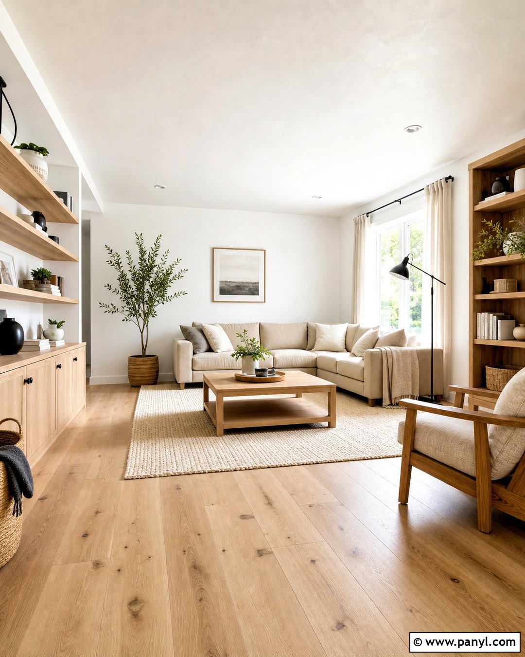
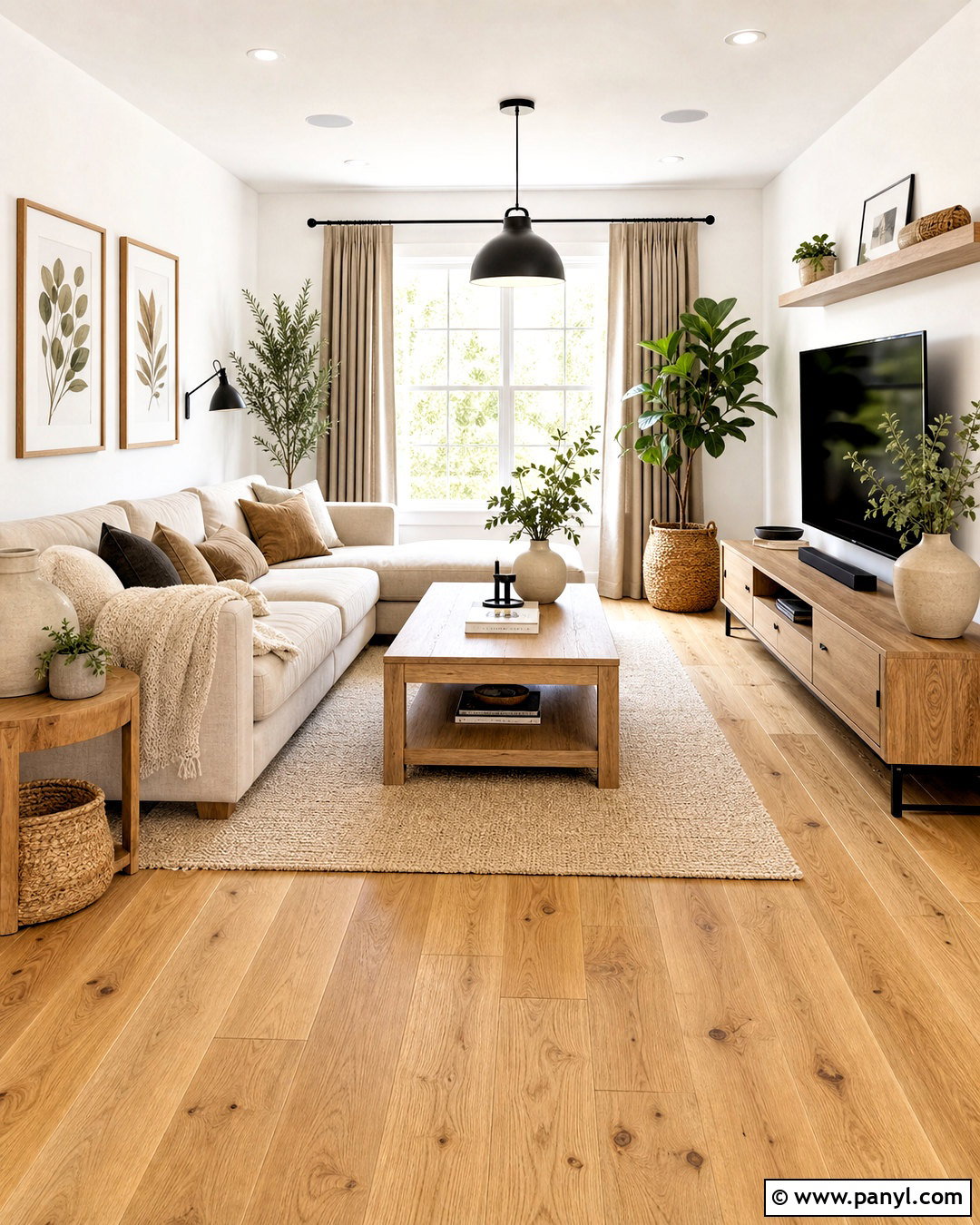
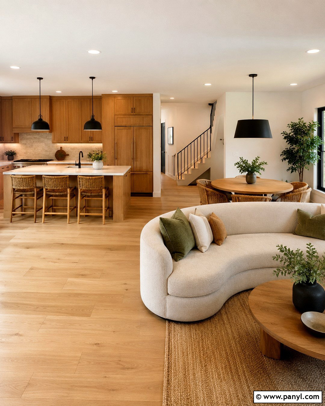
A white and oak palette creates a clean, welcoming interior without making the space feel cold. Use natural white oak for flooring, open shelving, and a simple coffee table. Warm white walls will soften the wood’s golden grain better than a sharp blue-white paint. Complete the living room with an oatmeal sofa, ivory curtains, and a textured cream rug. Small matte black details, such as lamp frames and cabinet handles, provide definition. Add greenery in off-white ceramic pots for gentle color. Keep the layout open and let natural light reach the wooden surfaces. This combination works especially well in small rooms because the pale background and lightly finished oak help the entire space appear airy, connected, and uncluttered.
2. Sage Green And Walnut Wooden Color Combination
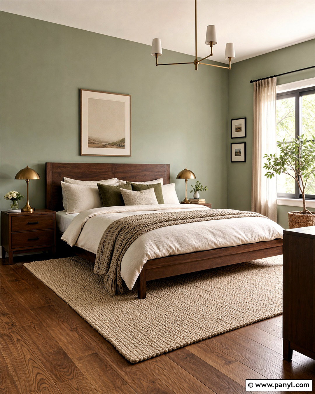
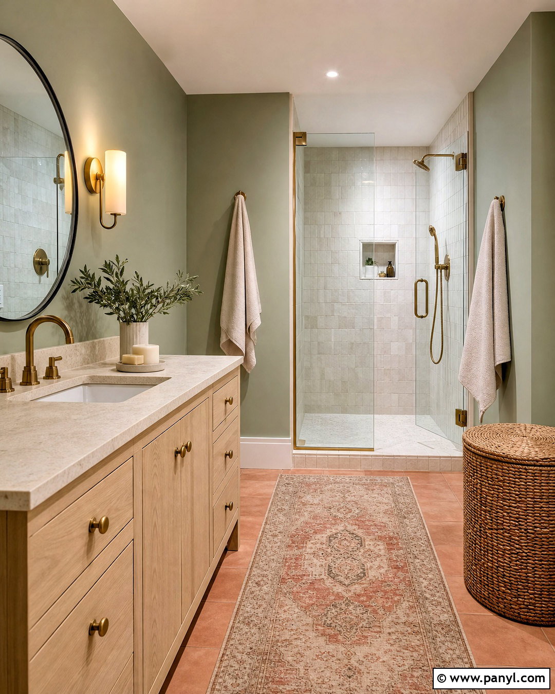
Soft sage green balances the richness of dark walnut while giving a room a calm, grounded character. Build the look around a walnut bed, matching nightstands, and warm medium-toned wood flooring. Paint the walls a muted sage with gray undertones rather than a bright botanical green. Layer the bed with ivory sheets, moss green cushions, and a beige woven throw. A natural wool rug prevents the dark furniture from feeling heavy. Use aged brass lamps to highlight walnut’s deep brown color, then add linen curtains and a few leafy plants. Repeating the sage in small artwork or ceramics creates continuity. The finished bedroom feels restful and refined, with enough contrast to keep every wooden piece clearly visible.
3. Navy Blue And Teak Wooden Color Combination
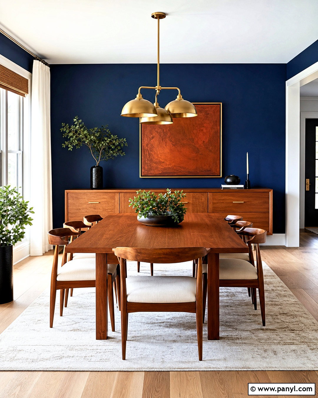
Deep navy walls make honey-colored teak furniture appear especially warm and distinctive. This pairing suits a dining room where strong color can create an intimate atmosphere. Choose a streamlined teak dining table, matching chairs with cream upholstered seats, and a teak sideboard. Balance the navy with a pale ceiling, light neutral rug, and soft white curtains. Brushed brass pendants and simple amber glass accessories complement the wood without overwhelming it. Introduce a little rust or burnt orange through cushions or framed artwork for added depth. Keep the table setting light and minimal. The final space combines bold walls with natural warmth, producing a polished dining area that feels dramatic during gatherings but remains comfortable and approachable every day.
4. Greige And Ash Wood Wooden Color Combination
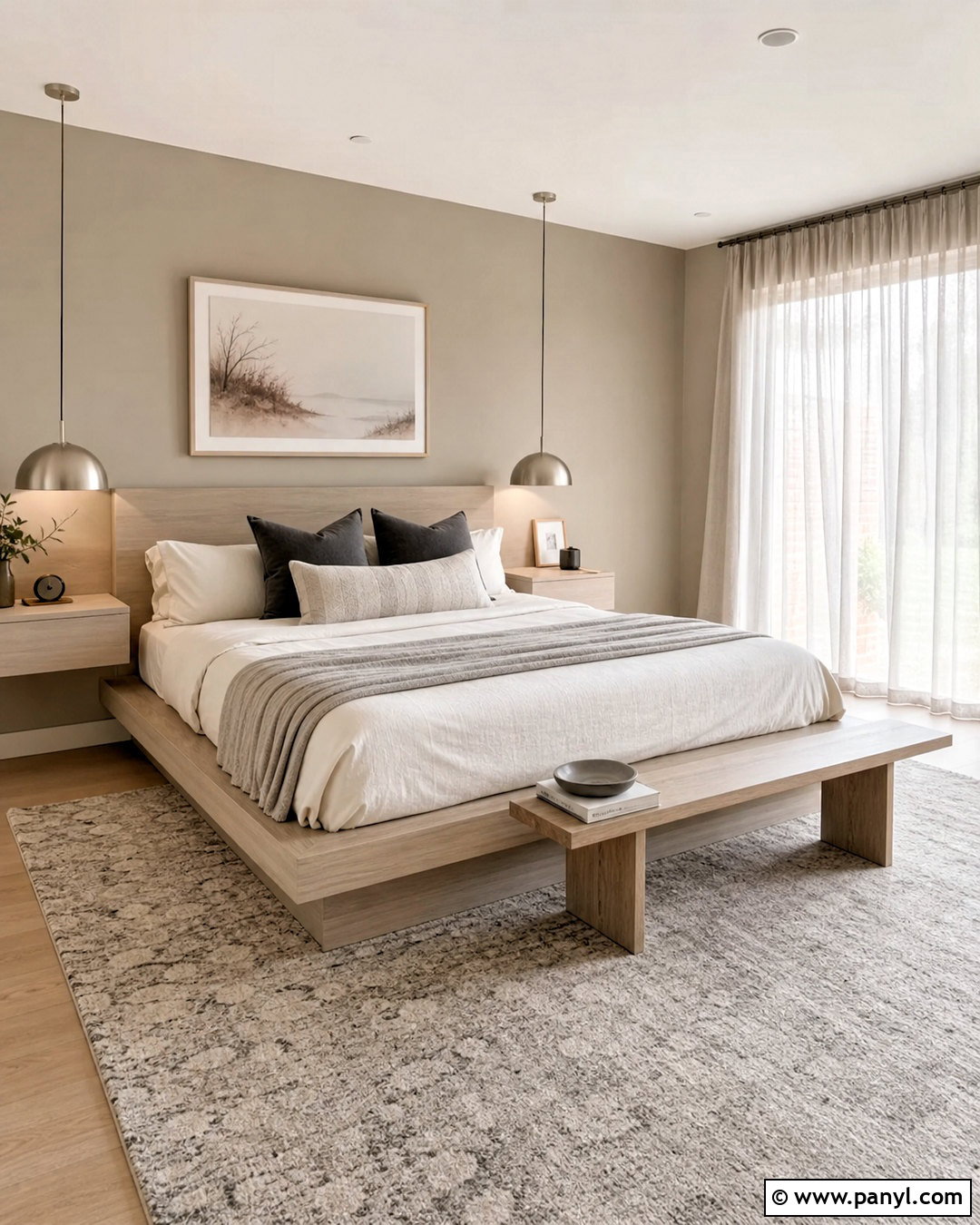
Greige walls and pale ash wood create a flexible neutral scheme that feels softer than a completely gray interior. Use ash for a low platform bed, floating nightstands, and a slim bench. Select a warm greige paint that sits between beige and gray, helping the wood grain remain visible. Dress the bed in layered white, taupe, and stone-colored linens. A charcoal accent pillow adds contrast without disturbing the restful palette. Choose a light wool rug, brushed nickel lighting, and sheer curtains to maintain the quiet mood. One large abstract print can introduce subtle clay and black details. This complete bedroom look is ideal when you want contemporary simplicity, gentle warmth, and a neutral foundation that can adapt to changing accessories.
5. Charcoal Gray And Natural Oak Wooden Color Combination
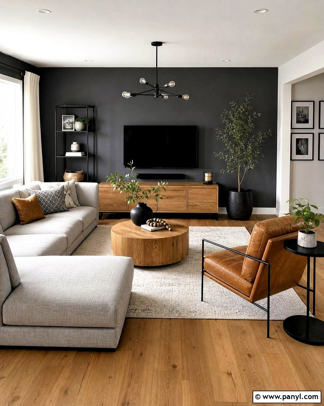
Charcoal gray brings a modern edge to natural oak and makes its warm grain stand out. Use the darker color on one main wall or across built-in cabinetry rather than covering every surface. Ground the living room with oak flooring, an oak media console, and a round wooden coffee table. A light gray sectional keeps the center of the room bright, while cream curtains and a pale patterned rug soften the contrast. Repeat charcoal through slim metal lamps, picture frames, and one or two cushions. Camel leather accents can connect the gray and oak tones naturally. The completed space feels contemporary but not stark because the wood, textiles, and warm leather prevent the darker elements from dominating the room.
6. Cream And Mahogany Wooden Color Combination
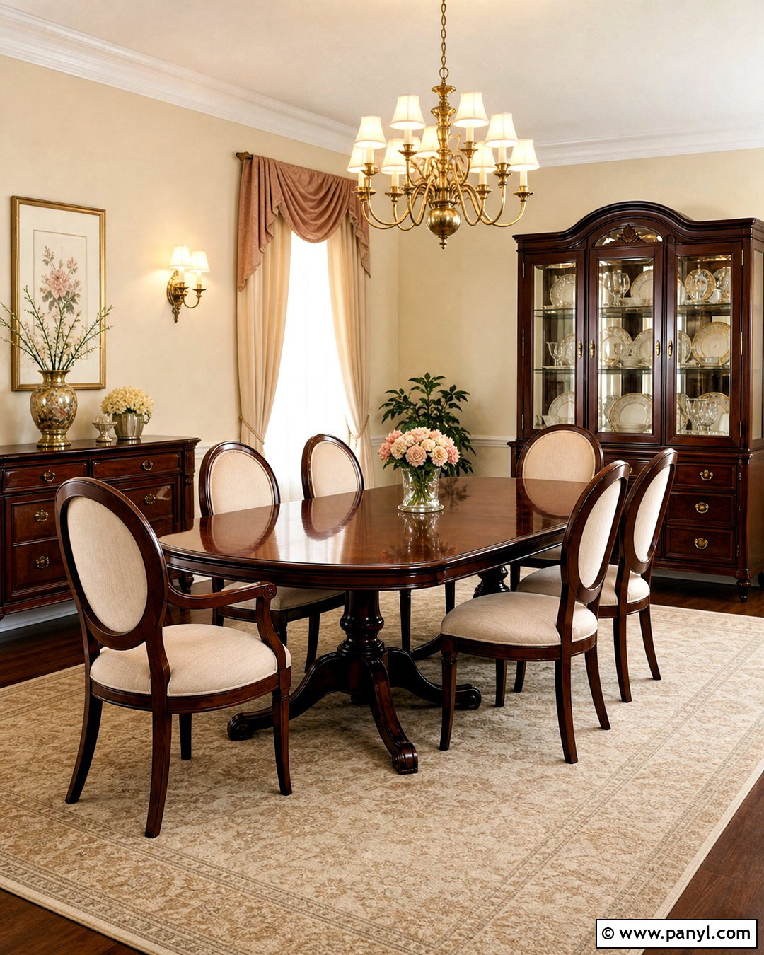
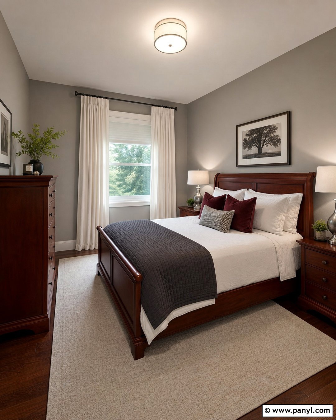
Cream provides an elegant background for mahogany’s deep reddish-brown color. This palette works beautifully in a traditional dining room with detailed wooden furniture. Choose a polished mahogany table, upholstered chairs, and a coordinated display cabinet. Use creamy walls, ivory drapery, and a large beige rug to brighten the darker pieces. Incorporate muted burgundy or dusty rose through artwork and seat fabric to echo the wood’s red undertone. Warm brass sconces and a classic chandelier reinforce the refined atmosphere. Avoid filling the room with additional dark finishes. Instead, leave open wall space and use pale table linens. The result is formal enough for special occasions but still warm, balanced, and comfortable for regular family meals.
7. Terracotta And Mango Wood Wooden Color Combination
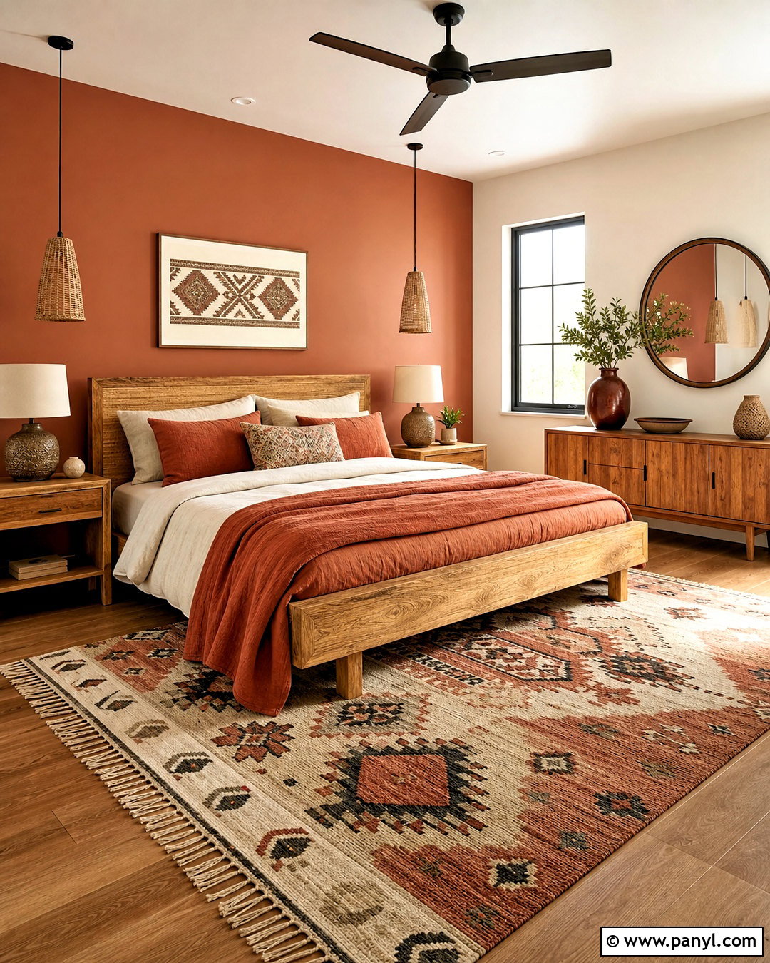
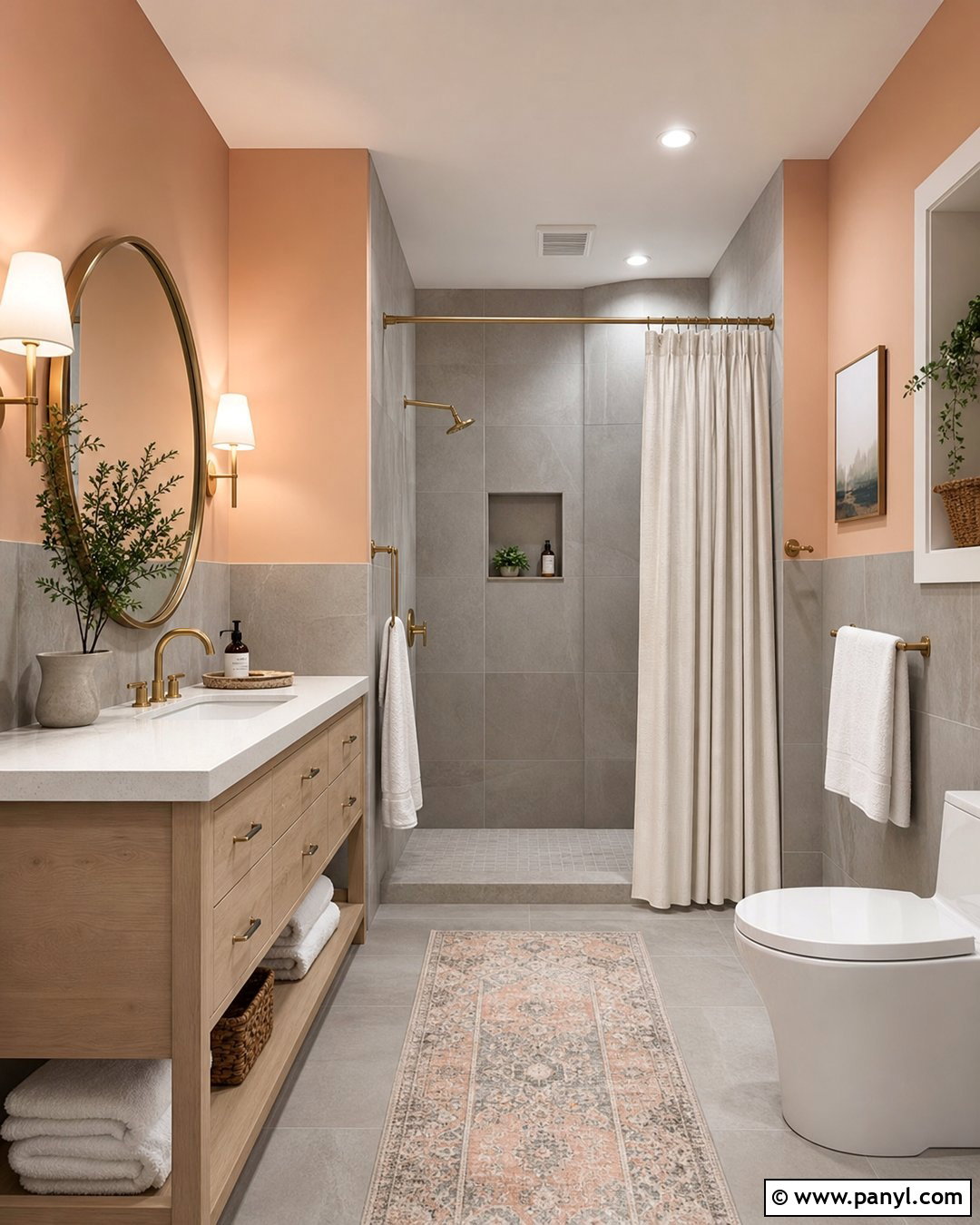
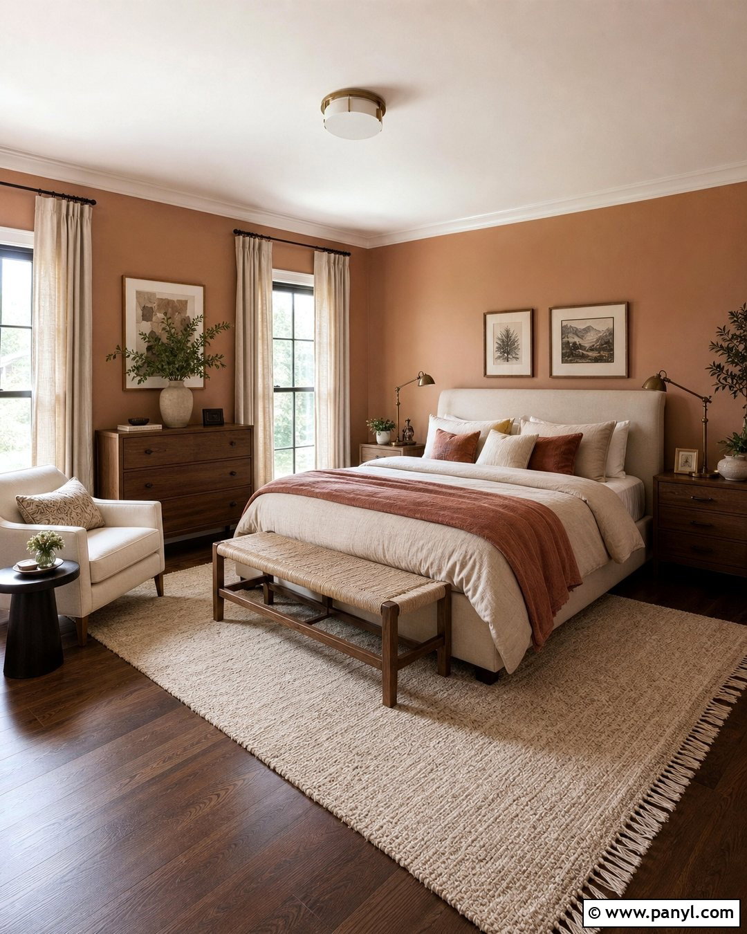
Earthy terracotta and golden mango wood create a relaxed room filled with sunbaked warmth. Start with a mango wood bed or low sideboard featuring visible grain and a natural matte finish. Paint one wall muted terracotta, leaving the remaining walls soft beige to keep the space open. Layer rust, sand, and cream textiles across the bed, then add a patterned flat-weave rug with small black details. Woven pendant lighting, linen curtains, and handmade ceramic pieces complete the organic look. Use greenery sparingly so it remains an accent rather than a competing color. This combination is particularly effective in a guest bedroom because it feels cozy and memorable while relying on practical materials and approachable, easy-to-coordinate colors.
8. Dusty Blue And Pine Wooden Color Combination
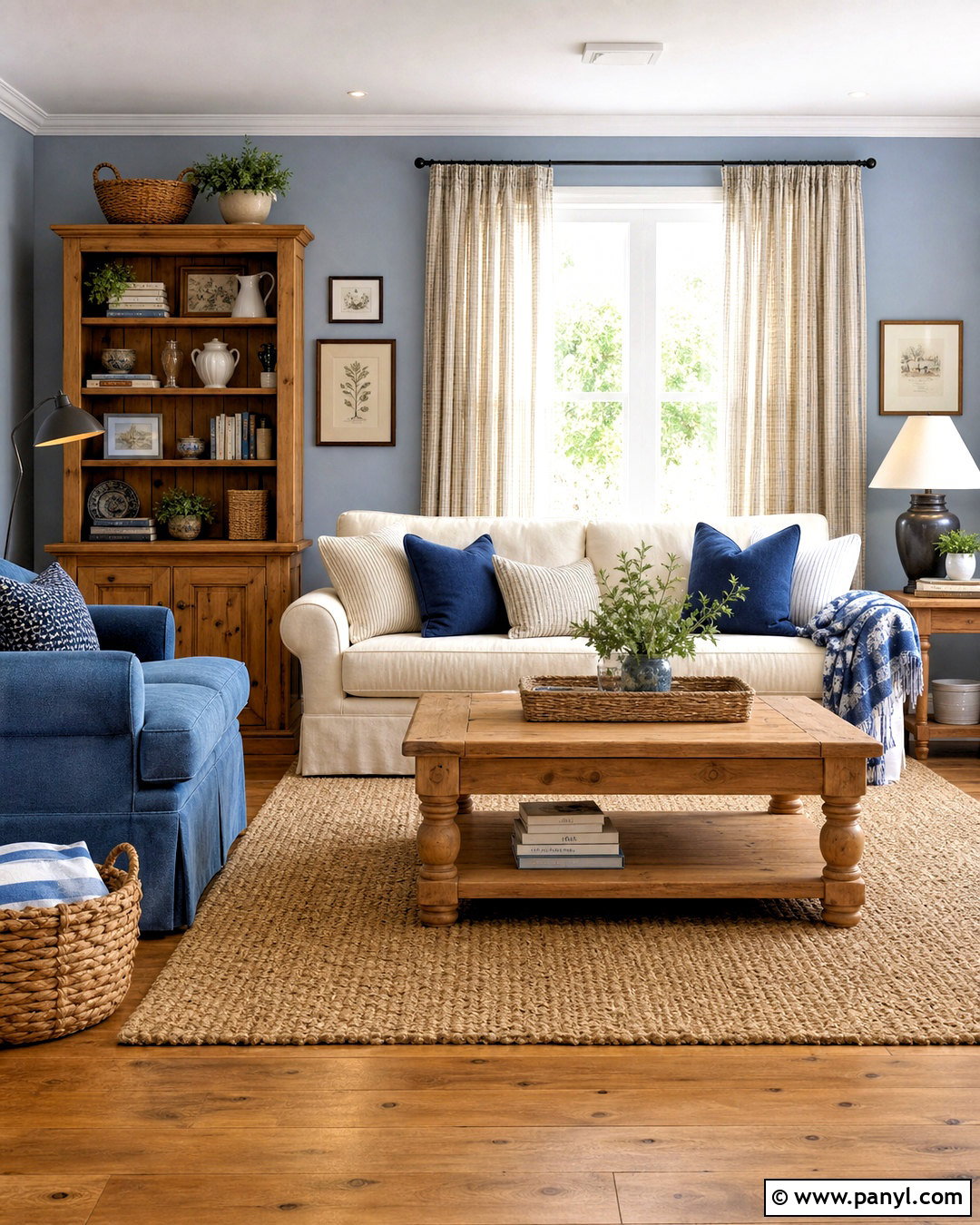
Dusty blue cools the yellow undertones of pine and gives casual wooden furniture a more polished appearance. Create a relaxed family room with pine flooring, a simple pine bookcase, and a sturdy wooden coffee table. Cover the walls in a soft blue-gray and choose an off-white sofa for brightness. Add denim blue cushions, a natural jute rug, and striped cream curtains for subtle pattern. Black iron lighting introduces crisp contrast, while woven baskets reinforce the room’s practical character. Keep the pine finish matte or lightly sealed rather than glossy. The completed palette feels fresh and familiar, making it a useful choice for cottages, casual homes, or busy living areas that need comfortable furniture and forgiving natural materials.
9. Forest Green And Cherry Wood Wooden Color Combination
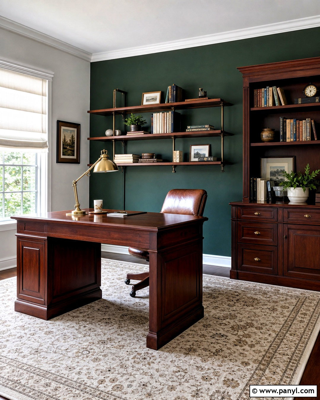
Cherry wood’s red undertones pair naturally with deep forest green, creating a rich office that feels focused and established. Use cherry for the desk, wall shelving, and a compact storage cabinet. Apply forest green to the wall behind the desk, then keep surrounding walls warm ivory to prevent the room from becoming too dark. Choose a tan leather chair, an antique-style brass desk lamp, and a cream rug with a restrained green pattern. Off-white Roman shades will filter daylight while maintaining privacy. Repeat the red-brown wood tone in picture frames, but avoid introducing unrelated orange finishes. This thoughtful combination creates a complete workspace with depth, warmth, and enough light-colored surfaces to remain comfortable during long working sessions.
10. Black And Walnut Wooden Color Combination
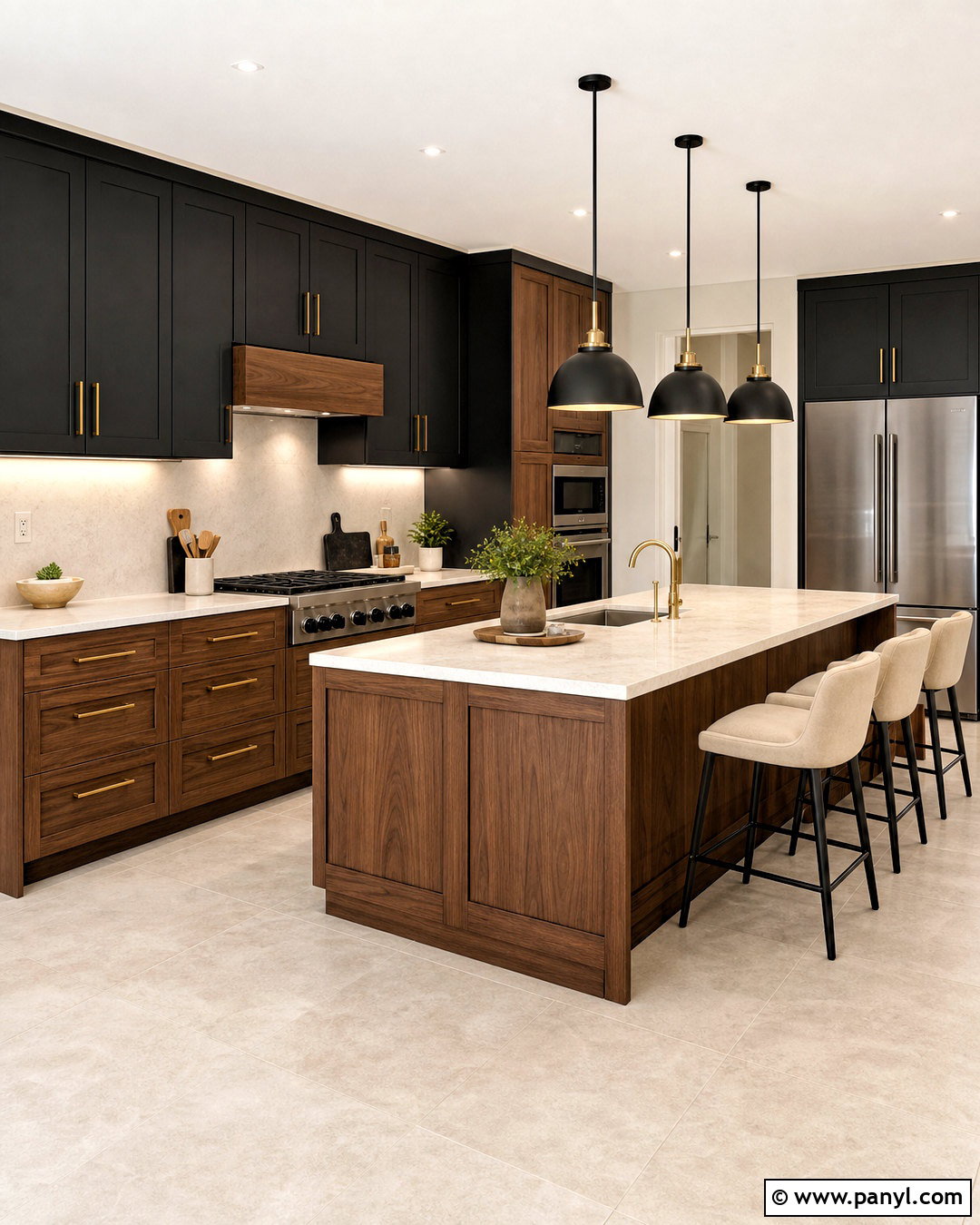
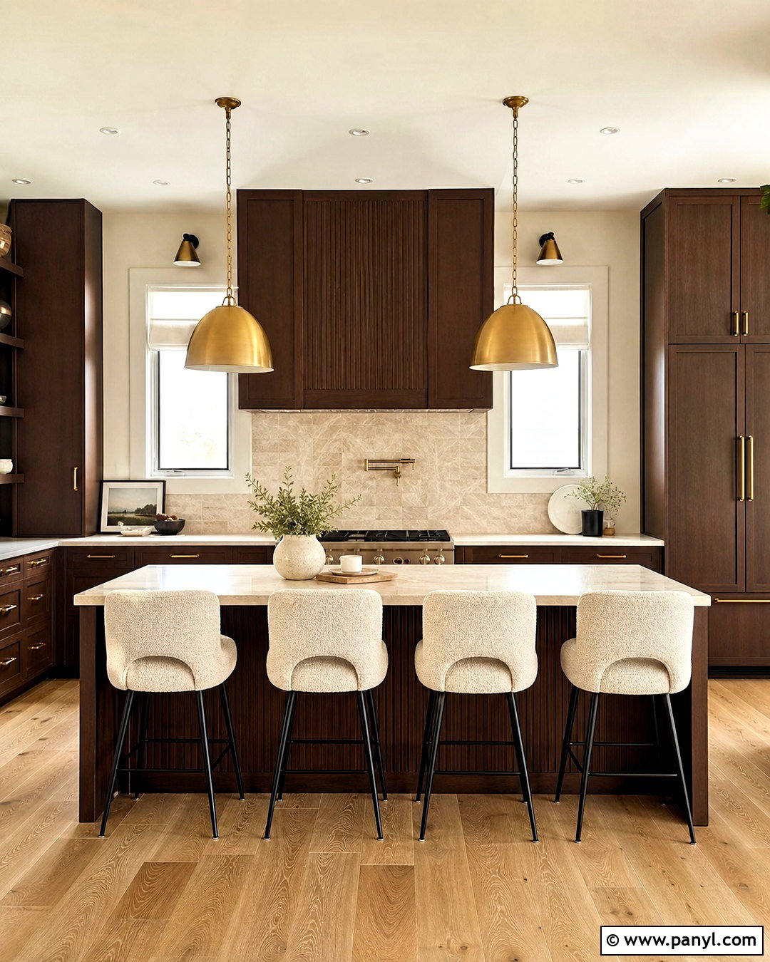
Black and walnut create a strong modern palette when lighter surfaces are included for balance. Design a streamlined kitchen with walnut lower cabinets, matte black upper cabinets, and a pale quartz countertop. Continue walnut on the island front to showcase the natural grain. Use a warm white backsplash and light oak or stone-look flooring so the room does not feel enclosed. Black pendant lights and faucets connect the cabinetry, while brushed brass handles add controlled warmth. Keep counter accessories minimal and choose simple cream barstools with black frames. The finished kitchen feels sophisticated and cohesive because each material has a clear role. Walnut supplies warmth, black adds structure, and the lighter countertop and backsplash reflect plenty of brightness.
11. Blush Pink And Maple Wooden Color Combination
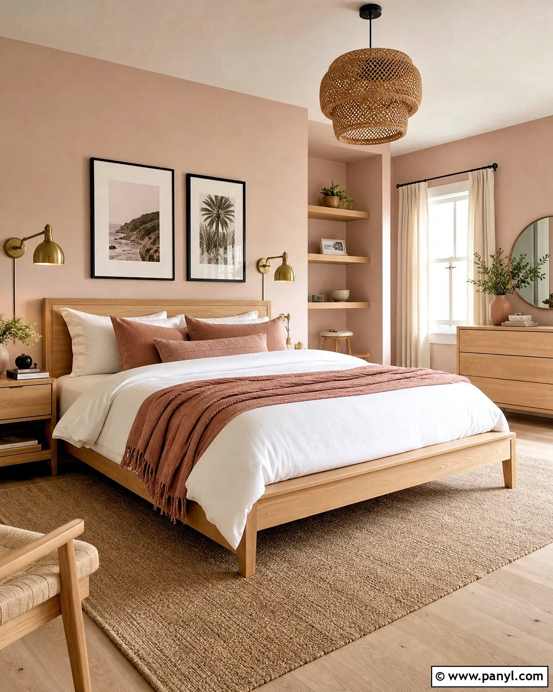
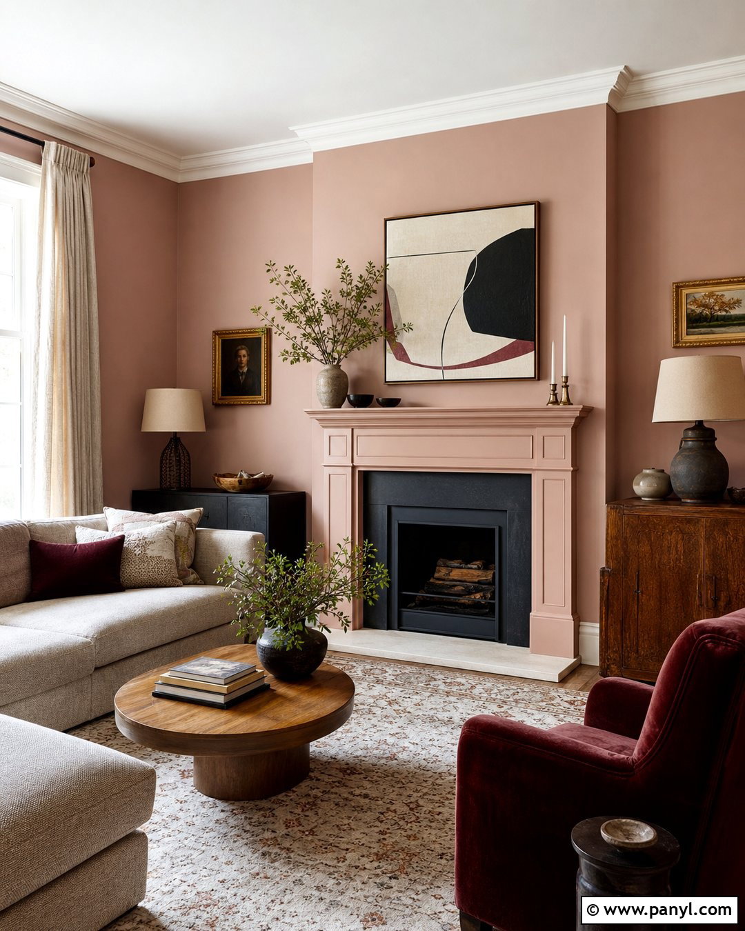
Blush pink brings gentle warmth to pale maple without making a room look overly sweet. Use maple for a clean-lined bed, dresser, and floating shelves. Paint the walls a muted plaster pink with beige undertones, then introduce white bedding and a soft taupe rug to create breathing room. Accent the bed with dusty rose and cinnamon cushions for subtle variation. Brushed brass sconces work well with maple’s creamy color, while ivory curtains maintain a bright finish. Add a small amount of charcoal through frames or a bedside lamp for visual weight. This complete bedroom palette feels soft, modern, and grown-up. It works especially well where natural daylight can reveal the quiet differences between the pink, beige, and pale wood tones.
12. Mustard Yellow And Teak Wooden Color Combination
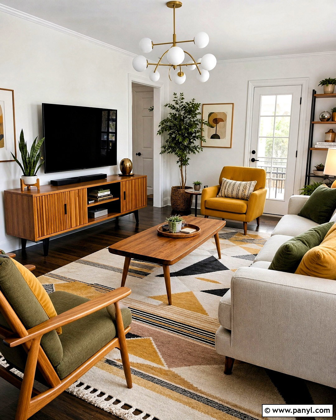
Mustard yellow and teak can produce a warm midcentury-inspired living room with plenty of personality. Begin with a teak media cabinet, tapered-leg coffee table, and one wooden lounge chair. Choose a cream sofa, then use mustard on an accent chair, cushions, or a single painted wall. A geometric rug containing cream, brown, and muted yellow will connect the furniture and color accents. Add globe lighting, walnut-toned frames, and a few matte ceramic accessories. Keep the remaining walls warm white to control the stronger color. Teal or deep olive can appear in one small decorative detail for contrast. The overall room should feel sunny and collected, with simple silhouettes preventing the mustard and golden wood from becoming visually overwhelming.
13. Olive Green And Dark Oak Wooden Color Combination
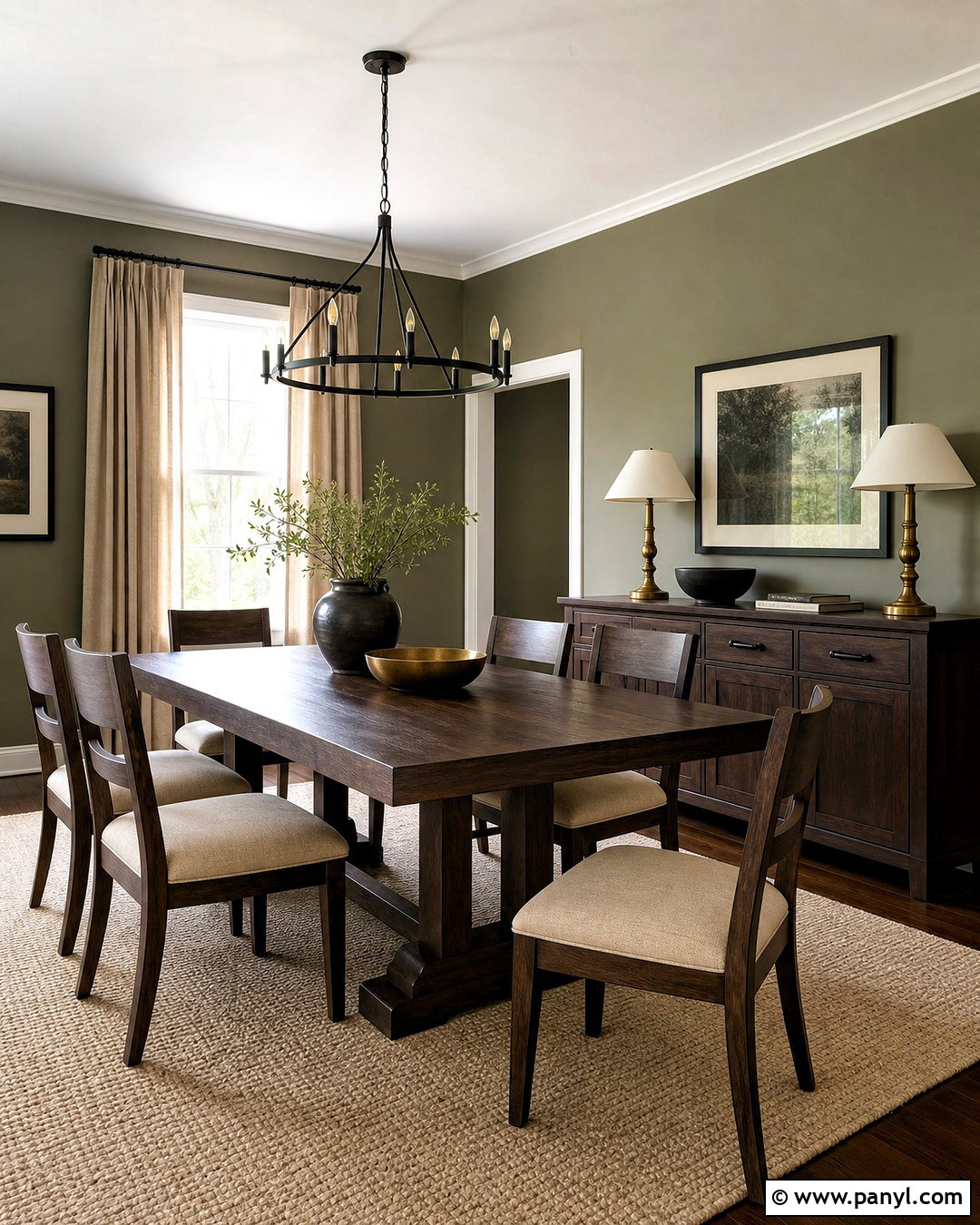
Olive green softens dark oak and creates a comfortable interior inspired by natural landscapes. Use dark oak for the dining table, chairs, and a shallow sideboard. Cover the walls in a subdued olive tone, then lighten the lower half of the room with an oatmeal rug and cream upholstered seats. Linen curtains in warm beige will complement both the paint and wood. Choose black metal lighting for structure and add aged brass candleholders or cabinet hardware for a subtle glow. A few stoneware pieces in off-white and brown complete the table. This room works best with uncluttered surfaces and generous lighting. The dark oak remains substantial, while the earthy green and pale textiles keep the finished dining space relaxed and welcoming.
14. Soft Gray And Honey Oak Wooden Color Combination
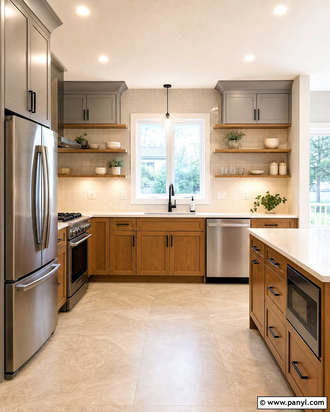
Soft gray can update honey oak without hiding its warm, golden character. Create a balanced kitchen using honey oak lower cabinets, soft gray upper cabinetry, and white quartz counters. Select a gray with warm or slightly beige undertones so it does not clash with the wood. Use an off-white backsplash and pale stone flooring to brighten the work area. Stainless steel appliances add a clean, neutral finish, while matte black handles give the cabinets a clearer outline. Continue the oak through open shelves or simple counter stools. A few muted blue accessories can provide controlled color. The complete kitchen feels lighter and more current, yet the existing wooden cabinetry still looks intentional rather than like an element that must be replaced.
15. Warm White And Cedar Wooden Color Combination
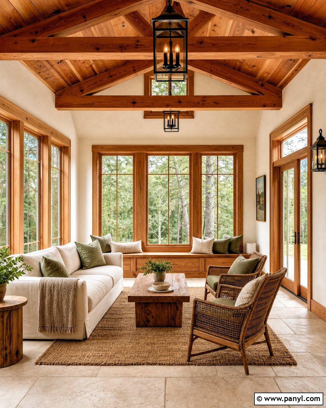
Warm white allows cedar’s orange and red notes to become the main decorative feature without making the interior feel overly rustic. Create a bright sunroom with cedar ceiling beams, cedar-framed windows, and a simple wooden bench. Paint the walls creamy white and use light limestone or pale oak flooring. Furnish the room with an ivory sofa, woven chairs, and a natural fiber rug. Soft rust and sage cushions can echo the outdoor landscape while relating to the cedar. Add black-framed lantern lighting to define the architecture. Avoid additional strongly red wood tones, which may make the palette look busy. The completed room feels airy, natural, and comfortable, with the cedar providing warmth against the fresh neutral background.
16. Burnt Orange And Espresso Wood Wooden Color Combination
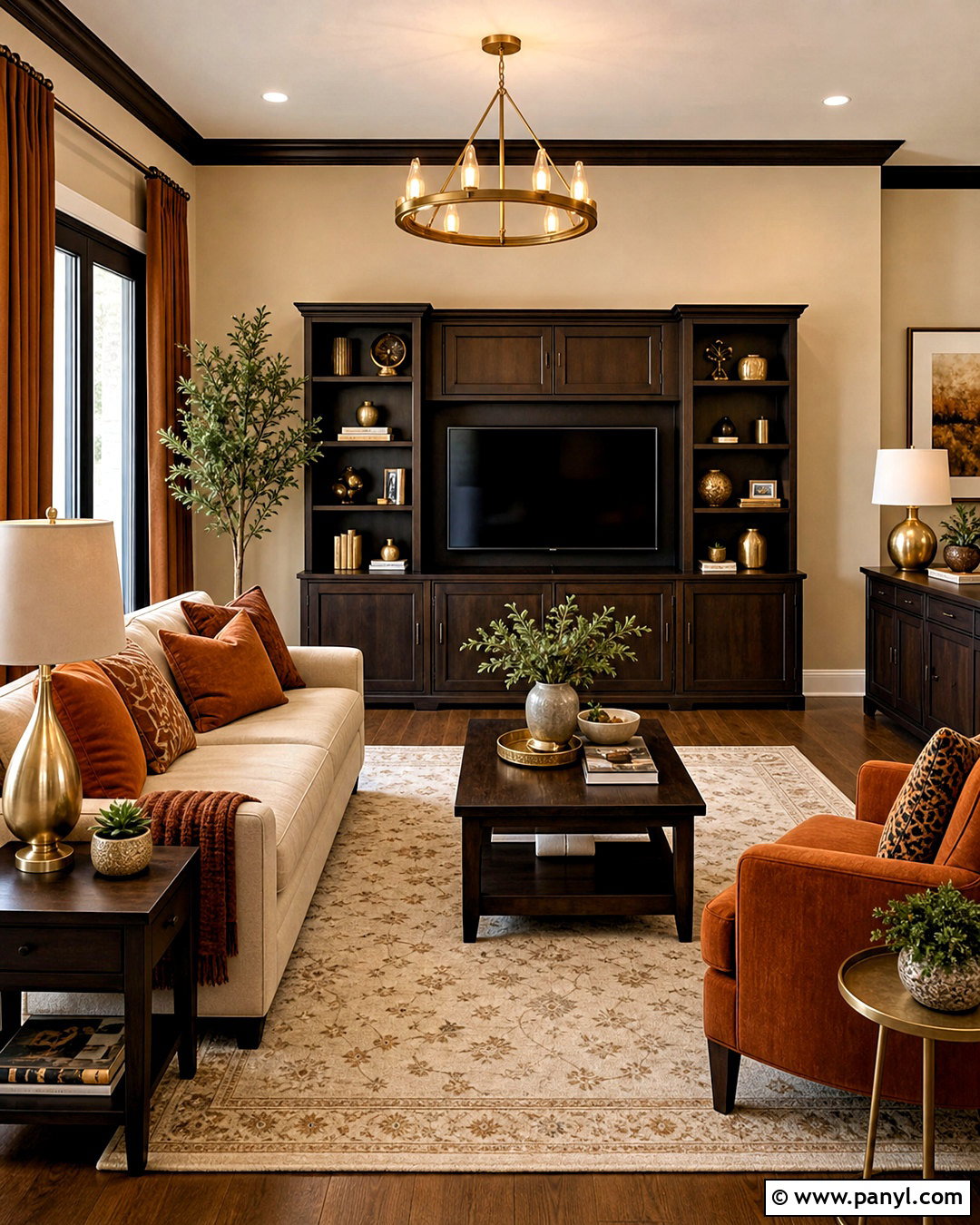
Burnt orange adds energy to espresso wood while preserving its deep, sophisticated appearance. Build a cozy living room around an espresso-stained media unit, side tables, and exposed furniture legs. Choose a warm beige sofa and use burnt orange on an upholstered chair, cushions, and abstract artwork. Paint the walls light sand to prevent the dark wood from absorbing too much light. A cream rug with brown linear details will connect the larger pieces. Finish the room with antique brass lighting and caramel-colored curtains. Include one or two plants for a fresh green contrast. This full palette feels warm and layered, but it remains balanced because the orange is concentrated in selected areas rather than spread across every surface.
17. Teal And Acacia Wood Wooden Color Combination
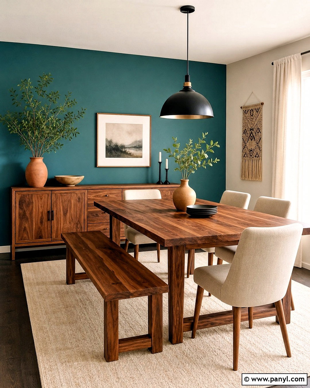
Rich teal highlights the varied golden and reddish grain found in acacia wood. Use this combination in a dining area with an acacia table, matching bench, and simple sideboard. Paint the main wall a medium teal and keep adjacent walls warm white. Upholster the dining chairs in oatmeal fabric to provide a quiet break between the strong wall and patterned wood. Add a cream rug, black metal pendant, and understated brass hardware. Decorative ceramics in teal, ivory, and clay can connect the palette without creating clutter. Because acacia often has noticeable natural variation, keep other patterns simple. The final room feels colorful and contemporary while allowing the table’s distinctive grain to function as an important part of the overall design.
18. Lavender Gray And Whitewashed Wood Wooden Color Combination
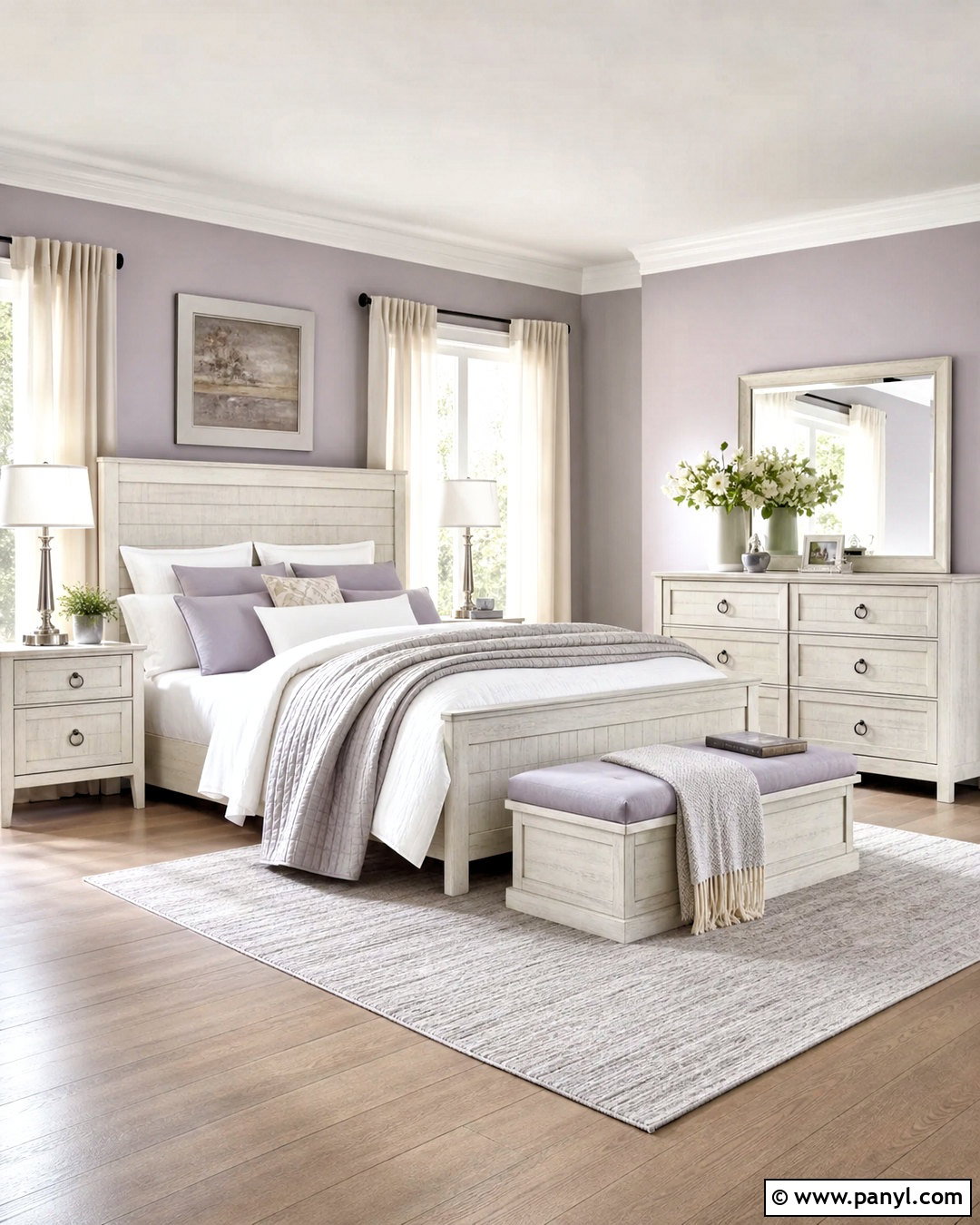
Lavender gray and whitewashed wood create a quiet, airy bedroom with more character than a standard all-white scheme. Choose a whitewashed wooden bed, dresser, and narrow bench with visible grain. Paint the walls a soft gray touched with muted lavender. Layer the bed with white linen, pale lilac cushions, and a stone-colored quilt. Use a light gray wool rug and sheer ivory curtains to maintain the room’s brightness. Brushed nickel lamps and clear glass accessories add a cool, clean finish. Introduce a small amount of natural oak through frames or a woven tray for warmth. The completed look feels peaceful and uncluttered, with enough tonal variation to keep the pale wooden furniture from disappearing into the background.
19. Deep Red And Smoked Oak Wooden Color Combination
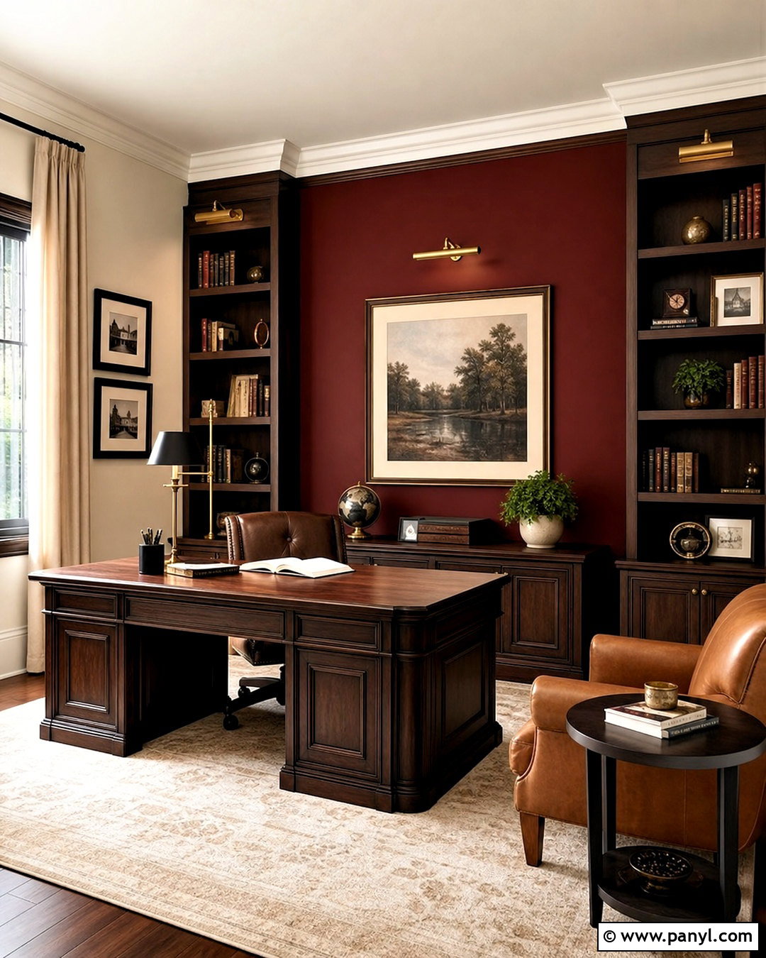
Deep red and smoked oak can create a dramatic reading room when balanced with generous neutral details. Use smoked oak for built-in shelves, a compact desk, and a round side table. Paint one wall a muted oxblood or deep brick red, leaving the ceiling and remaining walls warm cream. Add a camel leather armchair, an ivory rug, and beige curtains to soften the darker surfaces. Brass picture lights will emphasize the shelving and add warmth around the wood. Keep books and accessories arranged in small groups rather than filling every shelf. Black accents can appear through a floor lamp or hardware. The finished space feels intimate and distinctive, yet the pale upholstery and textiles prevent the deeper colors from looking oppressive.
20. Aqua Blue And Bamboo Wooden Color Combination
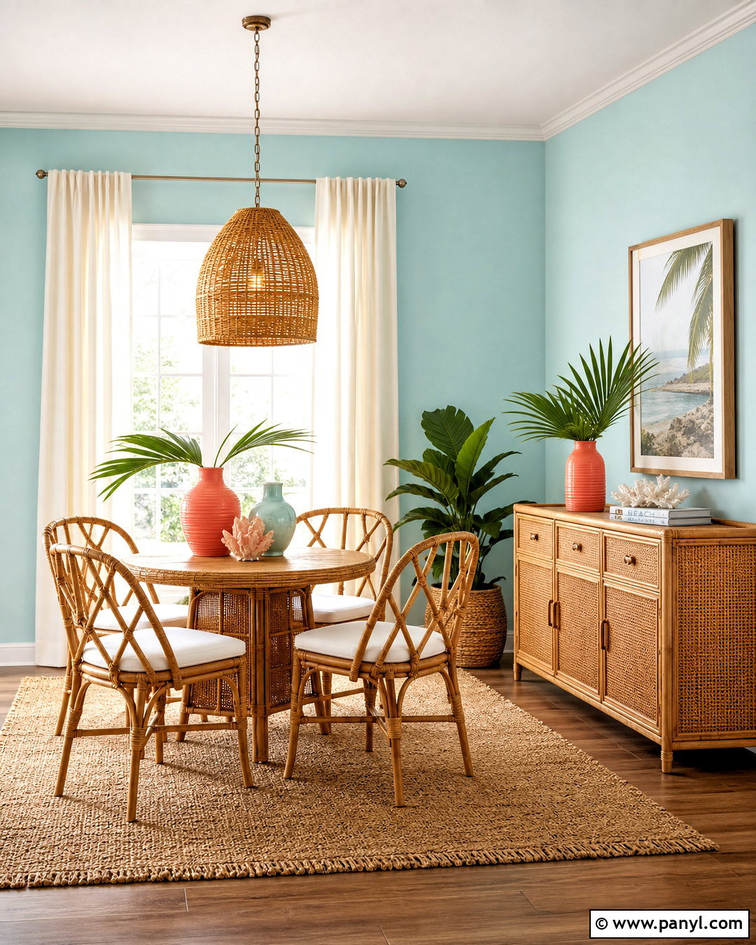
Aqua blue and bamboo produce a light, cheerful interior with a relaxed coastal influence. Create a bright breakfast nook using a bamboo dining set, woven pendant, and bamboo-framed storage cabinet. Paint the walls pale aqua rather than a highly saturated turquoise. Add white seat cushions, cream curtains, and a natural sisal rug to keep the palette grounded. Small coral, sandy beige, and sea-glass green accents can appear in artwork and ceramics. Use warm white trim and simple brushed nickel hardware for a clean finish. Avoid covering the room with themed accessories. The combination works best when natural textures and clear colors lead the design, resulting in an inviting everyday space that feels fresh without becoming overly decorative.
Conclusion:
Successful wooden colour combination ideas begin with the wood itself. Study whether its grain appears golden, red, gray, pale, or nearly black, then select colors that either support that undertone or create controlled contrast. Warm whites, cream, greige, and soft gray offer flexible backgrounds, while sage, navy, teal, terracotta, and forest green create stronger character. Build a complete palette instead of choosing wall paint alone. Consider flooring, furniture, upholstery, rugs, lighting, hardware, and window treatments together. Repeat each important color in two or three places, but leave enough neutral space for the wood grain to remain visible. With thoughtful balance, mixed materials and expressive colors can make wooden interiors feel coordinated, personal, and comfortable.

Related Ideas and Inspiration:
Leave a Reply