
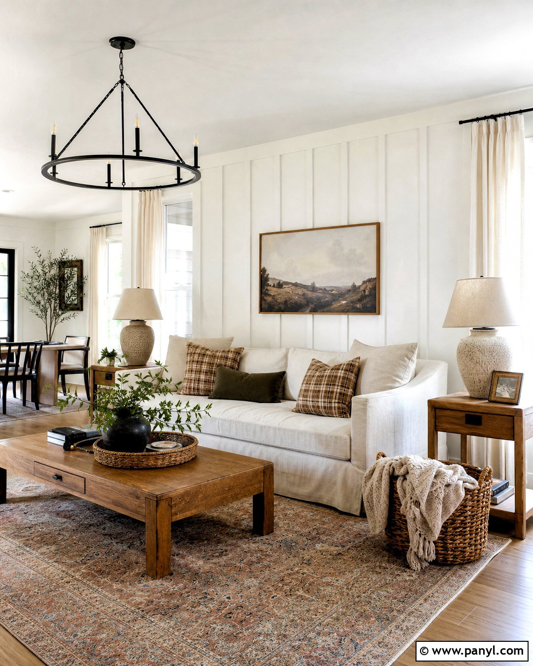
A welcoming home often begins with color that feels comforting, grounded, and easy to live with. These 20 warm color palette for home ideas combine creamy neutrals, earthy reds, mellow yellows, natural greens, and rich browns in complete room schemes. Each palette includes practical guidance for walls, furniture, flooring, textiles, metals, and decorative accents. You can use the combinations throughout your home or adapt one palette to a single room. The key is balancing stronger warm shades with softer colors and natural materials, so the finished space feels layered rather than overwhelming. Whether you prefer modern minimalism, rustic character, or relaxed traditional decor, you will find an approachable look below. Start planning your transformation with these 20 warm color palette for home ideas.

1. Terracotta And Cream Warm Color Palette
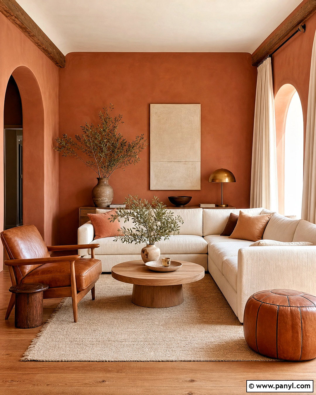
Terracotta walls can give a living room a sunbaked, welcoming character without making it feel too dark. Choose a muted clay shade rather than a bright orange, then balance it with a cream sofa, ivory curtains, and a natural wool rug. Medium oak flooring and a rounded wood coffee table strengthen the earthy foundation. Add cognac leather through one accent chair or a pair of small ottomans. Aged brass lamps provide gentle shine, while olive branches and handmade cream pottery soften the arrangement. Keep the ceiling and trim warm white for a clean transition between surfaces. This complete palette works especially well in rooms with plenty of natural light and suits Mediterranean, Southwestern, organic modern, and relaxed transitional homes.
2. Rust And Sage Warm Color Palette
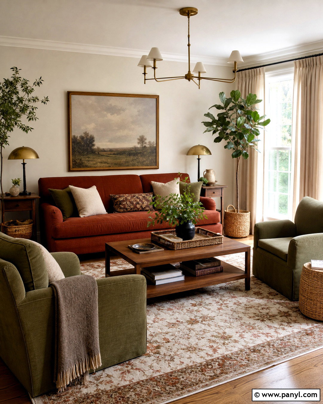
Rust and sage create a grounded living room that feels colorful but still connected to nature. Start with light beige walls and use a rust-colored sofa as the visual anchor. Add muted sage green armchairs, oatmeal curtains, and a patterned rug containing cream, clay, and moss tones. Walnut side tables introduce darker contrast without appearing harsh. Choose antique brass lighting and simple ceramic accessories in off-white or brown. A few leafy plants can repeat the green naturally, while linen pillows keep the seating casual. Avoid adding several other saturated colors because the rust and sage should remain dominant. This palette looks especially cohesive with medium wood floors, woven baskets, and textured fabrics, creating a comfortable room with an easy, collected appearance.
3. Ochre And Warm White Color Palette
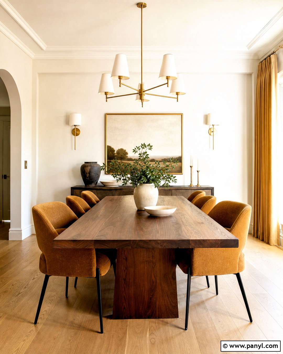
Does your dining room need energy without the intensity of bright yellow? Muted ochre brings a golden warmth that works beautifully with warm white, walnut, and soft brown. Paint the walls a creamy white and introduce ochre through upholstered dining chairs, full-length curtains, or a large woven rug. Center the room with a walnut table featuring a simple, substantial shape. A warm white pendant light can soften the stronger furniture colors, while brushed brass accents repeat the yellow undertone in a more polished finish. Add off-white ceramics, brown glass, and one large landscape print for understated decoration. Light oak flooring keeps the overall look airy. The completed dining room feels sunny, balanced, and welcoming without becoming excessively bright or overly themed.
4. Caramel And Chocolate Brown Color Palette
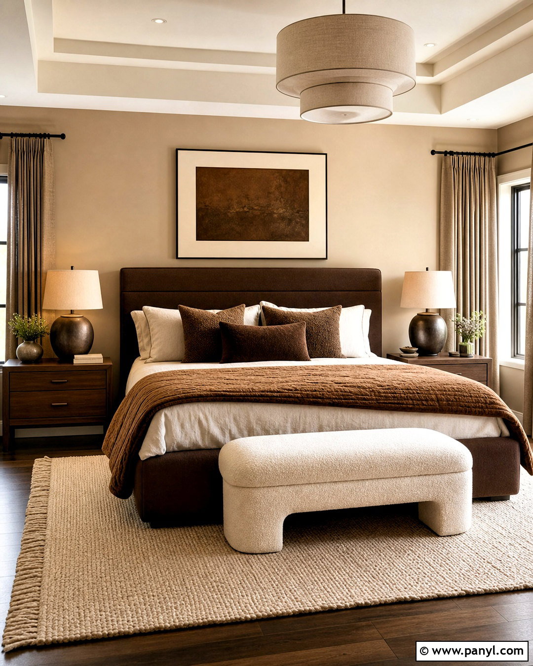
Layers of caramel and chocolate brown can make a bedroom feel restful, rich, and thoughtfully finished. Use creamy beige walls as the quiet backdrop, followed by a chocolate brown upholstered bed or dark walnut headboard. Dress the bed with ivory sheets, a caramel quilt, and pillows in tan, cocoa, and warm taupe. Place a light beige rug beneath the bed to prevent the darker furnishings from feeling heavy. Walnut nightstands and bronze lamps reinforce the warm foundation. For softness, hang oatmeal linen curtains and add a bouclé bench in warm white. Keep decorative objects minimal and select rounded shapes rather than severe lines. The tonal arrangement feels especially sophisticated when several textures, including linen, wool, velvet, wood, and woven fibers, appear together.
5. Burnt Orange And Olive Warm Color Palette
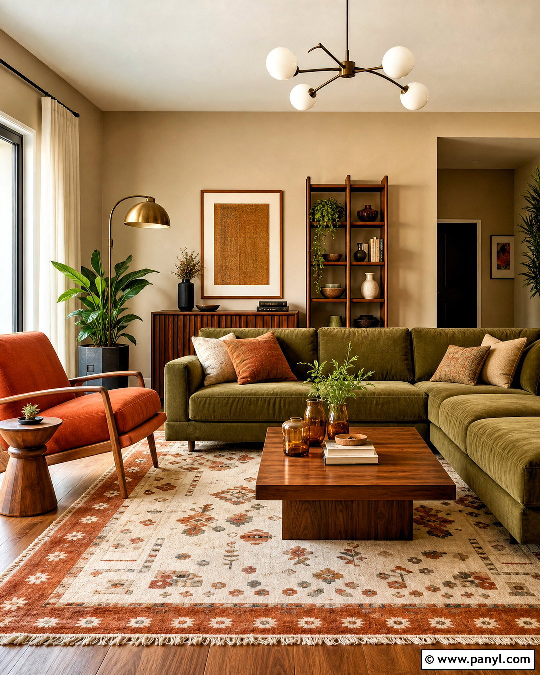
A burnt orange and olive palette brings cozy vintage character to a family room while remaining practical for everyday living. Cover the walls in a warm beige or soft sand color, then introduce a deep olive sectional with washable upholstery. Use burnt orange in the rug, throw pillows, and one comfortable lounge chair. Teak or medium walnut furniture complements both colors and gives the room a subtle midcentury influence. Add cream curtains and a light-colored ceiling to maintain brightness. Matte black frames can provide definition, but warmer bronze lighting will keep the overall scheme cohesive. Finish the room with patterned textiles, leafy plants, and a few amber glass accessories. The result feels lively and layered without relying on overly bright or competing colors.
6. Peach And Beige Warm Color Palette
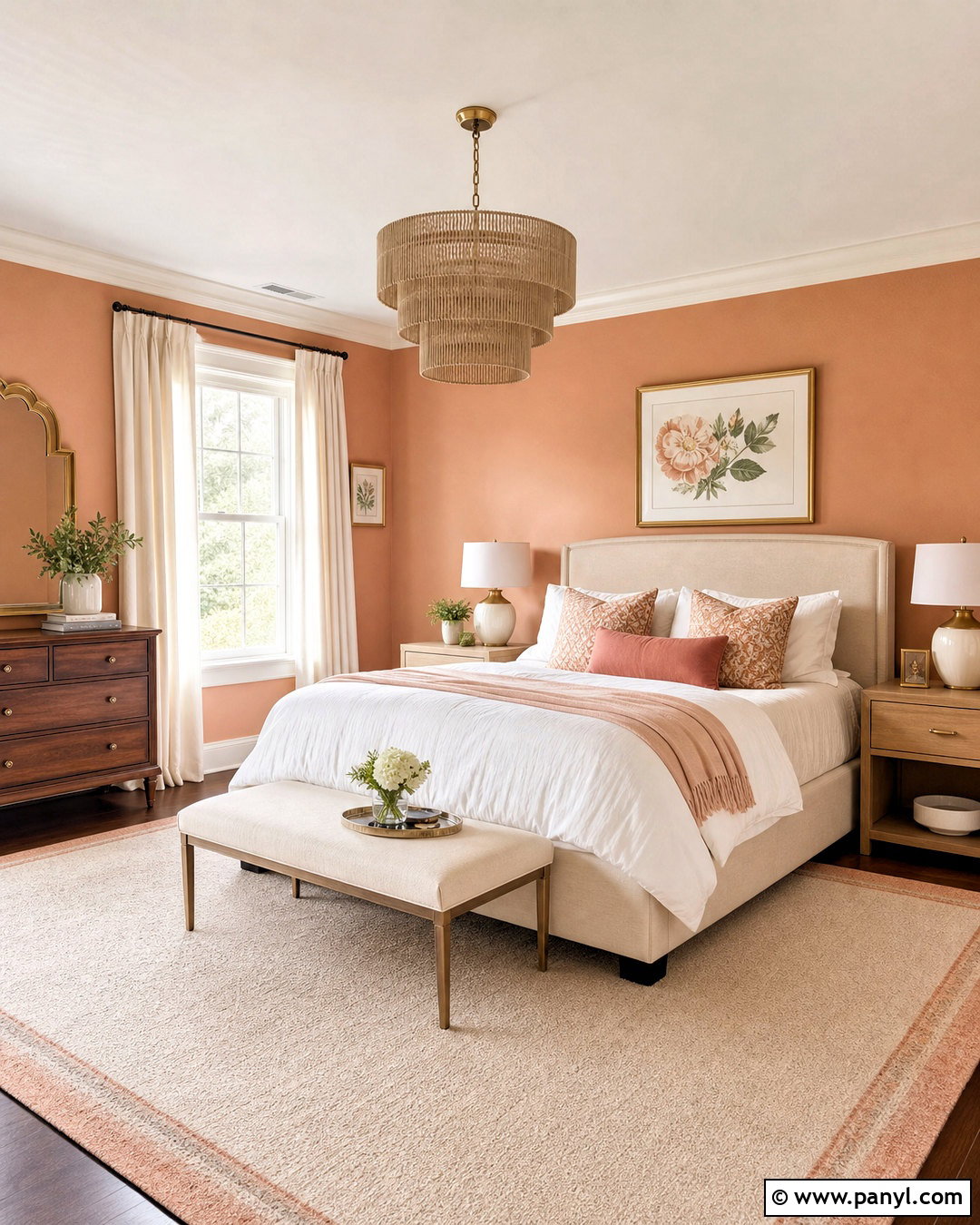
Soft peach can make a small bedroom look cheerful and warm while maintaining a calm atmosphere. Choose a dusty, muted peach for the walls and balance it with a beige upholstered bed, ivory bedding, and pale oak nightstands. Add a cream rug with a subtle peach or tan border to connect the main surfaces. Linen curtains in warm white help reflect daylight and prevent the wall color from becoming too dominant. Brushed brass lamps and small touches of warm pink add gentle variation. Include one medium-brown wood dresser for grounding contrast. Keep artwork simple, using botanical shapes or abstract forms in cream, peach, and camel. This complete scheme feels comfortable and fresh, making it suitable for guest rooms, children’s rooms, or compact primary bedrooms.
7. Brick Red And Tan Warm Color Palette
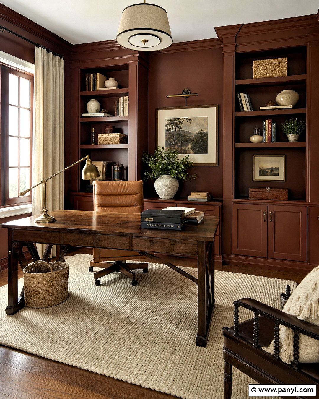
Brick red brings depth to a home office, especially when it is paired with relaxed tan and natural wood. Paint the walls in a muted red-brown shade and keep the ceiling warm white to preserve an open feeling. Position a substantial oak or walnut desk against the lightest wall, then add a tan leather chair and a cream wool rug. Built-in shelves painted to match the walls can create a cohesive, color-drenched effect. Use antique brass task lighting, woven storage boxes, and off-white pottery to break up the darker background. Framed artwork with cream mats adds needed breathing room. This palette works best with organized surfaces and restrained decoration. The completed office feels focused, comfortable, and distinctive without resembling a formal corporate workspace.
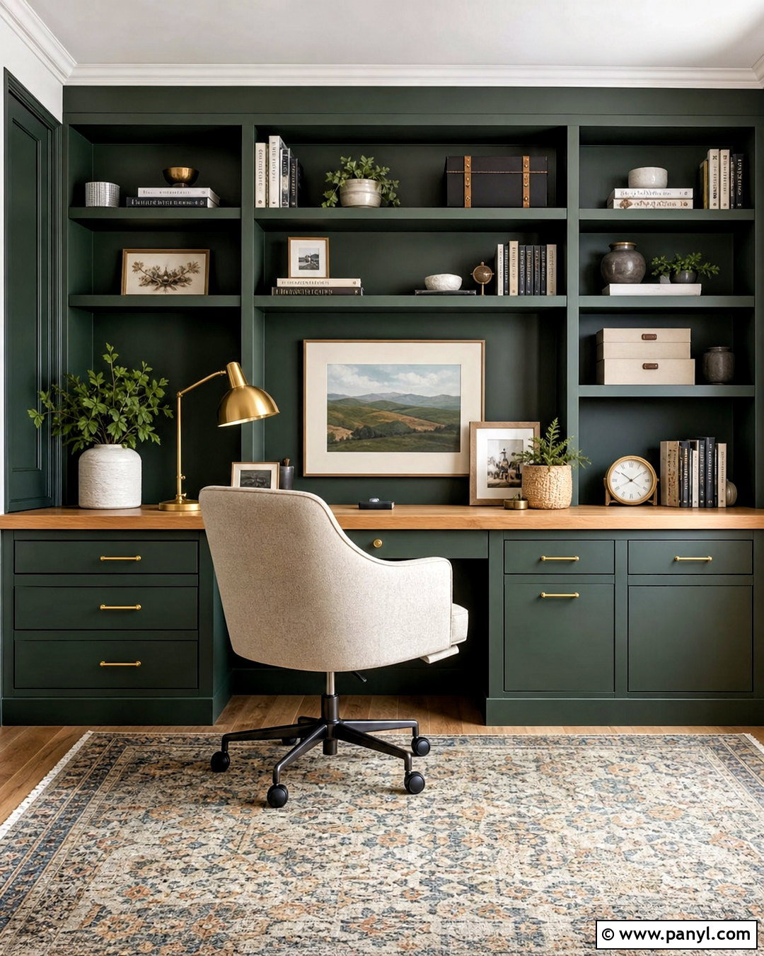
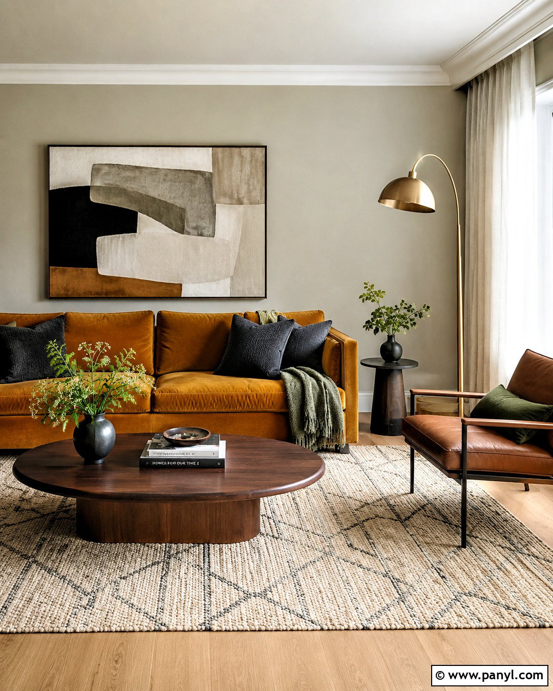
8. Butter Yellow And Cream Color Palette
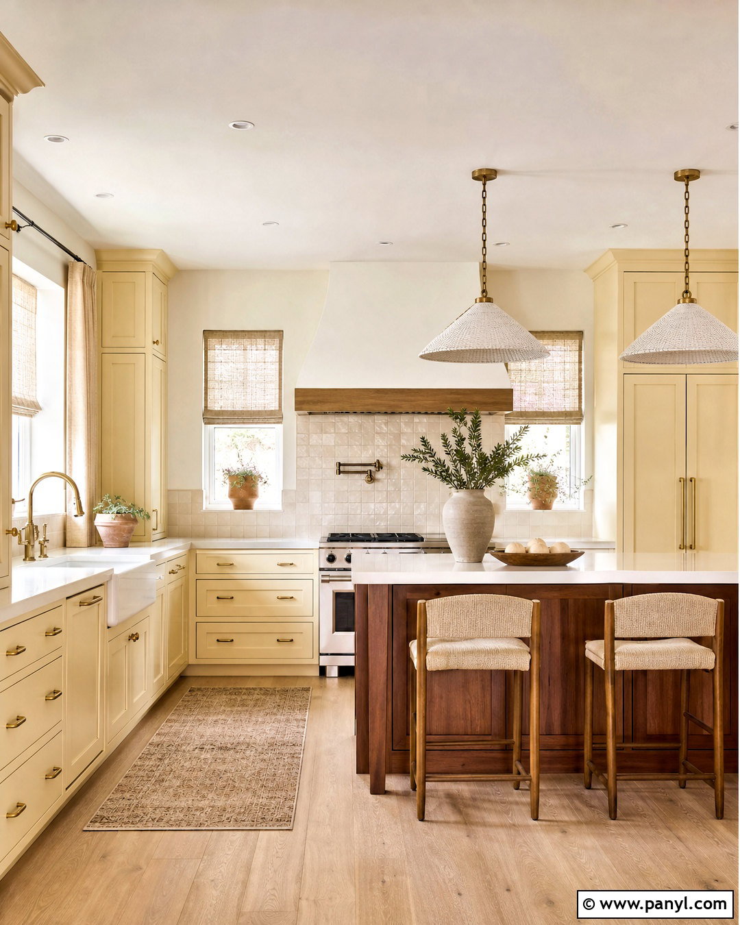
Imagine preparing breakfast in a kitchen filled with soft, buttery color rather than sharp white surfaces. Choose creamy yellow cabinets with simple panel doors, warm white walls, and lightly veined ivory quartz countertops. A pale oak floor or wood-look tile adds natural warmth underfoot. Use an off-white backsplash with handmade texture so the surfaces feel layered instead of flat. Brushed brass hardware works naturally with the yellow undertones, while a walnut island or small wood table provides deeper contrast. Add cream linen shades, tan counter stools, and a few terracotta planters to complete the room. Keep appliances and lighting streamlined. This gentle palette creates a bright, friendly kitchen that feels warm throughout the year without depending on strongly saturated yellow.
9. Clay Pink And Warm Taupe Color Palette
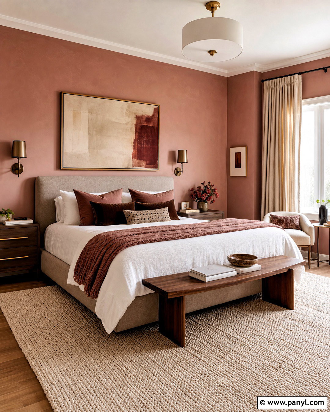
Clay pink and warm taupe can produce a sophisticated bedroom that feels soft without appearing overly sweet. Paint the walls a dusty clay pink with noticeable beige undertones. Select a taupe upholstered bed, warm white bedding, and a walnut bench or dresser to give the room structure. Layer the bed with muted rose, cocoa, and ivory pillows in linen and velvet. A cream wool rug lightens the floor, while oatmeal curtains keep the window treatment neutral. Use bronze or aged brass sconces instead of shiny silver fixtures. Abstract artwork containing brown, blush, and rust will connect the palette without introducing distracting colors. With clean-lined furniture and limited accessories, this finished bedroom feels modern, mature, and comfortable enough for everyday use.
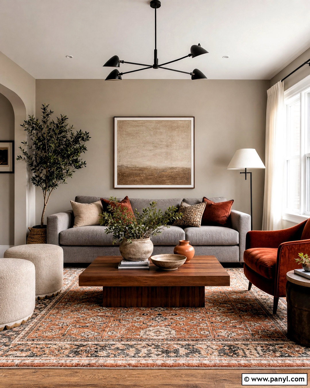
10. Cinnamon And Ivory Warm Color Palette
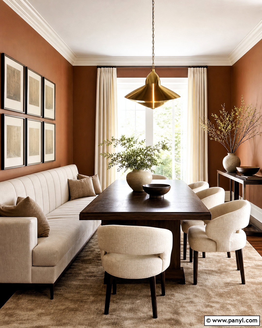
Cinnamon adds immediate warmth to a dining room when it appears on a large surface and is balanced with generous amounts of ivory. Paint the walls a softened cinnamon brown, then introduce an ivory upholstered banquette or cream dining chairs around a dark oak table. Choose a large beige rug to define the dining area and soften sound. Full-length ivory curtains create a bright vertical contrast against the walls. A sculptural brass pendant and bronze picture frames continue the warm undertones. Decorate with ceramic bowls, natural branches, and artwork containing muted tan and reddish brown. Avoid cool gray accessories, which can interrupt the palette’s cohesion. The completed room feels intimate and polished, making casual meals and larger gatherings equally comfortable.
11. Paprika And Sand Warm Color Palette
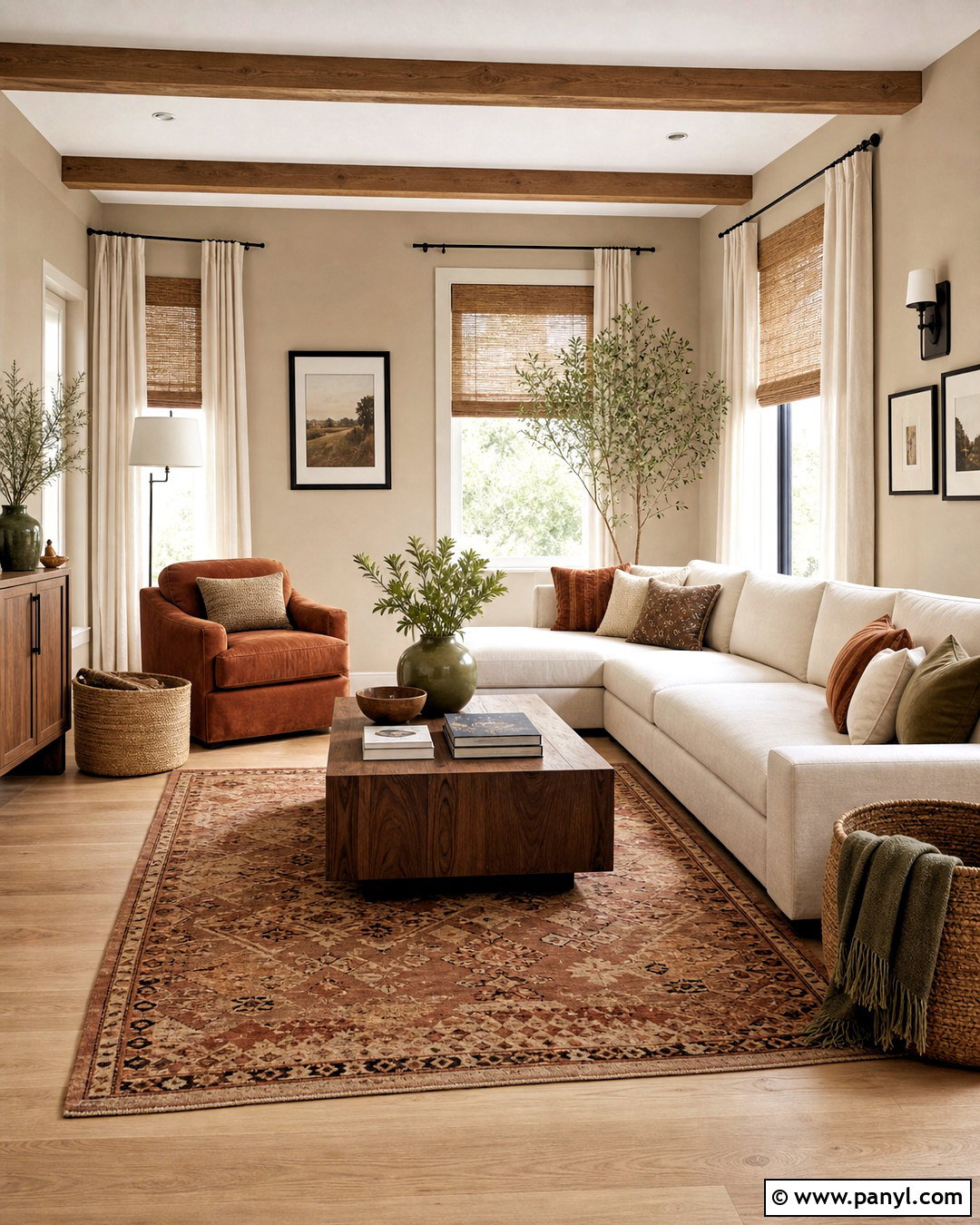
Paprika and sand can transform an ordinary living room into a colorful space that still feels relaxed. Begin with soft sand-colored walls, light oak flooring, and a large cream sectional. Introduce paprika through an upholstered accent chair, patterned rug, and several carefully spaced pillows. Use medium walnut for the coffee table and media cabinet to create visual weight. Woven shades, linen curtains, and natural baskets reinforce the sandy foundation. Add small touches of muted olive through plants or ceramics for balance, but keep paprika as the main accent. Black can appear sparingly in frames or hardware. By surrounding the spicy red-orange shade with pale neutrals and organic textures, the finished living room remains bright, cohesive, and approachable rather than intense.
12. Amber And Walnut Warm Color Palette
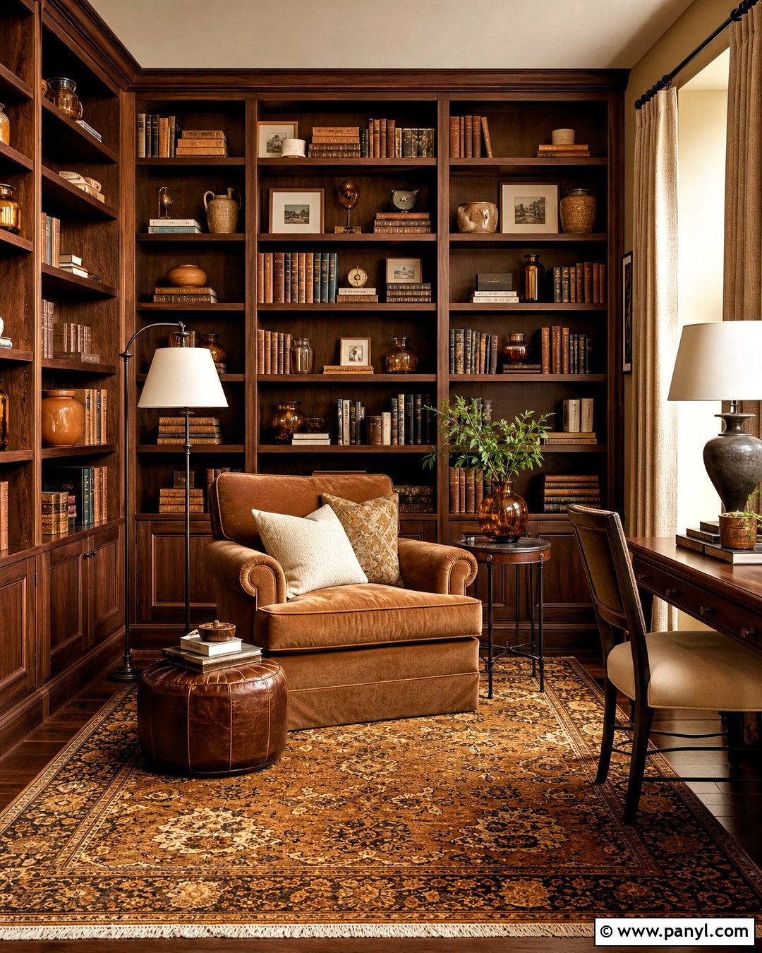
Glowing amber details pair naturally with walnut in a cozy reading room or library. Cover the walls in a warm camel shade and install walnut shelving across one main wall. Add a deep tan sofa or oversized reading chair with cream, amber, and rust cushions. A patterned wool rug containing golden brown and muted red will visually unite the seating and shelves. Choose bronze floor lamps with ivory shades to create functional reading light while supporting the palette. Amber glass vessels can decorate the shelves alongside books and cream pottery. Hang oatmeal curtains and use a warm white ceiling to offset the rich wood. The complete room feels collected and enveloping, with enough pale fabric and open shelf space to prevent the darker materials from becoming oppressive.
13. Copper And Mushroom Warm Color Palette
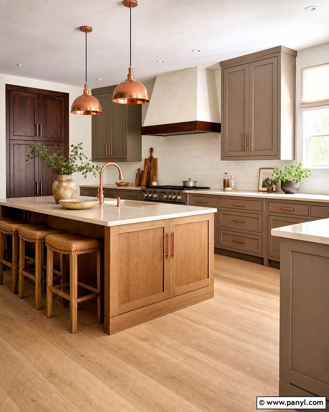
Copper and mushroom offer a refined alternative to traditional gray in a modern kitchen. Choose mushroom-colored cabinets with brown rather than blue undertones, then pair them with creamy quartz counters and a warm white backsplash. Copper pendant lights can become the focal point above a medium oak island. Repeat copper sparingly through cabinet handles or small countertop accessories so the metallic finish remains intentional. Use light oak flooring, tan stools, and ivory window coverings to continue the warm neutral story. A darker walnut pantry cabinet adds contrast and makes the lighter cabinetry feel more dimensional. Keep appliances integrated or select understated stainless steel. This balanced kitchen looks clean and contemporary, yet its brown-based neutrals, natural wood, and copper details prevent it from feeling cold.
14. Honey Gold And Deep Brown Color Palette
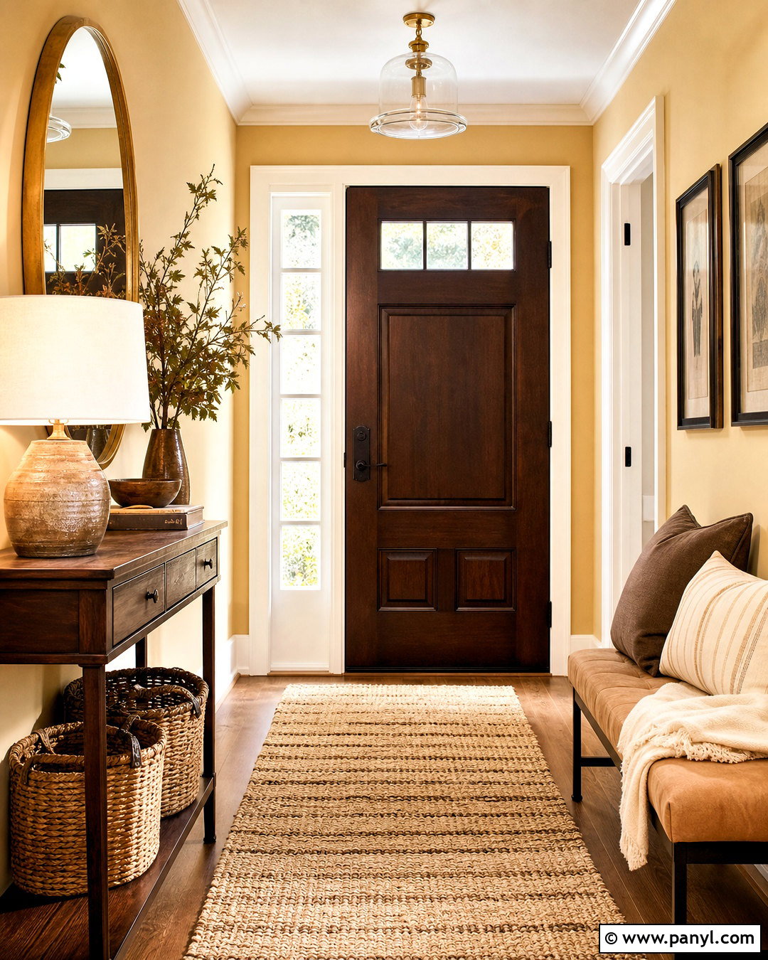
A honey gold and deep brown palette gives an entryway warmth, definition, and a memorable sense of arrival. Paint the walls a soft honey shade and use deep brown on the interior side of the front door. Add a slim walnut console, a woven runner in cream and caramel, and a rounded mirror with an aged brass frame. A small tan bench can provide seating without crowding the walkway. Choose warm white trim to outline the architecture gently. Baskets beneath the console offer practical storage while supporting the natural materials. Finish with a ceramic lamp, leafy branches, and one framed print containing brown and golden tones. The complete entry feels welcoming and organized, with enough contrast to highlight each feature without making a narrow space look smaller.
15. Coral And Camel Warm Color Palette
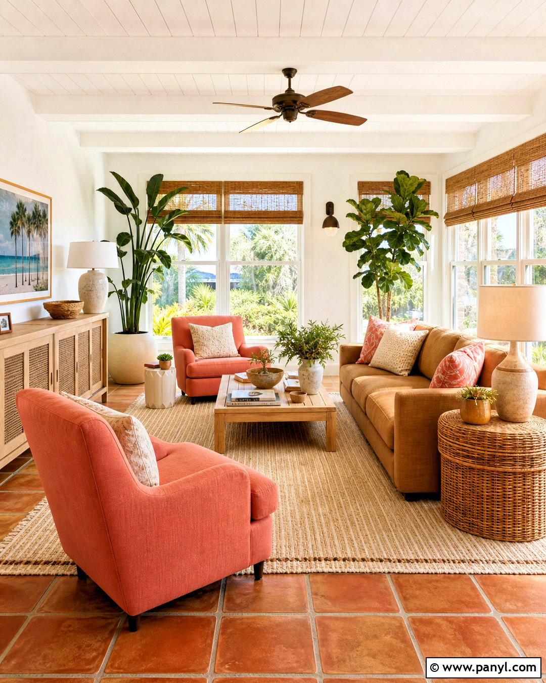
Coral and camel create a lively sunroom where color feels bright, comfortable, and connected to natural light. Use warm white walls and pale wood or terracotta tile flooring as the base. Choose a camel-colored sofa with clean lines, then add coral armchairs or patterned cushions as the stronger accent. A cream and tan rug keeps the furniture arrangement grounded. Woven bamboo shades, rattan side tables, and light oak pieces contribute relaxed texture. Add several green plants in cream and clay pots, allowing the foliage to cool the warm scheme naturally. Brass or bronze lighting will fit better than chrome. With coral spread across a few balanced locations rather than one concentrated area, the finished sunroom feels cheerful, cohesive, and easy to enjoy year-round.
16. Burgundy And Blush Warm Color Palette
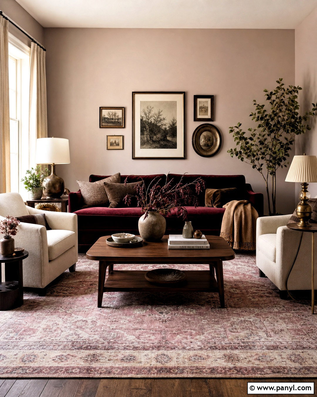
Burgundy and blush can make a formal living room feel rich and inviting rather than stiff. Start with pale blush-beige walls, then anchor the room with a burgundy velvet sofa. Add two cream armchairs, a walnut coffee table, and a large vintage-style rug containing faded rose, brown, and ivory. Oatmeal curtains soften the wall color while allowing the deeper sofa to remain prominent. Use aged brass lamps and dark bronze frames for subtle definition. A few cocoa pillows and a camel throw can bridge the light and dark tones. Keep decorative objects simple and substantial, such as stoneware vessels and one oversized artwork. This complete arrangement balances dramatic color with approachable neutrals, resulting in a polished room that still feels comfortable for daily use.
17. Apricot And Natural Oak Color Palette
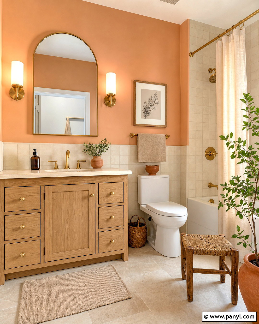
Apricot gives a bathroom a soft, flattering warmth when combined with natural oak and creamy stone. Use muted apricot paint above an ivory tile wainscot or across the main walls. Choose an oak vanity with simple drawers and a cream quartz or limestone counter. Brushed brass faucets, sconces, and cabinet pulls complement the peachy undertones without adding excessive shine. Install warm white floor tile with light beige grout for a clean base. An ivory shower curtain, oatmeal towels, and a small woven stool provide texture. Add one or two terracotta accessories and a leafy plant to finish the space. The resulting bathroom feels bright, gentle, and carefully coordinated, while the neutral tile and wood ensure the warmer wall color remains easy to update later.
18. Chestnut And Oatmeal Warm Color Palette
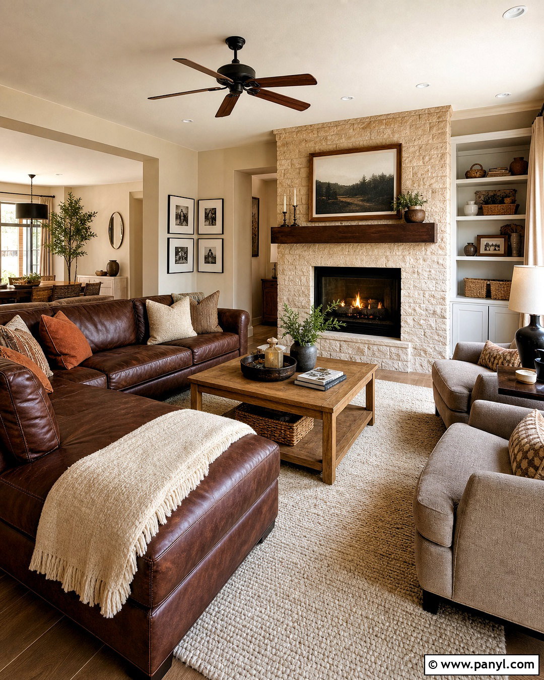
Chestnut brown and oatmeal create a comfortable family room built around durable materials and timeless warmth. Paint the walls a soft oatmeal beige and choose a chestnut leather sectional as the main seating. Add a cream wool rug, medium oak coffee table, and upholstered accent chairs in warm taupe. Curtains in natural linen keep the windows light, while rust and camel pillows add controlled color. Use bronze lamps, woven storage baskets, and simple wood frames to maintain cohesion. A stone fireplace in beige or warm gray can provide a quiet focal point without cooling the palette. Keep the layout open enough for movement and conversation. The completed room feels substantial, practical, and relaxed, with layered neutrals that disguise everyday wear better than stark white surfaces.
19. Sienna And Olive Warm Color Palette
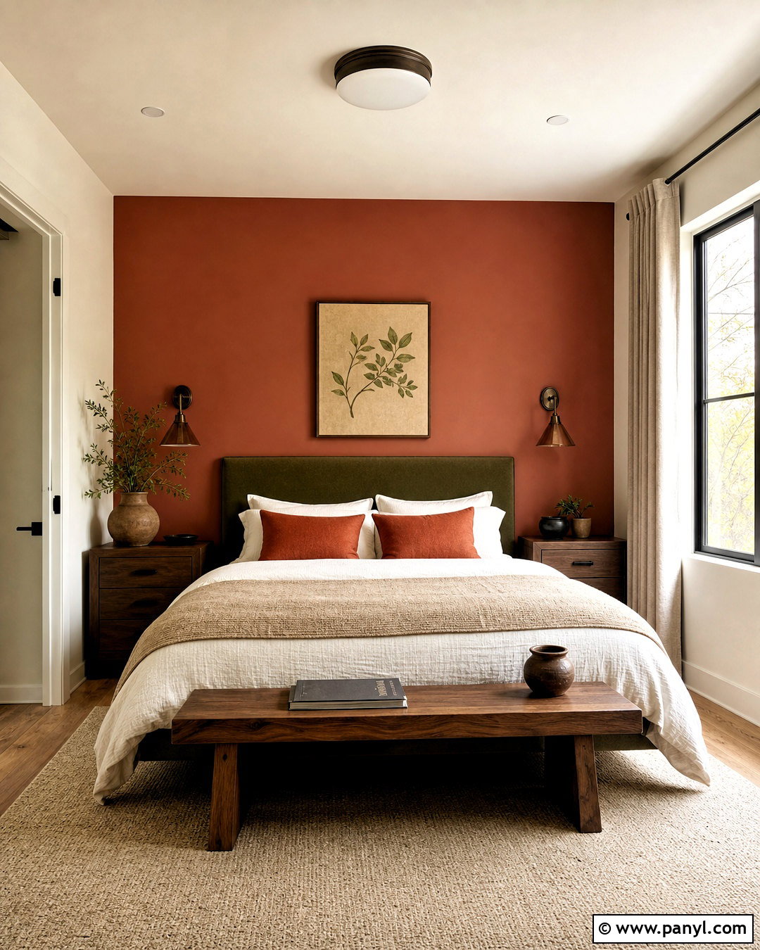
Sienna and olive form a rich bedroom palette inspired by clay, foliage, and natural wood. Paint the wall behind the bed in muted burnt sienna, leaving the remaining walls a soft cream. Choose an olive upholstered headboard and layer the bed with ivory sheets, a tan coverlet, and rust-colored pillows. Walnut nightstands and bronze sconces add depth on both sides of the bed. Place a beige wool rug beneath the furniture to soften the darker colors. Oatmeal curtains and warm white trim prevent the room from appearing too enclosed. Decorate with botanical artwork, handmade pottery, and a simple wood bench. This balanced arrangement delivers plenty of character while reserving lighter colors for the largest textiles and surrounding surfaces.
20. Warm Beige And Cocoa Color Palette
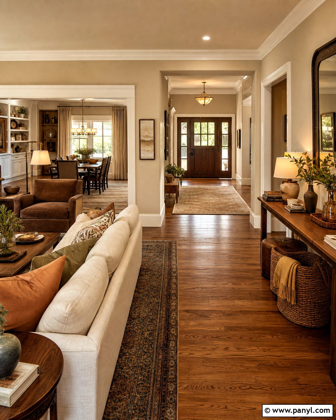
For a calm whole-home scheme, warm beige and cocoa offer flexibility from the entryway to the bedroom. Use light beige walls consistently through connected spaces, paired with warm white ceilings and trim. Introduce cocoa through upholstered chairs, wood cabinetry, rugs, and occasional accent walls. Medium oak flooring creates a continuous base, while cream sofas and oatmeal curtains keep shared rooms bright. Add caramel leather, walnut tables, and aged brass fixtures in measured amounts. Muted terracotta, olive, or ochre can appear in pillows and artwork without disrupting the neutral foundation. Repeating the same wood tones and metal finish helps each room relate to the next. The result is a cohesive home that feels warm, layered, and easy to refresh with seasonal textiles.
Conclusion:
Choosing a warm home palette is easier when every color, finish, and furnishing contributes to one complete look. These 20 warm color palette for home ideas demonstrate how terracotta, cream, rust, ochre, warm beige, brown, and muted green can work across kitchens, bedrooms, living spaces, bathrooms, and entryways. Begin with one dependable background color, add a stronger anchor shade, and repeat smaller accents throughout the room. Natural wood, linen, wool, stone, leather, and warm metallic finishes can provide depth without introducing unnecessary colors. Always test paint and fabric samples in the actual room before committing. With balanced contrast and thoughtful repetition, a warm palette can make an everyday home feel comfortable, coordinated, and personal.

Related Ideas and Inspiration:

Leave a Reply