
Warm cream paint colors bring softness, comfort, and light into a home without the stark feeling that can come with crisp white. The best choices range from barely warm off-whites to richer vanilla, ivory, and buttery tones. Their undertones matter. Yellow creates a sunny look, beige feels grounded, and subtle pink or greige can make cream more balanced. Lighting also changes everything, so the same shade may appear brighter in a south-facing room and deeper in a shaded space. Always test a large sample beside your flooring, cabinetry, countertops, and trim before committing. The complete room schemes below show how furniture, finishes, textiles, and accent colors can work together with 20 warm cream paint colors.

1. Sherwin-Williams Creamy SW 7012 Paint Color
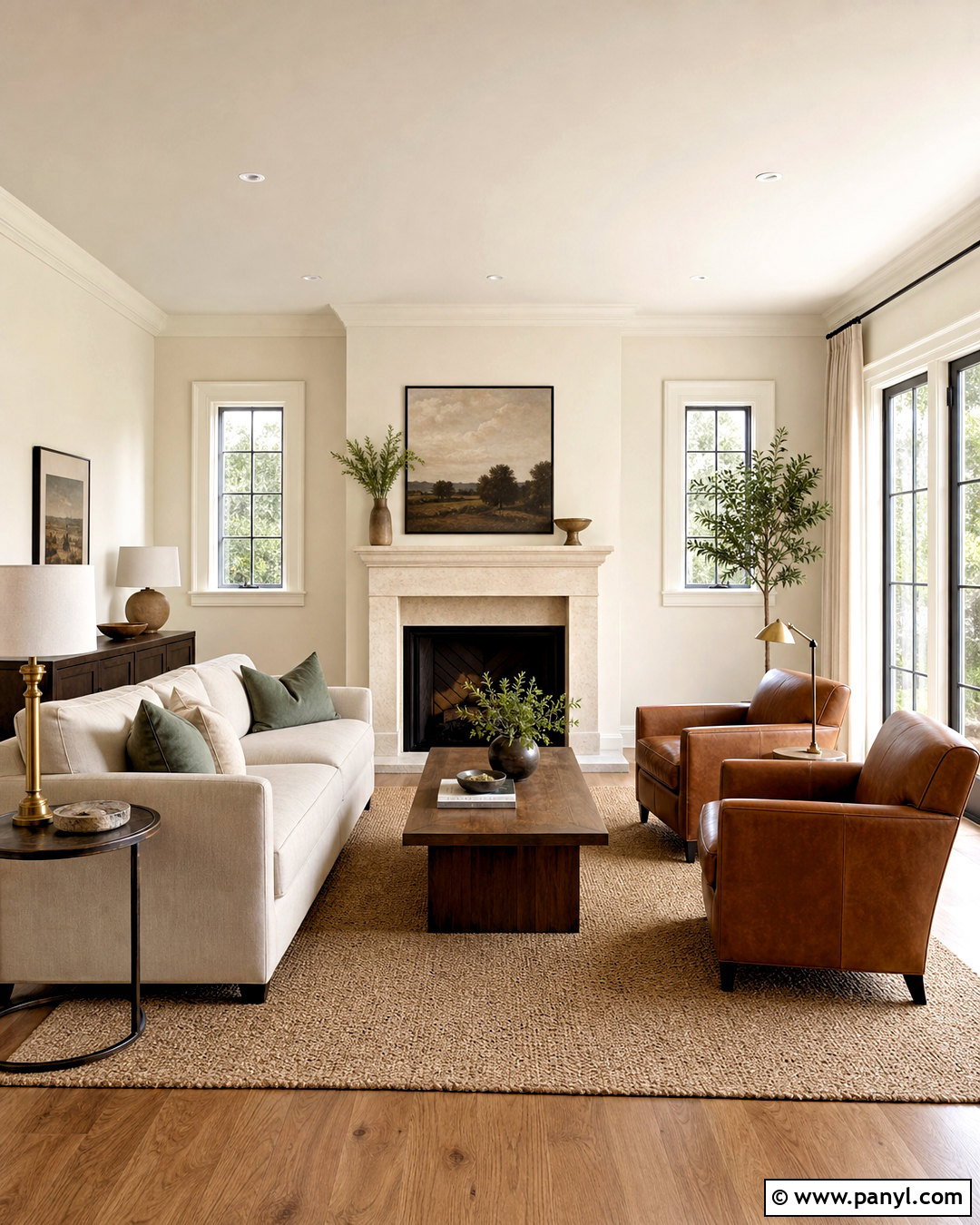
Sherwin-Williams Creamy SW 7012 has a gentle yellow undertone that creates warmth without turning the walls distinctly buttery. Use it in a welcoming living room with medium-toned oak flooring, an oatmeal linen sofa, and two cognac leather chairs. A natural jute rug reinforces the warmth, while muted sage pillows and aged brass lighting add quiet contrast. Paint the walls in an eggshell finish and use a slightly cleaner white on the ceiling for definition. Creamy works especially well with traditional millwork, limestone fireplaces, and woven window shades. Avoid combining it with icy gray furniture, which may make the walls look more yellow. This balanced room feels relaxed, sunny, and comfortably layered. ()
2. Sherwin-Williams Alabaster SW 7008 Paint Color
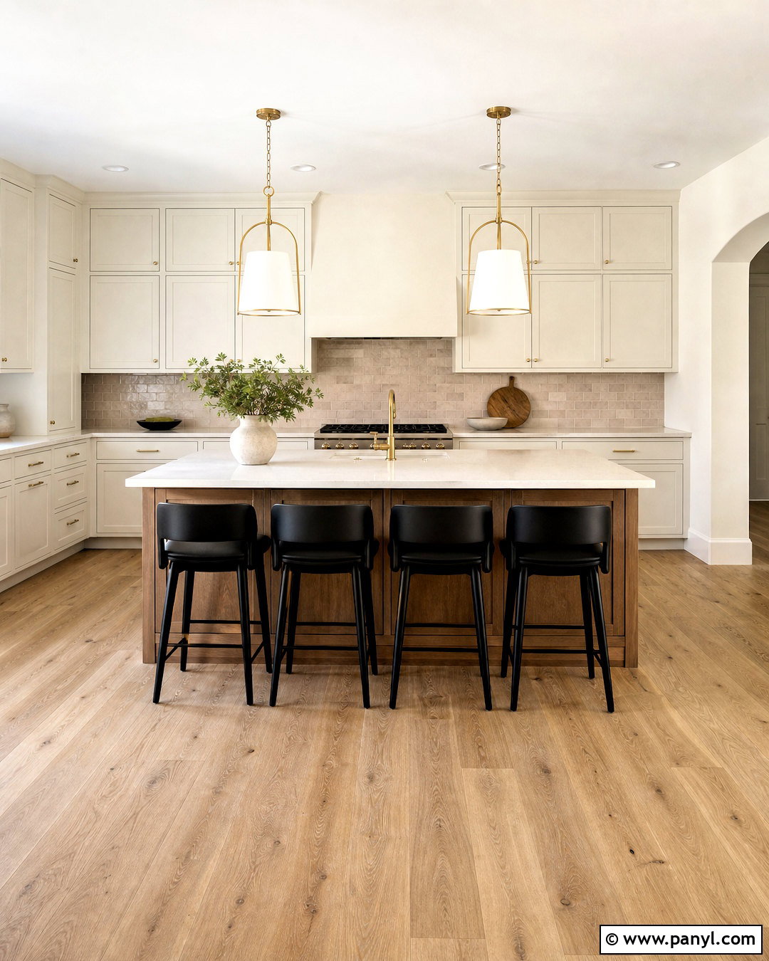
Alabaster SW 7008 creates a soft, understated kitchen that feels bright but not clinical. Cover the perimeter cabinets and walls in Alabaster, changing only the sheen so the cabinetry remains easy to clean. Add a medium walnut island, creamy quartz countertops, handmade taupe backsplash tile, and brushed brass hardware. Pale oak flooring keeps the palette light, while black counter stools provide a small amount of structure. This approach allows the entire kitchen to flow smoothly without looking flat. Introduce texture through linen Roman shades, ceramic bowls, and woven pendants rather than adding several competing colors. Alabaster is listed among Sherwin-Williams’ timeless whites and suits homeowners who want gentle warmth with a clean overall appearance. ()
3. Sherwin-Williams Greek Villa SW 7551 Paint Color
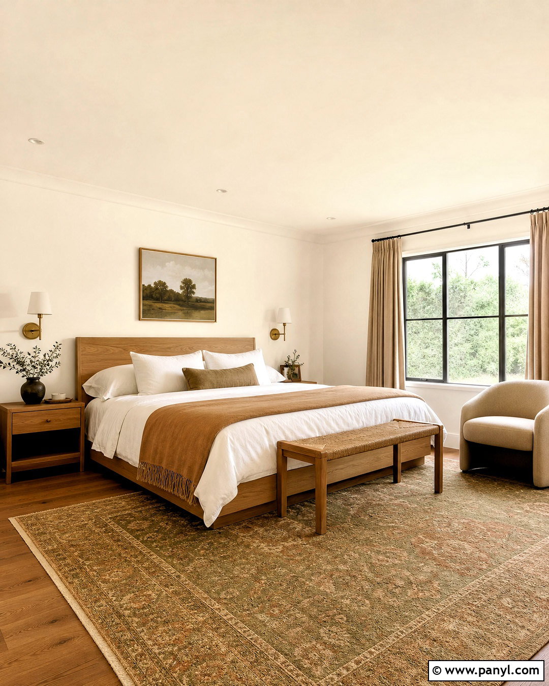
Could your bedroom use warmth without a visibly yellow wall color? Greek Villa SW 7551 offers a light creamy backdrop that pairs naturally with relaxed, organic materials. Paint the walls and ceiling the same color for a seamless envelope, then use satin Greek Villa on the trim for subtle dimension. Choose a light oak bed, white linen bedding, a camel wool blanket, and warm beige curtains hung close to the ceiling. Add antique brass sconces and a low-pile rug with faded olive and terracotta details. The result feels airy during the day and cozy under soft lamps at night. Keep cooler blue-gray accents limited because natural wood, clay, linen, and aged metal support this cream paint color more successfully. ()
4. Sherwin-Williams Dover White SW 6385 Paint Color
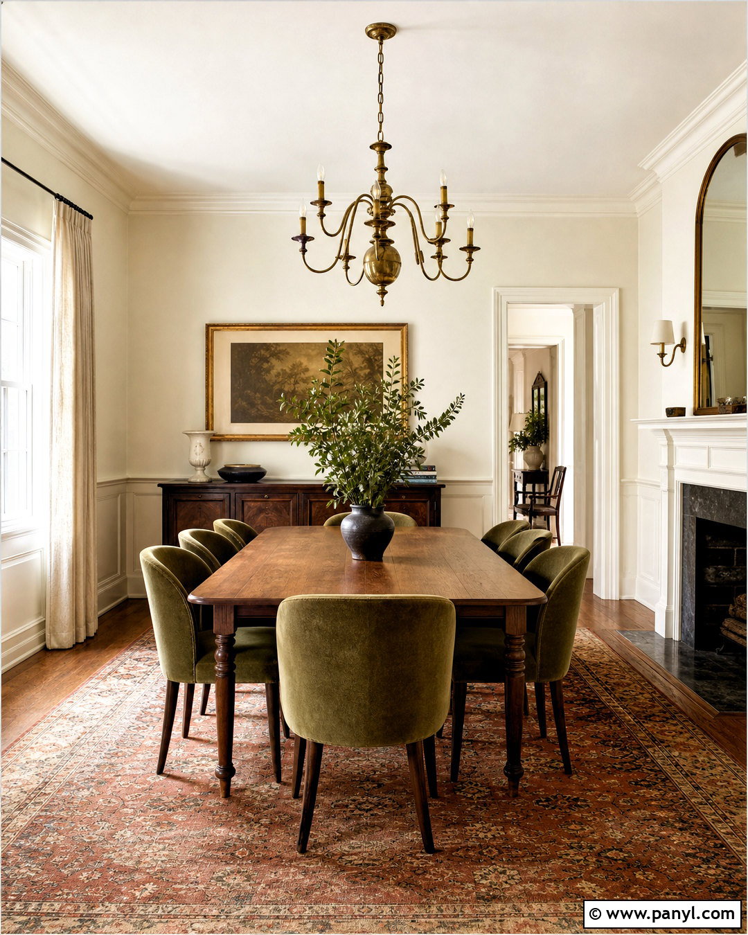
Dover White SW 6385 brings a noticeably sunny character to a traditional dining room. Its warm appearance works beautifully with walnut furniture, warm metals, and established architectural details. Paint the walls Dover White in a washable matte finish, then use the same shade in satin on paneled wainscoting for a rich, tone-on-tone effect. Center a rectangular walnut table beneath an aged brass chandelier and surround it with upholstered chairs in muted olive fabric. A vintage-style rug containing rust, cream, and moss ties everything together. Off-white linen curtains soften the windows without matching the walls too closely. Because Dover White can become warmer in strong sunlight, sampling it throughout the day is particularly important. ()
5. Sherwin-Williams Westhighland White SW 7566 Paint Color
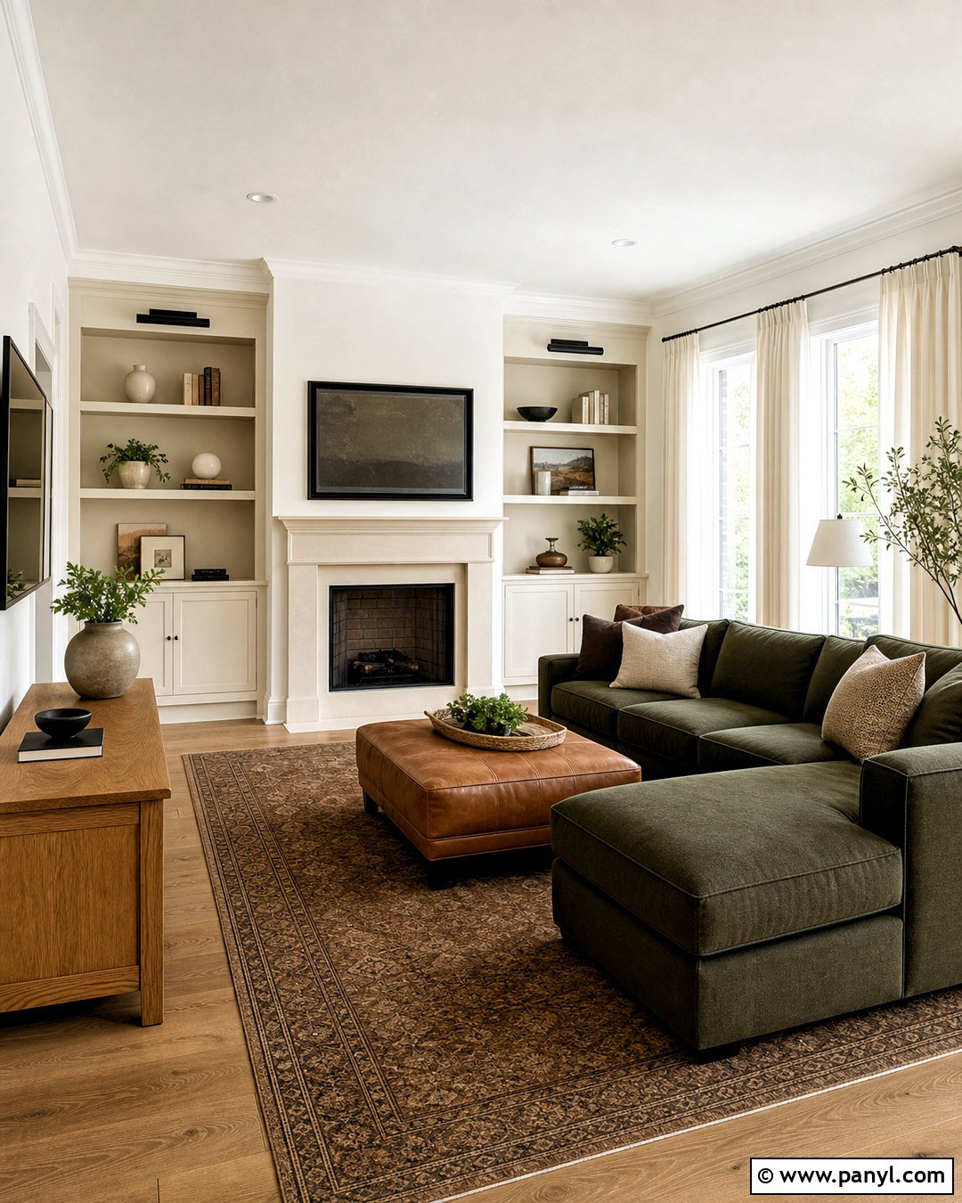
Westhighland White SW 7566 can give a shaded family room the lift it needs while maintaining a cozy mood. Use the color across the walls, built-in shelving, and fireplace surround to create a continuous background. Balance the creamy envelope with a deep olive sectional, caramel leather ottoman, and medium oak console. Textured ivory curtains and a brown-and-cream patterned rug prevent the room from feeling overly polished. Add matte black picture lights above the shelving for crisp contrast, then display pottery, books, and natural wood objects in small groups. Westhighland White belongs to Sherwin-Williams’ timeless white collection, making it a practical bridge between clean contemporary furniture and warmer traditional materials. The finished room feels comfortable, cohesive, and family-friendly. ()
6. Sherwin-Williams White Flour SW 7102 Paint Color
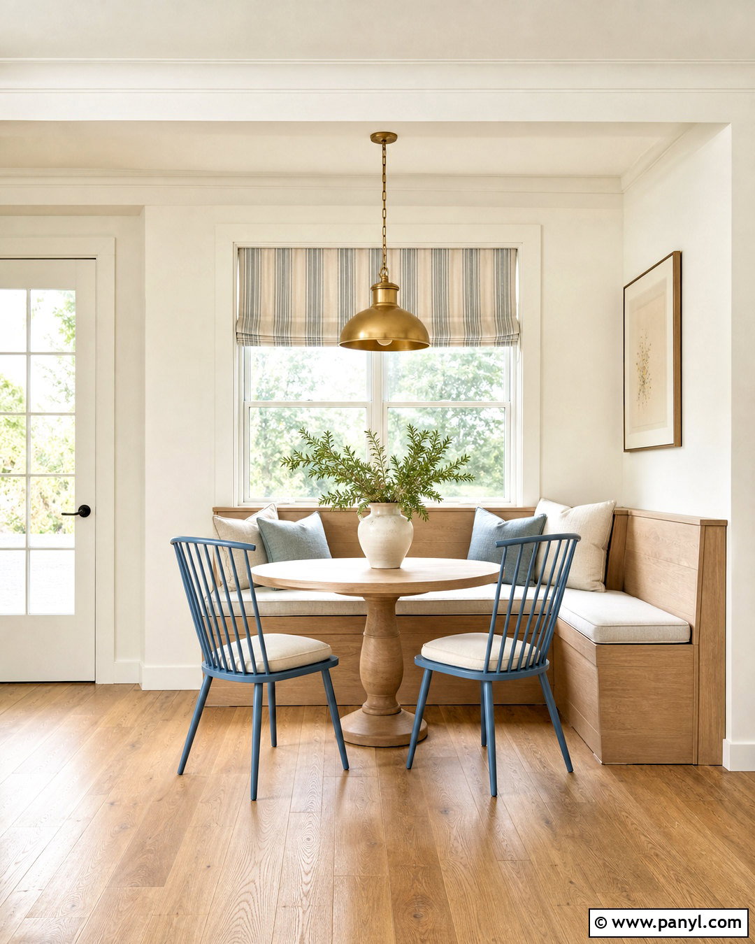
Morning light feels clean and soft in a breakfast nook painted White Flour SW 7102. This bright white carries a subtle cream undertone, so it warms the room without competing with colorful furnishings. Pair it with a built-in pale oak banquette, a round pedestal table, and spindle-back chairs painted dusty blue. Seat cushions in oatmeal performance fabric add comfort, while a striped Roman shade introduces a casual pattern. Use White Flour on the surrounding walls and trim, but vary the finish for quiet architectural definition. A small brass pendant and warm white oak flooring complete the design. This palette is useful when you want a cream paint color that reads close to white while still supporting wood, brass, and natural textiles. ()
7. Benjamin Moore White Dove OC-17 Paint Color
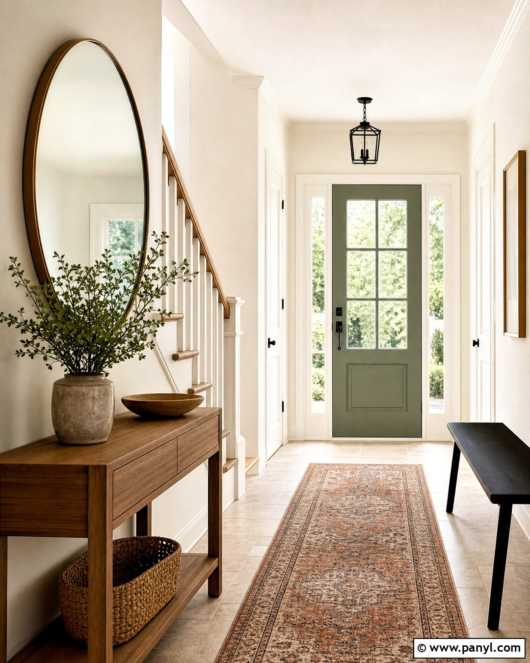
White Dove OC-17 creates a polished whole-home entry that feels warm, open, and timeless. Paint the walls in eggshell and apply the same color in satin to the trim, staircase spindles, and interior doors. This unified treatment helps a narrow entry appear larger while allowing the architectural shapes to remain visible through sheen. Add a natural oak console, a round antique brass mirror, and a slim black bench with a neutral cushion. Limestone-look flooring or a warm patterned runner grounds the pale palette. A muted green front door introduces color without disrupting the calm atmosphere. White Dove is one of Benjamin Moore’s popular interior whites and works especially well when nearby rooms contain warm wood and soft neutral furnishings. ()
8. Benjamin Moore Swiss Coffee OC-45 Paint Color
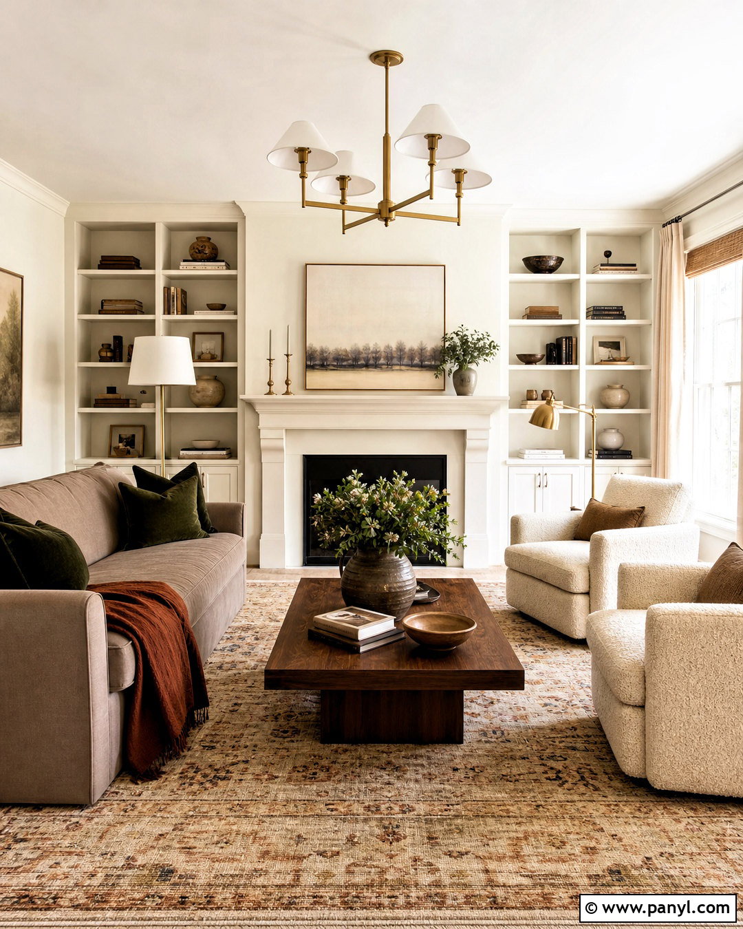
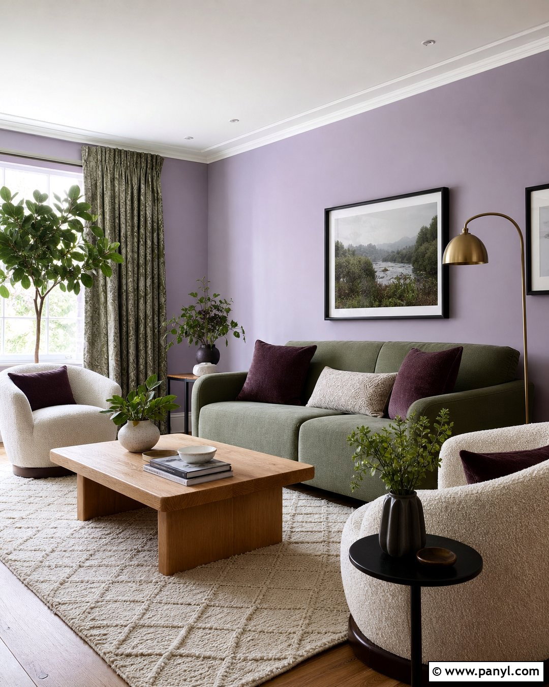
Benjamin Moore Swiss Coffee OC-45 suits a layered living room filled with creamy textiles and earthy accents. Use it on walls, built-in bookcases, and the fireplace mantel to create a warm, enveloping background. Bring in a taupe sofa, boucle lounge chairs, a walnut coffee table, and a large wool rug with subtle brown lines. Deep green pillows and a rust-colored throw provide enough contrast to keep the palette interesting. Choose aged brass lamps instead of shiny chrome, and use natural woven shades beneath full-length linen curtains. For stronger definition, paint the ceiling a cleaner soft white. Swiss Coffee also pairs effectively with dark green trim or doors, creating a classic contrast that still feels approachable and residential. ()
9. Benjamin Moore Navajo White OC-95 Paint Color
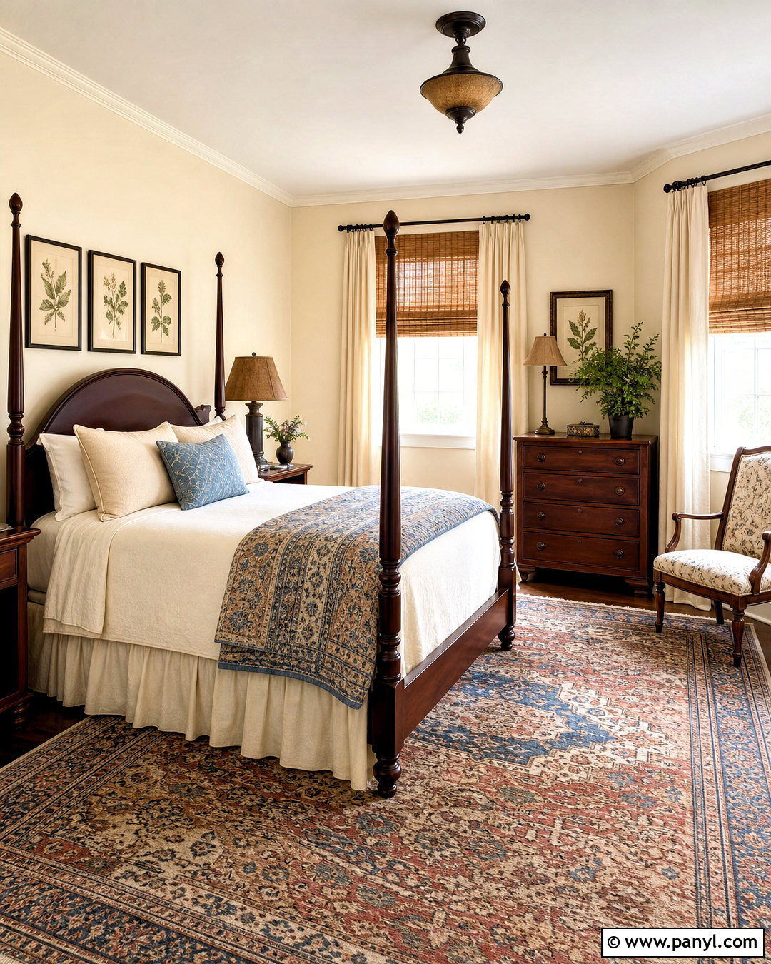
Navajo White OC-95 can turn a plain guest bedroom into a warm retreat with traditional character. The slightly warm off-white works well with a dark wood four-poster bed, ivory bedding, and a quilt featuring muted blue, cinnamon, and tan. Add woven bamboo shades, full-length linen curtains, and a vintage-inspired rug to soften the room. Paint the walls Navajo White and choose a lighter warm white for the ceiling if you want the cream undertone to remain visible. Aged bronze bedside lamps and framed botanical prints complete the scheme. Because this color has more presence than many near-white creams, it is particularly useful in north-facing bedrooms that need warmth, though every wall should be sampled first. ()

10. Benjamin Moore Linen White OC-146 Paint Color
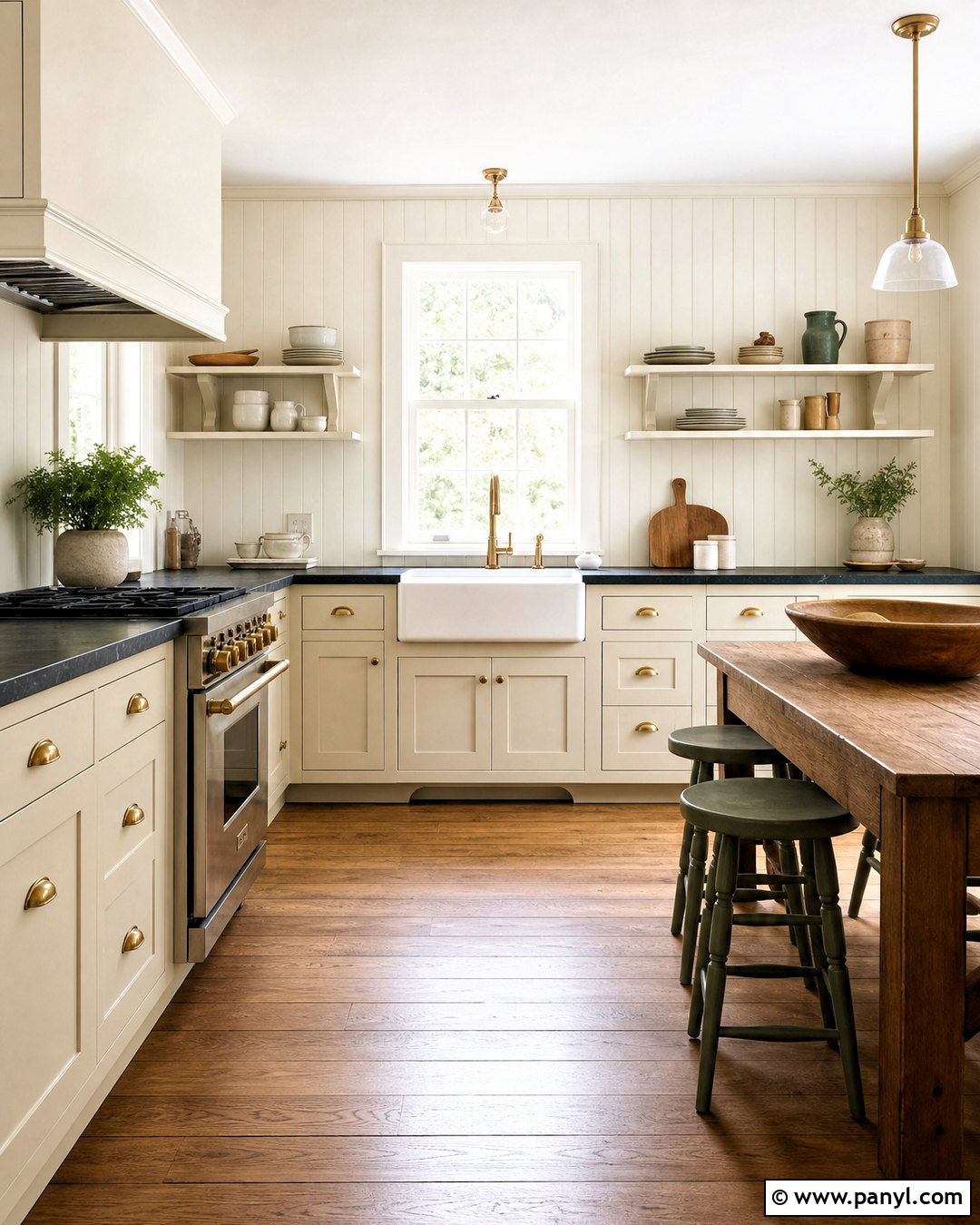
Linen White OC-146 provides the perfect foundation for a comfortable cottage kitchen. Paint the cabinets and beadboard walls in this warm cream, using satin on cabinetry and matte on vertical surfaces. Install soapstone-look counters, a white farmhouse sink, and unlacquered brass hardware for an aged, collected appearance. Medium oak flooring and a freestanding wood table deepen the warmth, while dusty green stools add a natural accent. Open shelves can hold white ceramics, wooden boards, and clear glassware without making the space busy. Keep the ceiling slightly lighter to prevent the room from becoming too golden. Linen White is among Benjamin Moore’s established interior colors and works best when the entire palette favors warm, natural finishes rather than cool gray surfaces. ()
11. Benjamin Moore Gentle Cream OC-96 Paint Color
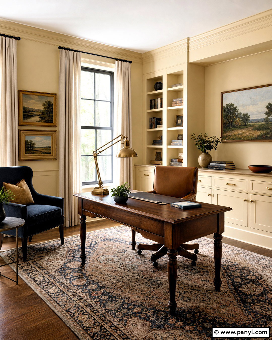
Gentle Cream OC-96 gives a home office a soft golden glow that feels focused rather than sterile. Apply it to the walls and built-in cabinetry, then use a medium walnut desk as the room’s visual anchor. A camel leather chair, patterned wool rug, and oatmeal curtains create a complete warm-neutral palette. Introduce muted navy through storage boxes or an upholstered side chair for controlled contrast. A brass library lamp and framed landscape artwork strengthen the traditional character without making the office feel formal. This cream has enough color to stand apart from bright white trim, so use that contrast intentionally around doors and crown molding. The finished workspace feels established, comfortable, and inviting, even when daylight is limited. ()
12. Benjamin Moore Soft Chamois OC-13 Paint Color
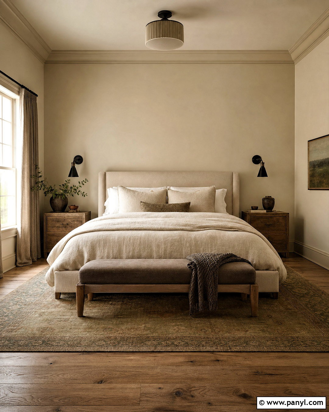
Soft Chamois OC-13 is a useful choice when traditional yellow cream feels too sweet. Create a restful primary bedroom by pairing its warm, muted walls with an upholstered oatmeal bed, weathered oak nightstands, and ivory linen bedding. Add a mushroom-colored bench, warm greige curtains, and a faded rug containing soft olive and brown. Dark bronze sconces bring definition without the sharpness of glossy black. Paint the trim in the same color at a higher sheen to preserve the quiet, tonal effect. Soft Chamois appears within Benjamin Moore’s interior and bedroom color selections, and its subdued character supports both warm and slightly cooler neutrals. The finished space feels calm and layered rather than yellow, bright, or overly beige. ()
13. Behr Swiss Coffee 12 Paint Color
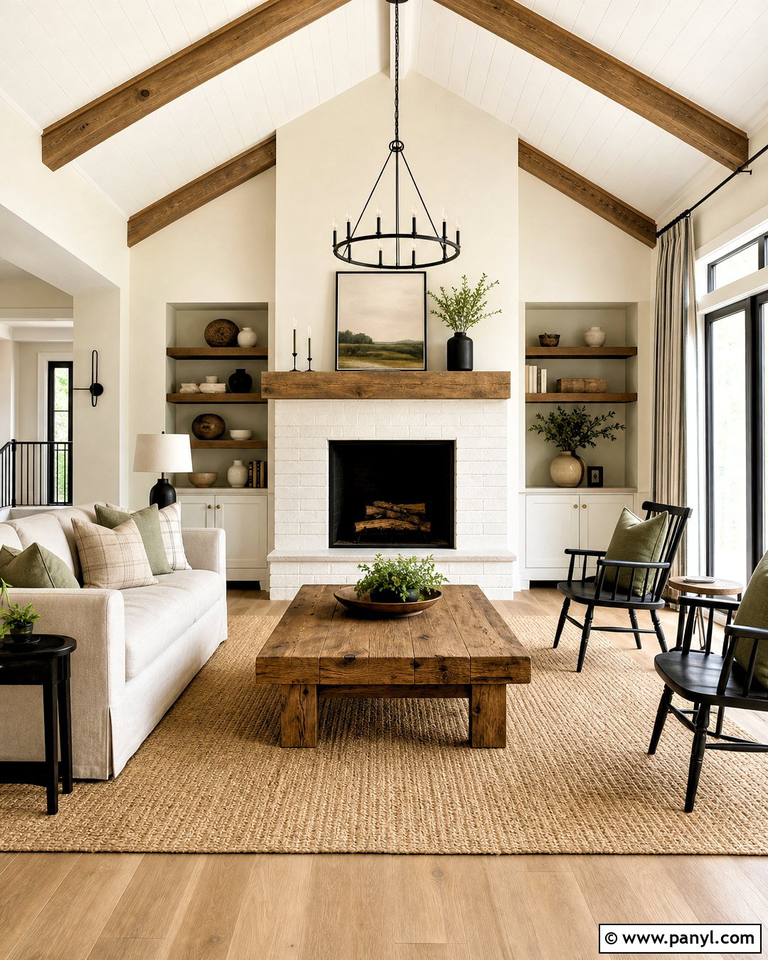
Behr Swiss Coffee 12 offers a creamy base for a casual modern farmhouse living room. Paint the walls this warm white and keep the ceiling a cleaner white to create a subtle sense of height. Add a slipcovered oatmeal sofa, black spindle chairs, a reclaimed oak coffee table, and a natural jute rug. Sage green pillows and simple striped curtains introduce restrained color and pattern. Use matte black hardware sparingly so the room does not become too high contrast. A white-painted brick fireplace can share the wall color, while a chunky wood mantel adds needed depth. Behr describes Swiss Coffee as a warm white with a cream base, making it suitable for both interior rooms and exterior applications. ()
14. Behr Blank Canvas DC-003 Paint Color
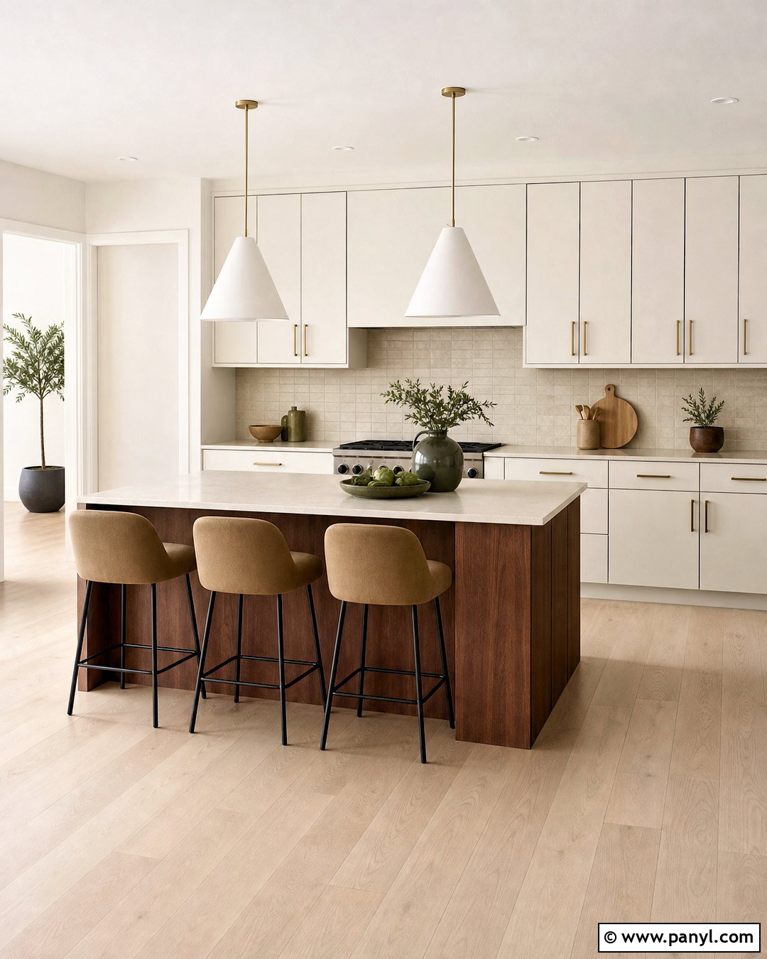
Blank Canvas DC-003 creates a bright contemporary kitchen that still feels welcoming. Use it on flat-panel cabinetry and surrounding walls for a smooth, unified backdrop. Add pale white oak flooring, creamy quartz counters, and a backsplash of handmade sand-colored tile. A large island stained medium walnut prevents the pale finishes from washing together. Choose brushed brass pulls, sculptural white pendants, and counter stools upholstered in warm tan fabric. A few deep olive accessories can add contrast without changing the calm mood. Behr describes Blank Canvas as a creamy white that is not strongly warm or cool, so it works well when a room combines natural wood with both black and brass details. The complete kitchen feels light, balanced, and comfortably modern. ()
15. Behr Heavy Cream PPU5-10 Paint Color
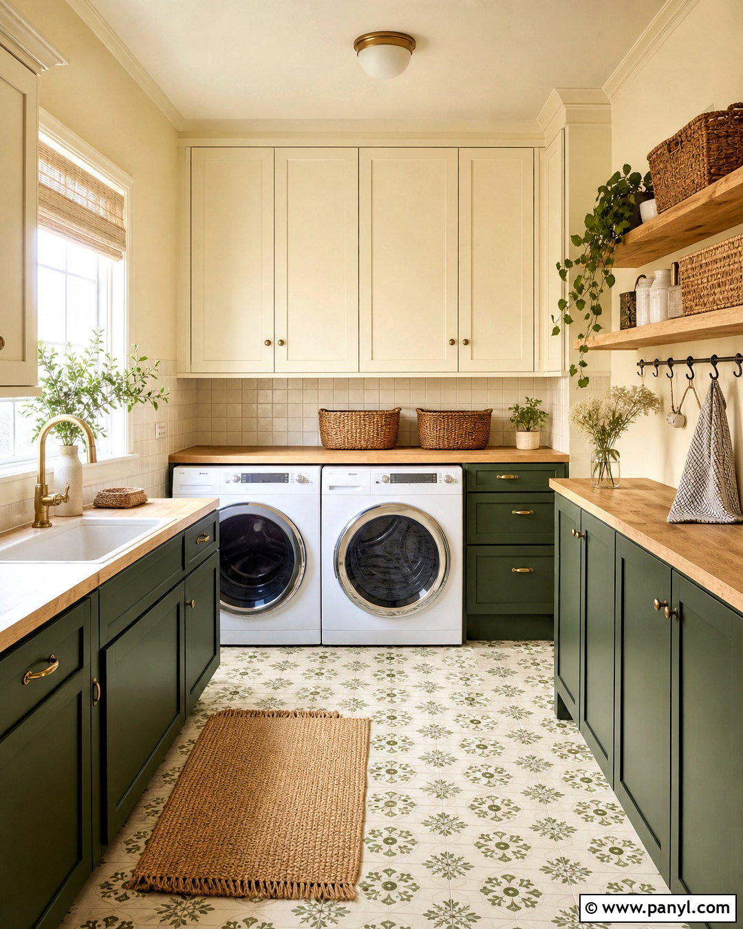
Heavy Cream PPU5-10 brings rich vanilla warmth to a cheerful laundry room. Cover the walls and upper cabinets in this inviting cream, then ground the design with lower cabinets painted muted forest green. Add butcher-block counters, warm white square backsplash tile, and aged brass cabinet pulls. A patterned floor with cream, olive, and soft brown connects the two cabinet colors while hiding everyday marks. Woven storage baskets and simple wood shelves keep supplies organized without adding visual clutter. Heavy Cream reflects plenty of light but has enough depth to remain clearly warmer than white. Behr characterizes it as an inviting, luscious white inspired by vanilla ice cream, making it a natural fit for hardworking rooms that need brightness and personality. ()
16. Behr Cottage White 13 Paint Color
Sunlight brings out the honey-gold notes of Behr Cottage White 13, making it well suited to a charming breakfast room. Paint the walls in this cream and use a soft white on the ceiling and trim to define the architecture. Furnish the room with a round oak table, woven rush-seat chairs, and a built-in window bench covered in muted floral fabric. Add gingham café curtains, an aged brass pendant, and simple pottery in sage and terracotta. Medium-toned wood is important because it grounds the sweetness of the walls. Behr identifies Cottage White as having unmistakable honey-gold notes, so avoid placing it beside cool blue-white cabinetry. The final palette should feel sunny, collected, and intentionally warm. ()
17. Behr Polar Bear 75 Paint Color
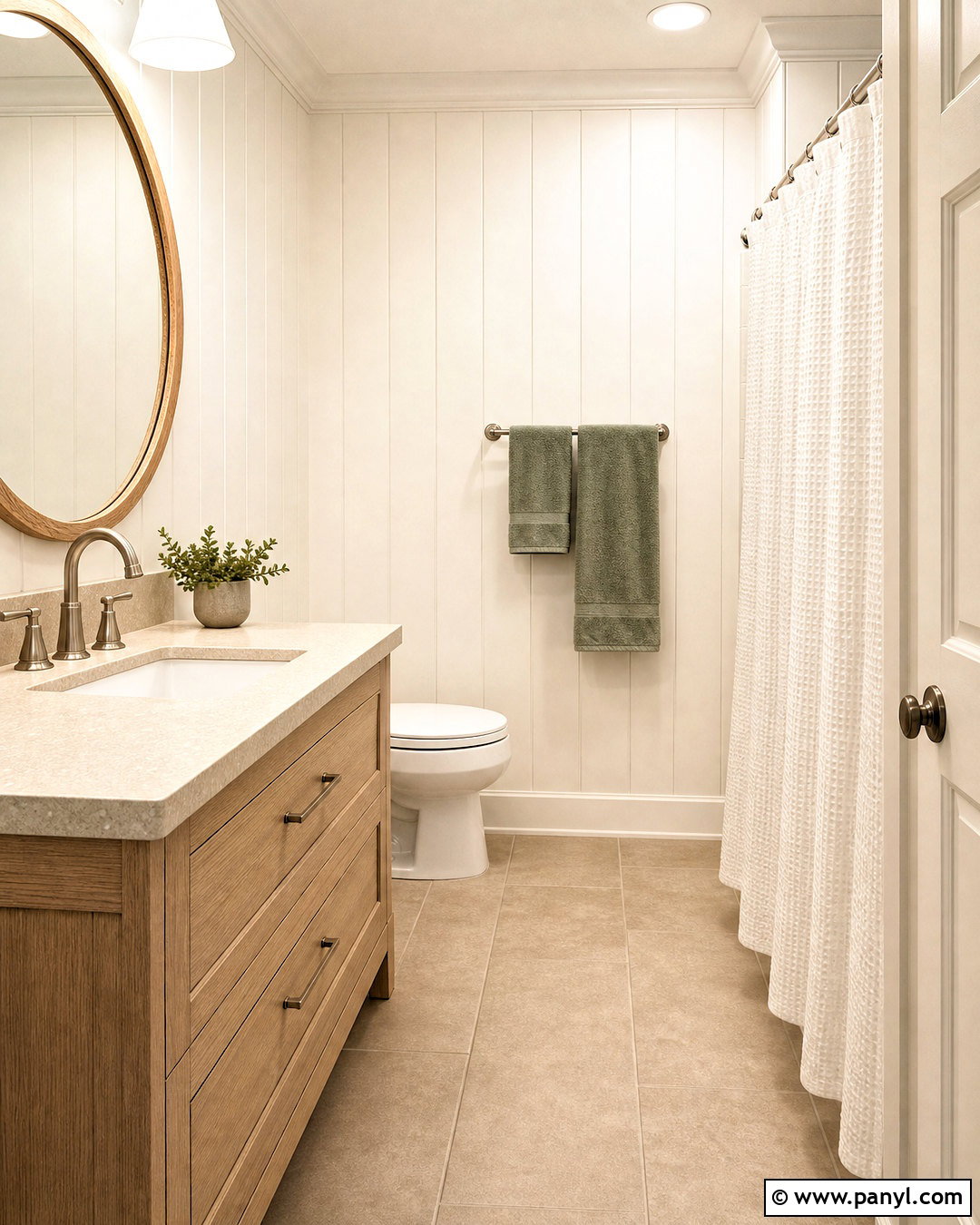
Polar Bear 75 gives a small bathroom a clean appearance while remaining softer than a sharp, blue-based white. Use it on the walls and vertical paneling, then introduce a light oak vanity with a creamy quartz top. Brushed nickel fixtures can add freshness, while a warm beige floor tile prevents the room from feeling cold. Frame the mirror in pale oak and add towels in soft sage or muted clay. A white shower curtain with subtle texture keeps the compact space visually open. Polar Bear belongs to Behr’s white color family and works as a flexible backdrop for both warm woods and restrained cooler metals. The complete bathroom feels bright, practical, and gently warmed rather than stark or overly traditional. ()
18. Farrow & Ball Pointing No. 2003 Paint Color
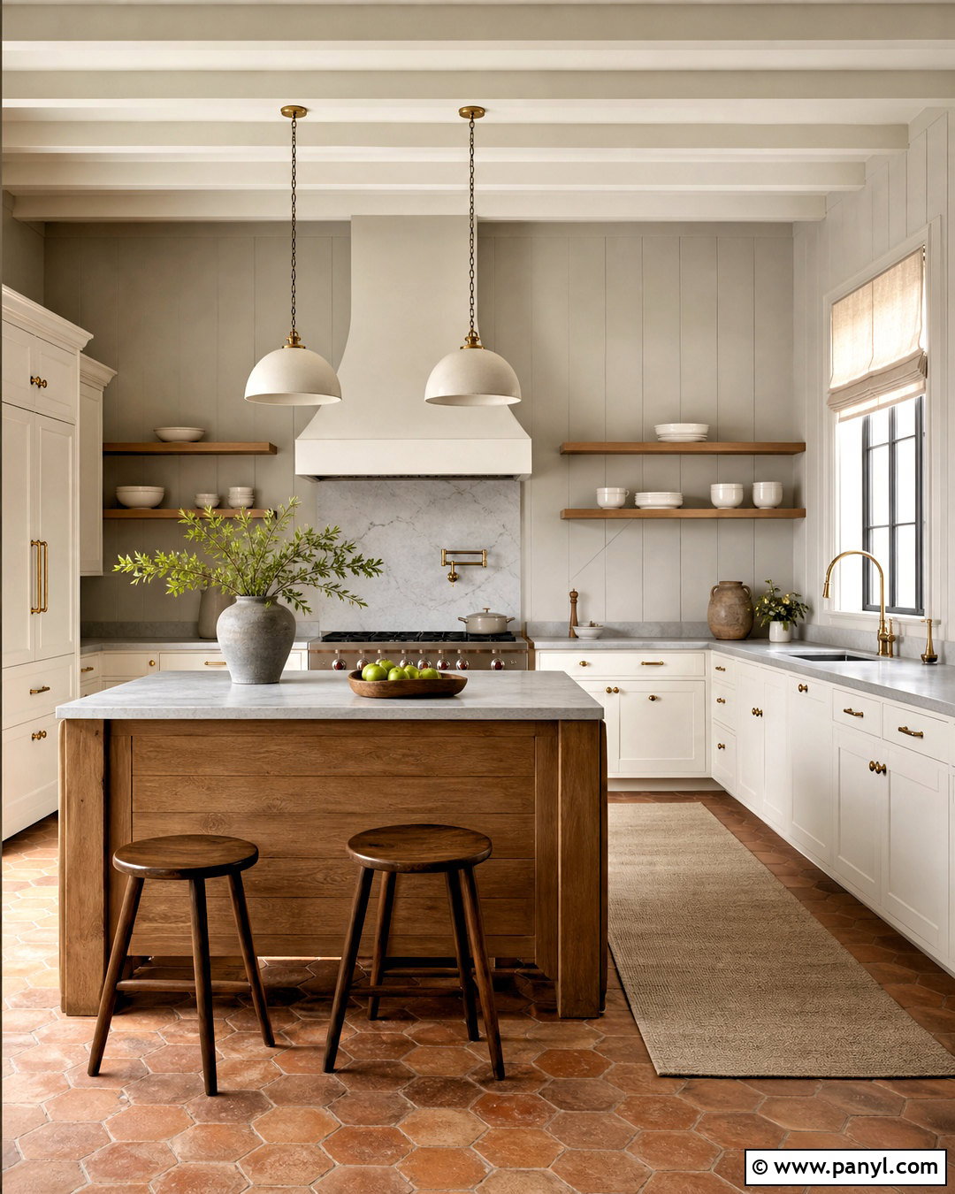
Pointing No. 2003 creates a fresh cream backdrop for an English-inspired kitchen with relaxed character. Paint traditional shaker cabinets and paneled walls in the same color, changing the finish between cabinetry and walls. Add honed gray limestone counters, a warm oak island, and aged brass hardware. Terracotta floor tile introduces earthy depth, while open shelving filled with white dishes keeps the room useful and informal. Choose a simple plaster pendant and linen Roman shade instead of ornate accessories. Pointing is often favored for its ivory quality, which reads warmer than white without becoming heavily yellow. The resulting kitchen balances refined millwork with rustic materials, making the cream paint color feel established, practical, and easy to live with. ()
19. Farrow & Ball Tallow No. 203 Paint Color

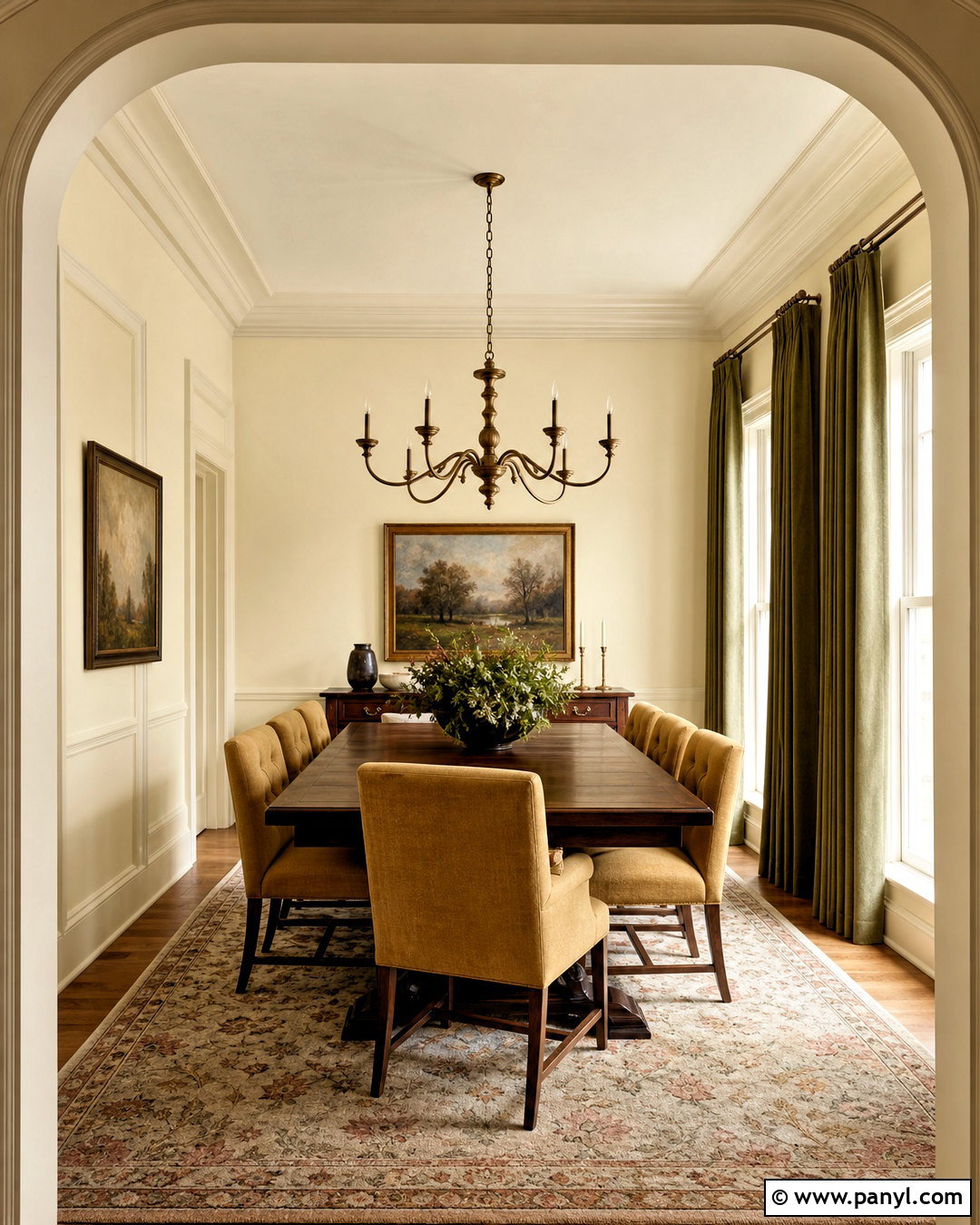
Tallow No. 203 can make a formal dining room feel glowing and intimate without relying on dark walls. Paint the walls, molding, and ceiling in this pale cream for a color-drenched effect, using varying sheens to highlight the architecture. Add a dark walnut dining table, upholstered chairs in muted ocher, and an antique-style brass chandelier. Full-length olive curtains provide earthy contrast, while a faded floral rug combines cream, brown, green, and dusty rose. Tallow carries subtle yellow and pink warmth, which pairs naturally with traditional woods and aged finishes. Keep bright white out of the room because it may make the cream look more saturated. The complete scheme feels soft, historic, and welcoming rather than stiff or overly formal. ()
20. Farrow & Ball Slipper Satin No. 2004 Paint Color
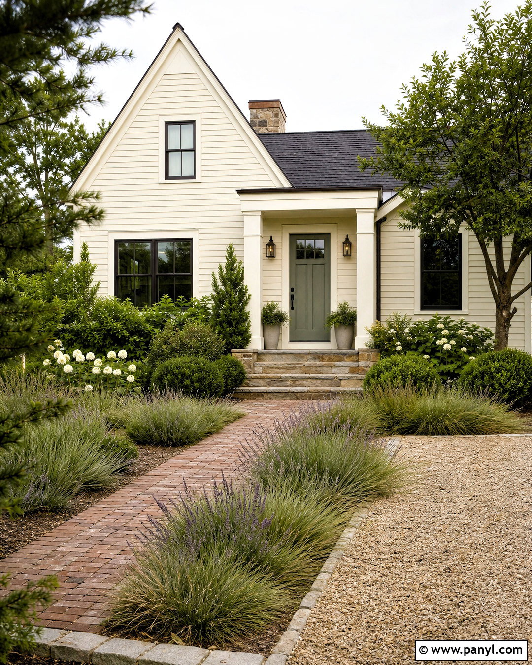
Slipper Satin No. 2004 supports a calm, refined exterior scheme for a traditional cottage or small Colonial home. Use the pale creamy neutral on the siding or stucco, then select slightly lighter warm-white trim around windows and rooflines. A muted sage green front door introduces gentle color, while aged brass hardware adds warmth. Pair the walls with a charcoal roof, natural stone steps, and gravel or brick paths. Layer the landscaping with clipped evergreen shrubs, ornamental grasses, lavender, and white flowering plants. The cream should connect visually with the warm stone rather than fight it. This restrained palette gives an average-size home depth and curb appeal while avoiding the harsh contrast created by brilliant white siding and black trim. ()
Conclusion:
Choosing among 20 warm cream paint colors becomes easier when you compare undertones, lighting, and existing finishes instead of looking at small chips alone. Near-white creams suit clean, modern spaces, while vanilla and honey creams complement traditional rooms, warm woods, and aged metals. Greige-leaning options offer a quieter alternative when yellow undertones feel too strong. Before painting, place large samples on several walls and study them during morning, afternoon, and evening light. Compare each sample with permanent materials such as flooring, tile, counters, and cabinetry. Once the undertone works with those fixed elements, build a complete palette around it using coordinated furniture, textiles, lighting, trim, and decor.

Related Ideas and Inspiration:

Leave a Reply