
Choosing wall colors becomes much easier when you picture the entire room rather than two paint chips side by side. These 20 best colour combinations for walls include light neutrals, earthy shades, modern contrasts, and richer palettes that can work across bedrooms, living rooms, kitchens, dining rooms, and home offices. Each look connects the wall treatment with flooring, furniture, textiles, lighting, and finishes, giving you a practical plan instead of an isolated color pairing. Before painting, sample both colors on large boards and view them throughout the day. Natural light, artificial lighting, and existing materials can noticeably change their appearance. Use the complete room schemes below to find the most suitable option among these 20 best colour combinations for walls.

1. Warm White And Sage Green Walls
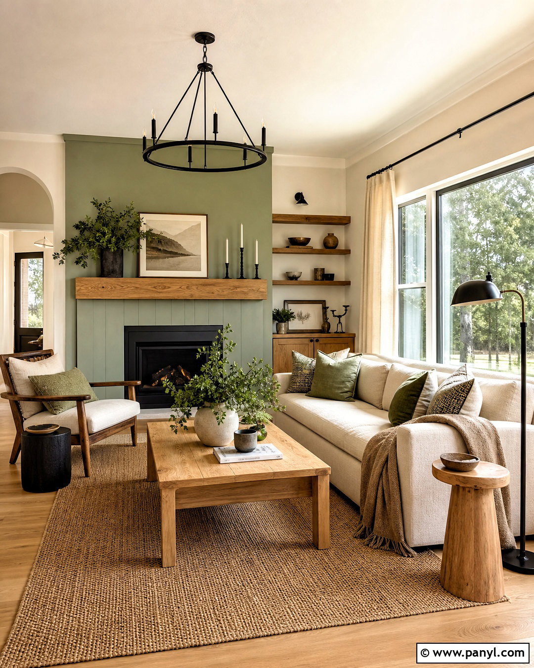
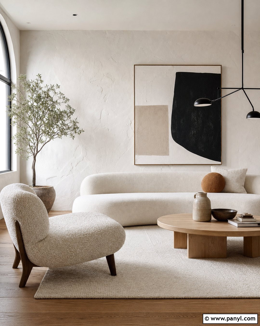
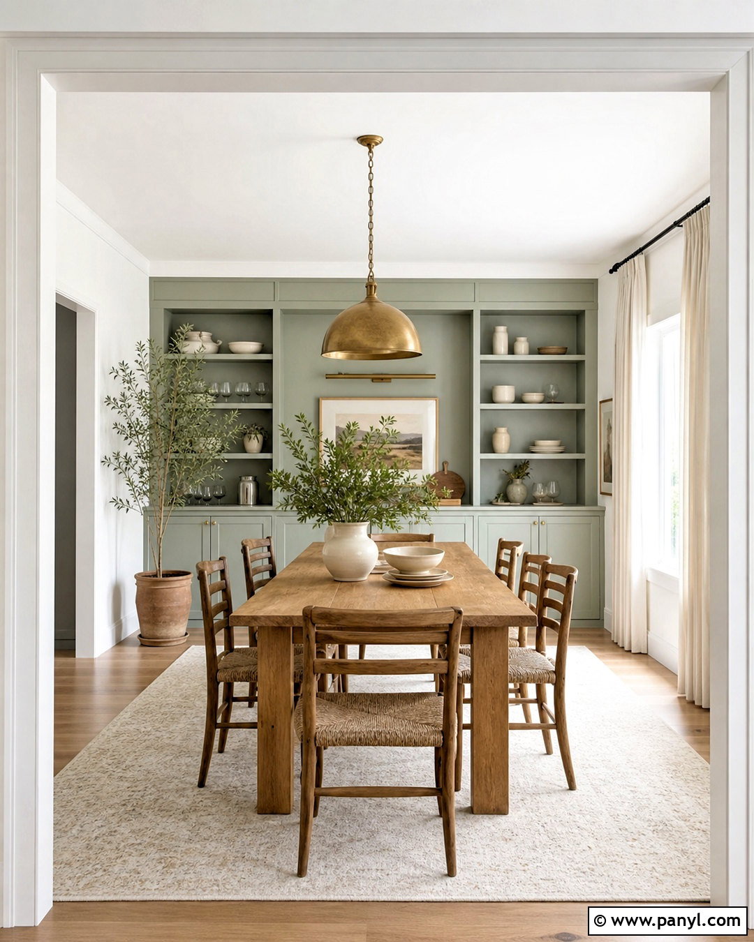
Warm white and sage green create a calm living room with a soft connection to nature. Cover three walls in creamy white, then use muted sage green on the fireplace or sofa wall. Choose a light oak coffee table, oatmeal linen seating, and a woven jute rug to continue the relaxed palette. Black metal lighting adds definition without overpowering the gentle colors. Bring in olive cushions, off-white curtains, handmade ceramics, and several leafy plants for layered texture. Keep the ceiling and trim warm white so the room feels cohesive. This wall combination works especially well with medium or bright natural light because the sage stays fresh while the creamy background prevents the space from looking cold.
2. Navy Blue And Crisp White Walls
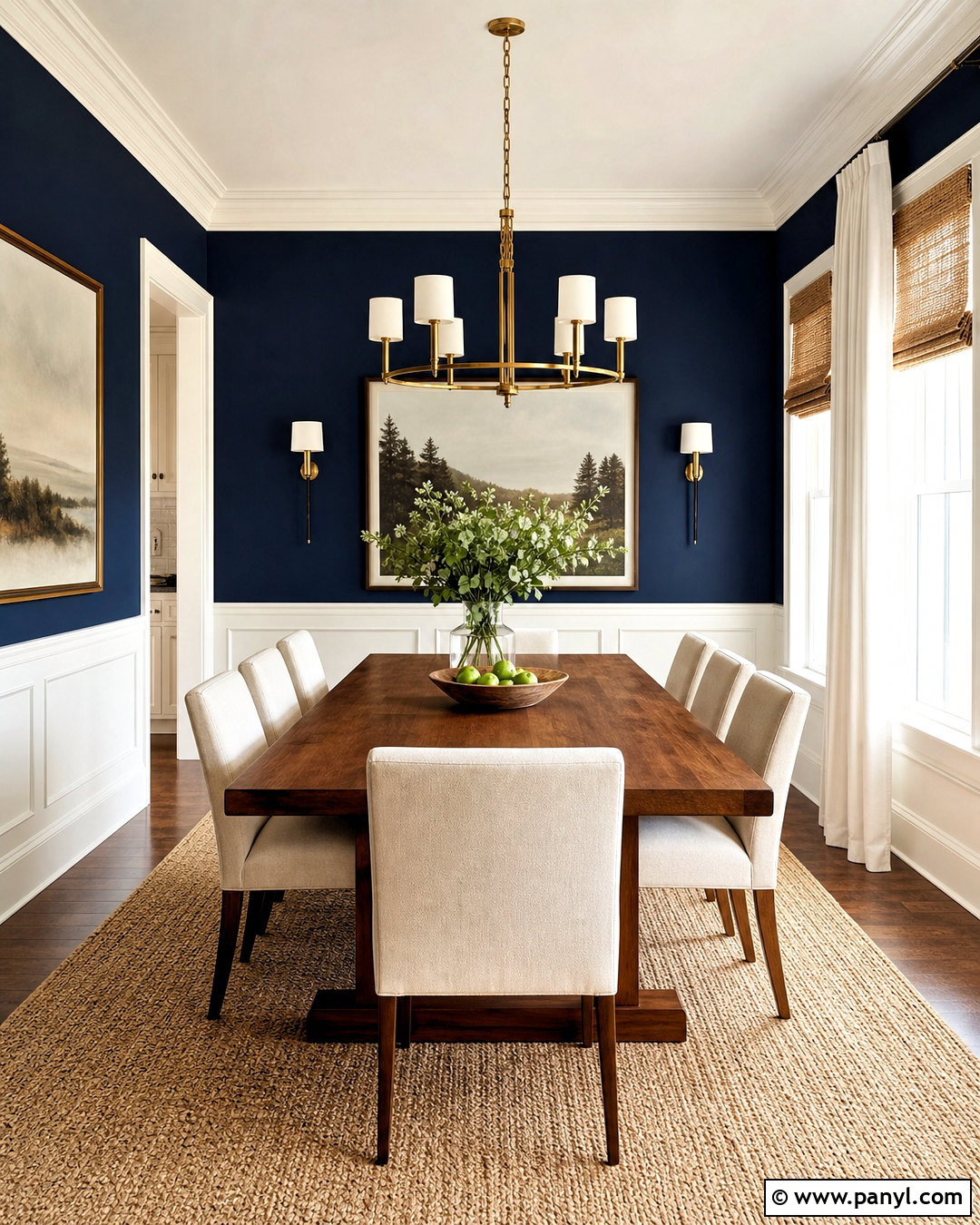
For a confident dining room, pair deep navy blue walls with crisp white architectural details. Use navy on the main walls, then paint the ceiling, baseboards, window trim, and any panel molding clean white. A medium walnut dining table warms the dark background, while upholstered cream chairs keep the arrangement comfortable and balanced. Add a brushed brass chandelier, simple white dinnerware, and framed artwork with touches of blue and rust. Natural woven shades can soften the windows without hiding the trim. If the room is small, reserve navy for the lower wall beneath a chair rail and use white above it. The finished scheme feels polished, welcoming, and strong without requiring excessive decoration.
3. Soft Greige And Charcoal Gray Walls
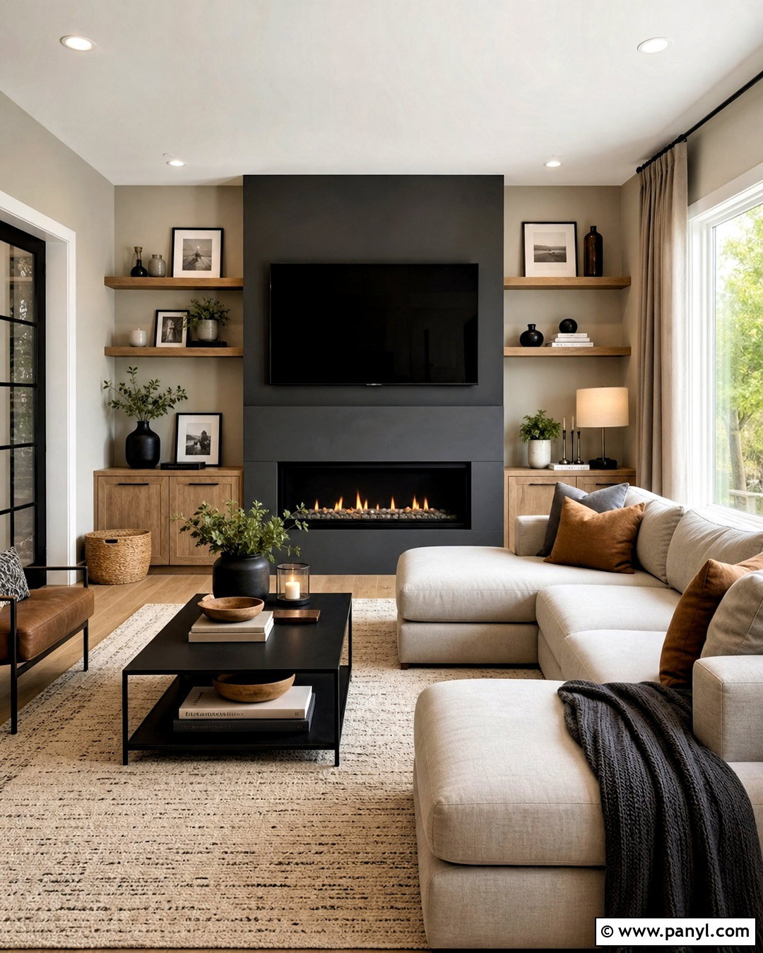
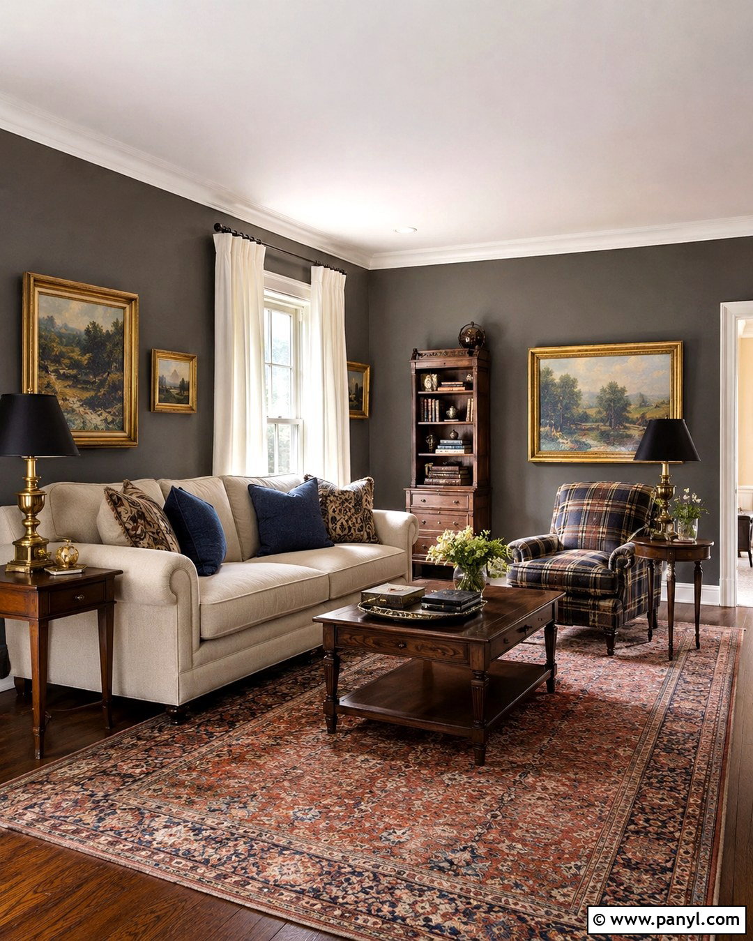
Soft greige and charcoal gray give a modern living room depth while keeping the overall look neutral. Paint most walls a warm greige and place charcoal gray behind the television, fireplace, or built-in shelving. Select a pale gray sectional, a black metal coffee table, and warm oak storage to balance cool and warm undertones. A textured cream rug prevents the darker feature wall from feeling heavy. Finish the room with taupe curtains, black picture frames, soft white lamps, and cushions in camel and gray. Repeat charcoal in small amounts rather than across every surface. This creates a clear visual anchor while allowing the quieter greige walls to reflect light and support an uncluttered, comfortable layout.
4. Dusty Blue And Warm Beige Walls
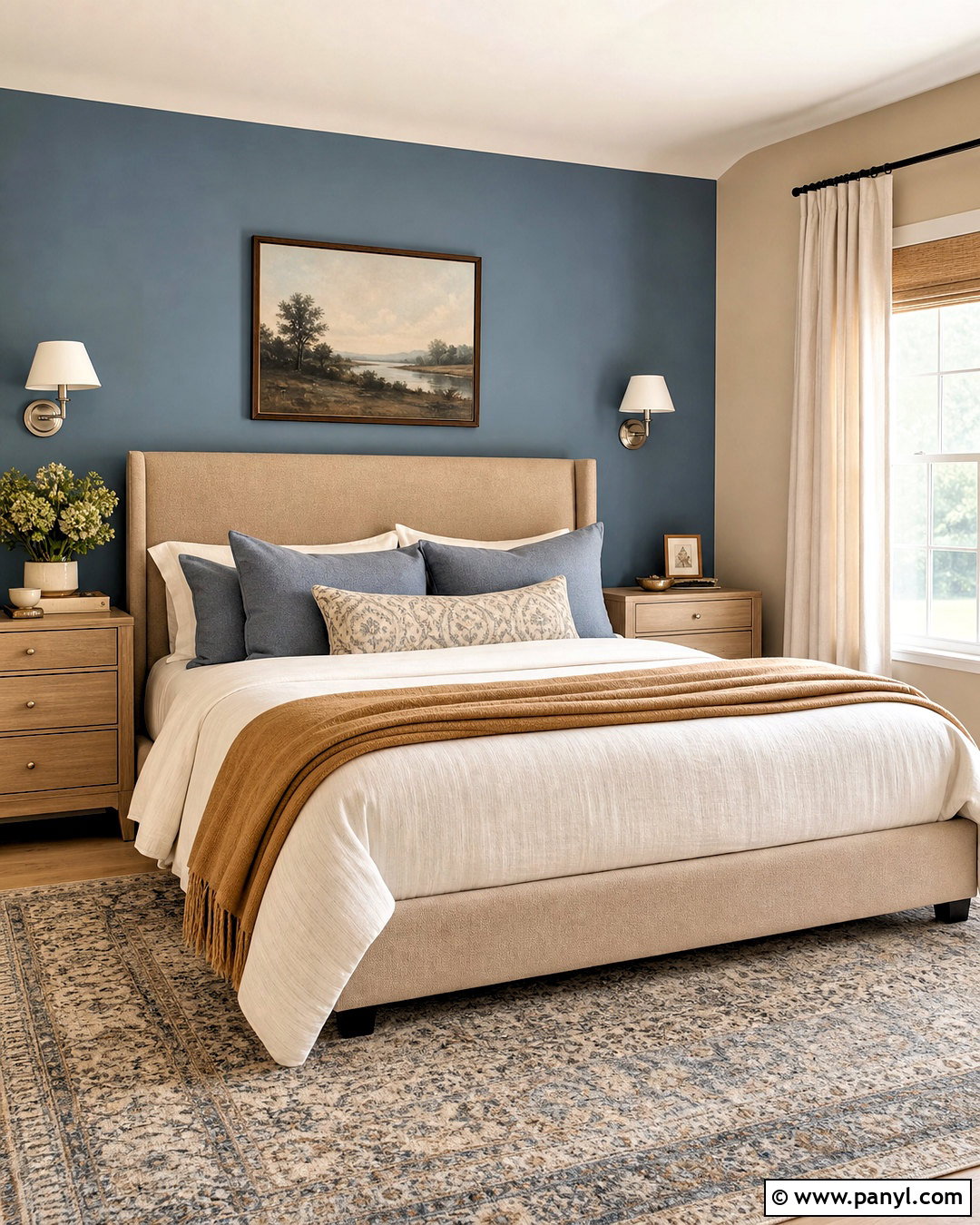
Imagine a restful bedroom where dusty blue surrounds the bed and warm beige softens the remaining walls. Paint the headboard wall in muted blue, then use sandy beige across the other three walls and ceiling trim. An upholstered oatmeal bed, light wood nightstands, and ivory bedding establish a warm foundation. Layer in blue-gray pillows, a camel throw, and a subtle patterned rug that includes both wall colors. Brushed nickel sconces and pale linen curtains provide a clean finish without making the room overly formal. Avoid bright white accents, which can create a sharp break between these muted shades. Instead, choose creamy fabrics and natural woods to build a peaceful, complete bedroom that feels comfortable throughout every season.
5. Terracotta And Cream Walls
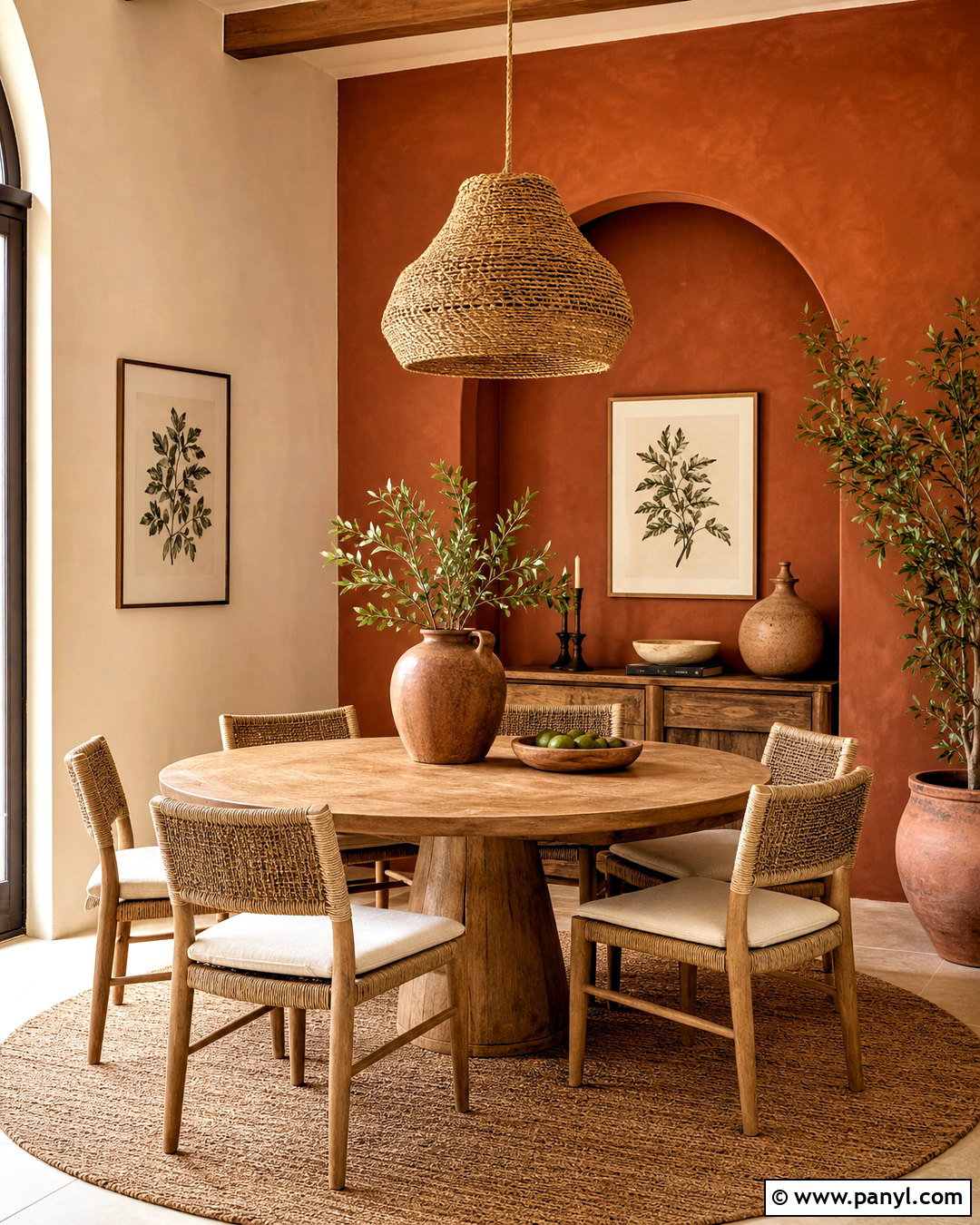
Terracotta and cream can transform a plain dining area into a warm, earthy gathering space. Use clay-toned terracotta on the wall behind a sideboard and soft cream on the surrounding walls. Choose a round oak table to improve flow, then add woven dining chairs with cream cushions. A natural fiber pendant, handmade pottery, and framed botanical prints reinforce the organic character. Keep window treatments light and simple so sunshine brings out the warmth in the terracotta. Dark bronze hardware and an olive green centerpiece provide small areas of contrast. Rather than adding several competing accent colors, repeat the clay shade in napkins, ceramics, or a patterned rug. The completed room feels grounded, sociable, and comfortably lived in.
6. Blush Pink And Olive Green Walls
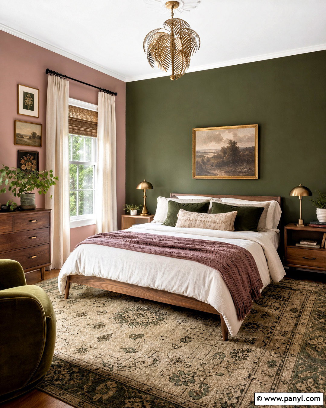
Blush pink and olive green make a balanced bedroom when both shades have muted, earthy undertones. Apply dusty blush to the main walls and use deep olive behind the bed to frame the sleeping area. Choose a walnut bed, cream bedding, and linen curtains that soften the stronger feature wall. Add olive pillows, a faded rose throw, and a vintage-style rug containing beige, green, and soft red. Antique brass lamps complement the warm palette and introduce a gentle glow. Keep the ceiling, trim, and doors in warm white for a neat transition between colors. The final design feels mature rather than overly sweet because dark wood and grounded green counterbalance the pink, creating a layered room with warmth and personality.
7. Pale Blue And Soft Gray Walls
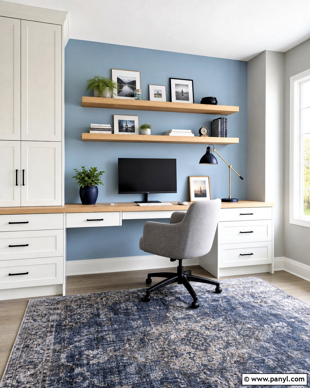
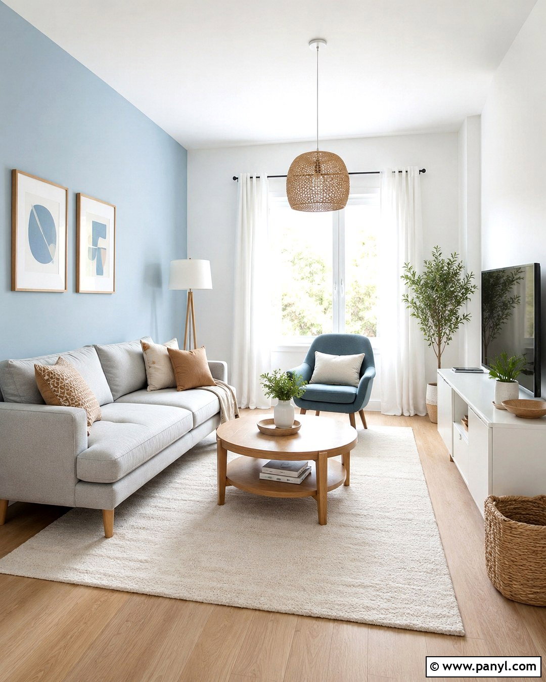
Pale blue and soft gray are ideal for a bright home office that needs to feel focused but not sterile. Paint the desk wall a gentle sky blue and use light gray on the remaining walls. Place a streamlined white oak desk against the blue background, paired with a comfortable gray upholstered chair. Closed cabinets in soft white reduce visual clutter, while floating oak shelves provide space for books and ceramics. Add a navy desk lamp, a subtle blue-gray rug, and simple white curtains. Matte black hardware gives the pale palette enough structure. Keep accessories limited and repeat each color at least twice. This creates a complete workspace where the wall combination, furniture, storage, and lighting feel deliberately connected.
8. Mustard Yellow And Deep Teal Walls
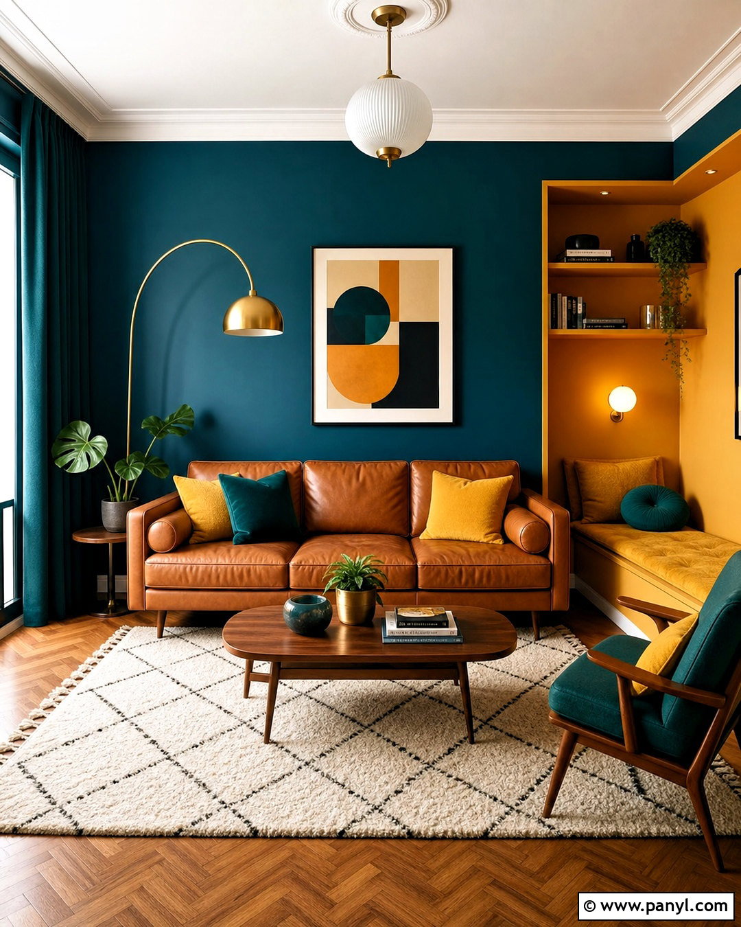
Mustard yellow and deep teal create an expressive living room with a warm, retro-inspired character. Cover the main seating wall in rich teal and paint an adjoining reading nook or built-in shelves mustard yellow. Anchor the space with a camel leather sofa, walnut coffee table, and cream wool rug. Add teal curtains, mustard cushions, and geometric artwork that repeats both shades in controlled amounts. A brass floor lamp complements the warmth of the yellow, while dark wood keeps the saturated palette grounded. Leave the ceiling and trim soft white to give the bold walls clean boundaries. Balance is essential here, so use one color as the dominant wall shade and the second in a smaller but clearly visible zone.
9. Lavender And Warm White Walls
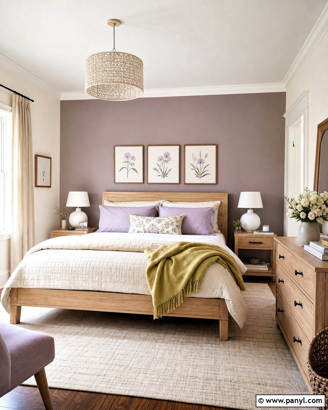
Lavender and warm white bring gentle color to a bedroom without making it feel childish. Select a gray-based lavender for the wall behind the bed and cover the other walls in a creamy white. A light oak bed, ivory quilt, and pale beige rug create a quiet neutral base. Introduce lavender again through two or three pillows, then add muted yellow or soft green in a small throw or bedside arrangement. Use white ceramic lamps, linen curtains, and minimal botanical artwork to maintain an airy finish. Silver or brushed nickel hardware works better than heavy black accents in this delicate setting. The complete look feels peaceful and polished because the lavender is softened by natural textures, restrained decor, and warmer surrounding surfaces.
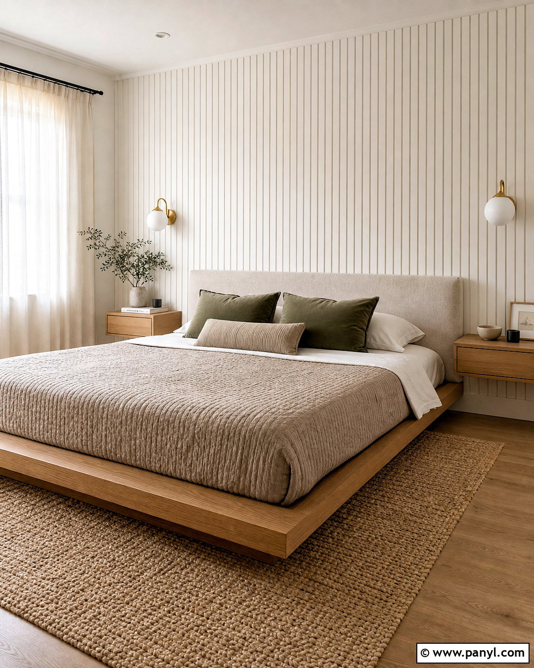
10. Forest Green And Cream Walls
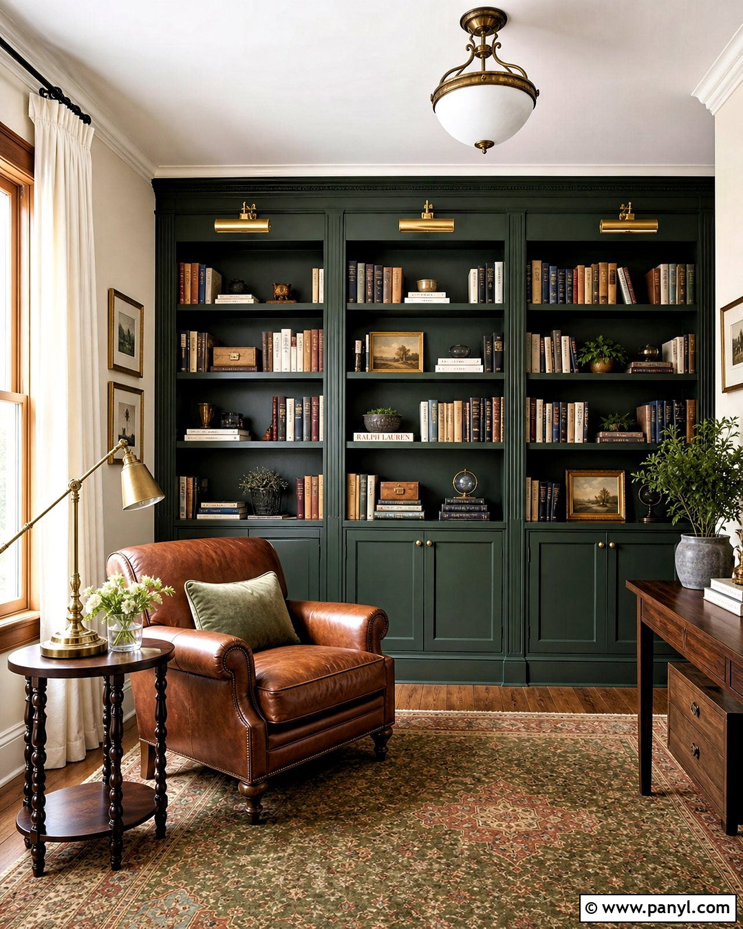
A forest green and cream wall scheme gives a home library or reading room an enveloping, traditional look. Paint the bookcase wall and its shelves deep forest green, then use rich cream on the remaining walls and ceiling. Position a cognac leather chair beside the shelving with a small walnut table and an aged brass reading lamp. A patterned rug in green, tan, and faded red adds warmth beneath the furniture. Choose cream curtains and natural wood frames to connect the lighter walls with the darker built-ins. If the room has limited daylight, use forest green on only one focal area. The cream background will preserve brightness while allowing the green wall to create the cozy, defined reading zone the room needs.
11. Black And Warm White Walls
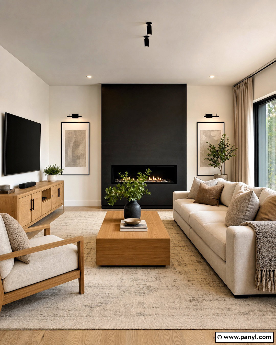
Black and warm white can feel surprisingly inviting when they are combined with natural materials. In a contemporary living room, paint the fireplace wall matte black and keep the surrounding walls, ceiling, and trim warm white. Arrange a cream sofa opposite the fireplace, then introduce a light oak media console and coffee table. A large beige rug, linen curtains, and textured cushions soften the graphic contrast. Repeat black through slim window frames, picture frames, and one floor lamp so the feature wall does not appear disconnected. Avoid filling the room with glossy finishes; matte paint and tactile fabrics create a more relaxed result. The finished space feels crisp, balanced, and modern while remaining suitable for an everyday home.
12. Peach And Ivory Walls
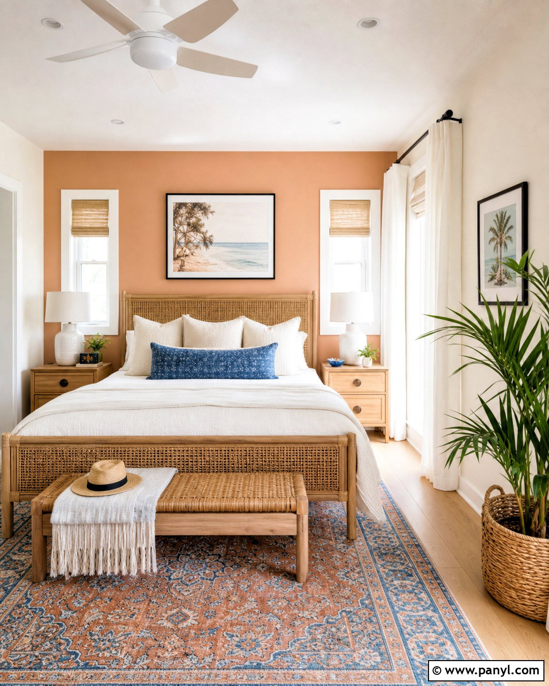
Peach and ivory produce a cheerful guest bedroom that feels warm even with simple furnishings. Choose a soft, slightly muted peach for the wall behind the bed and gentle ivory for all remaining walls. Add a woven cane headboard, white oak nightstands, and creamy cotton bedding. A small patterned rug can combine peach, beige, dusty blue, and tan without overwhelming the room. Use ivory curtains, ceramic lamps, and natural baskets to reinforce the light atmosphere. Touches of matte black in frames or drawer pulls provide just enough definition. Keep the peach shade away from intense orange undertones for a softer result. Together, the wall colors and natural materials create a welcoming bedroom that looks fresh, coordinated, and easy to maintain.
13. Chocolate Brown And Pale Blue Walls
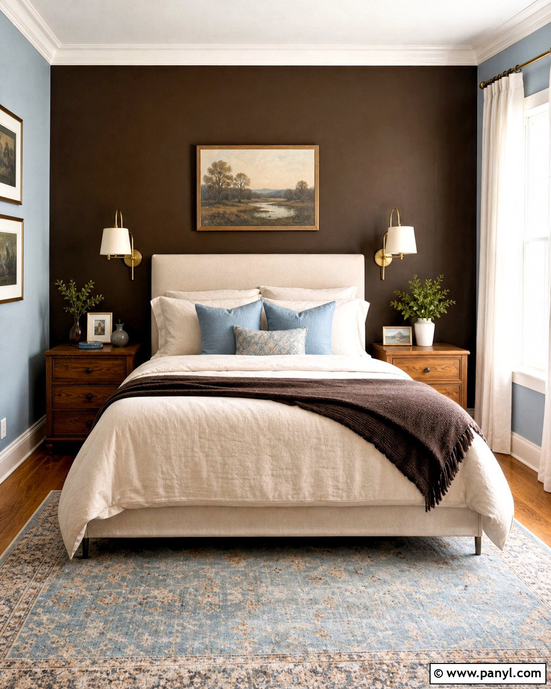
Chocolate brown and pale blue offer an elegant way to combine deep warmth with a cooler, lighter shade. In a bedroom, use chocolate brown behind the bed and pale blue across the remaining walls. Select an upholstered beige headboard, medium oak nightstands, and crisp cream bedding to bridge the contrast. Add pale blue pillows, a brown wool throw, and a rug with faded blue and tan details. Brass sconces bring warmth to the dark wall, while soft white curtains keep the window area bright. Avoid adding large areas of stark black, which can make the palette feel overly heavy. The completed design has depth and comfort, with the blue walls providing openness and the brown focal wall giving the bed a strong visual foundation.
14. Burgundy And Soft Taupe Walls
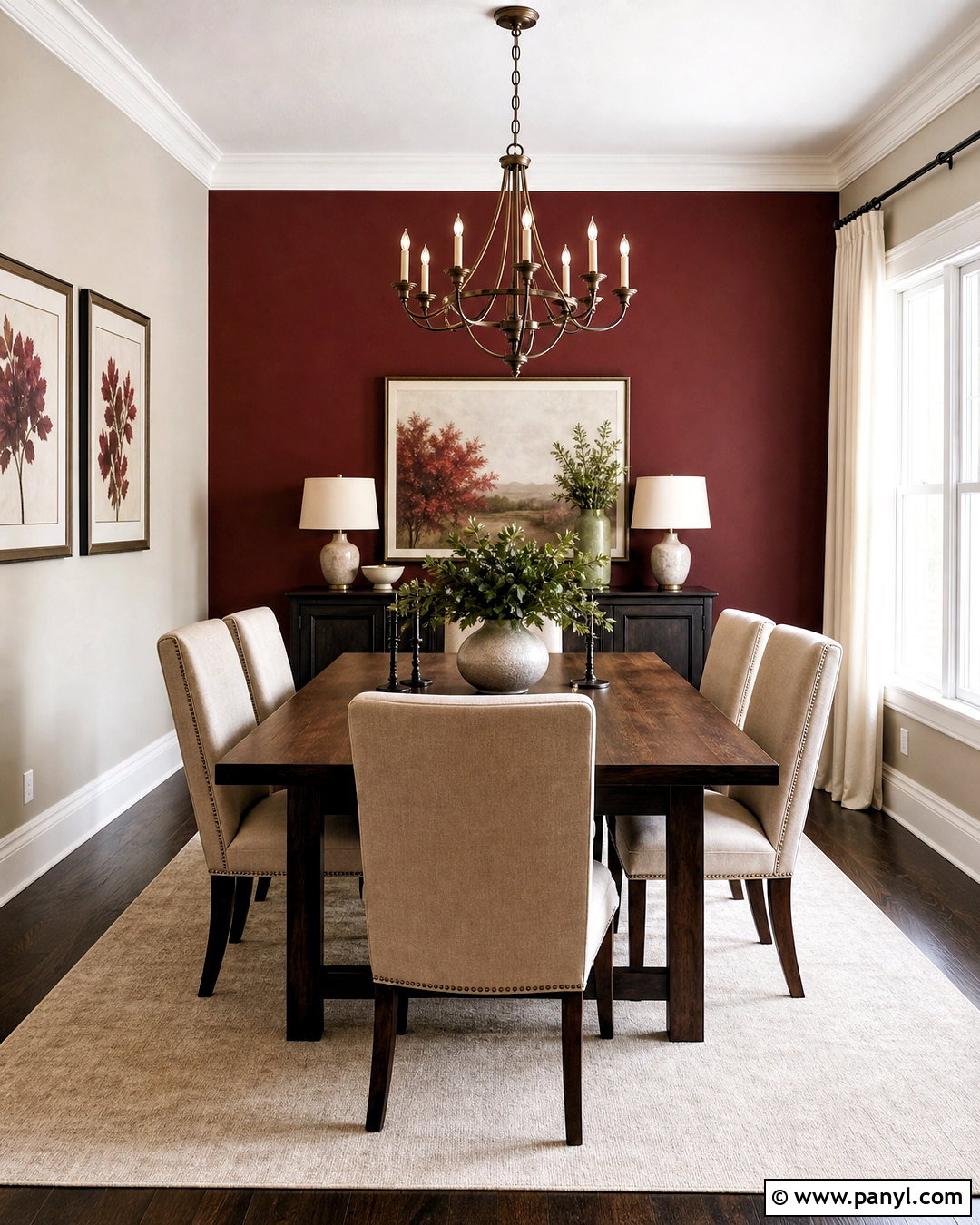
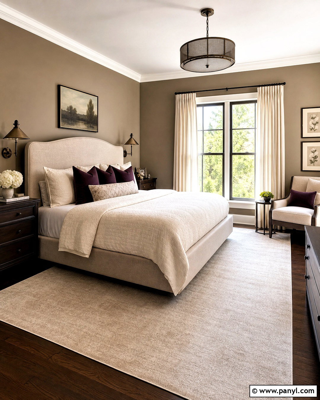
Burgundy and soft taupe can make a dining room feel rich without turning it dark or formal. Apply burgundy to the wall behind a buffet or fireplace, then cover the remaining walls in a light mushroom taupe. Pair the colors with a dark oak dining table, beige upholstered chairs, and a warm ivory rug. A bronze chandelier, cream curtains, and framed art with muted red details help distribute the palette around the room. Keep the tabletop styling simple with stoneware and greenery. Taupe should remain the dominant color, especially in a smaller room, while burgundy provides concentrated depth. This arrangement creates a complete dining setting that feels substantial, intimate, and suitable for both casual meals and special gatherings.
15. Mint Green And White Walls
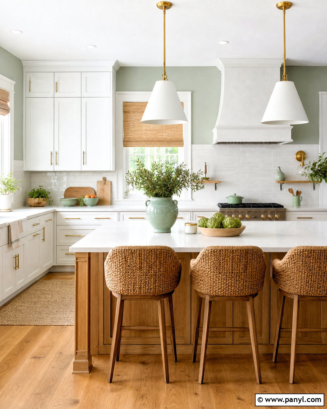
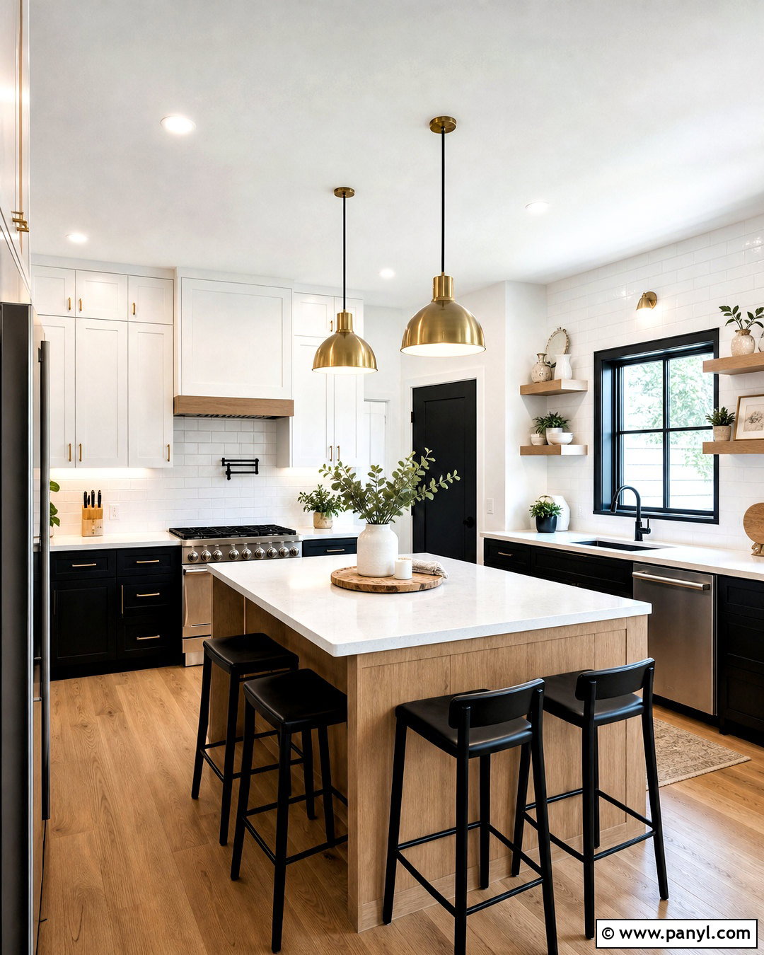
Mint green and white create a clean kitchen palette with more character than an all-white scheme. Use soft mint on a breakfast nook wall or the upper half of the room, then paint the remaining walls and trim a clear but not icy white. Choose white shaker cabinets, pale quartz counters, and a light oak island or dining table. Brushed brass hardware warms the cool green, while woven stools and Roman shades add natural texture. Introduce mint again through simple ceramics or seat cushions. A backsplash of glossy white subway tile will reflect light without competing with the painted area. The full kitchen feels bright and fresh because every finish supports the two-color wall scheme rather than introducing unnecessary contrast.
16. Burnt Orange And Greige Walls
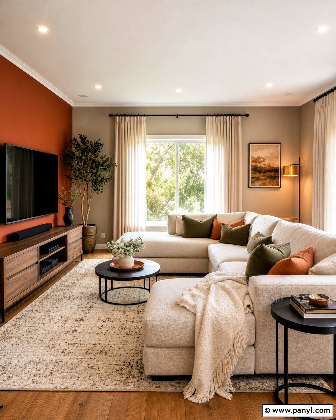
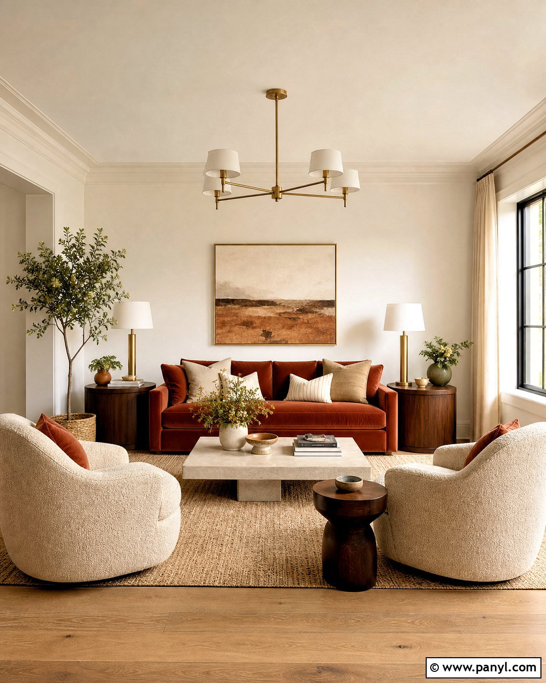
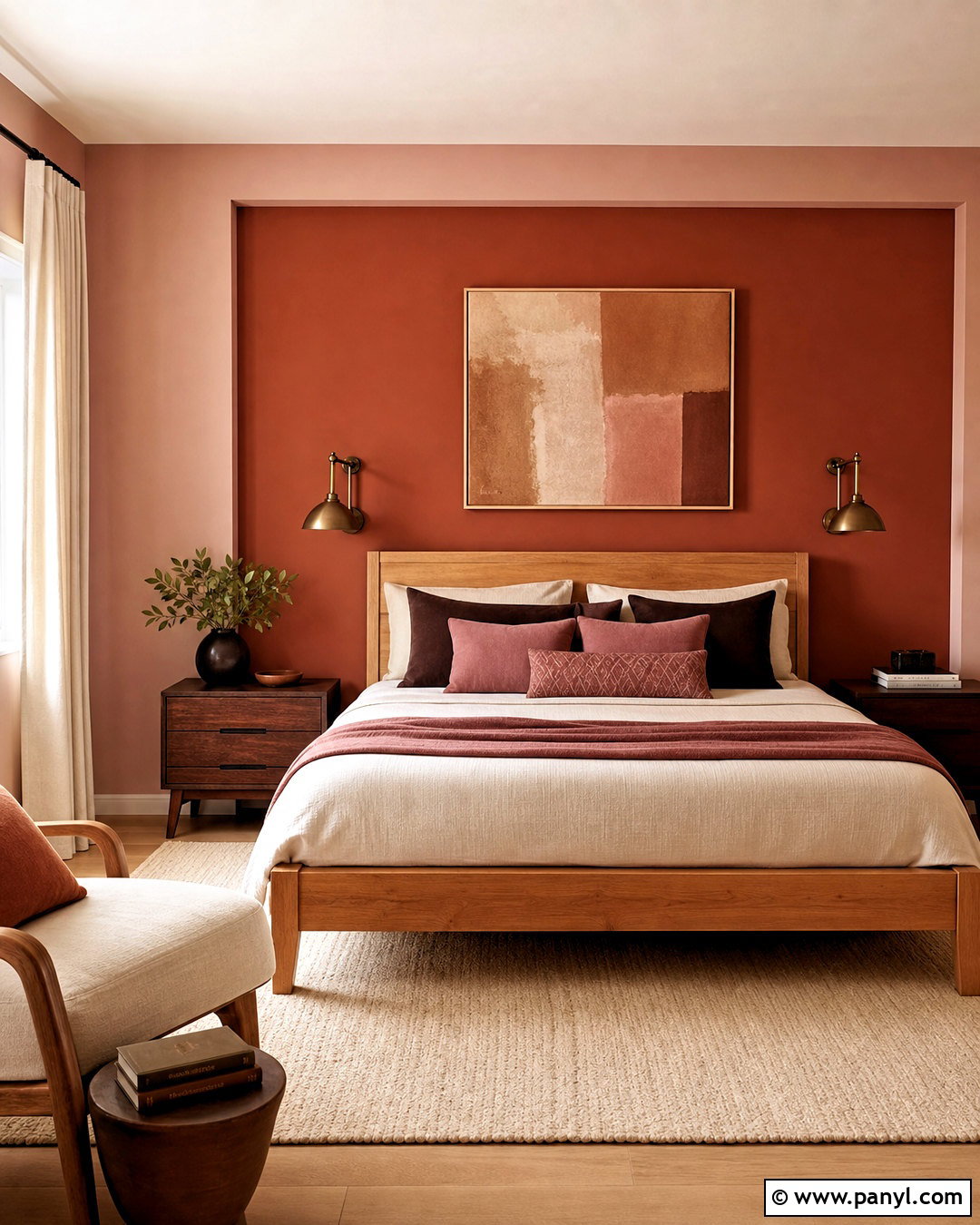
Burnt orange and greige bring warmth to a family room while remaining practical and grounded. Paint one broad wall in a deep, earthy orange and use light warm greige on the other walls. Place a beige sectional against the orange backdrop, then add a walnut media unit, black metal side tables, and a cream-and-tan rug. Olive green cushions and textured off-white throws can provide supporting color without distracting from the wall pairing. Choose linen curtains close to the greige wall color for a smooth, expansive look. Repeat burnt orange in one piece of artwork or a small ottoman. This creates a cohesive family space with a strong focal point, durable-looking finishes, and enough neutral surfaces to keep the richer shade controlled.
17. Cobalt Blue And Soft Cream Walls
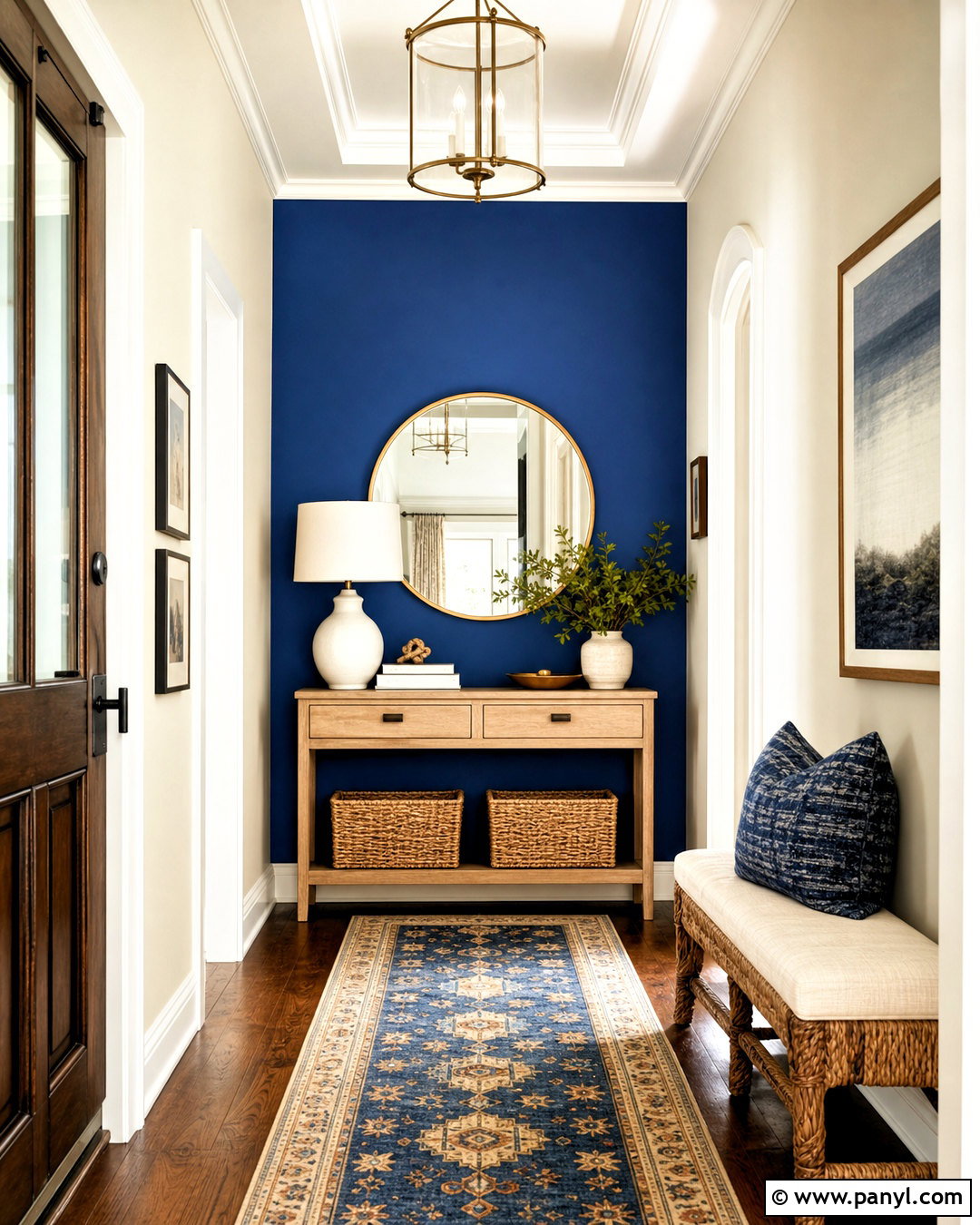
Cobalt blue and soft cream create an energetic yet balanced entryway. Paint the wall facing the front door in saturated cobalt, then use soft cream on the side walls, ceiling, trim, and doors. Add a narrow light oak console, a round brass-framed mirror, and a woven bench with cream upholstery. A patterned runner featuring blue, tan, and ivory connects the full hallway. Use baskets beneath the console for useful storage and place a simple ceramic lamp on top for softer evening light. Keep decorative objects limited because the blue wall already provides a strong visual statement. The cream surfaces prevent the entry from feeling enclosed, while natural wood and woven textures make the high-contrast combination approachable for a normal, busy household.
18. Emerald Green And Pale Pink Walls
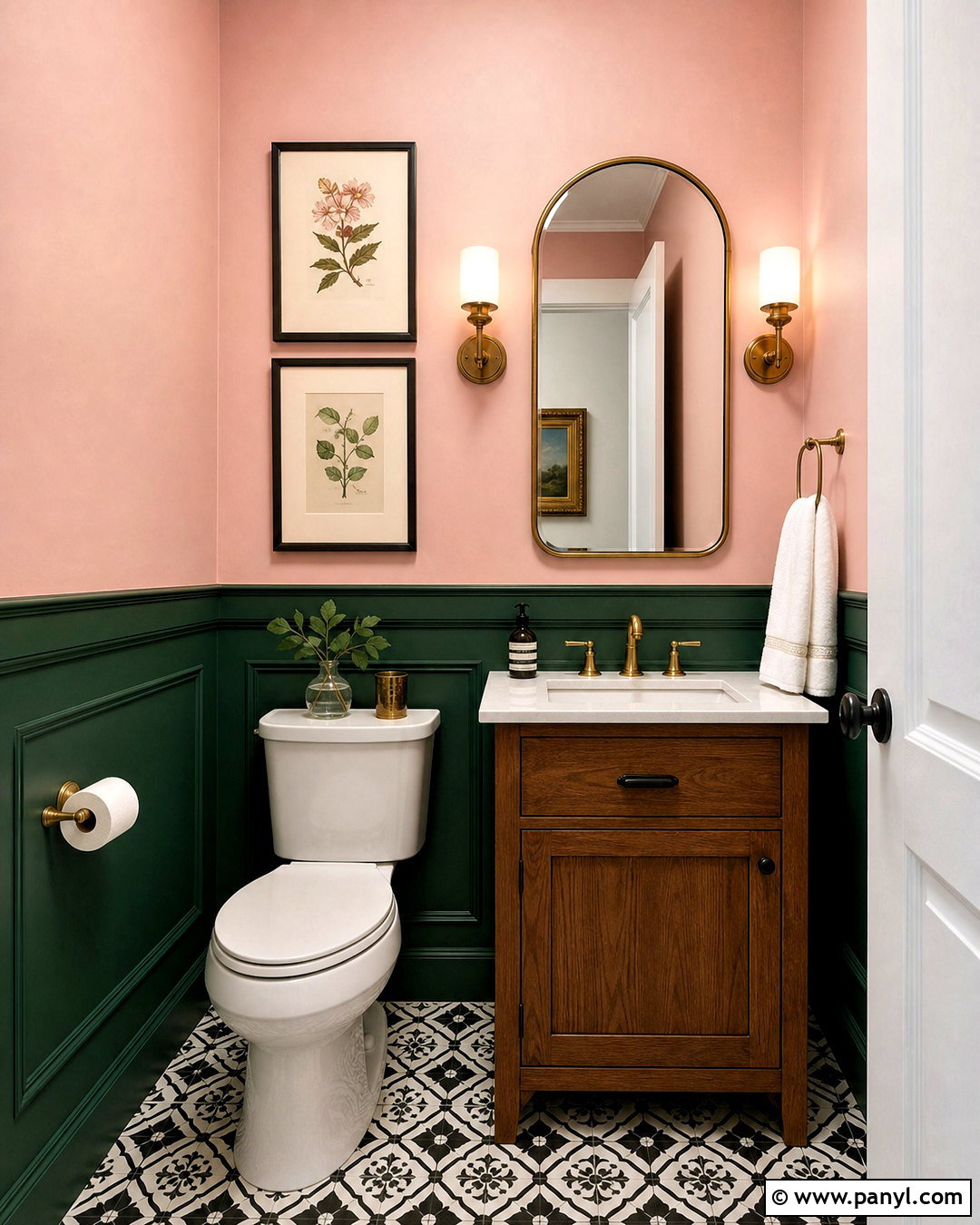
Emerald green and pale pink make a memorable powder room with a refined, jewel-toned finish. Use emerald green on the lower two-thirds of the walls, including simple panel molding, and pale blush pink above. Install a white pedestal sink or compact oak vanity with a white stone counter. Add an arched brass mirror, matching wall sconces, and a small black-and-white tile floor for crisp contrast. Keep towels white and accessories minimal so the color blocking remains the focal point. A framed botanical print can connect the green and pink naturally. Because powder rooms are compact and used briefly, they can handle stronger color. The finished space feels intentional, decorative, and complete rather than like a random accent wall experiment.
19. Slate Blue And Terracotta Walls
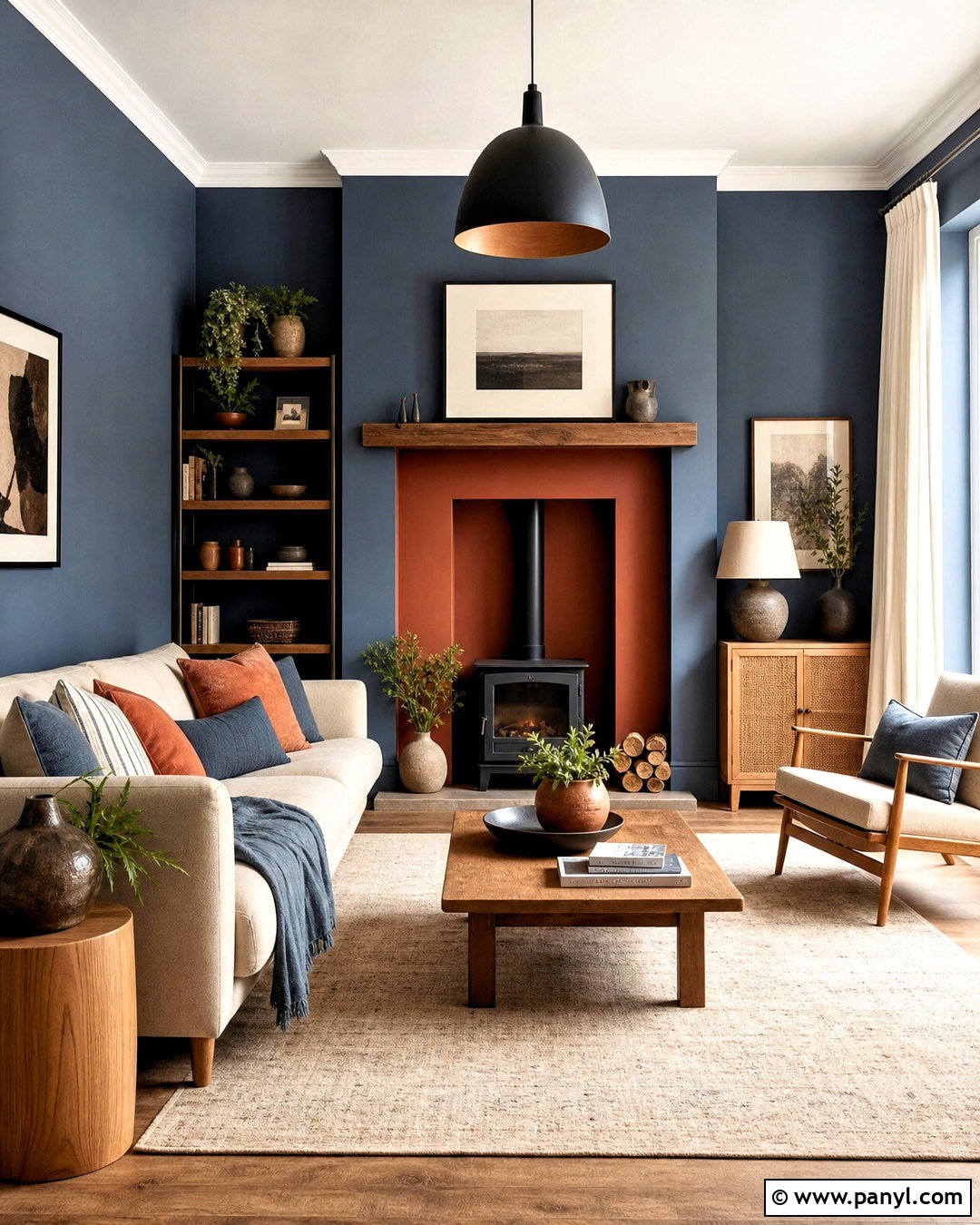
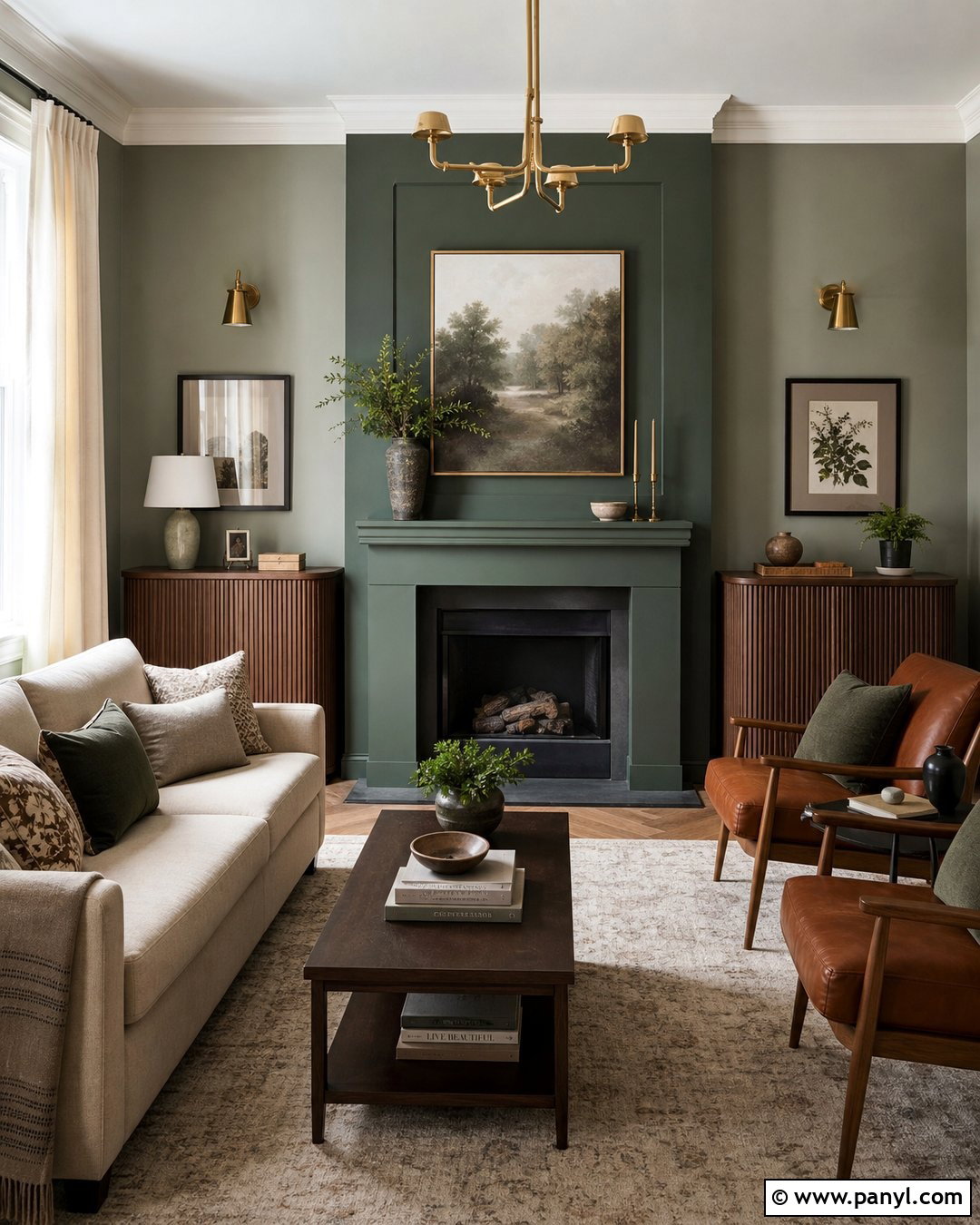
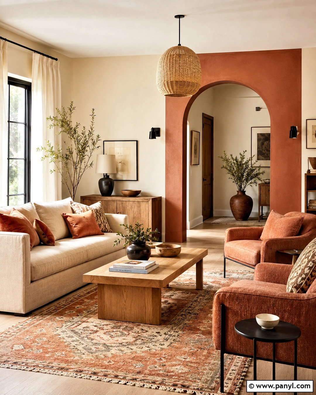
Slate blue and terracotta create a grounded living room that combines cool depth with sun-warmed color. Use slate blue on the main walls and paint a recessed alcove, fireplace surround, or built-in shelving in muted terracotta. Choose a flax-colored sofa, medium oak tables, and a large cream rug to keep the saturated walls from dominating. Layer terracotta cushions with blue-gray textiles, then add matte black lighting and simple clay pottery. Off-white curtains provide a clean border around the windows. Maintain similar muted intensity in both paint colors; a bright orange would clash with the smoky blue. With balanced furniture placement and repeated accent colors, this full-room palette feels relaxed, distinctive, and connected to natural stone, earth, and sky.
20. Butter Yellow And Light Gray Walls
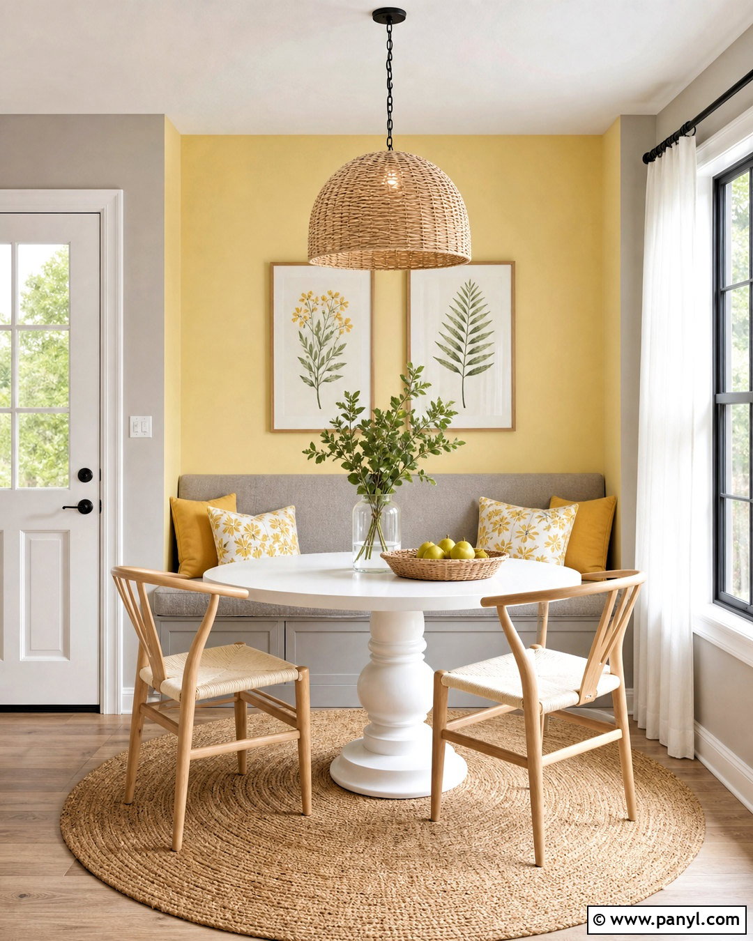
Butter yellow and light gray can brighten a breakfast room without appearing loud. Paint the wall surrounding the dining nook in soft butter yellow and cover the remaining walls in a warm light gray. Add a white pedestal table, pale oak chairs, and a built-in bench upholstered in gray fabric. Yellow-and-white cushions, a woven pendant, and a small botanical print continue the sunny character. Use sheer white curtains to maximize daylight and black window hardware for subtle definition. Keep the yellow creamy rather than neon, and select gray with warm undertones so the pairing stays friendly. The completed breakfast space feels light, practical, and upbeat, with enough neutral color to support daily use and enough yellow to give the room a recognizable identity.
Conclusion:
The right wall palette should connect naturally with the room’s light, furniture, flooring, and everyday purpose. These 20 best colour combinations for walls offer options ranging from quiet greige and charcoal to expressive teal and mustard. Start by identifying the fixed finishes you cannot easily change, such as flooring, cabinets, and large furniture. Then test your preferred colors beside those materials on more than one wall. Review the samples in morning, afternoon, and evening light before making a final choice. Once the wall colors are selected, repeat them subtly through textiles, artwork, and accessories. This simple approach creates a balanced room that feels intentional, comfortable, and visually complete.

Related Ideas and Inspiration:
Leave a Reply