
Sherwin-Williams Sea Salt SW 6204 is a muted green with blue undertones that can appear greener, bluer, or grayer as natural light changes. That flexibility makes it useful for coastal, farmhouse, transitional, cottage, and modern interiors. Sherwin-Williams officially coordinates Sea Salt with Spare White, Fleur de Sel, and Summit Gray, while designers also pair it with warm neutrals, crisp whites, charcoal tones, and deep blues. () The key is creating enough warmth, texture, and contrast around this soft color. Natural wood, woven materials, stone, linen, and metal finishes all help complete the room. These 20 sw sea salt color palette ideas offer complete, practical looks for bedrooms, kitchens, bathrooms, living spaces, and exteriors.

1. Sea Salt And Spare White Living Room
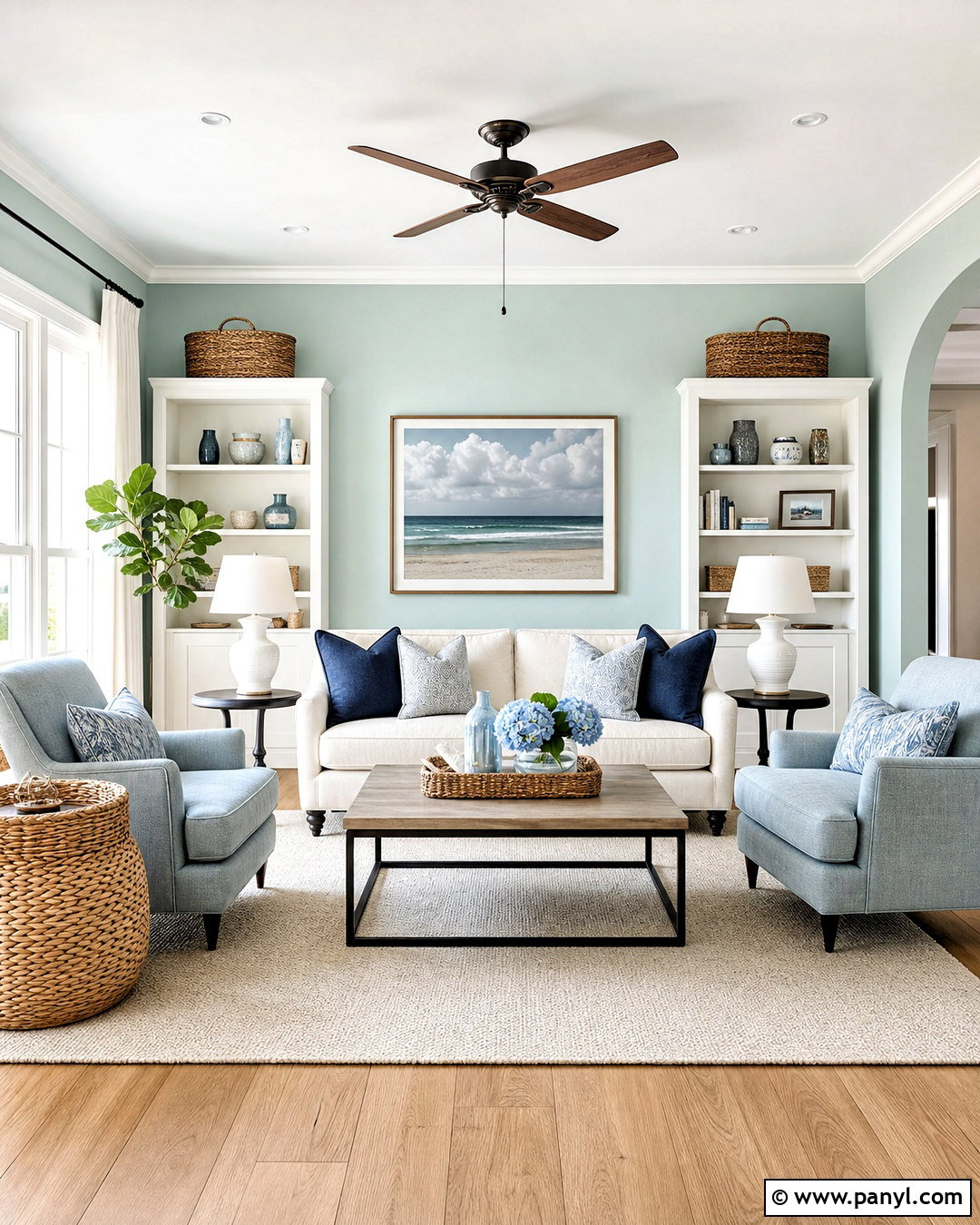
Create a light coastal living room with Sea Salt SW 6204 walls and Spare White SW 6203 across the ceiling, trim, and fireplace. Because both colors have a soft, cool character, the transition feels gentle rather than sharply outlined. Ground the airy palette with a natural oak coffee table, medium-toned wood flooring, and a large oatmeal wool rug. Choose a comfortable ivory sofa, pale blue-gray armchairs, and linen curtains that nearly match the trim. A few navy pillows provide definition without making the room feel dark. Add woven baskets, ceramic lamps, and simple botanical artwork. Keep furniture lines clean and relaxed so the entire room feels open, calm, and easy to maintain.
2. Sea Salt And Pure White Kitchen
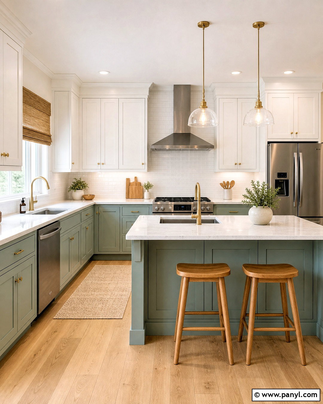
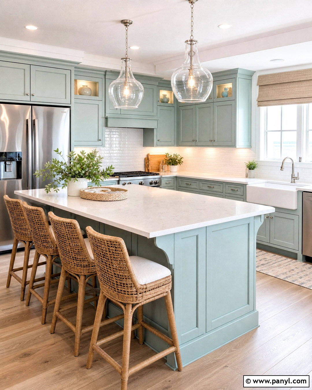
Sea Salt cabinets can give a bright kitchen color without overwhelming a smaller room. Paint the base cabinets and island Sea Salt SW 6204, then use Pure White SW 7005 on the upper cabinets, ceiling, trim, and surrounding walls. White quartz countertops and a glossy white subway tile backsplash keep the work area crisp. Introduce warmth with white oak stools, natural cutting boards, and light wood flooring. Brushed brass cabinet pulls and pendant lights add a polished accent that still feels welcoming. Choose stainless steel appliances for a practical, balanced finish. A few pale gray accessories can connect the cool undertones, while woven window shades prevent the white surfaces from looking sterile or overly bright.
3. Sea Salt And Alabaster Bedroom
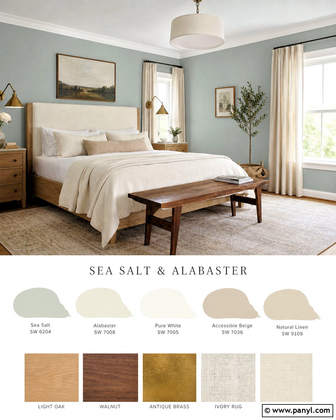
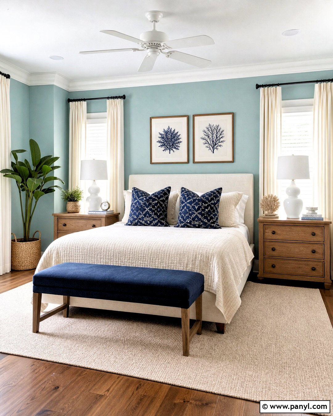
For a restful bedroom, combine Sea Salt SW 6204 walls with Alabaster SW 7008 trim, doors, and ceiling. Alabaster has enough softness to create a warmer transition than a brilliant white. Build the room around a light oak bed with an upholstered oatmeal headboard. Layer white cotton sheets, a pale beige quilt, and muted blue-green pillows for a calm, collected appearance. Natural linen curtains gently filter daylight and echo the warm neutral bedding. Use cream ceramic lamps, antique brass hardware, and a textured ivory rug to complete the palette. A small walnut bench at the foot of the bed introduces deeper contrast. Keep artwork minimal, using landscapes or abstract prints with beige, gray, and faded green.
4. Sea Salt And Fleur De Sel Bathroom
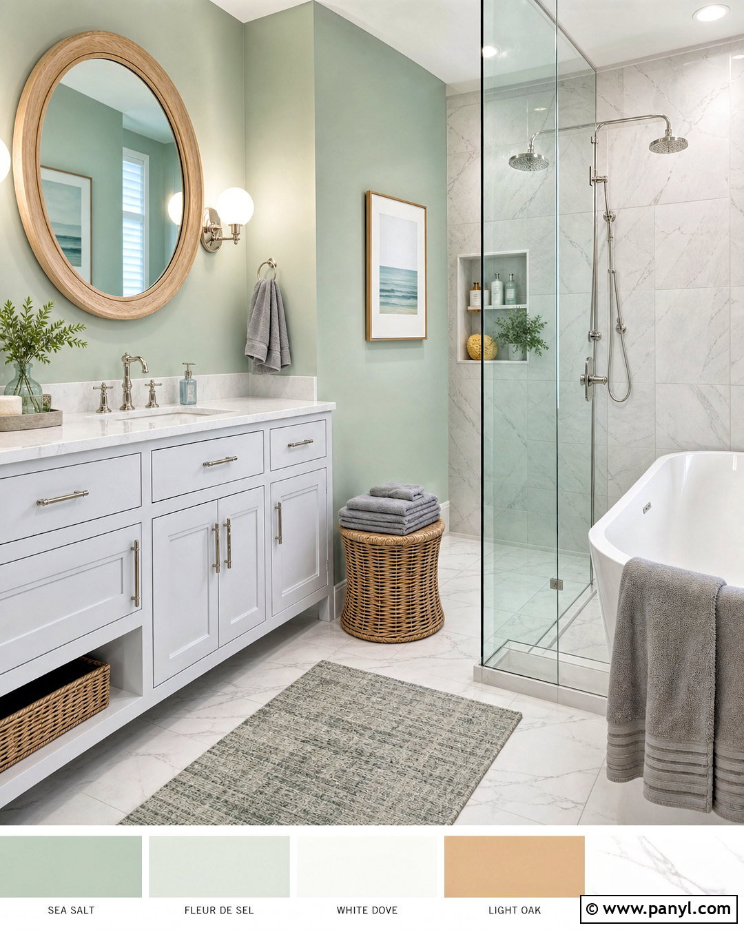
A Sea Salt and Fleur de Sel bathroom feels clean without becoming cold. Use Sea Salt SW 6204 on the upper walls and Fleur de Sel SW 7666 for the vanity, ceiling, trim, and paneled surfaces. Install white marble-look porcelain tile across the floor and shower walls for subtle movement. A light oak framed mirror brings needed warmth, while polished nickel faucets maintain the fresh character of the palette. Choose a white quartz vanity top, clear glass shower enclosure, and simple globe sconces. Soft gray towels and a small woven stool make the room more comfortable. Finish with eucalyptus stems and minimal countertop accessories so the quiet green-gray wall color remains visible and the bathroom feels spacious.
5. Sea Salt And Comfort Gray Dining Room
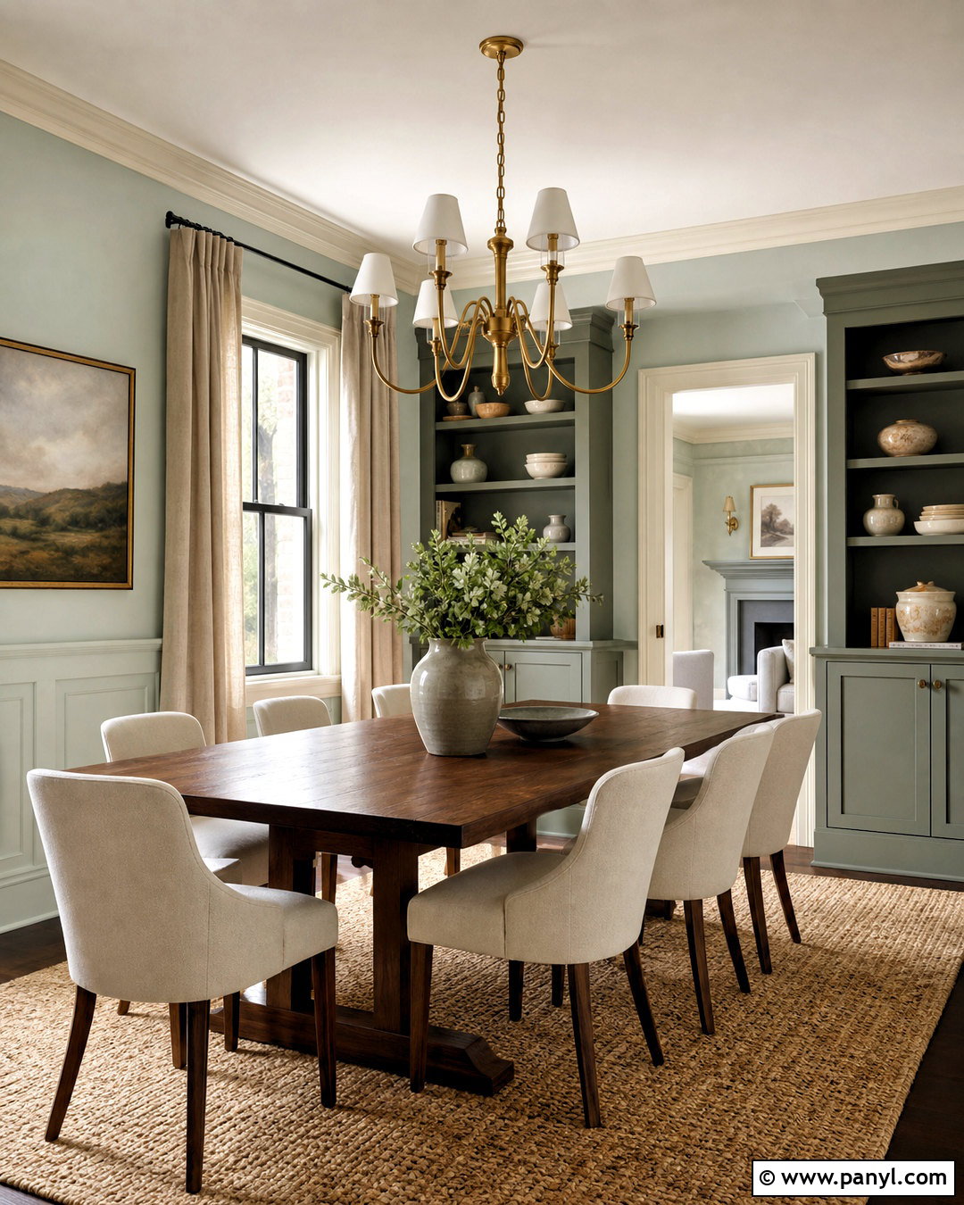
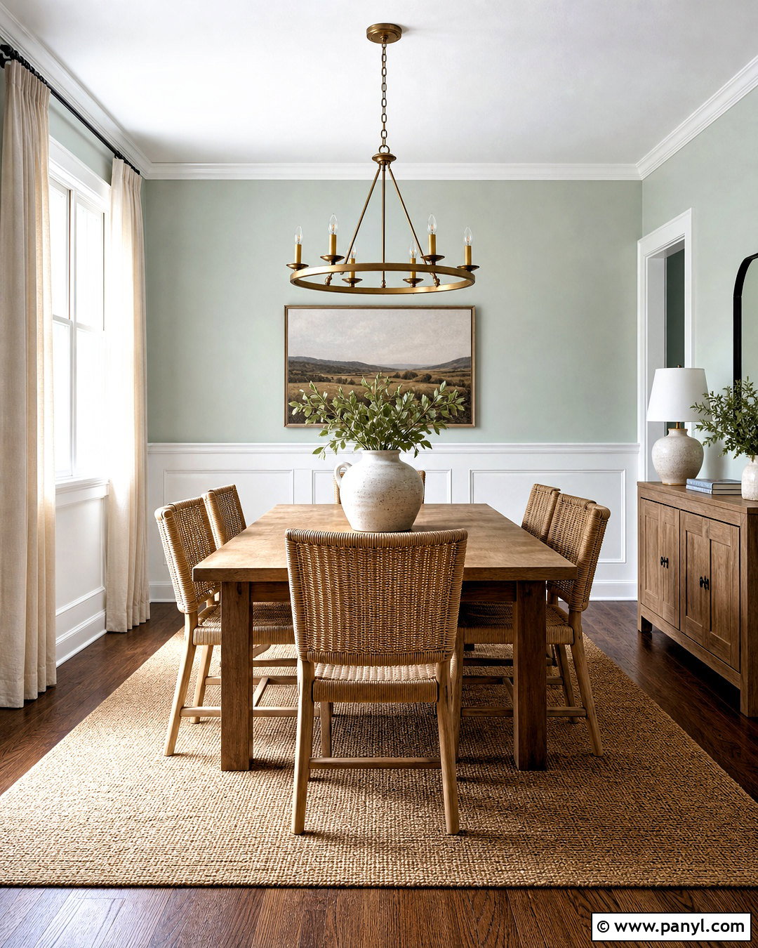
Would you like a tonal room that still has clear architectural depth? Paint the main walls Sea Salt SW 6204 and use Comfort Gray SW 6205 on built-in cabinets or the lower half of paneled walls. Finish the trim and ceiling in a soft white. A medium walnut dining table adds warmth and separates the similar green-gray paint colors. Pair it with cream upholstered chairs and a natural jute rug. Hang a simple aged-brass chandelier above the table, then repeat that finish through cabinet knobs and picture frames. Off-white curtains soften the windows without introducing another strong color. Stoneware dishes, smoky glass vases, and muted landscape artwork complete this refined transitional dining room without making it feel formal.
6. Sea Salt And Charcoal Blue Home Office
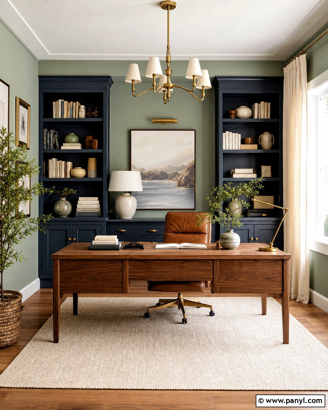
Give a home office stronger definition by pairing Sea Salt SW 6204 with Charcoal Blue SW 2739. Sea Salt works well across the main walls, while Charcoal Blue creates a focused backdrop on built-in bookcases or the wall behind the desk. Add a warm walnut desk and cognac leather chair to balance the cool paint colors. An ivory flat-weave rug keeps the floor area light, and off-white linen curtains distribute natural light around the room. Use aged brass for the desk lamp, cabinet hardware, and framed artwork. Shelves should include books, pale ceramics, and a few natural wood objects rather than crowded accessories. The finished office feels calm enough for daily work but has sufficient contrast for video calls and creative tasks.
7. Sea Salt And Dover White Sunroom
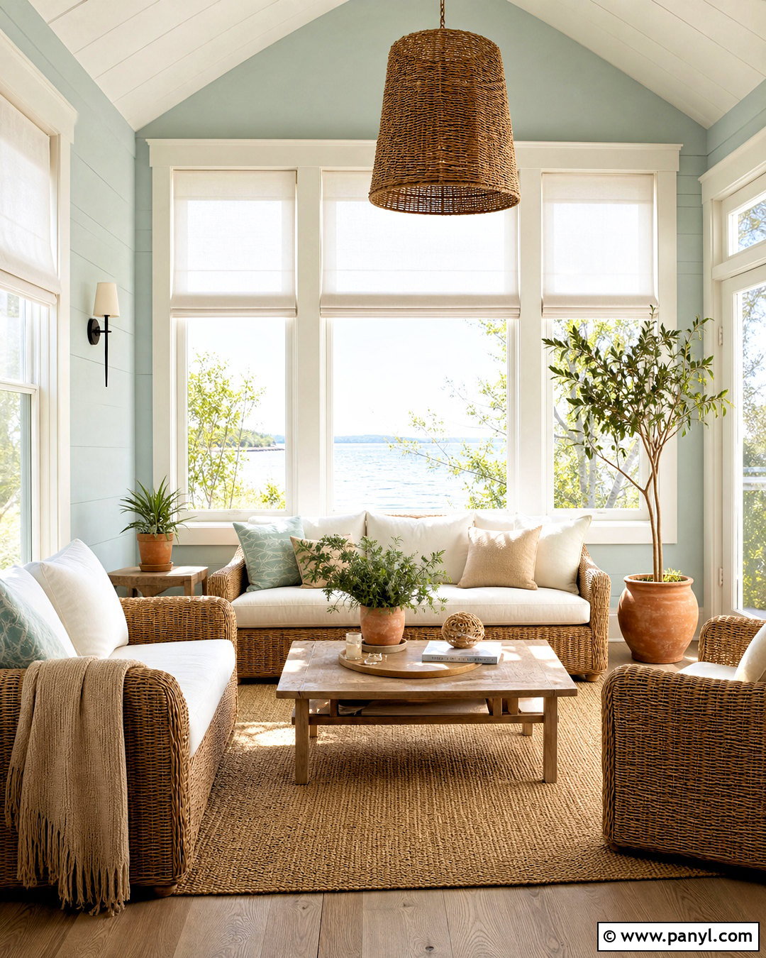
Sunlight can bring out the fresher side of Sea Salt, making it a natural choice for a comfortable sunroom. Cover the walls in Sea Salt SW 6204 and use Dover White SW 6385 on window trim, ceiling boards, and interior doors. Its creamy warmth softens the cooler green without creating a heavy yellow appearance. Arrange a woven rattan sofa and two matching lounge chairs around a pale oak coffee table. Use cushions in ivory, sandy beige, and faded aqua. A natural sisal rug adds durability and texture underfoot. Include terracotta planters filled with leafy green plants to introduce an earthy accent. White linen shades, ceramic table lamps, and a lightweight cotton throw complete the bright, casual retreat.
8. Sea Salt And Urbane Bronze Entryway
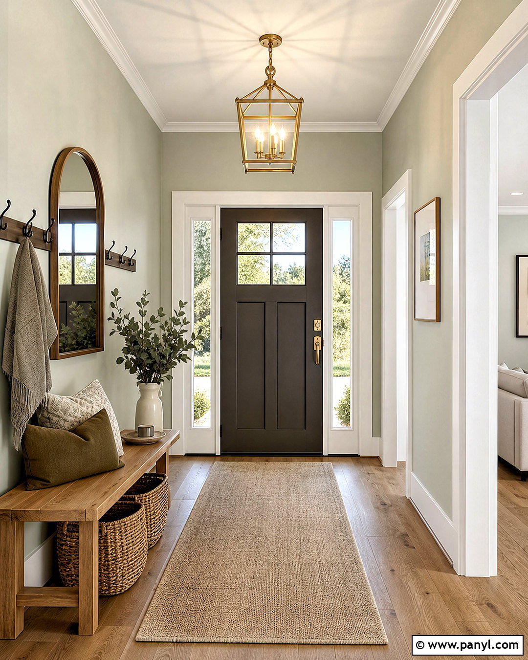
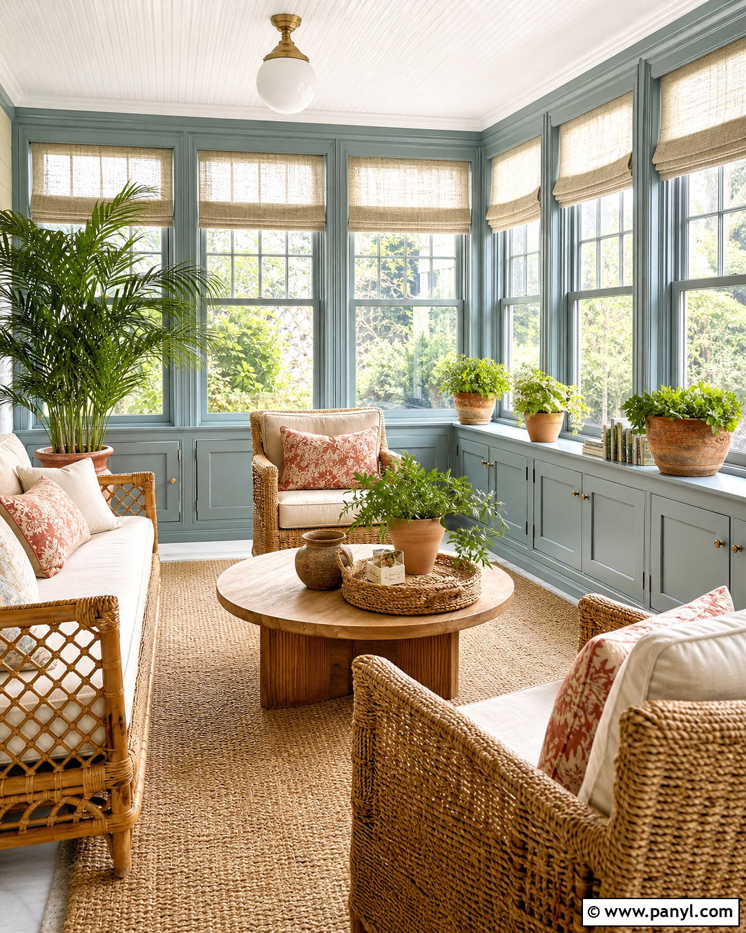
A small entryway can handle bold contrast when the darker color is used with restraint. Apply Sea Salt SW 6204 to the walls, then paint the interior front door Urbane Bronze SW 7048. Continue the deeper shade on a narrow console or stair railing for a connected look. Use warm white on the trim and ceiling to keep the entrance bright. A light oak bench, woven storage baskets, and a neutral runner introduce practical texture. Select matte black hooks and an aged brass ceiling fixture, combining dark structure with a little warmth. Finish the console with a rounded mirror, cream ceramic lamp, and simple greenery. The completed entry feels grounded, organized, and distinctive without requiring a large amount of furniture or decoration.
9. Sea Salt And Rainwashed Laundry Room
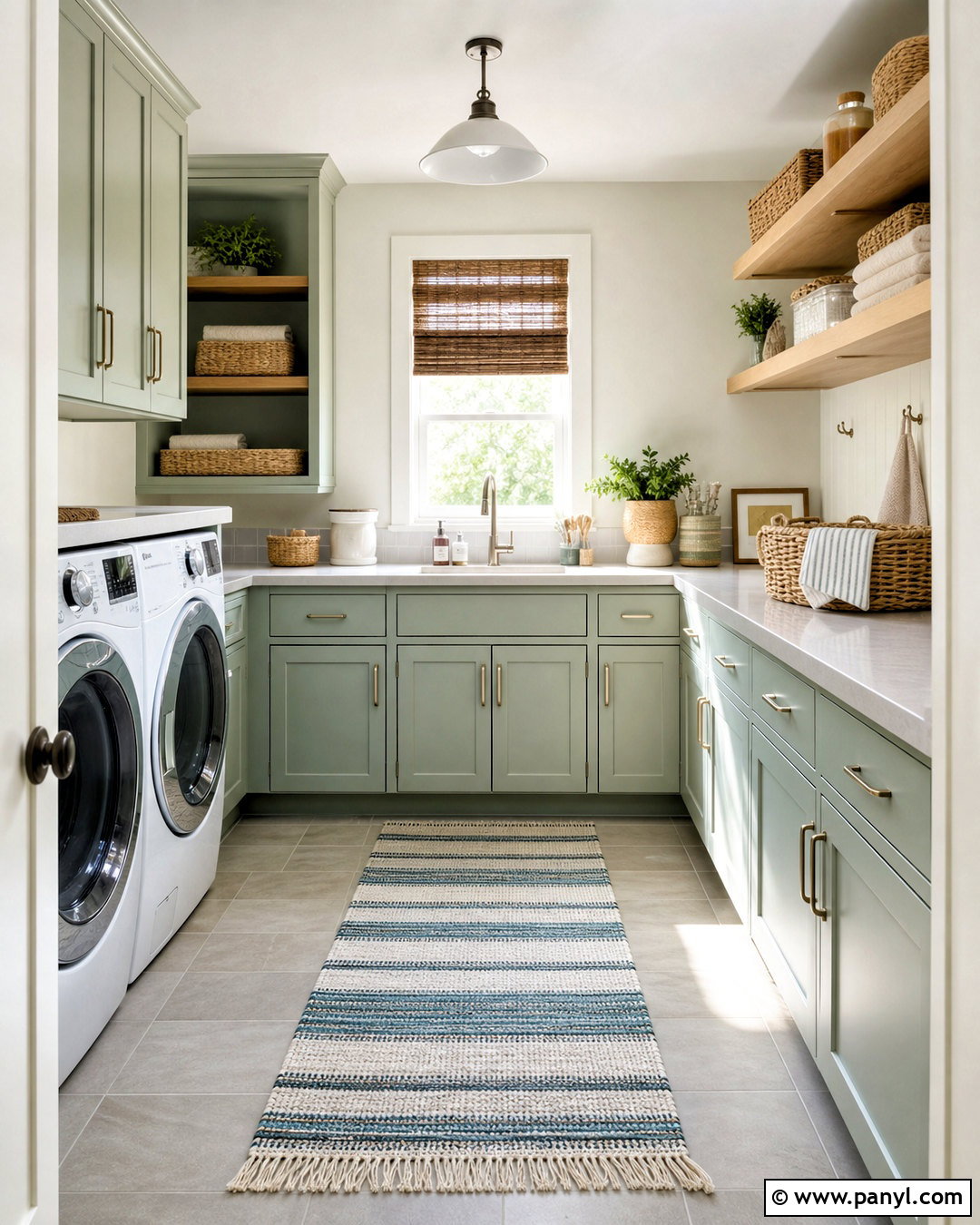
Turn a practical laundry room into a cheerful, coordinated space by using Sea Salt SW 6204 on the cabinets and Rainwashed SW 6211 on a small feature wall or utility door. Keep the remaining walls and ceiling soft white so the related blue-green shades remain easy to distinguish. Install a pale gray quartz counter above the washer and dryer, with white rectangular backsplash tile behind it. Warm maple shelving and woven baskets prevent the palette from feeling too cool. Add brushed nickel hardware, a striped washable runner, and clear storage containers for everyday supplies. Closed cabinetry should handle visual clutter, while one open shelf can display folded towels and simple pottery. The result feels fresh, functional, and intentionally designed.

10. Sea Salt And Oyster Bay Powder Room
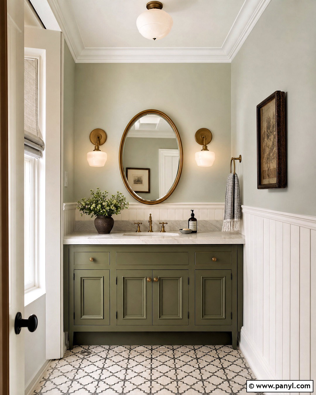
A powder room offers the perfect setting for a richer version of the Sea Salt palette. Paint the upper walls Sea Salt SW 6204 and the vanity Oyster Bay SW 6206. Add white vertical paneling to the lower walls for brightness and architectural texture. A honed white marble vanity top, oval brass mirror, and warm brass faucet create an elegant focal point. Choose a small patterned floor tile combining cream, muted gray, and soft green. Two milk-glass sconces keep the mirror area well illuminated. Complete the room with an ivory hand towel, dark wood picture frame, and a simple leafy branch in a ceramic vase. This layered green scheme feels polished, but it remains relaxed enough for an average home.
11. Sea Salt And Homburg Gray Reading Room
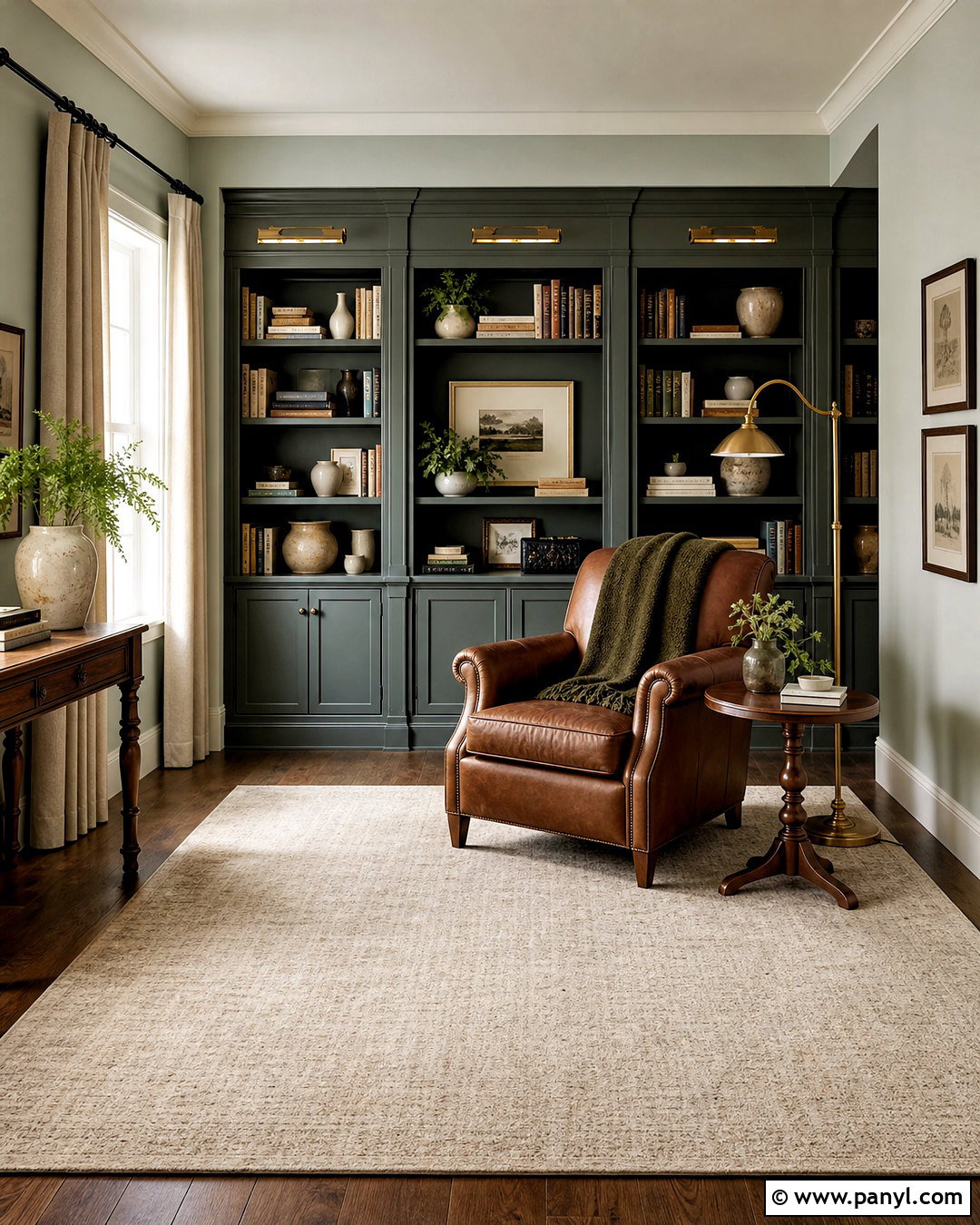
For a cozy reading room, surround Sea Salt SW 6204 walls with the deeper green-gray character of Homburg Gray SW 7622. Use Homburg Gray on floor-to-ceiling bookshelves, a window seat base, or a compact fireplace wall. Cream trim and a pale ceiling keep the darker cabinetry from closing in the space. Furnish the room with a caramel leather chair, matching ottoman, and small walnut side table. Add an ivory wool rug and textured oatmeal curtains for softness. Antique brass library lights help the built-ins feel established rather than trendy. Style shelves with books, cream pottery, and a limited number of framed photographs. A moss green throw can connect the two paint shades while making the chair especially inviting.
12. Sea Salt And Cityscape Bedroom
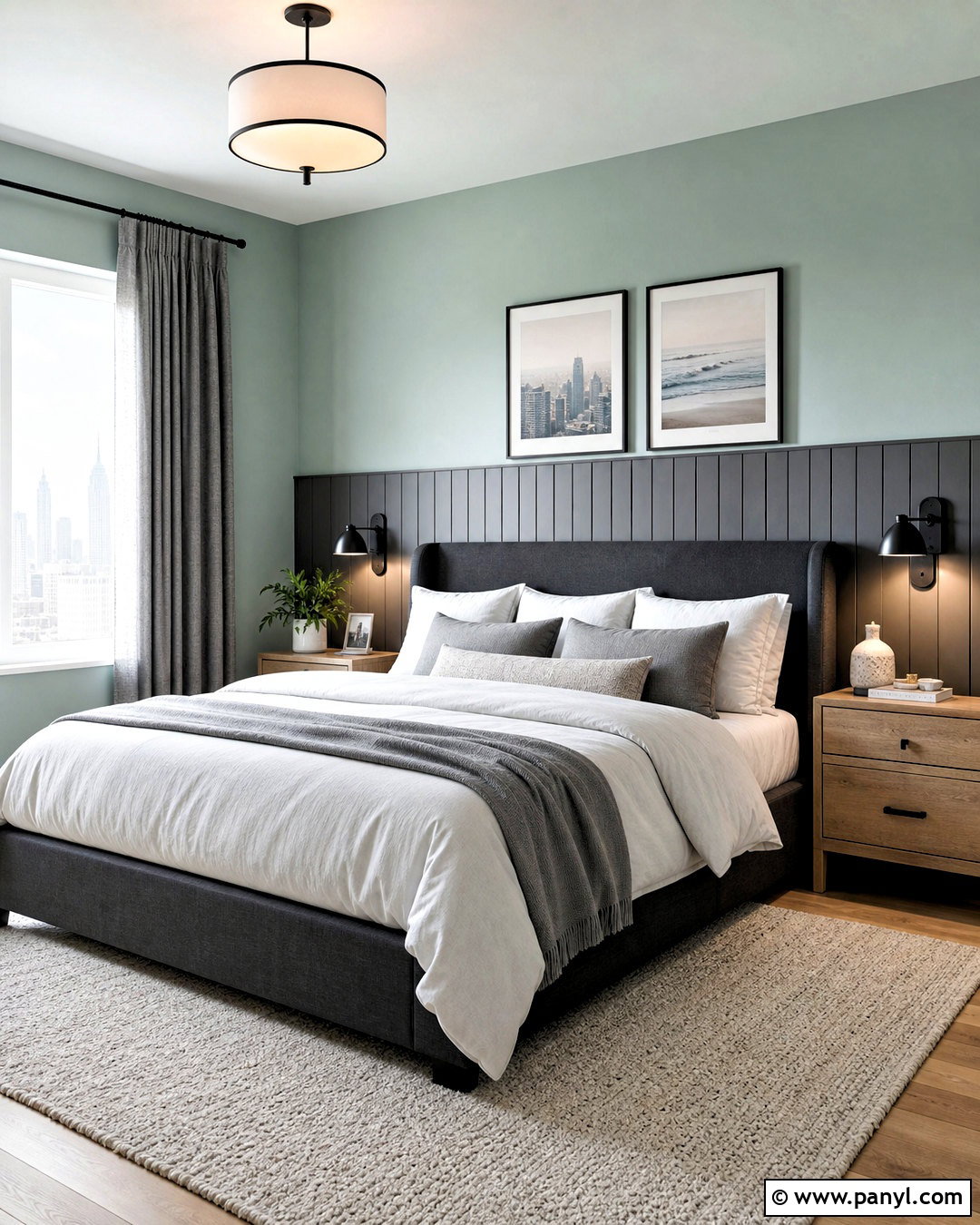
Sea Salt does not have to look coastal. Combine Sea Salt SW 6204 walls with Cityscape SW 7067 on a paneled headboard wall for a clean, contemporary bedroom. Use crisp off-white on the ceiling and trim, then bring in a low-profile charcoal upholstered bed. Bedding in white, pale gray, and muted green creates a layered look without unnecessary pattern. Choose light oak nightstands to warm the cool paint palette. Matte black sconces, slim curtain rods, and simple picture frames provide modern definition. A large ivory rug softens the room and prevents the graphite accent from dominating. Finish with gray linen curtains and one sculptural ceramic vase. The overall design feels streamlined, comfortable, and suitable for either a primary or guest bedroom.
13. Sea Salt And Accessible Beige Family Room

When Sea Salt appears too cool beside existing flooring, Accessible Beige SW 7036 can create a warmer bridge. Use Sea Salt SW 6204 on the main walls and Accessible Beige in an adjoining hallway, on built-in cabinetry, or around the fireplace. Choose a warm ivory sectional with washable fabric for everyday comfort. Add a camel-colored ottoman, light oak media console, and large beige-and-gray patterned rug. Woven wood shades and cream curtains add layered window treatment without blocking daylight. Accent pillows can combine muted green, tan, and dusty blue in simple patterns. Black metal lamps provide a small amount of contrast. This palette works especially well in a busy family room because it feels colorful and inviting while remaining neutral enough for practical furnishings.
14. Sea Salt And Natural Linen Nursery
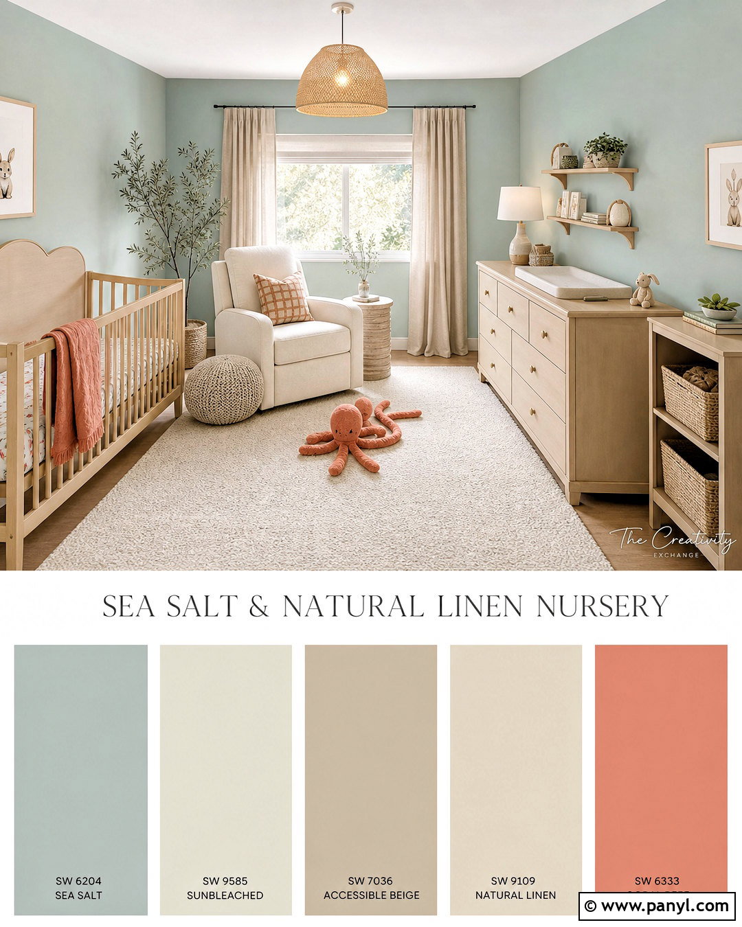
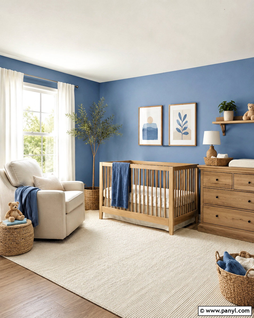
A soft nursery can feel peaceful without depending on a predictable theme. Paint the walls Sea Salt SW 6204 and use Natural Linen SW 9109 on a low dresser, bookcase, or wide horizontal stripe. Finish the trim, doors, and ceiling in warm white. Select a natural maple crib, cream upholstered glider, and oatmeal curtains with blackout lining. A washable ivory rug with a subtle beige pattern keeps the floor comfortable. Introduce muted coral through a throw pillow, storage baskets, and one framed print for gentle warmth. Keep larger surfaces quiet so the room can change as the child grows. Rounded wood shelves, woven bins, and a soft linen pendant complete this organized nursery while maintaining a calm, gender-neutral palette.
15. Sea Salt And Repose Gray Open Floor Plan
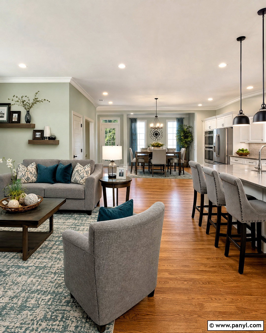
Connecting multiple spaces requires colors that change gently from room to room. Use Sea Salt SW 6204 in the living area and Repose Gray SW 7015 across the nearby kitchen or dining walls. Unify both zones with the same soft white trim, medium oak flooring, and brushed nickel fixtures. In the living room, choose a warm gray sofa, ivory chairs, and a pale blue-green rug. Repeat the sofa color through kitchen counter stools or dining chair upholstery. A white kitchen with gray quartz countertops keeps the transition balanced. Introduce black in small amounts through pendant lights and window frames. Consistent wood tones, textiles, and hardware allow each area to have its own identity while the entire open layout remains visually connected.
16. Sea Salt And Evergreen Fog Kitchen
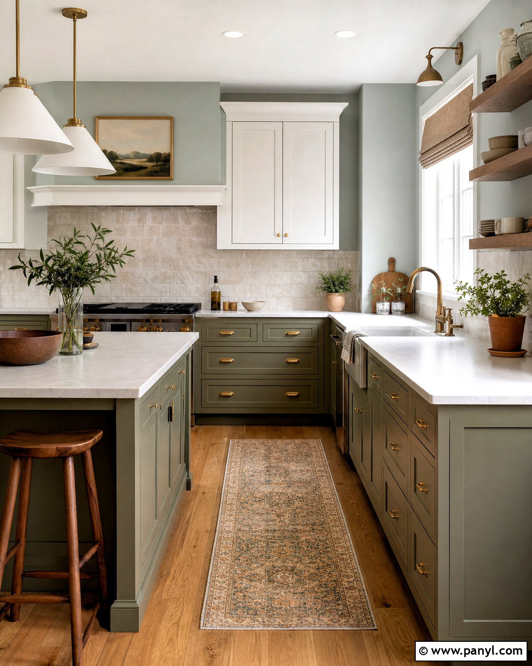
For an earthy kitchen with noticeable depth, place Sea Salt SW 6204 on the walls and Evergreen Fog SW 9130 on the lower cabinets and island. Keep upper cabinets warm white to prevent the room from feeling visually heavy. Choose creamy quartz countertops and a handmade off-white tile backsplash with subtle variation. Walnut stools, wood cutting boards, and medium oak flooring strengthen the natural character of the green palette. Use aged brass pulls and dome pendant lights for warmth. A narrow vintage-inspired runner can introduce beige, gray, and muted rust without competing with the cabinets. Finish with simple white dishes and herbs in clay pots. The combination feels organic and current while remaining easy to coordinate with common kitchen materials.
17. Sea Salt And Silvermist Bathroom
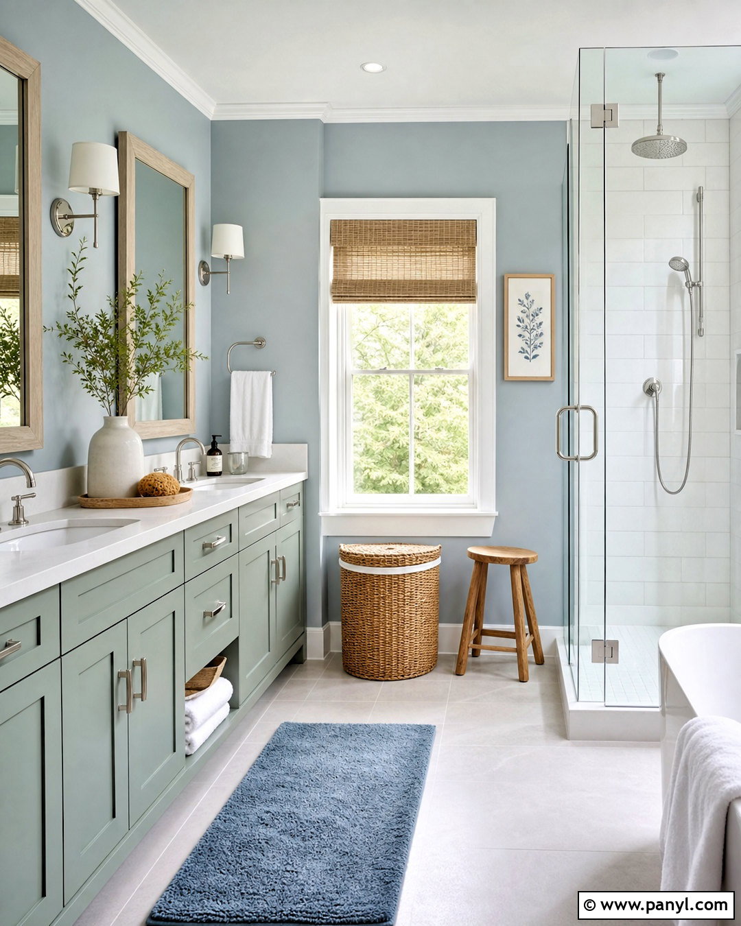
A spacious bathroom can support a cool, layered palette when texture prevents it from feeling flat. Paint the vanity Sea Salt SW 6204 and use Silvermist SW 7621 on the walls. Keep the ceiling, window trim, and doors Pure White SW 7005 for a fresh outline. Install large-format pale gray floor tile and white shower tile with light grout. A white quartz vanity top and frameless glass shower enclosure maintain an uncluttered appearance. Add warmth through a white oak mirror frame, woven hamper, and small wood stool. Polished nickel faucets reflect the cooler tones without creating harsh contrast. Finish with white towels, a muted blue bath mat, and a simple ceramic planter for a complete spa-inspired bathroom that still feels realistic.
18. Sea Salt And Greek Villa Dining Room
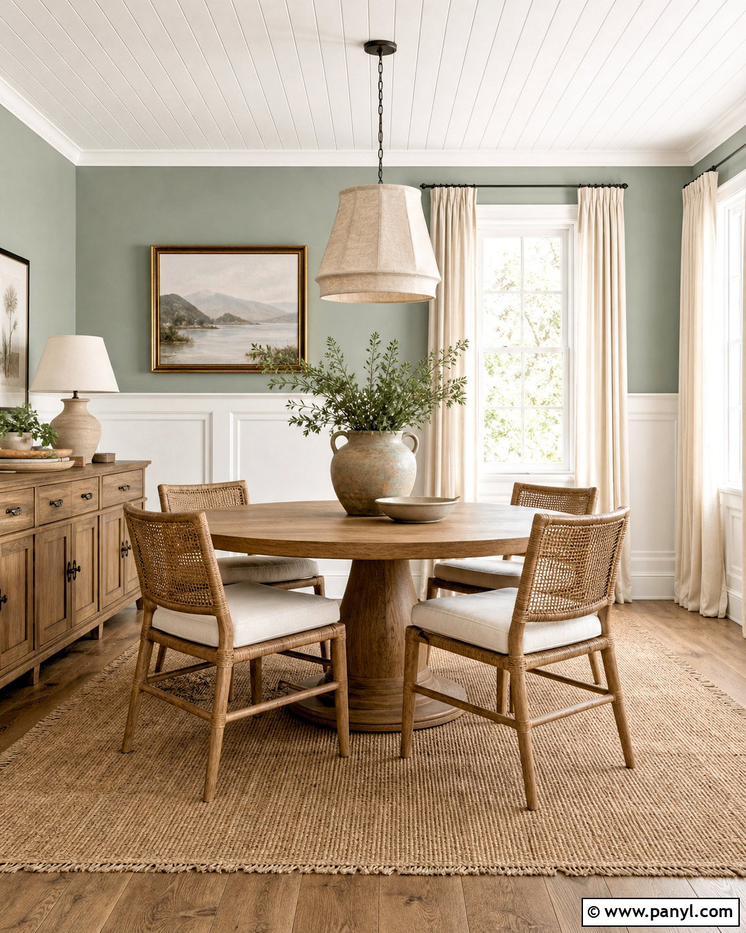
Warm whites can make Sea Salt feel softer and more traditional. Paint Sea Salt SW 6204 above a Greek Villa SW 7551 paneled wall treatment, then continue Greek Villa across the trim and ceiling. Place a round medium-oak table in the center of the room with woven-back dining chairs and cream seat cushions. A warm beige rug defines the dining area while balancing the cool upper walls. Hang a linen drum pendant or simple brass chandelier above the table. Introduce muted clay through ceramic dishes, a table runner, and understated artwork. Light-filtering ivory curtains finish the windows. This comfortable palette suits cottage and transitional homes because it blends gentle color, classic millwork, and natural materials without becoming overly themed.
19. Sea Salt And Naval Living Room
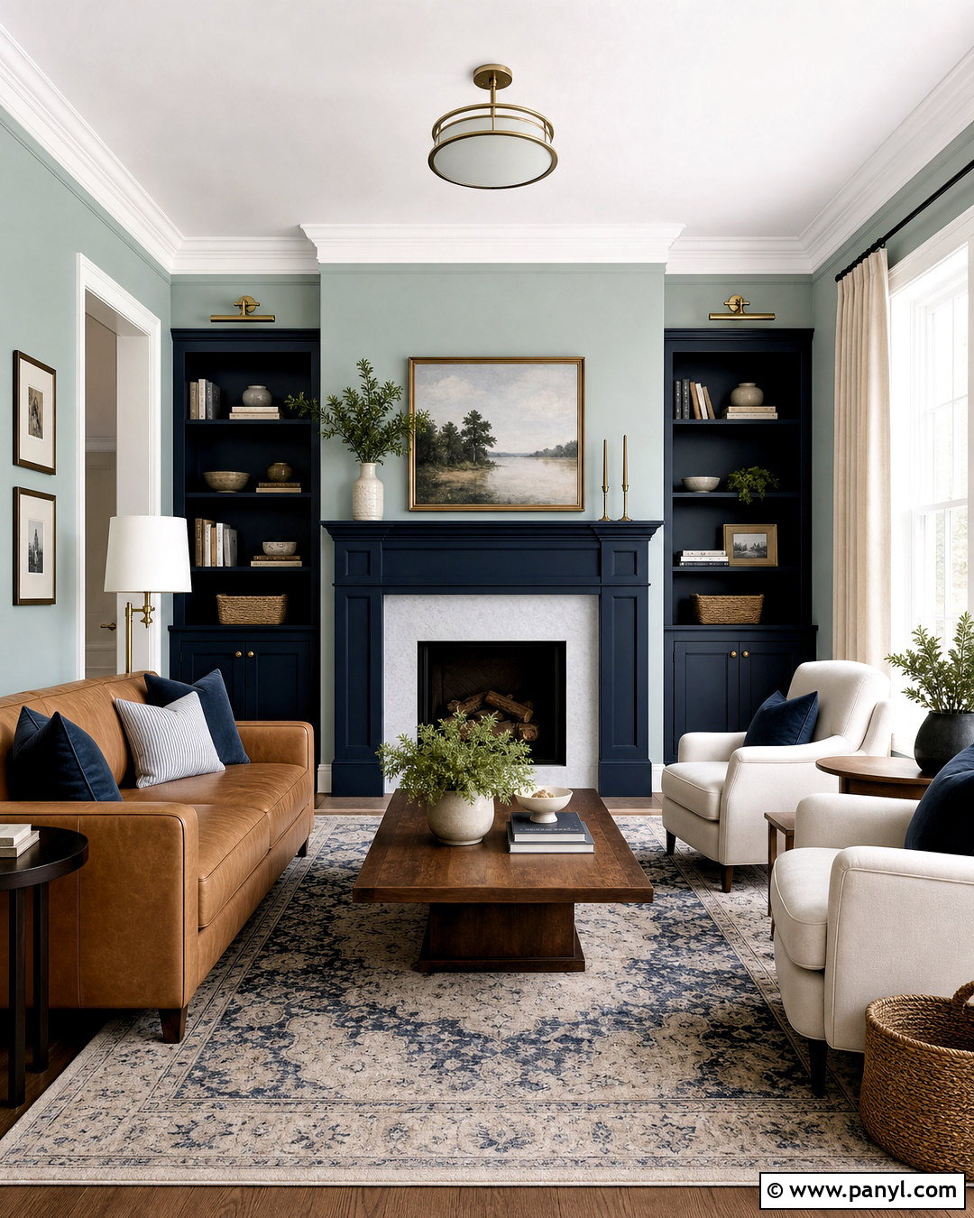
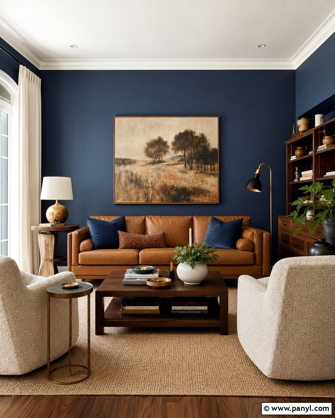
Deep navy can give Sea Salt a more structured, tailored appearance. Use Sea Salt SW 6204 on the surrounding walls and Naval SW 6244 on the fireplace, built-in cabinets, or one large focal wall. Keep the trim a balanced white for a clean separation between colors. Furnish the room with a camel leather sofa, two ivory armchairs, and a walnut coffee table. A cream rug with a subtle navy pattern connects the light and dark surfaces. Add aged brass sconces and table lamps to warm the strong blue contrast. Window treatments should remain simple, using natural linen or soft white fabric. Complete the room with blue-gray pillows, woven baskets, and restrained artwork so the striking paint combination remains the main visual feature.
20. Sea Salt Exterior Color Palette
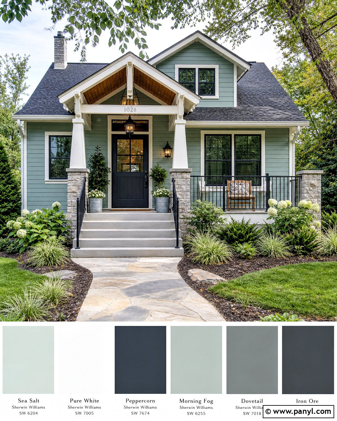
Sea Salt SW 6204 can create a welcoming exterior when paired with clean architectural accents and natural materials. Use it as the main siding color on a cottage, bungalow, or modest craftsman home. Paint the fascia, window frames, columns, and porch railings Pure White SW 7005. Choose a charcoal front door and repeat the dark tone through outdoor lighting, house numbers, and metal planters. A medium gray roof provides a practical transition between the pale siding and darker accents. Warm the exterior with a natural cedar porch ceiling or wood bench. Finish the curb view with curved planting beds, evergreen shrubs, ornamental grasses, white flowers, and a simple stone walkway. Always test exterior paint under direct sunlight before committing.
Conclusion:
The most successful 20 sw sea salt color palette ideas combine this adaptable green-blue paint with enough warmth, contrast, and texture to give the space definition. Soft whites produce an airy look, warm beige tones make it more welcoming, and deep navy or charcoal accents create a stronger modern finish. Natural oak, walnut, linen, stone, woven fibers, brass, and black metal can all support the palette when repeated with restraint. Before painting an entire room, compare samples beside the permanent flooring, countertops, tile, and furniture. View them during the morning, afternoon, and evening because surrounding light can noticeably shift the color. A thoughtful full-room plan will make Sea Salt feel intentional rather than simply pale.

Related Ideas and Inspiration:
Leave a Reply