
Natural stone offers far more color inspiration than basic beige and gray. Limestone, marble, slate, granite, travertine, and quartzite contain layered hues that can guide an entire room, from the wall color and flooring to furniture, textiles, metals, and decorative accents. Current interiors are embracing grounded neutrals, earthy greens, warm browns, clay tones, and richer blues alongside natural materials. () The secret is choosing one stone-inspired shade as the foundation, then adding supporting colors with different depths and temperatures. This creates contrast without making the space feel disconnected. Whether you prefer creamy minimalism, dramatic charcoal, or colorful marble tones, the following complete room schemes make it easier to build a balanced home using these 20 stone color palette ideas.

1. Warm Limestone Color Palette
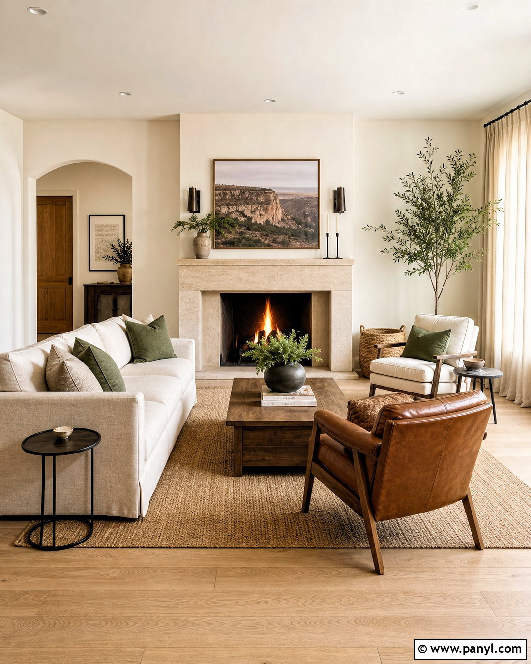
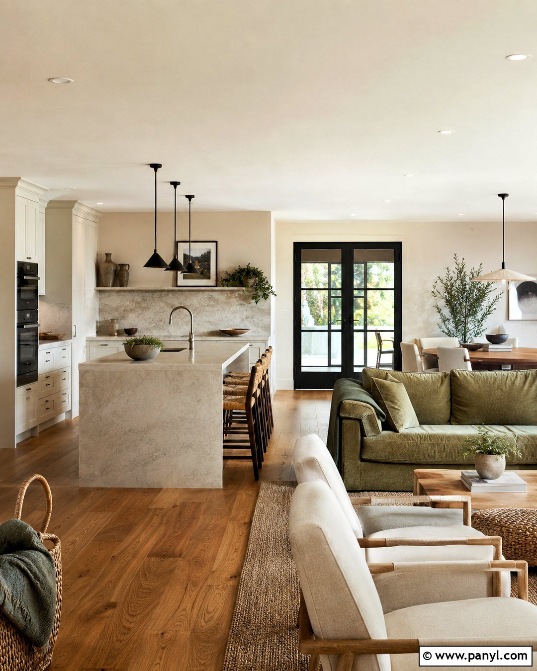
A warm limestone palette creates a living room that feels soft, sunny, and comfortably refined. Start with creamy limestone around the fireplace or across one feature wall. Paint the remaining walls warm ivory, then introduce oatmeal upholstery and a textured beige rug. Light white oak flooring and a matching coffee table keep the room relaxed instead of formal. For gentle contrast, add camel leather, muted olive pillows, and small blackened-bronze accents. Linen curtains should sit close to the wall color so the windows feel taller and brighter. Finish with handmade ceramics, woven baskets, and a leafy indoor tree. The complete palette includes ivory, limestone beige, oatmeal, camel, olive, pale oak, and dark bronze, creating a timeless space with plenty of natural warmth.
2. Travertine Beige Color Palette
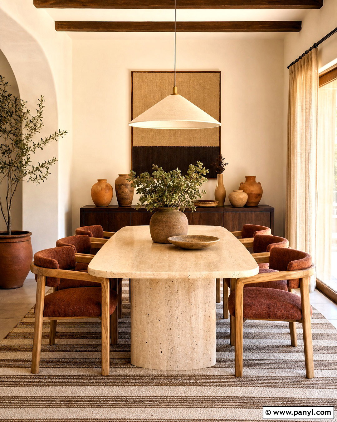
Imagine a dining room filled with sandy color, rounded forms, and subtle Mediterranean character. Use honed beige travertine flooring or a travertine-topped dining table as the visual anchor. Surround it with warm white walls, natural oak chairs, and rust-colored upholstered seats. A plaster pendant in soft cream adds sculptural interest without competing with the stone. Bring in terracotta through pottery and a low planter, then use chocolate brown for the cabinet or buffet. These deeper accents stop the beige layers from appearing washed out. Choose airy flax curtains and a flat-woven rug with cream and tan stripes. Beige travertine, warm white, oak, rust, terracotta, and chocolate form a welcoming palette that works especially well in open dining and kitchen areas.
3. Slate Gray Color Palette
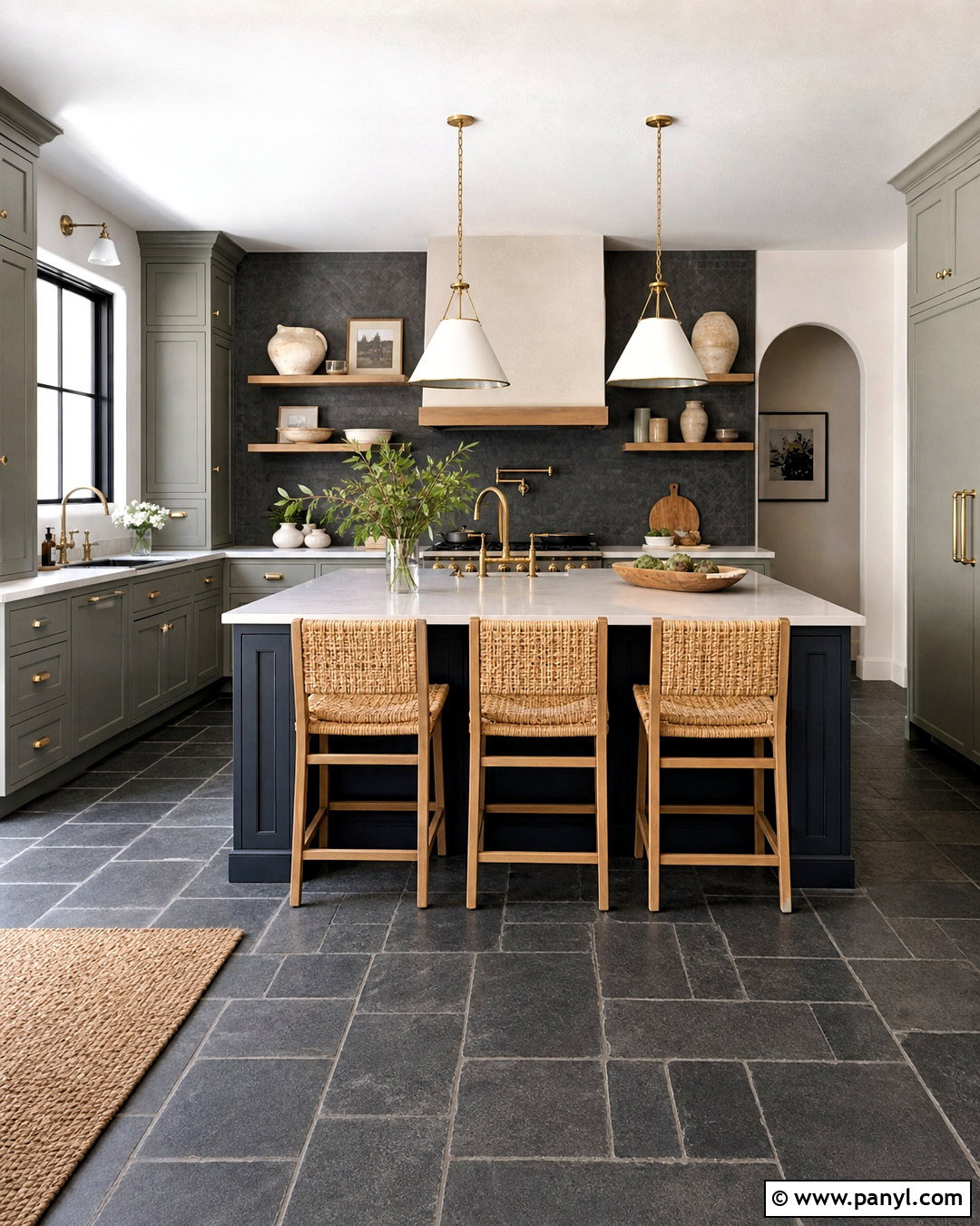
For a sophisticated kitchen, pair slate gray with warmer finishes that soften its cool, mineral appearance. Lay large-format slate tile across the floor or use a charcoal slate backsplash behind the range. Choose muted gray-green cabinets rather than matching the stone exactly. Cream quartz counters, white oak shelves, and a warm white ceiling prevent the darker surfaces from closing in the room. A deep navy island can add controlled color while maintaining the grounded mood. Use aged brass hardware and woven counter stools to introduce warmth and texture. Keep accessories simple with ivory ceramics, wooden boards, and a few herbs. The resulting palette combines charcoal slate, gray-green, navy, cream, oak, and brass in a complete kitchen that feels modern but not harsh.
4. Soapstone Charcoal Color Palette
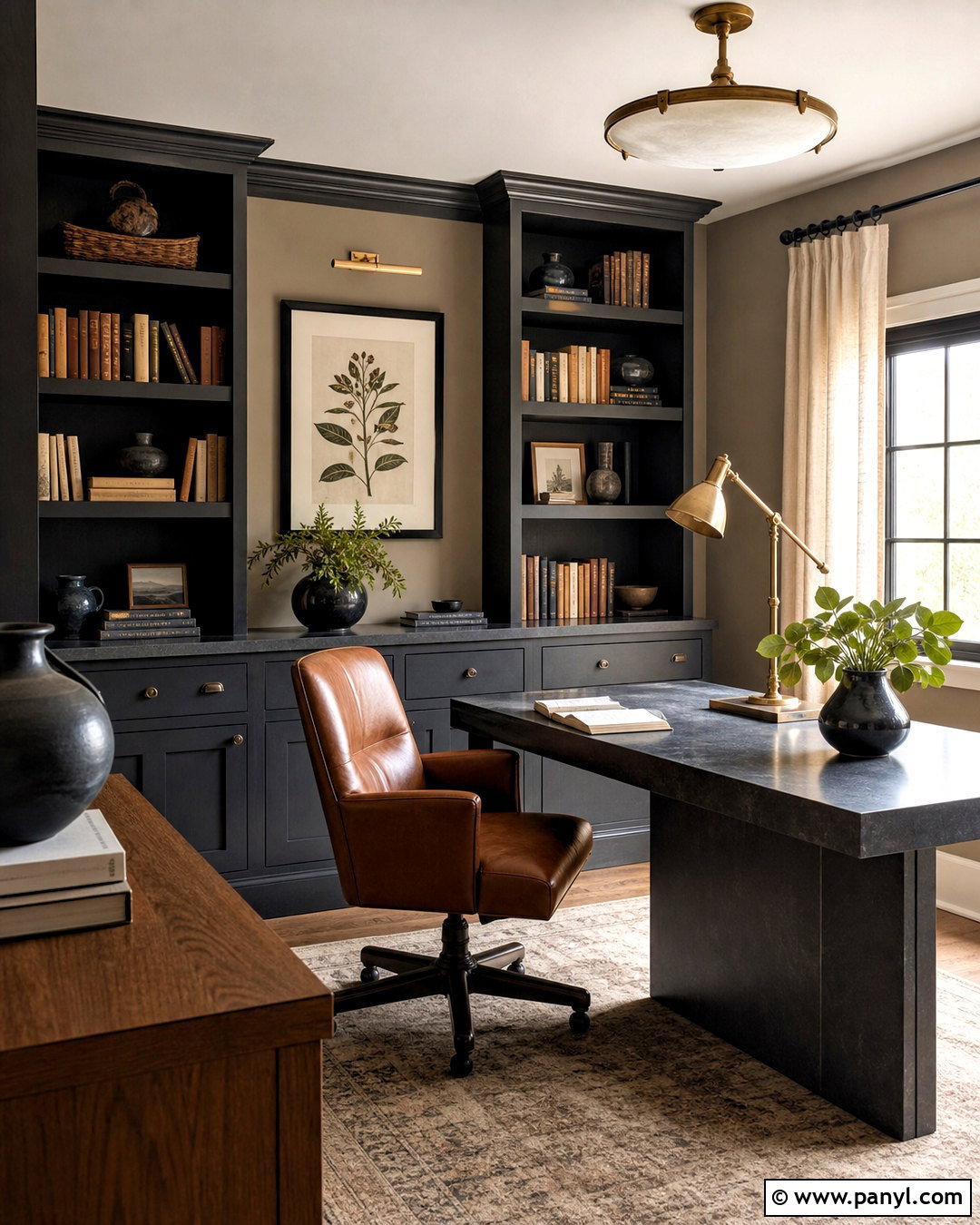
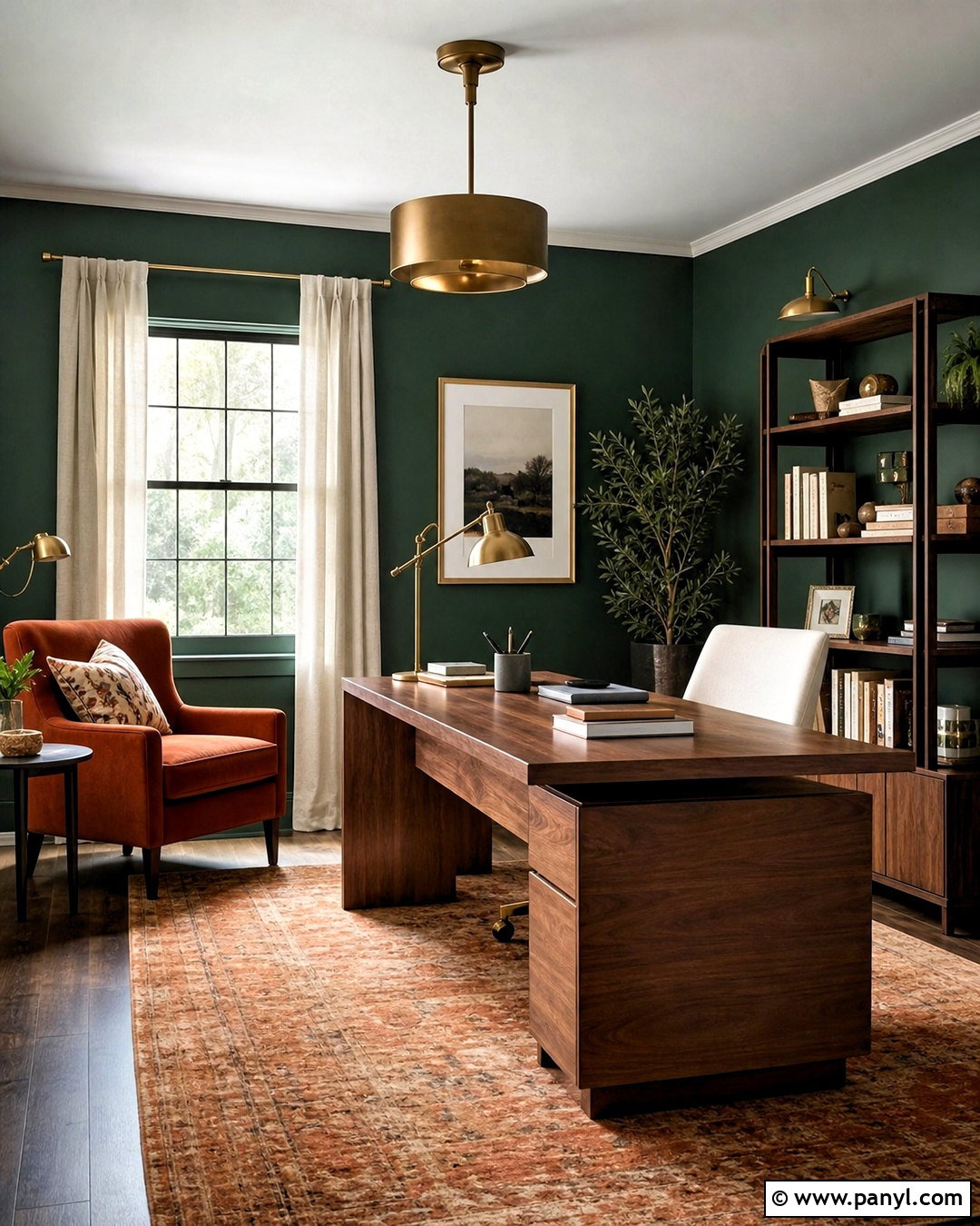
A soapstone-inspired palette gives a home office a calm, focused atmosphere with substantial visual depth. Begin with matte charcoal built-ins or a honed soapstone desktop featuring delicate pale veining. Paint the walls a softened mushroom taupe to create separation without strong contrast. A walnut desk, cognac leather chair, and brown wool rug bring out the warmer undertones in the dark stone. Add aged brass lighting for a subtle glow and use off-white linen at the windows. Books, black ceramic vessels, and framed botanical artwork can complete the shelves without creating clutter. This charcoal, mushroom, walnut, cognac, brass, and ivory combination feels grounded and professional. It is especially effective in rooms with good daylight, where the varied textures remain clearly visible.
5. Carrara Marble Color Palette
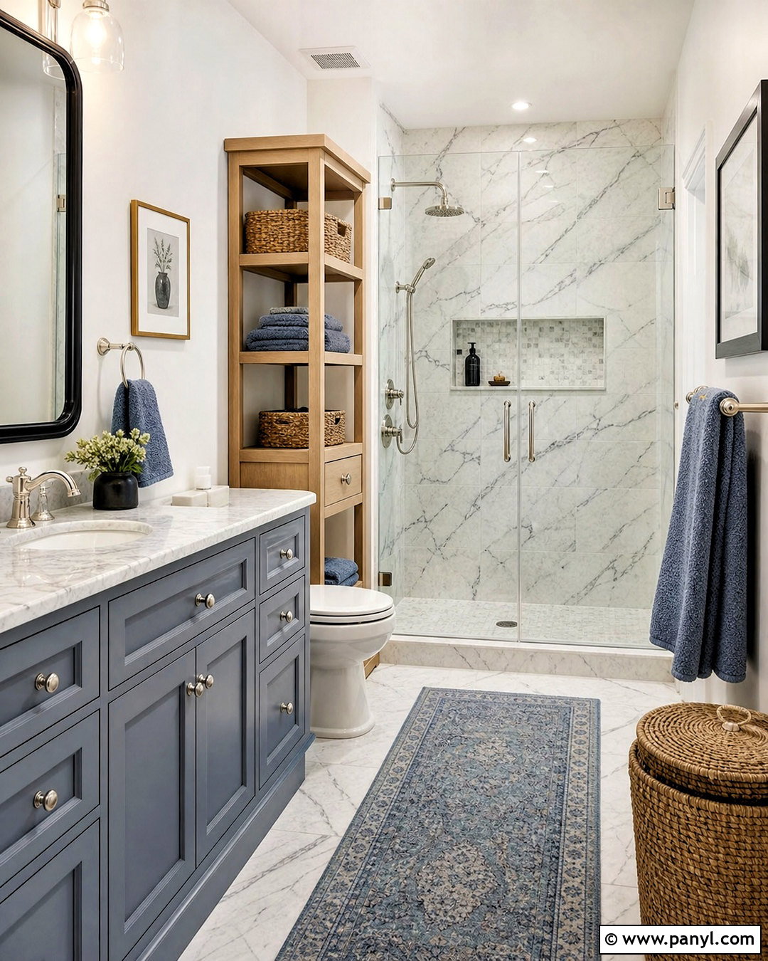
Carrara marble can inspire a bright bathroom without forcing every surface to become cold white. Use the marble on the vanity top, shower walls, or floor, then pull its blue-gray veining into a softly painted vanity. Choose warm white walls and polished nickel fixtures for a clean transition between colors. Pale oak storage and a woven hamper add warmth, while dusty blue towels deepen the cool side of the palette. Keep the shower curtain or window treatment in simple white linen. A small amount of charcoal, perhaps through mirror frames or floor details, gives the pale room definition. The full scheme of marble white, blue-gray, dusty blue, warm white, pale oak, nickel, and charcoal feels fresh, practical, and quietly elegant.
6. Taj Mahal Quartzite Color Palette
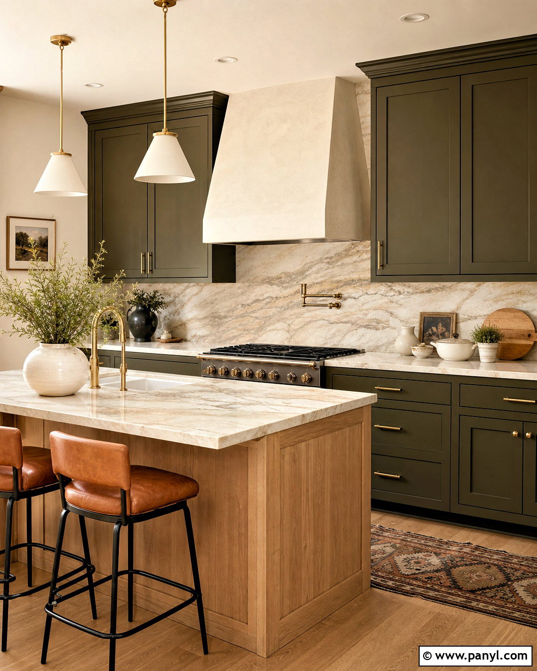
Warm beige quartzite works beautifully in a kitchen designed around natural, inviting colors. Make Taj Mahal quartzite the focal surface on the counters and backsplash so its creamy base and gentle tan veining remain visible. Pair it with dark olive cabinets for depth and a white oak island to break up the stronger color. Warm ivory walls will connect the stone to the ceiling without creating a sharp boundary. Choose aged brass hardware, caramel leather stools, and softly textured linen shades. A medium oak floor completes the earthy foundation. Keep countertop accessories in cream ceramic and dark wood. The coordinated palette of ivory, beige quartzite, olive, caramel, oak, and brass gives the kitchen richness while remaining calm enough for everyday family living.
7. Green Marble Color Palette
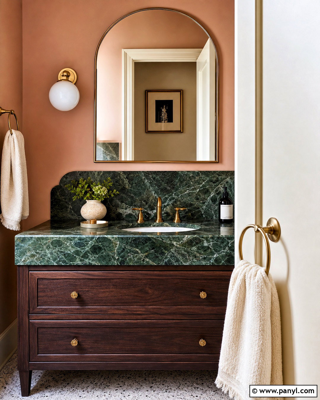
Could green marble become the starting point for an elegant powder room? Use it as a compact vanity top, backsplash, or lower wall treatment where the veining can be appreciated up close. Paint the upper walls muted blush rather than plain white, creating a soft complementary contrast with the green. Choose a dark walnut vanity and aged brass faucet to emphasize the stone’s warmth. Cream trim and a pale terrazzo floor keep the small room bright. Add one simple globe sconce, an arched brass mirror, and folded ivory towels. Avoid excessive accessories because the marble already provides movement. Forest green, moss, blush, cream, walnut, and brass create a colorful yet balanced palette that makes a practical powder room feel distinctive and complete.
8. Sandstone Tan Color Palette
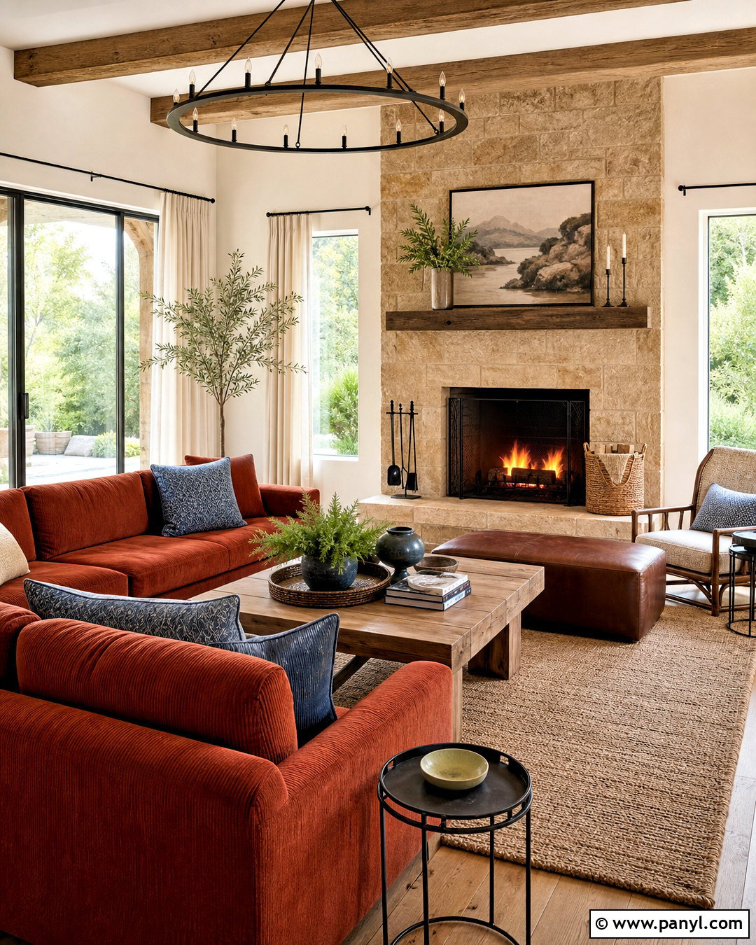
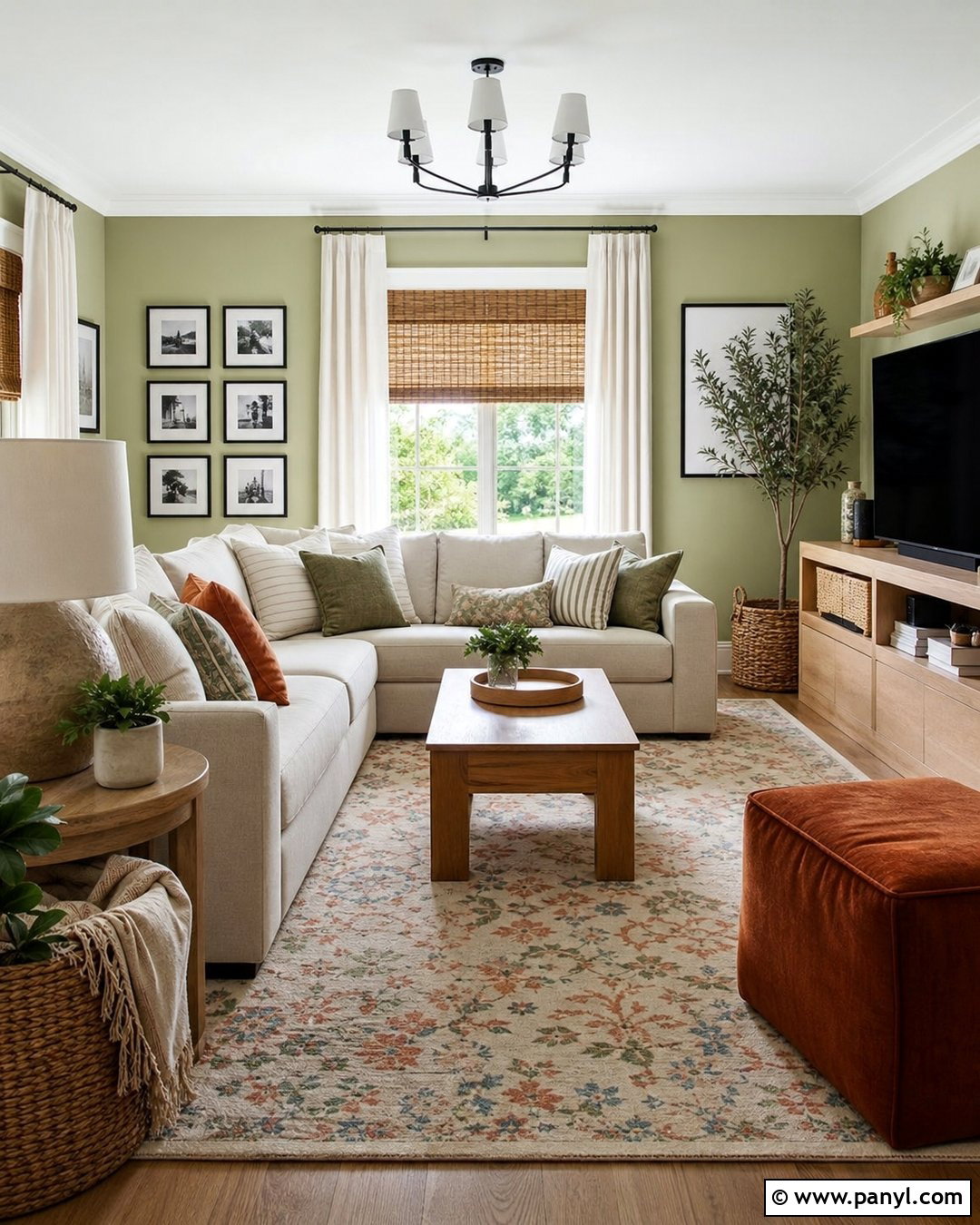
A sandstone palette is ideal for a family room that needs to feel relaxed, durable, and connected to the outdoors. Build the look around a tan sandstone fireplace with irregular blocks and warm beige mortar. Paint the walls a sandy off-white and select a deep rust sectional that stands out without feeling overly bright. Add a large natural jute rug, oak coffee table, and tobacco leather ottoman. Muted blue pillows provide a small amount of cooler contrast, while cream curtains maintain the room’s light quality. Use black metal sparingly through the fireplace tools and lighting. The complete palette combines sandstone tan, sandy white, rust, tobacco, oak, muted blue, and black, delivering a comfortable gathering space with plenty of color and practical texture.
9. River Stone Gray Color Palette
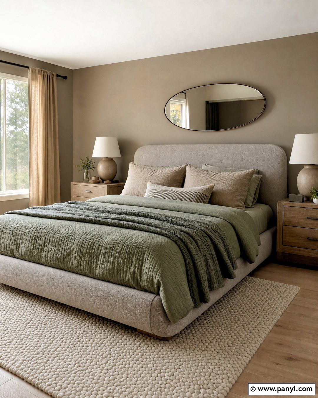
Smooth river stone colors can shape a peaceful bedroom that feels layered rather than plain. Choose a pebble-gray upholstered bed and paint the walls a light, warm greige. Introduce sage green through the quilt, bench, or curtains to echo moss growing beside natural rocks. Weathered oak nightstands and a creamy wool rug add gentle warmth underfoot. Use white bedding as a bright base, then layer taupe and charcoal pillows for definition. Rounded ceramic lamps and an oval mirror reinforce the softened shapes associated with river stones. Keep metal finishes in quiet brushed nickel. Pebble gray, greige, sage, taupe, cream, weathered oak, and charcoal work together as a restful palette suited to a simple, uncluttered bedroom.
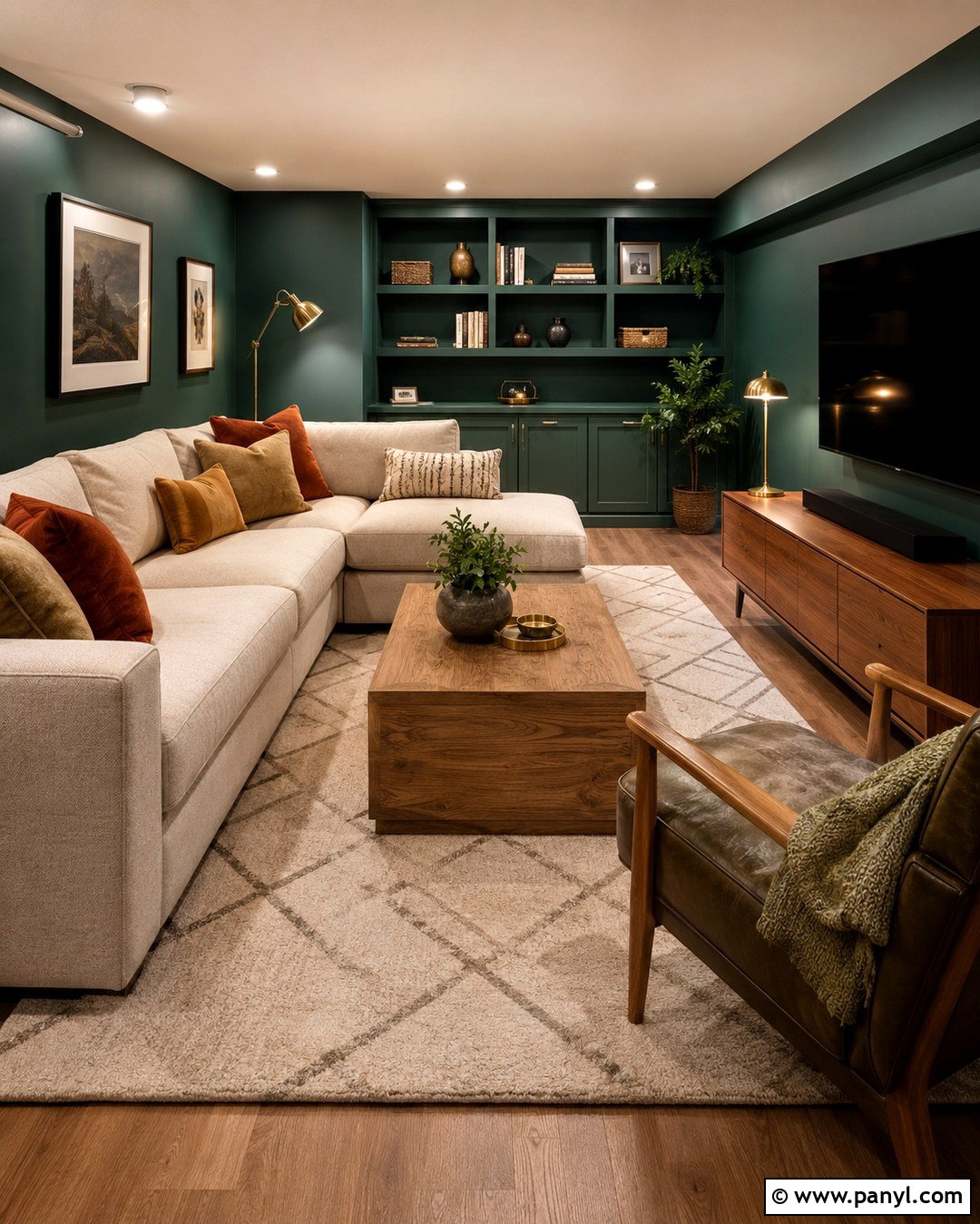
10. Black Granite Color Palette
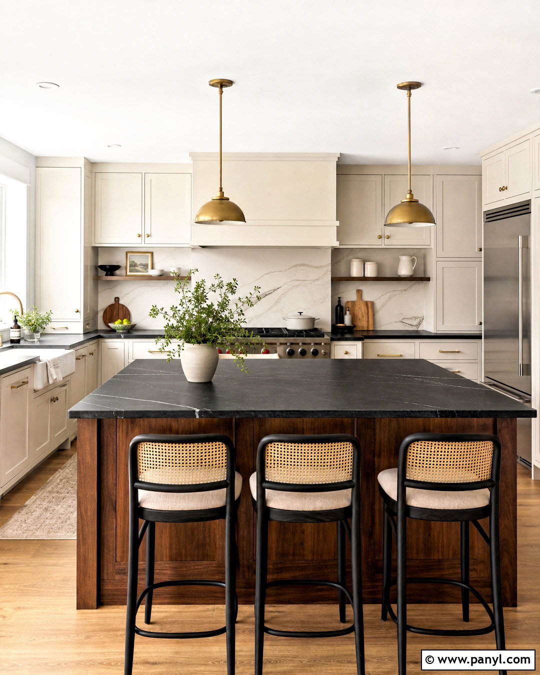
Black granite creates a dramatic kitchen when it is balanced with clear areas of light and warmth. Use polished or leathered black granite for the countertops and extend it onto a generously sized island. Choose creamy white cabinets around the perimeter, then finish the island base in medium walnut. A white backsplash with restrained gray veining keeps the cooking wall bright. Add brushed brass pendants and cabinet pulls to break up the black surfaces. Natural cane counter stools introduce a lighter texture, while warm oak flooring prevents the room from feeling stark. Keep decor limited to wooden boards, white bowls, and green branches. Black, cream, walnut, white, brass, cane, and oak create a confident kitchen palette with strong contrast and everyday livability.
11. Bluestone Color Palette
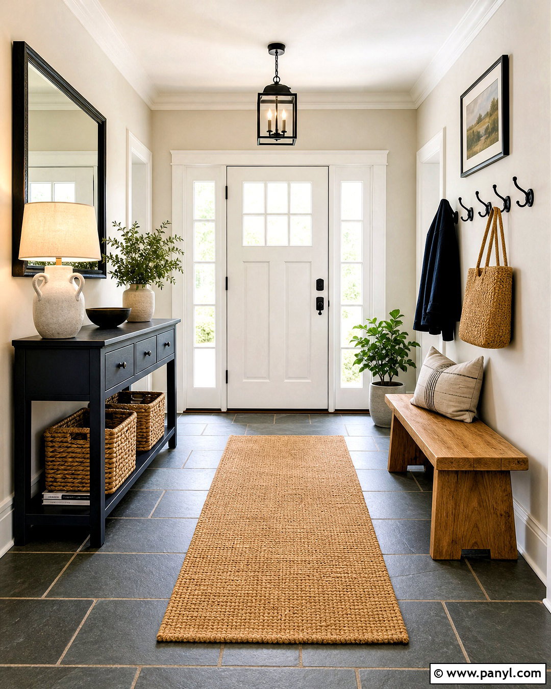
Bluestone can give an entryway a cool, tailored foundation while still feeling welcoming. Install blue-gray stone tiles in a simple rectangular pattern, using medium gray grout to make maintenance easier. Paint the walls a warm white and add a navy console with clean lines. A natural oak bench and woven baskets soften the cool floor and provide useful storage. Bring in muted ochre through a runner or small upholstered cushion for unexpected warmth. Matte black hooks and a black-framed mirror define the functional areas without overwhelming the narrow space. Finish with a ceramic lamp and simple greenery. The palette of blue-gray stone, navy, warm white, oak, ochre, and black turns an ordinary entrance into a complete and practical transition space.
12. Amber Onyx Color Palette
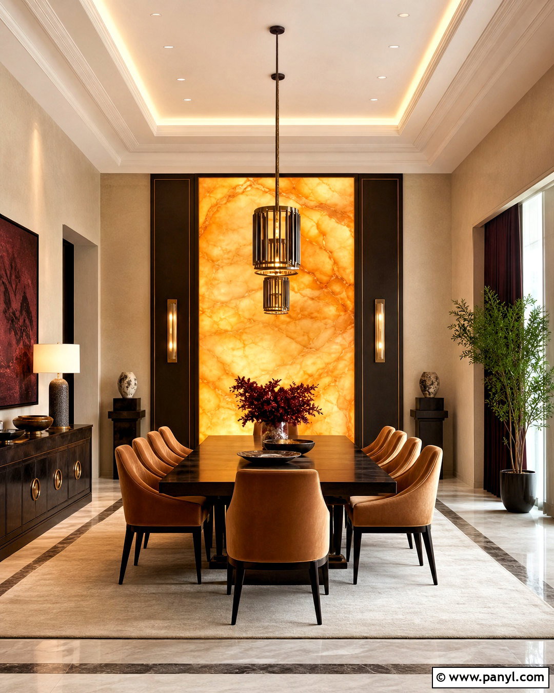
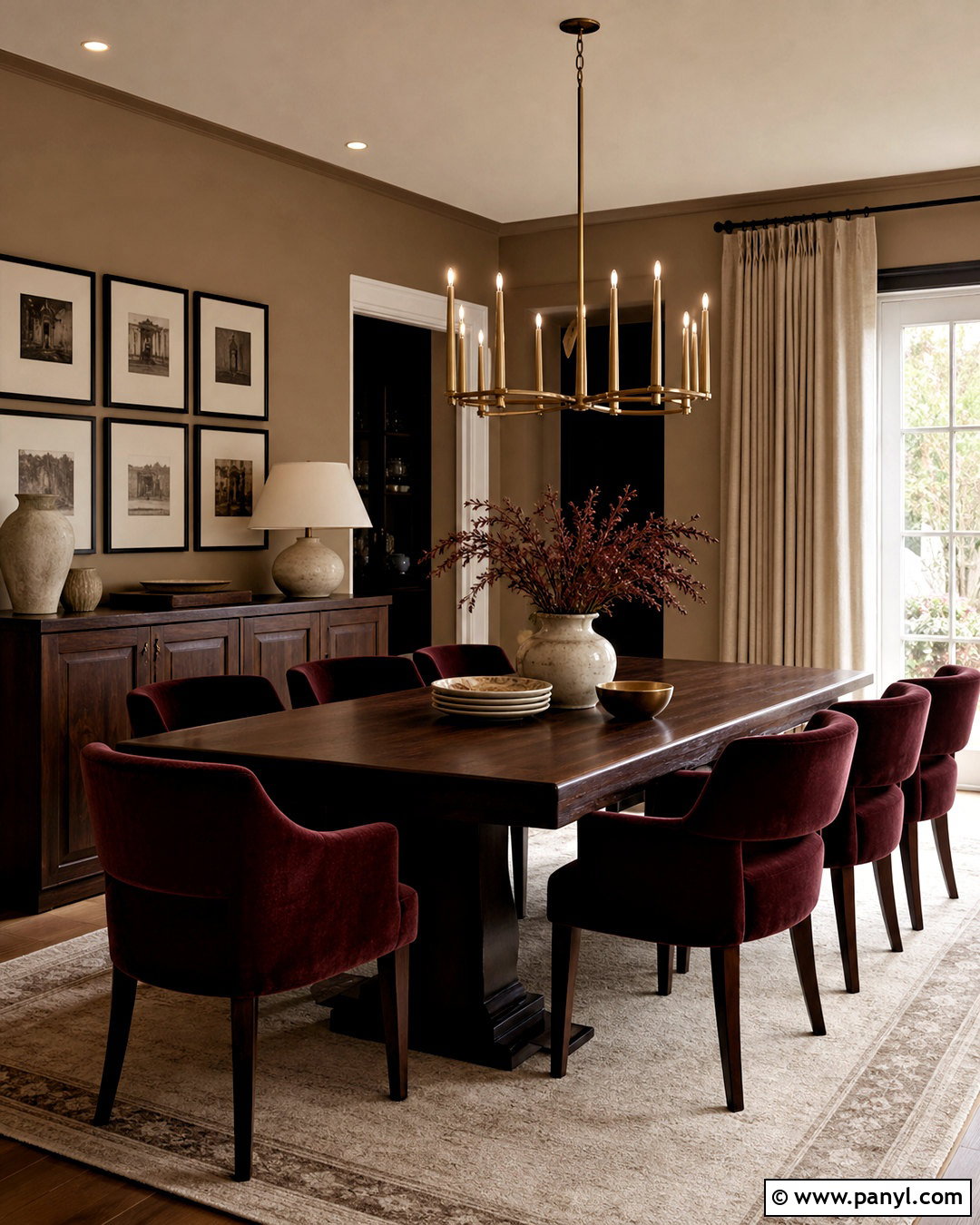
Amber onyx inspires a luxurious dining room filled with honey, caramel, and deep brown tones. Use a softly illuminated onyx panel behind a sideboard or choose a dining table with a restrained amber stone top. Paint the walls creamy beige and add espresso-stained wood furniture to frame the glowing stone color. Upholster the chairs in caramel velvet or textured golden tan fabric. A large ivory rug keeps the arrangement light, while bronze lighting adds a deeper metallic finish. Introduce small touches of burgundy through artwork or table linens for richness. Avoid cool gray, which can interrupt the warm progression. Amber, honey, caramel, cream, espresso, bronze, and burgundy produce an enveloping dining space that feels polished without becoming overly ornate.
13. Rose Quartz Color Palette
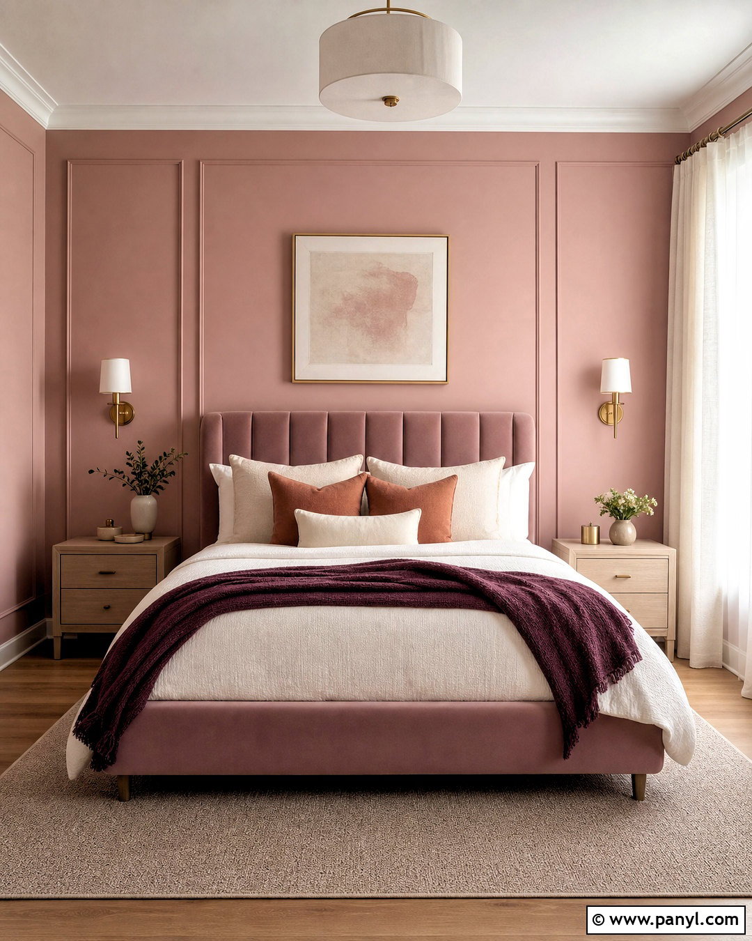
A rose quartz palette creates a gentle bedroom that feels grown-up, warm, and carefully layered. Begin with dusty rose walls or a muted pink upholstered headboard rather than a sugary pastel shade. Use ivory bedding and a light taupe rug to establish a quiet neutral base. Pale ash wood nightstands keep the scheme airy, while small rose quartz lamps or decorative objects reinforce the mineral inspiration. Add clay-colored pillows and a deep plum throw for enough contrast to define the bed. Brushed brass sconces lend warmth without making the room flashy. Finish with sheer cream curtains and minimal abstract artwork. Dusty rose, ivory, taupe, ash wood, clay, plum, and brass create a soothing retreat with both softness and visual structure.
14. Basalt Black Color Palette
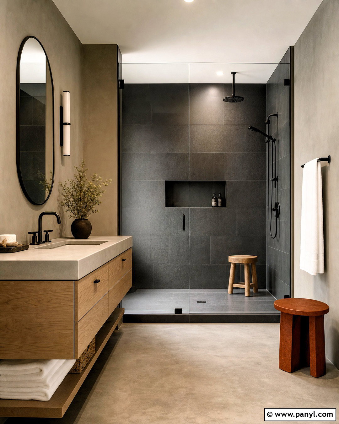
Basalt black is a strong choice for a modern bathroom with clean lines and tactile surfaces. Use dark basalt tile across the shower walls and floor, choosing a honed finish that feels softer than high-gloss black. Balance it with a floating white oak vanity and warm gray plaster walls. A pale concrete countertop introduces a lighter mineral texture, while matte black fixtures keep the visual language consistent. Add white towels, a frameless mirror, and a simple glass shower enclosure to brighten the composition. One rust-colored bath mat or stool can provide a controlled warm accent. The complete palette of basalt black, warm gray, concrete, white oak, crisp white, and rust creates a bold bathroom that remains functional, balanced, and easy to understand visually.
15. Calacatta Gold Color Palette
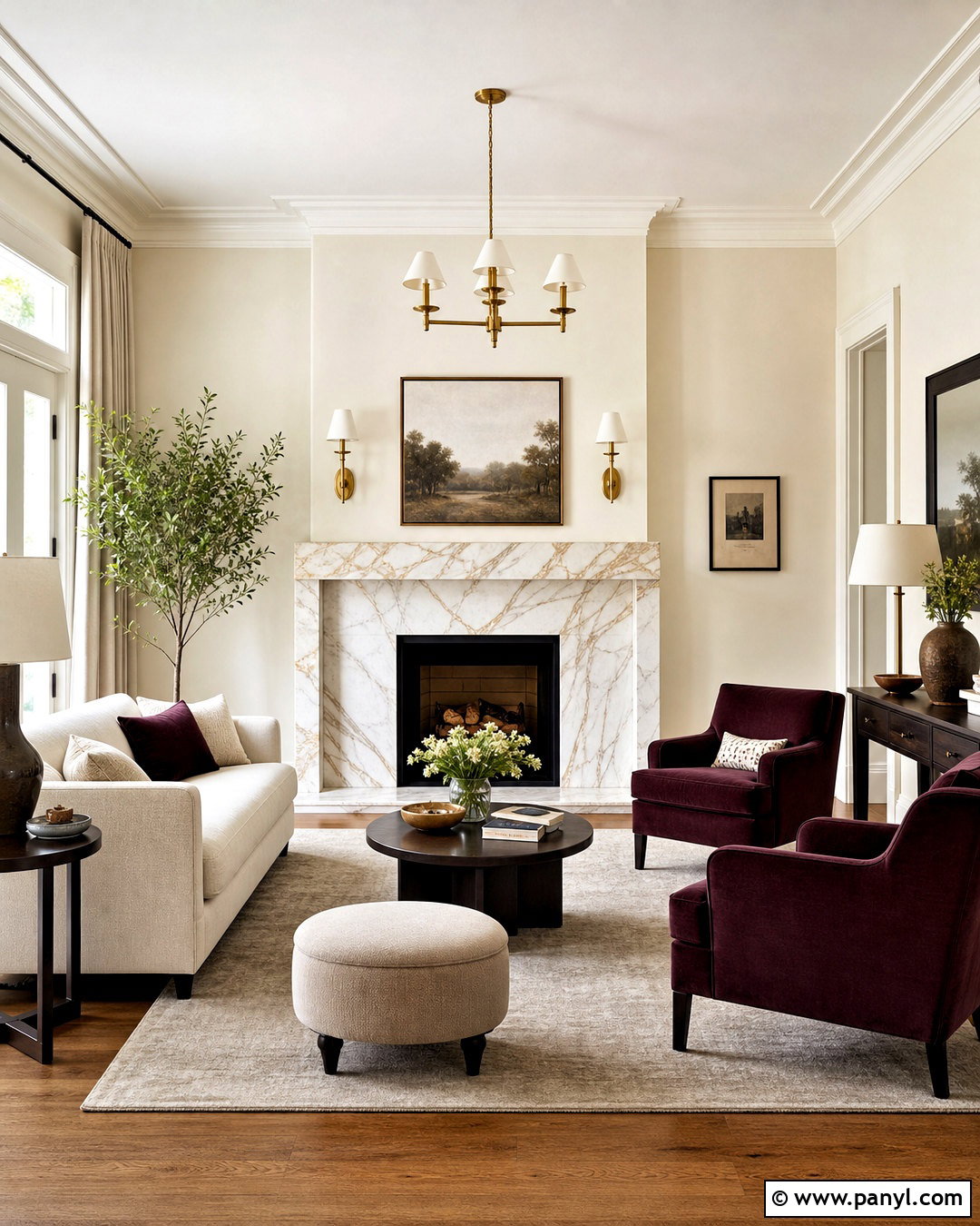
Calacatta gold marble provides an elegant base for a living room with creamy neutrals and richer accent colors. Use the stone around a streamlined fireplace, allowing its gold and gray veining to become the room’s natural artwork. Select cream walls, a soft ivory sofa, and medium oak flooring to continue the warm background. Add burgundy armchairs or pillows for depth, then repeat the marble’s warmer lines with aged brass lighting. A taupe wool rug grounds the seating arrangement without introducing another dominant hue. Dark brown side tables give the pale furniture clear definition. Cream, ivory, gold-veined white, burgundy, taupe, oak, brass, and dark brown create a polished room that feels collected, comfortable, and suitable for everyday use.
16. Red Travertine Color Palette
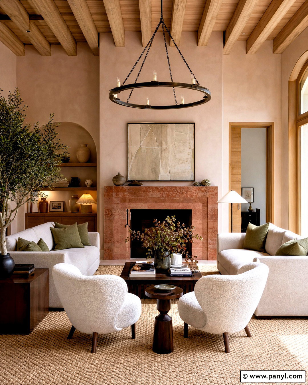
Red travertine can transform a plain entry or sitting room into a warm, earthy space with memorable color. Use the stone on a low fireplace, console top, or tiled floor, allowing its rust and dusty coral variations to remain the focal point. Paint the walls soft plaster pink for a tonal effect, then introduce cream upholstery and dark walnut furniture. Olive green cushions add a natural contrast that keeps the red tones from dominating. Choose aged bronze lighting and a woven tan rug for additional texture. White oak trim can lighten the edges of the room. The resulting palette blends red travertine, coral, plaster pink, cream, walnut, olive, tan, and bronze into a cohesive look inspired by sun-warmed landscapes.
17. Jade Stone Color Palette
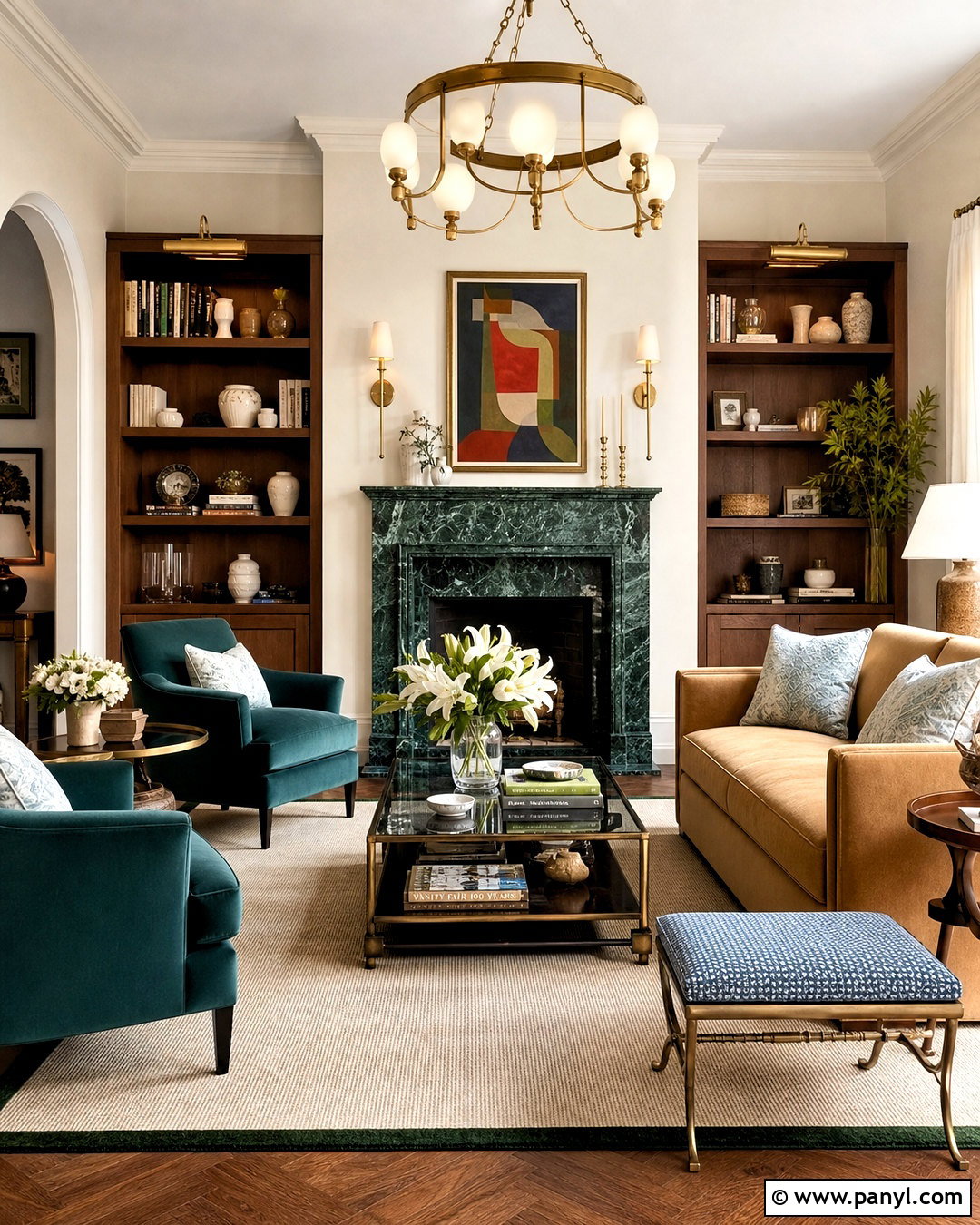
Rich jade green can support a colorful living room that still feels polished and balanced. Use green stone on the fireplace surround or choose a substantial jade-toned marble coffee table as the central feature. Paint the walls warm ivory and select a camel sofa to counter the cooler green. Add deep teal chairs for a layered, analogous color combination, then use pale blue pillows to lift the darker tones. Walnut shelving and antique brass lighting reinforce the room’s warmth. A cream rug with a subtle green border can connect the furniture arrangement. Keep decorative pieces in ivory ceramic and clear glass. Jade, teal, pale blue, camel, ivory, walnut, cream, and brass form an expressive stone palette without sacrificing comfort or visual order.
18. Brown Marble Color Palette
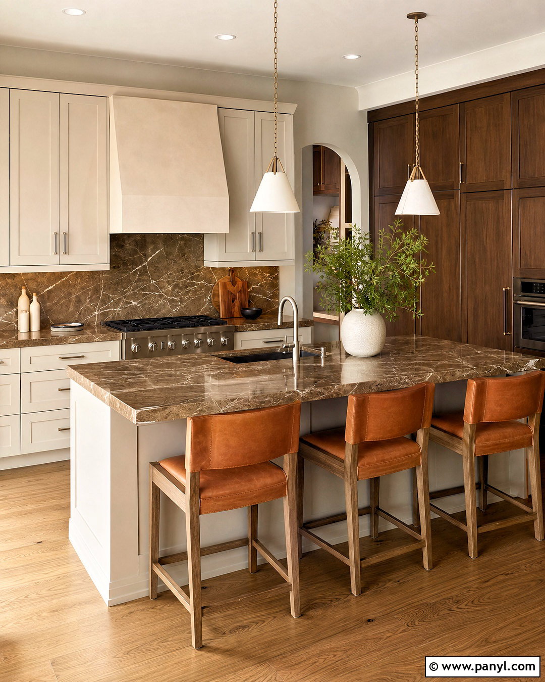
Brown marble offers a sophisticated foundation for a kitchen where warmth matters more than sharp contrast. Feature richly veined brown marble across the island and backsplash, then pair it with creamy mushroom cabinets. Choose dark walnut for tall pantry units, creating depth around the lighter central work area. Soft beige walls and a warm white ceiling prevent the brown surfaces from becoming heavy. Add brushed nickel hardware for a cooler, contemporary note and use cognac leather on the counter stools. Medium oak flooring will bridge the cabinets and stone naturally. Brown marble, caramel, mushroom, beige, walnut, cognac, oak, and nickel make the kitchen feel layered and inviting. The look works best when every finish has a slightly different texture.
19. Blue Quartzite Color Palette
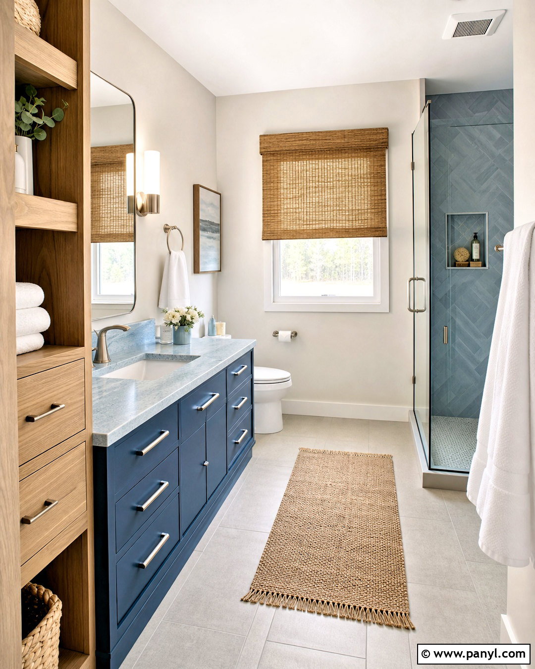
A blue quartzite palette brings quiet coastal color into a bathroom without relying on obvious nautical decor. Use pale blue quartzite for the vanity top and shower niche, highlighting its white, gray, and watery blue movement. Paint the vanity a deeper denim blue, then keep the walls warm white. White oak storage and a natural woven shade prevent the blue surfaces from appearing chilly. Choose brushed nickel fixtures, a light gray floor, and thick white towels for a clean finish. A small amount of sandy beige through a runner or stool adds warmth. Blue quartzite, denim, watery blue, white, gray, oak, nickel, and sand create a complete bathroom that feels fresh, bright, and naturally composed.
20. Fieldstone Color Palette
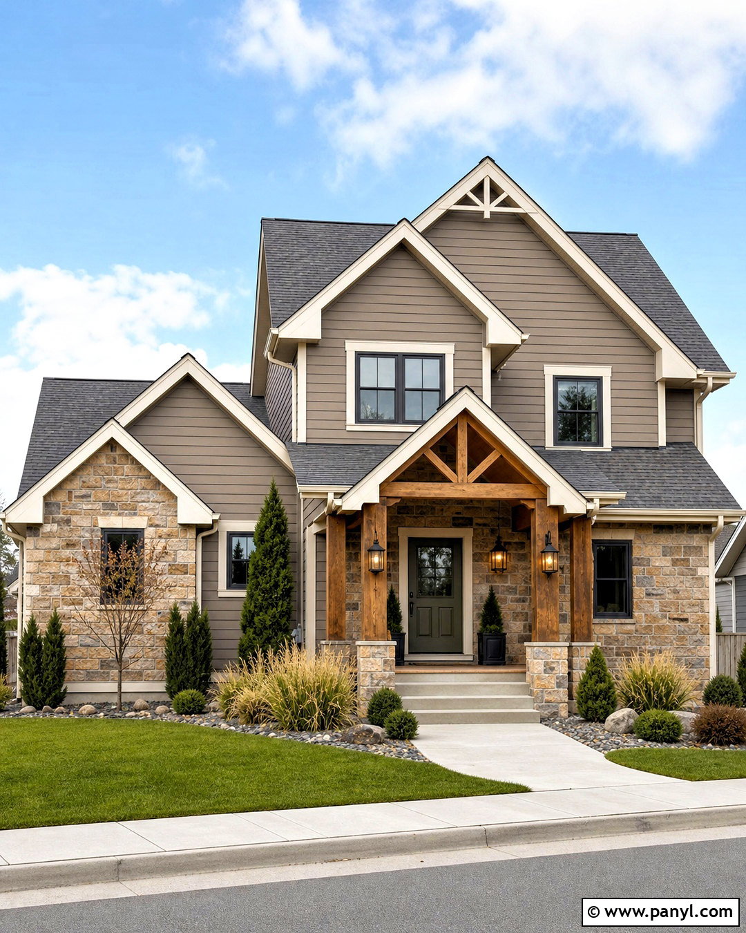
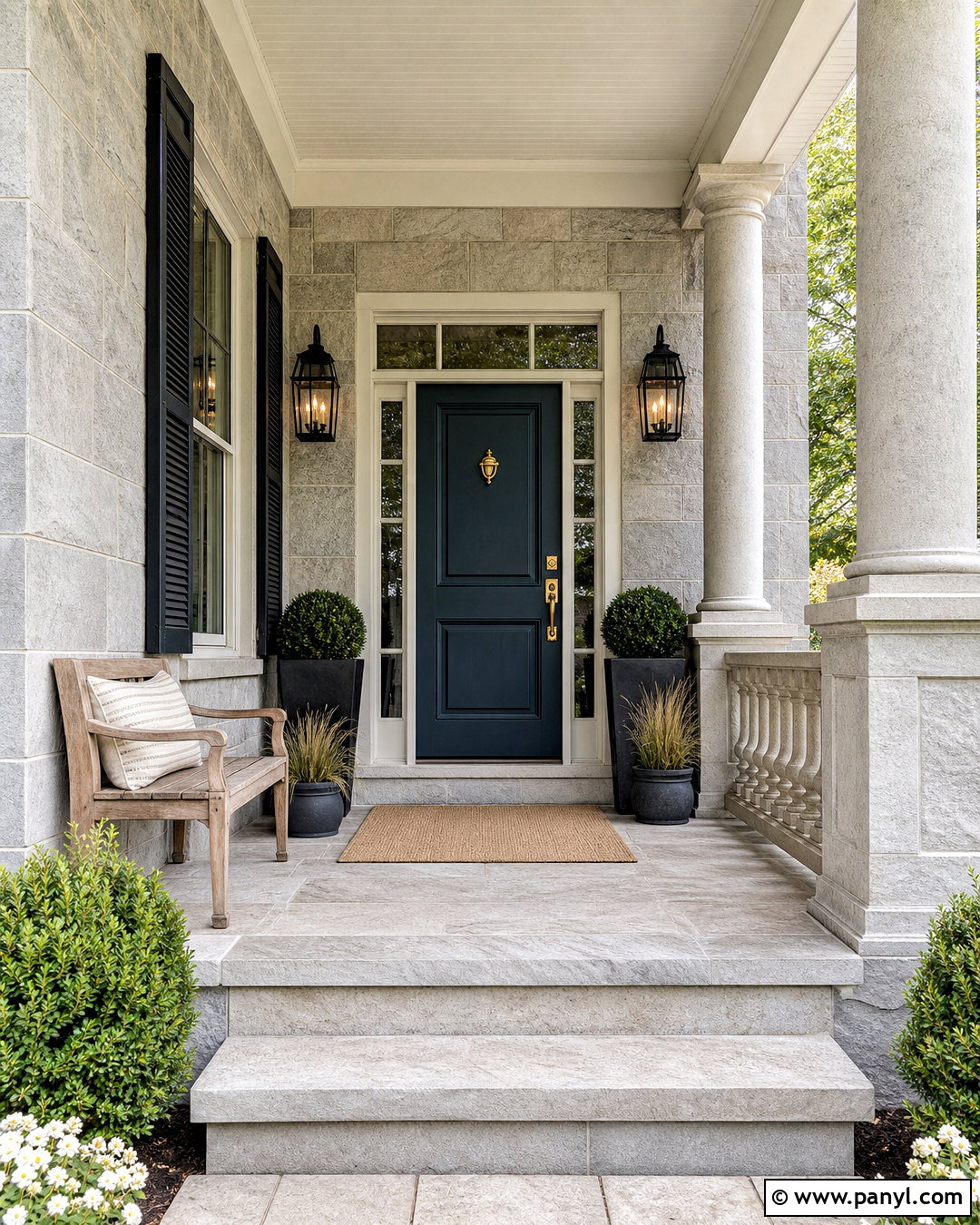
Mixed fieldstone can guide an exterior palette because its varied colors already provide a built-in design plan. Use natural fieldstone across the foundation, porch columns, or front elevation, then identify its strongest beige, gray, and brown tones. Choose warm greige siding that relates to the mortar rather than copying one stone exactly. Paint the trim creamy white and use deep olive on the front door for grounded color. A charcoal roof and bronze exterior lights add definition. Complete the curb view with cedar porch details, gravel edging, ornamental grasses, and evergreen shrubs. Fieldstone beige, warm gray, brown, greige, cream, olive, charcoal, bronze, and cedar produce a cohesive exterior that feels connected to the landscape through every season.
Conclusion:
A successful stone-inspired home does not depend on matching every finish perfectly. Instead, use the stone’s natural background, veins, and mineral markings to identify a flexible group of related colors. Choose one dominant neutral, one supporting natural tone, and one deeper accent. Then repeat those shades through furniture, textiles, wood, metal, and architectural details. Warm lighting, tactile materials, and controlled contrast will help even gray or black stone feel welcoming. Always view samples together in the actual room because daylight and surrounding finishes can shift their appearance. From creamy limestone to dramatic basalt and colorful jade, these 20 stone color palette ideas provide complete, practical schemes for building rooms and exteriors that feel balanced, natural, and thoughtfully connected.

Related Ideas and Inspiration:
Leave a Reply