
Choosing paint becomes easier when each color is viewed as part of a complete room rather than a tiny sample. These 20 Sherwin Williams paint colors cover warm whites, flexible greiges, earthy neutrals, calming greens, livable blues, and dramatic dark tones. Many appear in the brand’s collection of enduring customer favorites, while others reflect the move toward warmer, nature-inspired interiors. () For every shade below, you will find a coordinated look that includes furniture, flooring, trim, lighting, and decorative accents. Always test large samples on several walls because sunlight, artificial lighting, and nearby finishes can noticeably change a color. Use these complete room palettes to confidently explore 20 sherwin williams paint colors.

1. Alabaster Sherwin-Williams Paint Color
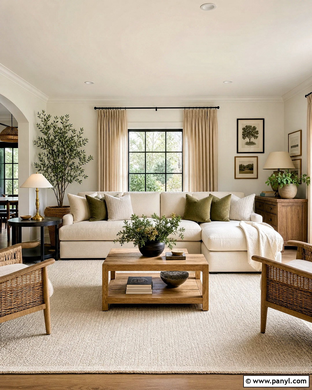
Alabaster SW 7008 creates a warm white living room that feels bright without looking cold or overly crisp. Paint the walls Alabaster and use Pure White on the trim for subtle definition. Add a cream linen sofa, light oak coffee table, woven armchairs, and an ivory wool rug to build a soft neutral foundation. Matte black curtain rods give the pale palette structure, while aged brass lamps introduce gentle warmth. Finish the room with oatmeal drapes, olive green pillows, ceramic vases, and large leafy plants. This combination works especially well with medium-toned hardwood floors. Alabaster can reflect surrounding colors, so compare samples beside your permanent flooring, stone, and upholstery before choosing the final finish.
2. Pure White Sherwin-Williams Paint Color
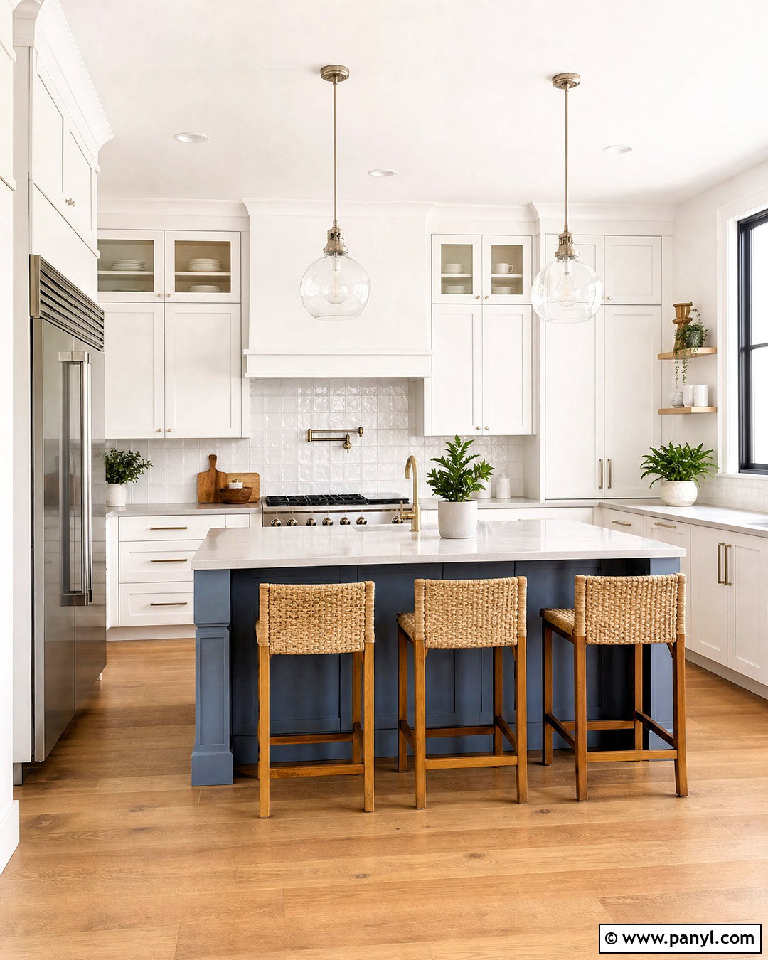
Pure White SW 7005 suits a clean kitchen where cabinetry, walls, and natural materials need to feel connected. Use it on Shaker cabinets in a durable satin finish and continue it across the walls in eggshell. A pale gray quartz countertop and handmade white backsplash keep the kitchen light, while white oak flooring prevents it from appearing clinical. Add brushed nickel hardware, clear glass pendants, and simple counter stools with woven seats. A muted blue-gray island can provide quiet contrast without overpowering the white surfaces. Complete the room with light-filtering shades and a few green plants. Because Pure White has a gentle softness, it pairs comfortably with both cool metals and warmer wood finishes.
3. Shoji White Sherwin-Williams Paint Color
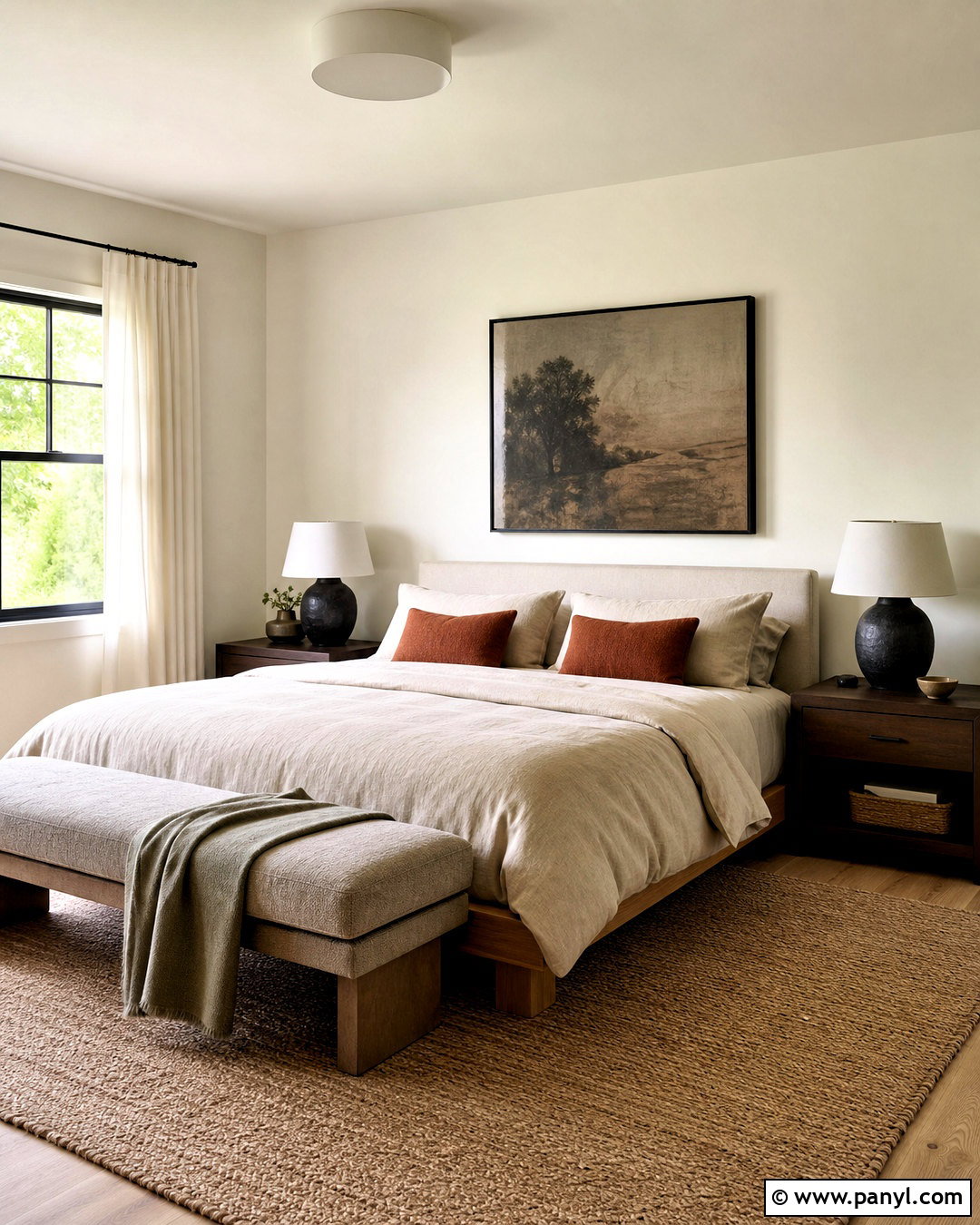
Shoji White SW 7042 gives a bedroom the comfort of cream with the versatility of a light neutral. Wrap the walls in this soft off-white, then keep the ceiling and trim slightly brighter for a clean outline. Choose a low oak bed, flax-colored linen bedding, and textured ivory curtains to emphasize its natural warmth. A taupe upholstered bench and vintage-style wood nightstands add depth without making the space busy. Bring in muted rust pillows, charcoal ceramic lamps, and black-framed artwork for balanced contrast. A large jute-and-wool rug grounds the arrangement. This complete palette is particularly effective in rooms with filtered daylight, where a stark white could feel dull or gray beside warm furniture.
4. Greek Villa Sherwin-Williams Paint Color
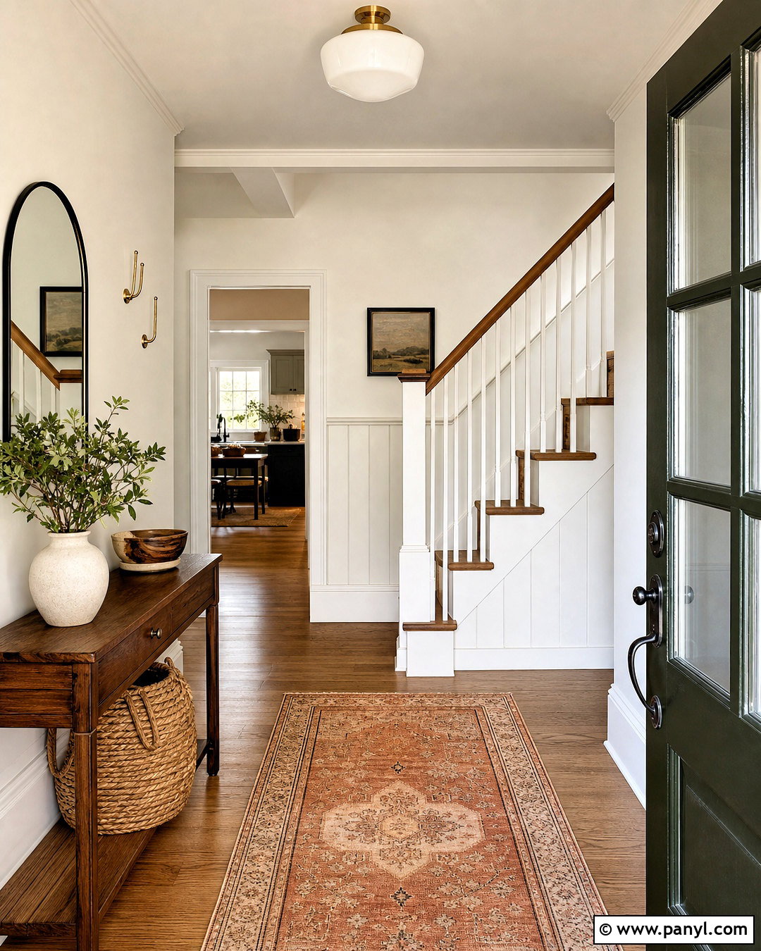
Greek Villa SW 7551 creates a welcoming entryway that bridges traditional architecture and relaxed modern decor. Paint the walls and paneled staircase in Greek Villa, using a satin sheen on millwork and an eggshell finish on flat walls. Pair the creamy white backdrop with natural oak flooring, a narrow walnut console, and an arched black mirror. A faded terracotta runner adds color and helps define the path through the space. Complete the entrance with a woven basket, ceramic table lamp, simple greenery, and brushed brass hooks. For stronger contrast, paint the interior side of the front door a deep olive green. The resulting scheme feels collected, practical, and warm rather than stark or overly formal.
5. Agreeable Gray Sherwin-Williams Paint Color
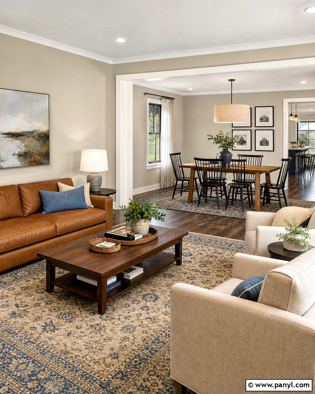
Agreeable Gray SW 7029 works well in an open-concept living and dining area because it connects warm and cool finishes. Use it continuously across the main walls, then add soft white trim to keep every transition crisp. Furnish the living zone with a camel leather sofa, two cream chairs, a walnut coffee table, and a patterned rug containing beige, gray, and faded blue. In the dining area, choose a medium oak table with black spindle chairs and a simple linen pendant. Repeat black accents through picture frames and hardware to unify both zones. Layered white curtains soften the windows. Test the color beside flooring because warm wood can reveal its beige side, while cooler daylight may emphasize gray.
6. Accessible Beige Sherwin-Williams Paint Color
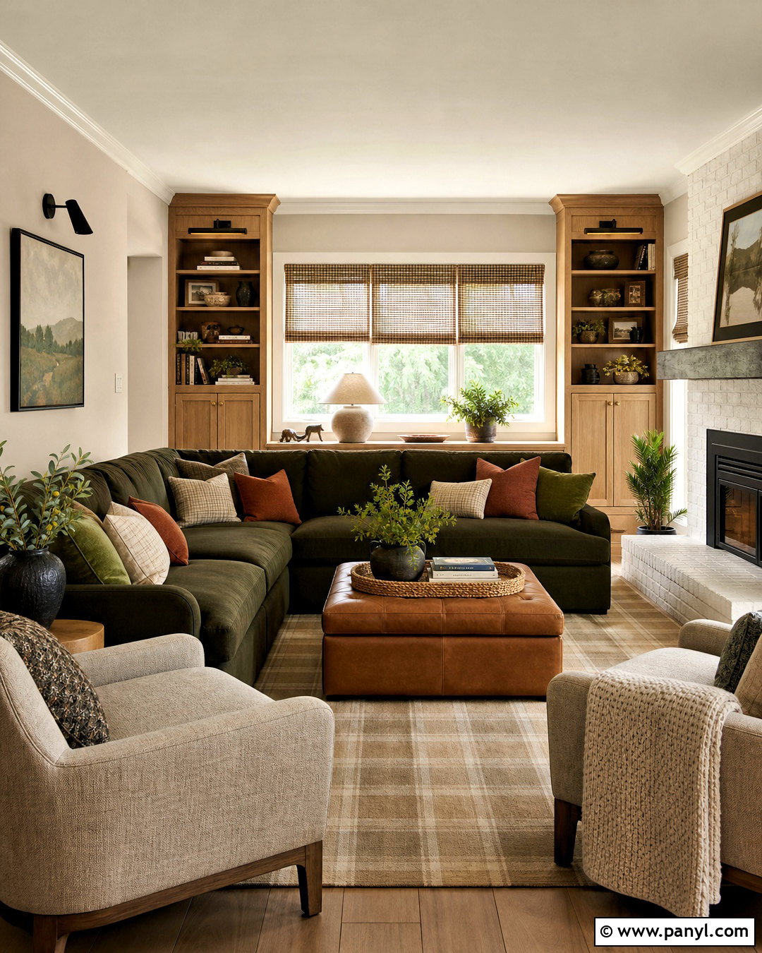
Accessible Beige SW 7036 brings warmth to a family room without the golden or orange cast associated with many traditional beige paints. Cover the walls in this balanced neutral and use creamy white trim for a smooth transition. Build the seating arrangement around a deep olive sectional, cognac leather ottoman, and two light oatmeal accent chairs. Medium oak built-ins, woven shades, and a subtle plaid rug give the room relaxed character. Add black metal sconces and dark bronze hardware to sharpen the earthy palette. Rust, moss, and ivory pillows complete the color story. This look is comfortable enough for everyday use but polished enough for entertaining, especially when natural textures are repeated around the entire space.
7. Repose Gray Sherwin-Williams Paint Color

Repose Gray SW 7015 can make a home office feel focused, open, and professionally finished. Paint the walls this light gray, then use Extra White on the ceiling, baseboards, and window trim. Position a walnut desk against the main wall and add built-in white shelving for practical storage. A charcoal upholstered chair, black task lamp, and gray-blue flat-weave rug provide clean contrast. Warm the workspace with leather desk accessories, natural baskets, and framed landscape prints. Full-length ivory curtains help soften cooler daylight and improve the room’s comfort. Repose Gray may show subtle blue or violet notes in certain exposures, so test it near the desk and in shaded corners before painting the entire office.
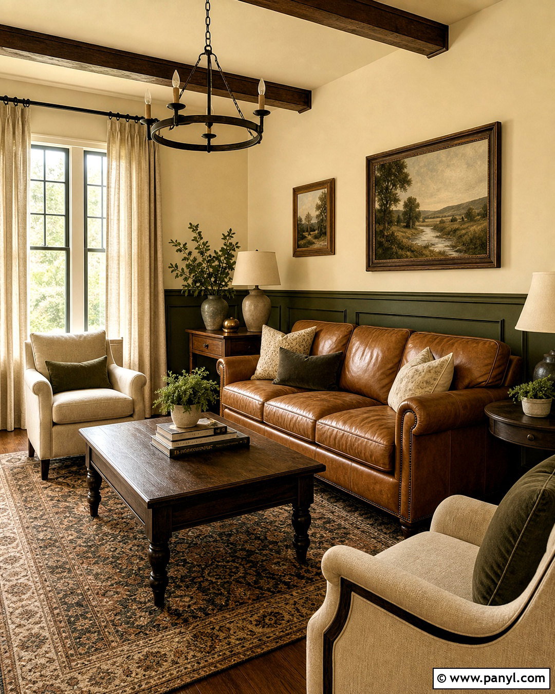
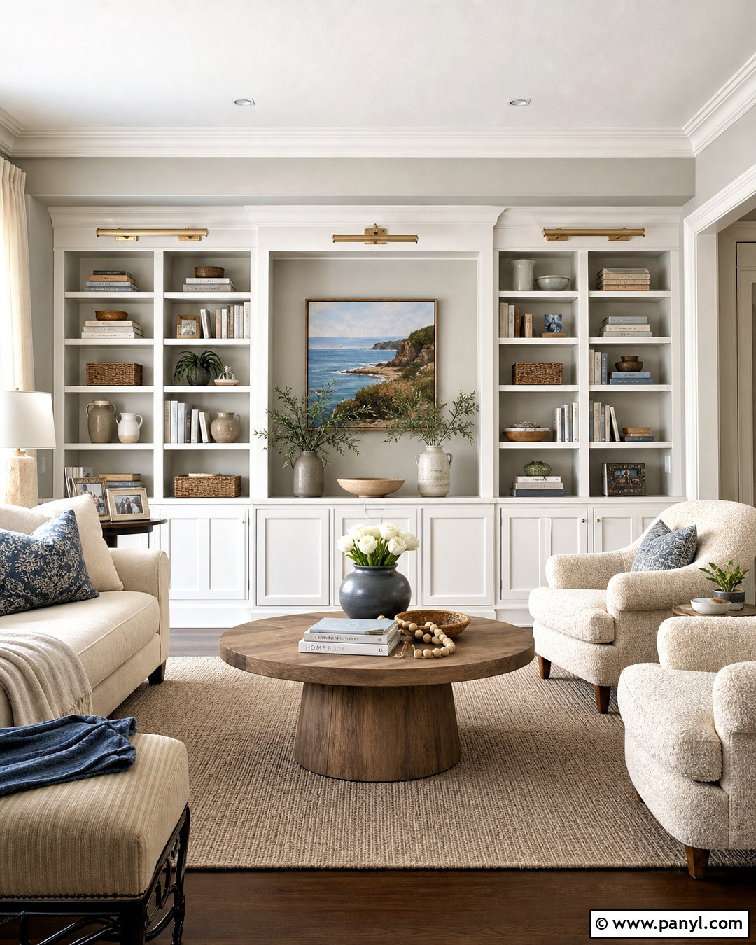
8. Drift Of Mist Sherwin-Williams Paint Color
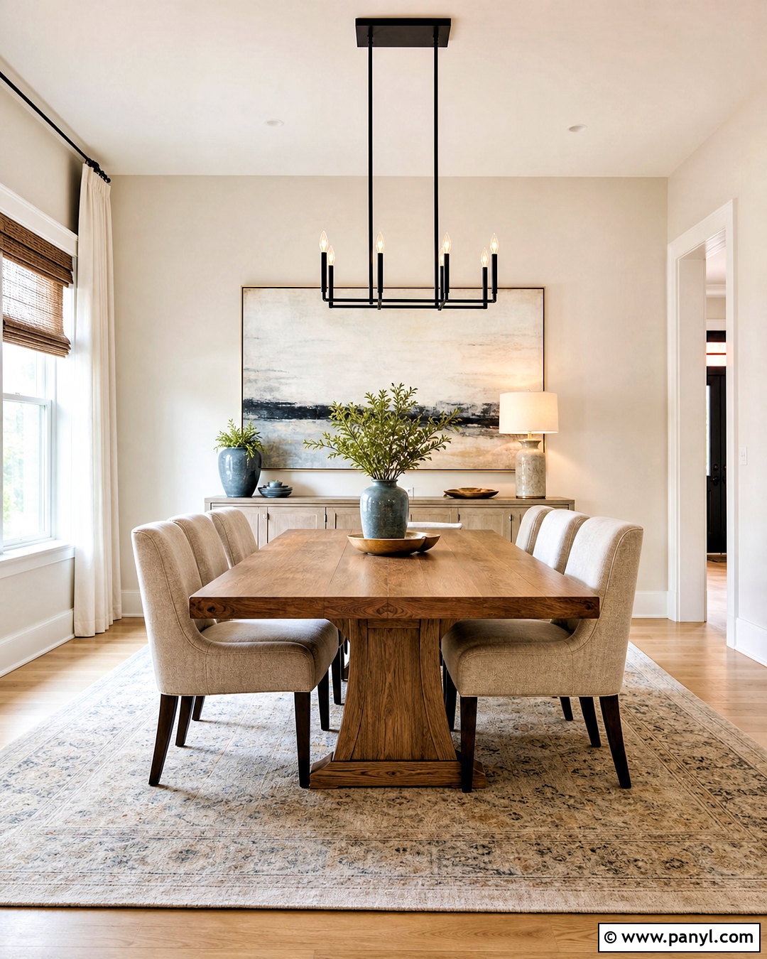
Drift of Mist SW 9166 creates a light, airy dining room with more depth than plain white. Use it on every wall and pair it with soft white trim, pale oak flooring, and a warm wood dining table. Upholstered oatmeal chairs keep the room comfortable, while a black linear chandelier adds a strong focal point above the table. Choose a light greige sideboard, oversized abstract artwork, and woven natural shades to build quiet layers. Dusty blue napkins and muted green ceramics introduce restrained color. This complete design works well in rooms that need visual brightness but still benefit from warmth. Check a large sample at night because artificial bulbs can make this subtle neutral appear creamier than expected.
9. Natural Linen Sherwin-Williams Paint Color
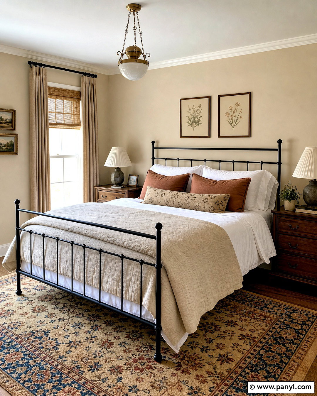
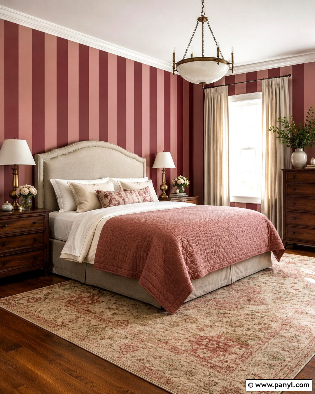
Natural Linen SW 9109 gives a guest bedroom a grounded, welcoming quality with its warm beige character. Paint the walls Natural Linen and balance them with crisp cream trim and a light ceiling. Center a black iron bed against the main wall, then layer it with white cotton sheets, a sand-colored quilt, and muted clay pillows. Use medium walnut nightstands and pleated linen lampshades to reinforce the cozy palette. A vintage-inspired rug in beige, faded red, and soft blue adds pattern without overwhelming the space. Complete the room with woven curtains, botanical artwork, and a simple upholstered chair. The finished bedroom feels warm and personal while remaining flexible enough for seasonal bedding changes.

10. Universal Khaki Sherwin-Williams Paint Color

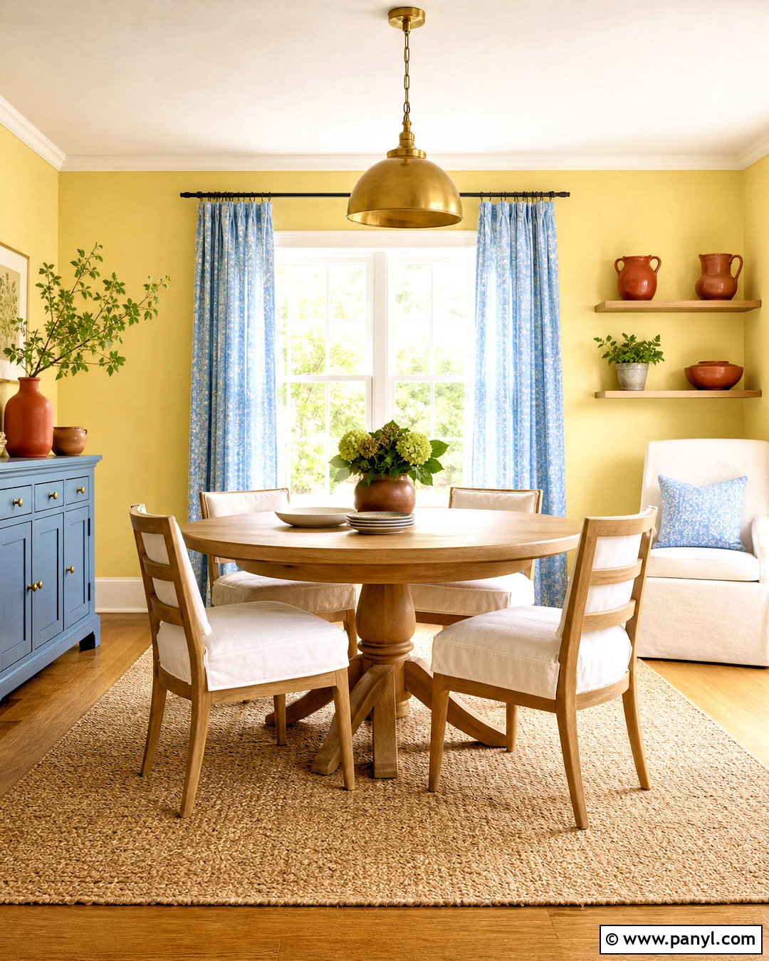
Universal Khaki SW 6150 creates a sophisticated den inspired by earthy materials and comfortable tailoring. Sherwin-Williams selected this balanced khaki as its 2026 Color of the Year, reflecting renewed interest in authentic, grounding neutrals. () Paint the walls and built-in bookcases in Universal Khaki, varying the sheen to create subtle dimension. Add a deep brown leather sofa, plaid wool chairs, and a large sisal rug over medium oak flooring. Antique brass picture lights and a dark bronze ceiling fixture enrich the warm scheme. Use cream curtains, forest green pillows, and burgundy accents sparingly. The result is cozy and substantial, yet lighter and more adaptable than a traditional dark brown library.
11. Sea Salt Sherwin-Williams Paint Color
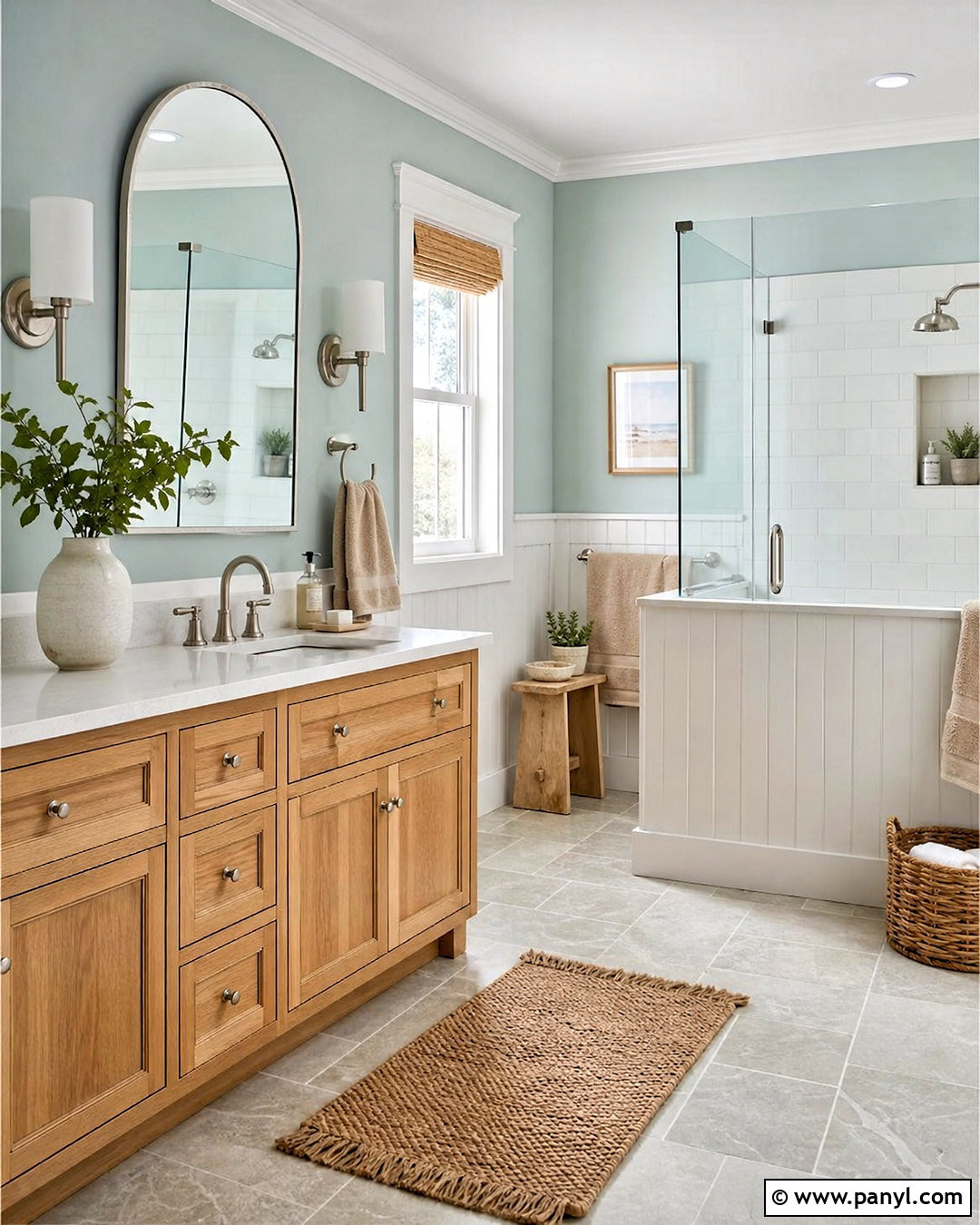
Sea Salt SW 6204 turns a bathroom into a calm retreat by combining soft green-blue walls with warm natural finishes. Apply the color above white vertical paneling and repeat the white on the ceiling and trim. Choose a light oak vanity with a white quartz top, brushed nickel faucets, and an arched mirror. Pale stone-look floor tile keeps the room fresh, while woven baskets and flax-colored towels add warmth. Install clear glass around the shower so the wall color remains visible throughout the space. A simple white shower curtain, ceramic accessories, and a small plant complete the design. Sea Salt changes noticeably with light, often appearing greener in warm conditions and cooler beside gray or blue materials.
12. Evergreen Fog Sherwin-Williams Paint Color
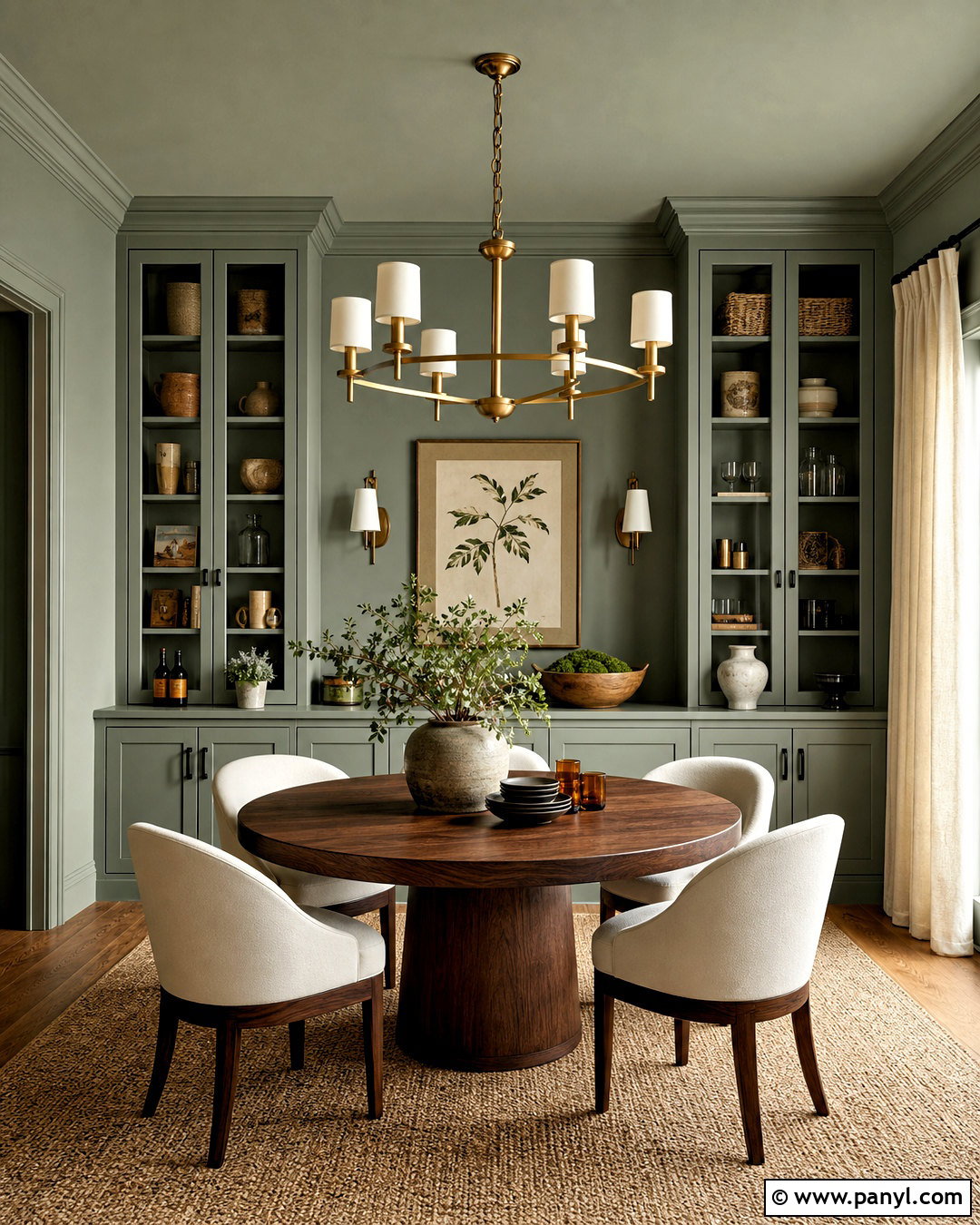
Evergreen Fog SW 9130 brings muted green depth to a dining room without creating an overly dark or themed interior. Color-drench the walls, trim, and built-in cabinet in this smoky green, using satin on the woodwork for slight contrast. Add a round walnut table, curved cream dining chairs, and a natural woven rug. An aged brass chandelier introduces warmth above the table, while off-white curtains brighten the perimeter. Display simple stoneware, amber glass, and framed botanical prints instead of adding many competing colors. Black accents can appear through narrow picture frames and cabinet hardware. This layered arrangement feels intimate for evening meals but remains calm and approachable during the day, particularly in rooms with generous natural light.
13. Clary Sage Sherwin-Williams Paint Color
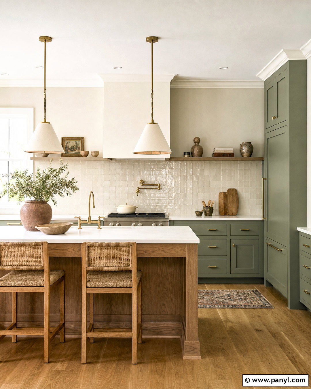
Clary Sage SW 6178 creates a relaxed kitchen built around soft green cabinetry and warm, practical surfaces. Paint the lower and full-height cabinets in Clary Sage, then use a creamy off-white on the walls and upper shelving. Choose honed white quartz counters with delicate beige veining and a backsplash of handmade ivory tile. Warm oak flooring, unlacquered brass hardware, and linen pendant shades support the organic palette. A small freestanding island in medium wood adds useful preparation space and keeps the green from dominating. Finish the kitchen with woven counter stools, clay pottery, and restrained black accents. This complete scheme feels fresh but established, making it suitable for cottages, ranch homes, and traditional suburban kitchens.
14. Naval Sherwin-Williams Paint Color
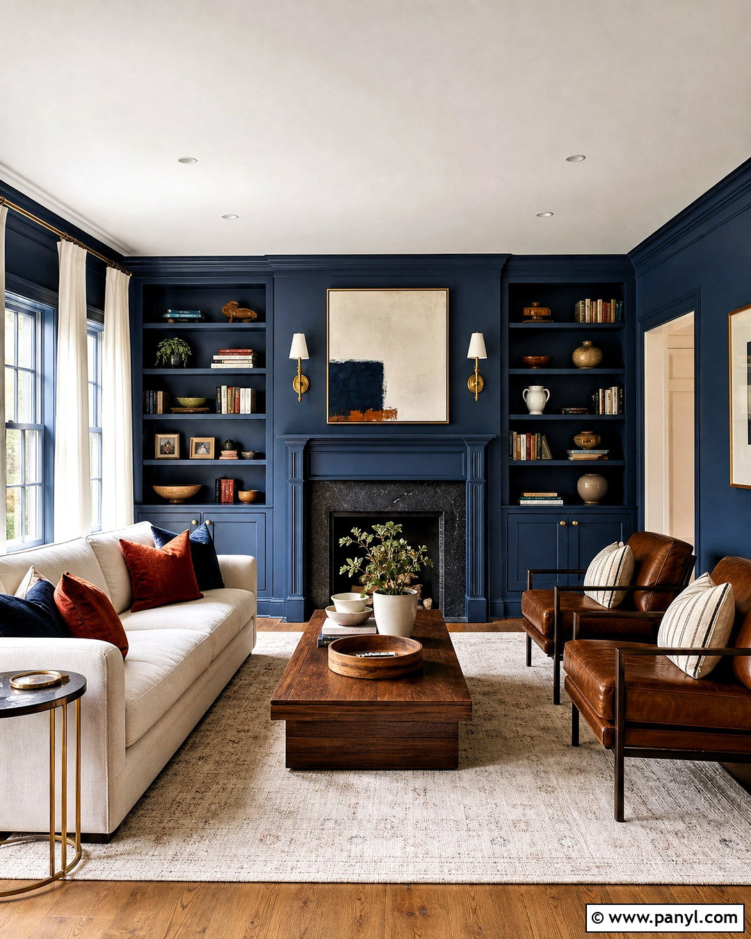
Naval SW 6244 delivers a dramatic living room when it is balanced with light upholstery and warm metallic finishes. Paint the walls and built-in shelving in this deep navy, leaving the ceiling a clean soft white to preserve height. Place a large ivory sofa against the darkest wall and add cognac leather chairs around a medium walnut coffee table. A cream rug with a subtle blue pattern brightens the floor. Use aged brass sconces, picture lights, and cabinet hardware to bring warmth to the cool blue background. White linen curtains frame the windows without creating harsh contrast. Finish with rust-colored pillows, natural wood accessories, and abstract art. The overall room feels bold, polished, and comfortably livable.
15. Upward Sherwin-Williams Paint Color
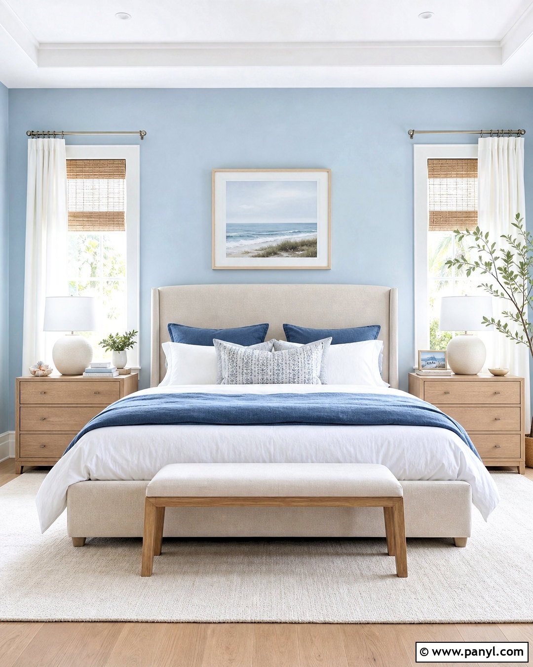
Upward SW 6239 creates a peaceful bedroom with an airy blue backdrop and uncomplicated modern furnishings. Paint all four walls in this gentle blue and pair them with crisp white trim, doors, and ceiling. Choose an upholstered bed in warm oatmeal fabric, pale oak nightstands, and white linen bedding layered with denim and soft gray accents. A light wool rug keeps the floor quiet, while brushed nickel lamps repeat the cool undertones of the walls. Add woven shades beneath white curtains to control changing daylight. Minimal coastal artwork and one natural wood bench complete the room without creating a literal beach theme. This palette feels refreshing in the morning and soothing when lit by soft neutral lamps at night.
16. Iron Ore Sherwin-Williams Paint Color
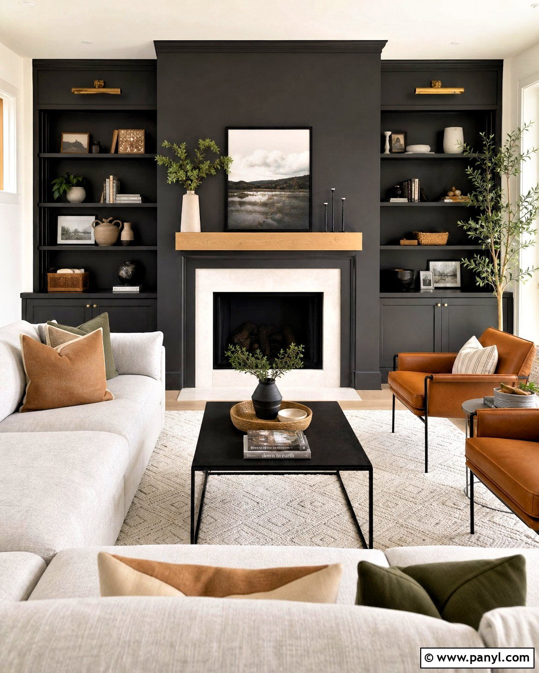
Iron Ore SW 7069 makes a fireplace wall feel architectural and intentional rather than simply dark. Paint the fireplace surround, adjacent built-ins, and the full wall in this rich charcoal. Keep the remaining walls warm white to balance the weight of the focal area. A pale oak mantel and stacked cream stone hearth introduce natural contrast. Arrange a light greige sectional and two camel leather chairs around a black metal coffee table. An ivory textured rug, linen curtains, and warm brass sconces prevent the room from appearing flat. Add restrained greenery and neutral ceramics to the shelving. Repeating Iron Ore on an interior door or window frame helps the strong fireplace feature feel connected to the rest of the living room.
17. Tricorn Black Sherwin-Williams Paint Color
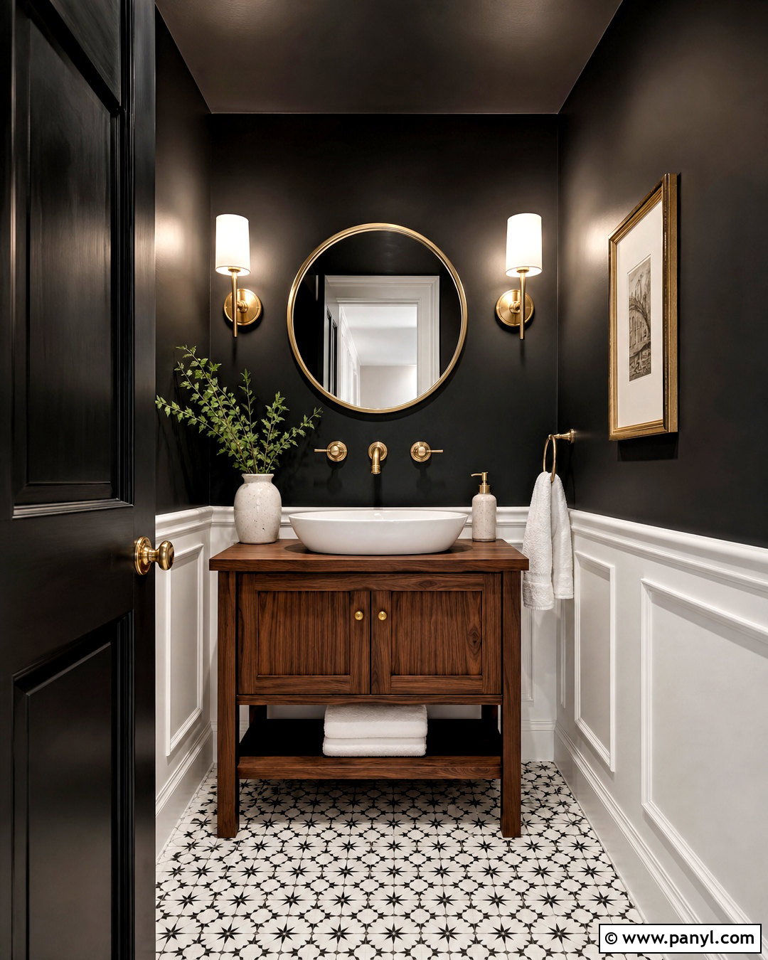
Tricorn Black SW 6258 gives a powder room a memorable, graphic look without requiring a large amount of paint. Use it across the upper walls and ceiling, then install white marble-look tile or crisp white paneling below. A compact walnut vanity adds warmth, while a white vessel sink keeps the central area bright. Select a round brass mirror, matching wall sconces, and a brass faucet for an elegant contrast against the black surface. Patterned black-and-white floor tile brings movement to the small room. Finish with white towels, one framed print, and a simple ceramic vase. Bright, neutral bulbs are essential here because they reveal the materials clearly and stop the finished room from feeling dim or enclosed.
18. Urbane Bronze Sherwin-Williams Paint Color
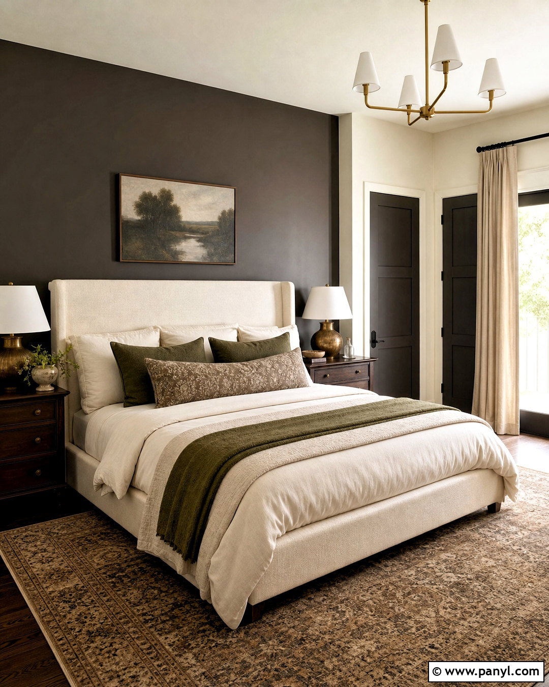
Urbane Bronze SW 7048 produces a cocooning primary bedroom when combined with creamy textiles and substantial wood furniture. Paint the wall behind the bed in this deep brown-gray and continue the color onto nearby doors for a connected look. Keep the other walls warm off-white if the bedroom has limited sunlight. Choose a tall cream upholstered bed, dark oak nightstands, and layered bedding in ivory, taupe, and muted olive. A large vintage-style rug softens the floor, while aged brass lamps provide gentle contrast. Full-length natural linen curtains maintain warmth around the windows. Add landscape artwork, a leather bench, and a few black accents. The final space feels dramatic and grounded without relying on harsh, solid black surfaces.
19. Redend Point Sherwin-Williams Paint Color
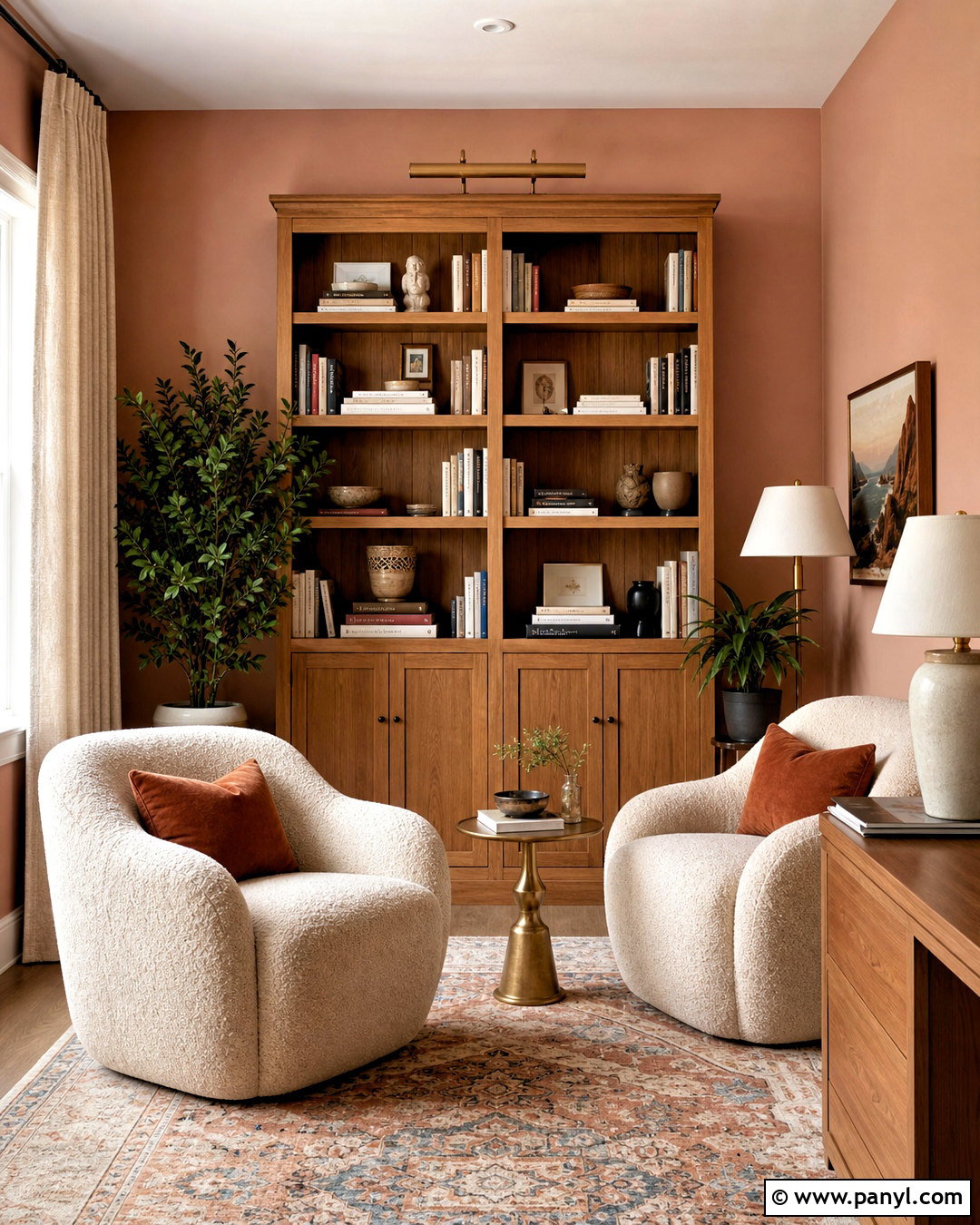
Redend Point SW 9081 adds muted clay warmth to a reading room or small sitting area. Cover the walls in this dusty blush-brown and use warm white on the trim and ceiling. Arrange two oatmeal boucle chairs beside a medium oak bookcase and a small round brass table. A cream rug with terracotta and faded blue details creates a layered foundation. Choose natural linen curtains, ceramic lamps, and soft rust pillows to deepen the earthy color story. Dark green plants offer a fresh counterpoint to the warm walls. Rather than treating the shade as pink, support its brown and clay qualities through wood, stone, and woven materials. The completed room feels comforting, mature, and distinctive without becoming overly sweet or decorative.
20. Cavern Clay Sherwin-Williams Paint Color
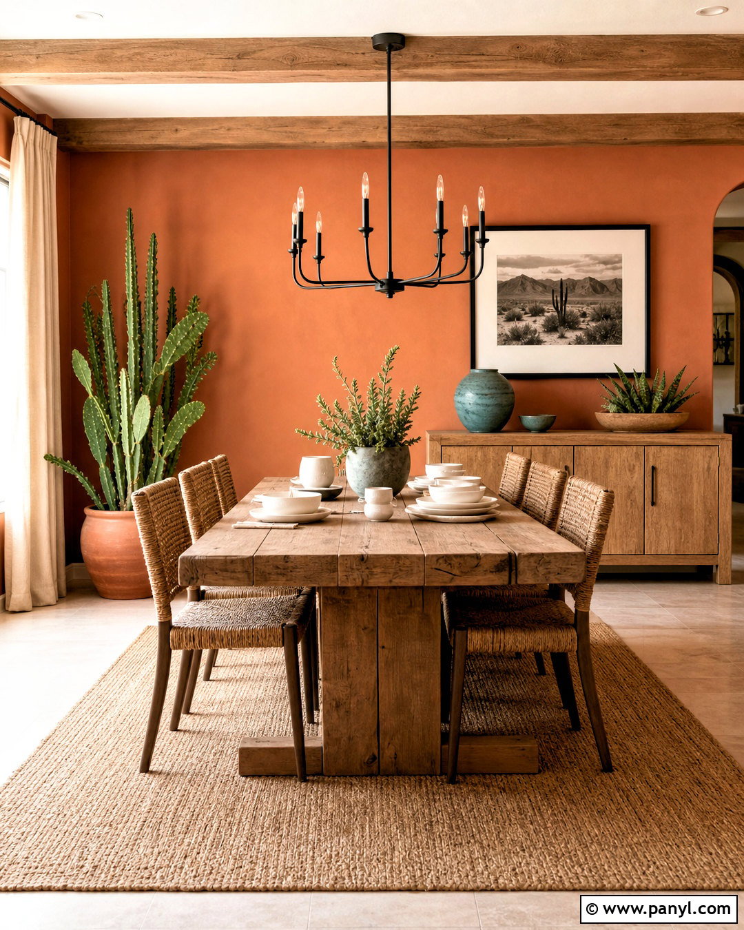
Cavern Clay SW 7701 creates a warm dining space influenced by Southwestern colors without becoming heavily themed. Paint the walls in this sunbaked terracotta and keep the trim a creamy white. Add a long reclaimed wood table, woven dining chairs, and a large natural fiber rug. A matte black chandelier and black-framed artwork give the warm surfaces necessary definition. Use sand-colored curtains, ivory tableware, and muted turquoise ceramics as controlled accents. A low oak sideboard provides storage and space for simple earthenware pieces. Green branches or drought-tolerant plants add life to the palette. The complete room feels energetic in daylight and cozy after sunset, making this expressive paint color practical for both everyday meals and casual gatherings.
Conclusion:
The best paint color is one that works with the room’s light, permanent materials, and everyday purpose. This collection of 20 Sherwin Williams paint colors offers practical options for bright kitchens, restful bedrooms, welcoming living areas, dramatic focal walls, and smaller statement spaces. Warm whites and flexible neutrals provide long-term versatility, while blues, greens, clay tones, and charcoal shades create stronger personality. Before committing, paint large sample boards and move them around the room for several days. Compare each shade in morning sun, afternoon shade, and artificial light. With thoughtful testing and a complete supporting palette, these 20 sherwin williams paint colors can create rooms that feel coordinated, comfortable, and personal.

Related Ideas and Inspiration:
Leave a Reply