
Choosing the right accent color can make Agreeable Gray feel warmer, fresher, brighter, or more dramatic. Sherwin-Williams describes this popular greige as a warm gray with beige undertones, which explains why it works with many soft neutrals, earthy shades, and richer colors. () The key is creating a complete palette rather than adding one disconnected pop of color. Consider the flooring, furniture, trim, lighting, metals, textiles, and natural materials together. Also test samples in morning and evening light because this neutral can appear warmer or grayer as conditions change. From navy kitchens to sage bedrooms and terracotta living rooms, these 20 accent colors for agreeable gray ideas offer practical, coordinated looks. Explore the sections below for more 20 accent colors for agreeable gray ideas.

1. Agreeable Gray And Navy Blue
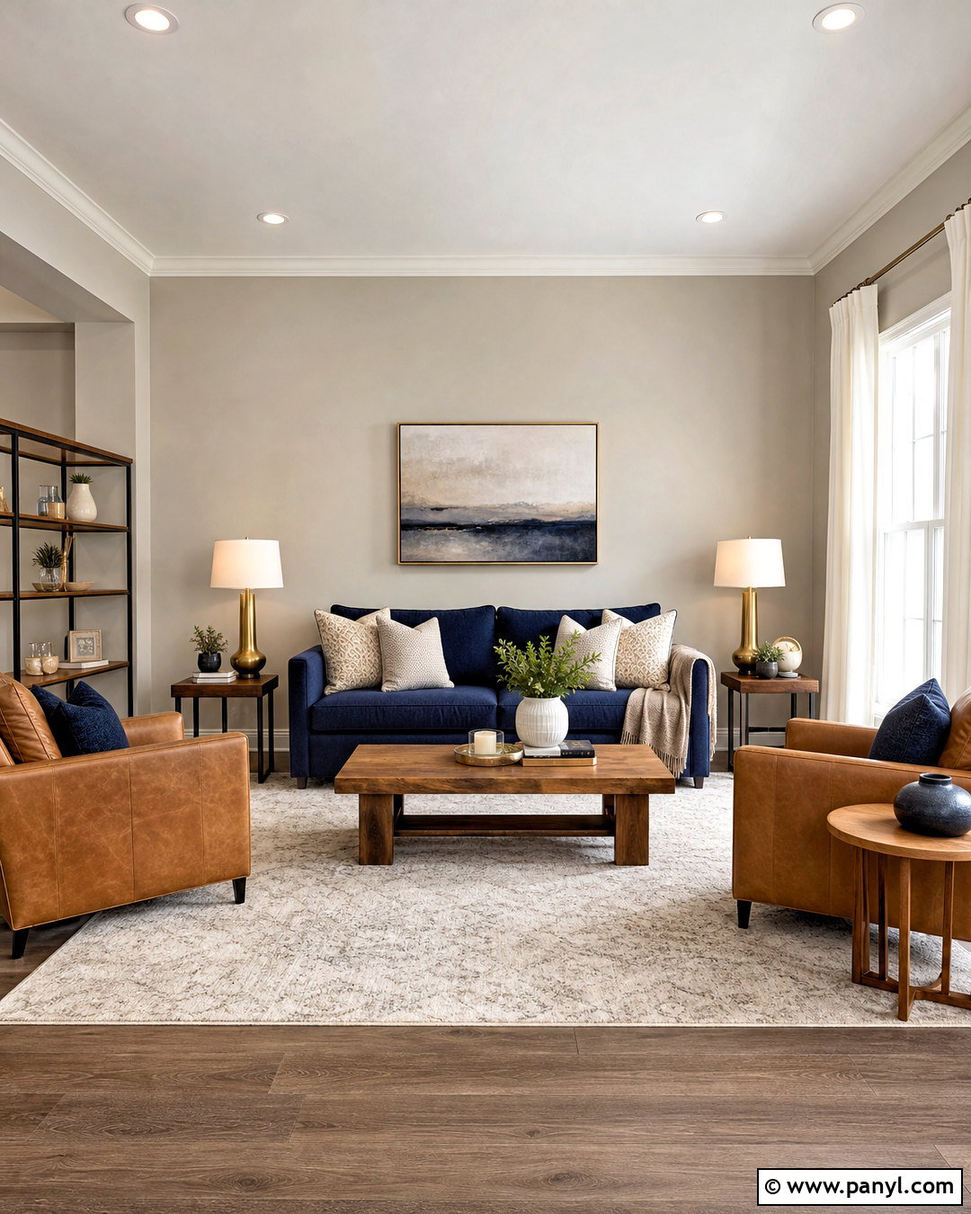
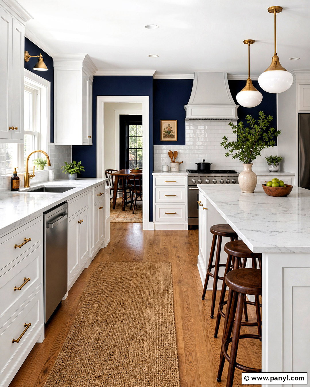
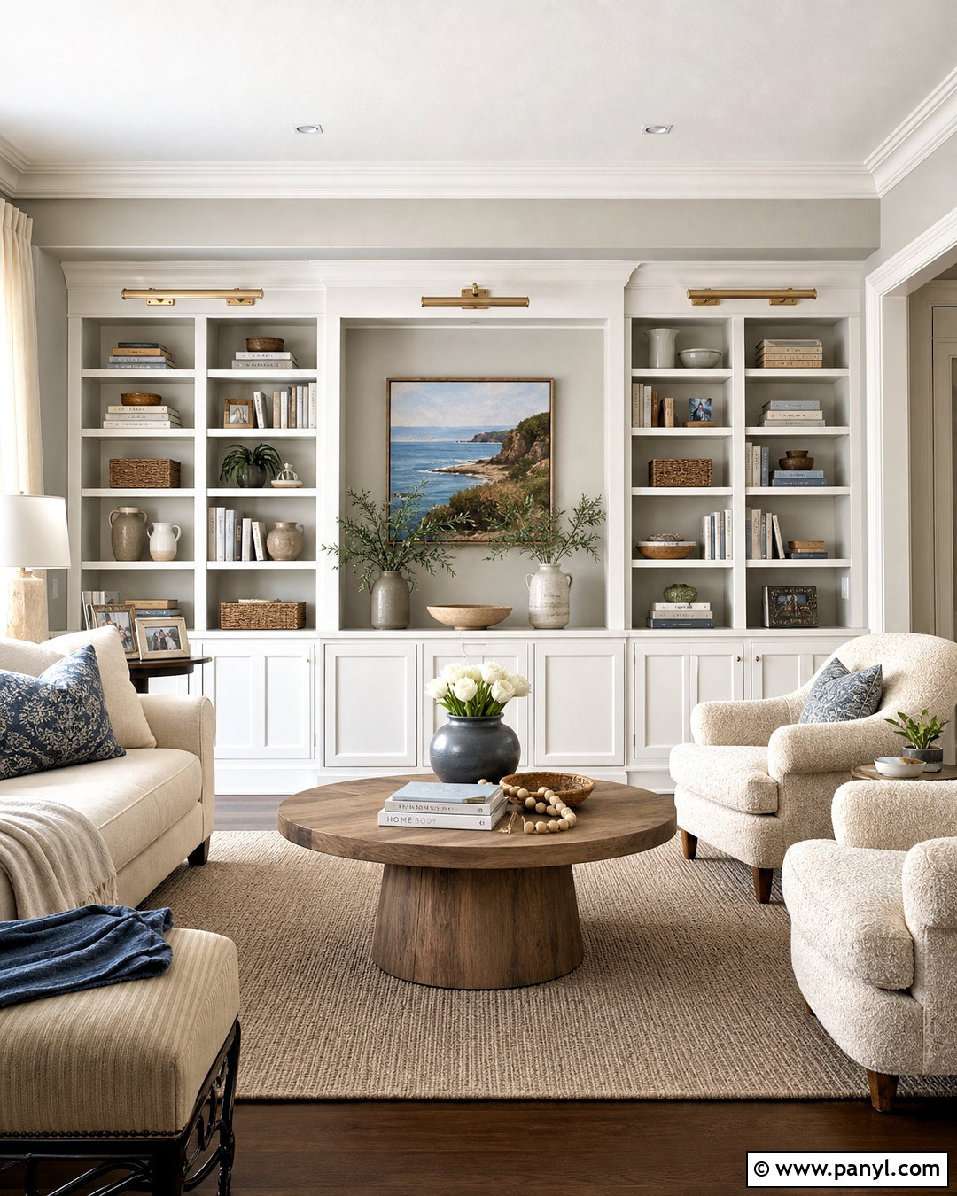
Navy blue gives Agreeable Gray a strong, classic contrast without making the room feel cold. In a living room, keep Agreeable Gray on the walls and introduce navy through a substantial sofa, built-in bookcases, or a large area rug. Add warm white curtains, medium-toned oak furniture, and cognac leather chairs to soften the darker color. Brushed brass lighting brings warmth and keeps the palette from becoming too serious. A cream rug with a subtle navy pattern connects the light and dark elements. Finish the look with blue-and-white ceramics, natural woven baskets, and restrained artwork. This complete scheme works especially well in transitional spaces because the navy adds structure while Agreeable Gray keeps the room relaxed and approachable.
2. Agreeable Gray And Sage Green
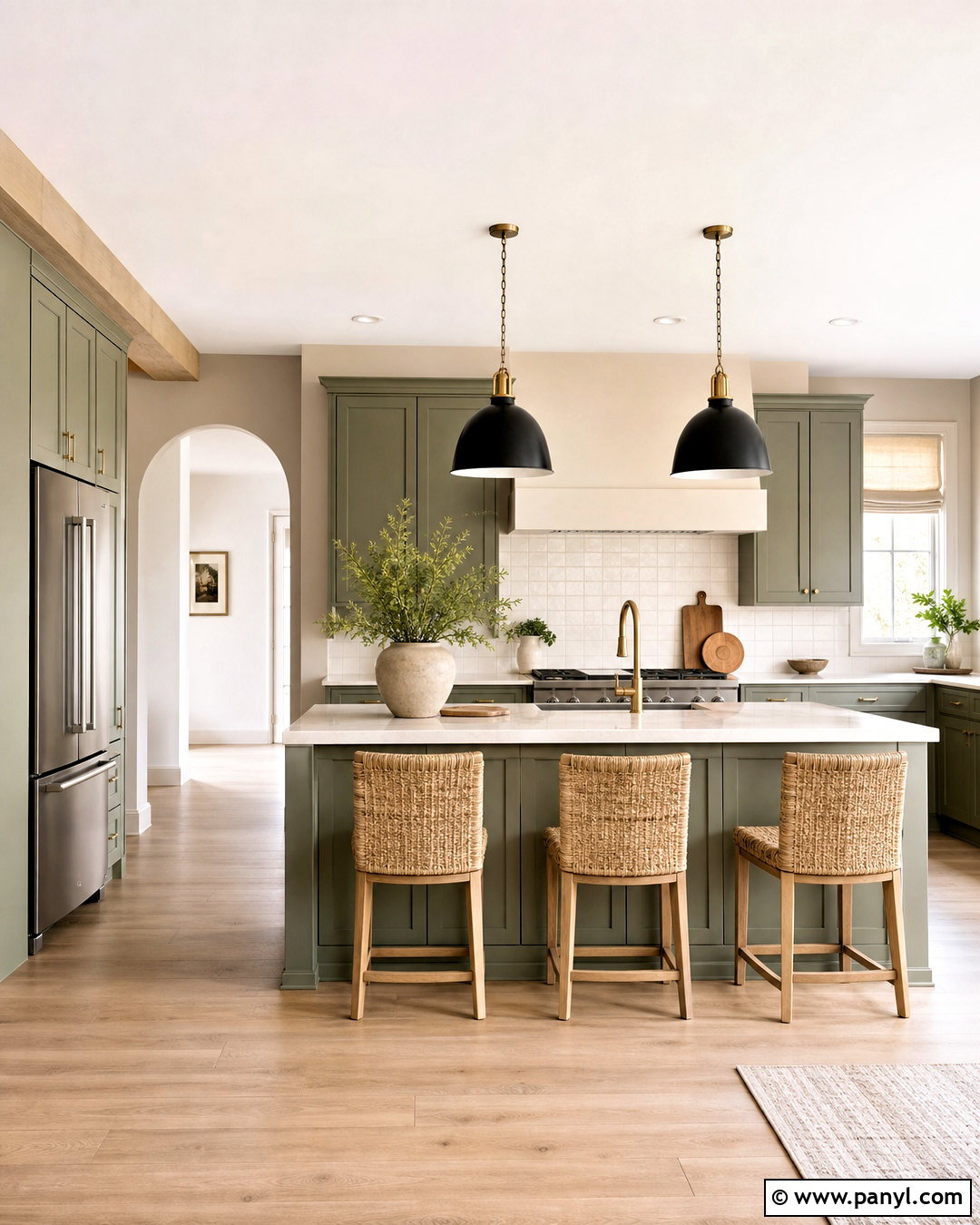
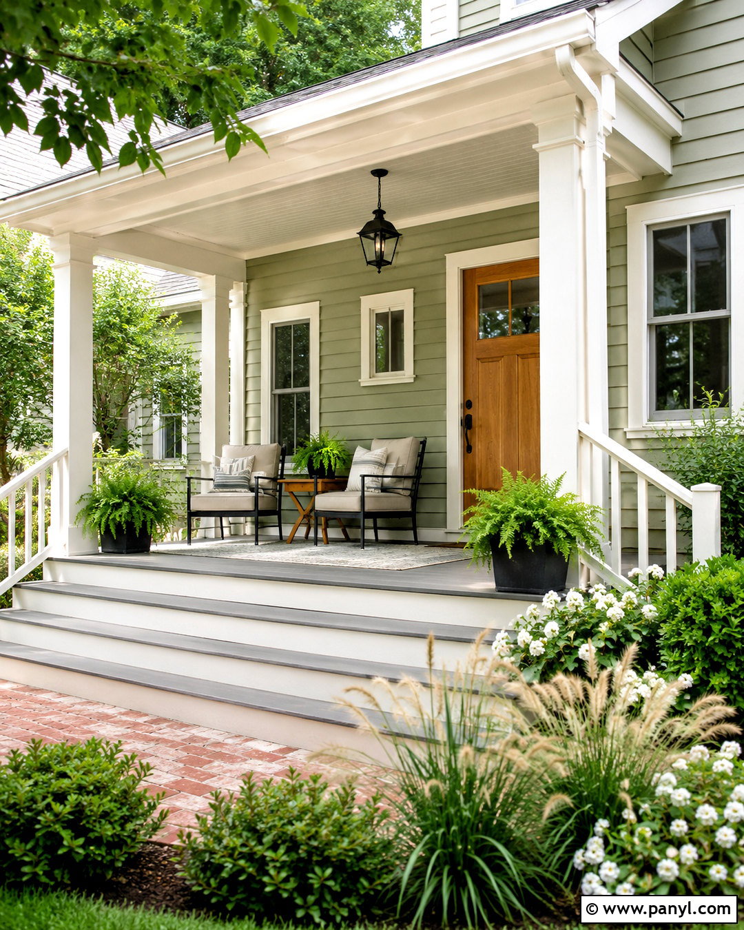
Soft sage green brings out the natural warmth in Agreeable Gray and creates a peaceful, organic room. Try Agreeable Gray walls with sage green cabinets in a kitchen or mudroom. Pair them with light oak flooring, creamy quartz counters, and an off-white backsplash for a bright foundation. Aged brass cabinet hardware adds gentle warmth, while woven stools and ceramic accessories introduce texture. Carry sage into nearby spaces through linen curtains, patterned cushions, or botanical artwork rather than repeating it everywhere. Black accents can be used sparingly on window frames or pendant lights for definition. The finished palette feels fresh but not trendy, making it an easy choice for homes that combine modern farmhouse, transitional, and nature-inspired details.
3. Agreeable Gray And Crisp White
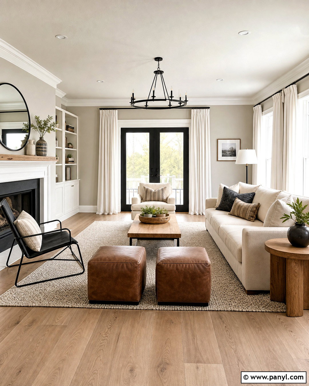
Do you want Agreeable Gray to look cleaner and more defined? Pair it with a crisp white on the trim, ceiling, doors, and built-in cabinetry. This combination creates a bright backdrop for a modern living room with pale oak floors, an ivory sofa, and simple black metal accents. Choose textured white curtains instead of stark synthetic fabric so the space still feels comfortable. A large neutral rug can layer cream, gray, and light taupe beneath the seating area. Add warmth with leather ottomans, woven baskets, and natural wood side tables. Keep decorative accessories limited and repeat white through lamps, pottery, and picture mats. The contrast frames Agreeable Gray clearly while maintaining an airy, cohesive whole-house palette.
4. Agreeable Gray And Charcoal Gray
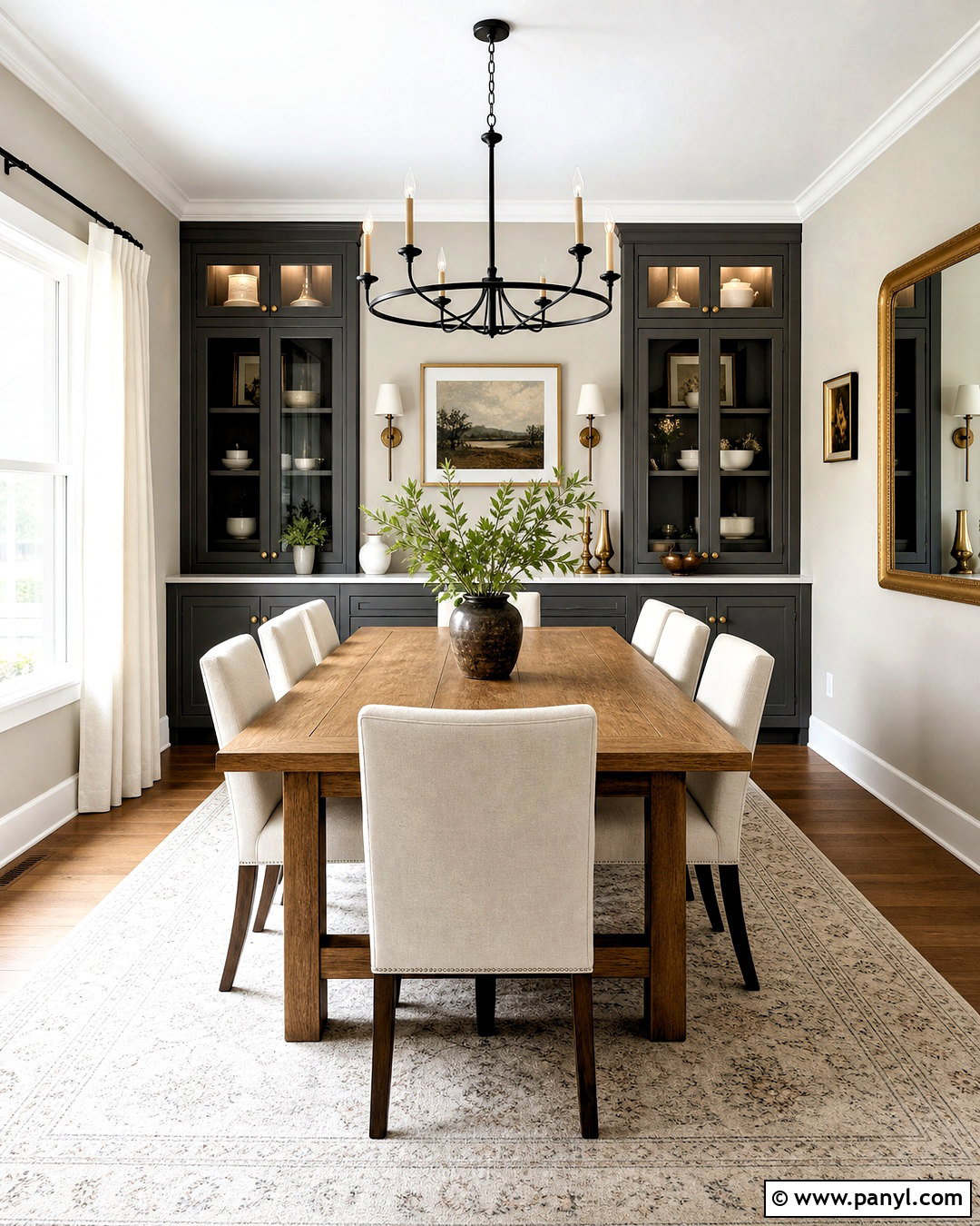
Charcoal gray can turn a basic Agreeable Gray room into a sophisticated, layered space. Use Agreeable Gray across the main walls, then bring charcoal onto lower cabinets, a fireplace surround, or one large upholstered piece. In a dining room, a charcoal built-in buffet creates a grounded focal point behind a medium oak table. Upholstered cream chairs prevent the darker tones from dominating. Choose a light rug with gray detailing, matte black lighting, and warm metal accessories for balance. Natural greenery and linen curtains keep the room from appearing too formal. The result is a tonal palette with noticeable depth. Because both colors share neutral qualities, wood grain, textured fabric, and warm lighting become essential parts of the completed design.
5. Agreeable Gray And Matte Black
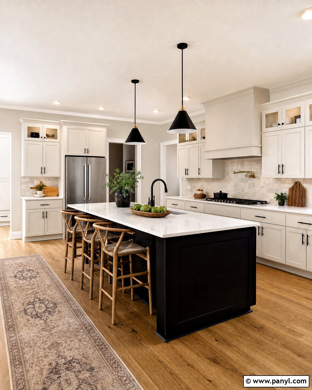
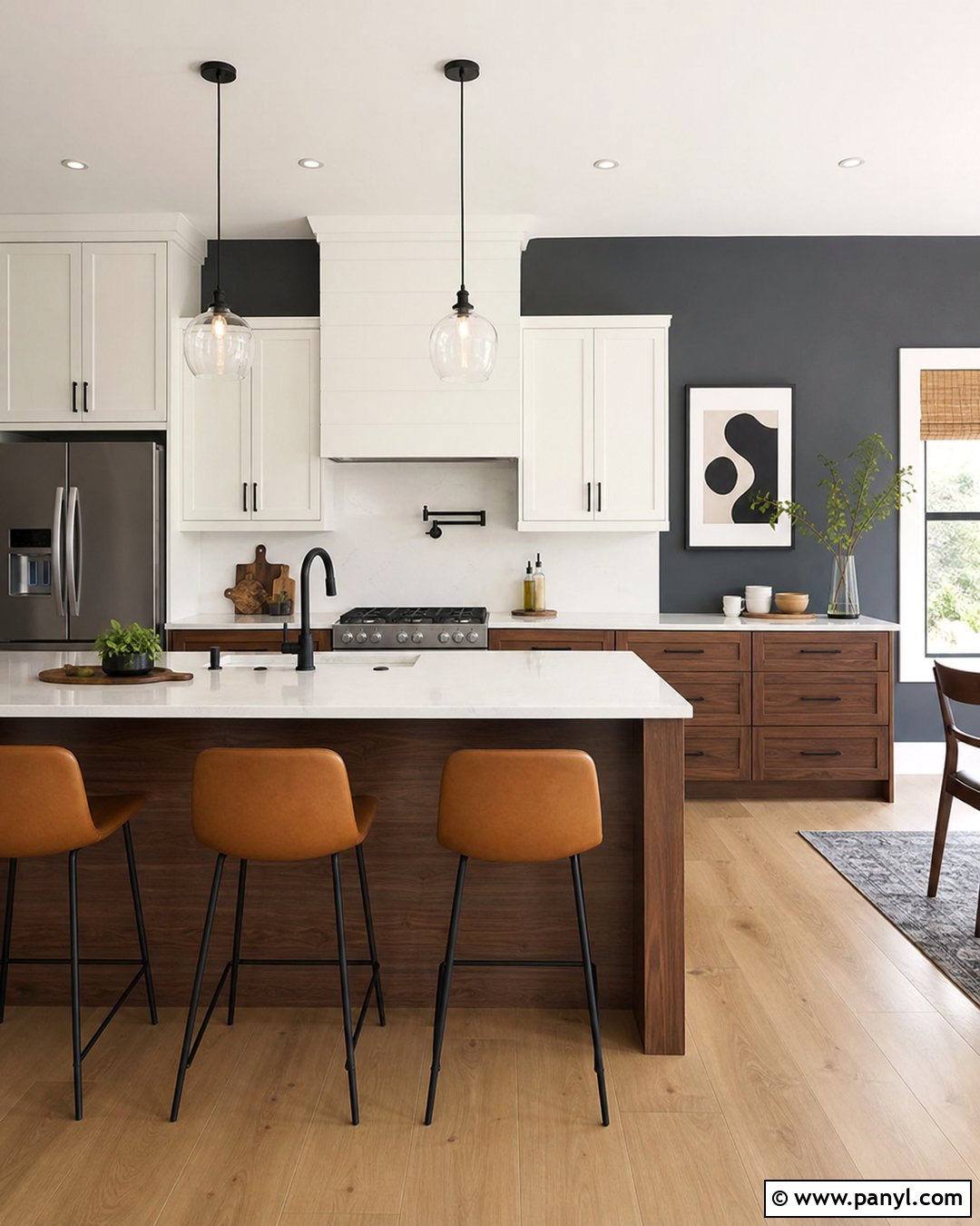
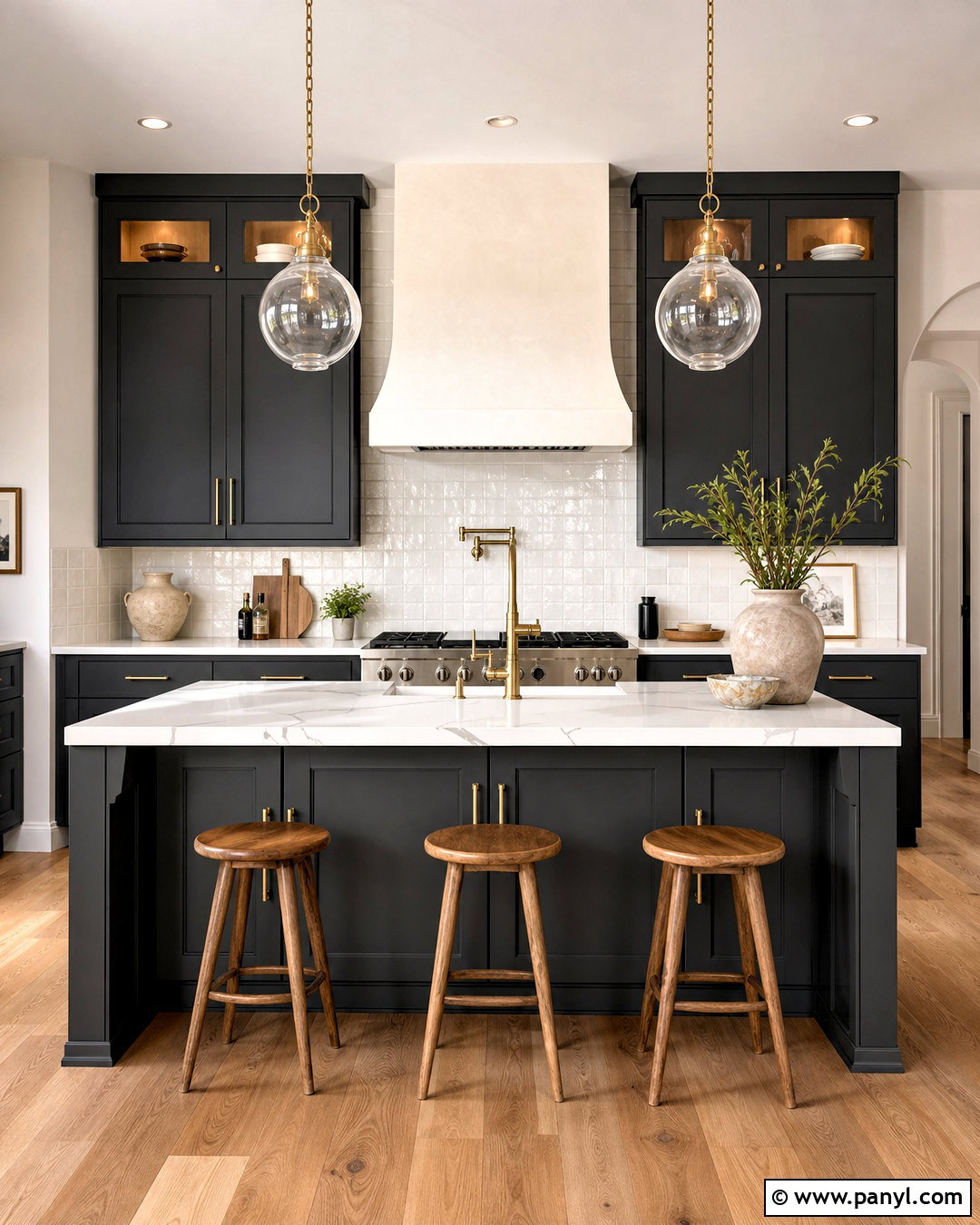
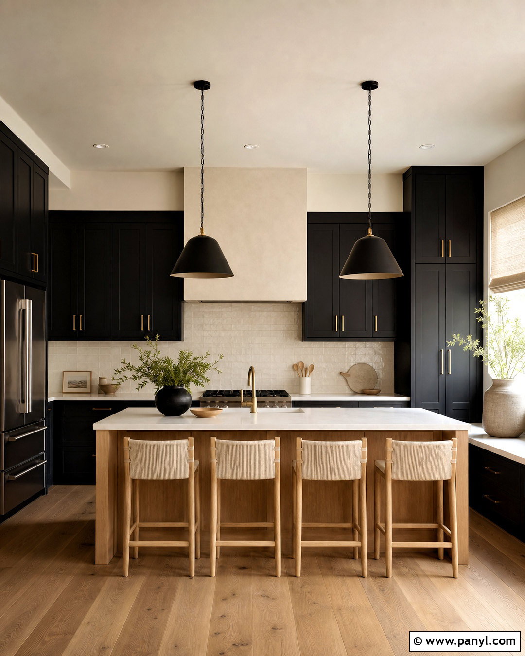
A few bold black surfaces give Agreeable Gray a clean, modern edge. For a kitchen, use Agreeable Gray walls with warm white perimeter cabinets and a matte black island. Continue black through slim pendant lights, cabinet pulls, and window frames, but avoid covering every major feature in the dark shade. White quartz counters and a creamy backsplash reflect light around the room. Natural oak stools, cutting boards, and flooring prevent the palette from feeling harsh. Add a vintage-inspired runner with gray, tan, and muted black detailing for softness. This balanced scheme feels graphic without becoming stark. Agreeable Gray acts as the bridge between the bright cabinetry, deep black accents, warm wood, and layered neutral textiles.
6. Agreeable Gray And Dusty Blue
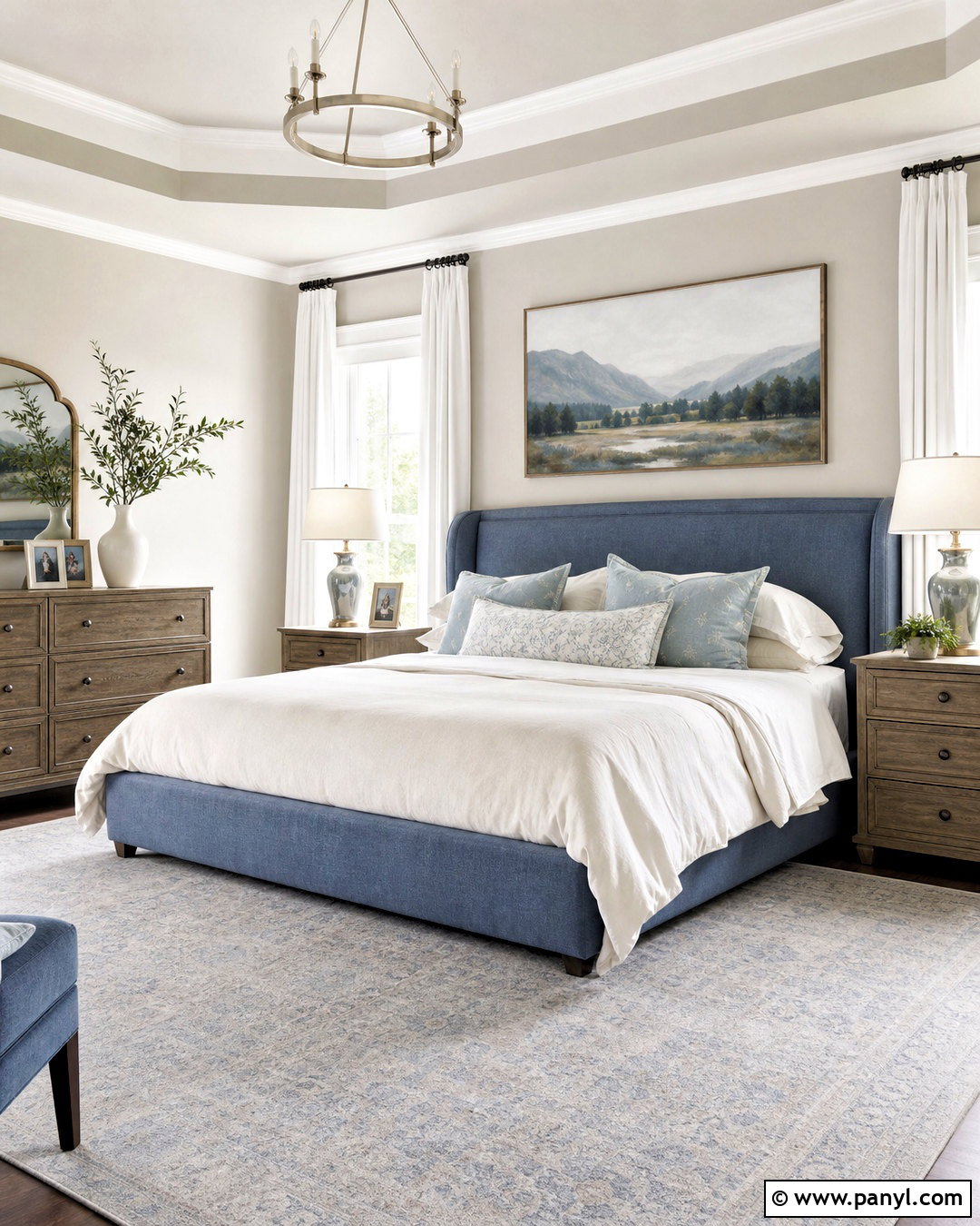
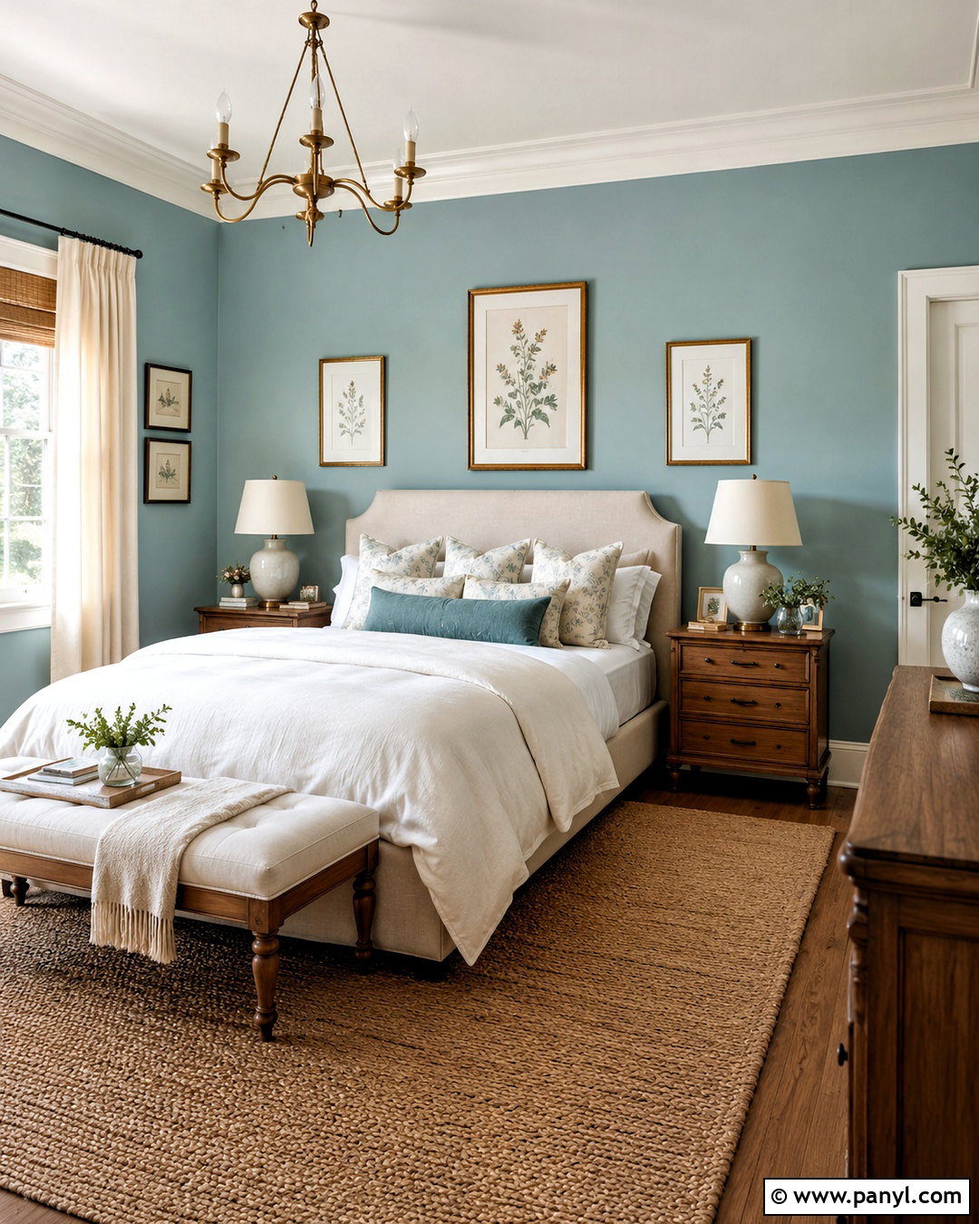
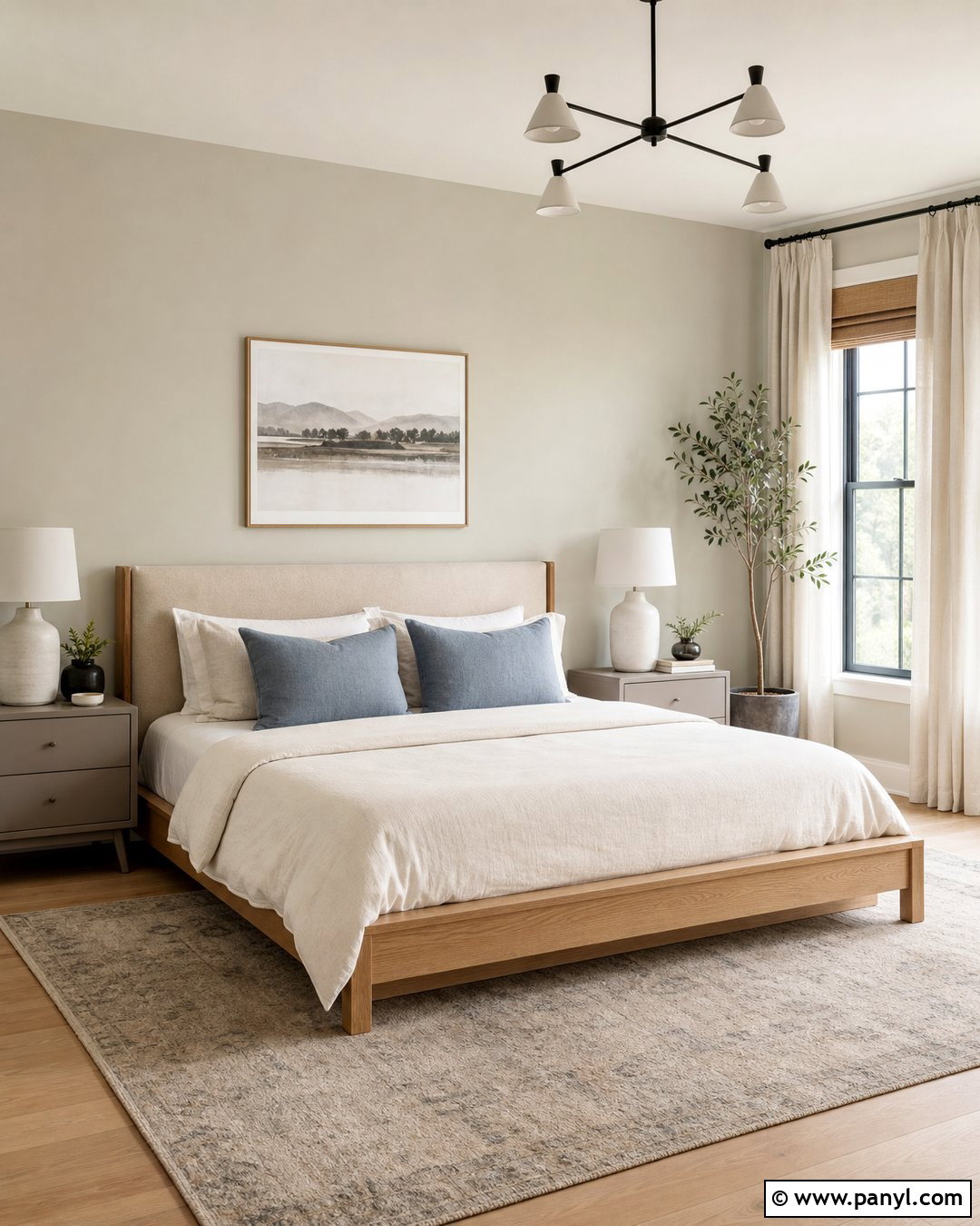
Dusty blue creates a soft, comfortable contrast that suits bedrooms and quiet sitting rooms. Begin with Agreeable Gray walls and an upholstered dusty blue bed or sofa as the main color statement. Layer the space with ivory bedding, faded blue cushions, and a light gray rug for a calm transition between shades. Weathered oak nightstands or side tables add warmth without looking heavy. Choose brushed nickel or antique brass lighting, depending on whether you want a cooler or warmer finish. White curtains keep the windows bright, while simple landscape artwork repeats the muted blue. The complete look feels restful and timeless because neither color demands attention. Instead, they support a gentle palette built around softness and subtle contrast.
7. Agreeable Gray And Deep Teal
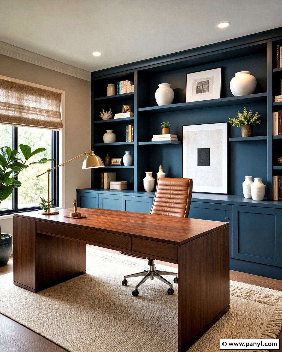
Deep teal adds personality to Agreeable Gray while still feeling refined and livable. In a home office, paint built-in shelving or the wall behind the desk teal, leaving the surrounding walls Agreeable Gray. Choose a walnut desk, camel leather chair, and cream wool rug to introduce warm materials. Brushed brass lighting highlights the green-blue depth of teal and relates naturally to the greige walls. Display books, white ceramics, framed prints, and a few leafy plants across the shelves without overcrowding them. Linen Roman shades soften the windows and help control glare. This full office palette feels focused and creative. The dark cabinetry provides a strong background, while Agreeable Gray keeps the overall room balanced, bright, and connected to adjoining spaces.
8. Agreeable Gray And Forest Green
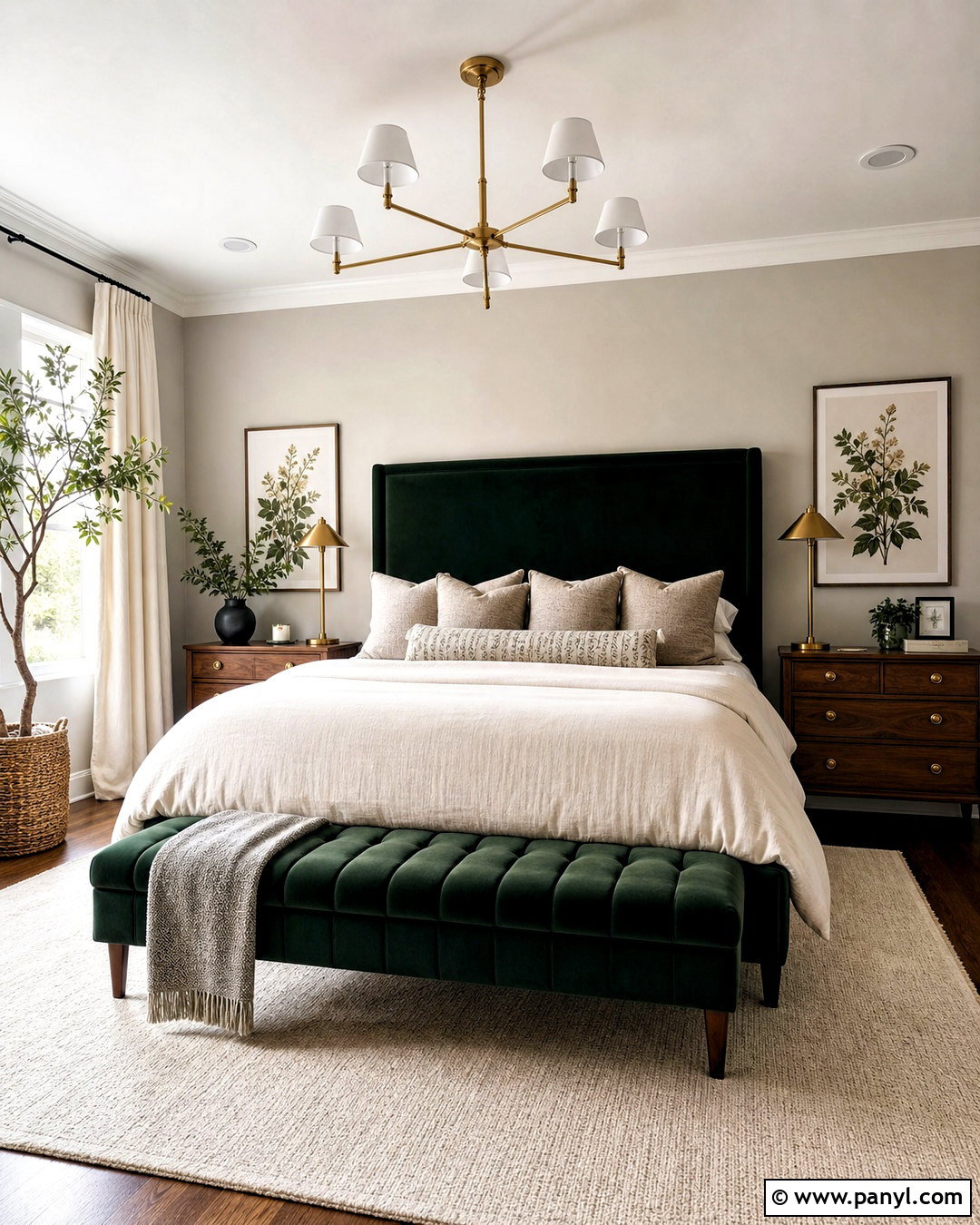
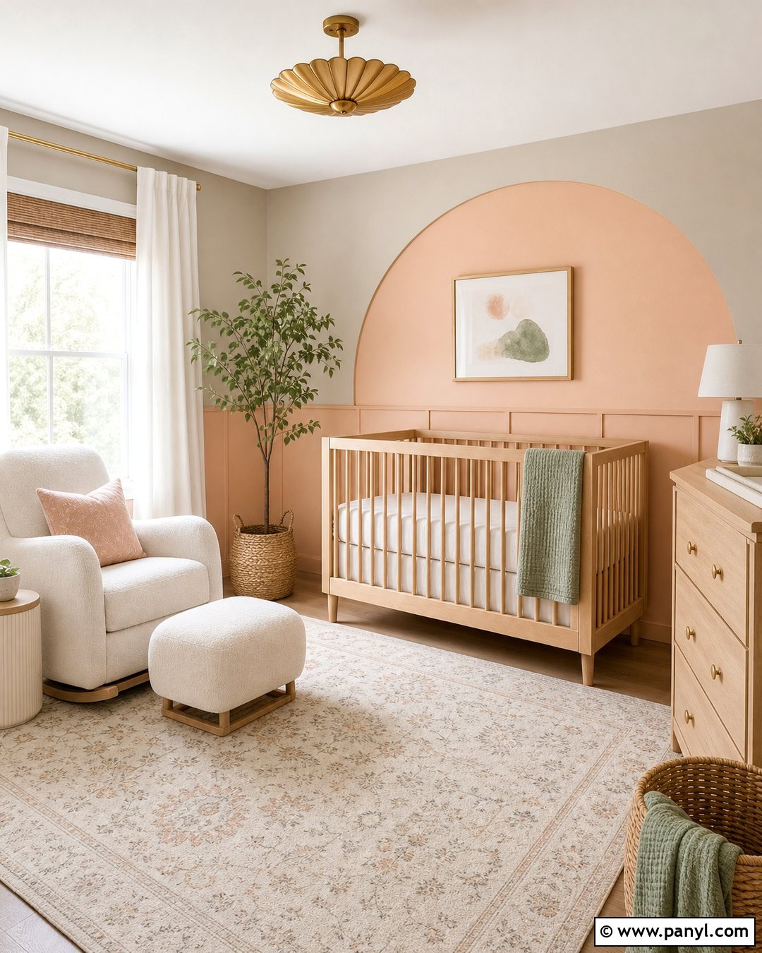
Forest green creates a grounded, dramatic palette that works beautifully with natural materials. Use Agreeable Gray on bedroom walls and introduce forest green through a velvet headboard, upholstered bench, and patterned curtains. Keep the bedding mostly ivory, then layer green and taupe pillows for continuity. Dark walnut nightstands add richness, while aged brass lamps warm the color combination. A light wool rug prevents the darker furniture from making the room visually heavy. Finish with botanical prints, ceramic lamps, and a few simple plants. Rather than scattering small green accessories everywhere, concentrate the color in two or three substantial features. This approach makes the bedroom feel intentional, restful, and connected to nature without overwhelming the softness of Agreeable Gray.
9. Agreeable Gray And Olive Green
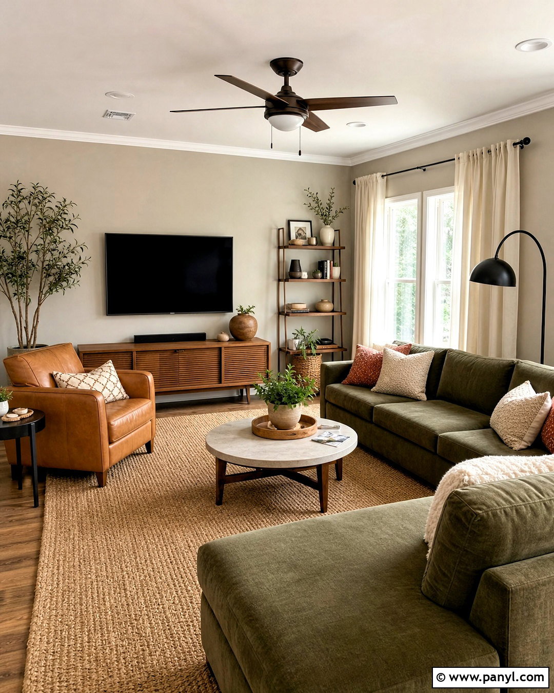
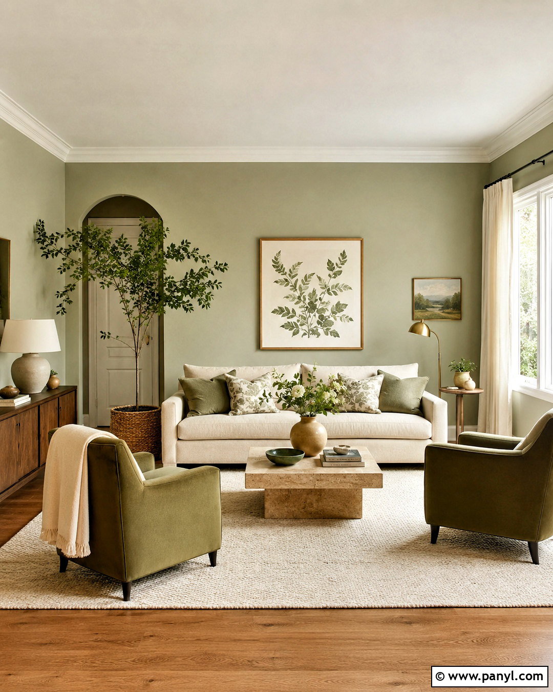
Olive green gives Agreeable Gray an earthy, relaxed quality that pairs especially well with rustic and midcentury furnishings. Create a comfortable family room with Agreeable Gray walls, an olive sectional, and a walnut media console. Layer in camel leather, cream bouclé, and woven jute to build warmth through different textures. A faded rug combining olive, taupe, and muted rust can tie the seating arrangement together. Use black metal sparingly on floor lamps and furniture legs for definition. Off-white curtains and a pale ceiling maintain brightness around the deeper upholstery. Finish with pottery, landscape artwork, and natural branches. The complete palette feels collected rather than overly coordinated, and every material supports the warm undertones of the wall color.
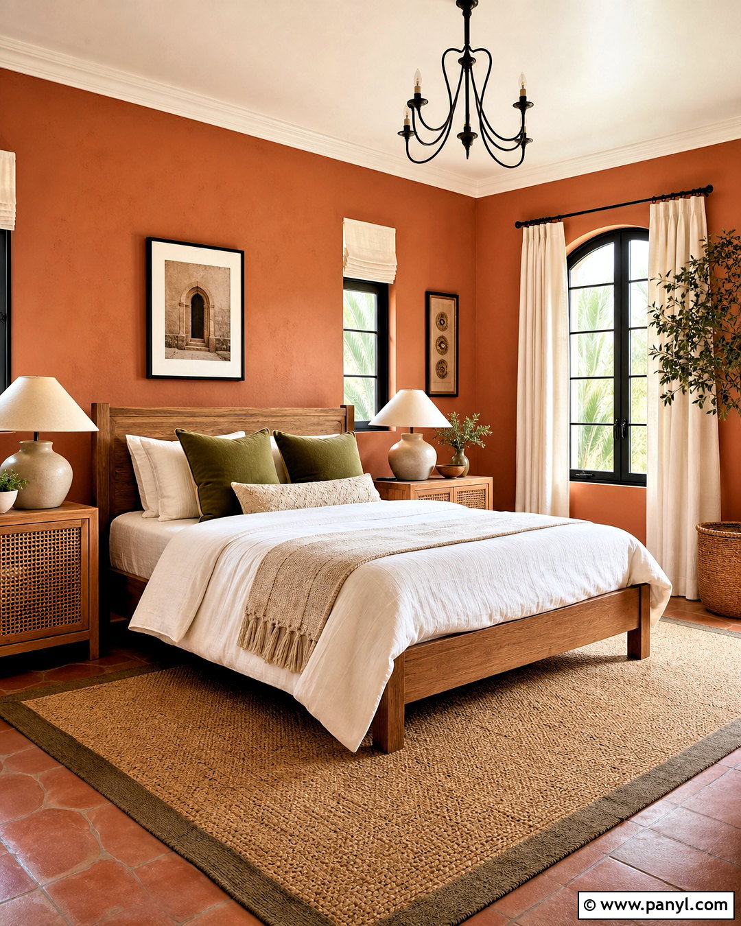
10. Agreeable Gray And Blush Pink
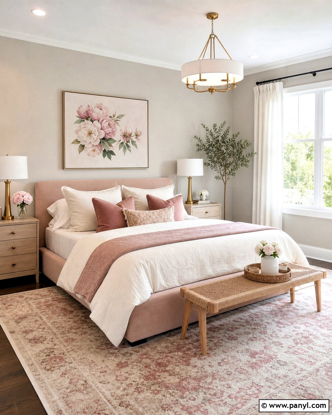
Blush pink softens Agreeable Gray and creates an elegant room without looking overly sweet. In a bedroom, use Agreeable Gray walls as the neutral foundation, then add a muted blush upholstered bed and ivory bedding. Layer dusty rose, cream, and taupe pillows to create gradual color transitions. Light oak nightstands and a natural woven bench keep the room casual, while brushed brass lamps add a polished finish. Choose a pale rug with a faded pink pattern instead of a solid pink floor covering. White linen curtains brighten the windows and balance the warmth. Minimal floral artwork can reinforce the palette without making it feel themed. This complete look feels calm, grown-up, and adaptable for both traditional and contemporary homes.
11. Agreeable Gray And Terracotta
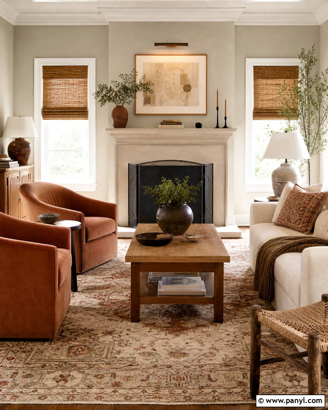
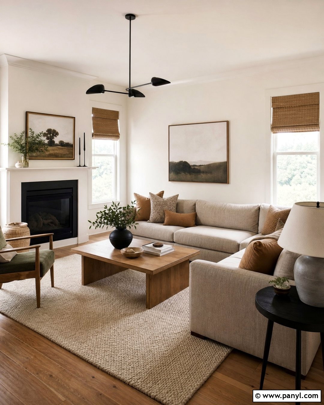
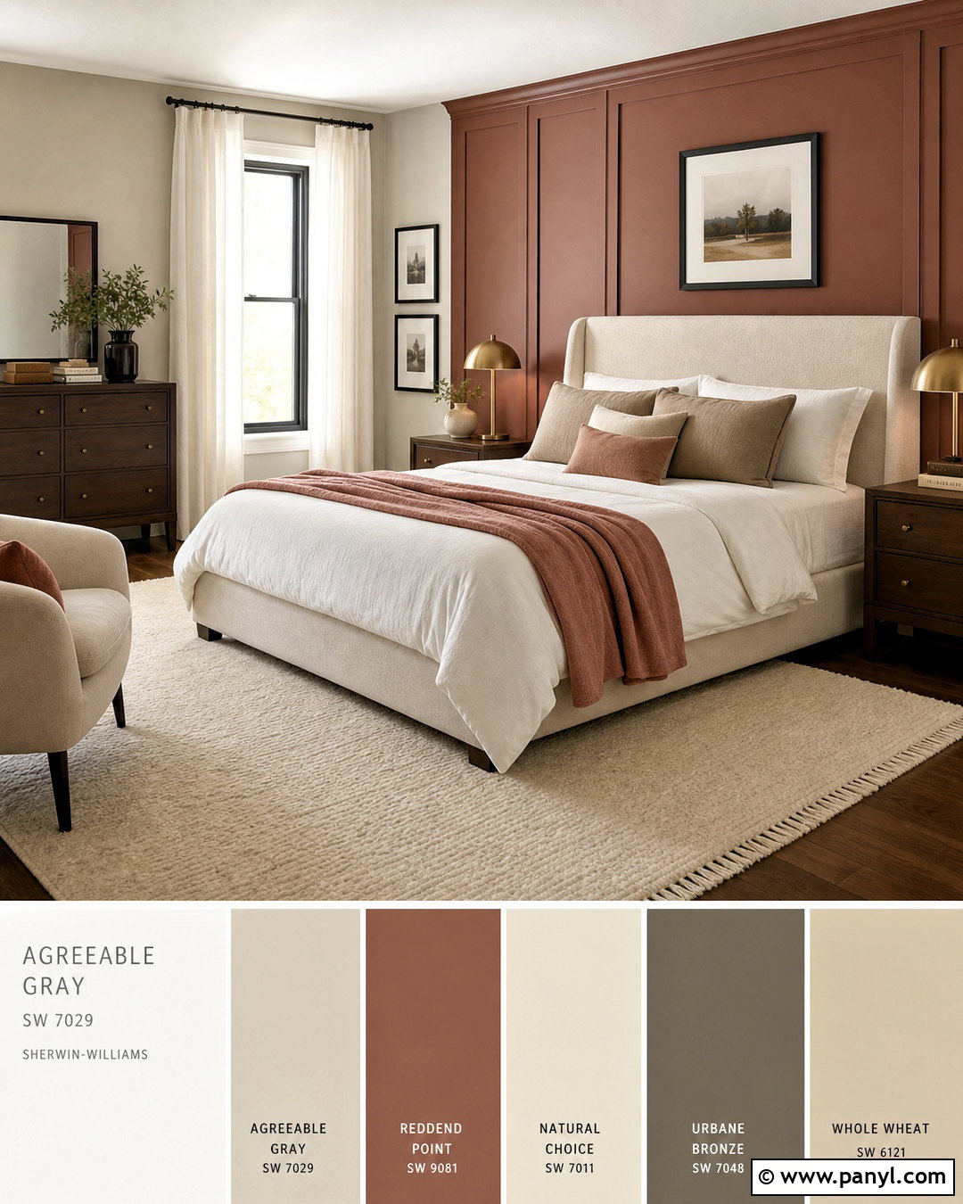
Warm terracotta makes Agreeable Gray feel inviting and sun-washed. Build a living room around Agreeable Gray walls, a cream sofa, and two terracotta lounge chairs. Use a patterned rug that combines clay, tan, charcoal, and ivory to anchor the seating area. Medium oak tables, woven shades, and handmade ceramic lamps strengthen the natural character of the scheme. Introduce charcoal through slim metal frames or a fireplace screen for contrast. Keep the window treatments light and simple so the earthy orange shade remains fresh rather than heavy. Terracotta also works well in cushions, artwork, and pottery, but repeat it in varied tones instead of one exact hue. The final room feels warm, textured, and comfortably connected to natural materials.
12. Agreeable Gray And Coral
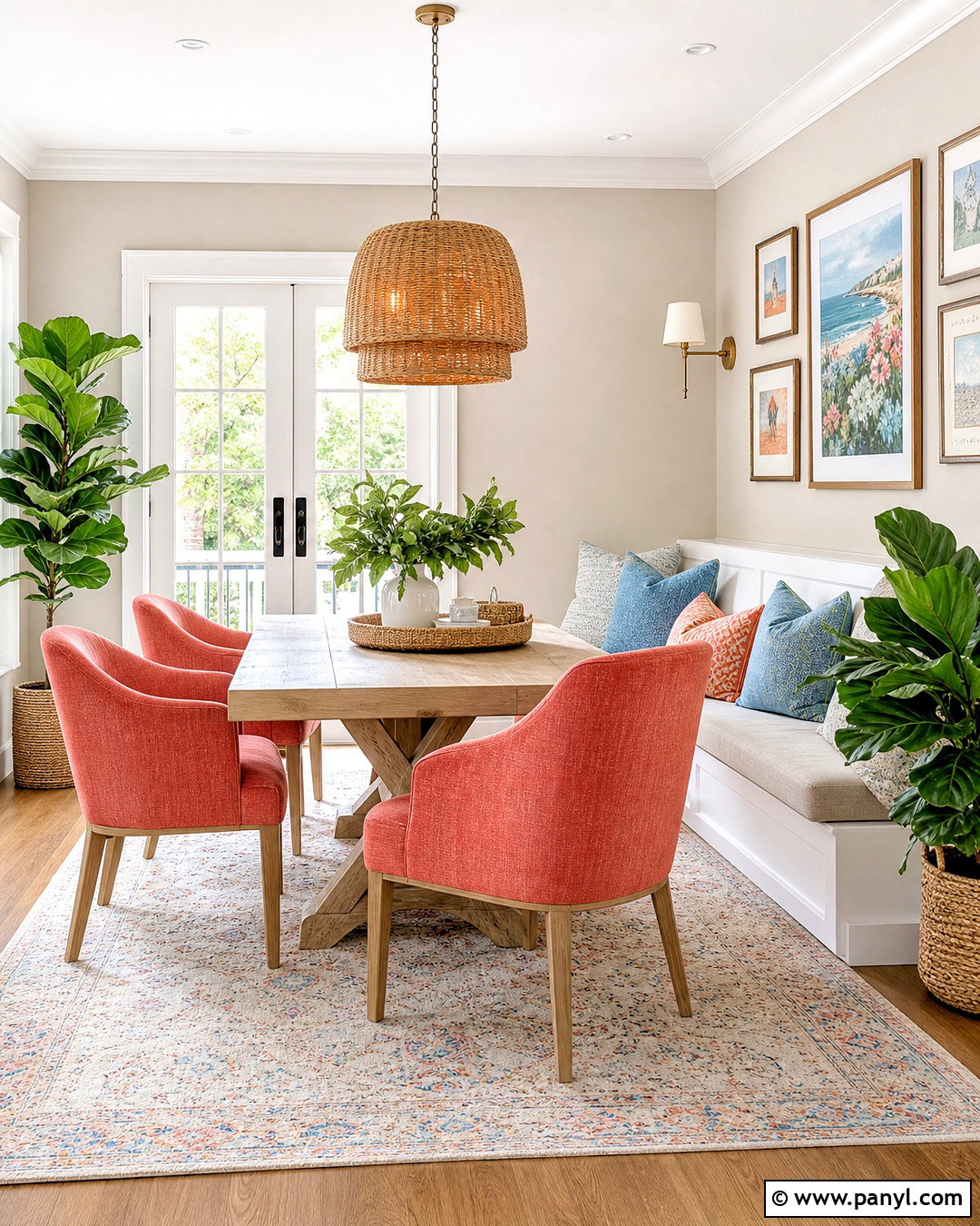
Coral gives Agreeable Gray a lively lift, particularly in bright breakfast rooms, bedrooms, and sunrooms. Keep the walls Agreeable Gray and use coral on dining chairs, a patterned banquette, or a large piece of artwork. Balance this energetic shade with warm white upholstery, light oak furniture, and natural woven textures. Small touches of muted blue can provide contrast without creating a busy palette. Choose a cream rug with coral and gray details to connect the room from floor to wall. Brass or soft gold lighting complements coral’s warmth, while leafy plants add a fresh green note. Using coral in a few purposeful areas creates a cheerful, complete design that still feels grounded by the quiet, flexible character of Agreeable Gray.
13. Agreeable Gray And Mustard Yellow
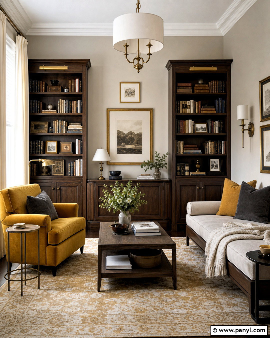
Mustard yellow adds warmth and character to Agreeable Gray without the sharpness of a bright lemon shade. Design a welcoming reading room with Agreeable Gray walls, a mustard armchair, and a neutral sofa or daybed. Layer cream, charcoal, and golden yellow textiles throughout the seating area. Dark wood bookcases provide structure, while a faded Persian-style rug introduces rust, beige, and muted gold. Add aged brass sconces and warm white curtains to enhance the cozy atmosphere. Keep decorative objects simple so the yellow remains the clear accent. A few black frames or iron details will sharpen the palette. This completed look feels cheerful and established, offering color and depth while preserving Agreeable Gray as the calm background.
14. Agreeable Gray And Camel Tan
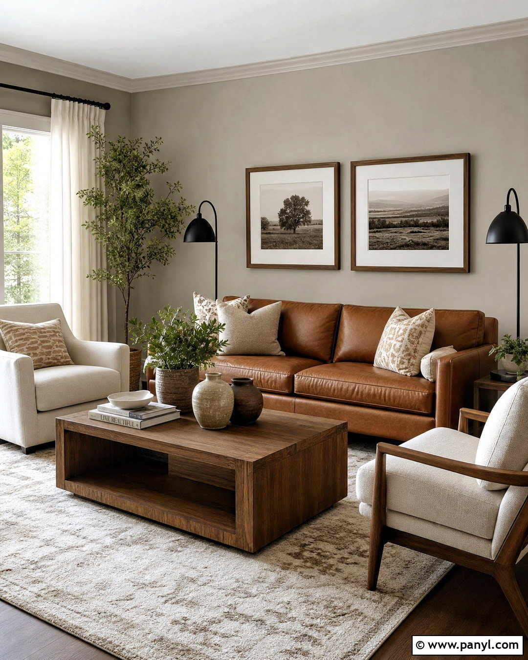
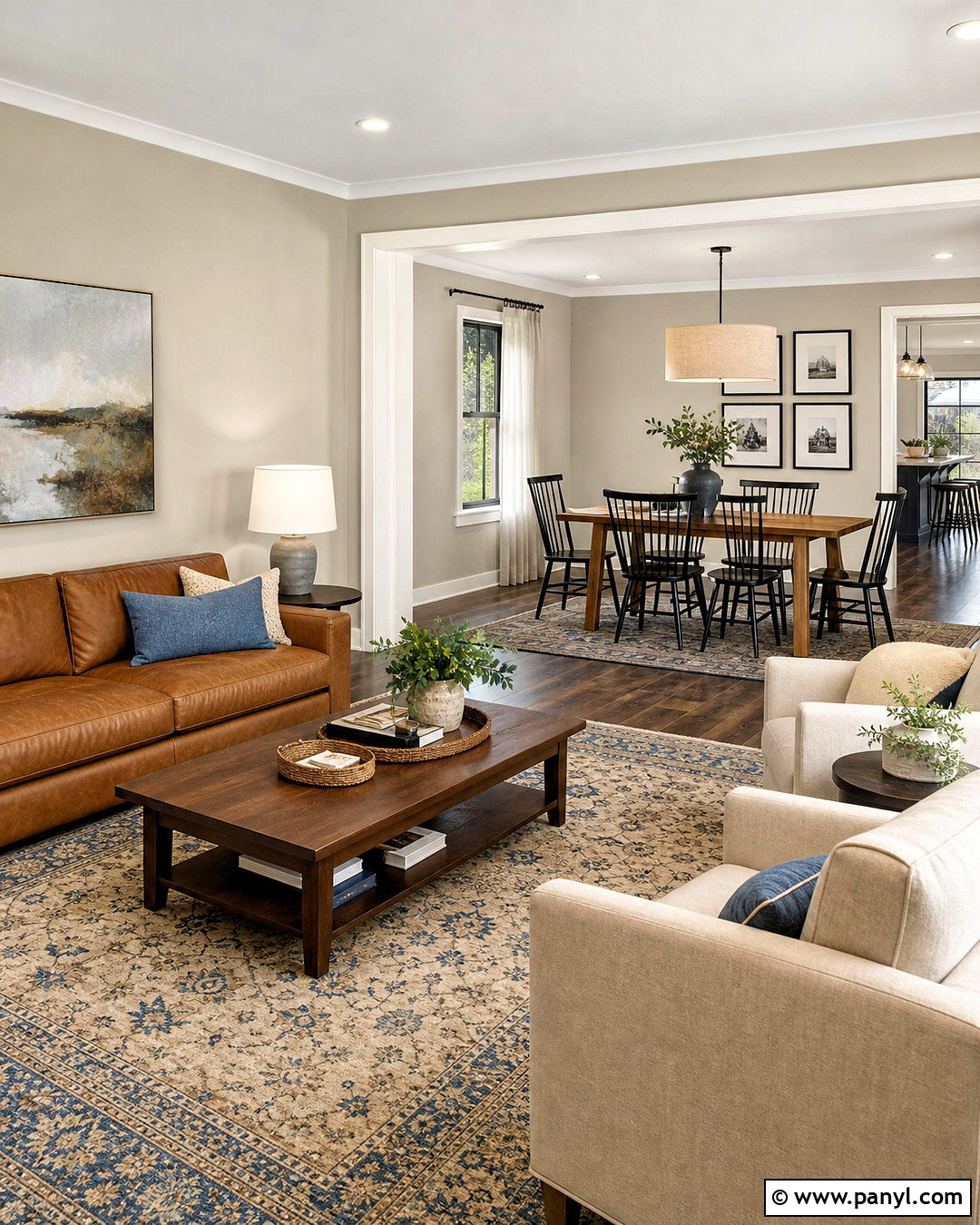
Camel tan emphasizes the warm side of Agreeable Gray and creates a comfortable, upscale neutral palette. Start with Agreeable Gray walls and add a camel leather sofa, ivory lounge chairs, and a substantial oak coffee table. Use a cream-and-taupe rug to define the seating arrangement, then repeat camel through small cushions or a leather ottoman. Black metal lighting provides necessary contrast, while linen curtains soften the windows. Consider walnut frames, stone accessories, and matte ceramic vessels for subtle variation. Since the palette relies on neutrals, mix smooth leather with nubby wool, woven fibers, and visible wood grain. The finished living room feels rich and layered, proving that an accent color does not need to be bright to make an impact.
15. Agreeable Gray And Chocolate Brown
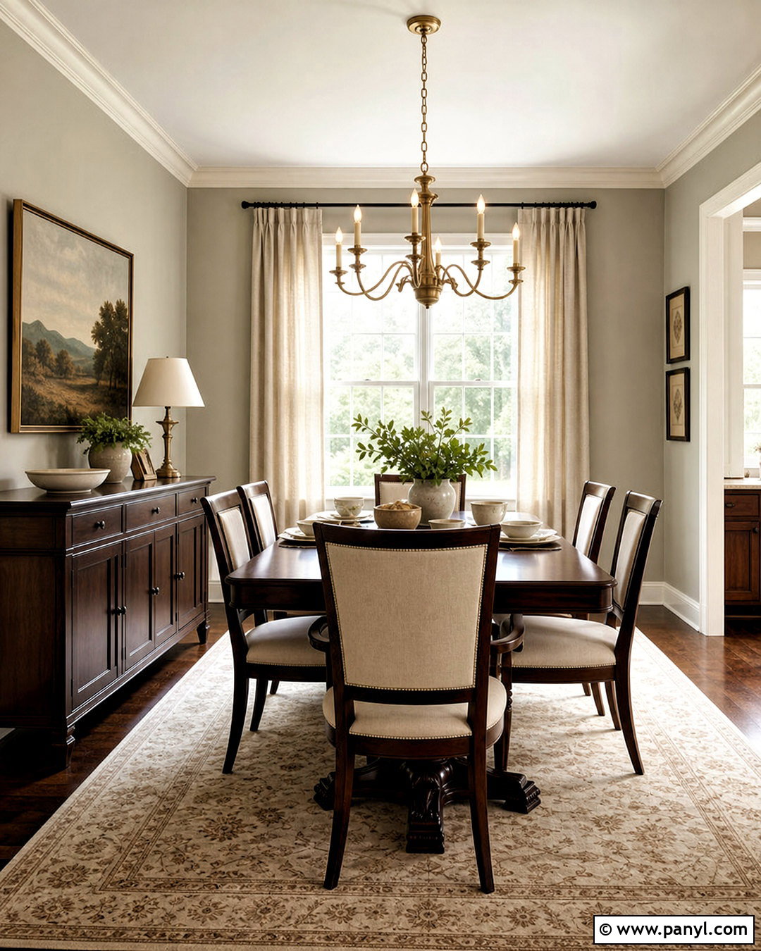
Chocolate brown brings depth and traditional warmth to Agreeable Gray. In a dining room, combine Agreeable Gray walls with a dark brown wood table, matching sideboard, and cream upholstered chairs. A large rug in beige, brown, and faded gray keeps the heavy furniture visually connected to the lighter walls. Add antique brass lighting, white curtains, and simple ceramic tableware for a balanced mix of light and dark. If the room has architectural trim, paint it a warm white to create a clean outline. Use greenery and one large landscape painting to introduce natural color. The completed scheme feels timeless rather than dated because Agreeable Gray lightens the dark wood, while contemporary fabrics and streamlined accessories refresh the traditional brown palette.
16. Agreeable Gray And Plum Purple
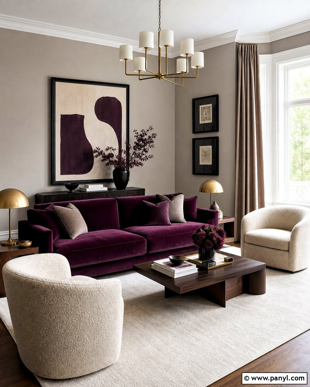
Plum purple creates an unexpected but polished contrast with Agreeable Gray. For a formal sitting room, keep the walls neutral and use plum on a velvet sofa or two matching armchairs. Add an ivory rug, taupe curtains, and walnut side tables to support the rich upholstery. Aged brass lighting highlights plum’s warmth, while charcoal accents give the room definition. Repeat the purple sparingly through artwork or one patterned pillow rather than filling the space with matching accessories. Cream boucle seating can lighten the arrangement and add texture. This complete palette feels sophisticated because the purple is deep and muted, not overly bright. Agreeable Gray provides enough warmth to connect plum with wood furniture, brass finishes, and soft neutral fabrics.
17. Agreeable Gray And Soft Lavender
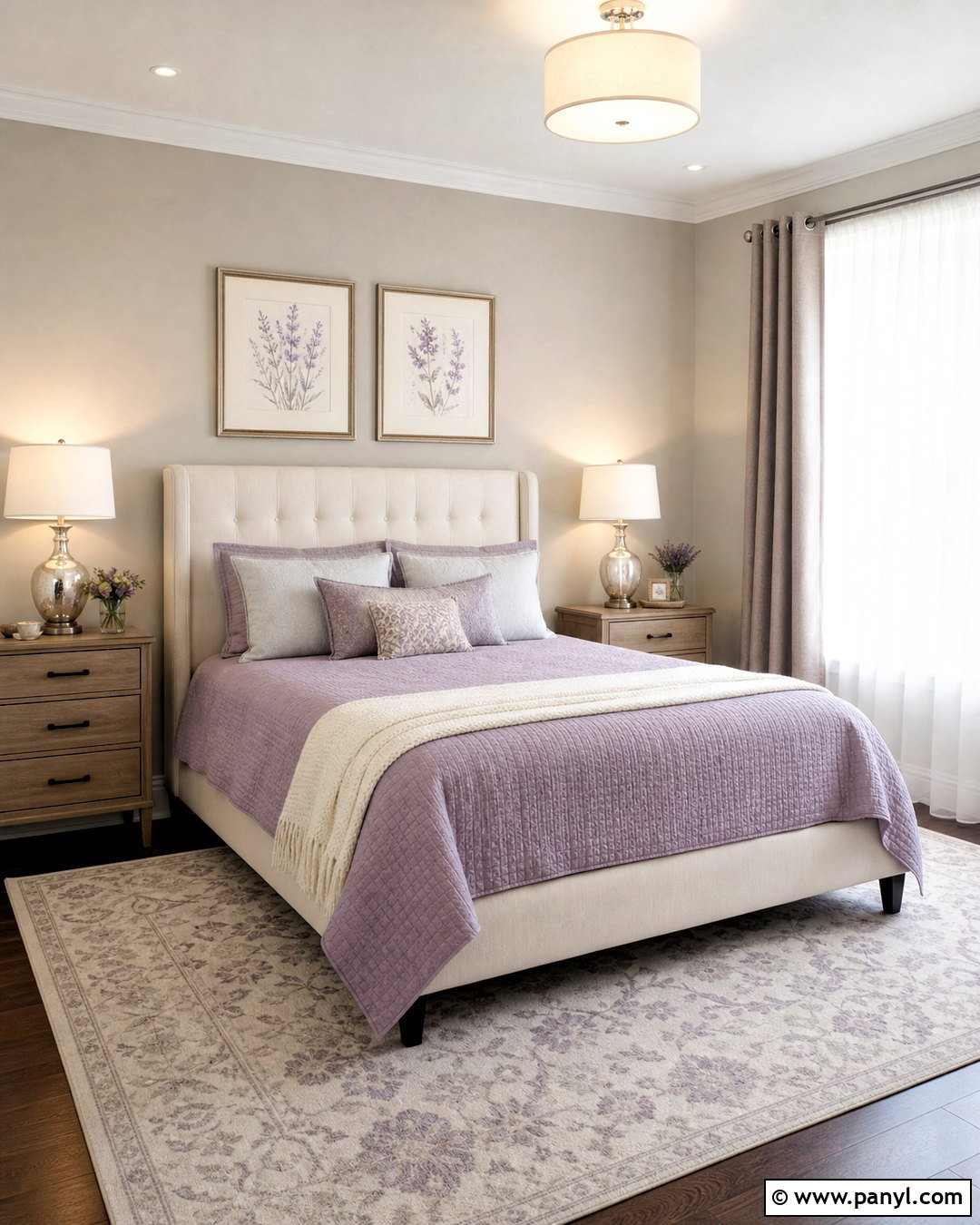
Soft lavender brings a light, restful color note to Agreeable Gray. This combination works particularly well in a guest bedroom with Agreeable Gray walls, a lavender quilt, and an ivory upholstered headboard. Add white bedding, gray-lilac pillows, and a pale patterned rug to create gentle layers. Light oak furniture keeps the room fresh, while polished nickel lamps add a clean finish. Choose sheer white curtains with heavier taupe panels for softness and practical light control. Botanical or abstract artwork can repeat small touches of lavender and green. Avoid cool blue-purple shades that may look disconnected from the warm greige walls. A dusty, grayed lavender produces a more cohesive room that feels peaceful, welcoming, and easy to update.
18. Agreeable Gray And Burgundy
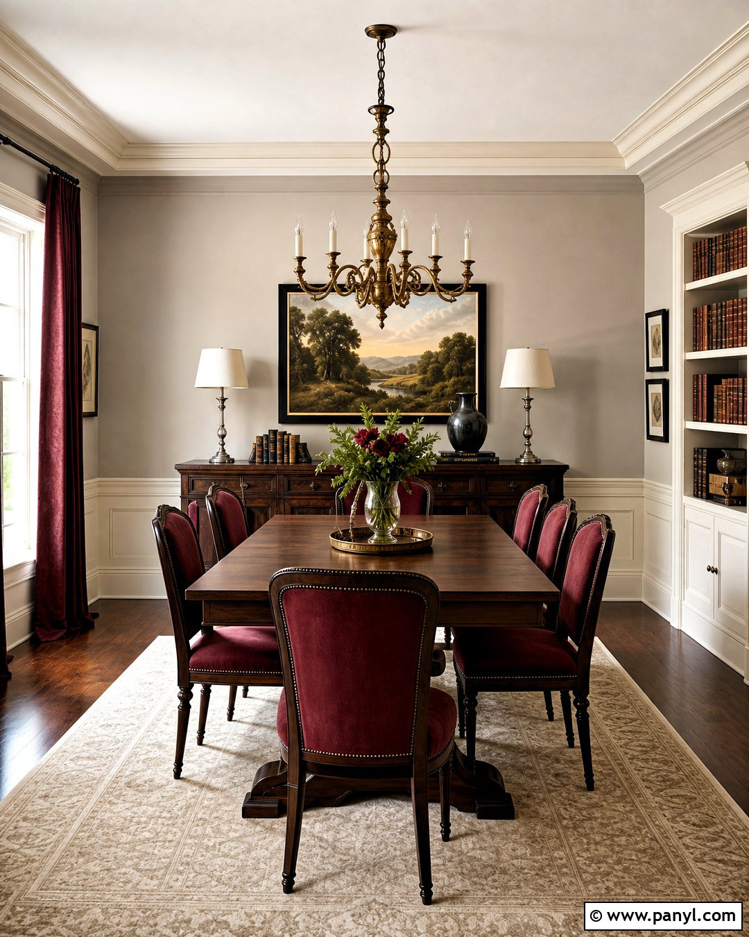
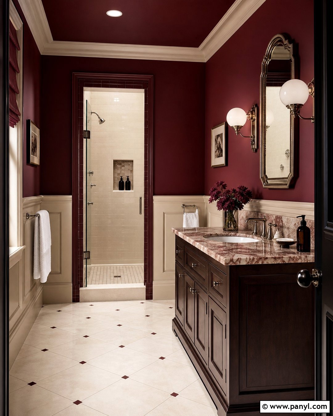
Rich burgundy gives Agreeable Gray a warm, dramatic presence suited to dining rooms, libraries, and traditional living spaces. Use Agreeable Gray on the main walls and introduce burgundy through dining chairs, full-length curtains, or a large vintage-inspired rug. Pair the red tone with dark walnut furniture, cream upholstery, and aged brass lighting. Warm white trim keeps the boundaries of the room clear and prevents the palette from feeling too dark. Add black frames, leather-bound books, and understated landscape art for depth. Burgundy should appear in substantial but controlled areas rather than numerous small decorations. The finished room feels established and inviting, while Agreeable Gray provides a lighter background that makes the deeper red look intentional instead of overpowering.
19. Agreeable Gray And Rust Orange
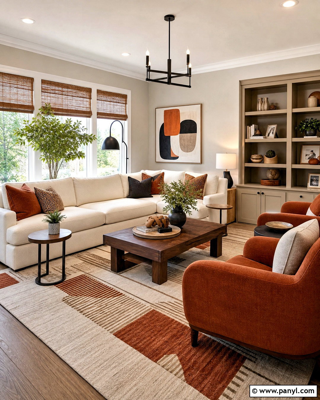
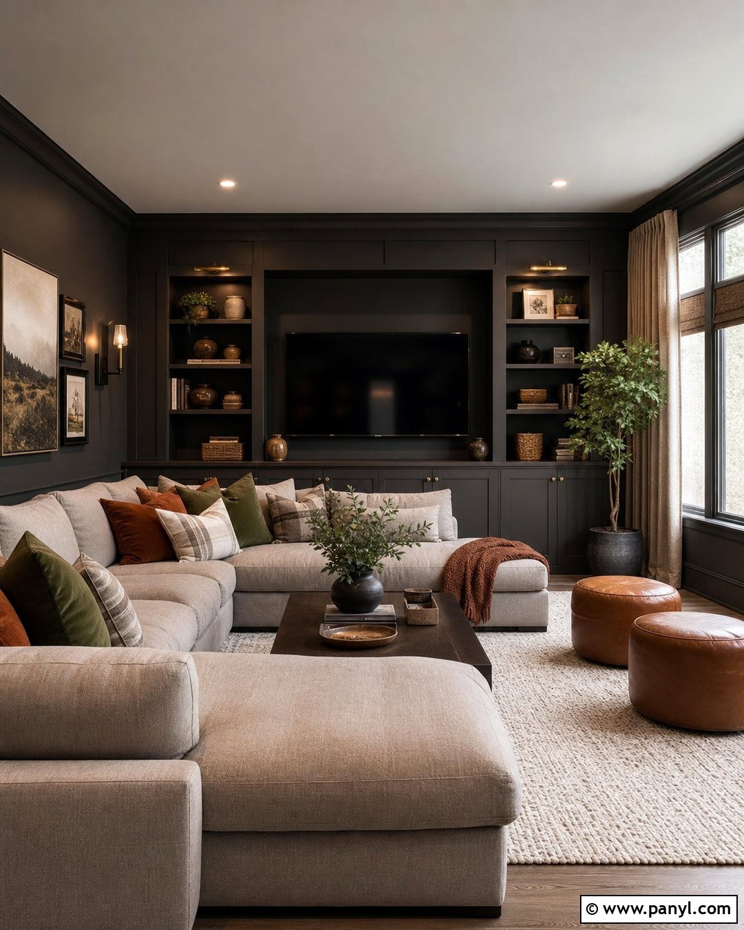
Rust orange adds energy to Agreeable Gray while maintaining an earthy, comfortable mood. Create a modern family room with Agreeable Gray walls, a warm ivory sectional, and rust-colored accent chairs. A geometric rug in cream, gray, rust, and black anchors the layout and provides clear visual connections. Use walnut tables, matte black lighting, and woven window shades to build warmth and contrast. Repeat rust in one or two cushions and a piece of abstract artwork, but allow plenty of neutral space around it. Indoor plants introduce fresh green and prevent the palette from feeling overly autumnal. This complete design is colorful enough to feel distinctive, yet the muted orange and natural materials keep it practical for everyday use throughout the year.
20. Agreeable Gray And Warm Taupe
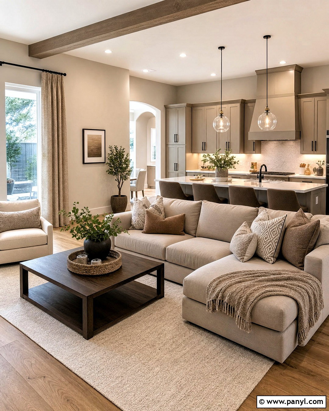
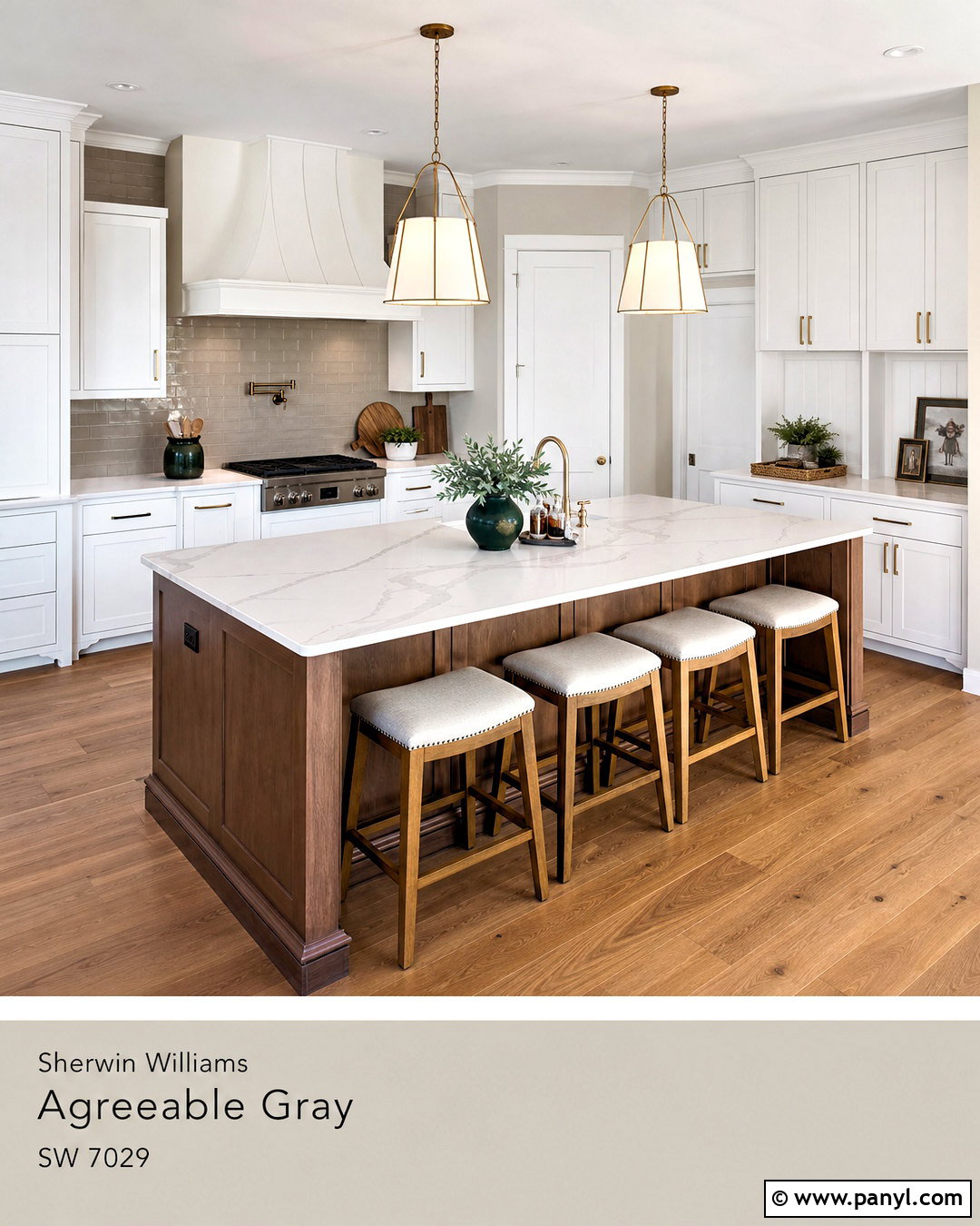
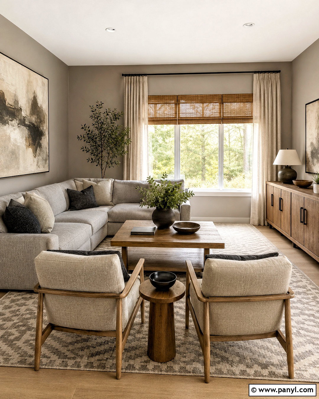
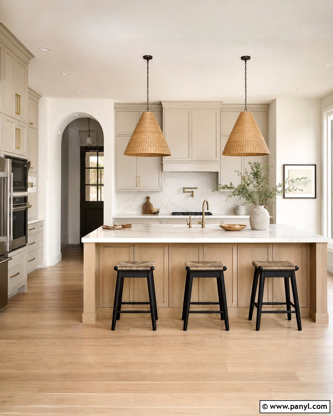
For a quiet, layered home, warm taupe is one of the easiest colors to combine with Agreeable Gray. Use Agreeable Gray on the walls, then introduce deeper taupe through kitchen cabinets, upholstered seating, or a feature wall. In an open living area, pair taupe cabinetry with creamy quartz, oak flooring, and soft white trim. Continue the color through a mushroom-toned sofa, ivory rug, and textured beige curtains. Add contrast using bronze hardware, black picture frames, and dark brown wood accents. Since both colors are understated, vary the materials and values to stop the room from looking flat. This coordinated neutral scheme flows naturally between rooms and creates a calm foundation for artwork, greenery, and changing decorative accessories.
Conclusion:
The best accent color depends on how you want Agreeable Gray to feel in your home. Navy, charcoal, and forest green create depth, while sage, dusty blue, and lavender produce a softer atmosphere. Terracotta, rust, mustard, and camel highlight its warmth. Crisp white and matte black deliver sharper definition. Before committing, sample both colors beside the flooring, countertops, furniture, and trim. Check them during daylight and under the bulbs used at night. Then repeat the accent through a few meaningful features rather than many unrelated accessories. These 20 accent colors for agreeable gray ideas make it easier to build complete, balanced rooms that feel coordinated, comfortable, and personal.

Related Ideas and Inspiration:
Leave a Reply