
Choosing kitchen paint colors is about more than finding a shade that looks good on a sample card. The right palette should complement your cabinets, countertops, flooring, appliances, and natural light while creating a welcoming place to cook and gather. Warm neutrals remain easy to live with, while earthy greens, muted blues, rich browns, and softened statement colors bring more personality. Finish also matters. Washable satin or eggshell works well on walls, while durable enamel is better suited to cabinets and trim. Before committing, test large samples beside permanent finishes during the morning, afternoon, and evening. The complete color schemes below offer practical ways to coordinate surfaces, fixtures, furniture, and decor using 20 distinctive kitchen paint colors.

1. Warm White Kitchen Paint Color
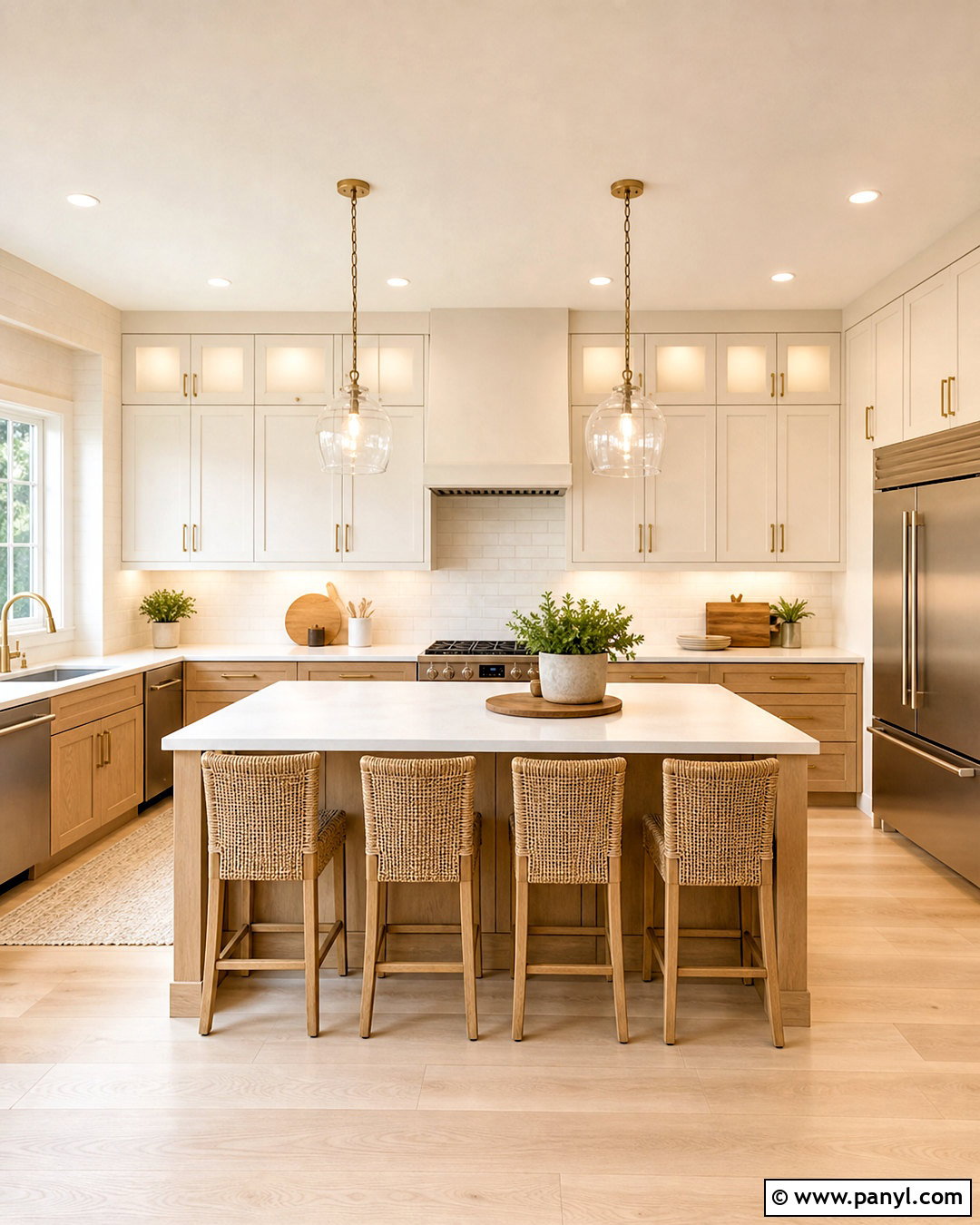
Warm white creates a bright kitchen without the sharp, clinical feeling that can come from cooler whites. Paint the walls and upper cabinets in a creamy white with subtle beige undertones, then introduce light oak lower cabinets for natural contrast. White quartz countertops with delicate tan veining will connect both finishes. For the backsplash, choose handmade off-white subway tile with slightly irregular edges and warm grout. A pale oak floor keeps the room airy, while brushed brass hardware and woven counter stools add character. Complete the kitchen with linen Roman shades, simple ceramic bowls, and clear glass pendants. This balanced scheme works especially well in kitchens that receive cool northern light or need a timeless update.
2. Cream Kitchen Paint Color
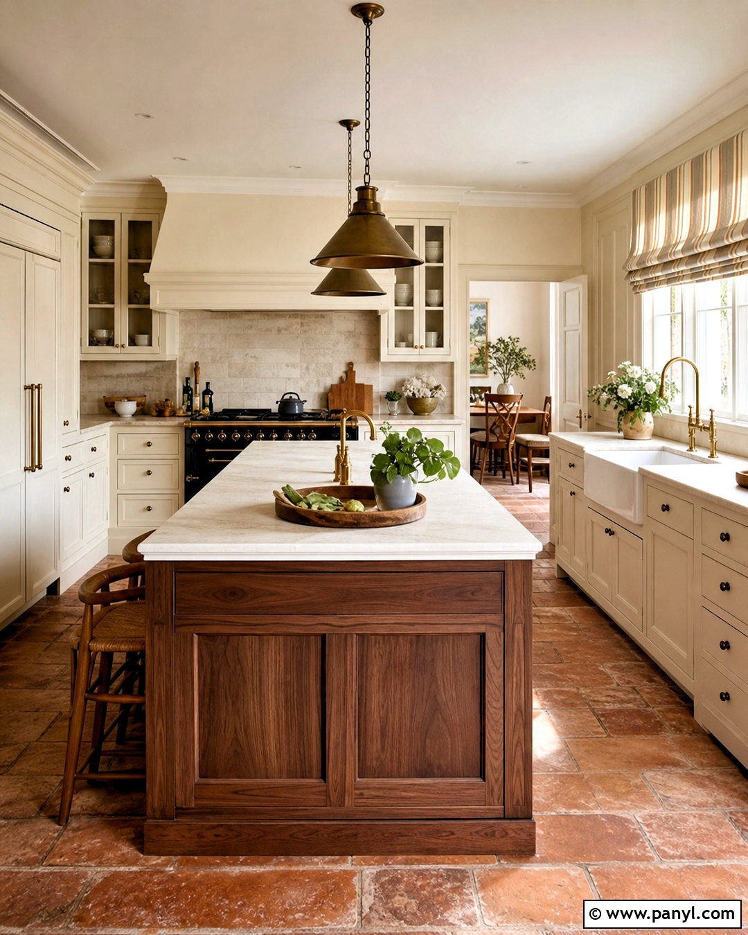
Soft cream paint gives a traditional kitchen a warmer and more comfortable appearance. Use the color across shaker-style cabinets and nearby walls, but select a slightly deeper cream for the cabinetry so each surface remains visible. Honed limestone countertops and a matching backsplash strengthen the gentle tonal effect. Medium-tone oak flooring provides enough depth to prevent the room from looking washed out. Choose antique brass knobs, a white apron-front sink, and warm bronze pendant lights for a relaxed farmhouse influence. A walnut island can anchor the center without disrupting the peaceful palette. Add striped cotton shades, wooden cutting boards, and muted green pottery for color. The finished kitchen feels sunny, polished, and inviting rather than overly yellow.
3. Soft Greige Kitchen Paint Color
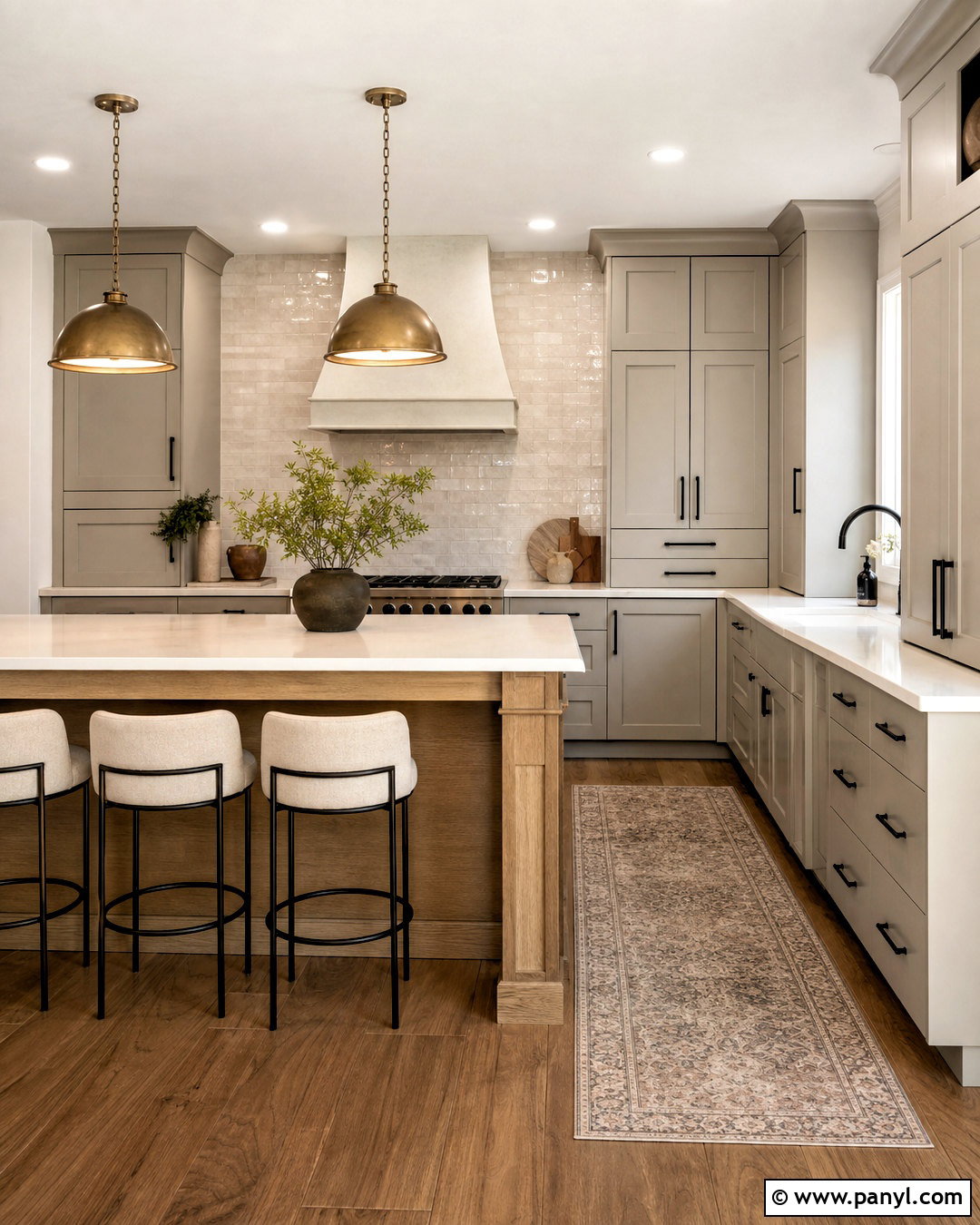
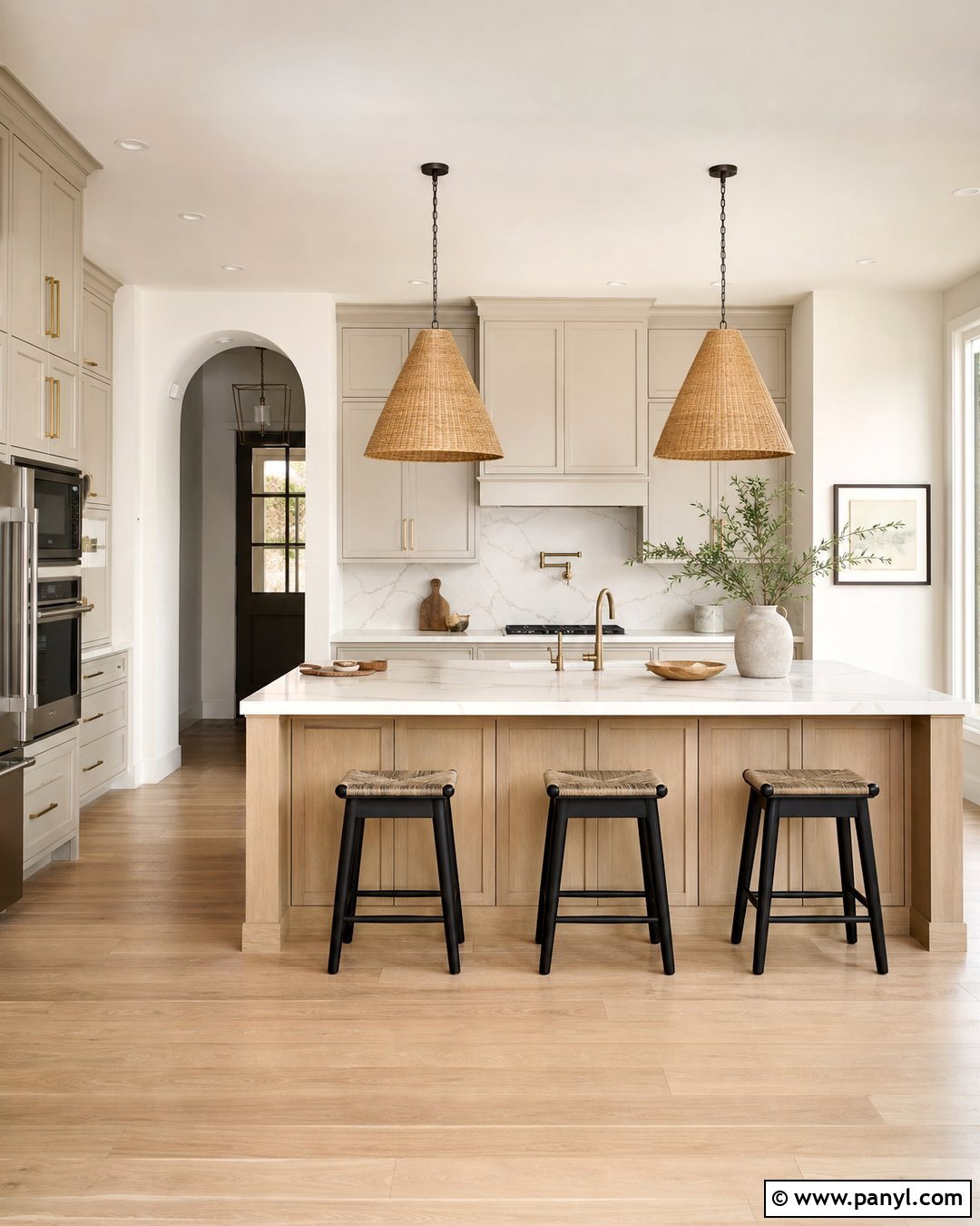
Can’t decide between gray and beige? Soft greige provides the calm quality of gray with enough warmth to coordinate with wood, stone, and metallic finishes. Paint the perimeter cabinets greige and keep the walls a soft off-white for gentle contrast. A natural oak island, warm white quartz countertops, and a cream zellige backsplash make the palette feel layered. Choose medium brown wood flooring instead of cool gray planks, which can flatten the room. Matte black hardware gives the cabinets definition, while aged brass pendants introduce warmth above the island. Finish with oatmeal-colored stools, understated pottery, and a washable vintage-style runner. This complete scheme suits modern, transitional, and updated farmhouse kitchens without relying on stark color differences.
4. Mushroom Taupe Kitchen Paint Color
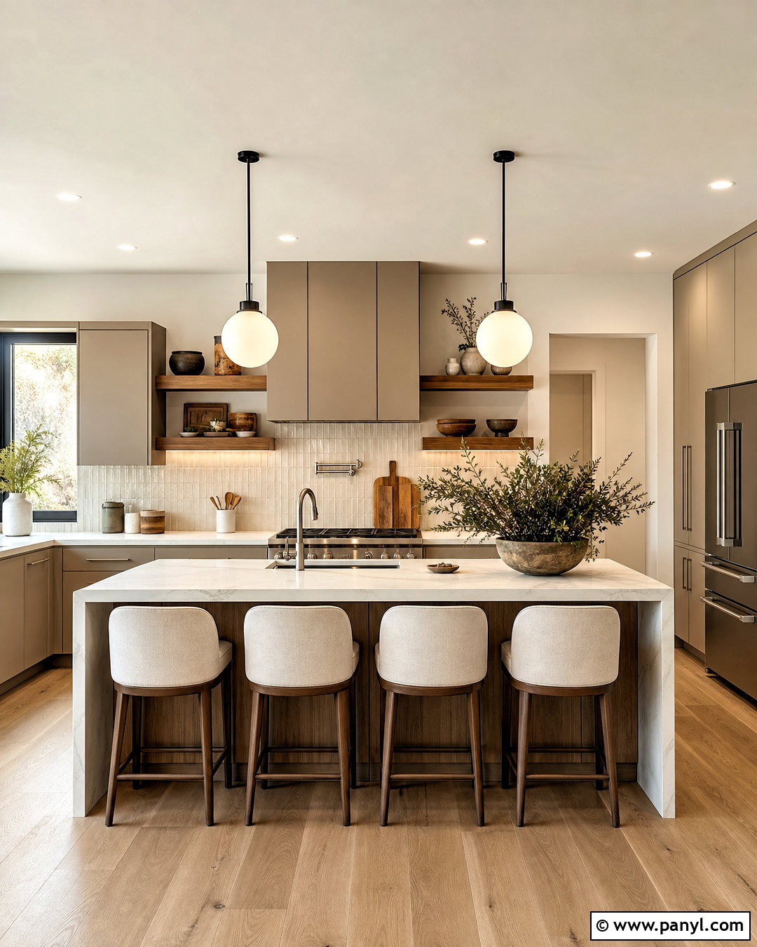
Mushroom taupe brings earthy depth to a kitchen while remaining quiet enough for everyday living. Cover flat-panel cabinets in a velvety taupe that contains balanced brown and gray undertones. Pair them with warm ivory walls and creamy marble-look quartz to keep the space open. A backsplash of elongated beige tile adds subtle texture without creating visual noise. Walnut shelves and medium oak flooring emphasize the paint’s brown undertones, while brushed nickel faucets prevent the room from feeling too warm. Use simple globe pendants, upholstered counter stools, and a few charcoal accessories for contrast. In a small kitchen, reserve mushroom taupe for lower cabinets and use ivory above. The completed room feels grounded, sophisticated, and easy to coordinate.
5. Sand Beige Kitchen Paint Color
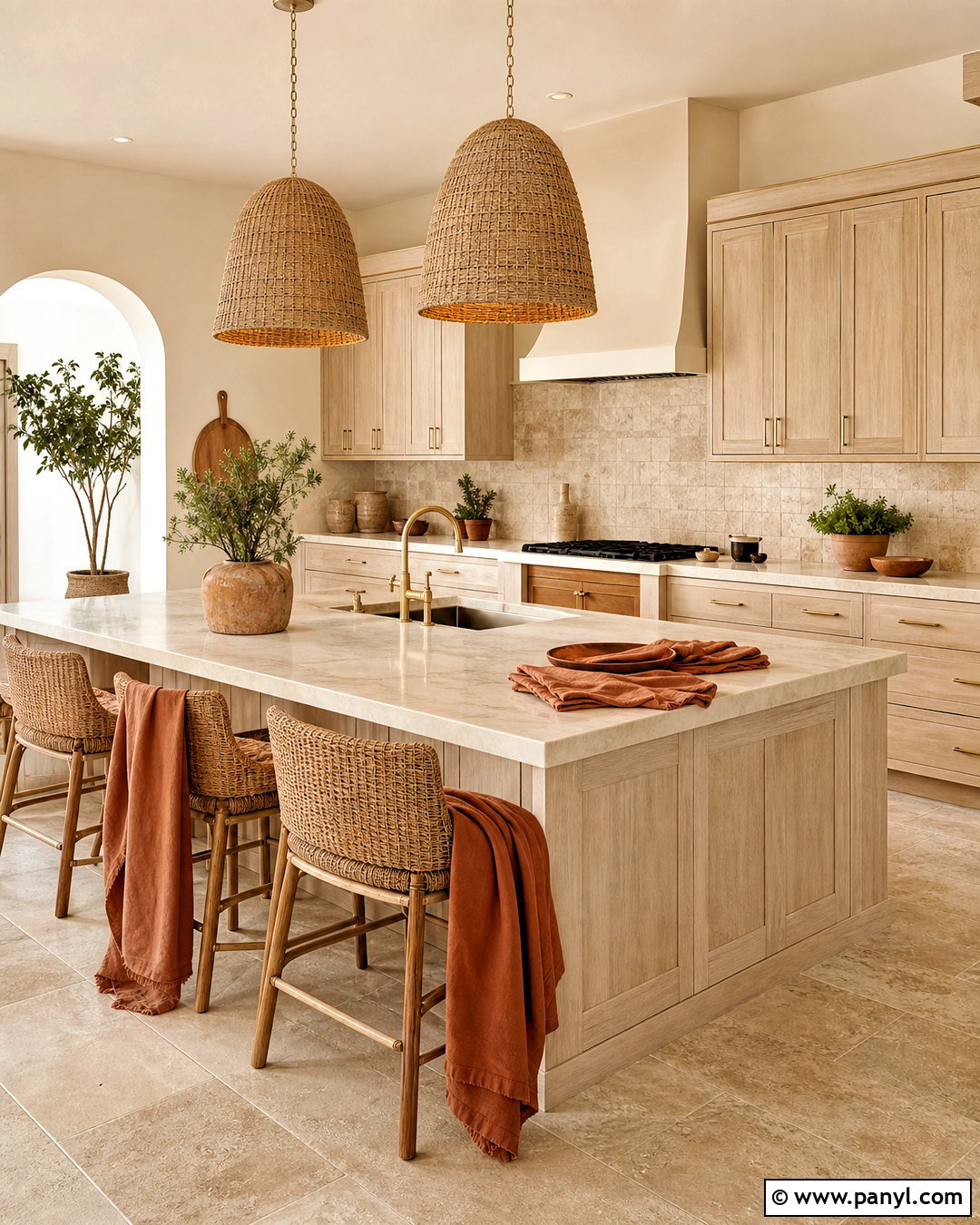
Imagine a kitchen that feels light, natural, and quietly connected to the outdoors. Sand beige walls create that effect when combined with pale wood cabinetry and softly textured materials. Paint the walls in a warm beige without strong yellow undertones, then use white oak cabinets in a clear matte finish. Cream quartz counters and a tumbled travertine backsplash continue the organic palette. Add light limestone-look flooring or wide oak planks, depending on the home’s architecture. Brushed brass pulls, woven pendants, and backless rattan stools contribute warmth without making the design feel themed. A muted clay-colored runner and leafy potted herbs offer gentle accents. This kitchen paint color works beautifully in open layouts where visual flow is especially important.
6. Butter Yellow Kitchen Paint Color
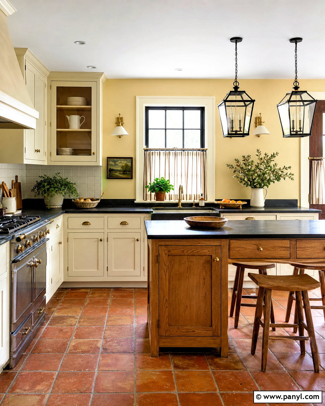
Butter yellow can make a kitchen feel cheerful without becoming loud or overly playful. Choose a pale, softened yellow for the walls and balance it with warm white shaker cabinets. A medium oak island gives the sunny color a sturdy visual anchor. Use soapstone-look countertops, creamy square backsplash tile, and aged brass hardware to create a relaxed heritage look. Terracotta flooring adds warmth, although natural oak also works in more contemporary homes. Black-framed pendants and a dark bronze faucet provide small, controlled points of contrast. Keep accessories simple with white stoneware, striped café curtains, and wooden utensils. The resulting kitchen feels bright even on cloudy days, making this palette particularly helpful for rooms with limited sunlight or smaller windows.
7. Terracotta Kitchen Paint Color
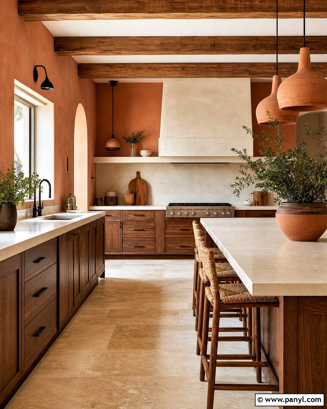
Terracotta paint surrounds the kitchen with earthy warmth and works best when the rest of the palette is carefully edited. Apply a muted clay shade to the walls, then use natural walnut or medium oak cabinets rather than competing painted finishes. Cream quartz countertops and an ivory plaster-style backsplash brighten the room while maintaining its organic character. Choose aged brass hardware, a bronze faucet, and simple ceramic pendant lights. Pale stone flooring can cool the palette slightly, while terracotta tile creates a richer, more rustic effect. Add oatmeal linen shades, woven stools, and matte black accents in small amounts. Keeping the ceiling warm white prevents the saturated walls from feeling heavy. The final design is cozy, expressive, and balanced by honest natural materials.
8. Dusty Rose Kitchen Paint Color
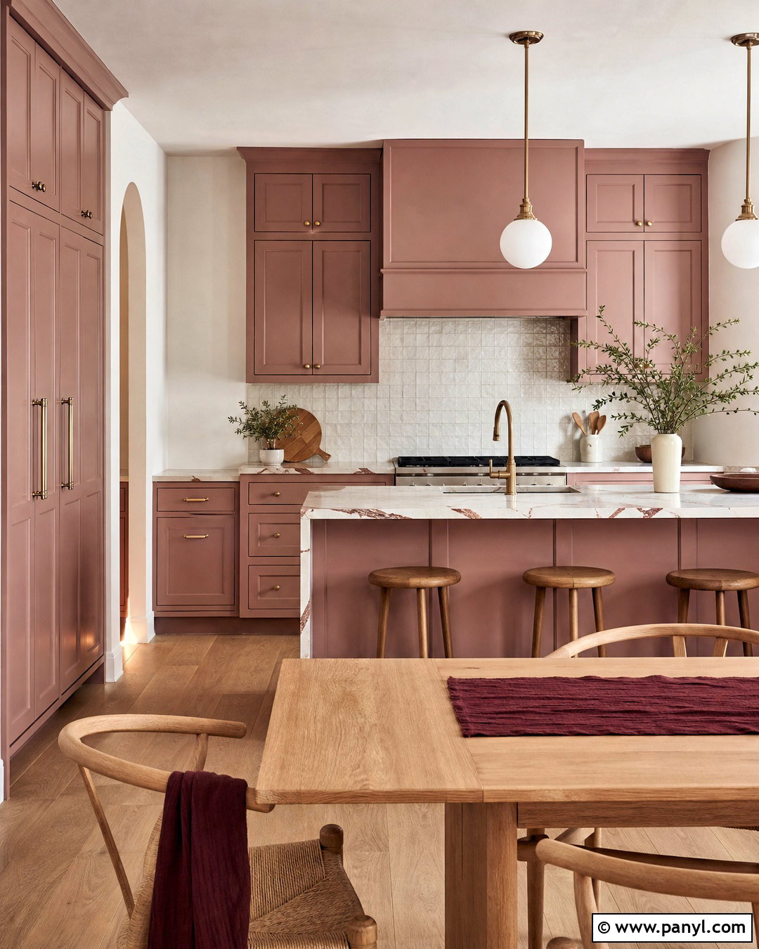
A muted dusty rose can look surprisingly sophisticated when treated as an earthy neutral. Paint the cabinets in a soft pink with brown or clay undertones, then use warm white walls to give the color breathing room. White quartz countertops with gentle burgundy veining will reinforce the palette without appearing overly coordinated. For a softer finish, install cream handmade tile behind the range and pale oak flooring throughout. Brushed brass hardware, opal glass pendants, and a light wood dining table create an elegant but approachable setting. Add deeper accents through burgundy seat cushions, dark wood serving boards, or a patterned runner. Avoid sugary pink accessories. The completed kitchen should feel warm and grown-up, with dusty rose acting as a calm foundation instead of a novelty.
9. Sage Green Kitchen Paint Color
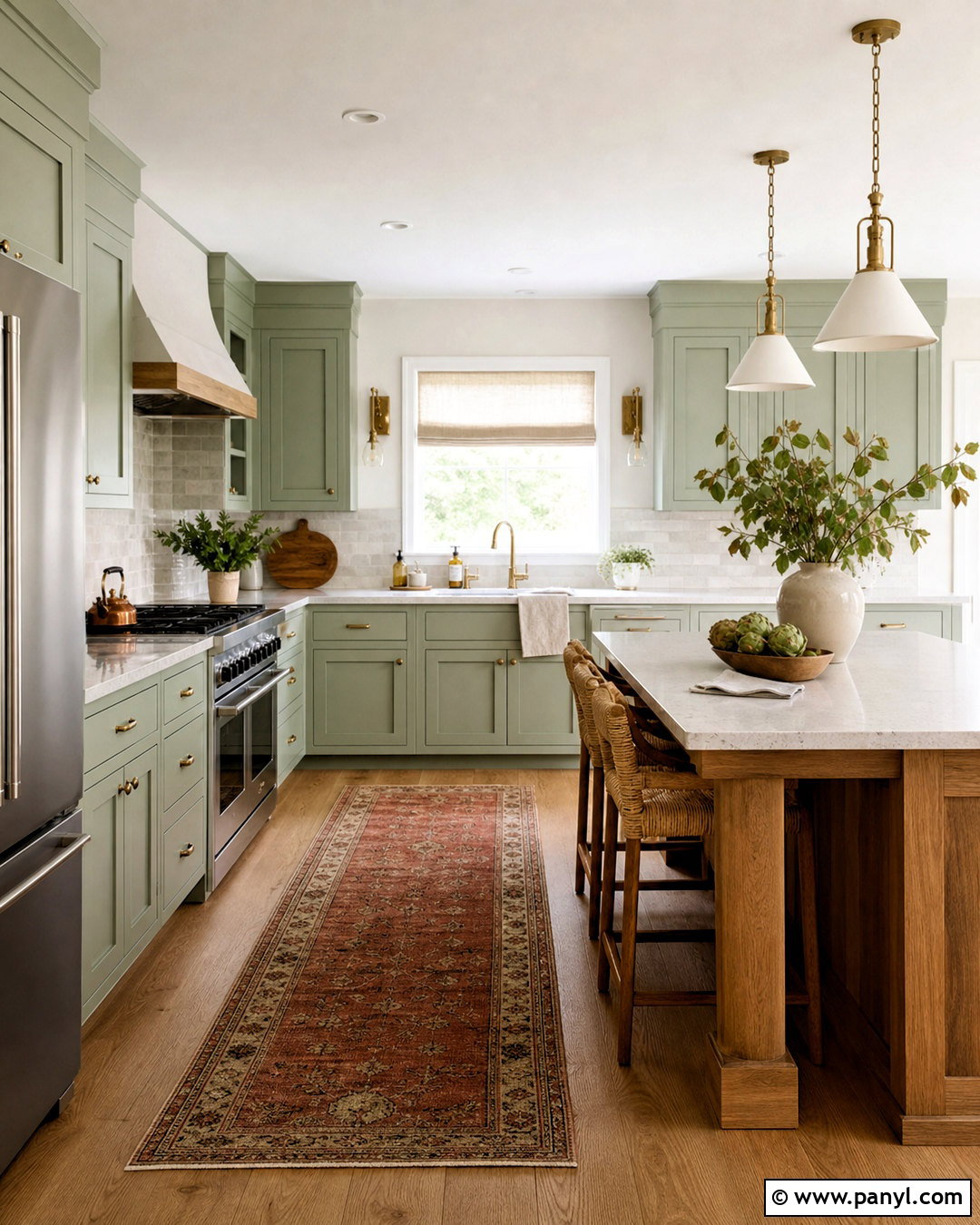
Sage green brings soft color into a kitchen while pairing easily with common natural finishes. Use sage on shaker cabinets and select creamy white for the walls, ceiling, and trim. Pale quartz countertops and an off-white zellige backsplash keep the room bright while allowing the green cabinetry to remain the main feature. White oak flooring, woven stools, and open wooden shelves create warmth. Choose aged brass pulls and a bridge-style faucet for a classic look, or matte black hardware for cleaner contrast. A natural wood island can break up the painted cabinetry in a larger room. Finish with linen window shades, ivory ceramics, and a faded rust runner. This cohesive palette feels fresh, relaxed, and suitable for both traditional and contemporary homes.
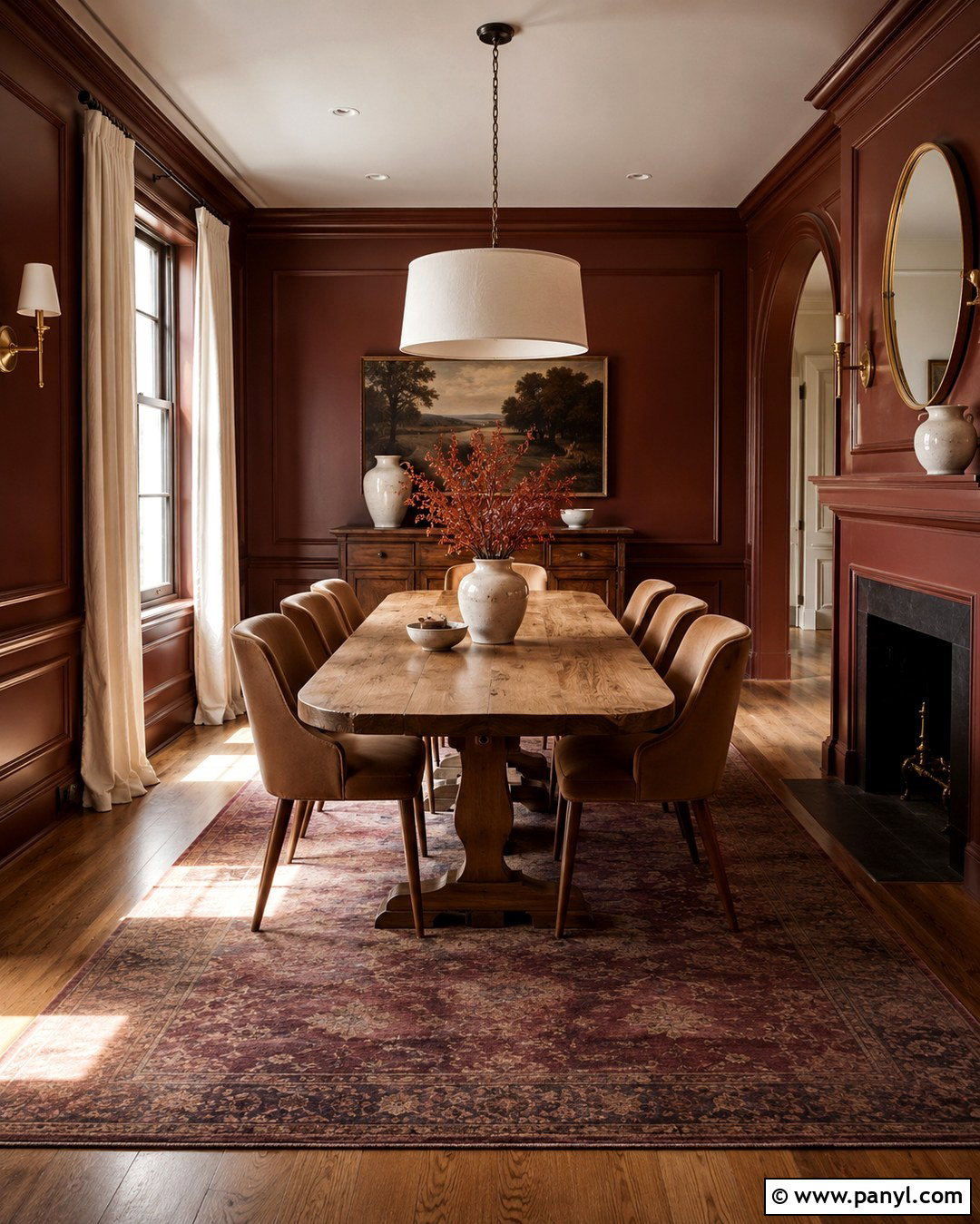
10. Olive Green Kitchen Paint Color
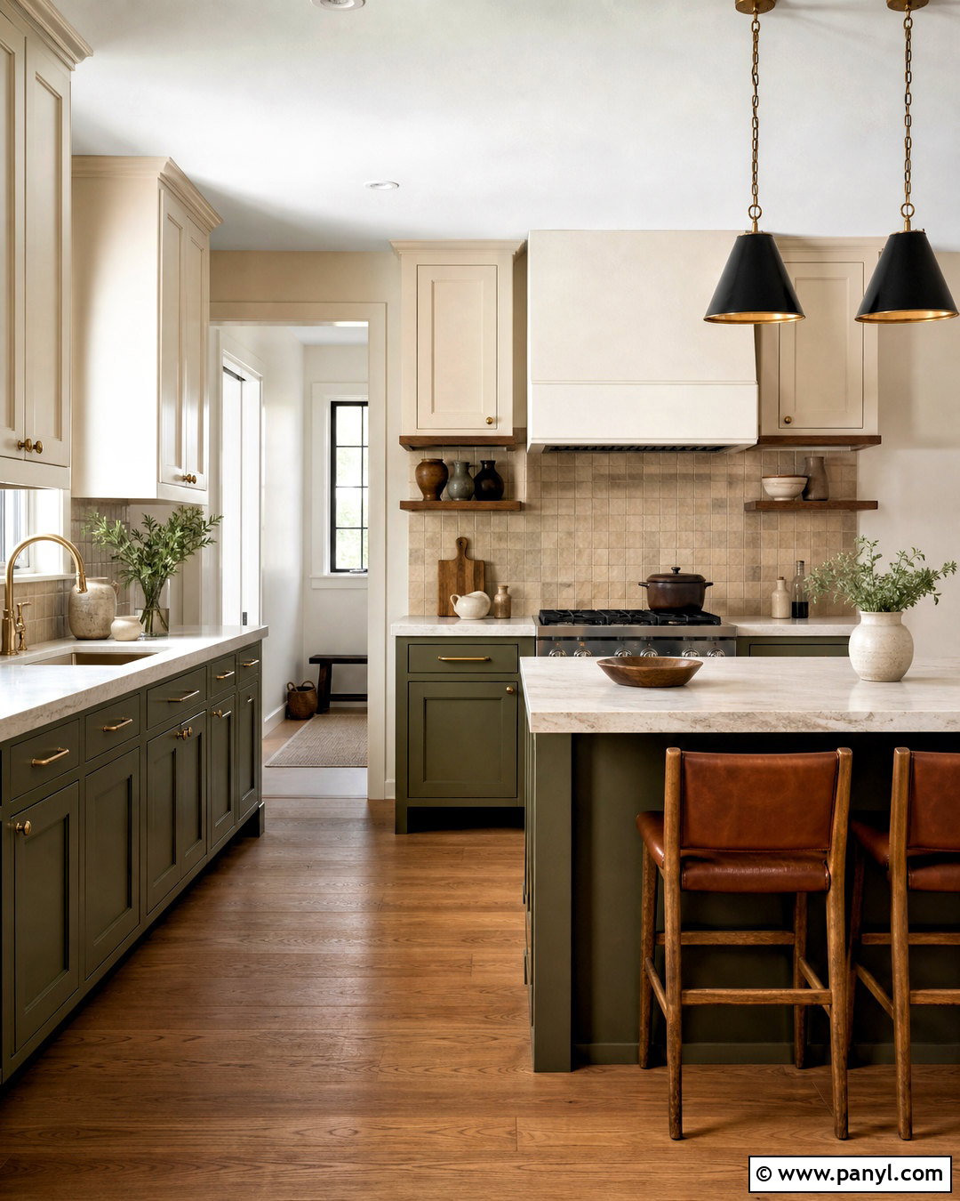
Olive green delivers more warmth and depth than lighter botanical shades. Paint lower cabinets and a substantial island in an earthy olive, then use warm cream on upper cabinets and walls. The two-tone arrangement keeps the darker color from overwhelming the room. Select creamy marble-look countertops and handmade tan backsplash tile to bring out the olive paint’s golden undertones. Walnut shelving, medium oak flooring, and antique brass fixtures complete the natural palette. Black metal pendants can add structure above the island, while saddle-brown leather stools create another rich layer. Display only a few pieces of cream pottery and amber glass. The finished kitchen feels established and comfortable, combining saturated color with materials that will continue to look attractive as they age.
11. Forest Green Kitchen Paint Color
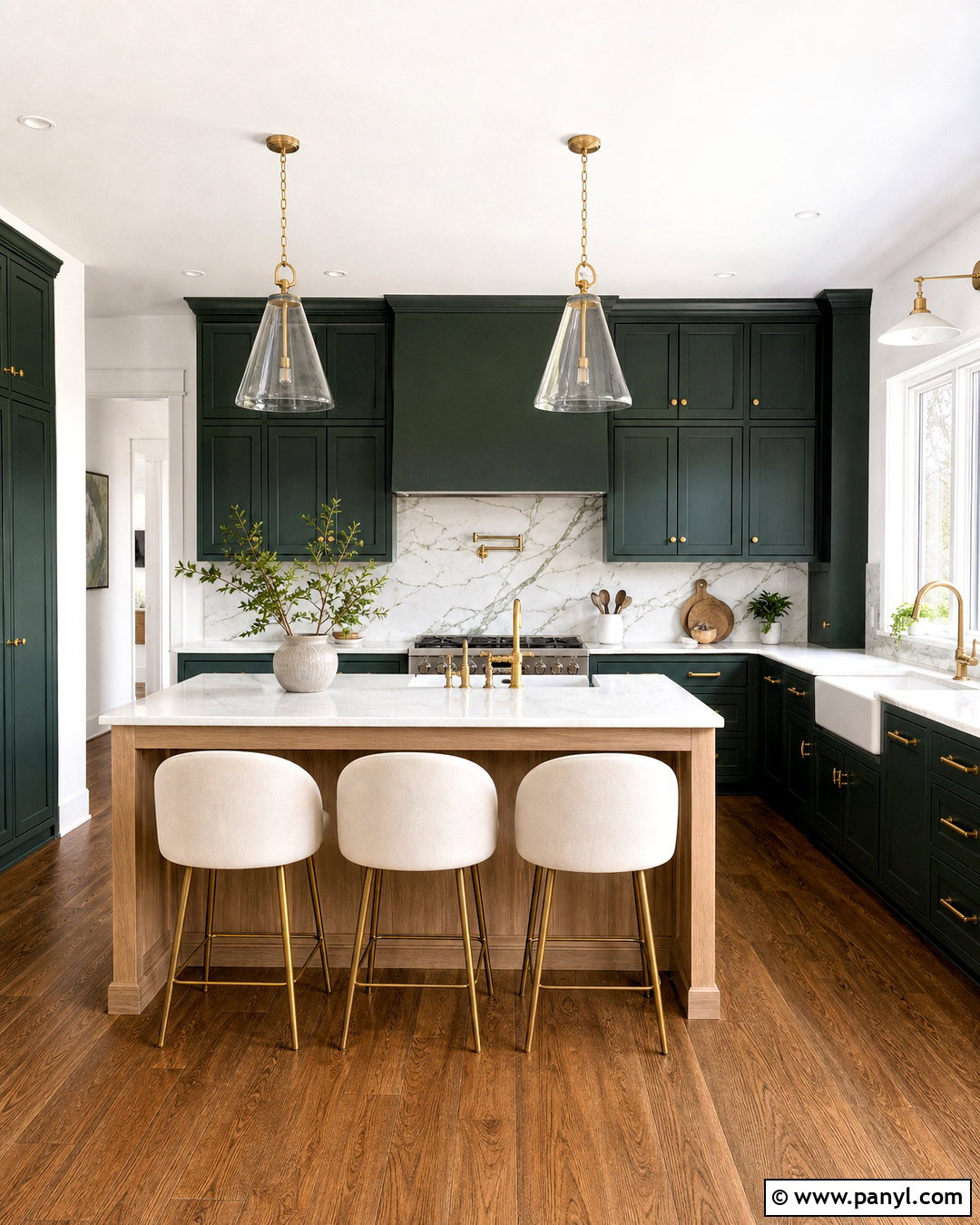
Deep forest green turns a kitchen into a dramatic gathering space, especially when there is generous daylight. Use the color across lower and upper cabinets for a confident, built-in appearance. Keep walls and ceilings warm white to preserve brightness, or paint only a small pantry in the same green for continuity. White marble-look quartz counters provide crisp contrast, while a backsplash with subtle green veining connects the surfaces. Add walnut flooring, unlacquered brass hardware, and clear glass pendants to soften the dark cabinetry. A light oak island can introduce relief in a larger layout. Finish with ivory counter stools, simple stoneware, and a narrow patterned runner. Strong task lighting under the cabinets will ensure the completed room remains practical as well as atmospheric.
12. Pale Blue Kitchen Paint Color
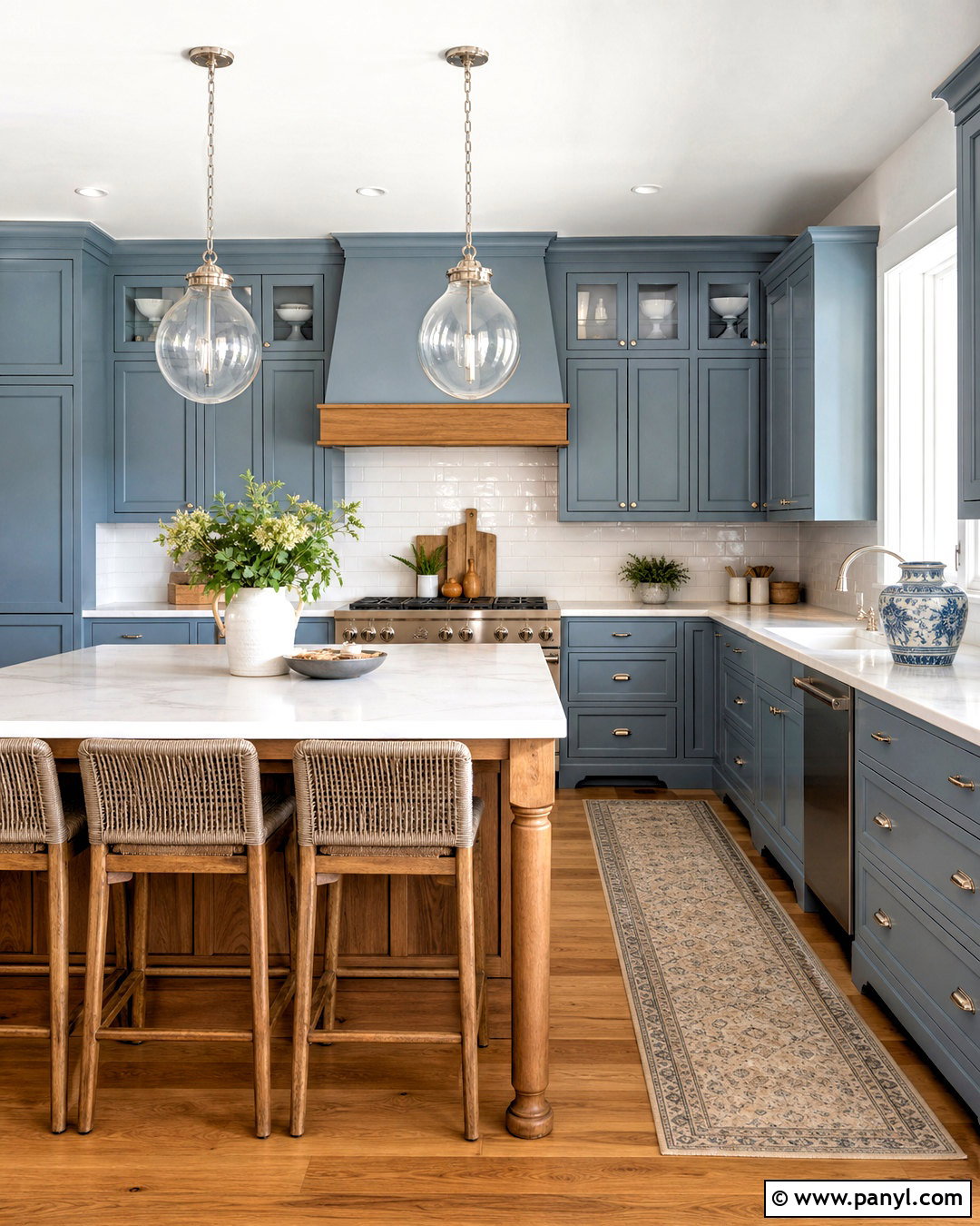
Pale blue gives a busy kitchen a clean, open feeling without defaulting to white. Choose a soft blue with a slight gray undertone for the cabinets, then paint the walls in a warm white that prevents the scheme from feeling chilly. White quartz counters and glossy ivory subway tile reflect light around the room. Natural oak flooring and a matching wood island add warmth where it matters most. Polished nickel hardware creates a crisp finish, although aged brass can produce a softer traditional look. Complete the space with woven counter stools, glass pendant lights, and a washable runner containing blue and beige. This palette is especially effective in compact kitchens because the cabinetry remains distinctive while still appearing light and visually unobtrusive.
13. Dusty Blue Kitchen Paint Color
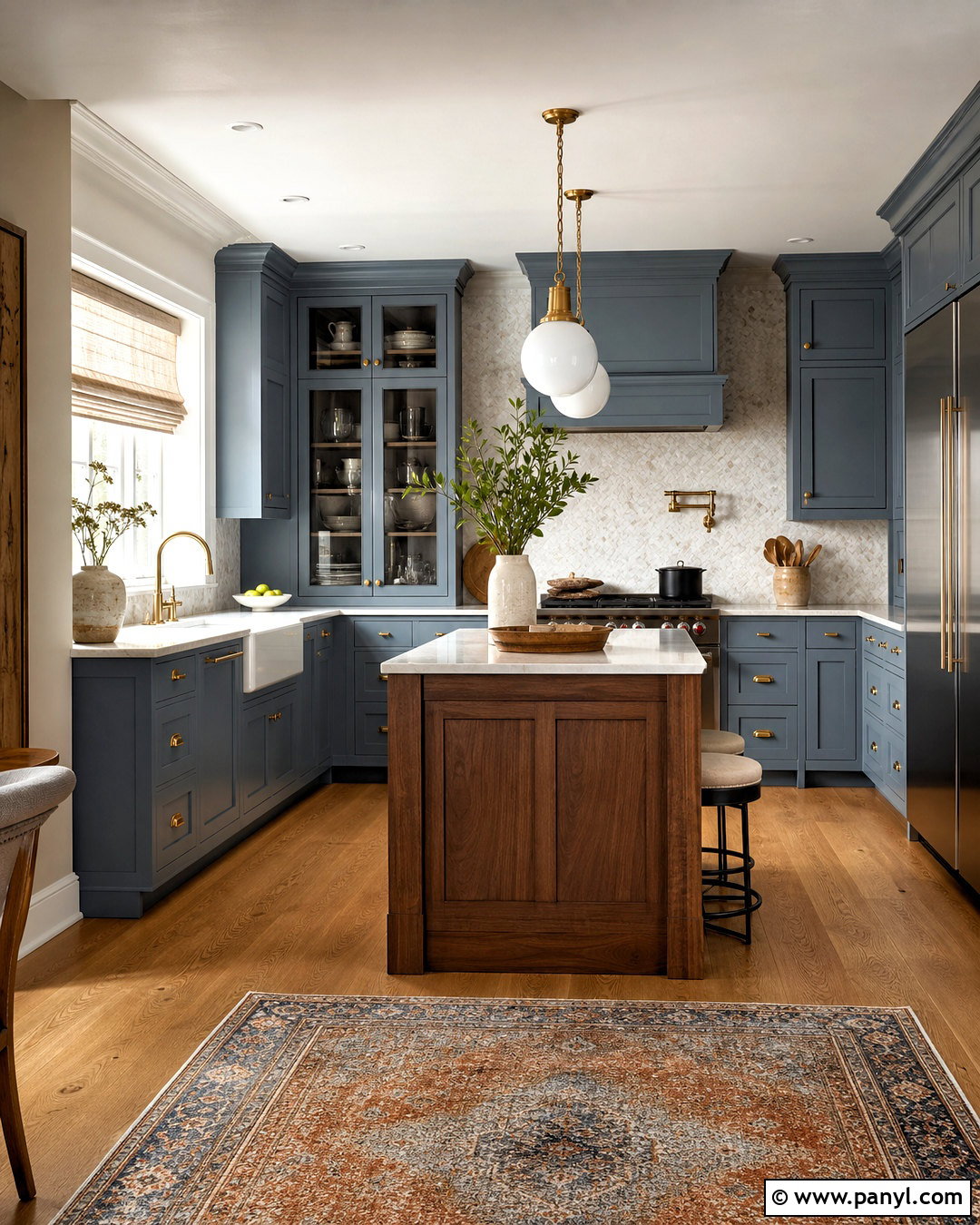
Dusty blue offers more presence than a pale pastel but remains softer than navy. Cover shaker cabinets in a muted blue with noticeable gray undertones, then introduce warm ivory walls and trim. Cream quartz countertops, a marble mosaic backsplash, and medium oak flooring create a balanced mixture of cool and warm surfaces. For the island, use stained walnut or repeat the dusty blue for a more unified effect. Satin brass hardware brings out the color’s subtle warmth, while white globe pendants keep the design fresh. Add oatmeal linen shades, striped seat cushions, and a vintage-style rug with rust details. The complete kitchen feels calm and collected rather than coastal, making dusty blue suitable for urban apartments, suburban homes, and traditional cottages alike.
14. Navy Blue Kitchen Paint Color
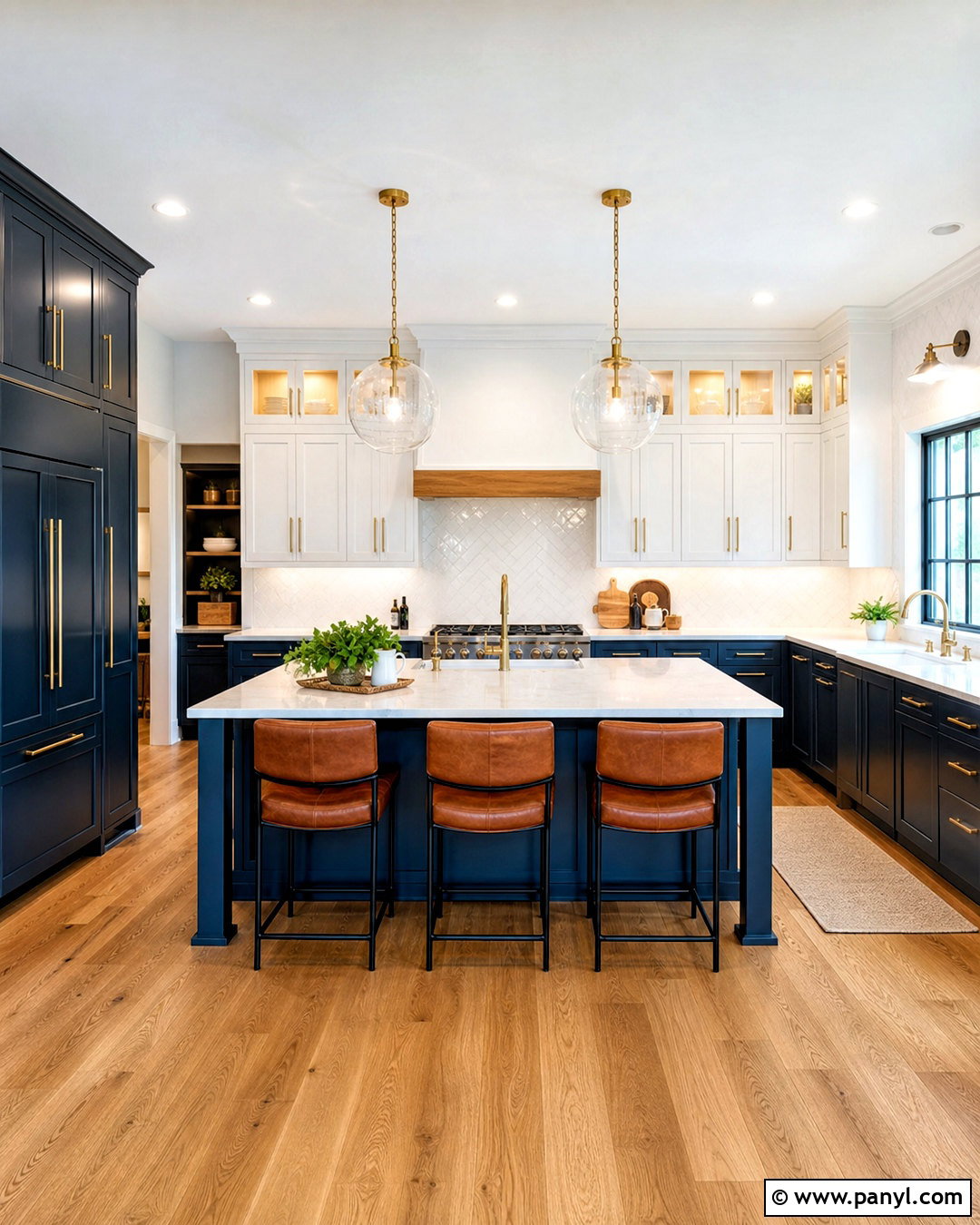
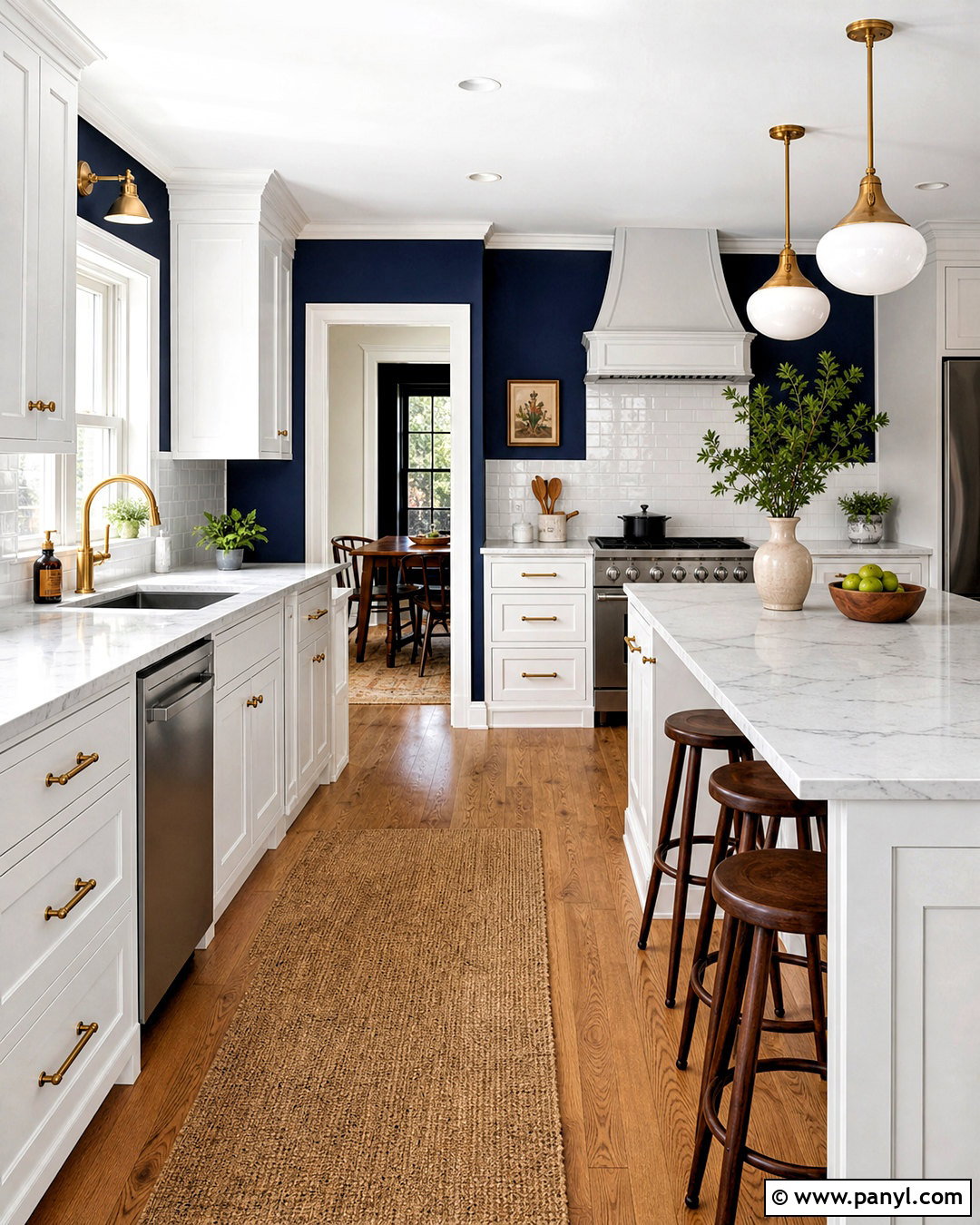
Navy blue cabinetry creates a polished kitchen with strong contrast and lasting visual impact. Apply navy to lower cabinets and the island, then use soft white on the upper cabinets and walls to maintain an open feeling. Bright quartz countertops and a white herringbone backsplash will reflect light against the dark paint. Warm oak flooring prevents the blue from reading as cold, while brass pulls and oversized globe pendants introduce a classic metallic accent. Saddle leather stools add another warm material around the island. If the kitchen is small, limit navy to one cabinet run or a freestanding pantry. Include plenty of undercabinet lighting and keep decorative objects restrained. The resulting scheme feels tailored, practical, and dramatic without becoming overly formal.
15. Deep Teal Kitchen Paint Color
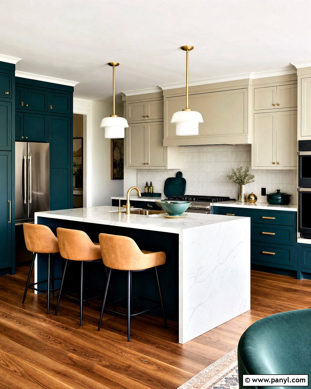
For a richer alternative to standard blue or green, deep teal creates an expressive yet balanced kitchen. Use teal on the island and lower cabinetry, then choose pale putty paint for the upper cabinets and surrounding walls. White quartz with subtle gray veining keeps work surfaces bright. A backsplash of creamy vertical tile adds texture and height, while walnut floors connect with the teal’s warm green undertones. Choose brushed brass hardware, a bronze faucet, and milk-glass pendants for a layered finish. Counter stools upholstered in camel-colored fabric will stand out beautifully against the island. Repeat teal sparingly in a runner or ceramic vase. This complete design works best when natural and artificial lighting are strong enough to reveal the paint’s changing blue-green character.
16. Soft Gray Kitchen Paint Color
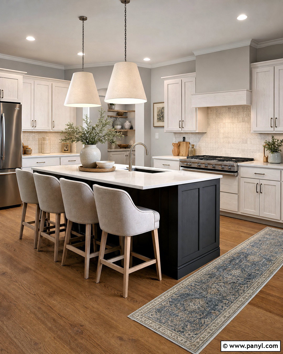
Soft gray can still feel current and welcoming when it contains warm undertones and is surrounded by natural materials. Paint the walls a light dove gray, then use white oak cabinetry to prevent the room from looking flat. A charcoal-painted island gives the center definition without repeating gray on every surface. Select warm white quartz countertops and a textured ivory backsplash rather than cool blue-white materials. Medium oak flooring, brushed nickel hardware, and linen pendant shades complete the understated palette. Add beige counter stools, handmade pottery, and a muted blue runner for gentle variation. This scheme is useful when existing stainless steel appliances need to blend naturally into the design. The finished kitchen appears clean and calm but avoids the cold, monochromatic effect of older gray rooms.
17. Charcoal Kitchen Paint Color
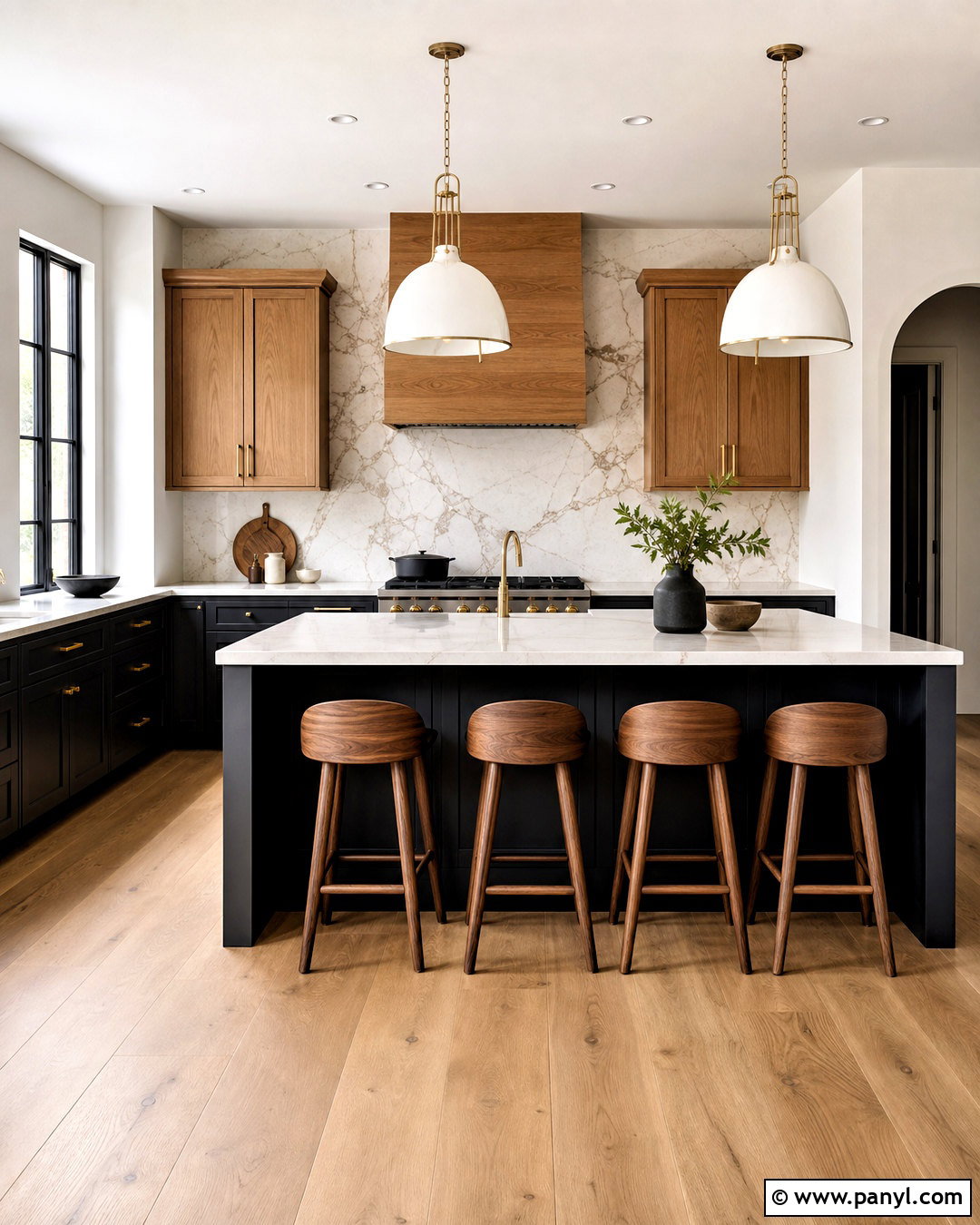
Charcoal paint gives cabinetry an architectural quality and can disguise everyday marks better than very pale finishes. Use charcoal on the lower cabinets and a large island, balancing it with creamy white walls and warm wood upper cabinets. Pale quartz countertops provide a bright working surface, while a full-height marble-look backsplash creates movement behind the range. Wide oak flooring and walnut counter stools soften the dark paint. Choose brushed brass pulls and sculptural white pendants for strong but controlled contrast. In a narrow kitchen, keep tall pantry cabinets charcoal but leave other surfaces light. Add only a few black accents so the room does not become visually heavy. The complete scheme feels modern, grounded, and comfortable enough for daily family use.
18. Chocolate Brown Kitchen Paint Color
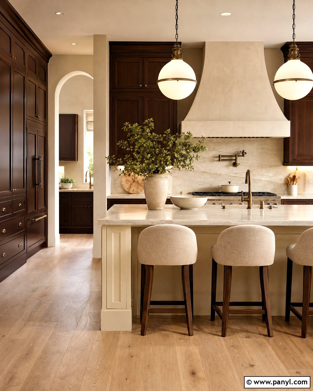
Rich chocolate brown can make a kitchen feel warm, intimate, and connected to natural wood. Paint the cabinets in a deep brown with subtle red undertones, using a satin finish that reflects a small amount of light. Pair them with creamy plaster-colored walls, pale stone countertops, and a beige slab backsplash. Light oak flooring offers contrast, while bronze hardware and softly rounded pendant lights continue the tonal warmth. Consider a cream-painted island if the room needs a brighter center, or repeat the brown for a more enveloping design. Upholstered stools in oatmeal fabric prevent the hard surfaces from feeling severe. Simple ivory ceramics and greenery complete the room. This color scheme provides drama without the sharpness associated with pure black cabinetry.
19. Muted Plum Kitchen Paint Color
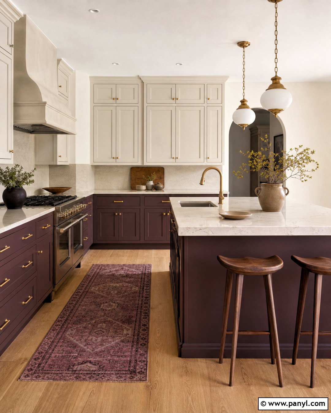
Muted plum introduces unexpected color while maintaining an earthy, sophisticated mood. Select a brown-based plum for an island and lower cabinetry, then paint upper cabinets and walls in a warm mushroom white. Cream quartz counters with faint mauve veining will quietly link the two colors. Use light oak flooring and a soft beige backsplash to prevent the purple undertones from dominating. Antique brass hardware, opal pendant lights, and walnut stools add warmth and refinement. A runner containing faded rust, plum, and tan can reinforce the palette without becoming overly decorative. Keep appliances and small accessories neutral. When treated as part of a complete material scheme, plum feels distinctive rather than theatrical and works particularly well in kitchens connected to formal dining or living areas.
20. Soft Black Kitchen Paint Color
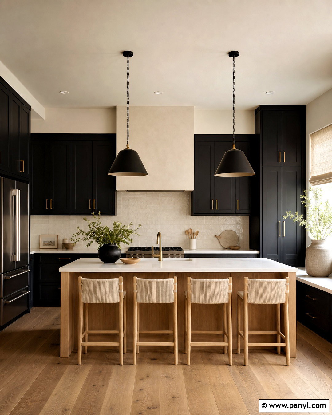
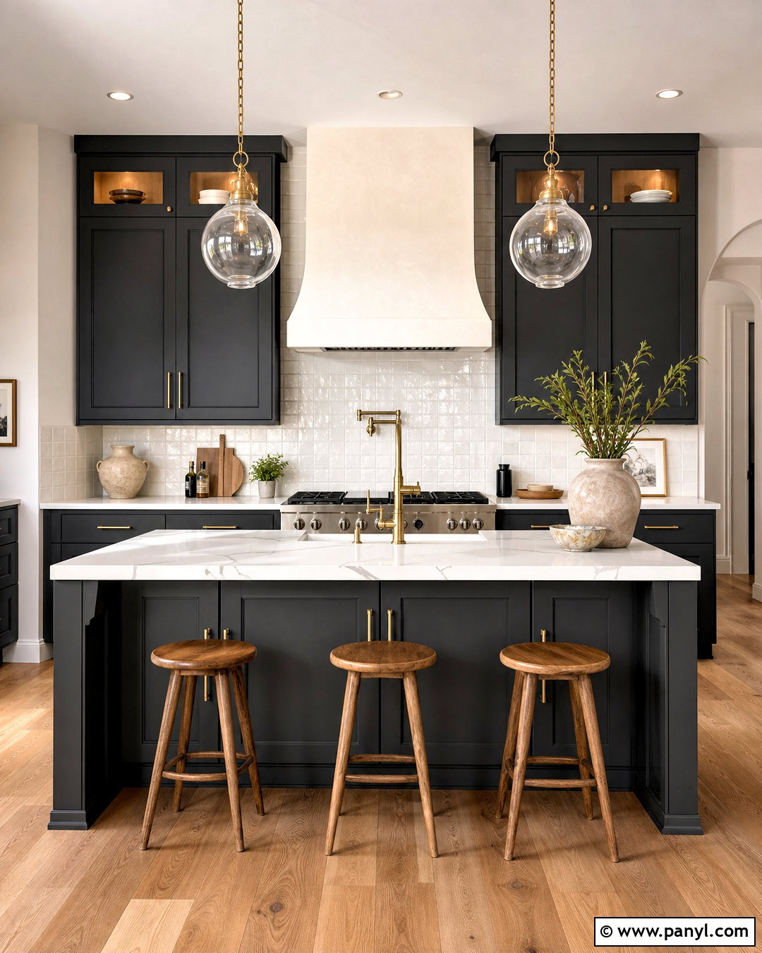
Soft black creates impressive depth but is easier to live with than a harsh, blue-based black. Paint flat-panel or simple shaker cabinets in a warm off-black, then pair them with creamy walls and a light oak ceiling or floor. Thick white quartz countertops and an ivory backsplash provide essential brightness. For the island, consider natural white oak to break up the dark cabinetry and create a welcoming central feature. Brushed brass hardware adds warmth, while matte black pendants keep the silhouette streamlined. Use light woven stools, pale linen shades, and minimal stoneware to soften the overall composition. Good undercabinet and ceiling lighting is essential. The finished kitchen feels contemporary and bold while retaining enough warmth for a realistic, comfortable home.
Conclusion:
The best kitchen paint colors support the way the entire room looks, feels, and functions. Instead of choosing paint in isolation, compare each shade with your fixed countertops, backsplash, flooring, appliances, and nearby rooms. Warm whites, greige, and beige provide flexible foundations, while green, blue, terracotta, plum, brown, and black create stronger character. Dark colors usually benefit from pale counters, reflective surfaces, and layered lighting. Lighter colors become more interesting when paired with wood, stone, and textured tile. Always test large samples on several walls or cabinet doors before making a final decision. By building a coordinated palette instead of focusing on one surface, these kitchen paint colors can create a complete and lasting design.

Related Ideas and Inspiration:
Leave a Reply