
Choosing the right companion color can make Alabaster White feel warmer, fresher, or more dramatic. These 20 colors that go with alabaster white ideas cover soft neutrals, earthy greens, classic blues, rich accent shades, and warm natural tones. Sherwin-Williams describes Alabaster SW 7008 as a soft, warm, balanced white, so it works especially well in layered palettes rather than stark, high-contrast combinations alone. () Use it for walls, cabinets, trim, or exterior siding, then select a partner based on the room’s lighting and existing finishes. Wood, stone, metal, textiles, and flooring should all support the pairing. Always sample paint in morning and evening light before committing. Below, you will find complete rooms and coordinated schemes built around 20 colors that go with alabaster white ideas.

1. Alabaster White And Accessible Beige
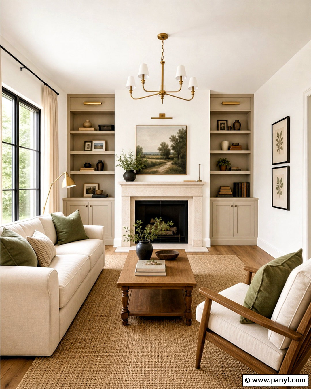
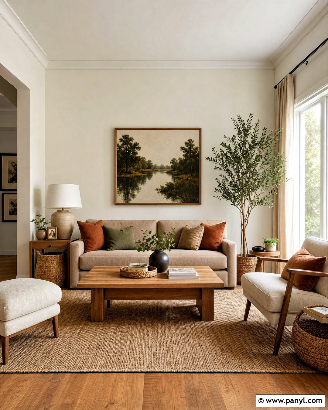
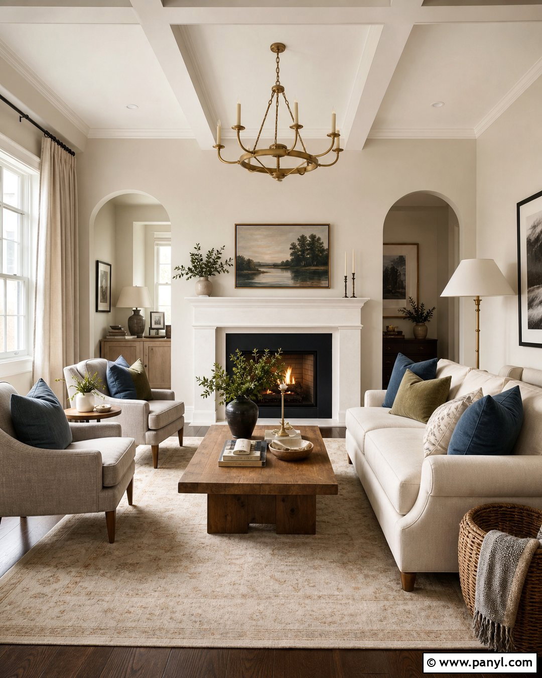
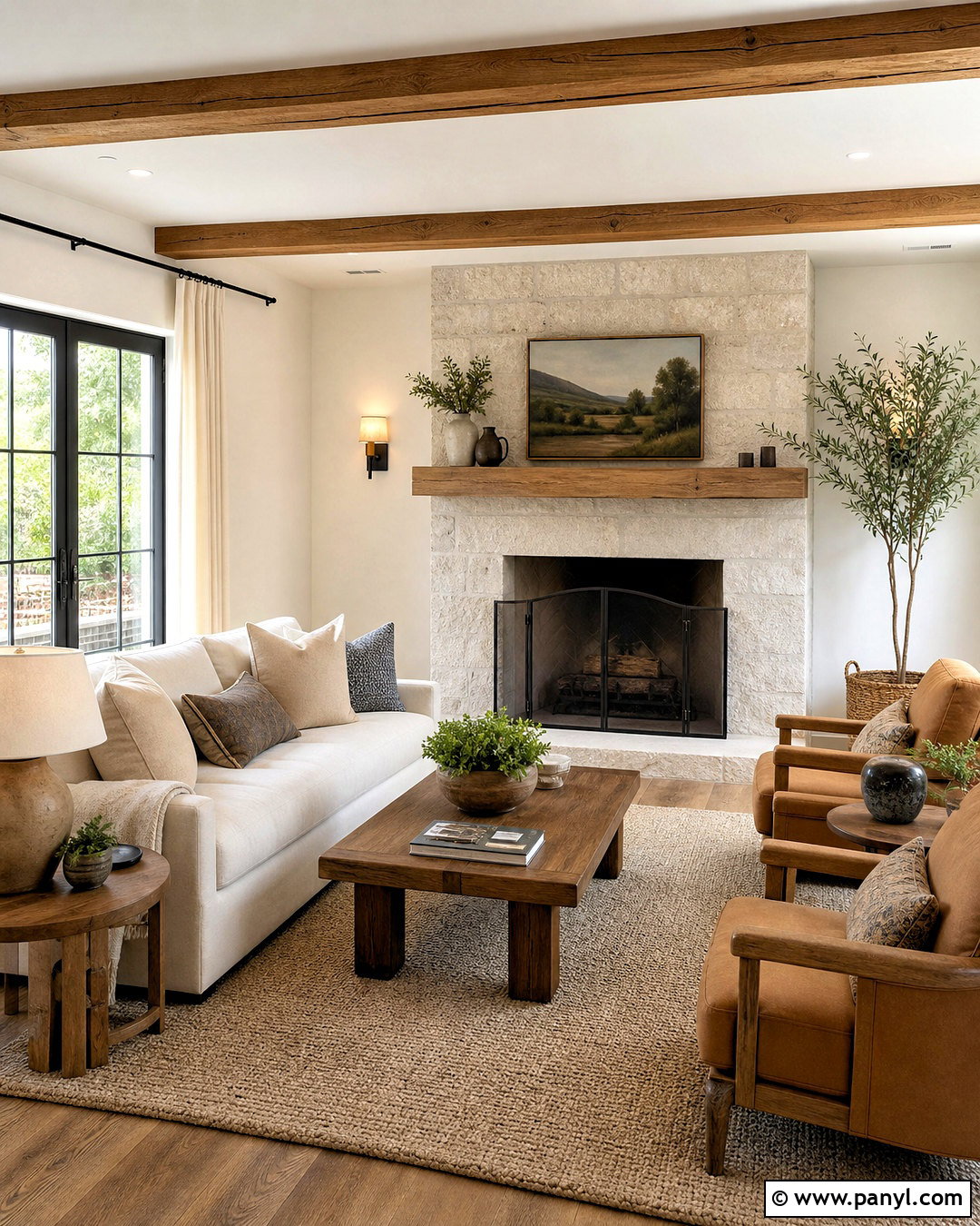
Accessible beige creates a soft, connected look beside Alabaster White without making the room feel colorless. Use Alabaster White on the walls and Accessible Beige on built-in cabinetry, an accent wall, or interior doors. In a living room, add a cream linen sofa, warm oak coffee table, and woven tan rug to strengthen the gentle contrast. Aged brass lighting introduces warmth, while matte black picture frames provide definition. Keep curtains close to the wall color so the windows remain light and open. Sage green pillows and simple botanical artwork can add a restrained natural accent. This combination works especially well in open floor plans because both colors transition smoothly between living, dining, and hallway spaces.
2. Alabaster White And Agreeable Gray
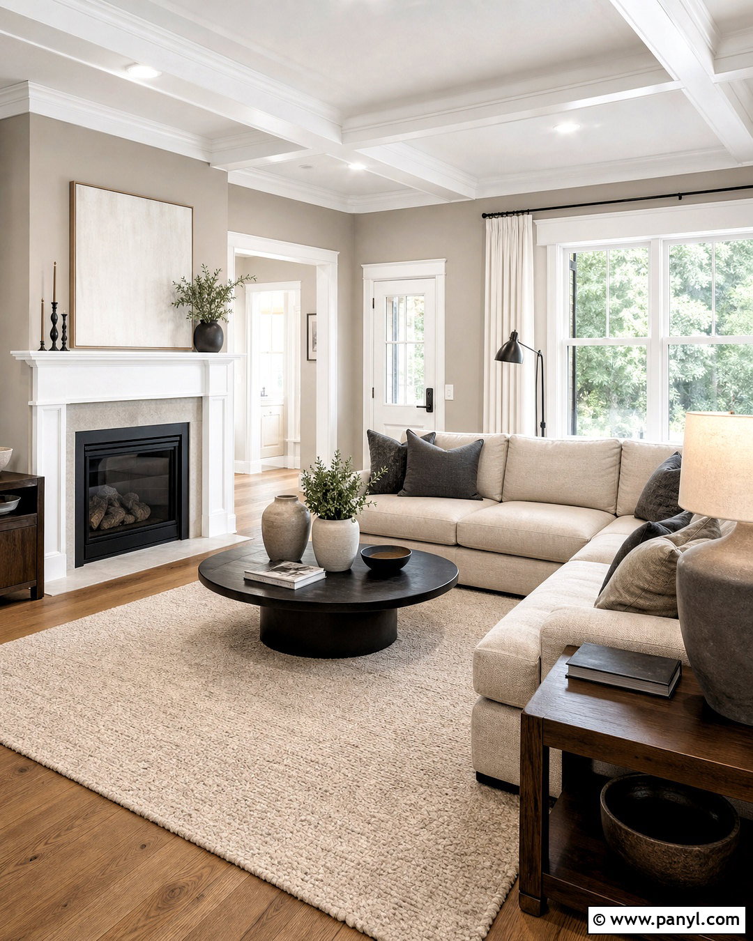
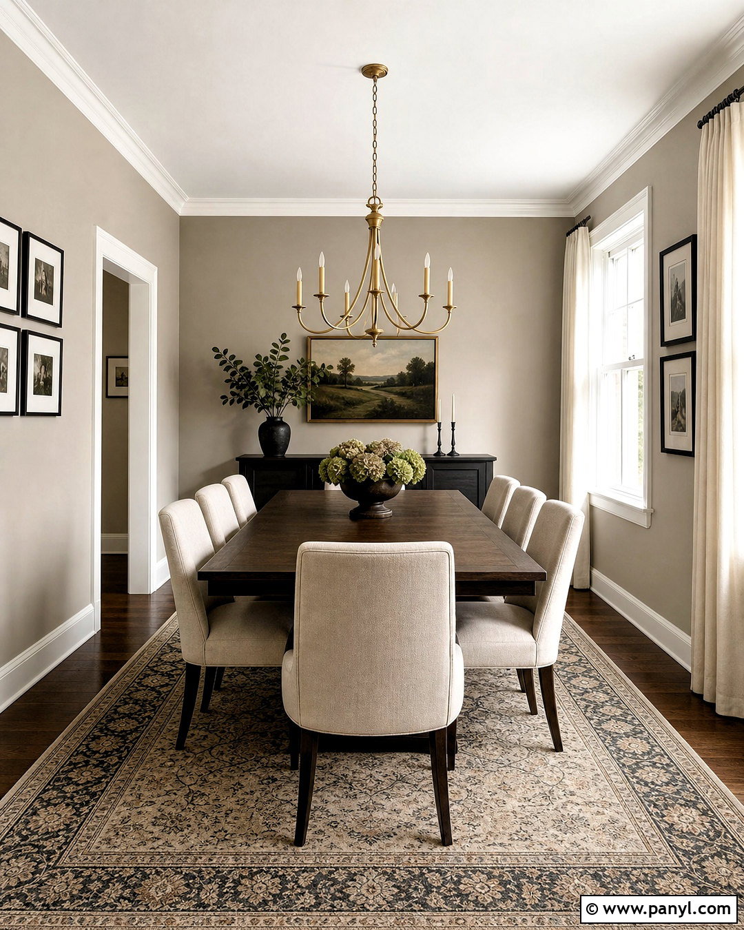
For a balanced neutral interior, pair Alabaster White with Agreeable Gray. Paint the walls Agreeable Gray and use Alabaster White across the ceiling, doors, trim, and fireplace surround. This approach gives the architecture a clean outline while keeping the overall room warm. Choose a light oatmeal sectional, medium-tone oak floors, and a textured ivory area rug. Charcoal pillows and black metal lamps prevent the palette from looking washed out. Add walnut side tables for deeper warmth and decorate with ceramic pieces in cream and soft gray. In rooms with limited sunlight, use several warm white light sources rather than one harsh overhead fixture. The completed space feels polished, comfortable, and easy to update with seasonal accent colors.
3. Alabaster White And Repose Gray
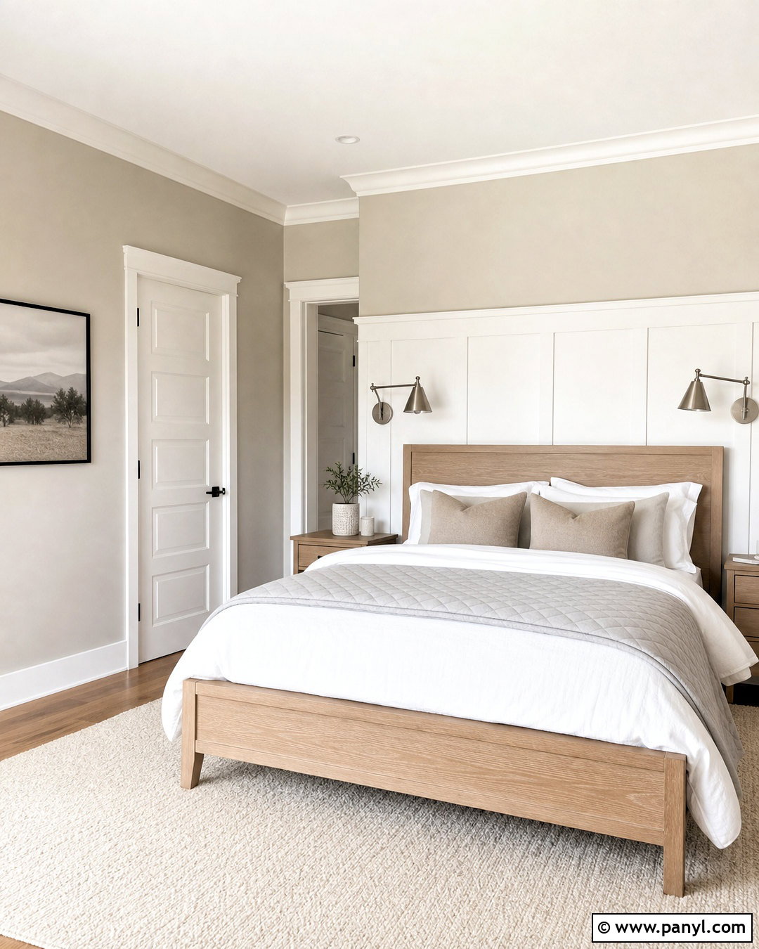
Repose Gray gives Alabaster White a cooler, more tailored companion without creating an overly sharp contrast. Try Repose Gray on bedroom walls, with Alabaster White on the ceiling, baseboards, window trim, and paneled headboard wall. Layer the bed with white cotton sheets, a light gray quilt, and soft taupe pillows. Pale oak nightstands keep the room warm, while brushed nickel lamps echo the cooler gray. Use an ivory wool rug to connect the trim color with the center of the room. Minimal black-framed artwork can add structure above the bed. Because gray can shift with changing light, repeat warmer materials throughout the space. The result is a calm, complete bedroom that feels bright without appearing plain or sterile.
4. Alabaster White And Charcoal Gray
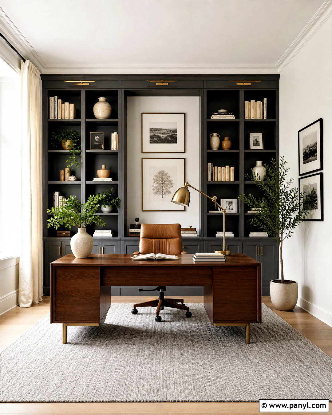
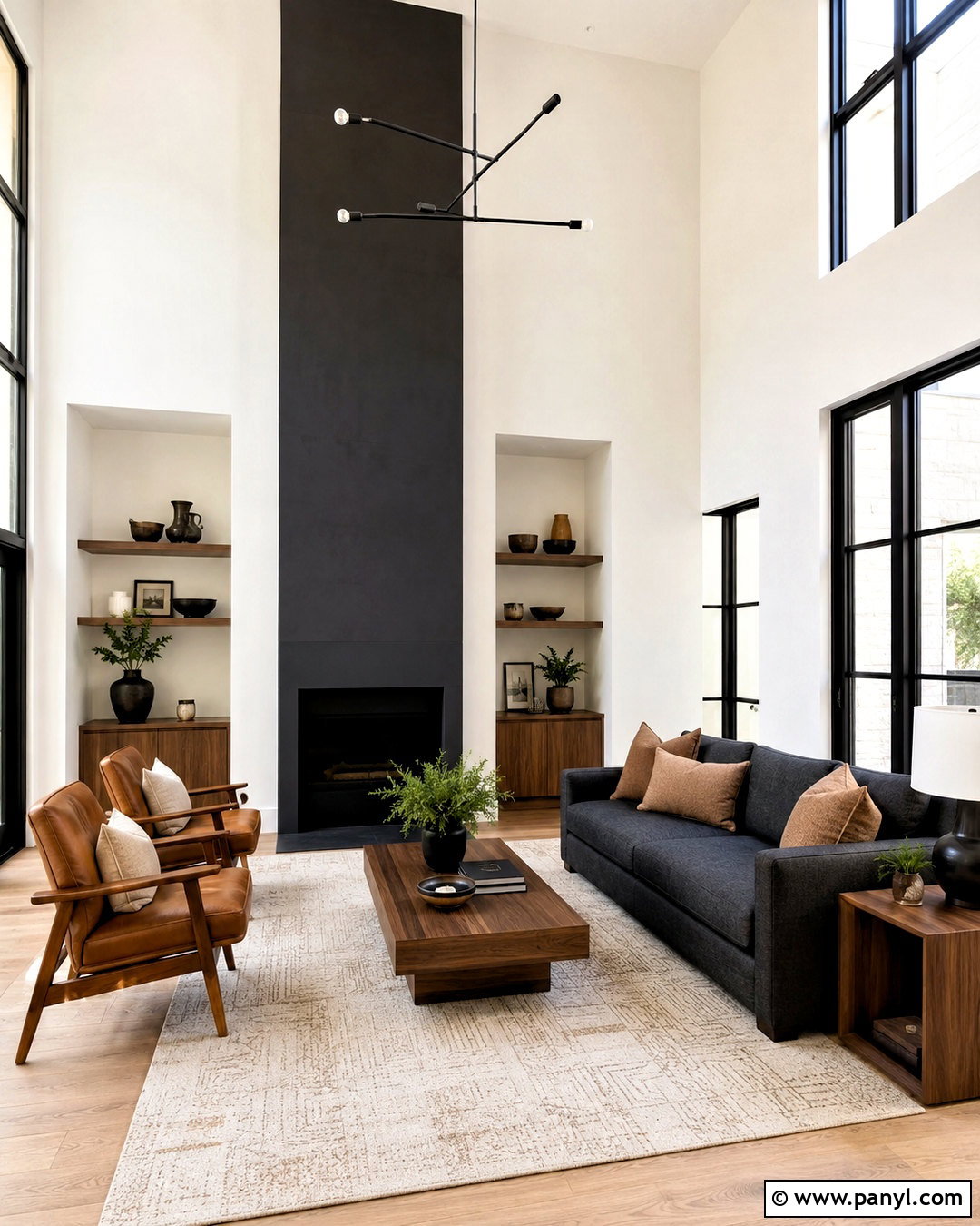
Charcoal gray creates a strong focal point while allowing Alabaster White to remain soft and inviting. In a home office, paint the walls Alabaster White and use charcoal on floor-to-ceiling bookshelves or the wall behind the desk. Add a walnut desk, cognac leather chair, and warm gray wool rug for a layered professional look. Brushed brass cabinet hardware and a matching desk lamp bring warmth to the darker paint. Keep window treatments simple with natural linen panels. A few cream ceramics, framed prints, and green plants will break up the charcoal cabinetry without cluttering it. This palette suits rooms that need visual structure. Alabaster White reflects light around the space, while charcoal grounds the furniture and gives the finished office a confident appearance.
5. Alabaster White And Black
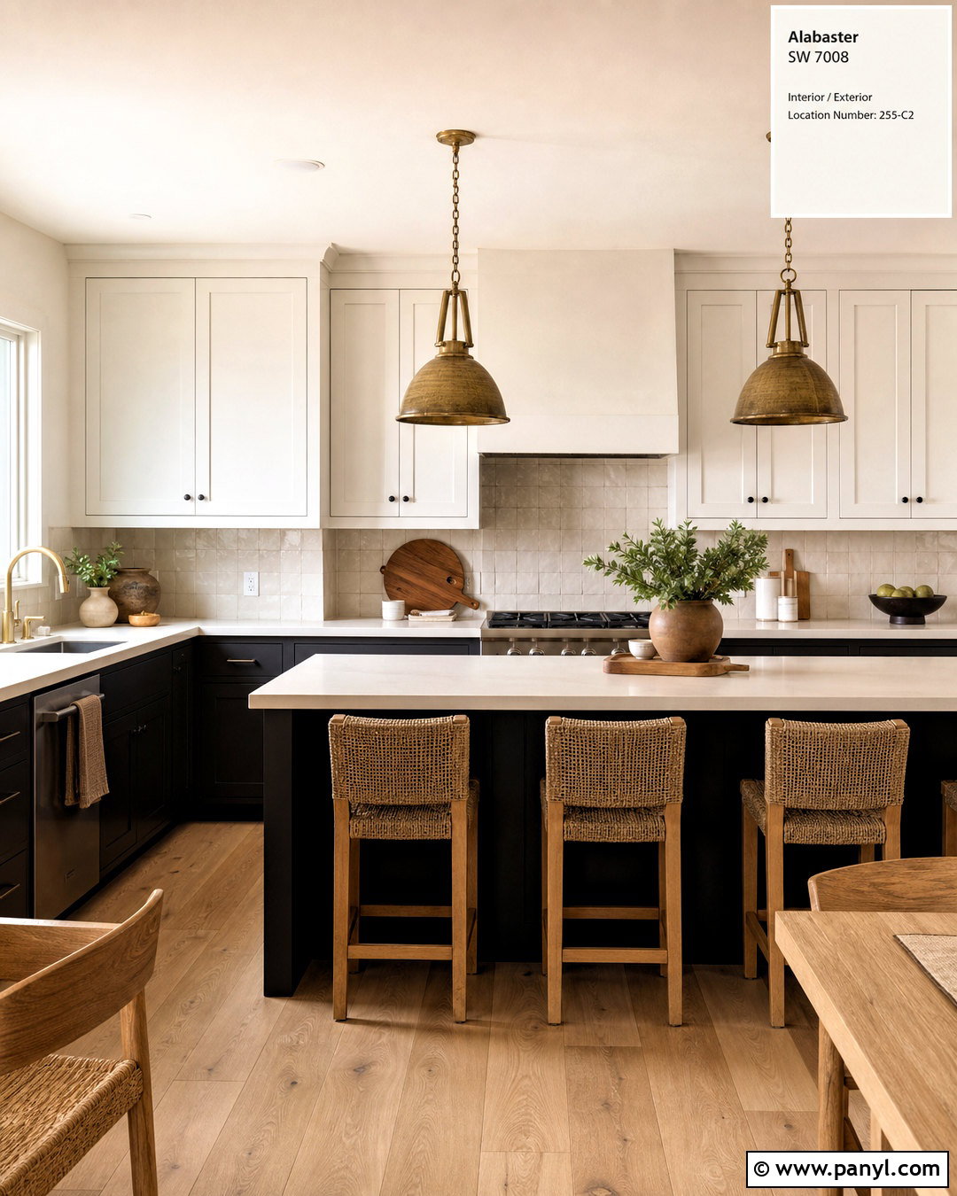
Black and Alabaster White form a classic high-contrast palette, but natural materials keep it from feeling severe. Use Alabaster White on kitchen walls and upper cabinets, then choose matte black for the island, range hood, or lower cabinetry. Warm white quartz counters with subtle beige veining connect both colors. Add white oak flooring, woven counter stools, and aged brass pendants to soften the crisp contrast. Repeat black through cabinet pulls, window frames, and small appliances rather than introducing unrelated finishes. A handmade cream tile backsplash adds texture while blending with the cabinetry. Keep decorative objects limited to wood boards, neutral pottery, and fresh greenery. The entire kitchen will feel bright and contemporary, with enough warmth to remain comfortable for everyday living.
6. Alabaster White And Navy Blue
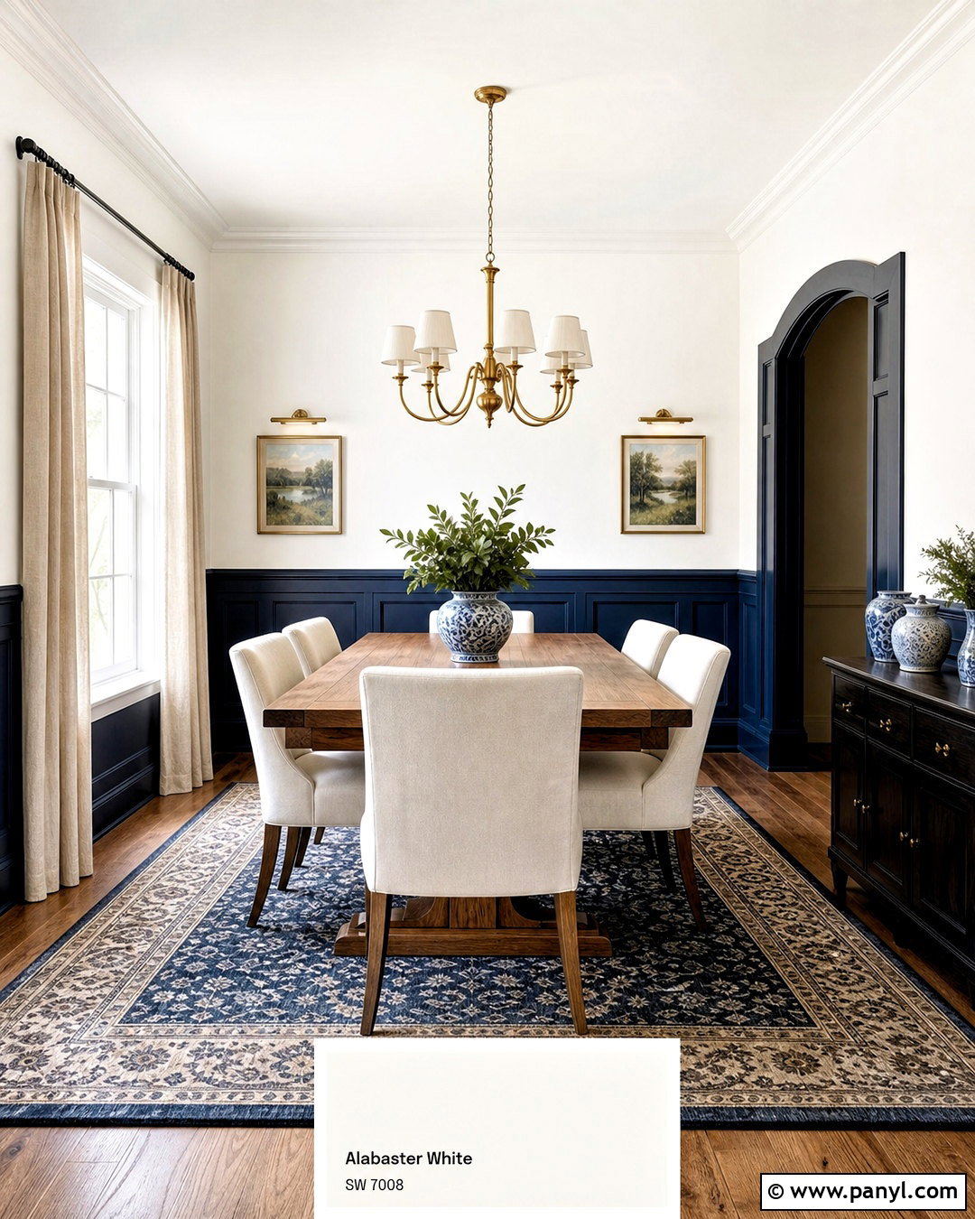
Navy blue adds elegant depth to Alabaster White and works beautifully in dining rooms, kitchens, and bedrooms. For a finished dining space, paint the walls Alabaster White and cover the lower wall paneling in deep navy. Add a medium-tone wood dining table, upholstered cream chairs, and a navy patterned rug that quietly repeats both colors. Brass sconces and a simple chandelier provide warm metallic accents. Hang linen curtains in a natural off-white rather than bright optic white. Blue-and-white ceramics can decorate a sideboard, while framed landscape artwork introduces muted greens and browns. Keep the ceiling Alabaster White to maintain an airy feeling. This complete palette feels traditional at its core, yet clean furniture lines can make it equally suitable for a modern home.
7. Alabaster White And Smoky Blue
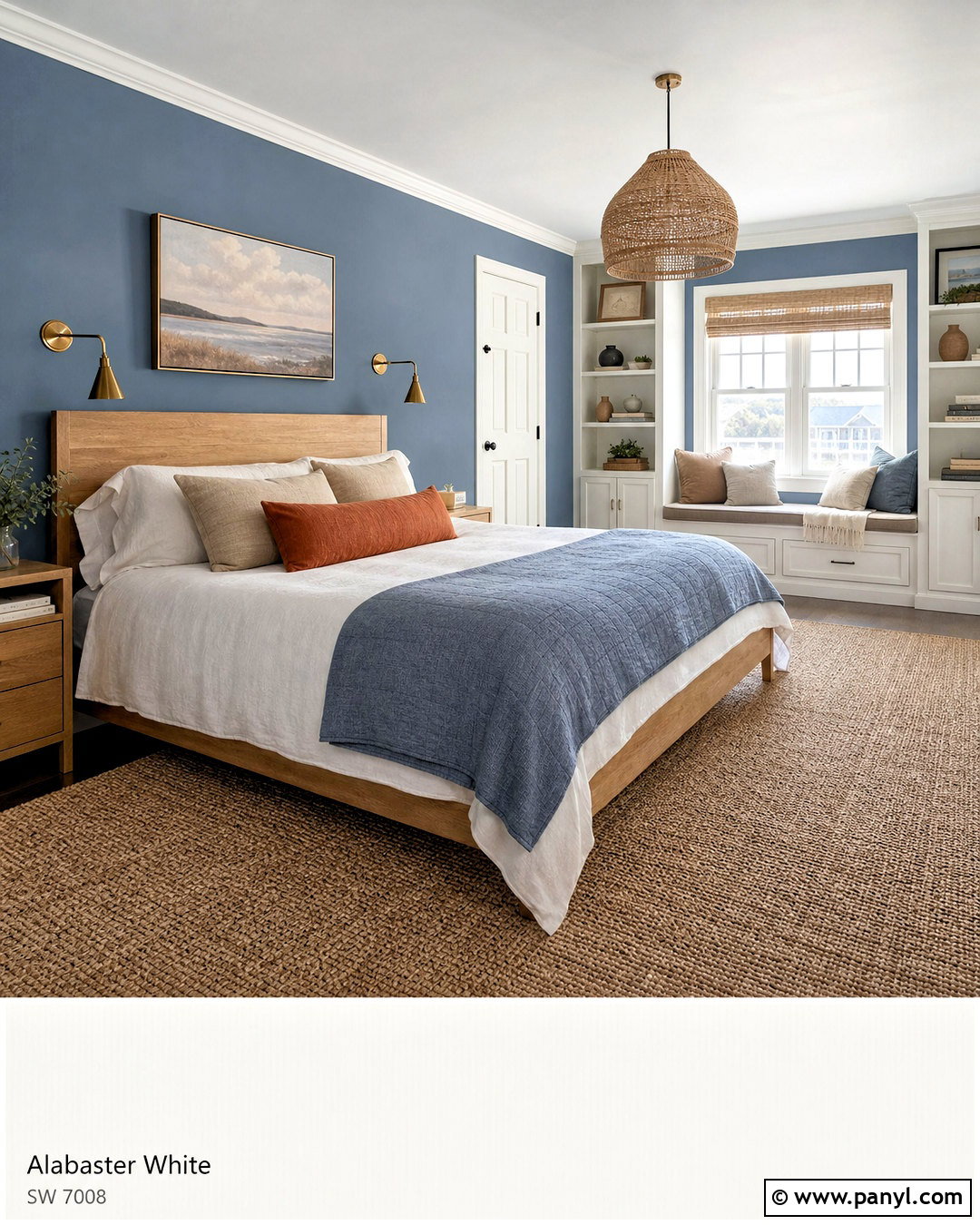
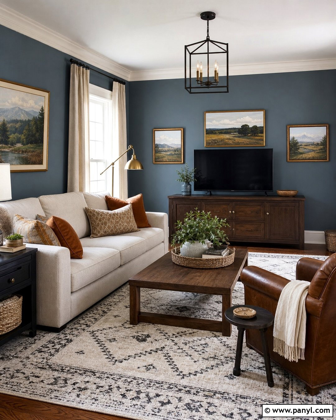
Smoky blue brings a peaceful, slightly weathered quality to Alabaster White. Use the blue on bedroom walls and reserve Alabaster White for the ceiling, trim, doors, and a simple fireplace or built-in window seat. A natural oak bed creates warmth against the cool walls. Finish the room with white linen bedding, a quilt in faded blue, and pillows in sand, cream, and muted rust. Choose a woven jute rug beneath the bed and add antique brass wall lights for gentle contrast. Artwork featuring soft coastal or landscape tones can tie the palette together without turning the room into a theme. The completed bedroom feels relaxed and collected. Alabaster White keeps the smoky blue from becoming heavy, especially in a smaller room.
8. Alabaster White And Powder Blue
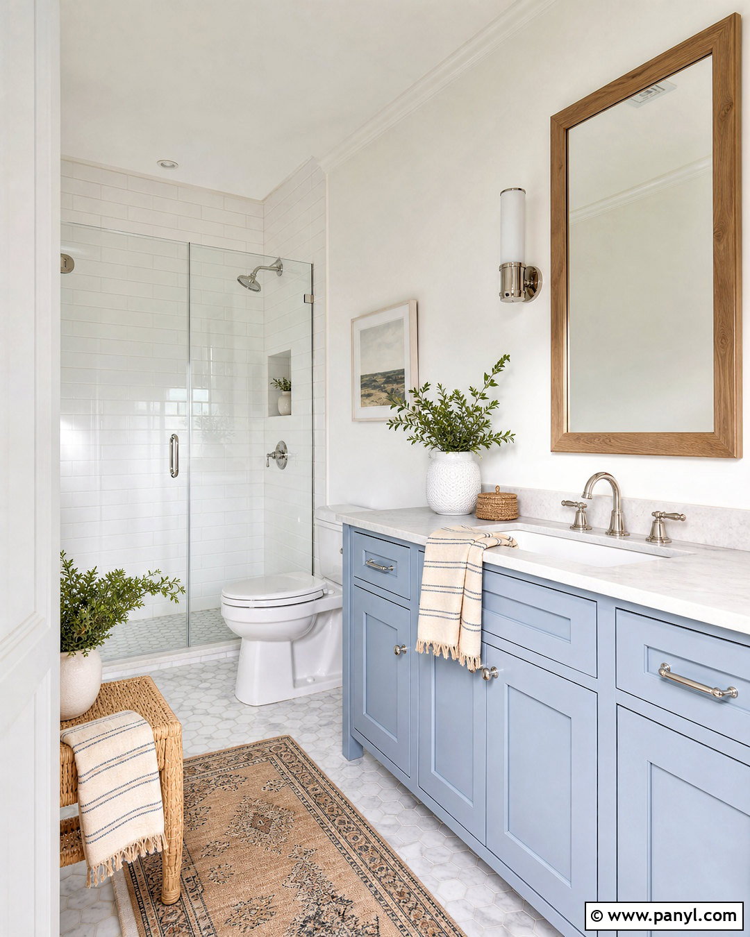
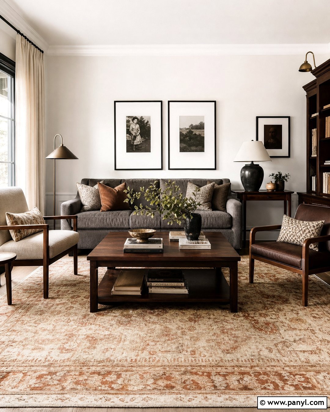
Powder blue offers a light, cheerful pairing for Alabaster White, making it a natural choice for bathrooms and smaller bedrooms. In a bathroom, use Alabaster White on the upper walls and powder blue on a shaker-style vanity. Continue the warm white through the trim, ceiling, and subway tile so the room feels cohesive. A pale marble countertop, polished nickel faucet, and clear glass shower enclosure maintain the airy effect. Introduce warmth with a light oak mirror and a small woven stool. Towels can combine white, pale blue, and subtle sandy stripes. Avoid adding too many competing pastel shades. Instead, use one or two touches of green through plants. The completed bathroom feels fresh and bright while remaining softer than a conventional blue-and-brilliant-white scheme.
9. Alabaster White And Sage Green
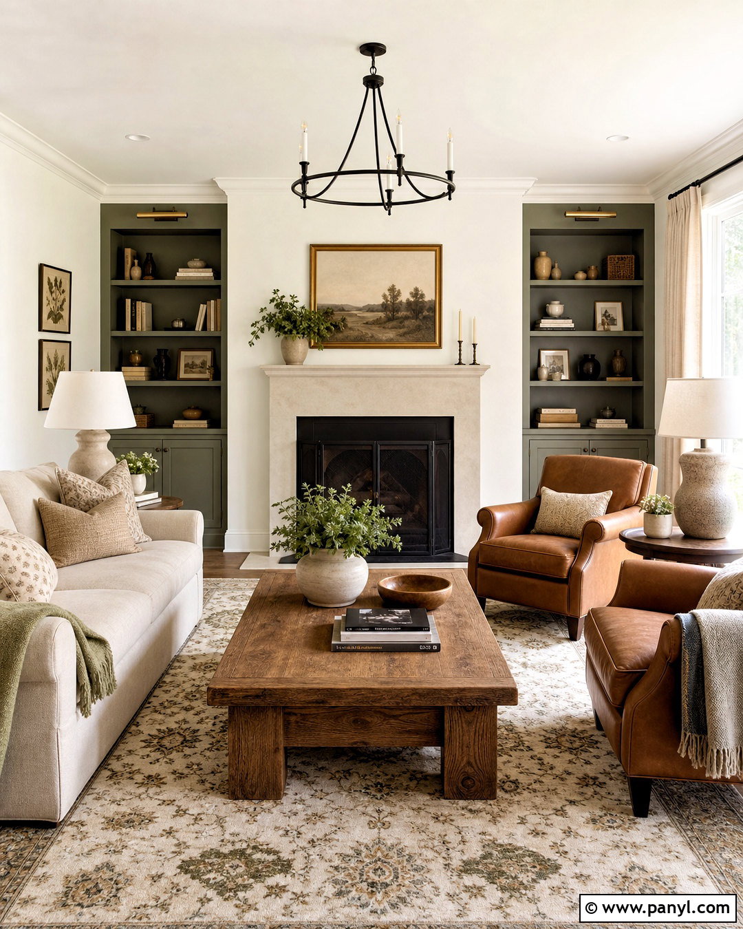
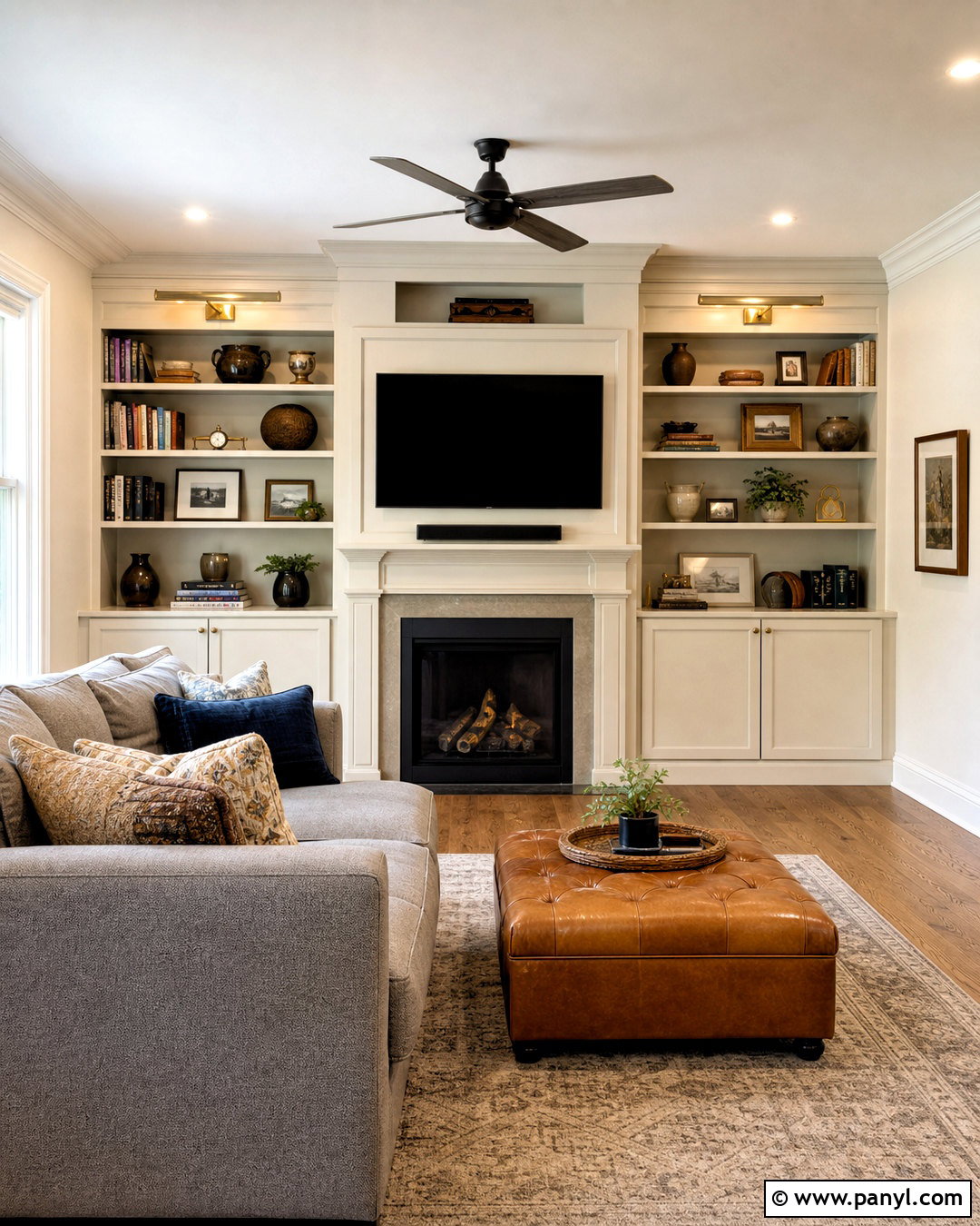
Sage green and Alabaster White create an earthy, comfortable palette that can soften a busy family room. Paint the walls Alabaster White and use sage green on built-in cabinets surrounding a fireplace. Choose a relaxed oatmeal sofa, caramel leather armchairs, and a large vintage-inspired rug containing cream, olive, and faded brown. Medium oak flooring and a rustic wood coffee table reinforce the natural direction. Black fireplace doors and curtain rods provide small points of definition. Add linen curtains, ceramic table lamps, and botanical prints in simple wood frames. Keep the mantel lightly decorated so the green cabinetry remains the main feature. This complete room feels warm and lived-in, while the pale wall color prevents the deeper natural materials from making the space look crowded.
10. Alabaster White And Seafoam Green
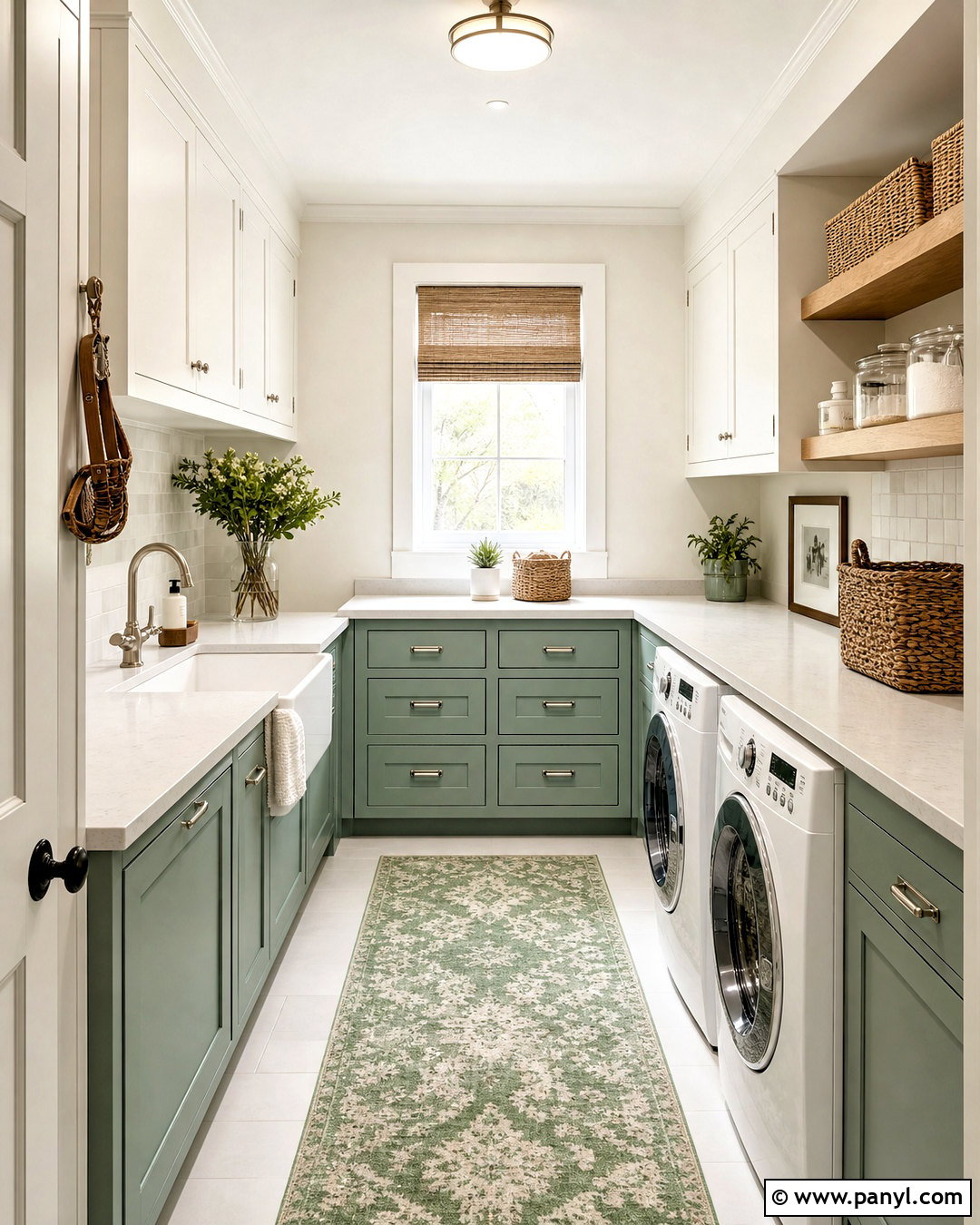
What if you want color without losing the open feeling of a warm white room? Seafoam green offers a gentle answer. Use Alabaster White on the walls and cabinetry of a laundry room, then bring seafoam green onto the lower cabinets or patterned floor tile. Select pale quartz counters, brushed nickel hardware, and a white farmhouse sink for a practical finish. Open oak shelves can hold woven baskets, glass containers, and folded neutral linens. Repeat the green in a small window shade or washable runner, but keep the accessories restrained. A backsplash of glossy warm white tile will reflect light and add texture. The finished laundry space feels organized, clean, and welcoming, turning a functional room into a coordinated extension of the home.
11. Alabaster White And Olive Green
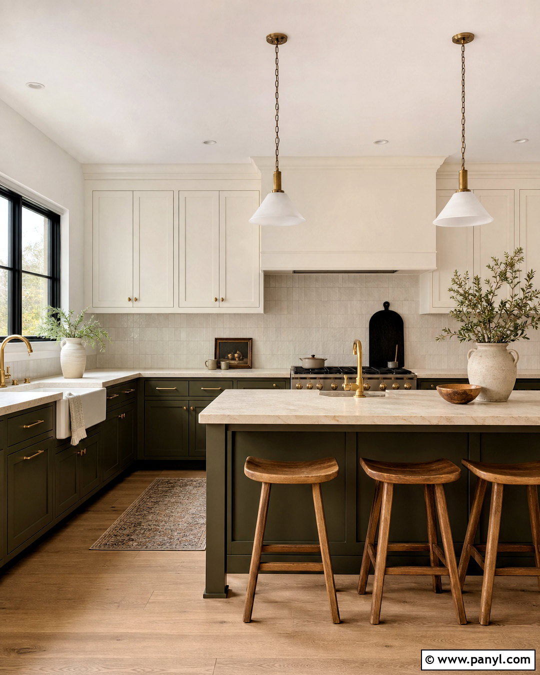
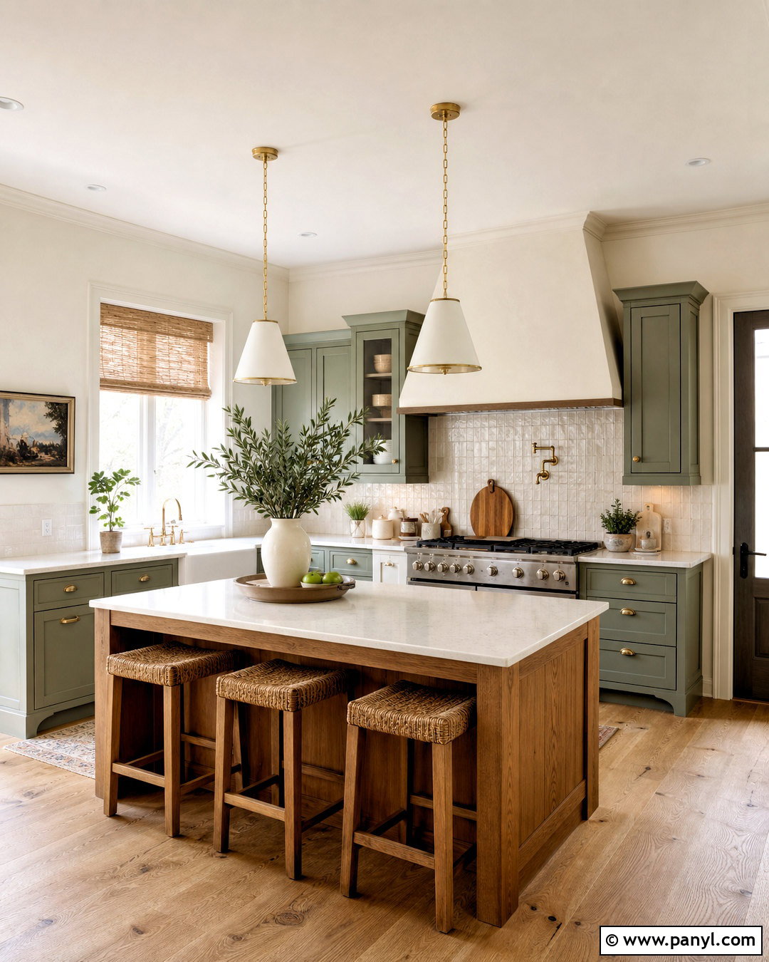
Olive green gives Alabaster White a richer, more grounded character. In a kitchen, apply Alabaster White to the walls and upper cabinets, then use deep olive green on the island and lower cabinetry. Select honed cream stone counters rather than cool blue-white marble. White oak floors, walnut counter stools, and aged brass hardware will enhance the earthy warmth. A backsplash made from handmade Alabaster-toned tile can connect the upper and lower portions of the room. Add black accents sparingly through the range and slim window frames. Simple clay pots and wooden cutting boards complete the palette without making it feel overly rustic. This kitchen scheme balances bright surfaces with saturated color, creating a look that feels substantial, practical, and connected to natural materials.
12. Alabaster White And Forest Green
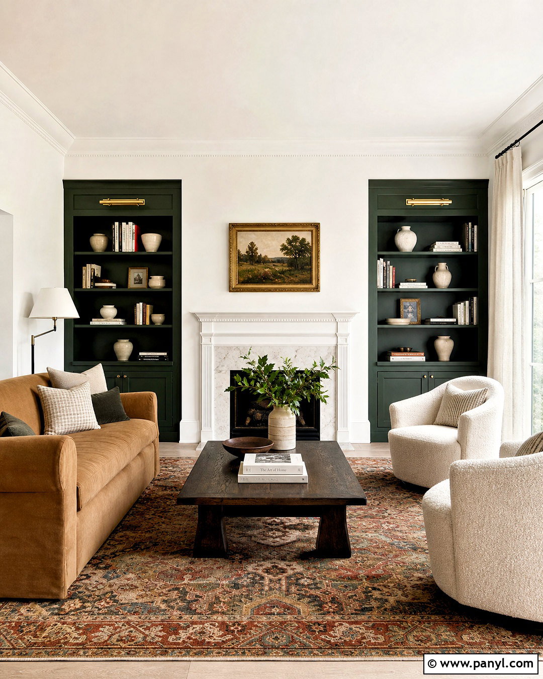
Forest green creates dramatic contrast while preserving the warmth of Alabaster White. Use Alabaster White across a living room’s walls, ceiling, and fireplace, then paint a pair of built-in bookcases deep forest green. Furnish the room with a camel-colored sofa, cream boucle chairs, and a dark wood coffee table. A traditional rug containing green, rust, navy, and ivory will make the color choice feel intentional. Add antique brass picture lights above the shelves and repeat the metal in small decorative objects. Linen curtains should remain light and uncomplicated. Balance darker cabinetry with books, cream pottery, and framed artwork rather than filling every shelf. The result is a sophisticated room with a clear focal point, plenty of contrast, and a comfortable mix of old and new details.
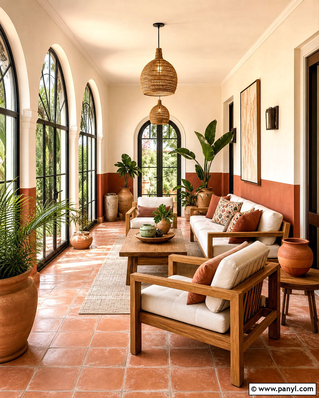
13. Alabaster White And Terracotta
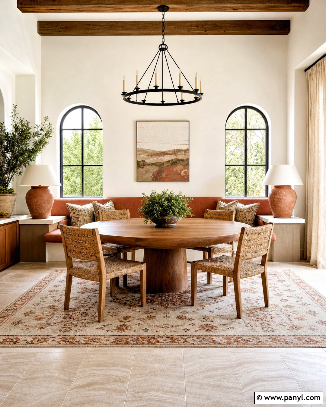
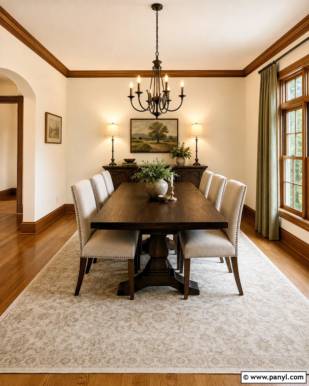
Terracotta warms Alabaster White with an earthy red-orange note that feels especially inviting in sunlit rooms. Paint dining room walls Alabaster White, then introduce terracotta through an upholstered banquette, patterned rug, and large ceramic table lamps. A round oak dining table and woven chairs support the natural palette. Choose linen curtains in flax or warm ivory so they blend gently with the walls. Add touches of dusty green through plants and artwork to balance the red undertone. Black metal accents can appear in a modest chandelier and narrow picture frames. Avoid covering every surface with orange. A few generous terracotta elements will have more impact than many tiny accessories. The completed space feels warm, relaxed, and suitable for both everyday meals and casual gatherings.
14. Alabaster White And Dusty Rose
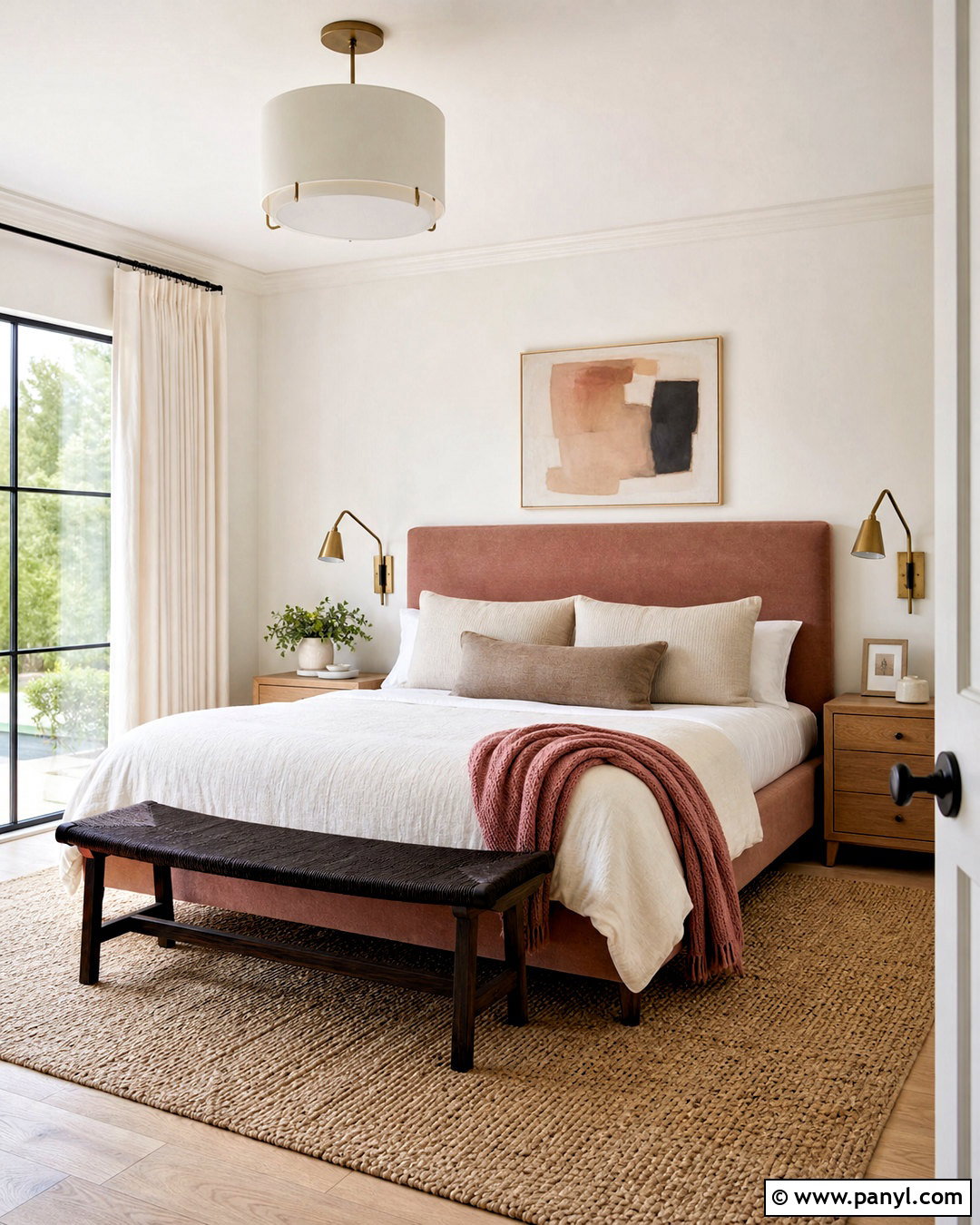
Dusty rose brings softness to Alabaster White without making the finished room overly sweet. In a primary bedroom, use Alabaster White on the walls and select a dusty rose upholstered bed as the main color feature. Layer it with ivory bedding, taupe pillows, and a muted rose throw. Medium oak nightstands and a natural woven rug add necessary warmth and texture. Choose aged brass sconces with simple cream shades, then hang abstract artwork containing blush, brown, and charcoal. Window treatments can be warm white linen with woven shades beneath them. A small dark wood bench at the foot of the bed grounds the pale palette. This room feels restful and mature because rose is balanced by neutral fabrics, natural wood, and a few darker accents.
15. Alabaster White And Muted Peach
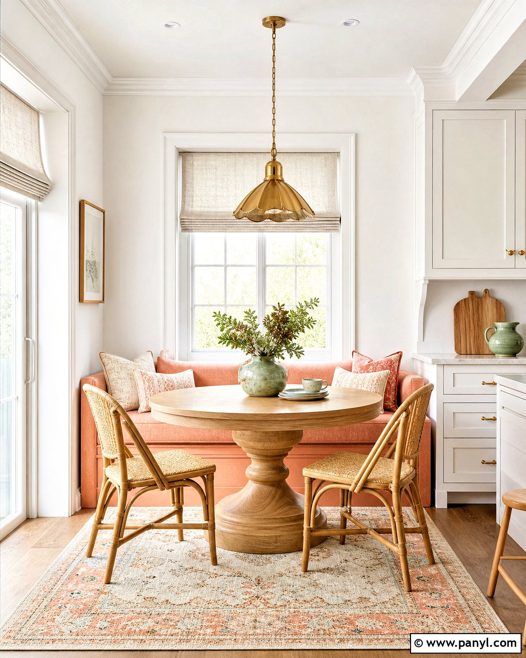
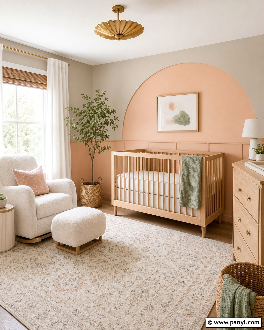
Muted peach gives Alabaster White a sunny warmth that can brighten a breakfast nook or casual dining area. Keep the walls and trim Alabaster White, then use peach on a built-in bench, washable cushions, or a shallow accent wall. Add a light oak pedestal table and curved chairs with woven seats. A cream rug with soft peach and tan details defines the dining zone. Brass lighting adds warmth overhead, while pale green ceramics introduce a subtle complementary note. Keep nearby cabinetry warm white so the room does not become visually fragmented. Linen Roman shades can filter direct sunlight and reinforce the soft palette. The finished nook feels cheerful and approachable, with enough neutral space to ensure the peach remains refined rather than overwhelming.
16. Alabaster White And Mustard Yellow
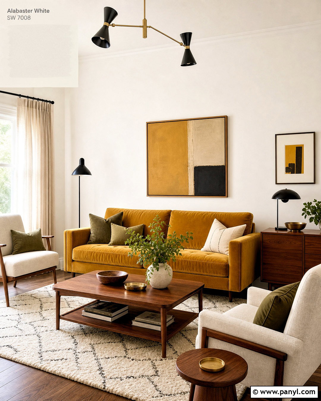
Mustard yellow adds energy and vintage warmth to Alabaster White. Use this pairing in a living room with Alabaster walls, a mustard velvet sofa, and walnut furniture. Ground the seating area with an ivory rug featuring small charcoal or brown details. Add two cream armchairs so the sofa remains the clear focal point. Black metal lamps and curtain rods create definition, while brass accents connect naturally with the golden upholstery. Artwork can include ochre, rust, olive, and warm white to distribute color around the room. Choose simple linen curtains and avoid additional bright primary colors. A few textured pillows in brown, cream, and muted green will complete the arrangement. This palette feels lively, but the extensive Alabaster backdrop keeps the finished room light and balanced.
17. Alabaster White And Burgundy
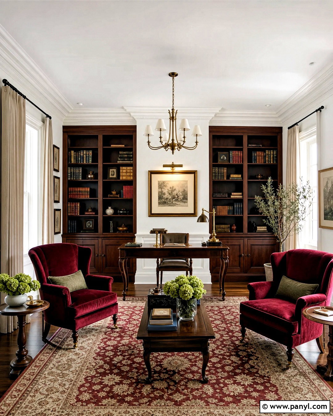
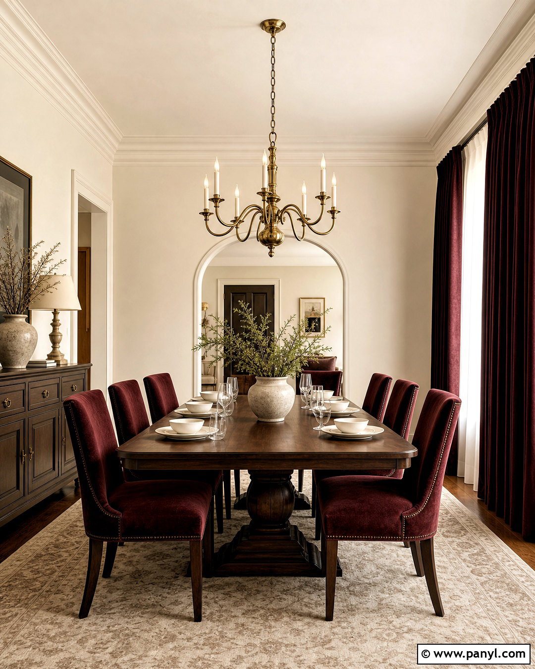
Burgundy gives Alabaster White a deep, formal contrast that works well in a library, dining room, or traditional bedroom. Paint the walls Alabaster White and introduce burgundy through a large area rug, velvet armchairs, and patterned curtains. Dark walnut bookshelves or a substantial dining table will support the richness of the accent color. Use warm brass lighting instead of cool chrome. Add cream upholstery and pale artwork to prevent the room from becoming too dark. Small touches of muted blue or olive can create a more layered palette. Keep the ceiling, crown molding, and window trim Alabaster White for a consistent architectural frame. The completed room feels established and comfortable, with burgundy adding character while the warm white maintains clarity and visual breathing space.
18. Alabaster White And Chocolate Brown
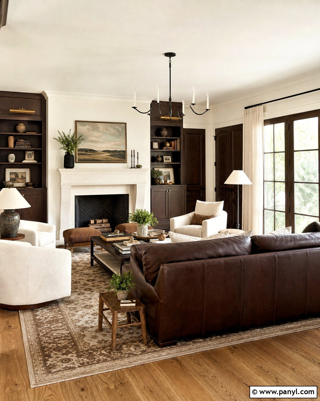
Chocolate brown provides a warm, substantial partner for Alabaster White, particularly when it appears through both paint and natural materials. In a living room, keep the walls Alabaster White and paint an entertainment cabinet or interior doors deep brown. Add a chocolate leather sofa, cream lounge chairs, and a medium-tone oak floor. A patterned rug in ivory, tobacco, and soft gray can connect the major furnishings. Use linen curtains and ceramic lamps to bring lighter texture into the room. Matte black accents should remain minimal because the brown already supplies strong contrast. Greenery and landscape artwork will make the palette feel natural rather than heavy. This finished scheme offers the depth of a dark neutral while remaining warmer and softer than a black-and-white room.
19. Alabaster White And Greige
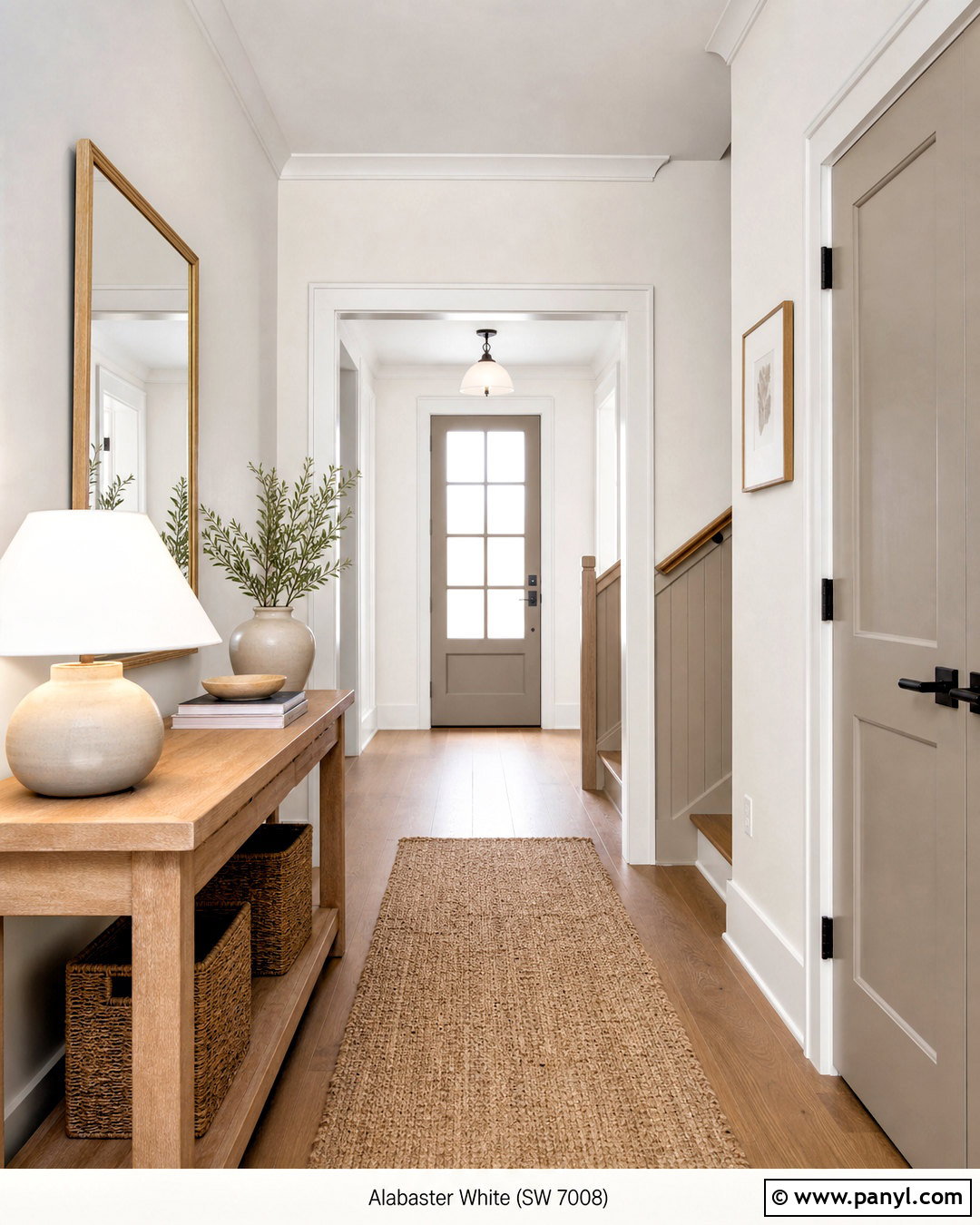
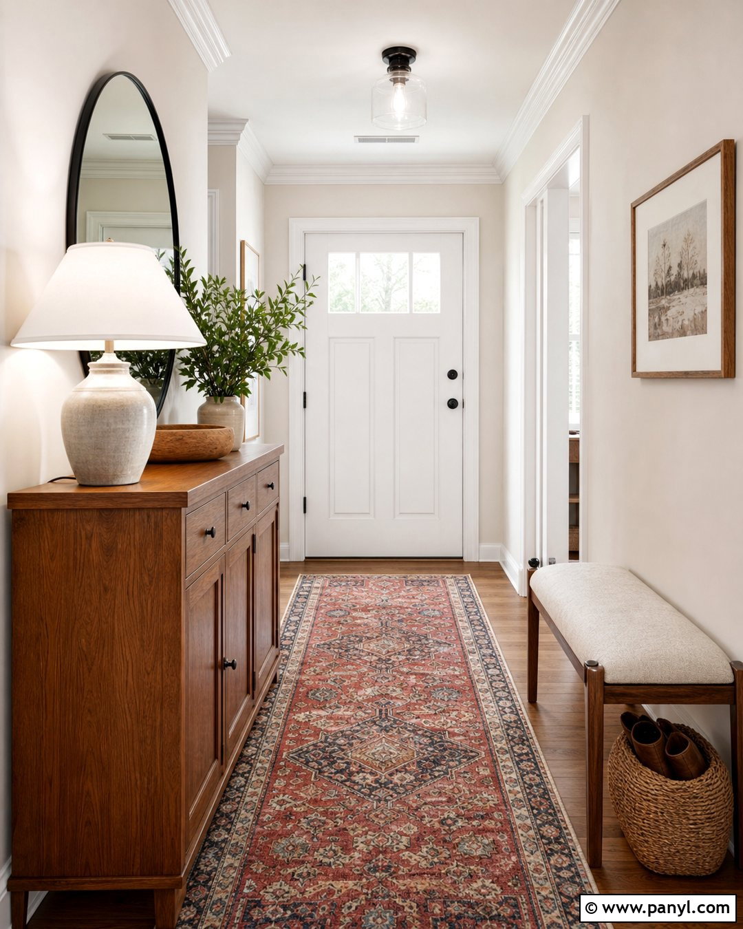
Greige creates an easy whole-house transition with Alabaster White because it combines the warmth of beige with the structure of gray. Use Alabaster White on hallway walls, ceilings, and trim, then paint connecting doors or a nearby stair wall in medium greige. A natural oak console, woven runner, and large framed mirror can turn the passage into a complete designed space. Add a ceramic lamp with a linen shade and a few simple objects in cream and brown. Black door hardware provides clean contrast without dominating the narrow area. Repeat the greige in adjacent upholstery or rugs to improve flow between rooms. The finished hallway feels bright and intentional, proving that practical connecting spaces can carry the home’s broader color palette just as effectively as main rooms.
20. Alabaster White And Soft Taupe
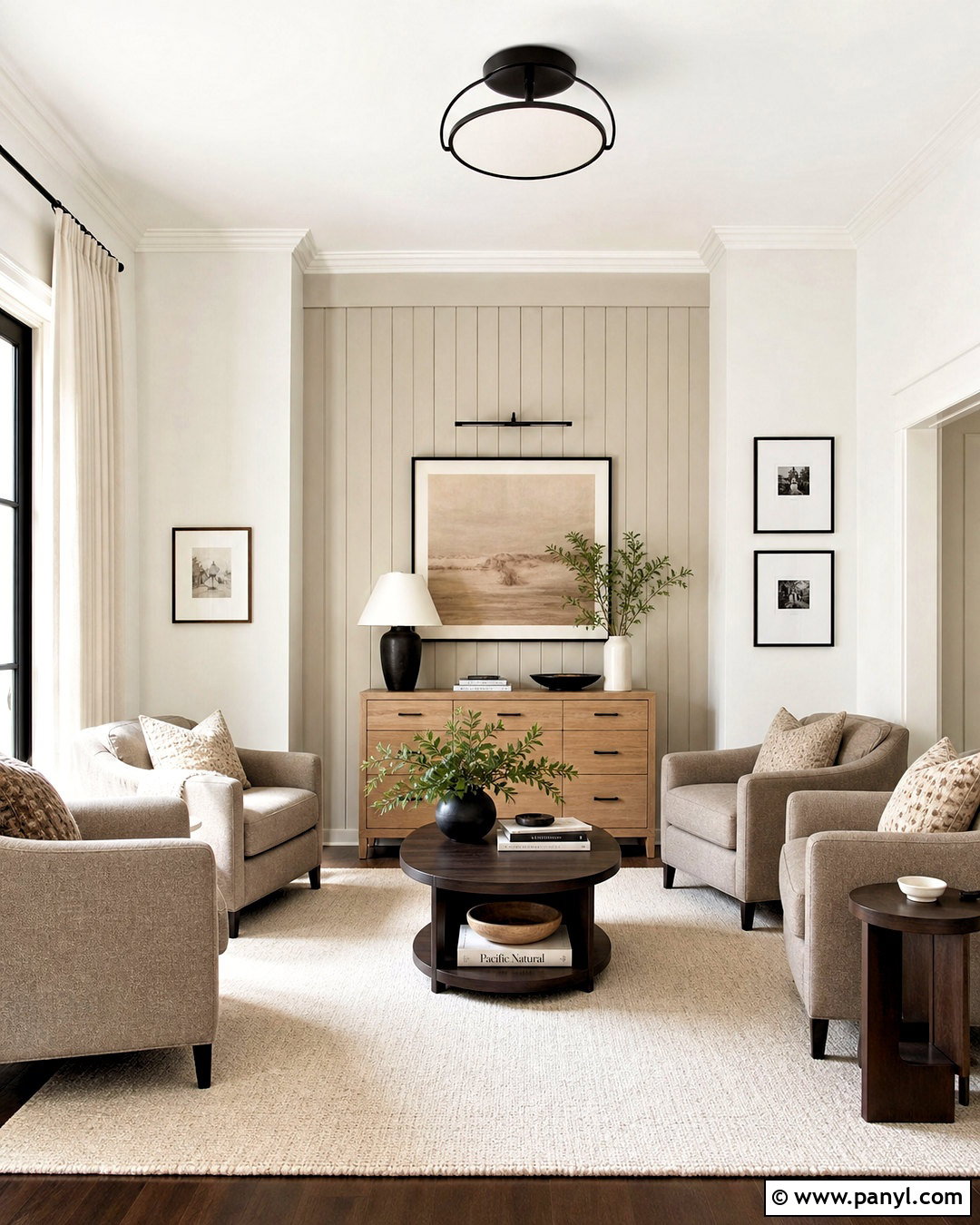
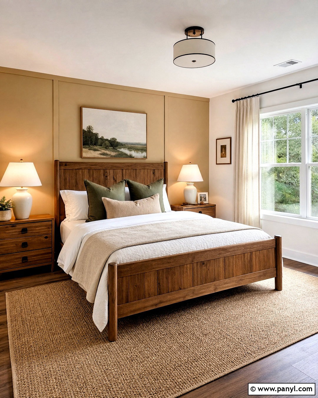
Soft taupe completes Alabaster White with understated warmth and works especially well in quiet, layered interiors. Paint a bedroom or sitting room Alabaster White, then introduce taupe on a paneled accent wall, upholstered chairs, and a large wool rug. Use a mix of white oak and dark walnut furniture to create depth. Cream linen curtains, warm white lampshades, and textured ivory pillows keep the room airy. Add a few black accents through picture frames or a slim floor lamp, but allow taupe and wood to provide most of the contrast. Artwork in muted brown, gray, and clay can tie everything together. This full palette is low contrast but not flat because different materials, finishes, and neutral values create a comfortable sense of dimension.
Conclusion:
The best companion for Alabaster White depends on the atmosphere you want to create. Beige, greige, and taupe produce quiet transitions, while charcoal, black, navy, and forest green offer stronger definition. Sage, seafoam, and smoky blue support a calm natural palette. Terracotta, mustard, peach, rose, and burgundy bring warmer personality. Before choosing, compare each sample with your flooring, countertops, furniture, and fixed finishes. View the colors at different times of day because natural and artificial light can change the relationship between them. Use one dominant color, one supporting shade, and a few repeated accents for a connected result. These 20 colors that go with alabaster white ideas make it easier to create a complete, balanced home palette.

Related Ideas and Inspiration:
Leave a Reply