
Rooms with limited sunlight can feel noticeably fresher when the wall color, furnishings, finishes, and lighting work together. The best wall colors to brighten a room are not limited to plain white. Warm ivory, pale blue, soft sage, blush, and delicate yellow can reflect available light while giving the space personality. Light reflectance value, commonly called LRV, is useful when comparing paint, but undertones and room orientation also affect the finished result. Always test large samples on multiple walls and view them morning, afternoon, and evening. Soft finishes, reflective accents, light flooring, and layered lamps can further enhance brightness. () Below, explore complete, practical looks inspired by **20 Wall Colors To Brighten A Room Ideas**.

1. Warm White Wall Color
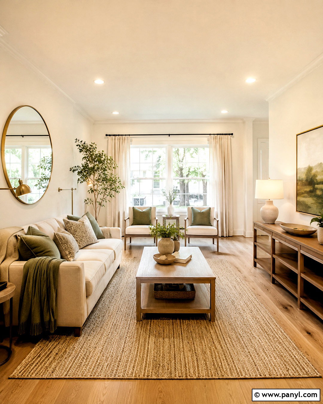
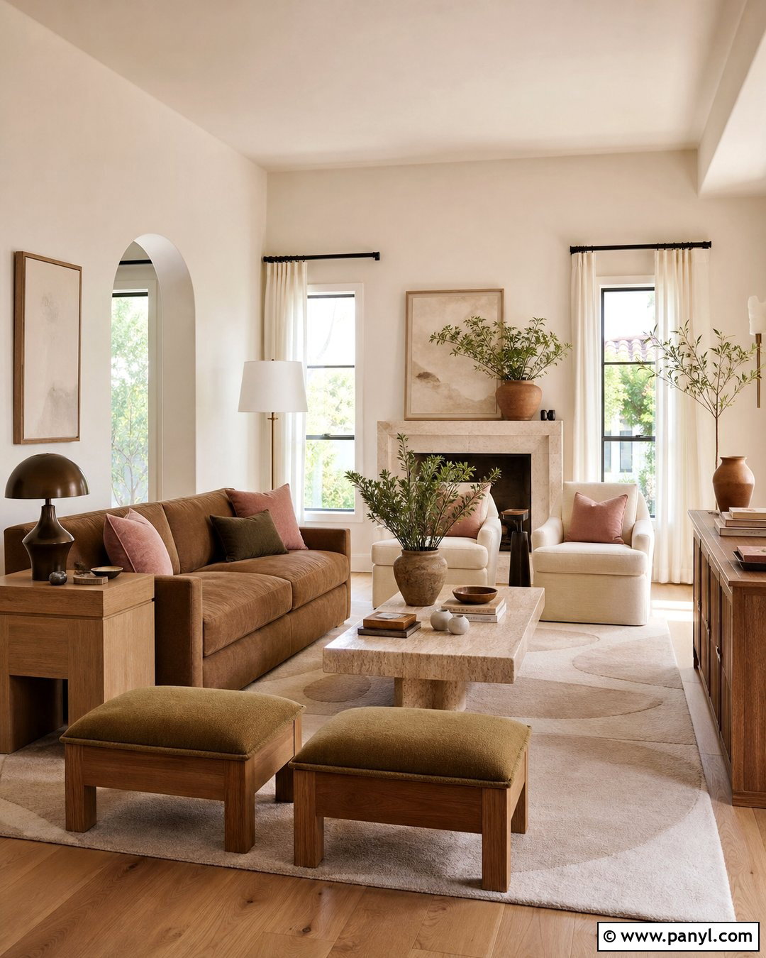
Warm white walls create a bright foundation without making the room feel cold or clinical. Choose a white with subtle cream or beige undertones, especially in a north-facing living room where daylight can appear cool. Continue the wall color onto the ceiling for a seamless, open effect, then use slightly brighter white on the trim. Build the room around an oatmeal sofa, pale oak coffee table, woven rug, and soft linen curtains. Brushed brass lamps and a large mirror add gentle reflection without excessive shine. Finish with tan, muted green, and warm gray accents. This complete palette works particularly well with natural wood floors because every surface contributes warmth while maintaining a clean, light-filled appearance.
2. Cream Wall Color
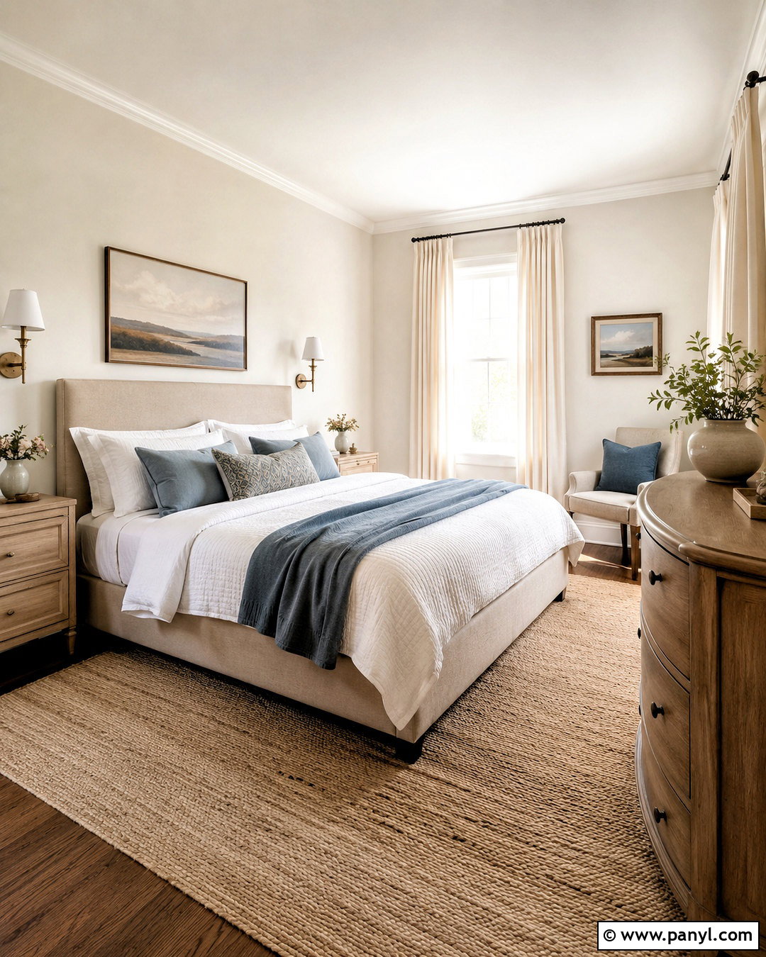
Cream walls give a dim bedroom a soft glow that pure white may not provide. Look for a light cream with balanced yellow undertones rather than a deep buttery shade. Pair it with an upholstered beige bed, white bedding, pale wood nightstands, and a natural fiber rug. Full-length ivory curtains should hang close to the ceiling and extend beyond the window frame, helping the window look larger. Add antique brass sconces, a curved light-oak dresser, and one generously sized mirror. Touches of dusty blue or muted olive prevent the room from feeling overly neutral. Keep the ceiling and trim a clean warm white. The resulting bedroom feels sunny, restful, and layered, even when the windows receive limited direct light.
3. Ivory Wall Color
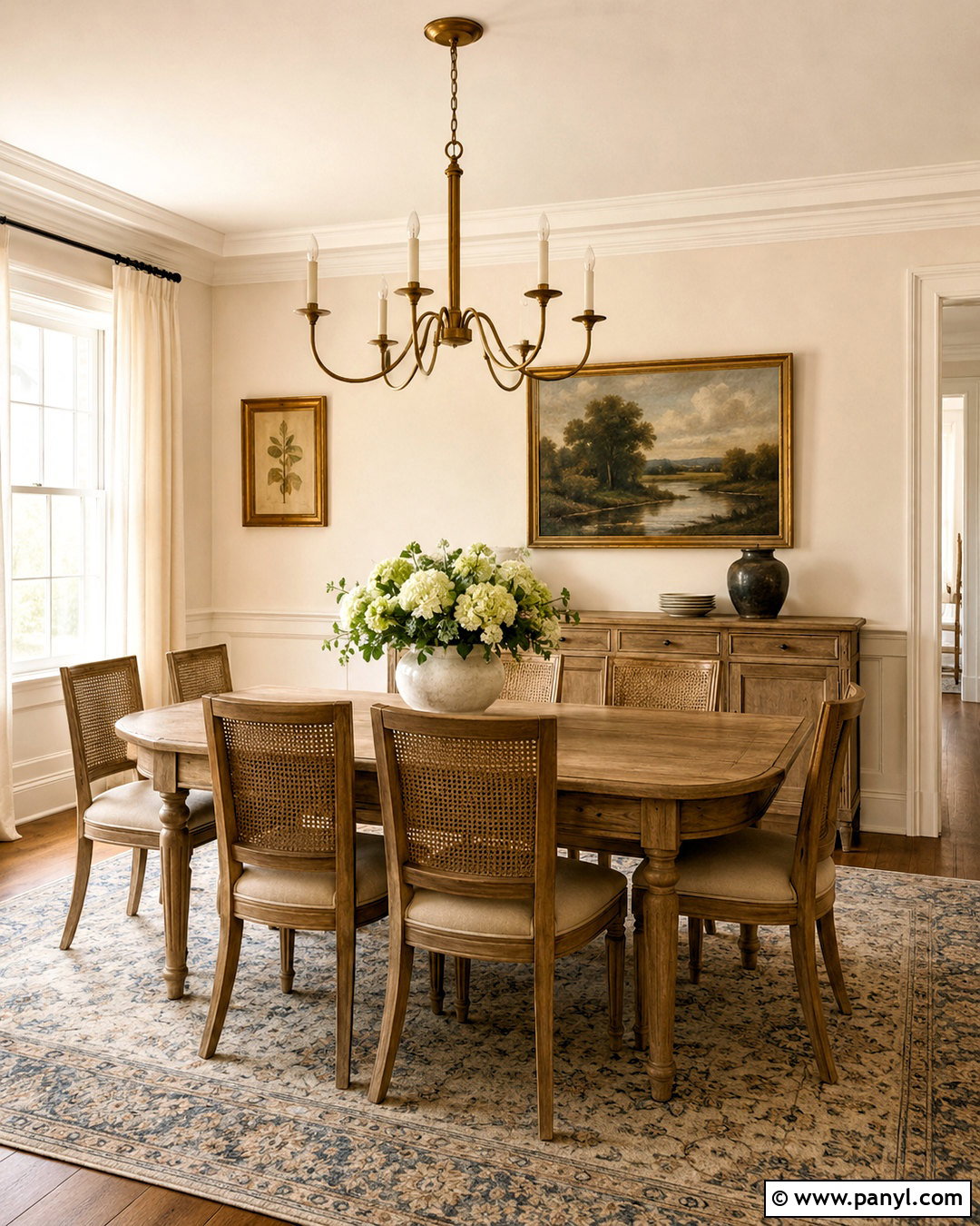
Ivory wall color brings polished brightness to a traditional dining room while preserving a comfortable, welcoming mood. Select a pale ivory that appears warm but not noticeably yellow. Use it across the upper walls and architectural molding, with soft white on the ceiling for quiet contrast. A light oak dining table, woven-back chairs, and a faded blue-and-cream rug create an airy arrangement. Hang a clear glass or aged brass chandelier that does not visually block the room. Pale linen drapery keeps the windows soft and open, while a large landscape painting introduces gentle color. Keep darker accents limited to slim chair legs or picture frames. This balanced design feels elegant without becoming heavy, formal, or visually crowded.
4. Soft Greige Wall Color
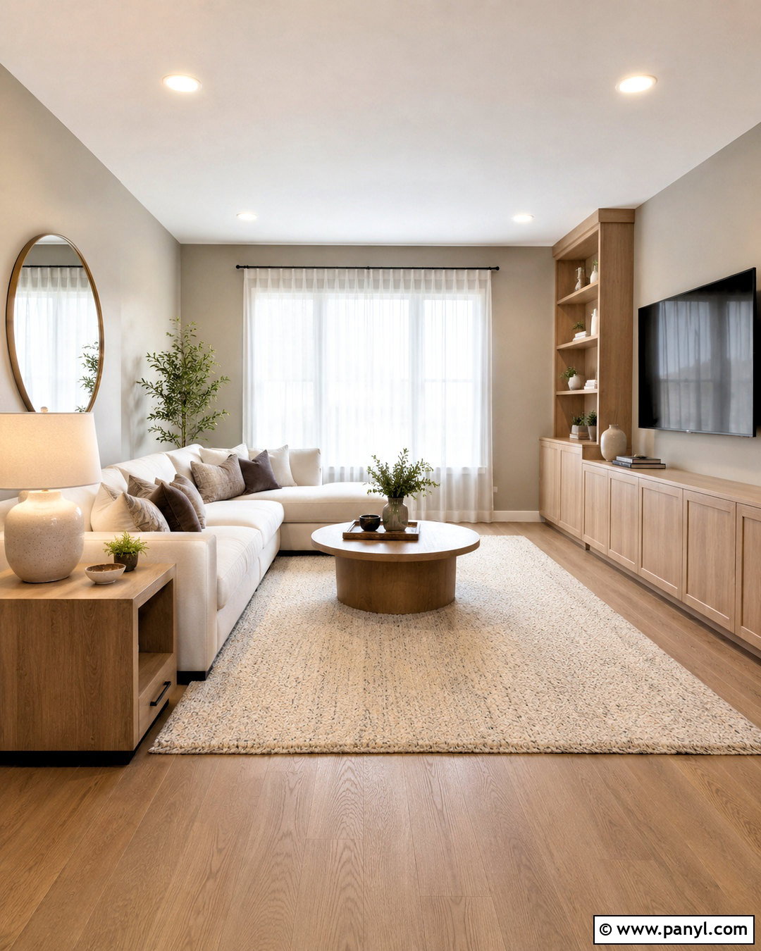
Soft greige is a practical wall color when you want brightness with more depth than white. The best version combines pale gray with a noticeable warm beige undertone, preventing a low-light family room from looking blue or dull. Pair the walls with warm white trim, a cream sectional, and light oak media cabinetry. Add a textured ivory rug, mushroom-colored pillows, and one or two charcoal details for definition. Sheer white curtains allow daylight to spread through the space, while woven shades provide privacy without adding visual weight. Use ceramic lamps with warm white shades and a large round mirror across from the window. The complete look is calm, contemporary, and forgiving enough for an active everyday room.
5. Pale Beige Wall Color
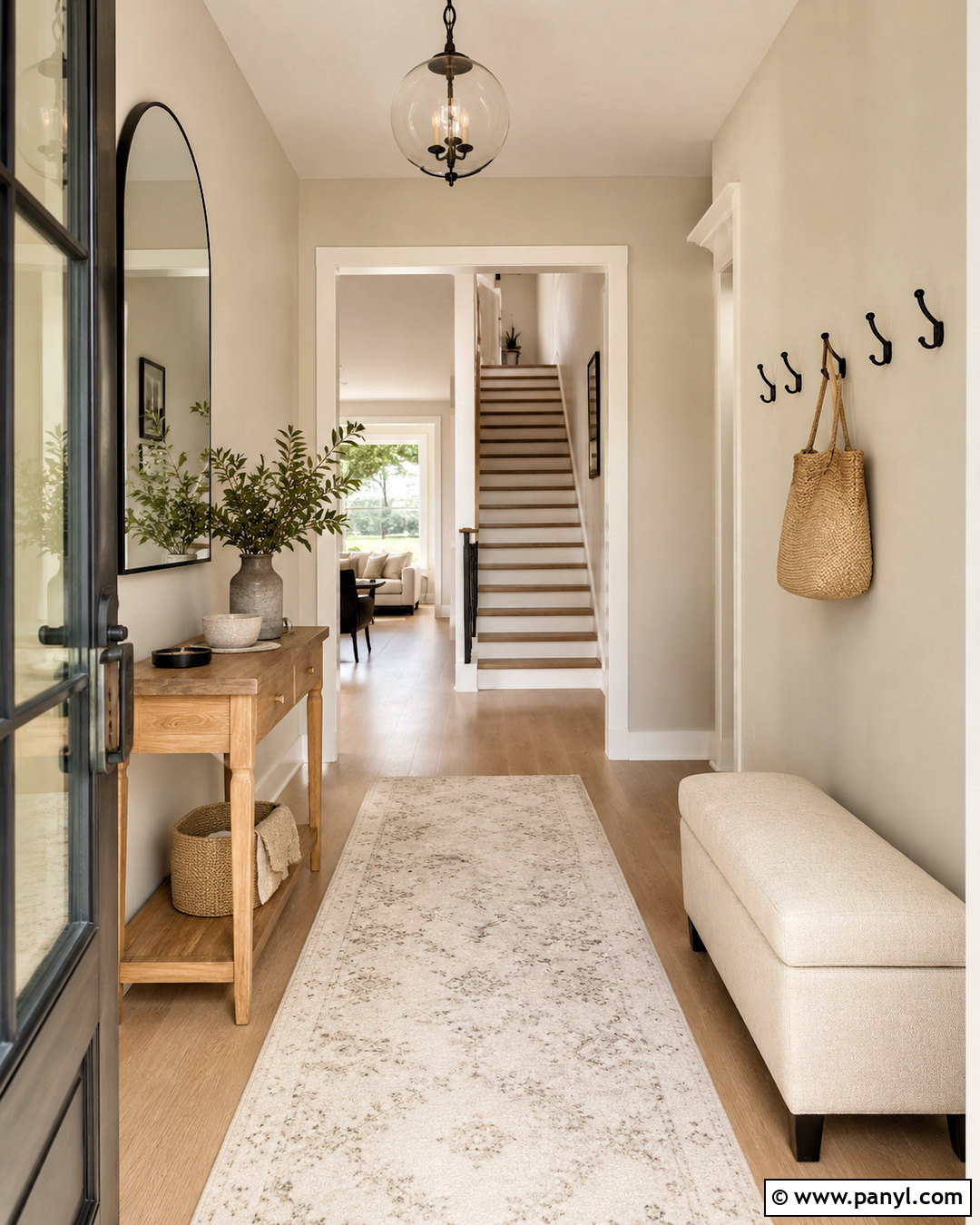
A pale beige wall color can make an entryway feel warmer and brighter the moment the door opens. Choose a delicate sandy beige with minimal brown or gray, then pair it with crisp off-white trim and a matching light ceiling. A narrow natural-oak console keeps the walkway open, while a large arched mirror reflects light toward the darker end of the hall. Add a washable cream runner with a subtle geometric pattern and a small upholstered bench in oatmeal fabric. Matte black hooks or hardware provide controlled contrast, but avoid bulky dark furniture. A clear glass pendant and a table lamp create layered illumination. The result is an inviting, practical entrance that feels larger, cleaner, and more connected to adjoining rooms.
6. Butter Yellow Wall Color
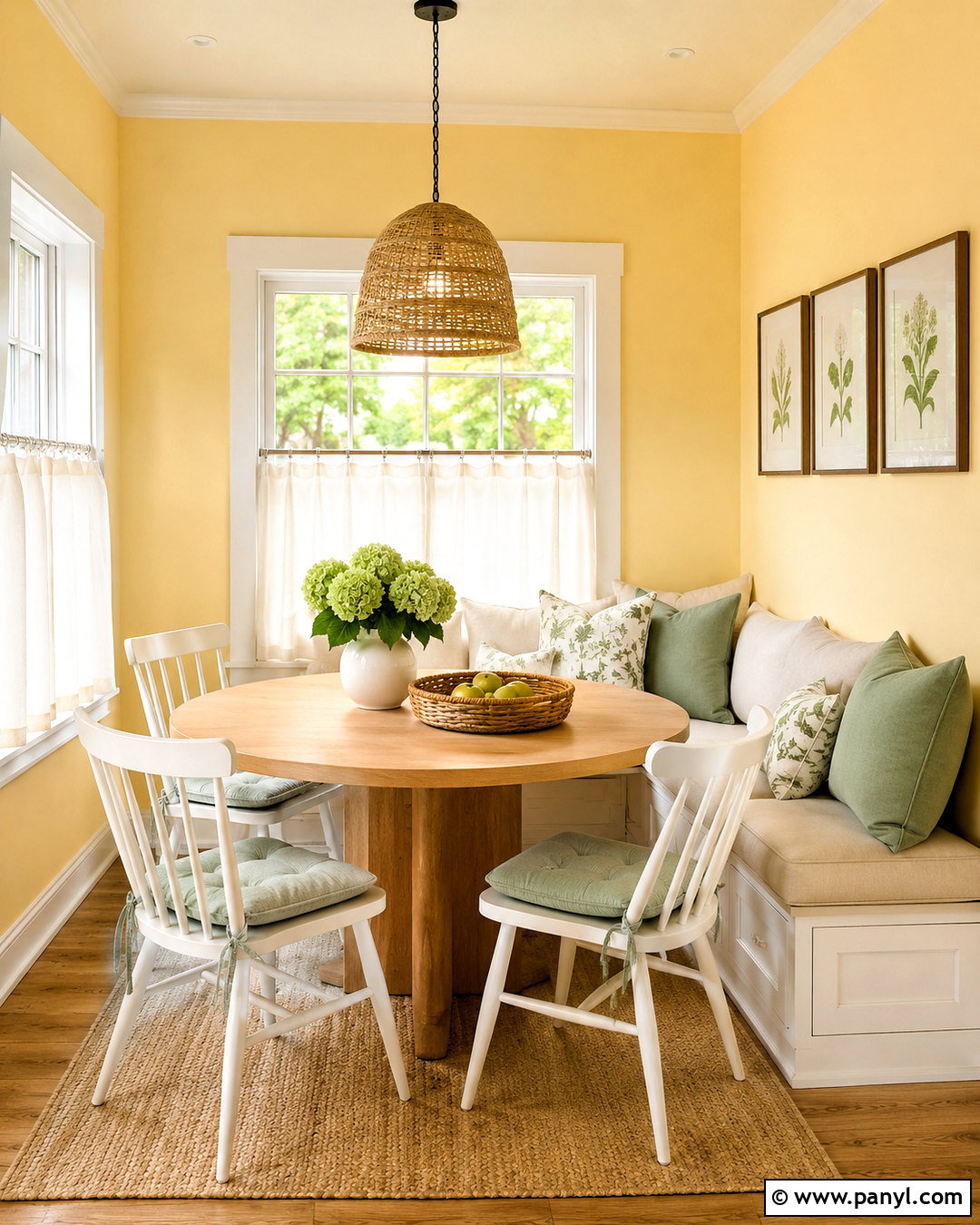
Butter yellow walls can give a breakfast nook a cheerful glow without becoming loud. Select a pale, creamy yellow rather than a highly saturated lemon tone. Pair the color with warm white trim, a round white-oak table, and simple spindle-back chairs painted soft white. A built-in bench with ivory cushions helps maximize seating while keeping the layout visually light. Add a small woven pendant, sheer café curtains, and botanical artwork in natural wood frames. Soft sage seat pads or striped blue textiles provide a fresh counterpoint to the yellow. Keep the flooring pale or introduce a washable cream rug. This complete room captures the feeling of morning sunlight, making it especially effective in a nook with small or shaded windows.
7. Pale Peach Wall Color
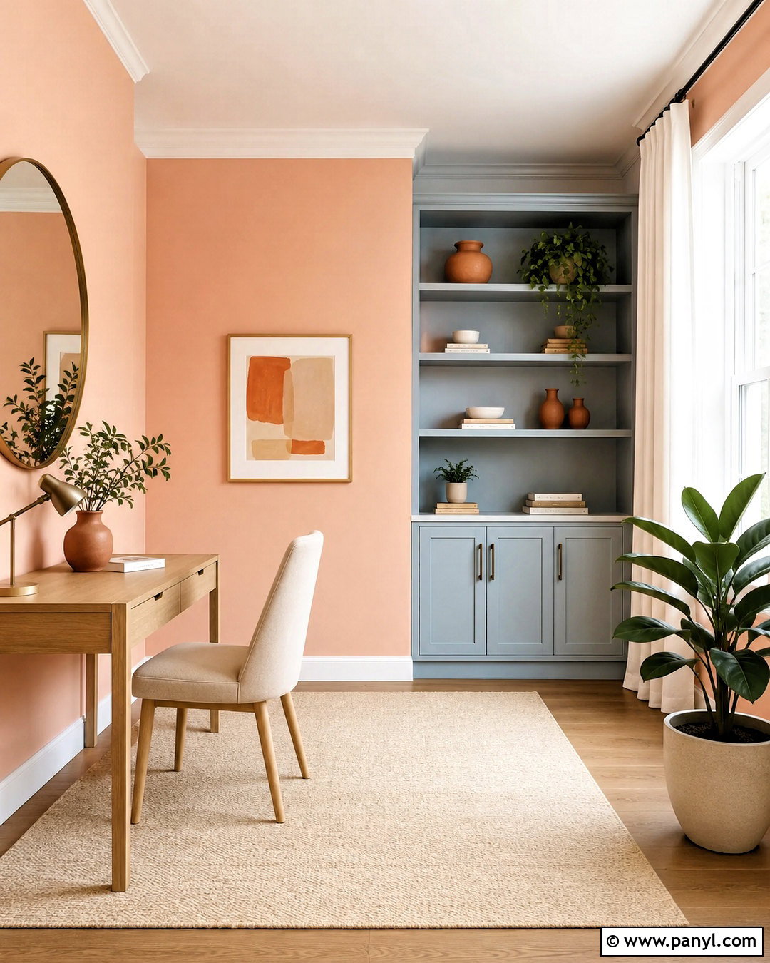
Pale peach creates flattering warmth in a home office that needs more energy and visual light. Choose a softly muted peach with cream undertones, avoiding shades that lean strongly orange. Balance the walls with warm white trim, a slim light-oak desk, and an ivory upholstered chair. Place the desk near the window but keep tall storage on an interior wall so it does not block daylight. A cream flat-weave rug, white linen curtains, and a rounded brass mirror make the room feel open. Add terracotta pottery, pale blue stationery storage, and one leafy plant for contrast. Under-cabinet lighting and a white desk lamp complete the scheme. The office will feel uplifting, organized, and comfortable during long work sessions.
8. Blush Pink Wall Color
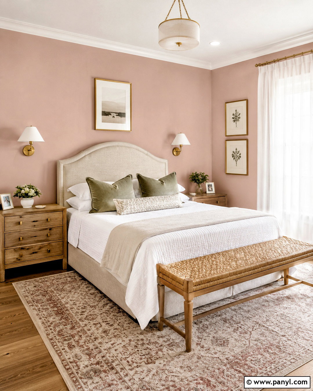
Blush pink walls can brighten a guest bedroom while creating a welcoming look that feels grown-up. Pick a pale, dusty blush with beige undertones instead of a sugary bubblegum pink. Combine it with ivory trim, a cream linen headboard, and light wood nightstands. White bedding keeps the main surfaces fresh, while taupe, muted burgundy, and soft green pillows add depth. Use full-height sheer curtains with woven shades so the window treatment remains airy but functional. A small brass pendant or pair of wall sconces contributes warm reflection. Ground the room with a faded cream-and-rose rug and simple botanical prints. This cohesive palette delivers color and comfort without reducing the sense of space or overwhelming a compact room.
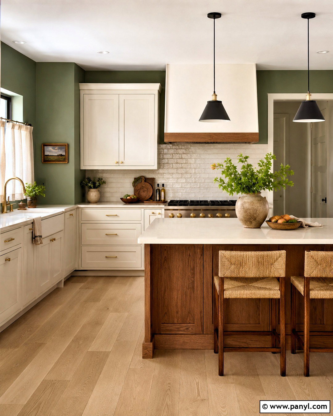
9. Soft Sage Wall Color
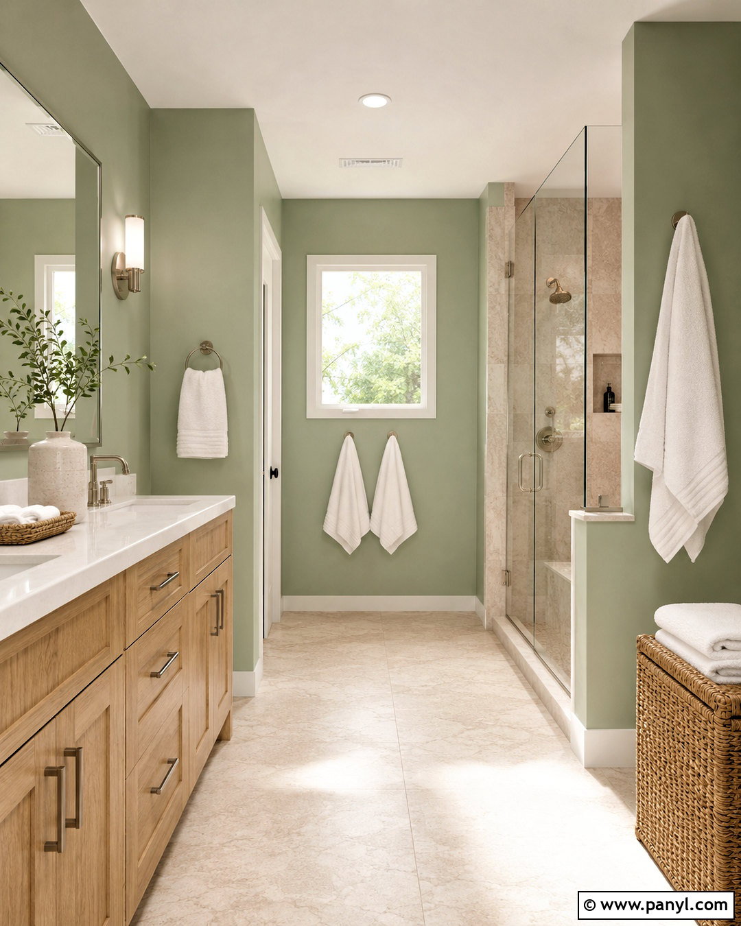
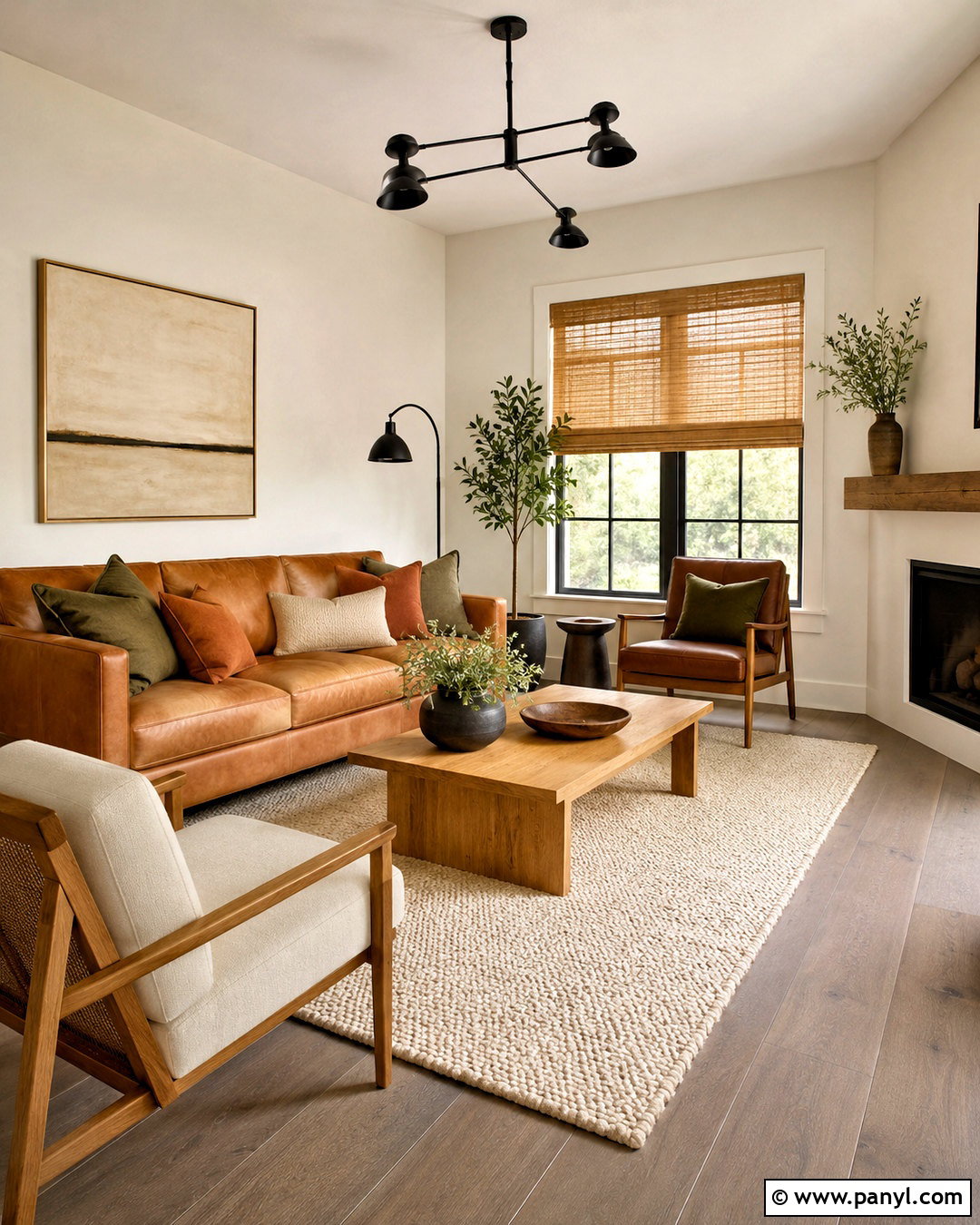
Soft sage wall color brings natural freshness to a bathroom, particularly when the shade has light yellow-gray undertones. Use it on every wall, then keep the ceiling, trim, and door warm white to sharpen the room’s edges. A light oak vanity with a white quartz top supports the organic palette without absorbing too much light. Add a wide frameless mirror, polished nickel faucets, and clear glass shower panels to reflect brightness throughout the room. Pale stone-look floor tile keeps the foundation quiet and easy to maintain. White towels, a woven basket, and restrained eucalyptus-green accessories complete the design. Avoid excessive dark hardware or busy patterns. The finished bathroom feels clean, relaxing, and brighter while still offering more character than a white-only scheme.
10. Mint Green Wall Color
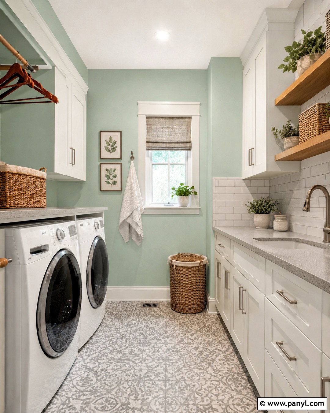
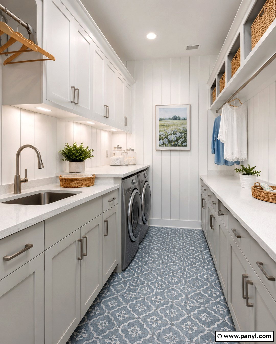
Mint green walls can transform a compact laundry room into a fresh, cheerful workspace. Choose a pale mint with enough gray to keep it sophisticated and easy to coordinate. Pair the walls with white cabinets, a light quartz counter, and a simple white subway tile backsplash. Pale wood open shelves warm the color and provide accessible storage for baskets and clear containers. Use brushed nickel hardware and a bright flush-mount ceiling fixture rather than visually heavy black accents. A light gray patterned floor introduces practical contrast without darkening the room. Add one framed botanical print and a small green plant near the window. This complete combination makes a functional room feel clean, spacious, and intentionally designed instead of overlooked or purely utilitarian.
11. Seafoam Green Wall Color
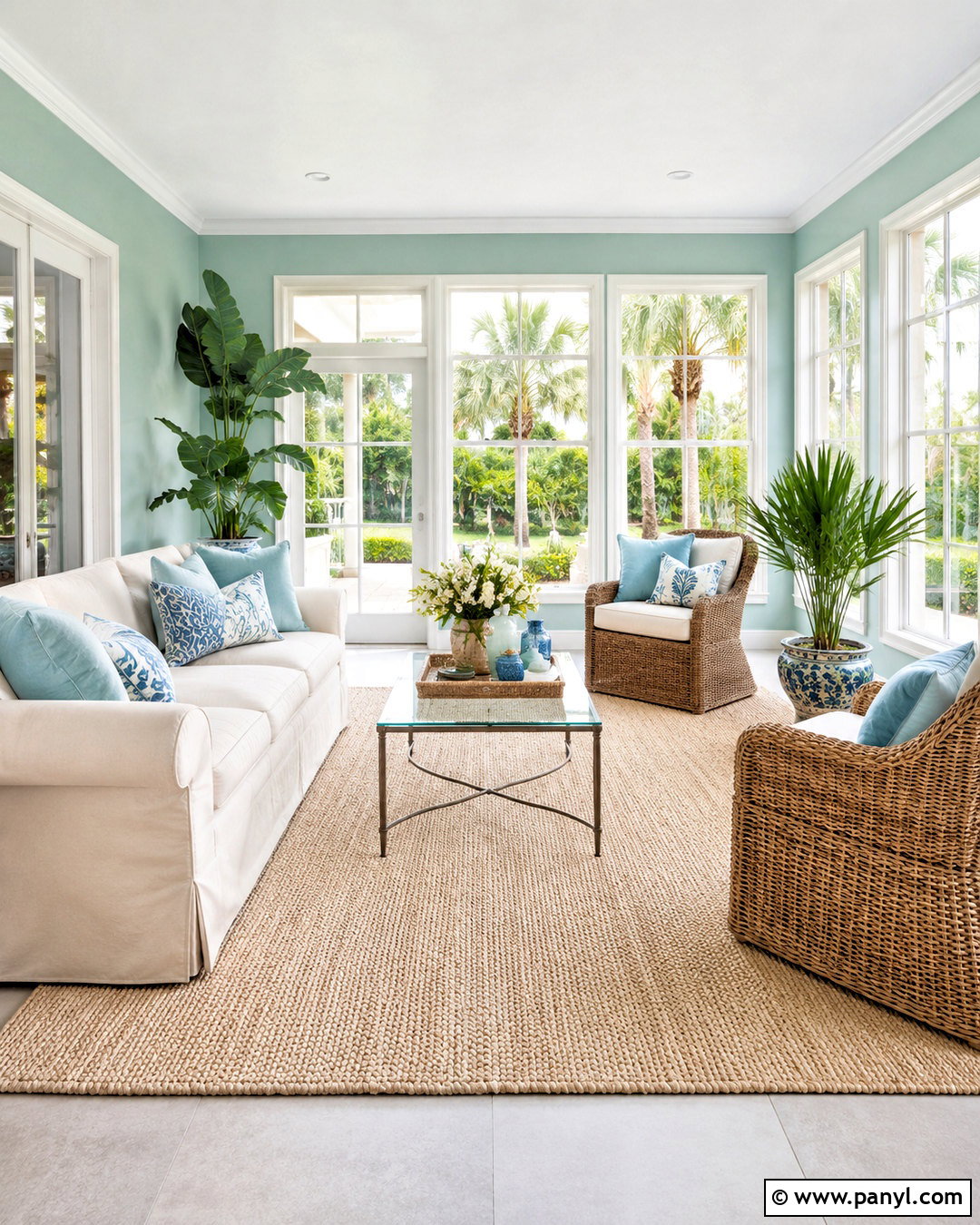
Seafoam green is an effective wall color for a sunroom because it strengthens the connection between indoor light and outdoor greenery. Select a pale blue-green with soft gray undertones to avoid an overly tropical effect. Pair it with bright white window trim, a cream slipcovered sofa, and two woven rattan chairs. Pale oak or light stone flooring supports the airy appearance, while a textured ivory rug defines the seating arrangement. Introduce watery blue cushions, natural linen curtains, and ceramic planters in white and sand tones. Keep window coverings minimal so daylight remains the main feature. A glass coffee table and slim floor lamp reduce visual bulk. The completed room feels breezy, balanced, and colorful without competing with views through the windows.
12. Pale Blue Wall Color
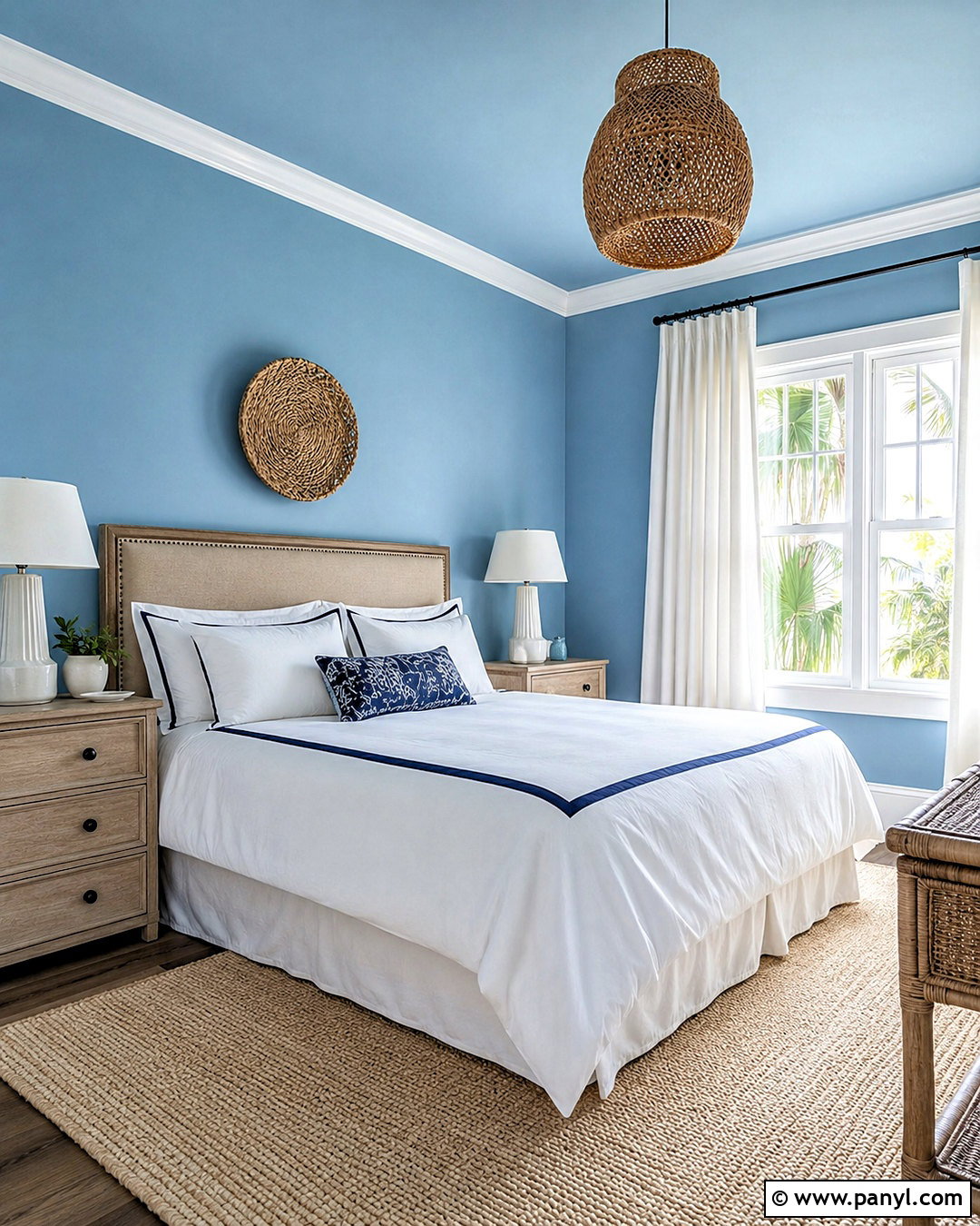
Pale blue walls can make a small bedroom feel open and peaceful, especially when the selected shade has a clean, slightly gray undertone. Continue the color onto the ceiling in a lighter formula to soften visible boundaries and create a more expansive effect. Use crisp white trim, a natural linen headboard, and bleached-oak nightstands. White bedding with navy piping provides definition without introducing large dark areas. Add a cream wool rug, woven pendant, and simple coastal artwork that avoids obvious themes. Sheer white curtains should extend from ceiling to floor, allowing the window to appear taller. Warm wood and brass details balance the cool wall color. Together, these elements produce a bright, restful room with subtle contrast and year-round appeal.
13. Sky Blue Wall Color
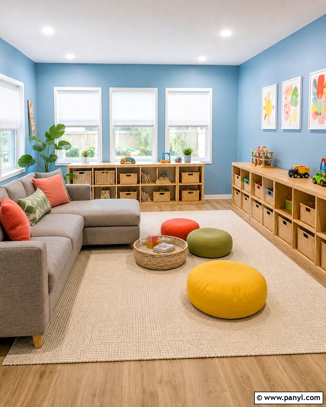
Sky blue wall color gives a playroom lively brightness while maintaining a relaxed backdrop for colorful toys and furniture. Select a clear, light blue that does not become icy under artificial lighting. Pair it with bright white trim, pale maple storage units, and a washable cream rug. Low built-in shelving keeps the upper walls open and reduces visual clutter. Use white roller shades, a soft gray sectional, and movable floor cushions in yellow, coral, and green. Closed baskets should match in material or color so storage looks orderly rather than chaotic. A large white ceiling light and adjustable wall sconces provide even illumination after sunset. This complete setup feels playful and spacious, while the blue walls visually support many accent colors without making the room look busy.
14. Blue Gray Wall Color
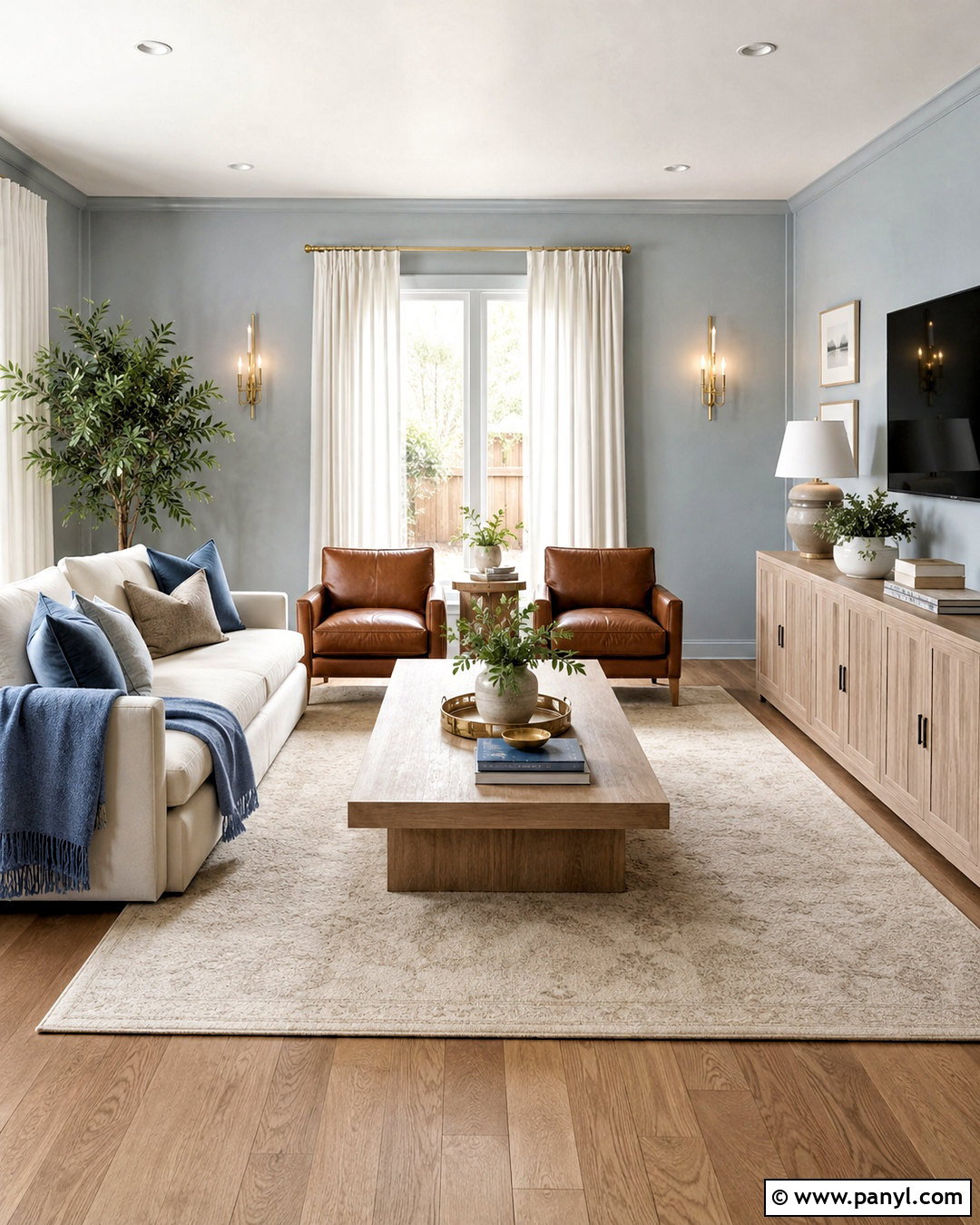
Light blue-gray walls can brighten a modern living room when the shade contains enough blue to look fresh rather than flat. This color works well with large windows, cool daylight, and a mixture of warm natural materials. Pair it with white trim, an ivory sofa, and a pale oak media console. Add camel leather chairs to introduce warmth, then layer a cream rug and soft blue textiles throughout the seating area. Use brushed brass or polished nickel lighting for understated reflection. Full-length white curtains frame the windows without reducing daylight. Keep artwork large and simple, with white mats and narrow oak frames. The resulting room feels crisp and contemporary, but the warm furniture prevents the cool wall color from becoming sterile or uninviting.
15. Powder Aqua Wall Color
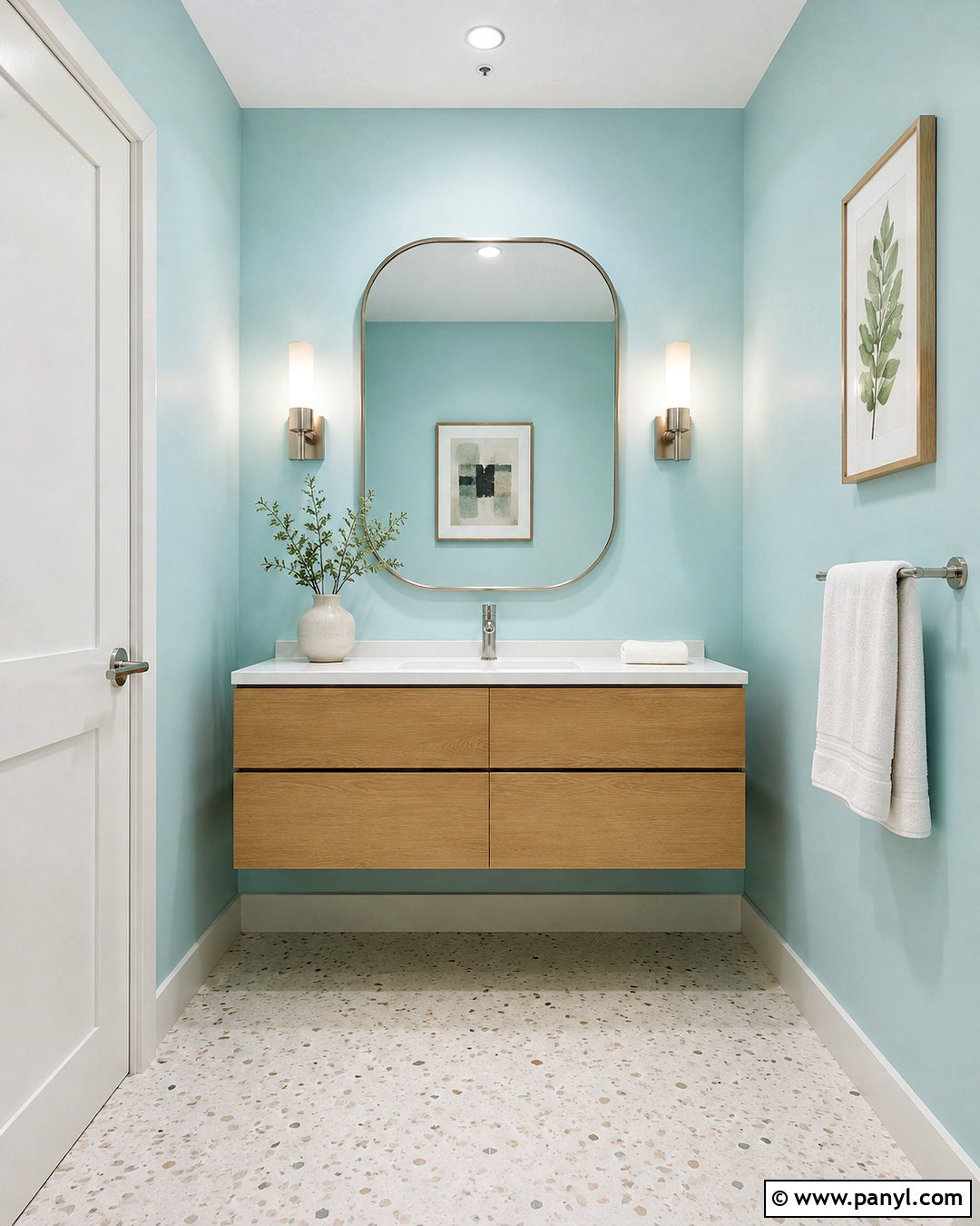
Powder aqua walls bring clean brightness to a windowless powder room without relying on plain white. Choose a pale aqua that balances blue and green with a restrained gray undertone. Cover the walls fully and paint the ceiling a soft warm white. A floating light-oak vanity leaves more flooring visible, helping the compact room appear open. Add a white stone countertop, polished chrome faucet, and oversized rounded mirror to distribute light from the sconces. White or pale terrazzo flooring introduces subtle pattern without crowding the space. Finish with fluffy white towels, one ceramic vase, and minimal framed artwork. Because this room depends on artificial light, test the paint beside the actual bulbs before committing. The completed space should feel crisp, watery, and pleasantly luminous.
16. Light Lavender Wall Color
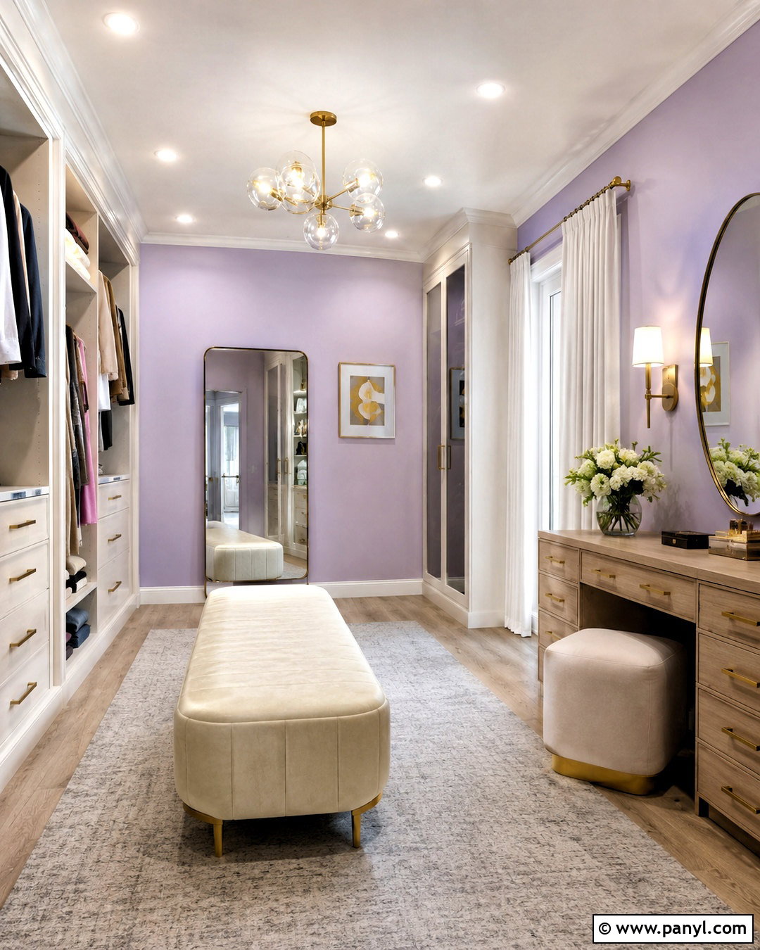
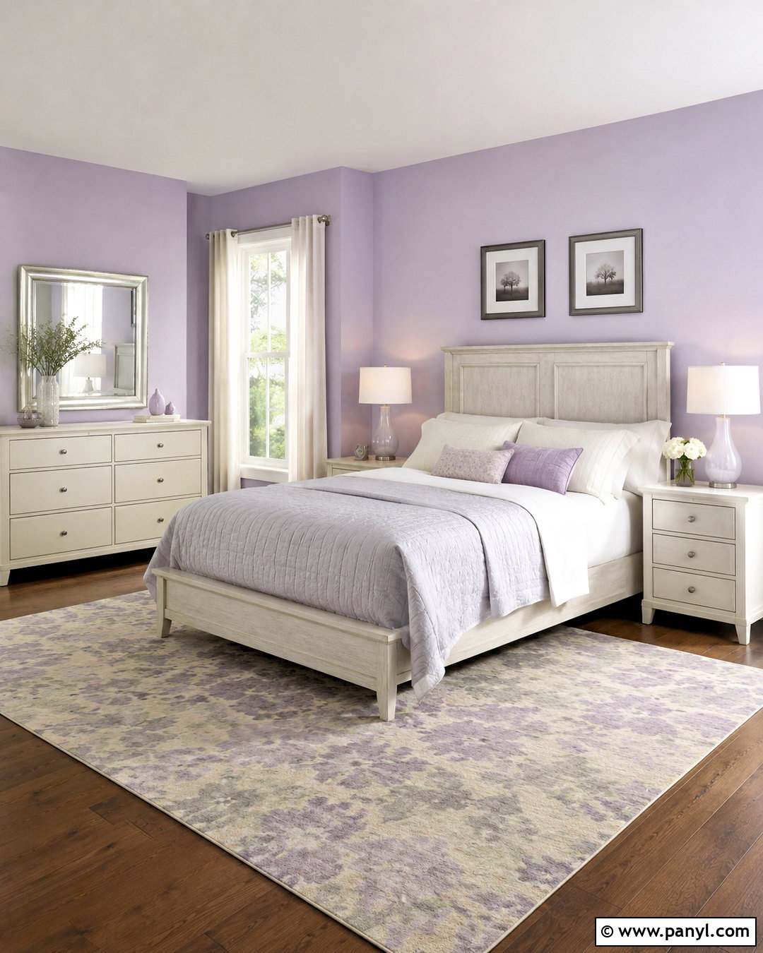
Light lavender wall color gives a dressing room or bedroom a gentle sense of brightness and elegance. Look for a pale lavender softened with gray, as overly pink or saturated purple can quickly dominate the space. Pair it with creamy white trim, an ivory upholstered bench, and built-in wardrobes in a slightly lighter neutral. Mirrored closet doors or a large standing mirror help move light around the room. Use a pale gray rug, white linen curtains, and brushed nickel hardware for a cool, polished base. Introduce small warm accents through a light wood vanity and champagne-brass lamp. Keep clothing and accessories organized behind closed doors. This refined combination feels colorful but calm, making a small personal space appear tidier, softer, and more spacious.
17. Lilac Gray Wall Color
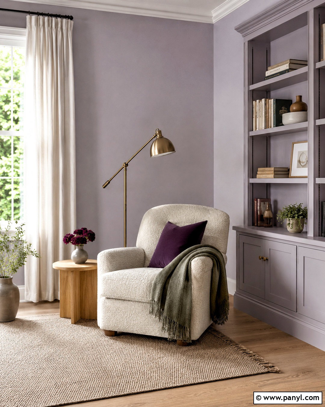
Lilac-gray walls offer a subtle alternative to ordinary gray in a quiet reading room. The faint violet undertone prevents the neutral from feeling lifeless while still reflecting available daylight. Pair the walls with soft white trim, a cream boucle chair, and a slim bookcase painted to match the wall. This tone-on-tone storage treatment reduces visual interruption and helps the room feel wider. Add a pale oak side table, an adjustable brass reading lamp, and a light oatmeal rug. Curtains in natural white linen soften the window without blocking it. Use book covers, cushions, and artwork in plum, dusty rose, and muted green for measured contrast. The finished retreat looks bright, layered, and peaceful, with enough color to feel thoughtfully designed rather than generic.
18. Pearl Gray Wall Color
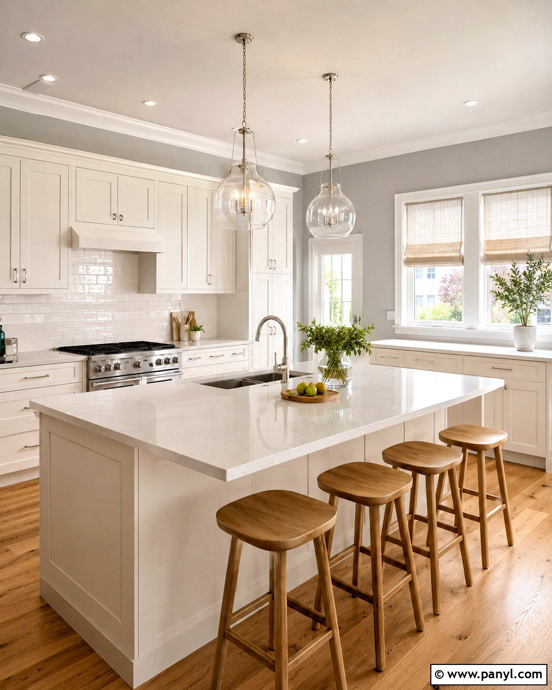
Pearl gray wall color can brighten a kitchen when paired with reflective surfaces and warm materials. Choose a very light gray with balanced undertones so it does not turn blue or lavender throughout the day. Use the color on open wall areas, then install warm white cabinets and a glossy white tile backsplash. Pale quartz counters and light oak stools keep the palette clean but not cold. Add polished nickel hardware and glass pendant lights to reflect task lighting across the room. A warm wood floor introduces natural contrast, while cream Roman shades soften the windows. Keep countertop appliances limited and organized to preserve clear visual lines. This complete kitchen feels brighter because the walls, cabinetry, backsplash, and lighting all support one restrained, light-enhancing palette.
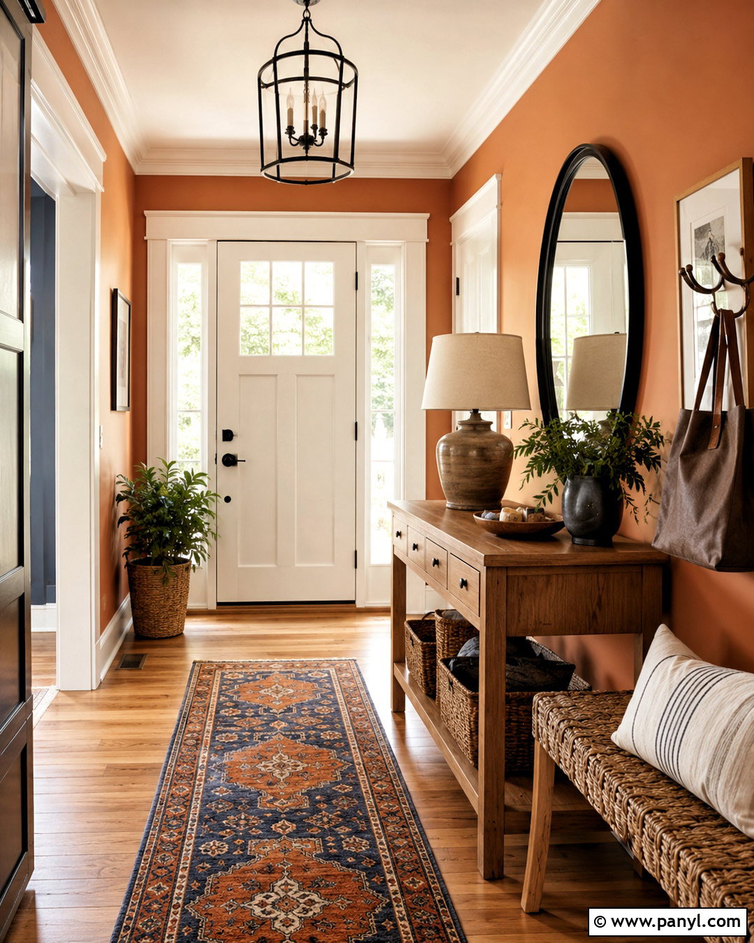
19. Soft Apricot Wall Color
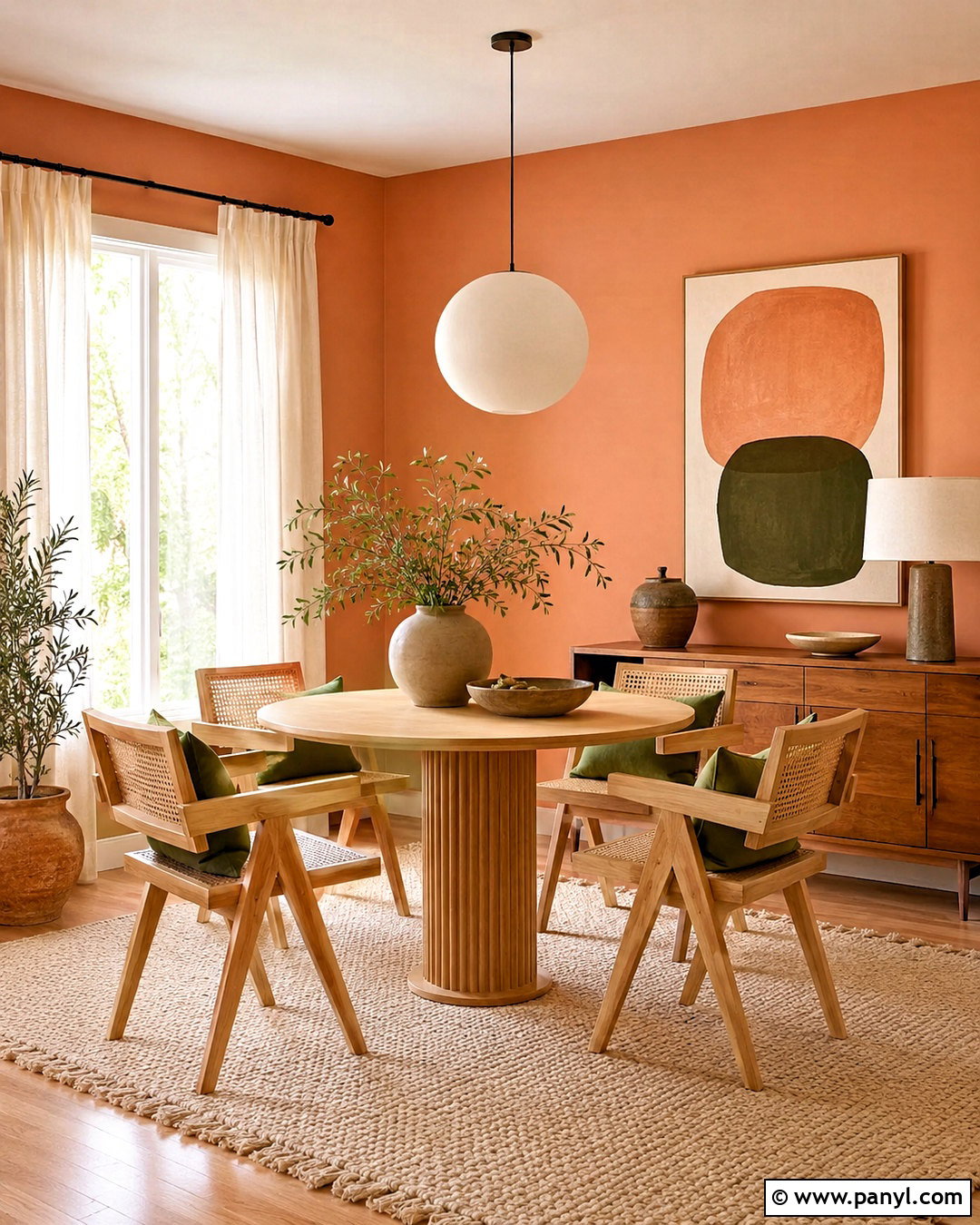
Soft apricot walls can energize a dining nook or creative room with a warm, sunlit appearance. Select a diluted apricot with beige undertones rather than a bold orange shade. Pair it with creamy white trim, a light wood table, and woven cane chairs. A white globe pendant keeps the overhead area visually clean, while a pale cream rug softens the floor. Introduce olive green cushions, natural pottery, and simple abstract artwork containing peach, tan, and muted blue. Use sheer ivory curtains to diffuse strong daylight and make the walls glow evenly. If the room is dim, place a table lamp or wall sconce near the painted surface. The full scheme feels lively and welcoming without sacrificing the open, uncluttered atmosphere needed in a smaller space.
20. Crisp White Wall Color
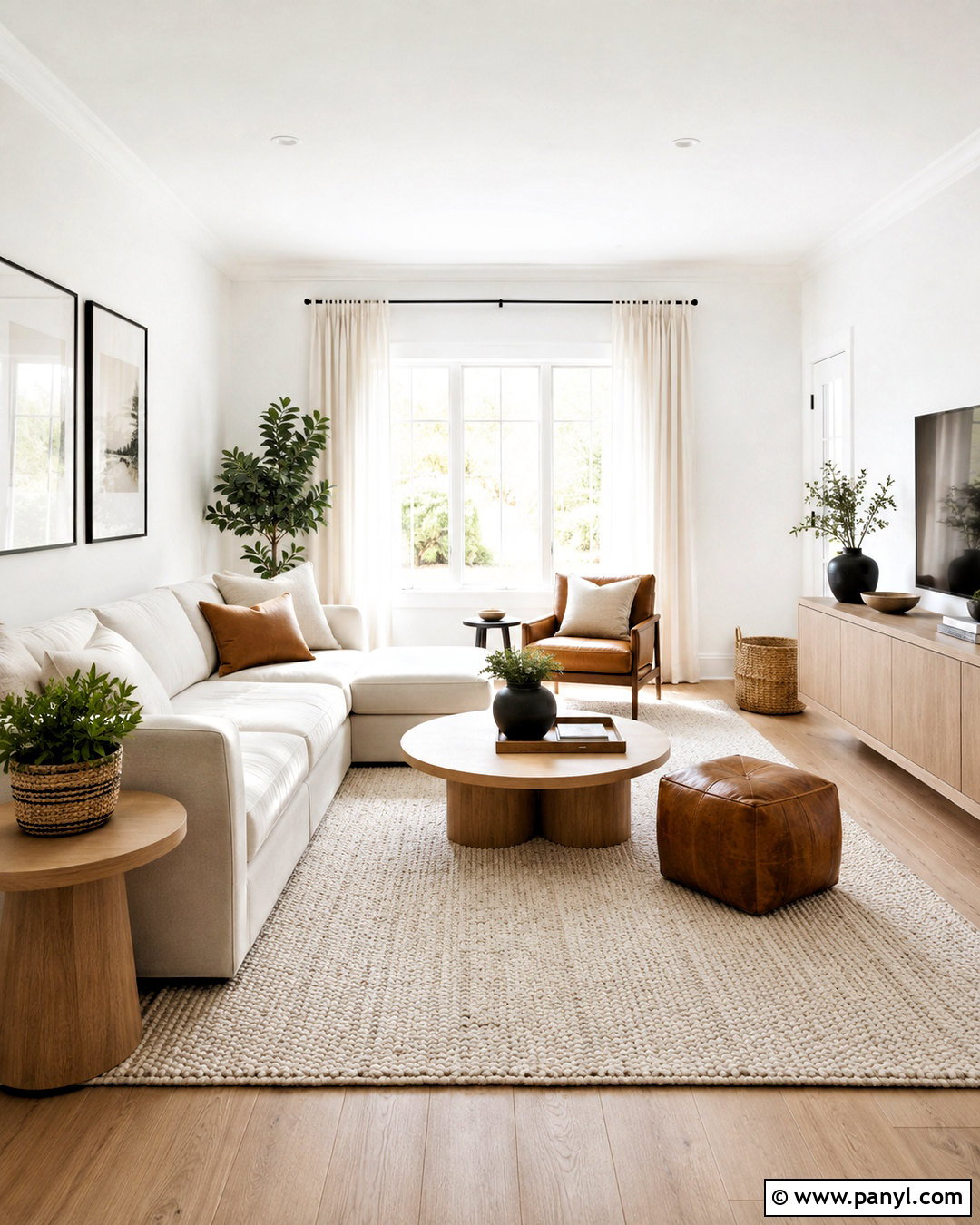
Crisp white wall color works best in a room with abundant daylight or warm furnishings that prevent it from feeling stark. Choose a balanced white rather than a sharply blue formula, and use the same color on the ceiling for uninterrupted brightness. Create contrast through texture instead of heavy color: an ivory sofa, looped wool rug, white linen curtains, and pale oak tables. Add cognac leather, woven baskets, and muted green plants to warm the clean background. Black accents should remain slim, such as a narrow lamp base or picture frame. A large mirror positioned perpendicular to the window helps distribute daylight without creating direct glare. The complete living room looks fresh and spacious, yet the layered natural materials keep it comfortable and realistic.
Conclusion:
Selecting the right paint is only one part of creating a brighter room. Wall color should coordinate with the ceiling, trim, flooring, furniture, window treatments, and lighting. Warm whites and creams offer flexibility, while pale greens, blues, pinks, and yellows bring gentle personality. Before painting the entire room, test large samples on different walls and observe them under daylight and evening bulbs. Consider the paint’s light reflectance value, but also watch how its undertones react to existing surfaces. Mirrors, pale textiles, clear glass, and organized layouts can strengthen the final effect. Use these **20 Wall Colors To Brighten A Room Ideas** to build a complete space that feels open, comfortable, and thoughtfully connected.

Related Ideas and Inspiration:

Leave a Reply