
Colorful wall colors can completely change how a home feels, making ordinary rooms brighter, warmer, calmer, or more personal. The key is building a balanced design around the paint rather than treating color as an isolated feature. Furniture, flooring, textiles, lighting, and trim should support the wall color so the finished room feels intentional. Current paint inspiration ranges from soft powder blues and muted pastels to saturated oranges, greens, and high-contrast combinations. () Before committing, view samples on several walls throughout the day because changing light can noticeably affect how a color appears. () The complete room looks below offer practical ways to decorate with 20 Colorful Wall Colors.

1. Coral Wall Color for Living Room
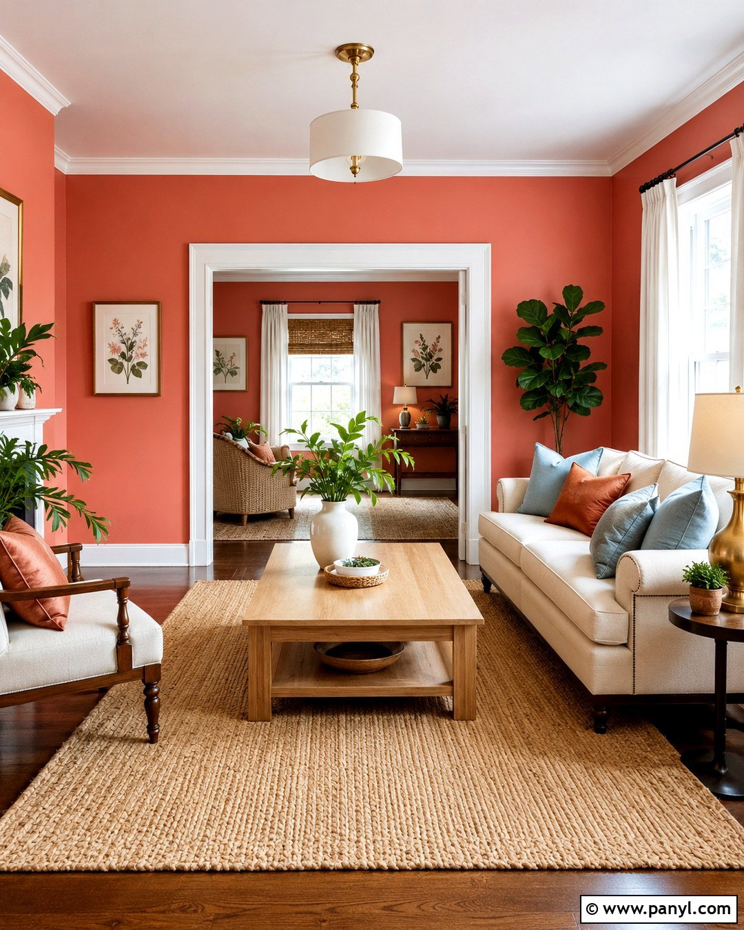
Coral walls give a living room a cheerful glow without the intensity of true orange. Choose a warm, slightly muted coral that looks rich rather than neon. Pair it with a cream sofa, light oak coffee table, and woven natural-fiber rug to create balance. Pale blue pillows add a cool contrast, while rust and blush accents connect everything to the walls. Use white trim to keep architectural details crisp and bright. A large botanical print, ceramic table lamps, and a few leafy plants complete the relaxed look. Brass lighting brings gentle warmth, but keep the metal finish brushed instead of highly polished. This colorful living room works especially well in spaces receiving soft morning light.
2. Teal Wall Color for Dining Room
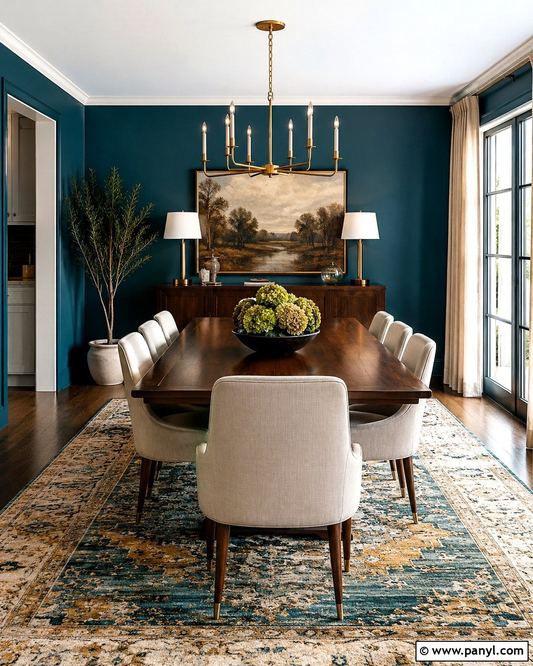
Deep teal walls can make a dining room feel intimate, polished, and wonderfully colorful. Cover every wall in a velvety teal finish, then use warm white on the ceiling to prevent the room from feeling enclosed. A medium-toned walnut dining table adds natural warmth, while cream upholstered chairs provide useful visual relief. Hang a simple aged-brass chandelier above the table and repeat that finish in slim picture frames. A patterned rug containing teal, ochre, and ivory ties the palette together. For the window treatments, choose full-length oatmeal linen curtains that soften the strong paint color. Finish the room with a dark wood sideboard, colorful glassware, and one oversized landscape painting rather than several small decorative pieces.
3. Mustard Yellow Wall Color for Kitchen
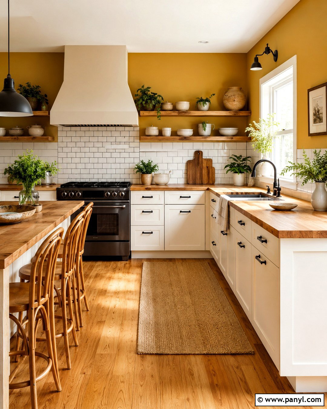
Mustard yellow walls bring sunny character to a kitchen while feeling more grounded than bright lemon. Use the color above a simple white tile backsplash and pair it with warm white cabinets for an easy, livable combination. Butcher-block countertops and honey-toned wood flooring strengthen the welcoming atmosphere. Add matte black cabinet hardware, pendant lights, and faucet fixtures to give the softer colors clear definition. A small breakfast table with bentwood chairs makes the kitchen feel comfortable rather than overly polished. Display cream pottery, wooden cutting boards, and a few green herbs on open shelving. Keep appliances and larger surfaces neutral so the walls remain the main feature. This scheme suits farmhouse, transitional, and casual modern kitchens.
4. Sage Green Wall Color for Bedroom
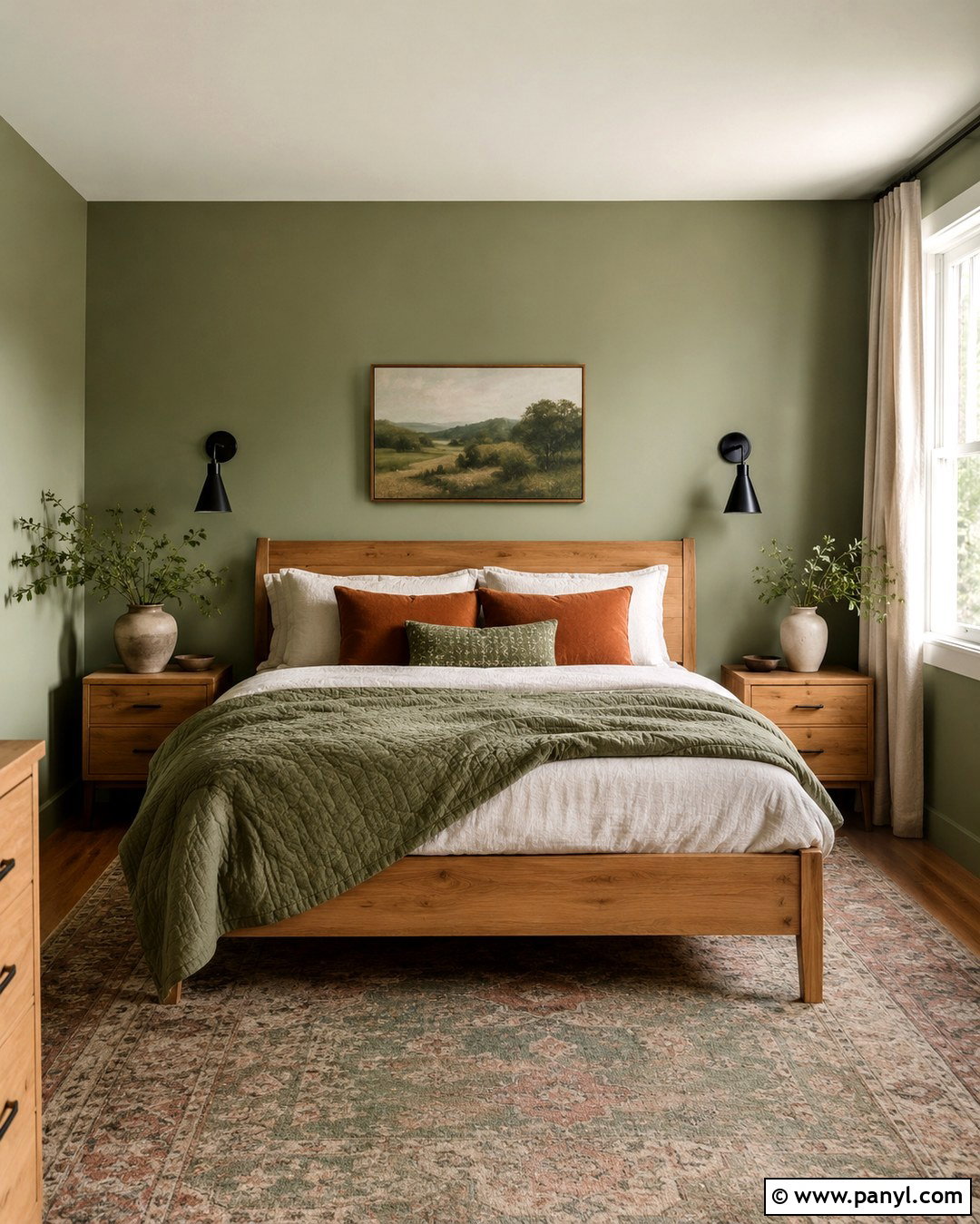
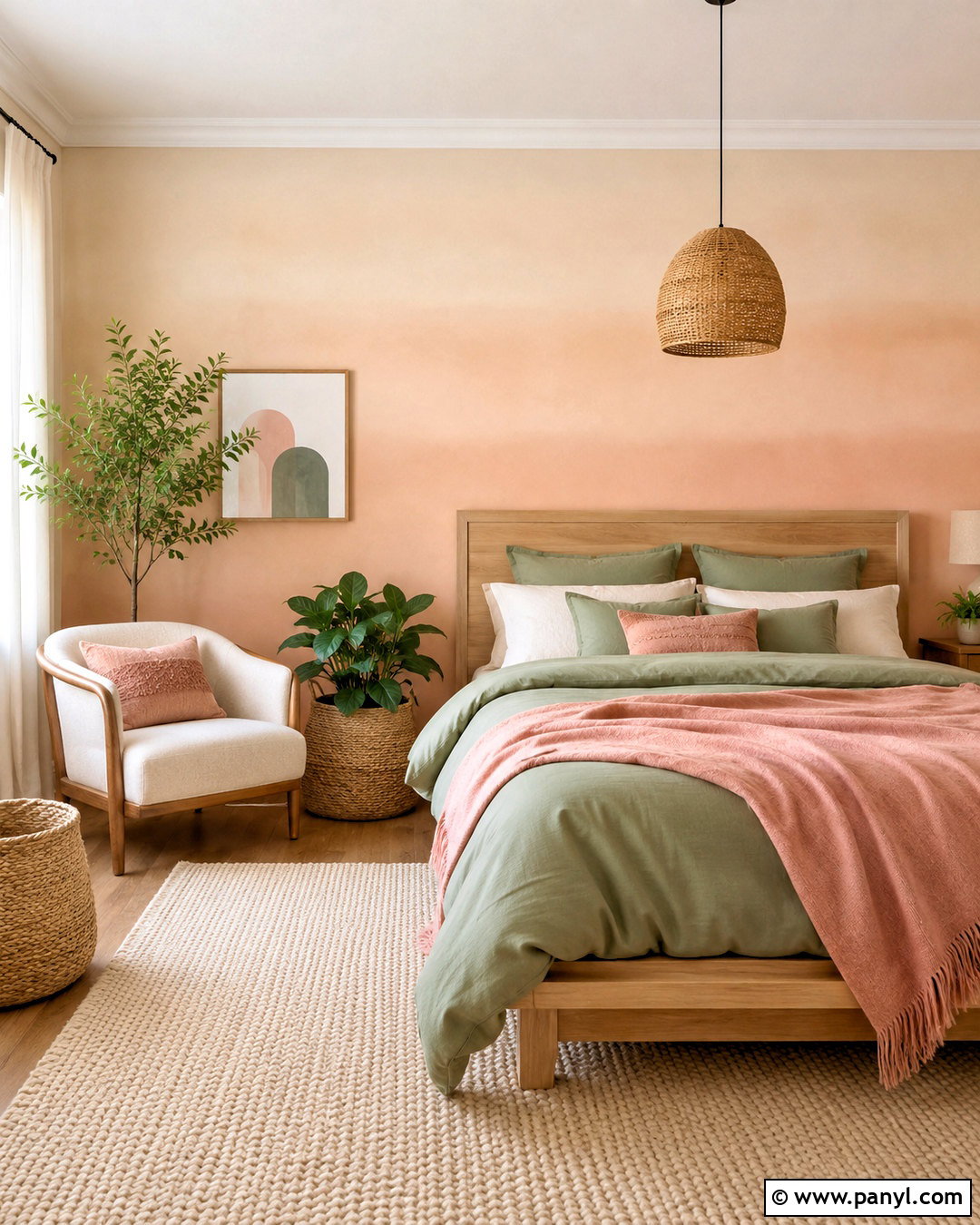
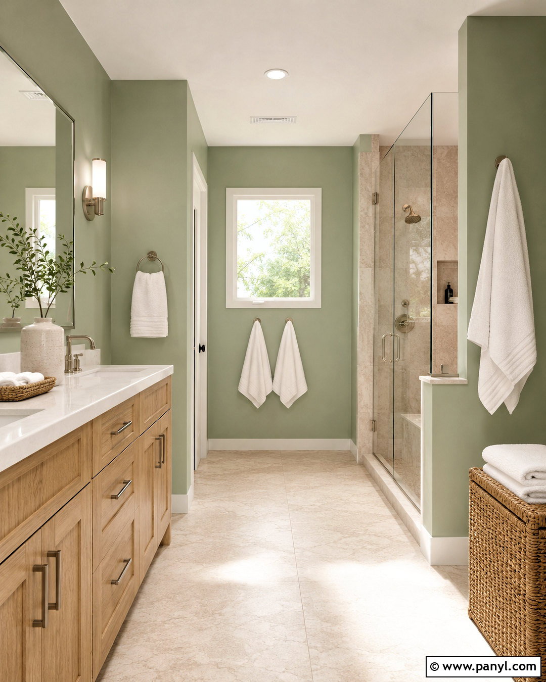
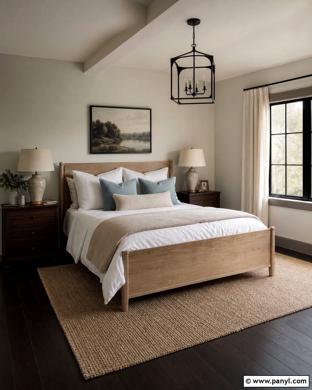
Soft sage green walls create a restful bedroom that still has noticeable color. Paint all four walls for a wrapped, cohesive effect, then keep the ceiling and trim creamy white. Place a natural oak bed against the main wall and dress it with white linen, a moss green quilt, and muted terracotta pillows. Light-filtering flax curtains add texture without competing with the paint. Ground the room with a vintage-style rug combining faded olive, beige, and dusty rose. Black bedside sconces introduce a small amount of contrast, while matching oak nightstands maintain a calm rhythm. A linen bench, simple landscape artwork, and ceramic vases complete the room. Avoid overly cool gray furnishings, which can make warm sage appear dull or disconnected.
5. Cobalt Blue Wall Color for Home Office
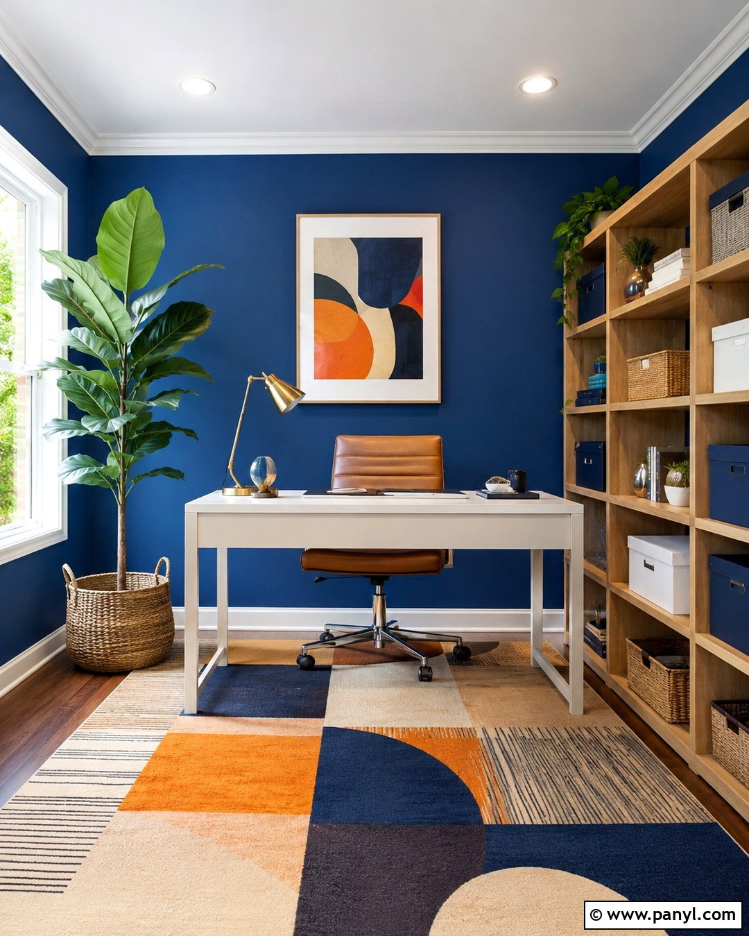
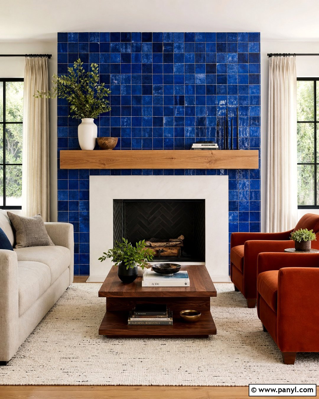
Cobalt blue walls turn a basic home office into an energetic, focused workspace. Because the color is powerful, combine it with streamlined furnishings and a limited supporting palette. Position a clean white desk against the blue wall and add a camel leather chair for warmth. A pale wood bookcase keeps storage practical while preventing the room from becoming too dark. Use closed boxes in white, navy, and natural rattan to organize smaller supplies. A flat-weave geometric rug can introduce red, cream, and softer blue accents without overwhelming the design. Finish with a matte white desk lamp, framed graphic artwork, and one tall indoor plant. Bright white trim and a light ceiling maintain clarity around the saturated blue walls.
6. Terracotta Wall Color for Bedroom
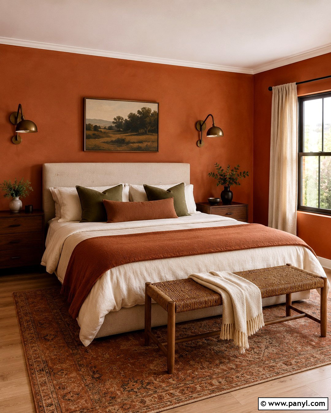
Earthy terracotta walls make a bedroom feel warm, grounded, and comfortably layered. Select a clay-inspired shade with brown or pink undertones rather than a sharp orange. Create a cohesive backdrop by painting every wall, while leaving the ceiling a soft ivory. An upholstered oatmeal bed adds lightness against the deeper color. Layer the bedding with cream sheets, a cinnamon coverlet, and muted olive pillows. Walnut nightstands, antique bronze sconces, and a woven bench strengthen the natural palette. Choose beige linen curtains and a large patterned rug containing faded rust, charcoal, and sand. Finish with handcrafted pottery and minimal black-framed art. The room will feel colorful and enveloping, yet restrained enough to remain soothing at the end of the day.
7. Lavender Wall Color for Bathroom
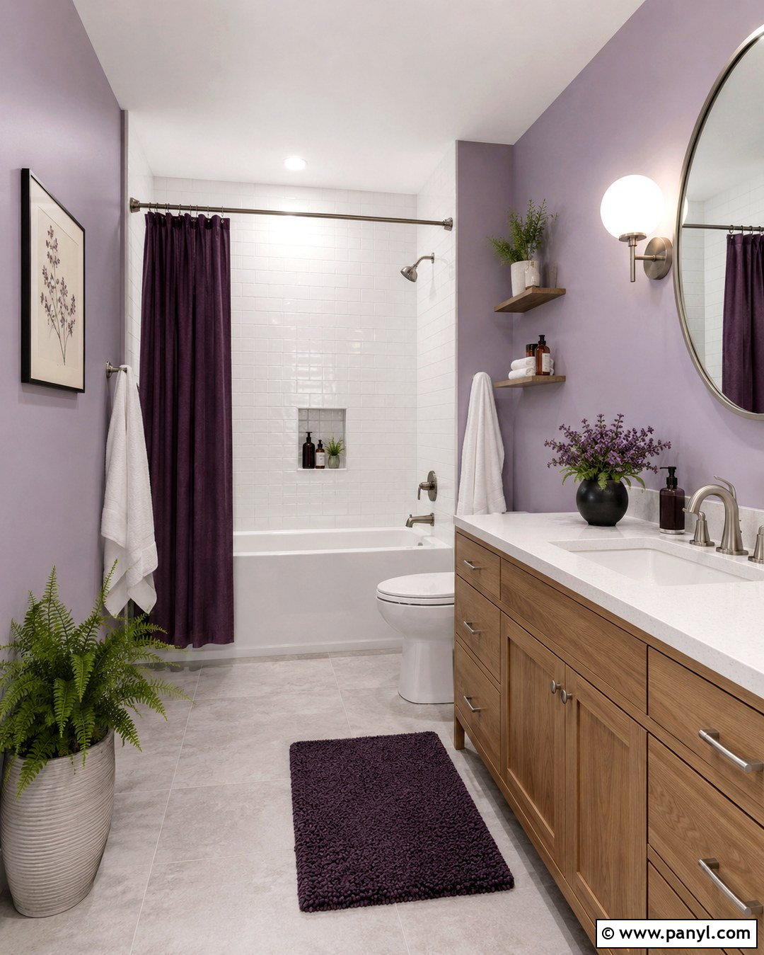
Lavender walls can give a bathroom a fresh, colorful identity without sacrificing a clean appearance. Choose a dusty lavender with gray undertones and combine it with white ceramic tile around wet areas. A light oak vanity introduces natural warmth, while a white quartz countertop keeps the room bright. Use brushed nickel fixtures for a soft, understated finish that does not compete with the wall color. Add a rounded mirror, globe sconces, and pale gray floor tile for gentle contemporary structure. White towels and a simple shower curtain provide breathing room. Small accents in plum, sage, and blush create depth around the lavender. Complete the look with a woven basket, a potted fern, and one framed botanical print near the vanity.
8. Emerald Green Wall Color for Living Room
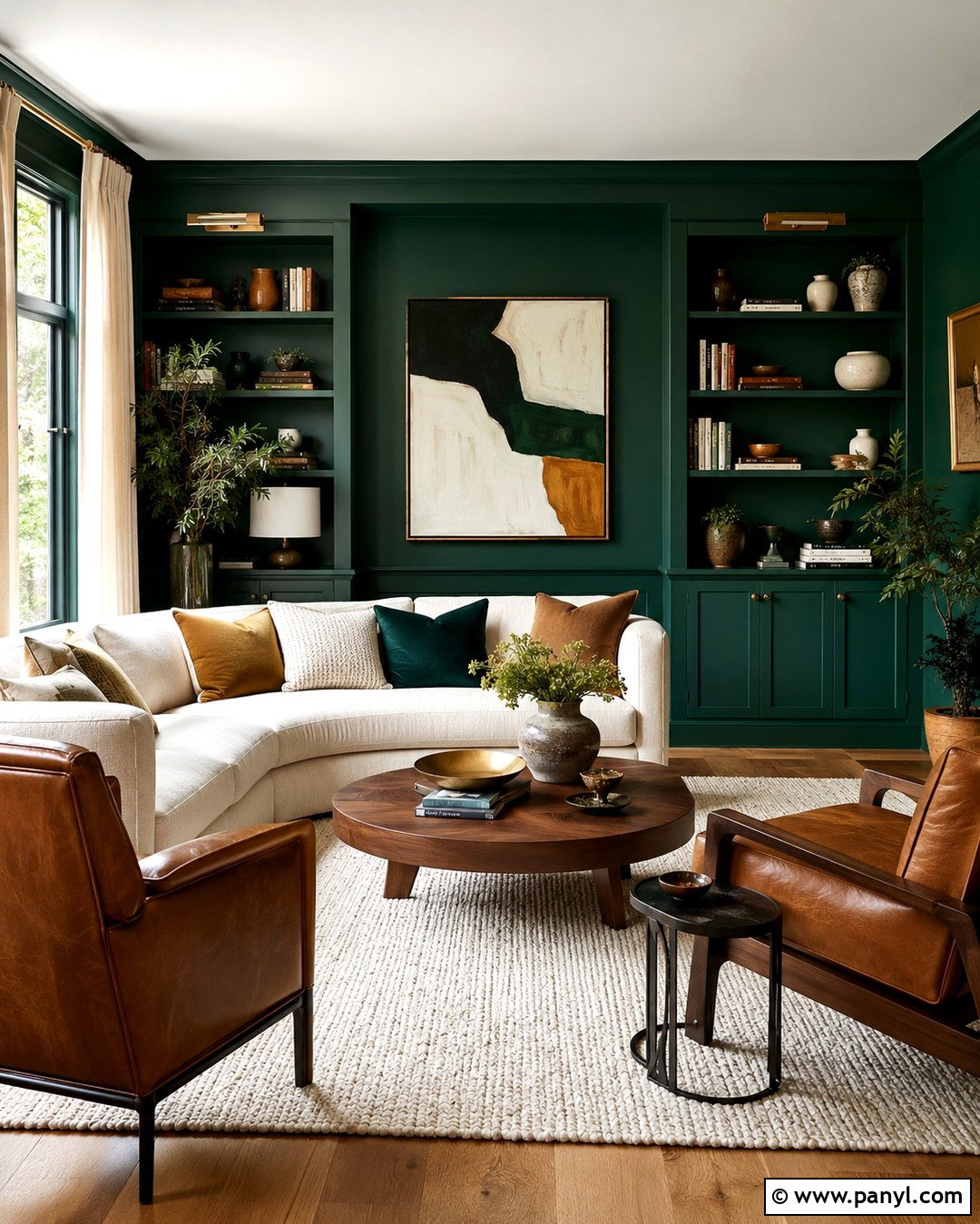
Emerald green walls create a dramatic living room that feels sophisticated instead of overly formal when paired with relaxed materials. Paint the walls and built-in bookcases the same rich green for a seamless, immersive backdrop. Add a curved cream sofa, two cognac leather chairs, and a warm walnut coffee table. An ivory rug with a subtle geometric pattern keeps the seating area visually open. Use velvet pillows in ochre, rust, and softer green tones to build a layered palette. Brass floor lamps and picture lights add a refined glow against the saturated walls. Display books, pottery, and framed art sparingly across the shelves. Full-length natural linen curtains soften the room and prevent the green surfaces from appearing too heavy.
9. Sky Blue Wall Color for Bedroom
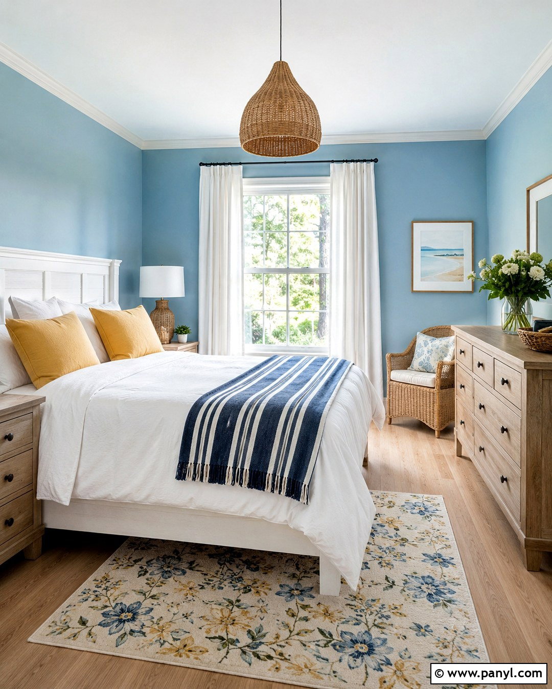
Clear sky blue walls make a bedroom feel open, breezy, and gently colorful. Select a blue with enough warmth to avoid an icy appearance, especially in a room with limited sunlight. Pair it with a white-painted bed, crisp cotton bedding, and a navy striped blanket for a classic foundation. Introduce pale oak through the nightstands and bench to warm the cooler palette. Soft yellow pillows and a small floral rug provide cheerful contrast without turning the room into a themed space. Hang simple white curtains near the ceiling to emphasize height and maximize daylight. Woven lampshades, ceramic accessories, and understated coastal artwork complete the design. Keep decorative shells and nautical objects minimal so the room remains versatile and current.
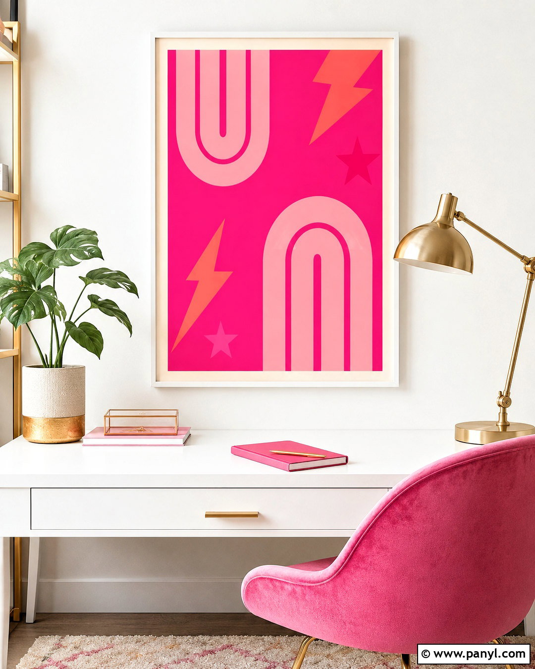
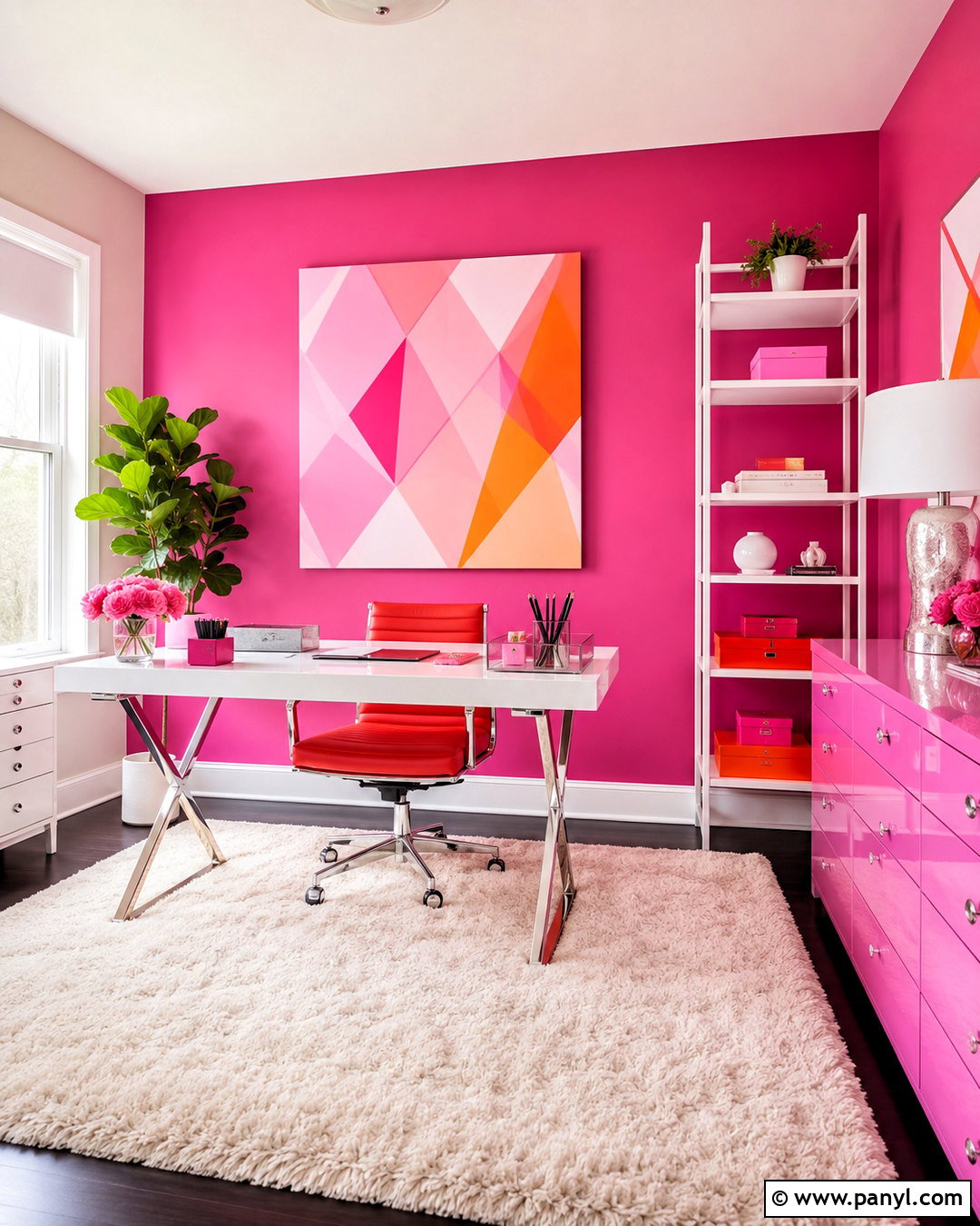
10. Raspberry Pink Wall Color for Dressing Room
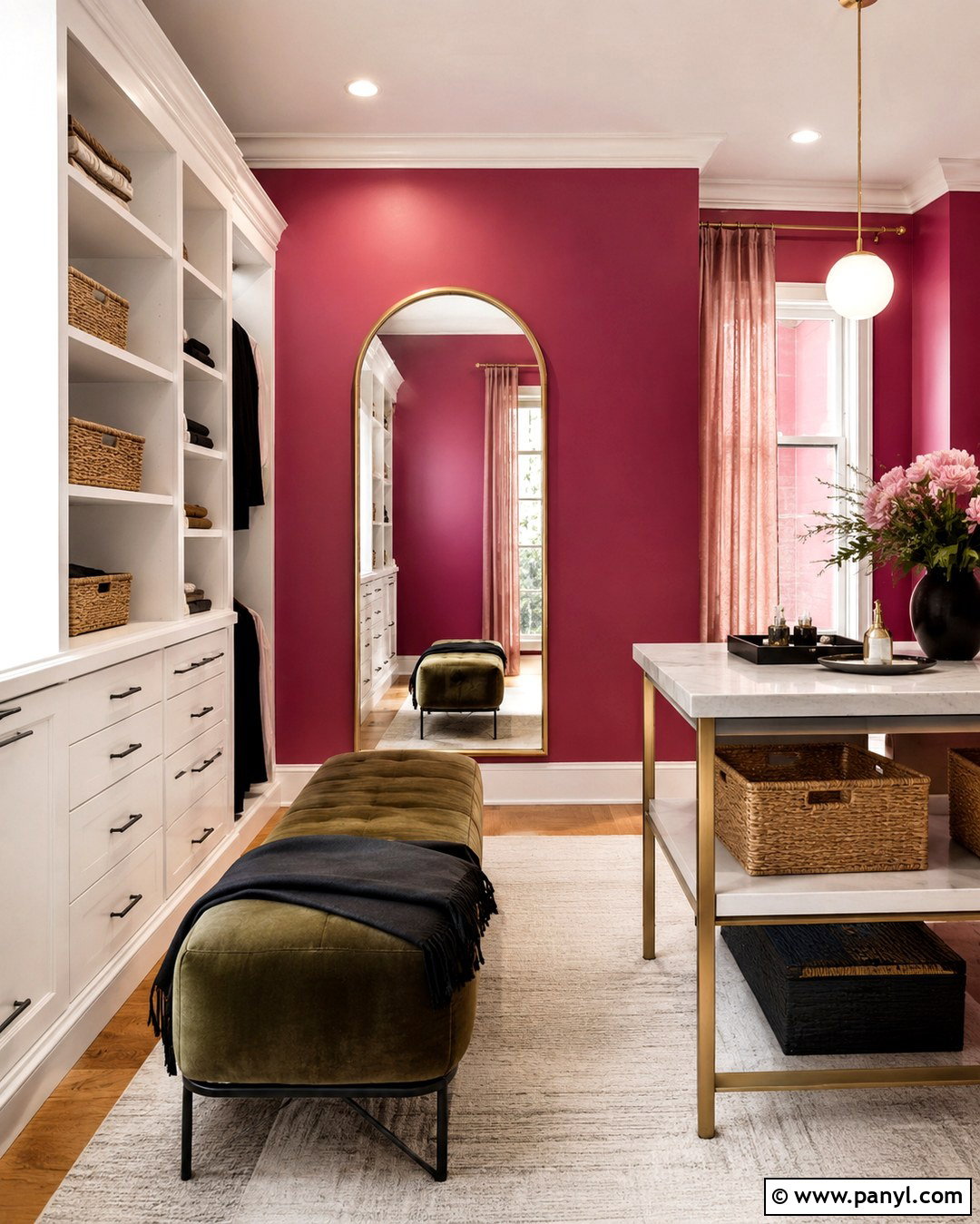
Raspberry pink walls can transform a dressing room or bedroom corner into a confident, polished space. Choose a deep berry pink rather than a sugary pastel, then balance it with white built-in storage and warm wood flooring. A small velvet bench in olive green creates sophisticated contrast. Add an arched brass mirror, a compact marble-topped table, and a cream area rug to lighten the overall composition. Window treatments in soft blush linen connect to the walls without matching them exactly. Use organized trays, woven boxes, and matching hangers so the practical elements look intentional. Black accents can appear through a slim floor lamp or picture frames. The finished room feels playful and grown-up, with enough neutral space to keep the strong pink comfortable.
11. Burnt Orange Wall Color for Family Room
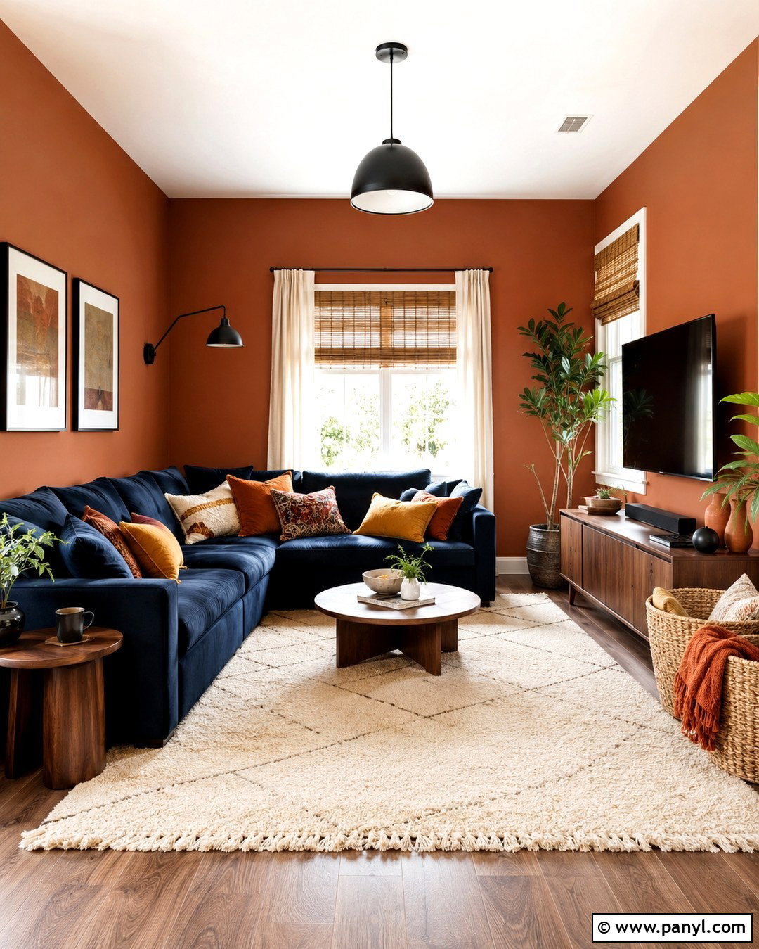
Burnt orange walls give a family room warmth, energy, and a relaxed retro influence. Select an earthy shade with cinnamon undertones and pair it with a deep navy sectional for bold but balanced contrast. A large cream rug brightens the center of the room, while walnut side tables reinforce the warmer notes. Add pillows in mustard, ivory, navy, and rust, mixing solids with small geometric patterns. Natural woven shades control daylight without covering the colorful walls. Use a matte black floor lamp and simple black frames to sharpen the palette. A low media console keeps the layout practical for everyday use. Finish with baskets for blankets, durable textured fabrics, and several leafy plants that look especially vibrant against the orange background.
12. Mint Green Wall Color for Laundry Room
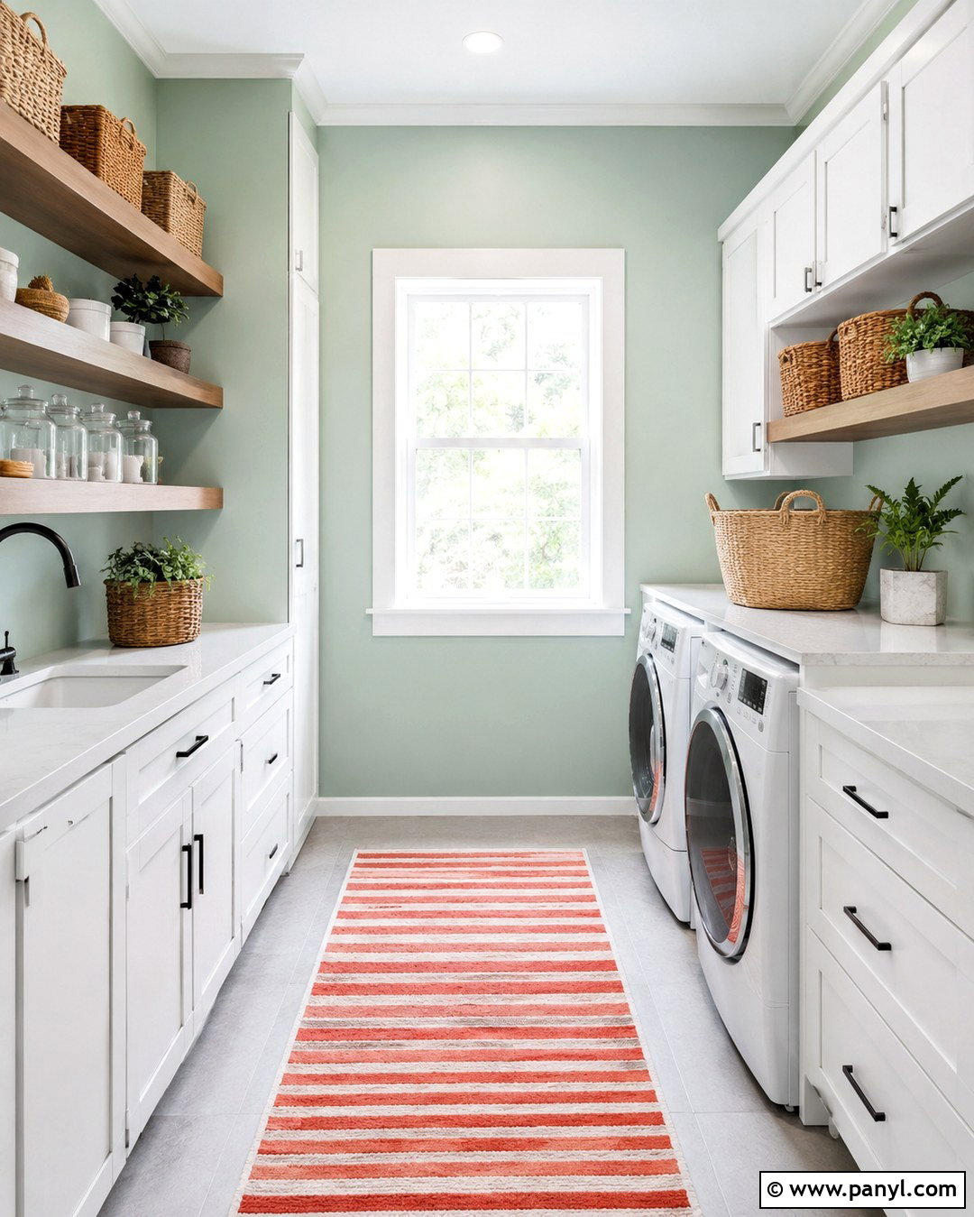
Mint green walls make a hardworking laundry room feel brighter and more enjoyable. Use a clean, softly muted mint rather than a pastel that looks overly sweet. Pair it with white shaker cabinets, a white quartz folding counter, and light gray floor tile. Warm wood floating shelves prevent the palette from feeling sterile and provide an attractive place for glass containers, baskets, and folded towels. Choose matte black handles and a black hanging rail for crisp definition. A small striped runner containing mint, coral, and cream introduces an extra layer of color. Keep cleaning products hidden in labeled containers or closed cabinets to reduce visual clutter. Good overhead lighting and an under-cabinet light help the colorful room remain functional, organized, and fresh.
13. Plum Wall Color for Dining Room
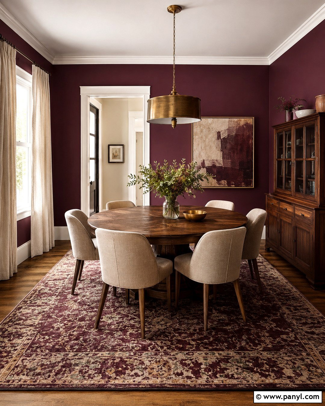
Plum walls give a dining room deep color with a softer character than black or navy. Choose a rich purple with warm red undertones, and paint the trim in a creamy off-white for clear contrast. A round oak dining table keeps the room approachable, while beige upholstered chairs lighten the darker walls. Place a contemporary brass pendant overhead and use matching candleholders as simple table accents. A patterned rug with plum, olive, rose, and ivory creates a connected palette underfoot. Hang one large abstract painting that includes lighter variations of the wall color. Pale linen curtains should reach the floor to soften the room’s edges. Add a vintage wood cabinet and neutral ceramic pieces for a collected design that works for everyday meals.
14. Turquoise Wall Color for Sunroom
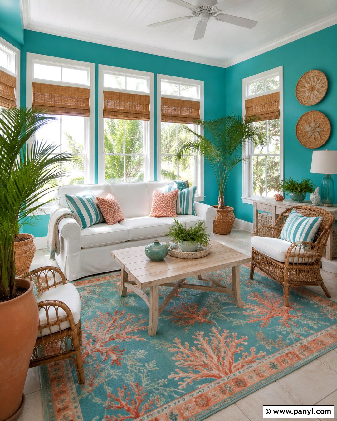
Turquoise walls bring a refreshing sense of color to a bright sunroom, especially when surrounded by natural materials. Choose a medium turquoise that combines clear blue and green instead of an intensely tropical shade. Arrange a white slipcovered loveseat with two woven rattan chairs around a pale wood coffee table. Use an indoor-outdoor rug featuring ivory, turquoise, and warm coral to connect the seating arrangement. White window trim keeps the many openings crisp and helps daylight move through the room. Add striped pillows, lightweight cotton throws, and terracotta planters filled with leafy plants. Natural bamboo shades provide practical sun control without making the space heavy. The final room feels joyful and relaxed while remaining suitable for an average home rather than a themed vacation retreat.
15. Peach Wall Color for Nursery
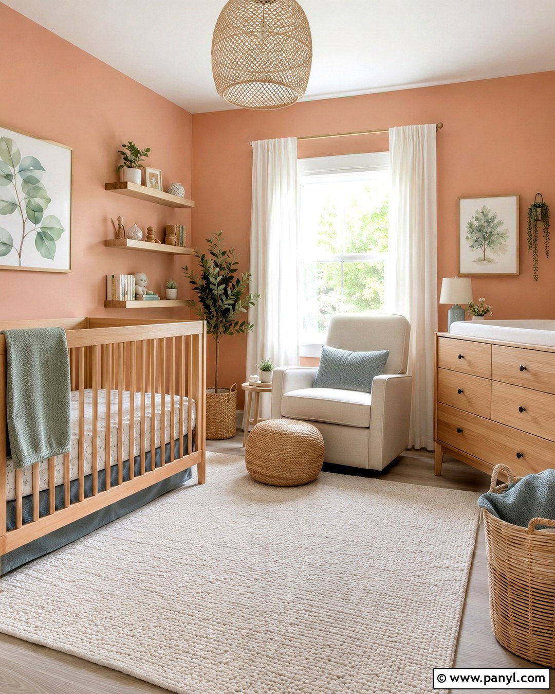
Warm peach walls create a gentle, colorful nursery that can adapt as a child grows. Choose a soft peach with muted terracotta undertones instead of a bright candy color. Place a natural wood crib against the main wall and use simple bedding in cream, sage, and dusty blue. A washable ivory rug adds softness, while a comfortable oatmeal glider makes the room practical for adults. Install pale wood shelves for books and a low matching dresser that can serve as a changing surface. White curtains filter daylight and keep the walls from appearing too orange. Finish the design with woven baskets, a fabric pendant light, and nature-inspired artwork. The balanced palette feels playful but avoids relying on short-lived characters or decorative themes.
16. Navy Blue Wall Color for Entryway
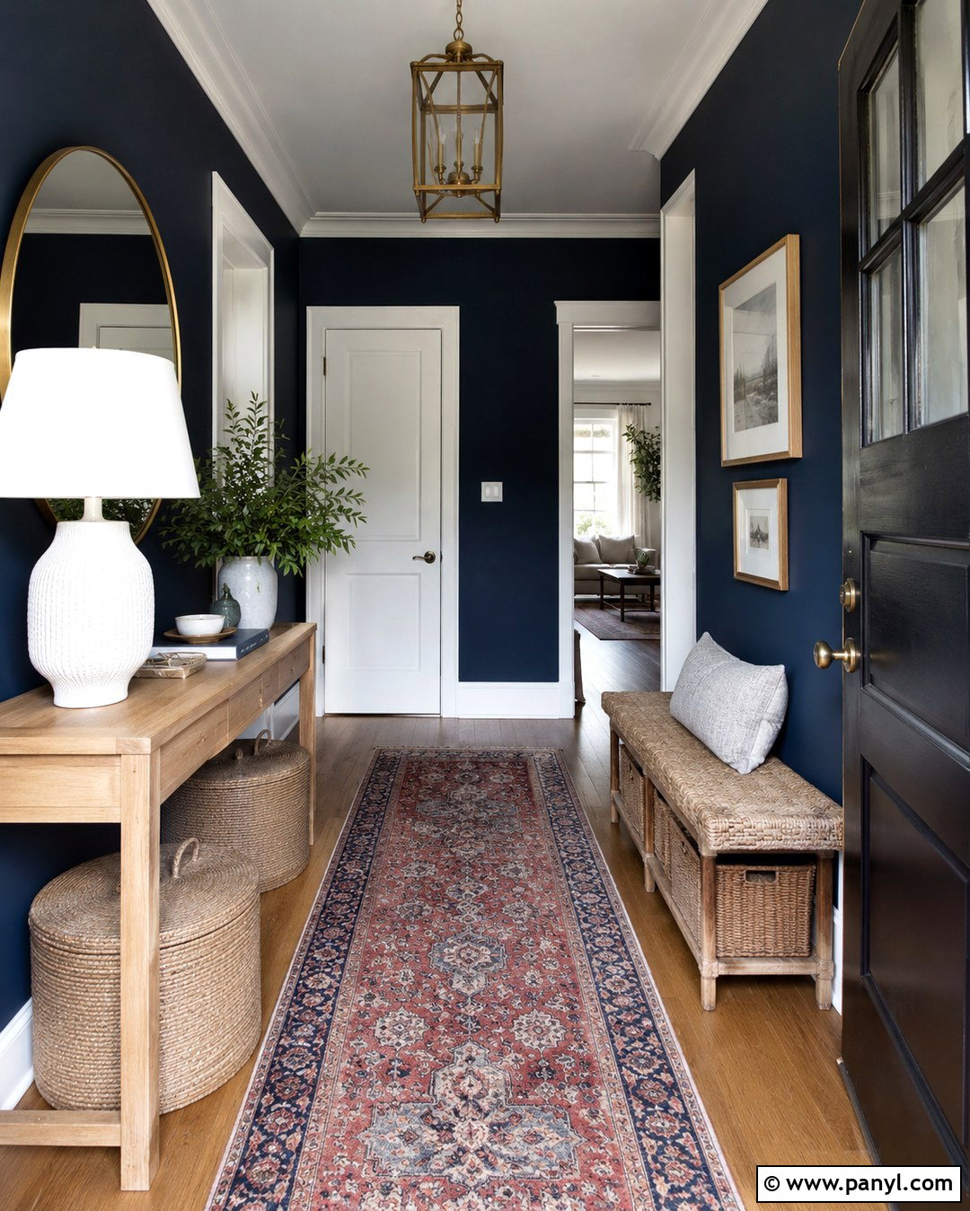
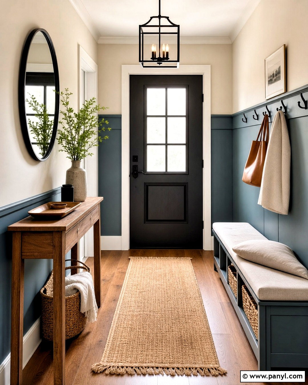
Navy blue walls give an entryway strong definition and can make a small transitional space feel intentional. Use the navy across every wall, then paint the doors, baseboards, and ceiling bright white for contrast. A narrow light oak console brings warmth and provides a convenient landing place for keys and mail. Hang a large round brass mirror above it to reflect light around the darker space. Add a washable vintage-style runner containing red, cream, and faded blue. A woven storage bench or lidded baskets can hold shoes without creating clutter. Finish with a white ceramic lamp, a small bowl, and simple framed artwork. The combination feels crisp, colorful, and welcoming while connecting easily to nearby rooms decorated with lighter neutral tones.
17. Olive Green Wall Color for Kitchen
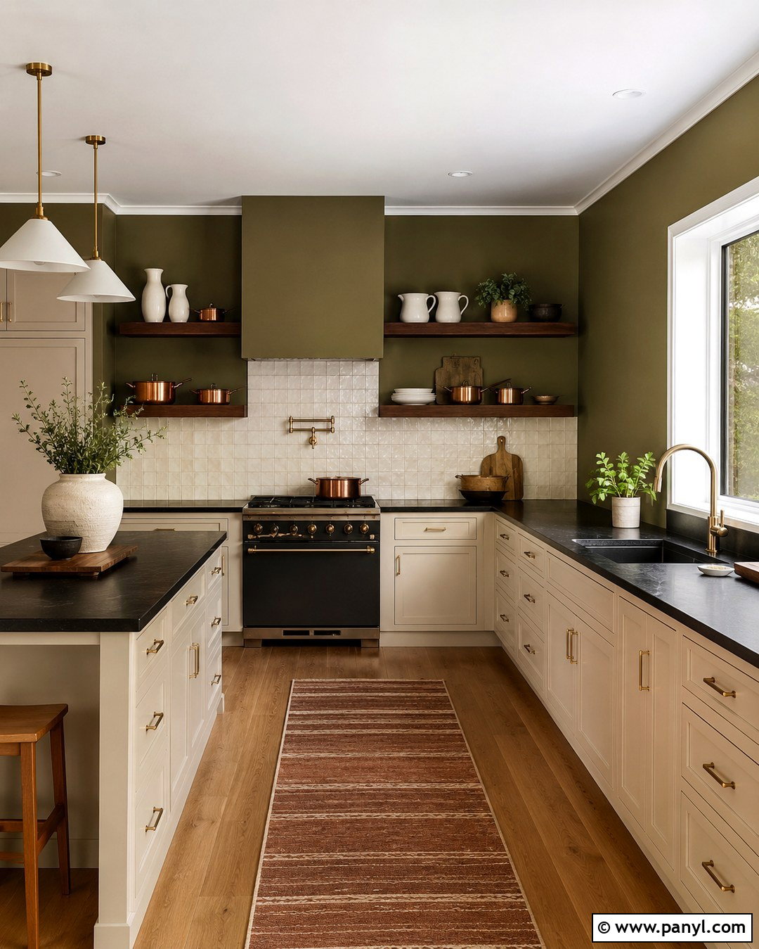
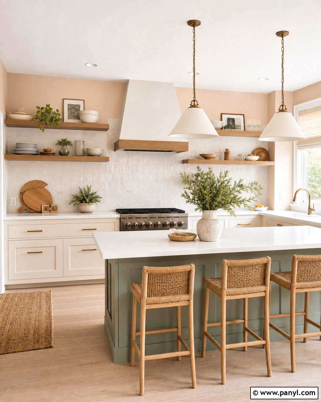
Olive green walls create an earthy kitchen palette that feels established, warm, and easy to live with. Use a medium olive behind cream cabinets and a backsplash of handmade off-white tile. The slight variation in the tile surface adds interest without competing with the paint. Choose dark soapstone or black quartz countertops for grounding contrast, then introduce walnut through open shelves and counter stools. Aged brass cabinet pulls and pendant lights complement the green’s warm undertones. Keep the flooring natural, such as medium oak or beige stone-look tile. Display white pottery, copper cookware, and practical wooden utensils in small groups. A striped runner with rust and olive details completes this colorful kitchen while preserving the functional, uncluttered layout.
18. Red Wall Color for Powder Room
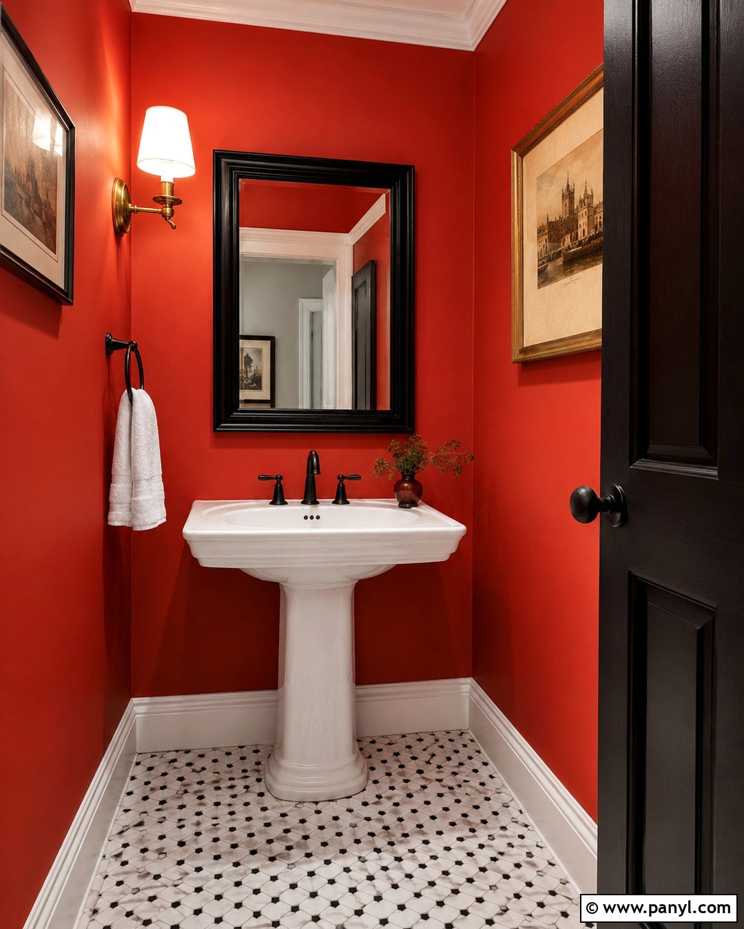
A powder room is an ideal place to use a confident red wall color because the compact footprint supports a dramatic design. Select a deep tomato red or warm brick red rather than a sharp primary hue. Pair it with a white pedestal sink, black-and-white patterned floor tile, and crisp white trim. A black-framed mirror and matte black faucet give the room clear structure. Add a small brass wall sconce for a warm metallic accent, but avoid mixing several competing finishes. One framed vintage-style print and a white hand towel provide enough decoration. If the room has no window, use bright, balanced bulbs that show the red accurately. The completed space feels bold, memorable, and carefully coordinated instead of visually crowded.
19. Periwinkle Wall Color for Guest Room
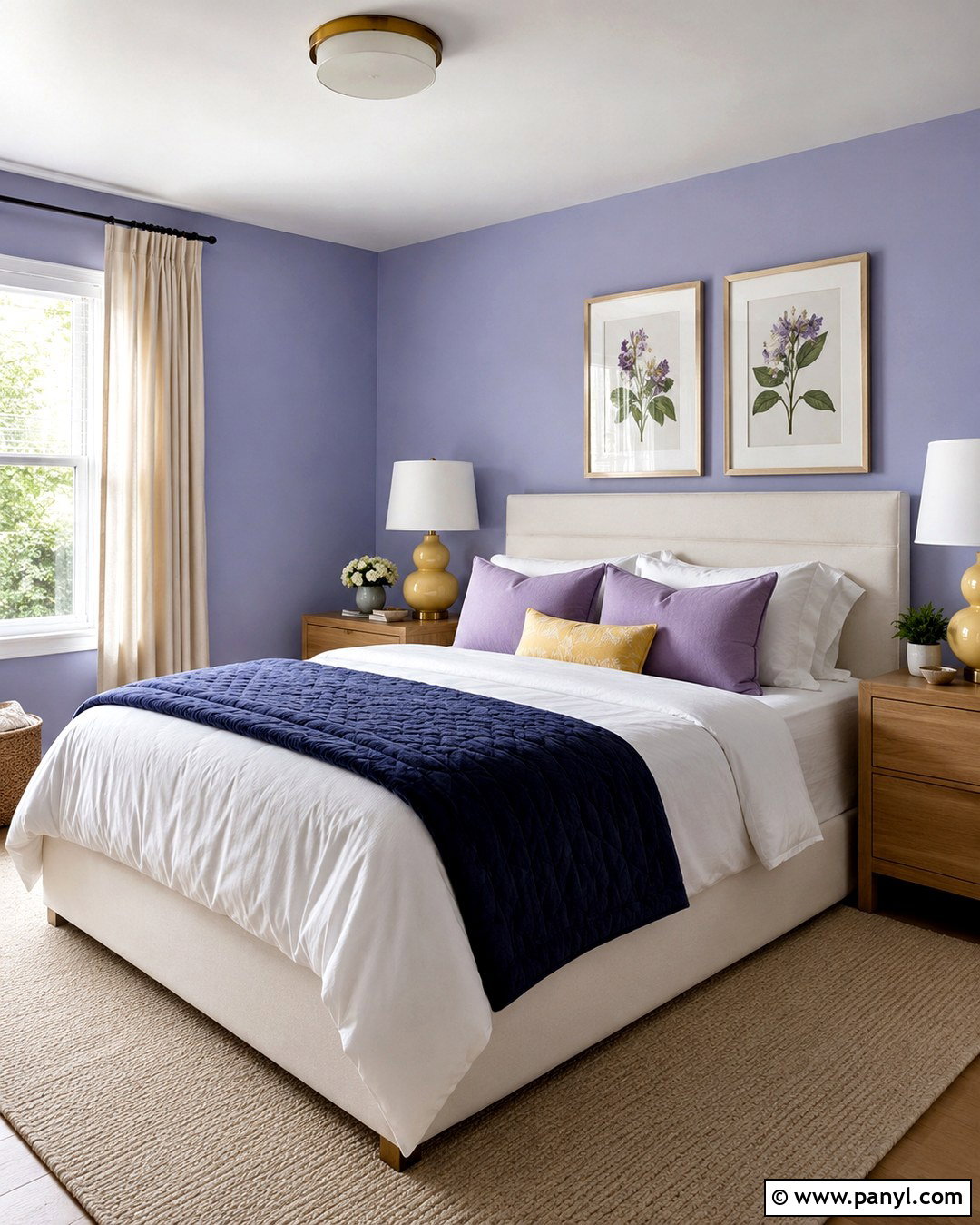
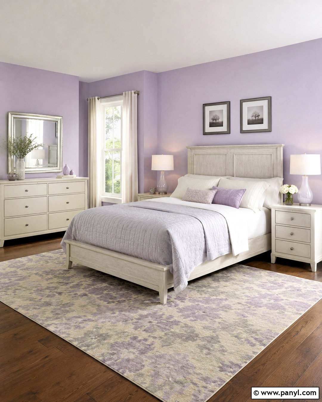
Periwinkle walls give a guest room a distinctive mix of blue and violet that feels calming yet more interesting than a standard neutral. Choose a softened midtone and pair it with a simple white upholstered bed. Layer crisp white bedding with a navy quilt, lavender pillows, and one mustard accent cushion. Light oak nightstands and a matching luggage bench bring warmth to the cooler wall color. Use cream curtains and a beige wool rug to create visual breathing room. Ceramic lamps in pale yellow add a cheerful contrast without becoming too prominent. Hang balanced botanical prints above the bed and place a small writing desk near the window. This complete palette feels fresh, comfortable, and welcoming for visitors of different ages.
20. Golden Yellow Wall Color for Breakfast Nook
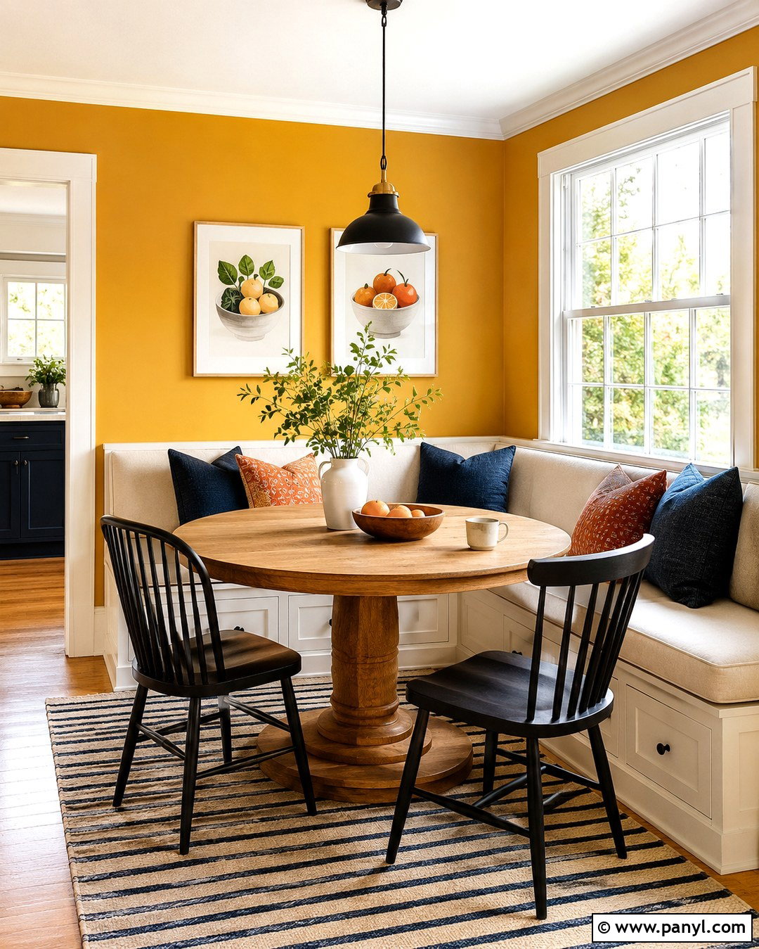
Golden yellow walls make a breakfast nook feel warm and energized from the beginning of the day. Choose a rich, slightly muted yellow that resembles ochre rather than a bright school-bus tone. Build the seating area with an L-shaped cream banquette, a round oak pedestal table, and two black spindle-back chairs. Add washable cushions in navy, rust, cream, and small floral patterns. White trim around nearby windows keeps the yellow crisp and reflects daylight. A compact black pendant defines the table without blocking the view. Use a striped flat-weave rug for softness and easy maintenance. Finish with framed food illustrations, simple white dishes, and a small vase of greenery. The completed nook feels sunny, practical, and connected to the surrounding kitchen.
Conclusion:
Decorating with colorful wall colors becomes much easier when every part of the room supports the chosen hue. Start with the wall color, then repeat its undertones through rugs, artwork, upholstery, or small accessories. Add neutrals to create breathing room and natural wood to bring warmth. Strong colors often look more balanced with simple furniture, while softer shades can support bolder patterns and contrasting accents. Always test paint in the actual room and observe it during morning, afternoon, and evening light before making the final decision. Whether you prefer calming sage, cheerful yellow, rich teal, or dramatic red, these 20 Colorful Wall Colors can help you create complete rooms with personality, comfort, and lasting visual balance.

Related Ideas and Inspiration:

Leave a Reply