
Choosing the right wall color can completely change how your kitchen feels without requiring a major renovation. The best 20 kitchen paint color ideas for walls balance cabinetry, countertops, flooring, lighting, and nearby rooms rather than treating paint as an isolated choice. Warm whites and earthy neutrals remain useful, while sage, olive, terracotta, blue, and richer accent colors bring more personality to modern kitchens. () Before selecting a shade, study the undertones already present in your cabinets and hard surfaces. A color should support those finishes instead of competing with them. Also consider how the room changes from morning to evening. The complete looks below offer practical, coordinated ways to use these 20 kitchen paint color ideas for walls.

1. Warm White Kitchen Walls
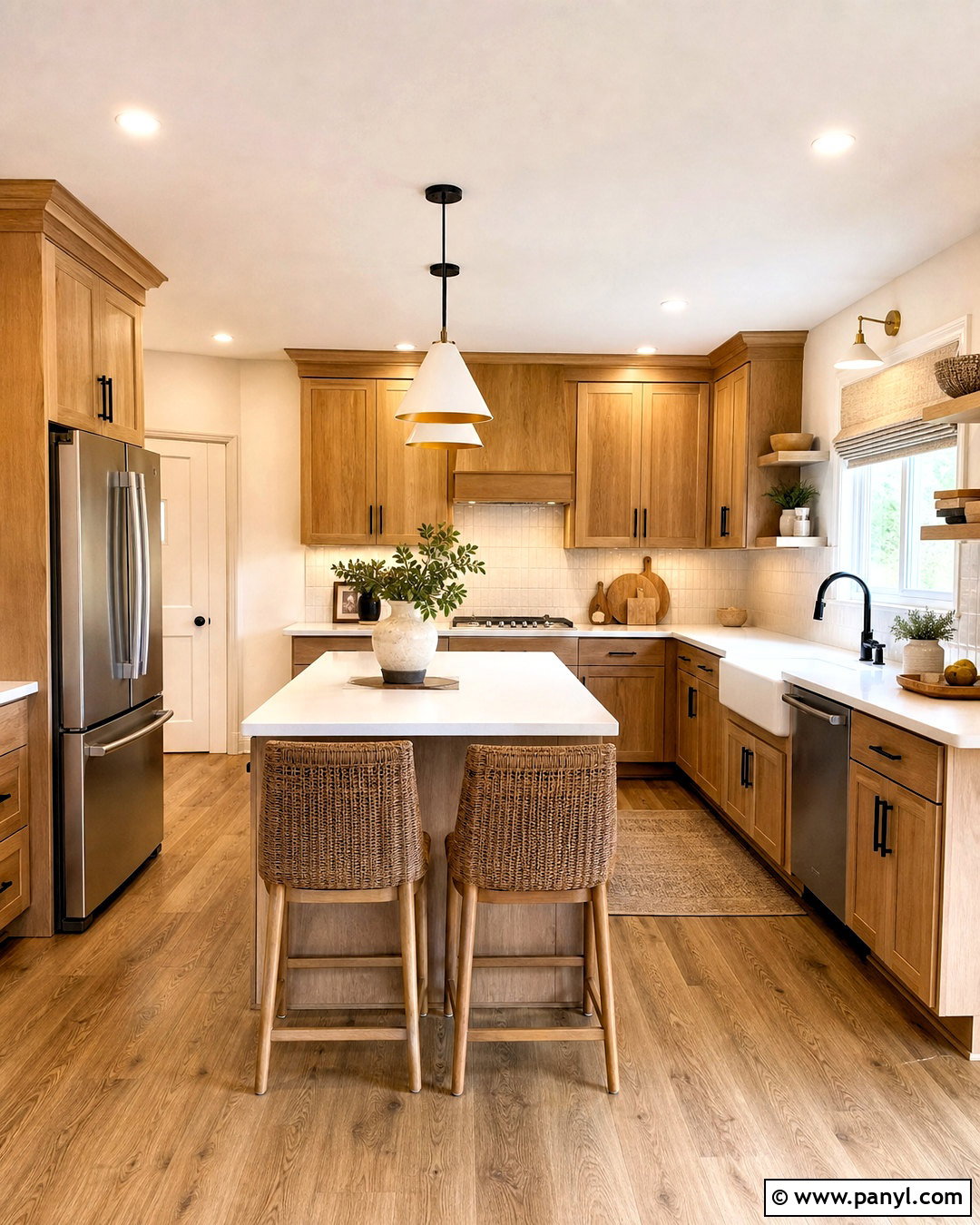
Warm white walls create a bright kitchen without the sharp, clinical effect of a cool white. Choose a shade with soft cream or beige undertones, then pair it with natural oak cabinets, white quartz counters, and a lightly textured backsplash. Medium-tone wood flooring prevents the room from looking washed out. Use matte black hardware for definition or brushed brass for a gentler finish. Woven counter stools, linen Roman shades, and simple ceramic pieces add natural texture. This palette works especially well in kitchens that receive cool northern light because the subtle warmth creates balance. Continue the wall color into an adjoining breakfast nook or hallway for an open, unified appearance. Finish with warm LED lighting so the paint remains inviting after sunset.
2. Cream Kitchen Walls
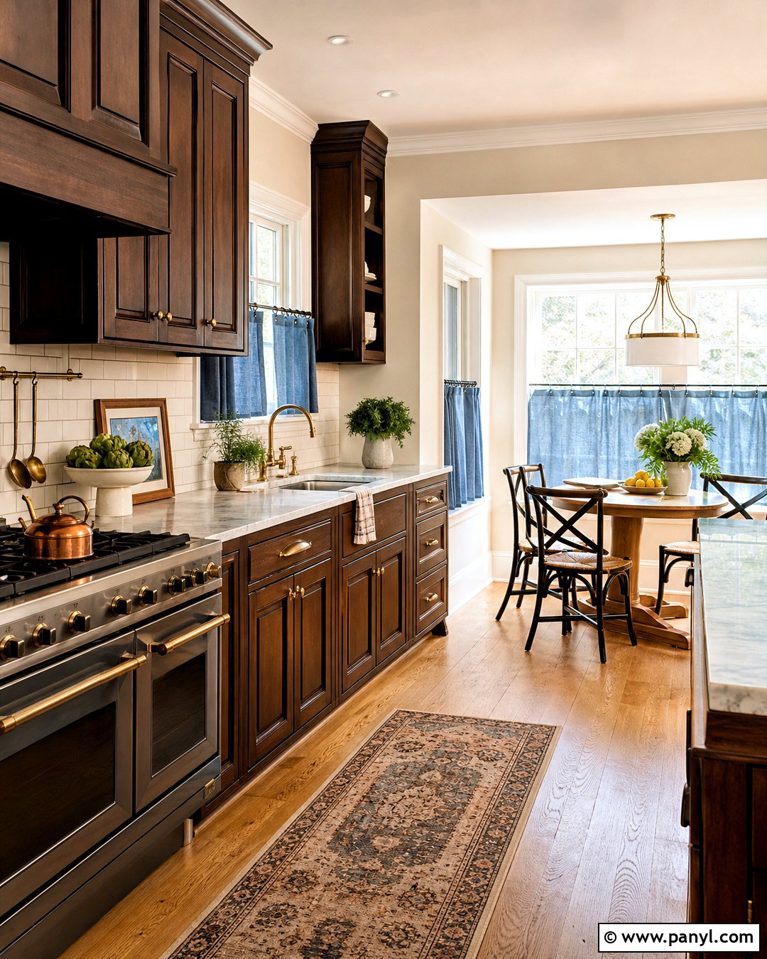
Imagine morning light falling across creamy walls, walnut cabinets, and softly veined stone counters. This combination feels comfortable, traditional, and polished without becoming overly formal. Select a cream that has a balanced yellow undertone rather than a strong buttery cast. Deep brown cabinetry gives the pale walls enough contrast, while aged brass handles reinforce the warmth. Add an ivory subway tile backsplash, medium oak flooring, and a vintage-inspired pendant over the island. For textiles, use muted blue, olive, or rust in small amounts through cafe curtains and washable runners. Cream is also useful when stark white walls make existing granite appear too busy. Keep the trim slightly lighter than the walls so architectural details remain visible while the overall kitchen still feels softly layered.
3. Soft Greige Kitchen Walls
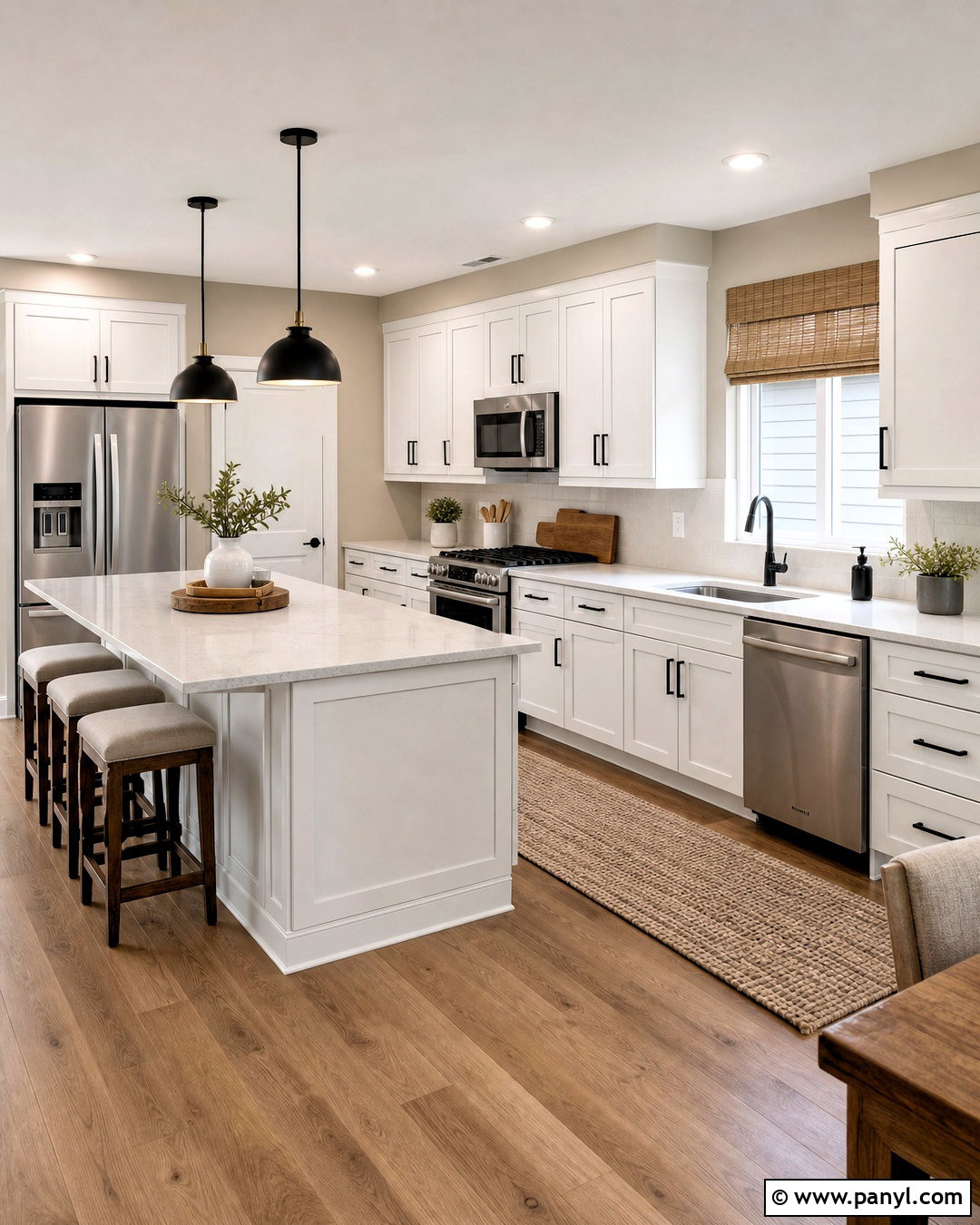
Soft greige walls bridge the gap between warm beige and quiet gray, making them useful in kitchens with mixed finishes. Build the complete look around white Shaker cabinets, stainless steel appliances, pale quartz countertops, and warm wood flooring. The wall color will connect cool metal with warmer timber without drawing attention away from either material. Introduce matte black lighting and cabinet pulls for crisp structure. A taupe runner, wooden cutting boards, and off-white pottery keep the room relaxed rather than overly sleek. In an open-plan home, carry the greige into the dining area to create a smooth visual transition. Choose a lighter greige for a small kitchen. A medium version can provide more depth in a large room with abundant windows and generous white cabinetry.
4. Mushroom Kitchen Walls
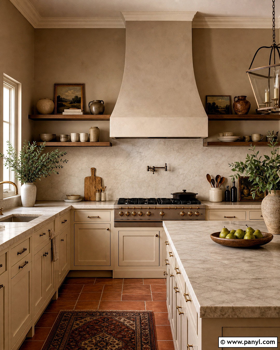
Mushroom-colored walls combine taupe, beige, and subtle brown for a kitchen that feels grounded and sophisticated. Pair them with creamy cabinets rather than bright white ones, which can make the wall color appear muddy. Honed marble or warm white quartz counters introduce gentle contrast, while walnut shelves deepen the earthy palette. Add antique brass hardware, a plaster-look range hood, and stoneware accessories in oatmeal and charcoal. Terracotta floor tiles can give this combination a rustic European character, while wide oak boards produce a cleaner transitional look. Mushroom paint is particularly effective when you want a neutral room with more presence than greige. Use plenty of layered lighting, including under-cabinet strips and clear glass pendants, so the rich undertones remain visible in corners and work areas.
5. Light Beige Kitchen Walls
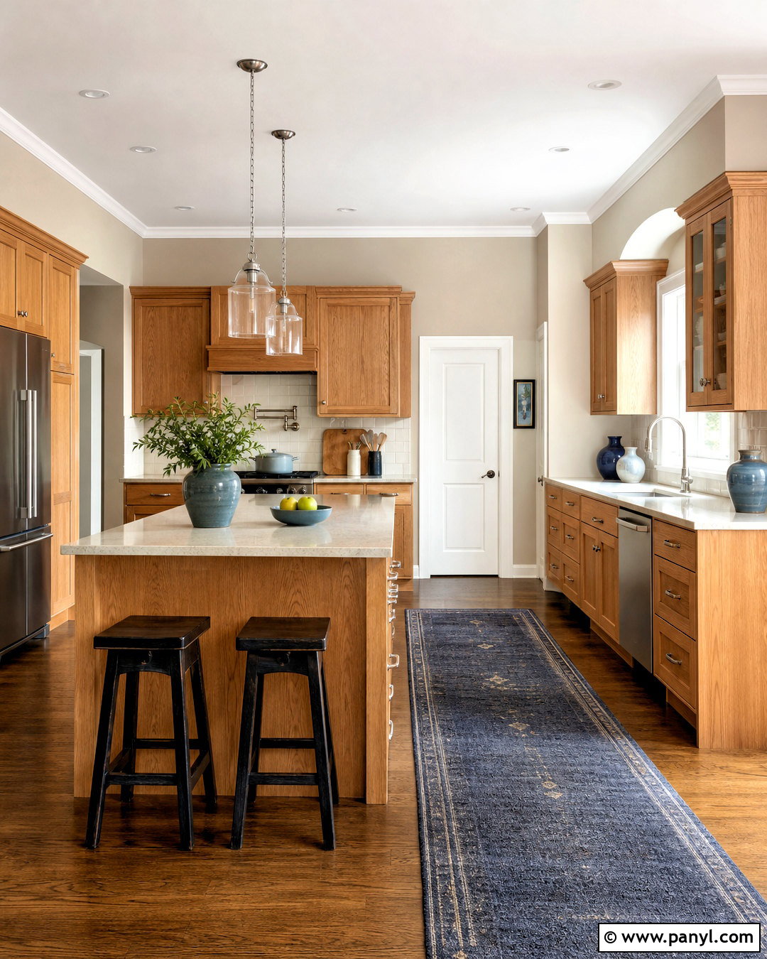
Light beige walls can soften a busy kitchen and make strong materials feel more connected. Create a complete, approachable look with medium oak cabinets, creamy quartz counters, brushed nickel fixtures, and warm beige paint that closely relates to the wood grain. A simple off-white backsplash keeps the room from becoming too brown. Add black counter stools or pendant lights to provide a few sharp accents. If the kitchen has tan granite, select a beige that repeats one of its quieter background tones instead of matching the darkest pattern. Blue-gray dishware and a muted navy runner can bring subtle contrast. Paint the trim a warm white for a clean edge. This welcoming palette works especially well in traditional, farmhouse, and builder-grade kitchens needing an affordable visual refresh.
6. Sage Green Kitchen Walls
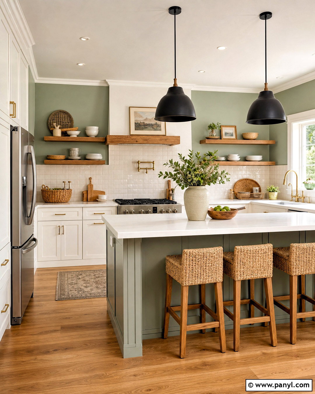
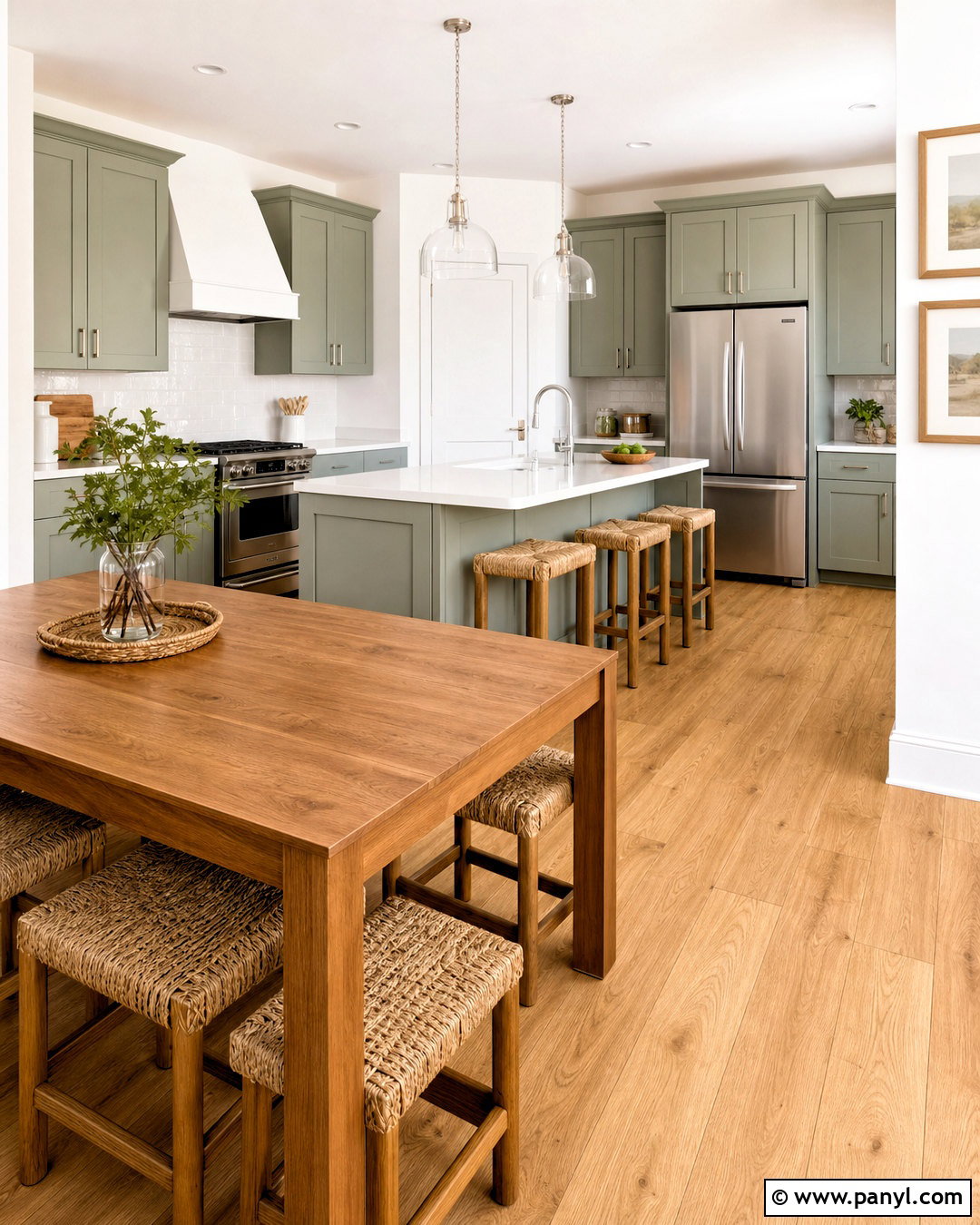
Sage green walls bring muted color into a kitchen while remaining easy to coordinate with wood and neutral finishes. For a fresh full-room scheme, combine soft sage walls with warm white cabinets, butcher-block accents, white quartz counters, and natural oak flooring. Brushed brass hardware adds warmth, while black window frames or pendant lights keep the palette from looking overly delicate. Use a backsplash with handmade ivory tiles to introduce gentle texture. A few deeper green accessories can strengthen the color story without filling every surface. If your kitchen connects to a dining or living area, repeat sage through upholstery, art, or planters rather than painting every adjoining wall. Select a sage with warm, slightly yellow undertones when the room contains honey oak or other golden wood finishes.
7. Olive Green Kitchen Walls
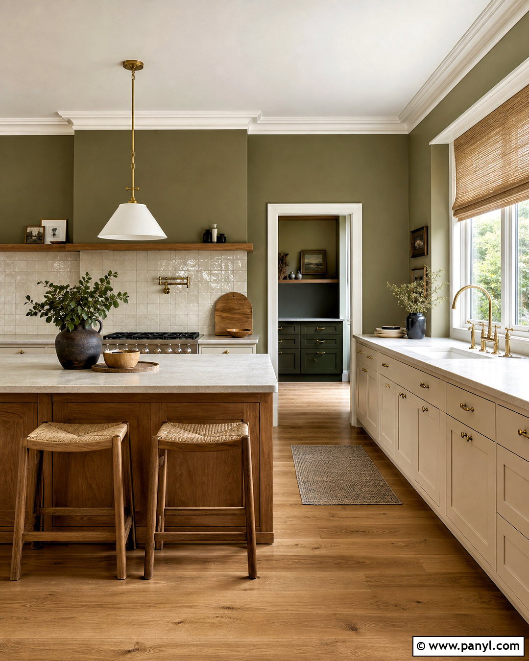
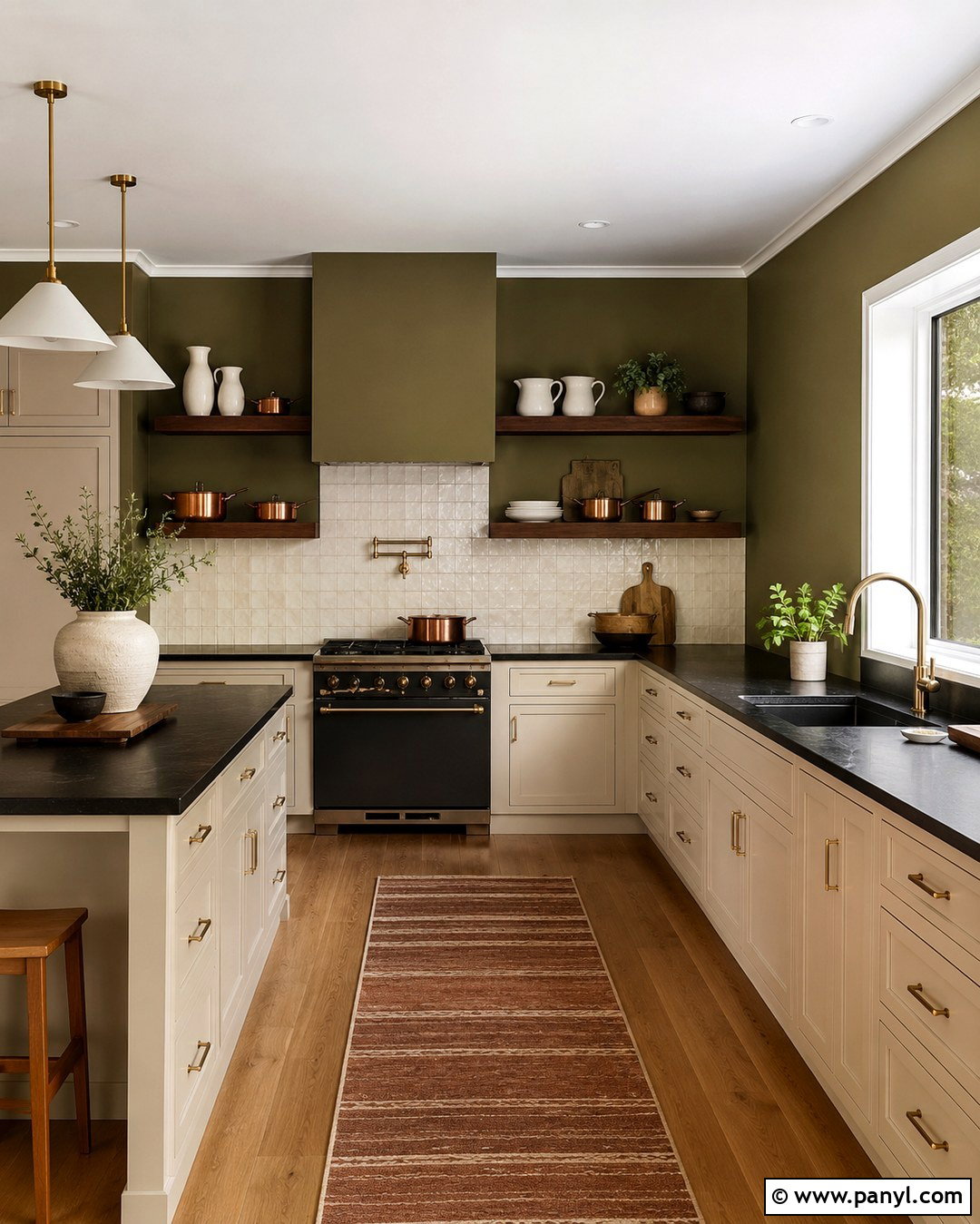
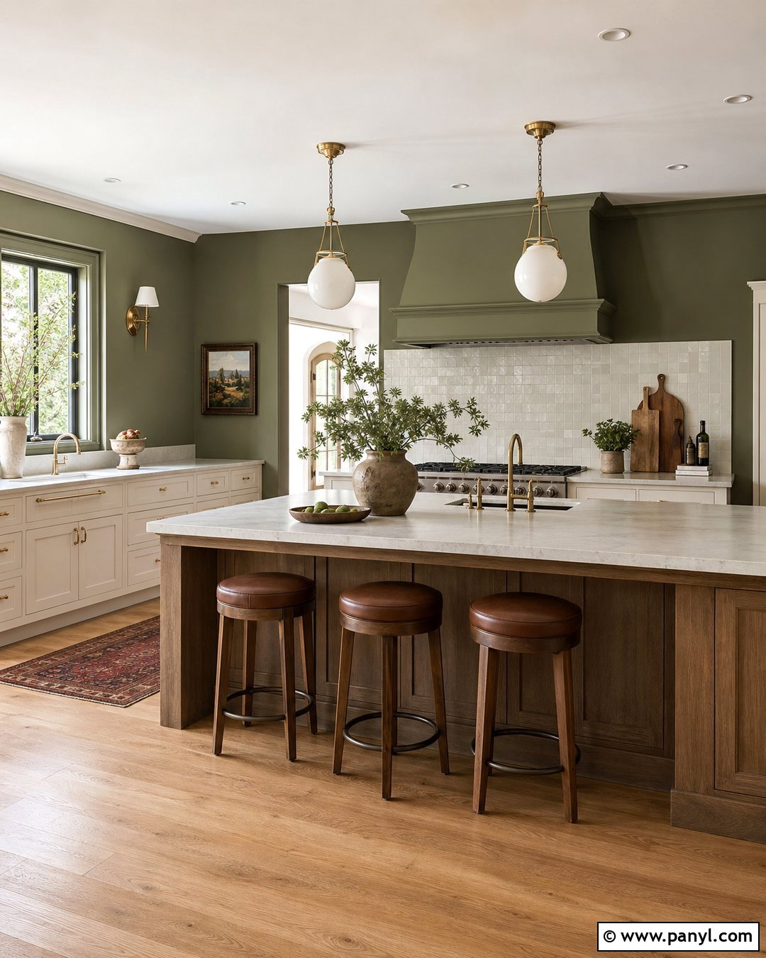
For a deeper nature-inspired kitchen, olive green walls create a warm, enveloping backdrop. Balance this richer color with cream cabinets, pale stone countertops, and medium-tone oak flooring. The green should have a brown or golden undertone so it feels earthy rather than military. Add unlacquered brass hardware, linen window treatments, and a natural wood island to reinforce the organic character. A backsplash in creamy zellige-style tile will reflect light and prevent the walls from dominating the room. Keep the ceiling and trim warm white for a defined, airy boundary. This look works best in medium or large kitchens with good natural or layered artificial light. For a smaller room, place olive on the breakfast-area wall and use coordinating cream on the primary cooking walls.
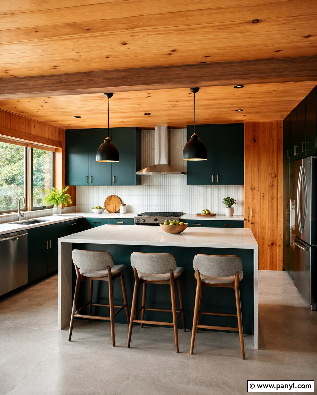
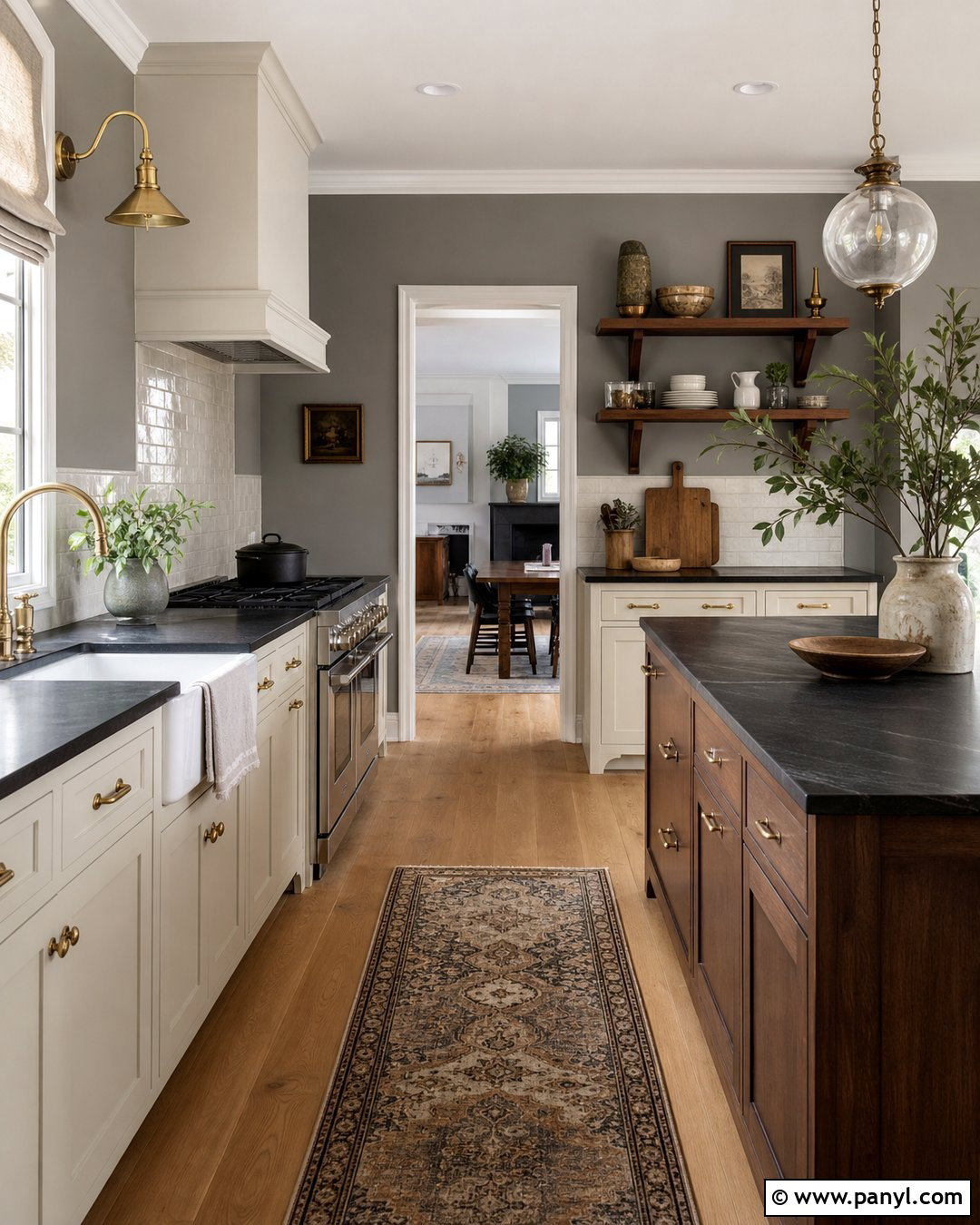
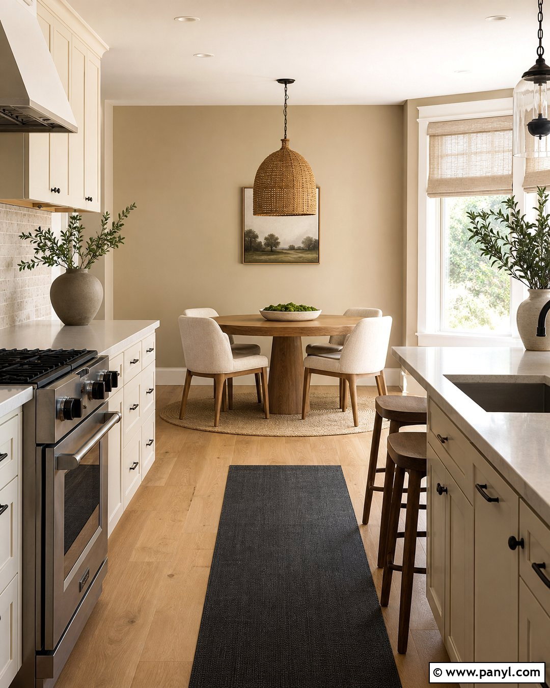
8. Eucalyptus Green Kitchen Walls
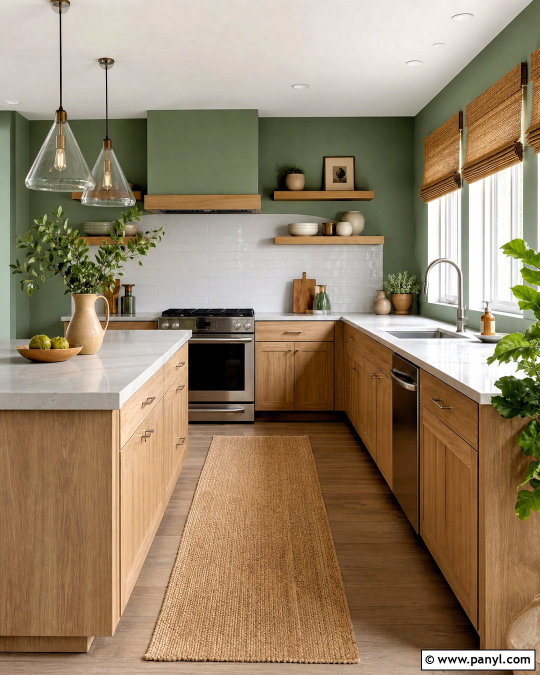
Eucalyptus green offers a cooler, cleaner alternative to traditional sage. Its subtle blue undertone pairs beautifully with white oak cabinets, pale gray quartz, and brushed nickel or chrome fixtures. Use the color throughout the kitchen for a calm, contemporary envelope, then add a white backsplash and ceiling to preserve brightness. Streamlined pendant lights, slim cabinet hardware, and simple backless stools support the uncluttered look. Warmth can come from woven shades, a natural jute runner, and a few tan ceramic pieces. Avoid pairing eucalyptus with heavily yellow cabinets because the contrast may feel disconnected. Instead, choose pale woods, soft white cabinetry, or a balanced gray finish. This kitchen wall color is particularly appealing in bright rooms where greenery outside the windows can become part of the overall composition.
9. Pale Blue Kitchen Walls
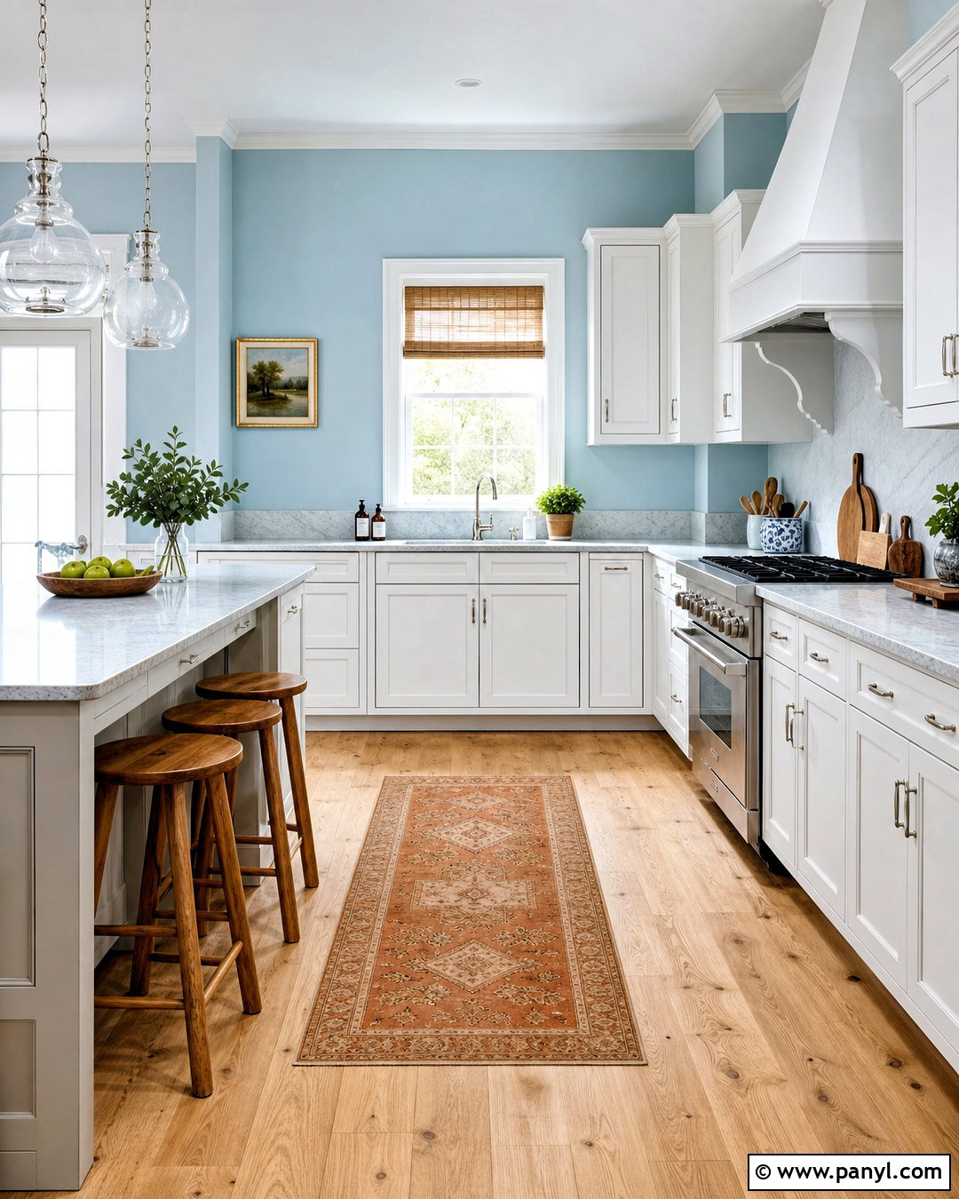
Pale blue walls make a kitchen feel light and cheerful while providing more character than a standard neutral. Pair the color with crisp white cabinets, light oak floors, and white marble-look countertops for a breezy, classic scheme. Polished nickel hardware and glass pendants complement the cool wall color without making the space feel industrial. Introduce warmth through wooden stools, bamboo shades, and a runner containing soft rust or sand tones. The best pale blue should remain visibly blue in daylight rather than fading into dull gray. In a coastal kitchen, add subtle woven textures without relying on themed decorations. In a traditional room, use paneled cabinet doors and a ceramic backsplash. Paint the trim clean white to sharpen the blue and emphasize windows, doorways, and crown molding.
10. Dusty Blue Kitchen Walls
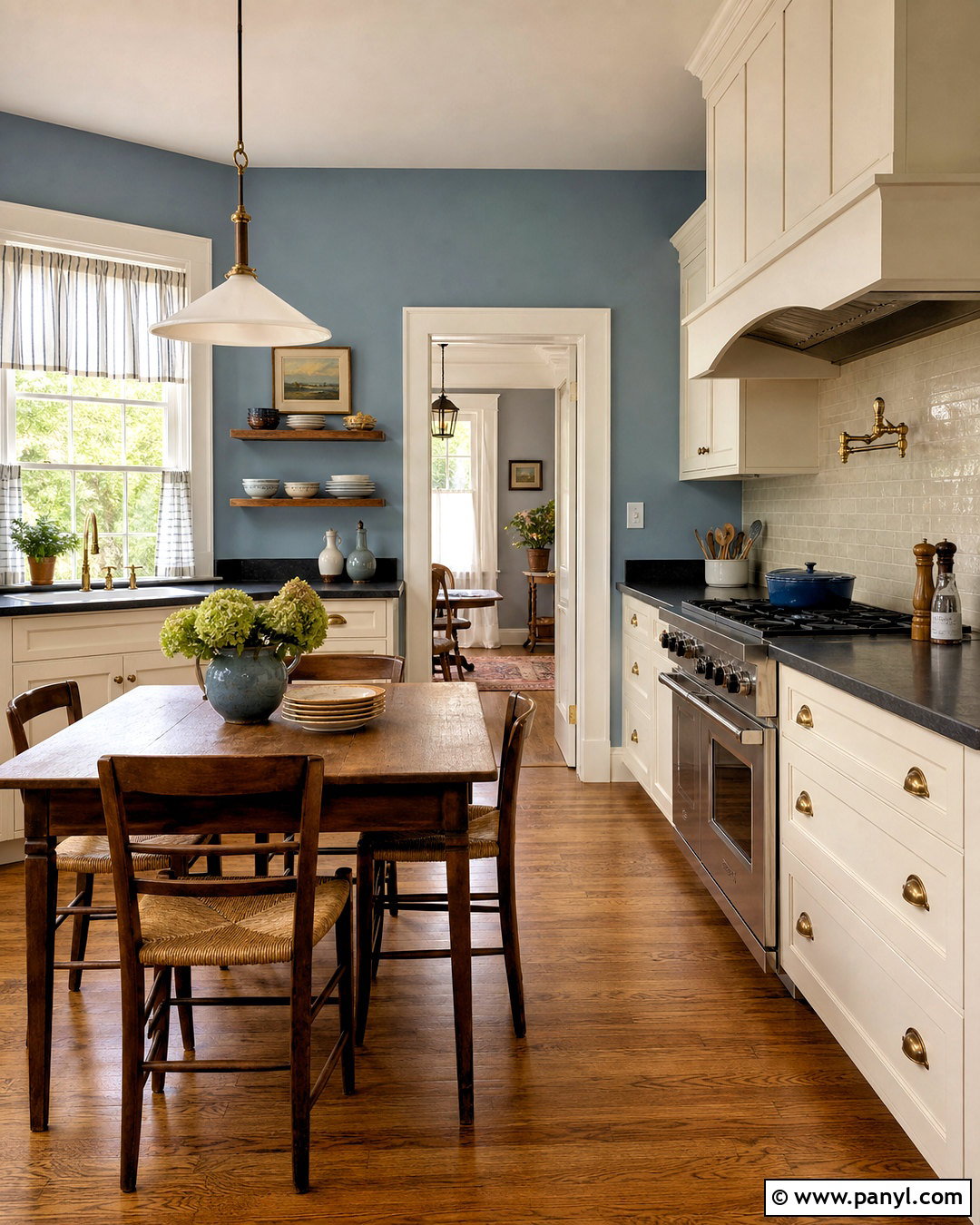
Dusty blue walls create a mature, relaxed kitchen with enough color to feel memorable. Build the room around warm white cabinetry, soapstone-look counters, medium oak flooring, and antique brass details. The gray undertone in dusty blue keeps the palette quiet, while the wood and metal prevent it from becoming cold. Use an off-white backsplash rather than a bright blue-and-white pattern, allowing the painted walls to remain the main color statement. A walnut dining table or freestanding hutch can add depth in an eat-in kitchen. Carry the blue into small decorative details, such as striped cafe curtains or ceramic canisters. Because dusty blue can shift noticeably under different bulbs, use balanced white task lighting and warmer decorative lighting to maintain a comfortable appearance throughout the evening.
11. Blue Gray Kitchen Walls
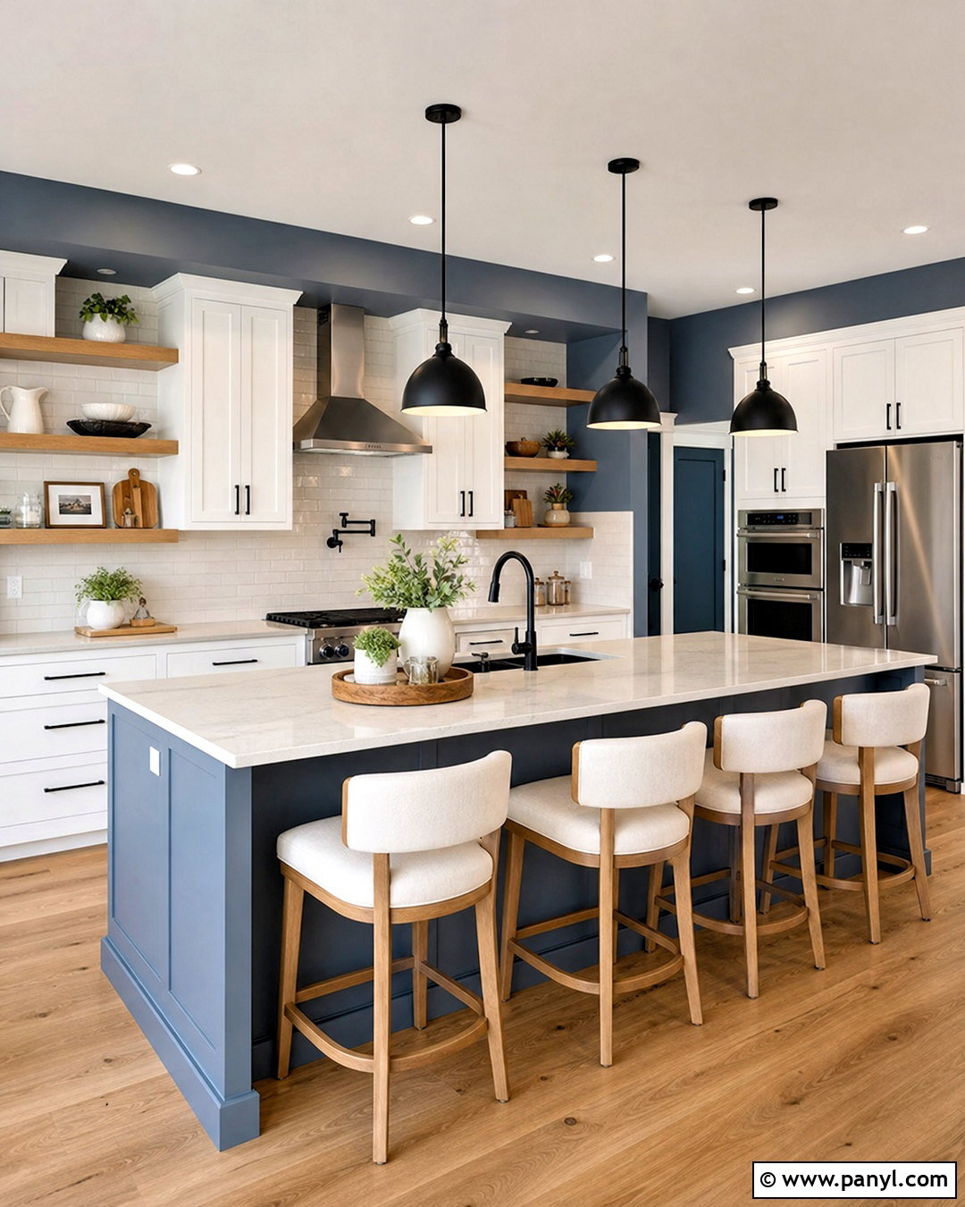
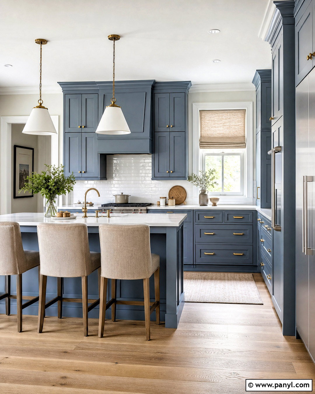
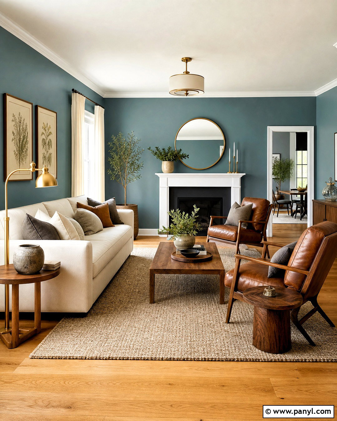
Blue-gray walls work well when a kitchen contains stainless steel appliances but still needs softness and warmth. Choose a balanced shade that reads blue in natural light, then pair it with white cabinets, warm oak shelving, and pale stone counters. The wood elements are essential because they offset the cooler wall and appliance finishes. Add matte black pulls and simple dome pendants for modern definition. A backsplash in glossy white tile reflects light across the muted walls, making the room feel more open. Use textiles in cream, tan, and muted navy to connect the palette. In an open kitchen, repeat the same blue-gray on a nearby built-in bookcase or dining-room feature wall. Avoid cool gray flooring; natural wood or warm stone creates a more welcoming and dimensional finished space.
12. Navy Blue Kitchen Accent Wall
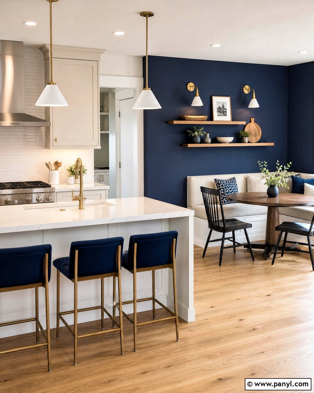
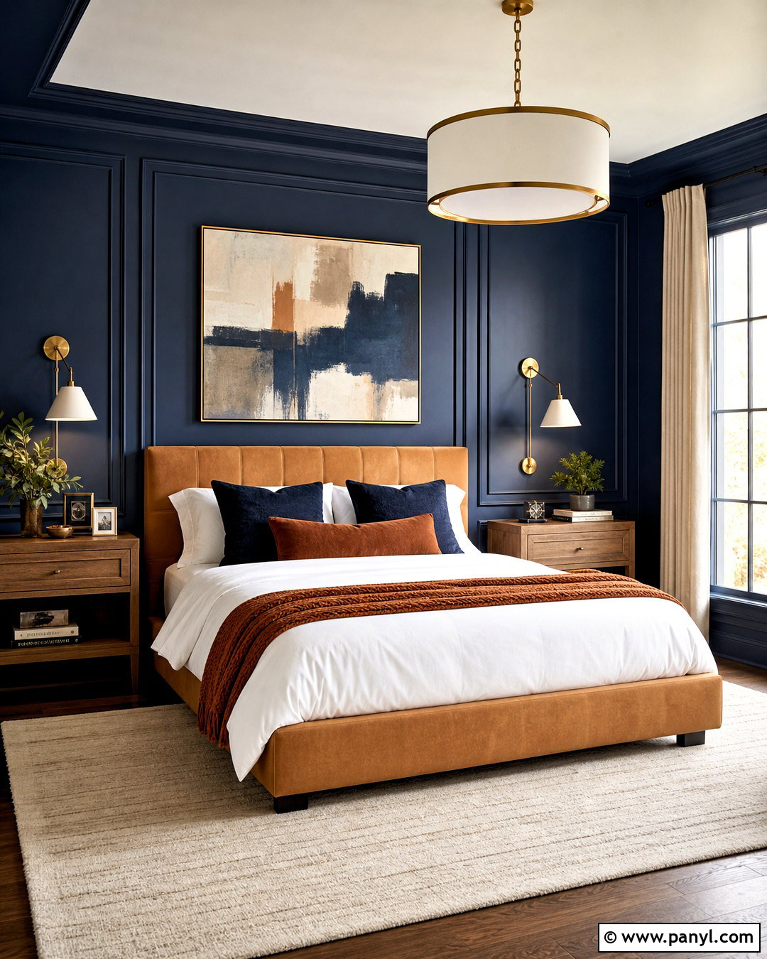
A navy blue accent wall can anchor a kitchen without making the entire room dark. Use it on the breakfast-nook wall, behind open shelving, or around a large window where natural light will reveal the color. Complete the look with warm white walls elsewhere, white cabinets, oak flooring, and quartz counters with gentle gray veining. Floating walnut shelves stand out clearly against navy and provide space for practical ceramics. Brushed brass sconces or cabinet hardware bring warmth and refinement. Keep the backsplash light and simple so the kitchen does not become visually crowded. Repeat navy through a runner or upholstered stools to make the accent wall feel intentional. This scheme works particularly well in open rooms where the darker wall can define the dining zone without requiring a divider.
13. Terracotta Kitchen Walls
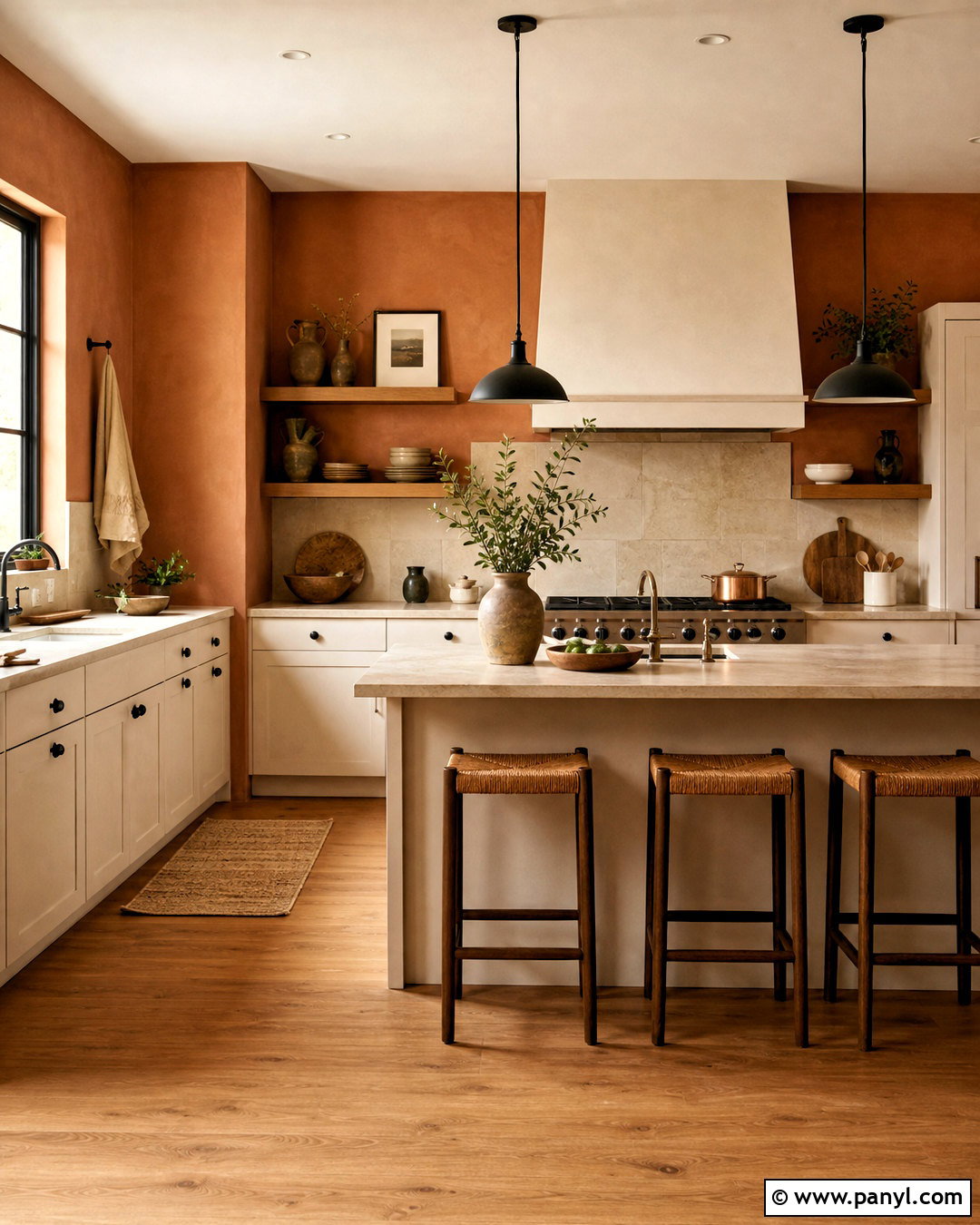
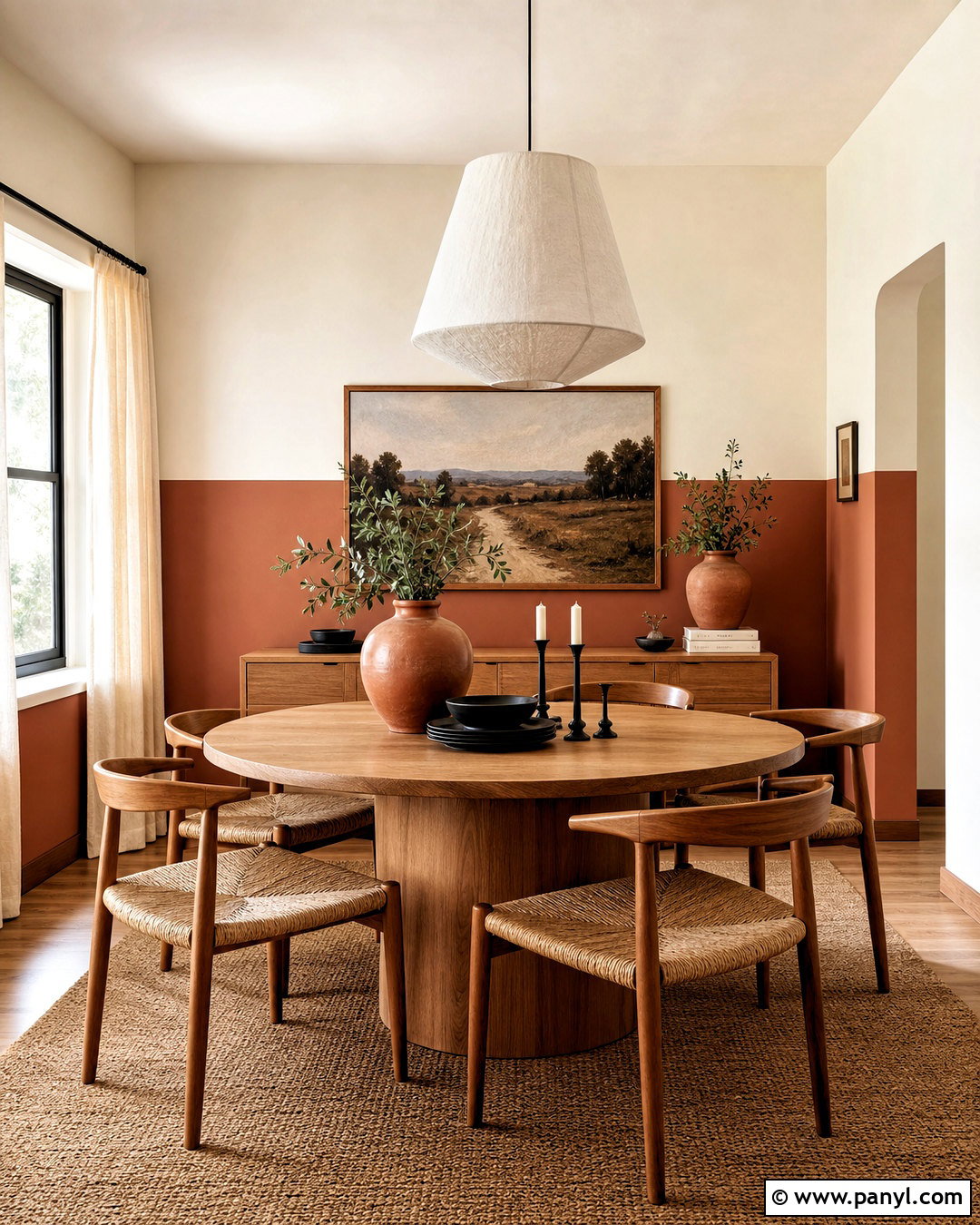
Terracotta walls surround the kitchen with earthy warmth and work especially well alongside cream, wood, and aged metal. Choose a muted clay version rather than a highly saturated orange. Pair it with off-white cabinets, oak counters or shelving, and a creamy stone backsplash. Dark bronze hardware and simple black pendants provide definition. For flooring, use warm wood or pale limestone-look tile so the palette remains natural and balanced. Terracotta can cover the entire room in a bright kitchen, while smaller spaces may benefit from using it above the backsplash and in the dining nook. Add linen textiles in sand, olive, and ivory. Keep decorative objects restrained because the wall color already brings strong personality. The completed kitchen should feel collected, welcoming, and connected to handcrafted materials.
14. Clay Pink Kitchen Walls
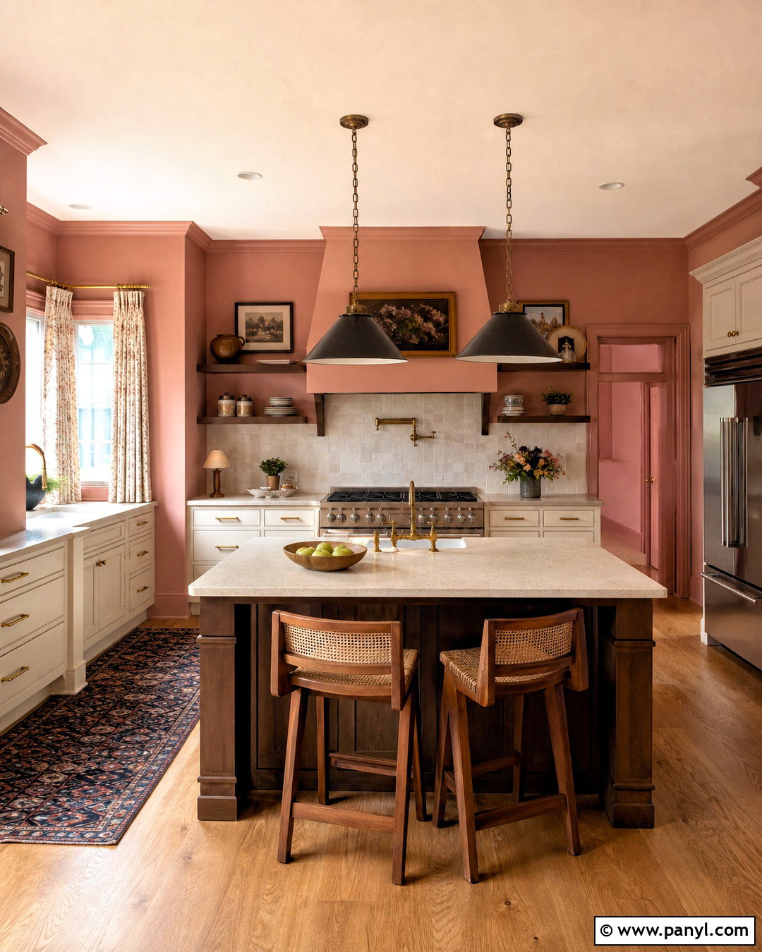
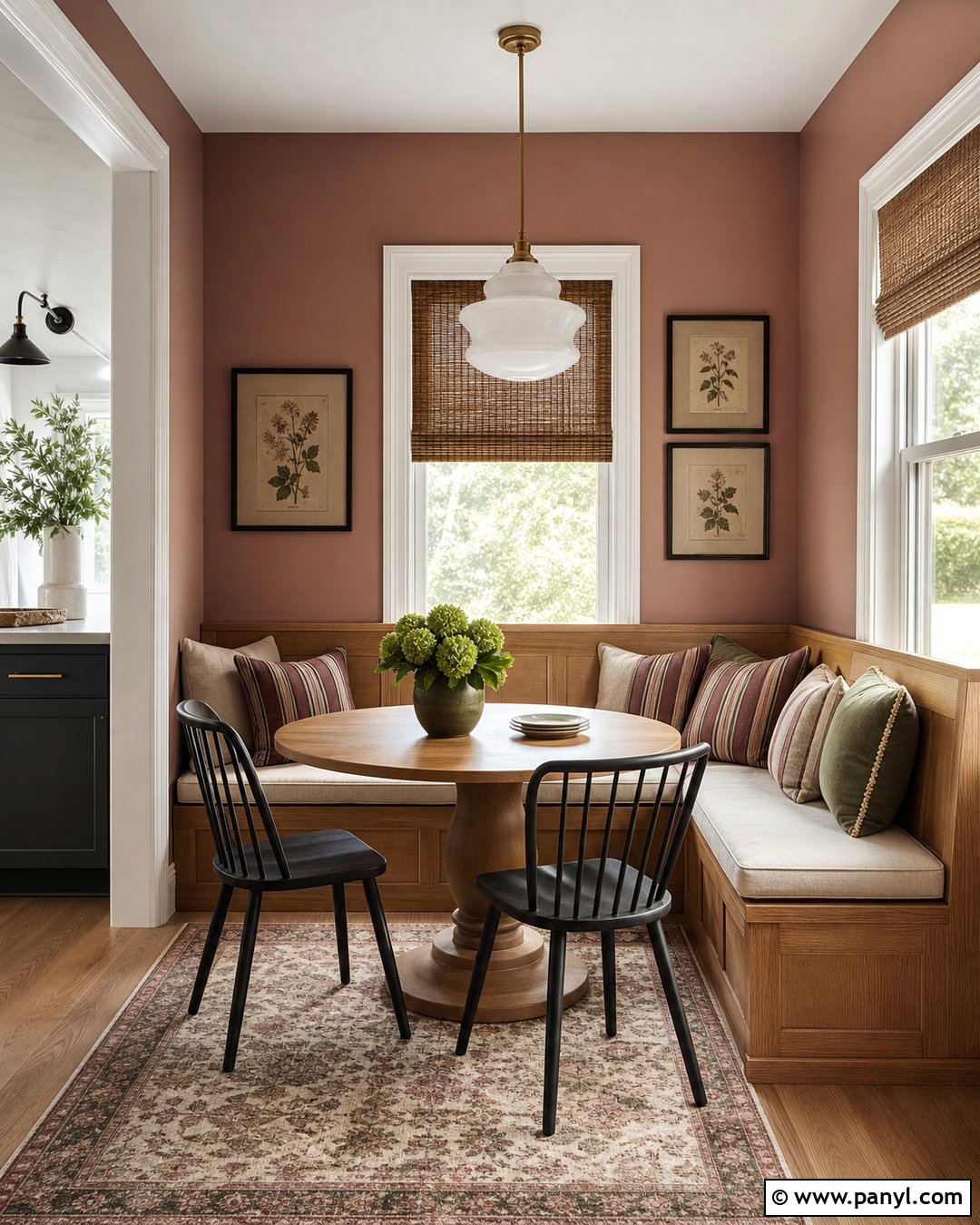
Clay pink is an earthy, toned-down wall color that can warm a kitchen without looking sugary or overly decorative. It works best with cream cabinetry, walnut accents, honed stone countertops, and antique brass hardware. Choose a shade containing brown, beige, or terracotta undertones. This creates a mature background that changes gently as daylight moves through the room. Add an ivory backsplash and warm oak flooring to keep the complete design light. Charcoal pendant lights can provide enough contrast to prevent the palette from becoming too soft. In a contemporary kitchen, use clean cabinet fronts and streamlined stools. For a vintage-inspired look, introduce cafe curtains, framed botanical art, and traditional latches. Repeat the clay color subtly in a patterned runner so the walls feel fully integrated with the room.
15. Soft Peach Kitchen Walls
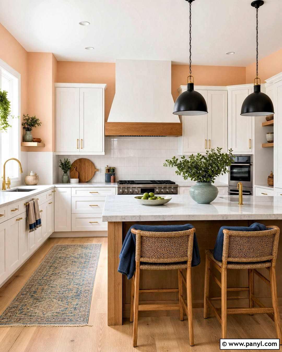
Soft peach walls can brighten a kitchen and flatter warm wood finishes, especially when the shade is pale and slightly muted. Pair it with white cabinets, maple or white oak details, and creamy quartz countertops. Use brushed brass hardware to reinforce the warmth, then add black pendants or stools for a modern counterpoint. A simple white tile backsplash keeps the room fresh and prevents the peach from feeling dated. Textiles in dusty blue or muted green provide pleasing contrast without overpowering the walls. This palette is particularly useful in kitchens with limited daylight because it creates a gentle, sunny effect. Keep the ceiling, doors, and trim warm white. Avoid orange-toned flooring; a natural light wood or neutral stone surface allows the peach walls to remain soft, clean, and sophisticated.
16. Butter Yellow Kitchen Walls
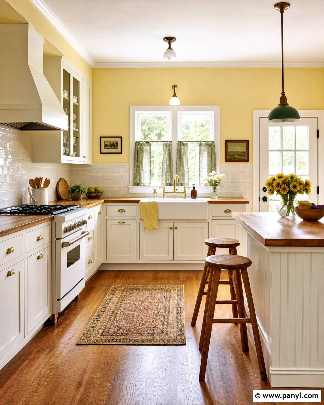
Butter yellow walls bring cheerful warmth to a kitchen when the color is soft rather than bright. Build a classic room with creamy white cabinets, butcher-block counters, warm oak flooring, and a white farmhouse-style sink. A backsplash in glossy ivory tile will bounce light around the space and make the yellow appear fresher. Add aged brass knobs, green cafe curtains, and simple wooden stools for a comfortable country-inspired finish. In a more modern kitchen, replace rustic details with flat-panel cabinets, pale quartz, and slim black lighting. Butter yellow looks especially natural in rooms that receive morning sunlight. Keep appliances and large surfaces neutral so the wall color does not compete with too many elements. Small accents in sage, navy, or soft red can add contrast while preserving the kitchen’s welcoming character.
17. Muted Mustard Kitchen Wall
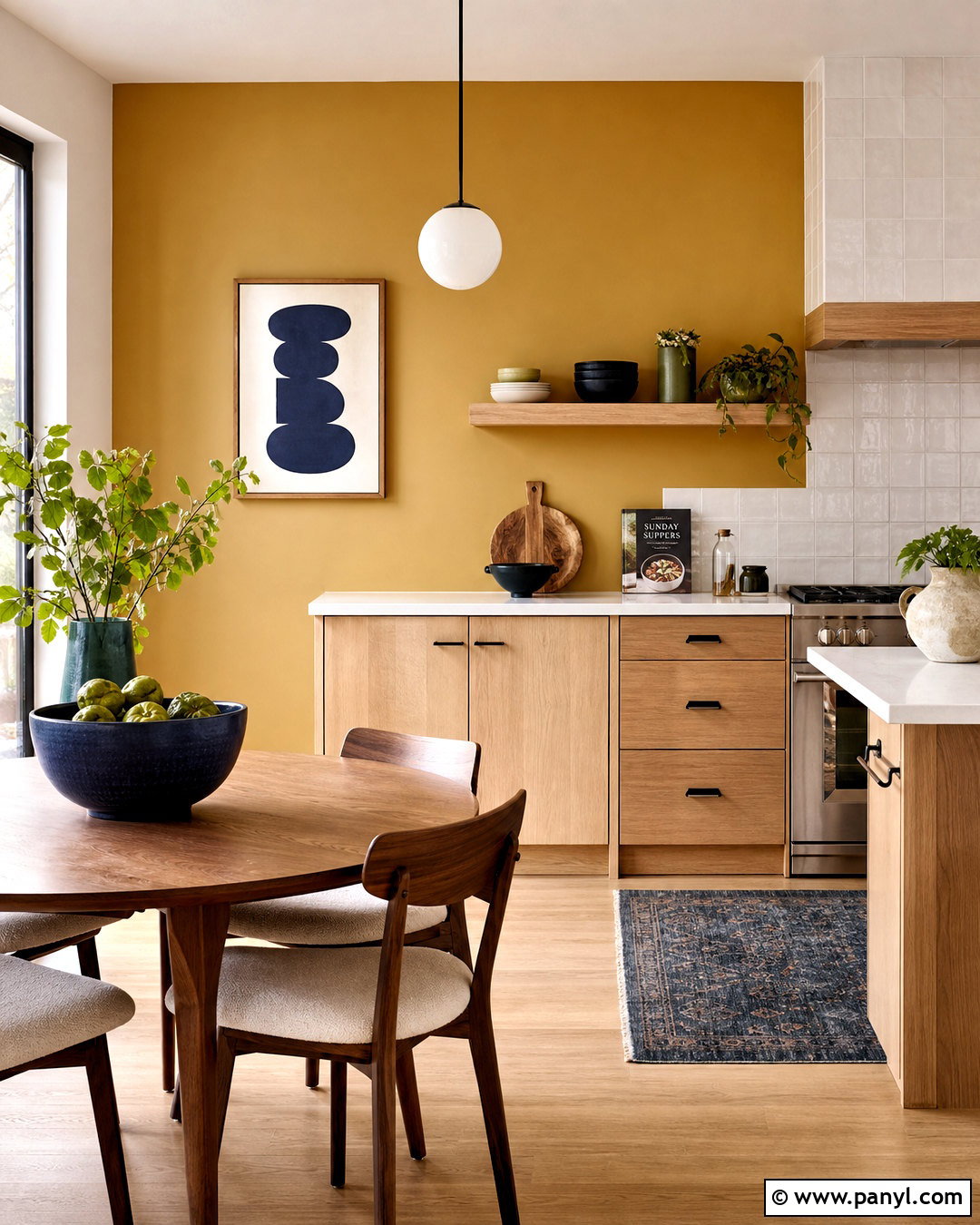
A muted mustard accent wall gives a kitchen energy while retaining an earthy, livable quality. Place it behind a breakfast table, a freestanding cabinet, or open shelves so it becomes a deliberate focal point. Surround it with warm white walls, pale oak cabinets, white quartz counters, and matte black hardware. A cream backsplash and light wood flooring keep the overall room bright. Add walnut chairs, linen cushions, and ceramics in deep blue or olive to balance the golden wall. This color works best when it contains brown or ochre undertones instead of a sharp lemon cast. Repeat mustard sparingly through a patterned runner or small piece of art. The finished palette feels modern and playful, yet the natural materials ensure it remains comfortable enough for everyday family use.
18. Warm Taupe Kitchen Walls
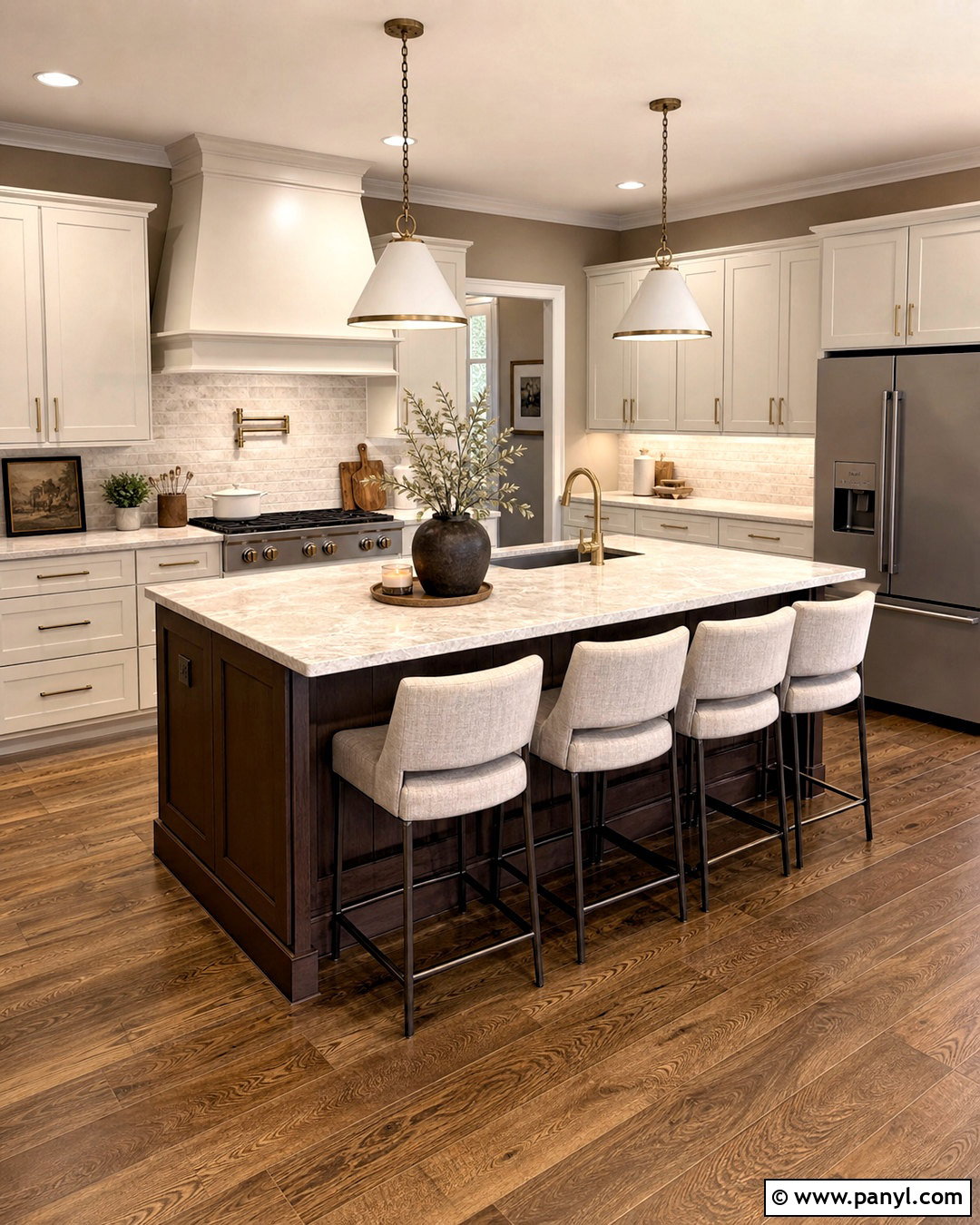
Warm taupe walls provide depth while preserving the flexibility of a neutral kitchen. Combine them with ivory cabinetry, dark walnut accents, creamy stone counters, and brushed brass fixtures. The finished room will feel layered because the walls sit between beige, brown, and gray rather than matching one surface exactly. Use a pale backsplash with subtle texture to brighten the work zones. A dark wood island can become the visual anchor, while upholstered stools in oatmeal fabric soften its weight. Warm taupe is particularly effective in a spacious kitchen that feels too open or stark with white walls. Carry it into the pantry or adjoining dining room for continuity. Choose warm white trim and balanced lighting, then introduce black only in small amounts through window frames, hardware, or a slender pendant.
19. Charcoal Gray Kitchen Accent Wall
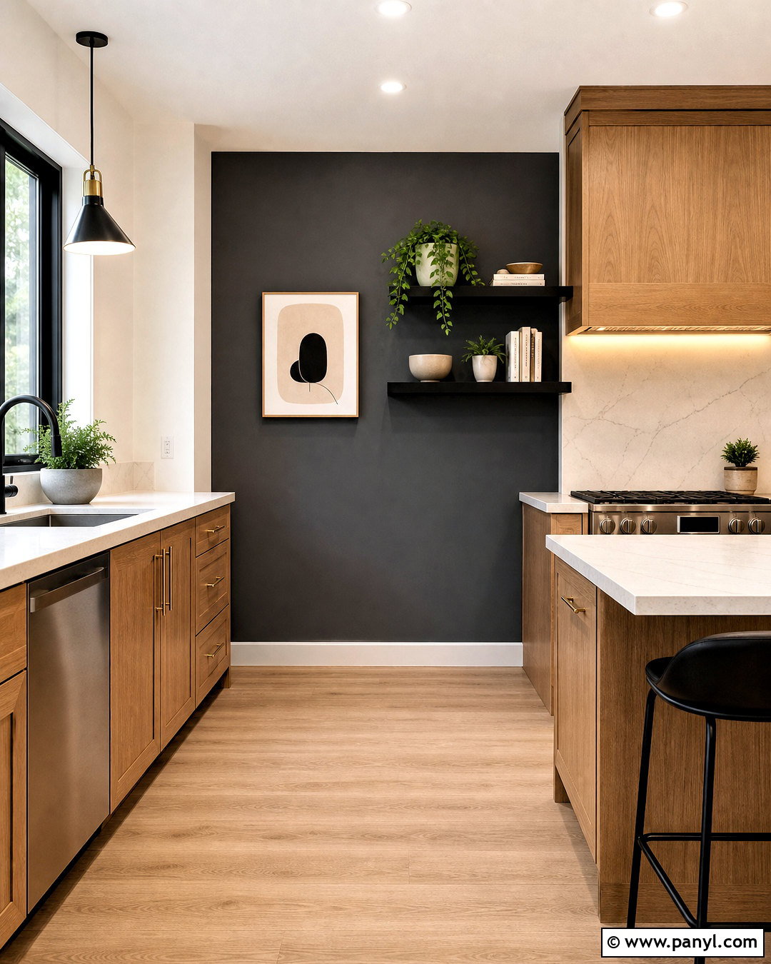
Charcoal gray creates a strong architectural focal point when used thoughtfully in a bright kitchen. Paint the wall surrounding a range, breakfast nook, or bank of open shelves, then keep the remaining walls warm white. Pair the accent with light oak cabinets, white quartz countertops, and pale wood flooring to maintain contrast. Brushed brass hardware and warm under-cabinet lighting prevent the dark gray from feeling cold. Use a white or lightly veined backsplash around cooking areas for practical brightness. A few black details can connect with the wall, but avoid making every fixture dark. In a smaller kitchen, choose a softened charcoal rather than near-black. The completed design should balance one dramatic vertical surface with generous light finishes, natural texture, and uncluttered countertops throughout the room.
20. Deep Burgundy Kitchen Accent Wall
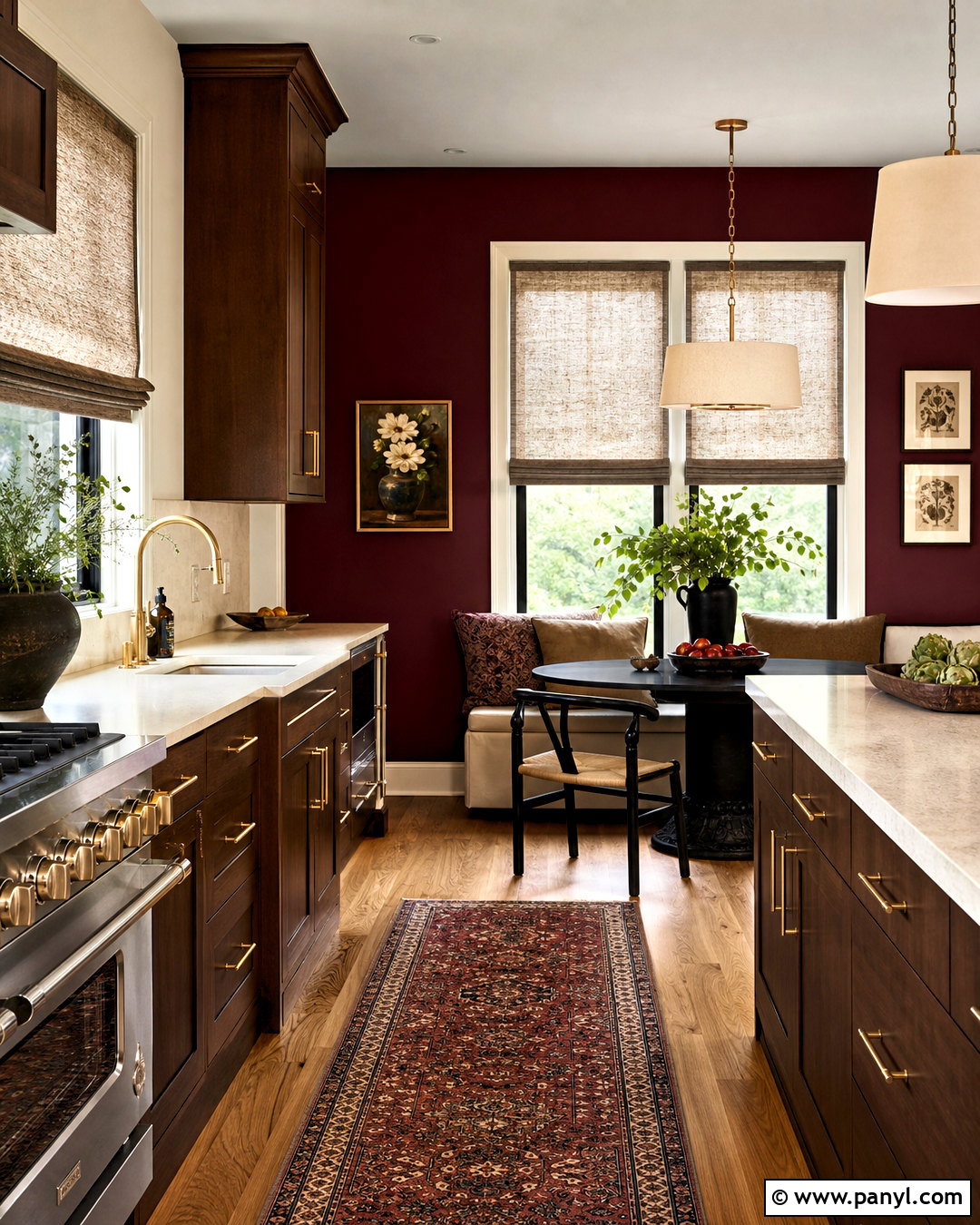
Deep burgundy brings unexpected richness to a kitchen and looks especially refined when paired with natural wood. Use it on a dining-nook wall or behind a built-in cabinet rather than covering every surface. Complete the palette with warm cream walls, walnut or medium oak cabinetry, pale stone counters, and aged brass hardware. The red-brown undertones coordinate naturally with timber and prevent the color from appearing overly bright. Add an ivory backsplash, soft linen shades, and a vintage-style runner containing muted burgundy, tan, and blue. Good lighting is essential, so combine ceiling fixtures, under-cabinet lights, and a pendant above the table. Keep accessories simple and functional. This balanced approach turns burgundy into a sophisticated background while preserving an open, comfortable kitchen suited to everyday cooking and dining.
Conclusion:
The most successful 20 kitchen paint color ideas for walls create a complete relationship between paint, cabinets, counters, flooring, lighting, and decor. Warm white, cream, greige, and taupe offer flexibility, while green, blue, terracotta, yellow, and burgundy introduce stronger personality. Before committing, paint large sample areas and observe them during the morning, afternoon, and evening because changing light can noticeably affect how a color appears. () Compare each sample directly beside the cabinetry, backsplash, and countertop rather than viewing it alone. Finally, choose the palette that supports how you want the kitchen to feel. A coordinated room will remain appealing longer than a color selected only because it is currently popular.

Related Ideas and Inspiration:

Leave a Reply