
Choosing the right exterior palette can make an average home look more welcoming, balanced, and carefully maintained. These 20 outdoor colours for houses cover light neutrals, earthy greens, classic blues, dramatic dark shades, and warmer statement colors. Each look combines the main wall color with suitable trim, roofing, doors, materials, and landscaping, creating a complete scheme rather than an isolated paint choice. A successful exterior palette should connect with permanent features such as brick, stone, roof shingles, and window frames before smaller accents are selected. () Always test large painted samples on different sides of the house because natural light can noticeably change undertones. Whether your home is traditional, coastal, farmhouse, or contemporary, you can find a practical starting point in these 20 outdoor colours for houses.
1. Warm White House Exterior
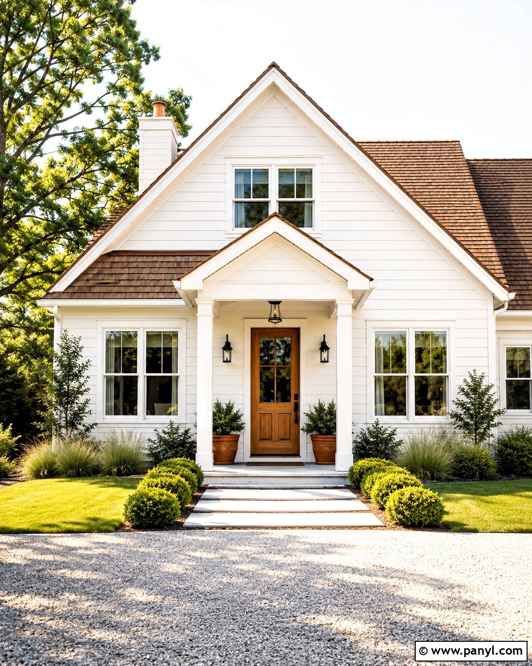
Warm white creates a clean exterior without the cold appearance that brighter whites sometimes develop outdoors. Choose a creamy white with subtle beige undertones for the siding or stucco, then use a slightly brighter white on window frames, fascia, columns, and railings. A medium-brown shingle roof and natural cedar front door keep the palette grounded. Add matte black lanterns, simple house numbers, and dark bronze gutters for crisp definition. This combination works especially well on farmhouse, Craftsman, and traditional homes. Complete the setting with pale gravel, clipped evergreen shrubs, ornamental grasses, and terracotta planters. Warm white reflects plenty of daylight, so the house feels fresh while still connecting comfortably with wood, stone, brick, and natural landscaping.
2. Soft Greige House Exterior
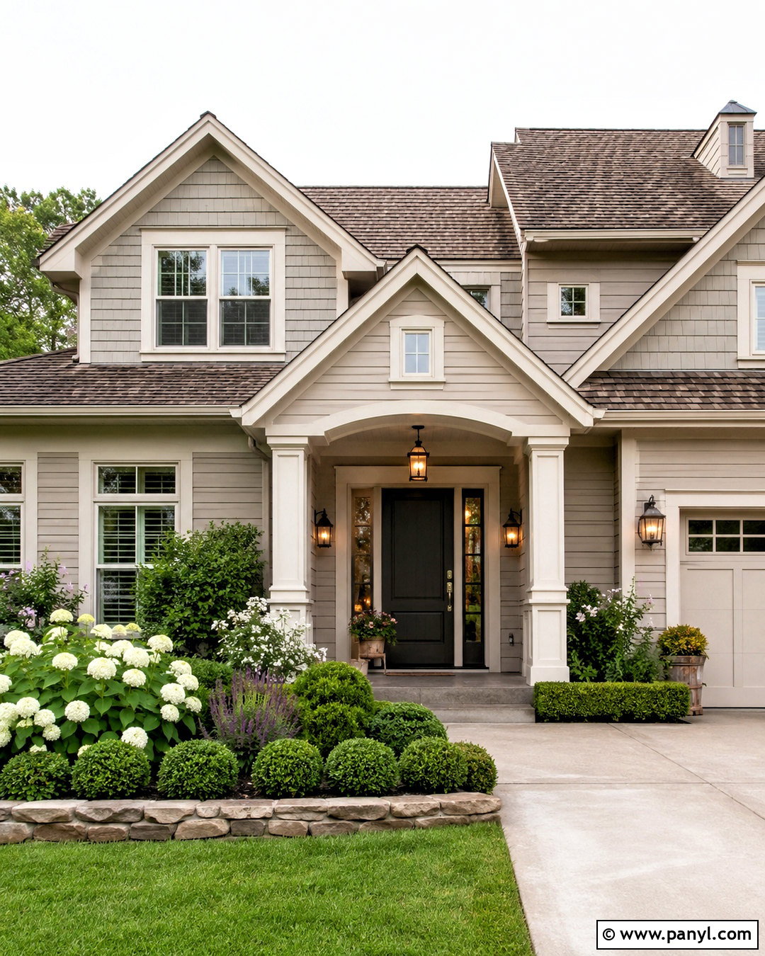
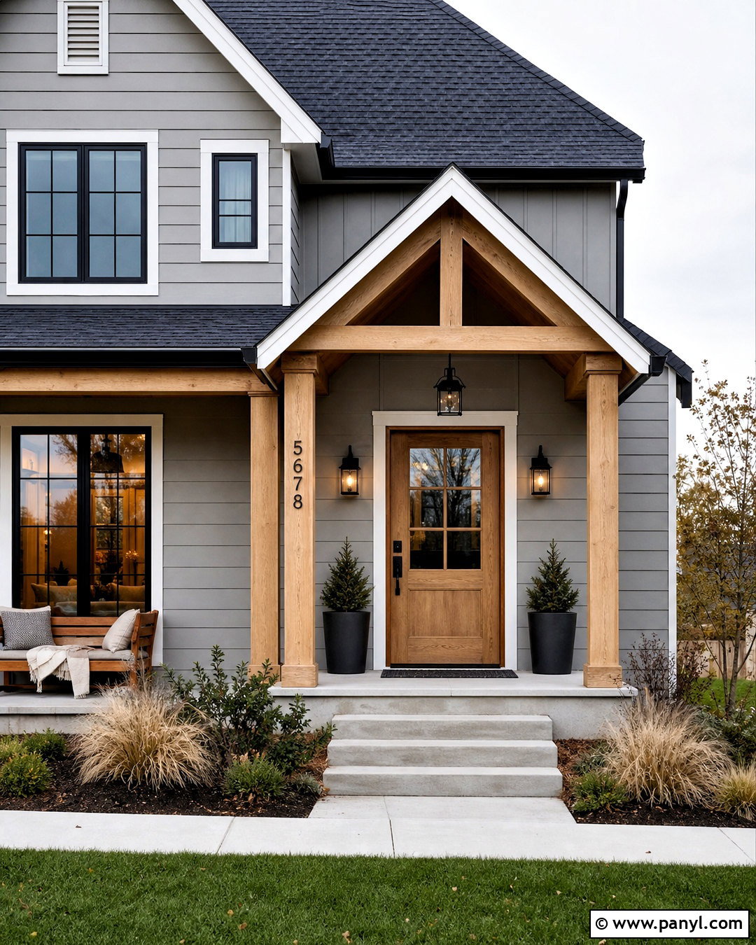
Can’t decide between gray and beige? Soft greige offers the cool balance of gray with enough warmth to complement stone, brick, and brown roofing. Apply it across the main siding, using creamy off-white for the trim, porch posts, and garage door. A charcoal front door gives the scheme a strong focal point without overwhelming the facade. Choose weathered bronze lights and medium-toned wood for porch furniture or decorative beams. If the home has stonework, select greige with undertones that repeat its lightest mortar color. Layer the front yard with boxwood, lavender, white hydrangeas, and gray-green foliage. The finished exterior looks polished and flexible, making it a practical choice for suburban homes where neighboring colors and existing materials need consideration.
3. Sage Green House Exterior
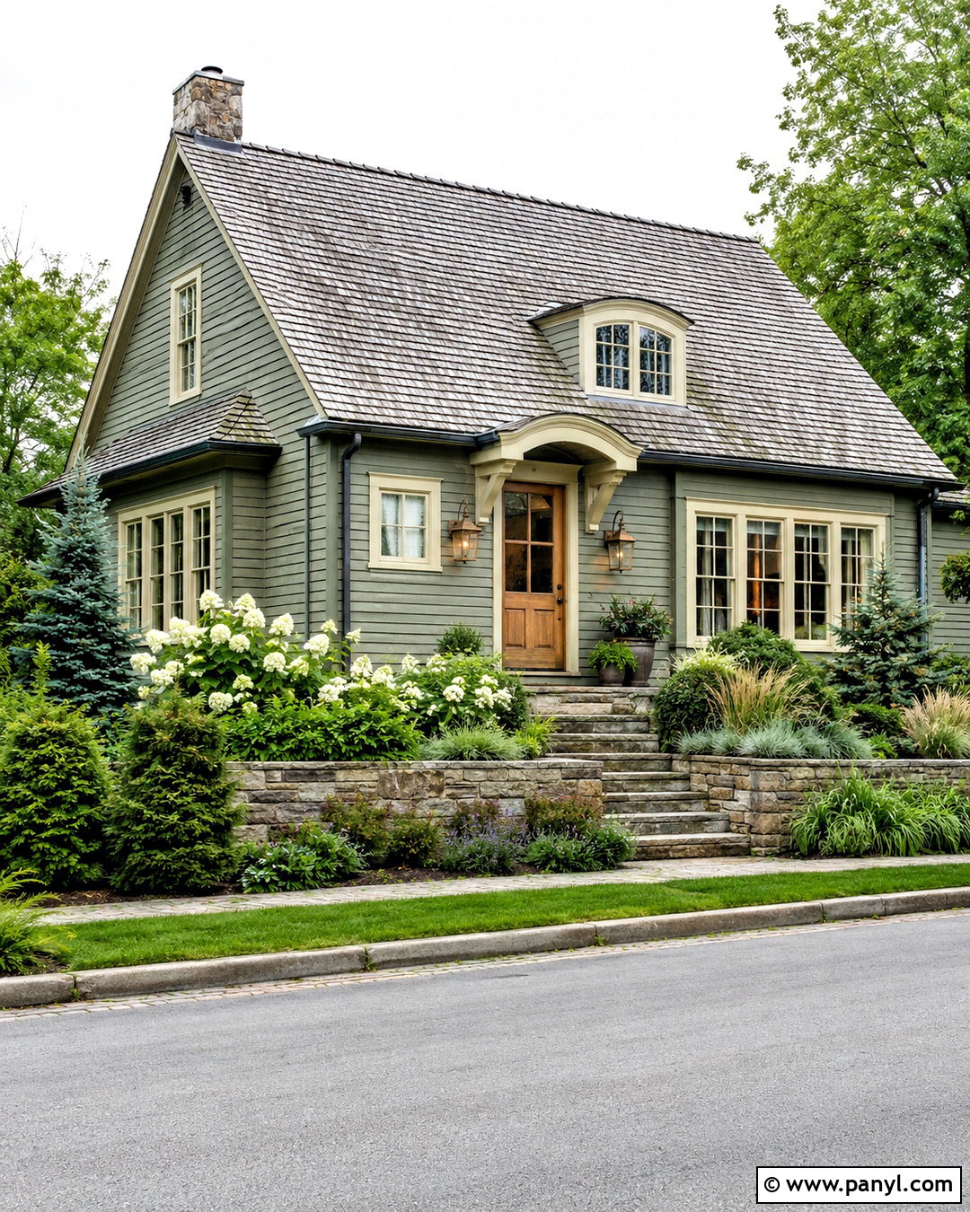
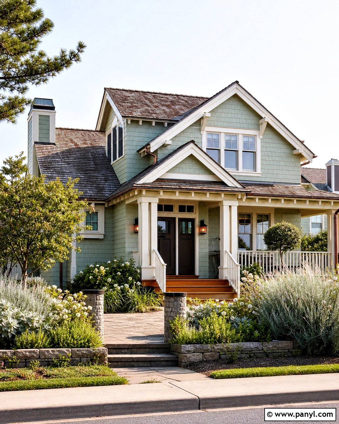
Soft sage green blends beautifully with trees and gardens while giving the house more character than a basic neutral. Cover horizontal siding with a muted, gray-based sage rather than a bright botanical green. Cream trim around the roofline and windows brings gentle contrast, while a stained oak front door adds warmth. Use a weathered gray roof, natural stone steps, and aged brass or bronze lights to support the organic palette. This complete scheme feels especially appropriate for cottages, ranch homes, and Craftsman exteriors. Surround the entrance with white flowering shrubs, rosemary, grasses, and layered evergreen planting. Avoid adding several competing accent colors. Repeating the sage, cream, wood, and stone tones keeps the entire property calm, cohesive, and naturally connected to its surroundings.
4. Charcoal Gray House Exterior
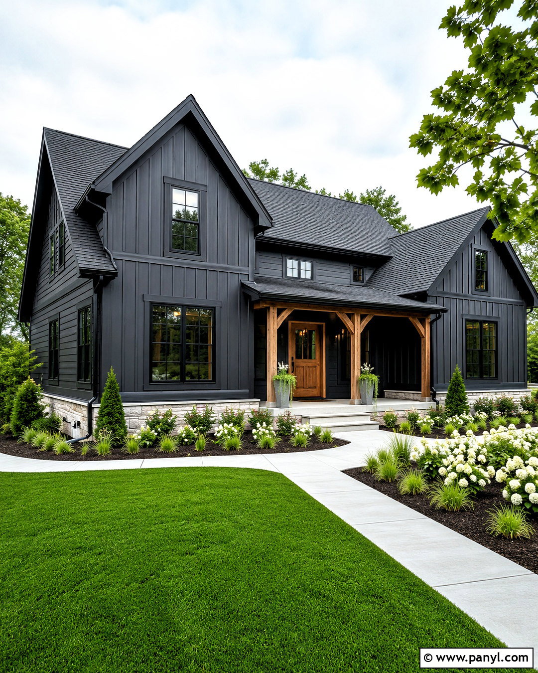
Charcoal gray gives a simple home a sharper architectural presence, particularly when the facade has clean lines and generous windows. Use deep charcoal on the main siding, but soften the effect with warm white trim and a medium cedar front door. Black window frames, gutters, and modern wall lights can blend into the dark body color rather than creating busy outlines. Select a black or dark gray roof so the upper portion feels unified. Pale concrete paths and light stone foundation details prevent the scheme from becoming visually heavy. For landscaping, use bright green ornamental grasses, white flowers, and neatly shaped shrubs. This exterior works well on modern farmhouses, cabins, and contemporary homes, creating contrast while remaining more approachable than an entirely black facade.
5. Deep Navy House Exterior
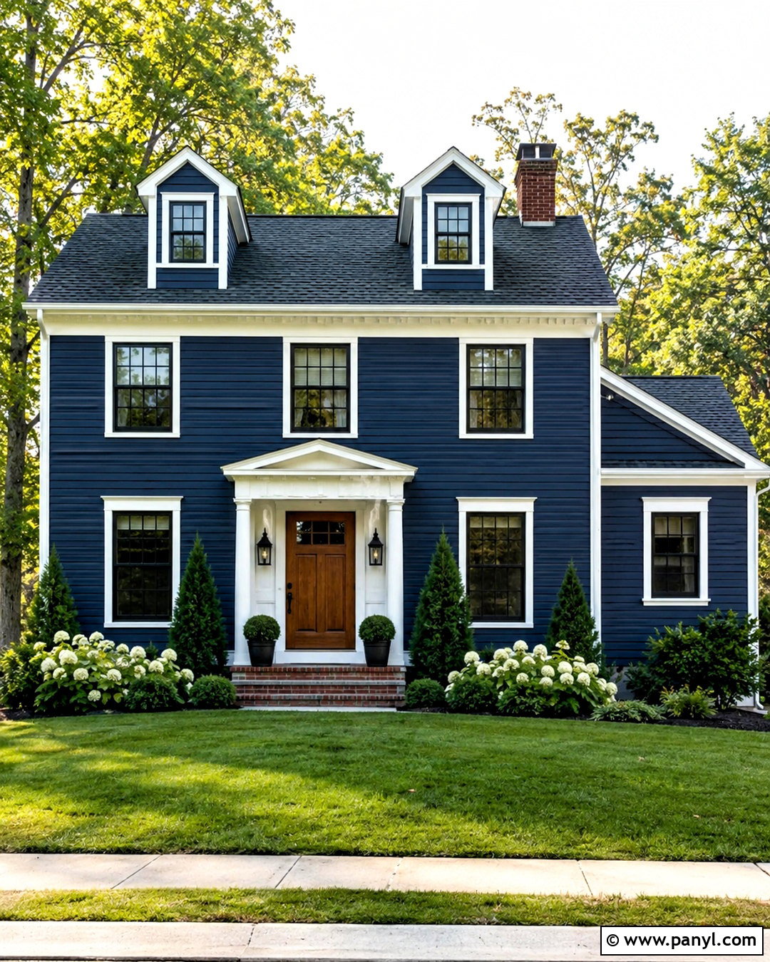
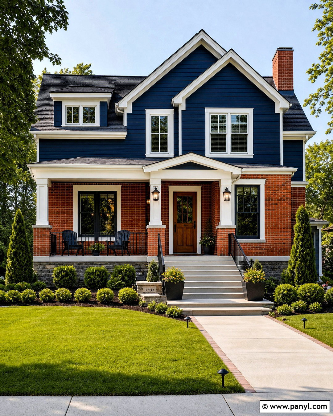
Deep navy blue feels established and classic while offering richer color than charcoal or black. Paint the siding a dark, slightly muted navy, then outline windows, eaves, porch columns, and railings with crisp white. A medium-brown wood door introduces natural warmth and keeps the entry from looking overly formal. Pair the scheme with a charcoal shingle roof, black lights, and simple metal hardware. Red brick steps can remain if their undertones are deep and earthy rather than orange. White hydrangeas, glossy evergreens, and structured foundation planting make the navy appear even more vibrant. This complete palette suits Colonial, Cape Cod, and updated traditional homes. Use navy consistently across secondary siding areas so the front elevation remains orderly rather than visually fragmented.
6. Light Blue House Exterior
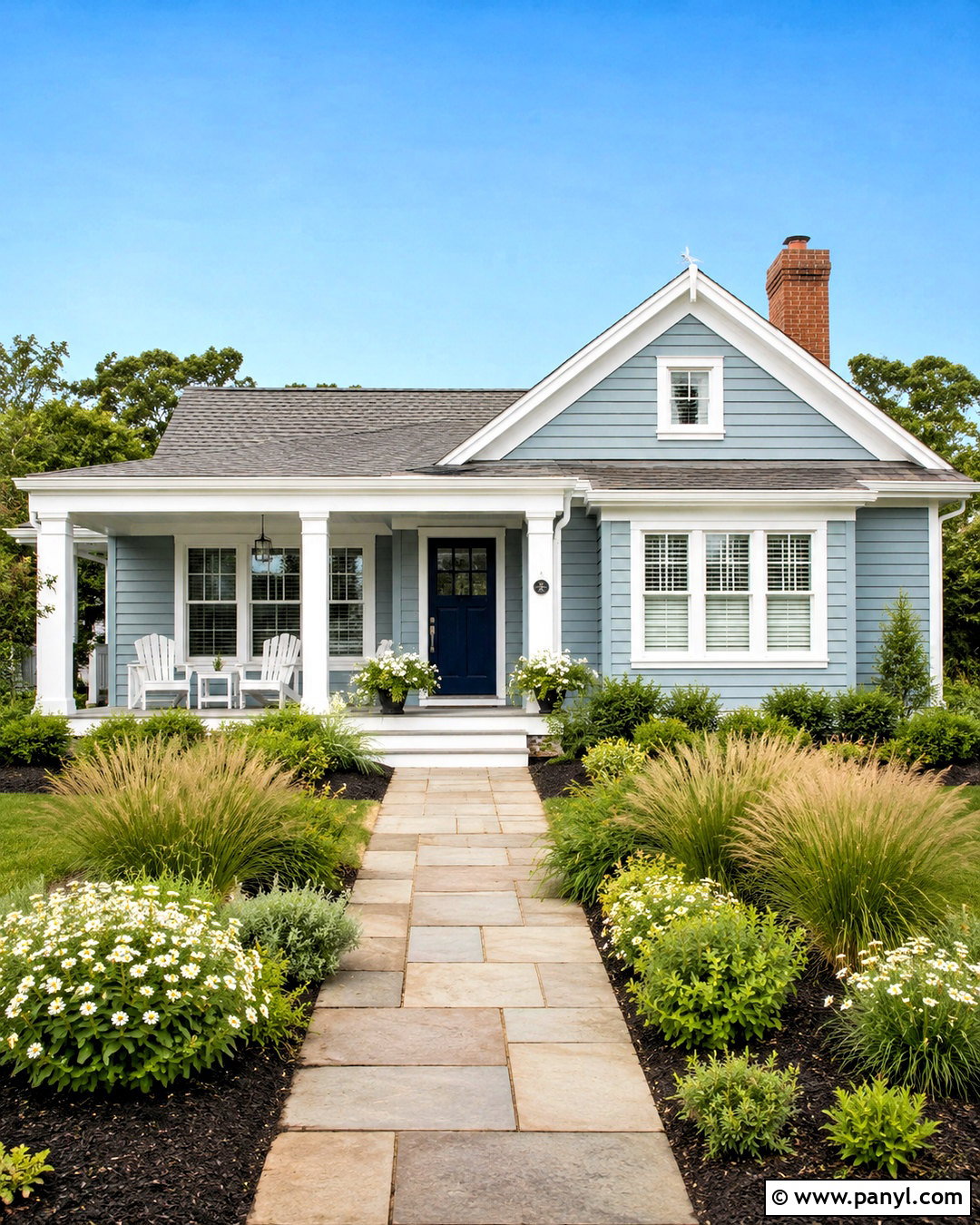
A light blue exterior can make a modest house feel cheerful, open, and relaxed. Select a softly grayed blue instead of a highly saturated pastel, which may look brighter across a large facade. Combine the blue siding with clean white trim, a medium gray roof, and a navy front door for layered contrast. Silver-toned or brushed nickel hardware works naturally with the cooler palette. Add white porch furniture, pale stone paving, and simple coastal grasses without turning the home into a themed display. This look works beautifully for cottages, bungalows, and homes near water, but it also brightens ordinary suburban streets. Keep shutters minimal or match them to the navy door. White flowering plants and fresh green shrubs complete the clear, airy composition.
7. Forest Green House Exterior
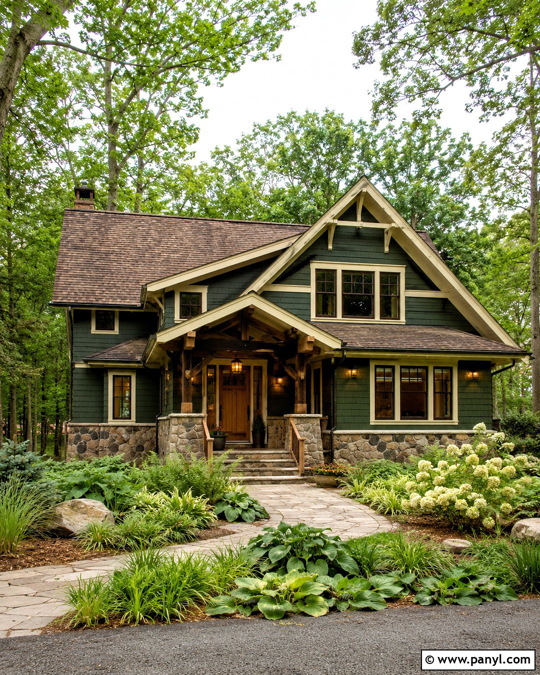
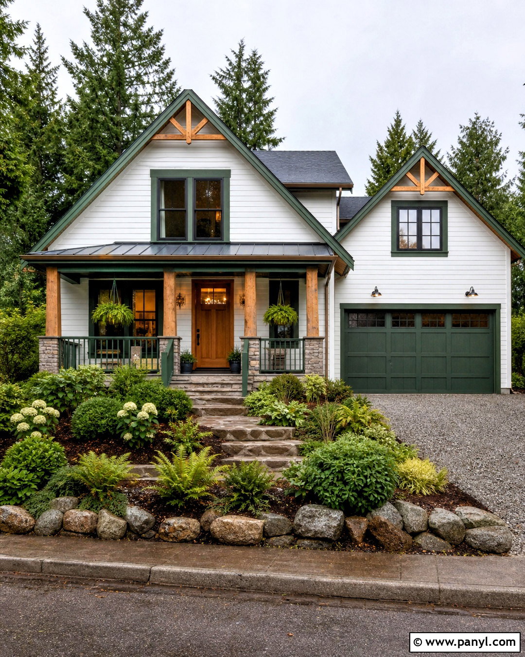
Forest green creates a strong, sophisticated exterior that settles naturally into wooded surroundings. Choose a deep green with muted blue or gray undertones for siding, shingles, or stucco. Use warm ivory on the trim to create softer contrast than stark white. A walnut-stained door, fieldstone base, and dark bronze lighting reinforce the home’s connection to nature. Finish the roof in weathered brown or charcoal, depending on the stone colors already present. This scheme is particularly effective for cabins, Craftsman houses, and traditional homes with substantial landscaping. Frame the facade with ferns, hostas, woodland grasses, and pale flowering shrubs. Allow some lighter materials around the porch and pathway to balance the dark walls and keep the entrance clearly visible and welcoming.
8. Warm Taupe House Exterior
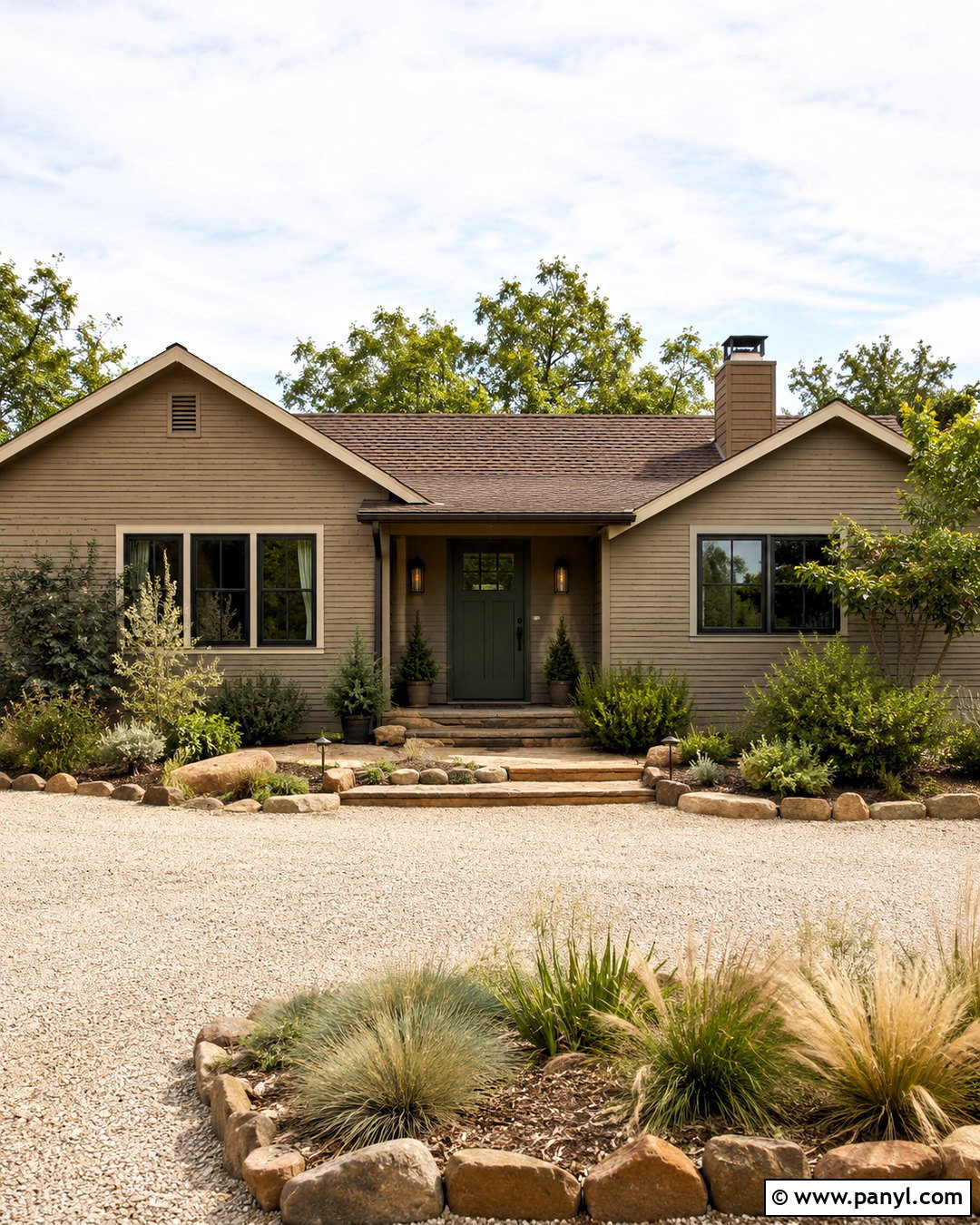
Warm taupe delivers depth without making the exterior feel dark or overly colorful. It combines brown, gray, and beige in a way that works especially well with natural stone and weathered wood. Paint the main body taupe, then use soft cream for window trim, soffits, and porch columns. A dark olive or deep bronze front door provides understated contrast. Choose a weathered-brown roof and aged bronze hardware to continue the warm undertones. This coordinated palette suits ranch, Mediterranean, and transitional homes where low, horizontal architecture benefits from a calm color. Build out the landscaping with olive-toned foliage, ornamental grasses, pale gravel, and low stone borders. Keeping the garage door close to the body color helps the front entrance remain the primary visual feature.
9. Cream House Exterior
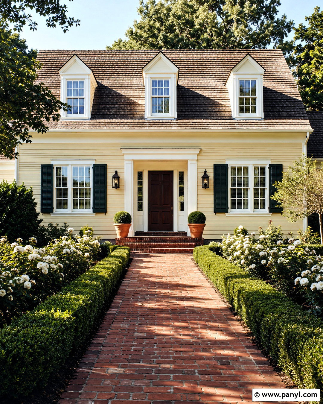
Cream brings warmth and softness to a facade while maintaining the bright appeal people often want from white. Choose a light buttery cream for the walls, paired with warm white trim that is just clean enough to define windows and architectural details. Add a dark chocolate-brown door, bronze lanterns, and a weathered brown roof for a timeless composition. If the home includes brick or stone, select materials with tan, buff, or muted red tones. Deep green shutters can add traditional character, although they should be used only where the window proportions support them. Finish the look with boxwood, white roses, terracotta pots, and a brick or flagstone walkway. The overall exterior feels sunny and inviting without relying on a bold or trendy body color.
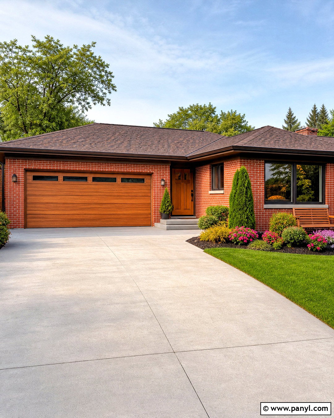
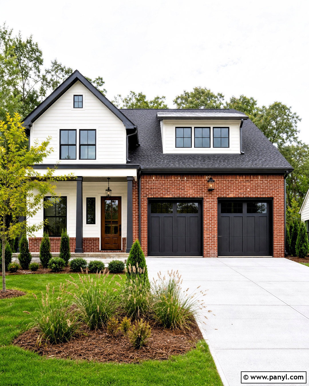
10. Terracotta House Exterior
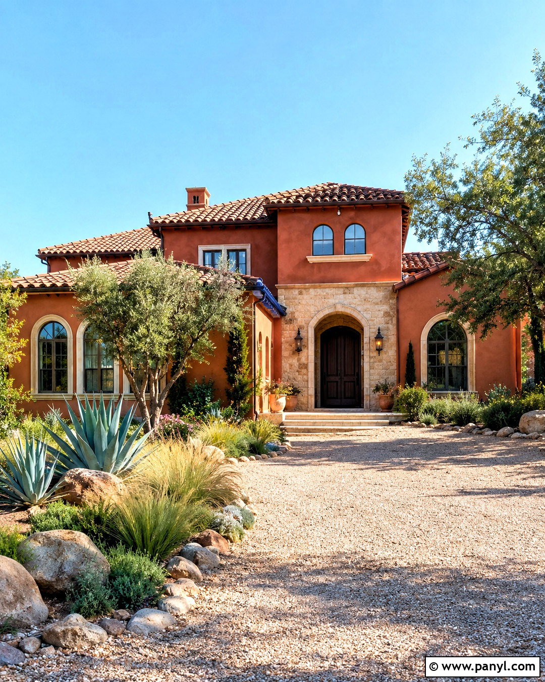
Terracotta gives an exterior a sun-warmed, earthy appearance inspired by clay, desert landscapes, and traditional stucco homes. Select a muted burnt-orange shade with brown undertones rather than a vivid orange. Pair the walls with creamy trim, a dark espresso front door, and aged bronze fixtures. A clay tile roof creates a seamless Mediterranean look, while brown shingles offer a practical alternative for simpler homes. Add natural stone around the foundation or entrance to break up broad painted surfaces. Drought-tolerant landscaping completes the palette beautifully, including agave, rosemary, ornamental grasses, and pale gravel. This full exterior scheme is especially suitable for Spanish, Southwestern, and adobe-inspired architecture. Keep secondary accents quiet so the terracotta remains rich, grounded, and visually comfortable.
11. Dusty Blue House Exterior
Dusty blue sits between classic blue and soft gray, creating a calm exterior with enough color to feel distinctive. Use this muted blue across the siding, then add ivory trim for a warmer, less coastal effect. A charcoal door and matching shutters create structure, while a medium-gray roof maintains the cool foundation. Natural wood porch decking can prevent the combination from feeling flat. Consider brushed black lanterns, simple railings, and stone in soft gray and beige tones. For the garden, combine white hydrangeas, silvery foliage, clipped shrubs, and lavender. This coordinated look works on traditional, cottage, and farmhouse homes. Because dusty blue changes with daylight, compare large exterior samples during sunny, cloudy, morning, and late-afternoon conditions before selecting the final shade.
12. Olive Green House Exterior
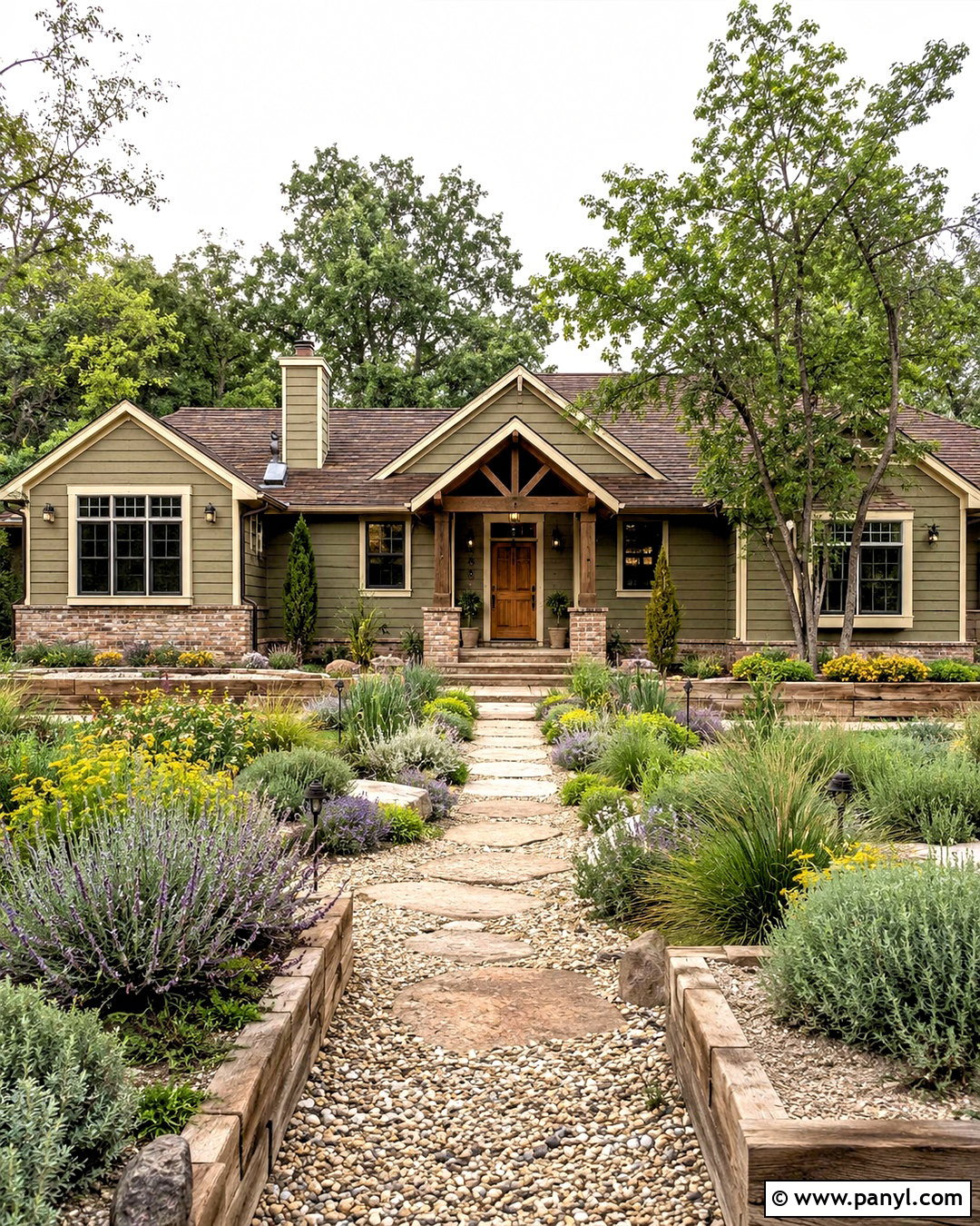
Olive green introduces an earthy, slightly warmer alternative to sage or forest green. Choose a medium olive with gray or brown undertones for the main facade, then pair it with creamy beige trim. A natural cedar door, dark bronze gutters, and a weathered brown roof complete the grounded palette. If the home includes brick, olive works best with muted red, brown, or tan masonry rather than bright orange brick. This color scheme feels at home on ranch houses, Craftsman homes, and rural properties. Repeat the exterior tones through gravel paths, timber planters, and natural stone edging. Plant rosemary, grasses, lavender, and compact evergreens around the foundation. The result feels established and connected to the landscape while still offering a noticeable departure from standard neutral siding.
13. Pale Yellow House Exterior
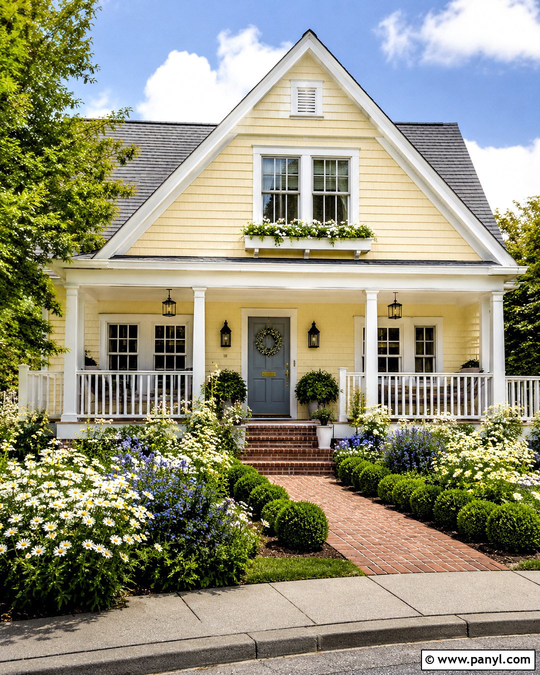
Pale yellow gives a house a sunny, welcoming personality without becoming loud. Look for a softened yellow with cream or beige undertones, since intense lemon shades can become much brighter in direct sunlight. Paint the trim warm white and use a medium-gray roof to balance the warmth. A muted blue-gray front door adds gentle contrast, while white porch railings maintain a clean traditional appearance. Black or aged bronze lanterns provide enough definition around the entrance. This complete scheme works especially well for cottages, Colonial homes, and small farmhouses. Enhance the curb appeal with white daisies, blue flowering plants, clipped greenery, and a brick walkway. Limit additional yellow accents so the facade remains calm, coordinated, and easy to appreciate from the street.
14. Black House Exterior
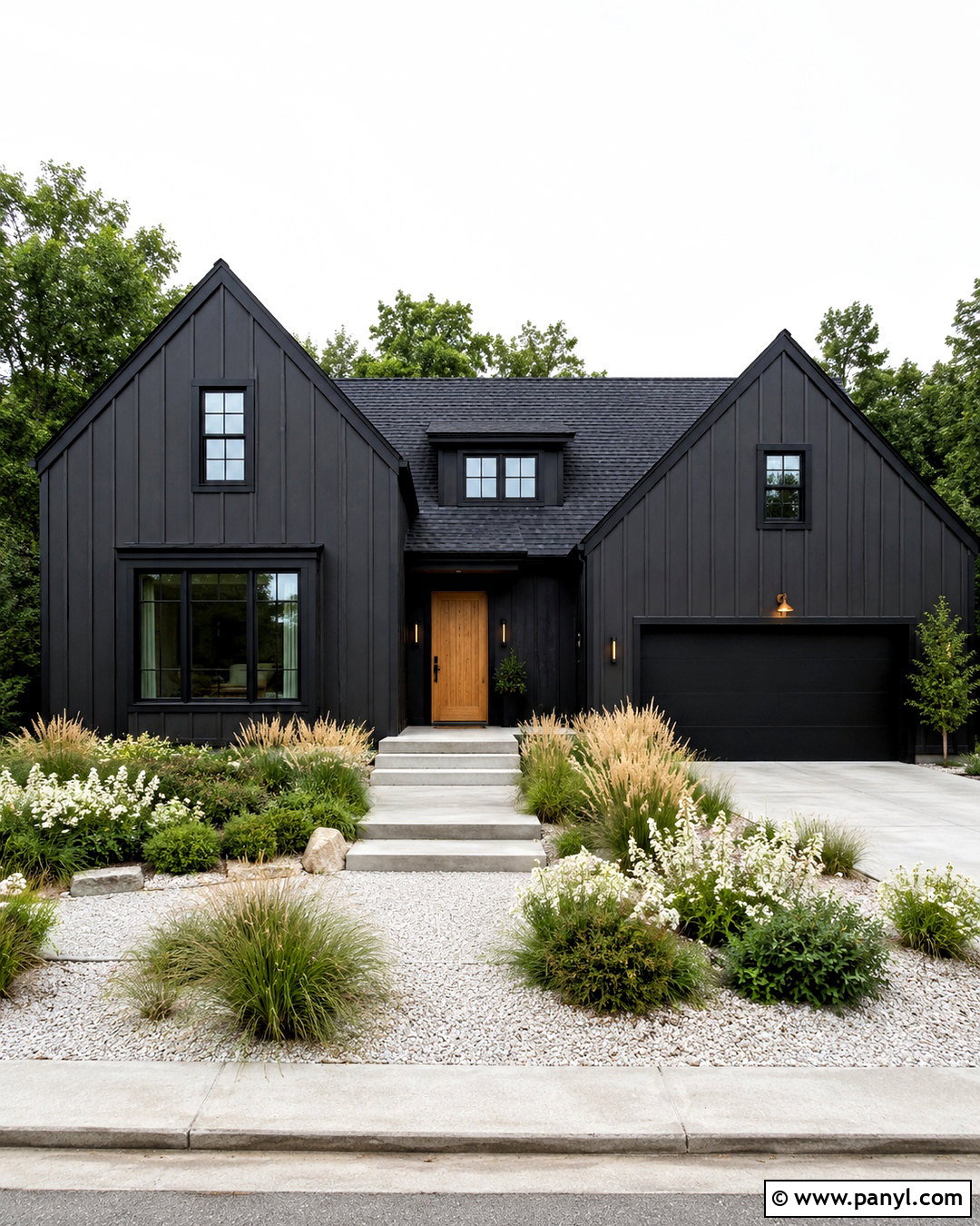
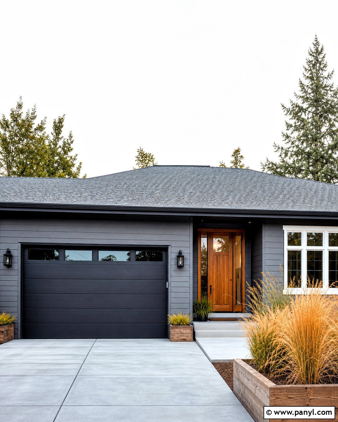
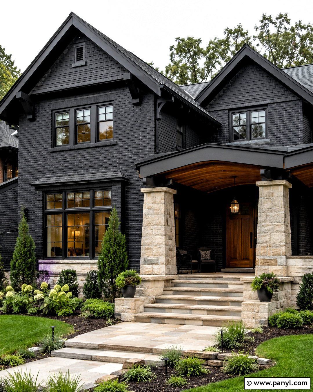
An all-black exterior can look modern and dramatic when texture, landscaping, and warm materials are used carefully. Choose a soft matte black rather than a glossy finish, applying it to siding and most trim for a streamlined effect. Keep the front door in warm cedar or medium oak to create a clear, welcoming focal point. Black window frames and gutters should blend into the facade, while light concrete steps and pale gravel provide contrast at ground level. A dark metal or charcoal shingle roof continues the monochromatic look. Use abundant green planting, white flowers, and natural grasses to soften the architecture. This palette works best on simple contemporary homes, cabins, and modern farmhouses where clean shapes allow the dark color to appear intentional instead of heavy.
15. Medium Gray House Exterior
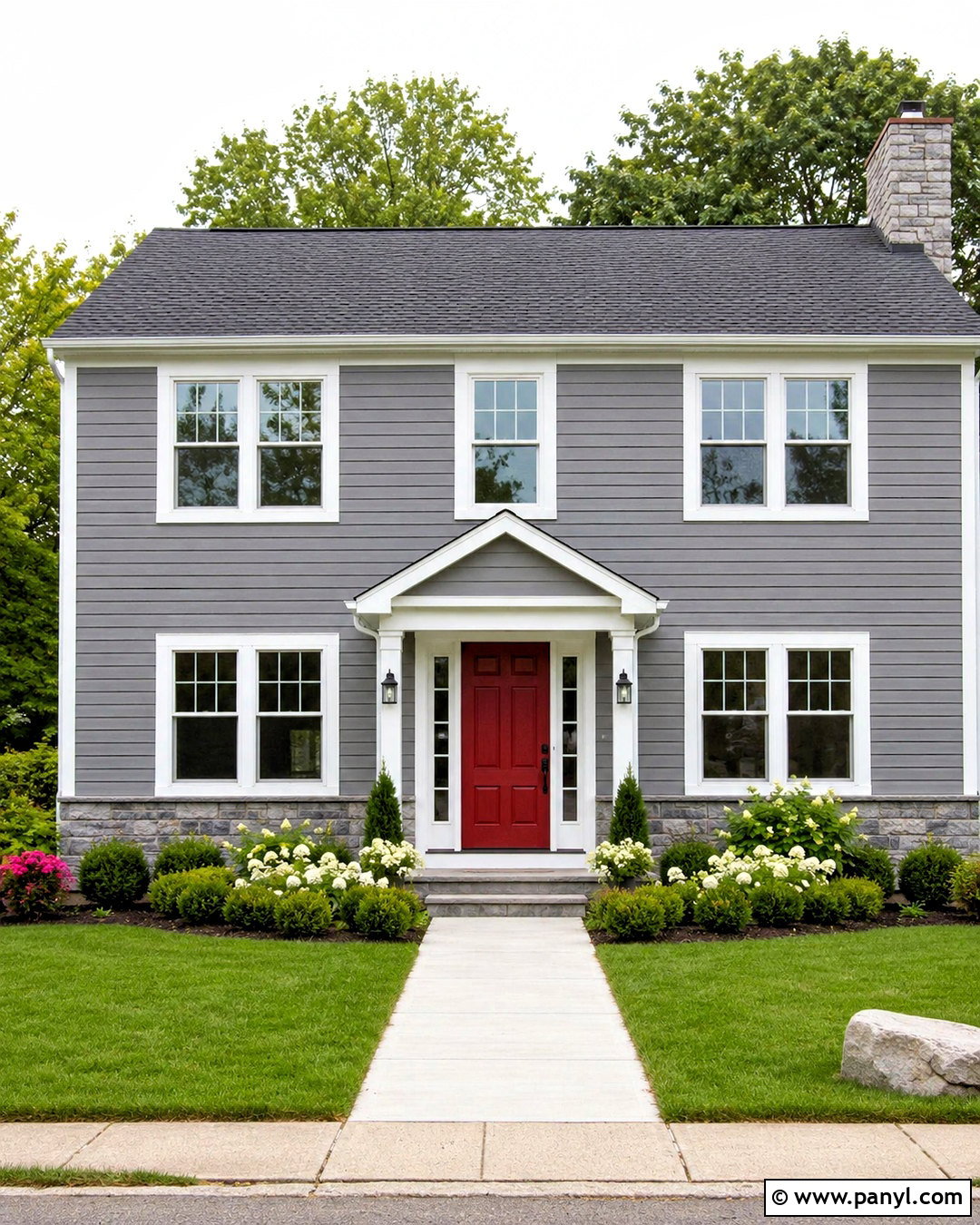
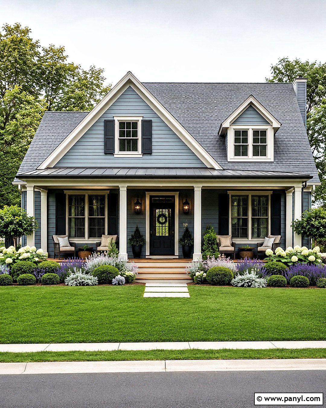
Medium gray offers more definition than pale gray while remaining neutral enough for many architectural types. Select a balanced shade that does not lean strongly blue or purple. Pair it with bright white trim around windows, fascia, and porch columns for a crisp outline. A deep red front door can introduce traditional warmth, while navy or black creates a quieter result. Choose a charcoal roof, black hardware, and gray stone accents to connect the full palette. This scheme fits split-level, Colonial, Craftsman, and suburban homes particularly well. Add fresh green shrubs, white flowering plants, and a straight stone or concrete walkway. Paint a prominent garage door the same gray as the body, allowing the brighter trim and colorful entrance to hold attention.
16. Muted Teal House Exterior
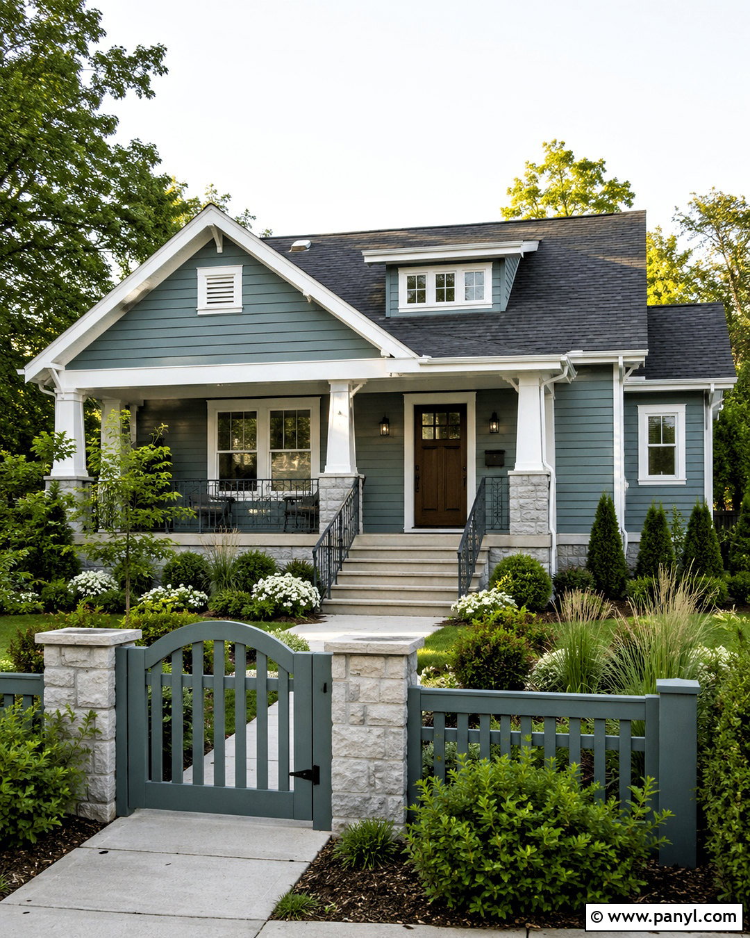
Muted teal gives an exterior distinctive color while remaining sophisticated and connected to nature. Select a medium teal softened with gray, avoiding bright turquoise tones that can dominate the street view. Use warm white trim to define windows and rooflines, then add a dark walnut door for natural contrast. A charcoal roof, black lanterns, and simple metal railings help modernize the palette. Pale gray stone around the base can visually anchor the stronger wall color. This scheme suits bungalows, coastal homes, and compact contemporary houses with straightforward facades. Surround the home with lush green shrubs, grasses, and white flowers rather than several colorful blooms. Repeating teal on a small garden gate or planter creates continuity without making the complete property appear overly coordinated.
17. Clay Beige House Exterior
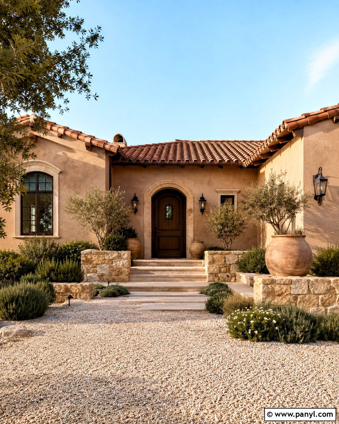
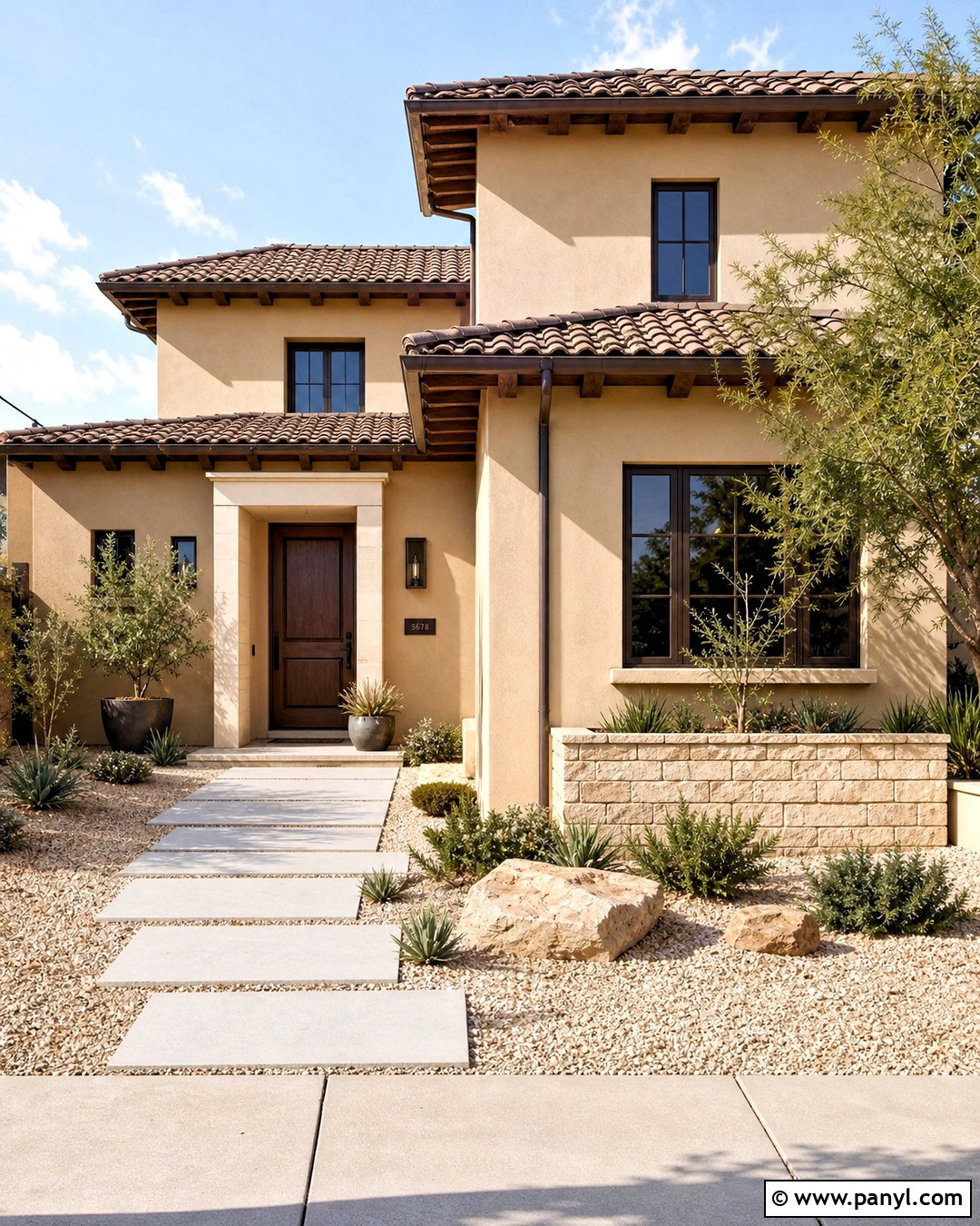
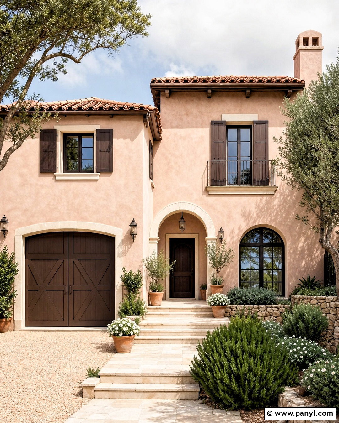
Clay beige captures the warmth of sand and natural earth, making it especially useful for houses in sunny or dry settings. Choose a medium beige with soft clay or pink-brown undertones for stucco or siding. Pair it with creamy trim, a dark brown front door, and bronze window frames or fixtures. A terracotta tile roof intensifies the warm character, while weathered brown shingles create a more understated version. Add rough limestone, pale gravel, and wood accents to provide texture. The surrounding landscape might include olive trees, rosemary, ornamental grasses, and low-water shrubs. This complete exterior suits Southwestern, Mediterranean, ranch, and transitional homes. Keep the trim warm because a cold, brilliant white may look disconnected from the walls, roofing, and natural hardscape.
18. Soft Blush House Exterior
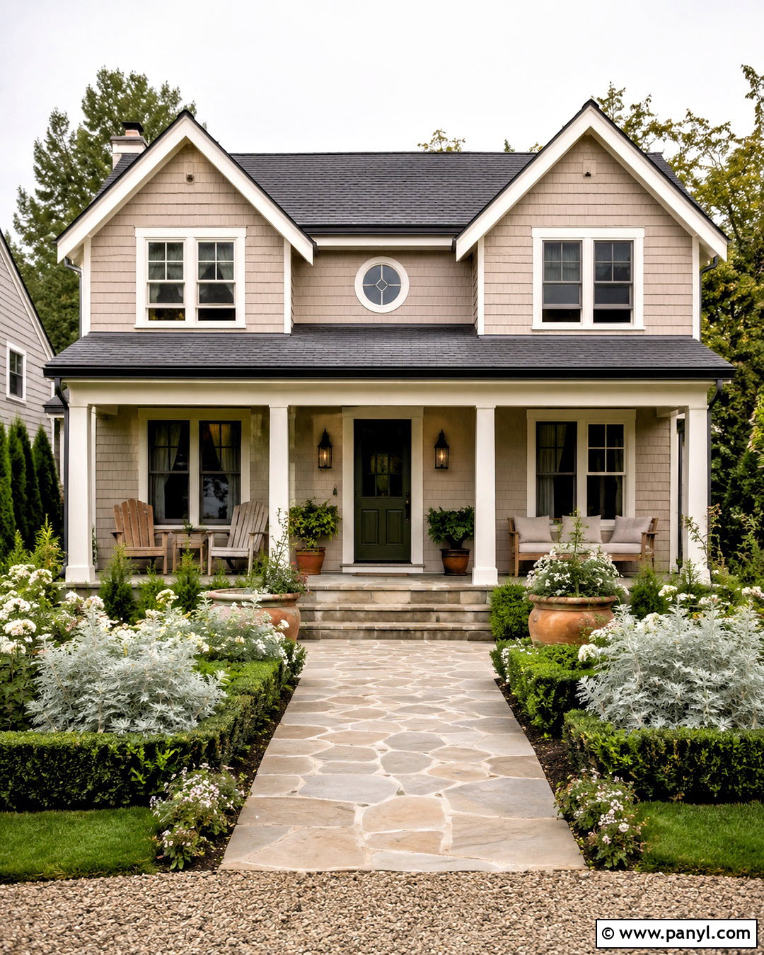
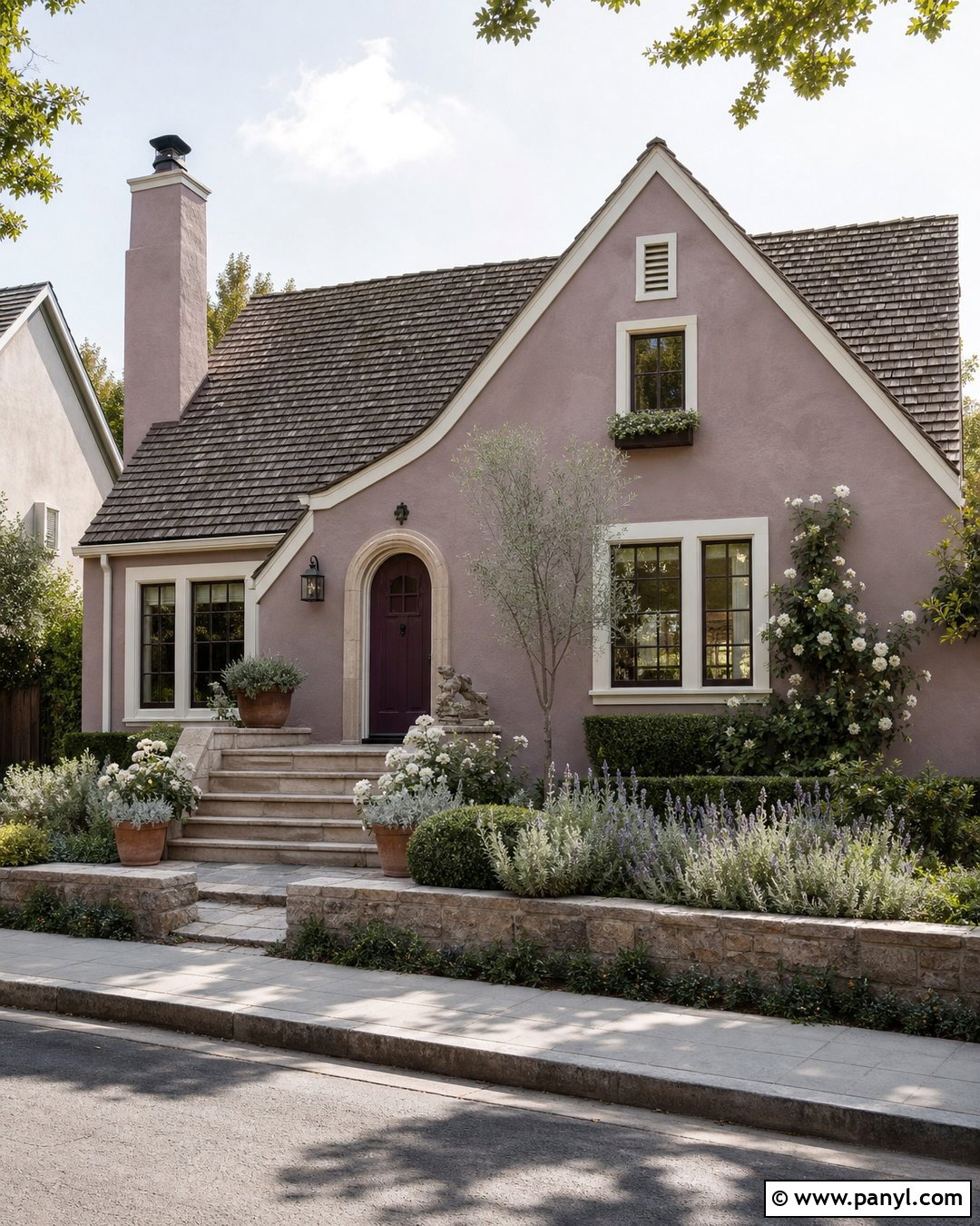
Soft blush can feel surprisingly refined when it has dusty beige or gray undertones. Use the pale pink across stucco, clapboard, or cottage siding, balancing it with warm white trim and a muted charcoal roof. A deep olive front door grounds the sweetness of the walls, while black or aged bronze lights add clean definition. Natural stone steps and weathered wood furniture keep the composition relaxed and residential. This palette works well for small cottages, coastal houses, and historic homes with decorative details. Surround the entrance with silvery foliage, white flowers, clipped shrubs, and simple terracotta planters. Avoid bright pink accessories or overly decorative landscaping. The best finished look treats blush as an elegant warm neutral rather than a novelty or highly themed color.
19. Chocolate Brown House Exterior
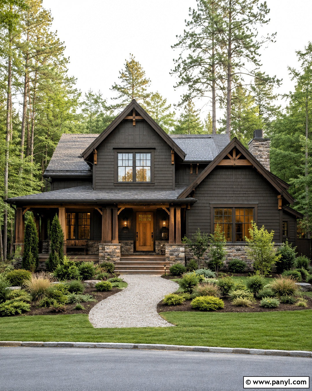
Chocolate brown creates a cozy, substantial exterior, particularly for wooded properties and homes with rustic architectural details. Choose a deep brown softened by gray undertones so it does not appear red or overly heavy. Pair the siding with light taupe trim, a natural oak door, and fieldstone accents. A weathered charcoal roof adds cool balance, while bronze lights and gutters blend quietly into the darker walls. Use cream around the entrance only if greater visibility is needed. This complete scheme suits cabins, ranch homes, Craftsman houses, and mountain-inspired exteriors. Brighten the property with pale gravel, warm concrete, ornamental grasses, and layered green planting. The contrast between dark walls, natural wood, light stone, and fresh foliage creates depth without introducing unnecessary accent colors.
20. Classic White And Navy House Exterior
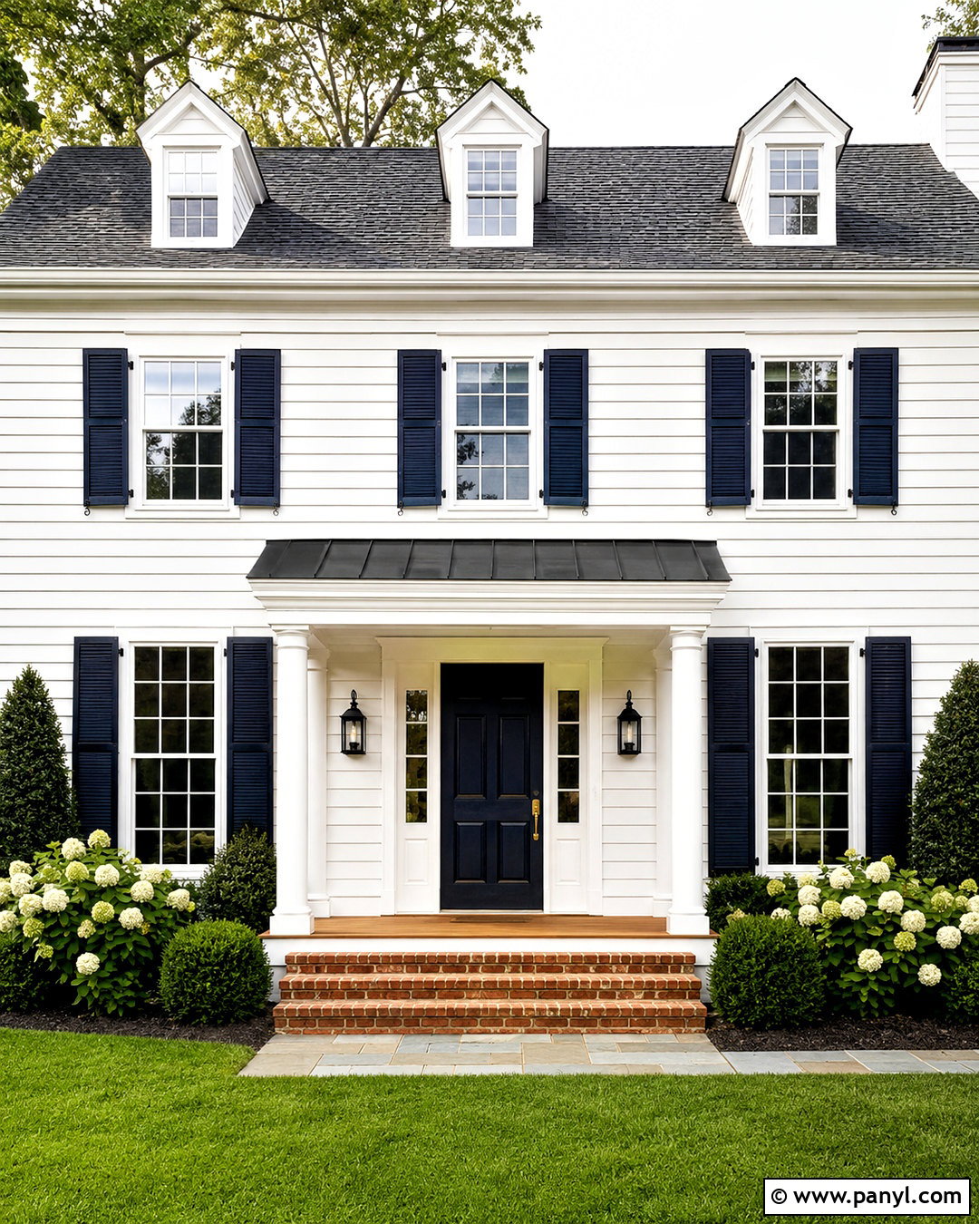
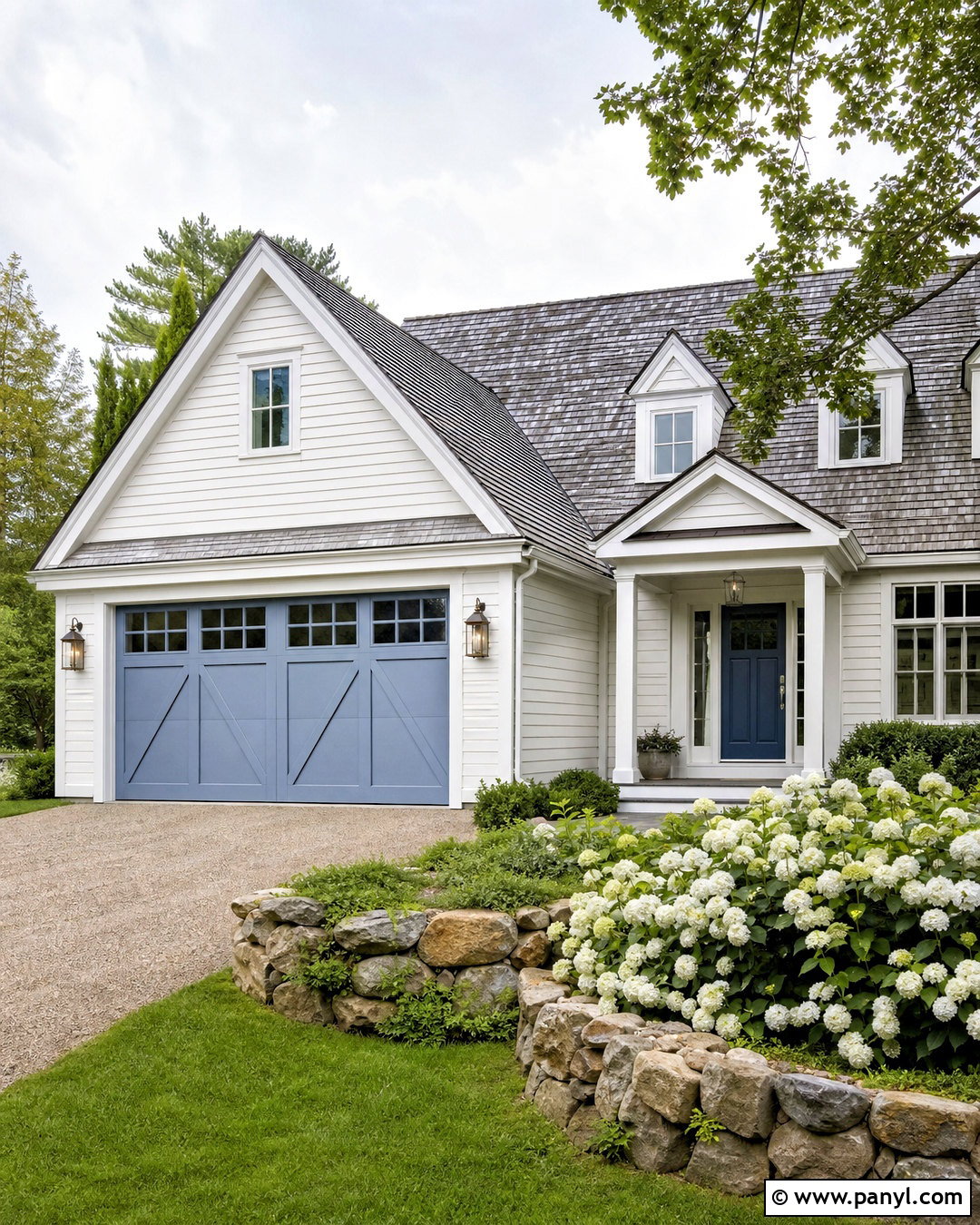
White siding with navy accents delivers a familiar, high-contrast exterior that can suit both coastal and traditional architecture. Use a warm or neutral white on the main walls, then apply deep navy to shutters, the front door, or a small gable section. Keep window trim white so the facade remains bright and orderly. A charcoal roof, black lanterns, and natural wood porch flooring add depth without competing with the navy. For brick steps, choose muted red or brown brick that provides a gentle transition to the landscape. Complete the setting with evergreen shrubs, white hydrangeas, and neat foundation beds. This balanced scheme is easy to personalize, but limiting navy to selected architectural features prevents the front elevation from looking striped or visually crowded.
Conclusion:
The best exterior palette considers the entire property rather than focusing on one attractive paint sample. Roofing, brick, stone, windows, doors, trim, lighting, and landscaping should all support the main wall color. These 20 outdoor colours for houses offer options ranging from warm white and soft greige to forest green, terracotta, blush, and dramatic black. Before purchasing paint, apply large samples to more than one wall and observe them throughout the day. Also compare every shade directly with permanent materials that will remain in place. A coordinated three-part palette of body, trim, and accent colors usually creates the clearest result. With careful testing and balanced contrast, your new exterior can feel intentional, welcoming, and suited to its architecture.

Related Ideas and Inspiration:
Leave a Reply