
Choosing paint for a low-light space is not as simple as reaching for the brightest white. The most successful 20 Best Wall Color For Dark Room Ideas consider undertones, furniture, flooring, artificial lighting, and the atmosphere you want to create. Warm pale colors can add a sunny glow, while deeper shades may soften shadowy corners and make the room feel intentionally cozy. Light-reflective value also helps predict how much light a paint color returns, but samples should always be tested throughout the day. () Complete the design with layered lighting, reflective surfaces, and balanced contrast rather than expecting paint to do everything. Use the following complete room looks to explore 20 Best Wall Color For Dark Room Ideas.

1. Warm White Wall Color
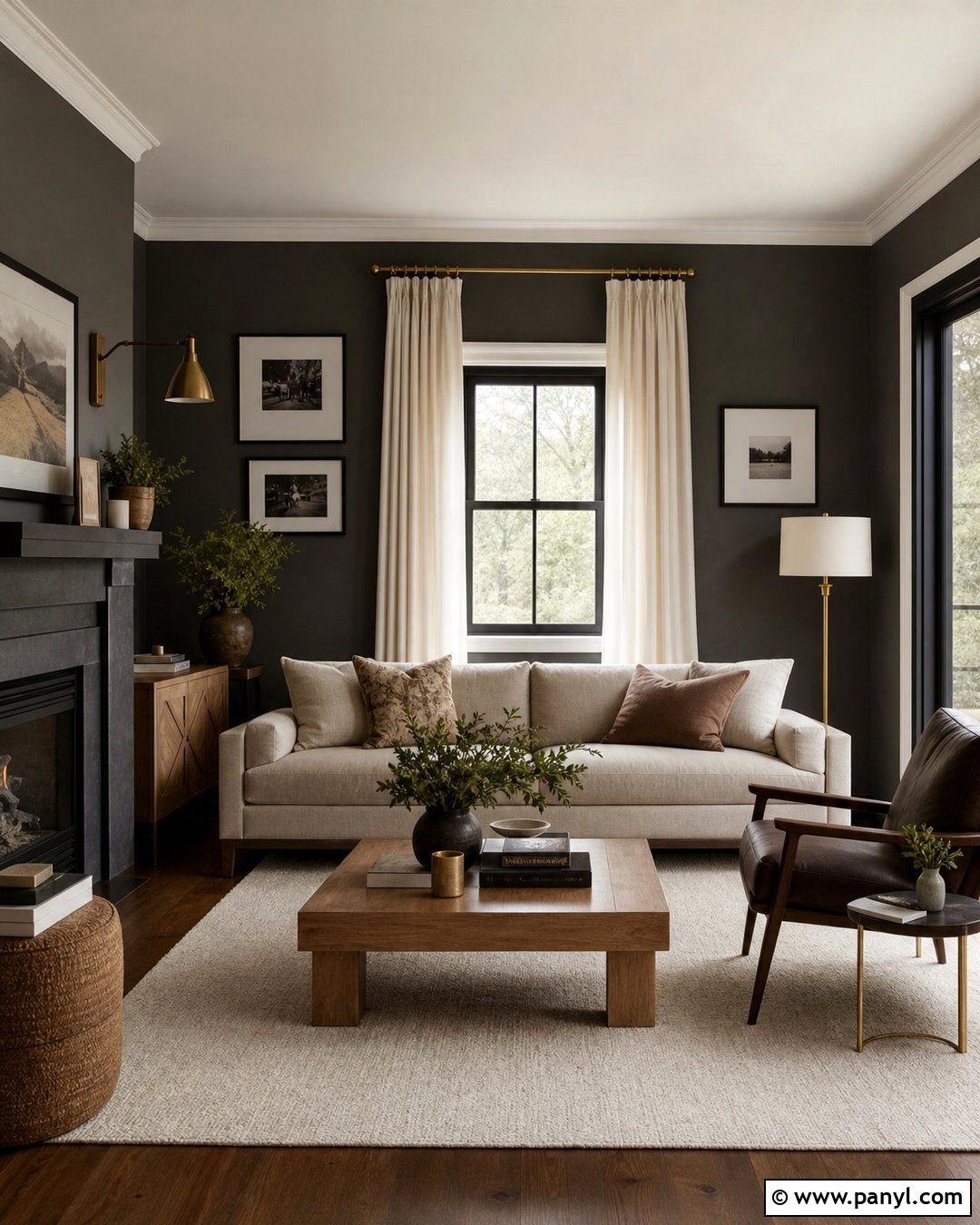
Warm white gives a dark room a clean appearance without the cold, shadowy effect that can happen with brilliant white. Select a creamy white with subtle yellow, beige, or red undertones. Paint the ceiling and trim in the same color, using a slightly glossier finish on the woodwork to reflect more light. Build a relaxed living room around the walls with a light oatmeal sofa, natural oak tables, ivory curtains, and a cream wool rug. Add brushed brass lamps and warm white bulbs at several heights. Black picture frames or a dark brown chair provide enough contrast to keep the pale palette from looking washed out. The finished room feels bright, soft, and comfortable.
2. Soft Ivory Wall Color
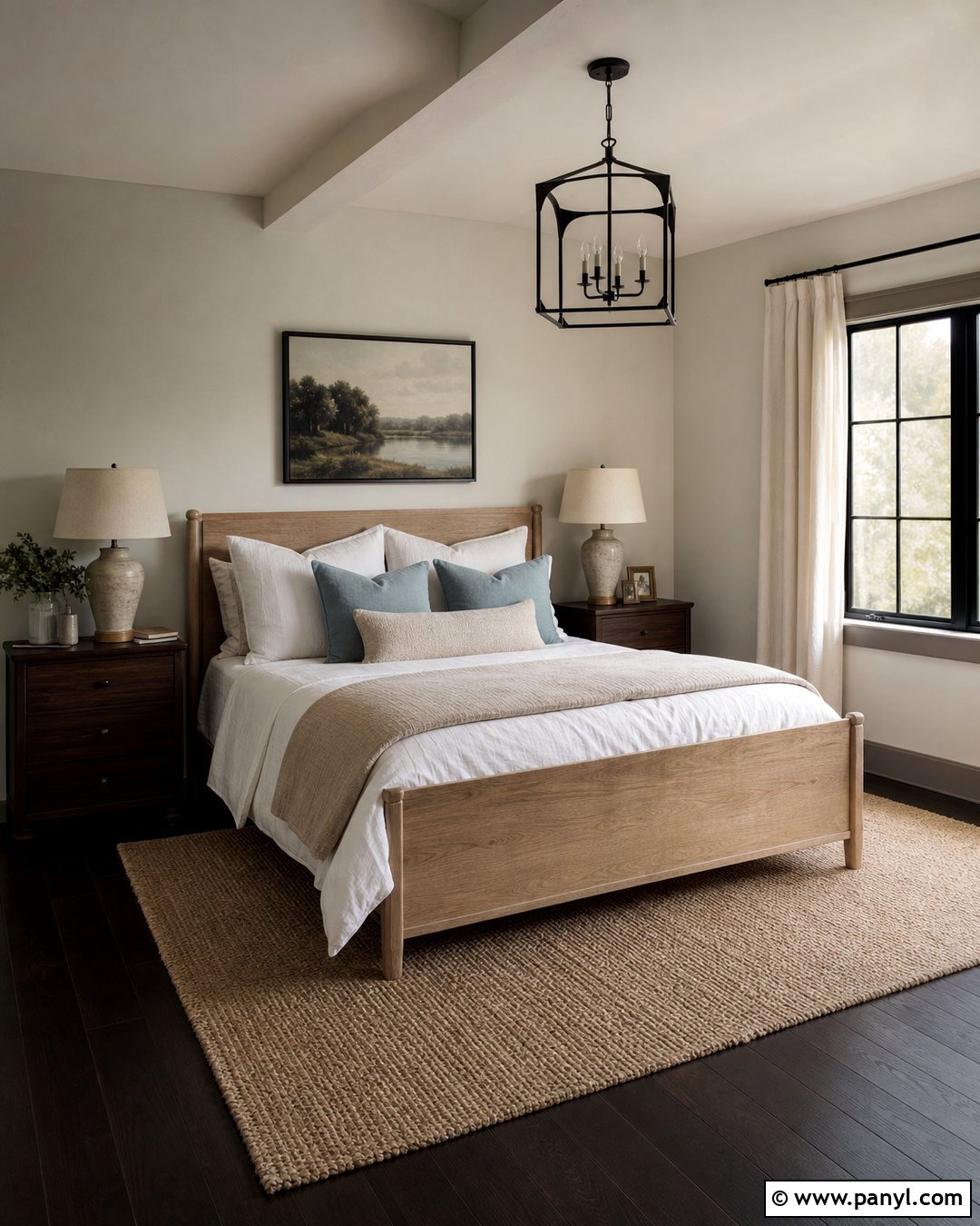
Soft ivory works especially well in dark bedrooms because it creates warmth while remaining lighter than traditional beige. Pair ivory walls with crisp cream trim instead of stark white, which can make the wall color appear unexpectedly yellow. Choose a light oak bed, linen bedding in white and sand, and small walnut nightstands for gentle contrast. A woven rug and full-length cotton curtains introduce texture without absorbing too much light. Place matching ceramic lamps beside the bed and add a flush-mount ceiling fixture with a frosted shade. Muted blue or sage pillows can break up the neutral scheme. This complete palette feels calm and timeless, making it suitable for traditional, cottage, transitional, or understated modern bedrooms.
3. Light Greige Wall Color
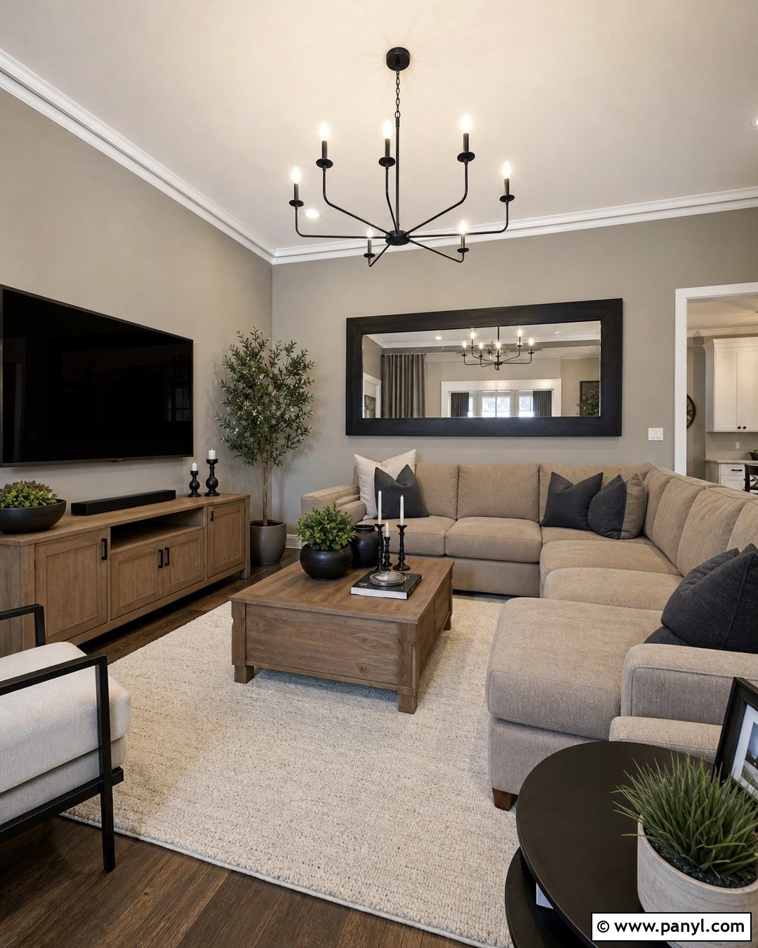
Do you want a neutral room that feels warmer than gray but cleaner than beige? Light greige is a practical middle ground. Look for a shade with balanced warm undertones so it does not turn icy in limited daylight. Use it throughout a living room with soft white trim and a matching pale ceiling. Bring in a flax-colored sectional, a light wood media console, and a textured ivory rug. Black metal lighting, charcoal pillows, and one dark-framed mirror add definition. Keep window treatments simple and hang them beyond the window frame to expose as much glass as possible. With warm LED bulbs and a few brushed nickel or glass accents, light greige creates an airy, contemporary room that still feels welcoming.
4. Pale Mushroom Wall Color
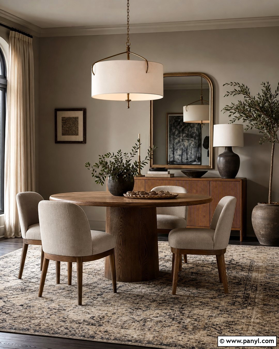
Pale mushroom brings more depth than cream while preserving a quiet, light-enhancing quality. Its mix of taupe, gray, and brown looks particularly attractive beside natural wood. Use this wall color in a dark dining room with an oak pedestal table, oatmeal upholstered chairs, and an oversized warm white pendant. Paint the trim a soft creamy white and repeat that color on the ceiling. A large antique-brass mirror can bounce light across the room, while a low sideboard keeps the layout visually open. Finish the space with linen curtains, simple ceramic vessels, and a flat-weave rug in beige and charcoal. The result is grounded and sophisticated without making a poorly lit dining area feel smaller or heavier.
5. Creamy Beige Wall Color
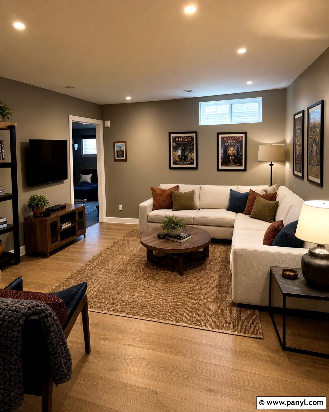
Creamy beige can give a windowless room the warmth of natural sunlight. Avoid muddy beige paint with strong green or gray undertones. Instead, select a clear, pale shade that looks soft under your installed bulbs. For a basement family room, combine creamy beige walls with a warm white ceiling, pale oak flooring, and an off-white sectional. Add a washable tan rug, rounded wood coffee table, and light-filtering curtains if small windows are present. Layer recessed lights with floor lamps and table lamps so the walls are illuminated evenly. Rust, olive, and navy accents can bring personality without overwhelming the room. This complete design feels inviting, durable, and practical enough for movies, games, homework, and everyday relaxation.
6. Butter Yellow Wall Color
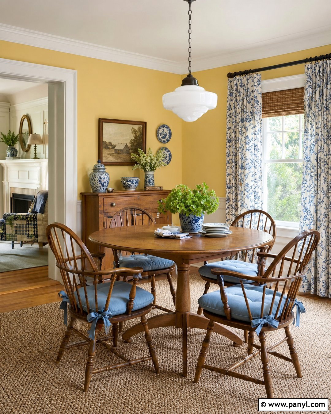
A gentle butter yellow can visually warm a room that receives little direct sun. The key is choosing a pale, softened yellow rather than a bright lemon shade. Create a welcoming breakfast room with butter yellow walls, warm white trim, and a white-painted ceiling. Add a round oak table, spindle-back chairs, a natural fiber rug, and a simple milk-glass pendant. Soft blue seat cushions and blue-and-white ceramics provide a fresh complementary accent. Keep heavy furniture away from the windows, and use a mirror opposite the strongest available light source. During the evening, warm white bulbs will support the paint’s sunny undertone. The entire room should feel cheerful and comfortable, not overly colorful or themed.
7. Soft Peach Wall Color
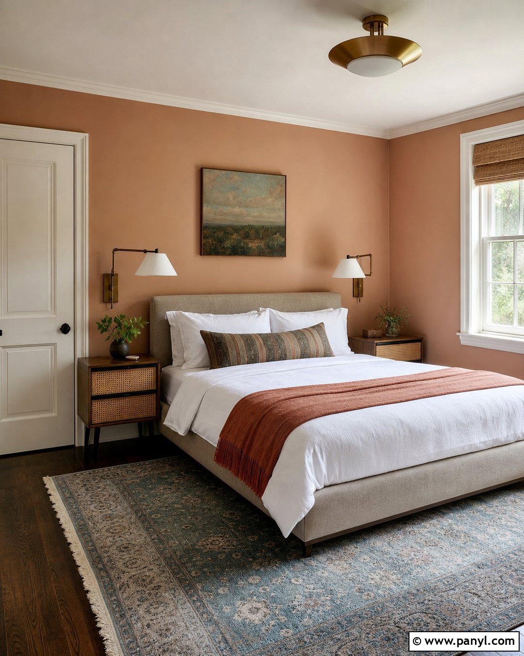
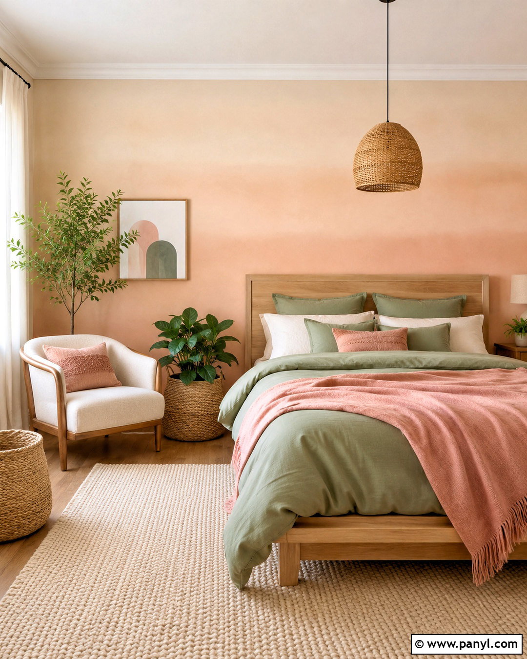
Soft peach brings a flattering glow to dark rooms, especially those with cool north-facing light. Choose a pale shade containing more cream than orange for an easy-to-live-with finish. In a compact guest bedroom, pair peach walls with warm white trim, a light upholstered bed, and natural cane nightstands. Use white cotton bedding, a muted terracotta throw, and a faded blue rug to create balanced color. A brass ceiling light and two wall-mounted reading lamps keep surfaces clear while spreading light around the room. Add one large landscape print instead of several small pieces of art. This scheme feels gentle and fresh during the day, then becomes warm and restful under artificial light without appearing childish or overly sweet.
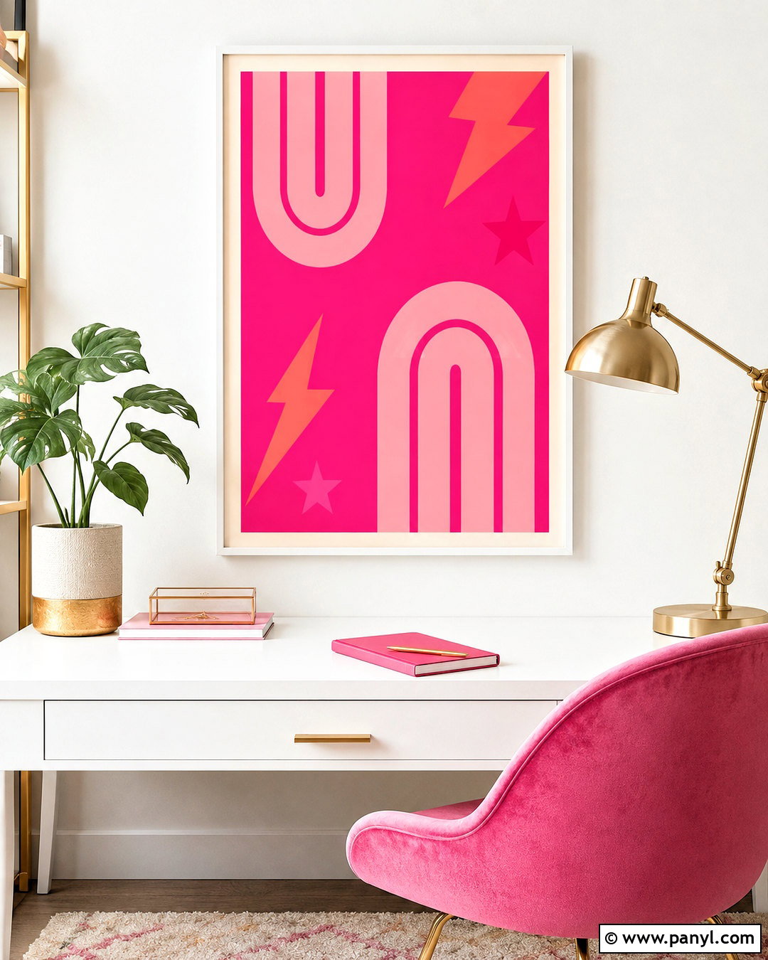
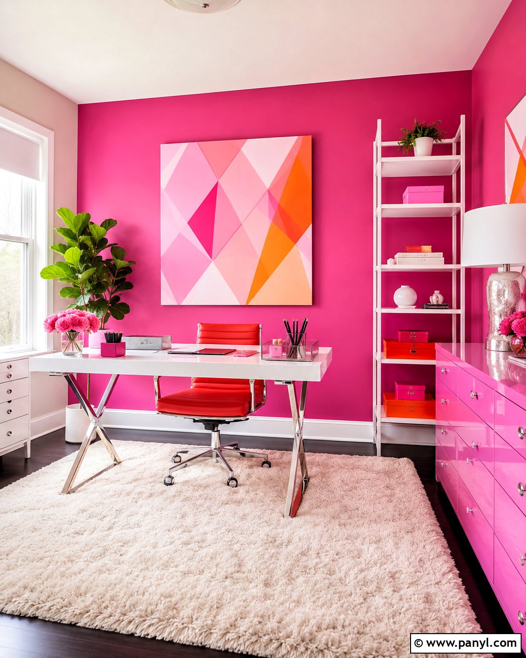
8. Blush Pink Wall Color
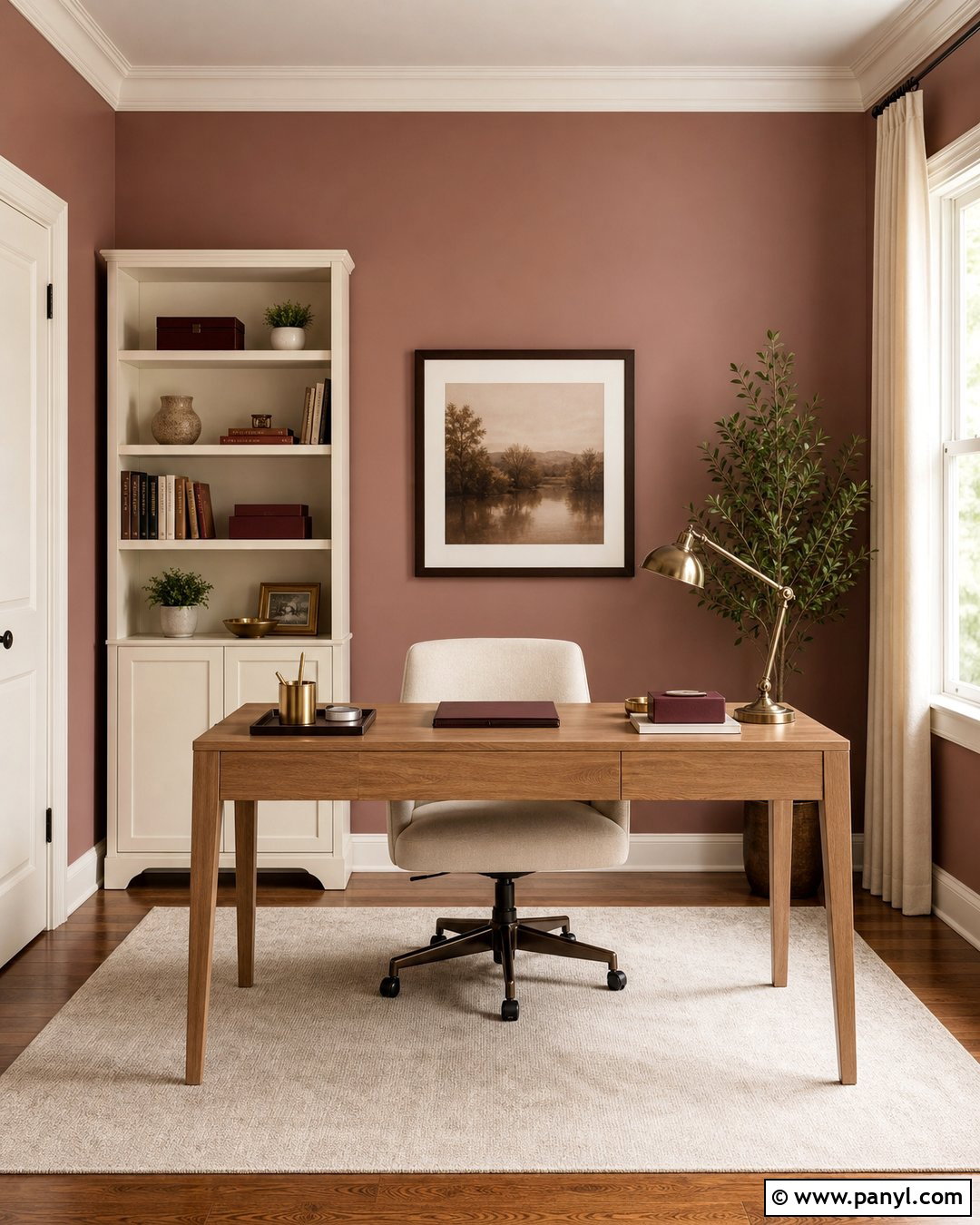
Blush pink can function as a soft neutral when it has dusty beige or brown undertones. It is particularly useful for warming a room where gray daylight makes ordinary neutrals look dull. Design a complete home office with blush walls, warm white trim, and a pale ceiling. Position a light oak desk near the window and place a cream bookcase against the darkest wall. An ivory upholstered chair, beige rug, and off-white curtains maintain an open feeling. Add burgundy folders, dark bronze hardware, and one deep green plant for controlled contrast. A polished metal desk lamp and a shaded floor lamp provide focused and ambient lighting. The finished office feels calm, professional, and more dimensional than an all-white workspace.
9. Pale Apricot Wall Color
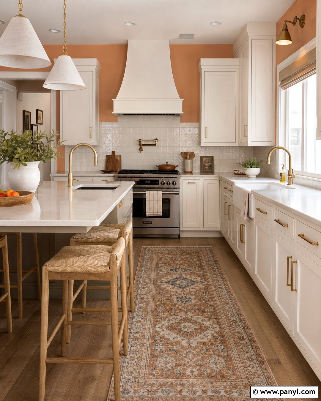
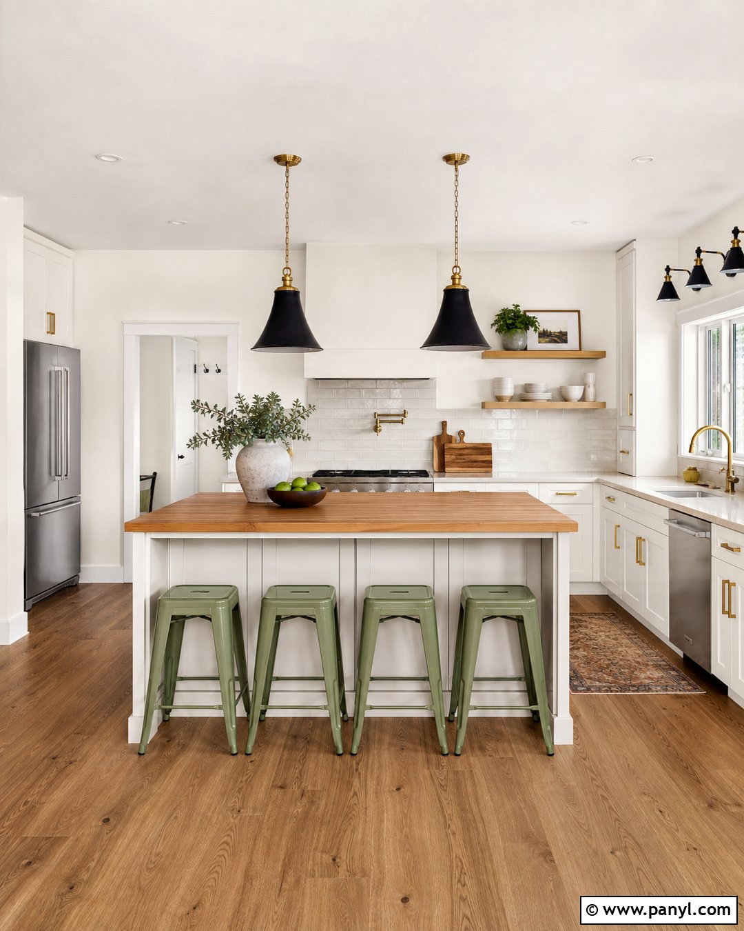
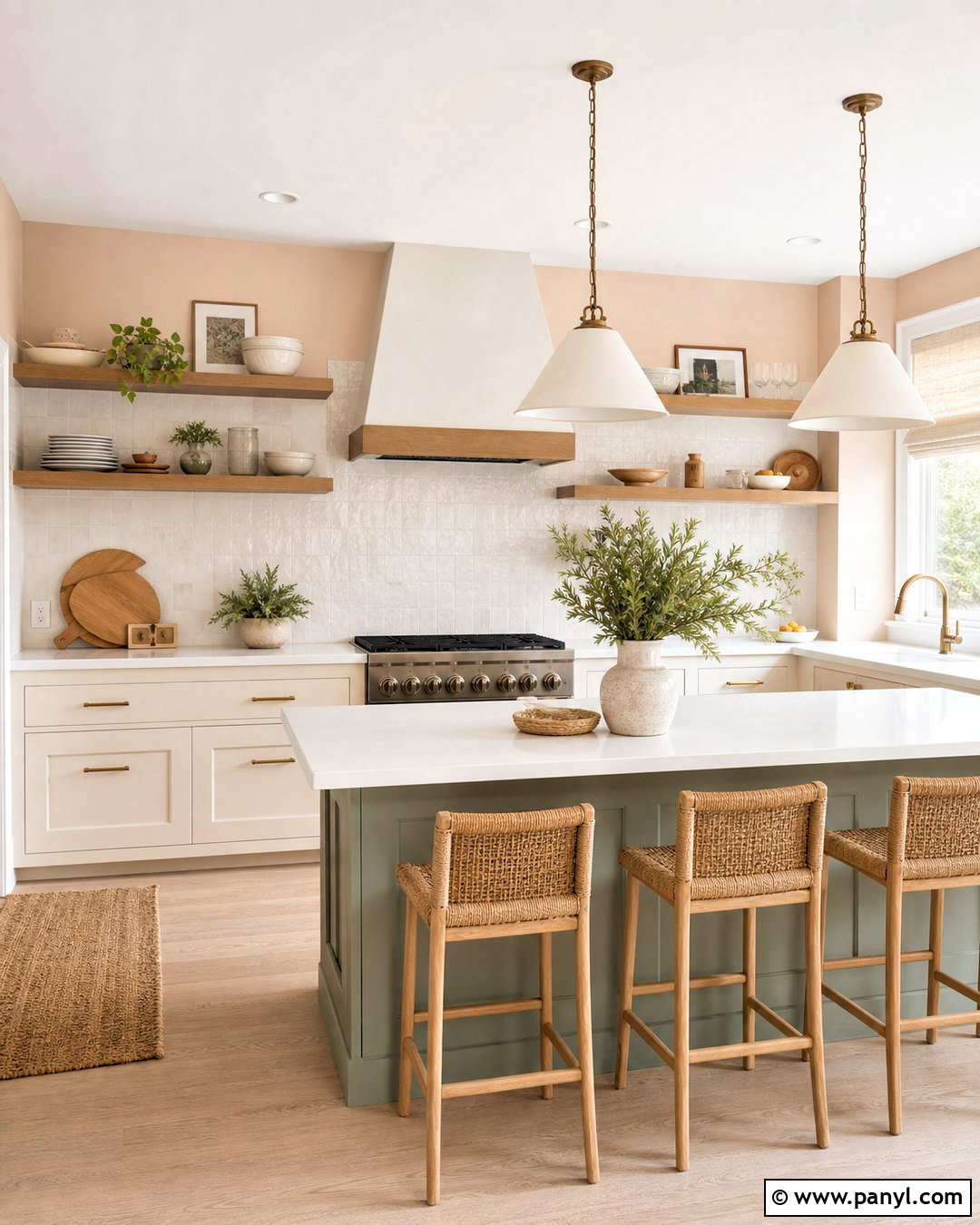
Pale apricot offers slightly more energy than blush while remaining soft enough for a low-light interior. Use it in a dark kitchen where warm color can counterbalance cool countertops or gray daylight. Combine apricot walls with creamy white cabinets, light quartz counters, and a simple backsplash in glossy off-white tile. The subtle shine from the tile helps distribute artificial light. Select light oak stools, brushed brass cabinet pulls, and warm white pendant lights for a coordinated finish. Keep flooring medium rather than extremely dark, and use a washable runner in cream, rust, and muted blue. This complete kitchen palette feels sunny and personal, yet the restrained apricot tone prevents the room from becoming too orange or visually busy.
10. Powder Blue Wall Color
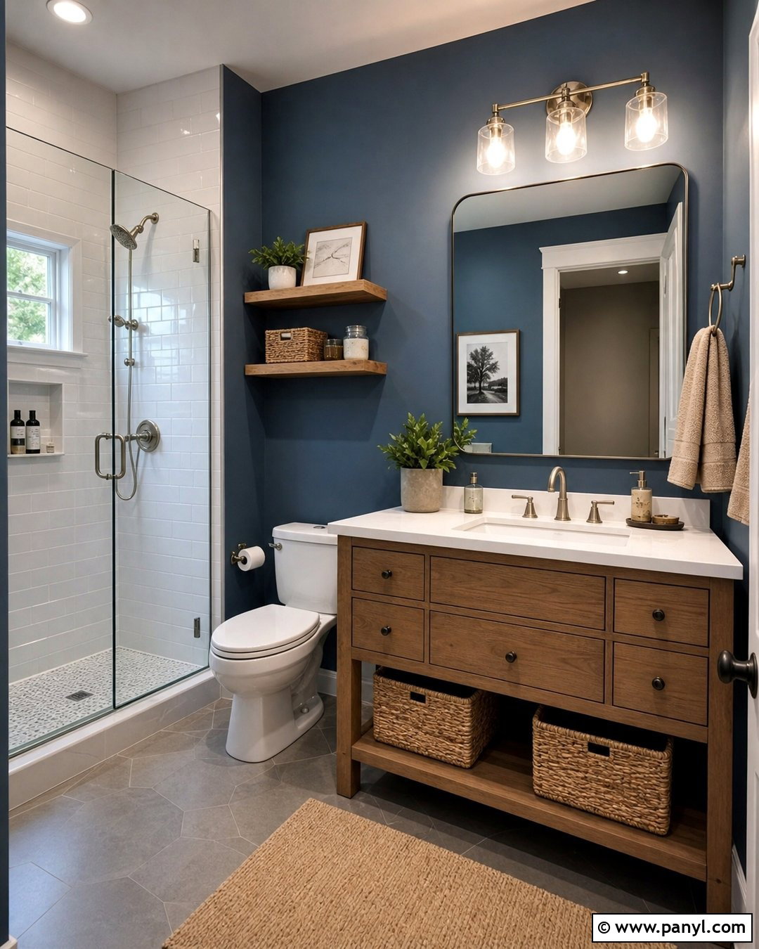
Powder blue can make a dark room feel fresh when the shade contains enough softness to avoid looking icy. It works beautifully in a small bathroom with warm white trim, a matching ceiling, and reflective surfaces. Pair the walls with a light oak vanity, white quartz countertop, polished nickel faucet, and glossy white shower tile. A large frameless mirror will increase the reach of both vanity lights and ceiling lights. Introduce warmth through a woven basket, beige towels, and a small vintage-style runner. Matte black hardware can be added sparingly for definition. The finished bathroom feels clean and open, while the blue walls create more character than plain white and visually connect the room to water without relying on obvious coastal decorations.
11. Light Blue Gray Wall Color
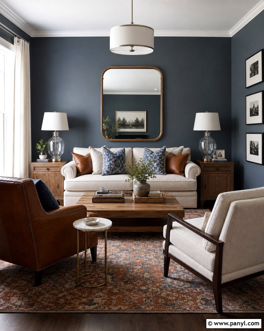
Light blue gray creates a tailored background for a room that needs calmness more than artificial warmth. Choose a softened blue with a noticeable gray base, then test it beside the flooring to make sure it does not turn too cold. In a dark living room, combine the walls with white trim, a cream sofa, medium oak furniture, and a faded rust-and-blue rug. Hang ivory curtains from near the ceiling to make the windows appear taller. Use clear glass lamps, nickel finishes, and a large mirror to increase visual brightness. Cognac leather and warm wood accents balance the cooler wall color. This coordinated scheme feels peaceful and polished, making it suitable for transitional homes, apartments, and smaller family spaces.
12. Pale Sage Green Wall Color
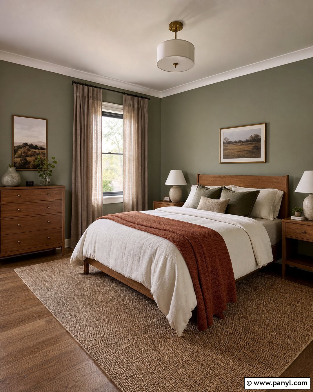
Pale sage green creates a natural, restful atmosphere while still behaving much like a neutral. For a low-light bedroom, choose a sage with warm gray or yellow undertones rather than a cool mint base. Pair the walls with creamy white trim, a simple oak bed, ivory bedding, and flax linen curtains. A jute-blend rug, ceramic lamps, and warm brass hardware complete the organic palette. Add deeper olive pillows and a rust-colored blanket for contrast, but keep large furniture pieces light. Painting the ceiling a soft warm white prevents the green from enclosing the room. With layered bedside and overhead lighting, the finished bedroom feels fresh, grounded, and relaxing without becoming dark, rustic, or excessively green.
13. Soft Mint Green Wall Color
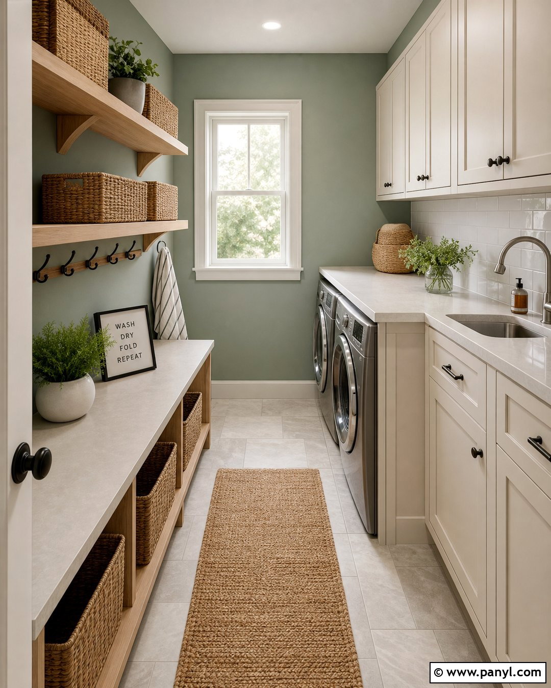
Soft mint can bring crisp energy to a dim laundry room, mudroom, or compact kitchen. Select a muted mint with a hint of gray so it feels sophisticated rather than sugary. Use it on the walls with warm white cabinetry, pale quartz counters, and light oak shelves. Glossy white tile behind the sink or worktop adds a reflective surface that helps brighten the darkest areas. Black hooks, labeled woven baskets, and brushed nickel fixtures keep the design practical and defined. Choose pale stone-look flooring and install bright ceiling lighting with good color rendering. The resulting room feels clean, organized, and welcoming. Mint walls also provide enough contrast for white storage features to remain visually clear instead of blending into a completely white background.
14. Light Lavender Wall Color
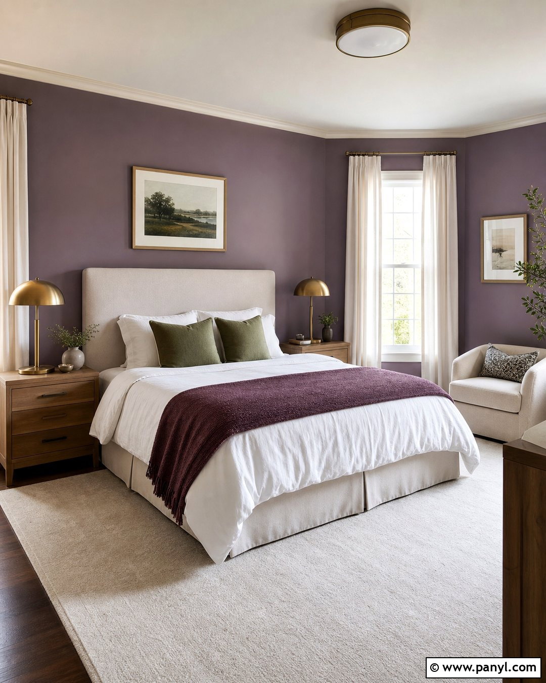
Light lavender can soften a dark bedroom while giving it more personality than a standard neutral. Look for a dusty lavender with warm gray undertones, avoiding vivid purple shades that may become intense under artificial light. Pair the walls with cream trim, a pale upholstered headboard, white bedding, and light walnut nightstands. Add a muted plum throw and sage green pillows for a balanced, nature-inspired palette. A large ivory rug keeps the lower half of the room bright, while brass lamps introduce a subtle glow. Use simple linen curtains that match the trim instead of contrasting window treatments. The complete design feels quiet, elegant, and slightly romantic, yet the natural materials prevent it from appearing overly formal or decorative.
15. Light Taupe Wall Color
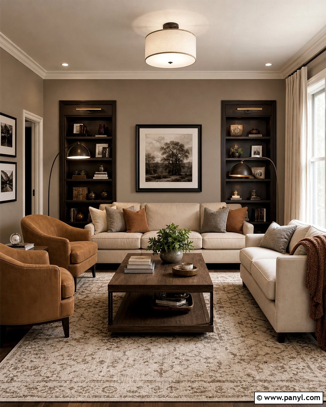
Light taupe works well when a dark room needs warmth, depth, and an adaptable neutral background. Its brown-gray character pairs easily with existing stone, wood, or upholstered furniture. Create a polished den with taupe walls, cream trim, and a warm white ceiling. Add a light beige sofa, two camel-colored chairs, an oak coffee table, and an ivory patterned rug. Bronze floor lamps and picture lights brighten vertical surfaces while making the room feel layered. Use dark brown only in narrow accents, such as frames, curtain rods, and table legs. A large mirror and pale linen curtains prevent the scheme from feeling heavy. The finished den feels cozy and established while remaining brighter than a room covered in medium brown or charcoal.
16. Warm Terracotta Wall Color
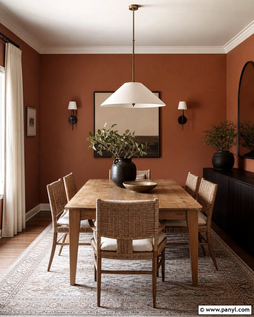
A muted, light terracotta shade can make a dim dining room feel intentionally warm instead of poorly lit. Choose a softened clay color with pink and beige undertones rather than a dark burnt orange. Pair the walls with cream-painted trim, a medium oak dining table, and woven chairs with ivory cushions. Hang a broad white pendant above the table and add two shaded sconces to illuminate the walls. A pale patterned rug, off-white curtains, and simple stoneware keep the room relaxed. Introduce charcoal through slim frames or a narrow sideboard for contrast. This complete look works particularly well with limited western or northern light because the earthy palette develops a comfortable glow under warm artificial lighting.
17. Deep Navy Wall Color
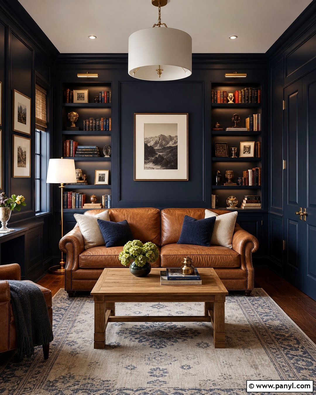
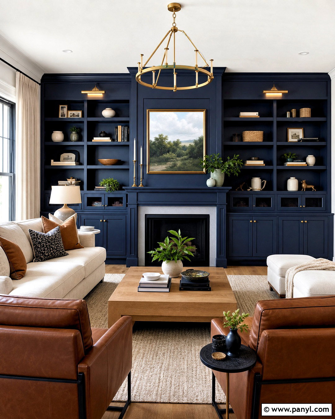
Sometimes the best approach is to embrace a dark room rather than force it to appear sunny. Deep navy walls can blur shadowy corners and create a cohesive, enveloping library or den. Paint the trim, shelves, and doors in the same navy for a seamless color-drenched effect. Balance the depth with a camel leather sofa, cream rug, light oak coffee table, and off-white lampshades. Use several light sources, including shelf lights, sconces, and a floor lamp, so the room remains functional. Brass hardware and framed artwork with wide white mats create bright highlights. The result feels deliberate and sophisticated, proving that a dark wall color can create visual depth when furniture, textiles, and lighting are carefully coordinated. ()
18. Forest Green Wall Color
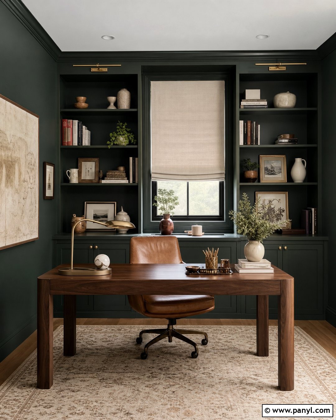
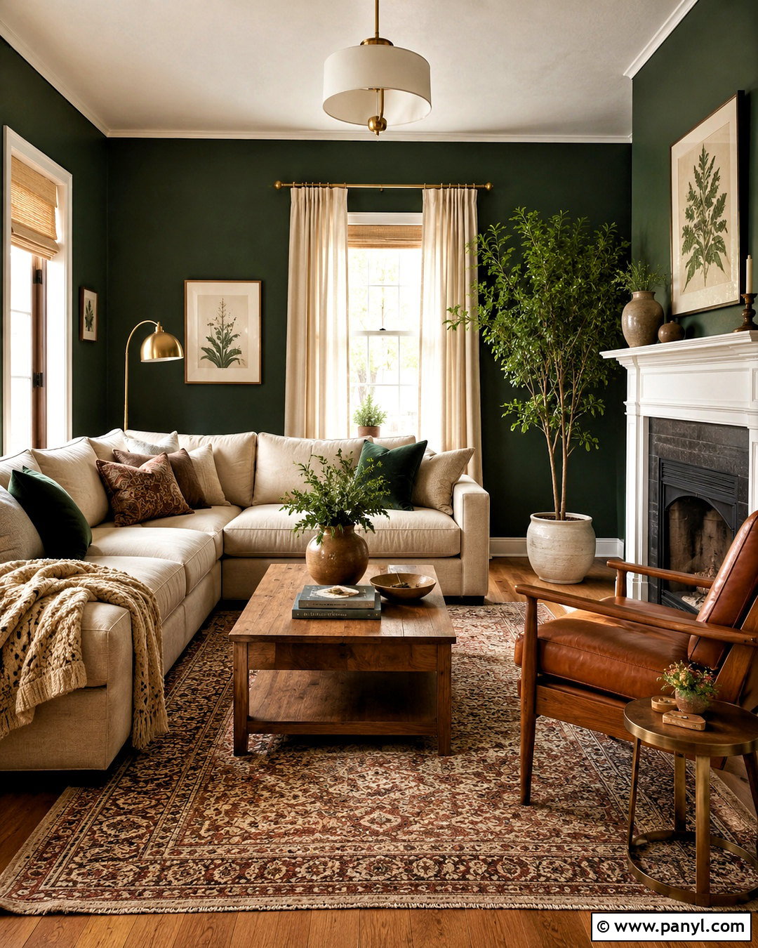
Forest green can transform a windowless office or snug into a rich, comfortable retreat. Use the color across the walls and built-in storage so scattered architectural lines do not create visual clutter. Add a warm white ceiling if the room is low, or continue the green overhead for a more enveloping effect in a taller space. Furnish the room with a walnut desk, cognac leather chair, cream rug, and pale linen Roman shade. Antique brass lighting and warm white bulbs bring out the green’s natural warmth. Display books and ceramics in restrained cream, rust, and brown tones. This finished scheme feels connected to nature and works best when multiple lamps illuminate the walls instead of relying on one central ceiling fixture.
19. Charcoal Gray Wall Color
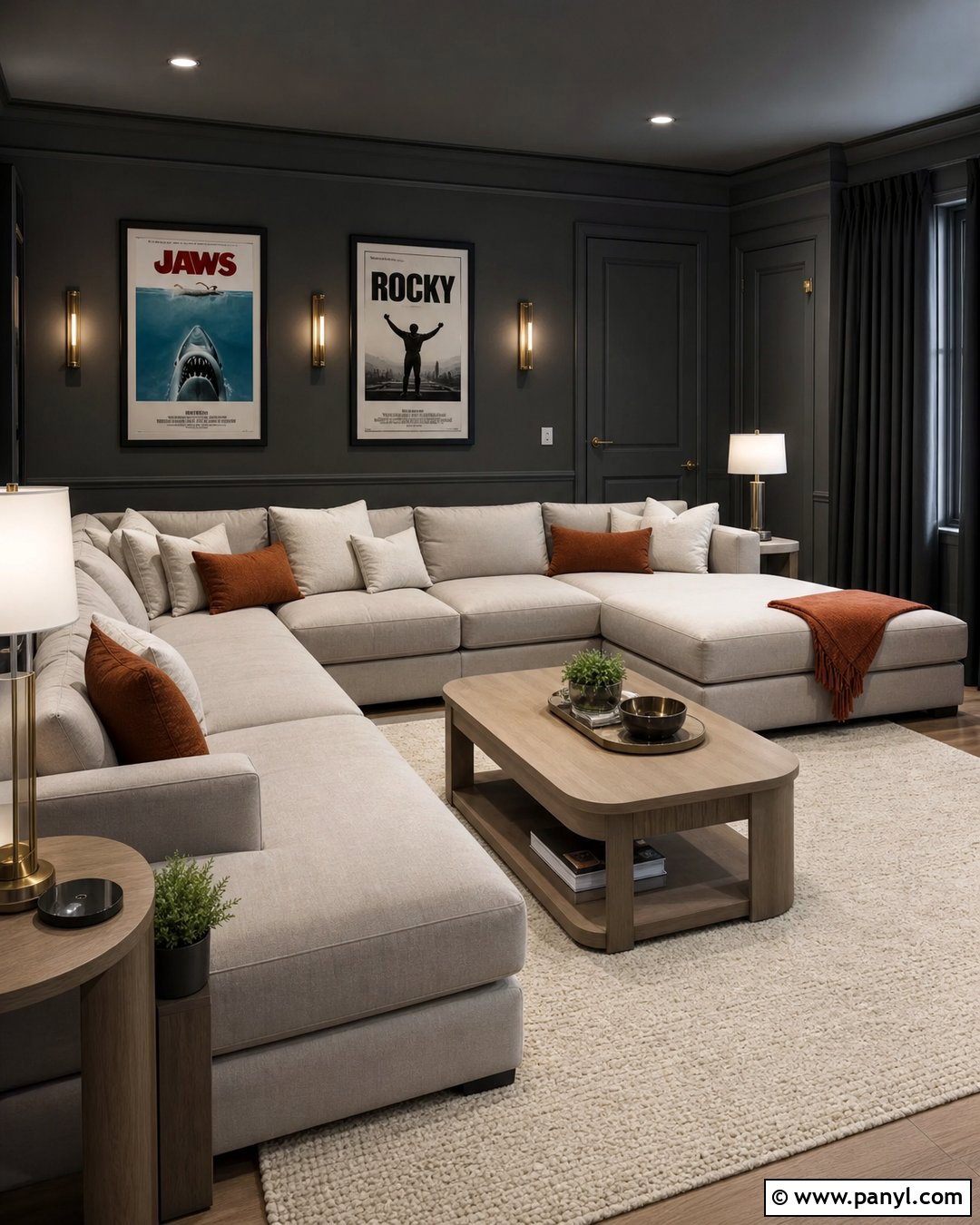
Charcoal gray gives a dim media room or bedroom a streamlined appearance because it reduces contrast between naturally shadowed areas. Choose a charcoal with warm brown undertones to avoid a cold, industrial result. Paint walls, trim, and interior doors in the same color, then use a lighter shade on the ceiling if additional lift is needed. Add a large oatmeal sectional or upholstered bed, an ivory rug, and pale wood tables. Blackout curtains can match the walls so they visually disappear when closed. Introduce interest with brushed brass lighting, cream pillows, and rust-colored textiles. This complete room feels intimate and modern, while the light furniture and carefully placed lamps prevent the charcoal envelope from becoming flat or oppressive.
20. Chocolate Brown Wall Color
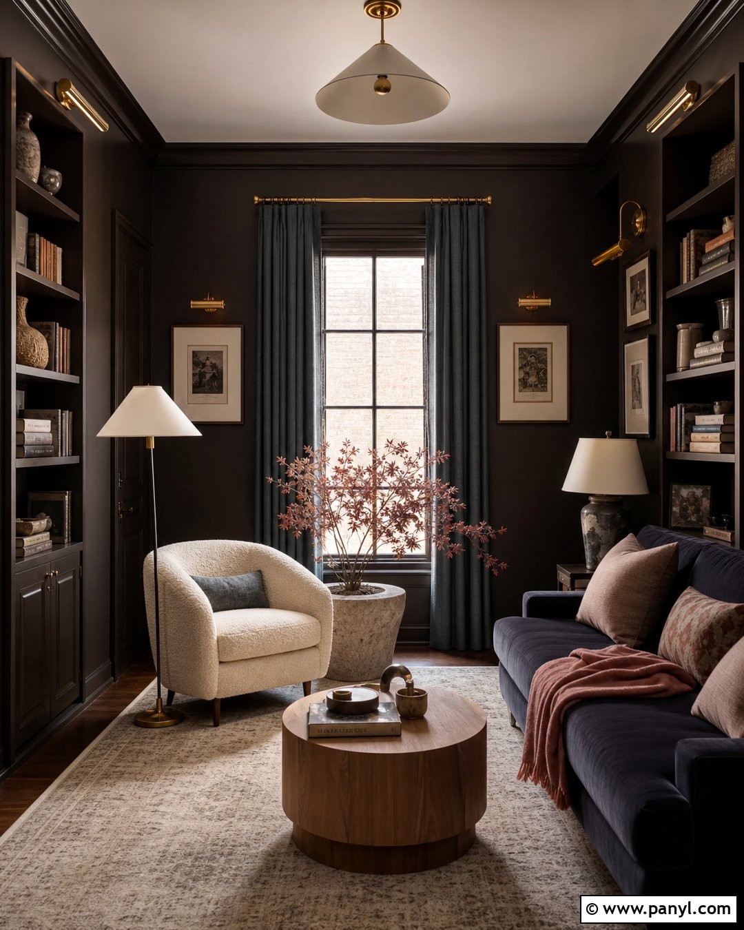
Chocolate brown creates an especially cozy finish in a dark room with few windows. Select a rich brown with warm red or plum undertones and use it consistently across the walls and built-in features. In a small reading room, pair the color with a cream boucle chair, light oak side table, and a pale wool rug. Add an off-white ceiling and trim if you want stronger contrast, or continue the brown onto the woodwork for a more immersive result. Brass sconces, a white-shaded floor lamp, and framed art with cream mats create essential points of brightness. Dusty blue and muted rose textiles soften the palette. The finished space feels elegant, comfortable, and purposeful rather than accidentally gloomy.
Conclusion:
The strongest 20 Best Wall Color For Dark Room Ideas balance paint with the room’s lighting, furniture, flooring, and intended mood. Warm white, ivory, peach, sage, and pale blue can create a lighter atmosphere, while navy, forest green, charcoal, and chocolate transform limited daylight into a deliberate design feature. Before committing, paint large sample boards and observe them beside permanent finishes during the morning, afternoon, and evening. Remember that bulbs also influence how undertones appear. Complete the room with several light sources, pale textiles, mirrors, and reflective finishes where appropriate. Whether you brighten the space or embrace its shadows, a coordinated whole-room palette will always look more successful than choosing wall paint in isolation.

Related Ideas and Inspiration:


Leave a Reply