
Choosing white paint sounds simple until warm, cool, creamy, gray, and bright undertones enter the room. The best shade should support your flooring, furniture, natural light, and overall decorating style. It should also look intentional beside trim, ceilings, cabinets, and fixed finishes. Warm whites complement wood, brass, beige, and earthy textiles, while cooler whites work naturally with blue, gray, chrome, and crisp black details. Because lighting can noticeably change how white paint appears, always sample your favorites on several walls and view them throughout the day. () The complete room schemes below make it easier to compare undertones and create a polished home using these **35 popular white paint colors for walls**.

1. Benjamin Moore White Dove OC-17
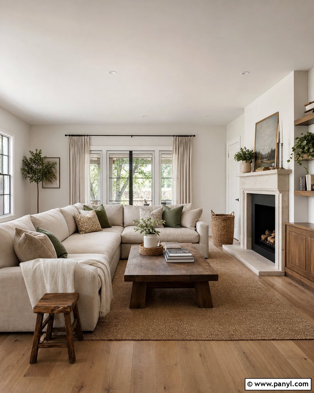
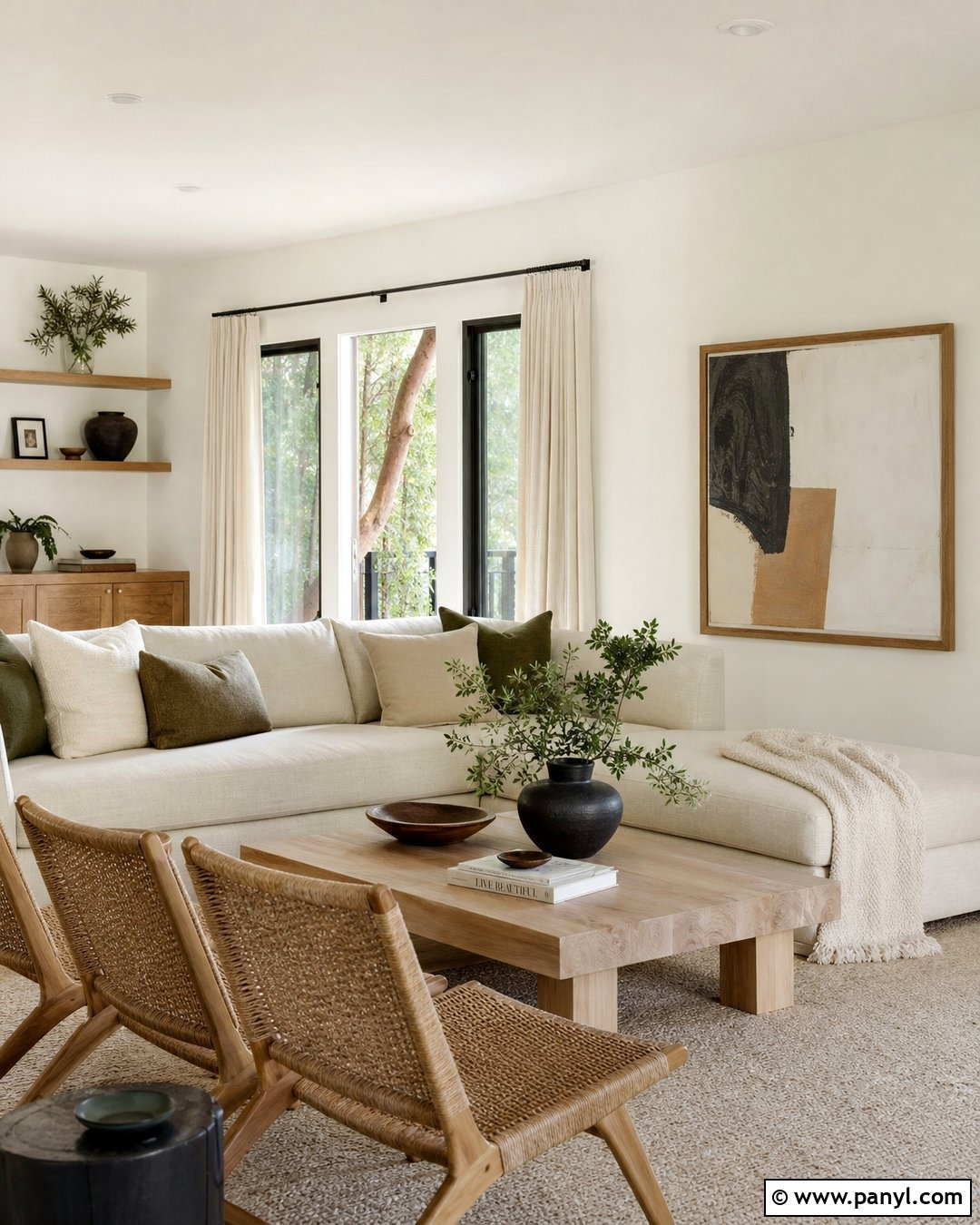
Benjamin Moore White Dove creates a soft, welcoming background without making a room look noticeably cream. Use it in a relaxed living room with natural oak flooring, a warm beige sectional, and linen curtains. A limestone fireplace adds subtle texture, while muted sage pillows and woven baskets introduce gentle color. Paint the ceiling and trim White Dove in a slightly glossier finish for a smooth, continuous effect. This combination works especially well in traditional, transitional, and organic modern homes. Dark bronze lighting and aged wood tables keep the pale palette grounded. Before committing, compare a large sample beside existing stone and fabrics because its warmth may become more visible in strong afternoon sunlight.
2. Benjamin Moore Chantilly Lace OC-65
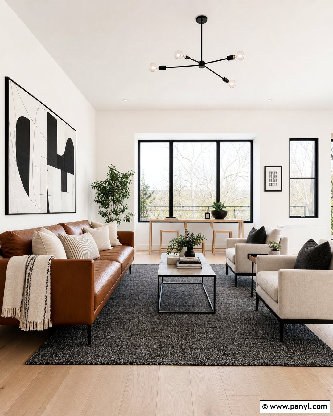
For a crisp room that still feels livable, Benjamin Moore Chantilly Lace is a dependable starting point. Cover the walls, ceiling, and streamlined trim in this clean white, then add warmth through pale oak floors and a caramel leather sofa. A charcoal area rug, black metal floor lamp, and graphic artwork create modern definition. This white is particularly effective in bright living rooms, open kitchens, and minimalist interiors where you want other finishes to look clear and distinct. Add ivory textiles rather than blue-white fabrics to soften the contrast. In rooms with limited daylight, test the color carefully because shadows can alter its appearance. The finished scheme feels fresh, uncluttered, and suitable for colorful artwork or bold furniture.
3. Benjamin Moore Simply White OC-117
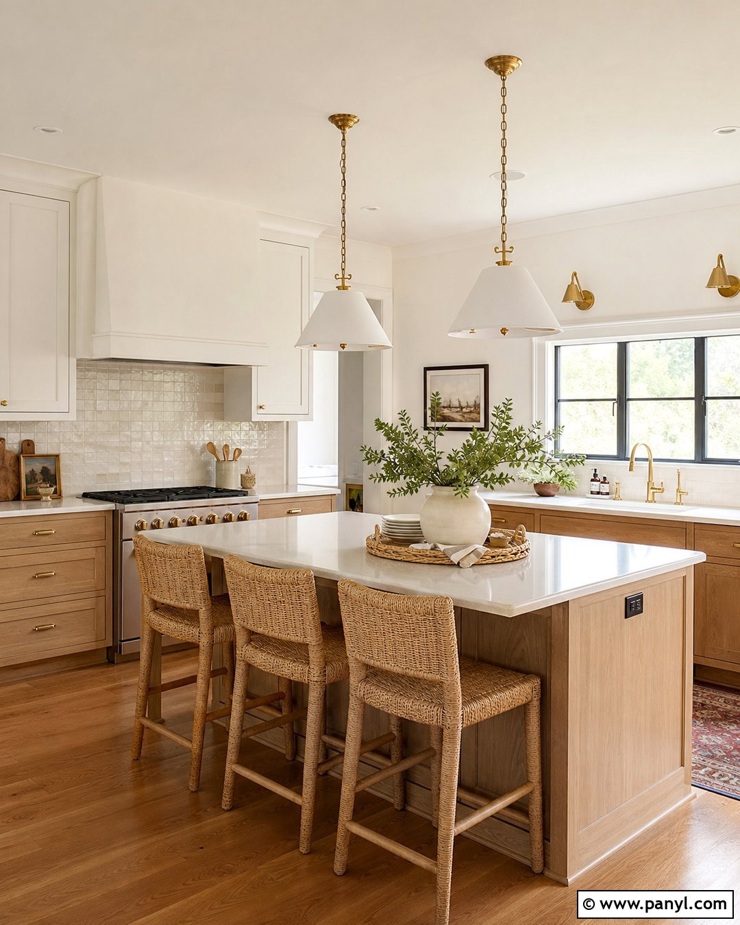
Benjamin Moore Simply White brings gentle warmth to rooms that need brightness without a stark finish. Build a cheerful kitchen around Simply White walls, matching upper cabinets, and warm white ceiling paint. Choose light oak lower cabinets, creamy quartz countertops, and handmade ivory backsplash tile for a layered look. Brushed brass hardware and woven counter stools emphasize the welcoming undertone. A medium-tone wood floor provides enough contrast to prevent the room from feeling washed out. This scheme fits updated traditional, cottage, and casual contemporary homes. Introduce small accents of olive green or muted blue through pottery and textiles. Always compare the sample against appliances and countertops, since nearby cool whites can make this shade appear warmer than expected.
4. Benjamin Moore Swiss Coffee OC-45
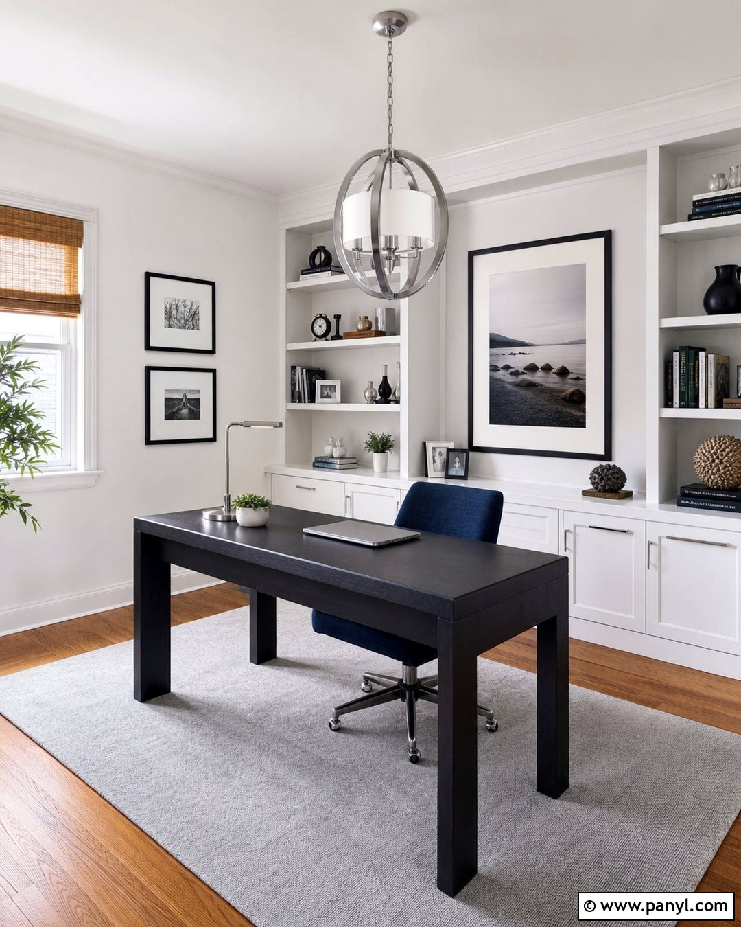
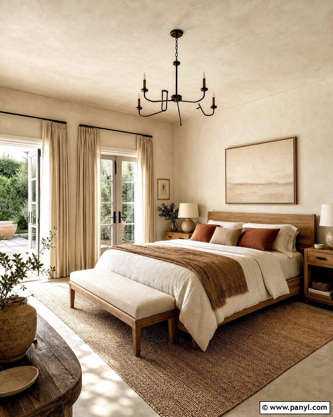
Imagine a bedroom that feels soft and collected rather than bright and clinical. Benjamin Moore Swiss Coffee provides a creamy foundation for that comfortable look. Pair the walls with an oatmeal upholstered bed, warm walnut nightstands, and natural linen bedding. Use off-white curtains, an ivory wool rug, and antique brass lamps to continue the layered neutral palette. Medium brown flooring and touches of terracotta give the room dimension. Instead of sharp white trim, use Swiss Coffee in satin so the walls and woodwork relate naturally. This shade suits traditional bedrooms, Mediterranean-inspired spaces, and relaxed interiors with warm materials. Test it beside beige carpeting and yellow-toned wood, which can intensify its creaminess under warm artificial lighting.
5. Benjamin Moore Cloud White OC-130
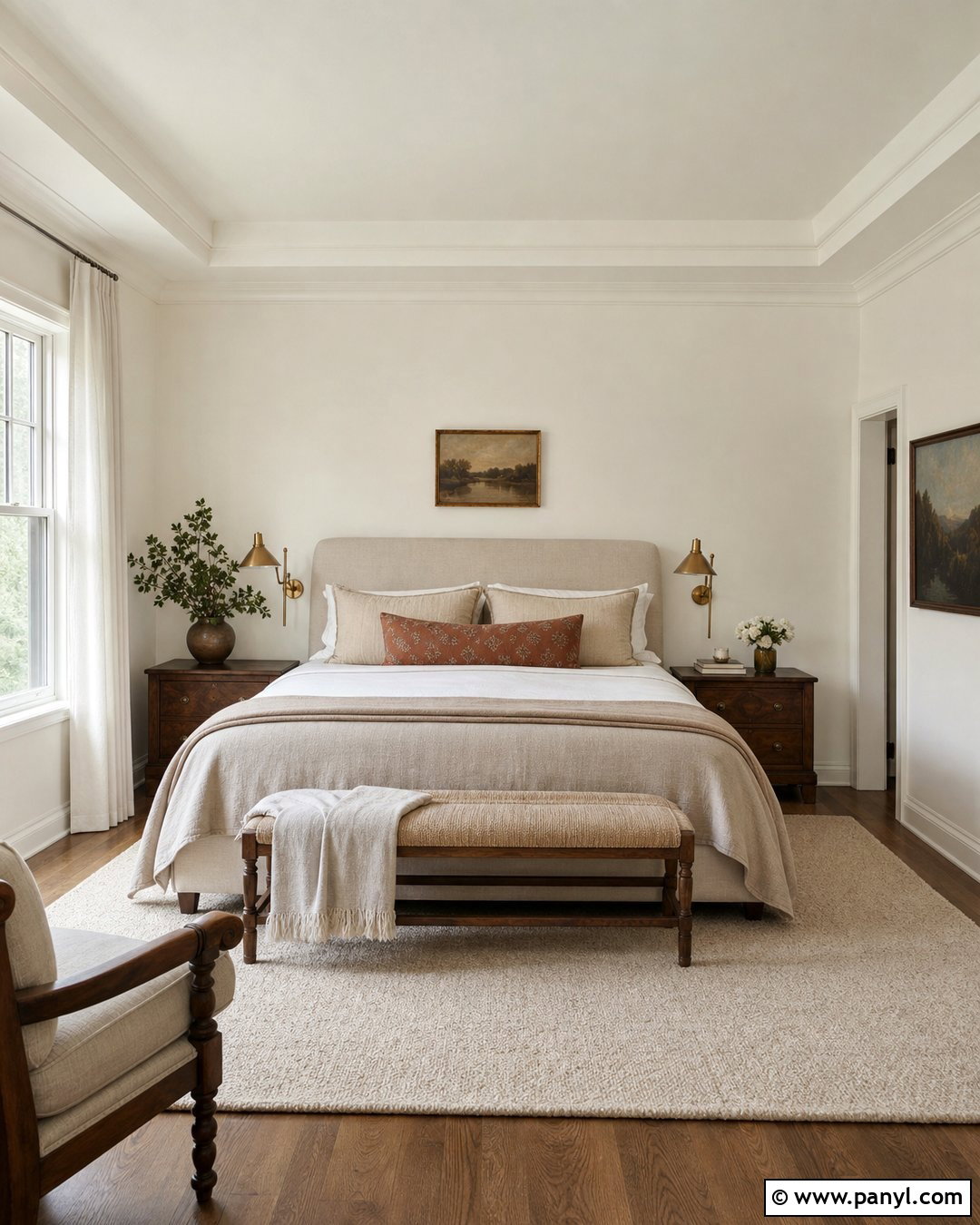
Benjamin Moore Cloud White can make a family room feel light, comfortable, and gently polished. Use it on paneled walls and built-in shelves, then choose a soft taupe sectional and two faded blue armchairs. A warm oak coffee table, sisal rug, and cream cotton curtains complete the casual arrangement. Paint the trim and shelving in a satin version of the same color to highlight architectural details without introducing a competing white. This full-room palette works well with warm hardwood, brick fireplaces, and traditional millwork. Add black picture frames sparingly for contrast. Cloud White can show more warmth near cool gray surfaces, so place a sample beside flooring, fireplace stone, and upholstery before selecting it for the entire room.
6. Benjamin Moore Decorator’s White OC-149
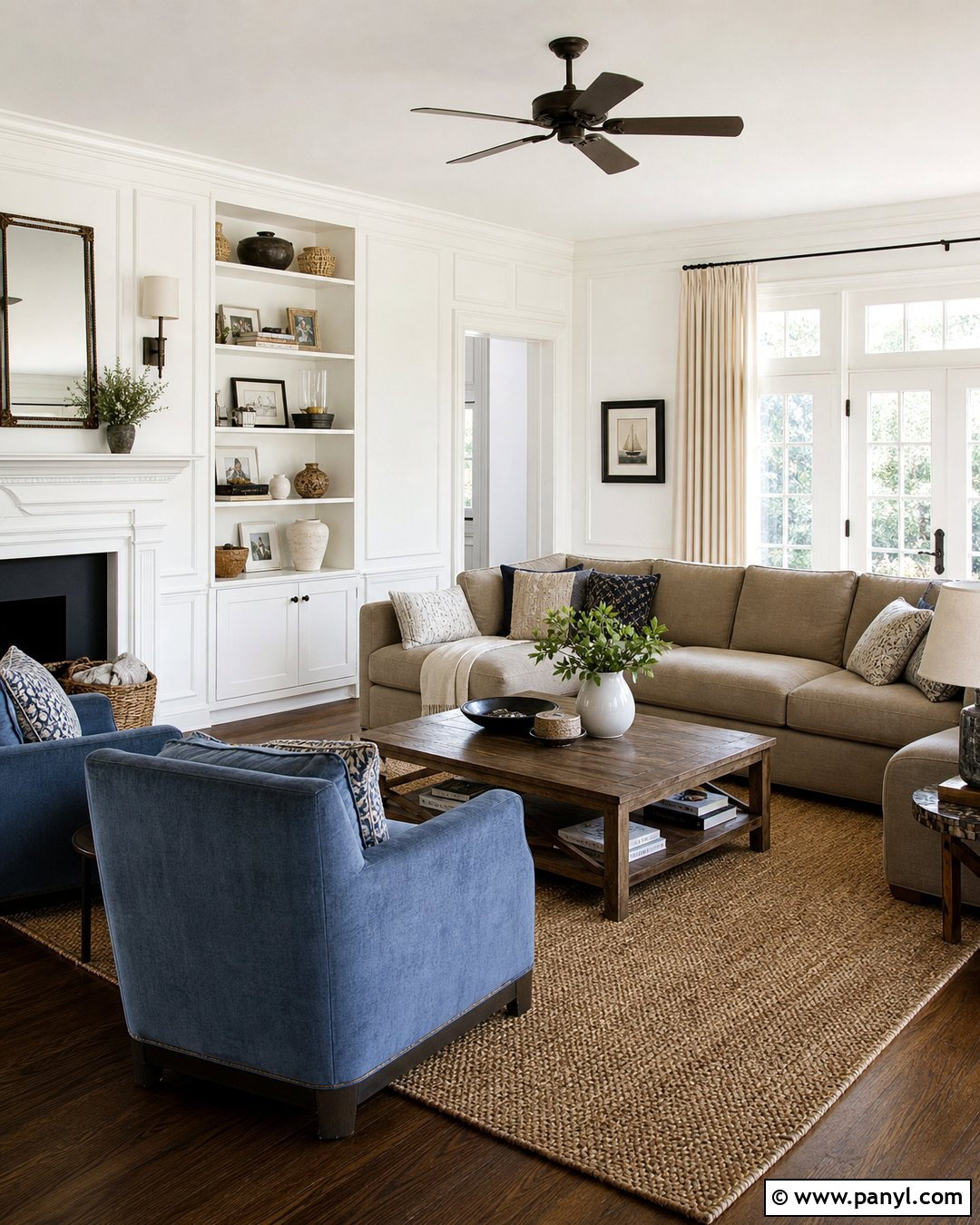
A cool, tailored home office is an excellent setting for Benjamin Moore Decorator’s White. Paint the walls this refined white and use matching semigloss on built-in bookcases. Add a charcoal desk, pale gray wool rug, and navy upholstered chair for a clean professional palette. Chrome lighting and black-framed artwork reinforce the cooler direction, while medium oak flooring prevents the room from feeling sterile. Simple white roller shades keep windows streamlined and allow daylight to spread across the walls. This scheme works especially well in contemporary rooms with gray stone, blue textiles, and cooler artificial lighting. Avoid combining it with very creamy trim. Instead, repeat Decorator’s White across nearby molding and doors for a coordinated, intentional finish.
7. Benjamin Moore Super White OC-152
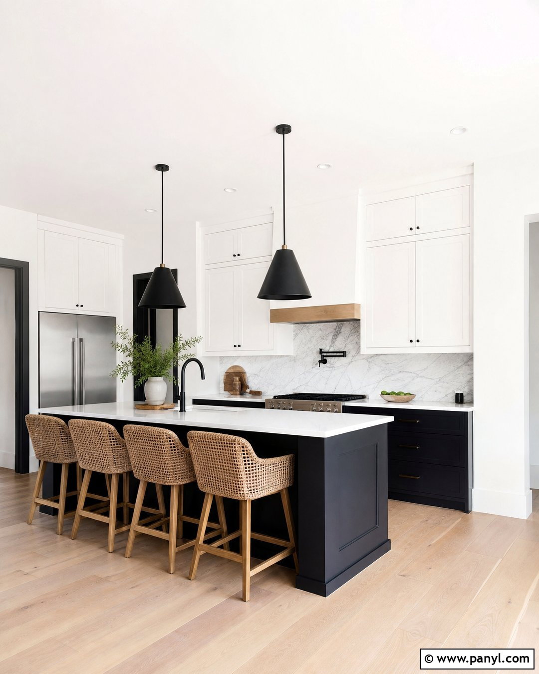
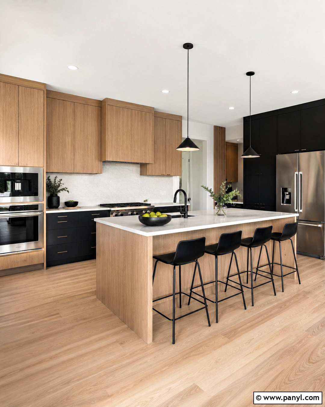
Benjamin Moore Super White produces a bright backdrop for a modern kitchen with strong architectural contrast. Use it across the walls, ceiling, and flat-panel upper cabinets. Anchor the room with matte black lower cabinets, white quartz counters, and a pale gray marble backsplash. Light oak flooring and woven wood stools introduce warmth without weakening the clean palette. Choose simple black pendants and stainless steel appliances for a cohesive contemporary look. This white also helps open shelves, colorful dishes, and indoor plants stand out clearly. Because bright whites can reveal wall imperfections, complete careful surface preparation before painting. Sample Super White next to the countertops and backsplash, ensuring their undertones look compatible in both daylight and evening lighting.
8. Benjamin Moore Seapearl OC-19
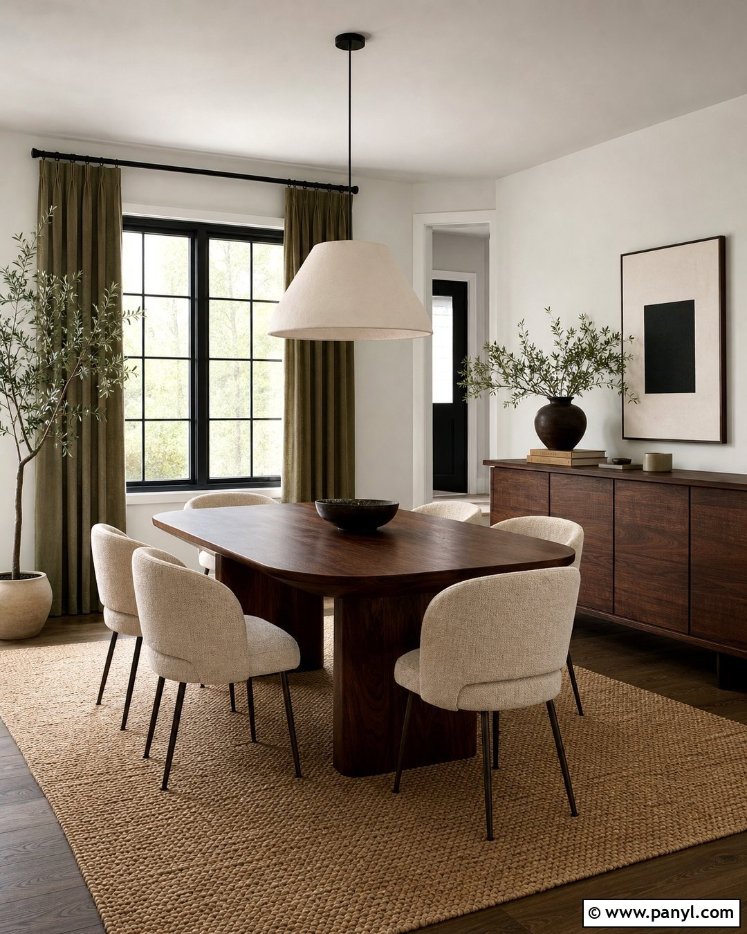
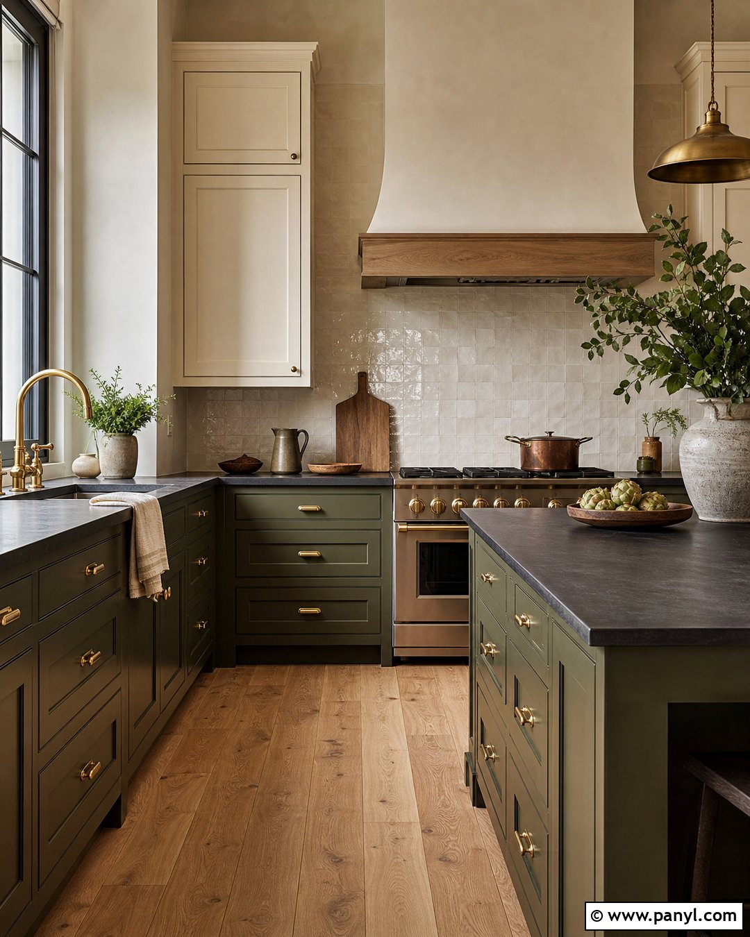
Benjamin Moore Seapearl offers an understated off-white backdrop for an earthy dining room. Pair the walls with walnut furniture, oatmeal upholstered chairs, and a large natural fiber rug. Add a plaster pendant light, ceramic tableware, and muted olive curtains for a calm organic palette. Use a cleaner warm white on the ceiling if you want gentle separation, or continue Seapearl overhead for a softly wrapped effect. Black window frames and a dark wood sideboard provide definition without overpowering the room. This scheme complements limestone, travertine, and medium-tone hardwood particularly well. Since Seapearl may read warmer or grayer depending on surrounding finishes, test it beside flooring and fabrics before using it throughout an open dining and living area.
9. Benjamin Moore Oxford White CC-30
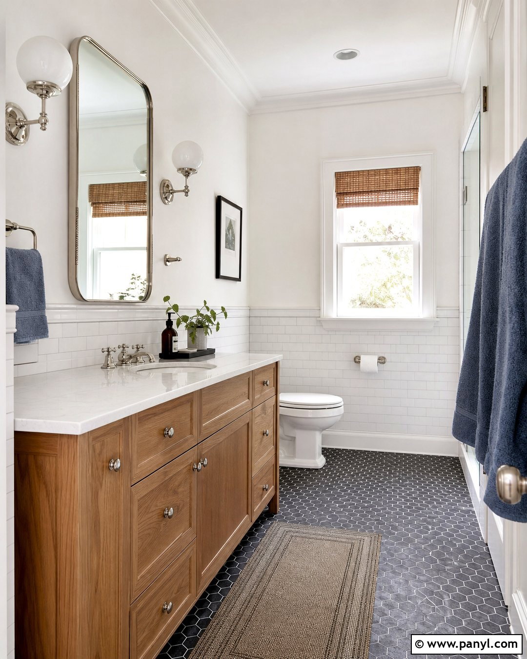
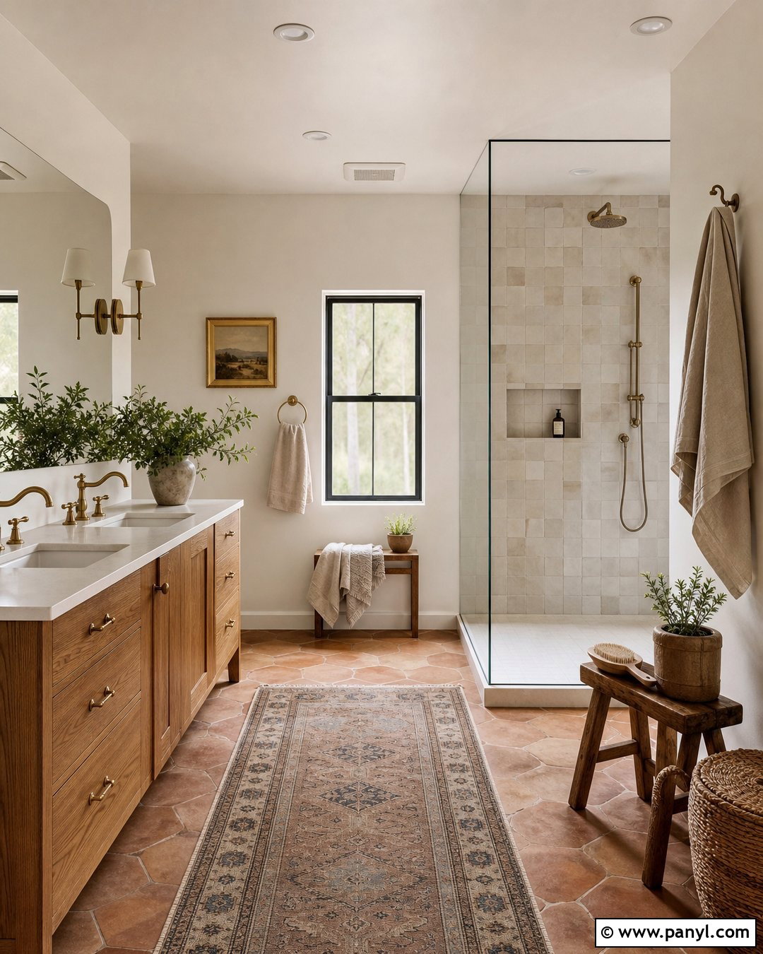
Oxford White creates a balanced, straightforward foundation for a bright bathroom. Apply it to the upper walls and use matching paint on the ceiling and window trim. Combine it with white ceramic subway tile, pale gray grout, and a medium oak vanity. Polished nickel fixtures, a framed mirror, and simple globe sconces maintain a fresh but familiar character. Ground the room with small charcoal floor tiles and add muted blue towels for controlled color. The combination suits transitional and updated traditional bathrooms because it feels clean without relying on severe contrast. Evaluate a sample next to the tile and sink, since those surfaces may contain their own white undertones. A washable eggshell or bathroom-appropriate finish will also make routine maintenance easier.
10. Benjamin Moore White Heron OC-57
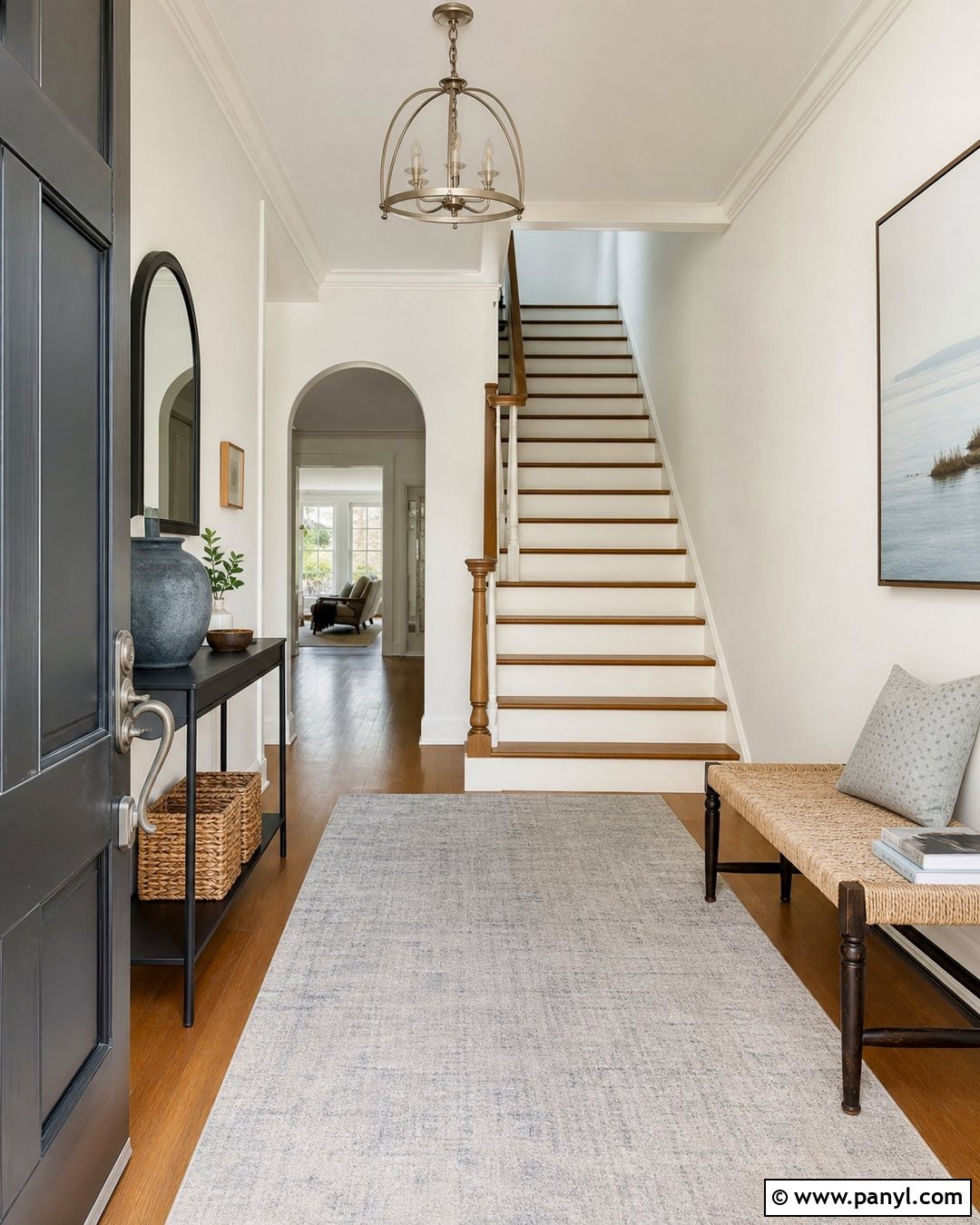
Benjamin Moore White Heron supports a light, sophisticated entryway with cooler accents. Paint the walls, stair risers, and trim in this fresh white, varying the finish to reveal the architectural details. Add a slim black console, pale gray runner, and brushed nickel ceiling fixture. A medium oak staircase and woven bench bring necessary warmth to the clean scheme. Decorate with blue-gray pottery, simple greenery, and one large abstract artwork rather than numerous small accessories. This complete look makes a narrow entrance feel orderly and open. It also connects naturally with adjoining rooms that contain cool gray, navy, or black finishes. Test the color in shadowed corners, where any cool undertone may become more noticeable than it appears near a sunny window.
11. Sherwin-Williams Alabaster SW 7008
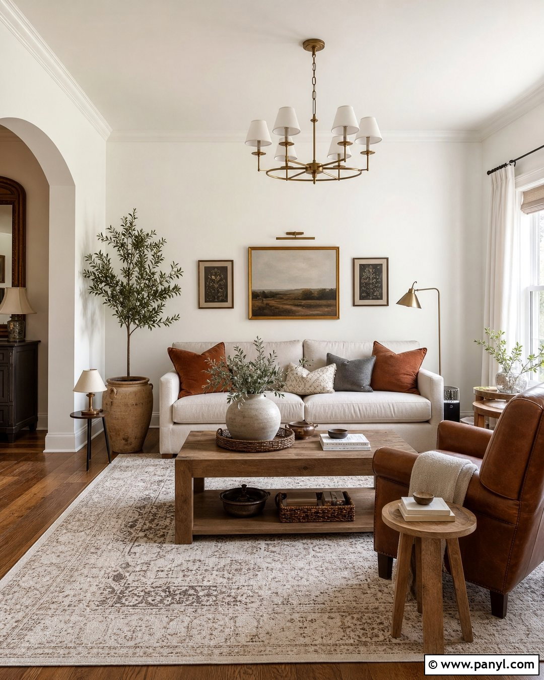
Sherwin-Williams Alabaster gives a living room a creamy softness that feels relaxed rather than yellow. Use it on the walls and traditional crown molding, then layer in a flax-colored sofa, cognac leather chair, and warm oak tables. An ivory patterned rug connects the furniture without disappearing against the pale background. Add muted rust pillows, olive branches, and antique brass lighting for subtle earthy color. Alabaster works naturally with farmhouse, transitional, and organic interiors where warmth is important. Paint the trim in the same color with a satin sheen to avoid a jarring blue-white border. In darker rooms, include balanced overhead and lamp lighting. Always sample beside existing beige tile or honey-toned wood because those materials may strengthen its warm character.
12. Sherwin-Williams Pure White SW 7005
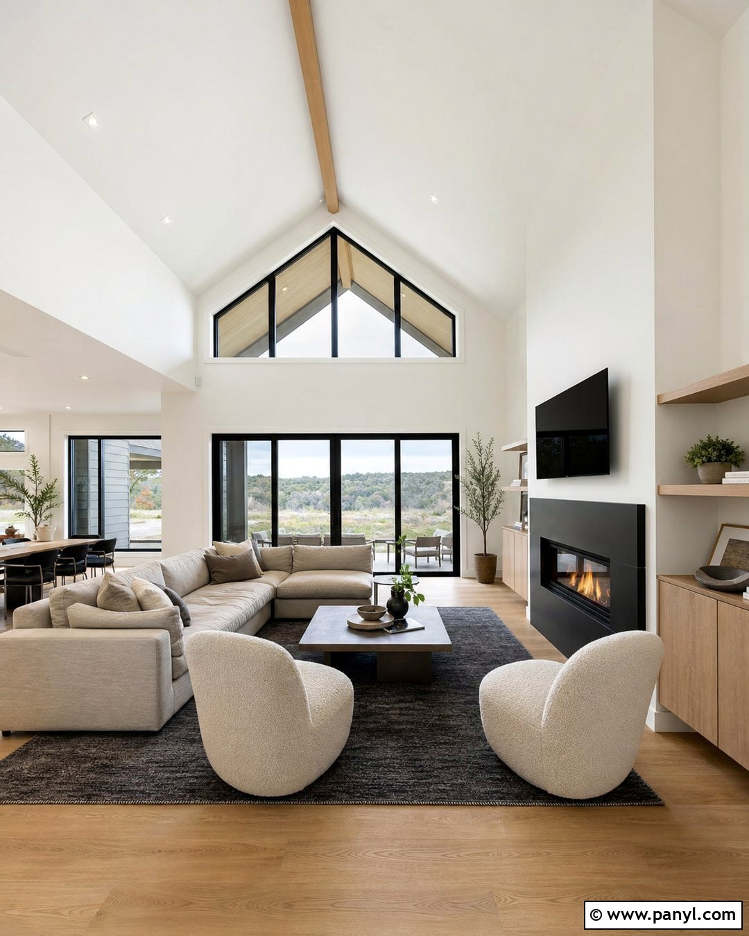
Sherwin-Williams Pure White is versatile enough for a clean, contemporary great room with warm materials. Cover the walls and ceiling in Pure White, then define the space with wide oak flooring and black-framed windows. A light greige sectional, cream boucle chairs, and a textured charcoal rug create an inviting seating zone. Choose a slim black fireplace surround and simple oak built-ins for balanced contrast. The slight softness of this white helps it coordinate with natural textiles while maintaining a bright overall appearance. Repeat the shade on doors and trim in satin for continuity. Colorful artwork can become the focal point without competing with the architecture. Test it near existing cabinetry, especially if the cabinets are a noticeably warmer or cooler white.
13. Sherwin-Williams Snowbound SW 7004
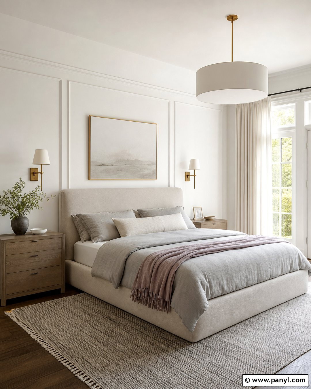
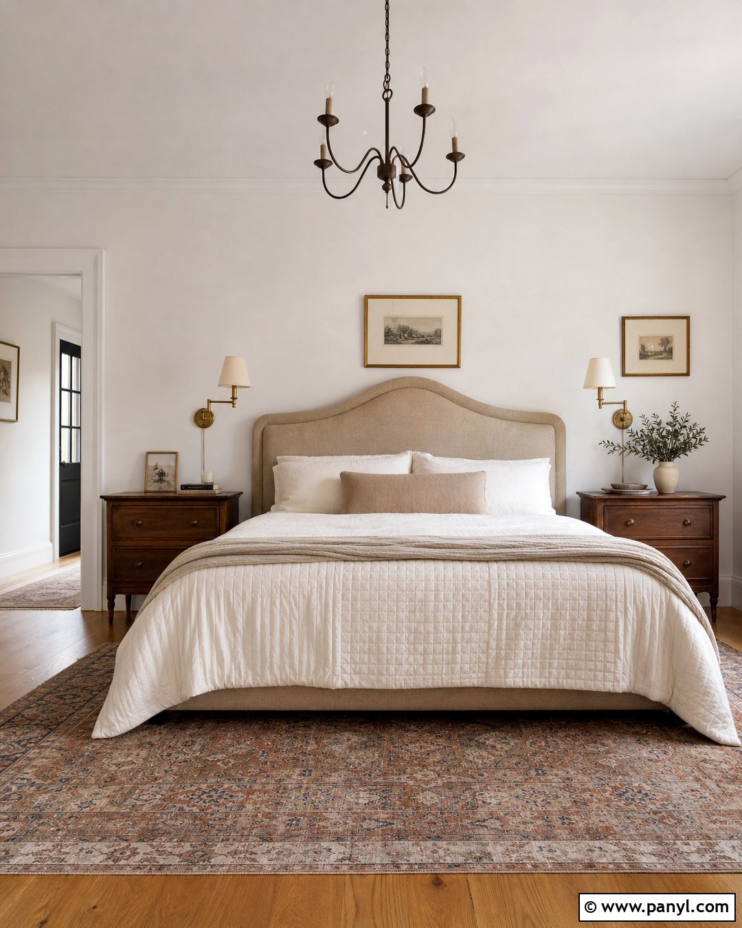
Sherwin-Williams Snowbound brings a subtle, sophisticated quality to a serene primary bedroom. Use it on the walls, ceiling, and simple panel molding to create gentle depth through different sheens. Pair the color with a mushroom upholstered bed, soft gray bedding, and washed oak nightstands. A dusty mauve throw and muted burgundy accent pillow can echo the shade’s nuanced warmth without dominating the space. Add a wool rug, white linen curtains, and aged brass sconces for a complete transitional look. Keep nearby whites limited so the room remains coordinated. Snowbound can change noticeably beside cream or blue-gray finishes, making a large sample essential. Observe it during morning light, afternoon shadows, and evening lamp light before painting every wall.
14. Sherwin-Williams Extra White SW 7006
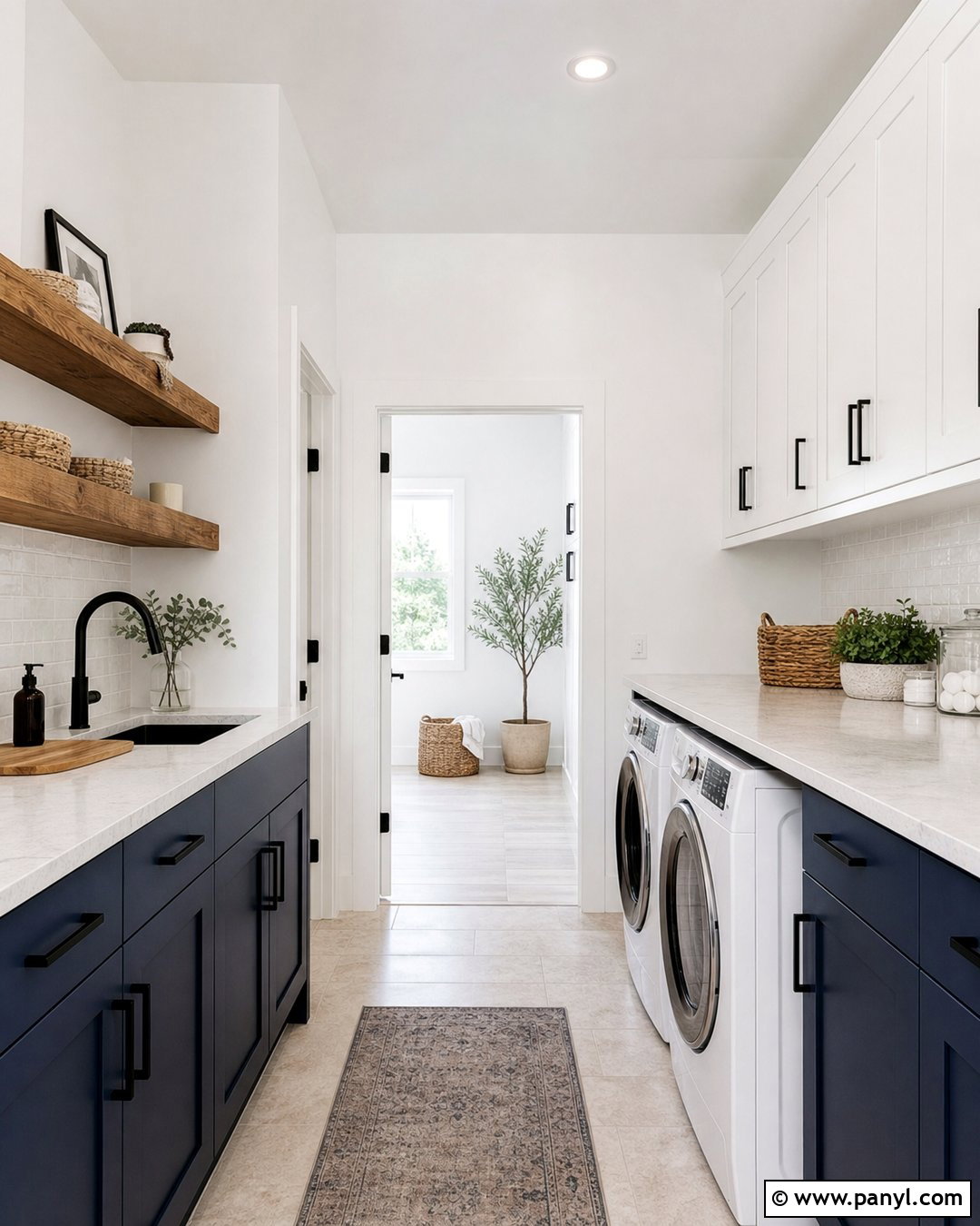
A streamlined laundry room feels noticeably sharper with Sherwin-Williams Extra White on the walls. Continue the color across upper cabinets, trim, and ceiling, using satin or semigloss where greater durability is needed. Add deep navy lower cabinets, pale quartz counters, and a white backsplash with light gray grout. Matte black hardware and a black hanging rail create crisp definition. Warm the space with natural oak shelving, woven storage baskets, and beige stone-look flooring. This complete palette makes a practical room feel organized and visually larger. Extra White also coordinates well with stainless steel appliances and cool surfaces. Compare a sample with the washer, dryer, countertop, and backsplash, since appliance whites may look warmer when positioned against a bright painted background.
15. Sherwin-Williams Dover White SW 6385
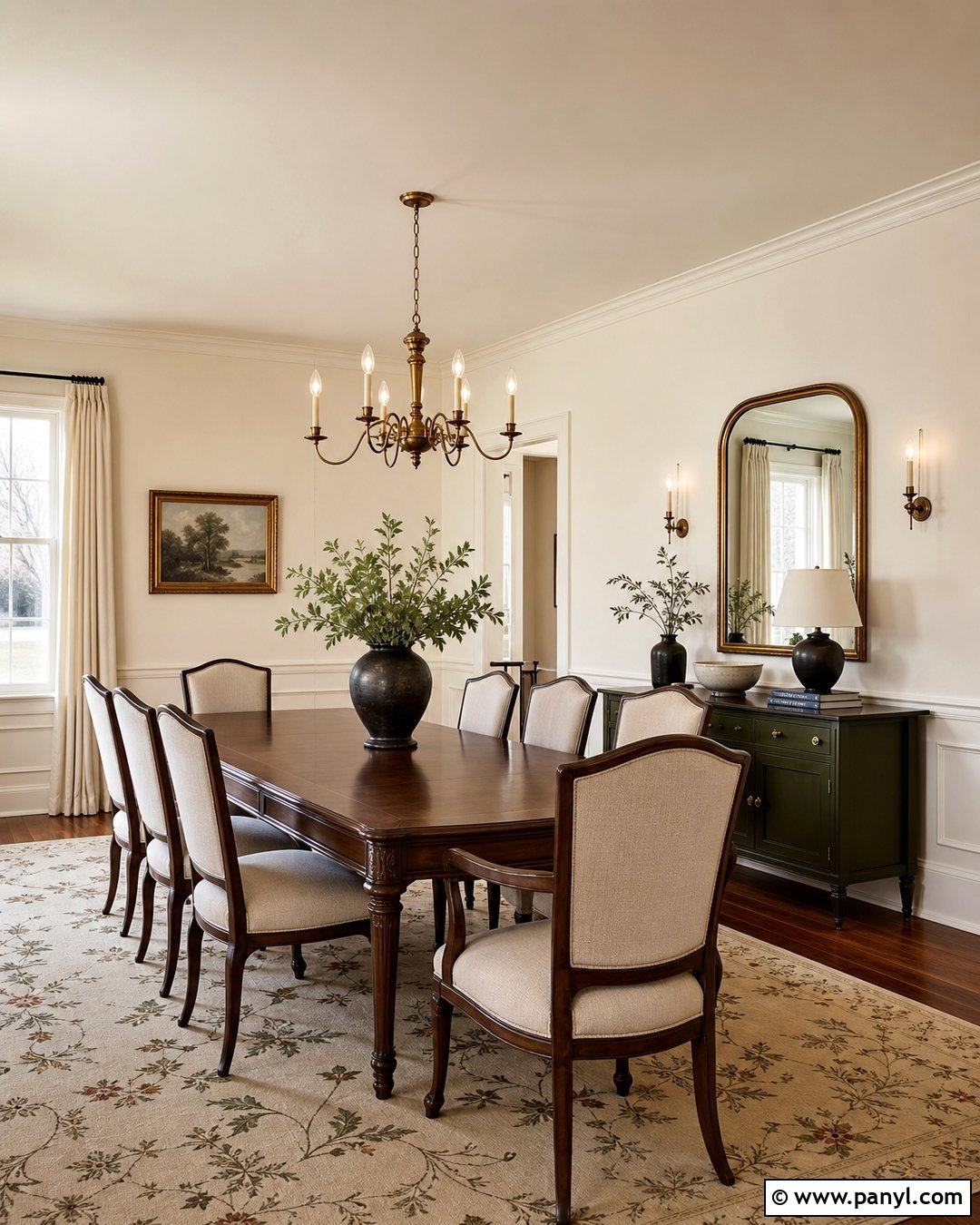
Sherwin-Williams Dover White creates a warmly traditional dining room that feels inviting during daytime and evening gatherings. Paint the walls and picture-frame molding in Dover White, then introduce a rich walnut table and upholstered linen chairs. A muted botanical rug, antique brass chandelier, and cream drapery support its comfortable character. Use warm wood flooring and a dark green sideboard to give the pale walls visual weight. For trim, continue Dover White in satin instead of pairing it with an icy white. This scheme suits classic, cottage, and traditional homes with beige stone or warm woods. Because Dover White can reveal noticeable creaminess, test it near fixed surfaces first. It may not be the best partner for cool marble or blue-white cabinetry.
16. Sherwin-Williams Creamy SW 7012
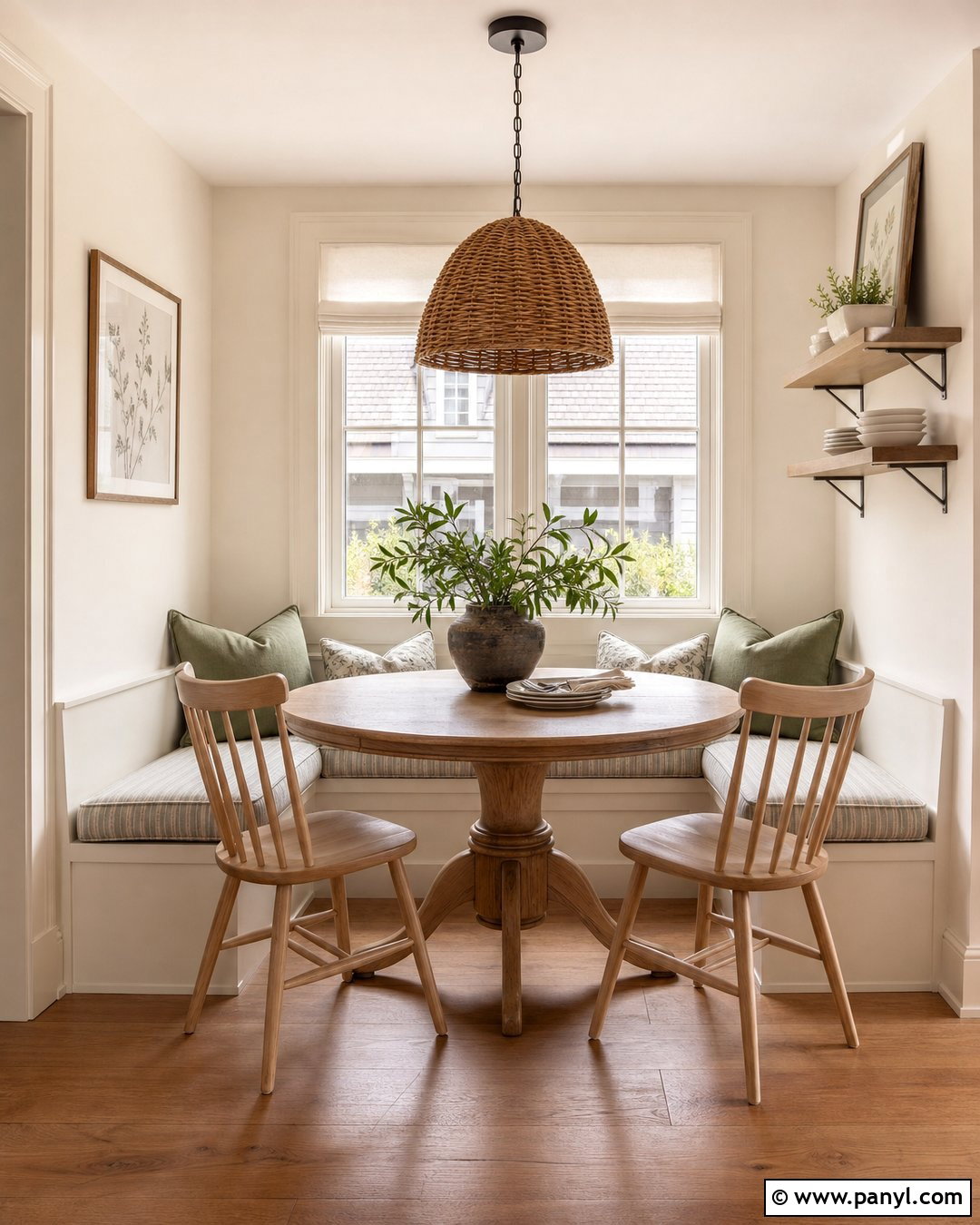
Sherwin-Williams Creamy can turn an ordinary breakfast nook into a soft and sunny retreat. Paint the walls and built-in bench this warm white, then add a round oak pedestal table and spindle-back chairs. Use a striped beige cushion, woven pendant, and relaxed cotton Roman shade for a casual cottage finish. Medium-tone wood flooring and small accents of sage green balance the warmth. Continue Creamy on the trim and ceiling in different sheens for a cohesive envelope. This shade performs best in rooms where natural materials and comfortable textures lead the design. Avoid overly cool gray furnishings, which may look disconnected. Test the paint near windows and under your actual bulbs, as stronger yellow light can make its warm undertone more pronounced.
17. Sherwin-Williams Shoji White SW 7042
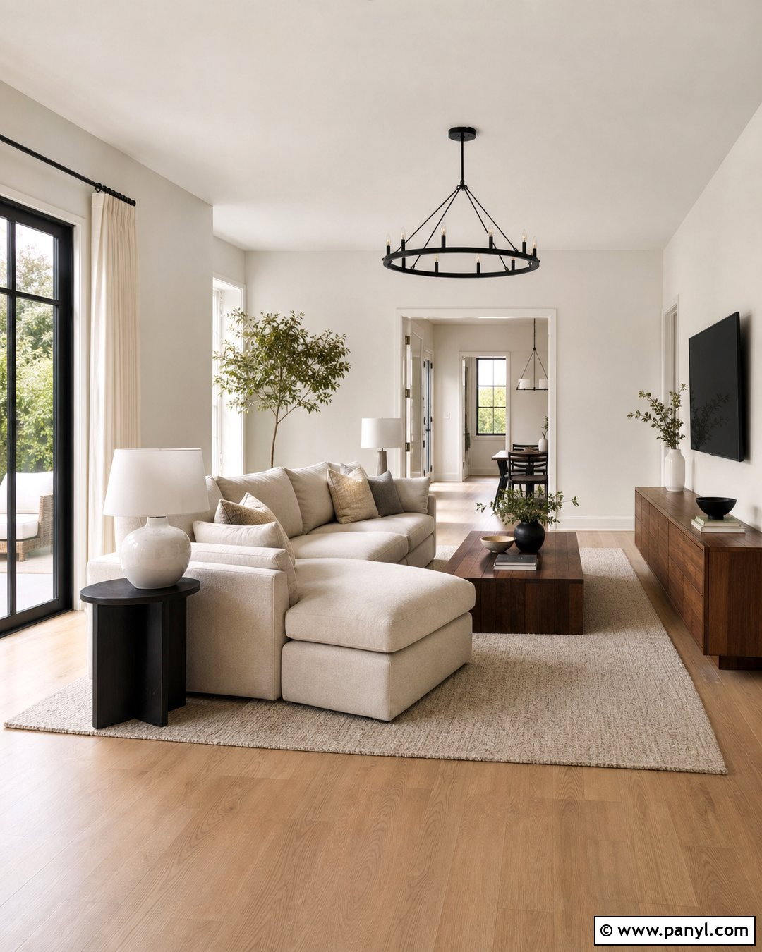
Shoji White provides enough depth to make an open living space feel calm and grounded. Use it on the walls alongside white oak floors, a sand-colored sectional, and a low walnut media console. Choose ivory curtains, a textured wool rug, and sculptural ceramic lamps for an organic modern effect. Soft black accents on window frames and side tables add structure. For trim, select a compatible soft white rather than a highly reflective blue-white. Shoji White works beautifully with stone, warm beige upholstery, and handmade finishes because it reads more like a light neutral than a sharp white. In a north-facing room, it may appear deeper or grayer, so examine a large sample beside your furniture before using it across connected spaces.
18. Sherwin-Williams Aesthetic White SW 7035
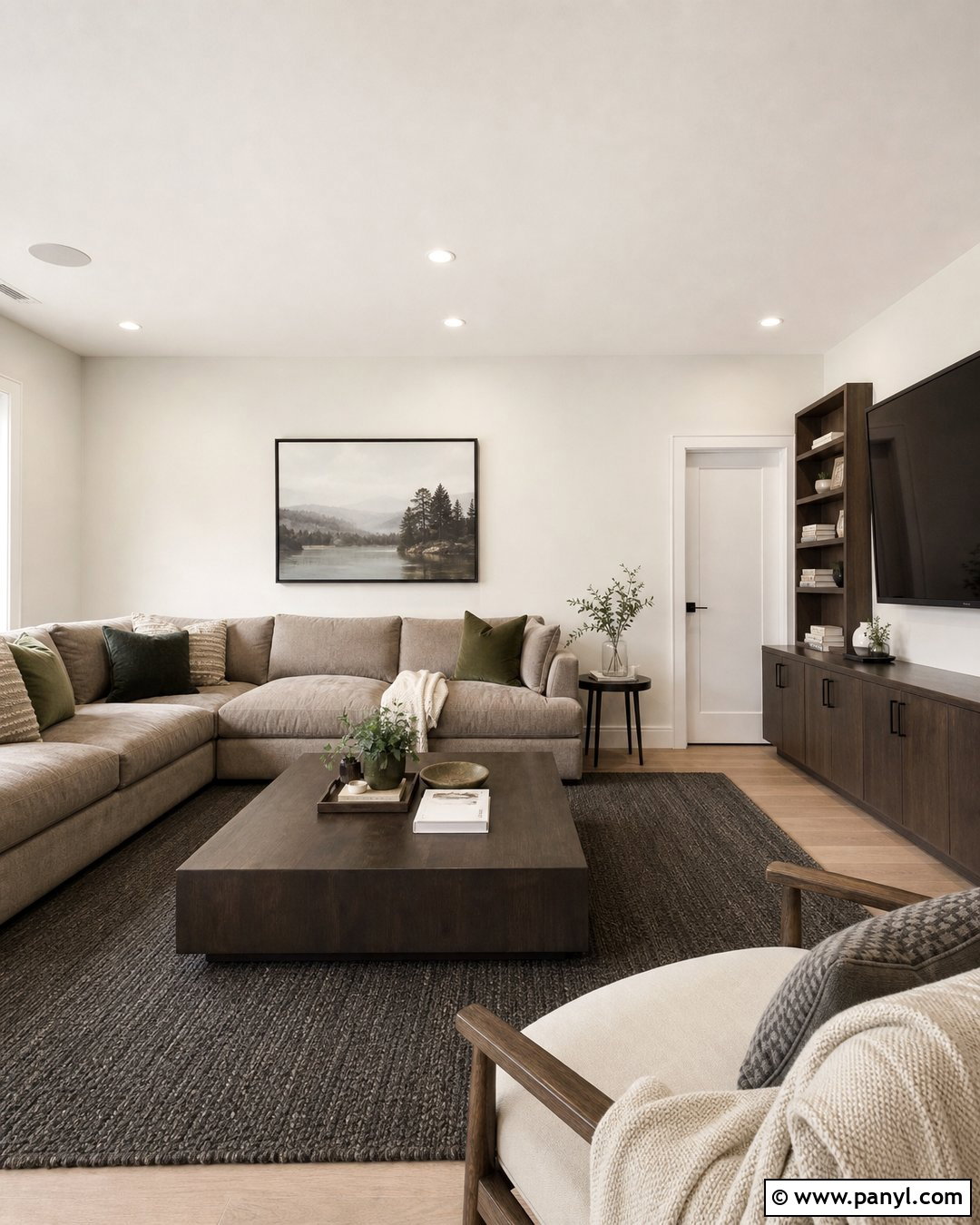
Aesthetic White creates a practical neutral backdrop for a comfortable media room or den. Paint the walls this muted off-white and pair them with a taupe sectional, dark walnut shelving, and a warm charcoal rug. Add olive green pillows, cream throws, and bronze lighting to deepen the relaxed atmosphere. Use a cleaner but still warm white on the trim for quiet contrast. This shade is useful when a bright white would feel too stark beside stone, beige carpet, or earthy furniture. It can also help a room with strong daylight feel more settled. Keep accessories simple and repeat the wood tones throughout the space. Sample Aesthetic White on multiple walls because shaded areas may reveal more gray or taupe than sunlit sections.
19. Sherwin-Williams Greek Villa SW 7551
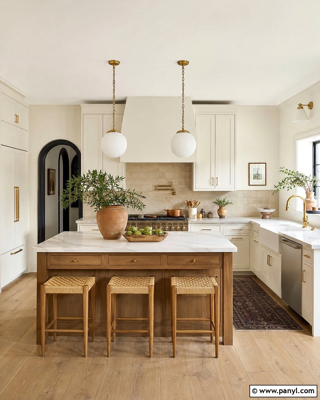
Sherwin-Williams Greek Villa supports a welcoming kitchen with classic materials and relaxed warmth. Paint the walls and Shaker cabinets in Greek Villa, then distinguish the cabinetry with a durable satin finish. Add honed marble-look counters, a warm beige backsplash, and unlacquered brass hardware. A medium oak island and natural woven stools prevent the pale surfaces from feeling flat. Terracotta pottery and olive green accessories add subtle Mediterranean character. This coordinated palette works well in transitional, farmhouse, and European-inspired kitchens. Avoid mixing it with a cold white ceiling unless you want the walls to appear creamier. Instead, repeat Greek Villa overhead. Test it beside stone and tile, where variations in undertones can either create a harmonious combination or an unintended yellow cast.
20. Sherwin-Williams City Loft SW 7631
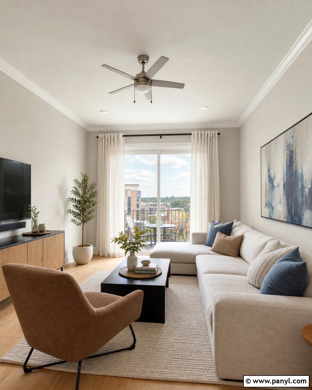
City Loft is an excellent near-white for a modern apartment where a brighter shade might look harsh. Use it on the walls with crisp soft-white trim, pale oak floors, and a compact oatmeal sofa. Add a black metal coffee table, mushroom-colored lounge chair, and abstract artwork containing dusty blue and warm gray. Linen curtains and a low-pile ivory rug keep the space airy without removing all contrast. This full design is especially helpful in open rooms that combine natural and artificial lighting. City Loft may appear more greige than white in shaded corners, which gives it useful depth. Test it beside large furnishings and kitchen cabinets, ensuring the connected finishes support its subtle gray and warm neutral character.
21. Sherwin-Williams Eider White SW 7014
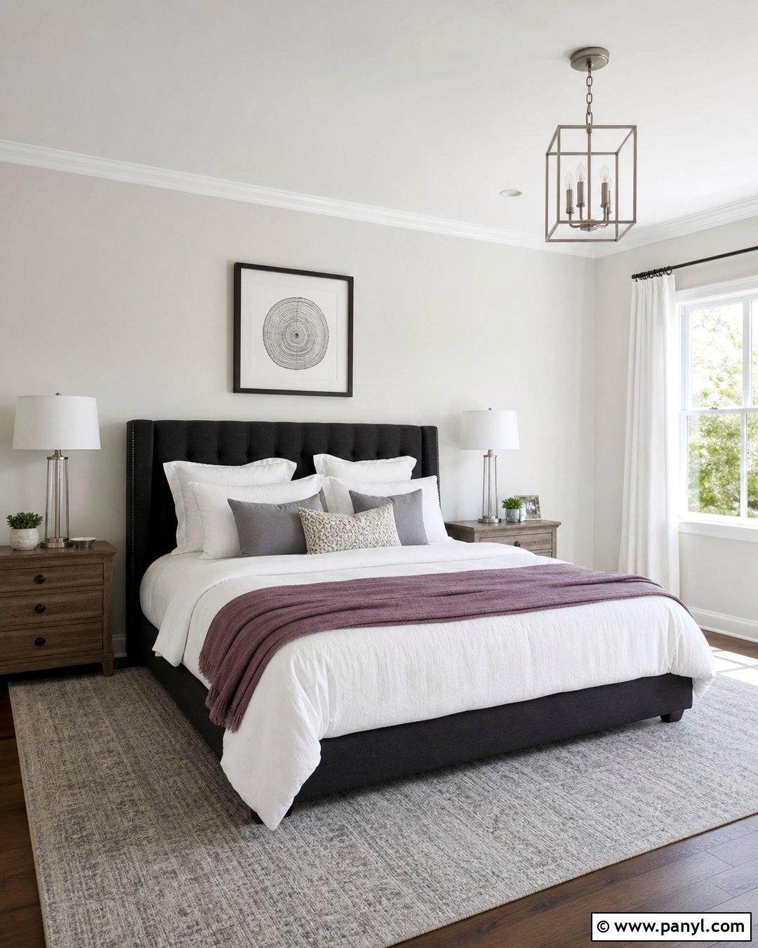
Sherwin-Williams Eider White adds quiet color to a sophisticated guest bedroom. Apply it to the walls and pair it with a charcoal upholstered headboard, white bedding, and washed walnut nightstands. Introduce dusty plum through a throw blanket or patterned pillow to complement the shade’s complex undertone. Brushed nickel lamps, a pale gray rug, and simple white curtains complete the balanced palette. Use a cleaner white on the trim to outline doors and windows, but avoid anything extremely blue. Eider White works best when you want a wall color that still reads light while offering more dimension than standard white. Since it can shift between gray, taupe, and faint violet, testing is especially important in north-facing rooms and spaces with cool LED bulbs.
22. Sherwin-Williams Natural Choice SW 7011
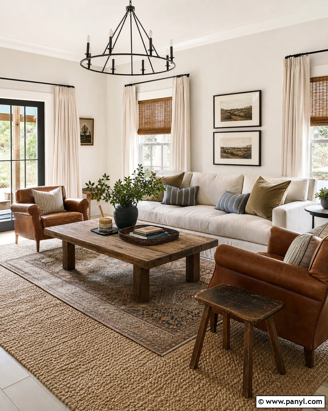
Natural Choice builds an easygoing backdrop for a warm, casual family room. Cover the walls in this creamy off-white, then arrange a beige slipcovered sofa, two cognac leather chairs, and a substantial reclaimed wood coffee table. Layer a jute rug beneath a smaller vintage-style rug for texture and definition. Woven blinds, linen curtains, and black iron lighting complete the relaxed modern farmhouse look. Use Natural Choice on the trim in satin for a softly blended result. This shade coordinates naturally with warm woods, brown leather, and muted greens. It may appear deeper in rooms with limited daylight, making balanced lamp lighting important. Compare a large sample with the flooring and fireplace material before extending the color into adjacent hallways or open areas.
23. Sherwin-Williams White Duck SW 7010
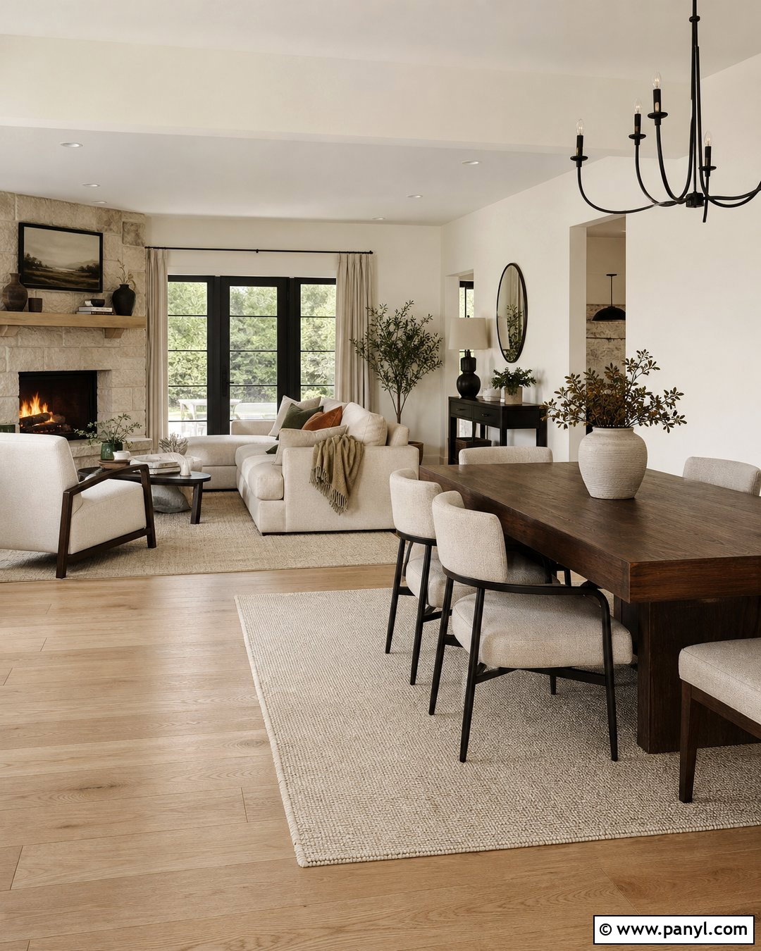
Sherwin-Williams White Duck creates a grounded, elegant background for an open dining and living area. Paint the walls this warm off-white and pair them with light oak flooring, cream upholstery, and a dark brown dining table. Add textured beige curtains, a limestone fireplace, and matte black fixtures for contrast. Muted olive, rust, and clay accessories reinforce the earthy palette without making the room feel colorful. Use a soft creamy white on trim and ceilings to create slight separation. White Duck is particularly effective in brightly lit spaces where a lighter white might become glaring. In darker rooms, however, it can read more like light greige. Sample it beside stone, wood, and upholstery to determine whether its depth suits the overall design.
24. Sherwin-Williams Origami White SW 7636
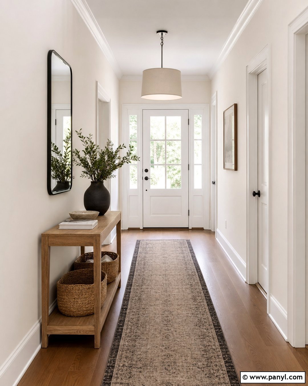
Origami White gives a small entry and hallway a clean appearance without making the space feel cold. Use it on the walls, then paint the trim and interior doors in a slightly brighter warm white. Add a slim oak console, black-framed mirror, and woven runner containing beige and charcoal. A simple linen-shaded pendant and natural baskets introduce texture while keeping the walkway clear. This complete transitional scheme works with both warm wood floors and restrained black accents. Origami White has enough softness to connect adjoining neutral rooms without disappearing into bright trim. Since narrow hallways receive uneven light, sample the shade near doorways and in shadowed corners. The result should feel gently warm, balanced, and consistent from one viewing direction to another.
25. Sherwin-Williams High Reflective White SW 7757
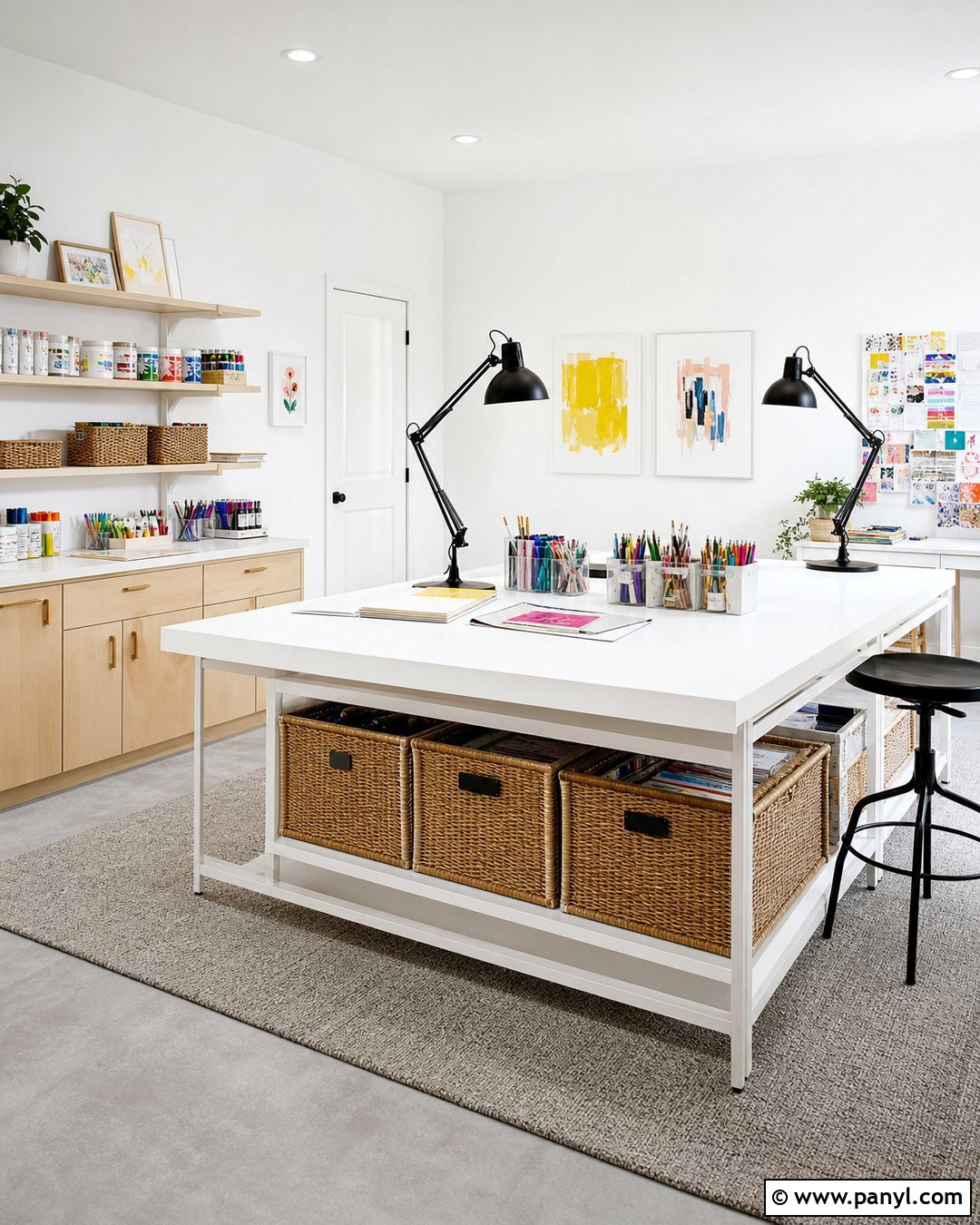
High Reflective White creates maximum clarity in a modern art studio, craft room, or naturally bright workspace. Paint the walls, ceiling, and simple trim in the same white, then vary the sheen to define each surface. Choose pale maple storage cabinets, a white worktable, and light gray flooring for a clean foundation. Black task lamps and colorful organized supplies provide controlled contrast. Include woven bins and a small neutral rug to prevent the room from feeling clinical. Because this white is exceptionally bright in appearance, careful wall preparation is important; dents and uneven patches may become more visible. Test it beside fixed white materials and observe it during peak daylight. Warmer furnishings can help balance the crispness without reducing the room’s fresh energy.
26. Behr Swiss Coffee 12
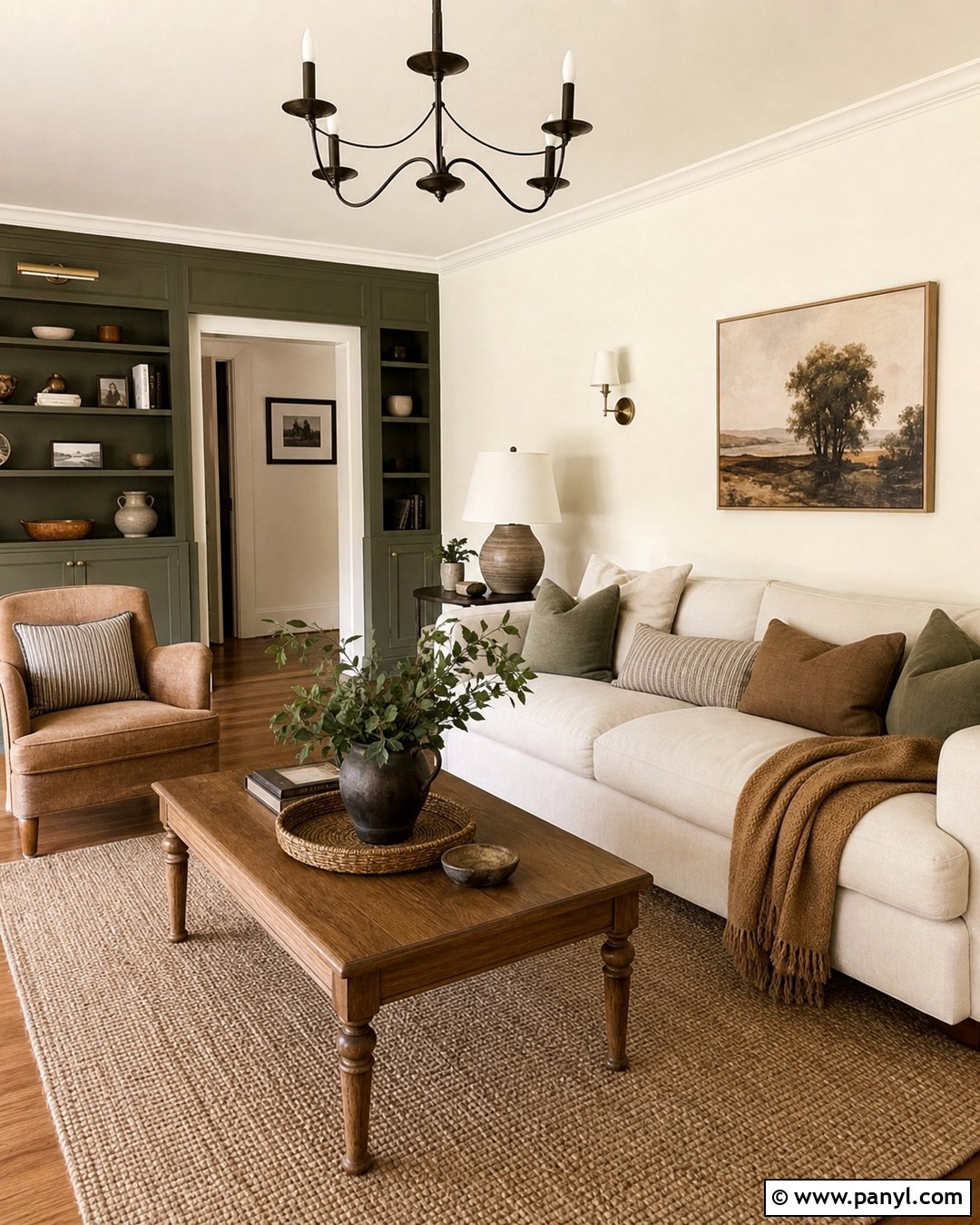
Behr Swiss Coffee produces a warm, relaxed living room suited to comfortable everyday decorating. Use it on the walls and ceiling, then layer a cream sofa with camel, taupe, and muted green textiles. Medium oak floors, a substantial wood coffee table, and a woven rug enhance the welcoming undertone. Add aged brass lamps and off-white curtains rather than sharp blue-white accessories. A dark olive built-in or painted cabinet can provide a strong focal point while remaining connected to the earthy palette. This shade works naturally in traditional, cottage, and casual contemporary homes. Test it beside existing trim because bright white molding can exaggerate its creaminess. Repeating Swiss Coffee in a higher sheen on the woodwork creates a softer, more unified room.
27. Behr Polar Bear 75
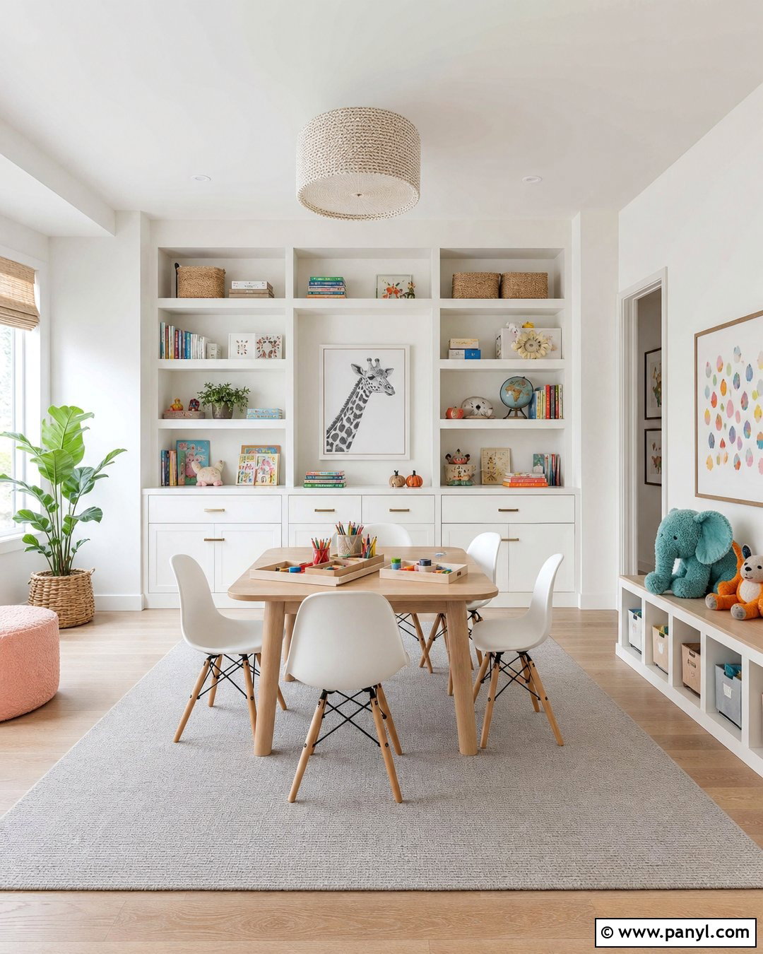
Behr Polar Bear offers a bright but approachable background for a colorful children’s playroom. Paint the walls and built-in storage this versatile white, then add pale oak flooring and a washable light gray rug. Use muted teal, sunny yellow, and soft coral through bins, cushions, and framed artwork. A natural wood table and white chairs keep the center of the room functional and uncluttered. Repeat Polar Bear on the ceiling and trim for a seamless effect, using a more durable finish on cabinets and doors. This combination feels cheerful without relying on heavily saturated walls. Since Polar Bear contains subtle warmth, compare it with existing cool white furniture. Sampling will show whether those pieces coordinate or make the painted surfaces look noticeably creamier.
28. Behr Whisper White HDC-MD-08
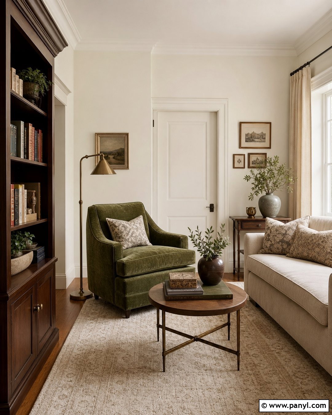
Behr Whisper White creates a gentle, polished backdrop for a cozy reading room. Cover the walls in this soft white and pair them with a moss green velvet chair, walnut bookcase, and small antique brass floor lamp. Add warm oak flooring, an ivory wool rug, and natural linen curtains to build an inviting neutral envelope. A cream loveseat and patterned beige pillows can complete the seating arrangement without crowding the room. Paint the trim in Whisper White satin for a low-contrast, unified result. This shade works well when you want brightness with less sharpness than a true white. Test it beside beige textiles and under evening lamps, as warm surroundings may make its subtle cream and neutral qualities more noticeable.
29. Behr Blank Canvas DC-003
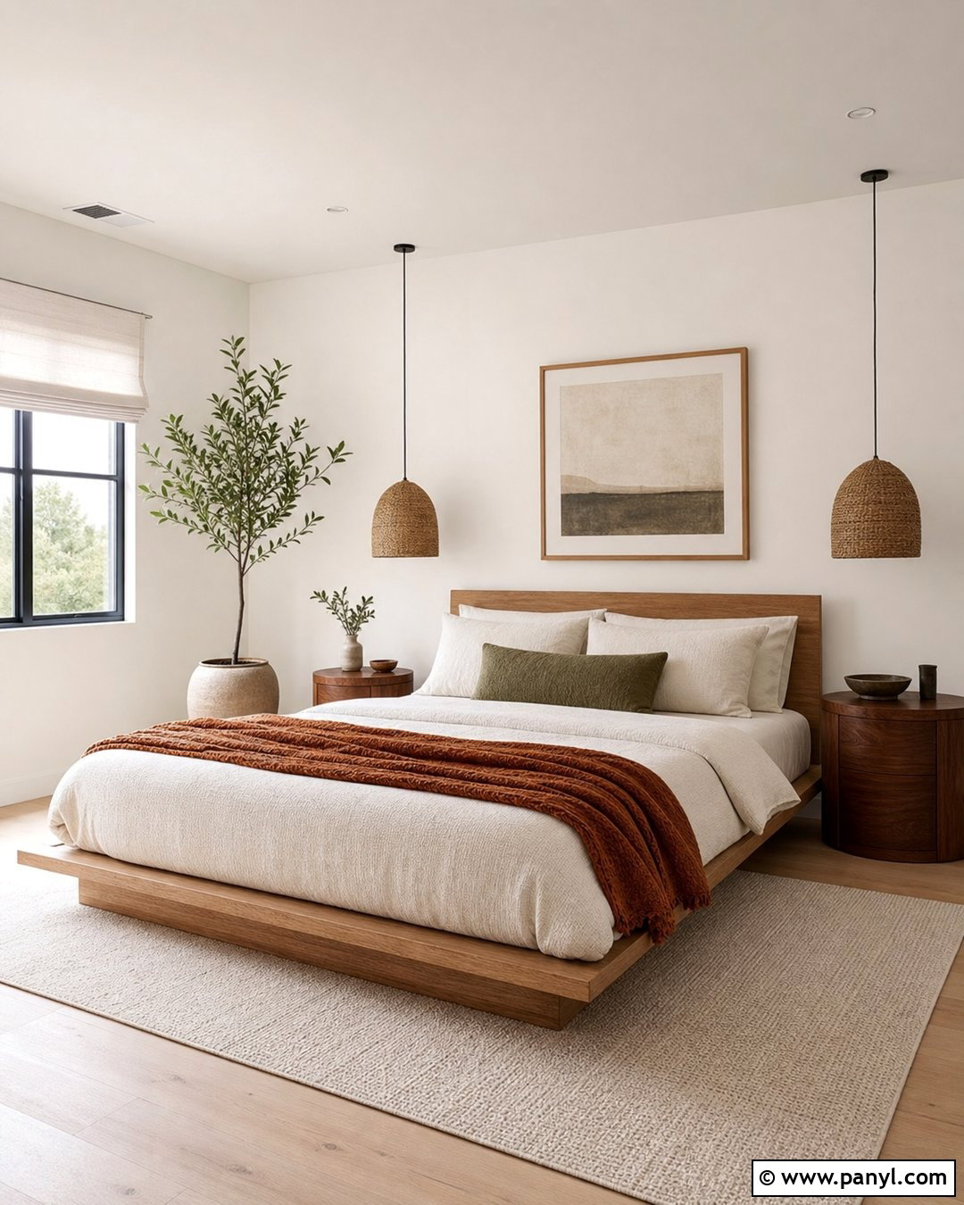
Blank Canvas gives a modern organic bedroom a soft background with enough warmth to support natural materials. Paint the walls and ceiling in this warm white, then add a low white oak bed, textured ivory bedding, and rounded walnut nightstands. Use a clay-colored throw, olive accent pillow, and woven pendant for understated color. Pale oak floors and a large wool rug keep the palette light but layered. Choose minimal black hardware and simple ceramic accessories to create definition. Continue Blank Canvas on trim in satin for a wrapped, contemporary appearance. This complete look feels current without depending on short-lived decorative trends. Test the paint near fabrics and flooring because surrounding beige, green, and gray tones can influence how its undertone appears.
30. Behr Ultra Pure White UPW
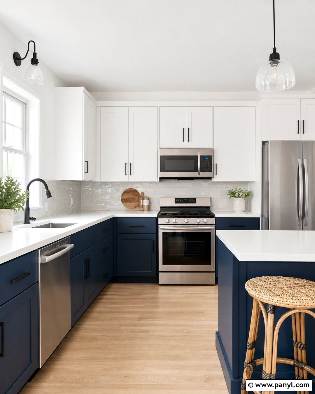
Behr Ultra Pure White makes a compact kitchen feel crisp, bright, and carefully organized. Use it on the walls, ceiling, and upper cabinets to create visual continuity. Contrast the white surfaces with navy lower cabinets, white quartz countertops, and a glossy pale gray backsplash. Add matte black hardware, stainless steel appliances, and light oak flooring for a balanced modern palette. A pair of woven counter stools introduces texture and keeps the scheme from looking overly clinical. This shade is useful when clear contrast and maximum brightness are design priorities. Check it against appliances, sinks, and tile before painting because those materials can contain warmer undertones. Thoughtful preparation is also essential, since bright white surfaces may emphasize uneven patches or imperfect cabinet doors.
31. Behr Cameo White MQ3-32
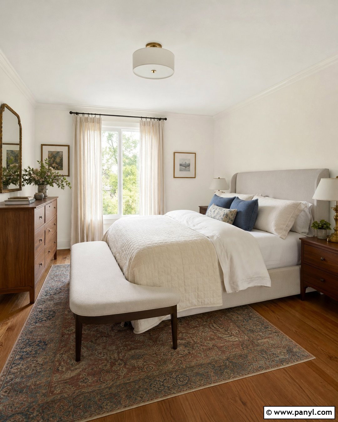
Behr Cameo White creates a soft, comfortable atmosphere in a traditional guest room. Apply it to the walls and pair it with an upholstered oatmeal headboard, walnut dresser, and warm white bedding. Use dusty blue pillows, a muted floral rug, and antique brass bedside lamps for gentle contrast. Natural linen curtains and medium-tone wood flooring complete the approachable palette. Continue Cameo White across crown molding and baseboards in satin to produce a smooth, coordinated finish. This shade is well suited to rooms with warm textiles and classic furniture where a very bright white might feel disconnected. Test it beside existing beige carpet or creamy upholstery, since similar warm surfaces can deepen its off-white character, especially under soft evening lighting.
32. Behr Silky White PPU7-12
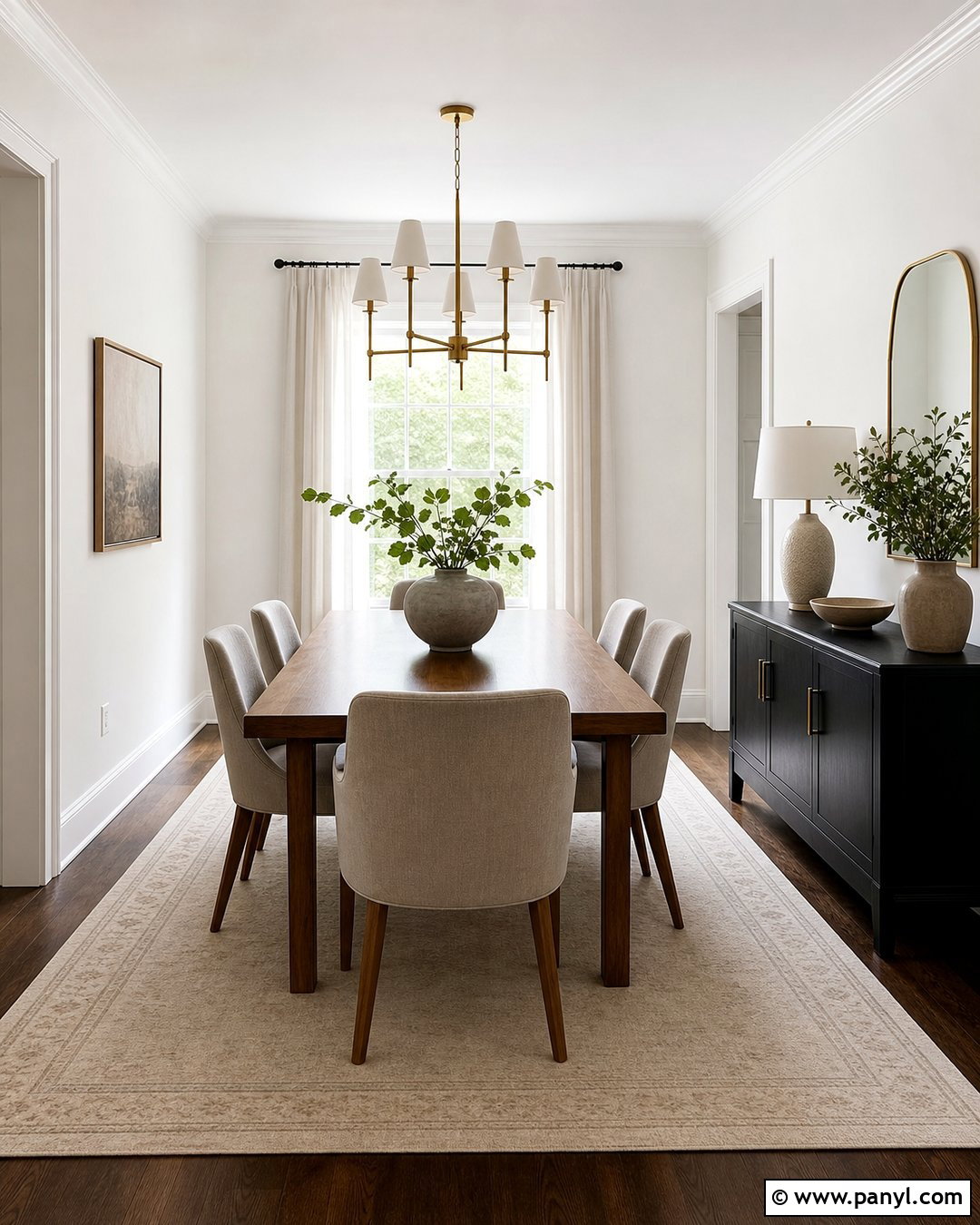
Behr Silky White provides a refined neutral foundation for a transitional dining room. Paint the walls this soft white and add clean satin trim in the same shade. Center the space with a medium walnut table, upholstered greige chairs, and an ivory rug with a subtle border. Use a brushed brass chandelier, linen drapes, and a black sideboard to balance warmth and contrast. Ceramic vessels and a few leafy branches complete the table without adding clutter. Silky White works naturally with mixed traditional and contemporary pieces because it is understated rather than glaring. Examine a sample next to flooring and fabrics throughout the day. The shade may look warmer in direct sun and slightly grayer in evening shadows, which can influence the final mood.
33. Behr Frost 57
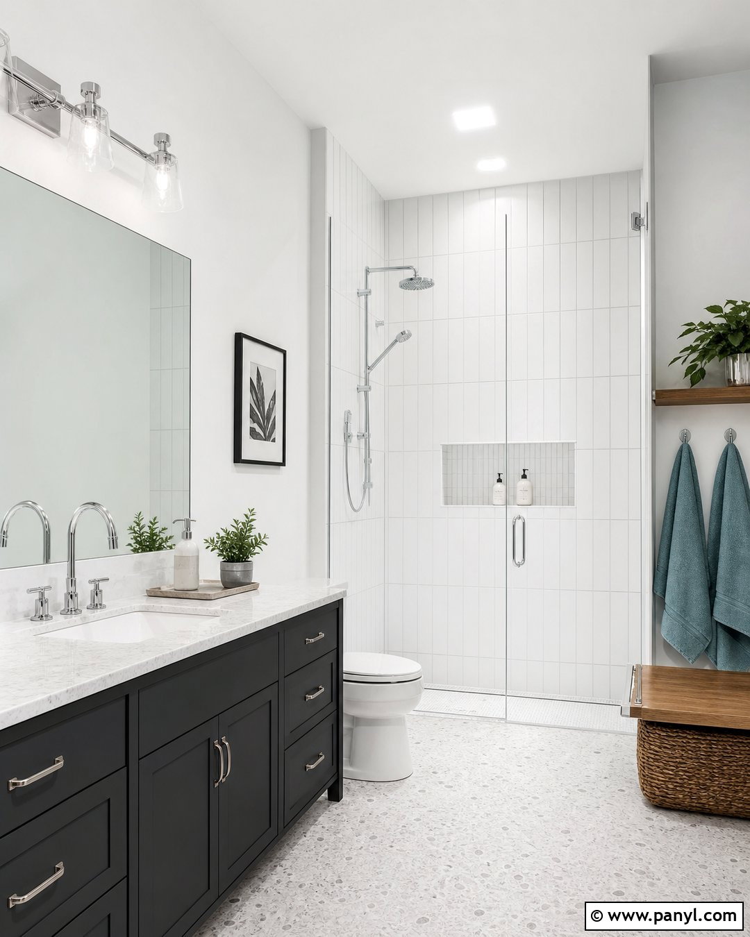
Behr Frost brings a lightly cool freshness to a small bathroom or powder room. Paint the upper walls in Frost and combine them with white vertical tile, pale gray grout, and a charcoal vanity. Polished chrome fixtures and a frameless mirror reinforce the clean palette. Warm the design with a white oak shelf, woven basket, and soft blue-green towels. Use light terrazzo flooring to connect the gray, white, and muted color accents. This complete bathroom feels airy but not empty because every material contributes subtle texture. Continue Frost on the ceiling for visual consistency. Test it beside tile and plumbing fixtures before committing, as a cool white may make warmer ceramic surfaces appear creamier. Bright, neutral bulbs will display the color more accurately.
34. Behr Whipped Cream DC-001
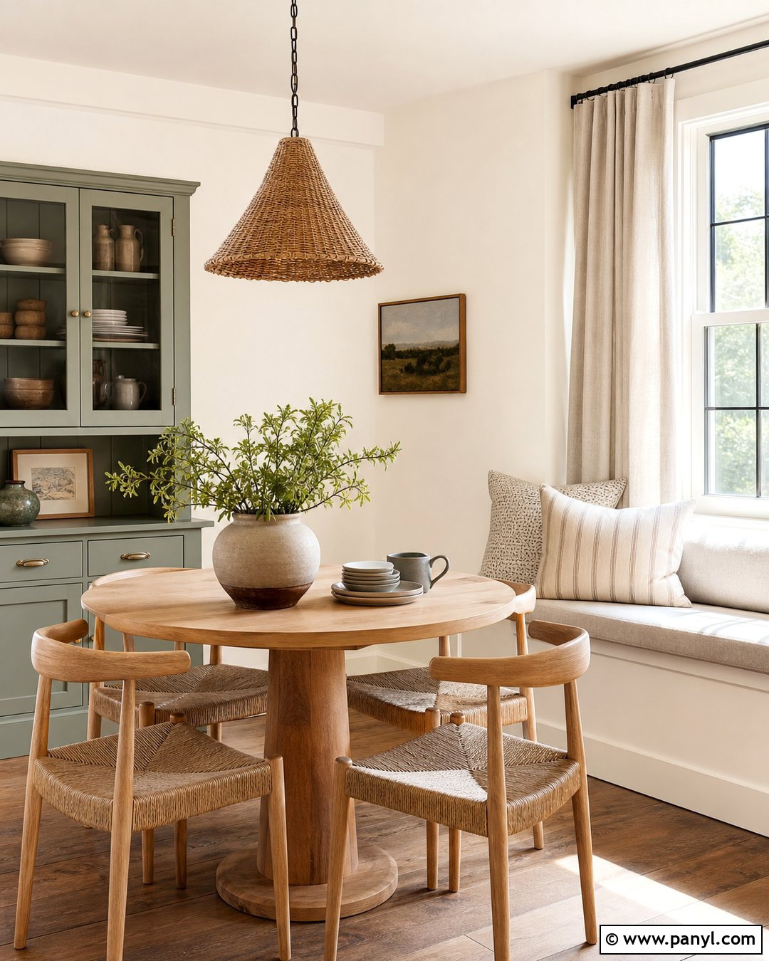
Behr Whipped Cream gives a breakfast room or casual dining space a bright, comfortable glow. Use it on the walls, ceiling, and built-in window seat for a seamless background. Add a round light oak table, woven dining chairs, and striped beige cushions. A soft sage green cabinet can serve as the main accent, while a natural fiber pendant and warm wood flooring reinforce the relaxed character. Choose cream curtains and handmade pottery to maintain the layered neutral effect. Whipped Cream is especially attractive in cottage, farmhouse, and organic modern rooms. Avoid pairing it with icy white trim unless deliberate contrast is desired. Sample it beside cabinetry and countertops, since strong warm finishes and yellow-toned lighting may enhance its creamy appearance.
35. Behr Bakery Box BL-W09
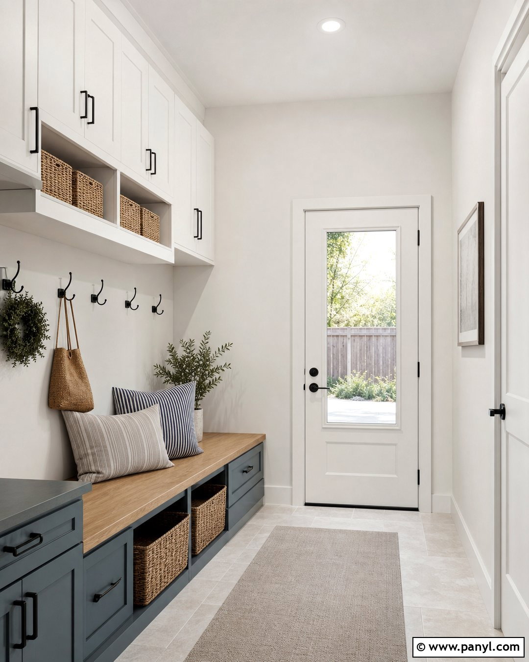
Behr Bakery Box creates a fresh, subtly cool foundation for a clean modern mudroom. Paint the walls and upper storage cabinets in this pale white, then add lower cabinets in muted blue-gray. Install light oak bench seating, matte black hooks, and durable pale stone-look flooring. Woven baskets, striped cushions, and simple greenery make the hardworking space feel finished rather than purely functional. Use Bakery Box on the trim and ceiling to keep the compact area visually open. The cooler direction works well with black metal, gray textiles, and blue accents. Test the color beside flooring and cabinet samples because green or blue undertones may become more visible in shade. Neutral white lighting will preserve the crisp, organized quality of the completed room.
Conclusion:
The right white should connect every surface and furnishing rather than function as an isolated color choice. Begin by identifying whether your floors, stone, tile, cabinets, and fabrics lean warm or cool. Then narrow the options to shades that share those undertones. Bright whites create clean contrast, while creamy and muted whites can soften large rooms or strong daylight. Always paint generous samples on more than one wall and observe them under natural and artificial light. Comparing trim, ceiling, and wall finishes at the same time will prevent mismatched whites. With careful sampling and a complete room plan, these **35 popular white paint colors for walls** can inspire a cohesive, comfortable, and lasting interior.

Related Ideas and Inspiration:
Leave a Reply