
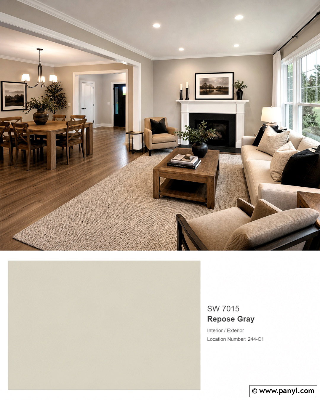
Choosing between Sherwin-Williams Repose Gray and Agreeable Gray becomes easier when you picture each color as part of a finished room. Agreeable Gray SW 7029 has an LRV of about 60, while Repose Gray SW 7015 has an LRV of about 58. This makes Agreeable Gray slightly lighter and typically warmer, while Repose Gray often looks a touch cooler and more distinctly gray. () However, flooring, daylight, trim, furnishings, and nearby colors can change how both paints appear. The best approach is to compare large samples throughout the day and design the entire palette around the winner. The complete rooms and exterior schemes below offer 20 practical ways to explore Repose Gray vs Agreeable Gray ideas.

1. Repose Gray Vs Agreeable Gray Side By Side
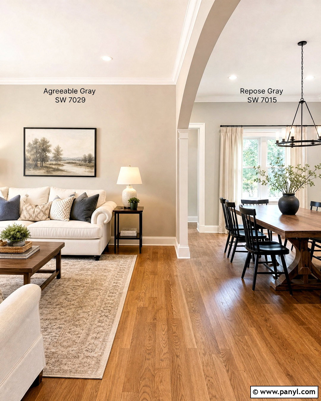
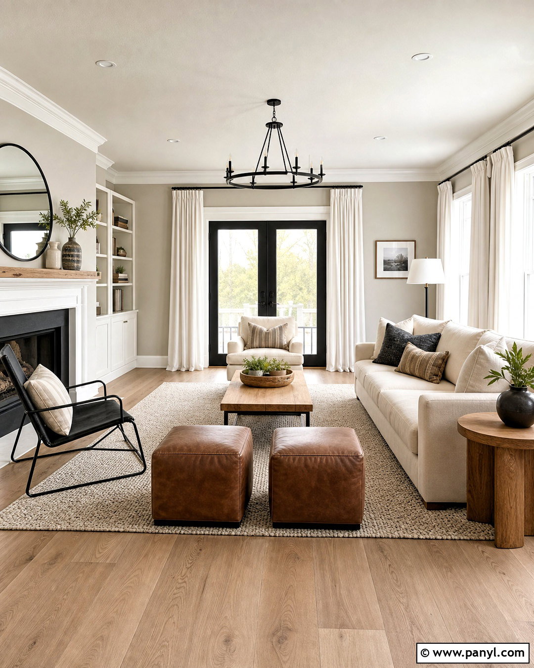
A side-by-side room provides the clearest comparison between these popular neutral paints. Picture an open living and dining area with Agreeable Gray on the living room walls and Repose Gray in the adjoining dining space. Use the same Pure White trim, medium oak flooring, and balanced daylight throughout so the differences remain visible. Agreeable Gray should create a softer, warmer transition around a cream sofa, woven rug, and light oak tables. Repose Gray can anchor the dining zone with a walnut table, black chairs, and crisp linen curtains. Repeat black metal and natural wood in both areas to connect the spaces. This arrangement shows whether your home benefits from Agreeable Gray’s beige warmth or Repose Gray’s slightly cooler gray character.
2. Agreeable Gray Living Room With Warm Wood
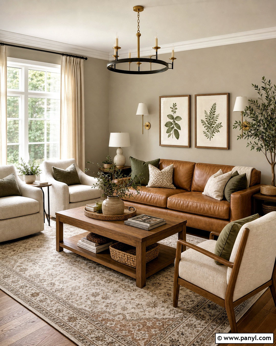
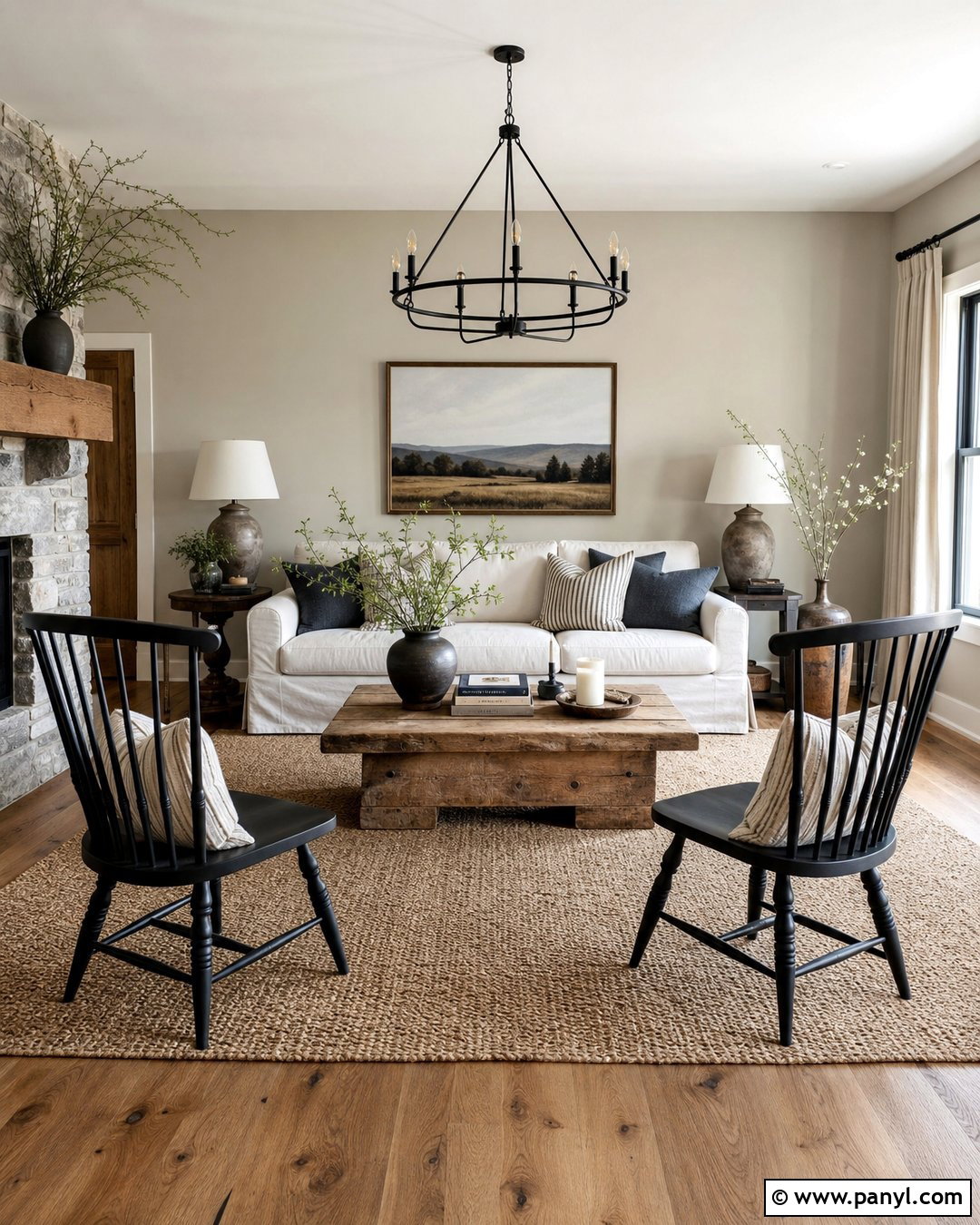
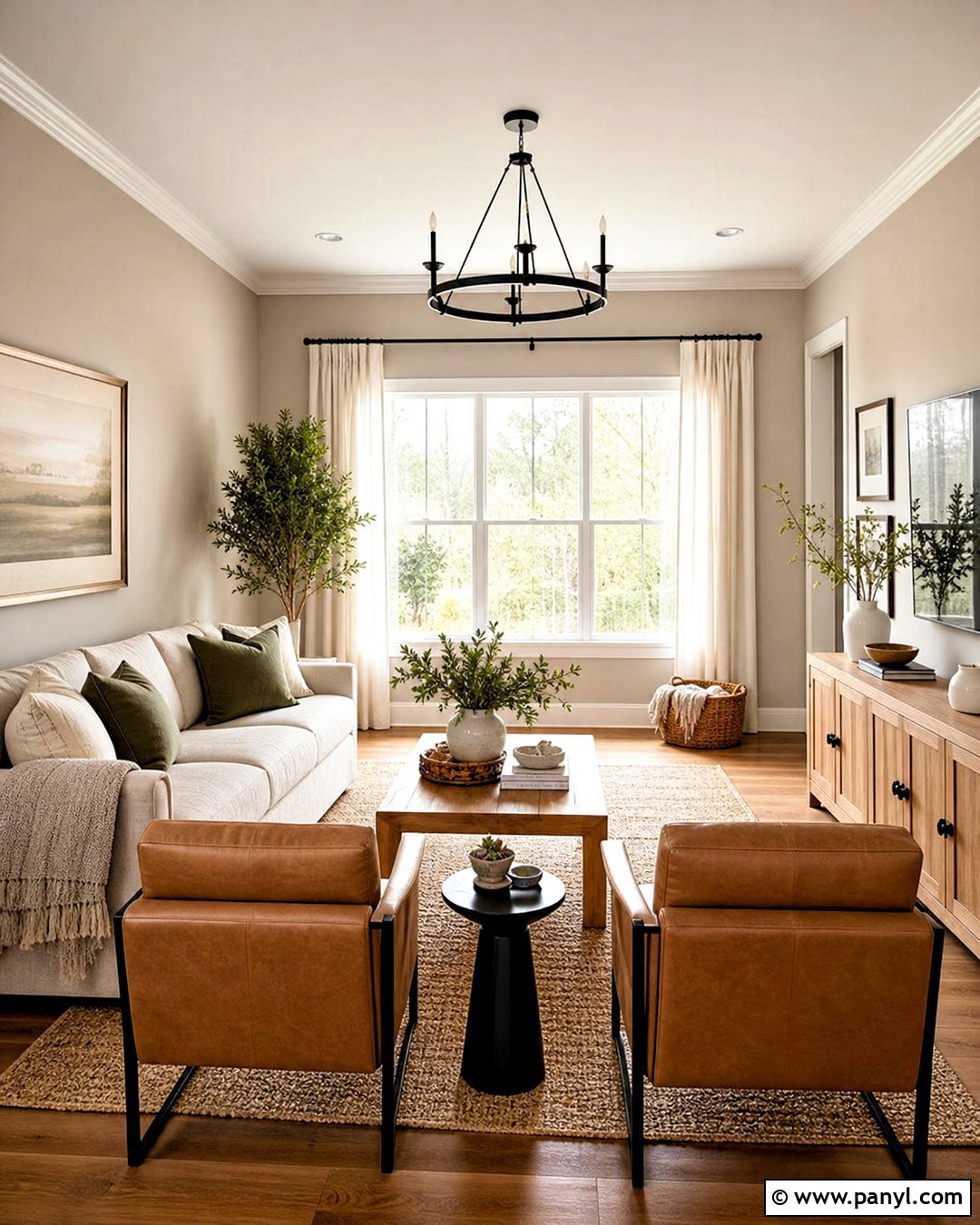
Sunlight, warm wood, and relaxed textiles bring out the welcoming side of Agreeable Gray. Paint all four walls in Agreeable Gray and keep the ceiling and substantial baseboards a clean, soft white. Add a camel leather sofa, two oatmeal armchairs, and a medium-toned oak coffee table over a cream-and-taupe patterned rug. Linen curtains should frame the windows without blocking daylight. Complete the room with antique brass lighting, olive green pillows, ceramic lamps, and simple botanical artwork. Compared with Repose Gray, Agreeable Gray supports these earthy materials with less risk of the walls feeling cool. The result is a comfortable transitional living room that feels light, coordinated, and practical enough for everyday family life.
3. Repose Gray Living Room With Black Accents
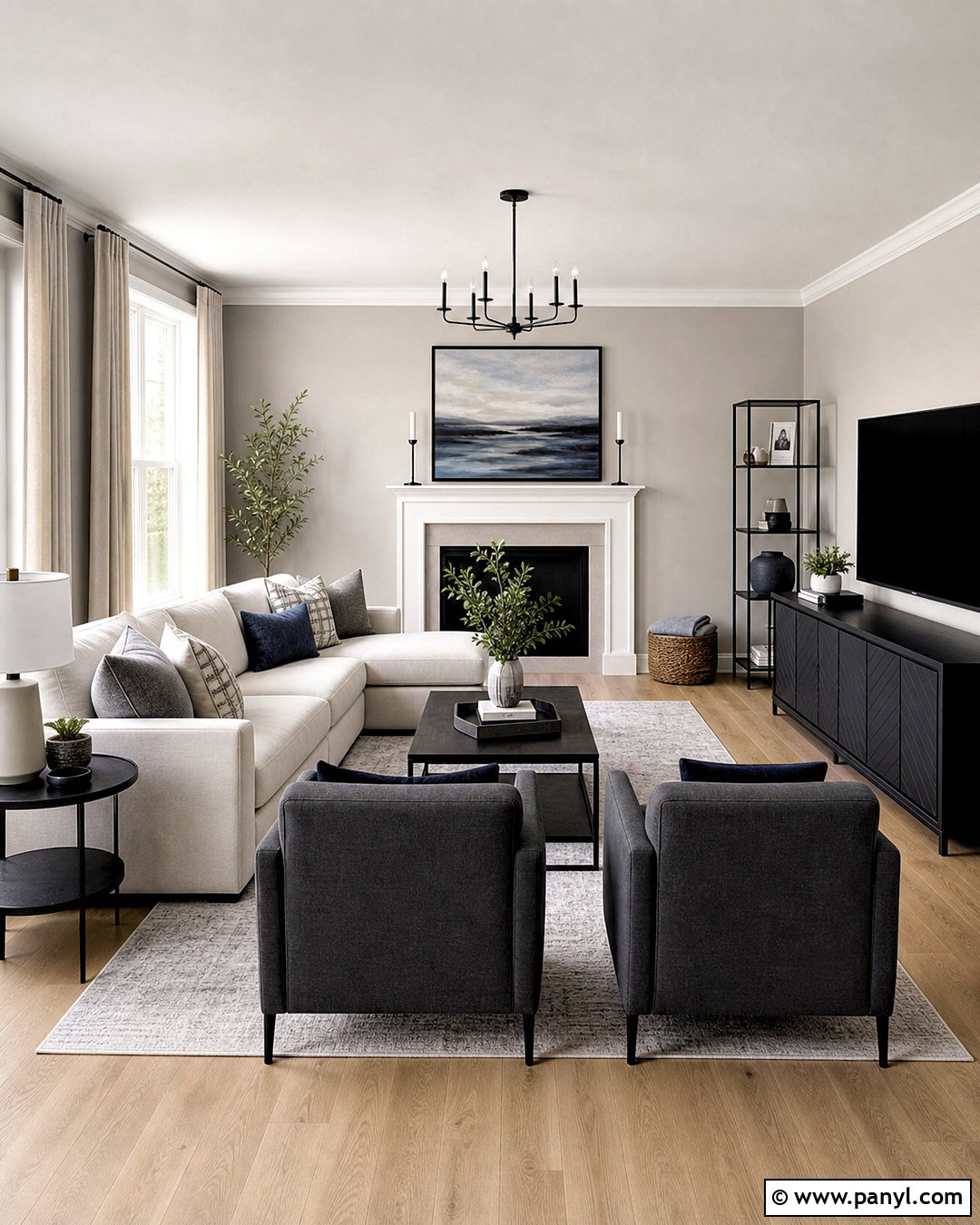
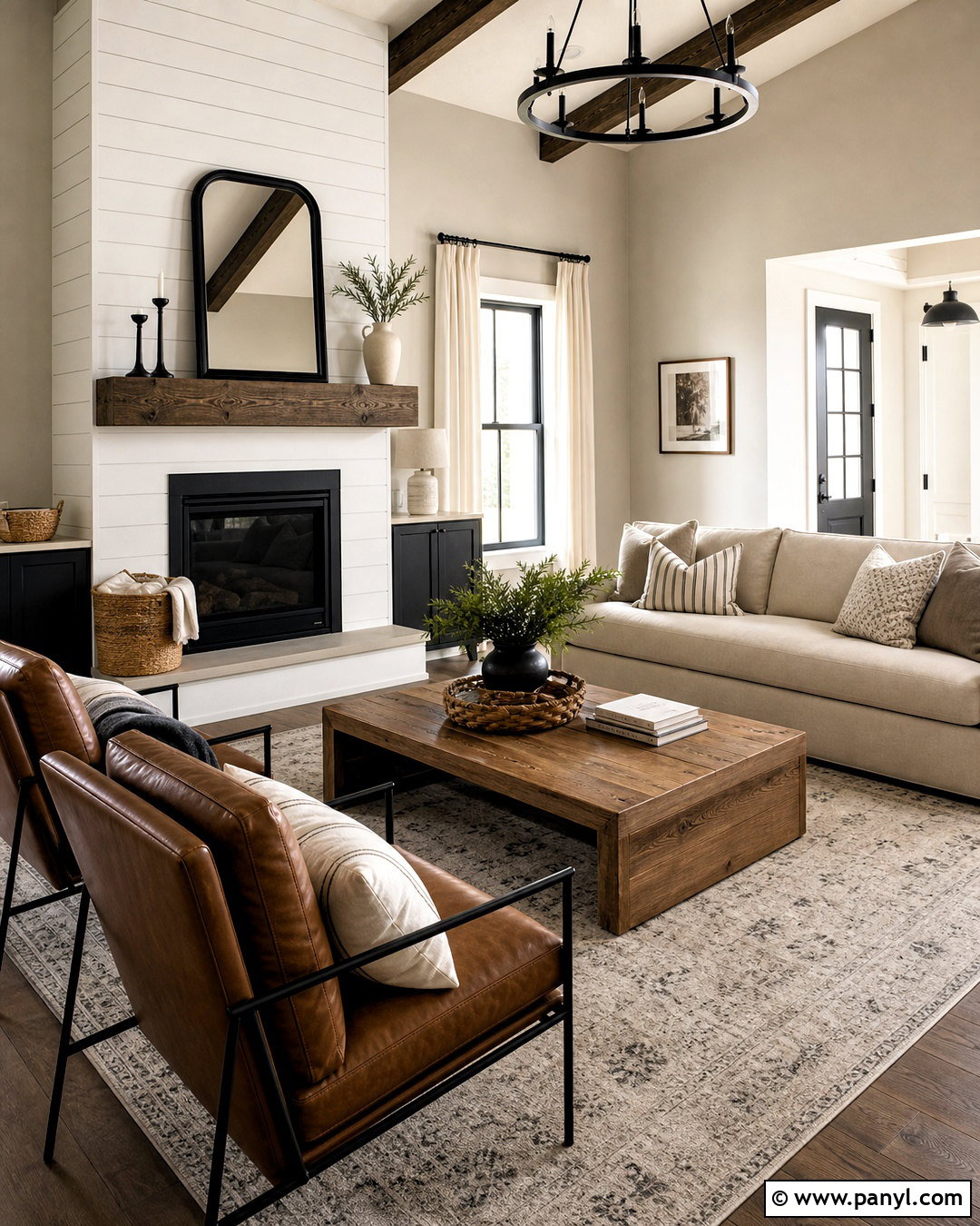
For a cleaner contemporary look, Repose Gray works beautifully with defined black details and pale upholstery. Cover the walls in Repose Gray, then introduce bright white trim, a white ceiling, and light natural oak flooring. Center a streamlined ivory sofa opposite a matte black media cabinet. Add charcoal lounge chairs, a pale gray wool rug, and nesting tables combining black metal with warm wood. Large abstract artwork in white, gray, taupe, and muted blue keeps the palette cohesive. Repose Gray generally looks more noticeably gray than Agreeable Gray, helping the black features feel sharp rather than heavy. Warm the complete room with linen curtains, textured pillows, a wooden floor lamp, and one tall green plant placed beside the window.
4. Agreeable Gray Open Concept Home
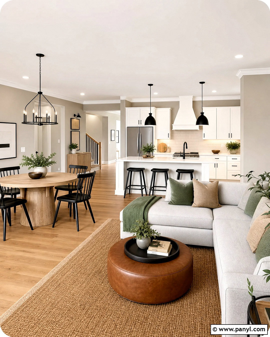
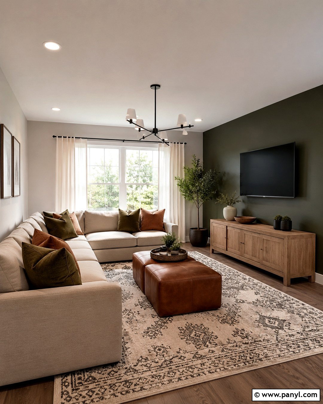
Does your kitchen flow directly into the living and dining areas? Agreeable Gray can form a gentle background that connects several functions without making the house feel overly gray. Use it continuously across the main walls, paired with creamy white kitchen cabinets, a warm white backsplash, and light quartz counters with subtle taupe veining. Choose honey oak floors that extend into a dining area with a round wood table and woven chairs. In the living zone, arrange a cream sectional, cognac leather ottoman, and muted green accents. Black pendants and cabinet hardware provide contrast. Agreeable Gray’s warmer appearance usually coordinates naturally with beige upholstery and golden wood, creating a softer whole-home flow than the somewhat cooler effect Repose Gray may produce.
5. Repose Gray Modern Kitchen
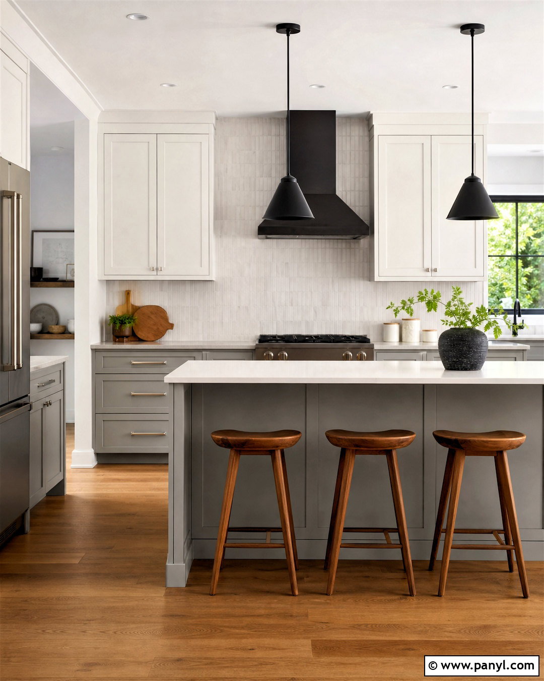
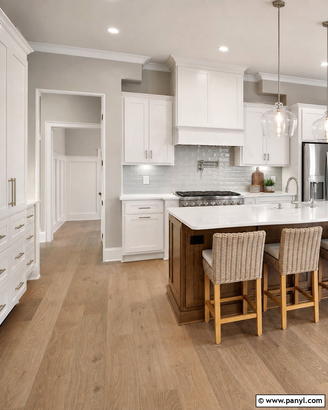
Repose Gray can give a modern kitchen visible depth while remaining quiet enough for large surfaces. Use it on Shaker-style lower cabinets and a full pantry wall, balanced by white upper cabinets and a bright white ceiling. Select pale quartz countertops, a handmade white tile backsplash, and brushed nickel hardware to maintain the cooler direction. Medium oak flooring and three wooden counter stools add essential warmth. A black range hood, slim black pendants, and dark window frames create structure without overwhelming the neutral palette. Compared with Agreeable Gray cabinetry, Repose Gray should appear slightly crisper and less beige. Keep the surrounding walls soft white so the cabinet color remains easy to recognize, especially in a kitchen with moderate natural light.
6. Agreeable Gray White Kitchen
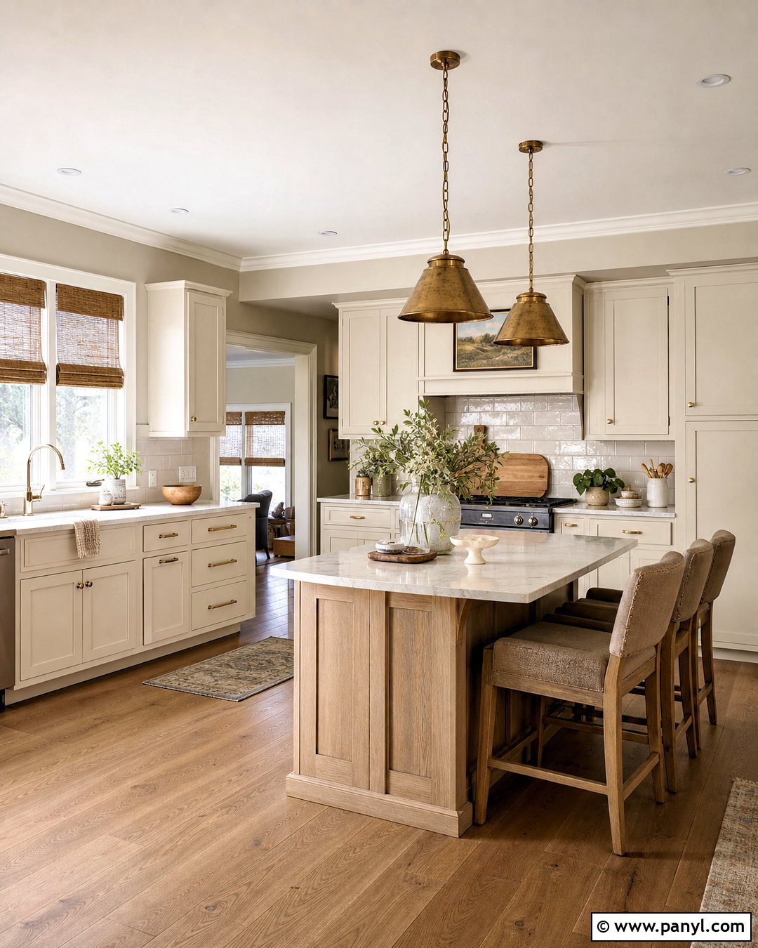
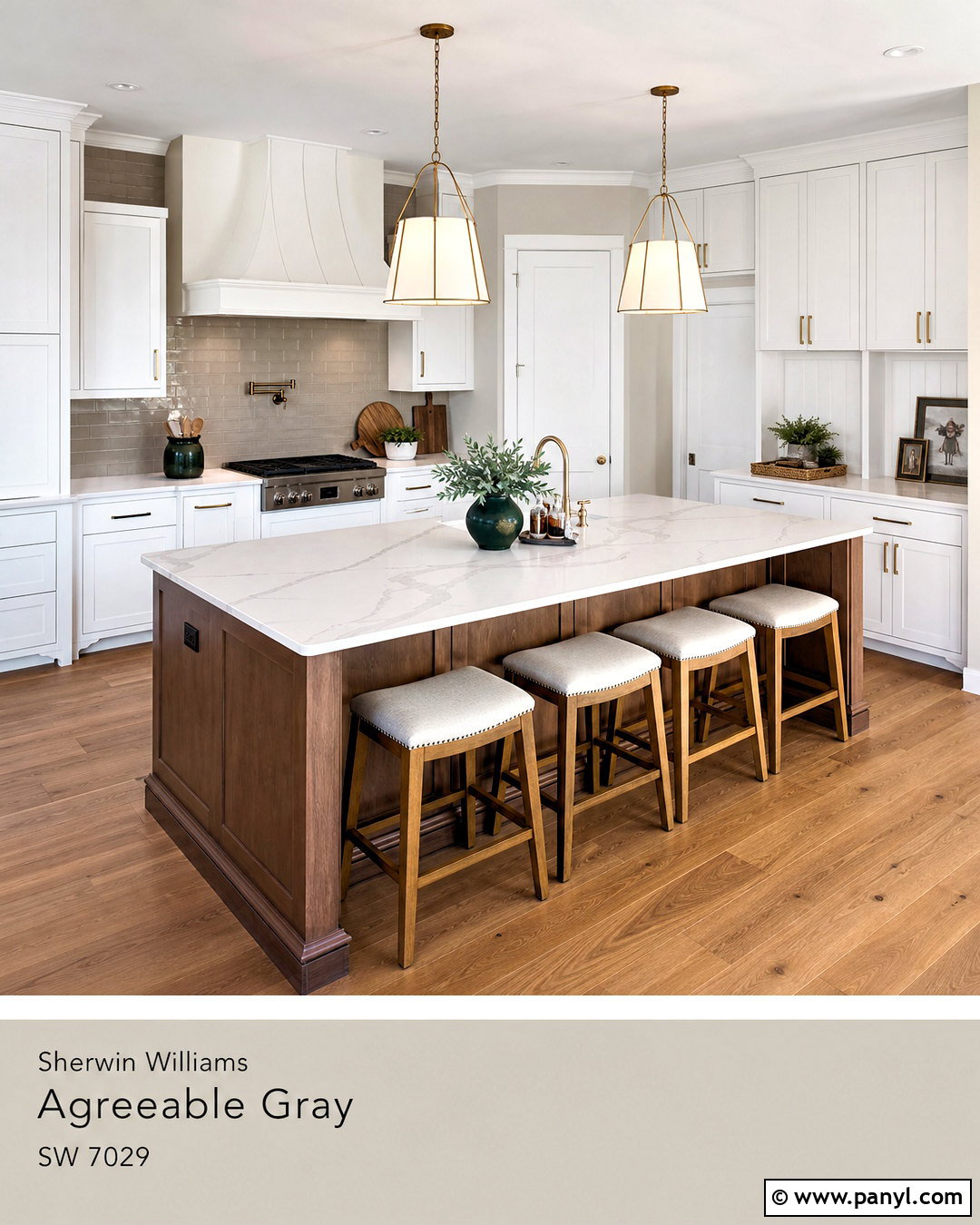
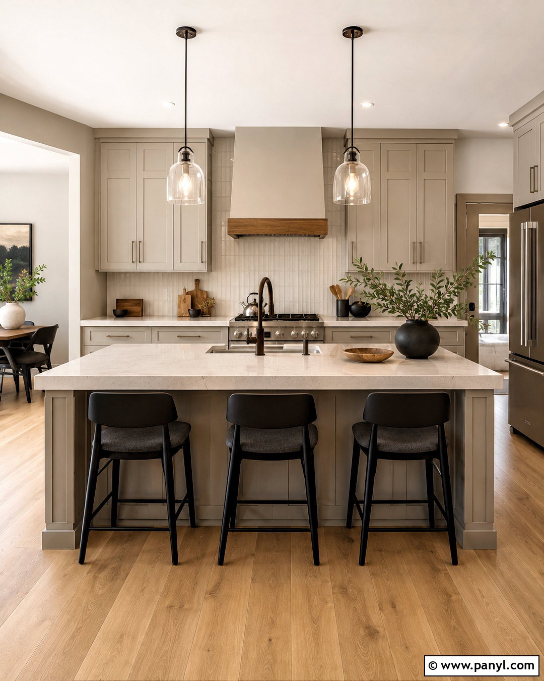
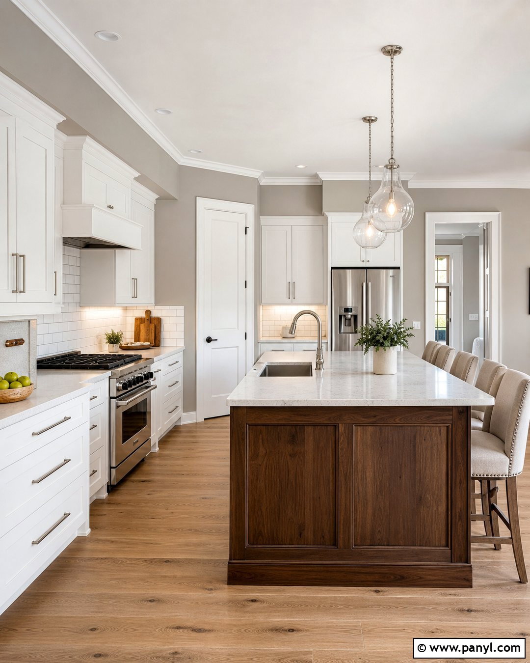
A warm white kitchen gains subtle separation when Agreeable Gray covers the walls. Combine the paint with creamy white cabinets, softly veined quartz countertops, and a glossy off-white subway tile backsplash. Use warm brass knobs, a bridge faucet, and aged brass pendants to support the beige side of the greige. Wide-plank oak flooring, tan counter stools, and woven window shades bring natural texture into the complete design. A muted sage runner and small pieces of handmade pottery introduce restrained color. Repose Gray could make this same kitchen feel a little cooler and more contemporary, while Agreeable Gray creates a gentler transition between the cream, brass, and wood finishes. Test it beside the cabinets to ensure neither surface makes the other appear unexpectedly yellow.
7. Repose Gray Bedroom With Blue Accents
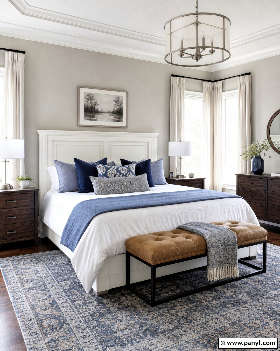
Cool blue details can highlight Repose Gray’s calm, balanced character without turning the bedroom icy. Paint the walls Repose Gray and use crisp white on the ceiling, trim, and simple paneled headboard. Dress the bed in white cotton sheets, a light gray quilt, and layered pillows in dusty blue, navy, and soft taupe. Place medium walnut nightstands on both sides, topped with white ceramic lamps and brushed nickel hardware. A blue-gray vintage-style rug should extend beneath the bed, while natural linen curtains soften the windows. Compared with Agreeable Gray, Repose Gray creates a more defined gray background for blue furnishings. Walnut, woven baskets, and a warm upholstered bench prevent the palette from feeling cold or overly formal.
8. Agreeable Gray Bedroom With Cream Textiles
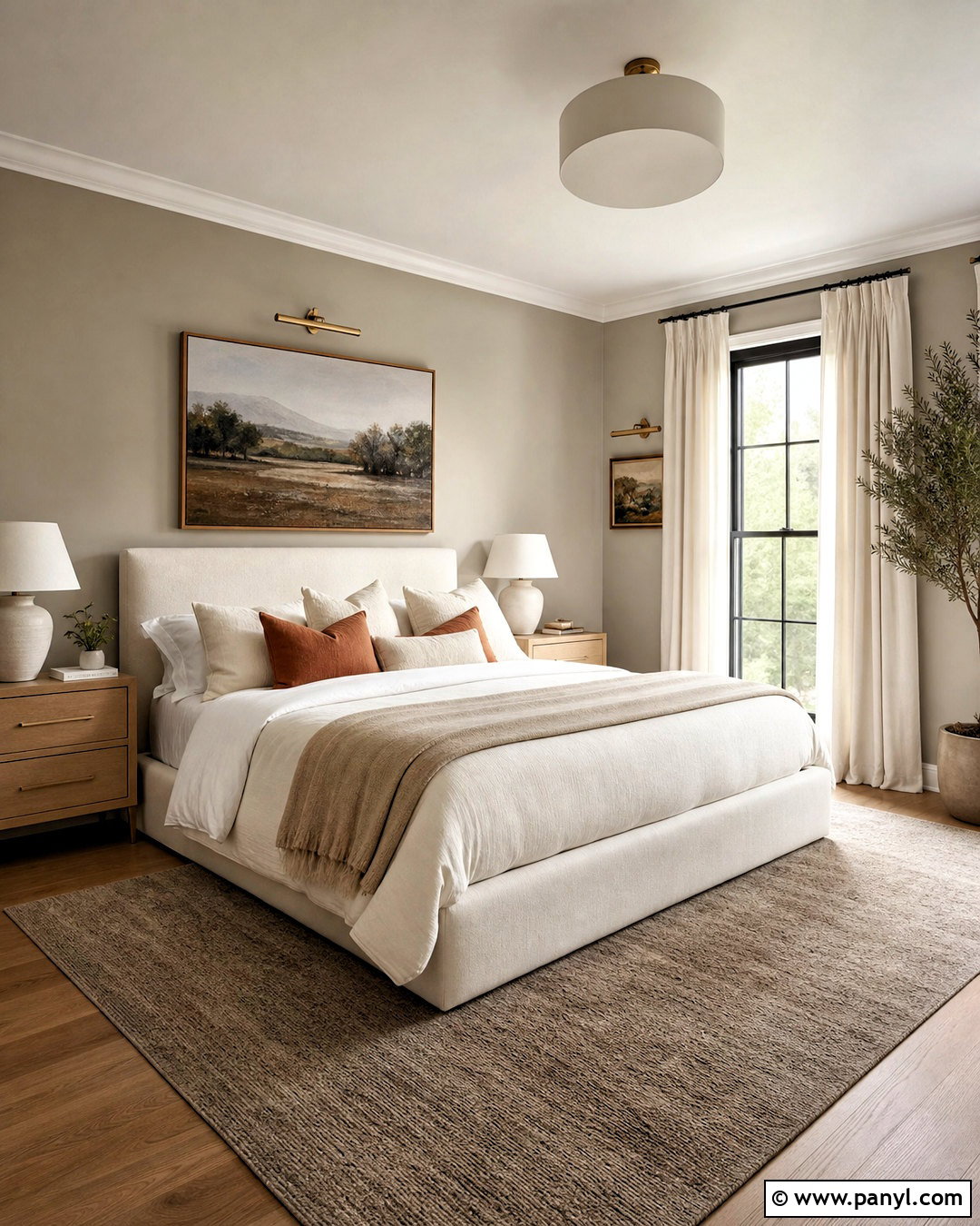
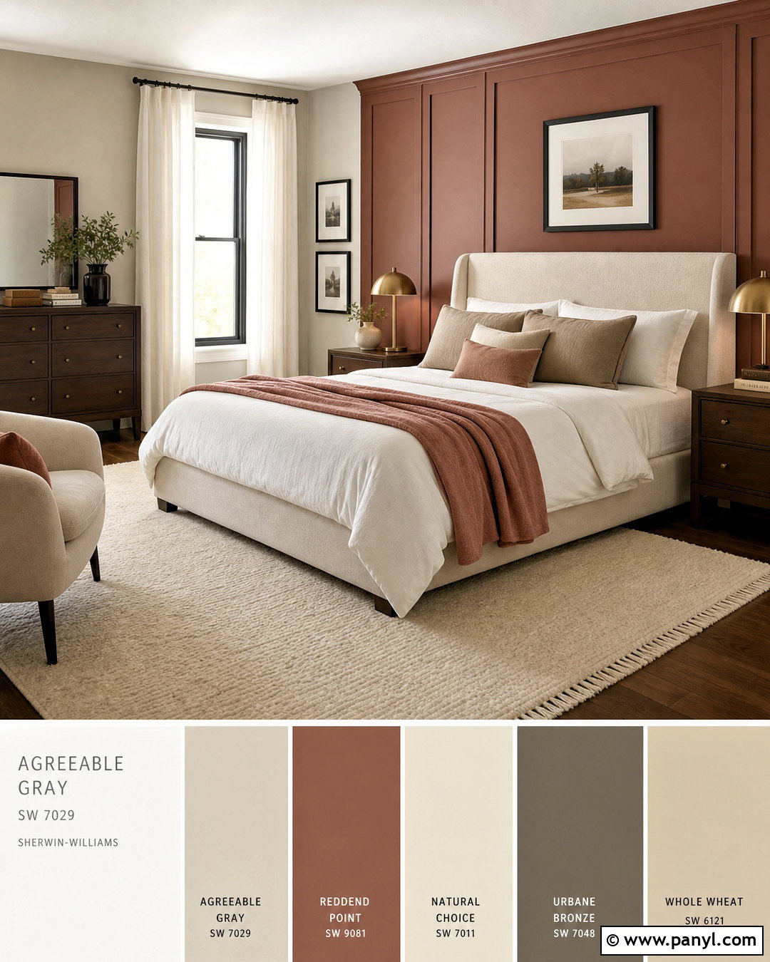
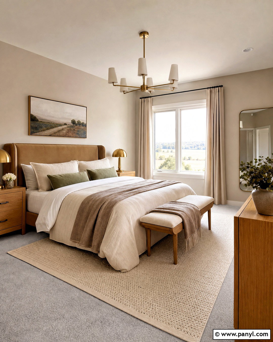
Soft layers turn Agreeable Gray into a restful bedroom color with plenty of warmth. Use the paint on every wall, complemented by an ivory upholstered bed, creamy bedding, and a thick beige throw. Add pale oak nightstands, warm white ceramic lamps, and a natural wool rug with a subtle taupe pattern. Full-length linen curtains should be slightly lighter than the walls to maintain an airy effect. Finish the complete look with muted terracotta pillows, brass picture lights, and understated landscape prints. Agreeable Gray supports cream and tan more smoothly than Repose Gray in many warm palettes. Still, compare samples beside the headboard and flooring before painting. The right lighting should make the room feel softly greige rather than noticeably beige or dull.
9. Repose Gray Bathroom With Marble
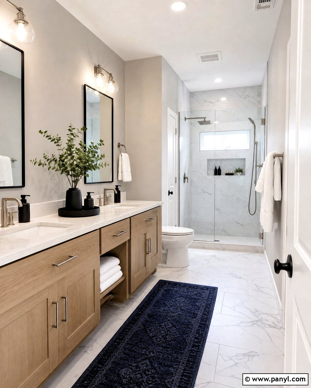
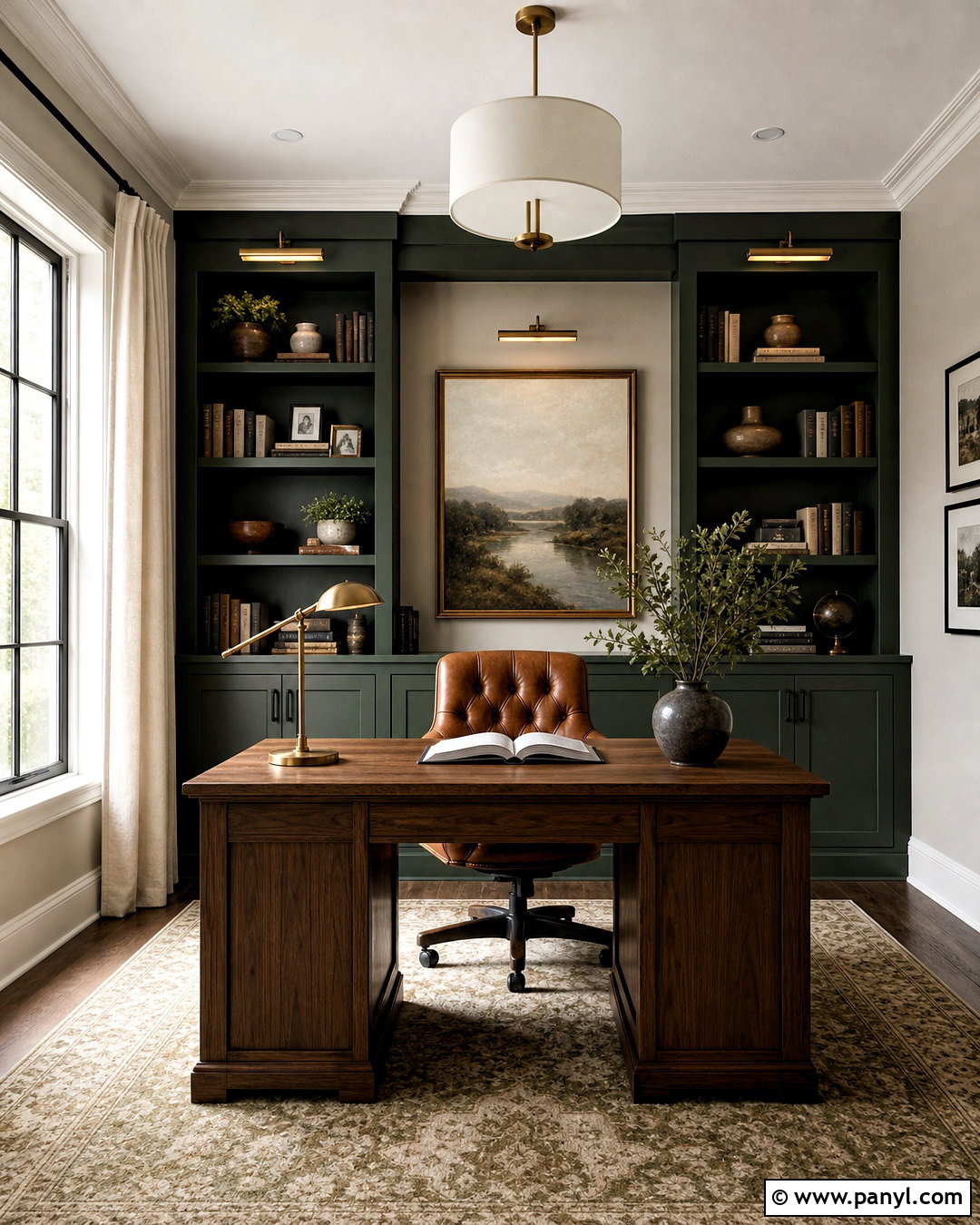
The subtle gray movement in marble provides a natural partner for Repose Gray. Paint the upper walls in Repose Gray and install white marble-look porcelain tile around the shower and across the floor. Choose a white oak vanity with a pale quartz top, brushed nickel faucets, and simple polished nickel mirrors. Bright white trim, white towels, and a frameless glass shower keep the room fresh. Add a muted navy runner, small black accessories, and one leafy plant for contrast. Repose Gray generally reinforces cool stone more effectively than the warmer Agreeable Gray, yet the oak vanity stops the bathroom from feeling sterile. Use bright neutral-white bulbs so the wall color and marble remain clear instead of developing unwanted yellow or blue casts.
10. Agreeable Gray Bathroom With Brass
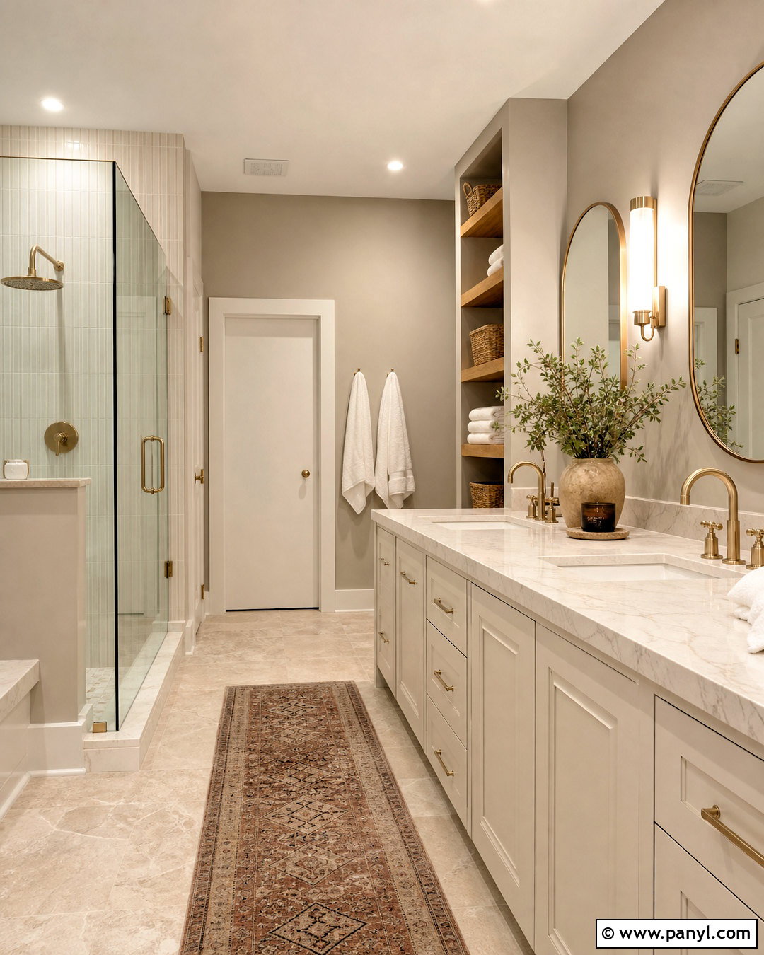
Warm metal finishes and natural textures help Agreeable Gray create an inviting bathroom rather than a plain neutral box. Use the color on the walls above a creamy white vanity and warm white vertical tile backsplash. Select a light quartz counter with beige veining, brushed brass faucets, rounded brass mirrors, and matching cabinet pulls. Beige stone-look flooring should provide a durable base, while oak floating shelves introduce relaxed storage. Add white towels, a muted clay-colored runner, and small woven baskets to complete the room. Agreeable Gray’s beige influence connects the brass, wood, and stone more naturally than Repose Gray might. Keep the ceiling and trim soft white, avoiding an overly yellow cream that could exaggerate the warmth of the walls.
11. Repose Gray Dining Room With Walnut
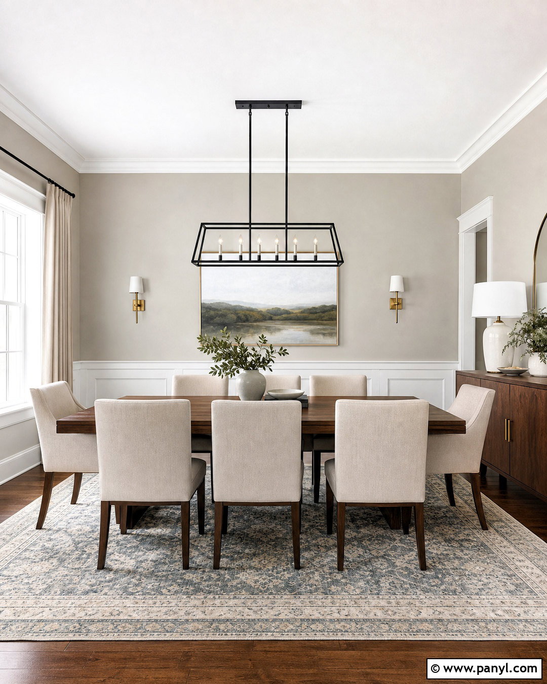
Imagine evening meals surrounded by smooth walnut, tailored upholstery, and softly gray walls. Repose Gray provides enough color to define a formal dining room while remaining versatile. Pair it with substantial white trim, a warm walnut table, and dining chairs upholstered in oatmeal fabric. Ground the arrangement with an ivory, gray, and faded blue rug. A black linear chandelier introduces a contemporary edge, while long natural linen curtains soften the architecture. Hang a large landscape painting containing muted blues, browns, and cream above a narrow walnut sideboard. Repose Gray offers a clearer gray contrast against the brown furniture than Agreeable Gray. Brass candlesticks, ceramic serving pieces, and warm bulbs can keep the finished dining room comfortable rather than cool.
12. Agreeable Gray Dining Room With Light Oak
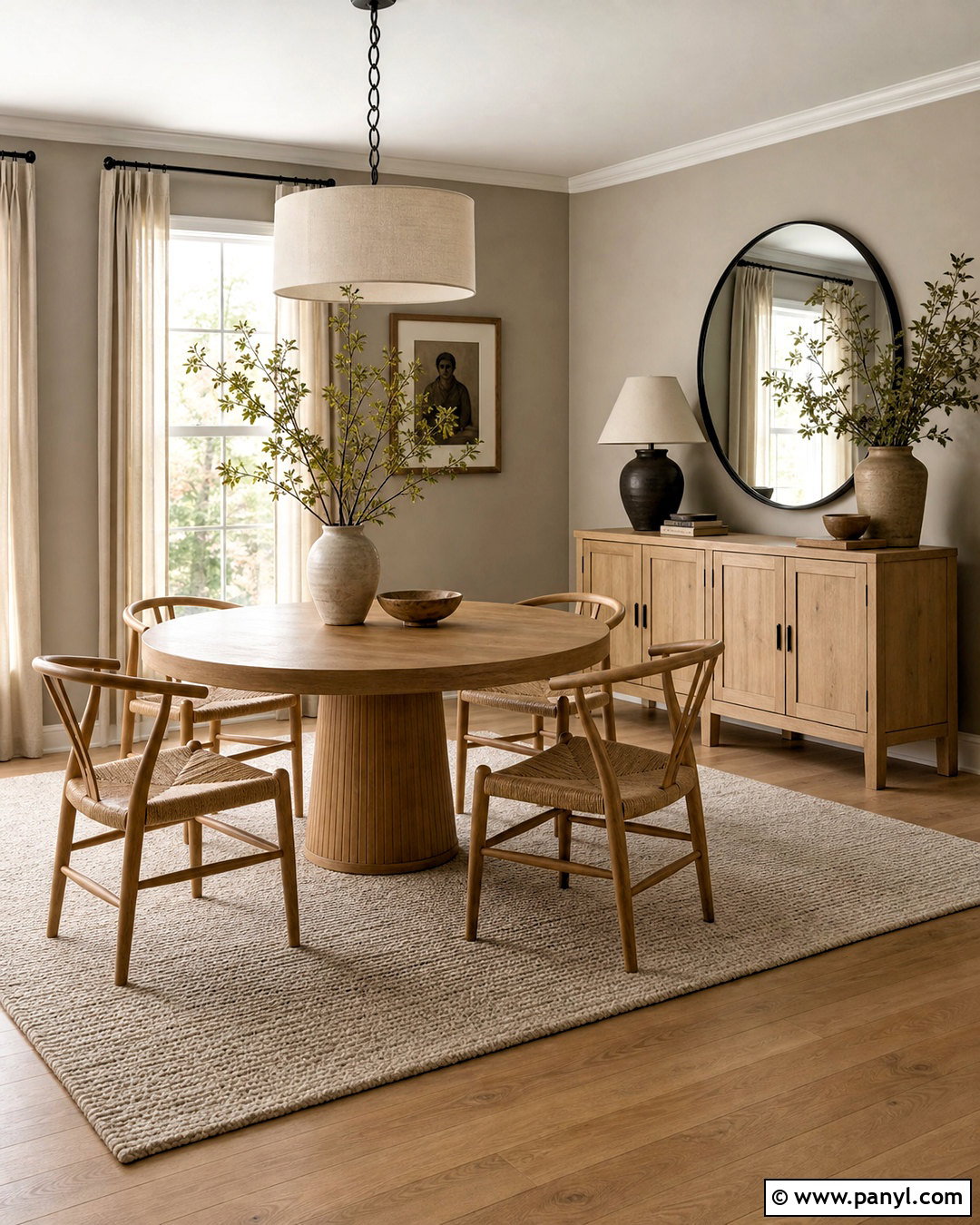
Agreeable Gray can make a casual dining room feel bright without creating a sharp white backdrop. Paint the walls in this warm greige, then add a round light oak pedestal table and curved chairs with woven seats. Use a warm white ceiling, white trim, and a cream flat-weave rug to maintain softness. A large linen drum pendant should center the table, while a pale oak sideboard provides storage along one wall. Style it with earthy pottery, a simple mirror, and branches in a ceramic vase. Black curtain rods and a few dark frames add necessary definition. Compared with Repose Gray, Agreeable Gray creates a lower-contrast transition between light wood, cream fabric, and natural fiber, producing a relaxed modern-organic dining space.
13. Repose Gray Home Office
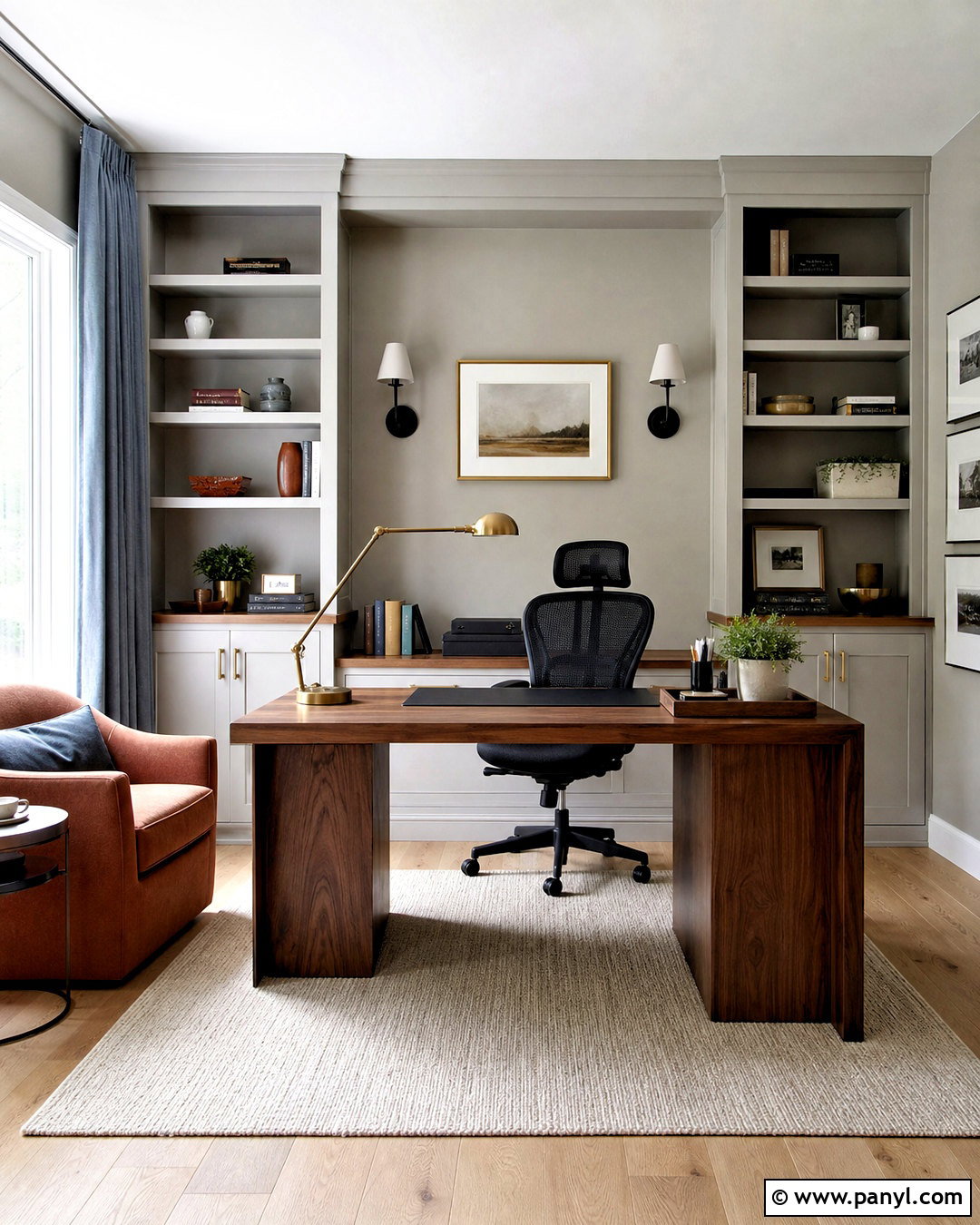
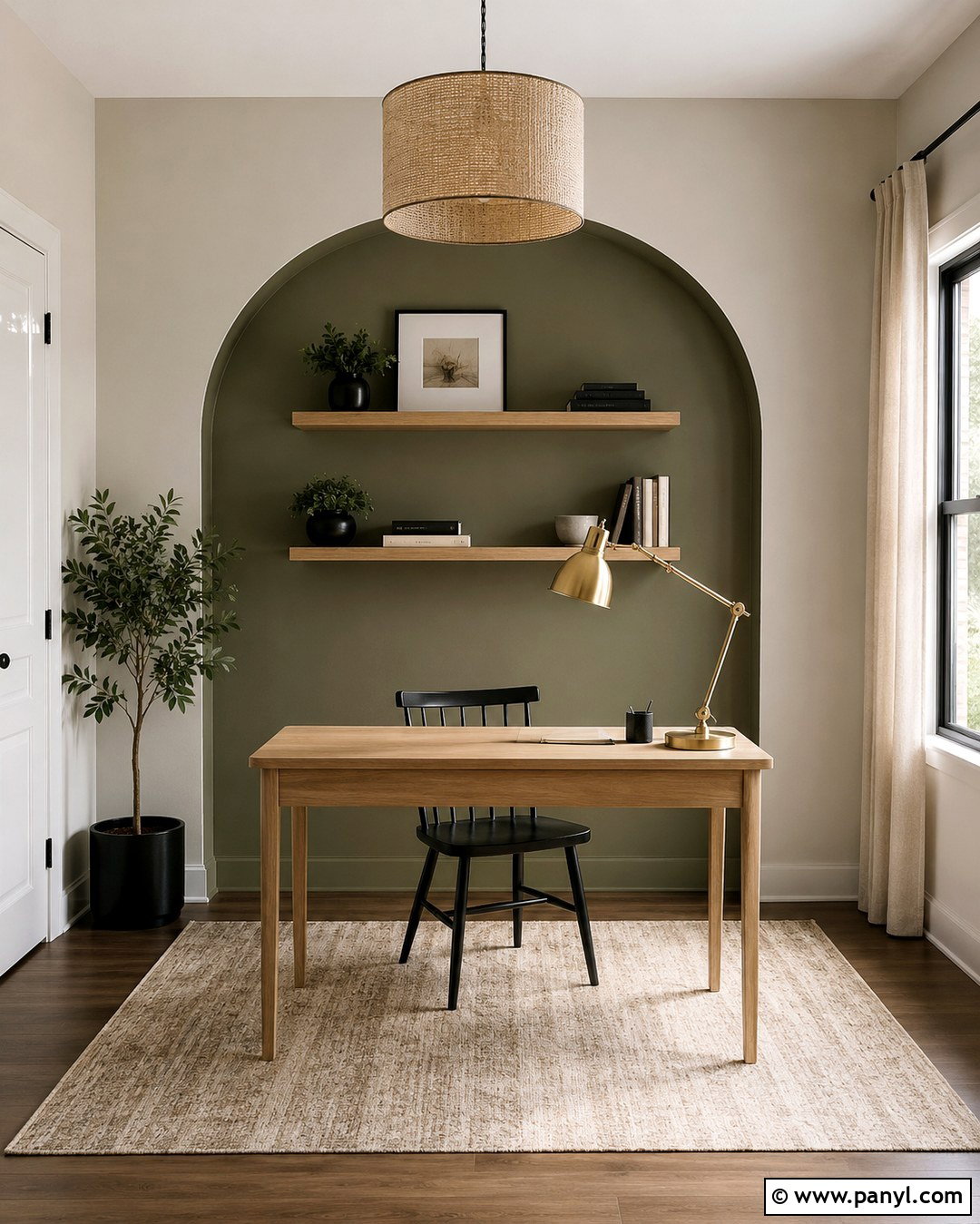
A productive home office needs enough contrast to feel focused but not visually busy. Repose Gray can cover the walls and built-in bookcases, creating a unified envelope around a substantial walnut desk. Use a white ceiling, pale oak floor, and a large ivory rug to prevent the room from becoming too shaded. Add a black ergonomic chair, matte black sconces, and closed storage along the lower cabinets. Blue-gray curtains and a muted rust desk chair for visitors introduce controlled color. Repose Gray usually looks more architectural than Agreeable Gray in this setting, especially beside black and dark wood. Complete the office with organized shelves, framed neutral artwork, a brass desk lamp, and one healthy plant near the brightest window.
14. Agreeable Gray Entryway
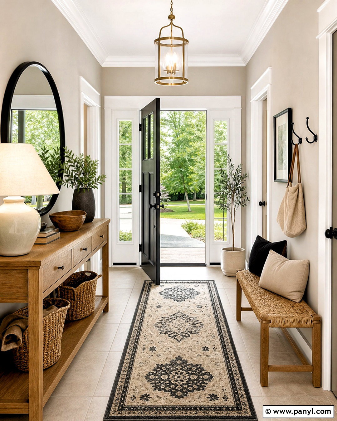
First impressions feel warmer when Agreeable Gray is paired with welcoming wood and woven finishes. Paint the entry walls in Agreeable Gray, adding bright white trim and a durable light beige porcelain floor. Place a narrow medium-oak console beneath a round black-framed mirror. A cream-and-charcoal runner should guide the eye toward the adjoining rooms, while a woven bench and black wall hooks create practical storage. Use a simple brass-and-glass ceiling fixture to add warmth without filling the compact space. Compared with Repose Gray, Agreeable Gray can soften an entry with limited furnishings and make natural materials feel more connected. Finish the design with a lidded basket, a ceramic lamp, restrained greenery, and one framed print rather than numerous small accessories.
15. Repose Gray Basement Family Room
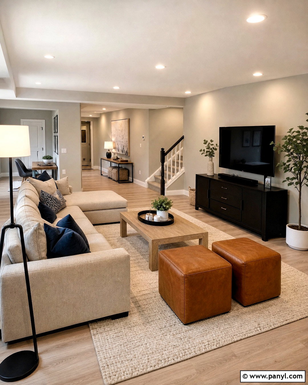
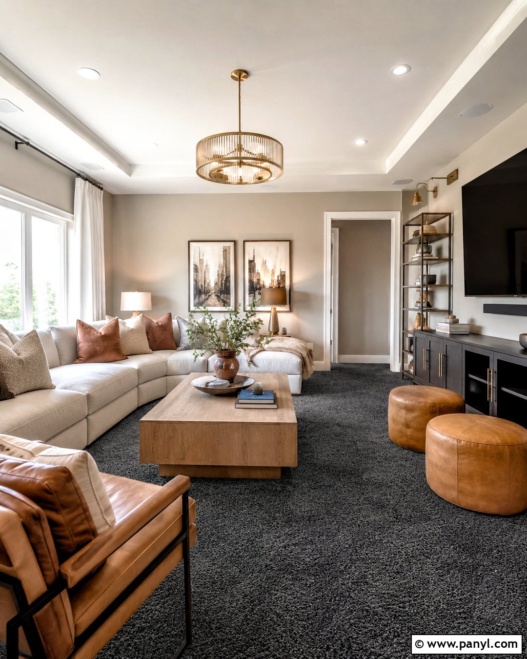
Basements often need a carefully layered lighting plan more than an automatically lighter paint color. Cover the walls in Repose Gray, then balance them with a bright white ceiling, wide white trim, and pale oak-look flooring. Arrange a large oatmeal sectional around a light wood coffee table and a low matte black media console. Use recessed fixtures with neutral-white bulbs, plus floor and table lamps to remove shadowy corners. A cream rug, blue pillows, and caramel leather ottomans keep the palette varied. Repose Gray gives the room more definition than Agreeable Gray while still reflecting a useful amount of light. Before committing, test a large sample because limited daylight can make its cooler or violet-gray tendencies more noticeable in certain basements.
16. Agreeable Gray North Facing Room
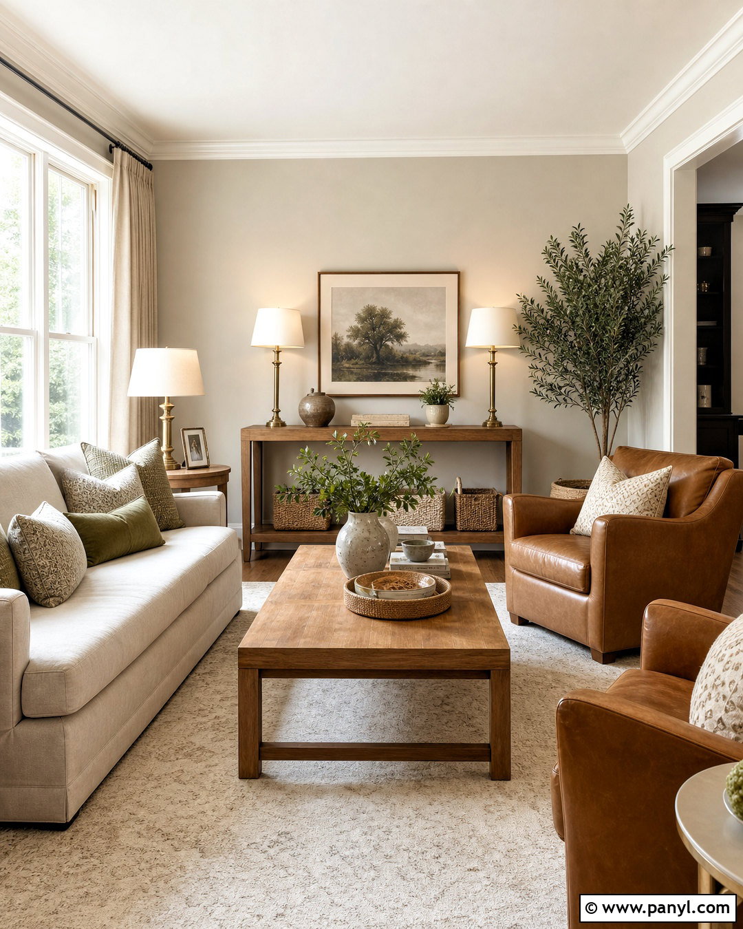
Cool northern daylight can make neutral paint appear flatter or grayer than expected. Agreeable Gray is often the stronger starting point because its beige warmth helps balance that cool exposure. Create a complete sitting room with Agreeable Gray walls, white trim, a cream sofa, and two camel-colored chairs. Add honey-toned oak tables, a warm ivory rug, and oatmeal linen curtains. Brass lamps and soft green pillows bring subtle color without disrupting the neutral scheme. Compared with Repose Gray, Agreeable Gray should keep the room feeling more comfortable when natural light is indirect. Avoid filling the space with cold silver, blue-gray fabric, or stark white furniture. Layer warm lamps throughout the room and check your sample during both daytime and evening hours.
17. Repose Gray South Facing Room
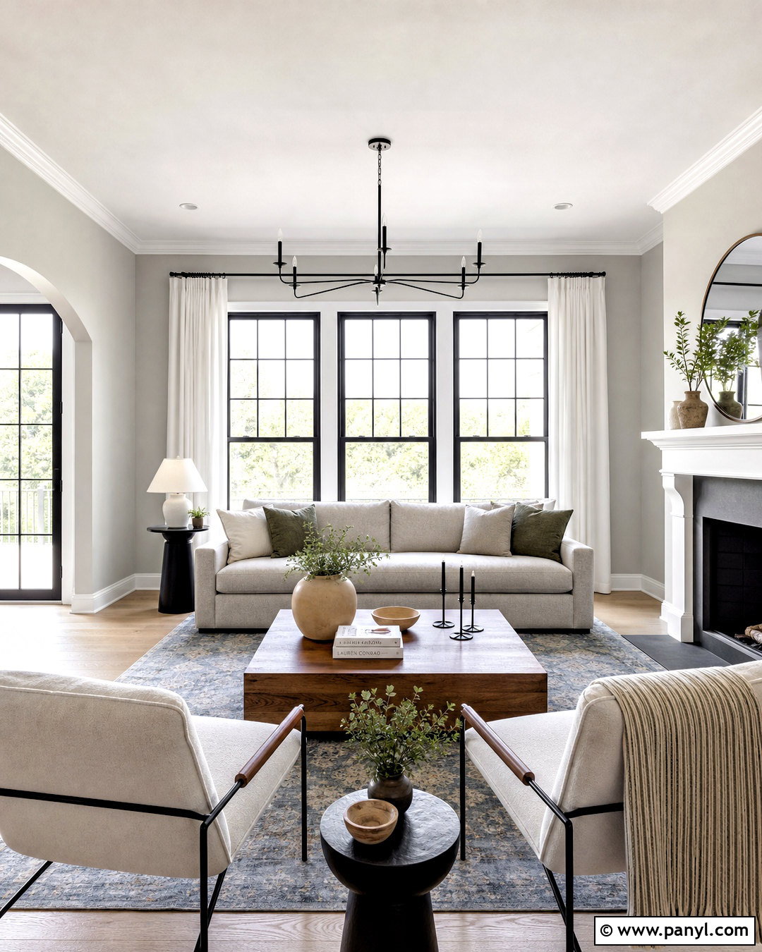
Abundant southern light can strengthen the warm side of almost any neutral. Repose Gray works well here because its cooler gray quality can balance the sunlight and prevent the walls from appearing too beige. Pair it with crisp white trim, a light greige sofa, and black-framed windows. Choose a faded blue rug, walnut coffee table, and textured ivory chairs for a balanced transitional living room. White linen curtains can filter glare while preserving brightness. Add muted green pillows, black metal lighting, and a few warm ceramic accessories. Agreeable Gray may look noticeably warmer in the same strong exposure, which can be ideal if you prefer beige. Repose Gray is the better direction when you want a clearer, contemporary gray result.
18. Repose Gray House Exterior
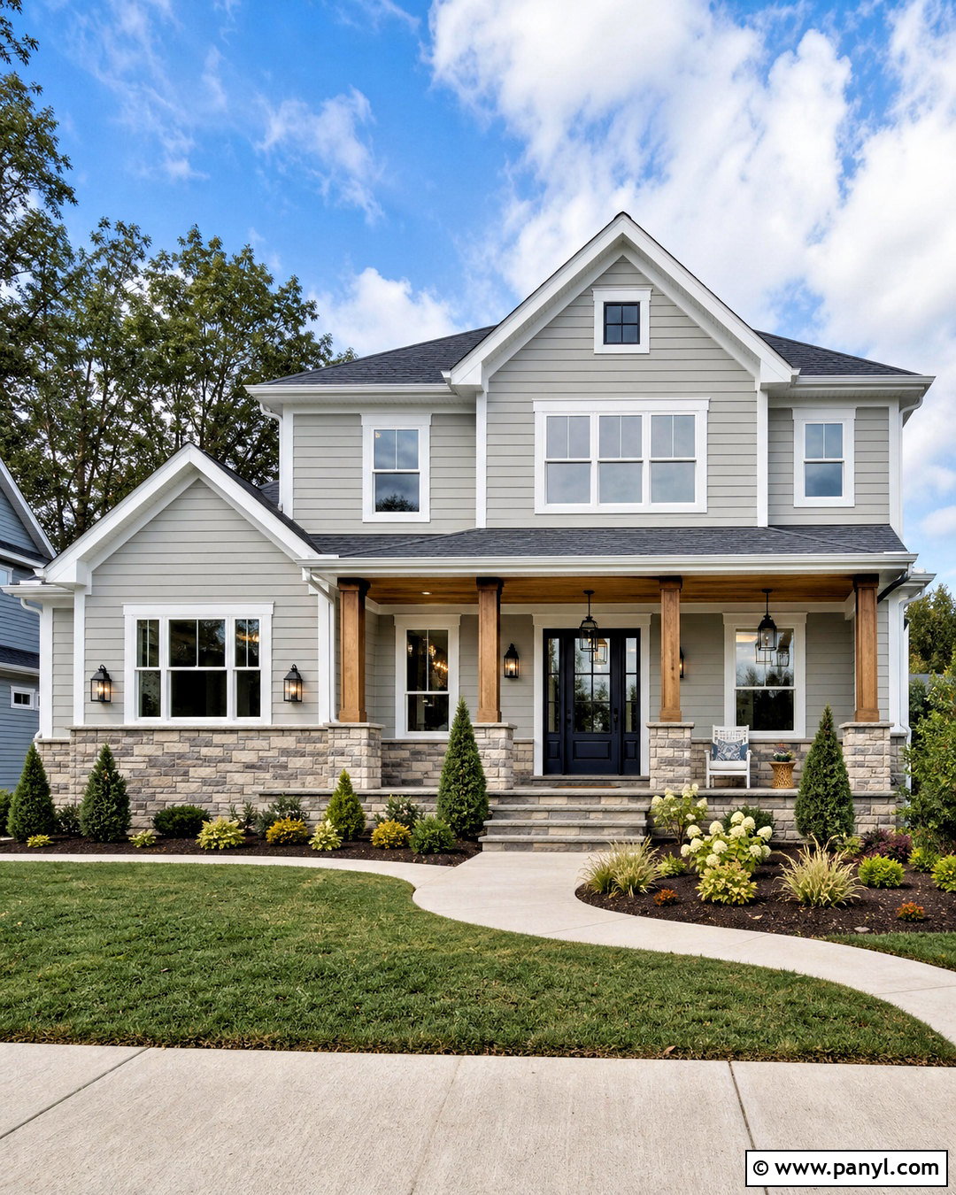
On an exterior, Repose Gray creates a composed light-gray body color that works well with strong contrasting details. Use it across horizontal siding, paired with bright white trim, charcoal architectural shingles, and a deep navy front door. Matte black lanterns, black gutters, and simple black house numbers sharpen the scheme. Introduce warmth through a natural cedar porch ceiling, medium-stained wooden columns, and stone foundation accents containing gray and beige. Complete the curb view with curved planting beds, clipped evergreen shrubs, ornamental grasses, and a clean concrete walkway. Outdoor sunlight can make Repose Gray appear lighter than it does indoors. Compared with Agreeable Gray, it generally offers a cooler, grayer facade that suits black, navy, and charcoal exterior materials.
19. Agreeable Gray House Exterior
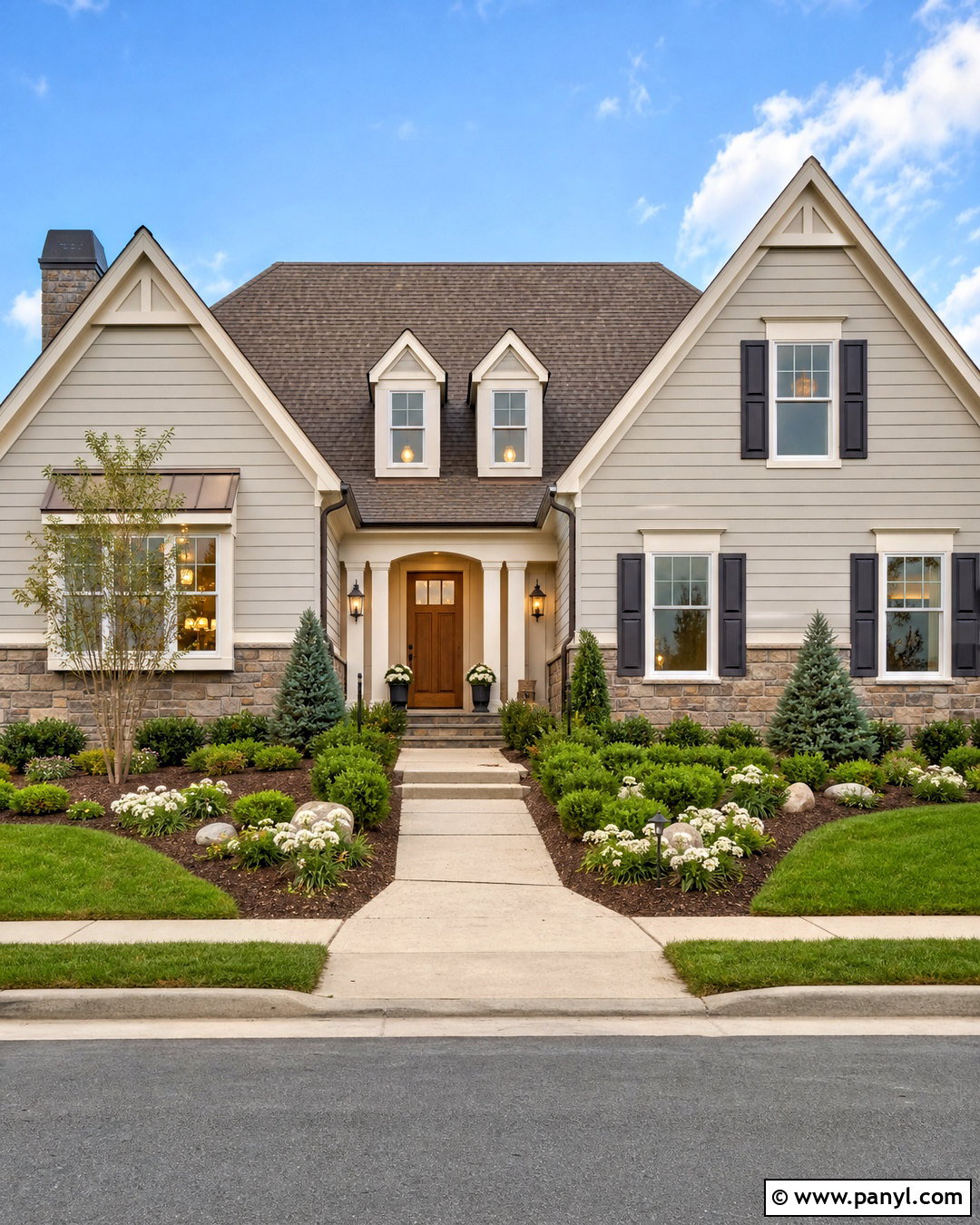
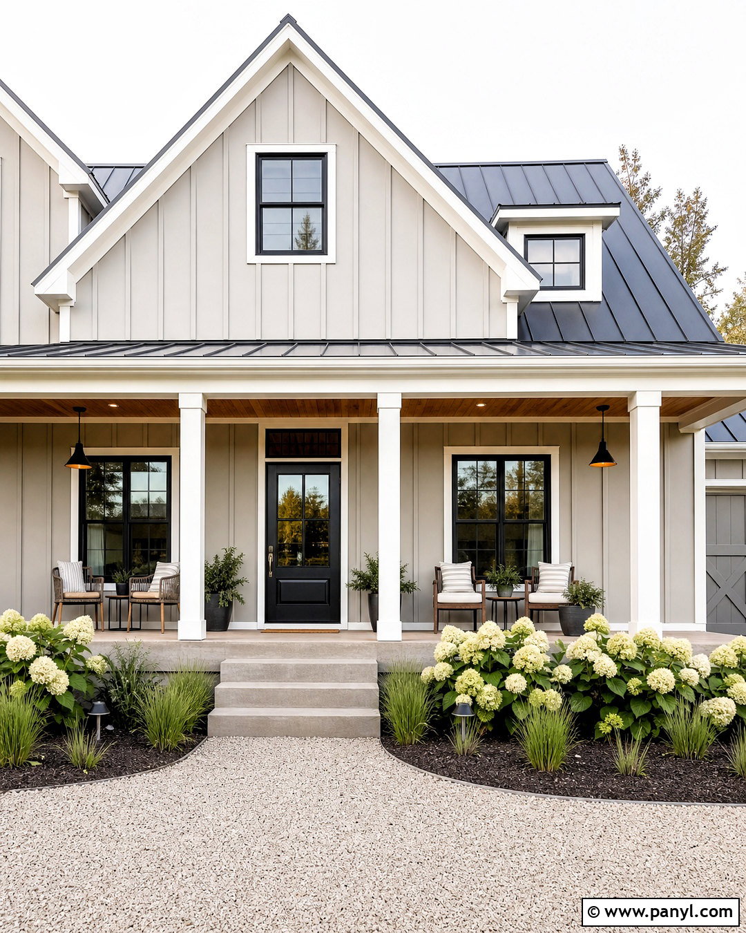
Agreeable Gray gives a home exterior a warmer greige presence that coordinates especially well with cream, brown, and natural wood. Apply it to the main siding and pair it with warm white trim, a medium-brown shingle roof, and a stained wood front door. Use bronze lanterns, dark bronze gutters, and matching hardware rather than stark black. A stone skirt containing tan, taupe, and soft gray should connect the body color to the landscaping. Finish the complete exterior with a light concrete path, layered evergreen shrubs, white flowering plants, and natural mulch. Agreeable Gray may look much lighter outdoors, so sample it on several sides of the house. It is warmer than Repose Gray and usually feels softer beside earthy roofing and masonry.
20. Repose Gray Vs Agreeable Gray Whole House Palette
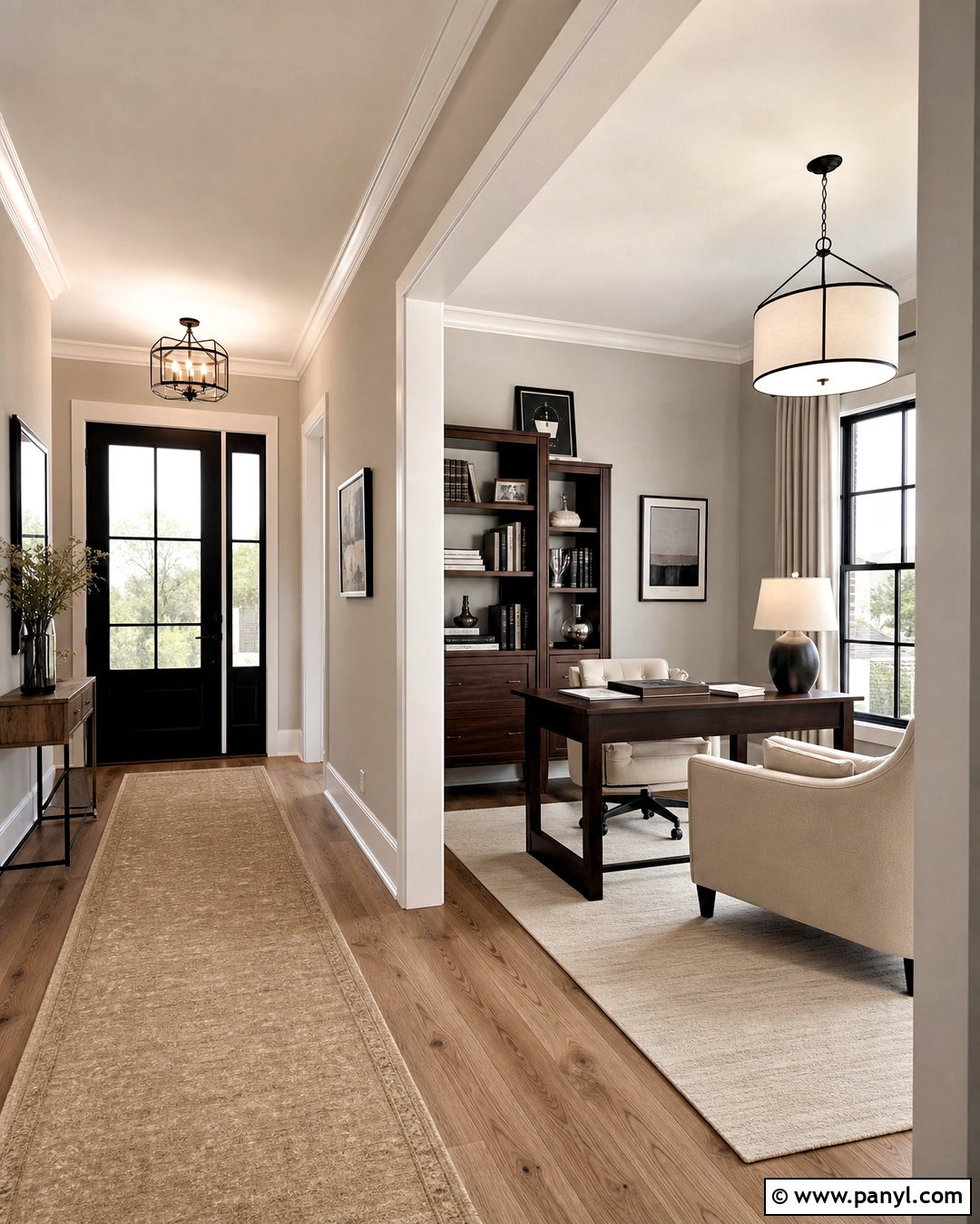
For a coordinated whole-house scheme, avoid alternating these similar greiges randomly from room to room. Instead, select one as the primary wall color and reserve the other for a clearly defined space. Use Agreeable Gray through the entry, open kitchen, halls, and warm family room, all connected by oak flooring and soft white trim. Introduce Repose Gray in a separate office or south-facing dining room containing walnut furniture, black accents, and cooler artwork. Repeat the same white trim, metal finishes, and wood tones to maintain continuity. Because their depths are close, the transition may look accidental without a doorway or architectural break. Large samples will reveal which color better supports the fixed flooring, counters, tile, and natural light throughout your home.
Conclusion:
The Repose Gray vs Agreeable Gray decision depends less on popularity and more on the finishes, daylight, and atmosphere already present in your home. Agreeable Gray usually supports cream upholstery, warm oak, brass, beige stone, and relaxed traditional rooms. Repose Gray often works better with crisp white, charcoal, black, blue, walnut, and cooler contemporary materials. Both are light neutral colors, and their small difference in LRV matters less than their relationship with surrounding surfaces. Sample each paint on more than one wall and observe it from morning through evening. These 20 Repose Gray vs Agreeable Gray ideas can help you build a complete palette instead of choosing wall color in isolation.

Related Ideas and Inspiration:
Leave a Reply