
The best 20 color palette ideas do more than place attractive shades side by side. A successful palette connects wall color, furniture, flooring, textiles, lighting, and decorative accents into one balanced look. It should also suit the room’s natural light, architecture, and everyday purpose. Warm earth tones can make open spaces feel inviting, while cooler combinations create freshness and calm. Dark colors add depth when balanced with lighter surfaces, and playful hues become easier to live with when grounded by natural materials. The complete palettes below include timeless neutrals, nature-inspired greens, rich browns, soft pastels, and confident color pairings for many rooms and decorating preferences. Use these practical 20 color palette ideas to create a home that feels cohesive, personal, and thoughtfully finished.

1. Sage Green Color Palette
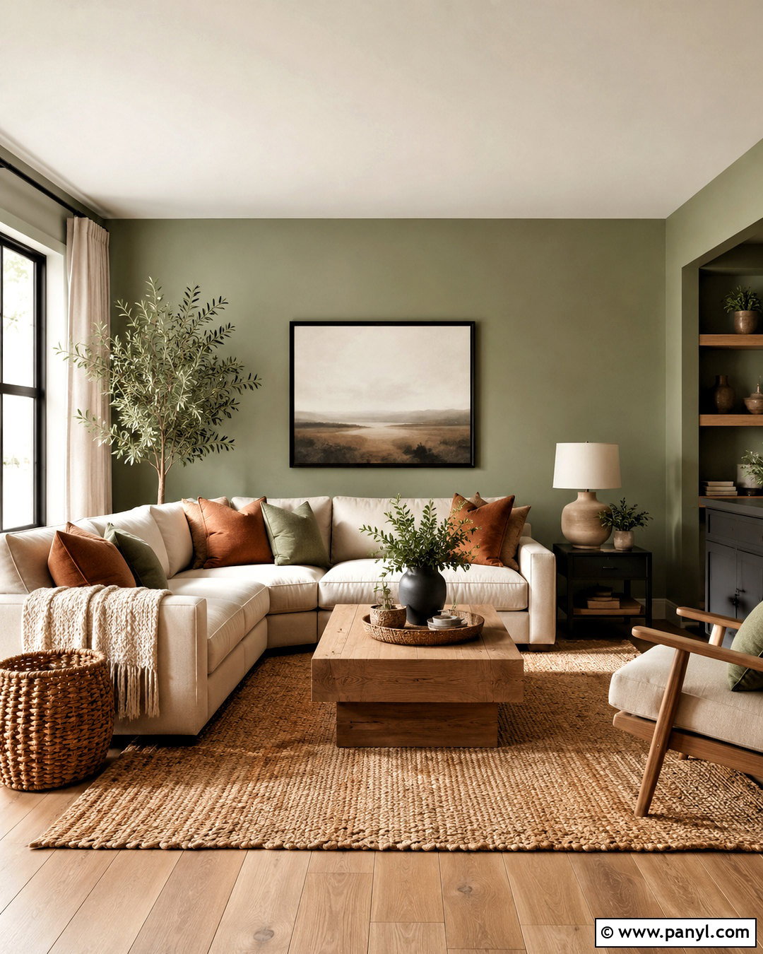
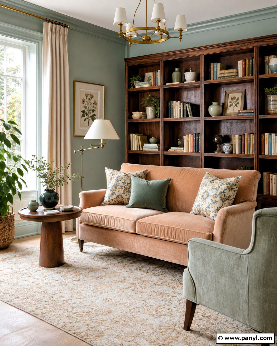
Soft sage green walls create a peaceful foundation that works beautifully with warm white, natural oak, muted clay, and matte black. Use an oatmeal-colored sofa as the largest furniture piece, then add sage curtains and rust-toned pillows for gentle contrast. A natural jute or wool rug can connect the seating area to honey-toned wood flooring. Choose an oak coffee table, woven baskets, ceramic lamps, and leafy plants to reinforce the organic character. Small black accents, such as curtain rods or picture frames, keep the room from appearing overly pale. This complete palette suits a living room, bedroom, or open family space because it feels fresh without becoming bright. Keep fabrics textured and patterns simple so every color remains restful and easy to coordinate.
2. Navy Blue Color Palette
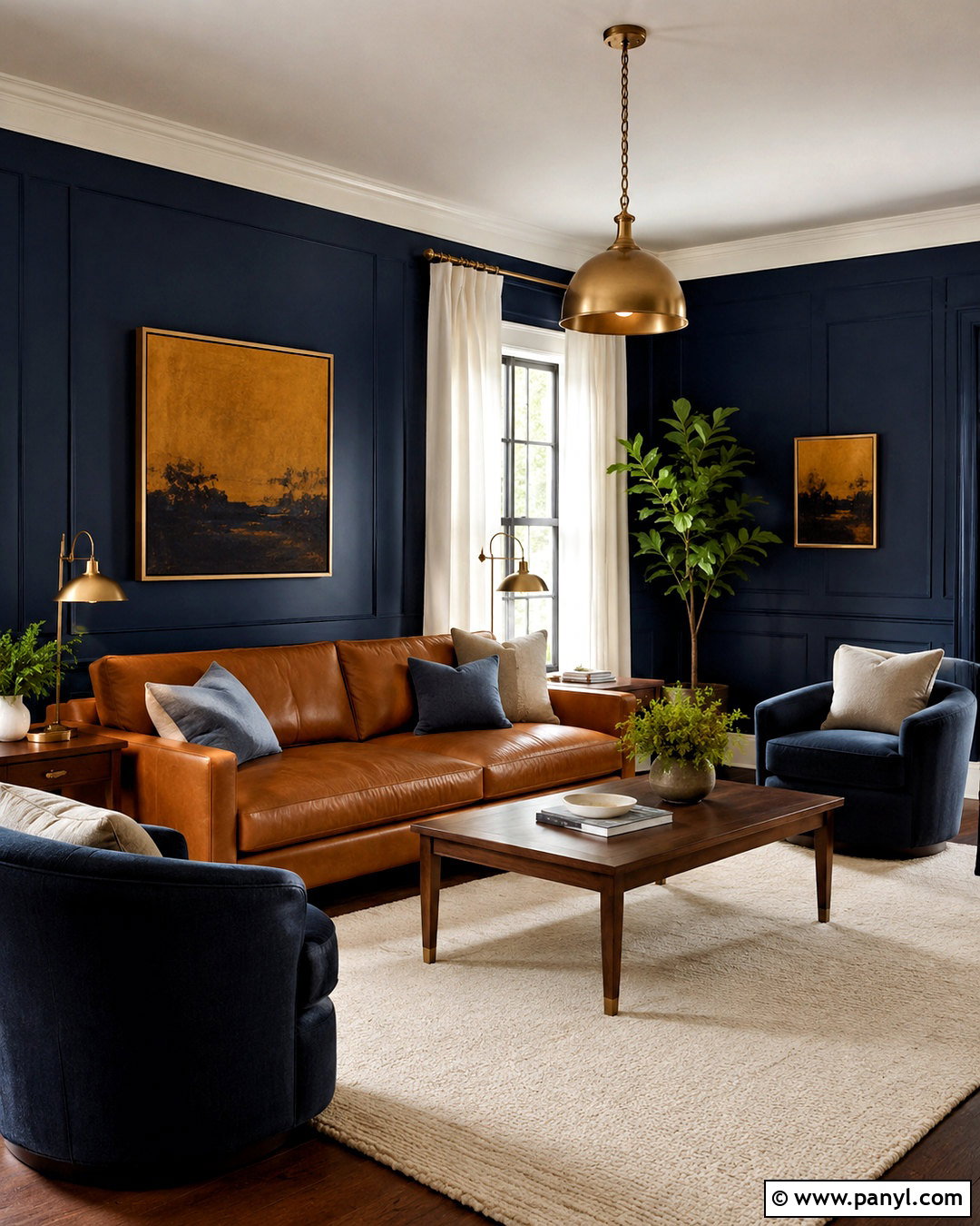
Imagine a comfortable living room with deep navy walls, crisp warm-white trim, a camel leather sofa, and touches of aged brass. Navy provides a dramatic backdrop, while warm brown leather prevents the scheme from feeling cold. Add an ivory rug and cream linen curtains to reflect daylight around the room. Walnut side tables, brass lamps, and framed artwork with muted blue and ochre details create a connected, collected finish. A few dusty blue pillows can soften the transition between the dark walls and lighter upholstery. For balance, keep the ceiling pale and use medium-toned wood flooring rather than another dark surface. This color palette delivers depth and sophistication while remaining welcoming enough for everyday use, especially when several warm textures are layered throughout the space.
3. Terracotta Color Palette
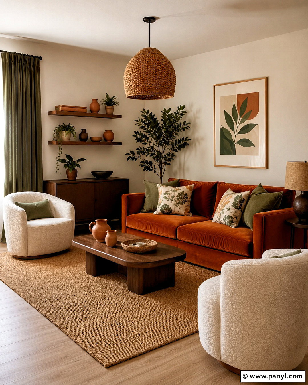
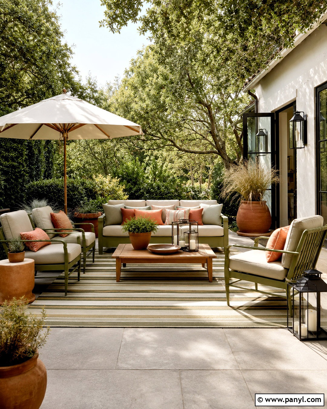
Sun-washed terracotta, creamy beige, olive green, and walnut brown form a warm palette inspired by natural landscapes. Begin with light beige walls and introduce terracotta through an upholstered sofa, large rug, or painted architectural feature. Olive curtains and botanical pillows add an earthy contrast without competing for attention. Ground the room with walnut furniture, woven pendant lighting, and handmade-looking ceramic accessories. Cream boucle chairs or linen upholstery provide enough lightness to keep the stronger colors balanced. This look works especially well in a dining room or casual living area with abundant natural light. Instead of matching every terracotta accent exactly, combine pale clay, burnt orange, and cinnamon tones. Their slight variation gives the room depth while maintaining a relaxed, unified appearance.
4. Warm Neutral Color Palette
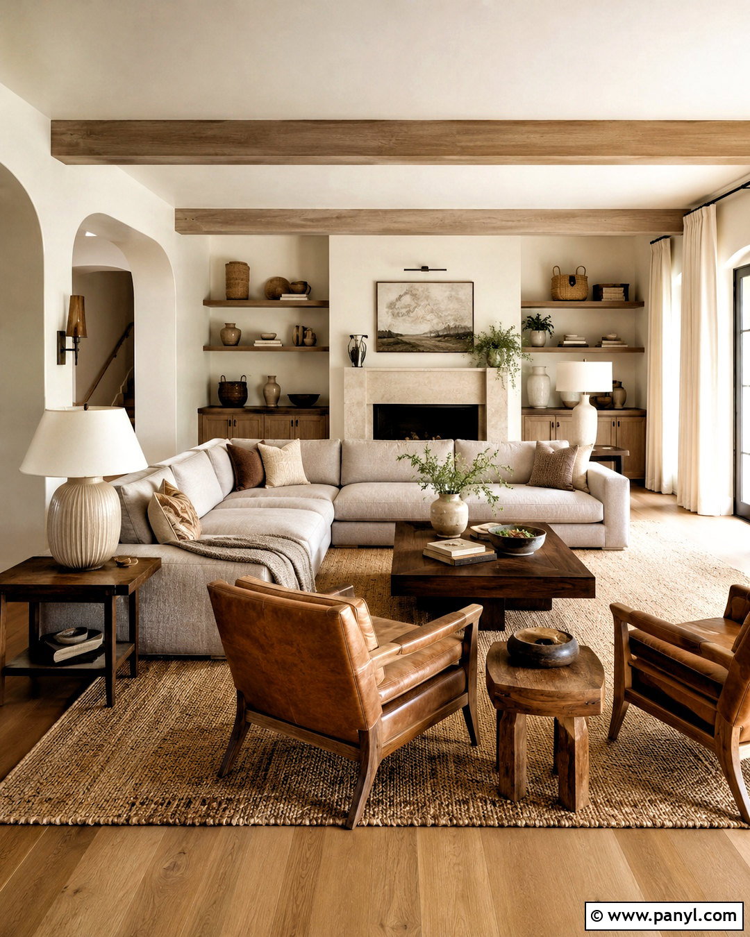
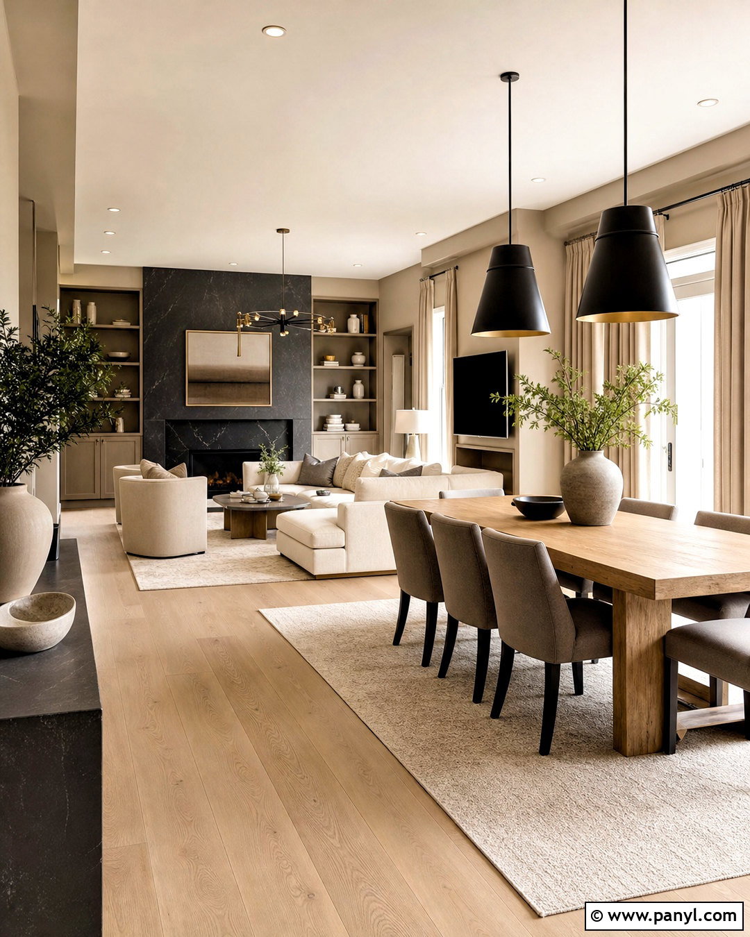
A warm neutral palette can feel layered and inviting when ivory, sand, taupe, caramel, and dark brown appear in different materials. Paint the walls a soft creamy white, then place a taupe sectional over a textured sand-colored rug. Add caramel leather chairs, dark walnut tables, and linen curtains that closely match the walls. The room gains interest from tactile finishes such as boucle, woven wool, ribbed ceramics, and lightly grained wood. Use dark brown sparingly in lamp bases, frames, or a single cabinet to create definition. Warm white lighting supports the cozy undertones after sunset. This complete scheme is ideal for an open living room because the low-contrast colors improve visual flow, while varied textures stop the design from looking flat or unfinished.
5. Dusty Blue Color Palette
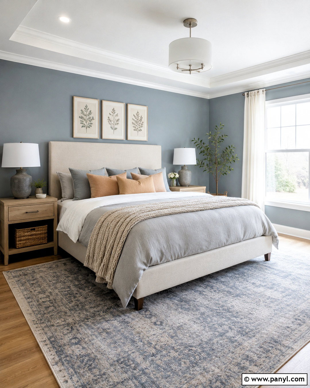
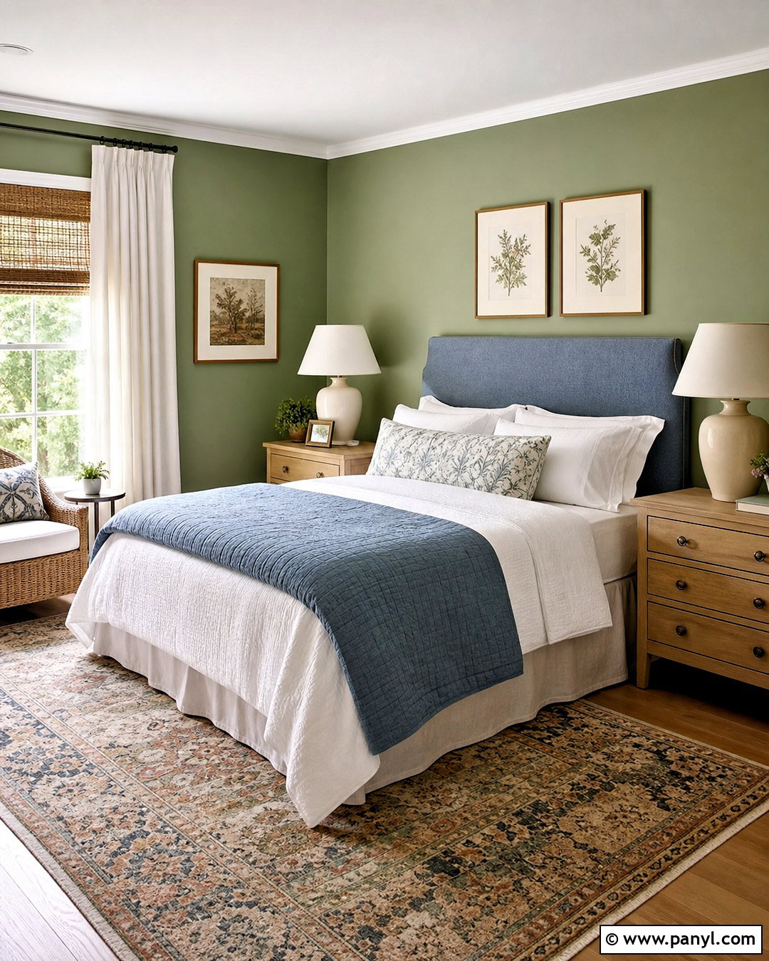
Would you like a bedroom that feels colorful but still calm? Combine dusty blue walls with warm white bedding, pale oak furniture, misty gray textiles, and muted peach details. The blue establishes a restful background without the sharpness of a highly saturated shade. Choose an upholstered ivory bed, light wood nightstands, and a blue-gray rug that extends generously beyond the bed. Peach pillows or a soft coral throw introduce warmth in a controlled amount. Brushed nickel lighting complements the cooler colors, while woven baskets keep the space relaxed. Use simple white curtains to brighten the windows and repeat dusty blue in one or two decorative pieces. This balanced palette creates a soothing bedroom that feels airy, polished, and comfortable throughout changing seasons.
6. Olive Green Color Palette
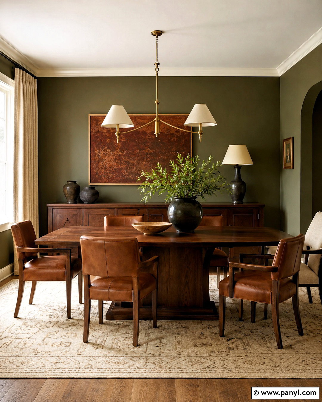
Rich olive green creates a grounded dining room when paired with warm cream, medium walnut, cognac brown, and antique brass. Cover the walls in olive paint, including the trim if you want a more enveloping effect. Center a walnut dining table beneath a brass pendant, then surround it with cognac leather or cream upholstered chairs. An ivory patterned rug will lighten the floor and define the dining zone. Add linen curtains, dark green pottery, and artwork containing small areas of rust or tan. Because olive has noticeable depth, balance it with reflective metal and pale textiles rather than filling the room with equally dark surfaces. The finished palette feels intimate and established, making it suitable for both everyday meals and comfortable gatherings without appearing overly formal.
7. Blush Pink Color Palette
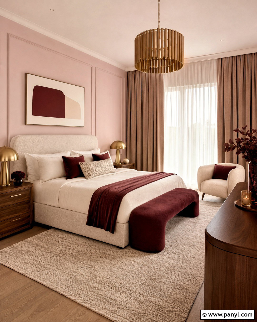
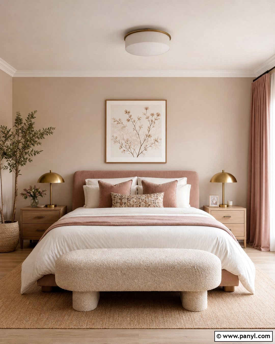
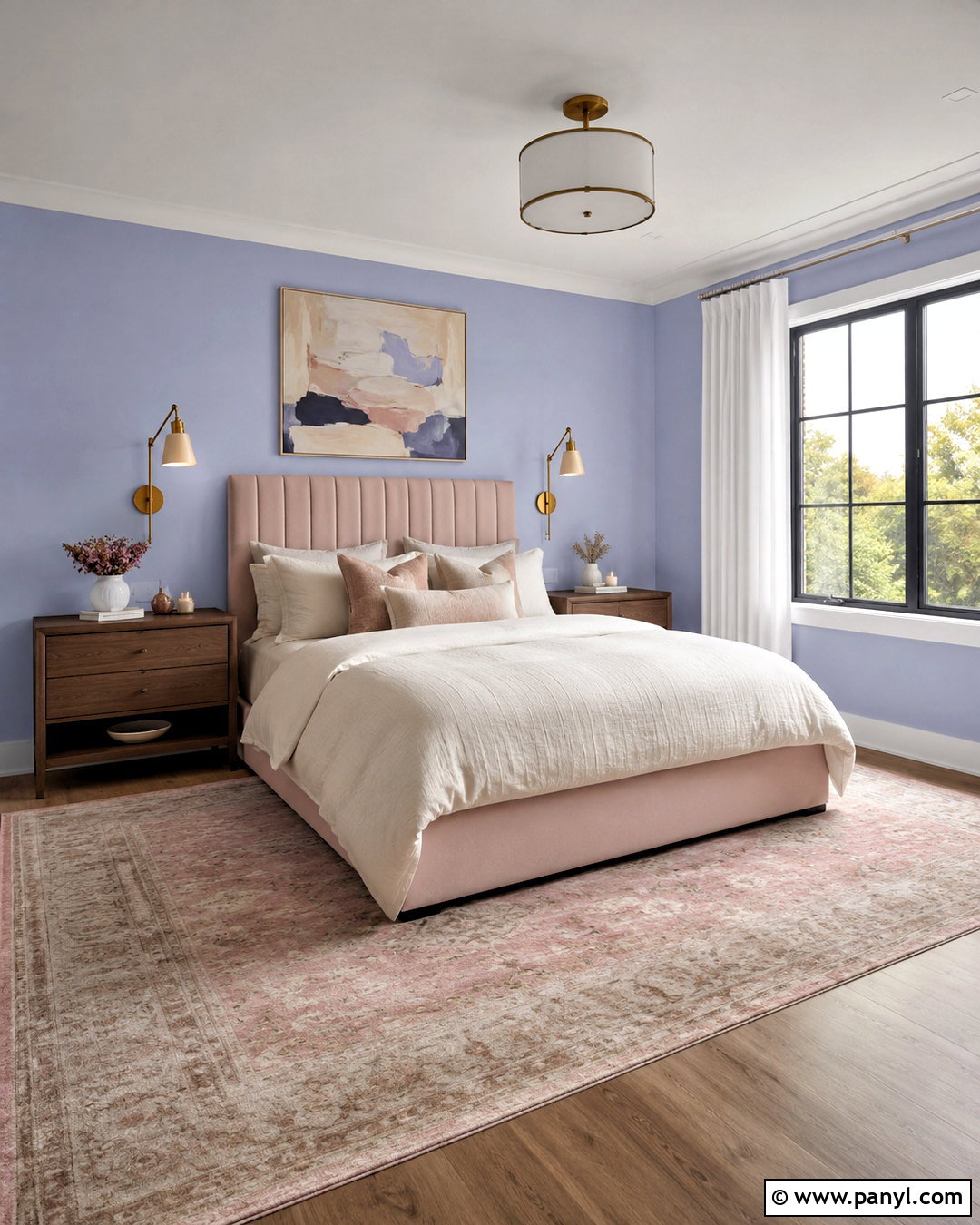
Blush pink becomes sophisticated when it is supported by mushroom taupe, warm white, walnut, and burgundy. Start with pale blush walls or a large pink upholstered bed, then use taupe on curtains, rugs, and a comfortable bench. Walnut nightstands add natural richness, while burgundy pillows provide a small but important note of contrast. Choose creamy bedding instead of bright white to preserve the palette’s soft warmth. Brushed brass lamps and rounded furniture shapes can complete the welcoming look. Avoid filling the room with many sugary pastel accents; deeper wood and red tones give the pink more maturity. This complete bedroom scheme feels gentle and expressive while remaining practical. It can also transition easily by replacing smaller burgundy accents with olive, navy, or chocolate brown.
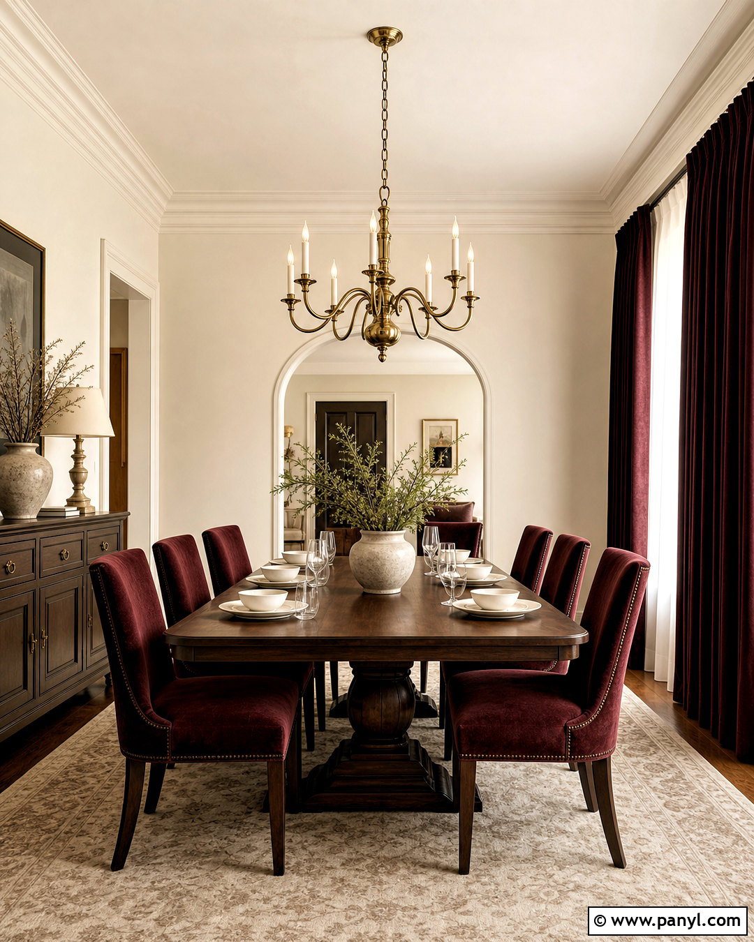
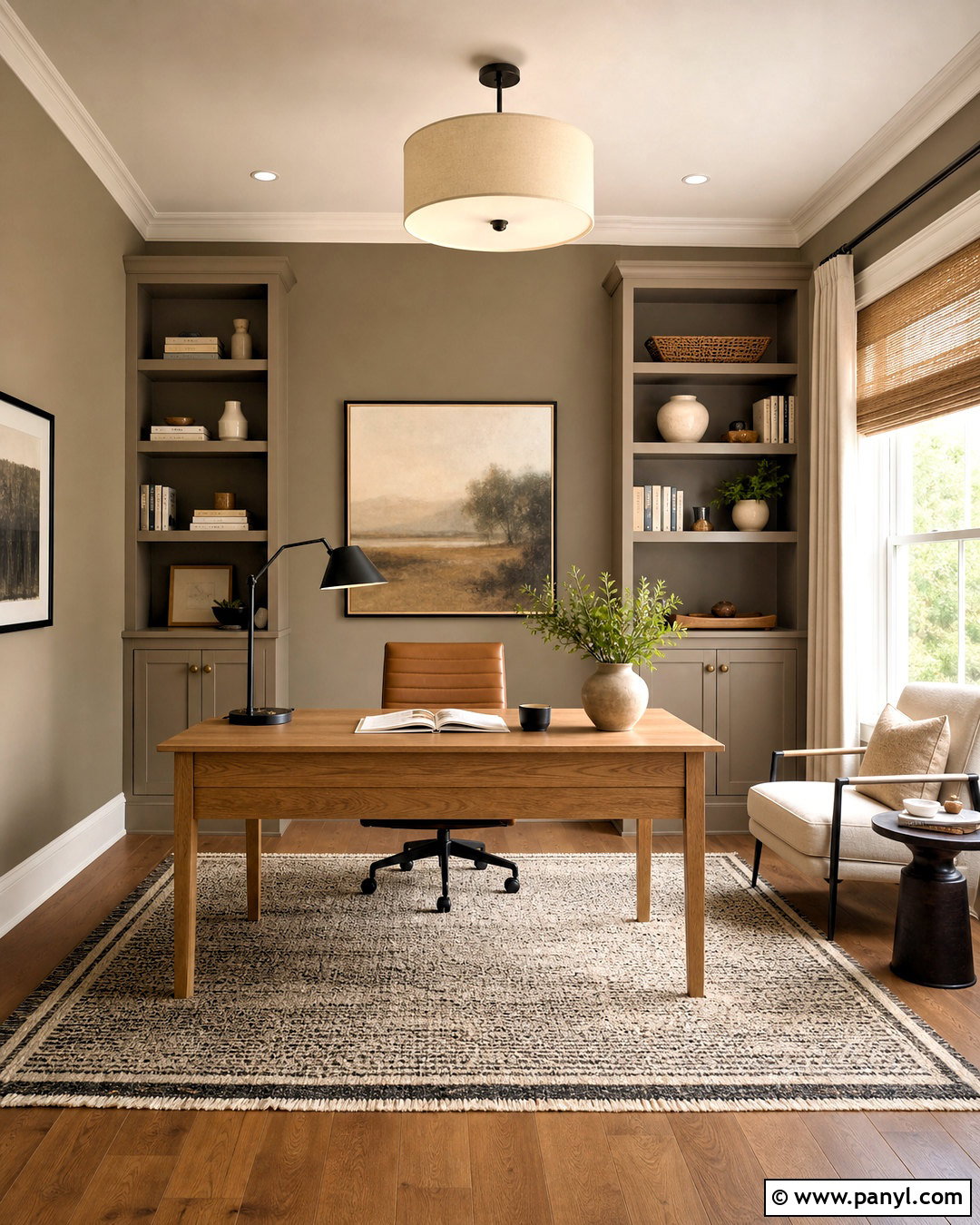
8. Chocolate Brown Color Palette
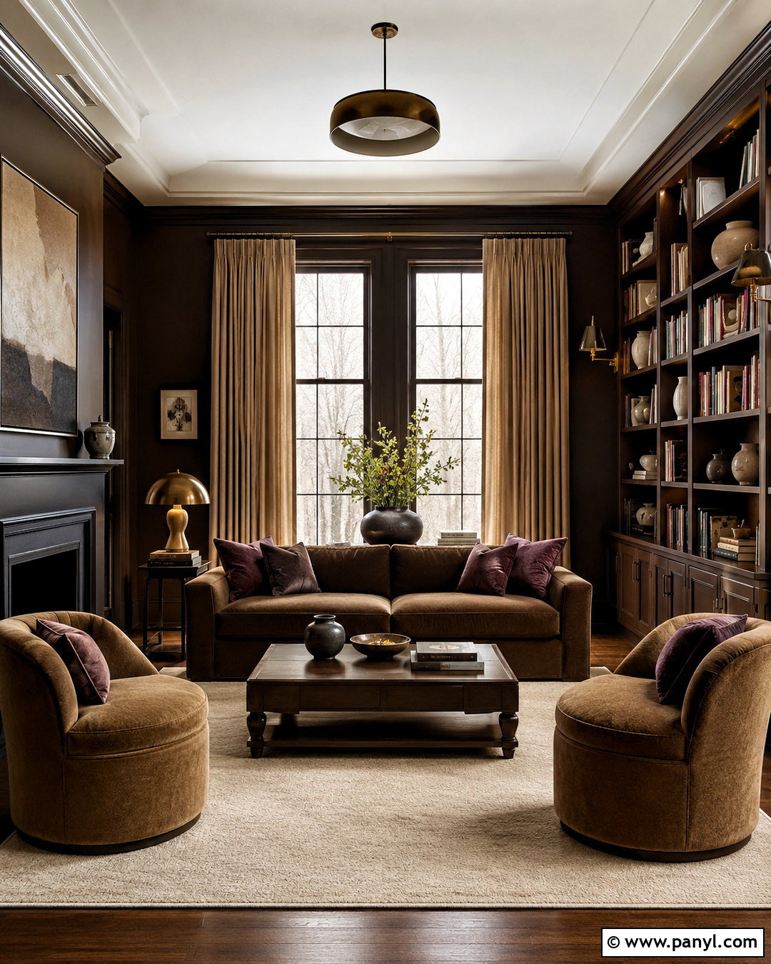
Chocolate brown, tan, parchment, and muted plum create a comfortable room with plenty of visual depth. Use chocolate paint on the walls or choose a large brown velvet sofa as the dominant feature. Balance that richness with parchment-colored curtains, a creamy rug, and a tan lounge chair. Muted plum pillows and artwork add an unexpected accent that feels softer than bright purple. Walnut shelving can blend naturally into the scheme, while aged brass lighting brings warmth and subtle shine. Keep the ceiling and main window treatments light so the darker surfaces do not overwhelm the room. This palette works especially well in a library, den, or formal sitting room. Layering velvet, wool, linen, and wood makes the closely related brown shades feel intentional rather than heavy.
9. Sky Blue Color Palette
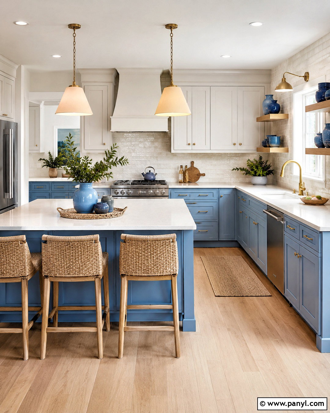
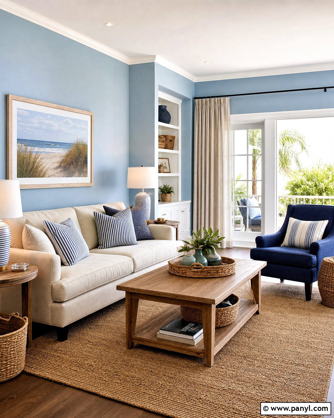
Clear sky blue, fresh white, sandy beige, and sunlit yellow create an uplifting kitchen that still feels suitable for daily life. Paint the lower cabinets blue and keep the upper cabinets or walls warm white. Choose light quartz countertops and a creamy backsplash with subtle tonal movement. Sandy beige can appear through oak stools, woven shades, and pale wood flooring. Introduce yellow sparingly with pendant lights, seat cushions, or countertop ceramics. Polished nickel hardware provides a clean finish without adding another strong color. The finished kitchen should feel bright rather than themed, so avoid excessive coastal accessories. By distributing the blue across cabinetry and repeating it in one small textile, the palette remains cohesive. Natural wood and quiet neutrals ensure the cheerful colors retain a comfortable balance.
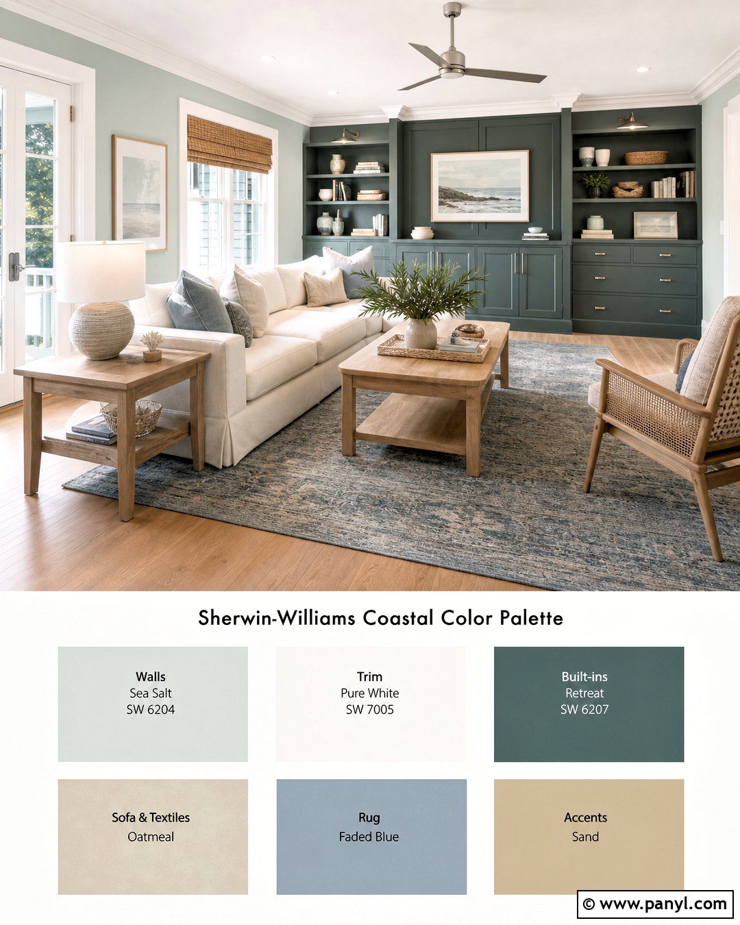
10. Burgundy Color Palette
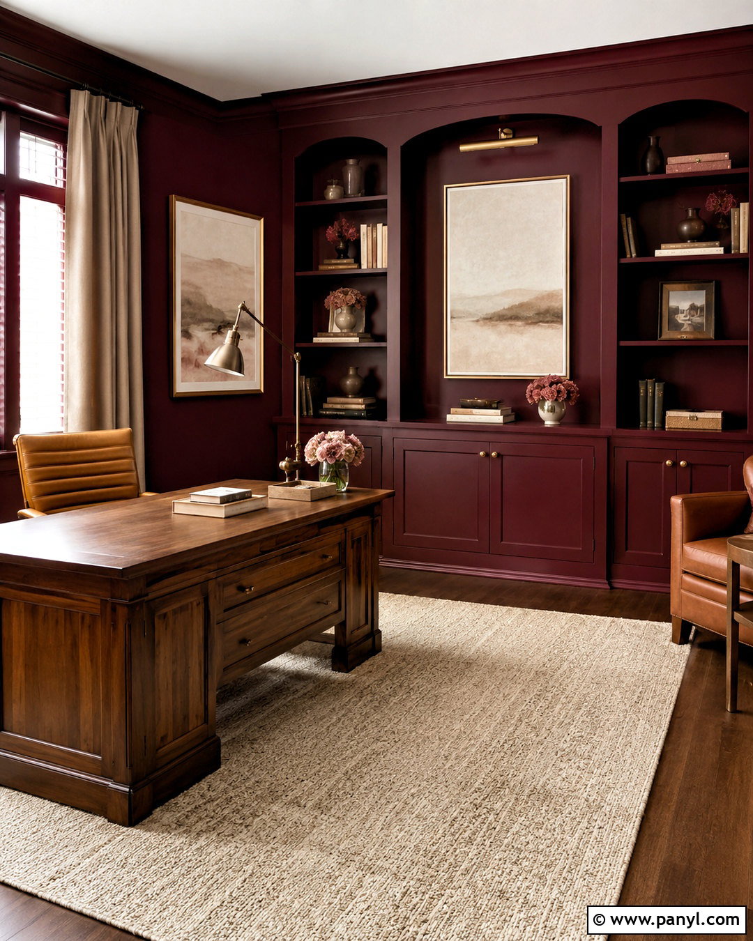
Deep burgundy can turn an ordinary home office into a focused, polished workspace. Pair burgundy walls with warm white trim, dark walnut furniture, camel leather, and aged brass. Position a substantial walnut desk near the strongest daylight, then add a camel leather chair and a cream wool rug. Built-in shelving painted to match the walls creates a seamless background for books and neutral pottery. Brass task lighting offers contrast and prevents the dark palette from becoming dull. Use oatmeal-colored curtains and pale artwork to brighten the upper part of the room. Small accents in dusty rose can connect the light and dark colors. This palette feels bold but not distracting because every shade shares a warm undertone, creating a complete workspace that appears comfortable, organized, and visually grounded.
11. Peach Color Palette
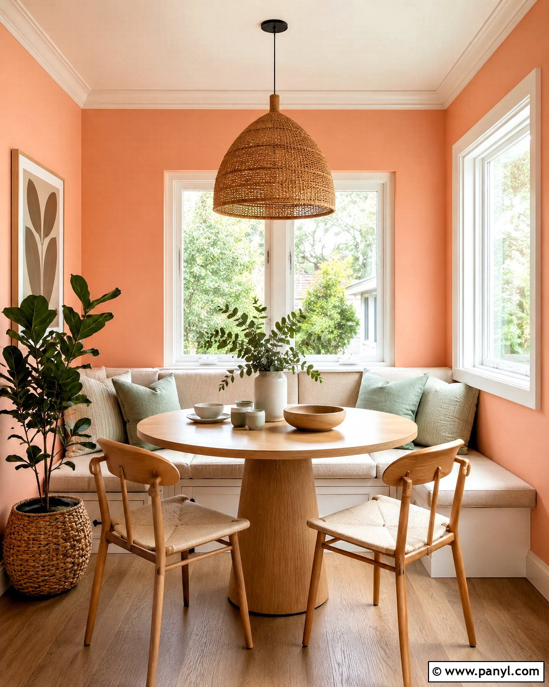
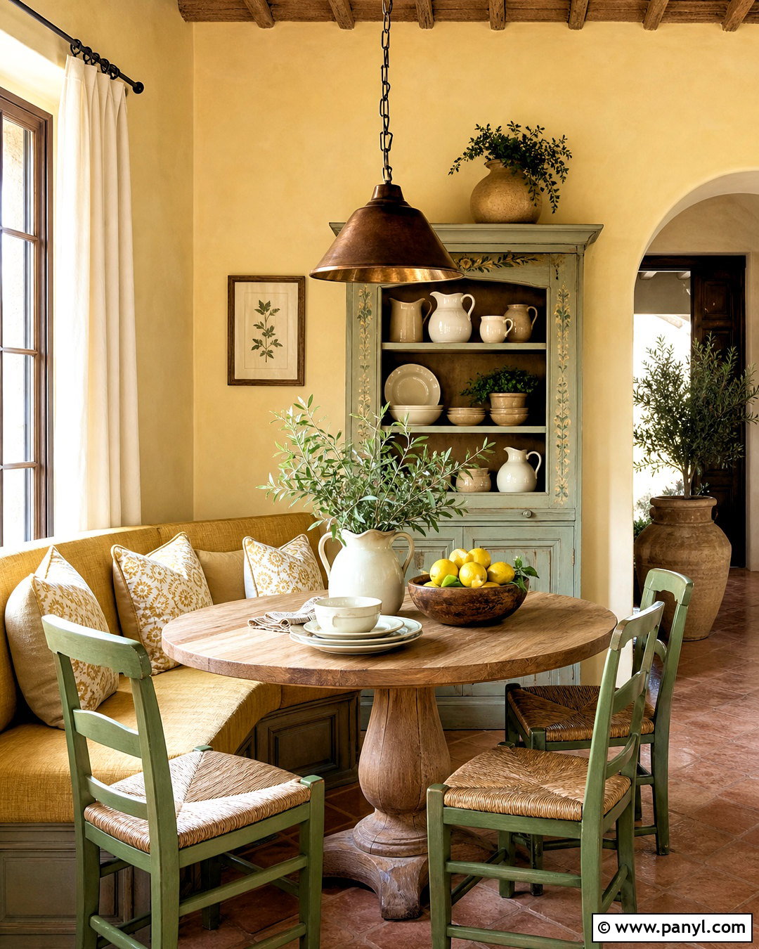
Soft peach, warm white, pale sage, and light oak make a breakfast nook feel cheerful from morning onward. Paint the walls a gentle peach that carries more warmth than pink, then add a built-in bench with cream upholstery. A round oak table and simple wood chairs keep the look casual and functional. Introduce sage through seat cushions, a Roman shade, or a small patterned rug. Warm white trim and cabinetry will provide a clean frame without creating harsh contrast. Finish the nook with ceramic tableware, a woven pendant, and one leafy plant. This complete color palette works best when peach remains the background and green serves as a restrained supporting accent. The natural materials soften both colors, resulting in a fresh space that feels bright without becoming overly sweet.
12. Charcoal Gray Color Palette
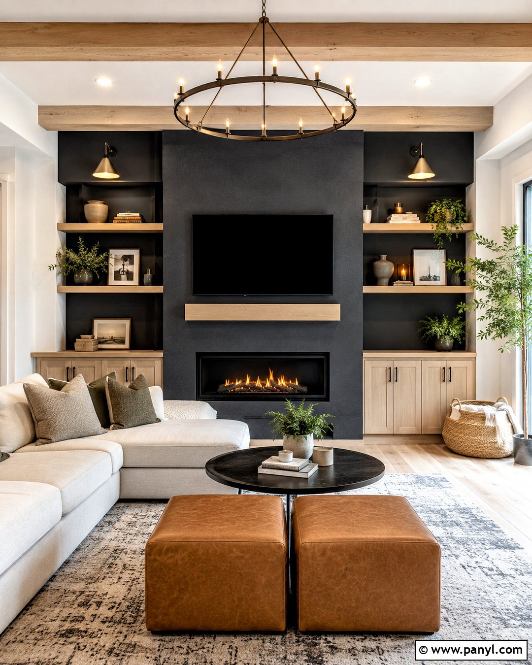
Charcoal gray feels modern and comfortable when paired with ivory, cognac, pale oak, and moss green. Use charcoal on a fireplace wall or throughout a media room, then bring in a large ivory sectional to create strong but balanced contrast. Cognac leather ottomans and pale oak shelving add warmth against the cool background. Place a generous gray-and-cream rug beneath the seating to soften the entire floor area. Moss green pillows, plants, and a wool throw provide a natural accent that does not compete with the dark wall color. Matte black hardware can blend quietly into the scheme, while warm metal lighting prevents a stark finish. This complete palette is particularly effective in rooms used at night, yet the light upholstery keeps it welcoming during the day.
13. Lavender Color Palette
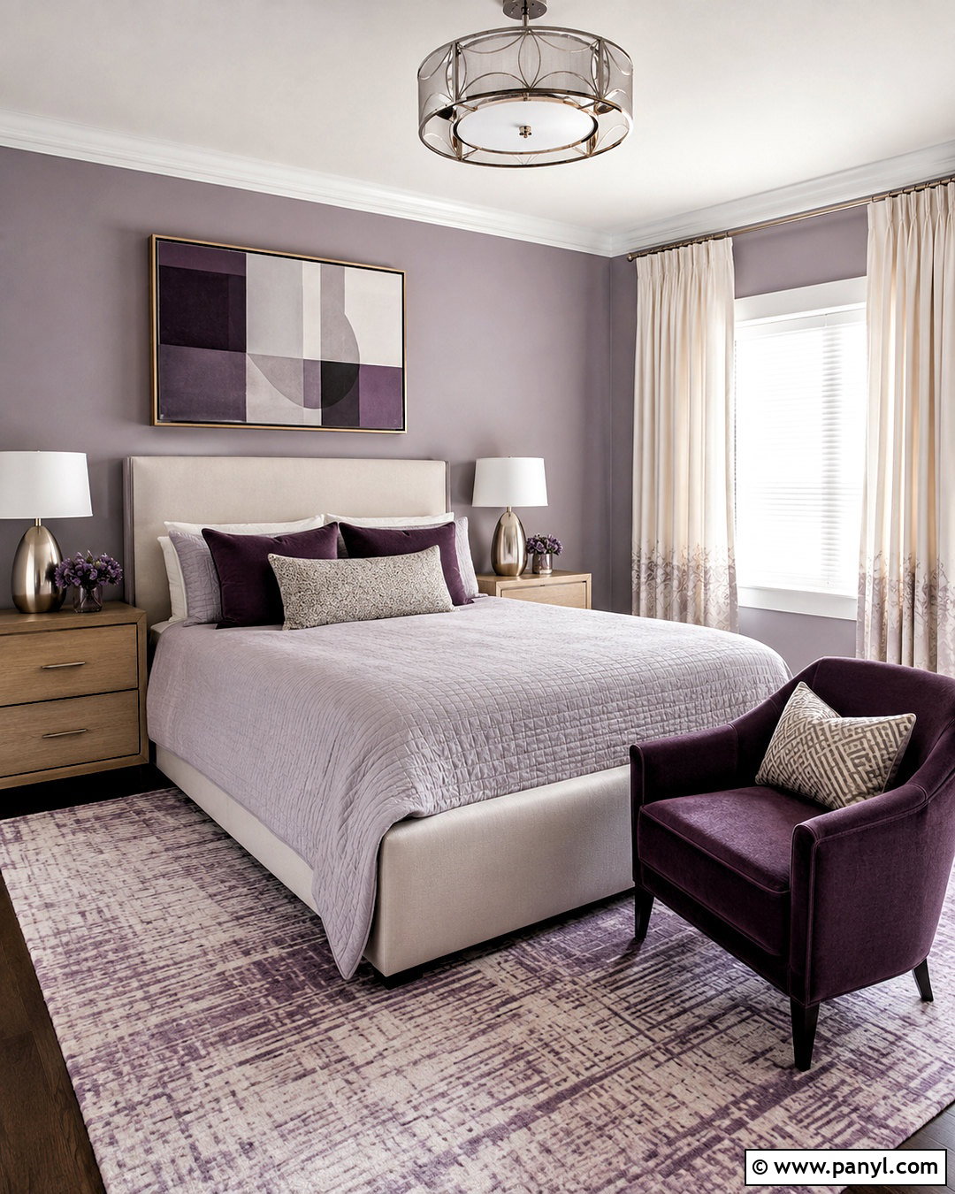
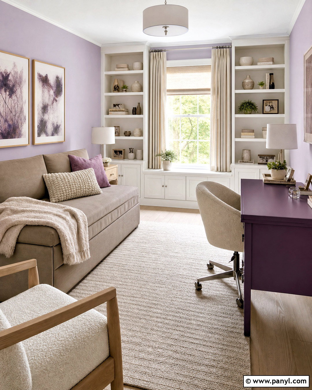
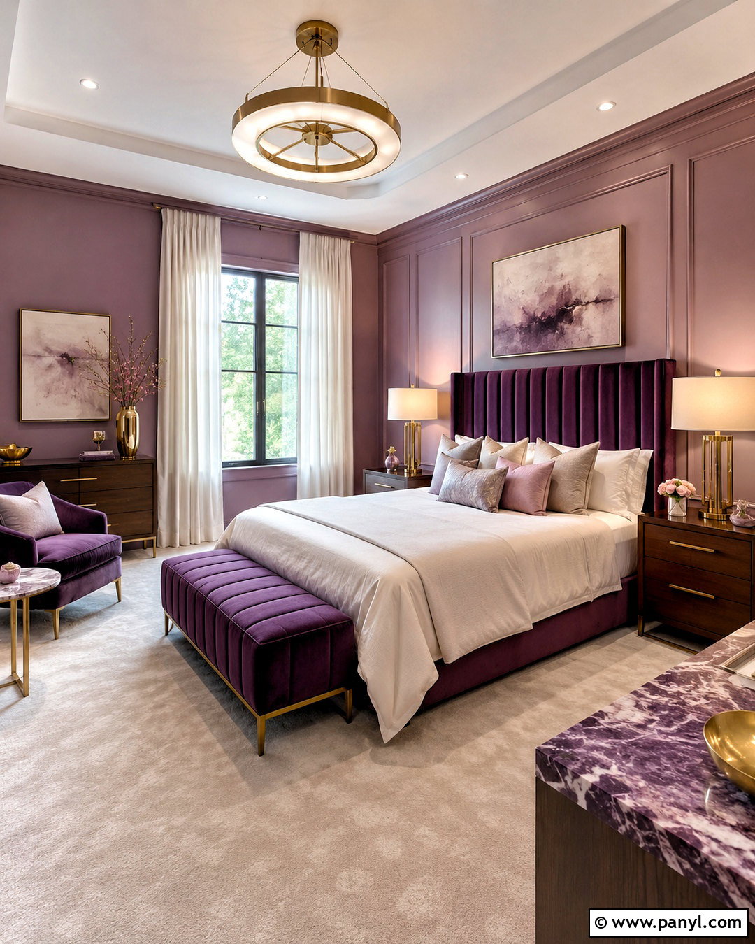
A muted lavender palette can make a guest bedroom feel serene, memorable, and grown-up. Choose gray-lavender walls, an upholstered cream headboard, pale gray bedding, and dark plum accents. Light oak nightstands warm the cooler shades and prevent the room from feeling too delicate. Add a soft rug containing lavender, ivory, and subtle taupe, then frame the windows with simple cream curtains. Dark plum works best in small amounts, such as a velvet lumbar pillow, lamp base, or narrow border on the bedding. Brushed nickel or soft brass fixtures can provide restrained shine. Keep decorative patterns organic or geometric rather than overly floral. With the stronger purple limited to accents, the finished palette remains peaceful and flexible enough to welcome guests with many different tastes.
14. Mustard Yellow Color Palette
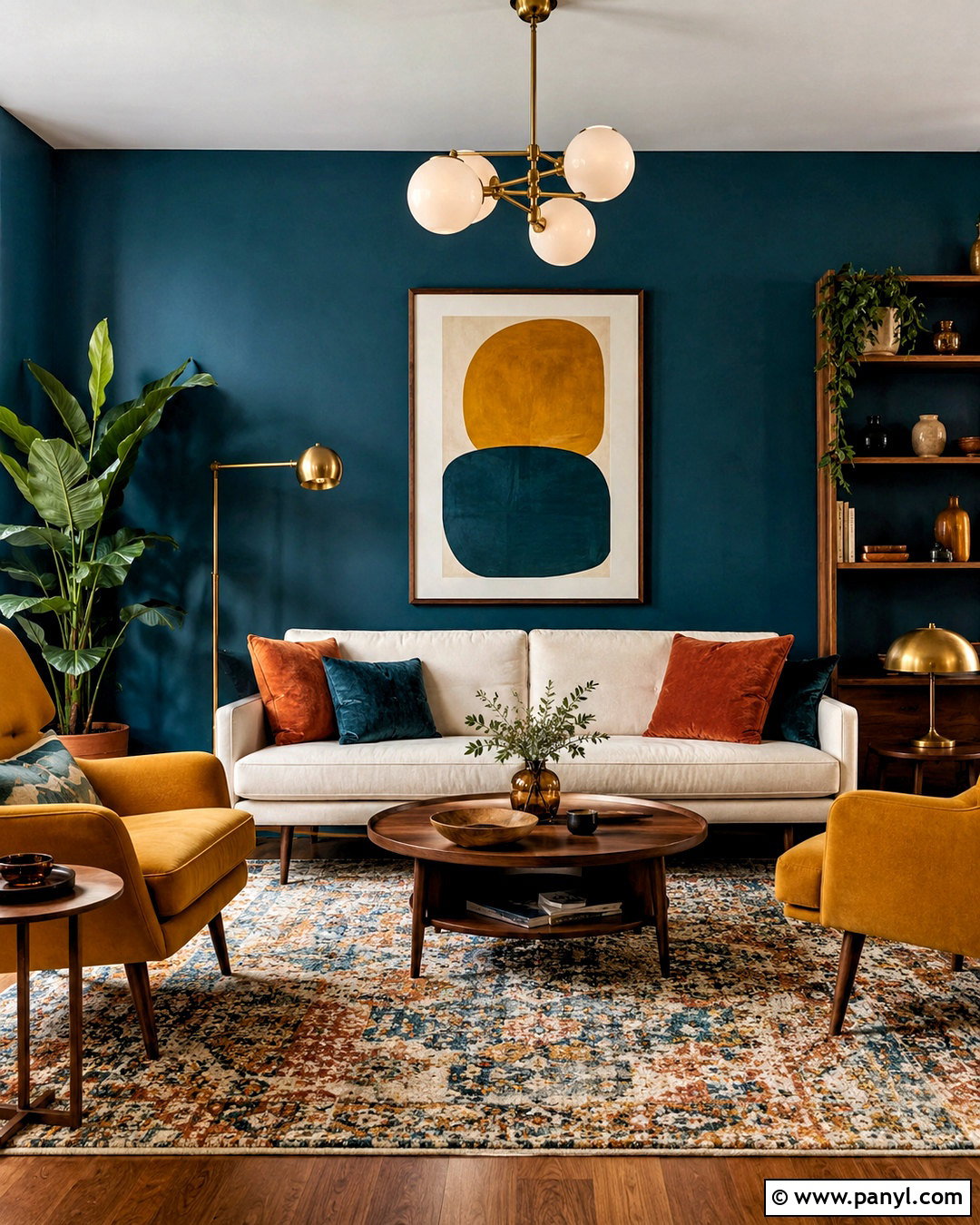
Mustard yellow, deep teal, warm cream, and walnut create a lively living room with a grounded, midcentury-inspired character. Choose deep teal for the walls or a large sectional, then introduce mustard through two lounge chairs, curtains, or a patterned rug. Cream upholstery and pale walls can balance the saturated colors if the room is small. Walnut coffee tables, shelving, and picture frames give the palette a consistent natural base. Add globe lighting in aged brass and a few cushions that combine teal, mustard, and rust. Keep the layout simple so the bold colors remain the main feature. This palette works because yellow brings energy while teal adds depth. Repeating each accent in at least two locations helps the complete room look connected instead of randomly colorful.
15. Black And White Color Palette
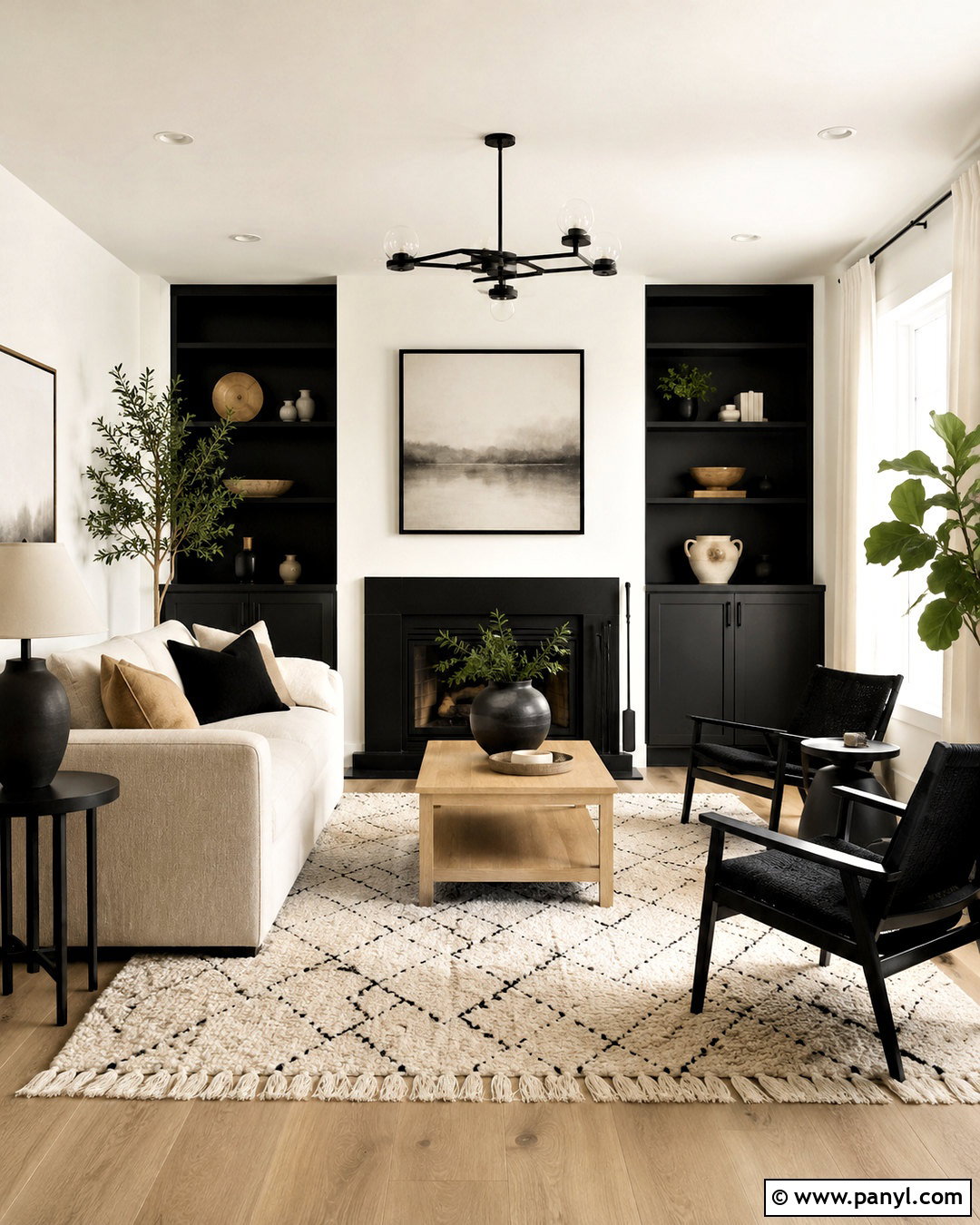
A black-and-white palette becomes warmer and more livable when natural oak, soft beige, and greenery are part of the complete room. Paint the walls warm white and use matte black on built-ins, window frames, or a prominent fireplace. Select a beige sofa rather than a bright white one, then add black side chairs with woven or wood details. A large cream rug featuring a restrained black pattern can unite the seating arrangement. Oak tables, linen curtains, and leafy plants reduce the visual sharpness of the contrast. Repeat black through lighting, frames, and hardware, but leave generous areas of pale color around them. The finished room feels graphic and clean without appearing cold, making this palette suitable for contemporary, Scandinavian, modern farmhouse, or transitional homes.
16. Forest Green Color Palette
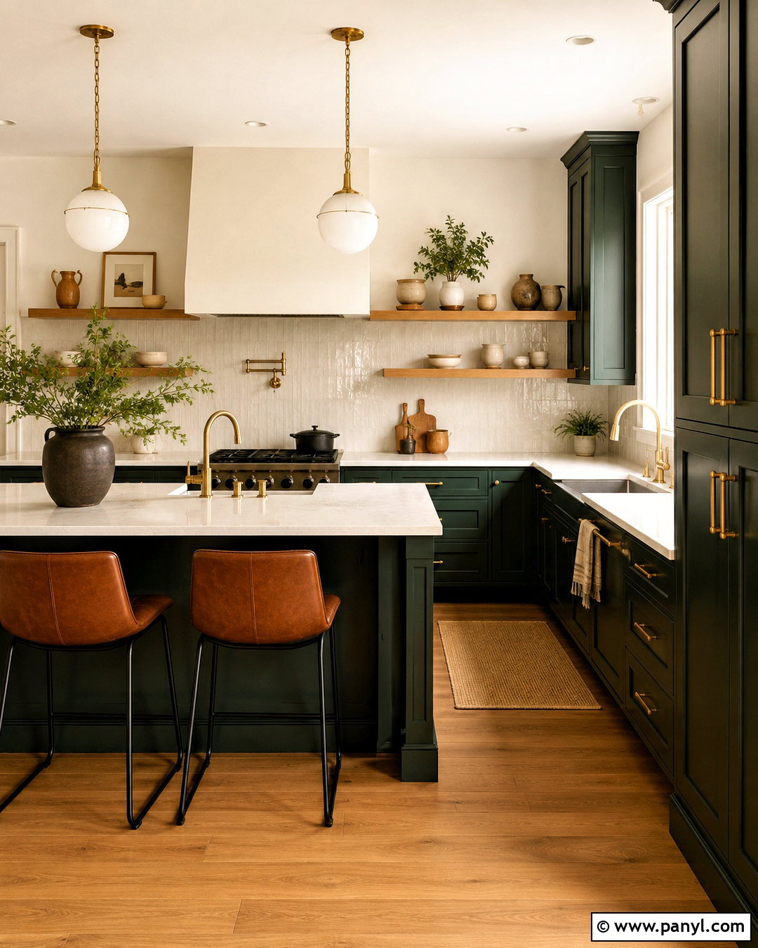
Deep forest green, creamy white, rust, and oak can create a cozy kitchen with lasting character. Paint the base cabinets and full-height pantry units forest green, while keeping the walls and backsplash creamy white. Choose medium oak flooring and a matching island top or open shelves to warm the strong cabinet color. Rust-colored counter stools introduce contrast through leather or textured fabric. Use unlacquered brass hardware and simple globe pendants for a softly polished finish. White quartz countertops will reflect light, especially if the kitchen has limited windows. Repeat the green in a runner or ceramic accessories without covering every surface. The completed palette feels rich and nature-inspired, while the light walls, counters, and backsplash maintain the practical brightness needed for cooking and cleaning.
17. Coastal Blue Color Palette
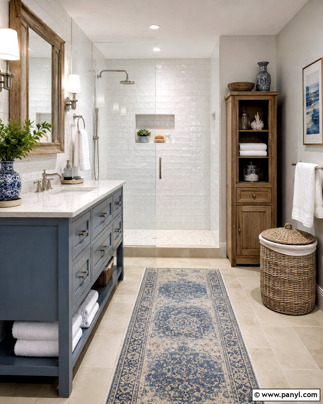
Coastal blue, crisp white, weathered oak, and sandy tan create a relaxed bathroom without relying on obvious seaside decorations. Use muted blue on the vanity and keep the walls white or cover them in pale handmade-look tile. A weathered oak mirror and matching storage cabinet add warmth, while sandy tan floor tile provides a practical grounding color. Choose polished nickel faucets for a clean, reflective accent. White towels, a woven laundry basket, and a blue-and-cream runner complete the room without adding clutter. If pattern is desired, introduce it through small-scale floor tile rather than decorative wall signs. This color palette feels bright and refreshing because each surface supports the overall scheme. The restrained materials also help an average-size bathroom appear more open and thoughtfully coordinated.
18. Rust Orange Color Palette
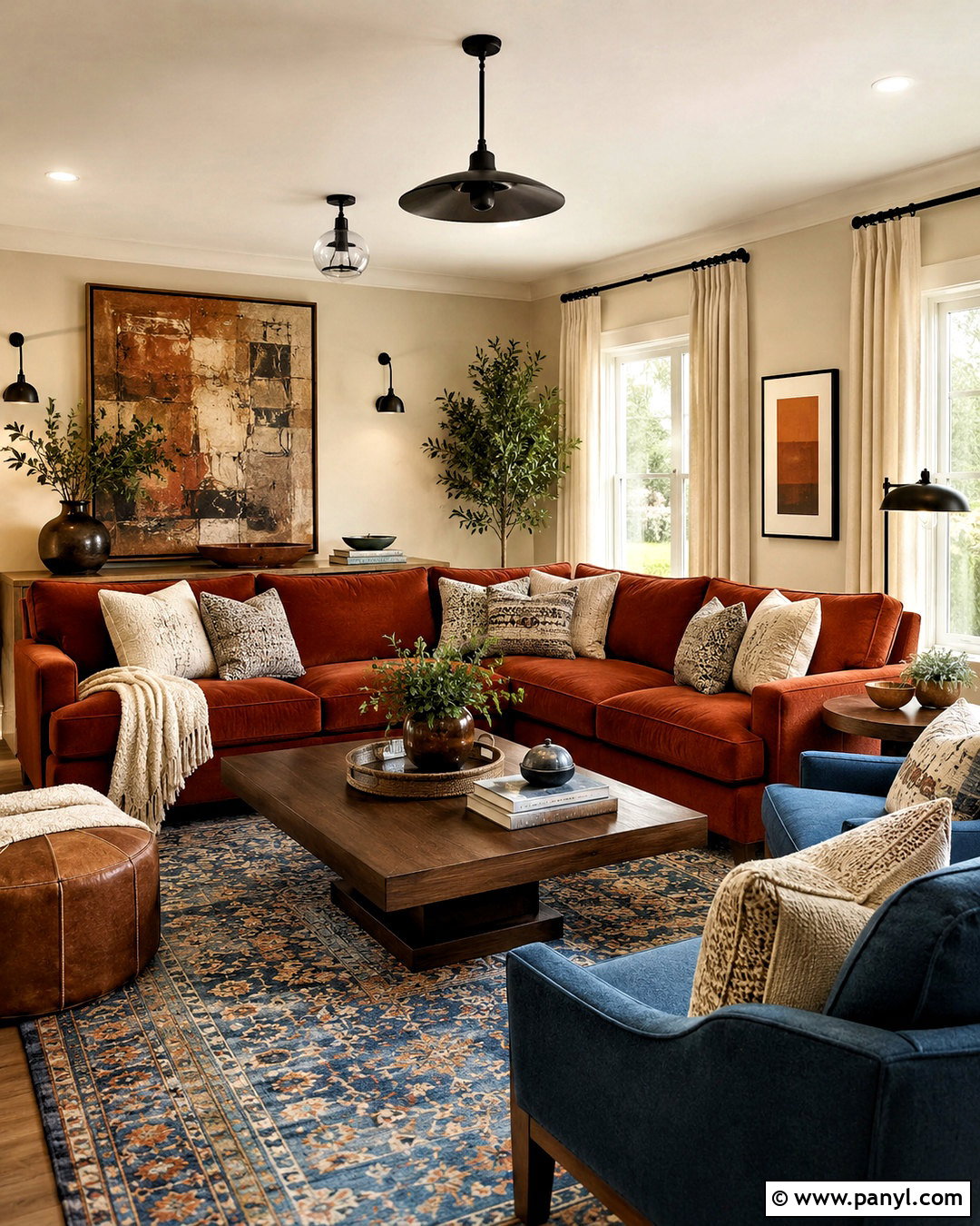
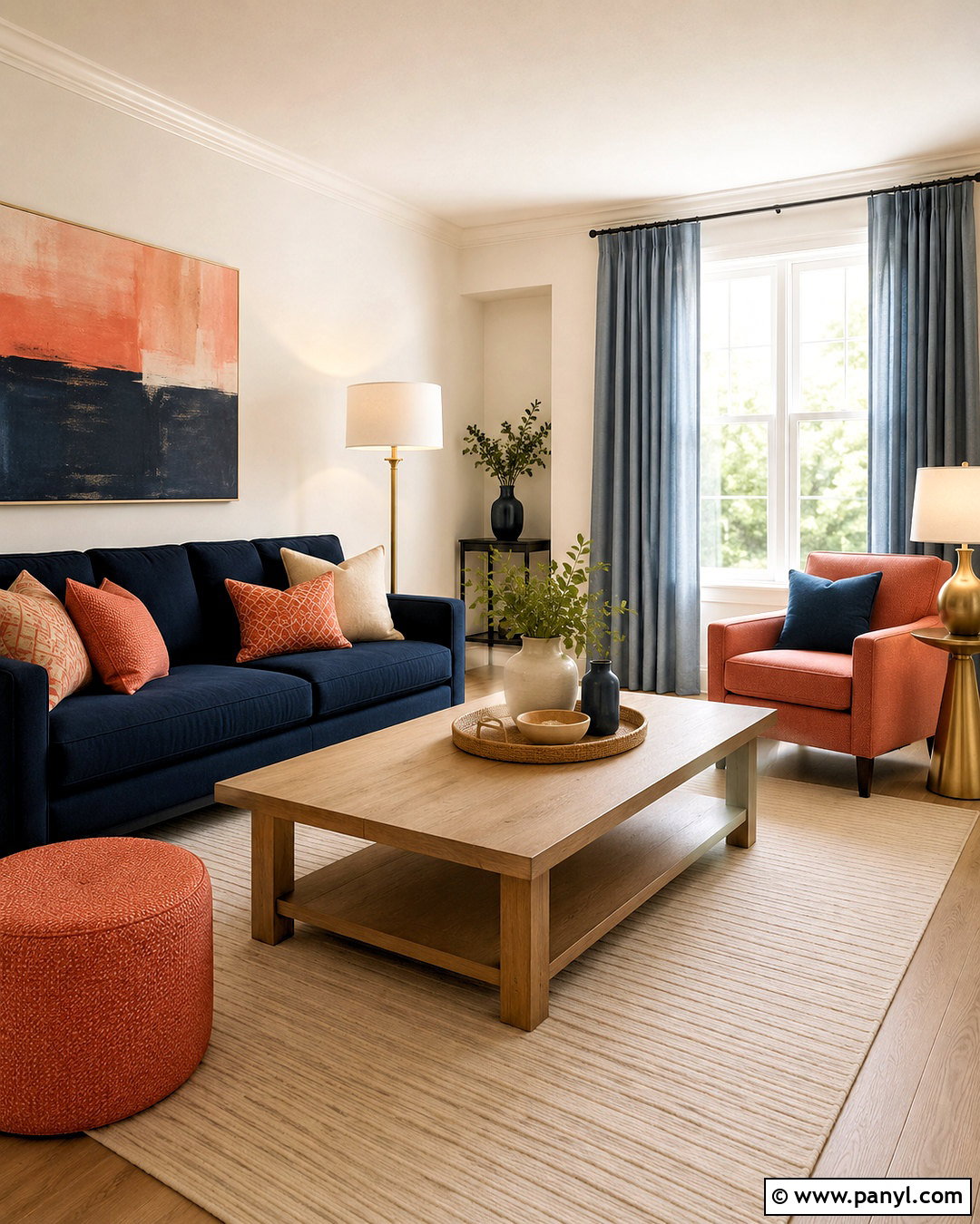
Rust orange brings warmth to a family room when combined with creamy beige, denim blue, walnut, and matte black. Start with beige walls and a deep, comfortable sofa in rust-colored fabric. Add denim blue armchairs or a large blue patterned rug to cool the orange and create balance. Walnut tables strengthen the earthy base, while matte black lighting and hardware add clean definition. Cream curtains and textured pillows keep the room from becoming too dark or autumnal. Look for artwork that repeats blue, rust, and neutral tones in a subtle composition. This palette works well for active spaces because the medium and deep colors are visually forgiving. Arrange the major colors around the room rather than concentrating them in one area, creating a complete and evenly balanced design.
19. Teal And Coral Color Palette
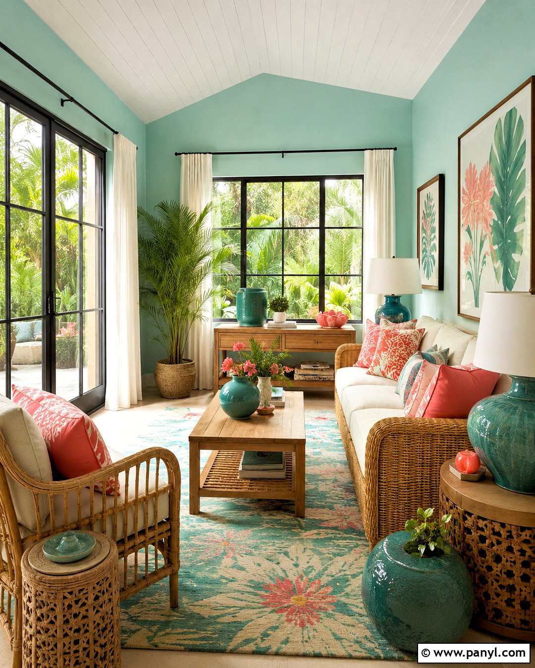
Teal and coral can look playful yet polished in a sunroom, enclosed porch, or casual sitting area. Use pale teal walls as the backdrop, then choose a natural rattan sofa with cream cushions. Add coral through patterned pillows, a painted side table, and a few ceramic pieces rather than one oversized feature. A blue-green rug can deepen the teal while helping the room feel grounded. Include warm white curtains, honey-toned wood, and abundant plants to support the fresh palette. Black accents should remain minimal, perhaps limited to one floor lamp or several slim window frames. The complete scheme feels energetic because teal and coral create clear contrast, but the natural fibers and neutral upholstery give the eyes places to rest. Keep patterns medium-scale and repeat both colors thoughtfully.
20. Greige Color Palette
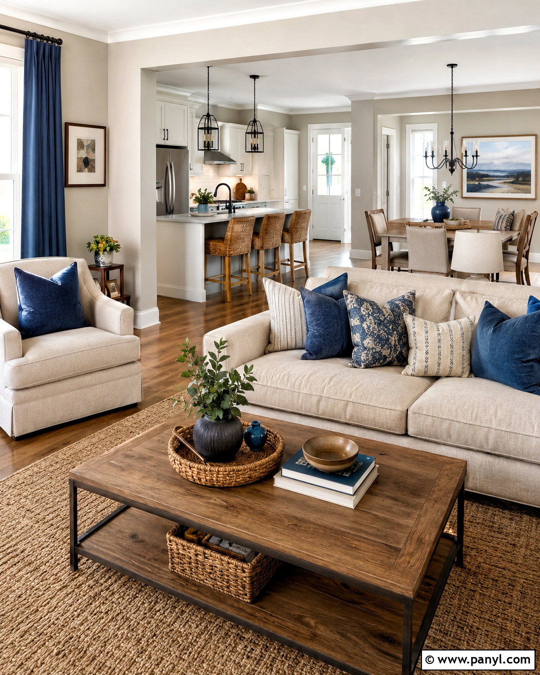
Greige, soft white, muted blue, and medium oak form a flexible whole-home palette that flows easily between connected rooms. Use greige on the main walls, soft white on ceilings and trim, and medium oak for flooring or major furniture. Bring muted blue into the living room through curtains and pillows, then repeat it gently in kitchen stools, hallway art, or bedroom textiles. Dark bronze hardware can provide definition without the sharpness of pure black. In larger rooms, layer oatmeal upholstery, taupe rugs, and woven natural materials to keep the neutrals interesting. Pay close attention to undertones so the greige does not shift unexpectedly beside flooring or countertops. This complete palette feels calm and cohesive while leaving room for seasonal accents, personal collections, and future furniture changes.
Conclusion:
Choosing a home color scheme becomes easier when every shade has a clear role. Begin with one dominant color for walls or large furniture, select a supporting neutral, and add one or two accents through textiles, art, lighting, and smaller furnishings. Always test paint beside existing floors, cabinets, and countertops because nearby materials can change how a color appears. Repeating each important shade around the room will create better balance, while texture keeps simple combinations interesting. Whether you prefer earthy green, dramatic burgundy, airy blue, or flexible greige, these 20 color palette ideas offer complete looks you can adapt to your space. Choose the combination that supports your natural light, daily routine, and personal sense of comfort.

Related Ideas and Inspiration:
Leave a Reply