
Choosing color becomes much easier when you can see several paint samples on wall surfaces beside the furniture, flooring, trim, and natural light already in the room. Small chips rarely show the full undertone or depth of a color. Larger test areas create a clearer picture, especially when viewed from morning through evening. For a dependable result, apply two coats, compare the samples under natural and artificial light, and test more than one wall when possible. () The arrangements below combine practical sampling methods with complete room palettes, helping you judge each color in a realistic setting rather than in isolation. Use these 25 Paint Samples On Wall Ideas to create an organized, attractive, and useful color-testing setup.
1. Large Paint Samples On Living Room Wall
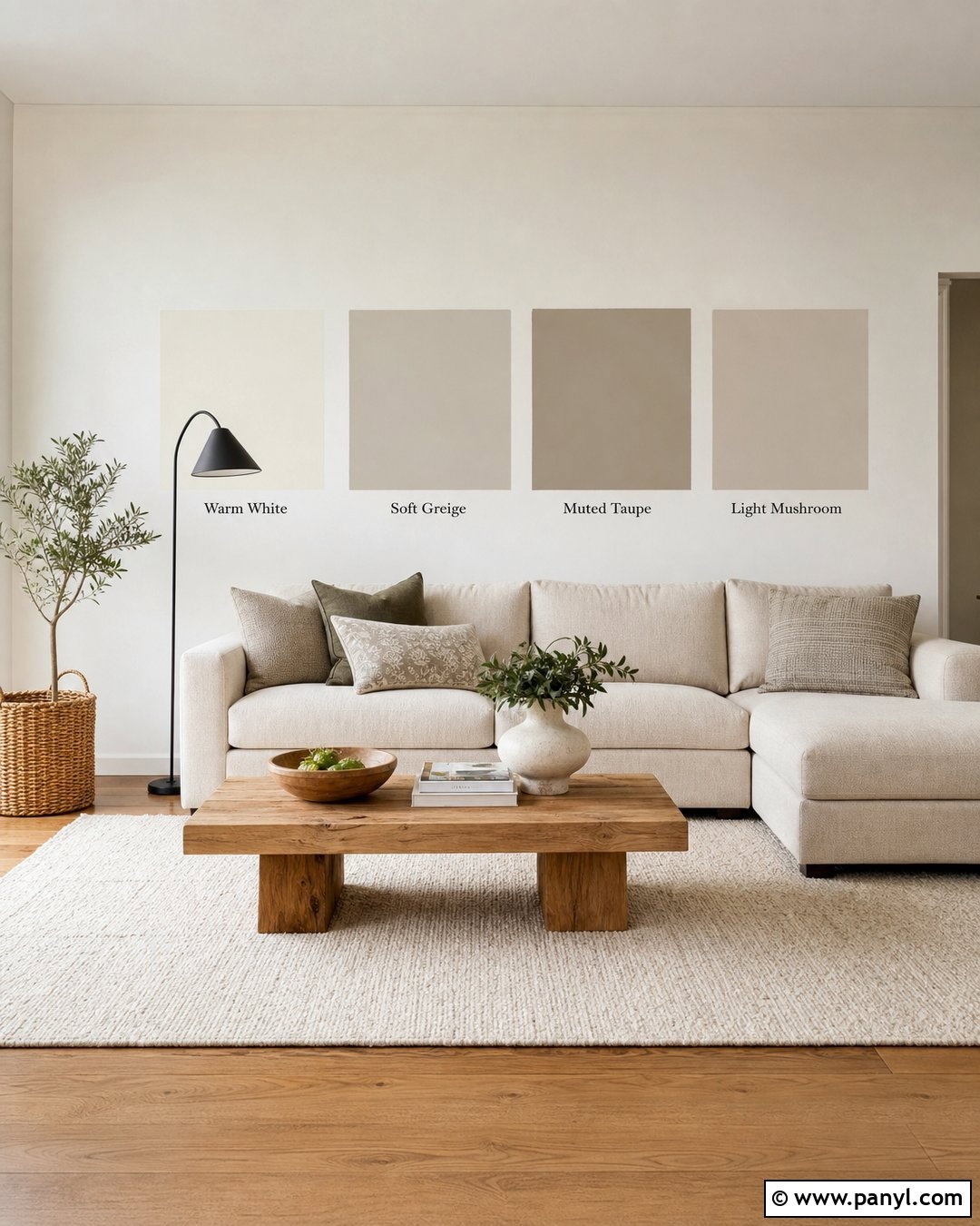
Create a row of large paint samples behind the main seating area, where each color can interact with the room’s biggest pieces. Try warm white, soft greige, muted taupe, and light mushroom squares on a clean white wall. Keep the samples separated so the surrounding colors do not distort each other. A beige linen sofa, medium oak coffee table, cream rug, and black floor lamp provide a balanced backdrop for comparison. Apply two even coats to each sample and allow them to dry completely. Stand across the room to judge the overall depth rather than studying the colors up close. Check the wall throughout the day before choosing the shade that best connects the upholstery, wood, flooring, and natural light.
2. Movable Paint Samples On Poster Board
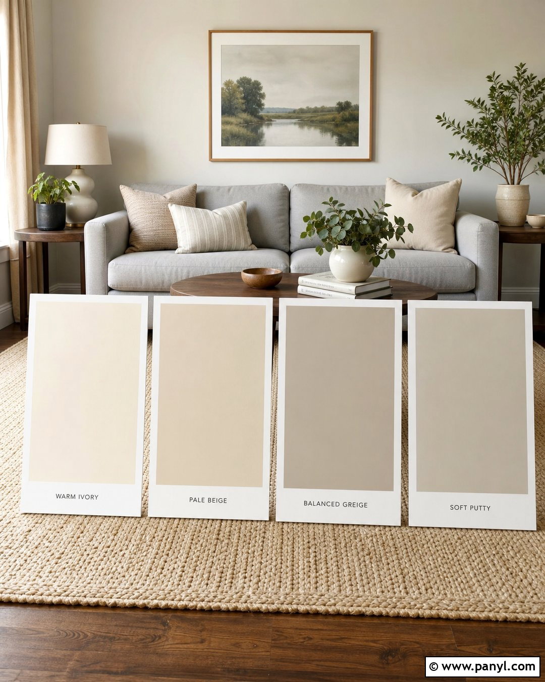
Movable poster boards let you test a complete neutral palette without leaving multiple painted patches on the wall. Cover large white foam boards with warm ivory, pale beige, balanced greige, and soft putty paint. Leave a narrow white border around each color for a cleaner comparison. Arrange the boards behind a light gray sofa with walnut side tables, natural linen curtains, and a woven cream rug. Move each board from the window wall to the darker interior wall during the day. This setup shows how the colors react to direct light, reflected light, and evening lamps. Large movable boards are especially practical in rental homes or freshly finished rooms where you do not want to repaint over several test patches later.
3. Peel And Stick Paint Samples In Bedroom
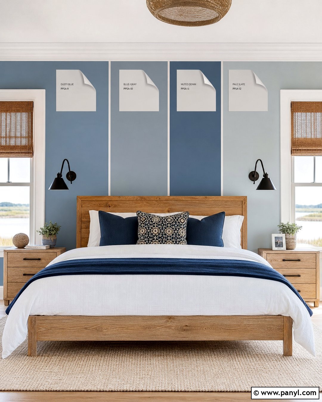
Turn a bedroom color test into a neat temporary display with oversized peel-and-stick paint samples. Place dusty blue, blue-gray, muted denim, and pale slate samples behind a natural oak bed. Dress the bed with crisp white sheets, a light gray quilt, and deep navy accent pillows so every candidate can be seen beside the final textiles. Add woven shades, black sconces, and a cream wool rug for contrast. Keep the samples at eye level and move the strongest contenders to the walls beside the windows and closet. Repositionable samples make it easy to compare colors without applying wet paint. They can also wrap slightly around a corner, revealing how the same blue changes between a bright wall and a shaded wall.
4. White Paint Samples Beside White Trim
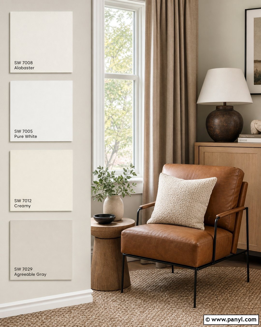
White paint becomes easier to evaluate when every sample sits directly beside the existing trim. Paint generous vertical rectangles of creamy white, neutral white, soft ivory, and pale warm gray beside a window or doorway with bright white molding. Furnish the room with a camel leather chair, pale oak console, oatmeal curtains, and a textured beige rug. These warmer elements help reveal whether a white leans yellow, pink, gray, or green. Do not crowd the samples together. Give each shade enough surrounding space to read clearly. A white border can also prevent the current wall color from affecting your judgment. Compare the samples during bright daylight and again with the lamps on before choosing the white that feels balanced beside the trim.
5. Greige Paint Samples Near Wood Flooring
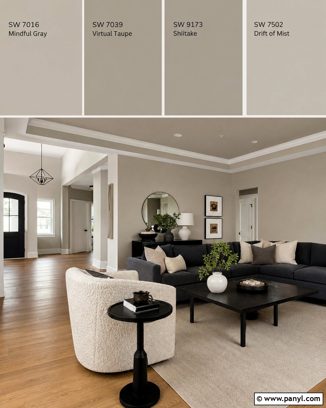
Testing greige close to the floor helps you find a shade that works with the wood’s undertone. Place large warm greige, taupe-gray, mushroom, and stone samples just above the baseboard in a living room with medium-toned oak flooring. Complete the setting with a cream boucle chair, charcoal sofa, black metal side table, and ivory woven rug. The mix of warm and cool materials exposes unwanted purple, green, or pink undertones quickly. Avoid judging the samples while they are still wet because their appearance can change as they dry. Afterward, move a few matching sample boards to eye level for a second view. The winning greige should connect the flooring and upholstery without making the room feel muddy, overly cool, or noticeably beige.
6. Beige Paint Samples In North Facing Room
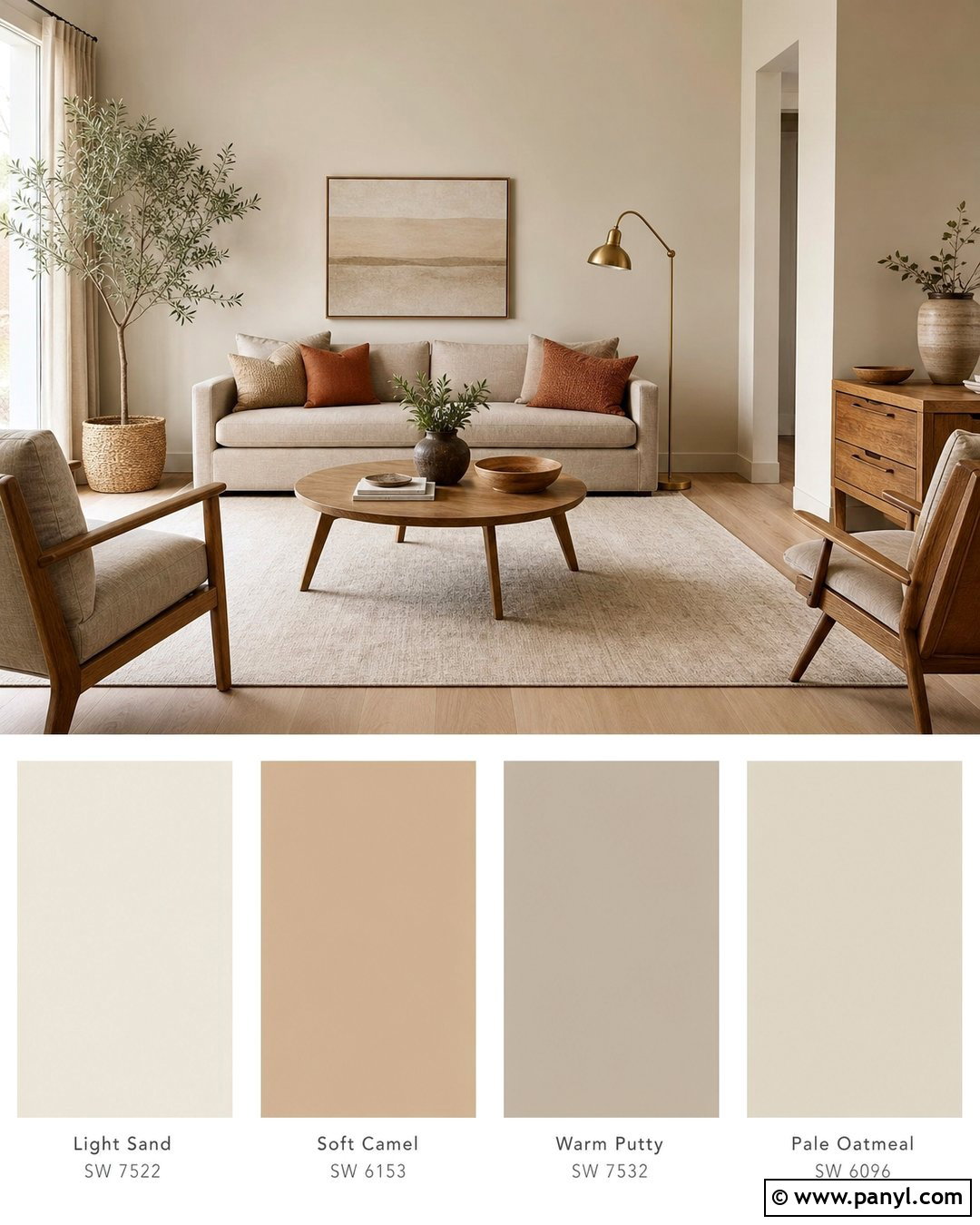
A north-facing room often benefits from beige samples with gentle warmth rather than strong yellow undertones. Test light sand, soft camel, warm putty, and pale oatmeal on the wall opposite the window. Build the room around a flax-colored sofa, warm oak furniture, rust accent pillows, and an ivory rug. A brushed brass lamp brings another warm surface into the comparison. Keep the window treatments light so available daylight reaches the samples. Colors may appear cooler or grayer on walls receiving limited direct sunlight, making several days of observation worthwhile. Select the beige that maintains a welcoming character in daytime shade while still looking clean beneath the room’s evening lighting. The final color should support the natural materials without turning orange or dull.
7. Warm White Paint Samples In Sunny Room
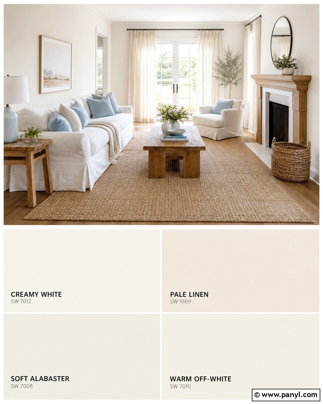
Strong sunlight can make some whites look harsh, so compare several warm white samples in the brightest part of the room. Paint large rectangles of creamy white, pale linen, soft alabaster, and warm off-white on a wall near the windows. Pair the test wall with a white slipcovered sofa, honey oak coffee table, pale sisal rug, and soft blue cushions. Linen curtains filter the light and prevent glare from overwhelming the samples. Check each white during intense afternoon sun, cloudy conditions, and evening lamp light. The best choice will remain warm without becoming noticeably yellow. Include the ceiling, trim, and flooring in your view from across the room. This creates a complete, relaxed palette instead of selecting a wall color based on one brightly lit moment.

8. Blue Paint Samples Behind Bed
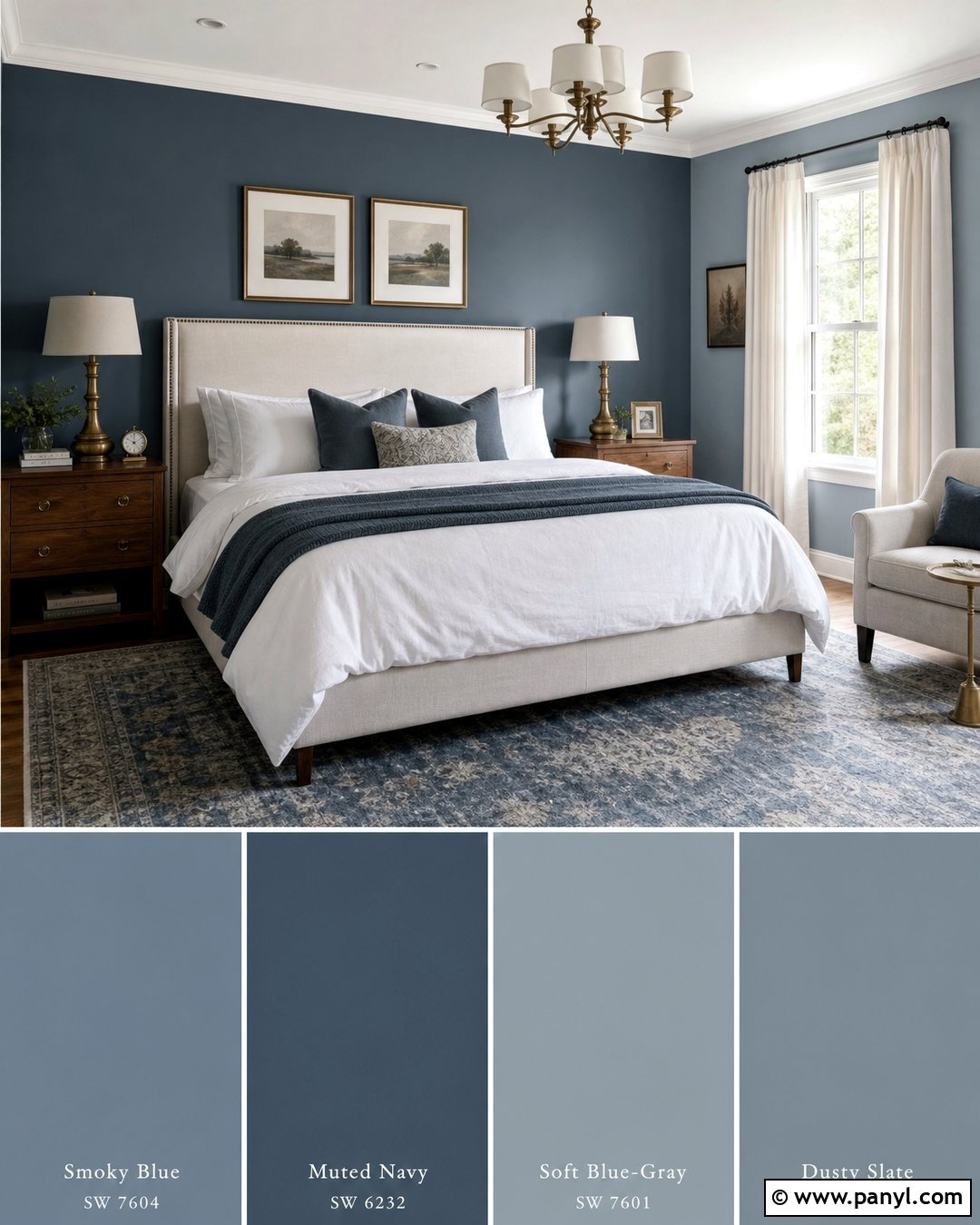
A bedroom wall offers enough space to compare several restful blue tones in their intended setting. Paint wide vertical samples of smoky blue, muted navy, soft blue-gray, and dusty slate behind an upholstered cream headboard. Use white bedding, a faded blue rug, medium walnut nightstands, and antique brass lamps to complete the palette. Make each sample wider than the nightstand so the color reads as a wall finish rather than a small mark. Consider how each blue works with both warm wood and cool fabric. View the samples with the curtains open in the morning and under bedside lamps at night. Choose the blue that creates depth behind the bed while keeping the room calm, balanced, and comfortable rather than cold or overly dark.
9. Green Paint Samples In Dining Room
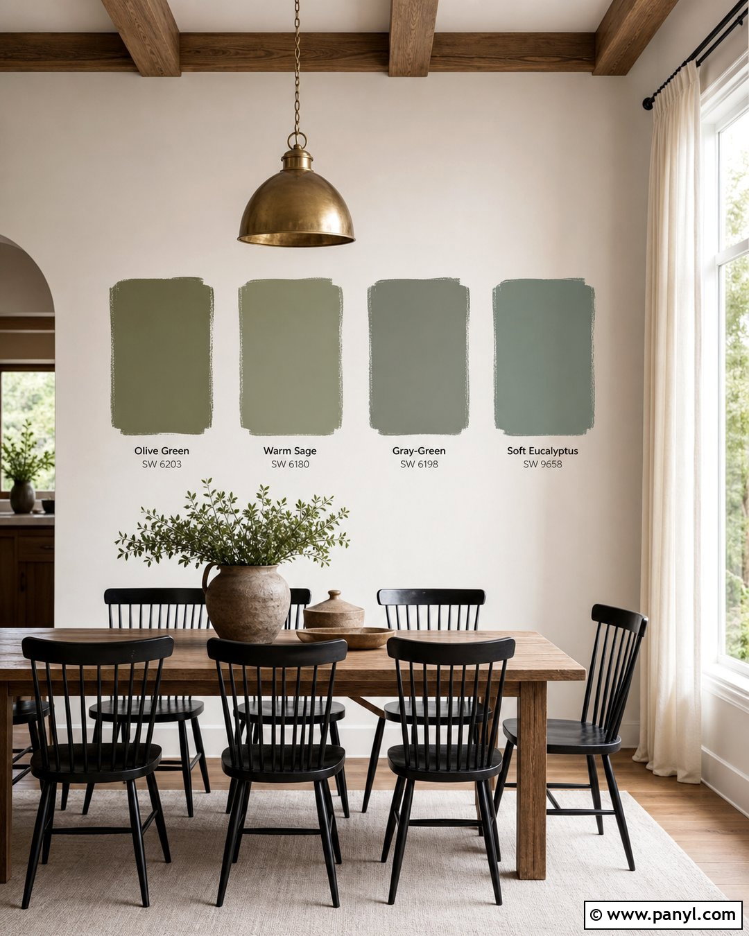
Muted green can transform a dining room, but its undertones need to work with the furniture and lighting. Test olive green, warm sage, gray-green, and soft eucalyptus in large blocks behind a medium oak dining table. Add black spindle chairs, a cream flat-weave rug, linen curtains, and a simple aged brass pendant. Earthy ceramics and a leafy plant help show how each green relates to natural decor. Keep the sample blocks several inches away from one another and observe them from the adjoining room. The selected shade should frame the dining area without overpowering it. During evening meals, turn on the pendant and nearby lamps to confirm that the green stays appealing under artificial light rather than appearing muddy, fluorescent, or unexpectedly gray.
10. Accent Wall Paint Samples Behind Sofa
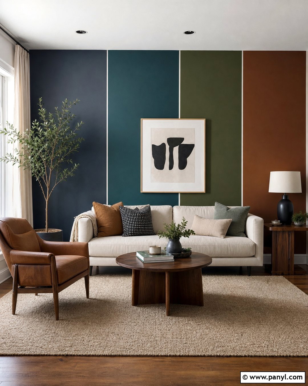
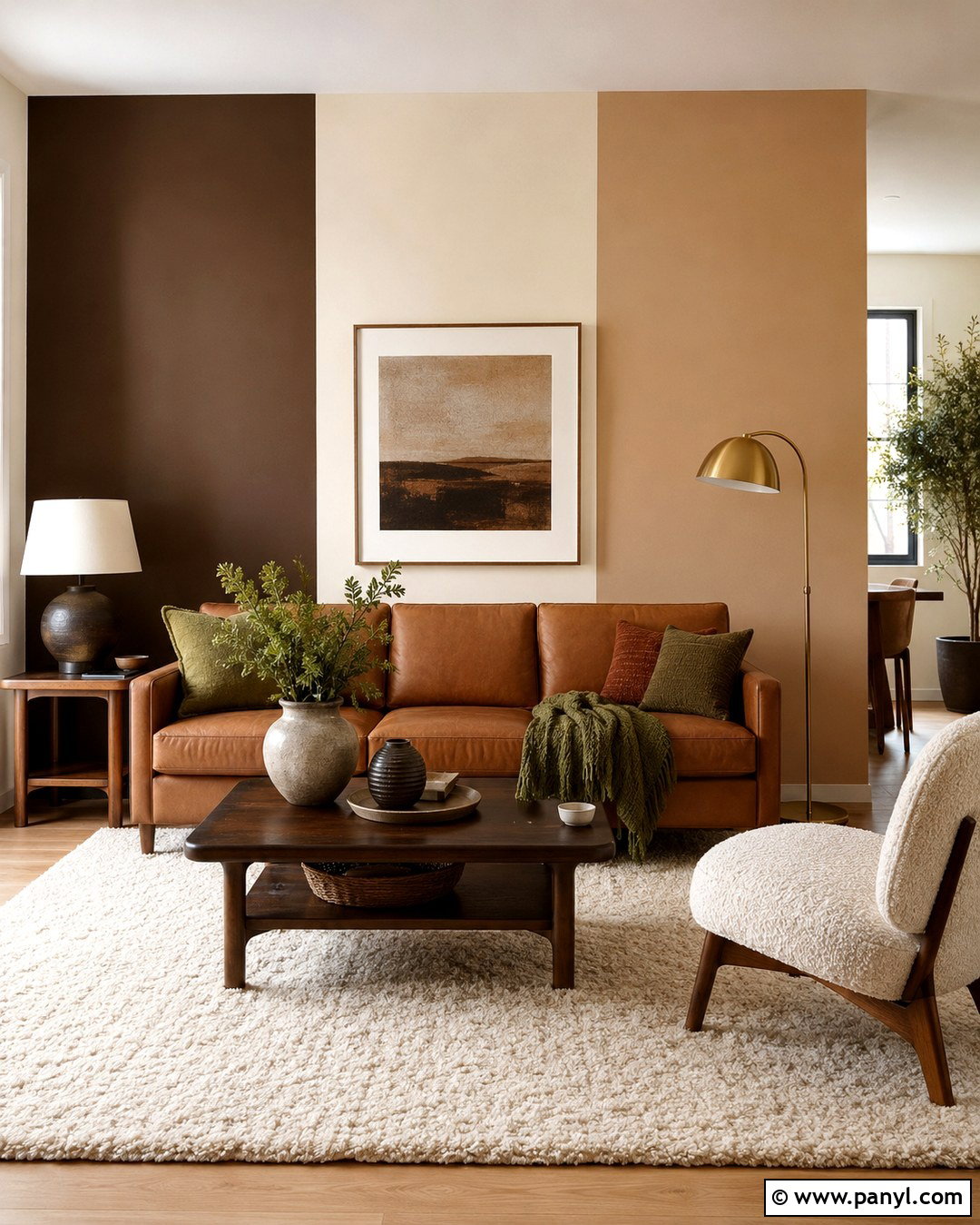
When planning an accent wall, test deeper colors directly behind the largest piece of furniture. Paint generous samples of charcoal blue, deep teal, forest green, and warm brown above a cream sofa. Ground the design with walnut end tables, a tan leather chair, neutral abstract art, and a beige wool rug. Leave enough sample color visible above and around the furniture to understand the finished effect. Dark shades can feel more intense when confined to small patches, so step back and imagine the entire wall covered. Evaluate how each option changes the contrast of the sofa, artwork, and adjacent light walls. The right accent color should create a strong focal point while still connecting naturally to the textiles, wood tones, metal finishes, and surrounding rooms.
11. Paint Samples Around A Window
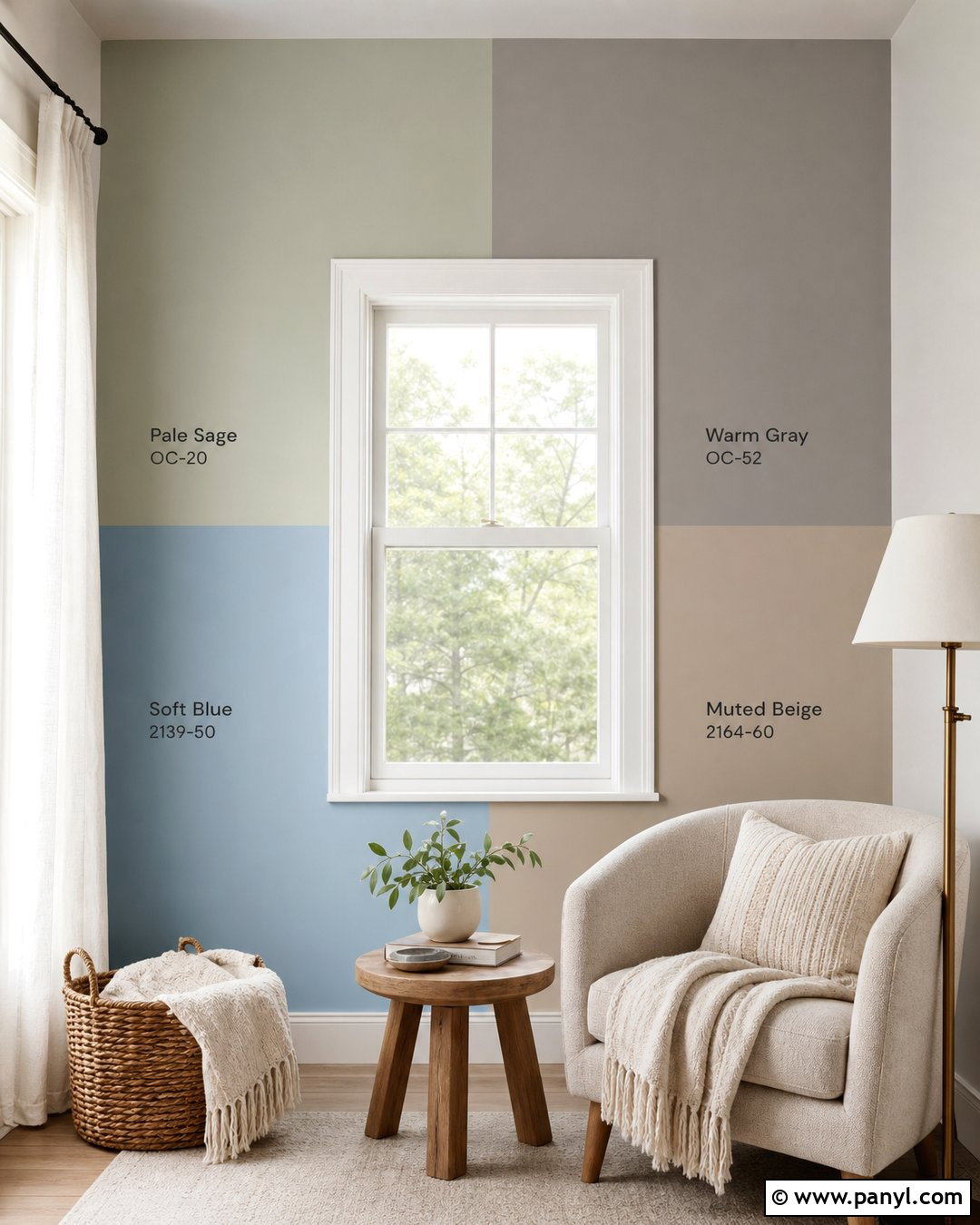
Placing paint samples beside a window reveals how colors behave in both direct light and shadow. Test pale sage, warm gray, soft blue, and muted beige in tall vertical areas on each side of white window trim. Furnish the room with an oatmeal reading chair, oak side table, woven basket, and cream floor lamp. Hang sheer white curtains so the changing daylight remains visible without producing harsh glare. Paint one version of each leading color close to the trim and another farther into the wall. This exposes differences created by the bright window edge and darker corners. The final color should feel consistent across the wall and complement the outdoor view. Avoid choosing solely from the brightest sample, since much of the completed room may receive softer light.
12. Paint Samples Wrapped Around A Corner
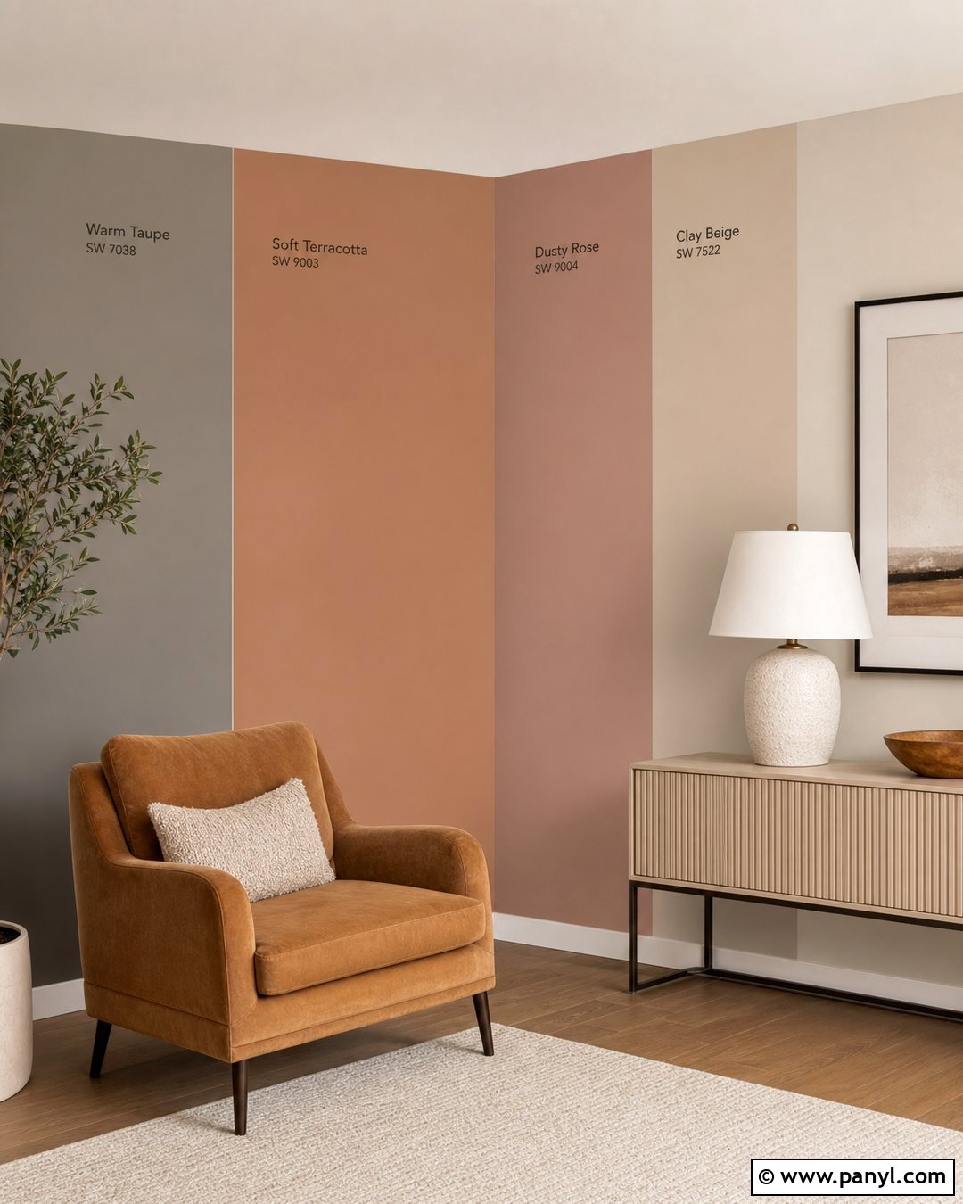
A sample that wraps around a corner shows two lighting conditions at the same time. Apply wide sections of warm taupe, soft terracotta, dusty rose, and clay beige across an inside corner in a cozy sitting room. Place a camel armchair on one side and a cream console with a ceramic lamp on the other. Use natural oak flooring, an ivory rug, linen curtains, and dark bronze accents to finish the earthy palette. Notice how each color looks lighter on the wall facing the window and deeper on the side wall. This method is particularly helpful for complex colors that shift noticeably between light and shadow. Select the shade that remains attractive on both surfaces and creates a smooth background for the furniture rather than an uneven or disconnected effect.
13. Paint Samples On Multiple Walls
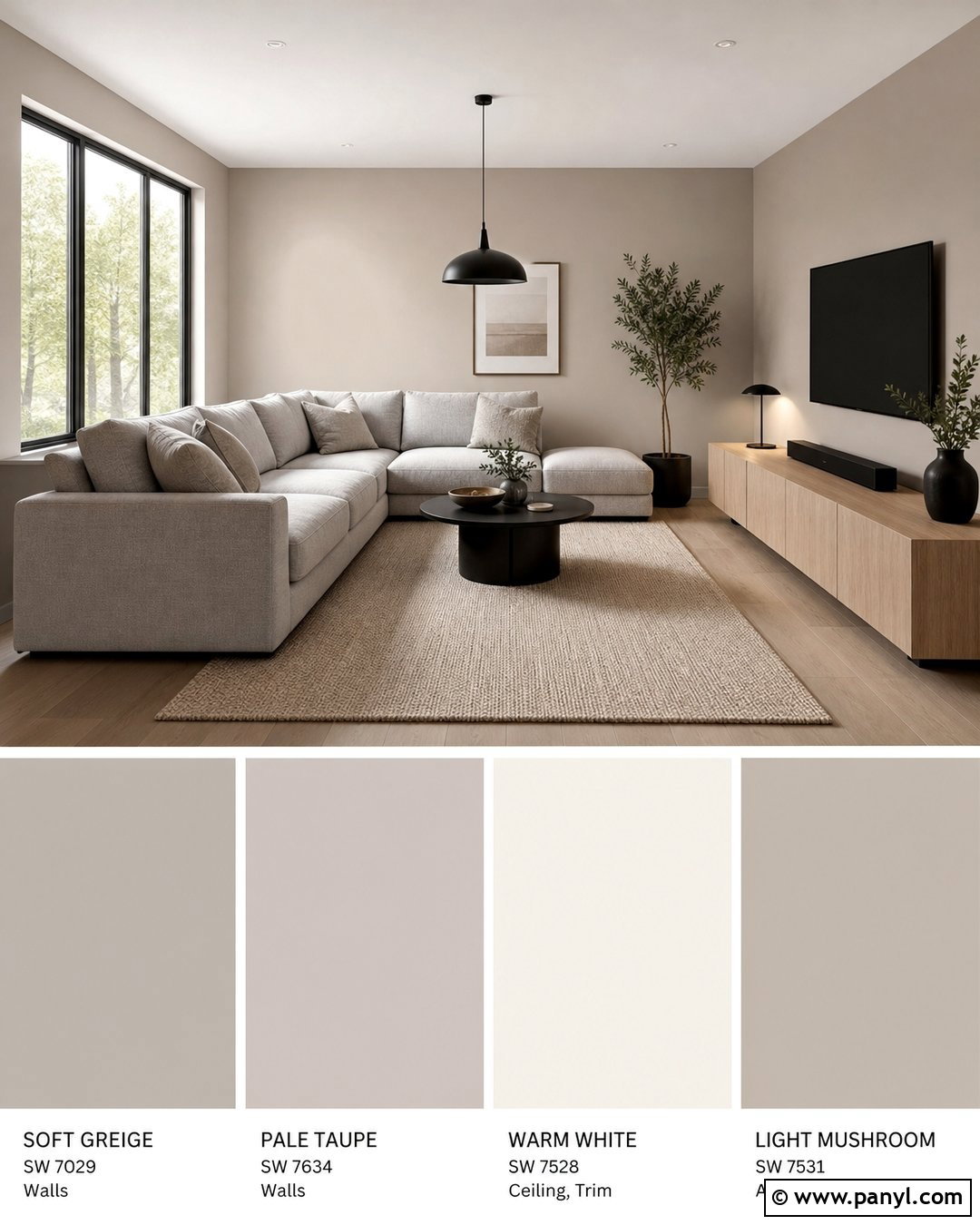
Testing the same colors on multiple walls prevents a decision based on only one lighting direction. Paint matching samples of soft greige, pale taupe, warm white, and light mushroom on the window wall, the opposite wall, and a shaded side wall. Complete the living room with a gray linen sectional, pale oak media cabinet, oatmeal rug, and black metal lighting. Keep each set arranged in the same order to make comparisons easier. Paint colors can look noticeably different depending on the amount and direction of light they receive, so checking more than one wall gives a more realistic result. () Choose the shade that performs consistently across the room, not simply the option that looks best in the brightest location.
14. Paint Samples Above The Baseboard
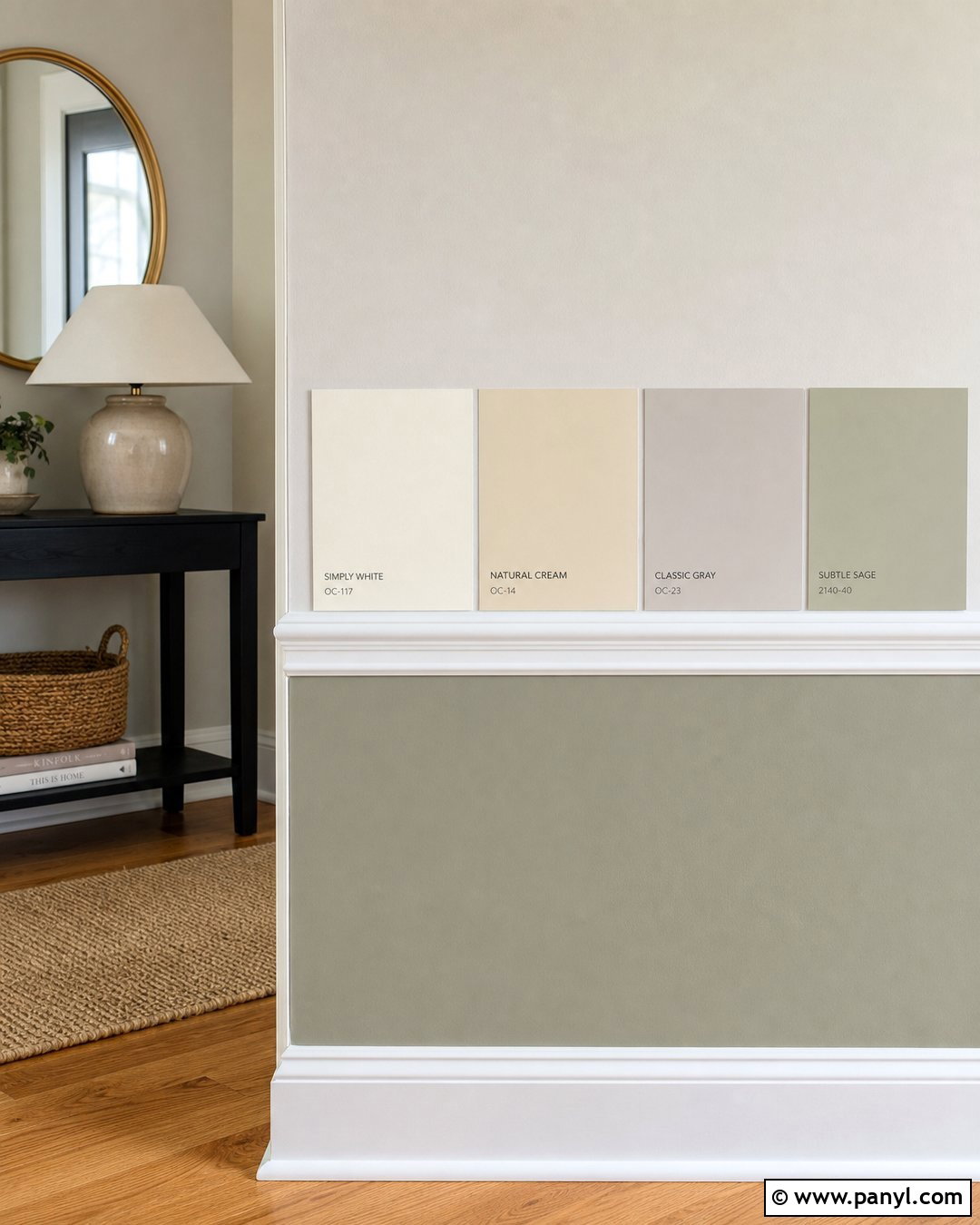
Low wall samples help you compare color directly against flooring, rugs, and baseboards. Paint wide horizontal blocks of cream, light tan, warm gray, and pale olive about six inches above bright white trim. Use the setup in an entryway with natural oak flooring, a narrow black console, woven runner, round brass mirror, and ceramic table lamp. The surrounding finishes provide immediate clues about each sample’s undertone. Once the strongest two colors emerge, repeat them at eye level to ensure they also work across a larger view. A shade that looks attractive beside the floor may feel heavier when seen higher on the wall. The finished entry palette should connect the flooring and adjoining rooms while making the white trim appear clean, crisp, and intentional.
15. Paint Samples Beside A Fireplace
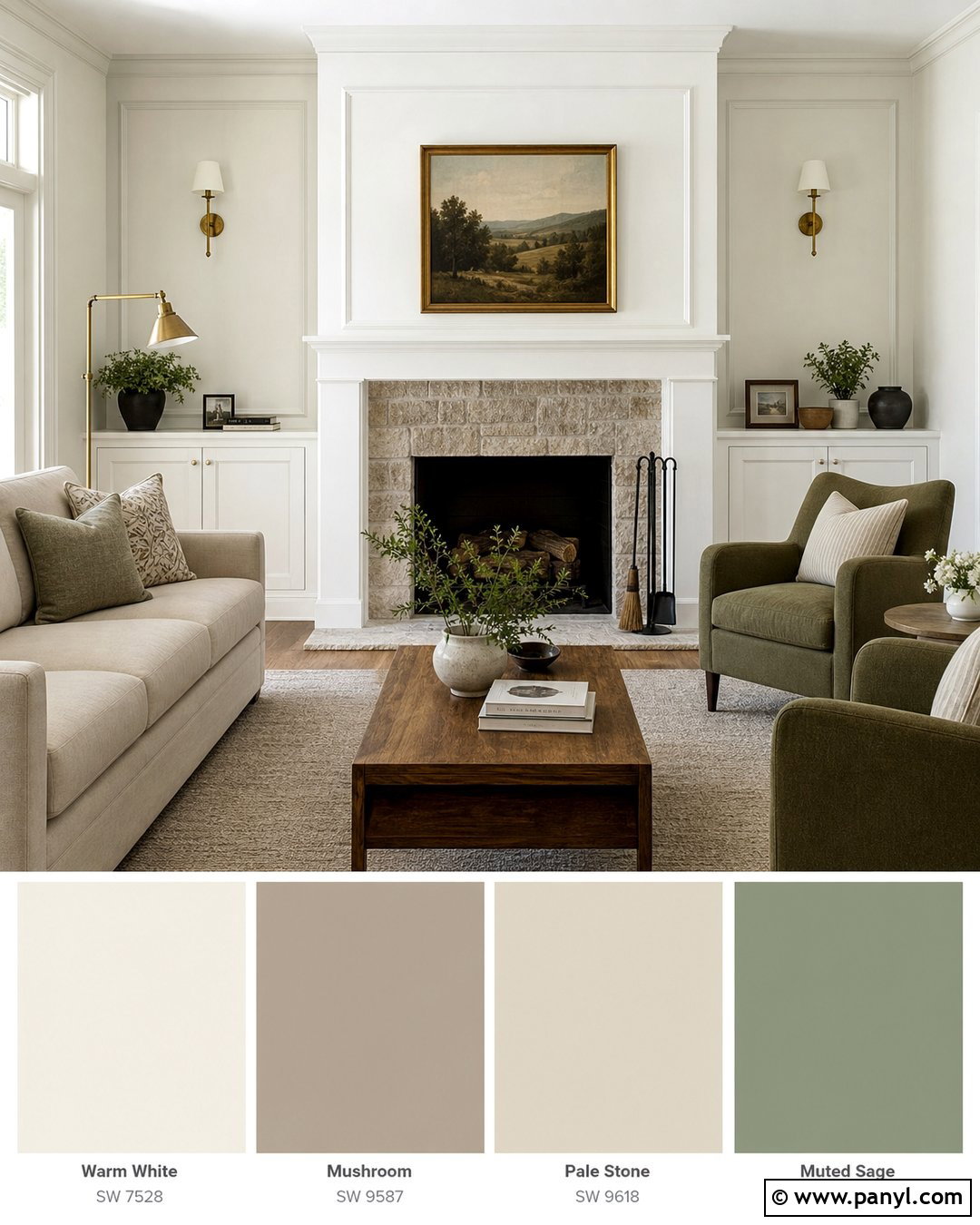
A fireplace introduces several fixed colors that should influence the final wall paint. Test warm white, mushroom, pale stone, and muted sage on both sides of a white-painted fireplace with a light gray stone surround. Arrange the room with a beige sofa, two olive chairs, a medium oak coffee table, and a textured ivory rug. Simple black fireplace tools and an aged brass lamp add controlled contrast. Position each paint sample close enough to the stone and mantel to reveal undertones, but leave space between the test areas. Look at the complete wall from the main seating position. The best color will complement the fireplace materials, soften the television or artwork above the mantel, and create a connected backdrop for the seating arrangement without competing with the room’s focal point.
16. Kitchen Paint Samples Near Cabinets

Kitchen wall color should be tested beside the cabinets, countertops, backsplash, and flooring rather than on an empty wall. Apply large samples of warm white, pale greige, muted blue-gray, and soft sage between upper cabinets or on an adjacent wall. Use white shaker cabinets, light quartz counters, a cream subway tile backsplash, oak flooring, and brushed brass hardware as the complete setting. Move sample boards to several locations, including a shadowed corner and the brighter sink area. This reveals whether a color clashes with the cabinet white or changes beside reflective surfaces. The winning shade should connect all fixed finishes while still creating enough contrast to define the walls. Keep countertop accessories simple so visual clutter does not distract from the color comparison.
17. Bathroom Paint Samples Beside Tile
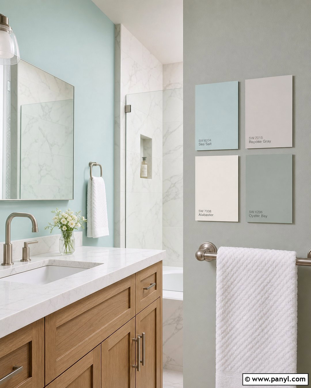
Bathrooms combine tile, mirrors, metal, and artificial light, so samples should be tested beside every major finish. Place large vertical samples of pale aqua, soft gray, warm white, and misty green beside white marble-look tile. Finish the room with a light oak vanity, white countertop, brushed nickel fixtures, frameless mirror, and textured white towels. Test the samples close to the vanity light and on the wall opposite the mirror, where reflections can alter their appearance. Use the bathroom at different times before making a choice. The selected color should stay fresh under bright task lighting while complementing the tile’s veining and the vanity’s warmth. Avoid a shade that makes the white surfaces appear dingy, overly blue, or yellow by comparison.
18. Hallway Paint Samples For Room Transitions
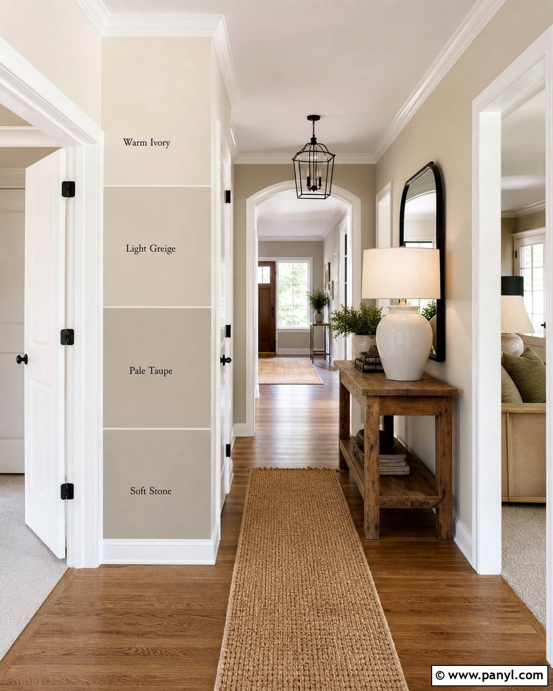
A hallway color needs to connect several rooms, so arrange the samples where multiple doorways are visible. Test warm ivory, light greige, pale taupe, and soft stone in tall rectangles between white-trimmed openings. Add a narrow oak console, black-framed mirror, woven runner, and simple ceramic lamp to create a complete hallway setting. Look through each doorway while standing beside the samples. Consider how every candidate works with the living room, kitchen, and bedroom colors beyond it. Repeat the strongest two shades near the darkest end of the hall, where limited natural light may change them. The final selection should brighten the passage, support the trim, and create a smooth visual transition instead of introducing an undertone that clashes with the adjoining spaces.
19. Open Floor Plan Paint Samples
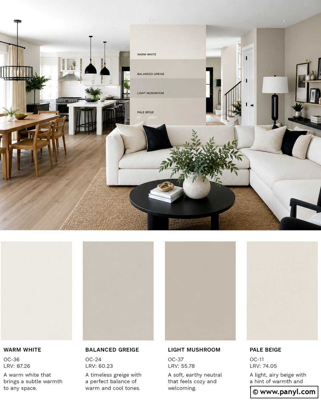
An open floor plan needs a paint color that works across several connected zones. Place large samples of warm white, balanced greige, light mushroom, and pale beige on a central wall visible from the kitchen, dining area, and living room. Use white cabinetry, oak dining furniture, a cream sectional, black accents, and a natural woven rug throughout the space. Repeat the same samples near the kitchen and on a wall receiving stronger window light. View them from several angles rather than standing directly in front. The chosen shade should coordinate with all major finishes and remain attractive as the lighting changes across the large room. A versatile mid-light neutral can unify the zones while allowing furniture, artwork, and textiles to define each area separately.
20. Kids Room Paint Samples In Soft Colors
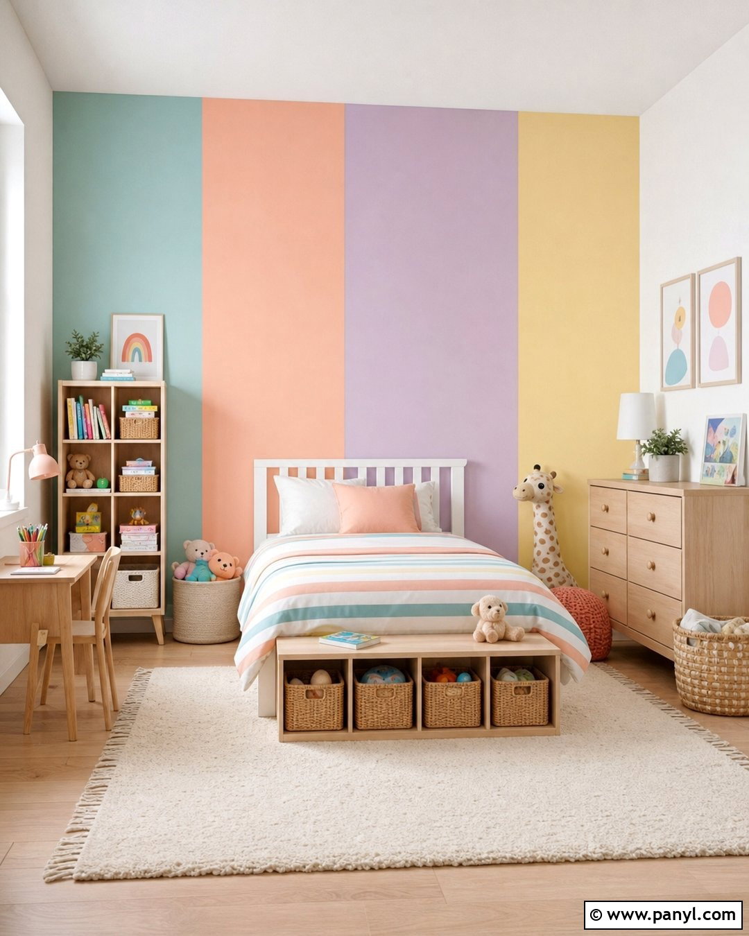
A children’s room can feel colorful without becoming overstimulating when the samples are slightly muted. Test dusty aqua, soft peach, pale lavender, and warm butter yellow behind a simple white bed. Use light oak furniture, an ivory rug, striped bedding, woven storage baskets, and a few coordinated toys to complete the room. Paint the colors in large arches or rectangles, but maintain clear spacing so each option is easy to judge. Check how the samples work with the room’s daylight and ceiling light. Consider whether the color will support future bedding and decor changes. The best shade should create a cheerful background while staying flexible enough for the room to mature. Softer versions of favorite colors usually coordinate more easily with furniture and storage pieces.
21. Home Office Paint Samples Behind Desk
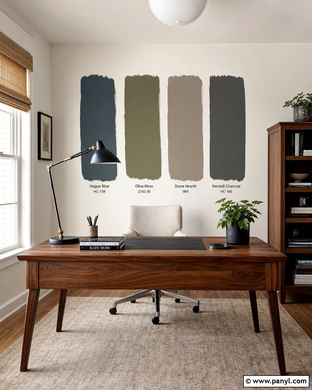
Test home office colors behind the desk so you can see how they affect the actual working area. Paint broad samples of deep blue-gray, warm olive, muted taupe, and soft charcoal above a walnut desk. Add a cream upholstered chair, black task lamp, natural woven shade, low bookcase, and simple framed artwork. The combination creates a professional but comfortable setting for evaluating each option. Sit at the desk and look toward the samples during normal work hours. Then check them with the task light and ceiling fixture switched on. A productive office color should provide definition without making the room feel cramped or gloomy. Choose the shade that supports screen visibility, coordinates with the furniture, and creates an attractive background for video calls.
22. Paint Samples For Color Drenching
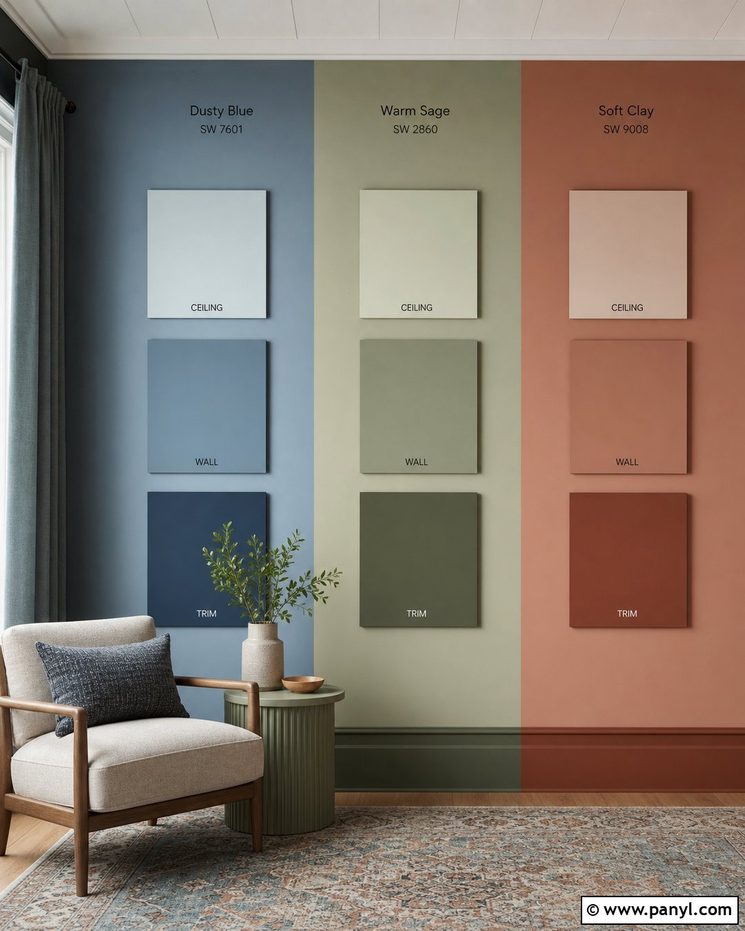
Color drenching requires testing the wall, trim, and ceiling relationship before covering the entire room. Choose three coordinated families, such as dusty blue, warm sage, and soft clay. Paint each main color in a large wall sample, then add smaller blocks showing lighter and darker versions for the trim and ceiling. Set up the room with a compact upholstered chair, matching side table, tonal curtains, and a patterned rug containing all three color families. This complete display helps you imagine a wrapped, unified effect rather than a single painted wall. Compare matte or flat ceiling color with satin trim and eggshell walls. The selected combination should create depth through subtle finish changes while maintaining enough variation for architectural details to remain visible and intentional.
23. Paint Samples In Different Sheens
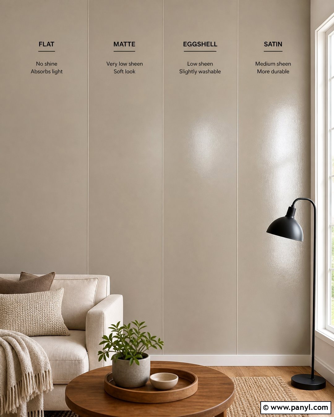
Color is only part of the decision because sheen can change how a painted surface reflects light. Test the same soft greige in flat, matte, eggshell, and satin sections on a wall beside a window. Complete the room with a cream sofa, medium oak table, black floor lamp, and textured beige rug. Label the back of movable boards instead of writing on the visible samples. Observe which section highlights wall texture, catches glare, or appears slightly deeper. Use the room’s lamps after sunset to check reflections from different angles. Once you find the best sheen, compare two or three final colors in that finish. This organized approach creates a more accurate preview of the completed wall than judging color from sample paint with an unknown finish.
24. Labeled Paint Sample Grid
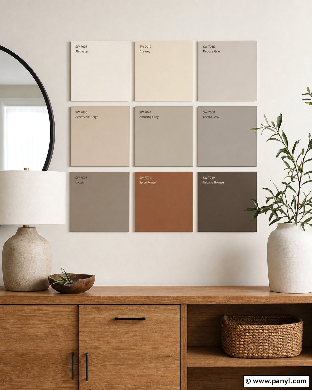
A clean grid keeps a larger group of samples organized while you narrow the palette. Paint nine equal squares containing three warm whites, three greiges, and three muted earth tones on large white foam boards. Attach small removable labels beneath the boards rather than writing directly on the wall. Display the grid above a low oak console with a round black mirror, stoneware lamp, woven basket, and simple greenery. Photograph the arrangement in daylight and evening light so you can compare it later. Remove obvious mismatches after the first day, leaving more visual space around the finalists. This structured process prevents similar colors from becoming confusing and creates a polished testing area that feels intentional. Finish by moving the top samples to several walls around the room.
25. Final Paint Samples With White Borders
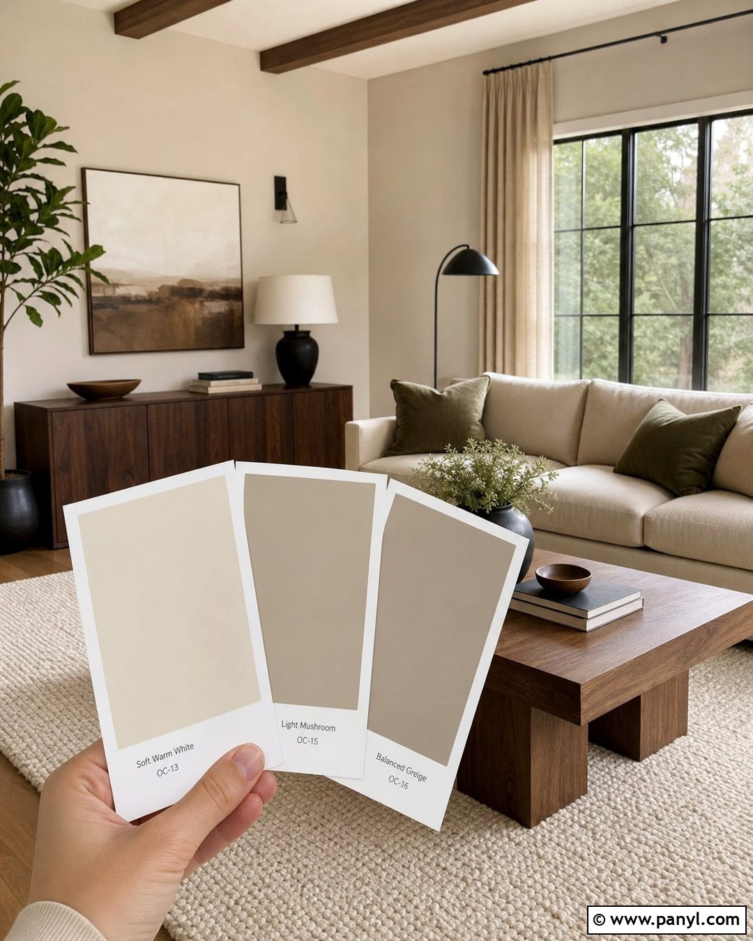
Give the final three paint samples generous white borders to reduce the influence of the existing wall color. Display soft warm white, light mushroom, and balanced greige on separate foam boards behind a beige sofa. Complete the room with walnut furniture, an ivory wool rug, olive pillows, black lighting, and natural linen curtains. Space the boards several feet apart rather than placing nearly identical neutrals side by side. Move them next to the trim, flooring, and darkest corner over several days. A white border can make subtle undertones easier to recognize, while a larger painted area offers a stronger representation than a small chip. () Select the color that connects every finish and remains appealing under all the room’s usual lighting conditions.
Conclusion:
Successful Paint Samples On Wall Ideas do more than display attractive colors. They place each option beside the room’s real flooring, furniture, trim, lighting, and fixed finishes. Use large samples, apply full coverage, and give every color enough space to be evaluated clearly. Movable boards and peel-and-stick samples are useful when you want to compare several walls without leaving painted patches. Direct wall tests can provide an equally realistic preview when properly prepared. Most importantly, take time with the decision. Check the finalists in morning light, afternoon shade, and evening illumination. A thoughtful sampling setup helps reveal undertones early and makes the completed room feel connected, comfortable, and intentionally designed.

Related Ideas and Inspiration:

Leave a Reply