
Choosing paint becomes much easier when you see how a color works with flooring, furniture, lighting, and decor. These 20 Wall Color Samples offer complete room schemes rather than isolated swatches, helping you picture each shade in a realistic home. The collection ranges from warm white and flexible greige to sage green, dusty blue, terracotta, and deep chocolate brown. Some palettes brighten small rooms, while others create a cozy, dramatic atmosphere. Before painting, test large movable sample boards beside your permanent finishes. Check each option in morning light, afternoon sun, and evening lamplight because undertones can change throughout the day. Use the complete looks below to compare furniture pairings, accent colors, finishes, and styling possibilities with these 20 Wall Color Samples.

1. Warm White Wall Color
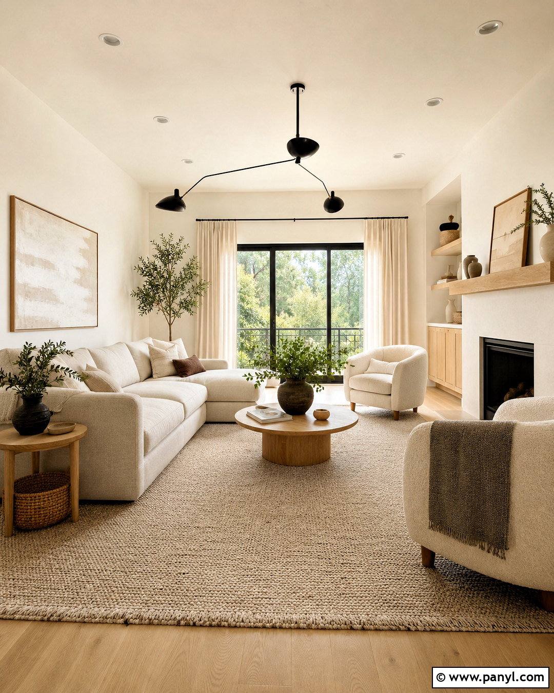
Warm white walls create a bright foundation without the cold appearance that comes from blue-based white paint. Use this shade throughout an open living room with natural oak flooring, a soft oatmeal sofa, and two cream boucle chairs. Add a light beige wool rug to define the seating area while keeping the palette airy. Matte black window frames and a slim black floor lamp provide enough contrast to sharpen the look. Finish the room with linen curtains, woven baskets, pale wood tables, and muted green branches in a ceramic vase. Choose white trim that closely matches the walls, preferably in a slightly glossier finish. This prevents awkward undertone differences and gives the complete room a calm, continuous appearance.
2. Cream Wall Color
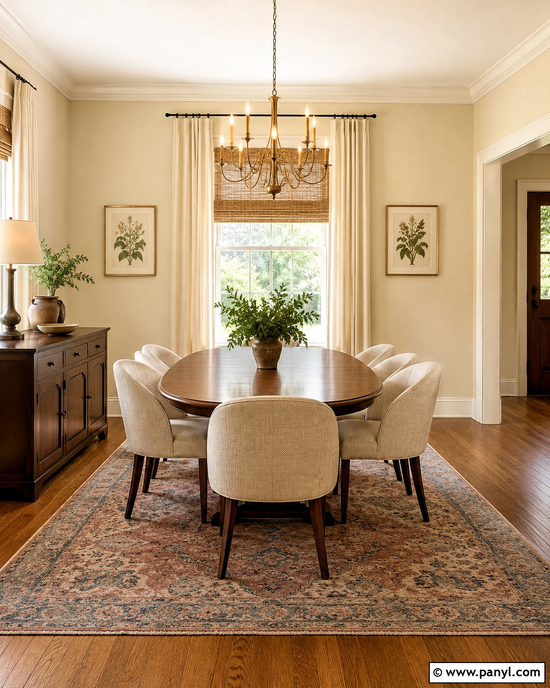
Cream walls bring softness to rooms that need warmth but still benefit from a light, neutral background. They work especially well in a traditional dining room with medium-tone oak floors, an oval walnut table, and upholstered oatmeal chairs. Use warm white on the ceiling and trim to create gentle definition without making the wall color appear yellow. An aged brass chandelier, woven Roman shades, and a faded rust-and-blue rug add character. Keep artwork simple with botanical prints in dark wood frames. Cream can intensify under warm bulbs, so select neutral-white lighting and test the sample near windows. The finished room should feel collected and comfortable, with enough earthy contrast to keep the creamy palette from looking overly pale or one-dimensional.
3. Light Greige Wall Color
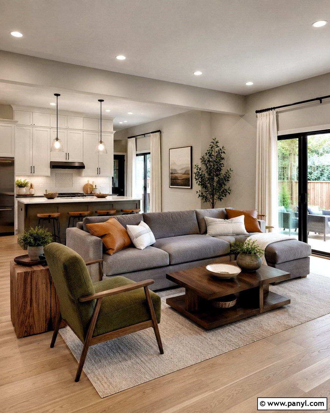
Light greige combines the clean quality of gray with the welcoming warmth of beige. It is a practical choice for an open family room where several finishes need to work together. Pair it with white oak floors, a warm gray sectional, and a textured ivory rug. Use soft white trim to frame the room, then repeat black accents through curtain rods, table legs, and picture frames. Camel leather pillows and a medium brown wood console prevent the neutral palette from feeling flat. Add one muted green chair or several leafy plants for natural color. Because greige undertones vary, compare the sample against flooring, countertops, and upholstery. The right version should bridge warm and cool materials rather than leaning noticeably pink, purple, or blue.
4. Mushroom Wall Color
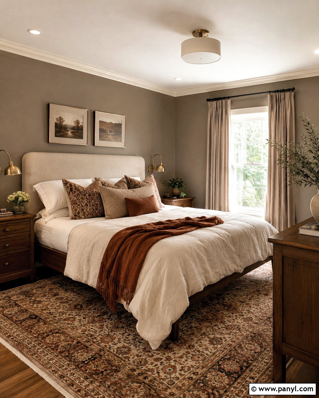
Mushroom walls create a grounded neutral look that feels richer than beige and softer than dark taupe. This color suits a cozy bedroom with walnut furniture, warm white bedding, and a substantial upholstered headboard in natural linen. Paint the trim a creamy off-white for subtle contrast, or use the mushroom shade on both walls and trim for a more enveloping finish. Layer the bed with taupe, ivory, and muted rust textiles. Antique brass sconces and a vintage-style patterned rug bring depth without disrupting the restrained palette. Add blackout curtains in a slightly deeper brown-gray tone. Since mushroom paint can reveal pink or green undertones, place a large sample beside the headboard, flooring, and curtains before deciding on the final shade.
5. Warm Taupe Wall Color
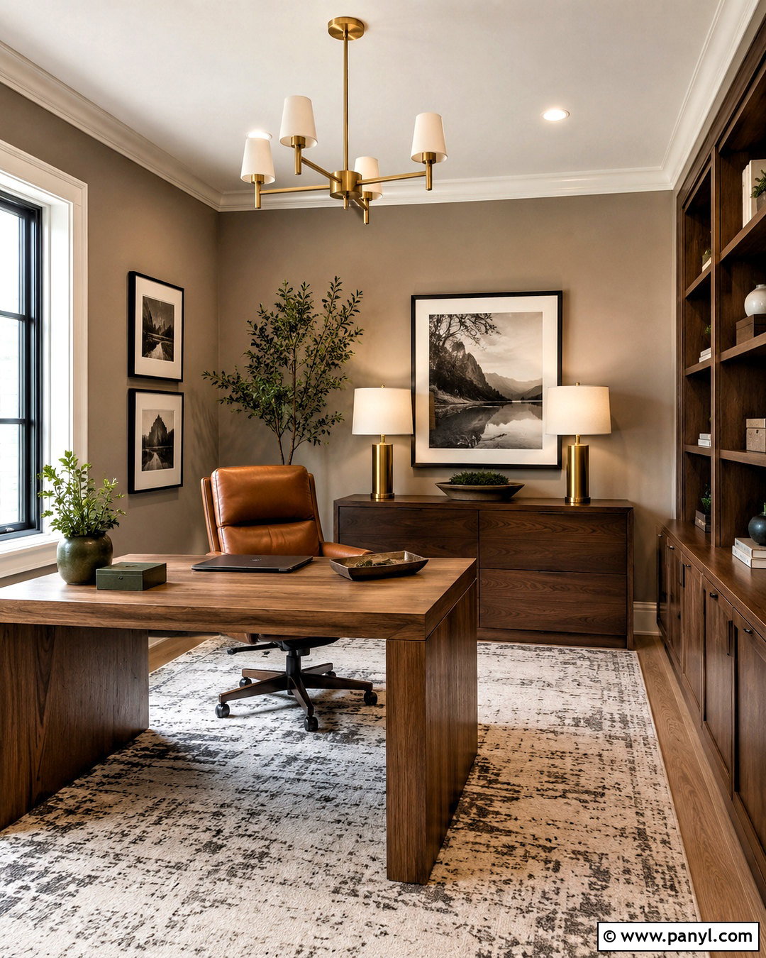
Warm taupe walls can make a home office feel polished, focused, and comfortable throughout the day. Build the room around a substantial oak desk, a cognac leather chair, and low walnut storage cabinets. Crisp off-white trim keeps the deeper neutral from becoming heavy, while a flat-weave rug in cream and charcoal adds quiet pattern. Include brushed brass desk lighting and framed black-and-white artwork for a tailored finish. A few olive green accessories introduce natural color without competing with the walls. Taupe changes noticeably under different light, so compare samples on walls facing separate directions. Select a shade with balanced brown and gray undertones. The completed office will feel sophisticated yet approachable, making it suitable for video calls, concentrated work, and occasional reading.
6. Sage Green Wall Color
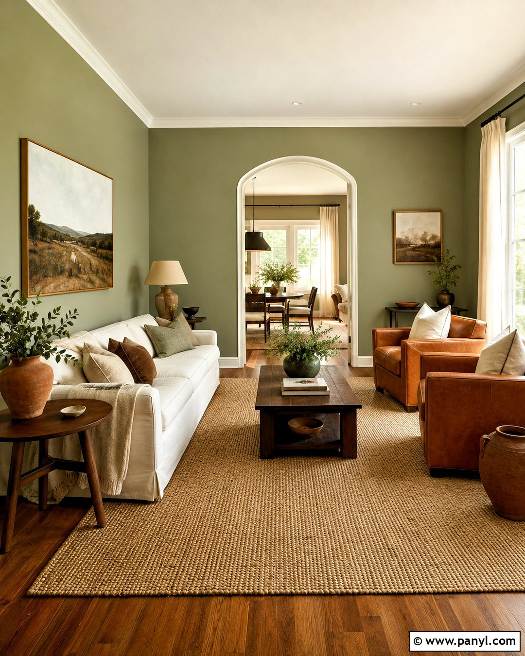
Soft sage green gives a living room a relaxed connection to nature while remaining easy to decorate around. Pair the walls with warm white trim, honey oak flooring, and a cream slipcovered sofa. Add two light brown leather chairs and a woven jute rug to strengthen the organic character. Walnut side tables, antique brass lighting, and linen curtains bring warmth to sage that might otherwise look cool. Repeat the wall color through small patterned pillows rather than matching every accessory exactly. Terracotta pottery and leafy plants provide subtle contrast. In a north-facing room, choose a warmer sage with slightly yellow undertones. In strong southern light, a grayer version may stay more balanced. The final space should feel fresh, comfortable, and thoughtfully layered.
7. Olive Green Wall Color
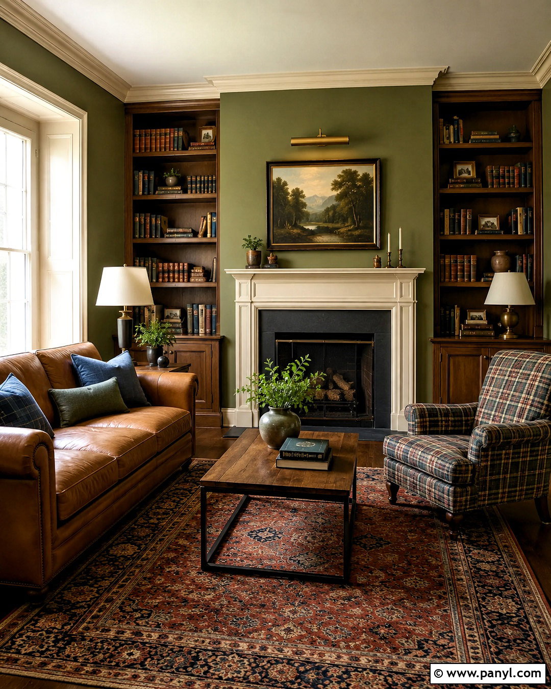
Olive green walls create a richer, earthier setting than pale sage and work beautifully in a library or reading room. Use the color across every wall, then add creamy trim and a warm white ceiling to preserve brightness. Arrange low walnut bookcases around a caramel leather sofa and a comfortable plaid reading chair. A vintage-inspired rug containing rust, beige, and faded blue will connect the dark green walls to the brown furniture. Choose aged brass picture lights and a linen-shaded floor lamp for warm illumination. Simple landscape art suits the natural palette without making the room feel themed. Olive is especially attractive beside wood, but samples should still be checked for muddy undertones. Balance the finished design with enough light textiles and open wall space.
8. Eucalyptus Green Wall Color
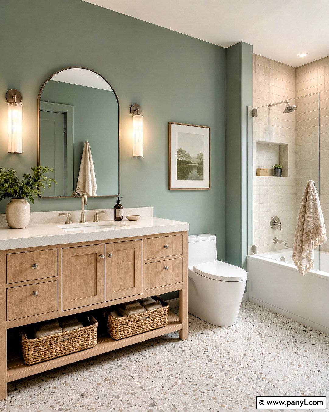
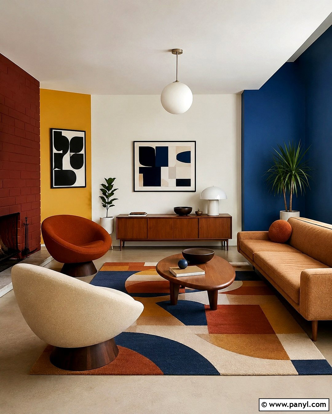
Eucalyptus green offers a quiet blue-green cast that can make a bathroom feel clean, restful, and more distinctive than plain gray. Pair the walls with a white oak vanity, white quartz countertop, and brushed nickel fixtures. Use warm white tile in the shower rather than stark blue-white tile, which could exaggerate the cooler side of the paint. A light terrazzo floor introduces subtle beige and gray variation. Add a rounded mirror, ribbed glass sconces, and natural linen towels to soften the crisp surfaces. Keep storage baskets and accessories in pale wood or woven materials. Test the color beside tile and under the actual vanity lighting. The complete bathroom should feel airy and organic, with the green walls connecting smooth modern finishes to natural textures.
9. Dusty Blue Wall Color
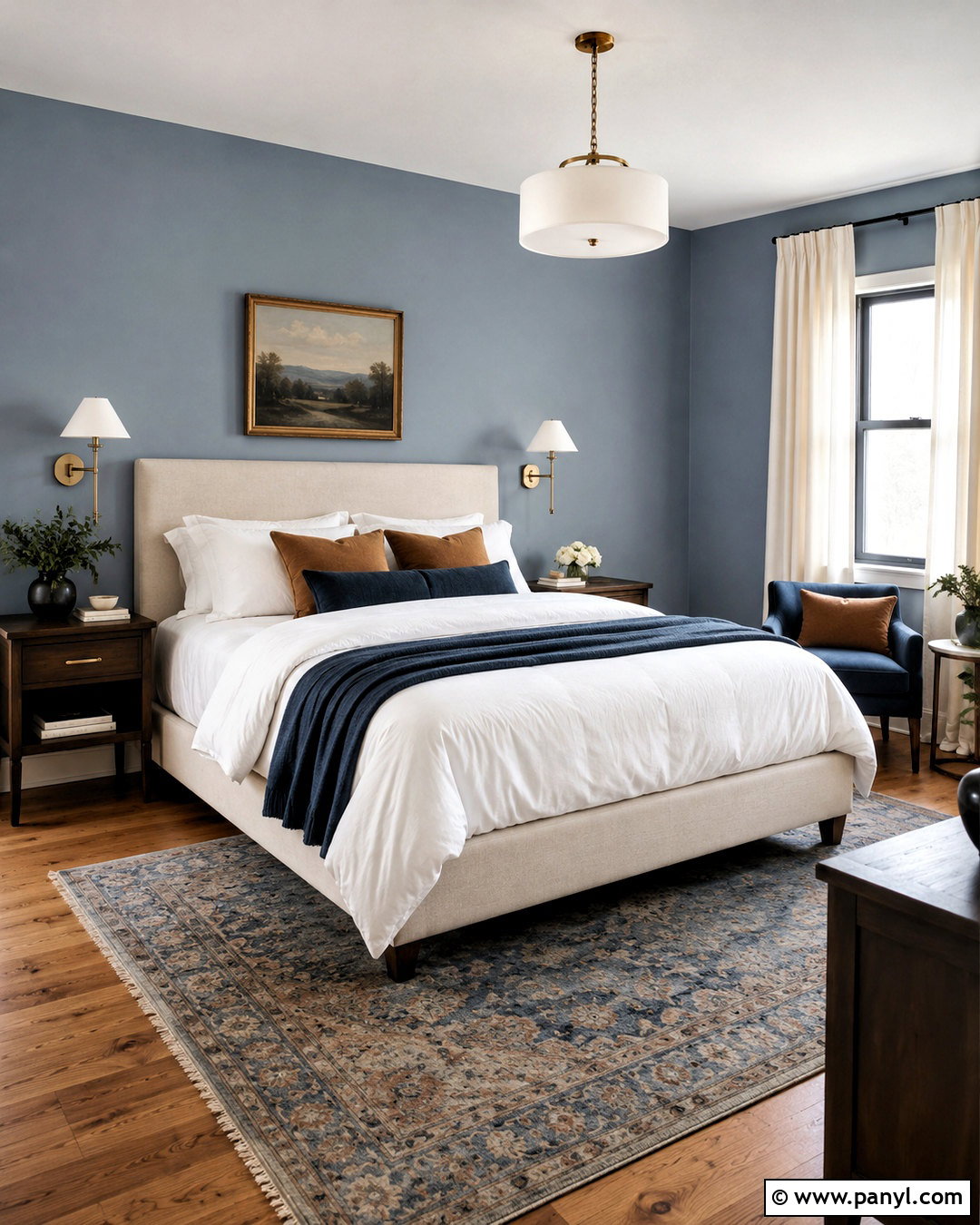
Dusty blue walls bring gentle color to a bedroom without creating an overly bright or themed result. Choose a muted shade with noticeable gray undertones, then pair it with warm white trim and medium oak floors. An upholstered bed in oatmeal linen keeps the palette soft, while navy piping or a navy throw adds controlled depth. Include warm walnut nightstands, brushed brass sconces, and ivory curtains to prevent the blue from becoming chilly. A vintage rug with faded red, cream, and blue details gives the room a collected appearance. Use white bedding as the base, then layer muted clay and tan pillows. Evaluate the sample during evening hours because artificial lighting may reveal unexpected green or purple notes that are less visible in daylight.
10. Slate Blue Wall Color
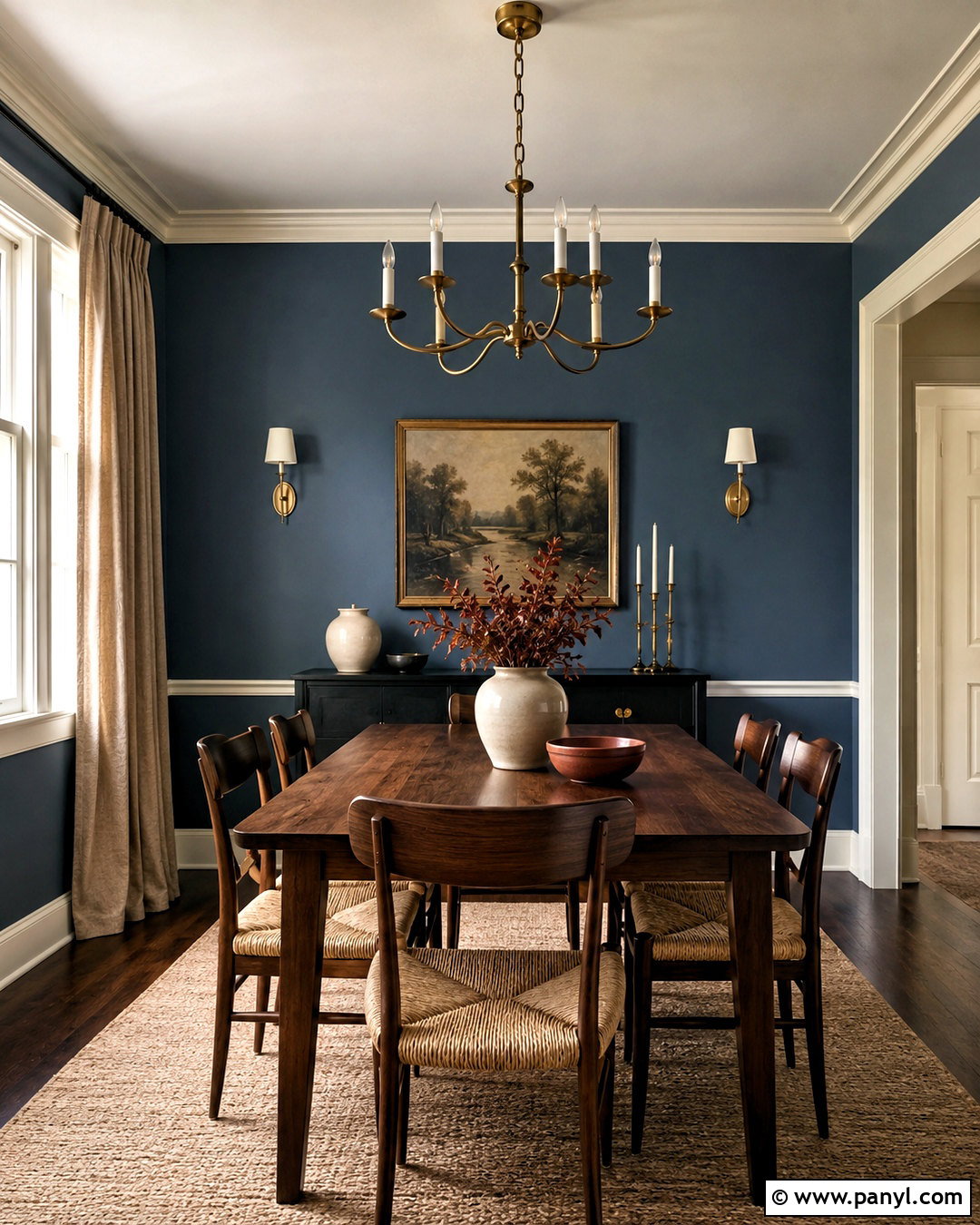
Slate blue creates a strong but livable dining room when paired with warm materials and clean architectural details. Cover the walls in this medium blue-gray, then use crisp warm white on the trim, ceiling, and built-in cabinetry. Center the room with a rectangular walnut table and woven rush-seat chairs. A brass chandelier introduces warmth, while a neutral wool rug softens acoustics and defines the dining zone. Display simple ceramic pieces in cream, rust, and muted green. Linen drapes in natural beige will reduce visual heaviness around the windows. Slate blue looks different beside cool and warm floors, so test a large sample near both the baseboards and furniture. The finished scheme should appear substantial and tailored, not nautical or overly formal.
11. Deep Navy Wall Color
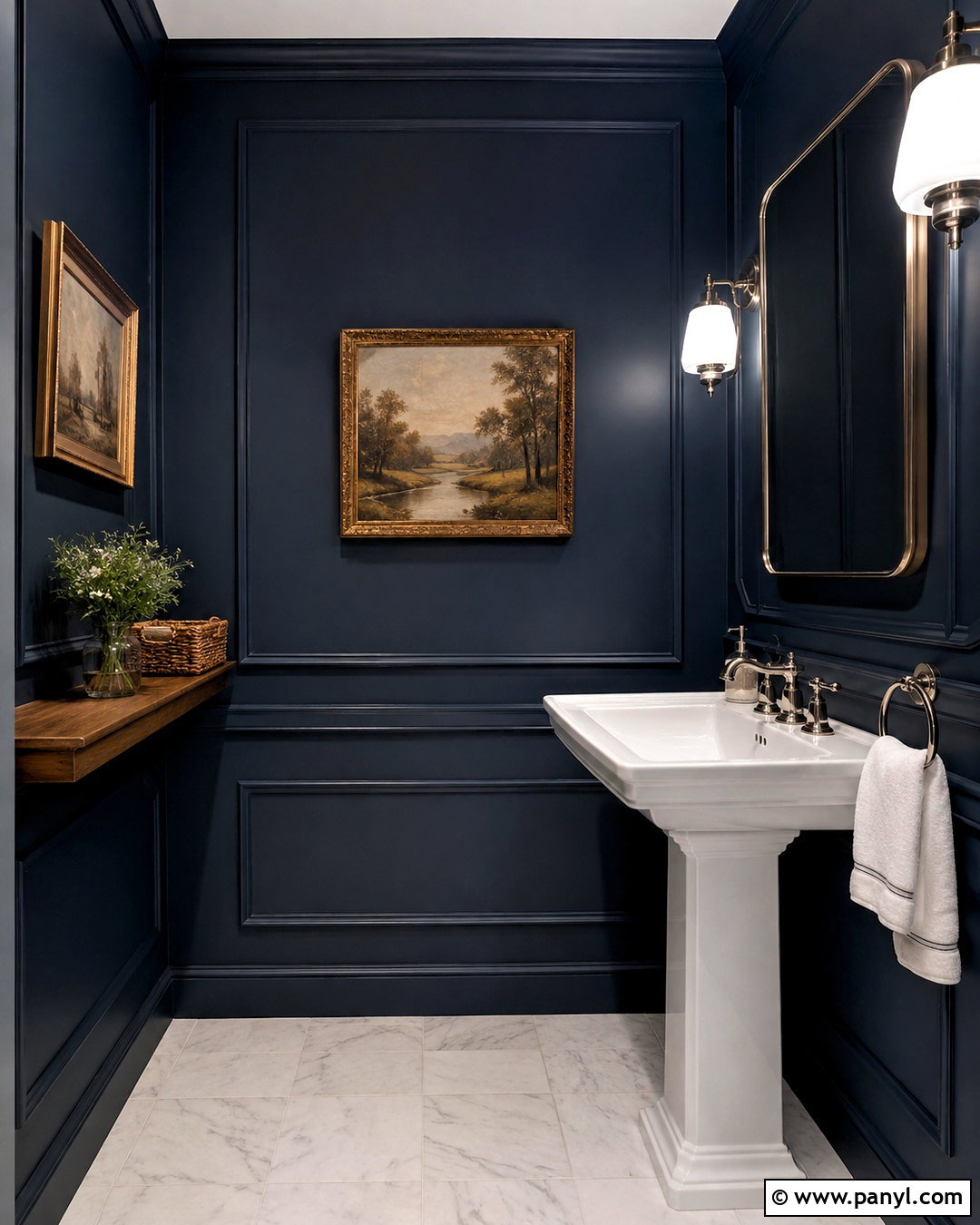
Deep navy walls can transform a small powder room into a dramatic space without requiring extensive remodeling. Use navy on every wall and continue it onto simple panel molding for extra depth. Balance the saturated color with a white pedestal sink, white ceiling, and pale marble floor. A polished nickel faucet and framed mirror create a crisp reflection, while two white glass sconces deliver bright, flattering light. Introduce warmth through a small walnut shelf and a framed vintage landscape. Keep towels and accessories white or light beige so they remain visible against the dark walls. Test the paint beside both daylight and fixtures because navy can shift toward black or purple. A satin or washable matte finish will also handle splashes and frequent cleaning effectively.
12. Pale Sky Blue Wall Color
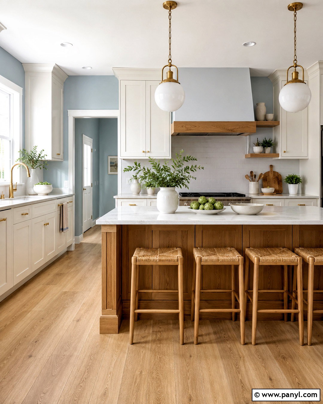
Pale sky blue can make a compact kitchen feel open and cheerful while maintaining a soft, classic appearance. Apply it to the walls around warm white Shaker cabinets and a creamy quartz backsplash. Light oak flooring and woven counter stools add warmth, preventing the blue from feeling icy. Choose brushed brass cabinet pulls and simple globe pendants to bring a gentle golden note into the scheme. A natural wood island can serve as the room’s visual anchor. Keep countertop accessories limited to white ceramics, pale wood boards, and a few fresh herbs. Select a blue with a muted gray base rather than a sugary pastel undertone. Tested beside cabinetry and countertops, the right sample should create freshness while allowing the fixed finishes to remain cohesive.
13. Terracotta Wall Color
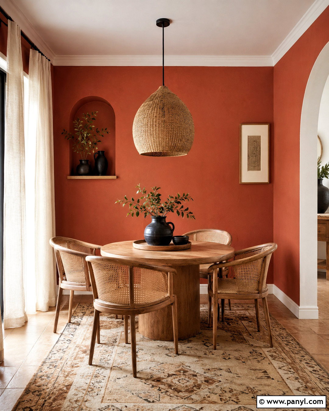
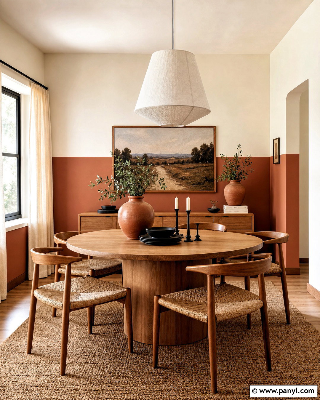
Terracotta walls add warmth and depth to a dining nook, particularly when surrounded by natural wood and creamy neutrals. Use the earthy orange-red shade on the main walls, then balance it with warm white trim and a pale ceiling. A round oak table, curved cane chairs, and a woven pendant create a casual, handcrafted character. Ground the area with a cream rug featuring a simple rust or brown pattern. Add off-white linen curtains to soften incoming sunlight and keep the room from becoming visually heavy. Black ceramic accents offer a small amount of contrast. Terracotta can appear much brighter across a full wall than on a tiny chip, so test a large sample. Choose a muted clay-based version for a welcoming, versatile result.
14. Soft Clay Wall Color
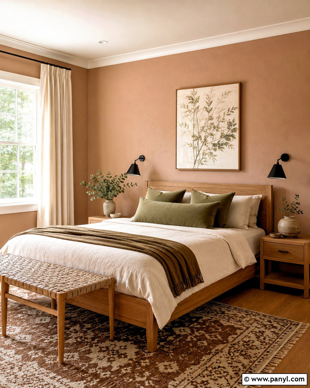
Soft clay walls sit between beige, peach, and muted terracotta, creating a warm backdrop that remains easy to live with. This color works well in a guest bedroom with an oak bed, ivory bedding, and a relaxed woven bench. Use creamy trim and linen curtains to maintain a gentle transition around the room. Add muted olive pillows, a brown-and-cream rug, and matte black bedside lamps for balanced contrast. Handmade ceramic vessels and simple botanical artwork reinforce the earthy palette without making it feel rustic. If the room receives strong afternoon sun, select a quieter clay tone so it does not become overly orange. In dimmer rooms, a slightly warmer sample can prevent the walls from looking dull. The complete look should feel sunny, restful, and natural.
15. Blush Pink Wall Color
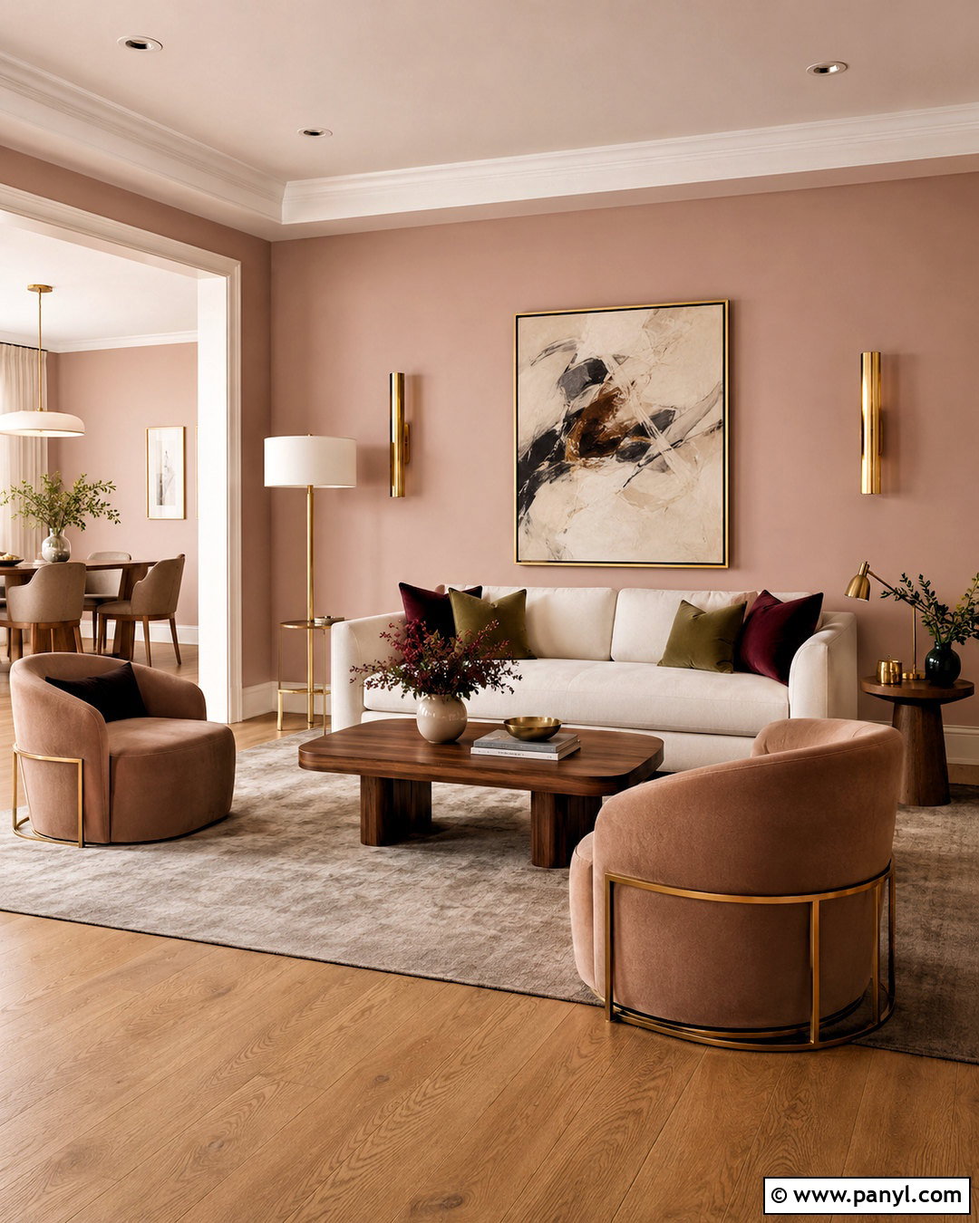
A muted blush wall color can feel sophisticated when the rest of the room avoids overly sweet details. Use it in a bright sitting room with an ivory sofa, light oak flooring, and two curved chairs upholstered in warm beige. Choose soft white trim to highlight the pink gently, then add a taupe rug and walnut coffee table for grounding. Accents in burgundy, olive, and brushed brass give the pale walls more maturity. Hang modern abstract artwork containing cream, rust, and charcoal tones. Linen curtains should stay close to the wall color rather than creating sharp contrast. Look for a dusty blush with beige or gray undertones. Once applied across the room, it should read as warm and calm instead of bright pink or peach.
16. Butter Yellow Wall Color
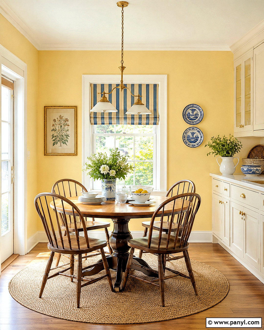
Butter yellow walls can brighten a breakfast room while producing a softer effect than clear, saturated yellow. Pair the walls with warm white trim, painted cream cabinetry, and medium oak flooring. A small round wood table with spindle-back chairs creates an inviting everyday dining area. Use a blue-and-cream striped Roman shade for fresh contrast, then add brass lighting and simple white dishes. A natural fiber rug keeps the scheme casual and helps connect the golden wall color to the wood finishes. Avoid orange bulbs, which may make yellow paint appear harsh after sunset. Test pale samples on multiple walls and choose one that stays creamy in both daylight and artificial light. The completed room should feel sunny and uplifting without becoming visually loud.
17. Muted Ochre Wall Color
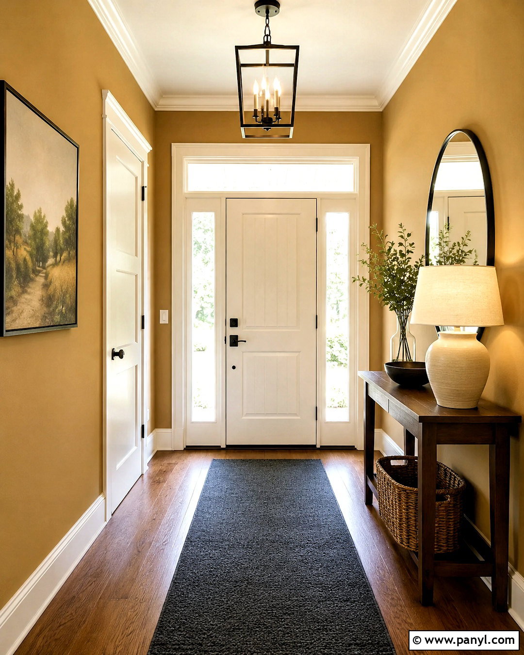
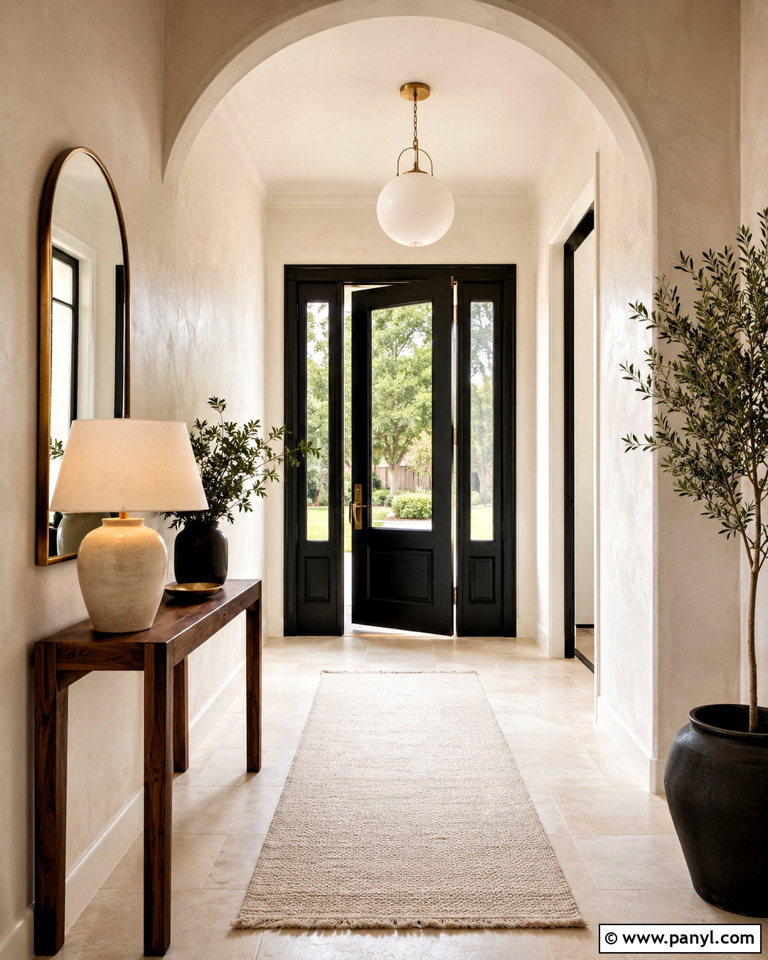
Muted ochre gives an entryway warmth, personality, and a welcoming sense of transition. Paint the walls in a soft golden earth tone, then use creamy white on the doors, trim, and ceiling. Place a narrow walnut console against one wall with a large rounded mirror above it. A charcoal runner, black metal light fixture, and dark umbrella stand add structure to the warm palette. Include a woven basket, an ivory ceramic lamp, and a small piece of landscape art for texture. Ochre looks especially balanced beside medium and dark wood, although it can become intense under direct sunlight. Compare several large samples and select a shade softened with brown or gray. This creates a grounded entrance that feels colorful but still connects naturally to surrounding neutral rooms.
18. Charcoal Gray Wall Color
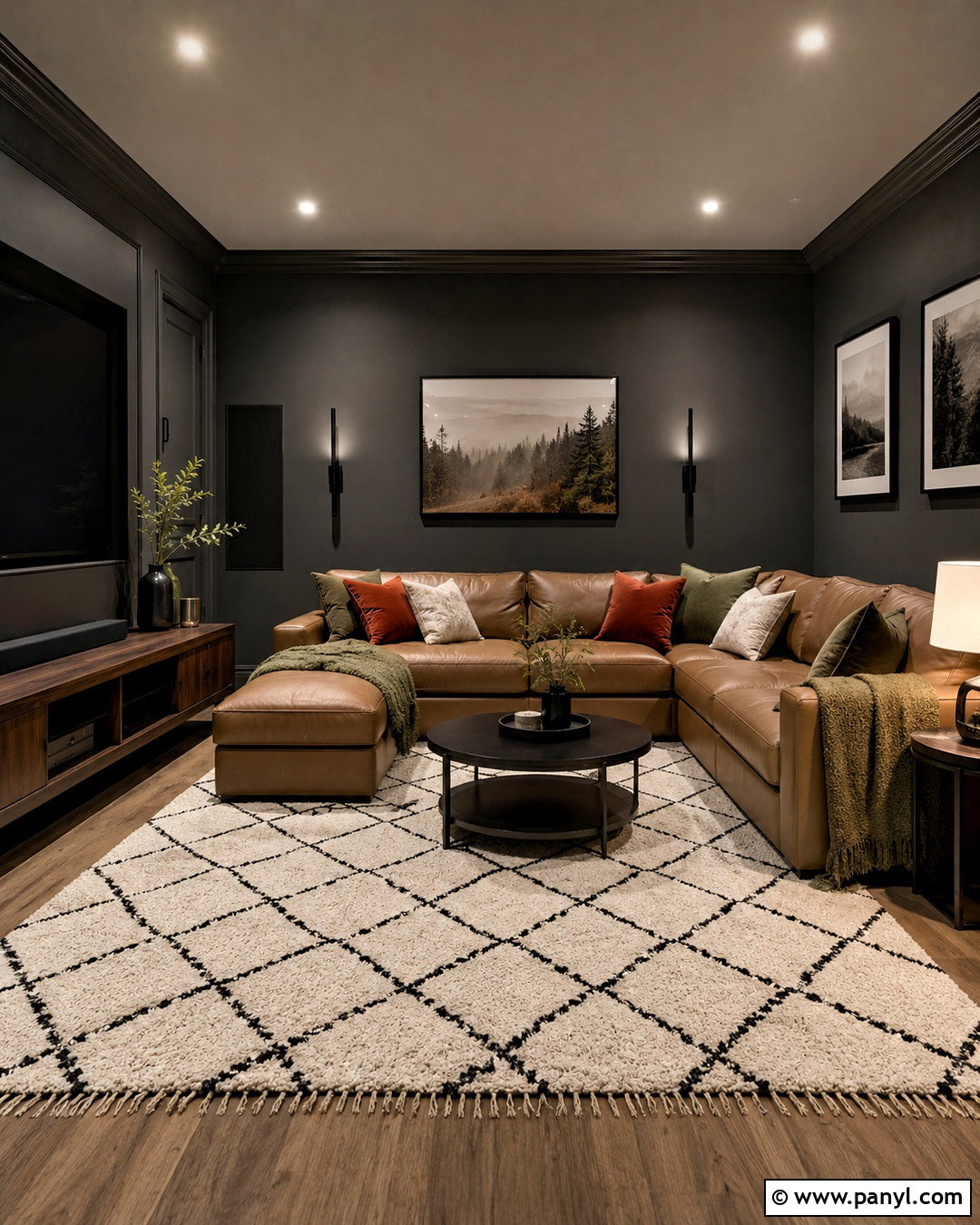
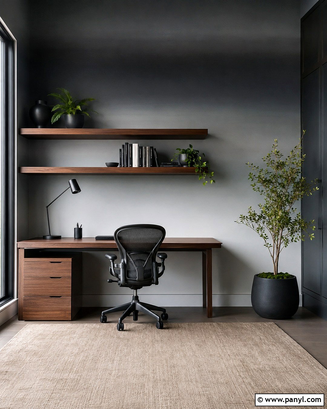
Charcoal gray walls create a dramatic media room where screens, speakers, and dark equipment can blend into the background. Paint every wall charcoal and use the same color on trim for a seamless, immersive effect. Keep the ceiling a softer warm gray if the room is small. Add a low camel leather sectional, a large cream-and-black rug, and walnut media storage to bring warmth to the dark shell. Install dimmable white lighting, but include floor and table lamps for comfortable everyday use. Rust pillows and olive throws provide restrained color. Charcoal can reveal blue, green, or brown undertones, so place samples beside the flooring and electronics. The finished room should feel cozy and intentional rather than shadowy, cramped, or unfinished.
19. Chocolate Brown Wall Color
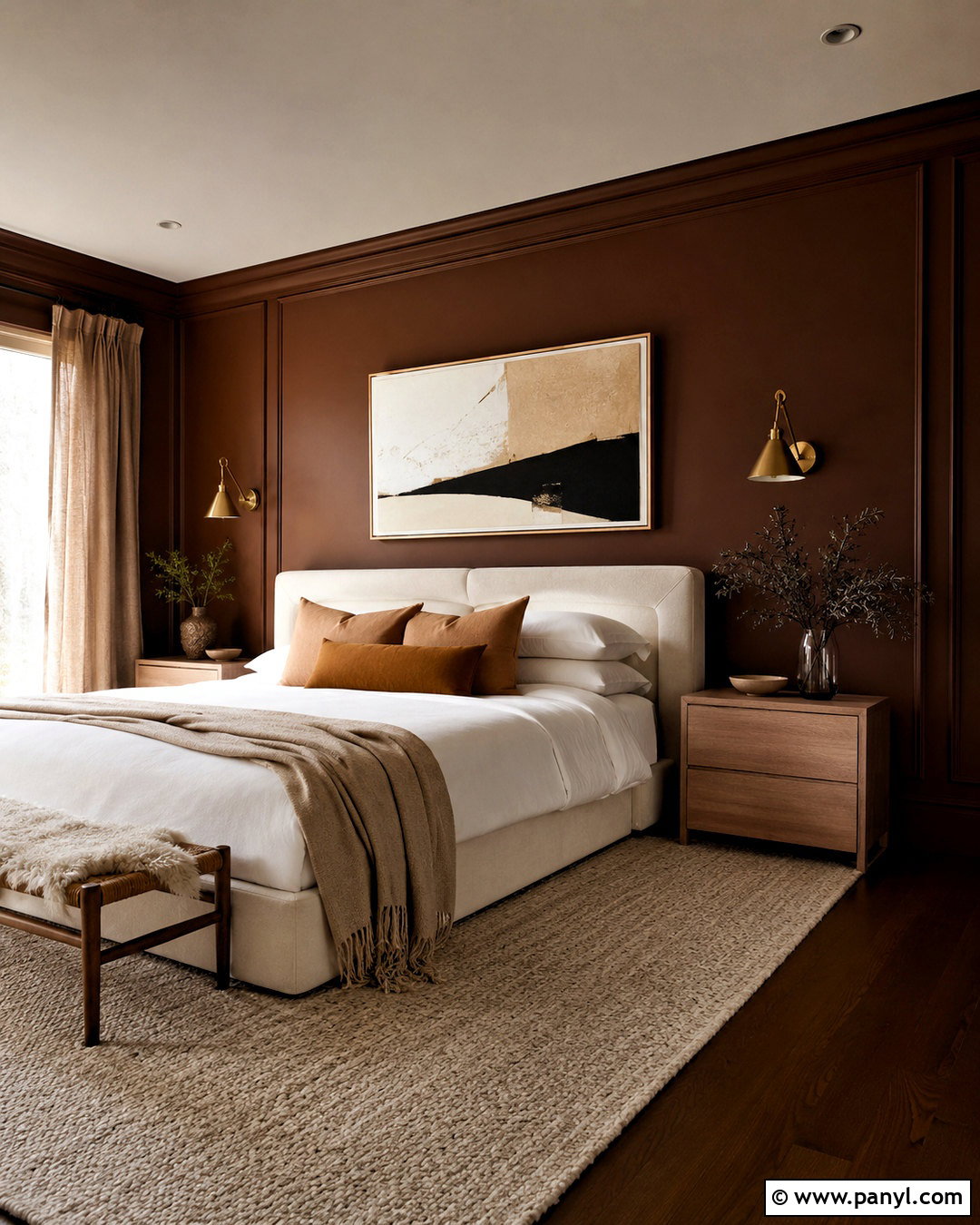
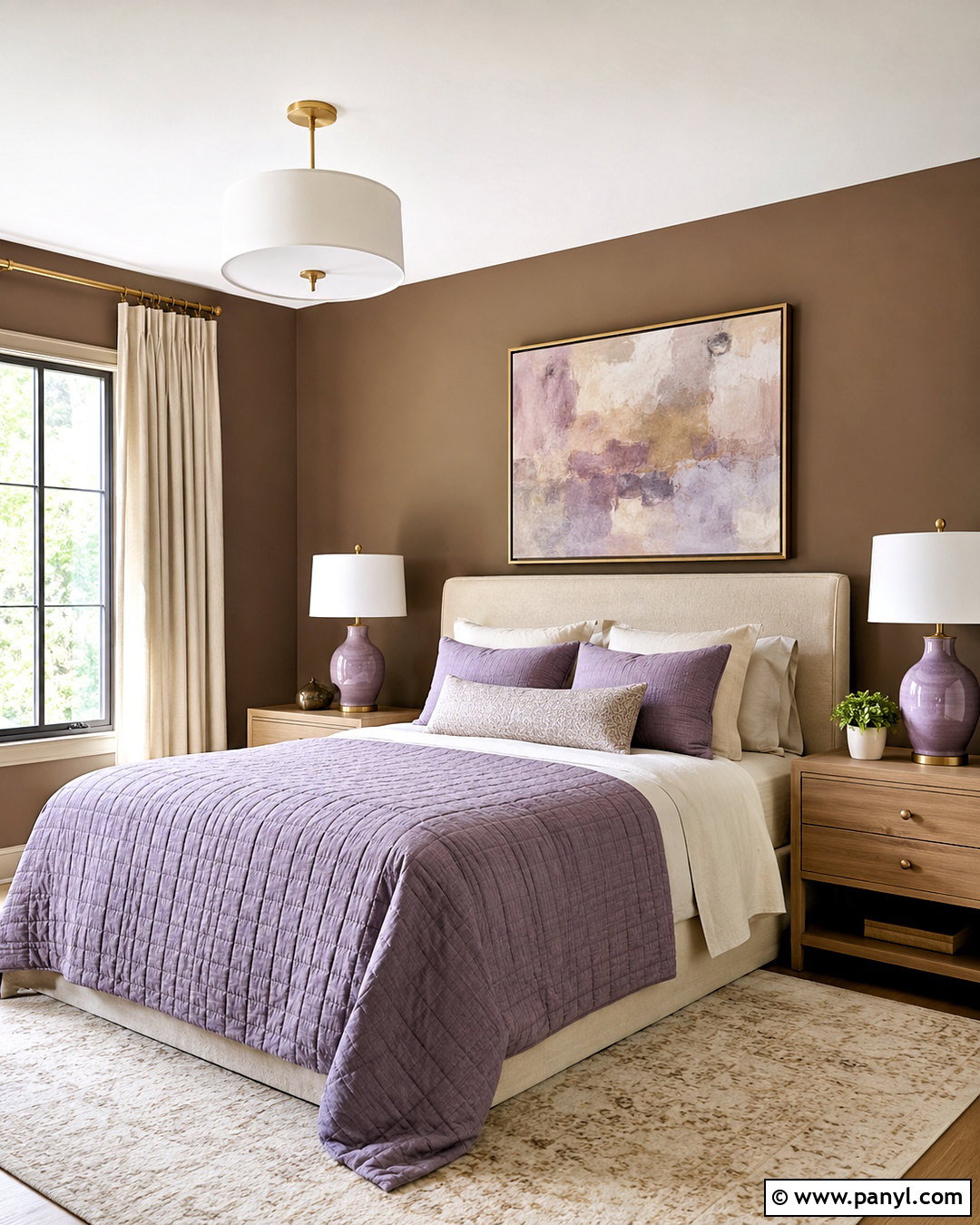
Chocolate brown walls can give a bedroom a cocooning quality when the surrounding materials are light, tactile, and carefully layered. Use a warm brown with subtle red undertones, then paint the trim in the same color with a satin finish. An ivory upholstered bed and crisp white bedding will stand out clearly against the darker walls. Add caramel linen pillows, a cream wool rug, and pale oak nightstands to balance the room. Aged brass sconces provide warmth, while simple abstract artwork introduces beige and muted blue. Keep the window treatments light but substantial, using full-length natural linen panels. Test brown paint at night as well as during the day. The best sample should feel rich and earthy without turning purple, black, or muddy under artificial lighting.
20. Lavender Gray Wall Color
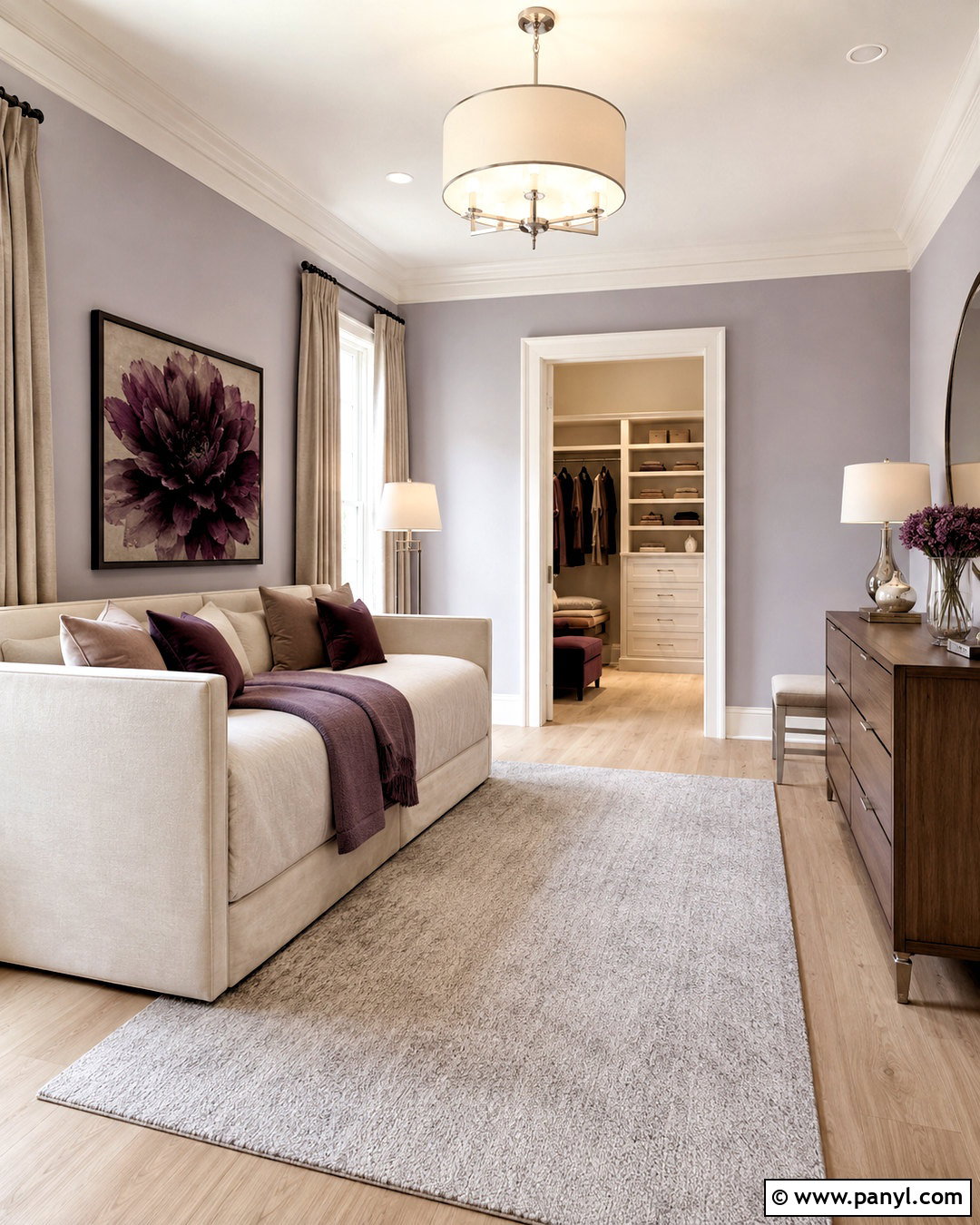
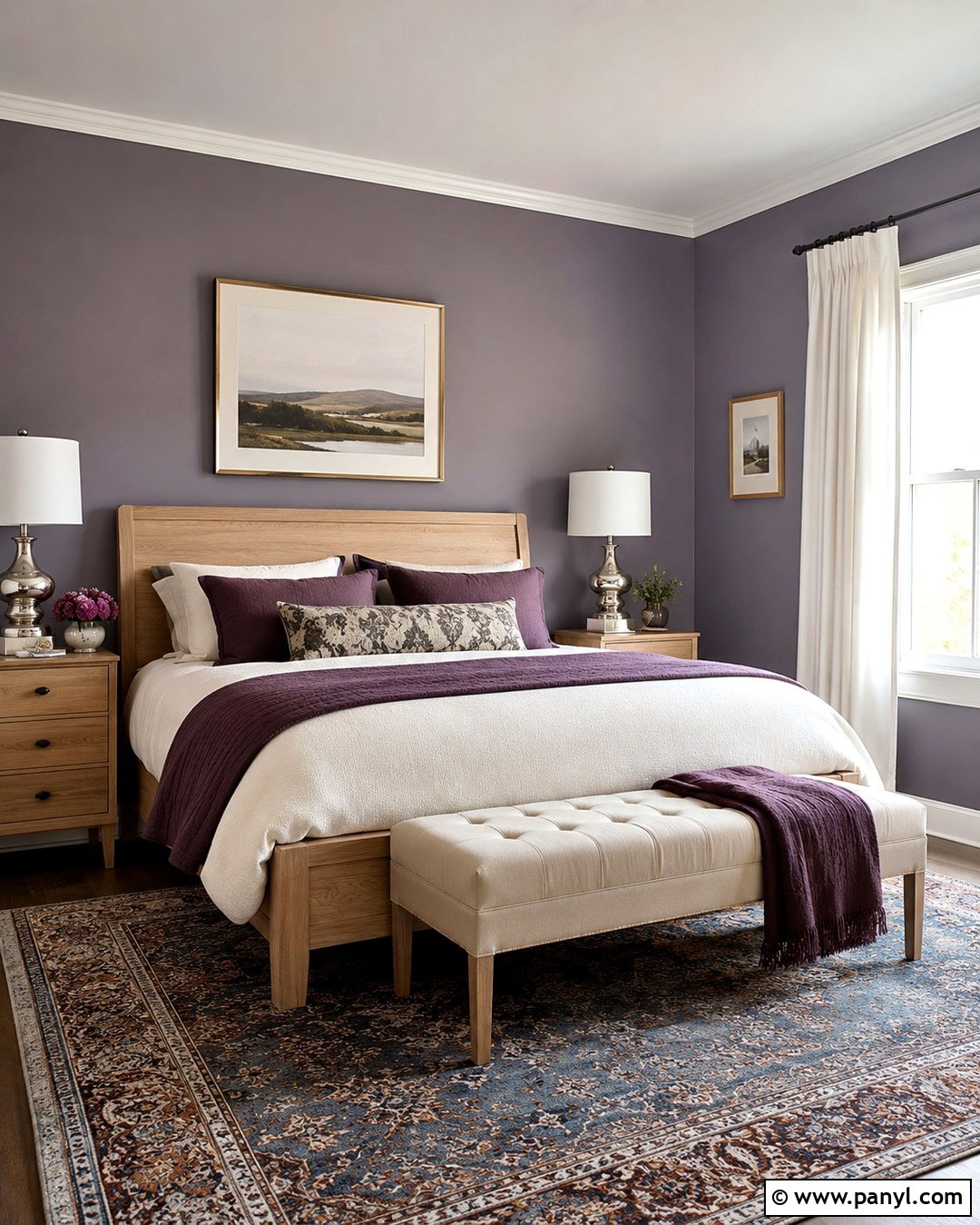
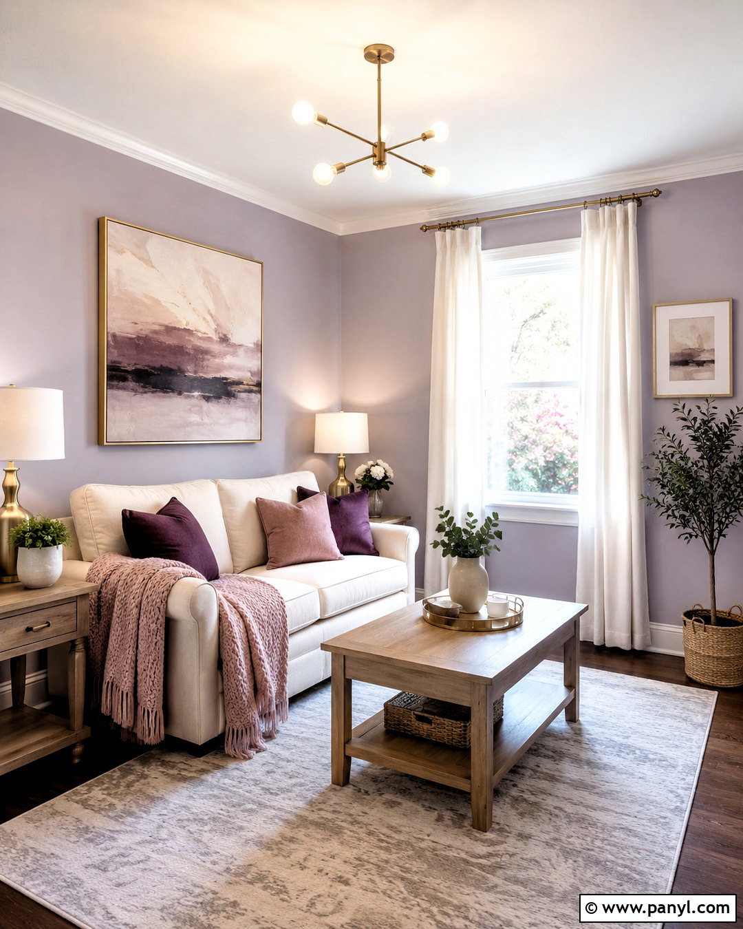
Lavender gray offers a subtle alternative to standard gray and can give a dressing room or quiet bedroom a refined, airy character. Choose a softened purple-gray with low saturation, then pair it with warm white trim and pale oak flooring. Use an ivory daybed, a light gray wool rug, and a slim walnut dresser to keep the room balanced. Brushed nickel lighting complements the cooler paint, while beige linen curtains and warm taupe pillows prevent an icy result. Add one or two plum accents for depth, but avoid filling the room with matching purple decor. Compare the sample against both daylight and warm bulbs because lavender undertones can become much stronger after sunset. The completed space should read as calm gray first, with a delicate violet cast.
Conclusion:
These 20 Wall Color Samples show how paint becomes part of a complete room rather than functioning as an isolated decorating choice. Warm neutrals offer flexibility, earthy greens connect interiors to natural materials, and deeper blues or browns create more intimate spaces. Whichever direction you prefer, compare every sample with the flooring, trim, countertops, textiles, and lighting already in the room. Paint large boards instead of relying on small paper chips, and move them between walls over several days. Observe the colors in morning sun, afternoon shade, and evening lamplight. Careful sampling may add time to the process, but it greatly improves the chance of creating a balanced, comfortable, and lasting finished room.

Related Ideas and Inspiration:
Leave a Reply