
Choosing wall colors becomes much easier when every shade has a clear role in the room. These 20 Wall Paint Color Schemes combine wall color, trim, ceilings, flooring, furniture, and decorative accents into complete looks you can recreate. The collection moves beyond stark white and cool gray, focusing on warmer neutrals, nature-inspired greens, soft blues, earthy reds, and deeper statement colors. Some palettes brighten compact rooms, while others create a cozy, enveloping effect. Before committing, paint large sample boards and view them beside your flooring and furniture throughout the day. Natural exposure and artificial lighting can dramatically change an undertone. Whether you prefer understated rooms or expressive color, the following 20 Wall Paint Color Schemes offer practical starting points for a coordinated home.

1. Warm White And Natural Wood Wall Paint
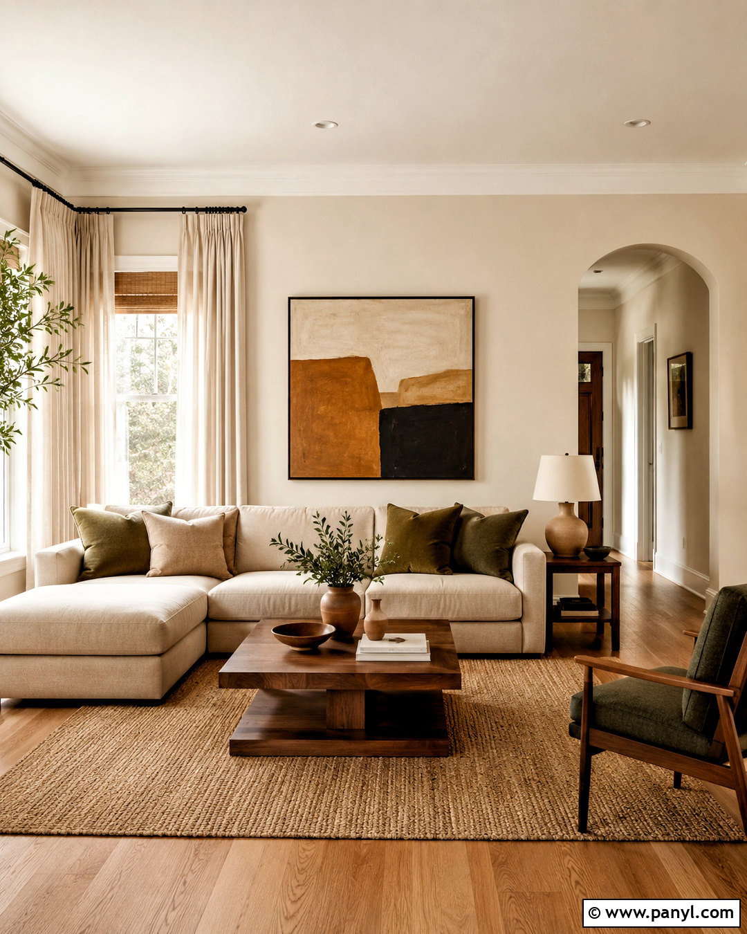
Warm white walls create a clean, flexible backdrop without making a room feel cold or unfinished. Choose a creamy white with subtle beige or yellow undertones, then continue it across most walls for a seamless effect. Use a slightly brighter warm white on the ceiling, baseboards, doors, and window trim. Natural oak flooring, a light beige sofa, and woven linen curtains reinforce the comfortable palette. Add walnut side tables for contrast and bring in muted olive, clay, or caramel through pillows and artwork. This complete scheme works especially well in living rooms with moderate or north-facing light. Select an eggshell wall finish for gentle reflection, while using satin on trim for durability and definition.
2. Sage Green And Cream Wall Paint
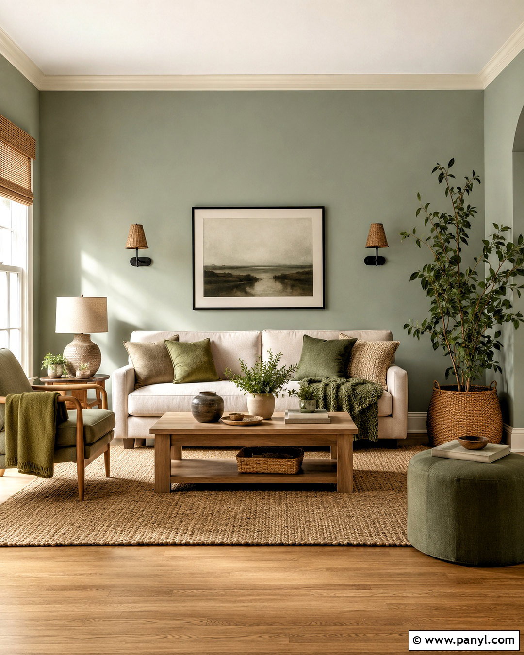
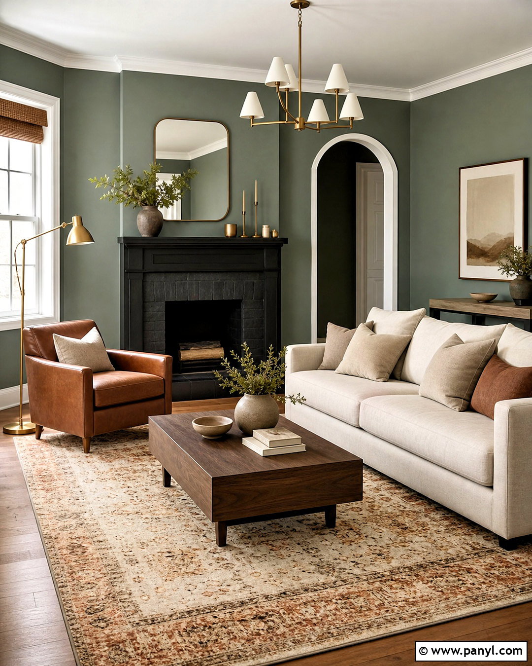
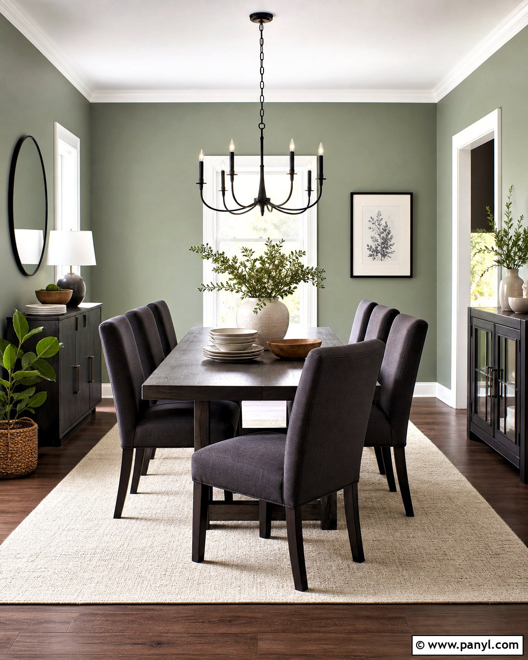
Soft sage green walls can make a living room feel restful, organic, and connected to the outdoors. Paint all four walls rather than creating one isolated accent wall, allowing the muted color to become a calm background. Pair it with creamy white trim and a ceiling that shares the same warm undertone. A natural linen sofa, oak coffee table, and jute rug prevent the green from feeling overly traditional. Introduce deeper olive through pillows, ceramic lamps, and leafy plants. Small matte black accents, such as curtain rods or picture frames, provide crisp definition. This wall paint color scheme looks especially balanced with medium wood floors and abundant daylight, but warm white lamps keep it inviting after sunset.
3. Soft Greige And Charcoal Wall Paint
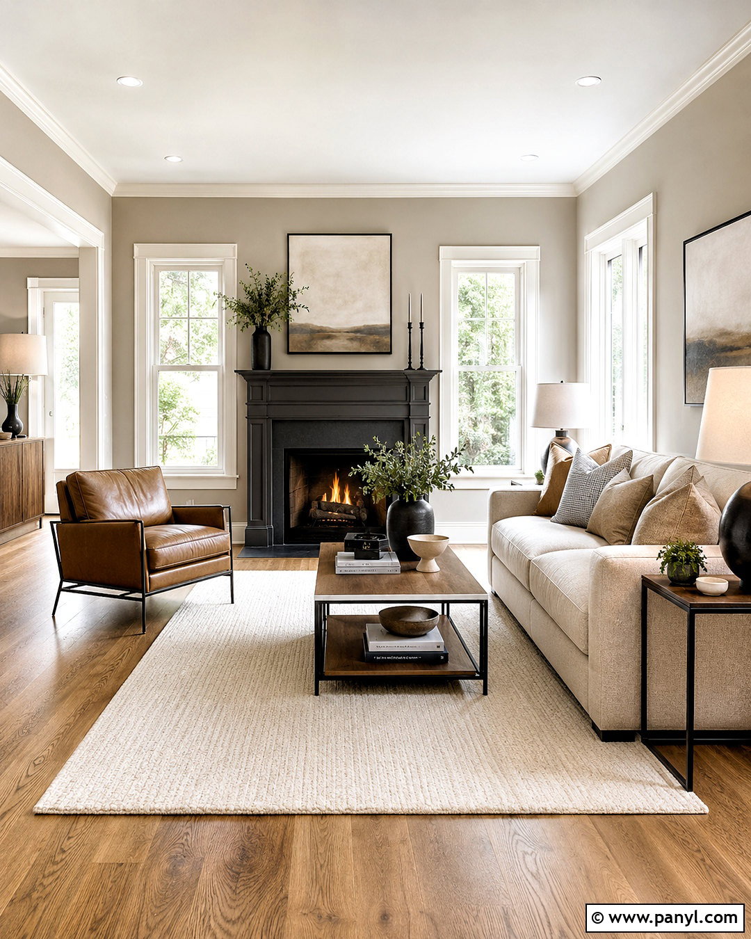
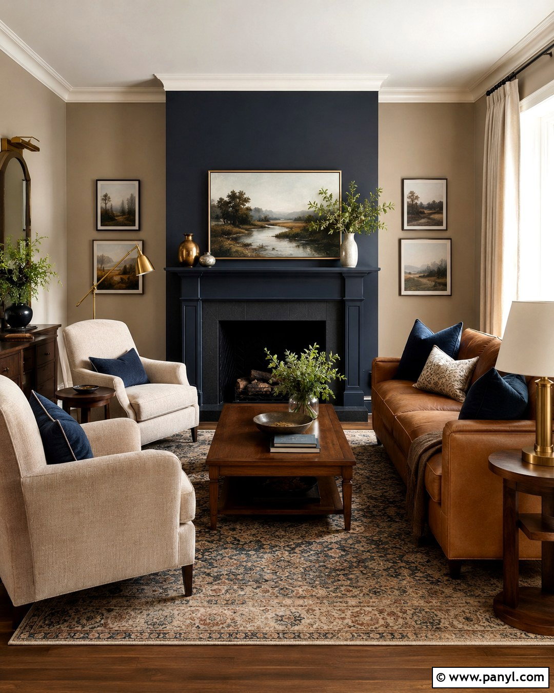
When beige feels too warm and gray feels too cool, soft greige offers a practical middle ground. Use it across the main walls, then paint built-in shelving, an interior door, or a fireplace surround in deep charcoal. The dark feature should connect to the room’s architecture instead of appearing as a random painted rectangle. Choose soft white for trim and ceilings, warm oak for flooring, and oatmeal upholstery for larger furniture. A black metal coffee table, textured ivory rug, and camel leather chair build additional contrast. Repeat charcoal in small details around the room to create continuity. Test the greige carefully because some shades turn violet or green beside existing flooring, stone, and artificial light.
4. Dusty Blue And Warm White Wall Paint
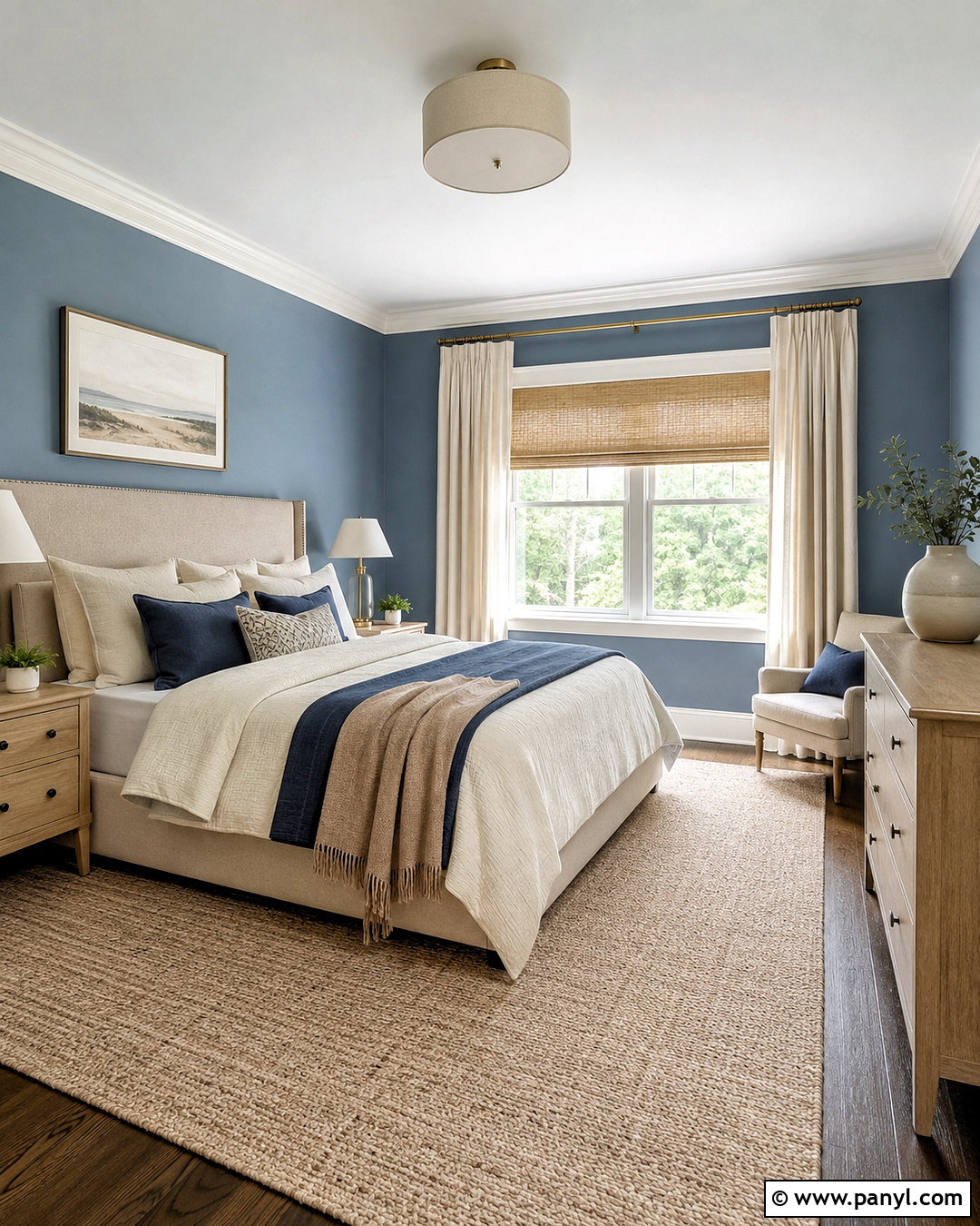
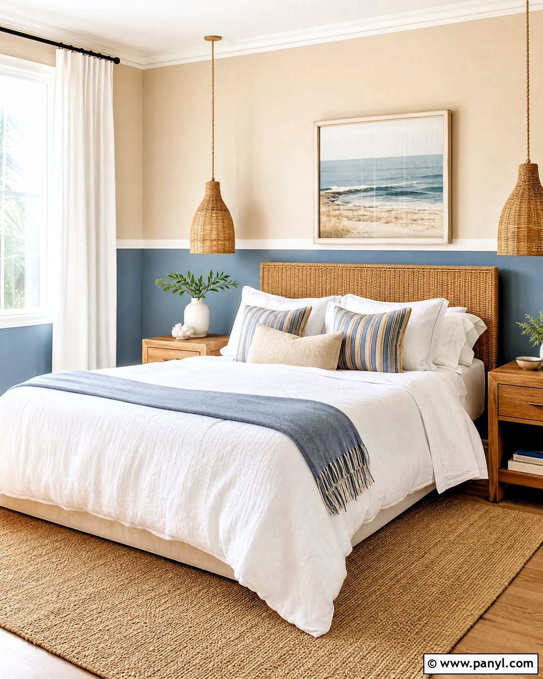
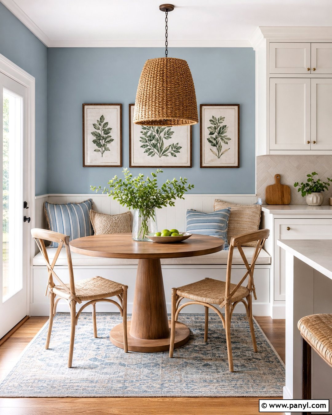
Dusty blue walls bring gentle color into a bedroom while remaining easy to coordinate with everyday furnishings. Select a softened blue with a slight gray or green undertone rather than a bright, icy shade. Cover every wall for a settled effect, then use warm white on the trim, doors, and ceiling. An upholstered oatmeal bed, white oak nightstands, and natural woven shades balance the cooler wall color. Layer the bedding with ivory, muted navy, and soft tan textiles. Brushed brass lamps add warmth without making the room look formal. For a smooth transition into an adjoining hallway, repeat the warm white there and carry dusty blue into artwork or a small bench cushion.
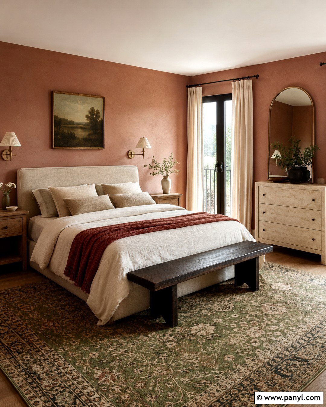
5. Terracotta And Soft Cream Wall Paint
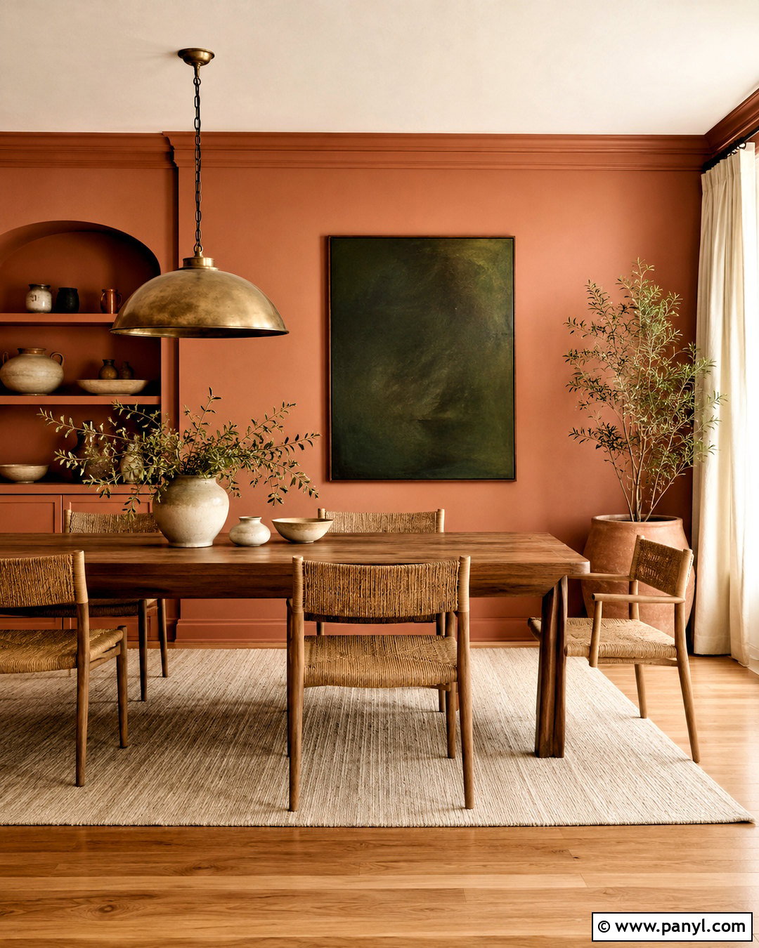
Earthy terracotta walls create a warm dining room that feels welcoming in every season. Choose a muted clay shade containing brown or dusty pink undertones instead of a vivid orange. Paint the walls and architectural molding in the same color, using different finishes to show subtle depth. A soft cream ceiling prevents the space from becoming visually heavy. Build the complete look with a medium-tone wood dining table, woven chairs, an ivory flat-weave rug, and off-white curtains. Aged brass lighting and handmade ceramic pieces suit the natural warmth of the palette. Add small touches of dark green through artwork or foliage. This scheme is particularly effective in rooms used mostly during afternoon and evening hours.
6. Olive Green And Mushroom Wall Paint
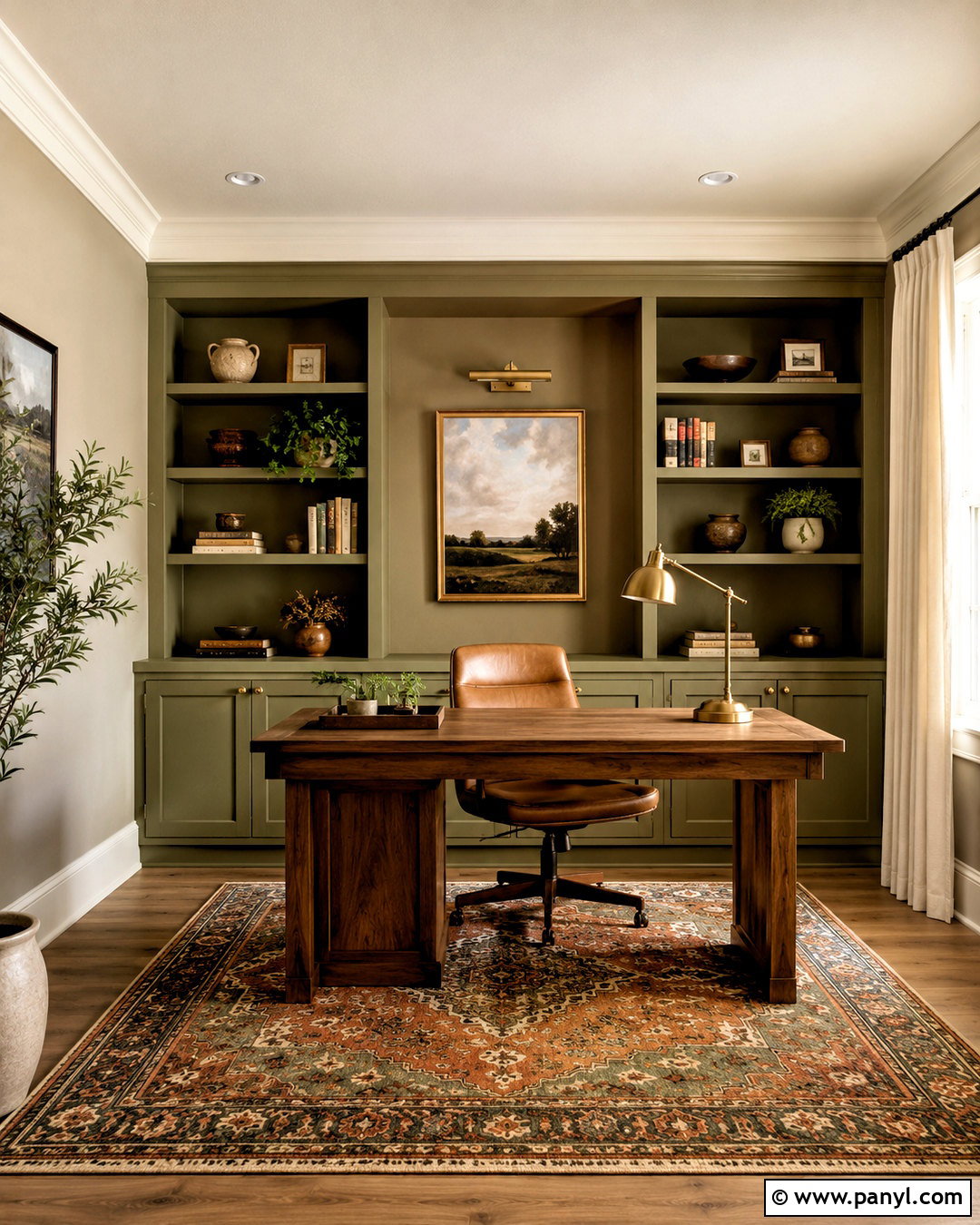
Olive green and mushroom beige form a sophisticated, nature-inspired palette for a cozy home office. Paint the main walls in a warm mushroom neutral, then use olive green on built-in bookcases, lower paneling, or the wall behind the desk. Keep the ceiling creamy white to preserve brightness. A walnut desk, cognac leather chair, and antique brass task lamp complement both colors. Ground the room with a patterned rug containing olive, beige, rust, and charcoal. If the office is compact, repeat the wall color on the door so fewer visual breaks interrupt the space. Balance the deeper cabinetry with pale window treatments and layered lighting, including a ceiling fixture, desk lamp, and shaded floor lamp.
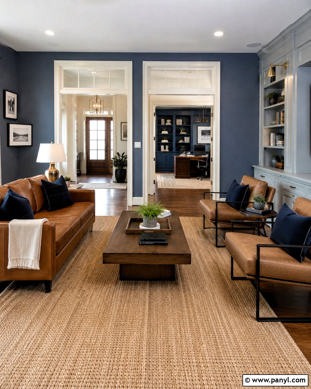
7. Navy Blue And Crisp White Wall Paint
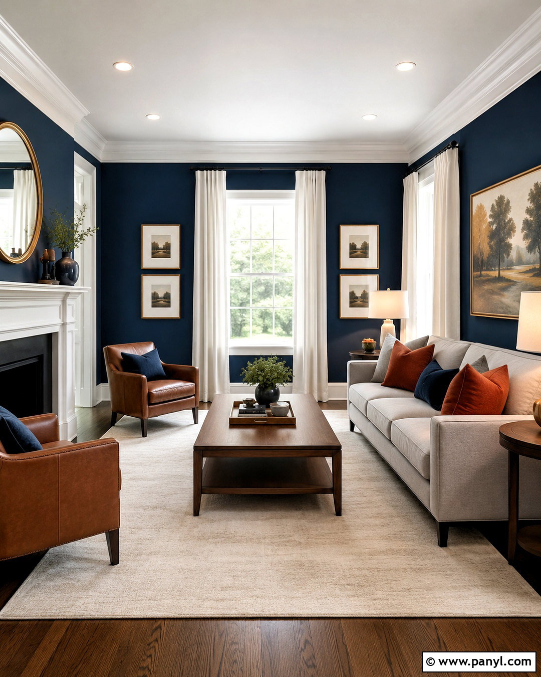
Navy blue can create a polished living room when it is balanced with enough light and texture. Paint the walls in a rich navy with a slightly softened undertone, then use crisp white on crown molding, window casings, baseboards, and the ceiling. The contrast works particularly well in rooms with traditional trim or tall windows. Choose a light gray sofa, warm walnut tables, and an ivory rug to brighten the lower half of the room. Caramel leather chairs keep the navy from looking too formal. Repeat white through curtains and lampshades, while introducing medium blue and rust in artwork and pillows. Multiple warm light sources are essential because navy absorbs more light than a pale neutral.
8. Pale Yellow And Ivory Wall Paint
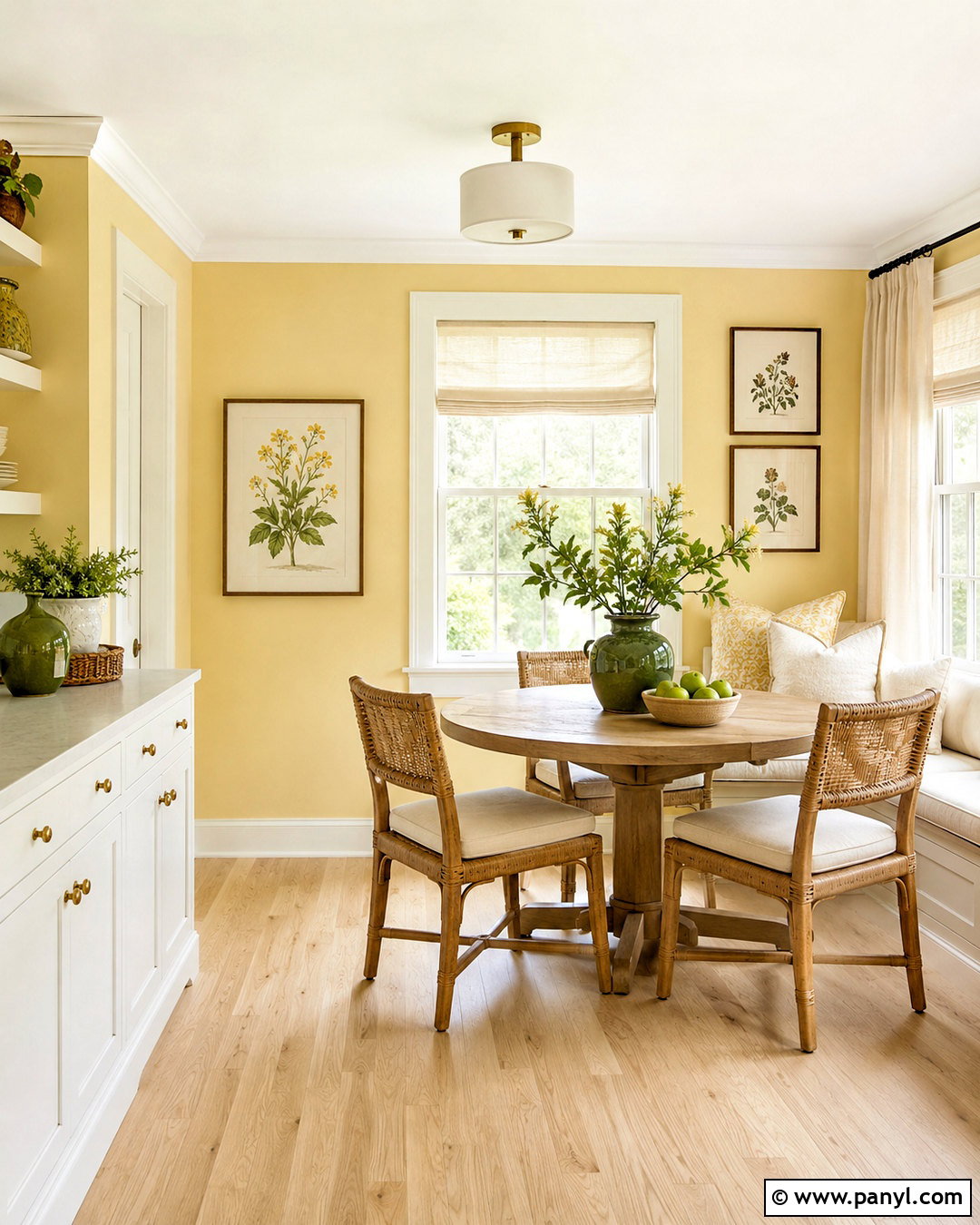
Pale yellow walls can brighten a breakfast room or kitchen without overwhelming the space. Look for a creamy, muted yellow that resembles soft sunlight rather than a highly saturated lemon tone. Pair it with ivory trim, a warm white ceiling, and light oak or maple flooring. White cabinets with warm undertones keep the palette open, while brushed brass hardware reinforces its cheerful warmth. Add a round wood table, woven chairs, and washable beige seat cushions to create a comfortable dining area. Soft green pottery and botanical artwork offer a natural complementary accent. If the room receives strong afternoon sun, test quieter yellow samples first. Intense light can make an already bright paint color appear considerably stronger.
9. Mushroom Beige And Chocolate Brown Wall Paint
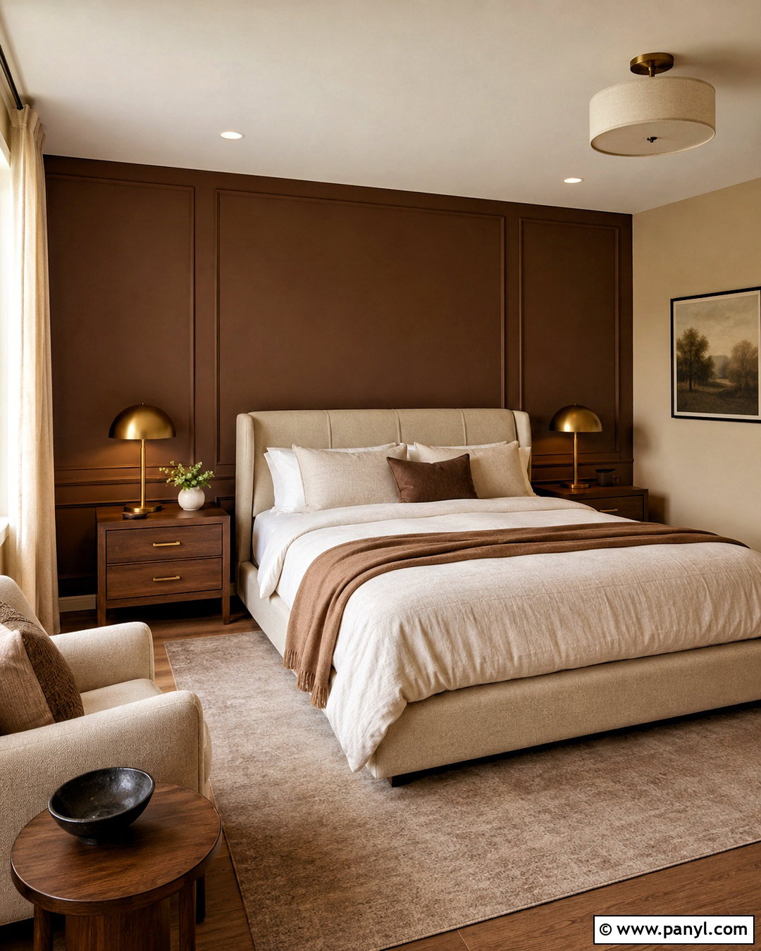
A tonal brown palette makes a bedroom feel grounded, comfortable, and quietly luxurious. Use mushroom beige on the walls and a deep chocolate brown on the wall behind the bed, built-in wardrobes, or paneled headboard area. The brown should have warm undertones so it feels rich rather than nearly black. Continue a creamy off-white across the ceiling and trim to soften the transition. Dress the room with an oatmeal upholstered bed, walnut nightstands, ivory bedding, and caramel-colored throws. A taupe rug adds softness without introducing another competing color. Use antique brass lights and minimal dark frames as finishing accents. This layered wall scheme works with both traditional furniture and clean-lined contemporary pieces.
10. Powder Blue And Buttercream Wall Paint

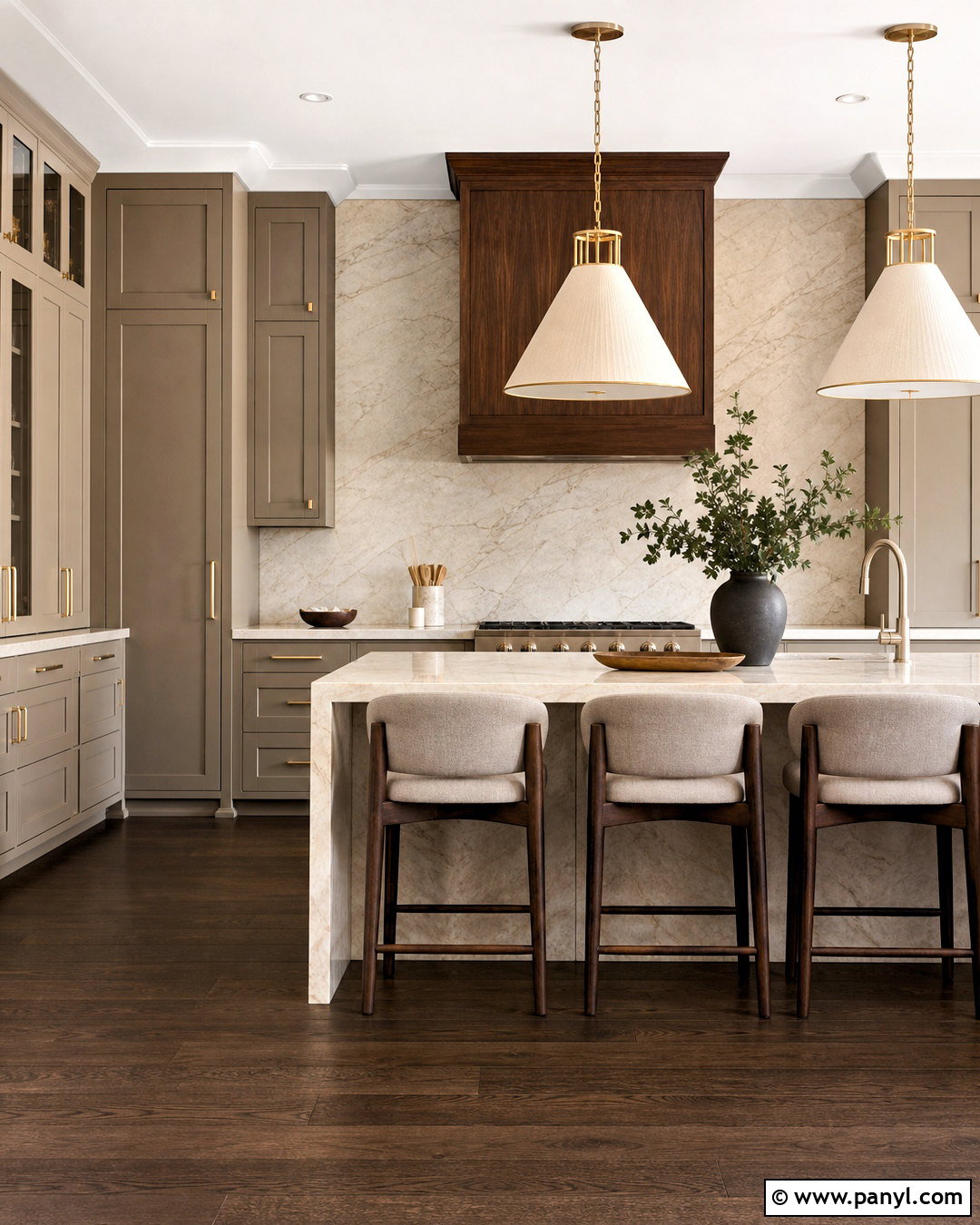
Powder blue and buttercream create a fresh wall paint color scheme for a kitchen, laundry room, or casual dining space. Use soft powder blue on the walls and a gentle buttercream shade on cabinetry or beadboard paneling. Keep the ceiling warm white so the two colors remain distinct. White quartz counters, pale oak shelving, and brushed nickel fixtures give the room a practical, modern foundation. Introduce natural texture through woven baskets, light linen café curtains, and a small washable runner. Warm wood details are important because they prevent the blue from feeling chilly. For a more subtle interpretation, paint only the lower cabinets buttercream while keeping upper storage and trim warm white, allowing the powder blue walls to remain the primary color.
11. Deep Teal And Blush Wall Paint
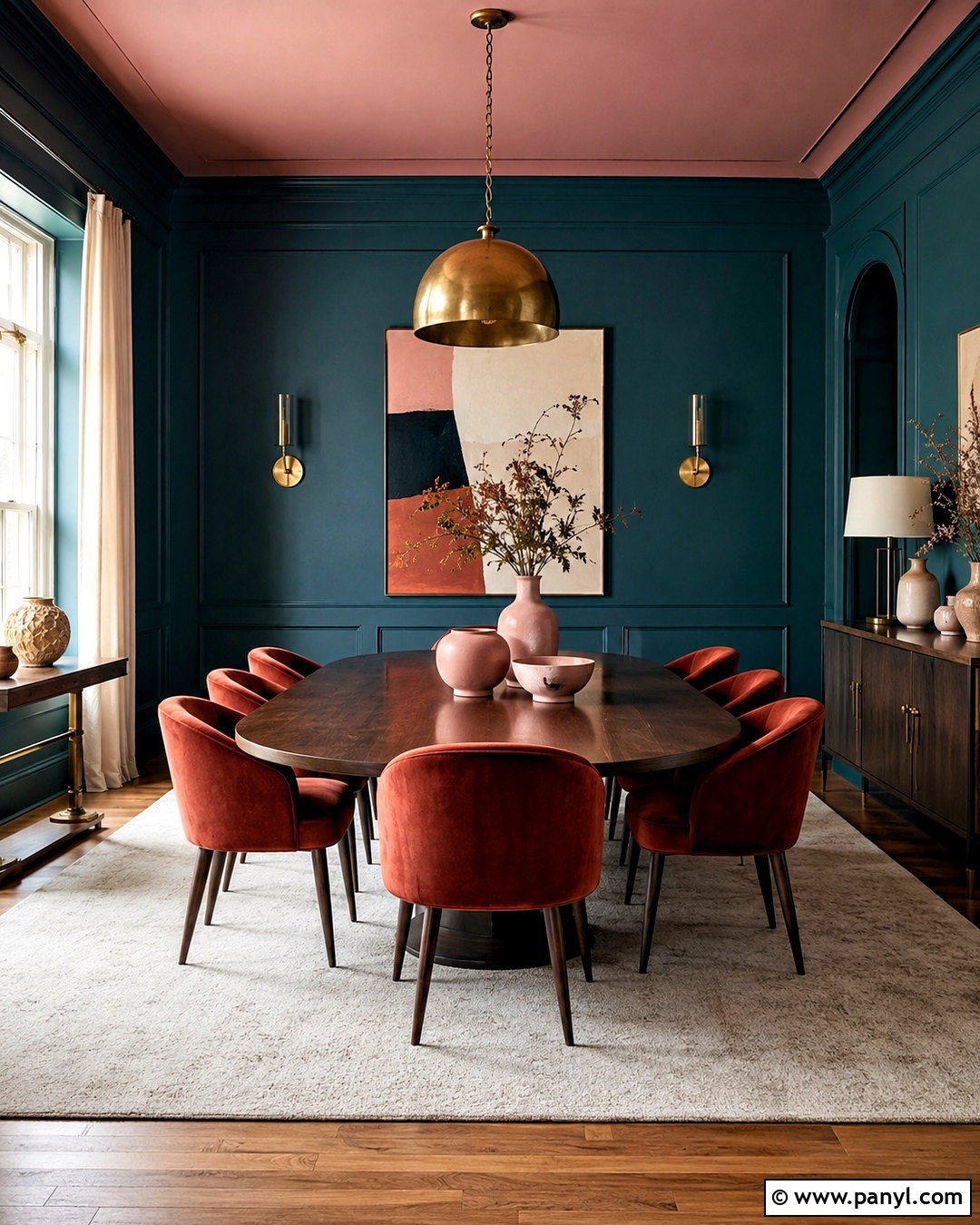
Deep teal and soft blush can transform a dining room into a colorful but balanced gathering space. Apply teal to all walls or color-drench the walls, molding, and doors for an enveloping result. Use muted blush on the ceiling or inside a recessed niche to soften the dark blue-green color. A walnut dining table, rust velvet chairs, and an ivory rug add warmth and prevent the room from looking overly dramatic. Choose aged brass lighting and cream curtains to reflect light around the space. Repeat blush in a ceramic centerpiece or abstract artwork rather than adding numerous new colors. This palette performs best with deliberate lighting, including a central pendant, shaded wall sconces, and warm bulbs that reveal the richness of both hues.
12. Soft Peach And Warm Beige Wall Paint
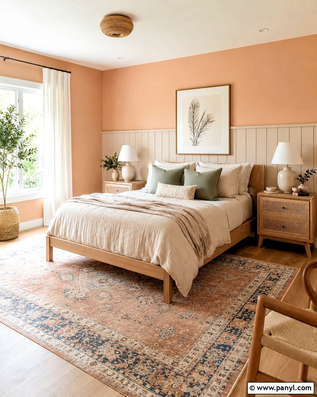
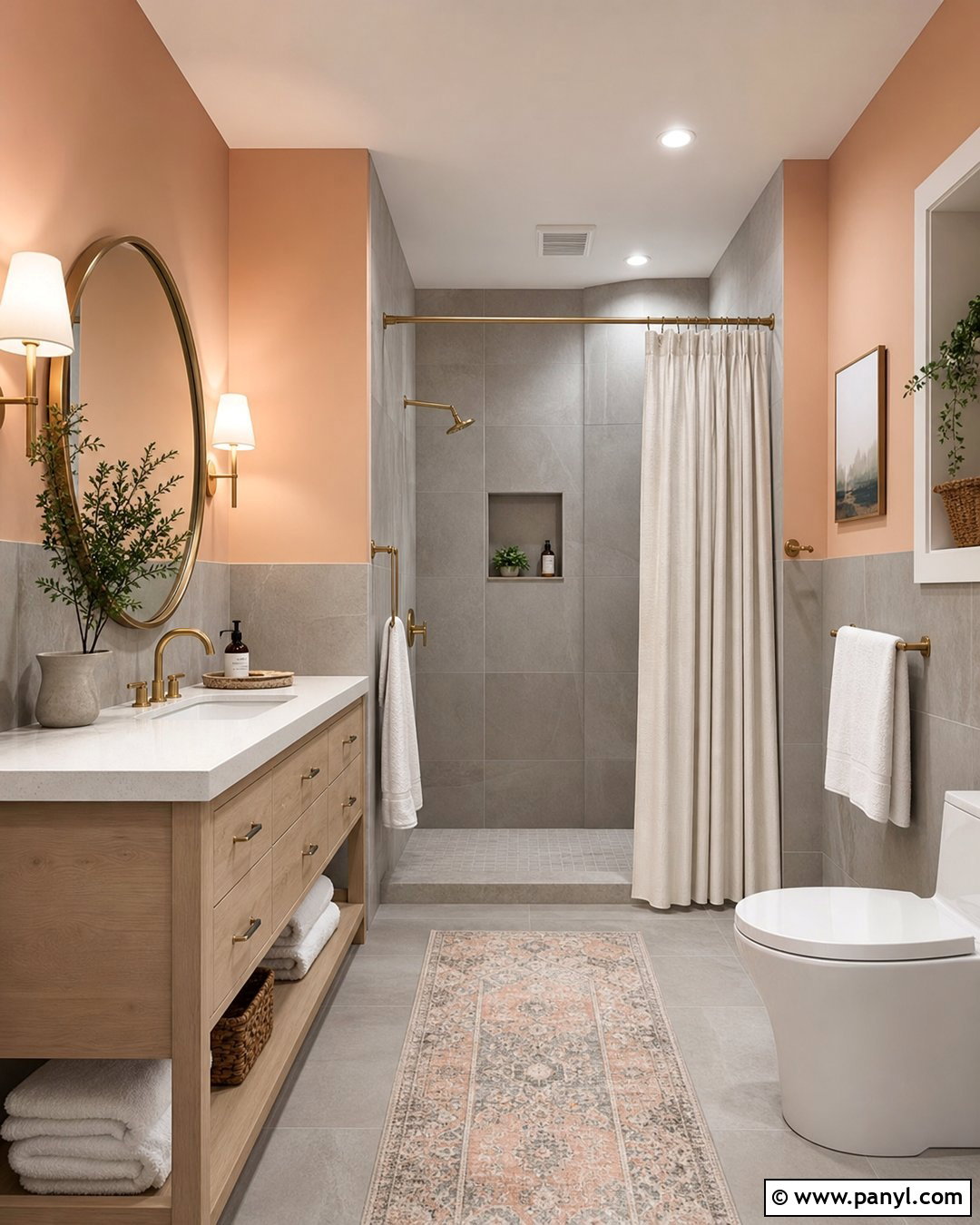
Soft peach walls give a guest bedroom warmth without relying on predictable pink or neutral paint. Choose a subdued peach with beige undertones, then pair it with warm beige on the closet doors, headboard wall paneling, or adjoining dressing area. Use creamy white for the ceiling and narrow trim. Furnish the room with a light oak bed, woven cane nightstands, ivory curtains, and natural linen bedding. Add dusty green pillows and a patterned rug containing peach, tan, and muted blue for gentle contrast. Avoid overly orange wood stains, which may amplify the warmth too much. Balanced with natural fibers and pale finishes, this complete palette feels airy during the day and softly glowing under bedside lamps at night.
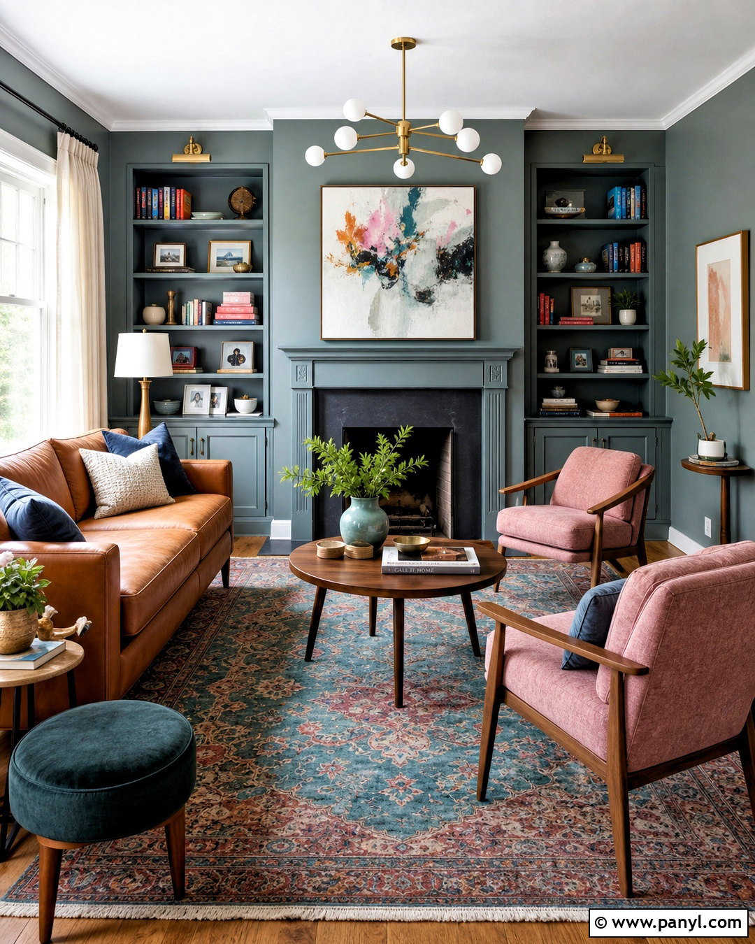
13. Forest Green And Antique White Wall Paint
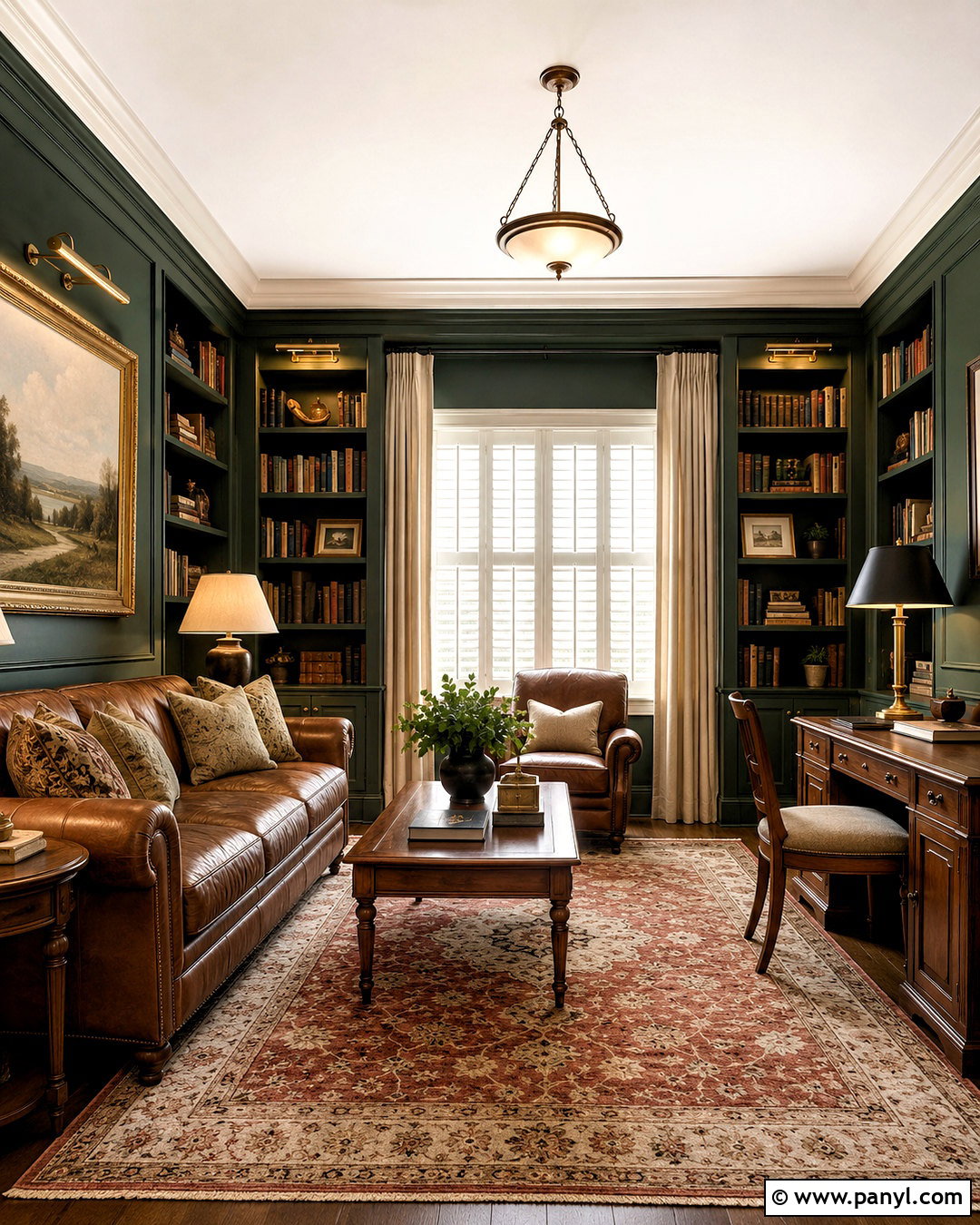
Forest green walls can make a library, den, or formal sitting room feel established and intimate. Use the deep green on walls and built-in shelves, choosing a satin finish for cabinetry and a washable matte or eggshell for the surrounding surfaces. Antique white on the ceiling, interior shutters, and selected trim introduces a softer contrast than brilliant white. Furnish the space with a brown leather sofa, walnut bookcase details, and a faded Persian-style rug in red, cream, and green. Brass picture lights and shaded lamps create useful pools of illumination. Keep window treatments light enough to preserve daylight. This complete wall paint scheme suits both older homes with detailed millwork and newer rooms that need stronger architectural character.
14. Lavender Gray And Soft White Wall Paint
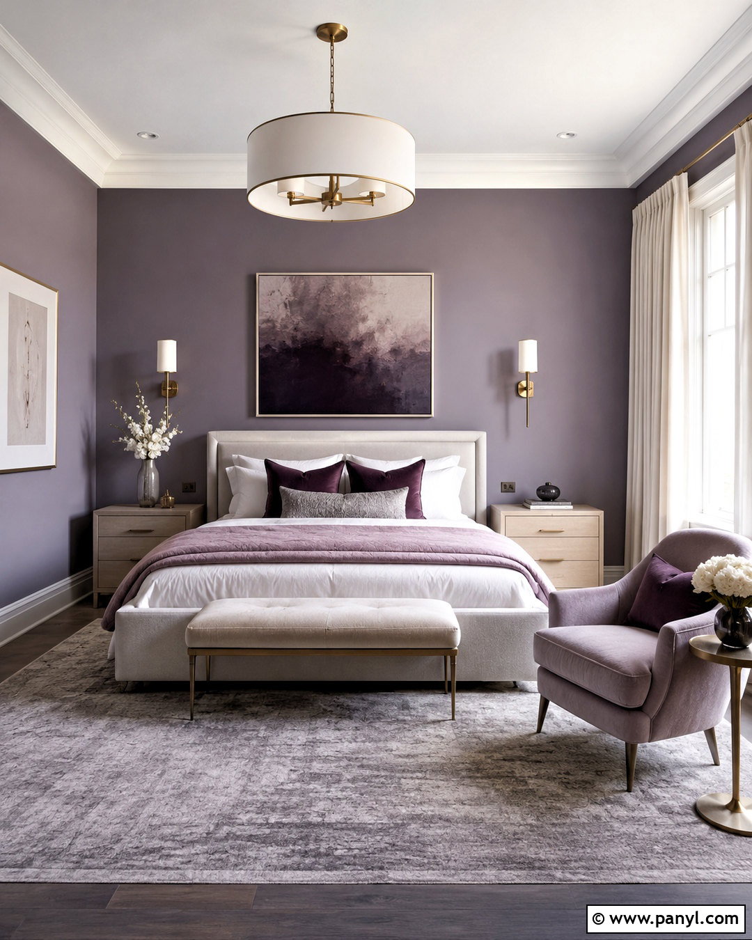
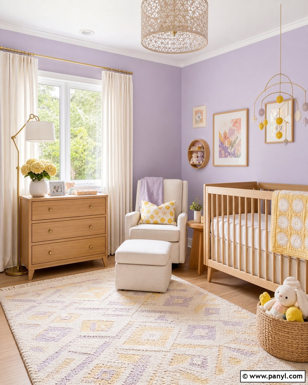
Lavender gray offers a quiet alternative to standard gray in a bedroom or reading room. Select a restrained shade that reads mostly neutral but reveals a violet undertone in natural light. Paint every wall for continuity, then use soft white across the ceiling, doors, and trim. Pair the color with a pale gray upholstered bed, bleached oak nightstands, and ivory curtains. Deep plum, muted mauve, and charcoal accents add depth through pillows, throws, and framed artwork. Brushed nickel or soft brass lighting can work, depending on whether you want a cooler or warmer finish. Always compare samples beside flooring because yellow or orange wood can make the lavender undertone appear more pronounced than expected.
15. Caramel And Cream Wall Paint
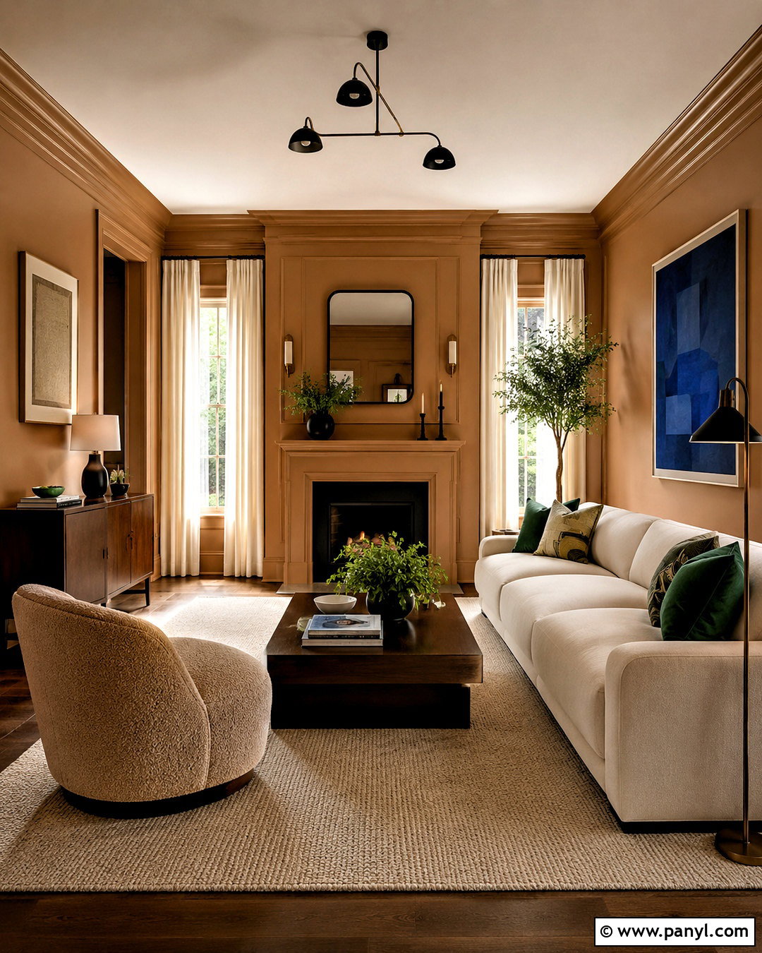
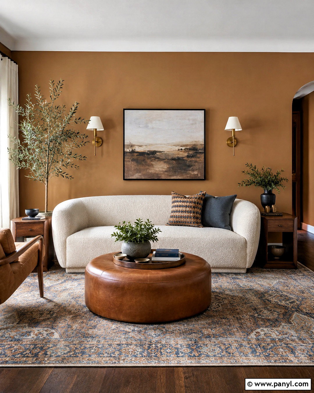
Caramel walls bring depth to a living room while remaining warmer and softer than dark brown. Choose a medium caramel shade with muted golden undertones, and apply it across walls, paneling, and the fireplace surround for a cohesive result. Use cream on the ceiling and curtains to maintain brightness. A low ivory sofa, dark walnut coffee table, and tan boucle chair continue the tonal palette without matching exactly. Introduce contrast through deep blue artwork, blackened bronze lighting, and a few dark green accessories. A textured wool rug containing beige and brown connects the furniture to the walls. This color combination looks especially inviting with natural light, but layered lamps help retain its rich appearance after dark.
16. Brick Red And Putty Wall Paint
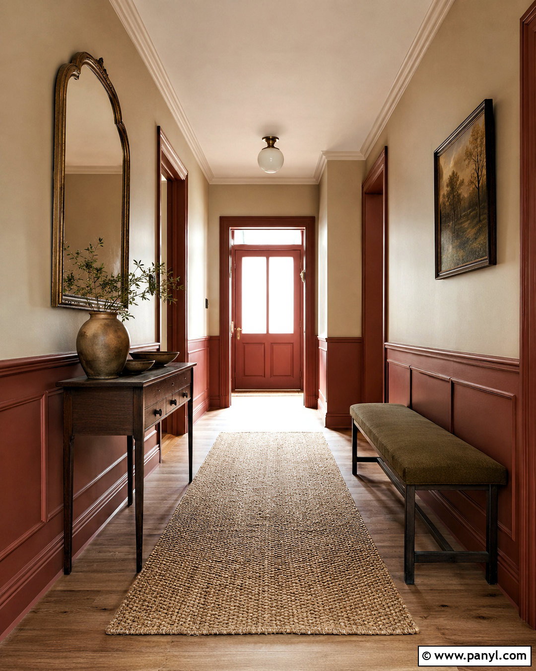
Muted brick red and putty create a warm, character-rich scheme for an entryway or dining room. Use brick red on lower wall paneling and putty beige above it, placing the dividing line at chair-rail height or slightly higher. Paint the trim in putty for a smoother, less segmented appearance, then keep the ceiling warm white. A dark wood console, woven runner, and antique brass mirror complement the earthy paint colors. Add olive green through a bench cushion, pottery, or simple foliage. Black accents should be limited to small hardware and frames. Because red reacts strongly to lighting, select a browned, softened version that remains comfortable in both bright daylight and evening artificial light.
17. Charcoal And Warm Taupe Wall Paint
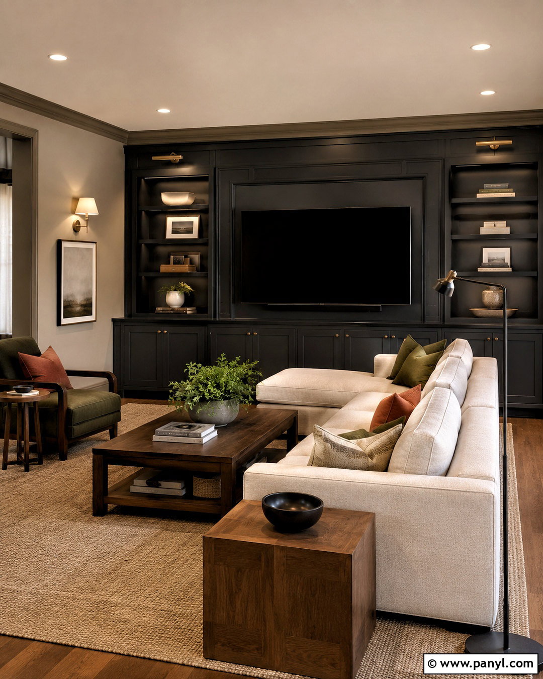
Charcoal and warm taupe can give a media room or den a tailored appearance without making it feel stark. Paint the television wall, built-in cabinetry, and nearby trim charcoal so the screen blends into the architecture. Cover the remaining walls in warm taupe, and use a slightly lighter taupe on the ceiling. A sectional in oatmeal or medium brown balances the dark surfaces, while walnut tables and a textured beige rug add warmth. Include rust, olive, and cream cushions for controlled color. Matte paint minimizes distracting reflections near the screen, but cabinetry benefits from a satin finish. Recessed ceiling lights, shaded sconces, and a floor lamp should provide adjustable illumination for watching, reading, and entertaining.
18. Seafoam Green And Sandy Beige Wall Paint
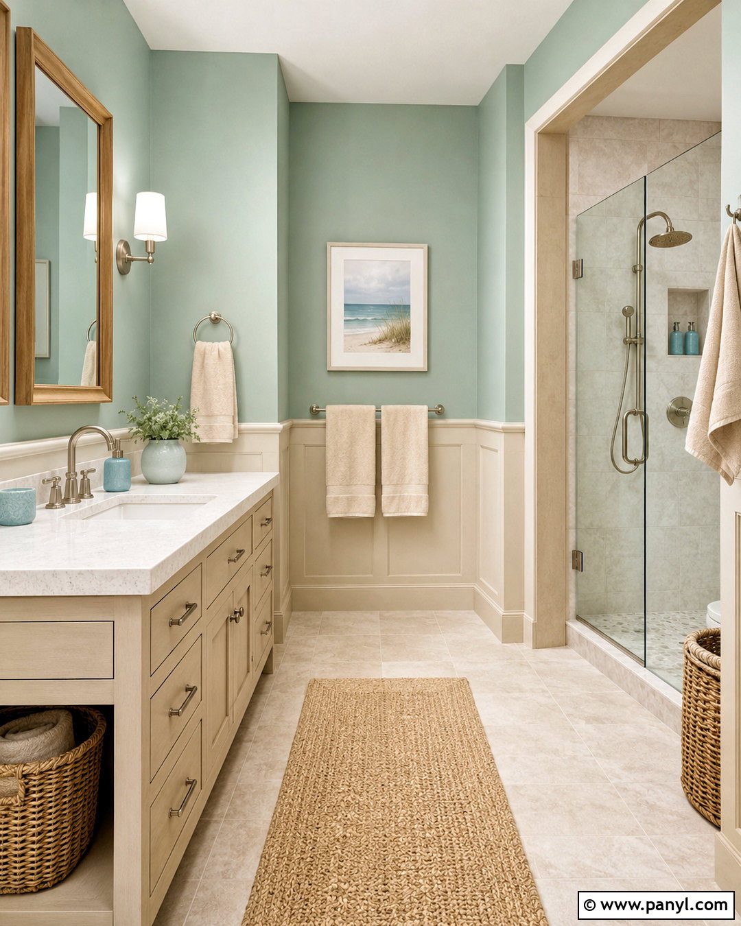
Seafoam green and sandy beige create a relaxed bathroom palette that feels fresh without becoming overly themed. Use seafoam on the upper walls and sandy beige on a vanity, lower paneling, or storage cabinet. Crisp but warm white trim keeps both colors looking clean. Complete the room with pale stone flooring, a white quartz countertop, brushed nickel fixtures, and light oak mirrors. Add cream towels, woven baskets, and one or two muted blue accessories for depth. Avoid decorative objects that make the room look like a literal beach display. Instead, rely on soft color, natural materials, and simple shapes. Use moisture-resistant paint in a satin or bathroom-specific finish to support easier cleaning and better durability.
19. Burgundy And Dusty Pink Wall Paint
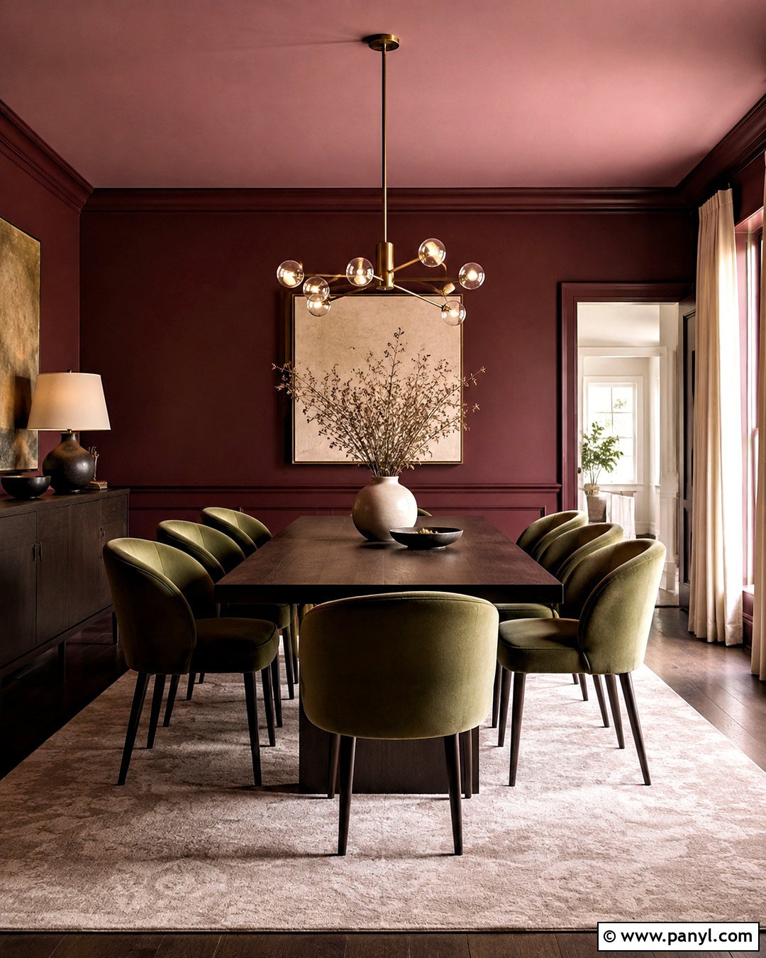
Burgundy and dusty pink form a confident color scheme for a dining room, powder room, or small sitting area. Paint the main walls burgundy and use dusty pink on the ceiling, interior doors, or upper portion of tall paneling. The pink should be muted and slightly brown rather than sugary or bright. Pair the walls with dark walnut furniture, an ivory rug, and warm brass lighting. Olive green upholstery or patterned textiles add an earthy counterpoint. Cream curtains help reflect daylight and keep the burgundy from dominating every surface. In a smaller room, painting the trim burgundy can reduce visual boundaries and make the space feel intentionally enveloping. Use several lamps to reveal the color’s depth at night.
20. Black And Warm White Wall Paint
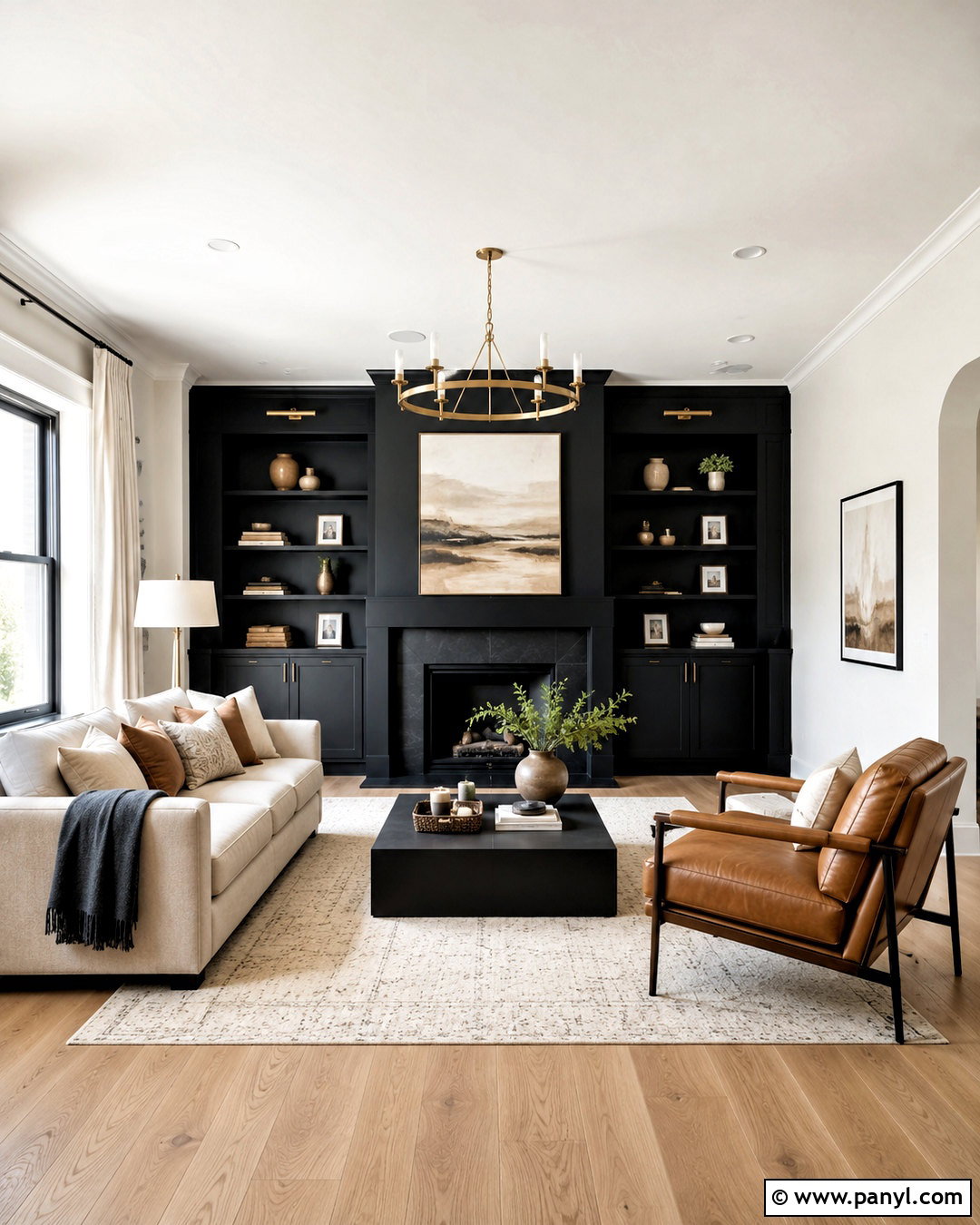
Black and warm white produce a striking room when their placement follows the architecture. Use soft black on built-in cabinets, a fireplace wall, window frames, or lower paneling rather than scattering dark patches around the room. Paint the remaining walls and ceiling a warm white with a creamy undertone. Choose pale oak flooring, an oatmeal sofa, and an ivory rug to keep the overall space approachable. Add cognac leather, natural linen curtains, and brushed brass lighting for warmth. Repeat black in thin furniture legs, frames, and hardware so the feature color feels connected. This complete palette suits modern, transitional, and farmhouse interiors, but a balanced proportion of light surfaces is essential in rooms with limited windows.
Conclusion:
Successful 20 Wall Paint Color Schemes do more than place attractive shades beside one another. They connect walls, ceilings, trim, floors, furniture, and lighting into one complete visual plan. Begin with the room’s permanent materials, including flooring, countertops, tile, and wood finishes. Then choose a main wall color, a supporting neutral, and one deeper accent. Repeating those colors in textiles and decor will make the finished room feel intentional. Always test movable sample boards on several walls and observe them from morning through evening. Most importantly, select colors that support how you want the room to feel. A thoughtful palette can make an ordinary space brighter, warmer, calmer, or considerably more personal.

Related Ideas and Inspiration:
Leave a Reply