
Choosing a coordinated palette is one of the easiest ways to make every room feel intentional. These 20 paint color schemes for home ideas combine wall colors, trim, ceilings, cabinetry, doors, flooring, and decor into complete looks you can realistically recreate. Some palettes use warm neutrals for flexibility, while others introduce sage, navy, terracotta, burgundy, or powder blue for more personality. The key is repeating a few related colors throughout connected spaces instead of selecting every room separately. Before committing, test large samples beside your flooring, countertops, tile, and permanent wood finishes. Check them in morning and evening light because undertones can shift noticeably. Whether your taste is traditional, modern, coastal, or rustic, you can find a practical starting point in these 20 paint color schemes for home ideas.

1. Warm White And Natural Wood Paint Color Scheme
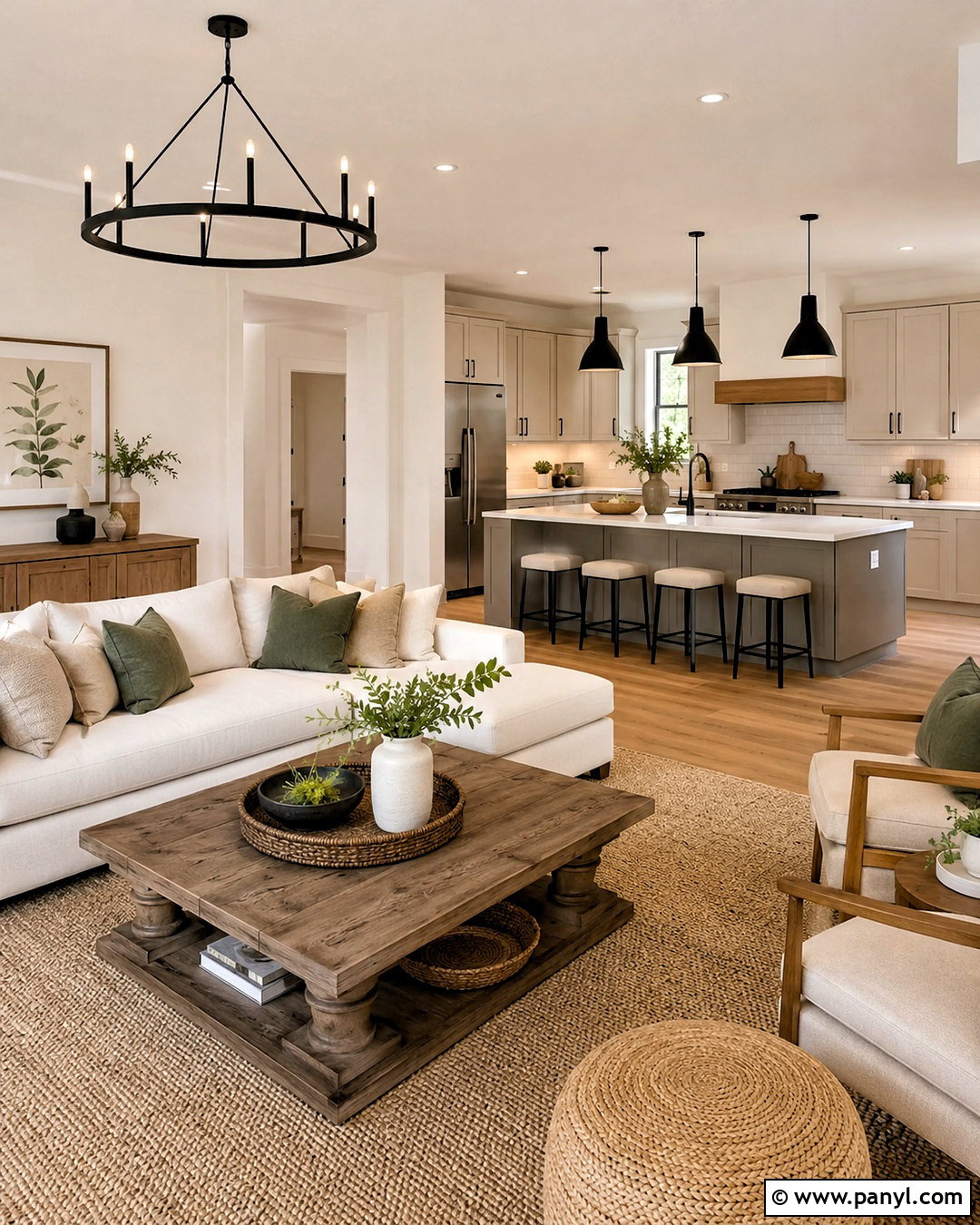
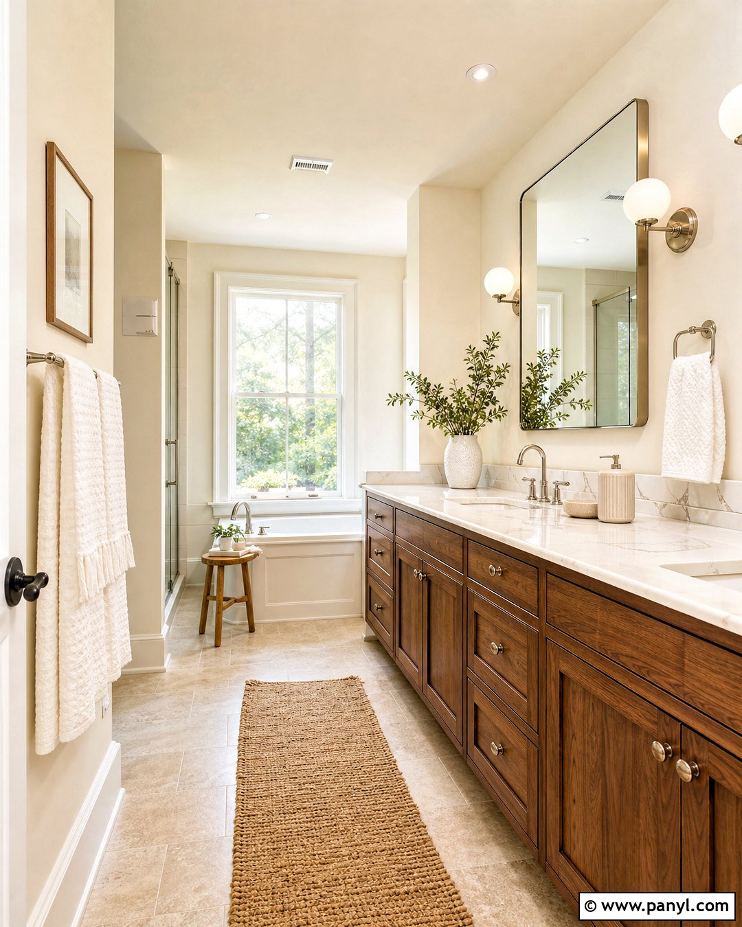
Warm white walls create a bright foundation without the chilly effect that can come from pure white paint. Choose an ivory or creamy white with subtle beige undertones for the main living areas. Use a slightly cleaner white on ceilings and trim to define doors, windows, and baseboards. Natural white oak flooring, light maple cabinetry, and woven textures reinforce the warmth. Add tan upholstery, oatmeal curtains, and muted olive accessories for gentle contrast. In the kitchen, pair warm white cabinets with a soft taupe island and creamy stone countertops. Matte black lighting provides definition without overwhelming the palette. This complete scheme works especially well in open-concept homes because the restrained colors allow connected rooms to flow naturally.
2. Soft Greige And Cream Paint Color Scheme
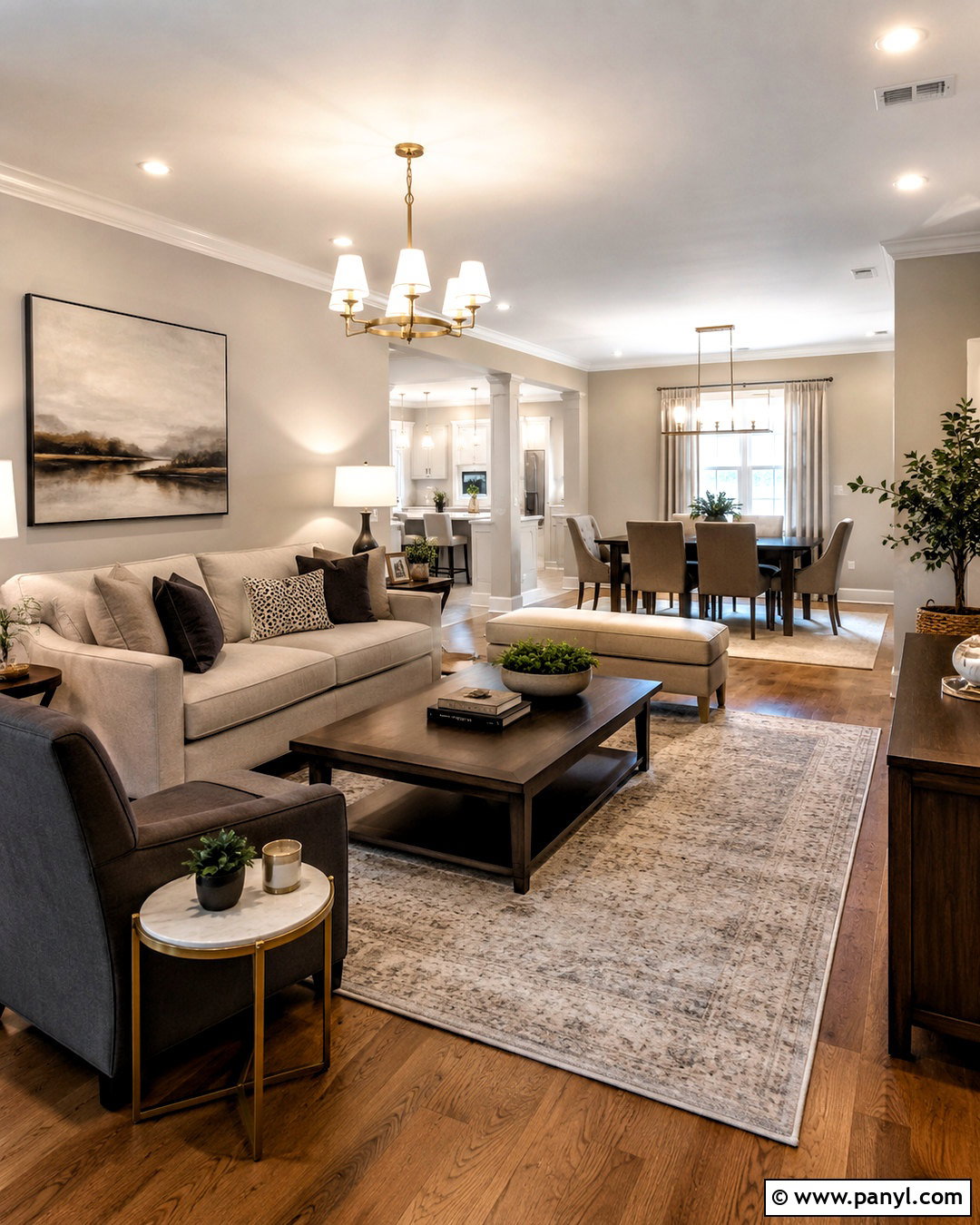
Can’t decide between gray and beige? Soft greige offers the balance of both, making it a practical wall color for hallways, living rooms, and shared spaces. Select a warm greige that looks beige in sunlight and gently gray in shaded areas. Paint trim and interior doors a creamy off-white rather than a stark builder white. Deepen the scheme with mushroom-colored cabinetry, taupe upholstery, and walnut furniture. Brushed brass fixtures add warmth, while charcoal accents prevent the palette from feeling washed out. Use pale cream in smaller rooms that need more brightness. Repeating greige through rugs, patterned textiles, and painted built-ins creates continuity. The finished home feels comfortable, polished, and neutral without appearing flat or overly matched.
3. Sage Green And Warm White Paint Color Scheme
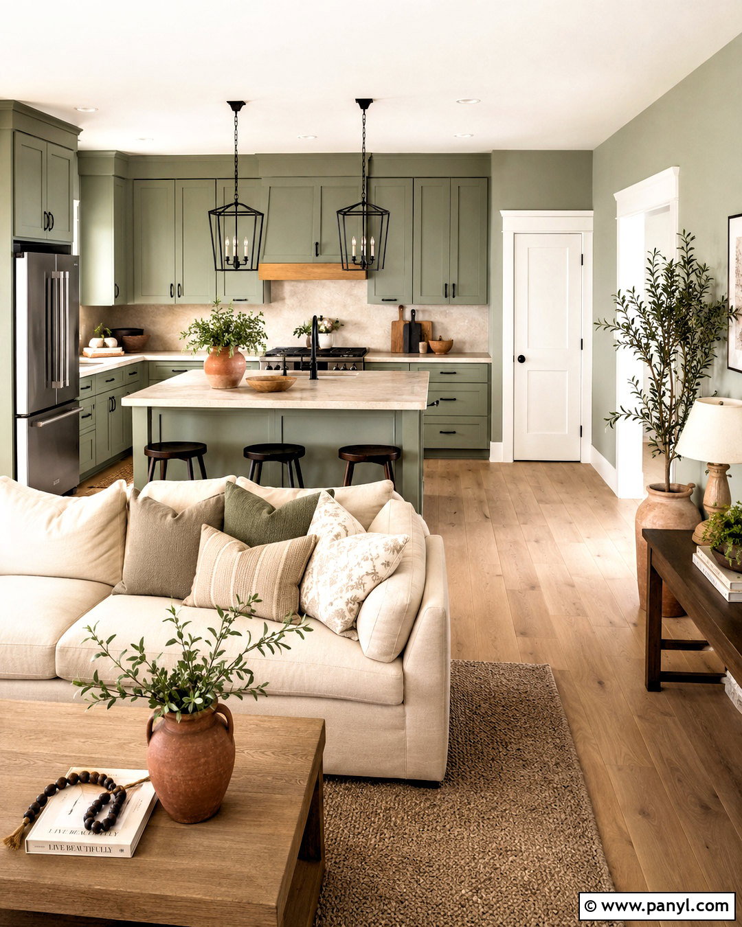
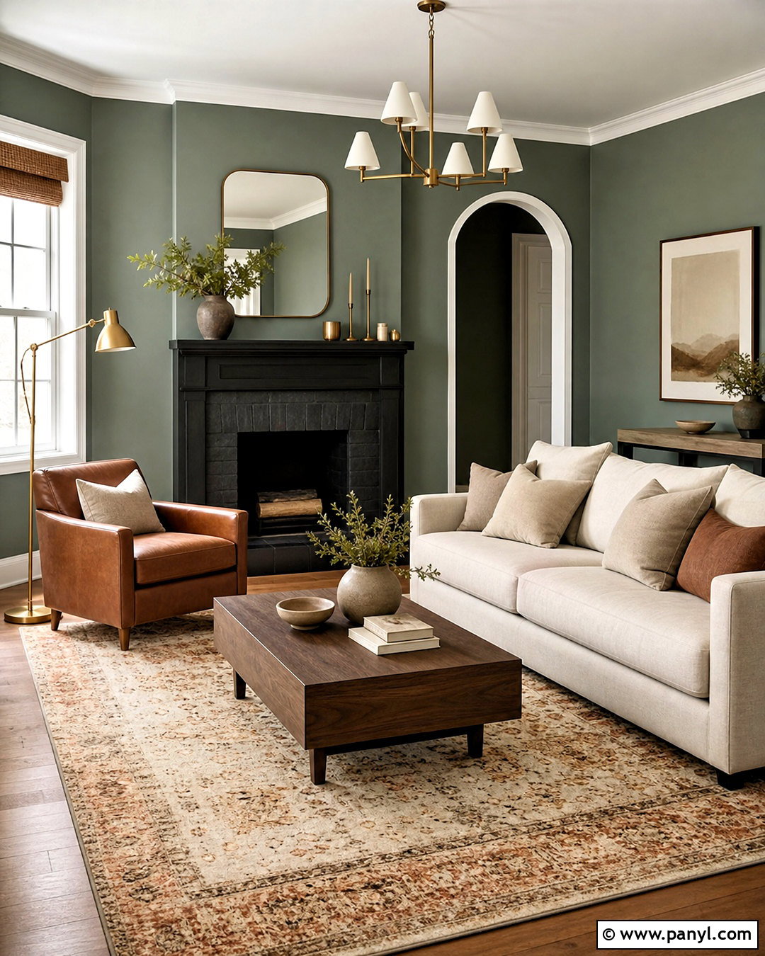
Soft sage green brings a peaceful, nature-inspired character to an entire home. Use a light, gray-leaning sage on living room or kitchen walls, then carry warm white through connecting hallways, ceilings, and trim. Medium sage works beautifully on lower kitchen cabinets, a bathroom vanity, or built-in shelving. Balance the green with white oak flooring, creamy linen furniture, and beige stone surfaces. A few black accents, such as window frames or cabinet pulls, provide crisp structure. Terracotta pottery and muted rust textiles introduce controlled warmth. Keep bedrooms lighter by reversing the colors: warm white walls with sage doors or headboard walls. This coordinated scheme feels fresh and welcoming while remaining easy to decorate throughout changing seasons.
4. Navy Blue And Crisp White Paint Color Scheme
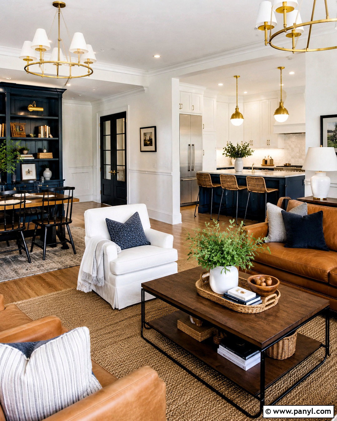
A navy and white palette gives a home strong contrast while maintaining a classic, orderly appearance. Use crisp white across main walls and ceilings, then reserve deep navy for a dining room, office, kitchen island, or built-in bookcase. Navy interior doors can also connect separate rooms without requiring every wall to be dark. Add medium-toned oak floors to soften the contrast and keep the house feeling comfortable. Camel leather, natural linen, and woven jute bring warmth to living spaces. Polished nickel or brushed brass hardware works equally well, depending on the desired finish. In smaller rooms, use navy below a chair rail with white above it. Repeating blue through rugs and artwork keeps the whole palette cohesive.
5. Terracotta And Sand Paint Color Scheme
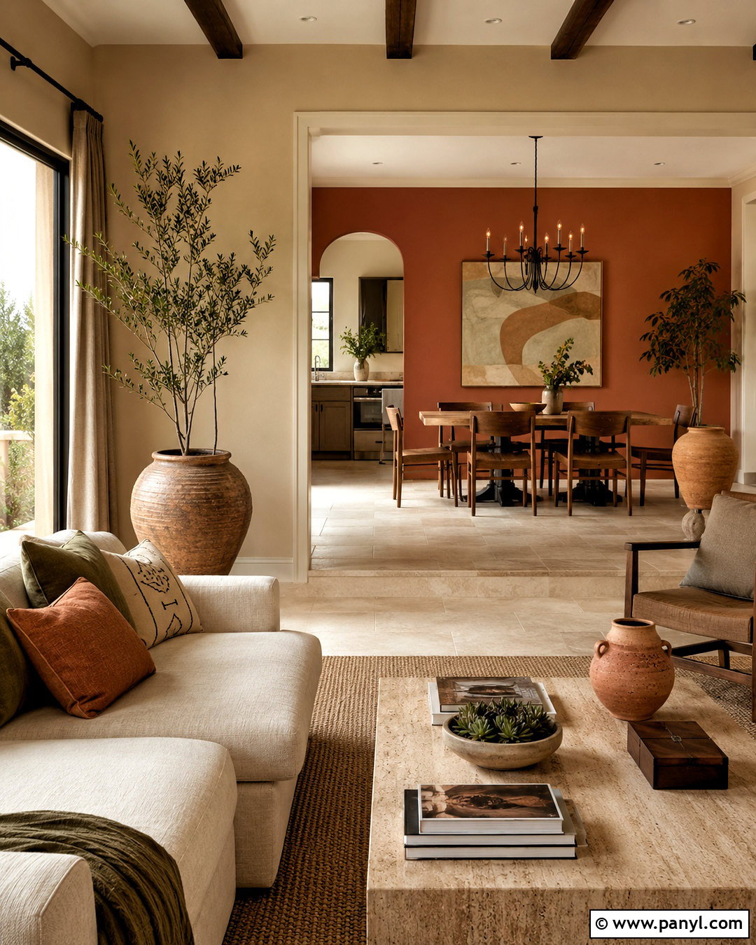
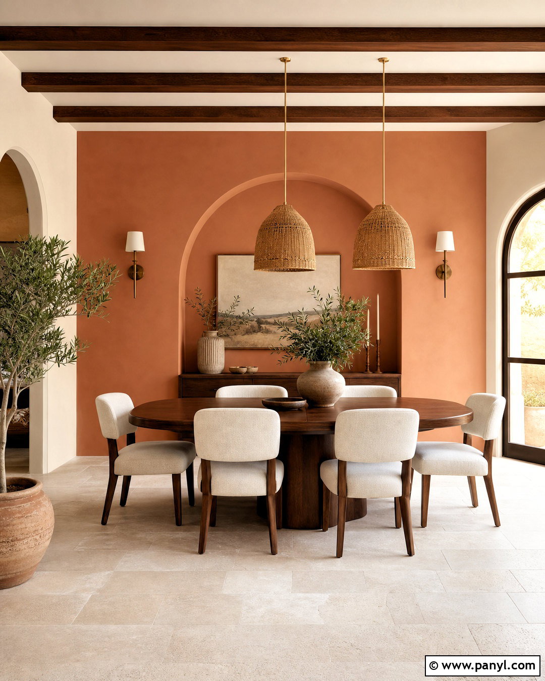
Imagine warm desert colors flowing gently from one room to another. Begin with sandy beige walls in open living spaces and use muted terracotta in a dining room, powder room, or bedroom. Choose earthy orange-red paint rather than a bright, saturated orange. Creamy trim softens the edges, while clay-colored doors or cabinetry can extend the palette in smaller doses. Complete the look with limestone, warm oak, linen upholstery, and handmade ceramic decor. Dark bronze lighting and hardware add depth without creating harsh contrast. Introduce olive green through plants and textiles because it naturally balances the terracotta. This scheme is especially effective in sunny homes, where the layered earth tones become richer and more inviting throughout the day.
6. Powder Blue And Soft White Paint Color Scheme
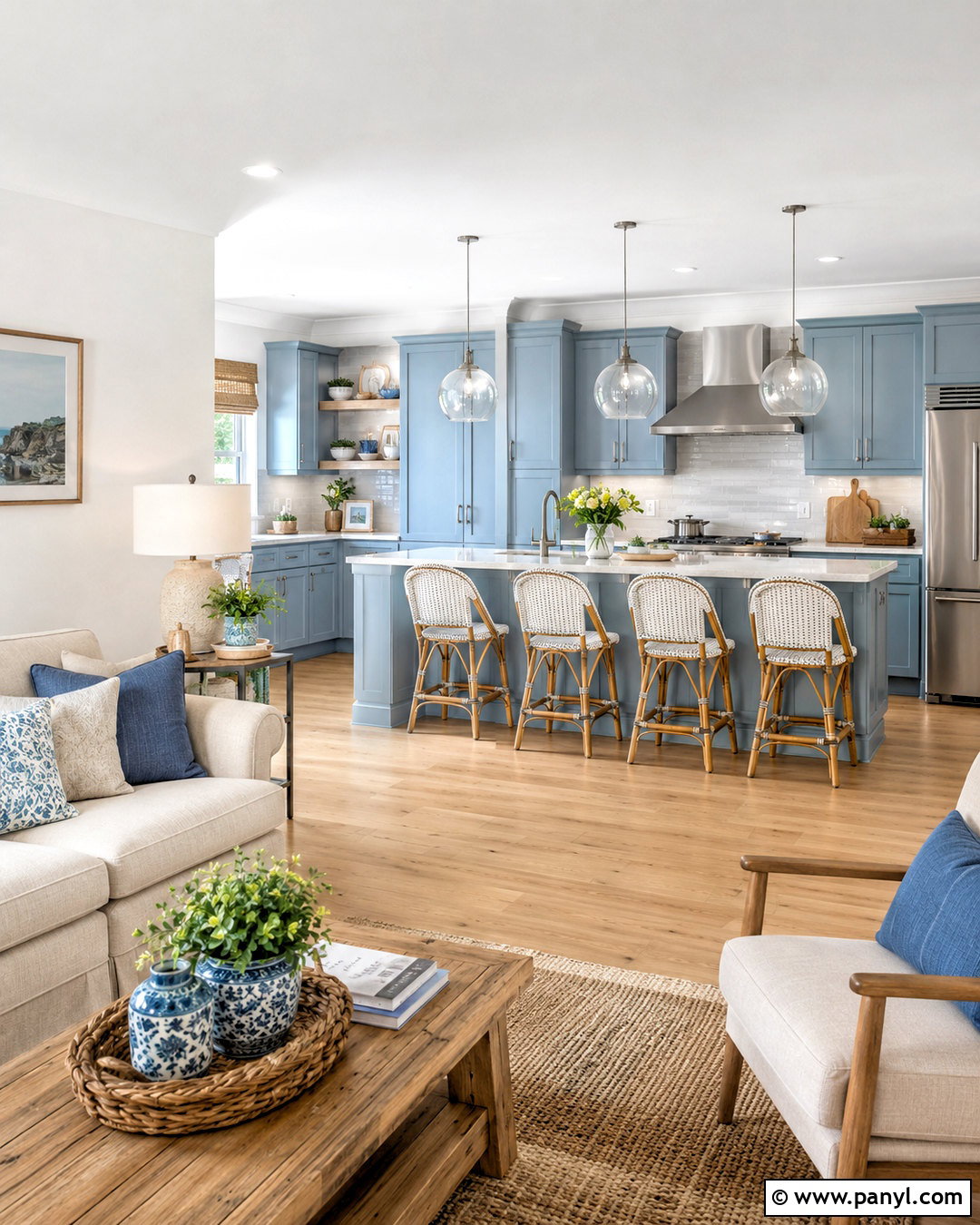
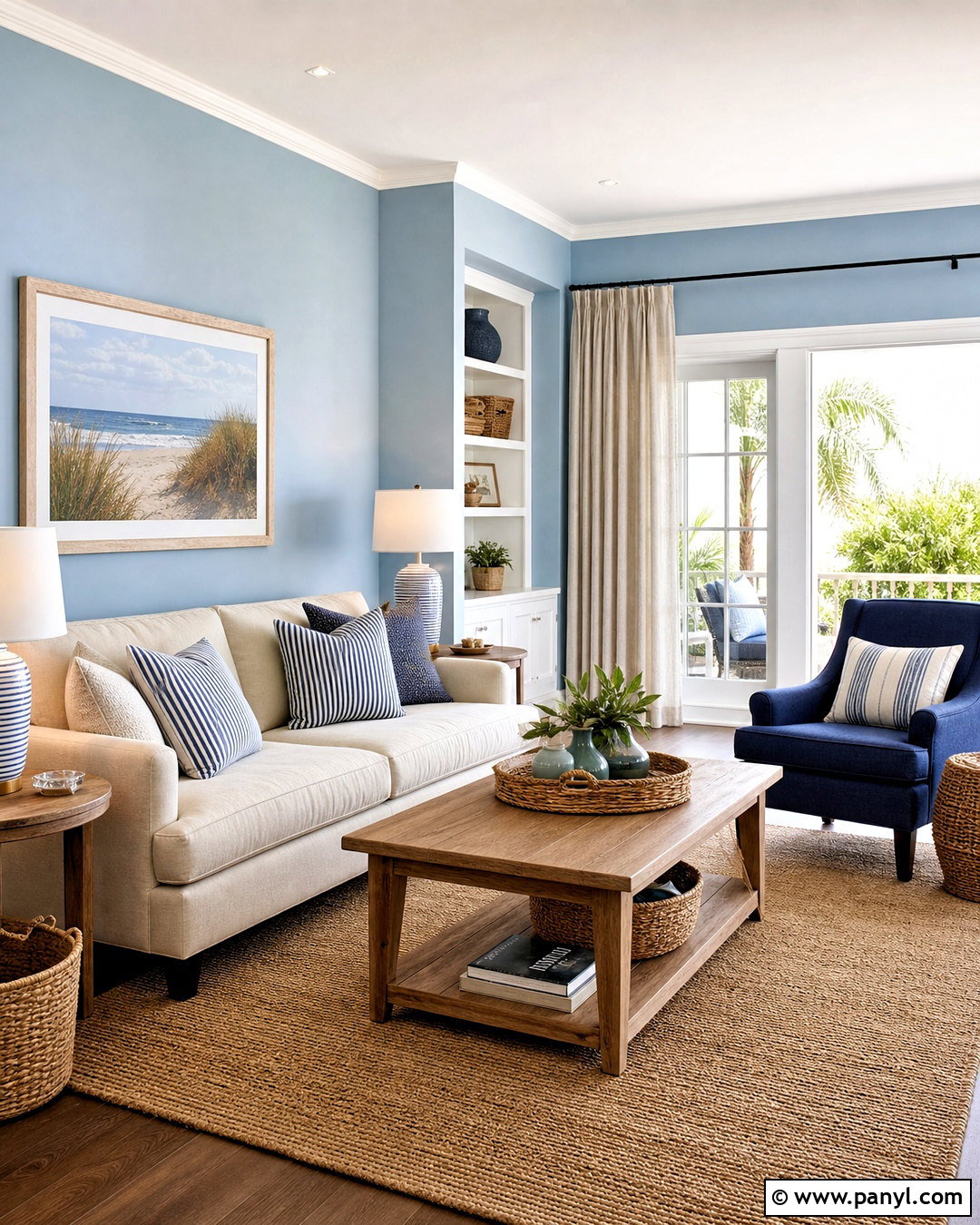
Powder blue can make a home feel airy, calm, and gently colorful without dominating the interior. Choose a subdued blue with a touch of gray for bedrooms, bathrooms, or a light-filled living room. Paint connecting spaces soft white and continue the same white across trim and ceilings. For the kitchen, try powder blue cabinetry with pale quartz counters and brushed nickel hardware. White oak or natural maple floors keep the scheme warm and approachable. Add deeper denim blue through a sofa, area rug, or painted console to create visual weight. Warm beige textiles prevent the palette from feeling overly cool. The final look suits coastal, cottage, and transitional homes but avoids obvious themed decorations or excessive blue accessories.
7. Olive Green And Mushroom Paint Color Scheme
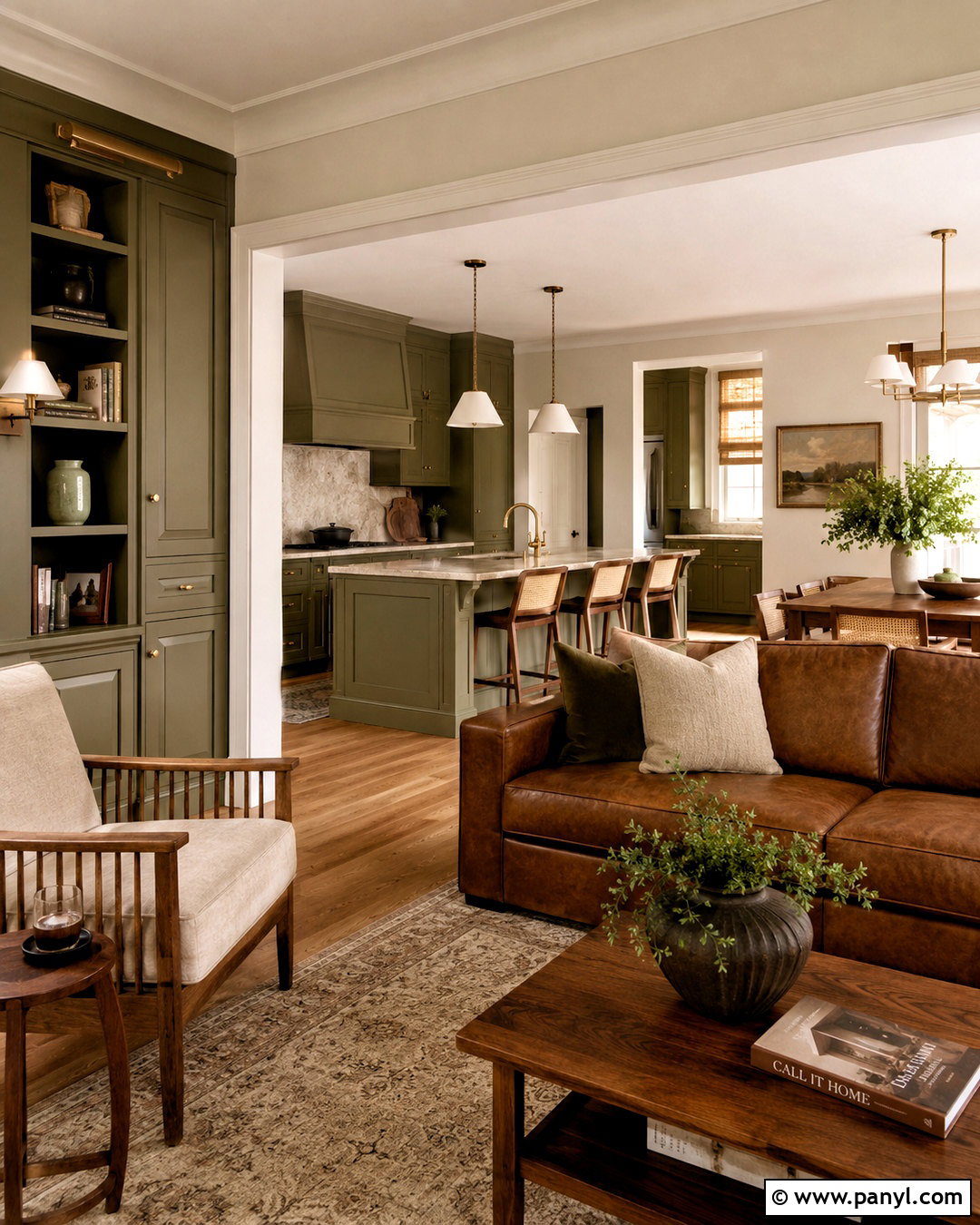
Olive green and mushroom create a grounded palette with more depth than typical light neutrals. Cover main walls in a pale mushroom beige, then use rich olive on kitchen cabinets, dining room walls, or a statement bookcase. Cream trim keeps transitions soft, while walnut furniture and medium oak floors complement both colors. Add aged brass hardware, natural stone, and woven shades for a layered finish. In bedrooms, choose a lighter olive-gray wall color and repeat mushroom through bedding and curtains. Black can appear sparingly in picture frames or lighting, but brown-black finishes often feel more harmonious. This whole-home combination is cozy enough for traditional architecture yet simple enough for contemporary furniture and clean-lined decorative pieces.
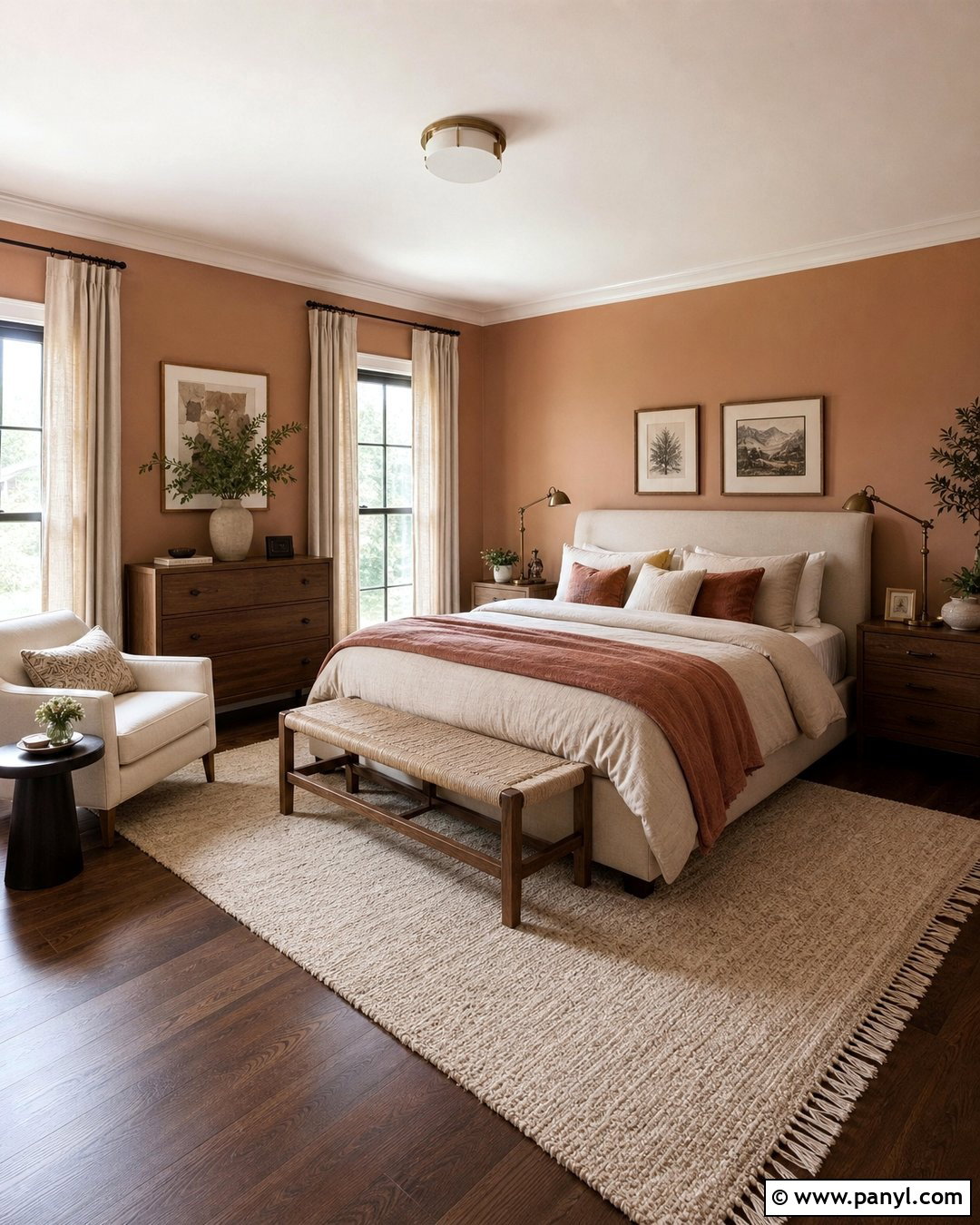
8. Charcoal Gray And Pale Oak Paint Color Scheme
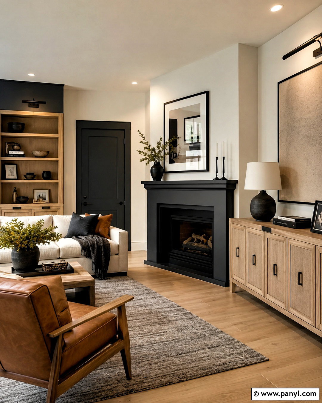
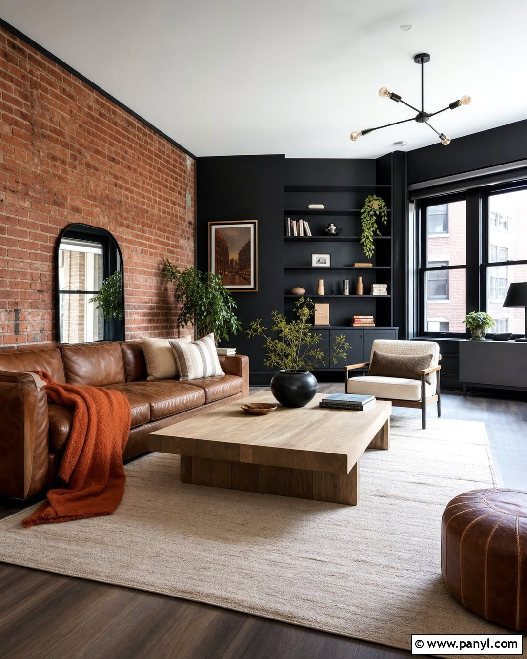
For a modern home that still feels inviting, combine charcoal paint with pale wood and warm off-white. Use off-white on most walls, then place charcoal on an office, fireplace wall, kitchen island, or interior doors. Avoid covering every room in dark gray, which can reduce natural brightness. Pale oak flooring and cabinetry create warmth and provide a clear contrast against the deeper painted surfaces. Choose cream upholstery, textured gray rugs, and matte black hardware to connect the palette. A muted camel or cognac accent adds welcome color without disrupting the streamlined look. Continue charcoal in smaller details, including stair railings and window frames. This controlled repetition gives the home definition while allowing lighter spaces to remain open and comfortable.
9. Dusty Rose And Taupe Paint Color Scheme
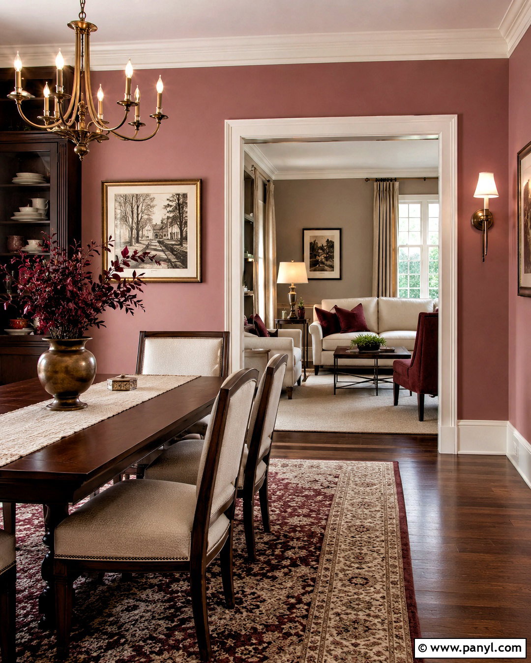
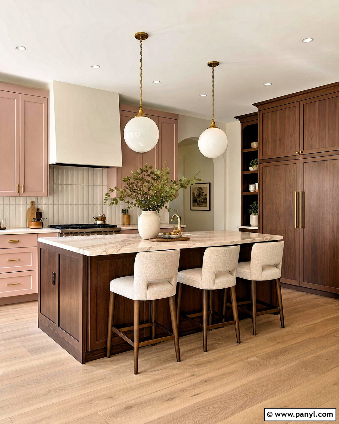
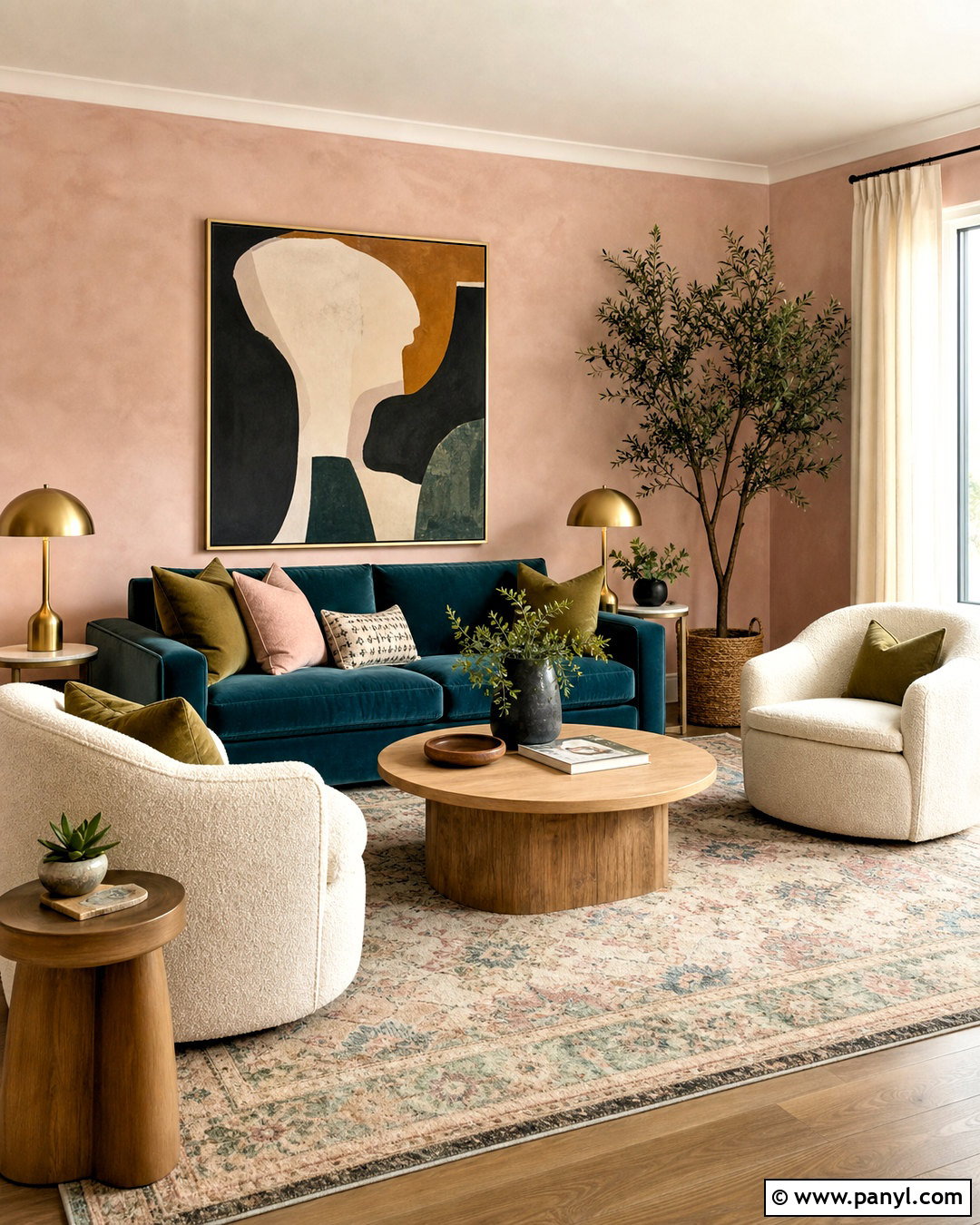
Dusty rose becomes surprisingly versatile when paired with taupe, cream, and warm brown. Select a muted pink with beige or brown undertones instead of a sugary pastel. Use it in a bedroom, sitting room, or dining room, then continue soft taupe through halls and shared living spaces. Cream trim creates a gentle border, while deep brown doors or built-ins add sophistication. Complete the scheme with walnut furniture, ivory textiles, antique brass, and subtle burgundy accents. A taupe kitchen with dusty rose accessories can connect the palette without looking overly coordinated. Keep patterns small and understated. The resulting home feels warm and expressive, yet the earthy undertones make the colors easier to live with than brighter pink combinations.
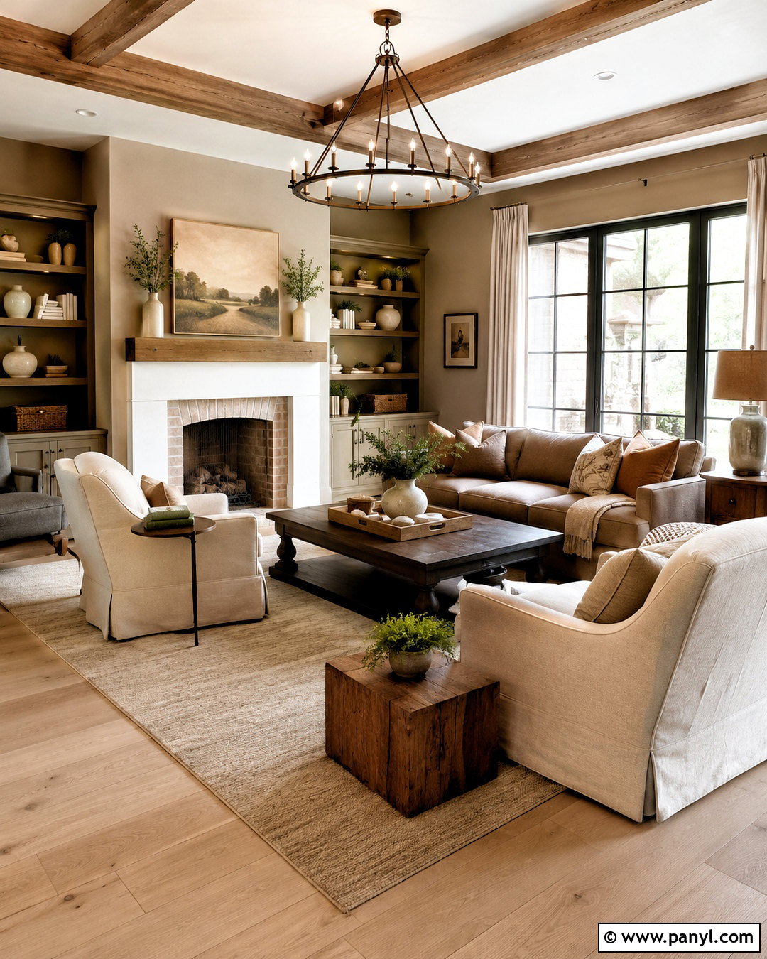
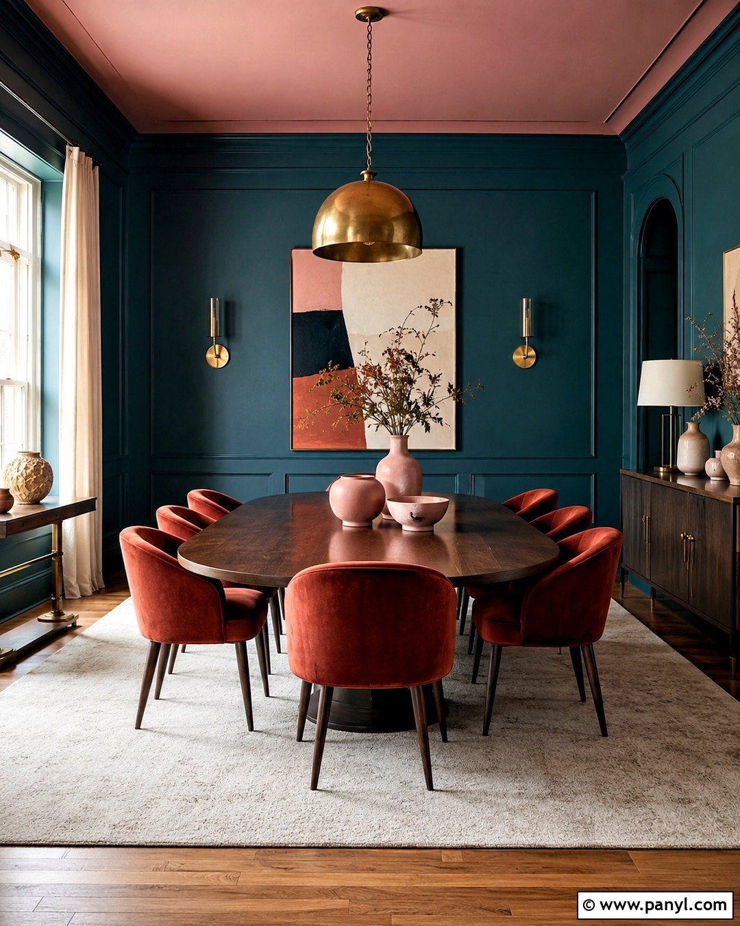
10. Blue Gray And Cloud White Paint Color Scheme
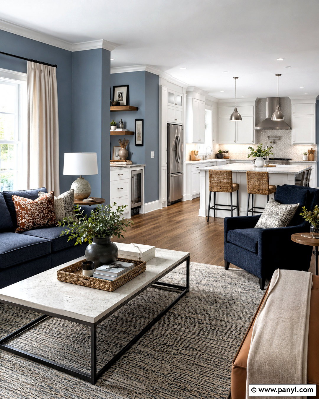
Blue-gray walls provide quiet color that changes beautifully as daylight moves through the house. Choose a soft shade that reads more blue than gray in bright rooms but becomes slightly smoky in the evening. Pair it with cloud white trim, ceilings, and cabinetry for a clean transition. Medium walnut flooring prevents the scheme from feeling cold, while navy upholstery adds depth. Use pale blue-gray in open spaces and a deeper slate blue in a study, mudroom, or bathroom vanity. Natural linen, brushed nickel, and light stone keep the finish relaxed. Small touches of muted rust or tan can warm the overall arrangement. This balanced scheme works well in homes with cool daylight or existing gray-blue stone surfaces.
11. Butter Yellow And Cream Paint Color Scheme
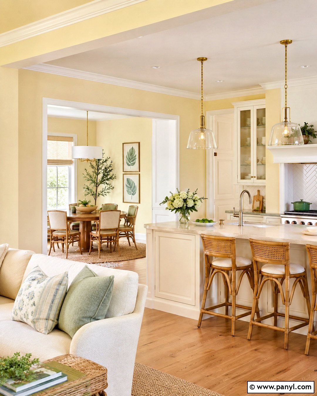
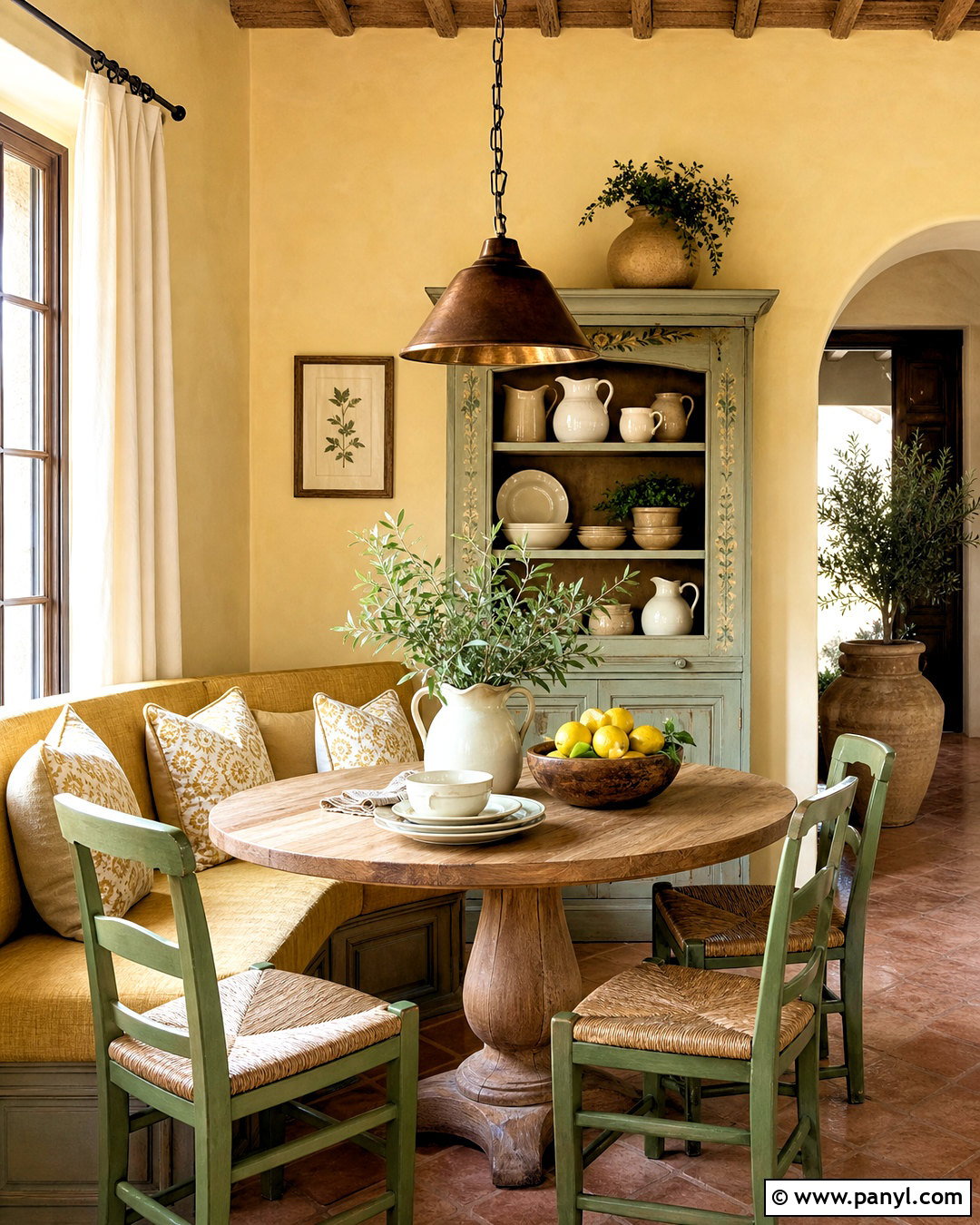
A soft butter yellow palette can brighten darker rooms while giving the entire home a cheerful, comfortable character. Look for a creamy yellow with muted golden undertones rather than a vivid lemon shade. Use it in the kitchen, breakfast room, or living room, then paint adjoining spaces a warm cream. Soft white ceilings and trim add subtle definition. Pair the walls with honey oak, natural cane, ivory upholstery, and pale stone countertops. Muted blue or gentle sage accents balance the yellow and keep it from becoming overly sweet. In a bedroom, reverse the palette with cream walls and a butter yellow painted headboard wall. The scheme feels sunny and nostalgic while still supporting clean, updated furniture and fixtures.
12. Burgundy And Blush Paint Color Scheme
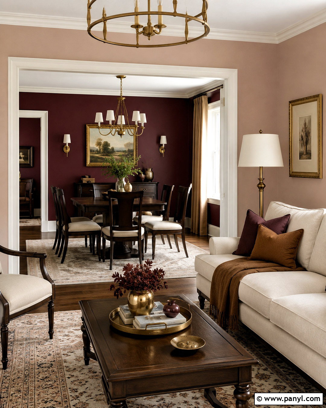
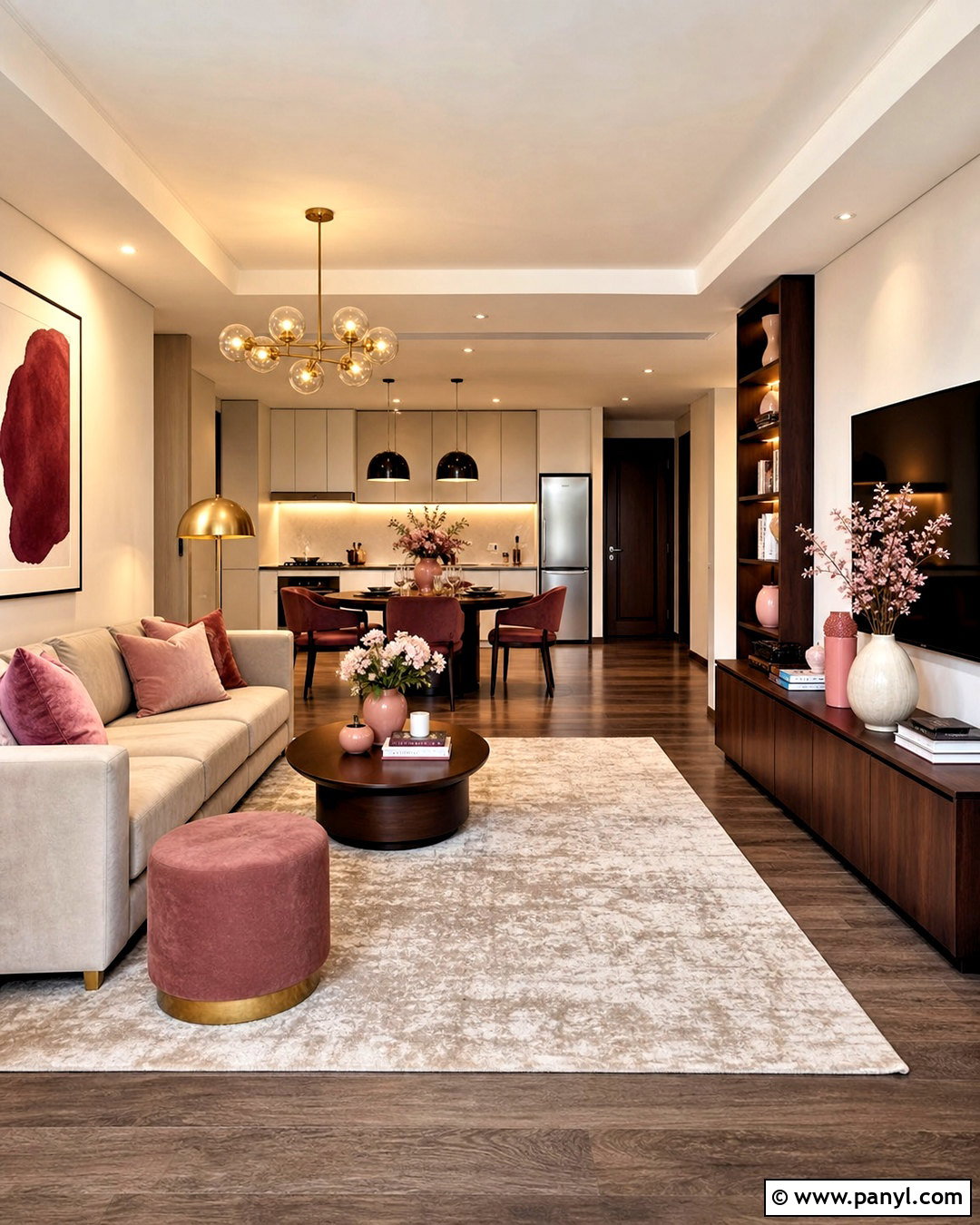
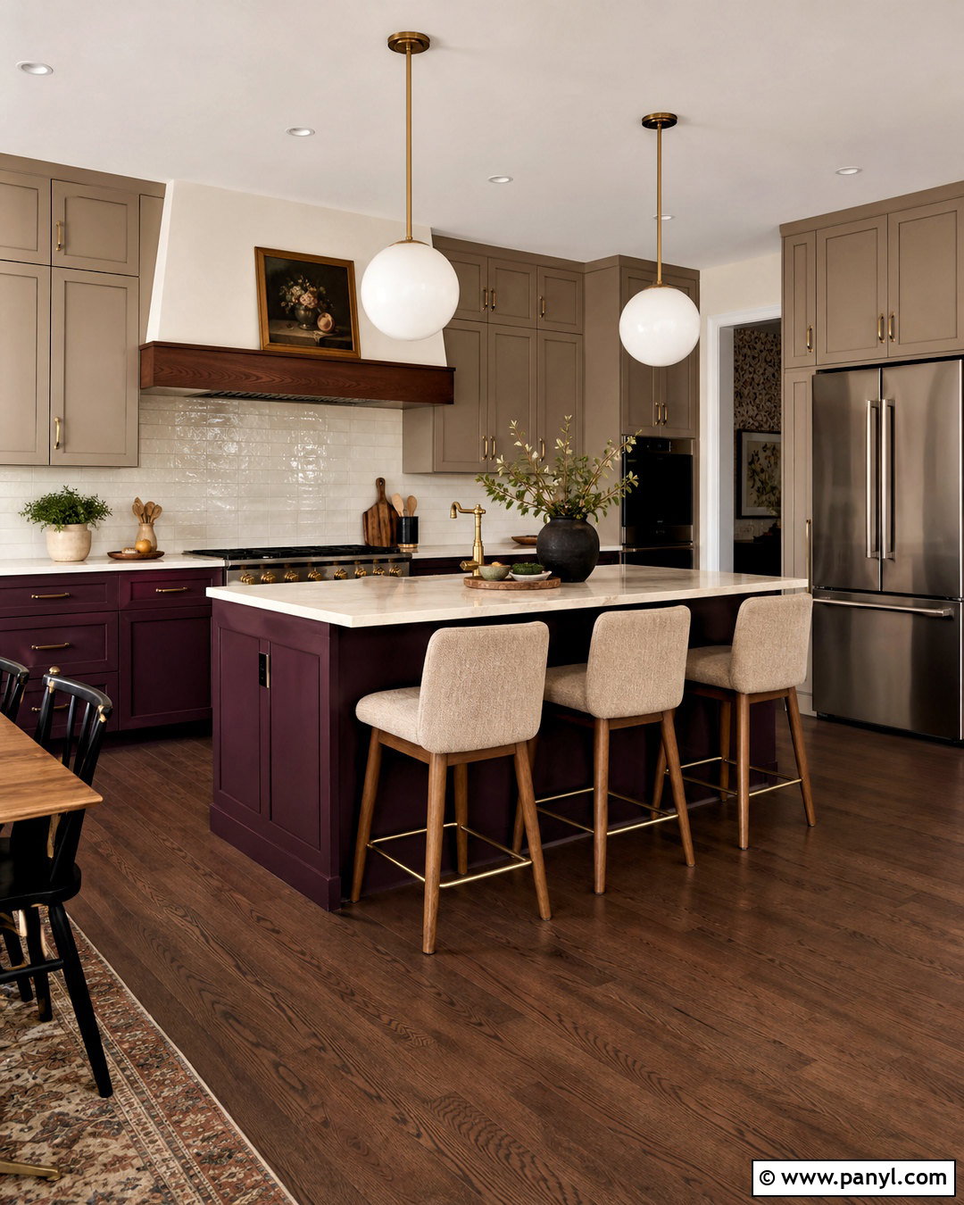
Burgundy delivers drama, but pairing it with blush and warm neutrals makes it more livable. Use deep wine-red paint in a dining room, library, or compact powder room where rich color can create an enveloping effect. Carry pale blush-beige through bedrooms or sitting areas, then connect everything with warm off-white halls and trim. Dark walnut furniture, creamy upholstery, and aged brass lighting reinforce the elegant color story. Avoid combining burgundy with icy gray, which can make the contrast feel severe. Instead, add caramel, plum, and soft brown textiles. A burgundy kitchen island or interior door can repeat the color elsewhere. This layered scheme feels distinctive without requiring every room to have deeply saturated walls.
13. Forest Green And Antique White Paint Color Scheme
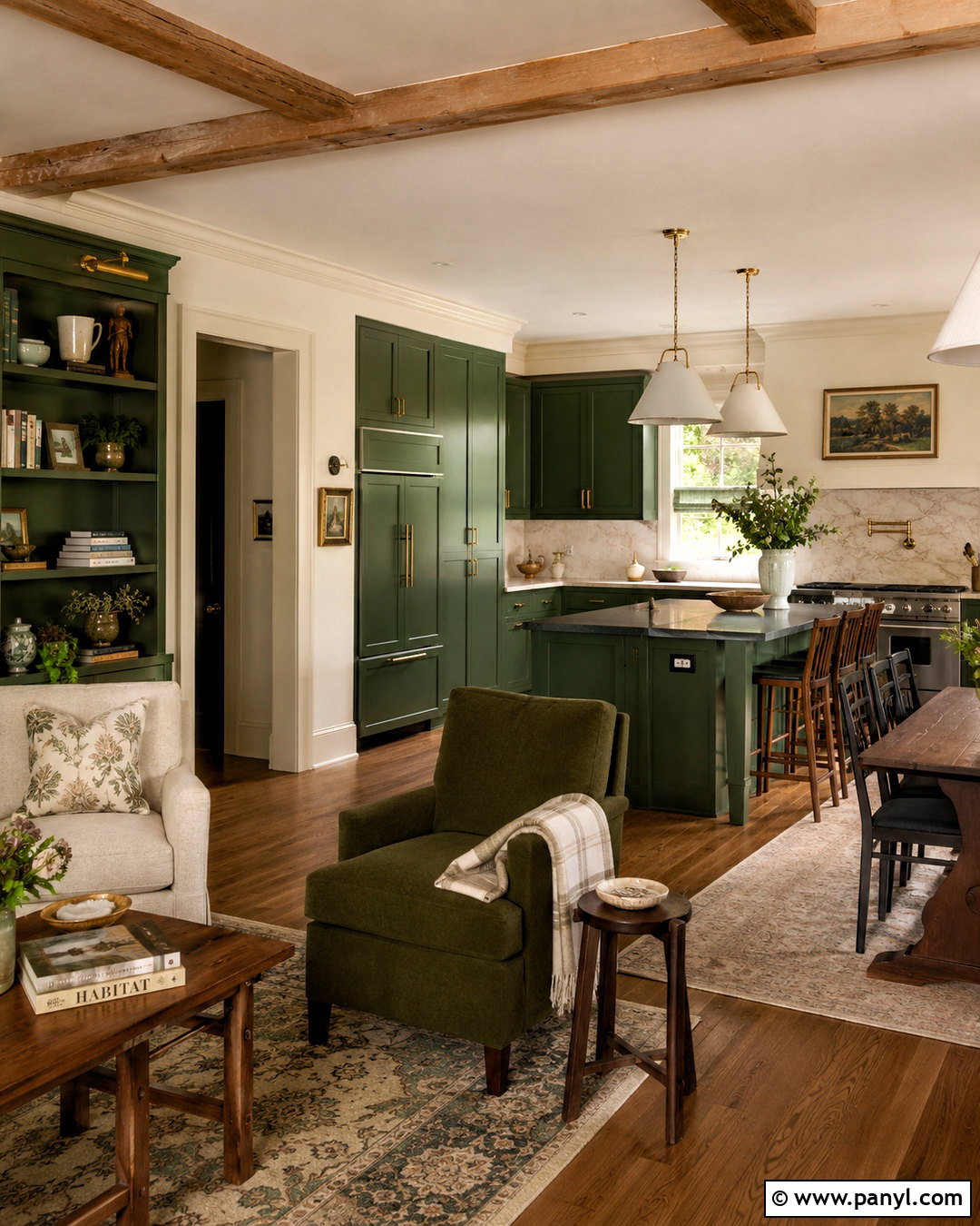
Forest green and antique white form a timeless combination that suits traditional, rustic, and updated transitional homes. Use antique white as the primary wall color, then add forest green to kitchen cabinets, a formal dining room, or built-in storage. Choose a green with warm undertones so it complements wood flooring and creamy surfaces. Dark-stained oak, unlacquered brass, and honed stone give the palette lasting character. In casual rooms, introduce plaid, botanical prints, or textured neutral fabrics in restrained amounts. Paint interior doors antique white to maintain brightness, or use green on one important door as a focal point. Repeating the color through lamps, rugs, and cabinetry helps every room feel related without making the house appear uniformly dark.
14. Chocolate Brown And Linen Paint Color Scheme
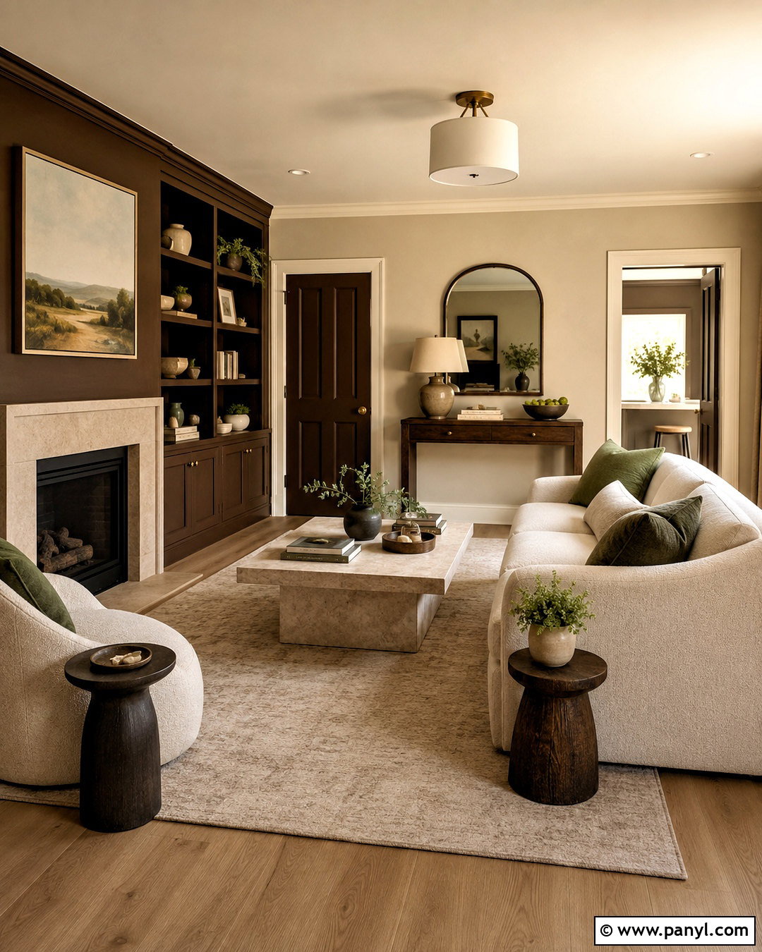
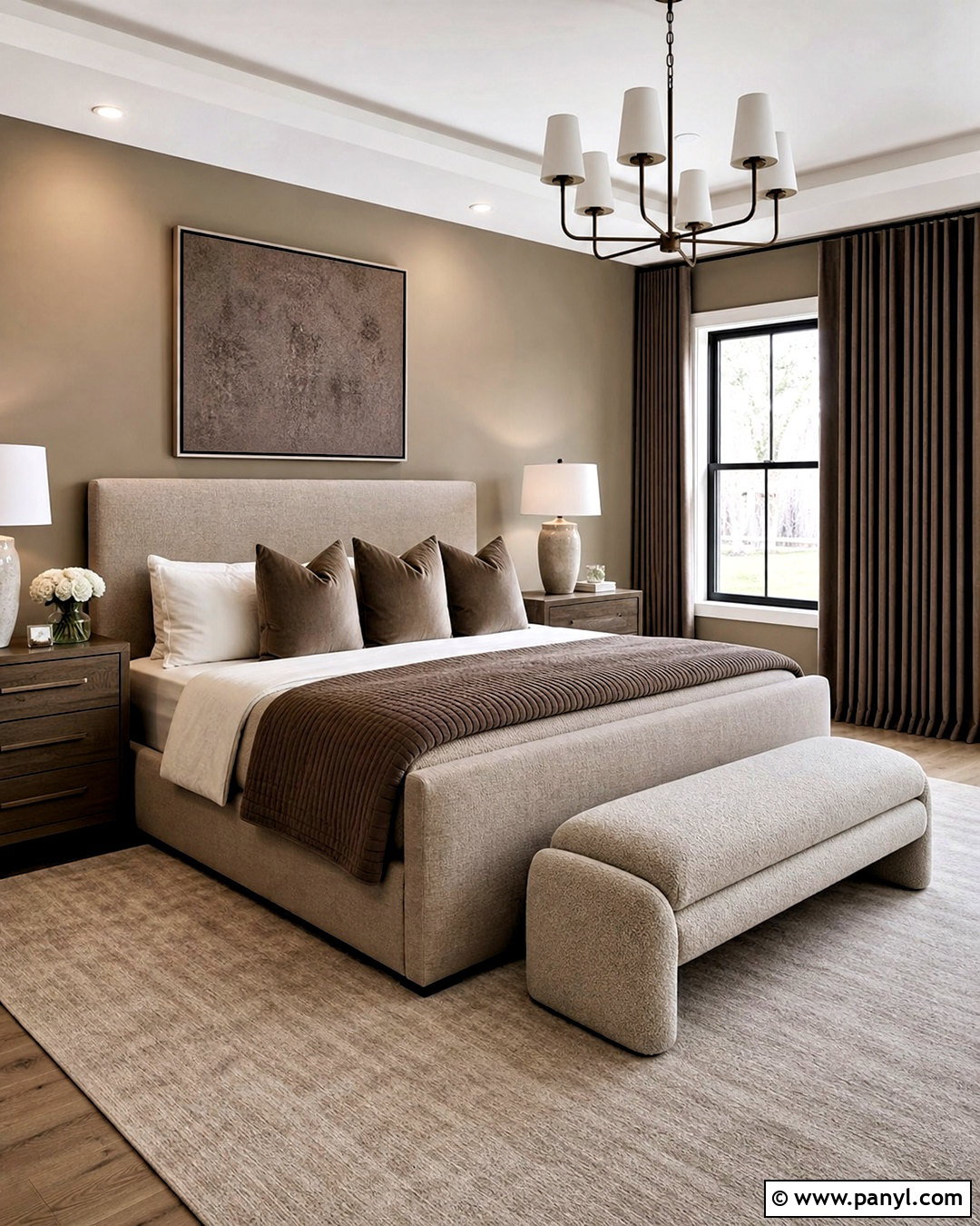
Rich chocolate brown can create a sophisticated home when balanced with generous areas of light linen color. Paint most walls a warm flax or linen beige, reserving brown for a den, bedroom, built-in cabinetry, or lower wall paneling. Match ceilings and trim with creamy white to maintain brightness. Use light oak floors, ivory boucle seating, and beige curtains to soften the dark accents. Bronze hardware and warm stone surfaces continue the tonal effect. Add muted green or powder blue through artwork and textiles for a small amount of contrasting color. Chocolate-painted doors can provide continuity along a hallway. Because every shade has warm undertones, the finished palette feels layered and cozy rather than heavy, dated, or overly formal.
15. Teal And Warm Beige Paint Color Scheme
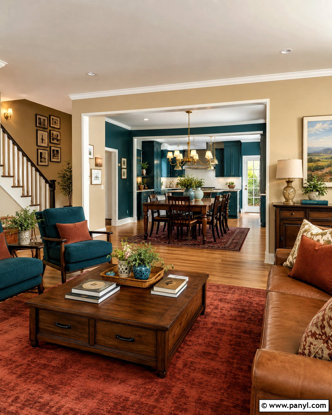
Teal brings energy to a home, while warm beige gives it a relaxed and practical foundation. Cover open living areas in a balanced beige with subtle golden undertones. Use deep teal on dining room walls, kitchen cabinetry, a bathroom vanity, or a paneled office. Cream trim creates a softer contrast than pure white. Pair the colors with walnut furniture, warm oak flooring, and brushed brass fixtures. Terracotta cushions or rust-colored rugs add another warm layer and prevent teal from feeling too aquatic. In bedrooms, select a softer blue-green shade that relates to the stronger accent color. Repeating teal in small decorative pieces across neutral rooms creates movement and consistency. The completed home feels colorful, confident, and comfortably coordinated.
16. Lavender Gray And Ivory Paint Color Scheme

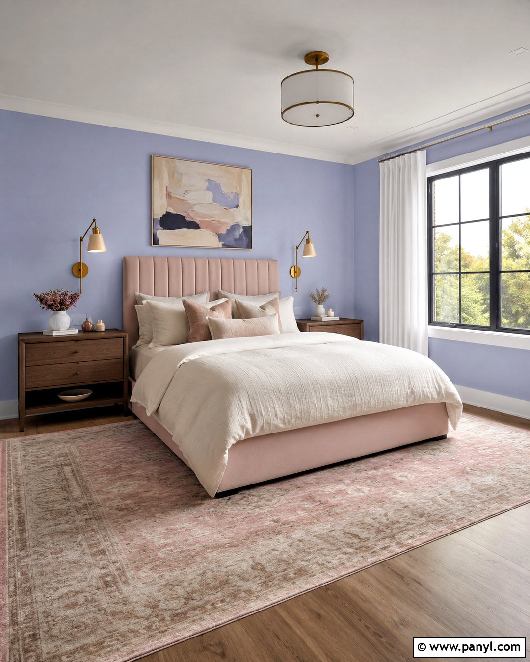
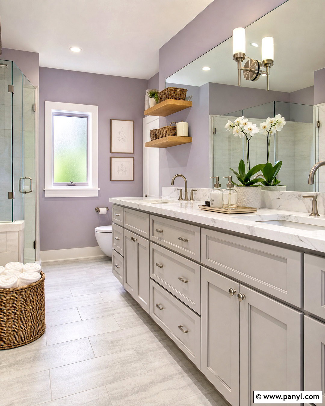
Lavender-gray offers a quiet alternative to standard gray, especially in bedrooms and softly furnished living spaces. Choose a muted violet with noticeable gray undertones so it appears sophisticated rather than overly pastel. Pair it with ivory walls in hallways and open rooms, then use creamy white on ceilings and trim. Light oak floors and natural linen fabrics bring warmth to the cooler color. Add plum, mushroom, and muted green accents through upholstery, rugs, or painted furniture. Brushed nickel suits a cleaner look, while antique brass creates a softer traditional finish. Use the lavender-gray again on bathroom cabinetry or a reading nook. The repeated color connects private rooms while ivory keeps the central areas bright, flexible, and visually calm.
17. Black And Warm White Paint Color Scheme
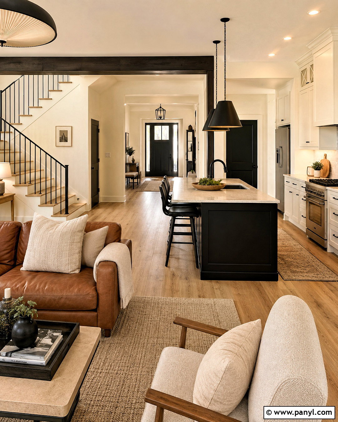
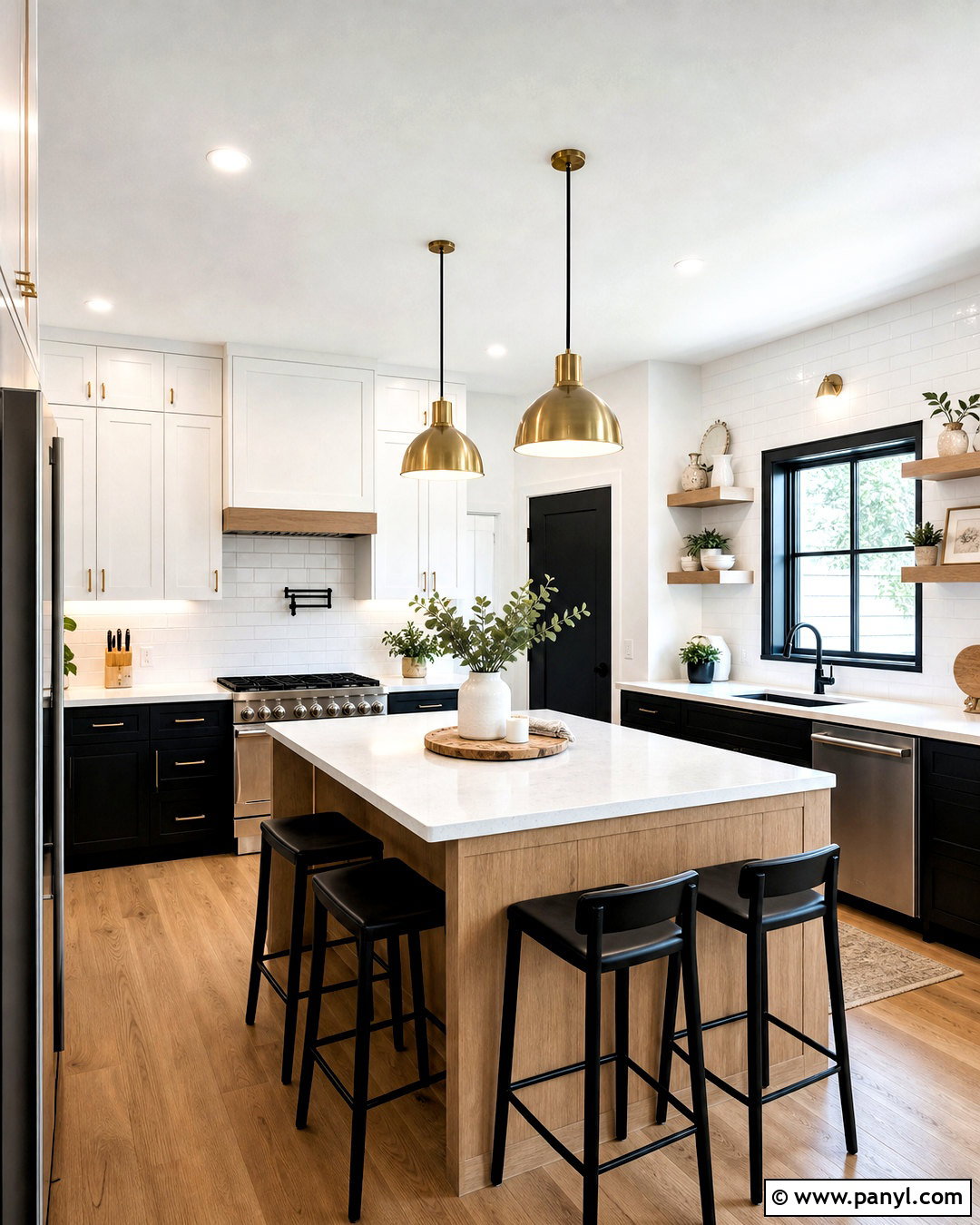
A black and warm white home does not need to feel stark or overly modern. Make warm white the dominant paint color across walls and ceilings, then use soft black on interior doors, stair railings, windows, or a single paneled room. Choose a black with brown undertones rather than a cold blue-black. Natural oak floors, tan leather, oatmeal fabrics, and woven shades reduce the severity of the contrast. In the kitchen, warm white perimeter cabinets can surround a black island with light stone countertops. Repeat black through lighting and hardware, but include wood and textured fabrics between dark elements. This balanced approach creates a clear architectural rhythm while keeping everyday rooms bright, welcoming, and easy to personalize.
18. Peach And Clay Paint Color Scheme
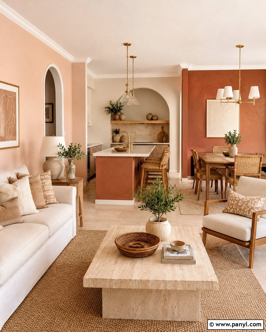
Soft peach and earthy clay produce a warm, optimistic interior that feels more subtle than bright orange. Use pale peach on living room or bedroom walls, then bring a deeper clay shade to a dining room, kitchen island, or bathroom vanity. Warm white trim keeps the palette fresh, while beige ceilings can create a softer, wrapped effect in cozy rooms. Pair these colors with light oak, cream upholstery, woven baskets, and travertine or limestone. Olive green plants and accents offer natural contrast. Keep metals understated with brushed brass or dark bronze. The scheme works best when both paint colors have muted, dusty undertones. Together, they create a welcoming home that feels sunny without becoming loud, tropical, or overly themed.
19. Slate Blue And Camel Paint Color Scheme
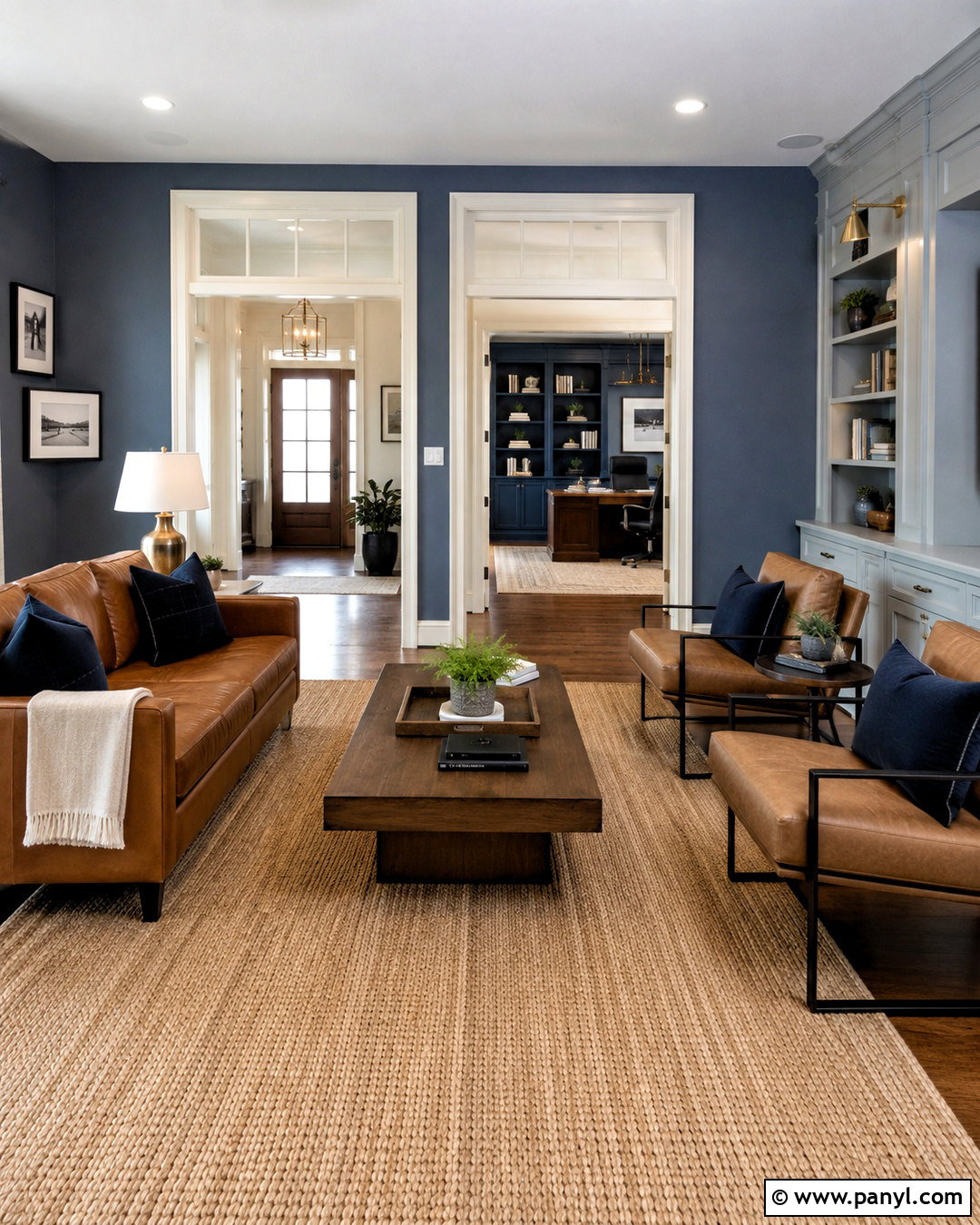
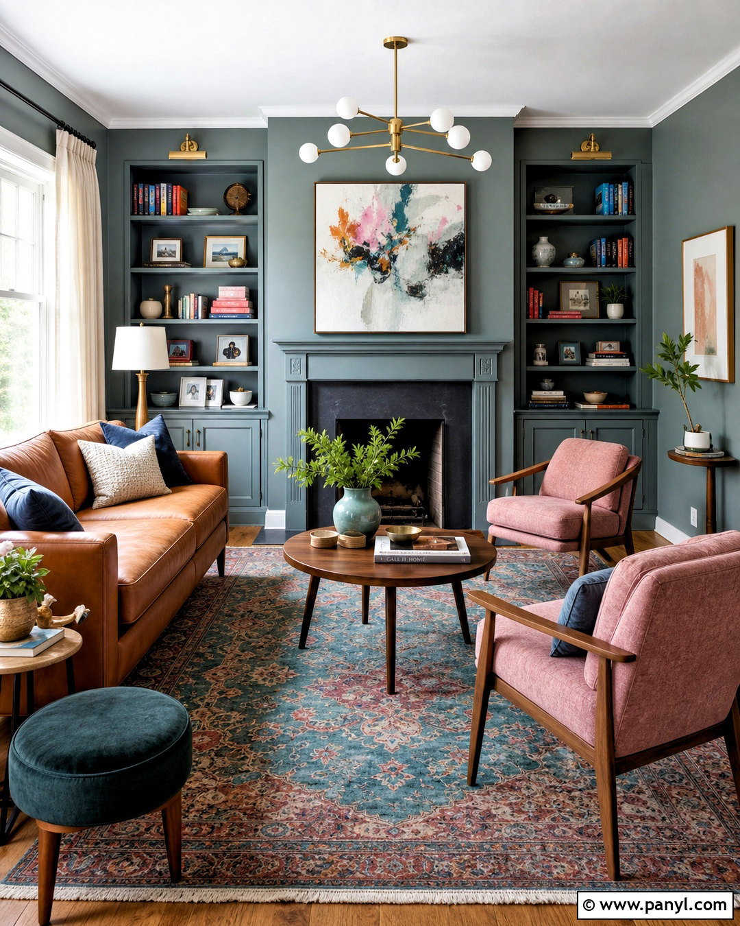
Slate blue walls paired with camel furnishings create a strong yet comfortable whole-home palette. Use a medium slate blue in a living room, office, or primary bedroom, then choose warm off-white for hallways and connecting spaces. Paint kitchen cabinetry a lighter blue-gray and maintain consistent cream trim throughout the house. Camel leather seating, warm walnut tables, and natural jute rugs balance the cooler paint. Add aged brass lighting for softness and dark navy accents for extra depth. In rooms with limited daylight, use slate only on lower paneling or built-ins rather than every wall. Repeating camel through curtains and upholstery builds warmth. The finished scheme feels tailored and substantial without relying on sharp black-and-white contrast.
20. Khaki And Deep Red Paint Color Scheme
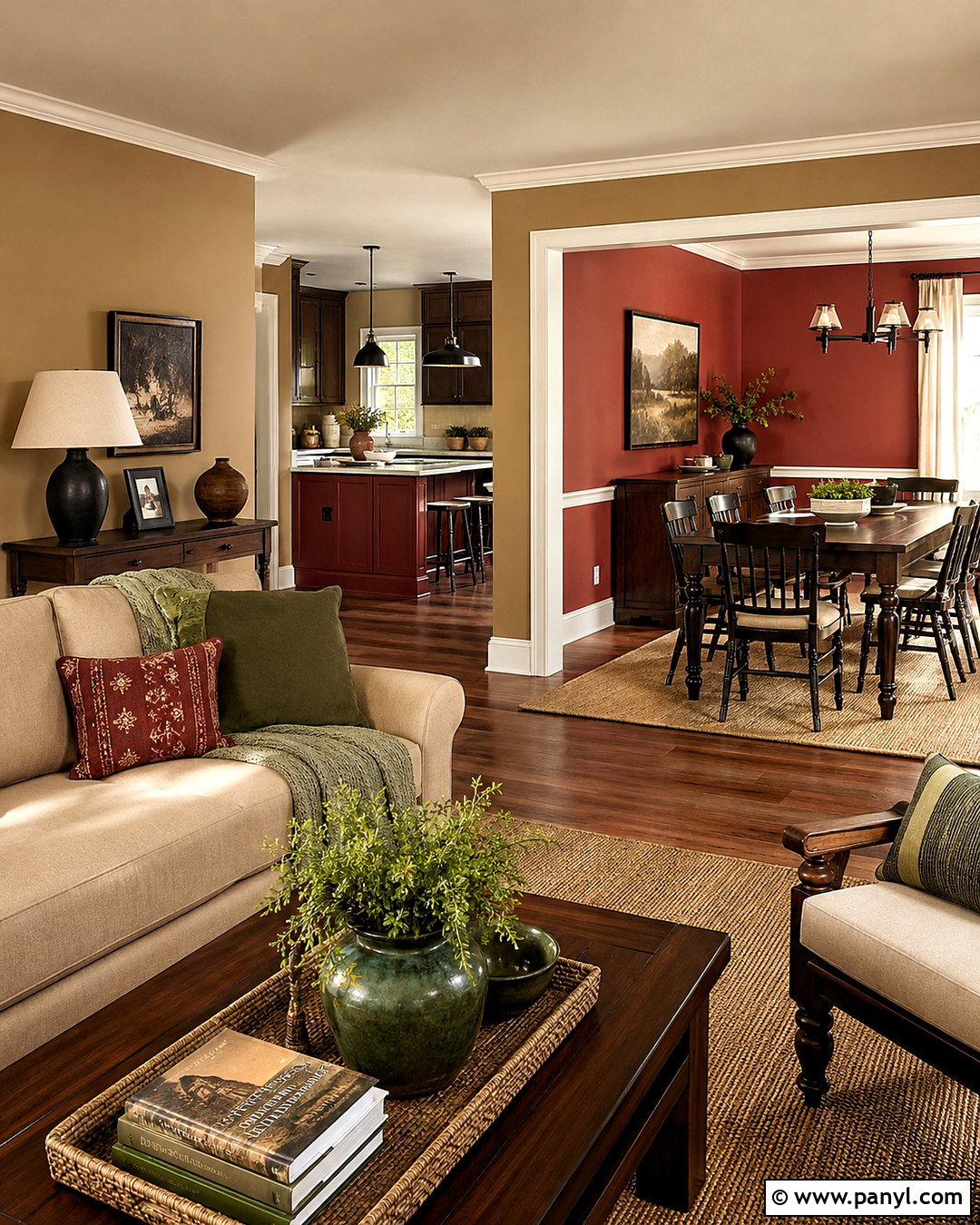
Khaki provides a flexible foundation for a sophisticated deep red accent. Select a warm, earthy khaki for living rooms, hallways, and open-plan areas. Use muted brick red or oxblood on a dining room, library, front door, or kitchen island. Cream trim and ceilings keep the combination bright, while dark oak furniture adds traditional weight. For a more relaxed interpretation, include natural linen, sisal rugs, and simple black metal lighting. Green-gray textiles can bridge the warm neutral and red without adding another competing color. Carry small red details into adjoining rooms through artwork or patterned upholstery. This complete palette feels collected and welcoming, offering more personality than an all-neutral home while remaining adaptable to both classic and modern furnishings.
Conclusion:
The best whole-home palette connects rooms without making every space look identical. These 20 paint color schemes for home ideas offer a mix of dependable neutrals, calming nature-inspired shades, and richer accent colors that can be adapted to different architecture and lighting. Begin with one dominant neutral, choose one or two supporting colors, and repeat them through cabinetry, doors, textiles, or furnishings. Keep permanent finishes such as flooring, countertops, and tile in mind before selecting paint. Most importantly, test each shade on multiple walls and observe it throughout the day. A thoughtful palette will improve visual flow, simplify decorating decisions, and give your home a finished look that feels personal rather than trend-dependent.

Related Ideas and Inspiration:
Leave a Reply