
Farrow and Ball paint colour palettes make it easier to create rooms that feel layered, balanced, and thoughtfully connected. Their nuanced neutrals, deep blues, earthy greens, and warm accent colors can shift beautifully as natural and artificial light changes. The key is to build a complete scheme rather than choosing one appealing wall color. Start with a dominant shade, add a related neutral, introduce contrast through woodwork or cabinetry, and repeat an accent color in textiles and decor. The Farrow & Ball range includes warm, cool, pale, and saturated colors that support both traditional and modern interiors. () Whether you prefer subtle tonal rooms or confident contrast, the combinations below offer practical ways to decorate with 20 Farrow and Ball paint colour palettes.
1. Setting Plaster Farrow And Ball Palette
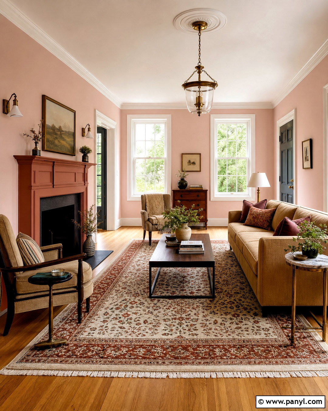
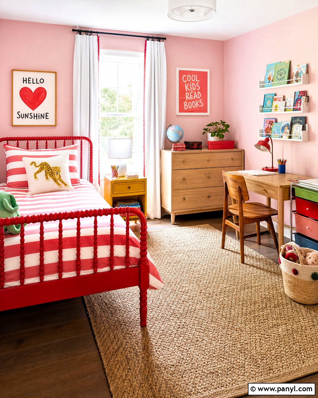
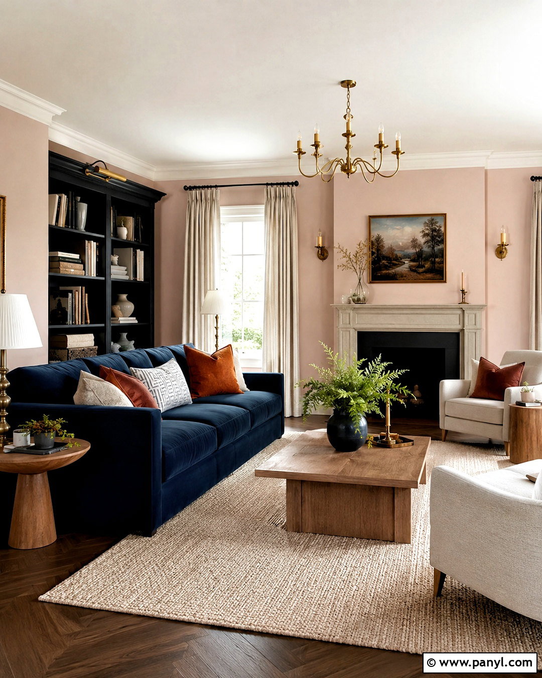
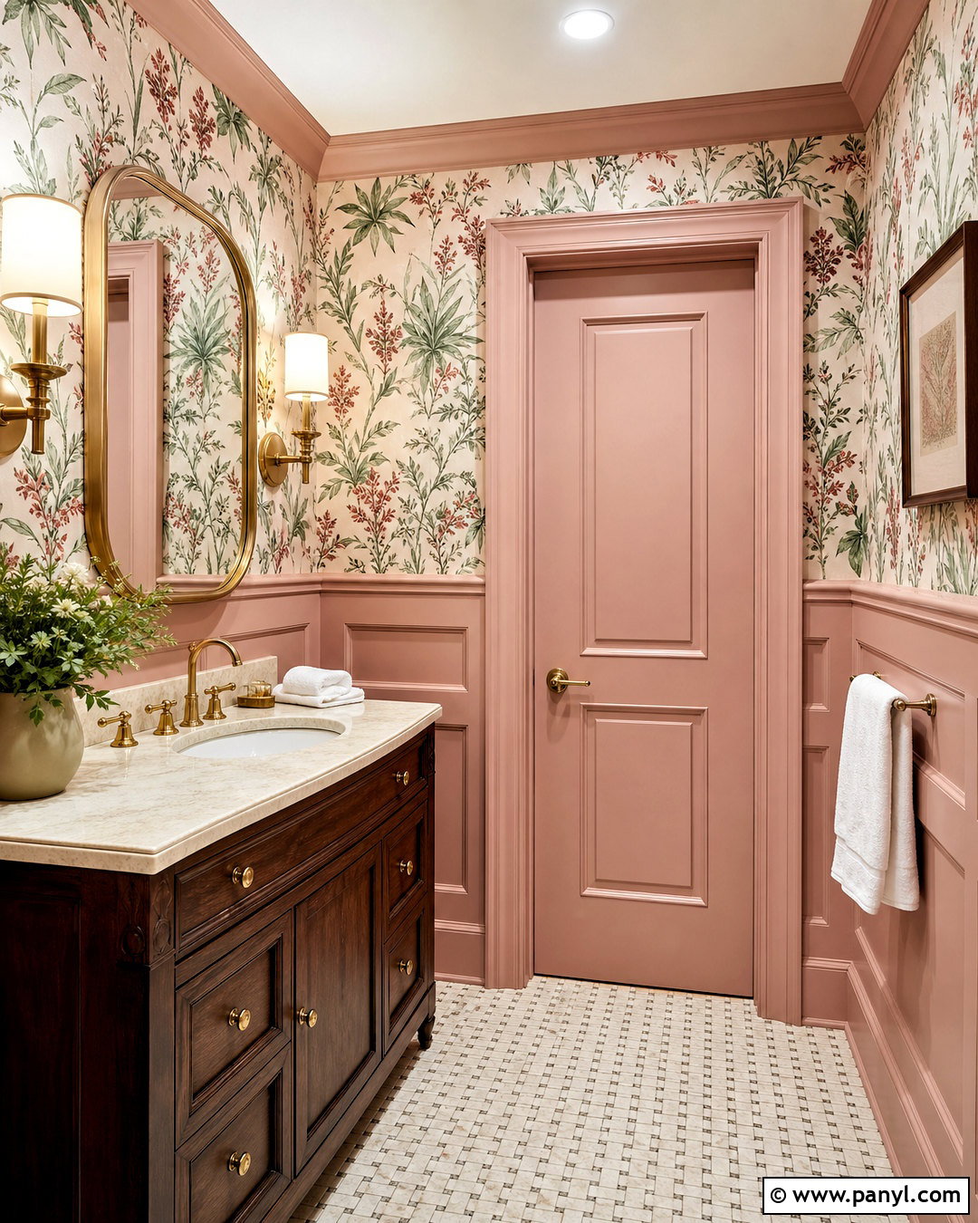
Setting Plaster creates a warm, dusty pink foundation that feels softer than a sugary pastel. Use it across living room walls, then paint trim and ceilings in School House White for gentle definition. A Dead Salmon fireplace surround adds an earthy terracotta note without overpowering the space. Introduce Railings through a metal-framed coffee table, slim bookcase, or painted interior door. Choose a camel sofa, oatmeal linen curtains, and a faded rust-and-cream rug to connect the warm colors. Medium oak flooring and antique brass lighting provide natural depth. This palette works especially well in rooms with afternoon sunlight because the layered pink and brown undertones become richer while the dark accents keep the overall look grounded.
2. Hague Blue Farrow And Ball Palette
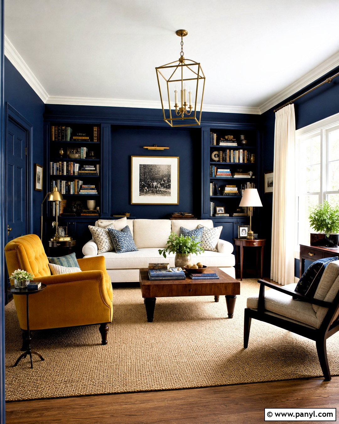
Could your living room handle a dramatic blue? Hague Blue walls create an enveloping background for pale upholstery and substantial wood furniture. Use Ammonite on the ceiling and trim to soften the transition without introducing a stark white. A built-in bookcase painted in Hague Blue keeps the room cohesive, while a mustard India Yellow armchair adds a lively focal point. Balance these colors with a cream sofa, walnut coffee table, and natural jute rug. Brushed brass lamps and warm white curtains prevent the dark blue from feeling cold. Add small amounts of rust, tan, and ivory through pillows and ceramics. The finished room feels confident and comfortable, with enough light contrast to suit both traditional homes and streamlined modern spaces.
3. Green Smoke Farrow And Ball Palette
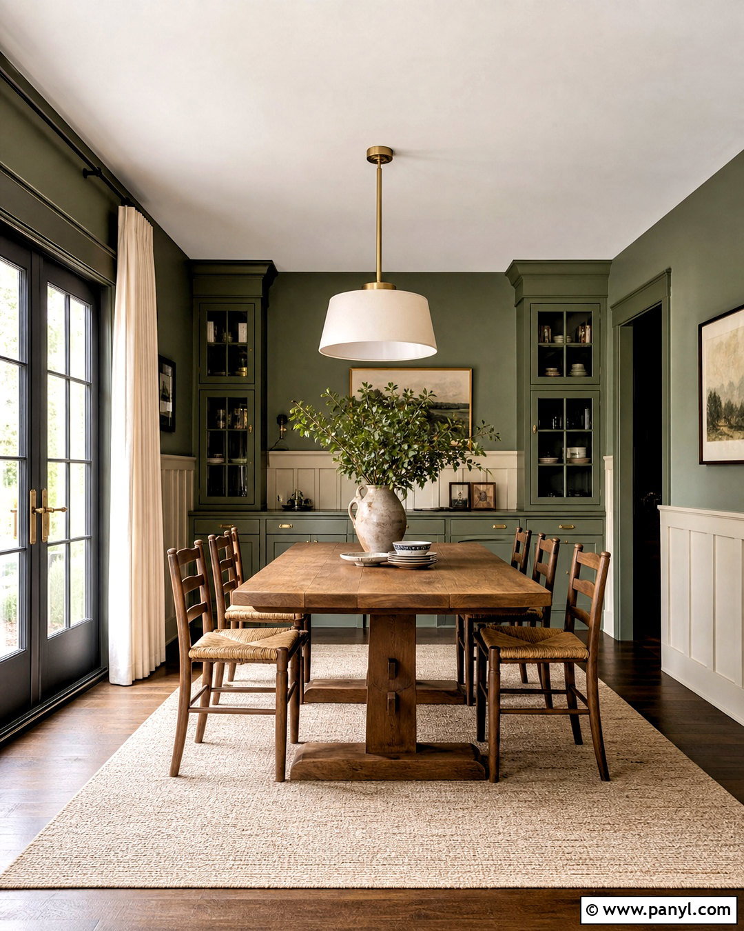
Green Smoke brings a calm, slightly weathered character to a dining room. Cover the walls and built-in cabinetry in this smoky green, using a durable low-sheen finish on the woodwork. Paint the ceiling Shaded White to add warmth, then introduce Drop Cloth on an adjoining hallway or paneled lower wall. Off-Black works as a controlled accent on a display cabinet, pendant light, or French doors. Complete the room with a long oak table, rush-seat chairs, and a flat-woven cream rug. Linen curtains in natural flax keep the look relaxed. Aged brass hardware and simple stoneware add texture without clutter. This full palette suits rooms overlooking trees or gardens because it forms an easy visual connection between the interior and surrounding greenery.
4. Pigeon Farrow And Ball Palette
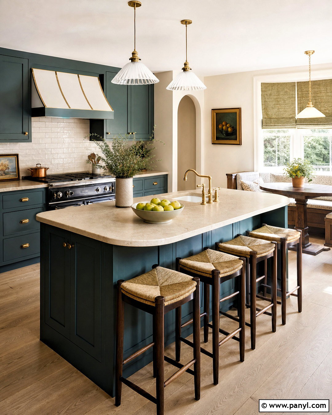
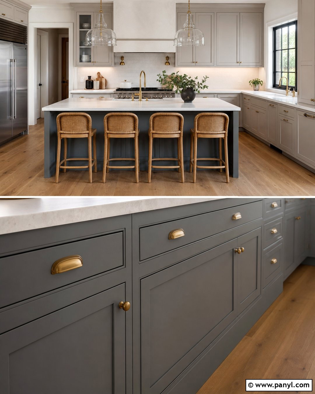
Soft blue-green Pigeon is an adaptable choice for a welcoming kitchen. Apply it to Shaker cabinets, including the island, then use Pointing on the walls and ceiling for a warm, clean backdrop. Cromarty can appear inside a pantry or on a nearby breakfast nook wall, creating subtle tonal variation. Anchor the scheme with Mouse’s Back on a freestanding cupboard or lower section of the island. Choose honed cream limestone counters, an ivory subway tile backsplash, and unlacquered brass hardware. Pale oak flooring keeps the room bright, while woven stools and linen blinds introduce casual texture. The colors are quiet enough for everyday living but more distinctive than standard gray cabinetry, producing a kitchen that feels collected rather than overly coordinated.
5. Inchyra Blue Farrow And Ball Palette
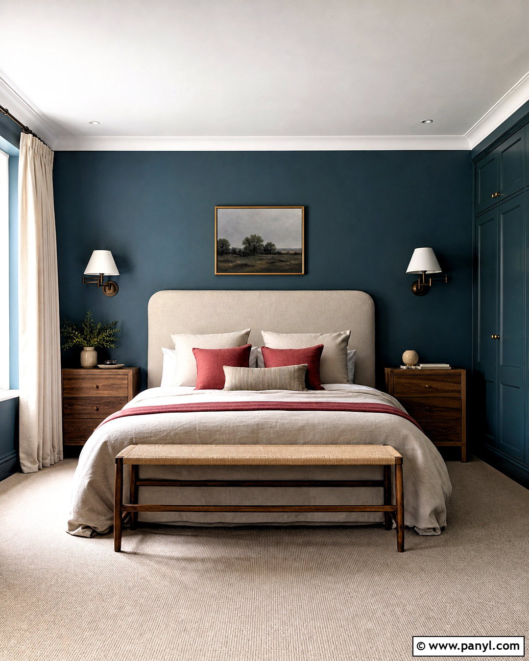
Inchyra Blue can transform a bedroom into a restful retreat with depth and character. Color-drench the walls, trim, and built-in wardrobes in this dark blue-green shade, then keep the ceiling Strong White to preserve brightness overhead. Add a De Nimes upholstered headboard for a softer denim-blue layer. Preference Red works best in small doses, such as patterned pillow piping, a bedside lampshade, or a narrow rug border. Select walnut nightstands, an oatmeal wool carpet, and natural linen bedding in cream and stone. Aged bronze sconces complement the darker tones without creating harsh contrast. This layered bedroom feels cozy but not gloomy because the pale textiles, restrained red accent, and lighter ceiling distribute visual weight throughout the entire space.
6. Sulking Room Pink Farrow And Ball Palette
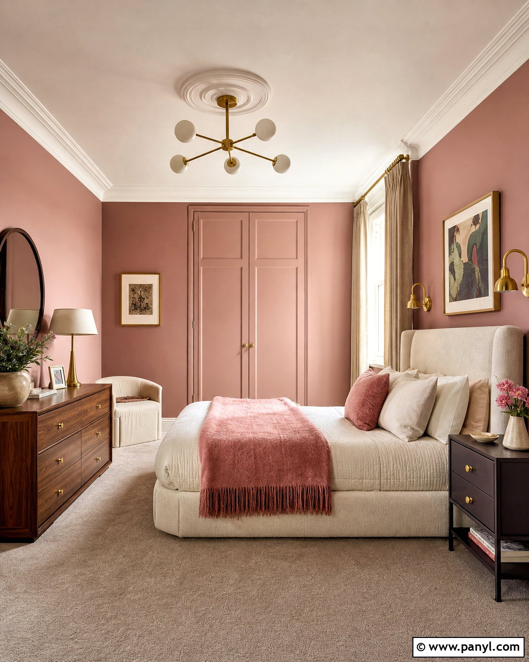
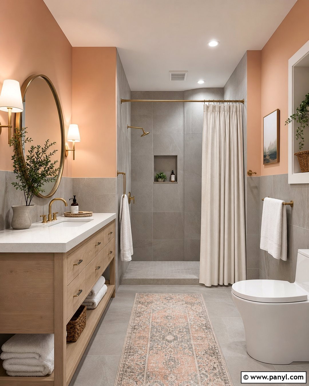
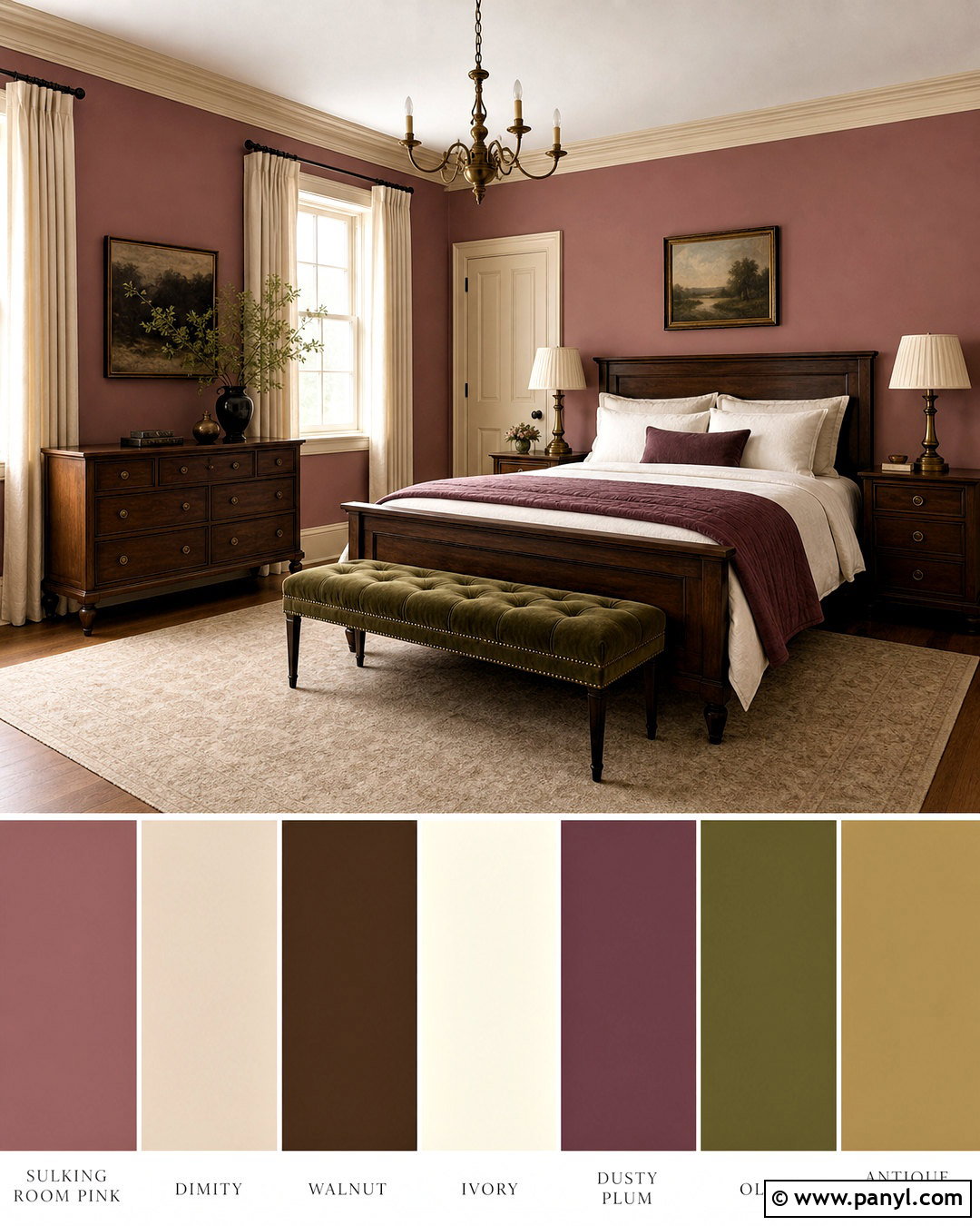
Muted rose walls can make a primary bedroom feel warm, sophisticated, and surprisingly neutral. Paint the walls in Sulking Room Pink, then use Peignoir on wardrobes or a paneled dressing area for a softer gray-pink transition. Great White on the ceiling and trim continues the subtle red undertone rather than creating a sharp boundary. Introduce Brinjal through a velvet bench, patterned bed pillows, or painted bedside tables. A pale upholstered bed, mushroom-colored carpet, and natural linen curtains help quiet the palette. Add dark walnut furniture and brushed brass lighting for contrast. Instead of filling the room with more pink accessories, use ivory bedding, plum details, and warm brown textures. The result is polished, cocooning, and comfortable throughout the year.
7. Skimming Stone Farrow And Ball Palette
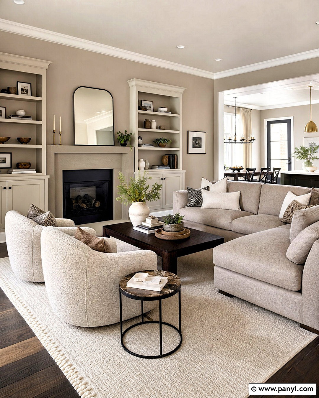
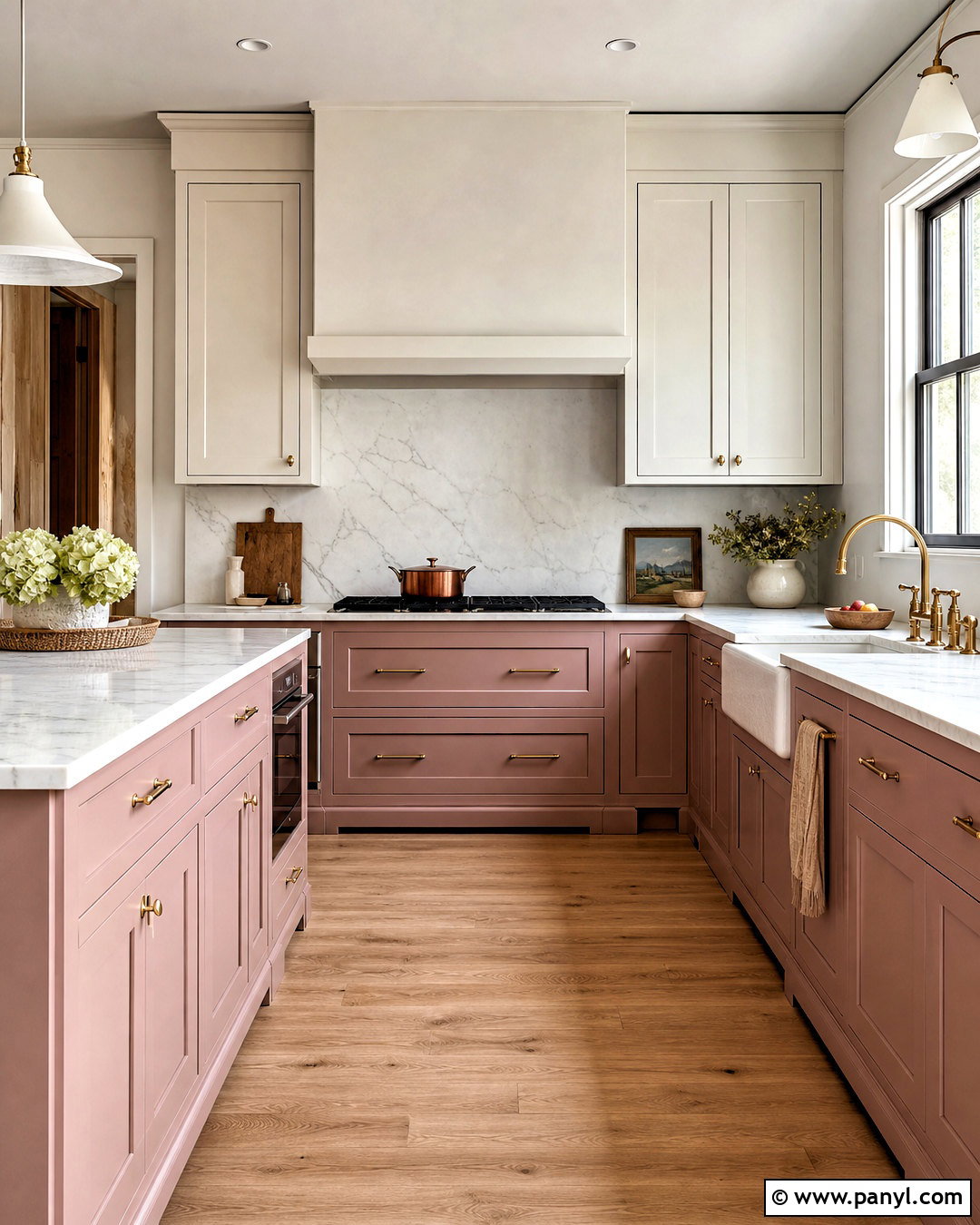
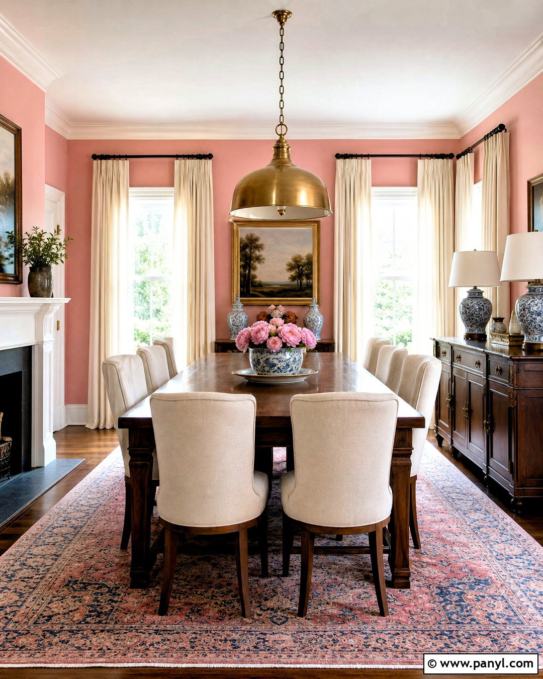
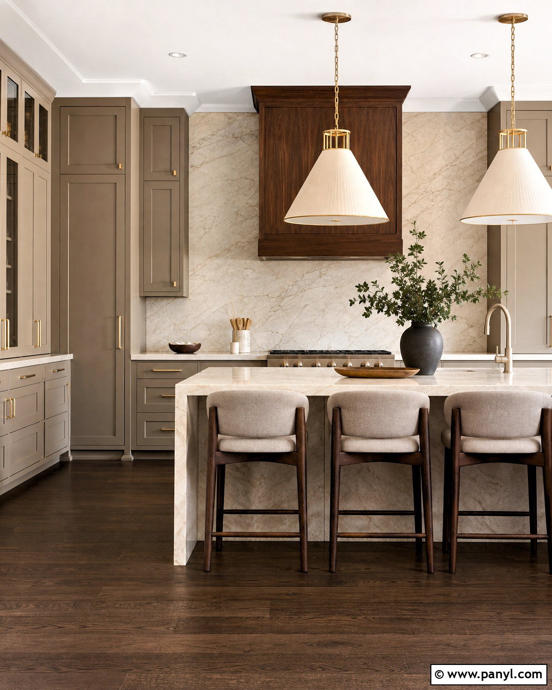
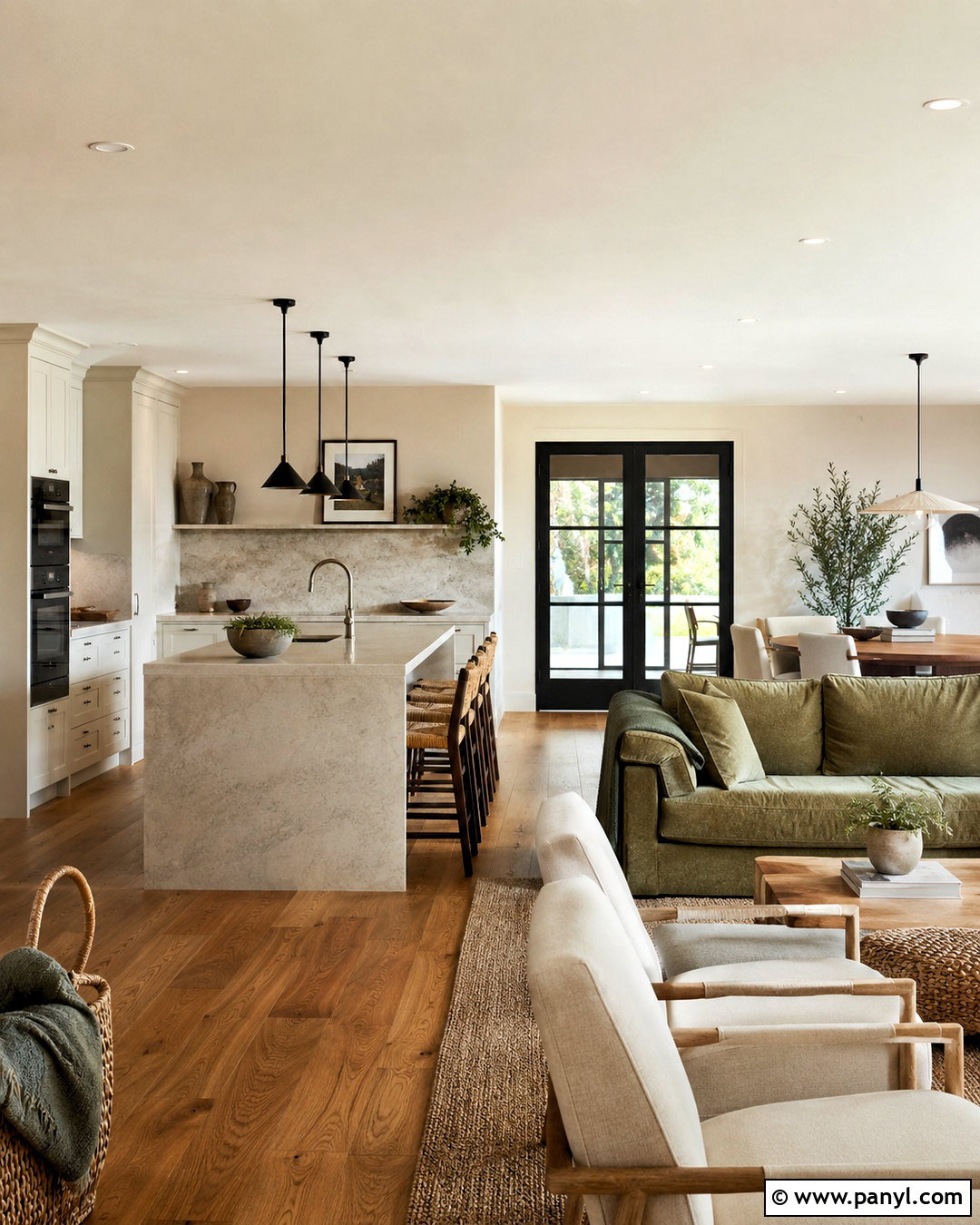
Warm neutrals become more interesting when several related depths are used together. Cover open-plan living room walls in Skimming Stone, then paint built-ins or an adjoining dining zone in Elephant’s Breath. Use Wimborne White on ceilings, window trim, and interior doors for a fresh but gentle contrast. London Clay adds structure on a fireplace, media cabinet, or kitchen island visible from the living area. Continue the scheme with a greige sectional, boucle accent chairs, dark wood tables, and a cream-and-taupe rug. Black metal lighting can provide definition, but use it sparingly. Curtains in undyed linen soften the room’s edges. This complete palette is practical for connected spaces because each neutral has a clear role while sharing an inviting, warm undertone.
8. Bancha Farrow And Ball Palette
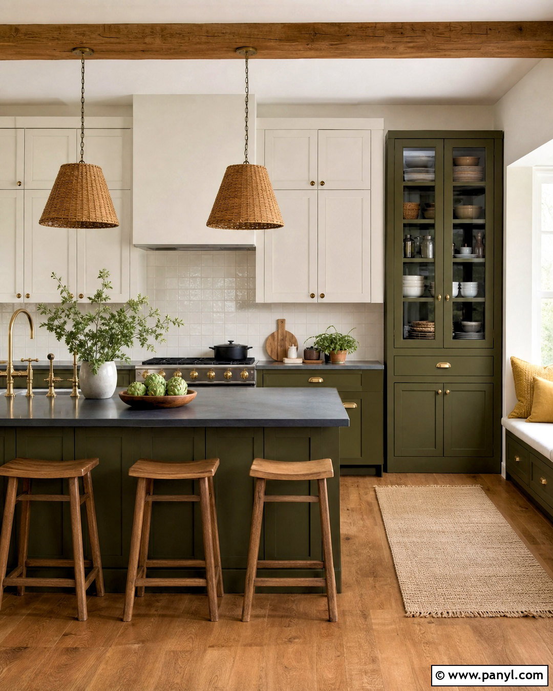
Bancha offers the richness of olive green without making a kitchen feel overly formal. Use it on base cabinets and a large island, pairing it with School House White walls and upper cabinetry. Paint a breakfast nook or tall pantry in Jitney to introduce a warm, earthy neutral. India Yellow can appear on dining chair cushions, striped Roman shades, or a small painted stool. Finish the kitchen with soapstone counters, handmade cream backsplash tile, and medium-toned oak flooring. Antique brass cabinet pulls strengthen the traditional character, while simple globe pendants keep the room current. Terracotta pots and woven baskets add texture. Together, these colors create a grounded kitchen that feels sunny and natural, even when the room receives limited direct daylight.
9. Blue Gray Farrow And Ball Palette
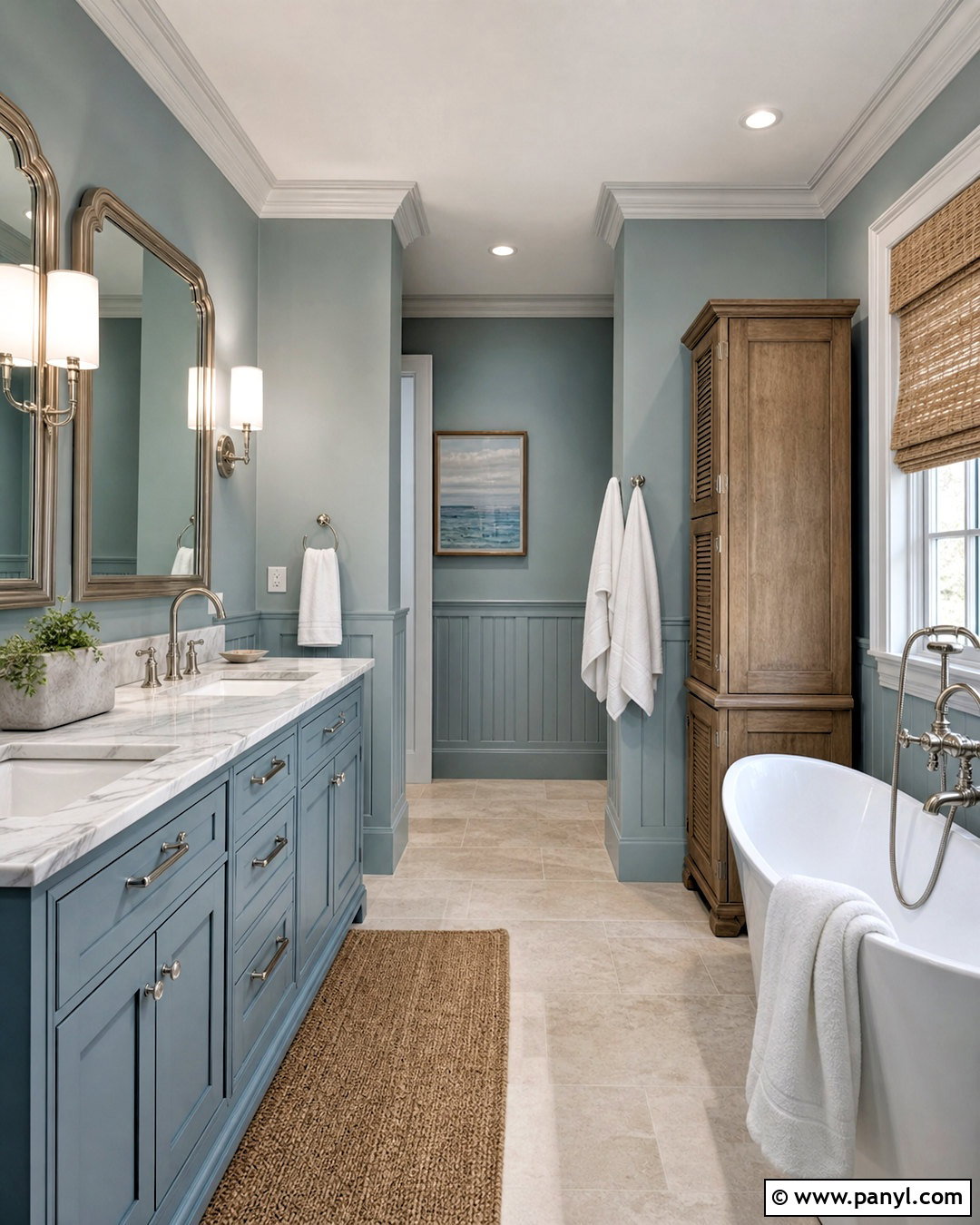
Blue Gray gives a bathroom a peaceful coastal feeling without relying on obvious nautical decoration. Paint the walls in this muted blue-green-gray, then use Slipper Satin across the ceiling and trim. A double vanity in Light Blue adds a cooler, slightly brighter layer while maintaining a tonal appearance. Tanner’s Brown can ground the room through a framed mirror, wooden stool, or painted linen cabinet. Choose honed white marble counters, brushed nickel fixtures, and pale gray limestone flooring. Waffle-textured white towels and a natural woven shade prevent the space from feeling too polished. If the bathroom has paneling, use Blue Gray above and Slipper Satin below. This balanced palette feels airy and relaxed, with enough dark contrast to define the pale surfaces and architectural details.
10. Calke Green Farrow And Ball Palette
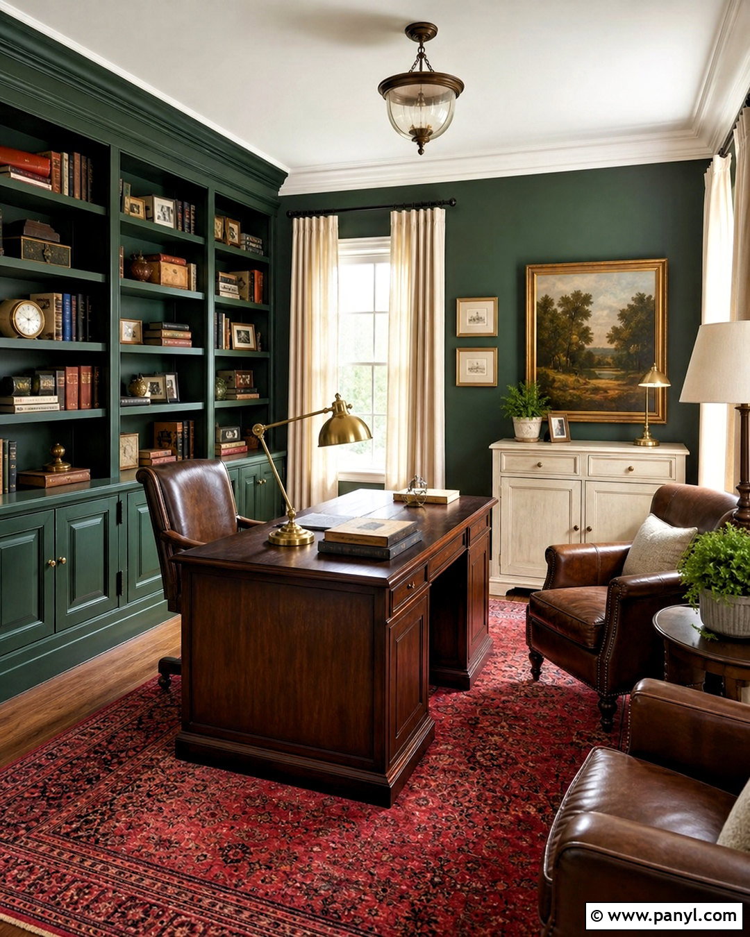
A traditional home office feels instantly established when Calke Green covers the walls, shelving, and trim. Use Lime White on the ceiling to bring soft warmth into the upper part of the room. An antique desk or storage cabinet painted in Old White introduces a faded, historic-looking neutral. Add Picture Gallery Red through a patterned rug, leather chair, framed artwork, or small upholstered footstool. Dark oak flooring and a substantial wood desk reinforce the room’s grounded character. Choose aged brass task lamps and cream linen curtains rather than bright white accessories. The complete look is colorful but controlled because every shade carries an earthy quality. This palette works particularly well with books, collected objects, and traditional millwork while remaining practical for a focused workspace.
11. Stiffkey Blue Farrow And Ball Palette
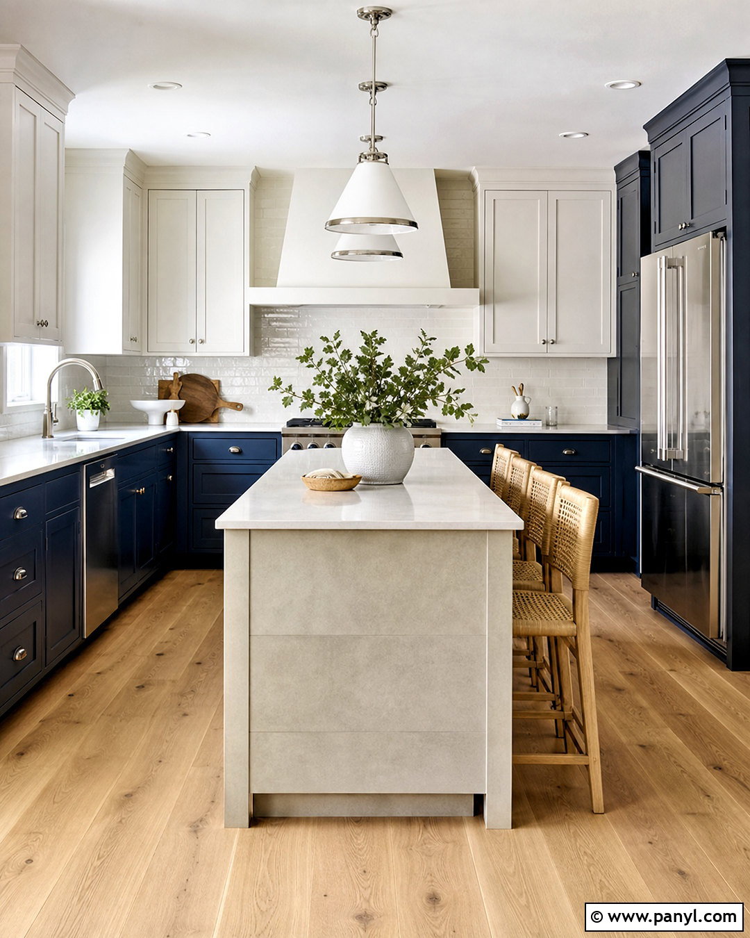
Stiffkey Blue cabinetry makes a compact kitchen feel intentional rather than simply small. Apply the deep navy to all lower cabinets and a tall pantry, then use Cornforth White on walls and upper cabinets. Purbeck Stone works well on an island or built-in bench, giving the room a stronger middle tone. Add Charlotte’s Locks as a concentrated burnt-orange accent on barstools, pendant shades, or a painted back door. Select white quartz counters, warm oak flooring, and polished nickel hardware to keep the space clear and bright. A backsplash of glossy off-white tile reflects light around the dark cabinetry. The orange should remain limited but visible from several angles. This creates a crisp, functional kitchen with a memorable contrast that still feels balanced.
12. Red Earth Farrow And Ball Palette
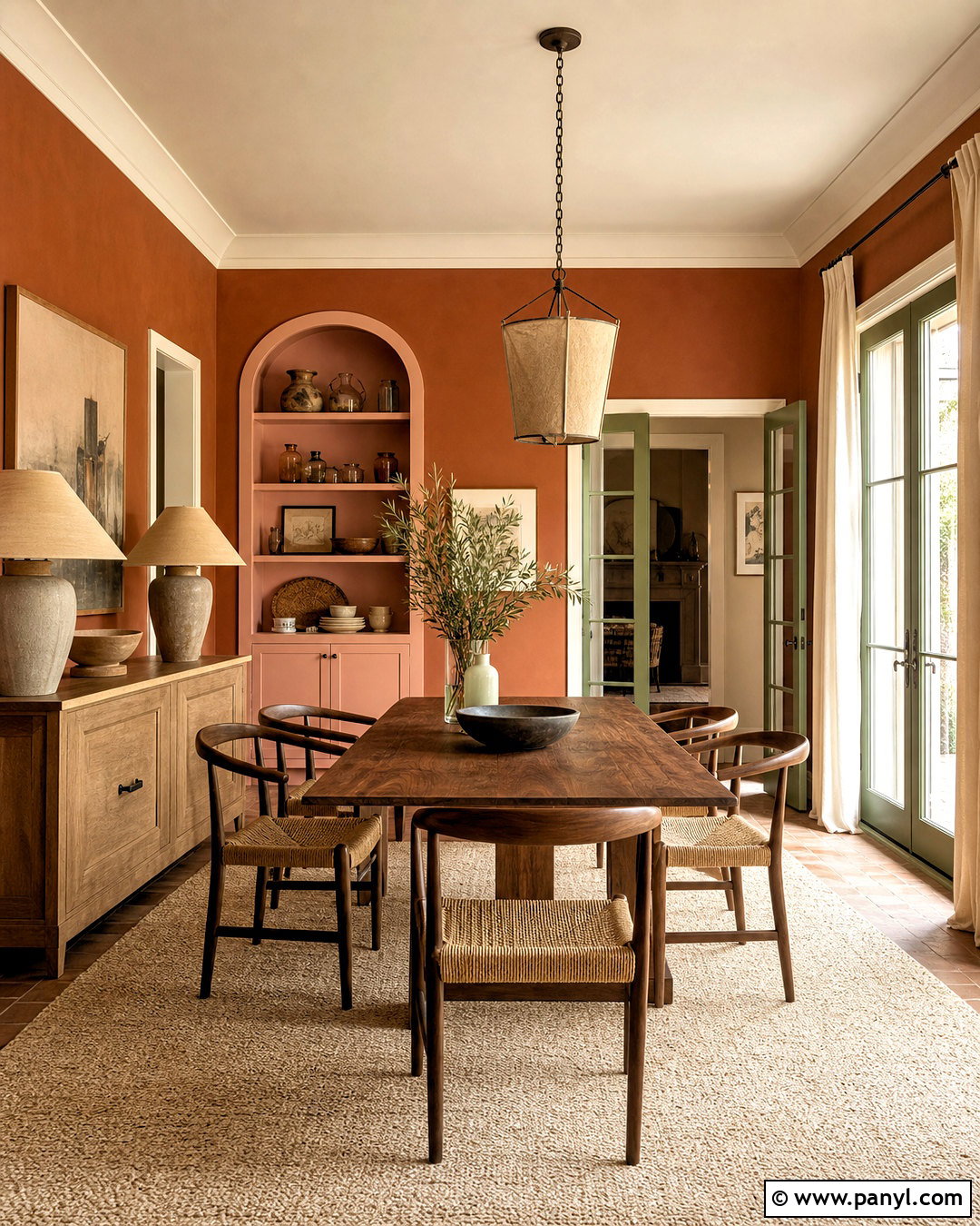
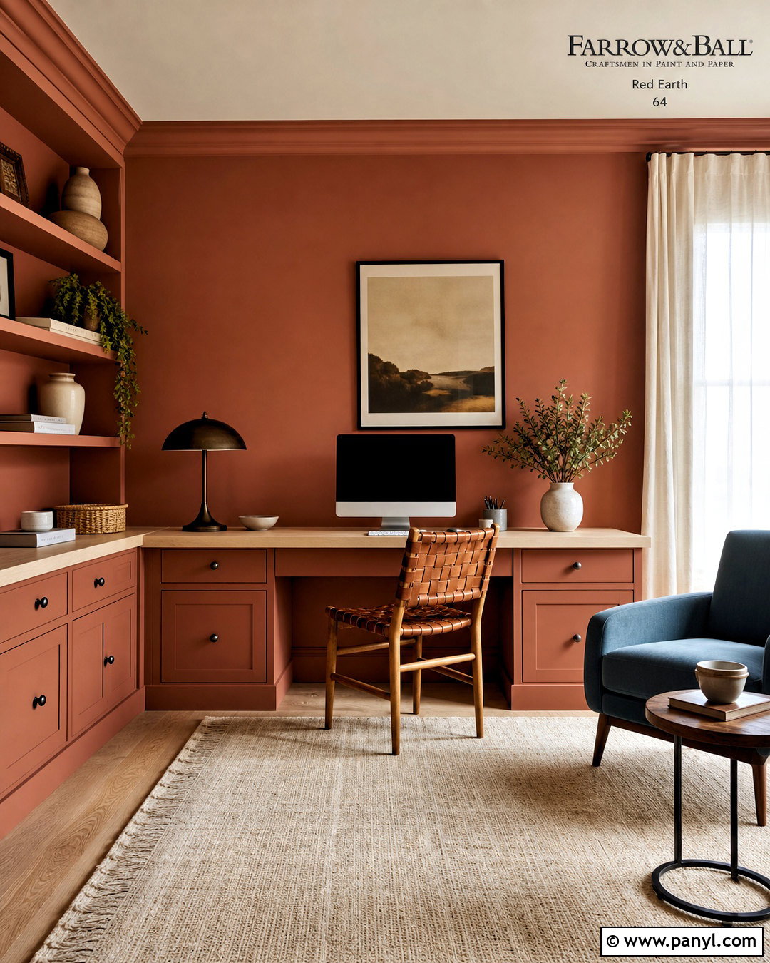
Sun-warmed Red Earth walls can give a dining room the relaxed beauty of natural terracotta. Paint the trim and ceiling in Dimity, whose warm tone blends smoothly with the reddish walls. Use Pink Ground inside a display cabinet or on the back wall of an adjoining alcove. Studio Green creates a dramatic anchor on French doors, a sideboard, or lower wall paneling. Furnish the room with a round walnut table, woven dining chairs, and a cream wool rug. Add linen curtains in soft beige and ceramic table lamps with earthy bases. Black accents are unnecessary because Studio Green supplies plenty of depth. The resulting palette feels warm and social, making it especially effective in a dining space used for casual meals and longer gatherings.
13. Parma Gray Farrow And Ball Palette
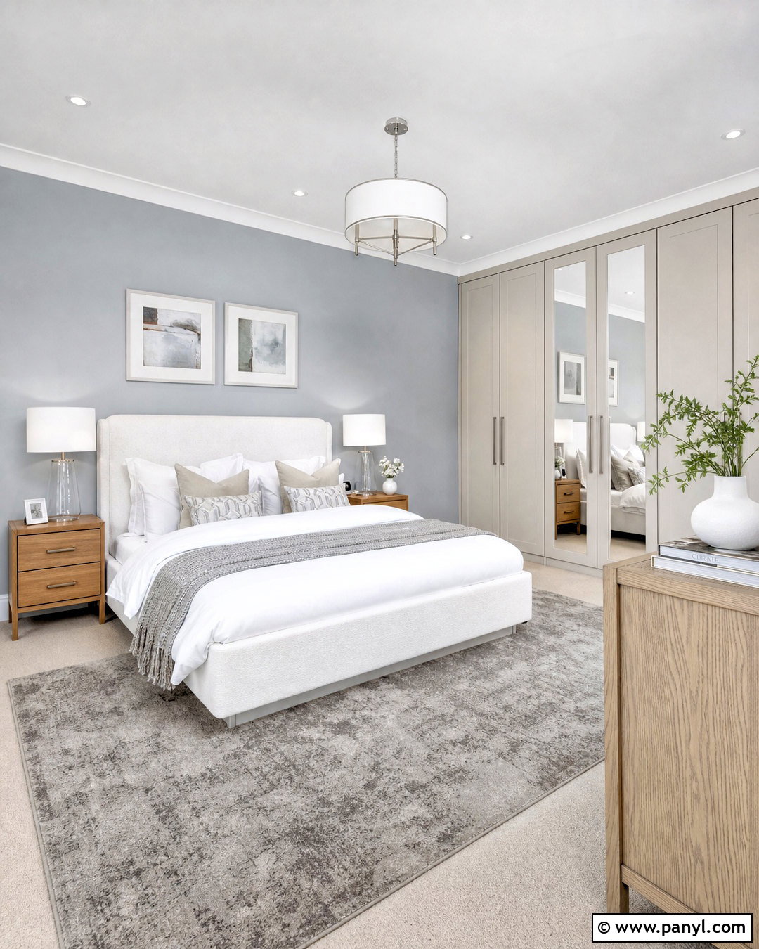
Despite its name, Parma Gray reads as a soft, cool blue and works beautifully in a light-filled bedroom. Use it across the walls, then paint the ceiling and trim in Cabbage White to reinforce its clean blue undertone. Borrowed Light can cover built-in wardrobes or a window seat, forming a delicate tonal layer. Add Railings on bedside tables, curtain rods, or a slim fireplace surround for crisp structure. Choose a white upholstered bed, pale oak furniture, and a silver-gray wool rug. Bedding in white, faded blue, and soft charcoal keeps the room calm. Avoid overly rustic accessories; streamlined lighting and simple ceramics suit this airy combination. The finished bedroom feels fresh and peaceful without looking cold or overly themed.
14. Card Room Green Farrow And Ball Palette
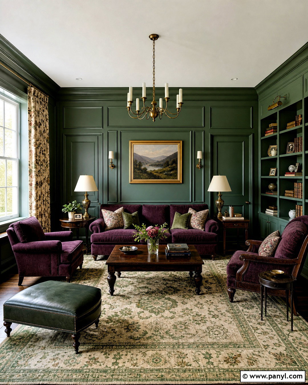
Card Room Green brings a dignified, muted color to a living room with traditional paneling. Use it on the walls and lower cabinetry, then paint the ceiling and cornices in Shadow White. Treron can deepen the fireplace wall, interior doors, or a pair of built-in bookcases. Introduce Brassica through a plum-toned sofa, patterned curtains, or two upholstered armchairs. Complete the arrangement with a dark wood coffee table, aged brass floor lamps, and a vintage-style rug containing green, cream, and muted purple. Neutral cushions keep the upholstery from dominating. Because the green shades have gray undertones, they sit comfortably beside natural stone and older timber. This complete scheme feels refined and layered while remaining relaxed enough for an everyday family room.
15. Babouche Farrow And Ball Palette
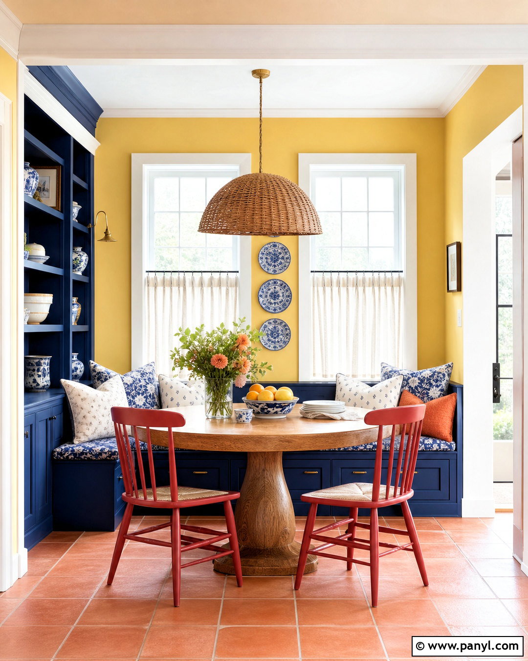
Bright Babouche turns a breakfast room into a cheerful space that feels energetic from the morning onward. Use the yellow across the walls, then add All White on the ceiling and trim for a sharp, clean edge. Paint built-in seating or a small dresser in Hague Blue to establish strong contrast. Red Earth can appear on chair frames, patterned cushions, or terracotta floor tiles. Choose a round oak table, woven pendant light, and simple café curtains in white linen. Keep decorative accessories minimal because the paint colors already provide plenty of personality. Blue-and-white ceramics can repeat the cooler accent without becoming thematic. The final room feels bold but livable, with natural wood and earthy red balancing the clear yellow and deep blue.
16. Preference Red Farrow And Ball Palette
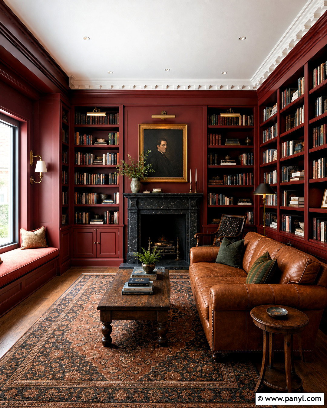
Preference Red creates a striking library or snug that feels comfortable rather than formal. Color-drench the walls, trim, and shelving in this deep red, allowing books and artwork to stand out against the saturated background. Paint the ceiling Joa’s White to introduce a warm neutral above. Dead Salmon can soften a window seat, interior cabinet, or adjacent hallway. Use Paean Black on the fireplace, doors, or a compact writing desk for depth. A caramel leather sofa, patterned wool rug, and walnut side tables complete the room. Add warm white lampshades and aged brass picture lights to distribute illumination evenly. This palette succeeds because its colors share warm, subdued qualities, producing a cozy space without relying on dark lighting or excessive traditional decoration.
17. Down Pipe Farrow And Ball Palette
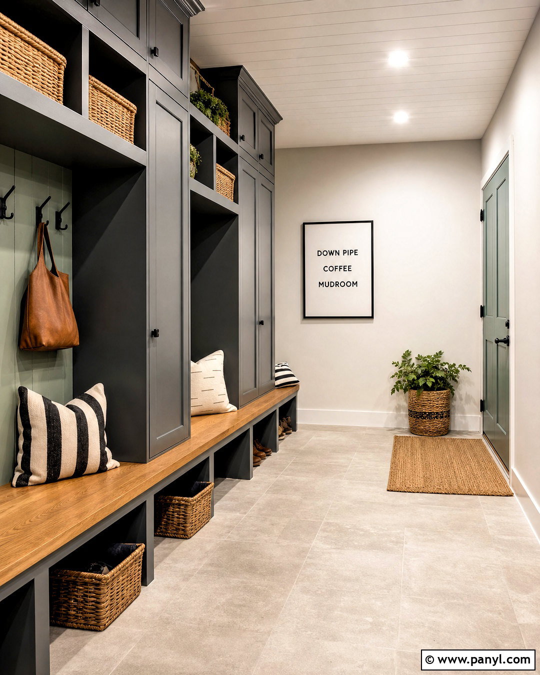
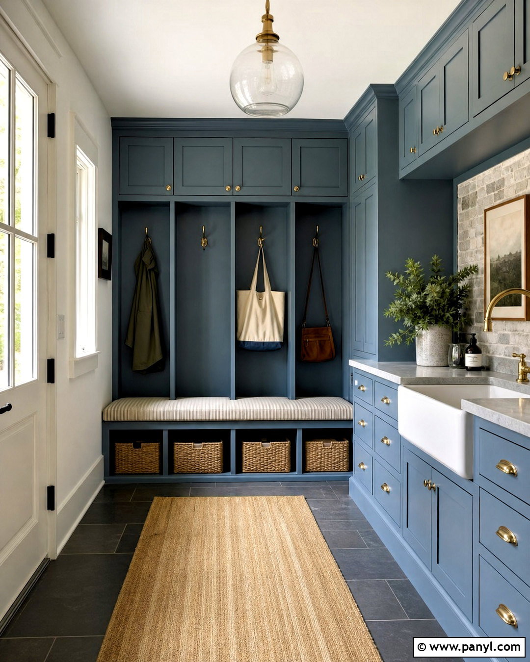
Dark gray can feel fresh when it is paired with bright white and one clear accent color. Use Down Pipe on mudroom cabinetry, built-in lockers, and an interior door. Paint the walls Dimpse and the ceiling Wevet to create a gradual shift from medium gray to delicate white. Arsenic provides a lively mint-green accent on a bench, storage cabinet interior, or utility sink base. Finish the space with pale gray floor tile, oak bench tops, matte black hooks, and woven storage baskets. Add durable striped cushions in charcoal and cream. The cabinetry supplies practical visual weight, while the green prevents the functional room from becoming dull. This complete palette works particularly well in busy entrances because it looks polished and can accommodate sturdy, easy-care materials.
18. Mizzle Farrow And Ball Palette
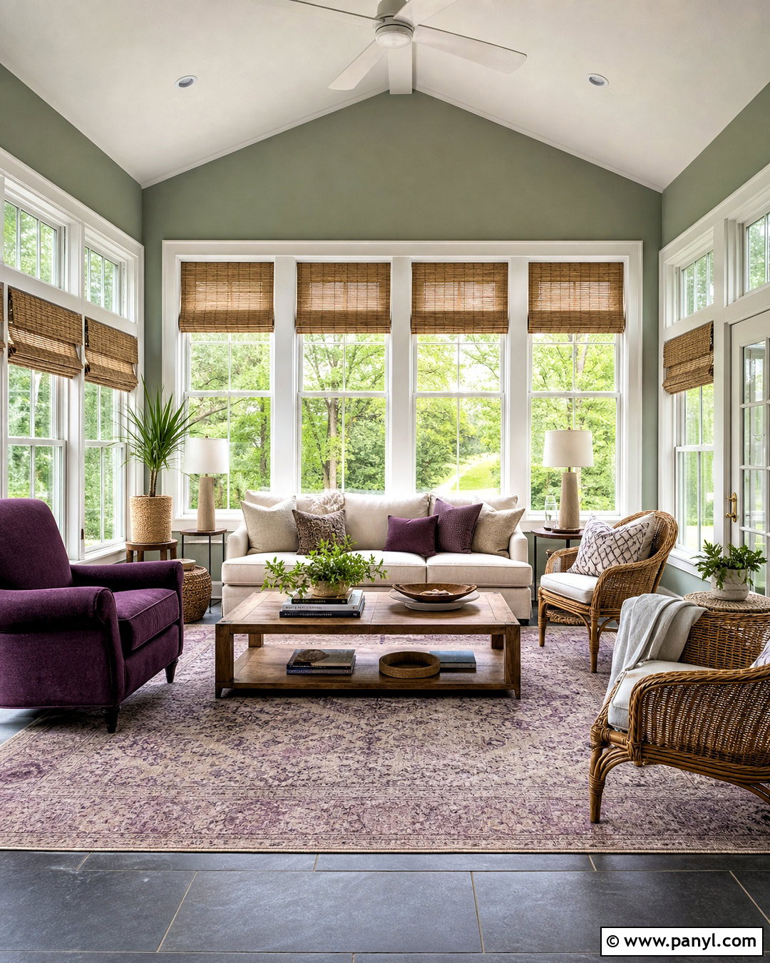
Mizzle wraps a sunroom in a misty green-gray that changes gently throughout the day. Apply it to the walls, then use James White on the ceiling, window frames, and French doors. Paint a storage cabinet or lower paneling in French Gray for deeper botanical color. Pelt can provide a sophisticated dark-purple note through an upholstered chair, ceramic lamp, or patterned rug. Arrange a pale linen sofa with rattan chairs and an oak coffee table to create a comfortable conversation area. Natural woven blinds filter strong light while supporting the garden-inspired palette. Use leafy plants sparingly so the space remains open. The combination connects beautifully with outdoor views, yet the purple and warm wood prevent the room from looking like a single wash of green.
19. Oval Room Blue Farrow And Ball Palette
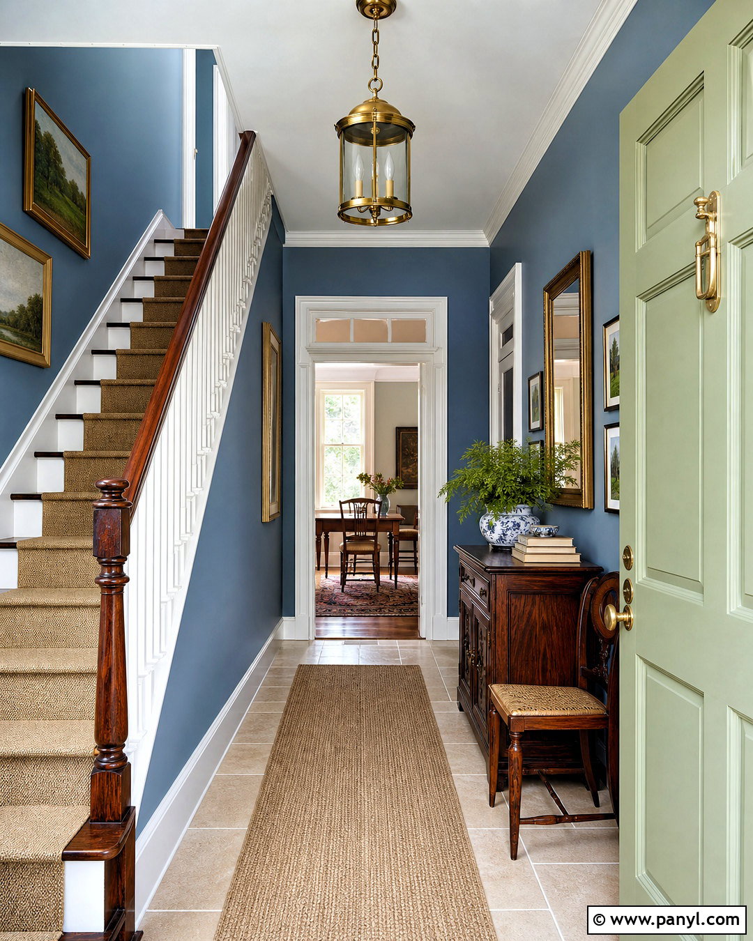
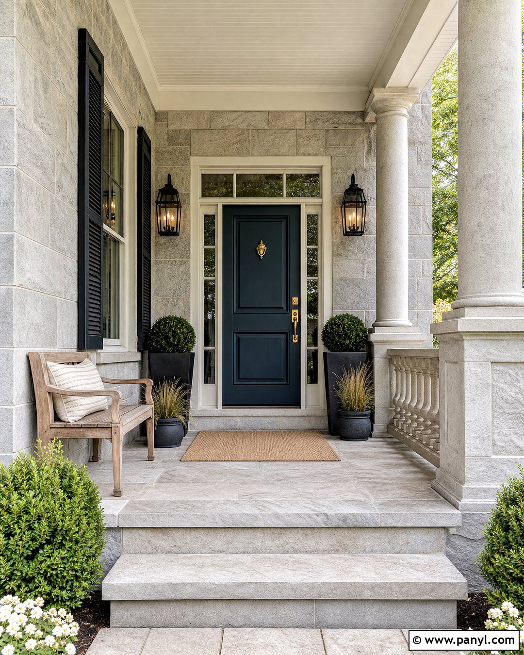
Oval Room Blue creates a welcoming entryway that feels colorful without becoming overpowering. Paint the walls in this muted blue, using Teresa’s Green on the inside of the front door or a nearby console. Pointing provides a warm white for ceilings, trim, and stair spindles. Ground the palette with Mahogany on the stair rail, interior doors, or a narrow storage cabinet. Choose limestone flooring, a vintage wood console, and a natural runner with blue and tan details. An aged brass pendant and framed landscape prints complement the traditional colors. Keep coats and shoes hidden in built-in storage so the painted surfaces remain visible. This complete entrance scheme establishes a calm, collected mood while handling the practical demands of a high-traffic area.
20. Dove Tale Farrow And Ball Palette
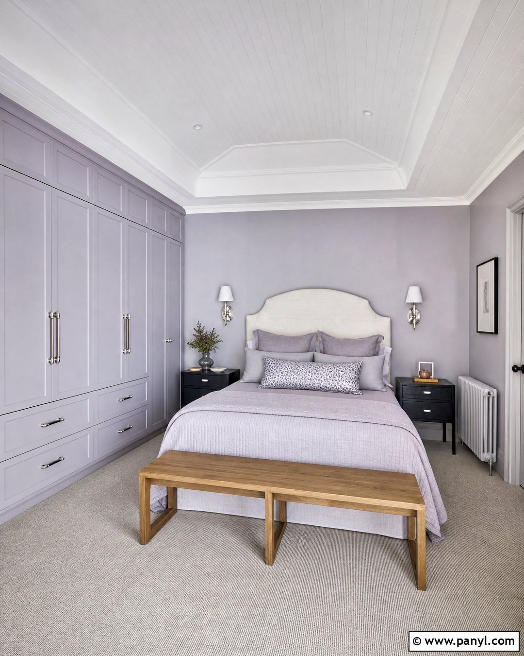
Dove Tale provides a soft gray-lilac base for a refined guest bedroom. Use it on the walls, then paint the ceiling and trim in Wevet for a light, uncomplicated finish. Calluna can define built-in wardrobes or the wall behind the bed with a cooler lavender tone. Add Paean Black through bedside tables, curtain hardware, and a small writing desk. Furnish the room with an ivory upholstered headboard, mushroom-colored carpet, and bedding in white, lavender-gray, and muted plum. Brushed nickel sconces keep the palette cooler, while a medium oak bench adds necessary warmth. Avoid filling the space with floral motifs. Simple stripes, solid linens, and abstract artwork create a more modern room that still feels gentle, restful, and welcoming to guests.
Conclusion:
The best 20 Farrow and Ball paint colour palettes combine more than attractive shades. They consider the room’s light, architectural details, furniture, flooring, textiles, and intended mood. Begin with the color that will cover the largest area, then test supporting shades beside it at different times of day. Warm whites usually soften earthy reds and browns, while cooler whites sharpen blue and gray schemes. Dark colors can define cabinetry, doors, fireplaces, or trim without taking over the entire room. Most importantly, repeat each key color at least twice through paint, fabric, furniture, or decor. This creates a connected design that feels considered, comfortable, and easy to live with.

Related Ideas and Inspiration:
Leave a Reply