
Choosing yourself can be a quiet daily practice, and your phone background is a simple place to reinforce that message. These I Choose Me wallpaper ideas combine encouraging words with polished colors, meaningful imagery, and screen-friendly layouts. Some designs feel soft and restorative, while others communicate confidence through bold typography and saturated color. Each concept creates a complete wallpaper rather than placing random lettering over a generic background. You will find minimalist neutrals, dreamy landscapes, retro patterns, botanical artwork, dark-mode options, and expressive collage compositions. Every layout can also be adjusted for a phone, tablet, or desktop screen. Explore the following 25 I Choose Me wallpaper ideas to find a visual reminder that reflects your personality and current season.
1. Minimalist I Choose Me Wallpaper

A warm cream background gives this minimalist wallpaper a calm, uncluttered appearance. Place “I Choose Me” slightly below the center in thin black serif lettering, leaving generous open space around the clock and widgets. A tiny hand-drawn heart beneath the phrase adds warmth without making the design feel overly decorative. Use a subtle paper texture rather than a completely flat background to create a refined, tactile finish. The restrained palette works especially well with neutral app icons in beige, black, or soft brown. For a matching home screen, remove the words and retain the cream texture and small heart. Together, the two screens create a cohesive setup that feels peaceful, intentional, and easy to view throughout the day.
2. Pink Floral I Choose Me Wallpaper
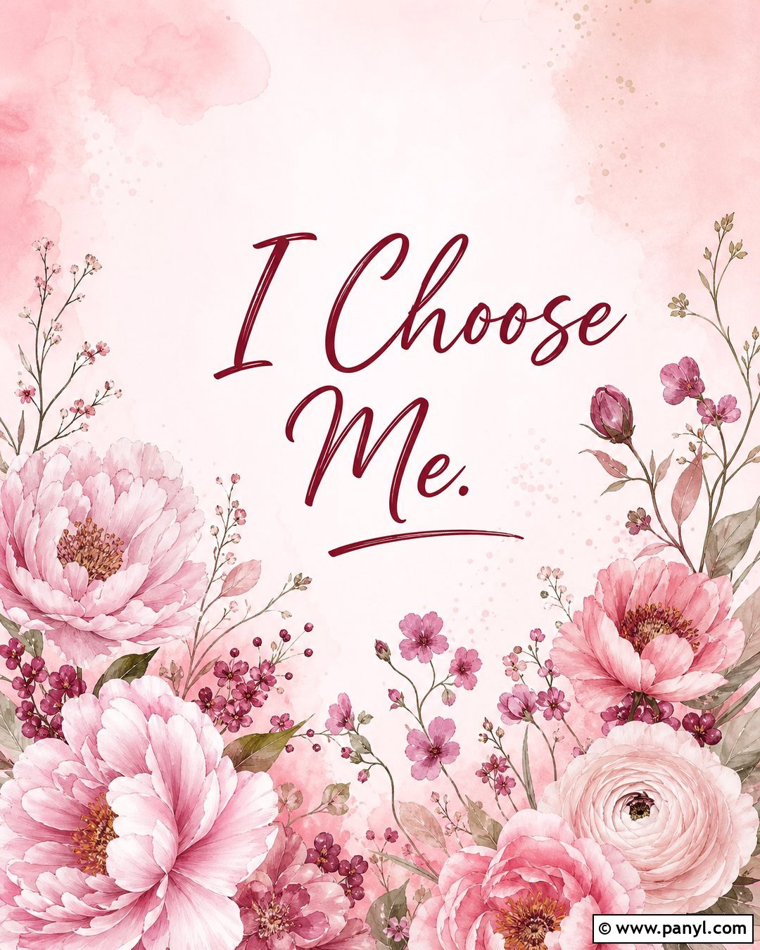
Soft pink flowers can make the affirmation feel nurturing while still creating a polished phone background. Start with a pale blush base and arrange watercolor peonies, ranunculus, and small wildflowers around the lower corners. Keep the upper portion airy so the clock remains clear. Center “I Choose Me” in deep berry-red script, using large lettering that remains legible without overpowering the flowers. A few loose petals drifting upward connect the floral border to the typography. Add a faint rose-colored glow behind the words for gentle contrast. This complete design works beautifully with blush widgets, cream icons, and a matching floral home screen. The final wallpaper should feel romantic and encouraging rather than crowded, overly sweet, or visually complicated.
3. Black And White I Choose Me Wallpaper
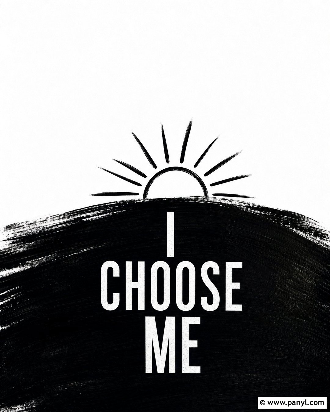
For a confident and timeless look, build the entire wallpaper around strong black-and-white contrast. Use a clean white background with a sweeping black shape crossing the lower third, almost like a broad painted brushstroke. Set “I Choose Me” in bold uppercase white letters inside that dark area. A smaller black line drawing of a rising sun can sit above the phrase, adding meaning while maintaining the monochrome palette. Leave the upper third mostly white for lock-screen information. Pair the wallpaper with simple black icons, a compact calendar widget, and minimal notification previews. The finished composition feels direct and decisive, making it a strong choice for anyone who prefers modern graphics over flowers, pastels, or highly detailed illustrations.
4. Sunset I Choose Me Wallpaper

Imagine a wide sunset fading from golden peach near the horizon into coral pink and soft violet overhead. Place a dark silhouette of rolling hills along the bottom to ground the composition. The phrase “I Choose Me” can appear just above the horizon in clean cream-colored lettering, where the glow naturally highlights it. Keep clouds soft and minimal rather than filling every part of the sky. This allows the phone clock to remain readable against the lavender upper section. A matching home-screen version can use the same sunset without typography, creating room for app icons. Warm, luminous, and hopeful, this wallpaper represents moving forward with greater clarity. It offers emotional impact without relying on a complicated collage or heavily decorative lettering.
5. Sage Green I Choose Me Wallpaper
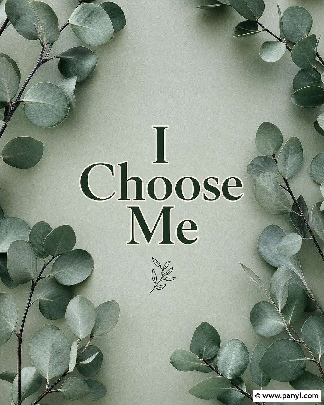
Muted sage green creates a grounded background that feels refreshing without appearing too bright. Add delicate eucalyptus branches around the outer edges, using dusty green leaves and thin charcoal stems. The center should remain open, with “I Choose Me” displayed in a slightly darker forest-green serif font. A narrow cream shadow behind the letters improves visibility while keeping the palette soft. Place a small crescent moon or simple botanical symbol below the words to finish the balanced layout. Pair this lock screen with cream widgets and matching sage app icons for a coordinated phone theme. The restrained botanical design feels natural and comforting. It suits anyone who wants an affirmation wallpaper that looks mature, calm, and decorative without becoming overly colorful or visually busy.
6. Blue Sky I Choose Me Wallpaper

A bright blue sky offers an uplifting setting for a self-prioritizing message. Use a clear cyan-to-pale-blue gradient with soft white clouds clustered near the bottom and along one side. Keep the center and upper third relatively open so screen details remain easy to see. Write “I Choose Me” in crisp white lettering with a subtle navy-blue outline. Small sun rays emerging from behind one cloud can add energy without distracting from the words. For the home screen, continue the sky across the background but reduce cloud detail behind the icons. The full design should feel light, optimistic, and spacious, like a visual breath between daily tasks. It is especially effective for someone who prefers cheerful colors and simple natural imagery over darker affirmation backgrounds.
7. Cosmic I Choose Me Wallpaper

Deep navy, violet, and midnight blue create an atmospheric cosmic wallpaper with a quietly powerful mood. Build a glowing galaxy across the lower half, using scattered stars, soft nebula clouds, and touches of electric blue. Place “I Choose Me” in luminous silver-white letters near the center, surrounded by a restrained halo rather than excessive sparkle. A small orbit line can curve around one word to connect the typography with the celestial theme. Keep the top area darker and less detailed so white clock numbers remain visible. Coordinated navy widgets and silver app icons complete the screen setup. This wallpaper presents self-choice as something expansive and personal. The final composition feels mysterious and empowering while remaining polished enough for everyday use.
8. Retro I Choose Me Wallpaper
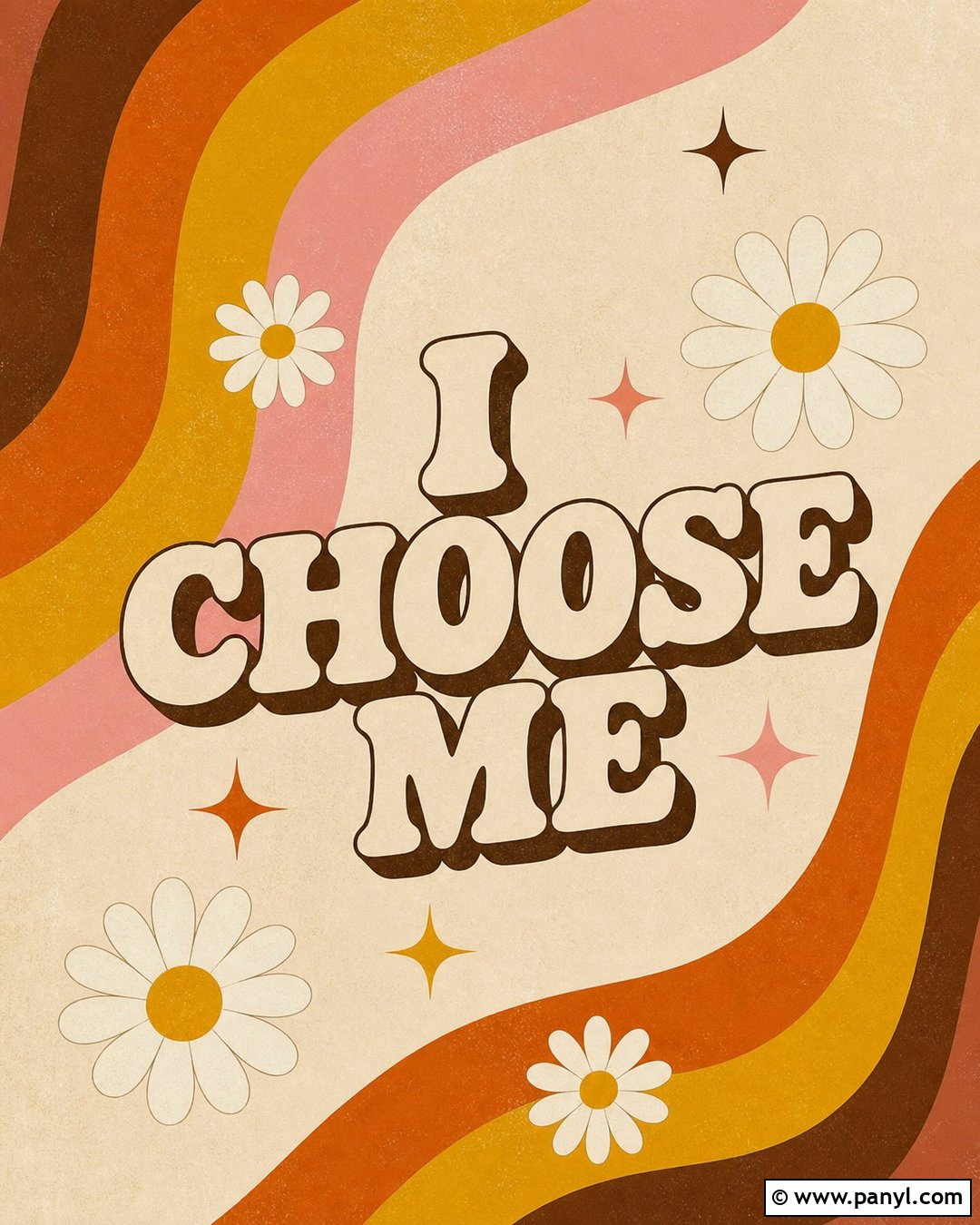
Create a playful retro wallpaper with wavy stripes in burnt orange, mustard yellow, cream, dusty pink, and chocolate brown. The stripes can rise from the bottom corners and curve toward the center, forming a natural frame around the affirmation. Use a chunky cream-colored font for “I Choose Me,” adding a dark brown drop shadow for a dimensional 1970s effect. Keep the upper center relatively plain, using a muted peach section behind the clock. Small daisies or starburst symbols can fill two corners without covering the primary lettering. Matching brown and orange widgets make the theme feel complete. This wallpaper is energetic and nostalgic, giving the personal message a fun visual personality instead of a serious or overly delicate presentation.
9. Marble I Choose Me Wallpaper
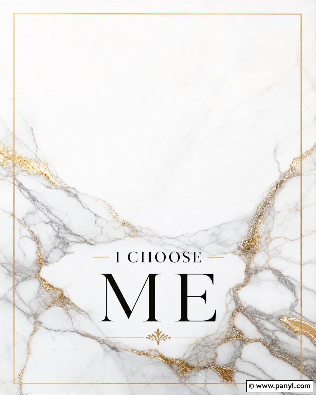
A white marble background with subtle gray veining creates a clean, elevated foundation for this affirmation wallpaper. Add fine metallic-gold lines that follow selected veins, giving the design a luxurious accent without covering the screen in glitter. Place “I Choose Me” in elegant black serif lettering across the lower middle. A thin gold rectangular frame can surround the phrase, helping it become the clear focal point. Keep the upper section mostly white for excellent contrast with dark lock-screen information. Choose simple black, white, and gold widgets to continue the refined palette. The finished design should resemble a polished editorial cover rather than a busy stone pattern. It offers a sophisticated option for anyone who wants their encouraging wallpaper to feel timeless, structured, and quietly confident.
10. Ocean I Choose Me Wallpaper

Clear turquoise water and soft rolling waves create a refreshing wallpaper centered on personal renewal. Show the ocean from a slightly elevated viewpoint, with white foam sweeping diagonally across the lower half and deeper blue water filling the top. Place “I Choose Me” over a calm section of water in large white sans-serif lettering. A faint teal shadow keeps the words visible without making them look pasted onto the scene. Avoid adding boats, buildings, or crowded beach details that compete with the affirmation. Use translucent blue widgets and simple white icons for the accompanying home screen. The complete wallpaper feels clean, open, and restorative. It can serve as a visual reminder to protect your peace and return to your own priorities.
11. Mountain I Choose Me Wallpaper

Layered mountains give the phrase a strong visual foundation while representing steady progress. Use muted peaks in slate blue, dusty lavender, and soft gray, placing the darkest range at the bottom and the lightest mountains near the horizon. A pale morning sky should fill the upper half, leaving enough open space for the clock. Set “I Choose Me” in dark navy lettering just above the nearest mountain ridge. Add a small golden sun rising behind the distant peaks to create warmth and direction. For a coordinated screen, select minimalist icons in navy, gray, and muted gold. This finished wallpaper feels determined yet peaceful. It delivers an encouraging message through a realistic landscape instead of relying entirely on decorative typography, patterns, or symbolic illustrations.
12. Butterfly I Choose Me Wallpaper
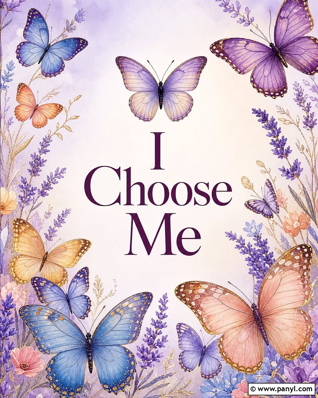
A butterfly theme can communicate personal change while maintaining a delicate, modern appearance. Begin with a pale lilac background that gradually fades into warm cream near the center. Arrange several detailed butterflies in lavender, soft blue, peach, and muted gold around the edges, leaving the middle uncluttered. Place “I Choose Me” in deep plum serif lettering, with the words stacked for a compact, balanced composition. One butterfly can appear just above the phrase as the primary focal accent. Avoid using too many tiny insects, which could make the screen feel scattered behind notifications. Plum widgets and cream app icons complete the look. The resulting wallpaper feels graceful and hopeful, offering a thoughtful alternative to heavily floral self-love graphics.
13. Chrome I Choose Me Wallpaper

A chrome-inspired wallpaper brings a futuristic edge to the affirmation. Use a smooth gradient background shifting from icy blue to pale lavender and cool silver. Place “I Choose Me” in large, rounded metallic letters with realistic reflective highlights and a subtle three-dimensional finish. Position the typography in the lower middle so the clock has a clean area above it. Add two or three liquid-metal shapes around the bottom corners, keeping them separated from the words. Pale blue reflections should connect every element into one coherent design. Pair the wallpaper with transparent widgets and silver or white icons for a sleek home screen. The finished look feels bold, polished, and current, making the personal message appear energetic rather than soft or traditionally sentimental.
14. Self Love Collage I Choose Me Wallpaper
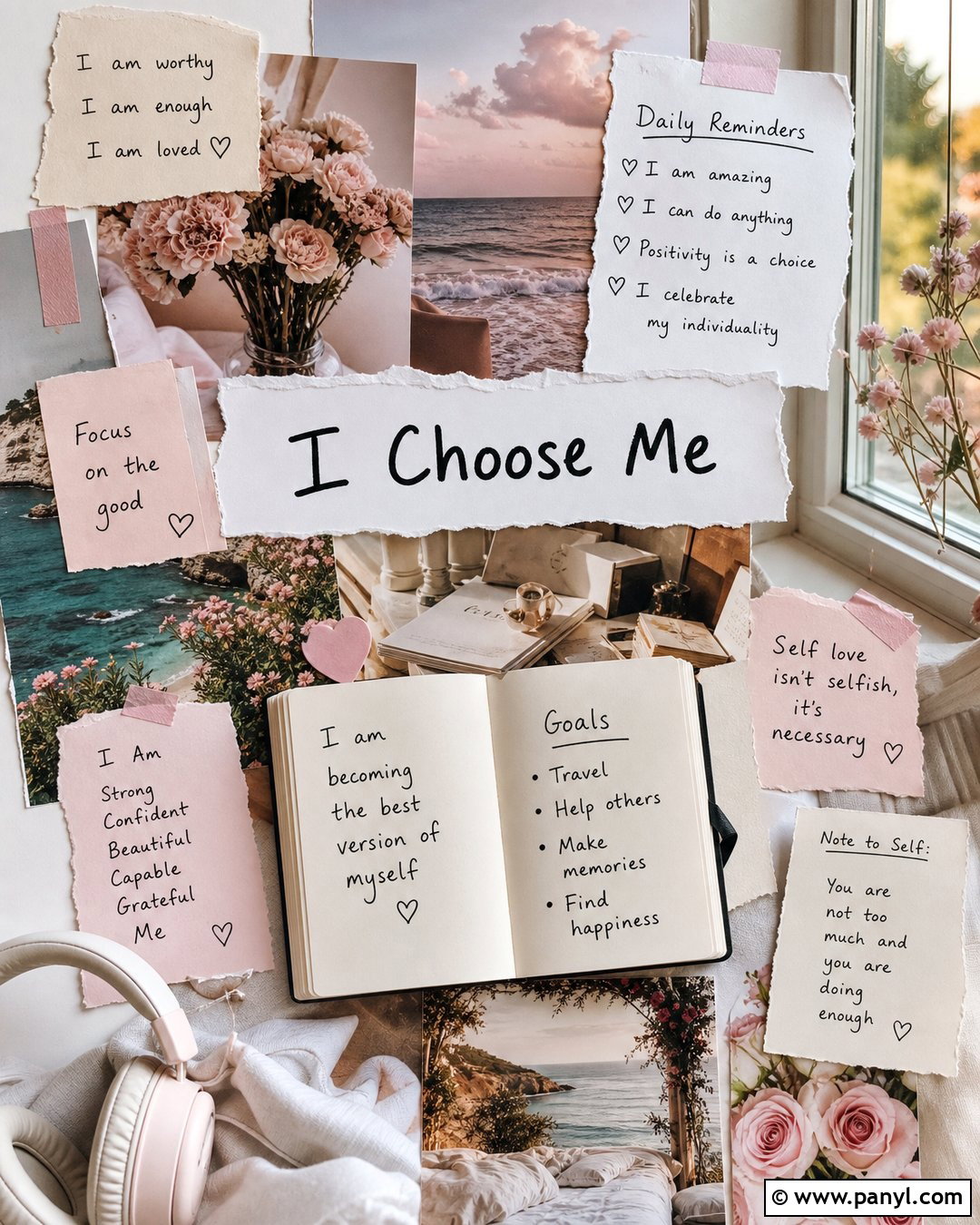
Build a personal collage using coordinated images that represent rest, growth, creativity, and independence. Combine torn cream paper, pink flowers, an open journal, a sunny window, headphones, and a peaceful ocean photograph on a warm beige base. Position “I Choose Me” on a central white paper strip in handwritten black lettering. Use small pieces of muted pink tape to make the composition feel assembled by hand. Keep the upper center less detailed so the lock-screen clock does not cover important imagery. A matching home screen can use the same paper textures with fewer photographs. The completed wallpaper feels expressive and personal, like a compact vision board. Every image supports the central affirmation instead of functioning as random decoration.
15. Red I Choose Me Wallpaper

Bright red gives this wallpaper an unapologetic, high-energy presence. Use a saturated cherry-red background with a slightly darker radial gradient around the edges. Set “I Choose Me” in oversized cream uppercase letters, stacking each word so the message fills the lower two-thirds of the screen. Add a thin black shadow to make the typography feel bold and graphic. The upper section should remain mostly solid red, keeping the clock clean and visible. A small cream star or heart beneath the final word can soften the composition without weakening its impact. Black widgets and cream app icons create a coordinated home screen. This complete design works for anyone who wants the affirmation to feel decisive, fearless, and impossible to overlook during a busy day.
16. Watercolor I Choose Me Wallpaper
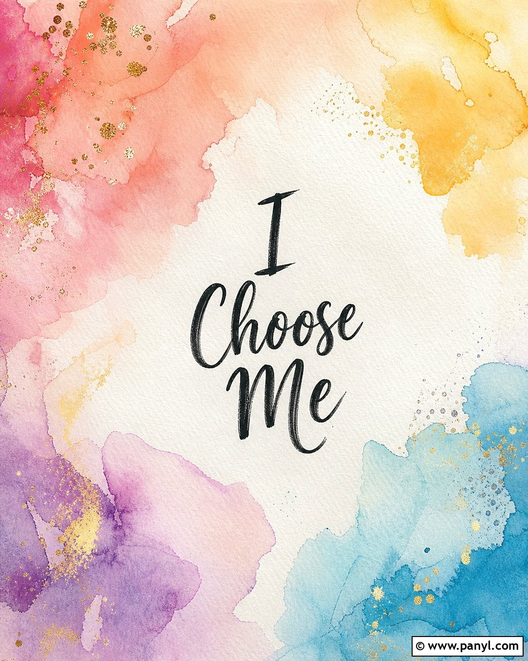
Soft watercolor washes create an artistic background that feels expressive without becoming distracting. Blend peach, coral, pale yellow, lavender, and sky blue across an off-white paper texture. Allow the colors to overlap naturally while leaving lighter areas around the clock and central lettering. Write “I Choose Me” in a relaxed charcoal brush script, positioning it slightly below the midpoint. Fine gold speckles can appear near the painted edges, but they should remain subtle and evenly spaced. For the accompanying home screen, use the same watercolor pattern with reduced saturation behind app icons. The completed design feels handmade, optimistic, and emotionally warm. It offers more color than a minimalist wallpaper while still maintaining enough negative space for practical daily use.
17. Dark Mode I Choose Me Wallpaper
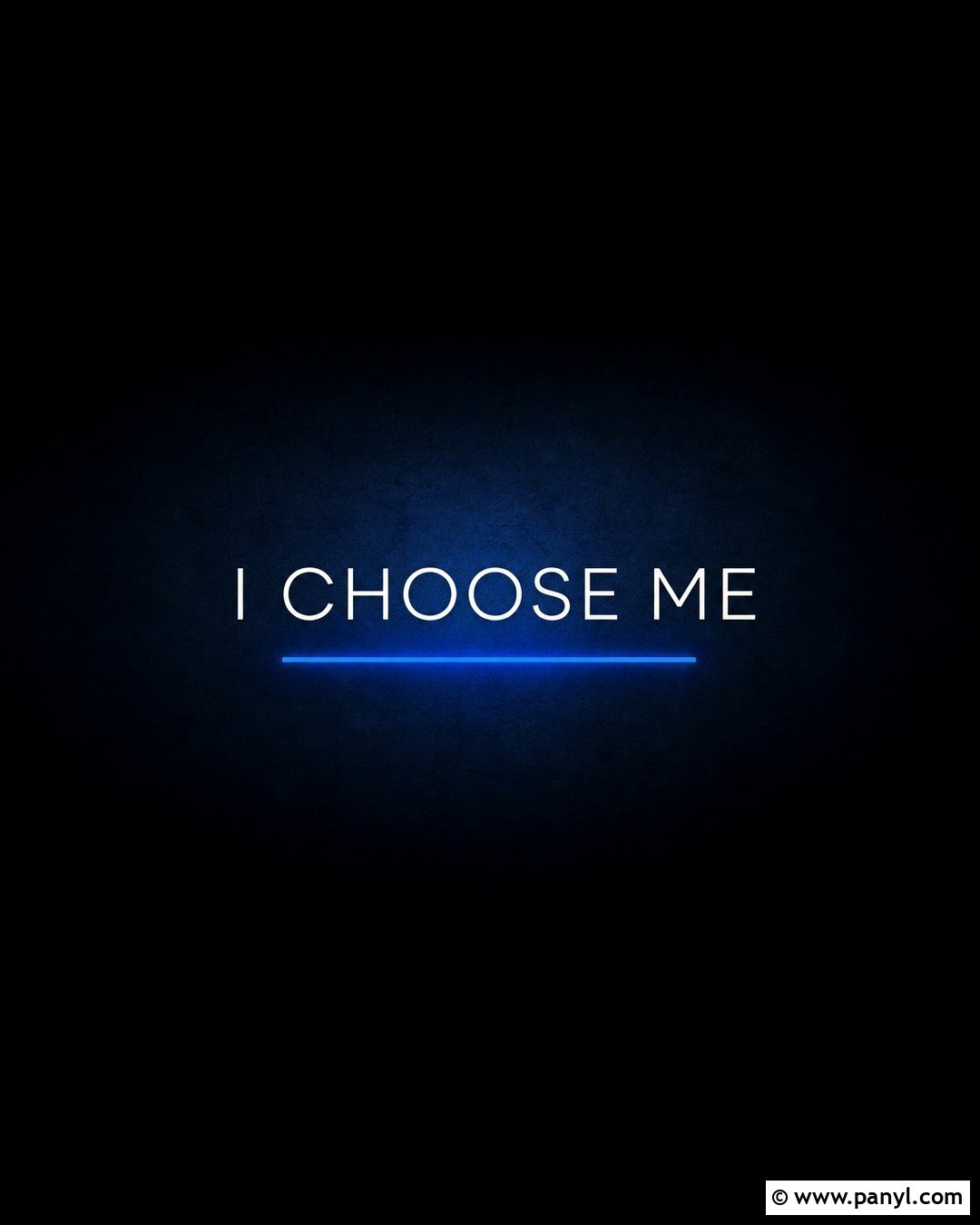
A near-black background creates an elegant wallpaper that works especially well for someone who prefers a darker screen. Add a subtle charcoal gradient and a soft midnight-blue glow behind the central typography. Display “I Choose Me” in thin white uppercase letters with wide spacing, keeping the phrase crisp and modern. A single electric-blue line can underline the words and provide a restrained pop of color. Leave the upper half nearly solid black so lock-screen elements remain easy to read. Coordinate the wallpaper with dark widgets and black app icons outlined in blue or white. The finished composition feels focused and sophisticated rather than gloomy. It keeps the affirmation visible while avoiding bright colors, detailed scenery, and decorative elements that might compete with notifications.
18. Boho I Choose Me Wallpaper
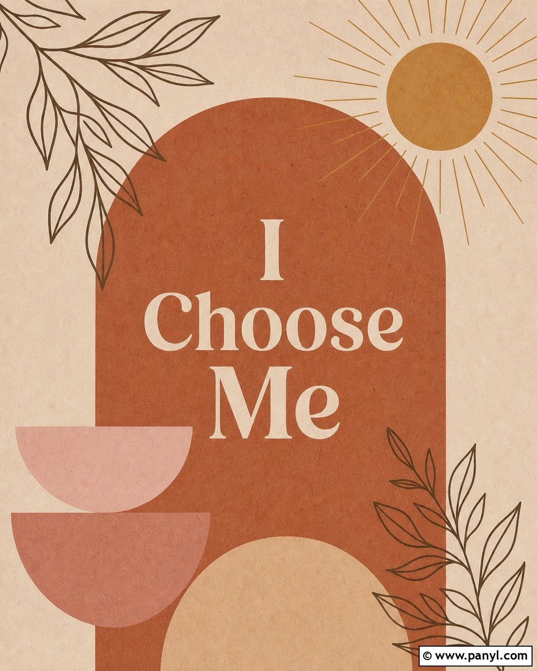
Warm earth tones create a relaxed boho wallpaper with plenty of visual character. Use a sandy beige background with a large terracotta arch rising from the bottom. Add a muted mustard sun, dusty rose semicircles, and thin brown botanical line art around the arch. Place “I Choose Me” in cream serif lettering inside the central terracotta shape. A few subtle paper-grain details keep the flat colors from looking overly digital. The top should stay mostly beige, allowing the clock and widgets to remain clear. Complete the phone theme with terracotta icons and rounded cream widgets. This balanced design feels warm, grounded, and artistic. It delivers the affirmation through a coordinated arrangement of organic shapes rather than scattered bohemian symbols or an overly busy pattern.
19. Y2K I Choose Me Wallpaper

For a playful early-digital look, combine bubblegum pink, icy blue, lavender, and glossy silver details. Use a soft pink gradient as the base, then add translucent stars, pixel hearts, and small chrome bubbles around the edges. Place “I Choose Me” in rounded white bubble lettering with a lavender shadow near the lower center. Keep the upper third simple enough for the lock-screen clock, using only a faint blue glow in that area. Glossy pastel widgets and silver app icons can extend the theme across the home screen. The complete wallpaper feels bright, youthful, and energetic without becoming visually chaotic. Limiting the number of symbols helps the affirmation remain prominent and prevents the nostalgic graphics from competing with everyday screen information.
20. Lavender I Choose Me Wallpaper
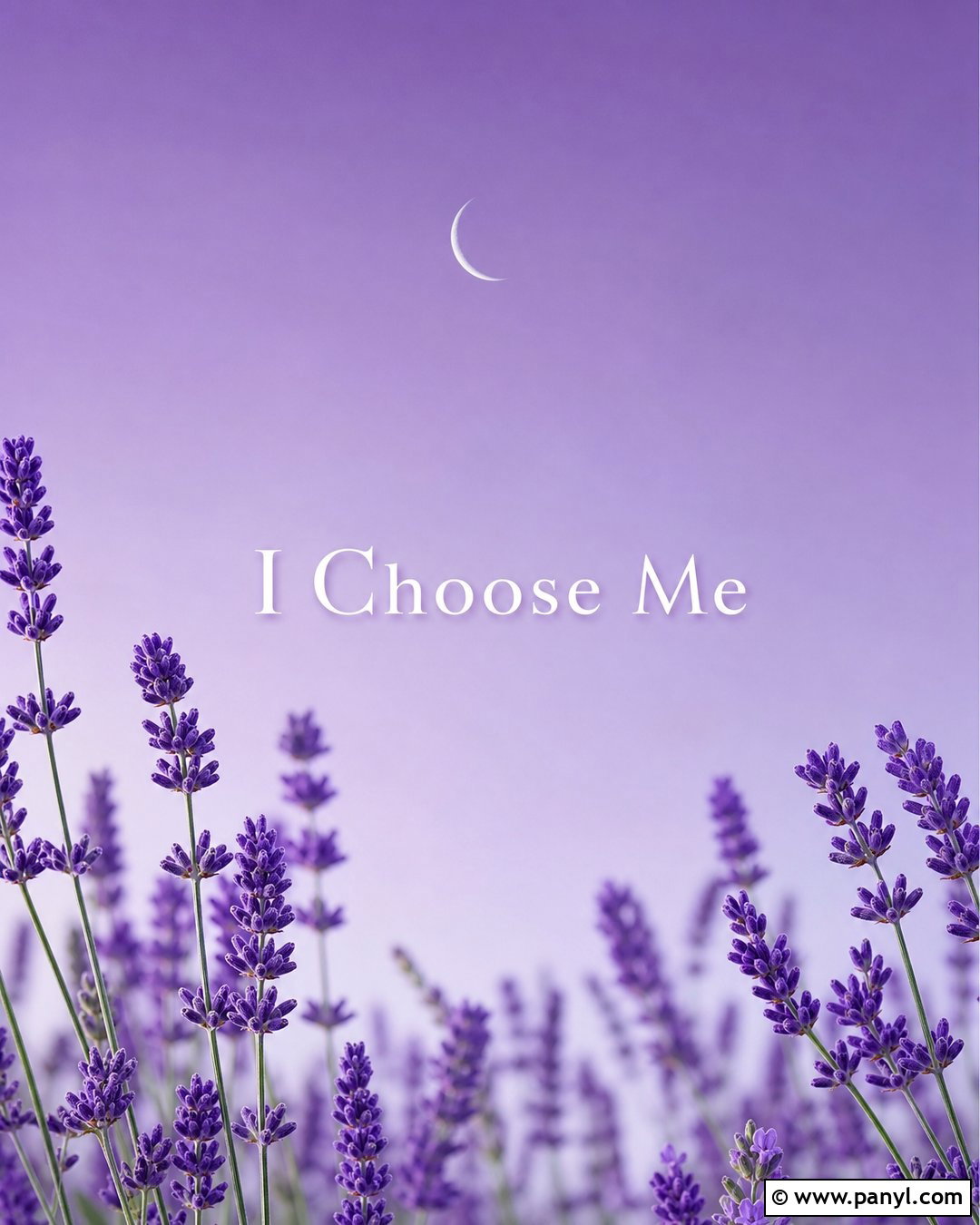
A lavender color palette gives this wallpaper a soothing appearance with enough color to feel distinctive. Begin with a soft purple gradient that becomes lighter toward the center. Frame the lower corners with realistic lavender sprigs, including muted green stems and tiny violet blossoms. Position “I Choose Me” in white serif lettering across the open center, adding a very soft plum shadow for clarity. A thin crescent moon above the phrase contributes a quiet, reflective detail. Leave the upper area free from flowers so the clock does not overlap the botanical artwork. Match the wallpaper with pale purple widgets and cream icons. The finished design feels calm, feminine, and carefully arranged, making it suitable for a peaceful lock screen that still communicates a confident personal boundary.
21. Gold I Choose Me Wallpaper

A warm golden design can make the affirmation feel celebratory without looking excessively glamorous. Use a deep honey-colored background with a subtle linen texture and slightly darker edges. Place “I Choose Me” in large cream serif lettering, surrounded by a thin metallic-gold oval frame. Add small sunburst lines at the top and bottom of the oval to create a balanced focal point. Keep the upper portion simple, allowing dark clock numbers to stand out against the golden base. Cream widgets and muted brass icons continue the palette on the home screen. This complete design has warmth, structure, and visual confidence. The limited range of colors prevents the metallic details from becoming distracting, while the framed message remains the unmistakable center of attention.
22. Sunrise I Choose Me Wallpaper

A soft sunrise over an open field creates a hopeful setting for this daily affirmation. Use a pale peach sky that transitions into warm yellow near the horizon, with light pink clouds stretching across the upper corners. Show a field of muted green grass and small cream wildflowers along the bottom. Place “I Choose Me” just above the rising sun in clear white lettering with a soft brown shadow. The central glow should naturally illuminate the phrase without washing it out. Keep the top center relatively open for the clock. Use pale green widgets and warm neutral icons to build a matching home screen. This complete landscape feels fresh and forward-looking, making it a gentle visual cue to begin each day with stronger personal intention.
23. City Lights I Choose Me Wallpaper

A modern city scene gives the message an independent, ambitious personality. Show a bright evening skyline in navy, violet, and electric blue, with illuminated windows and reflections across a calm river. Although the scene suggests nighttime, keep the overall image clear and luminous rather than dim. Place “I Choose Me” in bold white lettering above the buildings, where a smooth blue section of sky provides strong contrast. Avoid excessive signs, traffic, or tiny architectural details that could clutter the phone display. Dark blue widgets and white icons create a sleek matching layout. The completed wallpaper feels energetic and self-assured. It is a strong option for someone who connects personal growth with movement, new opportunities, and building an independent future.
24. Pressed Flower I Choose Me Wallpaper
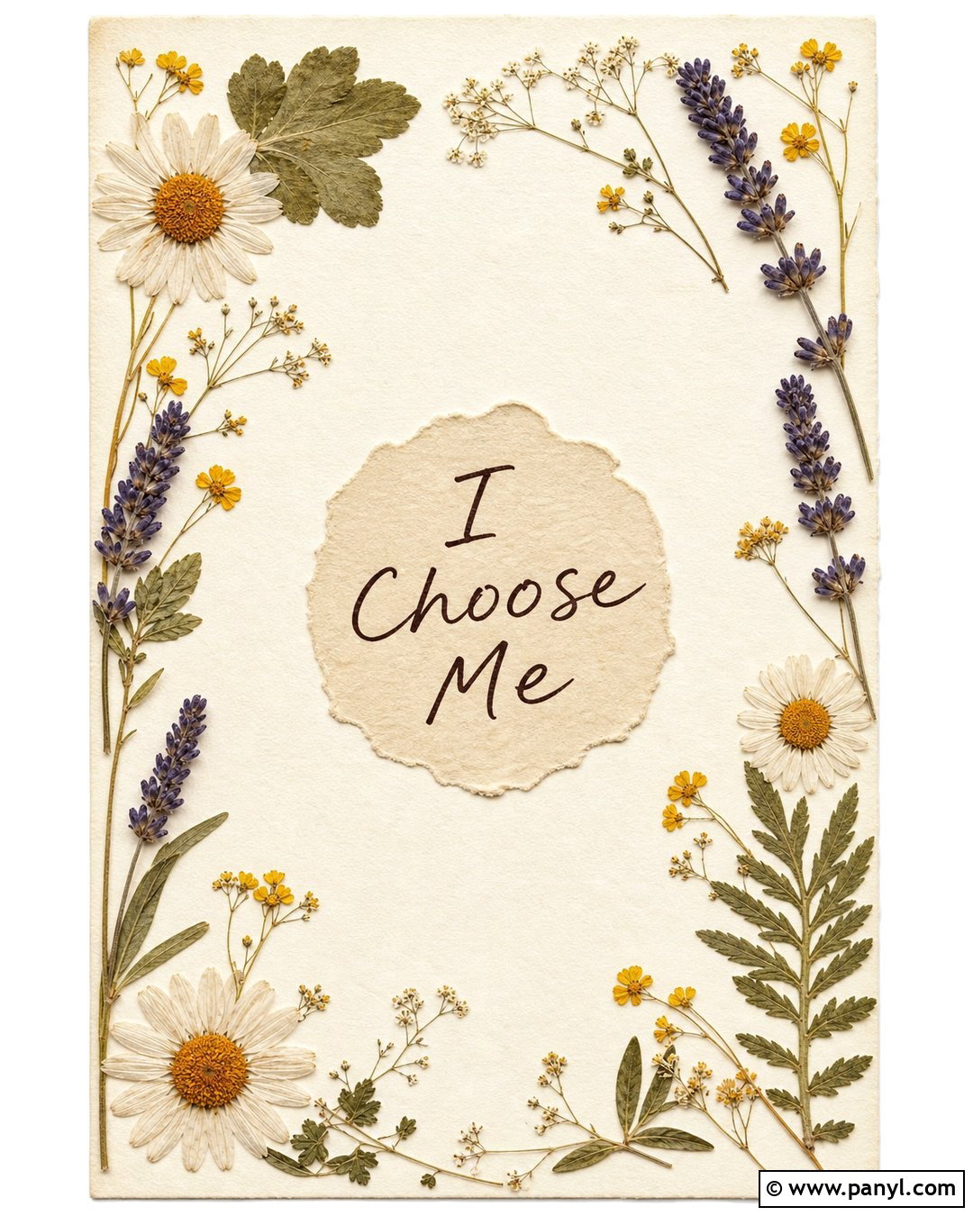
Pressed flowers create a delicate, handmade wallpaper with natural texture and subtle color. Use a warm ivory paper background covered by a loose border of flattened daisies, lavender sprigs, tiny yellow flowers, and muted green leaves. Keep the middle mostly open and place “I Choose Me” in dark brown handwritten lettering. A lightly torn paper circle behind the phrase can define the focal area without interrupting the botanical theme. Arrange the flowers asymmetrically so the design feels collected rather than mechanically repeated. Cream widgets and brown line icons work well on the matching home screen. The complete wallpaper is gentle but purposeful, bringing together vintage stationery details, natural materials, and a clear affirmation in one balanced vertical composition.
25. Personalized Photo I Choose Me Wallpaper

Turn a meaningful personal photograph into a wallpaper by selecting an image that represents peace, accomplishment, or a fresh beginning. It might show a favorite shoreline, a memorable hiking view, a sunlit garden, or another place where you feel fully yourself. Apply a soft neutral overlay so the photograph does not compete with the clock and notifications. Place “I Choose Me” in clean white lettering across a visually quiet section, usually near the lower middle. Add the date of an important personal milestone only if it strengthens the meaning without cluttering the design. Use colors sampled from the photograph for matching widgets and icons. This customized approach makes the wallpaper emotionally specific while maintaining a polished, cohesive screen layout.
Conclusion:
The best I Choose Me wallpaper ideas combine an encouraging message with colors and imagery you genuinely enjoy seeing every day. A quiet cream layout can support a calmer screen, while red typography, chrome details, or city lights can make the same affirmation feel bold and energetic. Consider how the clock, widgets, and icons will interact with the finished composition before choosing your layout. Leave open space where practical, maintain clear contrast, and limit extra decorations so the words remain easy to notice. Whether you prefer flowers, landscapes, abstract graphics, or a personal photograph, your wallpaper can become a small but meaningful reminder to protect your needs, honor your progress, and choose yourself with intention.

Related Ideas and Inspiration:
Leave a Reply