
Paint can do much more than cover a wall with one flat color. With the right technique, it can add depth, soften awkward architecture, imitate expensive materials, or create a focal point without wallpaper. Current approaches range from subtle limewash and tonal gradients to graphic color blocking and immersive color drenching, making decorative finishes suitable for both minimalist and expressive homes. () Before starting, repair cracks, clean the surface, apply the correct primer, and test your colors on a large sample board. Consider the room’s natural light, furniture, flooring, and overall mood as one complete design. The following 20 paint effects on walls offer practical ways to transform bedrooms, living spaces, hallways, dining rooms, and home offices.

1. Limewash Wall Finish
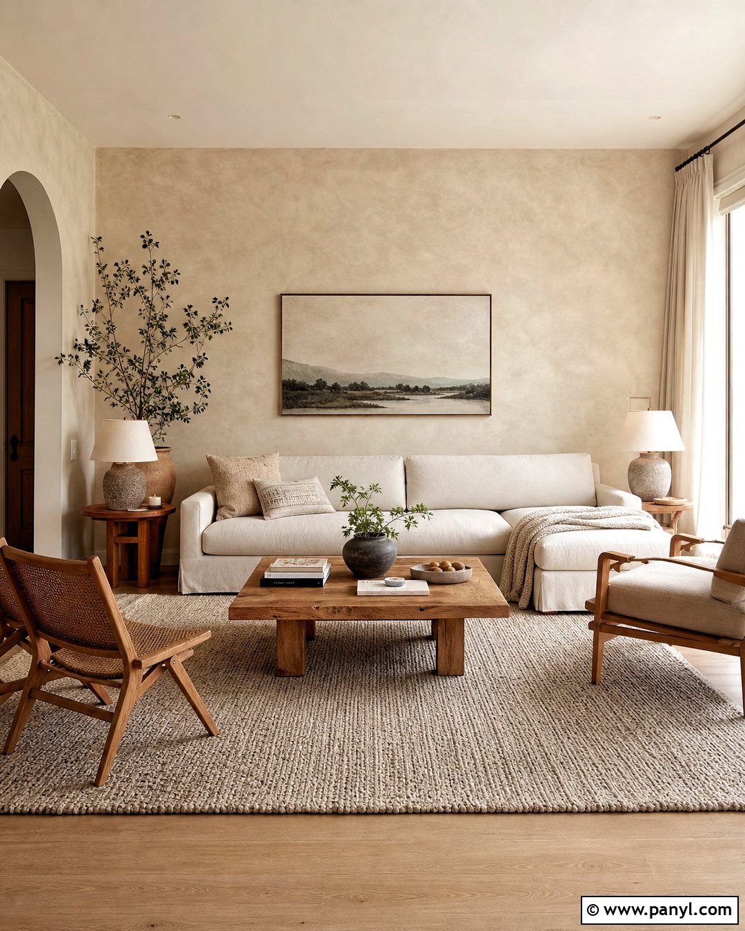
A limewash wall finish gives a living room soft movement without creating a busy pattern. Choose a warm mushroom, mineral beige, muted clay, or dusty sage shade, then continue the earthy palette through natural oak furniture, linen upholstery, and woven accents. The cloudy finish works especially well across every wall rather than on one small feature wall. Apply overlapping strokes with a wide masonry brush, allowing lighter and darker areas to remain visible. Avoid trying to make the coverage perfectly even because tonal variation creates the desired depth. Complete the room with off-white curtains, a low-profile sofa, ceramic lamps, and a textured wool rug. Matte finishes and simple decor allow the layered walls to remain the main attraction.
2. Color Wash Wall Effect
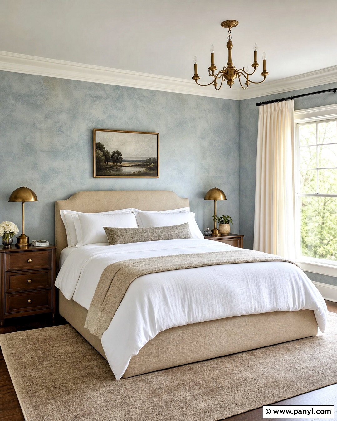
Color washing creates a translucent, gently aged surface that suits relaxed bedrooms, reading rooms, and traditional living spaces. Begin with a pale base coat, such as warm cream, and layer a diluted glaze in muted blue, soft terracotta, or olive green over it. Work in loose, overlapping brushstrokes so no hard lines develop. For a complete bedroom look, pair dusty blue color-washed walls with an upholstered oatmeal bed, medium-tone wood nightstands, white bedding, and antique brass lighting. Keep the ceiling and trim creamy white to frame the effect neatly. The finished walls should feel softly mottled rather than heavily distressed. Test the glaze ratio first because greater transparency creates a quieter finish, while concentrated color produces stronger movement and contrast.
3. Ombre Wall Paint
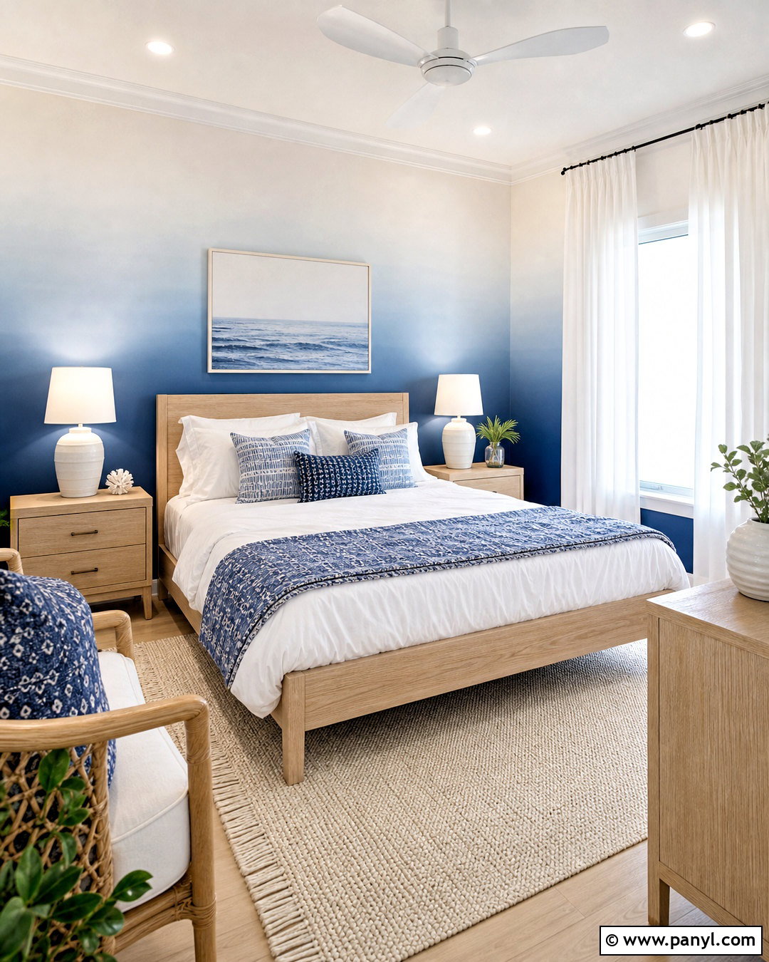
Imagine a bedroom wall gradually changing from deep blue near the floor to airy blue-white near the ceiling. This ombre wall paint effect adds color while maintaining an open, restful feeling. Select three or four closely related shades and mark broad horizontal sections with light pencil lines. Apply the colors one area at a time, blending adjoining edges while both paints are still wet. A large clean brush helps soften visible transitions. Use the darkest shade behind a pale oak bed, then repeat the blues through pillows and a patterned rug. White curtains, light bedding, and simple ceramic lamps balance the saturated lower wall. Continue the effect around the room for an immersive result or use it behind the bed as a carefully framed focal surface.
4. Gradient Wall Paint
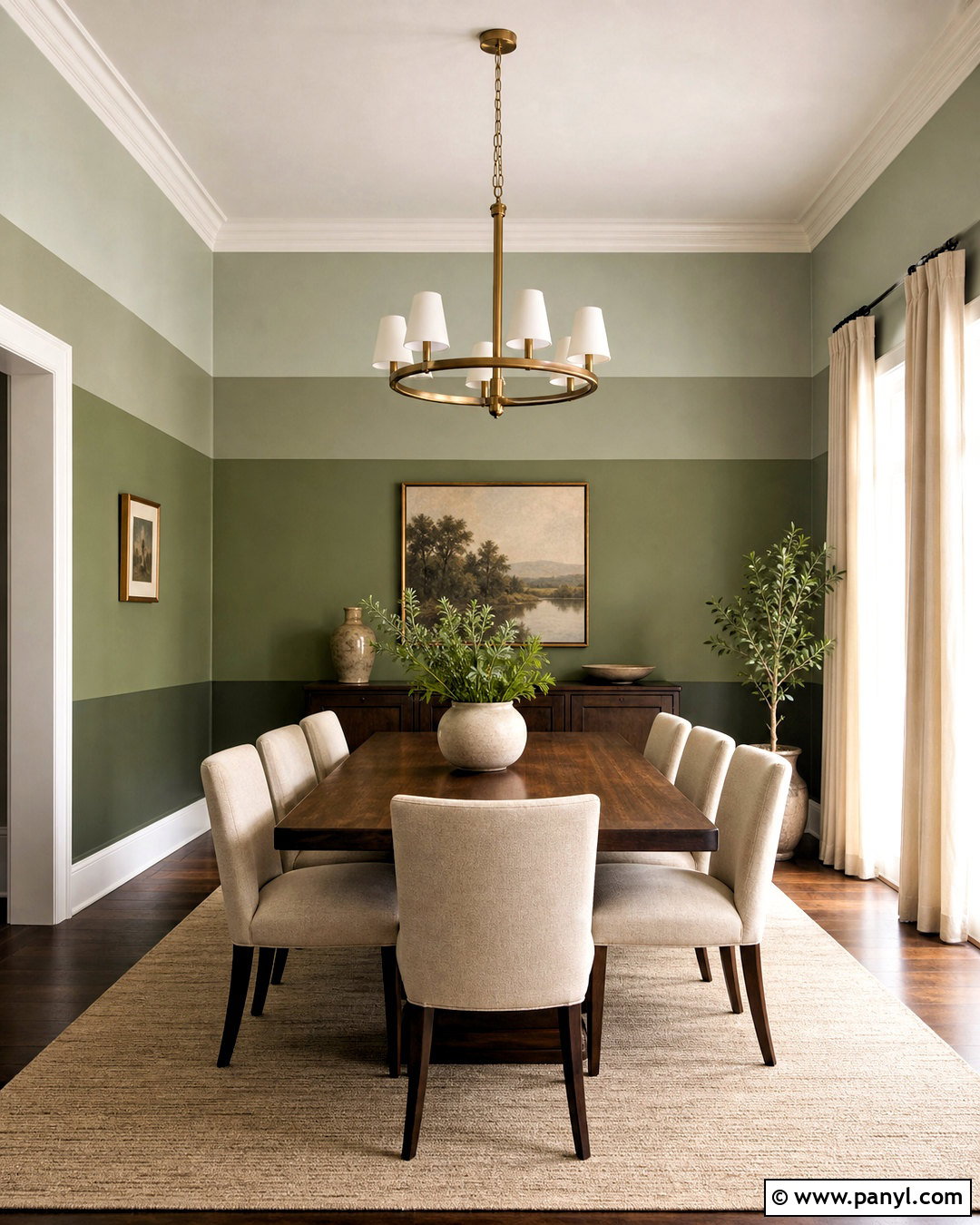
Gradient wall paint uses distinct tonal bands rather than the fully blended transitions associated with ombre. It looks polished in a dining room where architectural layers can be emphasized. Paint the lower wall in deep olive, the center in medium sage, and the upper wall in pale gray-green, finishing the ceiling in the lightest shade. Position each transition at a deliberate architectural point, such as a chair rail or picture molding. A walnut dining table, oatmeal chairs, aged brass chandelier, and cream curtains create a grounded surrounding scheme. Keep artwork limited so the rising bands remain clear. Crisp transitions give the room a contemporary look, while lightly softened boundaries feel more relaxed. Always compare the chosen shades together before painting because their undertones must remain consistent.
5. Color Blocking Wall Paint
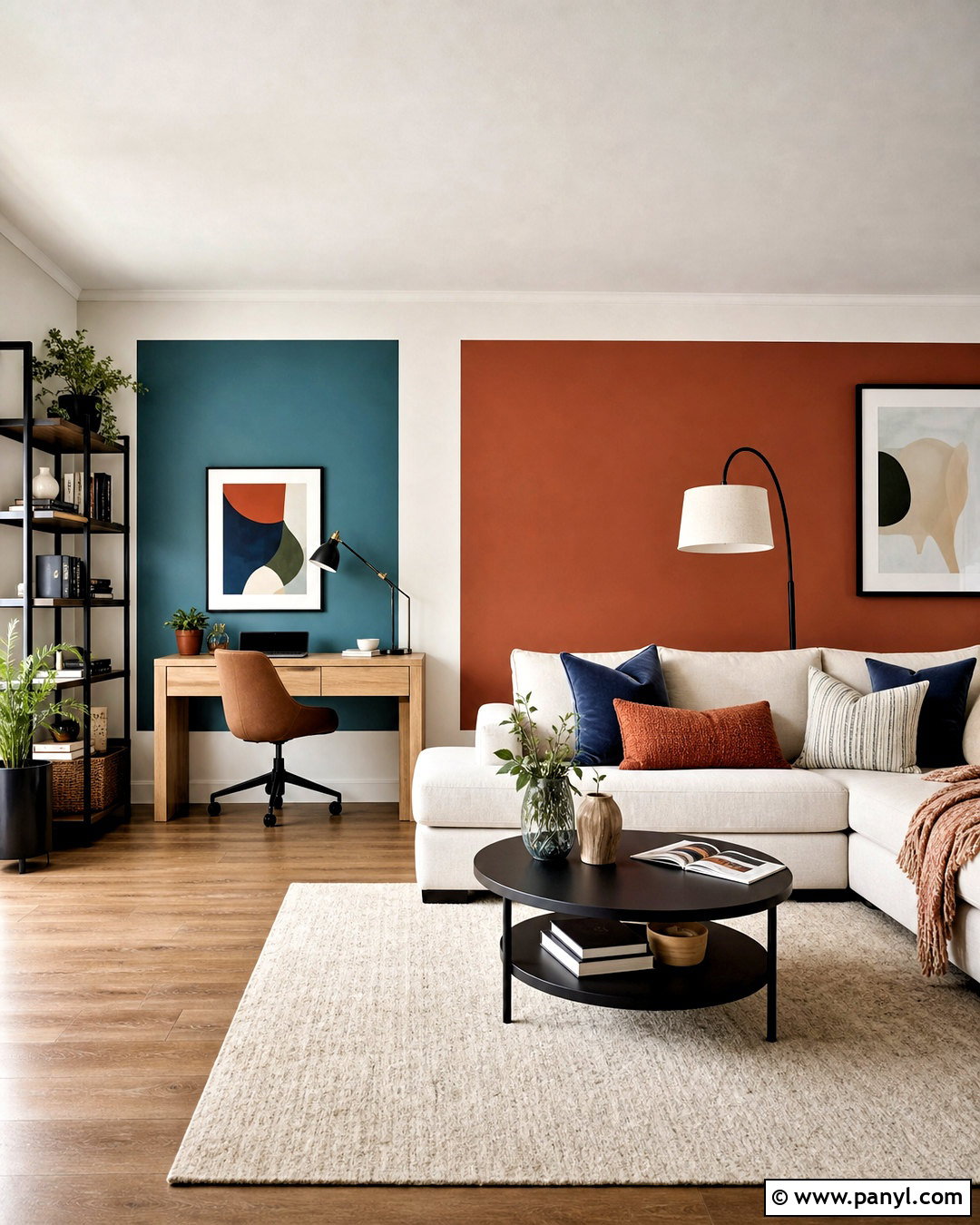
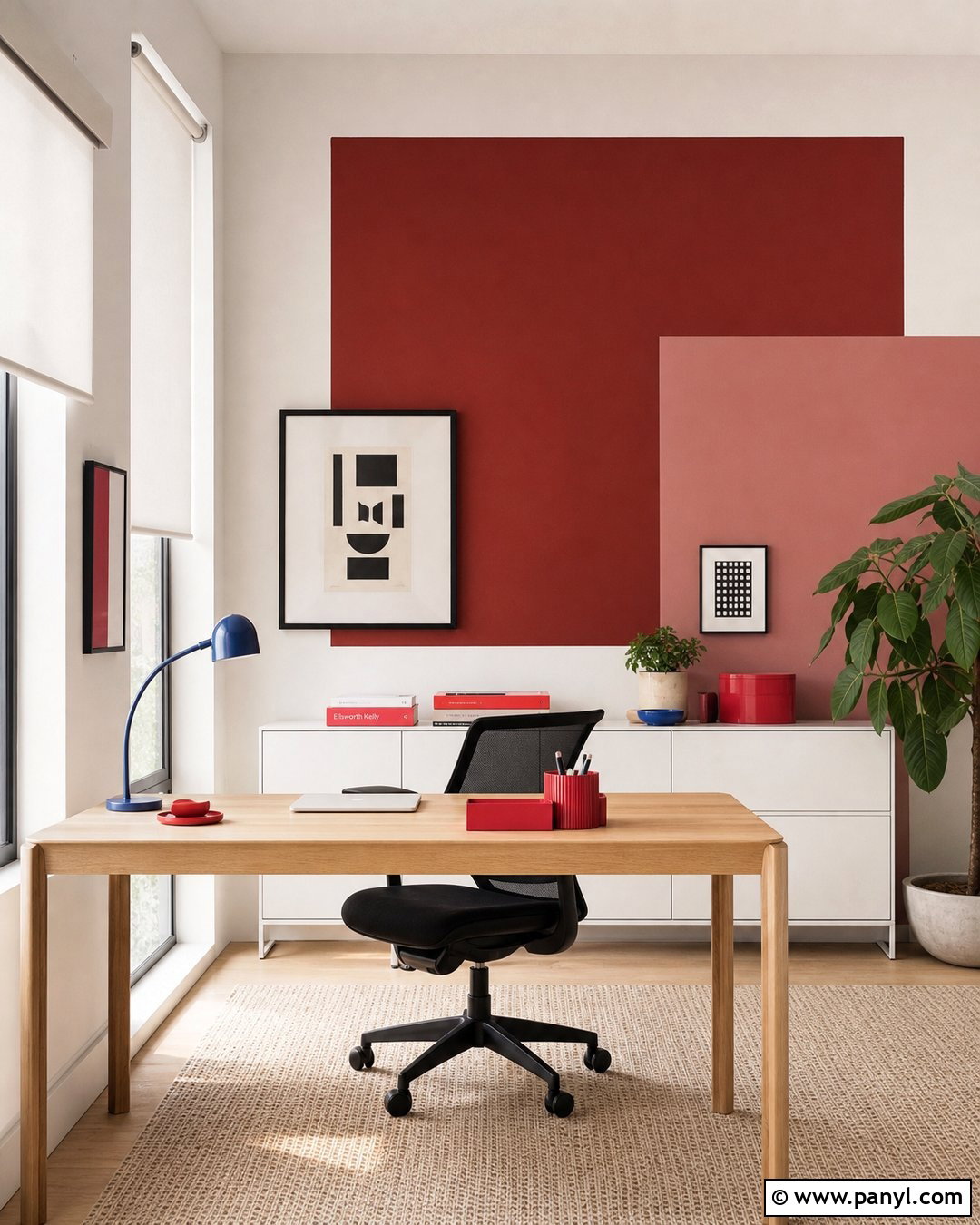
Could an open-plan room use clearer zones without adding partitions? Color blocking can visually define dining, working, and lounging areas through large painted shapes. In a multipurpose living room, cover the main walls in warm off-white, then frame a desk with a large muted teal rectangle. Use a wide rust-colored block behind the sofa and repeat both colors in cushions, artwork, and storage pieces. Straight edges require careful measuring, low-tack painter’s tape, and thin coats that will not bleed underneath. Choose two or three related colors rather than filling the room with competing shades. Keep the largest furniture neutral and select simple oak or matte black accents. The completed space feels coordinated because every painted section corresponds to a specific function and furniture arrangement.
6. Painted Wall Arches
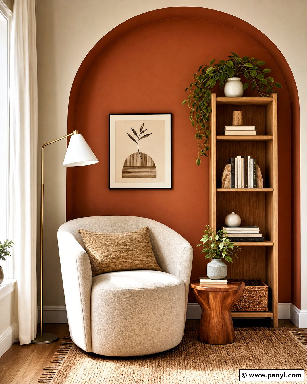
A painted wall arch can give an ordinary reading corner a stronger sense of place. Paint the surrounding wall soft cream, then create a tall, rounded arch in warm terracotta, dusty rose, or sage green. Position a slim bookcase, upholstered chair, and small floor lamp inside the painted shape so the composition feels intentional. The arch should extend beyond the furniture rather than appearing too narrow or short. Use a pencil tied to string to draw an even curve, then outline it with an angled brush before filling the center with a roller. Add a woven rug, linen pillow, and wood side table in coordinating natural tones. This effect provides the appearance of a niche or architectural opening without construction, making it useful in rentals and compact rooms.
7. Geometric Wall Paint
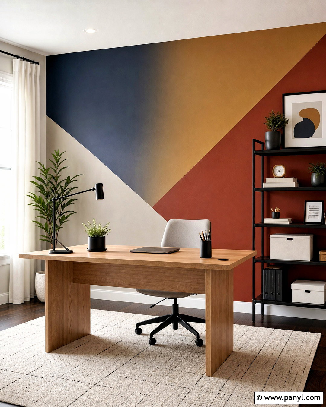
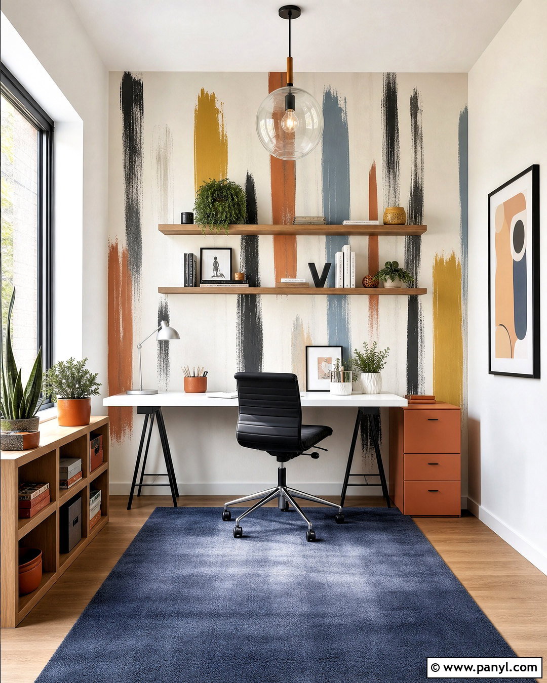
Geometric wall paint brings structure to a modern home office when the shapes relate to the desk and storage layout. Start with a soft greige base, then add overlapping blocks or diagonal sections in deep navy, muted mustard, and clay red. Keep the strongest color behind the desk to establish a clear focal point. A light oak work surface, black shelving, neutral task chair, and simple white curtains will prevent the room from becoming visually crowded. Plan the entire pattern on paper before transferring measurements to the wall. Use painter’s tape for sharp edges and remove it while the final coat remains slightly damp. Limit the design to three accent colors with one neutral base. This creates an energetic backdrop that still feels suitable for focused daily work.
8. Striped Wall Paint
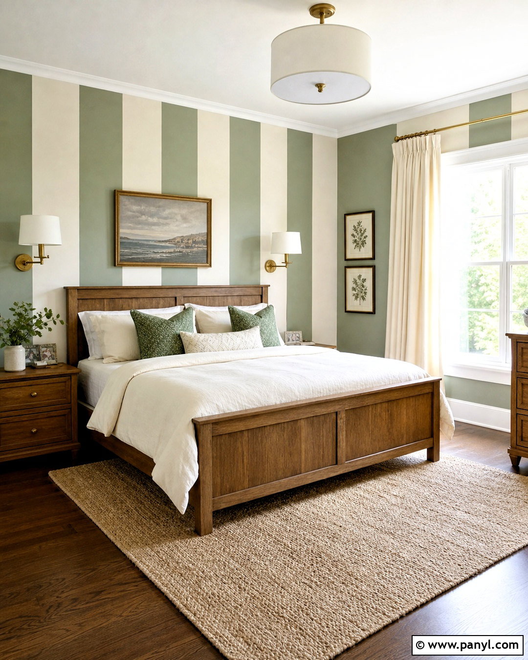
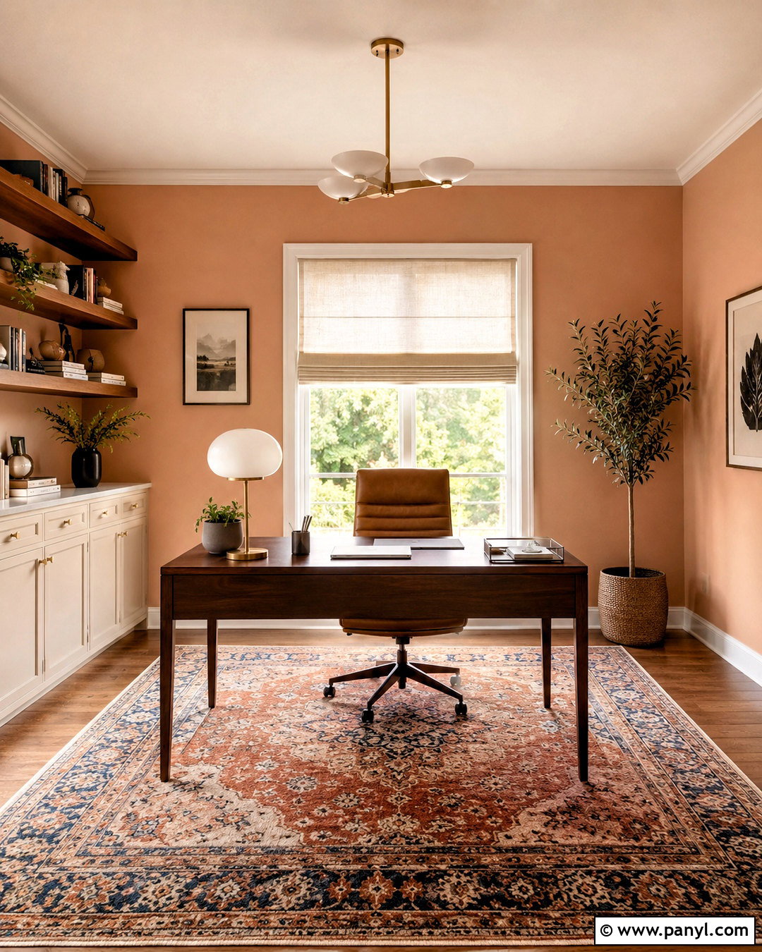
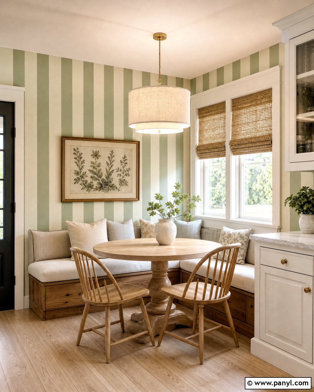
Striped wall paint can adjust how a room feels while adding a classic pattern. Vertical stripes visually emphasize height, making them useful in a small powder room or low-ceilinged hallway. Horizontal bands can help a narrow room appear wider. For a calm bedroom, alternate broad warm-white and muted sage stripes, then add an oak bed, cream bedding, green pillows, and brushed brass sconces. Wider stripes feel cleaner and more current than numerous narrow lines. Measure from the center of the main wall so both outer edges look balanced. After applying the base color, seal the tape edges with that same shade before adding the contrasting paint. This extra step helps produce crisp lines. Keep curtains and large textiles mostly solid so the complete room remains restful.
9. Checkerboard Wall Paint
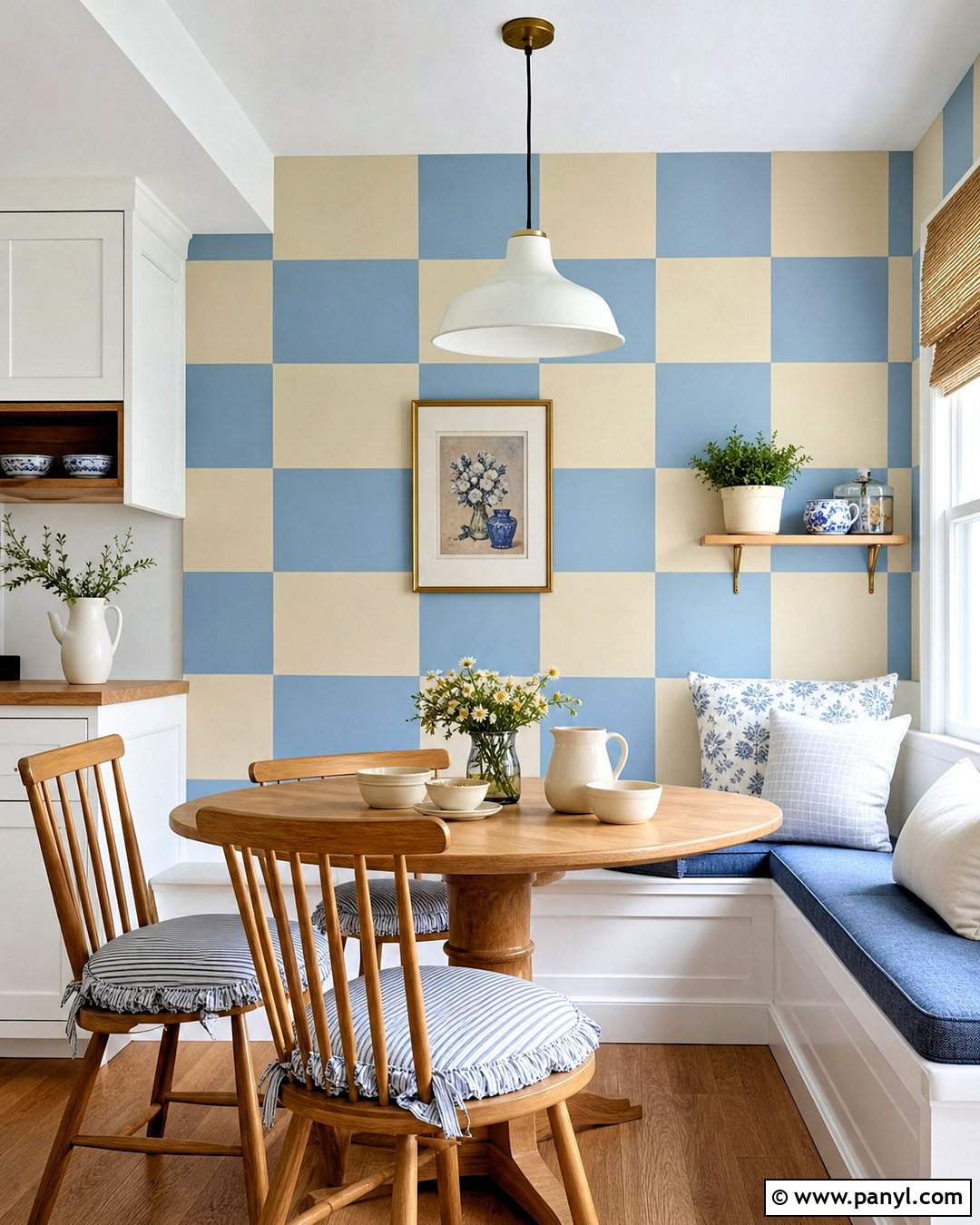
Checkerboard wall paint introduces cheerful pattern while still feeling orderly and architectural. It works especially well in a breakfast nook, playroom, or creative studio. Choose softened colors rather than stark black and white; warm cream and dusty blue create a friendly, livable backdrop. Use larger squares to keep the pattern from feeling too busy, and align the grid with the table, window, or built-in bench. Complete a breakfast nook with a round oak table, spindle-back chairs, striped seat cushions, and a simple white pendant. Carefully measure the wall and paint alternating squares in stages so adjacent wet areas do not touch. Repeat the blue through small accessories, but avoid adding several competing patterns. The final space should feel playful, balanced, and easy to use.
10. Scalloped Wall Paint
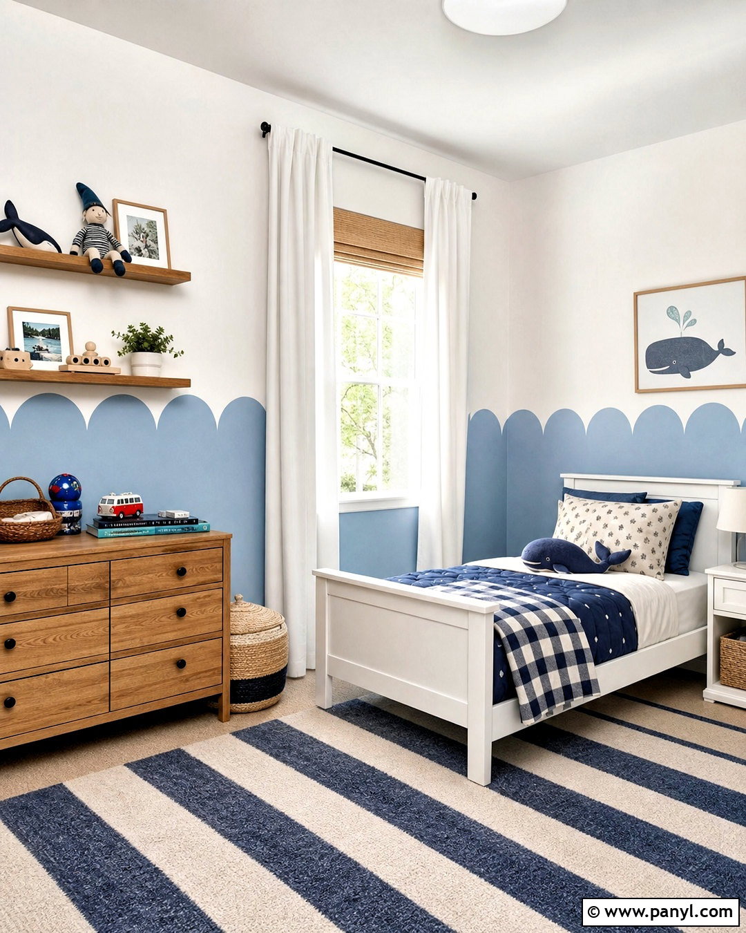
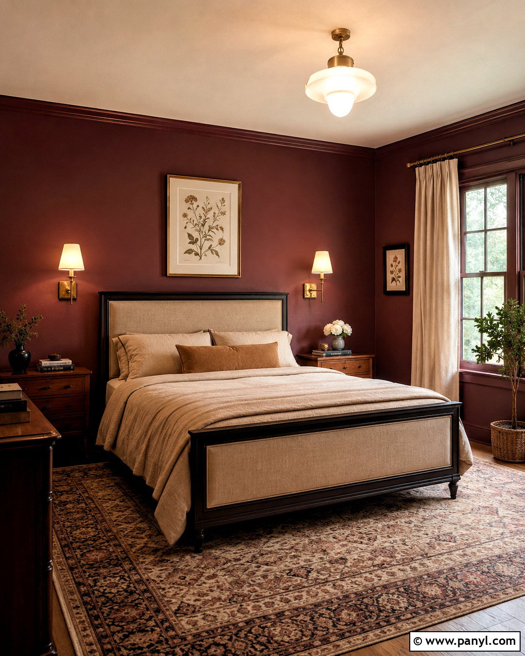
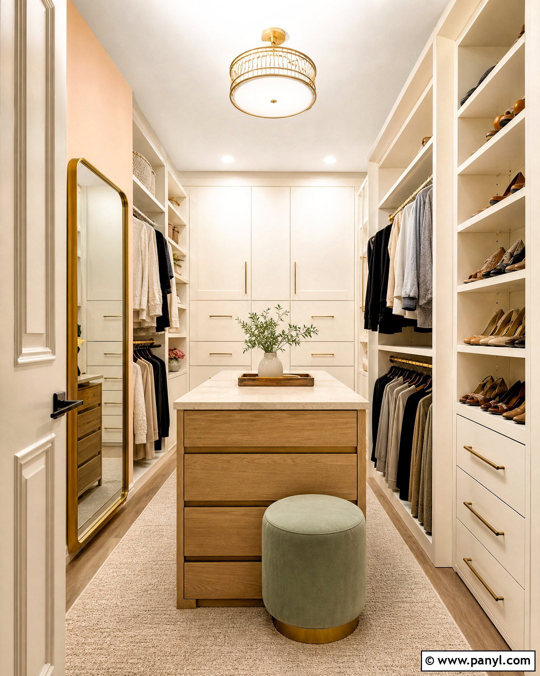
Soft scallops can bring gentle character to a nursery, child’s bedroom, craft space, or feminine home office. Paint the lower portion of the wall muted peach, dusty lavender, or pale blue, finishing the top edge with evenly sized rounded curves. Keep the upper wall warm white to make the room feel bright. In a child’s room, combine pale blue scallops with a white bed, natural wood dresser, woven baskets, and navy-and-cream bedding. Trace the curves using a round template so every scallop has the same width and depth. Place the painted boundary slightly above the furniture rather than cutting directly through headboards or shelving. Simple curtains and restrained wall decor prevent the effect from becoming overly themed. The result feels playful but can easily mature as furnishings change.
11. Sponge Painted Walls
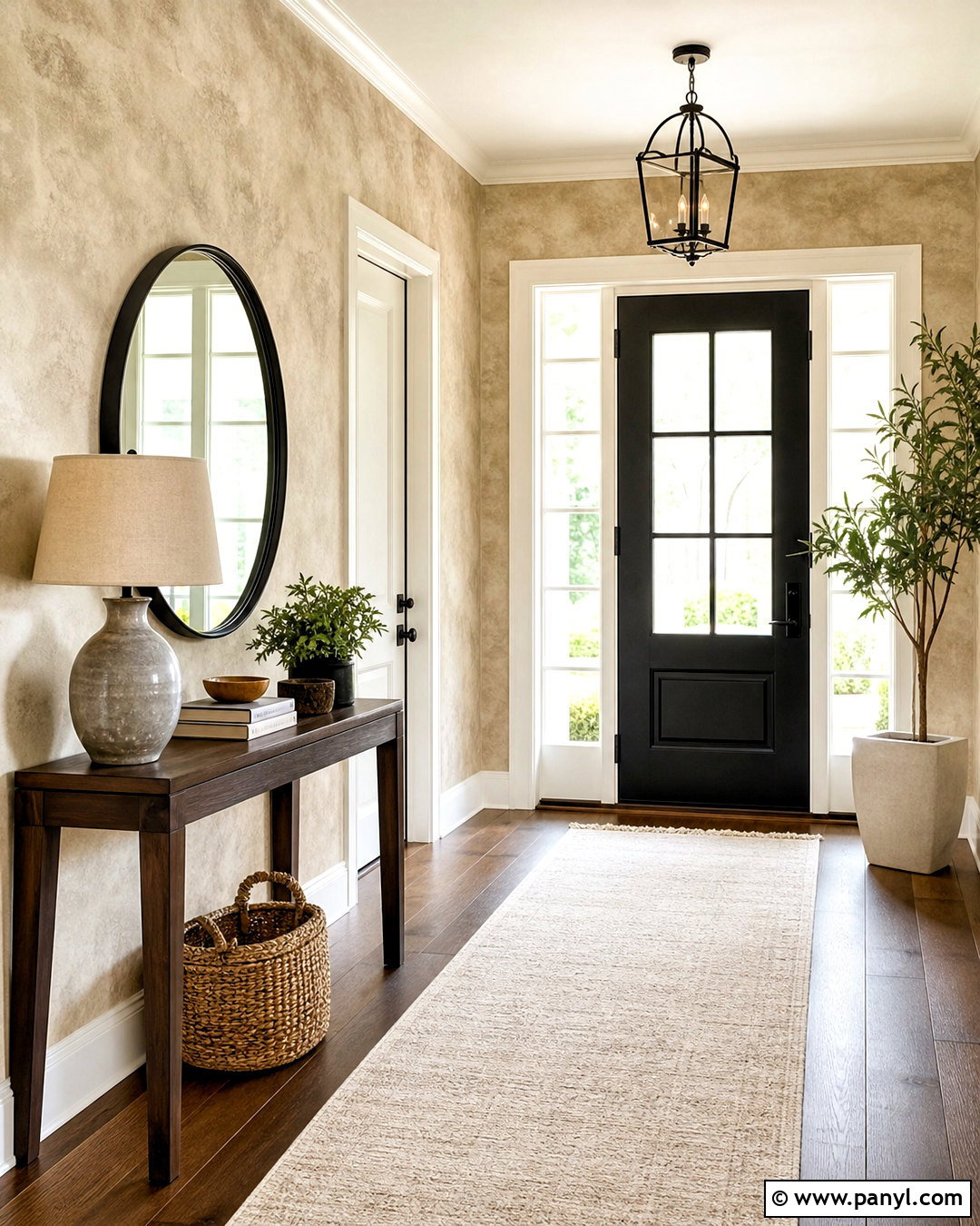
Sponge painting can look sophisticated when the colors are closely related and the pattern remains subtle. For a welcoming entryway, begin with a warm beige base and dab on a slightly deeper taupe glaze using a natural sea sponge. Rotate the sponge frequently and leave irregular spaces so repeated stamp marks do not appear. Blend the effect lightly while wet, especially around corners and trim. Pair the finished walls with a narrow walnut console, cream runner, round black mirror, and ceramic table lamp. Warm white doors and baseboards provide a clean outline. Avoid combining highly contrasting colors, which can make the finish look harsh or dated. A restrained neutral palette gives the walls a stone-like softness that also helps disguise minor bumps and patched areas.
12. Rag Rolled Wall Finish
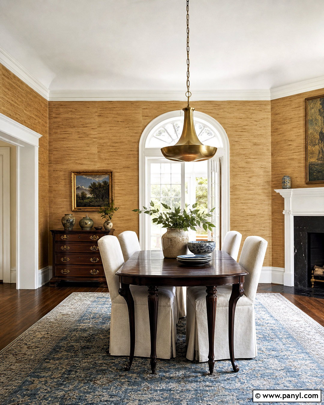
Rag rolling produces fine, flowing texture that can add warmth to a traditional dining room or quiet sitting area. Apply a light caramel base coat, then roll a loosely twisted cotton rag through a translucent warm brown glaze. Change the rag’s direction as you work to avoid obvious vertical tracks. The finished surface should resemble gently aged plaster rather than a repeated decorative pattern. Build the room around the warm walls with a dark wood dining table, cream upholstered chairs, an antique brass pendant, and a faded blue rug. Use off-white trim to keep the edges fresh and defined. Practice on cardboard before working on the wall because pressure and rotation affect the final texture. Complete one manageable section at a time, maintaining a wet edge throughout the application.
13. Venetian Plaster Wall Effect
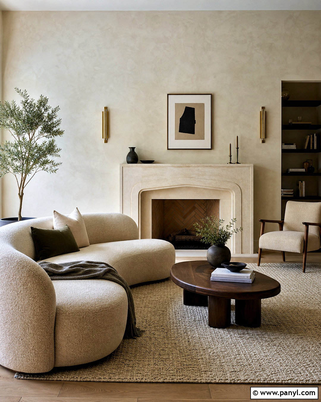
Venetian plaster creates a smooth, layered surface with the visual depth of polished stone. It makes an elegant backdrop for a fireplace wall, dining room, or quiet primary bedroom. Choose warm ivory, pale greige, putty, or muted charcoal depending on the room’s light level. Apply several thin layers with a flexible trowel, allowing irregular marks to overlap. Burnishing the final surface produces a soft sheen, while leaving it less polished creates a more matte appearance. For a refined living room, combine ivory Venetian plaster walls with a limestone fireplace, curved cream sofa, walnut coffee table, and brushed brass lighting. Keep the decor minimal and tactile. Because preparation strongly affects the finish, the underlying wall should be smooth, clean, and correctly primed before the decorative layers begin.
14. Concrete Effect Wall Paint
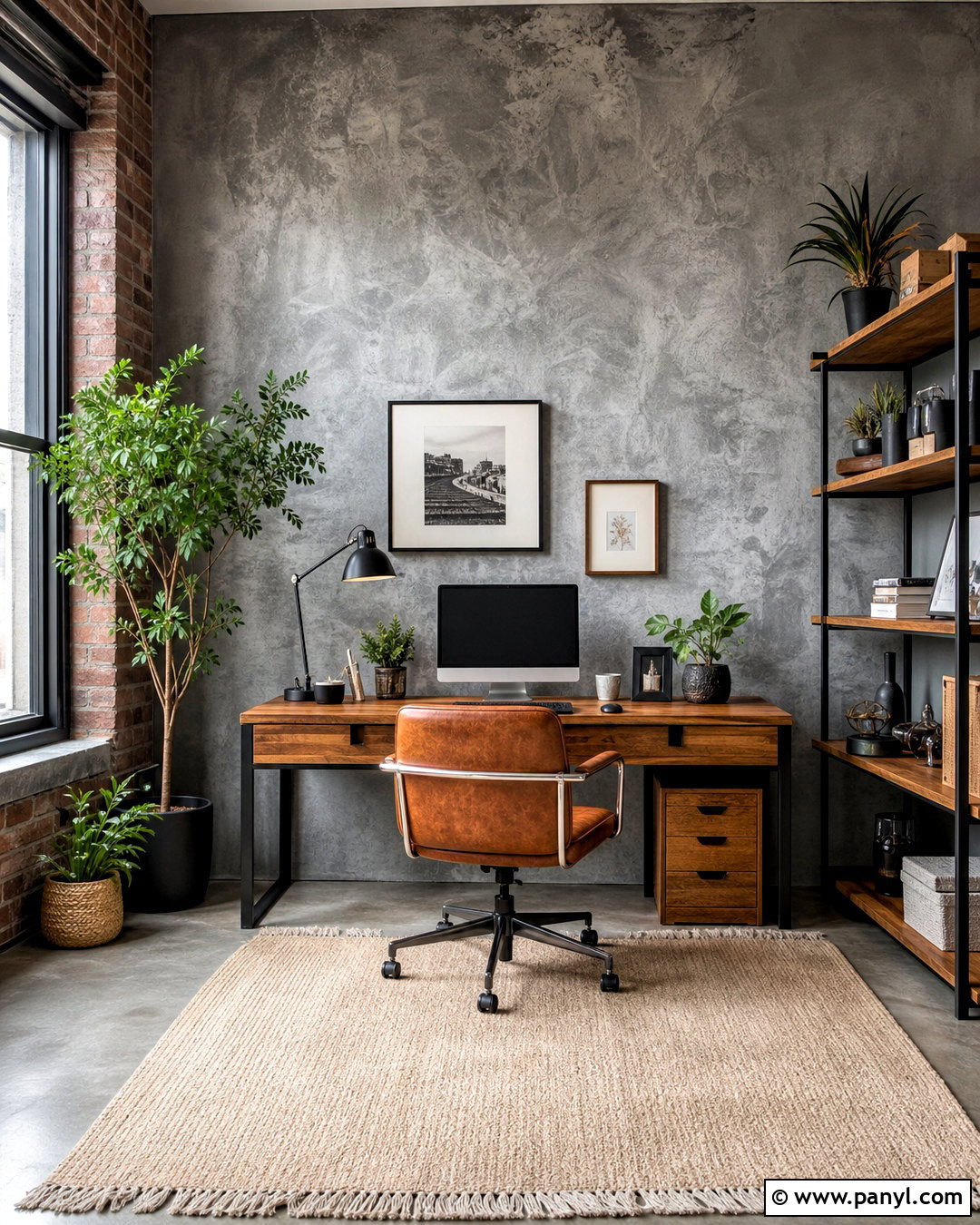
Concrete effect wall paint offers an industrial appearance without the weight and construction involved in installing concrete panels. Use it throughout a modern home office or on the main wall of a loft-inspired living room. Layer cool gray and charcoal paint with a broad trowel or specialized texture tool, creating subtle shifts rather than strong patches. Balance the raw finish with warm oak furniture, cognac-colored upholstery, cream textiles, and leafy plants. Matte black lighting and shelving strengthen the architectural look, while a light rug prevents the space from feeling cold. The texture should remain relatively smooth and understated. Avoid combining it with too many other distressed finishes. One coherent mix of concrete gray, wood, leather, and soft neutral fabric creates a finished room that feels modern but comfortable.
15. Faux Marble Wall Paint
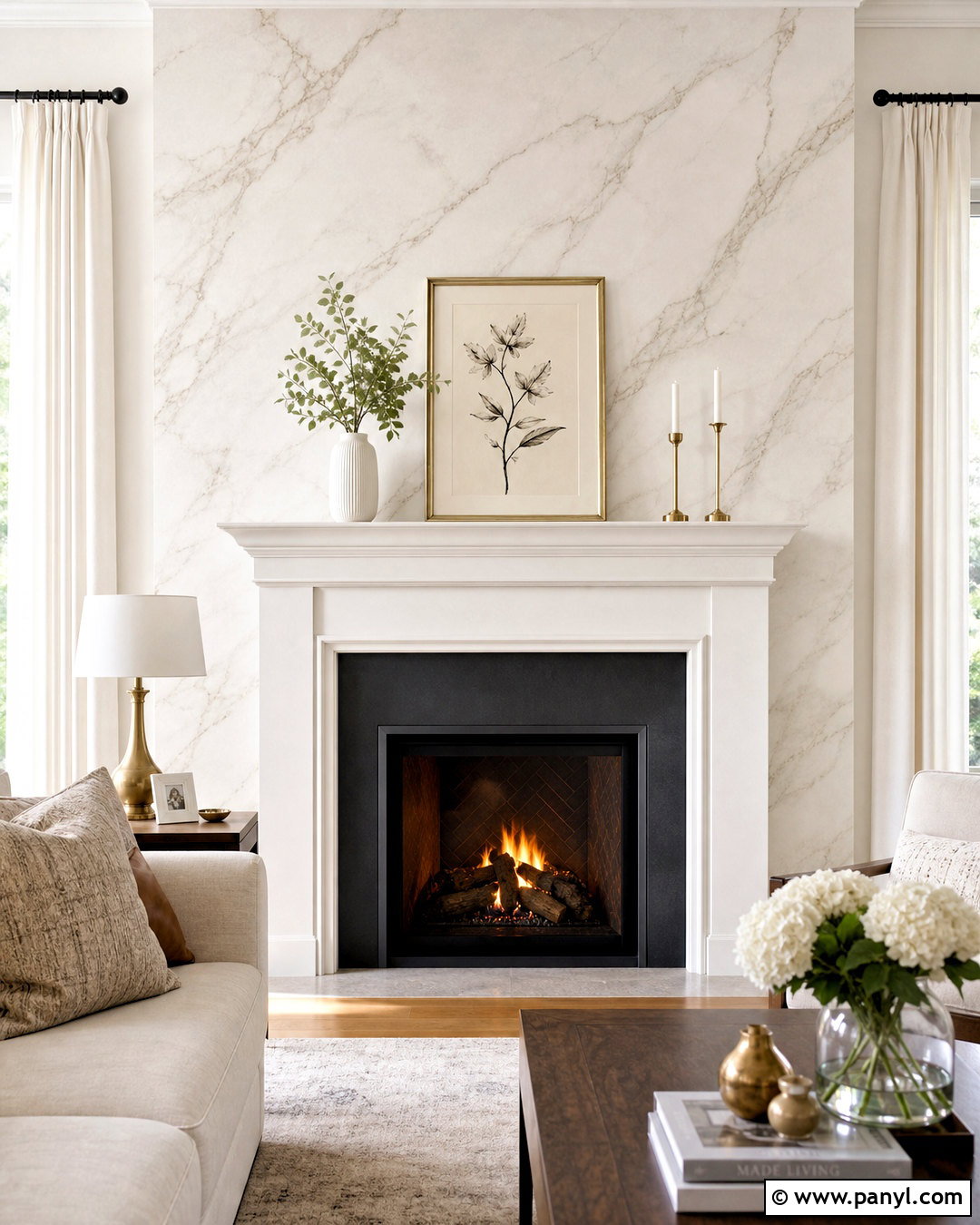
Faux marble paint can turn a fireplace surround or dining room wall into an elegant focal feature. Begin with a soft white or pale gray background, then build translucent gray veining with a fine artist’s brush and feather. Blend sections before they dry so the veins appear embedded beneath the surface rather than drawn on top. Add a few warm taupe lines for realistic variation, but leave generous areas of quiet white. In a living room, pair the marble effect with a white mantel, oatmeal sofa, walnut tables, and brushed brass accents. Keep nearby artwork simple because the painted surface already provides movement. A protective clear finish can add a gentle stone-like sheen. Practice the direction and branching of the veins on a sample board before painting the permanent surface.
16. Metallic Wall Paint
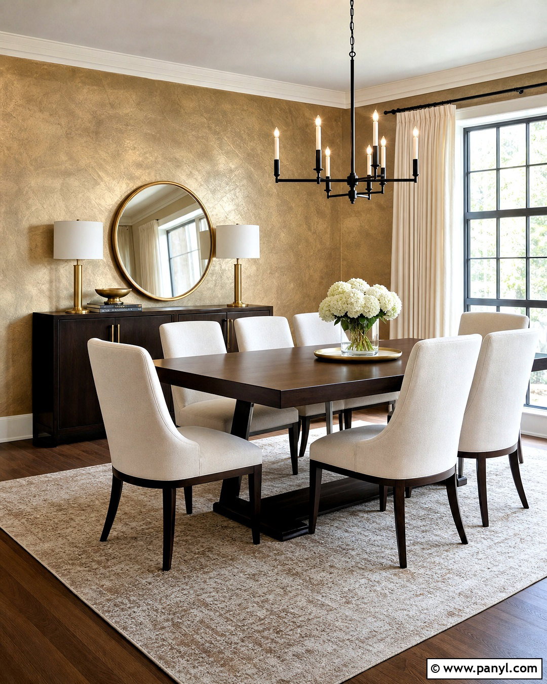
Metallic wall paint reflects light and can create a sophisticated glow when used in a restrained palette. In a dining room, apply soft champagne, muted bronze, or pewter paint across the walls using crosshatched brushstrokes. This keeps the surface dimensional and prevents it from looking like a flat sheet of foil. Pair champagne walls with a dark walnut table, cream chairs, a simple black chandelier, and ivory curtains. Repeat the metallic tone in only a few small details, such as cabinet hardware or a mirror frame. Smooth wall preparation is essential because reflective finishes can reveal dents and uneven patches. Test the paint under daylight and artificial lighting before committing. The completed room should shimmer gently as the viewing angle changes without appearing glittery, flashy, or overly formal.
17. Color Capping Wall Paint
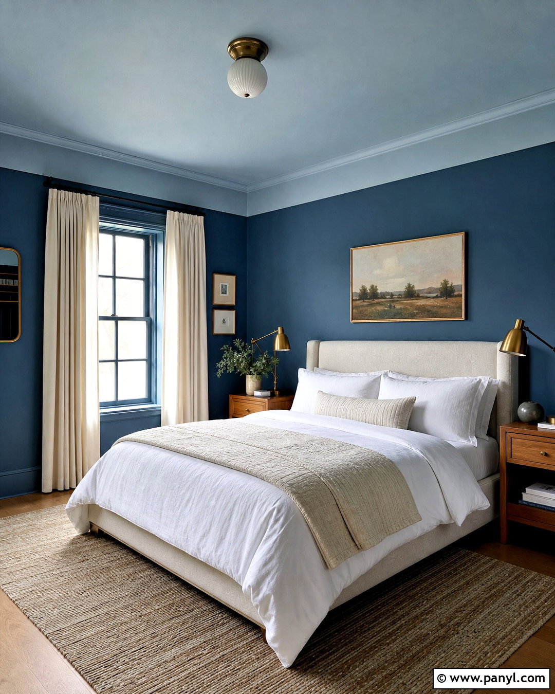
Color capping brings the ceiling into the wall design by extending its color several inches downward. In a cozy bedroom, paint the walls deep dusty blue and cover the ceiling in a lighter misty blue. Continue the ceiling shade 12 to 18 inches down the walls, creating a crisp horizontal border around the room. This upper band softens the transition overhead and adds a layered, enveloping effect. Use an oatmeal upholstered bed, natural oak nightstands, white bedding, and warm brass lamps to keep the darker color balanced. Paint the baseboards in the deeper blue for a more integrated finish. Accurate measuring is important because the line travels across every wall. The final scheme feels more complete than an isolated accent wall and highlights the room’s full architecture.
18. Stenciled Wall Pattern
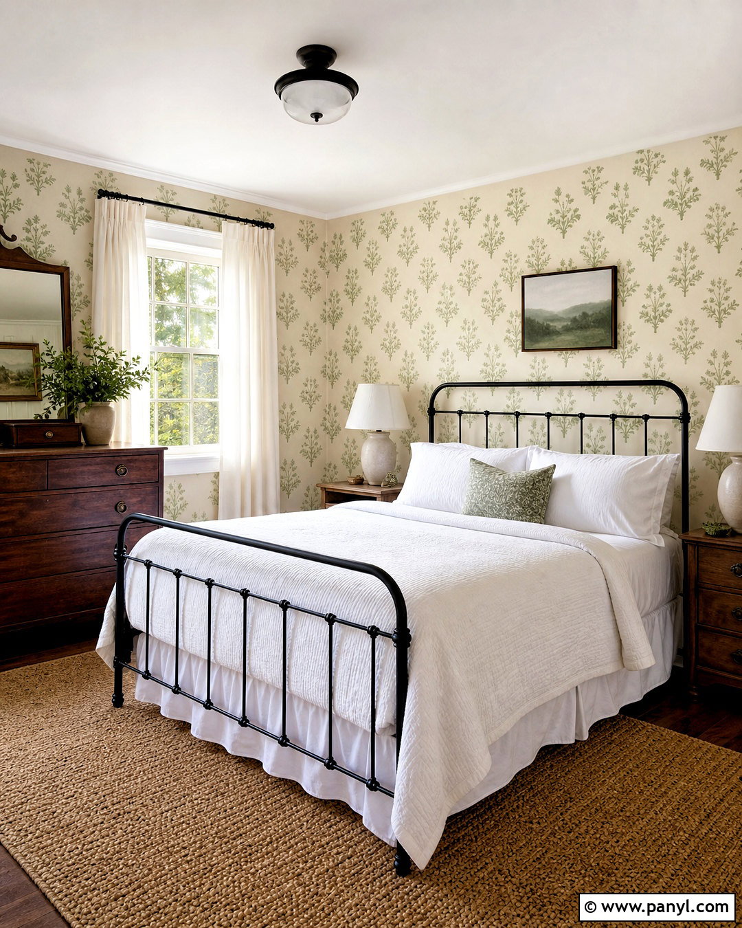
A stenciled wall pattern can imitate wallpaper while allowing complete control over color and scale. Choose a simple botanical, block-print, or small geometric stencil for a guest bedroom. Paint the walls warm ivory, then repeat the design in muted green or dusty blue. Begin at the visual center of the main wall and work outward, checking each row with a level. Use minimal paint on a dense stencil brush or foam roller to reduce bleeding. Complete the bedroom with a black metal bed, white linen bedding, a vintage wood dresser, and a neutral woven rug. Keep the remaining textiles mostly solid so the pattern remains clear. Slight variations can give the surface a handmade quality, but careful spacing ensures the entire room still feels polished and thoughtfully planned.
19. Hand Painted Wall Mural
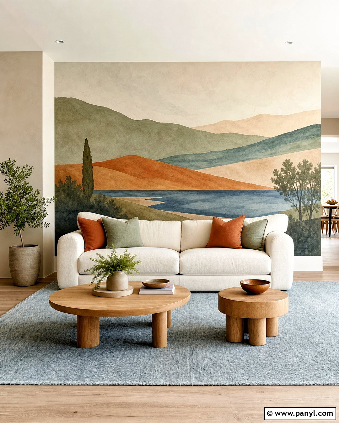
A hand-painted wall mural turns a plain surface into original artwork and can guide the colors of an entire room. In a living room, create a simplified landscape with rolling shapes in muted sage, clay, sand, and dusty blue. Use broad, clean forms rather than numerous tiny details so the mural remains calm behind furniture. Place a cream sofa against the scene, then add oak tables, rust-colored pillows, and a pale blue rug that repeats the painted palette. Sketch the composition lightly before filling each section with matte interior paint. Wrap a few shapes around a corner to make the mural feel integrated with the room rather than framed like a poster. Keep other walls neutral and choose minimal artwork, allowing the painted landscape to remain the primary visual feature.
20. Color Drenched Walls
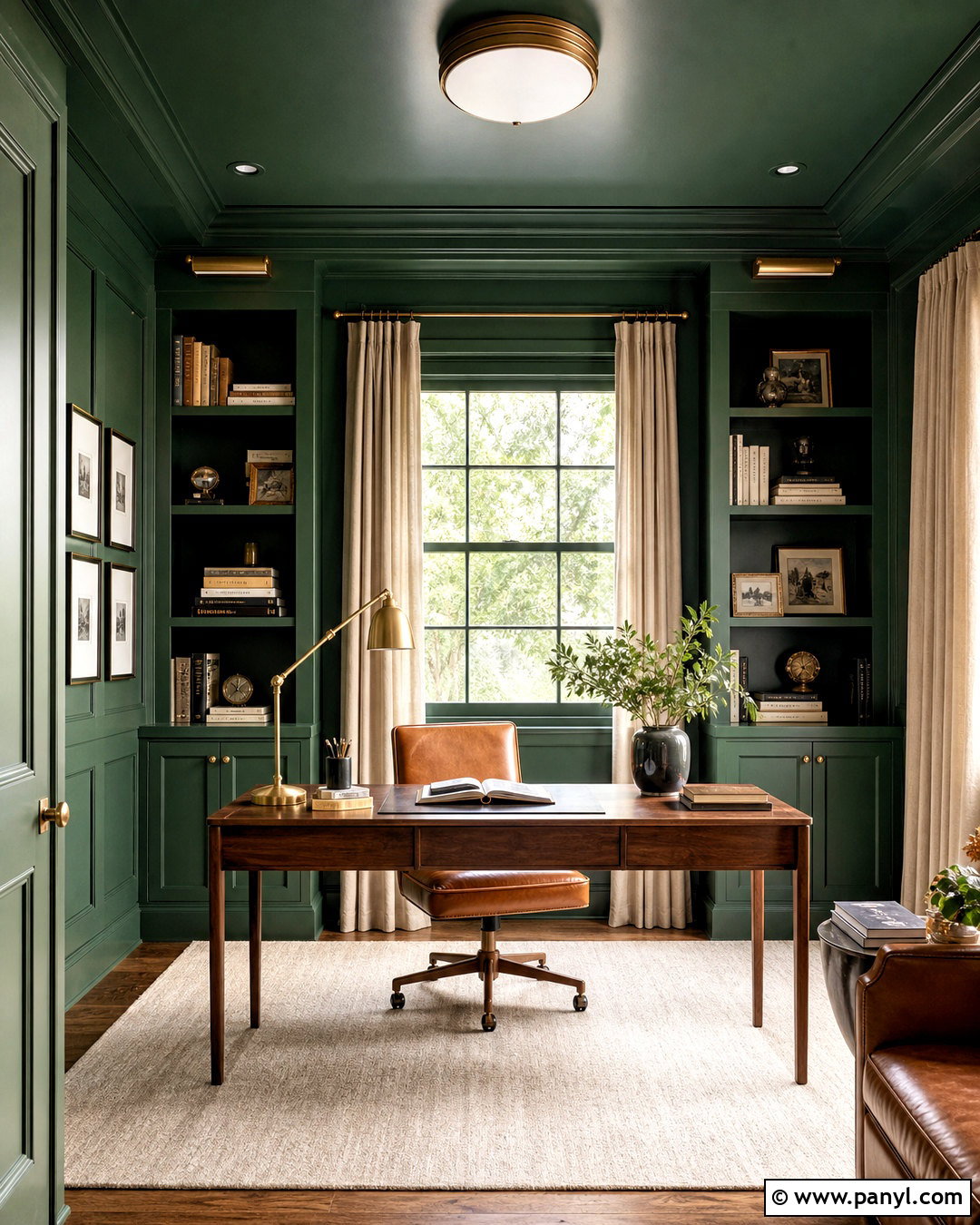
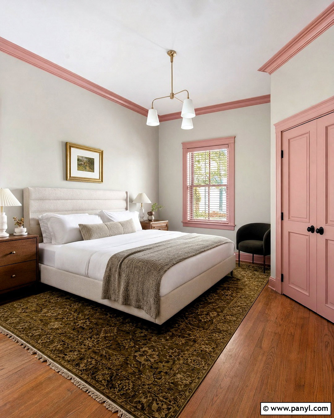
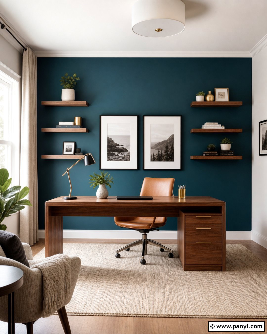
Color drenching creates an immersive room by painting the walls, trim, doors, built-ins, and sometimes the ceiling in one unified hue. Deep forest green can make a library or home office feel grounded, while muted blush, warm clay, or dusty blue suits bedrooms and sitting rooms. Vary the sheen slightly to preserve architectural definition; use matte paint on walls and satin on trim and doors. In a green office, add a walnut desk, tan leather chair, brass lamp, cream rug, and linen curtains. These warmer materials prevent the saturated scheme from feeling heavy. Paint samples should be viewed on several surfaces because one color can shift under different light. A successful color-drenched room feels intentionally enveloping, with furniture and decor selected to support the dominant shade.
Conclusion:
Decorative painting makes it possible to change the character of a room without replacing flooring, furniture, or architectural features. The best effect depends on the wall condition, natural light, room size, and atmosphere you want to create. Soft limewash, color washing, and rag rolling add quiet texture, while murals, checkerboards, and geometric patterns create stronger focal points. Faux marble, concrete, metallic paint, and Venetian plaster can also reproduce the feeling of more expensive materials. Always prepare the surface carefully and test colors, tools, and techniques before tackling the full room. With thoughtful furniture, lighting, and decor choices, these 20 paint effects on walls can produce complete, personal interiors rather than isolated decorative experiments.

Related Ideas and Inspiration:
Leave a Reply