
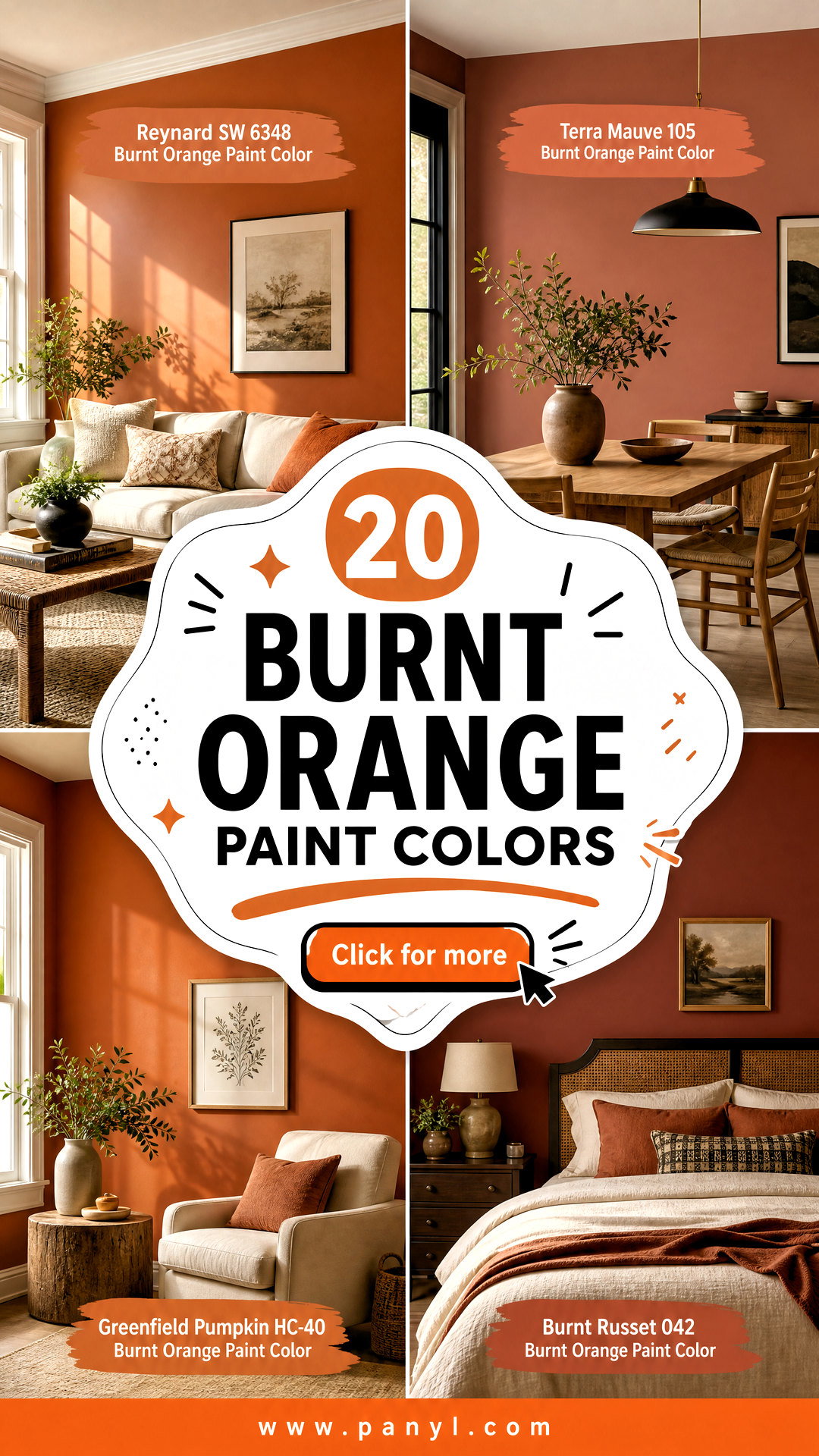
Burnt orange paint colors bring warmth, depth, and an earthy sense of comfort into the home. Some shades lean toward terracotta and clay, while others carry stronger copper, pumpkin, brown, or red undertones. This range makes burnt orange surprisingly versatile for living rooms, bedrooms, kitchens, dining spaces, offices, and even bathrooms. Pair it with creamy white for a relaxed look, dark blue for contrast, olive green for an organic palette, or walnut wood for richer character. Because orange changes noticeably under different lighting, always test large samples during the morning and evening before committing. The complete room schemes below will help you compare undertones, furnishings, finishes, and practical ways to decorate with 20 burnt orange paint colors. ()
1. Cavern Clay SW 7701 Burnt Orange Paint Color
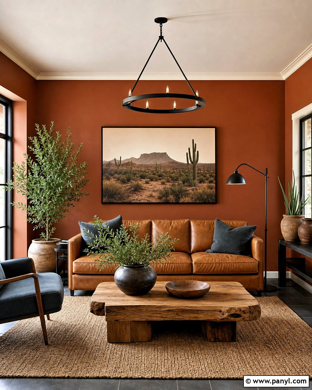
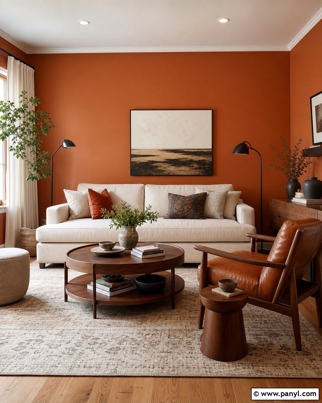
Sherwin-Williams Cavern Clay creates a grounded, welcoming room with its reddish-orange midtone. Use it across the walls of a relaxed living room, then balance the color with warm cream trim and a light beige ceiling. A camel leather sofa, chunky oak coffee table, and woven jute rug support its desert-inspired warmth without making the space feel overly themed. Add charcoal pillows and a muted slate-blue chair for cooler contrast. Black metal lighting gives the scheme a clean, modern edge, while pottery and leafy plants reinforce the earthy palette. This color works especially well in rooms receiving balanced natural light, where its orange and clay qualities can remain rich rather than turning too dark. ()
2. Earthen Jug SW 7703 Burnt Orange Paint Color
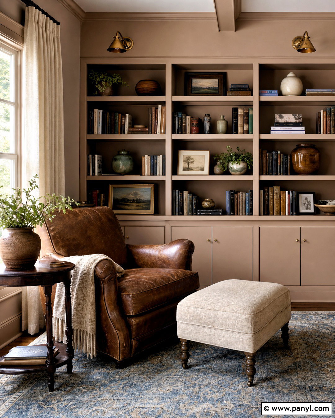
For a deeper and more enclosed atmosphere, Earthen Jug works beautifully in a reading room or home library. Paint the walls and built-in shelving the same burnt orange-brown color, using a satin finish on the woodwork and matte paint on the walls. This tonal approach creates depth while keeping the architecture visually organized. Furnish the room with a tobacco-brown leather chair, an oatmeal footstool, and a dark walnut side table. Antique brass sconces add warmth without disappearing against the walls. Finish the space with cream curtains, a faded blue patterned rug, and books arranged with simple ceramic objects. A pale ceiling keeps the room from feeling heavy and reflects useful light around the darker surfaces. ()
3. Pennywise SW 6349 Burnt Orange Paint Color
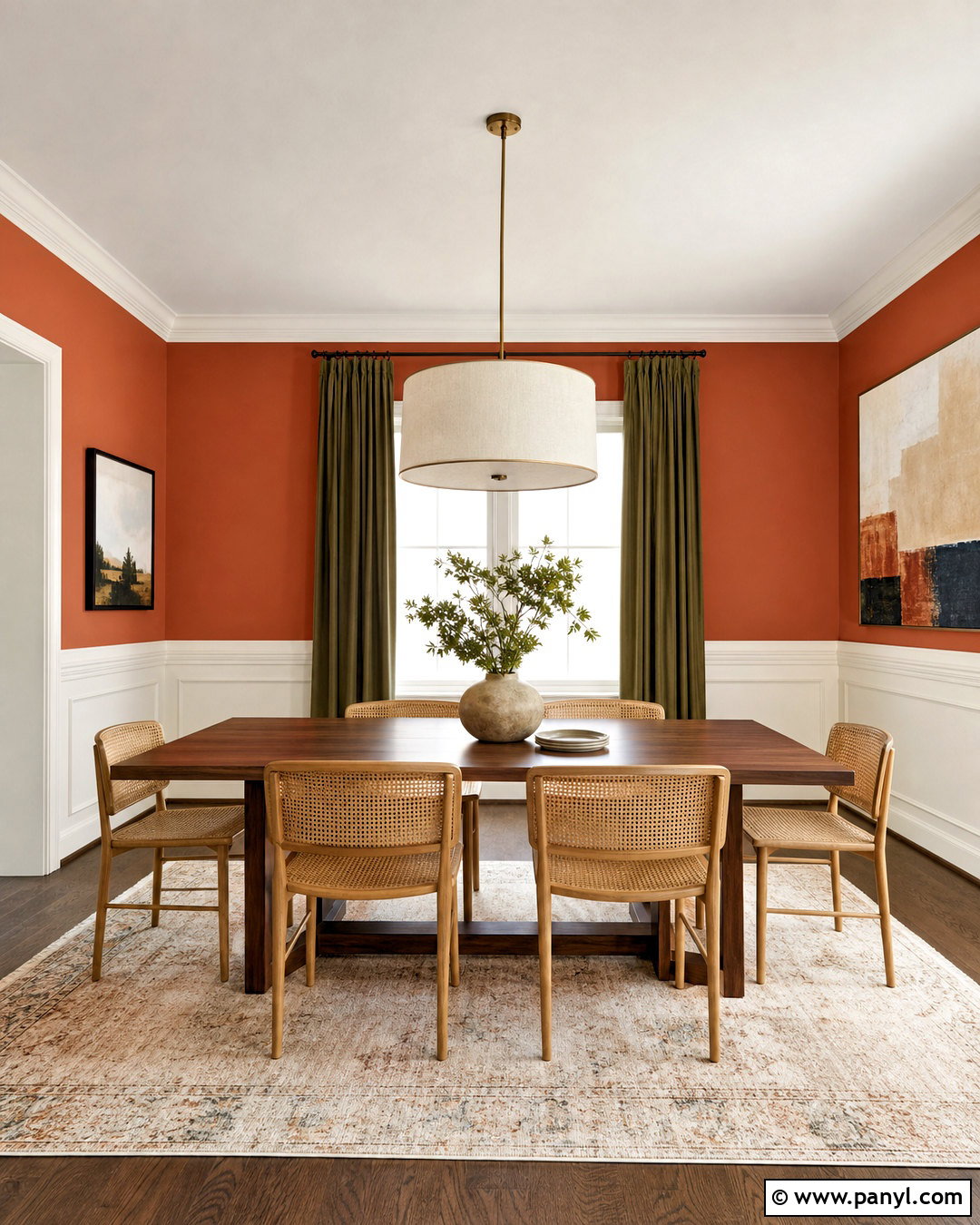
Pennywise is a bold terracotta shade that can turn an ordinary dining room into a warm gathering space. Cover all four walls for a confident look, but retain soft ivory on the ceiling, crown molding, and baseboards. A rectangular walnut table grounds the palette, while natural cane chairs introduce texture and prevent too much dark wood from overwhelming the room. Choose a simple linen pendant instead of an ornate fixture. Olive green curtains and a vintage-style cream rug add contrast while preserving the earthy mood. For artwork, select one large abstract piece featuring beige, rust, and muted navy. Pennywise has enough brown influence to feel established and cozy, making it easier to live with than a brighter, citrus-based orange. ()
4. Copper Harbor SW 6634 Burnt Orange Paint Color
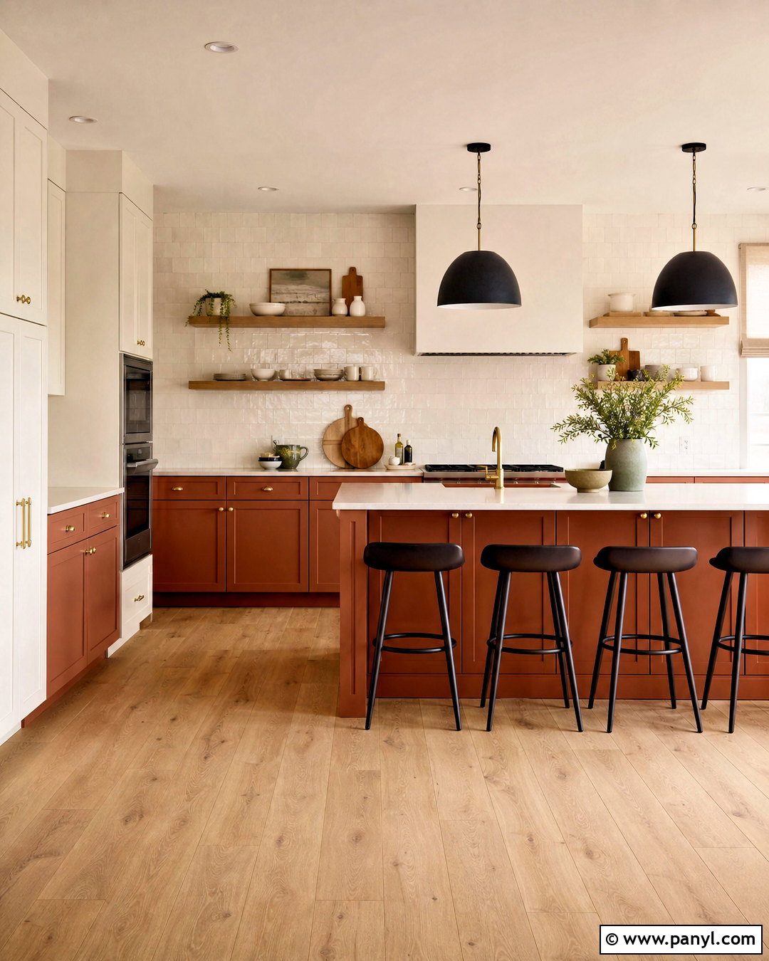
Could a compact kitchen handle burnt orange without feeling smaller? Copper Harbor offers a softer, muted solution when used on lower cabinets beneath warm white walls. Pair the cabinetry with creamy quartz counters, a handmade ivory tile backsplash, and light oak open shelving. Brushed brass hardware complements the coppery undertone, while matte black pendant lights add definition. Keep upper cabinets warm white so the strongest color remains below eye level. A medium-tone oak floor connects the orange cabinets with the lighter surfaces. Add muted sage accessories, natural linen shades, and simple stoneware rather than introducing more saturated colors. This complete scheme feels inviting and distinctive, yet the controlled color placement keeps the kitchen bright, functional, and visually balanced. ()
5. Baked Clay SW 6340 Burnt Orange Paint Color
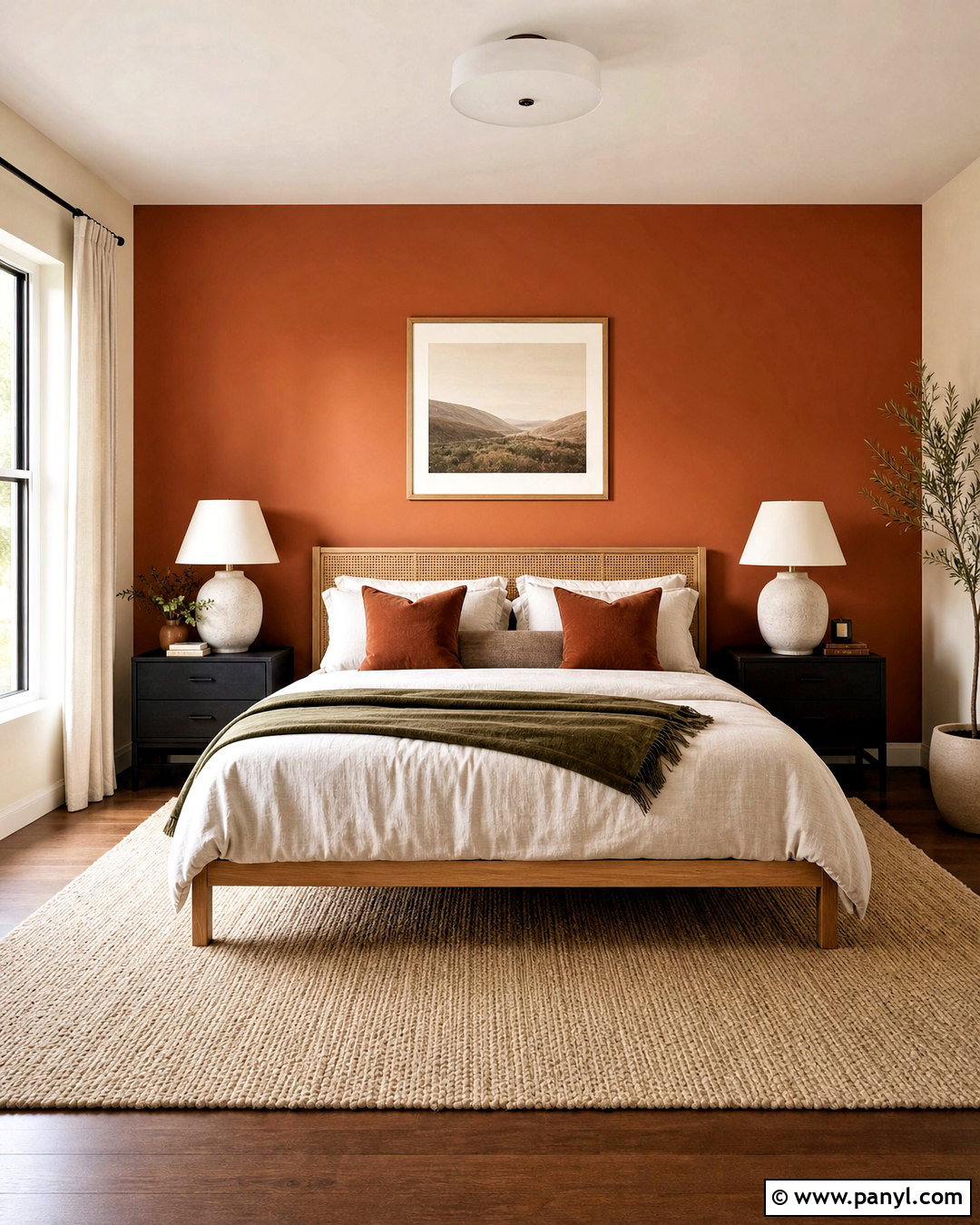
Baked Clay is an approachable choice for a bedroom because its orange tone feels softened by beige and brown. Paint the wall behind the bed in this warm clay color, then use creamy off-white on the remaining walls and ceiling. An oak platform bed with a woven headboard continues the natural palette without matching the accent wall too closely. Layer the bed with ivory linen, cinnamon-colored pillows, and a muted olive throw. Place simple black nightstands on each side to sharpen the soft scheme. A natural wool rug and unlined linen curtains make the room feel relaxed. Complete the design with ceramic lamps and minimal botanical artwork, allowing the painted wall to remain the clear but comfortable focal point. ()
6. Red Cent SW 6341 Burnt Orange Paint Color
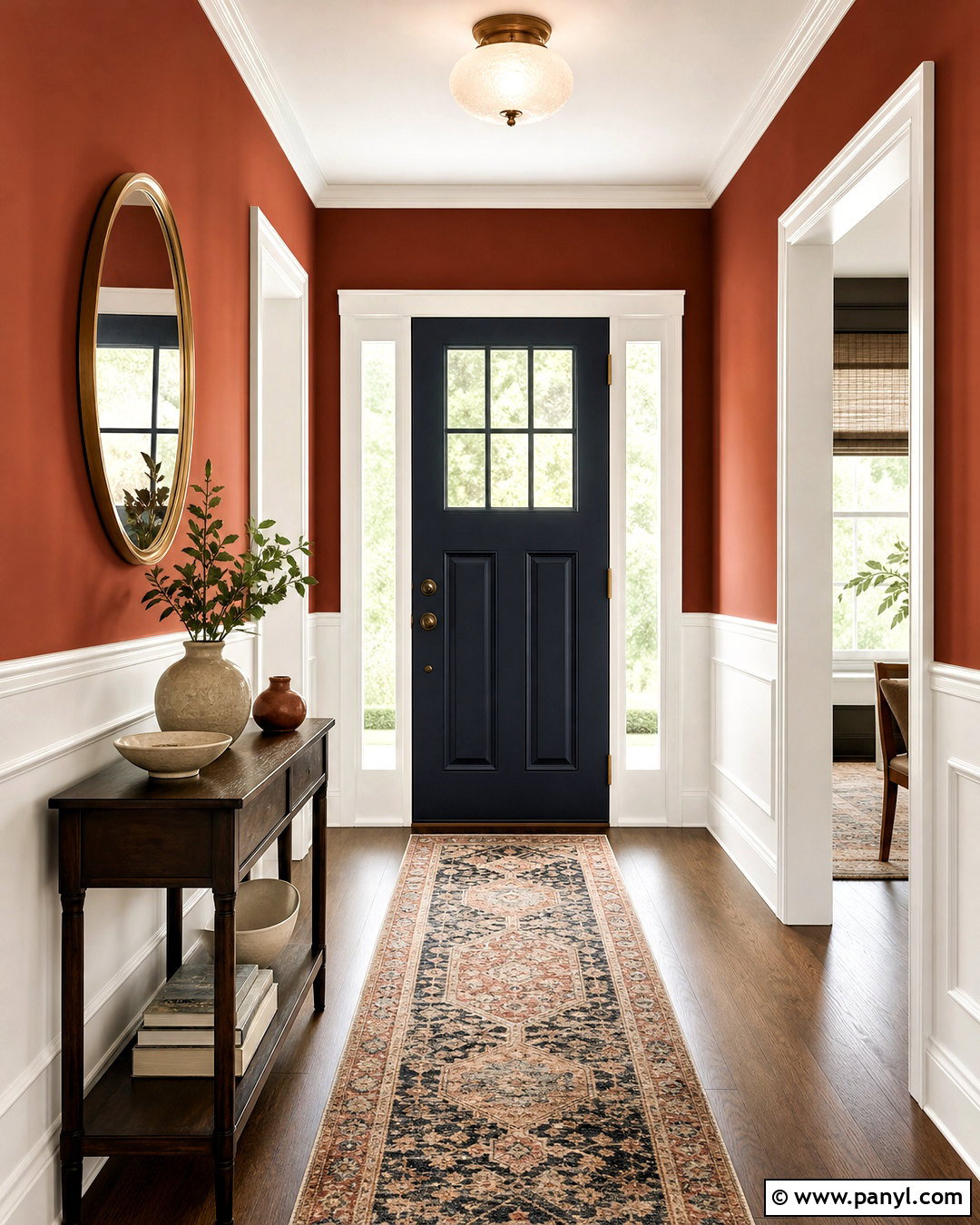
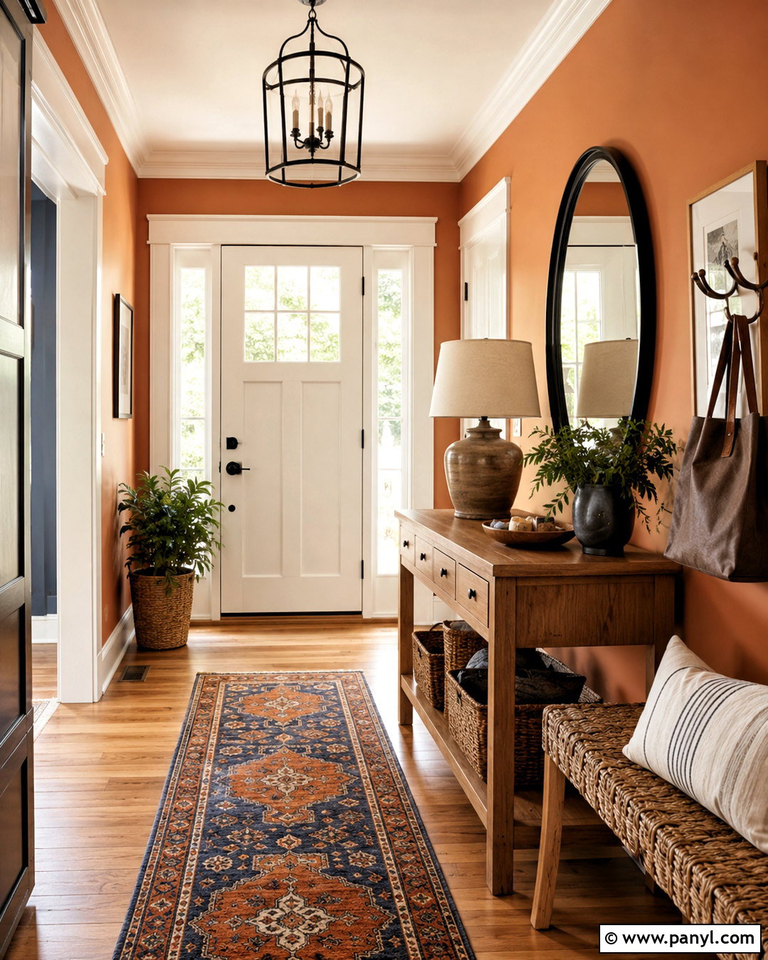
Red Cent carries stronger red and copper notes, making it an excellent paint color for a dramatic entryway. Use it on the walls above simple white wainscoting to create a balanced division of color. A narrow dark wood console, a round brass-framed mirror, and a patterned runner in cream, navy, and faded rust give the hallway a collected appearance. Paint the interior side of the front door deep navy for a cooler counterpoint. Warm white trim provides crisp definition around openings and prevents the red-orange wall color from dominating. Since entryways often receive changing light, add a frosted glass ceiling fixture for even illumination. The completed scheme feels energetic and polished while providing an inviting transition into neutral adjoining rooms. ()
7. Spicy Hue SW 6342 Burnt Orange Paint Color
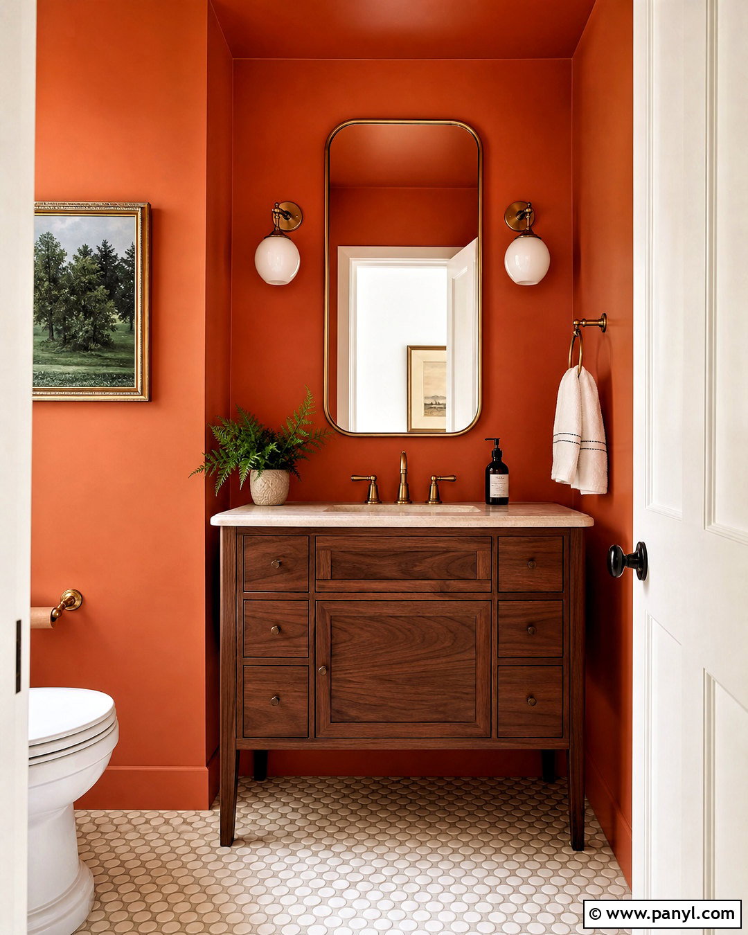
Rich and saturated, Spicy Hue suits a small powder room where a darker color can create intentional impact. Paint the walls and ceiling in the same matte burnt orange, then introduce a walnut vanity with a pale cream stone top. An unlacquered brass faucet, matching wall sconces, and a rounded mirror bring a subtle glow to the enclosed space. Use ivory mosaic tile on the floor to brighten the lower half of the room. A single framed landscape with dark green details provides an organic accent without cluttering the walls. Add white towels and one small leafy plant for freshness. The color-drenched approach makes the powder room feel cohesive rather than cramped, while the pale flooring and reflective metal keep it visually balanced. ()
8. Reynard SW 6348 Burnt Orange Paint Color
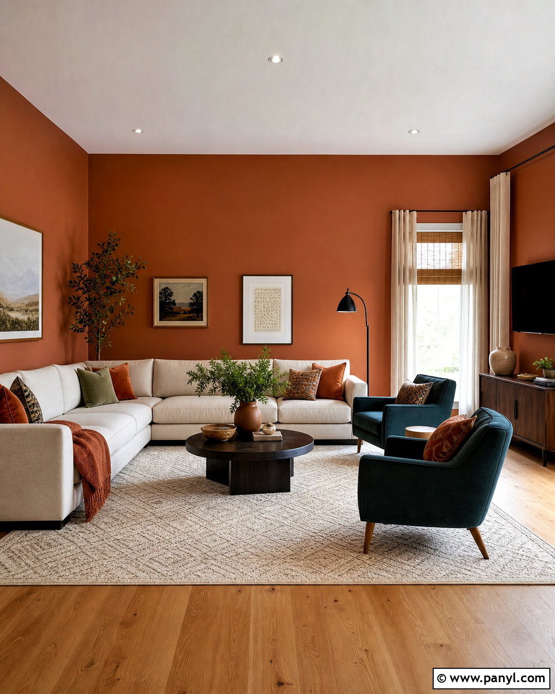
Reynard offers a medium burnt orange with brown influence that feels natural beside wood, stone, and woven materials. Use it throughout a casual family room with warm white trim and a lightly stained oak floor. A large oatmeal sectional provides a calm central piece, while two dark teal armchairs create strong but tasteful contrast. Place a walnut media cabinet along one wall and choose a cream rug with a subtle geometric pattern. Textiles in rust, tan, olive, and navy help distribute the wall color around the room. Add woven shades beneath off-white curtains to control sunlight and soften the windows. The result is a comfortable, practical room where the paint adds personality but remains grounded by durable neutral furnishings. ()
9. Truepenny SW 6355 Burnt Orange Paint Color
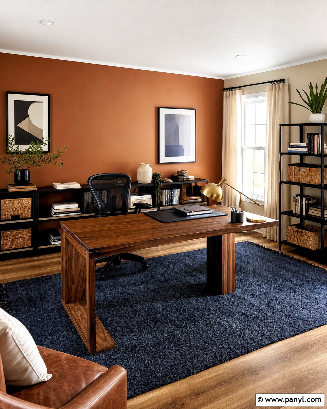
Truepenny leans toward golden copper, making it especially effective in a home office that needs warmth and energy. Paint the wall behind the desk in this rich orange shade and keep the other walls a light, creamy beige. Choose a substantial walnut desk, a black ergonomic chair, and slim black shelving for an organized modern layout. A deep blue flat-weave rug offsets the orange while defining the workspace. Add linen curtains, a brass desk lamp, and closed woven storage boxes to soften the functional furniture. Keep artwork limited to two coordinated prints with cream mats and dark frames. This scheme feels focused and stimulating without becoming visually noisy, making the color suitable for a workspace used throughout the day. ()
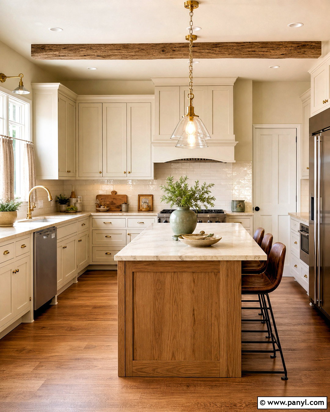
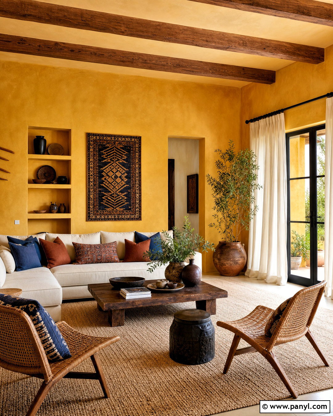
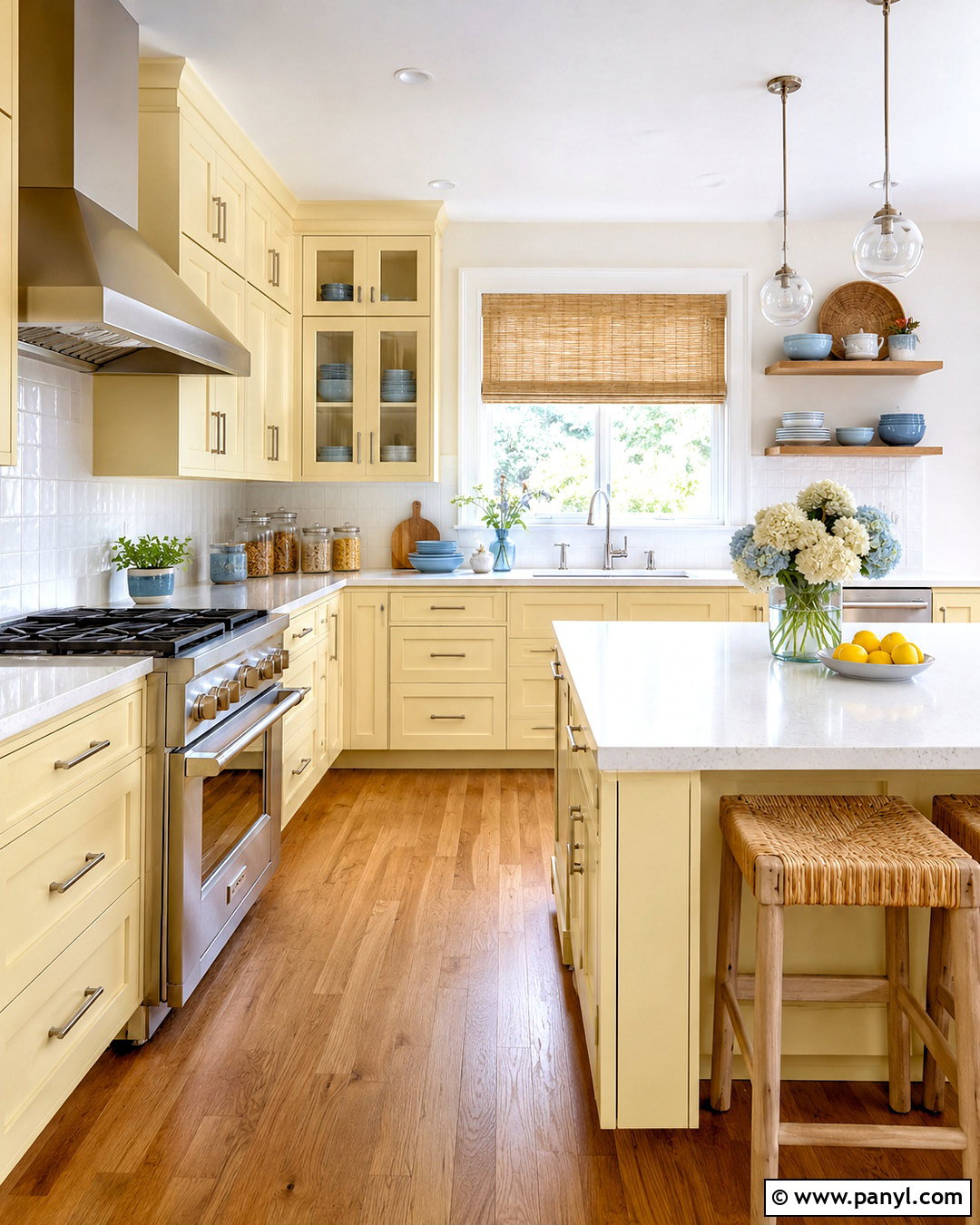
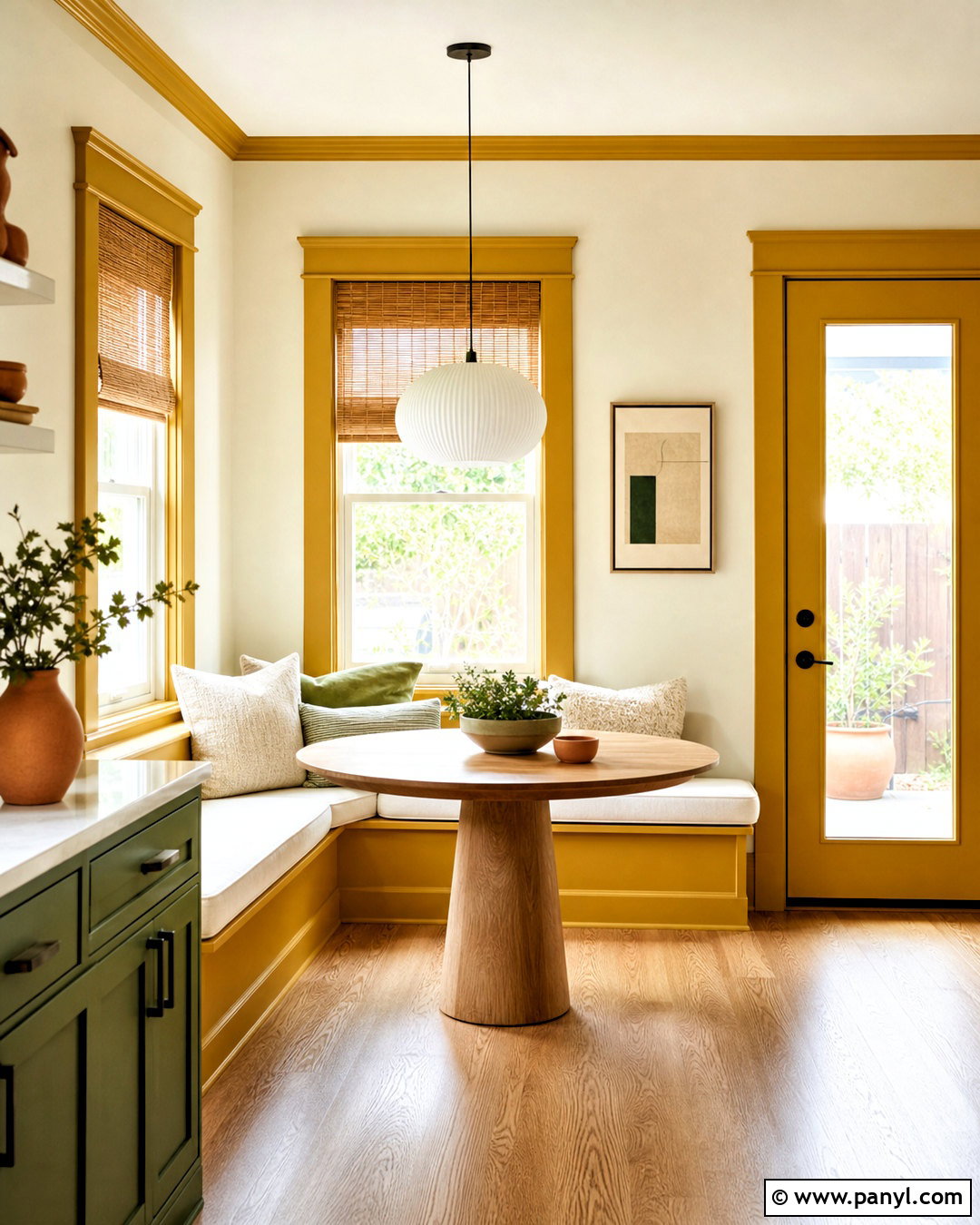
10. Copper Mountain SW 6356 Burnt Orange Paint Color
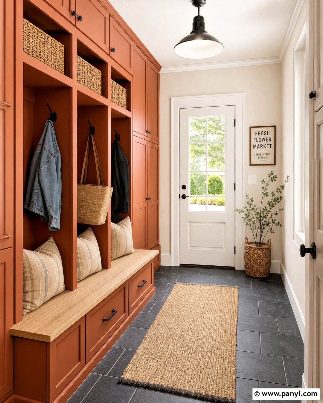
The brown undertone in Copper Mountain gives a mudroom or utility entrance a sturdy, natural character. Paint built-in cabinets, cubbies, and a storage bench in this coppery orange, then surround them with warm white walls. Use charcoal slate-look floor tile to hide everyday dirt and provide a cool contrast. Add a pale oak bench seat, black hooks, woven baskets, and striped beige cushions for practical storage and comfort. A glass-paneled exterior door can bring daylight into the space, helping the cabinetry retain its warmth. For a coordinated finish, repeat the cabinet color on the interior door leading into the house. This complete palette feels durable, organized, and welcoming while giving a hardworking area more visual personality. ()
11. Terra Mauve 105 Burnt Orange Paint Color
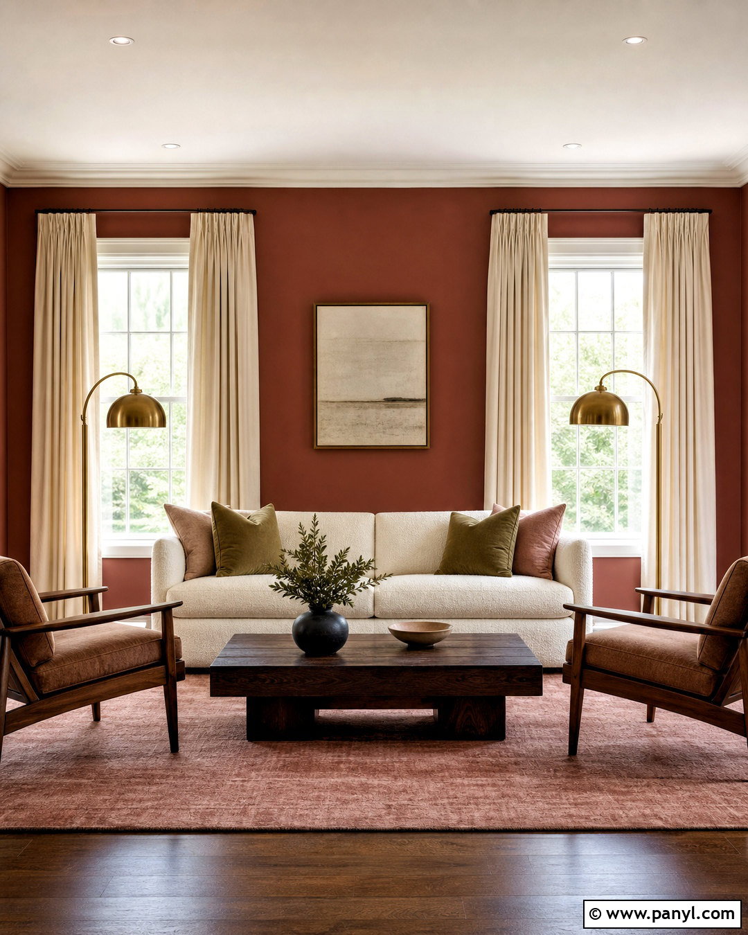
Benjamin Moore Terra Mauve is a deep burnt sienna shade that can give a formal living room understated richness. Apply it to the walls with soft white trim and a matching soft white ceiling. A cream boucle sofa creates an immediate light contrast, while walnut lounge chairs and a dark wood coffee table echo the color’s depth. Add a muted rose rug, olive pillows, and aged brass floor lamps for a layered palette. Full-length oatmeal curtains keep the windows soft without competing with the walls. Because Terra Mauve has a lower, moodier value, use several light sources at different heights. The finished room should feel intimate and refined, with pale upholstery preventing the saturated walls from becoming visually heavy. ()
12. Baked Terra Cotta 1202 Burnt Orange Paint Color

Sunlight brings out the grounded orange and brown undertones of Baked Terra Cotta, making it well suited to a breakfast room. Paint the walls this earthy shade and use creamy white on the trim and ceiling. Center a round oak pedestal table in the space, surrounded by woven rush-seat chairs that add texture without bulk. Hang a matte black pendant above the table and place a light natural-fiber rug underneath. Soft sage-green curtains offer a gentle complementary color, while ivory tableware and handmade pottery continue the casual feeling. A built-in bench with beige cushions can provide additional seating. This complete look is warm and cheerful, but its natural materials keep the orange walls from reading as overly bright or playful. ()
13. Potters Clay 1221 Burnt Orange Paint Color
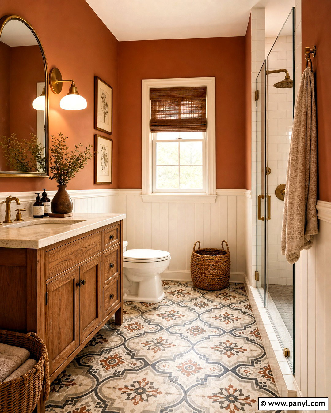
Potters Clay creates a softly aged look that complements traditional bathrooms and rustic materials. Cover the upper walls in this muted orange-brown shade, then install warm white vertical paneling below. A medium oak vanity, cream stone countertop, and brushed brass fixtures establish a natural foundation. Choose an arched mirror and simple milk-glass sconces to keep the design classic but uncluttered. Patterned floor tile in ivory, faded charcoal, and terracotta connects the upper and lower portions of the room. Add beige towels, woven baskets, and one small green plant near the window. The finished bathroom feels warm without losing brightness because the white paneling and pale counter interrupt the stronger wall color and reflect light around the space. ()
14. Copper Kettle 1218 Burnt Orange Paint Color
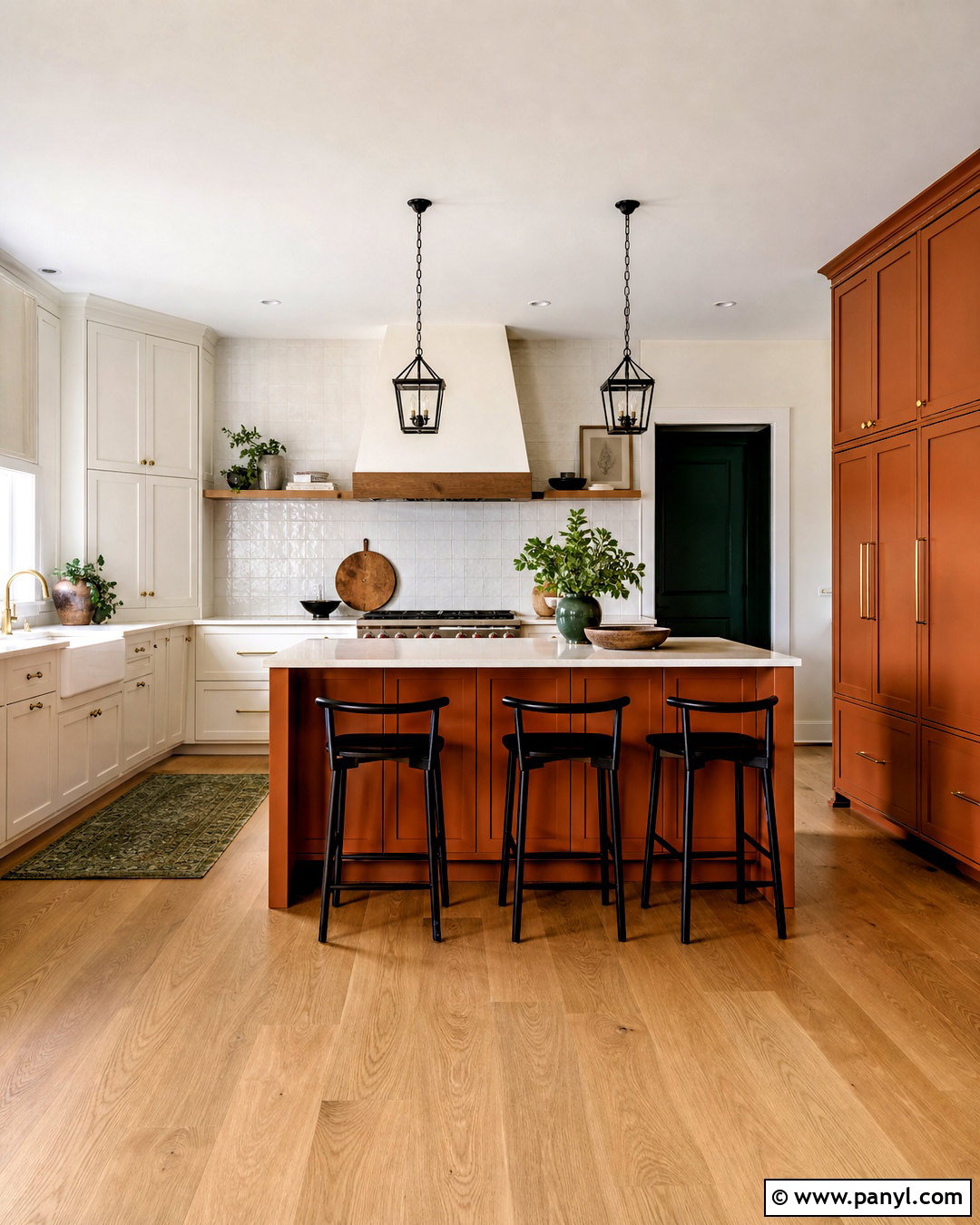
Copper Kettle can give kitchen cabinetry the appearance of a rich painted finish with vintage character. Use it on a large island and matching pantry cabinets while keeping perimeter cabinetry creamy white. Pair the orange-copper paint with lightly veined quartz counters, natural oak flooring, and an off-white square tile backsplash. Brushed brass knobs reinforce the warm palette, but black counter stools and iron pendant lights add necessary contrast. Introduce deep green through a small runner and a few practical countertop accessories. Avoid matching the walls to the cabinetry; a pale warm neutral will give every surface space to breathe. The finished kitchen feels colorful and collected, yet the balanced placement makes the burnt orange cabinetry easy to combine with changing decor. ()
15. Etruscan AF-355 Burnt Orange Paint Color
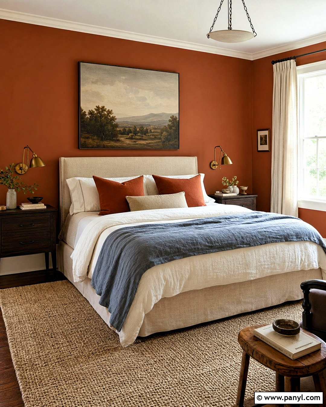
Etruscan brings an old-world terracotta quality to a bedroom while still working with clean, updated furniture. Paint all four walls in this rich earth tone and lighten the ceiling and trim with a soft, slightly warm white. Choose an upholstered bed in natural flax linen, then add dark oak nightstands and aged brass reading lights. Layer cream bedding with a faded blue coverlet and patterned rust pillows. A large beige wool rug softens the floor and stops the palette from becoming too dark. Keep window treatments simple with full-length ivory curtains. One oversized landscape above the bed can introduce olive, blue-gray, and sand tones. This complete design feels enveloping and restful, balancing historical color with practical modern simplicity. ()
16. Audubon Russet HC-51 Burnt Orange Paint Color
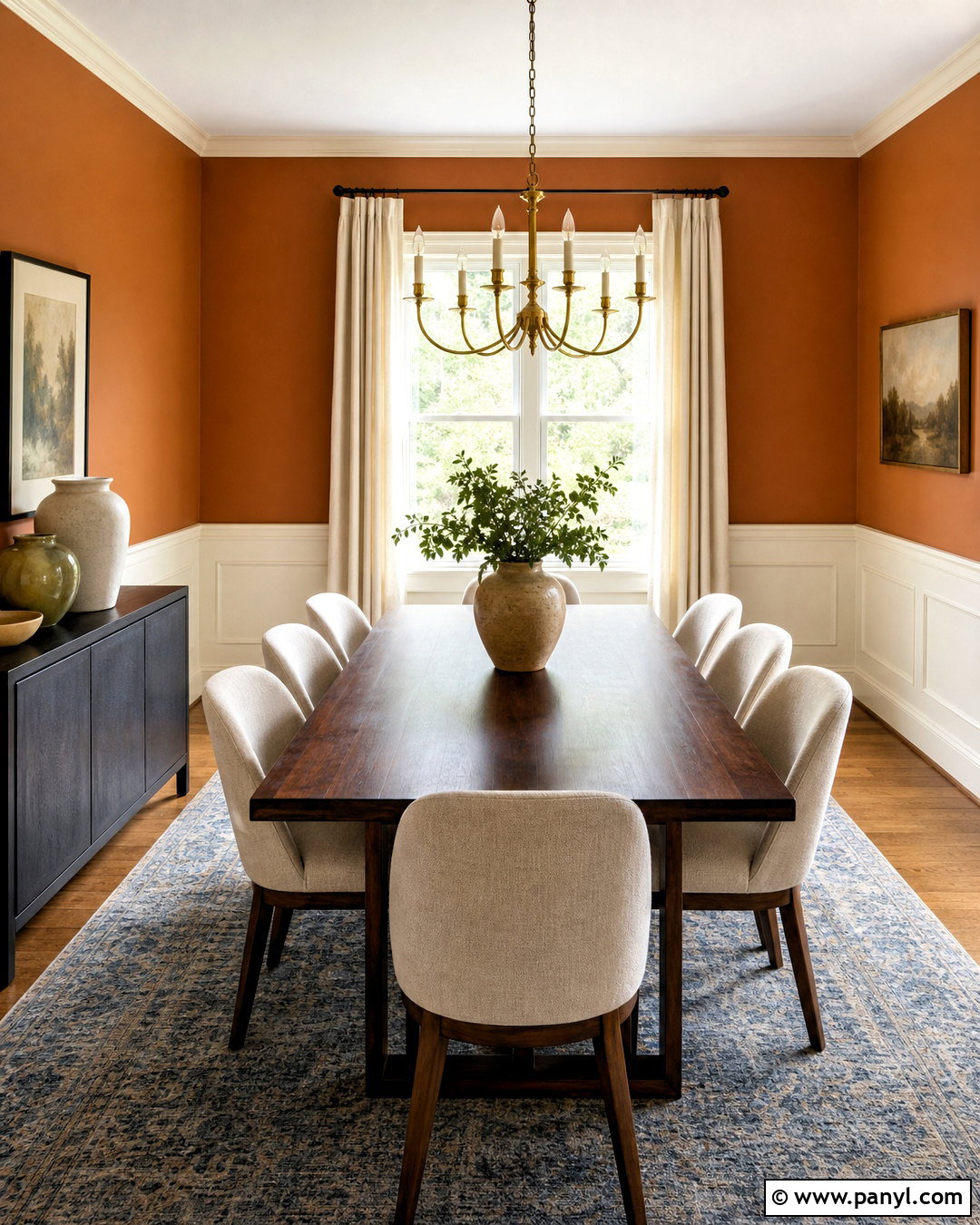
Imagine a dining room that feels warm in every season rather than tied to fall decor. Audubon Russet provides a sophisticated orange-brown backdrop for a traditional-meets-modern scheme. Paint the walls above warm white picture-frame molding, allowing the architectural detail to lighten the color. Use a dark walnut dining table with streamlined cream upholstered chairs and a simple aged brass chandelier. A blue-gray rug beneath the table adds cool contrast and protects the wood floor. Dress the windows with natural linen panels and include a black sideboard for visual weight. Ceramic vessels in cream and olive complete the arrangement. By avoiding themed accessories, the room lets the russet walls provide lasting warmth while the furniture keeps the overall appearance refined and versatile. ()
17. Greenfield Pumpkin HC-40 Burnt Orange Paint Color
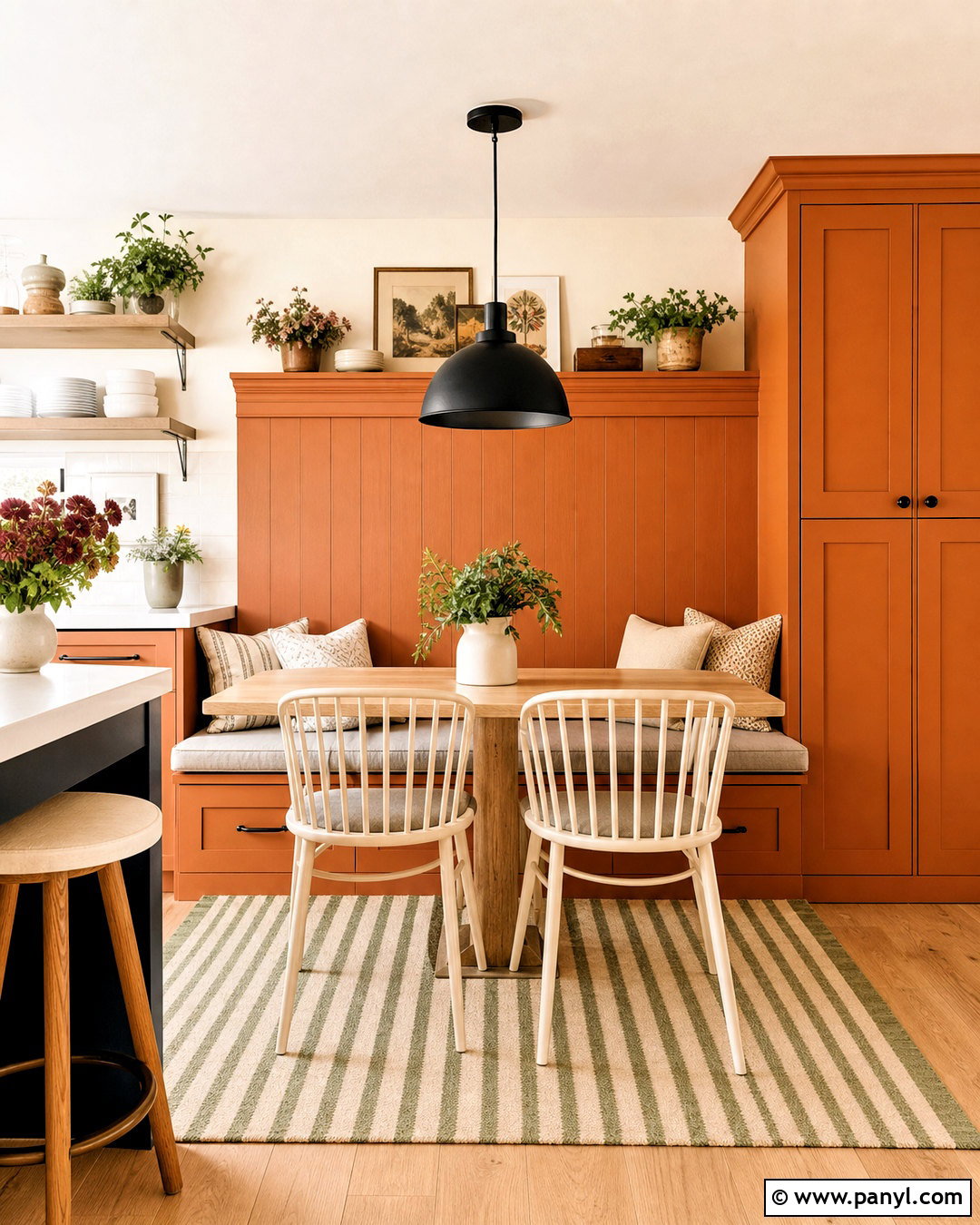
Greenfield Pumpkin has a golden, harvest-like warmth that can enliven a cheerful kitchen nook. Use it on built-in banquette cabinetry and the wall behind the seating rather than throughout the entire kitchen. Pair it with a white oak table, spindle-back chairs painted warm white, and comfortable beige seat cushions. A small pendant in matte black provides definition, while a washable striped rug introduces olive and cream. Keep nearby kitchen walls pale ivory so the saturated orange becomes a purposeful feature. Open shelves can display white dishes, clear glassware, and a few green plants. The complete nook feels sunny and welcoming without becoming overly rustic, and the limited application makes the stronger color easier to update around later. ()
18. Burnt Sienna 1196 Burnt Orange Paint Color
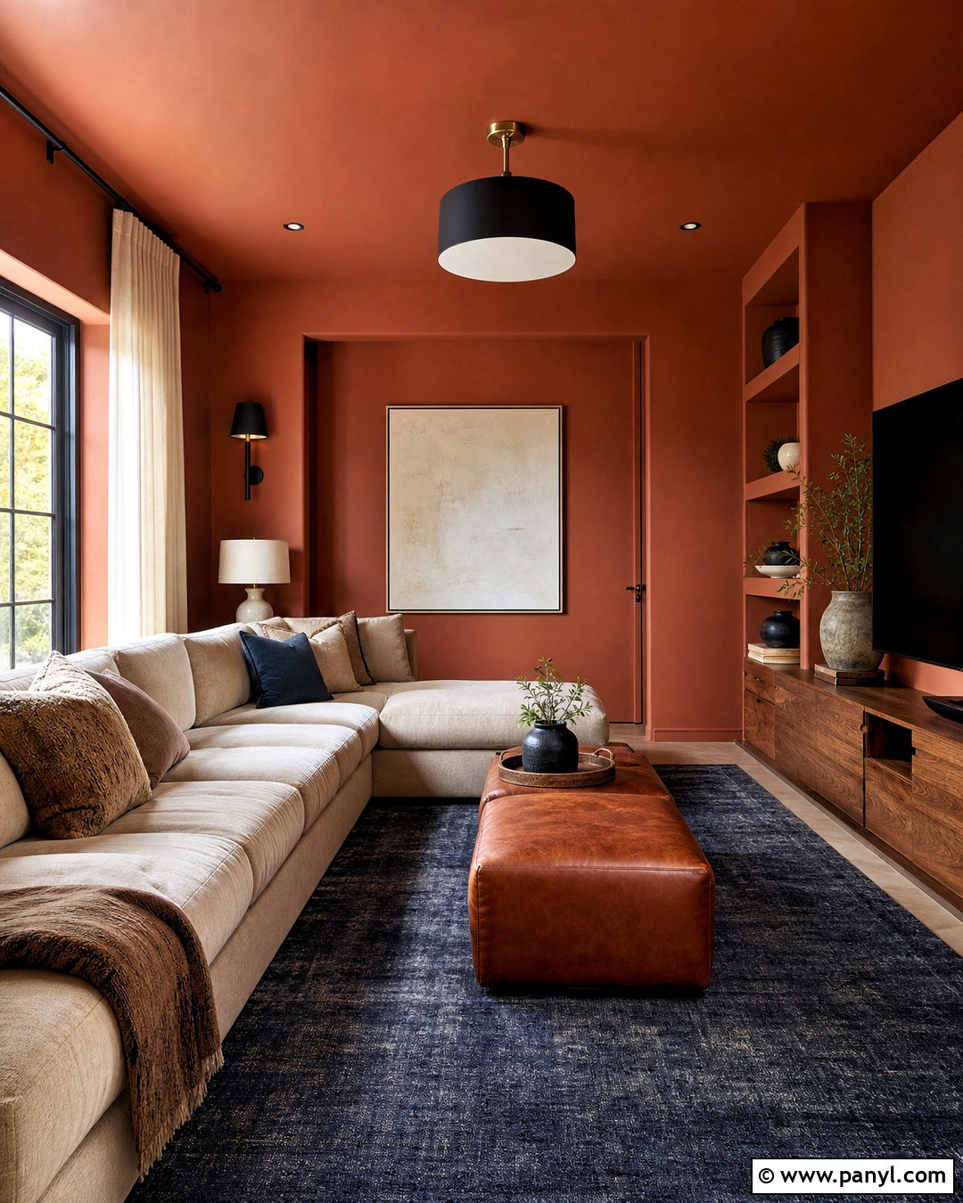
Burnt Sienna offers enough brown depth to create a dramatic media room without the harshness of black or charcoal. Paint the walls, built-in storage, and ceiling in the same shade for a seamless, cocooning effect. Add a large sand-colored sectional to brighten the center of the room and place a low walnut console beneath the television. A faded navy rug introduces cooler color, while cognac leather ottomans echo the warmth of the paint. Use dimmable black wall sconces for movie viewing, but include cream curtains and pale artwork so the room still looks inviting during the day. The completed space feels comfortable, organized, and intentionally dark, with lighter upholstery ensuring the burnt orange remains visible and nuanced. ()
19. Southwest Pottery 048 Burnt Orange Paint Color
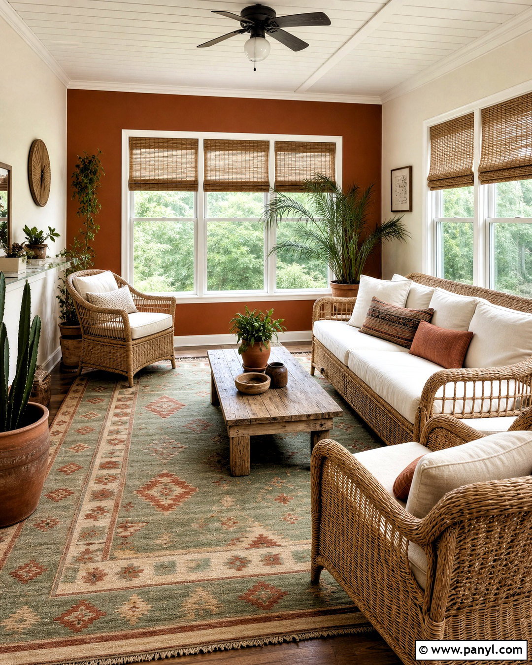
Southwest Pottery can transform a sunroom into a relaxed space filled with natural texture. Paint one long wall and the lower window trim in this earthy orange, then use soft cream across the remaining walls and ceiling. Furnish the room with pale rattan chairs, ivory cushions, and a low reclaimed-oak coffee table. A flat-weave rug in sage, sand, and rust connects the painted surface with the seating area. Add large leafy plants in simple clay pots and install woven shades to filter strong afternoon light. Keep decorative objects minimal so the windows and warm palette remain the focus. This balanced room captures the character of sun-baked materials without relying on literal regional motifs or an overly themed decorating approach. ()
20. Burnt Russet 042 Burnt Orange Paint Color
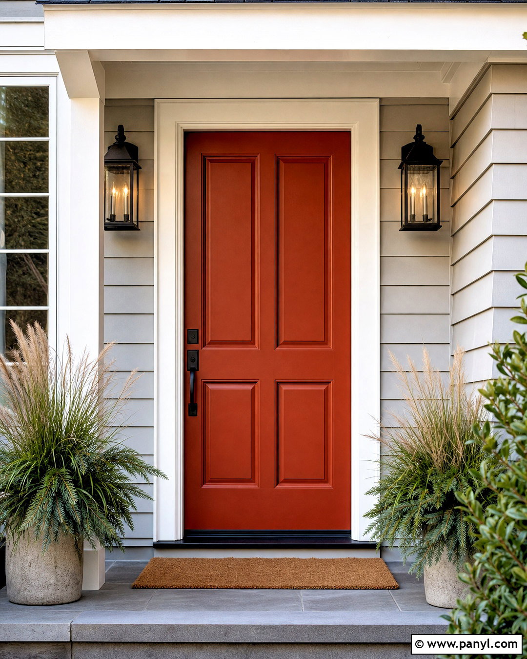
Burnt Russet provides a deep, red-leaning finish that makes a front door feel distinctive and welcoming. Use the color on a paneled wood door in a durable satin or soft gloss finish, surrounded by warm white trim and light greige siding. Matte black hardware and lanterns give the entry crisp definition, while a natural coir mat and two simple stone planters keep the styling practical. Fill the planters with evergreen foliage and soft green grasses rather than competing flowers. If the porch floor is concrete, stain it a medium warm gray to connect the siding and black accents. This complete exterior palette makes the burnt orange door the focal point while maintaining a timeless, approachable curb appearance. ()
Conclusion:
The best burnt orange paint colors combine the energy of orange with the stability of red, brown, or muted clay undertones. Lighter terracotta shades can brighten kitchens and casual gathering areas, while deep sienna and russet tones create intimate bedrooms, libraries, and media rooms. For balance, pair these colors with cream, warm white, natural oak, walnut, olive green, muted blue, or matte black. Consider using stronger shades on cabinetry, doors, built-ins, or one architectural feature if four painted walls feel overwhelming. Most importantly, view each sample beside your flooring, fabrics, and trim throughout the day. With thoughtful testing and a coordinated room plan, these 20 burnt orange paint colors can feel warm, modern, and enduring.

Related Ideas and Inspiration:
Leave a Reply