
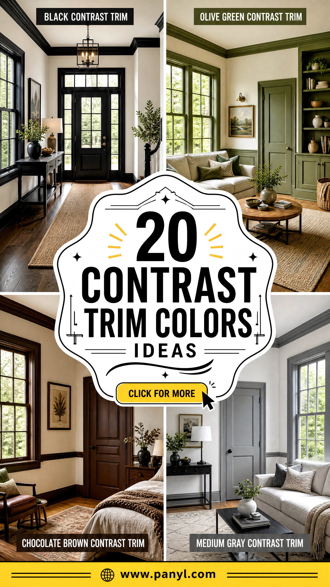
Contrast trim turns ordinary baseboards, door casings, windows, and crown molding into intentional architectural details. Instead of defaulting to bright white, you can use black, earthy green, warm brown, muted blue, or another distinctive shade to frame a room and strengthen its overall palette. The best combinations coordinate the trim with flooring, furniture, lighting, and textiles rather than treating paint as an isolated choice. Dark trim can ground pale walls, while light trim gives saturated walls a crisp, structured finish. Sheen matters too: satin or semigloss typically creates practical definition against a flatter wall finish. Always test samples beside permanent surfaces in changing daylight before committing. The complete room looks below explore 20 contrast trim colors. ()
1. Black Contrast Trim
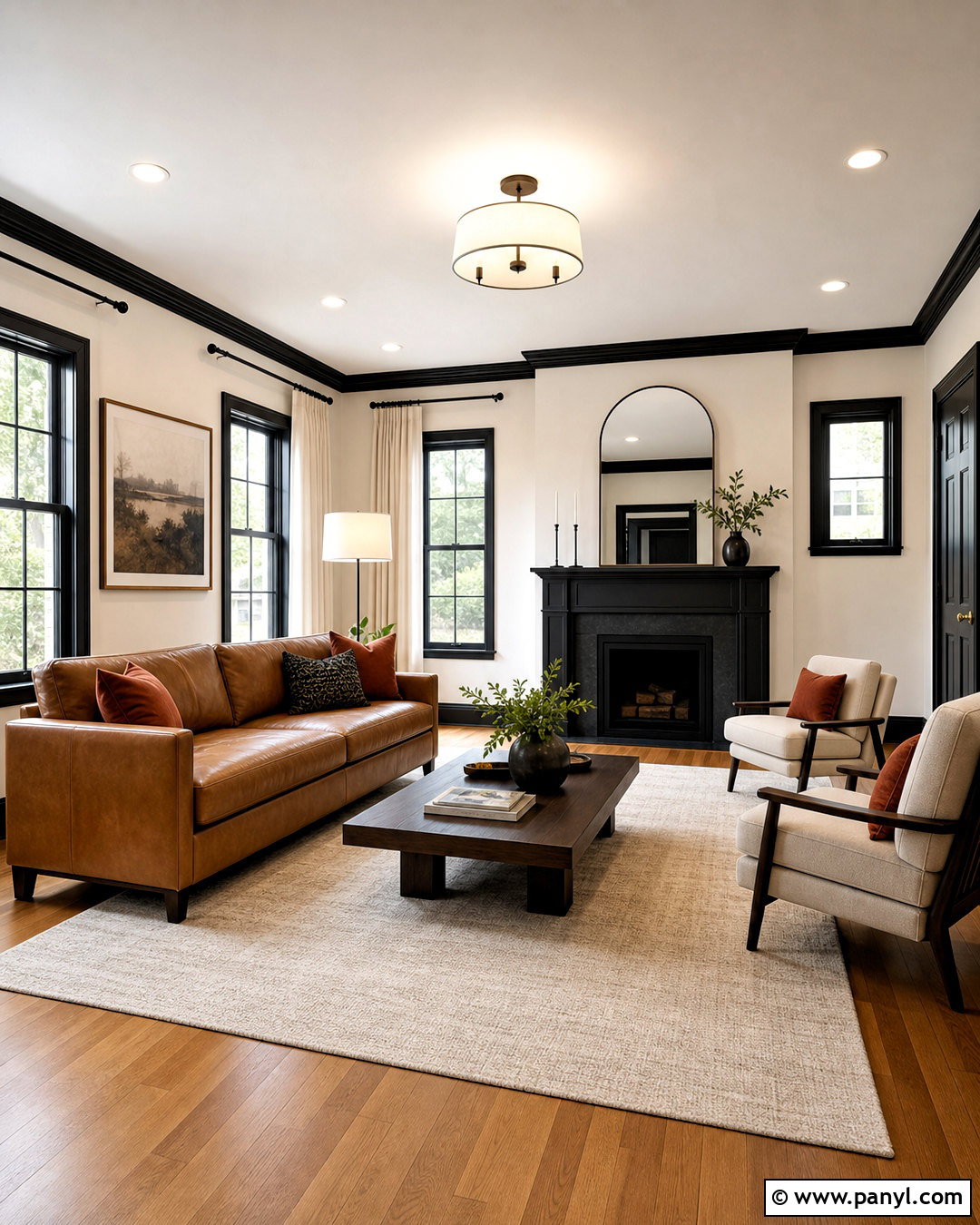
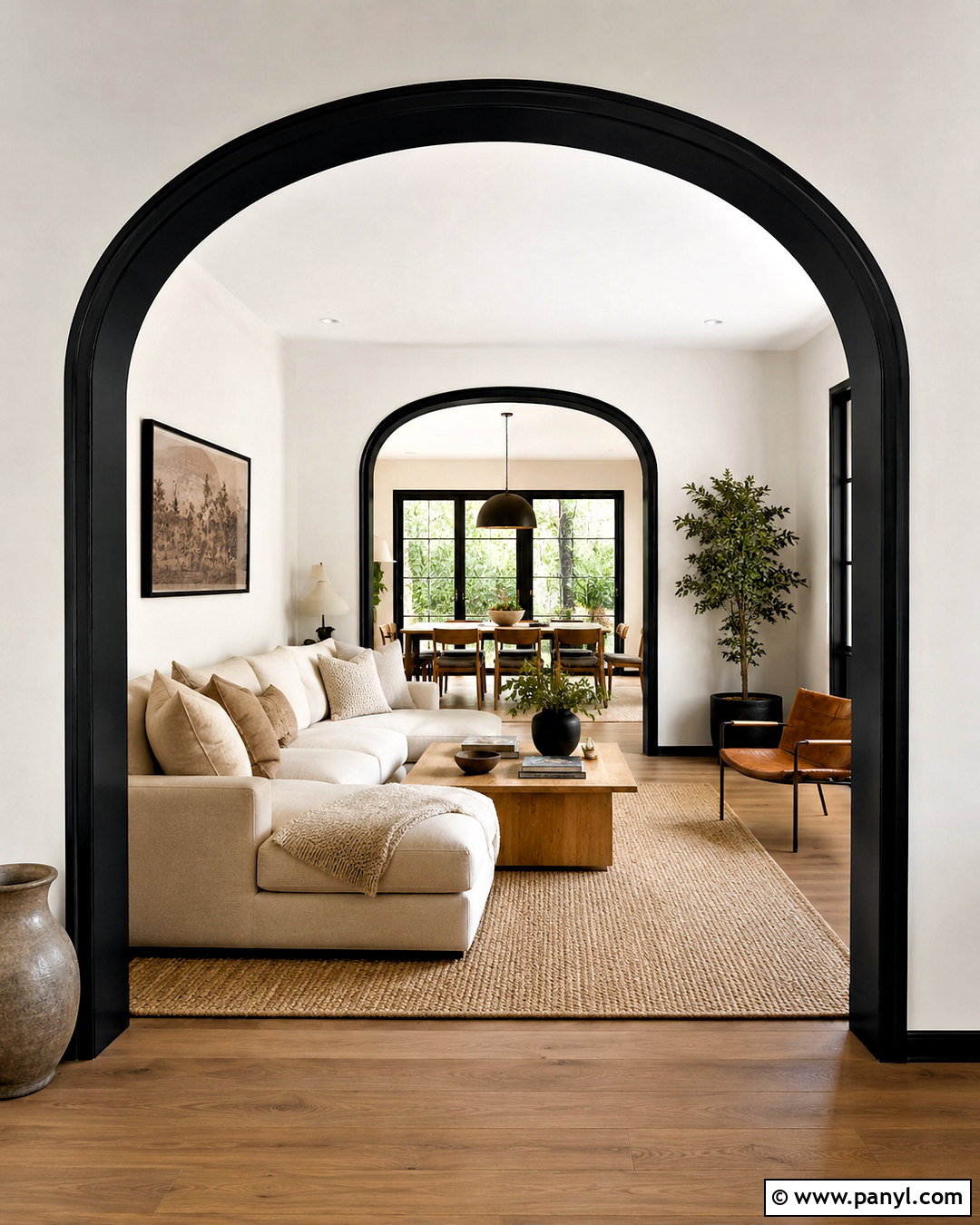
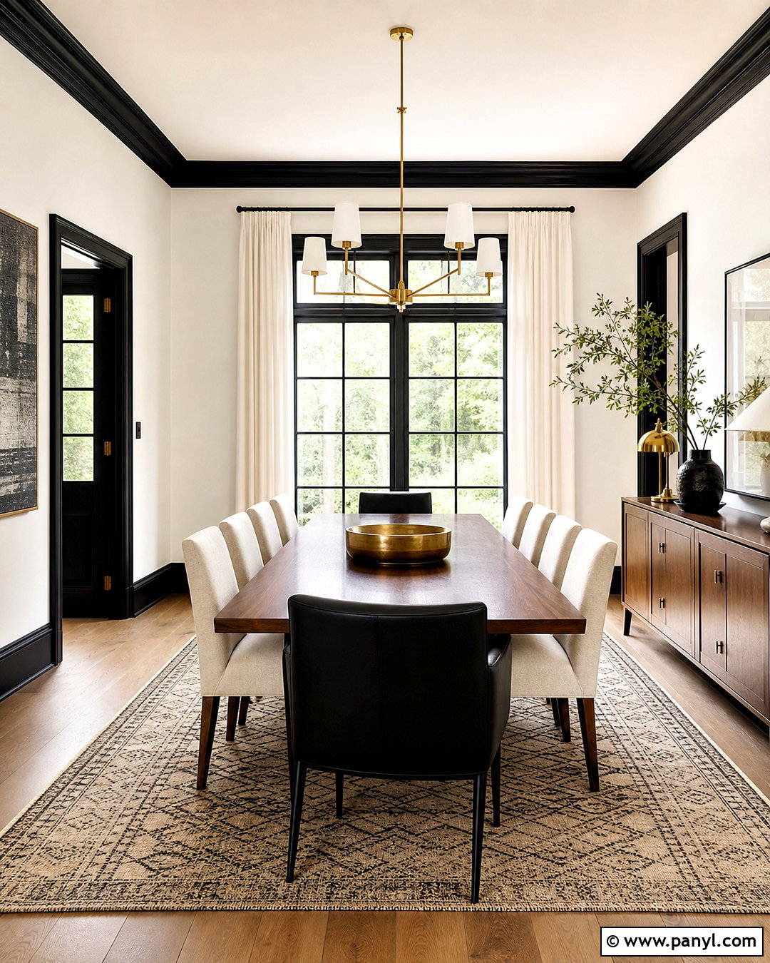
Black trim creates a sharp frame around warm white walls and gives a basic living room stronger architectural presence. Carry matte black across the window casings, baseboards, interior doors, and a simple fireplace surround for continuity. Medium oak flooring and a camel leather sofa soften the graphic contrast, while cream curtains prevent the windows from appearing too heavy. Add a textured ivory rug, walnut coffee table, and a few rust-colored pillows to warm the palette. This combination works especially well in rooms with generous natural light and uncluttered moldings. Choose satin black rather than a high-gloss finish for a polished look that feels bold without making every surface overly reflective.
2. Charcoal Gray Contrast Trim
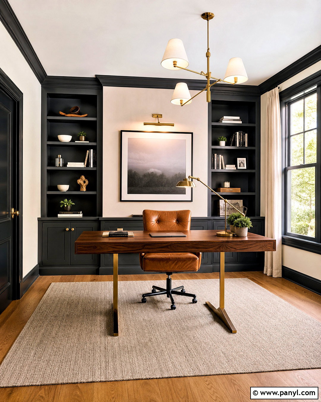
For a softer alternative to pure black, charcoal gray trim brings depth to creamy walls without producing an overly stark outline. Use it throughout a home office on baseboards, door casings, built-in shelving, and the window frame. Pair the paint with a walnut desk, cognac leather chair, warm oak flooring, and an oatmeal-colored rug. Brushed brass lighting adds a warm counterpoint to the cool charcoal undertone. Keep window treatments simple with natural linen panels, allowing the dark casing to remain visible. A satin finish will make the millwork easy to clean while distinguishing it from matte walls. The completed room feels professional, grounded, and comfortable enough for everyday use.
3. Navy Blue Contrast Trim
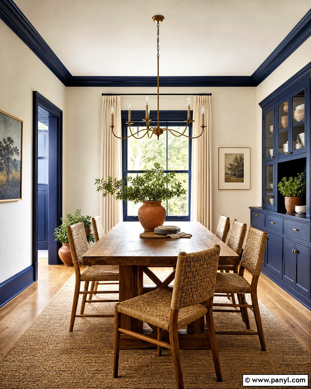
Navy blue trim adds classic color while remaining versatile enough for a dining room used every day. Place it against soft ivory walls and repeat the navy on baseboards, window frames, door casings, and a built-in china cabinet. A medium-toned oak dining table keeps the room warm, while woven dining chairs and a natural fiber rug introduce relaxed texture. Use aged brass lighting and cream drapery to balance the darker paint. Small accents in muted red or terracotta can make the scheme feel layered rather than strictly blue and white. Navy looks best when the room receives steady natural light, which reveals its blue character and prevents the trim from reading as black.
4. Forest Green Contrast Trim
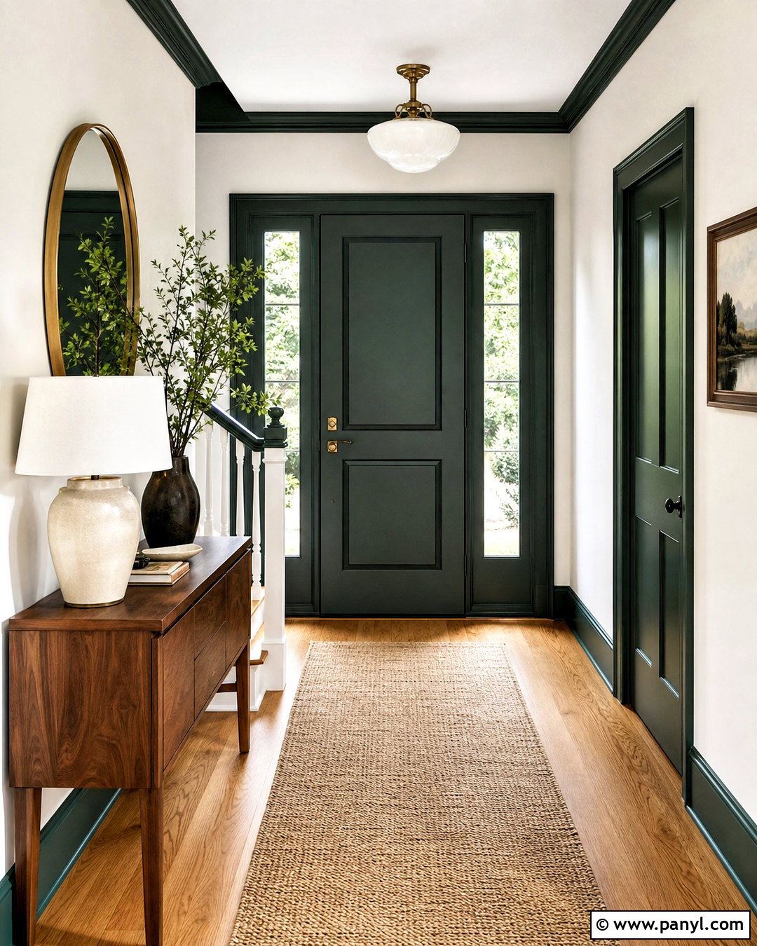
Deep forest green trim gives a bright entryway a grounded, nature-inspired identity. Paint the front door, surrounding casing, baseboards, stair railing, and nearby closet door the same rich green. Warm white walls keep the narrow space open, while honey oak flooring and a woven runner reinforce the organic palette. Add a slim walnut console, antique brass mirror, and ceramic table lamp with a cream shade. A few restrained botanical accents can connect the paint to the rest of the decor without turning the room into a theme. Forest green has enough depth to define millwork clearly, yet its earthy quality feels welcoming. Satin paint will also stand up well to frequent contact in this busy space.
5. Olive Green Contrast Trim
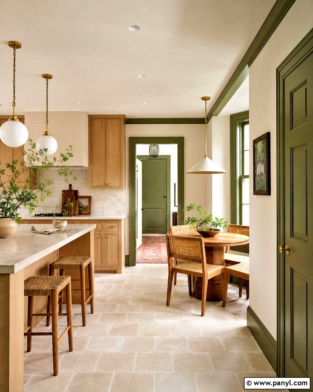
Olive green trim can make a kitchen feel warm, collected, and connected to natural materials. Use the color on window casings, baseboards, door frames, and the lower section of a simple breakfast nook. Pair it with softly plastered cream walls, white oak cabinetry, honed beige stone counters, and handmade ivory backsplash tile. A round oak table with woven chairs completes the casual layout. Antique brass hardware and warm white pendant lights support the green’s golden undertone. Keep appliances and larger fixtures quiet so the painted millwork remains the defining feature. This combination is particularly effective in kitchens overlooking a yard because the olive trim creates a visual bridge between indoor finishes and outdoor greenery.
6. Sage Green Contrast Trim
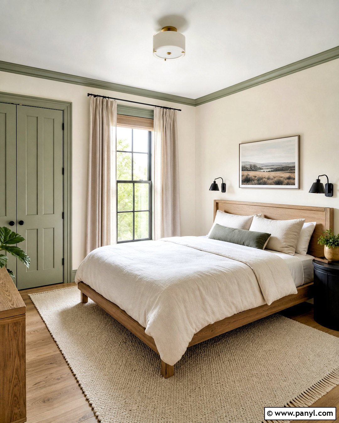
Soft sage trim introduces noticeable contrast without overpowering a calm bedroom. Paint the baseboards, window casing, closet doors, and crown molding in a muted gray-green, then use warm off-white on the walls. Build the room around a light oak bed, ivory linen bedding, and pale oatmeal curtains. A wool rug in cream and faded green ties the surfaces together, while small black reading sconces provide crisp definition. Keep decorative objects limited to natural ceramics, wood, and one or two botanical prints. Because sage is lighter than many contrasting trim colors, it works well in smaller rooms or spaces with limited daylight. Choose satin trim paint to create subtle separation from the flat walls.
7. Greige Contrast Trim
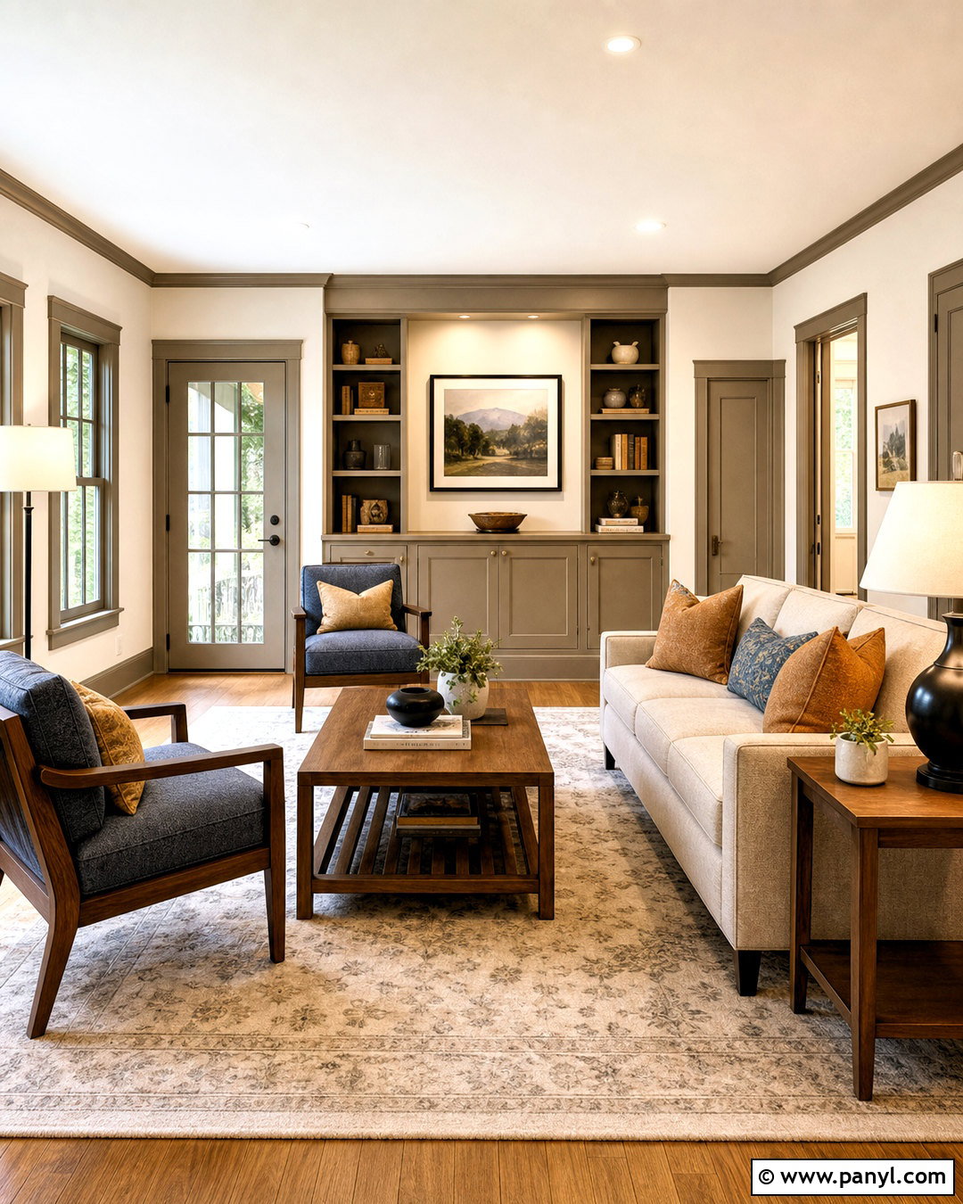
Greige trim is ideal when you want visible definition but prefer a quiet, neutral room. In a transitional living room, combine warm white walls with medium greige baseboards, door casings, window frames, and built-in cabinetry. Use a soft beige sofa, walnut side tables, and an ivory rug with a restrained linear pattern. Black metal lamps add structure, while muted blue and camel accents keep the palette from feeling flat. Match the greige undertone to the flooring: a warmer shade complements natural oak, whereas a balanced gray-beige suits limestone or cooler wood. The result feels tailored but approachable. This look also allows artwork and furniture to change over time without requiring another full paint update.
8. Taupe Contrast Trim
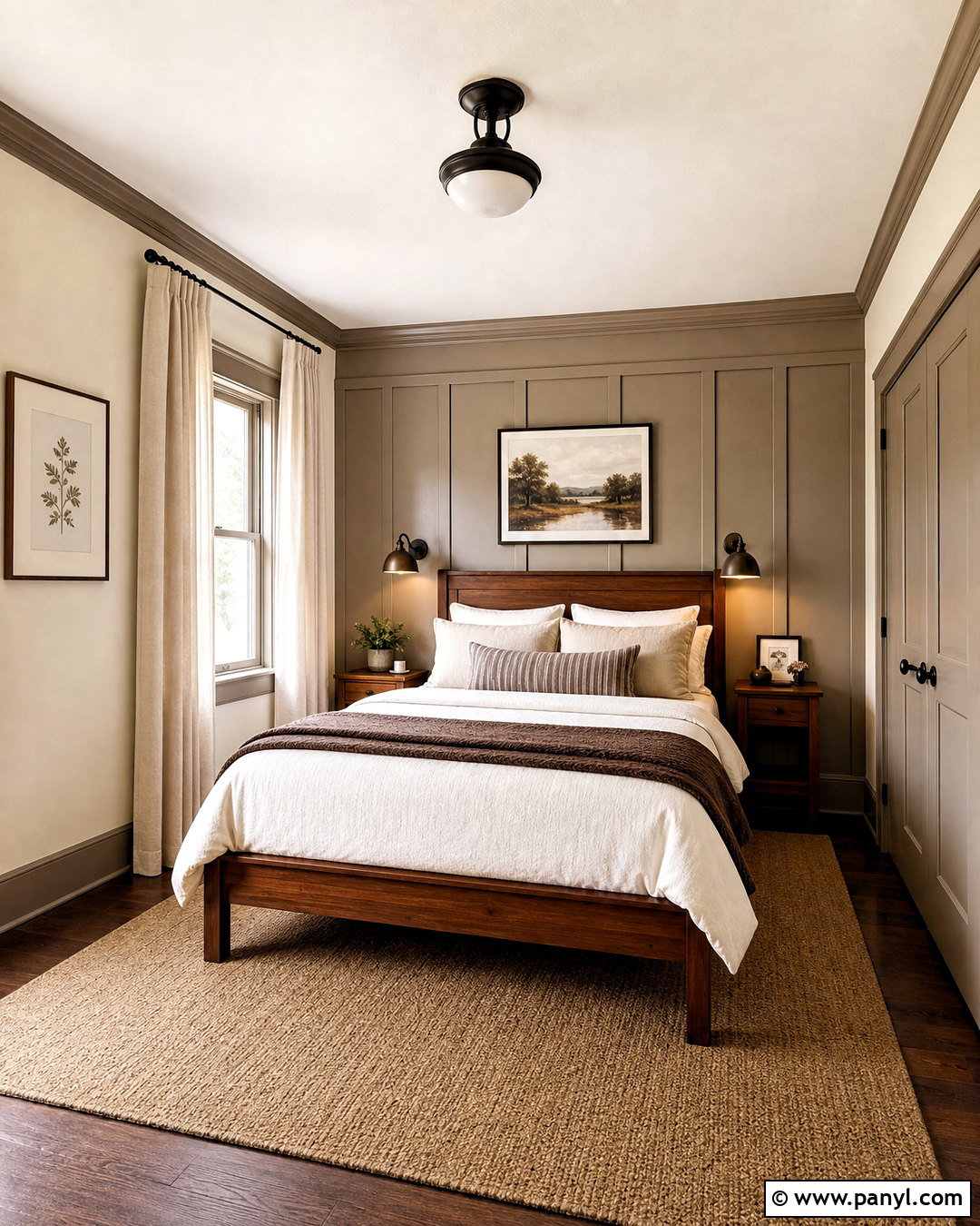
Taupe trim brings cozy depth to a bedroom while maintaining a sophisticated neutral palette. Set a medium mushroom-taupe against pale cream walls, using it on baseboards, window casings, closet doors, and a paneled headboard wall. Layer the room with a walnut bed, ivory quilt, cocoa-colored throw, and linen curtains that sit between the wall and trim tones. A plush beige rug keeps the floor soft, while bronze sconces strengthen the warm color direction. Avoid pairing taupe with icy white because the undertones may appear disconnected. A creamy wall color creates a smoother transition while preserving contrast. This complete scheme feels restful, practical, and richer than an all-white treatment without relying on a bold statement color.
9. Chocolate Brown Contrast Trim
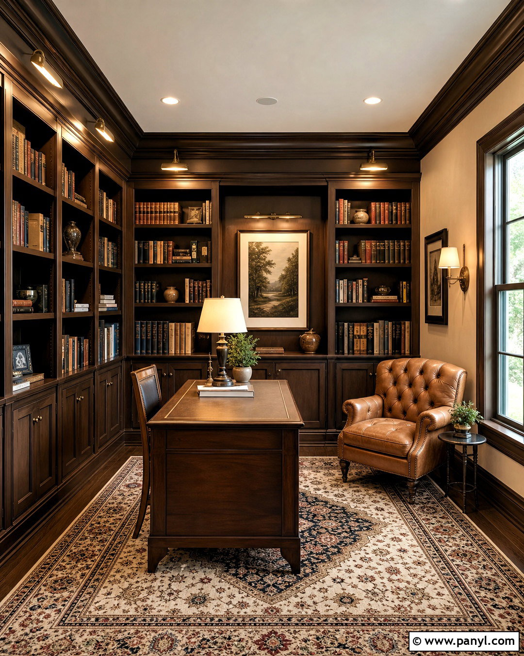
Chocolate brown trim gives a library or reading room a warm, traditional foundation. Pair deep brown baseboards, window casings, crown molding, and built-in bookcases with parchment-colored walls. A tufted caramel chair, walnut writing desk, and vintage-inspired patterned rug create a comfortable layout without making the room feel formal. Add aged brass picture lights and cream linen shades to brighten the darker wood tones. Books and ceramics in rust, olive, and muted blue provide controlled color. The brown paint should relate closely to the room’s wood furniture but remain distinct enough to look intentional. Satin or semigloss finishes highlight molding profiles and help painted trim resemble carefully finished woodwork from a distance.
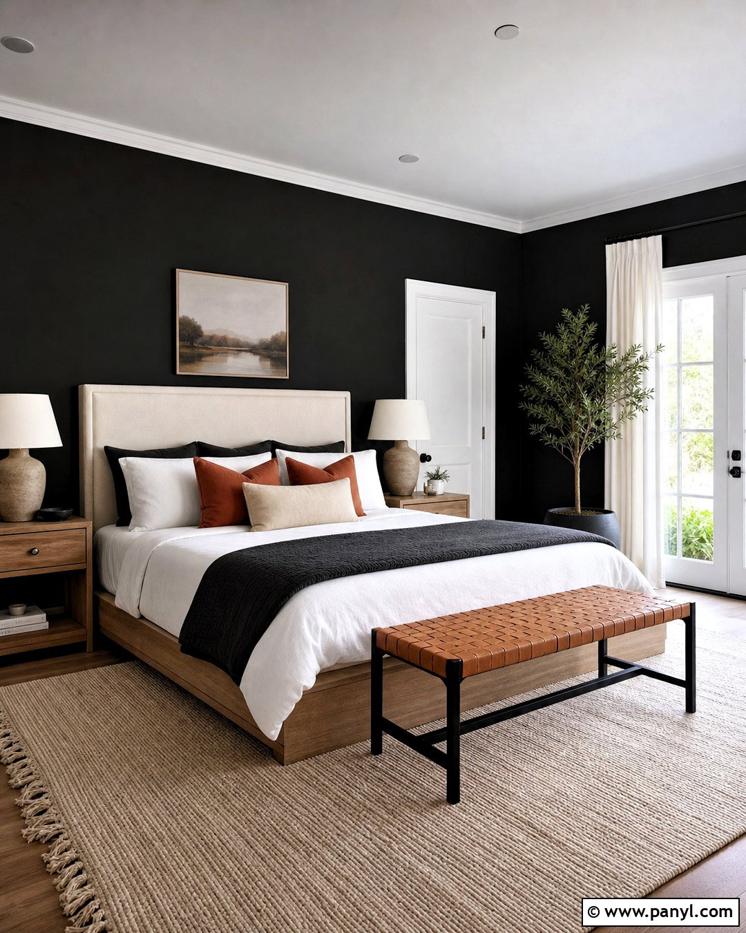
10. Terracotta Contrast Trim
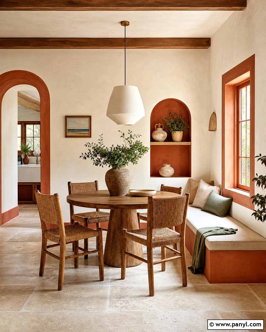
Warm terracotta trim can transform a plain dining nook into an inviting Mediterranean-inspired space. Use the earthy red-orange on window frames, baseboards, door casings, and a shallow wall niche. Balance it with creamy plaster-look walls and pale limestone or light oak flooring. Choose a round wood table, woven chairs, and an ivory pendant with a simple sculptural shape. Linen cushions in sand and faded olive soften the warm palette, while handmade ceramic vessels reinforce the artisanal character. Keep the terracotta slightly muted rather than bright orange so it feels grounded and livable. Repeating the color in one small textile or piece of artwork helps the trim relate naturally to the complete room rather than appearing randomly selected.
11. Burgundy Contrast Trim
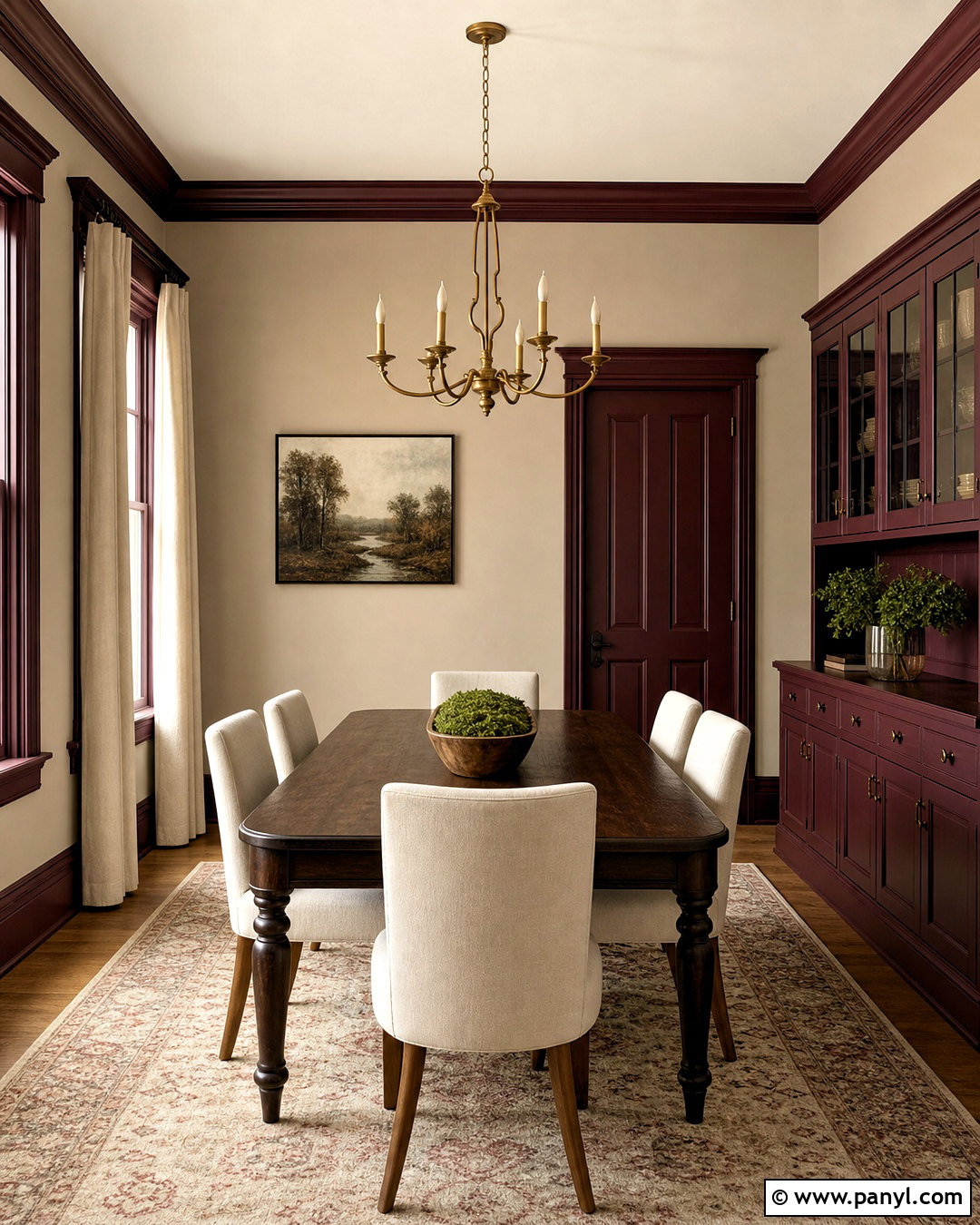
Burgundy trim creates a rich, tailored dining room when paired with warm neutral walls. Apply the deep red to baseboards, window casings, crown molding, interior doors, and a compact built-in serving cabinet. Choose light mushroom walls to soften the contrast and prevent the combination from feeling overly formal. A dark oak table, upholstered cream chairs, and a faded traditional rug establish a comfortable foundation. Aged brass lighting complements the red undertone, while natural linen curtains brighten the windows. Limit additional saturated colors, using only small touches of muted rose, brown, or olive. The finished room feels dramatic yet balanced because burgundy surrounds the space in measured architectural lines instead of covering every wall.
12. Dusty Blue Contrast Trim
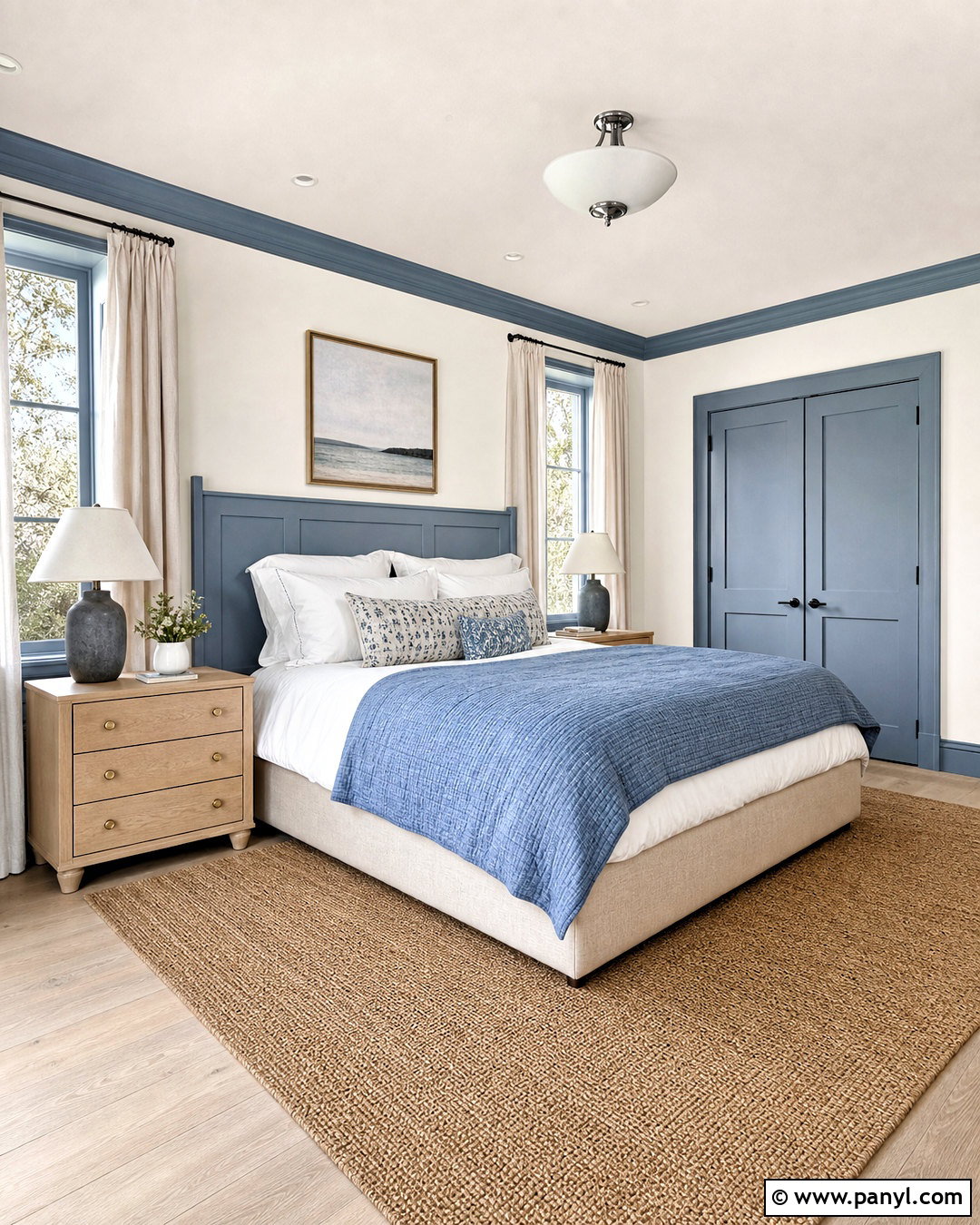
Dusty blue trim gives a guest bedroom gentle color and a relaxed, airy character. Pair the muted blue with warm white walls, applying it to the baseboards, window casing, closet doors, and a simple paneled headboard feature. Use white oak nightstands, an upholstered oatmeal bed, and crisp white bedding layered with a faded blue quilt. Natural linen curtains and a woven cream rug maintain softness. Add brushed nickel or pewter lighting to support the blue’s cooler quality without introducing harsh shine. Dusty blue works especially well when it contains a touch of gray, which keeps the trim sophisticated. Repeat the shade sparingly in artwork or pillows so the coordinated room still feels light and effortless.
13. Deep Teal Contrast Trim
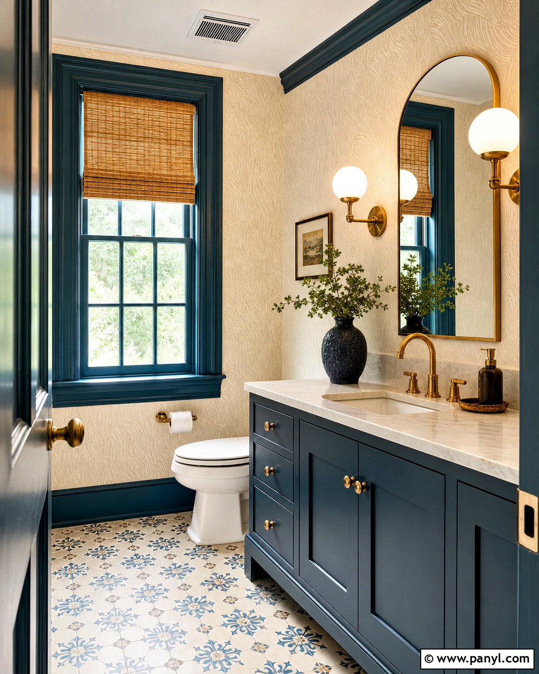
Deep teal trim brings personality to a powder room while making its compact architecture feel intentional. Cover the baseboards, door casing, window frame, and vanity in the same blue-green shade. Use warm white walls or subtly textured ivory wallpaper to create a bright background. A white marble-look counter, unlacquered brass faucet, arched mirror, and small globe sconces complete the polished arrangement. Add patterned floor tile in cream, teal, and soft gray for another layer of character. Because powder rooms are enclosed, a bold trim color can make a memorable impact without overwhelming a larger living area. Keep towels and accessories simple so the strong millwork color remains the clear focal point.
14. Slate Blue Contrast Trim
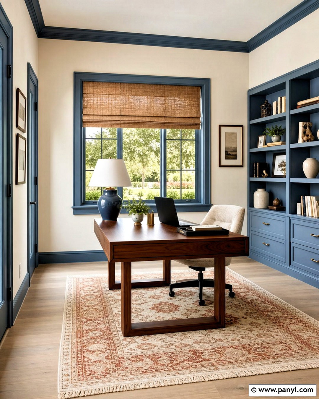
Slate blue trim creates a composed, classic look in a light-filled home office or study. Paint the window frames, baseboards, door, and built-in storage in a medium blue with clear gray undertones. Soft cream walls and pale oak flooring prevent the color from becoming too cool. Furnish the room with a walnut desk, upholstered beige chair, navy desk lamp, and flat-woven rug in ivory and faded rust. Roman shades in natural linen allow the painted windows to remain prominent. The muted quality of slate blue makes it easier to coordinate than brighter shades. It supplies enough depth to outline the architecture while supporting a calm environment suited to focused work, reading, and organized storage.
15. Mustard Ochre Contrast Trim
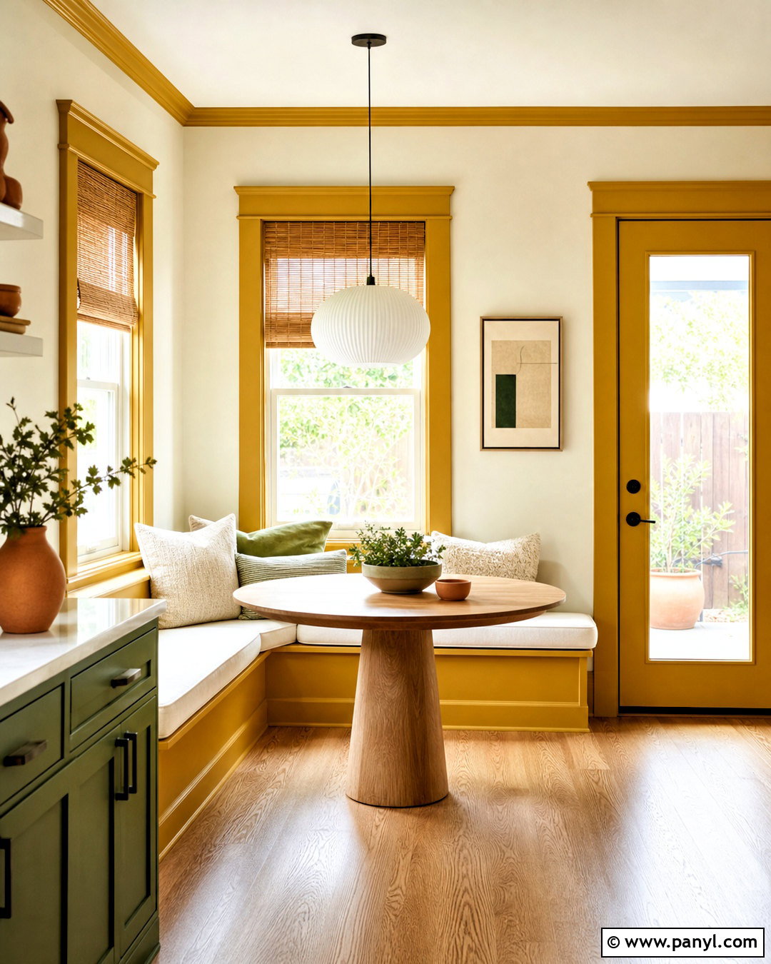
Mustard ochre trim introduces sunny warmth to a breakfast room without requiring brightly colored walls. Use the golden shade on baseboards, window casings, a glazed door, and a built-in bench. Surround it with soft ivory walls, warm oak flooring, and a round pedestal table in medium wood. Add cream seat cushions, woven shades, and a simple white pendant to keep the room balanced. Accents in muted green and terracotta complement the ochre while preserving its leading role. Choose a slightly earthy, browned mustard instead of a high-energy yellow for a more lasting result. Morning light will bring out its warmth, making the finished space feel cheerful, comfortable, and visually connected to natural wood.
16. Muted Plum Contrast Trim
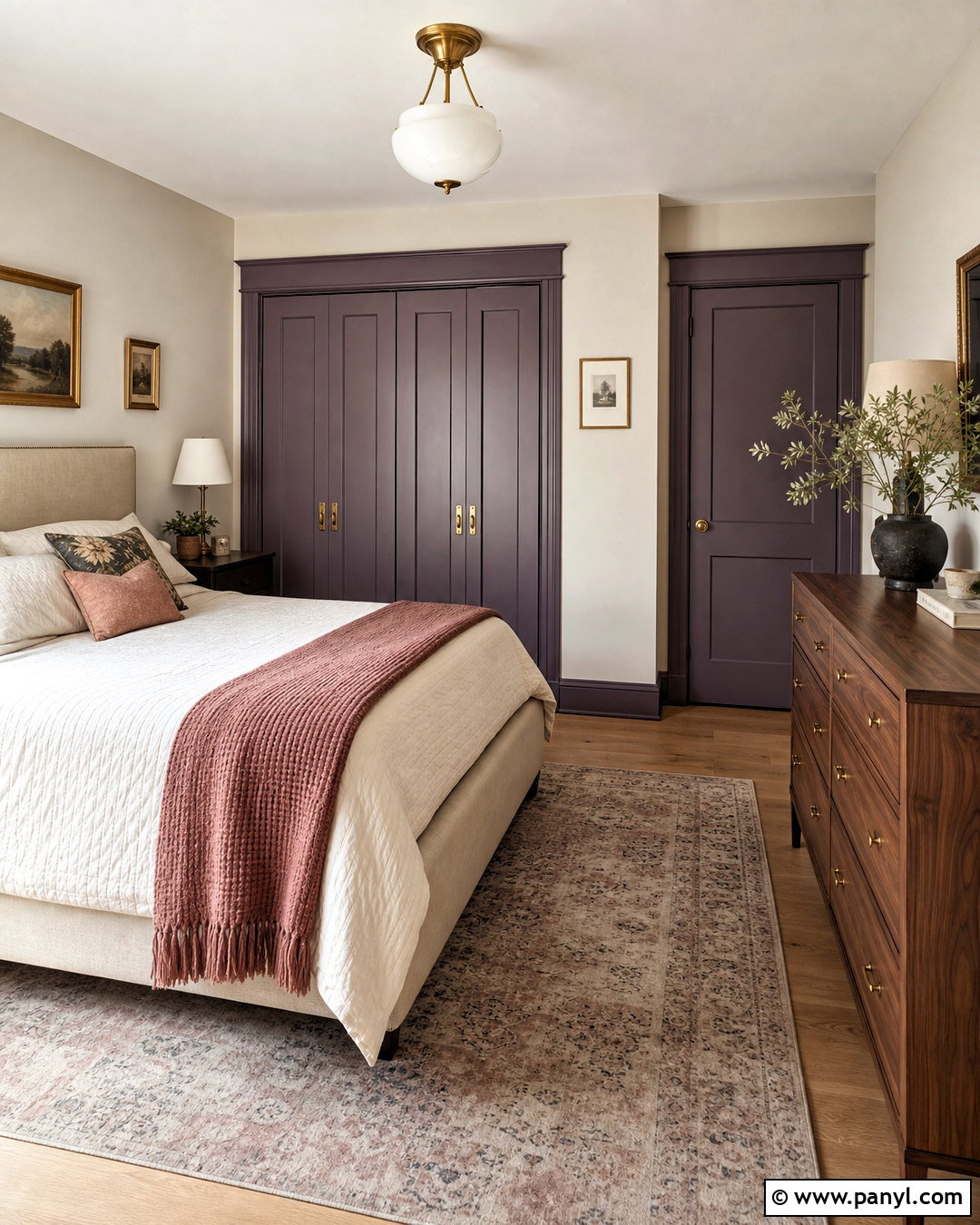
Muted plum trim offers an elegant alternative to brown or charcoal in a bedroom or dressing room. Select a softened purple with noticeable gray undertones and apply it to the baseboards, door frames, closet cabinetry, and window casing. Pair it with pale putty walls, a walnut dresser, and an upholstered bed in warm beige. Layer cream bedding with dusty rose and cocoa accents, then ground the room with a faded patterned rug. Antique brass hardware and milk-glass lighting add warmth without competing with the paint. Plum should be deep enough to outline the room but muted enough to coordinate with neutral furnishings. The complete look feels personal and refined rather than overly sweet or theatrical.
17. Rust Contrast Trim
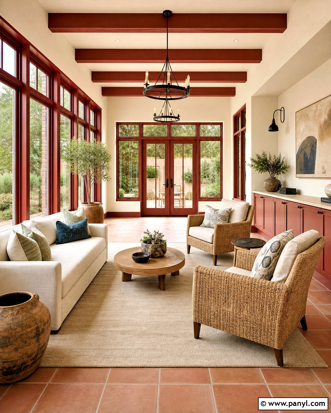
Rust-colored trim gives a sunroom or casual sitting area an earthy Southwestern influence. Paint the window frames, baseboards, French doors, and a low storage cabinet in a warm red-brown shade. Use creamy walls, pale clay floor tile, and a natural linen sofa to establish a bright foundation. Add woven lounge chairs, an ivory rug, and pillows in sage, sand, and faded indigo. Black metal lighting introduces a clean modern line that keeps the palette from feeling rustic. Rust works best when it echoes nearby terracotta, brick, or warm wood surfaces. With abundant windows and simple furnishings, the trim reads as a confident architectural detail while the entire room remains relaxed and welcoming.
18. Medium Gray Contrast Trim
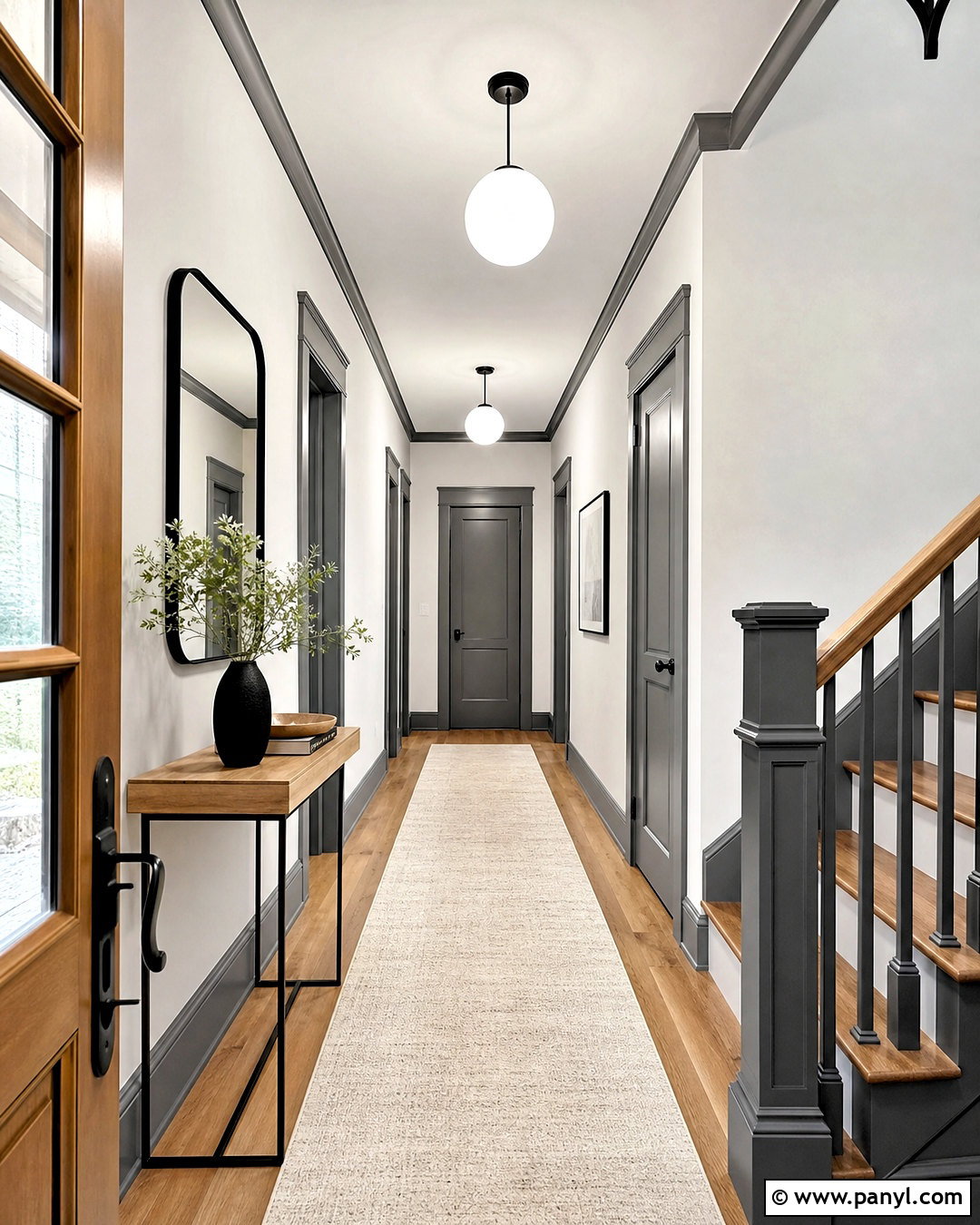
Medium gray trim gives a busy hallway clean definition and handles everyday visual wear better than brilliant white. Apply a balanced gray to baseboards, door casings, interior doors, and the stair railing, then use a soft warm white on the walls. Light oak flooring and a washable ivory runner keep the passage bright. Add a narrow wood console, black-framed mirror, and simple globe ceiling lights for a practical, complete arrangement. Avoid a strongly blue gray if the surrounding materials are warm. A neutral or slightly warm gray will coordinate more easily with wood floors and adjacent rooms. Satin paint provides a durable finish while reflecting enough light to show the trim’s crisp edges.
19. Warm Beige Contrast Trim
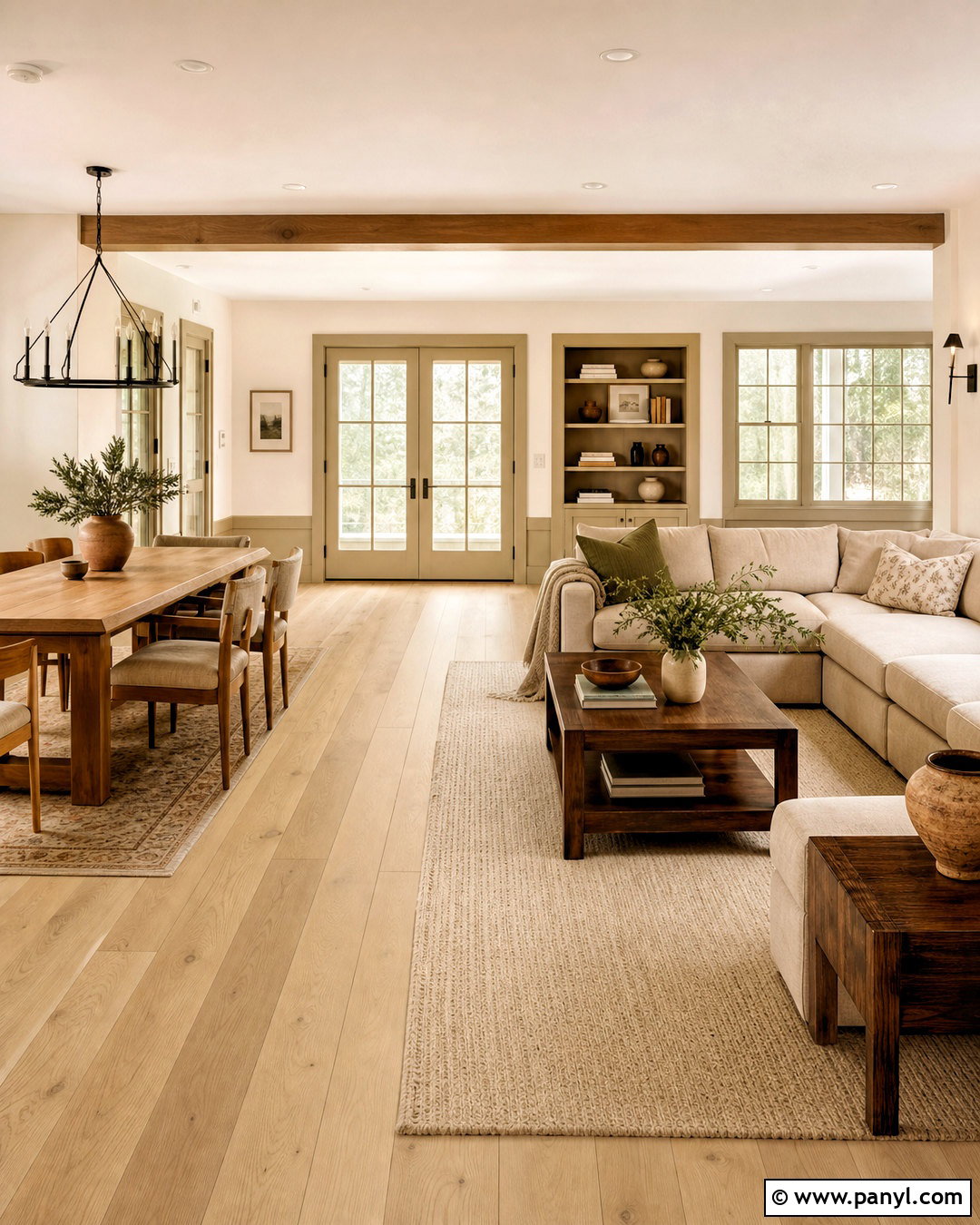
Warm beige trim delivers a subtle, welcoming contrast in an open living and dining area. Pair pale ivory walls with sand-colored baseboards, window casings, doors, and built-in cabinets. Use light oak furniture, an oatmeal sectional, and a textured cream rug to maintain a soft tonal foundation. Dark bronze lighting and walnut accent tables provide enough depth to keep the room from looking washed out. Introduce muted olive and clay through pillows, pottery, and artwork. Although the contrast is gentle, the darker beige still outlines doors and windows clearly. This restrained approach works well when several rooms are visible at once because it creates architectural continuity without surrounding the entire floor plan in heavy color.
20. Blush Pink Contrast Trim
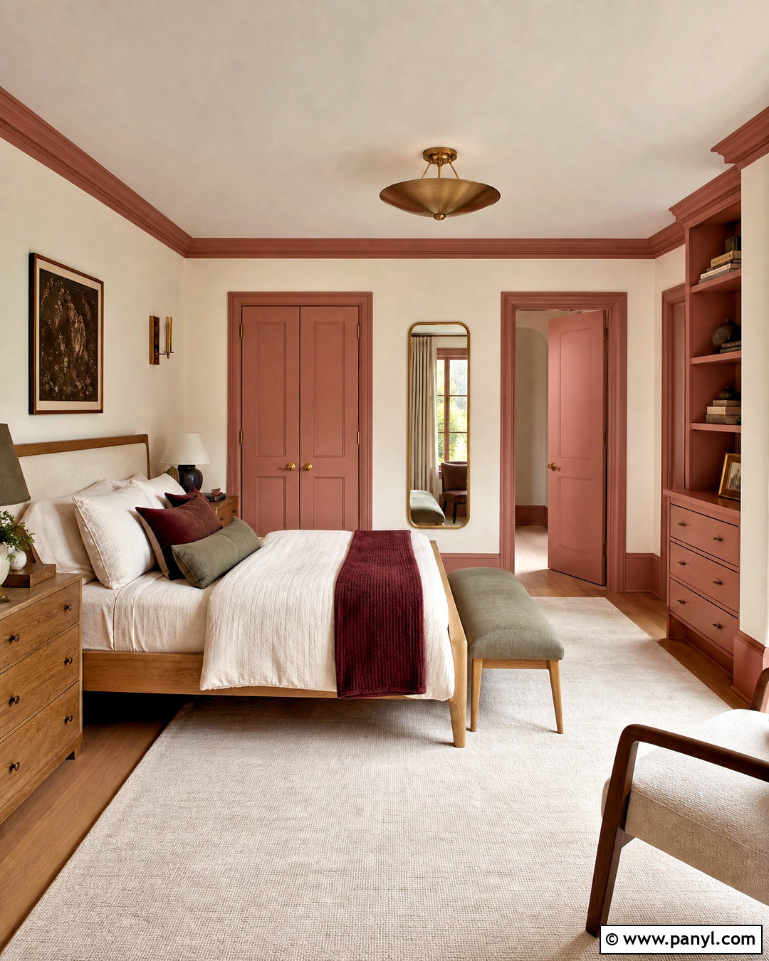
Blush pink trim can look sophisticated in a nursery, bedroom, or creative studio when the shade is muted and balanced with natural materials. Choose a dusty clay-pink for baseboards, window casings, doors, and built-in storage against warm white walls. Add white oak furniture, an ivory wool rug, and linen curtains in pale oatmeal. Accents in burgundy, sage, and warm brown give the palette maturity, while a simple brass ceiling light adds a refined finish. Avoid overly sugary pinks or excessive matching decor. The trim should behave like an earthy architectural color rather than a decorative theme. With clean furniture lines and restrained accessories, the completed room feels warm, distinctive, and easy to update.
Conclusion:
Choosing among these 20 contrast trim colors begins with the room’s permanent features, including flooring, countertops, brick, tile, and natural wood. Once the undertones agree, build a complete palette that repeats the trim shade through a few restrained furnishings or accents. Use darker colors to emphasize strong moldings, frame views, and ground pale walls. Softer shades provide definition without making small rooms feel heavily outlined. Before painting everything, sample the wall and trim colors together on movable boards. Check them in morning, afternoon, and artificial light. Finish walls in matte or eggshell and use satin or semigloss on trim for useful separation, easier cleaning, and a polished final result.

Related Ideas and Inspiration:
Leave a Reply