
Interior doors can do far more than separate one room from another. The right paint color can connect your palette, highlight architectural details, and make an ordinary hallway feel thoughtfully finished. These 20 indoor door colors include dependable neutrals, nature-inspired greens, deep dramatic tones, and cheerful accents. Each option is presented as a complete look, with coordinating walls, trim, flooring, hardware, furniture, and decor. Before committing, test your chosen color on the door and view it throughout the day. Natural and artificial light can noticeably change its undertones. Also consider painting the frame to match for a seamless effect or keeping the trim lighter for contrast. Use these practical combinations to discover which of the 20 indoor door colors best fits your home.
1. Warm White Indoor Door
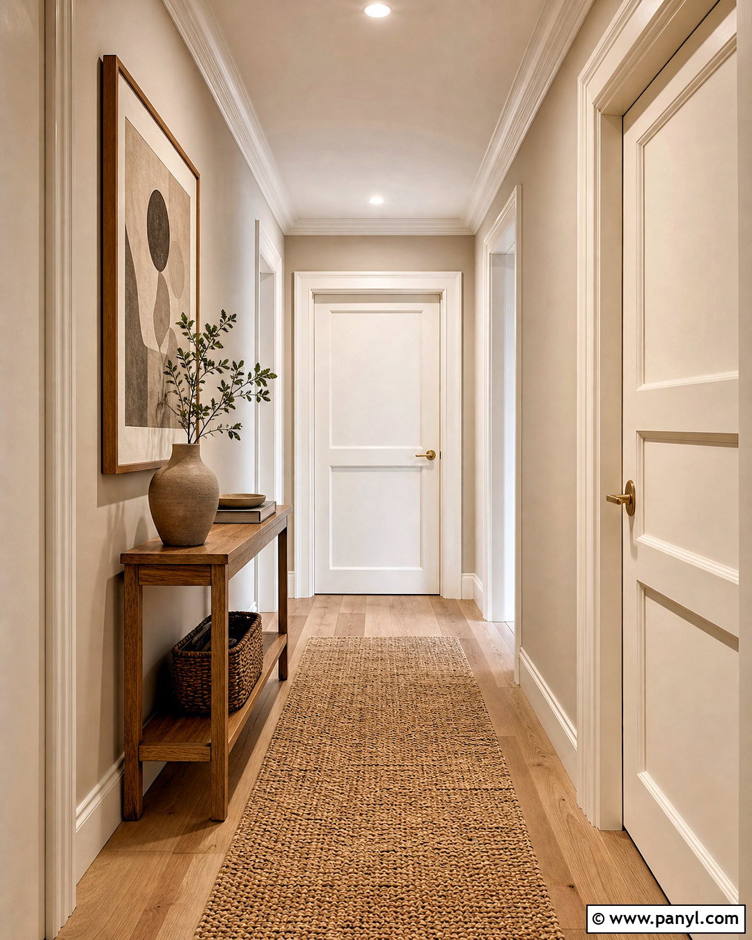
A warm white door keeps the interior bright without looking cold or overly crisp. Pair it with soft beige walls, matching warm white trim, and light oak flooring for an airy transitional look. Choose a satin or semigloss finish so fingerprints wipe away easily and the paneled details catch the light. Brushed brass levers add gentle warmth, while a natural woven runner prevents a hallway from feeling plain. In an adjoining room, repeat the palette through cream upholstery, oatmeal curtains, and pale wood furniture. This combination works especially well in homes with limited natural light. The subtle warmth helps different rooms flow together while still giving the door enough definition against slightly deeper walls.
2. Cream Indoor Door
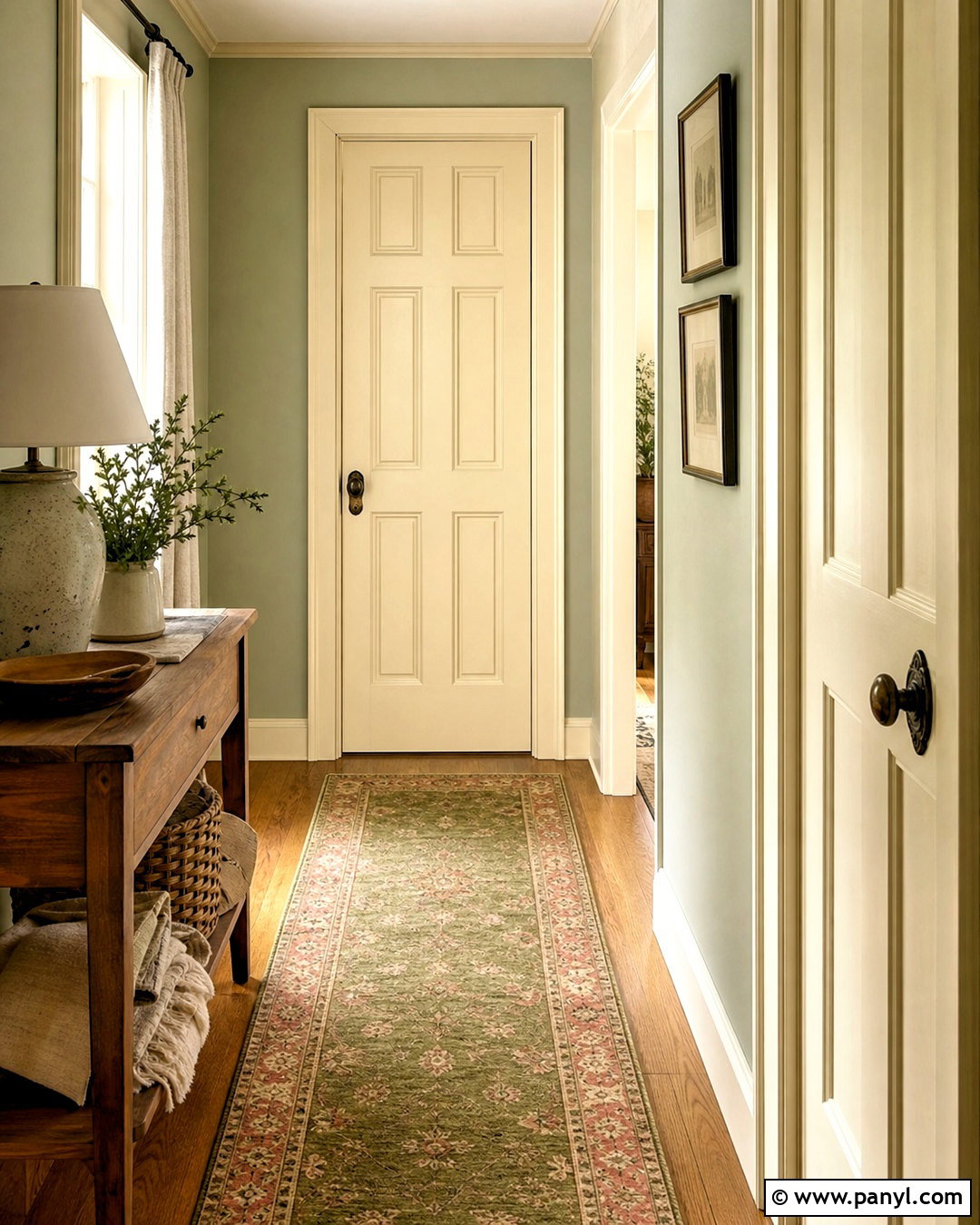
Cream indoor doors create a softer, more traditional effect than bright white. Build the complete scheme with muted sage walls, creamy trim, medium oak floors, and antique brass hardware. A patterned runner in olive, beige, and faded rust can connect the door color to the surrounding hallway. Use a warm cream with a clear buttery undertone rather than a dingy yellow cast. This palette suits cottage, farmhouse, and traditional homes with paneled doors and detailed molding. Carry the cream onto the doorframe for a substantial architectural look, but leave the walls contrasting enough to define each opening. Nearby wood furniture, ceramic lamps, and linen textiles complete the relaxed design without making the space feel overly rustic.
3. Soft Greige Indoor Door
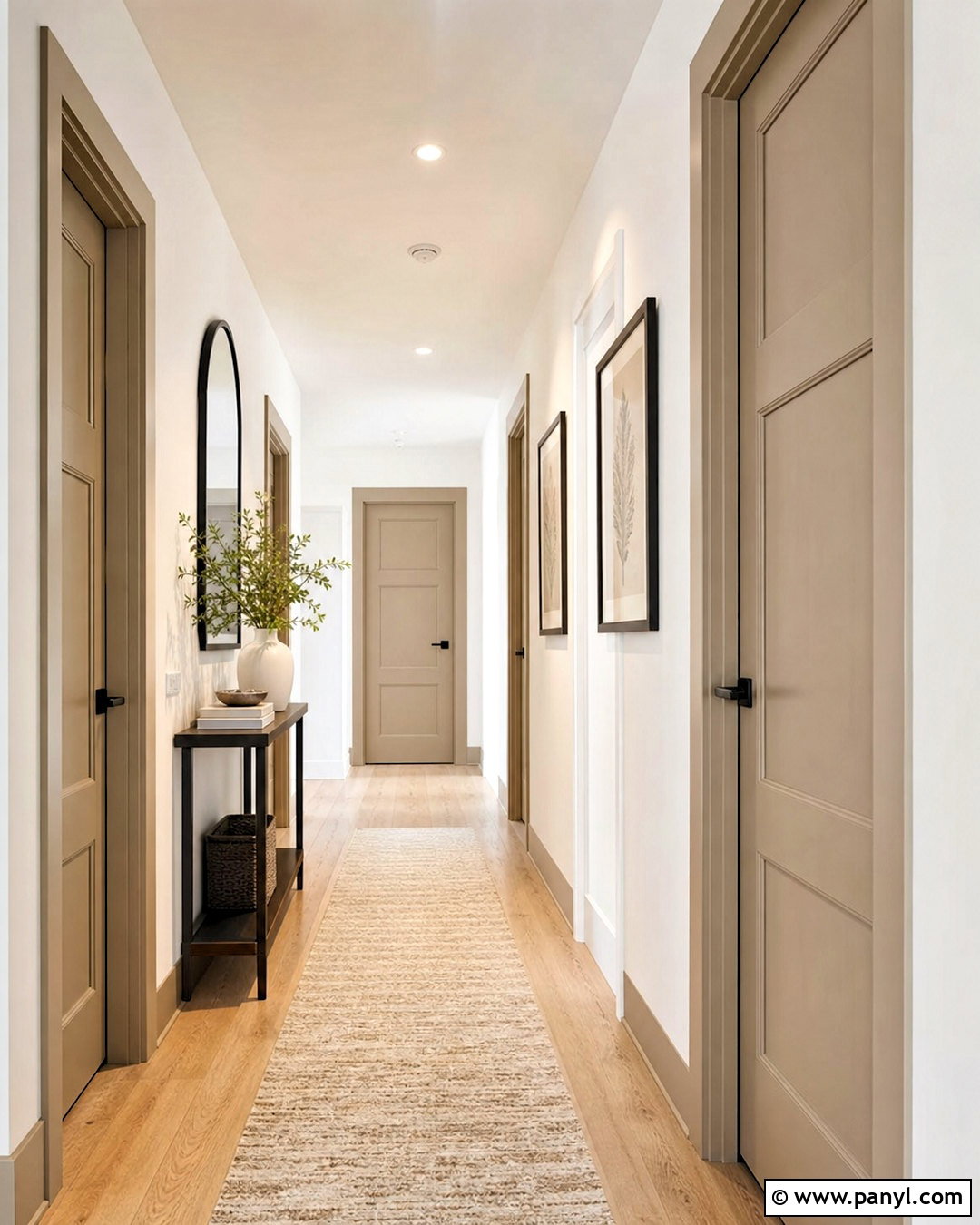
Greige offers the warmth of beige with the balanced appearance of gray, making it easy to coordinate across an open floor plan. Use soft greige on the doors and frames, then pair it with warm white walls and medium-toned white oak flooring. Matte black levers create clean definition, while a black-framed mirror and slim console repeat that contrast elsewhere in the hallway. Add a textured cream runner, simple pottery, and muted green branches to soften the arrangement. This indoor door color works particularly well when adjoining rooms have different neutral palettes. It creates a consistent transition without demanding attention. Select a satin finish for a practical surface that still looks refined beside flat or eggshell walls.
4. Warm Taupe Indoor Door
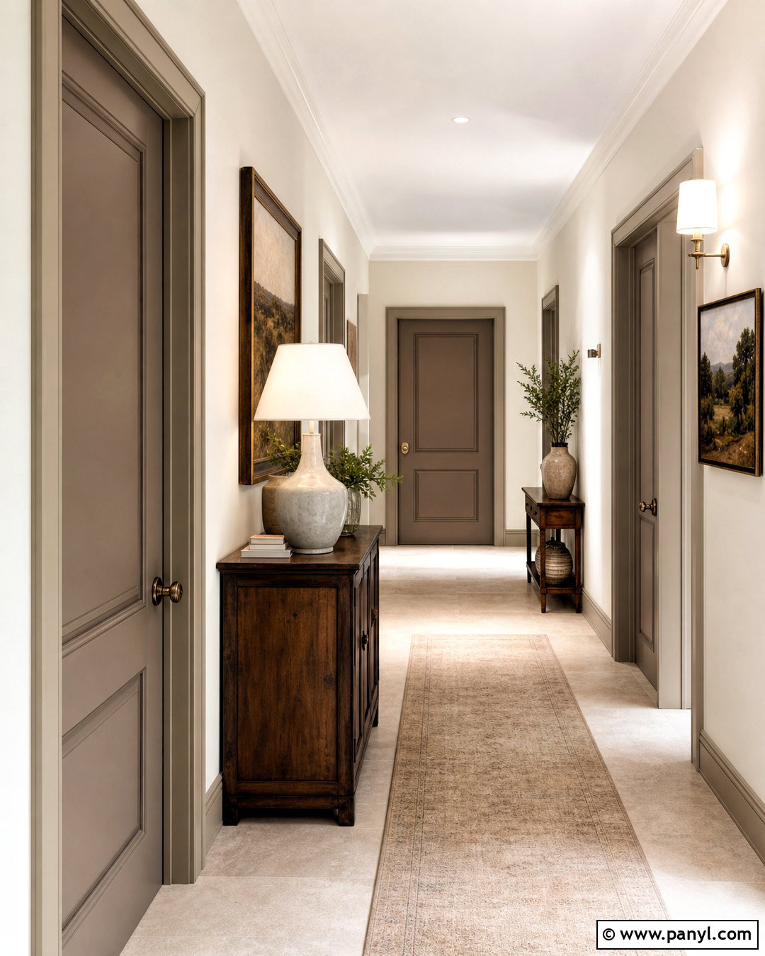
Imagine a quiet hallway where warm taupe doors add depth without making the space feel dark. Pair the doors with creamy off-white walls, pale limestone-look flooring, and trim painted in the same taupe for a smooth, enveloping finish. Aged brass hardware brings out the brown undertones, while walnut furniture gives the palette a richer anchor. Complete the space with a beige runner, a sculptural ceramic lamp, and understated landscape artwork. Warm taupe is especially useful in interiors containing mixed wood tones because it bridges lighter oak and darker walnut. For the most cohesive result, repeat the color in small details such as curtain borders, picture frames, or upholstered dining chairs visible through the doorway.
5. Light Gray Indoor Door
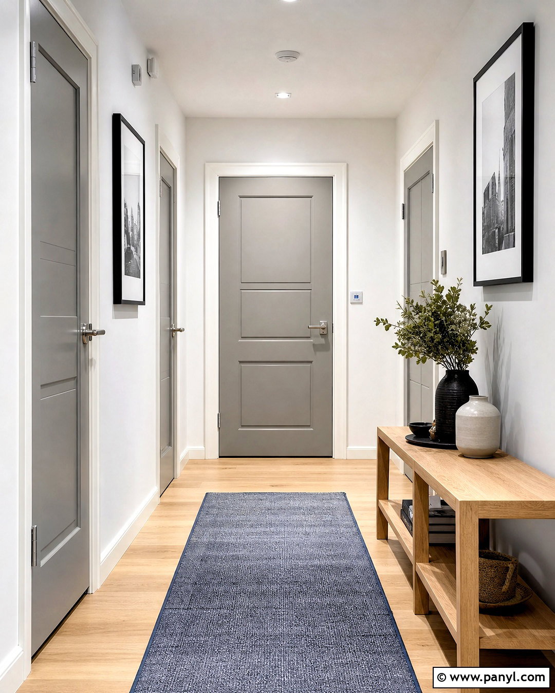
Light gray doors provide gentle contrast in a bright modern home while remaining neutral enough for colorful decor. Choose a balanced gray that does not appear icy, then surround it with clean white walls, matching white baseboards, and pale oak or maple flooring. Satin nickel hardware supports the cool, streamlined palette. In the hallway, add a narrow natural wood console, a blue-gray runner, and simple black-framed artwork to keep the design from feeling sterile. Paint the doorframe light gray as well for a more intentional finish. This scheme works nicely with Scandinavian and contemporary interiors where uncluttered lines matter. Warm textiles and natural fibers ensure the completed space remains comfortable, welcoming, and visually balanced.
6. Charcoal Indoor Door
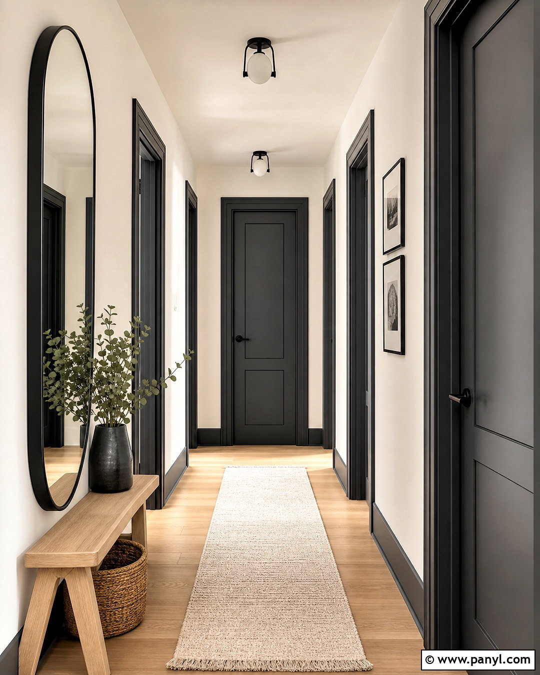
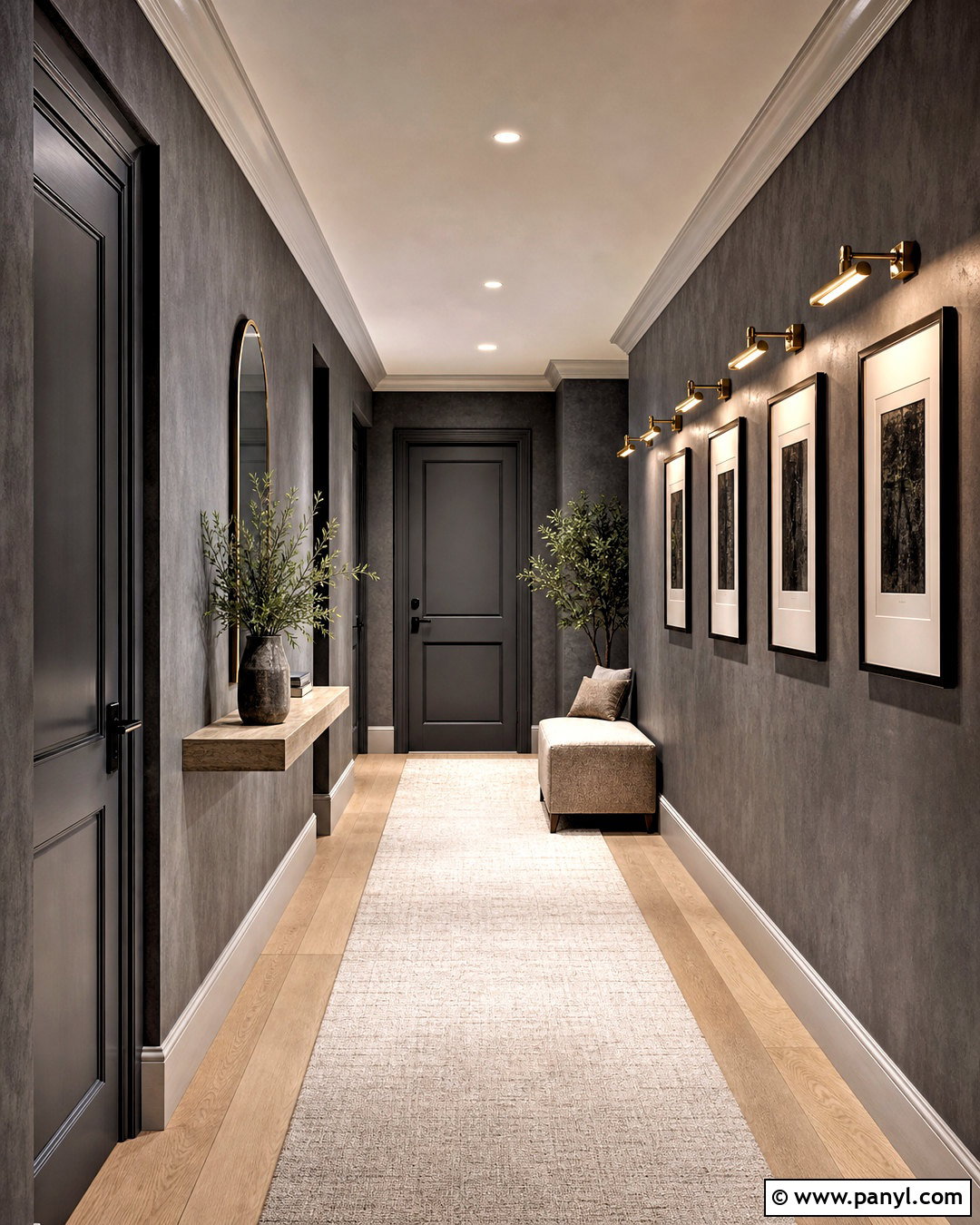
Charcoal doors bring drama to an interior while feeling slightly softer than pure black. Balance their visual weight with warm white walls, light oak floors, and crisp white baseboards. Paint the doorframes charcoal to emphasize the architecture and create strong vertical lines down the hallway. Choose black or dark bronze hardware for a unified appearance, then add a pale wool runner and a light wood bench. An oversized mirror can reflect natural light and prevent the darker doors from closing in the space. This complete look suits modern, industrial, and transitional homes. Repeat charcoal in small amounts through lighting, frames, or furniture legs, but keep larger furnishings pale so the doors remain the primary dark feature.
7. Matte Black Indoor Door
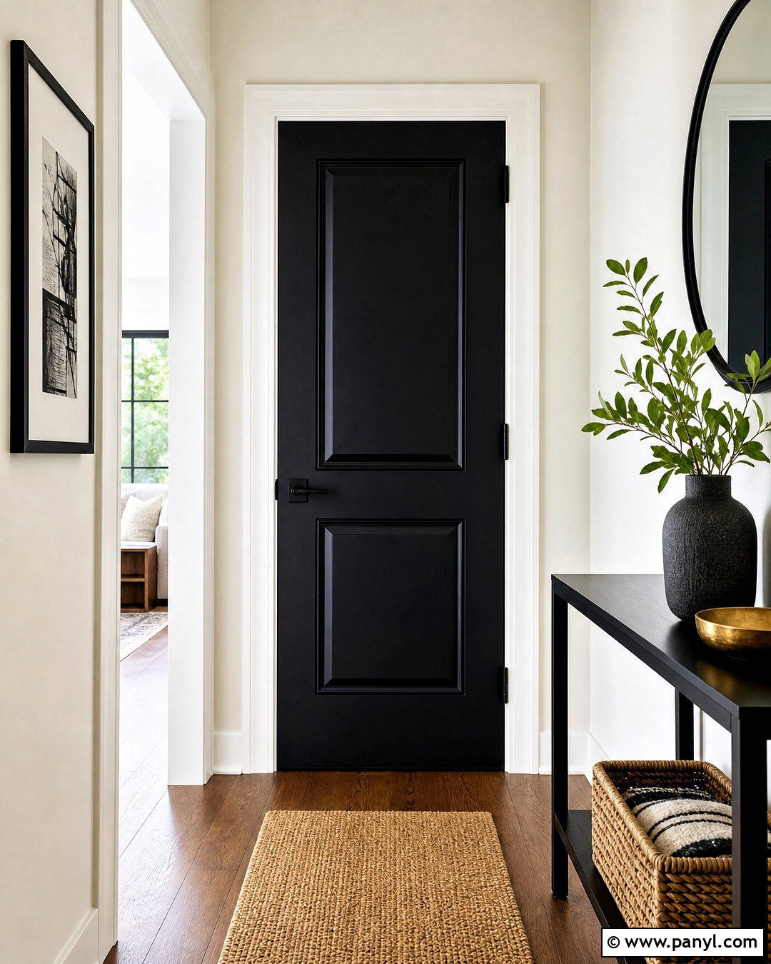
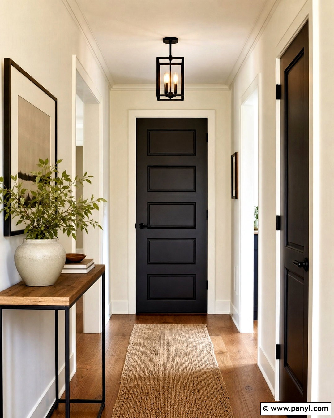
A matte black indoor door becomes a bold architectural feature, especially when it has raised panels or glass inserts. Place it against warm white walls with matching white trim to produce a crisp outline. Medium oak flooring and a natural jute runner soften the high contrast, while matte black hinges and levers give the door a polished, consistent finish. Continue the color through a slim console, black picture frames, or a metal ceiling light. In smaller hallways, use black selectively on one important door rather than every opening. Plenty of pale surfaces and a well-positioned mirror will maintain brightness. The finished look feels confident and modern without requiring bright wall colors or elaborate decorations.
8. Deep Navy Indoor Door
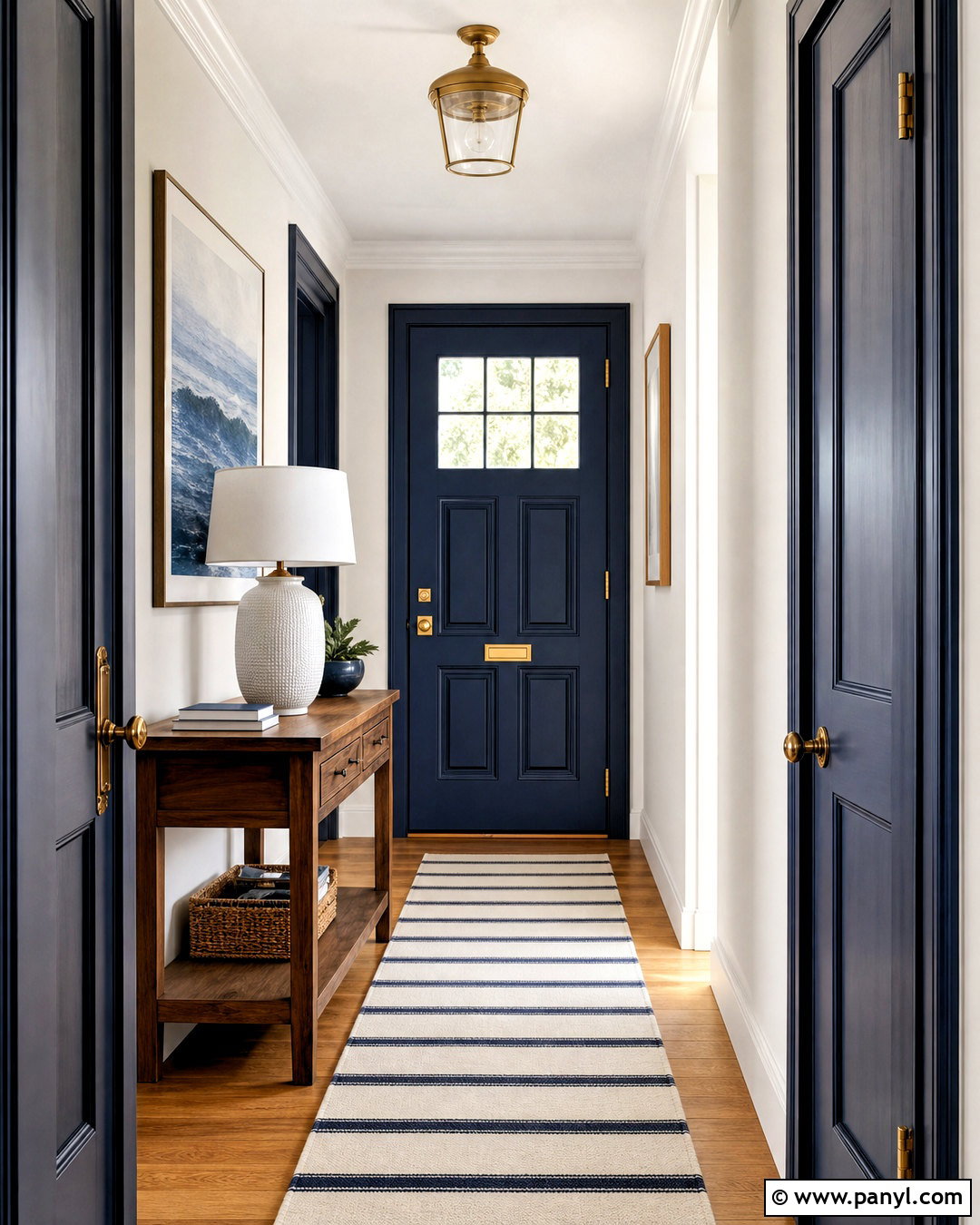
Deep navy gives an indoor door the impact of black with a more colorful, welcoming character. Pair it with soft white walls, white trim, honey-toned oak flooring, and brushed brass hardware. The warm metal and wood prevent the blue from feeling too formal or cool. Complete the hallway with a striped cream-and-navy runner, a walnut console, and artwork containing muted blue accents. Painting both the door and frame navy creates a stronger architectural statement, while a white frame delivers a cleaner coastal effect. This combination works beautifully in entry halls, offices, bedrooms, and dining spaces. Use the same navy on nearby cabinetry or a small piece of furniture to make the door feel connected rather than randomly accented.
9. Dusty Blue Indoor Door
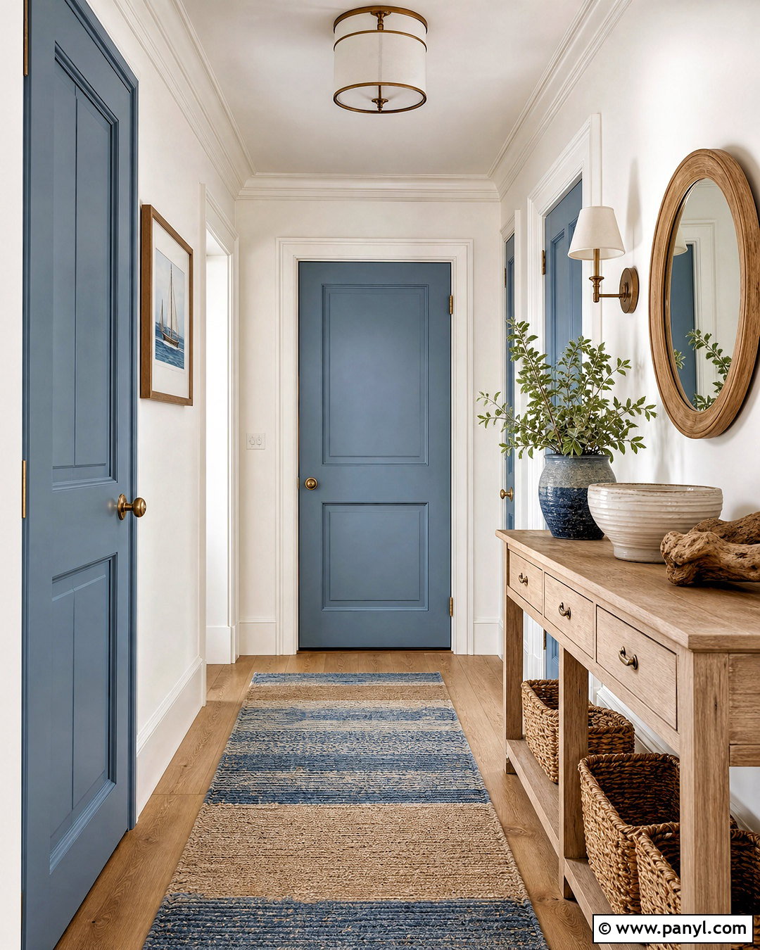
Dusty blue doors introduce color in a calm, understated way. Their soft gray undertone pairs naturally with warm white walls, light oak floors, and creamy trim. Select brushed nickel hardware for a relaxed contemporary finish or aged brass for a more traditional room. A flat-woven runner in blue, sand, and ivory can connect multiple doors along a hallway. Add a pale wood console, woven baskets, and simple ceramic decor to complete the easygoing palette. This indoor door color is a practical option for coastal, cottage, and Scandinavian-inspired homes. Keep surrounding colors muted rather than sharply contrasting. Repeating dusty blue in pillows, artwork, or window treatments will create a consistent visual path from one room to another.
10. Pale Blue Indoor Door
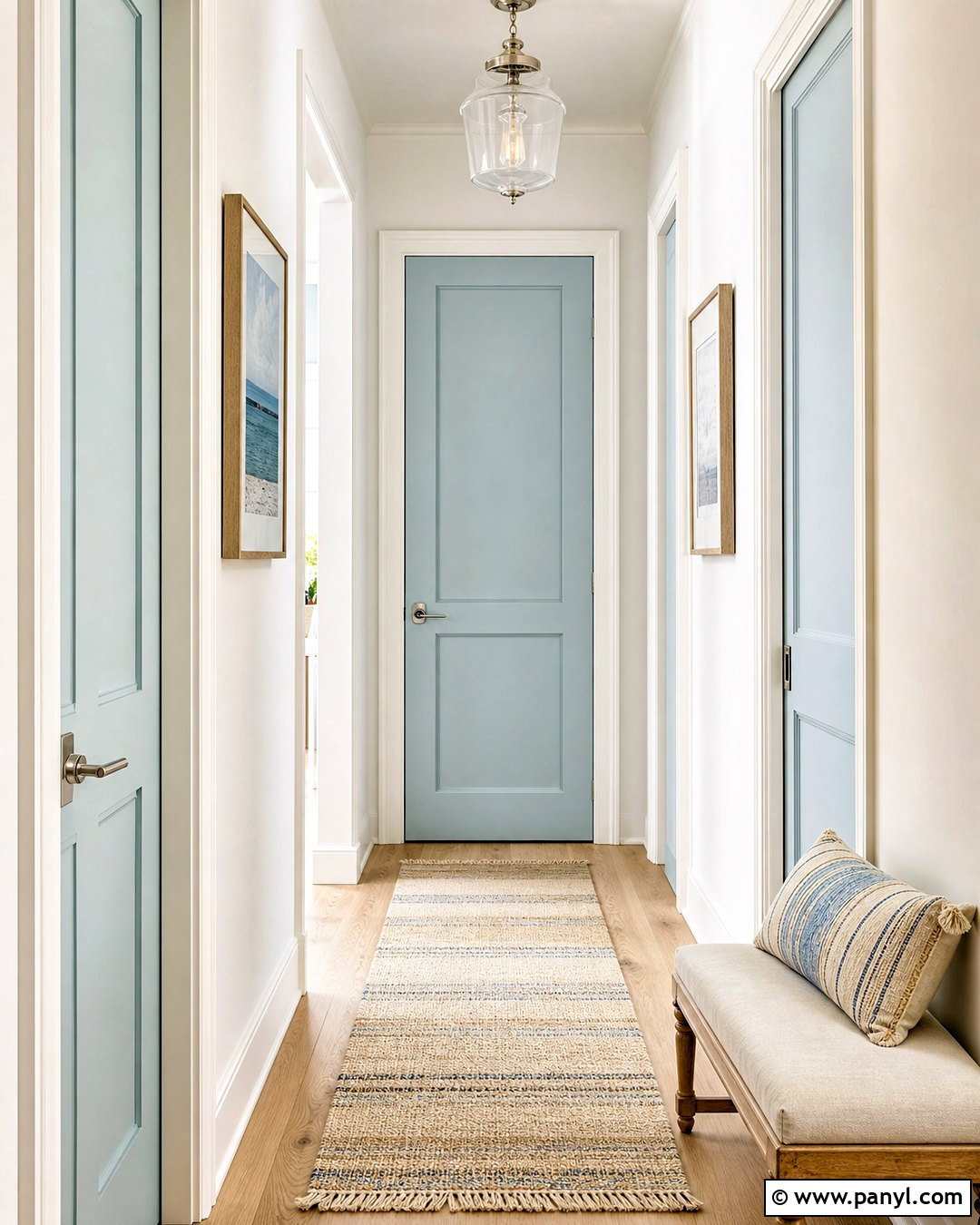
Pale blue doors can make a compact hallway feel fresh, open, and gently colorful. Build the look around milky white walls, white doorframes, blond wood flooring, and polished nickel hardware. A narrow bench with natural linen upholstery adds warmth, while a cream runner with fine blue stripes reinforces the door color. Choose a clear, softened blue rather than a highly saturated pastel to keep the result sophisticated. This scheme fits bedrooms, bathrooms, laundry areas, and light-filled coastal interiors. If several doors are visible together, paint all of them the same blue to create rhythm and order. Finish the space with clear glass lighting, light wood frames, and restrained greenery so the architecture remains crisp and uncluttered.
11. Sage Green Indoor Door
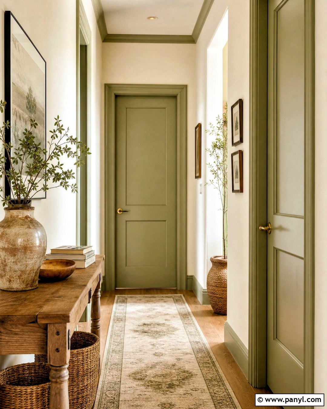
Sage green is an approachable indoor door color that brings a natural, restful quality to the home. Combine it with creamy white walls, coordinating sage frames, warm oak flooring, and aged brass hardware. A neutral runner with olive detailing and a small wood console can extend the earthy palette through the hallway. Add woven baskets, handmade pottery, and soft linen accents for texture. This complete look works with cottage, organic modern, farmhouse, and transitional interiors. Sage can shift significantly in different lighting, so test it beside the room’s permanent flooring and wall color. Repeat the green through plants, artwork, or upholstery, but vary the shades slightly to keep the space layered rather than overly matched.
12. Olive Green Indoor Door
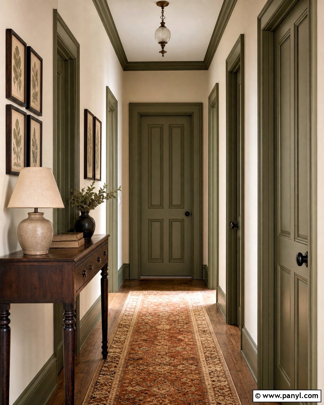
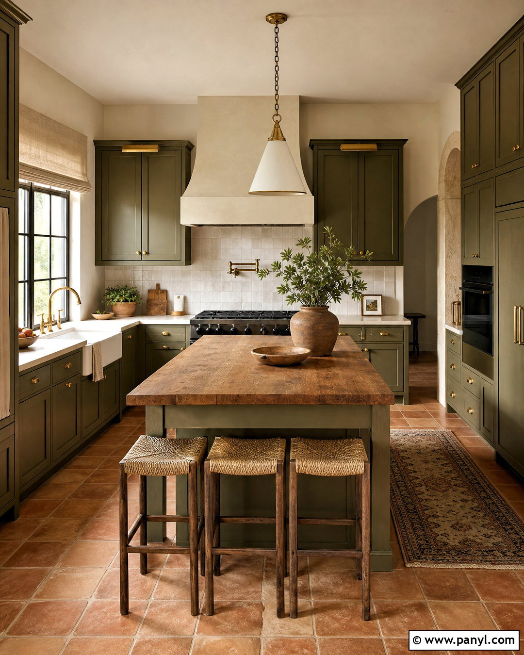
For a richer natural palette, paint the interior doors a warm olive green and carry the same shade onto the frames. Surround them with soft beige walls, terracotta or medium oak flooring, and dark bronze hardware. A vintage-style runner containing olive, rust, and cream will bring the entire hallway together. Add a walnut console, a pleated linen lamp, and framed botanical artwork for a collected yet orderly finish. Olive doors look especially appealing in rooms with leather, natural wood, and woven materials. Because this color has more visual weight than sage, balance it with generous light neutrals. The completed design feels grounded and distinctive, making it suitable for traditional, Mediterranean, rustic, and eclectic homes.
13. Forest Green Indoor Door
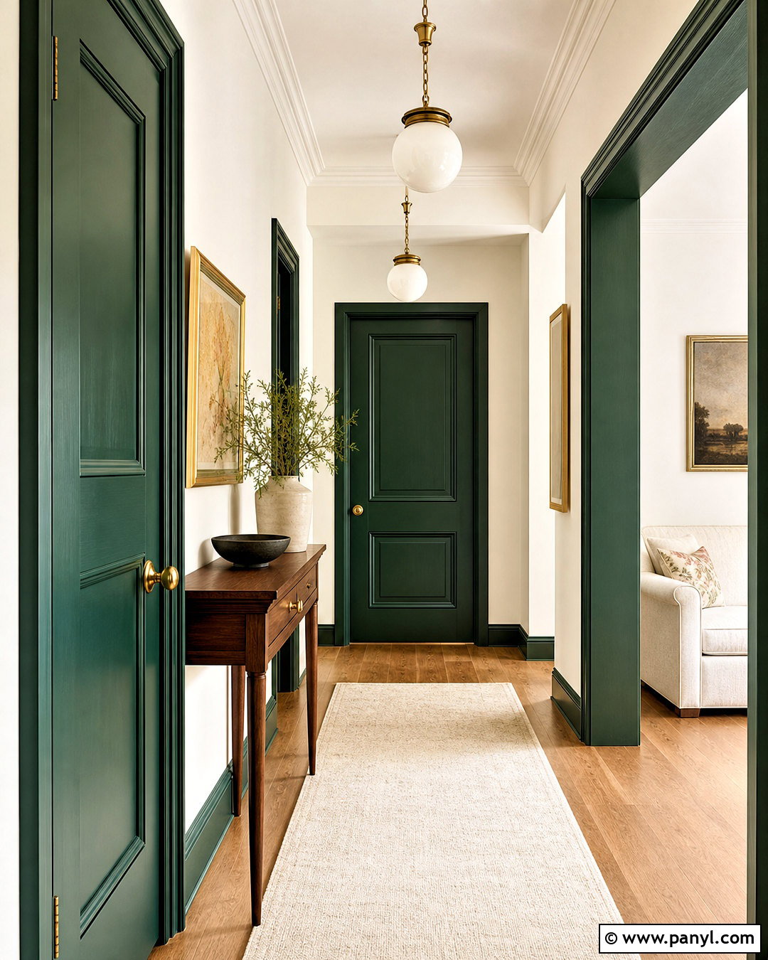
Forest green turns a basic door into a striking focal point while maintaining an elegant connection to nature. Use it in a light hallway with warm white walls, white baseboards, and medium oak floors. Painting the doorframe green strengthens the feature, while unlacquered brass hardware creates a warm, classic contrast. Furnish the area with a slim walnut table, a cream runner, and artwork containing deep green and muted gold. Keep window coverings and larger textiles pale to balance the saturated color. This scheme works particularly well for a study, dining room, pantry, or primary bedroom entrance. Repeating forest green on cabinetry or a single upholstered chair helps the door belong to the broader interior palette.
14. Terracotta Indoor Door
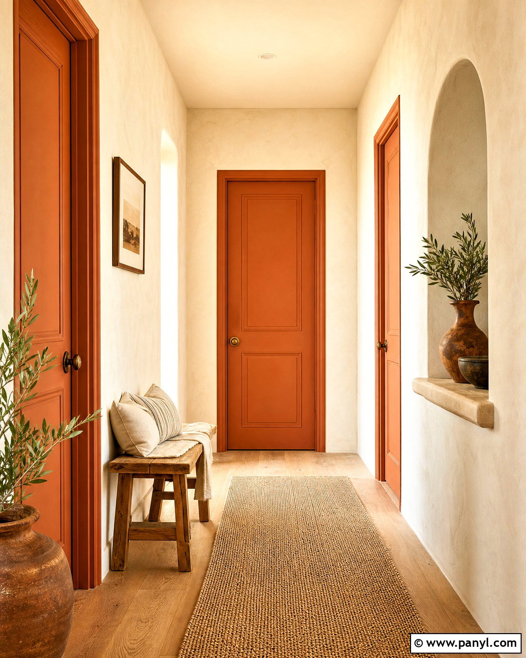
A terracotta indoor door fills the space with earthy warmth and works beautifully beside natural materials. Pair the muted clay color with creamy plaster-look walls, pale oak or tumbled stone flooring, and antique brass hardware. Paint the doorframe terracotta for a bold, finished outline, then use off-white baseboards to maintain lightness. Complete the hallway with a woven runner, a light wood bench, linen cushions, and handmade ceramic vessels. Introduce olive green through a plant or subtle artwork to balance the red-orange undertone. This palette fits Southwestern, Mediterranean, bohemian, and organic modern homes. Select a softened terracotta rather than a vivid orange so the door remains versatile and comfortable through changing seasons.
15. Burgundy Indoor Door
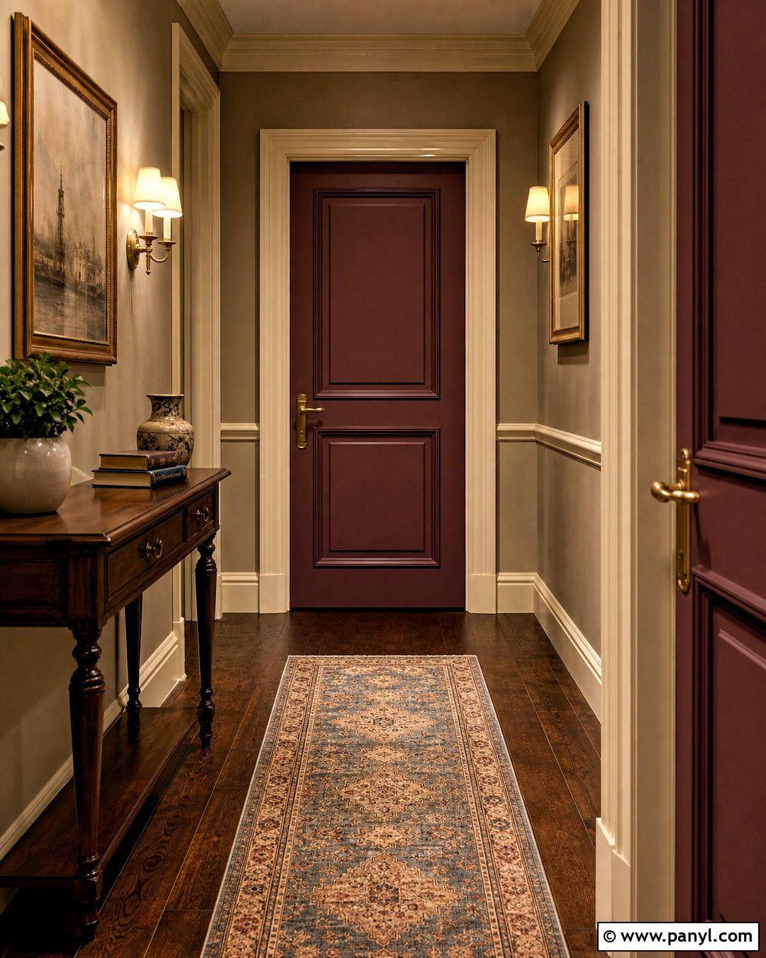
Could a deep red door work indoors without overwhelming the room? A muted burgundy finish makes it possible. Pair it with warm greige walls, cream trim, dark oak flooring, and aged brass hardware for a rich, traditional palette. Paint the frame burgundy when you want a formal architectural feature, or keep it cream for sharper separation. A patterned runner containing burgundy, dusty blue, and tan will distribute the color through the hallway. Finish the design with a dark wood console, shaded wall sconces, and understated framed art. This sophisticated combination suits libraries, dining rooms, home offices, and historic homes. Keep surrounding furniture simple so the saturated door color remains purposeful rather than visually heavy.
16. Blush Pink Indoor Door
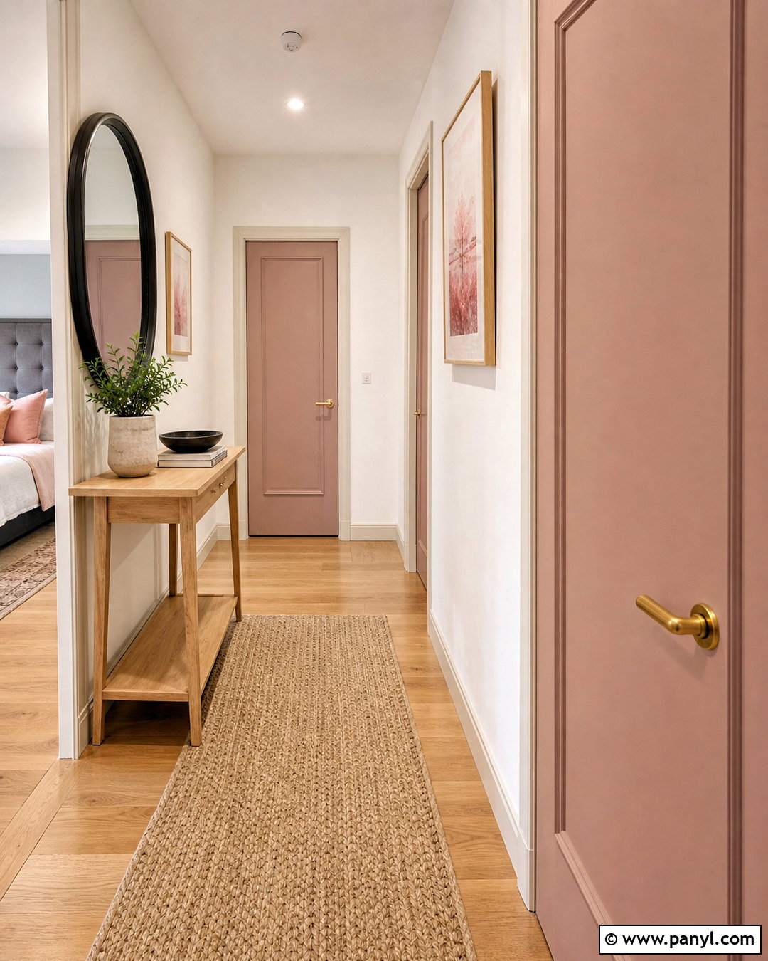
Blush pink gives an indoor door a warm, playful lift while remaining softer than brighter pinks. Choose a dusty blush with beige or clay undertones, then pair it with warm white walls, cream trim, and light oak flooring. Brushed brass hardware adds polish without making the palette feel overly sweet. Complete the space with a natural fiber runner, a pale wood console, and artwork containing muted rust, beige, and rose. Charcoal accents, such as a mirror frame or table lamp, can ground the lighter colors. This finished look works in bedrooms, nurseries, dressing rooms, and creative spaces. Repeat blush sparingly through one cushion or ceramic accessory to maintain an elegant, balanced result.
17. Mustard Yellow Indoor Door
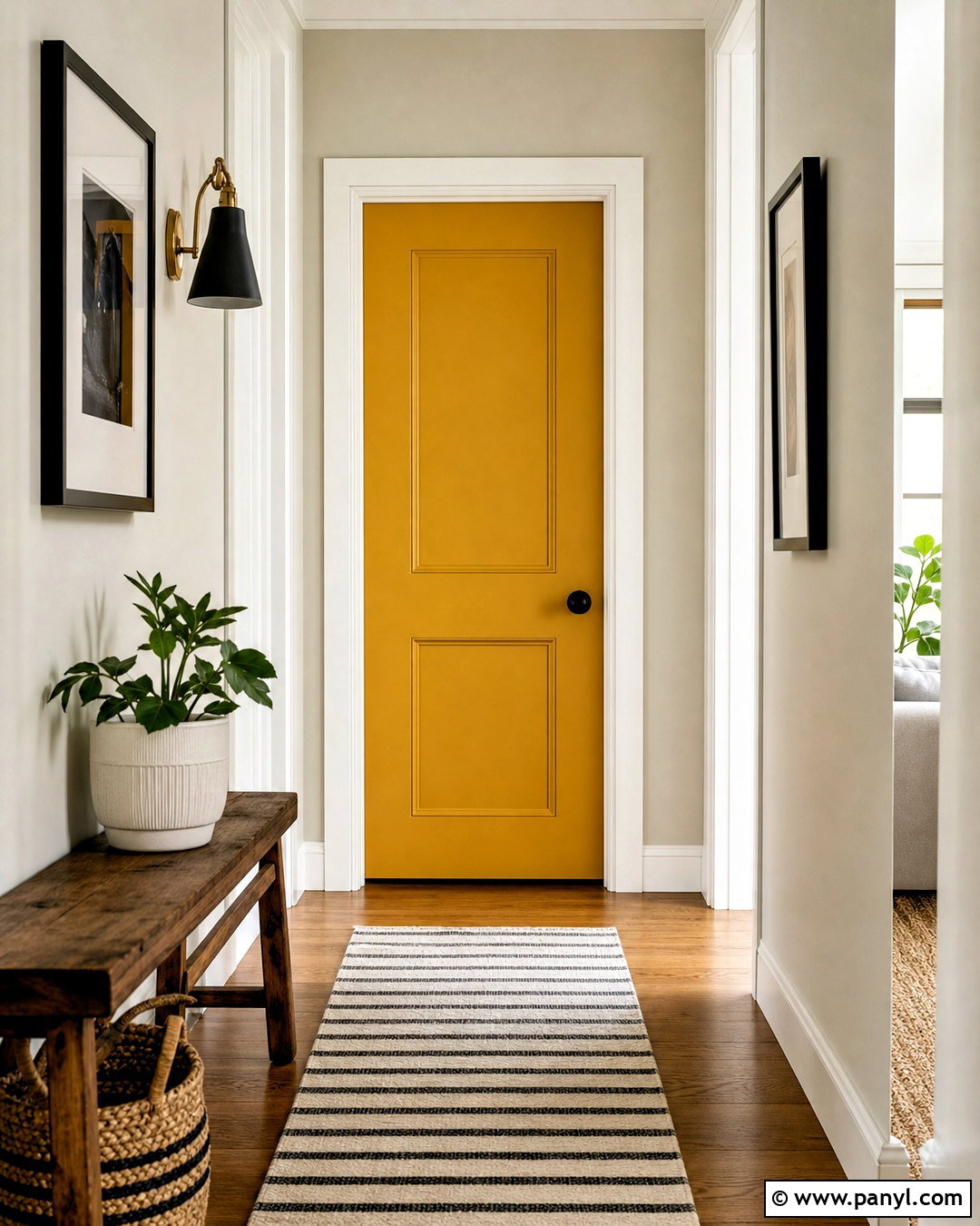
Mustard yellow doors create a cheerful focal point with more depth than a bright primary yellow. Use the color in a white or pale greige hallway with warm oak flooring and crisp white trim. Matte black hardware gives the door a modern edge, while a striped runner in cream, charcoal, and muted gold ties the palette together. Add a simple wood bench, black-framed artwork, and a woven basket to create a complete, practical space. Mustard works particularly well on a pantry, laundry room, playroom, or home office door. If the hallway contains several openings, limit the yellow to one destination door. This keeps the accent intentional and allows the surrounding neutral doors to provide visual rest.
18. Aubergine Indoor Door
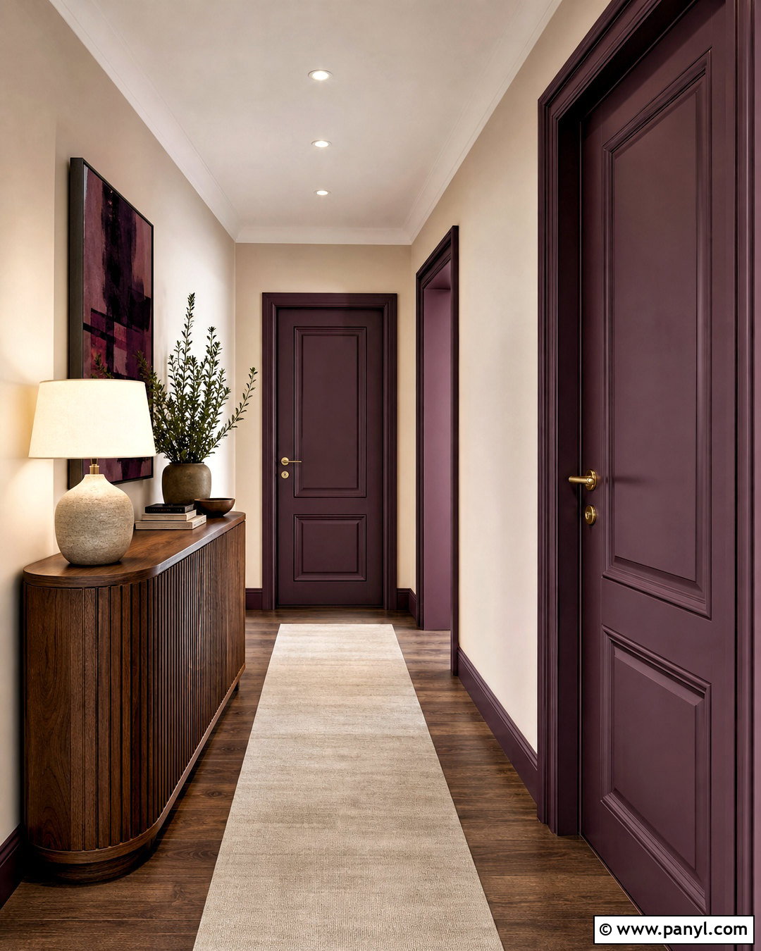
Aubergine offers a dramatic alternative to navy, charcoal, or burgundy. Its deep purple-brown character looks sophisticated beside warm beige walls, cream trim, and dark walnut flooring. Use antique brass hardware to highlight the color’s warmth, then add a neutral runner with restrained plum detailing. A curved walnut console, stoneware lamp, and softly colored abstract artwork will complete the refined hallway. Paint the frame aubergine for an enveloping effect or leave it cream when the corridor needs more brightness. This indoor door color suits dining rooms, powder rooms, libraries, and bedrooms with layered textiles. Keep neighboring colors muted, using taupe, camel, dusty rose, and cream to support the door without competing with it.
19. Chocolate Brown Indoor Door
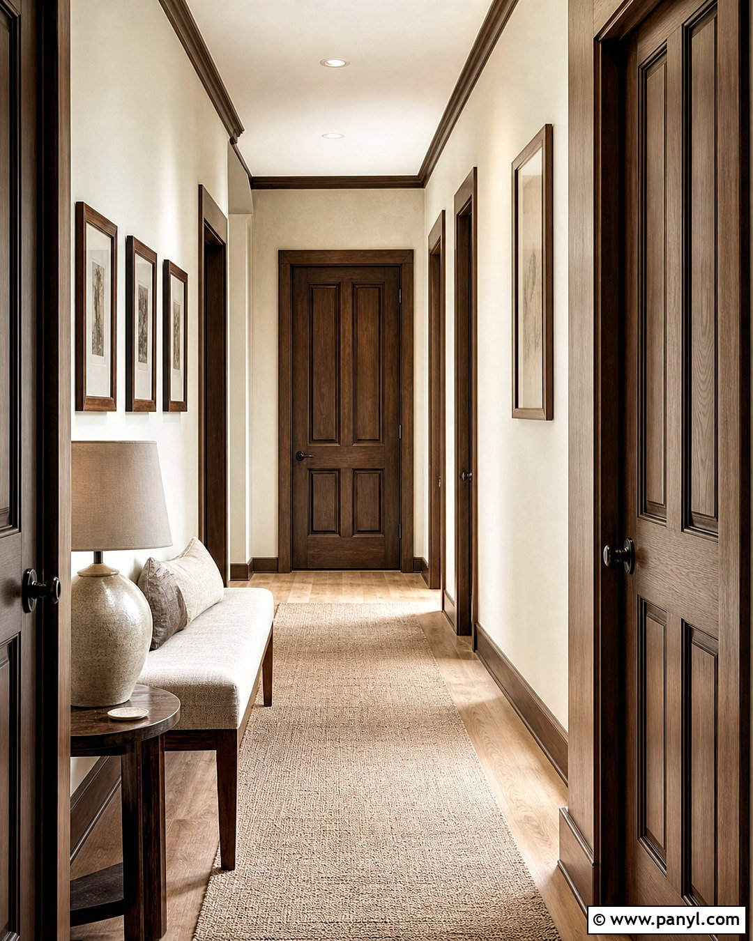
Chocolate brown doors feel warm, substantial, and timeless when balanced with lighter finishes. Pair them with creamy walls, matching cream baseboards, pale oak flooring, and aged bronze hardware. Paint the doorframe brown to create the appearance of custom millwork, particularly on paneled doors. A beige wool runner, linen-covered bench, and light ceramic lamp will brighten the hallway while preserving its earthy character. Repeat the brown through walnut furniture, leather accents, or narrow picture frames. This complete scheme is ideal for traditional, midcentury, rustic, and contemporary interiors. Choose a chocolate shade with warm, natural undertones rather than an almost-black brown, especially in spaces that receive limited daylight or have low ceilings.
20. Natural Oak Indoor Door
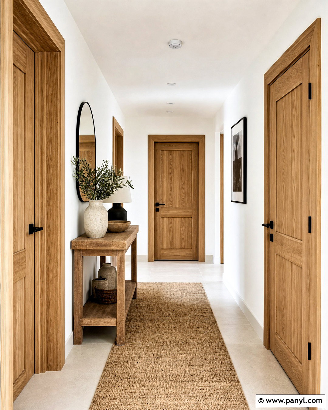
A clear-finished natural oak door introduces color through authentic wood grain rather than opaque paint. Pair the warm honey tone with soft white walls, white or oak doorframes, and pale limestone or neutral wood flooring. Matte black hardware creates modern contrast, while brushed brass offers a softer traditional finish. Furnish the hallway with a simple cream runner, an oak console in a slightly different tone, and black-framed artwork. Avoid matching every wood surface exactly; gentle variations make the design feel natural and layered. This look works with Scandinavian, organic modern, midcentury, and transitional interiors. A low-sheen clear finish protects the surface while preserving the tactile appearance and visible character of the wood.
Conclusion:
Choosing between these 20 indoor door colors comes down to the effect you want each doorway to create. Warm white, cream, greige, and taupe support a quiet, flexible interior. Charcoal, navy, forest green, burgundy, and aubergine make doors more architectural. Softer blue, sage, blush, and terracotta bring personality without dominating the room. Whatever color you prefer, evaluate it with the walls, flooring, trim, hardware, and nearby furniture rather than viewing it alone. Test a generous sample on the actual door and check it in morning, afternoon, and artificial light. With a coordinated full-room palette, an indoor door becomes an intentional part of the home instead of a forgotten surface.

Related Ideas and Inspiration:
Leave a Reply