
Choosing a connected palette makes every room feel intentional, even when each space has its own personality. These 20 indoor color schemes house ideas combine wall colors, furniture, wood tones, metals, flooring, and textiles into complete looks you can recreate. Current interiors favor warmer, more personal palettes, natural finishes, and carefully layered color rather than cold, one-note minimalism. () Before committing, compare each scheme with your existing floors, countertops, cabinets, and natural light. Carry at least one neutral, wood finish, or accent color between adjoining rooms to create flow. From soothing sage and cream to dramatic teal and ochre, the following combinations offer practical inspiration through 20 indoor color schemes house ideas.

1. Warm White And Sage Green Color Scheme
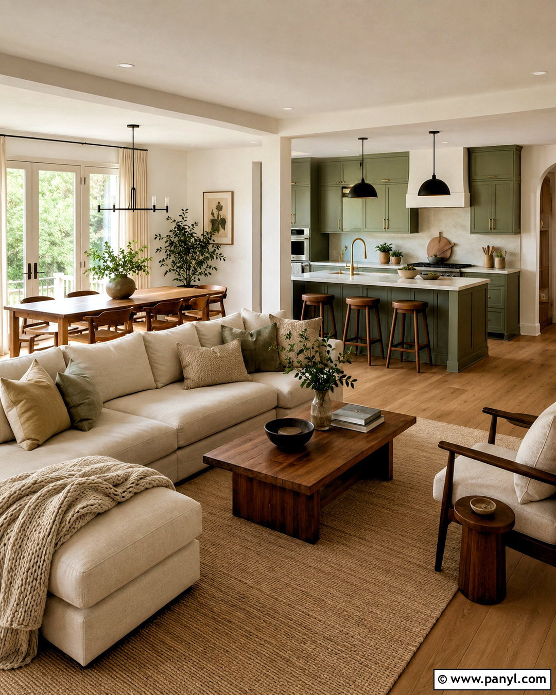
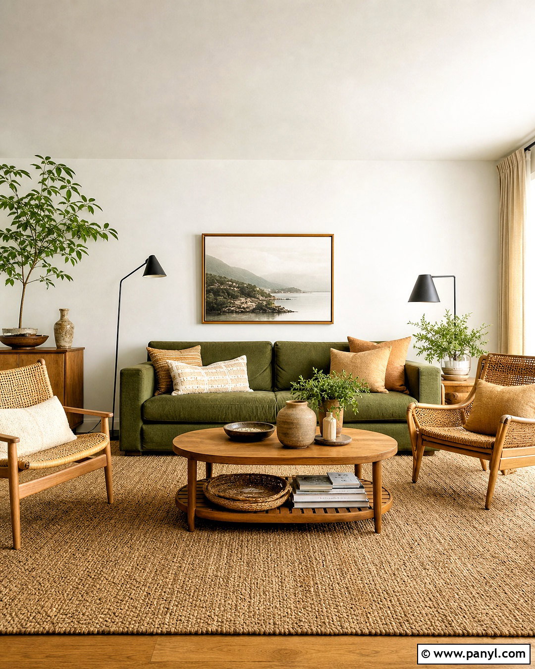
Warm white walls create a bright foundation, while sage green brings gentle color into kitchens, bedrooms, and living areas. Use creamy white through hallways and open spaces to keep the house connected. Choose muted sage for lower kitchen cabinets, a dining room wall, or built-in shelving. Medium walnut furniture adds depth without making the palette feel heavy. Layer oatmeal upholstery, ivory curtains, and a beige wool rug into the living room. Matte black lighting provides definition, while aged brass hardware adds quiet warmth. Complete the scheme with pottery, landscape artwork, and a few deeper olive accents. Natural oak or warm-toned flooring works especially well because it supports both the creamy base and earthy green details.
2. Greige And Charcoal Color Scheme
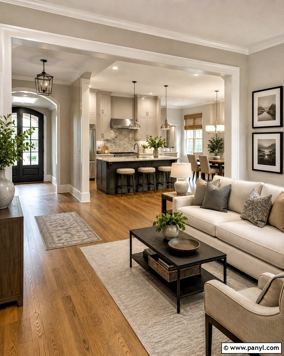
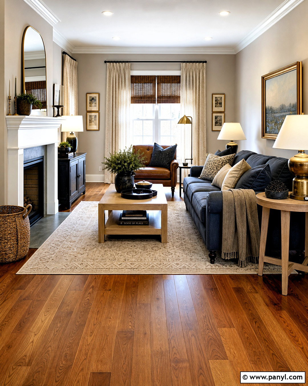
Do you want a neutral home that still has noticeable contrast? Soft greige walls offer more warmth than pale gray and look comfortable beside white trim, charcoal furniture, and medium oak flooring. Continue the greige through the entry, living room, and connecting hallways. Use charcoal on a kitchen island, fireplace surround, or upholstered bed to anchor larger rooms. Cream sofas and bedding prevent the darker accents from taking over. Add woven tan shades, black-framed artwork, and brushed nickel or matte black fixtures. Subtle patterns in gray, beige, and ivory can appear on rugs and pillows. This balanced scheme suits modern and transitional homes, especially when repeated materials create an easy visual connection from room to room.
3. Beige And Terracotta Color Scheme
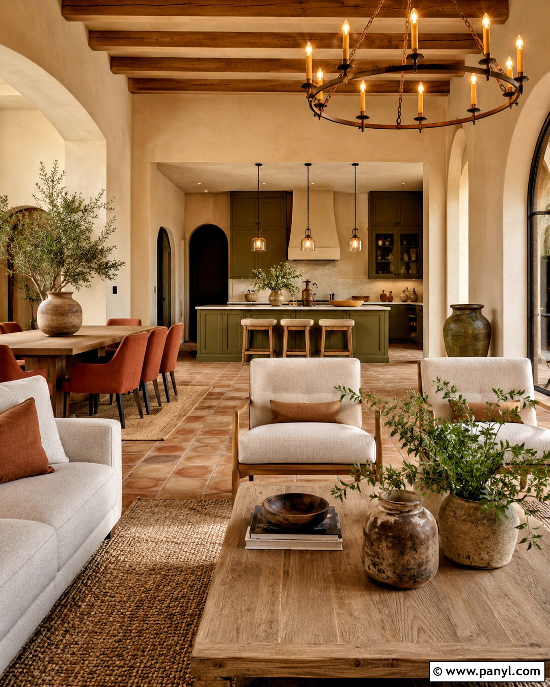
Sun-warmed beige, earthy terracotta, and soft olive create a welcoming palette that feels collected rather than overly coordinated. Paint the main living areas a light sandy beige and introduce terracotta in a dining room, reading nook, or upholstered accent chair. Olive green cabinets or curtains provide a natural counterpoint to the warm clay color. Choose honey oak furniture, cream linen upholstery, and handwoven rugs with rust and brown details. Bronze lighting and aged brass hardware reinforce the earthy direction. In bedrooms, use beige walls with rust bedding and olive pillows for a quieter version of the palette. Ceramic lamps, botanical art, and natural baskets finish the look without turning the house into a strict themed interior.
4. Pale Blue And Natural Oak Color Scheme
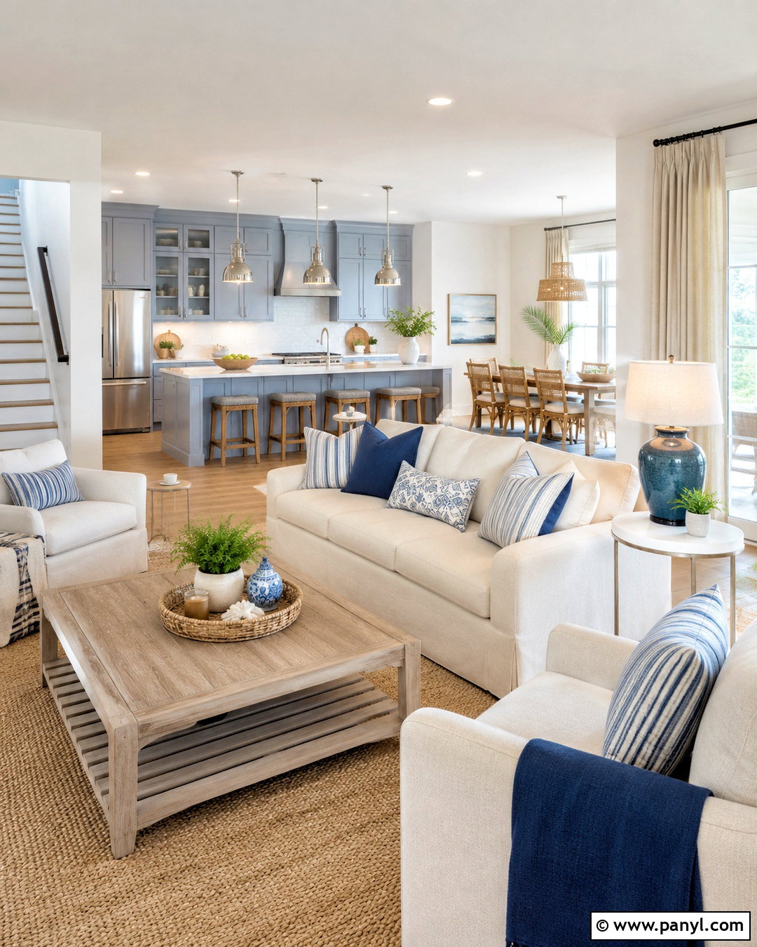
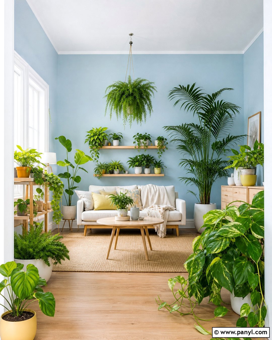
A pale blue and natural oak palette can make an indoor space feel fresh without becoming cold. Select a soft, slightly gray-blue for living room walls or kitchen cabinets, then carry warm white through hallways and adjoining rooms. Natural oak flooring, dining furniture, and vanities add enough warmth to balance the blue. Use ivory sofas, oatmeal curtains, and sandy beige rugs for a relaxed base. Small touches of muted navy can appear in pillows, artwork, or an entry bench. Choose polished nickel hardware for a clean finish or brushed brass for added warmth. White ceramic lamps, striped textiles, and simple coastal artwork complete the scheme while keeping it suitable for homes far beyond the shoreline.
5. Navy And Ivory Color Scheme
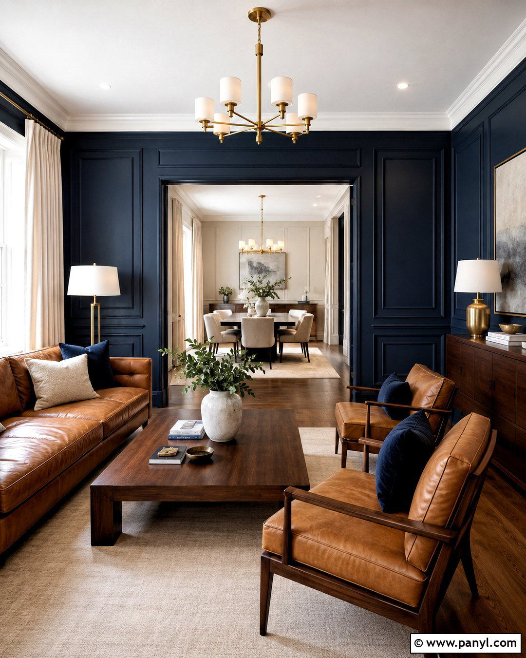
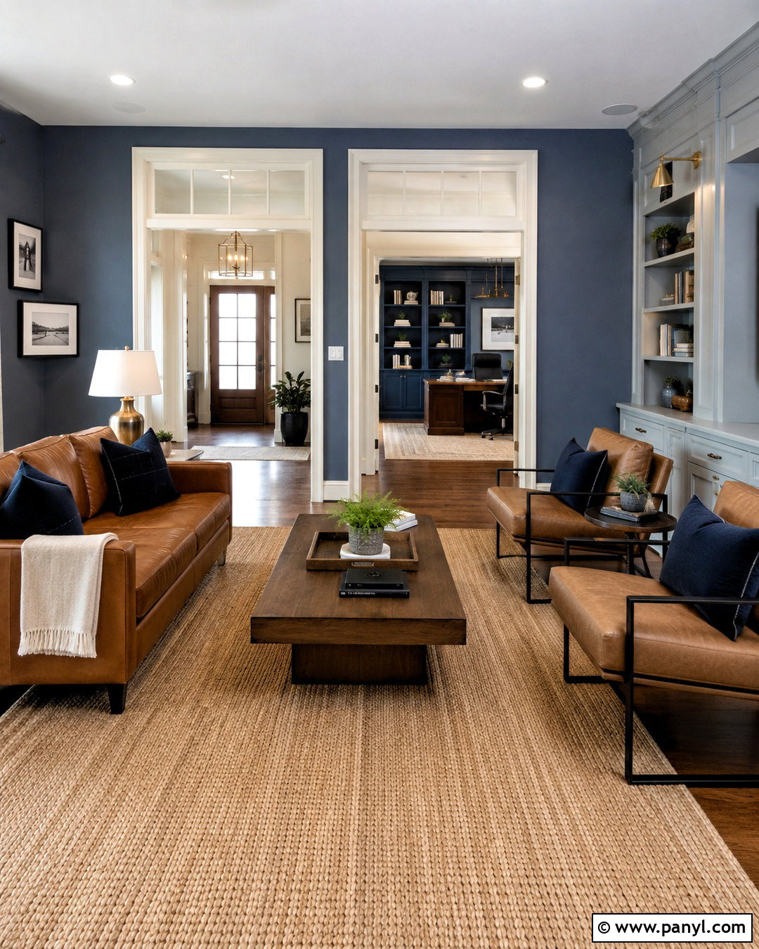
Deep navy delivers drama, but ivory and camel keep it comfortable for everyday living. Use navy on dining room walls, lower kitchen cabinets, or a paneled home office. Paint connecting spaces a warm ivory so the darker rooms feel intentional rather than disconnected. A camel leather sofa, walnut dining table, and medium brown flooring bring richness to the overall palette. Add cream curtains and pale rugs to reflect light around navy surfaces. Brushed brass hardware, picture lights, and table lamps offer a warm metallic accent. In bedrooms, repeat navy through a headboard or patterned bedding instead of every wall. Crisp white ceilings and carefully placed mirrors prevent this classic indoor color combination from looking enclosed or excessively formal.
6. Muted Green And Clay Color Scheme
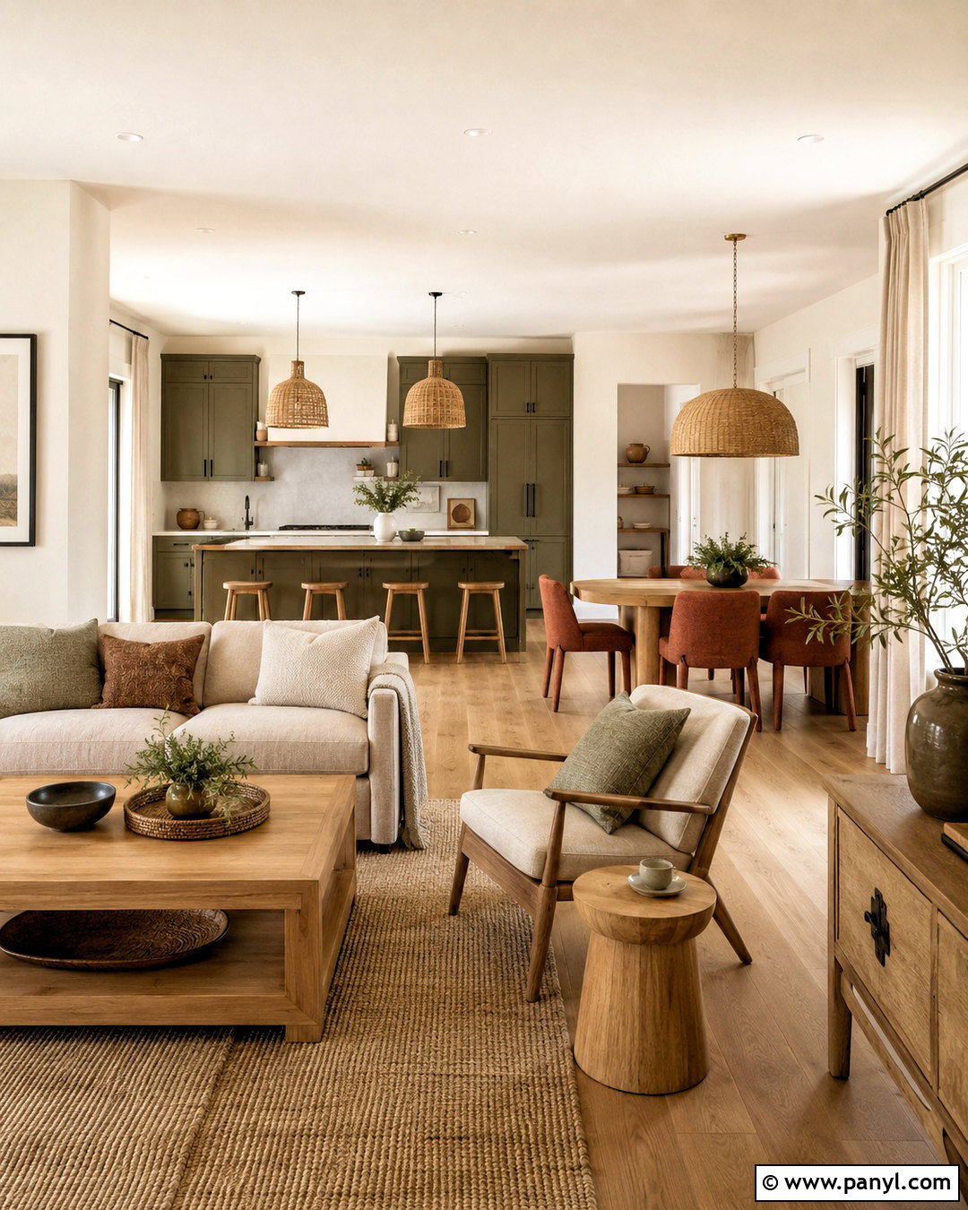
Imagine entering a home filled with softened greens, sunbaked clay, and warm cream. Begin with light cream walls in the entry and open-plan areas. Apply muted green to kitchen cabinets, a living room bookcase, or bedroom walls. Clay red works best as a supporting color on dining chairs, rugs, cushions, and pottery. Choose natural maple or white oak furniture to keep the combination bright. Linen upholstery, woven pendant lights, and warm beige curtains strengthen the organic character. For visual balance, use dark bronze hardware and a few espresso brown accents. The finished scheme feels earthy and relaxed, yet it remains polished because every room repeats the same cream base, natural wood, and restrained clay details.
7. Taupe And Dusty Rose Color Scheme
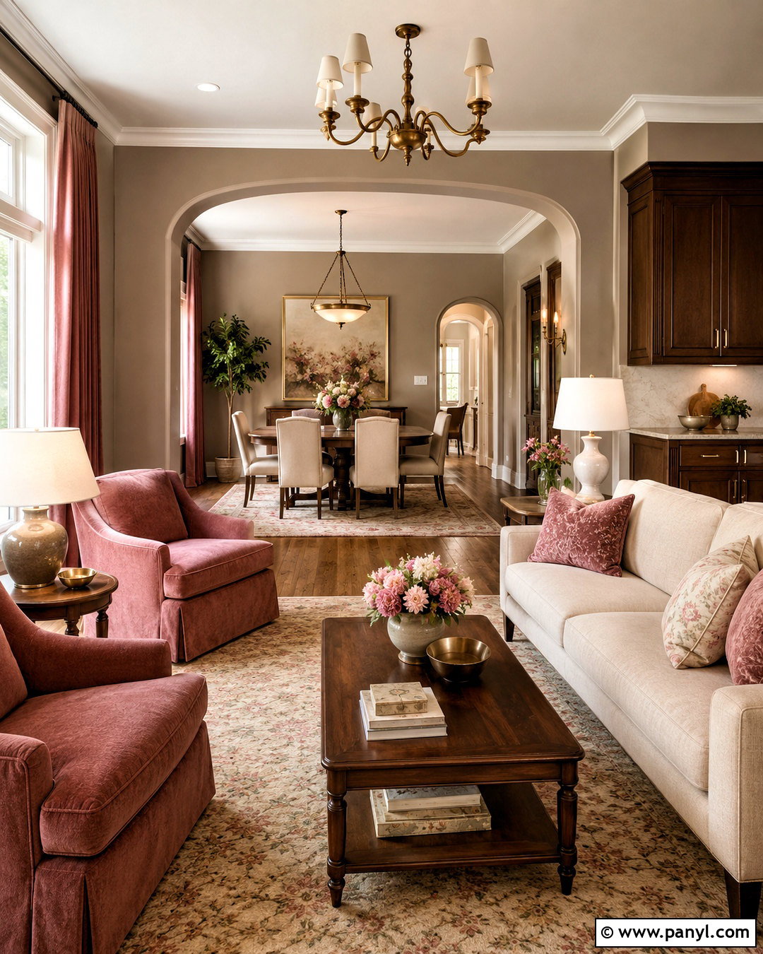
Taupe becomes much more expressive when paired with dusty rose, chocolate brown, and soft cream. Cover the primary living spaces in a warm mushroom taupe that complements both dark and light furniture. Use dusty rose on an upholstered chair, bedroom walls, drapery, or a dining room rug. Chocolate brown cabinetry and walnut tables give the delicate pink a grounded, grown-up appearance. Add cream sofas, ivory bedding, and pale stone surfaces to maintain brightness. Antique brass lighting works beautifully with these warm undertones. Patterns should remain subtle, such as faded florals, narrow stripes, or geometric rugs in rose and brown. This indoor palette is especially effective in traditional, vintage-inspired, and softly modern homes.
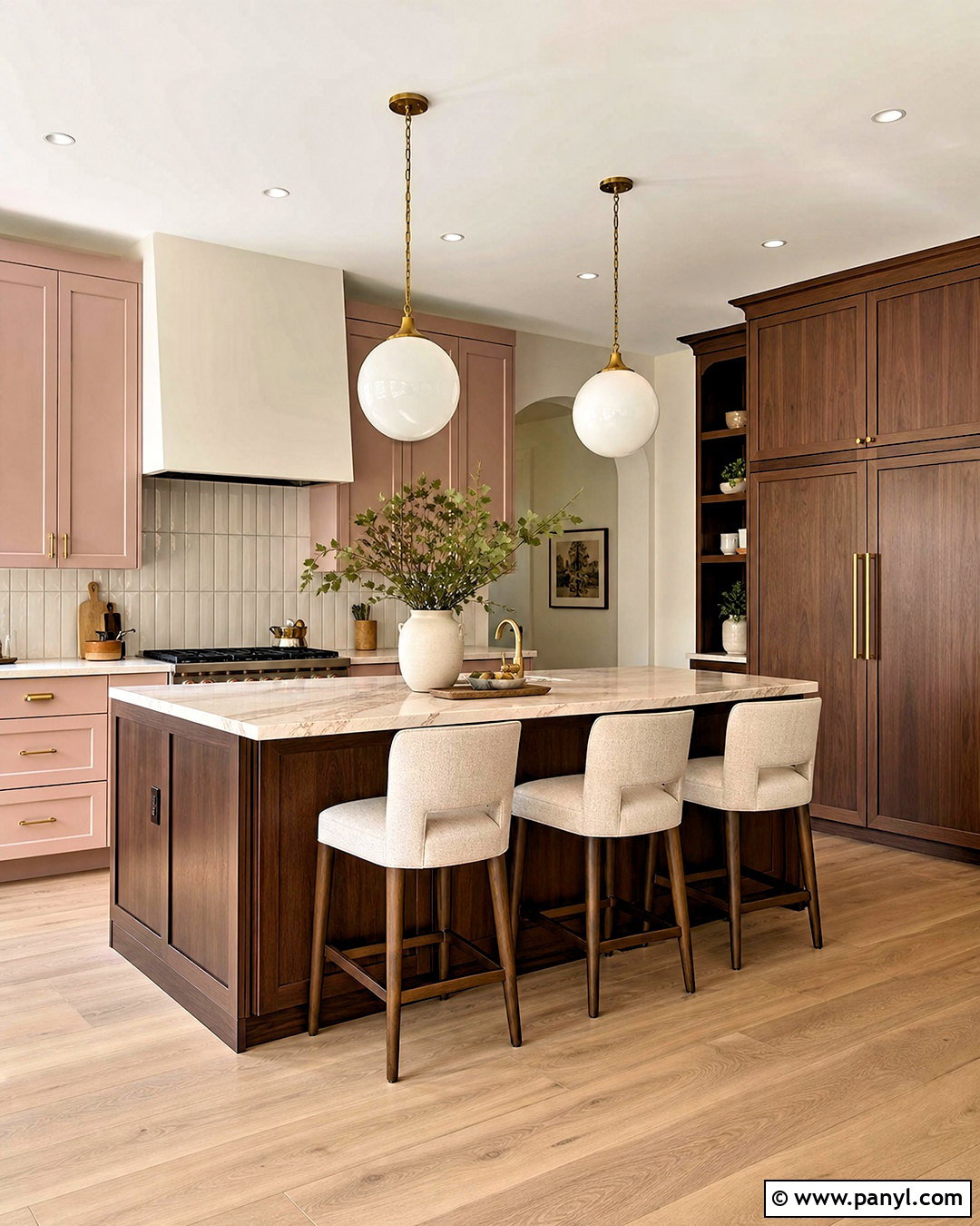
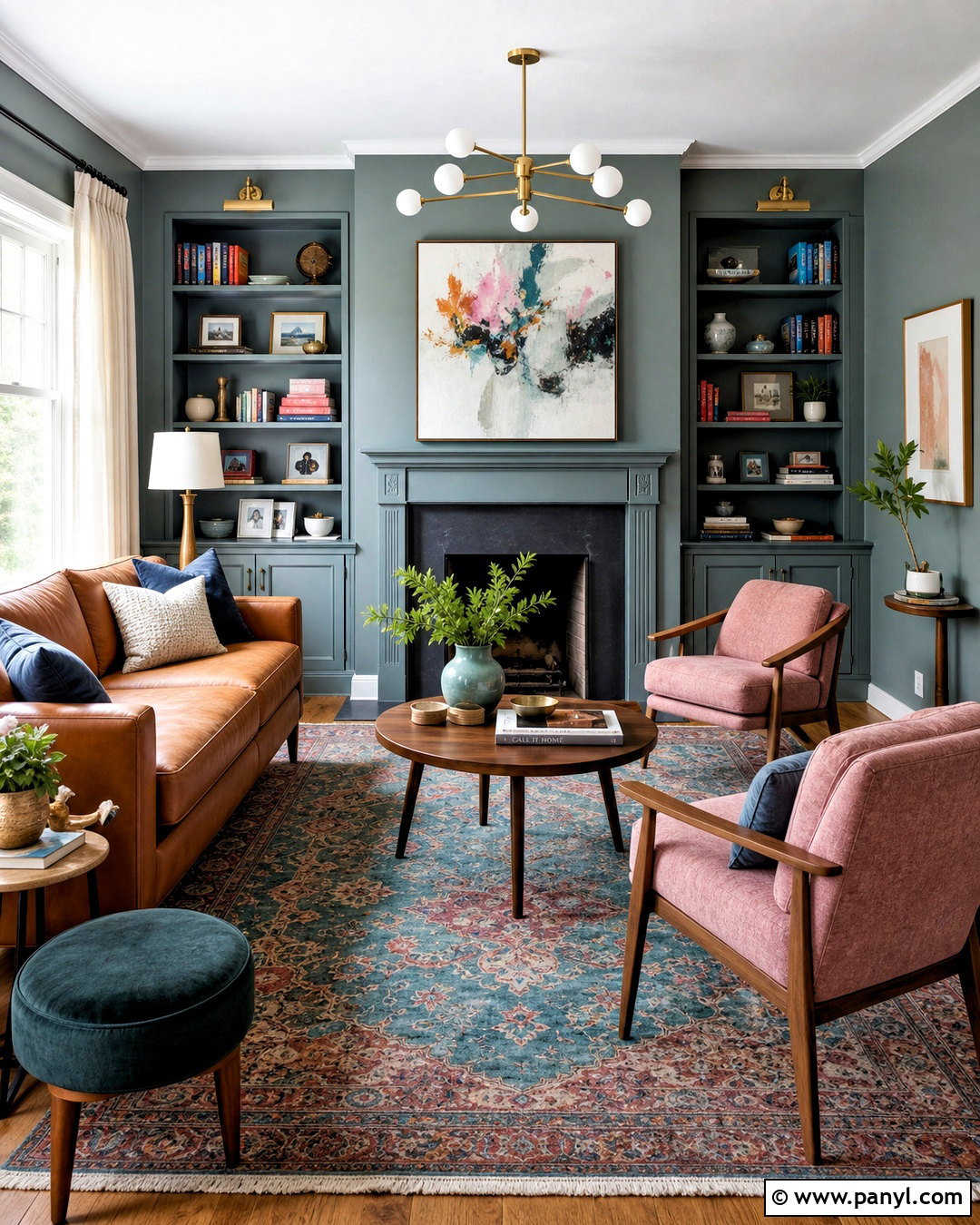
8. Blue Gray And Walnut Color Scheme
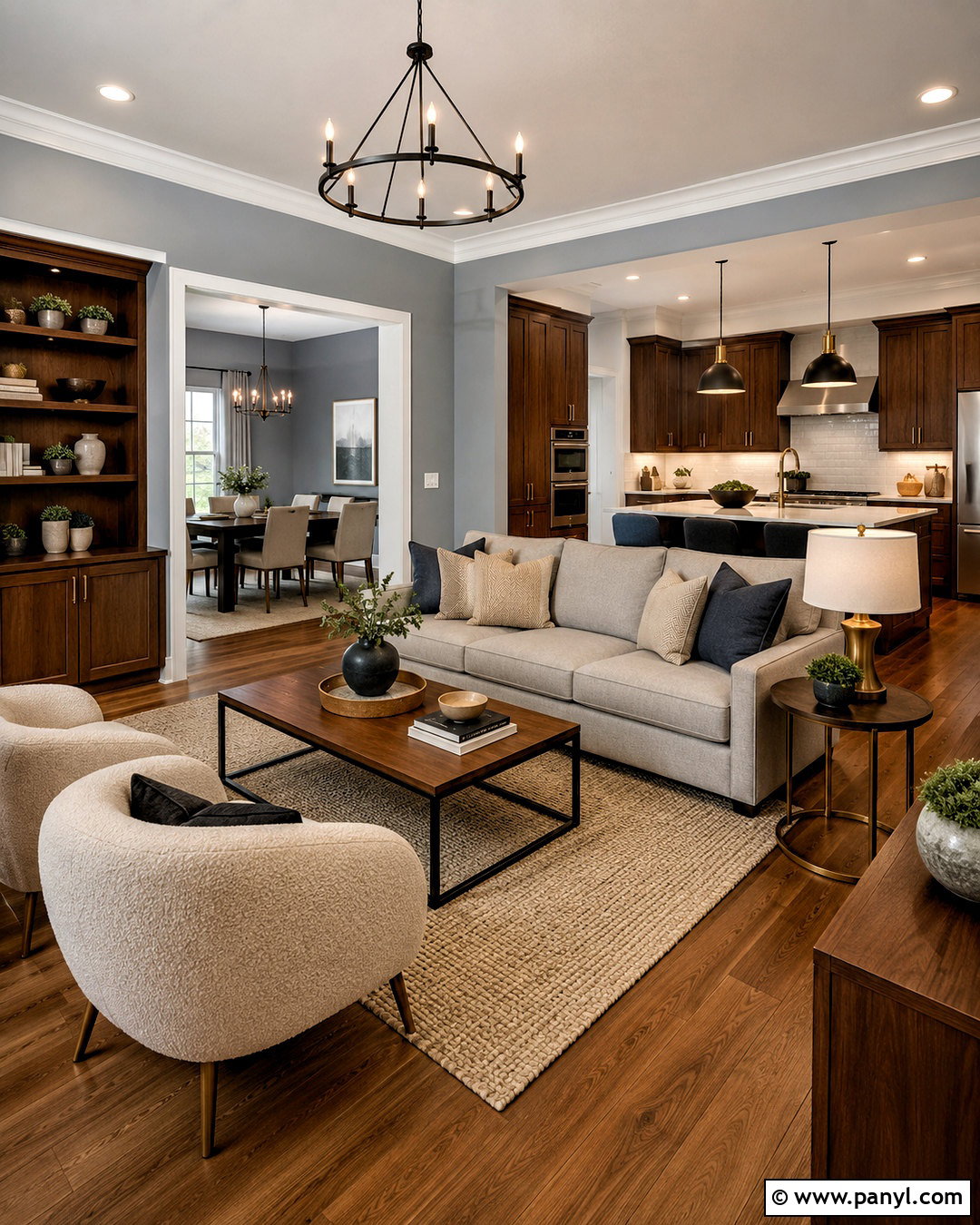
Cool blue-gray walls can feel balanced and inviting when surrounded by rich walnut and warm white. Use the blue-gray in a living room, office, or bedroom, then select warm white for trim, ceilings, and transitional spaces. Walnut cabinets, shelving, and dining furniture introduce strong natural contrast. Choose a light gray sofa, cream boucle chairs, and a textured beige rug to soften the darker wood. Black metal lighting adds a clean outline, while brushed brass accessories contribute warmth in smaller doses. Repeat blue-gray through kitchen island paint, bathroom tile, and patterned textiles. Avoid icy flooring with this scheme. Medium oak, walnut, or warm beige carpet will make the full interior look more cohesive and comfortably layered.
9. Butter Yellow And Soft Blue Color Scheme
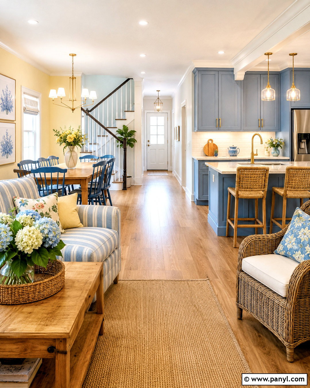
Morning light feels especially cheerful against butter yellow, soft blue, and creamy white. Use pale butter yellow in the kitchen, breakfast room, or a sunny family room. Continue creamy white through the entry and halls to create a calm transition. Soft blue cabinets, dining chairs, or bedroom walls balance the yellow without dulling its warmth. Natural pine and light oak furniture support the relaxed palette. Add gingham, ticking stripes, and small floral patterns in controlled amounts for character. White stone counters and unlacquered brass hardware keep kitchens looking clean yet welcoming. A few muted green plants and woven baskets provide natural texture. The completed house feels colorful and bright without relying on overly saturated primary shades.
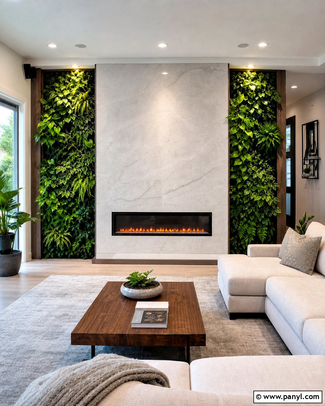

10. Charcoal And Rust Color Scheme
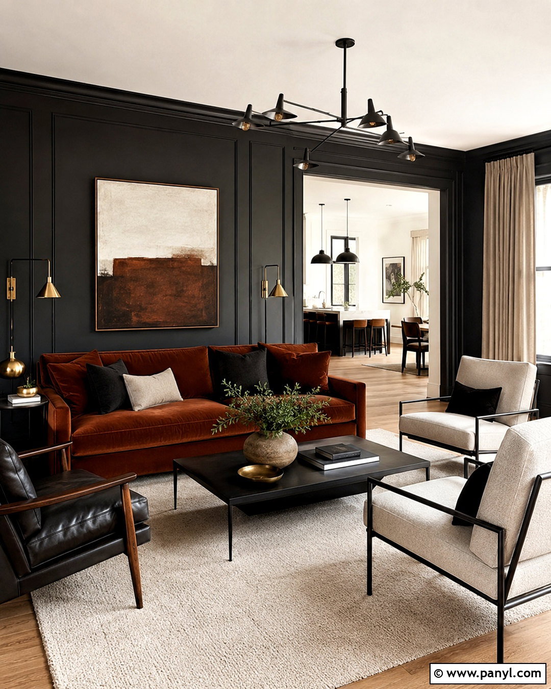
Charcoal walls, rust upholstery, and warm white accents form a dramatic palette with plenty of livable warmth. Reserve charcoal for a den, dining room, fireplace wall, or lower cabinetry. Use warm white throughout larger open areas so the home does not feel uniformly dark. A rust velvet sofa or leather dining chairs can become the central color feature. Balance those strong tones with light oak floors, cream rugs, and natural linen curtains. Matte black fixtures blend smoothly with charcoal, while antique brass provides a brighter accent. Repeat rust in artwork, pillows, and patterned runners rather than adding more unrelated colors. This complete scheme works best with layered lighting, uncluttered furniture arrangements, and simple architectural details.
11. Blush And Burgundy Color Scheme
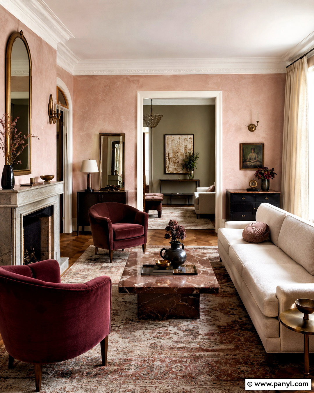
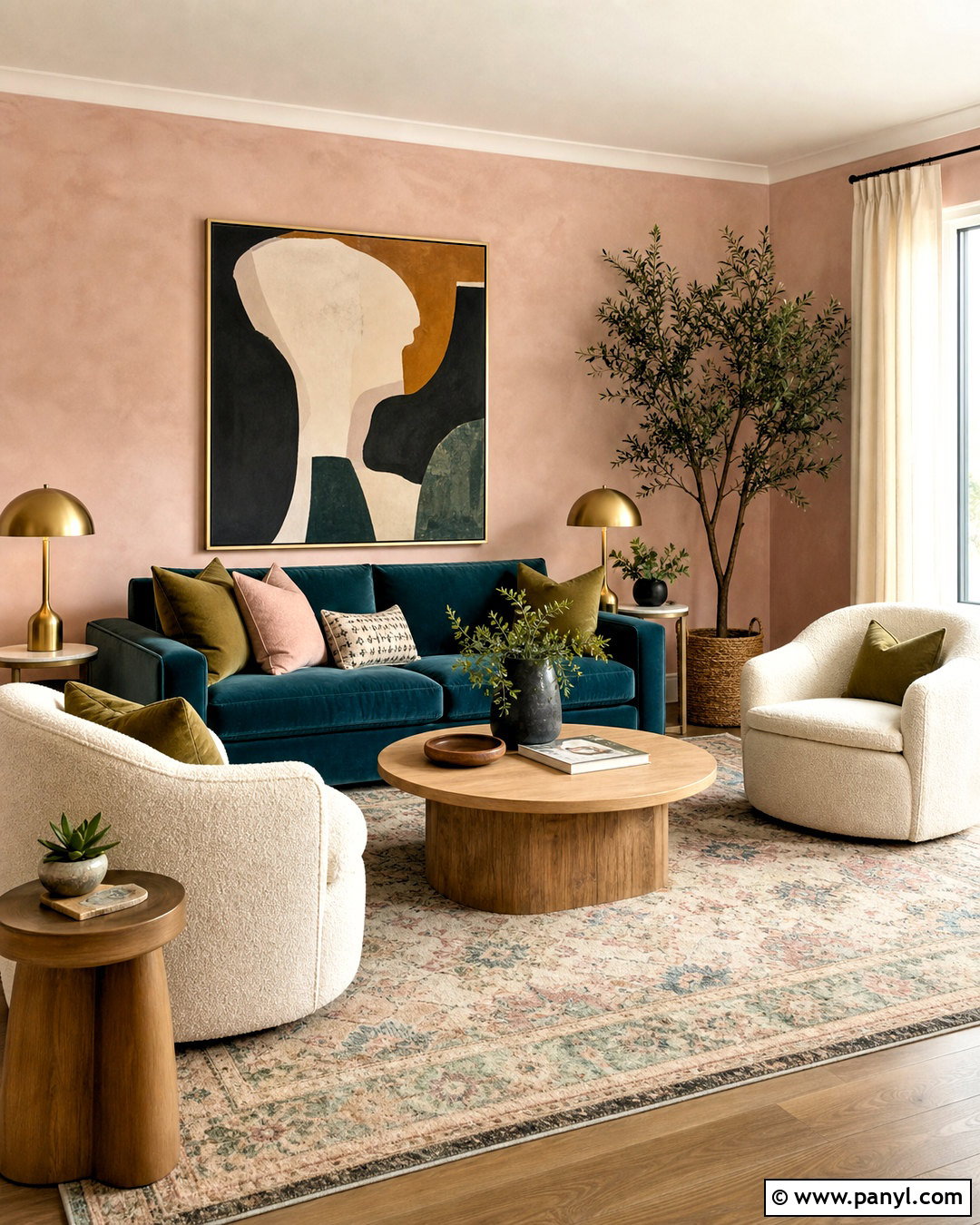
Soft blush gains sophistication when it is paired with burgundy, mushroom, and dark wood. Choose a pale plaster-like blush for a bedroom, sitting room, or dining space. Keep the entry and shared living areas warm white or light mushroom for gentle transitions. Burgundy can appear on velvet chairs, patterned rugs, cabinet interiors, or a painted bookcase. Use espresso-stained furniture and medium walnut flooring to add structure. Cream upholstery and natural linen window treatments prevent the palette from becoming too sweet. Aged brass sconces and warm marble surfaces provide a refined finish. Carry small amounts of blush and burgundy into neighboring rooms through artwork and textiles, producing an indoor scheme that feels connected, comfortable, and confidently colorful.
12. Teal And Ochre Color Scheme
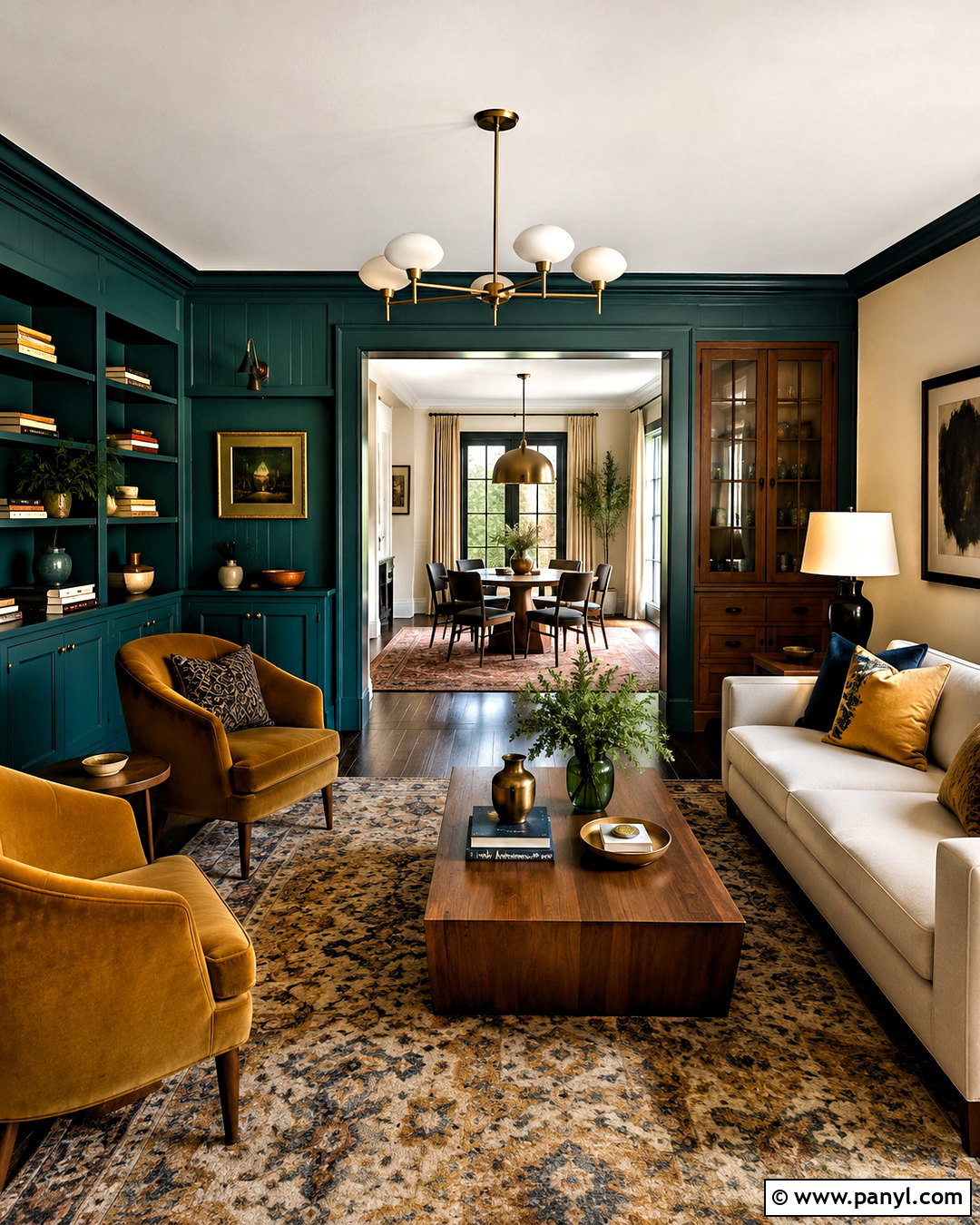
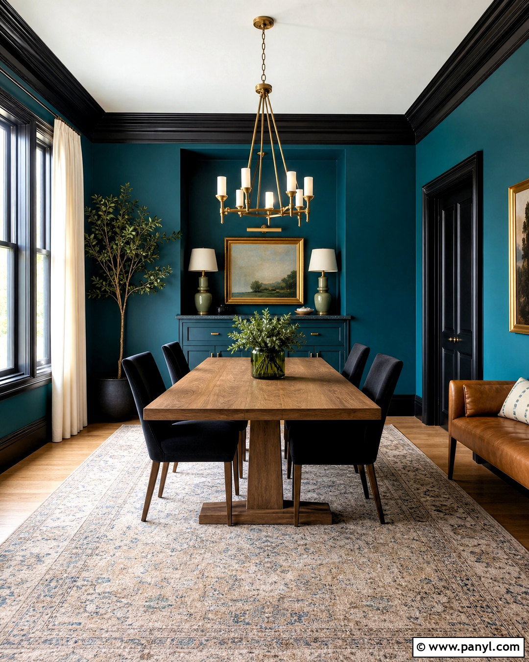
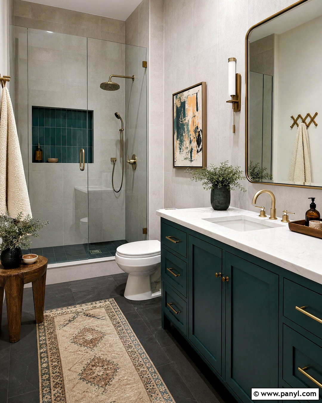
For a home with strong personality, combine deep teal with ochre, warm beige, and walnut. Paint a dining room or library teal from the baseboards to the ceiling for an enveloping look. Keep the main living room warm beige and repeat teal through a sofa, curtains, or built-ins. Ochre chairs, pillows, and patterned rugs provide a sunny contrast. Walnut tables and cabinetry hold the intense colors together, while cream upholstery creates breathing room. Select antique brass lighting and dark bronze hardware instead of bright chrome. In bedrooms, soften the combination with beige walls, teal bedding, and one ochre accent chair. The result feels bold and layered, but the repeated wood tones and neutral background maintain visual order.
13. Black White And Wood Color Scheme
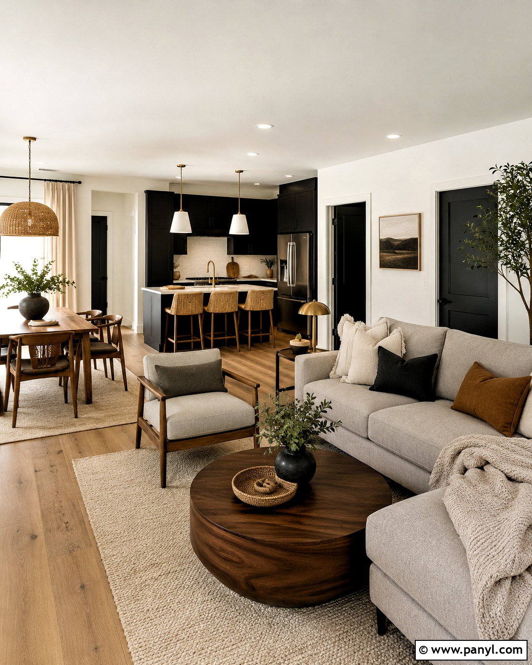
Black and white interiors feel warmer and more enduring when natural wood plays a major role. Use soft white, rather than stark blue-white, across most walls and ceilings. Introduce black on interior doors, kitchen cabinets, window frames, or a fireplace surround. Wide-plank oak flooring, a walnut dining table, and woven rattan pieces prevent the contrast from appearing severe. Choose a warm gray sofa, ivory rugs, and oatmeal curtains to bridge black and white surfaces. Matte black hardware keeps the scheme consistent, while a small amount of brushed brass adds dimension. Limit patterns to clean stripes, checks, and simple abstract designs. Every room should include visible wood or natural fiber so the completed house remains approachable rather than clinical.
14. Lavender Gray And Cream Color Scheme
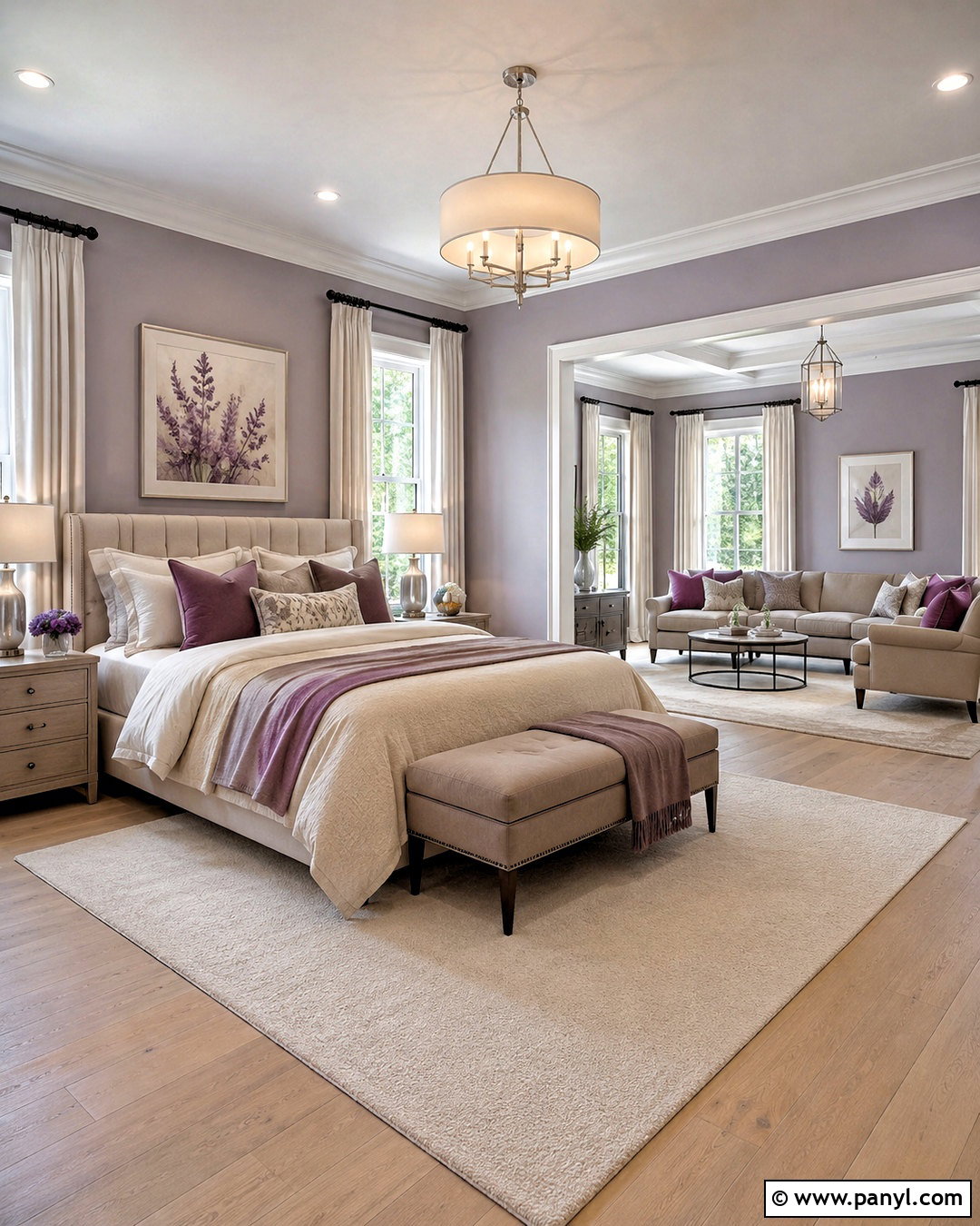
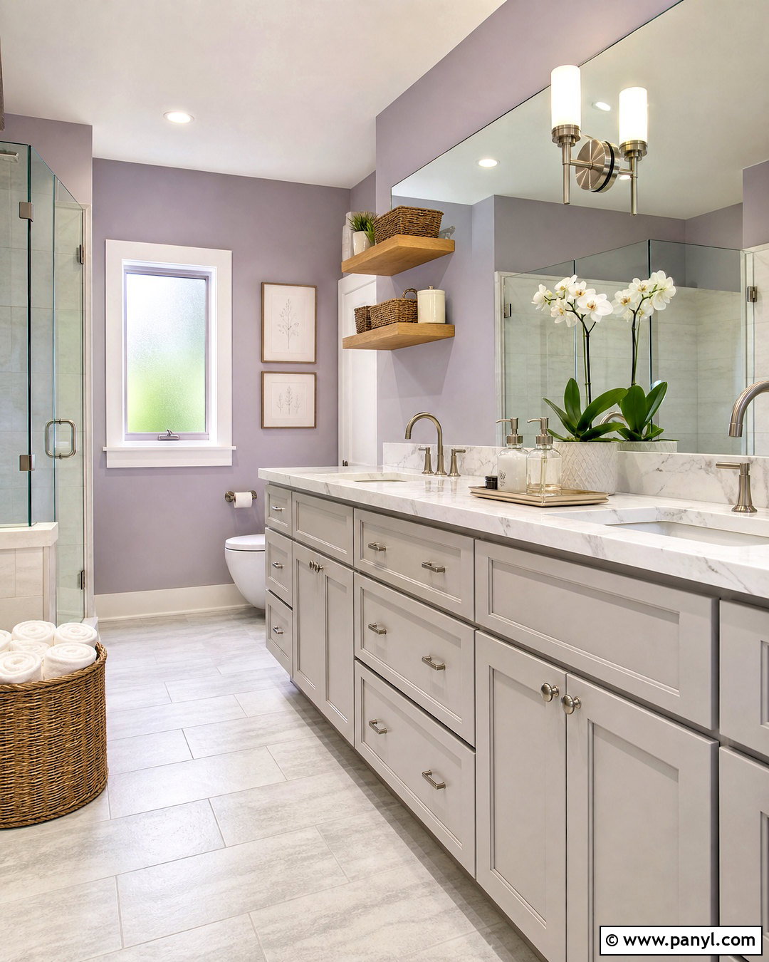
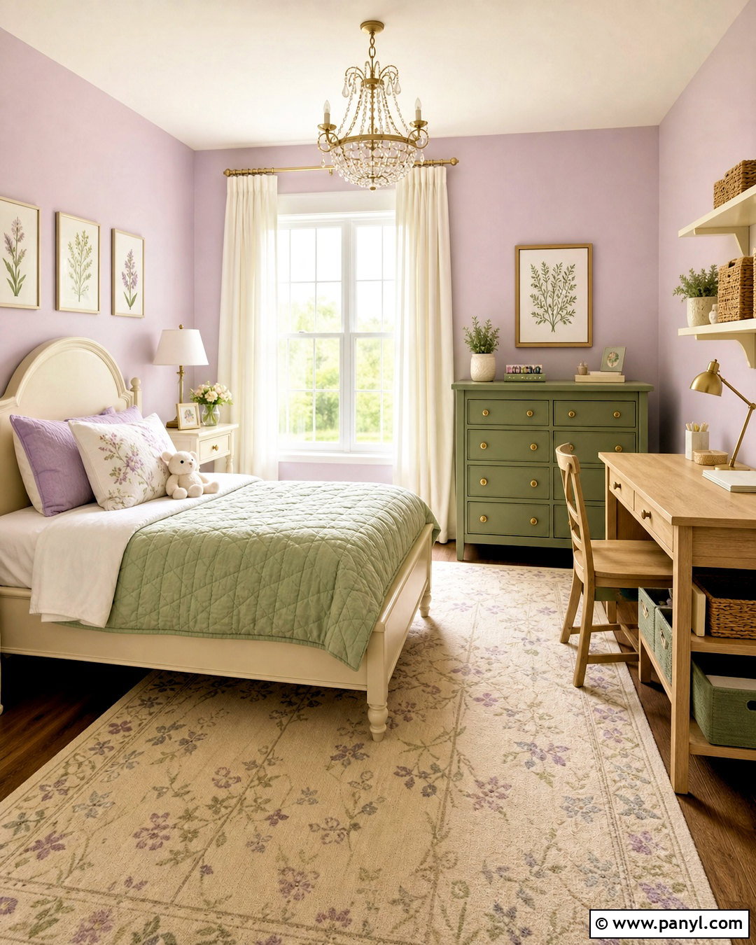
Lavender gray offers a subtle alternative to standard gray, especially in bedrooms, bathrooms, and quiet living spaces. Select a muted shade with noticeable gray undertones rather than a bright purple. Pair it with creamy white trim, pale oak flooring, and mushroom-colored upholstery. In the living room, use cream walls with lavender-gray curtains and chairs for a more restrained interpretation. Soft plum can appear in artwork, pillows, or a small painted cabinet. Choose satin nickel fixtures for a cool, polished look, or aged brass if the room needs warmth. Textured ivory rugs and natural linen bedding keep the palette light. Repeating lavender gray in several small details allows the house to feel coordinated without making every room look identical.
15. Forest Green And Tan Color Scheme
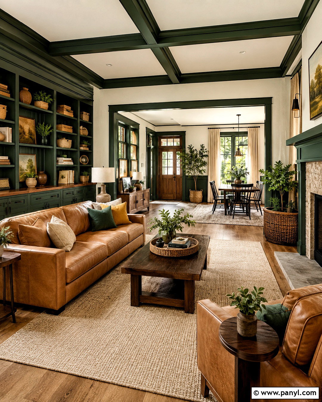
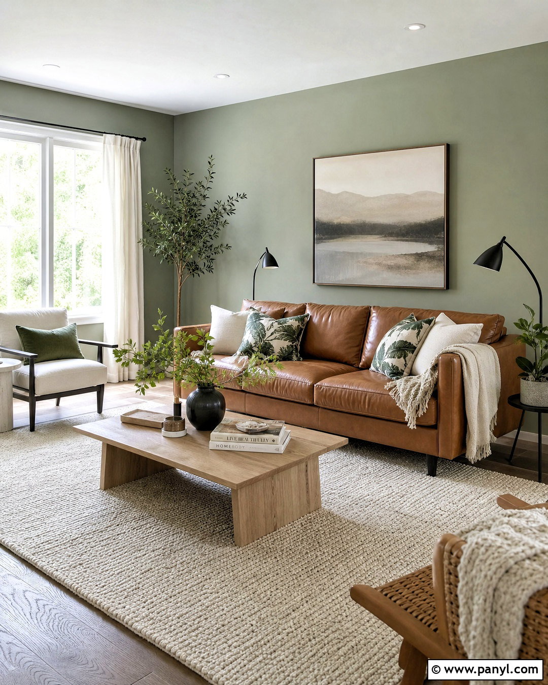
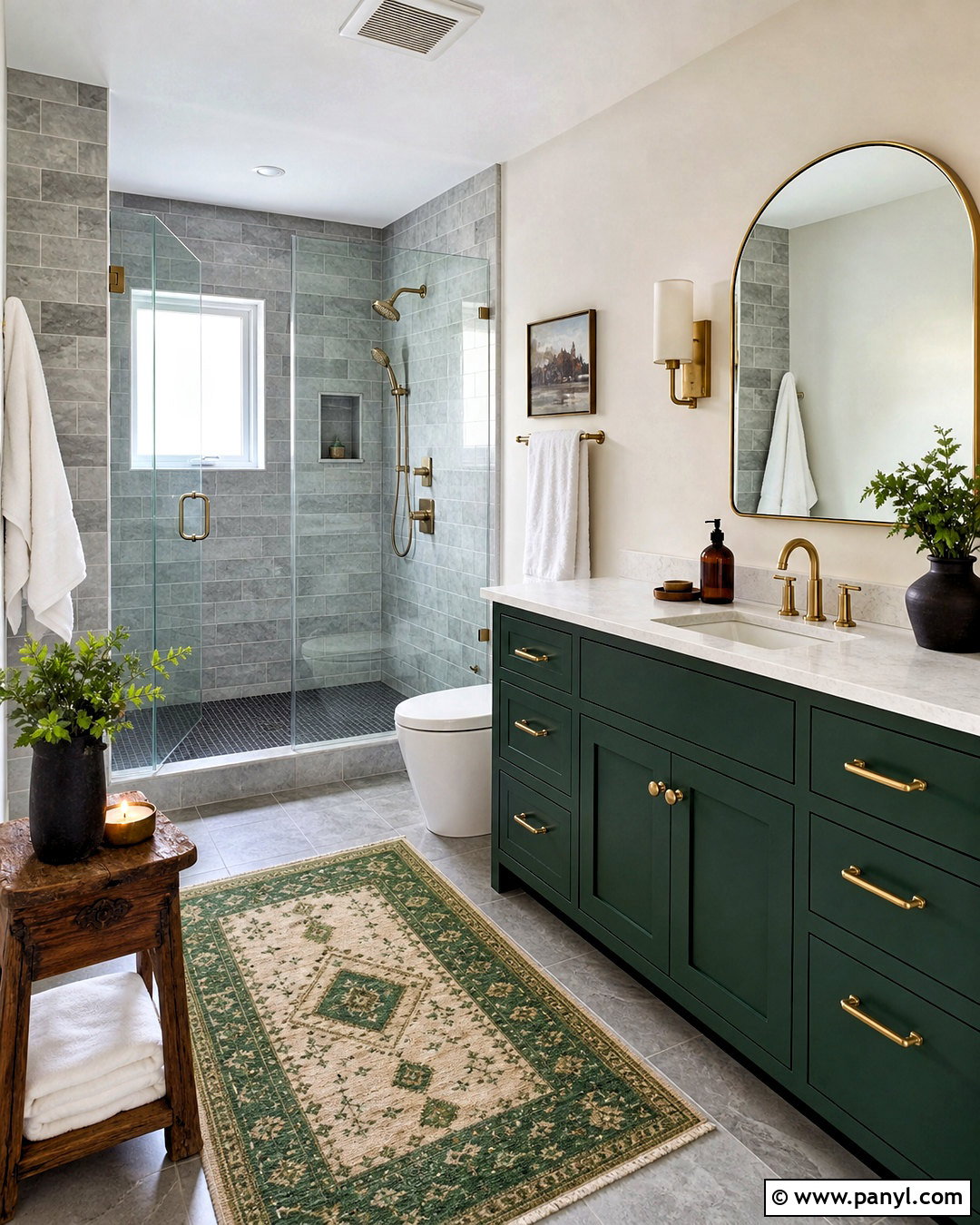
There is something instantly grounded about forest green surrounded by tan leather, cream fabric, and dark bronze. Use the green on living room built-ins, a kitchen island, or all four walls of a home office. Paint connecting rooms a soft cream with warm undertones. Tan leather seating introduces durability and contrast, while oak floors and walnut tables support the woodland palette. Choose beige wool rugs, linen curtains, and woven baskets to lighten the darker elements. Dark bronze hardware looks quieter than black and works naturally with green. Add small rust or mustard accents through vintage-inspired textiles. This color scheme can move comfortably through traditional, craftsman, farmhouse, or modern interiors depending on the furniture shapes and architectural finishes selected.
16. Coastal Blue And Sand Color Scheme
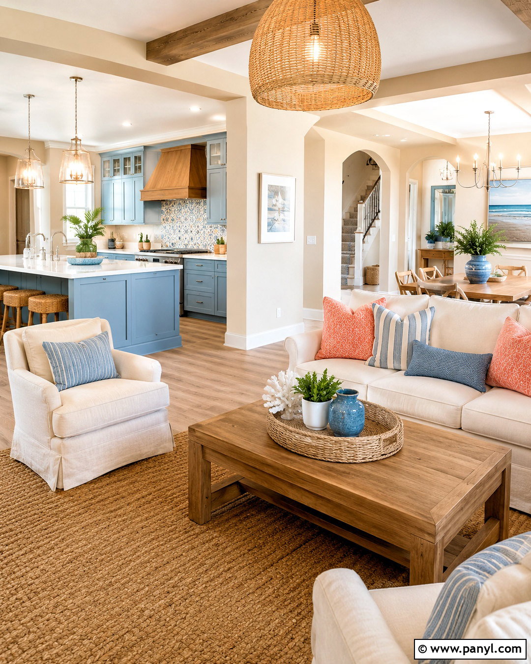
A coastal indoor palette should feel breezy and natural, not filled with obvious beach decorations. Begin with sandy beige or warm white walls throughout the main spaces. Use faded coastal blue on kitchen cabinets, a bathroom vanity, or bedroom walls. Add off-white slipcovered seating, light oak tables, and woven jute rugs. Muted coral can provide a small accent through pillows, artwork, or ceramic lamps. Select brushed nickel or soft brass hardware, depending on whether you prefer a cooler or warmer finish. White linen curtains keep windows open and bright. Repeat blue through striped textiles and handcrafted tile. The finished home feels relaxed and connected because sand, blue, white, and natural fibers appear in different proportions across every room.
17. Monochromatic Warm Neutral Color Scheme
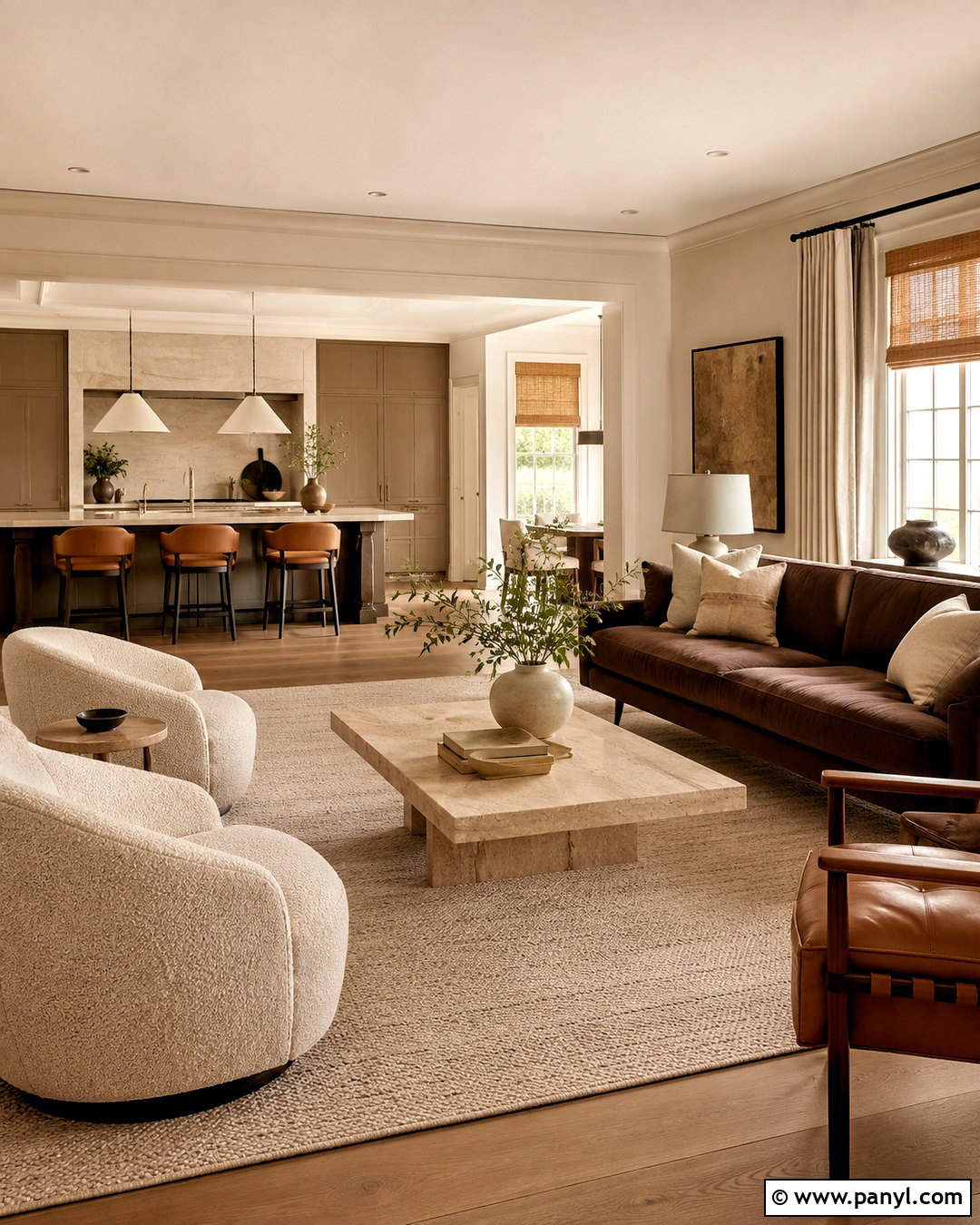
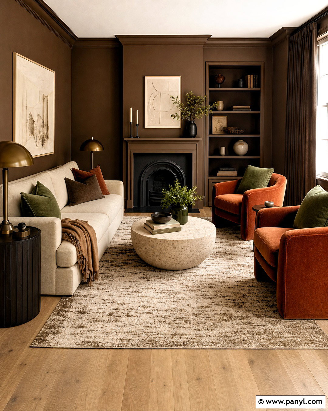
A monochromatic neutral house can feel rich when each surface has a slightly different depth and texture. Start with creamy off-white ceilings and light beige walls. Use medium taupe for cabinetry, built-ins, or a dining room, then bring in chocolate brown through wood furniture and small accents. Upholstery can range from ivory boucle to oatmeal linen and camel leather. Choose natural oak flooring with beige wool rugs to maintain tonal flow. Travertine tables, woven shades, and plaster lamps add variation without introducing unrelated colors. Bronze hardware supplies a gentle outline. The key is avoiding one flat shade everywhere. Layering warm whites, sand, mushroom, caramel, and brown creates dimension while preserving the peaceful, cohesive character of a neutral whole-house interior.
18. Jewel Tones And Warm Neutral Color Scheme
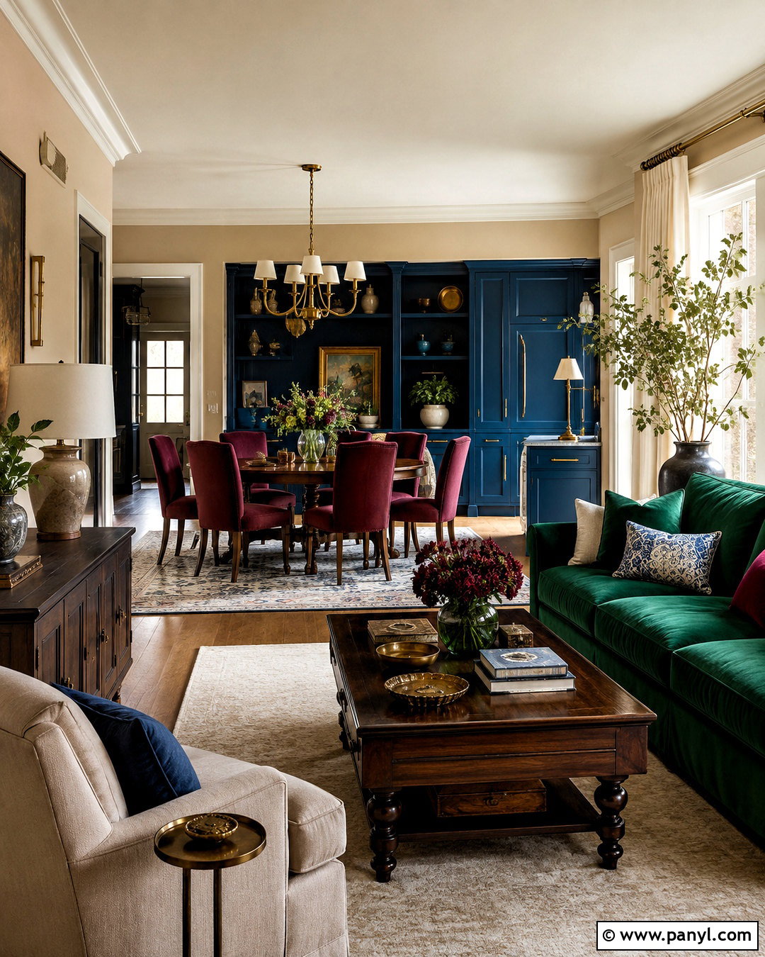
Emerald, sapphire, and garnet can share a home successfully when a consistent warm neutral controls the background. Paint the open living spaces a soft beige and reserve jewel tones for defined rooms and substantial furnishings. An emerald sofa can anchor the living room, while sapphire cabinets distinguish the kitchen or study. Use garnet on dining chairs, bedroom textiles, or a smaller painted cabinet. Dark walnut furniture connects the saturated colors, and cream curtains soften their intensity. Antique brass lighting complements all three hues and gives the palette a unified finish. Keep floors and large rugs neutral. By repeating each jewel tone only a few times, the completed house feels colorful and elegant instead of crowded with competing statement pieces.
19. Southwestern Indoor Color Scheme
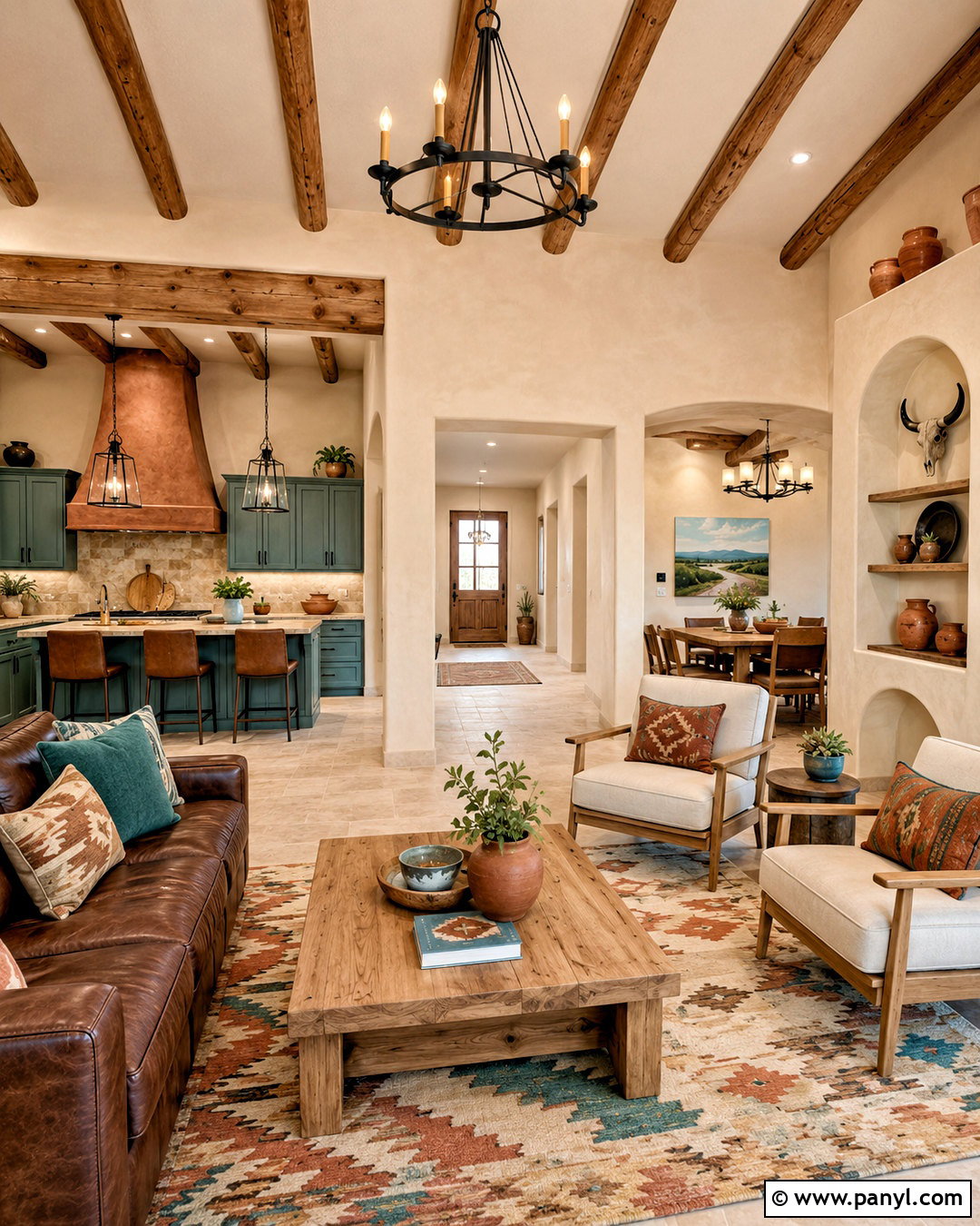
Warm desert colors create a relaxed indoor environment when they are balanced with simple forms and natural materials. Use sandy beige on most walls, with muted adobe clay in the dining room or behind living room shelving. Introduce dusty turquoise through a kitchen island, bathroom vanity, or patterned rug. Cream upholstery and light oak furniture keep the house from becoming visually heavy. Add dark brown leather, woven wool textiles, terracotta pottery, and black iron lighting for depth. Avoid covering every surface with rustic decoration. A few geometric patterns and handcrafted accessories are enough. Carry beige, clay, turquoise, and warm wood into each room in changing proportions, creating a cohesive Southwestern palette that feels fresh, practical, and suitable for everyday living.
20. Muted Primary Color Scheme
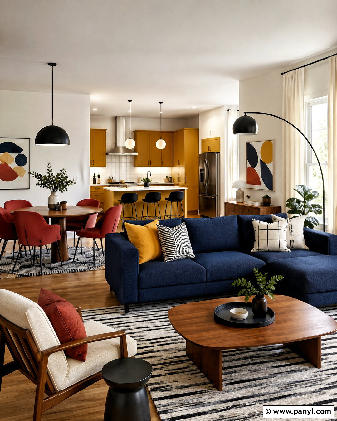
Could red, yellow, and blue work throughout a grown-up home? The answer is yes when every shade is softened. Choose warm white walls as the shared background, then use brick red, mustard yellow, and dusty navy in carefully planned areas. A navy sofa can anchor the living room, mustard cabinets can brighten a laundry room, and brick red dining chairs can energize the kitchen. Medium oak floors and walnut furniture provide a steady natural base. Repeat the colors through graphic artwork, striped rugs, and solid pillows rather than busy novelty prints. Black lighting and cream curtains create definition and balance. The finished palette feels lively and modern while remaining cohesive enough to move smoothly from public rooms into private spaces.
Conclusion:
The most successful indoor palette considers the entire house, not one room at a time. Begin with a dependable base color, then repeat selected woods, metals, and accents to connect adjoining spaces. Bold shades can define closed rooms, while lighter neutrals help open areas feel continuous. Always test paint beside permanent finishes and view it during morning, afternoon, and evening light before buying a large quantity. You can also introduce a new palette gradually through rugs, curtains, artwork, and painted furniture. Whether you prefer calm neutrals, earthy greens, coastal blues, or expressive jewel tones, these 20 indoor color schemes house ideas offer complete, practical looks that can be adjusted for your architecture, lighting, and personal taste.

Related Ideas and Inspiration:

Leave a Reply