
Warm living room colors can make the heart of your home feel softer, more welcoming, and easier to relax in. The best palettes go beyond wall paint. They connect the walls with upholstery, wood tones, rugs, window treatments, lighting, and decorative accents. Current color direction favors nuanced warm whites, earthy neutrals, muted greens, soft pinks, and deeper brown-based shades rather than cold gray or stark white schemes. () Before choosing, sample each paint on several walls and view it during the morning, afternoon, and evening. Natural light and existing finishes can noticeably change its appearance. Whether you prefer light neutrals or rich color, these complete room schemes offer 20 warm living room colors to inspire your space.

1. Warm White Living Room Color
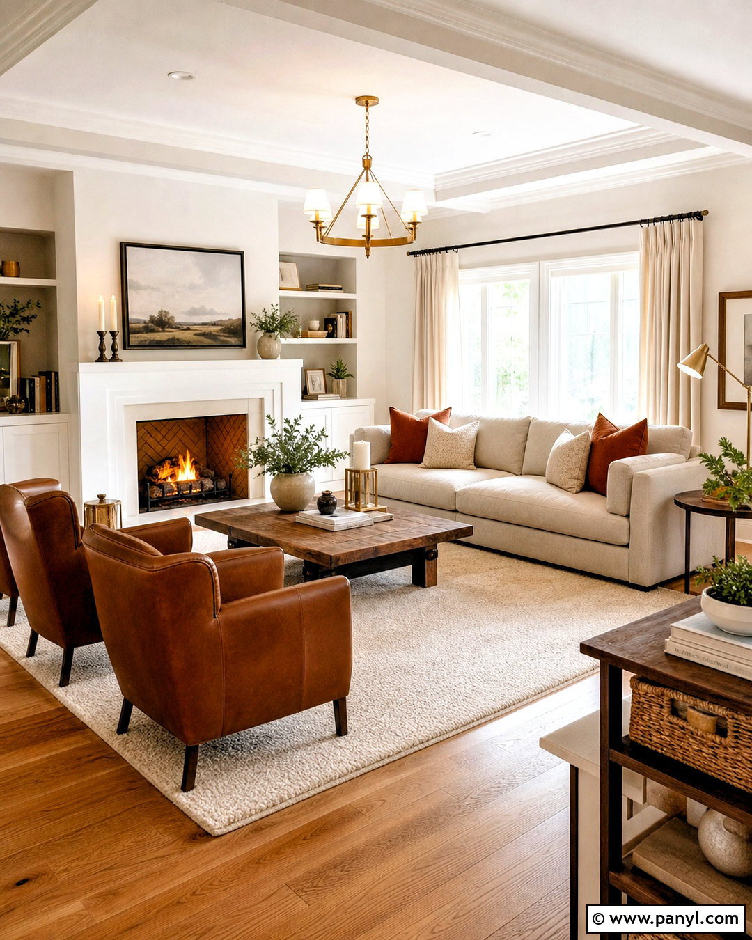
Warm white creates a bright living room without the sharp, clinical feeling of pure white. Choose a creamy white with subtle yellow, beige, or red undertones for the walls and ceiling. Continue the softness with an oatmeal linen sofa, ivory curtains, and a light beige wool rug. Medium oak flooring and a rounded walnut coffee table bring natural contrast without making the room feel heavy. Add cognac leather chairs, muted rust pillows, and brushed brass lighting for deeper warmth. Matte black frames can provide a small amount of definition. This complete palette works especially well in compact rooms, open layouts, and homes with limited daylight. Test several whites beside the trim because an undertone becomes more obvious when two whites sit together.
2. Cream Living Room Color
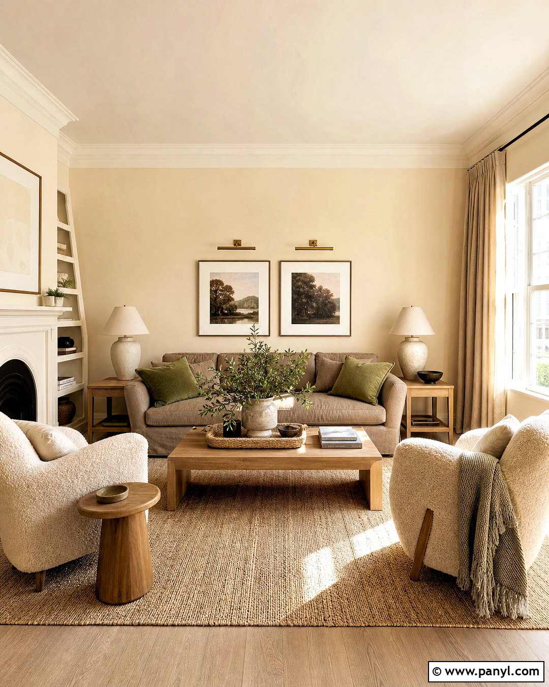
Imagine afternoon sunlight falling across creamy walls, a soft sectional, and layers of natural texture. Cream is richer than warm white, making it a comfortable choice for traditional, modern organic, or relaxed transitional rooms. Paint the walls a pale buttercream and keep the ceiling a slightly lighter version of the same color. Pair it with a mushroom-colored sofa, bouclé accent chairs, and a woven jute-and-wool rug. Warm oak tables, linen curtains, and handmade ceramic lamps prevent the neutral palette from looking flat. Introduce muted olive through pillows and a leafy plant, then add aged brass picture lights above simple landscape artwork. Varying materials is essential because it gives this low-contrast color scheme enough depth, movement, and character.
3. Ivory Living Room Color
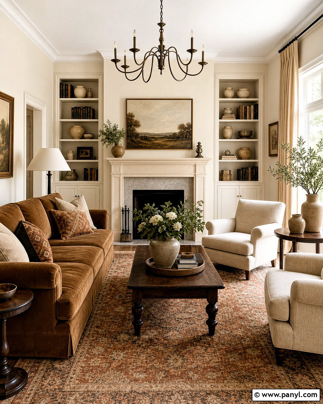
An ivory living room feels polished, airy, and warmer than a room decorated in bright white. Use soft ivory across the walls, molding, and built-in shelves for a seamless foundation. A camel velvet sofa creates a strong focal point, while two oatmeal armchairs keep the seating arrangement balanced. Ground the room with a faded rust, cream, and brown patterned rug. Dark walnut tables and antique bronze lighting add definition against the pale background. For window treatments, choose full-length flax linen curtains rather than cool white panels. Style the shelves sparingly with tan books, cream pottery, wood boxes, and small framed artwork. This palette is particularly effective when you want a refined neutral room that still feels comfortable enough for everyday family use.
4. Warm Beige Living Room Color
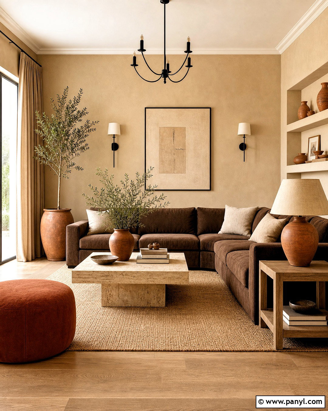
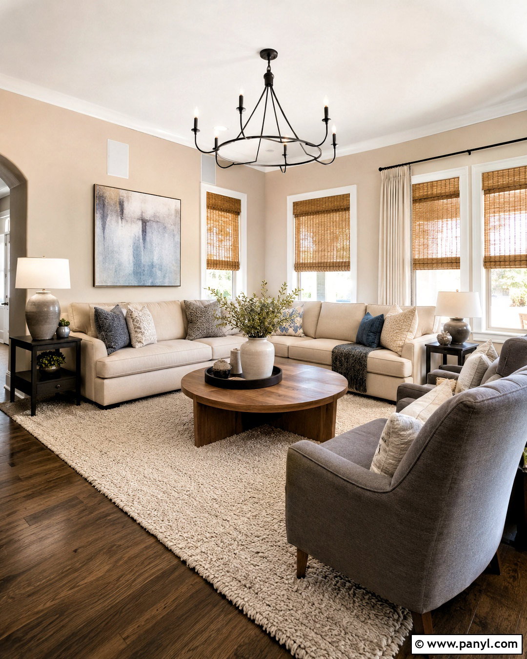
Could beige be interesting rather than predictable? It can when several related tones and contrasting textures are used throughout the room. Start with warm sandy beige walls and slightly deeper beige curtains. Choose a chocolate brown sofa with clean lines, then soften it with cream pillows and a nubby ivory throw. A large taupe rug establishes the seating zone, while oak side tables and a travertine coffee table introduce natural variation. Bring in terracotta through pottery, artwork, and one upholstered ottoman. A black metal floor lamp gives the quiet palette a crisp edge. This complete look suits busy households because medium neutrals are practical and forgiving. Avoid matching every beige exactly; subtle differences make the finished living room feel layered instead of generic.
5. Warm Greige Living Room Color
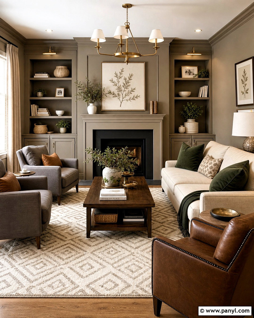
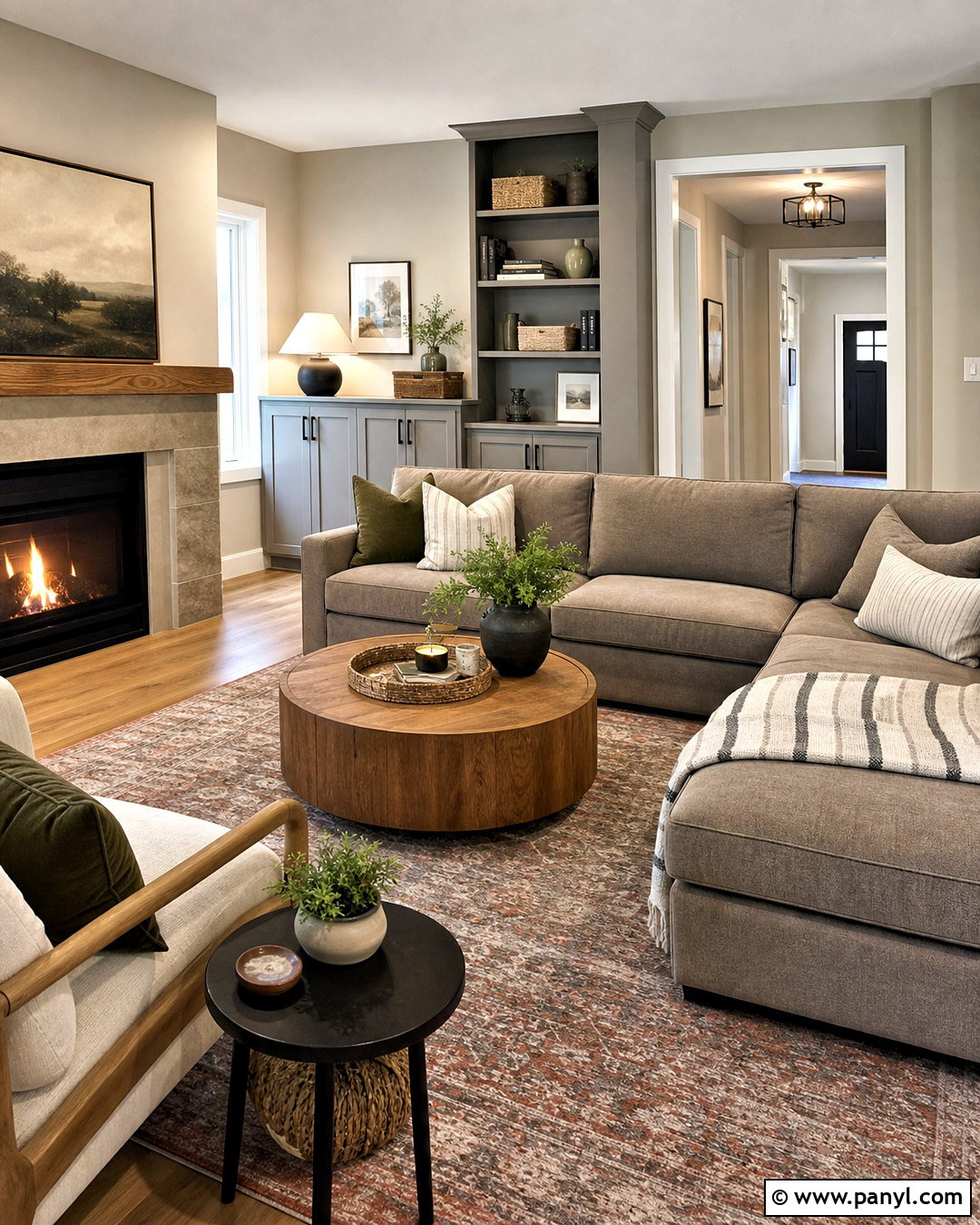
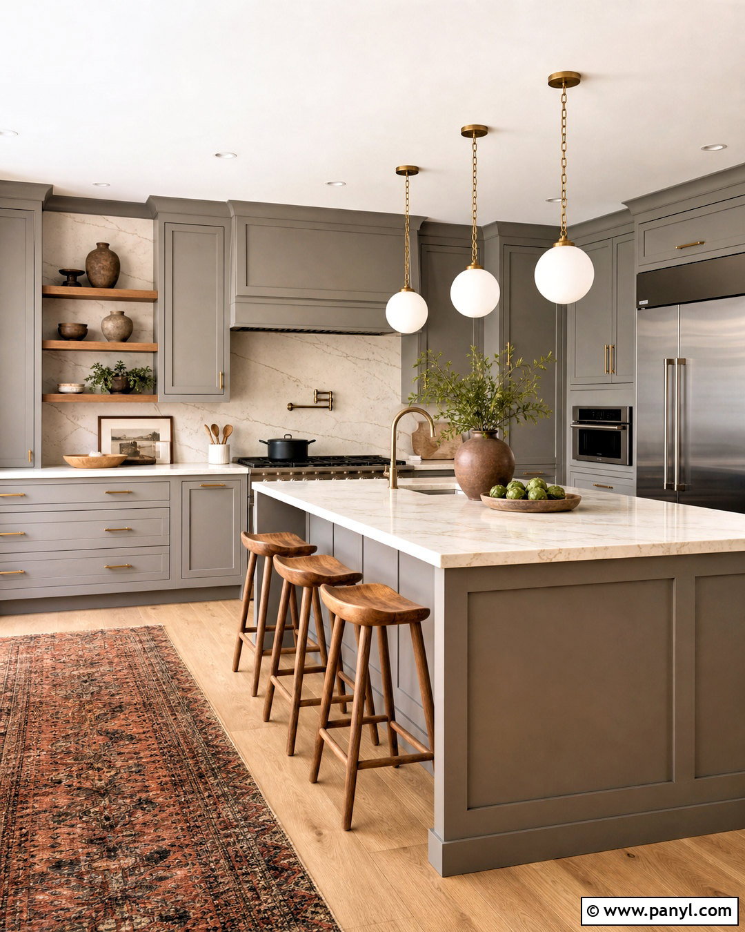
Warm greige combines the flexibility of gray with the welcoming undertones of beige. Select a greige that leans noticeably brown rather than blue, especially if your living room receives cool northern light. Cover the walls and built-ins in the same shade, using a satin finish on the woodwork for quiet contrast. Add a flax-colored sofa, warm gray armchairs, and a cream rug with a subtle geometric pattern. Walnut furniture, cognac leather, and aged brass help pull the palette toward the warmer side. Deep green pillows and botanical artwork add color without disturbing the calm atmosphere. Keep the ceiling creamy white to maintain brightness. This balanced scheme works well in open-plan homes where the living room color must coordinate with nearby kitchens, halls, or dining areas.
6. Taupe Living Room Color
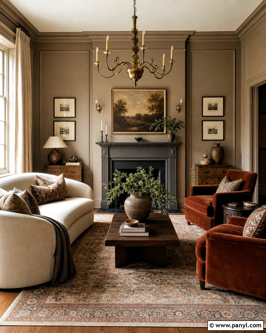
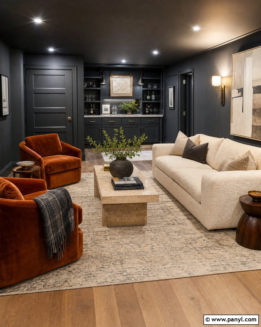
Taupe creates a cocooning background that feels sophisticated but remains easy to decorate. Look for a medium taupe with earthy brown or mauve undertones rather than a cool violet cast. Paint the walls, trim, and fireplace surround in closely related taupe shades for a gentle color-drenched effect. Place a cream curved sofa opposite two rust velvet chairs, then anchor the arrangement with a faded Persian-style rug. Dark walnut tables and an antique brass chandelier deepen the room without overwhelming it. Use linen curtains that nearly match the walls to make the windows appear taller. Finish with landscape paintings, brown ceramics, and a few black accents. The resulting living room feels intimate, collected, and suitable for both quiet evenings and formal entertaining.
7. Camel Living Room Color
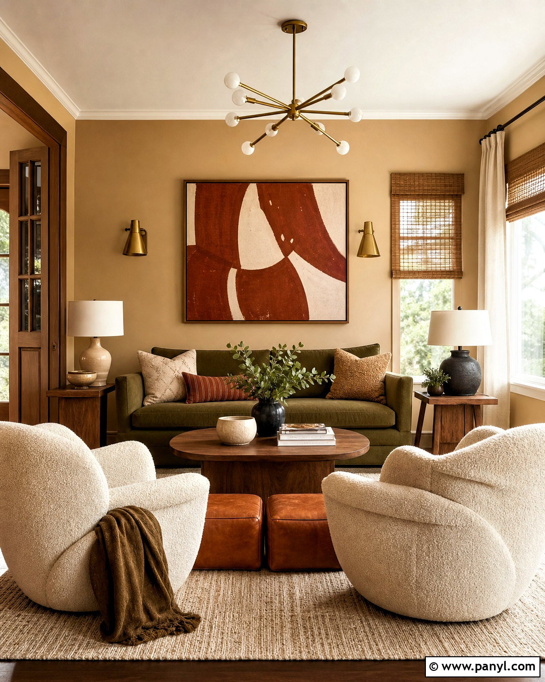
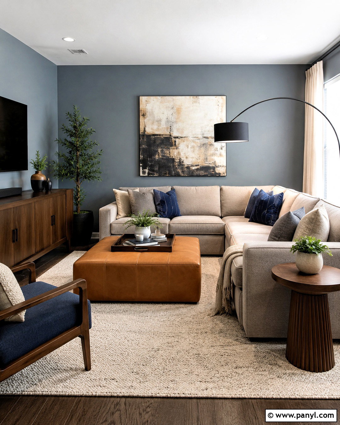
Camel brings the warmth of leather and sunbaked sand into a comfortable, highly livable palette. Use muted camel paint on the walls and warm white on the ceiling and trim. A deep olive sofa gives the room grounded contrast, while two cream boucle chairs prevent it from becoming too dark. Choose a flat-weave rug combining camel, tan, ivory, and soft black. Walnut furniture, cognac leather stools, and woven shades reinforce the earthy foundation. For a modern touch, hang oversized abstract artwork containing rust, brown, and chalky white. A sculptural brass floor lamp adds soft shine beside the sofa. This scheme works beautifully with medium and dark wood floors because camel connects naturally with their golden and reddish undertones while still feeling colorful.
8. Caramel Living Room Color
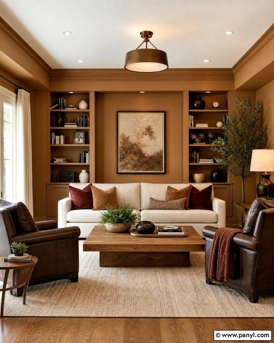
Caramel walls can transform an ordinary living room into a rich, enveloping retreat. Choose a midtone caramel with a balance of brown, gold, and muted orange rather than a highly saturated shade. Extend it across the walls, built-in bookcases, and fireplace mantel for a cohesive finish. Furnish the room with a cream linen sofa, dark brown leather chairs, and a warm beige rug. A substantial oak coffee table introduces a casual, family-friendly surface. Add bronze lighting, oatmeal curtains, and cushions in cinnamon, burgundy, and chocolate. Keep the ceiling soft cream so the deeper wall color does not feel oppressive. The palette is especially successful in rooms used at night because lamplight enhances caramel’s depth and makes every textile appear softer and more inviting.
9. Honey Yellow Living Room Color
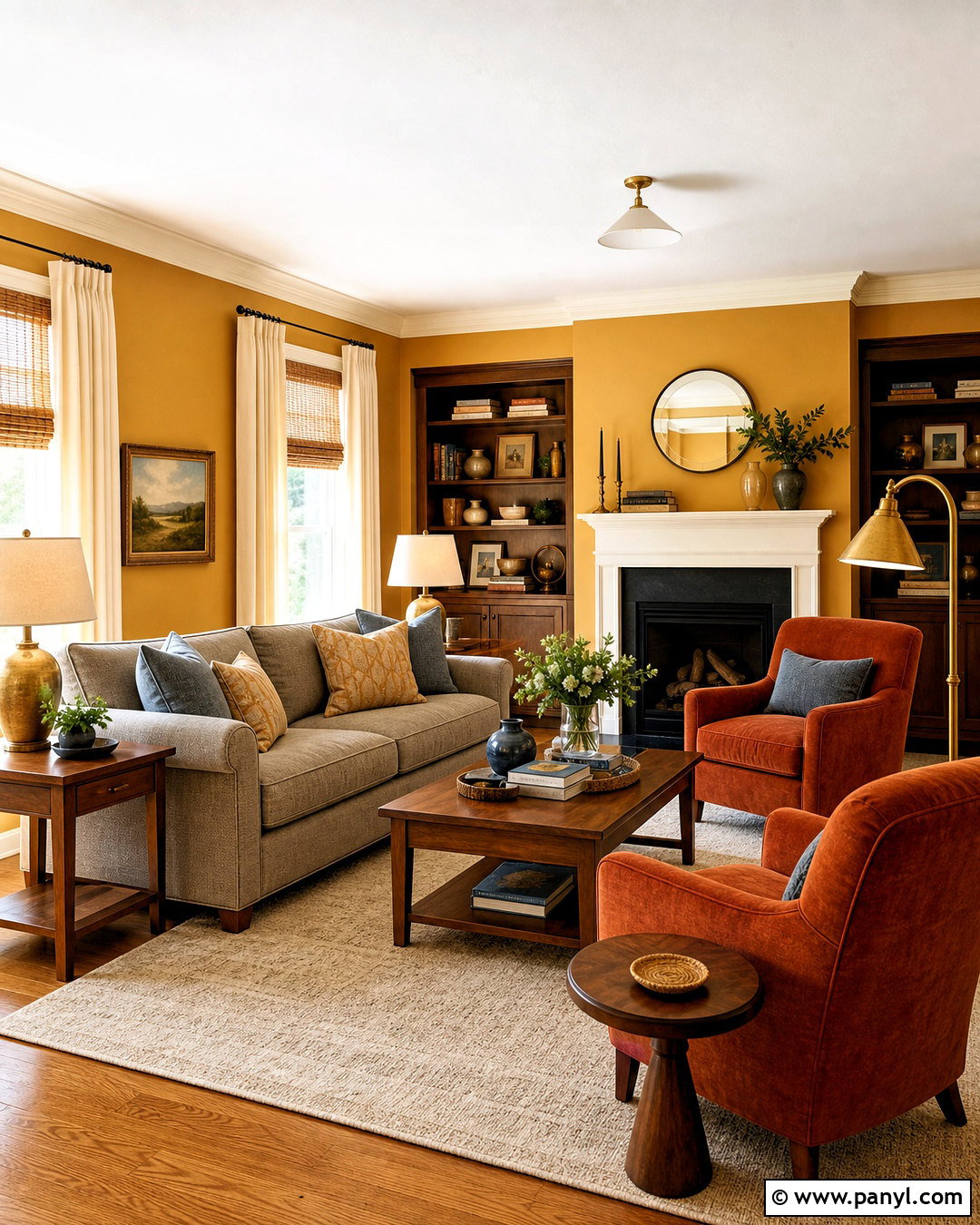
Honey yellow gives a living room a gentle glow without the intensity of bright lemon. Use a muted golden honey on the walls, then balance it with creamy trim and light oak flooring. A warm gray sofa provides a calm neutral anchor, while rust-colored armchairs repeat the wall’s earthy undertones. Choose an ivory rug with a simple brown border and install natural woven shades beneath full-length cream curtains. Walnut tables and aged brass lamps add deeper golden notes. Small accents of dusty blue in artwork and pillows create refreshing contrast. This complete scheme feels cheerful in the morning and cozy after sunset. It is a useful option for rooms that need warmth but still require enough brightness for reading, conversation, and everyday family activities.
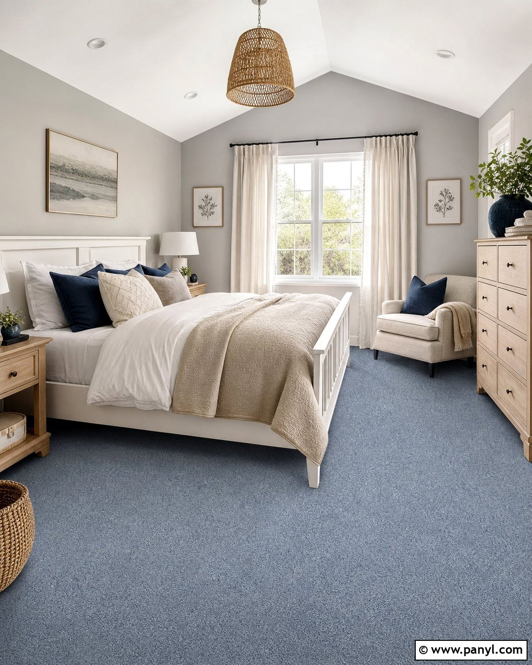
10. Mustard Yellow Living Room Color
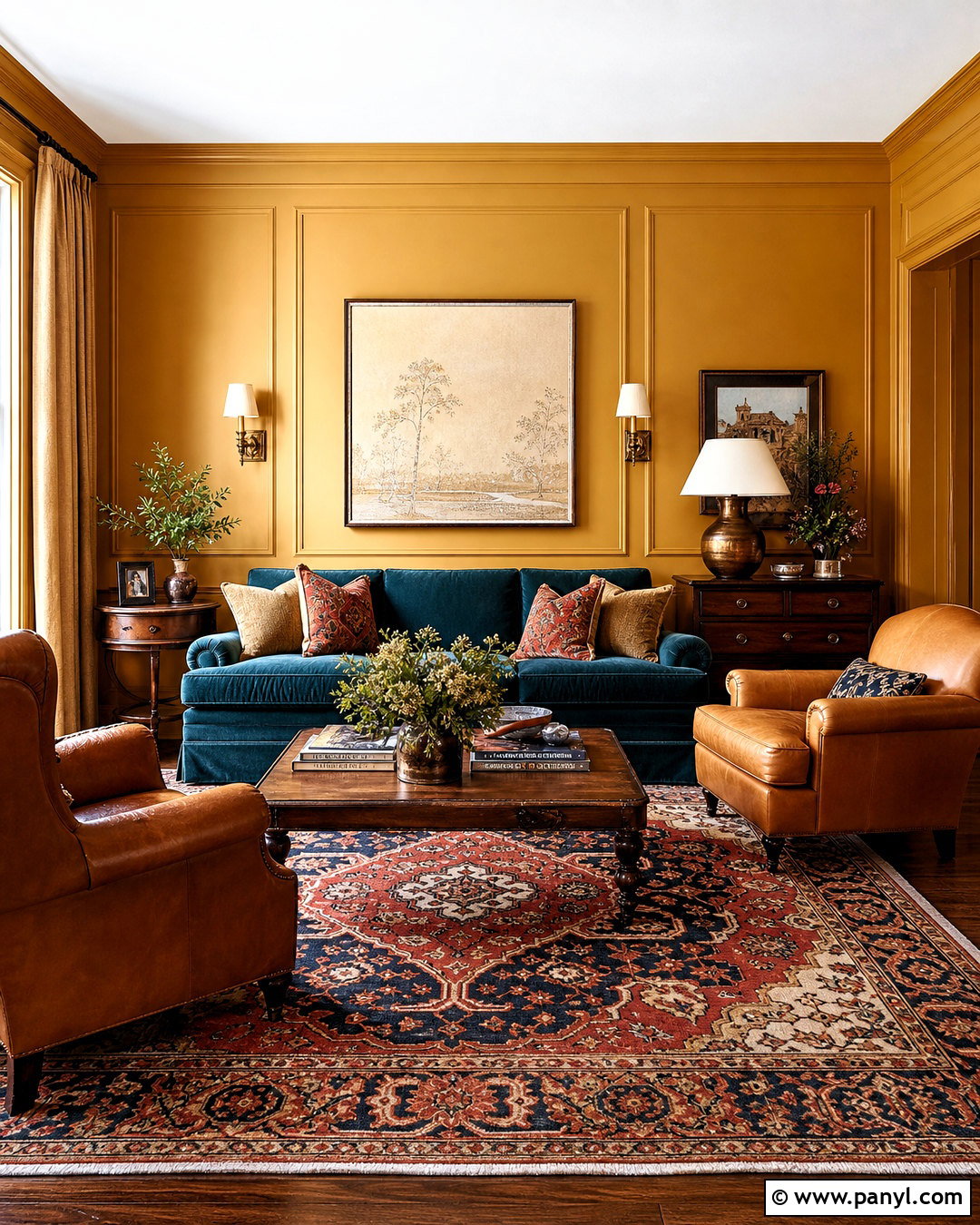
Mustard yellow makes a confident statement while remaining grounded by its brown undertones. For a balanced design, use mustard on paneled walls or throughout a compact living room rather than isolating it on one unrelated accent wall. Pair the color with a deep blue-green velvet sofa and two caramel leather chairs. An aged red, cream, and navy rug connects the stronger hues and creates a collected appearance. Choose dark wood furniture, antique brass sconces, and relaxed flax curtains. Cream ceilings and pale upholstery details keep the room from feeling overly saturated. Display simple artwork with generous white space to provide visual breathing room. The finished palette suits vintage-inspired, eclectic, and traditional homes, yet streamlined furniture can make the same mustard background feel surprisingly modern.
11. Ochre Living Room Color
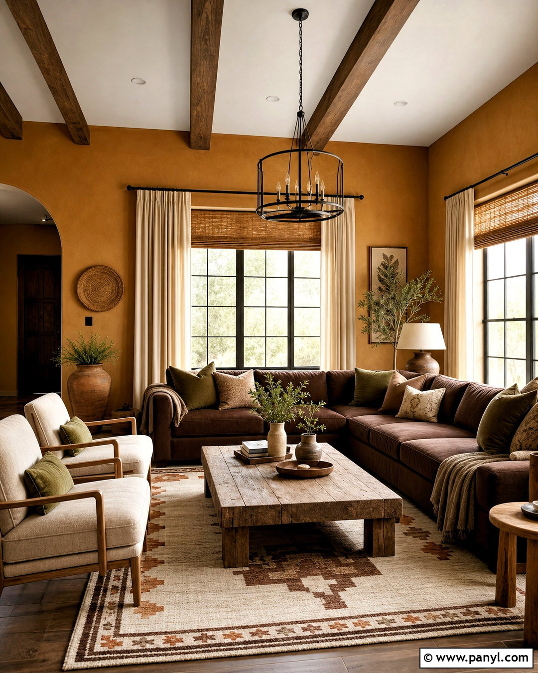
Ochre offers earthy depth somewhere between golden yellow, tan, and muted orange. Paint the walls a mineral-inspired ochre and use warm white around the windows and ceiling. A cocoa brown sectional gives the space practical seating, while a pair of oatmeal lounge chairs lightens the arrangement. Place a large cream-and-rust geometric rug beneath a weathered oak coffee table. Olive green pillows, ceramic vessels, and leafy plants provide a natural counterpoint to the golden walls. Select woven bamboo shades and simple linen curtains for layered window coverage. Matte black picture frames and iron curtain rods add controlled contrast. This living room color scheme feels connected to clay, wood, fiber, and stone, making it especially appropriate for modern organic, Southwestern, or relaxed Mediterranean interiors.
12. Terracotta Living Room Color
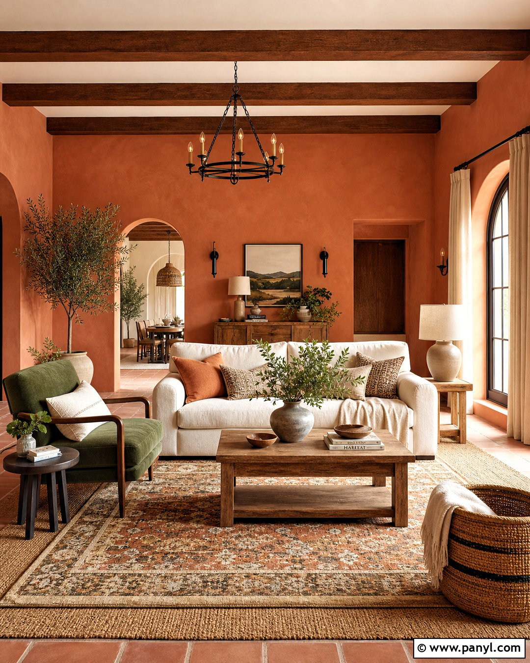
Terracotta surrounds a living room with the warmth of fired clay and sunbaked architecture. Choose a muted terracotta containing enough brown to feel comfortable across all four walls. Pair it with a generously sized cream sofa and an olive green accent chair. A natural jute rug layered beneath a smaller patterned rug adds softness and definition. Use medium oak furniture, woven baskets, and linen curtains in pale oatmeal. Blackened bronze lighting gives the earthy room a sharper modern edge. Repeat terracotta in only a few accessories so the design does not become overly matched. Cream pottery, landscape artwork, and green plants complete the palette. This scheme is particularly effective in rooms with strong daylight, which reveals the color’s subtle shifts between orange, rose, and warm brown.
13. Burnt Orange Living Room Color
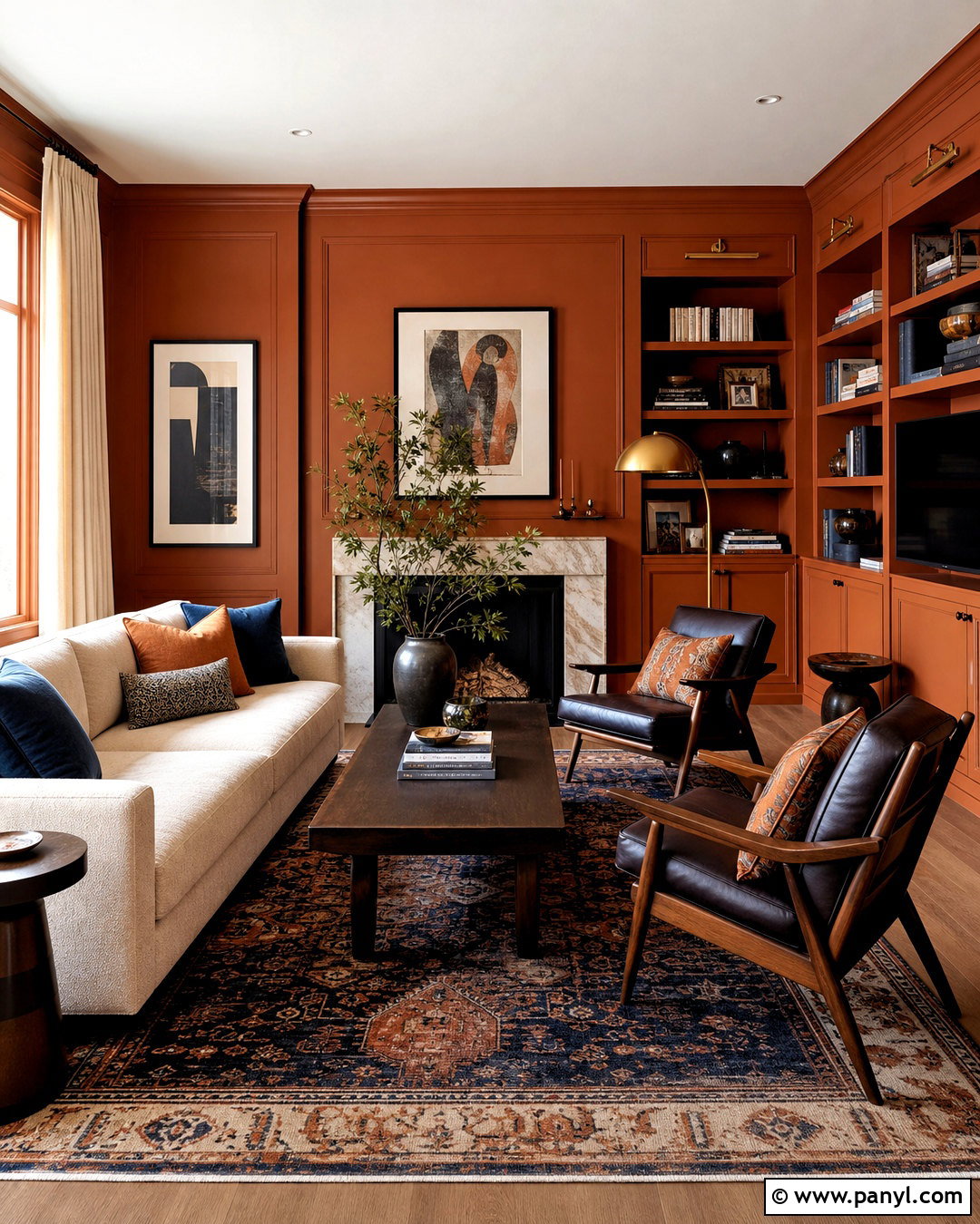
A burnt orange living room can feel energetic, grown-up, and surprisingly versatile. Select a deep orange softened with brown, then apply it to the walls and built-in cabinetry for a confident, unified background. Furnish the space with a light beige sectional and two dark walnut lounge chairs upholstered in cream. A vintage-style rug containing navy, rust, tan, and burgundy grounds the vivid walls. Add full-length oatmeal drapery and a substantial dark wood coffee table. Navy pillows and artwork offer cool contrast, while brass lighting reflects the room’s warm character. Keep accessories limited and use plenty of solid fabrics so the palette remains restful. This complete design works best when balanced with pale upholstery, dark wood, and one cooler accent color.
14. Peach Living Room Color
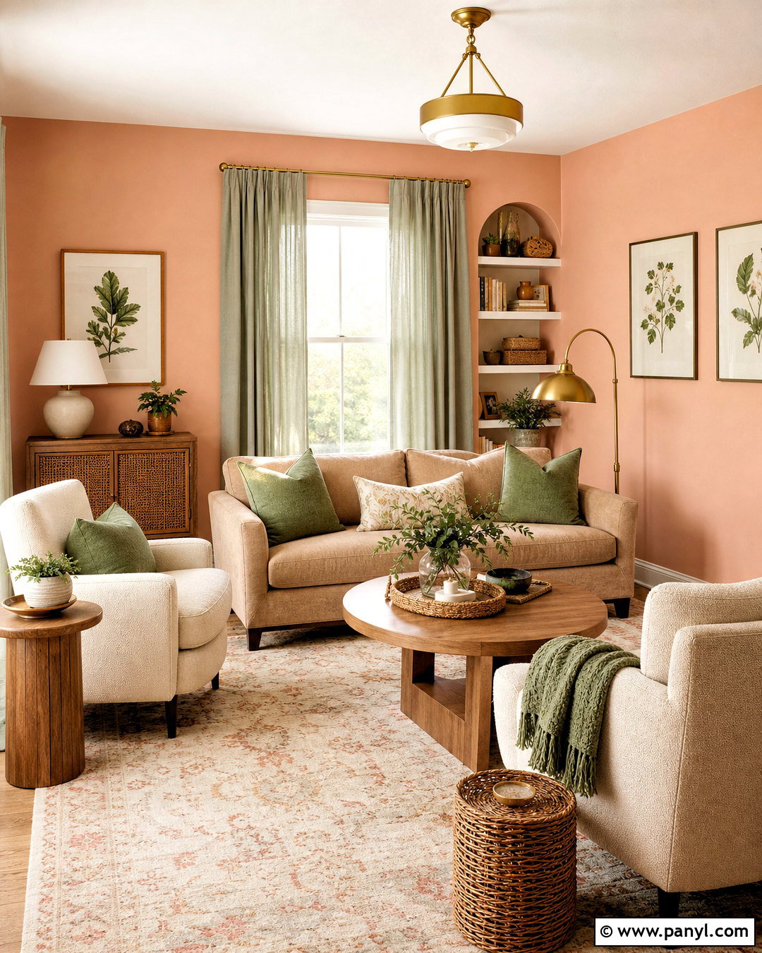
Soft peach brings flattering warmth to a living room while maintaining a light, open appearance. Pick a dusty peach with beige or pink undertones instead of a bright tropical orange. Paint the walls peach and keep the trim a creamy off-white. A light camel sofa, ivory boucle chairs, and a pale patterned rug establish a tonal seating area. Introduce medium oak tables and natural rattan details for relaxed texture. Muted sage curtains and pillows balance peach’s sweetness and give the room a more grounded character. Use brushed brass lamps and understated botanical prints to finish the walls. This palette is especially useful in a room with cool daylight because peach adds visual warmth without requiring dark paint. The result feels fresh, soft, and comfortably sophisticated.
15. Blush Pink Living Room Color
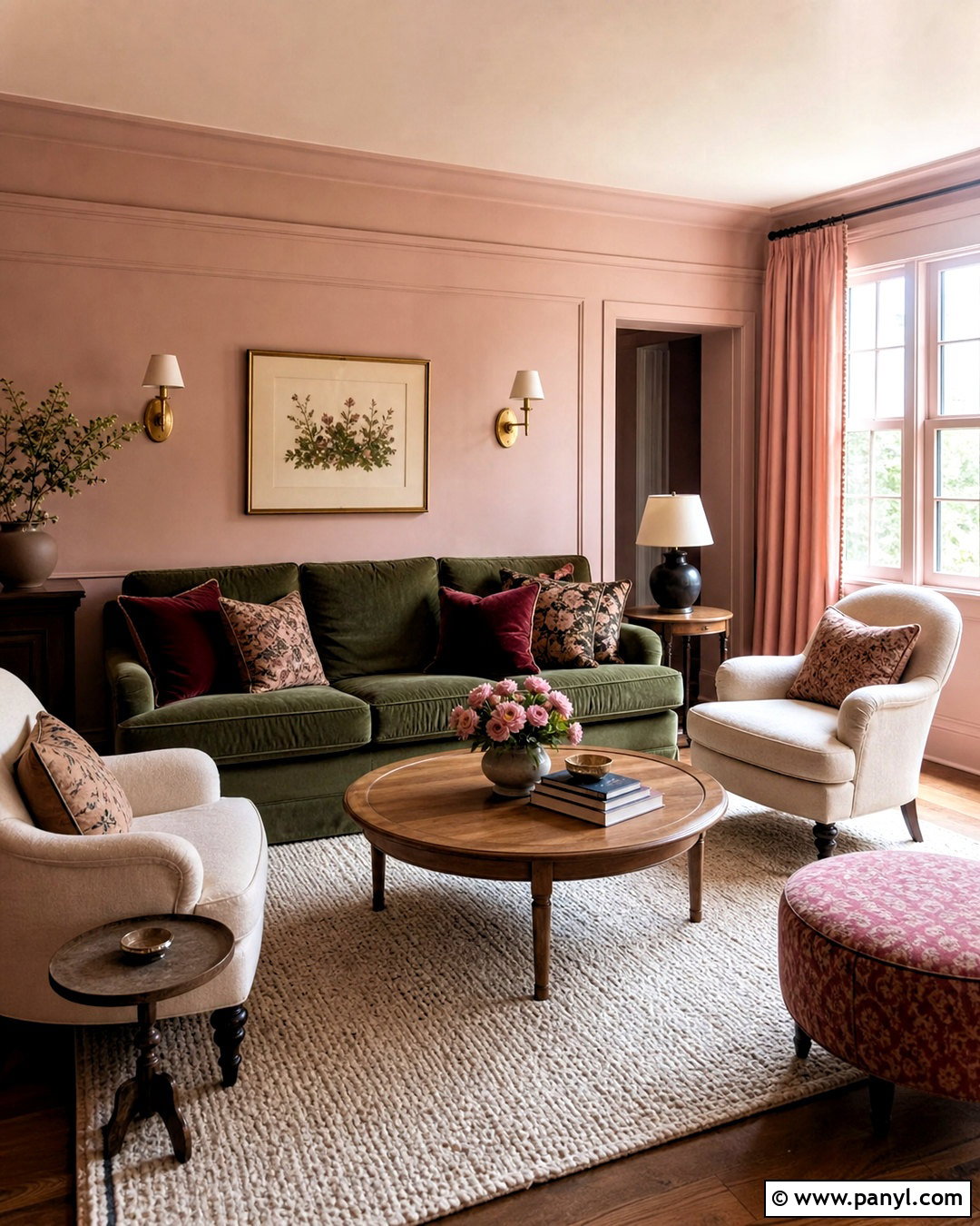
Blush pink functions much like a warm neutral when it is dusty, pale, and slightly beige. Cover the walls in a chalky blush, then create contrast with a deep moss green sofa. Add oatmeal armchairs, a cream wool rug, and a round oak coffee table to maintain a relaxed foundation. Burgundy pillows and a faded red patterned ottoman deepen the palette without making it overly feminine. Choose linen curtains that closely match the walls, allowing the windows and room boundaries to appear softer. Antique brass sconces and dark wood side tables supply aged character. Keep decorative objects earthy and simple, using ceramic vessels, landscape paintings, and natural branches. This finished look offers warmth and personality while remaining adaptable to contemporary, cottage, transitional, or vintage-inspired homes.
16. Dusty Rose Living Room Color
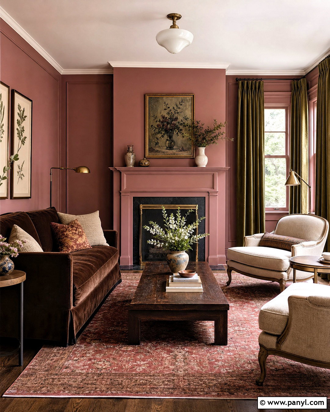
Dusty rose creates a more mature and enveloping atmosphere than pale blush. Its muted red and brown undertones pair naturally with wood, leather, and aged metal. Use the color across the walls and painted fireplace, then keep the ceiling warm white for balance. A chocolate velvet sofa becomes the room’s anchor, accompanied by two flax linen chairs and a dark oak coffee table. Lay down a faded cream, burgundy, and olive rug to connect every major color. Olive curtains provide an unexpected but harmonious contrast. Add antique brass lamps, framed botanical artwork, and cream ceramics for lighter highlights. Because dusty rose changes noticeably under different lighting, test large samples before painting. The finished room should read as earthy and historical rather than sugary or overly bright.
17. Brick Red Living Room Color
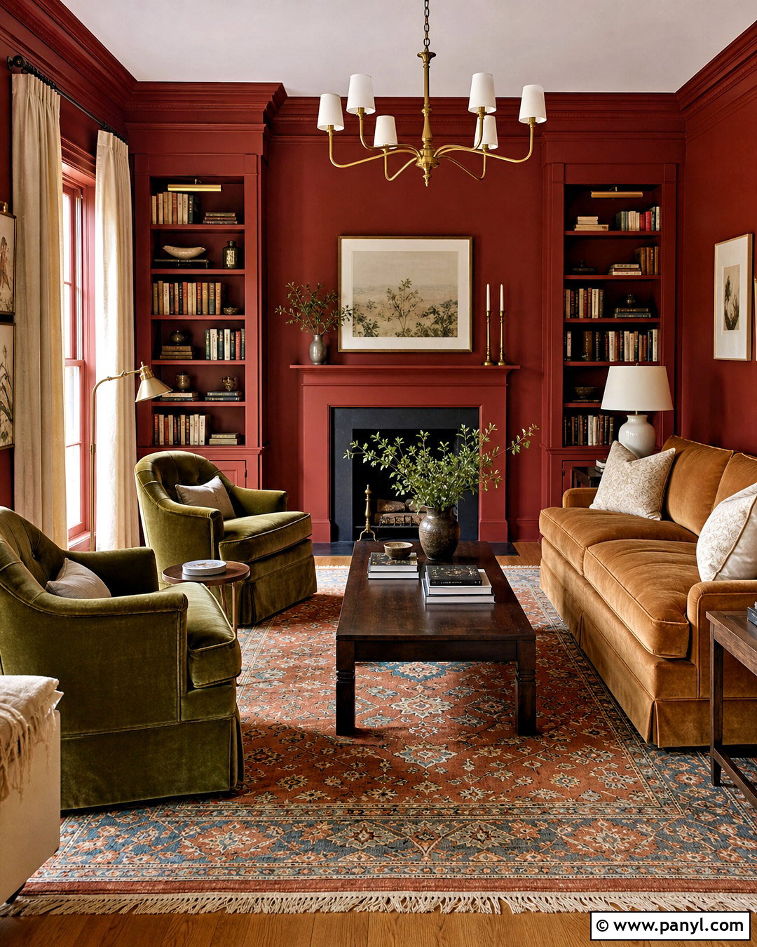
Deep brick red can make a living room feel intimate, architectural, and full of character. Select a muted red with brown and clay undertones, avoiding brilliant primary red. Color-drench the walls, molding, and shelving for a seamless effect, but leave the ceiling soft ivory if the room is small. Place a warm tan sofa against the red background and add two olive velvet chairs near the fireplace. A worn Turkish-style rug containing rust, cream, and faded blue adds pattern underfoot. Dark walnut tables, bronze lighting, and oatmeal curtains soften the saturation. Use cream pillows and pale artwork to introduce necessary breathing space. This complete palette works particularly well in libraries, traditional sitting rooms, and living rooms designed mainly for evening conversation and relaxation.
18. Chocolate Brown Living Room Color
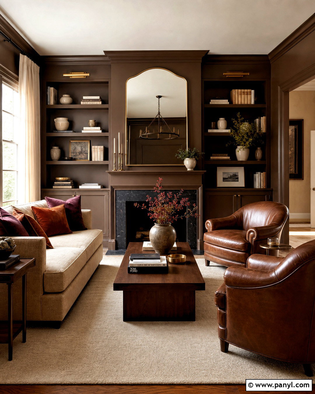
Chocolate brown walls create a cozy room that feels intentional rather than gloomy when supported by lighter surfaces. Choose a rich cocoa brown and use it on the walls, trim, and bookcases. Keep the ceiling creamy white to reflect light downward. A large oatmeal sofa, ivory wool rug, and pale linen curtains provide generous contrast. Bring in caramel leather through two club chairs and select a walnut coffee table with a simple silhouette. Rust, burgundy, and muted gold pillows add tonal depth. Brass picture lights and a large mirror help distribute brightness around the room. Instead of filling every shelf, leave open areas among cream pottery and books. This balanced treatment turns deep brown into a sophisticated neutral suitable for traditional or streamlined contemporary furniture.
19. Olive Green Living Room Color
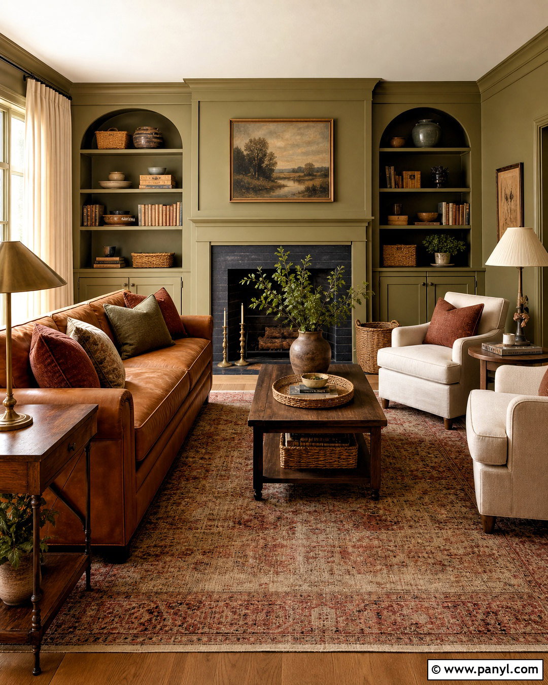
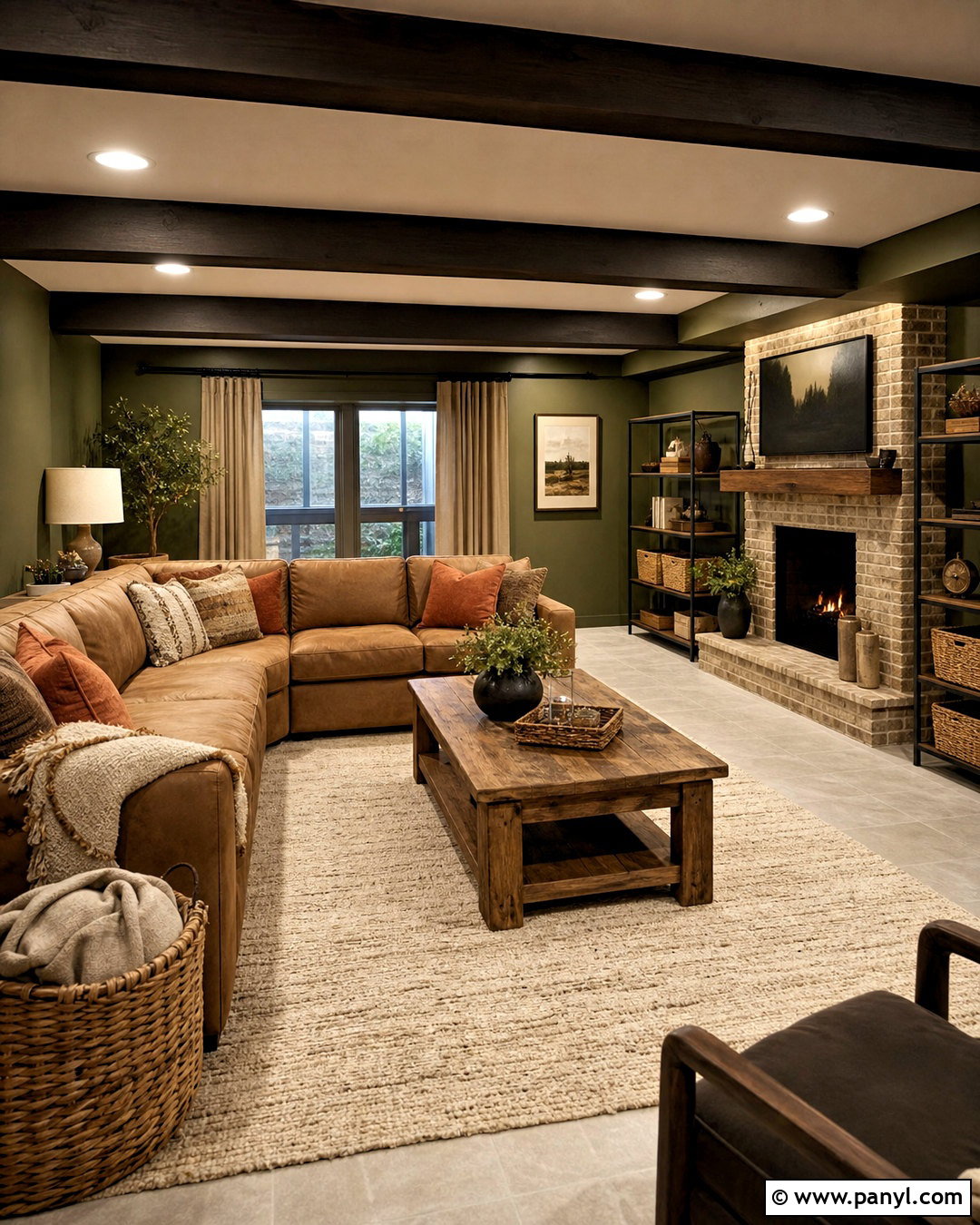
Olive green feels warm because its yellow undertones connect easily with tan leather, aged wood, and brass. Choose a muted medium olive for the walls and built-in storage, then add a warm white ceiling for contrast. A camel leather sofa creates a strong centerpiece, complemented by two cream upholstered chairs. Ground the seating area with a faded red, olive, and beige rug. Walnut tables, linen curtains, and woven baskets emphasize the palette’s natural character. Add rust-colored pillows and antique brass lamps to strengthen the warmth. Black frames can introduce definition in small amounts. This complete olive scheme feels relaxed and grounded throughout the year. It also provides a flattering background for houseplants without depending on them as the room’s main decorative feature.
20. Warm Sage Green Living Room Color
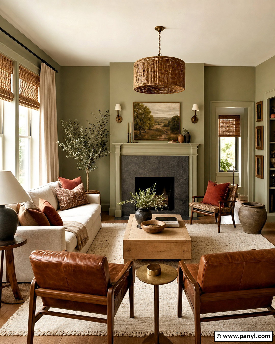
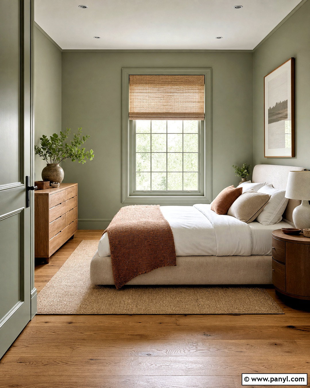
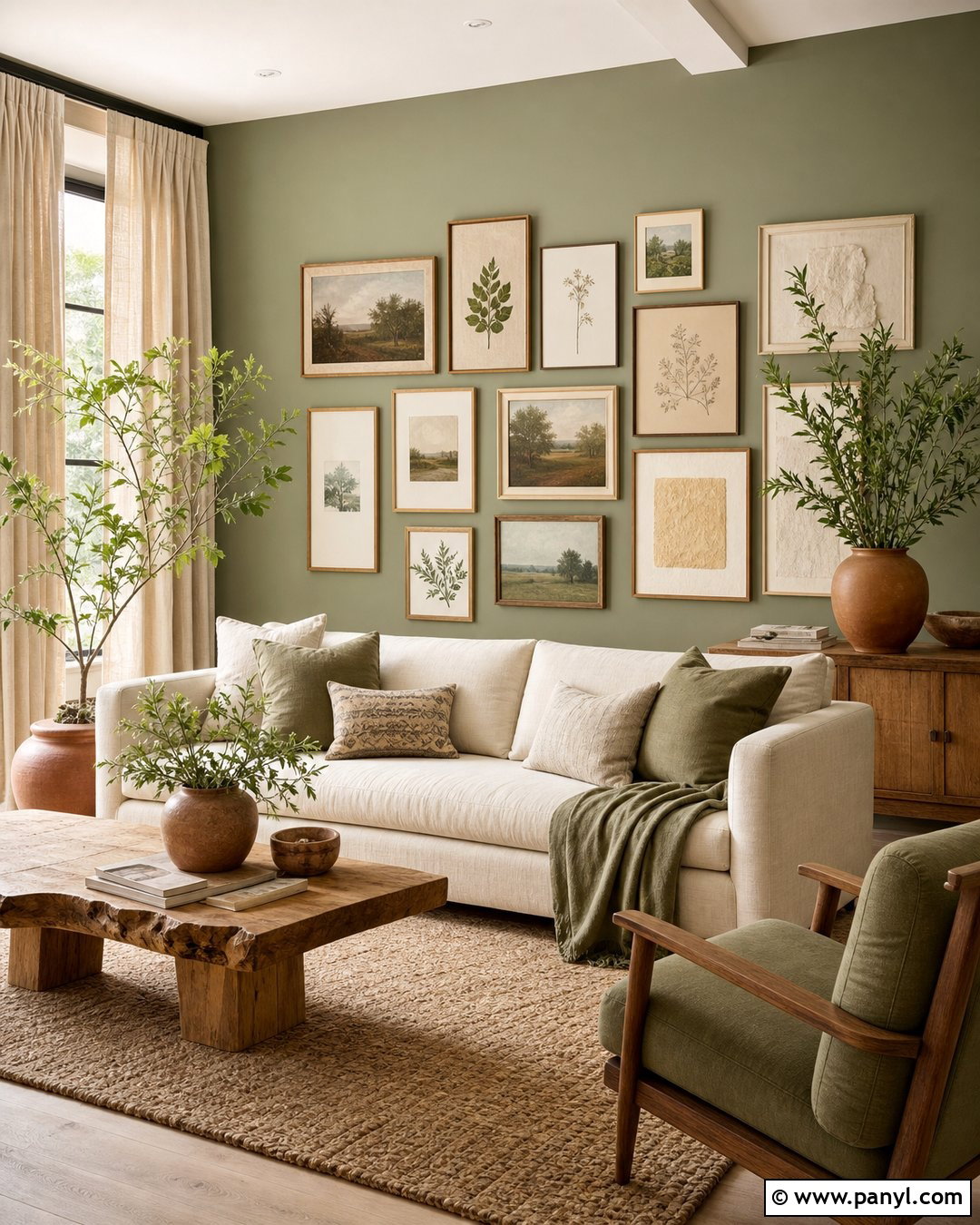
Warm sage green offers color without sacrificing the calm flexibility of a neutral. Look for a soft sage with yellow, olive, or beige undertones instead of a cool blue-green version. Paint the walls and fireplace surround sage, then use cream on the ceiling and trim. Arrange a flax linen sofa with two cognac leather chairs around a pale oak coffee table. A beige wool rug keeps the center of the room light, while rust pillows and clay-colored pottery add earthy contrast. Choose woven shades, ivory curtains, and aged brass lighting for additional warmth. Simple landscape prints can repeat the green without overwhelming the design. This approachable palette works in bright rooms, low-light spaces, cottages, and modern homes because its natural colors are easy to coordinate.
Conclusion:
Choosing among these 20 warm living room colors starts with studying what is already in your space. Consider the flooring, fireplace material, furniture, daylight, and adjoining rooms before committing to paint. Light shades such as cream, ivory, peach, and warm sage can keep a smaller room open. Midtone camel, ochre, olive, and terracotta create more noticeable character. Chocolate, brick red, and caramel offer a deeper, cocooning effect. Whatever palette you prefer, repeat its main undertones through rugs, curtains, upholstery, wood, and lighting finishes. Always test large samples and observe them for several days. A successful warm living room feels coordinated and inviting, not simply painted in a warm shade.

Related Ideas and Inspiration:
Leave a Reply