
Choosing the right wall colors can make a room feel brighter, warmer, larger, or more grounded. These 20 wall color combination ideas cover calm neutrals, earthy shades, gentle pastels, and bold contrasts for every part of the home. Each palette creates a complete look by coordinating wall placement with furniture, flooring, textiles, lighting, and decorative finishes. Pay close attention to undertones because similar-looking colors can feel disconnected when one leans warm and the other cool. Natural and artificial light will also change how paint appears throughout the day, so test large samples before committing. () From relaxed bedrooms to lively kitchens, the following 20 wall color combination ideas offer practical inspiration you can recreate.

1. Sage Green and Warm White Walls
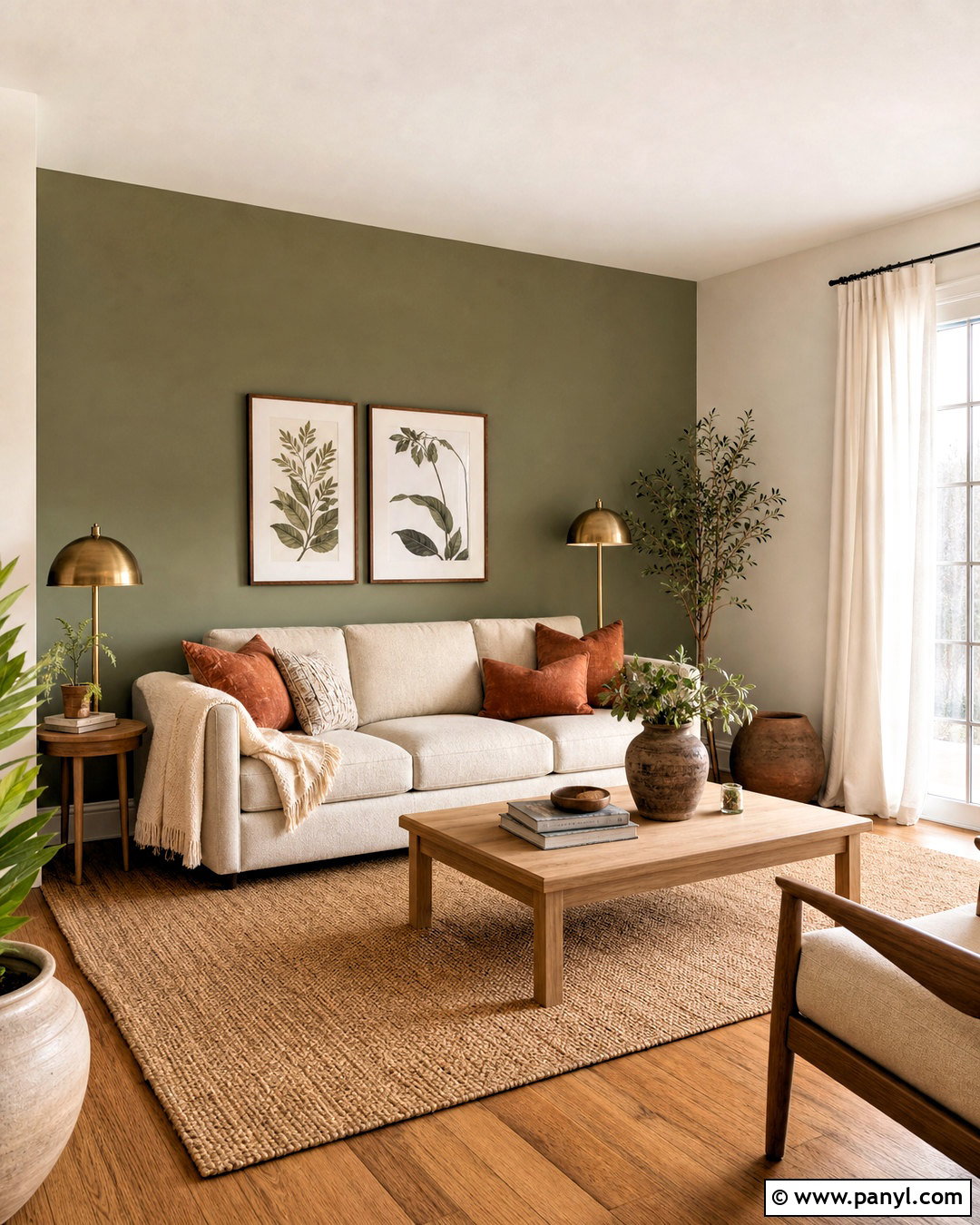
Sage green and warm white create a relaxed living room that feels fresh without looking cold. Paint the main walls a creamy white, then use muted sage on the fireplace wall or built-in shelving. An oatmeal linen sofa, light oak coffee table, and woven jute rug continue the natural palette. Add rust-colored pillows and aged brass lamps for gentle warmth. White oak flooring works especially well, although medium brown wood can give the room more depth. Choose soft white curtains instead of bright white fabric so the undertones remain consistent. Finish the room with botanical artwork, simple pottery, and a few leafy plants. This complete scheme suits farmhouse, transitional, organic modern, and casual contemporary homes.
2. Navy Blue and Soft Beige Walls
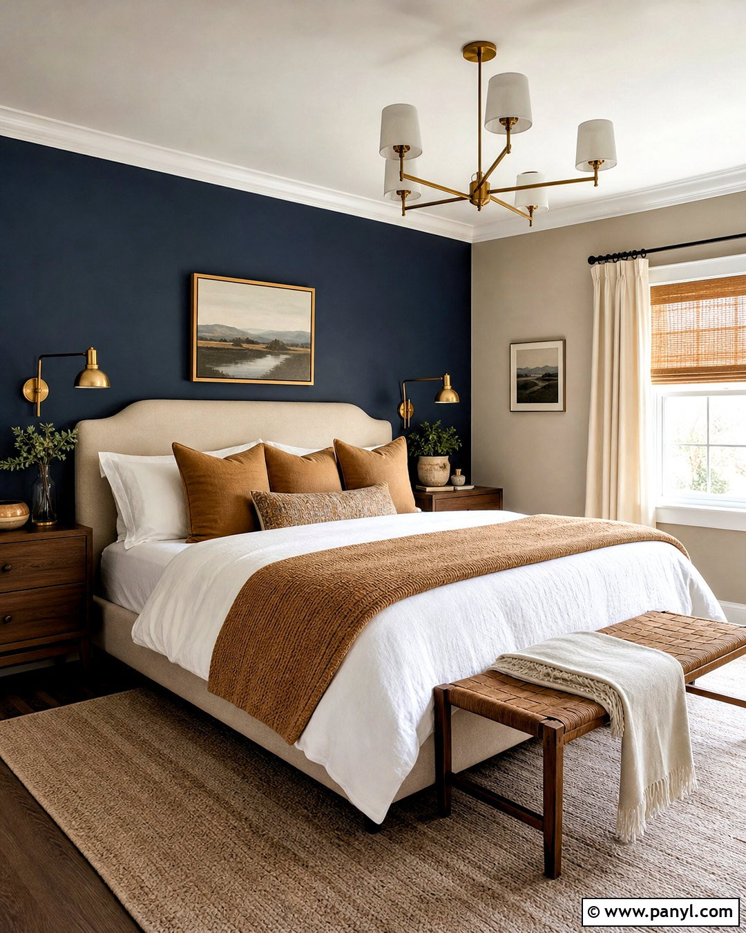
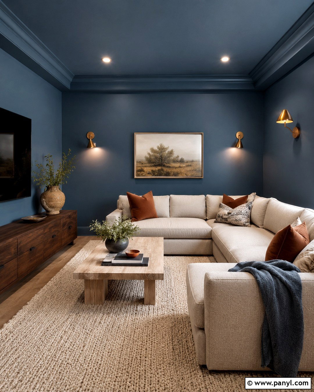
Could your bedroom use more depth without becoming overly dark? Cover the wall behind the bed in rich navy blue and paint the remaining walls soft beige. An upholstered oatmeal headboard creates a comfortable transition between the two colors. Layer white bedding with navy, camel, and muted gold accents, then place walnut nightstands on either side. Warm brass sconces bring out the richness of the navy, while a light beige rug prevents the floor area from feeling heavy. Keep the ceiling and trim creamy white rather than stark white. Framed landscape prints, woven shades, and simple ceramic accessories complete the room. This combination produces a polished bedroom with enough warmth to remain restful and welcoming.
3. Terracotta and Cream Walls
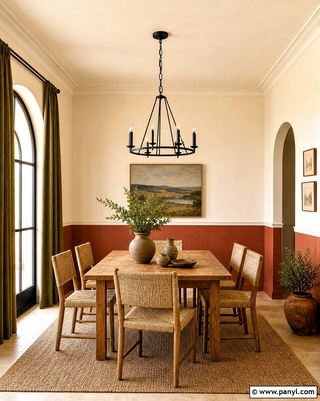
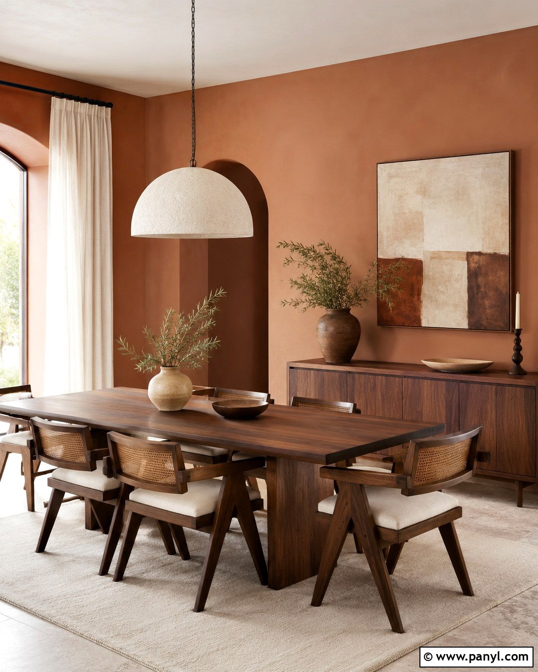
Sun-baked terracotta paired with cream gives a dining room an inviting, earthy character. Use terracotta on the lower half of the walls beneath simple molding, then continue cream above it and across the ceiling. A medium-toned oak dining table, woven chairs, and a natural fiber rug reinforce the grounded palette. Introduce matte black through a linear chandelier and slim picture frames. Olive green linen napkins or curtains provide a subtle third color without competing with the walls. Keep large surfaces simple, especially if the terracotta is fairly saturated. Handmade pottery, an off-white ceramic vase, and a textured neutral centerpiece finish the arrangement. The result feels warm, collected, and suitable for everyday dining or relaxed entertaining.
4. Dusty Blue and White Walls
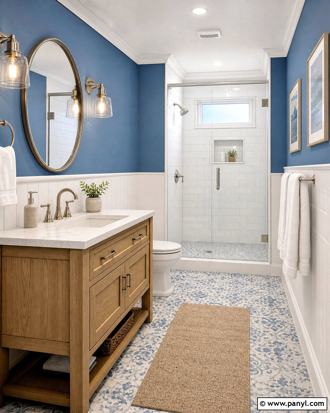
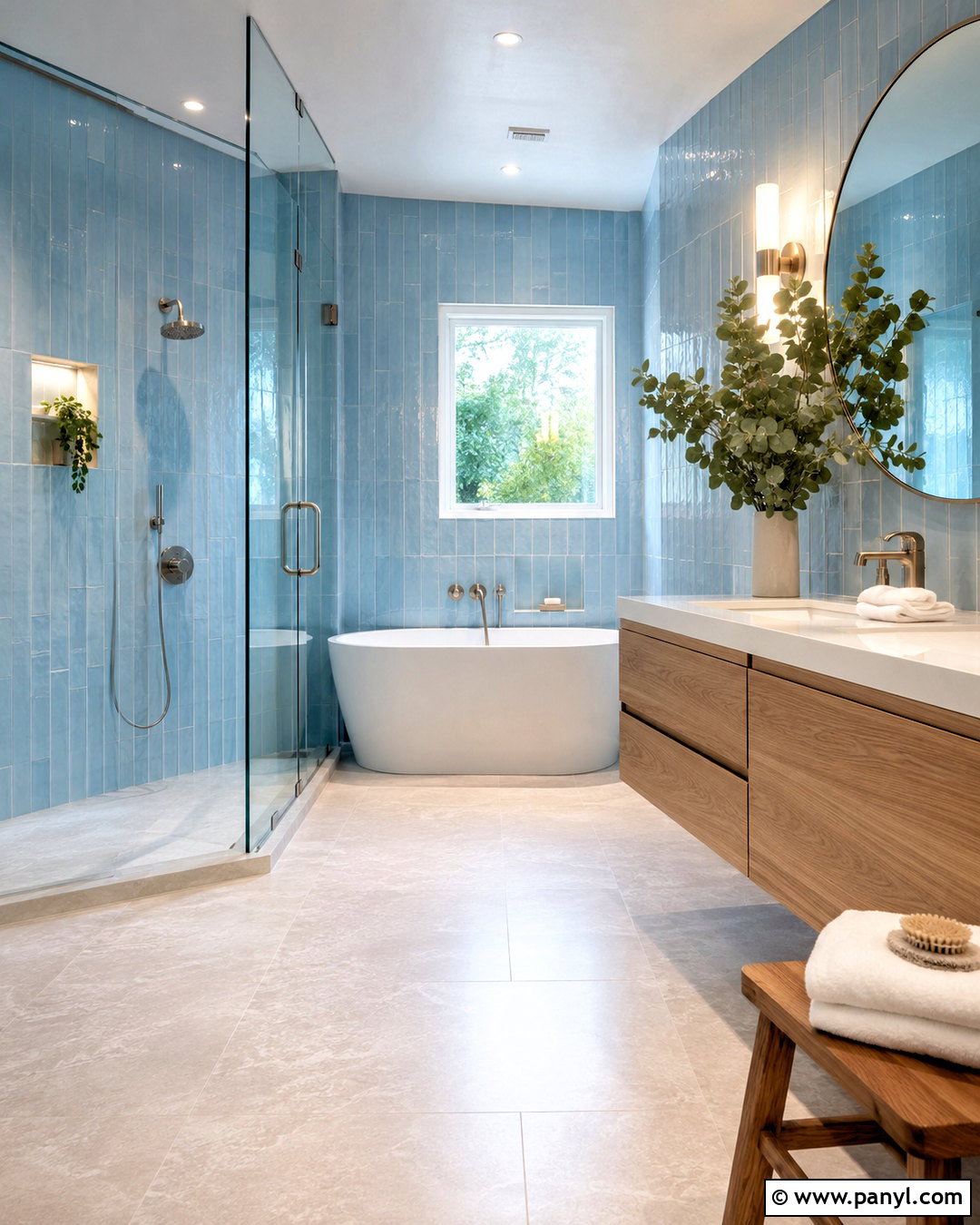
Dusty blue and soft white can turn a small bathroom into a clean, airy retreat. Paint the upper walls dusty blue and use white beadboard or vertical paneling below. Pair the walls with a pale oak vanity, white quartz counter, and brushed nickel fixtures. White subway tile inside the shower maintains brightness, while light gray grout adds gentle definition. A blue-and-cream patterned floor introduces movement without overwhelming the compact room. Select towels in white, muted navy, and faded blue to repeat the palette. A rounded mirror and clear glass sconces keep the design visually light. For a finished look, add one small landscape print and a simple wood stool instead of filling every surface with accessories.
5. Greige and Charcoal Walls
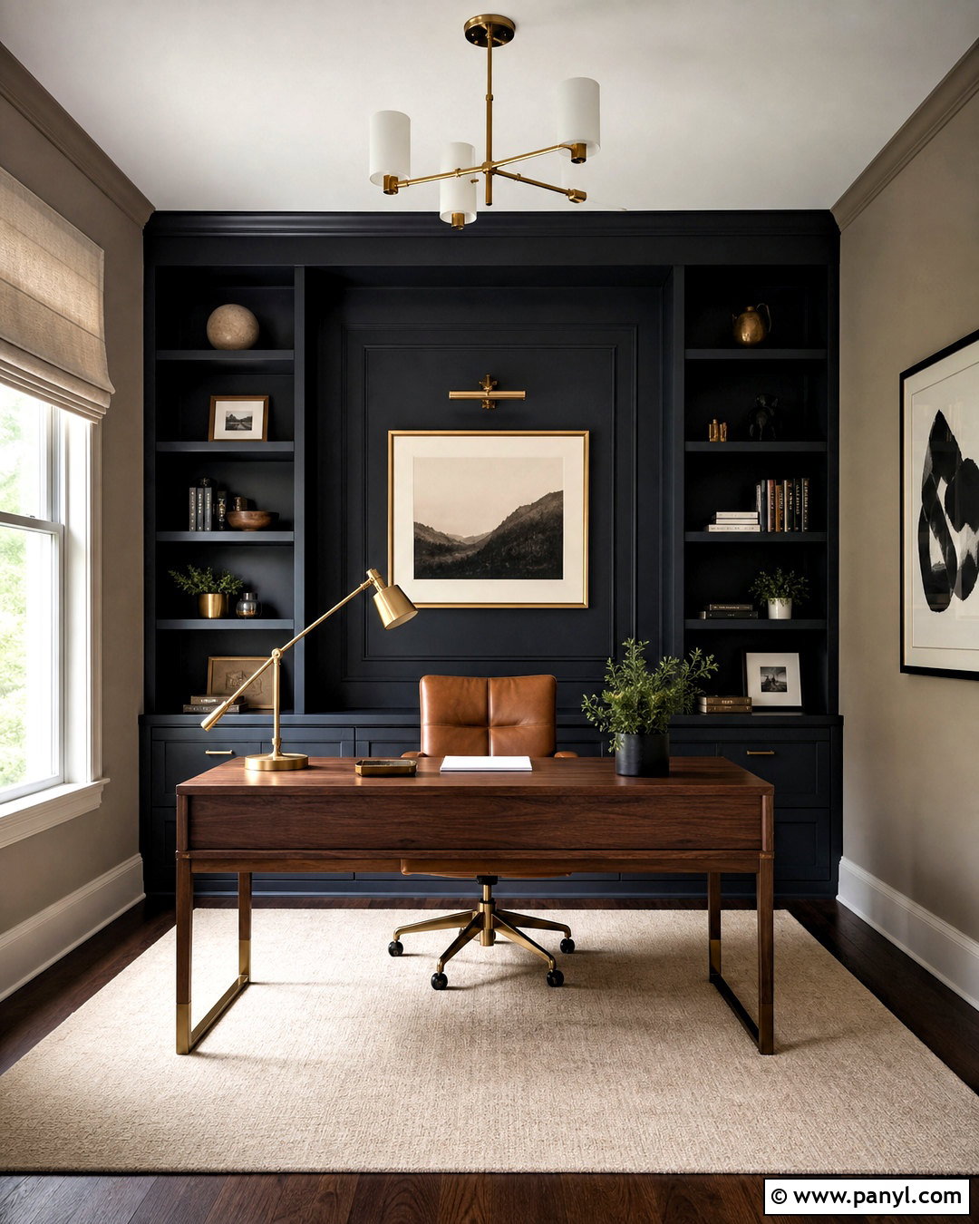
A home office can feel focused and professional with greige and charcoal walls. Use warm greige across most of the room, then paint the wall behind the desk deep charcoal. Continue charcoal over built-in shelves if you want the storage to blend into the architecture. A walnut desk, cognac leather chair, and cream wool rug soften the darker background. Add matte black lighting and brushed brass desk accessories for a balanced mix of finishes. Linen Roman shades provide privacy without blocking too much daylight. Keep artwork graphic but restrained, using black, beige, and muted rust tones. This scheme works best when the greige has warm brown undertones, preventing the room from becoming flat or overly industrial.
6. Blush Pink and Warm Gray Walls
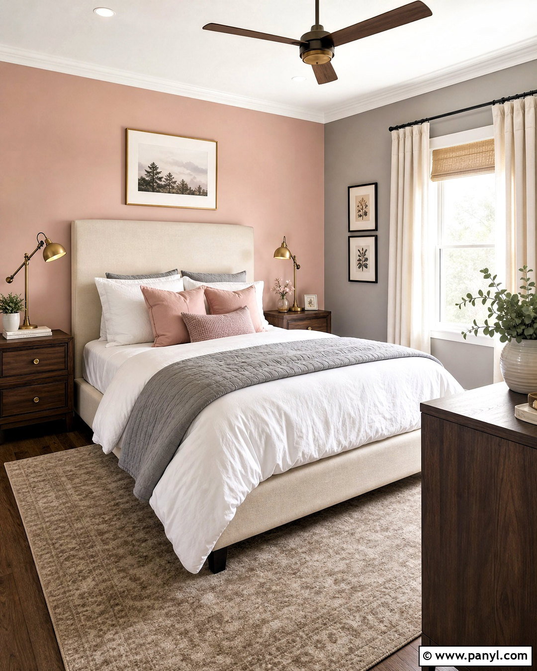
Blush pink and warm gray produce a sophisticated guest bedroom that does not feel overly sweet. Paint three walls a gentle warm gray and use dusty blush behind the bed. Choose a light wood or cream upholstered bed, then layer it with white sheets, a gray quilt, and muted rose pillows. A taupe rug grounds the room, while antique brass lamps add a soft glow. Carry the blush color into one or two pieces of artwork rather than matching every accessory. White curtains with a warm undertone keep the windows bright. Add a small walnut dresser and a rounded mirror for contrast. The completed space feels comfortable, modern, and welcoming to guests of different ages and tastes.
7. Olive Green and Ivory Walls
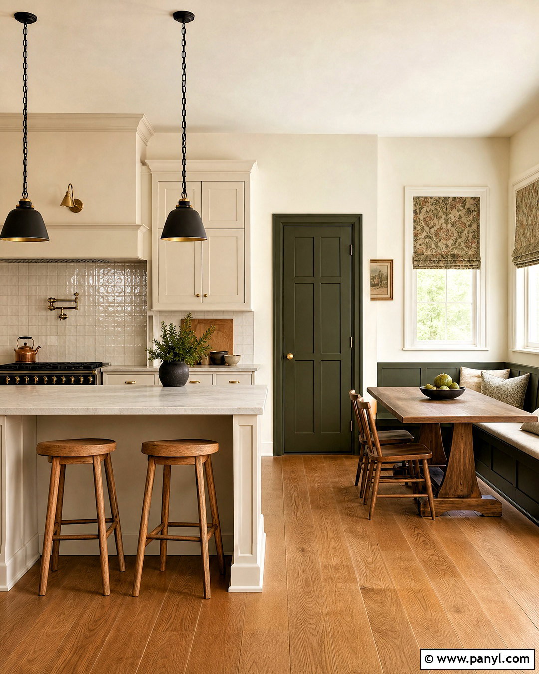
Olive green and ivory give a kitchen a warm, heritage-inspired appearance. Paint the main walls ivory and use deep olive on a breakfast nook wall, pantry door, or architectural alcove. Coordinate the room with cream cabinets, aged brass hardware, and honed stone counters in a soft beige tone. Medium oak flooring and a wood dining bench enhance the earthy character. A patterned Roman shade containing olive, tan, and muted red can connect the wall colors to the window. Keep the backsplash simple with handmade ivory tile and warm grout. Add black metal stools or pendant lights for definition. This combination feels especially cohesive when natural wood, unlacquered metal, and softly textured materials are repeated throughout the kitchen.
8. Teal and Light Gray Walls
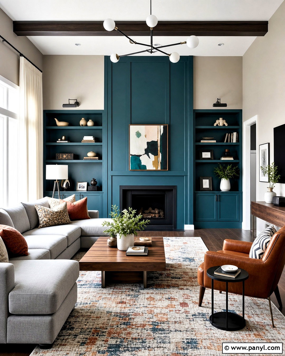
Vivid teal and light gray can create a living room that feels colorful yet controlled. Apply teal to the fireplace wall and continue it across nearby built-ins for a strong focal area. Paint the remaining walls a pale, slightly warm gray. A light gray sectional balances the intensity of the teal, while walnut tables and cognac leather accents introduce warmth. Use a large rug containing teal, rust, cream, and charcoal to connect the entire palette. Black curtain rods and floor lamps provide crisp definition. Keep the curtains off-white and add cushions in rust and muted turquoise. The complete design feels lively and contemporary, but the generous use of gray keeps it practical for daily living.
9. Mustard Yellow and Soft White Walls
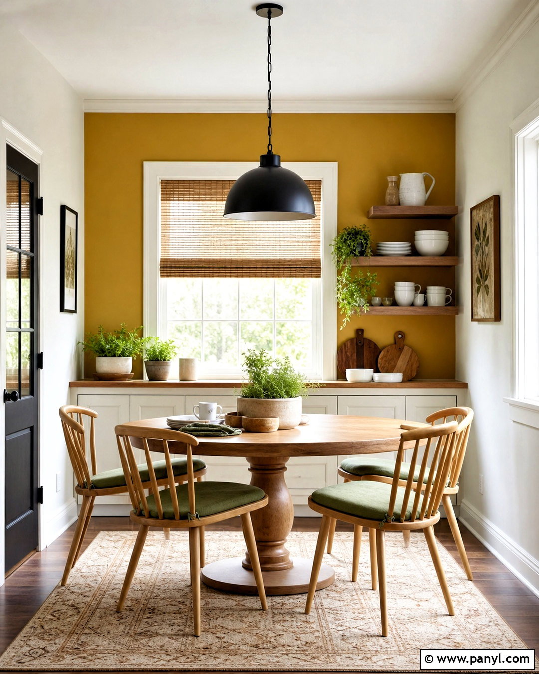
A breakfast room becomes cheerful and inviting when mustard yellow is balanced with soft white. Paint a sunny window wall mustard, then use warm white on the remaining walls, ceiling, and trim. Furnish the space with a round oak pedestal table and simple white or natural wood chairs. A washable cream rug with a subtle yellow pattern defines the dining area. Introduce black through a pendant light and slim window frames, but keep these accents limited. Sage green cushions and small potted herbs offer a natural supporting color. Open shelving can display white dishes and warm wood serving pieces. This coordinated room feels energetic in the morning without relying on neon color or overly playful decor.
10. Burgundy and Pale Pink Walls
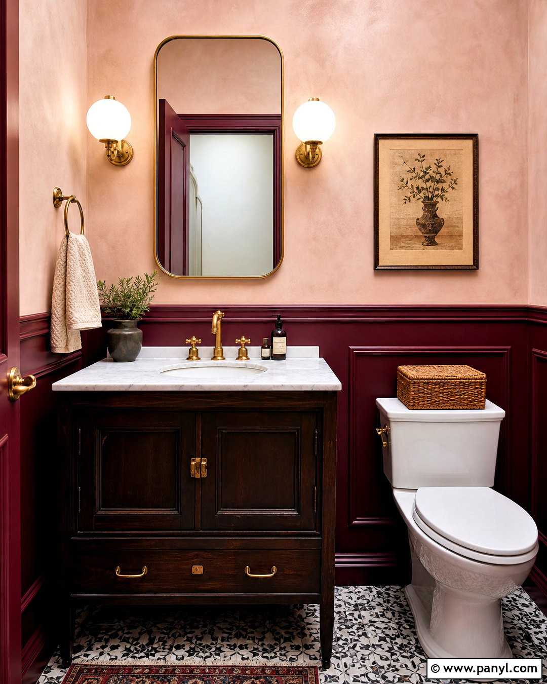
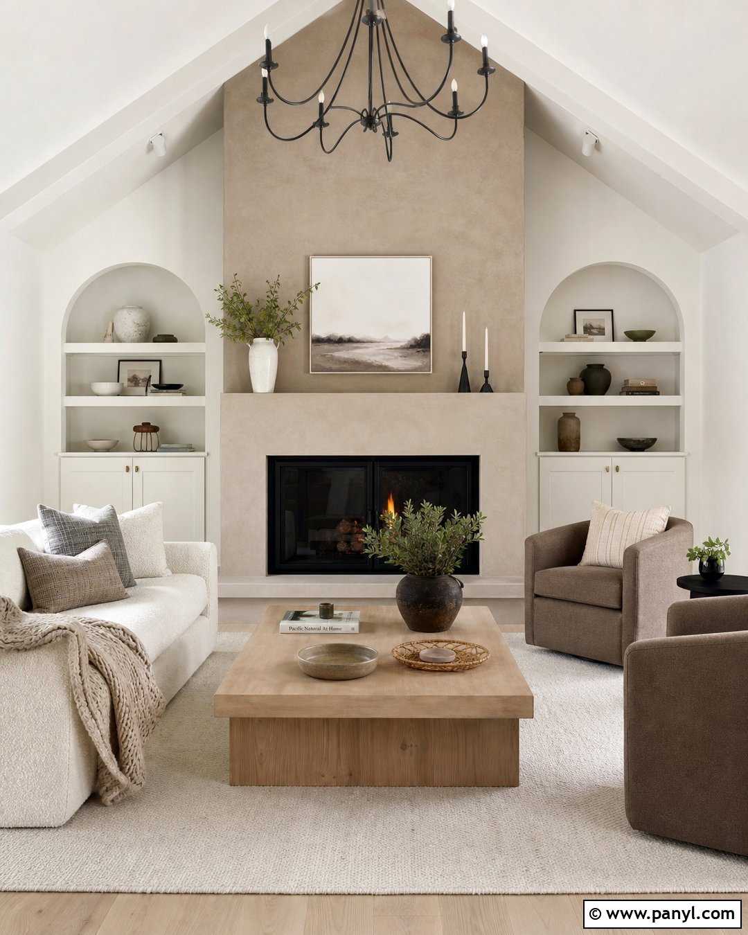
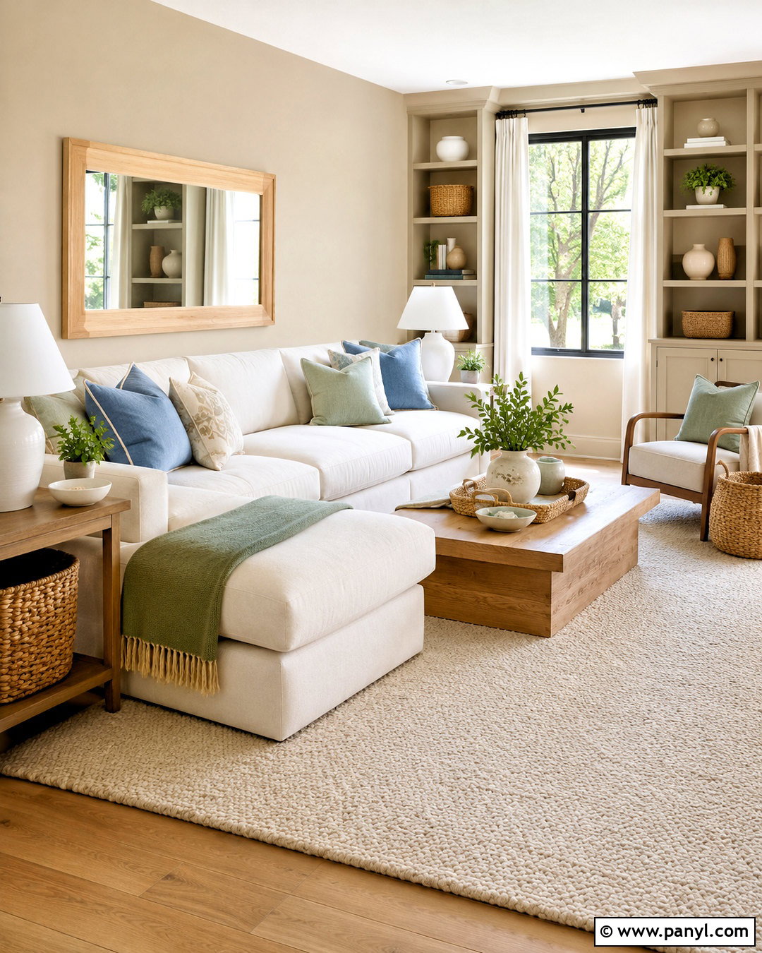
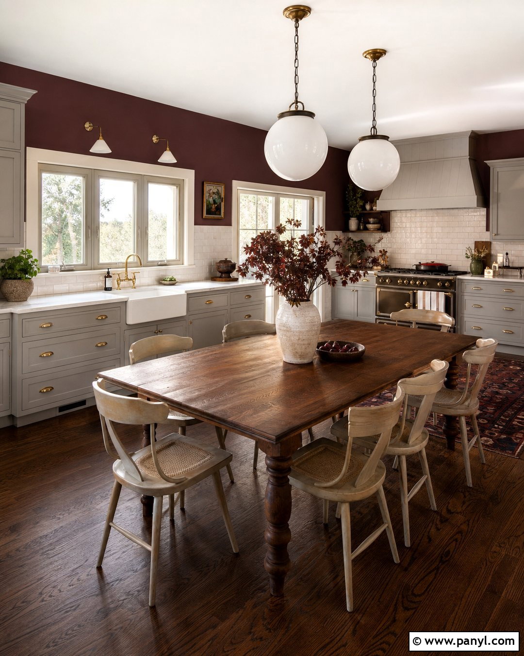
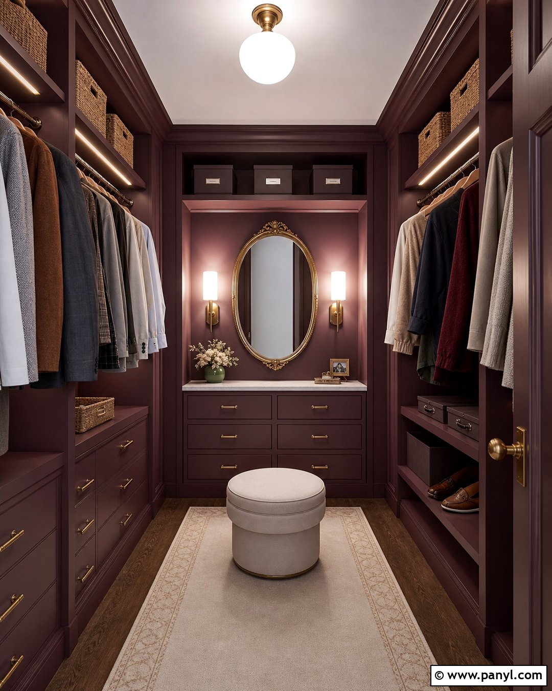
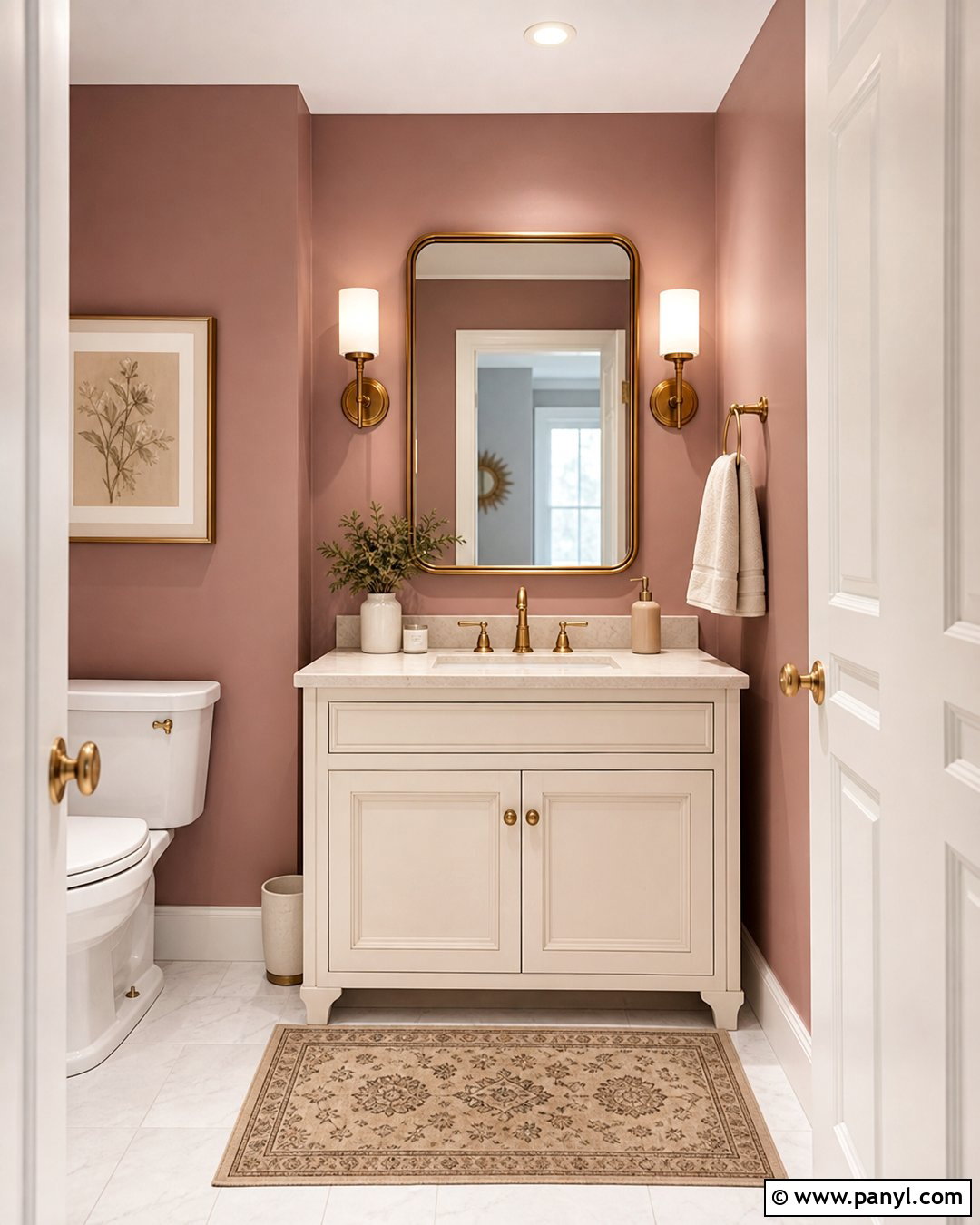
Burgundy and pale pink create a dramatic powder room with a surprisingly balanced finish. Use deep burgundy on the lower walls and paint the upper walls a muted plaster pink. A narrow chair rail can create a clean dividing line between the colors. Choose a white marble sink, dark wood vanity, and antique brass faucet to support the rich palette. A small burgundy-and-cream patterned floor adds character without introducing another dominant hue. Hang a rounded brass mirror and two opal glass sconces above the vanity. Keep towels and accessories cream or soft white. Because powder rooms are compact and used briefly, this full-color treatment feels memorable rather than overwhelming, especially with bright, well-positioned lighting.
11. Chocolate Brown and Mushroom Walls
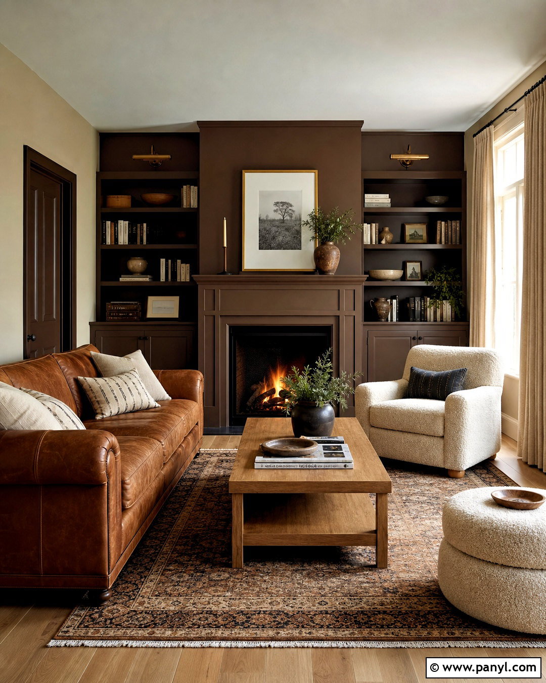
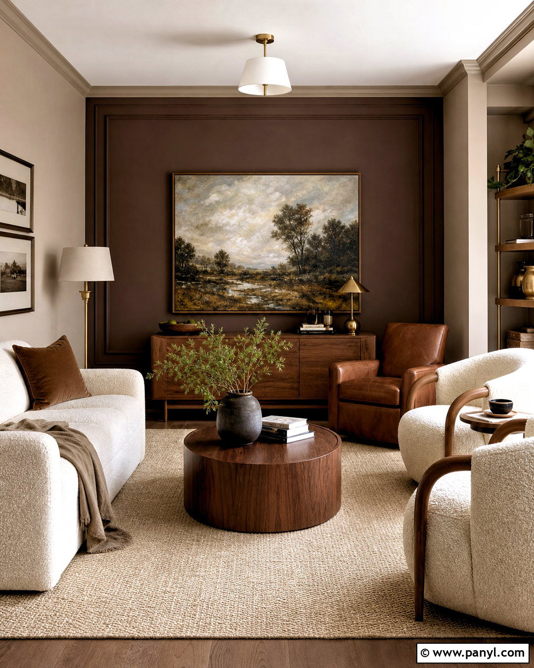
Chocolate brown and mushroom make a den feel cozy, refined, and connected to nature. Paint the walls mushroom, then cover the fireplace wall and built-in bookcases in deep chocolate brown. A camel leather sofa, cream boucle chair, and medium oak coffee table create tonal layers across the room. Choose a patterned wool rug that combines brown, beige, rust, and faded blue. Bronze picture lights and a dark metal floor lamp support the deeper wall color. Linen curtains in warm oatmeal soften the windows and prevent the room from feeling enclosed. Fill the shelves thoughtfully with books, pottery, and a few framed photographs. This complete palette works particularly well in rooms intended for reading, conversation, and quiet evenings.
12. Lavender and Cream Walls
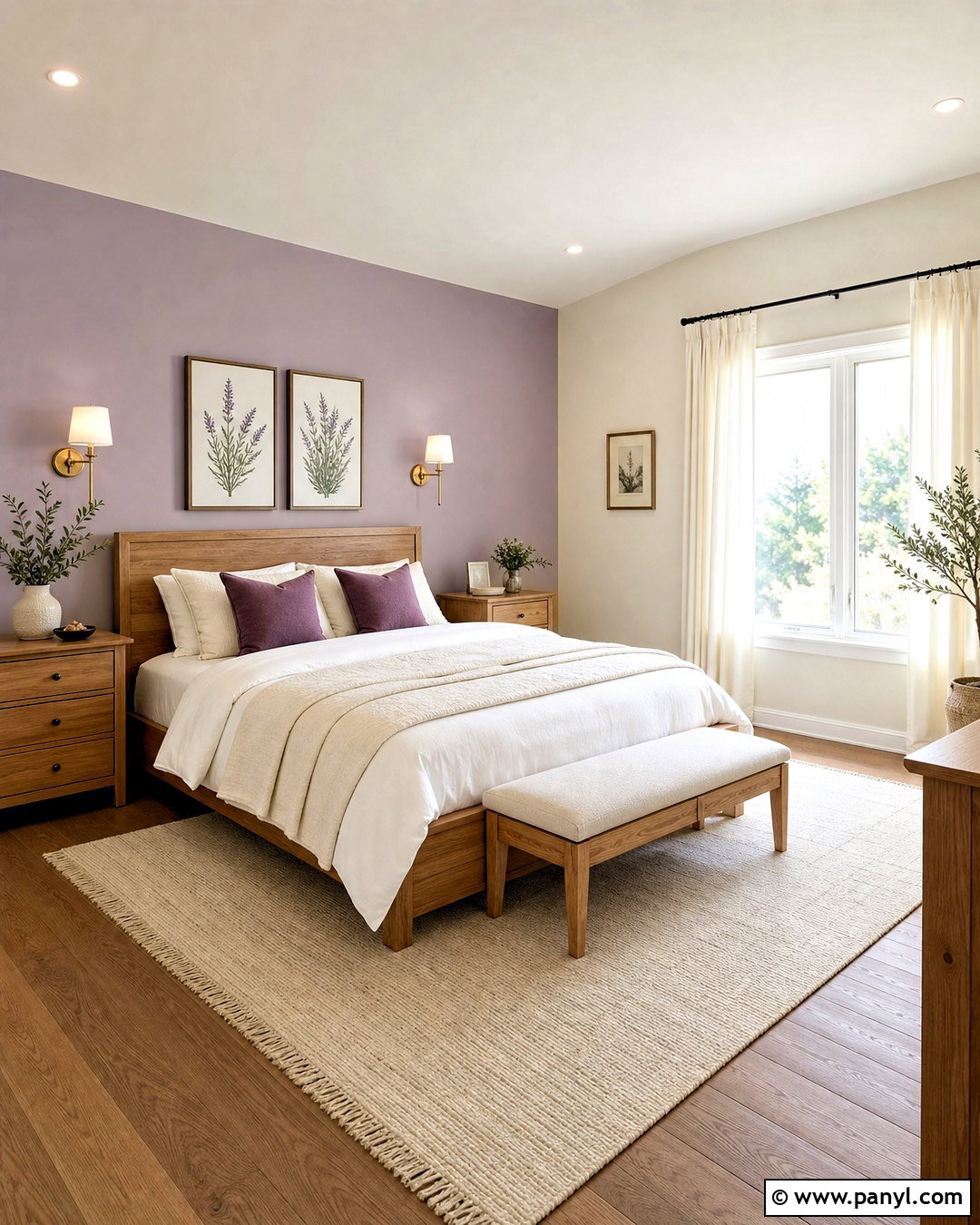
Soft lavender and cream bring gentle color to a bedroom while maintaining a calm, grown-up look. Paint the wall behind the bed muted lavender and use rich cream across the other walls. A natural oak bed and matching nightstands keep the room from feeling too delicate. Dress the bed in white linen, a cream quilt, and pillows in lavender, plum, and faded green. Add a light wool rug and simple off-white curtains for softness underfoot and around the windows. Brushed brass sconces offer warmth, while botanical prints provide an easy decorative link to the palette. Avoid icy lavender shades; a slightly gray or dusty version will coordinate more naturally with wood, woven materials, and warm neutral upholstery.
13. Black and Warm White Walls
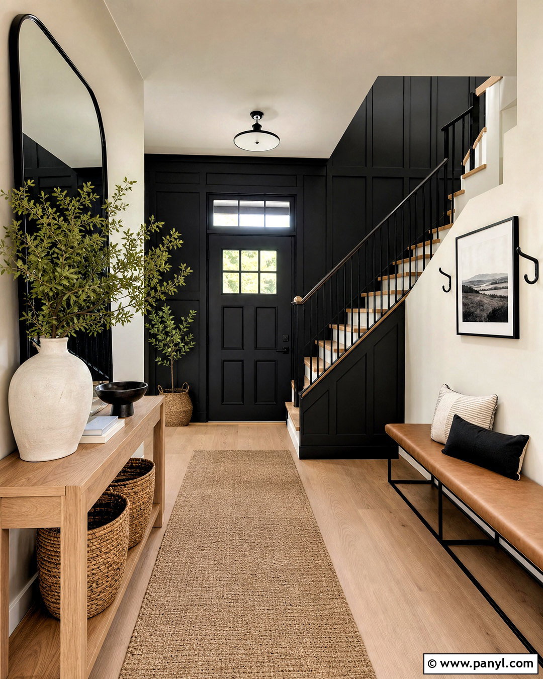
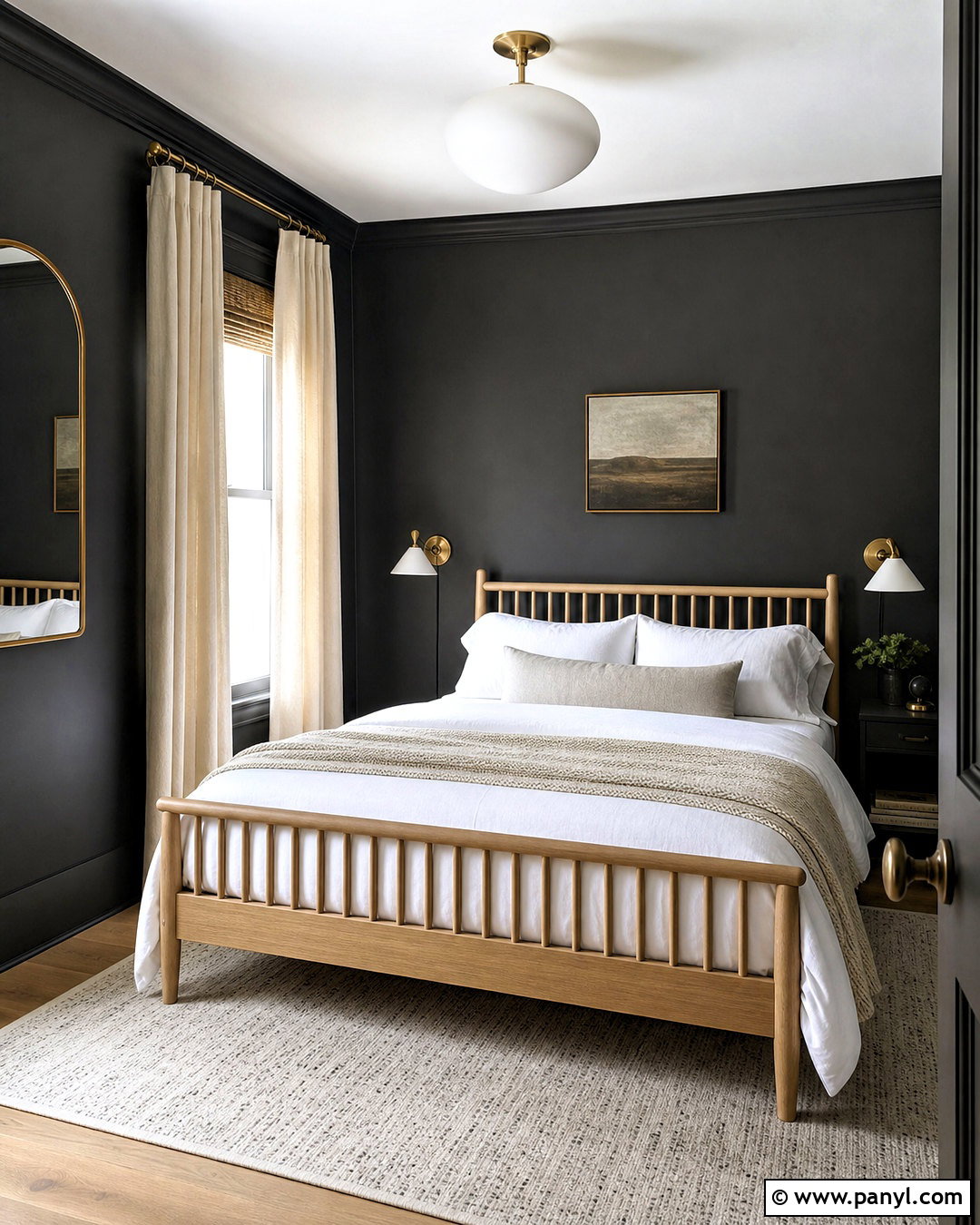
Black and warm white create a crisp entryway when the darker color is used with restraint. Paint the main walls warm white and apply matte black to the staircase wall, interior front door, or paneled lower section. A slim oak console adds warmth beside the strong contrast. Place a natural woven runner along the floor and hang a large rounded mirror above the console to reflect light. Black metal hooks, a simple ceiling fixture, and framed monochrome artwork repeat the accent color throughout the space. Add a tan leather bench or woven basket for practical storage. Warm white trim is important here because a blue-white shade can make the black feel harsh. The finished entry looks organized, architectural, and welcoming.
14. Sky Blue and Sand Walls
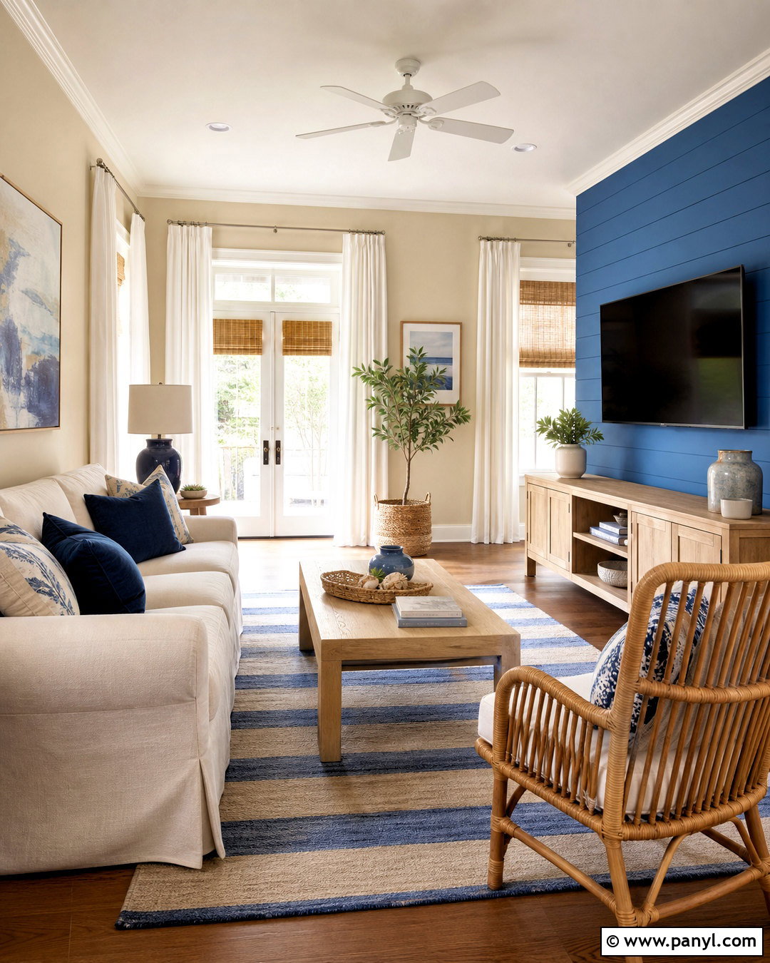
Sky blue and sandy beige give a family room an easy coastal influence without relying on themed decorations. Paint most walls a pale sand color and use clear sky blue around the media wall or reading nook. Select a cream slipcovered sofa, light oak media cabinet, and woven rattan chair. A blue-and-beige striped rug visually joins both wall colors while making the seating zone feel complete. Use white linen curtains, ceramic lamps, and navy pillows for additional contrast. Natural materials such as seagrass baskets, unfinished wood, and woven shades support the relaxed atmosphere. Instead of obvious coastal signs or shell accessories, display abstract artwork in blue, tan, and white. The final room feels bright, casual, and comfortable year-round.
15. Forest Green and Parchment Walls
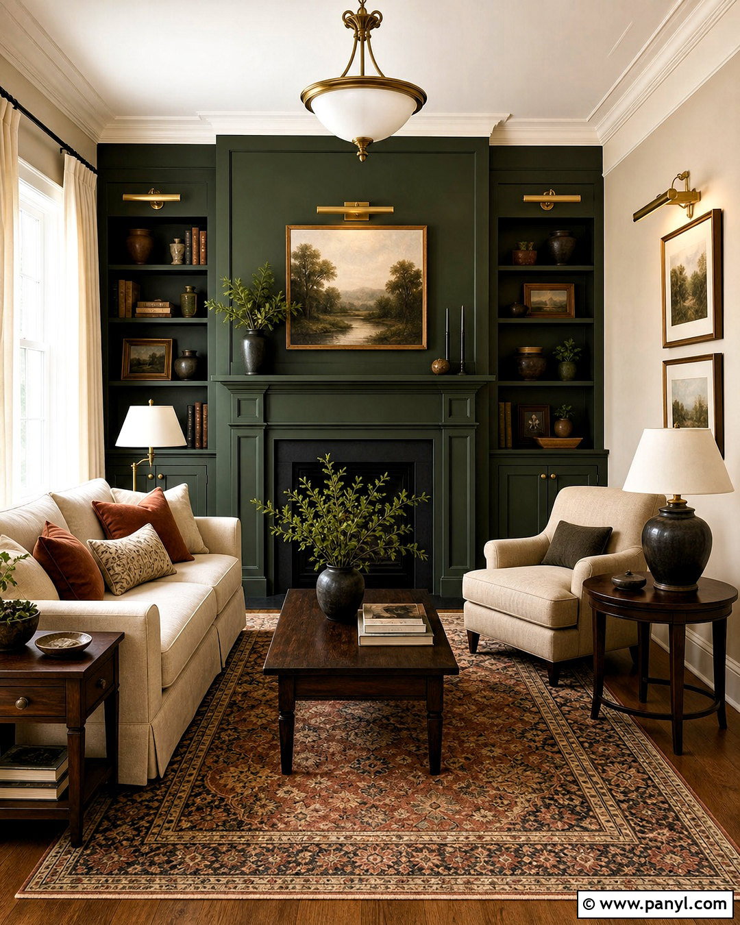
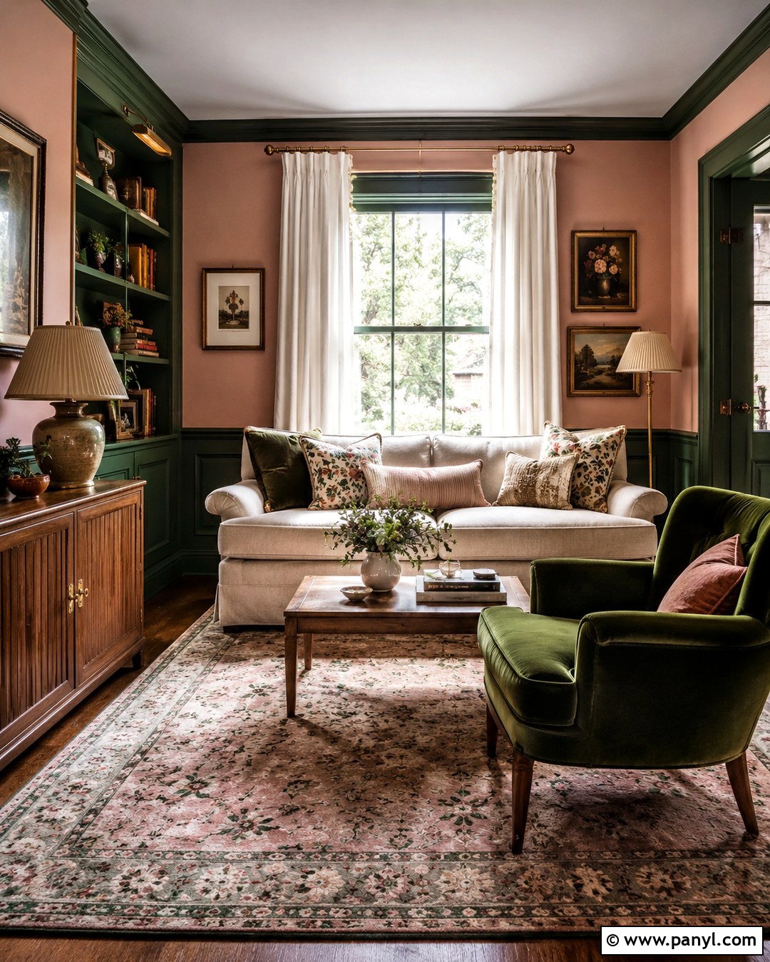
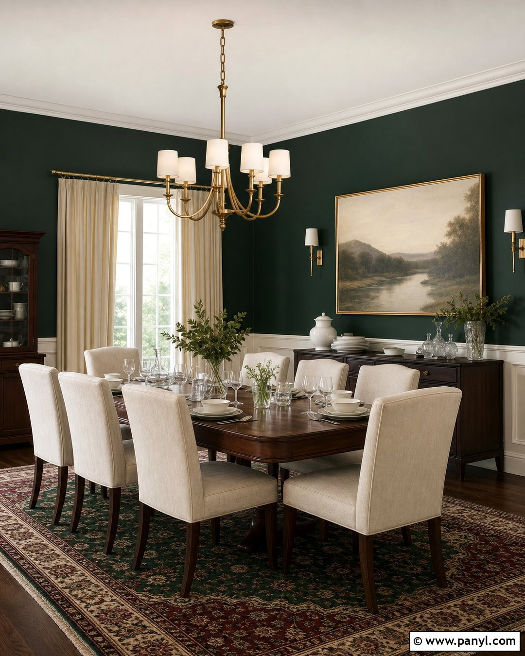
Deep forest green and parchment create an elegant living room with a comfortable, grounded quality. Paint the fireplace wall and adjacent shelving forest green, then use warm parchment on the other walls. Place a parchment-colored sofa in front of the darker backdrop so its silhouette stands out clearly. Add walnut side tables, brass picture lights, and a vintage-style rug containing red, green, and beige. Cream curtains soften the windows, while rust velvet cushions bring another warm layer to the seating. Keep the ceiling light and the trim slightly creamy rather than brilliant white. Landscape artwork, dark pottery, and leafy branches complete the room. This palette feels richly decorated without requiring ornate furniture or a large decorating budget.
16. Coral and Pale Aqua Walls
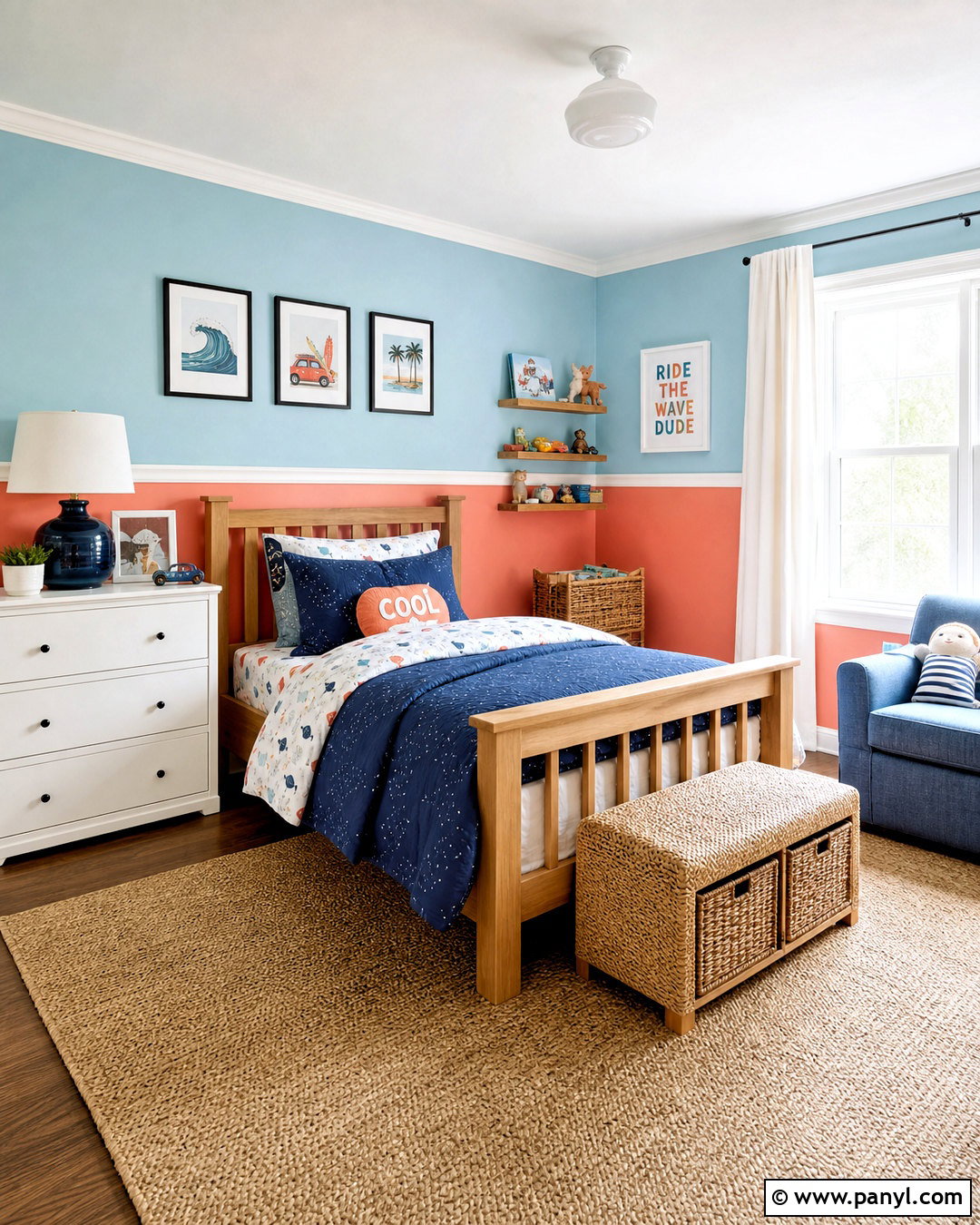
Coral and pale aqua can make a child’s bedroom feel energetic without looking overly bright. Paint the lower third of the walls soft coral and use pale aqua above, separating the colors with a slim white molding strip. Choose a natural wood bed, white dresser, and woven storage baskets to keep the foundation simple. Bedding that combines aqua, coral, navy, and cream ties the walls to the furniture. Add an easy-to-clean beige rug and white cotton curtains for balance. A small reading chair in muted blue creates a useful corner without introducing a competing color. Finish with playful framed illustrations and a simple white ceiling light. The complete room can adapt easily as the child grows.
17. Rust and Dusty Blue Walls
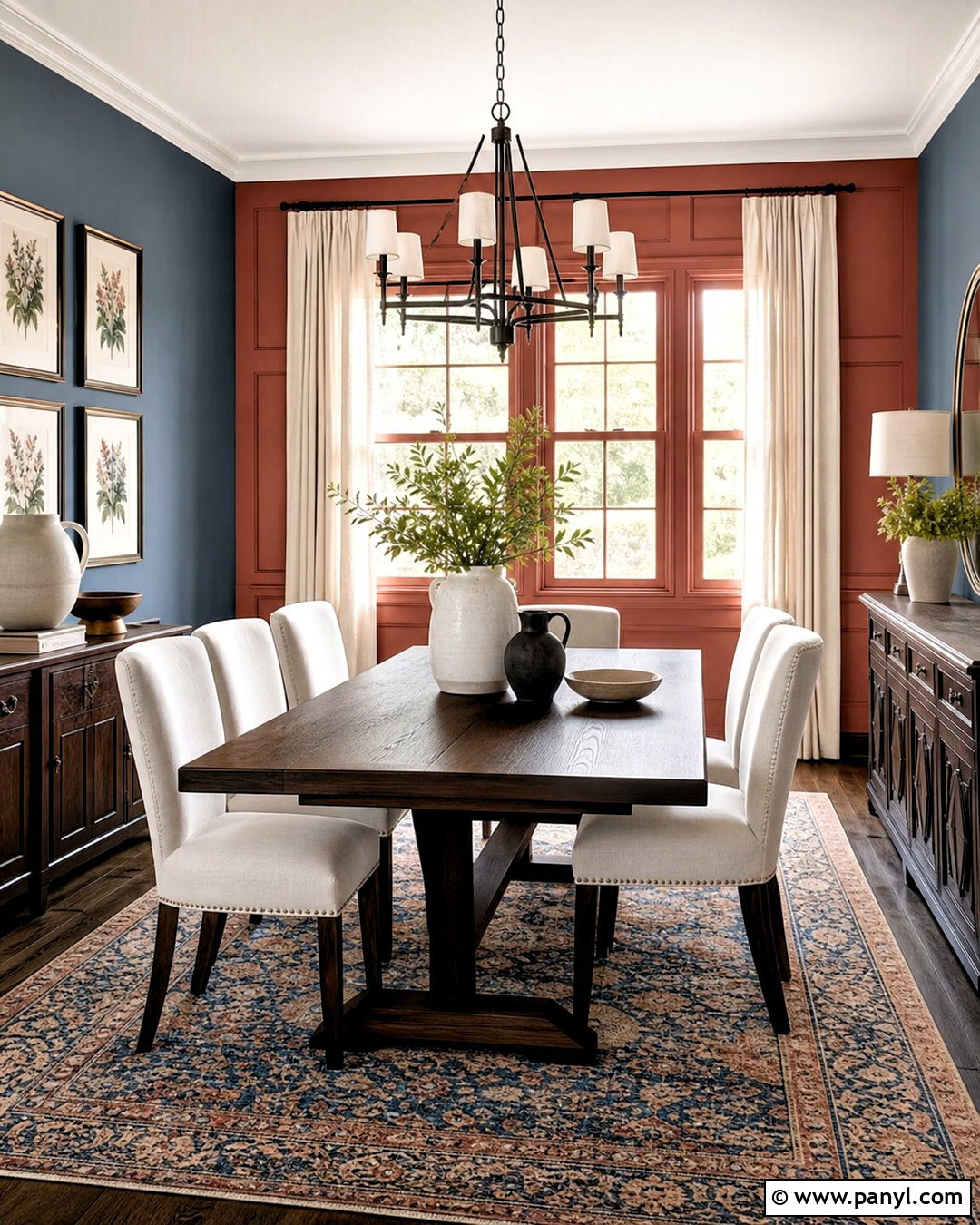
Rust and dusty blue form a warm, distinctive dining room palette. Paint the walls dusty blue and highlight a recessed niche, window wall, or paneled section in earthy rust. A dark oak dining table gives the room substance, while woven or beige upholstered chairs prevent it from becoming too heavy. Hang a black metal chandelier with simple cream shades above the table. A vintage-inspired rug containing rust, faded blue, tan, and ivory brings the two wall colors together. Choose natural linen curtains and display off-white ceramics on a dark wood sideboard. A few muted botanical prints complete the space. The contrast is noticeable but softened by the gray undertones present in both colors, creating a comfortable and collected room.
18. Plum and Ochre Walls
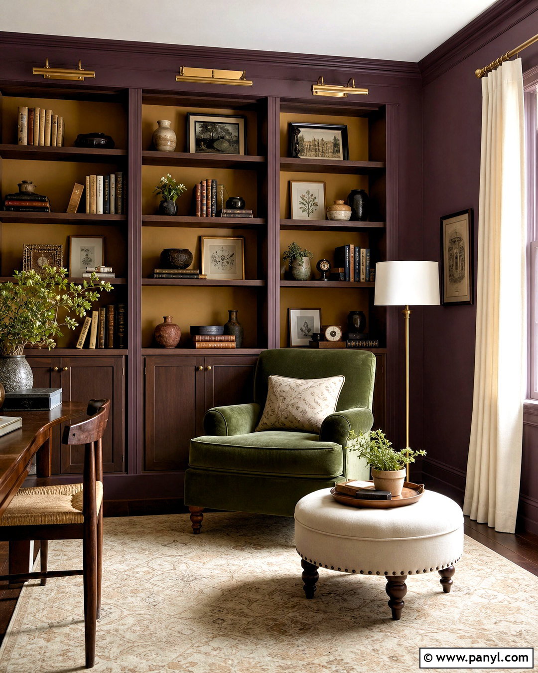
Plum and ochre deliver a bold reading room that still feels polished. Cover the walls in muted plum, then paint the inside backs of bookcases or a window alcove rich ochre. A moss green velvet chair introduces a third earthy hue, while a cream ottoman and beige rug keep the center of the room light. Choose dark walnut shelving and aged brass picture lights to complement the deep wall color. Off-white curtains frame the windows without competing with the palette. Arrange books with ceramics, small artwork, and practical storage boxes rather than filling every shelf. This room benefits from layered lighting, including a floor lamp beside the chair. The finished scheme feels expressive, intimate, and thoughtfully balanced.
19. Taupe and Muted Green Walls
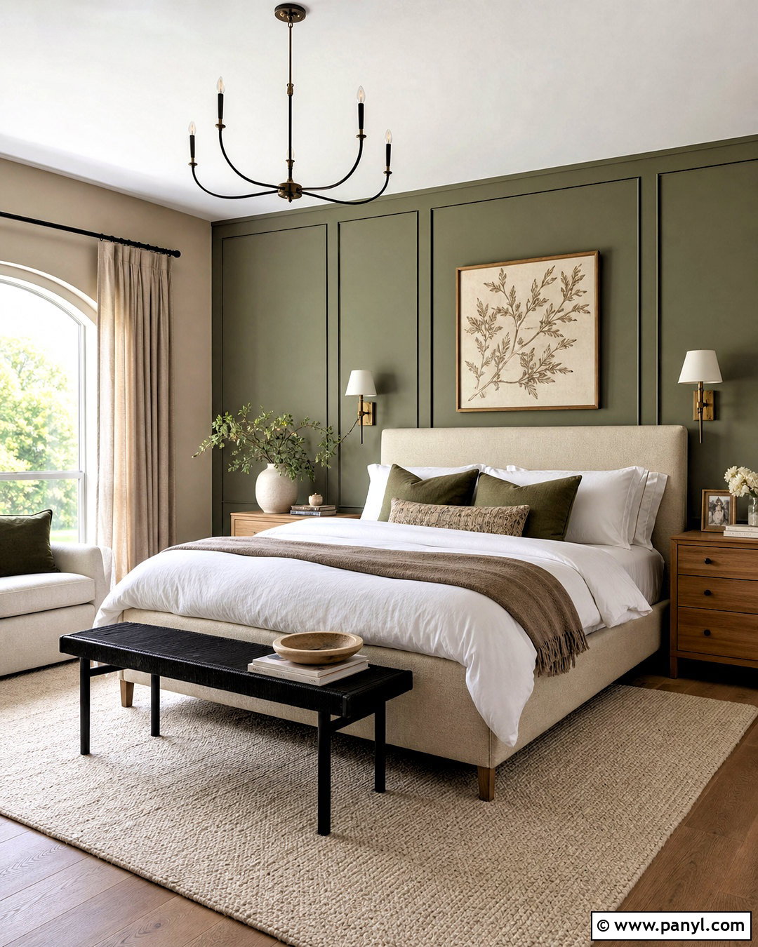
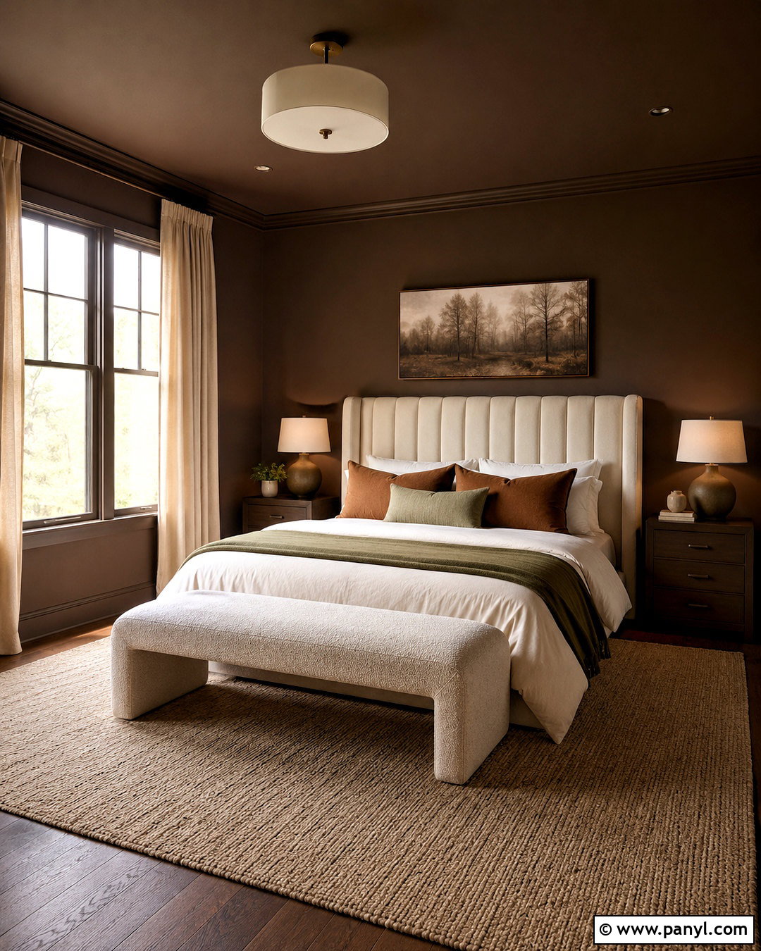
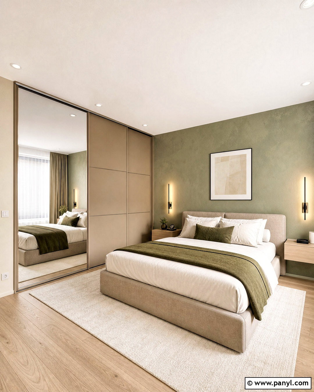
Taupe and muted green create a restful primary bedroom with understated color. Paint the walls warm taupe and apply muted green to the paneled wall behind the bed. An upholstered oatmeal bed, oak nightstands, and a cream wool rug form a soft neutral base. Layer white bedding with taupe blankets and green accent pillows, then add bronze sconces for warmth. Linen curtains in a shade close to the wall color make the windows feel taller and less visually busy. Bring in one dark element, such as a black bench or deep brown dresser, to ground the lighter palette. Botanical artwork and a ceramic vase are enough decoration. The complete design feels peaceful, natural, and easy to update with new textiles.
20. Cobalt Blue and Crisp White Walls
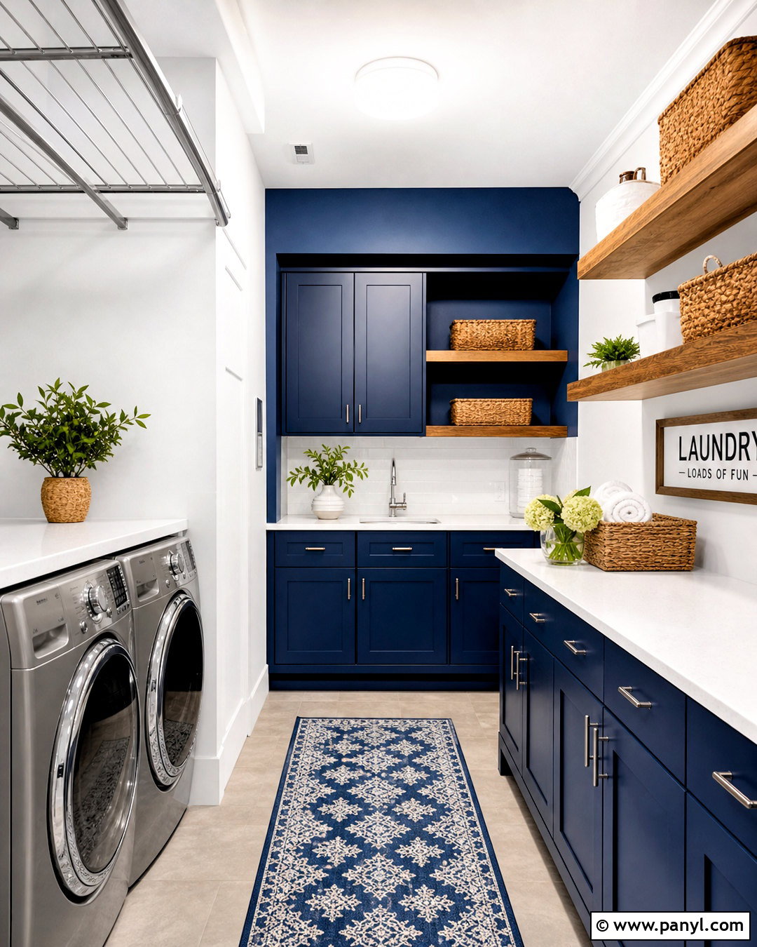
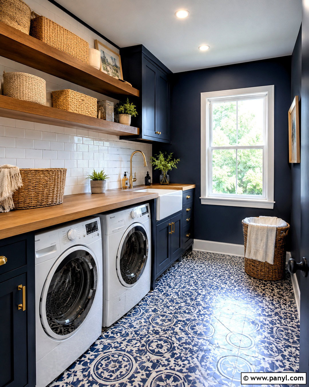
Cobalt blue and crisp white turn a laundry room into a fresh, organized workspace. Paint the lower cabinets and one main wall bold cobalt, then use clean white on the remaining walls, ceiling, and trim. Install white quartz counters and a simple white tile backsplash to reflect light around the room. Warm wood floating shelves stop the high-contrast palette from feeling sterile. Add brushed nickel hardware, woven baskets, and a washable blue-and-white runner. Keep detergents inside labeled cabinets or matching containers so the room remains visually calm. A wall-mounted drying rail in polished metal adds function without clutter. This complete scheme combines strong color with practical surfaces, making an everyday utility space feel intentional and pleasantly energetic.
Conclusion:
The best 20 wall color combination ideas balance personality with practical details such as lighting, room size, existing furniture, and flooring. Warm whites soften earthy greens, browns, and terracotta, while pale neutrals make navy, charcoal, burgundy, and cobalt easier to use. For a cohesive result, repeat both wall colors through textiles, artwork, cabinetry, or smaller accessories. Limit extra hues and mix natural materials to keep the room comfortable. Always view large painted samples beside permanent finishes during the morning, afternoon, and evening before selecting the final formula. Whether you prefer gentle tonal layers or confident contrast, a thoughtfully planned wall palette can make the entire space feel connected, finished, and distinctly yours.

Related Ideas and Inspiration:
Leave a Reply