
The right paint palette can change how a room feels, how furniture connects, and how natural light moves through the space. These wall color design ideas go beyond picking a pretty shade. Each look combines wall paint with trim, flooring, furniture, lighting, textiles, and decorative accents for a complete room you can realistically recreate. Current color directions favor warmer neutrals, botanical greens, calming blues, earthy reds, soft yellows, and deeper cocooning shades. () You will find options for bright rooms, cozy retreats, compact spaces, and homes with traditional or modern character. Always sample paint on several walls before committing because surrounding finishes can shift its appearance. Use these **20 wall color design ideas** to build a balanced palette that feels intentional from every angle.

1. Warm White Wall Color Living Room
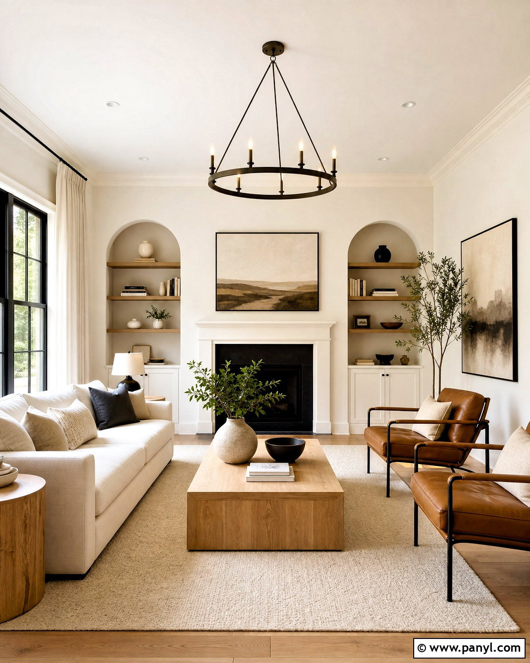
Warm white walls create a bright living room without the sharp, clinical feeling of pure white. Choose a creamy white with subtle beige or yellow undertones, then continue it across the walls and trim in different finishes. Matte walls and satin trim add quiet definition while keeping the room visually open. Ground the palette with a light oak coffee table, a oatmeal-colored sofa, and a textured ivory rug. Add cognac leather chairs and muted rust pillows for warmth. Linen curtains should closely match the walls so the windows feel larger. Black picture frames and a slim bronze floor lamp provide controlled contrast. This complete scheme works especially well in rooms with wood flooring, stone fireplaces, and plenty of daylight.
2. Soft Greige Wall Color Open Floor Plan
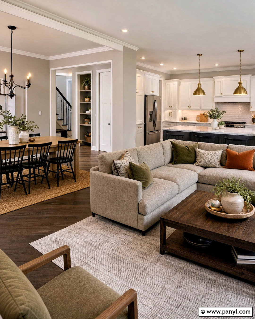
Soft greige provides a practical connection between a living room, dining area, and kitchen. Look for a balanced shade that sits between warm beige and gentle gray, without appearing noticeably purple or blue. Paint the continuous walls greige and use soft white on the ceiling, doors, and baseboards. Define the living area with a taupe sectional, walnut tables, and a cream patterned rug. In the dining zone, introduce black chairs around a natural wood table. Warm brass pendants help the kitchen feel connected to the same palette. Repeat olive green and rust accents across all three areas through pillows, ceramics, and artwork. The finished space feels coordinated, but each functional zone still has its own identity and visual anchor.
3. Sand Beige Wall Color Bedroom
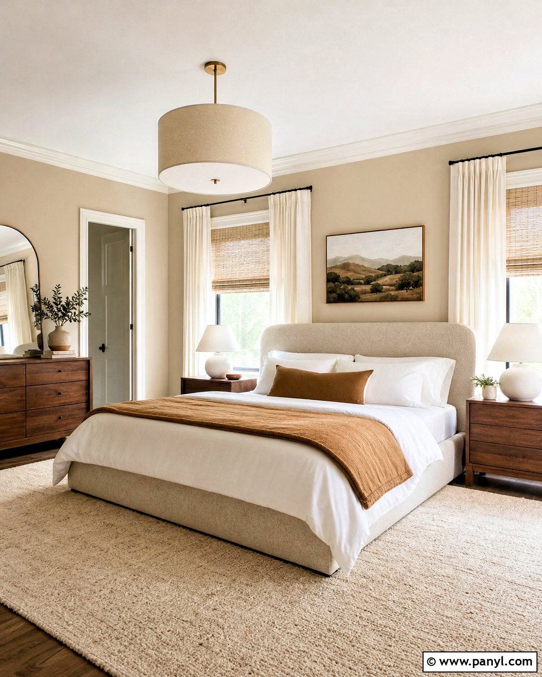
Imagine a quiet bedroom with the soft, natural coloring of sand and woven linen. A light beige wall color establishes that relaxed mood while providing more warmth than gray. Pair it with creamy trim, light oak flooring, and a low upholstered bed in oatmeal fabric. Layer the bed with white sheets, a beige quilt, and muted caramel pillows. Simple walnut nightstands add deeper contrast without making the room heavy. Install woven shades beneath full-length ivory curtains for texture and flexible light control. A large wool rug in cream and tan keeps the palette comfortable underfoot. Finish the room with ceramic lamps, restrained landscape artwork, and one leafy plant. The varied textures prevent this neutral wall color scheme from looking flat or unfinished.
4. Sage Green Wall Color Living Room
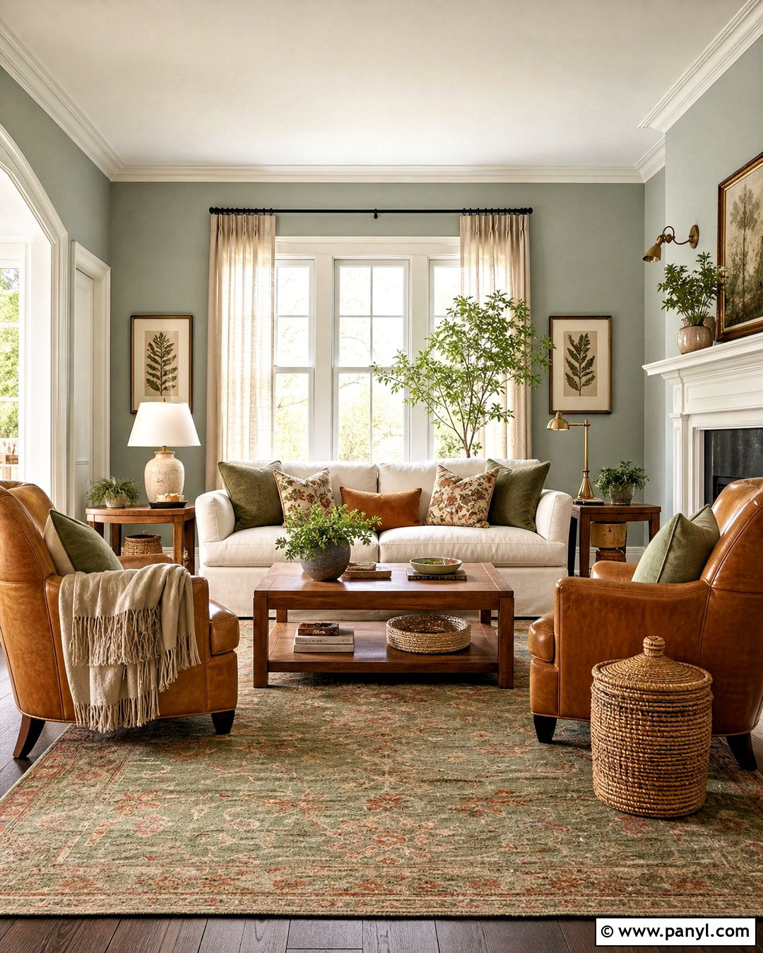
Sage green walls can make a living room feel calm, welcoming, and naturally connected to outdoor views. Select a muted green with gray undertones rather than a bright mint shade. Combine it with warm white trim and medium-toned oak flooring for a balanced foundation. A cream slipcovered sofa keeps the center of the room light, while two camel leather chairs add warmth and durability. Bring in a faded vintage rug containing sage, rust, and beige to tie the palette together. Linen curtains, woven baskets, and walnut side tables reinforce the organic look. Use aged brass lighting instead of shiny metal for a softer finish. Botanical artwork can echo the walls, but mix in abstract pieces so the overall room does not feel overly themed.
5. Olive Green Wall Color Dining Room
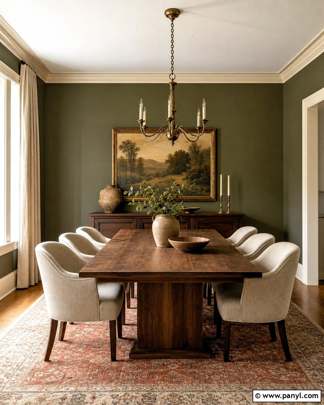
Olive green gives a dining room depth while remaining easier to decorate than a brighter jewel tone. Cover every wall in a medium olive shade and use creamy off-white on the ceiling and architectural trim. Center the room around a solid walnut table with curved dining chairs upholstered in natural linen. A traditional rug with faded red, beige, and green details adds pattern beneath the furniture. Hang a large aged brass chandelier at an appropriate height over the table to create a strong focal point. Full-length beige curtains soften the dark walls and frame the windows. Display simple pottery and landscape art rather than filling every surface. The finished dining room feels intimate enough for evening meals but still warm and inviting during the day.
6. Forest Green Wall Color Home Office
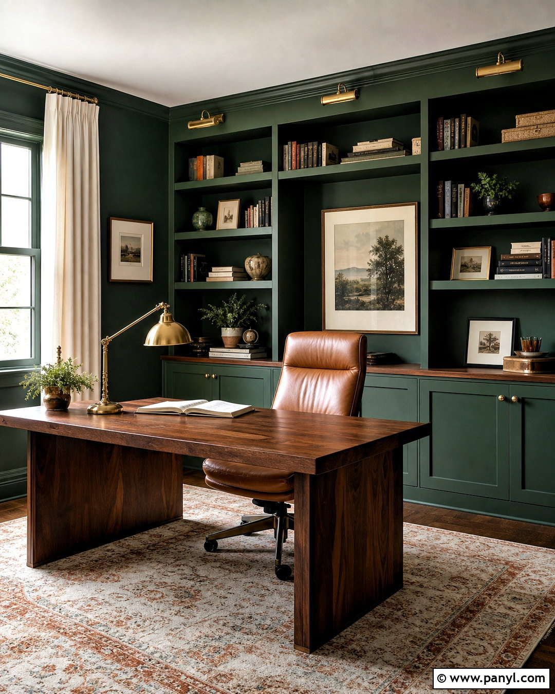
A deep forest green wall color turns a home office into a focused, polished workspace. Use the shade on all four walls for continuity instead of limiting it to one accent wall. Paint built-in shelves the same green in a satin finish, allowing books and decorative objects to stand out. A substantial walnut desk brings warmth to the center of the room, while a tan leather chair adds a comfortable professional touch. Choose a vintage-inspired rug with cream, rust, and dark green details to soften the floor. Warm white curtains prevent the palette from feeling too enclosed. Add adjustable brass task lighting and a simple ceiling fixture for layered illumination. A few framed prints with wide ivory mats create breathing room against the saturated background.
7. Powder Blue Wall Color Bedroom
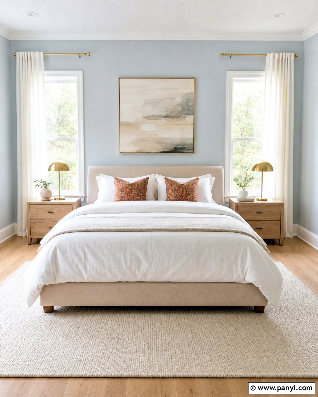
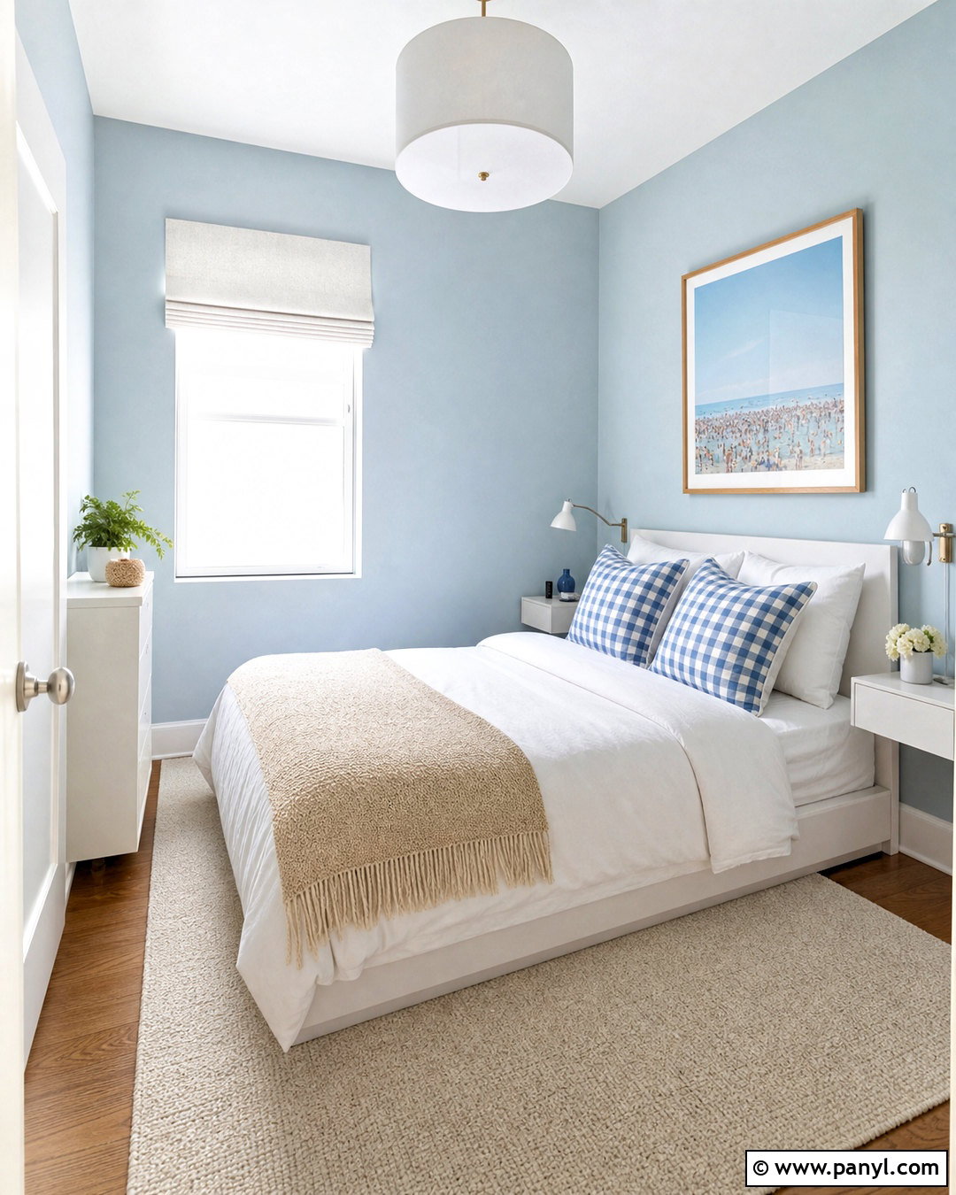
Powder blue walls create an airy bedroom that still feels colorful and personal. Choose a pale blue with a soft gray undertone, then pair it with crisp white trim and light natural flooring. An upholstered bed in warm beige prevents the palette from becoming overly cool. Dress it with white bedding, a blue-gray coverlet, and patterned pillows containing touches of rust or brown. Light oak nightstands and brushed brass lamps provide gentle warmth on both sides of the bed. Frame the windows with ivory linen curtains that allow filtered daylight to enter. A cream wool rug grounds the furniture, while medium-scale coastal or abstract artwork repeats the blue without creating a literal theme. The overall design feels restful, clean, and comfortable throughout the year.
8. Dusty Teal Wall Color Family Room
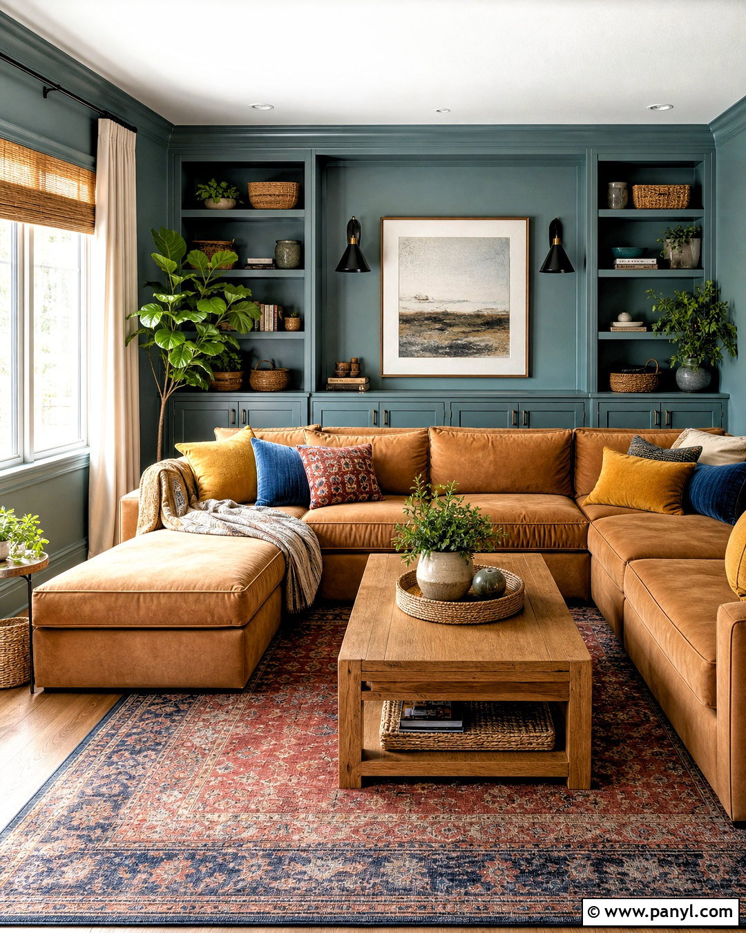
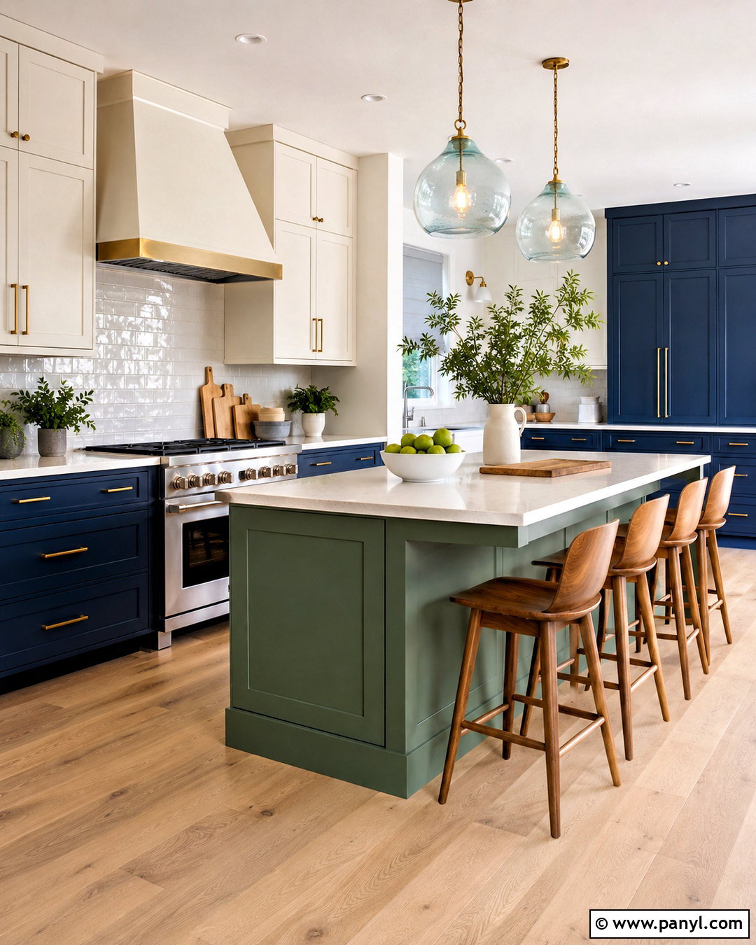
Dusty teal offers rich color without the intensity of a bright turquoise wall. It works especially well in a family room where comfort and character are equally important. Apply the teal across the walls and built-in storage, then keep the ceiling a warm white to reflect light. Choose a large camel-colored sectional with washable fabric and layer it with cream, mustard, and patterned teal pillows. A substantial oak coffee table makes the arrangement practical, while a faded red and blue rug adds depth. Use woven shades and simple ivory curtains to soften the windows. Matte black sconces and hardware introduce a modern edge. Finish with wood-framed artwork, family-friendly baskets, and a few plants, leaving enough open space for everyday movement and activities.
9. Deep Navy Wall Color Dining Room
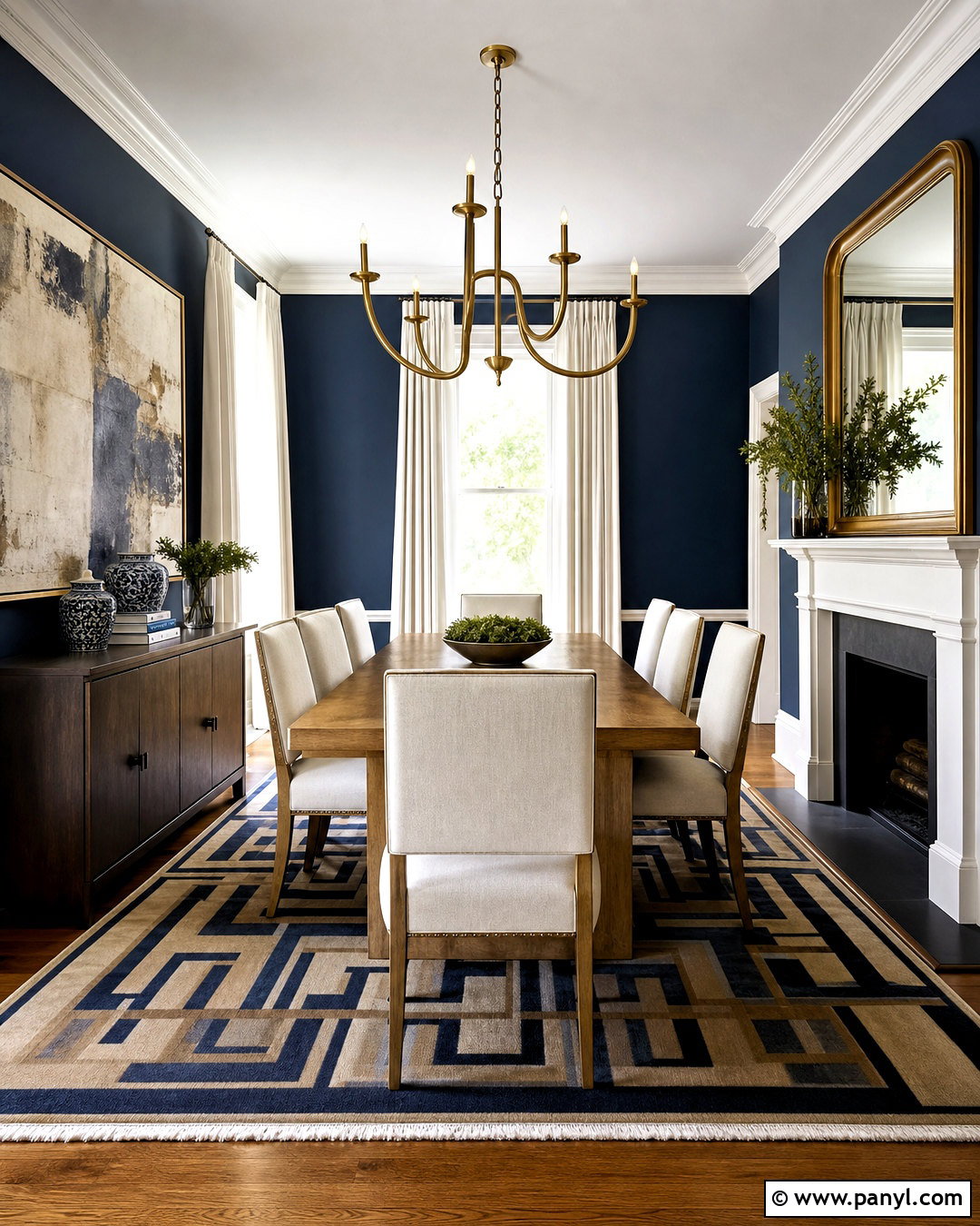
Deep navy walls can give an ordinary dining room a refined, architectural presence. Select a navy with slightly softened undertones so it appears rich rather than electric. Continue the color below and above any wall molding for a seamless look, then paint the ceiling and trim warm white. A medium oak dining table brings natural contrast, while upholstered cream chairs brighten the center of the room. Add a geometric rug containing navy, tan, and muted red to connect the furniture with the walls. A sculptural brass chandelier provides warm reflection against the dark paint. Hang one oversized artwork instead of several small pieces to maintain a clean composition. White linen curtains and a large mirror will distribute available light and keep the room feeling balanced.

10. Butter Yellow Wall Color Kitchen
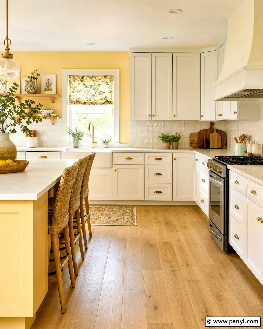
Butter yellow walls bring gentle energy to a kitchen without overwhelming the cabinets and work surfaces. Choose a soft, creamy yellow rather than a sharp lemon shade. Pair it with warm white Shaker cabinets, pale quartz countertops, and a simple cream backsplash. Natural oak flooring and woven counter stools reinforce the sunny warmth of the palette. Use aged brass cabinet pulls and pendant lights for a coordinated metal finish. A small Roman shade in a blue and yellow botanical fabric can add pattern near the sink. Keep countertop accessories limited to useful wooden boards, neutral ceramics, and a few green herbs. The resulting kitchen feels bright and cheerful, yet the restrained materials keep it from becoming overly colorful, themed, or visually busy.
11. Muted Ochre Wall Color Entryway
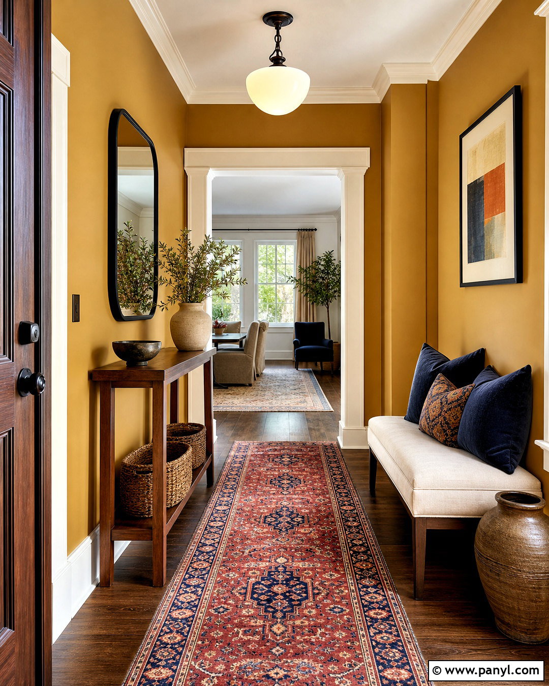
An ochre entryway creates a warm first impression and can make a transitional area feel like a designed room. Select a muted golden shade with brown undertones, then balance it with creamy trim and a light ceiling. Place a slim walnut console against the longest wall and hang a rounded black-framed mirror above it. A vintage runner containing rust, navy, and tan introduces pattern while protecting the main walkway. Add a small upholstered bench where space permits, along with woven baskets for shoes and everyday accessories. An opal glass ceiling light will illuminate the rich walls evenly. Keep the artwork simple and use only a few ceramic objects on the console. This complete scheme gives the entry personality without sacrificing practical circulation or storage.
12. Terracotta Wall Color Living Room
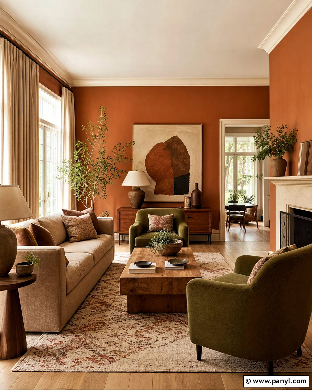
Terracotta walls create a warm living room inspired by clay, earth, and sunbaked natural materials. Use a softened terracotta rather than a vivid orange so the color remains comfortable across a large surface. Pair it with creamy trim, wide linen curtains, and pale oak flooring. A deep beige sofa provides a quiet foundation, while olive green armchairs create an earthy complementary contrast. Ground the seating arrangement with a patterned rug in cream, rust, brown, and faded blue. Choose a chunky wood coffee table and handmade ceramic lamps to reinforce the tactile quality of the room. Black metal details can sharpen the palette in small amounts. Finish with abstract artwork, woven pillows, and greenery for a collected space that feels warm rather than heavily rustic.
13. Clay Red Wall Color Dining Room
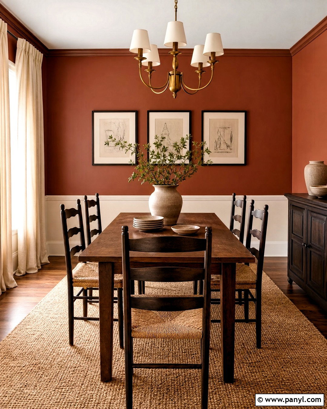
Clay red walls can transform a dining room into a cozy gathering place with grounded, sophisticated color. Look for a brown-based red that resembles natural brick or fired pottery rather than a bright primary red. Use the wall color throughout the room, then add warm white trim to outline doors and windows. A dark oak dining table gives the center visual weight, while rush-seat chairs introduce a lighter natural texture. Hang a cream drum pendant or an aged brass chandelier above the table. A neutral woven rug keeps the floor calm beneath the saturated walls. Decorate with black-framed sketches, simple stoneware, and linen curtains in oatmeal. The result feels intimate and layered, with enough neutral contrast to remain comfortable for daily meals and larger gatherings.
14. Plaster Pink Wall Color Bedroom
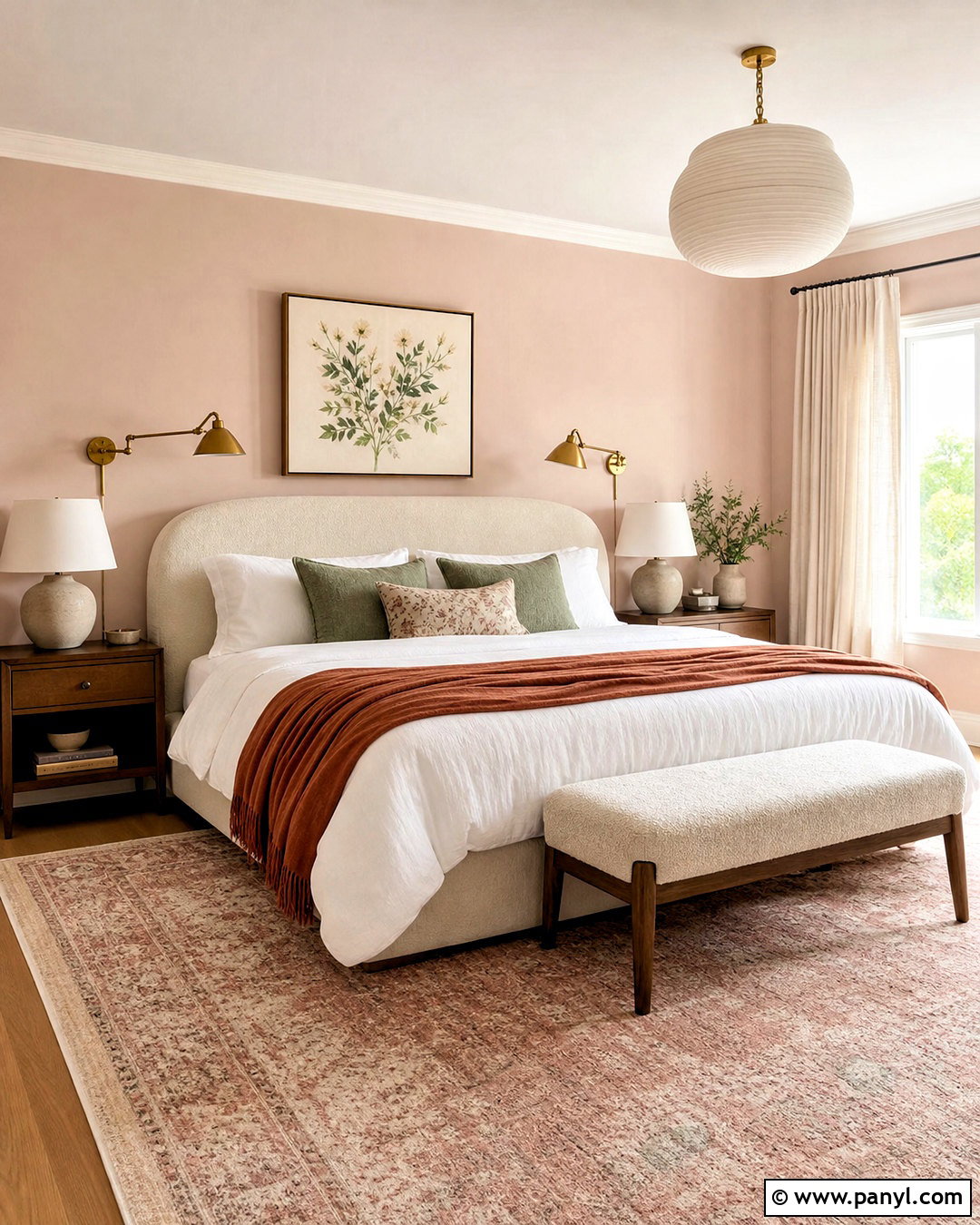
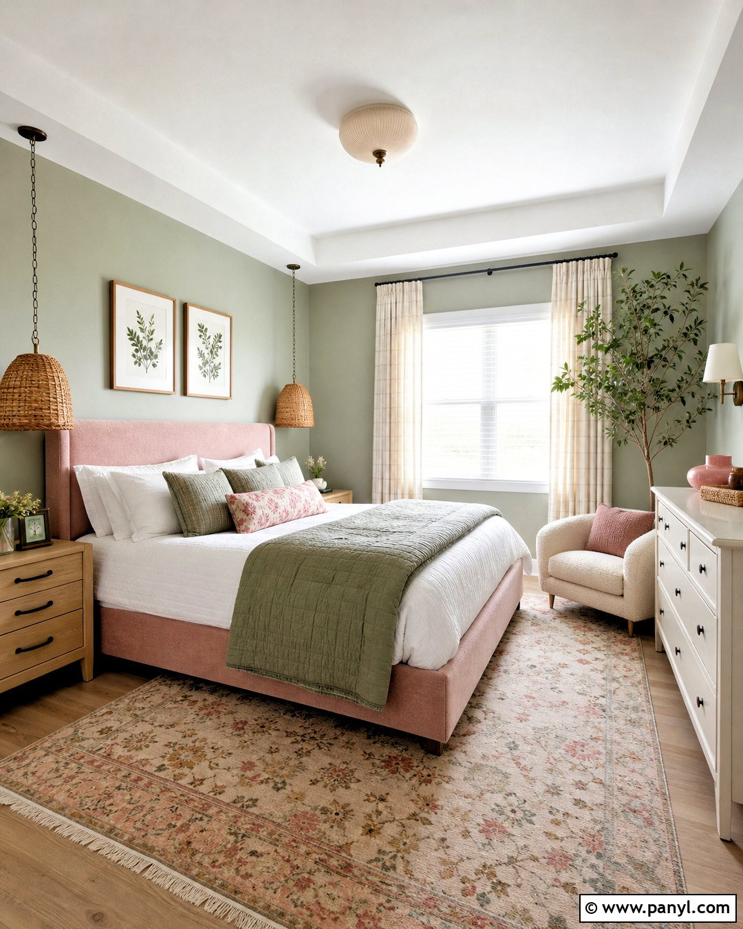
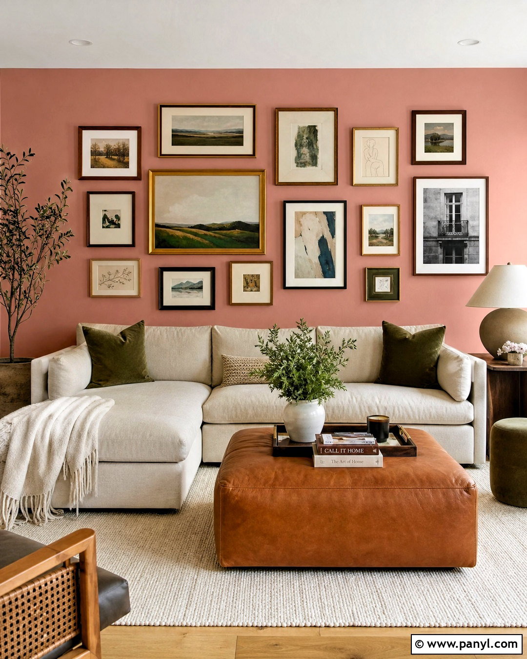
Plaster pink walls offer a soft alternative to beige while maintaining a grown-up, relaxed atmosphere. Choose a dusty pink with beige or clay undertones instead of a sugary pastel. Pair it with warm white trim, medium oak floors, and a curved upholstered bed in cream boucle or linen. Layer white bedding with a rust-colored throw and muted green accent pillows. Walnut nightstands provide darker structure, while ceramic lamps add handmade texture. Use full-length natural linen curtains to soften incoming light and make the ceiling appear taller. A faded rug combining blush, brown, and ivory will connect the major colors. Finish with minimal botanical artwork and brushed brass accents. This wall color design feels warm, understated, and adaptable rather than overly feminine or juvenile.
15. Muted Coral Wall Color Powder Room
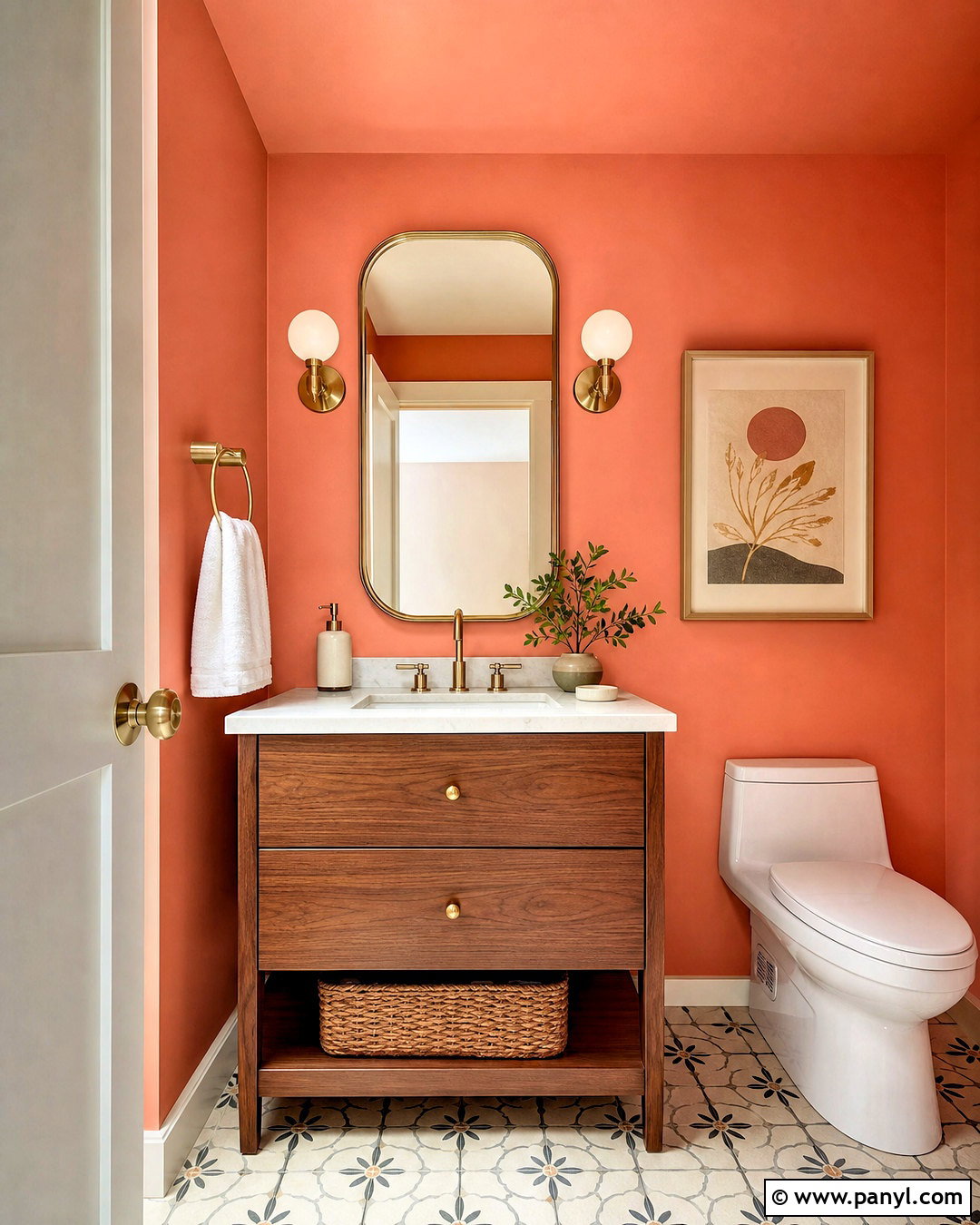
A powder room is an ideal space for a saturated muted coral wall color because the smaller footprint supports a stronger visual statement. Paint every wall coral and continue the color onto the ceiling for an enveloping finish. Balance it with a compact walnut vanity, a white stone countertop, and simple brass fixtures. A rounded mirror with a thin brass frame keeps the arrangement soft and cohesive. Install two opal glass sconces beside the mirror so faces receive even, flattering light. Use small-scale patterned floor tile in cream and warm gray to add interest without competing with the walls. White towels and a neutral woven basket provide practical contrast. One framed print and a small ceramic vase are enough to complete this colorful, uncluttered room.
16. Rich Plum Wall Color Bedroom
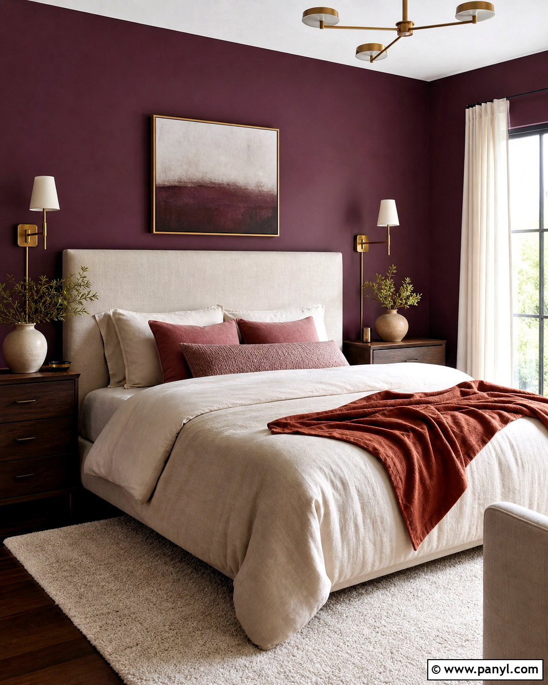
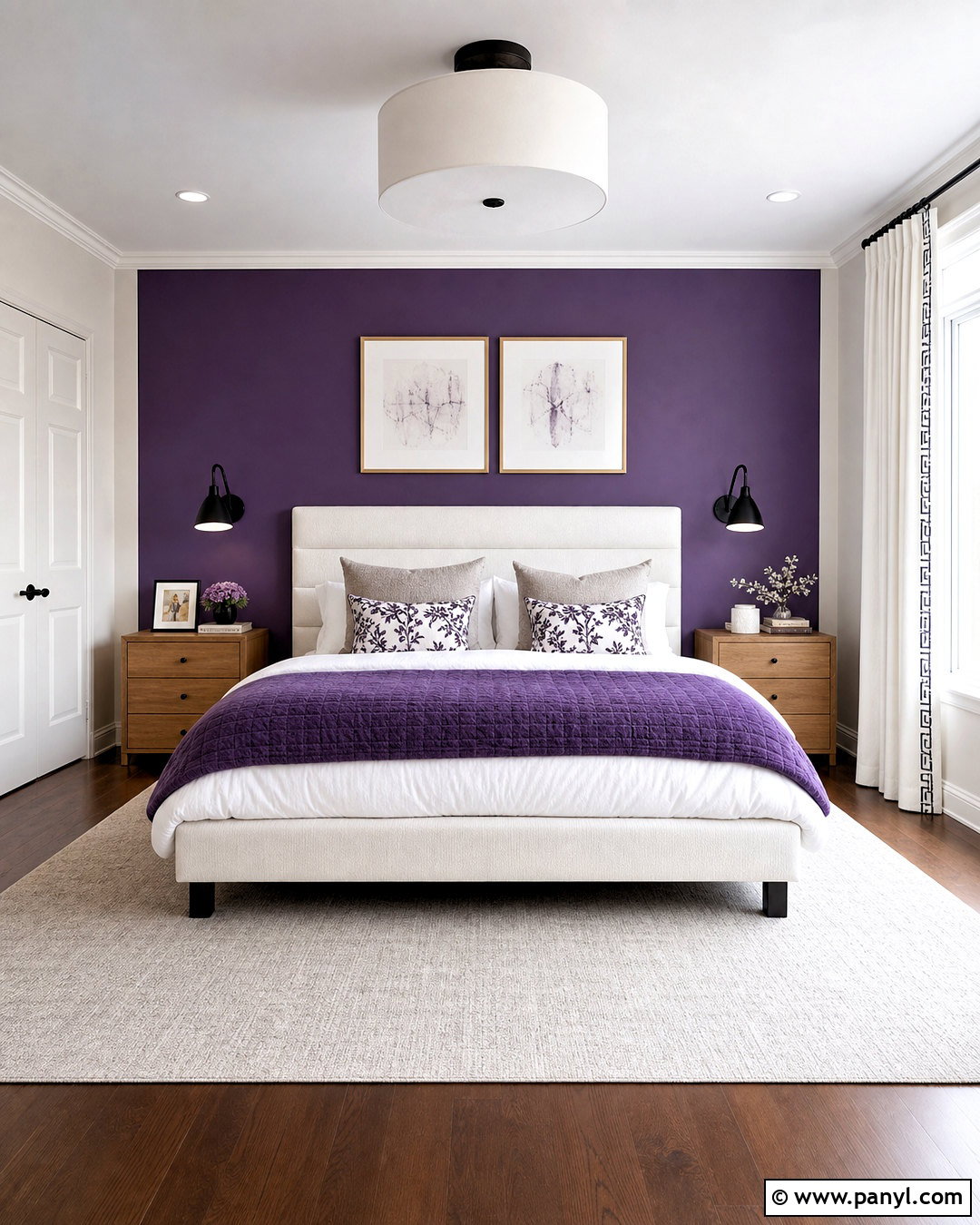
Rich plum walls can create a cocooning bedroom when they are supported by lighter textiles and warm wood. Choose a deep purple with red or brown undertones, avoiding shades that appear overly bright or cool. Apply it to all walls and use a slightly lighter plum or warm white on the ceiling, depending on the room’s natural light. Place a tall oatmeal linen headboard against the main wall and layer the bed with cream bedding, muted rose pillows, and a rust velvet throw. Dark walnut nightstands and aged brass sconces enhance the warmth. Add an ivory wool rug and natural linen curtains to break up the saturated color. Restrained artwork and a few ceramic pieces complete the sophisticated room without reducing its restful simplicity.
17. Cocoa Brown Wall Color Living Room
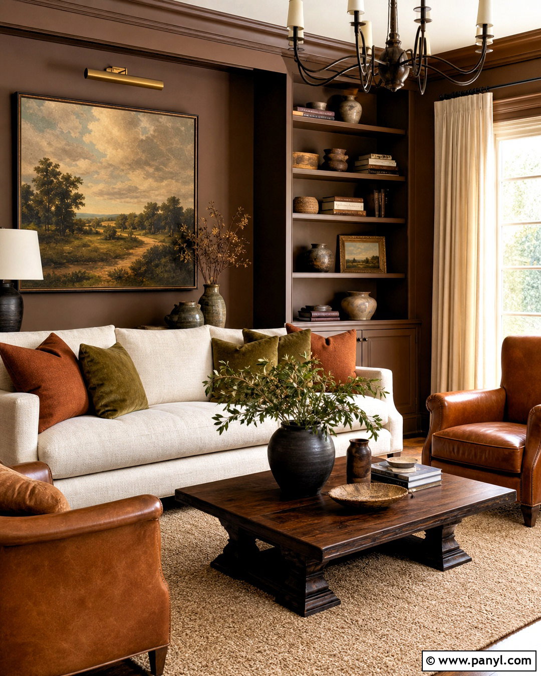
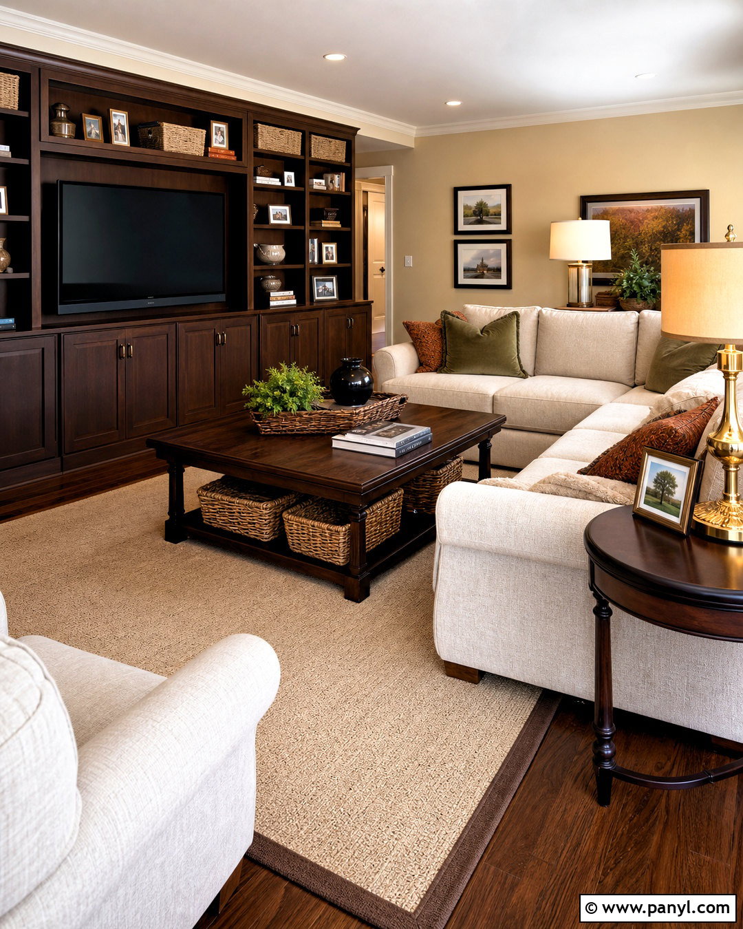
Cocoa brown walls wrap a living room in warmth while providing an elegant background for pale upholstery and natural materials. Select a medium brown with subtle red undertones rather than a flat gray-brown. Continue it across the walls and built-in cabinetry, using satin paint on the woodwork for quiet variation. A large cream sofa and two caramel leather chairs create a comfortable conversation area. Layer a tan wool rug beneath a dark wood coffee table, then add rust, moss green, and ivory pillows. Full-length cream curtains help reflect daylight around the room. Use bronze lighting, landscape paintings, and textured pottery as finishing elements. The resulting palette feels rich and grounded, but the generous light surfaces prevent the room from appearing dark or dated.
18. Warm Charcoal Wall Color Home Office
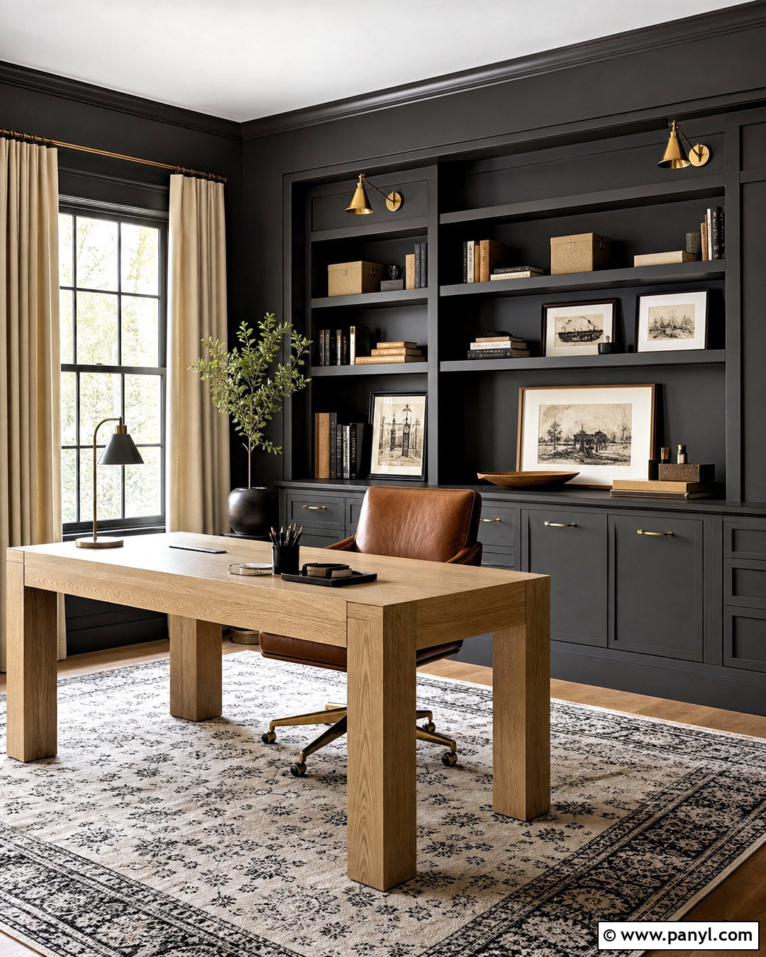
Warm charcoal walls give a home office modern definition without the harshness of pure black. Choose a charcoal containing soft brown undertones and apply it to the walls, trim, and built-in bookcases for a unified background. Bring in a pale oak desk with a simple shape to create clear contrast. A cognac leather desk chair adds warmth, while a cream and black patterned rug makes the workspace feel finished. Install adjustable brass sconces above the shelving and a white globe ceiling light overhead. Use linen curtains in a light oatmeal shade to frame the windows. Books, framed sketches, and neutral storage boxes can provide subtle variation across the dark shelves. Keep the central floor area open so the compact room remains functional and visually organized.
19. Soft Lavender Wall Color Guest Bedroom
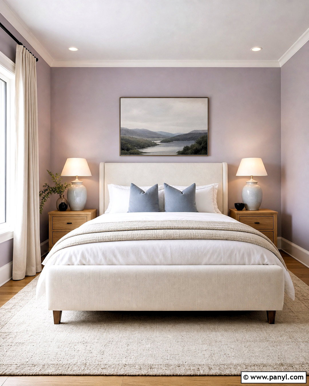
Soft lavender walls bring gentle color to a guest bedroom while remaining versatile enough for different decor preferences. Select a muted lavender with gray undertones rather than a bright purple pastel. Combine it with warm white trim, natural oak flooring, and an ivory upholstered bed. White bedding creates a fresh base, while dusty blue pillows and a beige quilt establish a balanced palette. Place light wood nightstands on both sides with compact ceramic lamps for symmetry. A cream rug adds softness and helps the furniture stand out from the floor. Use simple linen curtains in warm white and hang one peaceful landscape above the headboard. Small black accents, such as picture frames and drawer pulls, will sharpen the room without disturbing its light, restful character.
20. Two Tone Cream And Blue Wall Color
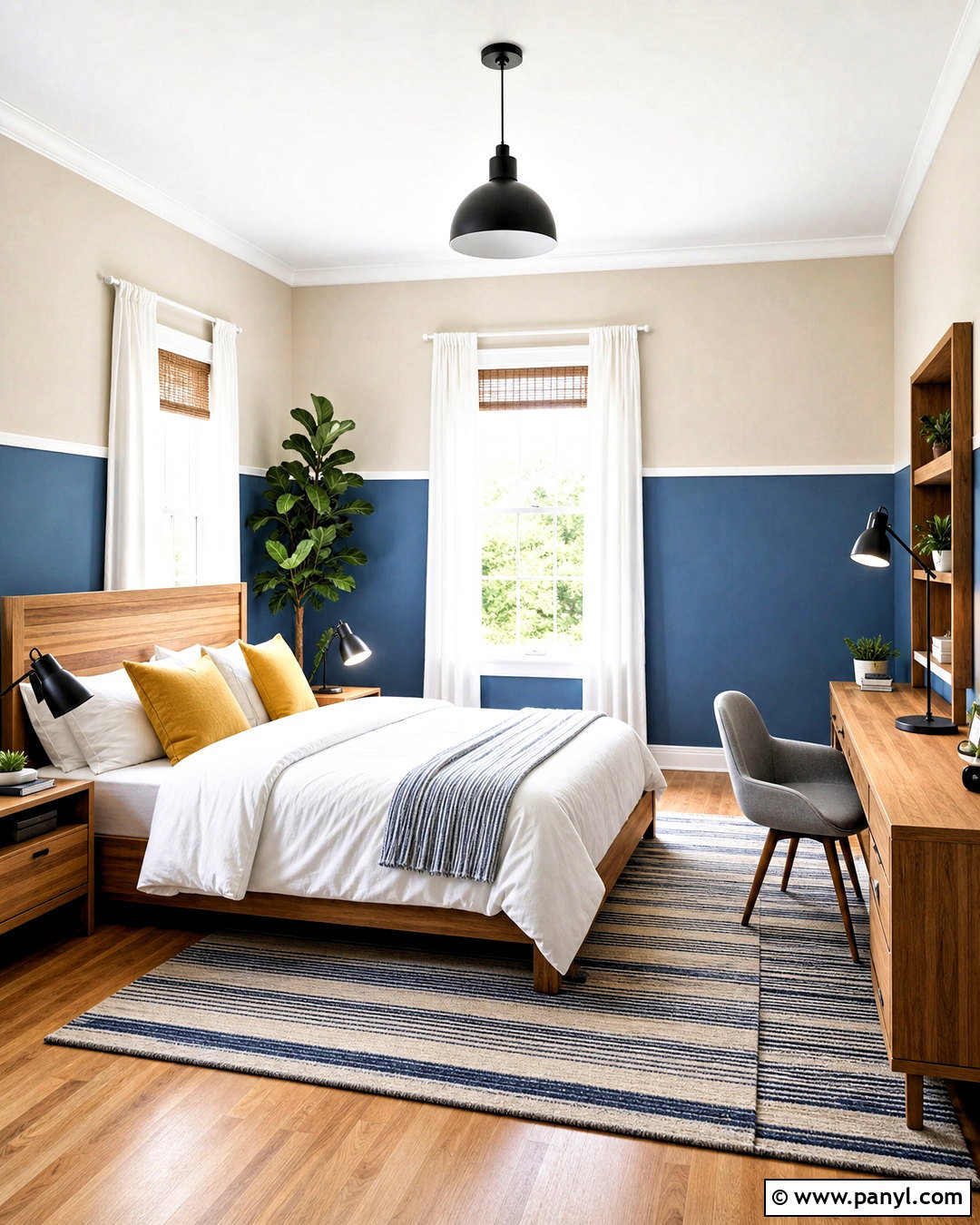
Two-tone walls can add architectural interest to a multipurpose bedroom without requiring elaborate paneling. Paint the lower third of each wall a dusty medium blue and use warm cream above it. Separate the colors with a narrow white chair rail for a clean transition. A natural wood bed and matching desk make the room suitable for guests, studying, or remote work. Dress the bed with white linens, a blue quilt, and muted mustard pillows. Choose a striped rug that repeats the cream and blue palette without matching it exactly. White curtains keep the windows bright, while black task lighting introduces crisp contrast. Consistent color placement around the entire room makes the scheme feel intentional and more complete than a single painted accent wall.
Conclusion:
Successful wall color design is about more than following a trend or choosing a favorite paint chip. The wall shade should connect naturally with the room’s light, flooring, furniture, trim, textiles, and purpose. Warm neutrals create flexible foundations, while botanical greens, dusty blues, earthy reds, and deeper browns deliver more personality. Before painting the entire room, test large samples beside permanent materials and observe them throughout the day. Repeat the chosen wall color in small decorative details, but include enough contrast to keep the space layered. Whether you prefer subtle neutrals or enveloping color, these **20 wall color design ideas** offer complete, practical looks that can help every room feel more comfortable, coordinated, and thoughtfully finished.

Related Ideas and Inspiration:

Leave a Reply