
Fresh paint can change how a room feels before you replace a single piece of furniture. These 20 interior wall paint ideas explore complete, livable looks built around warm neutrals, earthy greens, soft blues, saturated colors, and creative paint techniques. You will find options for living rooms, bedrooms, kitchens, bathrooms, entryways, offices, and compact spaces. Current color direction favors warmer undertones, nature-inspired shades, tonal layering, and immersive color drenching rather than relying only on a traditional accent wall. () Each look also includes furniture, lighting, flooring, trim, and decor guidance, making it easier to create a balanced room instead of choosing paint in isolation. Use the sections below to find practical, personalized 20 interior wall paint ideas.

1. Warm Greige Living Room Wall Paint
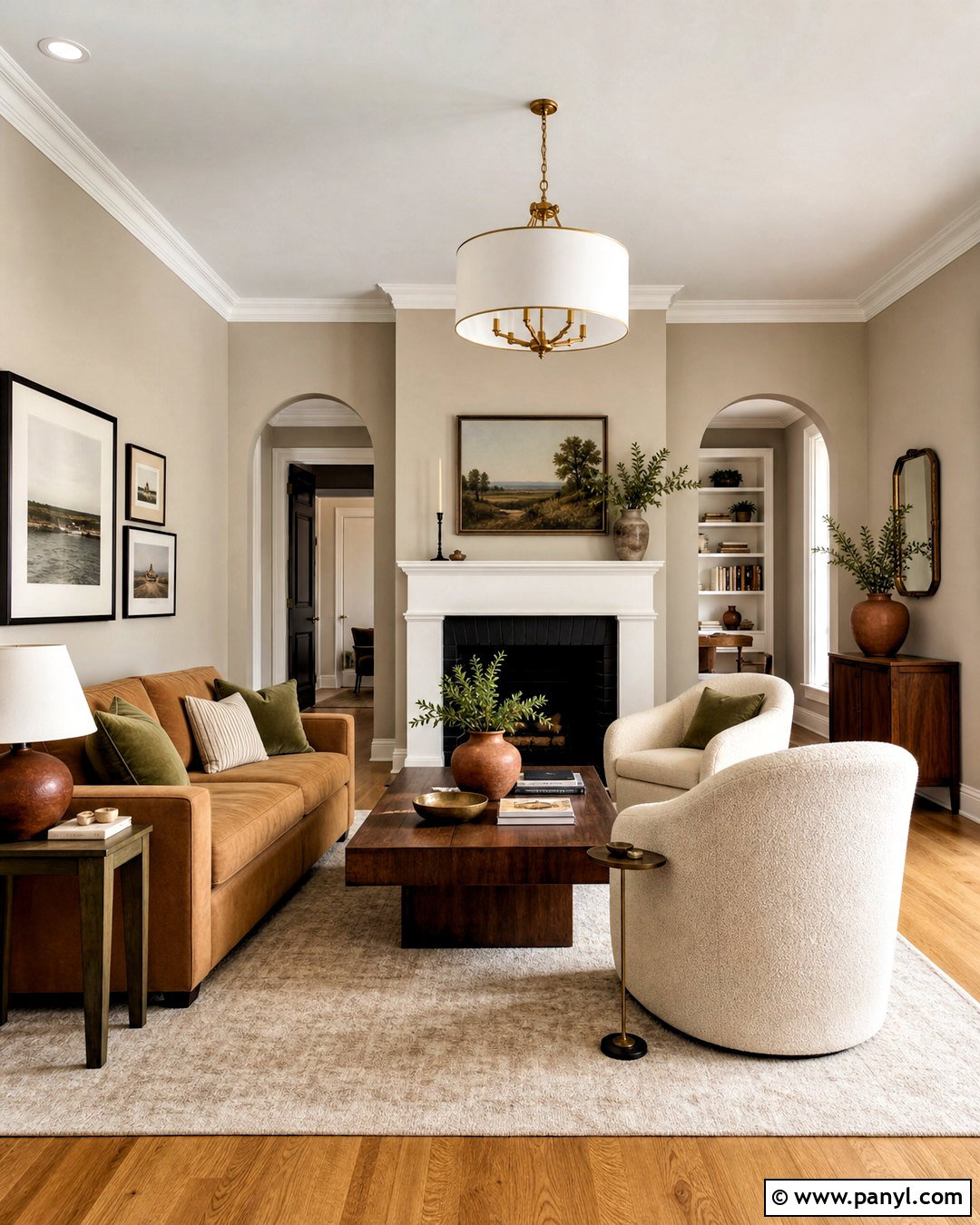
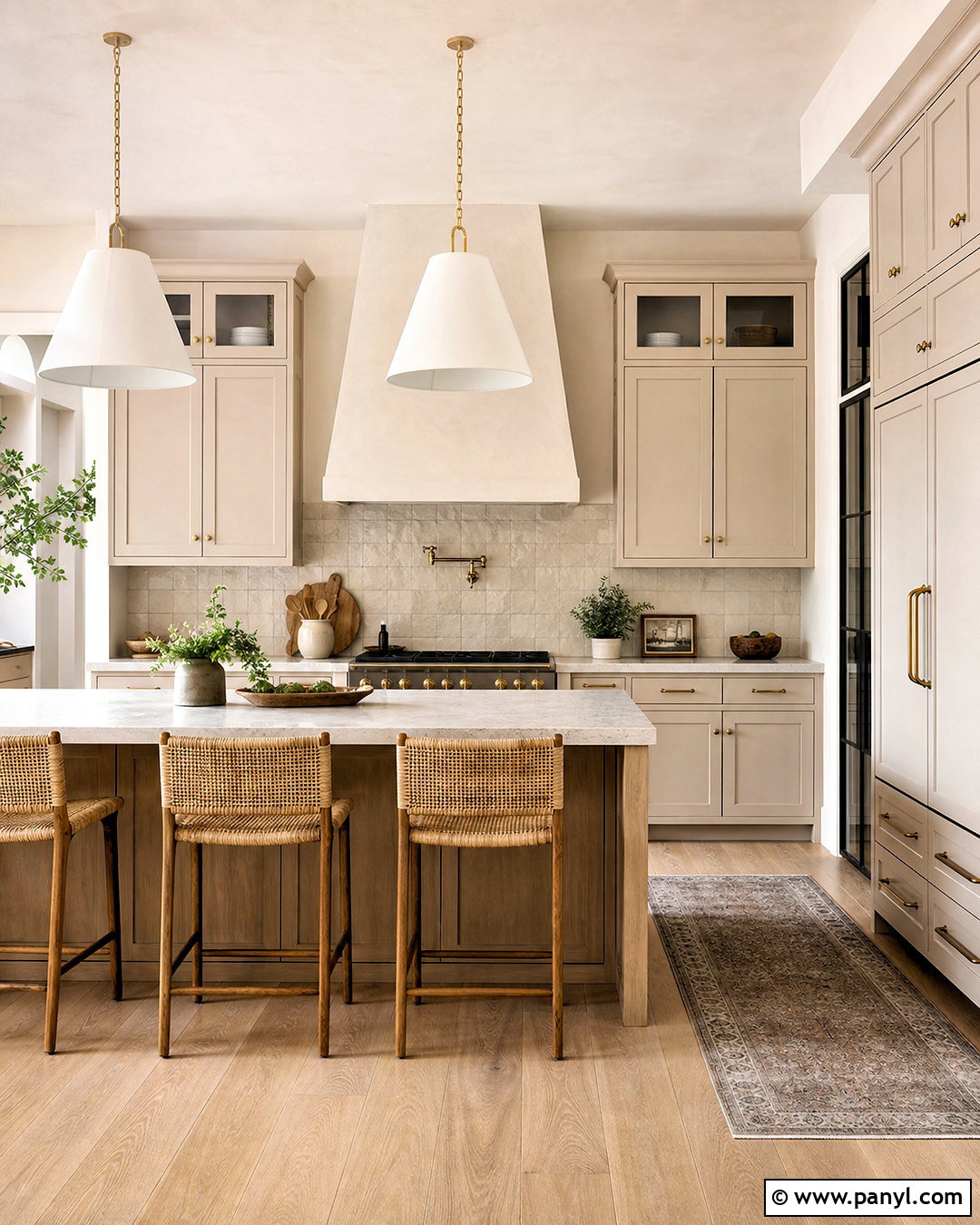
Warm greige creates a comfortable living room that feels polished without looking overly formal. Choose a beige-gray shade with subtle taupe undertones for the walls, then use creamy white on the ceiling and trim. Ground the room with a medium-toned oak floor and a large oatmeal wool rug. A camel-colored sofa, two ivory boucle chairs, and a walnut coffee table add warmth without competing with the walls. Introduce muted olive, rust, and chocolate through pillows, pottery, and framed artwork. Brushed brass lighting brings a soft reflective finish to the neutral palette. Before committing, test large paint samples beside the flooring during morning and evening light. The finished room should feel layered, welcoming, and versatile enough to support seasonal decor changes.
2. Sage Green Bedroom Wall Paint
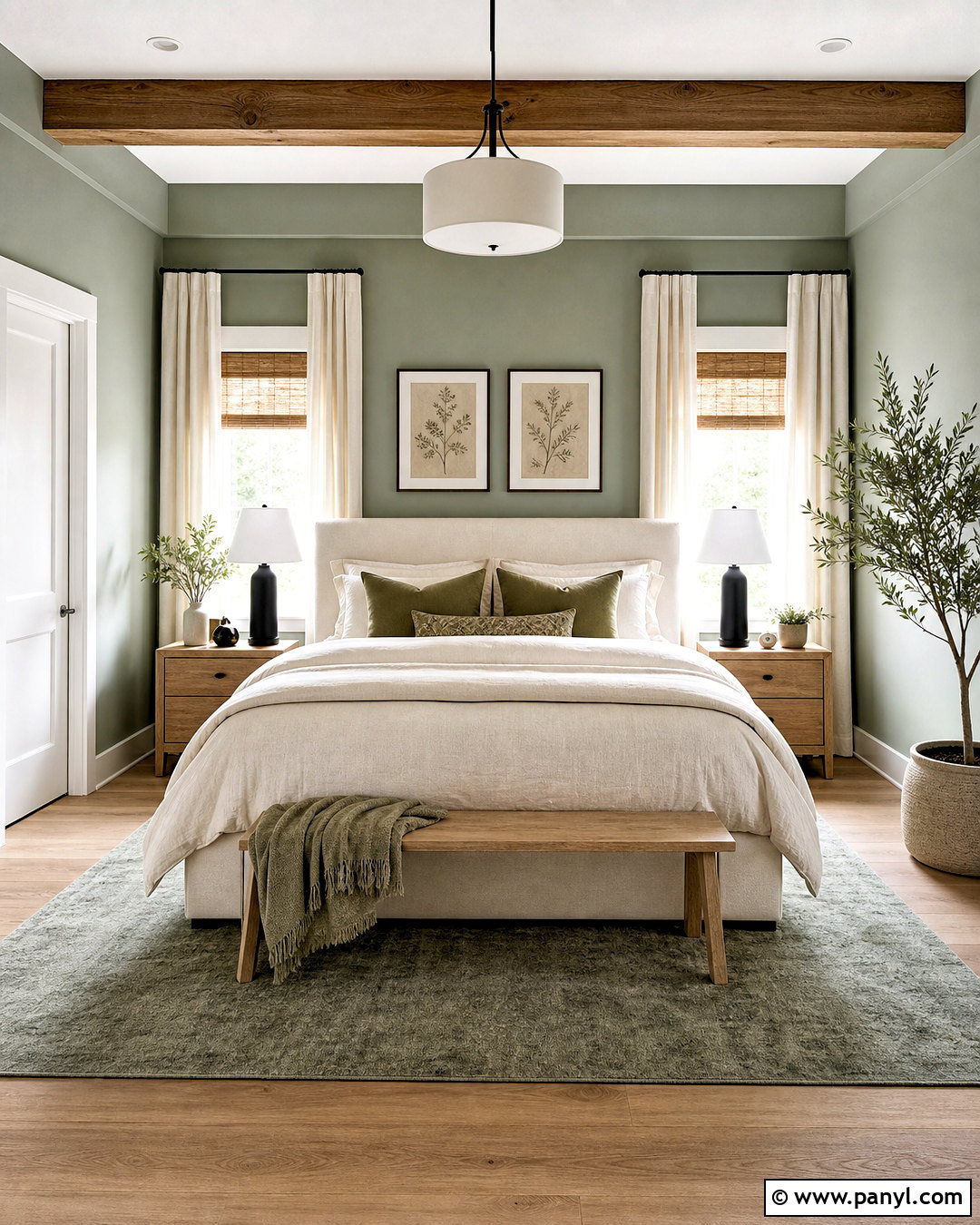
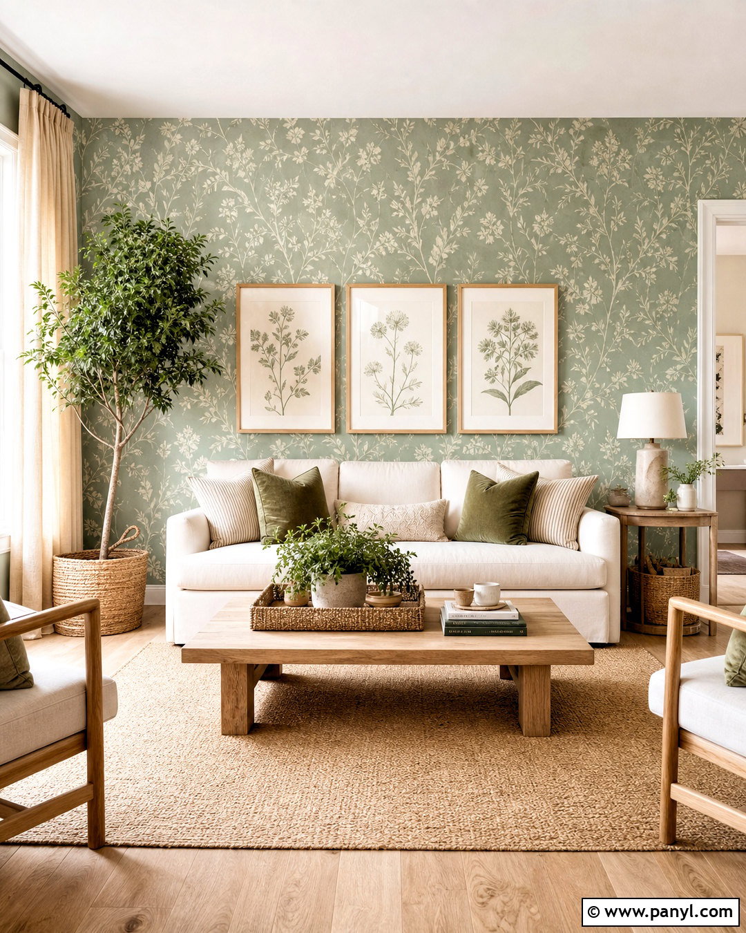
Soft sage green walls can make a bedroom feel restful, fresh, and connected to nature. Select a muted shade with gray undertones rather than a bright botanical green. Paint all four walls for a complete look, then keep the ceiling and trim warm white. An upholstered oatmeal bed, pale oak nightstands, and natural linen bedding maintain the quiet mood. Add deeper olive pillows, a textured cream throw, and small black lamps for contrast. Woven shades soften the windows, while full-length ivory curtains make the room feel finished. A vintage-inspired rug with faded beige and green details ties the palette together. Keep artwork simple and organic, such as pressed botanicals or an understated landscape. This combination works especially well in bedrooms receiving gentle morning light.
3. Deep Blue Dining Room Wall Paint
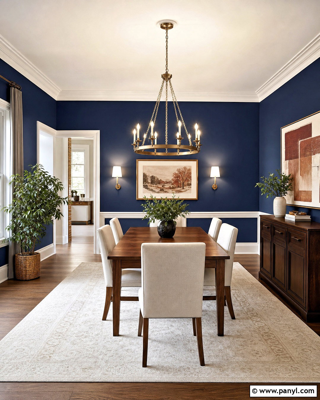
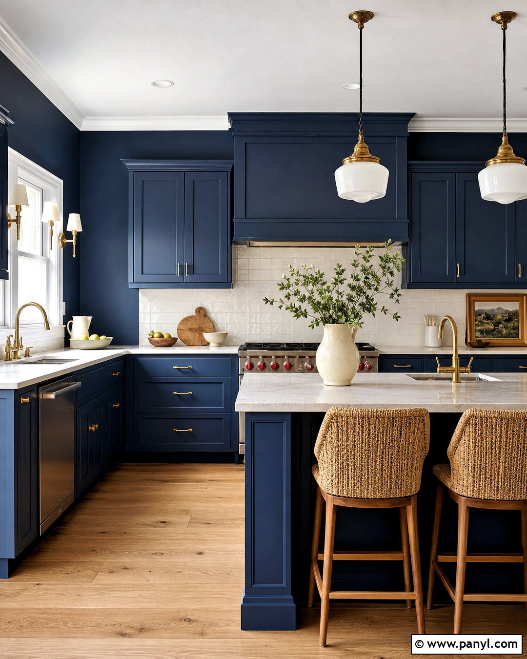
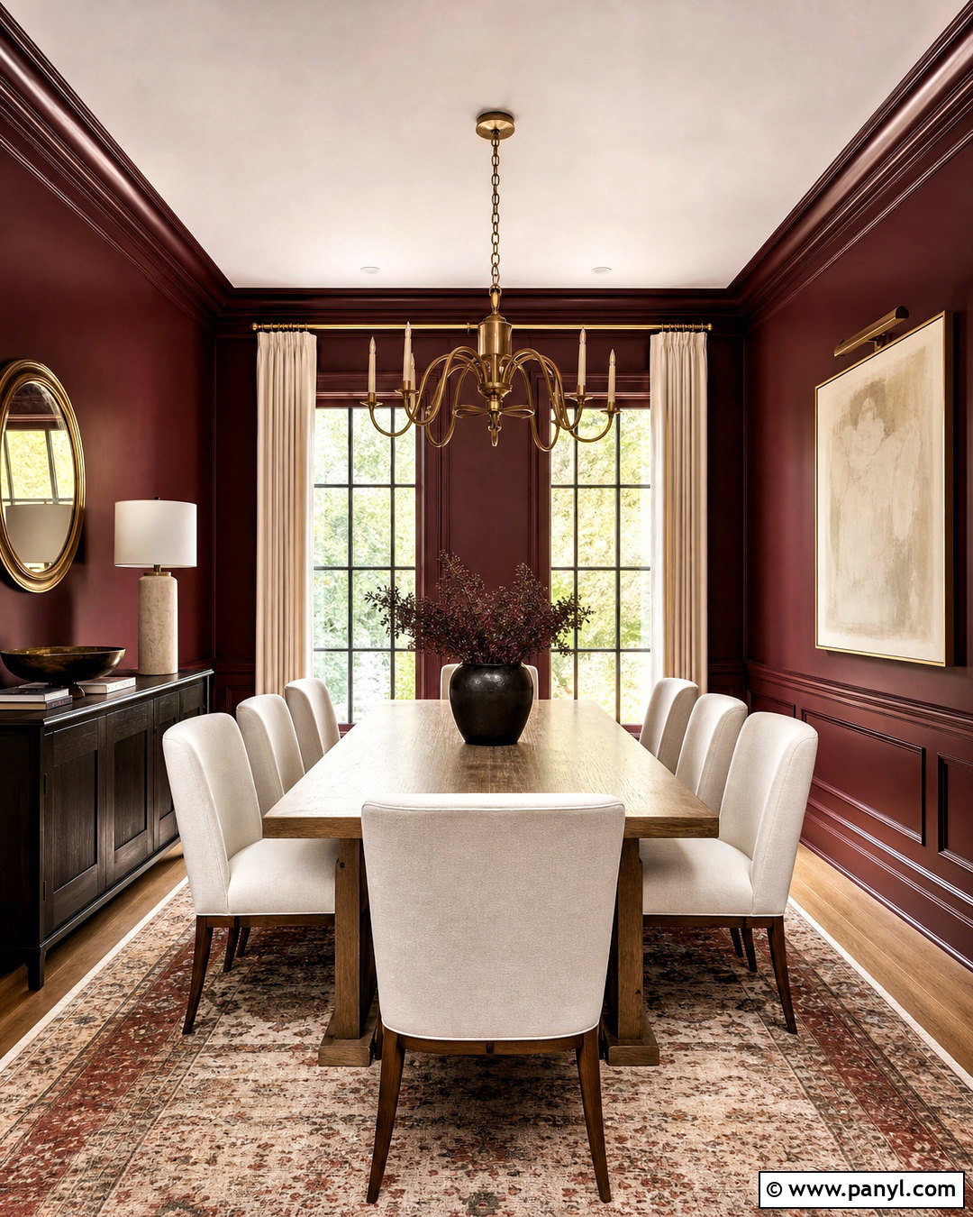
Deep blue wall paint gives a dining room a dramatic identity while remaining easy to pair with classic materials. Choose a rich navy with slightly softened undertones and carry it across every wall. Crisp white trim creates definition, although matching blue trim can produce a more immersive result. Place a medium-brown wood dining table at the center with upholstered cream chairs or woven cane seating. A large brass chandelier adds warmth and prevents the palette from appearing cold. Use an ivory rug to brighten the floor and hang oversized art with rust, cream, or ochre details. Natural greenery introduces freshness without distracting from the color. Balance the dark walls with multiple light sources, including sconces or table lamps on a sideboard, so the dining room feels intimate rather than dim.
4. Terracotta Living Room Wall Paint
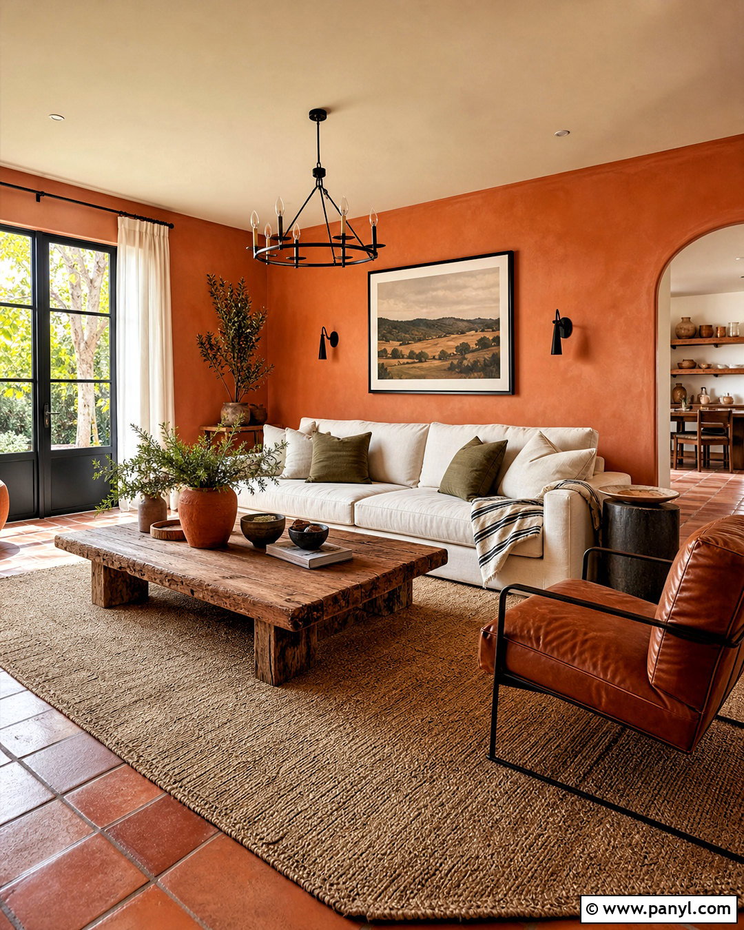
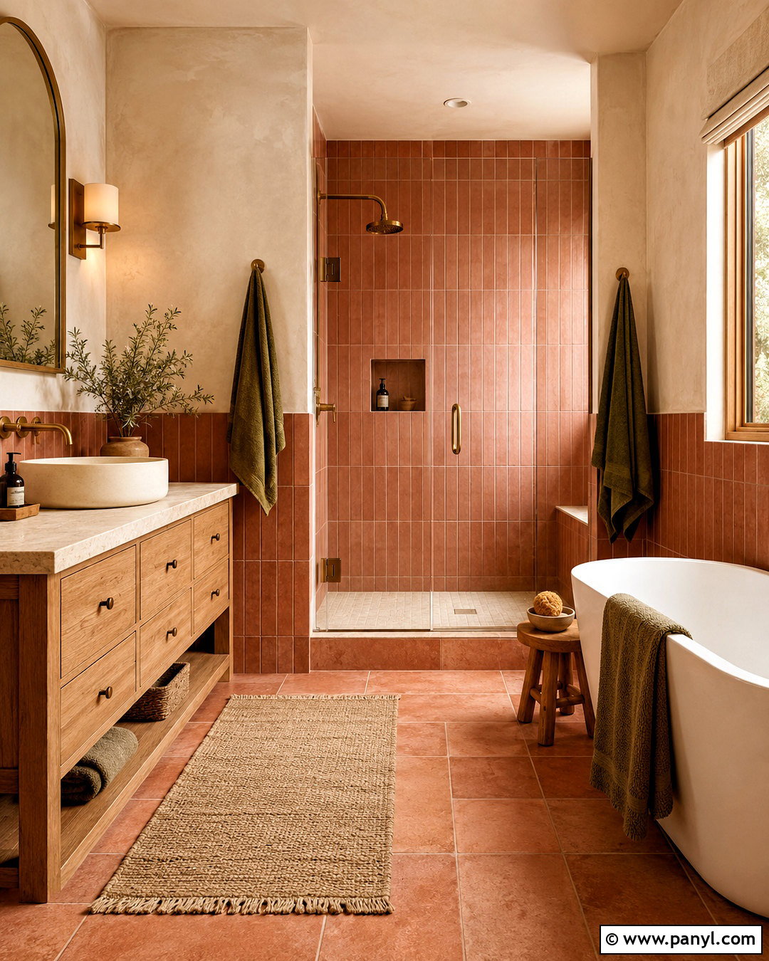
Terracotta walls bring warmth and personality to a living room, especially when paired with relaxed natural materials. Look for a dusty clay shade with brown or muted orange undertones instead of a sharp, vivid orange. Cover all four walls, then use a soft cream ceiling to keep the space open. Furnish the room with an off-white linen sofa, cognac leather chair, rustic oak coffee table, and flat-weave beige rug. Black metal lighting adds a clean modern edge. Layer in olive green pillows, striped textiles, handmade pottery, and simple landscape prints. Keep window treatments light with woven shades or natural linen panels. Terracotta can shift noticeably throughout the day, so sample it on several walls. The final room should feel earthy, sun-warmed, and comfortably collected rather than overly themed.
5. Soft Blue Bathroom Wall Paint
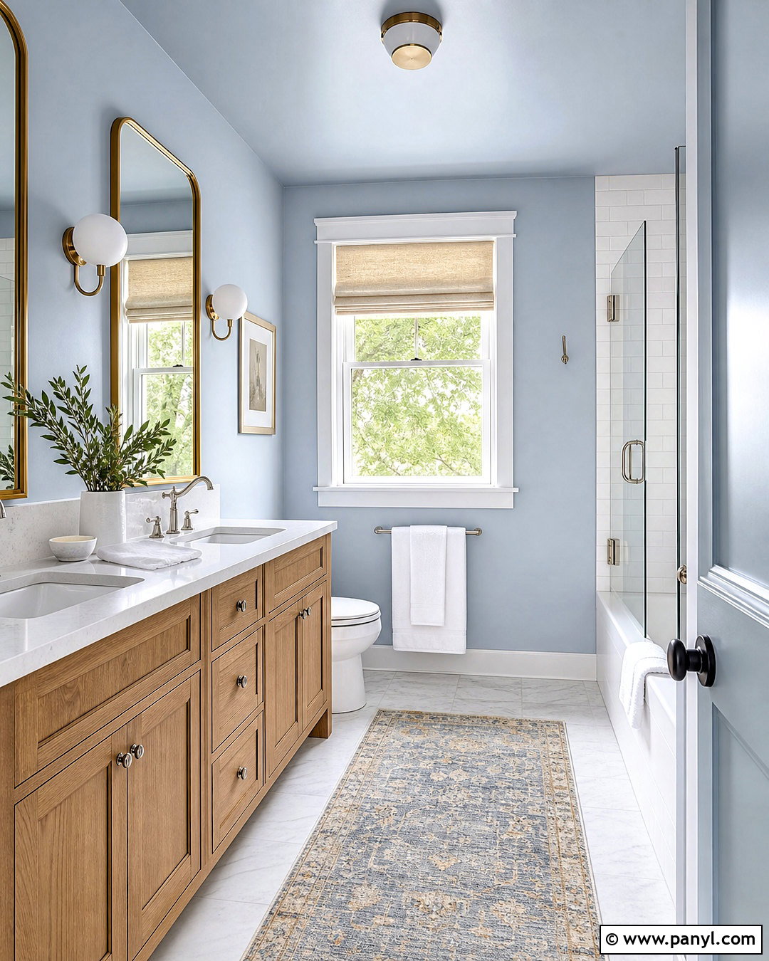
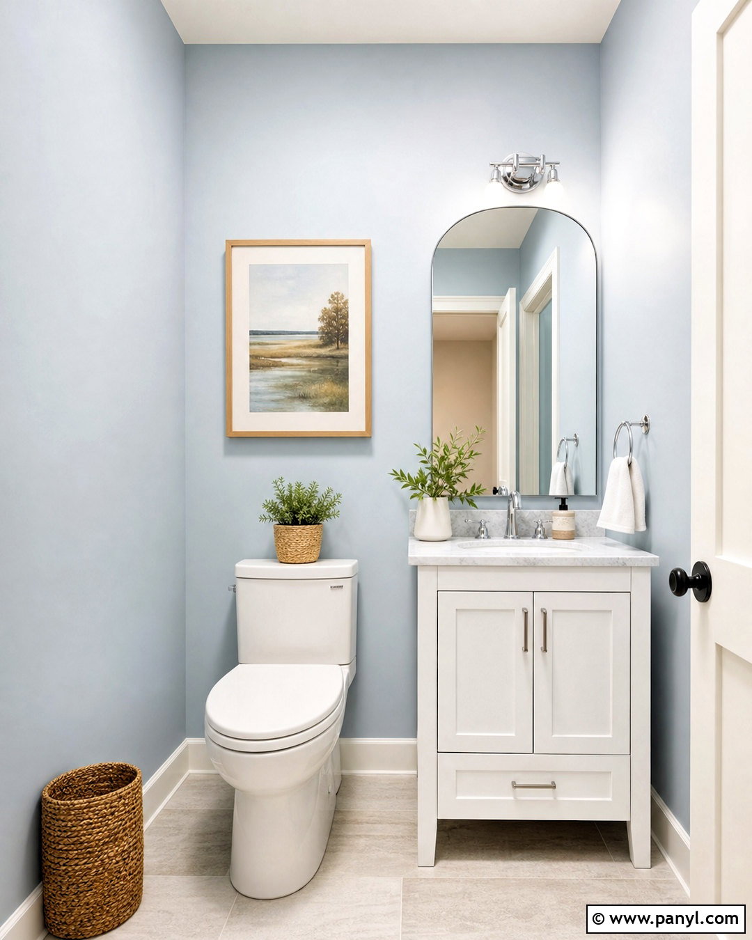
A soft blue bathroom feels clean and peaceful without depending on stark white surfaces. Choose a pale blue with a slightly gray or green undertone, then pair it with white tile, light grout, and a natural oak vanity. Paint the upper walls and ceiling in the same blue to create a gentle, enveloping effect. Polished nickel or brushed brass fixtures introduce subtle shine, while a white quartz countertop keeps the room practical and bright. Add a rounded mirror, globe sconces, and neatly folded white towels. A small vintage-style rug with faded blue and sand tones gives the space character. Use paint formulated for humid rooms and prepare the walls carefully around the shower and sink. The completed bathroom should look airy, cohesive, and easy to maintain.
6. Mushroom Bedroom Wall Paint
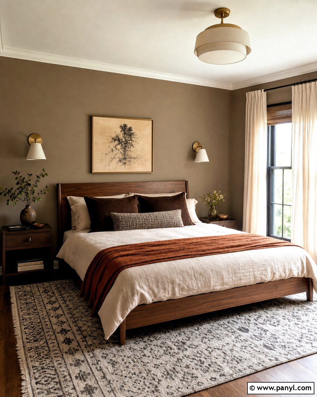
Mushroom wall paint offers more depth than beige while remaining calm enough for a restful bedroom. This adaptable color usually combines taupe, brown, and gray, so choose an undertone that complements the flooring and natural light. Paint the walls mushroom and use a slightly lighter tonal shade on the trim rather than bright white. Build the room around a walnut bed, flax linen bedding, and warm ivory curtains. Add chocolate brown pillows, a rust-colored throw, and aged brass bedside sconces for richer contrast. A patterned rug in cream, taupe, and charcoal prevents the palette from appearing flat. Limit accessories to ceramics, books, and one large piece of understated artwork. This complete scheme feels sophisticated but still comfortable, making it suitable for traditional, modern, or transitional bedrooms.
7. Olive Green Home Office Wall Paint
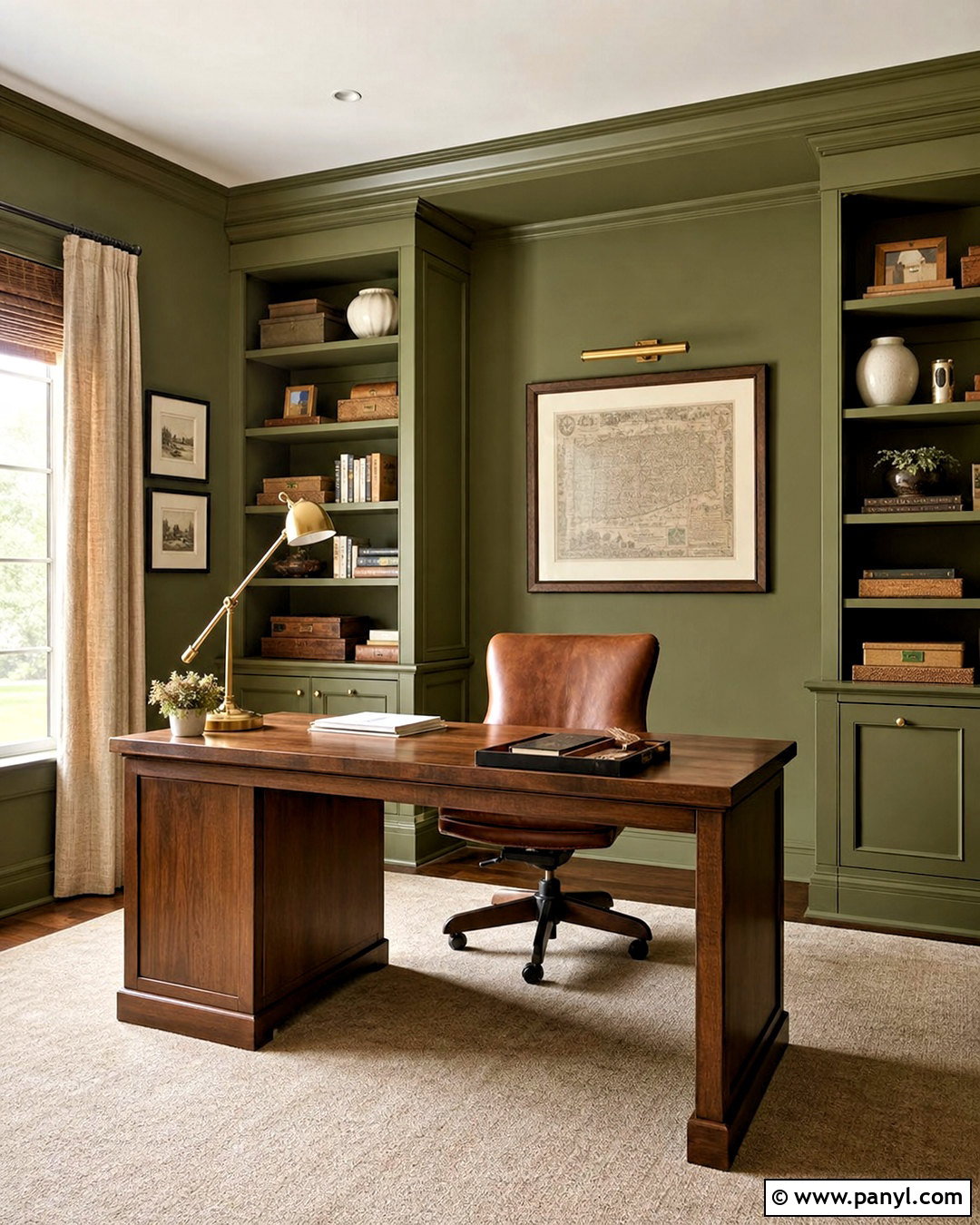
Olive green gives a home office focus and character while working beautifully with wood furniture. Choose a medium, earthy olive that feels grounded rather than yellow. Paint the walls, built-in shelves, and trim the same shade for a cohesive color-drenched effect. A walnut desk and cognac leather chair reinforce the warm palette, while a cream rug keeps the floor area light. Add antique brass task lighting and simple framed prints with generous white matting. Organize books and office supplies in matching boxes so the painted shelves remain visually calm. Natural linen curtains filter glare without making the room heavy. If the office receives limited daylight, choose an olive with enough softness to avoid a murky finish. The result is productive, tailored, and welcoming during long work sessions.
8. Cream Kitchen Wall Paint
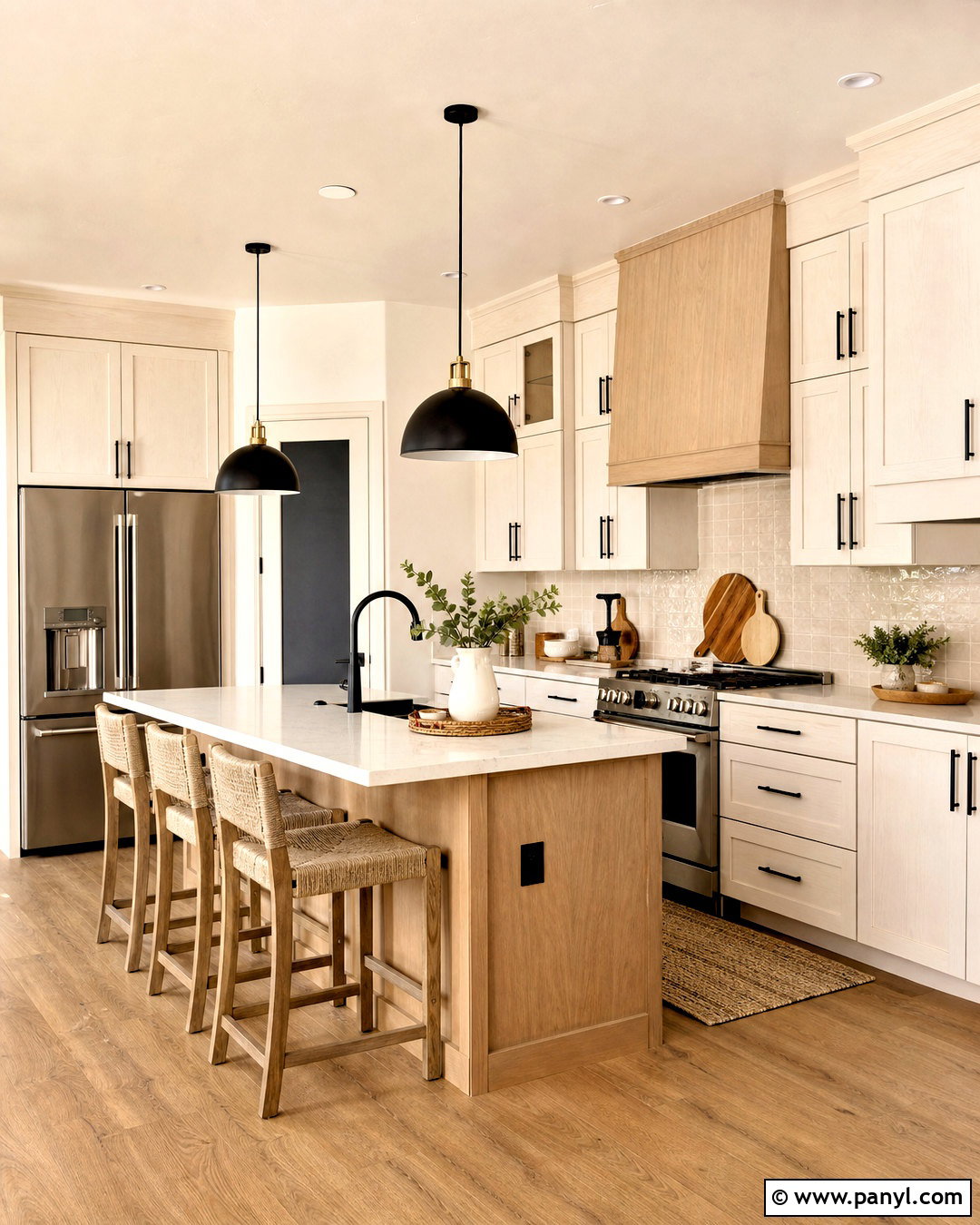
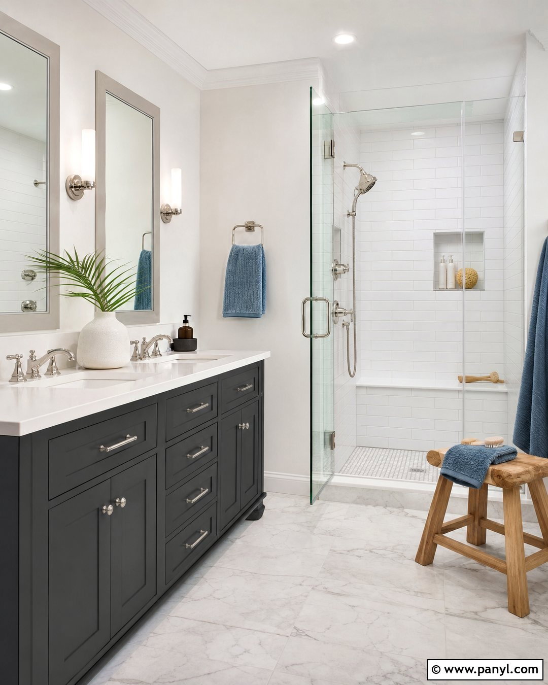
Cream wall paint can warm up a kitchen without making it look yellow or dated. Select a soft ivory with restrained beige undertones and compare it directly with the cabinet color before painting. Use the cream across the walls and ceiling to create continuity, then introduce slightly deeper trim for gentle definition. White oak cabinets, creamy quartz counters, and a handmade off-white tile backsplash create a layered tonal foundation. Matte black hardware and pendant lights add crisp contrast. Complete the room with woven counter stools, warm wood cutting boards, and small green plants. If the kitchen has cool gray flooring, choose a more balanced cream rather than a strongly golden shade. This coordinated approach produces a bright, inviting kitchen in which the wall paint supports every surface instead of competing with it.
9. Dusty Rose Bedroom Wall Paint
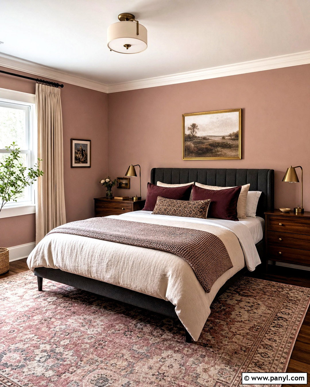
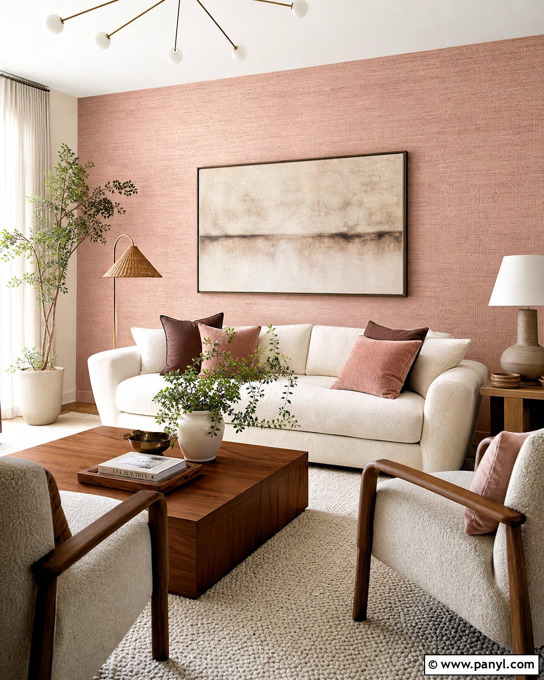
Dusty rose walls can create a warm, grown-up bedroom when the shade contains muted brown or gray undertones. Paint every wall in the softened pink, then use warm white for the ceiling and baseboards. A charcoal upholstered bed provides structure, while ivory bedding keeps the room light. Add walnut nightstands, pleated cream lampshades, and brushed brass accents for an elegant mix of finishes. Pillows in burgundy, taupe, and muted floral patterns build depth without making the room overly sweet. Ground the scheme with a vintage-style rug containing faded rose and deep brown. Natural linen curtains soften daylight and complement the earthy undertones. Keep decorative objects restrained and sculptural. This complete palette feels cozy and sophisticated, working equally well in traditional homes and simple modern interiors.
10. Charcoal Powder Room Wall Paint
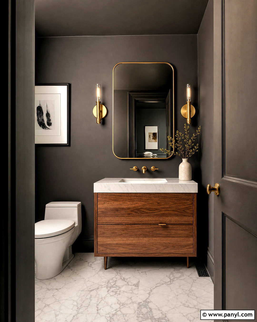
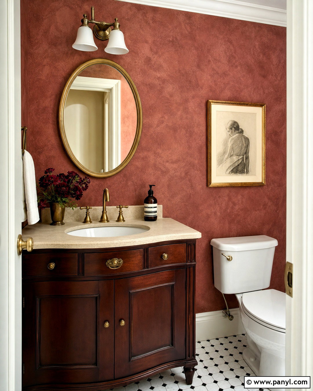
A small powder room is an excellent place to use charcoal wall paint with confidence. Choose a deep charcoal with warm undertones and carry it onto the ceiling, trim, and door for a seamless finish. Pair the dark envelope with a compact white stone sink or a medium-toned wood vanity. A large brass-framed mirror and matching wall sconces reflect light around the room. Use a pale marble or patterned black-and-white floor to introduce contrast beneath the saturated walls. One small framed artwork and a simple vase are enough for decoration. Because every imperfection can show under deep paint, smooth the walls and apply a consistent primer first. The finished powder room should feel intentional, polished, and atmospheric, proving that a compact space can successfully handle a strong color.
11. Pale Yellow Breakfast Nook Wall Paint
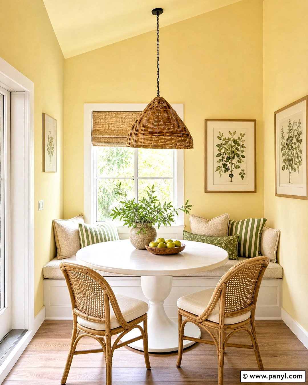
Pale yellow can make a breakfast nook feel sunny even when natural light is limited. Select a buttery shade softened with cream rather than a bright lemon tone. Paint the surrounding walls and continue the color onto the ceiling to give the small dining area its own identity. Add a built-in white oak bench with washable oatmeal cushions and a round pedestal table in warm white. Chairs in natural cane or light wood maintain the casual mood. Introduce sage green through striped pillows, ceramics, or a small Roman shade. A woven pendant light provides texture above the table, while simple botanical prints add quiet pattern. Keep nearby kitchen colors warm and related. This cheerful, complete look feels fresh in the morning but remains soft enough for everyday family meals.
12. Two Tone Entryway Wall Paint
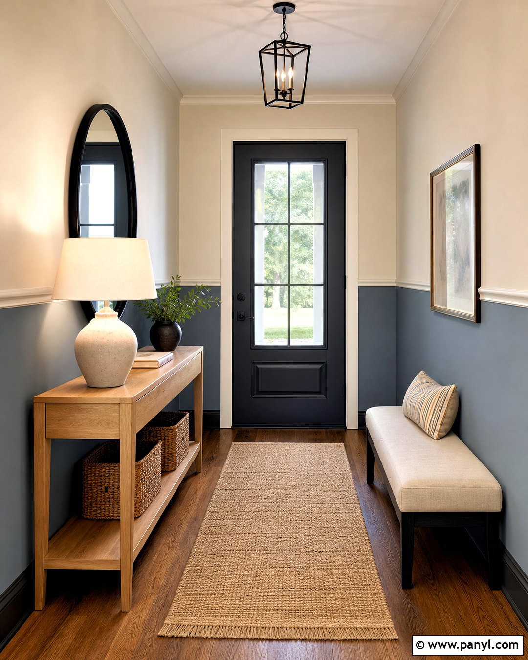
A two-tone paint treatment brings structure and durability to a busy entryway. Use a deeper blue-gray or muted green on the lower half of the walls and a warm off-white above. Divide the colors at approximately chair-rail height, adding simple molding for a tailored transition. Continue the darker shade onto the baseboards so everyday scuffs are less noticeable. Complete the entry with a slim oak console, round black mirror, woven runner, and covered storage baskets. A small bench with neutral upholstery creates a practical place to remove shoes. Add one ceramic lamp and a restrained arrangement of branches for height. Keep doors and upper trim in the warm off-white. The overall scheme should feel organized and welcoming while visually connecting adjacent rooms through coordinated undertones and materials.
13. Teal Reading Room Wall Paint
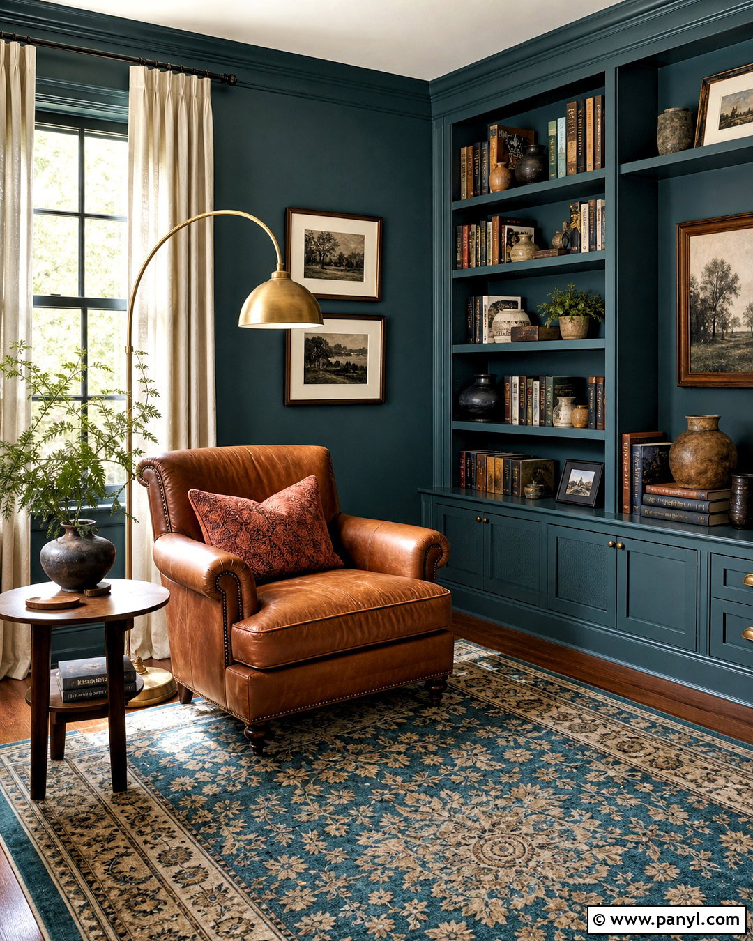
A rich teal paint scheme can turn an unused sitting area into a cozy reading room. Choose a blue-green shade with smoky undertones and apply it to the walls, trim, and built-in bookcases. Keep the ceiling a softer version of the same color if full saturation feels too heavy. Place a caramel leather chair near the window with a curved brass floor lamp and small walnut side table. A cream-and-teal patterned rug lightens the floor, while rust and ochre pillows introduce warm contrast. Arrange books with pottery and framed photographs rather than filling every shelf. Linen curtains in warm ivory soften the edges of the room. This coordinated design makes teal feel purposeful and sophisticated, creating a comfortable retreat where furniture, lighting, storage, and wall color support the same mood.
14. White Wall Paint With Colorful Trim
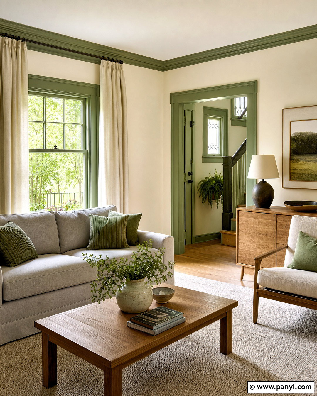
White walls gain personality when paired with colorful doors, baseboards, and window trim. Start with a soft, warm white that suits the room’s natural light. Paint the architectural details a muted blue, sage green, dusty terracotta, or gentle taupe. For a balanced living room, pair white walls and sage trim with a light gray sofa, oak tables, and an ivory rug. Repeat the trim color in pillows, ceramics, or framed artwork so it feels connected to the rest of the space. Keep the ceiling white to maintain openness. Satin or semi-gloss paint makes the colored trim easier to clean and creates a subtle sheen contrast against matte walls. The finished design feels fresh and detailed while remaining flexible enough for changing furniture, textiles, and decorative accents.
15. Chocolate Brown Bedroom Wall Paint
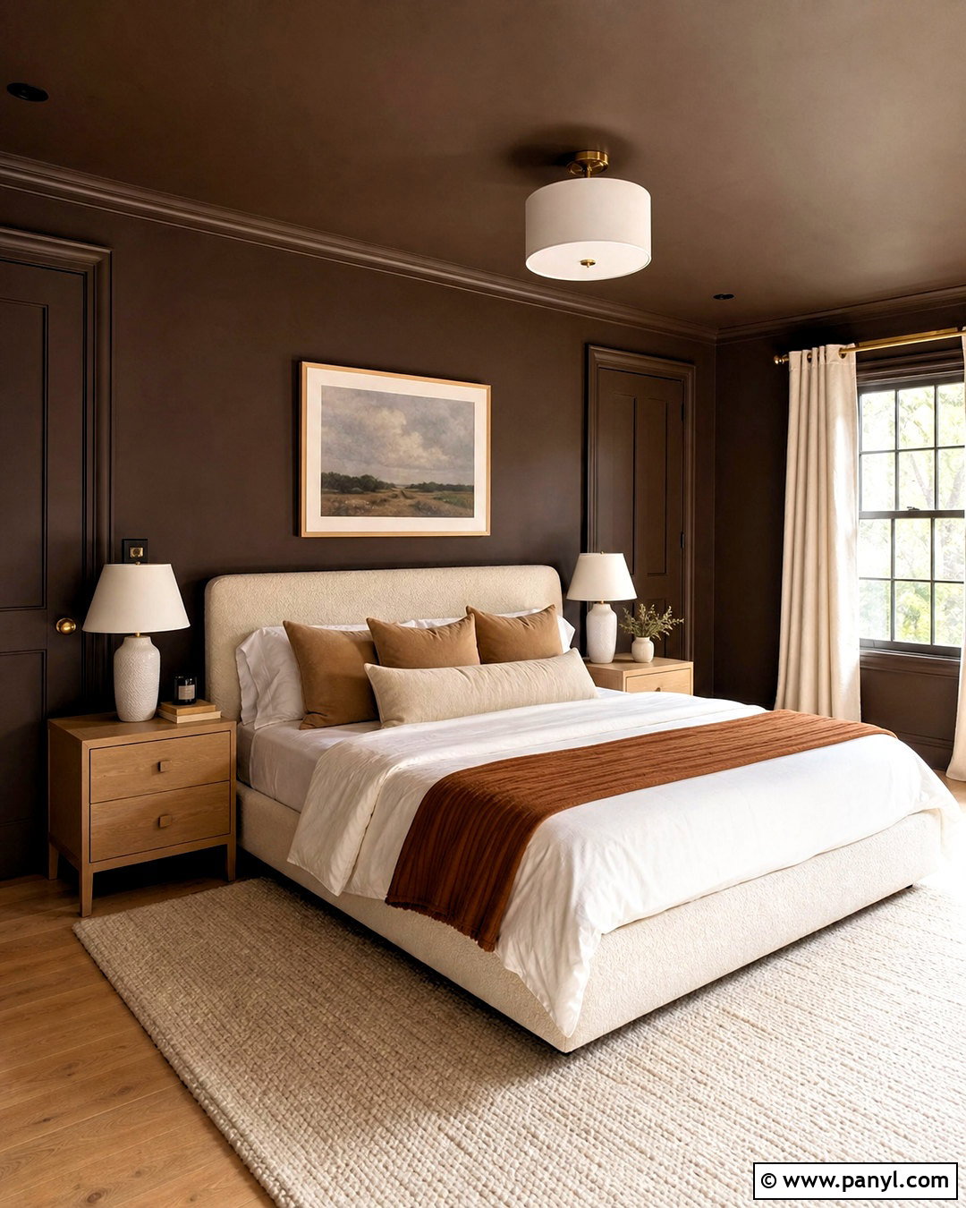
Chocolate brown walls can make a bedroom feel cocooning, especially when balanced with pale textiles and warm lighting. Choose a deep brown with red or neutral undertones rather than a nearly black shade. Color-drench the walls, trim, doors, and ceiling for a smooth, uninterrupted effect. Place an ivory upholstered bed against the darkest wall and layer it with cream, camel, and muted rust bedding. Light oak nightstands provide contrast, while ceramic lamps with linen shades cast an even glow. Use a pale wool rug to soften the floor and full-length natural curtains to frame the windows. Minimal artwork in cream mats keeps the room visually quiet. The complete palette should feel rich but restful, with enough light surfaces and tactile materials to prevent the brown paint from overpowering the space.
16. Lavender Guest Room Wall Paint
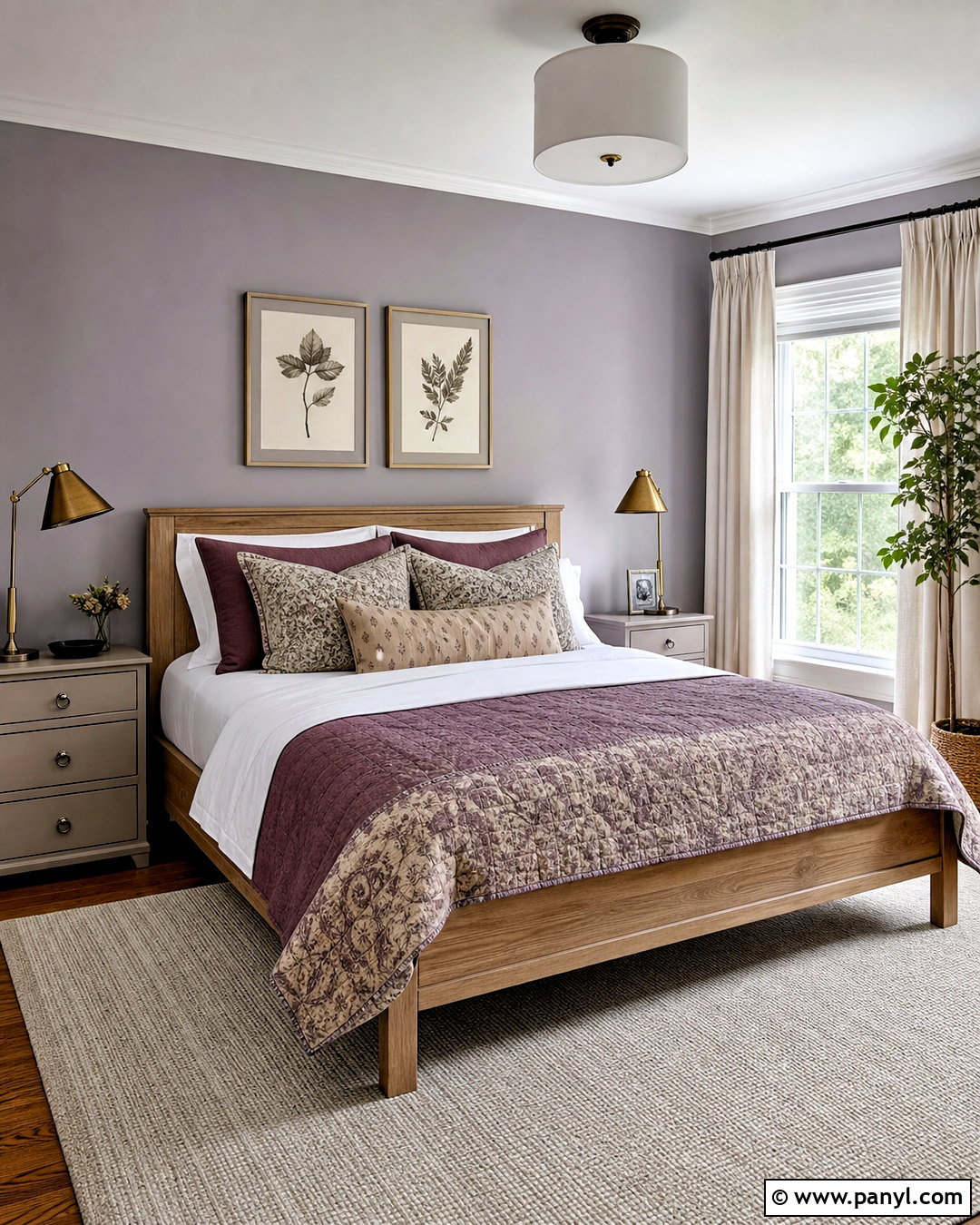
Muted lavender brings gentle color to a guest room without making the design feel childish. Look for a dusty lavender with gray undertones and paint all four walls, leaving the ceiling warm white. Pair it with a natural oak bed, crisp white sheets, and a quilt featuring soft plum, blue, and beige. Mushroom-colored nightstands create a grounded transition between the cool walls and warm wood. Add aged brass lamps, simple botanical art, and a flat-weave cream rug for a comfortable finish. Window treatments in oatmeal linen help filter strong sunlight and soften the lavender throughout the day. Avoid overly bright purple accessories, which can make the palette feel disconnected. This thoughtful combination creates a welcoming guest bedroom that feels colorful, calm, and easy to coordinate with practical furnishings.
17. Painted Arch Living Room Wall
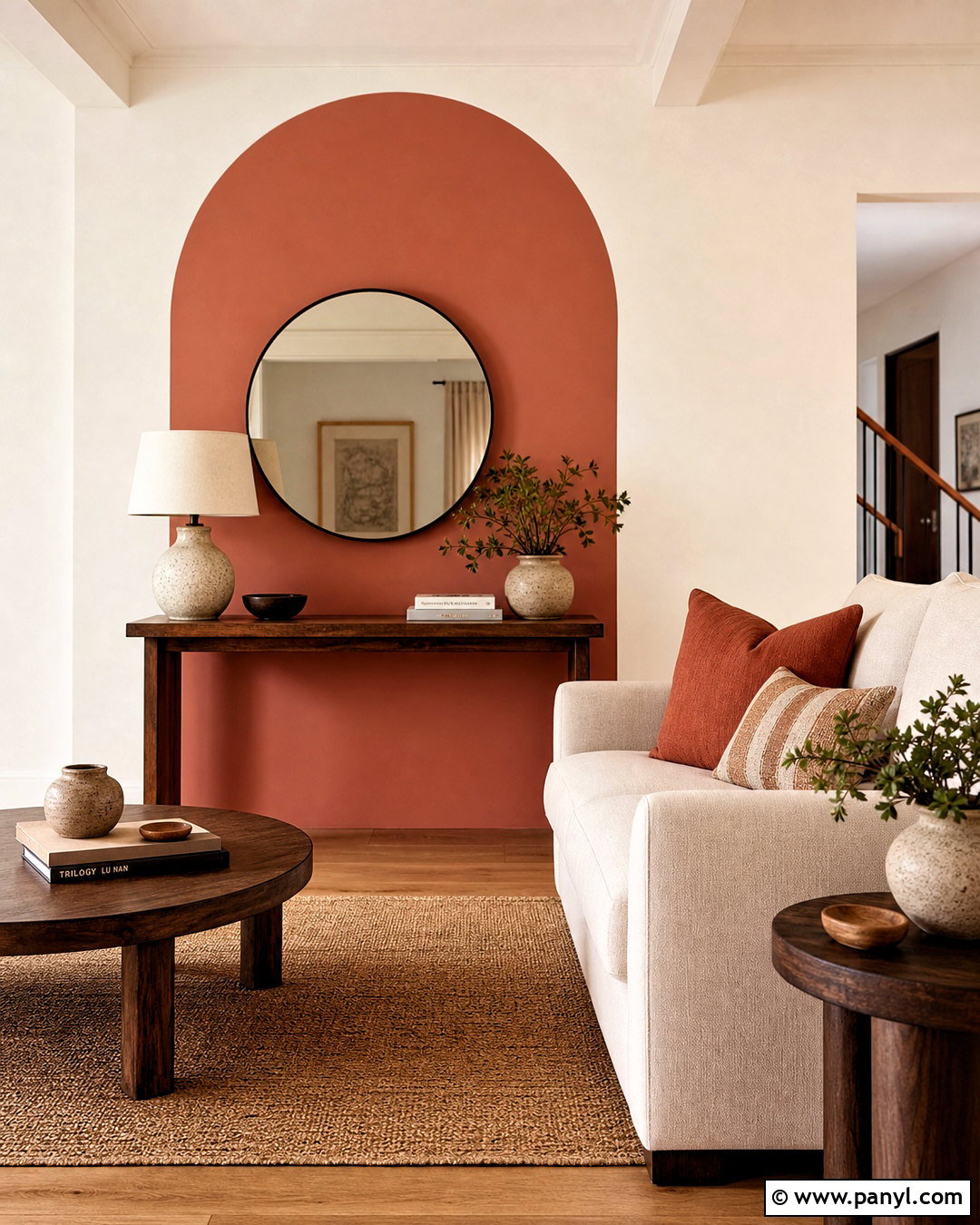
A painted arch creates a strong focal point without requiring an entire accent wall. Use warm terracotta, deep sage, or muted blue to frame a console, reading chair, or small desk. Keep the surrounding living room walls creamy white so the curved shape remains clear. For a complete arrangement, center a slim walnut console inside a terracotta arch and add a large round mirror, ceramic lamp, and stacked books. Place a neutral sofa nearby with pillows that repeat the arch color. An oak floor and woven rug maintain warmth throughout the room. Measure the curve carefully and use painter’s tape with a steady detail brush for clean edges. The final look should feel connected to the furniture layout, not like a random painted shape placed on an empty wall.
18. Limewash Living Room Wall Paint
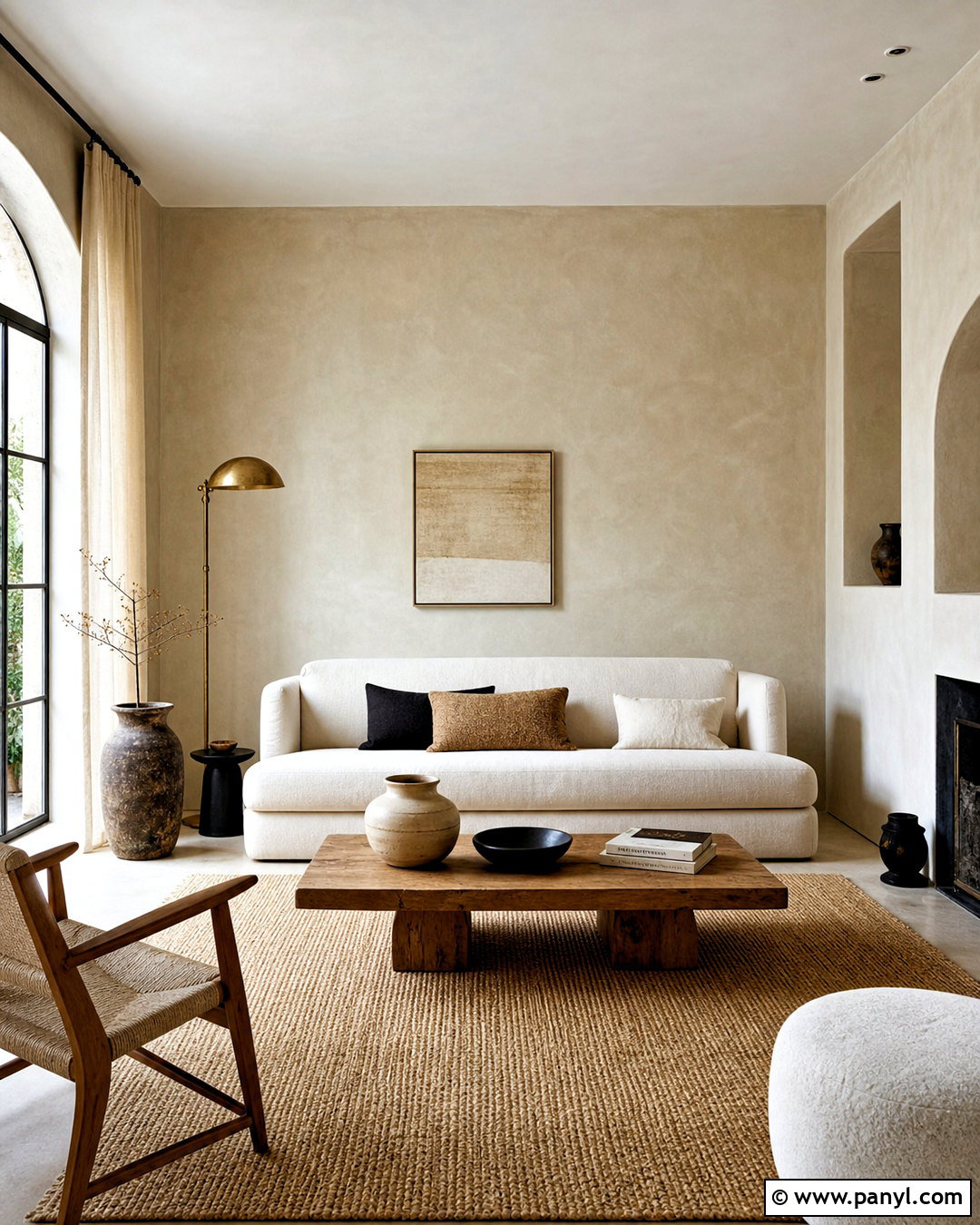
Limewash-style walls add soft movement and mineral texture to a living room without depending on bold color. Choose a warm beige, pale clay, or muted taupe finish and apply it across every wall for consistency. Pair the textured surface with a low cream sofa, sculptural oak coffee table, and large natural fiber rug. Linen curtains, handmade ceramics, and an aged brass floor lamp reinforce the relaxed character. Keep artwork minimal so the variation in the walls remains visible. Matte materials work best, while small black accents provide needed definition. Follow the chosen finish system carefully because application methods and required primers can vary. When completed, the room should feel organic and layered, with subtle tonal changes that respond beautifully to daylight and complement simple, tactile furnishings.
19. Soft Black Media Room Wall Paint
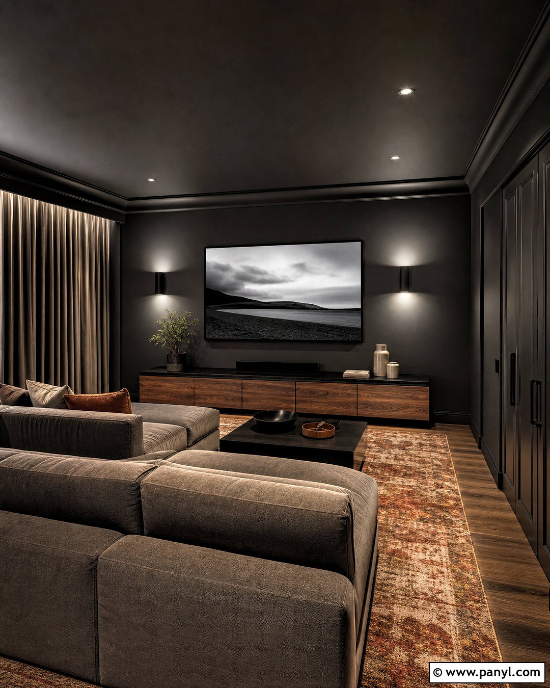
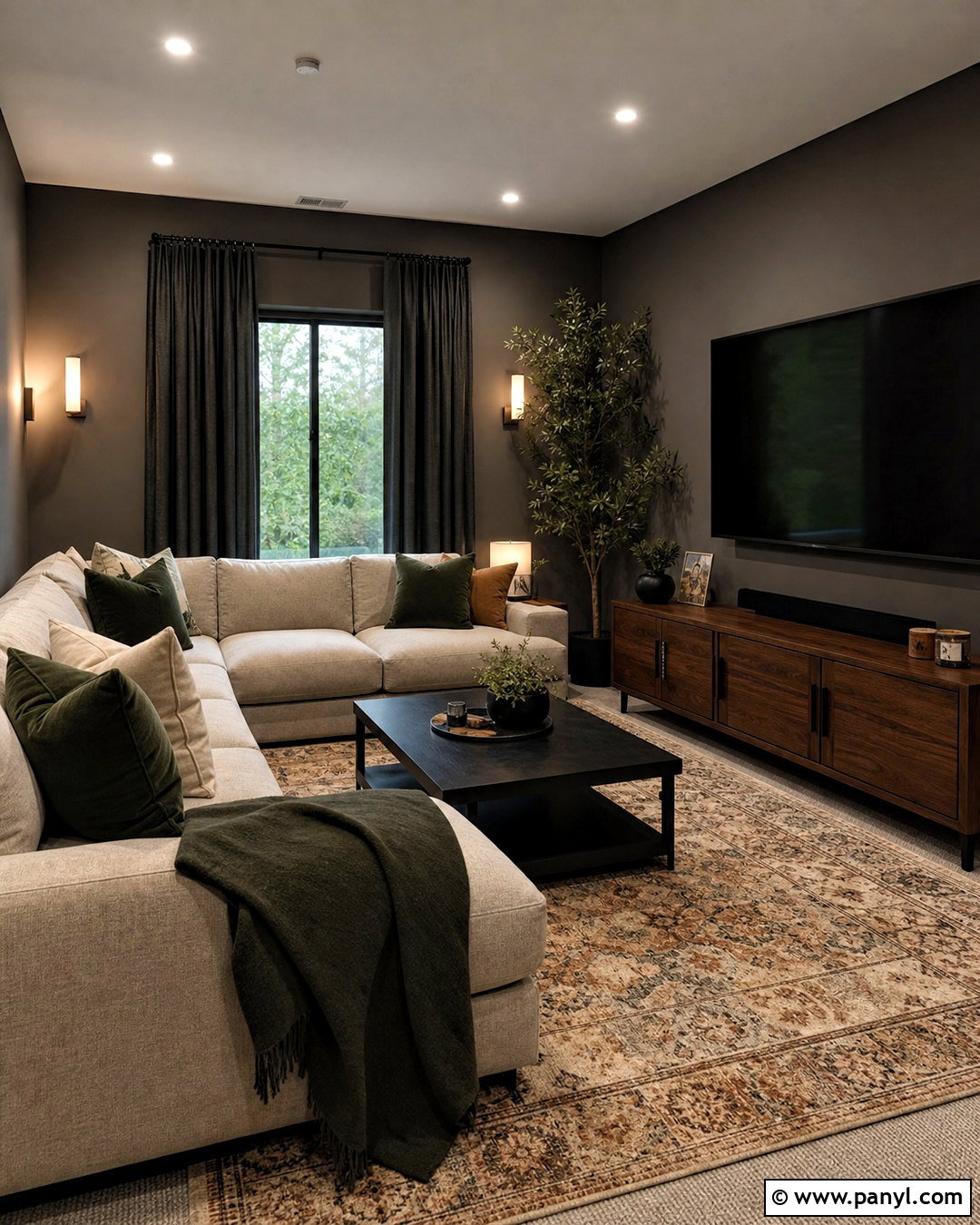
Soft black paint can improve the visual unity of a media room by allowing the screen and dark equipment to blend into the background. Select a softened black with charcoal or brown undertones and use it on every wall, the trim, and the ceiling. Add a deep modular sofa in warm gray, a low walnut media cabinet, and a large patterned rug with rust and cream details. Wall sconces with diffused white shades provide comfortable light without creating harsh glare. Use acoustic curtains in dark taupe and include closed storage to reduce visual clutter. A few oversized prints can decorate the room without distracting from viewing. The complete space should feel relaxed and comfortable rather than stark, with natural wood, textured fabric, and warm accents balancing the dark painted envelope.
20. Blue Gray Hallway Wall Paint
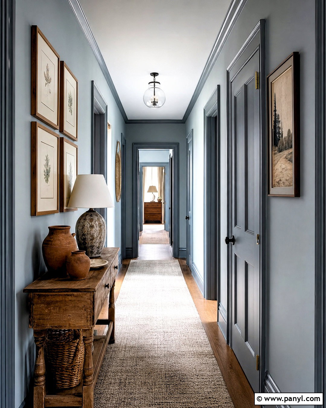
Blue-gray wall paint can give a hallway definition while creating a calm transition between rooms. Choose a medium-light shade with enough blue to look intentional but enough gray to remain adaptable. Paint the walls and doors in the same color, then use a slightly darker version on the baseboards and door frames. This tonal approach highlights architecture without producing sharp contrast. Add a narrow vintage wood console, a long neutral runner, and several framed prints arranged at eye level. A simple ceiling fixture and one table lamp ensure the corridor stays bright. Repeat nearby room colors through small details, such as rust pottery or sage artwork. Before painting, sample the shade along the darkest section of the hallway. The completed design should feel connected, spacious, and thoughtfully decorated.
Conclusion:
Choosing wall color becomes easier when you plan the entire room rather than judging a small paint chip by itself. Consider the direction of natural light, flooring undertones, fixed finishes, furniture, and the atmosphere you want to create. Warm greige and cream offer flexibility, while olive, teal, terracotta, chocolate, and deep blue provide stronger character. Techniques such as color drenching, tonal trim, painted arches, limewash, and two-tone walls can also highlight architecture or define a specific area. Always test large samples on multiple walls and observe them throughout the day. With thoughtful preparation and coordinated materials, these 20 interior wall paint ideas can help you create rooms that feel finished, personal, comfortable, and visually balanced.

Related Ideas and Inspiration:
Leave a Reply