
Choosing the right kitchen color means looking beyond a single paint chip. Cabinets, walls, countertops, flooring, hardware, and natural light should create one balanced scheme. These 20 kitchen paint colours range from warm neutrals and gentle pastels to earthy greens, deep blues, and dramatic dark shades. Each palette offers a complete look you can adapt to a small galley, an open-plan room, or a spacious family kitchen. Before committing, paint large sample areas and view them during the morning, afternoon, and evening. Compare every shade directly with your fixed finishes, especially stone, tile, wood, and metal. The sections below provide practical pairings and decorating details that make it easier to confidently choose from these 20 kitchen paint colours.
1. Warm White Kitchen Paint
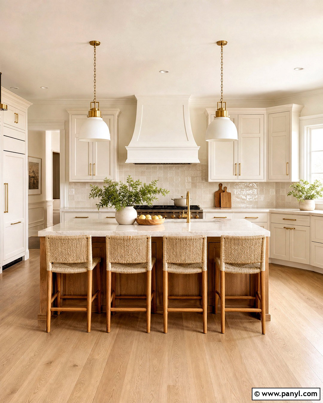
Warm white creates a bright kitchen without the harsh, clinical feeling of pure white. Use it across Shaker cabinets and walls, but choose slightly different tones or finishes to preserve depth. Satin cabinet paint provides a washable surface, while matte walls keep the room soft and relaxed. Add pale oak flooring, creamy quartz counters, and a handmade ivory tile backsplash. Brushed brass handles and milk-glass pendants introduce gentle warmth without overpowering the neutral scheme. A medium-toned wood island can provide a welcome focal point in a larger room. In a compact kitchen, continue warm white onto the ceiling and trim to reduce visual breaks. Finish the look with woven counter stools, linen shades, and simple ceramic accessories in tan and soft brown.
2. Cream Kitchen Paint
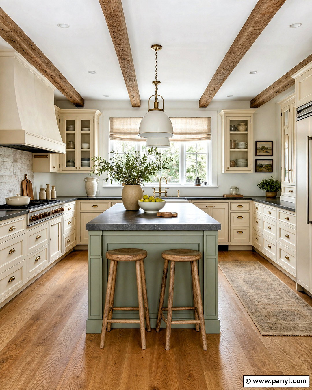
Cream paint makes a kitchen feel sunny, comfortable, and established. It works especially well in traditional rooms with framed cabinetry, detailed molding, or a farmhouse sink. Paint the cabinets a soft buttery cream and keep the walls a cleaner off-white so the finished space feels layered rather than yellow. Soapstone or dark honed granite counters add definition, while a pale limestone backsplash supports the warmer undertones. Choose unlacquered brass hardware, medium oak flooring, and aged bronze lighting for an inviting finish. A muted green island can introduce contrast without disrupting the calm palette. Keep window treatments light and natural, such as simple linen Roman shades. Cream also complements vintage cutting boards, pottery, and woven baskets, giving the entire kitchen a collected but uncluttered appearance.
3. Oatmeal Kitchen Paint
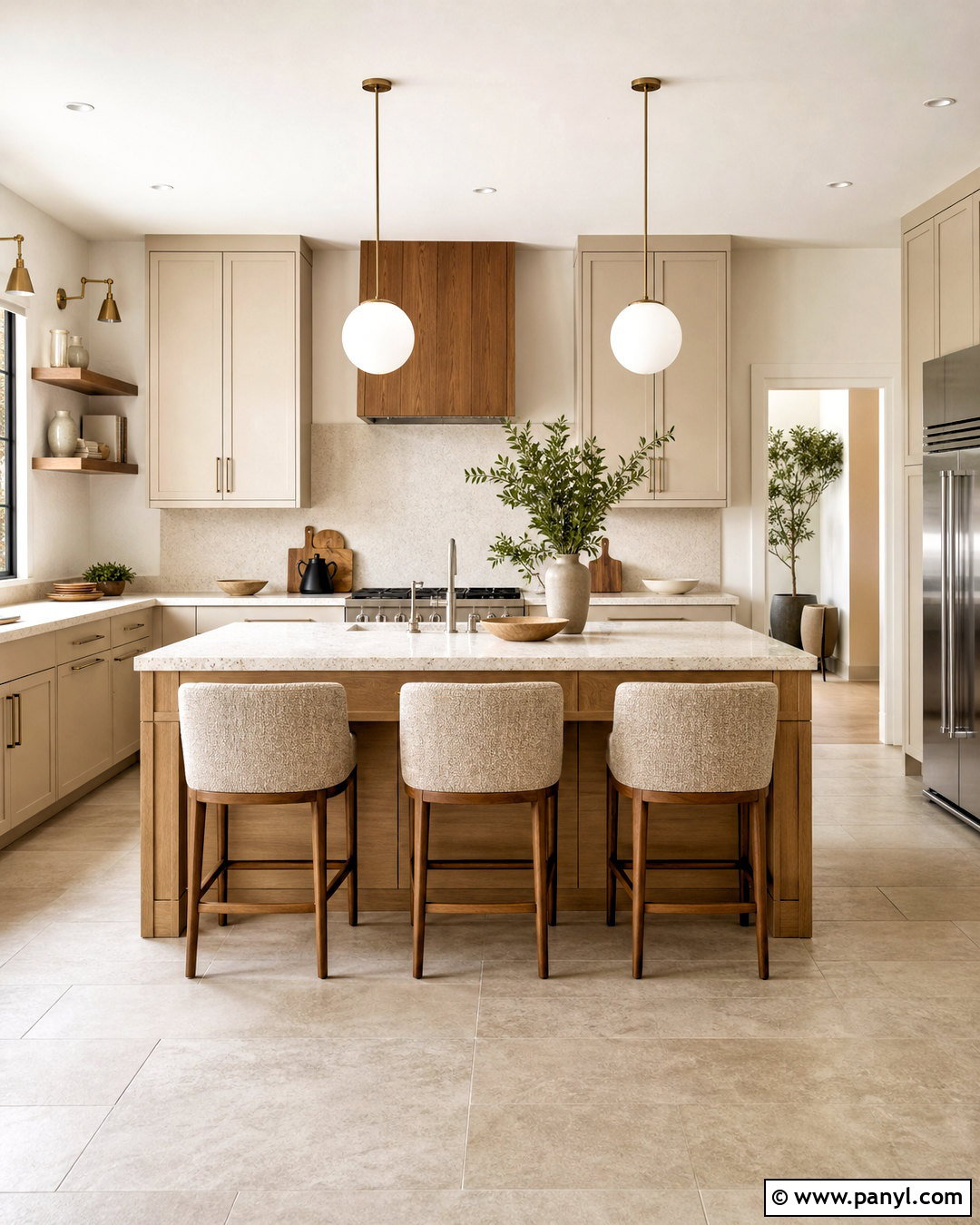
Oatmeal sits between cream, beige, and taupe, making it a flexible option for a softly neutral kitchen. Cover flat-panel cabinets in this gentle shade and pair them with warm white walls to create subtle separation. Honed marble-look quartz, light travertine, or creamy terrazzo counters work beautifully with its quiet undertones. Add walnut shelving or an oak island to deepen the palette and prevent the room from looking washed out. Brushed nickel hardware offers a clean contemporary touch, while aged brass creates a warmer transitional finish. Use simple globe pendants, pale stone flooring, and textured linen seating to complete the look. Oatmeal is particularly effective in open-plan homes because it connects easily with adjoining living areas decorated in natural wood, ivory upholstery, and earthy neutral accents.
4. Greige Kitchen Paint
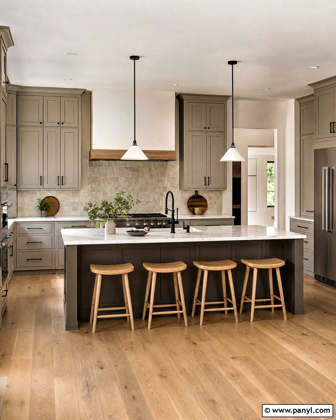
Can’t decide between gray and beige? Greige combines the cool structure of gray with enough warmth to feel welcoming. Use a mid-light greige on Shaker cabinets, then pair it with warm white walls and a white quartz countertop containing soft taupe veining. A backsplash of handmade beige tile adds texture without competing with the cabinetry. Black hardware and slim black pendants can sharpen the scheme, while oak floors keep it grounded and comfortable. For a gentler look, replace black accents with brushed brass. A darker greige island creates quiet contrast in a larger kitchen and visually anchors the center of the room. Check samples against your daylight carefully, because some greiges can appear cooler in north-facing spaces and noticeably warmer beneath evening lighting.
5. Taupe Kitchen Paint
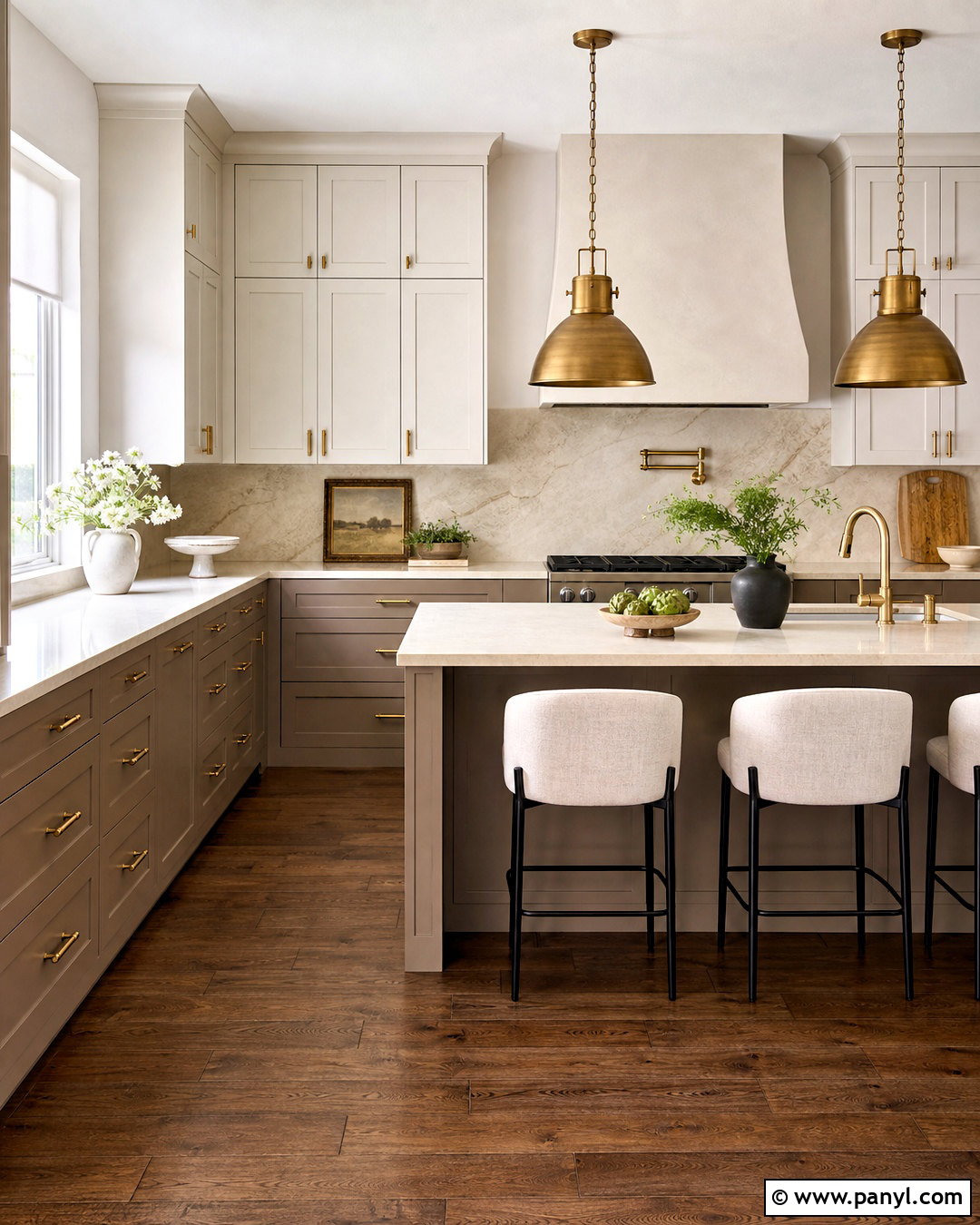
Taupe brings depth to a neutral kitchen while remaining easier to live with than a dark, saturated color. Paint lower and full-height cabinets in a velvety medium taupe, then use a soft ivory on upper cabinets and walls. This arrangement keeps the room open while giving the lower half visual weight. Choose creamy quartz counters, a full-height stone backsplash, and medium walnut flooring for a refined tonal effect. Aged brass pulls and warm metal pendants complement taupe’s brown undertones. In a modern kitchen, streamlined doors and minimal hardware keep the palette clean. In a traditional space, framed cabinet fronts and fluted glass provide character. Add black only in small amounts, such as window frames or stool legs, so the overall design remains warm, calm, and approachable.
6. Mushroom Kitchen Paint
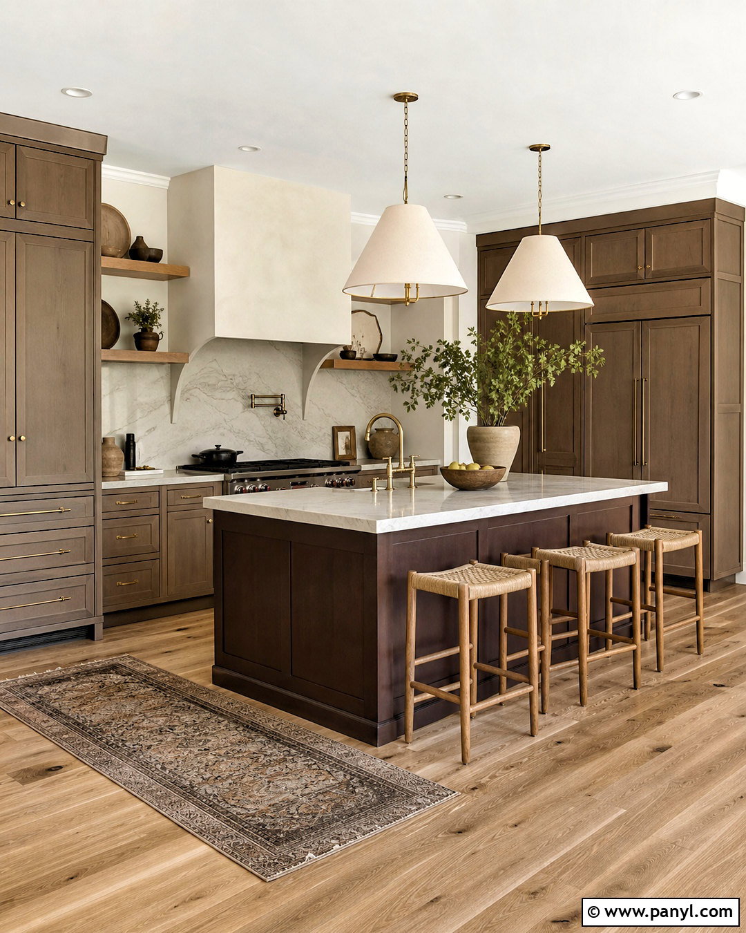
Mushroom paint creates a grounded kitchen with more personality than beige but less intensity than brown. Its gray-brown undertones suit cabinets particularly well, especially beside natural stone and warm wood. Apply mushroom to perimeter cabinetry and paint the island a deeper cocoa shade for a tonal, furniture-like appearance. Cream walls, off-white quartz counters, and a softly veined marble backsplash prevent the palette from becoming heavy. Choose antique brass hardware, white oak flooring, and linen pendant shades to strengthen the organic feel. Open shelves in matching oak can display a limited collection of neutral pottery. Because mushroom changes noticeably under different bulbs, select warm-white lighting that does not exaggerate its gray side. The finished kitchen should feel earthy and polished, with enough contrast to define every surface clearly.
7. Soft Beige Kitchen Paint
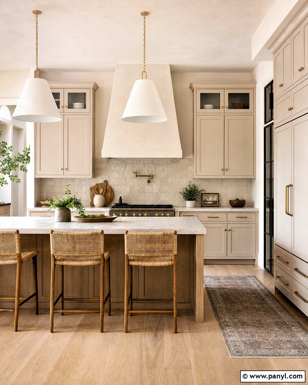
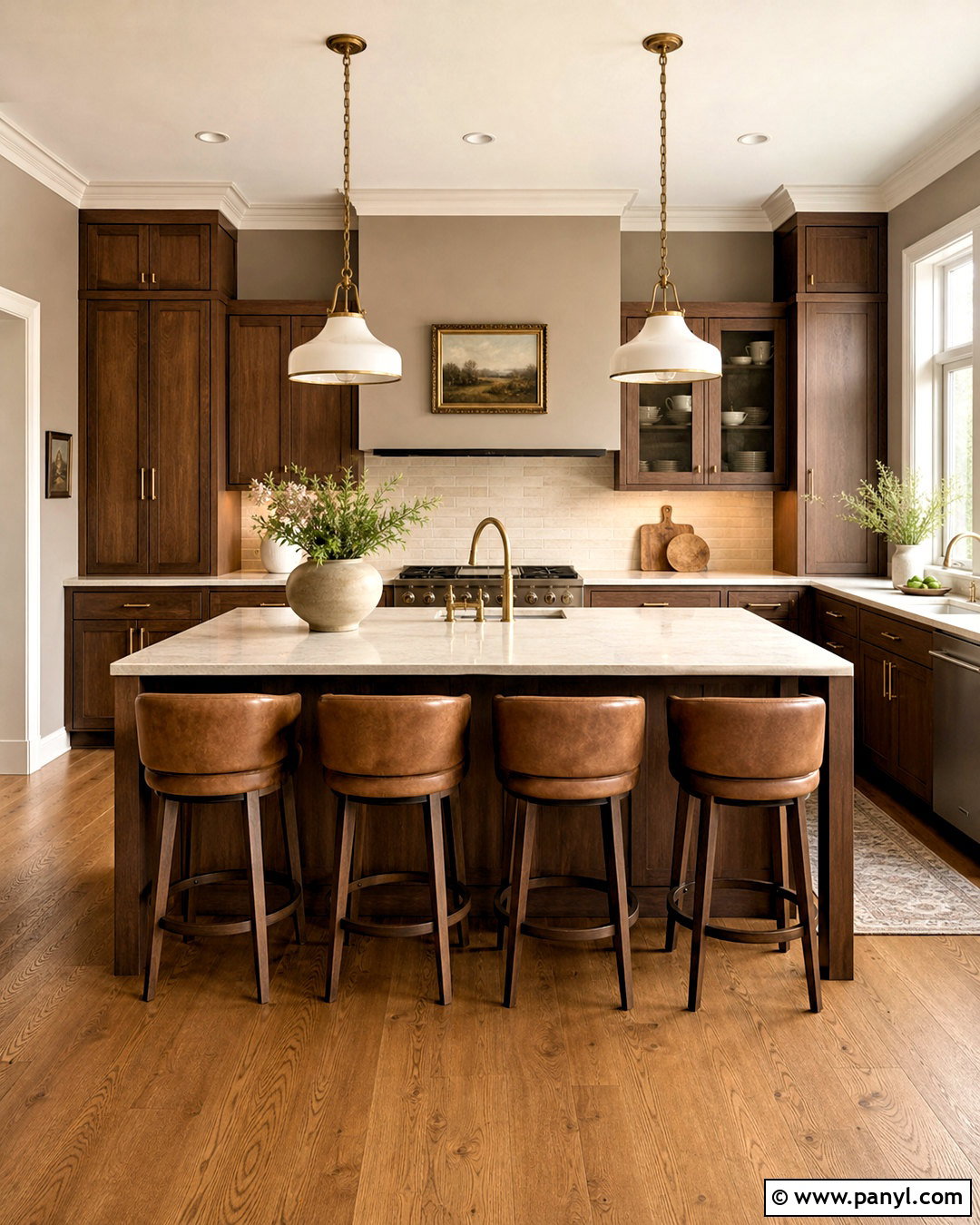
Soft beige can make a busy kitchen feel calm, airy, and naturally connected to wood finishes. Use it on simple inset cabinets and pair it with warm white walls for an understated two-tone effect. Pale oak flooring, creamy porcelain counters, and sand-colored backsplash tiles create a seamless background that visually expands the room. Add brushed brass knobs, woven counter stools, and oversized white pendants for comfortable modern farmhouse character. A plaster-finished range hood in the same beige helps the cooking area blend into the cabinetry. To prevent the palette from feeling flat, mix smooth paint with visible wood grain, handmade tile, and natural textiles. A few restrained accents in olive green or dark brown will add definition. This complete scheme works especially well in kitchens that receive strong, warm afternoon sunlight.
8. Butter Yellow Kitchen Paint
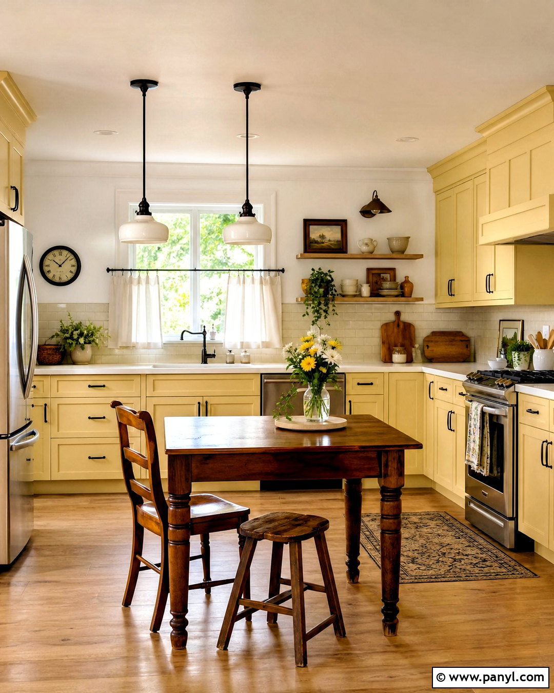
Butter yellow gives a kitchen cheerful warmth without the intensity of bright lemon. Paint the cabinetry in a muted creamy yellow and balance it with clean white walls, white quartz counters, and a simple ivory backsplash. Medium oak flooring reinforces the sunny character, while dark bronze handles provide enough contrast to define doors and drawers. Consider a freestanding wood table instead of a formal island for a relaxed country look. White ceramic pendants, café curtains, and open shelves filled with practical pottery complete the room. In a smaller kitchen, use butter yellow only on the lower cabinets and keep upper storage white to maintain an airy feeling. The shade looks especially inviting near garden views, natural greenery, and warm wood, creating a fresh kitchen that remains comfortable through every season.
9. Dusty Pink Kitchen Paint
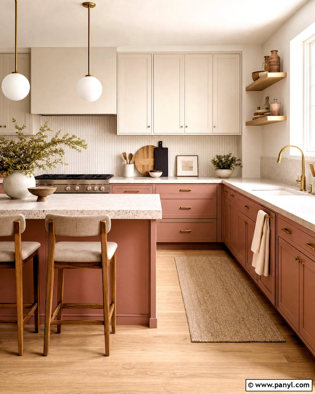
Dusty pink can feel sophisticated when it carries muted clay or beige undertones. Use it on lower cabinets and a compact island, then keep upper cabinets and walls a creamy white. This placement delivers visible color without overwhelming the room. Pair the cabinetry with pale terrazzo counters, off-white vertical tiles, and light oak flooring for a clean contemporary foundation. Brushed brass pulls and globe pendants enhance the warmth, while burgundy or dark brown accents add mature contrast. Avoid overly sweet decorative details; choose simple furniture, natural linen, and sculptural ceramics instead. In a galley kitchen, repeating the pink on both lower cabinet runs creates balance. The completed palette feels warm and individual, yet the pale surfaces above counter height help preserve brightness and a practical sense of openness.
10. Terracotta Kitchen Paint
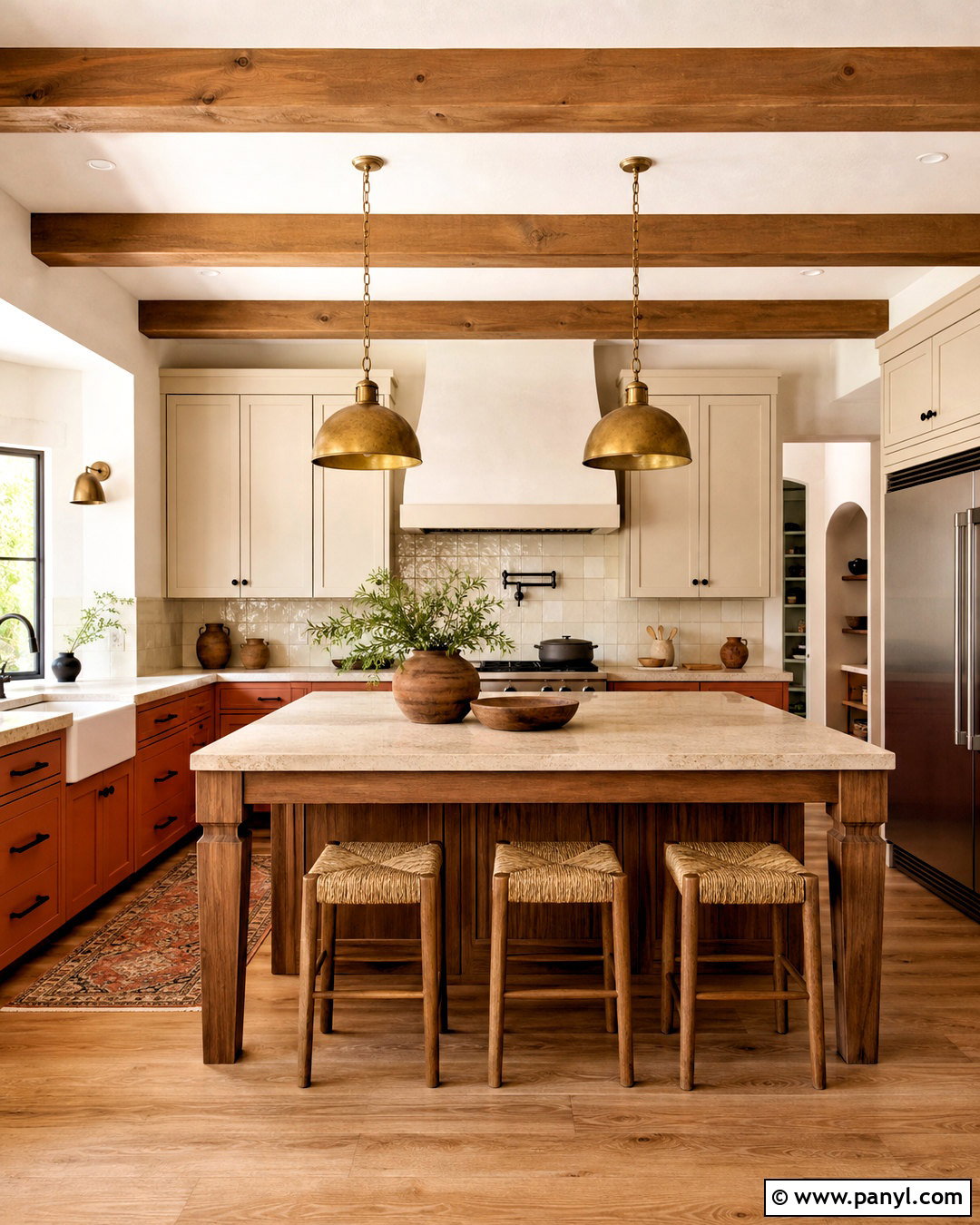
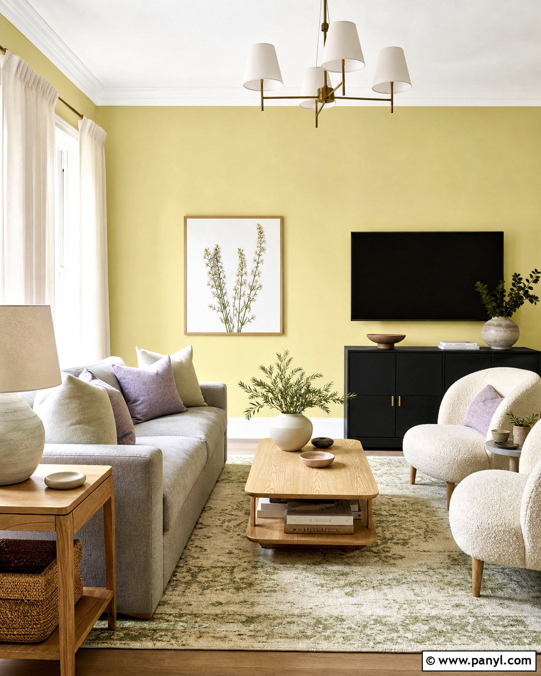
Terracotta paint brings the warmth of sunbaked clay into a hardworking kitchen. Choose a softened red-orange shade for lower cabinets and a tall pantry wall, then balance it with warm cream upper cabinets. Use creamy stone counters, handmade ivory backsplash tiles, and medium oak flooring to support the earthy palette. Matte black hardware gives the cabinet color a crisp outline, while aged brass lighting adds a softer glow. A wood island with woven stools can connect the painted cabinetry to the floor. Keep accessories restrained, using brown pottery, linen towels, and a few leafy plants rather than many competing colors. Terracotta performs especially well in rooms with generous natural light. In a darker kitchen, select a lighter clay shade and increase the amount of cream around windows and work surfaces.
11. Burgundy Kitchen Paint
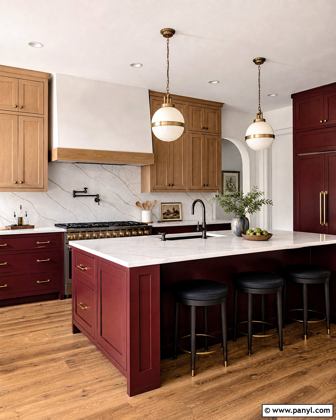
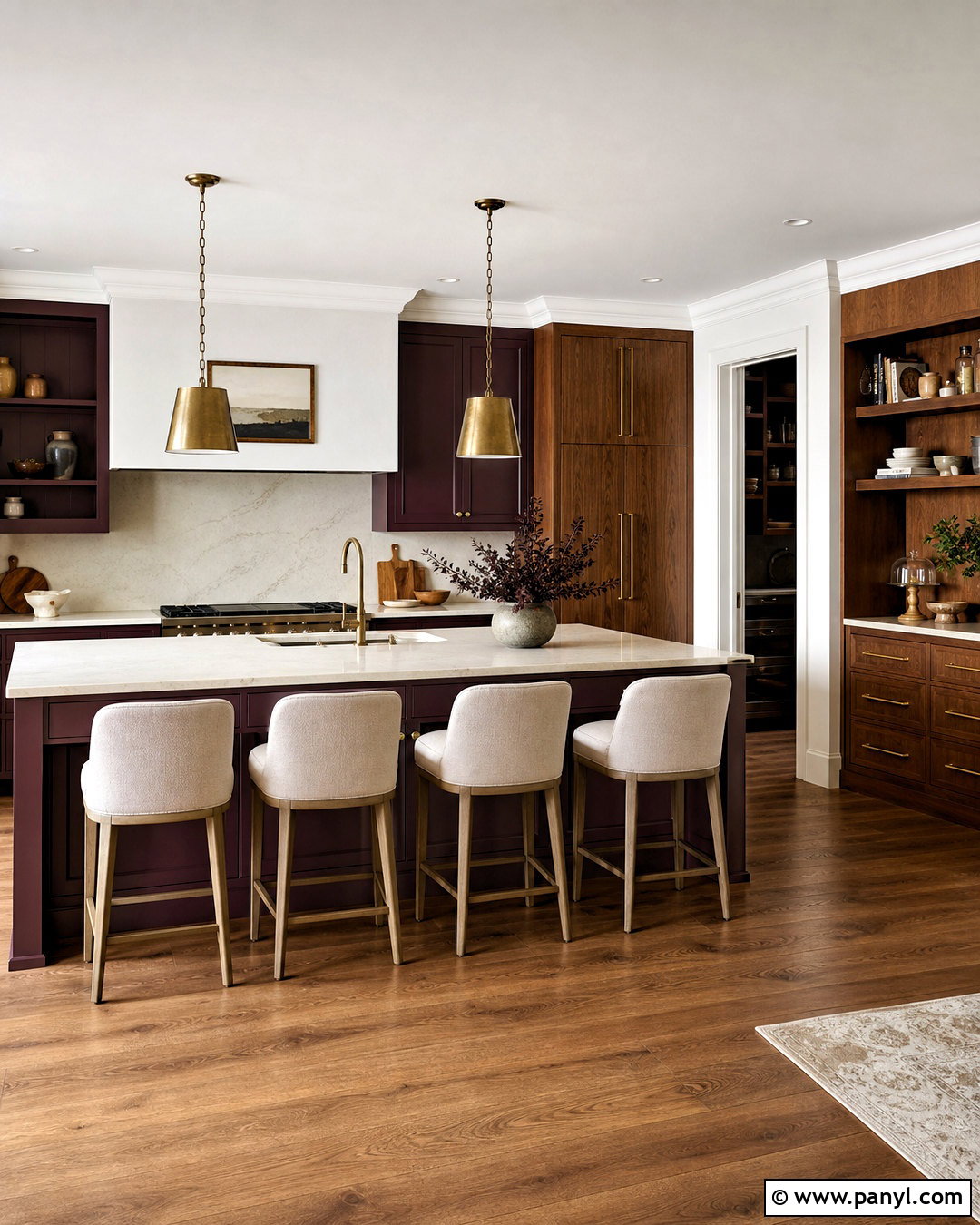
Deep burgundy creates a rich kitchen that feels dramatic but warmer than black. Use it on a large island and lower cabinets, pairing it with warm white walls and pale oak upper cabinetry. White marble-look quartz counters bring brightness, while a softly veined backsplash connects the red cabinetry with the lighter surfaces. Choose aged brass pulls, dark bronze faucets, and cream globe pendants for an elegant finish. Medium-toned wood flooring prevents the contrast from becoming stark. If the room is small, limit burgundy to the island, pantry door, or one uninterrupted cabinet wall. Keep decorative accents simple and repeat the cabinet color only once, perhaps through a patterned runner. The finished kitchen should feel balanced and welcoming, with plentiful pale surfaces to offset the strength of the burgundy paint.
12. Sage Green Kitchen Paint
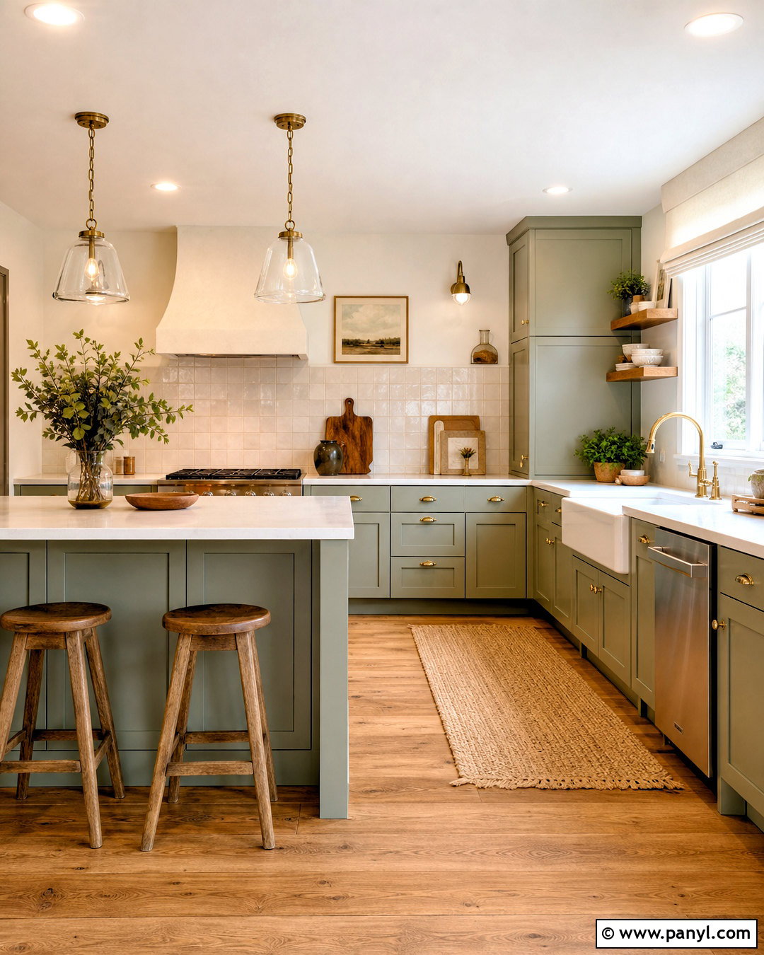
Sage green offers a calm connection to nature and works comfortably in farmhouse, transitional, and modern kitchens. Paint Shaker cabinets in a soft gray-green, then use warm white on the walls and ceiling. Cream quartz counters and handmade ivory tiles keep the work area bright, while natural oak flooring adds warmth. Brushed brass hardware creates a gentle contrast that feels less severe than black. For a complete farmhouse look, include a white apron-front sink, a plaster range hood, and simple wood counter stools. In a modern version, use slab cabinetry and streamlined pendants instead. Sage can appear silvery in cool light, so test it near windows and beneath your chosen bulbs. Finish with linen shades, practical wood accessories, and minimal greenery rather than filling every surface with decorative objects.
13. Olive Green Kitchen Paint
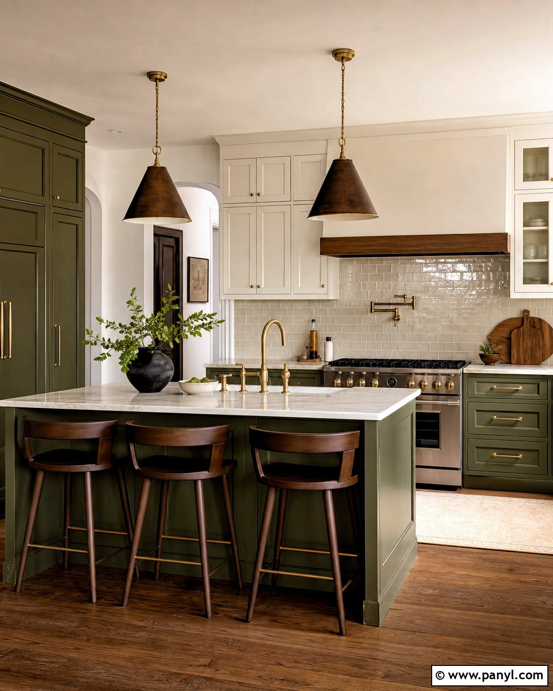
Olive green gives cabinetry a grounded, heritage-inspired look with more depth than pale sage. Use it across lower cabinets, a tall pantry, and the island, leaving upper cabinets warm white to prevent the room from feeling enclosed. Pair olive with creamy marble-look counters, a beige zellige backsplash, and medium walnut flooring. Unlacquered brass hardware draws out the paint’s earthy yellow undertones, while dark bronze lighting adds structure overhead. A wood dining nook or curved counter stools can make the scheme feel more relaxed. In a bright kitchen, olive may cover all cabinetry successfully, particularly when ceilings are high. For limited daylight, keep walls, trim, and window treatments pale. The final room feels substantial and welcoming, combining classic painted storage with natural materials that will age gracefully.
14. Forest Green Kitchen Paint
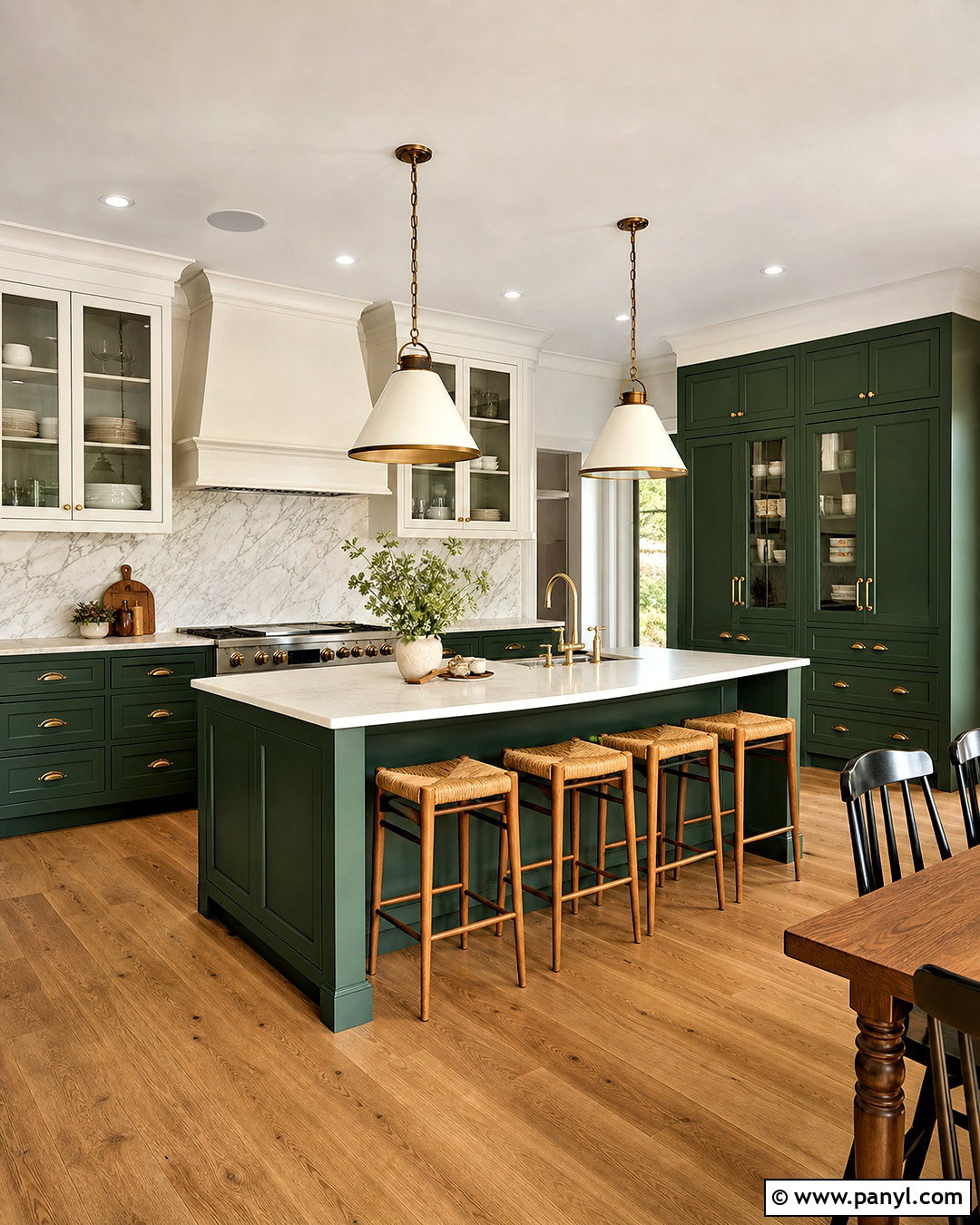
Forest green can transform a bright kitchen into a dramatic yet inviting gathering space. Paint the island and perimeter base cabinets in a deep green, then use warm white for upper storage, walls, and the range hood. Pale quartz counters and a full-height marble backsplash reflect light around the darker cabinetry. Add aged brass handles, statement pendants, and medium oak flooring to introduce warmth. Glass-front upper cabinets can break up solid surfaces and provide a lighter place for everyday dishware. If the room has limited daylight, reserve forest green for a single island or pantry bank. Repeat the color subtly through a runner or framed artwork instead of adding many green accessories. The complete scheme should combine rich lower surfaces with bright upper areas, allowing the dark paint to look intentional rather than overpowering.
15. Eucalyptus Green Kitchen Paint
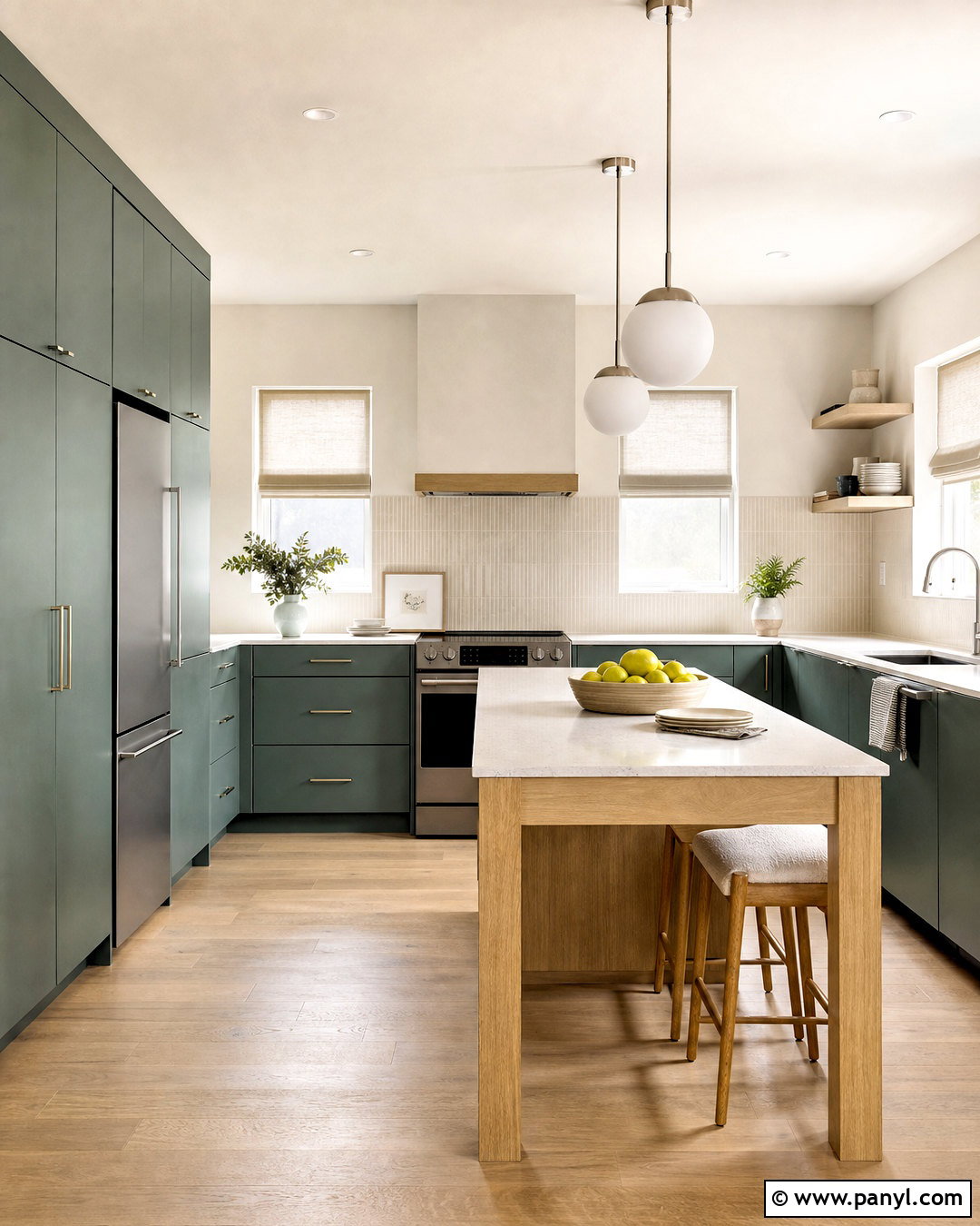
Eucalyptus green has a muted blue-gray quality that feels clean, soft, and contemporary. Use it on flat-panel cabinetry and pair it with warm white walls to keep the color from reading too cool. Pale oak floors, white quartz counters, and narrow ivory backsplash tiles provide a light natural foundation. Brushed nickel hardware reinforces the fresh modern character, while brass can add extra warmth if the kitchen faces north. Include a slim oak island or wood dining table to balance the painted surfaces. Frosted globe pendants and simple linen window treatments maintain the airy look. For visual continuity, paint the pantry door eucalyptus green as well. Keep small appliances and counter accessories neutral so the cabinetry remains the clear feature. The finished room feels peaceful, functional, and gently colorful rather than overtly themed.
16. Dusty Blue Kitchen Paint
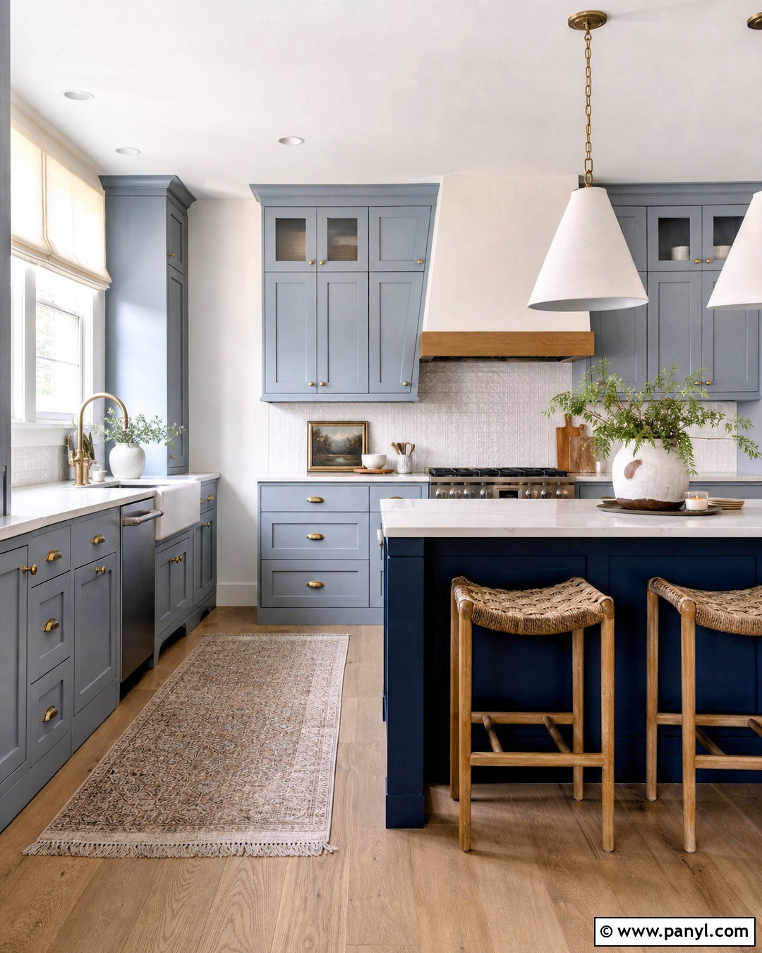
Dusty blue gives a kitchen relaxed color while remaining quiet enough for everyday living. Choose a muted gray-blue for Shaker cabinetry and combine it with soft white walls, creamy quartz counters, and a lightly textured white backsplash. White oak flooring prevents the blue from feeling chilly, while aged brass knobs add warmth and definition. A deeper blue island can create a subtle tonal focal point without introducing another unrelated color. Use woven stools, linen shades, and ceramic pendants to soften the cabinetry’s straight lines. In a small room, paint lower cabinets blue and leave upper storage white. This visually opens the walls while still delivering character. Check the sample beside stainless steel appliances, since cool metals can strengthen blue undertones. The completed design should feel bright, balanced, and comfortably informal.
17. Slate Blue Kitchen Paint
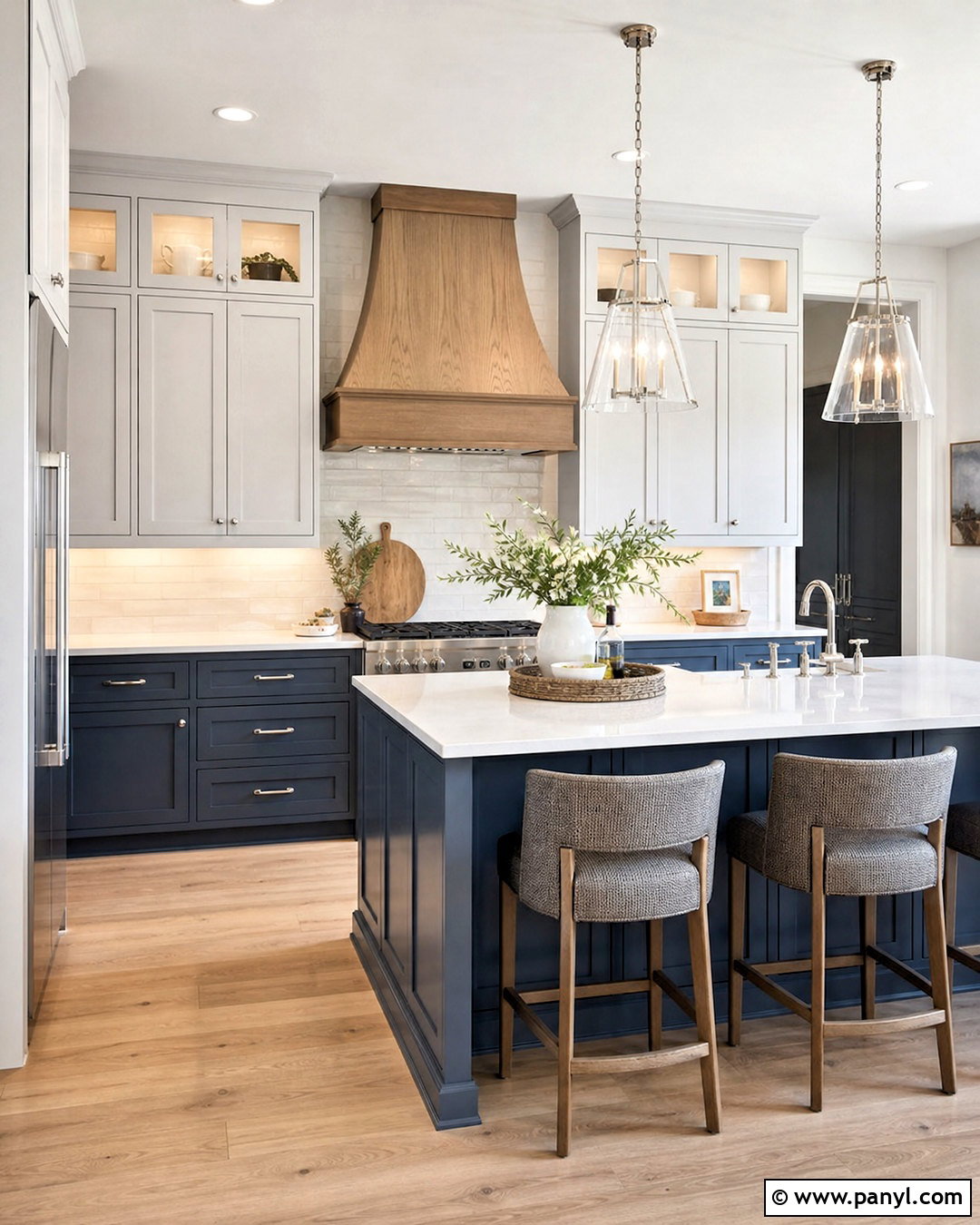
Slate blue offers more depth than dusty blue while remaining softer than navy. Cover lower cabinets and a substantial island in this smoky medium-dark shade, then use pale gray-white on walls and upper storage. Pair it with white quartz counters containing fine gray veining and a backsplash of warm ivory tile. Light oak flooring keeps the scheme from becoming overly cool. Polished nickel hardware creates a tailored finish, while aged brass offers warmer contrast. Add clear glass pendants so lighting does not visually crowd the island. A natural wood range hood or shelving can connect the floor to the cabinetry and make the room feel cohesive. Slate blue works particularly well in open layouts, where its muted tone provides color without competing with nearby living room furniture or artwork.
18. Navy Blue Kitchen Paint
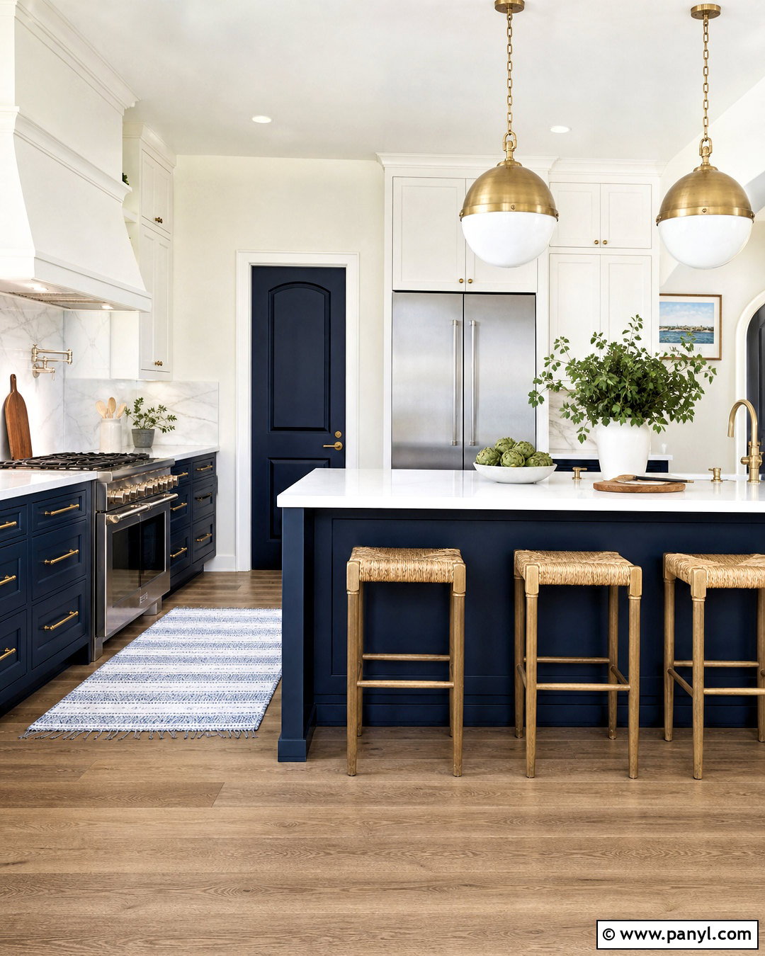
Navy blue creates a classic focal point and looks particularly effective on an island or lower cabinet run. Balance the depth with warm white upper cabinets, walls, and ceiling. Bright quartz counters and a white subway or marble backsplash will reflect light and maintain a clean working area. Choose brass handles and pendants for a warmer traditional look, or polished nickel for a sharper coastal finish. Medium oak flooring and woven stools soften the strong blue-and-white contrast. In a large kitchen, navy can cover all cabinets if there are generous windows and several layers of lighting. In a smaller room, restrict it to the island and pantry door. Carry the color through one restrained accessory, such as a runner, but allow natural wood and pale surfaces to dominate the finished scheme.
19. Charcoal Kitchen Paint
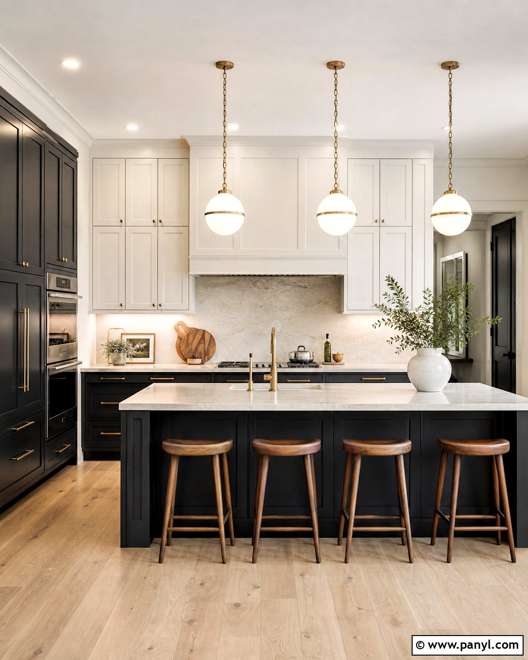
Charcoal paint delivers drama without the absolute depth of black. Use it on lower cabinets and a full-height pantry wall, then choose warm white upper cabinets to keep the room visually balanced. A pale stone countertop and matching slab backsplash create a bright horizontal break between dark and light surfaces. Add white oak flooring, walnut counter stools, and aged brass hardware to warm the charcoal’s cool undertones. Simple globe pendants and undercabinet lighting ensure that work areas remain clear and inviting. In an industrial kitchen, matte black metal can replace brass, but include plenty of wood to prevent a cold result. Charcoal also disguises minor marks on busy lower cabinetry. The complete space should feel structured and sophisticated, with dark paint concentrated below eye level and reflective materials used strategically above.
20. Soft Black Kitchen Paint
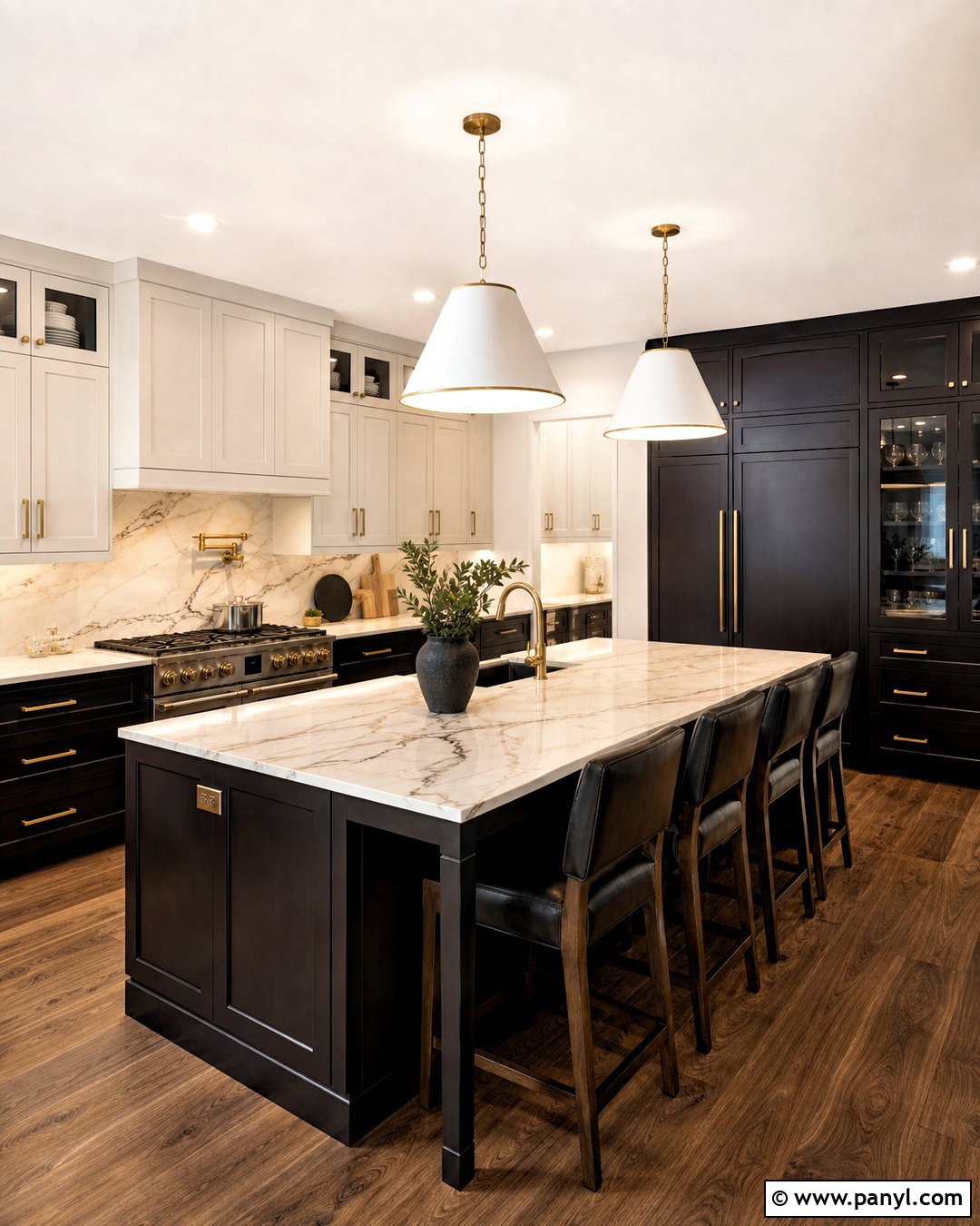
Soft black has brown, green, or charcoal undertones that make it more livable than a flat jet black. Apply it to a large island, base cabinets, and one tall storage bank, while keeping walls and upper cabinets creamy white. Use warm marble-look counters, a full-height lightly veined backsplash, and medium walnut flooring to prevent the scheme from appearing stark. Aged brass hardware and oversized white pendants create clear, elegant contrast. Glass cabinet doors can lighten the upper portion of the room and display simple cream dishware. In a compact kitchen, paint only the island or lower cabinets black and prioritize strong task lighting. Soft black works best when paired with tactile, natural materials. The finished design feels bold and tailored, yet still welcoming enough for a practical family kitchen.
Conclusion:
The most successful kitchen palette connects every painted surface with the finishes already in the room. Warm whites, oatmeal, and greige offer flexibility, while yellow, pink, and terracotta bring gentle personality. Greens and blues create calm depth, and burgundy, charcoal, or soft black can provide a stronger focal point. Whichever direction you prefer, compare large samples with the countertop, backsplash, flooring, and cabinetry before making a final decision. Observe them under natural daylight and your actual kitchen bulbs. Also consider where the darkest color will sit and how it affects the room’s visual balance. With thoughtful testing and coordinated materials, these 20 kitchen paint colours can inspire a complete kitchen that feels personal, practical, and beautifully connected.

Related Ideas and Inspiration:
Leave a Reply