
Color can completely change how a kitchen feels, from bright and spacious to warm, grounded, or energetic. The strongest schemes connect cabinet color with countertops, flooring, hardware, backsplash tile, and lighting rather than treating paint as an isolated choice. Today’s kitchens are embracing warmer neutrals, earthy greens, natural wood, softened pastels, and richer accent colors that feel personal without sacrificing function. () Before committing, compare samples beside your existing finishes throughout the day. This helps reveal undertones and prevents costly color clashes. Whether you prefer a timeless neutral kitchen or a bold two-tone design, the complete palettes below provide practical inspiration. Explore these approachable 20 kitchen colours ideas.

1. Warm White And Natural Oak Kitchen
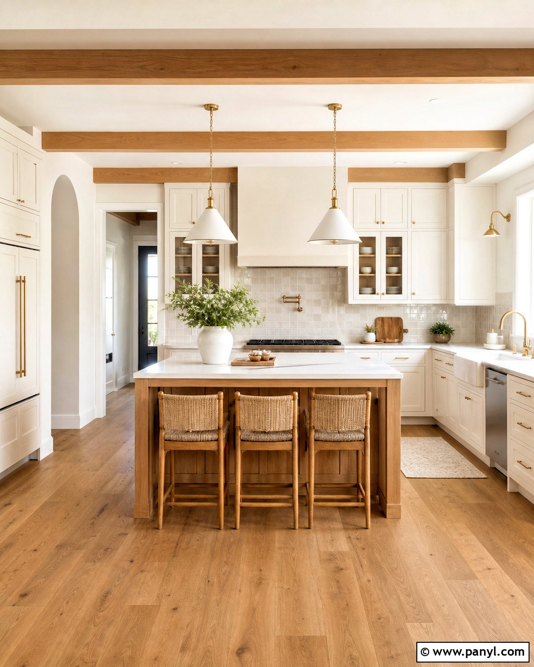
A warm white and natural oak palette creates an airy kitchen without the cold feeling of pure white. Choose creamy white cabinets with subtle beige undertones, then introduce oak through the island, open shelves, or flooring. Pale quartz countertops keep the work surfaces practical and bright, while an off-white zellige backsplash adds gentle texture. Use brushed brass hardware and simple glass pendants for warmth. Counter stools with woven seats can soften the clean cabinetry and support a relaxed modern farmhouse look. Keep walls a slightly lighter warm white so the cabinets remain visible. A few green herbs, stoneware pieces, and linen towels complete this balanced kitchen color scheme without introducing unnecessary clutter.
2. Cream And Walnut Kitchen
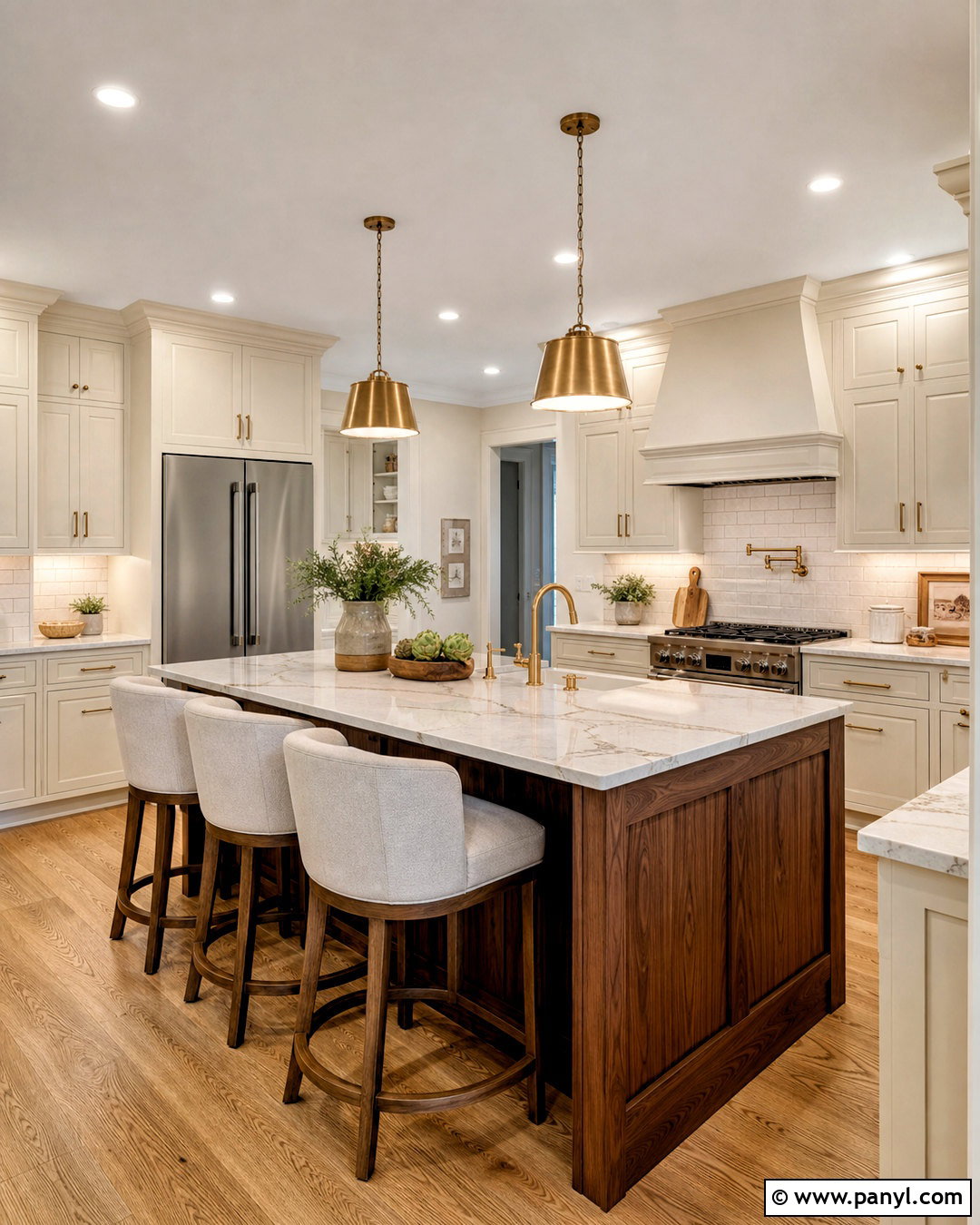
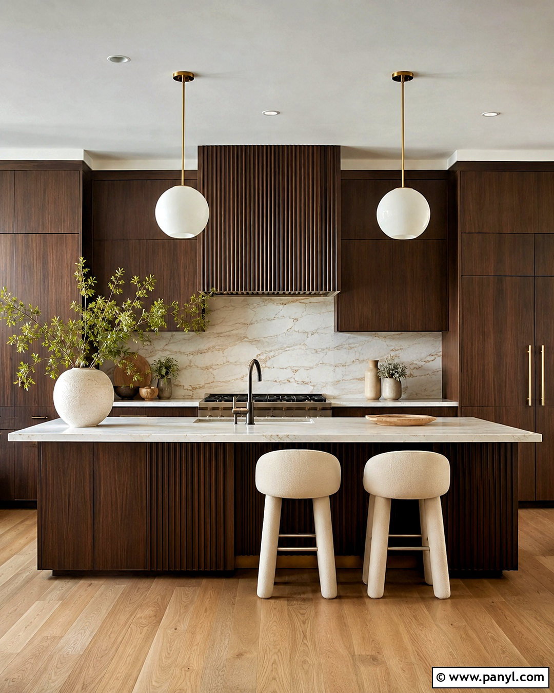
Rich walnut gives a cream kitchen welcome depth and makes a large space feel more inviting. Use cream-painted perimeter cabinets, walnut cabinetry on the island, and a light quartz countertop with delicate brown veining. The contrast should feel warm rather than dramatic, so avoid icy whites and blue-toned gray surfaces. Continue the walnut in a small appliance cabinet or floating shelf to distribute the darker color around the room. A handmade cream tile backsplash, aged brass pulls, and warm beige walls reinforce the layered palette. Medium-tone oak flooring can bridge the light and dark finishes. Finish the room with oatmeal-colored stools, ceramic lighting, and restrained countertop decor for a sophisticated transitional kitchen that remains comfortable and practical.
3. Soft Greige And Brass Kitchen
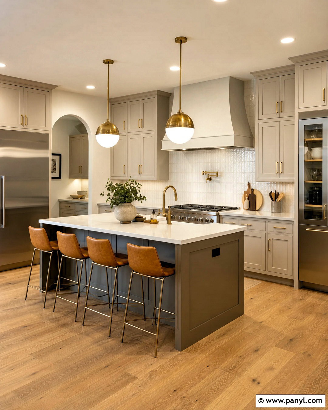
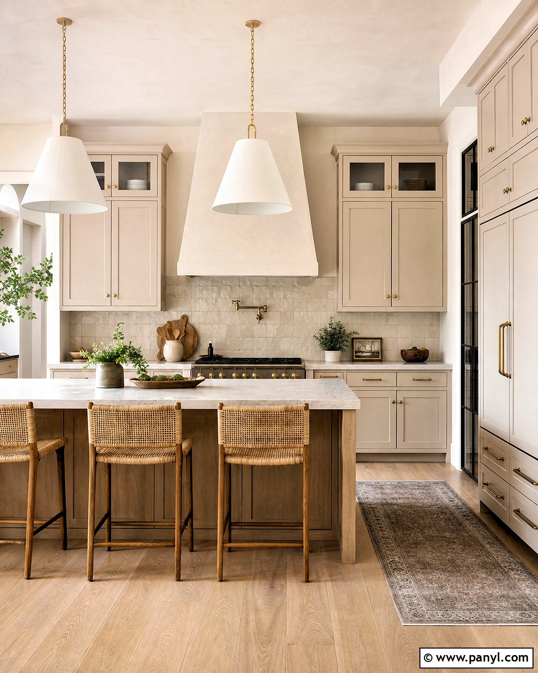
If white feels too plain but gray feels too cool, soft greige offers an adaptable middle ground. Paint the cabinets a pale taupe-gray with warm undertones and pair them with creamy quartz countertops. Use the same greige on the range hood for a seamless, furniture-like appearance. Brushed brass knobs, a matching faucet, and slim pendant lights add definition without overwhelming the neutral palette. Choose a backsplash of lightly textured ivory tile and wide-plank oak flooring to prevent the scheme from appearing flat. Walls can remain warm white, while a slightly deeper greige island creates subtle contrast. Add tan leather stools, pale wood accessories, and simple pottery so the finished kitchen feels layered, polished, and naturally welcoming.
4. Mushroom Taupe Kitchen
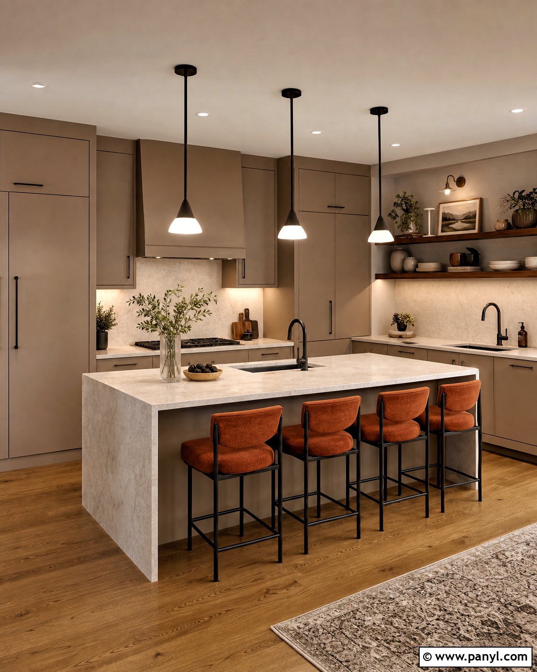
Mushroom taupe creates a cozy, enveloping kitchen that works especially well in rooms with soft natural light. Carry the earthy cabinet color across the lower and upper units, then paint the walls a lighter version of the same shade. This tonal approach reduces harsh visual breaks and gives a compact room a calm, cohesive appearance. Choose creamy stone countertops with brown or gray movement and a matching slab backsplash for understated texture. Dark bronze hardware adds gentle contrast, while walnut shelves and warm oak flooring strengthen the organic palette. For the island, use the same mushroom shade rather than introducing another strong color. Natural linen shades, sculptural ceramic pendants, and rust-colored seat cushions provide the finishing layers.
5. Sage Green And Cream Kitchen
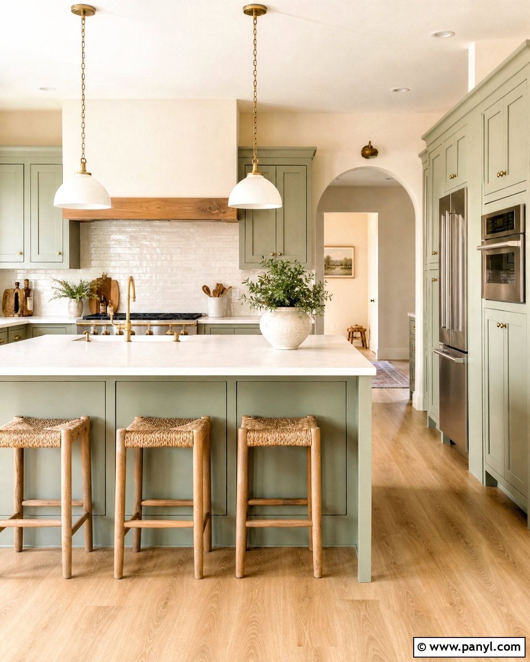
Soft sage green brings color into a kitchen while remaining easy to coordinate with neutral finishes. Use sage cabinets, cream walls, and a warm white quartz countertop to create a fresh but comfortable foundation. A cream subway tile backsplash with slightly uneven edges supports a casual cottage character. Natural oak flooring, woven counter stools, and antique brass hardware prevent the green from feeling overly cool. If the kitchen includes an island, paint it a deeper sage or use light oak for quiet variation. Display a few cream ceramics and wooden boards on open shelving, but keep work surfaces clear. Warm white pendant lights and a simple Roman shade complete this relaxed kitchen, which suits traditional, farmhouse, and transitional homes.
6. Deep Olive Green Kitchen
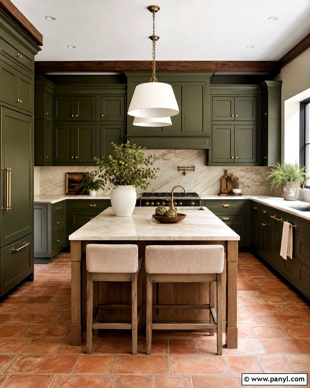
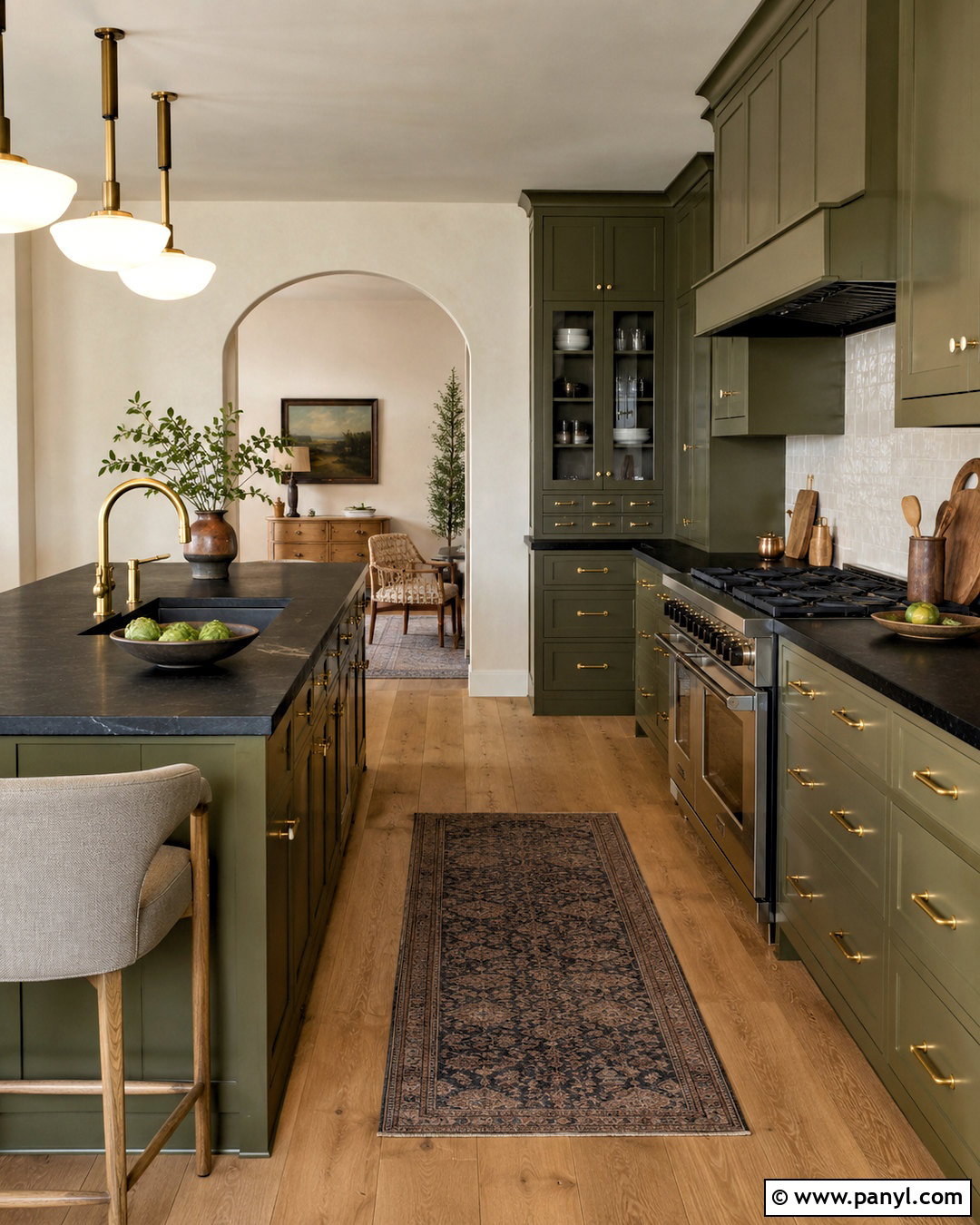
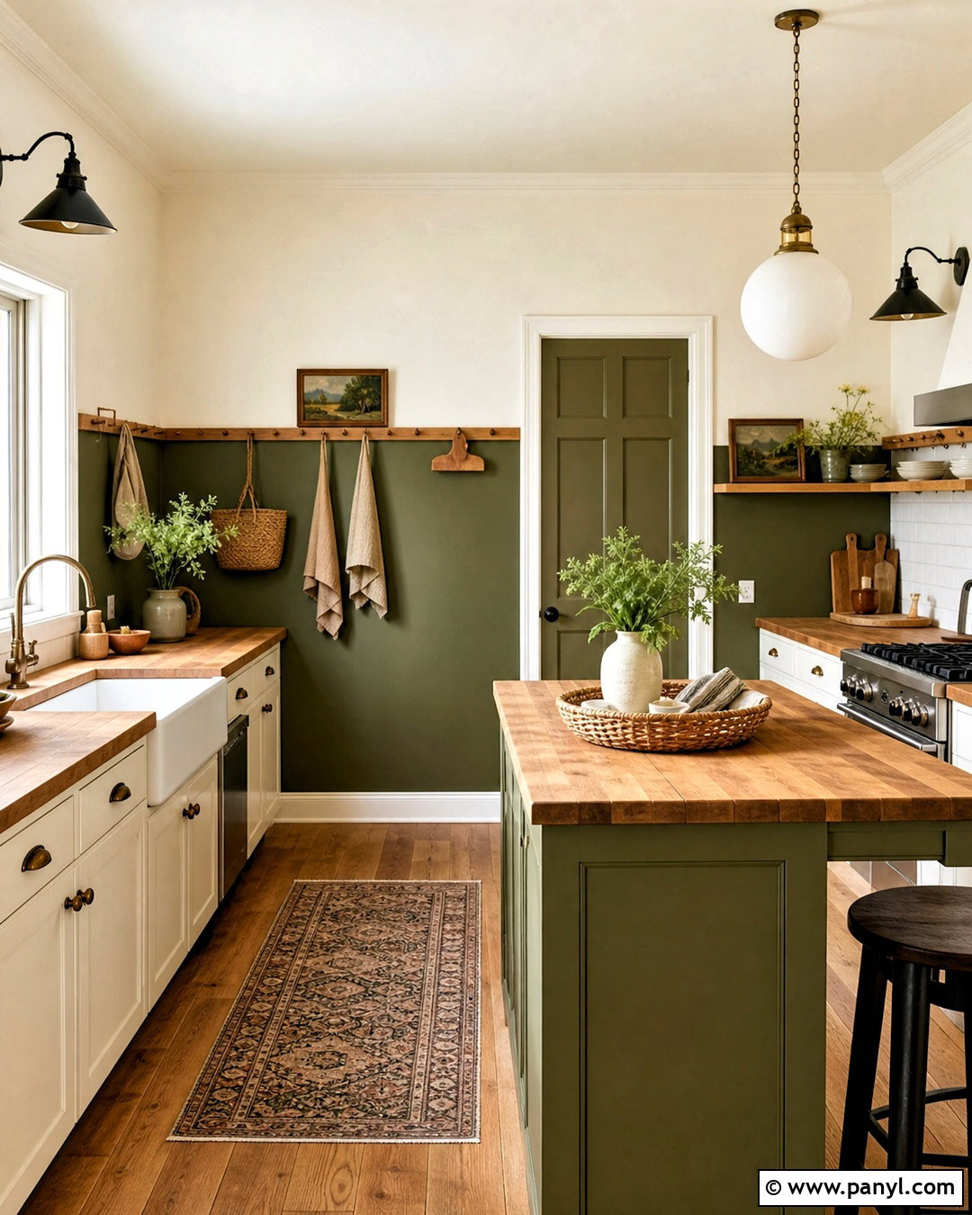
Deep olive green produces a grounded kitchen with more richness than pale botanical shades. Apply it to paneled cabinets and the range hood, then balance its weight with creamy walls and light stone counters. A marble backsplash featuring warm beige veining connects the dark cabinetry to the softer surfaces. A medium oak island can introduce natural contrast, although an olive island also works when the room receives generous daylight. Select aged brass hardware and warm metal pendants rather than stark chrome. Terracotta floor tiles or warm wood planks strengthen the earthy character. Use linen stools, handmade pottery, and a few restrained botanical accents to complete the space. The result feels substantial, natural, and inviting rather than overly dark.
7. Forest Green And White Marble Kitchen
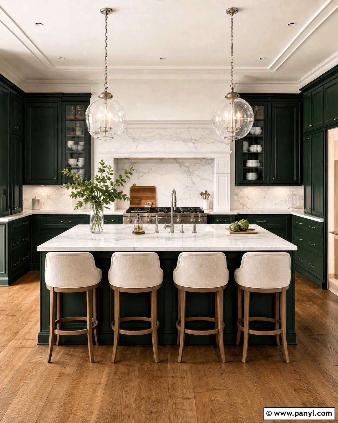
Forest green cabinetry creates a striking focal point when supported by bright marble and balanced natural light. Use the deep green on lower cabinets, tall pantry units, and the island, leaving the walls warm white to keep the room open. White marble countertops and a matching backsplash introduce movement and reflect light around the darker surfaces. Choose polished nickel hardware for a crisp traditional finish or aged brass for a warmer effect. Medium-tone wood flooring keeps the kitchen from feeling too formal. Upholstered counter stools in oatmeal fabric and clear glass pendants add softness without competing with the cabinets. Finish with white ceramics, simple greenery, and one framed print, allowing the rich green and natural marble to remain dominant.
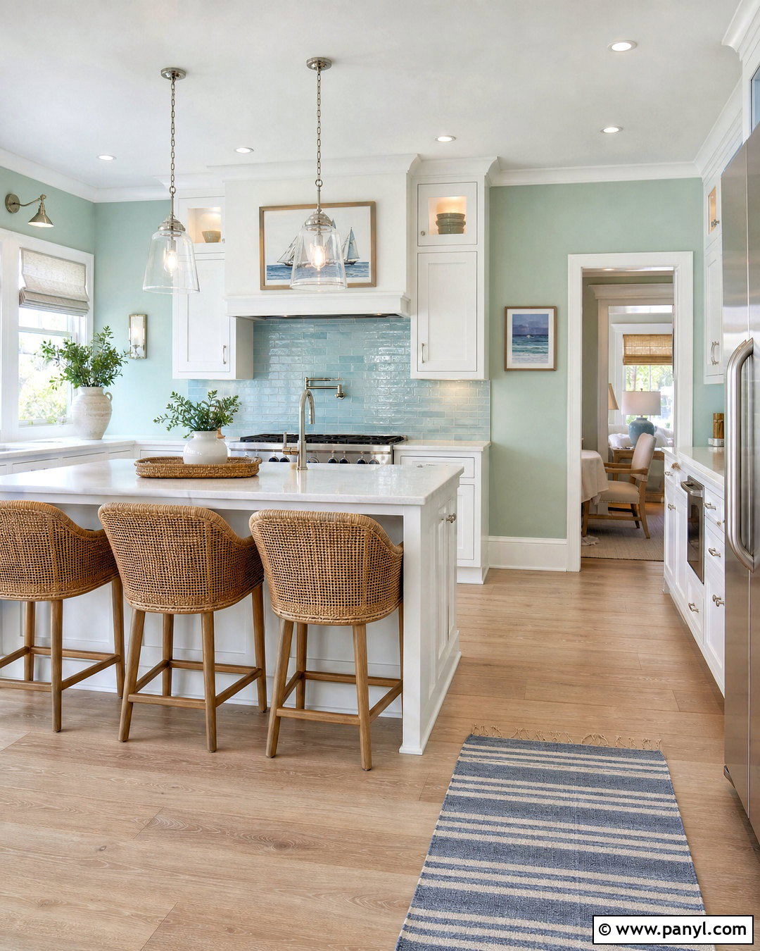
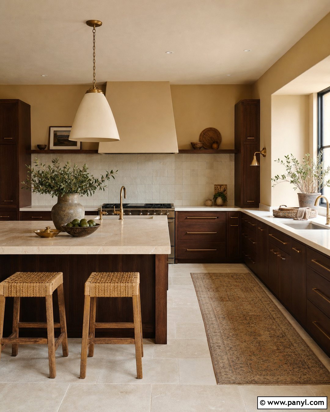
8. Navy Blue And Warm White Kitchen
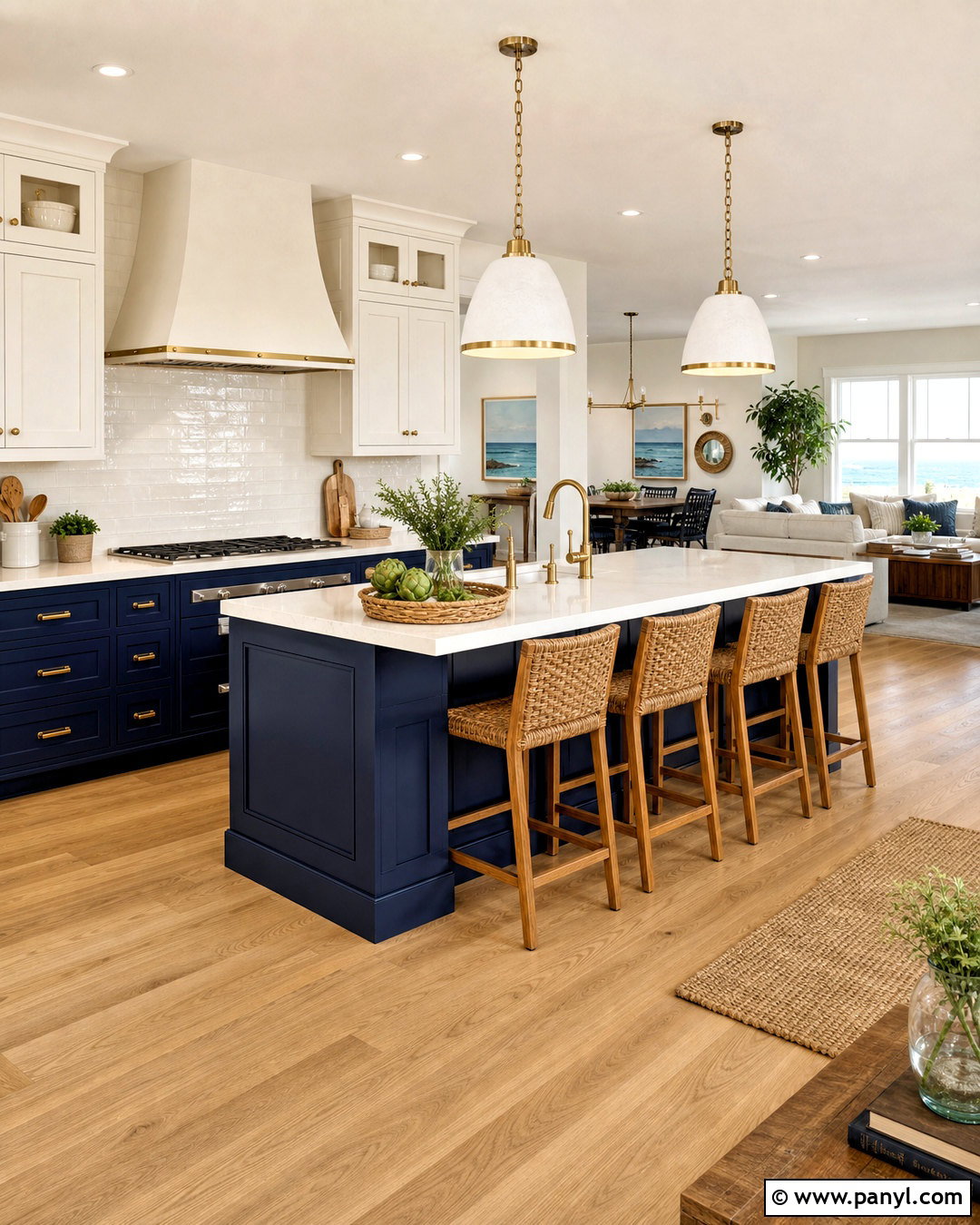
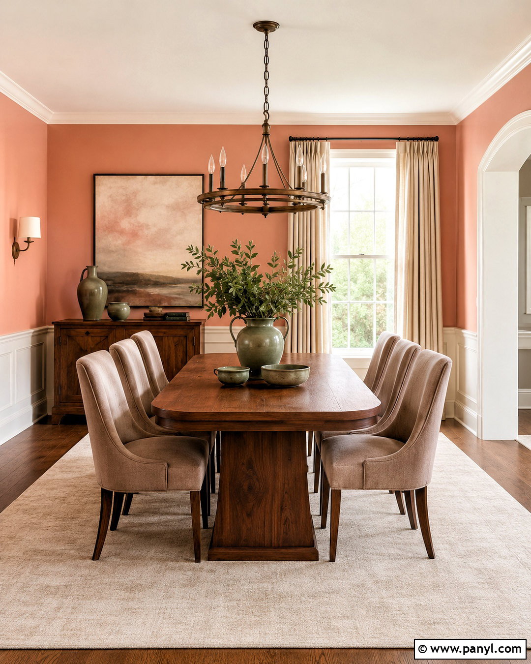
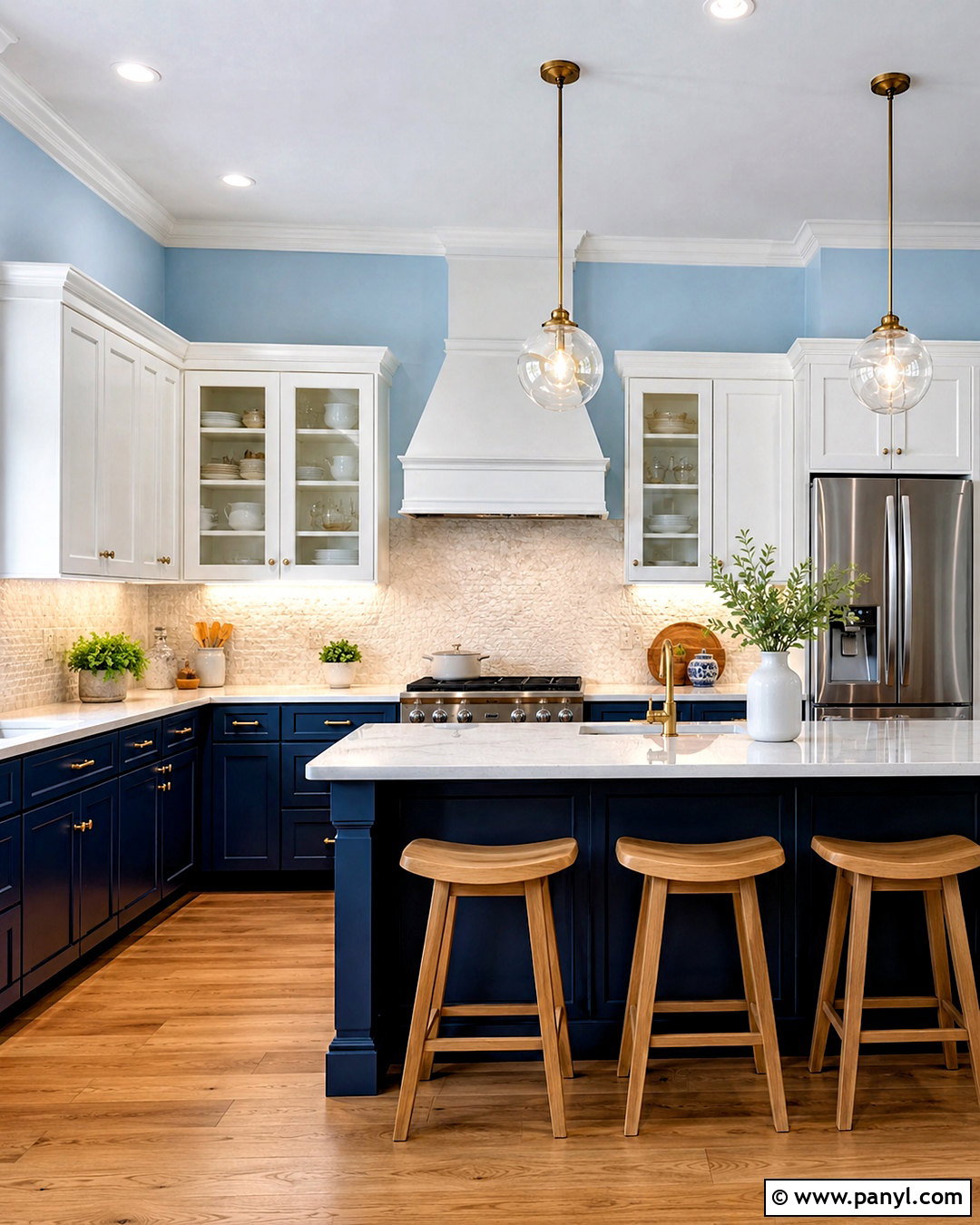
Navy blue and warm white deliver clear contrast without relying on a severe black-and-white palette. Use navy on the island and lower cabinets, then select warm white upper cabinets to maintain brightness at eye level. A white quartz countertop with subtle gray veining can connect both colors, while a glossy warm white backsplash reflects light. Introduce unlacquered brass pulls, a brass faucet, and dome pendants for a classic nautical influence that still feels appropriate inland. Light oak flooring and natural woven stools prevent the navy from looking heavy. Keep walls creamy white and repeat blue through only a few accessories. This complete palette works particularly well in open kitchens where the navy island helps visually define the cooking and gathering zone.
9. Dusty Blue And Light Oak Kitchen
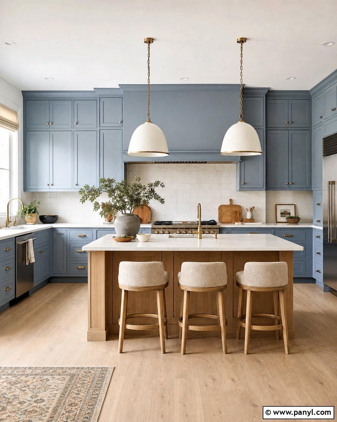
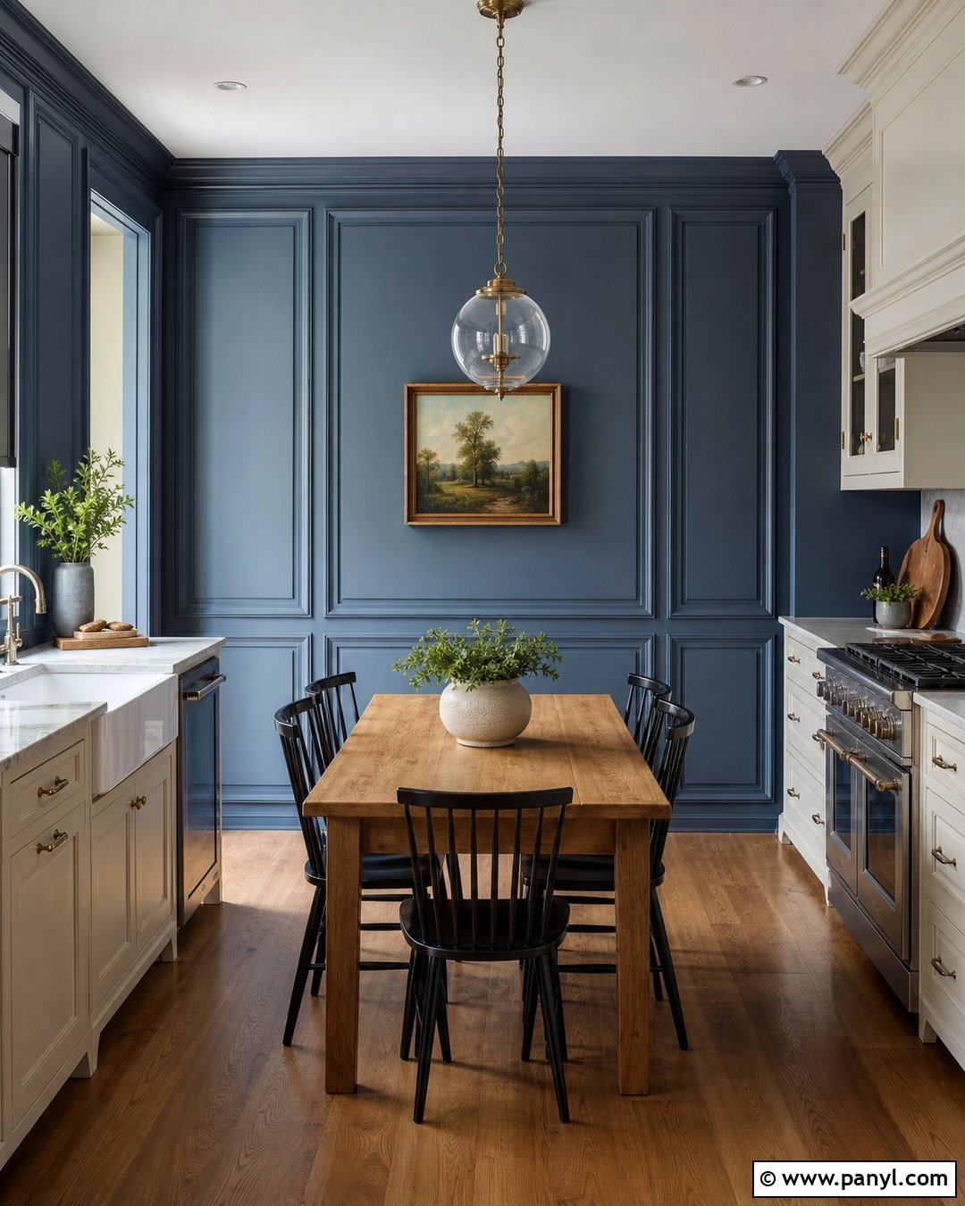
Dusty blue offers a quieter alternative to navy and creates a calm kitchen with gentle character. Paint the cabinets a muted blue with gray undertones and introduce light oak through the island, shelves, or flooring. Cream quartz countertops and an ivory square-tile backsplash keep the palette soft and approachable. Use brushed nickel hardware for a clean finish or antique brass for a slightly warmer traditional look. A plaster-style range hood in warm white can break up a long wall of blue cabinetry. Complete the seating area with pale wood stools and natural linen cushions. Simple ceramic pendants, woven baskets, and understated countertop accessories reinforce the relaxed mood while allowing the blue cabinets and oak elements to work as equal partners.
10. Teal And Terracotta Kitchen
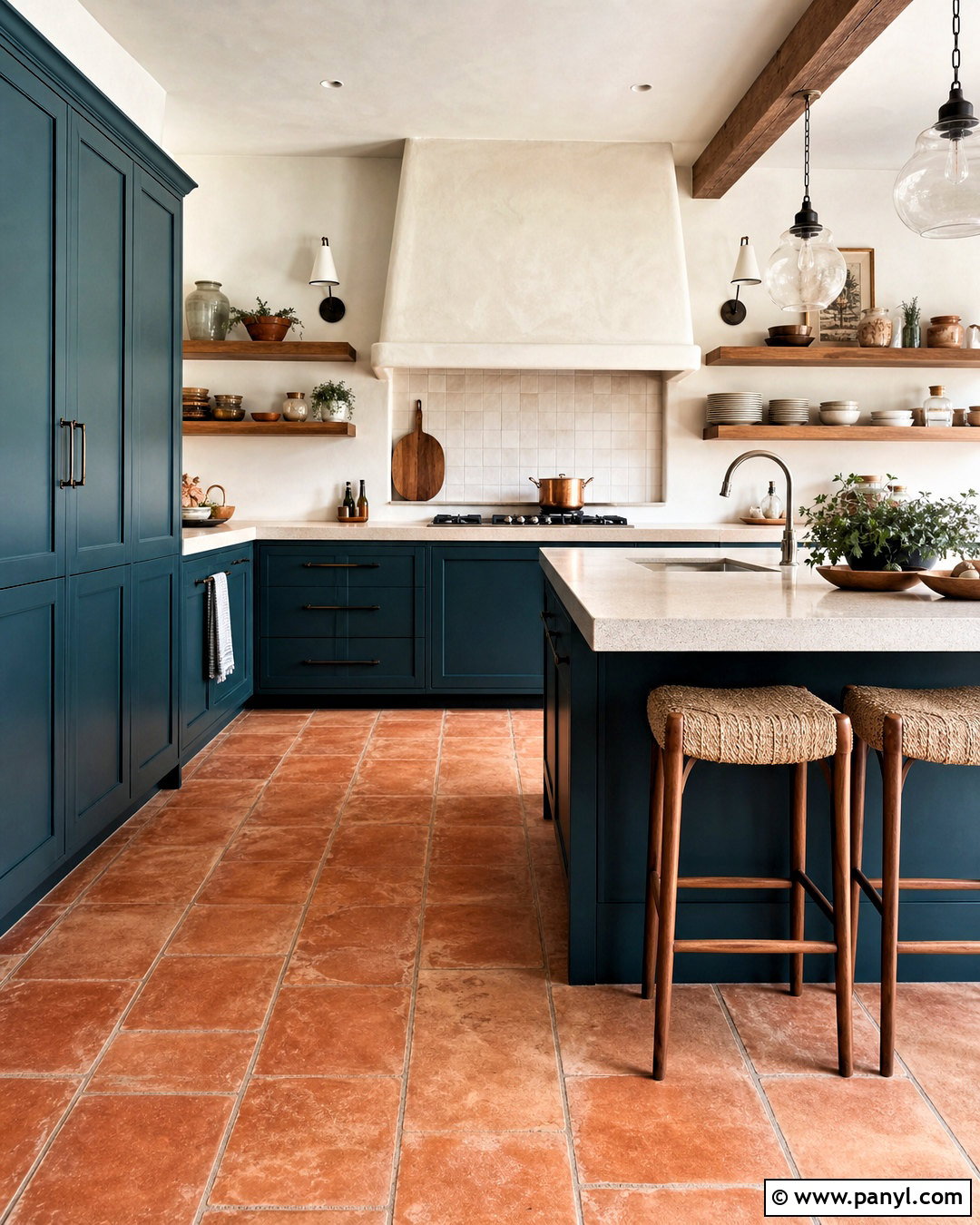
Teal and terracotta form a vibrant kitchen palette inspired by natural minerals and sunbaked clay. Use muted deep teal on the cabinets, then introduce terracotta through the floor tile or a patterned backsplash. Warm cream countertops will soften the transition between these strong colors and provide a practical neutral work surface. Choose dark bronze hardware, a simple plaster range hood, and medium wood shelves to support the earthy Mediterranean influence. Keep walls sandy white rather than bright white, which can look too sharp beside terracotta. A wood island with teal end panels helps distribute both finishes. Add woven counter stools, cream pottery, and warm red-brown textiles in small amounts, creating a lively but controlled kitchen with a cohesive visual rhythm.
11. Charcoal Gray And Wood Kitchen
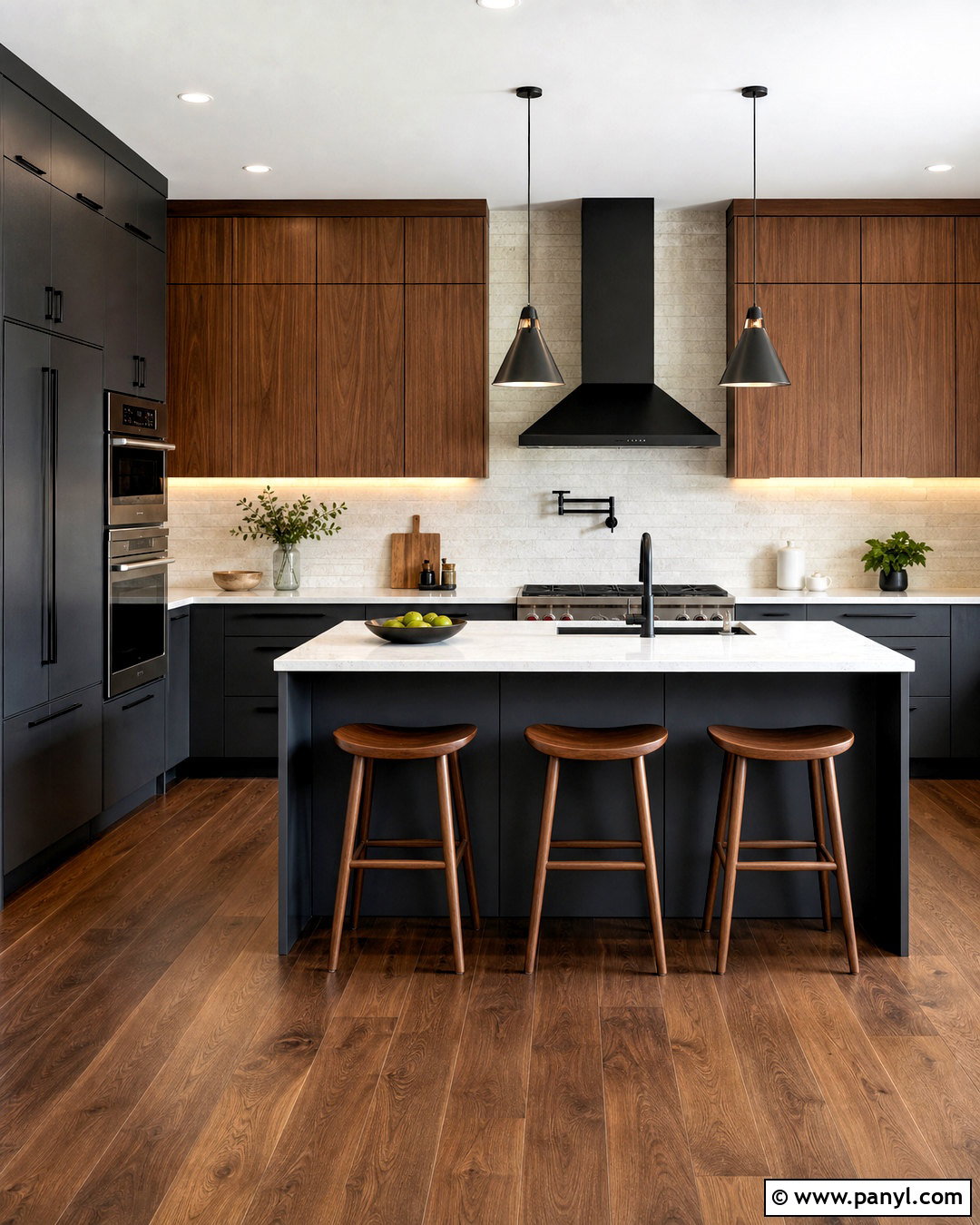
Charcoal gray can make a kitchen feel sleek and architectural when it is balanced with enough wood and warm light. Use matte charcoal cabinets on the lower units and tall storage, then add walnut or oak upper cabinets to prevent the room from becoming visually heavy. Choose pale quartz countertops and a light stone backsplash for contrast. Black hardware blends into the cabinetry, while warm metal pendants can add a subtle decorative note above the island. Wide-plank wood flooring should repeat the tone of the upper cabinets. Keep walls a soft off-white and use simple wood counter stools. Under-cabinet lighting is particularly important because it brightens work surfaces and reveals the texture within this refined, modern kitchen palette.
12. Black And Natural Oak Kitchen
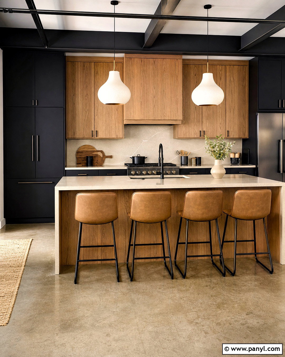
A black and natural oak kitchen feels bold yet approachable when the dark finish is carefully distributed. Choose matte black lower cabinets and tall pantry units, then use oak for the upper cabinets and central island. White or pale beige quartz countertops offer contrast without creating a harsh monochrome effect. Continue the countertop material up the wall as a backsplash for a clean, uninterrupted surface. Black hardware can disappear against the cabinetry, allowing the oak grain to attract more attention. Use light wood flooring if the room is compact, or warm concrete-look tile for a modern industrial direction. Sculptural white pendants, saddle-colored stools, and minimal ceramic accessories complete this practical scheme while keeping the overall room bright and balanced.
13. Burgundy And Blush Kitchen
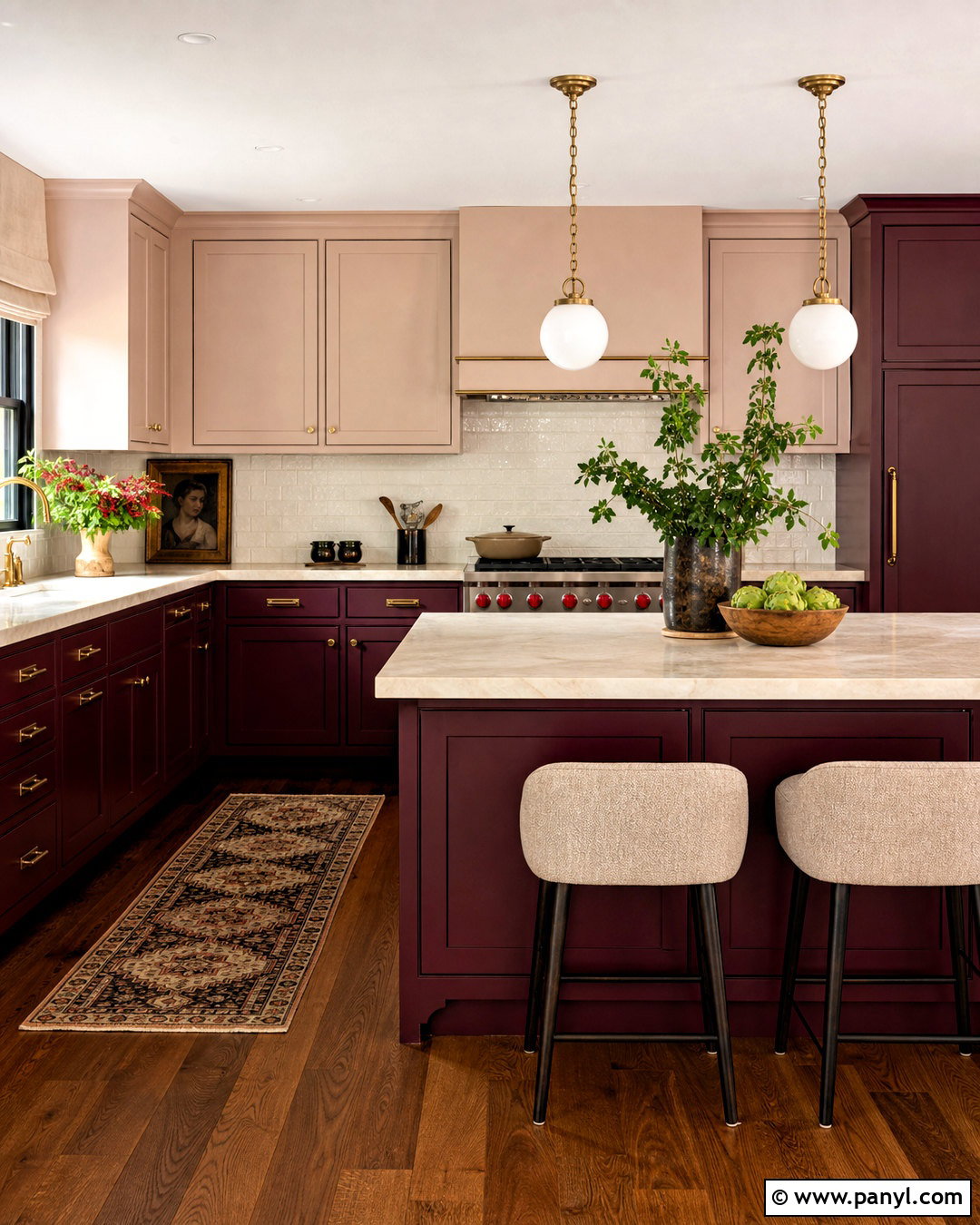
Burgundy gives kitchen cabinetry impressive depth, while pale blush brings softness to the surrounding surfaces. Use burgundy on the island and lower cabinets, reserving the light pink-beige tone for walls or selected upper cabinets. Cream marble countertops with warm veining will connect the red and pink undertones naturally. Add aged brass hardware and opal glass pendant lights for a refined finish. Medium walnut flooring or a walnut pantry cabinet can ground the palette and prevent it from appearing overly decorative. Keep the backsplash simple with handmade ivory tiles. Upholstered stools in oatmeal fabric and a few muted rose accessories will complete the room. This combination feels expressive and grown-up when every finish has a warm, slightly subdued undertone.
14. Plum And Walnut Kitchen
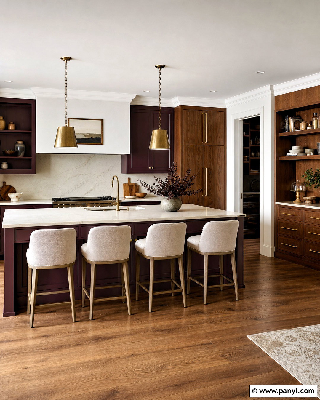
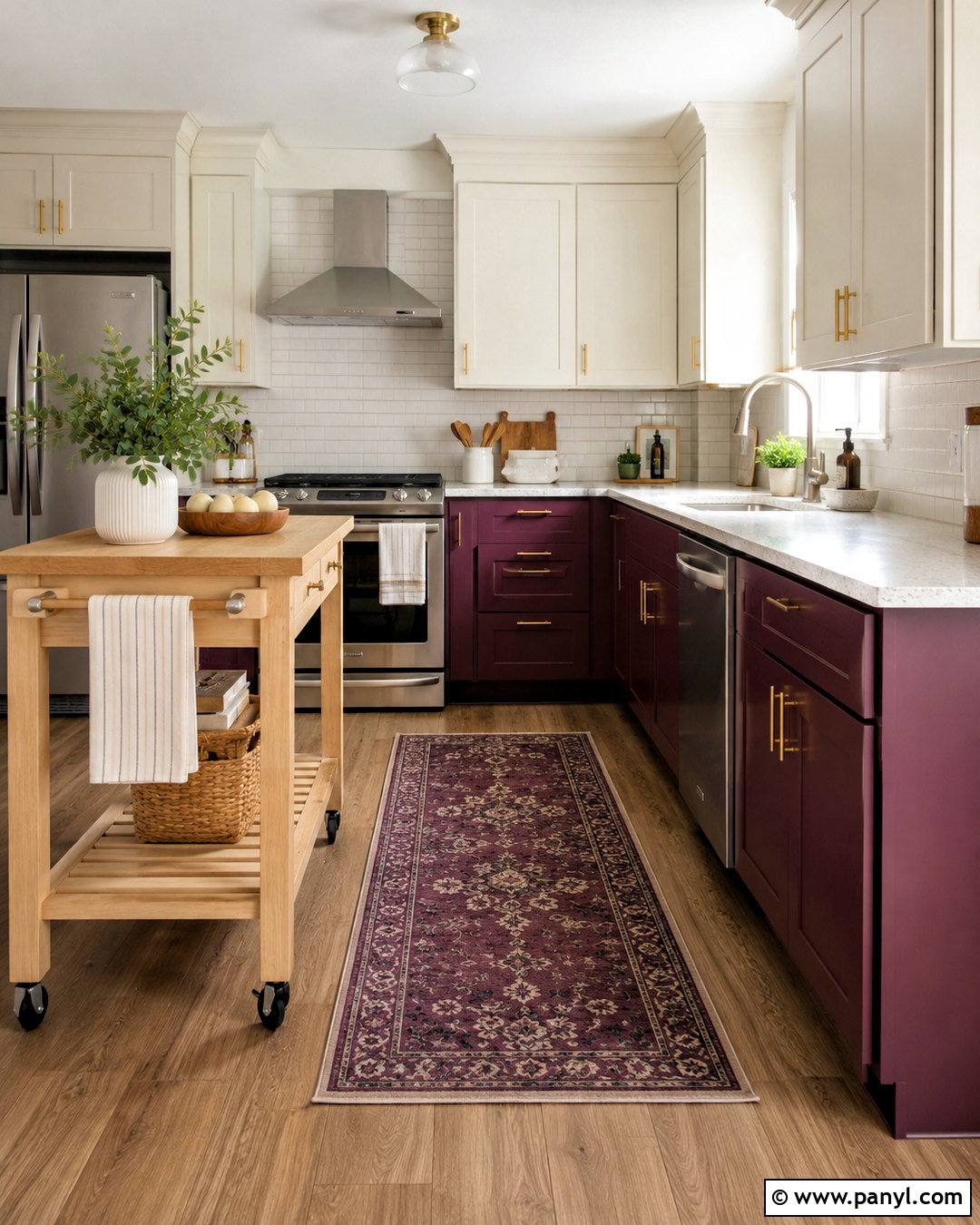
Deep plum cabinetry can look surprisingly sophisticated when treated as an earthy color rather than a bright purple. Select a brown-based plum for the island and lower cabinets, then introduce walnut on tall units or open shelving. Warm white upper walls and cream stone countertops ensure that the darker colors have enough breathing room. A softly veined marble backsplash adds movement without competing with the cabinetry. Choose antique brass pulls, simple globe pendants, and medium walnut flooring for a cohesive finish. If the room is small, limit plum to the island and one cabinet wall. Neutral linen stools, dark ceramic bowls, and understated artwork provide finishing details. The completed kitchen feels warm, distinctive, and carefully layered rather than themed.
15. Soft Pink And Cream Kitchen
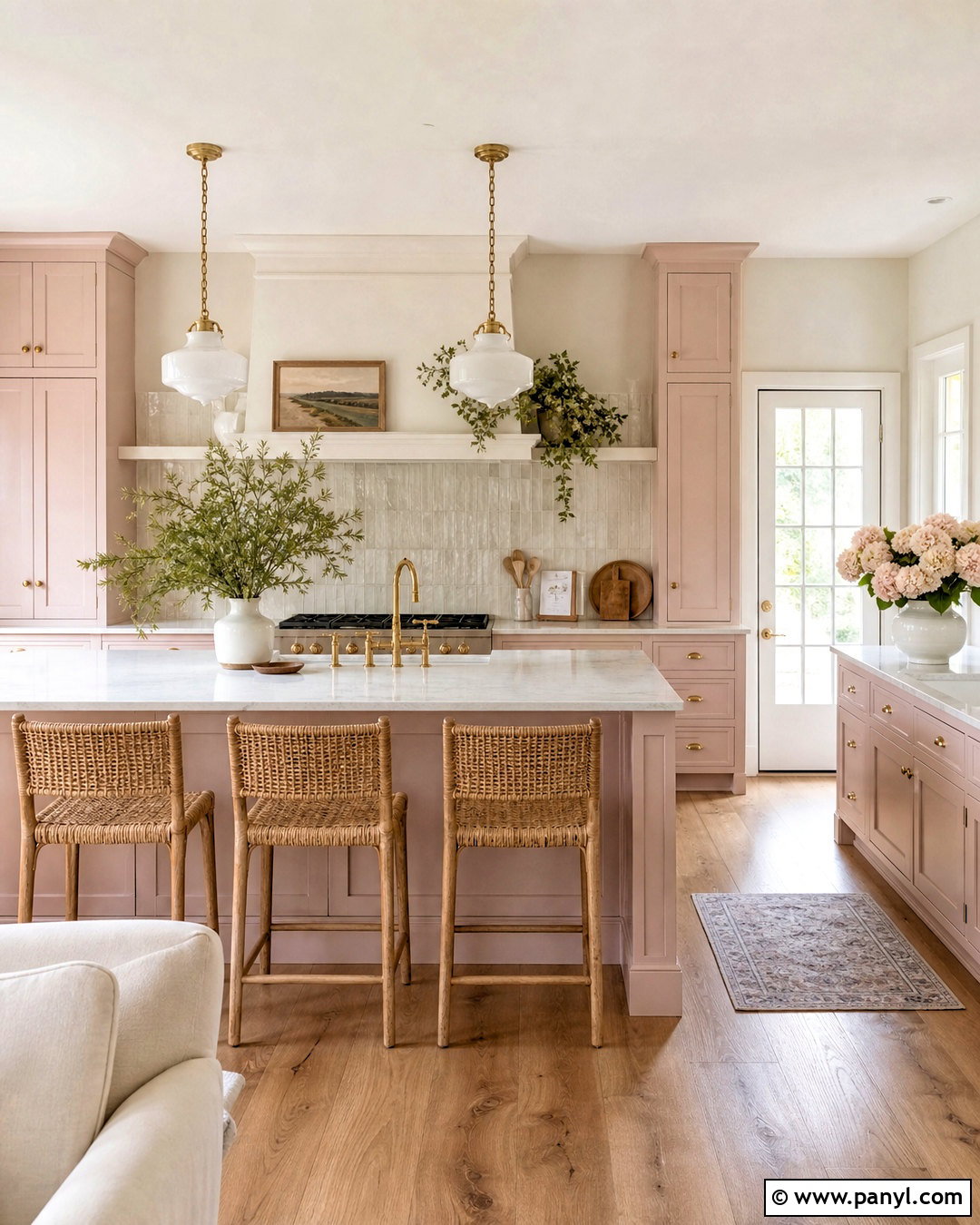
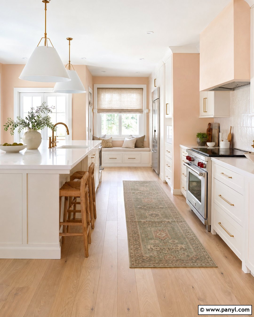
Soft pink can function almost like a neutral when it has dusty beige undertones. Paint shaker cabinets a pale plaster pink, then pair them with cream walls and light quartz countertops. A warm white backsplash with a gently rippled finish will add dimension while preserving the quiet palette. Use aged brass hardware, a brass faucet, and small milk-glass pendants to enhance the warmth. Natural oak flooring and an oak island countertop can introduce texture and make the room feel more relaxed. Choose woven stools, ivory linen shades, and simple cream ceramics for the final layers. Avoid adding too many additional pastel colors. Keeping the scheme focused on pink, cream, oak, and brass results in an elegant kitchen that feels soft but not overly sweet.
16. Butter Yellow And White Kitchen
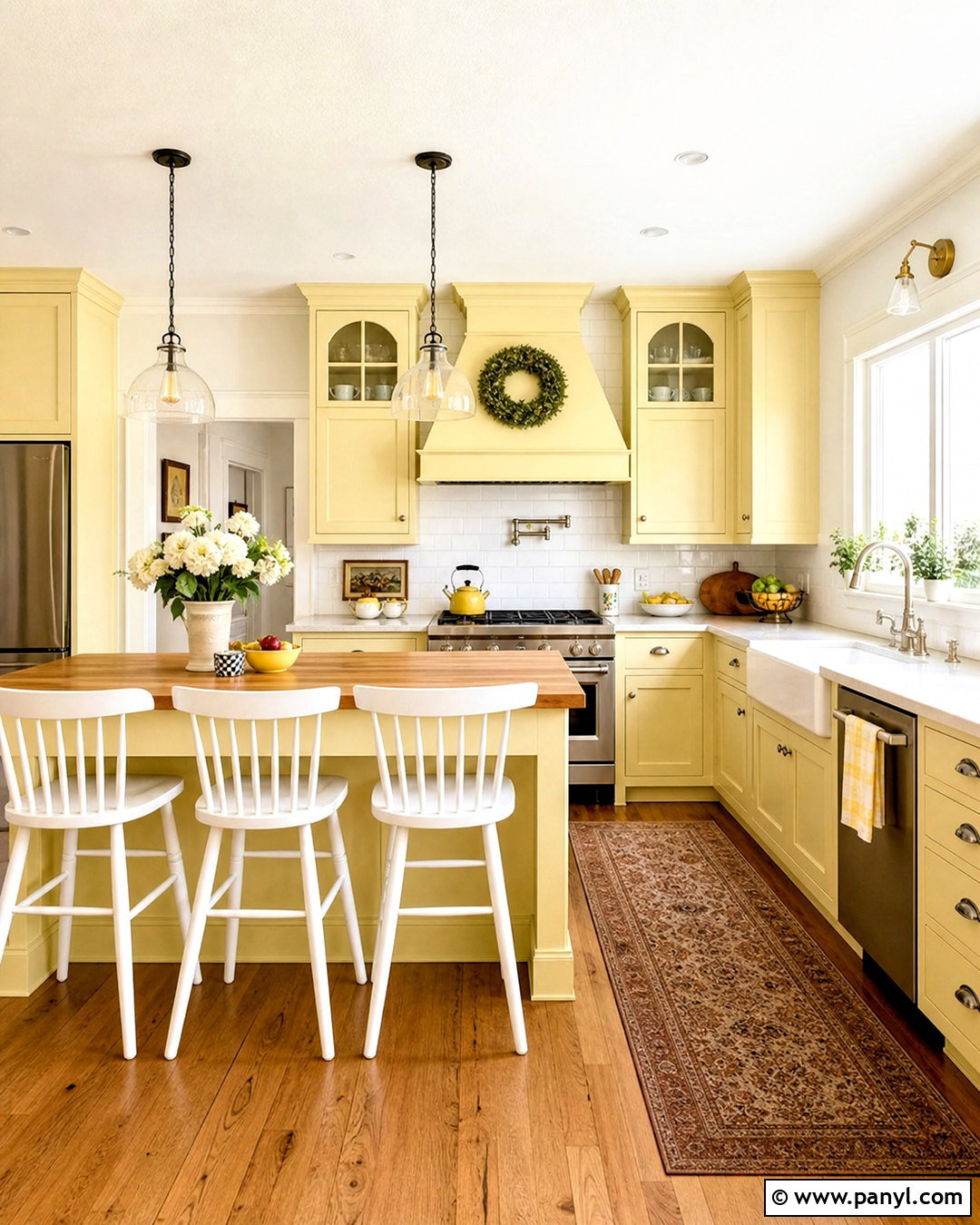
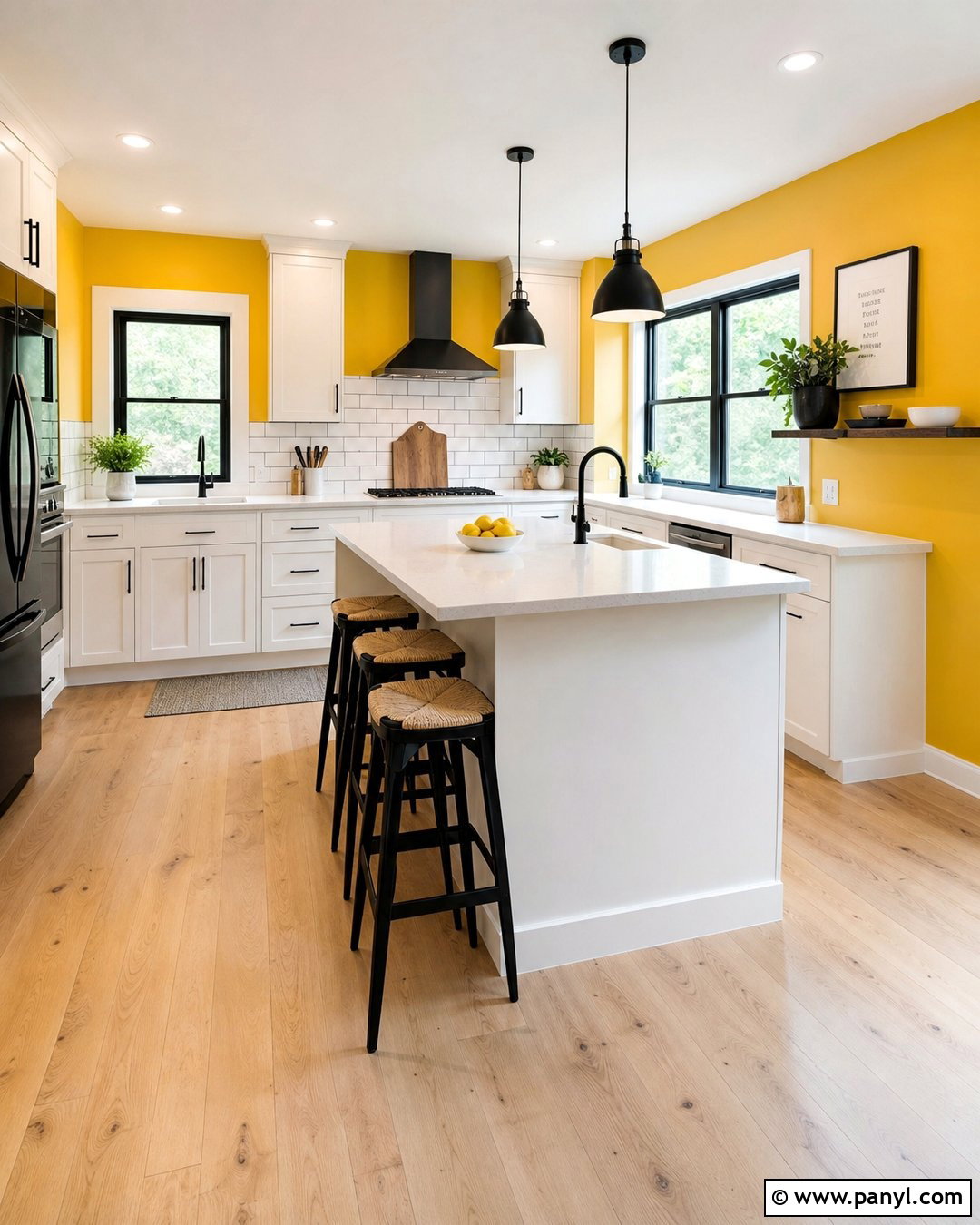
Butter yellow fills a kitchen with cheerful warmth while remaining softer than bright primary yellow. Use the color on the cabinets and range hood, then balance it with warm white walls and pale quartz countertops. A classic white backsplash keeps the design fresh, while oak flooring adds another sunny natural tone. Choose polished nickel hardware for a clean vintage look or aged brass for a warmer cottage finish. A butcher-block island can strengthen the casual character and provide a durable preparation surface. Complete the room with white spindle stools, simple glass pendants, striped cream textiles, and a few pale blue accessories. The blue should remain minimal, acting as a cool counterpoint that allows the gentle yellow cabinetry to stay central.
17. Terracotta And Sand Kitchen
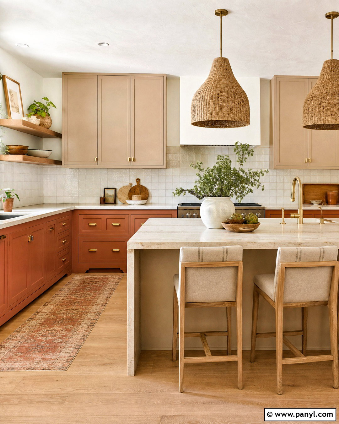
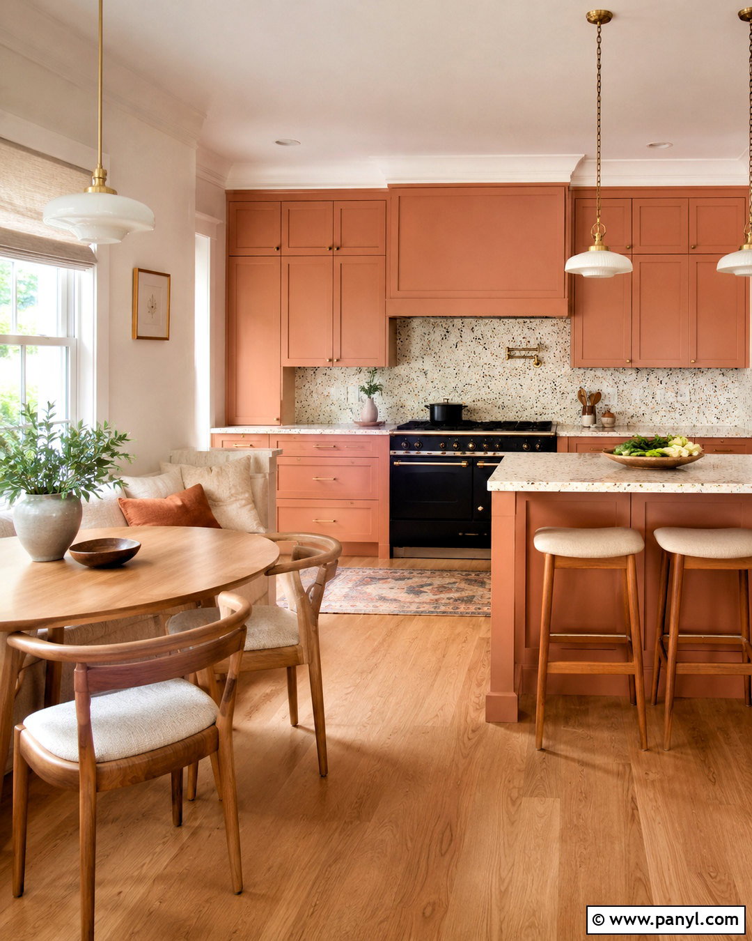
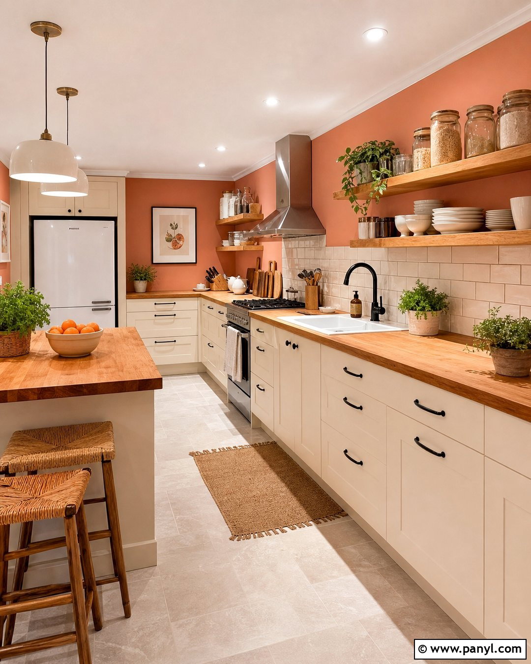
Imagine a kitchen filled with warm clay, sunlit sand, and softly textured natural materials. Paint the lower cabinets a muted terracotta, then use sandy beige on upper cabinetry and walls. Cream limestone or quartz countertops maintain brightness while supporting the warm undertones. Choose a handmade ivory backsplash or continue the countertop material behind the range. Light oak flooring, brushed brass hardware, and woven pendant lights reinforce the organic palette. A sand-colored island with a terracotta base creates a subtle two-tone effect without dividing the room sharply. Add linen counter stools, earthenware pottery, and a small amount of muted olive through plants or textiles. This finished kitchen feels relaxed, tactile, and connected to warm desert landscapes.
18. Rust Red And Maple Kitchen
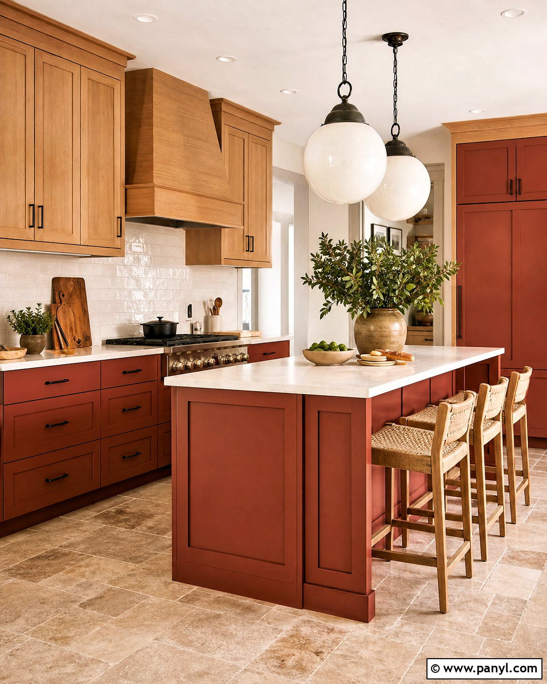
Rust red brings energy to a kitchen, but its earthy brown undertones keep it easier to live with than brilliant red. Use rust on the island and lower cabinets, balancing it with natural maple upper cabinetry and creamy walls. Select light beige quartz counters and a simple off-white tile backsplash to give the stronger color enough visual space. A maple range hood or pantry wall can repeat the wood and create consistency. Dark bronze hardware, woven pendants, and warm stone flooring support the grounded palette. Choose neutral stools with wood frames and add only a few rust-colored accessories. By combining the red cabinetry with pale wood and uncomplicated finishes, the room feels warm, energetic, and welcoming without becoming visually overwhelming.
19. Sky Blue And Brick Red Kitchen
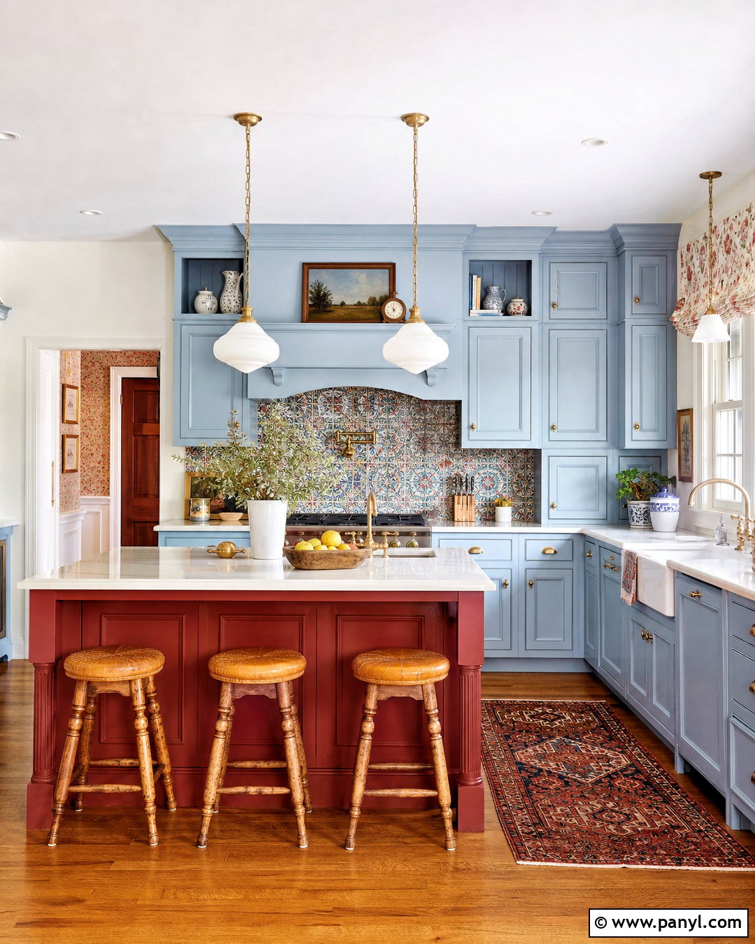
Unexpected color pairings can work beautifully when one shade leads and the other plays a supporting role. Use soft sky blue across the main cabinets, then introduce brick red on the island or inside a glass-front display cabinet. Warm white walls and cream quartz countertops give both colors a calm background. Choose a lightly patterned backsplash containing small touches of blue and red to connect the palette without appearing busy. Medium oak flooring, antique brass hardware, and simple white pendants maintain a casual vintage character. Finish the island with natural wood stools and repeat brick red through one Roman shade or runner. The result is a colorful, cheerful kitchen that still feels organized because each shade has a defined purpose.
20. Blue Green And Warm Beige Kitchen
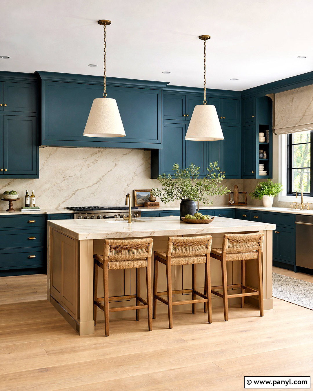
Blue-green cabinetry creates a layered color that can shift between teal, green, and blue as daylight changes. Use it on the perimeter cabinets and balance it with a warm beige island for a relaxed two-tone scheme. Select cream countertops with gentle tan veining and continue them onto the backsplash to unify the different cabinet colors. Brushed brass hardware complements both hues, while light oak flooring keeps the overall kitchen bright. Paint the walls a pale sandy neutral instead of white for a softer transition. Woven counter stools, linen pendant shades, and simple wood accessories complete the natural materials story. This flexible palette brings noticeable color into the room while maintaining the calm, coordinated appearance needed in an everyday family kitchen.
Conclusion:
Choosing a kitchen color palette becomes easier when you consider the entire room instead of focusing only on cabinet paint. Countertops, backsplash materials, flooring, hardware, lighting, and nearby rooms should all support the main colors. Test large samples vertically and horizontally because shades can look different on walls, cabinets, and islands. Warm neutrals offer flexibility, while olive, blue, burgundy, terracotta, and muted pastels introduce more personality. Natural wood can connect nearly any palette and prevent painted surfaces from feeling flat. Most importantly, select colors that suit your home and available daylight. Use these 20 kitchen colours ideas to build a balanced, practical space that feels personal and remains enjoyable for years.

Related Ideas and Inspiration:
Leave a Reply