
Choosing the right wall colors can completely change how a room feels, functions, and connects with the rest of your home. These 25 Color Combination For Wall Ideas explore balanced pairings for living rooms, bedrooms, kitchens, bathrooms, offices, and transitional spaces. Each look includes wall placement, furnishings, finishes, and decorative accents, so you can recreate a complete design rather than simply copy two paint swatches. For a cohesive result, choose colors with compatible undertones and test large samples in morning, afternoon, and evening light before painting. A dominant shade paired with a smaller secondary color usually creates the most comfortable balance. () Whether you prefer soft neutrals or confident contrast, the following 25 Color Combination For Wall Ideas offer practical inspiration.

1. Sage Green And Warm White Wall Color Combination
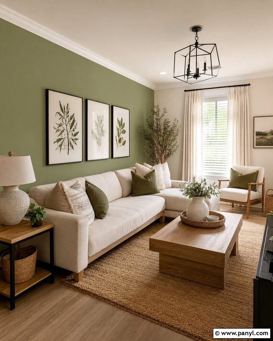
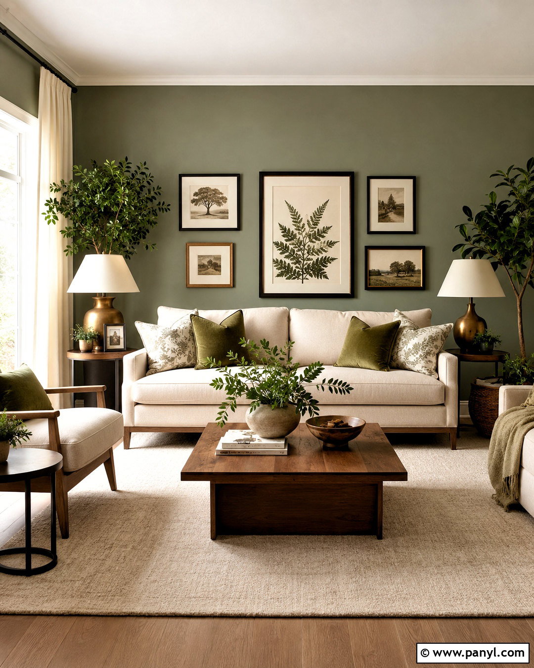
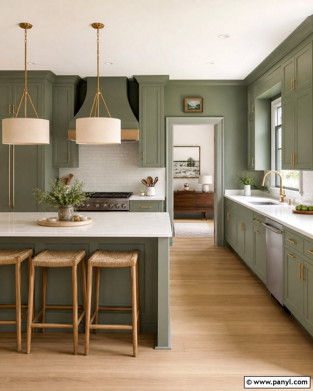
Sage green and warm white create a peaceful living room that feels fresh without looking cold. Paint the main walls a creamy white, then use muted sage on the wall behind the sofa or fireplace. An oatmeal-colored sofa, light oak coffee table, and woven natural-fiber rug keep the space relaxed. Add olive pillows, ivory curtains, and black metal lighting for definition. Warm white trim helps both wall colors flow smoothly instead of creating a sharp boundary. This combination works especially well in rooms with garden views, wood flooring, or plenty of daylight. For a more finished look, repeat the sage through ceramics and botanical artwork while allowing cream upholstery and pale wood to remain visually dominant.
2. Navy Blue And Crisp White Wall Color Combination
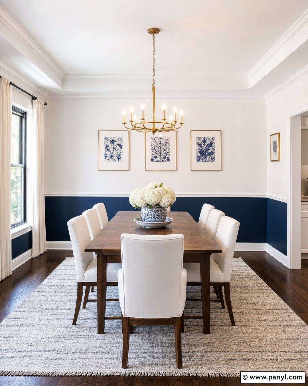
Navy blue and crisp white give a dining room clean contrast and a classic sense of structure. Use navy on the lower two-thirds of the walls, finishing it with a simple chair rail. Paint the upper portion, ceiling, and trim a clean white to keep the room bright. A medium-toned walnut dining table warms the strong palette, while white upholstered chairs prevent the arrangement from becoming too heavy. Add brushed brass lighting, blue-and-white artwork, and a flat-weave rug containing both colors. The navy section can also conceal everyday marks in a busy dining area. This complete scheme feels polished in traditional, coastal, and transitional homes without requiring elaborate architectural details or expensive wall treatments.
3. Terracotta And Cream Wall Color Combination
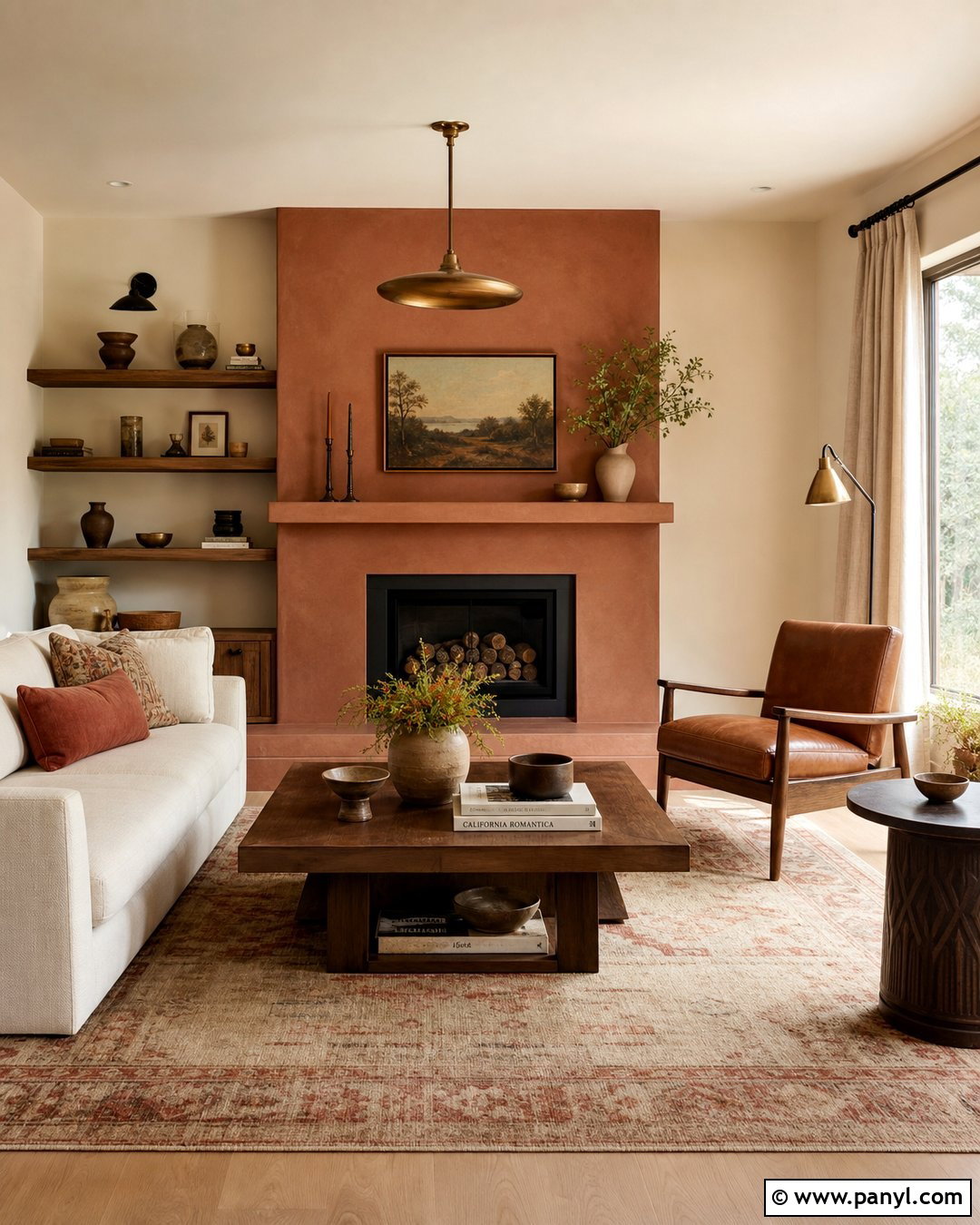
Terracotta and cream can turn an ordinary living room into a warm, earthy retreat. Cover the fireplace wall in softened terracotta rather than a bright orange shade, then use creamy beige across the remaining walls and ceiling. Choose a low-profile cream sofa, walnut side tables, and a textured wool rug in sand and rust. Linen curtains should stay close to the cream wall color, helping the room appear taller and calmer. A leather chair, handmade pottery, and aged brass fixtures deepen the natural palette. Instead of adding many small accessories, display one large abstract artwork that includes clay, brown, and ivory. This wall combination works beautifully with wood flooring and receives a richer appearance in afternoon sunlight.
4. Greige And Charcoal Wall Color Combination
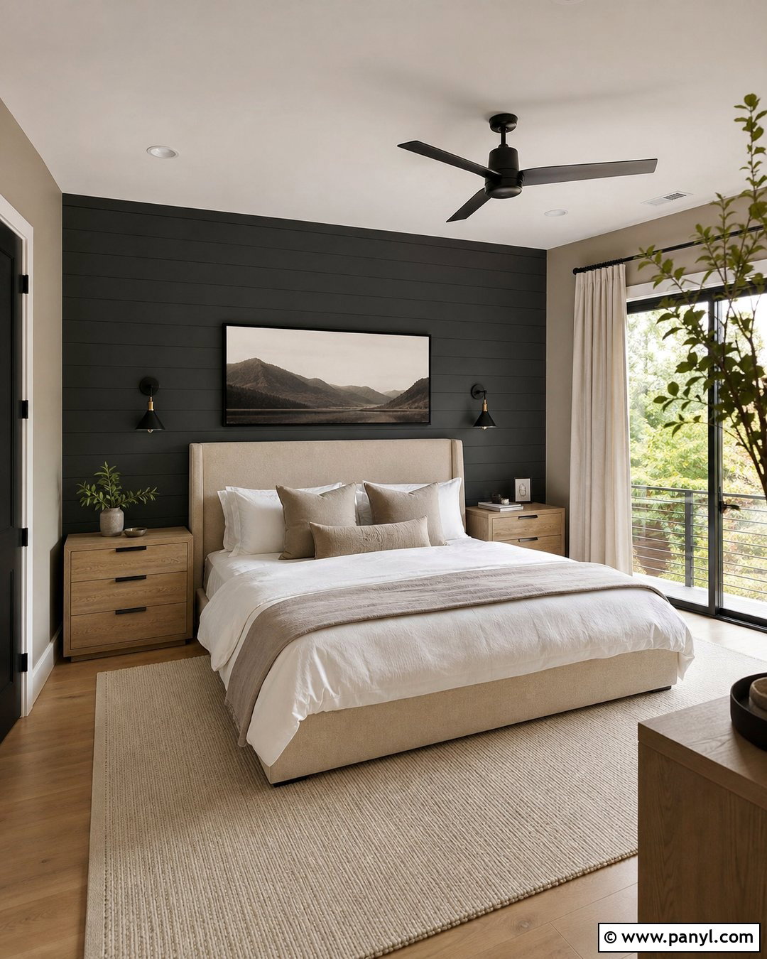
Greige and charcoal deliver a sophisticated bedroom without making the sleeping area feel gloomy. Paint most walls a warm greige, then place charcoal behind the upholstered bed to create a strong focal point. Select a beige linen headboard, light oak nightstands, and white bedding layered with gray and taupe throws. Matte black sconces connect visually with the darker wall while freeing the nightstands from bulky lamps. Use pale curtains and a soft wool rug to balance the charcoal’s depth. Keep the ceiling warm white rather than stark white, which can look disconnected beside greige. Minimal landscape artwork, smoky glass accessories, and one leafy plant complete a restful bedroom that feels modern, comfortable, and intentionally coordinated.
5. Dusty Blue And Soft Beige Wall Color Combination
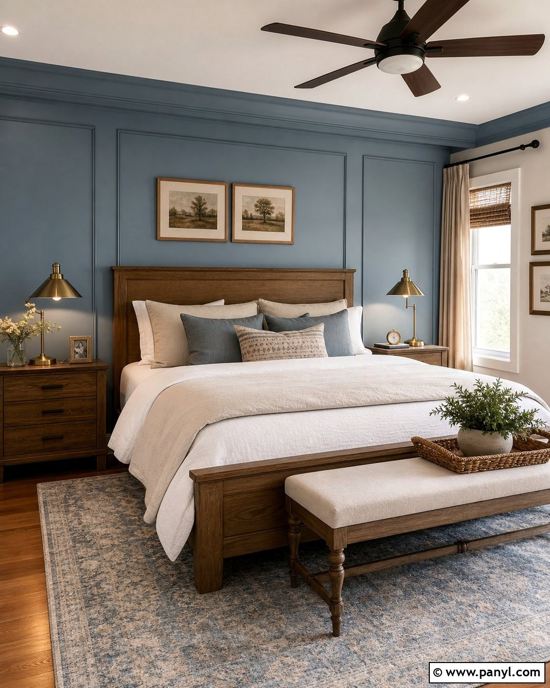
Dusty blue and soft beige bring quiet color to a bedroom while maintaining a comfortable neutral base. Apply dusty blue to the headboard wall and continue it onto a shallow ceiling border for a gently wrapped effect. Paint the remaining walls soft beige, choosing a shade with warm rather than yellow undertones. A natural oak bed, ivory bedding, and beige curtains create an airy foundation. Introduce faded blue through a patterned rug and two decorative pillows, but avoid matching every accessory precisely. Antique brass lamps and warm wood frames keep the blue from feeling chilly. This complete look works in primary bedrooms, guest rooms, and smaller spaces where dark navy might appear too dominant or reduce the sense of openness.
6. Blush Pink And Olive Green Wall Color Combination
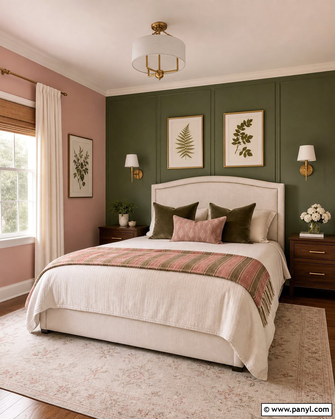
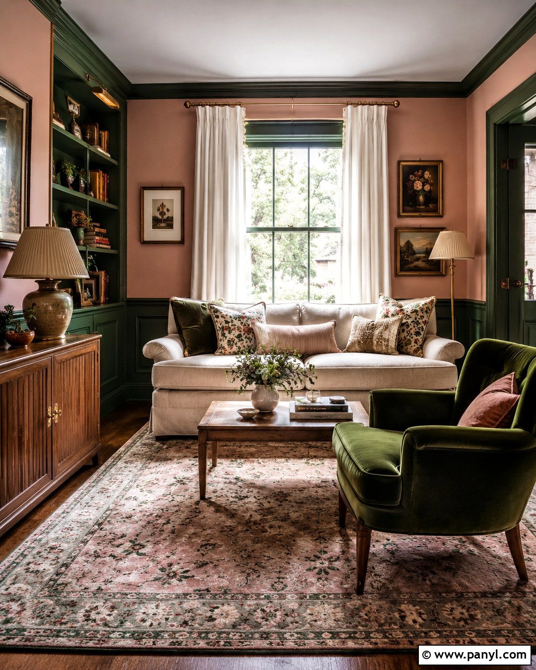
Blush pink and olive green create a guest room that feels welcoming, grounded, and slightly playful. Paint three walls a dusty blush with muted brown undertones, then use olive green behind the bed. An off-white upholstered headboard softens the transition between both colors. Choose walnut nightstands, cream bedding, and a striped throw that subtly repeats pink and green. Brass wall sconces add warmth, while simple botanical prints connect the olive accent to a natural theme. Keep curtains and the area rug light so the room does not become overly saturated. This combination feels most balanced when neither color is excessively bright. The finished space should read as earthy and relaxed rather than sugary, tropical, or overly themed.
7. Butter Yellow And White Wall Color Combination
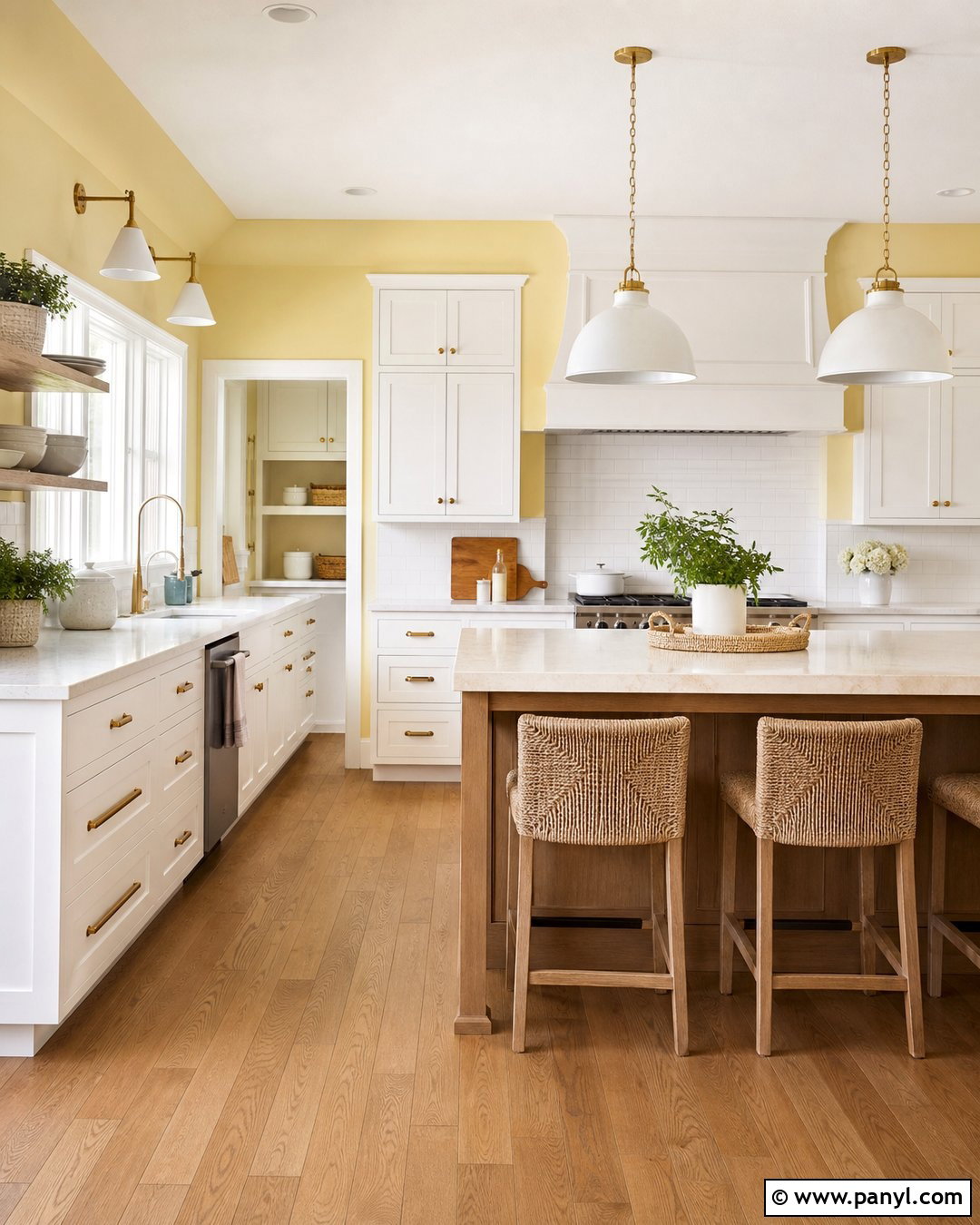
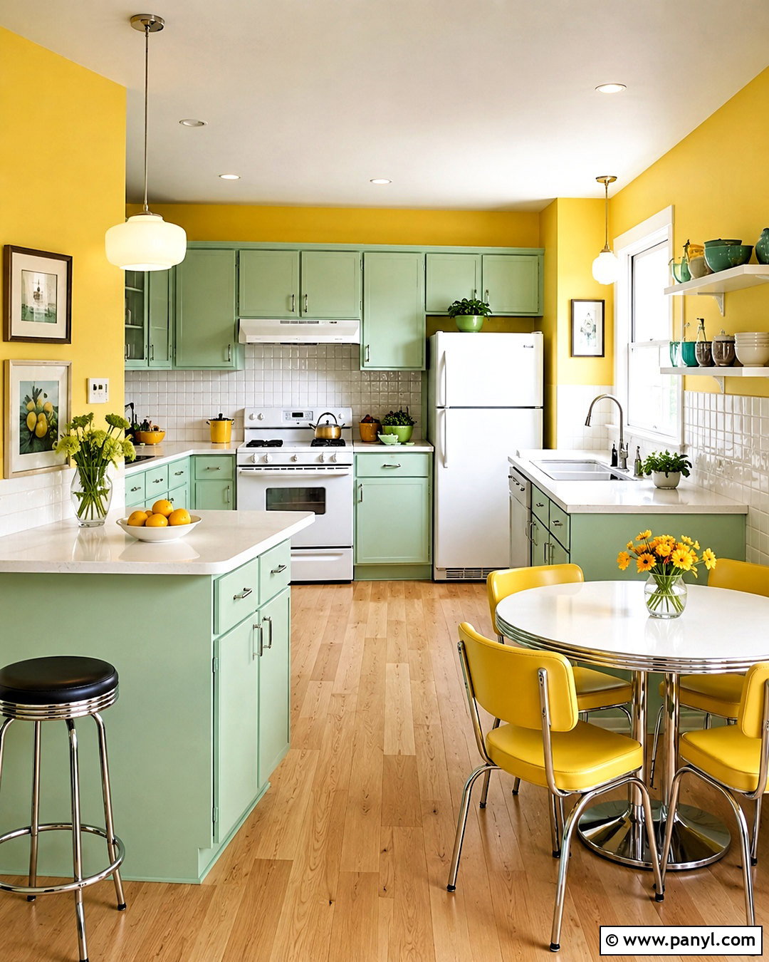
Butter yellow and white make a kitchen feel sunny even when natural light is limited. Use gentle butter yellow on the main walls, then paint cabinets, trim, and the backsplash wall a soft white. Warm oak flooring, pale quartz counters, and unlacquered brass hardware complement the yellow without making the room look overly traditional. A compact wood island can provide contrast and practical workspace. Add woven counter stools, white ceramic pendants, and restrained green accents through herbs or simple tableware. Avoid intense lemon shades, which can reflect harshly across cabinets and counters. This complete kitchen palette works best when the yellow is soft enough to behave like a warm neutral, giving the room energy while remaining comfortable throughout the day.
8. Teal And Warm Gray Wall Color Combination
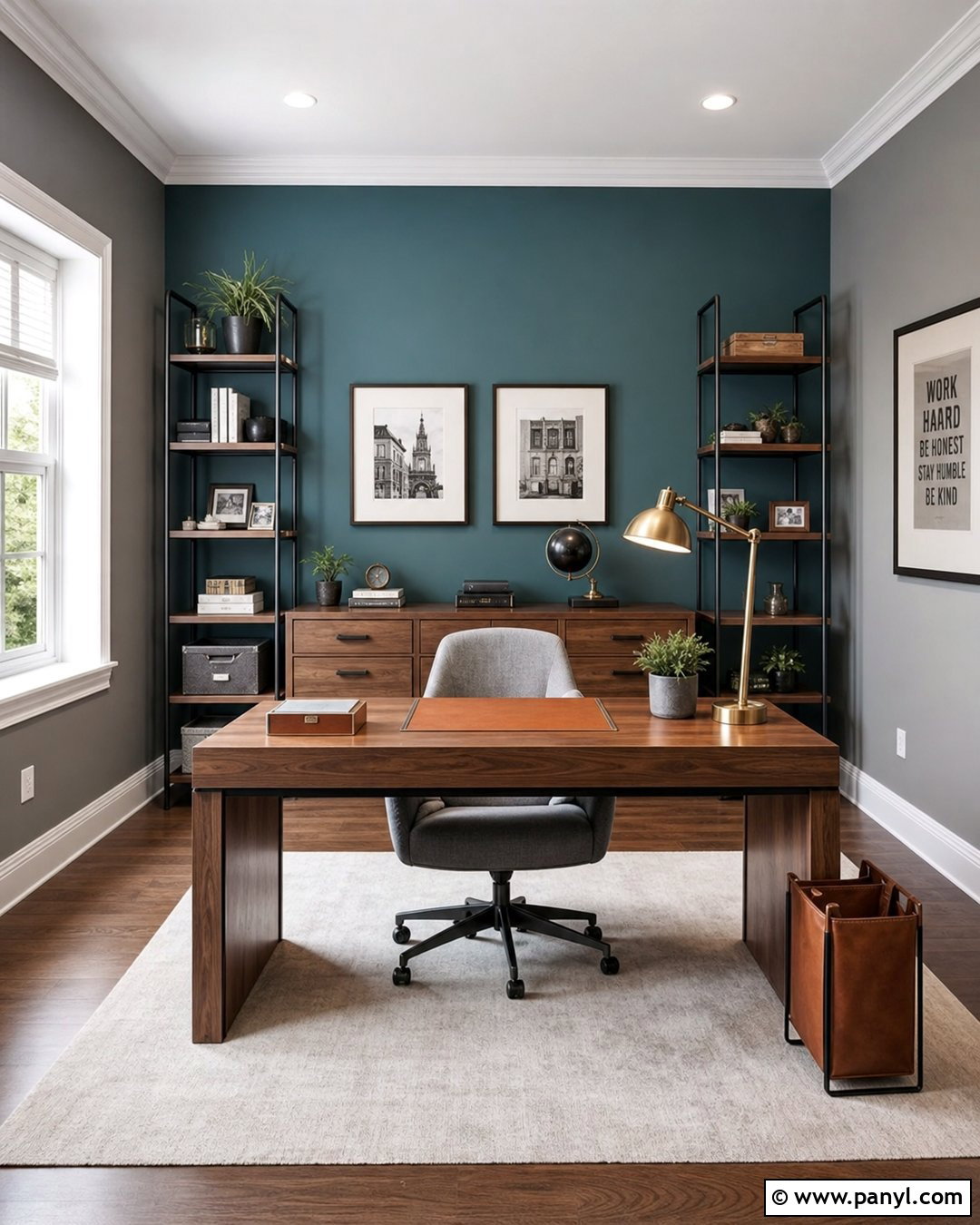
Teal and warm gray can give a home office focus, personality, and visual order. Paint the desk wall a medium-depth teal and cover the remaining walls in warm gray. A streamlined walnut desk, gray upholstered chair, and black metal shelving make the palette feel professional rather than decorative. Place closed storage along the teal wall so cabinetry and artwork form one organized focal area. A light rug and white ceiling prevent the saturated color from enclosing the workspace. Use brushed brass task lighting and cognac leather accessories for extra warmth. This design is especially effective in a room used for video meetings because the teal creates a clear background, while the surrounding gray reduces distraction and keeps the overall office calm.
9. Forest Green And Taupe Wall Color Combination
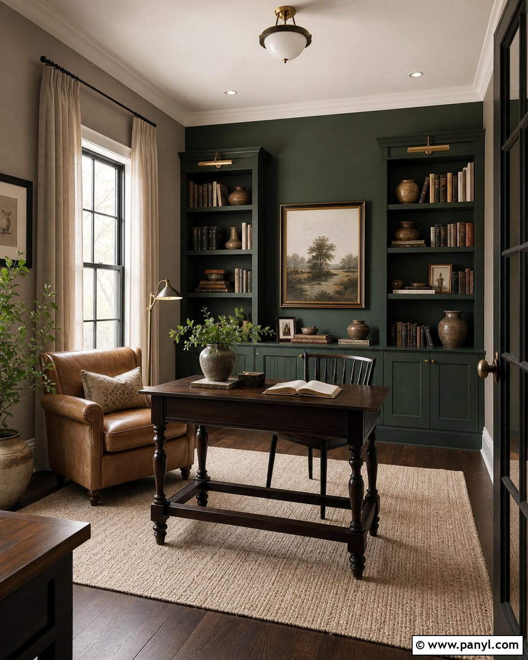
Forest green and taupe create a cozy library or reading room with depth and warmth. Use deep forest green on built-in bookshelves and the wall behind them, then paint the other walls a medium taupe. A camel leather chair, dark wood side table, and oatmeal rug introduce rich texture without competing with the wall colors. Add an antique brass floor lamp and linen window treatments for soft, practical lighting. Books, pottery, and framed sketches should be arranged with breathing room rather than packed tightly across every shelf. Keep the ceiling and crown molding a lighter taupe to preserve height. The completed room feels intimate and grounded, making it suitable for reading, quiet conversation, or an elegant secondary home office.
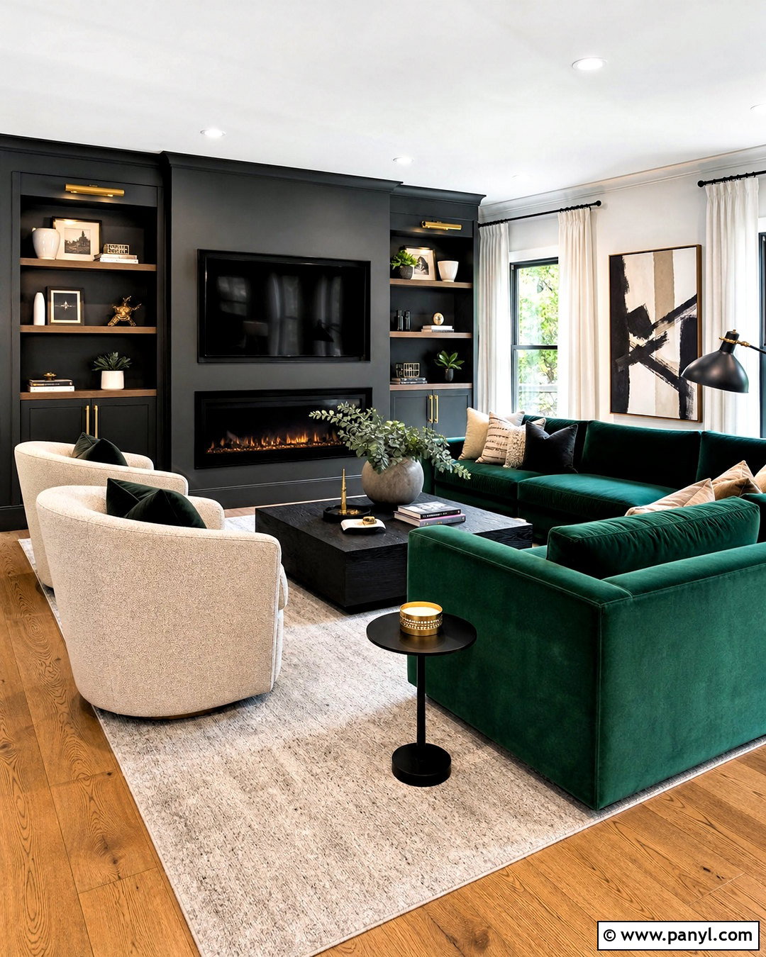
10. Clay Pink And Burgundy Wall Color Combination
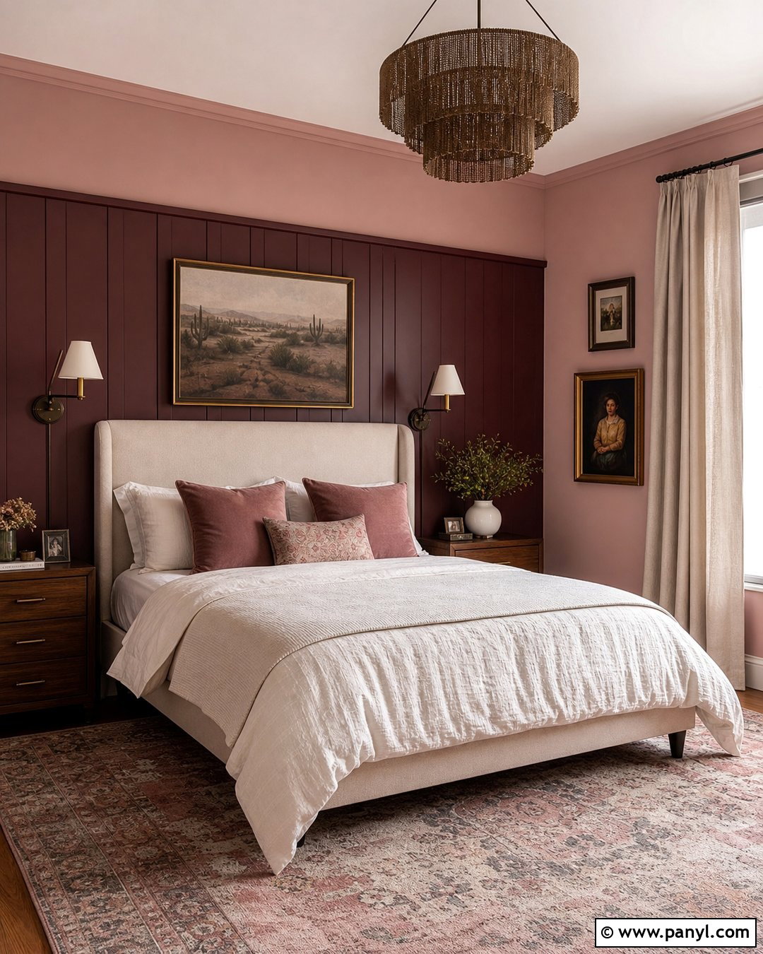
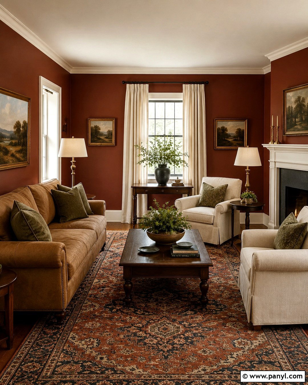
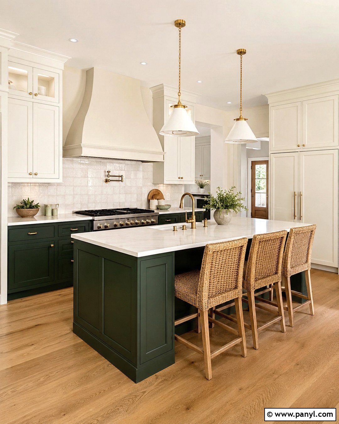
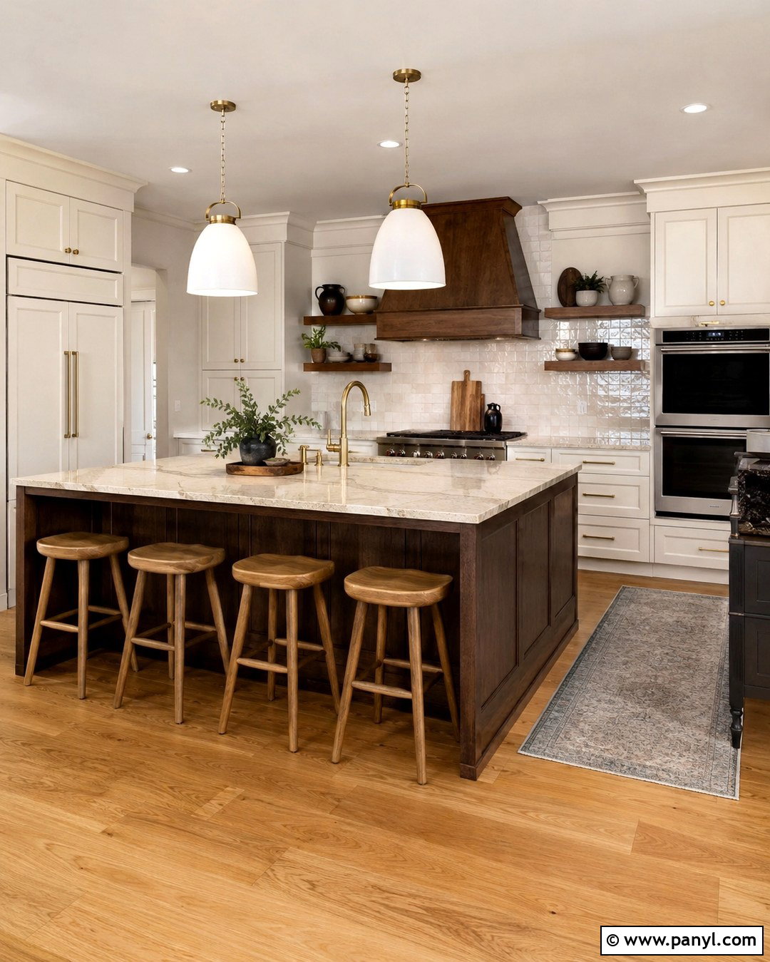
Clay pink and burgundy produce a layered bedroom that feels rich but still restful. Paint the main walls a muted clay pink, then apply burgundy to the wall behind the bed. Choose a tall oatmeal headboard to break up the darker surface and prevent the bed from disappearing into it. Walnut furniture, cream bedding, and dusty rose pillows create a smooth transition between the two wall colors. Add dark bronze sconces and a vintage-inspired rug containing faded red, tan, and blue. Window coverings should remain neutral and full-length to soften the strong palette. This combination is especially effective in rooms with limited architectural detail because the burgundy creates a clear focal point while clay pink brings gentle warmth to every surrounding wall.
11. Sky Blue And Cloud White Wall Color Combination
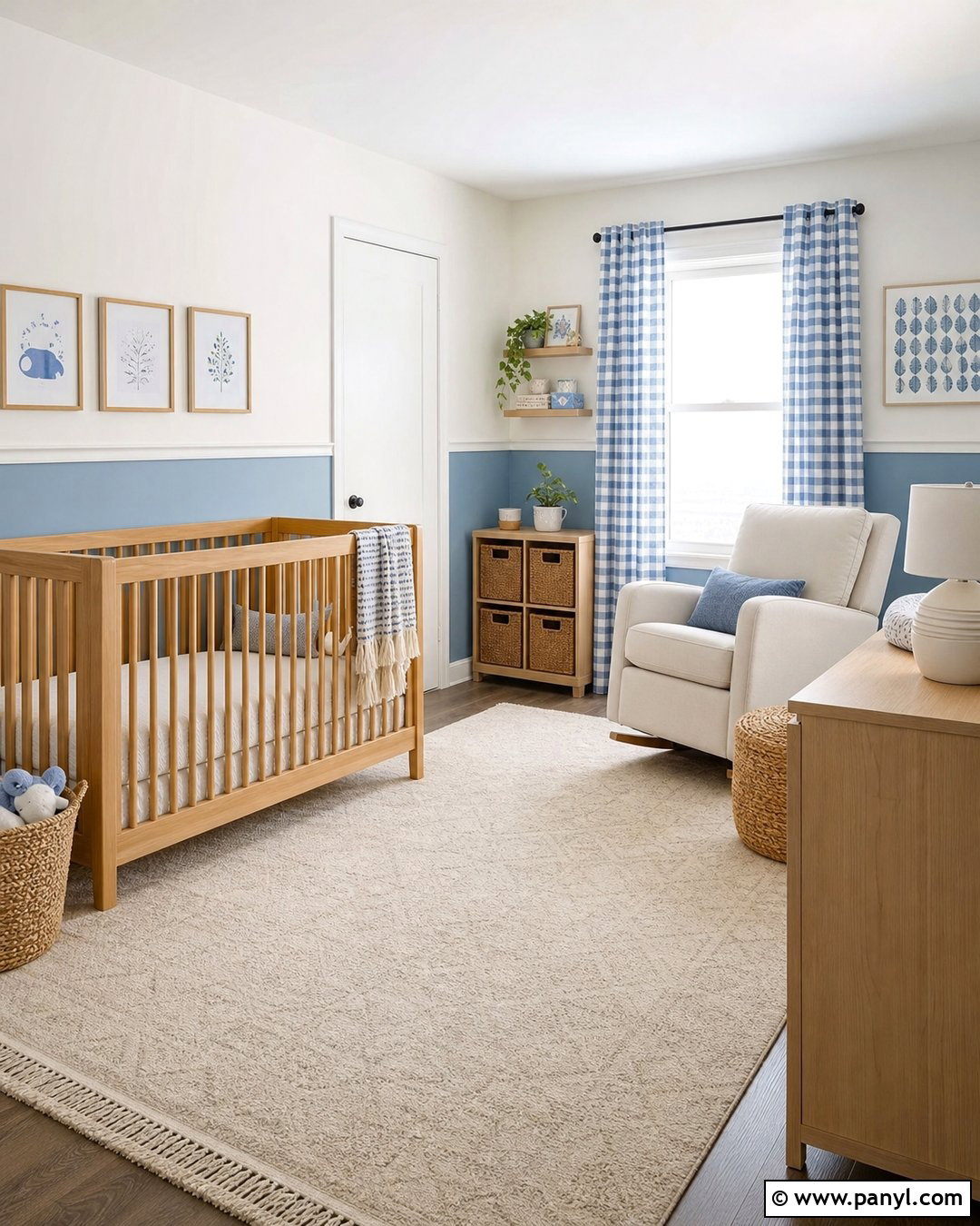
Sky blue and cloud white create a nursery that feels bright, peaceful, and adaptable as a child grows. Paint the lower half of the walls a softened sky blue and the upper half cloud white, dividing them with slim white molding. Place a natural wood crib against the blue section and add a comfortable ivory glider nearby. A washable cream rug, pale wood dresser, and simple woven baskets make the room practical without disrupting the airy palette. Use curtains in a small blue-and-white pattern, plus restrained accents in tan and muted green. Avoid heavily themed decor that may quickly feel dated. The two-tone wall treatment supplies enough visual interest, while flexible furniture and accessories allow the nursery to transition into a toddler room later.
12. Lavender And Stone Gray Wall Color Combination
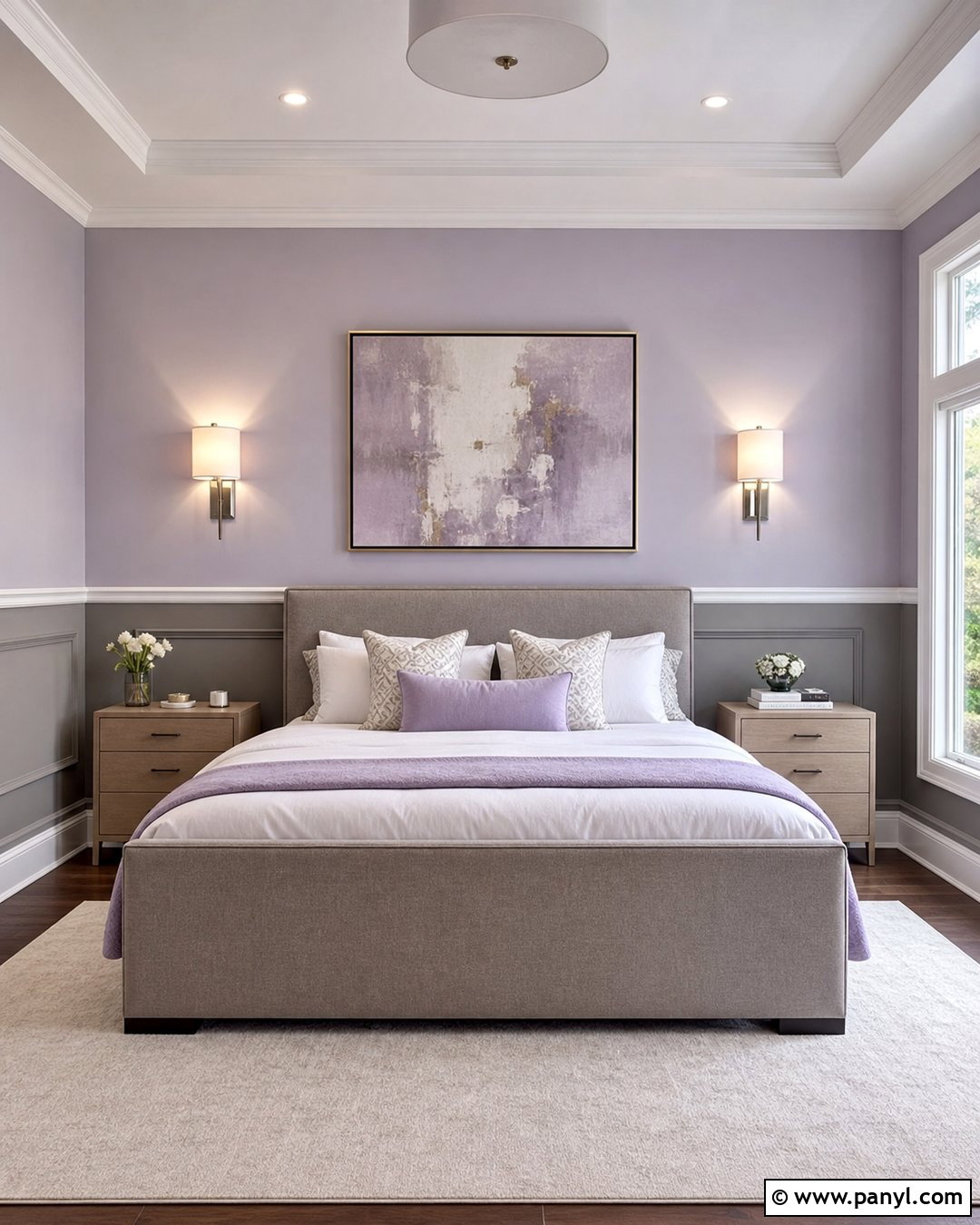
Lavender and stone gray offer a soft bedroom palette with a more contemporary character than lavender and white. Apply pale, grayed lavender to the upper walls and use stone gray below a simple horizontal molding. An upholstered bed in warm gray keeps the larger furniture connected to the lower wall color. Layer white sheets with lavender, charcoal, and light taupe textiles for dimension. Pale oak nightstands and brushed nickel sconces maintain a cool, clean finish, while an ivory rug provides warmth underfoot. Choose abstract artwork rather than floral decor to prevent the room from appearing overly delicate. This full design works particularly well in teen rooms and guest bedrooms because it feels expressive, calm, and easy to update with new accessories.
13. Caramel Brown And Ivory Wall Color Combination
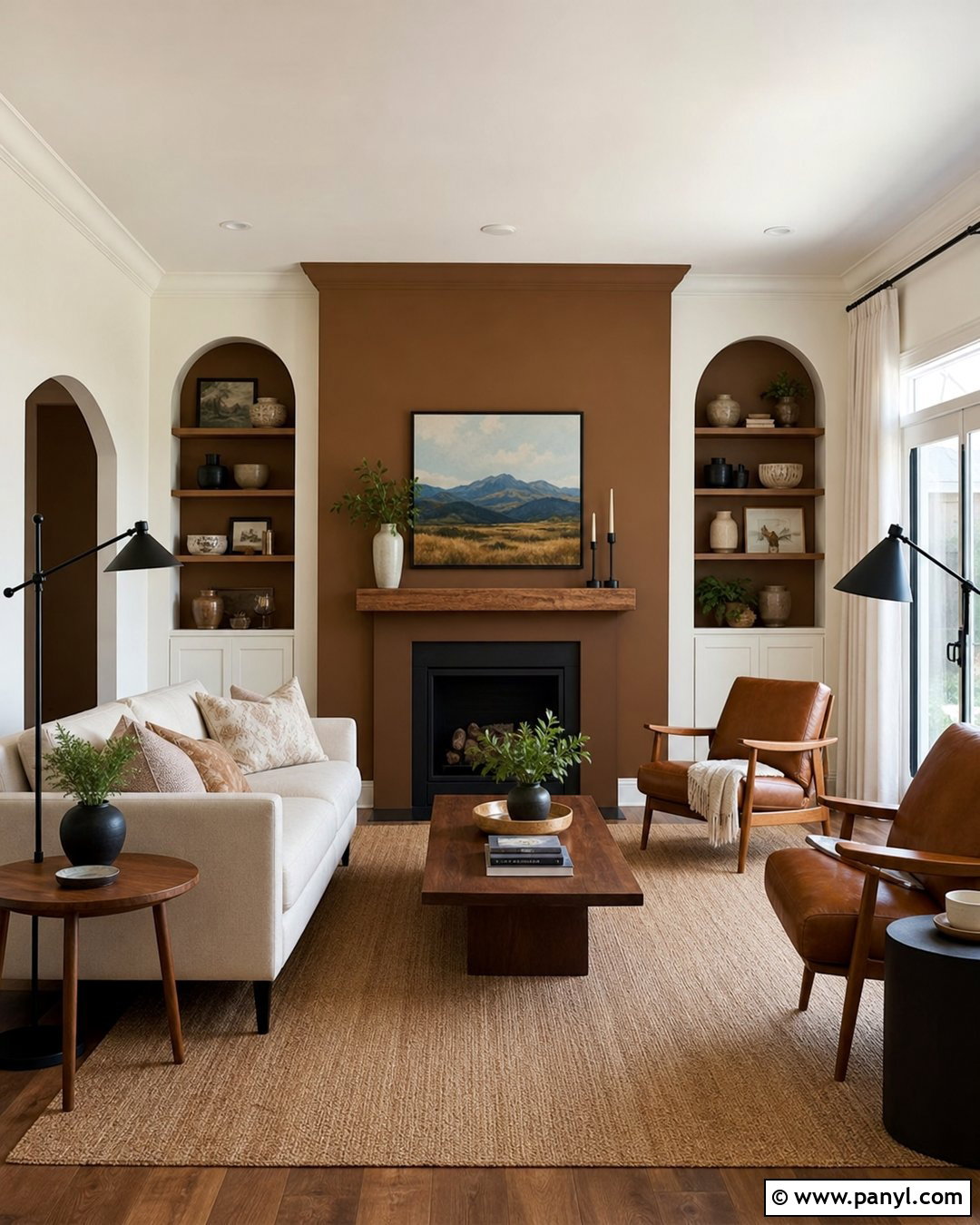
Caramel brown and ivory make a living room feel warm, substantial, and comfortable throughout the year. Paint the television or fireplace wall a rich caramel brown, then use soft ivory across the surrounding walls and ceiling. Arrange an ivory sofa opposite two cognac leather chairs, creating a balanced conversation area around a walnut coffee table. A large beige rug grounds the seating and prevents dark furniture from blending into wood flooring. Add black metal lamps, linen curtains, and artwork containing cream, brown, and muted blue. The caramel wall should have enough depth to frame electronics, shelving, or a fireplace, but it should not appear nearly black. This finished palette suits transitional, organic modern, and midcentury-inspired homes.
14. Black And Warm White Wall Color Combination
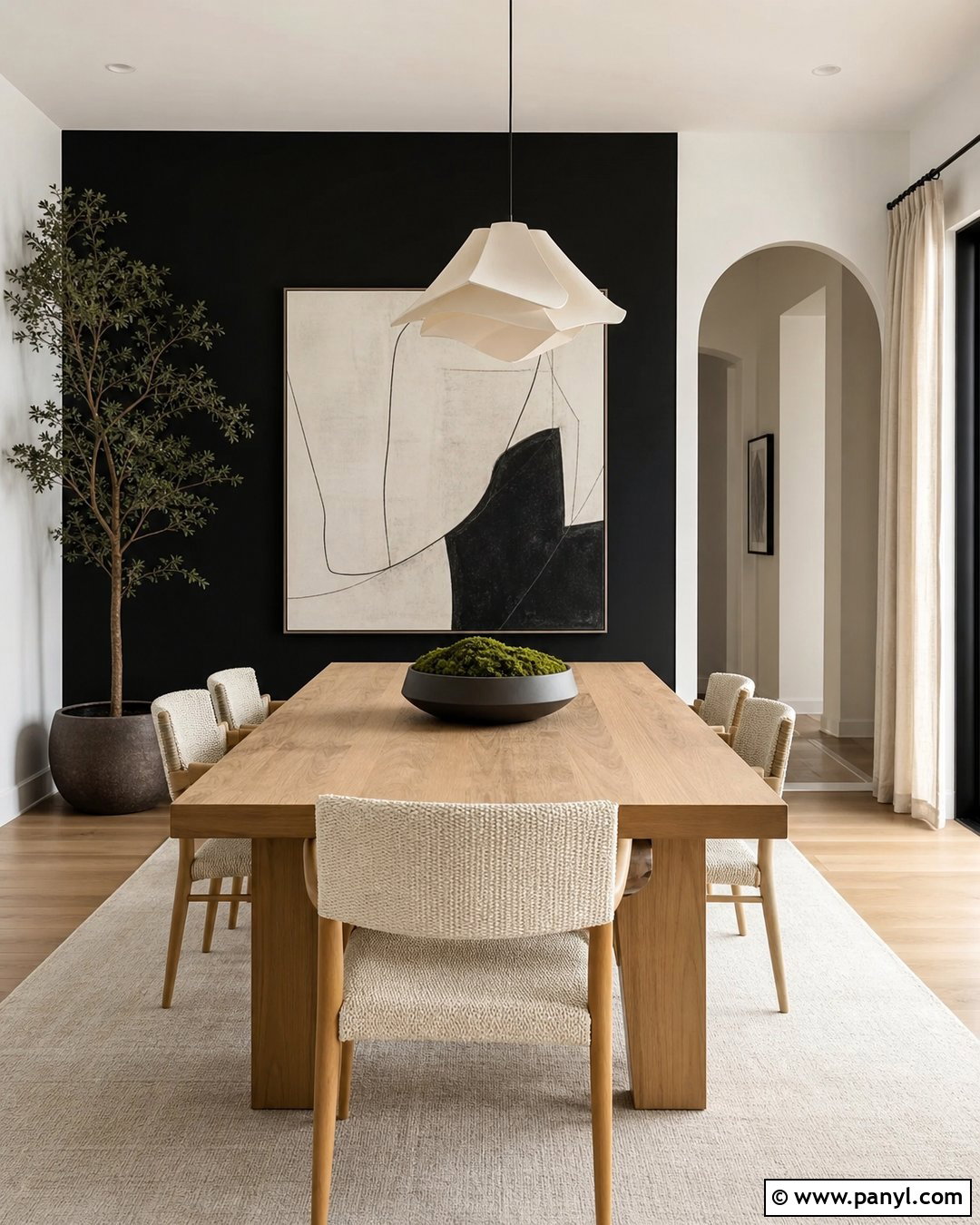
Black and warm white create a dramatic dining room when the dark color is used with restraint. Paint one uninterrupted wall matte black and keep the other walls, trim, and ceiling warm white. Position a light oak dining table against the darker backdrop, then surround it with woven or cream upholstered chairs. A sculptural white pendant light adds contrast above the table, while a pale rug keeps the floor area visually open. Display one oversized artwork with white space instead of filling the black wall with many small frames. Natural linen curtains and greenery soften the sharp palette. Repeating black through narrow window frames, chair legs, or candleholders creates continuity, resulting in a bold room that still feels welcoming and balanced.
15. Peach And Light Gray Wall Color Combination
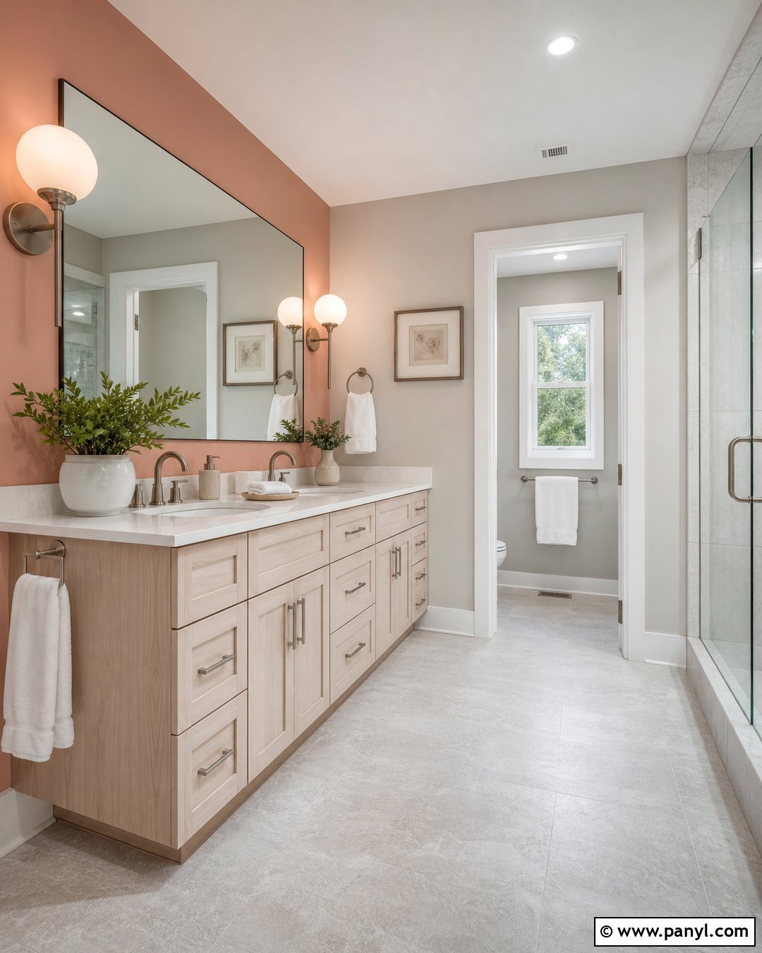
Peach and light gray bring gentle warmth to a bathroom without relying on predictable blue or all-white surfaces. Paint the vanity wall a muted peach and use light gray on the remaining moisture-resistant walls. A white oak vanity, white quartz counter, and brushed nickel fixtures create a clean foundation. Choose pale gray floor tile with subtle texture, then add a frameless mirror and globe sconces for even illumination. White towels and a simple shower curtain keep the small room from becoming busy. Repeat peach through one ceramic planter or bath mat rather than numerous matching accessories. The gray controls the warmth of the peach, while the peach keeps hard bathroom finishes from feeling clinical. Together, they create a fresh and approachable everyday space.
16. Emerald Green And Soft Pink Wall Color Combination
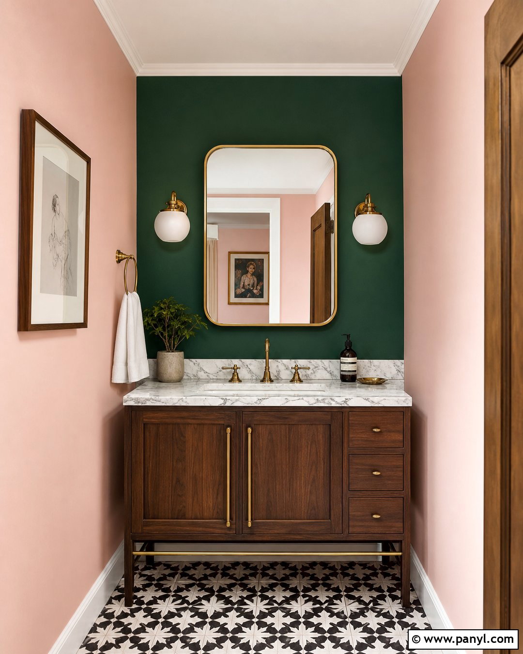
Emerald green and soft pink can transform a powder room into a confident, polished space. Use saturated emerald on the vanity wall and a muted plaster-like pink on the remaining walls. A compact walnut vanity, white marble counter, and brass faucet introduce classic materials that bridge both colors. Add a rounded brass mirror and two opal glass sconces for symmetry. Black-and-white patterned floor tile supplies crisp contrast without introducing another strong hue. Because a powder room is small and used briefly, it can support richer color than a large living area. Keep towels and accessories white or cream, allowing the walls to remain the main feature. The finished room feels bold, coordinated, and memorable without depending on complicated decorative treatments.
17. Rust Orange And Oatmeal Wall Color Combination
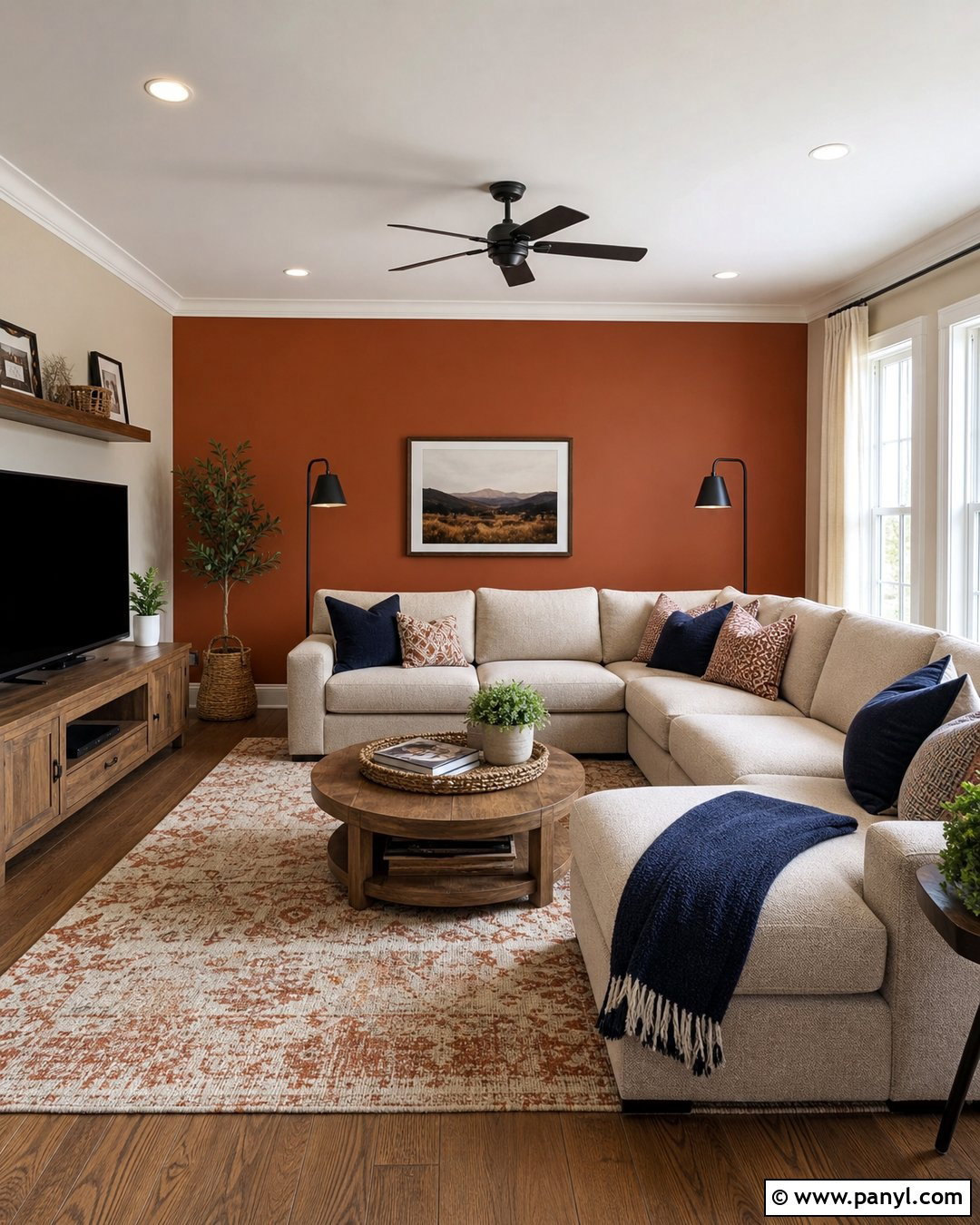
Rust orange and oatmeal create a family room that feels energetic yet comfortable. Paint the wall behind the sectional a softened rust shade and cover the remaining walls in warm oatmeal. Choose a deep beige sectional, oak media console, and durable patterned rug containing rust, cream, and muted brown. Navy pillows can provide a small amount of cool contrast, while woven baskets and linen curtains reinforce the relaxed atmosphere. Use black floor lamps and simple framed artwork to add structure. Avoid bright orange accessories, since the feature wall already provides enough color. This combination works especially well in rooms used for games, reading, and casual gatherings because the neutral surfaces remain practical while the rust wall gives the shared space a distinct identity.
18. Cobalt Blue And Cream Wall Color Combination
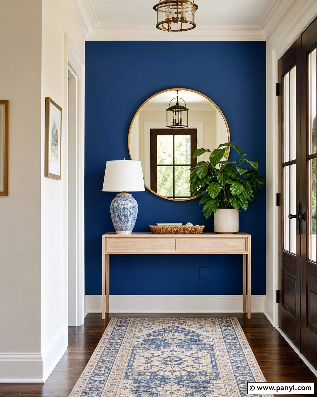
Cobalt blue and cream turn an entryway into a clear introduction to the home’s personality. Paint the wall facing the front door cobalt blue, then use cream on adjoining walls, trim, and the ceiling. Place a narrow light wood console against the blue surface and hang a large round brass mirror above it. A patterned runner containing blue, tan, and ivory helps lead the palette into nearby rooms. Add a ceramic lamp, woven tray, and one simple plant without overcrowding the console. If the entry has interior doors, keep them cream so the blue wall remains the strongest feature. This complete arrangement delivers bold color in a controlled area and works particularly well when surrounding living spaces use softer neutral tones.
19. Mocha Brown And Linen Wall Color Combination
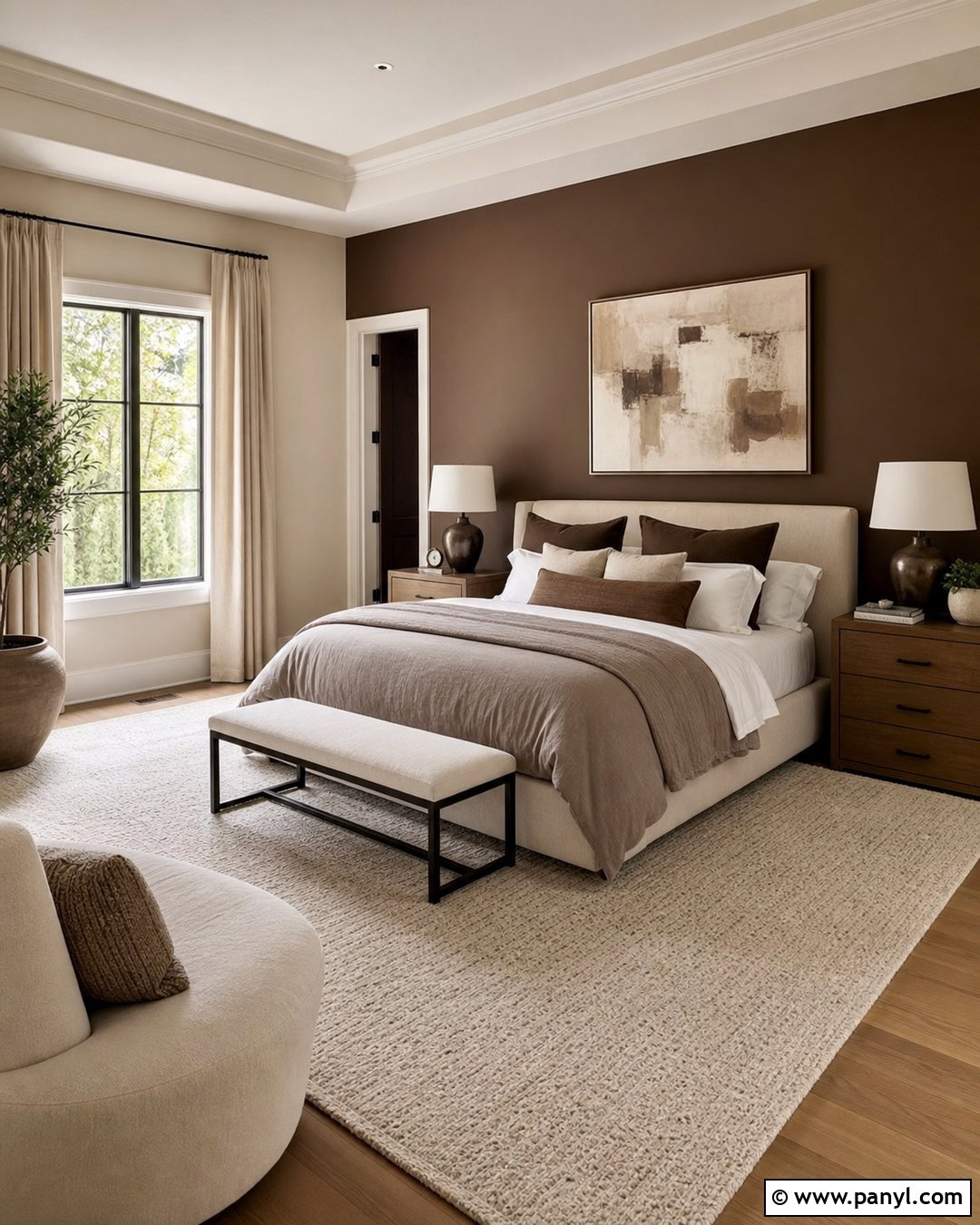
Mocha brown and linen establish a restful bedroom with rich, comforting neutrals. Paint the bed wall a deep mocha and use light linen beige on the remaining walls. Select an upholstered bed in warm cream, then layer it with white sheets, taupe blankets, and chocolate brown pillows. Medium oak nightstands prevent the scheme from becoming too dark, while bronze lamps add understated contrast. Full-length linen curtains should closely match the lighter walls, visually expanding the windows. A textured ivory rug brightens the floor and softens the room acoustically. Keep artwork minimal, using one wide abstract piece with brown, beige, and muted green. The finished bedroom feels grounded and luxurious, yet every element remains practical enough for a comfortable, everyday home.
20. Muted Coral And Sage Green Wall Color Combination
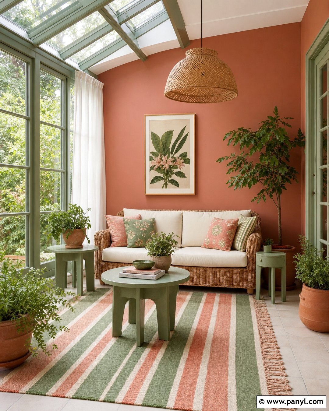
Muted coral and sage green create a cheerful sunroom inspired by garden colors. Paint the window wall soft sage, including narrow sections between the frames, and use muted coral on the largest solid wall. Furnish the room with a natural rattan sofa, cream cushions, and two sage-painted side tables. A washable striped rug can include coral, green, and beige without making the space overly colorful. Add lightweight white curtains that filter sunlight while preserving the view. Terracotta planters and leafy plants connect the indoor palette with the landscape outside. Keep the ceiling white and choose woven pendant lighting for a breezy finish. This complete combination feels lively in daylight but remains soft enough for reading, breakfast, or quiet afternoon relaxation.
21. Deep Plum And Greige Wall Color Combination
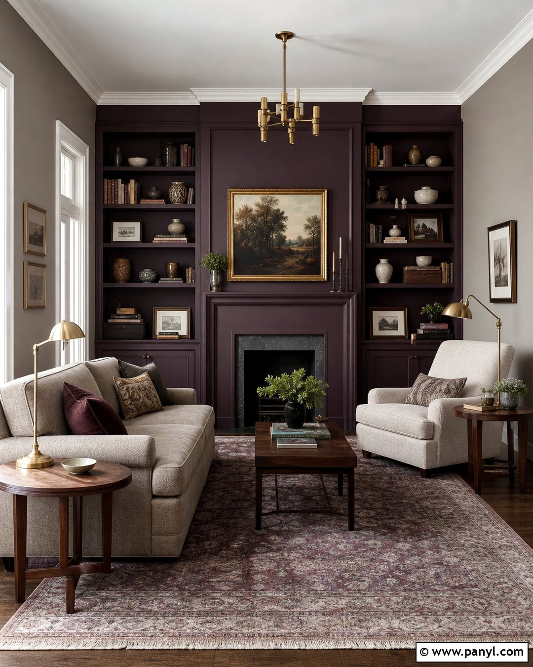
Deep plum and greige give a reading room or compact den an intimate, sophisticated atmosphere. Use plum on the wall surrounding built-in shelves or a fireplace, then paint the other walls balanced greige. A light taupe sofa and cream reading chair prevent the darker accent from dominating the room. Add walnut tables, antique brass lighting, and a low-pile rug with faded plum and gray details. Books and decorative objects should repeat the palette subtly rather than matching it exactly. Warm white trim provides a clean edge around doors and windows. The plum works best when it has brown or gray undertones instead of a bright purple cast. With restrained accessories and layered lighting, the completed room feels cozy, grown-up, and suitable for everyday use.
22. Turquoise And Sand Wall Color Combination
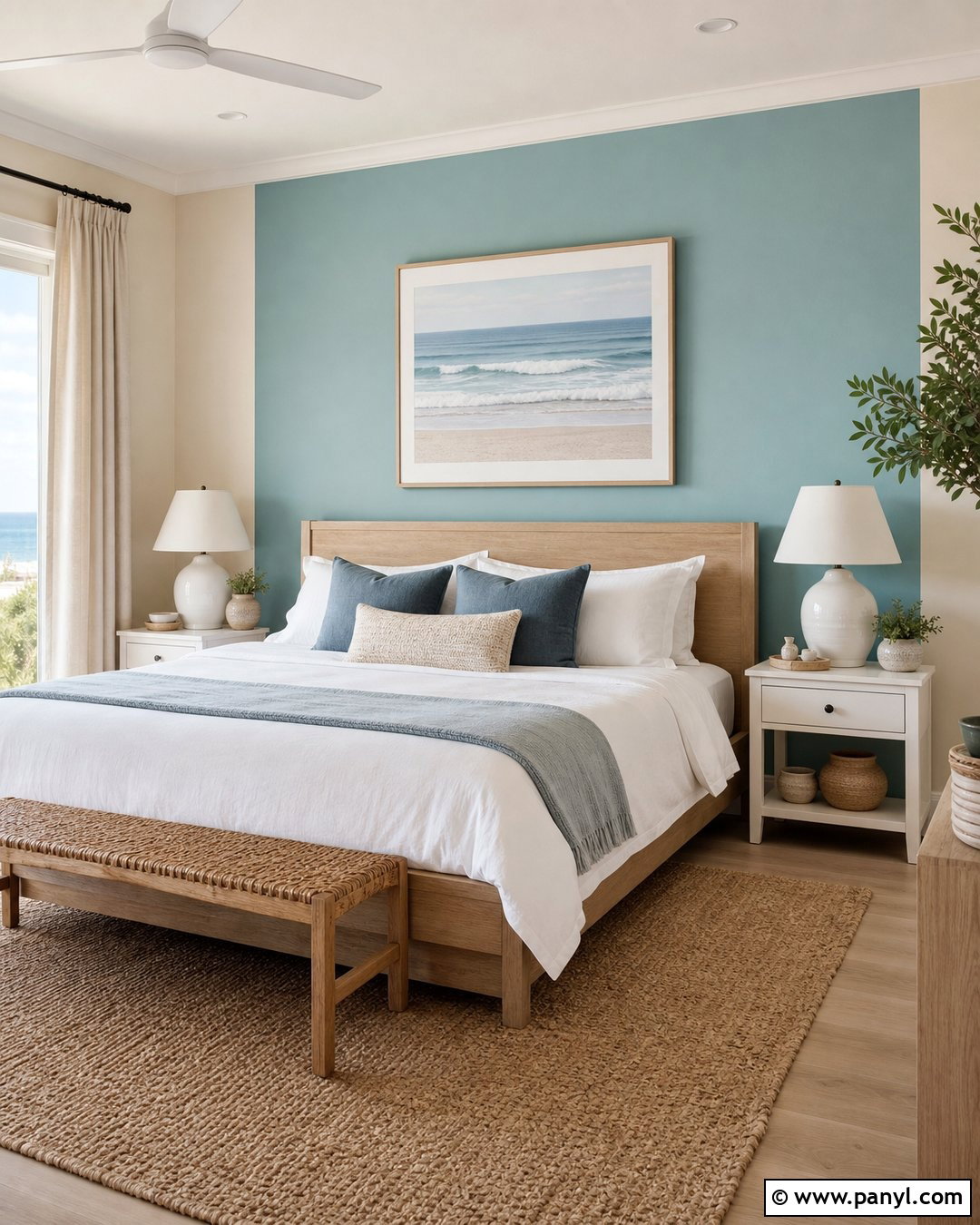
Turquoise and sand create a coastal bedroom without relying on obvious nautical decorations. Paint the wall behind the bed a softened turquoise and cover the remaining walls in light sandy beige. Choose a white oak bed, crisp white bedding, and a woven bench to establish a natural foundation. Add blue-gray pillows, a beige throw, and linen curtains that match the sand-colored walls. A textured jute rug reinforces the relaxed palette, while brushed nickel or matte white lamps maintain a clean finish. Instead of anchors, shells, or themed signs, use abstract ocean artwork and handmade ceramics. The completed room feels bright and refreshing because the coastal influence comes from color, texture, and natural materials rather than decorative clichés.
23. Mustard Yellow And Navy Wall Color Combination
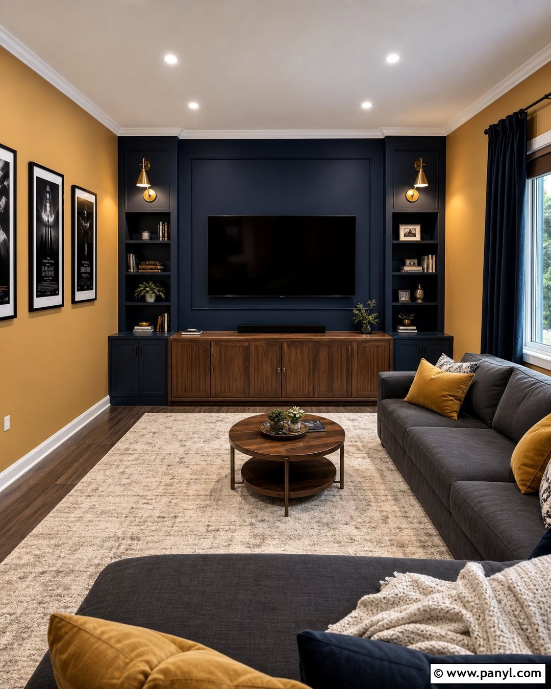
Mustard yellow and navy bring warmth and depth to a media room while maintaining a polished appearance. Paint the television wall matte navy so the screen blends into the background, then use muted mustard on the surrounding walls. Choose a charcoal sectional, walnut media cabinet, and large cream rug to balance both saturated colors. Add navy curtains for improved light control and mustard pillows to connect the seating with the walls. Wall-mounted brass sconces provide practical illumination without producing screen glare. Keep artwork simple and use closed storage to reduce visual clutter. This full scheme feels cozy enough for movie nights but attractive enough for daily lounging. The neutral furniture also makes future updates easier without repainting the entire room.
24. Red Brown And Putty Wall Color Combination
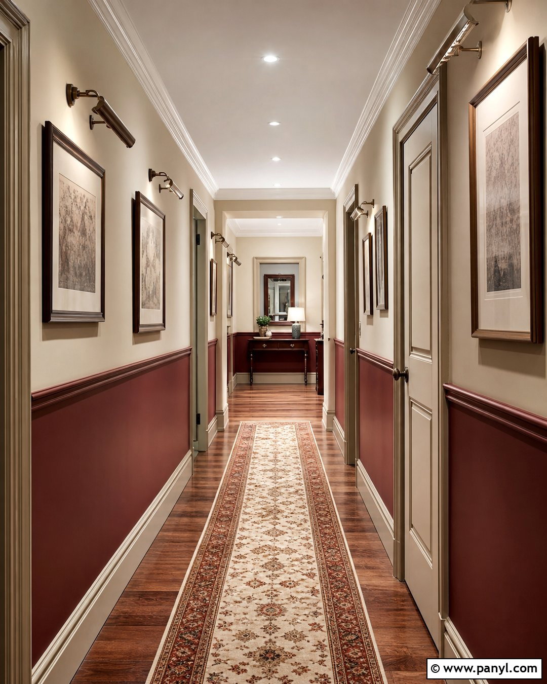
Red brown and putty can make a plain hallway feel connected, warm, and intentionally designed. Paint the lower third of the walls a deep red-brown, then apply soft putty above it. Separate the colors with narrow molding painted in the putty shade for a seamless transition. A slim runner in cream, rust, and faded blue adds pattern without narrowing the walkway. Use matching black or aged brass picture lights above a small series of framed prints. Doors and baseboards can remain putty to keep the dark color from creating too many visual boundaries. This combination is practical in a busy corridor because the deeper lower section disguises scuffs. The lighter upper walls preserve brightness and help the hallway appear more open.
25. Pale Green And Soft Blue Wall Color Combination
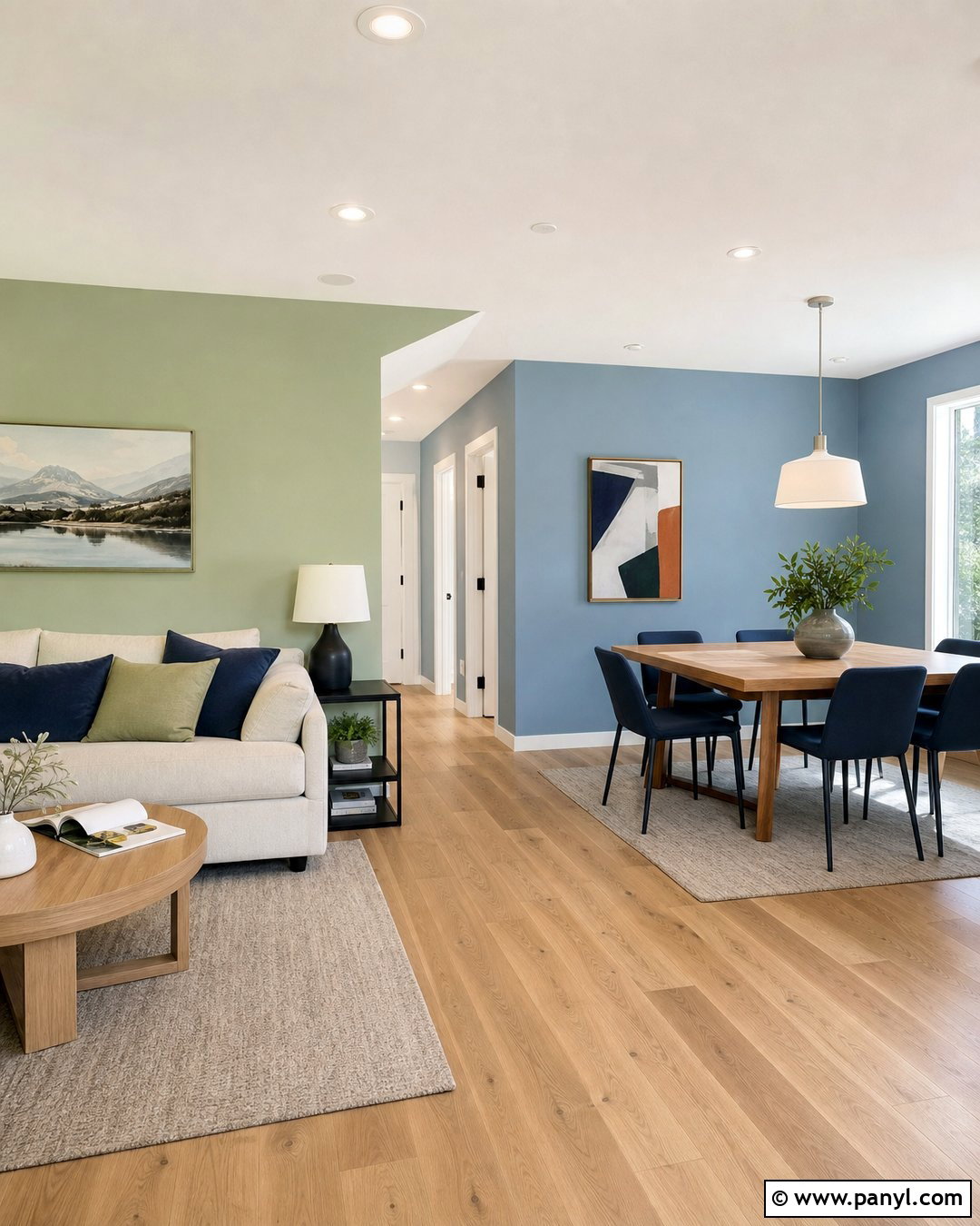
Pale green and soft blue create a smooth transition across an open-plan living and dining area. Use pale green in the living zone and muted blue in the dining zone, meeting the colors at a natural architectural break such as a corner, beam, or doorway. Connect both spaces with light oak flooring, warm white trim, and cream upholstery. In the living area, add a beige sofa and green-gray pillows. In the dining area, use a natural wood table, blue upholstered chairs, and a simple white pendant. Artwork containing both colors helps the zones feel related rather than separately decorated. This complete palette defines each function gently while preserving the spacious, continuous character that makes an open layout appealing.
Conclusion:
The best 25 Color Combination For Wall Ideas balance personality with the architecture, lighting, furnishings, and purpose of each room. Begin with the mood you want, then select one dominant wall color and one supporting shade. Soft neutrals make strong accents easier to live with, while related muted colors create a quieter, layered effect. Carry both shades into rugs, artwork, curtains, or furniture, but avoid matching every item. Most importantly, test large painted samples on different walls and observe them throughout the day before making a final choice. Thoughtful placement matters as much as the colors themselves. With a complete room plan, a two-color wall scheme can feel cohesive, practical, and personal.

Related Ideas and Inspiration:
Leave a Reply