
Choosing paint that still feels beautiful years later starts with balance, not passing trends. The best **20 Evergreen Wall Color Ideas** include warm neutrals, nature-inspired greens, classic blues, and deeper shades that bring lasting character to a home. Each color works best as part of a complete room, supported by thoughtful flooring, furniture, lighting, and finishes. Before committing, test a large painted sample on several walls and observe it throughout the day. Natural and artificial light can reveal undertones that small color chips hide. Whether you prefer bright rooms, cozy spaces, or traditional interiors, these versatile palettes offer a dependable starting point. Explore the complete room schemes below for practical, stylish **20 Evergreen Wall Color Ideas**.

1. Warm White Wall Color
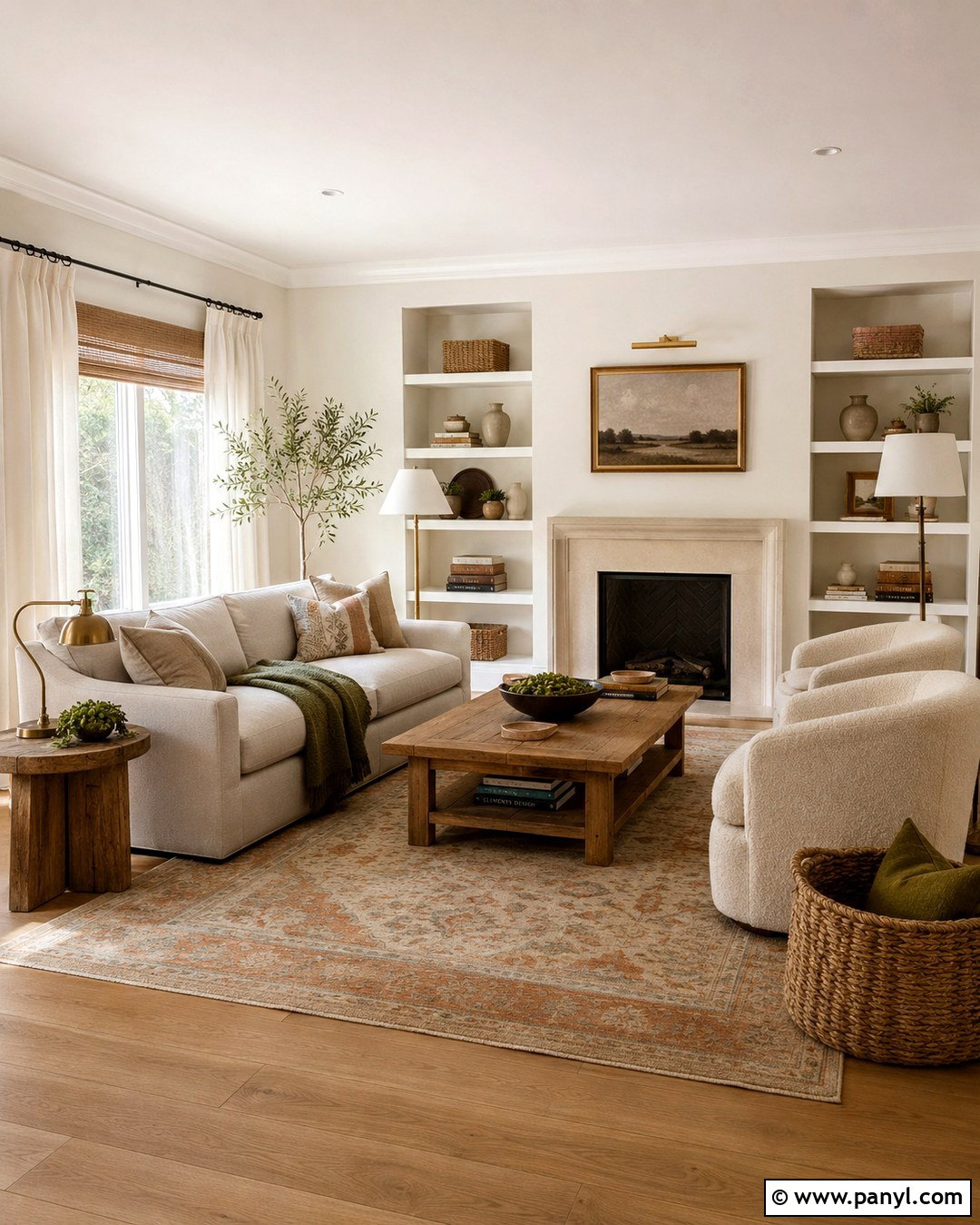
Warm white walls create a clean foundation without making a room feel cold or unfinished. Use this color in a living room with natural oak flooring, a soft oatmeal sofa, and two cream boucle chairs arranged around a medium-toned wood coffee table. Linen curtains, woven baskets, and aged brass lamps introduce warmth and texture. Choose a white with subtle cream or beige undertones rather than a sharp blue base. For contrast, add charcoal picture frames and a muted olive throw. A large vintage-style rug in beige, rust, and faded blue will anchor the seating area. This complete palette feels comfortable in traditional, farmhouse, coastal, and modern homes while leaving plenty of flexibility for changing furniture and seasonal decor.
2. Soft Cream Wall Color
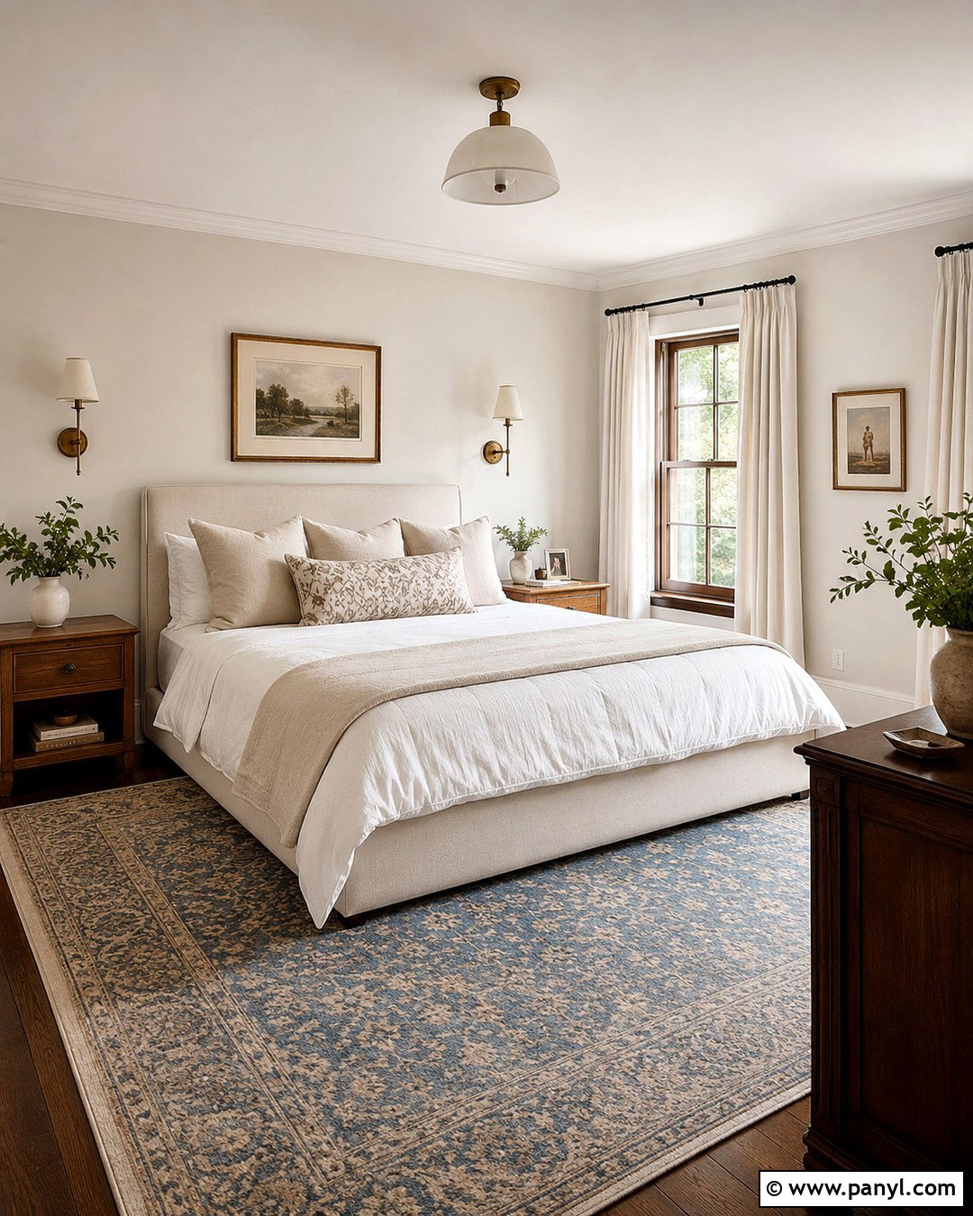
Soft cream walls bring gentle warmth to bedrooms, especially when the space receives cooler northern light. Build the room around an upholstered bed in natural linen, medium oak nightstands, and warm white bedding layered with tan and muted blue accents. Use ivory curtains rather than bright white panels so the window treatment blends smoothly with the walls. Antique brass sconces and a faded Persian-style rug add character without making the room feel formal. Keep the ceiling and trim slightly lighter than the walls for quiet definition. A few dark wood elements will prevent the pale palette from appearing washed out. The resulting bedroom feels restful, collected, and inviting, with enough neutral balance to support both traditional and contemporary furnishings.
3. Light Greige Wall Color
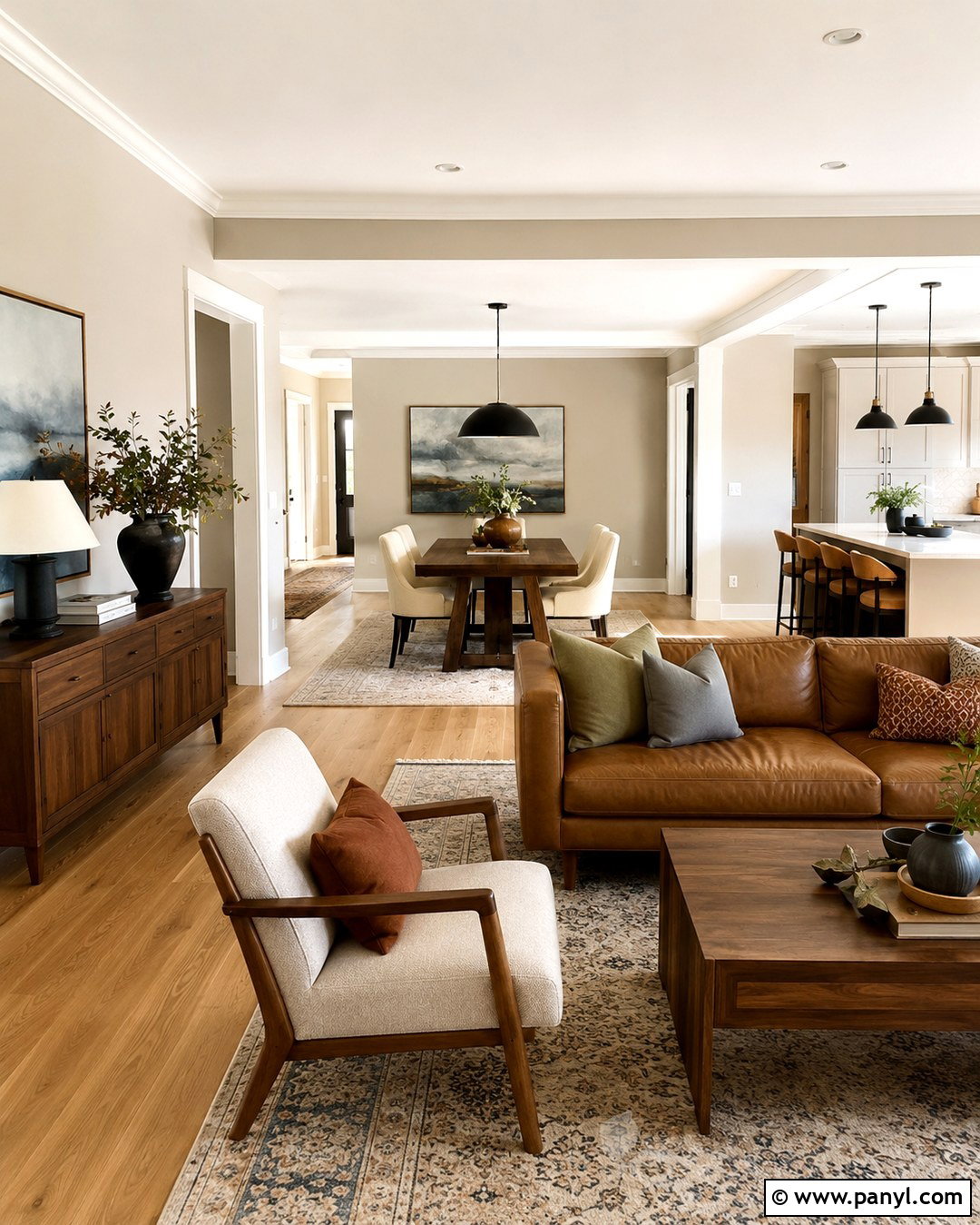
When gray feels too cool and beige seems too warm, light greige offers a practical middle ground. Paint the walls of an open living and dining area in a balanced greige with subtle warm undertones. Pair it with white oak flooring, a camel leather sofa, and dining chairs upholstered in textured ivory fabric. Matte black light fixtures provide crisp contrast, while walnut furniture adds depth. Include soft blue, olive, and rust accents through artwork, cushions, and a patterned area rug. Use warm white on the ceiling, trim, and interior doors to keep the architecture bright. This wall color connects neighboring spaces without demanding identical decor, making it especially useful in open floor plans where several furniture arrangements must feel visually coordinated.
4. Mushroom Beige Wall Color
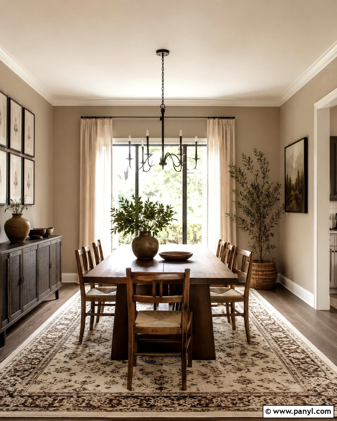
Mushroom beige has a softly shaded quality that makes a dining room feel warm and established. Cover all four walls in a medium-light beige with gentle gray or taupe undertones. Add a walnut dining table, rush-seat chairs, and a simple black iron chandelier to create a balanced traditional-modern look. Full-length linen drapes in oatmeal will soften the windows, while a cream and brown patterned rug defines the table area. Display landscape art in dark wood frames and use ceramic table lamps on a low sideboard. Warm white trim keeps the room from becoming heavy. This layered design looks especially attractive beside natural stone, aged brass, and handmade pottery, creating an adaptable dining space that feels welcoming for everyday meals and larger gatherings.
5. Classic Taupe Wall Color
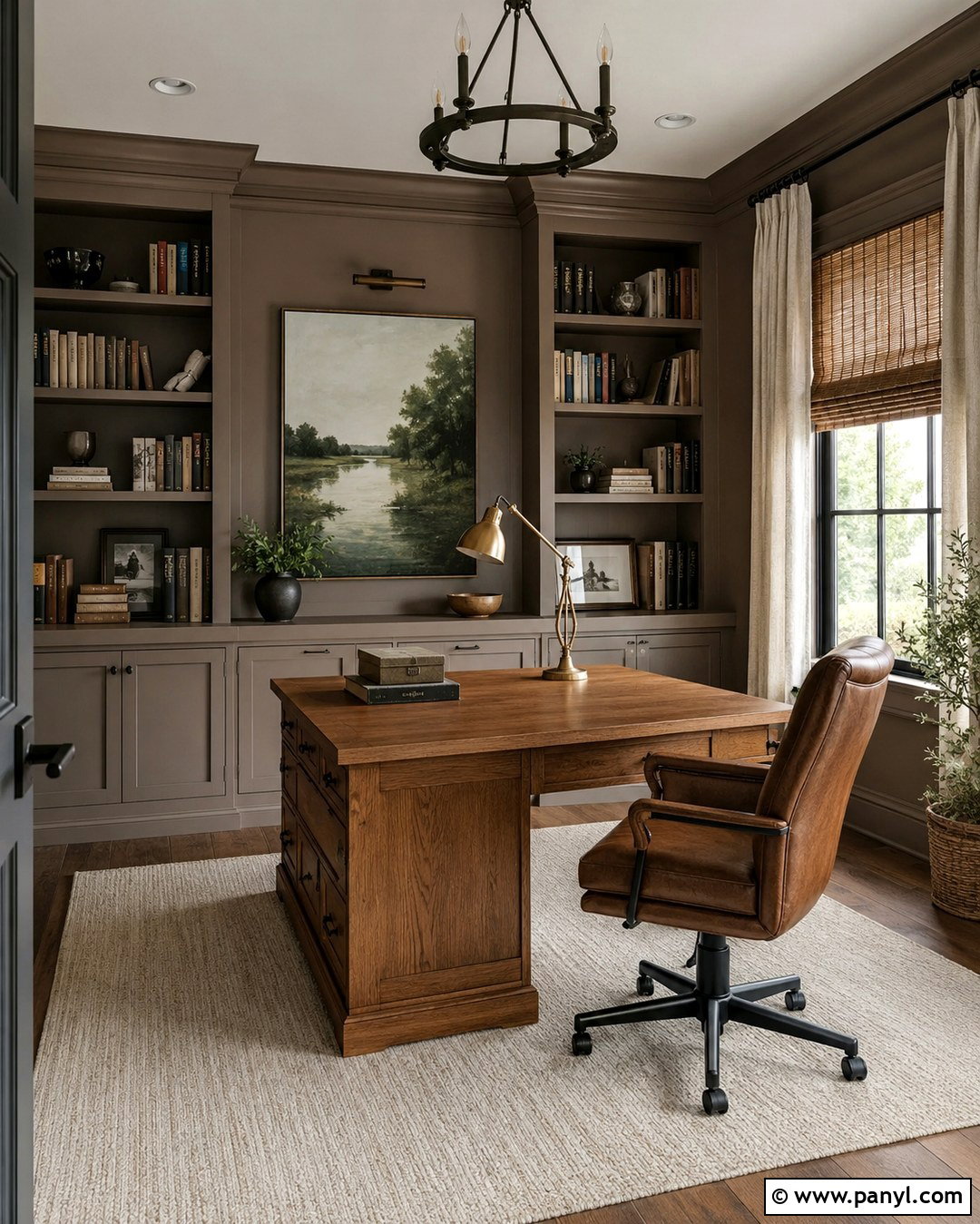
Classic taupe gives a home office enough depth to feel polished without becoming distracting. Choose a warm brown-gray shade for the walls, then introduce a substantial oak desk, a comfortable caramel leather chair, and floor-to-ceiling bookshelves painted in the same color. This tonal treatment creates a built-in appearance and reduces visual clutter. Add a cream wool rug, woven window shade, and linen curtain panels for softness. Black metal hardware and a bronze desk lamp provide structure, while muted green artwork brings a natural accent. Keep the ceiling a warm white to reflect light downward. The finished office feels calm and professional, yet still comfortable enough for long work sessions, reading, planning, or managing household tasks.
6. Pale Sage Green Wall Color
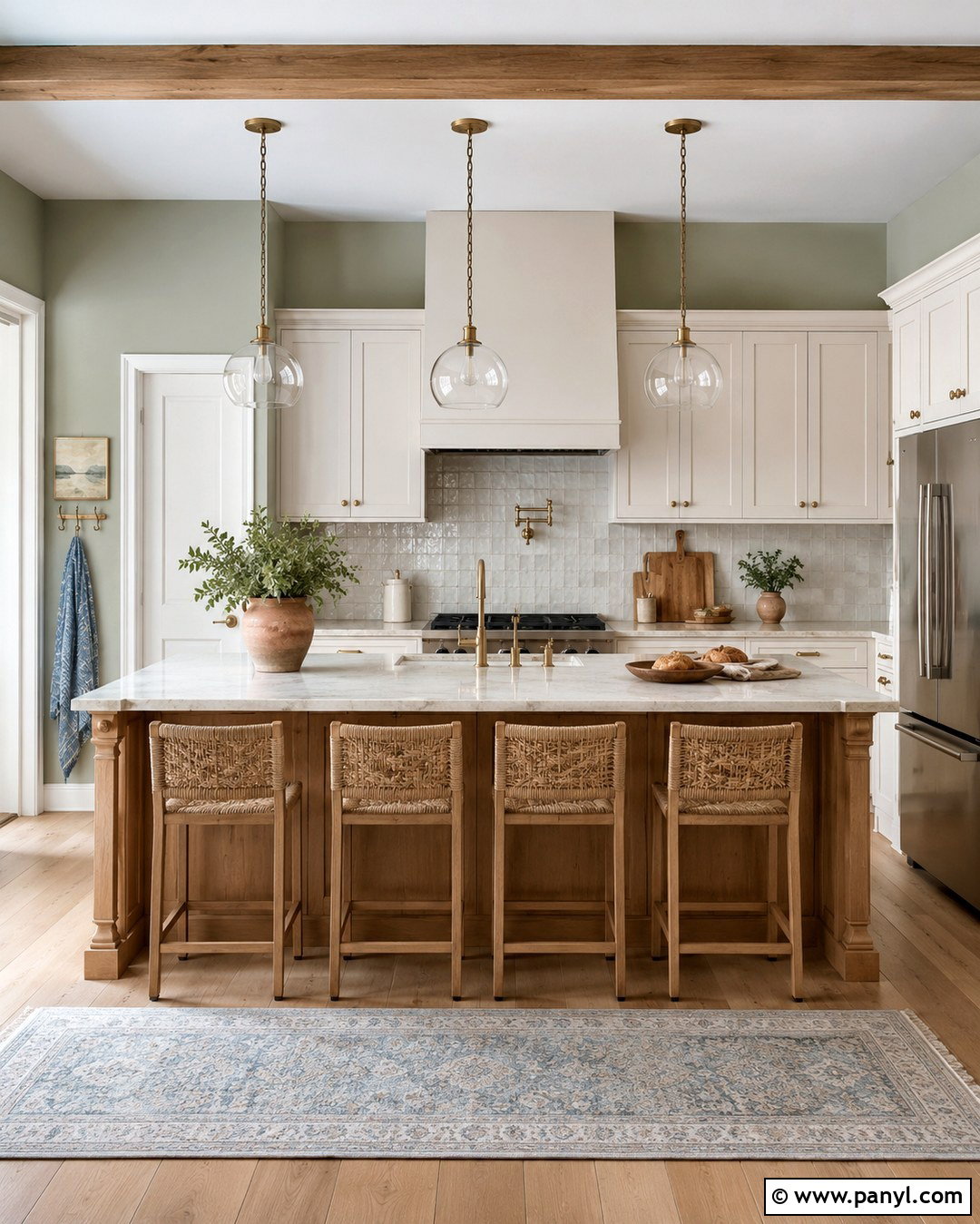
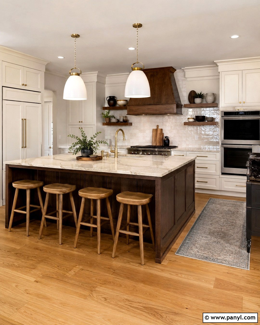
Pale sage green can make a kitchen feel fresh while remaining gentle enough for everyday living. Use the color on the walls with warm white shaker cabinets, honed cream quartz counters, and a softly textured zellige backsplash. White oak flooring and a matching island introduce natural warmth. Complete the scheme with brushed brass hardware, woven counter stools, and simple glass pendant lights. A few terracotta planters and muted blue textiles add controlled color without competing with the walls. Avoid icy white finishes, which may make sage appear dull or overly gray. Instead, repeat warm undertones through wood, stone, and fabric. This complete kitchen design feels relaxed and familiar, blending easily with farmhouse, cottage, transitional, and understated modern architecture.
7. Dusty Olive Green Wall Color
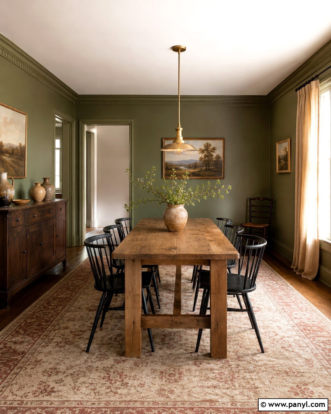
Dusty olive walls turn a dining room into a grounded, intimate space without relying on overly dark paint. Pair the green with a rectangular oak table, black spindle-back chairs, and a vintage brass pendant centered overhead. Warm white ceiling paint balances the richer walls, while linen curtains in natural flax soften the edges of the room. Add a traditional rug containing faded olive, cream, and brick red. A dark wood sideboard can hold pottery, serving pieces, and a shaded table lamp. Use simple botanical or landscape art rather than a busy gallery wall. With its combination of natural green, aged metal, textured fabric, and substantial wood, the finished room feels connected to nature and comfortable in every season.
8. Deep Forest Green Wall Color
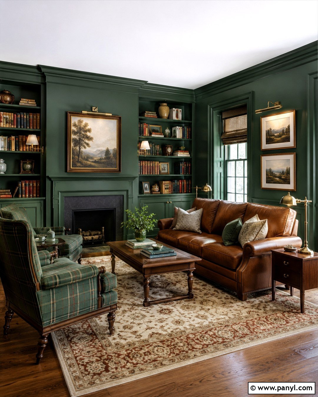
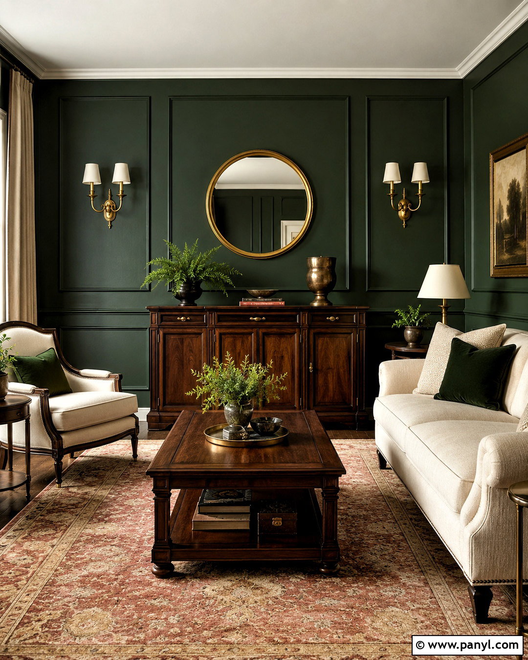
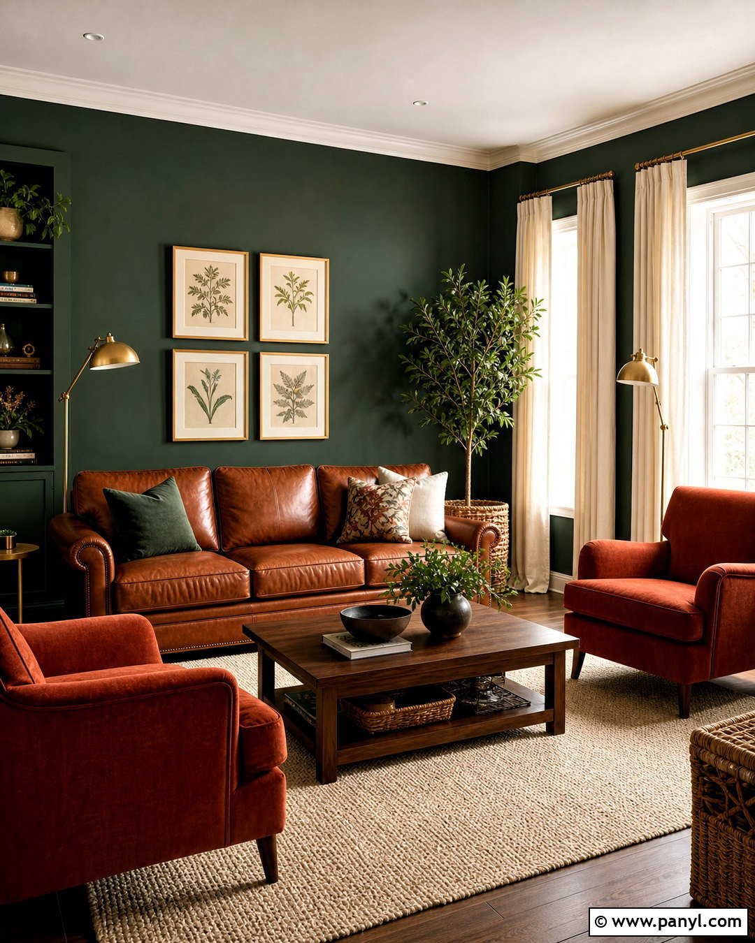
Deep forest green creates a memorable library or reading room when it surrounds the entire space rather than appearing on one disconnected wall. Paint the walls, built-in shelves, and trim in the same rich green using different sheens for subtle dimension. Add a cognac leather sofa, a pair of plaid or camel-colored chairs, and a large wool rug with cream and rust details. Brass picture lights and shaded floor lamps will brighten bookshelves and reading corners. Keep the ceiling warm white if the room is small, or continue the green overhead for a more enveloping effect. Walnut tables and framed landscapes strengthen the heritage look. The final room feels cozy, substantial, and thoughtfully layered rather than dark or themed.
9. Soft Blue Gray Wall Color
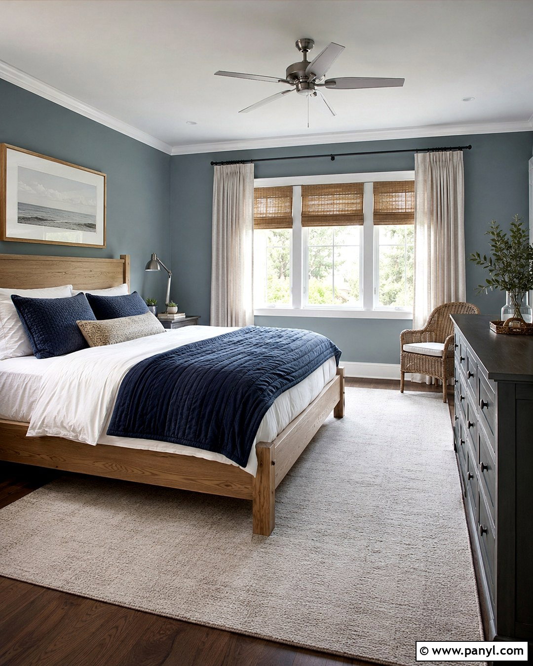
Soft blue-gray walls give a bedroom a peaceful character while providing more personality than plain neutral paint. Select a muted shade with a balanced gray undertone, then pair it with a natural oak bed, crisp white bedding, and a quilt in faded navy and cream. Add flax-colored curtains and woven shades to introduce warmth around the windows. A pale wool rug will soften the flooring, while brushed nickel or antique brass lamps offer understated shine. Keep large furniture pieces simple, and include one darker element, such as a navy bench or charcoal dresser, to stabilize the light palette. This combination works particularly well in rooms with abundant daylight, creating a refreshed but familiar environment for sleeping, reading, and relaxing.
10. Powder Blue Wall Color
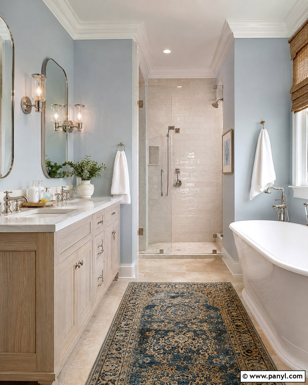
Powder blue makes a bathroom feel airy when combined with warm materials and restrained detailing. Paint the walls in a pale, slightly muted blue, then install a white oak vanity with a honed marble or quartz top. Use warm white tile in the shower rather than a stark blue-white finish. Polished nickel faucets, a thin framed mirror, and clear glass sconces keep the room bright. Add a woven shade, white cotton towels, and a small vintage-style rug containing blue and tan. Natural stone flooring or light beige porcelain tile will ground the cooler wall color. The finished bathroom feels crisp without becoming clinical, and the simple combination of blue, wood, white, and metal remains easy to update with new textiles and accessories.
11. Classic Navy Blue Wall Color
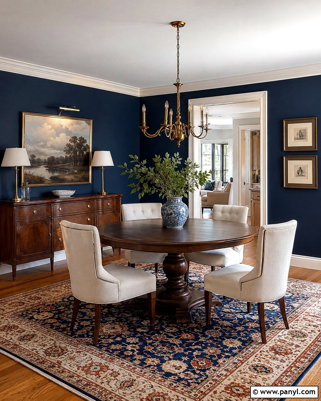
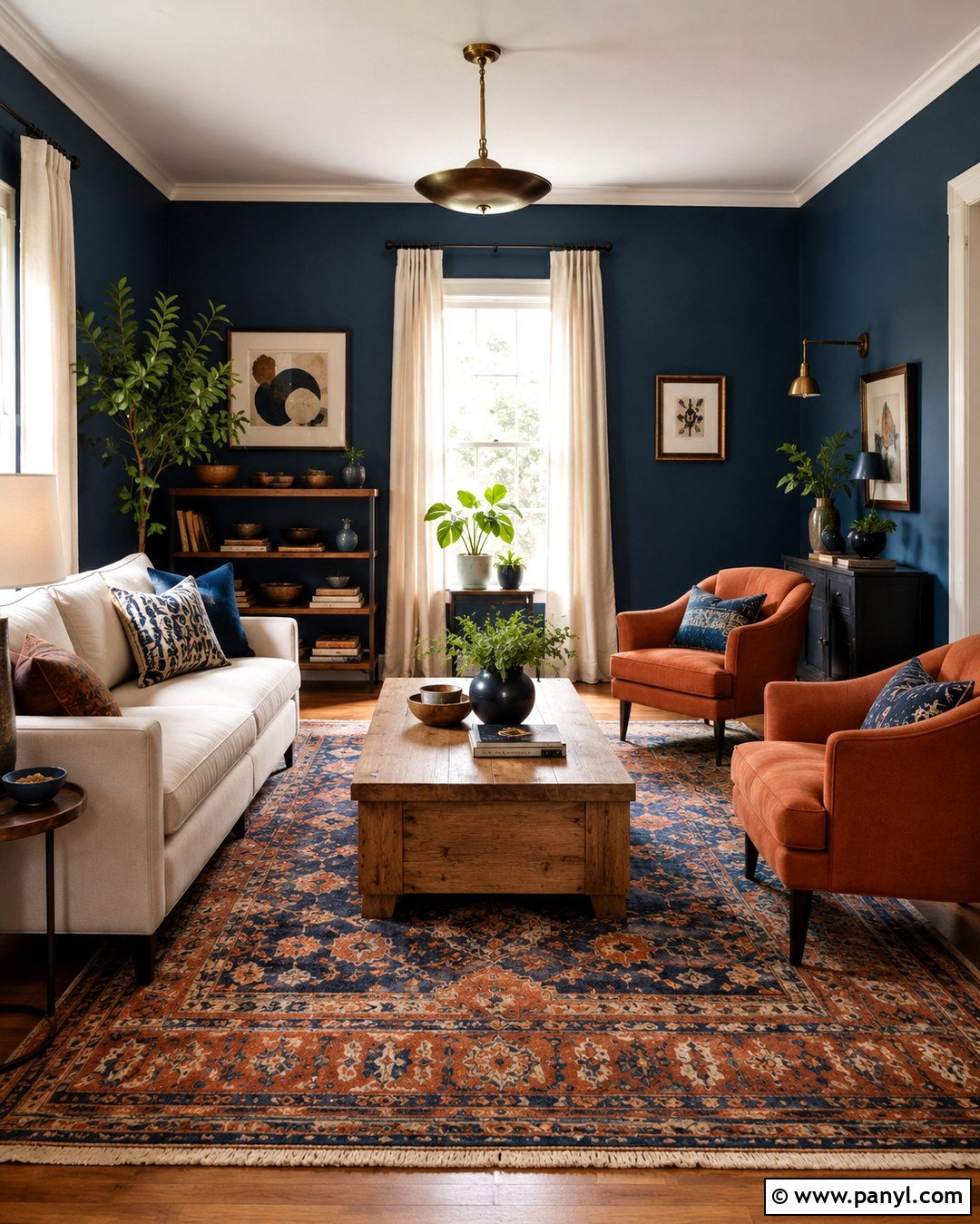
Classic navy walls give a dining room structure, depth, and a sense of permanence. Use the color across every wall, then balance it with bright warm white trim, a light ceiling, and medium oak flooring. A round pedestal table encourages comfortable movement, while upholstered cream chairs soften the strong background. Install a brass chandelier and repeat the finish through picture frames or cabinet hardware. A patterned rug with navy, ivory, and muted rust connects the room’s main colors. Hang one large piece of art rather than several small objects, allowing the walls to remain visually calm. The complete space feels dramatic but approachable, especially when lamps, candles, and ceiling fixtures provide several layers of clear, warm illumination after sunset.
12. Slate Blue Wall Color
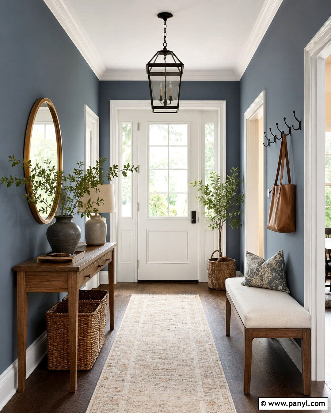
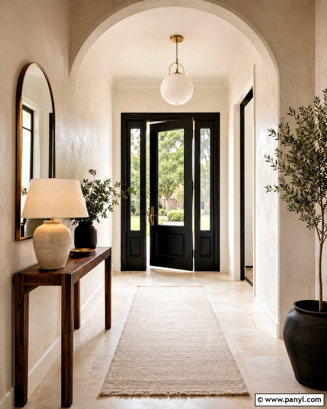
Slate blue works beautifully in an entryway because it feels colorful, tailored, and easy to coordinate with adjoining neutral rooms. Cover the walls in a medium blue with gray undertones, then add a slim walnut console, a round antiqued brass mirror, and a textured ivory runner. Paint doors and trim warm white for definition, or use the slate shade on both walls and trim for a more seamless look. Black hooks and a simple lantern-style ceiling fixture add practical contrast. Include a woven basket for shoes and a small upholstered bench if space allows. Landscape art, leafy branches, and aged pottery will complete the arrangement. This entry feels welcoming and organized while setting a calm, collected direction for the rest of the home.
13. Muted Teal Wall Color
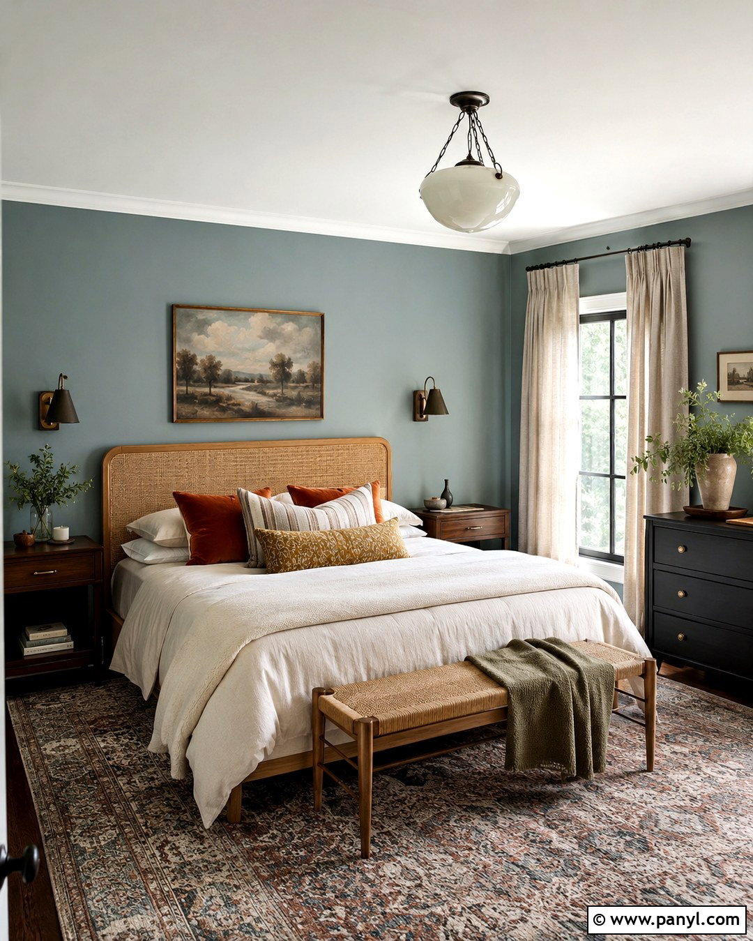
Muted teal brings color to a guest bedroom without overwhelming visitors or limiting future decorating choices. Select a medium teal softened with gray, then balance it with a cane or oak headboard, ivory bedding, and natural linen curtains. Introduce rust, tan, and faded gold through a patterned rug and a few carefully chosen pillows. Dark bronze sconces give the walls definition and free space on compact nightstands. Keep the ceiling warm white and use simple cream trim around doors and windows. A small dresser in walnut or painted black will ground the brighter elements. The finished guest room feels distinctive but restful, offering a complete palette that can move comfortably between coastal, vintage, midcentury, and relaxed transitional interiors.
14. Soft Terracotta Wall Color
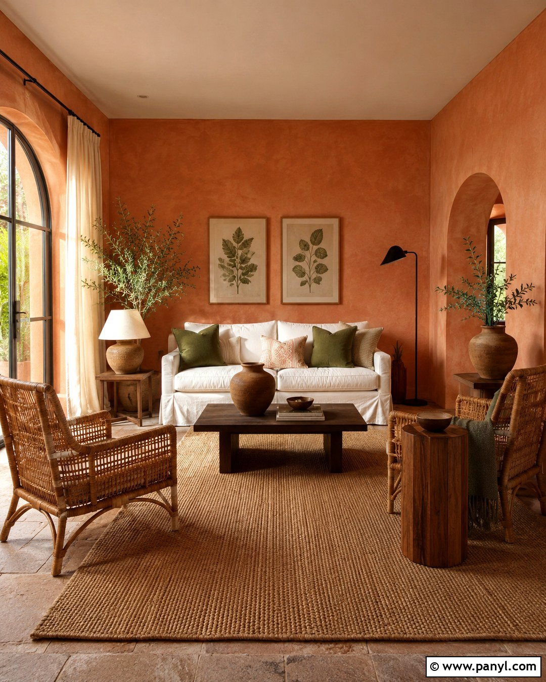
Soft terracotta walls can warm a sunroom or casual sitting room while maintaining an earthy, livable appearance. Choose a muted clay shade rather than vivid orange, and pair it with a cream slipcovered sofa, woven rattan chairs, and a natural jute rug. Use walnut or aged oak side tables to deepen the palette. Linen curtains in warm ivory will filter strong sunlight without creating sharp contrast against the walls. Add olive green cushions, handmade pottery, and botanical artwork to reinforce the organic direction. Black accents should be limited to thin frames or a simple floor lamp. This complete room feels cheerful during daylight and comfortably warm in the evening, with natural textures preventing the wall color from becoming overly energetic or theme-driven.
15. Muted Blush Wall Color
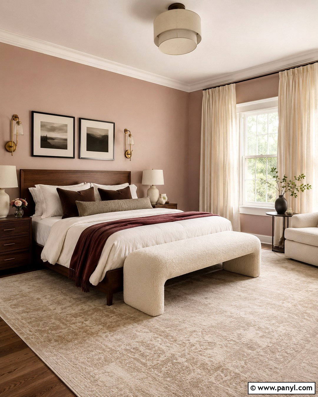
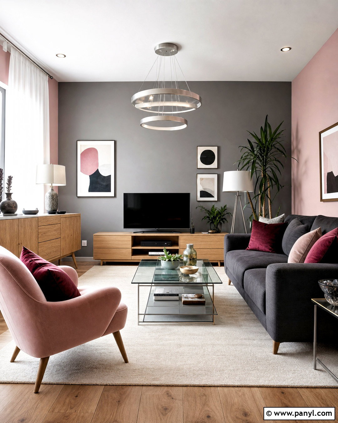
Muted blush gives a bedroom soft color without creating an overly sweet or decorative result. Look for a dusty pink with beige or clay undertones, then combine it with a walnut bed, cream boucle bench, and warm white bedding. Add cocoa brown pillows and a faded burgundy throw for depth. A large neutral rug, linen curtains, and ceramic table lamps keep the room relaxed. Use aged brass sparingly through drawer pulls and sconces. Black accents can appear in artwork frames to sharpen the gentle palette. Avoid pairing blush with many pastel accessories; earthy neutrals make it feel more mature and adaptable. The complete bedroom has warmth, personality, and enough visual balance to work in traditional, modern, vintage, or eclectic homes.
16. Butter Yellow Wall Color
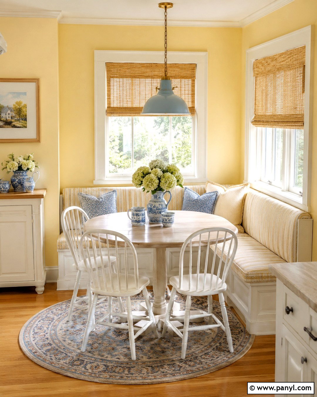
Butter yellow creates a cheerful breakfast room that feels sunny even on cloudy mornings. Choose a soft, creamy yellow with muted undertones and pair it with a round white oak table, simple spindle chairs, and a built-in bench covered in beige striped fabric. Warm white trim keeps the transition gentle, while a pale blue pendant light adds restrained contrast. Use woven shades, a small patterned rug, and ceramic dishes in cream and blue to complete the space. Avoid strong orange woods or bright primary colors that may make the walls appear more intense. With light woods, natural textiles, and a few cool accents, this complete breakfast area feels fresh and familiar rather than childish, making it comfortable for meals, homework, and casual conversation.
17. Warm Charcoal Wall Color
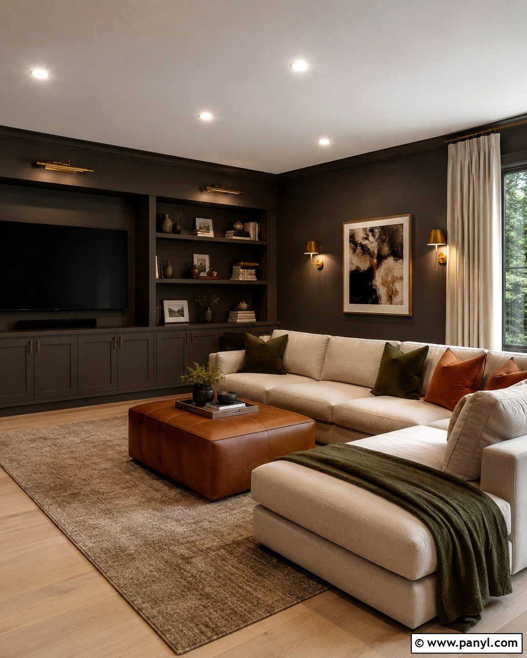
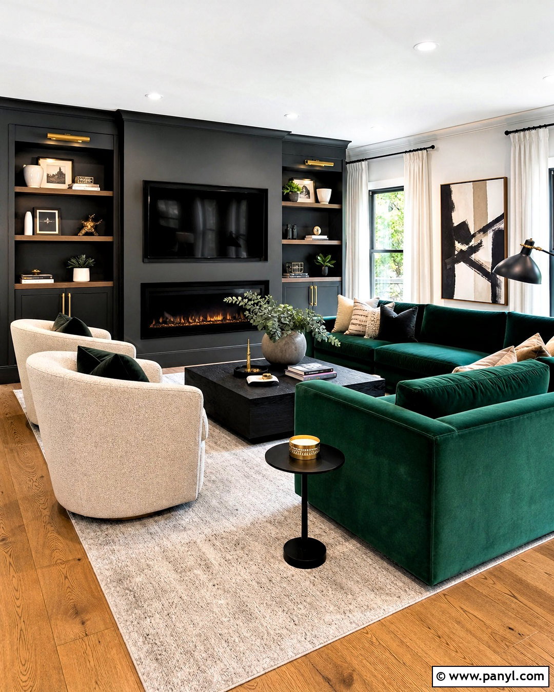
Warm charcoal walls create a sophisticated media room while reducing the visual presence of a television. Select a deep gray with brown undertones and carry it across the walls, trim, and built-in storage for a unified background. Add a large oatmeal sectional, cognac leather ottoman, and textured wool rug in taupe and cream. Walnut shelving and antique brass sconces bring warmth to the dark envelope. Use lined linen curtains to control glare while maintaining a residential feel. Cushions in olive, rust, and soft black will connect the furnishings to the walls. Several lamps are essential for comfortable reading and conversation. The result is a cozy, flexible room that feels intentional during both movie nights and ordinary daytime use.
18. Chocolate Brown Wall Color
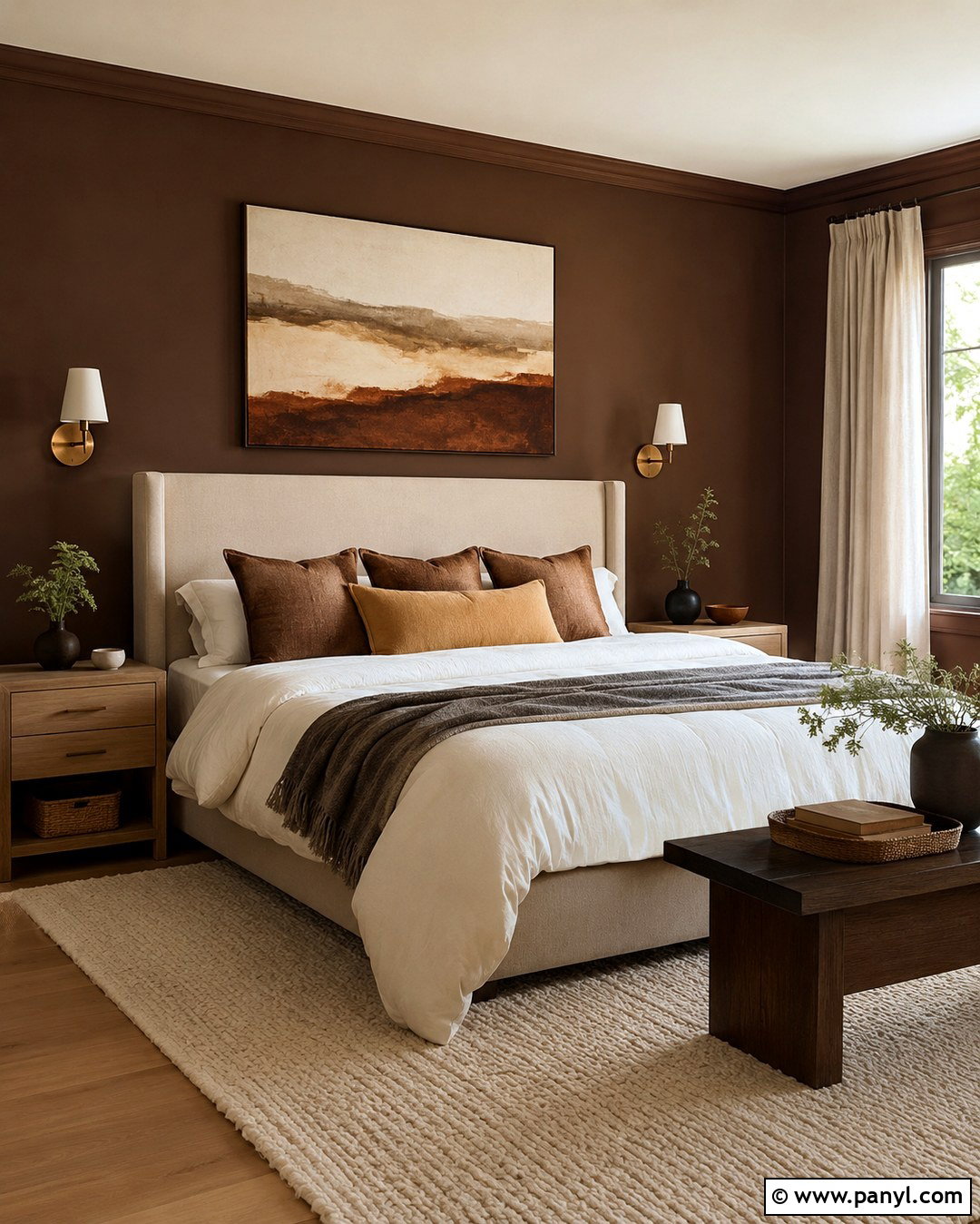
Chocolate brown can make a primary bedroom feel deeply restful when the supporting materials remain light and tactile. Choose a rich brown with soft neutral undertones, then use it on every wall for a continuous, enveloping effect. Center a tall oatmeal upholstered bed against the darkest wall and layer it with ivory bedding, camel pillows, and a warm gray throw. Pale oak nightstands, linen curtains, and a cream wool rug will brighten the lower half of the room. Add aged brass sconces and one large abstract artwork containing cream, rust, and muted blue. Keep the ceiling warm white unless the room is especially large. The completed design feels grounded and elegant, with enough natural texture to prevent the brown from looking heavy.
19. Soft Black Wall Color
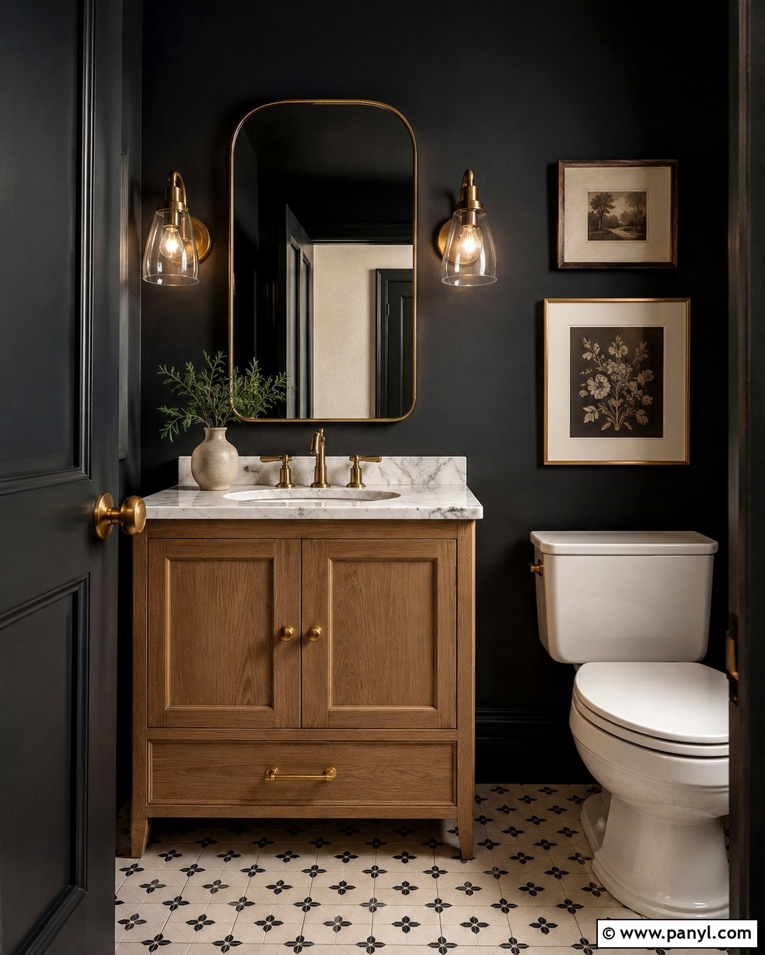
Soft black walls make a compact powder room feel purposeful rather than visually restricted. Choose an off-black with charcoal or brown undertones and apply it to every wall. Add a white marble-topped vanity in natural oak to create strong but warm contrast. Use unlacquered brass hardware, a rounded mirror, and two clear glass sconces to reflect light around the room. A patterned floor in cream and black reinforces the palette without introducing unrelated colors. Keep the ceiling warm white or continue the wall shade overhead for a cocooning finish. One framed artwork and a small ceramic vase are enough decoration. This complete powder room uses dramatic paint in a controlled way, producing a polished look that remains compatible with traditional and modern homes.
20. Brick Red Wall Color
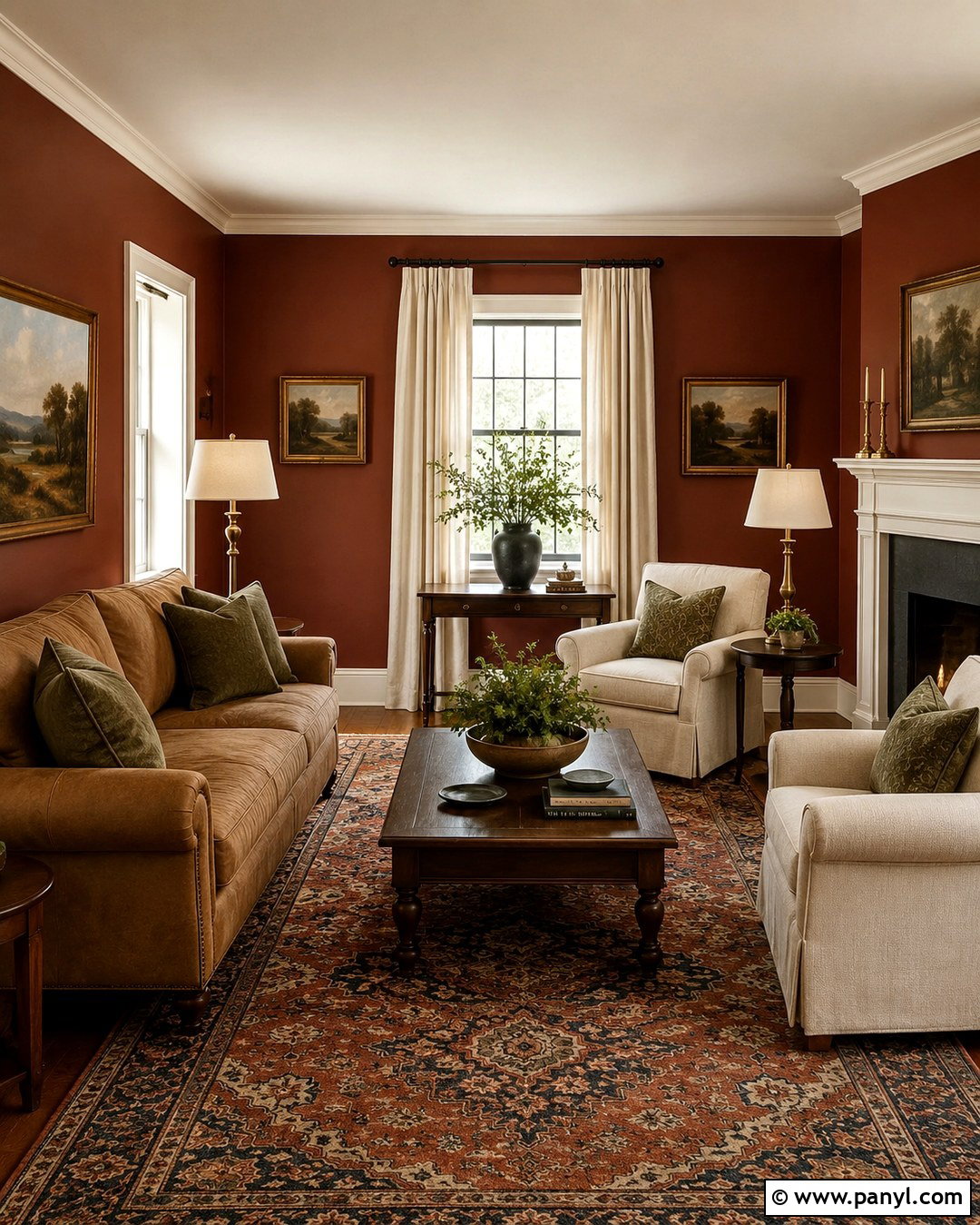
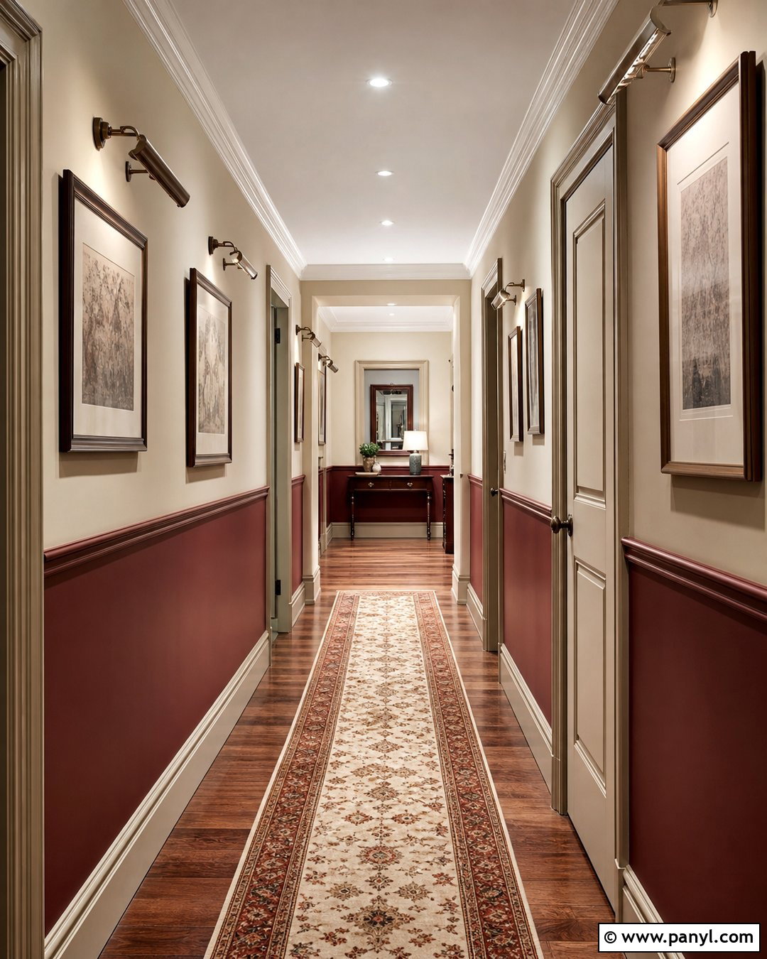
Brick red brings enduring warmth to a living room when it is muted, earthy, and supported by substantial neutral furnishings. Paint the walls in a brown-based red, then add a camel sofa, cream armchairs, and a dark walnut coffee table. A traditional rug containing rust, faded navy, and beige will connect the palette across the floor. Use warm white on the ceiling and trim to frame the deeper walls. Brass table lamps, linen curtains, and landscape paintings contribute to a comfortable collected appearance. Avoid filling the room with additional red objects; olive green, navy, leather, and natural wood provide better balance. The finished space feels rich and welcoming while drawing on familiar architectural and decorative colors that suit both historic and newer homes.
Conclusion:
Timeless paint does not have to mean plain white walls throughout the entire house. These **20 Evergreen Wall Color Ideas** show how soft neutrals, natural greens, familiar blues, and earthy deeper shades can create rooms with lasting character. The most successful choice will respond to the room’s light, fixed finishes, furnishings, and daily purpose. Always sample several nearby shades before purchasing paint, since undertones can change from morning to evening. Once the wall color is selected, repeat its warm or cool qualities through flooring, textiles, wood, metal, and artwork. A coordinated room will look more intentional than a fashionable color used alone, helping your home remain comfortable and visually balanced for years.

Related Ideas and Inspiration:

Leave a Reply