
Paint can reshape a room faster and more affordably than almost any other design change. The right palette can brighten limited natural light, highlight architectural details, create visual flow, and make existing furniture feel more intentional. These interior paint ideas move beyond isolated accent walls. Each look combines wall color, trim, ceilings, flooring, furniture, lighting, and decor into a complete space you can realistically recreate. The collection includes warm neutrals, earthy greens, restful blues, rich dramatic shades, and cheerful colors for every comfort level. Before committing, sample each color on several walls and observe it throughout the day. Whether you are updating one room or planning a connected whole-home palette, these practical interior paint ideas offer a clear place to begin.

1. Warm White Living Room Paint
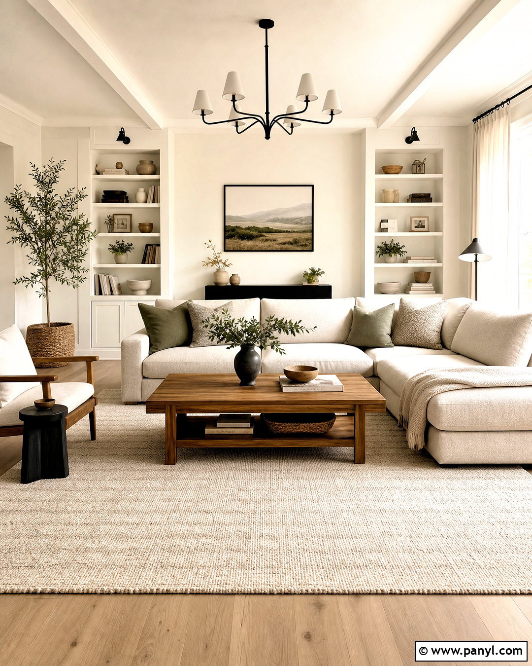
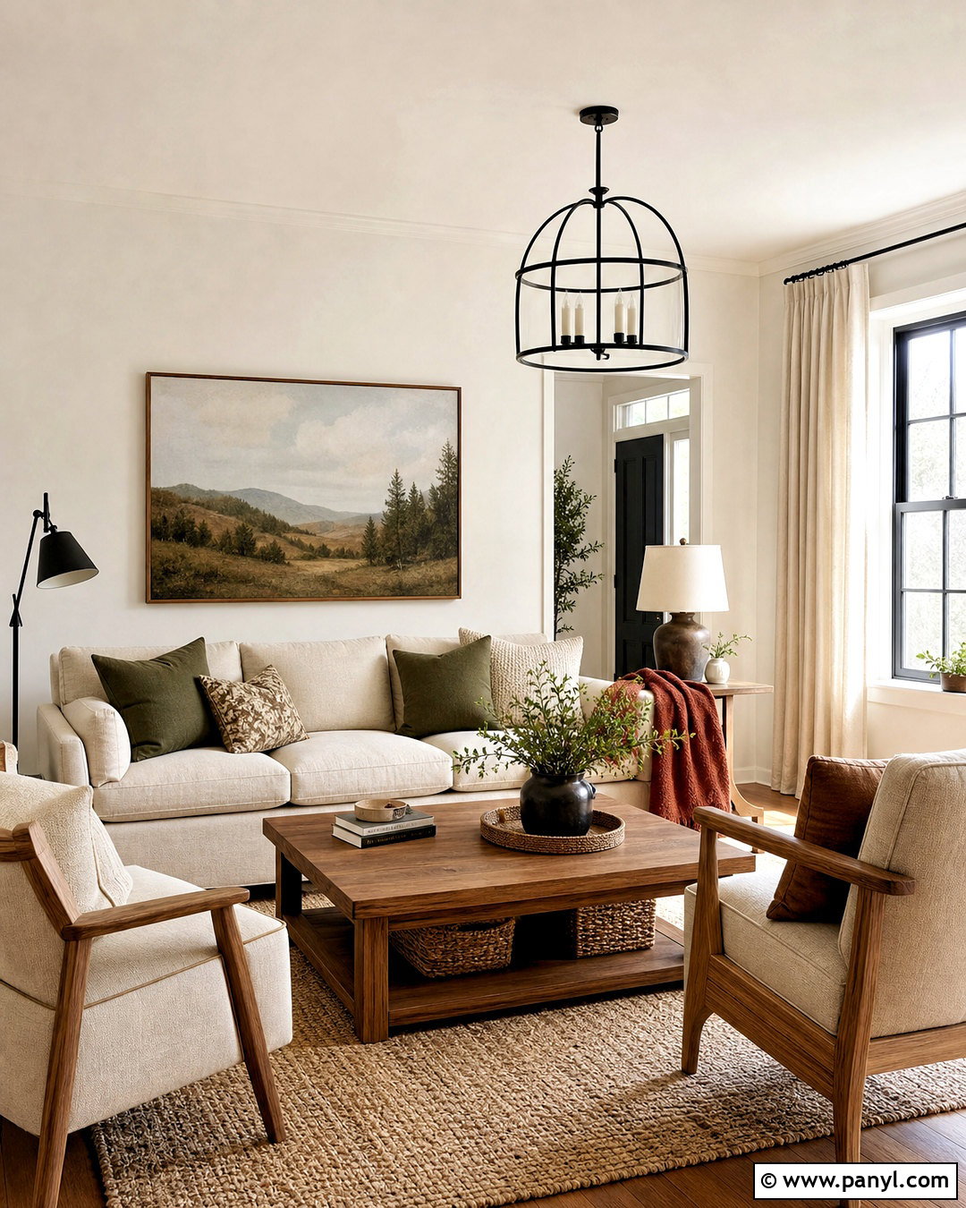
Warm white walls create a bright living room without the cold, clinical feeling of a sharp blue-white. Choose an off-white with soft cream or beige undertones, then repeat it on the ceiling for seamless height. Use slightly brighter white on baseboards, windows, and doors to define the architecture. A camel or oatmeal sofa, warm oak tables, and a textured ivory rug reinforce the inviting palette. Add contrast through matte black lighting, dark wood frames, and olive green pillows. Linen curtains should closely match the walls so the windows appear larger. This complete scheme works especially well in rooms with north-facing light, traditional wood floors, or open connections to other spaces. Test samples beside upholstery and flooring before selecting the final undertone.
2. Sage Green Kitchen Paint
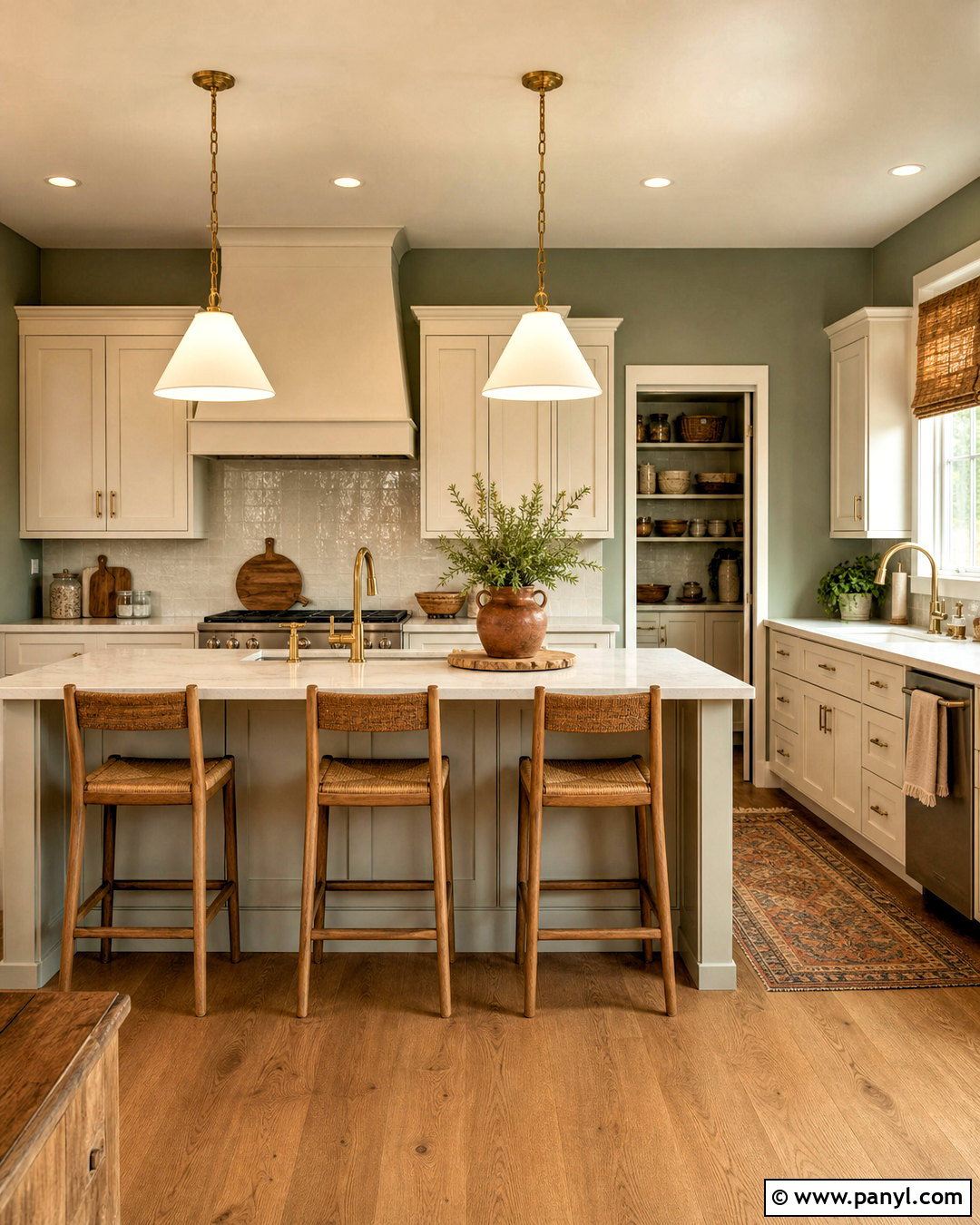
Soft sage green gives a kitchen gentle color while remaining easy to coordinate with natural materials. Paint the walls a muted, gray-green shade and keep the cabinets warm white for a clean two-tone arrangement. White quartz counters, a handmade cream tile backsplash, and light oak stools prevent the green from feeling heavy. Use brushed brass hardware and pendant lights to introduce warmth. A medium oak floor or wood-look tile helps ground the room, while terracotta pots and woven shades add earthy texture. Carry sage onto a pantry door or small breakfast area to connect the entire space. This palette is particularly effective in kitchens with garden views because it visually brings the outdoors inside without relying on a bright or overly saturated green.
3. Dusty Blue Bedroom Paint
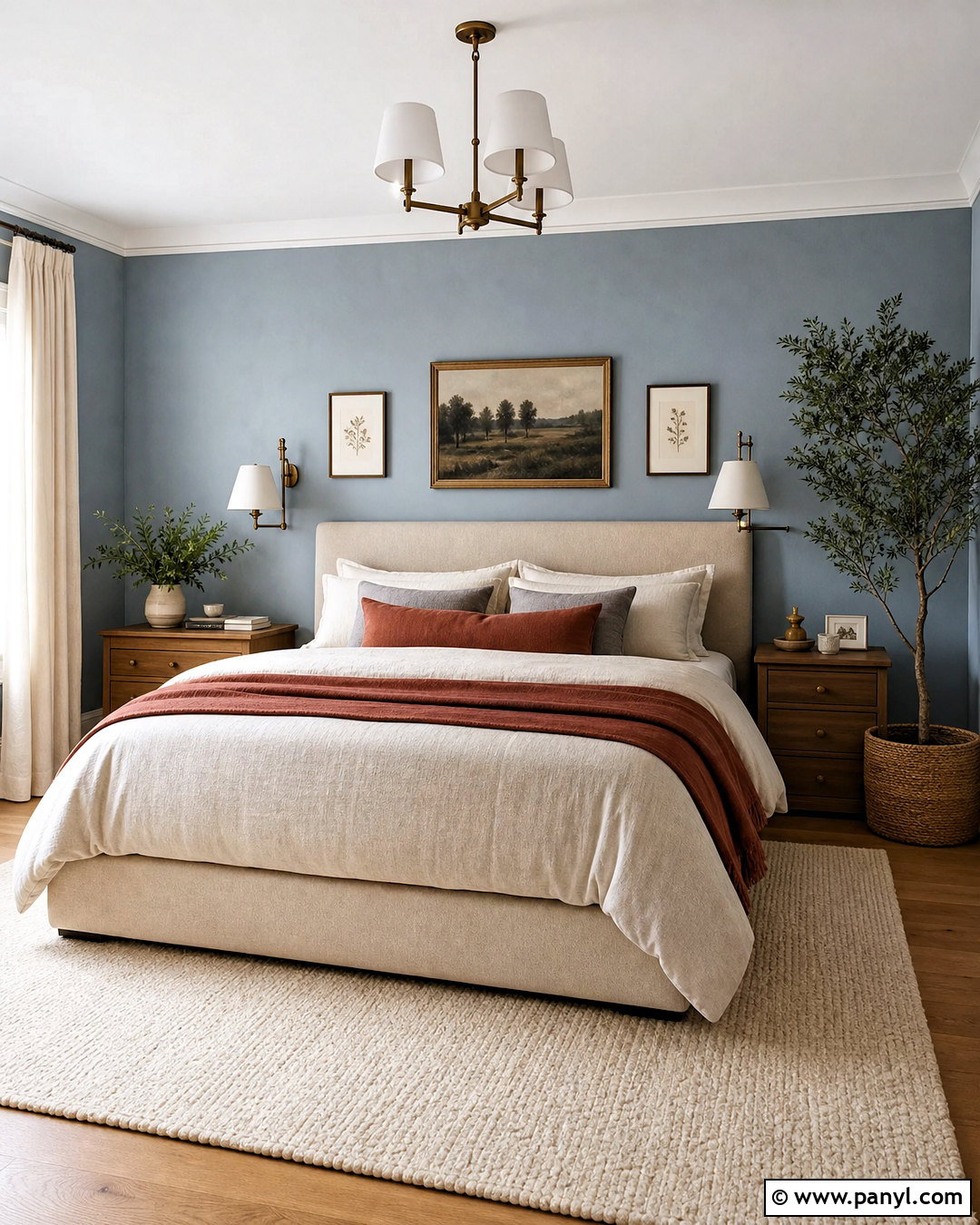
A dusty blue bedroom can feel restful, tailored, and comfortable when every surface supports the muted color. Paint the walls a soft blue with a noticeable gray undertone, then use warm white on the ceiling and trim. Position an upholstered oatmeal bed against the main wall and layer it with crisp white sheets, faded blue pillows, and a rust-colored throw. Medium wood nightstands keep the palette from becoming too cool. Add aged brass sconces, natural linen curtains, and a cream wool rug for softness. Simple landscape artwork can repeat the blue, brown, and ivory tones. Avoid icy flooring or silver-heavy accents. Warm woods and subtle earthy details balance the blue walls, creating a complete bedroom that feels calm in both morning and evening light.
4. Terracotta Dining Room Paint
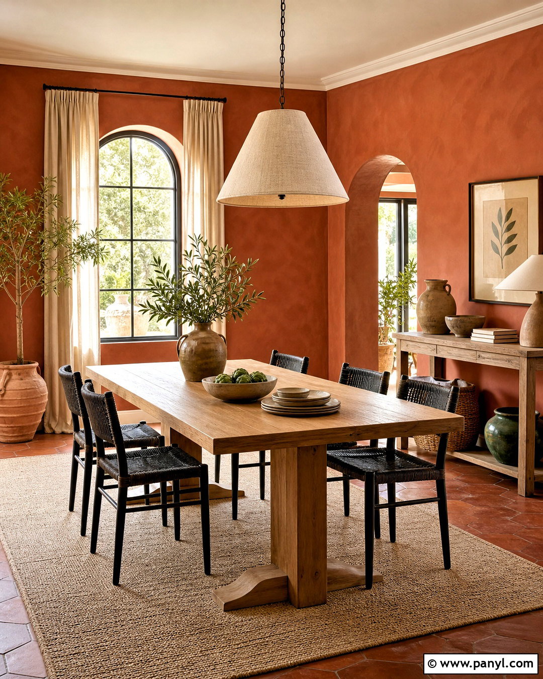
Terracotta paint surrounds a dining room with warmth and makes shared meals feel especially welcoming. Select a softened clay shade rather than a vivid orange, and paint the walls from baseboard to ceiling molding. Cream trim provides a fresh edge, while a natural oak dining table adds another warm but distinct tone. Surround it with woven or black wood chairs to establish contrast. An oversized linen pendant, neutral flat-weave rug, and handmade ceramic pieces suit the relaxed finish. Introduce olive green through artwork, plants, or seat cushions to balance the red undertone. If the room receives strong afternoon light, choose a slightly muted terracotta. The completed palette feels grounded and expressive without requiring elaborate furniture or expensive decorative finishes.
5. Soft Greige Open Plan Paint
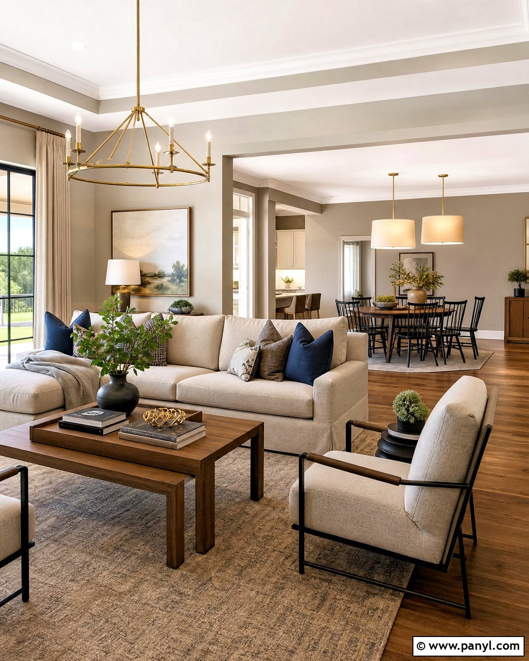
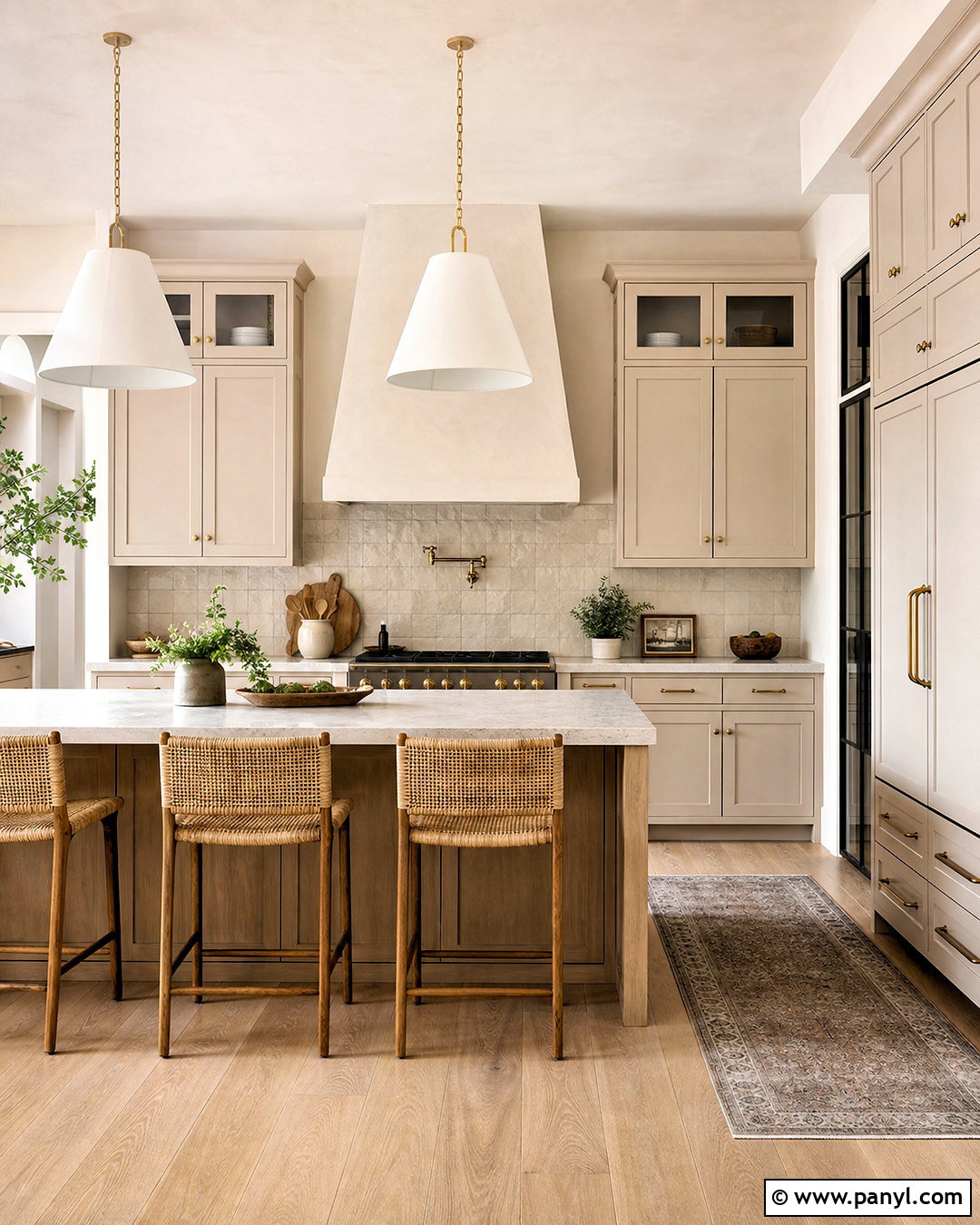
Greige works best in an open-plan interior when it connects several areas without making everything look identical. Choose a soft beige-gray with warm undertones for the main walls, then use creamy white on ceilings, doors, and trim. Define the living zone with an ivory sectional, a walnut coffee table, and a textured taupe rug. In the dining area, repeat walnut through the table and add black chairs for definition. Brushed brass lights and muted blue textiles create controlled accents. Continue the same greige through connecting halls, but introduce deeper taupe on built-ins or a kitchen island. This subtle variation gives the layout rhythm. Always compare the paint against flooring, counters, and upholstery, since surrounding finishes can make greige appear unexpectedly pink, green, or gray.
6. Navy Blue Home Office Paint
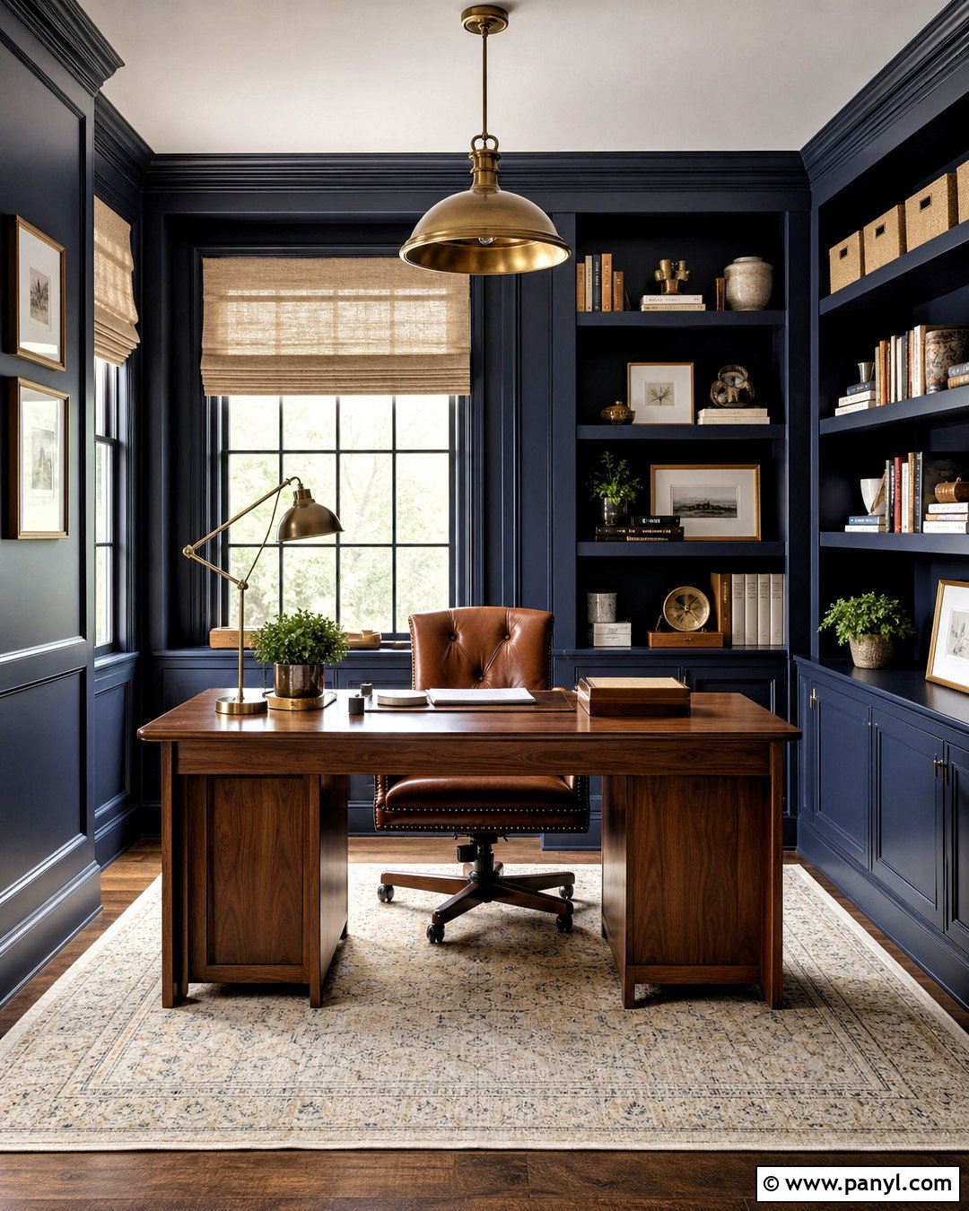
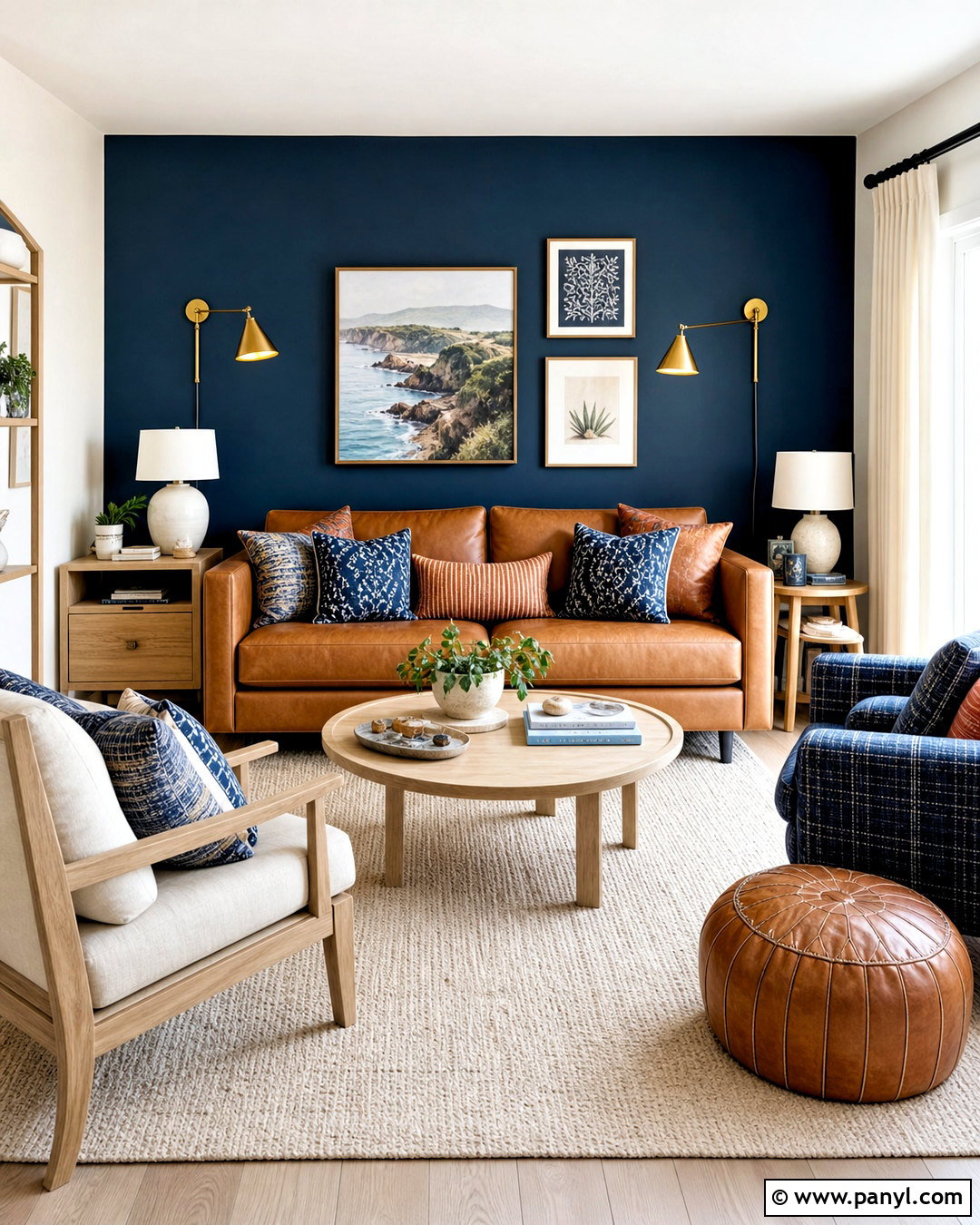
Deep navy paint can turn a basic home office into a focused, polished workspace. Use the color across the walls and built-in shelves for a cohesive backdrop, then paint the ceiling warm white to preserve brightness. A medium walnut desk, cognac leather chair, and cream patterned rug soften the navy while adding practical comfort. Install aged brass picture lights or a simple brass desk lamp for warm reflection. Books, framed art, and storage boxes should mix ivory, tan, blue, and muted red rather than introducing many unrelated colors. Position the desk near the window and use pale linen shades to control glare. This complete scheme feels substantial on video calls, yet natural wood, light textiles, and layered task lighting keep the room from appearing dark or formal.
7. Plaster Pink Bathroom Paint
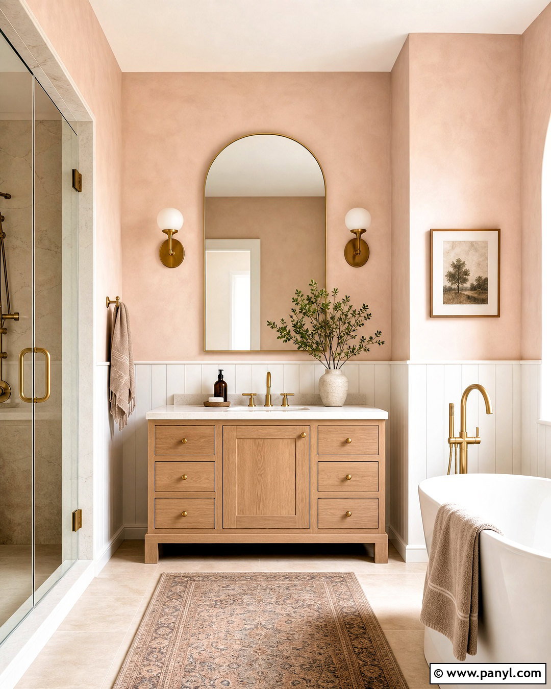
Plaster pink brings flattering warmth to a bathroom while remaining more sophisticated than a sugary pastel. Choose a chalky pink-beige for the upper walls and pair it with creamy white tile or vertical wall paneling below. A light oak vanity, white stone counter, and brushed brass fixtures strengthen the warm palette. Use an arched mirror and simple opal glass sconces to spread clear, even light. Beige floor tile, ivory towels, and a muted burgundy bath mat add quiet depth. Keep decorative accessories minimal so the color remains the main feature. In a small bathroom, painting the ceiling a diluted version of the wall color can reduce harsh contrast. The finished room feels soft, clean, and distinctive without depending on elaborate patterns or highly decorative fixtures.
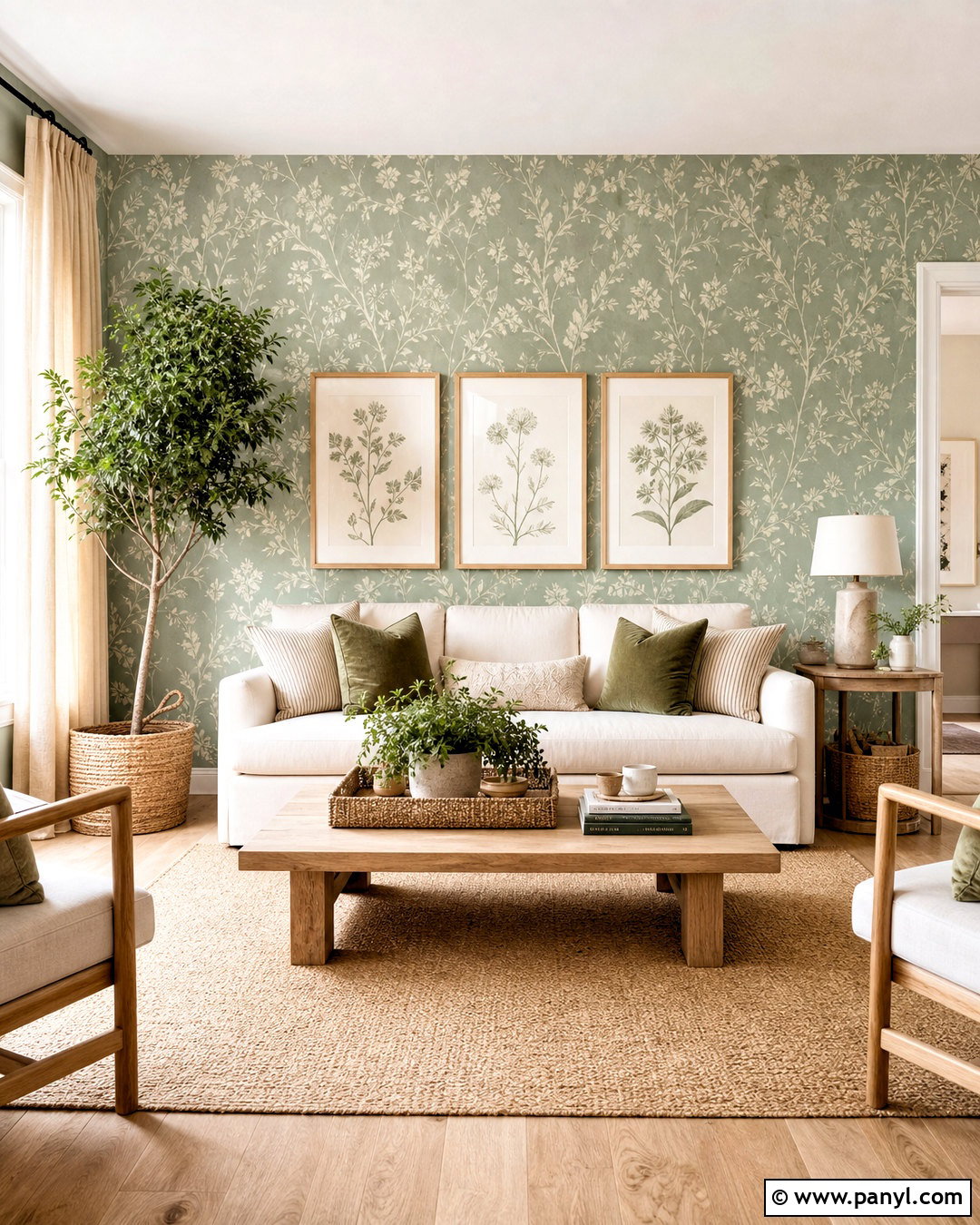
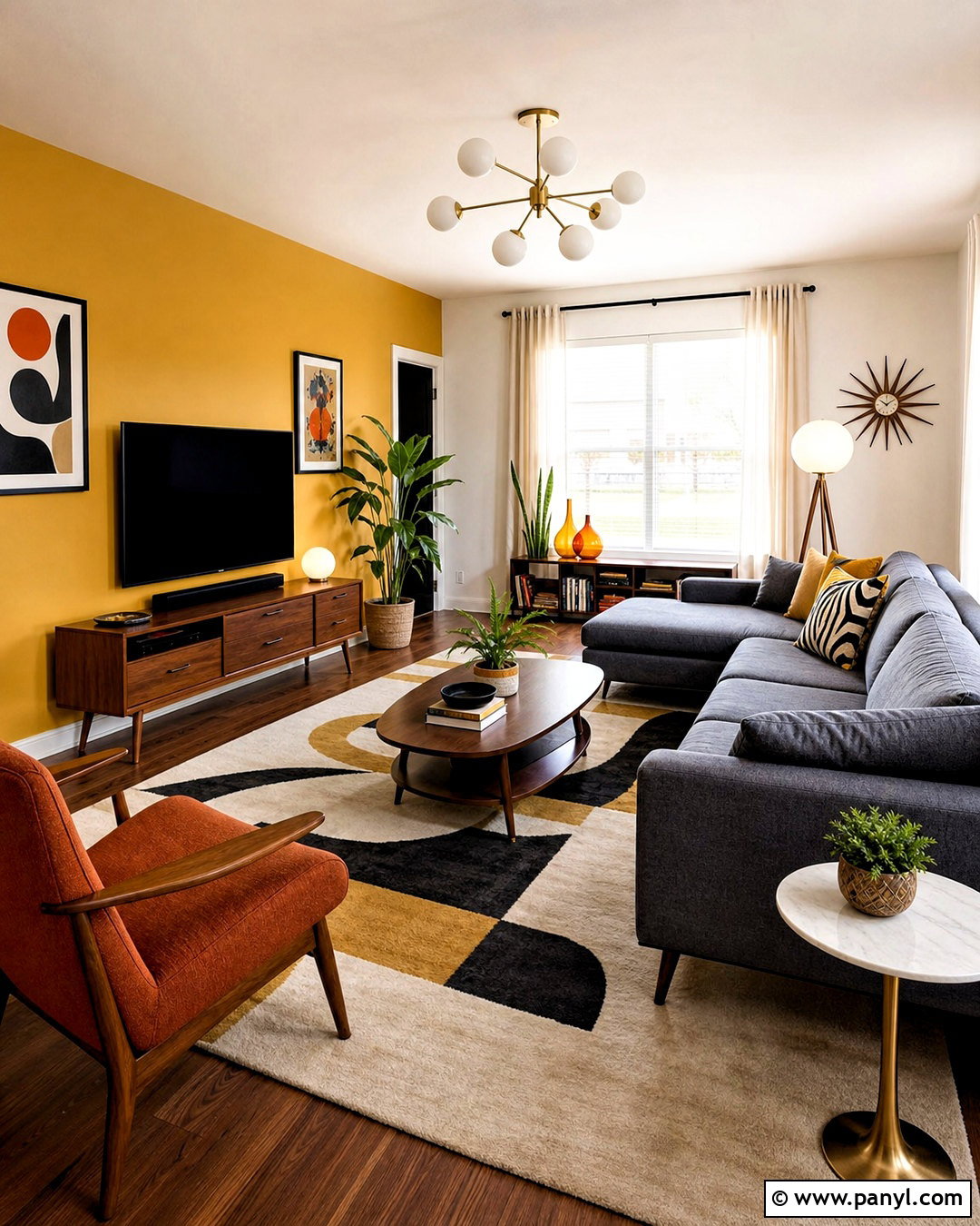
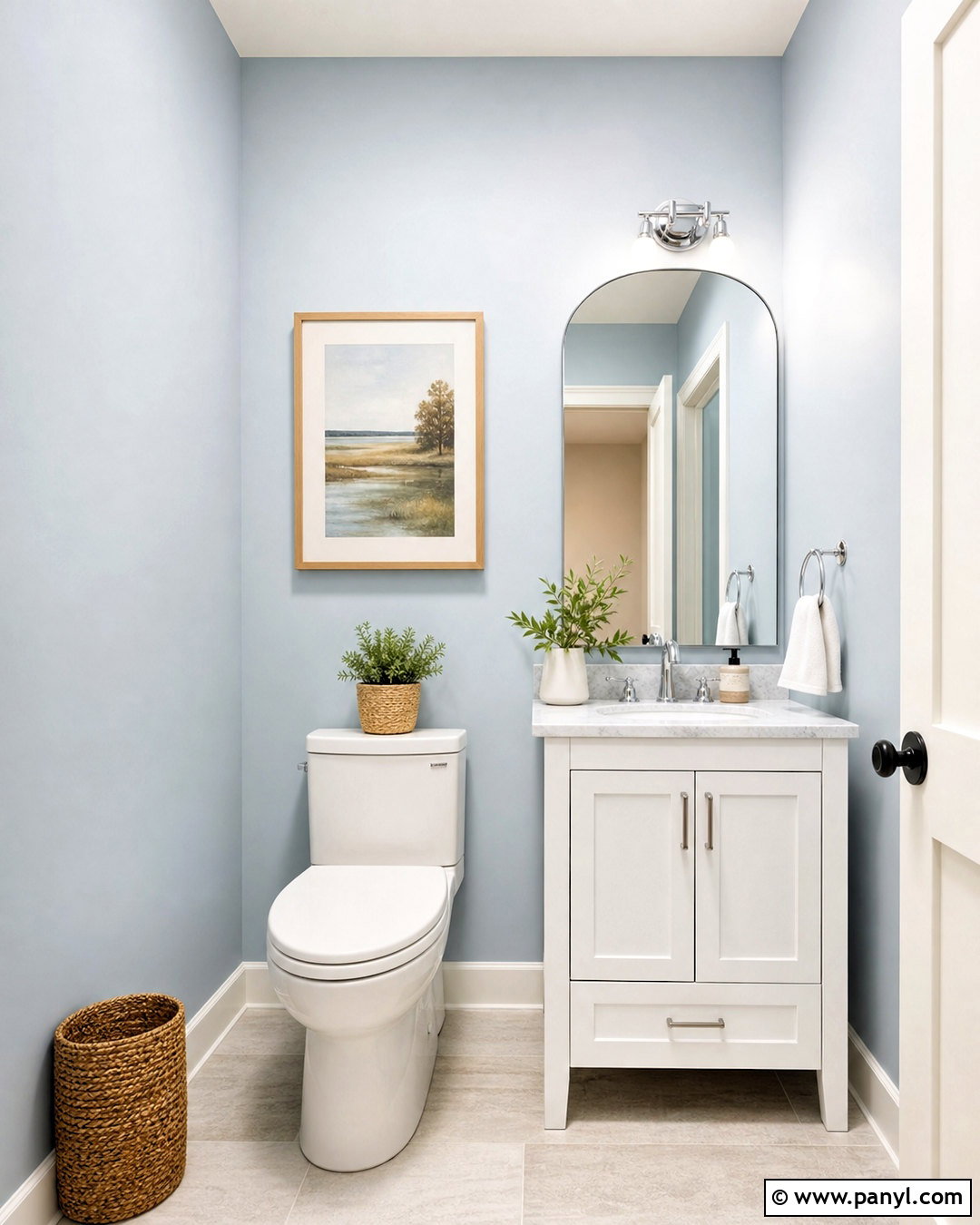
8. Olive Green Color Drenched Den
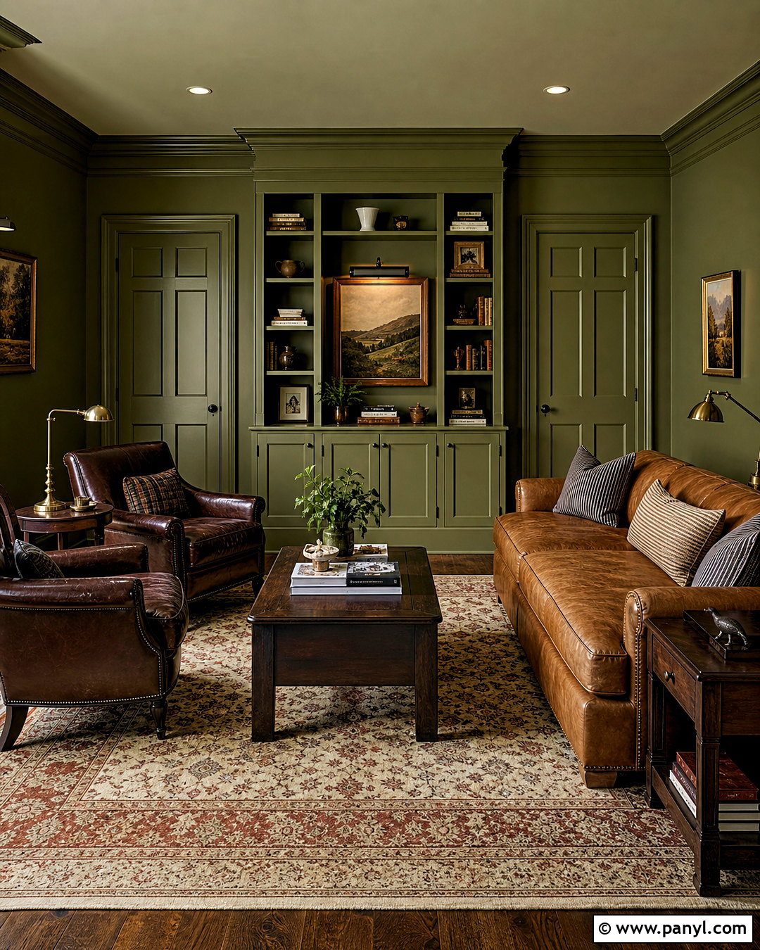
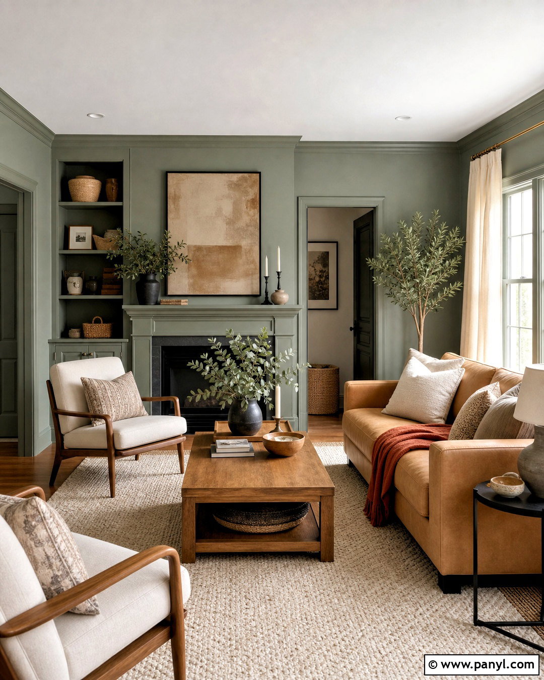
A color-drenched olive den feels cozy because the walls, trim, doors, and ceiling share one continuous hue. Select a muddy olive with brown or gray undertones rather than a sharp botanical green. Use an eggshell finish on the walls and a more durable satin finish on woodwork to create subtle dimension. Furnish the room with a caramel leather sofa, dark walnut shelving, and a cream-and-rust vintage-style rug. Aged brass lamps and warm white bulbs prevent the green from becoming flat. Add striped cushions, framed landscapes, and a few clay accessories for restrained pattern and texture. This treatment works particularly well in small dens or reading rooms. The uninterrupted paint visually softens corners, while pale textiles and reflective metal provide necessary highlights.
9. Butter Yellow Breakfast Nook Paint
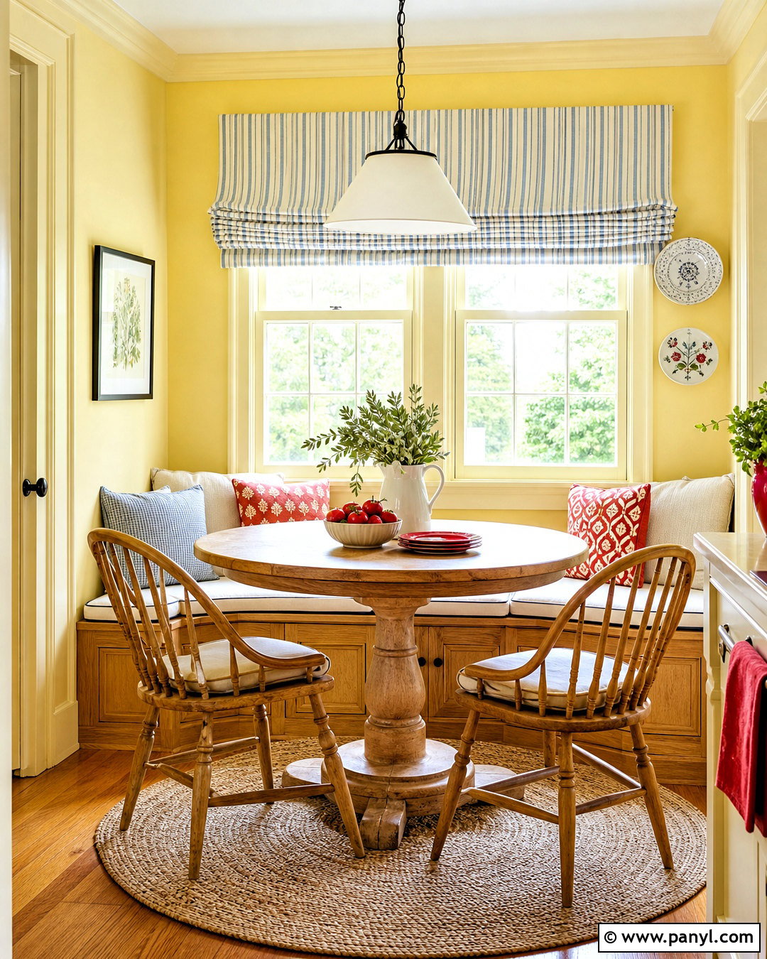
Butter yellow paint makes a breakfast nook feel cheerful even before direct sunlight reaches the room. Choose a creamy, low-saturation yellow and use it on the walls and window trim for a wrapped, welcoming effect. Keep the ceiling warm white to bounce light downward. A built-in oak bench with ivory cushions, a round pedestal table, and simple spindle chairs create a practical arrangement for everyday meals. Add a blue striped Roman shade and small touches of tomato red through dishes or artwork. Natural fiber flooring or a washable woven rug keeps the palette casual. The yellow should look creamy rather than neon under artificial light. Sample it beside cabinetry and countertops, since cool white finishes can intensify yellow and change the balance of the completed nook.
10. Charcoal Gray Media Room Paint
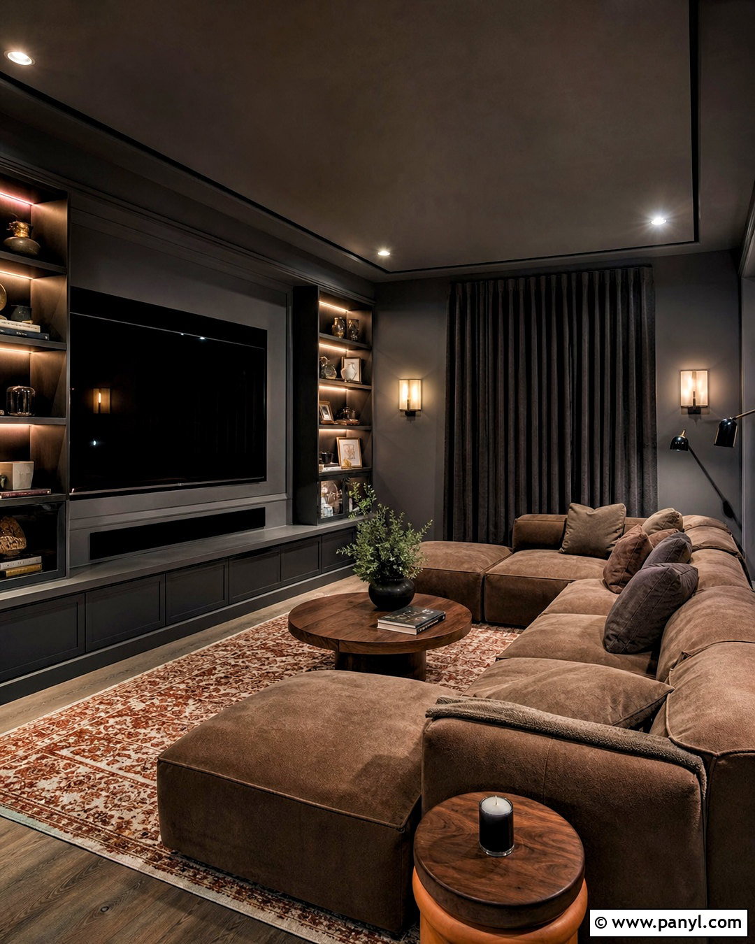
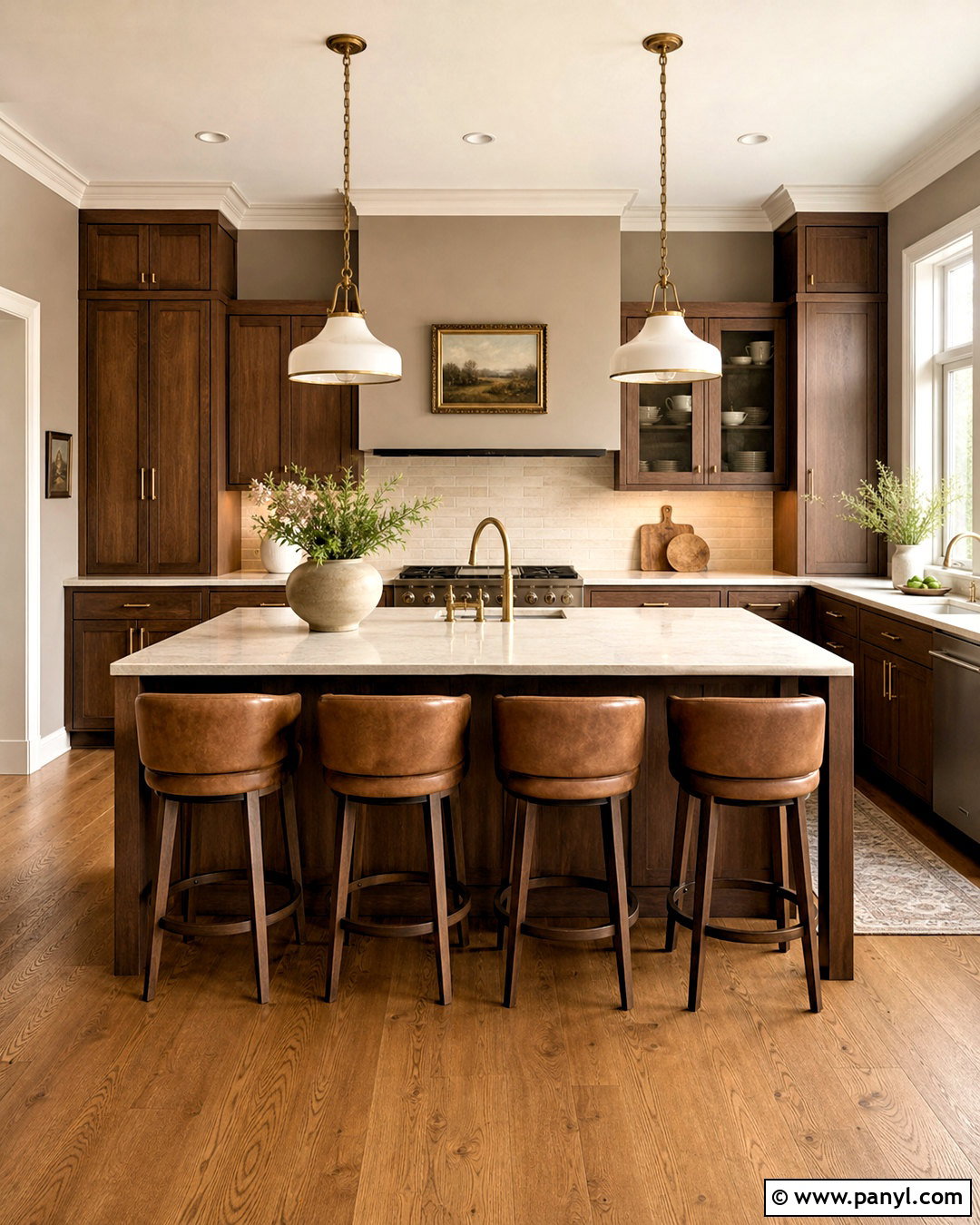
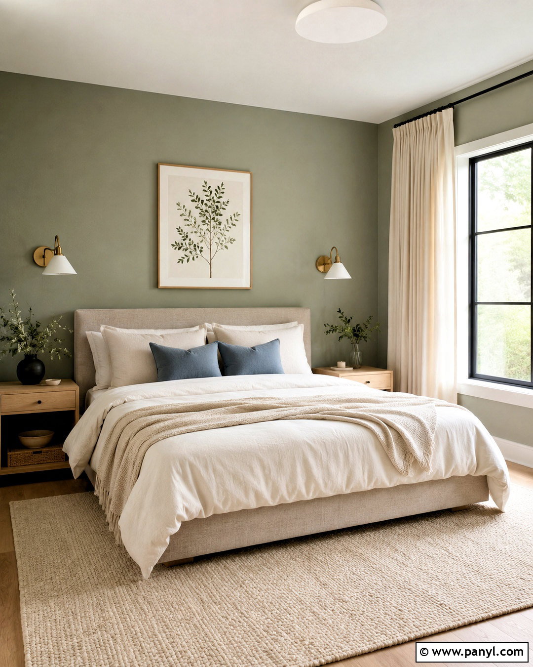
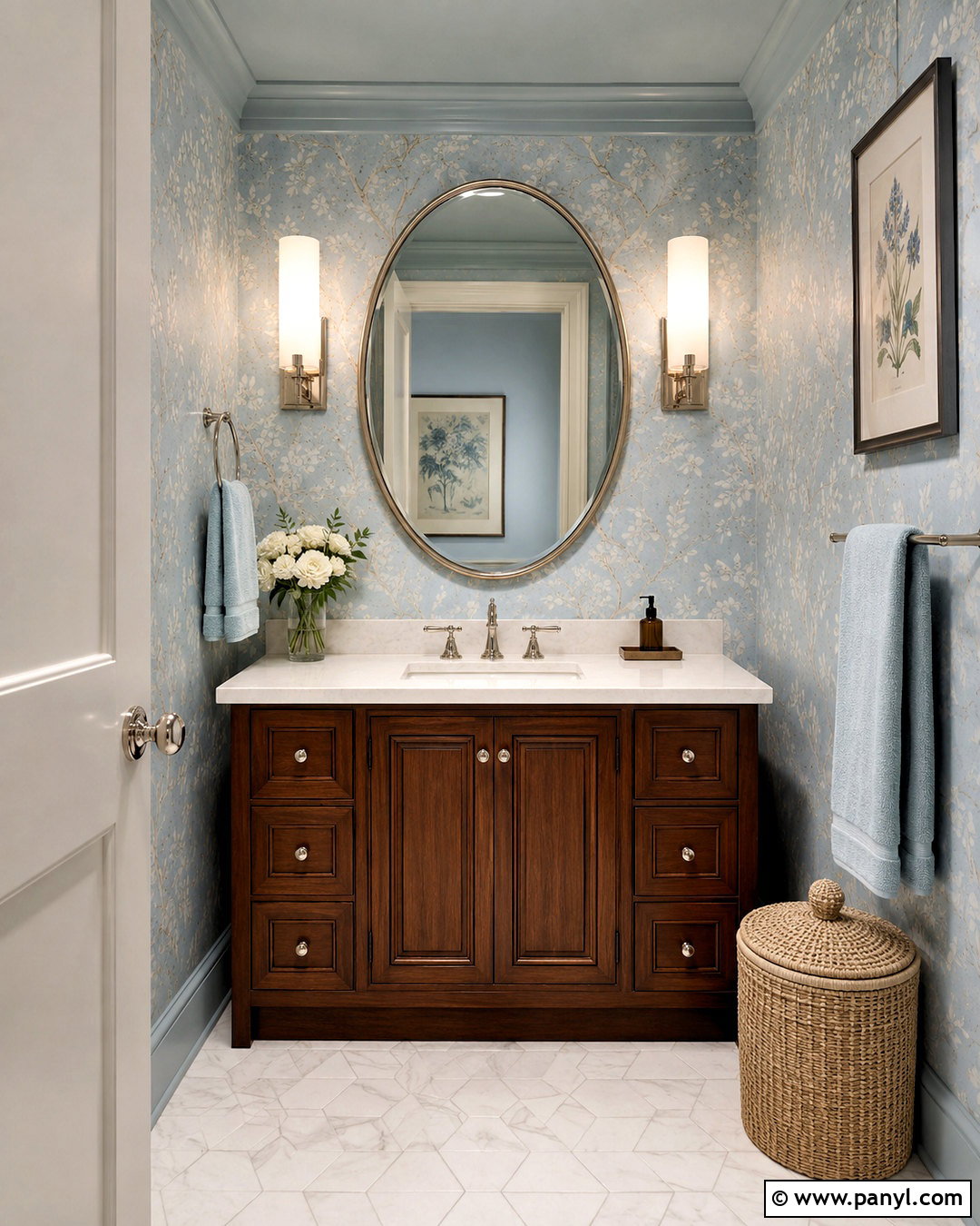
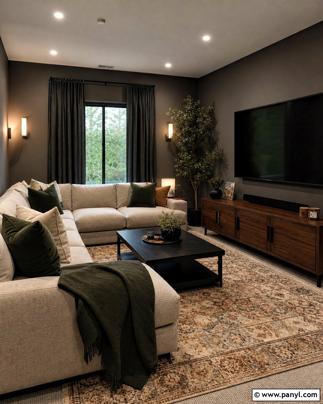
Charcoal paint supports comfortable screen viewing while giving a media room a finished, architectural look. Cover the walls and built-in television unit in a deep warm gray, avoiding blue undertones that may feel cold. Use the same color on the ceiling if the room is dedicated to movies, or choose a lighter gray ceiling in a multipurpose family room. A low-profile sectional in mushroom brown, a large rust-and-cream rug, and walnut side tables introduce warmth. Install dimmable wall sconces and concealed shelf lighting instead of relying on one bright ceiling fixture. Acoustic curtains in charcoal or taupe can improve softness and reduce glare. Keep artwork simple and place it away from the screen. The result feels cozy and intentional rather than dark or basement-like.
11. Pale Blue Sunroom Paint
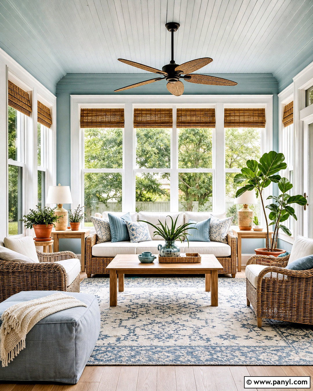
Pale blue paint can make a sunroom feel open and airy while connecting it to sky and garden views. Choose a clear blue softened with a touch of gray, then apply it to the walls and ceiling for a gentle enveloping effect. Use bright white on window frames to sharpen the view and emphasize natural light. Furnish the room with a woven sofa, ivory cushions, light oak tables, and a blue-and-cream patterned rug. Add leafy plants in terracotta pots to introduce green and warm orange accents. Natural bamboo shades provide practical glare control without covering the windows heavily. The finished design should remain light and casual. Avoid filling the room with blue furniture, since varied wood, wicker, cream, and greenery give the painted surfaces more visual depth.
12. Two Tone Hallway Paint
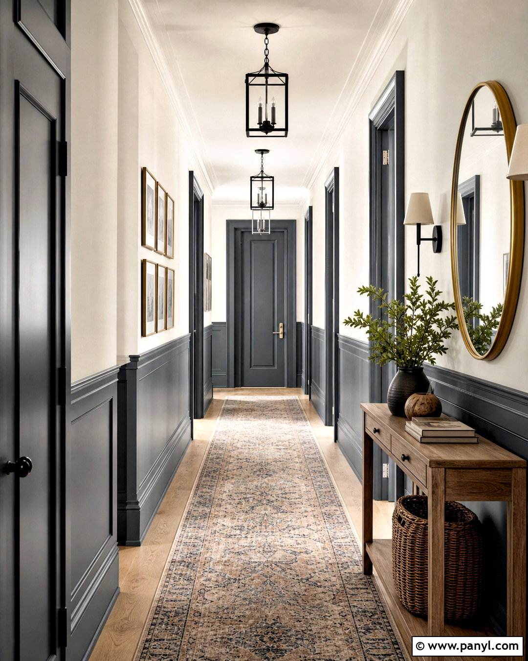
Two-tone paint gives a plain hallway stronger proportions and helps protect its most frequently touched surfaces. Apply a muted blue-gray, soft olive, or warm taupe below chair-rail height, then use creamy white above it and across the ceiling. Paint the baseboards and lower doors in the deeper shade for a durable, unified foundation. A narrow oak console, round brass mirror, and washable runner add warmth without blocking the walkway. Use simple black or aged brass ceiling lights at regular intervals to create rhythm. Framed artwork can bridge the upper and lower colors through a restrained palette. Keep the dividing line level as it passes doorways and corners. This complete treatment adds character to a hardworking transition space while making scuffs and everyday wear less visually distracting.
13. Muted Terracotta Guest Room Paint
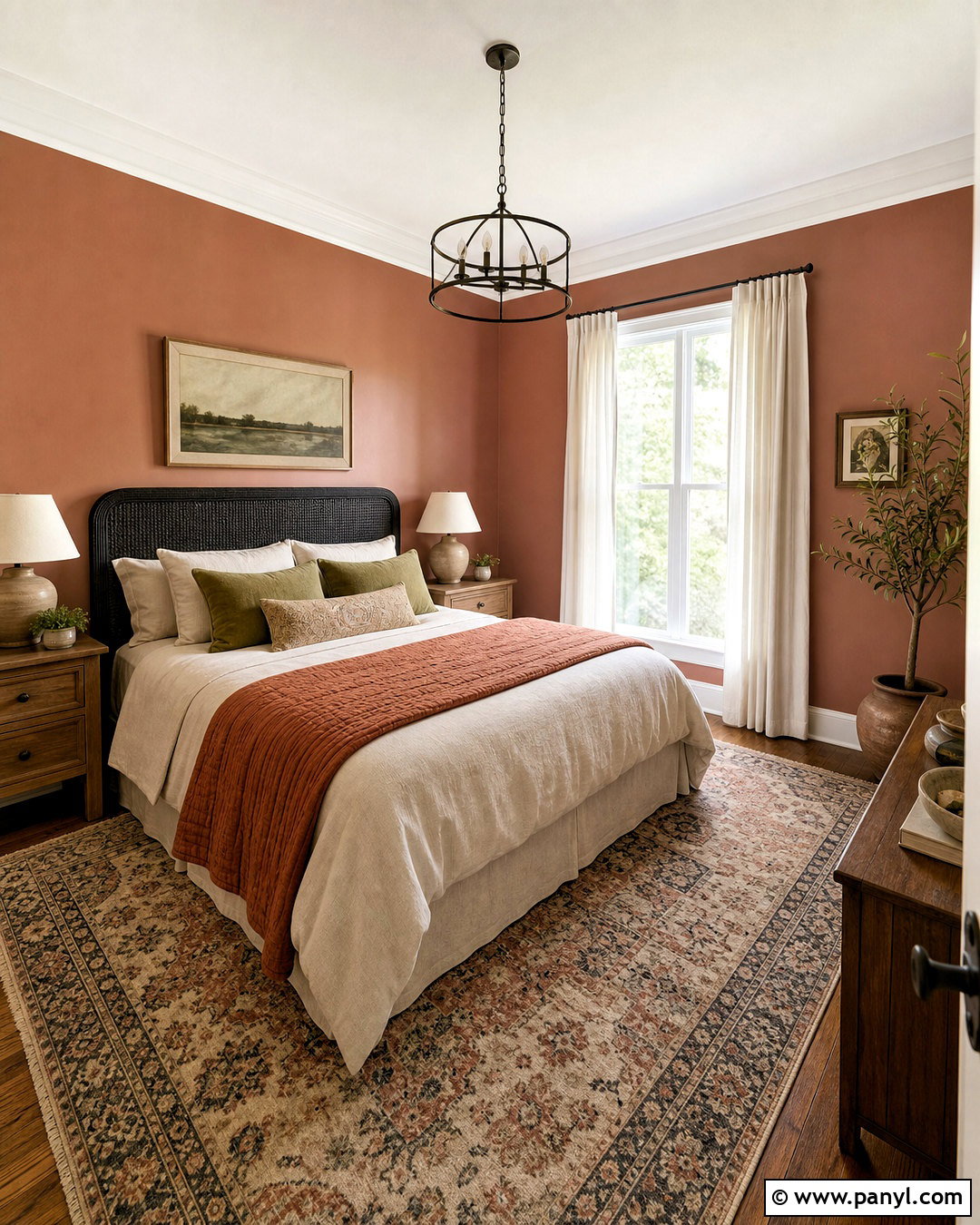
Muted terracotta can make a guest bedroom feel warm and memorable without becoming visually overwhelming. Choose a dusty pink-clay shade for the walls and pair it with soft ivory trim and ceiling paint. Center a dark wood or woven headboard on the main wall, then dress the bed with cream linen, olive pillows, and a deep rust quilt. Small oak nightstands and ceramic lamps continue the natural theme. Use a faded patterned rug that combines clay, beige, green, and blue to unify the furnishings. Lightweight ivory curtains keep the windows bright and balance the saturated walls. Include one comfortable chair and a simple luggage bench so the room functions well for visitors. The layered earth tones create comfort while still feeling fresh, uncluttered, and carefully planned.
14. Warm Taupe Primary Bedroom Paint
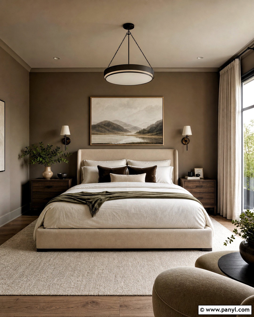
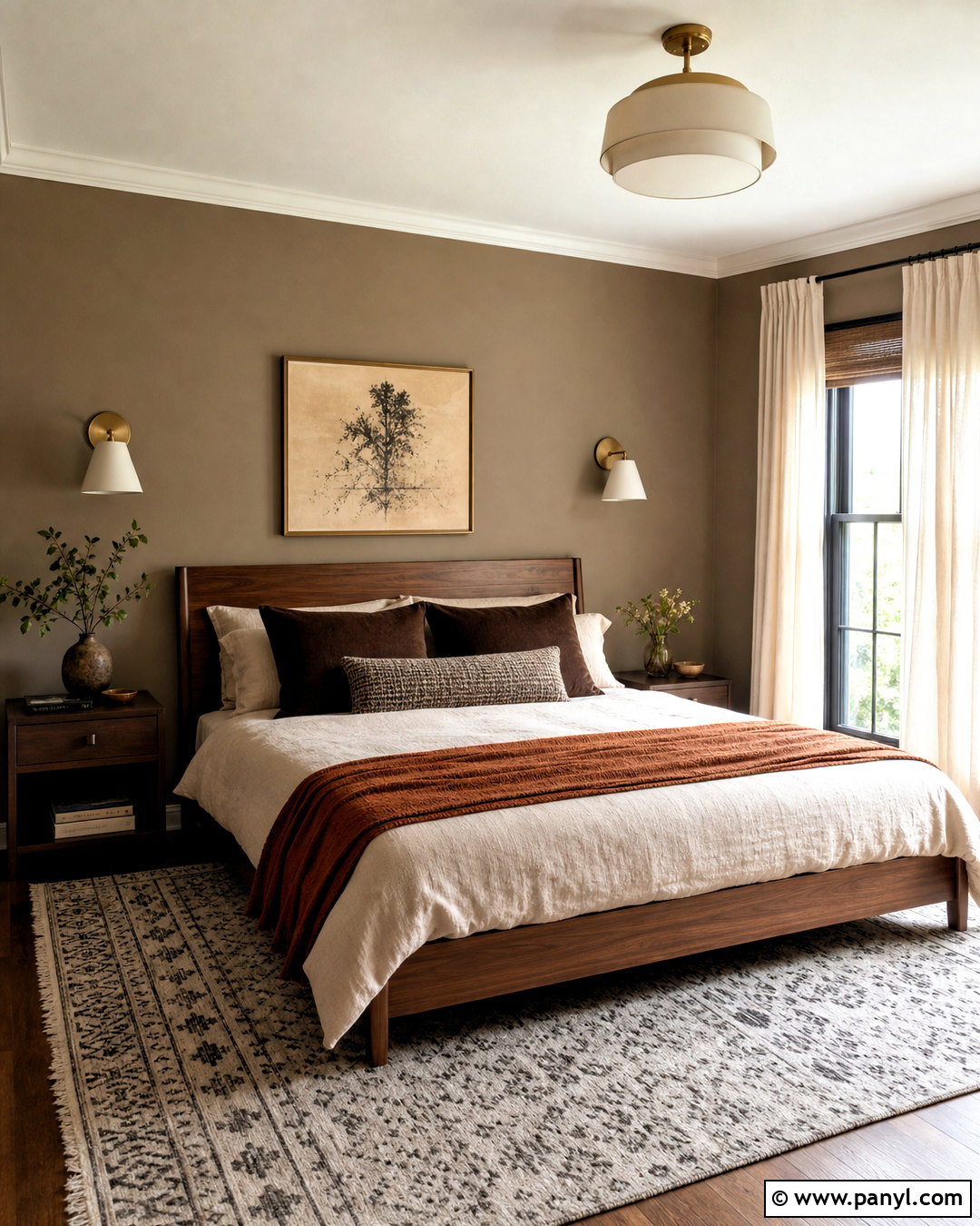
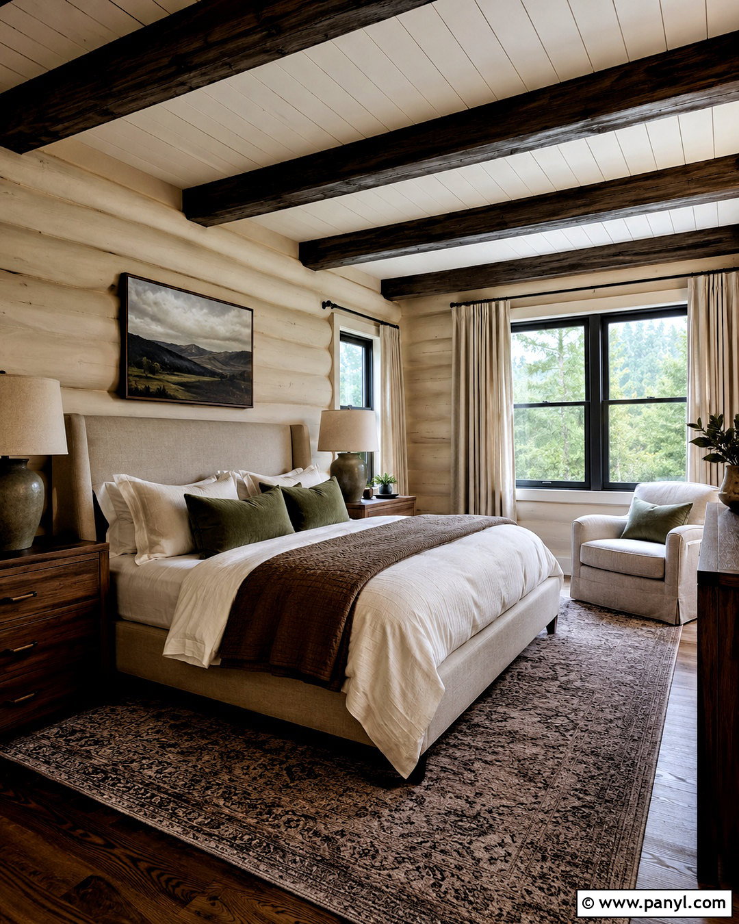
Warm taupe creates a quiet primary bedroom that has more depth than plain beige but remains easy to live with. Select a shade with balanced brown and gray undertones, and paint the walls in a soft matte finish. Use slightly lighter taupe on the ceiling to reduce contrast and make the room feel cocooned. An oatmeal upholstered bed, dark oak nightstands, and ivory bedding establish a restful foundation. Add chocolate brown pillows, a muted green throw, and a large wool rug for layered color. Bronze or black reading sconces provide definition without looking flashy. Choose full-length linen curtains close to the wall color for a seamless finish. This tonal scheme succeeds through texture, so mix smooth cotton, nubby wool, woven wood, and softly aged metal throughout the room.
15. Forest Green Library Paint
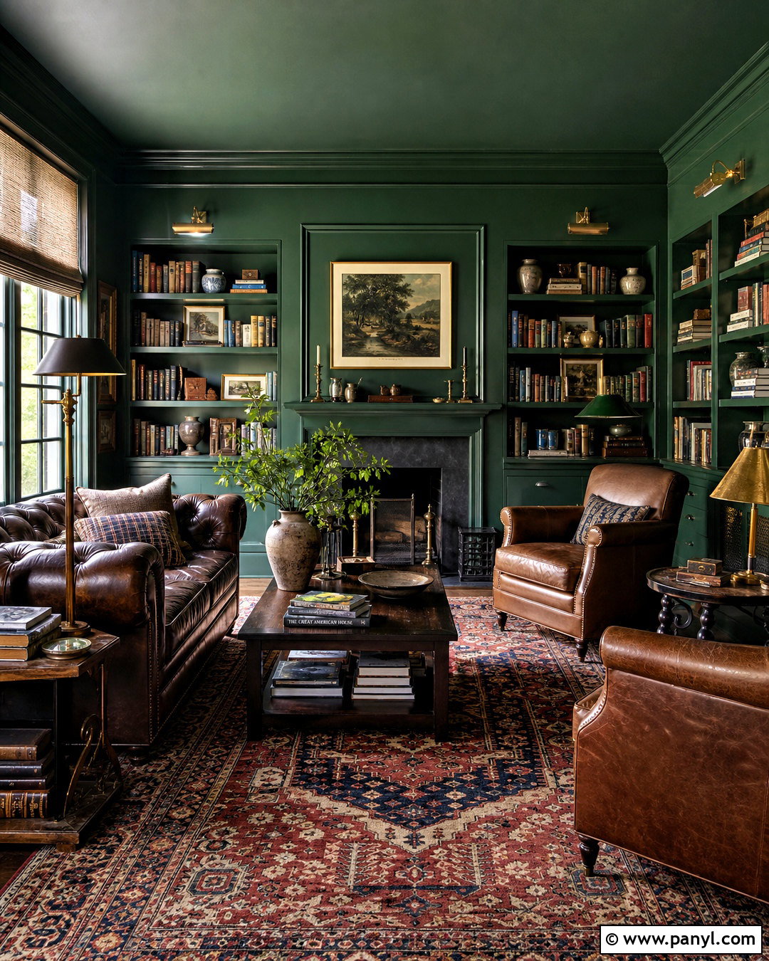
Forest green paint creates an immersive home library when it is paired with generous lighting and warm materials. Paint the walls, built-in bookcases, and trim in a deep green with slightly muted undertones. Keep the ceiling green for a traditional cocooning effect, or use warm cream if the room has limited daylight. Place a brown leather sofa or two camel reading chairs near a dark wood coffee table. A faded red, navy, and cream rug adds pattern underfoot and prevents the palette from becoming overly coordinated. Install brass library lights above shelves and a shaded floor lamp beside each seat. Leave some open space among the books for pottery and framed art. The finished room should feel collected and comfortable, with several practical places to sit, read, and set down a drink.
16. Creamy Beige Nursery Paint
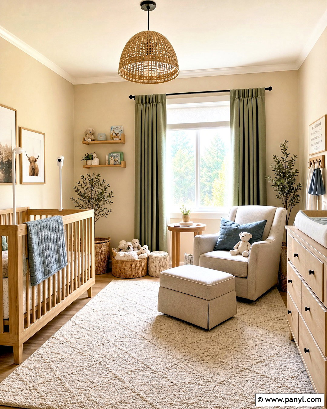
Creamy beige offers a flexible nursery backdrop that can grow with the child and support many accent colors. Paint the walls a warm, pale beige and use clean off-white on the ceiling, trim, and doors. Position a natural oak crib against a simple wall, leaving decorative objects safely out of reach. Add a washable ivory rug, a comfortable oatmeal glider, and a light wood dresser that doubles as a changing station. Muted sage green, dusty blue, and clay accents can appear in curtains, storage baskets, and removable artwork. A woven ceiling light and blackout linen drapes make the room practical at different times of day. This complete palette feels soft without becoming bland because wood grain, fabric texture, and carefully spaced color provide warmth, contrast, and lasting versatility.
17. Burgundy Dining Room Paint
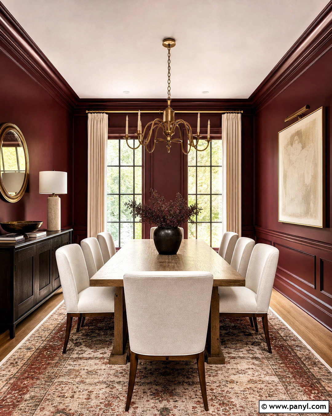
Burgundy paint gives a dining room depth, drama, and a strong sense of enclosure. Select a brown-based burgundy rather than a bright purple-red, then carry it across the walls and trim for a refined color-drenched finish. A medium oak table and cream upholstered chairs lighten the center of the room. Add an aged brass chandelier, ivory curtains, and a warm patterned rug containing red, tan, and muted blue. Large artwork with pale backgrounds can break up the walls without weakening the palette. If the room has wainscoting, paint it burgundy as well and vary the sheen for subtle definition. This rich scheme works best with several warm light sources. The final look feels intimate and balanced because light upholstery, natural wood, and reflective brass offset the saturated paint.
18. Soft Lavender Bedroom Paint
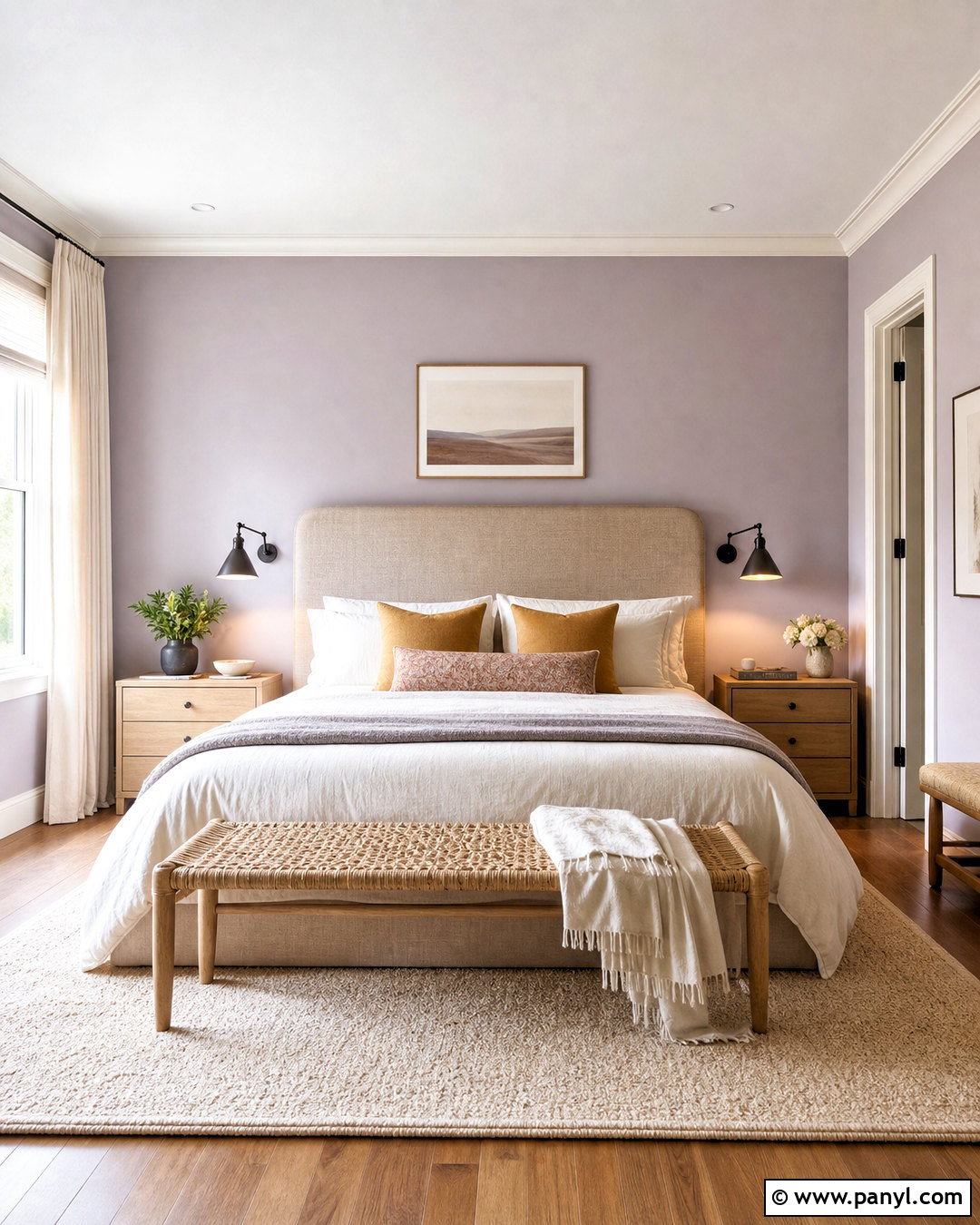
Soft lavender can create a calm bedroom that feels modern when balanced with warm neutrals and restrained contrast. Choose a grayed lavender rather than a sweet pastel, and apply it to the walls with warm white on the trim and ceiling. Pair the color with a natural linen headboard, ivory bedding, and light oak nightstands. Use muted mustard or ocher pillows sparingly to complement the purple undertone. A cream rug, woven bench, and softly pleated curtains add texture without introducing visual noise. Black reading lights or dark bronze hardware give the room a necessary crisp edge. Keep artwork simple, using botanical or abstract prints in lavender, tan, and green. The finished bedroom feels peaceful and personal while avoiding the overly themed appearance sometimes associated with purple rooms.
19. Muted Teal Laundry Room Paint
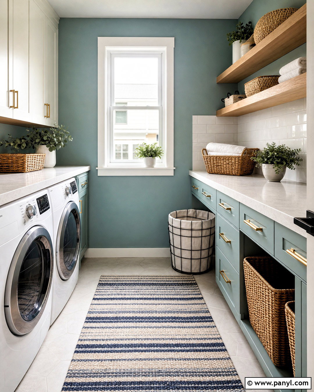
Muted teal gives a laundry room personality while disguising some of the scuffs common in a utility space. Paint the walls and lower cabinets in a softened blue-green, then use warm white on upper cabinets, trim, and the ceiling. A pale quartz counter over front-loading machines provides space for folding, while a simple white tile backsplash keeps the room bright. Install brushed brass or matte black hardware, depending on the surrounding home finishes. Woven baskets, light wood shelves, and a striped washable runner add practical warmth. Include strong ceiling lighting and under-cabinet task lights so the teal remains clear rather than shadowy. This complete scheme turns an ordinary work area into an organized room that feels connected to the rest of the home instead of visually overlooked.
20. Mocha Brown Living Room Paint
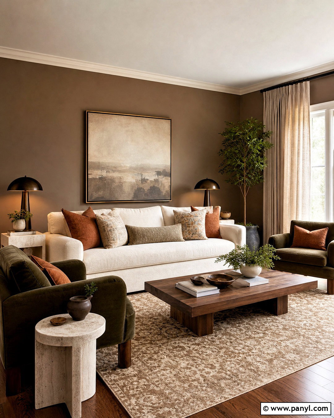
Mocha brown paint creates a warm, grounded living room that works beautifully with cream upholstery and natural stone. Choose a medium brown with soft gray undertones, avoiding shades that appear orange under warm bulbs. Paint the walls mocha and use creamy white on the ceiling for lift. A large ivory sofa, walnut coffee table, and travertine side tables create a sophisticated neutral foundation. Add olive green chairs, rust-colored pillows, and a patterned beige rug to keep the room from feeling monochromatic. Bronze floor lamps and linen curtains provide gentle contrast. Repeat the mocha on built-in shelving or an interior door to make the palette intentional. The completed design feels rich but approachable, especially when tactile materials such as wool, linen, leather, wood, and stone are layered together.
Conclusion:
The most successful interior paint ideas begin with the whole room rather than a single attractive color. Consider the direction of natural light, existing flooring, fixed finishes, furniture, and the mood you want the space to create. Warm whites and greige provide flexible foundations, while sage, blue, terracotta, and taupe add gentle personality. Deeper olive, navy, burgundy, charcoal, and brown can make smaller rooms feel intentionally cozy. Whatever palette you choose, test large samples beside trim and furnishings for several days. Then repeat key colors through textiles, art, wood, and metal finishes. With thoughtful coordination, these interior paint ideas can make every room feel more comfortable, cohesive, and distinctly yours.

Related Ideas and Inspiration:
Leave a Reply