
Dark green walls bring depth, calm, and character to a room, but the surrounding trim determines how that richness is perceived. Bright trim can sharpen the contrast, warm neutrals can soften it, and deeper colors can create a dramatic, enveloping effect. The best choice also depends on the green’s undertone, available natural light, flooring, furniture, and the home’s architectural details. Always sample the wall and trim colors together because forest, hunter, olive, and blue-green paints react differently throughout the day. Finish matters too: matte or eggshell walls paired with satin trim provide subtle definition and practical durability. The complete room looks below explore 20 Trim Color For Dark Green Walls.
1. Crisp White Trim
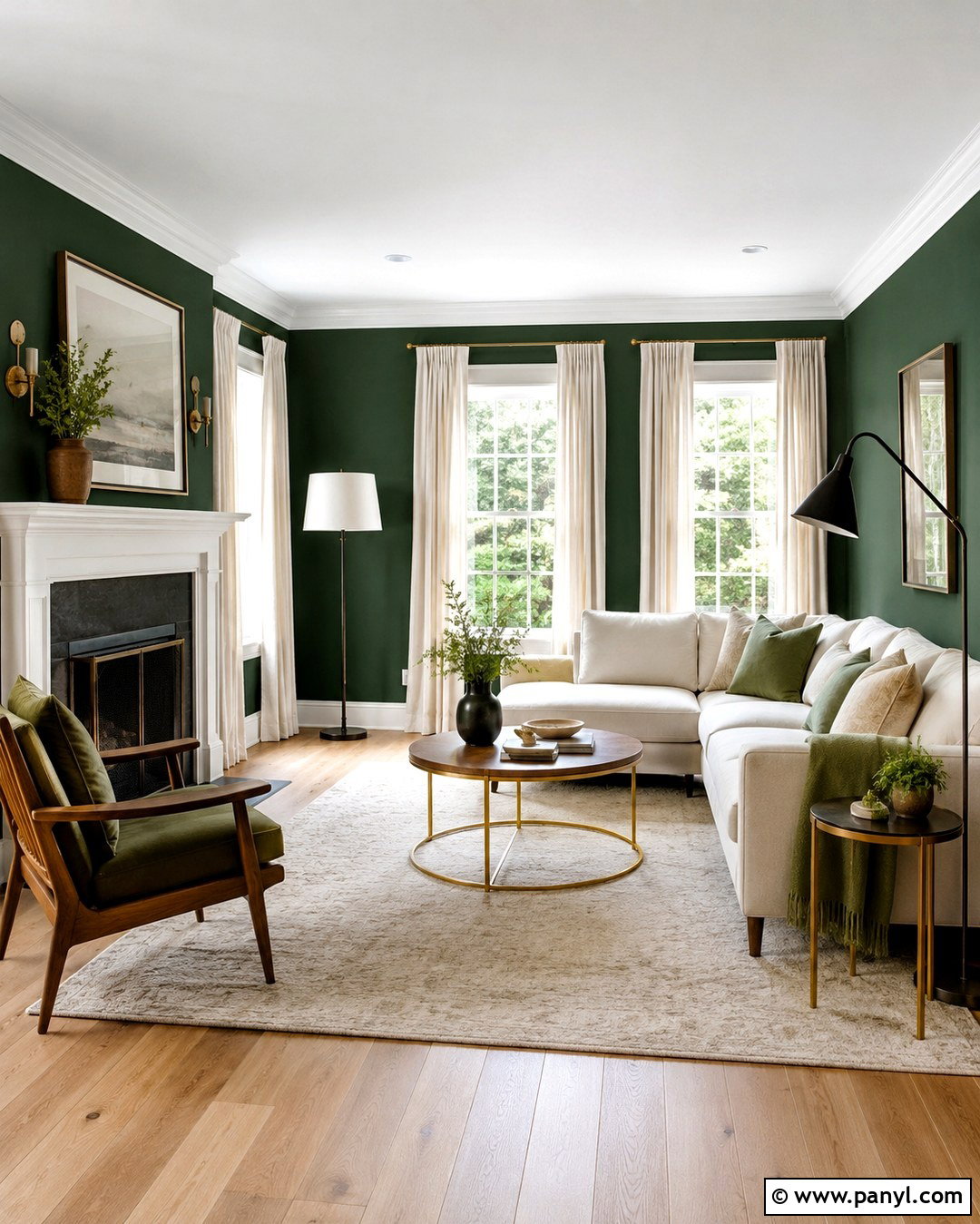
Crisp white trim creates the clearest contrast against forest or hunter green walls. It outlines windows, doors, crown molding, and baseboards, making the architecture feel clean and intentional. This combination works especially well in a living room with plenty of daylight. Add a light oak floor, an ivory sofa, and black metal lighting for a fresh transitional look. Small brass accents prevent the palette from feeling cold, while natural linen curtains soften the strong contrast. Choose a neutral or slightly cool white rather than a creamy shade when the green has blue undertones. Use satin or semi-gloss on the trim so it reflects light and remains easy to clean.
2. Warm White Trim
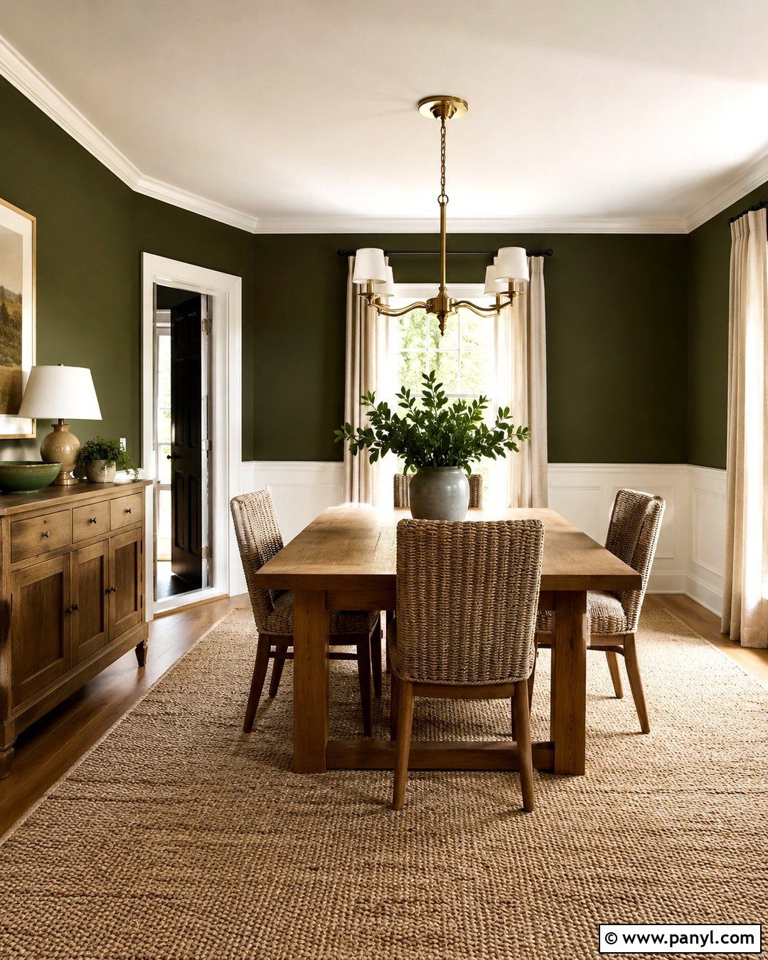
Warm white trim offers gentler contrast than a bright, icy white. It is an excellent match for dark olive, moss, and earthy forest green walls because its subtle yellow or beige undertone connects naturally with the warmth of the green. Build a welcoming dining room around this pairing with a medium-toned wood table, woven chairs, linen curtains, and aged brass lighting. A cream ceiling can continue the soft effect without making the space look yellow. For consistency, paint the baseboards, door casings, crown molding, and interior doors in the same warm white. This trim color is especially useful in north-facing rooms, where cold daylight can make pure white appear slightly blue.
3. Soft Cream Trim
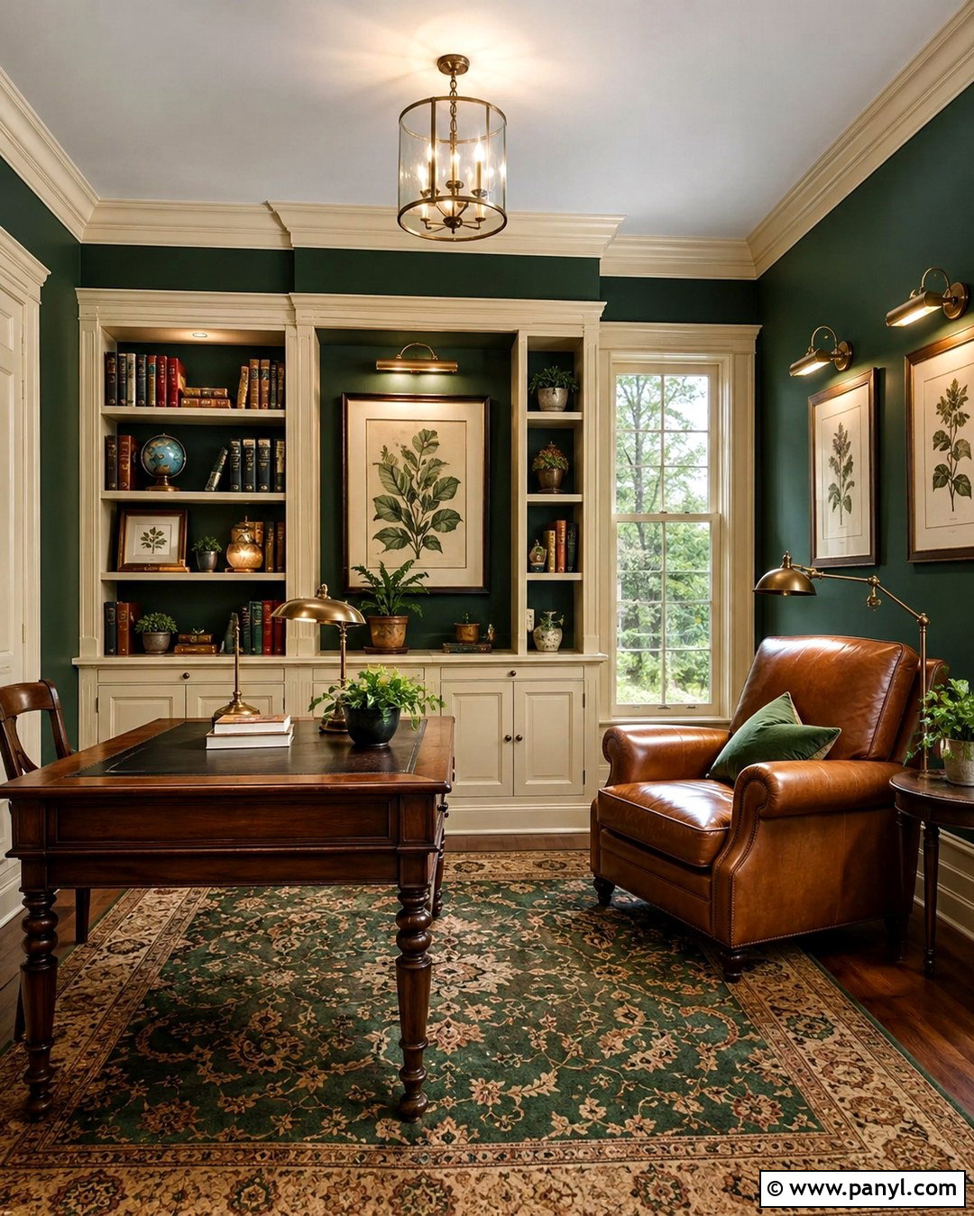
Soft cream trim gives dark green walls a comfortable, traditional character. The warm contrast feels less formal than brilliant white and looks especially attractive with olive or brown-based green. Create a complete reading room with cream-painted built-ins, a caramel leather chair, an antique wood desk, and a patterned rug containing green, tan, and muted red. Warm metal picture lights can highlight artwork without overpowering the palette. Keep the ceiling a lighter version of the cream to maintain an airy upper boundary. This combination suits older homes with substantial molding because the creamy finish emphasizes detail softly. Avoid heavily yellow creams, which can make certain blue-green walls look disconnected or overly cool.
4. Ivory Trim
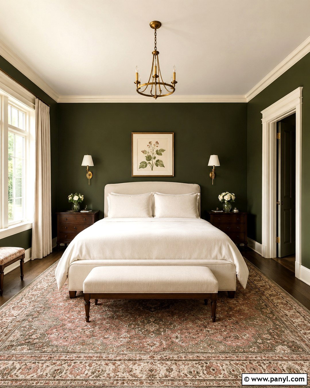
Ivory trim creates an elegant bridge between dark green walls and warm natural materials. It has enough pigment to feel softer than white while still providing visible architectural contrast. Try this palette in a bedroom with an upholstered oatmeal headboard, ivory bedding, walnut nightstands, and antique brass sconces. A faded botanical rug can repeat the green while introducing dusty rose and tan. Paint the door and window trim in satin ivory, then continue the color across the ceiling for a balanced frame around the darker walls. Ivory looks particularly refined with deep olive and traditional forest green. Before committing, test it beside the wall color to ensure its undertone does not appear excessively yellow or pink.
5. Light Greige Trim
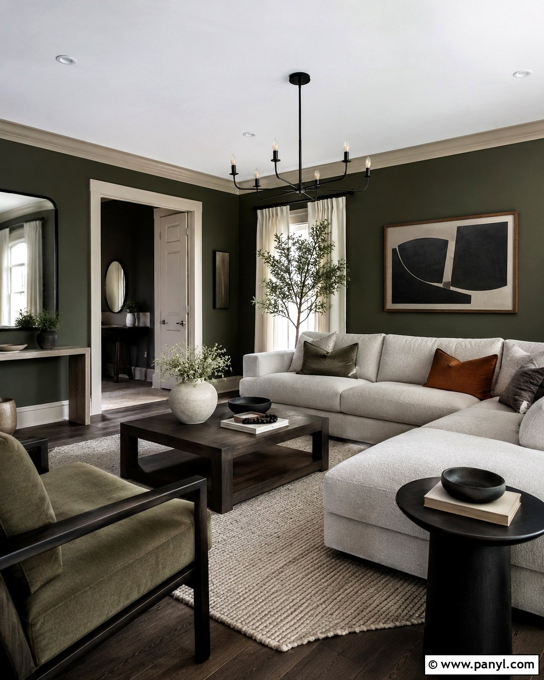
Light greige trim gives dark green walls a contemporary softness without the sharpness of white. Blending gray and beige, this neutral works with warm and cool furnishings and is useful in open-plan homes. Create a relaxed living room with greige trim, a pale textured sectional, smoked oak tables, black accents, and a large wool rug. Keep the ceiling a cleaner off-white so the room still feels bright. Greige is particularly effective with muted dark greens containing gray because the two colors share a restrained undertone. Select a trim shade that remains visibly lighter than the walls. A satin finish adds definition, while matte green walls provide a velvety background for furniture and art.
6. Pale Beige Trim
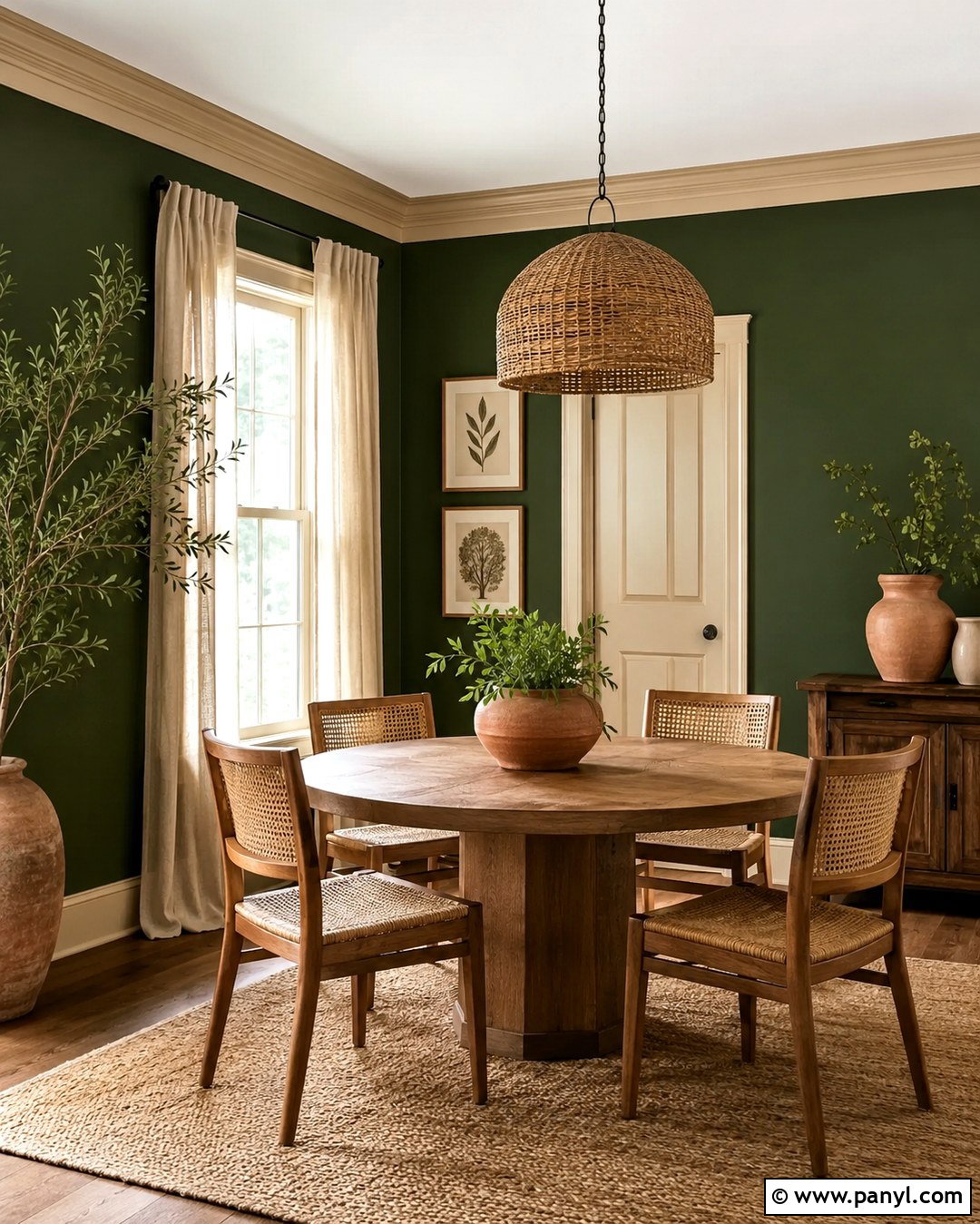
Pale beige trim warms dark green walls and creates an earthy, approachable room. This pairing feels especially natural when the wall color leans olive, moss, or khaki rather than blue. Use it in a casual dining space with a round oak table, woven pendant, cane-back chairs, and sandy linen curtains. Terracotta pottery and simple botanical prints reinforce the organic palette. Extend the beige onto paneled doors and lower cabinetry for a coordinated design, but keep the ceiling slightly lighter to preserve openness. Choose a beige with subdued undertones instead of a strongly golden formula. The finished space should feel layered and warm, with enough contrast to show the molding without producing a stark outline.
7. Mushroom Trim
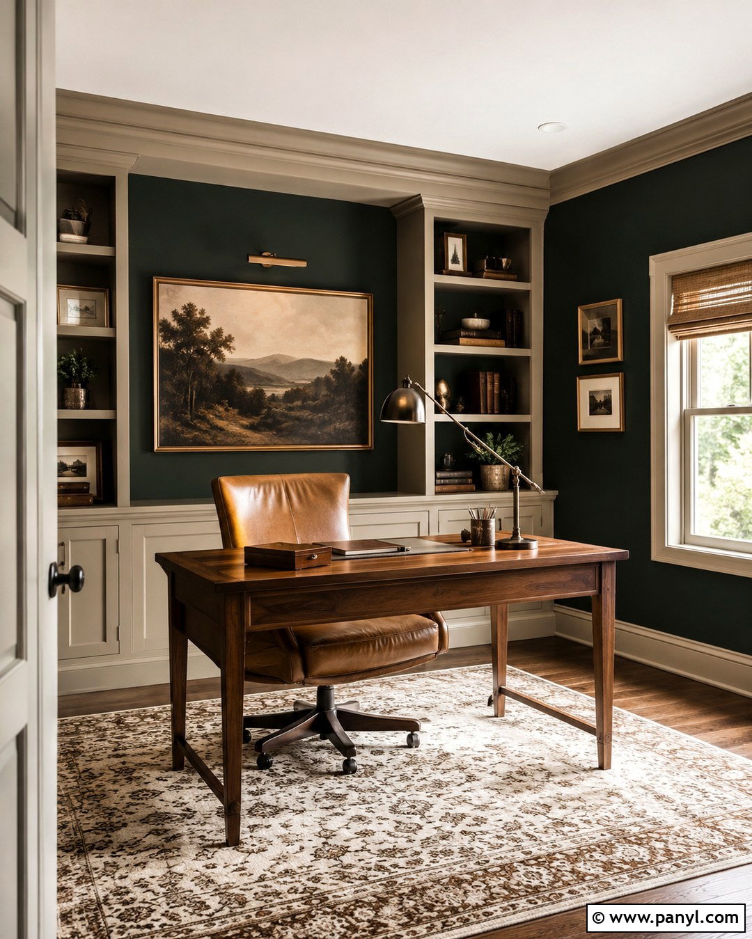
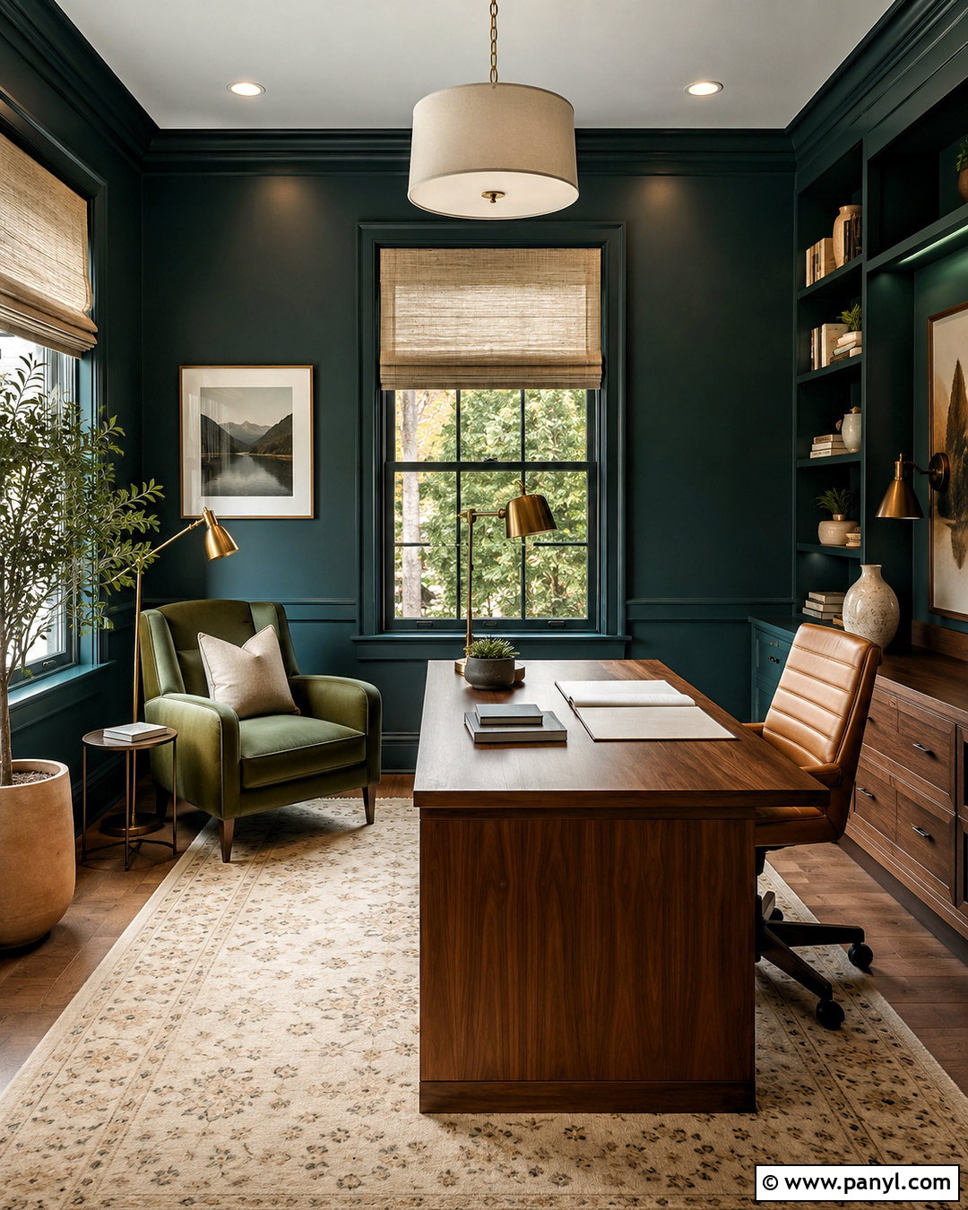
Mushroom trim combines taupe, gray, and brown undertones, making it a sophisticated partner for deep green walls. It creates moderate contrast and looks grounded beside walnut, aged leather, stone, and antique metals. Consider this combination for a home office with dark green walls, mushroom-painted built-ins, a walnut desk, a camel leather chair, and a bronze library lamp. A cream-and-brown rug can brighten the floor while maintaining the mature palette. Use the mushroom color on all millwork, including shelves, baseboards, and doors, to make the cabinetry feel integrated. This pairing works best when both colors share similar warm or neutral undertones, so evaluate large samples in daytime and artificial light.
8. Light Taupe Trim
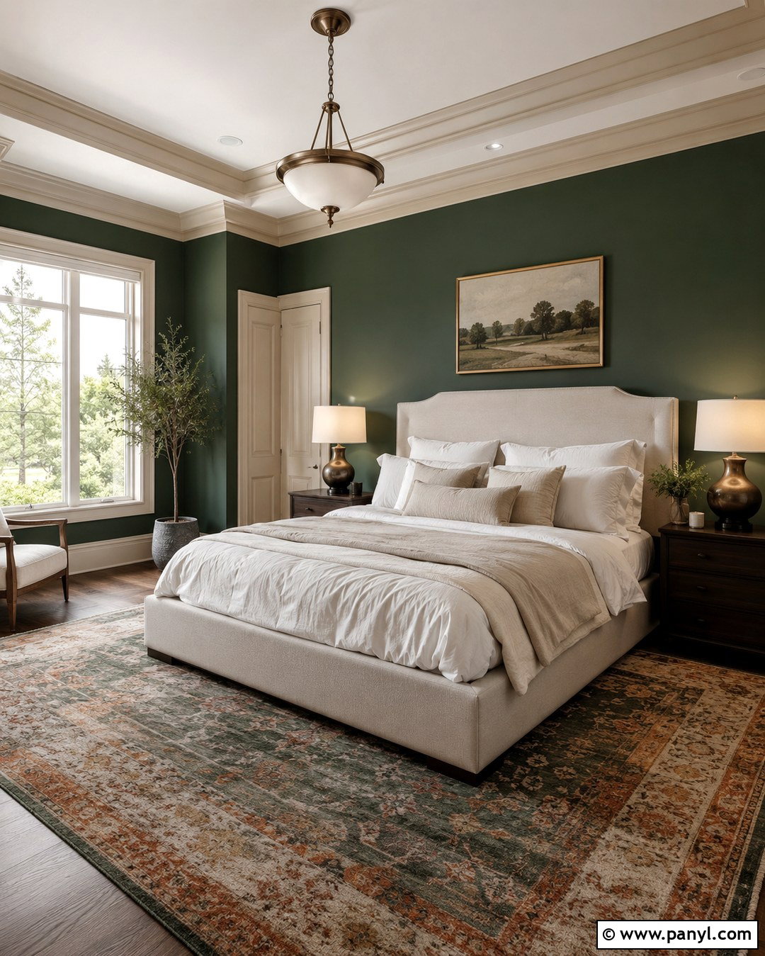
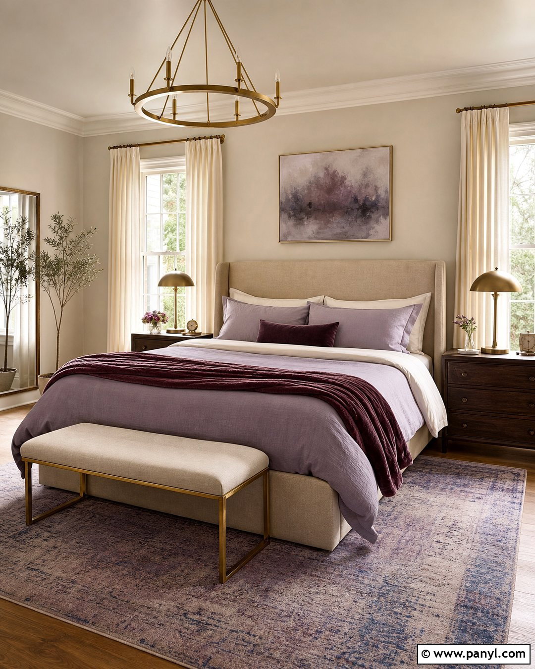
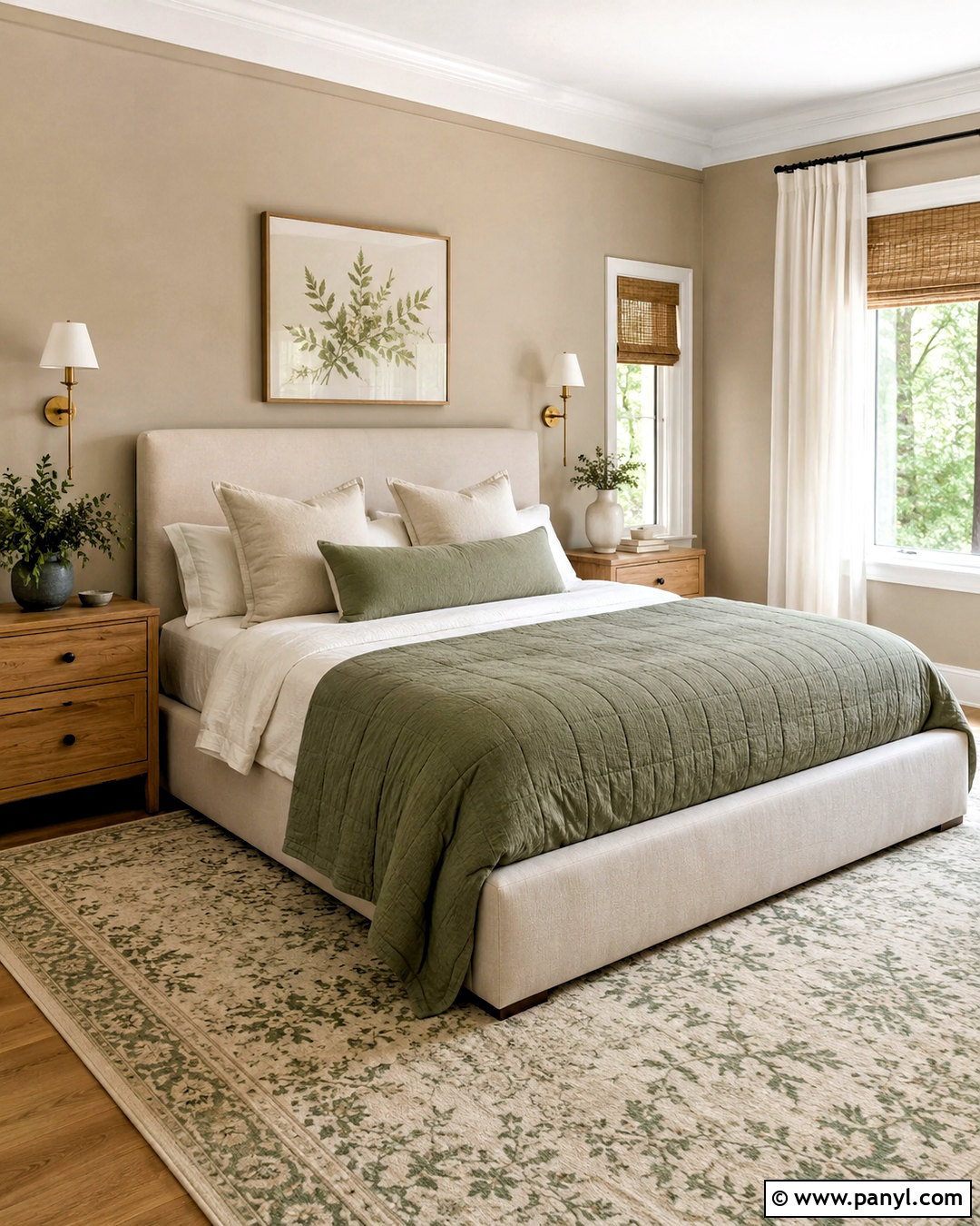
Light taupe trim introduces quiet warmth without competing with dramatic dark green walls. Compared with beige, taupe usually carries more gray or brown, giving the room a polished and balanced appearance. Design a comfortable bedroom with taupe trim, an oatmeal bed, layered white bedding, dark wood nightstands, and bronze lamps. Add a rug featuring faded green and rust to connect the walls with warmer furnishings. Painting the closet doors and crown molding taupe creates a cohesive envelope while retaining clear separation from the green. This trim choice is particularly effective in rooms with warm wood flooring. Avoid taupes with strong purple undertones unless they have been tested beside the exact green paint.
9. Pale Gray Trim
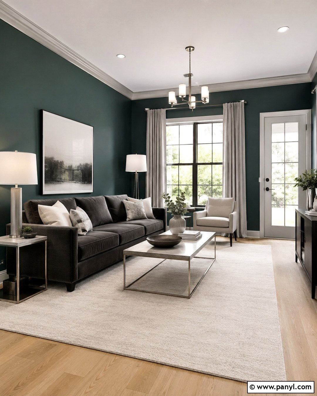
Pale gray trim gives dark green walls a cooler, tailored edge. It pairs naturally with blue-based forest green, deep teal-green, and gray-green paint. Use the combination in a modern living room with a charcoal sofa, pale gray curtains, light oak flooring, and brushed nickel lighting. White cushions and a cream rug can prevent the cooler palette from becoming severe. Choose a soft gray with enough depth to remain visible against the ceiling but not so much that it competes with the walls. Continue it across doors and built-in shelving for consistency. This look performs best in rooms with balanced or warm daylight, which helps the gray maintain a comfortable appearance rather than turning icy blue.
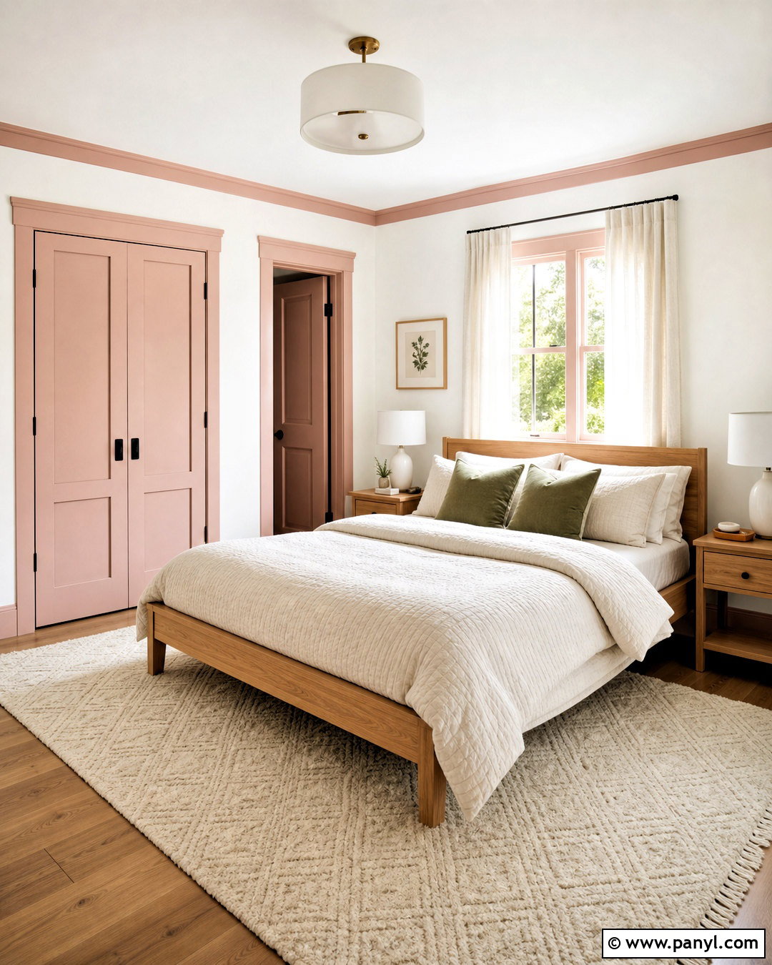
10. Charcoal Gray Trim
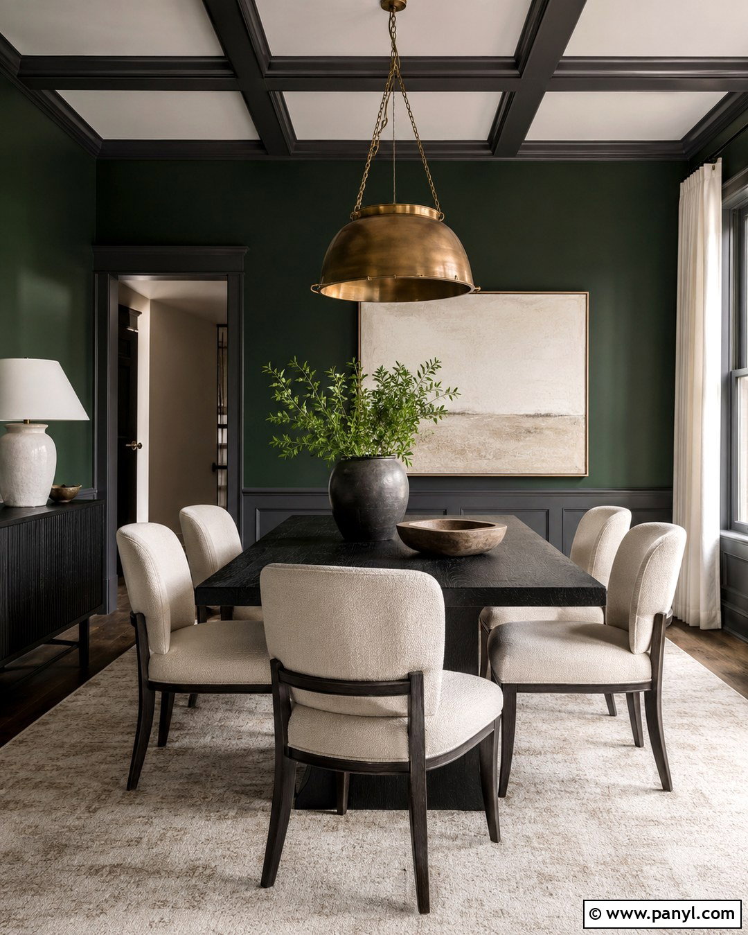
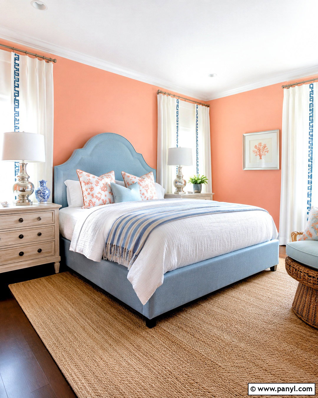
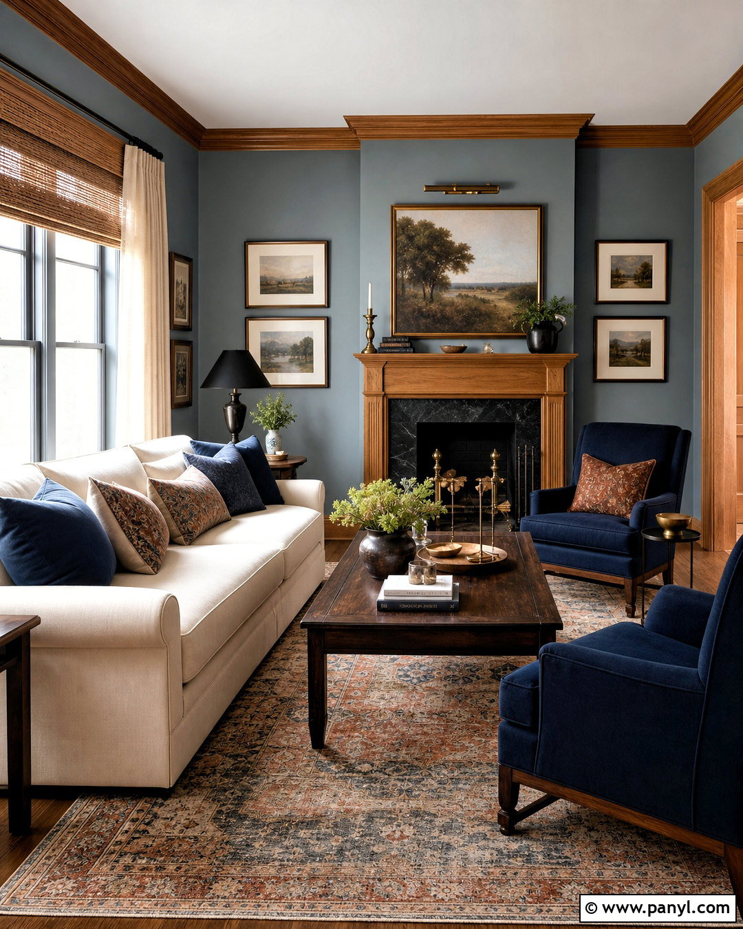
Charcoal gray trim makes dark green walls feel dramatic and architectural. Because both colors are deep, the contrast is subtle, allowing molding and doorways to blend into a sophisticated backdrop. Create a dining room with charcoal trim, a blackened wood table, oatmeal upholstered chairs, and a large aged brass pendant. Pale artwork and a lightly patterned rug will keep the space from becoming visually heavy. This combination works best in a room with generous windows or layered artificial lighting. Paint the trim in satin so its slight sheen distinguishes it from matte walls. Select a charcoal with warm or neutral undertones, particularly when the green leans olive, to avoid an unintended blue cast.
11. Matte Black Trim
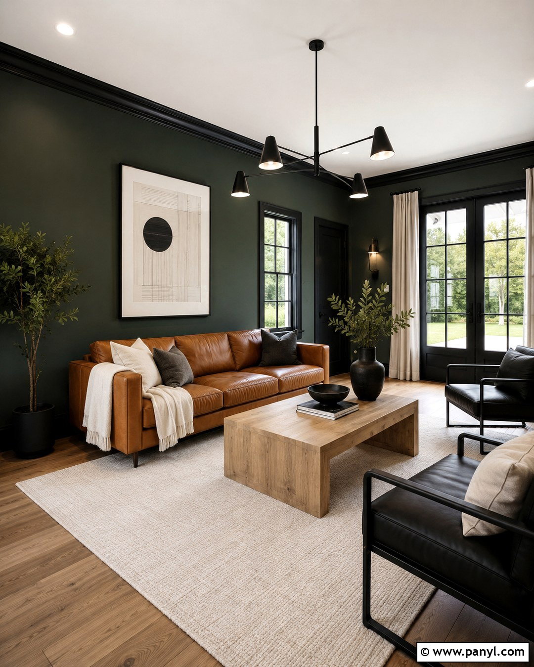
Matte black trim gives dark green walls a bold, graphic finish. It works particularly well in contemporary rooms with simple baseboards, steel-framed windows, or streamlined doors. Build the complete look with a cognac leather sofa, a natural oak coffee table, a cream area rug, and black metal lighting. Keep curtains and larger upholstery pieces light to balance the depth of the walls and trim. Although the look is described as matte, a durable low-sheen satin is more practical for surfaces that receive frequent contact. Repeat black in small doses through frames, hardware, and furniture legs. This creates a deliberate visual rhythm rather than making the trim look like an isolated dark outline.
12. Matching Dark Green Trim
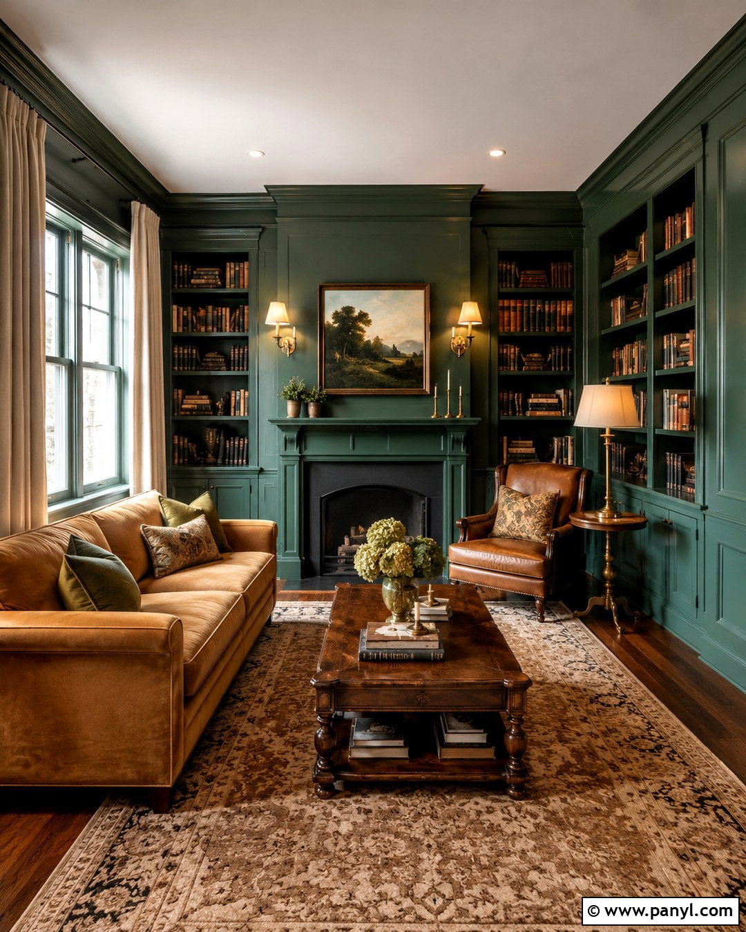
Painting the trim and walls the same dark green produces a seamless, color-drenched interior. With fewer contrasting lines, the room can feel taller, calmer, and more enveloping. Use this treatment in a library or snug with green-painted shelves, a camel velvet sofa, an antique wood coffee table, and warm brass sconces. Introduce cream through curtains, lampshades, and a patterned rug so the finished space retains dimension. Apply matte or eggshell paint to the walls and satin paint to the trim. The slight finish change allows the molding to remain visible without breaking the unified color. This approach is especially effective when ornate trim would otherwise make a small room feel visually busy.
13. Sage Green Trim
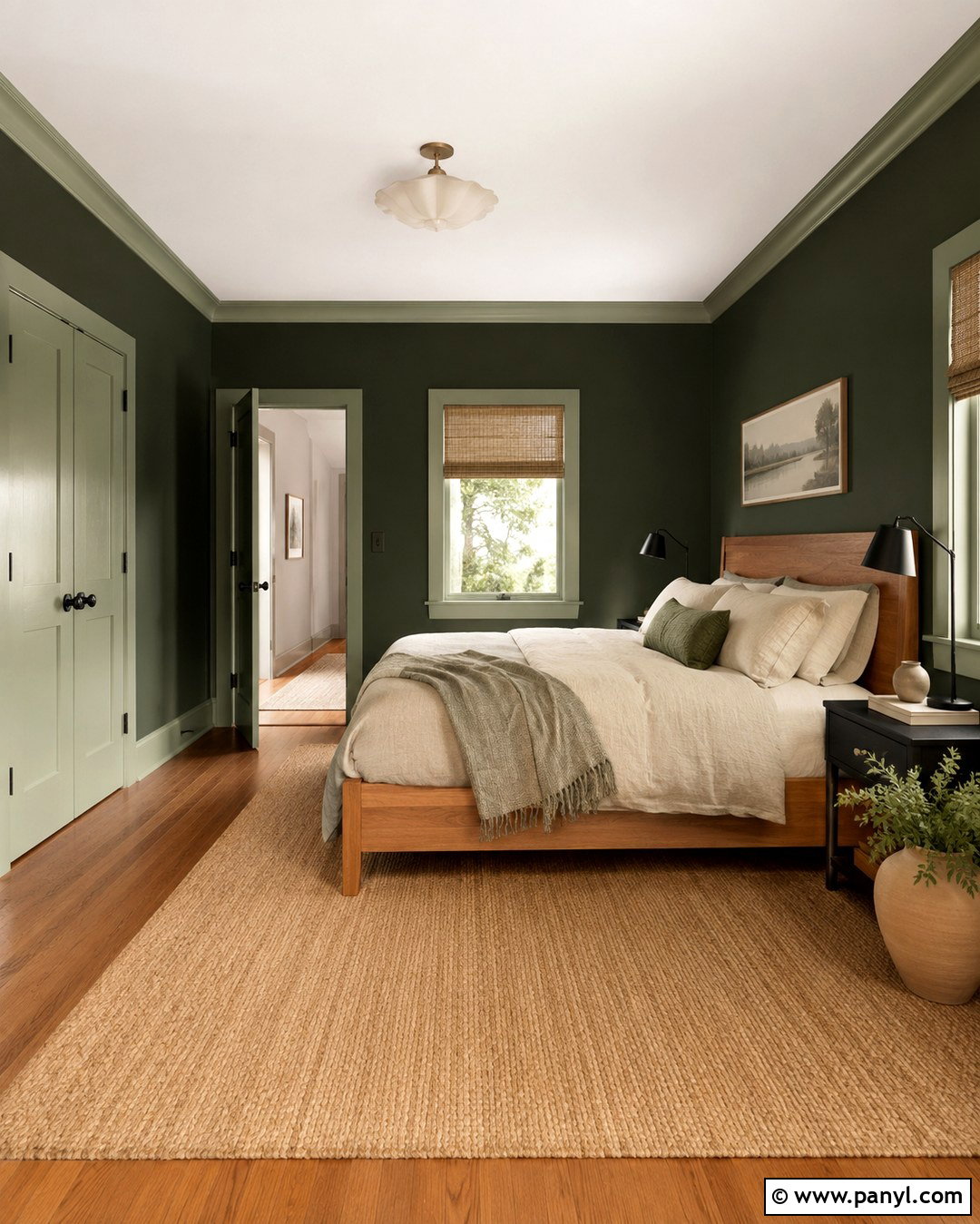
Sage green trim creates a tonal palette that feels lighter and more relaxed than matching dark green. The gentle difference highlights doors and molding while keeping the entire room connected to nature. Try this pairing in a bedroom with forest green walls, sage-painted trim, an oak bed, natural linen bedding, and woven shades. Add black reading lamps for definition and warm clay accessories for contrast. The sage should share the same warm or cool direction as the wall color. A gray-based sage suits deep cool green, while a warmer herbal shade complements olive. Continue the lighter green onto closet doors or a window seat to make the trim choice feel substantial and intentional.
14. Dusty Blue Trim
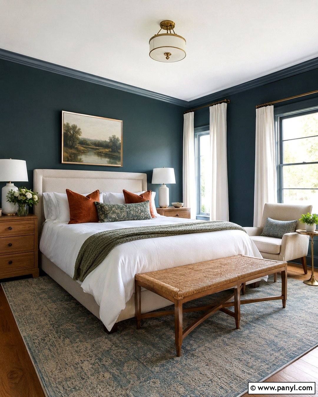
Dusty blue trim creates a calm, unexpected contrast with dark green walls. Since both hues are commonly associated with natural landscapes, they can sit together comfortably when their saturation levels are similar. Design a guest bedroom with dark blue-green walls, muted blue trim, a cream upholstered bed, medium oak furniture, and a faded blue-and-green rug. Warm brass hardware and rust-colored cushions add necessary warmth. Keep the ceiling soft white to prevent the scheme from becoming too enclosed. The blue should be muted rather than bright or coastal. Test the combination carefully under evening bulbs, since artificial light can increase the apparent difference between the green walls and blue-painted woodwork.
15. Deep Navy Trim
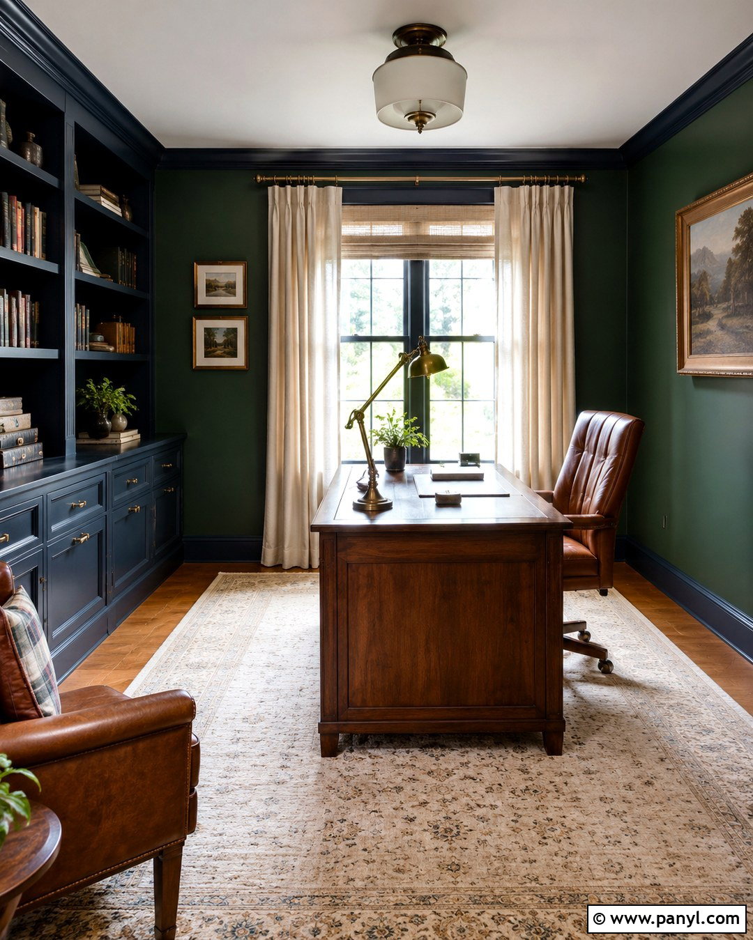
Deep navy trim gives dark green walls a layered jewel-tone appearance. The two colors should be distinct enough to register separately, yet similarly deep so neither dominates the room. Use this combination in a formal home office with navy built-ins, forest green walls, a walnut desk, a tan leather chair, and brass task lighting. Cream curtains and a light patterned rug will brighten the composition. Choose a green that does not lean too yellow, since olive walls may clash with a strongly blue navy. A satin navy finish on doors, shelves, and moldings subtly catches light. Repeat both colors in books, artwork, or textiles to make the unusual pairing look confidently coordinated.
16. Blush Pink Trim
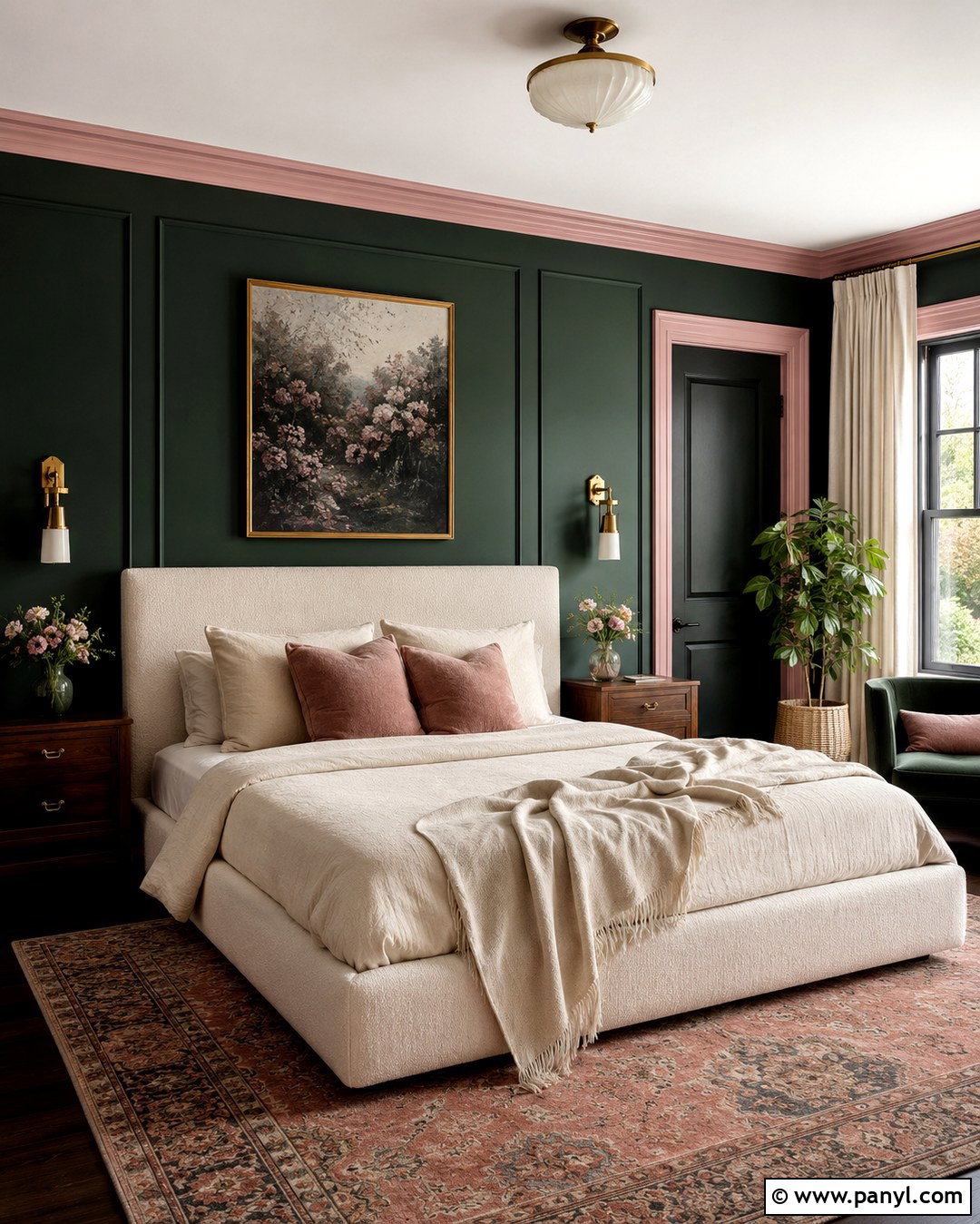
Blush pink trim softens dark green walls and creates a balanced contrast inspired by green foliage and pale flowers. The pink should be muted and slightly dusty, not sugary or intensely saturated. Build a stylish bedroom with dark green walls, blush-painted molding, an ivory upholstered bed, walnut nightstands, and warm brass lighting. Linen bedding in cream and soft rose keeps the room restful, while a vintage-style rug grounds the palette. Use the blush on doors and window frames as well as baseboards so it feels purposeful. This pairing works with emerald, forest, and blue-green walls. A neutral ceiling and restrained accessories prevent the room from looking overly themed or visually busy.
17. Terracotta Trim
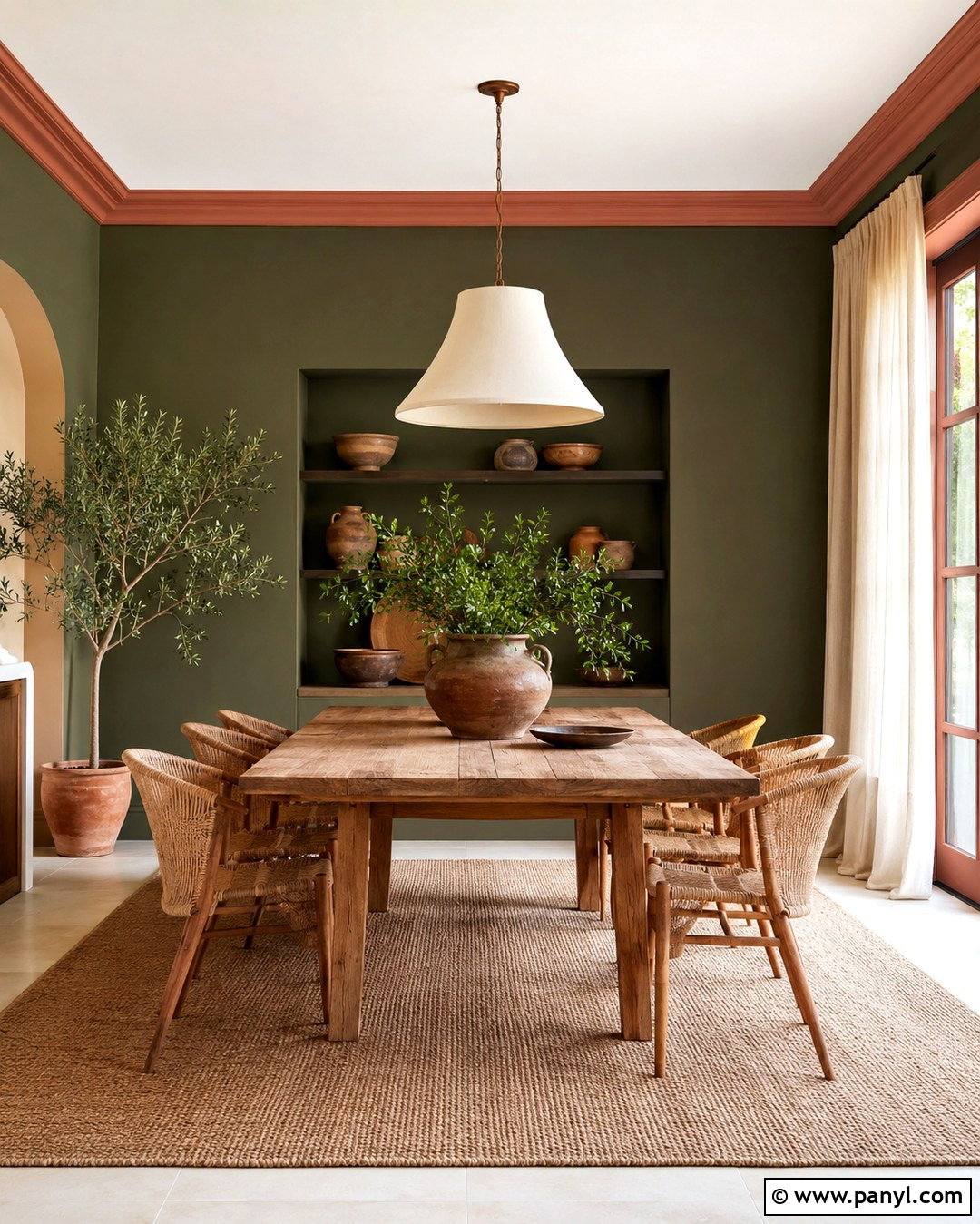
Terracotta trim brings warmth and energy to dark green walls. Its earthy red-orange base provides a clear contrast while still feeling grounded and natural. Consider this palette for a creative dining room with olive-green walls, terracotta-painted trim, a rustic oak table, woven chairs, and a large cream pendant. Handmade pottery, linen curtains, and a neutral jute rug complete the relaxed look. Choose a muted clay tone rather than a vivid orange, which could overpower the architecture. Use terracotta on a substantial element such as paneled doors or wainscoting in addition to narrow trim. Repeating the color in small decorative pieces helps the bold woodwork feel integrated throughout the room.
18. Muted Ochre Trim
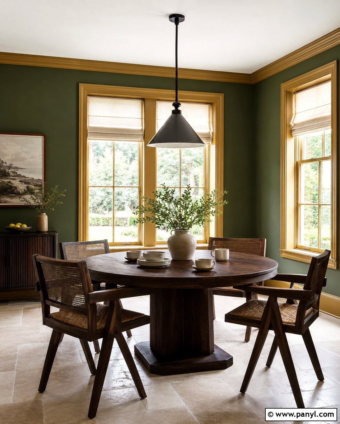
Muted ochre trim adds sun-warmed contrast to deep green walls without the intensity of bright yellow. This pairing feels rich, collected, and especially effective with olive or moss green. Create a welcoming breakfast room with ochre window trim, green walls, a round dark wood table, cane chairs, and cream Roman shades. Add black hardware and simple ceramic tableware to sharpen the earthy colors. Because ochre can change dramatically under different lighting, sample it beside the green throughout the day. A toned-down shade with brown or gray undertones is easier to live with. Keep the ceiling warm white and the flooring neutral so the walls and architectural trim remain the intentional focal points.
19. Deep Burgundy Trim
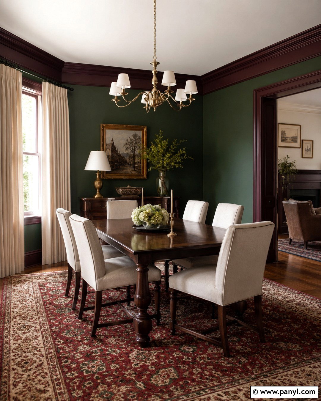
Deep burgundy trim creates a sophisticated complementary contrast against dark green walls. Both colors are intense, so this combination suits rooms intended to feel intimate, such as a dining room, study, or small sitting room. Pair forest green walls with burgundy doors and molding, a dark walnut table, cream upholstery, and aged brass lighting. A traditional rug containing muted red, green, and beige will unify the palette. Choose a brown-based burgundy rather than a bright purple-red for a more timeless effect. Use satin paint on the trim to reveal its color under light. Pale curtains and lampshades are important because they provide visual breathing room within this deep, highly layered scheme.
20. Natural Wood Tone Trim
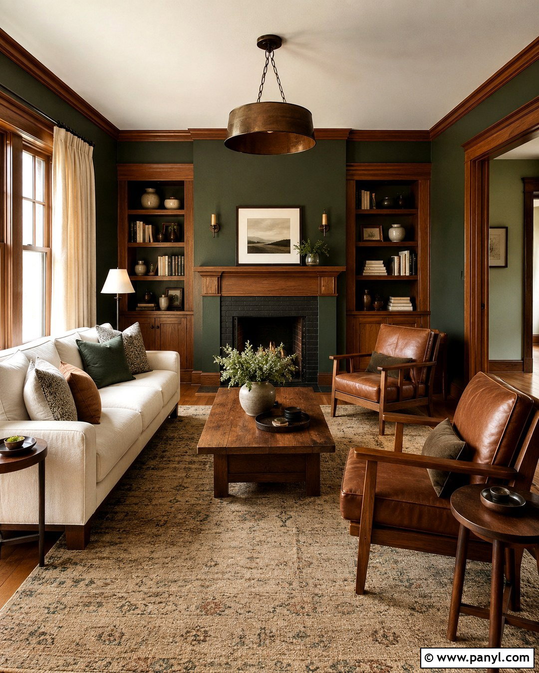
Natural wood-tone trim introduces authentic warmth and texture around dark green walls. While technically a stained rather than painted finish, it functions as a rich brown trim color and complements green’s organic character beautifully. Create a craftsman-inspired living room with forest green walls, medium walnut or white oak trim, a cream sofa, leather chairs, and an earthy wool rug. Use matching wood for doors, window casings, and built-in shelving so the effect feels cohesive. Brass or bronze lighting enhances the warmth without distracting from the grain. Avoid mixing several unrelated wood tones. A clear matte or satin protective finish keeps the trim looking natural while allowing its pattern and color variation to remain visible.
Conclusion:
Selecting trim for dark green walls is about creating the right balance of contrast, warmth, and architectural definition. Crisp white and pale gray make the room feel sharper, while cream, beige, and taupe produce a softer transition. Black, charcoal, navy, and burgundy establish a dramatic envelope. Tonal green trim creates unity, while blush, terracotta, and ochre add distinctive color. Natural wood offers texture and lasting warmth. Before painting, compare large samples against the walls, flooring, furniture, and light at several times of day. Whether the goal is bright, earthy, traditional, or bold, these 20 Trim Color For Dark Green Walls provide a complete starting point for a coordinated room.

Related Ideas and Inspiration:
Leave a Reply