
Cream trim brings warmth, softness, and traditional character to a room, but it needs the right wall color to look intentional rather than dated. The best **cream trim wall color ideas** balance the trim’s yellow, beige, or muted peach undertones while supporting the room’s natural light, furniture, and flooring. Warm neutrals create gentle transitions, while muted greens, blues, and darker colors provide stronger architectural contrast. Before painting, compare large samples directly beside the existing trim at different times of day because undertones can shift noticeably as the light changes. () From airy off-white and greige to deep navy and earthy terracotta, the following complete room looks show practical ways to decorate with cream woodwork. Explore these 20 Cream Trim Wall Color Ideas to find a palette that suits your home.

1. Warm White Walls With Cream Trim
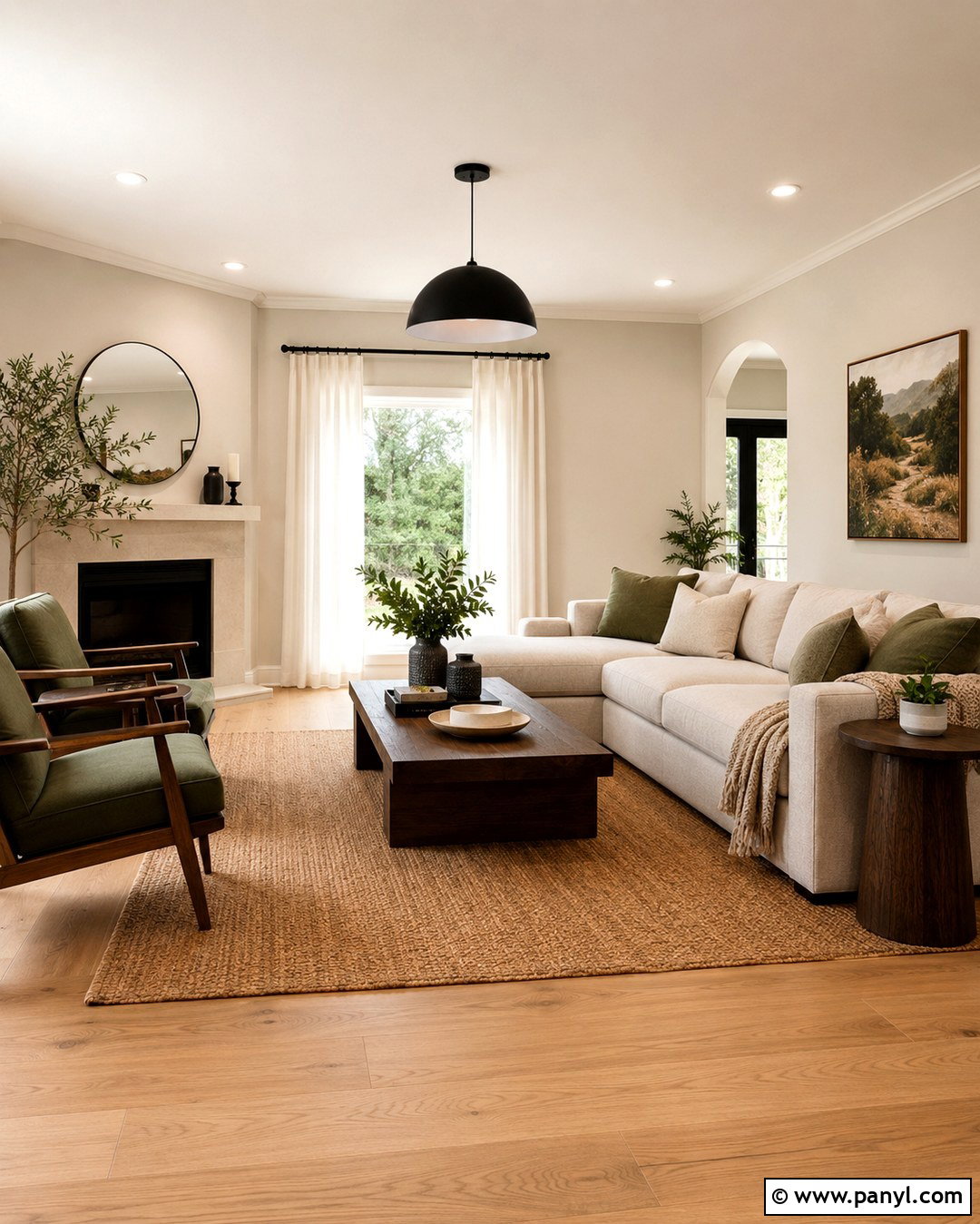
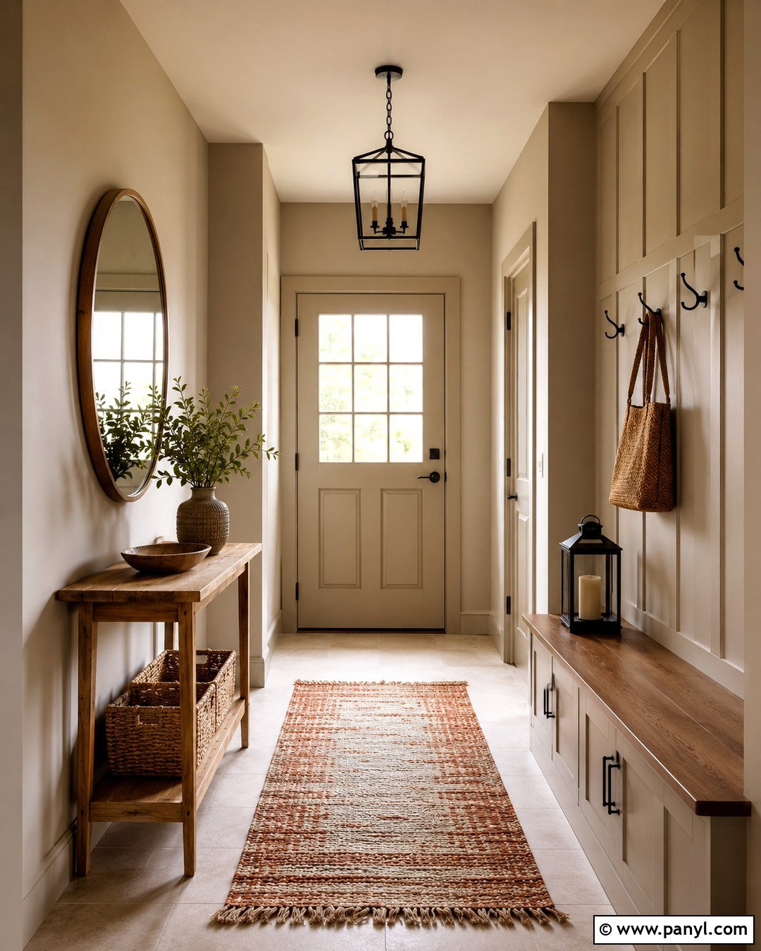
Warm white walls create a light, layered look without making cream trim appear unusually yellow. Choose a soft white with a subtle beige or yellow base rather than a bright blue-white. Use an eggshell finish on the walls and satin or semi-gloss on the trim so the architectural details remain visible. Complete the room with pale oak flooring, an oatmeal sofa, ivory curtains, and a woven natural-fiber rug. Medium walnut tables provide enough contrast to keep the scheme from feeling washed out. Add matte black lighting and a few muted green accents for definition. This combination works especially well in smaller living rooms, hallways, and spaces with limited daylight because it feels bright while preserving the comfortable warmth of the existing woodwork.
2. Light Greige Walls With Cream Trim

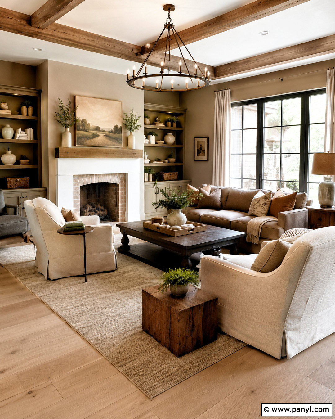
Light greige walls offer a practical bridge between traditional cream trim and cleaner, more contemporary furnishings. Look for a beige-forward greige that does not contain strong blue or purple undertones. Those cooler notes can make yellow-based trim seem dull by comparison. Build a relaxed living room around the palette with a warm gray sofa, cream boucle chairs, medium oak furniture, and textured linen curtains. A beige and charcoal patterned rug can connect the wall color to darker accents. Use aged brass lamps and black picture frames sparingly for structure. This complete scheme feels updated but not cold, making it useful in open-plan homes where cream baseboards, doors, and window casings continue from one area to another.
3. Soft Beige Walls With Cream Trim
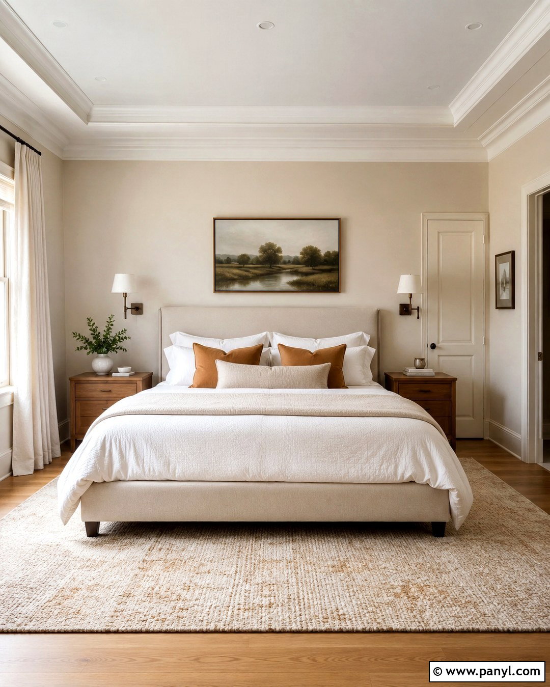
A soft beige wall creates a low-contrast transition that lets cream trim blend naturally into the room. Select a beige that is slightly deeper than the trim and carries a similar warm undertone. In a bedroom, pair this combination with an upholstered oatmeal bed, white bedding, caramel-colored pillows, and medium-tone oak nightstands. Add a large wool rug containing cream, tan, and muted brown to establish gentle visual layers. Bronze sconces and simple landscape artwork keep the room grounded without disrupting the quiet palette. This approach is especially effective when the trim is wide, ornate, or used around several doors. Instead of trying to disguise its warmth, the room repeats that warmth through textiles and wood, creating a cohesive and comfortable finished space.
4. Taupe Walls With Cream Trim
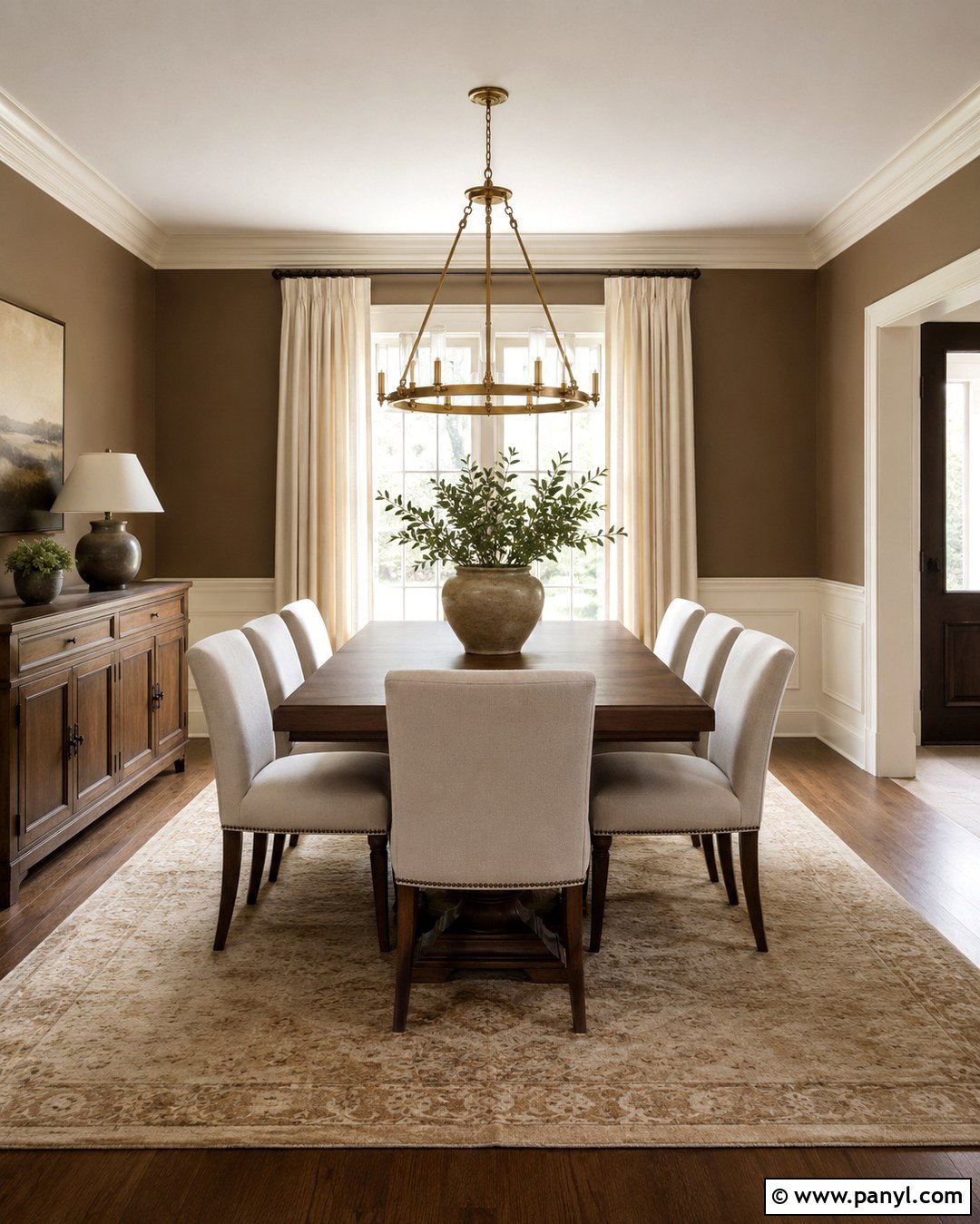
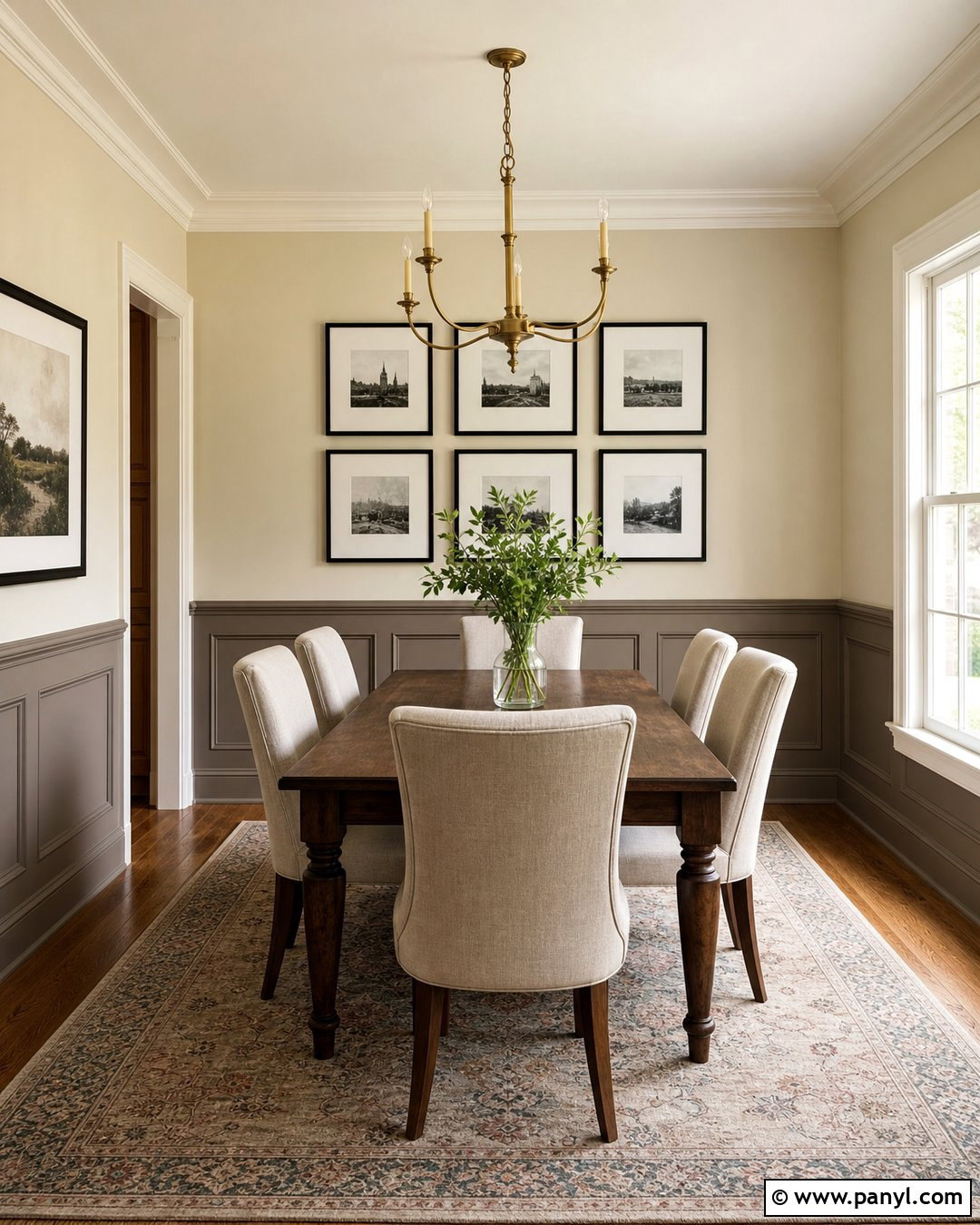
Taupe walls bring depth to cream trim while maintaining an elegant neutral palette. The safest taupes for this pairing lean brown rather than strongly violet or gray. Try the combination in a formal dining room with a warm walnut table, cream upholstered chairs, and a softly patterned neutral rug. Hang natural linen curtains near the ceiling to make the room appear taller, and use an aged brass chandelier as a warm focal point. Dark bronze curtain rods and framed artwork add slim lines of contrast. Since taupe absorbs more light than beige, balance it with a pale ceiling and generous lighting. The finished room feels refined and grounded, while the cream crown molding, baseboards, and door casings create a clear architectural frame around the deeper walls.
5. Mushroom Walls With Cream Trim
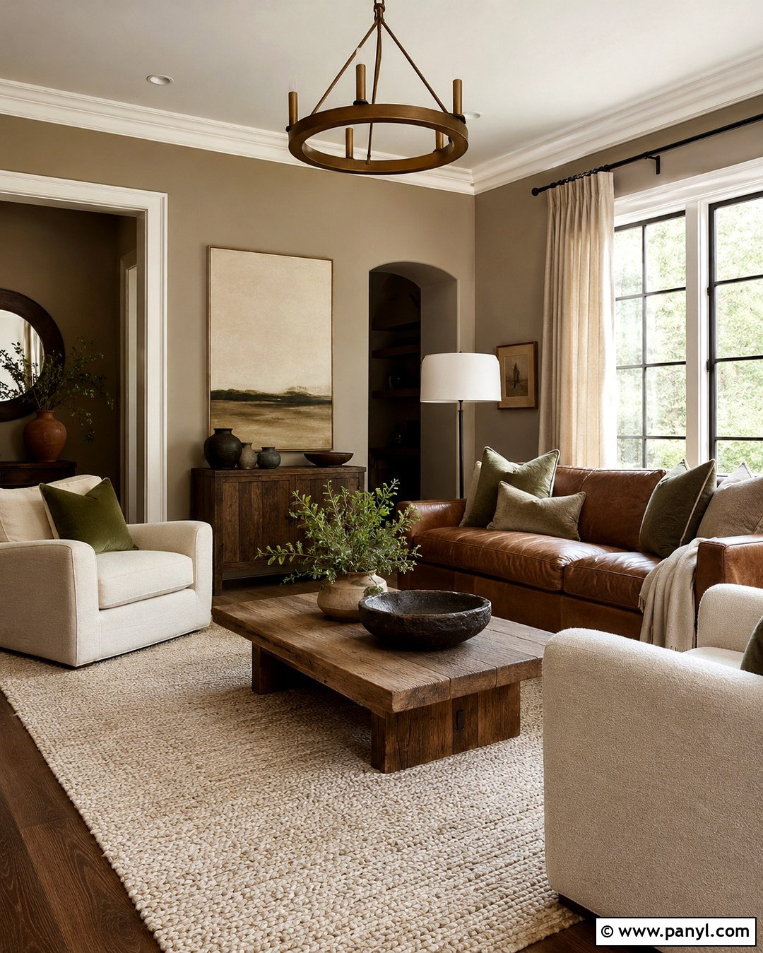
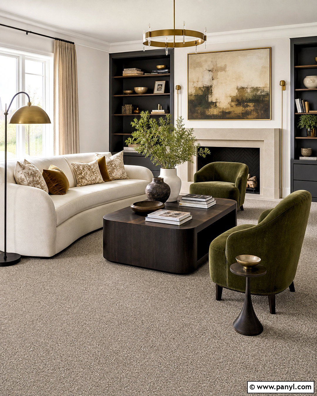
Mushroom paint combines brown, gray, and beige in a soft, earthy color that complements muted cream trim. It works particularly well when the room includes stone, weathered wood, or other natural finishes. For a comfortable family room, use mushroom walls with a camel leather sofa, cream armchairs, a reclaimed oak coffee table, and a thick ivory rug. Add olive pillows and warm metal lighting to strengthen the organic palette. Keep window treatments simple with unbleached linen panels that sit between the wall and trim colors. The subtle contrast makes the woodwork noticeable without outlining every surface too sharply. Because mushroom shades vary considerably, test several options beside the trim and flooring to ensure the wall color does not turn unexpectedly purple or muddy.
6. Sage Green Walls With Cream Trim
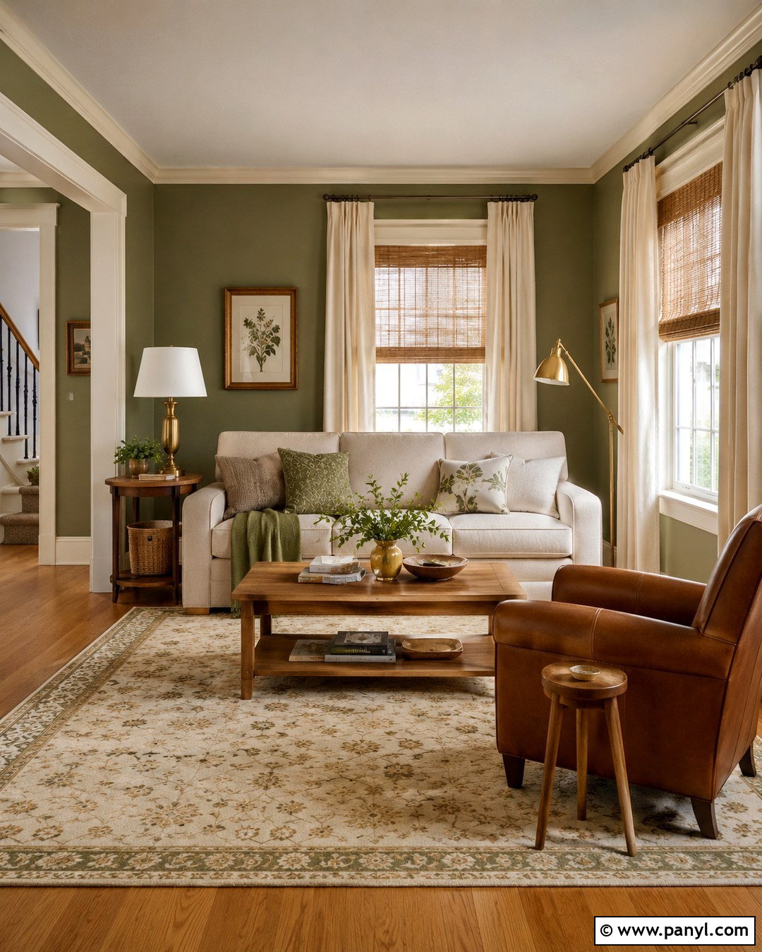
Sage green walls give cream trim a fresh, garden-inspired setting while preserving its warmth. Choose a muted sage containing gray or brown rather than a bright mint green. In a living room, combine it with a natural linen sofa, cognac leather chair, warm oak tables, and a cream-and-olive rug. Woven shades and relaxed ivory curtains reinforce the casual organic character. Finish the space with antique brass lamps, dark botanical artwork, and a few substantial ceramic pieces instead of numerous small accessories. The cream baseboards and window casings provide soft definition against the green without creating the stark contrast of pure white. This palette suits cottage, farmhouse, transitional, and nature-focused interiors, especially rooms overlooking trees, gardens, or leafy backyard spaces.
7. Olive Green Walls With Cream Trim
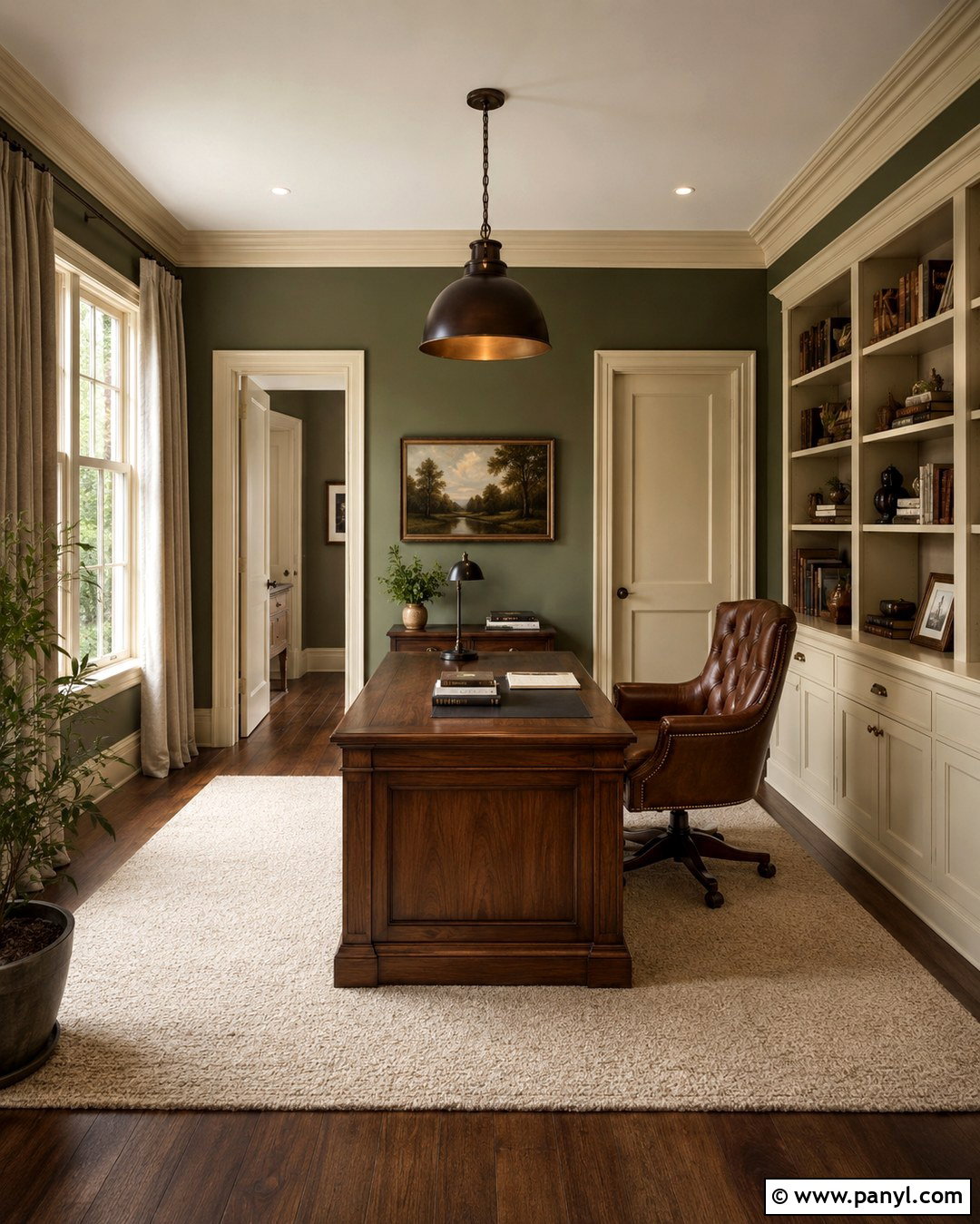
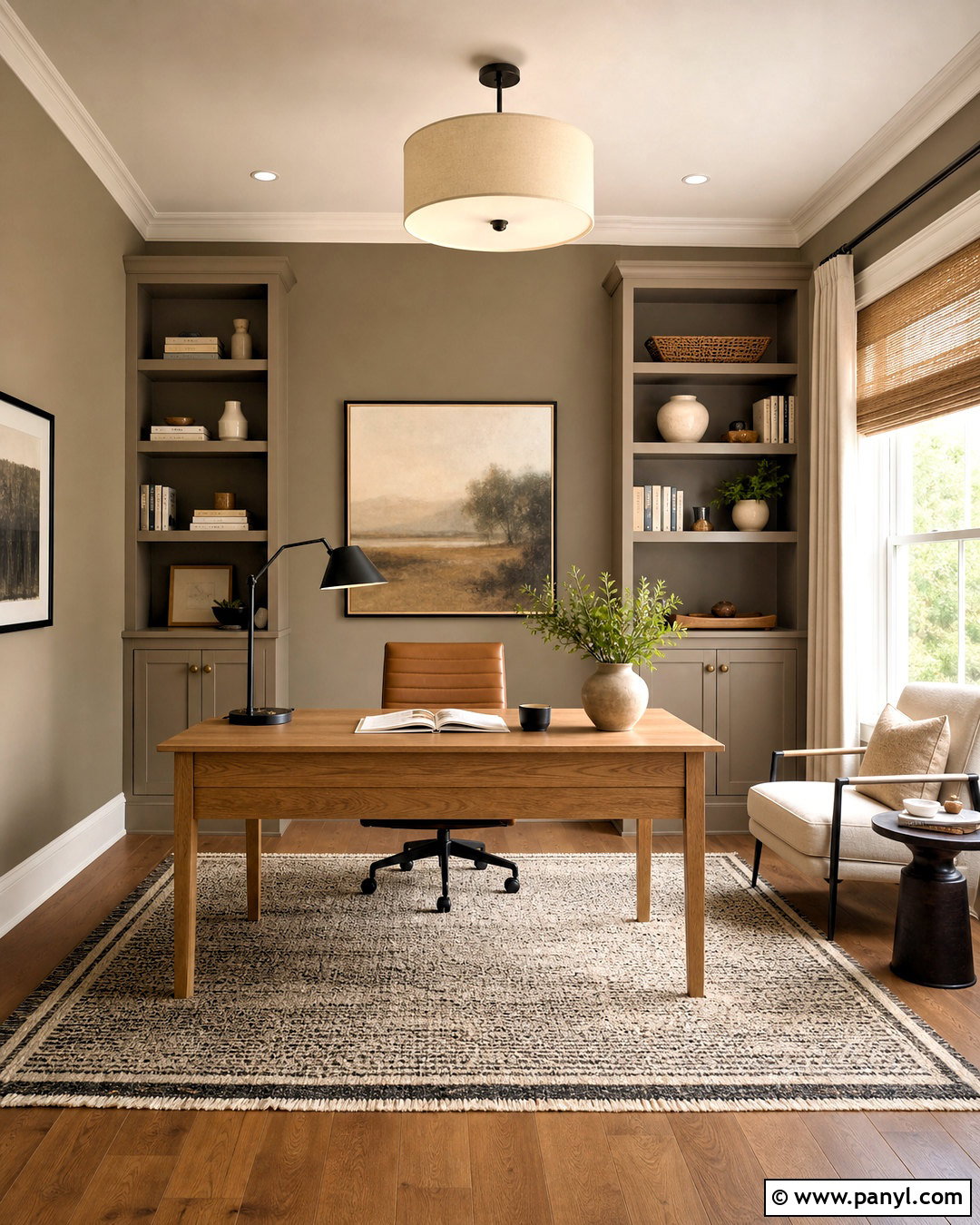
Earthy olive walls create a richer and more enveloping room around cream-painted woodwork. Select a softened olive with brown or gray undertones so it feels grounded rather than overly yellow. This combination is ideal for a library, office, or cozy sitting room featuring built-in shelving. Add a tobacco leather chair, walnut desk, cream wool rug, and heavy natural linen curtains. Antique brass hardware and a dark bronze desk lamp reinforce the sophisticated warmth. Keep the ceiling a pale warm neutral to prevent the room from feeling closed in. Cream door casings, crown molding, and baseboards will stand out clearly against olive, highlighting the architecture. Repeating cream in upholstery, lampshades, and artwork helps the contrasting trim feel integrated throughout the full design.
8. Blue Green Walls With Cream Trim
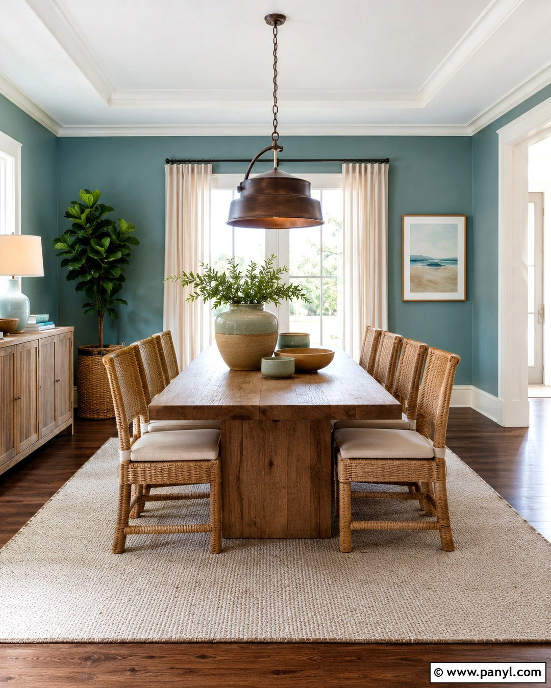
A muted blue-green wall color offers cool contrast while still feeling natural beside cream trim. Look for a smoky teal or subdued sea-glass shade rather than a clear turquoise. Use it in a bright dining room with a warm oak table, woven dining chairs, and an ivory flat-weave rug. Cream curtains can visually connect the windows to the painted casings, while dark bronze lighting adds definition overhead. Introduce handmade ceramics in blue-green, sand, and brown to repeat the palette without making it overly coordinated. The cool walls help cream molding appear richer and more deliberate. Warm wood and natural fibers then prevent the room from becoming chilly. This balanced combination works particularly well in coastal, transitional, and relaxed contemporary homes.
9. Dusty Blue Walls With Cream Trim
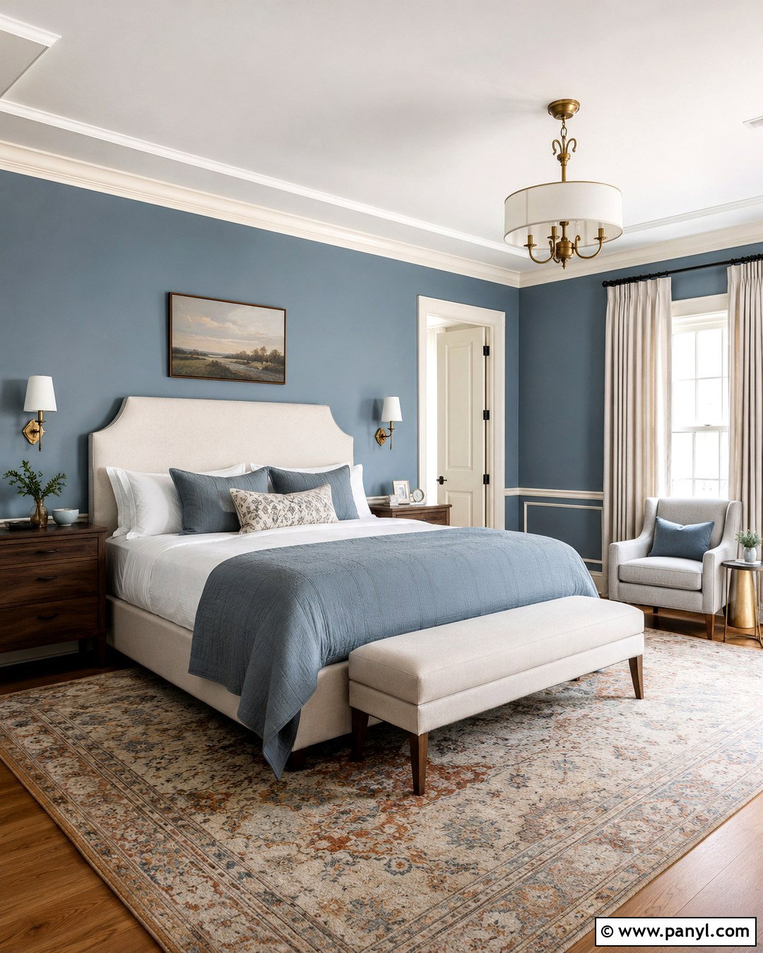
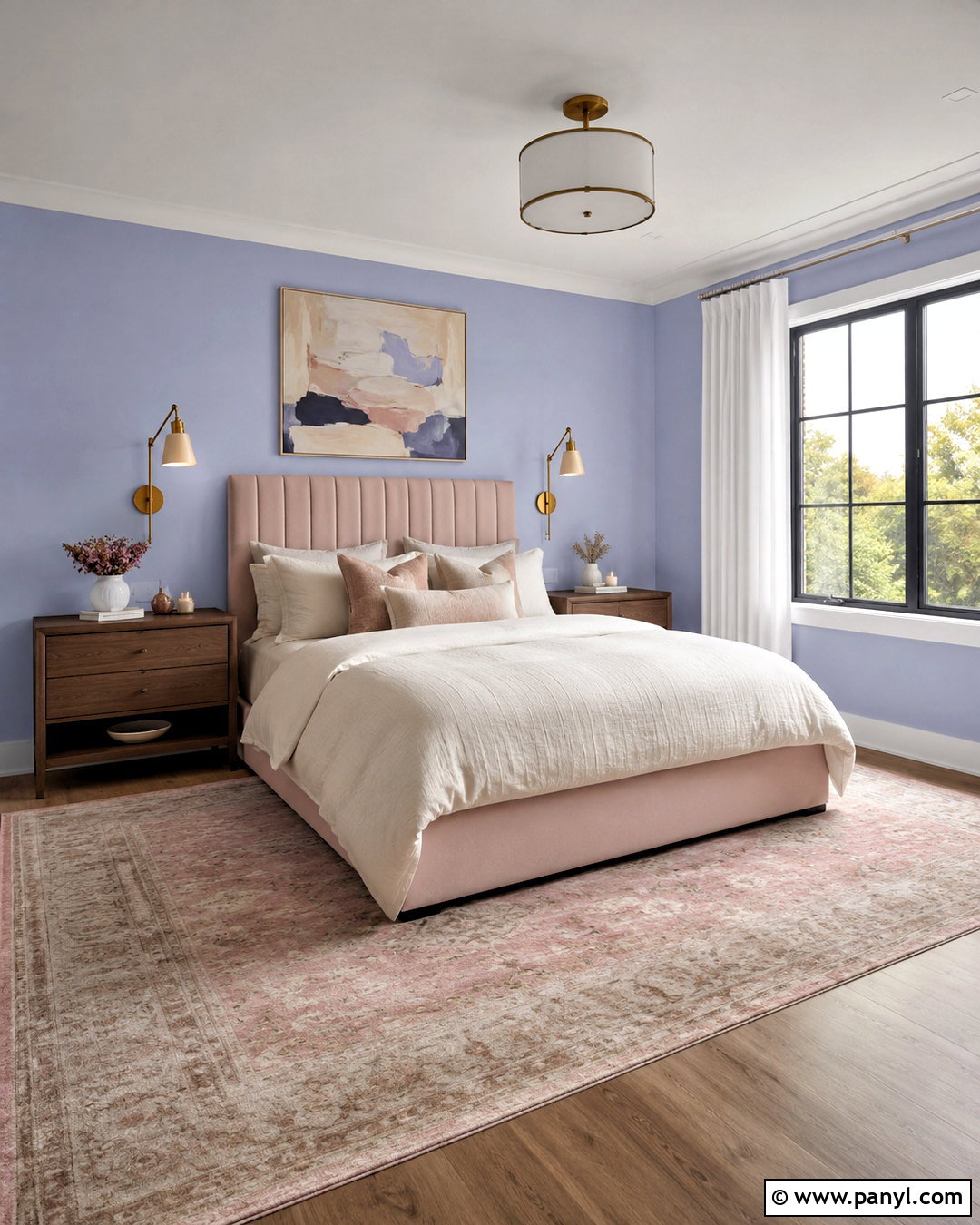
Dusty blue walls create a calm background that allows cream trim to appear softly illuminated. Pick a blue with noticeable gray and only minimal green undertones. In a bedroom, pair the walls with a cream upholstered headboard, crisp white sheets, a muted blue coverlet, and warm walnut nightstands. Use natural linen drapes and a faded traditional rug containing cream, blue, and soft rust. Brushed brass sconces introduce another warm element near the cooler wall color. Keep furniture shapes simple so the room feels current rather than overly traditional. The contrast between dusty blue and cream is noticeable but gentle, making it a smart solution for anyone who wants color without overwhelming the room or turning the existing woodwork into the strongest feature.
10. Slate Blue Walls With Cream Trim

Slate blue creates a stronger, tailored contrast with cream trim and works beautifully in rooms with good natural light. Choose a medium-depth blue containing enough gray to keep it sophisticated. Build a complete home office around it with a walnut desk, cognac leather chair, cream area rug, and floor-to-ceiling bookcases painted to match the trim. Add black-framed artwork and an aged brass ceiling fixture for crisp structure. Natural bamboo shades bring warmth to the windows and prevent the blue from feeling overly formal. The cream baseboards, shelving, and casings will read as intentional architectural accents against the darker walls. This palette feels substantial yet approachable, especially when balanced with warm wood, tactile fabrics, and a few restrained rust or olive accessories.
11. Navy Blue Walls With Cream Trim
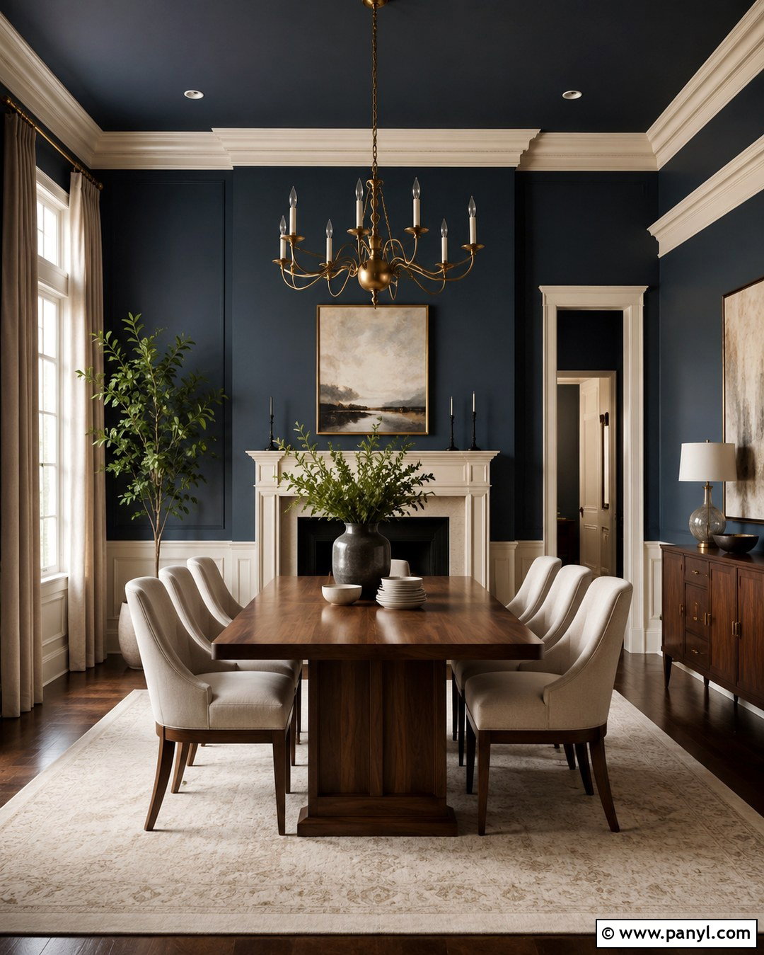
Deep navy walls transform cream trim into a bold architectural feature. This high-contrast pairing is especially effective in a dining room, den, or bedroom where a more dramatic atmosphere feels appropriate. Choose a navy with a slightly softened or smoky quality rather than an extremely bright blue base. Complete the room with warm walnut furniture, cream upholstery, a large ivory rug, and full-length neutral curtains. Antique brass lighting and hardware echo the golden character of the trim. Use the cream color again on a fireplace mantel or built-in cabinets to create continuity. Since navy can visually reduce a room, include multiple light sources and leave the ceiling pale. The finished scheme looks classic and polished without depending on stark white woodwork.
12. Pale Gray Walls With Cream Trim

Pale gray can work with cream trim when it has a warm, balanced base. Avoid icy blue-gray or lavender-gray paint, which may exaggerate the trim’s yellow notes. For a transitional living room, pair warm gray walls with an ivory sofa, taupe chairs, oak tables, and a cream rug containing thin charcoal details. Add soft beige curtains, black metal lighting, and artwork that combines gray, brown, and warm white. These repeated colors make the wall and trim relationship look purposeful. The pale walls maintain brightness, while the cream molding contributes warmth around doors and windows. This scheme is useful when existing furniture is gray but the permanent woodwork is cream, since layered neutrals can visually connect both elements without requiring an expensive trim repaint.
13. Charcoal Walls With Cream Trim

Charcoal walls create a striking backdrop for cream trim, particularly in rooms with prominent crown molding, paneled doors, or a detailed fireplace. Use a softened charcoal with brown or neutral undertones instead of a distinctly blue black. In a media room or den, add a camel leather sectional, cream wool rug, walnut console, and textured beige curtains. Warm brass sconces and shaded table lamps keep the darker walls comfortable. Repeat the trim color through pillows, lampshades, and framed artwork so it does not look disconnected. A pale ceiling can preserve openness, while darker window treatments produce a more cocooning result. This full palette feels modern and confident, yet the cream woodwork keeps it warmer and more inviting than a charcoal-and-bright-white combination.
14. Terracotta Walls With Cream Trim
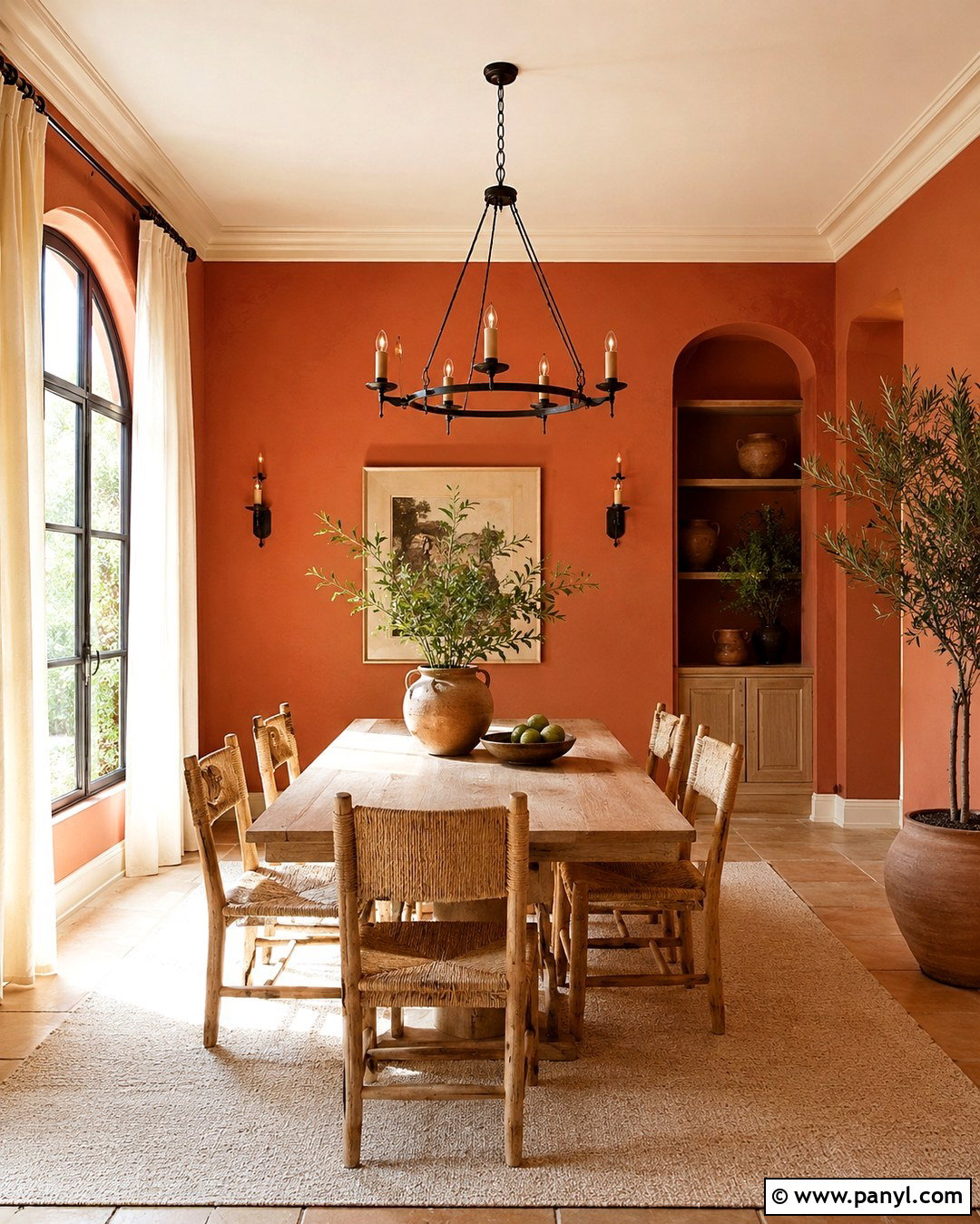
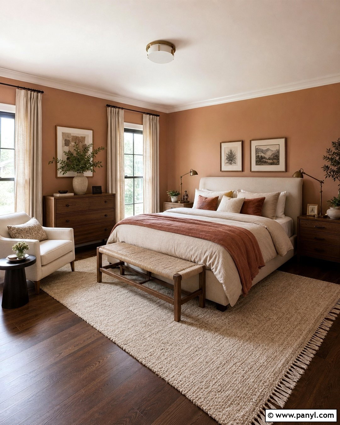
Terracotta walls emphasize the warm personality of cream trim and bring earthy character to a dining room or sunroom. Select a muted clay color containing brown and soft red rather than vivid orange. Pair it with a pale oak dining table, woven rush chairs, an ivory rug, and cream linen curtains. Use dark bronze lighting, handmade pottery, and olive-green accents to create a balanced natural palette. Cream crown molding and window casings will feel connected to the walls because both colors share warm undertones, yet there is still enough depth to define the architecture. Terracotta works best with thoughtful restraint, so keep large furniture pieces neutral. Plenty of daylight and light-colored textiles will also prevent the finished room from feeling overly heavy or intensely rustic.
15. Muted Blush Walls With Cream Trim
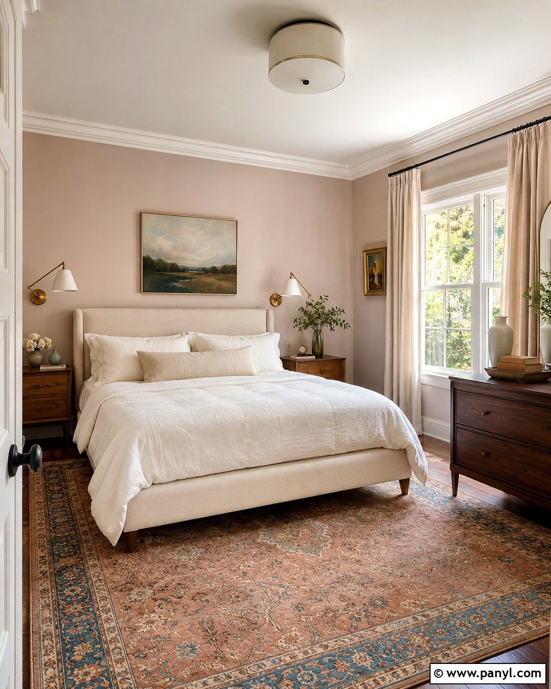
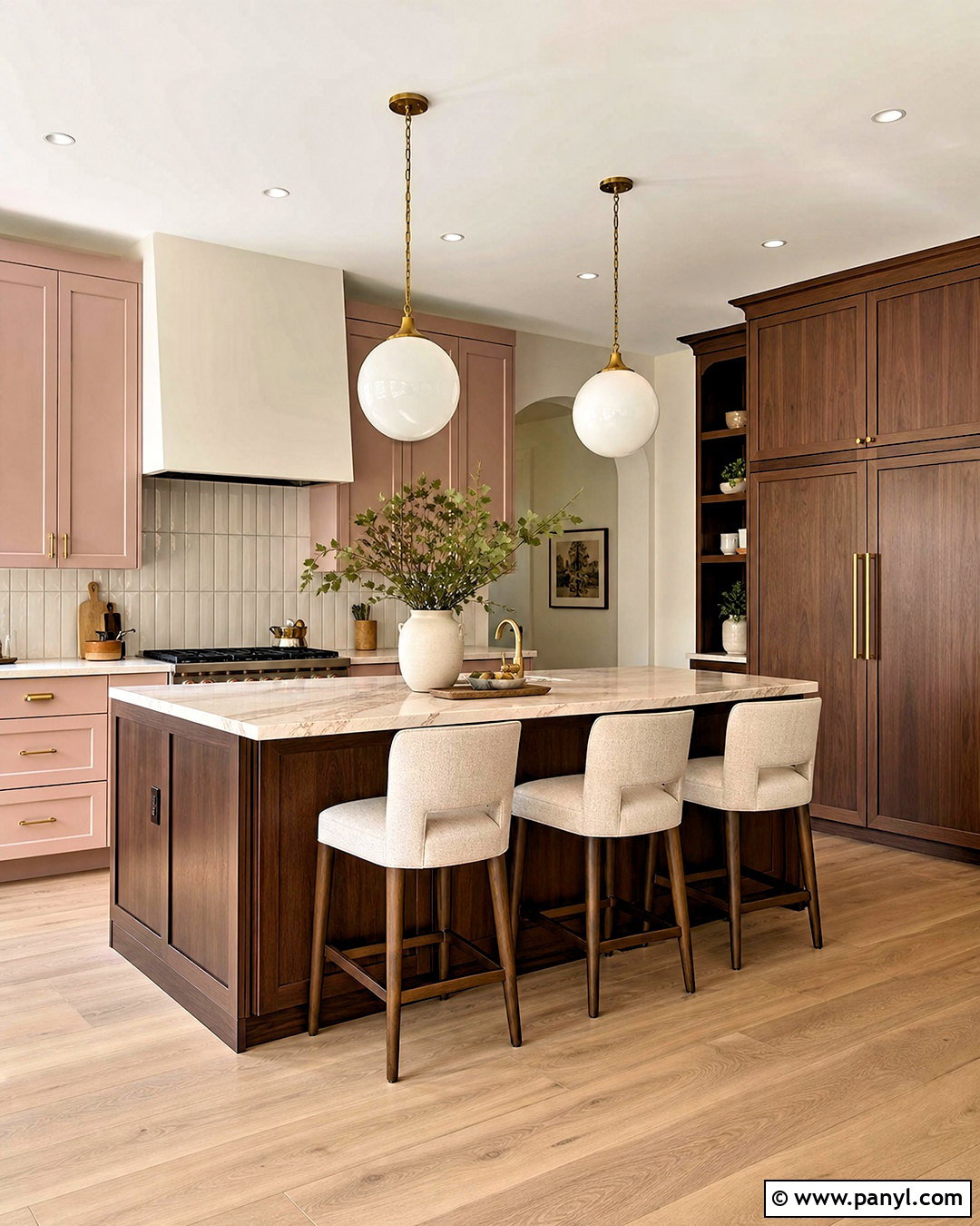
Muted blush walls add gentle color without competing with creamy doors, baseboards, and molding. The most versatile blush shades contain beige, brown, or dusty rose notes rather than looking candy pink. Create a polished bedroom with a cream bed, warm white bedding, oak nightstands, and a vintage-inspired rug combining blush, tan, and faded blue. Add natural linen curtains and aged brass sconces for warmth. A dark wood bench or dresser gives the pale palette necessary visual weight. This combination feels soft but can remain tailored when furniture lines are simple and decorative accents are limited. Repeating cream in the bedding and lampshades links the trim to the furnishings, making the entire space look layered and intentional instead of overly sweet or theme-driven.
16. Dusty Rose Walls With Cream Trim
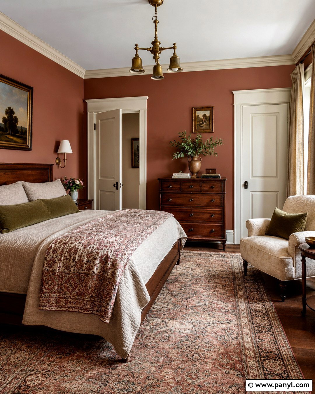
Dusty rose offers more depth than blush while still coordinating naturally with warm cream trim. Choose a toned-down rose with visible brown or gray undertones. In a reading room or guest bedroom, combine it with walnut furniture, cream upholstery, oatmeal curtains, and a faded Persian-style rug. Add olive or deep burgundy accents in small amounts to make the palette feel grounded. Antique brass lighting complements both the rosy walls and yellow-based woodwork. Keep the ceiling light and uncluttered so the richer wall color remains balanced. The cream trim creates a soft frame rather than a sharp outline, which suits the room’s warm, collected character. This complete look works especially well with vintage furniture, traditional artwork, and natural materials updated through clean styling.
17. Warm Yellow Walls With Cream Trim
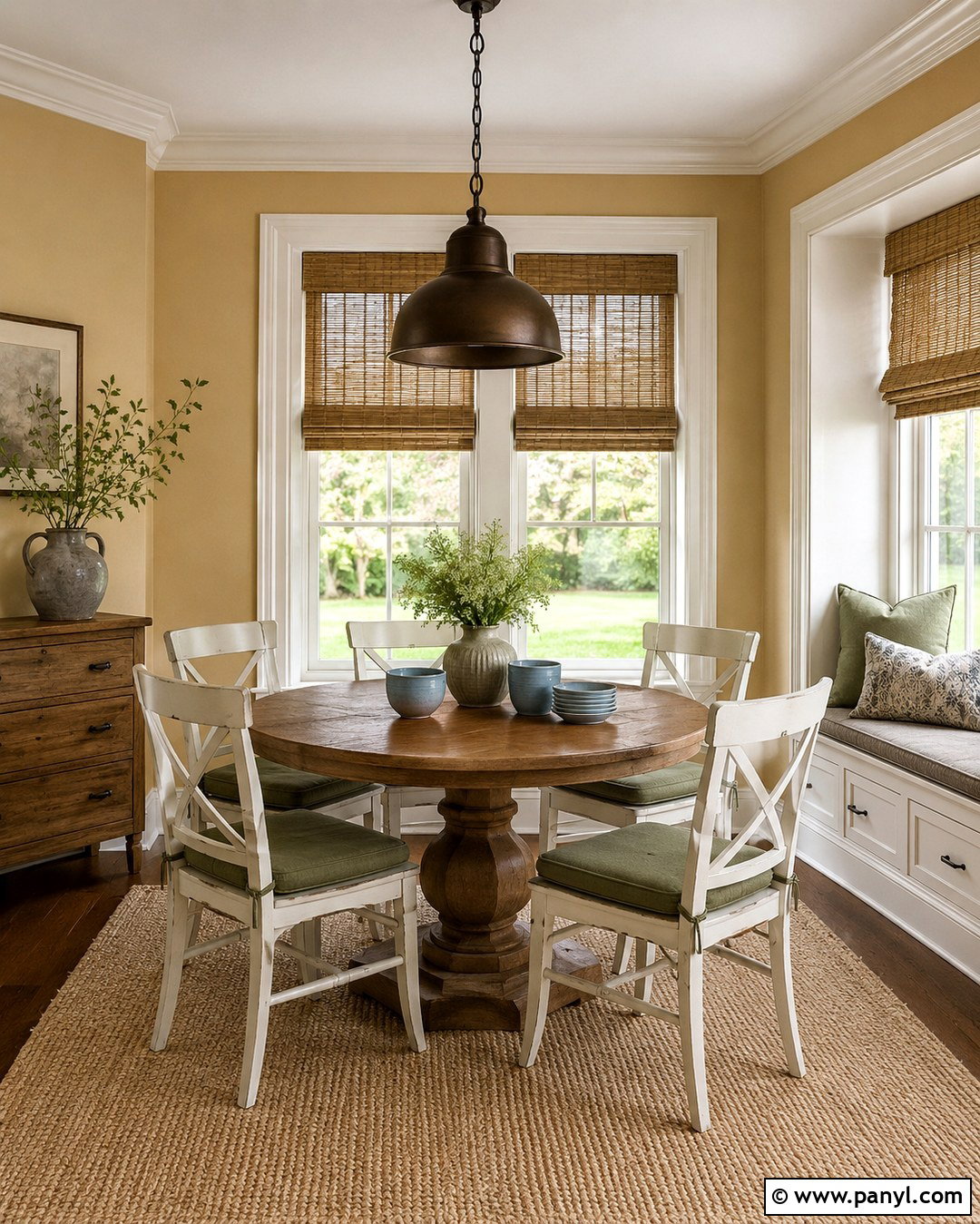
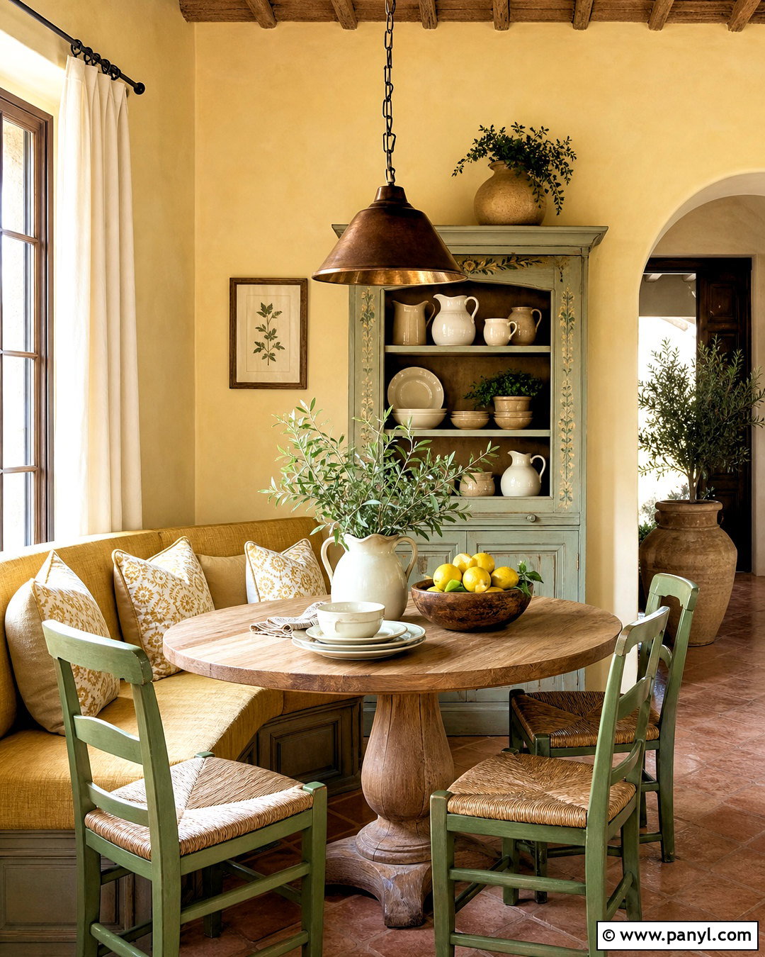
Warm yellow walls can complement cream trim when the two colors are deliberately separated by depth. Choose a softened ochre, straw, or buttery yellow that is clearly darker than the woodwork. In a sunny breakfast room, use a round oak table, cream-painted chairs, woven shades, and a washable beige rug. Add blue-gray ceramics or muted green seat cushions to cool the palette slightly. Black or dark bronze lighting provides definition and prevents the room from becoming visually pale. Because both paint colors share yellow undertones, the transition feels harmonious. However, sample the wall shade beside the trim before committing. Similar yellows can look mismatched if their undertones differ, while a clearly deeper, earthier yellow creates a more confident and coordinated finished design.
18. Light Brown Walls With Cream Trim

Light brown walls bring comfortable depth to cream trim and work particularly well with traditional architecture. Consider a soft café au lait, toasted almond, or warm cocoa shade rather than a dark chocolate brown. Design the room with an ivory sofa, camel leather chairs, walnut tables, and a large cream-and-tan rug. Natural linen drapes maintain a soft transition around the windows, while black metal lighting adds a modern edge. Include muted blue or olive accessories to break up the warm neutral palette. The cream trim will appear lighter and cleaner against brown walls without producing severe contrast. This combination suits family rooms and open living areas because it feels durable, relaxed, and easy to coordinate with wood flooring, stone fireplaces, and everyday furnishings.
19. Soft Black Walls With Cream Trim
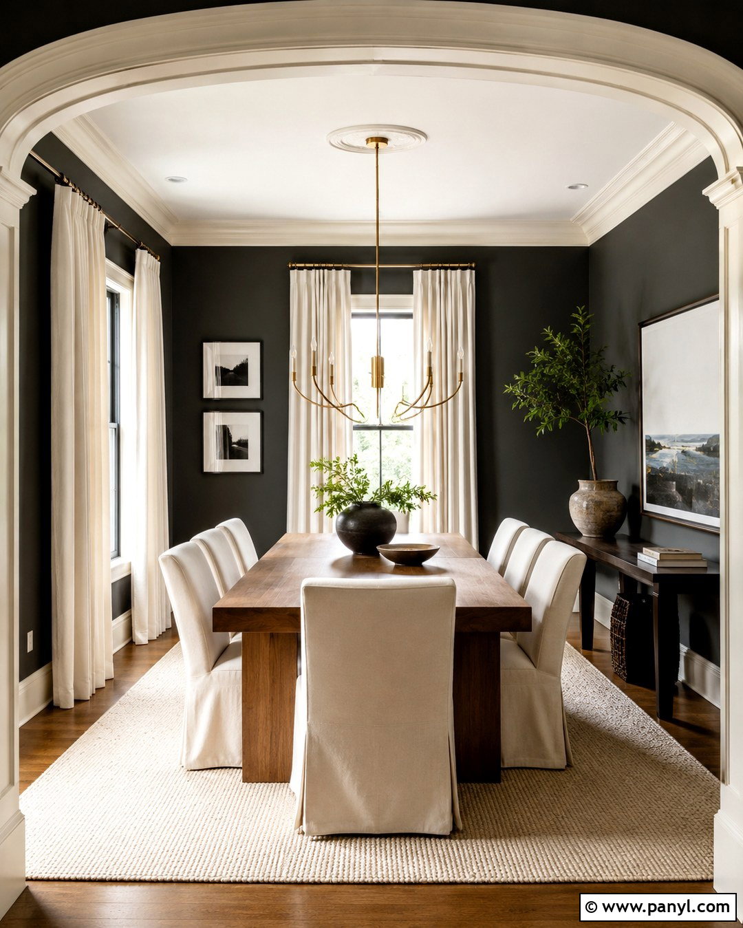
Soft black walls create the most dramatic contrast in this collection while cream trim keeps the result from feeling harsh. Choose an off-black with brown, charcoal, or green undertones rather than a flat, absolute black. Use the color in a well-lit dining room with a warm oak table, cream slipcovered chairs, a pale textured rug, and generous ivory curtains. A sculptural brass chandelier will provide warmth and a strong central feature. Repeat black through frames and smaller furniture details, then add natural greenery for freshness. The cream crown molding, doors, and baseboards become part of the design instead of fading into the background. This palette is bold, but balanced materials and ample lighting make it suitable for a realistic residential interior.
20. Cream Walls With Matching Cream Trim
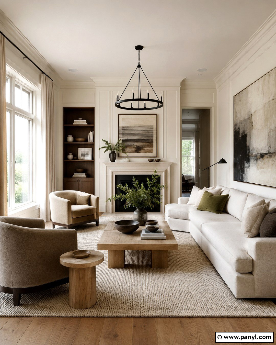
Using the same cream color on walls and trim creates a seamless, tonal room that feels calm and thoughtfully finished. Apply eggshell paint to the walls and satin or semi-gloss to baseboards, doors, and casings. The finish difference will provide subtle dimension even though the color remains consistent. In a living room, add an ivory sofa, oatmeal chairs, pale oak tables, and a textured wool rug. Introduce contrast through dark walnut, matte black lighting, olive textiles, and oversized artwork. This method is particularly helpful when the room contains many doors, low ceilings, or uneven architectural details because fewer visible color breaks create continuity. Layering varied textures and several neutral values prevents the matching cream surfaces from looking flat or unfinished. ()
Conclusion:
The best 20 Cream Trim Wall Color Ideas show that warm woodwork can support far more than beige walls. Soft whites, greige, sage, dusty blue, terracotta, navy, and charcoal can all create cohesive rooms when their undertones relate to the existing trim. Build the full palette around lighting, flooring, furniture, textiles, and metal finishes rather than selecting wall paint in isolation. Warm woods and natural fabrics usually help cream details feel intentional, while controlled dark accents provide structure. Most importantly, place large painted samples directly beside the trim and examine them during morning, afternoon, and evening light. This simple step reveals undertone conflicts before you invest time and money in painting the entire room.

Related Ideas and Inspiration:


Leave a Reply