
Drywall colors can completely change how a finished room feels, even when the furniture and layout stay the same. In most homes, the term refers to paint colors applied over properly primed drywall rather than the color of unfinished gypsum panels. The best choice depends on natural light, flooring, trim, room size, and the mood you want to create. Warm whites make compact spaces brighter, while earthy greens, softened blues, and clay tones add personality without overwhelming the room. Darker shades can also work beautifully when balanced with lighter textiles and reflective finishes. Always test large painted samples on several walls because undertones shift throughout the day. The complete room schemes below offer practical inspiration for choosing and decorating with 20 Drywall Colors.

1. Warm White Drywall
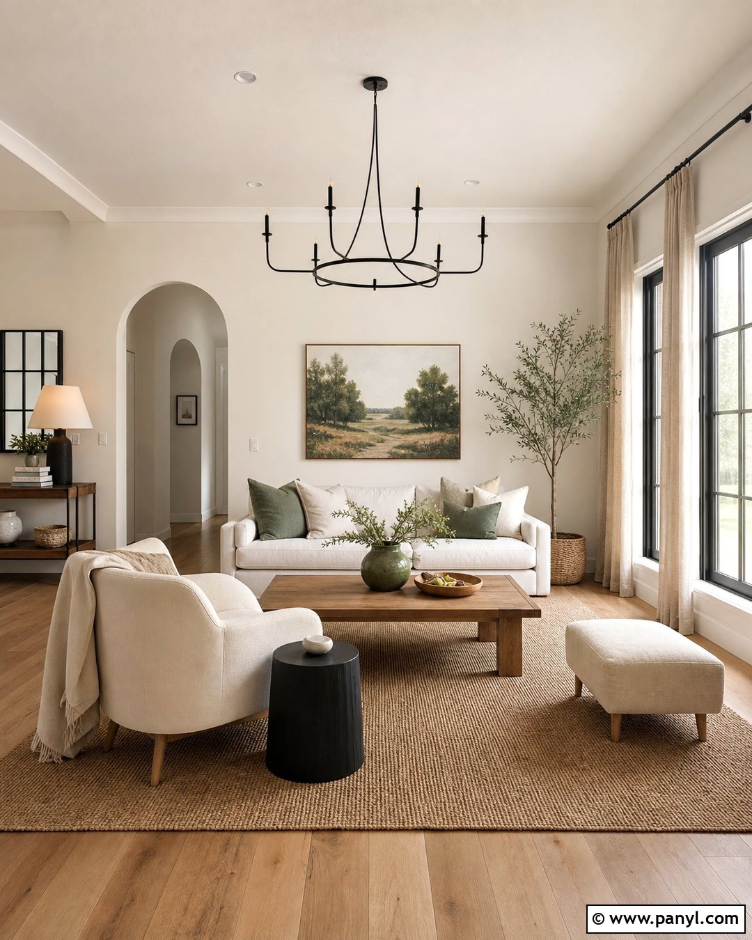
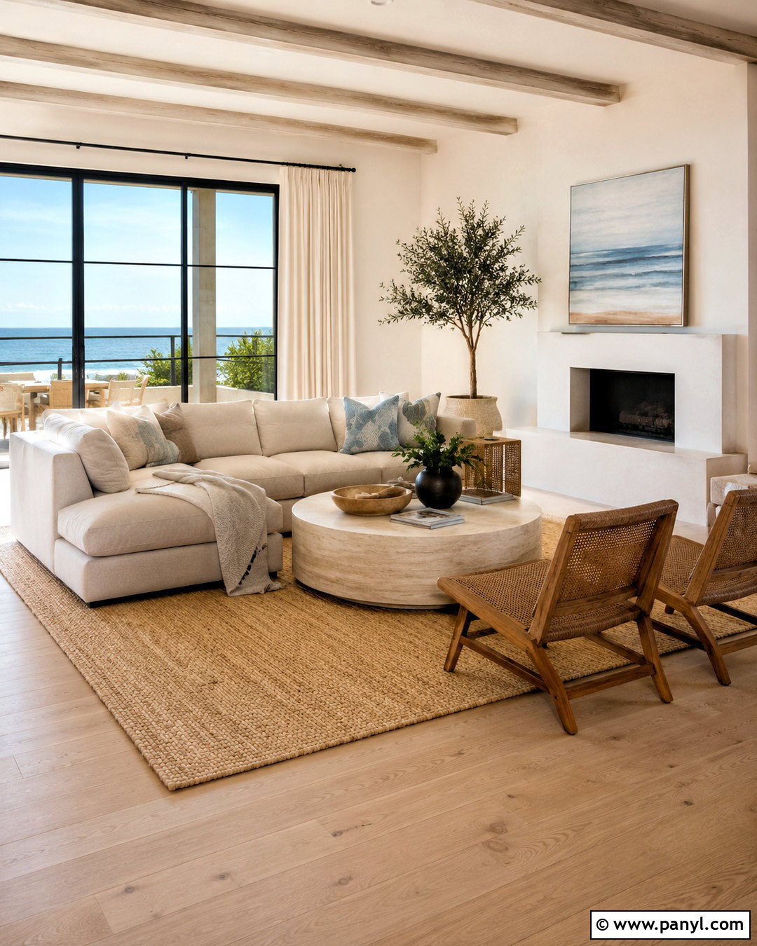
Warm white drywall creates a bright interior without the chilly appearance of a sharp, blue-based white. Use it throughout an open living room with natural oak flooring, cream upholstery, and woven linen curtains. A warm white ceiling and matching trim produce a soft, continuous envelope, while slightly darker wood furniture keeps the room from looking washed out. Add a beige wool rug, black metal lighting, and a few muted green accents for balance. This color is especially helpful in rooms with limited daylight because its subtle cream undertone reflects light gently. Before painting the entire space, compare samples beside the flooring and trim. The right warm white should look inviting in morning light and clean under evening lamps.
2. Soft Cream Drywall
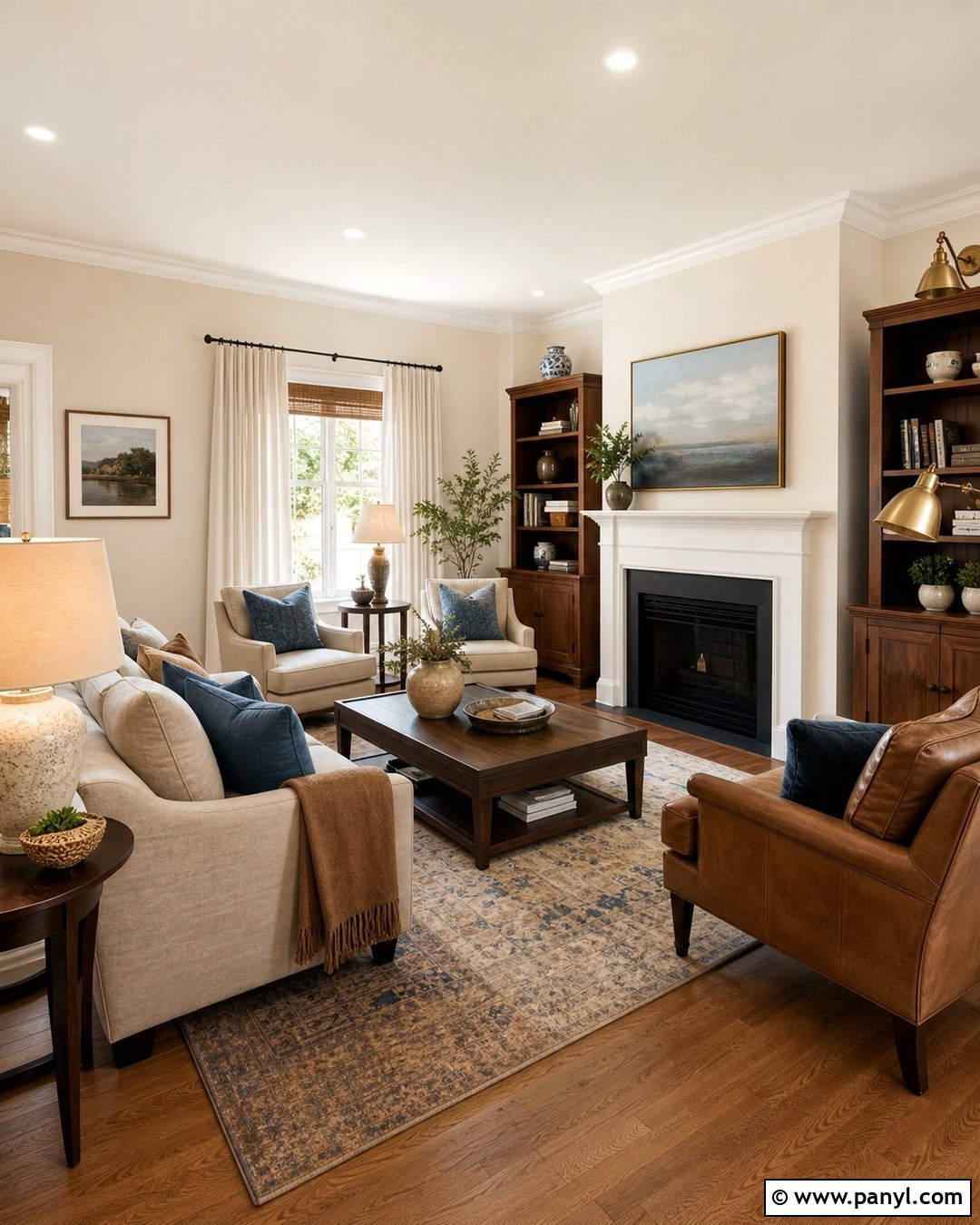
Soft cream drywall brings comfortable warmth to bedrooms, family rooms, and traditional living spaces. Build the room around walnut furniture, medium-toned wood flooring, and layered textiles in oatmeal, camel, and faded blue. Instead of using brilliant white trim, choose a creamy off-white that keeps the contrast gentle and coordinated. A linen sofa, antique brass lighting, and ceramic table lamps strengthen the welcoming look. This color works particularly well in north-facing rooms, where cooler daylight can flatten beige and white paint. Keep yellow decorative accents to a minimum so the walls do not appear overly golden. Natural materials, subtle patterns, and a few charcoal details give the finished room enough depth while preserving its relaxed, light-filled character.
3. Ivory Drywall
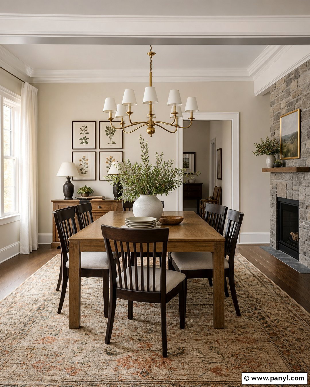
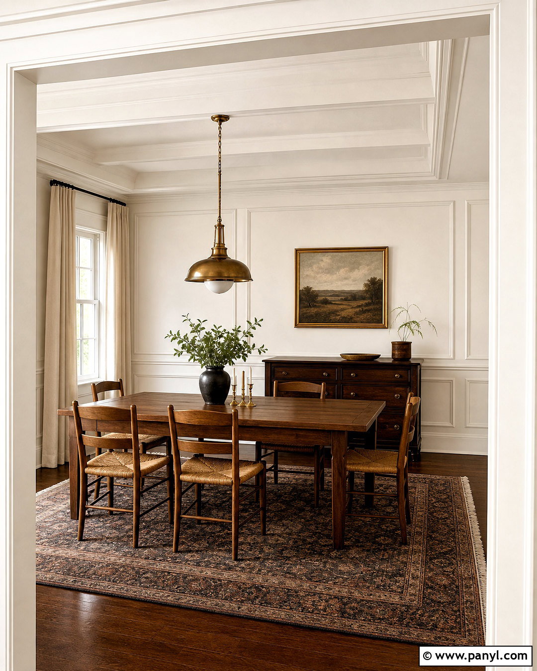
Ivory drywall suits a polished dining room that needs more richness than plain white can provide. Pair ivory walls with dark espresso dining chairs, a medium oak table, and a softly patterned rug containing beige, rust, and muted green. Use matching ivory on the ceiling, then choose satin-finished trim in a slightly lighter warm white for quiet definition. Brushed brass lighting and framed botanical artwork complement the creamy undertone without making the design feel old-fashioned. Ivory can become too yellow beside orange wood, so introduce cooler materials such as gray stone, clear glass, or black metal. The resulting room feels refined but still approachable, with enough contrast to highlight architectural details and enough softness to remain comfortable for everyday meals.
4. Light Greige Drywall
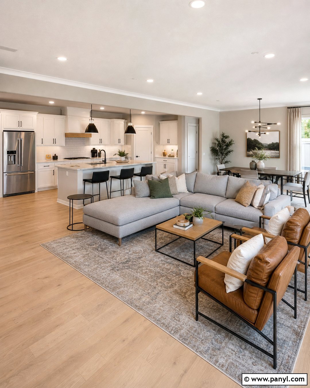
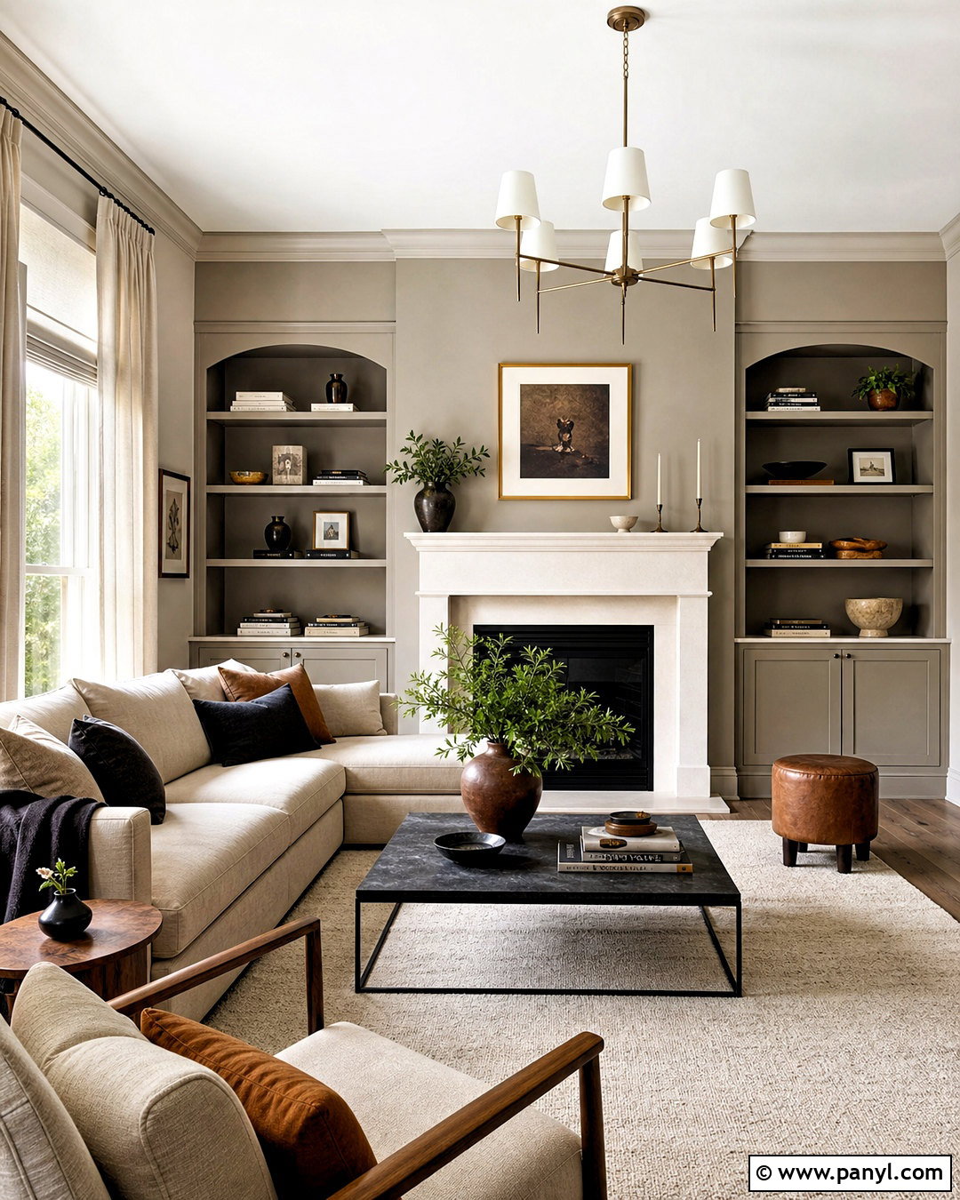
Light greige drywall bridges warm and cool furnishings, making it a practical choice for connected kitchens and living areas. Create a cohesive open-plan room with pale greige walls, white oak flooring, warm white cabinets, and a soft gray sectional. Repeat the wall color near the kitchen and seating zone so the entire floor feels visually connected. Matte black fixtures provide crisp definition, while camel leather chairs and beige curtains pull out the paint’s warmer side. Include sage green accessories for a subtle natural accent. Because greige can shift toward purple, green, or pink, check samples beside countertops and flooring before committing. A balanced shade should look comfortably neutral rather than noticeably gray or beige in the room’s dominant light.
5. Warm Beige Drywall
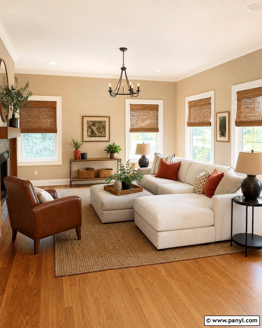
Sunlight gives warm beige drywall a soft, sandy character that feels especially natural in a casual living room. Combine the walls with honey oak flooring, an off-white sofa, and woven shades that filter strong afternoon light. Terracotta cushions, brown leather seating, and a large jute rug add depth without disrupting the tonal palette. Paint the ceiling warm white and use the same white on baseboards and window trim for a fresh border. To prevent beige from feeling dated, favor clean-lined furniture and simple artwork rather than heavily ornate pieces. Black picture frames and dark bronze lamps bring welcome contrast. The completed room feels grounded, bright, and comfortable, with several closely related neutrals creating texture instead of visual clutter.
6. Mushroom Drywall
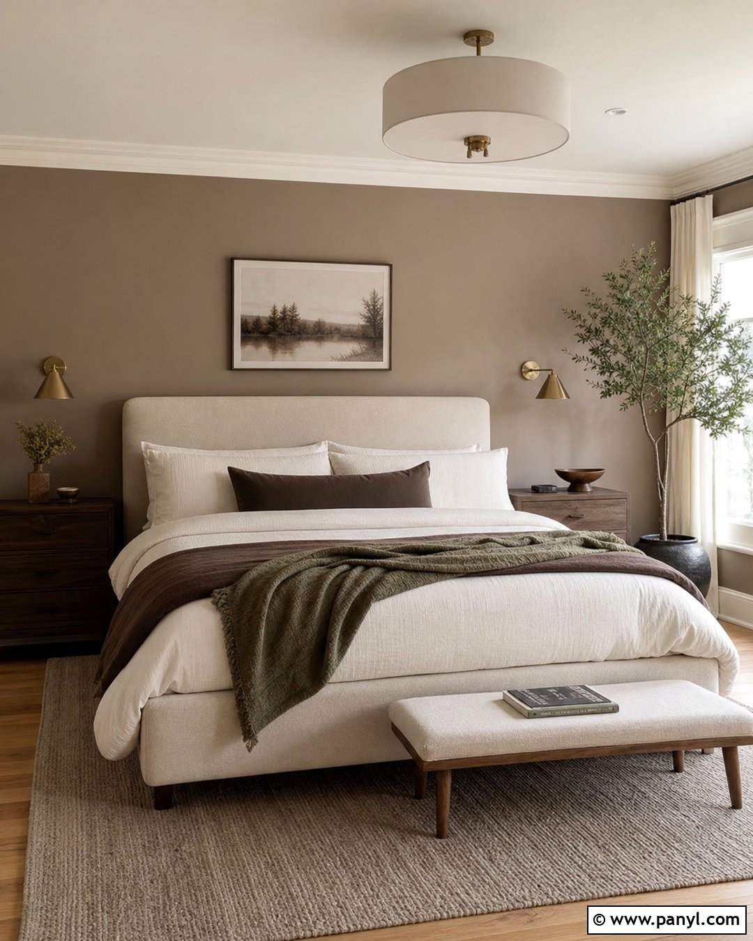
Mushroom drywall blends taupe, beige, and soft gray into an earthy neutral with greater depth than standard greige. Use it in a bedroom with an upholstered oatmeal bed, walnut nightstands, and warm white bedding layered with cocoa and muted olive textiles. Natural oak flooring and a wool area rug keep the palette organic, while aged brass sconces add a refined finish. Continue the mushroom color across all four walls for a calm, enclosed effect, but keep the ceiling and trim a creamy white. This shade can appear darker in rooms with small windows, so support it with light curtains and well-placed lamps. Matte ceramics, linen fabrics, and understated landscape art complete a restful room that feels intentionally tonal rather than simply brown.
7. Warm Taupe Drywall
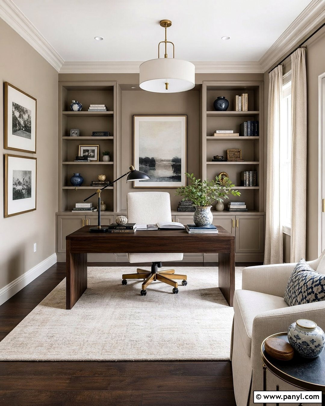
Warm taupe drywall gives a home office a mature, focused atmosphere without the heaviness of dark brown. Pair it with a substantial walnut desk, an ivory desk chair, and built-in shelves painted in the same taupe for a smooth color-drenched look. Natural linen curtains soften the windows, while a cream rug brightens dark wood flooring. Add black task lighting, brushed brass hardware, and a few muted blue accessories to sharpen the neutral scheme. Taupe often carries pink, violet, or green undertones, so examine samples beside existing woodwork before painting. With balanced lighting and simple furniture, this color creates a professional workspace that feels warm, organized, and visually quiet enough for reading, remote work, or creative projects.
8. Pale Gray Drywall
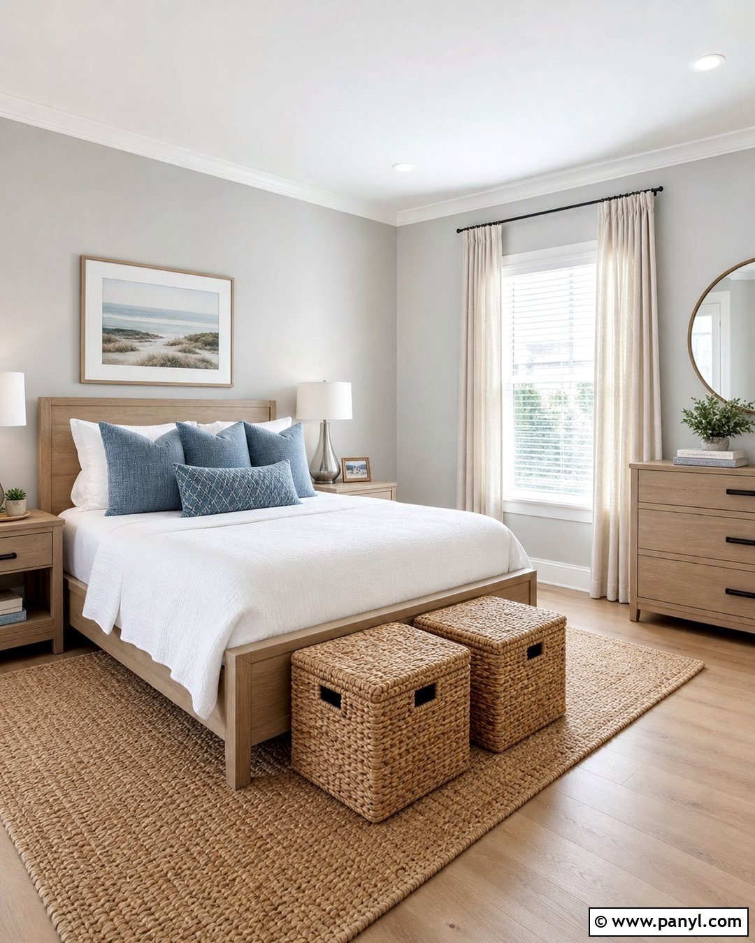
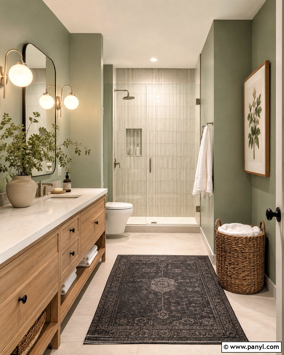
Pale gray drywall works best when the full room includes enough warmth to keep the color from feeling cold. Design a modern guest bedroom with light gray walls, white oak furniture, crisp white bedding, and a textured beige rug. Add dusty blue pillows, natural linen curtains, and brushed nickel lighting for subtle tonal variation. A warm white ceiling and trim will soften the transition around the room. In spaces with intense southern sunlight, pale gray can reduce glare and create a calmer background. Avoid surrounding it entirely with cool silver and stark white surfaces. Instead, bring in woven baskets, warm wood, and ivory textiles. The balanced scheme feels clean and spacious while remaining comfortable enough for an inviting bedroom.
9. Charcoal Drywall
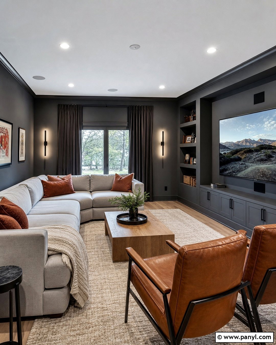
Charcoal drywall can turn a media room into a dramatic, comfortable retreat when the entire palette is carefully balanced. Cover all four walls in deep charcoal and use the same color on built-in shelving to reduce visual distractions. Choose a light gray sectional, a large cream rug, and pale oak tables to keep the dark envelope from feeling cramped. Blackout curtains in a similar charcoal tone support screen viewing, while recessed ceiling lights and slim wall sconces provide controlled brightness. Add cognac leather accents and rust-colored pillows for warmth. A flat or matte wall finish helps minimize glare, but trim can have a slightly higher sheen for durability. The completed room feels immersive, tailored, and appropriate for both movies and casual gatherings.
10. Sage Green Drywall
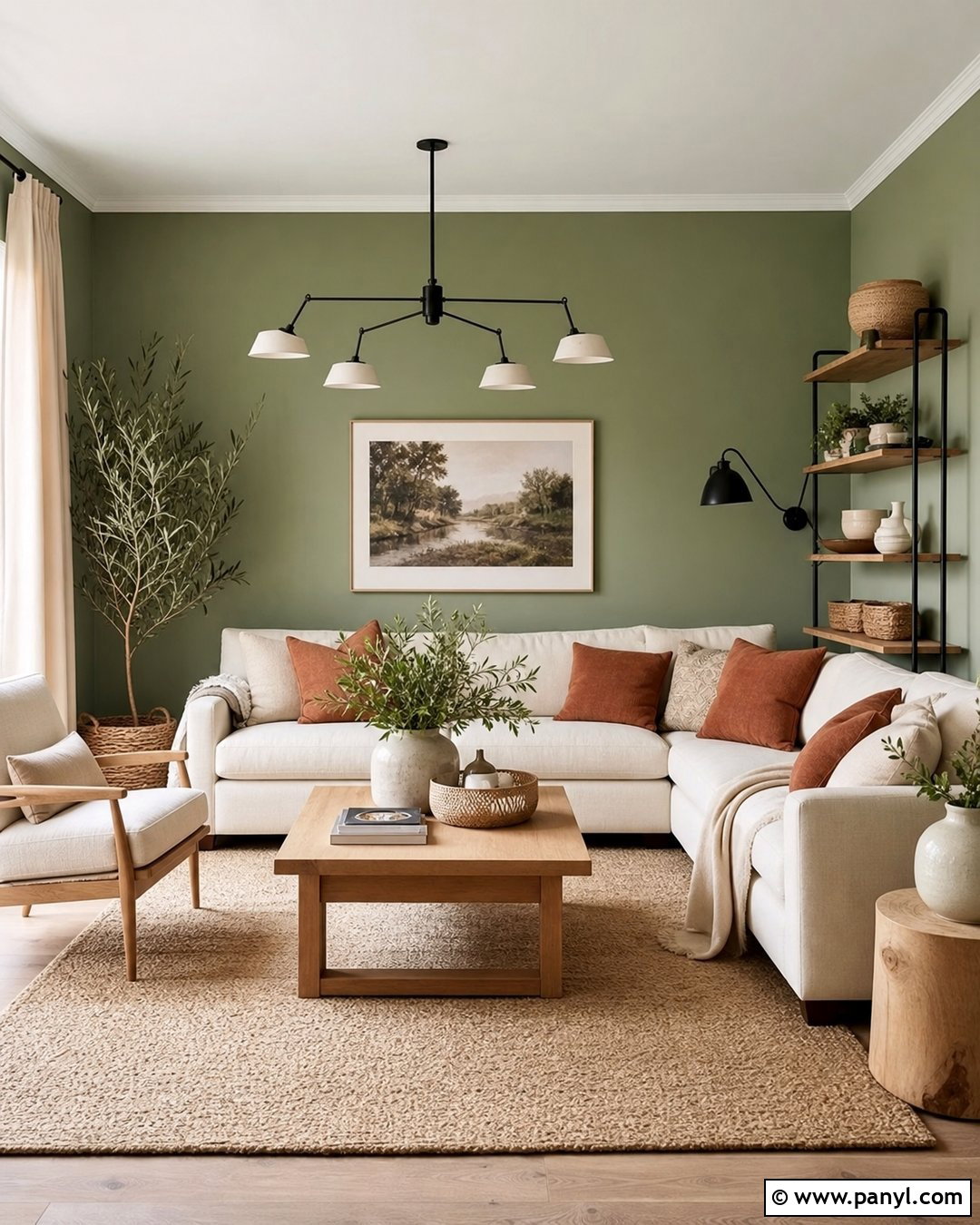
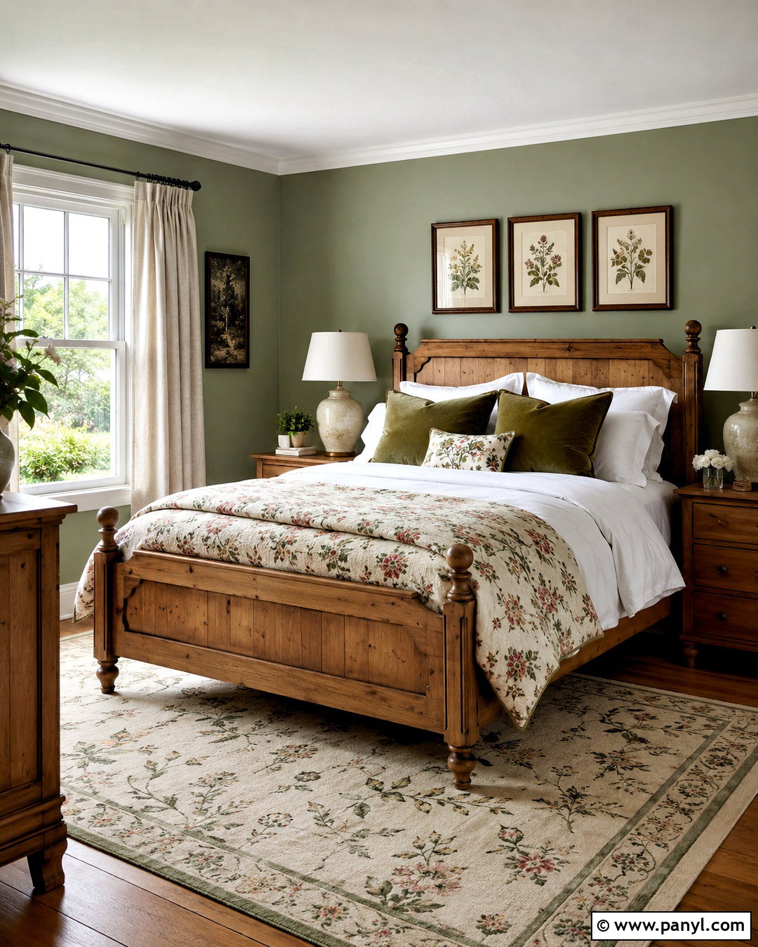
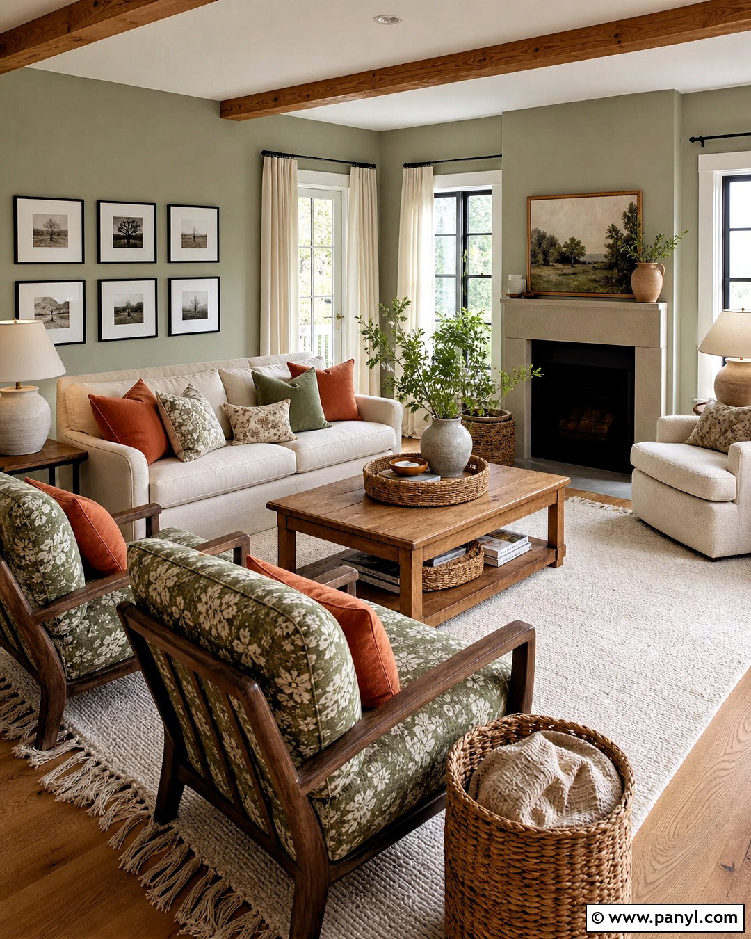
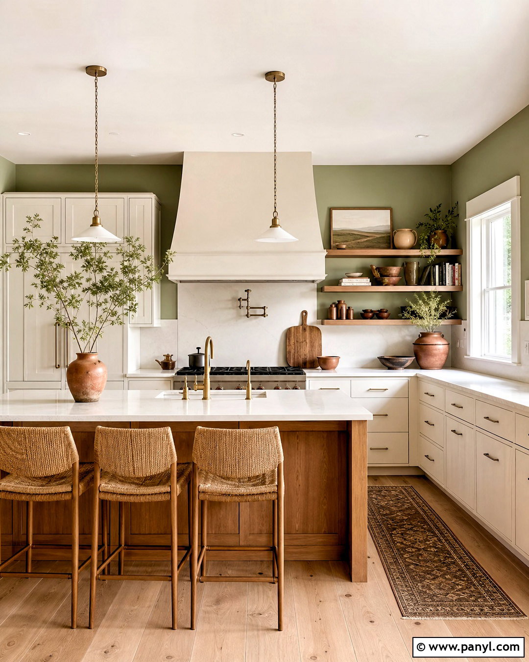
Sage green drywall creates a calm, nature-inspired living room that still functions as a versatile everyday space. Pair the muted green walls with a cream sofa, white oak tables, and a warm beige rug. Use off-white trim rather than a stark white so the contrast remains soft. Linen curtains, woven baskets, and handmade ceramic pieces reinforce the organic character, while matte black lighting prevents the palette from becoming overly delicate. Introduce small amounts of terracotta through cushions or artwork to warm the green. Sage is particularly responsive to surrounding colors, so check that the selected shade does not become minty beside cool flooring. The complete design should feel layered, peaceful, and connected to outdoor views without resembling a themed room.
11. Olive Green Drywall
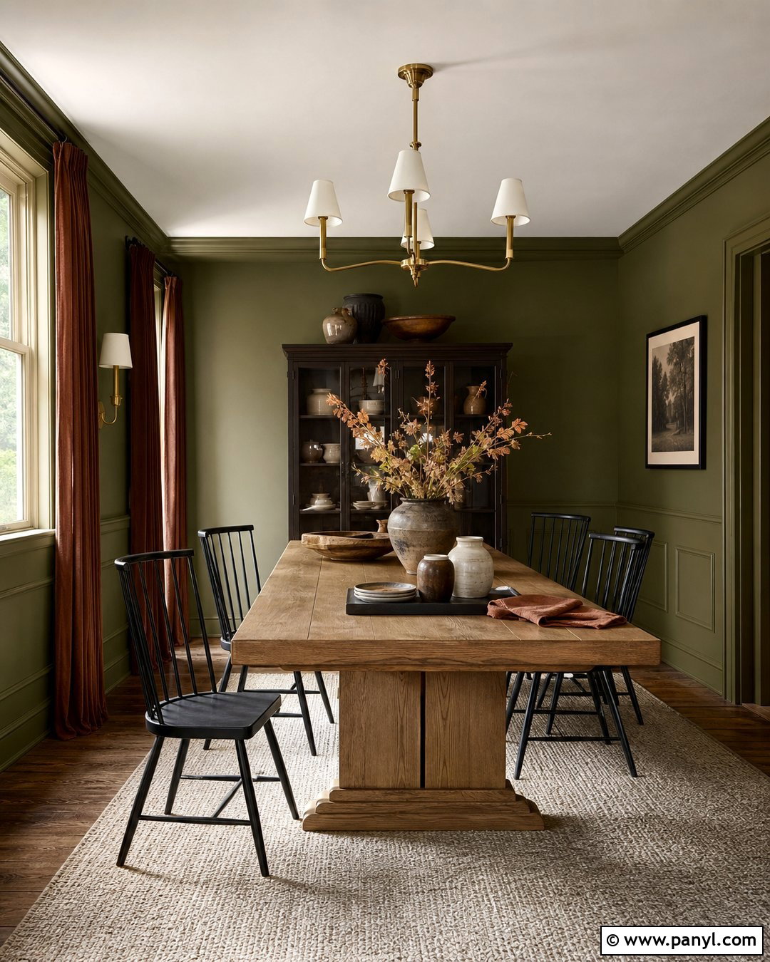
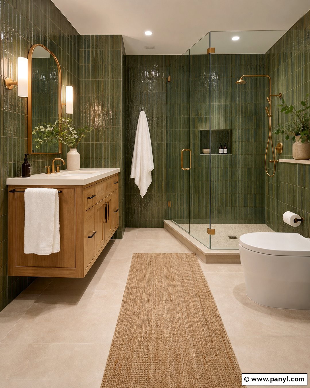
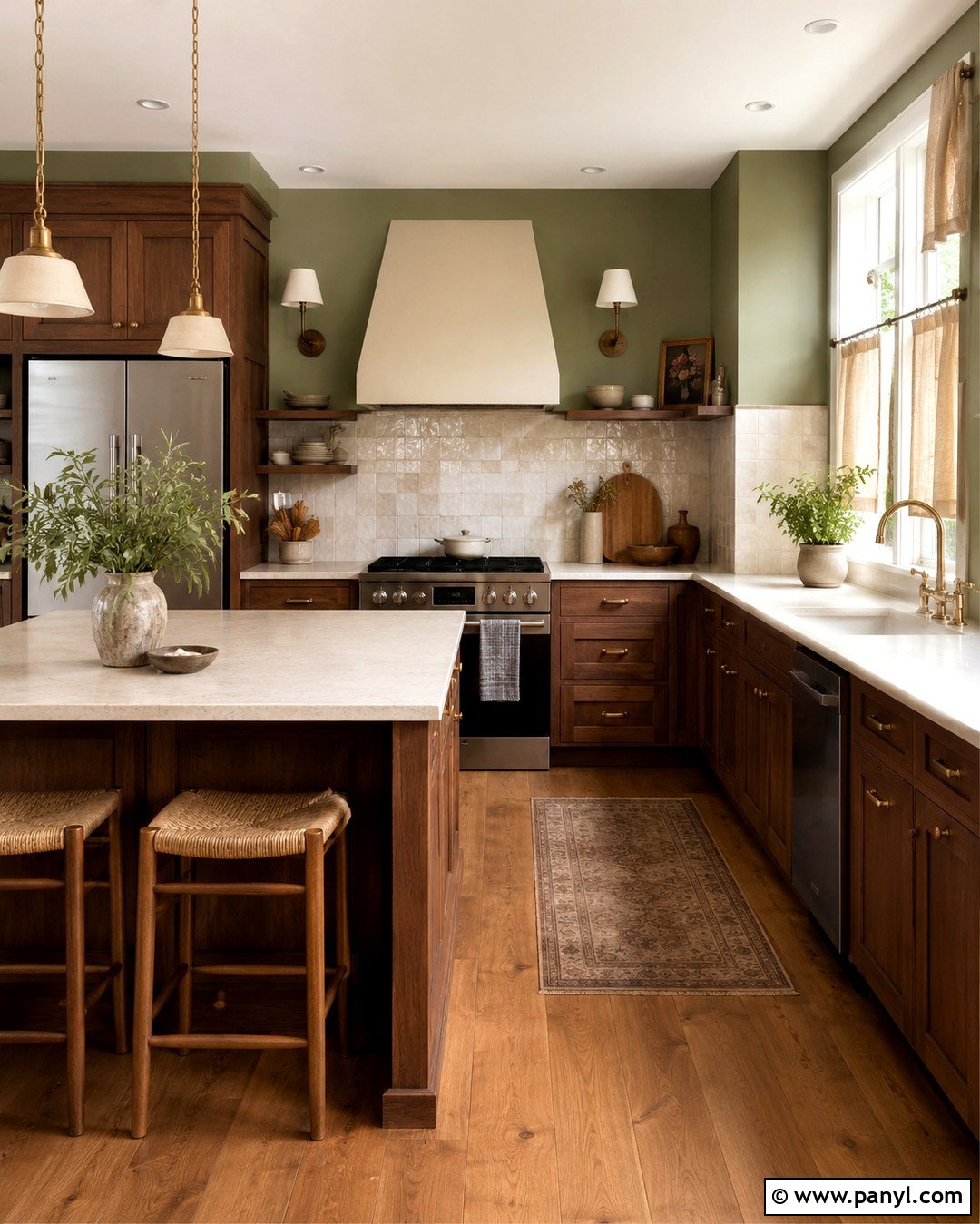
Olive green drywall gives a dining room an earthy richness that works beautifully with wood and aged metal. Paint every wall in a muted olive, then add a substantial oak dining table, black spindle-back chairs, and a neutral wool rug. Warm white on the ceiling keeps the space open, while matching olive trim can make the walls feel more architectural. Hang a simple brass chandelier above the table and display cream ceramics in a dark wood cabinet. Rust, camel, and natural linen accents complement the yellow undertones in olive. Since this color absorbs more light than sage, use it in a room with generous windows or layered illumination. The finished setting feels intimate and grounded without becoming overly formal or visually heavy.
12. Forest Green Drywall
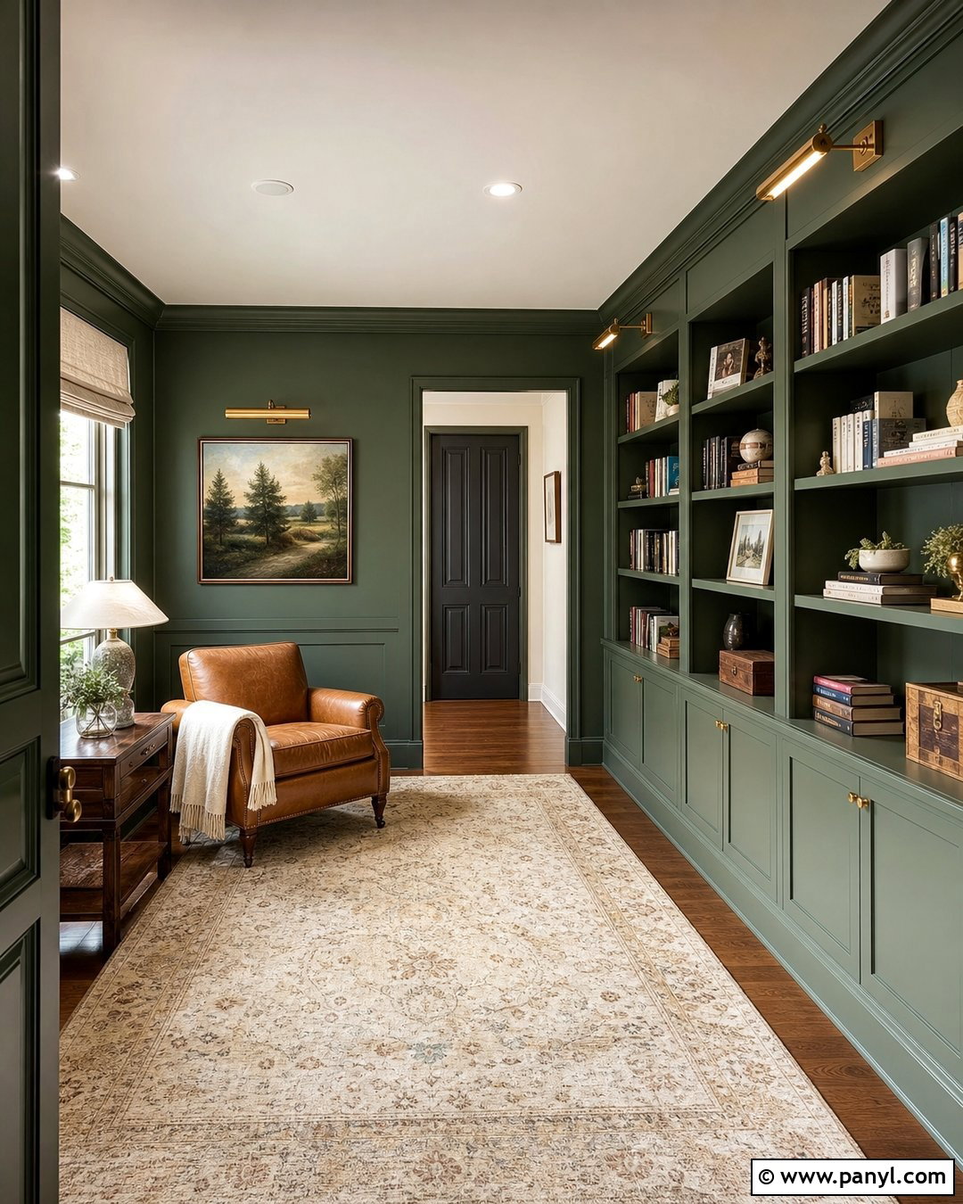
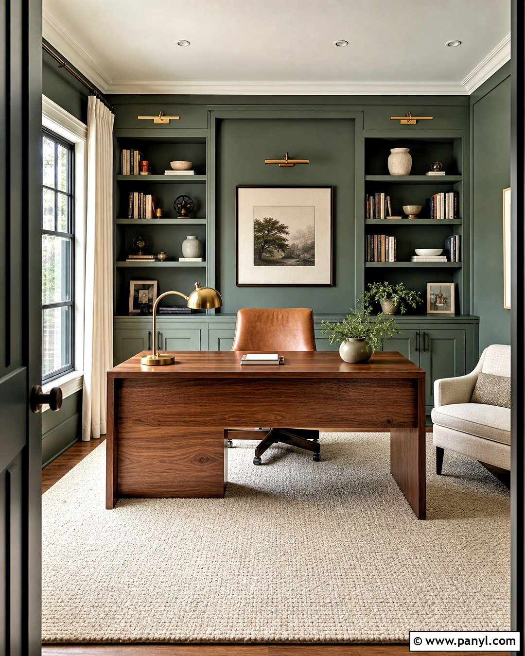
Forest green drywall creates a strong backdrop for a traditional library or reading room. Use the color across the walls, trim, and bookcases to form a continuous, cocooning interior. Balance that depth with a caramel leather chair, a pale patterned rug, and warm oak flooring. Brass picture lights, a cream ceiling, and a linen Roman shade introduce brightness at different heights. Keep book spines, artwork, and accessories edited so the saturated walls remain the main visual feature. A small side table in dark wood and a textured ivory throw make the reading corner comfortable. Forest green can look nearly black in shaded areas, so test it under both daylight and installed lighting. The complete room should feel sophisticated, restful, and usable.
13. Dusty Blue Drywall
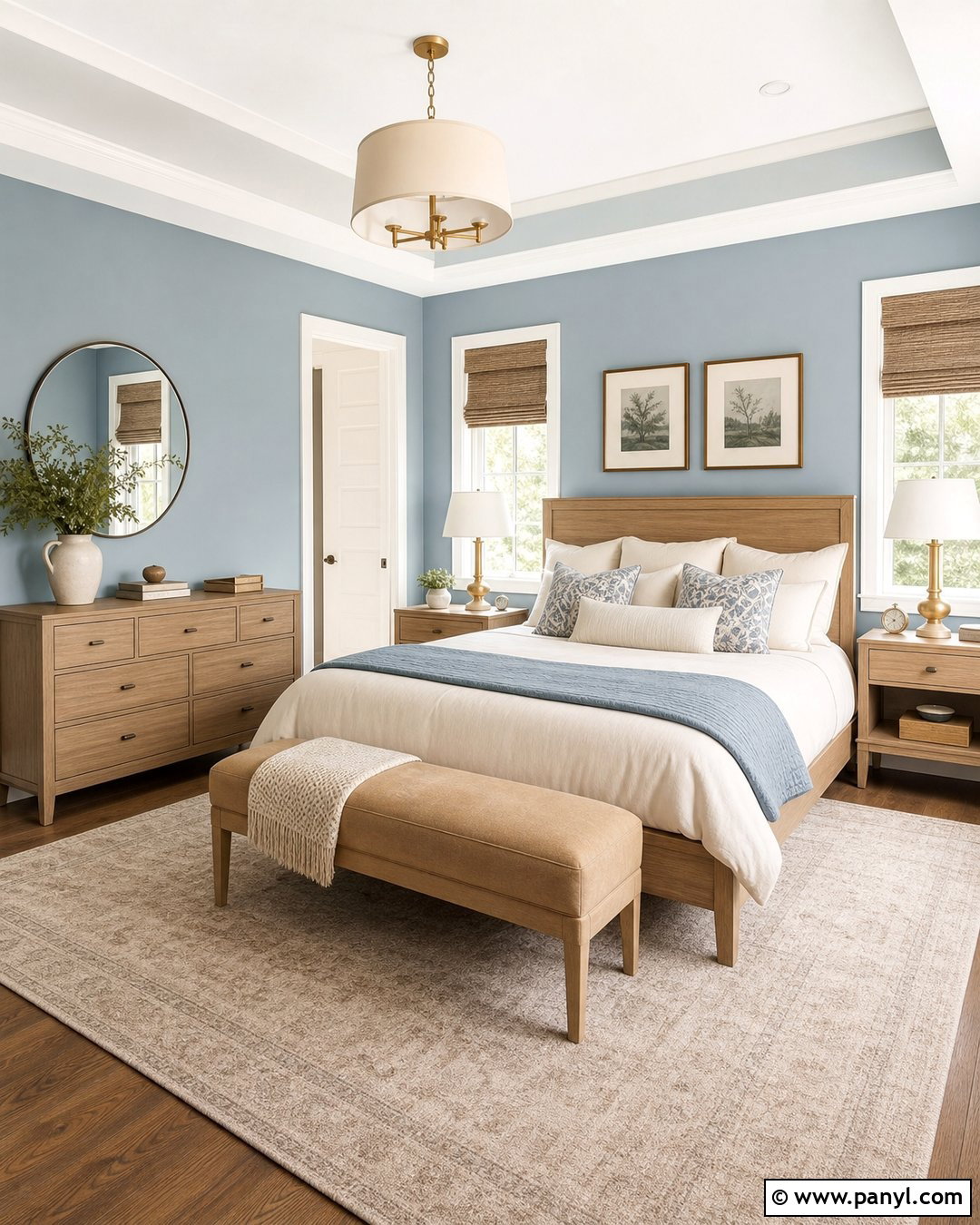
Dusty blue drywall gives a bedroom color while maintaining a relaxed, restful mood. Surround the shade with white oak furniture, ivory bedding, and a light beige carpet or area rug. Use warm white trim to clarify the room’s architecture, then repeat the blue through a few patterned cushions rather than matching every accessory. Woven shades, brushed brass lamps, and a tan upholstered bench prevent the room from becoming too cool. Dusty blue works well when it contains enough gray to remain subdued, but it should still appear clearly blue in daylight. Avoid bright navy and icy silver accents if you want a softer effect. The resulting bedroom feels airy and collected, with a gentle coastal influence that does not rely on obvious nautical decorations.
14. Blue Gray Drywall
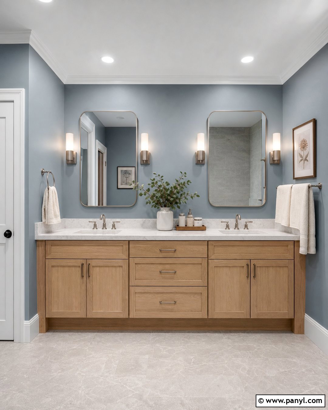
Blue gray drywall is a useful choice for a bright bathroom where plain gray might look flat. Combine the walls with a white oak vanity, honed white marble, brushed nickel fixtures, and warm white trim. Large mirrors reflect daylight and help the muted color remain fresh rather than shadowy. Use pale stone flooring and ivory towels to soften the cool palette, then add a small amount of natural greenery for contrast. Choose moisture-resistant interior paint in an appropriate bathroom finish so the completed surface is easier to maintain. Because blue-gray shades intensify near cool tile, sample the paint directly beside every permanent finish. A balanced selection creates a clean, spa-like bathroom that feels calming, practical, and warmer than an all-white scheme.
15. Navy Blue Drywall
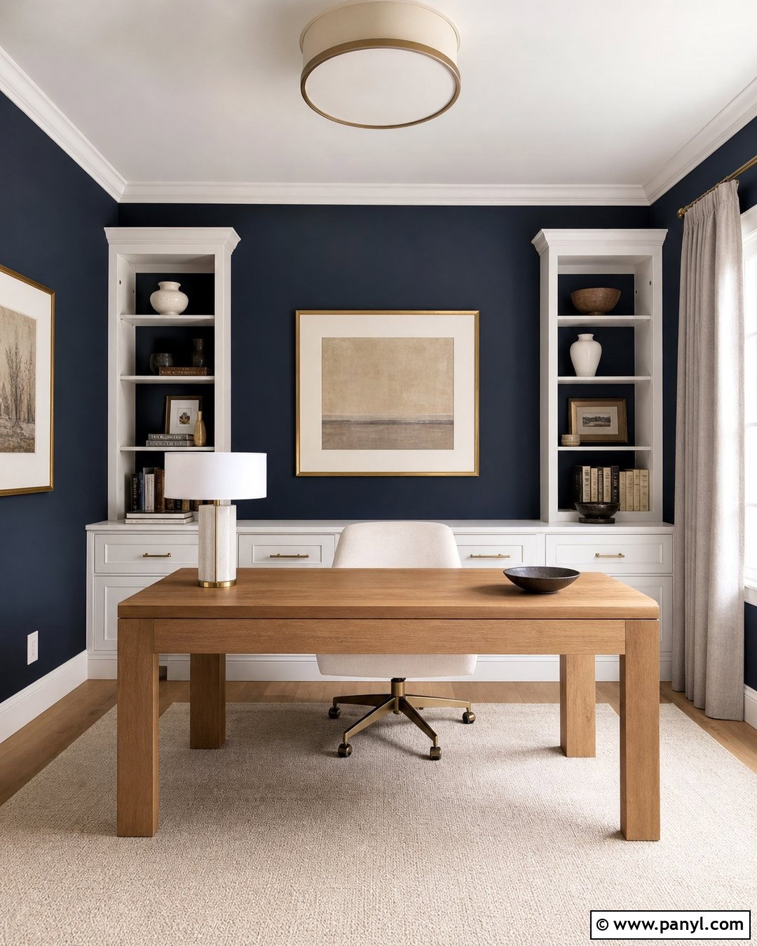
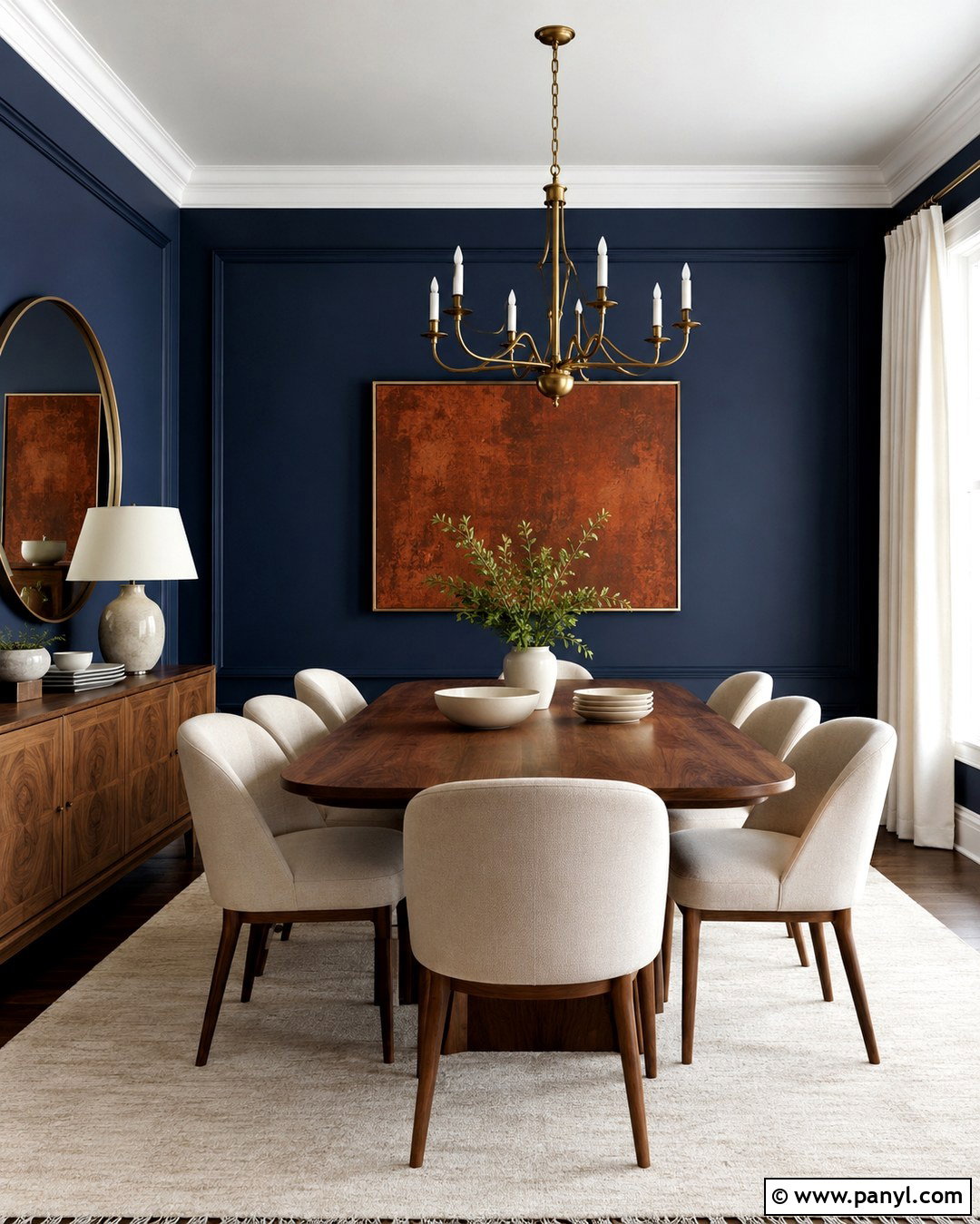
Navy blue drywall produces a striking home office when supported by lighter furnishings and focused lighting. Paint the main walls deep navy, then add a natural oak desk, a cream upholstered chair, and white built-in cabinets. A large ivory rug brightens the floor, while brass hardware and a sculptural desk lamp bring warmth against the blue. Use warm white on the ceiling so the room retains visual height. Framed artwork with beige mats can break up expansive wall areas without weakening the dramatic effect. Navy often changes from vivid blue to nearly black as daylight fades, making adequate task and ambient lighting essential. The finished office feels confident and organized, with enough warmth and contrast to remain comfortable during long working hours.
16. Terracotta Drywall
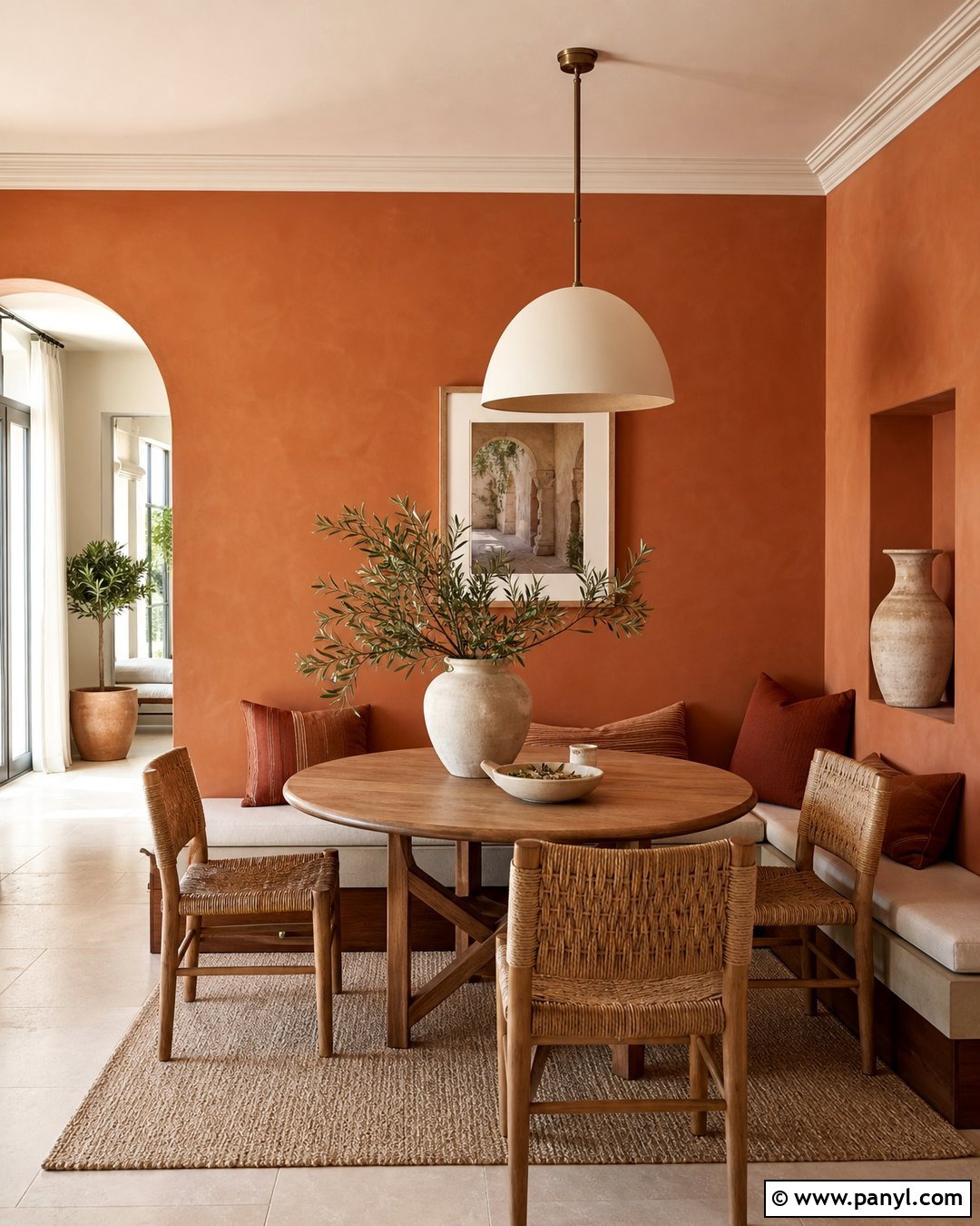
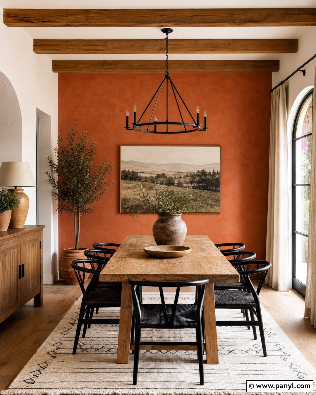
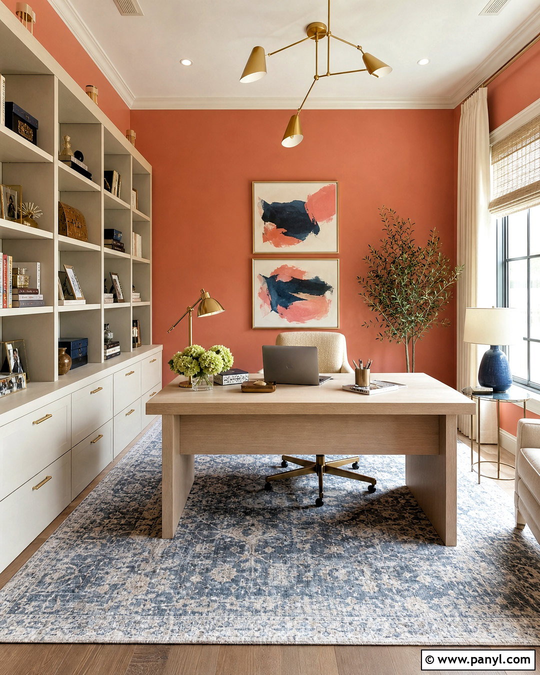
Terracotta drywall wraps a dining nook in warm, sunbaked color and pairs naturally with relaxed Southwestern or Mediterranean details. Use the earthy orange walls with a round oak table, woven dining chairs, and a cream pendant light. Pale limestone-look flooring or a neutral rug helps balance the strong wall color. Add off-white trim, rust-patterned cushions, and handmade pottery in cream and brown. Keep additional red and orange accents limited so the room does not become visually intense. Terracotta is especially attractive in spaces receiving warm afternoon light, but a muted version is easier to use than a bright orange shade. The completed nook feels cheerful, grounded, and personal, with natural materials ensuring the colorful walls remain sophisticated.
17. Muted Clay Drywall
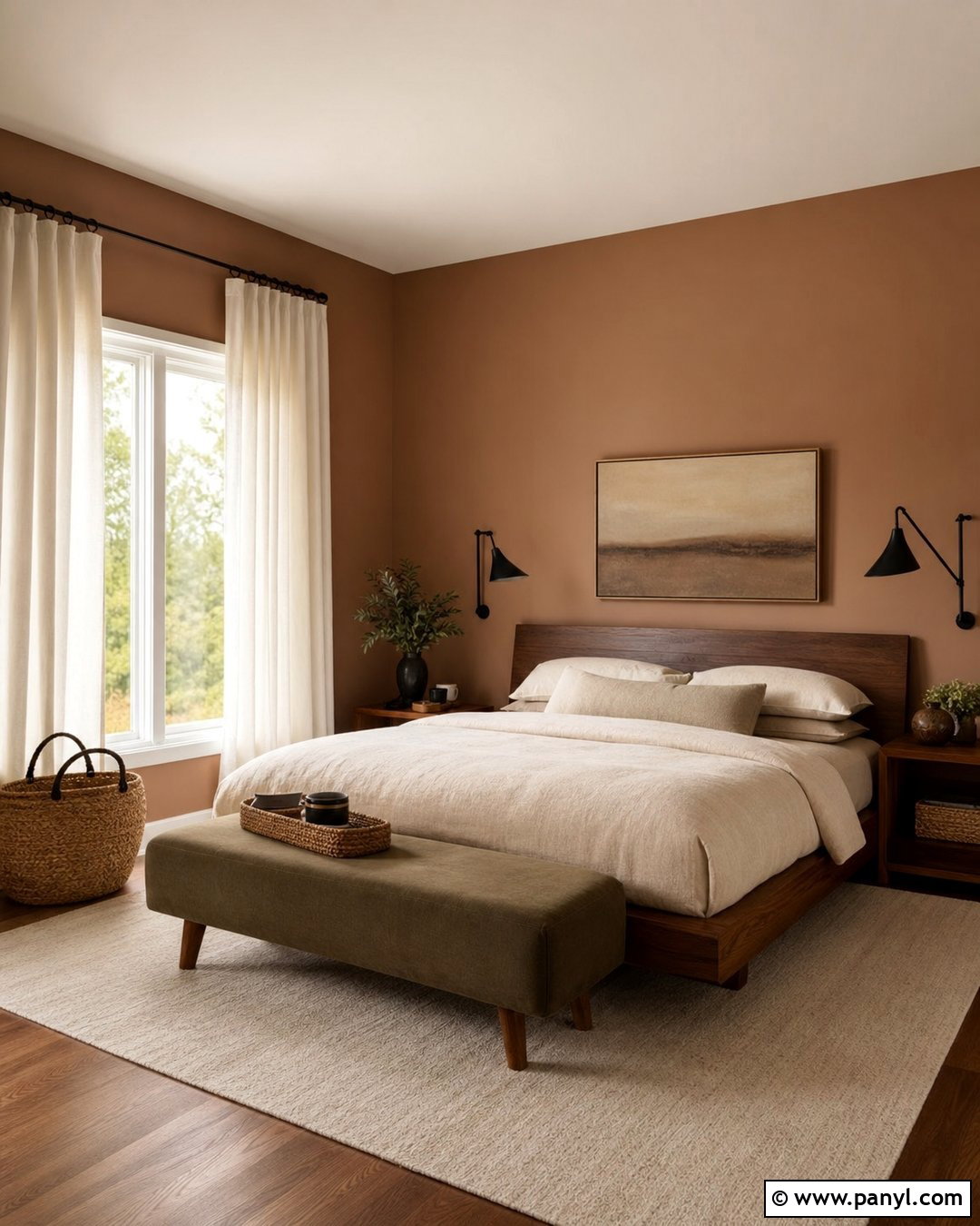
Muted clay drywall combines soft brown, pink, and terracotta undertones for a warm bedroom with subtle character. Pair it with a low-profile walnut bed, oatmeal linen bedding, and a large ivory rug. Cream curtains and an off-white ceiling keep the space bright, while dark bronze lamps give the pale earthy palette stronger definition. Introduce muted olive through a bench or throw to create a natural complementary contrast. Rather than filling the room with blush accessories, use wood, stone, and woven materials that emphasize clay’s grounded quality. This color can become noticeably pink under warm bulbs, so evaluate samples with the lighting you use at night. The finished bedroom feels cozy and modern, with warmth coming from the walls instead of excessive decoration.
18. Dusty Rose Drywall
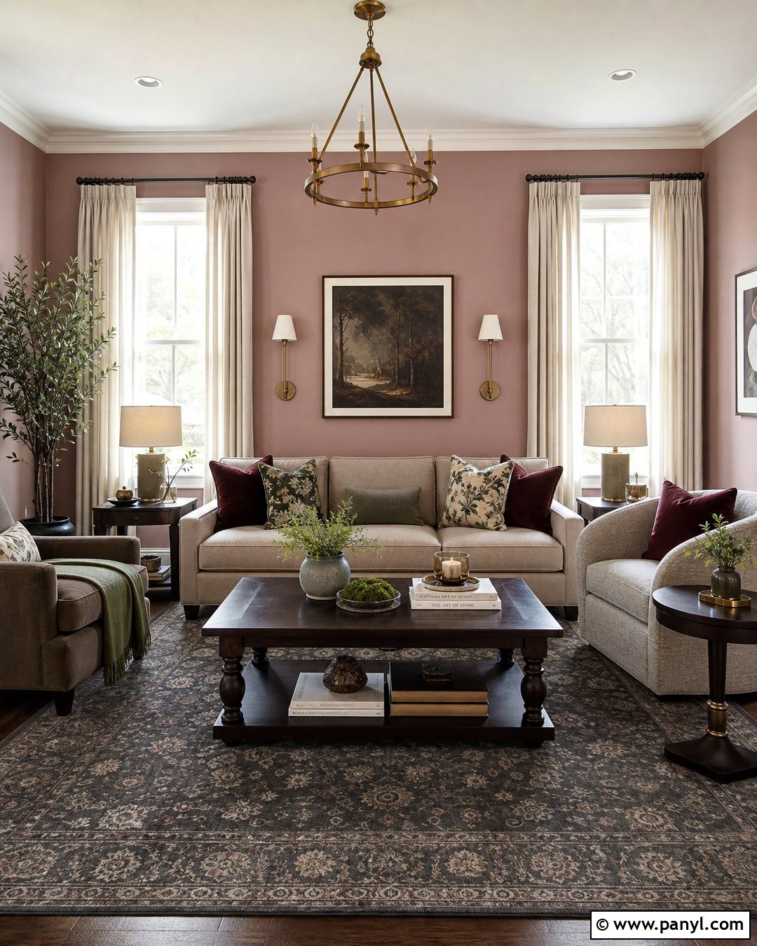
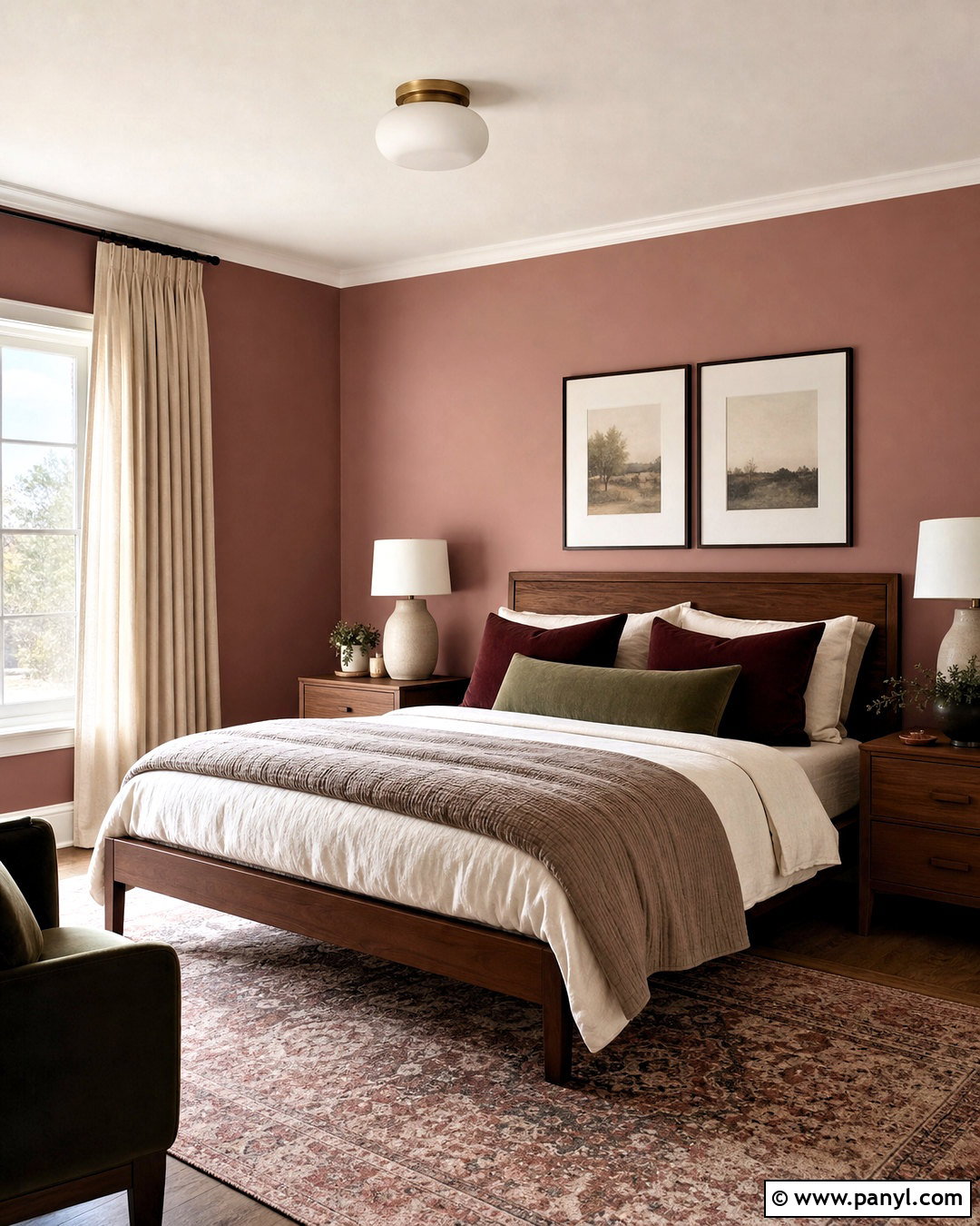
Dusty rose drywall can feel sophisticated rather than overly sweet when used with deeper neutrals and streamlined furniture. Create a sitting room with muted rose walls, a taupe sofa, dark walnut tables, and a charcoal patterned rug. Warm white trim provides a clean outline, while aged brass lighting and ivory curtains add gentle brightness. Include burgundy, chocolate brown, and muted green accessories in small amounts to deepen the palette. Avoid pairing the walls with numerous pastel pieces, which can make the room feel less balanced. A rose shade containing gray or brown undertones is generally easier to coordinate than a clear pink. The completed space feels warm, welcoming, and distinctive while still offering a practical setting for reading, conversation, or quiet relaxation.
19. Muted Peach Drywall
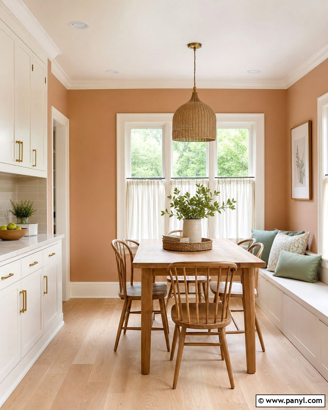
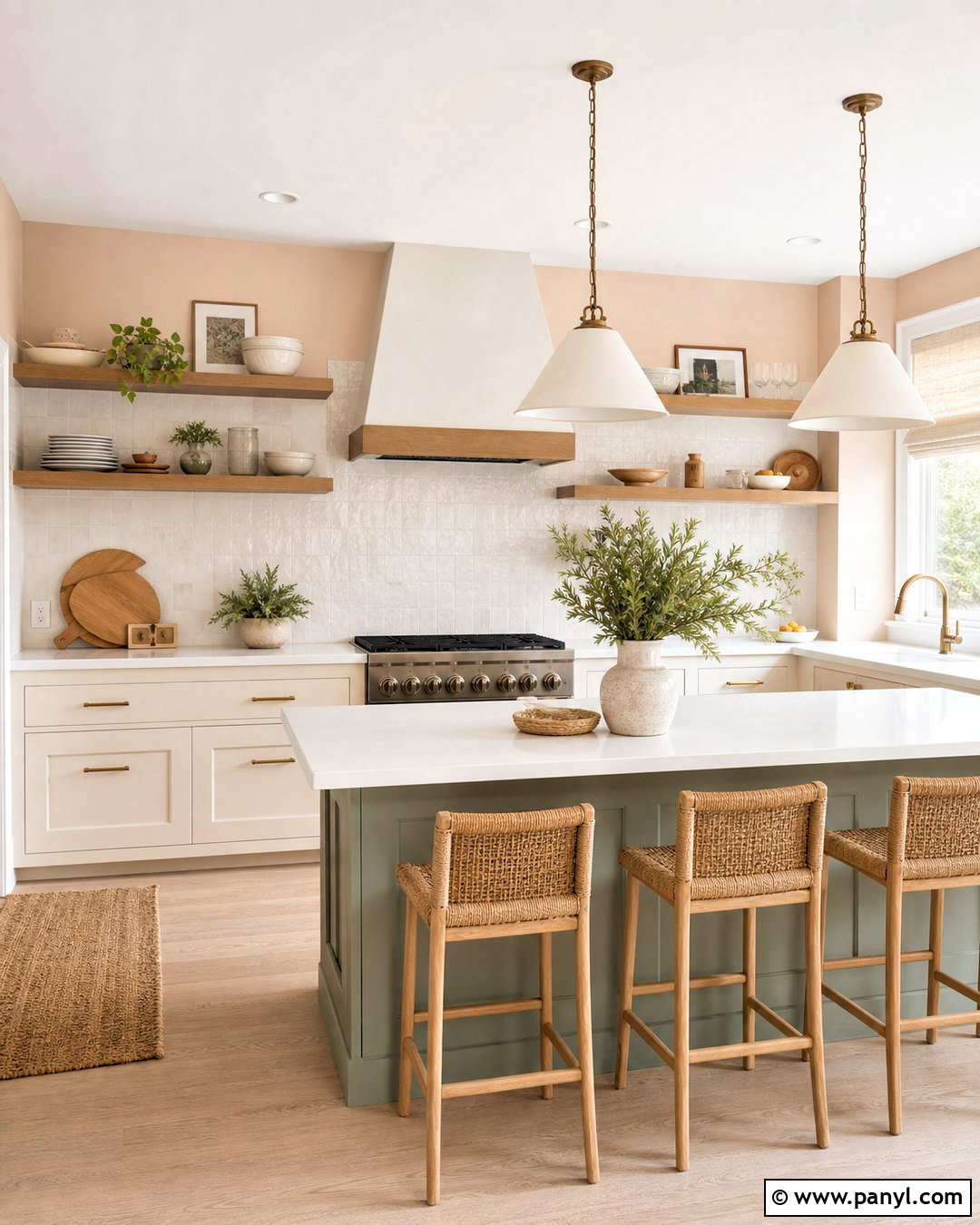
Muted peach drywall brings a flattering glow to a breakfast room or compact kitchen without creating the intensity of bright orange. Pair the walls with warm white cabinetry, light oak flooring, and a small natural wood table. Use brushed brass hardware, cream café curtains, and woven pendant lighting to reinforce the sunny atmosphere. Soft sage accessories provide a cooling contrast, while pale stone countertops keep the room grounded. Select a peach with beige or clay undertones so it remains calm across large surfaces. Strong daylight can make this color appear brighter than expected, so testing several muted samples is important. The final room feels fresh and energetic in the morning, yet its natural finishes and restrained palette keep it comfortable throughout the day.
20. Deep Burgundy Drywall
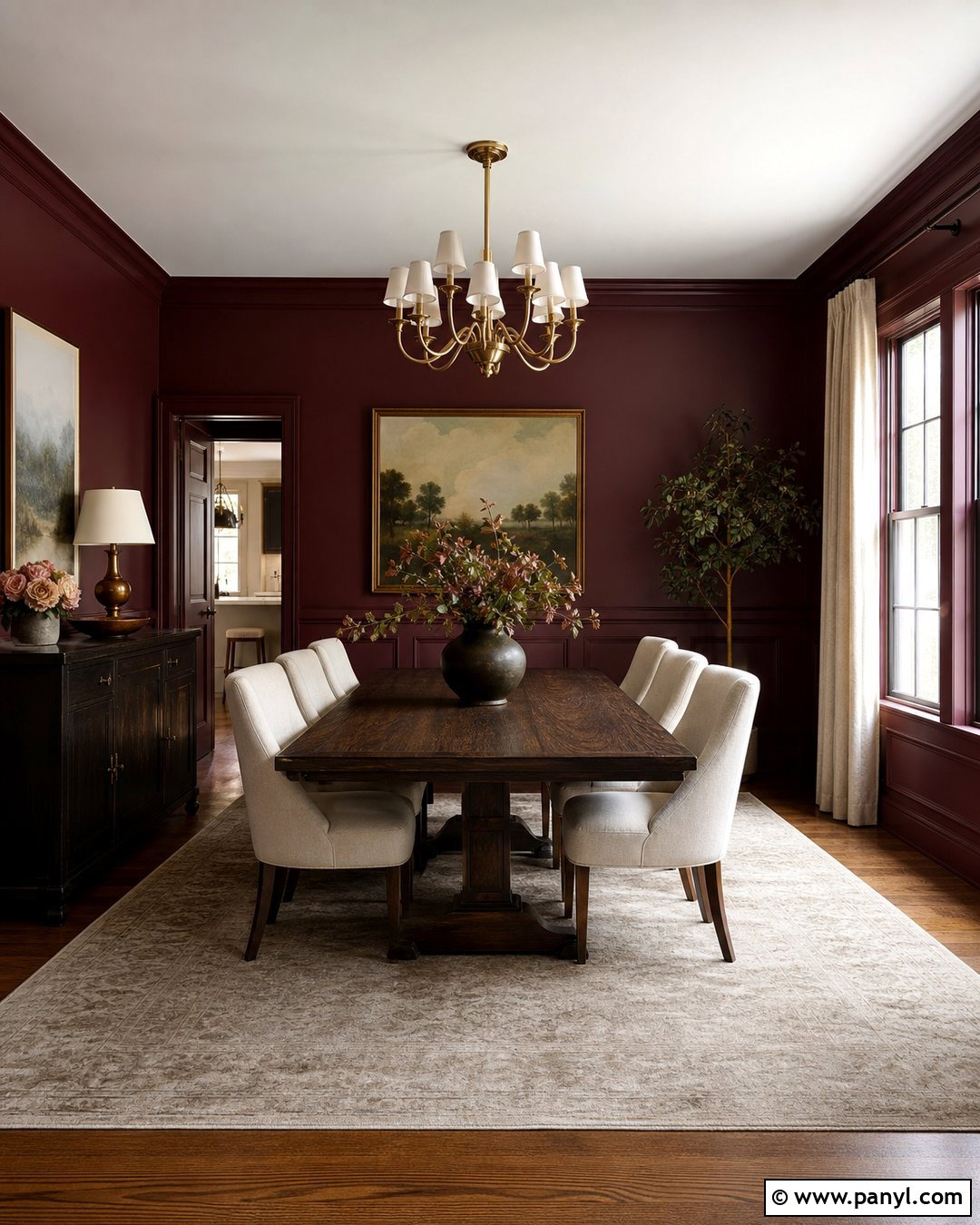
Deep burgundy drywall creates an intimate dining room with more warmth than charcoal or navy. Apply the color to all four walls and consider matching trim for a seamless, enveloping effect. Add a dark oak dining table, cream upholstered chairs, and a large beige rug to balance the saturated background. Antique brass lighting and warm white ceiling paint lift the room, while muted blush or olive accents prevent the palette from feeling severe. Burgundy can reveal red, brown, or violet undertones depending on nearby finishes, so sample it beside flooring and furniture. Use several light sources rather than relying on one central fixture. The completed dining room feels dramatic and polished, but the lighter upholstery and natural wood keep it suitable for regular family use.
Conclusion:
Choosing among these 20 Drywall Colors becomes easier when you consider the whole room rather than selecting paint in isolation. Flooring, trim, furniture, daylight, and artificial lighting all influence how a wall color appears. Warm whites and greiges offer flexibility, while sage, dusty blue, terracotta, and burgundy create more distinctive interiors. Whatever direction you prefer, apply primer first and test large samples on multiple walls. View them in the morning, afternoon, and evening before making the final decision. Then coordinate the ceiling, trim, textiles, wood tones, and metal finishes with the chosen shade. A thoughtful, complete palette will make painted drywall feel like an intentional part of the home instead of a simple background surface.

Related Ideas and Inspiration:
Leave a Reply