
Chartreuse sits between yellow and green, giving rooms a fresh energy that can feel earthy, retro, elegant, or boldly modern. () The key is choosing supporting colors that control its intensity. Crisp neutrals make it cleaner, dark shades add sophistication, and warm earth tones bring out its natural side. Chartreuse can cover walls, energize upholstery, highlight cabinetry, or appear through smaller accents. Before committing, compare samples in morning and evening light because the same shade may look greener or more yellow as conditions change. The complete room schemes below include balanced color proportions, practical materials, and coordinated finishes, making it easier to create a polished home with these chartreuse color palette ideas.

1. Chartreuse And White Color Palette
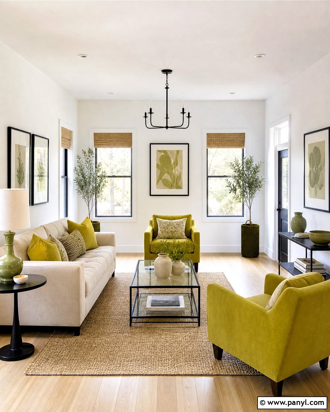
A chartreuse and white palette creates a clean, energetic room without letting the bright color feel overwhelming. Start with warm white walls, pale oak flooring, and a simple white or oatmeal sofa. Bring chartreuse into roughly one-quarter of the room through two upholstered chairs, patterned curtains, and a few ceramic accents. Natural woven shades and a jute rug soften the contrast, while matte black picture frames provide thin, grounding lines. Choose solid chartreuse upholstery rather than several competing patterns for a calmer result. A glass coffee table keeps the room visually open and allows the rug to remain visible. This complete living room look feels cheerful and modern, yet its neutral foundation makes seasonal updates easy.
2. Chartreuse And Navy Color Palette
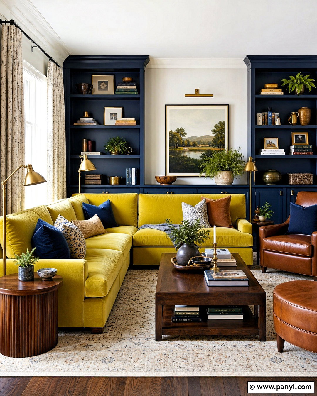
Deep navy gives chartreuse a sophisticated backdrop and makes its yellow-green character appear especially vivid. Use navy on built-in bookcases or the wall behind a sofa, then introduce chartreuse through a velvet sectional or matching lounge chairs. Keep the ceiling and remaining walls soft white so the room retains brightness. Walnut side tables, cognac leather details, and aged brass lighting add warmth between the cool blue and sharp green. A cream rug with a restrained navy pattern connects the larger surfaces without creating visual noise. Repeat chartreuse only two or three times, perhaps in upholstery, artwork, and a small vase. The finished palette works beautifully in a living room, library, or polished home office.
3. Chartreuse And Charcoal Gray Color Palette
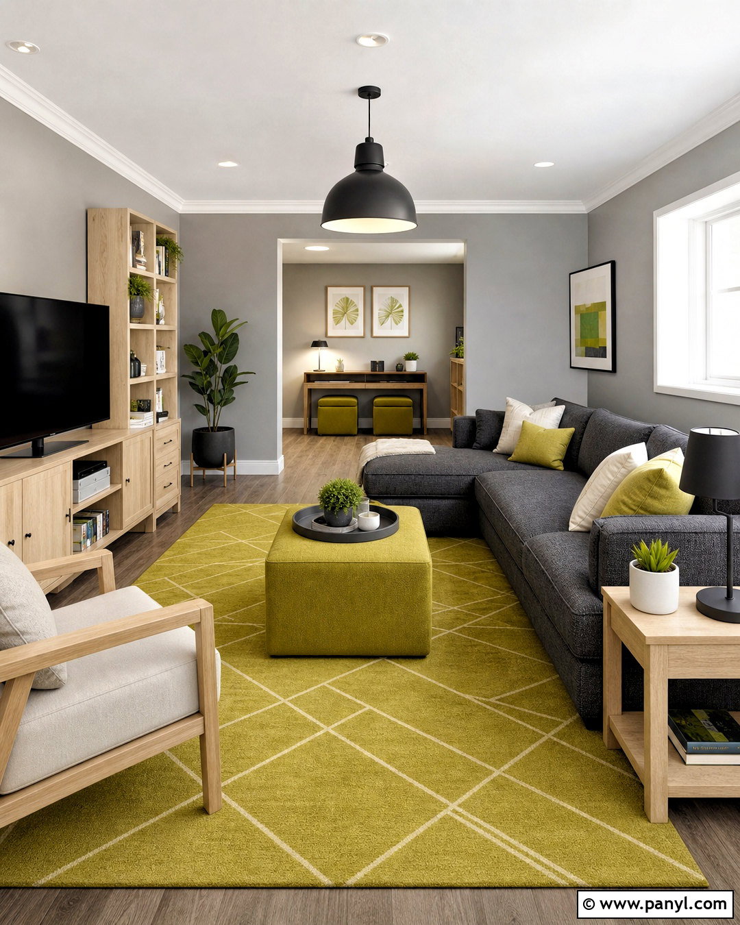
Imagine a streamlined family room where charcoal gray feels warm rather than heavy. Cover the main sofa in textured charcoal fabric and use a softer gray on the walls. Chartreuse can then become the focal color through a large geometric rug, an ottoman, and tailored window panels. Add pale maple furniture to lift the dark foundation, plus brushed nickel or matte black lighting for a crisp finish. White ceilings and linen-colored cushions prevent the palette from becoming overly industrial. Select a slightly muted chartreuse instead of neon green, especially when using it across a large floor covering. This balanced scheme feels contemporary, practical, and forgiving enough for an active household while still making a memorable color statement.
4. Chartreuse And Blush Pink Color Palette
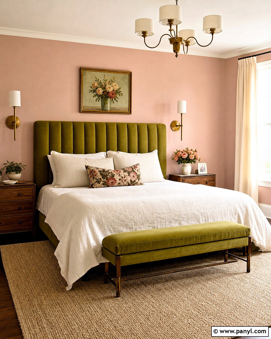
Soft blush pink takes the sharp edge off chartreuse and creates a welcoming palette with playful vintage character. In a bedroom, paint the walls a dusty blush and choose an upholstered chartreuse headboard as the main feature. Dress the bed in ivory linen with restrained accents in both colors. Light walnut nightstands and a natural wool rug keep the room grounded, while antique brass sconces add gentle warmth. Instead of introducing bright white, use cream on the ceiling, trim, and curtains for a softer transition. A small floral pattern can combine blush, chartreuse, and muted green without making the space feel juvenile. The final room is colorful and romantic, but clean furniture lines maintain an updated appearance.
5. Chartreuse And Lavender Color Palette
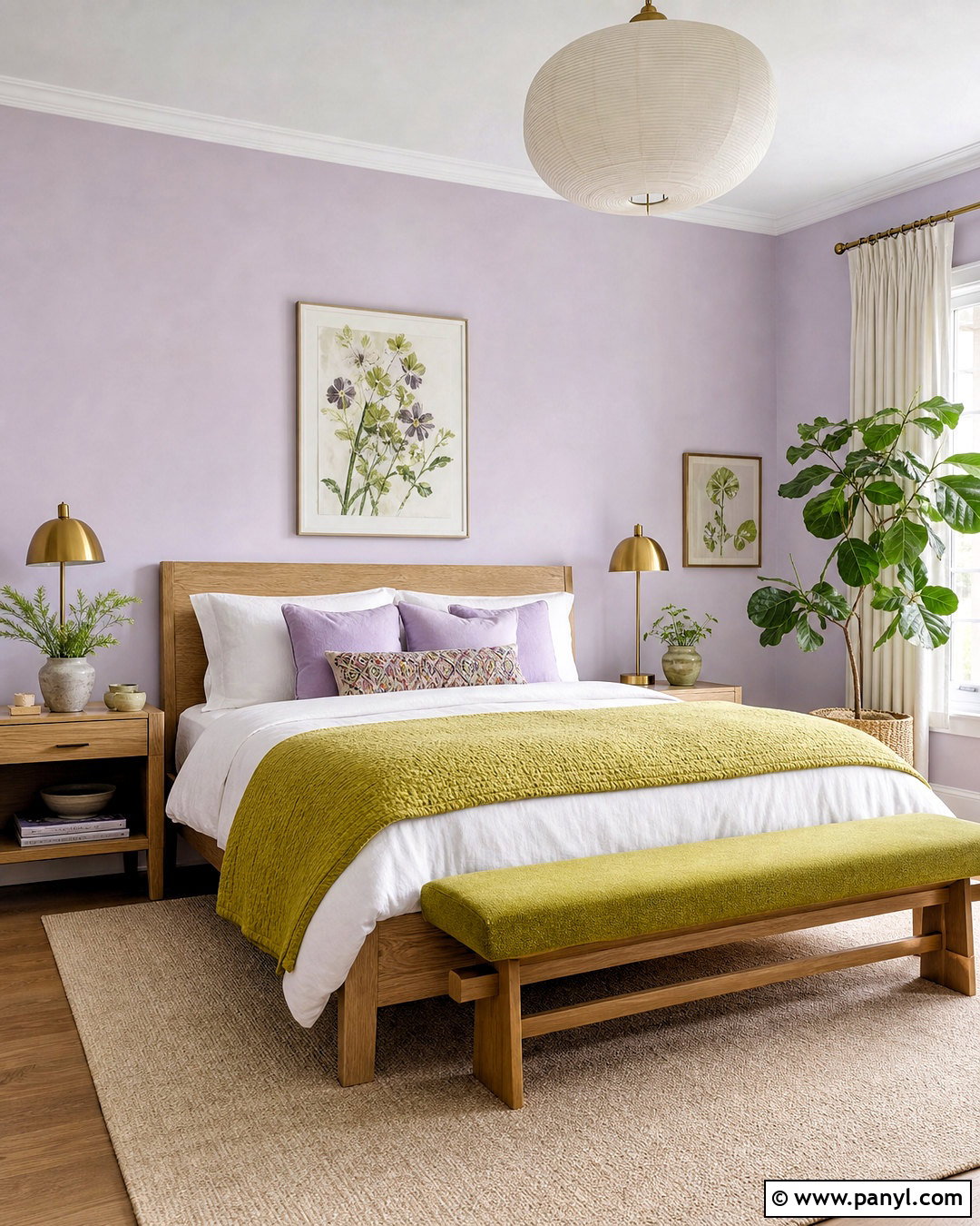
Chartreuse and lavender create a fresh bedroom palette that balances stimulation with softness. Choose pale lavender for the walls, then add a chartreuse quilt, upholstered bench, and botanical artwork. A light oak bed and matching nightstands establish a natural base that prevents the pastel combination from looking sugary. Layer white sheets, lilac pillows, and a cream rug to create breathing room between the stronger colors. Brushed brass lamps provide warmth, while simple ceramic accessories add a handcrafted element. Keep the chartreuse slightly softened and yellow-based rather than fluorescent. Because violet tones sit across from yellow-green on the color wheel, the pairing naturally creates noticeable contrast. () Used in measured amounts, it feels bright, balanced, and comfortably livable.
6. Chartreuse And Cobalt Blue Color Palette
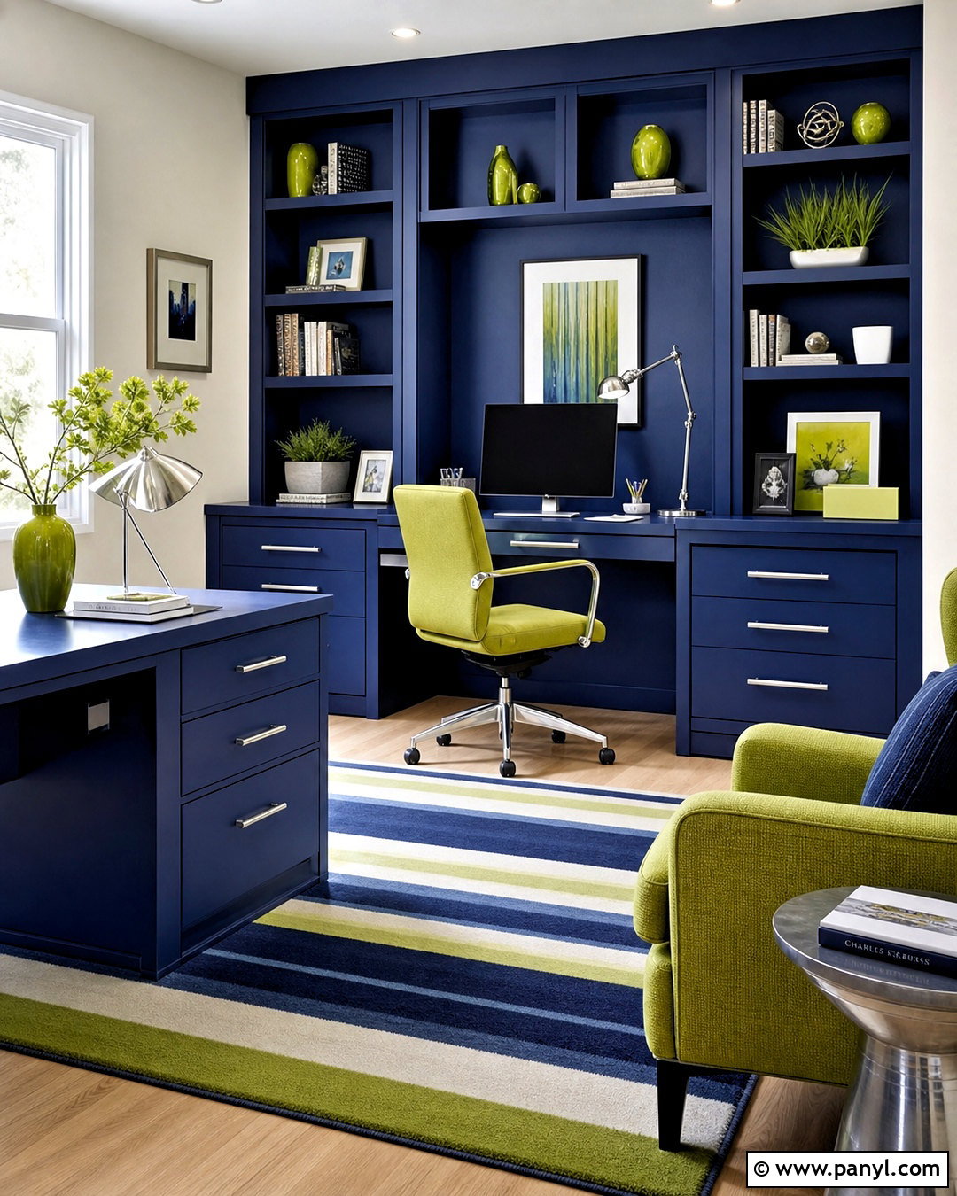
For a room with confident color, pair saturated chartreuse with clear cobalt blue. This combination works especially well in a creative home office or compact den. Paint the built-in desk and shelves cobalt, then place a chartreuse swivel chair at the center. Use warm white walls and a light wood floor to separate the two strong hues. A striped flat-weave rug can repeat blue, green, and cream in smaller proportions. Add polished chrome hardware and white task lighting for a sharp modern finish. Keep paperwork inside closed cabinets so the colors, rather than clutter, remain the focus. The completed space feels energetic and organized, making it suitable for working, reading, or managing everyday household tasks.
7. Chartreuse And Teal Color Palette
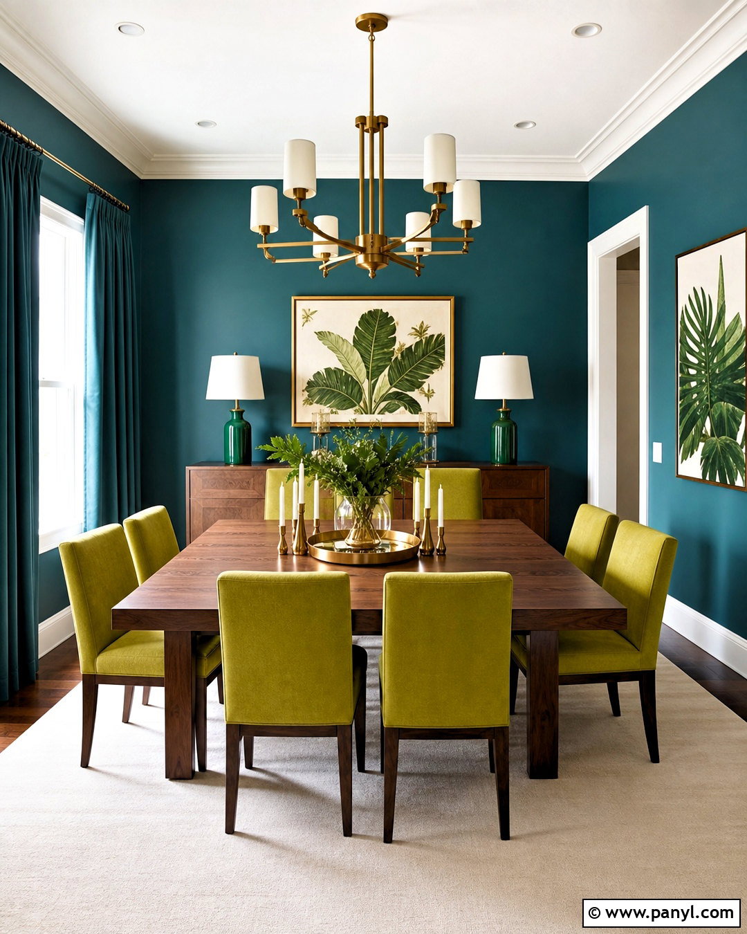
Teal and chartreuse can transform a dining room into a rich, nature-inspired space. Paint the walls deep teal and place chartreuse upholstered chairs around a substantial walnut dining table. Crisp white trim outlines the architecture, while a large cream rug keeps the dark wall color from weighing down the room. Choose an aged brass chandelier with a simple silhouette and repeat the metal through curtain rods or cabinet hardware. Teal linen curtains create a seamless background, allowing the chairs to remain the strongest feature. Botanical artwork can introduce softer green variations without adding another dominant color. The resulting design feels dramatic enough for entertaining but still grounded, warm, and connected to the organic tones found in leaves and wood.
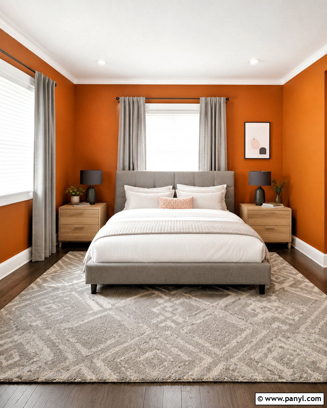
8. Chartreuse And Terracotta Color Palette
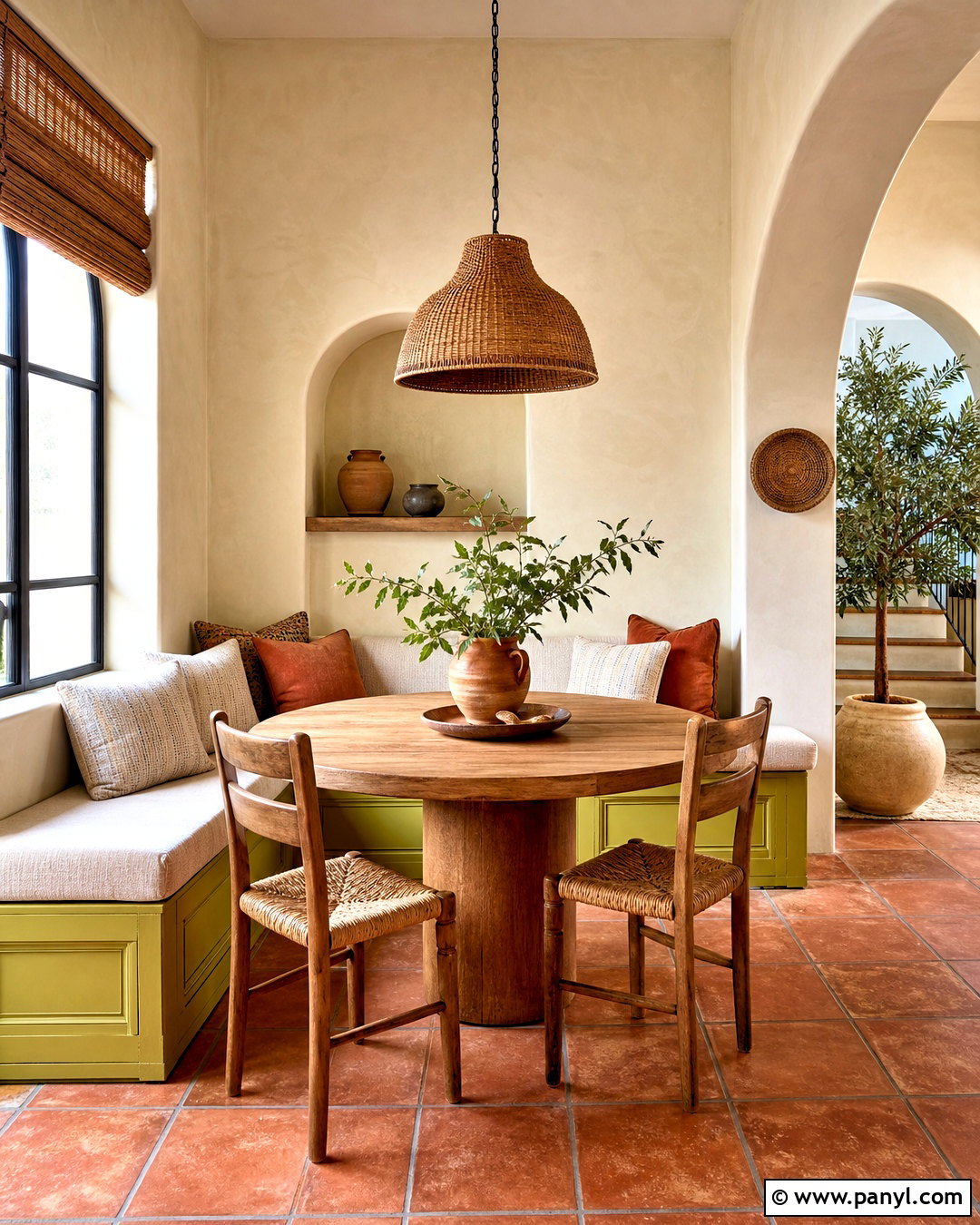
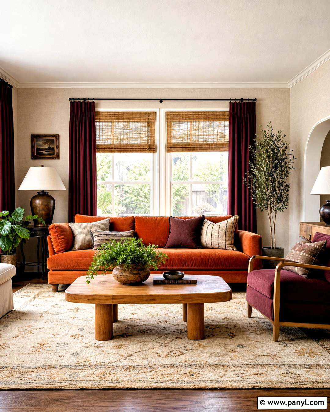
Warm terracotta gives chartreuse an earthy quality that works beautifully in a sunroom or casual breakfast area. Begin with limewashed cream walls and terracotta tile flooring. Add a built-in chartreuse banquette with oatmeal cushions, then center a round oak pedestal table in front of it. Rust-colored pillows and hand-thrown clay pottery repeat the floor’s warmth at eye level. Use woven pendant lighting, bamboo shades, and leafy plants to reinforce the natural character. Avoid glossy finishes because matte plaster, wood, linen, and clay make the intense green feel more relaxed. This complete palette recalls a bright garden terrace while remaining practical indoors. It is especially effective in rooms receiving generous natural light throughout the day.
9. Chartreuse And Coral Color Palette
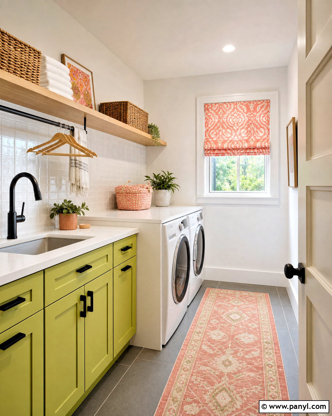
Could a laundry room feel both practical and genuinely cheerful? Start with chartreuse lower cabinets and warm white upper walls, then introduce coral through patterned Roman shades, storage baskets, and a washable runner. Use white quartz counters and a simple white tile backsplash to keep the compact room bright. Natural maple shelves provide useful open storage and soften the brighter colors. Choose matte black cabinet pulls and a black faucet to add definition without competing with the palette. Coral should appear in smaller amounts than chartreuse so the room stays coordinated rather than chaotic. With matching containers, concealed supplies, and a clear folding surface, this lively combination turns an everyday work zone into an organized, polished space.
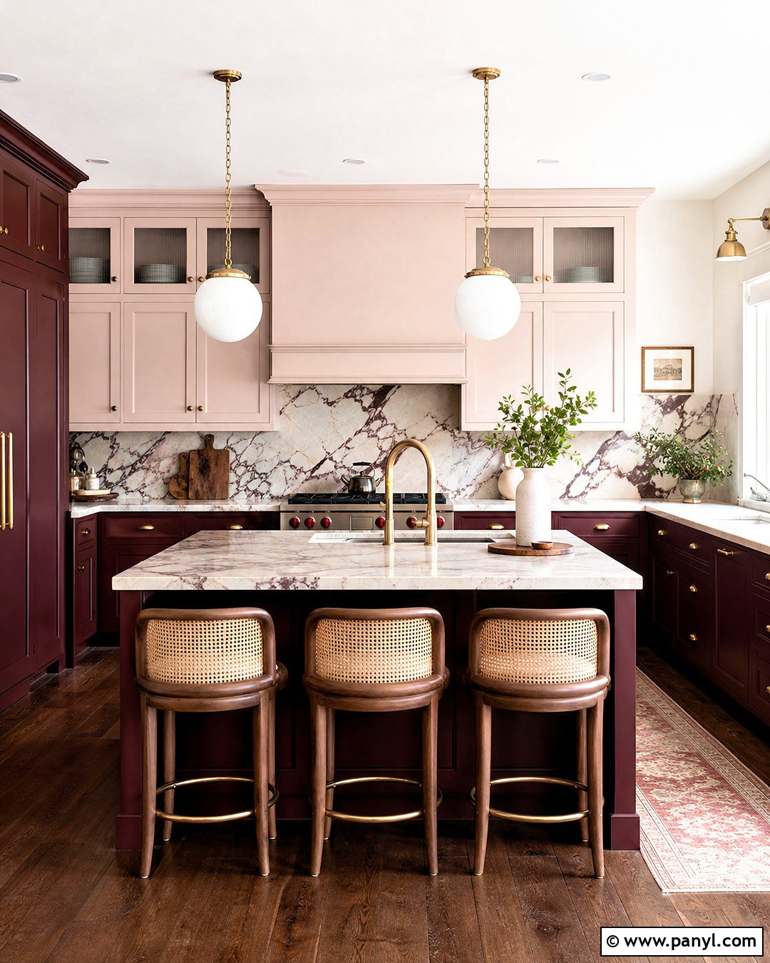
10. Chartreuse And Chocolate Brown Color Palette
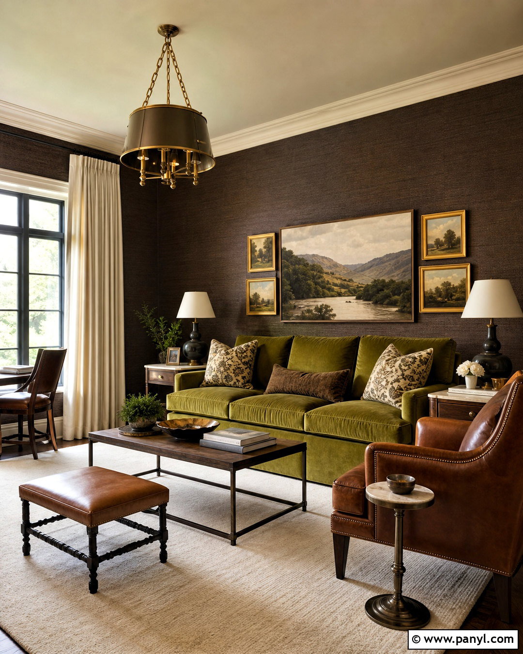
Chocolate brown makes chartreuse feel warmer, richer, and surprisingly refined. Build a cozy reading room around chocolate-painted walls or dark brown grasscloth. Place a chartreuse velvet sofa against this deep background and add a pair of walnut end tables with creamy stone tops. An ivory wool rug, off-white curtains, and a pale ceiling prevent the dark envelope from feeling enclosed. Use bronze lighting and rust-colored leather accents to strengthen the warm undertones. A few framed landscapes can repeat moss, ochre, and brown in quieter shades. The chartreuse sofa should remain the only large bright surface, giving the eye a clear focal point. This finished palette feels collected, comfortable, and ideal for reading or relaxed conversation.
11. Chartreuse And Cream Color Palette
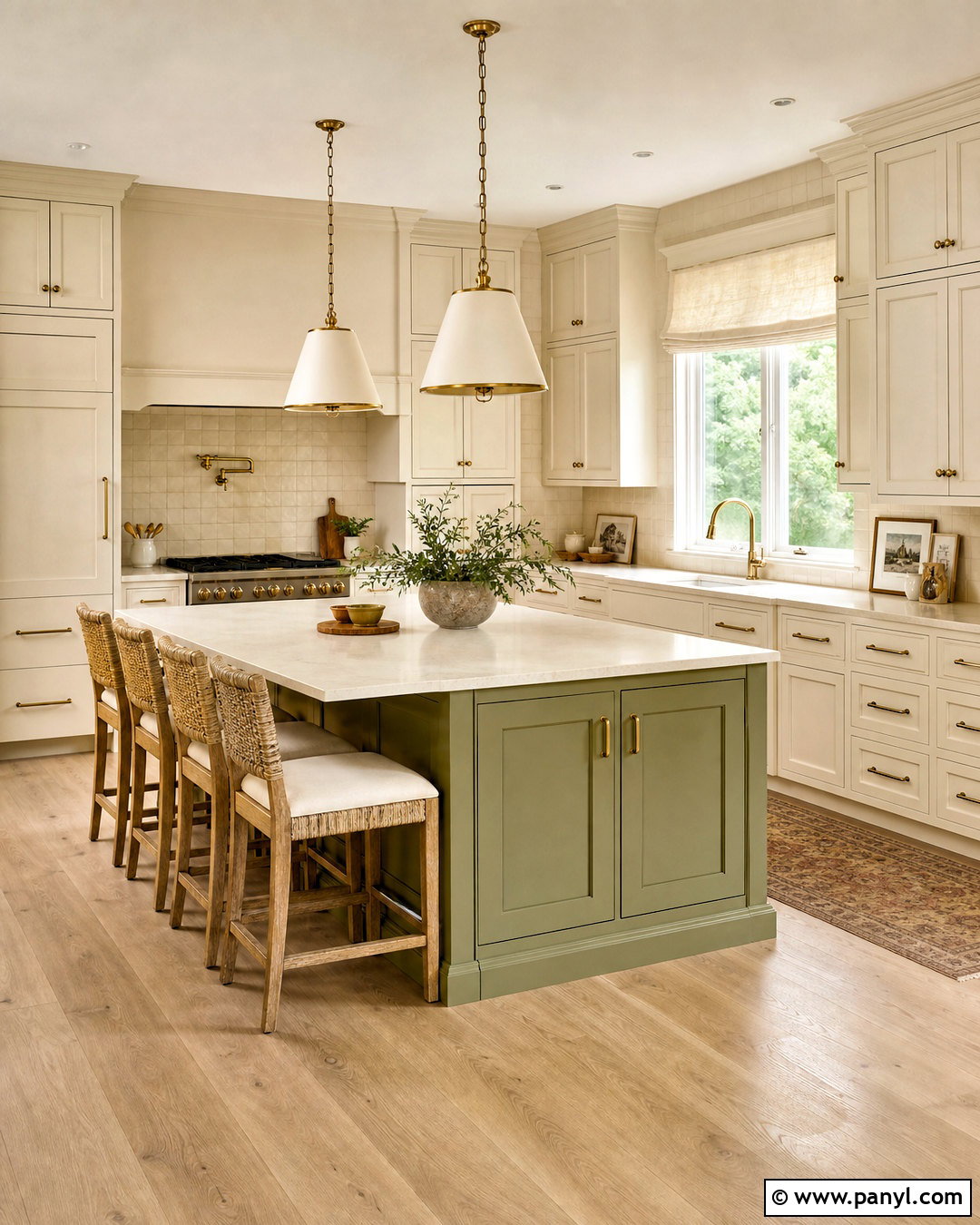
A chartreuse and cream kitchen feels sunny without depending on stark white. Use muted chartreuse on the lower cabinets or a generous island, then finish the perimeter cabinets in warm cream. Choose lightly veined cream quartz counters and handmade ivory backsplash tile for subtle depth. Pale oak flooring and woven counter stools add natural texture, while unlacquered brass hardware introduces a soft golden note. Keep appliances integrated or stainless steel so they do not disrupt the gentle color story. Roman shades in cream linen can include a narrow chartreuse border for a tailored detail. The complete room looks bright and inviting, yet the softened finishes make the unusual cabinet color easier to live with than a sharper, more fluorescent green.
12. Chartreuse And Black Color Palette
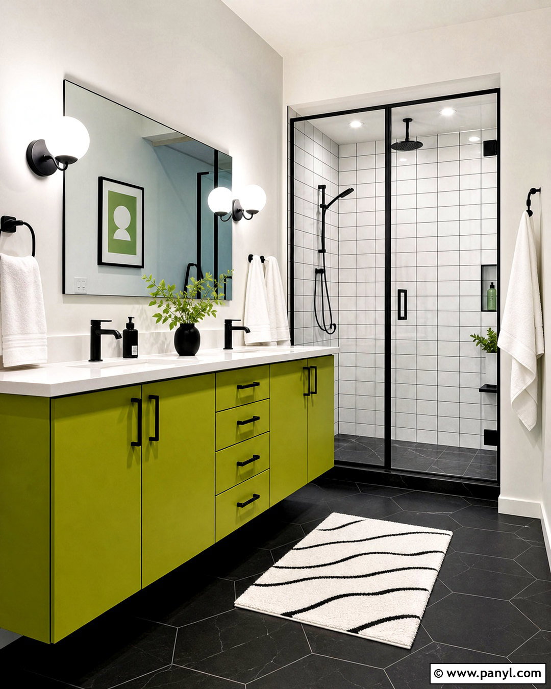
Black gives chartreuse a graphic, architectural edge that suits a modern bathroom. Use matte black floor tile and a black-framed glass shower enclosure as the foundation. Cover the vanity in chartreuse lacquer, topped with simple white quartz and an integrated sink. White wall tile keeps the room bright, while black grout creates a crisp grid that connects with the floor. Choose a frameless mirror, matte black faucet, and minimal globe sconces to maintain the clean geometry. A single chartreuse bath mat can repeat the vanity color without overdoing it. Keep towels and containers solid white so the small room remains uncluttered. This high-contrast palette feels bold and current while retaining a practical, easy-to-understand layout.
13. Chartreuse And Natural Oak Color Palette
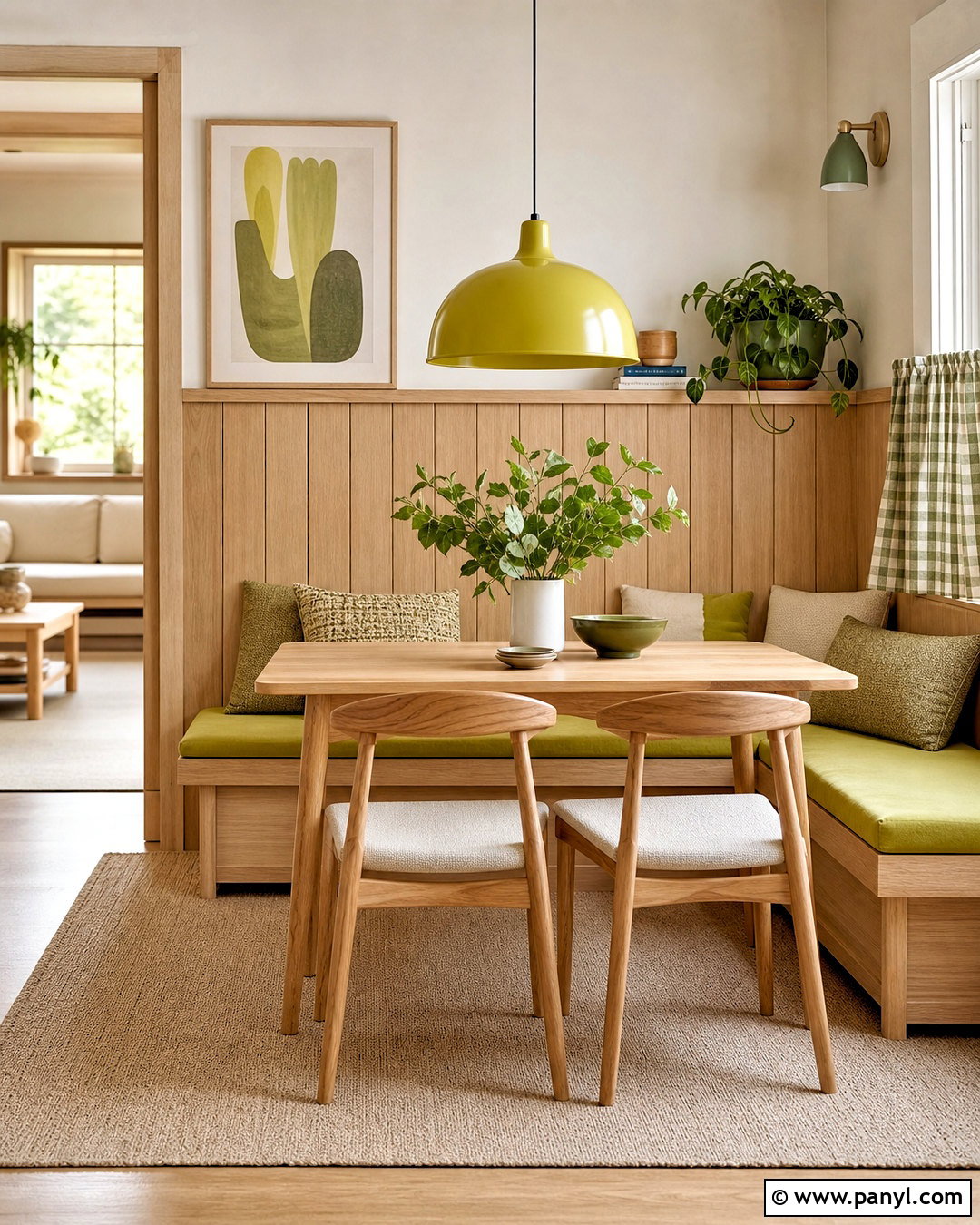
Natural oak softens chartreuse and highlights its connection to fresh foliage. In a modern dining nook, install pale oak wall paneling or a built-in bench with visible wood grain. Add chartreuse seat cushions, coordinating cafe curtains, and one oversized pendant in the same yellow-green family. Keep the table and chairs in matching oak for a calm, continuous foundation. Warm white walls, oatmeal upholstery, and a beige wool rug provide quiet transitions between the vivid green and golden wood. Avoid adding dark stains or cool gray finishes, which can interrupt the palette’s light natural quality. The finished nook feels Scandinavian-inspired yet warmer and more colorful, with enough durability and comfortable seating for meals, homework, and casual gatherings.
14. Chartreuse And Burgundy Color Palette
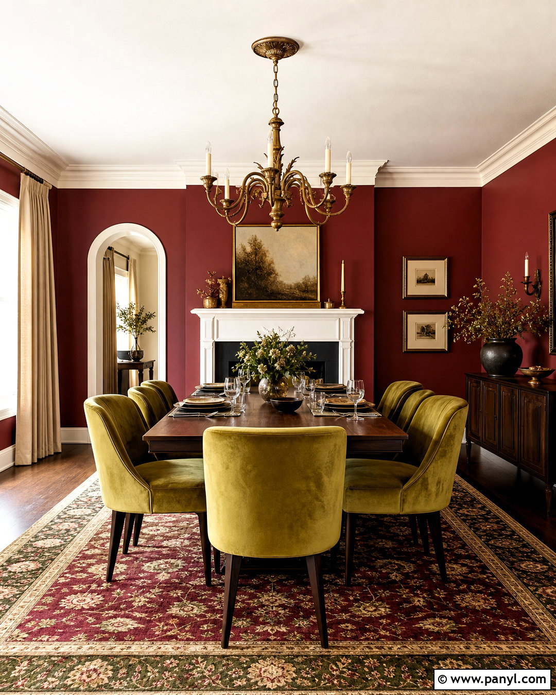
Burgundy brings depth and formality to chartreuse, making the pairing suitable for a dramatic dining room. Paint the walls a muted wine red and upholster the dining chairs in olive-leaning chartreuse velvet. A dark walnut table grounds both colors, while warm white trim keeps the architecture visible. Hang an aged brass chandelier above the table and use cream linen curtains to brighten the edges of the room. An antique-style rug can combine burgundy, moss, beige, and touches of blue in a controlled pattern. Keep decorative accessories limited to clear glass, brass, and neutral ceramics. The final look feels traditional without becoming predictable because chartreuse introduces an unexpected freshness against the deeper red walls and substantial dark furniture.
15. Chartreuse And Plum Color Palette
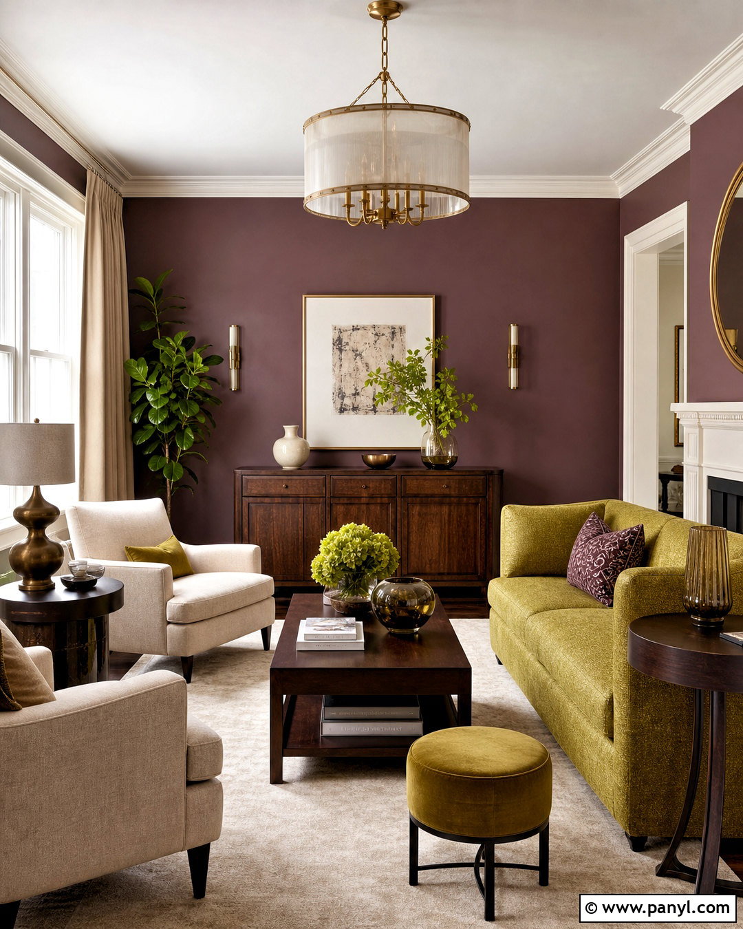
Chartreuse and plum create a luxurious living room with strong complementary contrast. Use dusty plum on the walls and select a chartreuse sofa with a soft, woven texture rather than a shiny finish. Add cream lounge chairs, dark wood tables, and an ivory rug to give the saturated colors enough open space. Curtains in a pale mushroom shade can soften the wall color near the windows. Repeat plum through one patterned pillow and a ceramic lamp, but let chartreuse remain the central statement. Antique brass and smoked glass accents reinforce the sophisticated mood. This room works best with layered, evenly distributed lighting so both colors remain clear. The completed palette is expressive, elegant, and well suited to an eclectic home.
16. Chartreuse And Sky Blue Color Palette
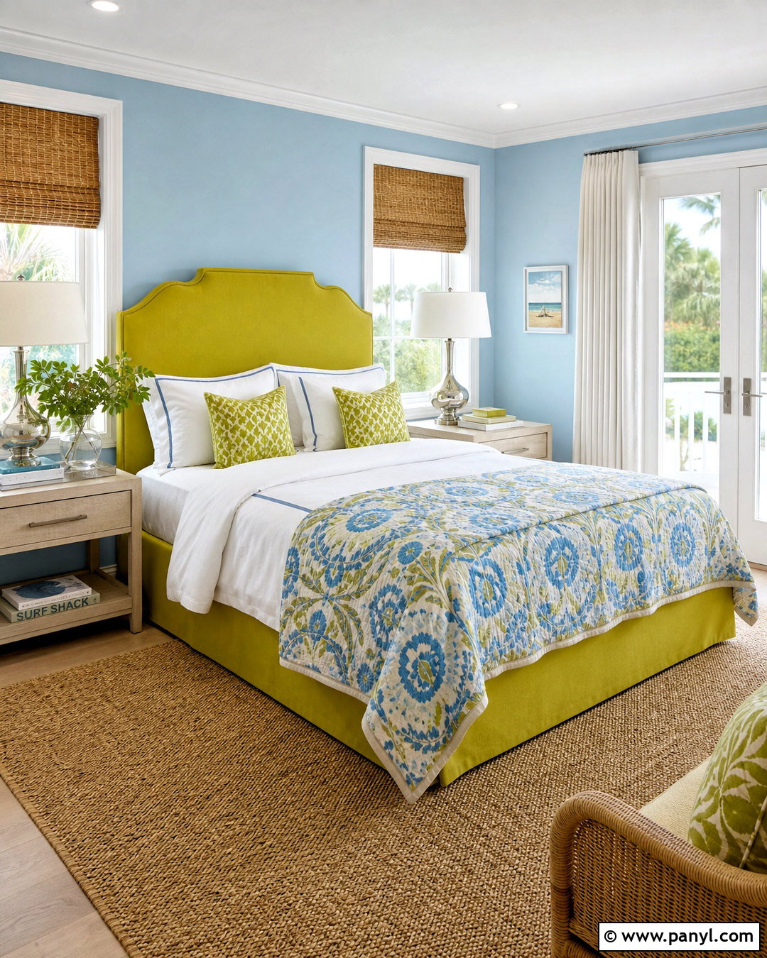
Sky blue makes chartreuse feel light, crisp, and perfect for a casual bedroom or guest room. Paint the walls a soft blue and place a chartreuse upholstered bed against the strongest uninterrupted wall. Use white bedding with blue piping, then layer a patterned quilt that contains small amounts of both colors. White oak nightstands, a natural fiber rug, and woven blinds give the palette an easy coastal quality without relying on themed decor. Add polished nickel lamps and a few clear glass accessories for brightness. Keep the ceiling and trim clean white to sharpen the room’s edges. The finished space feels optimistic and restful, with chartreuse providing enough personality to keep the familiar blue-and-white foundation from becoming predictable.
17. Chartreuse And Orange Color Palette
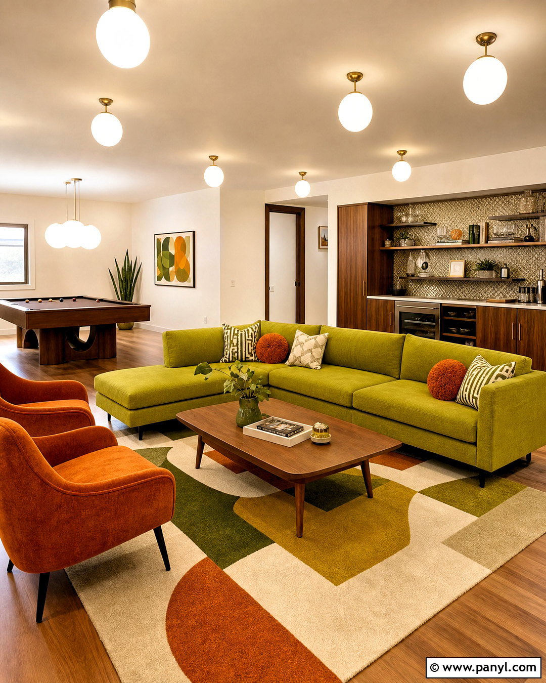
Chartreuse and orange deliver a lively retro palette that feels especially effective in a game room or family den. Use warm white walls and medium-tone wood flooring as the neutral base. Choose a chartreuse sectional, then add burnt orange lounge chairs and a geometric rug containing cream, olive, and both feature colors. Walnut storage cabinets and globe lighting strengthen the midcentury influence. Keep window treatments solid cream so the furniture remains visually dominant. Instead of scattering many small accessories around the room, display a few oversized ceramic pieces and bold abstract prints. The completed design feels spirited but intentional because orange and chartreuse occupy separate large surfaces, while wood and cream provide enough visual rest between them.
18. Chartreuse And Olive Green Color Palette
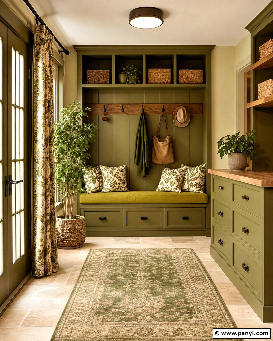
Layering chartreuse with olive creates a tonal green scheme that feels organic rather than overly bright. Begin with olive walls or cabinetry, then introduce chartreuse through an upholstered bench, patterned curtains, and botanical cushions. Warm beige flooring and natural oak furniture prevent the two greens from blending into one flat block. Use cream on the ceiling and larger textiles to brighten the composition. Antique bronze hardware and woven baskets add earthy texture, while leafy plants connect the palette to nature. Choose olive as the dominant shade and reserve chartreuse for approximately 15 to 20 percent of the room. This complete mudroom or entry design feels practical, grounded, and welcoming, with enough color contrast to define each functional zone clearly.
19. Chartreuse And Red Color Palette
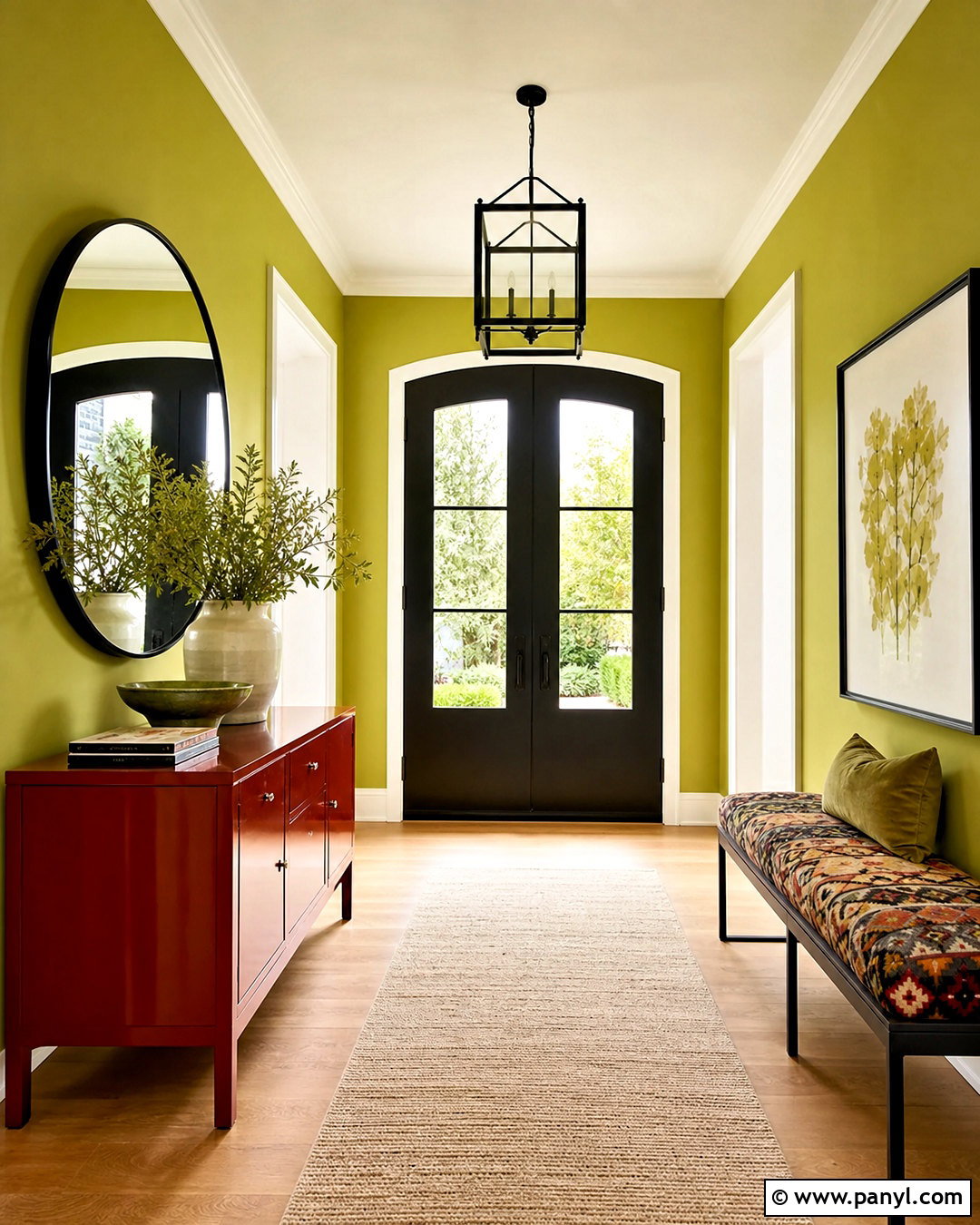
Red and chartreuse make a powerful statement, so careful proportion is essential. In a modern entryway, cover the walls in a softened chartreuse and place a lacquered brick-red console against them. Keep the flooring pale stone or light oak, and use a large cream runner to create breathing space. A round black-framed mirror and black metal light fixture add sharp definition. Repeat red only once through a small patterned bench cushion or ceramic bowl. Closed console drawers help the compact area stay orderly, allowing the color relationship to remain the focal point. The finished entry feels expressive and welcoming without becoming visually exhausting. Muted versions of both colors are generally easier to coordinate than equally intense primary shades.
20. Chartreuse And Brass Color Palette
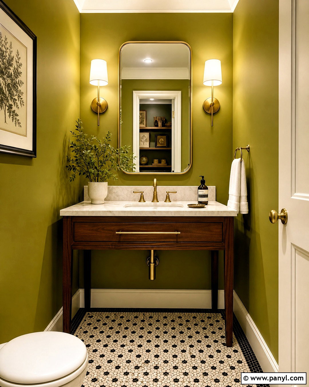
Brass brings out the golden undertones in chartreuse and gives the color an elegant glow. Create a polished powder room with chartreuse walls, a slim walnut vanity, and a cream marble countertop. Use brass for the faucet, mirror frame, sconces, and cabinet pulls, keeping every metal finish consistent. A small-scale black-and-cream mosaic floor adds structure and prevents the room from becoming too sweet. Paint the ceiling warm white and choose white towels for a clean break from the saturated walls. If extra pattern is desired, use a restrained botanical wallpaper above simple chartreuse paneling. The completed space feels jewel-like and memorable, yet its classic stone, wood, and metal materials keep the brighter color grounded and sophisticated.
Conclusion:
The most successful chartreuse rooms balance energy with restraint. This yellow-green shade can feel crisp beside white, sophisticated against navy, earthy with terracotta, or luxurious next to plum and brass. Start by deciding whether chartreuse will cover a large surface or serve as a smaller accent. Then choose quiet flooring, consistent metal finishes, and one or two supporting colors. Always test paint and fabric samples together because lighting and material texture affect how green or yellow the shade appears. Whether you prefer calm natural rooms or dramatic high-contrast spaces, these chartreuse color palette ideas offer practical ways to create a complete, coordinated design that feels distinctive, intentional, and comfortable.

Related Ideas and Inspiration:

Leave a Reply