
This guide to **20 2 tone living room walls paint colors** makes it easier to build a polished room around two coordinated shades. Instead of treating paint as a separate feature, each palette below combines wall placement, furniture, flooring, lighting, textiles, and decor into one complete look. Current color directions include powder blue, gray-green, chocolate brown, mustard, and nature-inspired neutrals, while a lighter upper wall can help create a more open feeling. () You can divide the colors horizontally, highlight one architectural zone, or use painted paneling to create a clean transition. Always test large samples beside your existing upholstery and flooring before committing. Explore these practical **20 2 tone living room walls paint colors** to find a combination that fits your light, layout, and decorating style.

1. Sage Green And Warm White Living Room Walls
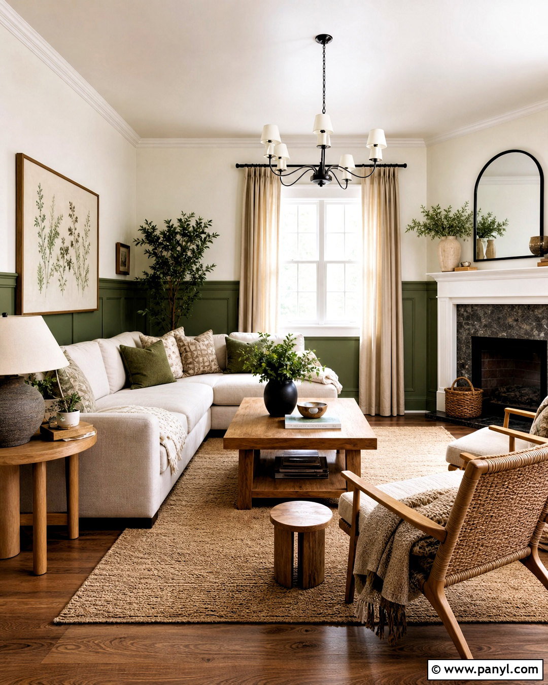
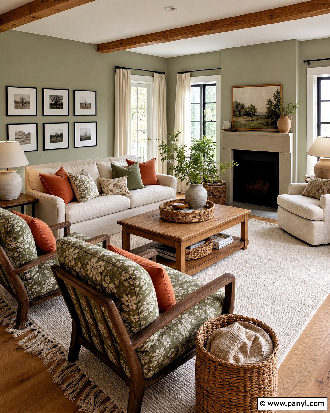
Soft sage green on the lower two-thirds of the walls creates a grounded base, while warm white above keeps the living room bright. Separate the colors with a narrow painted chair rail for a crisp, finished line. Choose a cream sofa, a natural oak coffee table, and woven accent chairs to continue the relaxed palette. A beige wool rug softens medium-toned wood flooring without making the arrangement look washed out. Add olive pillows, linen curtains, ceramic lamps, and simple botanical artwork for gentle color variation. This combination works especially well in living rooms with large windows because daylight reveals the subtle gray undertones in sage. Matte wall paint and satin trim provide enough finish contrast to make the two-tone treatment look intentional.
2. Navy Blue And Crisp White Living Room Walls
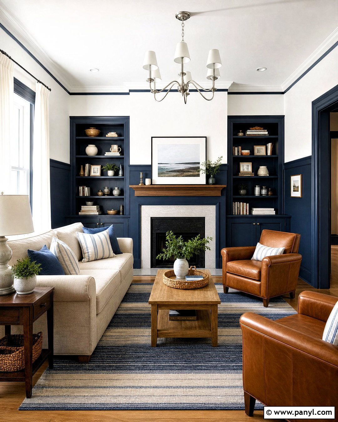
Deep navy lower walls paired with crisp white upper walls give a traditional living room a cleaner, more current appearance. Extend the navy across built-in cabinets or fireplace millwork so the darker shade feels connected to the architecture. Balance it with a light oatmeal sofa, camel leather armchairs, and a medium oak coffee table. A striped blue-and-cream rug can repeat both wall colors without becoming too busy. Use polished nickel lighting, white linen curtains, and framed coastal or abstract artwork to brighten the arrangement. Keeping navy below eye level prevents it from visually closing in the room. This scheme suits spaces with substantial windows, white crown molding, and warm wood floors, creating strong contrast while remaining comfortable enough for everyday family use.
3. Terracotta And Cream Living Room Walls
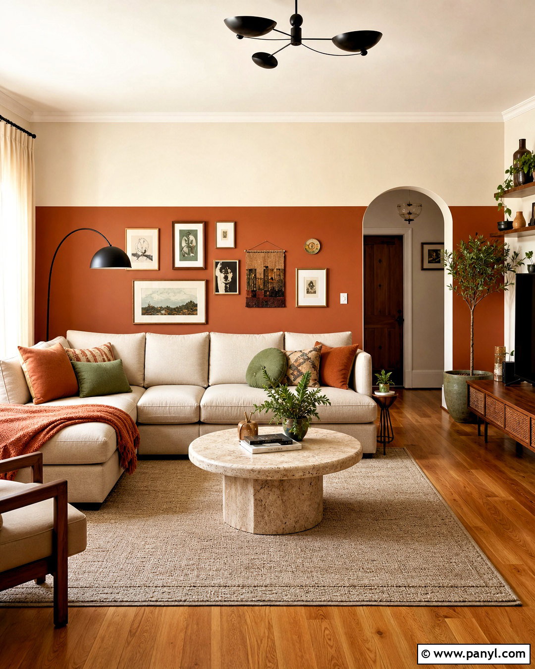
Warm terracotta and creamy off-white can turn an ordinary living room into a welcoming, earthy retreat. Paint the lower half terracotta and use cream from the dividing line to the ceiling. A slim cream picture ledge provides a practical transition and offers space for layered artwork. Furnish the room with a sand-colored sectional, walnut side tables, and a rounded travertine coffee table. Rust, clay, and muted green cushions connect the walls to the seating area. Complete the look with a flat-weave rug, linen curtains, black metal lighting, and large leafy plants. Terracotta feels especially natural beside hardwood or brick flooring. Choose a softened, brown-based shade rather than bright orange, allowing the finished room to feel warm, balanced, and easy to decorate.
4. Charcoal Gray And Soft Gray Living Room Walls
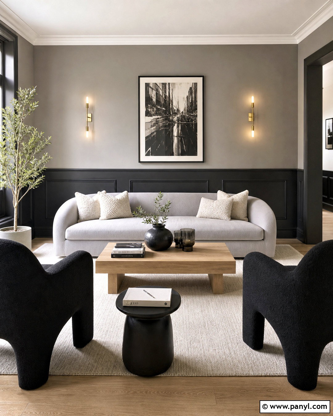
A charcoal lower wall and soft gray upper wall create depth without the sharpness of a black-and-white combination. Use charcoal across simple wall paneling, including the baseboards, then apply pale warm gray above. The tonal transition makes the ceiling feel higher while giving the furniture a strong backdrop. Add a light gray sofa, sculptural black chairs, and a pale oak coffee table for a modern arrangement. Cream boucle pillows and a textured ivory rug keep the room from feeling cold. Brass sconces, smoky glass accessories, and oversized monochrome artwork bring in polished details. This pairing is ideal for an urban or contemporary living room, but selecting warm gray undertones is important. They complement wood, beige fabrics, and warm metals more naturally than blue-based grays.
5. Dusty Blue And Greige Living Room Walls
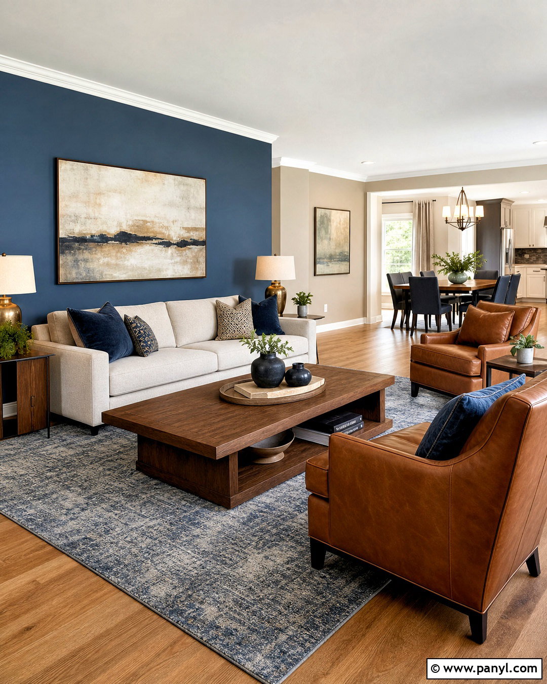
Dusty blue and warm greige deliver subtle color while maintaining the flexibility of a neutral living room. Place dusty blue on the wall behind the sofa and continue greige across the remaining walls, creating a calm focal zone rather than a harsh accent wall. Choose a flax-colored sofa, walnut coffee table, and two caramel leather chairs arranged around a soft blue-gray rug. Full-length greige curtains make the windows appear taller and blend smoothly with the main wall color. Add navy cushions, aged brass lamps, and artwork containing muted blue, tan, and cream. Because both paints have softened undertones, the transition feels cohesive from every angle. This complete scheme works particularly well in an open-plan home where the living area needs definition without using highly saturated color.
6. Olive Green And Natural Beige Living Room Walls
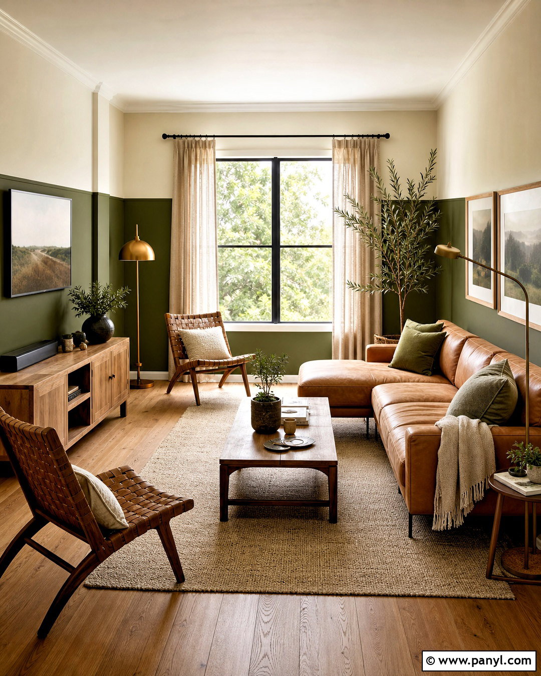
Rich olive green along the lower walls gives a living room an organic foundation, while natural beige above brings warmth and light. Create the split slightly below the midpoint so the darker shade does not dominate. A low-profile tan sofa, oak media console, and woven lounge chairs reinforce the natural character. Ground the seating with a patterned rug that mixes olive, cream, charcoal, and faded brown. Add oatmeal curtains, bronze floor lamps, and landscape prints in simple wood frames. Olive also coordinates beautifully with existing stone fireplaces and medium-to-dark flooring. For a cohesive finish, paint the baseboards olive and keep the ceiling soft white. The result is earthy and collected, with enough contrast to define the architecture while remaining restful during every season.
7. Blush Pink And Deep Burgundy Living Room Walls
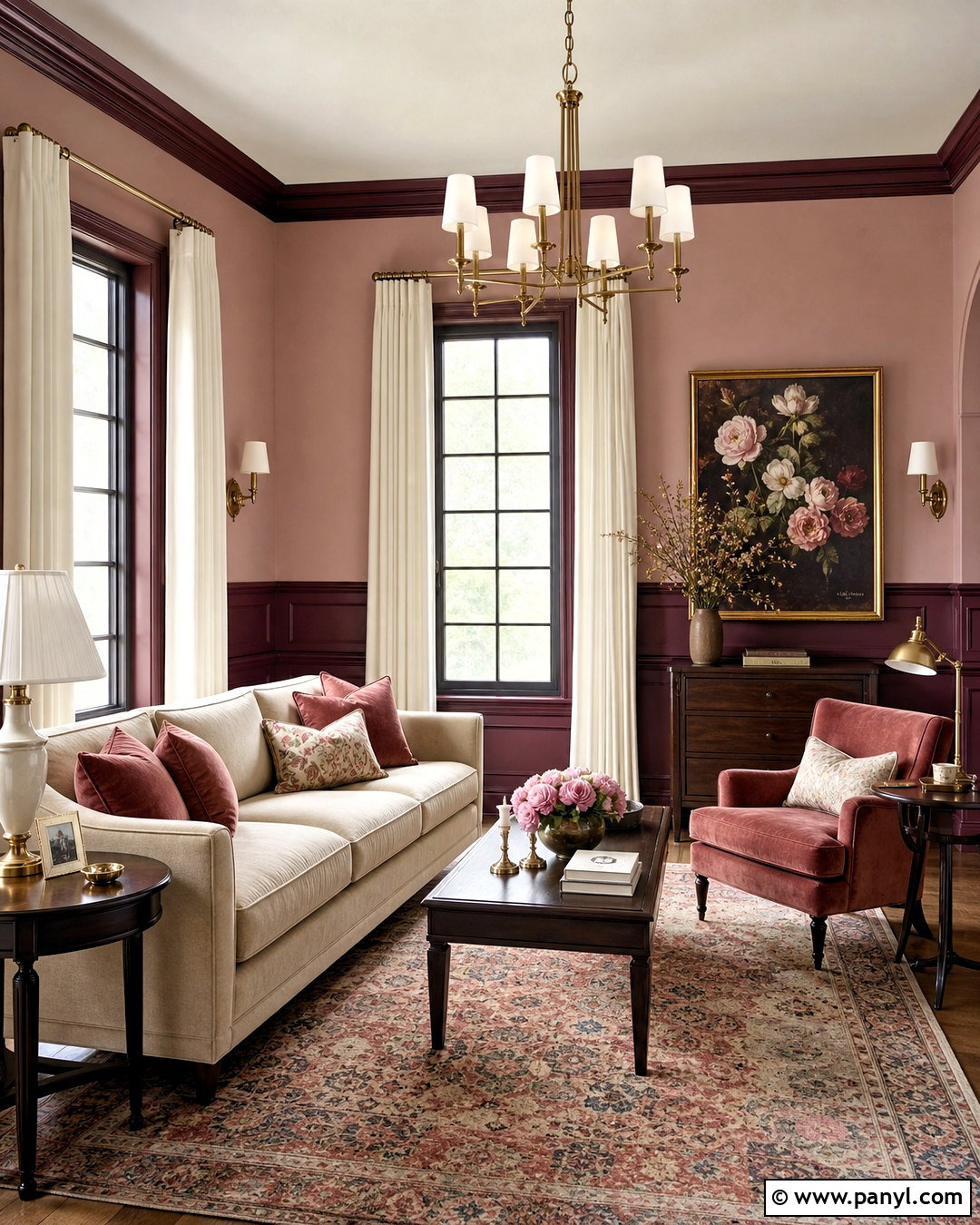
Muted blush upper walls and deep burgundy lower paneling offer a sophisticated alternative to a bright pink living room. The blush keeps the room soft and airy, while burgundy introduces visual weight around the furniture. Pair the walls with a warm beige sofa, dark walnut tables, and a rust-colored velvet chair. A faded Persian-style rug can combine rose, burgundy, cream, and brown, connecting every part of the palette. Use off-white curtains, antique brass lighting, and oversized floral or abstract art with restrained colors. Burgundy should carry a brown or plum undertone rather than a sharp red cast. This prevents the room from feeling overly formal. The completed look feels warm, layered, and suitable for traditional, transitional, or gently eclectic homes.

8. Chocolate Brown And Caramel Living Room Walls
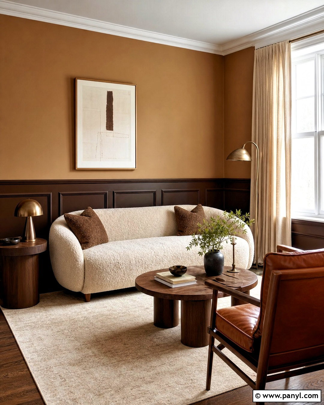
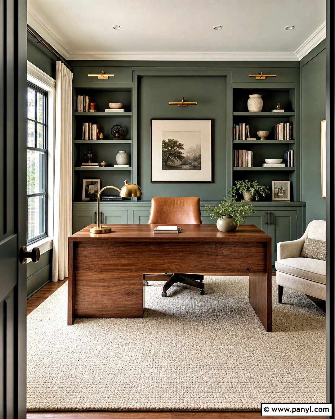
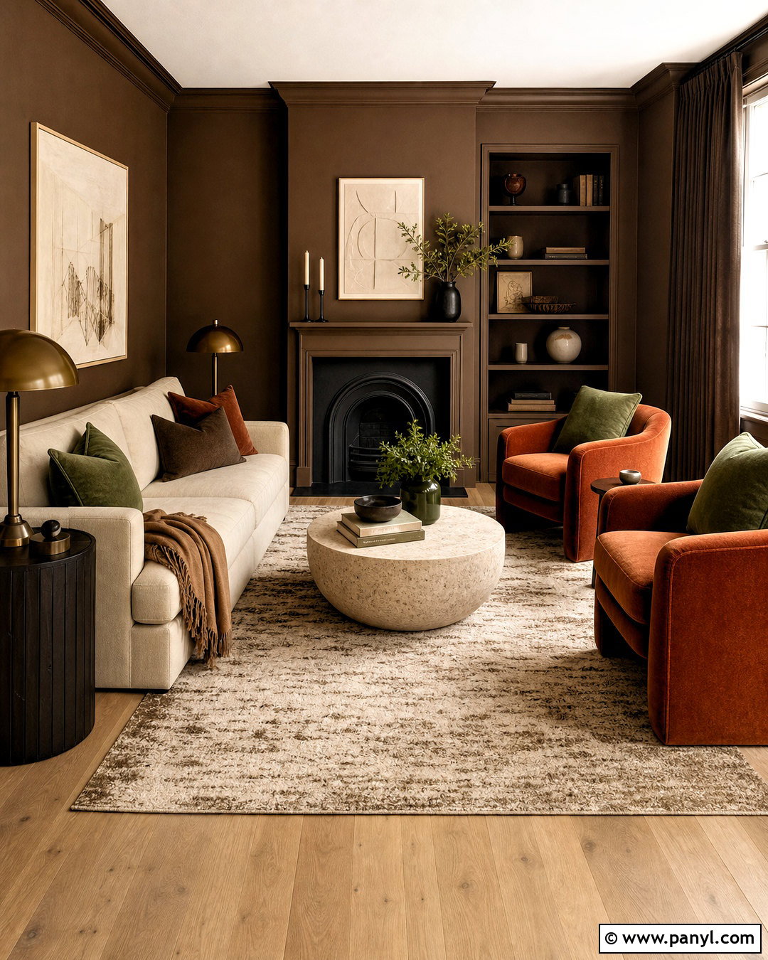
Imagine a cozy living room wrapped in chocolate brown paneling with soft caramel paint above. This warm tonal pairing provides contrast without introducing an unrelated color. Choose a cream boucle sofa to brighten the center, then add walnut side tables and a cognac leather lounge chair. A light beige rug creates breathing room between the dark lower walls and wood flooring. Complete the setting with bronze lamps, oatmeal curtains, textured brown cushions, and simple artwork in tan and black. Chocolate works best when the room has good daylight or generous artificial lighting. Painting the trim and paneling in a satin finish also reflects more light than flat paint. The overall design feels intimate and polished, with rich neutrals that remain comfortable rather than heavy.
9. Teal Blue And Warm Ivory Living Room Walls
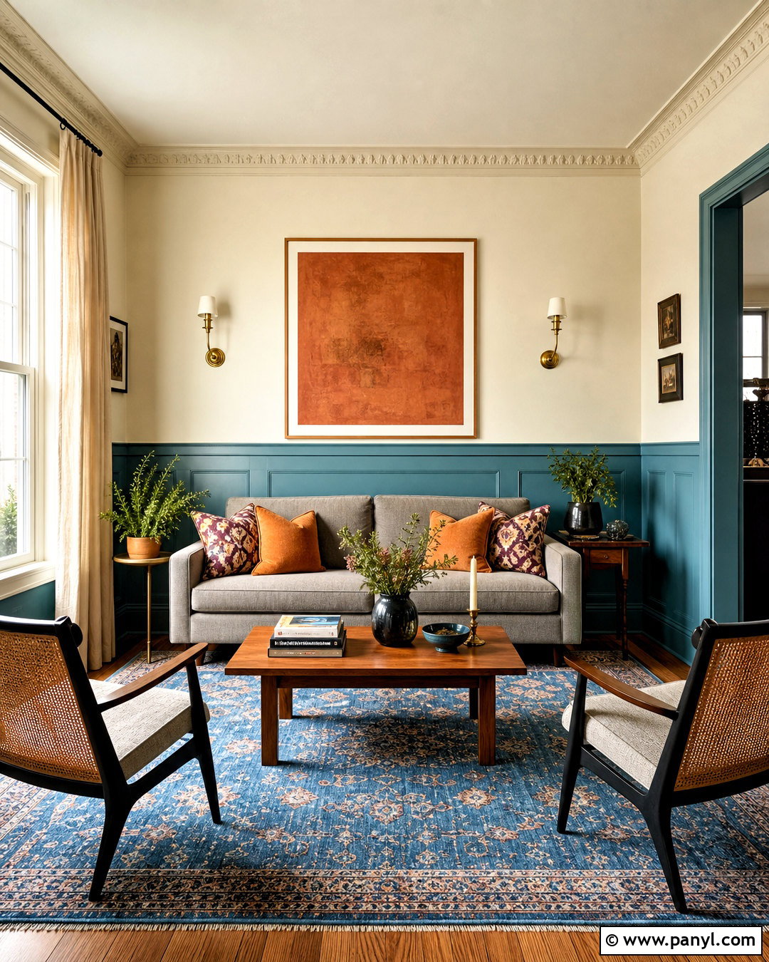
Teal blue lower walls and warm ivory upper walls create a lively but balanced living room. Use the teal on vertical paneling to add architectural texture, then carry ivory across the plain plaster above and onto the ceiling. A warm gray sofa, cane-backed chairs, and a medium wood coffee table keep the scheme approachable. Introduce ochre and cream cushions for controlled contrast, and place a blue-patterned rug beneath the full seating group. Natural linen curtains soften the windows without competing with the walls. Brushed brass sconces and framed art containing blue, rust, and ivory finish the design. Choosing a muted teal with gray undertones makes this pairing easier to live with. It remains colorful in daylight but appears deeper and more restful during evening hours.
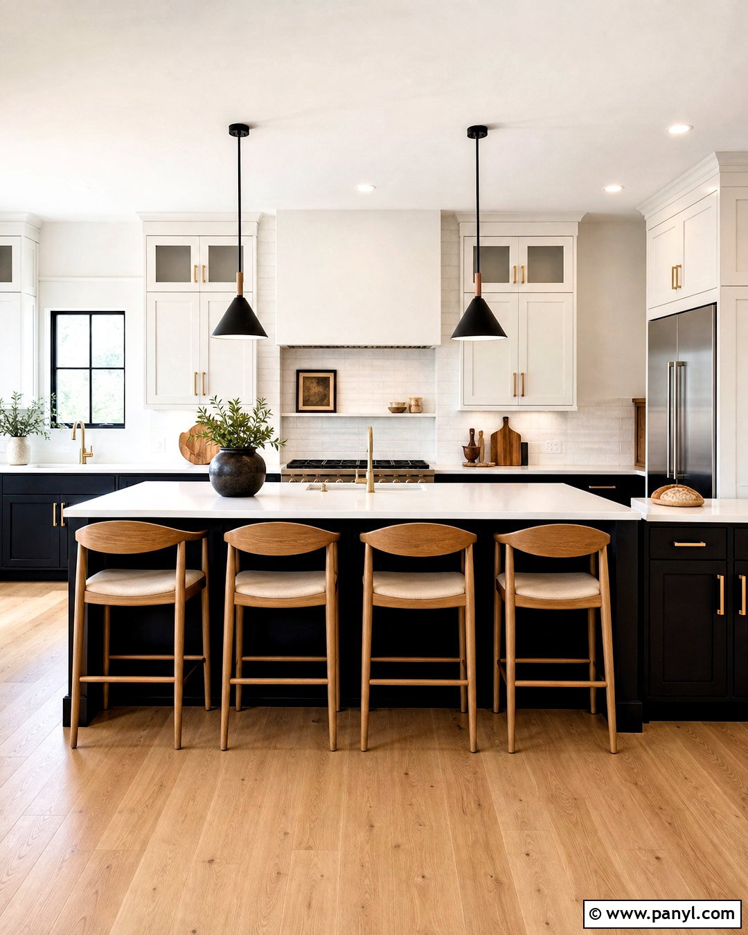
10. Mustard Yellow And Warm White Living Room Walls
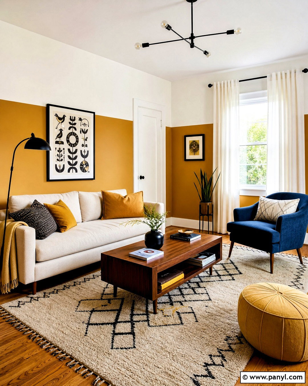
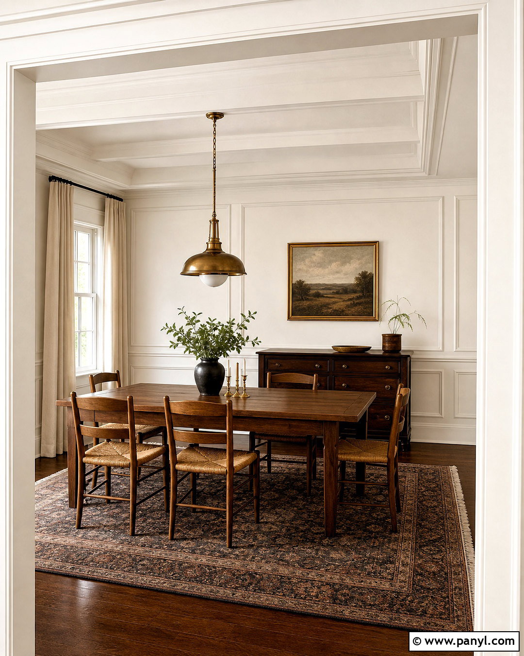
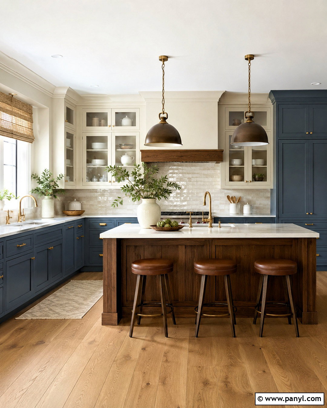
Mustard yellow brings cheerful warmth when it is balanced by a generous amount of warm white. Paint the lower third mustard and keep the larger upper wall white, using a narrow wood picture ledge as the dividing detail. Build the room around a light beige sofa, a walnut coffee table, and one deep blue armchair for contrast. A cream rug with a subtle ochre pattern ties the furniture to the painted base. Add white linen curtains, black metal lighting, and graphic artwork featuring mustard, navy, and rust. Since mustard can change dramatically under artificial light, choose a softened shade with brown undertones. This complete palette feels bright without becoming juvenile, making it suitable for midcentury, modern, or casual family living rooms.
11. Matte Black And Soft Beige Living Room Walls
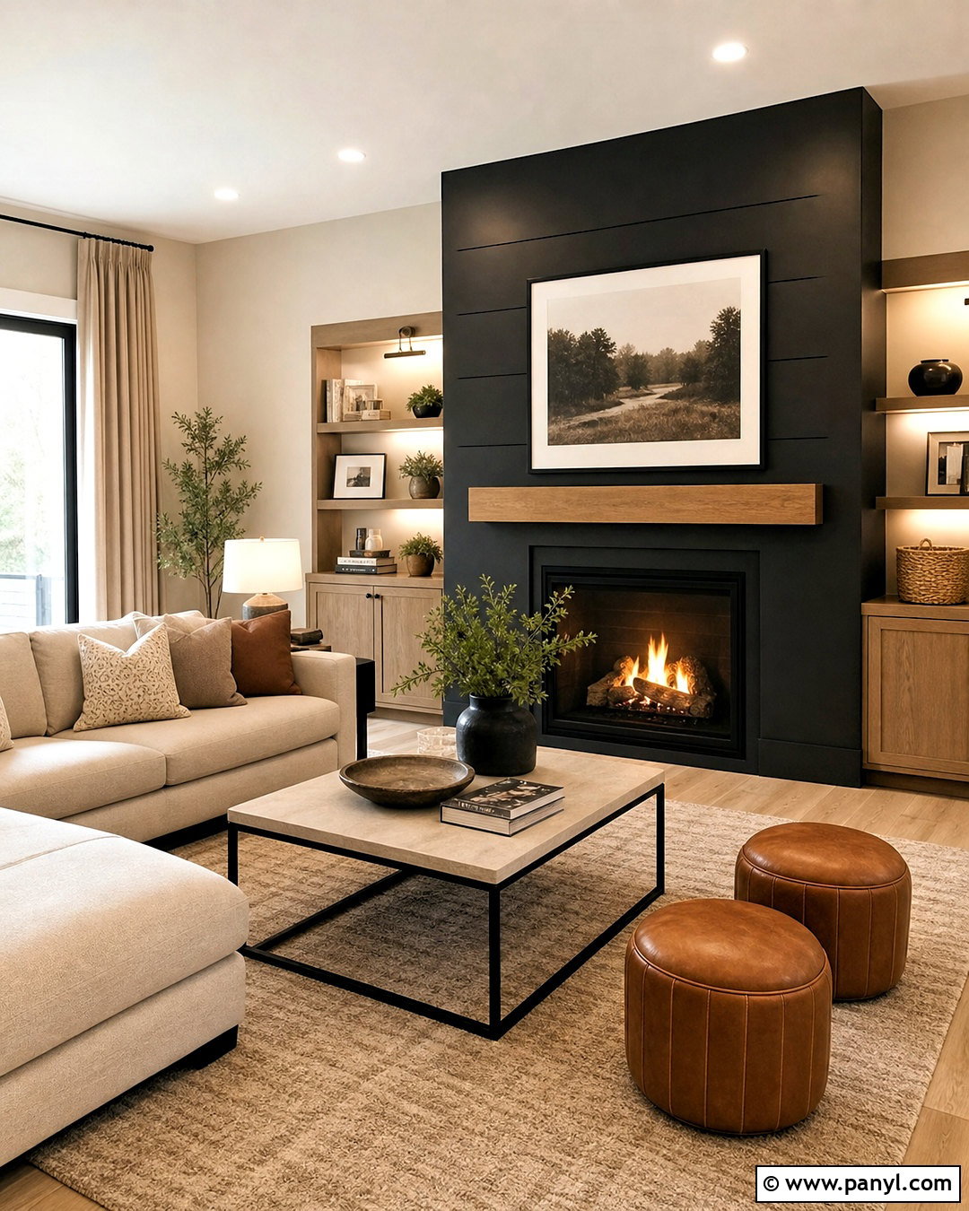
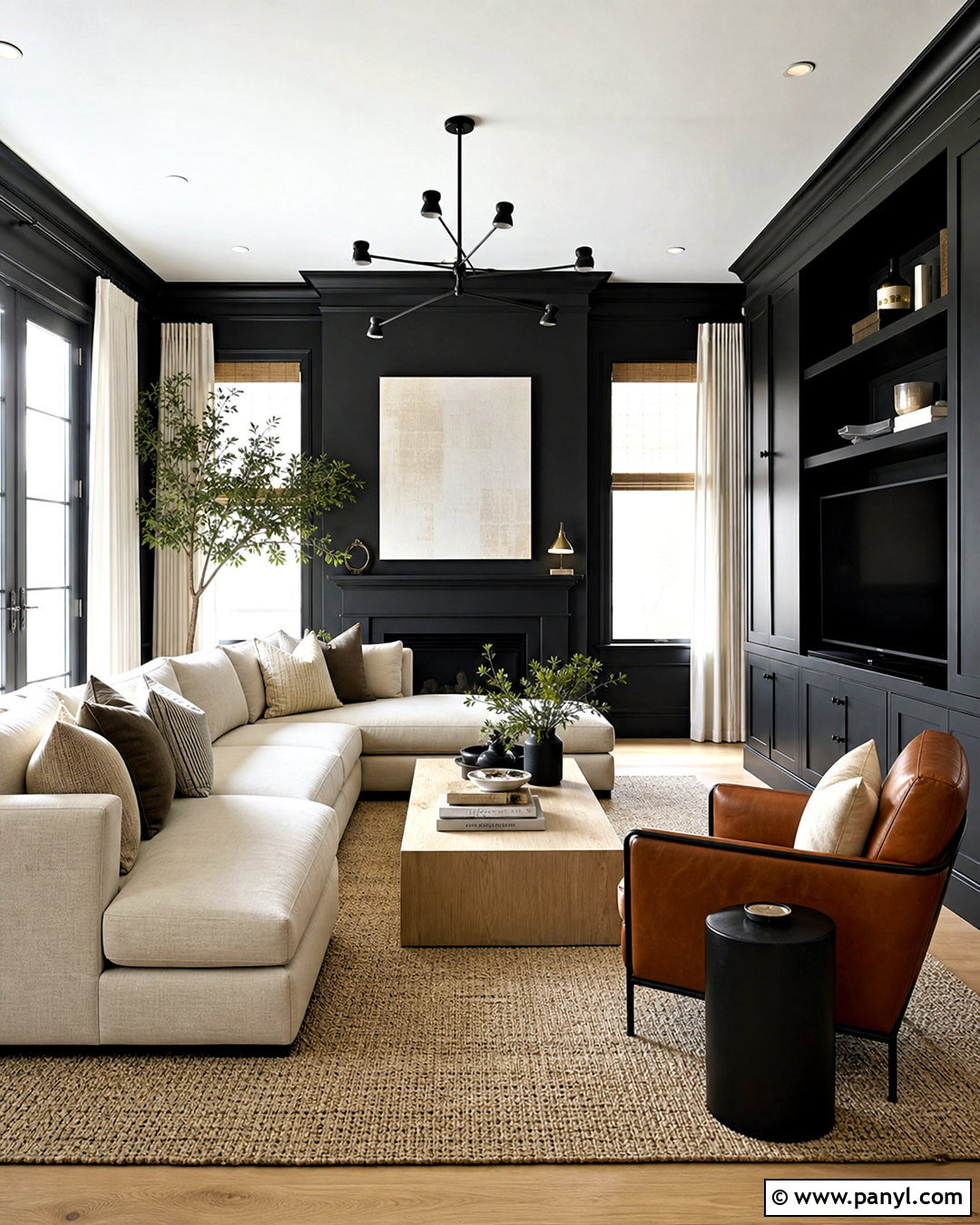
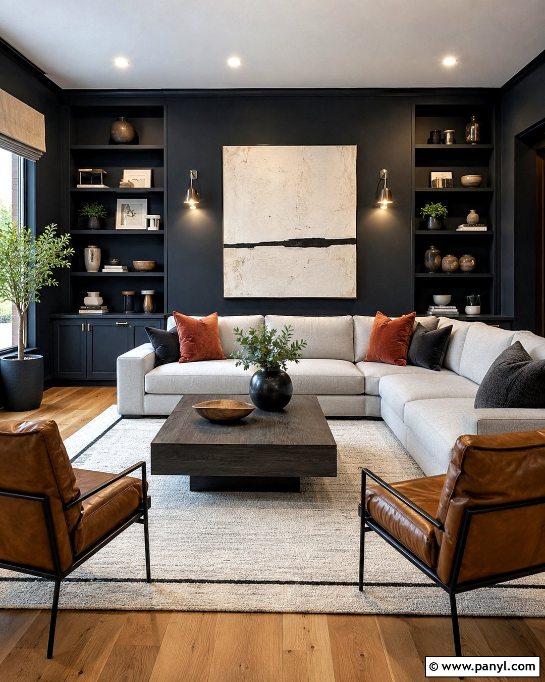
Matte black and soft beige can feel surprisingly inviting when the darker color is used with restraint. Apply black to the fireplace wall and its surrounding built-ins, then paint the adjoining living room walls a warm beige. A large ivory sectional becomes the visual bridge between the two shades. Add a black-framed coffee table with a light stone top, caramel leather stools, and a textured taupe rug. Beige curtains, oak accessories, and woven baskets prevent the black surface from looking stark. Use warm white lamps and restrained artwork so the fireplace remains the main focal point. This two-tone layout works best when black defines a genuine architectural feature instead of appearing on a random wall. The completed room feels graphic, comfortable, and carefully connected.
12. Lavender And Soft Gray Living Room Walls
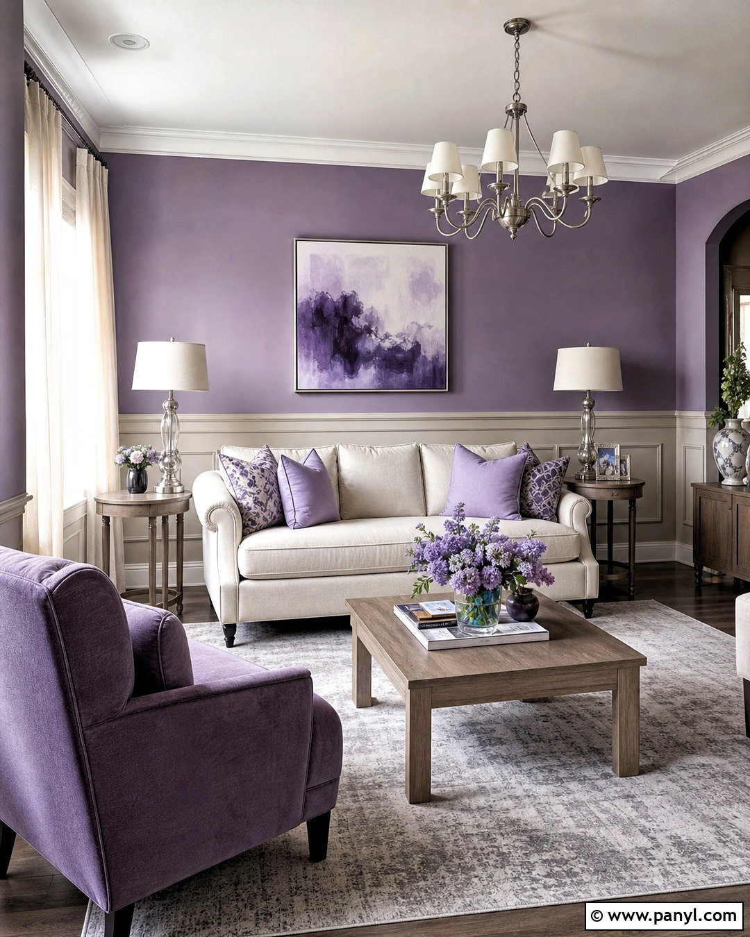
Smoky lavender paired with soft warm gray creates a quiet living room with more personality than an all-neutral scheme. Paint lavender on the upper walls and use gray across lower molding or paneling. This placement allows the gentle purple tone to catch natural light while the gray anchors the furniture. Select a cream sofa, pale oak tables, and a muted plum accent chair. A gray-and-ivory rug provides subtle pattern beneath the arrangement. Add lilac cushions, brushed nickel lamps, gauzy off-white curtains, and abstract artwork with lavender, charcoal, and beige. Avoid sugary purple shades and cool silver grays, which can make the combination feel disconnected. Dusty versions of both colors produce a relaxed, grown-up room that works well with contemporary or updated traditional furnishings.
13. Forest Green And Pale Taupe Living Room Walls
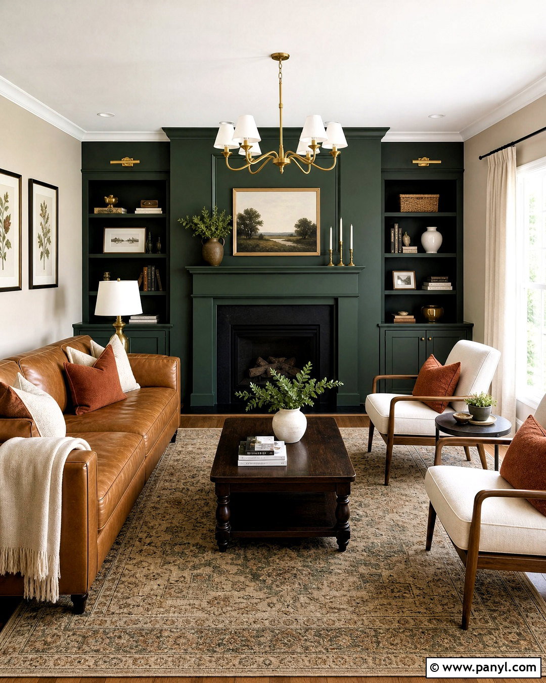
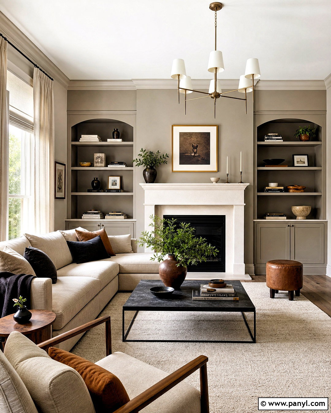
Deep forest green can frame a living room beautifully when pale taupe provides an airy counterbalance. Paint the fireplace wall, built-in shelving, and connecting trim green, then cover the other walls in light taupe. Arrange a camel leather sofa opposite the fireplace with two cream upholstered chairs angled toward it. A dark wood coffee table and vintage-inspired beige rug reinforce the warm undertones. Add rust cushions, antique brass lighting, linen curtains, and framed botanical prints. The green architecture becomes a strong destination without overwhelming the full space. Pale taupe is more forgiving than bright white because it connects naturally to wood and leather. This complete design suits rooms with traditional details, although clean-lined furniture can give the same palette a more contemporary character.
14. Clay Pink And Linen Beige Living Room Walls
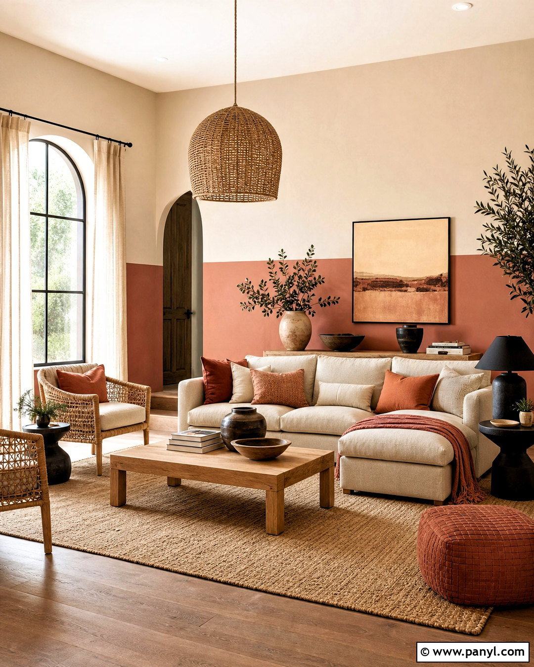
Clay pink and linen beige produce a soft, sun-warmed living room that feels colorful without being overly sweet. Use clay pink below a horizontal molding line and linen beige above, carrying beige onto the ceiling for a seamless finish. Furnish the room with an oatmeal sofa, light oak coffee table, and woven rattan chairs. Add terracotta and dusty rose cushions, a cream jute-blend rug, and lightweight natural curtains. Matte black lamps introduce enough contrast to sharpen the muted palette. Choose simple ceramic decor and abstract art in brown, cream, and faded coral. Clay pink has earthy orange and brown undertones, helping it coordinate with natural materials. The finished room feels relaxed and modern, especially when furniture shapes are simple and accessories are kept intentionally limited.
15. Cobalt Blue And Clean White Living Room Walls
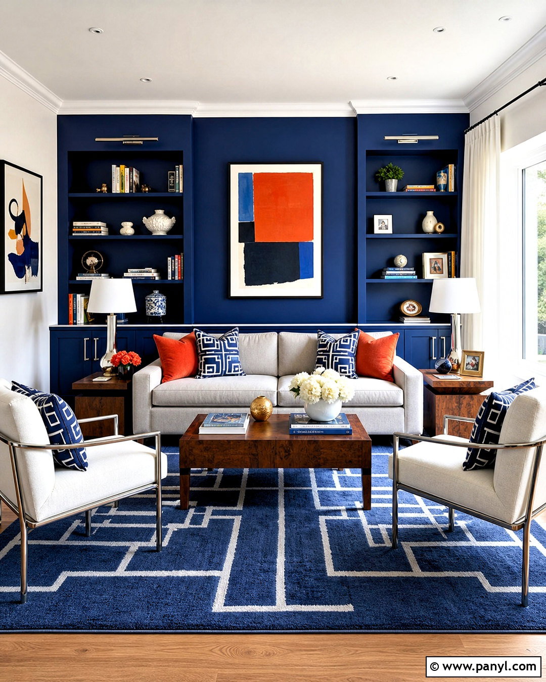
For a brighter statement, combine cobalt blue with clean white in a structured living room. Paint the wall behind the main sofa cobalt, including shallow display niches, and use white on the remaining walls and trim. A light gray sofa softens the strong blue backdrop, while walnut side tables add essential warmth. Place two white upholstered chairs across from the sofa and center the arrangement on a blue-and-cream geometric rug. Use red-orange cushions sparingly as a complementary accent. White curtains, chrome or polished nickel lamps, and large modern artwork keep the room fresh. Cobalt is intense, so repeating it through only a few textiles creates better balance. This scheme works especially well in a bright room with uncluttered furniture and clearly defined conversation areas.
16. Greige And Cream Living Room Walls
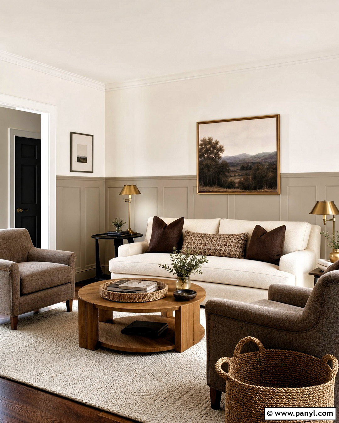
Greige and cream prove that two-tone living room walls do not need bold contrast to look interesting. Apply medium greige to the lower paneling and creamy white above, creating a soft shift in depth. Continue greige across the baseboards for a seamless architectural effect. Choose an ivory sofa, taupe armchairs, and an oak coffee table with a rounded shape. A textured cream rug keeps the tonal arrangement light, while chocolate brown pillows add definition. Finish with linen curtains, aged brass lamps, woven baskets, and landscape artwork in muted earth tones. This palette is practical for rooms connected to kitchens or hallways because both shades transition easily into nearby neutrals. Different textures and wood finishes prevent the completed space from appearing flat or overly matched.
17. Powder Blue And Warm Tan Living Room Walls
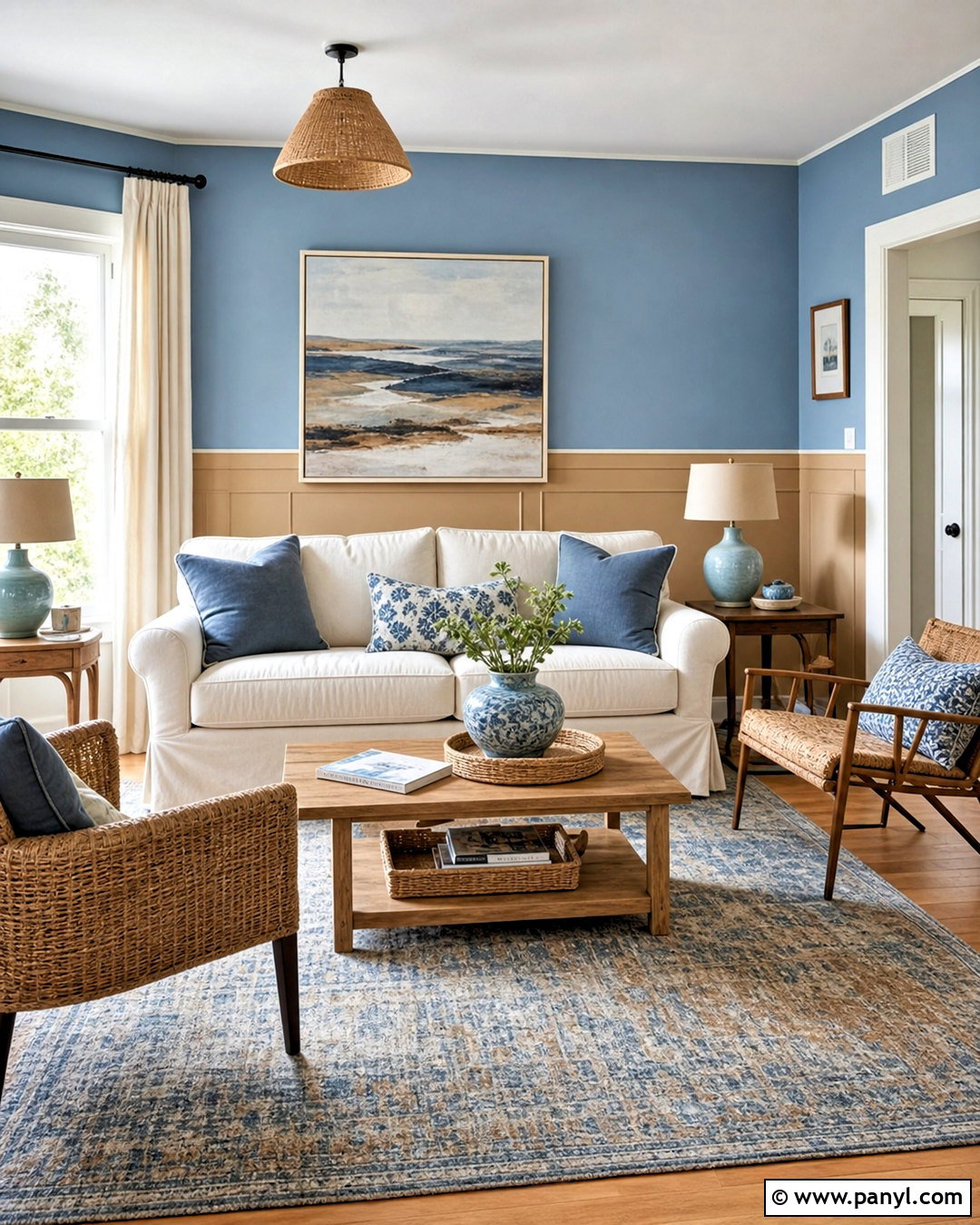
Powder blue upper walls and warm tan lower walls bring a fresh, unexpected balance to a casual living room. The airy blue visually lifts the room, while tan creates a stable background for everyday furniture. Use simple tan paneling below the dividing rail and keep the trim consistent with that color. Add a cream slipcovered sofa, honey oak coffee table, and two woven chairs with blue cushions. A faded blue-and-brown rug connects the cool and warm sides of the palette. Hang lightweight ivory curtains and choose ceramic lamps with off-white shades. Coastal artwork can work here, but abstract landscapes create a less themed result. This approachable design feels sunny and relaxed, especially in rooms with natural wood floors and abundant morning or afternoon light.
18. Rust Orange And Soft Sand Living Room Walls
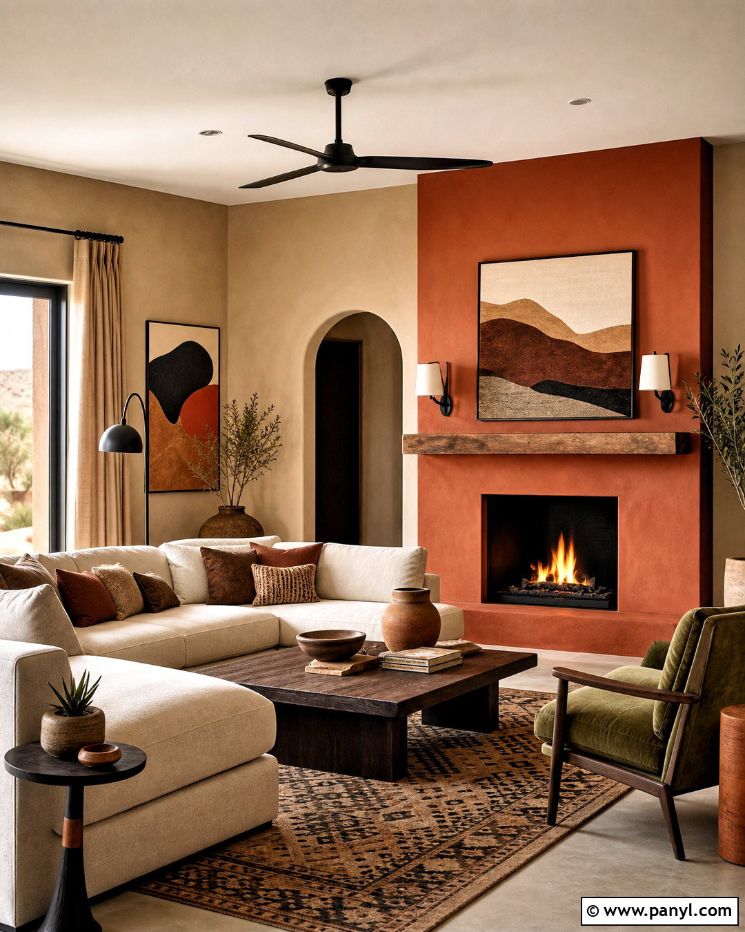
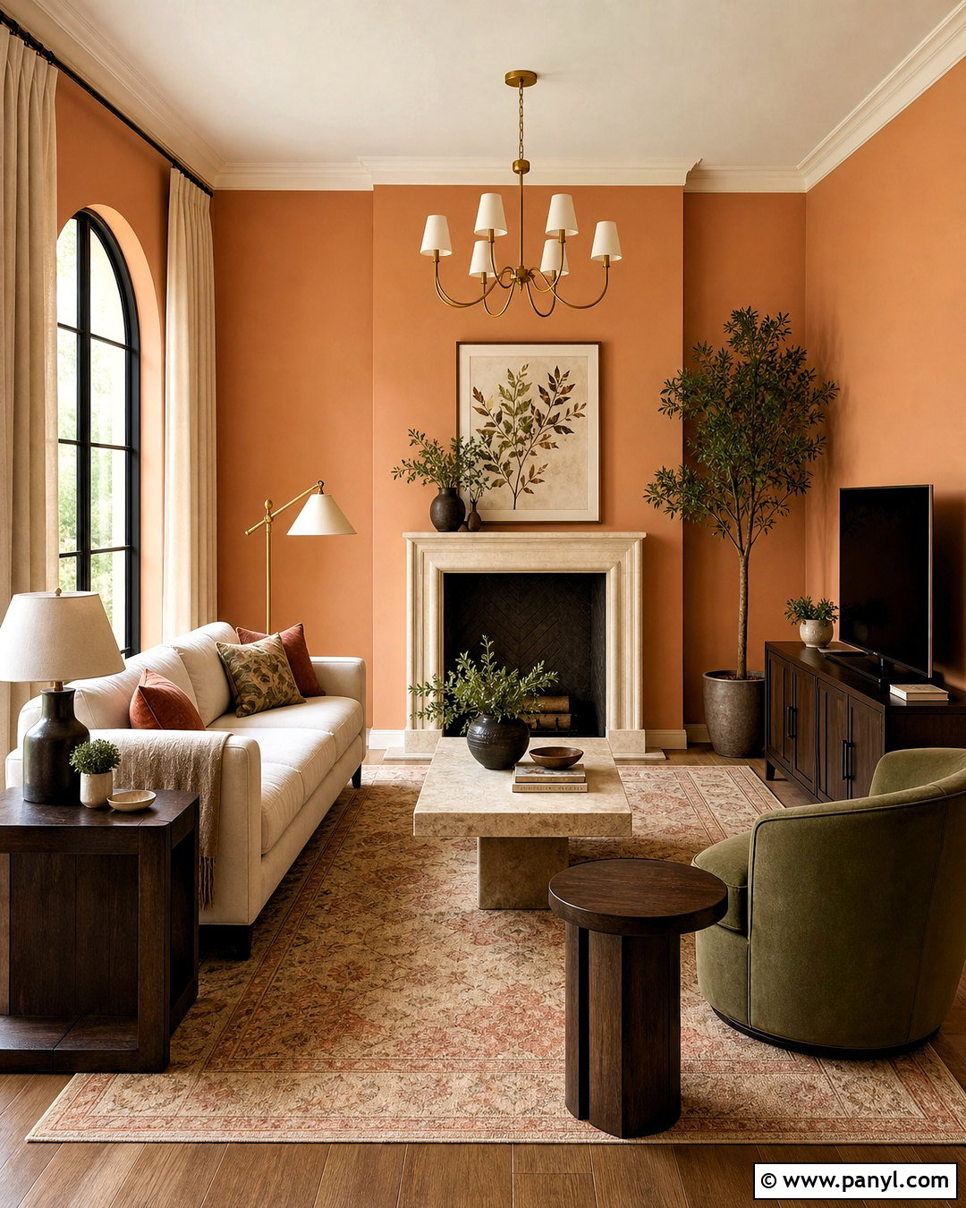
Rust orange and soft sand create a warm living room inspired by natural clay, stone, and desert landscapes. Cover the fireplace wall in rust and paint the remaining walls a light sandy beige. Continue the rust over the fireplace surround if it is simple plaster, helping the feature read as one sculptural form. Choose a cream sectional, dark wood coffee table, and olive green accent chair. A patterned rug containing rust, beige, and faded charcoal grounds the layout. Add tan curtains, black metal lamps, and artwork featuring organic shapes. Rust should be deep and muted rather than bright orange. With that adjustment, the finished palette feels earthy and sophisticated. It is particularly effective alongside walnut furniture, leather accents, and warm-toned hardwood flooring.
19. Plum Purple And Pale Pink Living Room Walls
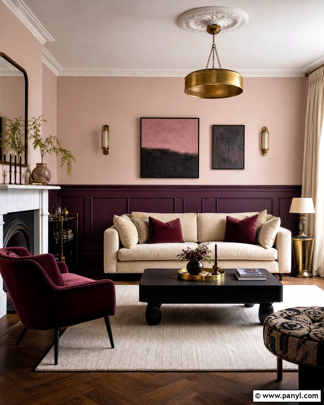
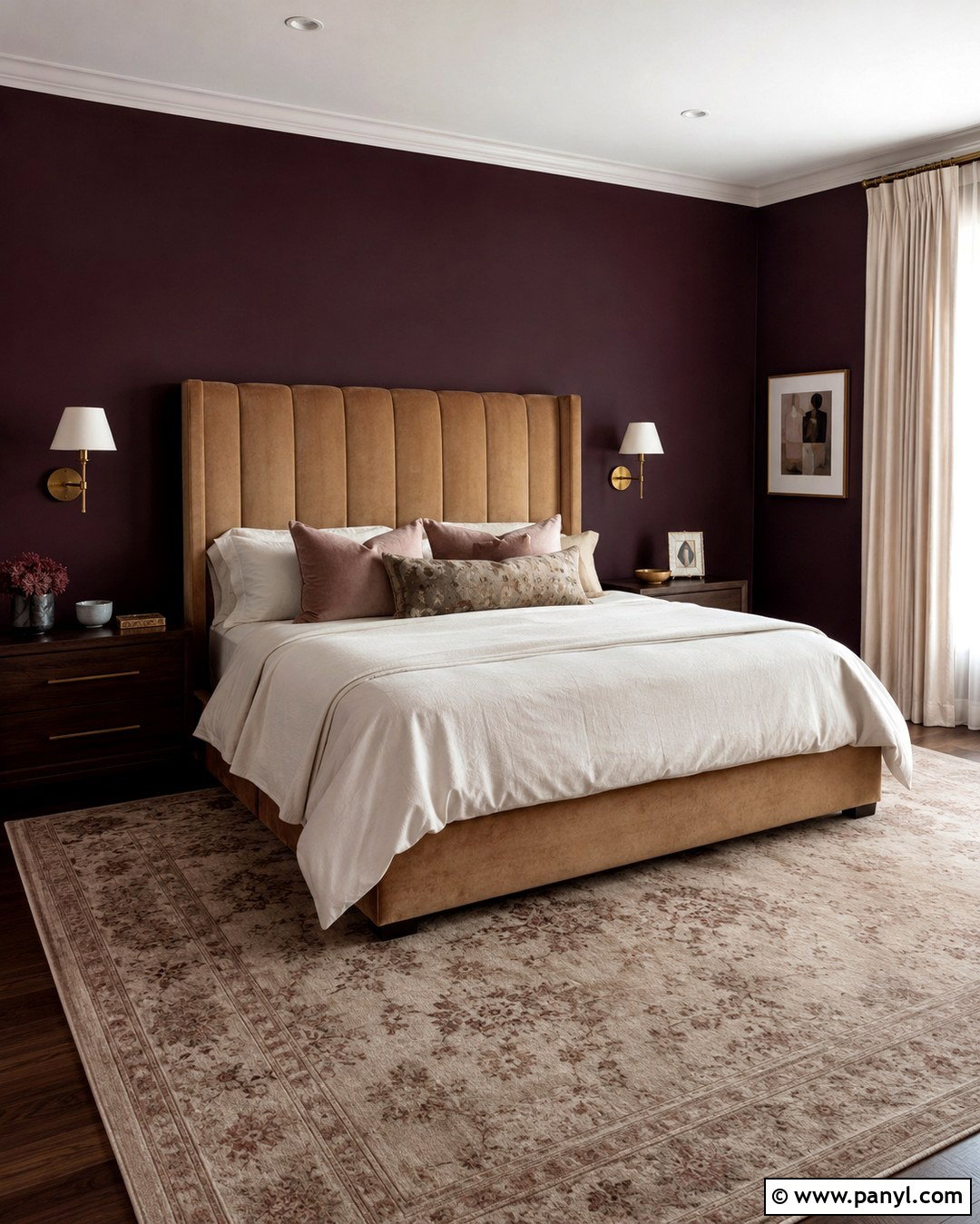
Deep plum lower walls and pale pink above create a rich, cocooning room with a light upper edge. Use plum across paneled walls and baseboards, then choose a chalky pink with gray undertones for the upper section. A beige velvet sofa keeps the arrangement neutral, while a plum chair repeats the darker paint. Add a black wood coffee table, an ivory rug, and burgundy cushions for controlled tonal layering. Cream curtains help reflect daylight around the room. Aged brass lighting and modern artwork in pink, brown, and charcoal provide a polished finish. The two paints should share warm undertones so the transition feels intentional. This complete scheme suits formal sitting rooms and cozy lounges, but simple furniture prevents the colors from feeling overly ornate.
20. Aqua Blue And Cream Living Room Walls
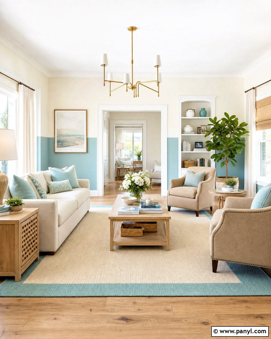
Soft aqua and creamy white make a living room feel clear, bright, and comfortable. Paint the lower half aqua, including the baseboards and window trim, while using cream above to soften the contrast. Furnish the room with a natural linen sofa, pale oak tables, and two sand-colored armchairs. A cream rug with a subtle aqua border defines the conversation area without introducing a competing pattern. Add sea-glass green pillows, woven shades, white curtains, and brushed brass lighting. Keep decorative objects simple, using ceramic vessels, natural books, and abstract coastal artwork rather than literal themed accessories. A grayed aqua is easier to coordinate than a highly saturated turquoise. The completed room remains fresh throughout the year and works especially well in a smaller, sunlit home.
Conclusion:
Choosing from these **20 2 tone living room walls paint colors** is about more than finding two attractive shades. The placement of each color should support the room’s proportions, focal points, furniture, and natural light. Darker paint can ground paneling, built-ins, or a fireplace, while lighter color usually keeps the upper wall open and balanced. Tonal combinations feel calm, whereas contrasting pairings create stronger definition. Before painting the entire room, view large samples during morning, afternoon, and evening light. Also compare them with your flooring, upholstery, curtains, and wood finishes. With thoughtful placement and a coordinated decorating plan, two-tone walls can give an everyday living room greater depth, structure, and personality.

Related Ideas and Inspiration:
Leave a Reply