
Choosing from **40 kitchen colors for walls** can feel overwhelming because paint must work with cabinets, counters, flooring, lighting, and nearby rooms. The best choice is not simply a beautiful swatch. It is a complete palette that balances undertones, contrast, texture, and the mood you want. Current kitchen paint collections include everything from warm whites and earthy neutrals to greens, blues, yellows, and deeper statement shades. () Before committing, view large samples beside every fixed finish during morning, afternoon, and evening light. Then build the room around two or three supporting tones rather than adding too many competing colors. Whether your kitchen is modern, farmhouse, traditional, coastal, or compact, the complete looks below make it easier to explore **40 kitchen colors for walls**.
1. Warm White Kitchen Walls
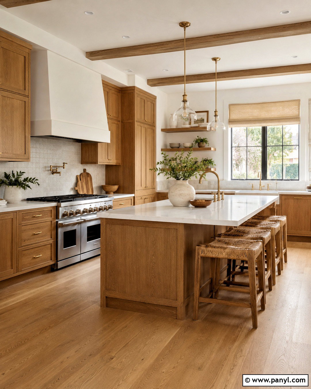
Warm white walls create an inviting kitchen without making the room look yellow or overly creamy. Pair them with medium oak cabinets, lightly veined quartz counters, and a handmade off-white tile backsplash. These layered neutrals keep the room bright while allowing natural wood grain to stand out. Use aged brass hardware and simple glass pendants for warmth, then ground the palette with light brown stone or white oak flooring. Linen Roman shades, woven counter stools, and a few green plants bring comfortable texture. This wall color works especially well in north-facing kitchens because its gentle warmth can soften cool daylight. Keep the ceiling and trim slightly cleaner and brighter than the walls to create definition without introducing a harsh contrast.
2. Crisp White Kitchen Walls
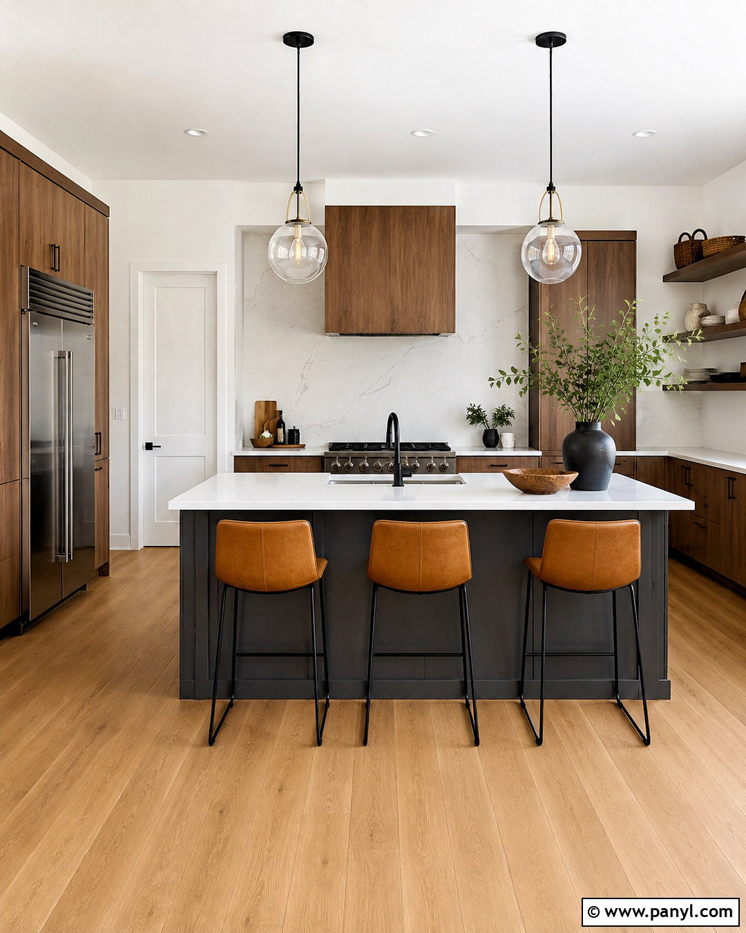
Crisp white kitchen walls provide a clean backdrop for bold materials and strong architectural lines. Create a modern look with flat-panel walnut cabinets, white quartz counters, and a dark charcoal island. A backsplash made from large porcelain slabs reduces visual clutter, while matte black hardware repeats the island color. Add natural warmth through wide-plank oak flooring and tan leather counter stools. Clear glass pendants preserve the open feeling and prevent the bright palette from appearing too clinical. Crisp white is most successful in kitchens with generous natural light and finishes that already contribute warmth. Instead of filling the room with small decorations, display a few sculptural bowls, wooden cutting boards, and leafy branches. The result feels polished, practical, and comfortably balanced.
3. Soft Ivory Kitchen Walls
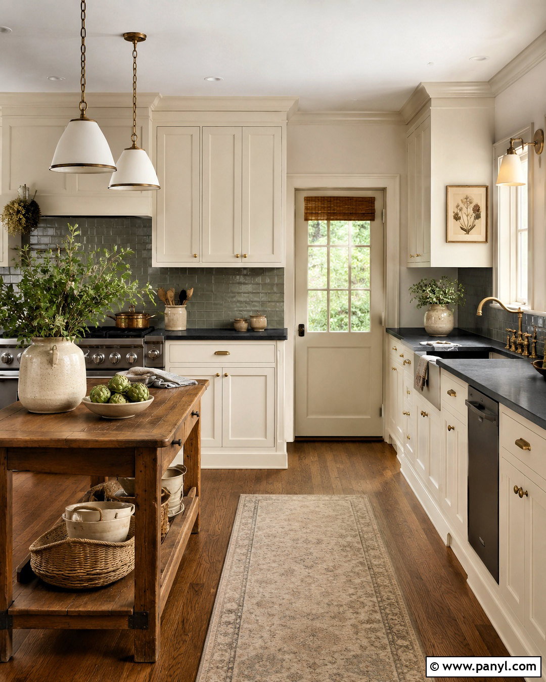
Soft ivory walls give a traditional kitchen a gentle, established character. Combine the color with creamy inset cabinets, dark soapstone counters, and a warm gray subway tile backsplash. The slight separation between the ivory walls and lighter cabinetry creates depth while keeping the overall palette calm. Choose medium walnut flooring, antique brass knobs, and shaded pendant lights to reinforce the classic direction. A freestanding wood table can replace a formal island in a smaller kitchen, adding workspace and relaxed charm. Display cream pottery and framed botanical artwork in restrained groupings. Soft ivory complements rooms with limited sunlight, but it should be tested beside existing stone because yellow undertones can become stronger near cool gray surfaces. Balanced correctly, this kitchen feels warm, timeless, and welcoming.
4. Creamy Beige Kitchen Walls
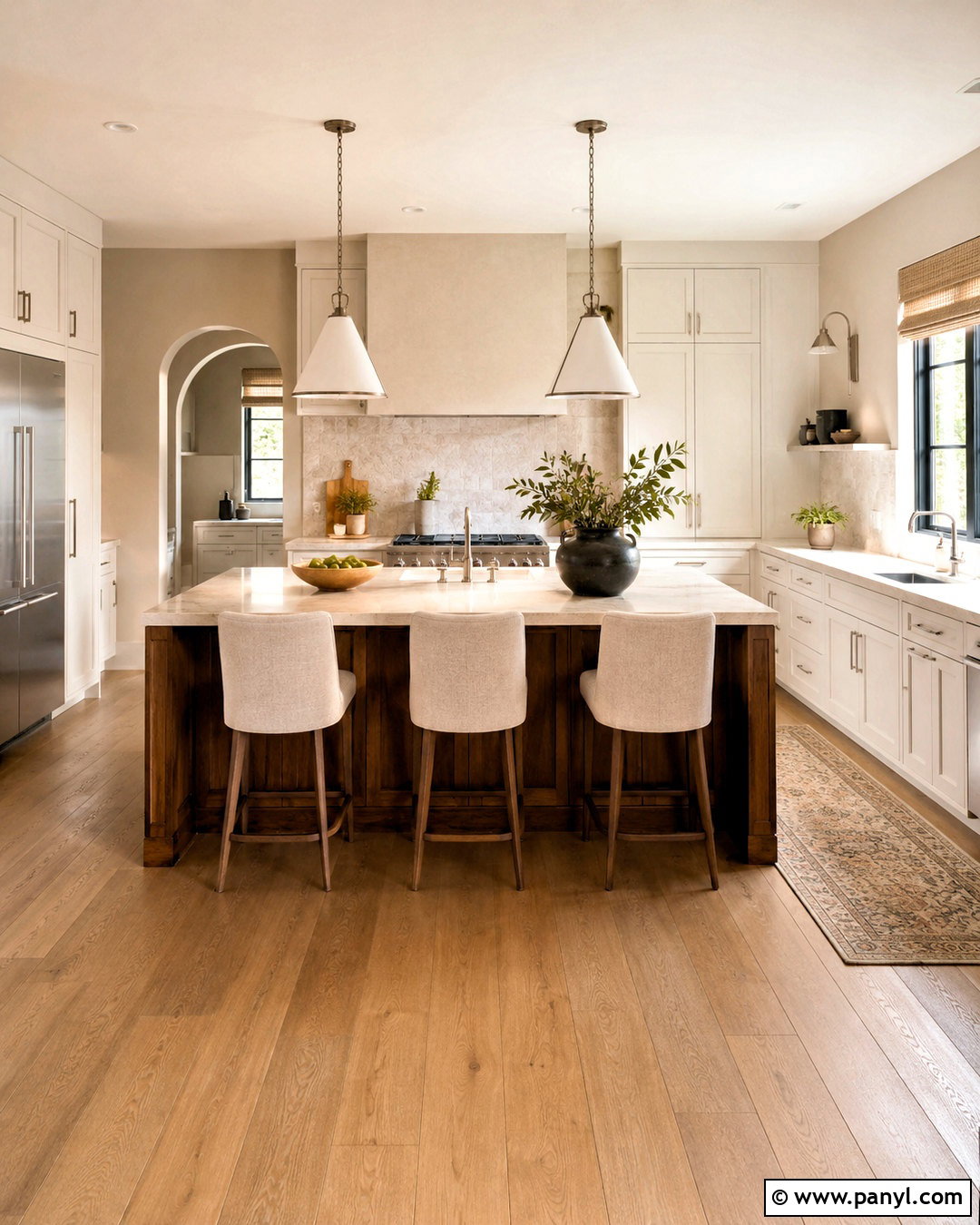
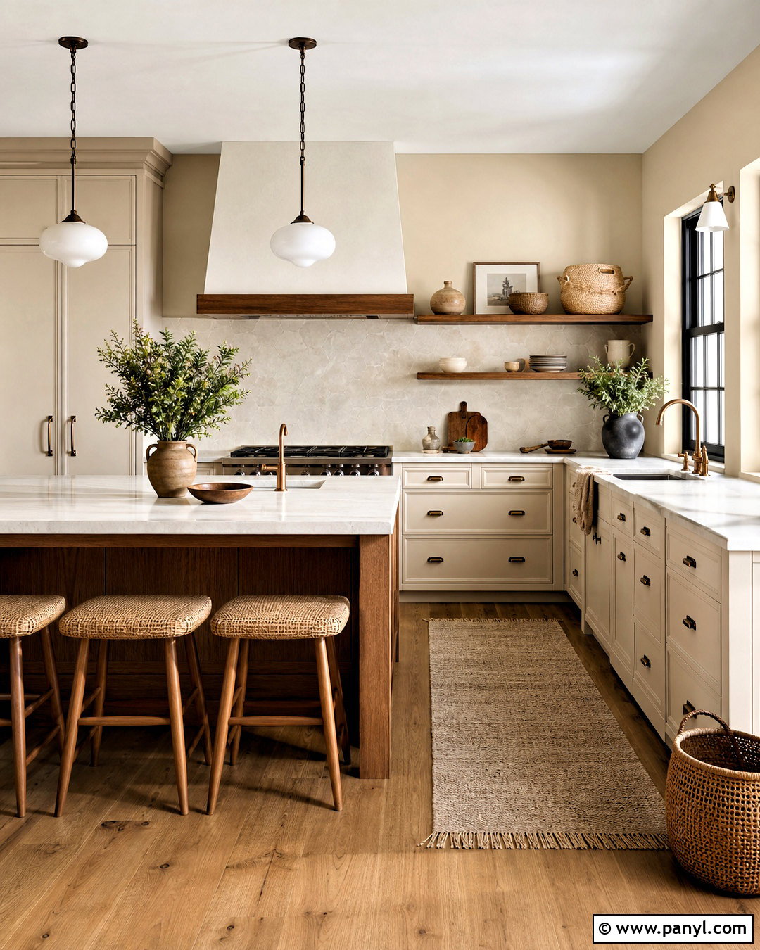
Creamy beige walls can soften a busy family kitchen and create a warm bridge between painted cabinets and natural wood. Pair the walls with muted white Shaker cabinets, beige quartz counters, and a tumbled limestone backsplash. Introduce contrast through a walnut island topped with durable pale stone. Brushed nickel fixtures provide a cooler note, preventing the palette from becoming too golden. Use practical oak-look flooring, upholstered counter stools, and washable oatmeal Roman shades to complete the room. Black accents should be limited to thin window frames or a simple range hood detail. This color is particularly useful in open layouts where the kitchen connects to beige, brown, or cream furnishings. Repeating the wall color in nearby textiles helps the entire living area feel coordinated.
5. Light Greige Kitchen Walls
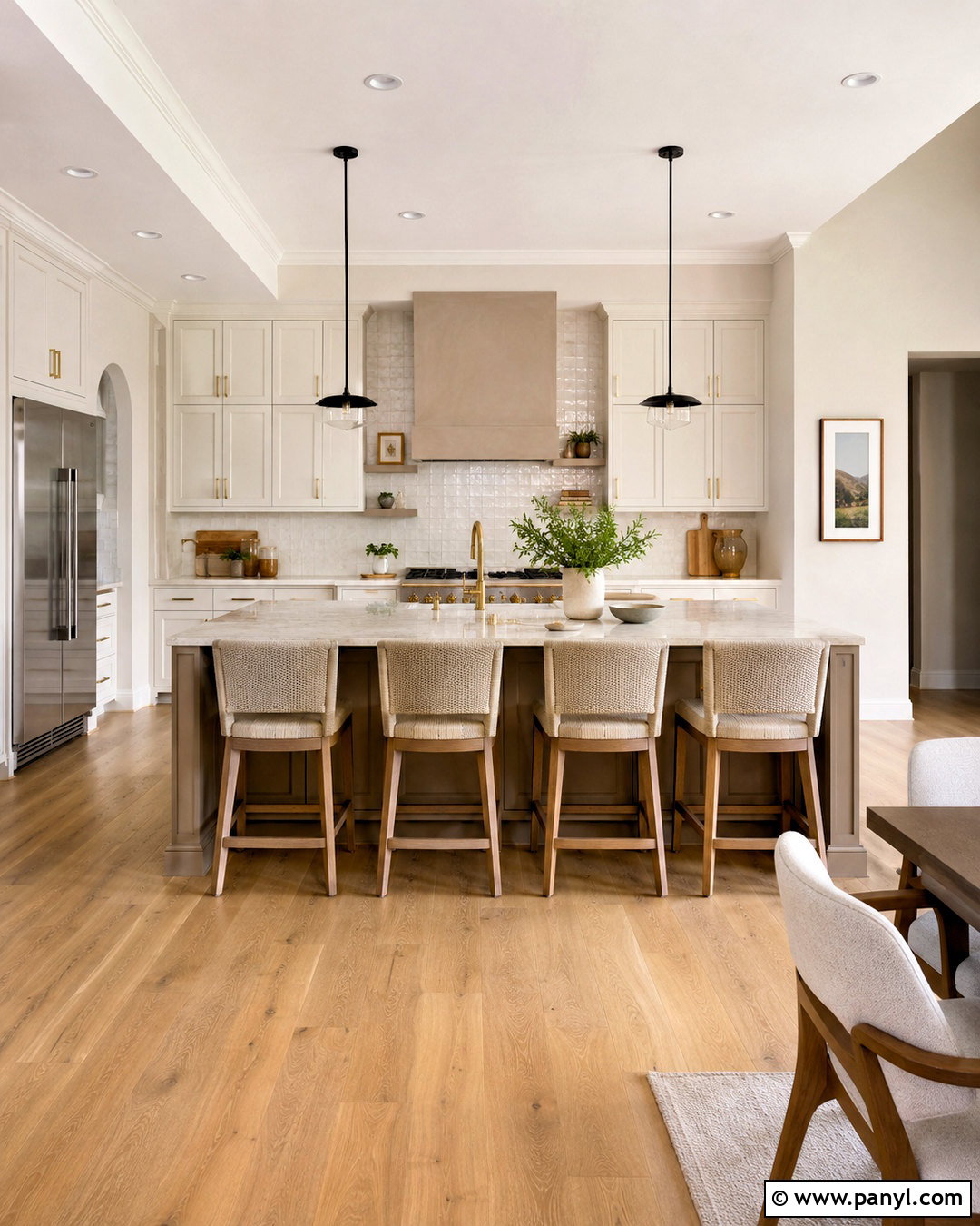
Light greige kitchen walls blend the softness of beige with the clean appearance of gray. Build a transitional palette with warm white cabinets, brushed brass hardware, and quartz counters featuring subtle taupe veining. A glossy ivory backsplash reflects light and provides a gentle contrast against the quieter wall color. For the island, choose medium-toned oak or a deeper mushroom paint that relates to the walls without matching them exactly. Pale oak flooring and natural woven stools keep the room relaxed. Add black only in small amounts, such as slim pendant frames or a faucet. Light greige is especially helpful when the kitchen contains both cool stainless steel and warm wood. It visually connects those finishes, producing a balanced space that does not feel overly cool or beige.
6. Warm Taupe Kitchen Walls
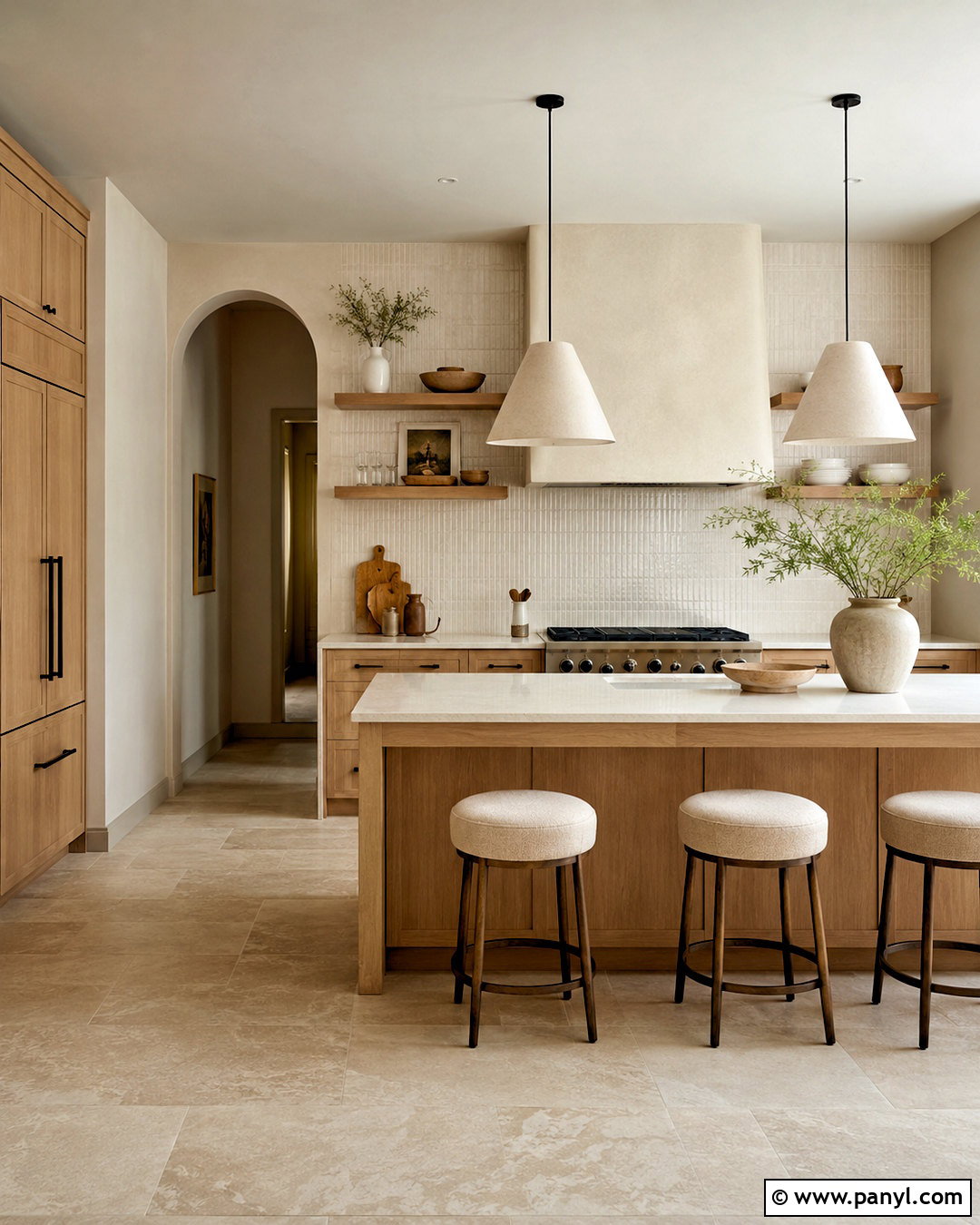
Warm taupe walls create a grounded kitchen that feels richer than light beige but remains easy to coordinate. Pair them with rift-cut white oak cabinets, creamy quartz counters, and a backsplash of vertically stacked ivory tile. A dark bronze faucet and matching cabinet pulls add definition without the sharpness of black. Choose limestone-look flooring or wide oak boards with a muted brown finish. Over the island, hang simple plaster pendants that echo the wall color while adding sculptural form. Soft white upholstery and understated ceramics prevent the room from becoming too brown. Warm taupe works beautifully in kitchens with strong daylight because the color can absorb brightness and make the space feel settled. Use lighter trim to frame the walls and maintain a fresh, intentional finish.
7. Mushroom Kitchen Walls
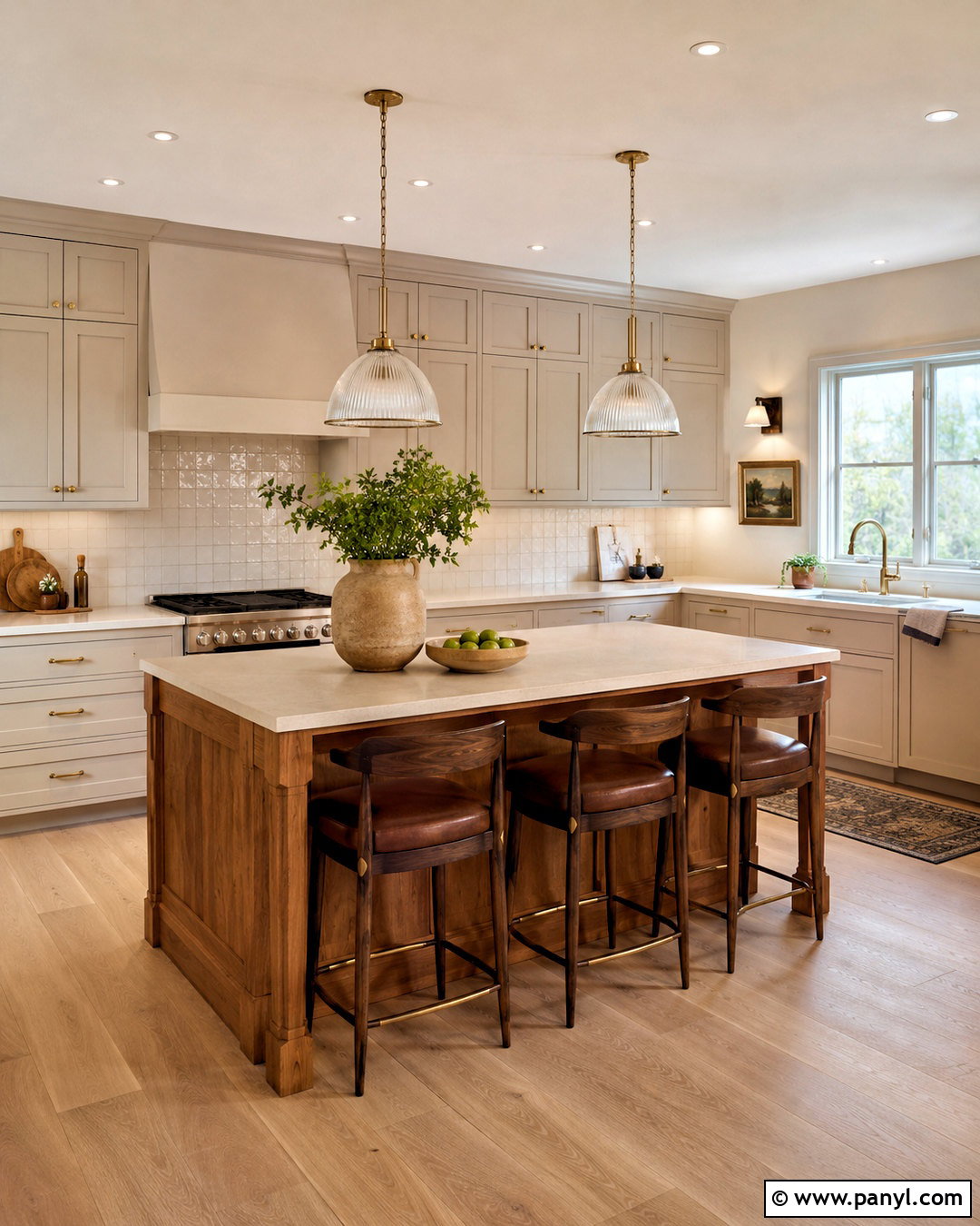
Mushroom-colored walls bring subtle earthiness to a kitchen through balanced brown, gray, and beige undertones. Create a cohesive look with putty-painted cabinets, honed cream counters, and a textured backsplash made from handmade square tiles. Keep the island natural oak to prevent the tonal scheme from appearing flat. Aged brass hardware, ribbed glass pendants, and pale oak flooring introduce quiet variation. Dark brown counter stools can provide contrast while remaining softer than black. Since mushroom shades change noticeably with surrounding materials, sample the paint beside the backsplash and cabinets before deciding. Finish the room with linen shades, ceramic bowls, and a small framed landscape. This complete palette feels calm and layered, making it suitable for both traditional architecture and simplified modern kitchens.
8. Pale Gray Kitchen Walls
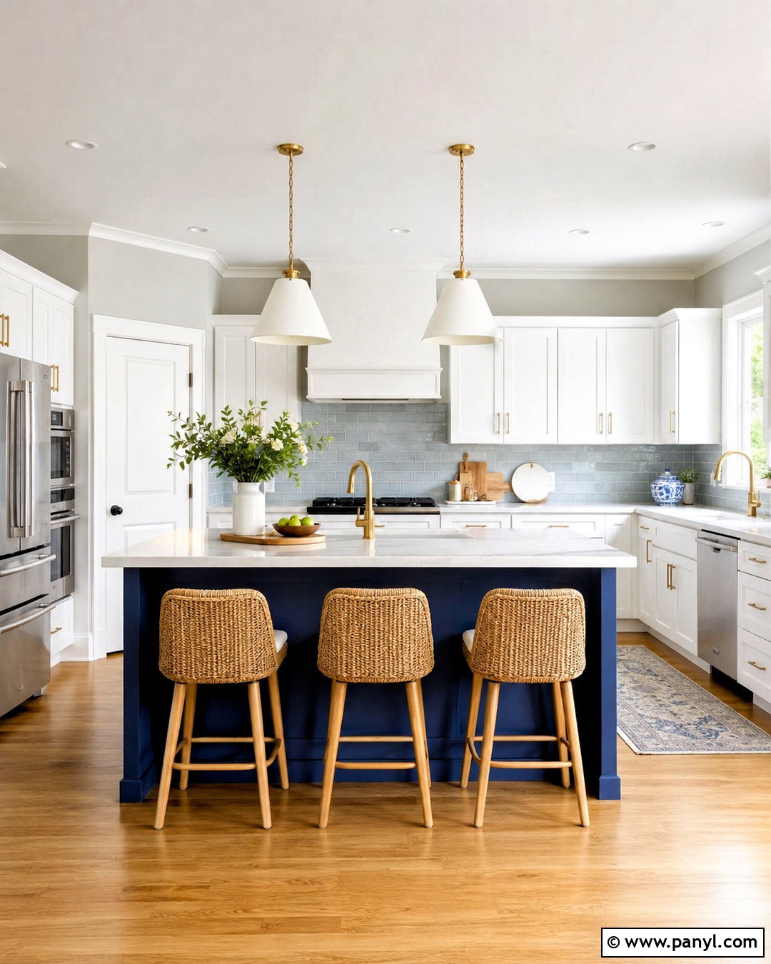
Pale gray kitchen walls offer a cool, understated background that lets cabinetry and countertops take the lead. Pair them with clean white cabinets, light marble-look quartz, and a pale blue-gray backsplash for subtle tonal movement. Warm the room with natural oak flooring, woven stools, and brushed brass lighting rather than repeating too many silver finishes. A medium blue island can create a strong focal point without overwhelming the light palette. Use white trim with a similar undertone so the boundaries look deliberate. Pale gray works best when it contains enough warmth to coordinate with the floor and any nearby furnishings. Add simple wood accessories, blue ceramics, and fresh greenery for life. The finished kitchen feels open and organized while retaining more dimension than an all-white scheme.
9. Blue Gray Kitchen Walls
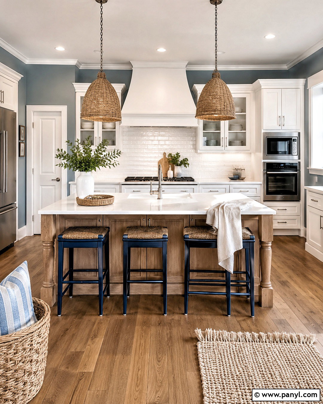
Blue-gray walls bring a quiet, airy color to the kitchen while remaining restrained enough for everyday use. Combine them with warm white cabinets, brushed nickel hardware, and white quartz counters containing soft gray veining. A backsplash of glossy white rectangular tile keeps the cooking area bright. Add a weathered oak island, medium oak flooring, and woven pendant lights to balance the cool wall color with natural warmth. Navy counter stools can deepen the palette without creating an abrupt contrast. This scheme works well in coastal, transitional, and cottage kitchens, but it does not require themed decorations. Keep accessories simple with clear glass, white ceramics, and linen textiles. Repeating blue gray on an adjoining breakfast nook wall helps the kitchen feel connected to the surrounding space.
10. Charcoal Kitchen Walls
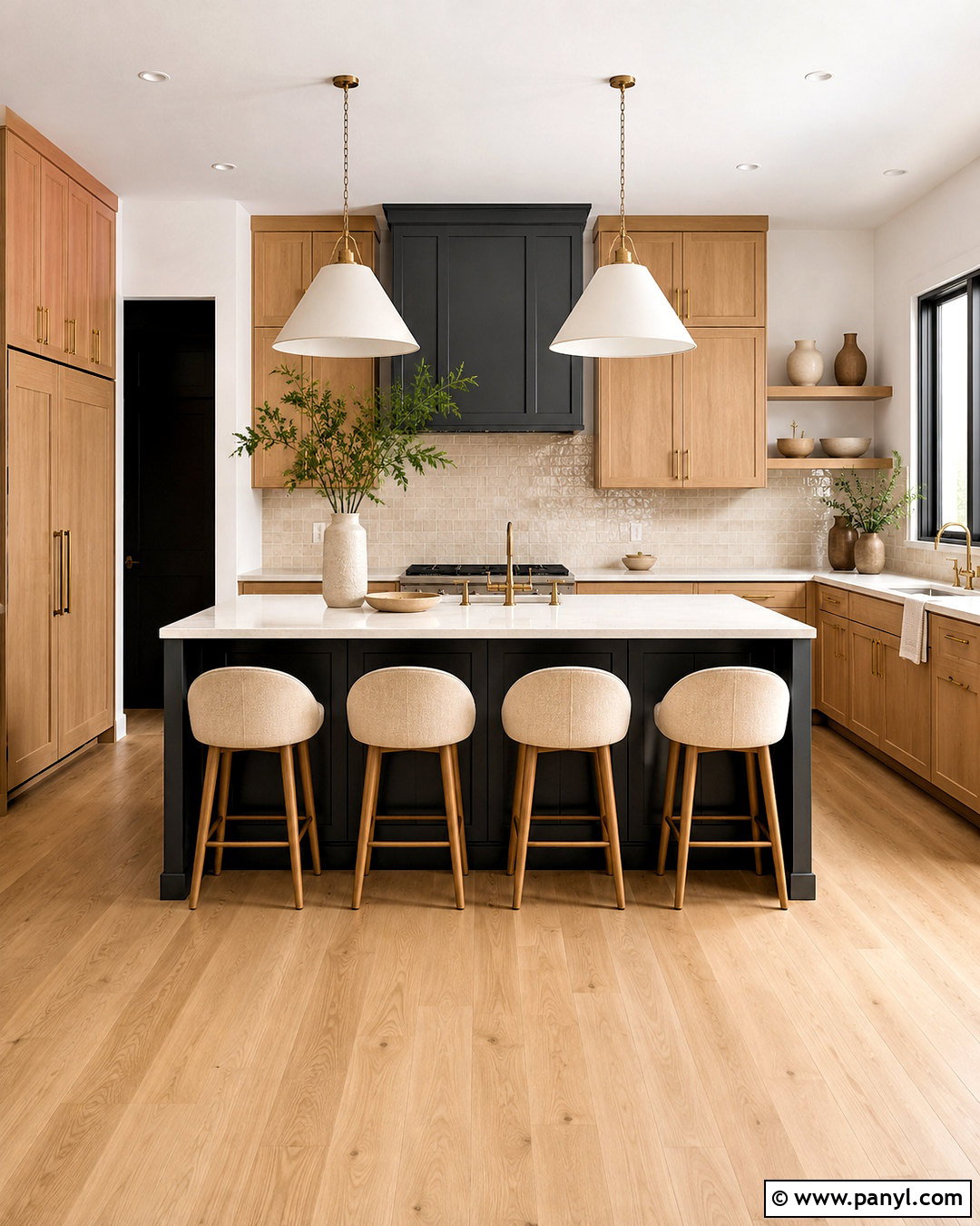
Charcoal walls can make a large, bright kitchen feel intimate and architecturally defined. Balance the depth with natural white oak cabinets, thick white quartz counters, and a backsplash of softly reflective cream tile. Paint only the walls and leave the ceiling a warm white to maintain visual height. A matching charcoal island creates cohesion, while brass hardware and oversized white pendants prevent the palette from feeling heavy. Select light oak flooring and oatmeal counter stools to introduce warmth underfoot. Keep window treatments minimal so daylight can reach the darkest surfaces. Charcoal works particularly well when there is enough uninterrupted wall area for the color to appear intentional. A few pale ceramics, wood boards, and green branches complete this dramatic yet livable contemporary kitchen.
11. Soft Black Kitchen Walls
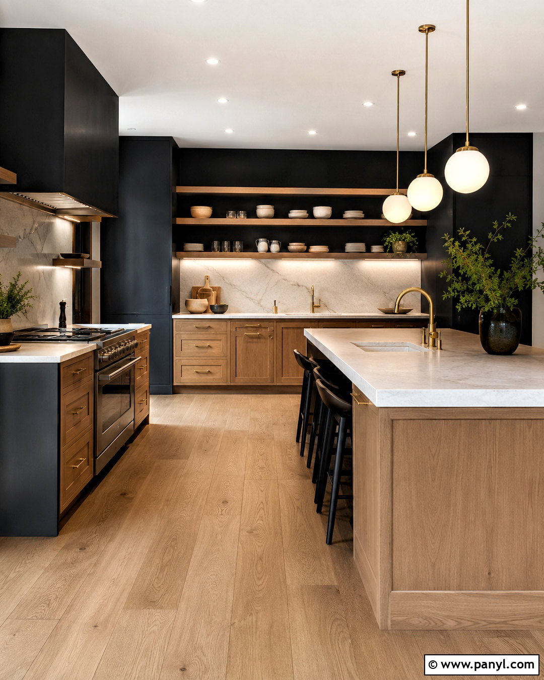
Soft black walls deliver bold contrast without the hard appearance of a pure jet black. Use them in a kitchen with light oak cabinets, creamy stone counters, and a full-height backsplash in warm white marble or quartz. The pale surfaces will stand forward clearly, while the softened black creates a sophisticated frame. Choose unlacquered brass hardware, off-white globe pendants, and wide oak flooring to keep the atmosphere welcoming. On open shelves, display light ceramics and clear glass so the objects remain visible against the dark wall. This palette is most successful in a kitchen with large windows or strong layered lighting. Include under-cabinet illumination and several ceiling fixtures. The completed room feels dramatic and modern, but its natural materials keep it comfortable for daily life.
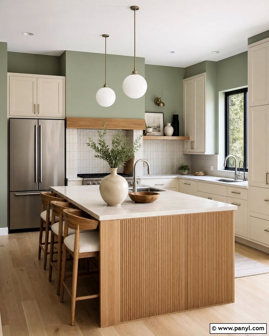
12. Pale Sage Green Kitchen Walls
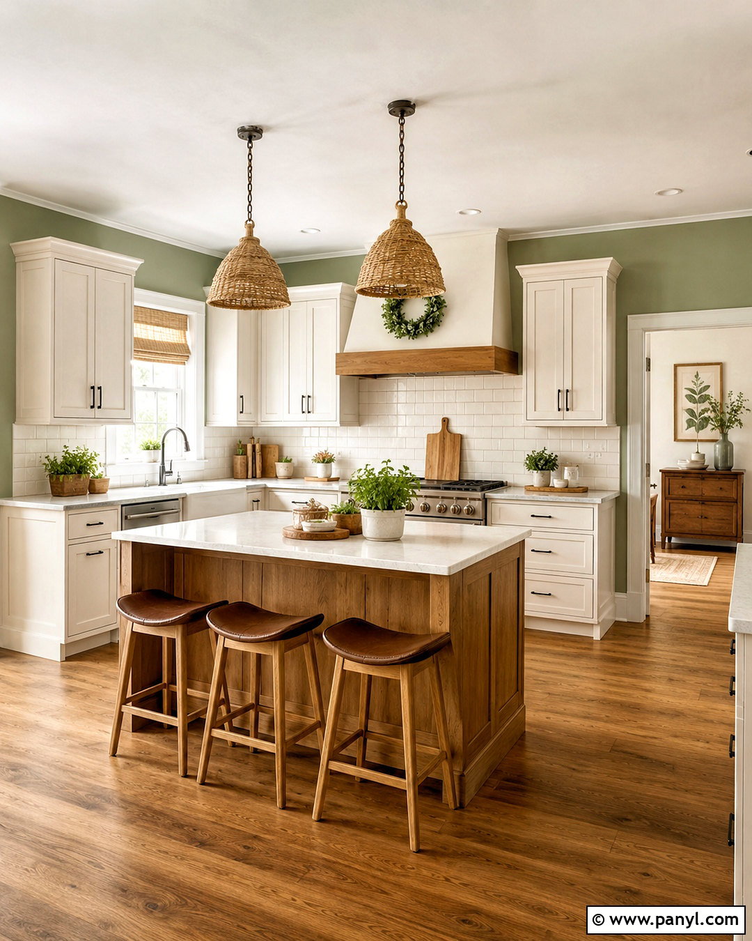
Pale sage green walls introduce a natural hint of color that pairs easily with warm neutrals. Create an airy farmhouse kitchen with creamy white Shaker cabinets, butcher-block accents, and light quartz counters. Use a simple off-white subway tile backsplash and medium oak flooring to keep the room bright. Black iron hardware provides crisp definition, while woven pendants and linen shades soften the straight cabinet lines. Consider a natural oak island with saddle-colored stools for extra warmth. Pale sage is quiet enough to continue into a breakfast area or connecting hallway, creating an easy visual flow. Complete the room with stoneware, wooden utensils, and a few potted herbs. Avoid overly rustic accessories so the finished kitchen remains fresh, uncluttered, and suitable for a modern home.
13. Warm Sage Kitchen Walls
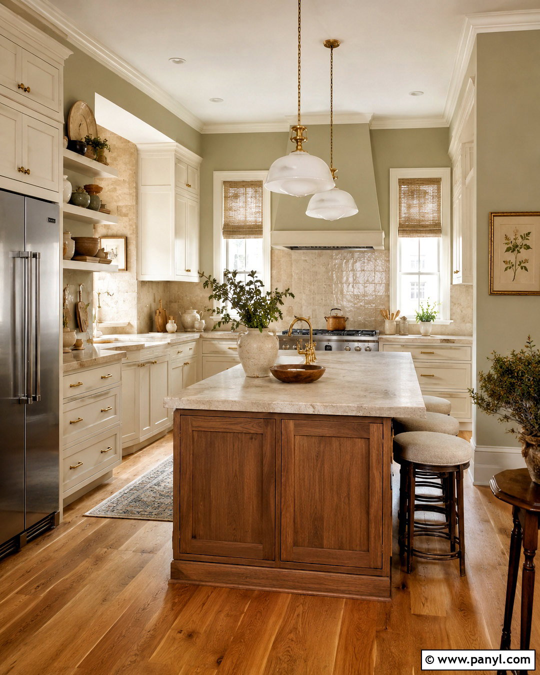
Warm sage walls offer more depth than pale green while retaining a calm, organic character. Pair this color with off-white cabinets, creamy granite or quartz counters, and a backsplash made from handmade ivory tile. Choose walnut or dark oak for the island to establish a grounded focal point. Antique brass handles and milk-glass pendants reinforce the warmth of the green without making the room ornate. Medium-toned wood flooring ties the cabinets and island together. Add natural linen shades, muted botanical prints, and simple cream pottery rather than bright decorative colors. Warm sage is especially attractive in kitchens overlooking a garden because it creates a gentle connection between indoors and outdoors. The resulting scheme feels layered and comfortable, with enough contrast to keep every finish visually distinct.
14. Olive Green Kitchen Walls
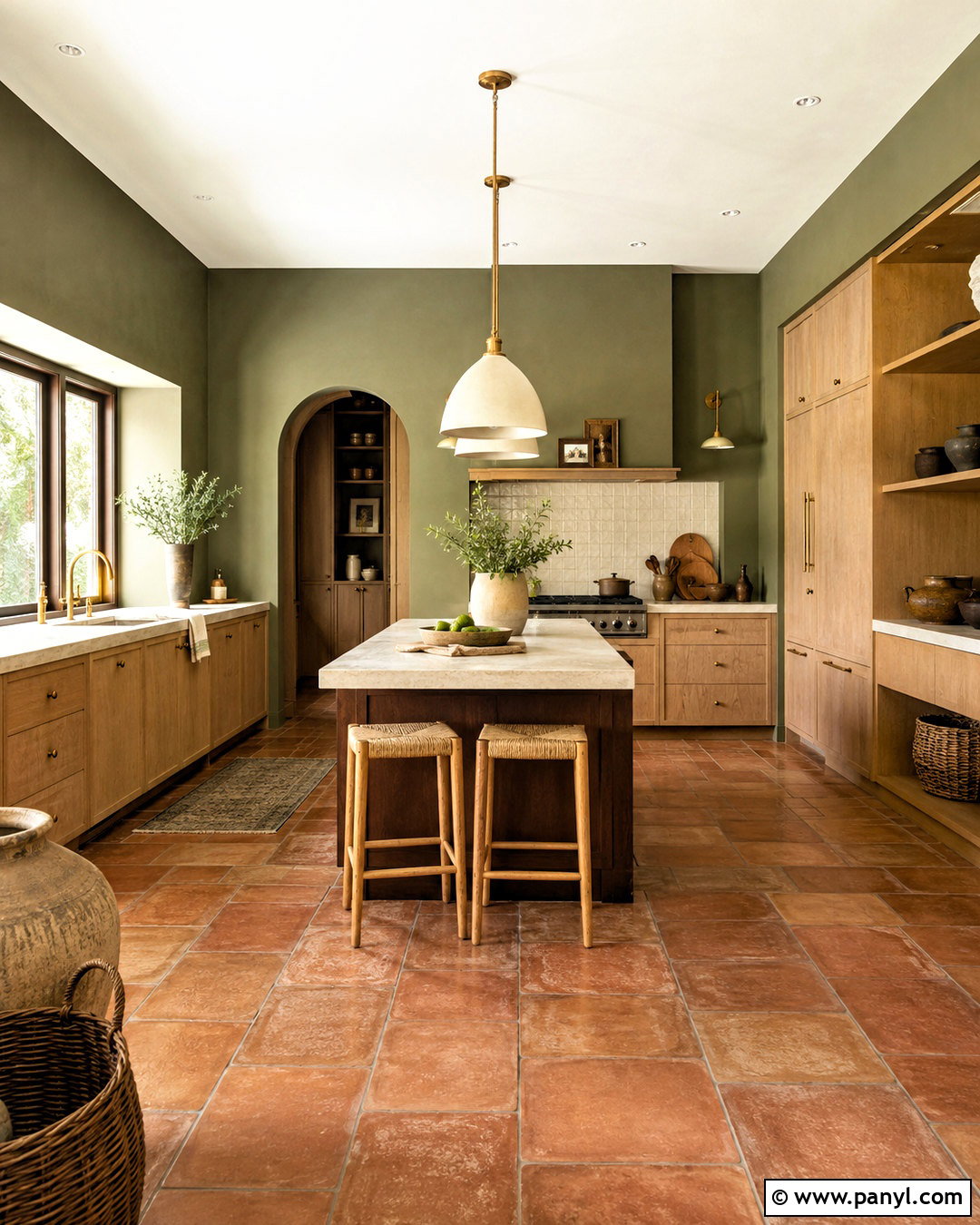
Olive green walls create a rich, earthy kitchen that works beautifully with wood, stone, and warm metal. Pair the walls with white oak cabinetry, honed beige limestone counters, and a backsplash of elongated cream tile. A dark brown island adds weight, while antique brass hardware brings a soft glow to the deeper green. Use terra-cotta floor tile for a rustic Mediterranean direction or medium oak planks for a cleaner transitional look. Cream pendant lights and light upholstered stools keep the room from becoming too dark. Carry olive onto a pantry door or window trim for a more enveloping finish. Complete the palette with clay pottery, woven baskets, and restrained greenery. This full scheme feels warm and established rather than trendy or overly themed.
15. Forest Green Kitchen Walls
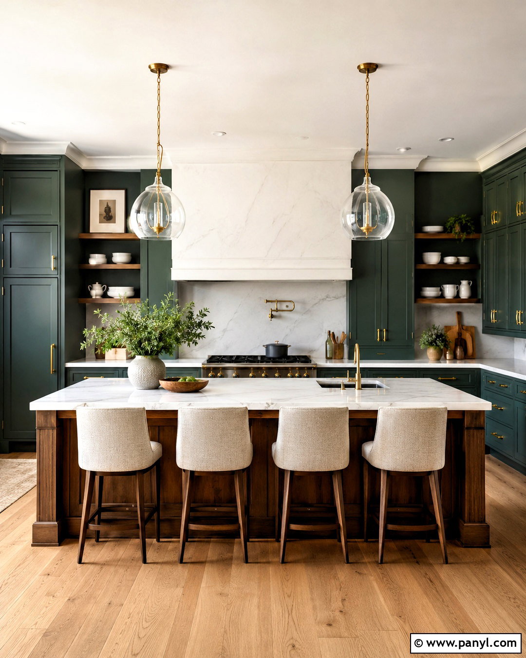
Forest green walls can turn a spacious kitchen into a bold, elegant gathering place. Balance them with creamy inset cabinets, white marble-look counters, and a matching light backsplash that reflects daylight. Use a walnut island with a substantial stone top to strengthen the traditional character. Aged brass hardware and large glass pendants offer warm contrast against the saturated walls. Medium oak flooring prevents the room from feeling formal or cold. If the kitchen has open shelving, choose natural wood shelves and display white dishes so they remain visible. Keep fabric accents in oatmeal, tan, and muted pattern rather than adding more strong colors. Forest green works best when repeated thoughtfully on a door, range alcove, or nearby built-in, making the finished palette feel deliberate and cohesive.
16. Mint Green Kitchen Walls
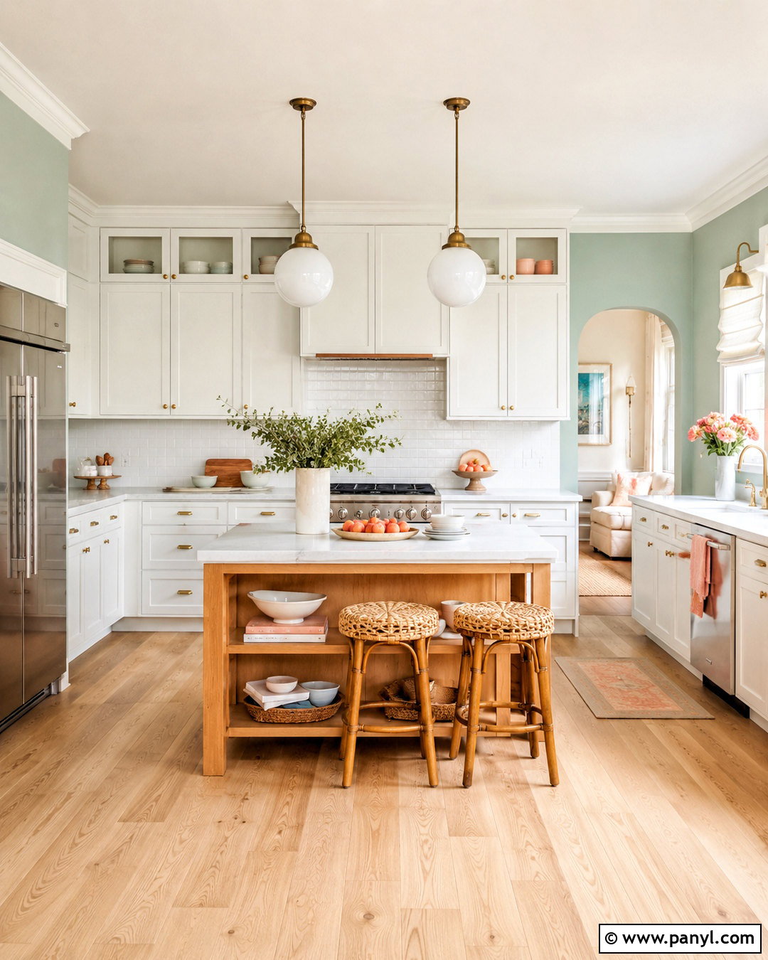
Mint green walls give a compact kitchen a cheerful, clean personality without requiring a strong decorative theme. Pair the color with bright white cabinets, pale quartz counters, and a glossy white backsplash that bounces light around the room. Introduce warmth through maple shelving, light oak flooring, and woven counter stools. Polished nickel hardware feels crisp beside mint, while simple opal globe lights continue the fresh appearance. A small island in natural wood can provide contrast and useful storage. Keep accessories limited to white ceramics, glass containers, and a few soft yellow or peach accents. Choose a muted mint rather than a highly saturated version for easier coordination. This complete design suits vintage-inspired apartments, cottage kitchens, and lighthearted modern spaces that need color without visual heaviness.
17. Celadon Green Kitchen Walls
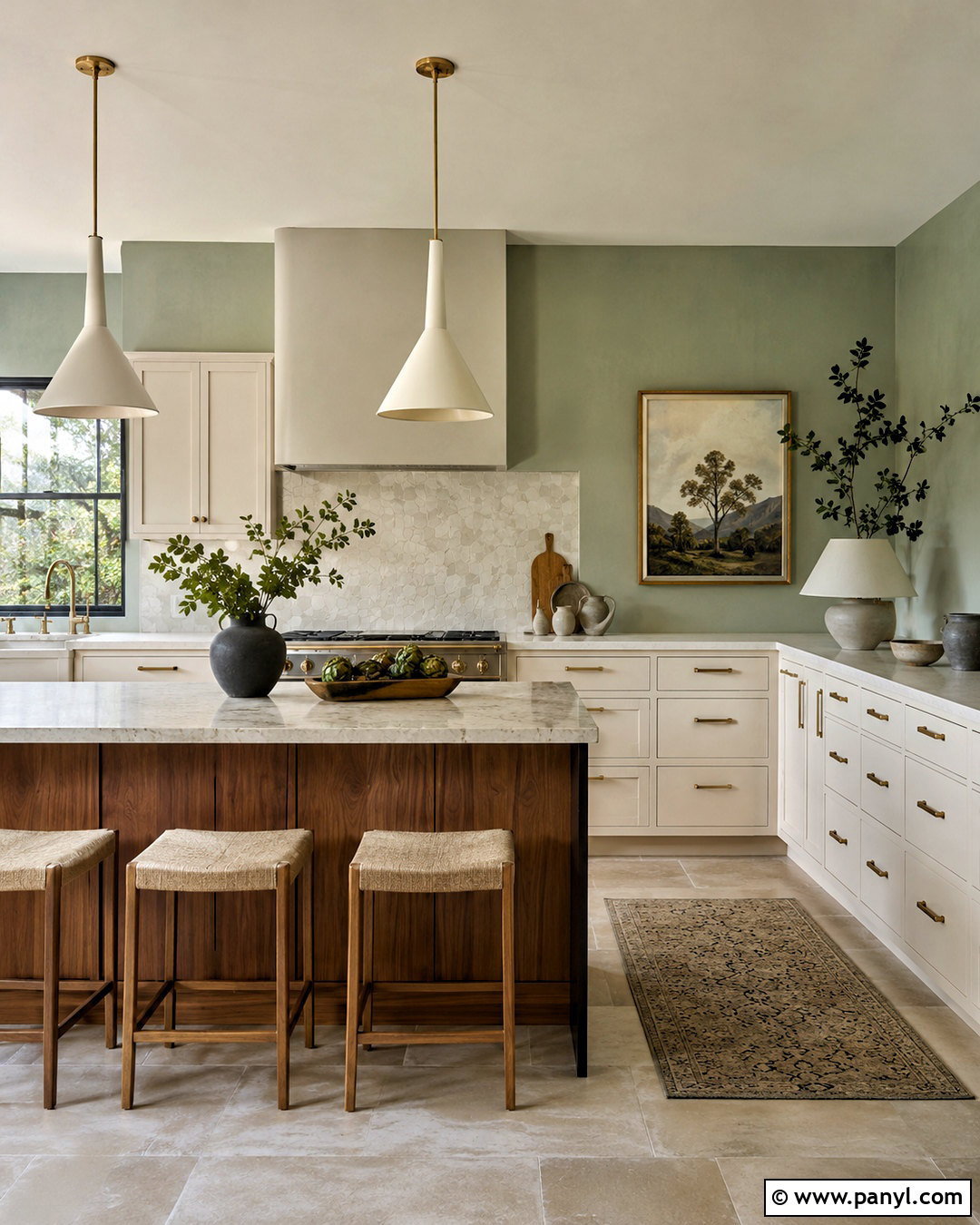
Celadon green walls combine gentle green and gray notes for a refined kitchen with subtle color. Build the room around warm white cabinets, pale marble counters, and a backsplash of softly irregular white tile. Use medium walnut on the island or open shelves to provide a deeper natural contrast. Brushed brass hardware adds warmth, while slim cream pendants maintain a light silhouette. Pale stone flooring creates an elegant foundation, although lightly finished oak also works well. Repeat celadon in a breakfast nook cushion or framed artwork to connect the wall color across the room. Avoid combining it with several other pastels, which can weaken the sophisticated effect. With restrained accessories, natural textures, and balanced lighting, celadon produces a serene kitchen that works in both classic and contemporary homes.
18. Muted Teal Kitchen Walls
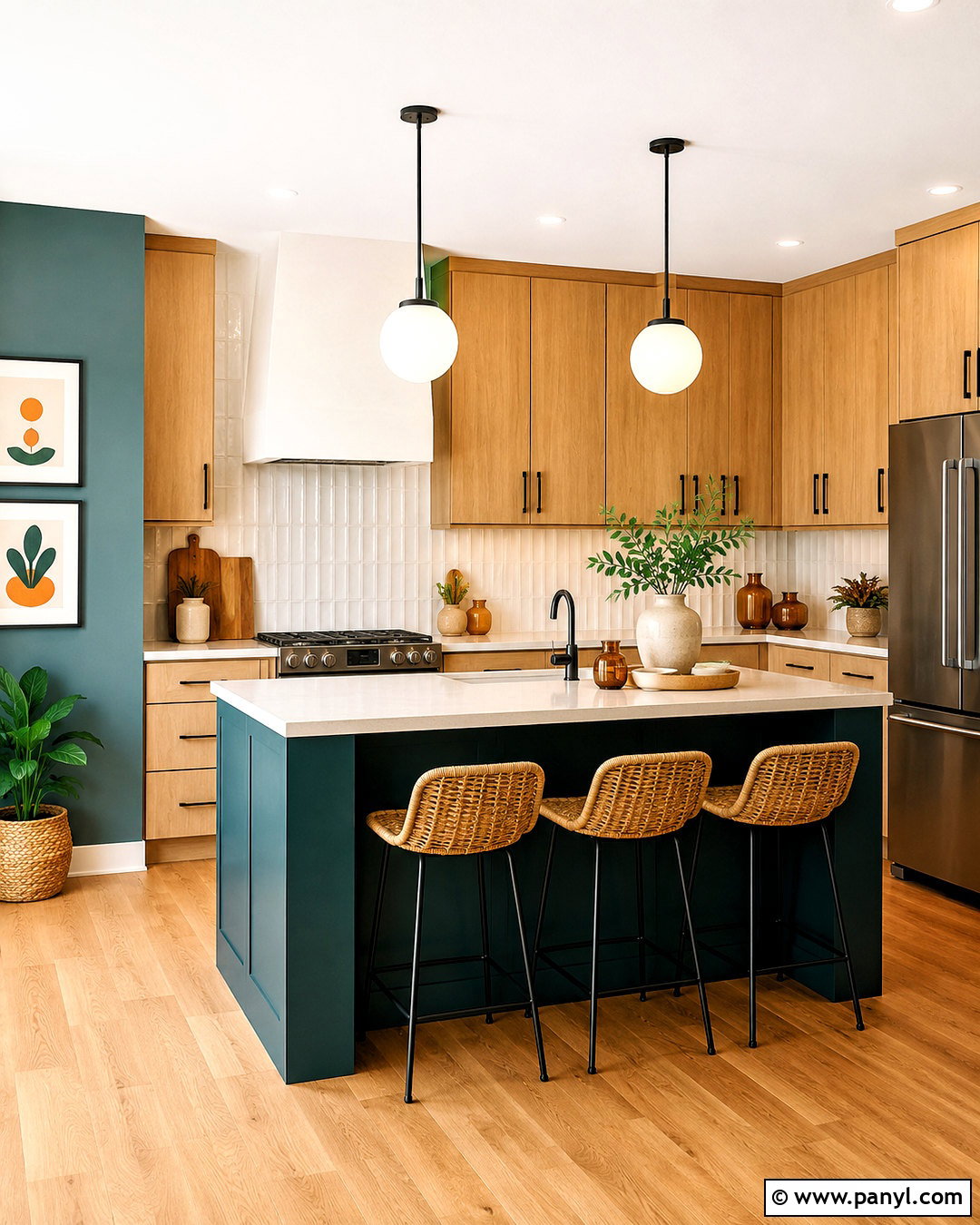
Muted teal walls add noticeable personality while remaining more flexible than bright turquoise. Pair them with natural maple cabinets, creamy quartz counters, and a backsplash of off-white vertical tile. Black hardware and a dark faucet sharpen the palette, while warm oak flooring prevents the blue-green walls from feeling cold. Choose an island painted in deep teal or stained walnut, then add light woven stools for contrast. White globe pendants provide clean illumination without competing with the color. Keep decorative pieces simple, using cream pottery, amber glass, and wooden serving boards. Muted teal works especially well in kitchens with limited exposed wall space because the stronger hue becomes a controlled accent around cabinets and doors. The overall look feels colorful, modern, and practical rather than overly bold.
19. Pale Blue Kitchen Walls
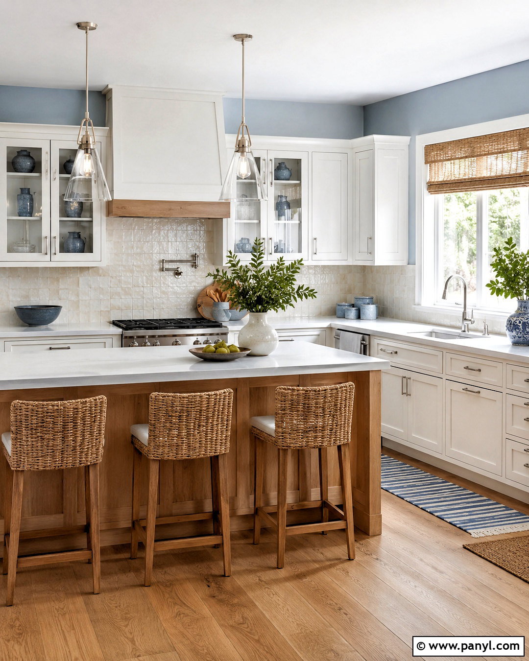
Pale blue walls give a kitchen a relaxed sense of openness, particularly when combined with soft white finishes. Choose warm white Shaker cabinets, white quartz counters, and a backsplash of pearly handmade tile. Add light oak flooring and a matching island to introduce natural warmth throughout the lower half of the room. Polished nickel hardware and clear glass pendants reinforce the clean atmosphere. Woven counter stools, cream linen shades, and a striped washable runner provide casual texture. Pale blue can shift cooler under artificial light, so use warm-white bulbs and test samples near the cabinets. Rather than adding obvious coastal decorations, rely on subtle materials and a few blue-gray ceramics. This creates a kitchen that feels calm and breezy without becoming themed or visually predictable.
20. Powder Blue Kitchen Walls
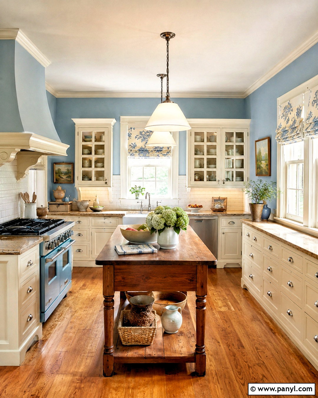
Powder blue walls bring soft vintage character to a kitchen with traditional cabinetry and detailed millwork. Pair the color with ivory cabinets, warm marble-look counters, and a classic white subway tile backsplash. Use polished nickel cup pulls and bridge-style faucets for a refined metallic note. A walnut worktable or island adds essential contrast, while medium oak flooring makes the room feel established. Install fabric-shaded pendants and a simple patterned Roman shade to soften the practical surfaces. Cream dishes, blue ceramics, and framed landscapes can support the palette without overcrowding it. Powder blue looks best beside warmer whites rather than stark, cool whites. The completed kitchen has a graceful, collected quality that suits historic homes, cottage interiors, and updated traditional spaces with plenty of everyday function.
21. Sky Blue Kitchen Walls
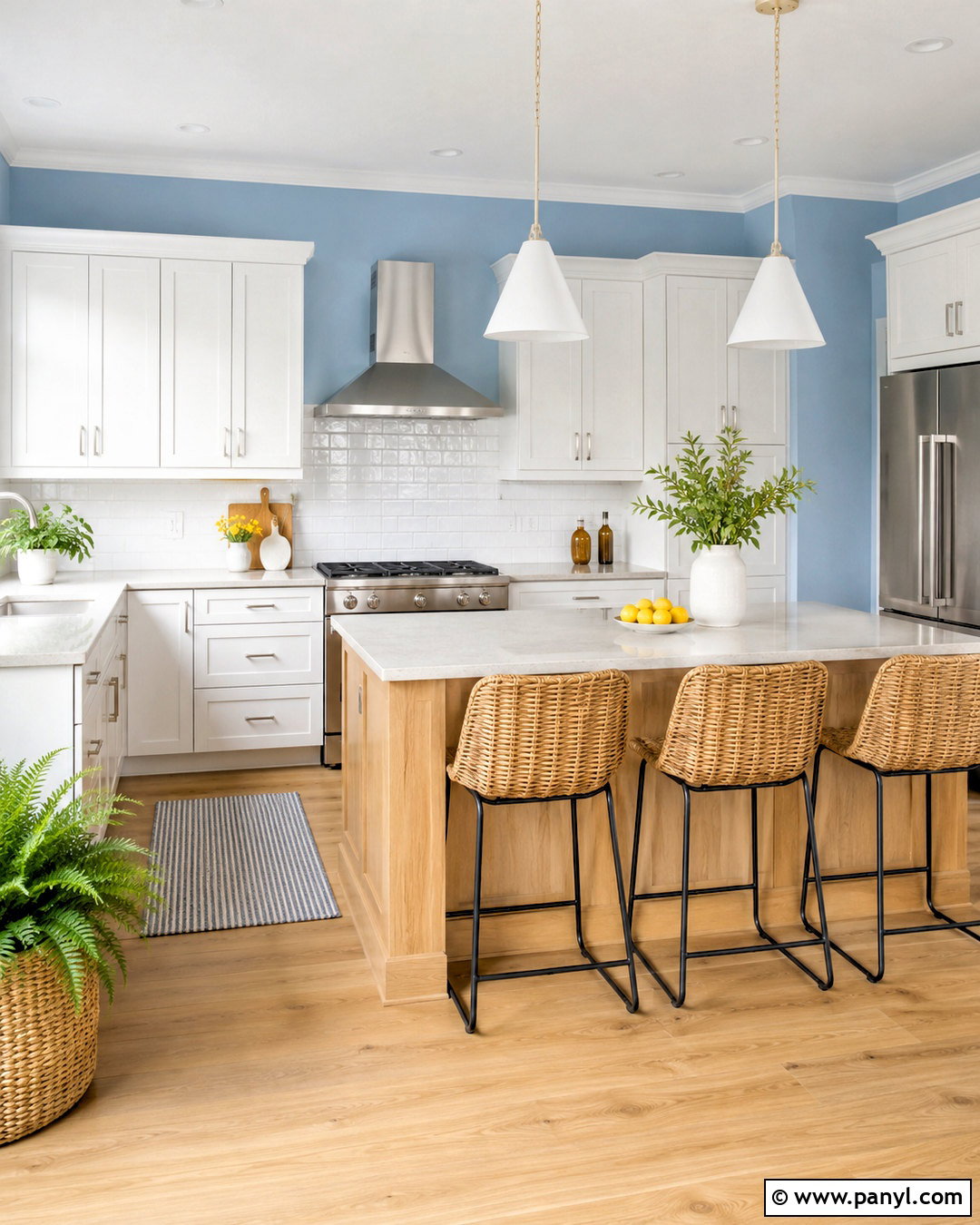
Sky blue walls can brighten an informal kitchen and make the entire room feel cheerful. Build the design with clean white cabinets, pale gray quartz counters, and a simple glossy white backsplash. A light maple island and natural wood flooring balance the fresh blue with warmth. Use brushed nickel hardware, white cone pendants, and woven stools to maintain a casual modern look. Small accents in sunny yellow or leafy green can add energy, but keep them limited to towels, artwork, or countertop pottery. Sky blue is effective in kitchens with smaller windows because it introduces color without absorbing excessive light. Extend the paint into the breakfast nook for continuity. The final room feels clear, friendly, and well suited to busy mornings, casual meals, and family gatherings.
22. Coastal Blue Kitchen Walls
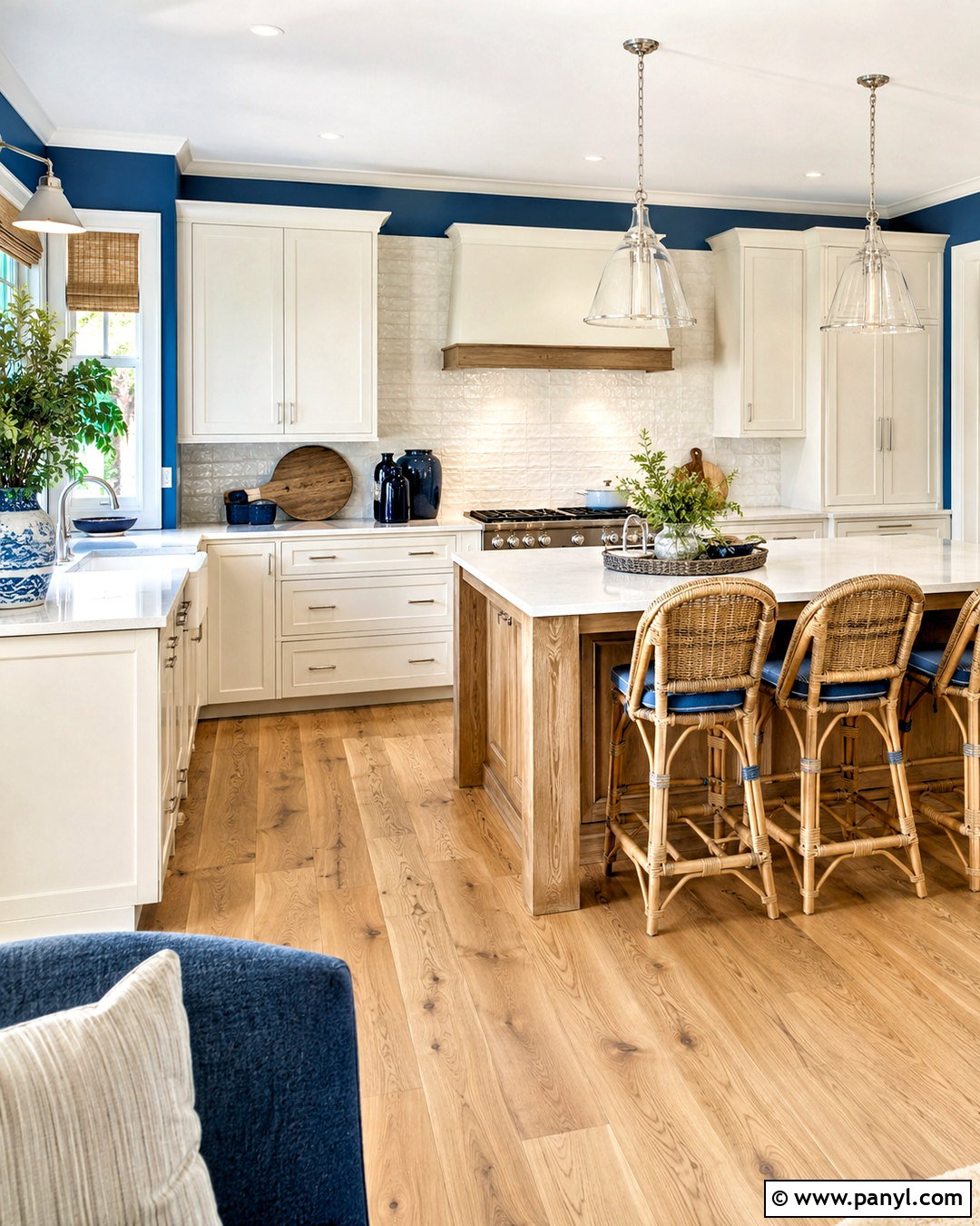
Coastal blue walls create a relaxed kitchen when they are paired with natural textures instead of decorative seaside motifs. Choose warm white cabinets, pale quartz counters, and a backsplash made from lightly textured ivory tiles. Use weathered oak for the island and wide-plank flooring, then add woven rattan stools and linen window shades. Brushed nickel hardware and clear glass pendants keep the finishes light. A few navy accents can provide depth through seat cushions, pottery, or a washable runner. Coastal blue should appear muted and slightly gray rather than intensely bright. That restraint allows the color to work in homes far from the water. With straightforward cabinetry, practical materials, and uncluttered surfaces, the finished kitchen feels breezy, comfortable, and naturally connected to the surrounding living areas.
23. Slate Blue Kitchen Walls
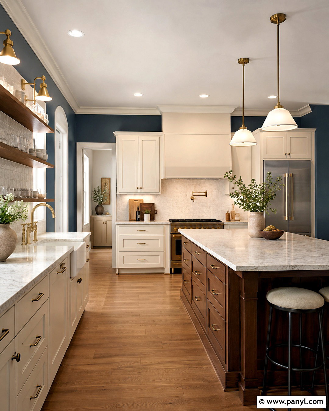
Slate blue walls give a kitchen depth while maintaining the versatility of a sophisticated neutral. Pair them with creamy white cabinets, pale veined quartz counters, and an ivory backsplash to establish strong but balanced contrast. A walnut island and medium oak flooring introduce warmth beneath the cooler wall color. Choose aged brass hardware and warm white pendants for a soft metallic glow. On open shelving, use cream stoneware, clear glass, and wooden accents to create visible layers against the blue. Slate blue works particularly well in transitional kitchens where classic cabinet profiles meet cleaner lighting and furniture. Continue the color onto a pantry door for cohesion. The finished room feels composed and substantial, offering more personality than gray while remaining easy to live with over time.
24. Navy Blue Kitchen Walls
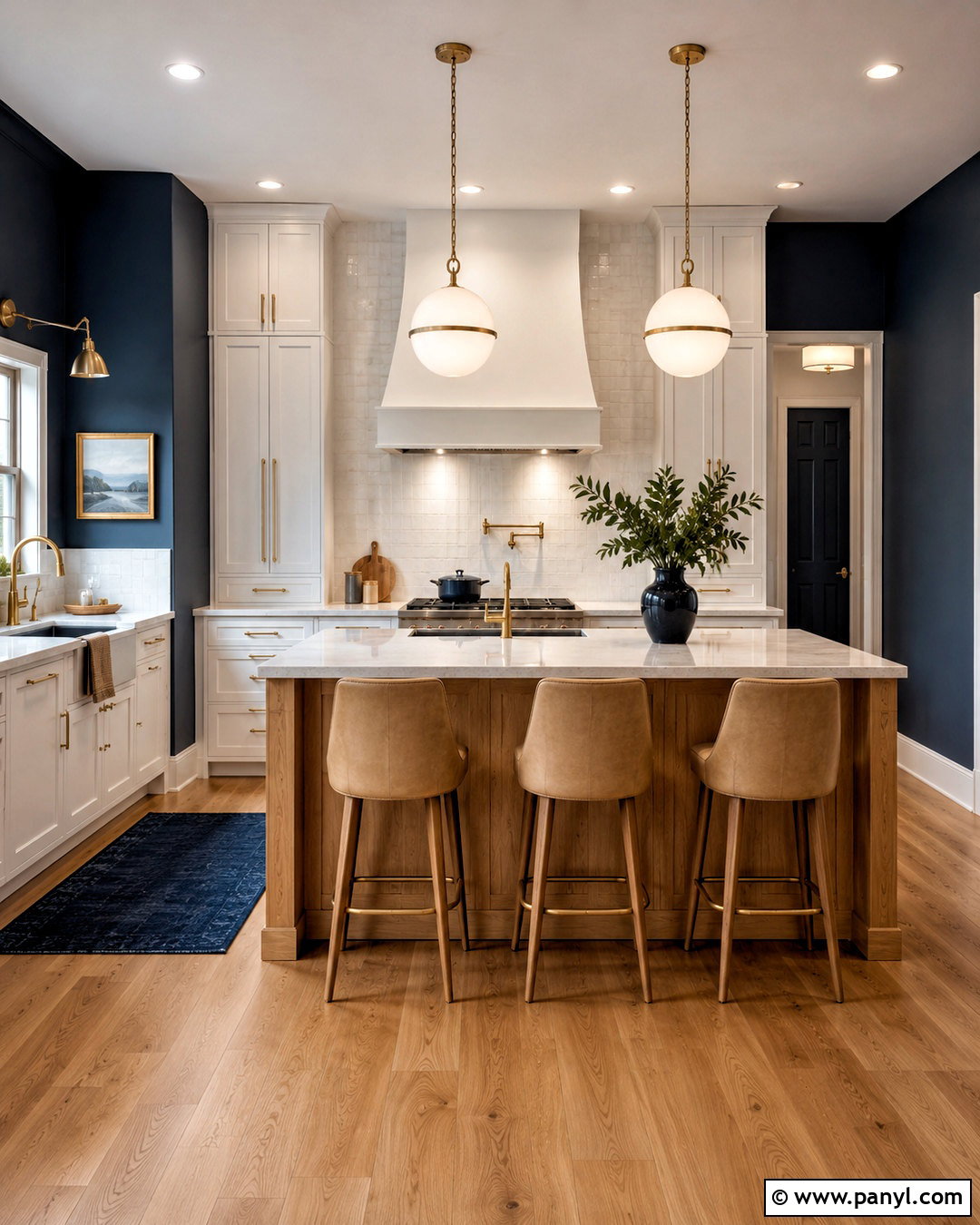
Navy blue walls create a confident kitchen that can feel either classic or contemporary depending on the supporting finishes. For a balanced transitional room, pair navy with white cabinets, pale quartz counters, and a full-height white tile backsplash. Add a natural oak island, warm oak flooring, and tan upholstered stools to soften the strong contrast. Brass hardware and opal glass pendants bring warmth and visibility to the darker perimeter. Keep the ceiling bright white and use layered lighting beneath cabinets and over work surfaces. Navy is a practical choice when only narrow strips of wall remain visible around cabinetry because the limited area controls its intensity. Repeat the color in a runner or window treatment. The result is polished, lively, and grounded by natural materials.
25. Dusty Aqua Kitchen Walls
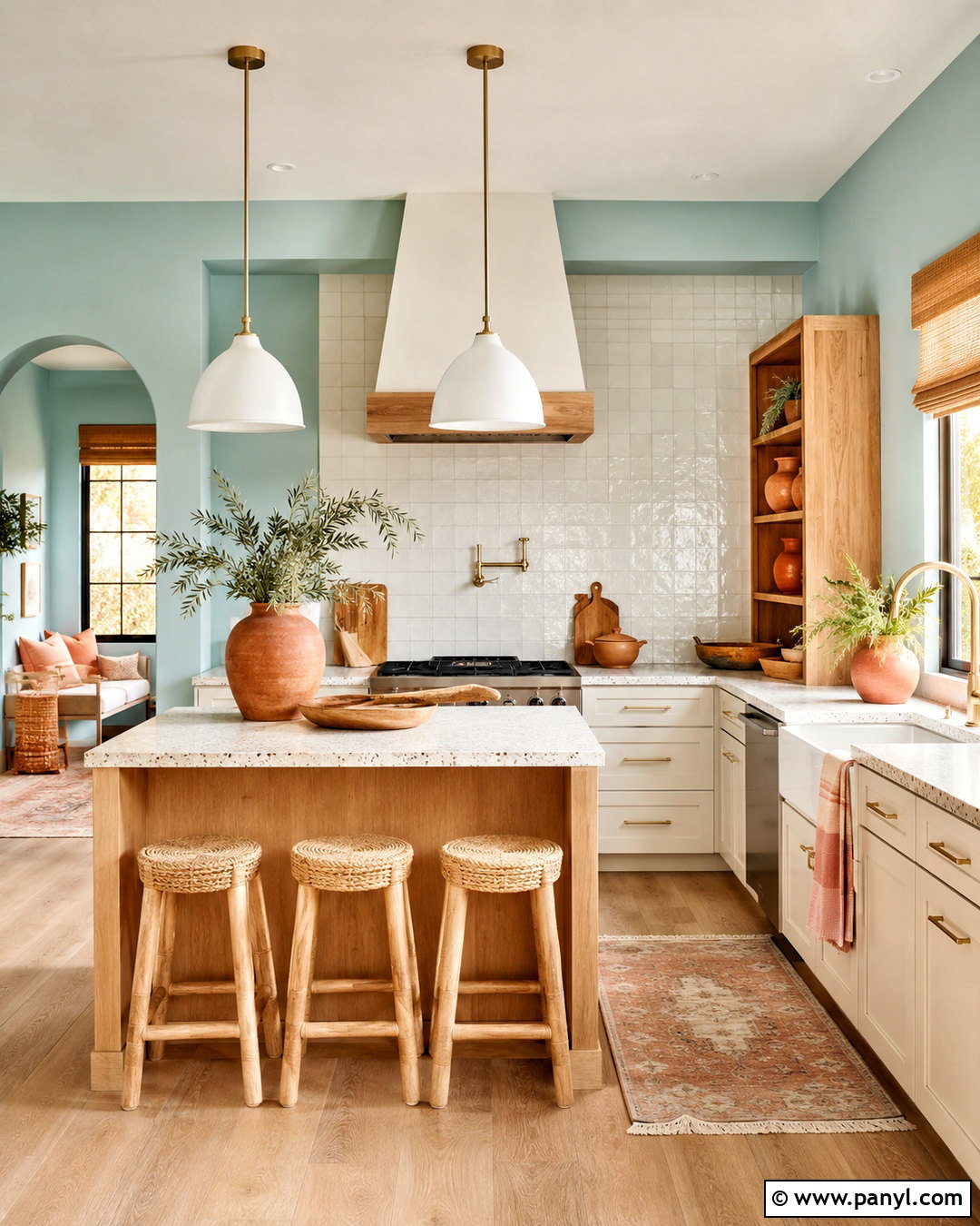
Dusty aqua walls blend blue and green for a kitchen that feels colorful, fresh, and pleasantly subdued. Combine the walls with creamy white cabinets, light terrazzo or quartz counters, and a backsplash of glossy off-white tile. Use pale oak for the island and flooring to supply natural warmth. Brushed brass pulls, simple white pendants, and woven counter stools create a relaxed contemporary finish. Add small accents of clay, peach, or muted coral through pottery and textiles, giving the cool aqua a warmer companion. Avoid bright turquoise accessories, which can push the room toward an overly themed appearance. Dusty aqua works well in compact kitchens because it provides personality without the visual weight of navy or forest green. The completed palette feels approachable, cheerful, and carefully balanced.
26. Butter Yellow Kitchen Walls
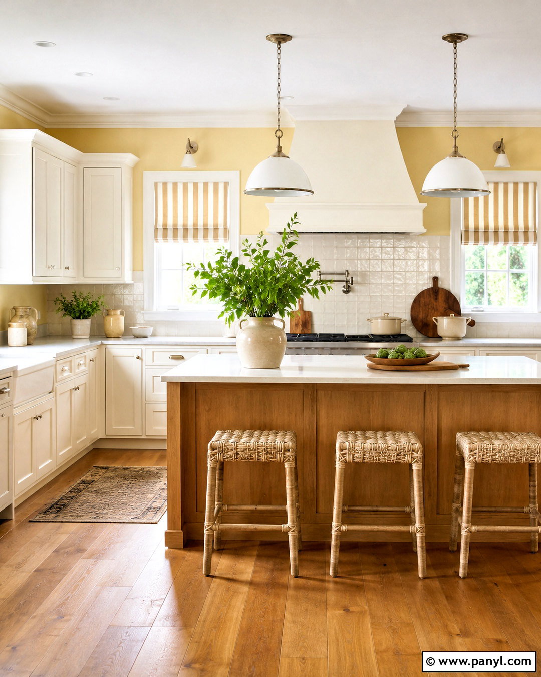
Butter yellow walls can make a kitchen feel sunny and welcoming even when natural light is limited. Pair this soft yellow with creamy white cabinets, warm quartz counters, and a backsplash of ivory square tile. A light oak island and medium wood flooring reinforce the cozy palette without adding more yellow. Choose polished nickel hardware for a clean contrast, then install white enamel pendants above the work area. Woven stools, striped linen shades, and simple green plants give the room casual character. Butter yellow should look muted and creamy rather than neon or lemony. Use white trim to keep its edges fresh and defined. This complete scheme suits farmhouse, cottage, and traditional kitchens, creating an upbeat environment that remains comfortable enough for everyday family meals.
27. Sunny Yellow Kitchen Walls
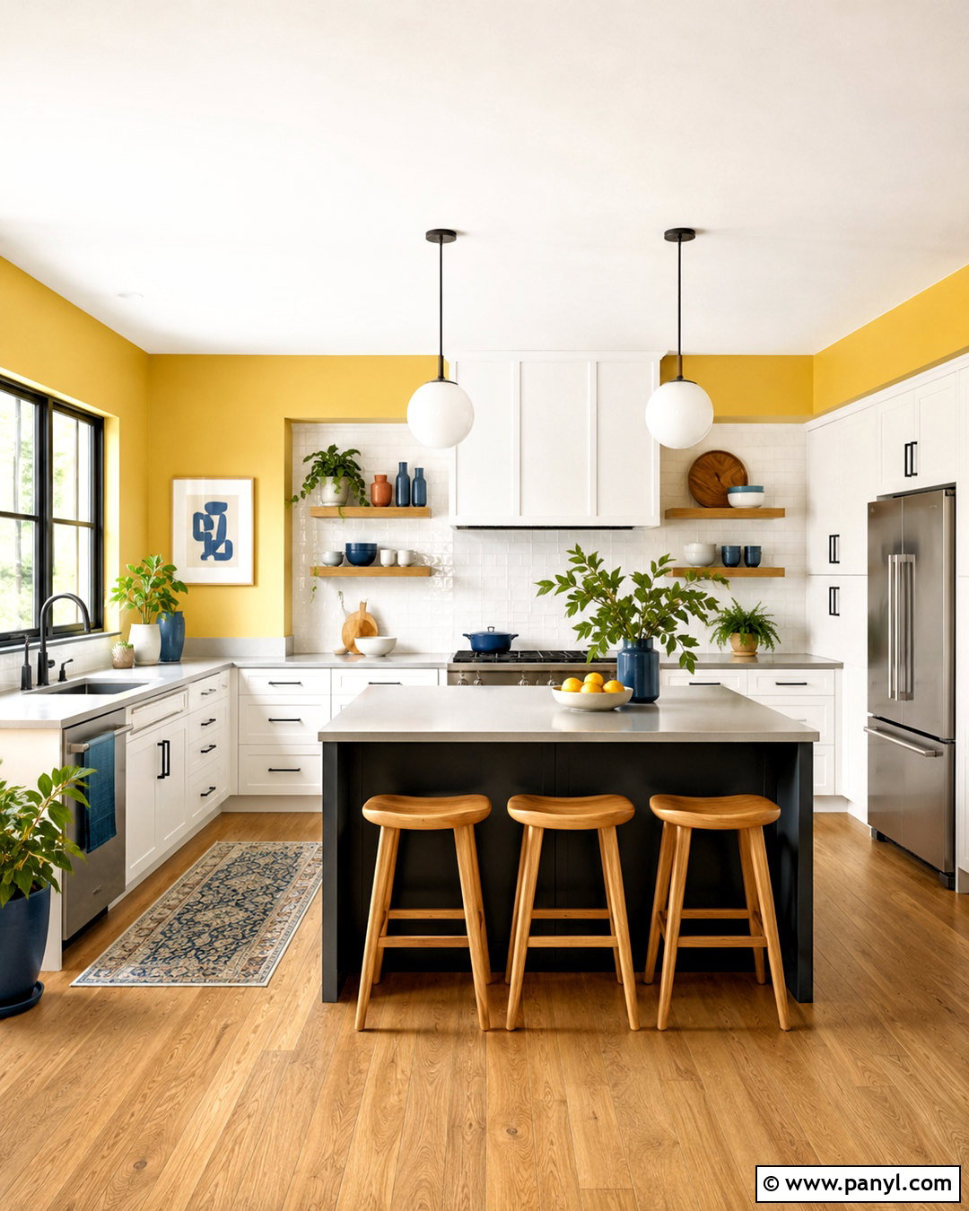
Sunny yellow walls bring energetic color to a bright kitchen and work best when balanced by crisp, uncomplicated finishes. Pair them with white flat-panel cabinets, pale gray quartz counters, and a glossy white backsplash. Ground the vibrant walls with a charcoal island, black hardware, and medium oak flooring. White globe pendants keep the upper half open, while natural wood stools soften the contrast. Limit additional colors to a few green plants and muted blue accessories. If the room has many windows, the yellow will appear even brighter, so test less saturated samples before painting every wall. Another option is to use yellow throughout a defined breakfast area while keeping the cooking zone white. The completed kitchen feels playful and modern without sacrificing visual order.
28. Ochre Kitchen Walls
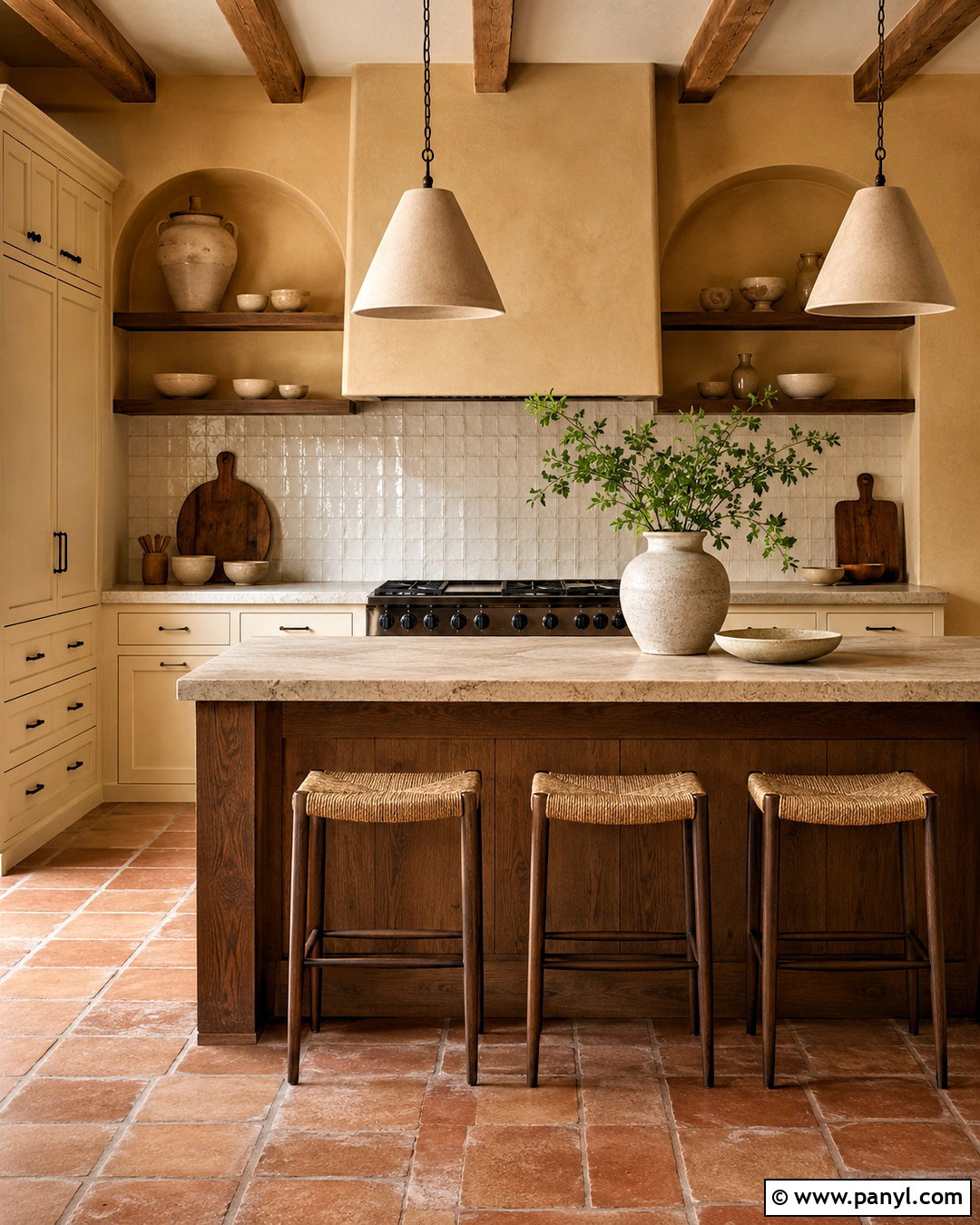
Ochre walls create a warm, earthy kitchen inspired by natural pigments and sunbaked materials. Pair the color with creamy cabinets, honed limestone counters, and a backsplash of handmade off-white tile. Introduce walnut on the island and open shelving to deepen the palette. Dark bronze hardware, simple plaster pendants, and terra-cotta floor tiles reinforce the grounded character. For a lighter approach, substitute oak flooring and woven tan stools. Ochre is strong enough to stand alone, so keep artwork and accessories restrained. Use cream pottery, dark wood boards, and green branches for texture. This wall color is especially effective in kitchens with warm daylight and traditional architectural details. The finished room feels layered and comfortable, blending Mediterranean warmth with practical, contemporary simplicity.
29. Terracotta Kitchen Walls
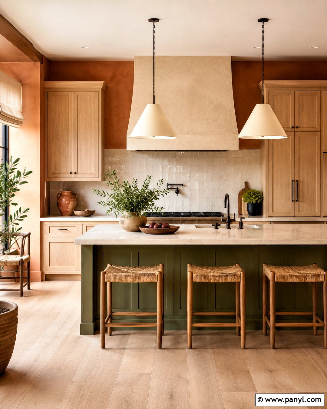
Terracotta walls wrap a kitchen in warm, clay-inspired color and pair naturally with wood and creamy stone. Create a welcoming Mediterranean look with white oak cabinets, ivory quartz counters, and a backsplash of handmade cream zellige-style tile. Use dark bronze hardware and a plaster range hood for strong architectural definition. Terra-cotta floor tiles can create a tonal effect, while pale oak flooring offers quieter contrast. Add woven counter stools, linen shades, and large cream pendants to brighten the saturated walls. Keep the island natural wood or paint it a muted olive green for an earthy complementary note. Avoid introducing too many orange accessories. Instead, use white ceramics and simple greenery. The resulting kitchen feels warm, relaxed, and collected without becoming overly rustic.
30. Soft Clay Kitchen Walls
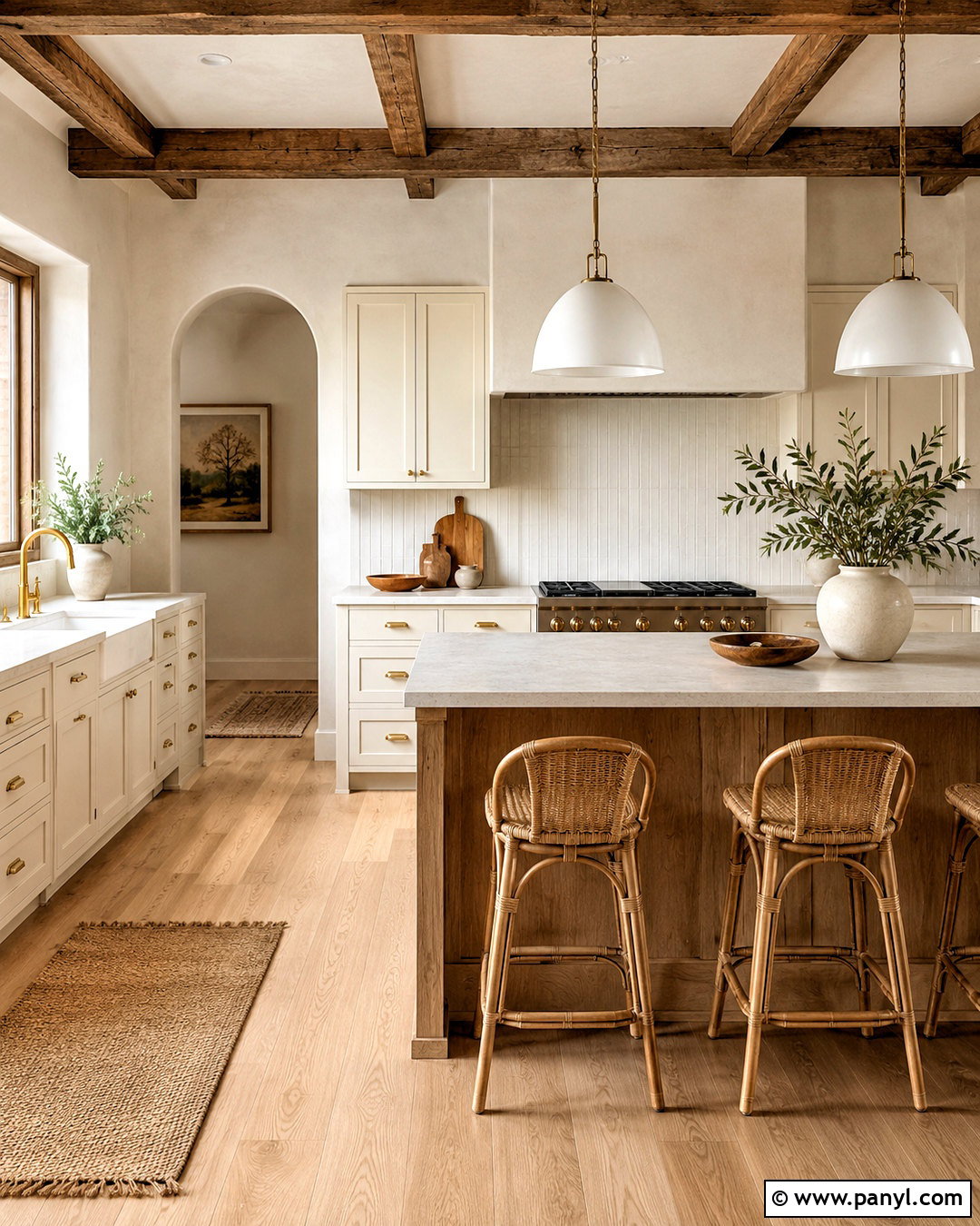
Soft clay walls offer the warmth of terracotta in a quieter, easier-to-use form. Pair this dusty orange-beige color with creamy Shaker cabinets, light quartz counters, and a backsplash of vertical ivory tile. A natural oak island and pale wood flooring create a light, cohesive foundation. Use brushed brass hardware and white dome pendants to keep the room bright. Counter stools in woven cane or oatmeal fabric provide additional texture without introducing competing colors. Soft clay works especially well in open-plan homes containing beige, tan, and muted green furnishings. Repeat it in small textiles beyond the kitchen to support visual flow. Finish the room with cream ceramics, wood boards, and an olive branch arrangement. The complete look feels warm, modern, and pleasantly understated.
31. Rust Kitchen Walls
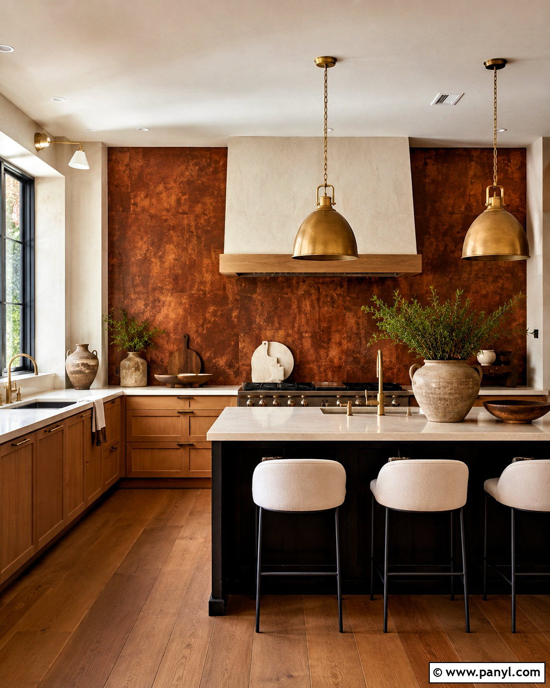
Rust-colored walls give a kitchen rich character through deep red-orange undertones. Balance the saturated color with light oak cabinets, creamy quartz counters, and an off-white backsplash that extends to the ceiling. Matte black hardware can add crisp definition, while aged brass lighting brings a softer, warmer glow. Use medium brown flooring and pale upholstered stools to connect the dark walls with the natural cabinetry. A black or walnut island provides a strong central anchor. Keep decorative accents neutral, relying on cream pottery, clear glass, and a few green plants rather than additional reds. Rust is best suited to kitchens with good natural light or generous artificial lighting. Used as part of a complete, restrained palette, it creates a warm and memorable room rather than an overwhelming one.
32. Blush Pink Kitchen Walls
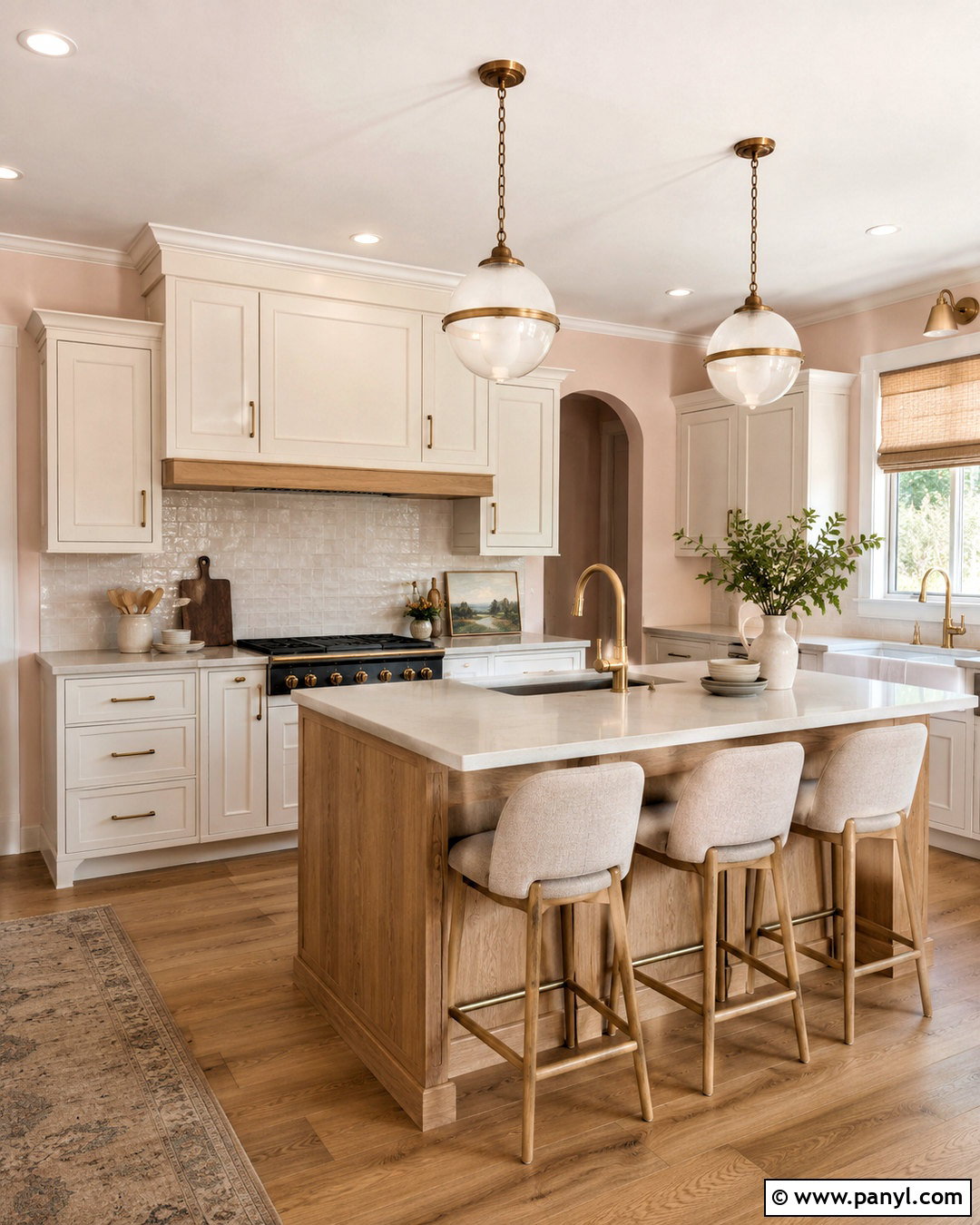
Blush pink walls bring gentle warmth to a kitchen while functioning almost like a neutral. Pair them with warm white cabinets, pale gray quartz counters, and a backsplash made from creamy handmade tile. Natural oak flooring and a matching island keep the palette relaxed and prevent the pink from feeling overly sweet. Add brushed brass hardware, white globe lights, and oatmeal counter stools for a polished finish. Small accents of sage green, charcoal, or dark brown provide mature contrast. Choose a dusty blush with beige undertones rather than a bright pastel pink. This shade works particularly well in kitchens with limited exposed wall area, where it appears as a soft glow around cabinets and windows. The overall design feels light, welcoming, and quietly distinctive.
33. Plaster Pink Kitchen Walls
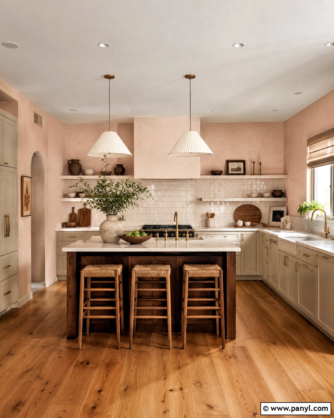
Plaster pink walls create an earthy, mineral-like background that is warmer than greige and more subdued than traditional pink. Combine them with putty-colored cabinets, creamy stone counters, and an ivory backsplash with visible handmade texture. Use a dark walnut island and medium oak flooring to provide depth. Aged brass pulls and softly shaped white pendants support the warm, natural palette. Consider linen Roman shades and woven stools in sand or oatmeal. Plaster pink pairs attractively with clay, beige, dark brown, and muted green, making it useful in an open kitchen connected to neutral living spaces. Keep accessories simple and tactile, such as stoneware bowls and wooden boards. The finished room feels contemporary, calm, and layered rather than delicate or overly decorative.
34. Dusty Rose Kitchen Walls
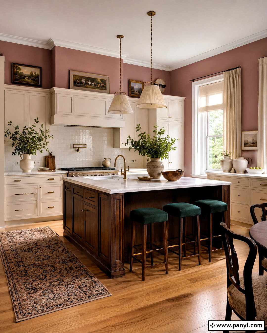
Dusty rose walls can give a traditional kitchen a rich, collected feeling when balanced with natural wood and pale stone. Pair the walls with ivory inset cabinets, white marble-look counters, and a glossy cream backsplash. Choose a dark walnut island with turned legs or furniture-like detailing to add depth. Antique brass hardware and fabric-shaded pendants enhance the classic direction, while medium oak flooring keeps the room approachable. Use dark green or charcoal in small amounts through stools, artwork, or a pantry door. Avoid adding several other pink tones, since a restrained palette makes dusty rose look more sophisticated. Cream pottery, framed landscapes, and linen window treatments complete the room. This scheme feels warm, individual, and suitable for both period homes and updated suburban kitchens.
35. Peach Kitchen Walls
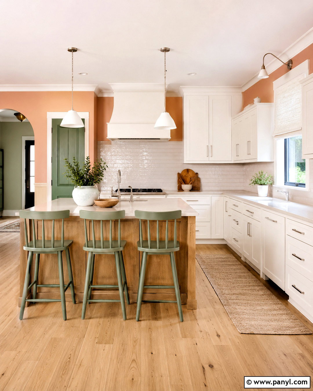
Peach walls add a bright, warm glow that can make an everyday kitchen feel more cheerful. Choose a muted peach with beige undertones, then pair it with white cabinets, pale quartz counters, and a backsplash of simple ivory tile. Light oak flooring and a natural wood island balance the color without introducing harsh contrast. Use polished nickel hardware and white pendants for a clean finish. Sage green counter stools or a small green pantry cabinet can provide a grounded complementary accent. Keep fabrics neutral with cream linen shades and a tan runner. Peach works especially well in breakfast kitchens and rooms receiving soft morning light. With straightforward cabinetry and limited accessories, the finished design looks fresh and modern rather than overly colorful or childlike.
36. Muted Coral Kitchen Walls
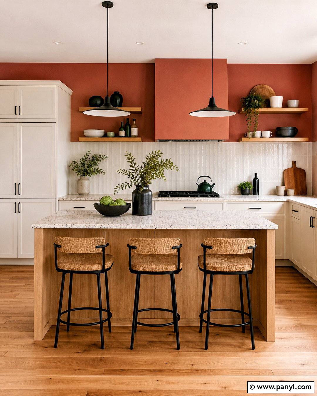
Muted coral walls create an upbeat kitchen with more depth than peach and less intensity than bright orange. Pair the color with creamy white cabinets, light terrazzo counters, and a glossy off-white tile backsplash. Use a pale oak island and matching wood flooring to add warmth while preserving an airy atmosphere. Matte black hardware and slim black pendants provide enough contrast to define the cabinetry. Add natural woven stools, white ceramics, and a few deep green accents through plants or a painted door. Because coral changes considerably under warm bulbs, choose neutral warm-white lighting that shows the paint accurately. This palette works well in modern, eclectic, and compact kitchens. The complete room feels lively and distinctive while remaining organized, practical, and comfortable.
37. Lavender Gray Kitchen Walls
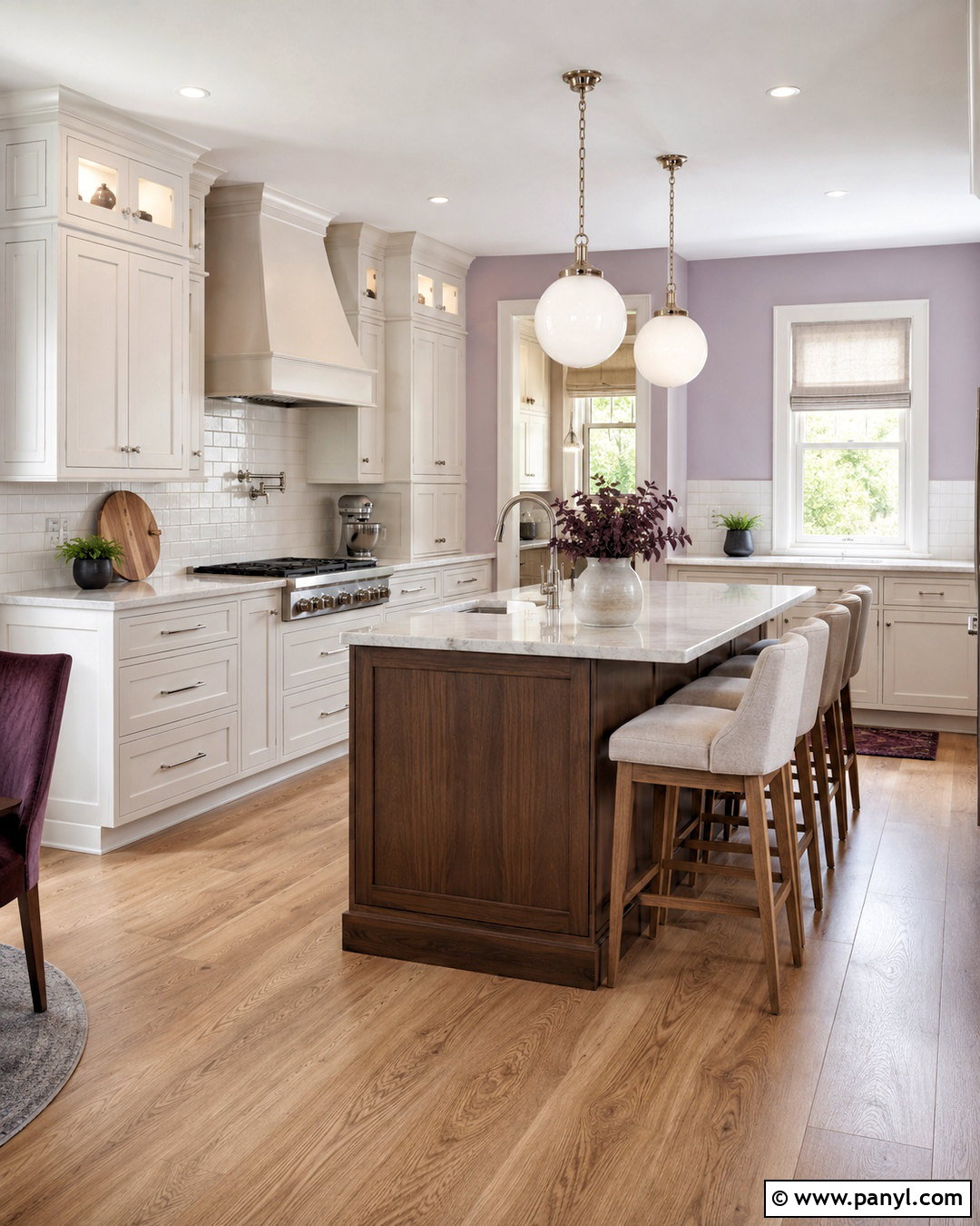
Lavender-gray walls provide a subtle alternative to standard cool gray, adding a soft violet undertone that changes gently with the light. Pair them with warm white cabinets, pale marble-look counters, and a white backsplash with light gray grout. Use medium oak flooring and a walnut island to counterbalance the cooler wall color. Polished nickel hardware and opal globe pendants maintain a refined appearance. Add oatmeal stools, linen shades, and a few muted plum or sage accessories for quiet depth. Lavender gray works best in kitchens with clean finishes and limited competing colors. Test the paint beside stone counters to ensure the undertones relate. The finished kitchen feels serene and elegant, offering understated color that remains appropriate for both contemporary and updated traditional interiors.
38. Deep Plum Kitchen Walls
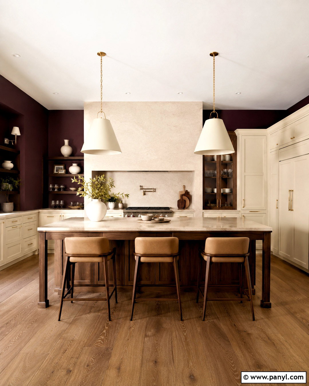
Deep plum walls create a dramatic kitchen with warmer character than navy or charcoal. Pair them with creamy cabinets, pale quartz counters, and a full-height ivory backsplash to reflect light around the room. A walnut island and medium oak flooring support the red-violet undertones without creating excessive contrast. Choose aged brass hardware and large cream pendants for warmth and visibility. Upholstered stools in tan or oatmeal soften the bold walls. Use plum on a pantry door or built-in cabinet to make the scheme feel intentional, but leave the ceiling light. Keep accessories restrained with white ceramics, dark wood, and clear glass. In a spacious, well-lit kitchen, this complete palette feels sophisticated and memorable while remaining comfortable enough for everyday cooking and casual gatherings.
39. Burgundy Kitchen Walls
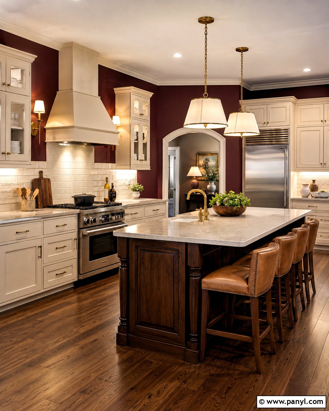
Burgundy walls bring deep, traditional warmth to a kitchen and look especially rich beside cream cabinetry. Use warm white inset cabinets, lightly veined stone counters, and a backsplash of glossy ivory tile. A dark oak island creates a furniture-like centerpiece, while aged brass hardware and shaded pendants reinforce the classic mood. Choose medium walnut flooring and tan leather stools to build a cohesive lower palette. Burgundy can absorb considerable light, so keep window coverings simple and add strong task lighting beneath upper cabinets. Display white dishes and pale ceramics on any open shelves to create visible contrast. Avoid combining the walls with bright red accents. When surrounded by restrained neutrals and natural materials, burgundy creates an elegant, enveloping kitchen that feels established rather than dated.
40. Chocolate Brown Kitchen Walls
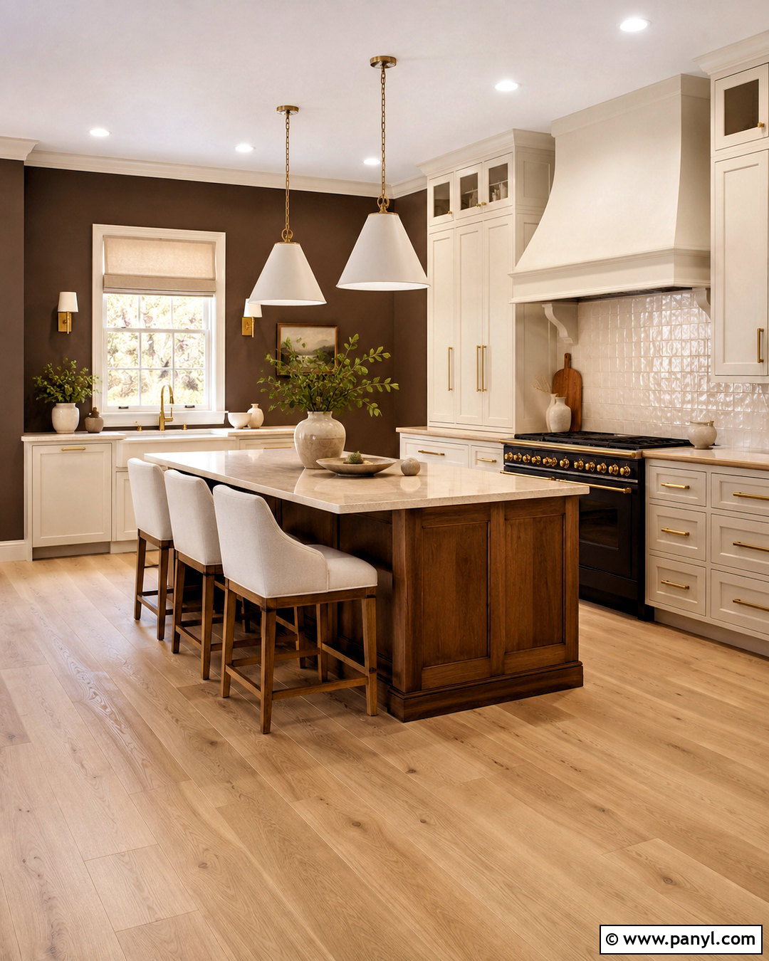
Chocolate brown walls give a large kitchen a cozy, grounded quality while showcasing pale cabinets and countertops. Pair the rich walls with creamy white cabinetry, warm quartz counters, and a backsplash of textured ivory tile. Natural oak or walnut on the island creates a layered brown palette rather than a stark contrast. Use aged brass hardware, oversized white pendants, and light upholstered stools to brighten the room. Pale oak flooring can keep the overall design fresh, while medium walnut flooring produces a more traditional result. Add cream linen shades and simple green branches for softness. Chocolate brown is most effective when the shade has warm, balanced undertones and the kitchen receives ample light. The completed space feels substantial, comfortable, and connected to natural materials.
Conclusion:
The best choice among these **40 kitchen colors for walls** depends on more than personal preference. Start with the fixed surfaces you cannot easily change, including cabinets, counters, backsplash tile, flooring, and nearby furniture. Then choose a wall shade that either creates gentle harmony or provides controlled contrast. Warm whites, greiges, sage greens, and pale blues offer flexible backgrounds, while olive, navy, terracotta, plum, and chocolate brown create stronger atmosphere. Always paint large sample boards and move them around the kitchen during different times of day. Compare each option under your actual bulbs as well as natural light. Once the color is selected, repeat its undertones through wood, metal, textiles, and decor for a cohesive finished room.

Related Ideas and Inspiration:
Leave a Reply