
Choosing the right wall color becomes much easier with a clear plan, and these **20 room paint colour ideas** offer complete, coordinated looks for spaces throughout the home. Instead of treating paint as an isolated choice, consider the flooring, furniture, natural light, trim, textiles, and mood you want to create. Professional color guidance recommends evaluating these fixed elements and testing samples under changing daylight before making a final decision. () Current palettes include warm neutrals, nature-inspired greens, expressive blues, earthy browns, and immersive color treatments that continue across walls and architectural details. () Whether your taste is airy, cozy, traditional, or modern, you can find a practical starting point among these **20 room paint colour ideas**.

1. Warm White Living Room Paint Color
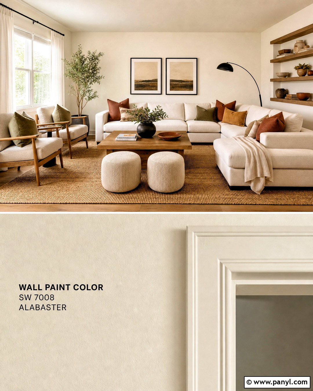
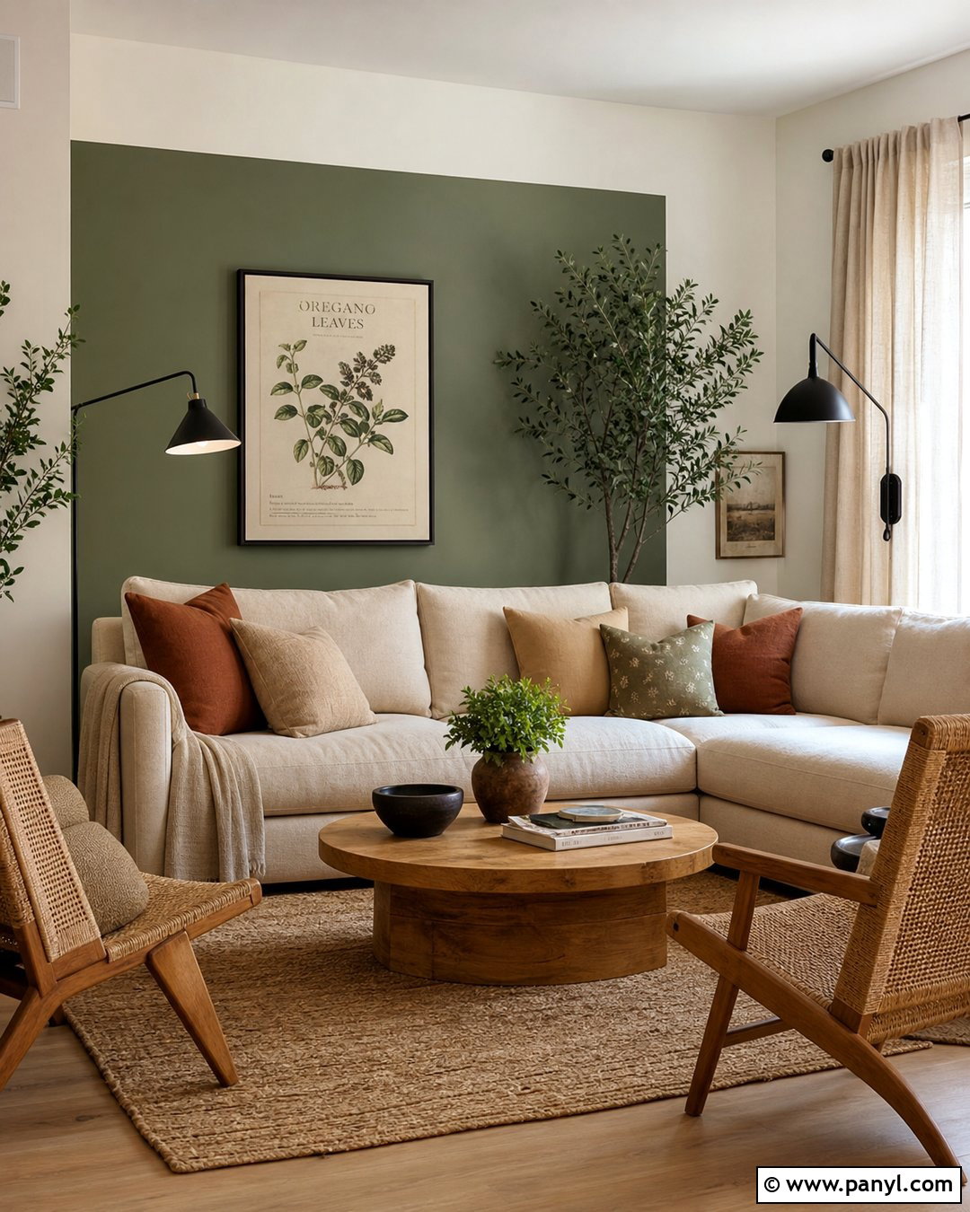
Warm white walls create a bright living room without the stark feeling that can come from cooler whites. Choose a creamy white with gentle beige or yellow undertones, then repeat it on the ceiling in a slightly lighter finish. Add an oatmeal-colored sofa, natural oak coffee table, and woven jute rug to establish warmth. Soft camel, olive, and muted rust pillows bring controlled color into the neutral setting. Use linen curtains that closely match the walls so the windows feel larger. Black-framed artwork and a slim black floor lamp provide necessary contrast. Complete the arrangement with two rounded accent chairs facing the sofa, leaving an open walkway through the room. The finished look feels relaxed, sunny, and flexible enough for changing seasonal decor.
2. Soft Greige Open Plan Room Paint Color
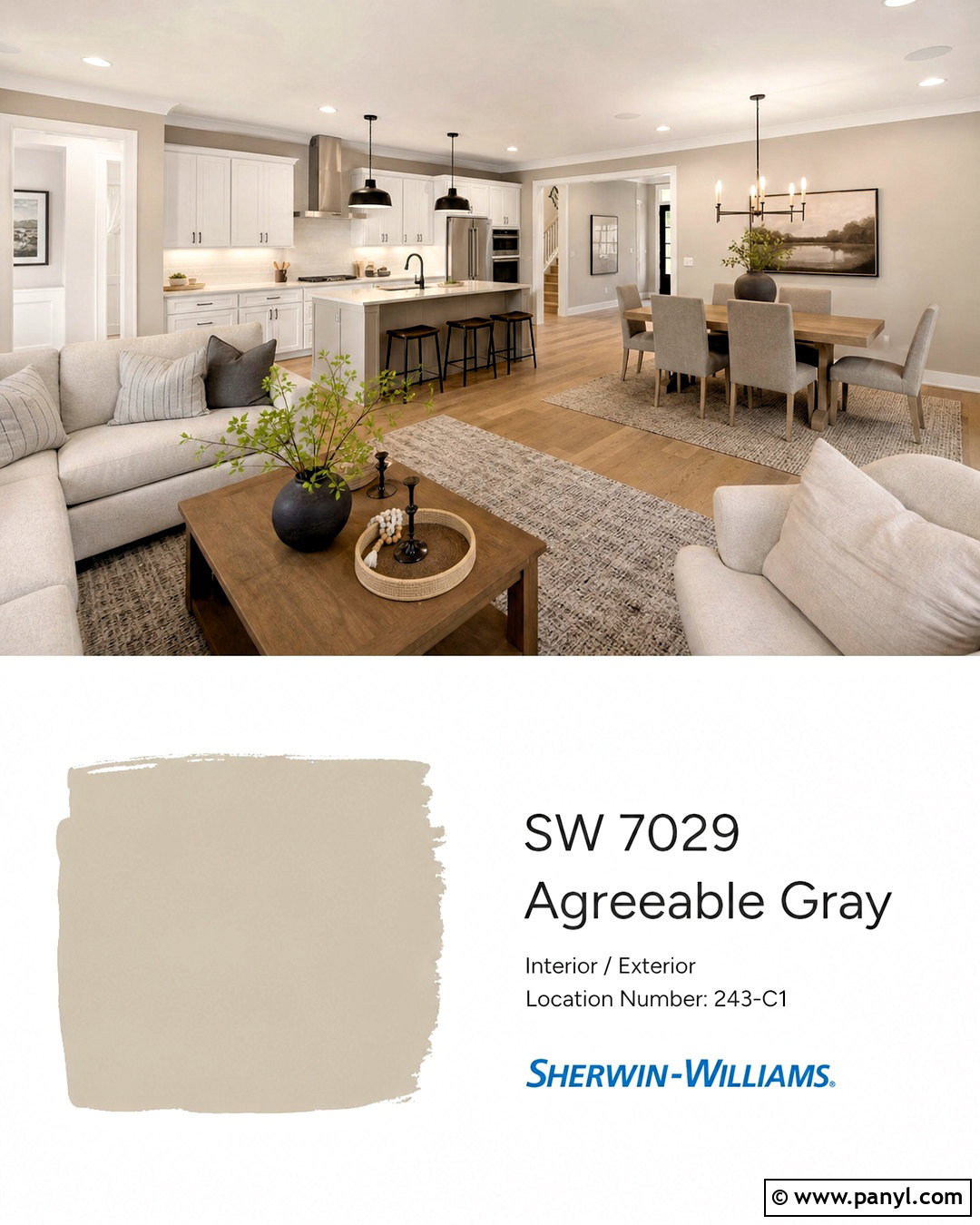
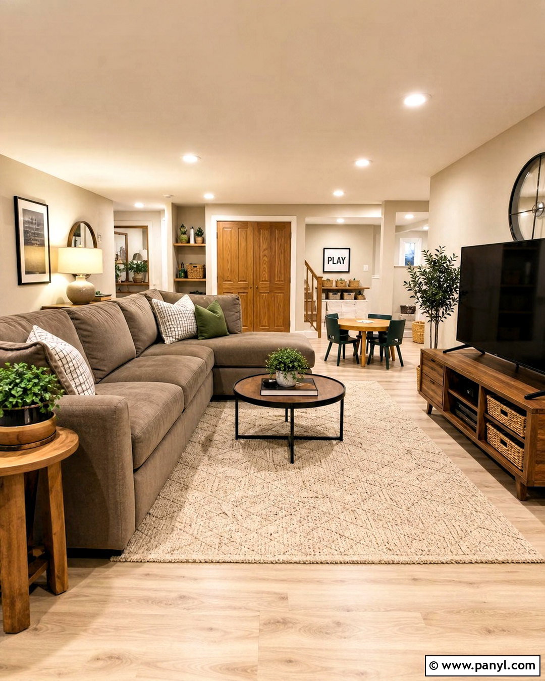
Soft greige is a practical choice when a living room, kitchen, and dining area share one continuous space. Look for a balanced shade that blends warm beige with a small amount of gray, avoiding anything overly cool or purple. Carry the color across the main walls to connect each zone visually. Use warm white for the ceiling and trim, light oak flooring underneath, and medium-toned wood furniture for definition. In the living area, arrange a cream sectional around a textured rug. Choose taupe dining chairs and simple black pendant lights near the table. Greige walls also complement white or mushroom kitchen cabinets without creating harsh contrast. Repeating black, cream, and natural wood accents throughout the space keeps the open layout coordinated rather than visually busy.
3. Sage Green Bedroom Paint Color
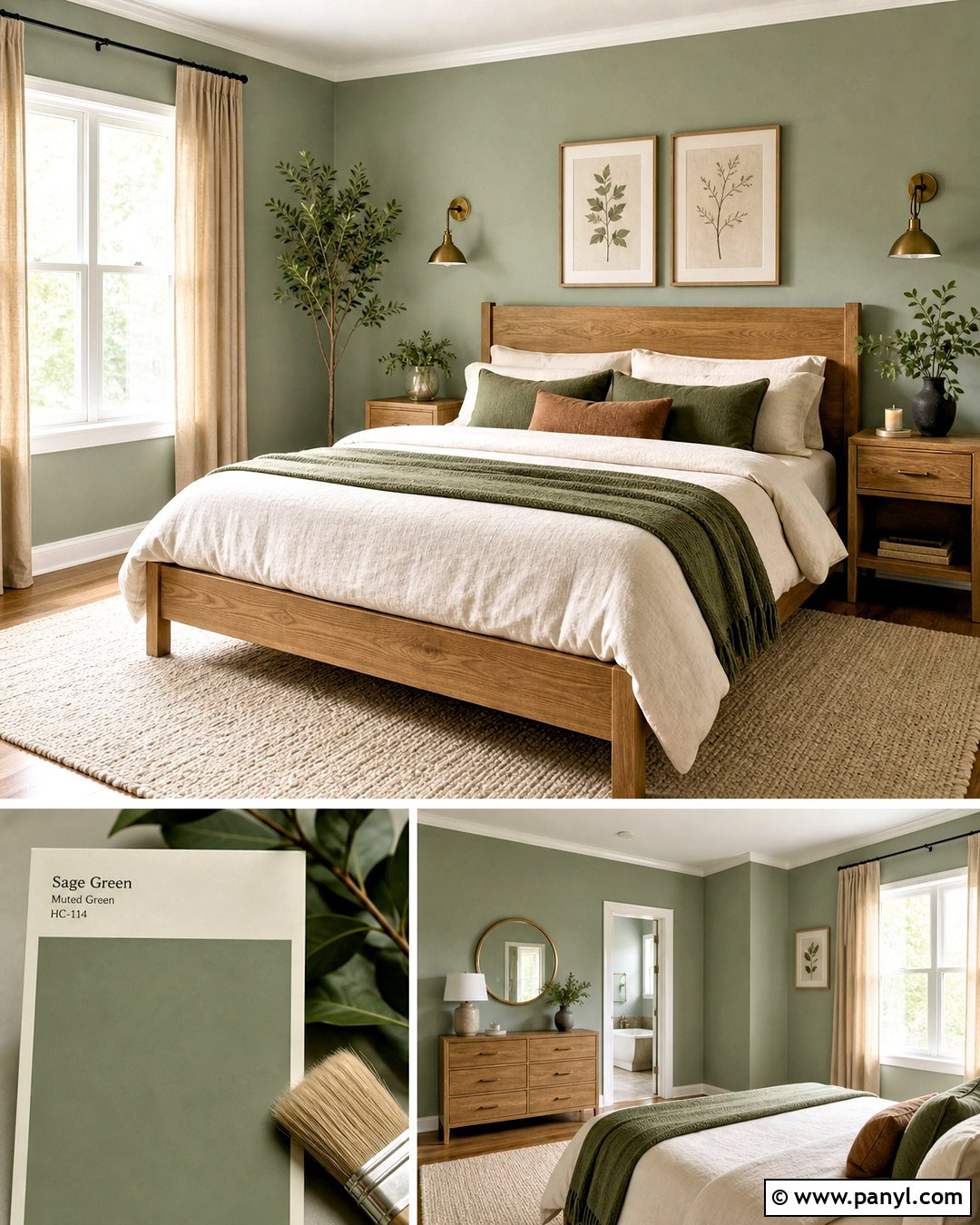
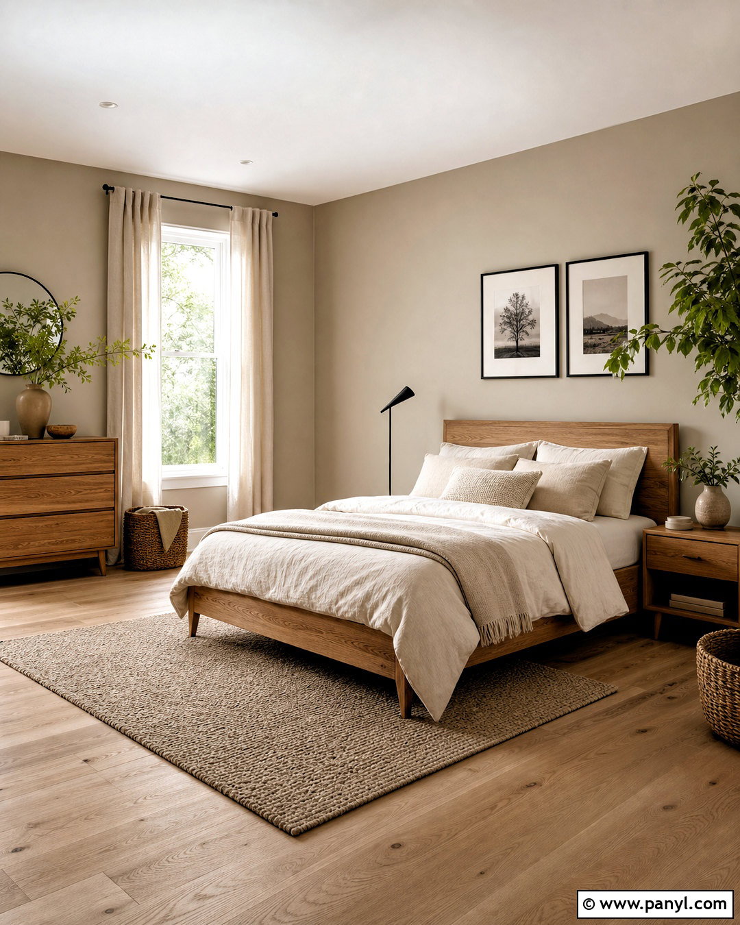
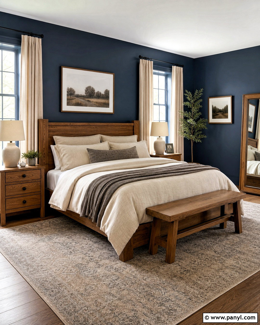
A muted sage green bedroom feels peaceful while offering more personality than a standard neutral. Paint every wall in a soft gray-green, then use warm white on the ceiling and narrow trim for gentle contrast. Position a natural oak bed against the longest uninterrupted wall and dress it with ivory linen, a moss-colored quilt, and small clay-toned pillows. Matching oak nightstands and aged brass sconces add warmth without making the room look formal. Choose light beige curtains that fall from near the ceiling to the floor, helping the windows appear taller. A cream wool rug softens the flooring and anchors the bed. Finish with simple botanical artwork and one substantial plant. The restrained palette creates a complete bedroom that feels connected to nature, comfortable, and easy to maintain.
4. Dusty Blue Dining Room Paint Color
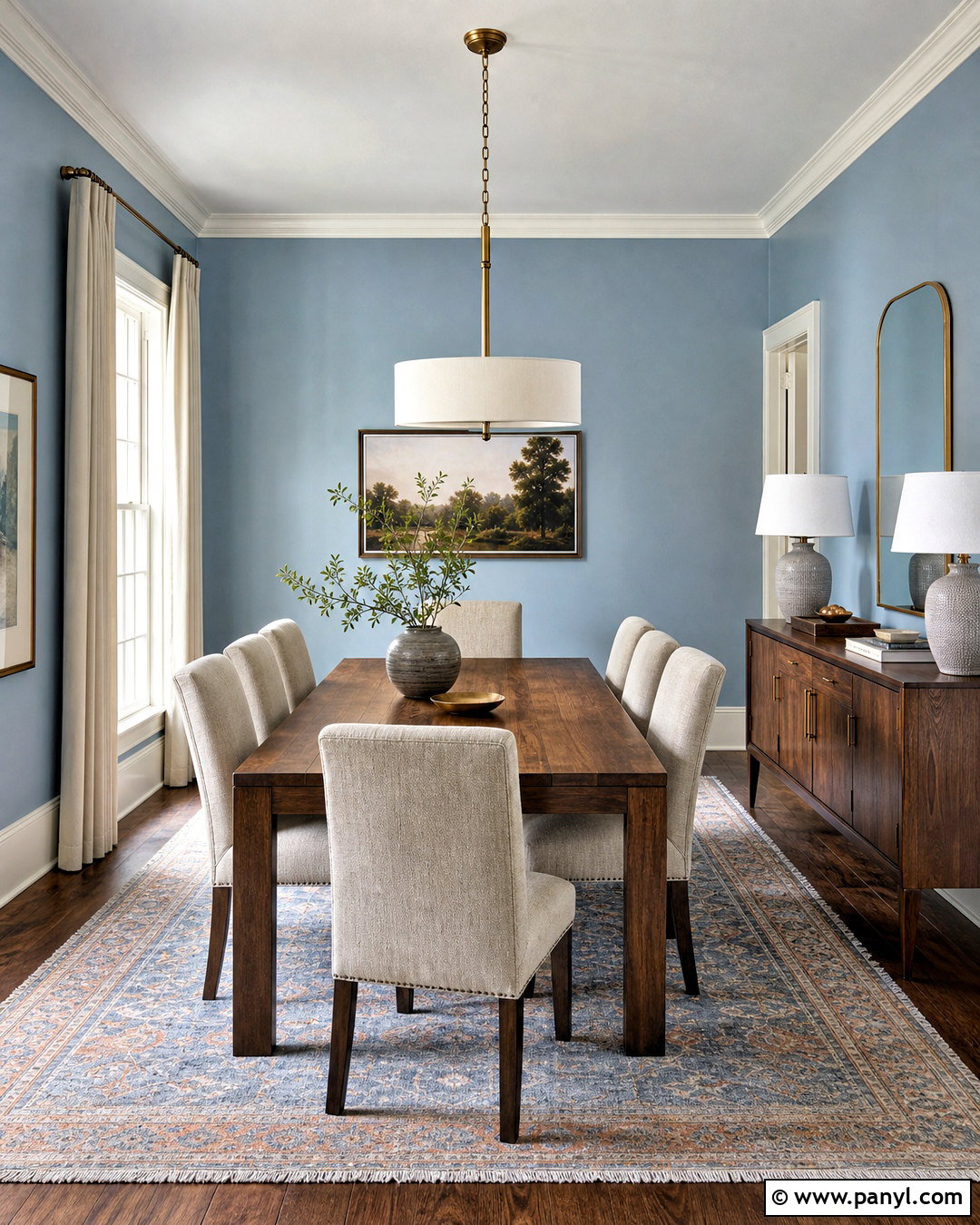
Dusty blue walls give a dining room noticeable color while maintaining a calm, livable atmosphere. Select a softened medium blue with gray undertones and use it on all four walls. Crisp warm white trim keeps the room defined, while a pale blue-white ceiling creates a smoother transition overhead. Center a medium walnut dining table beneath a sculptural brushed brass pendant. Upholstered oatmeal chairs lighten the arrangement and balance the cooler wall color. Add a low walnut sideboard, ceramic table lamps, and artwork containing cream, blue, and muted brown. Full-length ivory curtains prevent the scheme from feeling too formal. A vintage-style rug with faded blue and rust details connects the furniture to the paint. This complete palette works especially well in rooms used for both everyday meals and gatherings.
5. Deep Navy Home Office Paint Color
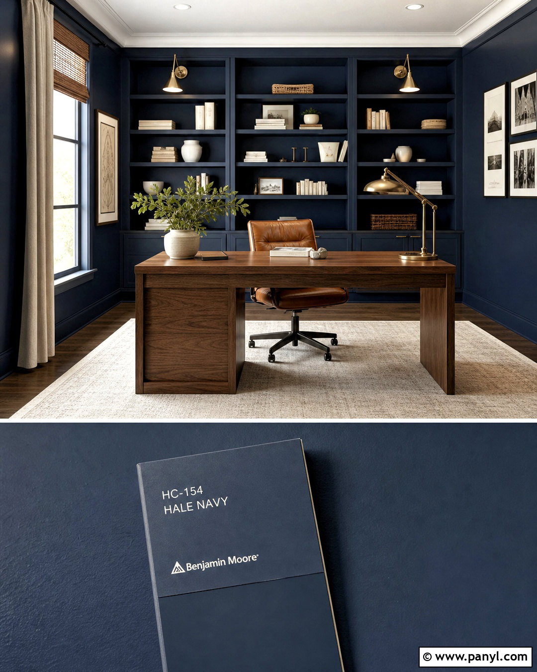
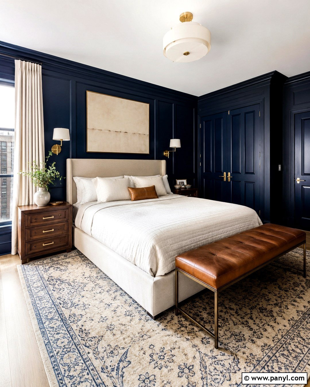
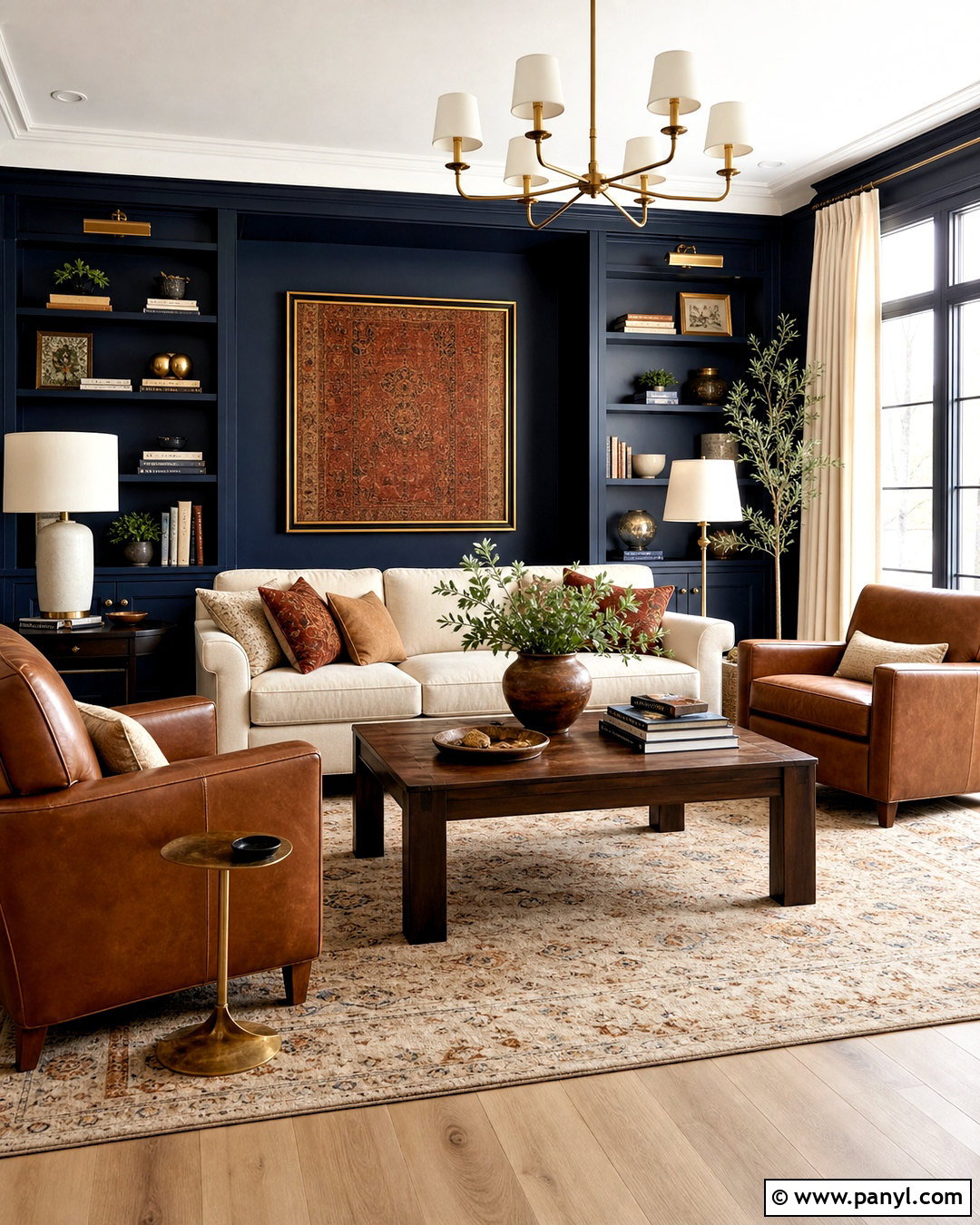
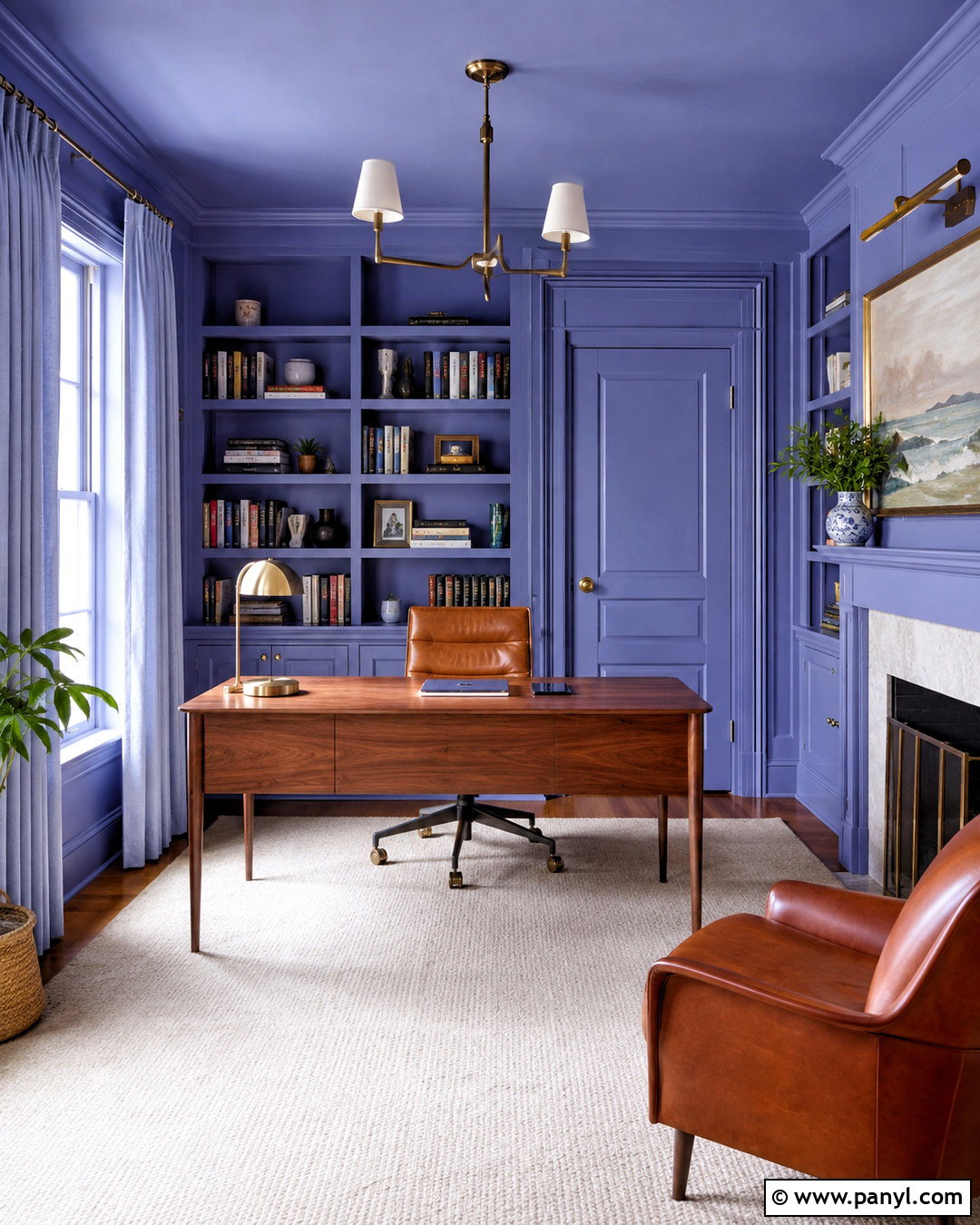
Deep navy can turn a basic home office into a focused, polished workspace. Use the same rich navy across the walls, built-in shelving, and trim for an immersive finish, but leave the ceiling warm white to preserve brightness. Place a substantial walnut desk near the center or facing a window instead of pushing it tightly against a wall. A cognac leather chair introduces warmth, while a low-pile cream rug keeps the floor area light. Style the shelves sparingly with neutral books, framed artwork, and matte white ceramics. Add a brass desk lamp and matching picture lights to reflect light against the darker paint. Simple woven shades soften daylight without hiding the windows. The combination feels professional and comfortable, with enough visual depth to make video-call backgrounds look intentional.
6. Terracotta Family Room Paint Color
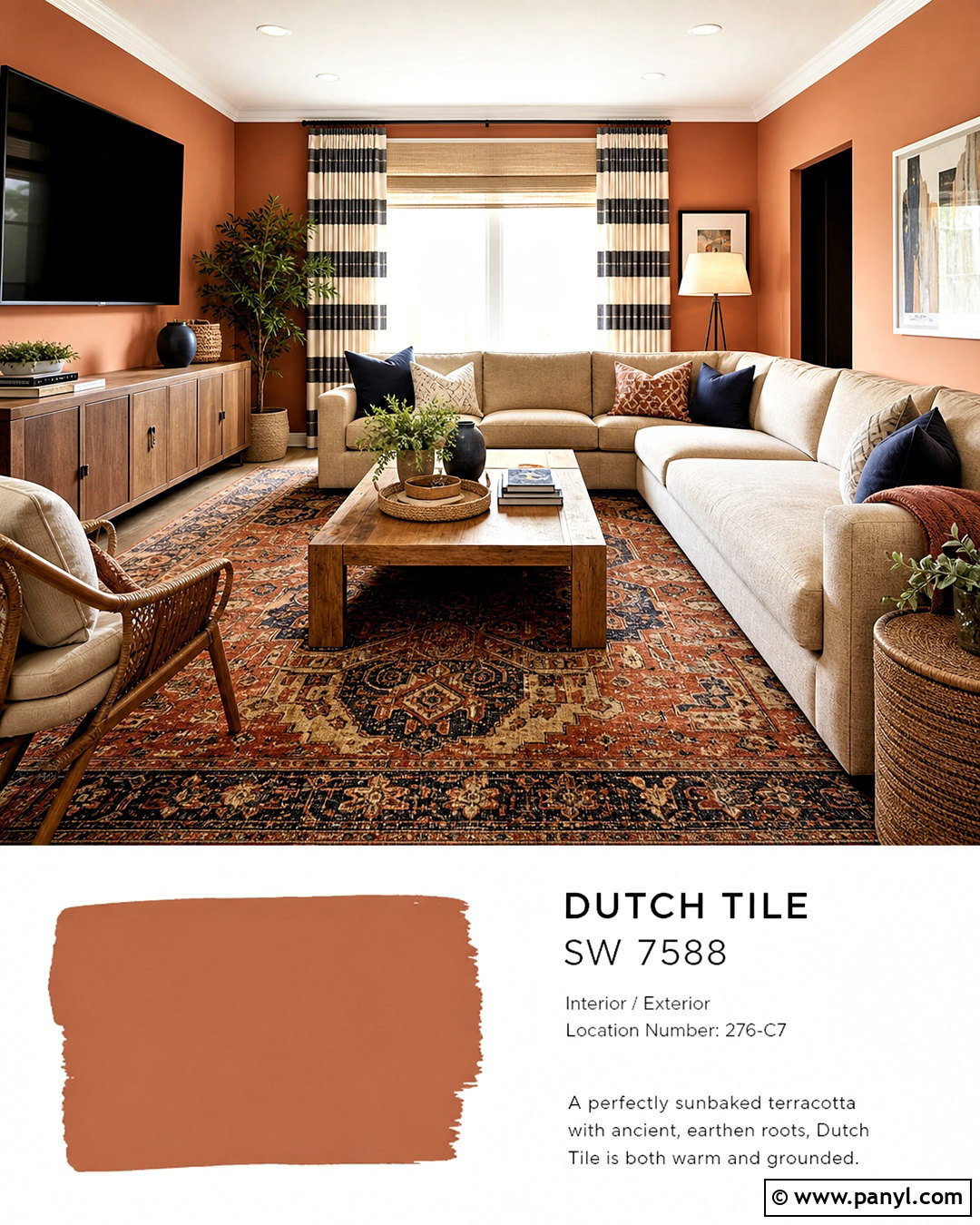
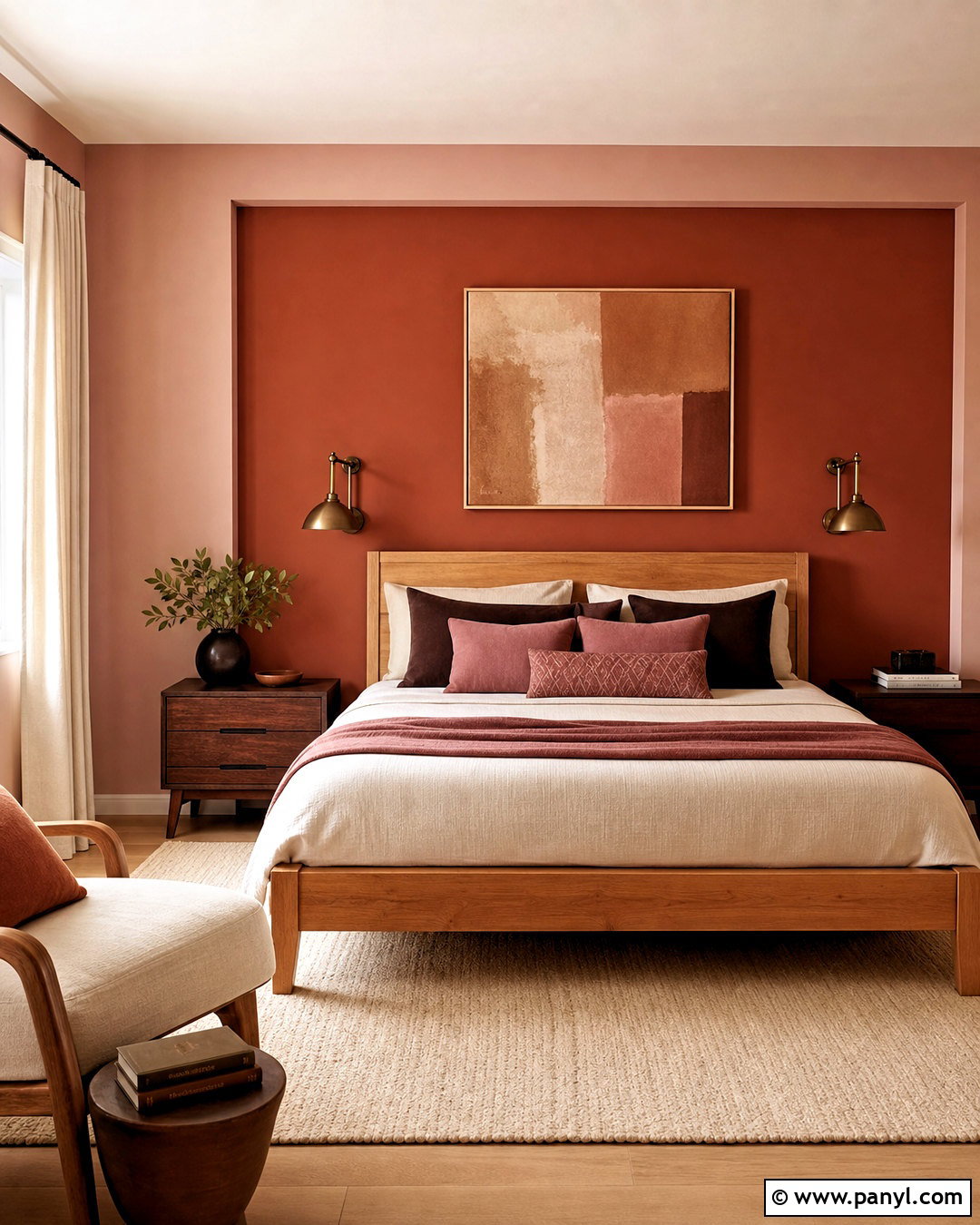
Warm terracotta walls can make a family room feel welcoming, energetic, and grounded. Choose a softened clay shade rather than a bright orange, then pair it with creamy trim and a warm white ceiling. Build the seating area around a deep beige sectional with washable upholstery. Add a large patterned rug containing rust, indigo, and sand so everyday wear is less noticeable. A sturdy oak coffee table, woven storage baskets, and closed media cabinetry keep the space practical. Dark blue pillows provide contrast, while striped cream curtains introduce a casual pattern. Arrange one reading chair and a floor lamp near the window to create a separate quiet corner. The final room feels colorful but not overwhelming because the natural wood, neutral upholstery, and practical storage balance the expressive paint.
7. Butter Yellow Kitchen Paint Color
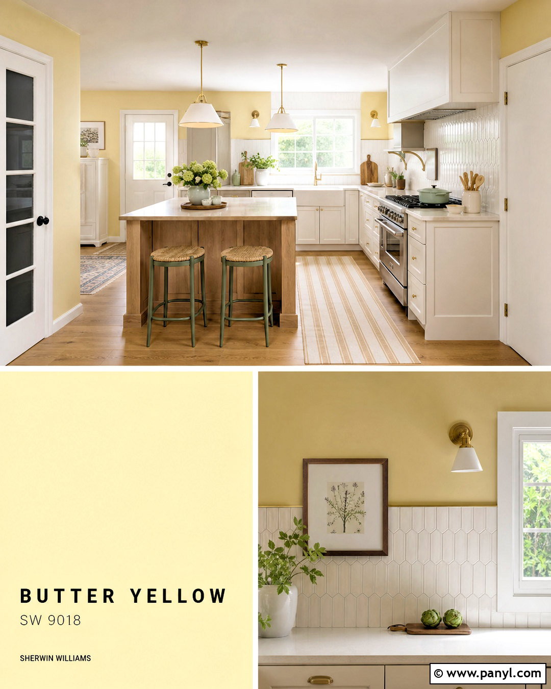
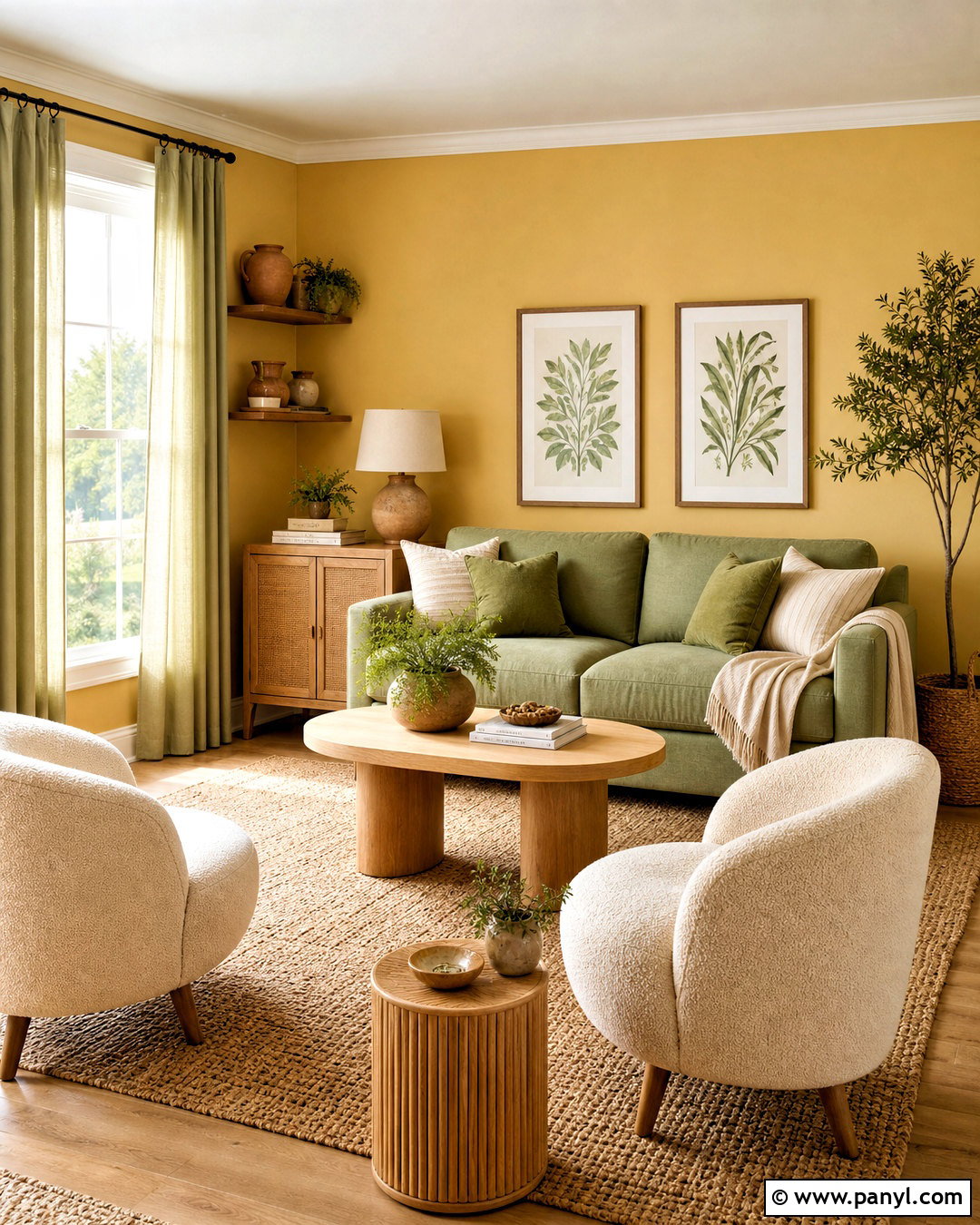
A soft butter yellow kitchen feels cheerful without becoming overly bright. Use the color on the walls surrounding warm white cabinets, allowing the cabinetry to remain the clean foundation of the room. Choose light oak flooring, cream quartz countertops, and a handmade white tile backsplash to reinforce the sunny palette. A small wood island or breakfast table adds natural texture at the center. Use aged brass cabinet hardware and simple pendant lights for warmth, then introduce sage green through stools, pottery, or a washable runner. White ceiling paint should have a slightly creamy undertone so it does not clash with the walls. Keep window coverings light and minimal. Together, these finishes create a fresh, inviting kitchen that works in cottage, traditional, transitional, and relaxed modern homes.
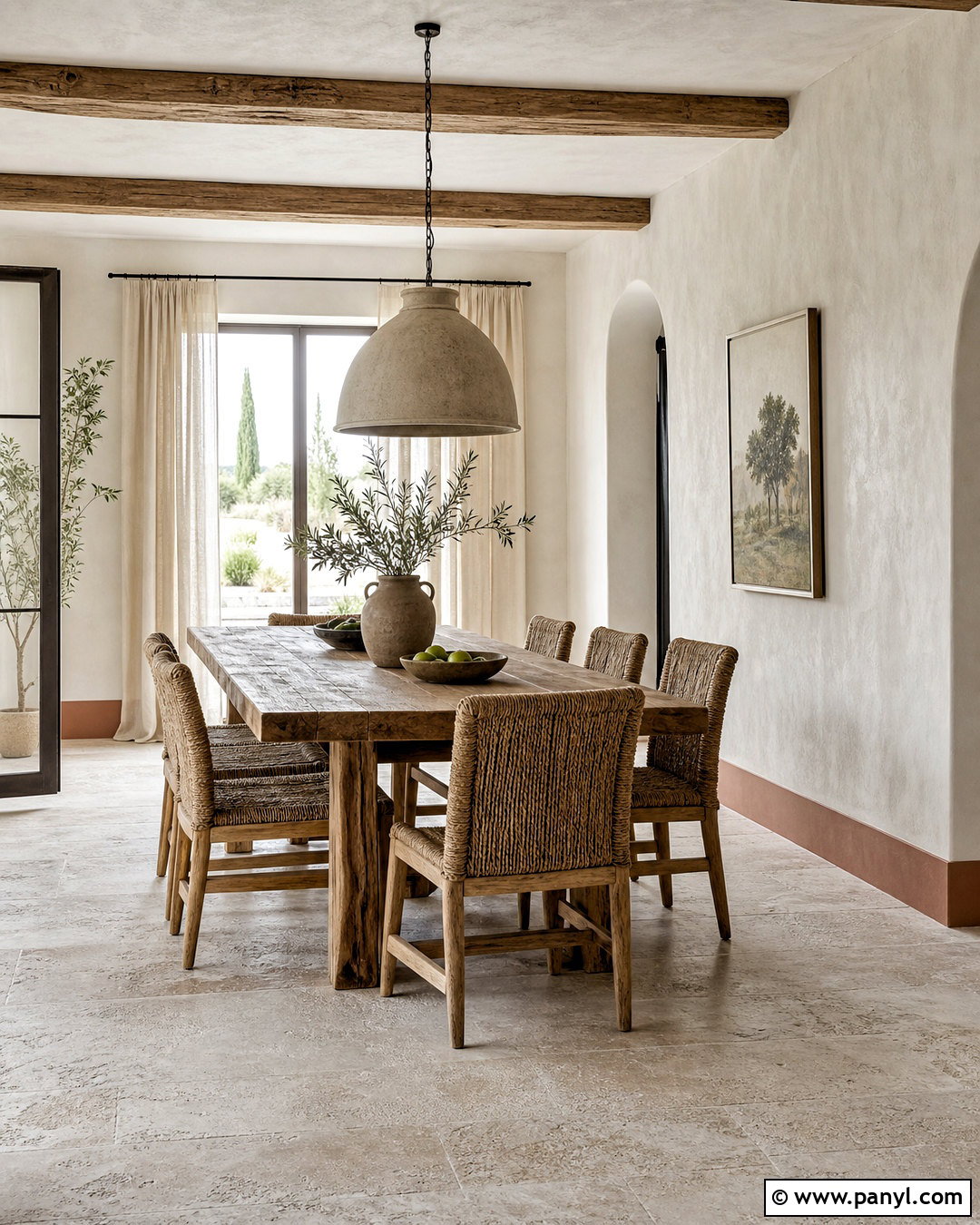

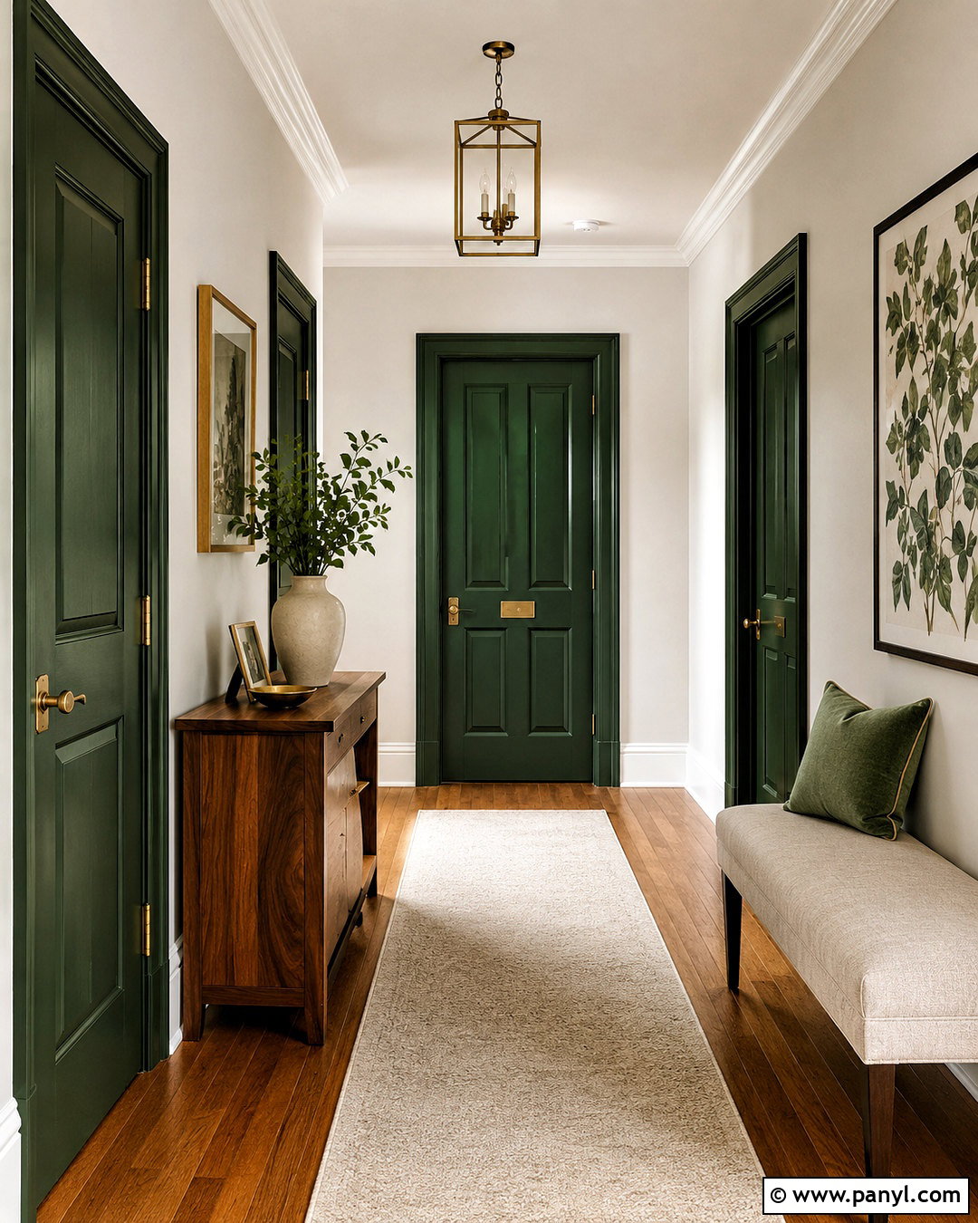
8. Muted Blush Bedroom Paint Color
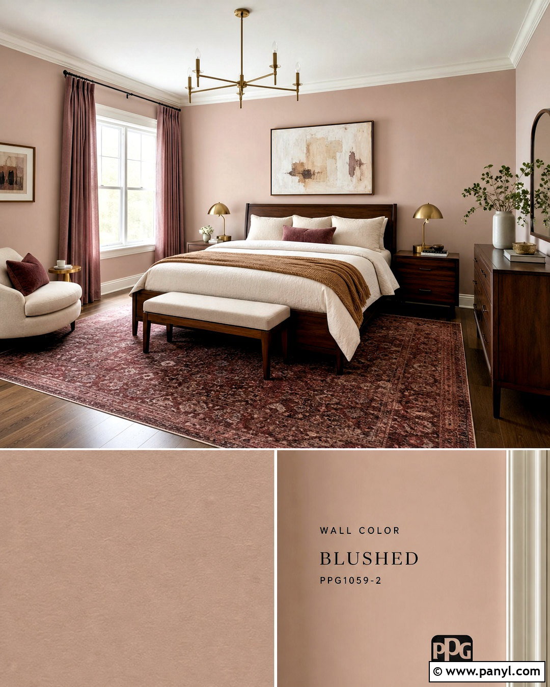
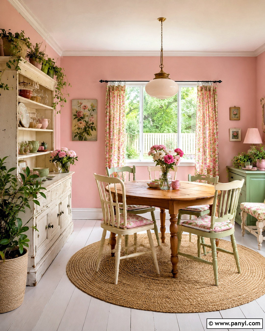
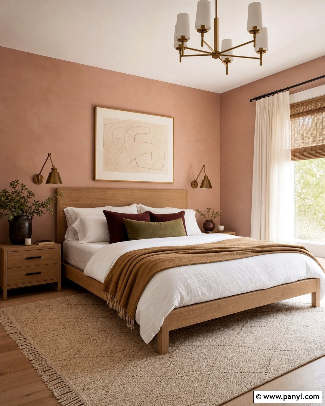
Muted blush gives a bedroom gentle warmth when it contains enough beige or brown to avoid looking overly sweet. Apply the dusty pink shade to the walls and use a soft ivory on the ceiling, baseboards, and doors. A dark walnut bed creates a strong focal point, while cream bedding and a textured camel throw make the palette feel mature. Add matching walnut nightstands, linen lampshades, and brushed brass hardware for a balanced mix of finishes. A faded burgundy and beige rug adds depth beneath the bed. Keep curtains close to the wall color for a seamless effect, and choose abstract artwork with restrained rust, cream, and charcoal details. This coordinated approach turns blush paint into a versatile backdrop suitable for a refined primary bedroom or comfortable guest room.
9. Olive Green Living Room Paint Color
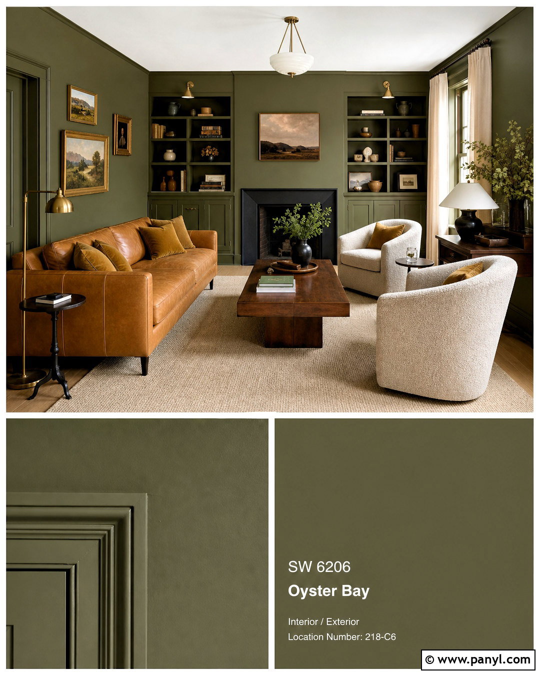
Olive green brings depth to a living room while pairing naturally with wood, leather, and warm metal finishes. Choose a medium olive that has earthy brown undertones, then continue it across the walls and any built-in cabinetry. Use a light cream ceiling to keep the room from feeling closed in. Arrange a camel leather sofa opposite two oatmeal boucle chairs, with a walnut coffee table between them. A large beige rug brightens the floor and clearly defines the conversation area. Add antique brass lamps, dark wood picture frames, and pillows in cream, black, and muted ochre. Natural linen curtains soften the windows without competing with the wall color. The resulting room feels collected and comfortable, blending traditional materials with clean, modern furniture shapes for a look that can age gracefully.
10. Charcoal Media Room Paint Color
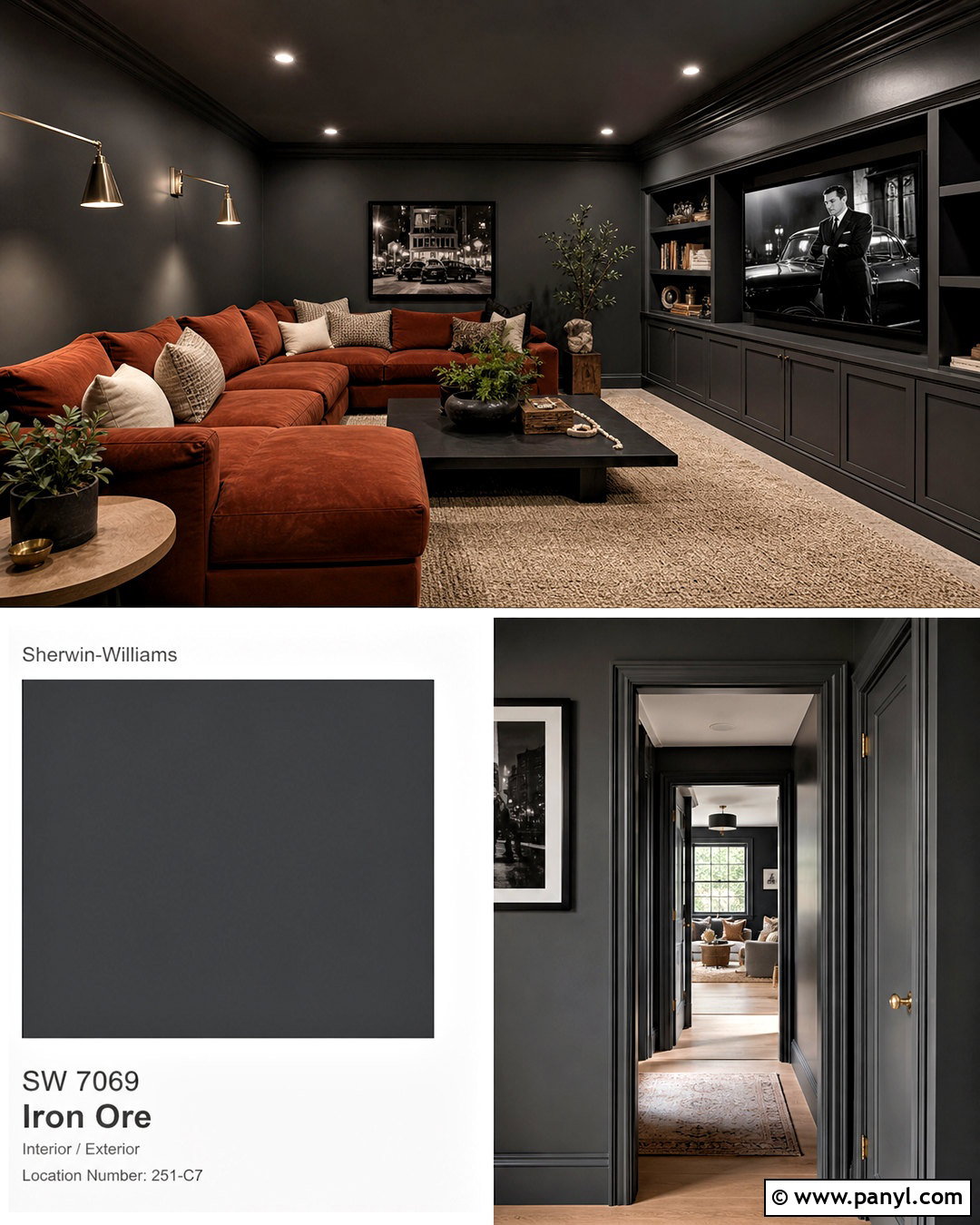
Charcoal paint is well suited to a media room because it reduces visual contrast around the television and creates a cozy atmosphere. Paint the walls, trim, built-in media unit, and door in the same deep charcoal, using different sheens to define each surface. Continue the color onto the ceiling if the room receives sufficient daylight; otherwise, choose a softer gray overhead. Add a generous rust-colored sectional, a low black coffee table, and a thick taupe rug. Closed cabinets should hide electronics, games, and cables to maintain a clean appearance. Use adjustable wall lights instead of relying only on ceiling fixtures. Textured cream pillows and warm wood side tables prevent the dark palette from feeling flat. The completed space feels intimate, functional, and intentionally designed for comfortable viewing.
11. Pale Aqua Bathroom Paint Color
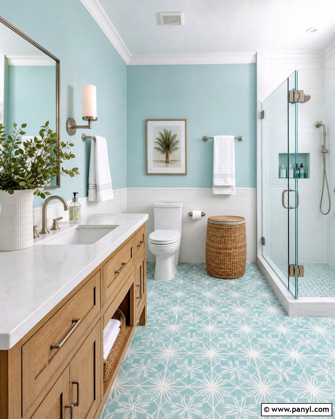
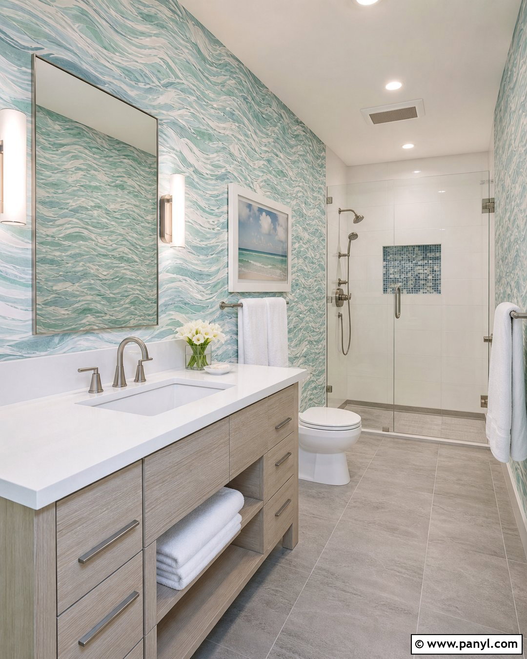
Pale aqua walls can make a bathroom feel clean and refreshing without relying entirely on white. Choose a watery blue-green with a soft gray undertone, then pair it with white wall tile, pale grout, and a light oak vanity. A white quartz countertop and simple rectangular mirror keep the room bright. Use brushed nickel faucets for a cool, understated finish, or select brushed brass if the adjoining rooms have warmer accents. Add a small patterned floor tile containing aqua, cream, and gray to tie the palette together. White towels, a woven hamper, and one leafy plant provide the finishing details. Keep the ceiling crisp white and use bright, flattering lighting around the mirror. This complete scheme works particularly well in compact bathrooms where fresh color can add character without adding visual clutter.
12. Mushroom Taupe Entryway Paint Color
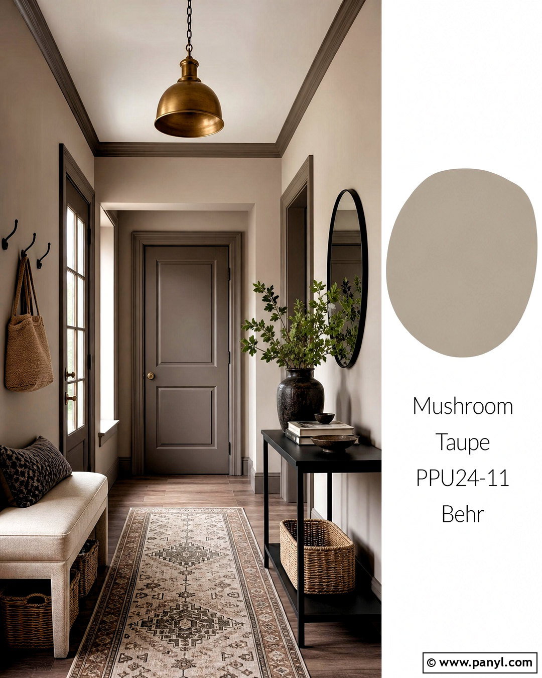
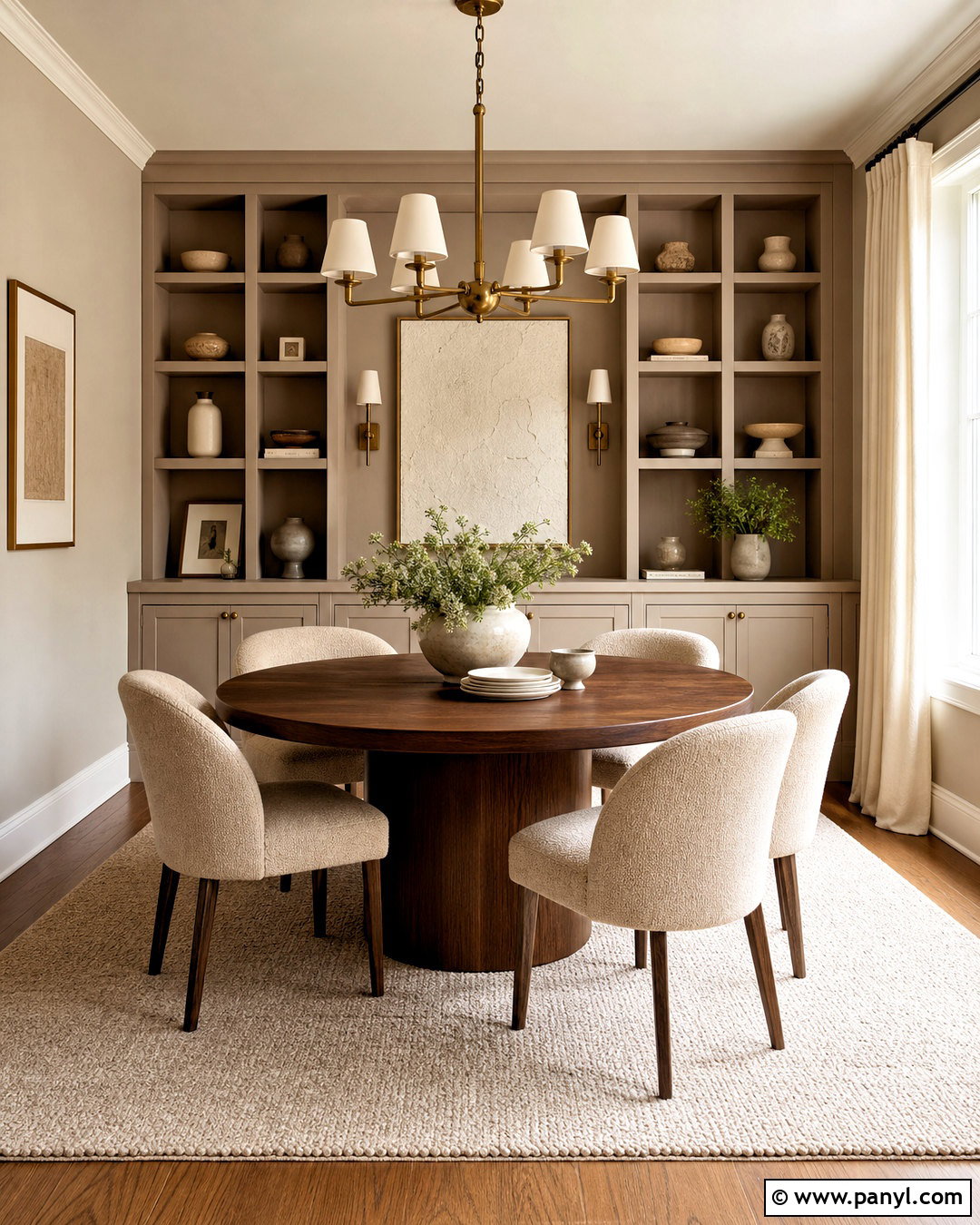
Mushroom taupe gives an entryway a grounded neutral backdrop that hides minor marks better than bright white. Select a mid-light shade with balanced gray and brown undertones, then use it on the walls and interior doors. Paint the trim a deeper taupe from the same color family for subtle tonal layering. Place a slim black console along one wall with a large rounded mirror above it. An upholstered bench, woven baskets, and wall hooks create an organized landing area for shoes and everyday items. Choose a durable patterned runner with beige, charcoal, and faded rust details. A warm white ceiling keeps the narrow area open, while an aged brass pendant adds welcoming light. This coordinated design gives even a small entrance a finished appearance and connects easily with both warm and cool adjoining rooms.
13. Burgundy Dining Room Paint Color
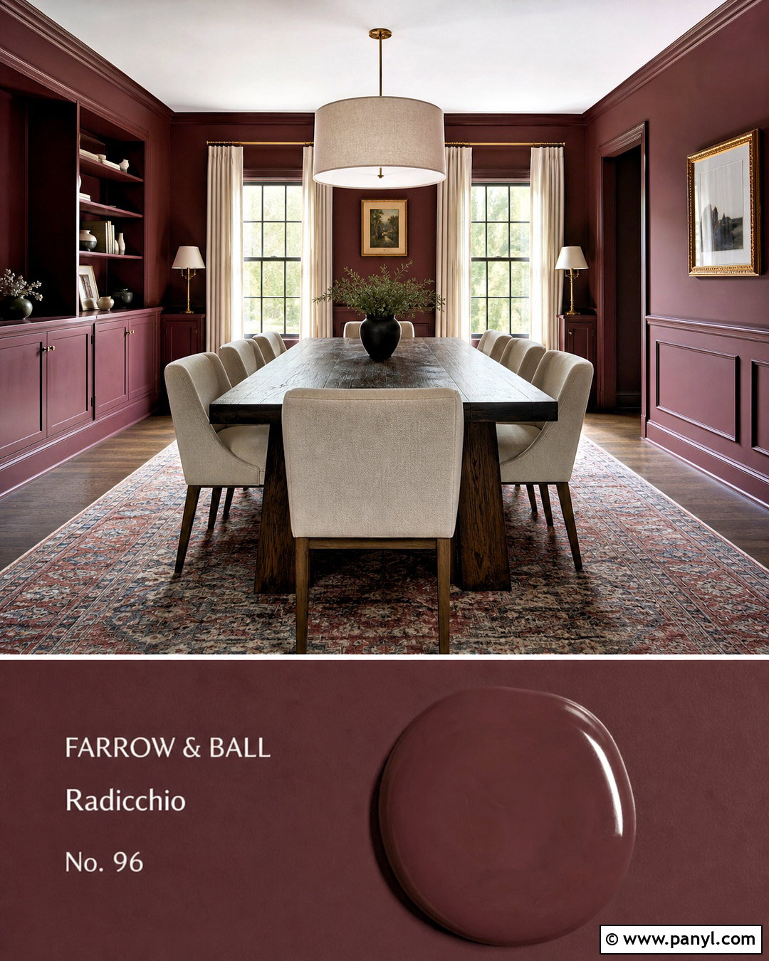
Burgundy creates a dramatic dining room that feels rich rather than flashy when balanced with lighter furnishings. Choose a deep red with brown undertones and apply it to the walls, molding, and built-in storage for a cohesive effect. Keep the ceiling pale cream to reflect light over the table. Use a substantial dark oak dining table with upholstered oatmeal chairs to soften the intensity of the paint. A vintage-inspired rug featuring faded red, tan, and navy adds pattern without introducing unrelated colors. Hang a large linen-shaded pendant above the table and place two brass lamps on a low sideboard. Cream curtains provide contrast and frame the windows. The finished room feels intimate for evening meals, yet the natural wood and pale textiles keep it approachable enough for regular family use.
14. Soft Lavender Guest Room Paint Color
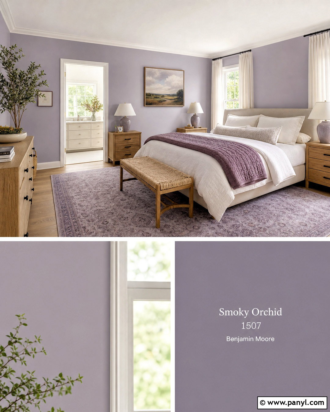
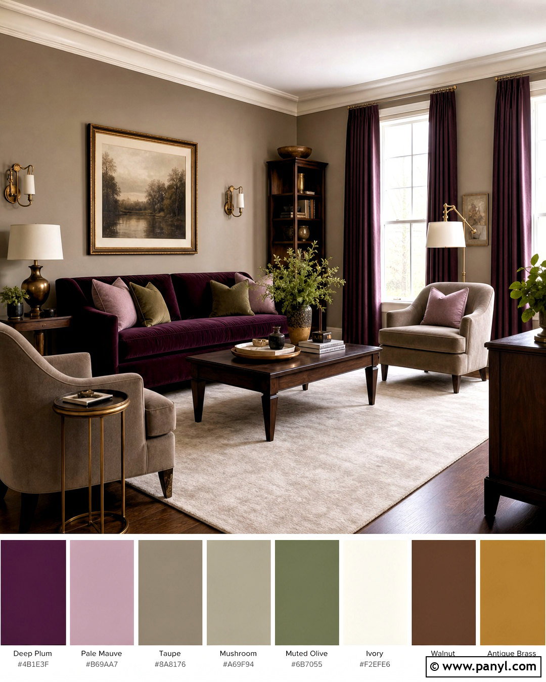
Soft lavender can create a distinctive guest room when the shade is muted with gray rather than overly bright or sugary. Paint the walls in a pale smoky lavender and keep the ceiling and trim warm white. Center an upholstered oatmeal bed against the main wall, then layer white sheets with a plum quilt and striped beige pillows. Light oak nightstands and simple ceramic lamps prevent the palette from feeling too formal. Choose a neutral rug with faded lavender details and hang full-length ivory curtains to soften the windows. A small wood desk can double as a dressing table without crowding the room. Finish with understated landscape artwork and a woven bench at the foot of the bed. The coordinated scheme feels restful, personal, and welcoming to guests of different ages.
15. Clay Pink Nursery Paint Color
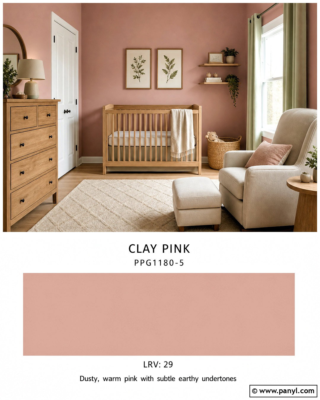
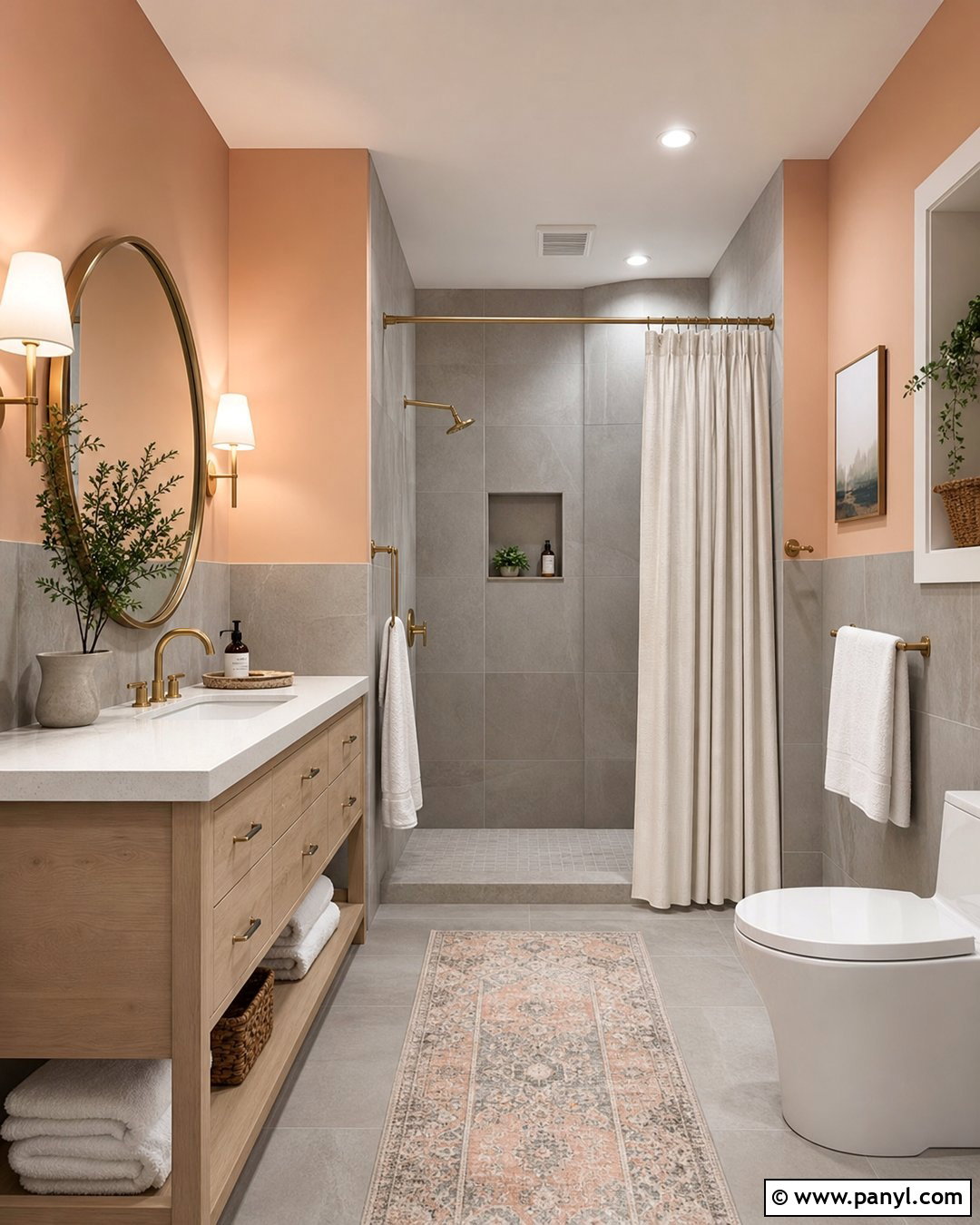
Clay pink offers a warm, flexible nursery palette that can adapt as the room changes over time. Select a subdued earthy pink with terracotta undertones and use it on the walls, paired with creamy white trim and ceiling paint. Position a natural maple crib along a clear wall, away from curtains and cords, and place a washable ivory rug at the center. Add a comfortable oatmeal-colored glider, a small oak side table, and a low dresser with rounded wood handles. Storage baskets and closed shelving reduce visual clutter. Introduce muted sage through curtains, a blanket, or simple botanical artwork, creating a balanced nature-inspired palette. Soft white lighting and a flush ceiling fixture keep the room practical. The finished design feels calm, warm, and suitable beyond the earliest nursery stage.
16. Deep Teal Reading Room Paint Color
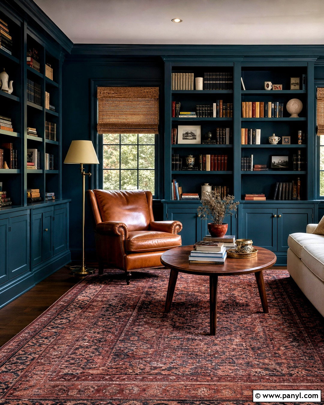
Deep teal can transform a spare room or quiet corner into a comfortable reading retreat. Paint the walls, bookcases, and trim in the same blue-green shade to make the shelving feel integrated. Use a warm off-white ceiling so the room retains some overhead brightness. Place a deep cognac leather chair beside a small round walnut table, with an adjustable brass floor lamp positioned behind it. Add a compact cream loveseat if space allows, arranging it opposite the shelves. A faded red and navy rug brings warmth beneath the darker walls. Style the bookcases with books, ceramics, and a few framed pieces while leaving some open space. Natural woven shades control glare. The complete room feels enveloping and purposeful, with every element supporting reading, conversation, and quiet relaxation.
17. Warm Khaki Living Room Paint Color
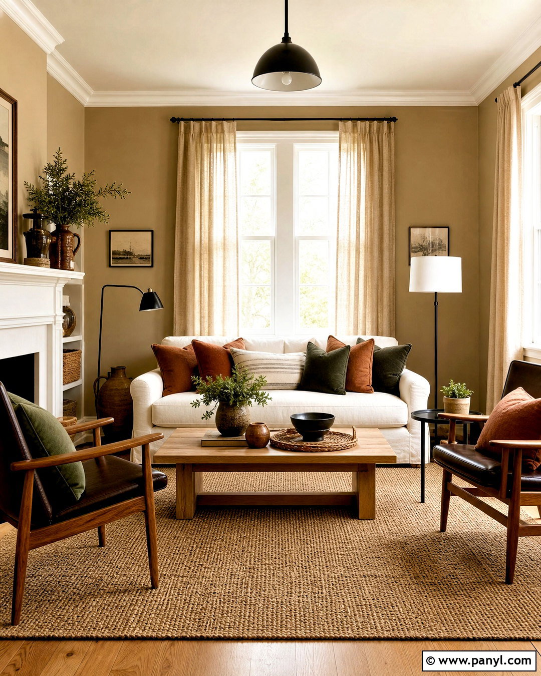
Warm khaki offers more depth than beige while remaining easy to coordinate with everyday furniture. Choose a medium tan with subtle olive undertones and apply it across the walls. Use creamy white for the ceiling and trim, then introduce darker khaki on built-in cabinets or a fireplace surround for tonal contrast. Arrange a cream sofa with two dark brown wood chairs around a sturdy oak coffee table. Add pillows in rust, forest green, and black to sharpen the neutral palette. A woven wool rug and flax linen curtains strengthen the natural, relaxed character of the room. Use black metal lighting and framed artwork to create crisp focal points. This complete scheme suits open, casual homes because the wall color connects comfortably with wood floors, stone details, and adjoining neutral spaces.
18. Pale Blue Sunroom Paint Color
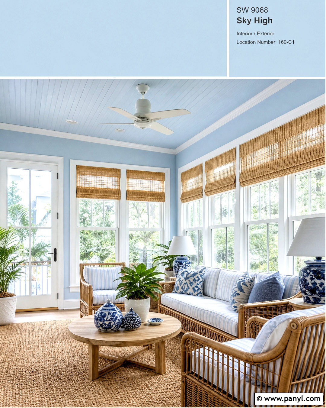
A pale blue sunroom feels airy when the color is used across both walls and ceiling. Choose a clear but softened sky blue, then paint the window trim and doors warm white to emphasize the room’s architecture. Arrange a light rattan sofa and two matching chairs around a round oak coffee table. Use ivory cushions with narrow navy stripes for a fresh, tailored pattern. A natural fiber rug grounds the seating area without hiding the flooring. Add ceramic planters in white and cobalt blue, but keep the number of plants controlled so the room remains open. Lightweight white shades can filter strong sunlight while preserving the view. The complete palette creates a bright transition between indoors and outdoors and works equally well for reading, morning coffee, or relaxed conversation.
19. Chocolate Brown Bedroom Paint Color
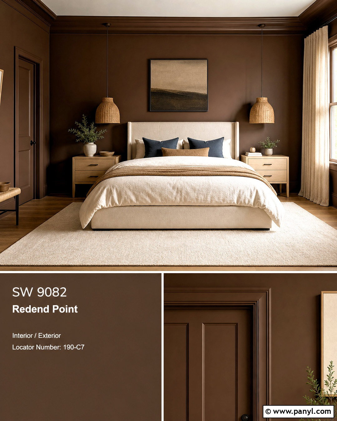
Chocolate brown walls can make a bedroom feel restful and luxurious when lighter materials are used throughout the rest of the space. Select a rich brown with warm red undertones and apply it to the walls, trim, and doors for a seamless effect. Keep the ceiling light beige rather than bright white to reduce sharp contrast. Choose an ivory upholstered bed with tall proportions, then layer cream bedding, camel blankets, and muted blue pillows. Pale oak nightstands and woven pendant lights bring natural texture into the darker room. A large cream rug brightens the floor, while linen curtains soften the windows. Use minimal artwork with pale backgrounds and dark wood frames. This balanced design demonstrates how brown paint can feel contemporary, comforting, and visually rich instead of heavy or dated.
20. Forest Green Color Drenched Room
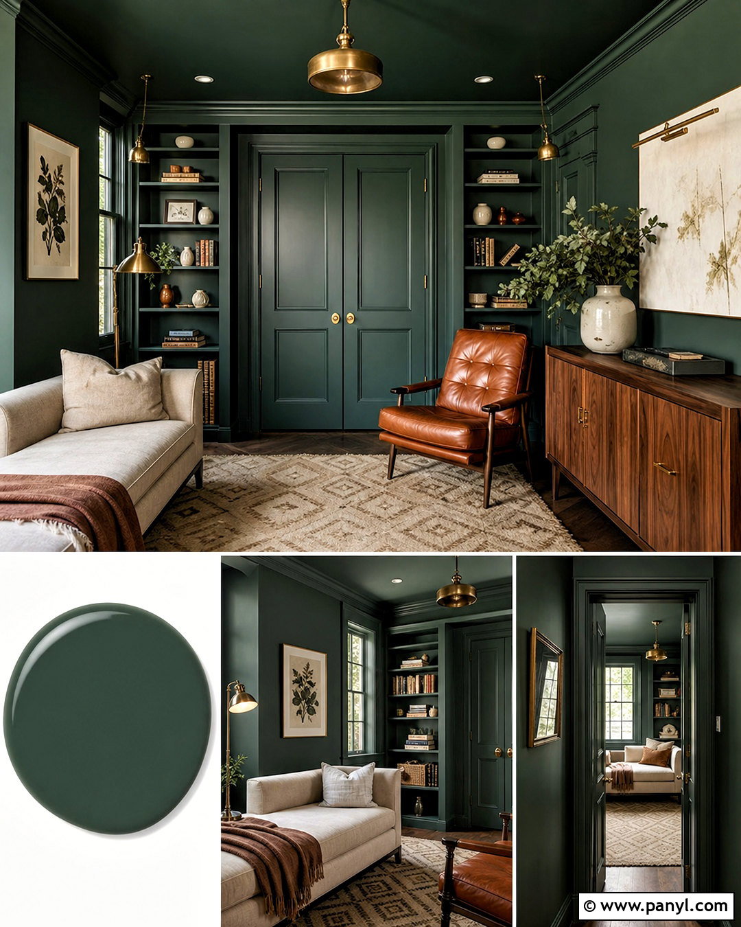
A forest green color-drenched room makes a strong statement while giving separate architectural elements one unified appearance. Apply the same deep green to the walls, trim, doors, built-in shelves, and ceiling, using a durable satin finish on woodwork and a softer finish on broad surfaces. Add a light oatmeal sofa or daybed to create a bright focal point against the saturated background. Warm the room with a walnut cabinet, cognac leather chair, and antique brass lighting. A cream rug with a simple geometric border keeps the floor from disappearing into the darker palette. Limit accessories to ivory ceramics, books, and restrained botanical artwork. This complete look works particularly well in libraries, dens, and small sitting rooms where an immersive atmosphere feels intentional rather than overpowering.
Conclusion:
The best paint scheme does more than cover the walls. It connects the furniture, flooring, lighting, architecture, and textiles into one complete room. Begin with the surfaces you cannot easily change, then compare paint samples beside them during morning, afternoon, and evening light. Consider undertones carefully, especially when combining whites, wood finishes, stone, and large upholstered pieces. Lighter colors can create freshness, while deeper shades can add intimacy and definition. Neither approach is automatically right for every space. The most successful choice supports how the room is used and reflects the atmosphere you enjoy. Use these **20 room paint colour ideas** as flexible starting points, adjusting each palette to suit your home’s light, layout, and existing finishes.

Related Ideas and Inspiration:
Leave a Reply