
Choosing color becomes easier when you design the entire space instead of focusing on one paint chip. These 20 room colour ideas combine wall shades, furniture, flooring, textiles, lighting, and accents to create complete looks you can recreate at home. Current interiors are moving beyond flat, all-beige rooms toward warmer neutrals, nature-inspired greens, earthy browns, deeper blues, and more personal color combinations. () The best palette still depends on natural light, room size, existing finishes, and the atmosphere you want. Test colors at different times of day, then repeat each main hue through at least two or three elements. Whether you prefer peaceful neutrals or expressive contrast, these 20 room colour ideas offer a practical starting point.

1. Warm White Living Room Color Scheme
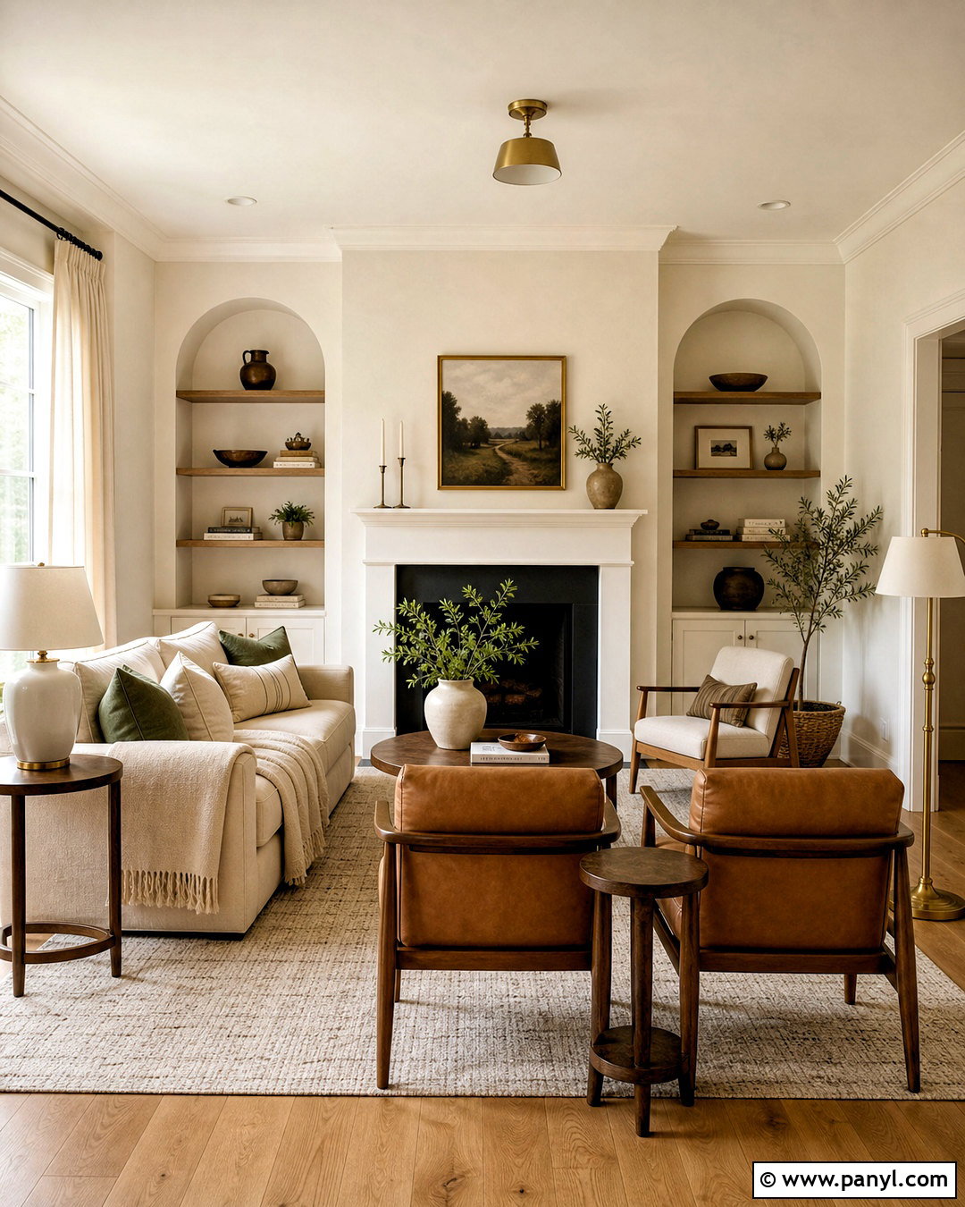
A warm white living room feels bright without looking cold or unfinished. Choose creamy white walls with a soft beige or yellow undertone, then ground the room with a natural oak floor and a large oatmeal-colored rug. A light taupe sofa creates gentle contrast while keeping the arrangement airy. Add cognac leather chairs, walnut side tables, and antique brass lighting for warmth. Black picture frames or a slim fireplace screen provide enough definition to prevent the pale colors from blending together. Finish the look with olive green cushions, textured ivory curtains, and a few handmade ceramic pieces. This complete palette works especially well in rooms with northern light, where pure white can appear gray or slightly blue.
2. Sage Green Bedroom Color Scheme
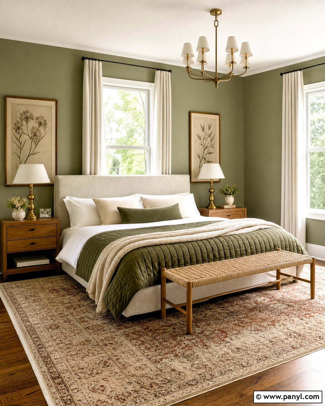
Soft sage green creates a restful bedroom that still has recognizable color. Cover the walls in a muted, warm sage rather than a bright mint tone. Pair it with an upholstered oatmeal headboard, white cotton sheets, and a quilt in cream and faded olive. Medium-tone oak nightstands add natural warmth, while brushed brass lamps bring a subtle polished finish. Use full-length linen curtains in warm white to soften incoming daylight. A vintage-style rug combining beige, dusty green, and muted rust gives the room a comfortable layered appearance. Keep the ceiling and trim creamy white for gentle contrast. This palette suits modern farmhouse, transitional, cottage, and organic interiors because it balances natural color with simple, familiar materials.
3. Navy Blue Living Room Color Scheme
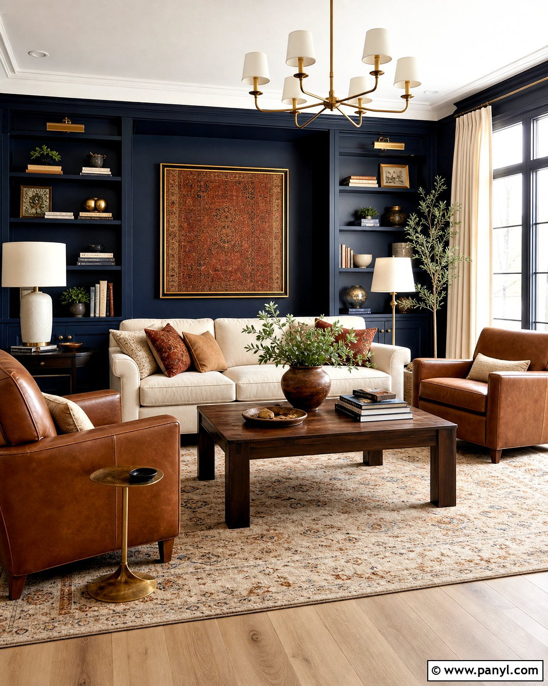
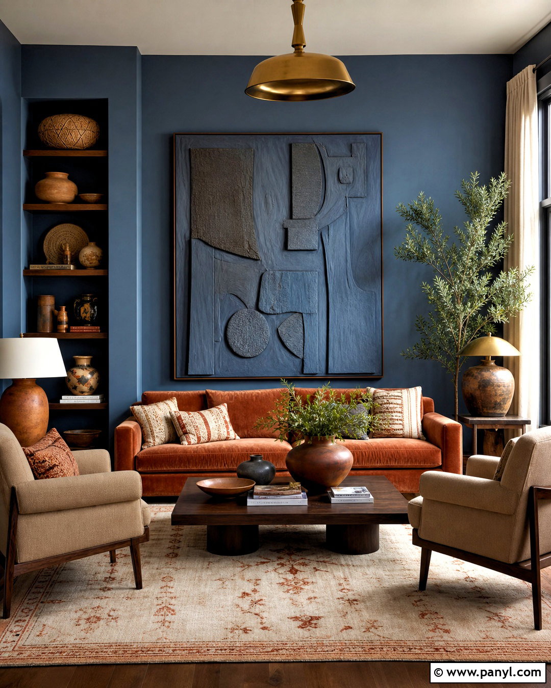
Deep navy walls can make a living room feel polished, intimate, and surprisingly comfortable. Use navy across the walls and built-in shelving so the architecture reads as one continuous feature. Balance that depth with a generous cream sofa, warm white curtains, and a pale patterned rug. Walnut furniture prevents the blue from feeling too formal, while camel leather chairs introduce a rich contrasting tone. Add aged brass sconces, table lamps with ivory shades, and framed artwork containing touches of rust, blue, and cream. White oak flooring can keep the overall room lighter. If natural light is limited, paint the ceiling a soft off-white and include several light sources at different heights to preserve brightness throughout the day.
4. Terracotta Dining Room Color Scheme
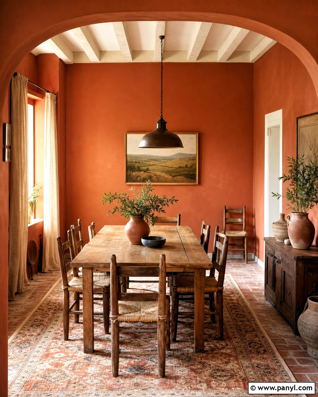
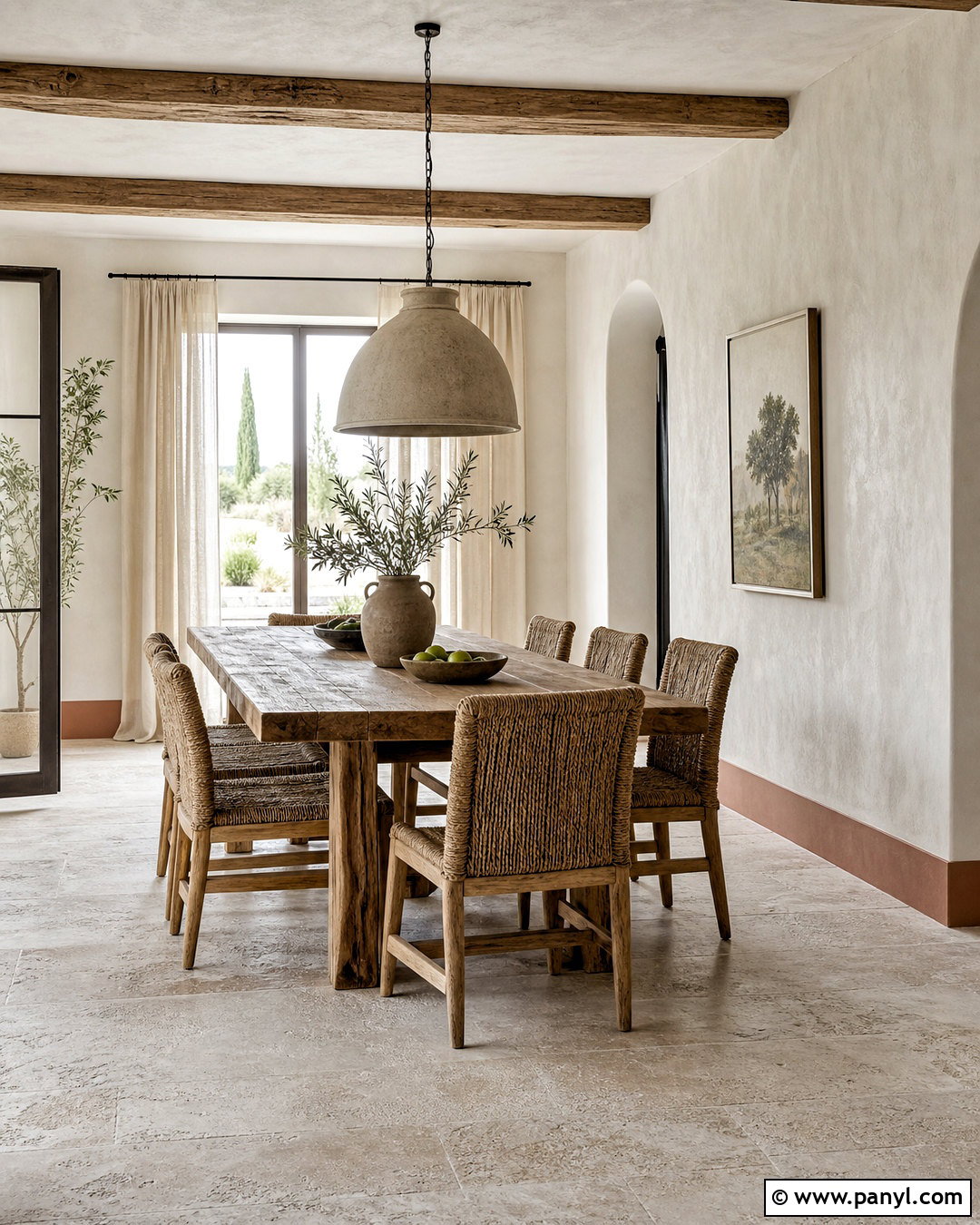
Imagine a dining room that feels warm and welcoming before the table is even set. Muted terracotta walls provide an earthy background with more softness than vivid orange. Center the space around a rectangular oak dining table with woven rush chairs or warm beige upholstered seating. A vintage rug containing faded red, cream, and brown reinforces the grounded palette. Choose linen curtains in natural flax and a dark bronze pendant with a simple sculptural shape. Cream-painted trim freshens the edges without producing harsh contrast. Handmade pottery, wood serving pieces, and one large landscape print complete the room. Terracotta looks particularly attractive beside warm wood because both colors share red and golden undertones, creating an easy visual connection.
5. Soft Blue Bedroom Color Scheme
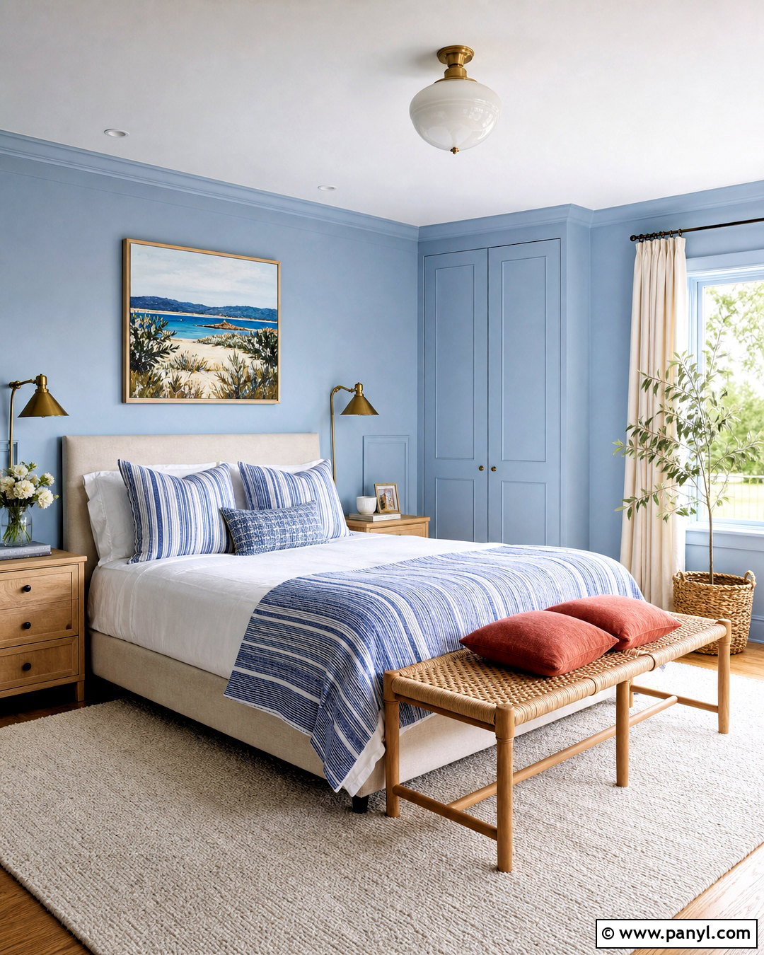
Pale blue can transform a bedroom into a light, peaceful retreat when it is balanced with warmth. Select a slightly gray, powdery blue for the walls and continue it onto simple closet doors for a cohesive finish. Dress the bed in crisp white sheets, a natural linen duvet, and a striped blue-and-cream throw. Light oak bedside tables and a woven bench introduce organic texture. Instead of cool silver accents, choose aged brass lamps and hardware to soften the palette. Ivory curtains and a cream wool rug keep the room from appearing overly blue. Add one or two dusty red cushions for a controlled contrast. The final space feels fresh and calming rather than themed or overly coastal.
6. Chocolate Brown Living Room Color Scheme
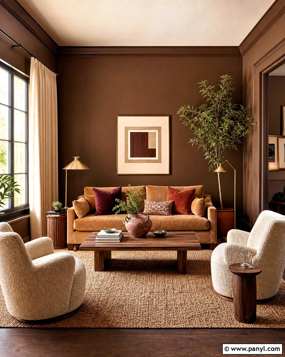
Chocolate brown gives a living room depth while creating a cozy, enveloping setting. Paint the walls a rich cocoa shade with warm undertones and use the same color on the trim for a smooth, color-drenched effect. Introduce a large camel sofa, cream boucle chairs, and a substantial walnut coffee table. A beige wool rug brightens the floor and clearly defines the seating arrangement. Add rust, burgundy, and muted rose through cushions and artwork, but keep each accent slightly earthy. Brass floor lamps and warm white lampshades provide reflective highlights against the dark walls. Finish with natural linen curtains and leafy plants in terracotta pots. The mix feels sophisticated yet relaxed enough for an everyday family room.
7. Butter Yellow Kitchen Color Scheme
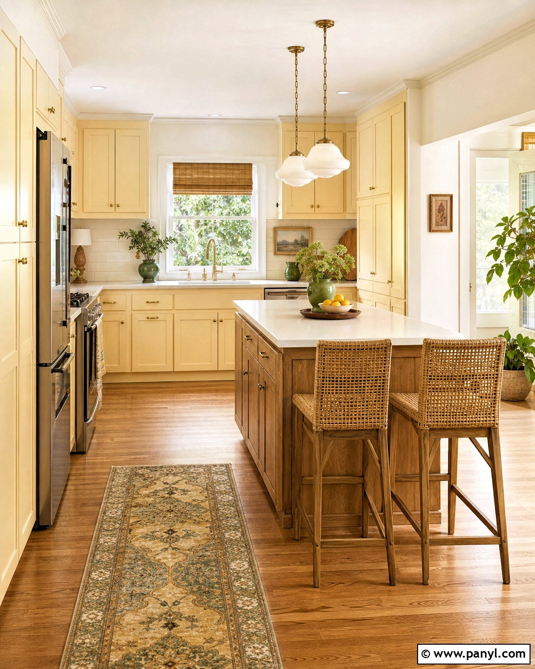
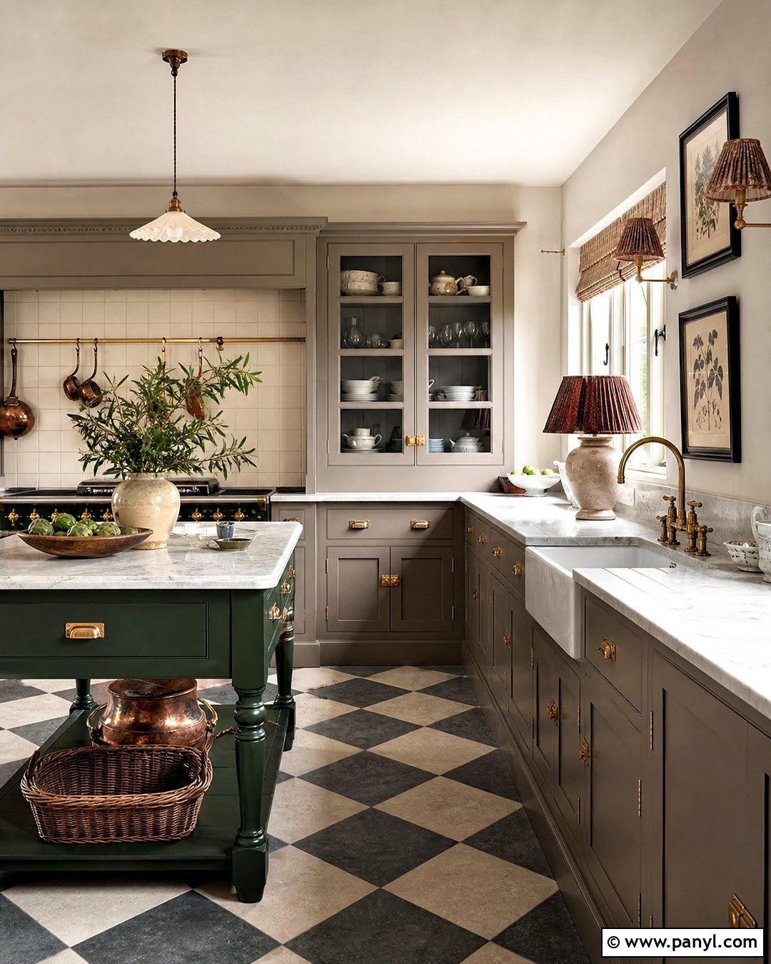
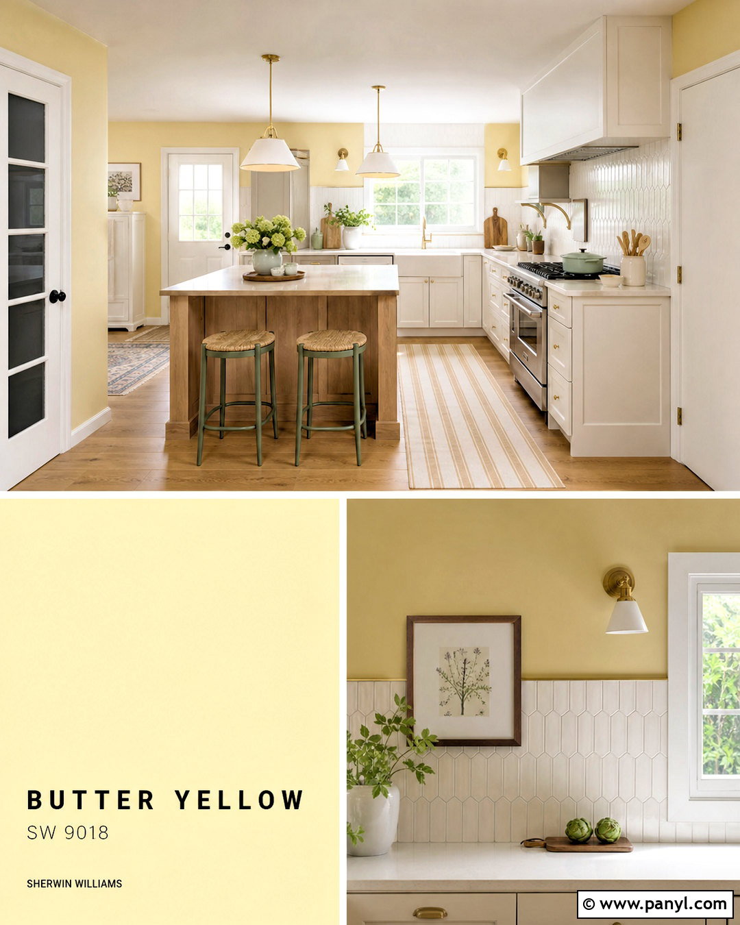
Butter yellow can make a kitchen cheerful while remaining soft enough for long-term use. Apply the pale, creamy yellow to Shaker-style cabinets and pair it with warm white walls. White quartz or lightly veined marble countertops will reflect light, while a square cream backsplash keeps the surfaces quiet. Choose medium oak flooring and a matching wood island to ground the sunny cabinetry. Unlacquered brass handles, a simple brass faucet, and milk-glass pendants add warmth without becoming flashy. A small breakfast table with woven chairs can extend the natural materials into the dining area. Finish with muted green pottery, linen towels, and a washable runner. Avoid sharp black accents, which can make this delicate palette feel unnecessarily divided.
8. Olive Green Home Office Color Scheme
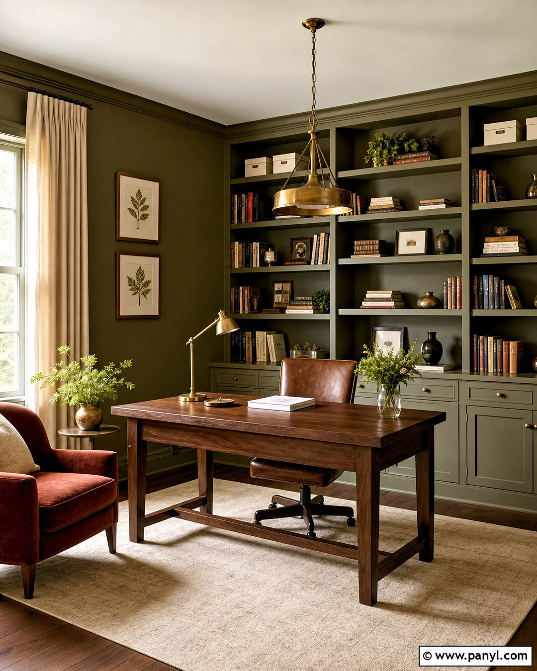
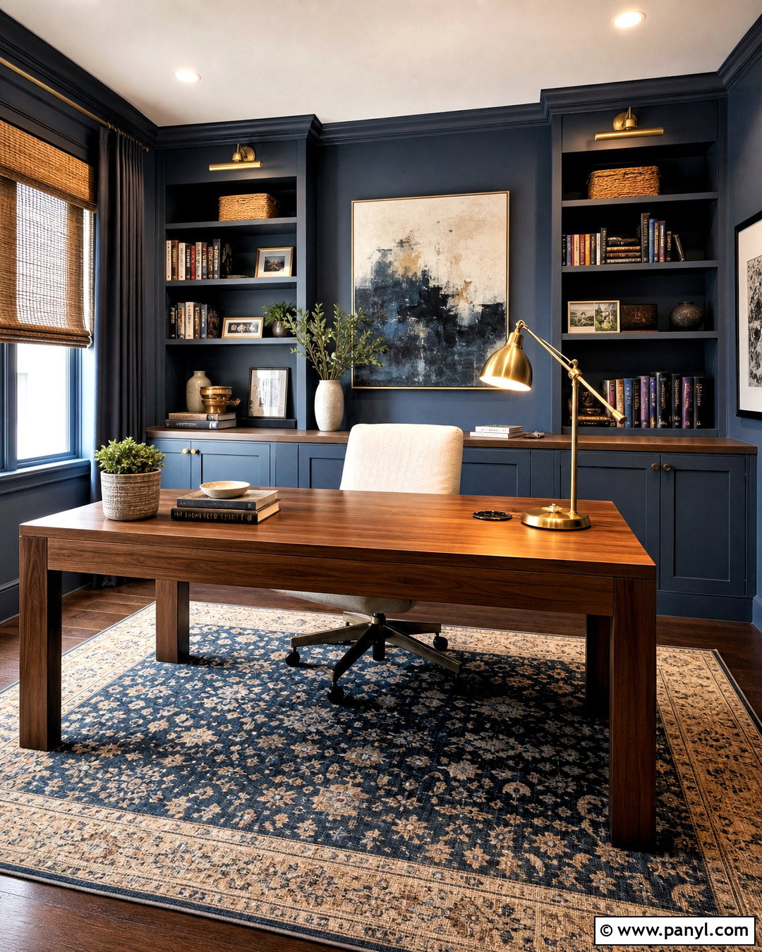
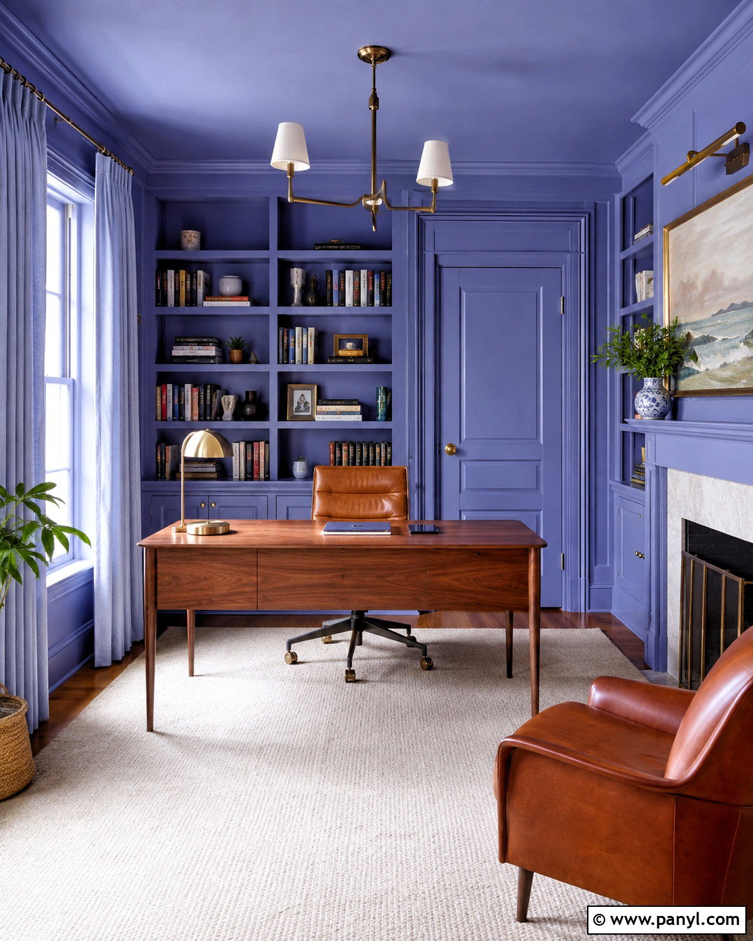
An olive green home office feels focused, grounded, and connected to nature. Paint the walls, trim, and built-in bookcases in the same muted olive to create a calm visual envelope. Position a walnut desk near the strongest source of daylight and pair it with a cognac leather chair. A large beige rug softens sound and lightens the center of the room. Choose antique brass picture lights, cabinet hardware, and a practical desk lamp for warm metallic detail. Books, cream storage boxes, and framed botanical prints can break up the darker shelving. Add natural linen curtains and one rust-colored lounge chair for reading. This complete arrangement feels professional without copying the cold appearance of a conventional corporate workspace.
9. Blush Pink Guest Bedroom Color Scheme
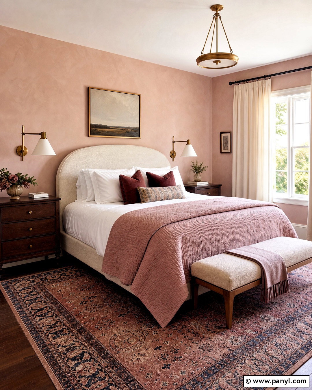
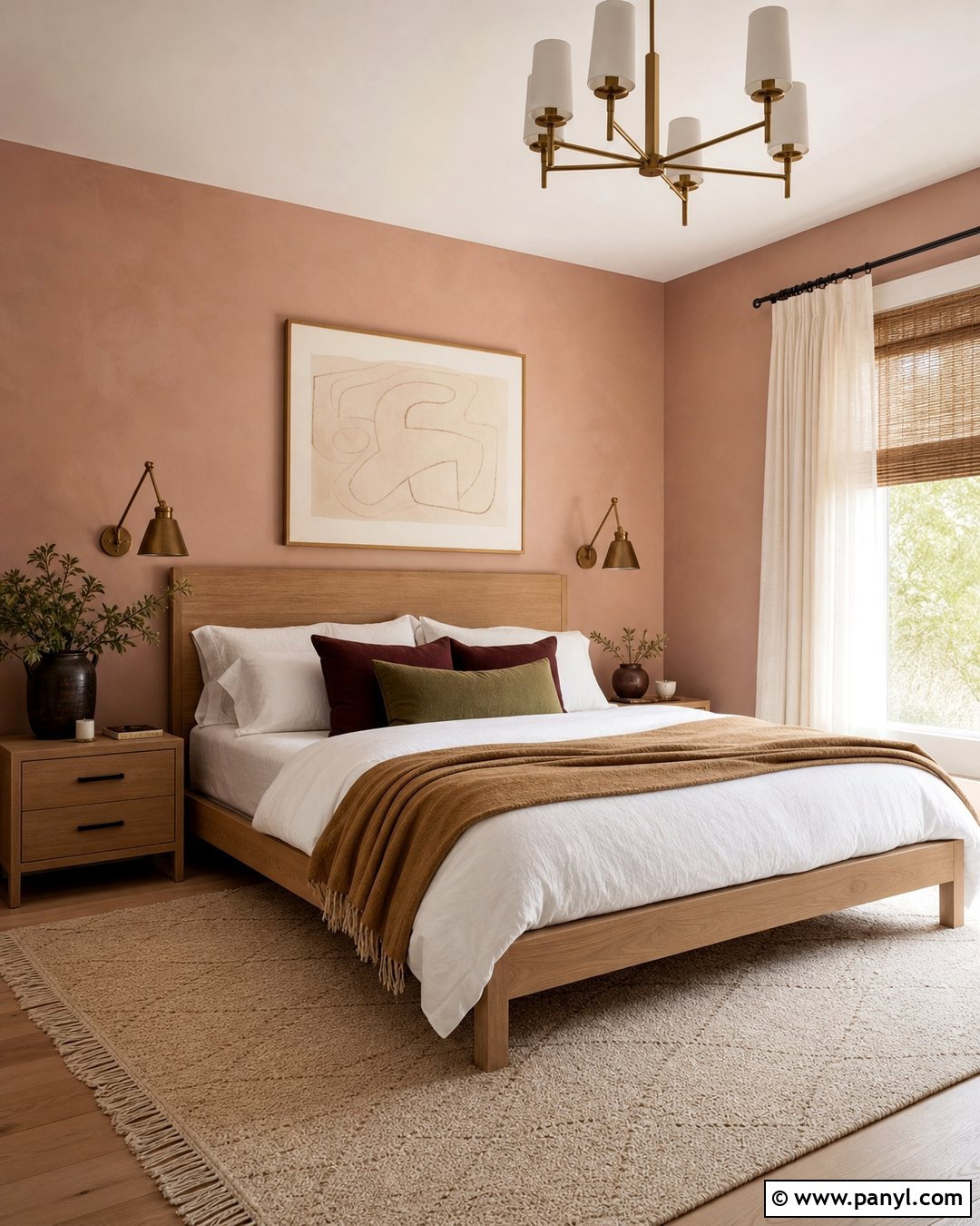
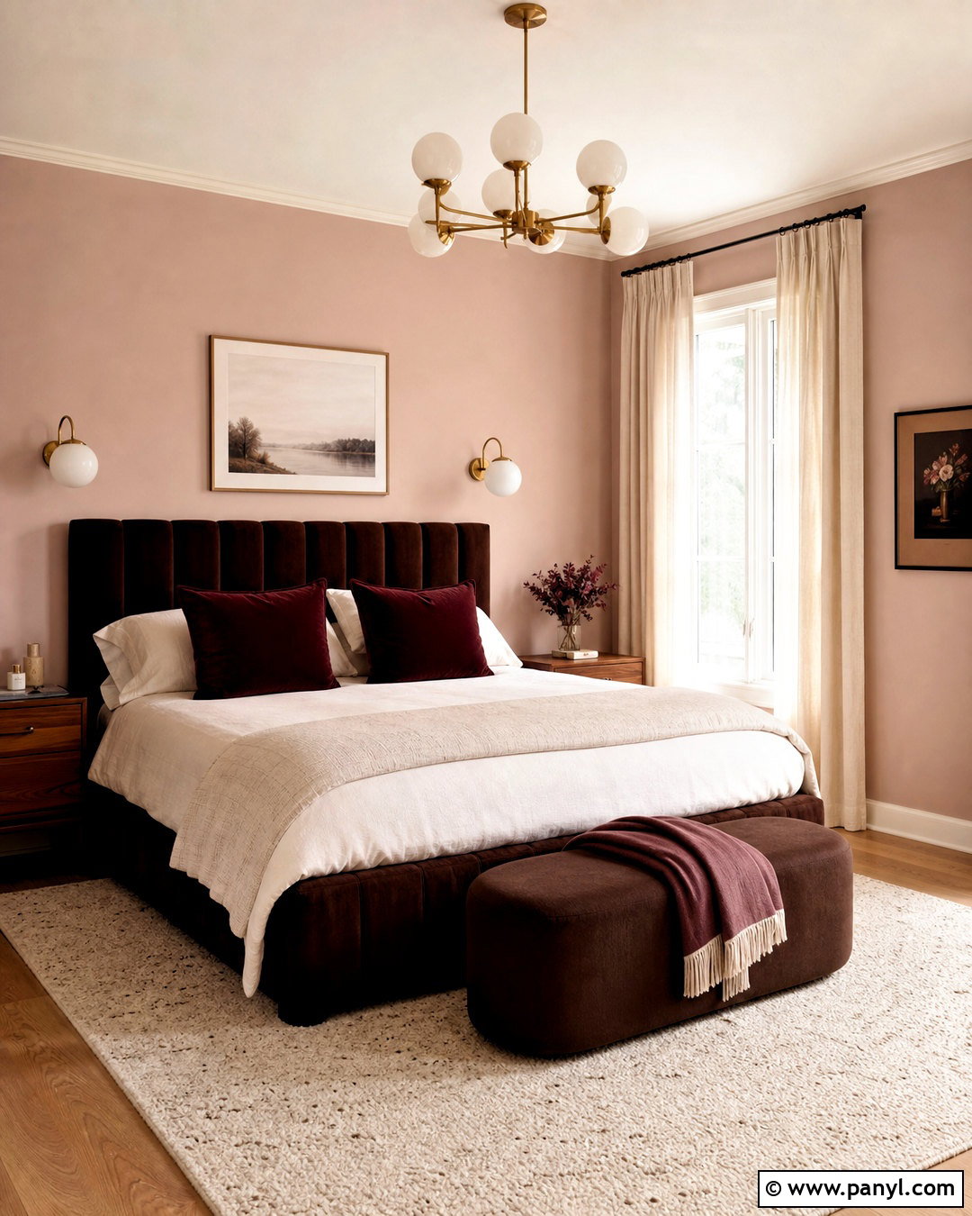
Blush pink works beautifully in a guest bedroom when it is treated as a subtle neutral. Select a dusty plaster pink for the walls and combine it with a curved headboard in oatmeal or mushroom-colored fabric. Keep the bedding mostly white, adding a rose quilt and burgundy-edged cushions for definition. Dark wood nightstands introduce maturity and prevent the room from appearing overly sweet. Use aged brass wall lamps, cream curtains, and a traditional rug containing faded pink, navy, and beige. A simple bench at the foot of the bed makes the room more functional for visitors. Finish with understated landscapes or abstract artwork. The result is welcoming, comfortable, and appropriate for guests with a wide range of decorating preferences.

10. Teal Bathroom Color Scheme
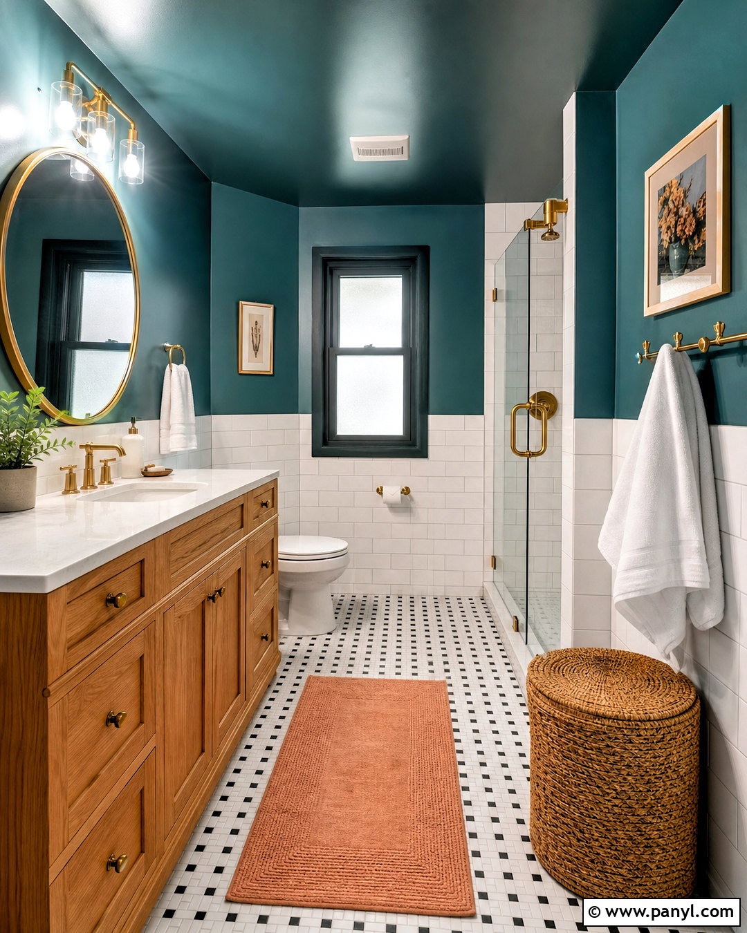
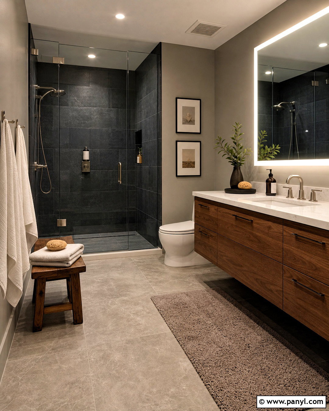
A rich teal bathroom can feel refreshing and luxurious without requiring a large floor plan. Use deep blue-green paint above the sink and on the ceiling, then cover the lower walls with glossy white rectangular tile. A natural oak vanity warms the cool teal and provides useful storage. Choose a white quartz counter, brushed brass faucet, and rounded brass-framed mirror for a clean focal point. Small black-and-white mosaic floor tiles add pattern without introducing another major color. Complete the space with white towels, a woven laundry basket, and a muted coral bath mat. Bright wall sconces on both sides of the mirror will make the darker wall color practical. This balanced palette suits both compact bathrooms and larger primary spaces.
11. Greige Family Room Color Scheme
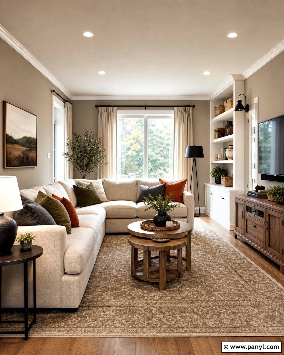
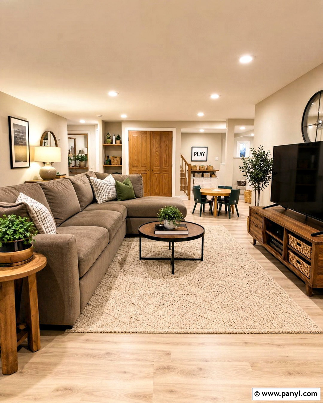
When a family room needs to feel calm but withstand everyday activity, warm greige offers a flexible foundation. Paint the walls a medium-light greige and use creamy white on the ceiling, trim, and built-in storage. Choose a generous sectional in durable oatmeal fabric, then layer it with washable cushions in olive, rust, and charcoal. A patterned beige rug can disguise minor marks while defining the main conversation area. Add oak nesting tables, woven baskets, and a low media console in medium brown wood. Black metal lamps and curtain rods create crisp outlines without dominating the room. Finish with linen-look curtains and personal artwork. The finished palette remains neutral, but varied textures and controlled accent colors keep it from feeling flat.
12. Burgundy Dining Room Color Scheme
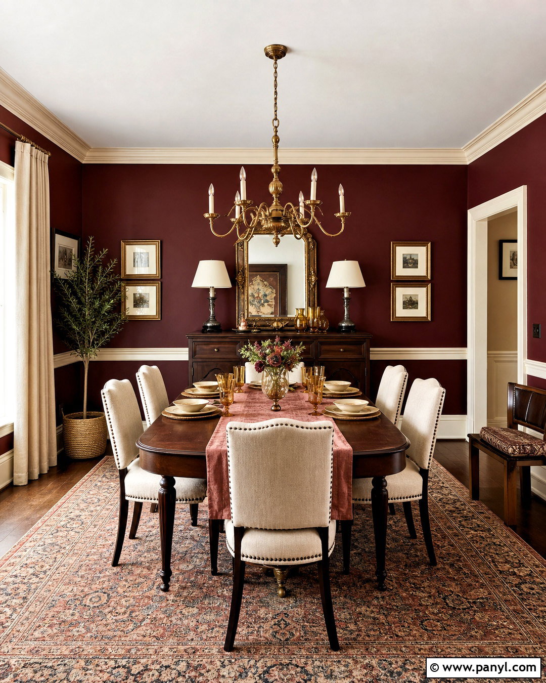
Burgundy brings drama to a dining room while maintaining a traditional, comfortable atmosphere. Cover the walls in a deep red with brown undertones, and paint the trim a warm cream for subtle relief. A dark walnut table becomes the visual anchor, surrounded by upholstered chairs in beige or muted camel. Hang a sculptural antique brass chandelier above the table and place a faded Persian-style rug underneath. Soft rose napkins, cream dishes, and amber glass accessories can lighten the arrangement during gatherings. Use full-length natural linen curtains rather than heavy dark drapes. If the room connects to a pale hallway, the transition will make the burgundy feel even richer. This complete scheme works well for both formal dinners and casual family meals.
13. Peach Living Room Color Scheme
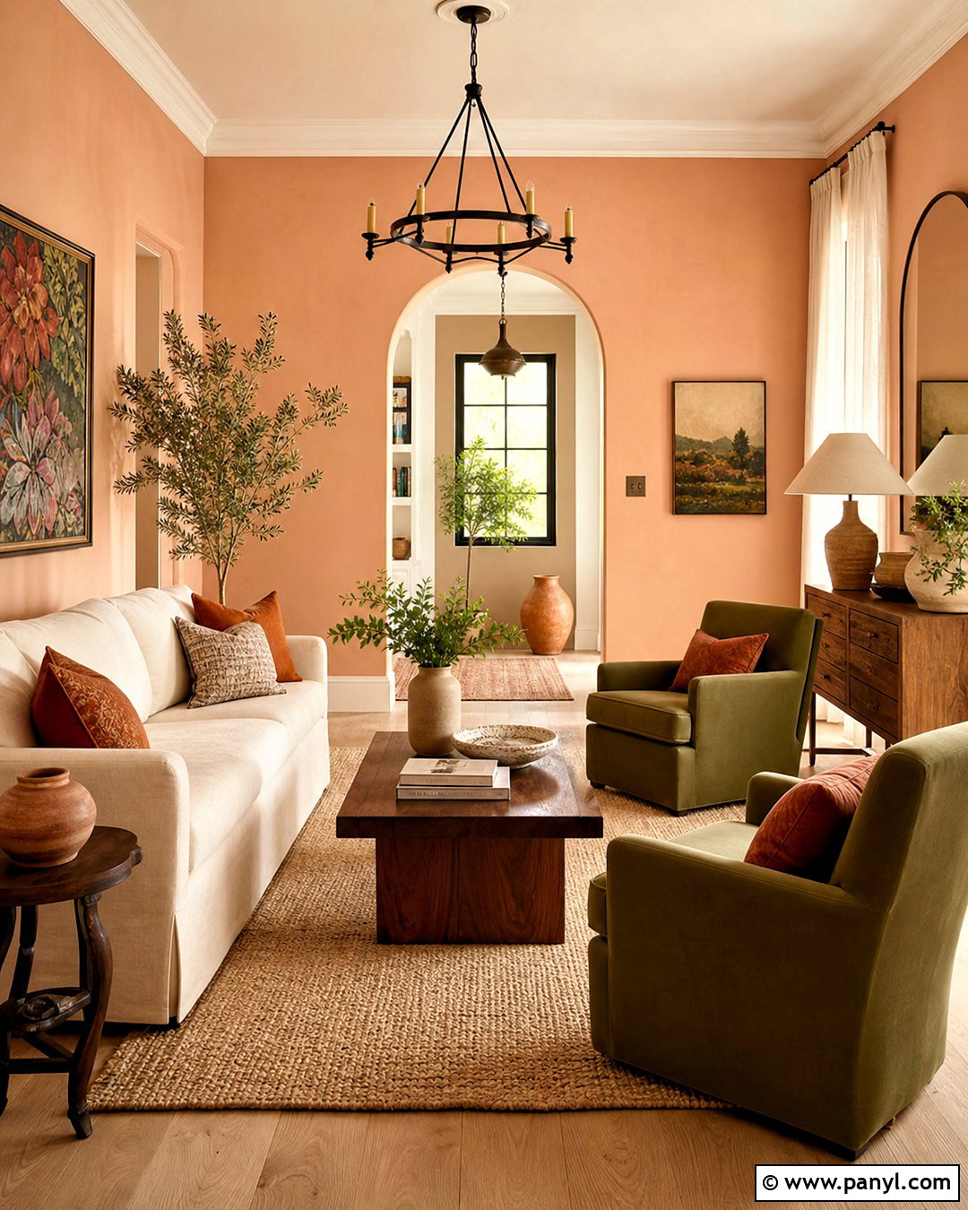
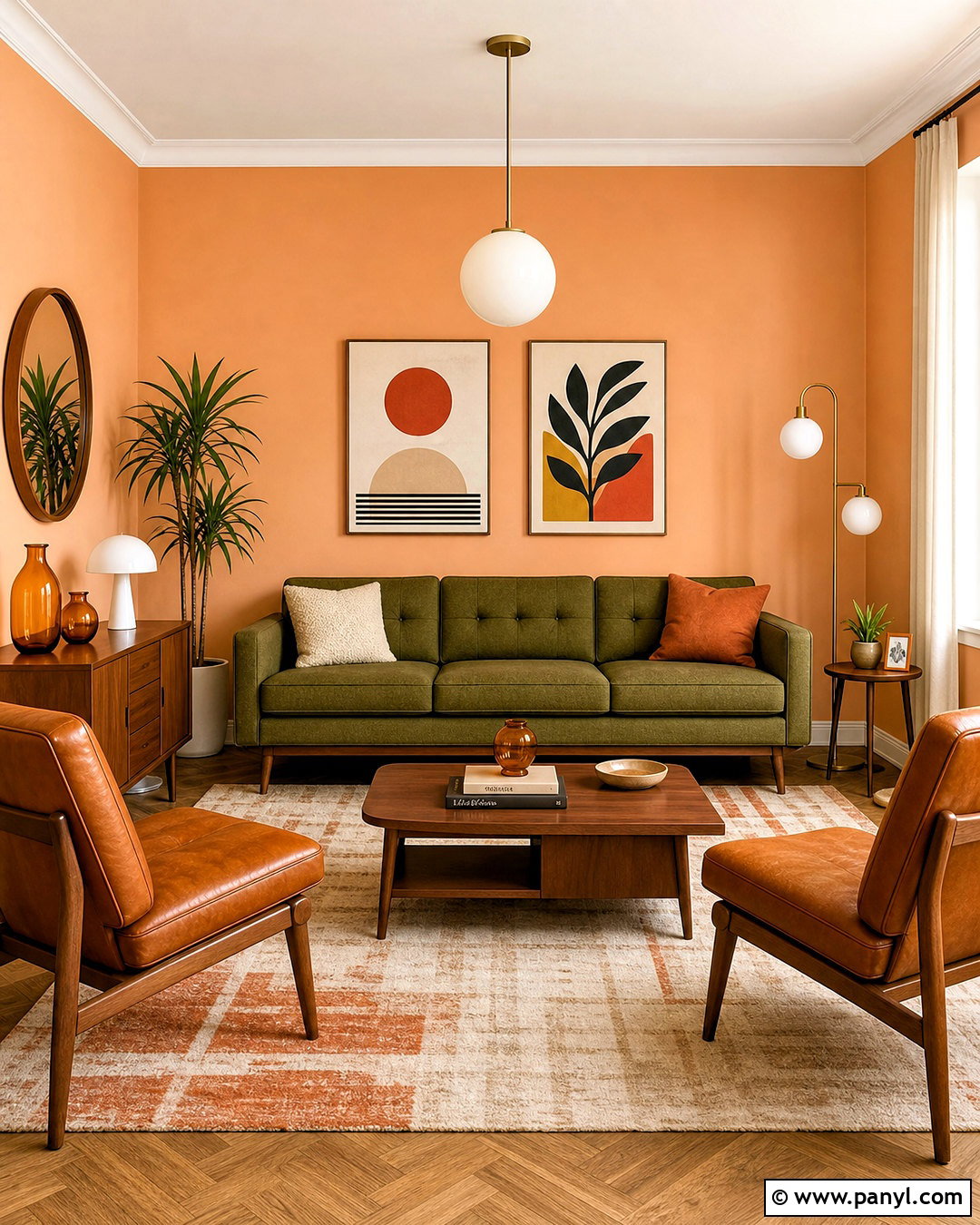
Soft peach walls can give a living room a sunny glow without the intensity of orange. Look for a muted peach with beige or pink undertones, then pair it with a cream sofa and pale oak flooring. Two olive green armchairs provide a natural complementary contrast and help the room feel balanced. Introduce a woven jute rug, walnut coffee table, and linen curtains in warm white. Terracotta pottery and rust-colored cushions can deepen the warm side of the palette, while small touches of dark bronze add definition. Keep artwork simple but colorful, repeating peach, green, and brown. The overall effect is lighthearted and warm, making this scheme especially useful in rooms that receive soft or indirect natural light.
14. Charcoal Gray Media Room Color Scheme

A charcoal media room creates an immersive setting while reducing glare around the television. Paint the walls, trim, ceiling, and media cabinetry in the same matte charcoal gray for a seamless background. Choose a deep sectional in medium gray or muted navy, leaving enough walking space around the seating. A large low-pile rug in charcoal and beige will soften the floor without introducing distracting color. Use walnut side tables and cognac leather ottomans to warm the darker palette. Add dimmable wall sconces with bronze finishes and discreet task lamps beside reading seats. Acoustic curtains in dark gray can improve comfort while completing the look. Keep decorative objects minimal, focusing instead on textured cushions, blankets, and a few framed prints.
15. Lavender Bedroom Color Scheme
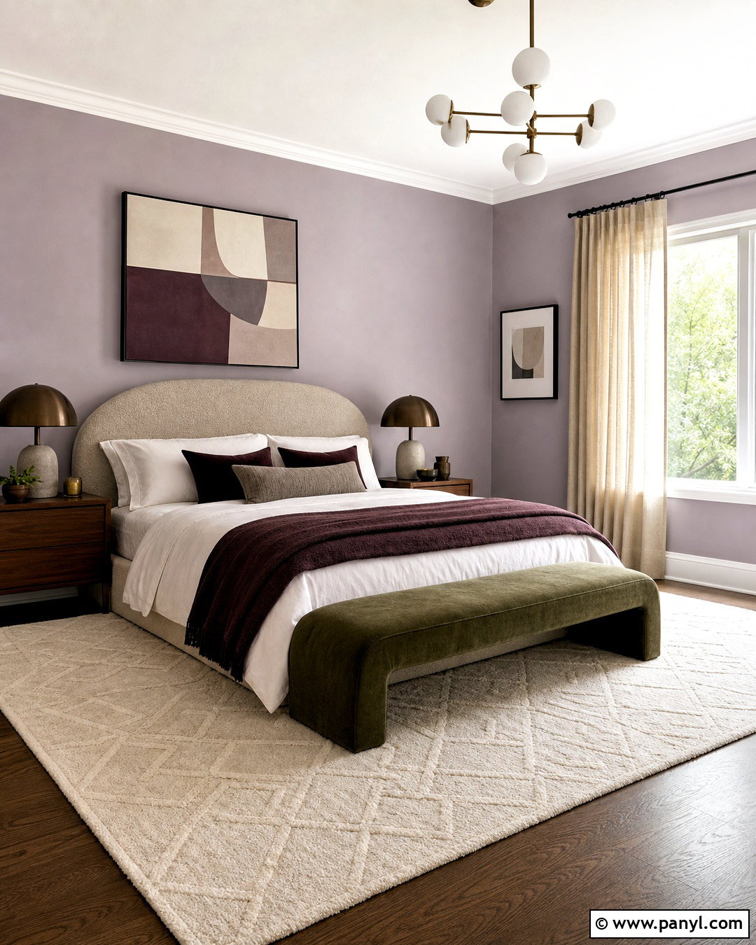
Lavender can feel grown-up and restful when paired with earthy neutrals instead of sugary pastels. Paint the walls a dusty lavender with noticeable gray undertones. Add a walnut bed frame or a linen headboard in mushroom beige, then layer white bedding with plum, taupe, and pale lilac textiles. Warm wood nightstands and bronze lamps keep the cool purple grounded. Choose an ivory rug with a subtle geometric pattern and natural linen curtains that reach the floor. One olive green chair or bench creates an unexpected contrast that connects the palette to nature. Avoid filling the room with matching purple accessories. Repeating lavender only in the walls, one cushion, and a small piece of artwork will produce a more balanced, intentional result.
16. Forest Green Reading Room Color Scheme
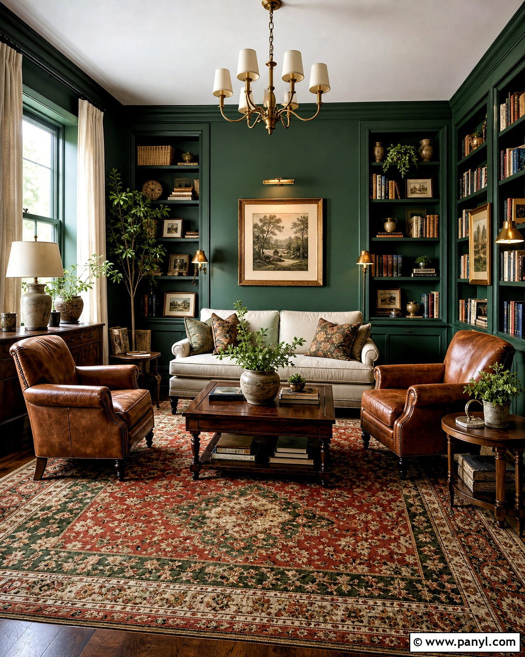
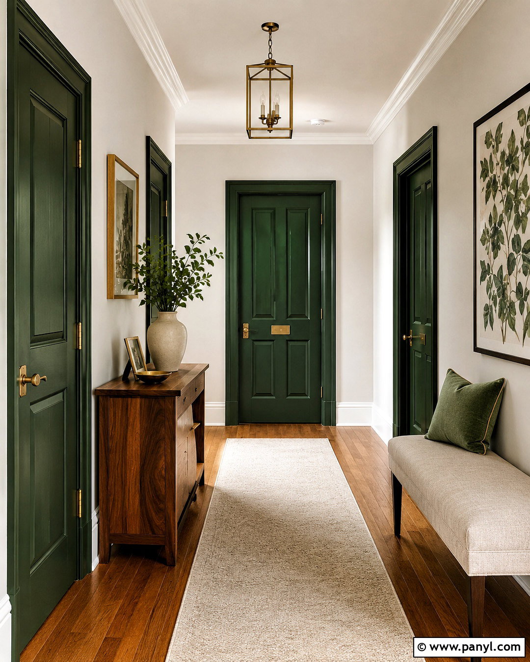
Forest green can turn an underused sitting room into a comfortable place for reading and conversation. Paint the walls and bookcases a deep, warm green, leaving the ceiling a gentle cream to reflect light. Arrange two caramel leather chairs beside a compact round walnut table, with a small oatmeal sofa facing them. A patterned rug featuring red, green, and beige gives the room a collected appearance. Use brass library lights over the shelves and a shaded floor lamp beside each reading chair. Linen curtains, vintage prints, and ceramic planters soften the strong architecture. Books naturally add varied color, so keep other accessories restrained. The finished room should feel layered and personal, with multiple light sources supporting both reading and relaxed evening use.
17. Black And White Kitchen Color Scheme
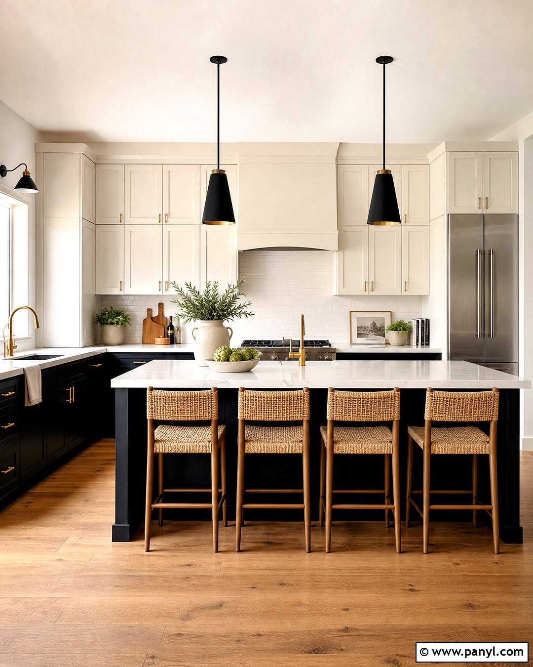
A black and white kitchen feels cleanest when warm materials soften the contrast. Use matte black on the lower cabinets and island, while keeping upper cabinetry and walls warm white. Choose lightly veined white quartz counters and a simple off-white backsplash with matching grout. Natural oak flooring and three woven counter stools introduce warmth across the lower half of the space. Repeat black through slim pendant lights, cabinet hardware, and window frames, but avoid making every fitting dark. A brushed brass faucet provides one subtle metallic accent. Display wood cutting boards, cream pottery, and a few green herbs to make the room feel lived in. The final palette is graphic and modern without appearing harsh, sterile, or overly industrial.
18. Coastal Blue Sunroom Color Scheme
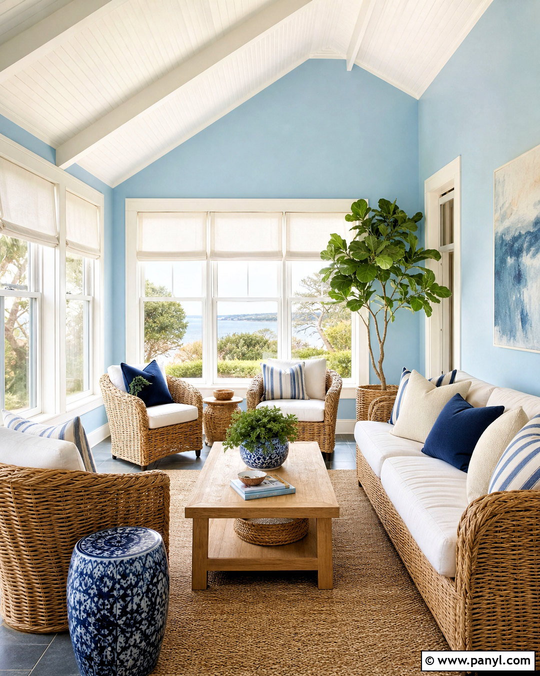
A coastal blue sunroom should feel airy and relaxed rather than filled with obvious seaside decorations. Paint the walls a pale sky blue and keep window frames, trim, and the ceiling crisp warm white. Arrange a natural rattan sofa and chairs around a light oak coffee table, using cushions in cream, navy, and narrow blue stripes. A large sisal rug adds texture and withstands regular foot traffic. Hang simple white linen shades that filter sunlight without hiding the windows. Add ceramic planters, leafy plants, and one or two pieces of abstract blue artwork. Weathered wood can appear in small amounts, but avoid distressed furniture throughout. This restrained combination creates a bright sitting space that feels connected to the outdoors in every season.
19. Mustard Yellow Entryway Color Scheme
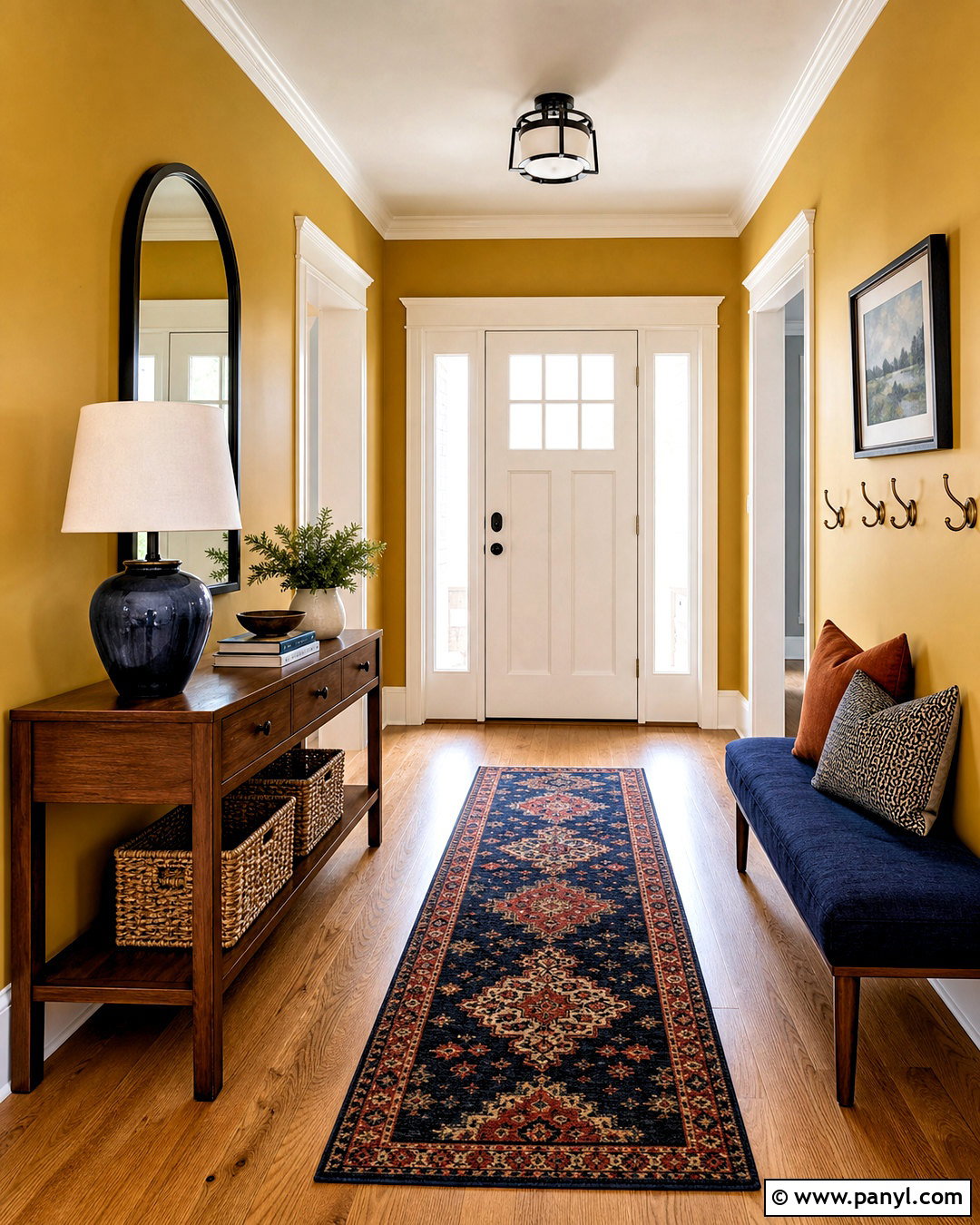
Mustard yellow gives an entryway energy and character while helping the transitional space feel intentionally decorated. Use a muted golden mustard on the walls, paired with warm white trim and a medium oak or brick floor. Place a narrow walnut console along the main wall and hang a large black-framed mirror above it. A washable runner combining navy, cream, and rust will connect the warm walls with darker accents. Add a navy upholstered bench, woven storage baskets, and antique brass hooks for practical organization. Keep doors in warm white or paint one interior door deep navy for stronger contrast. A ceramic lamp with a cream shade ensures the entry remains welcoming after sunset. The complete look is colorful, useful, and easy to maintain.
20. Earthy Neutral Bedroom Color Scheme
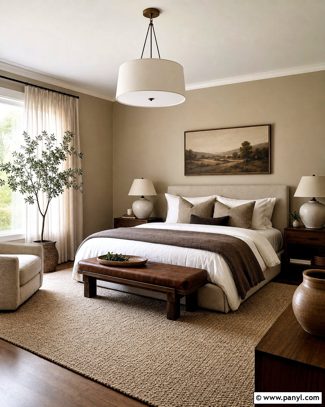
Layered earthy neutrals can create a bedroom that feels peaceful without relying on plain beige everywhere. Start with mushroom-colored walls and a slightly lighter warm white ceiling. Choose an upholstered bed in textured oatmeal fabric, then combine ivory sheets with taupe, cocoa, and muted clay bedding. Dark oak nightstands add depth, while ceramic lamps in chalky white provide a softer contrast. Use a thick wool rug in sand and cream beneath the bed, allowing it to extend generously on each side. Linen curtains in natural flax will filter daylight and support the warm palette. Finish with a brown leather bench, handmade pottery, and one understated landscape. Variation in texture and tone gives this quiet room a complete, comfortable identity.
Conclusion:
Successful room color begins with a clear mood and a balanced combination of surfaces, furnishings, and accents. Instead of choosing paint separately, consider how the walls will relate to flooring, upholstery, curtains, wood tones, metals, and natural light. Pale palettes benefit from texture and darker outlines, while bold colors need warm materials and thoughtful lighting. Repeating an accent in a few places helps the entire room feel connected. Before committing, sample paint on more than one wall and observe it from morning through evening. You can also begin with rugs, artwork, or furniture you already own. Use these 20 room colour ideas to build a home that feels cohesive, practical, and personal.

Related Ideas and Inspiration:
Leave a Reply