
Pearl paint brings a soft, light-catching glow to walls without the sharp shine of high-gloss finishes. It sits between eggshell and semi-gloss, offering more dimension, durability, and washability than flatter options. That makes it especially useful in kitchens, bathrooms, entryways, hallways, and other busy spaces. Careful preparation matters because reflective finishes can reveal uneven patches or roller marks. () The best 20 Pearl Paint Colors For Walls range from luminous whites and warm neutrals to peaceful greens, airy blues, and dramatic jewel tones. Each color works best as part of a complete room palette with coordinated flooring, furnishings, lighting, and trim. Explore these practical, polished combinations for using 20 Pearl Paint Colors For Walls throughout your home.

1. Pearl White Living Room Walls
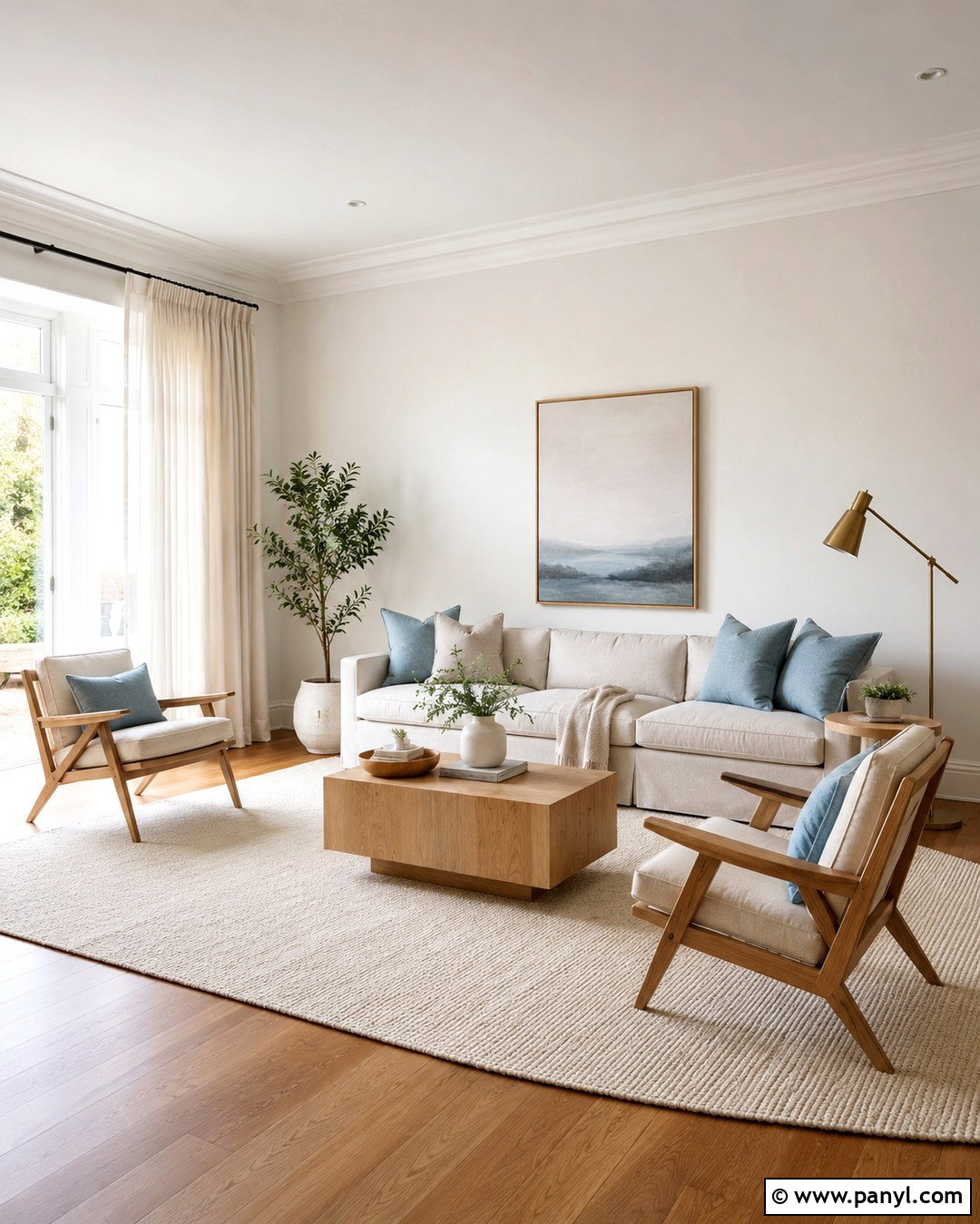
Pearl white walls create a bright living room that feels softer and more welcoming than one painted in stark white. Choose a warm pearl white with faint cream or gray undertones, then repeat it across the walls for a continuous glow. Add an oatmeal-colored sofa, two light oak accent chairs, and a textured ivory rug to build gentle contrast. Brushed brass lamps bring warmth, while pale blue pillows prevent the neutral palette from looking flat. Keep the ceiling matte white so the wall sheen remains subtle rather than overwhelming. Natural linen curtains will filter strong daylight and reveal the finish gradually. This complete scheme works particularly well in compact living rooms because every surface feels connected, open, and comfortably polished.
2. Cream Pearl Bedroom Walls
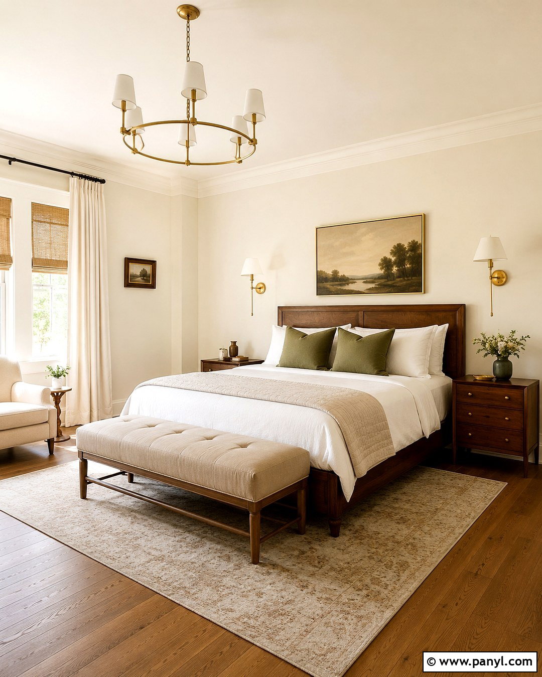
Imagine waking up in a room that feels warm, quiet, and filled with gentle morning light. Cream pearl paint can create that effect without the heavy yellow cast found in some traditional cream colors. Use it on every wall and combine it with a walnut bed, crisp white bedding, and a sand-colored upholstered bench. Muted olive pillows add an earthy note, while woven shades reinforce the warmth of the palette. Select aged brass sconces with simple linen shades instead of highly reflective fixtures. Medium-tone oak flooring will ground the luminous walls and keep the bedroom from appearing washed out. For the trim, use a soft white in satin or semi-gloss. The result is a relaxed, layered bedroom with understated shine.
3. Champagne Pearl Dining Room Walls
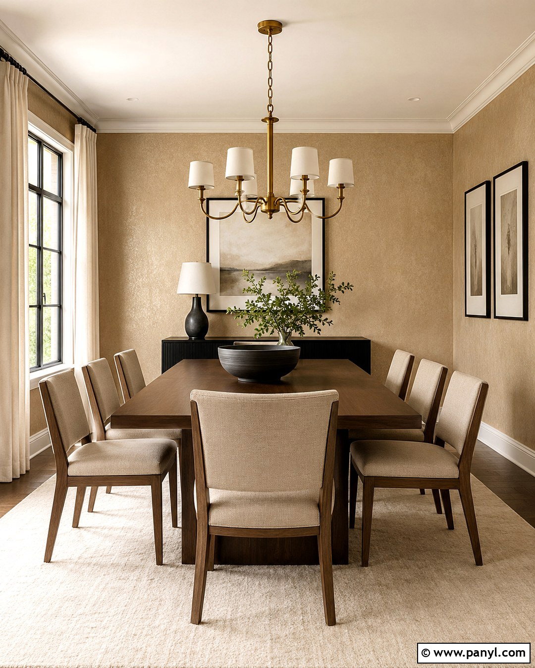
Champagne pearl walls can make an everyday dining room feel polished while remaining comfortable enough for family meals. This color combines warm beige with a delicate golden undertone, so it works beautifully beside medium and dark wood. Center the room around a walnut dining table with curved upholstered chairs in natural linen. Add a large cream rug, off-white curtains, and a simple antique-brass chandelier. Black picture frames or a slim black cabinet provide enough contrast to sharpen the soft palette. Paint the ceiling a flat warm white to prevent excessive reflection overhead. In rooms with afternoon sunlight, champagne pearl develops a warmer glow. Test it beside the flooring first, since orange-toned wood can intensify its golden character.
4. Oyster Pearl Living Room Walls
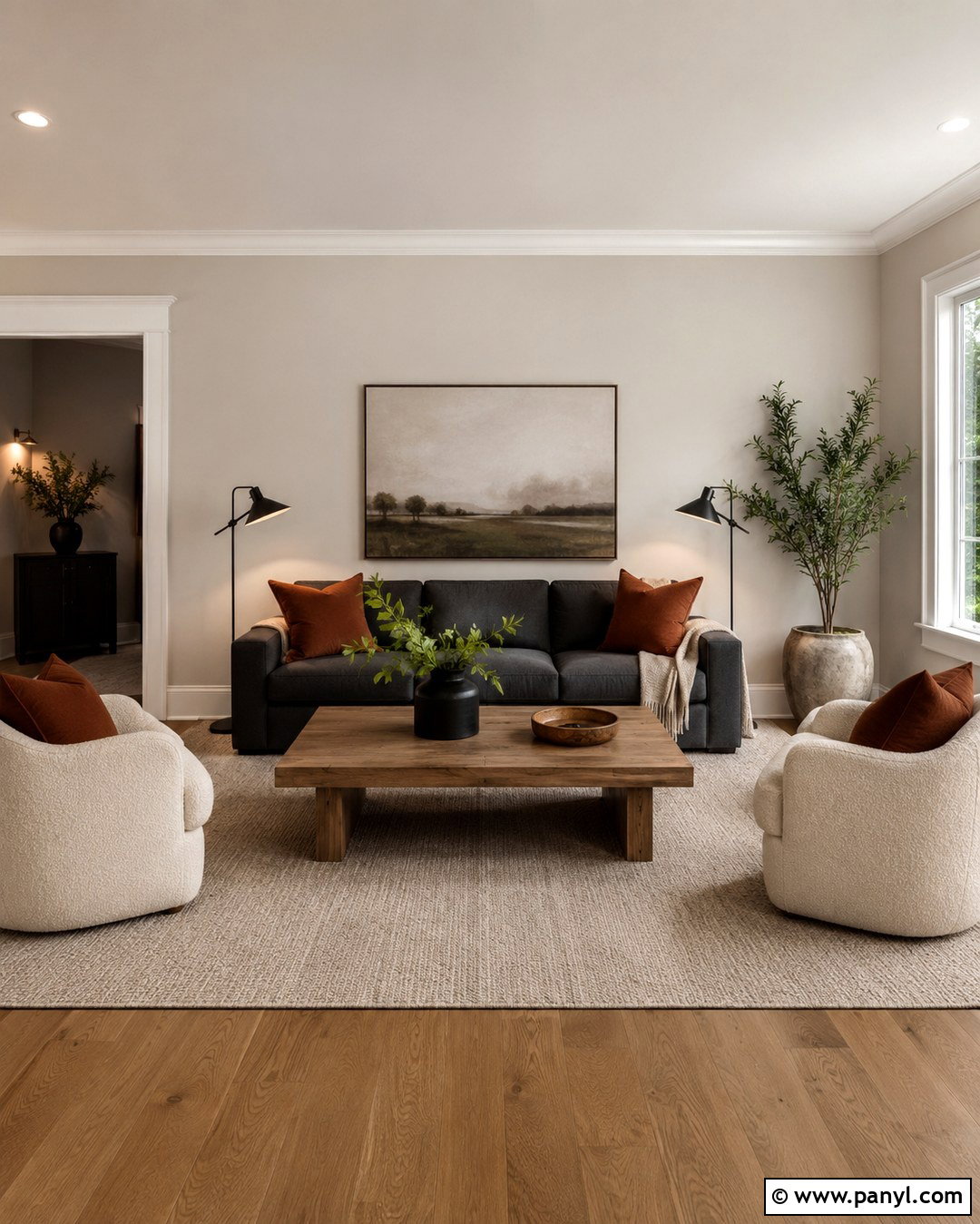
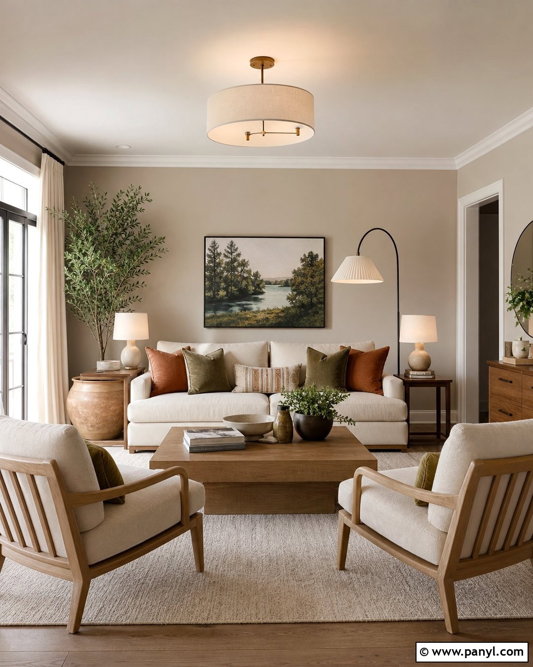
For a neutral room with more depth than plain beige, consider oyster pearl. This adaptable color blends gray, cream, and a restrained taupe undertone, producing walls that shift gently as daylight changes. Pair it with a charcoal sofa, ivory boucle chairs, and a medium oak coffee table for a balanced contemporary living room. Rust-colored pillows and a muted landscape print introduce warmth without disrupting the calm foundation. Use warm white trim and a matte white ceiling to frame the oyster walls clearly. A low-pile greige rug will connect the furniture to the paint, while black metal lighting adds definition. The completed space feels collected and practical, with enough contrast to keep the quiet wall color from becoming bland.
5. Silver Pearl Home Office Walls
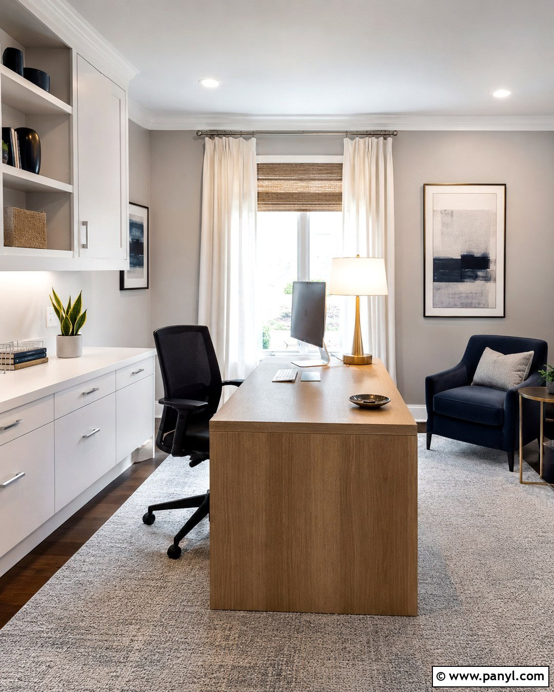
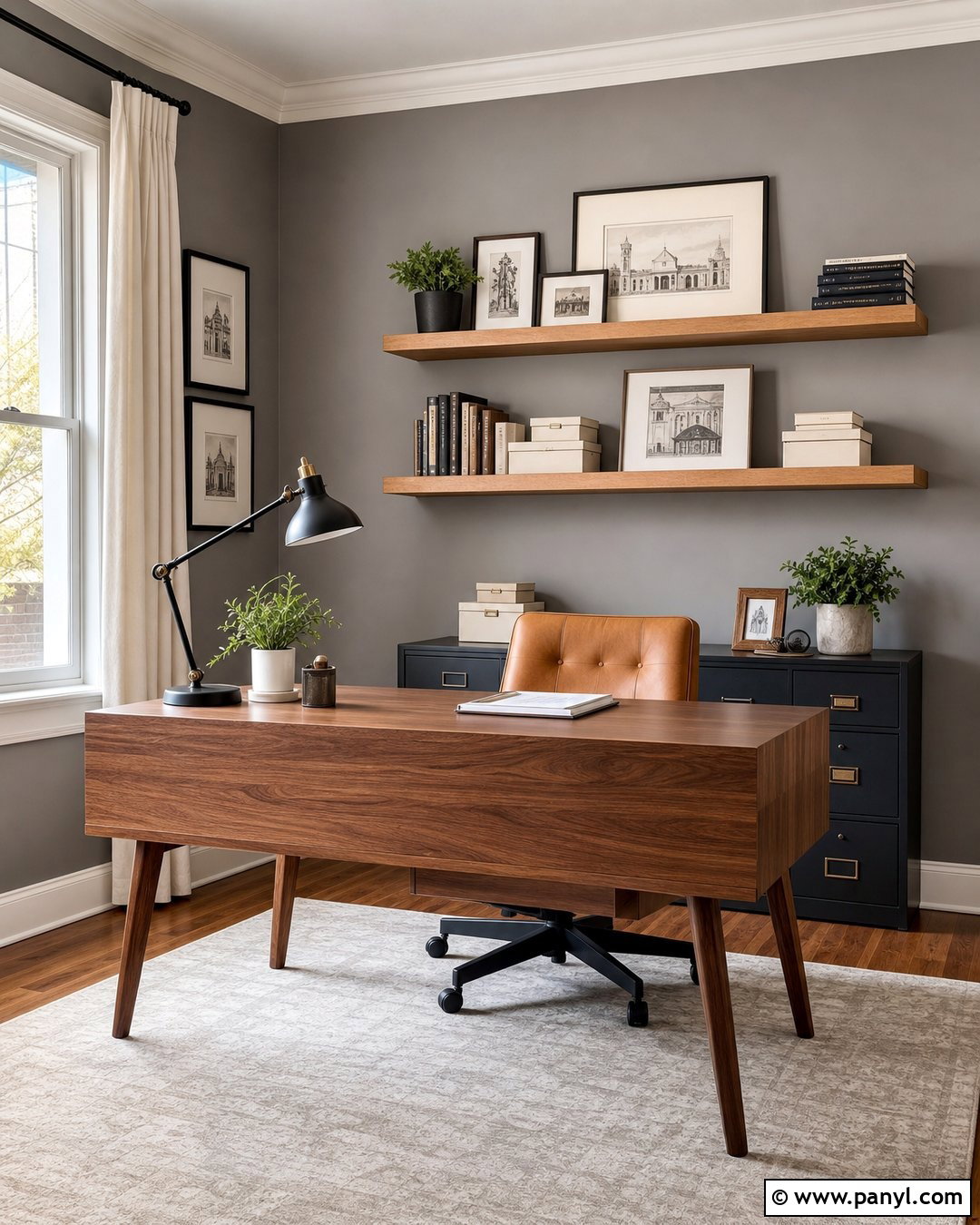
Silver pearl paint gives a home office a crisp, contemporary backdrop that reflects light around the workspace. Look for a pale silver with balanced or slightly blue undertones rather than a cold, metallic gray. Install a streamlined white oak desk against the main wall and add a black ergonomic chair for clean contrast. Closed white cabinetry keeps supplies organized, while brushed nickel hardware repeats the cool shimmer of the paint. Introduce softness through a light gray wool rug, ivory curtains, and one muted navy chair. Use neutral-white task lighting because overly warm bulbs may make silver walls appear dull or green. This complete office palette feels clear and focused, yet the layered materials prevent it from looking clinical.
6. Dove Gray Pearl Hallway Walls
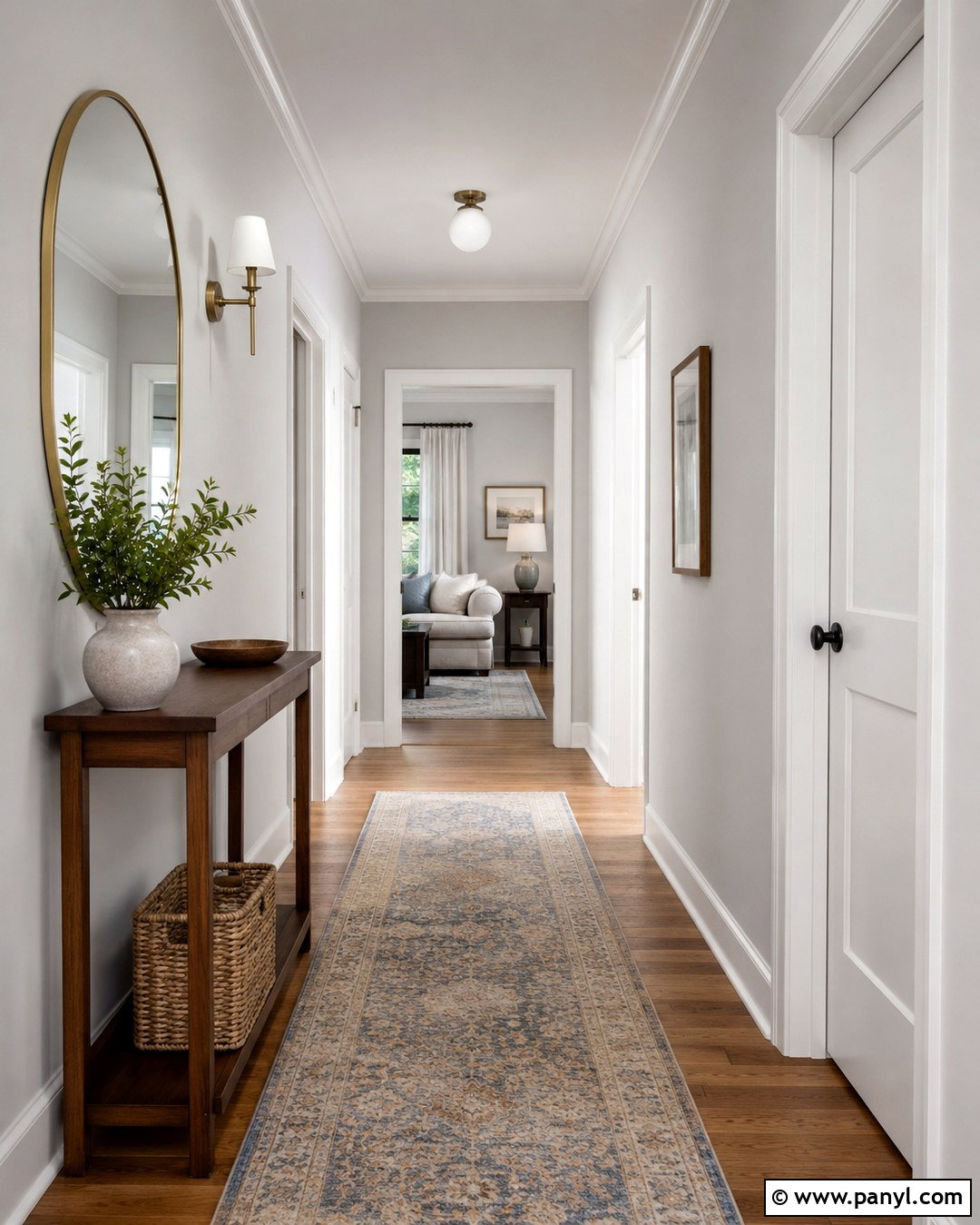
Hallways often need a wall finish that feels attractive while standing up to frequent contact and cleaning. A dove gray pearl finish offers a soft glow and practical durability for these busy transition areas. () Choose a light, balanced gray and pair it with crisp white baseboards, door casings, and interior doors. Run natural oak flooring through the hallway to warm the cool-neutral walls. A narrow walnut console, rounded mirror, and shaded brass sconce create a useful focal point without crowding the walkway. Add one washable runner with faded blue and beige details. Because pearl finishes can emphasize flaws, repair dents and sand patched areas before painting. The finished hallway will feel brighter, wider, and intentionally connected to surrounding rooms.
7. Blush Pearl Bedroom Walls
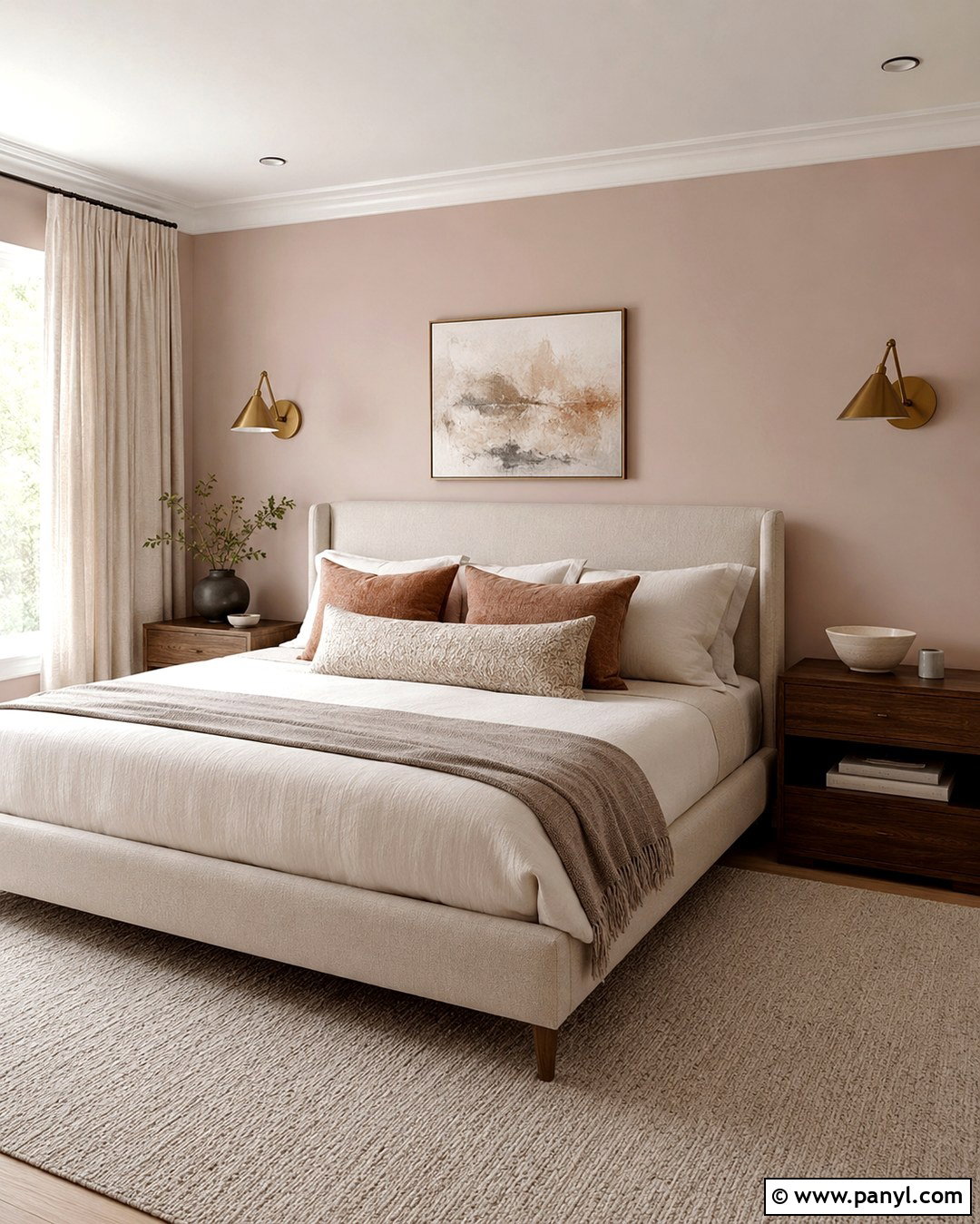
Blush pearl walls can feel sophisticated rather than overly sweet when the surrounding palette includes grounded neutrals. Select a dusty blush with beige or muted gray undertones and apply it throughout the bedroom. Build the room around an oatmeal upholstered bed with layered white, taupe, and muted terracotta bedding. Medium walnut nightstands provide visual weight, while aged brass sconces complement the warm shimmer of the walls. Keep window treatments simple with full-length natural linen curtains. A cream wool rug and one abstract artwork in burgundy, tan, and charcoal will complete the composition. Use warm white paint on the trim instead of bright white. This combination produces a calm, adult bedroom in which the pearl sheen appears gentle and atmospheric.
8. Dusty Rose Pearl Powder Room Walls
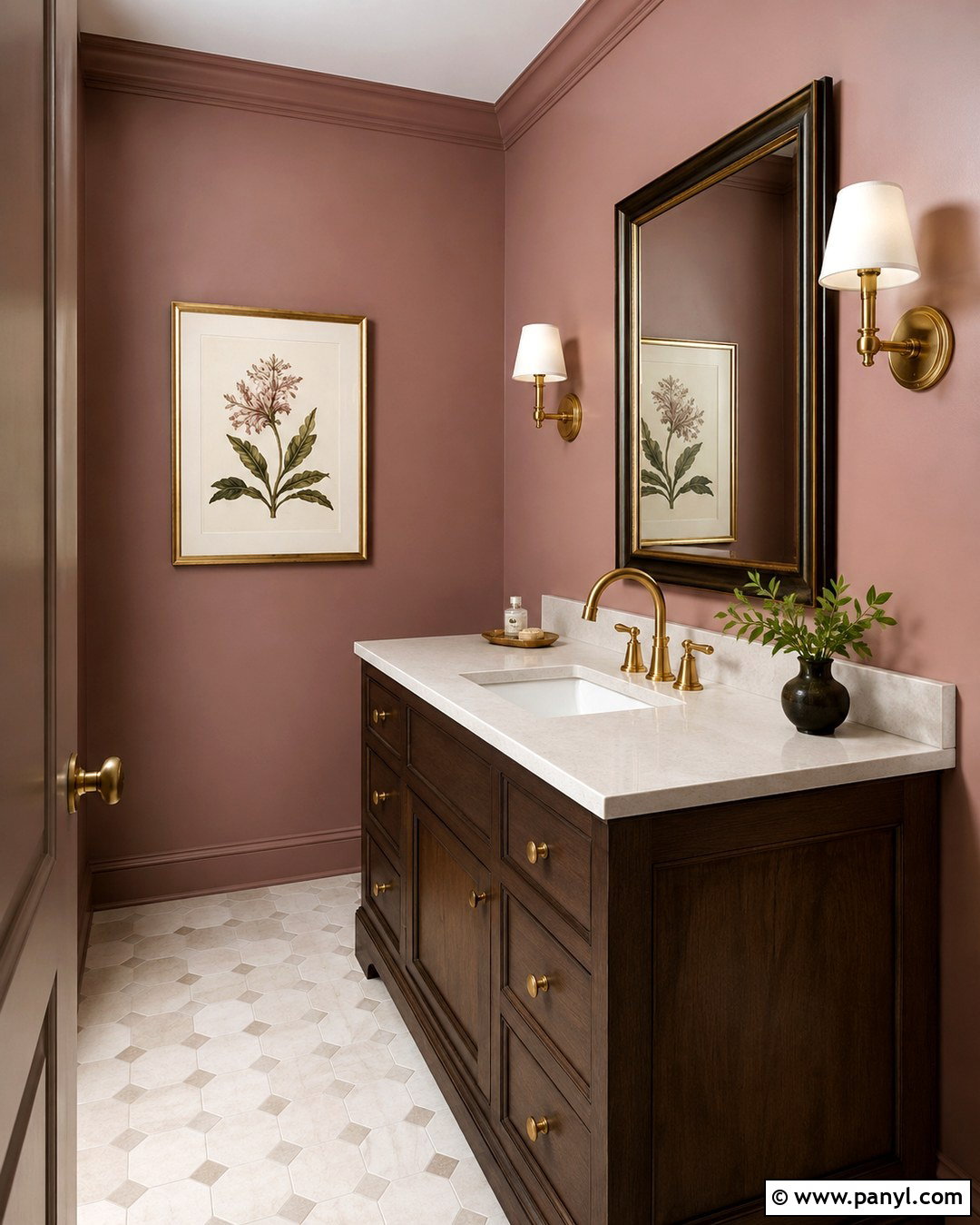
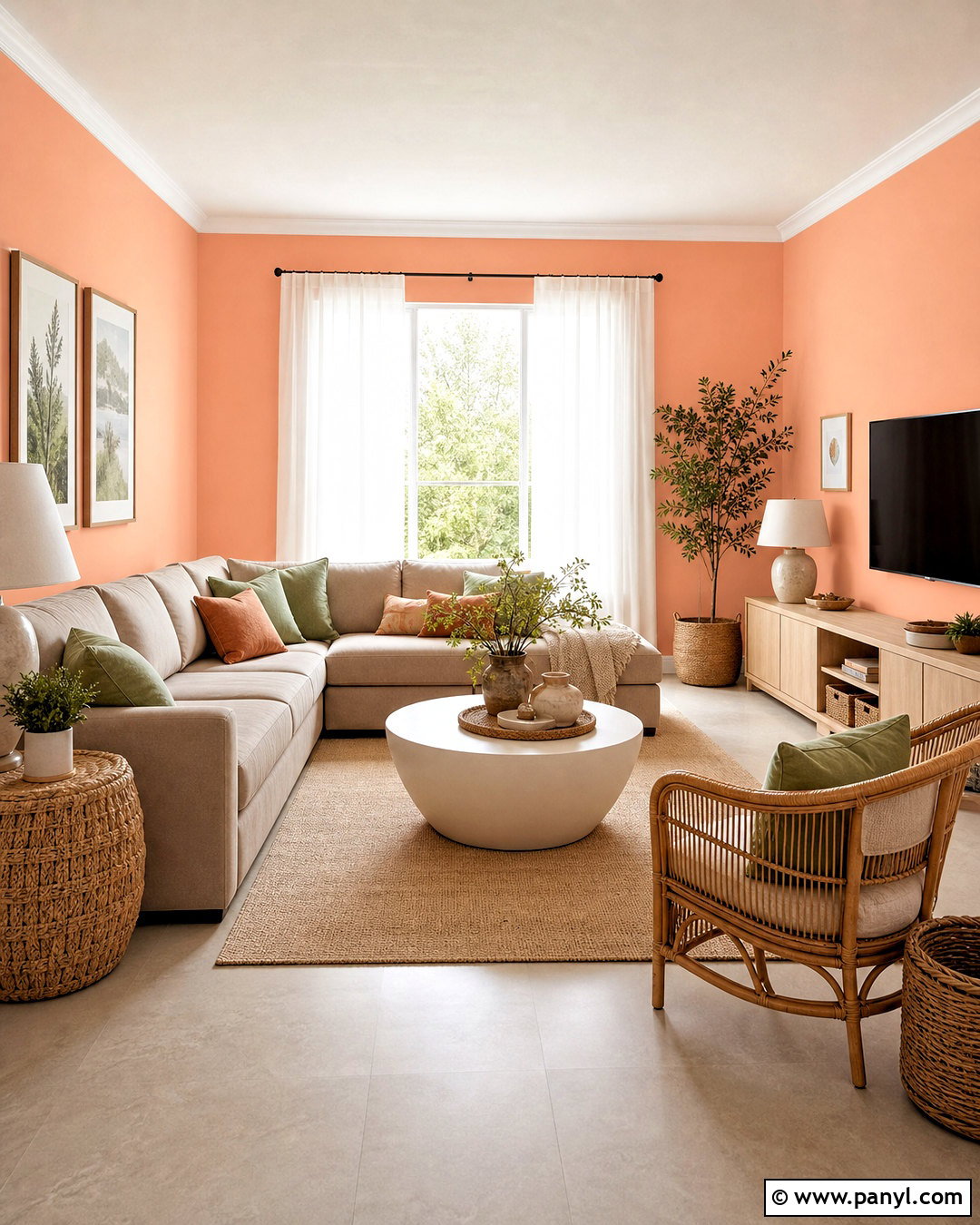
A small powder room is an ideal place to use dusty rose pearl paint because the compact walls allow its soft reflection to become a feature. Choose a medium rose with muted brown undertones, then balance it with a dark walnut vanity and creamy quartz countertop. An unlacquered brass faucet, framed mirror, and pair of compact sconces will emphasize the warmth without making the room feel ornate. Use ivory floor tile with light taupe grout for a clean foundation. A white ceiling and simple white trim keep the rose from becoming visually heavy. Avoid filling the walls with numerous decorations. One framed botanical print is enough. The resulting powder room feels distinctive, flattering, and carefully coordinated from floor to ceiling.
9. Peach Pearl Breakfast Nook Walls
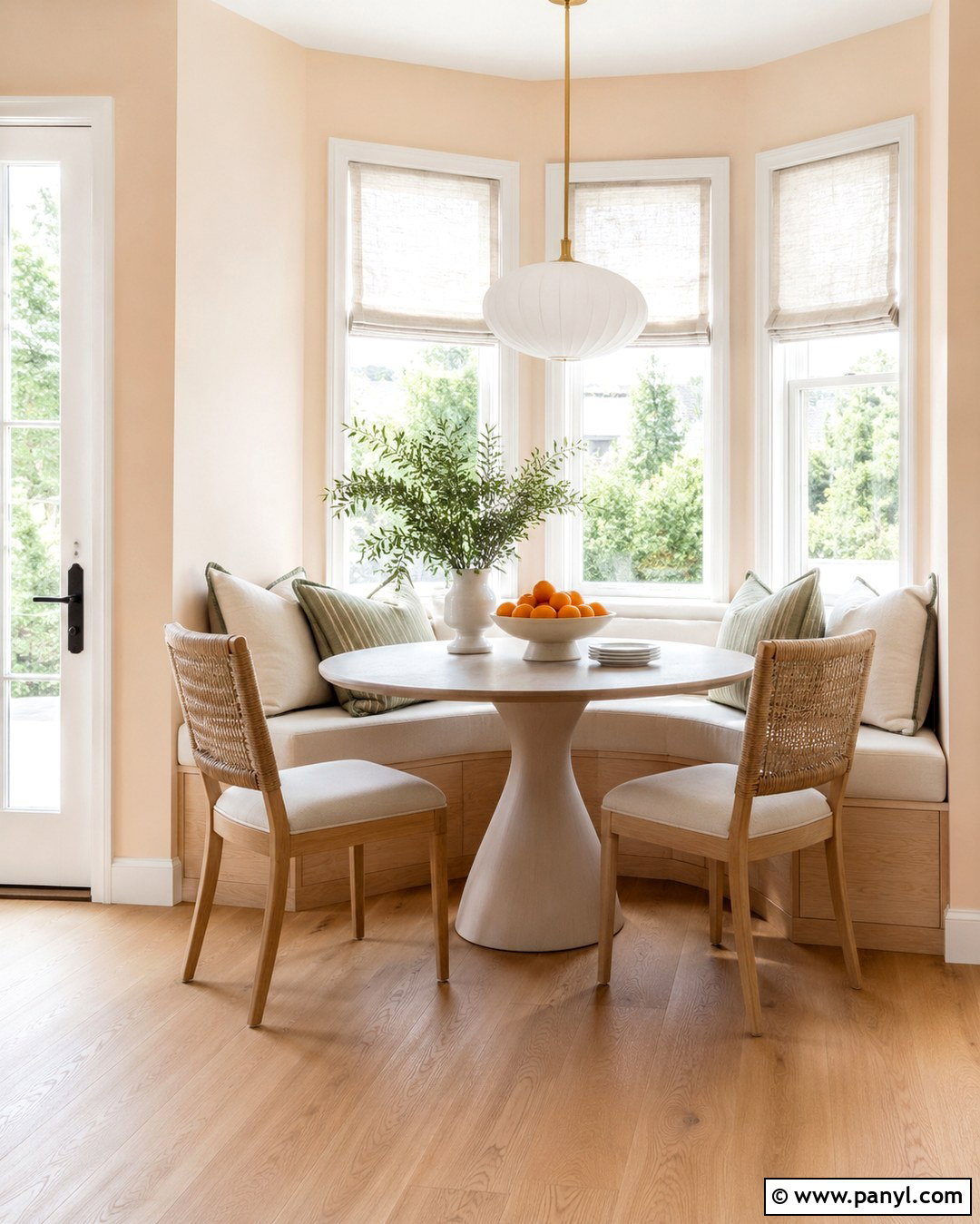
Soft peach pearl paint can bring cheerful warmth to a breakfast nook, especially where cool morning light tends to make neutral walls feel lifeless. Choose a pale peach with restrained pink and cream undertones. Place a built-in or freestanding white oak bench along one wall, adding ivory seat cushions and striped sage pillows. A small round pedestal table saves space, while woven dining chairs introduce casual texture. Hang a white glass pendant with brushed brass fittings above the table. Light limestone-look flooring or natural oak will complement the wall color without increasing its sweetness. Finish the windows with relaxed Roman shades in natural linen. This complete arrangement feels fresh, sunny, and practical for everyday coffee, meals, or informal work.
10. Buttercream Pearl Kitchen Walls
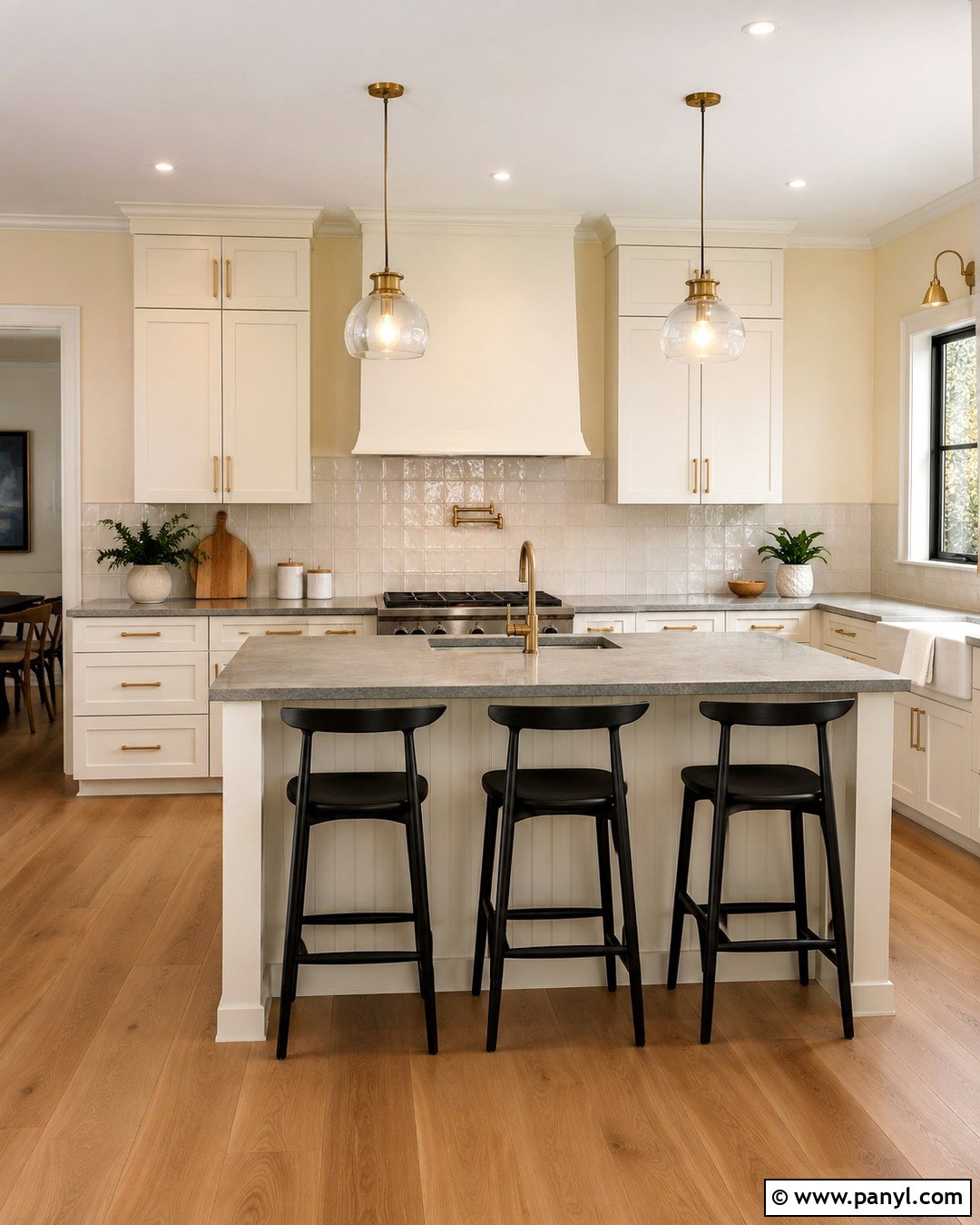
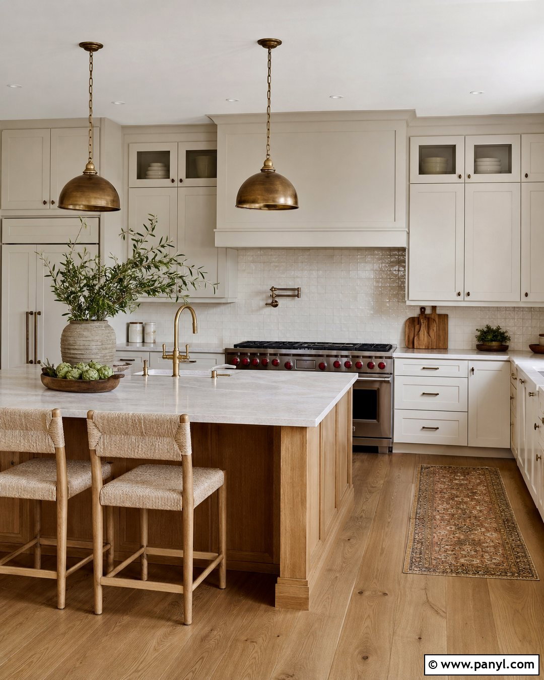
Buttercream pearl walls introduce warmth to a kitchen while offering a surface that is easier to wipe than many low-sheen finishes. Pearl is commonly suited to kitchens because it handles moisture and routine cleaning without the hard appearance of glossier paint. () Pair the walls with creamy white cabinets, honed light-gray quartz counters, and a backsplash of handmade ivory tile. Use medium oak flooring and brushed brass hardware to strengthen the inviting palette. Black counter stools or pendant details will prevent the room from looking overly pale. Choose a gentle buttercream with more cream than yellow, particularly if the kitchen receives strong afternoon sun. The finished space should feel warm and bright, not intensely golden.
11. Sage Pearl Living Room Walls
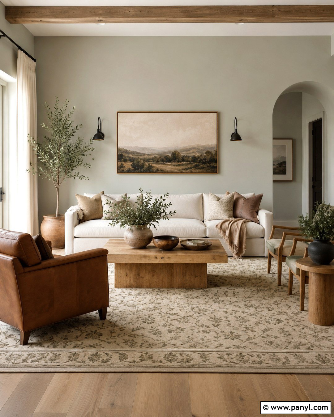
Sage pearl walls create a nature-inspired living room that feels fresh without relying on a basic neutral. Pick a softened sage with gray undertones so the pearl sheen looks refined rather than glossy. Combine it with a warm cream sofa, cognac leather chair, and natural oak tables. An ivory rug with a subtle olive pattern will connect the larger surfaces, while dark bronze lamps add needed contrast. Use warm white trim and woven linen curtains to maintain an easy, organic atmosphere. Terracotta pottery and a few leafy plants can reinforce the green, but keep accessories edited. In strong daylight, sage may appear lighter and cooler, so sample it on more than one wall. The completed design feels grounded, comfortable, and quietly colorful.
12. Eucalyptus Pearl Bedroom Walls
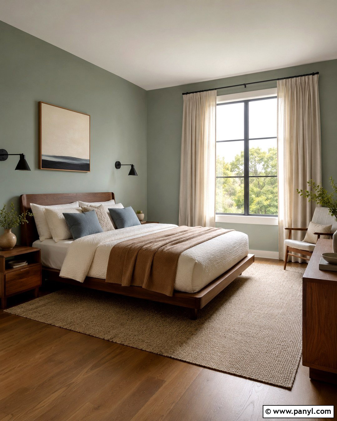
Eucalyptus pearl paint has a cooler, slightly deeper character than traditional sage, making it suitable for a restful bedroom with modern details. Cover all four walls to create a cohesive envelope, then add a low walnut bed and softly textured ivory bedding. Layer in muted blue-gray pillows, a camel-colored throw, and a natural wool rug. Matte black sconces and curtain rods will define the pale green walls without competing with their delicate shine. Choose floor-length oatmeal curtains to soften the windows and warm the palette. White oak or medium walnut flooring works equally well, depending on the desired contrast. Keep the ceiling flat white. The finished room feels peaceful and clean, with enough tonal variation to remain interesting throughout the day.
13. Seafoam Pearl Bathroom Walls
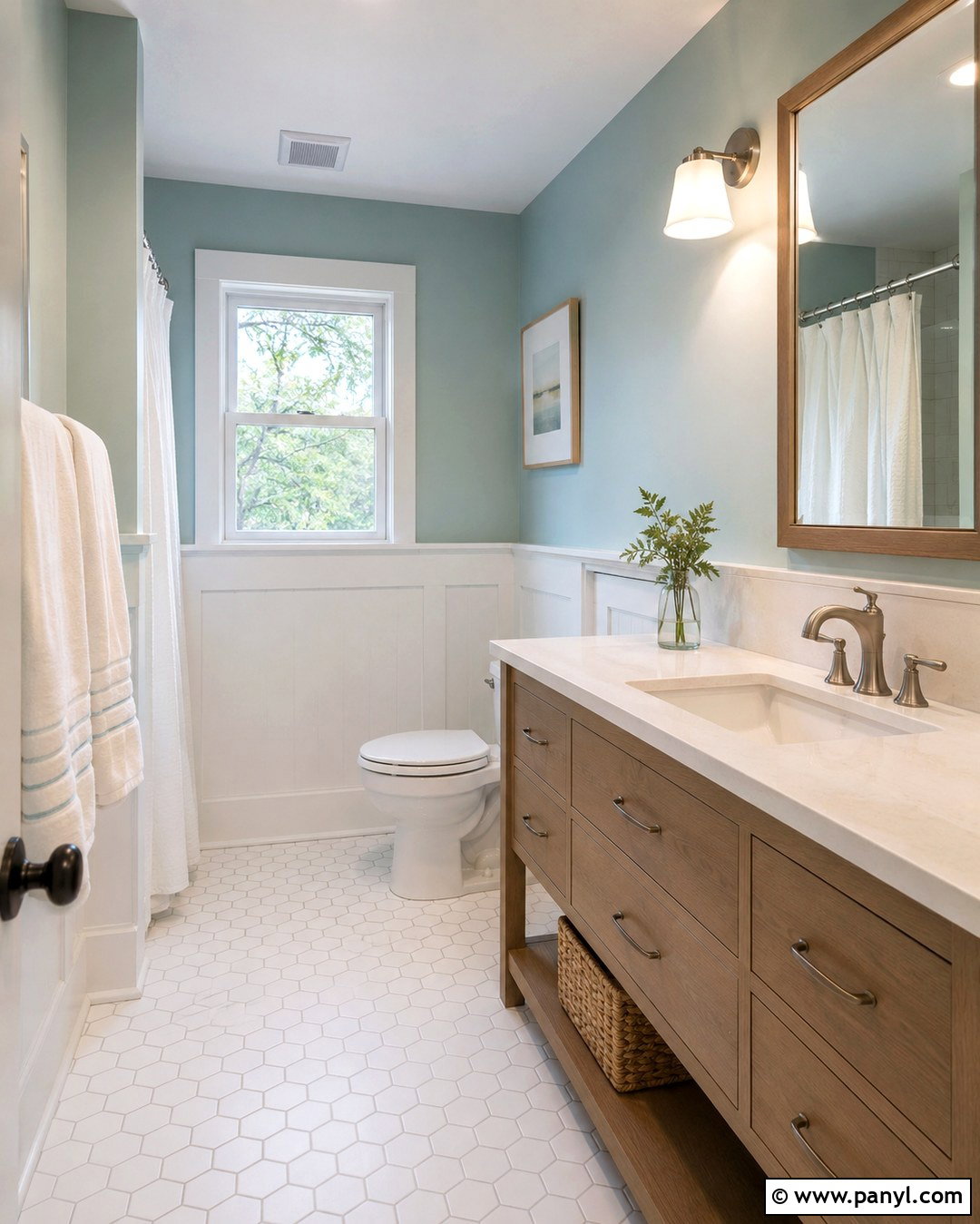
Seafoam pearl walls can make a bathroom feel airy and clean while introducing more personality than white or beige. Select a pale blue-green with gray undertones and use it above white tile or simple painted wainscoting. A light oak vanity, white quartz top, and brushed nickel fixtures will support the fresh coastal palette without becoming themed. Install matte white floor tile in a small geometric pattern and add an ivory shower curtain with subtle texture. Use bright, neutral lighting around the mirror so the seafoam remains clear rather than turning muddy. Pearl finishes are well suited to higher-humidity areas when the chosen paint product is formulated for that use. () The finished bathroom will feel bright, balanced, and easy to maintain.
14. Misty Blue Pearl Bedroom Walls
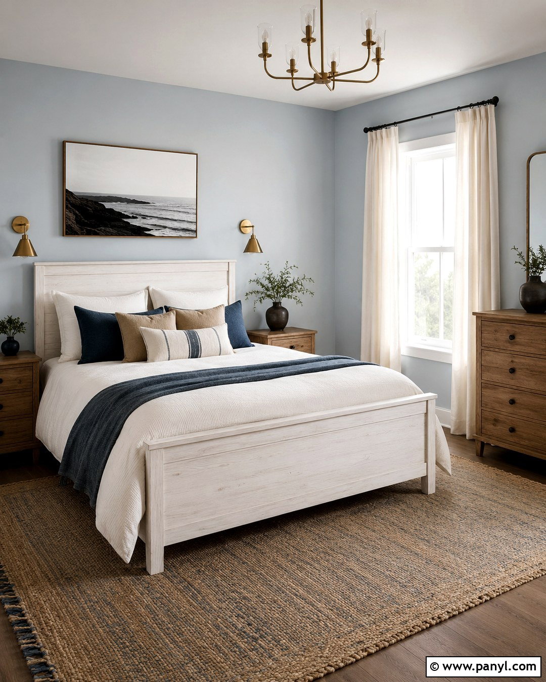
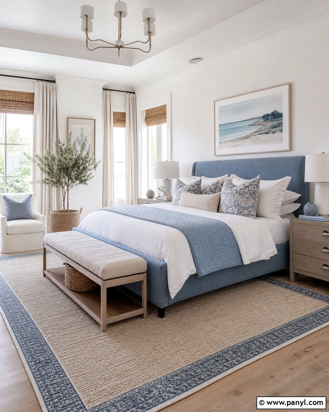
Misty blue pearl paint creates a soft bedroom backdrop that changes gracefully from cool daylight to warmer evening illumination. Choose a pale blue with enough gray to keep it calm and versatile. Pair it with a white oak bed, warm white bedding, and layered pillows in navy, flax, and faded denim. A woven jute-and-wool rug will add texture beneath the lighter palette. Use antique-brass sconces and one warm wood dresser to prevent the blue from feeling chilly. Off-white linen curtains should extend from near the ceiling to the floor, visually increasing the room’s height. Keep artwork simple, with coastal landscapes or abstract shapes in muted neutrals. This complete bedroom feels peaceful and polished without appearing overly formal or heavily decorated.
15. Blue Gray Pearl Kitchen Walls
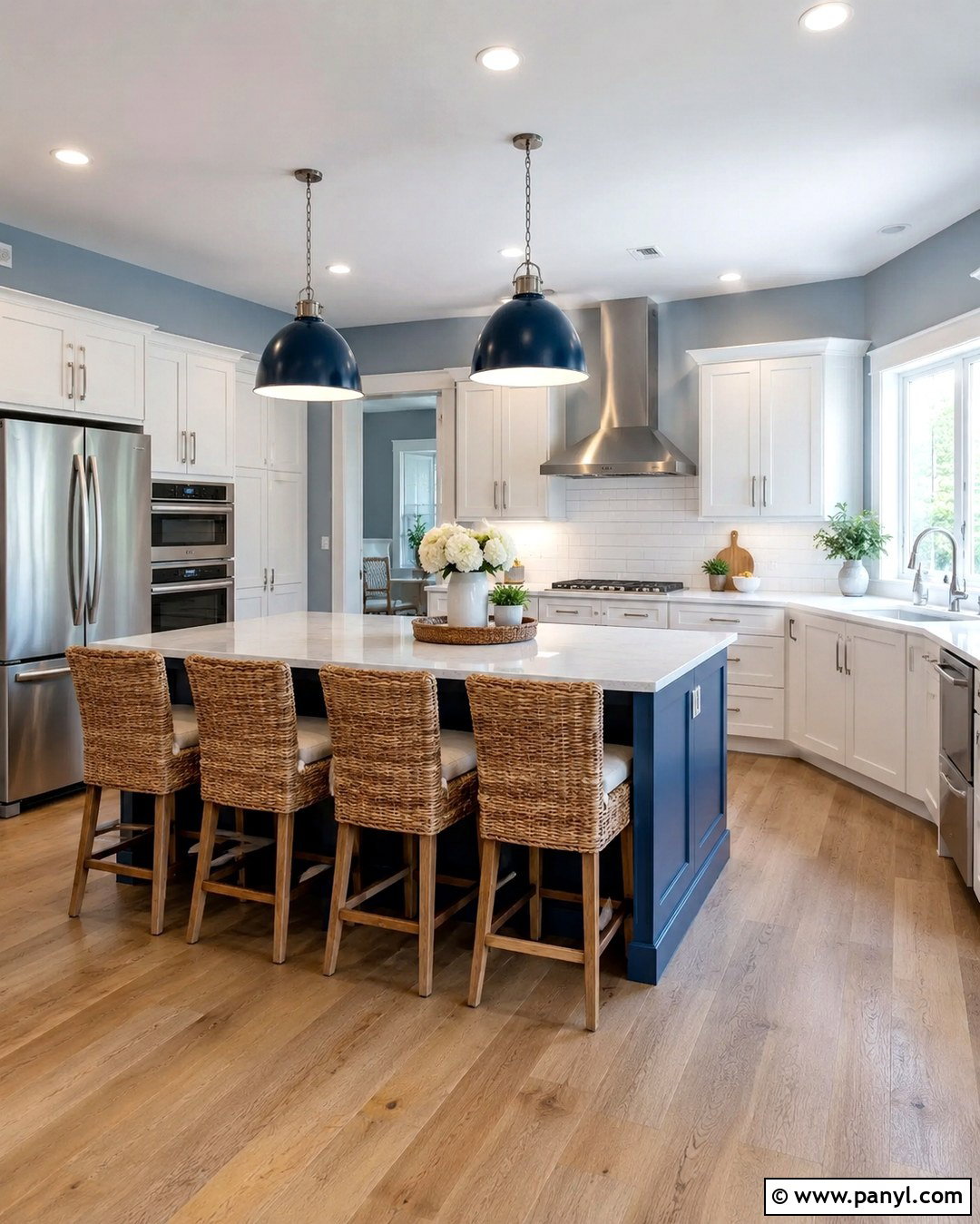
Does your white kitchen feel clean but slightly unfinished? Blue-gray pearl walls can add structure and color while preserving its open appearance. Choose a medium-light blue-gray with a balanced undertone and surround it with warm white cabinets. Add pale quartz counters, white subway tile, and brushed nickel hardware for continuity. Natural oak flooring and woven counter stools will provide the warmth this cooler wall color needs. Use navy pendant lights or a navy-painted island to create one deeper focal point. Keep accessories functional and minimal, such as wood cutting boards and white ceramic containers. The pearl finish will pick up changing light across the kitchen, so apply samples near windows and under cabinet lighting before choosing the final shade.
16. Powder Blue Pearl Nursery Walls
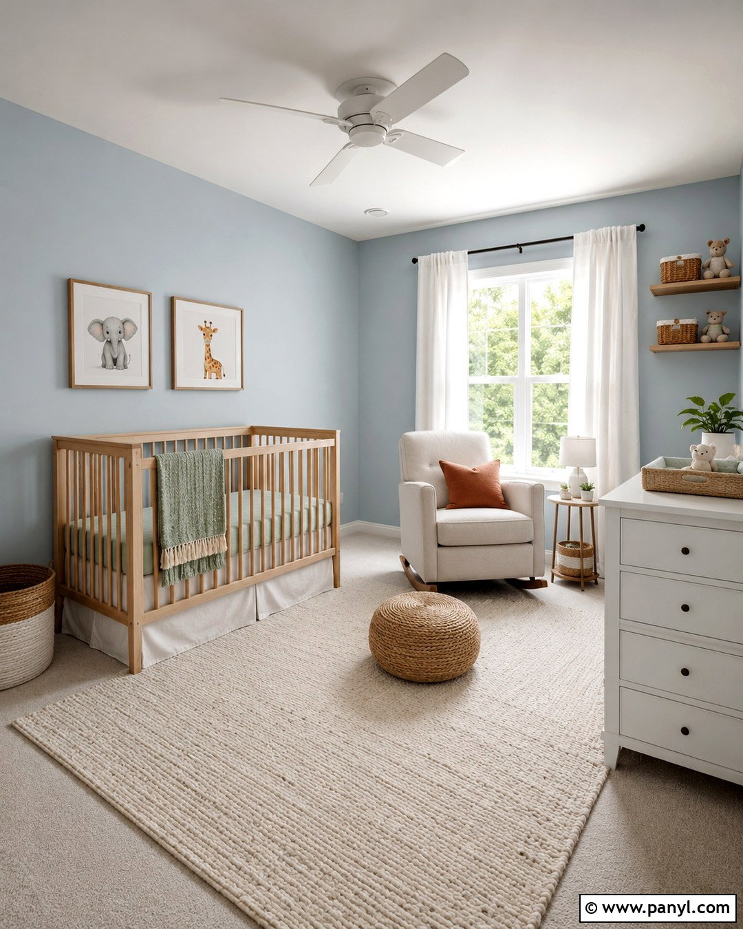
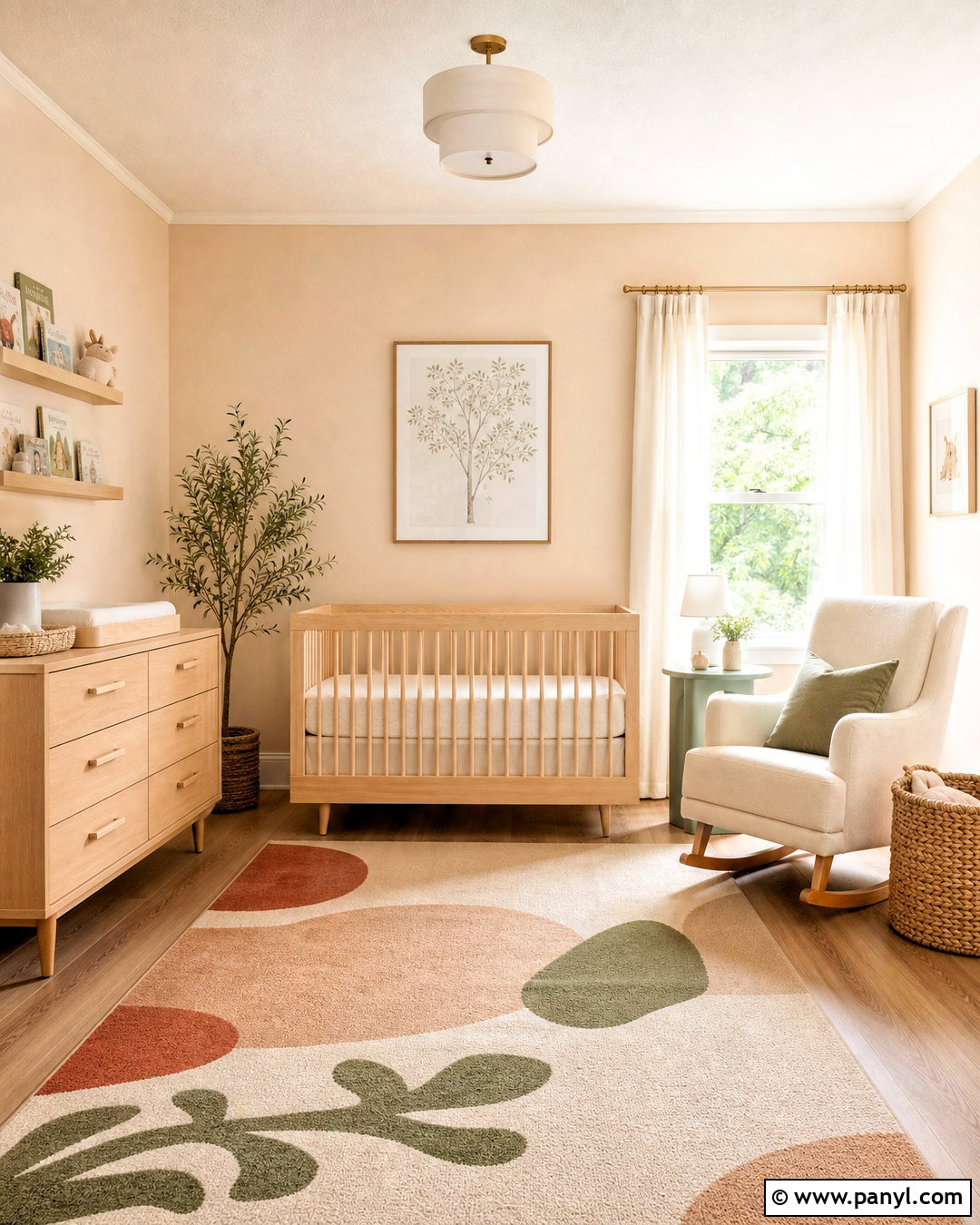
Powder blue pearl walls offer a gentle foundation for a nursery that can grow with the child. Select a muted blue with a faint gray undertone rather than a bright primary shade. Place a natural maple crib against the main wall and add a cream upholstered glider beside a small oak table. Layer an ivory washable rug over pale wood flooring, then introduce color through sage, tan, and soft rust textiles. White curtains with blackout lining keep the space bright during the day and functional at rest time. Use covered storage baskets and a low white dresser to maintain a calm arrangement. A few simple framed illustrations can complete the walls. The pearl finish adds subtle dimension while the flexible palette avoids an overly themed appearance.
17. Lavender Pearl Dressing Room Walls
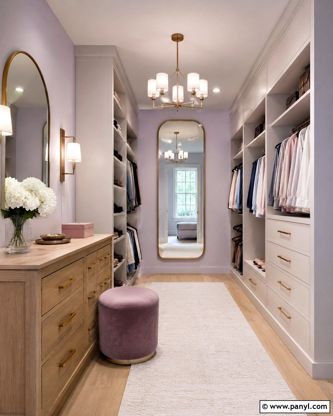
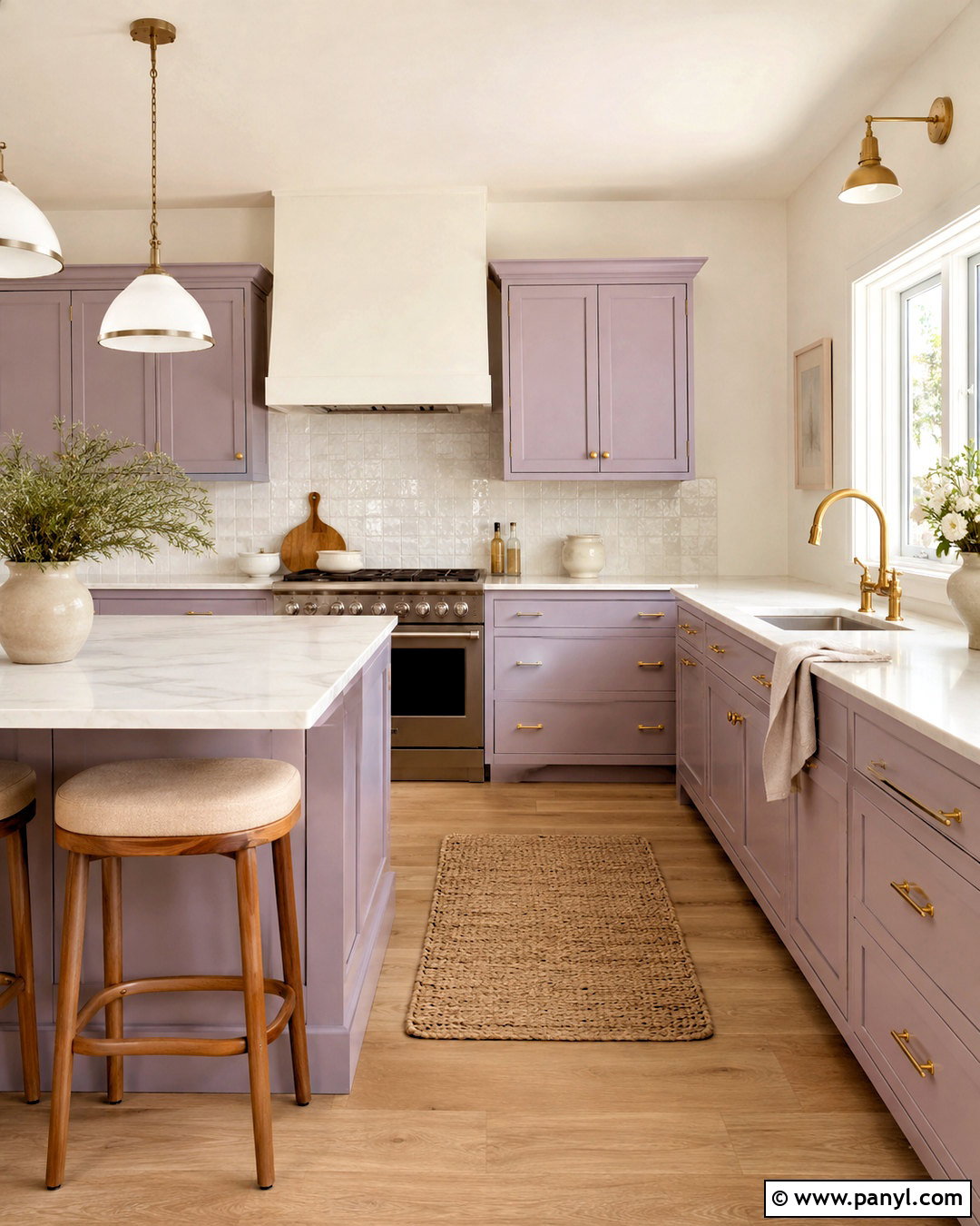
Lavender pearl paint can turn a dressing room or walk-in closet into a light, elegant space without sacrificing functionality. Look for a pale lavender softened by gray, which will coordinate more easily with wood, white, and metallic finishes. Install warm white cabinetry and include one light oak dresser or center island if space allows. Brushed brass hardware and a rounded full-length mirror will complement the delicate wall glow. Use a low-pile cream rug and an upholstered stool in dusty mauve for comfort. Bright, color-balanced lighting is essential where clothing and makeup are selected. Avoid strongly yellow bulbs, which may distort the lavender. The resulting dressing area feels organized and refined, with every storage element contributing to the complete visual design.
18. Lilac Pearl Home Office Walls
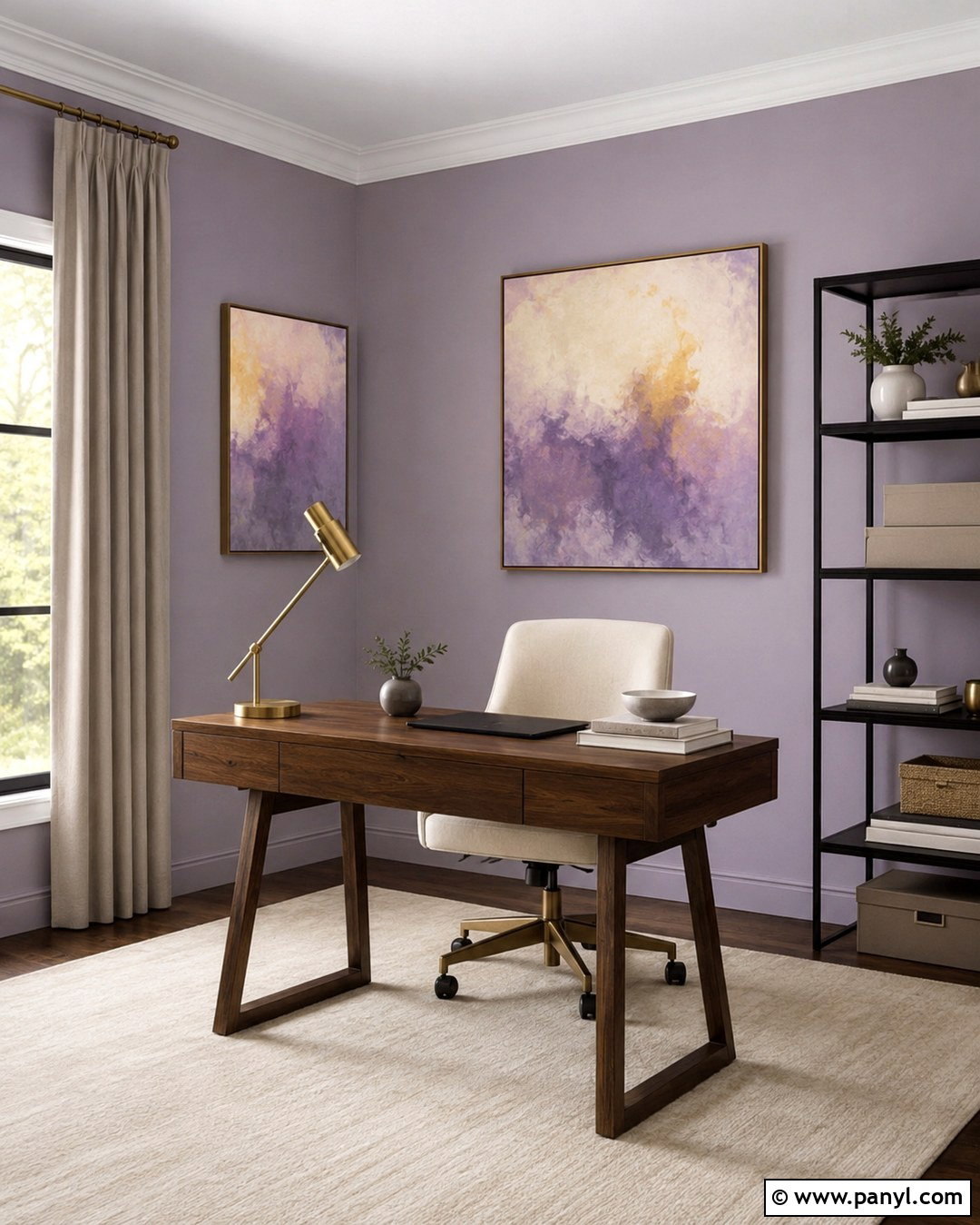
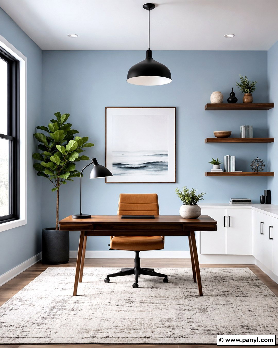
A home office does not have to rely on gray or beige to feel focused. Muted lilac pearl paint provides a creative backdrop while remaining calm enough for daily work. Choose a gray-based lilac and pair it with a walnut desk, cream desk chair, and slim black shelving. Add an ivory rug and taupe curtains to soften the room’s cooler notes. A brass task lamp introduces warmth, while a framed abstract print can repeat lilac, charcoal, and muted ochre. Keep storage boxes in matching neutral colors so the walls remain the main feature. Paint the trim a soft warm white for gentle contrast. This coordinated office feels personal and energizing, yet it remains practical, uncluttered, and suitable for video calls.
19. Taupe Pearl Entryway Walls
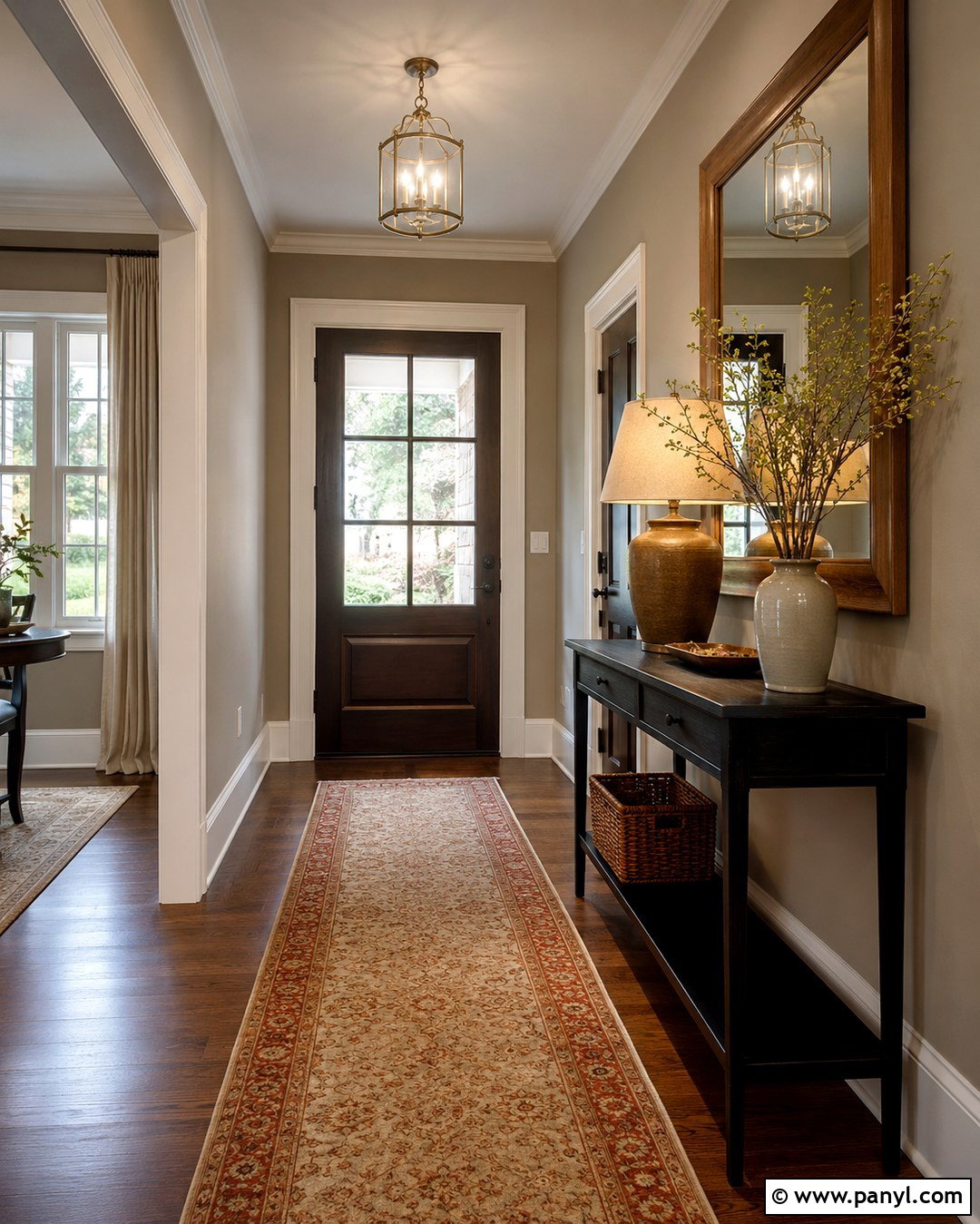
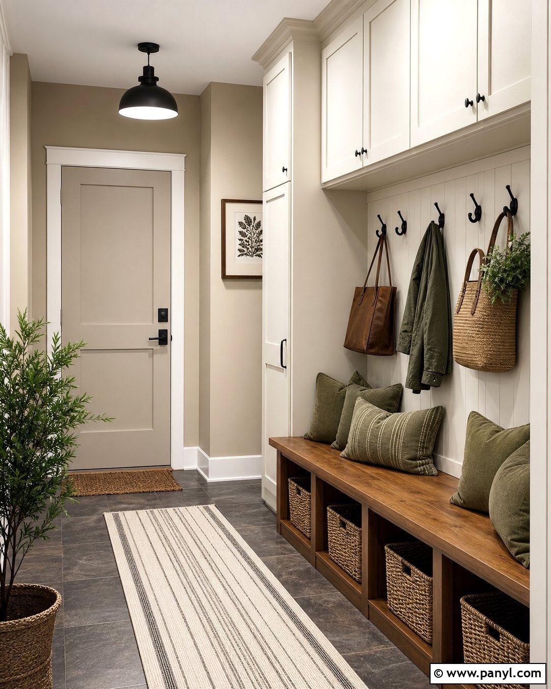
Taupe pearl walls bring warmth and definition to an entryway while coordinating easily with nearby neutral rooms. Select a medium-light taupe that combines brown and gray without a strong pink or purple cast. Anchor the space with a narrow black console and a large oak-framed mirror. A washable runner in cream, charcoal, and muted rust will hide everyday wear while connecting the color palette. Add a shaded brass lamp, a ceramic bowl for keys, and one simple branch arrangement. Use creamy white trim around doors and baseboards for a clean outline. Because entry walls experience frequent contact, the washable nature of pearl paint is especially useful here. The completed entry feels welcoming, organized, and substantial without requiring excessive furniture or decoration.
20. Deep Teal Pearl Accent Walls
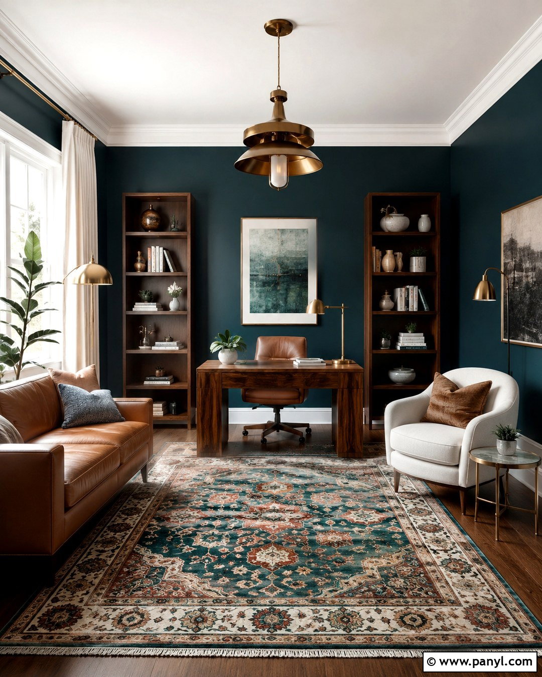
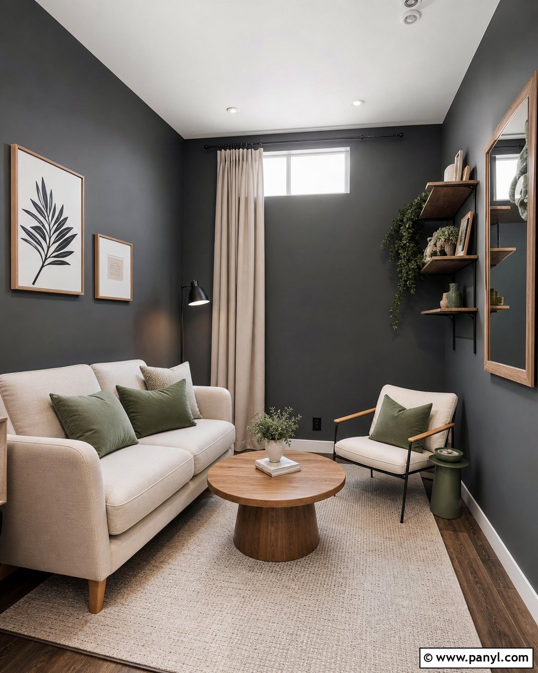
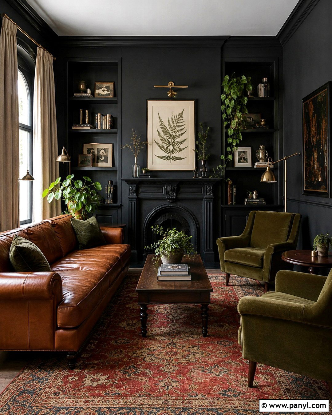
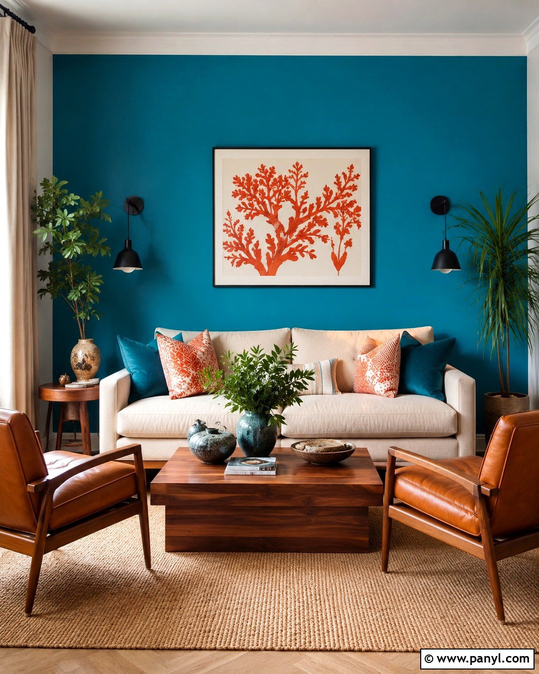
Deep teal pearl paint offers a dramatic alternative to pale, luminous colors. Use it on a living room focal wall or across a compact reading room where controlled shine can emphasize the color’s blue-green depth. Pair the walls with a camel leather sofa, ivory lounge chair, and medium walnut shelving. A patterned rug containing teal, rust, and cream will unify the scheme. Add aged brass lighting and warm white curtains to prevent the darker color from absorbing too much light. Keep the ceiling and trim warm white for a crisp boundary. Smooth wall preparation is particularly important because deeper colors and reflective finishes may expose application marks. Applied carefully, this complete palette feels rich, comfortable, and striking without becoming dark or overpowering.
Conclusion:
The most effective 20 Pearl Paint Colors For Walls combine attractive color with a complete, balanced room plan. Soft white, cream, oyster, and taupe create versatile foundations, while sage, blue, blush, lavender, and teal introduce controlled personality. Consider the room’s daylight, artificial lighting, flooring, furniture, and trim before making a final choice. Always test a large painted sample because undertones and sheen can look different throughout the day. Pearl finishes require smooth preparation and careful application, but their gentle reflection and washable surface can be especially valuable in active spaces. Use matte ceilings, restrained accessories, and varied natural textures to balance the luster. The result will feel dimensional and polished rather than overly shiny.

Related Ideas and Inspiration:
Leave a Reply