
Painted wainscoting can make a plain room feel more finished while giving the walls practical depth and definition. Today’s most useful schemes go beyond traditional white panels. They include earthy greens, warm neutrals, deep blues, tonal color drenching, and painted paneling paired with patterned wallpaper. Designers are also using different paint sheens to distinguish wainscoting from upper walls without introducing another color. () The right combination depends on natural light, flooring, furniture, and the mood you want to create. These complete room looks balance panel color, wall treatment, trim, furnishings, and finishes so every detail feels connected. Explore these 20 painted wainscoting ideas color schemes to find a look that fits your home.

1. White Wainscoting With Warm Beige Walls
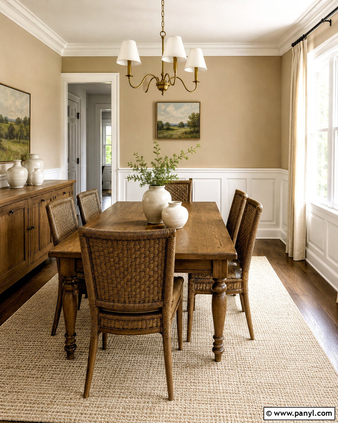
Crisp white wainscoting and warm beige walls create a bright, comfortable foundation for a traditional dining room. Choose a soft white with a subtle creamy undertone rather than a sharp blue-white. Paint the raised panels, chair rail, baseboards, window trim, and door casing in the same satin finish. Above the rail, use a light sandy beige in a washable matte finish. Ground the room with a medium oak dining table, woven rush-seat chairs, and an ivory wool rug. A brushed brass chandelier brings warmth without making the space formal. Finish the scheme with linen curtains, simple landscape art, and cream ceramics. The restrained palette highlights the panel details while keeping the entire room relaxed and inviting.
2. Navy Wainscoting With White Walls
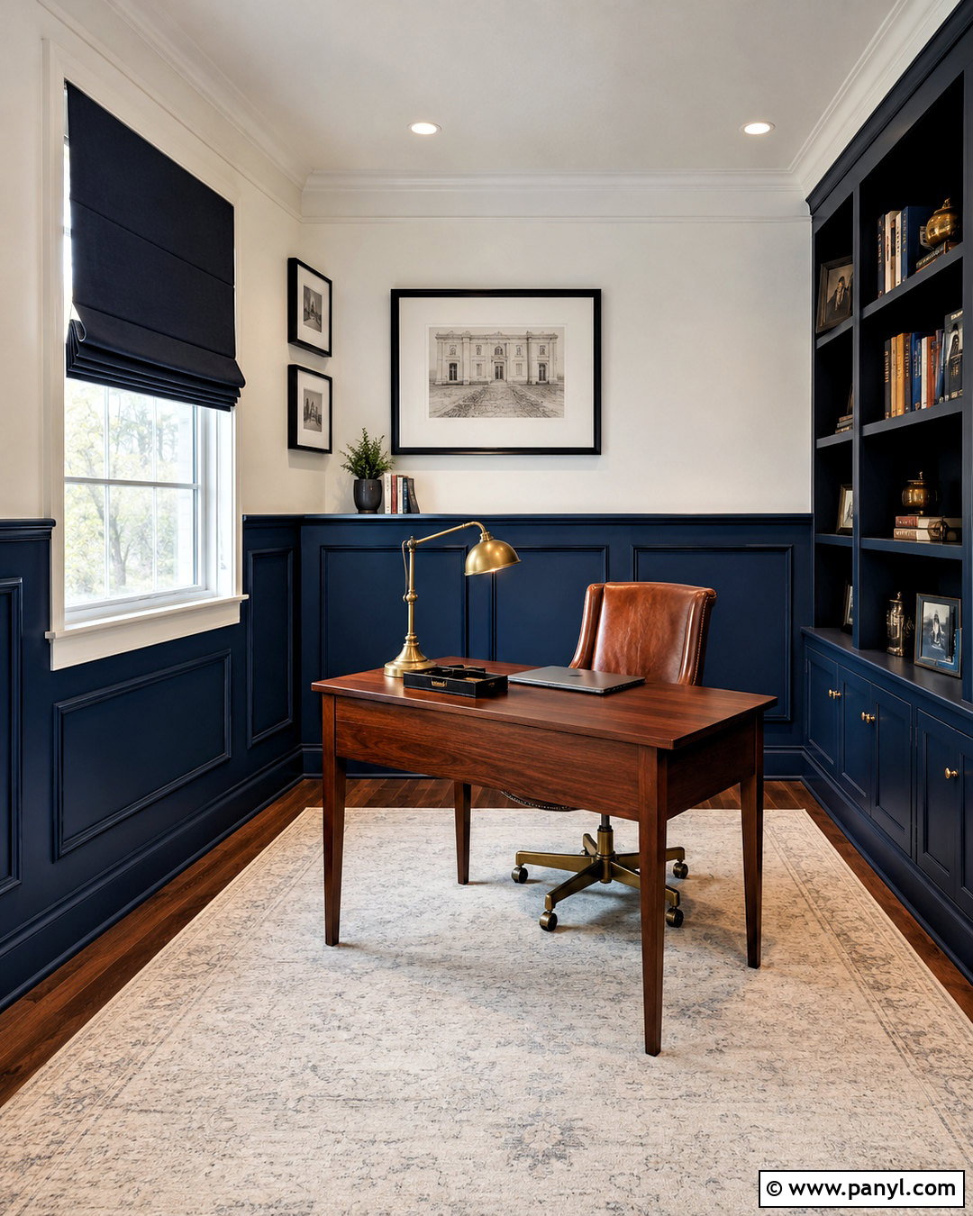
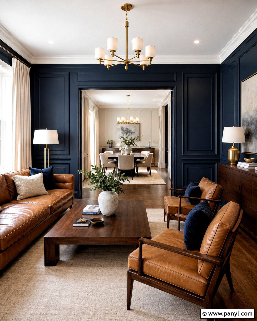
Deep navy wainscoting gives a home office a confident, tailored appearance without covering every wall in dark color. Install simple rectangular panels approximately two-thirds of the way up the wall, then paint the paneling, chair rail, baseboards, and door trim in satin navy blue. Keep the upper walls and ceiling a clean, slightly warm white. A walnut desk, cognac leather chair, and aged brass lamp add richness, while a pale neutral rug prevents the lower half from feeling heavy. Hang black-framed prints against the white walls and use navy window shades for continuity. This complete scheme works especially well when the room receives generous daylight. Repeat small navy accents in books and desk accessories to connect the upper and lower sections.
3. Sage Green Wainscoting With Cream Walls
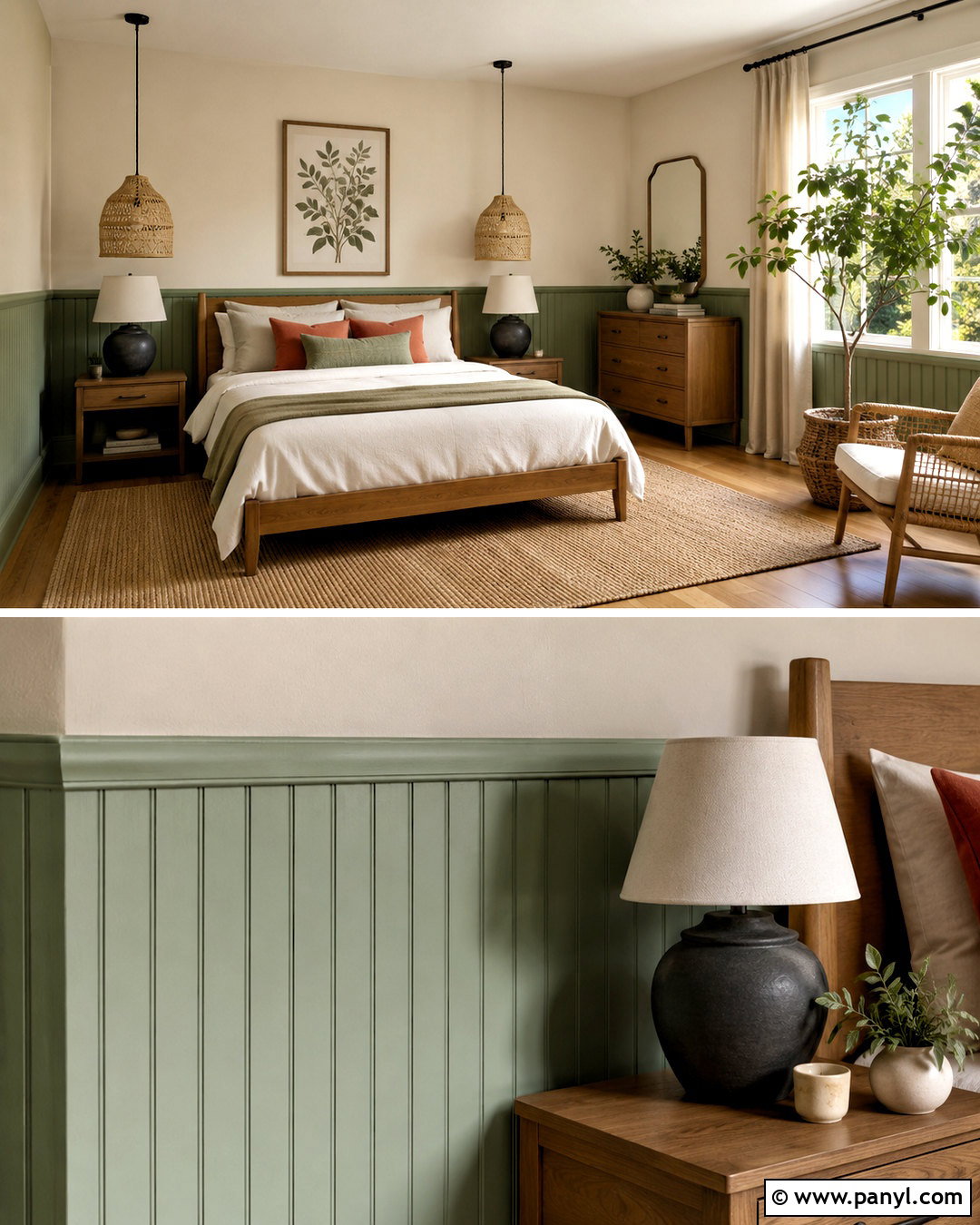
Soft sage green wainscoting brings gentle color into a bedroom while remaining easy to coordinate with natural materials. Use vertical beadboard or narrow picture-frame molding behind the bed and around the room. Paint it in a muted sage with gray undertones, including the baseboards and chair rail. Warm cream above the paneling keeps the palette light and prevents the green from appearing too cool. Add an oak bed, oatmeal linen bedding, a jute rug, and woven pendant lighting. Terracotta-colored pillows introduce a small amount of earthy contrast. Simple botanical prints and ceramic bedside lamps complete the room. This balanced combination feels restful because the strongest color stays below eye level, while the pale upper walls reflect light throughout the space.
4. Charcoal Wainscoting With Greige Walls
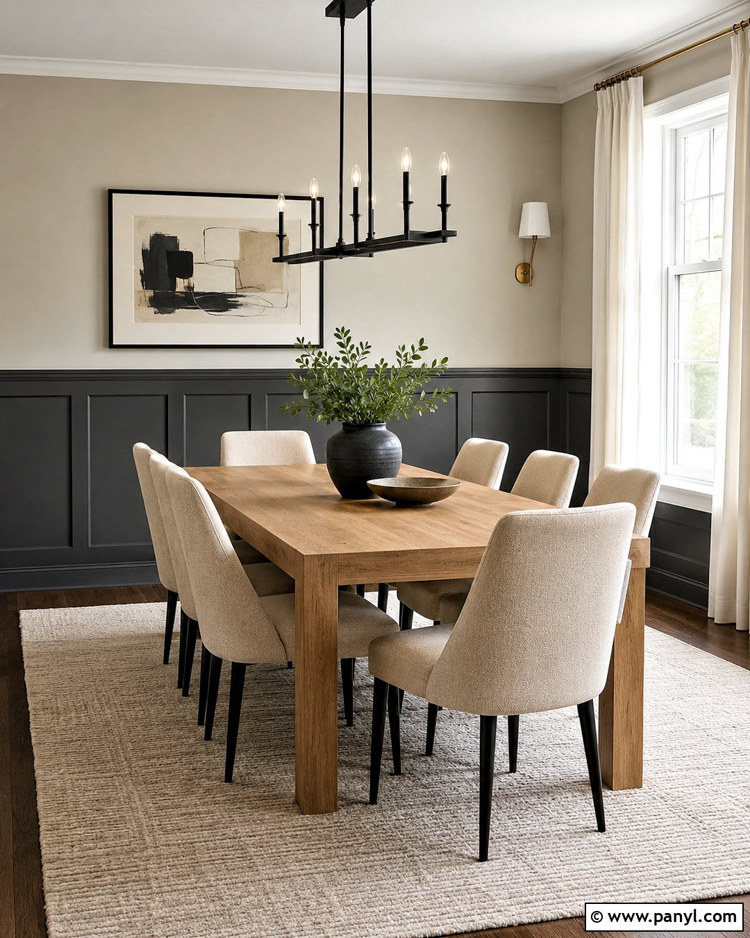
For a modern dining room, pair charcoal wainscoting with soft greige walls and warm wood furniture. Choose flat-panel molding with wide rectangular frames for a clean architectural effect. Paint the lower walls, trim, and interior doors in a deep charcoal satin. Apply a lighter warm greige above the chair rail and continue it across the ceiling for a seamless backdrop. A rectangular oak table and upholstered oatmeal chairs soften the dark paneling. Add a linear matte black chandelier, off-white curtains, and abstract artwork containing charcoal, taupe, and rust. Keep the floor light or medium toned so the room does not become visually bottom-heavy. Small brushed brass details provide warmth and help the neutral scheme feel layered rather than strictly black and gray.
5. Black Wainscoting With Floral Wallpaper
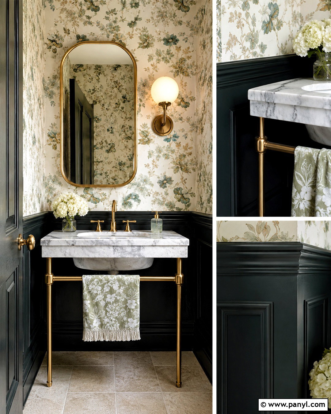
Black painted wainscoting can turn a small powder room into a polished, memorable space. Use traditional raised panels at sink height and coat the paneling, baseboards, door, and trim in soft black satin paint. Above it, install floral wallpaper with a warm ivory background and accents of muted green, dusty blue, and tan. The dark lower section frames the pattern and gives the compact room a clear visual structure. Choose a white marble console sink, polished brass faucet, and rounded brass mirror to brighten the design. A small globe sconce and pale stone floor keep the room balanced. Pulling several wallpaper colors into the towels and accessories connects both wall treatments while allowing the black wainscoting to remain the strongest grounding element.
6. Dusty Blue Wainscoting With Pale Gray Walls
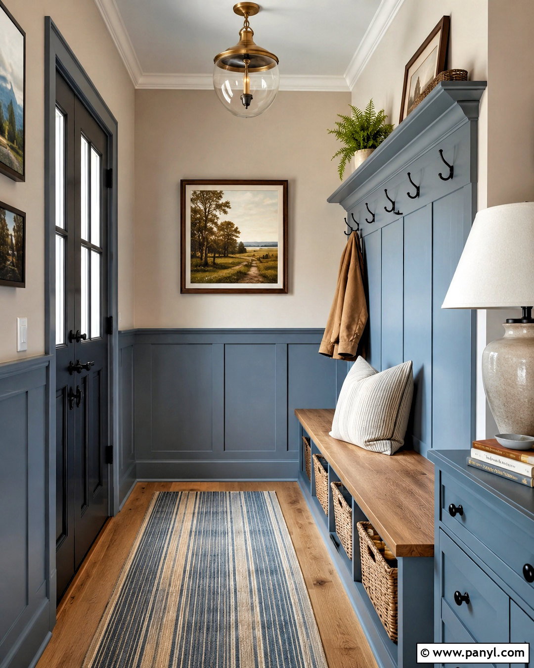
Dusty blue wainscoting creates a calm entryway that feels colorful without being overly bold. Select a softened blue with noticeable gray undertones and apply it to simple shaker-style panels, the chair rail, baseboards, and a built-in bench. Paint the upper walls pale warm gray and keep the ceiling soft white. A natural oak console or bench seat introduces warmth against the cooler wall colors. Add a washable striped runner containing blue, cream, and taupe, plus black metal hooks and an aged brass ceiling light. Woven baskets beneath the bench provide useful storage and additional texture. Complete the entrance with one large landscape print and a ceramic table lamp. The result is an organized, coordinated transition space rather than a collection of unrelated decorative features.
7. Forest Green Wainscoting With Tan Walls
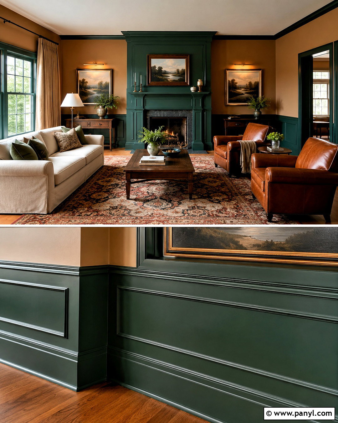
Rich forest green wainscoting and warm tan walls create a grounded living room with an inviting, collected quality. Use substantial picture-frame molding that reaches slightly above standard chair-rail height. Paint the paneling, baseboards, window casings, and fireplace surround in the same deep green satin. Choose a light camel-tan paint above it to brighten the room and echo natural wood tones. Furnish the space with a cream sofa, walnut coffee table, and two cognac leather chairs. An antique-style rug containing green, rust, and beige connects the color scheme. Add linen drapes, brass picture lights, and landscape art in dark wood frames. Keeping upholstery fairly light prevents the lower green surfaces from dominating while preserving the cozy, enveloping character of the palette.
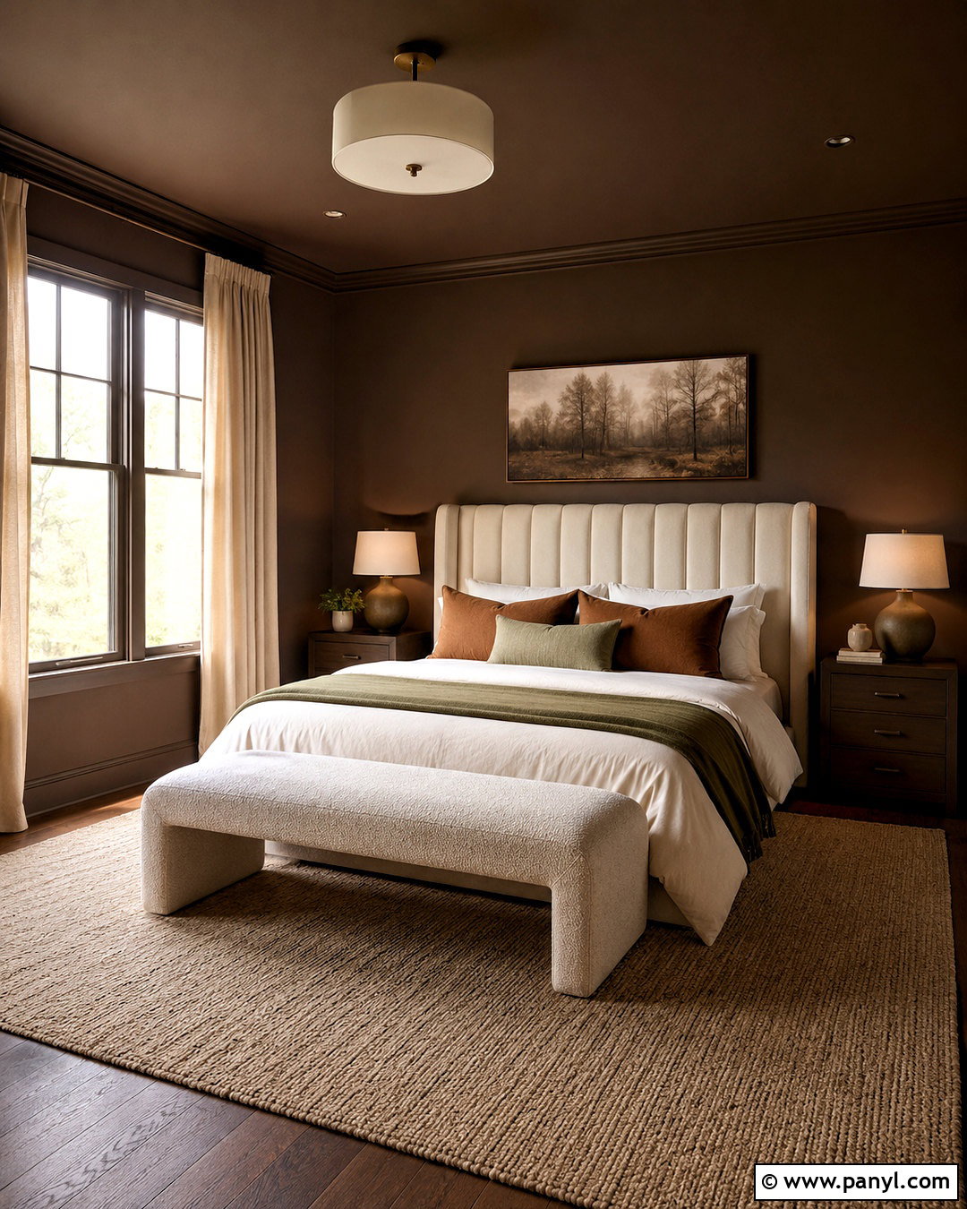
8. Blush Wainscoting With Ivory Walls
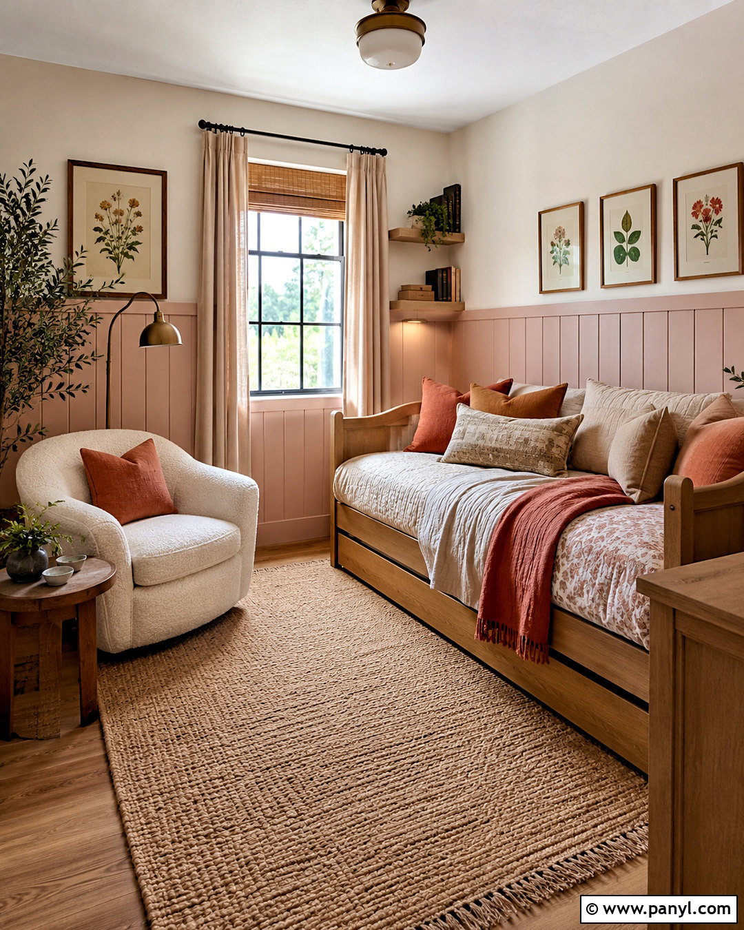
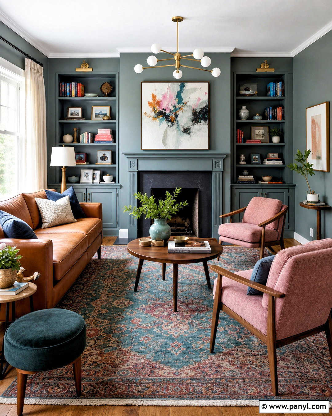
Muted blush wainscoting offers a warm alternative to beige in a bedroom, nursery, or quiet reading room. Select a dusty pink with brown or clay undertones rather than a sugary pastel. Paint low beadboard paneling, the chair rail, baseboards, and door trim in a soft satin finish. Use gentle ivory above the rail and across the ceiling to keep the room airy. Pair the walls with a pale oak daybed, cream boucle chair, and woven natural-fiber rug. Bedding in oatmeal, terracotta, and faded rose creates a subtle tonal progression. Add an antique brass floor lamp and simple botanical artwork for definition. Because the furniture and textiles remain neutral, the painted wainscoting reads as part of the architecture instead of becoming an isolated pink accent.
9. Olive Wainscoting With Botanical Wallpaper
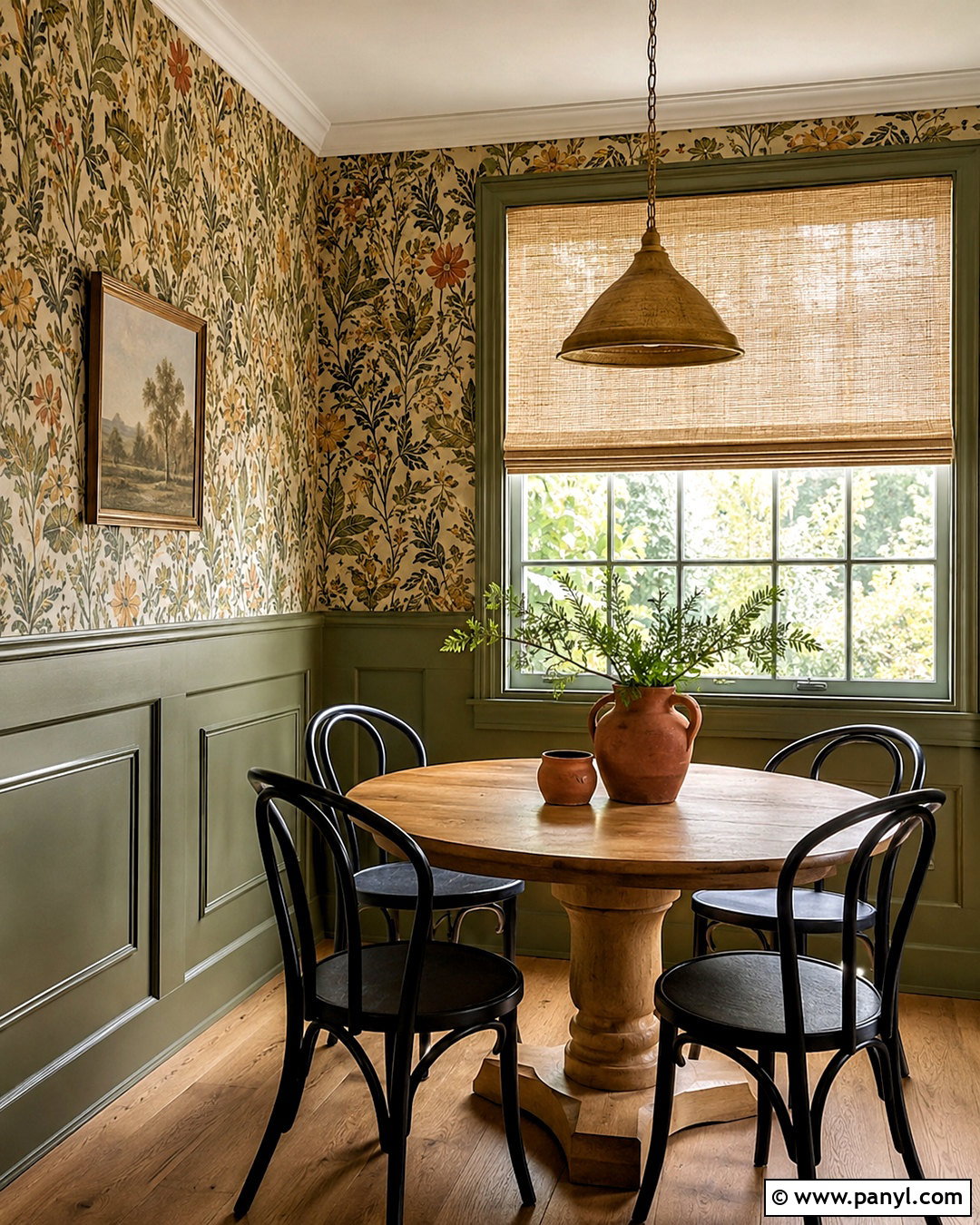
Olive green wainscoting works beautifully beneath botanical wallpaper in a dining nook or breakfast room. Choose wallpaper with an off-white ground and leafy motifs in olive, ochre, rust, and soft black. Pull the deepest green from the print for the wainscoting, chair rail, baseboards, and window trim. A satin finish gives the lower walls subtle dimension, while the wallpaper provides movement above. Center a round oak pedestal table in the space and surround it with curved black chairs or woven café seating. Use a natural linen Roman shade and an aged brass pendant to maintain the earthy palette. Terracotta pottery and simple greenery complete the arrangement. Repeating the wainscoting color within the wallpaper makes the layered treatment look intentional and unified.
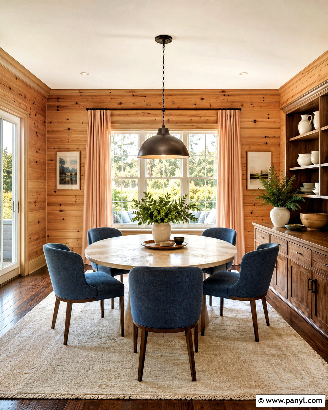
10. Terracotta Wainscoting With Cream Walls
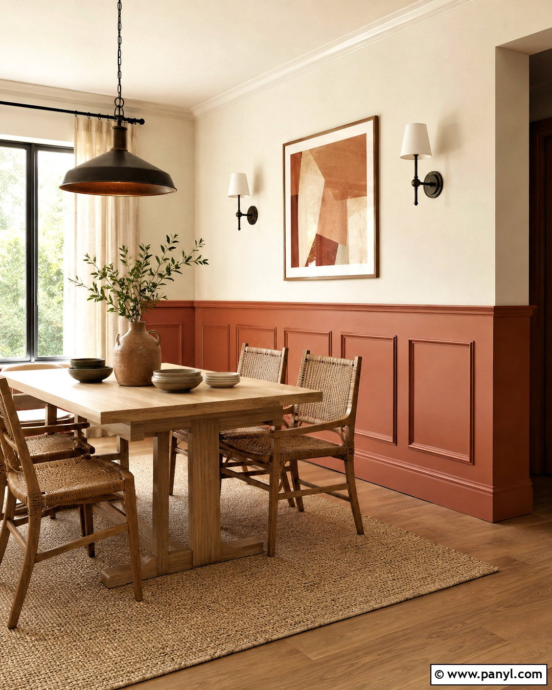
Warm terracotta wainscoting gives an informal dining area depth and sunbaked color. Look for an earthy clay shade with muted red and brown undertones. Apply it to square picture-frame molding, baseboards, and lower door casings in a durable satin finish. Use creamy off-white paint above the rail, keeping the transition soft instead of highly contrasting. A pale oak table, woven dining chairs, and a natural jute rug reinforce the relaxed palette. Introduce dark bronze through the pendant light and curtain rod, then add linen curtains in oatmeal or warm white. Handmade ceramics and abstract art with clay, mustard, and charcoal accents finish the room. The pale upper walls preserve brightness, while the terracotta panels anchor the furniture and add character throughout the entire space.
11. Teal Wainscoting With Soft White Walls
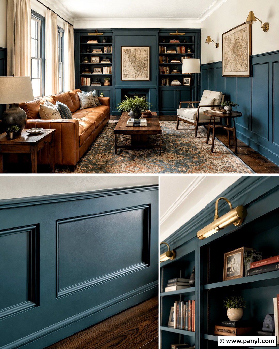
Deep teal wainscoting can give a living room or library corner a strong focal structure. Choose a blue-green shade with enough depth to outline the molding clearly. Paint three-quarter-height panels, built-in shelves, window trim, and baseboards in matching satin teal. Keep the narrow upper wall area and ceiling soft white so the architecture remains defined. Add a camel leather sofa, cream lounge chair, and walnut side tables for warmth. A patterned rug containing teal, rust, beige, and navy ties the furniture to the painted millwork. Use brass sconces, linen window panels, and framed vintage maps as finishing details. Limiting the brighter teal to the lower architecture allows the room to feel colorful yet composed, with neutral furniture providing visual breathing room.
12. Burgundy Wainscoting With Warm Pink Walls
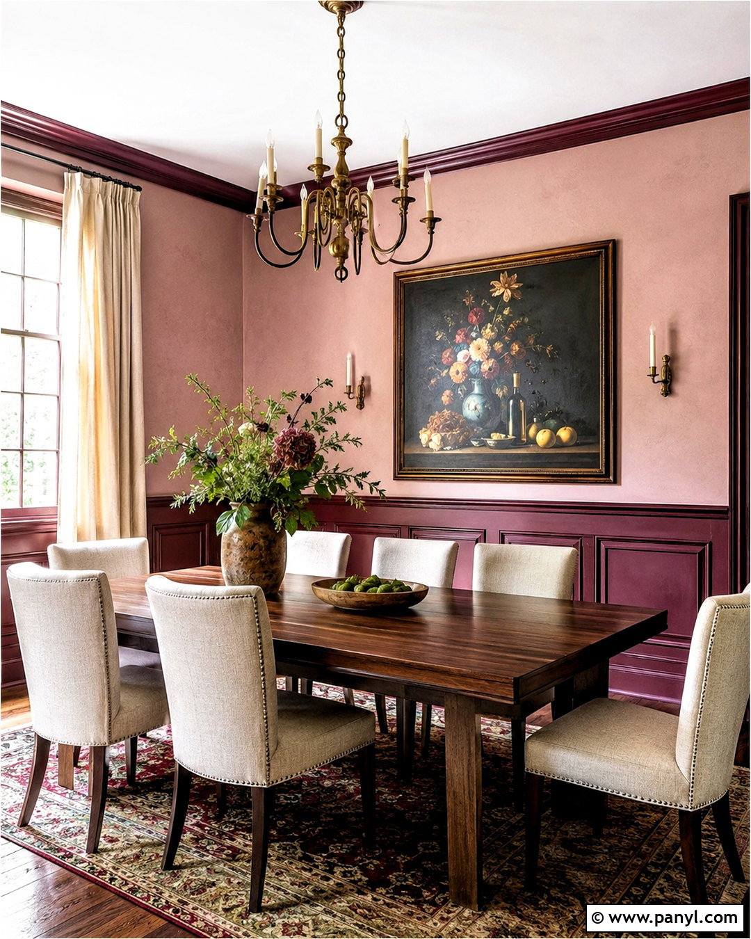
Burgundy wainscoting paired with muted warm pink walls creates a sophisticated tonal dining room. Choose a brown-based burgundy for raised panels, baseboards, chair rail, and door trim. Above it, use a pale plaster pink that shares the lower color’s warm undertone. The related hues produce contrast without dividing the room into two unrelated halves. Furnish the space with a dark walnut table, oatmeal upholstered chairs, and a vintage-inspired rug containing burgundy, blush, and olive. An aged brass chandelier and cream linen curtains soften the deeper paint. Keep artwork restrained, using one large still life or abstract piece rather than a crowded gallery wall. This complete palette feels rich and intimate, but the light upper walls and upholstery stop it from becoming excessively dark.
13. Pale Blue Wainscoting With Striped Wallpaper
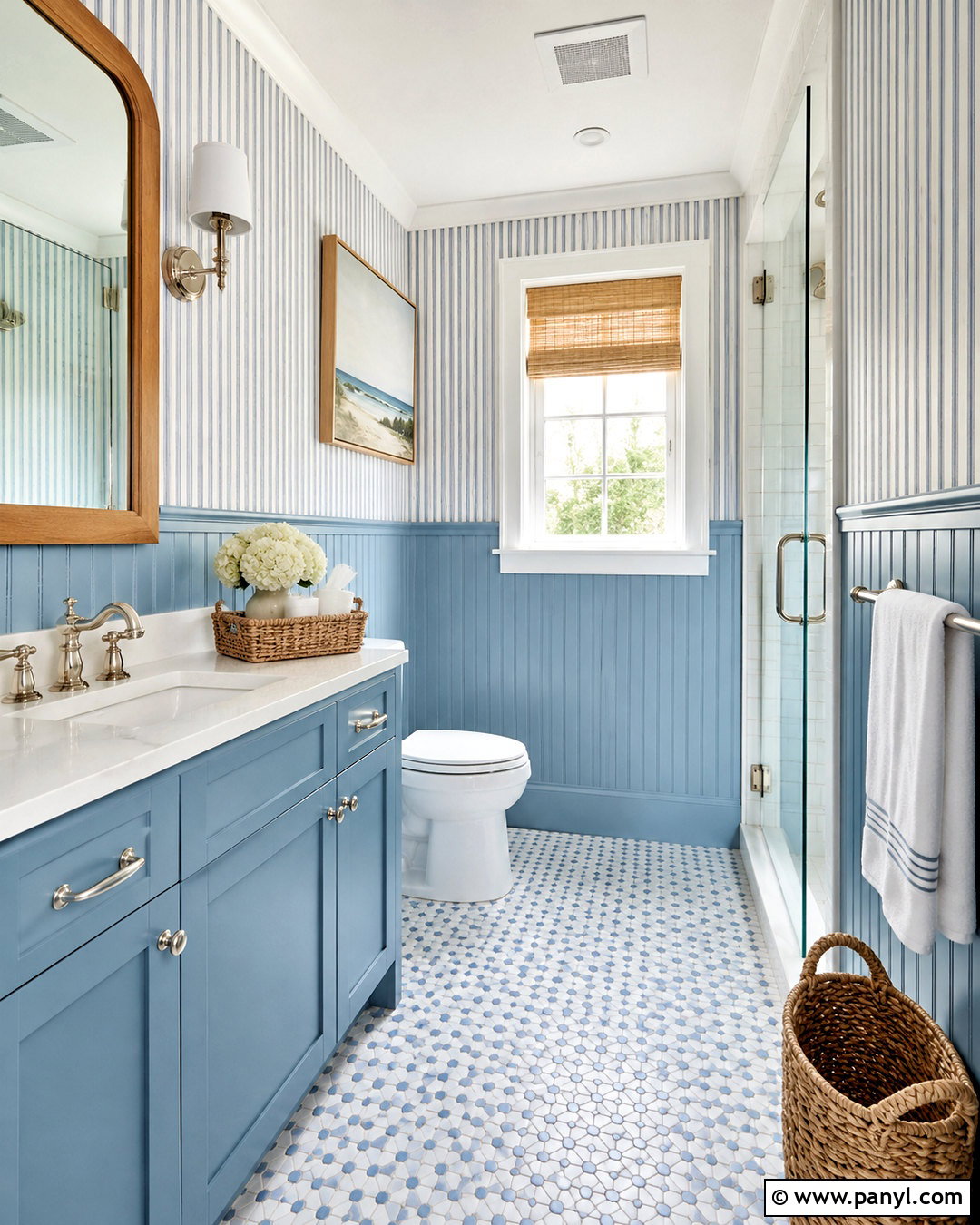
Pale blue wainscoting and narrow striped wallpaper create a cheerful bathroom with classic coastal character. Paint vertical beadboard, baseboards, window trim, and the vanity in a clean powder blue. Above the chair rail, use wallpaper with slim white and blue stripes that closely match the panel color. Keep the ceiling and remaining trim bright white for a crisp border. A white quartz counter, polished nickel fixtures, and a frameless glass shower maintain the fresh appearance. Add a light oak mirror, woven laundry basket, and small blue-and-white floor tiles for gentle pattern. Avoid overly themed accessories; simple towels and clear glass containers are enough. Coordinating the vanity with the wainscoting helps the compact room look planned, spacious, and visually organized.
14. Mustard Wainscoting With White Walls
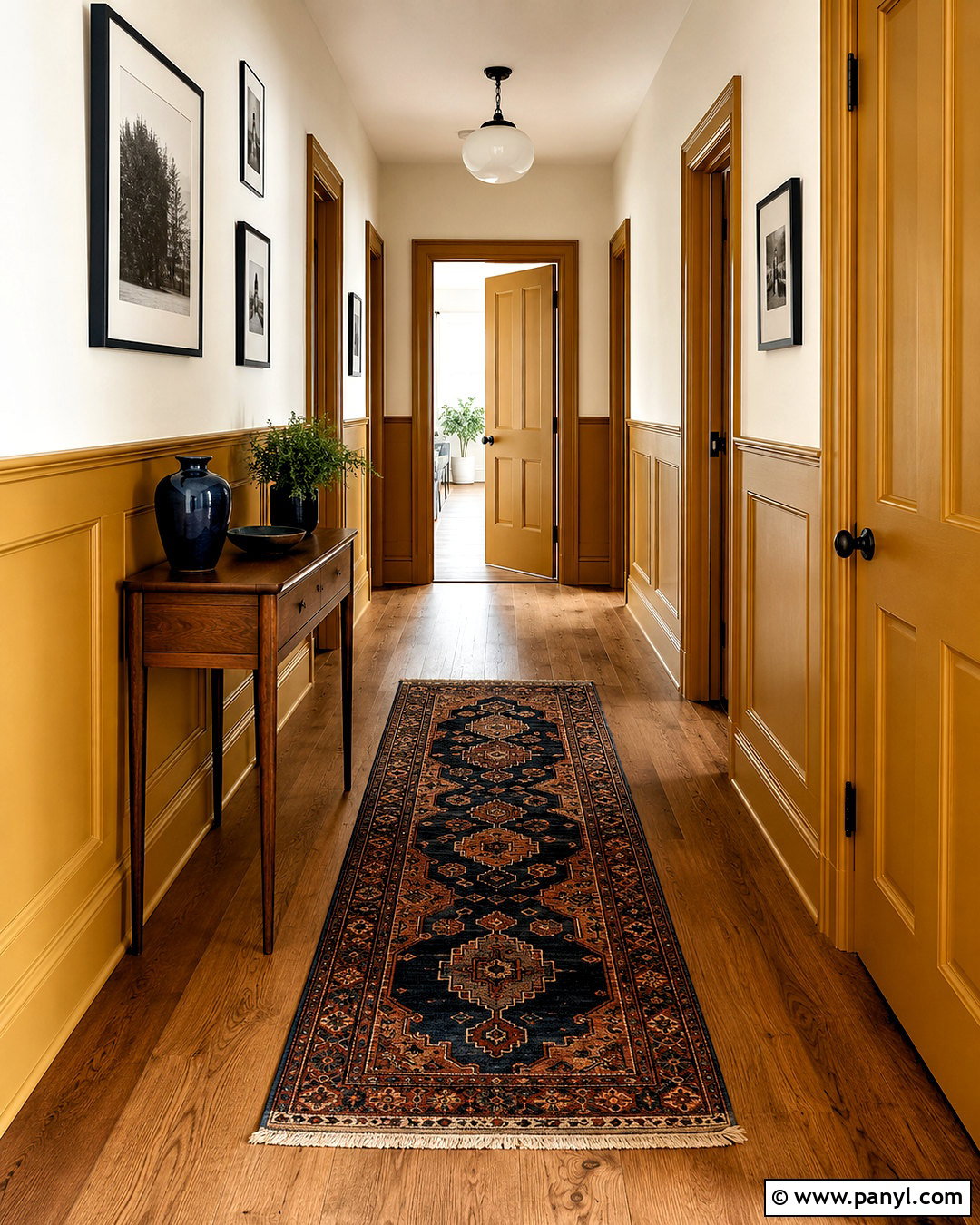
Muted mustard wainscoting brings warmth and personality to a hallway without requiring large furniture or extensive decoration. Use low shaker-style panels painted in an ochre-based mustard with a slightly earthy finish. Continue the color across the baseboards and interior doors to create a steady line through the passage. Keep the upper walls and ceiling a warm white, which gives the stronger lower color a clean boundary. Lay a vintage runner with mustard, navy, rust, and cream details over medium oak flooring. Add black-framed family photographs, a slim walnut console, and an opal glass ceiling fixture. The limited palette makes the corridor feel designed rather than overlooked. A small ceramic lamp or bowl in navy provides enough cool contrast to balance the golden paneling.
15. Greige Wainscoting With White Walls
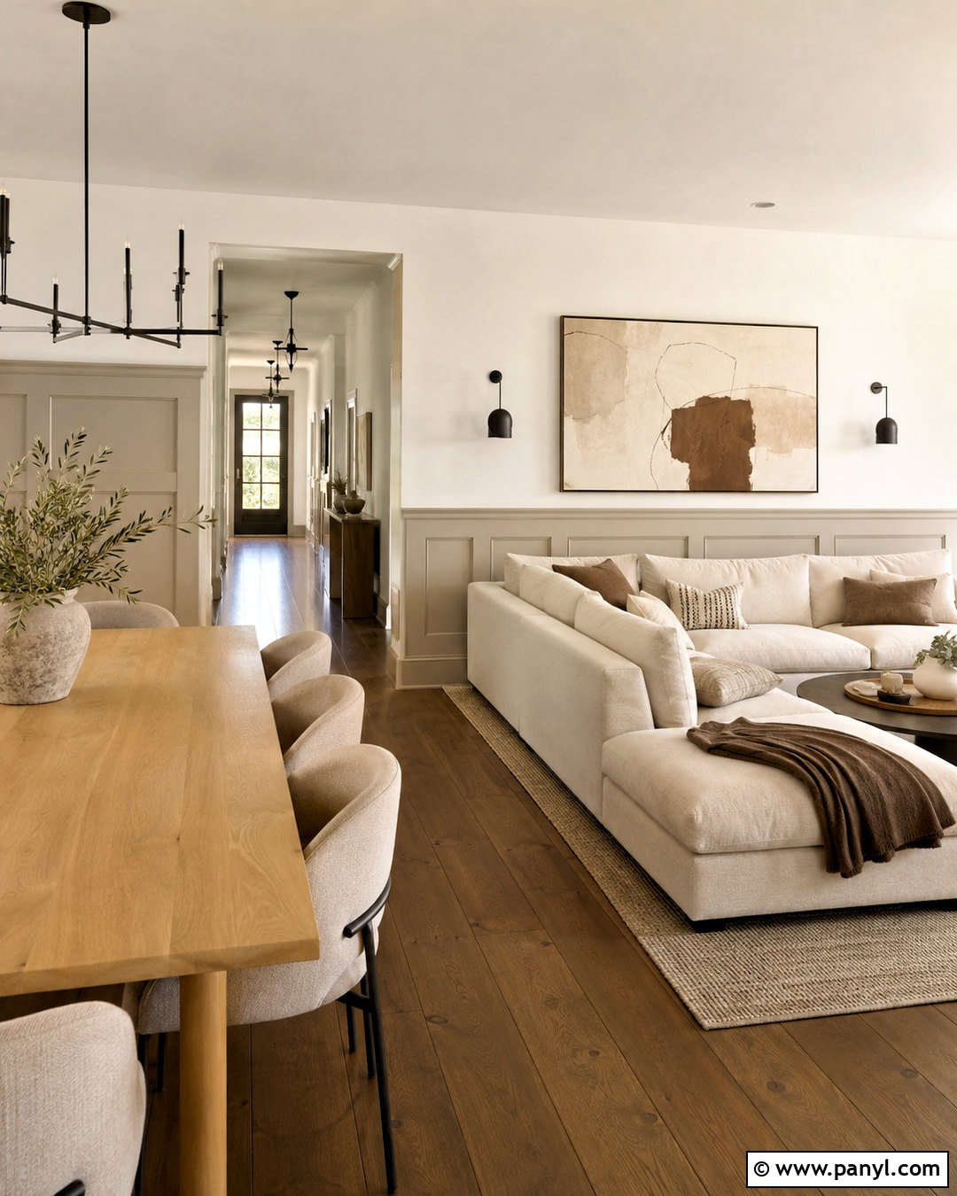
Greige wainscoting offers quiet architectural depth in an open living and dining area where bold color could interrupt the flow. Choose a medium warm greige for wide rectangular panels, columns, baseboards, and doorway trim. Use a soft white on the upper walls and ceiling, avoiding stark shades that could make the greige look muddy. Furnish the room with an ivory sectional, light oak dining table, and textured taupe chairs. Layer wool, linen, boucle, and woven fibers to keep the neutral scheme from appearing flat. Matte black lighting and dark bronze hardware add slim points of contrast. A large abstract canvas with cream, brown, and muted gray links the surfaces together. This understated combination emphasizes the molding while remaining flexible enough for changing furniture and seasonal accents.
16. Chocolate Brown Wainscoting With Cream Walls
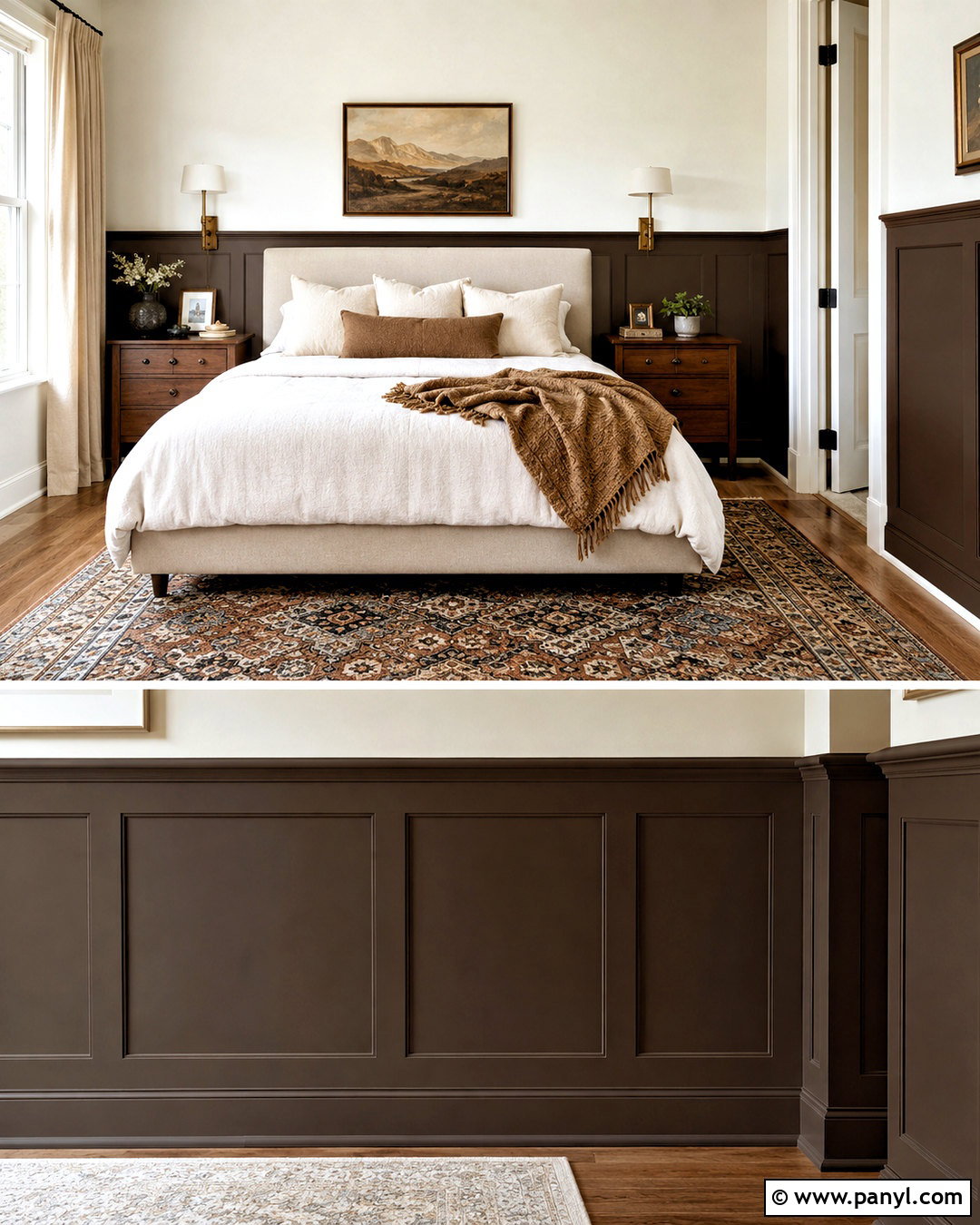
Chocolate brown wainscoting gives a bedroom a warm, cocooning base when balanced with cream walls and light textiles. Select a deep cocoa paint with subtle red undertones and use it on flat panels behind the bed, side walls, baseboards, and door trim. Keep the upper walls a rich cream rather than pure white. An upholstered oatmeal bed, ivory duvet, and camel-colored throw soften the dark lower section. Add walnut nightstands, bronze sconces, and a patterned rug containing brown, sand, muted blue, and rust. Full-length cream curtains keep windows bright and reduce visual weight. The coordinated wood furniture prevents the brown wainscoting from feeling isolated, while the generous pale bedding creates a clear, comfortable focal point in the center of the room.
17. Monochromatic Blue Wainscoting
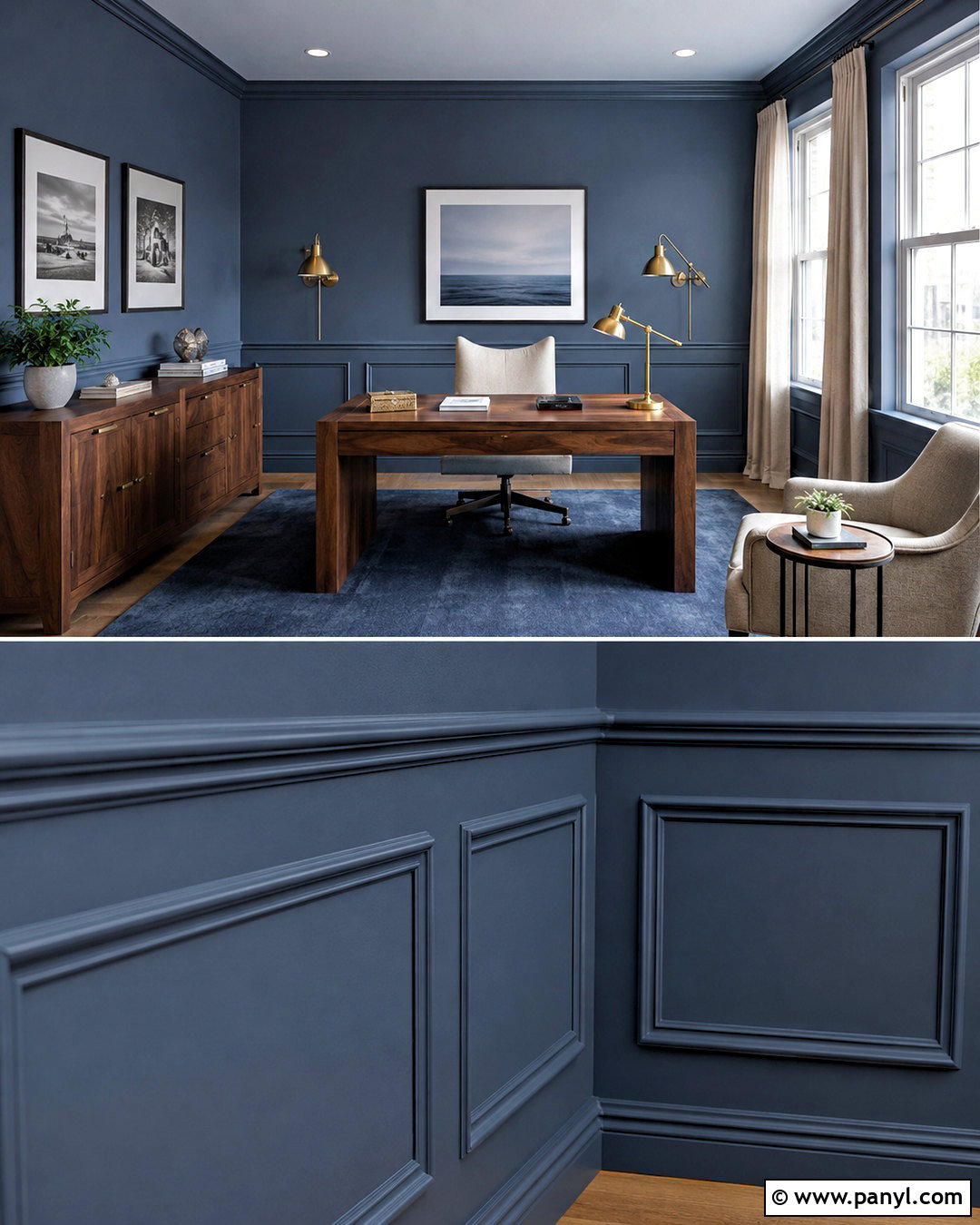
A monochromatic blue scheme lets wainscoting stand out through texture and sheen instead of sharp color contrast. Paint the picture-frame paneling, chair rail, baseboards, window casings, and doors in a medium smoky blue satin. Cover the upper walls in the same color using a matte finish, then use a shade one step lighter on the ceiling. This approach works well in a home office or reading room where a cohesive background supports concentration. Add a walnut desk, cream desk chair, navy rug, and brushed brass task lighting. White artwork mats and light linen curtains provide small areas of brightness. Using one paint family across the architecture creates an enveloping effect, while varying finishes allows the molding shadows and panel edges to remain visible.
18. Monochromatic Green Wainscoting
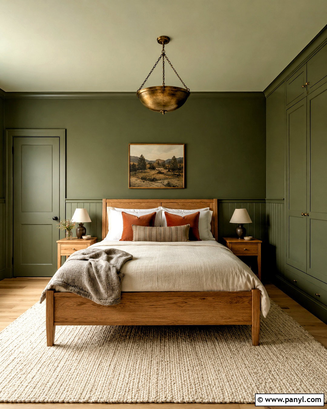
Muted green color drenching transforms a small guest room into a restful, unified retreat. Choose a midtone moss green and paint the wainscoting, upper walls, doors, trim, and built-in wardrobe in the same hue. Use satin on the paneling and woodwork, matte on the walls, and a slightly paler green across the ceiling. Pair the enveloping background with an oak bed, natural linen bedding, and an ivory wool rug. Rust-colored pillows and an antique brass pendant introduce warmth without breaking the organic palette. Keep artwork minimal, using one framed landscape with cream matting above the bed. The consistent wall color reduces visual interruptions, while different paint sheens reveal the panel profiles and prevent the room from looking like one flat green surface.
19. Lavender Wainscoting With Warm Gray Walls
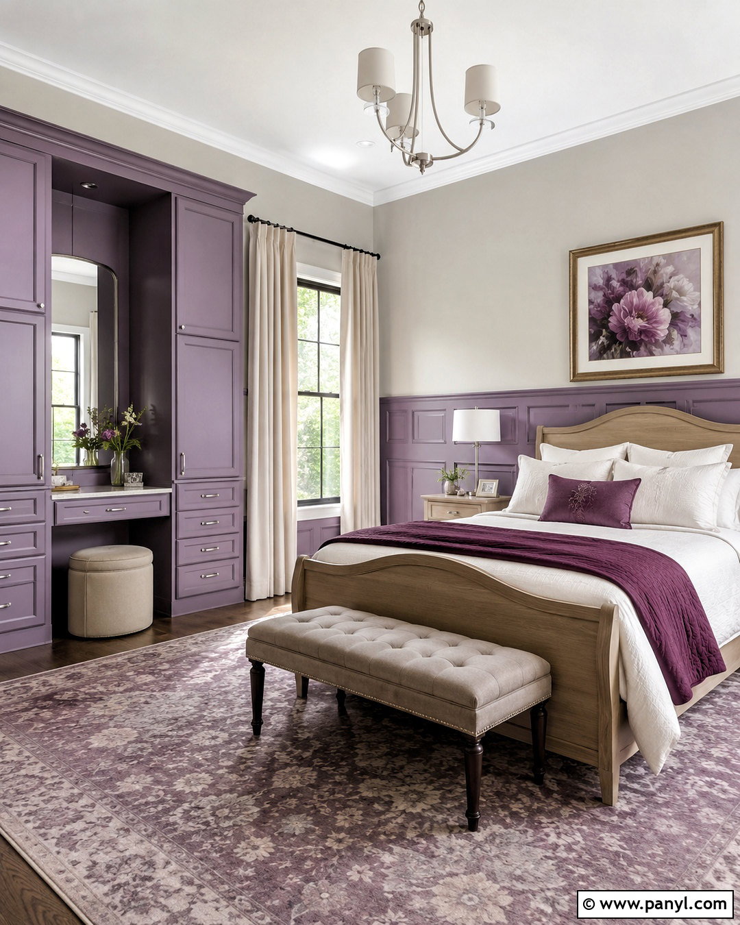
Dusty lavender wainscoting provides gentle color for a bedroom or dressing room while warm gray walls keep the scheme mature. Look for a subdued lavender with noticeable gray undertones. Paint narrow picture-frame molding, baseboards, door trim, and a small built-in vanity in a soft satin finish. Use pale warm gray above the rail and creamy white on the ceiling. Furnish the room with a light oak bed, ivory bedding, and a taupe upholstered bench. Introduce deeper plum through one throw pillow or lampshade rather than repeating it everywhere. Brushed nickel hardware, linen curtains, and a faded floral rug complete the palette. The nearby gray wall color softens the purple panels, producing a subtle transition that feels calm, polished, and easy to live with.
20. Two-Tone Neutral Wainscoting
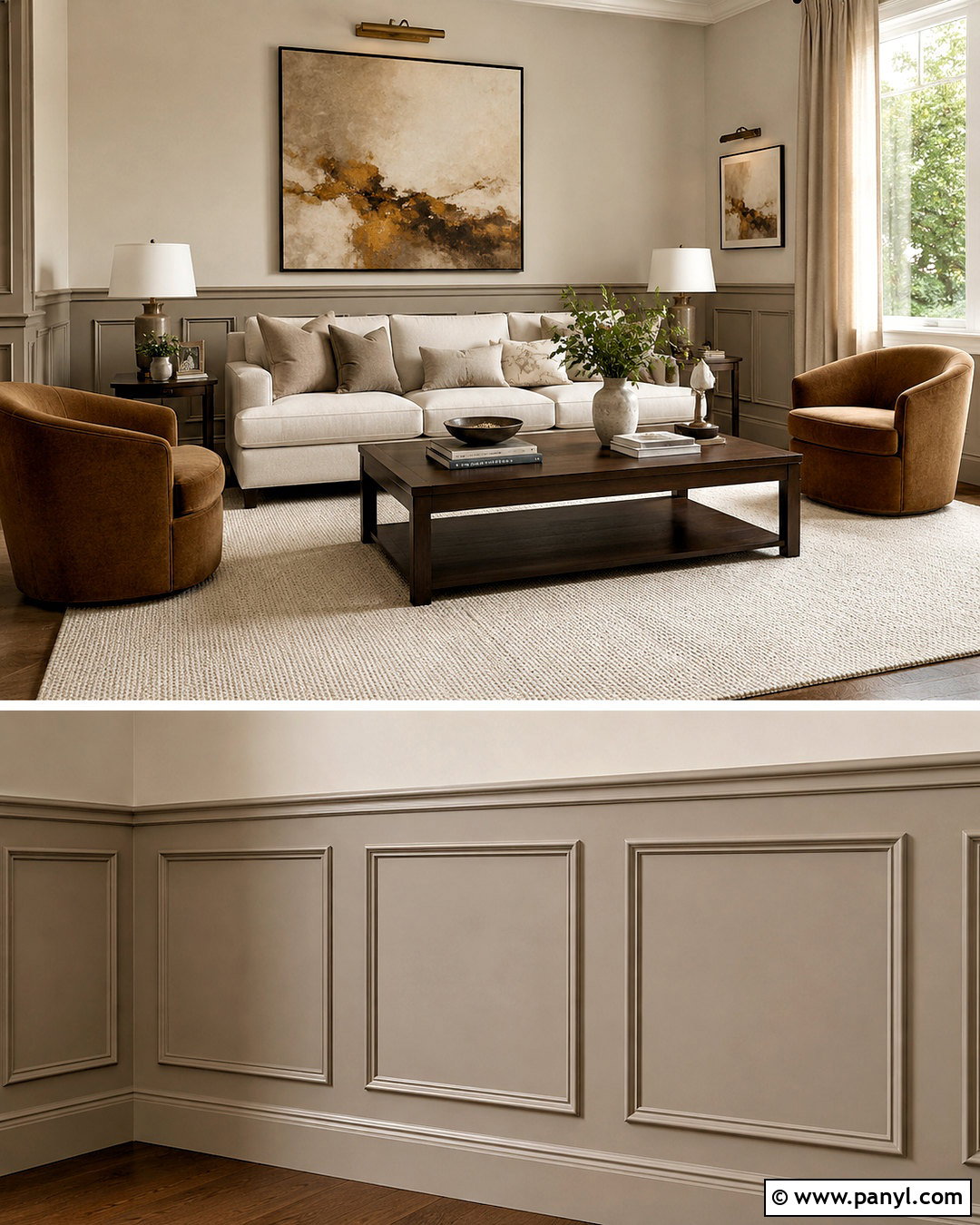
Two related neutrals can define wainscoting without the dramatic division created by black and white. Paint raised lower panels in medium mushroom taupe, including the chair rail, baseboards, and interior doors. Use a lighter putty beige on the upper walls and continue it across the ceiling. This layered scheme works particularly well in a formal living room with traditional molding and contemporary furniture. Choose a cream sofa, curved caramel chairs, dark walnut coffee table, and textured ivory rug. Add bronze picture lights, linen drapes, and oversized abstract artwork in taupe, black, and muted ochre. Because both wall colors share warm undertones, the transition appears soft and cohesive. Contrasting paint sheens ensure the detailed paneling remains visible within the restrained neutral palette.
Conclusion:
Choosing a successful wainscoting palette involves more than selecting an attractive lower-wall color. Consider the upper walls, trim, ceiling, flooring, natural light, furniture, and decorative finishes as one complete composition. Pale panels can brighten compact rooms, while navy, forest green, burgundy, and chocolate brown bring weight to larger or well-lit spaces. Wallpaper offers pattern, and tonal color drenching creates a smoother, more immersive result. Before painting, test large samples beside flooring and fabrics at different times of day. Use a durable satin or semigloss finish on paneling for easier maintenance and a softer finish above. These 20 painted wainscoting ideas color schemes offer practical starting points for creating rooms that feel connected, balanced, and thoughtfully finished.

Related Ideas and Inspiration:
Leave a Reply