
Choosing a kitchen palette is about more than matching cabinet paint to a countertop. The best 20 kitchen color palette ideas coordinate cabinetry, walls, backsplash, flooring, hardware, lighting, and natural materials into one complete look. A balanced scheme can make a compact kitchen feel more open, bring warmth to a large layout, or add personality without creating visual clutter. Begin with the finishes that are hardest to replace, such as stone counters and flooring. Then layer in cabinet color, wall paint, metals, and smaller accents. From warm neutrals and natural greens to deep blues and cheerful yellows, the following schemes offer practical combinations for modern, farmhouse, traditional, and contemporary spaces. Explore these 20 kitchen color palette ideas to find a look that suits your home.
1. Warm White And Natural Oak Kitchen Palette
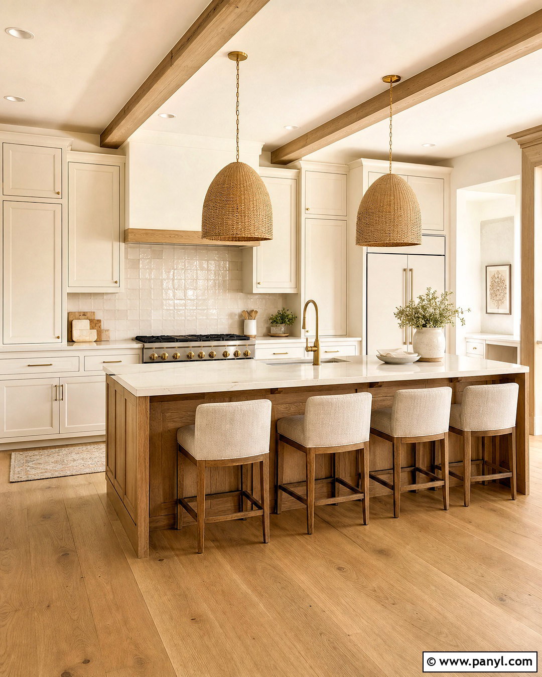
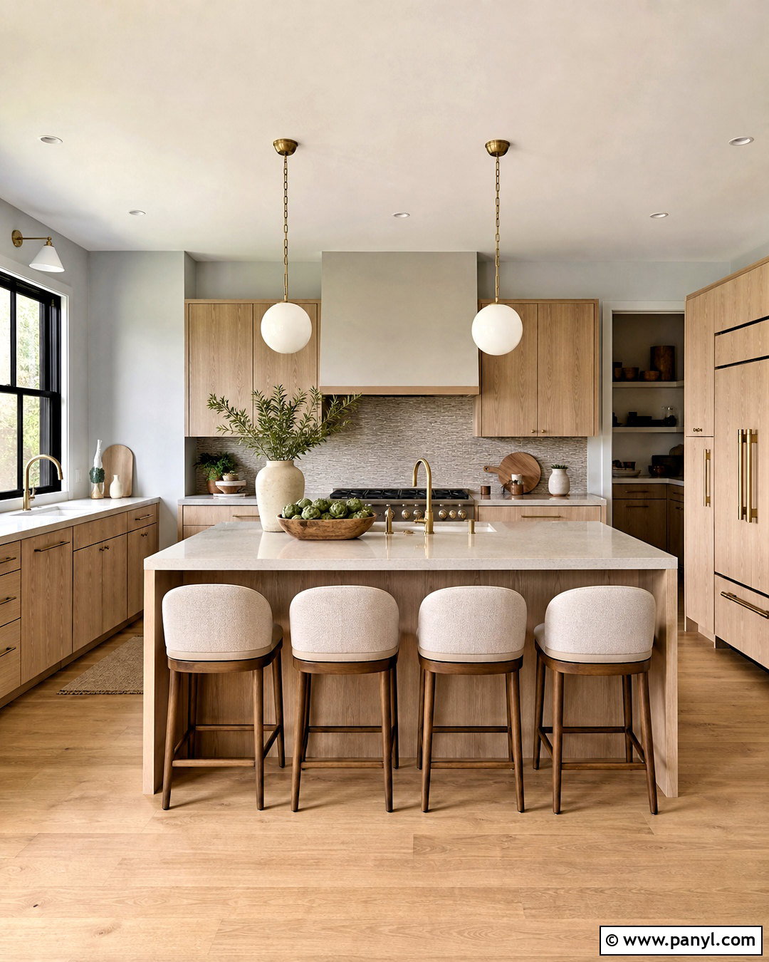
Warm white cabinetry and natural oak create a bright kitchen that still feels comfortable and inviting. Choose creamy white rather than a sharp blue-white for the perimeter cabinets and walls. Introduce white oak through the island, flooring, open shelving, or range hood. A lightly veined quartz countertop connects both colors without making the room feel busy. For the backsplash, use handmade-look ivory tile with subtle tonal variation. Brushed brass hardware and woven pendant lights add another layer of warmth. Keep upholstered stools in oatmeal or light tan fabric. This complete palette works especially well in kitchens with limited natural light because every finish reflects brightness while wood grain prevents the space from looking flat or overly sterile.
2. Sage Green And Cream Kitchen Palette
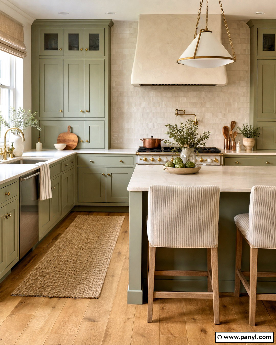
Soft sage green brings gentle color into a kitchen without overpowering the room. Use sage on Shaker cabinets, then balance it with creamy walls, ivory quartz countertops, and a warm white backsplash. Natural oak flooring and a small amount of walnut can deepen the palette while preserving its calm character. Choose aged brass knobs, bridge faucets, and pendant lights for a relaxed traditional finish. A stone or plaster range hood in pale cream creates a soft focal point above the stove. For textiles, bring in muted beige, faded olive, and subtle striped patterns. This coordinated kitchen feels fresh but grounded, making it suitable for farmhouse, cottage, transitional, or casual family homes. Avoid cool gray accents, which may interrupt its warm undertones.
3. Navy Blue And Crisp White Kitchen Palette
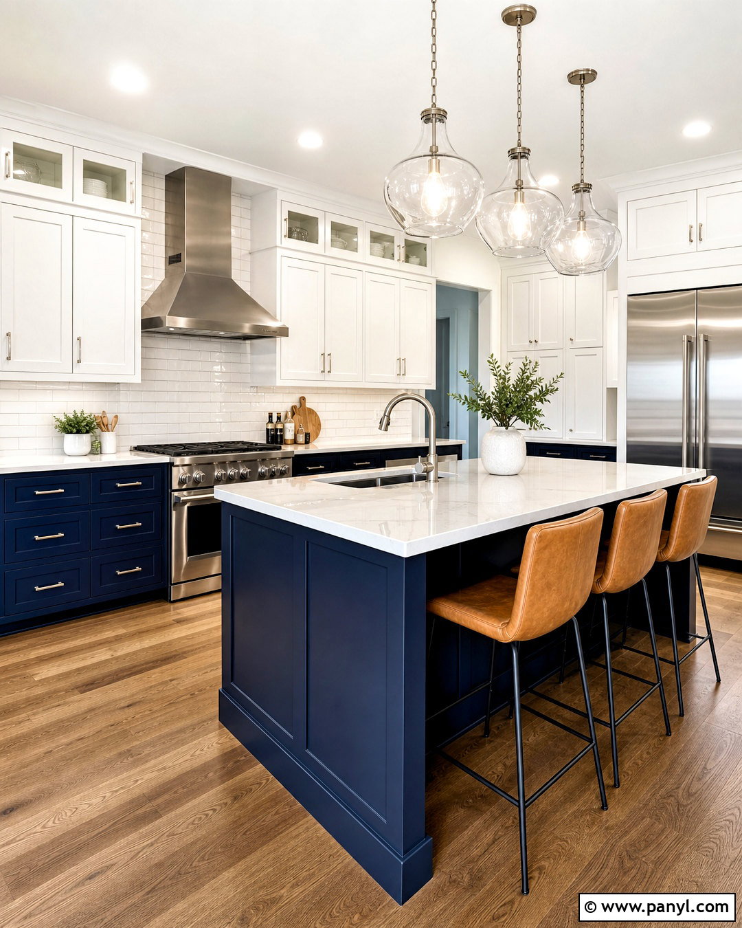
A navy and white kitchen delivers bold contrast while remaining clean and easy to coordinate. Place deep navy blue on the island and lower cabinets, then use crisp white for upper cabinets and walls. White quartz countertops with fine gray veining keep work surfaces bright. A glossy white subway tile backsplash reflects light and visually separates the darker cabinetry. Add polished nickel or brushed brass hardware, depending on whether you prefer a cooler or warmer finish. Medium oak flooring keeps the scheme from feeling too formal. Consider natural rattan stools or tan leather seating around the island. The finished room should distribute navy evenly rather than concentrating it in one corner. Repeating blue through a runner, cookware, or window treatment creates a more intentional result.
4. Olive Green And Pale Blue Kitchen Palette
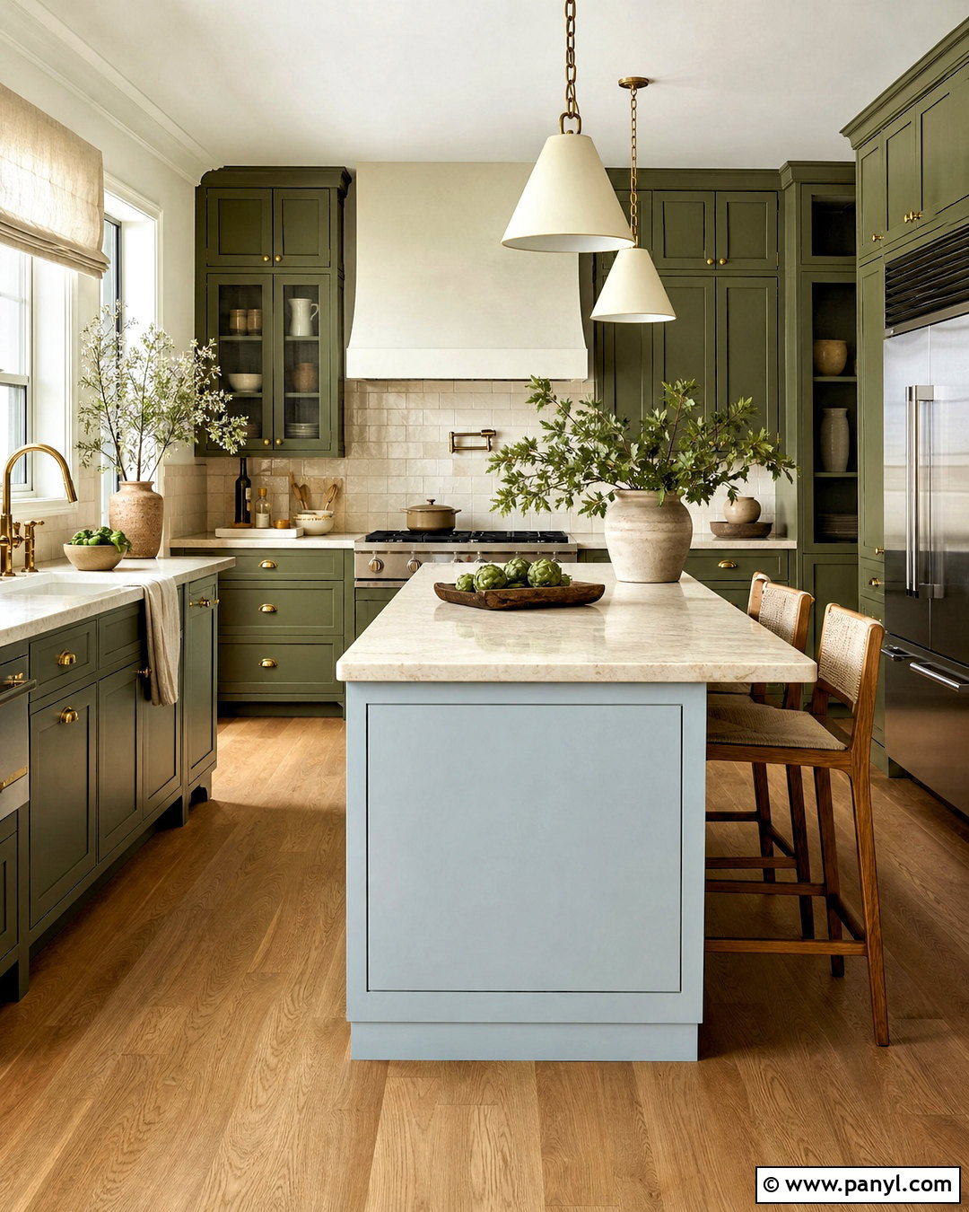
Deep olive cabinets and pale blue accents form an unexpected kitchen palette that feels earthy yet refreshing. Use olive green across lower cabinets, a tall pantry wall, or the full cabinetry layout. Paint the remaining walls a soft sky blue with slightly muted undertones. Cream limestone counters and an off-white backsplash prevent the two colors from competing. Natural oak flooring and antique brass hardware support the olive’s warmth. A pale blue island can become the room’s lighter centerpiece, especially in a spacious kitchen. Keep decorative accents simple with tan ceramics, linen shades, and small touches of dark brown. This complete palette works best when both colors are softened rather than highly saturated. The result is distinctive, balanced, and connected to natural outdoor colors.
5. Greige And Walnut Kitchen Palette
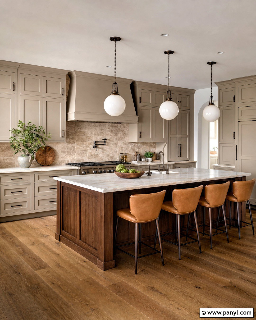
Greige cabinetry and rich walnut create a polished neutral kitchen with noticeable depth. Select a warm greige for perimeter cabinets and walls, avoiding formulas that appear cold or lavender under artificial light. Use walnut on the island, open shelves, or a bank of tall cabinets to introduce strong natural grain. Cream quartzite or quartz countertops add movement without competing with the wood. Continue the understated look with a taupe stone backsplash and wide-plank oak flooring. Aged bronze hardware and simple globe pendants provide definition. Upholster stools in camel leather or textured beige fabric. Because this scheme depends on tonal layering, vary the textures rather than adding many extra colors. The finished kitchen feels calm, substantial, and suitable for both modern and transitional homes.
6. Terracotta And Cream Kitchen Palette
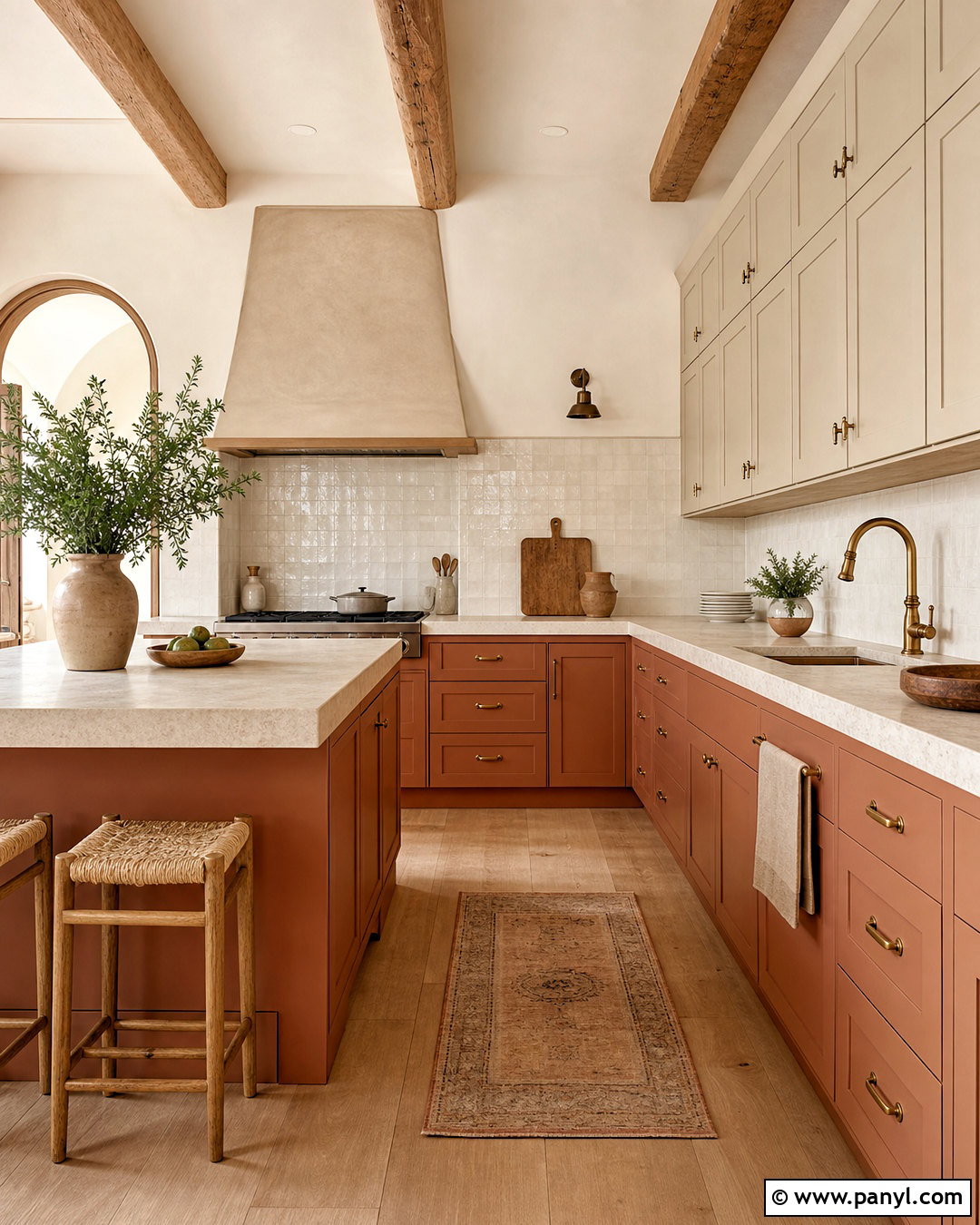
Warm terracotta gives a kitchen sunbaked color and welcoming character. Use muted clay-colored cabinets on the island or lower cabinetry, paired with cream upper cabinets and soft ivory walls. A backsplash of handmade zellige tile in warm white introduces shine and irregular texture. Choose light limestone or creamy quartz counters to brighten the heavier terracotta sections. Oak flooring, woven shades, and natural linen textiles continue the relaxed palette. For hardware, antique brass or dark bronze creates a softer result than polished chrome. Add a plaster range hood in pale sand to anchor the cooking zone. Small accents in dusty peach, rust, and olive can appear through pottery and upholstery. Together, these finishes create a cohesive Mediterranean-inspired kitchen without requiring ornate architectural details.
7. Charcoal Gray And Light Oak Kitchen Palette
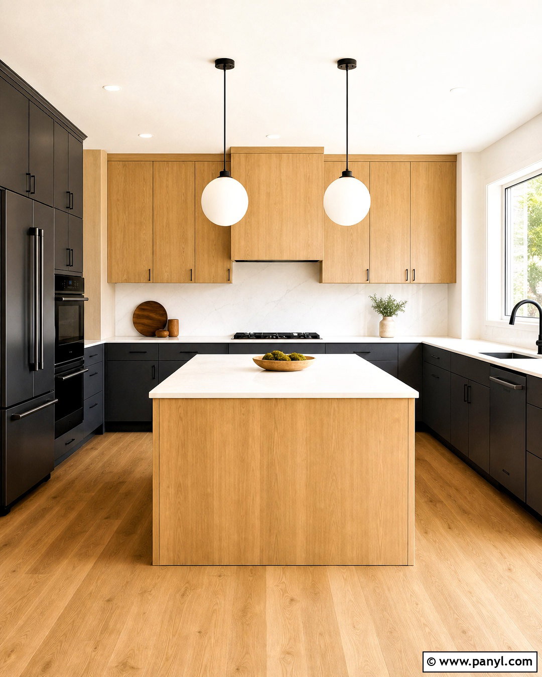
Charcoal gray and light oak produce a contemporary kitchen with strong contrast and natural warmth. Cover lower cabinets and a full-height appliance wall in matte charcoal, then use light oak for upper cabinets or the island. Warm white walls and pale quartz countertops prevent the darker sections from closing in the room. Install a simple slab backsplash in matching quartz for a streamlined finish. Matte black hardware blends quietly into the charcoal cabinetry, while brushed steel appliances add a practical metallic accent. Light oak flooring can continue the wood tone throughout the room. Keep pendants minimal, with white glass or black metal shades. This palette is most successful in an uncluttered layout where wood grain, clean cabinet lines, and generous lighting remain clearly visible.
8. Dusty Blue And Warm Beige Kitchen Palette
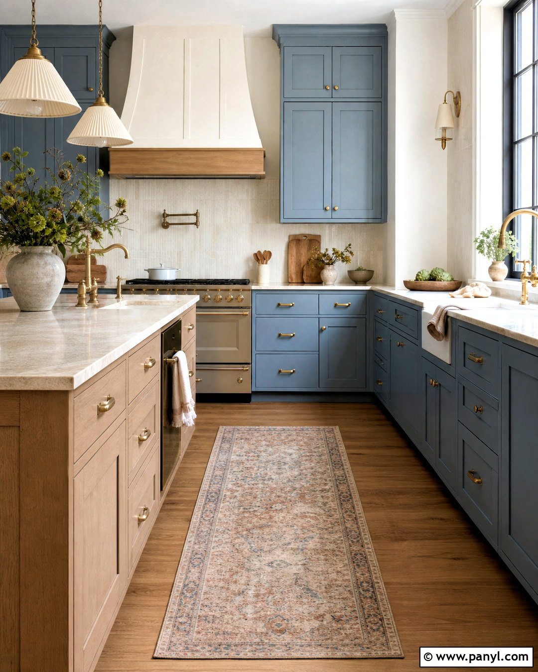
Dusty blue cabinetry creates a soothing kitchen when paired with warm beige surfaces and natural finishes. Choose a softened blue with gray-green undertones rather than a bright coastal shade. Use it across Shaker cabinets, then paint the walls a light sandy beige. Creamy stone counters and a textured ivory backsplash connect the colors smoothly. Bring in medium-toned oak flooring, aged brass handles, and linen pendant shades for warmth. A beige-painted island can break up an extensive wall of blue while keeping the room light. Add a runner featuring faded blue, tan, and rust for subtle pattern. The finished palette feels relaxed and lived-in, making it a good fit for cottage, farmhouse, traditional, or transitional kitchens. Keep appliances and decorative objects understated to preserve the calm atmosphere.
9. Black And Butcher Block Kitchen Palette
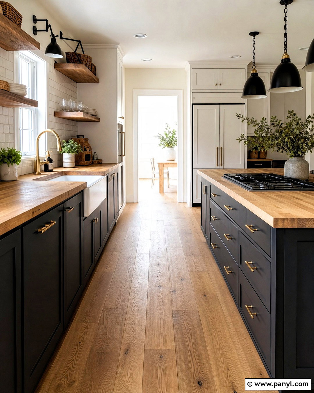
Black cabinetry and butcher block counters create a dramatic kitchen that still feels approachable. Select a soft matte black rather than a glossy finish, and use it on lower cabinets or across a compact galley layout. Warm wood countertops immediately soften the dark color and add useful visual texture. Paint walls and upper cabinets a creamy white to maintain brightness. A simple ivory square-tile backsplash gives the palette a clean, practical background. Repeat the wood through floating shelves, flooring, and stool seats. Unlacquered brass hardware introduces gentle contrast, while black pendant lights keep the room grounded. Add warm white under-cabinet lighting so work surfaces remain clear. This scheme works particularly well when black, wood, and white appear in balanced proportions throughout the entire room.
10. Butter Yellow And White Kitchen Palette
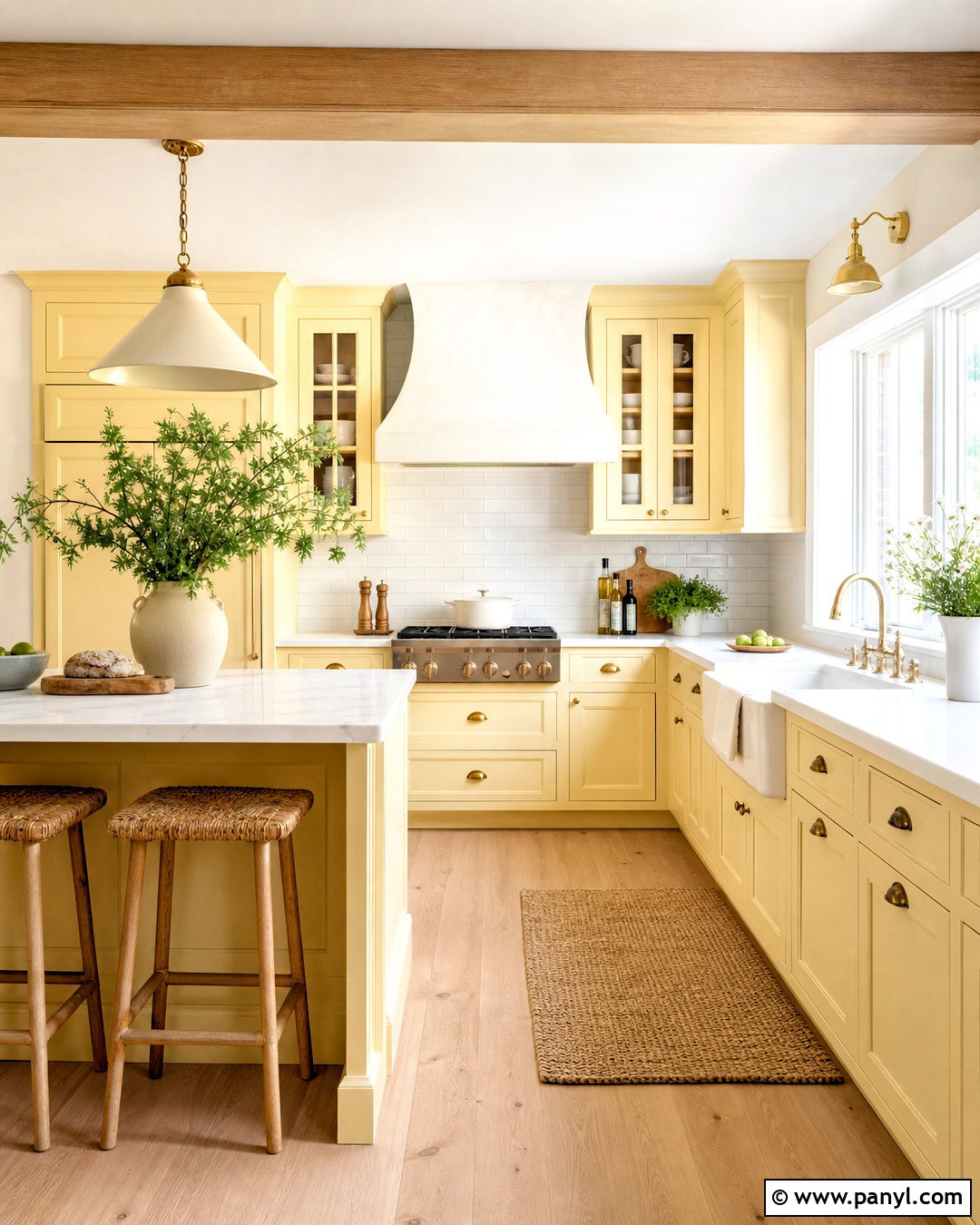
Butter yellow cabinetry brings cheerful color to a kitchen without creating a harsh or overly bright result. Choose a soft yellow with creamy undertones and use it on traditional cabinets or a central island. Pair it with warm white walls, ivory countertops, and a glossy white tile backsplash. Light oak floors and woven counter stools support the sunny atmosphere. Polished nickel hardware can add a crisp note, while aged brass creates a warmer vintage effect. Consider a white farmhouse sink and a softly curved plaster hood to complete the welcoming layout. Small blue, green, or terracotta accents can appear in a runner and everyday ceramics. Keep these additions muted so yellow remains the main color. The finished kitchen feels bright, familiar, and comfortable throughout the year.
11. Burgundy And Soft Pink Kitchen Palette
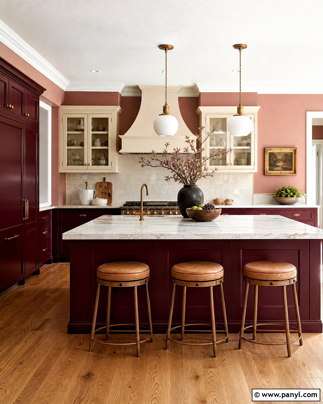
Burgundy and soft pink create a rich kitchen palette with warmth, depth, and surprising versatility. Use deep burgundy on the island, lower cabinetry, or a freestanding pantry unit. Balance it with dusty blush walls and cream upper cabinets. Select pale marble or quartz counters with restrained burgundy veining to connect the scheme naturally. An ivory backsplash and medium oak floor keep the darker red from dominating. Antique brass hardware adds warmth, while opal glass pendants introduce a lighter element above the island. Upholstered stools in tan or muted rose can reinforce the palette without looking overly coordinated. For a refined finish, keep cabinet profiles simple and avoid excessive decorative patterns. The completed kitchen feels elegant, welcoming, and more nuanced than a standard red-and-white combination.
12. Forest Green And Brass Kitchen Palette
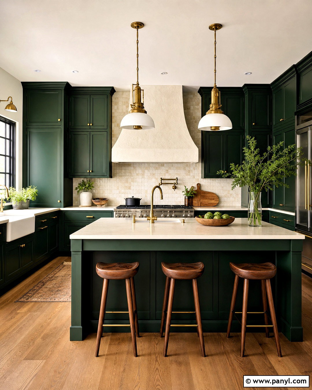
Forest green cabinetry and brass accents give a kitchen a deep, tailored appearance. Use the green on floor-to-ceiling cabinets, the island, or both, while keeping walls a warm off-white. Cream quartz or lightly veined marble counters brighten the work areas and provide clear separation from the dark cabinet color. A backsplash in ivory tile or pale natural stone adds quiet texture. Choose brushed or aged brass for handles, faucets, pendants, and shelf brackets, but keep the shapes simple. Walnut stools and medium oak flooring complement the richness of the green. A white plaster hood can become the main architectural focal point. With balanced lighting and uncluttered counters, this palette feels dramatic without becoming heavy, making it suitable for traditional and contemporary kitchens alike.
13. Taupe And Cream Kitchen Palette
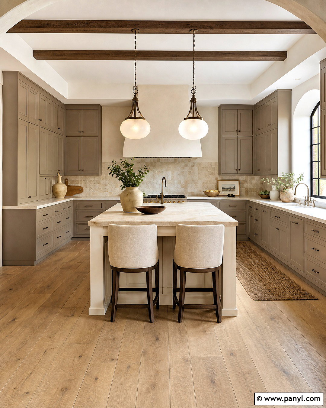
A layered taupe and cream kitchen offers a soft alternative to plain white or cool gray. Paint perimeter cabinets a medium mushroom taupe, then use cream for the island, walls, and range hood. Select countertops with beige, ivory, and gentle brown veining to unite both cabinet colors. A limestone backsplash adds organic movement while maintaining the neutral scheme. Wide-plank oak floors create a warmer base, and aged bronze hardware supplies enough contrast to define doors and drawers. Use upholstered counter stools in textured oatmeal fabric and pendants with linen or frosted glass shades. The secret is varying lightness and texture across the room. When every finish is identical, neutrals can look flat. This complete tonal approach feels comfortable, refined, and easy to personalize over time.
14. Teal And Walnut Kitchen Palette
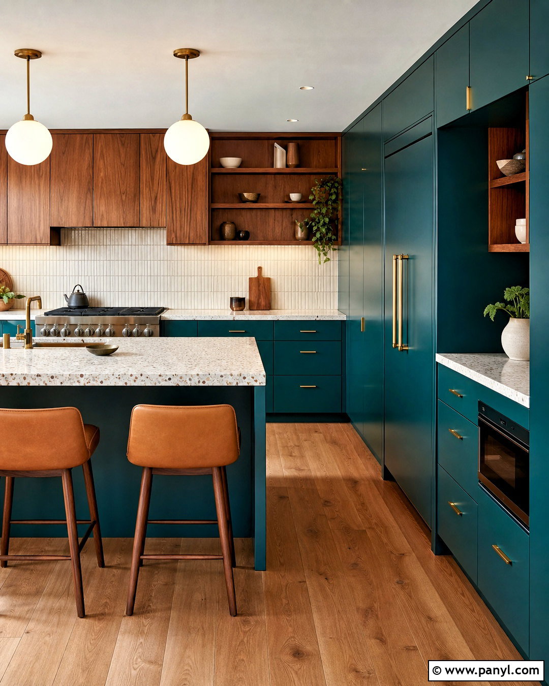
Deep teal and walnut form a colorful midcentury-inspired kitchen with warmth and graphic clarity. Use teal on flat-panel lower cabinets and a tall pantry wall, then introduce walnut through upper cabinets, shelving, or the island. Choose a creamy terrazzo or light quartz countertop to brighten both darker finishes. A backsplash of small ivory tiles adds subtle pattern without distracting from the cabinetry. Incorporate brushed brass hardware, globe pendants, and warm white walls for a polished finish. Medium-toned wood flooring should complement the walnut without matching it exactly. Counter stools in camel leather or burnt orange fabric can provide one controlled accent. Keep the layout clean and functional so the bold palette remains sophisticated. The completed room feels colorful, balanced, and intentionally connected from floor to ceiling.
15. Pale Blue And White Oak Kitchen Palette
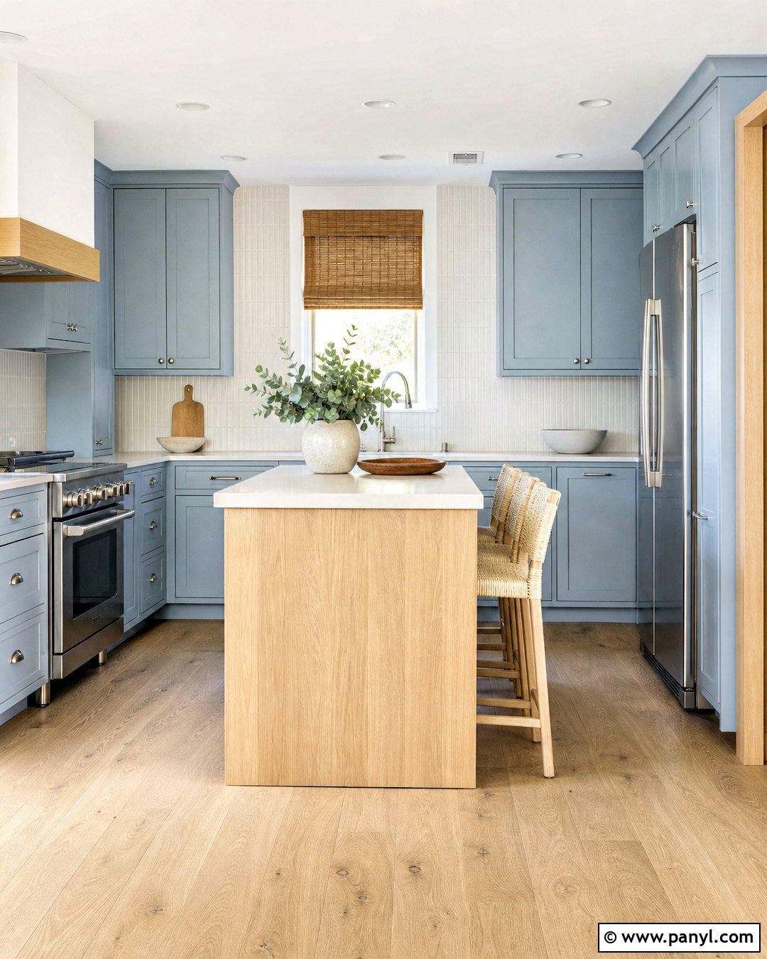
Pale blue cabinets and white oak accents can make a small kitchen feel airy without relying entirely on white. Choose a gentle powder blue for the lower and upper cabinetry, then bring in white oak through open shelves, flooring, and a slim island. Warm white walls and creamy quartz countertops maintain a soft transition between surfaces. Use a vertically stacked ivory backsplash to add height and a modern rhythm. Brushed nickel hardware reinforces the cool blue, while woven shades and beige textiles prevent the palette from feeling chilly. Keep stools light and visually open, especially in a narrow layout. A few accents in muted navy or warm tan provide depth. This finished scheme suits coastal, Scandinavian, cottage, and relaxed contemporary interiors without becoming overly themed.
16. Chocolate Brown And Ivory Kitchen Palette
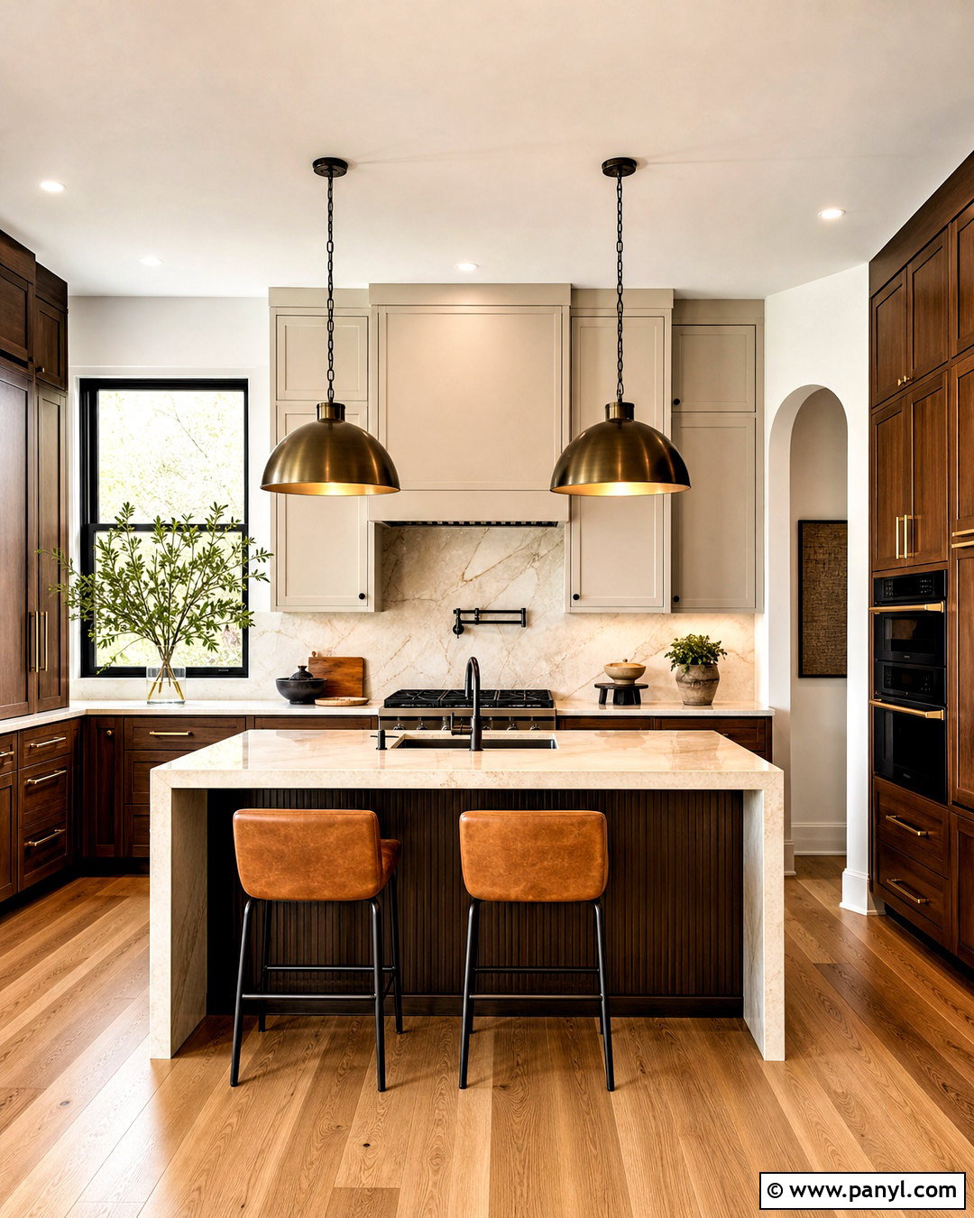
Chocolate brown cabinetry creates a warm, enveloping kitchen when balanced with generous ivory surfaces. Apply the brown to lower cabinets, the island, and a tall storage wall, using either painted wood or a dark natural veneer. Choose ivory upper cabinets and walls to keep the eye level bright. Cream marble or quartzite countertops add subtle veining, while a matching slab backsplash creates a quiet backdrop. Bronze hardware, warm metal pendants, and medium oak flooring deepen the earthy character. Add counter stools in caramel leather and simple cream upholstery in a breakfast nook. The palette should include several brown values rather than one flat tone. This variation creates depth and helps the finished kitchen feel sophisticated, comfortable, and rooted in natural materials rather than overly dark.
17. Soft Peach And Olive Kitchen Palette
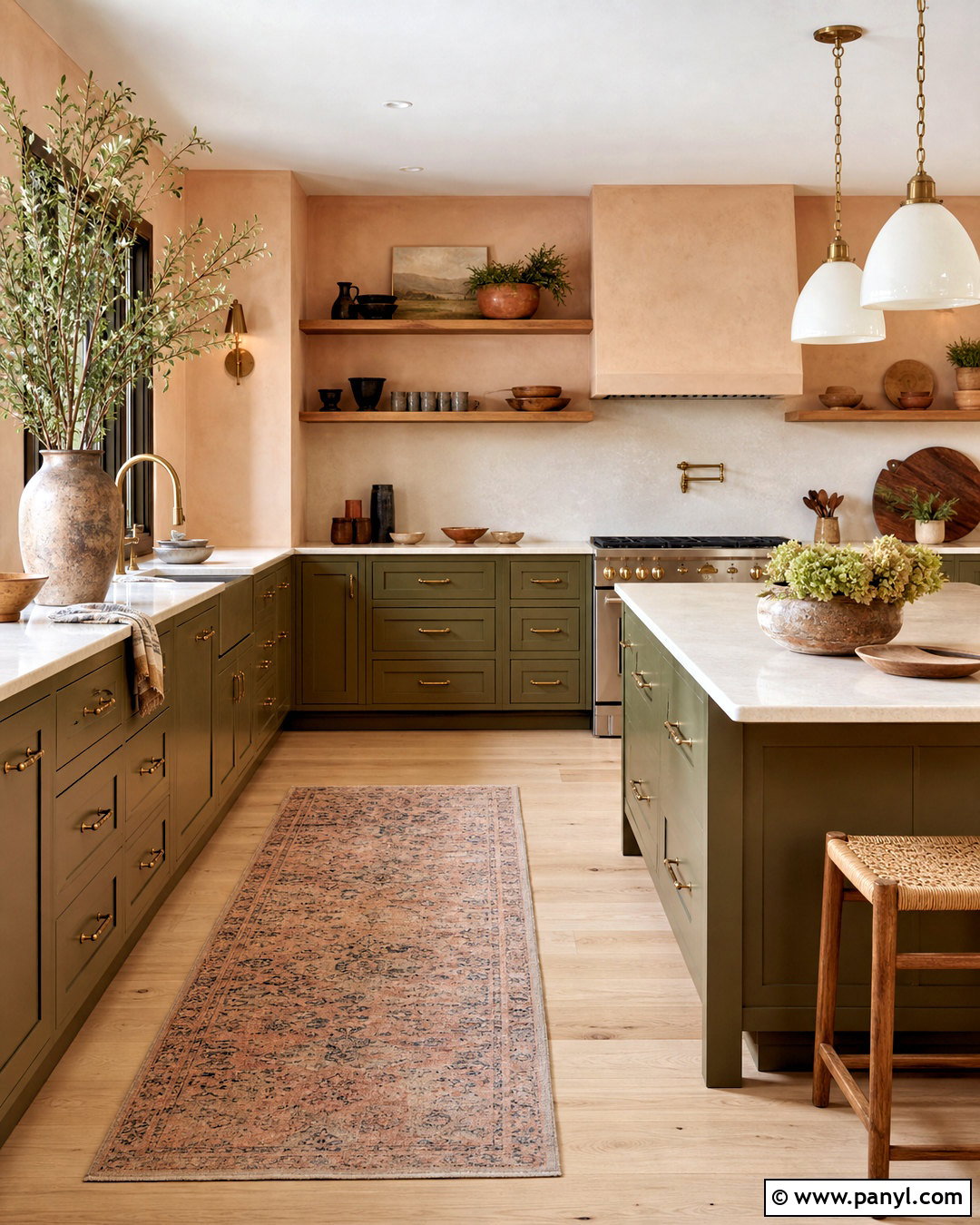
Soft peach and olive green bring warmth and personality to a kitchen while remaining gentle enough for everyday living. Use muted olive on lower cabinets and the island, then paint the upper cabinetry or walls a pale plaster peach. Cream countertops and an off-white backsplash provide a neutral pause between the two colors. Natural oak flooring and open shelves make the palette feel grounded. Choose aged brass hardware and milky glass pendant lights for a warm, softly traditional finish. A patterned runner can combine peach, green, tan, and faded blue in small amounts. Keep decorative pieces simple and handmade in appearance, such as stoneware bowls and wooden boards. The complete kitchen feels cheerful and earthy, with enough contrast to remain interesting without looking loud or overly playful.
18. Cobalt Blue And Warm White Kitchen Palette
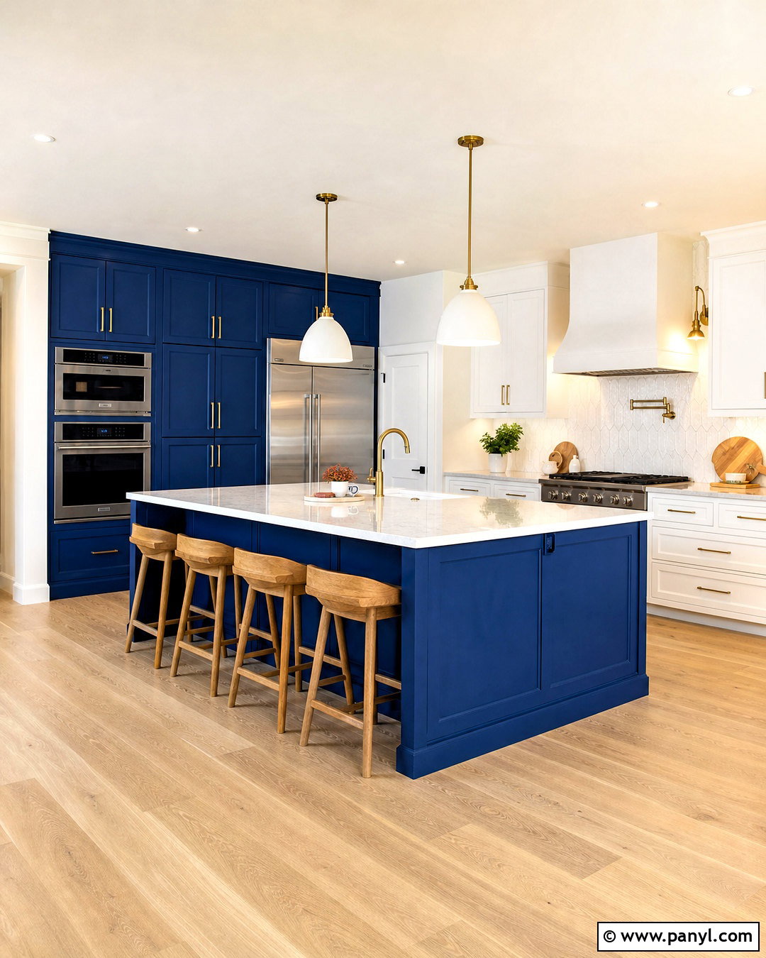
Cobalt blue can create an energetic kitchen when it is carefully balanced with warm white and natural wood. Use the strong blue on a central island or one complete cabinet wall rather than scattering it across unrelated features. Paint the remaining cabinetry a creamy white and select pale quartz countertops with minimal pattern. A warm white tile backsplash keeps the color contrast clear. Introduce white oak through flooring, shelving, and counter stools to soften the vivid blue. Polished nickel or brushed brass hardware can both work, but choose one finish and repeat it consistently. Add small touches of cobalt through cookware or patterned textiles. By limiting the strongest color to defined areas, the completed scheme looks intentional, bright, and modern rather than visually overwhelming.
19. Brick Red And Putty Kitchen Palette
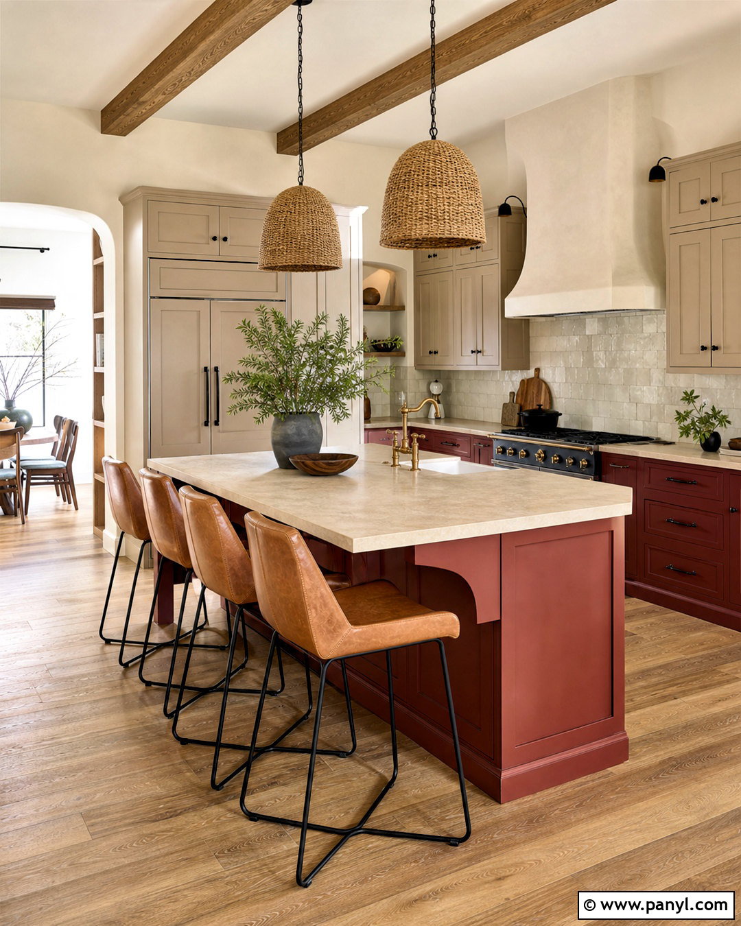
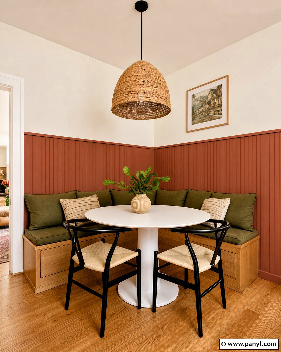
Brick red and putty create an earthy kitchen palette inspired by aged masonry, clay, and natural stone. Paint lower cabinets or the island a muted brick red, then use putty beige for upper cabinetry and walls. Choose warm limestone countertops with subtle variation instead of bright white surfaces. A backsplash of creamy handmade tile adds texture and reflects light around the cooking area. Oak floors, dark bronze hardware, and a plaster range hood complete the grounded look. Consider woven pendant lights and counter stools with tan leather seats. A few olive green accents can appear in ceramics or fabric, but they should remain secondary. The finished kitchen feels warm and established, working especially well in farmhouse, Spanish-inspired, rustic, and traditional homes with visible architectural character.
20. Lavender Gray And Deep Plum Kitchen Palette
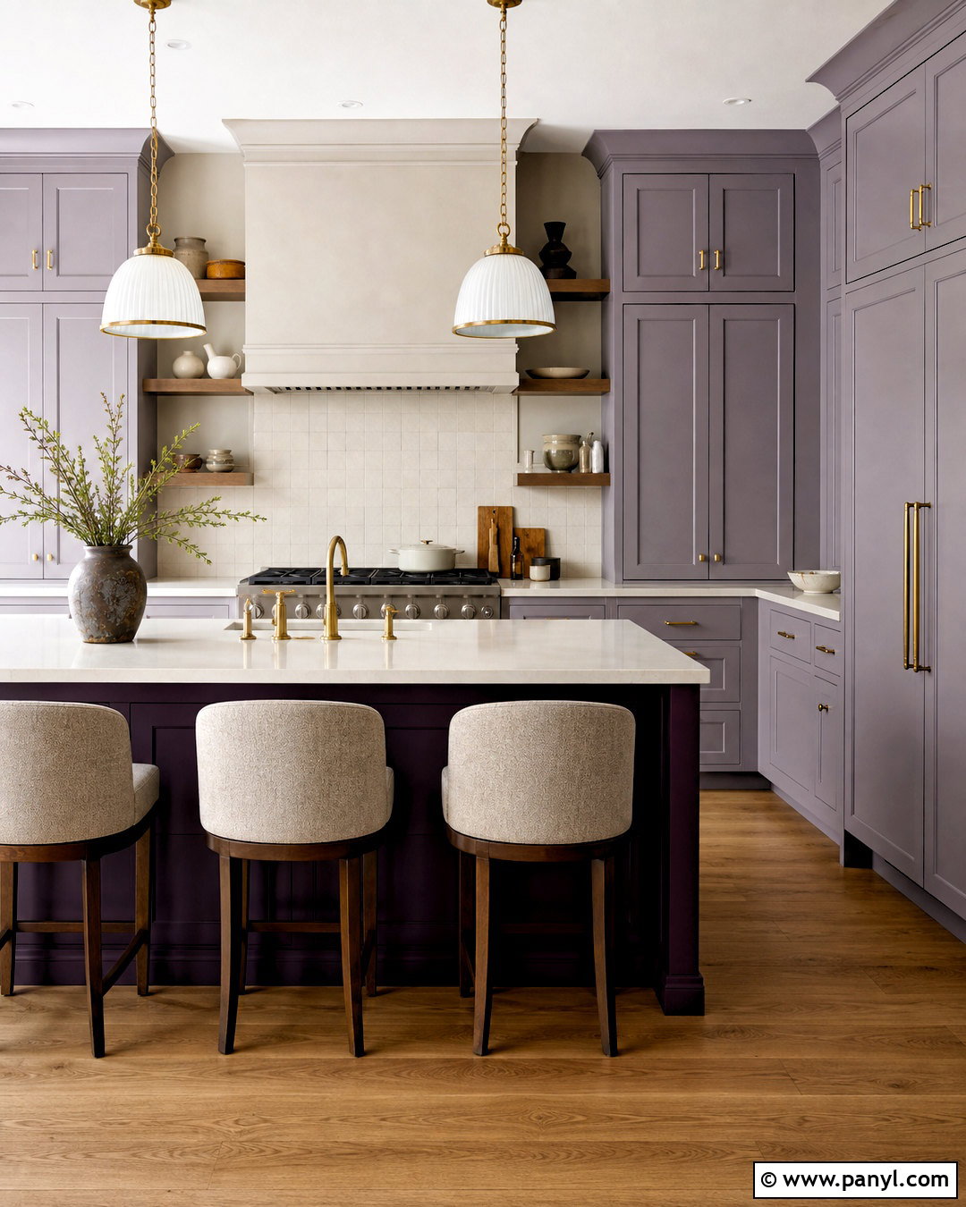
Lavender gray and deep plum offer a sophisticated kitchen scheme for anyone seeking color beyond blue or green. Use smoky lavender gray on the perimeter cabinets and reserve deep plum for the island or a built-in pantry. Warm white walls, cream quartz counters, and an ivory backsplash keep the purple tones subtle and livable. Add natural walnut shelving or medium oak flooring to balance their cooler character. Aged brass hardware creates warmth and stands out beautifully against both cabinet colors. Choose pendant lights with white glass shades and stools upholstered in oatmeal fabric. Avoid adding several other purple accents, which can make the room feel overly matched. With restrained styling and simple cabinet profiles, this complete palette appears rich, distinctive, and suitable for a modern or transitional home.
Conclusion:
The most successful 20 kitchen color palette ideas treat the kitchen as one connected space rather than a collection of separate finishes. Cabinets may establish the dominant color, but countertops, flooring, walls, backsplash, hardware, lighting, and furniture determine whether the final result feels balanced. Warm neutrals provide flexibility, natural greens create an earthy atmosphere, and deeper blues, browns, reds, or plums add stronger personality. Before making a final commitment, view samples beside permanent materials in morning, afternoon, and artificial light. Pay attention to undertones and repeat each important color in at least one supporting detail. With thoughtful planning, any of these palettes can create a functional, welcoming kitchen that feels personal and visually complete.

Related Ideas and Inspiration:
Leave a Reply