
Choosing wall colors becomes much easier when every shade works with the room’s furniture, flooring, lighting, and overall mood. This guide to **20 Colour Combination For Interior Walls** offers complete, practical palettes for living rooms, bedrooms, kitchens, dining areas, offices, and family spaces. The pairings range from soft neutrals and earthy greens to dramatic blues, warm terracotta, and sophisticated burgundy. Current interiors are moving toward richer neutrals, nature-inspired hues, and expressive contrasts while keeping rooms comfortable and livable. () Before painting, sample both colors on different walls and observe them throughout the day. Then coordinate the palette with wood tones, textiles, metals, and artwork. Use this practical list of **20 Colour Combination For Interior Walls** to find a balanced look for your home.

1. Sage Green And Warm White Interior Walls
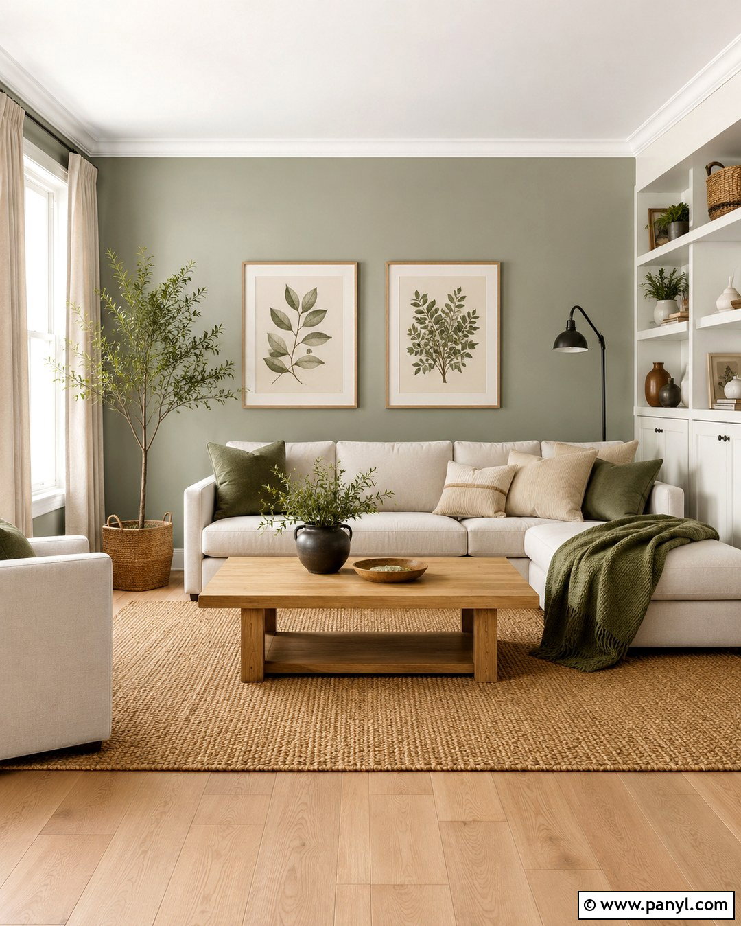
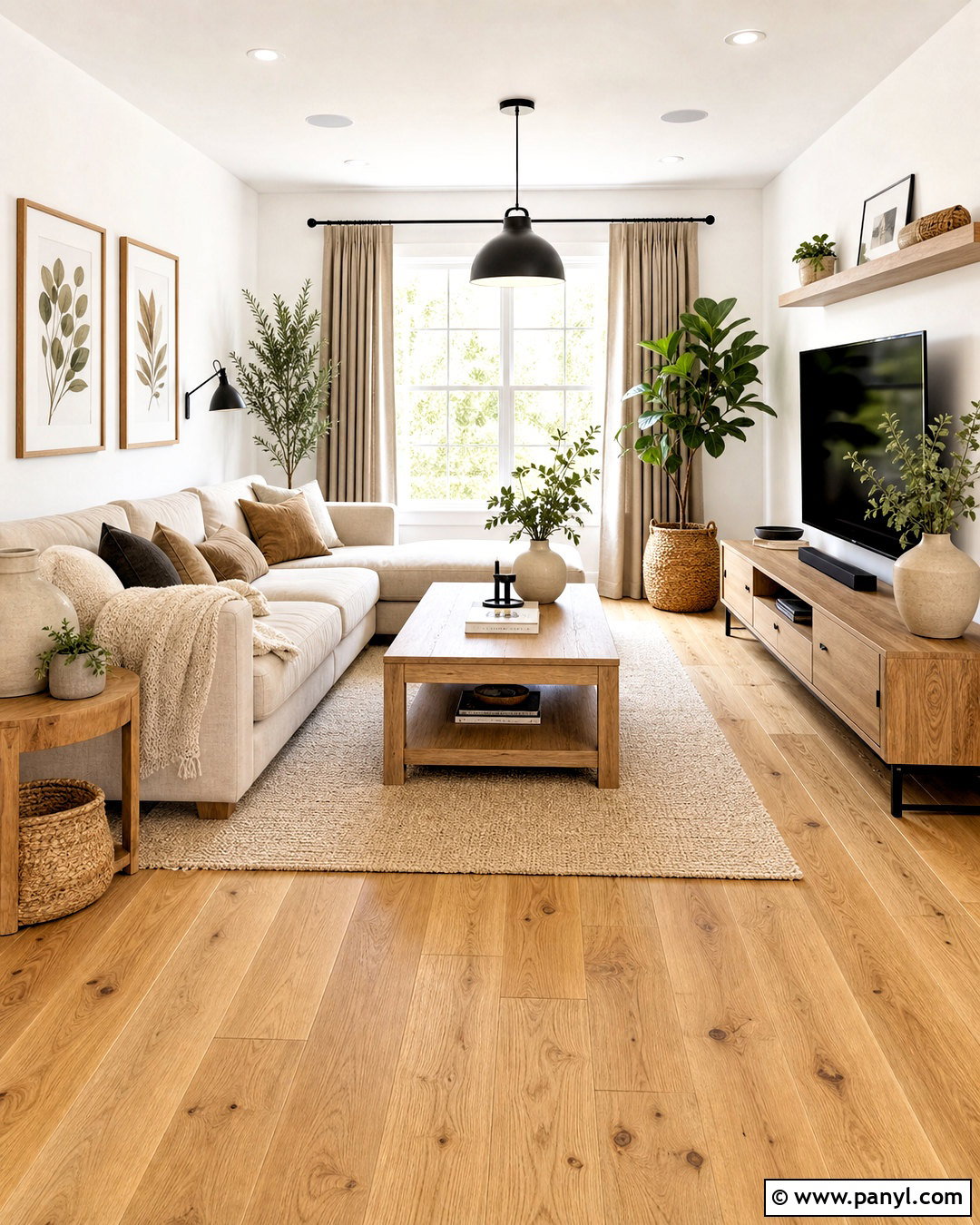
Sage green and warm white create a peaceful living room that feels fresh without looking cold. Paint the main walls a creamy white, then use muted sage green behind the sofa, fireplace, or built-in shelving. This placement gives the room a focal point while preserving an open atmosphere. Add a natural oak coffee table, oatmeal-colored sofa, and woven jute rug to reinforce the earthy palette. Linen curtains allow sunlight to soften both wall colors. Small touches of matte black, such as a floor lamp or picture frames, provide clean definition. Complete the room with botanical prints, ceramic vases, and cushions in cream, olive, and subtle stripes. The finished look suits modern farmhouse, Scandinavian, and relaxed contemporary homes.
2. Navy Blue And Soft Gray Interior Walls
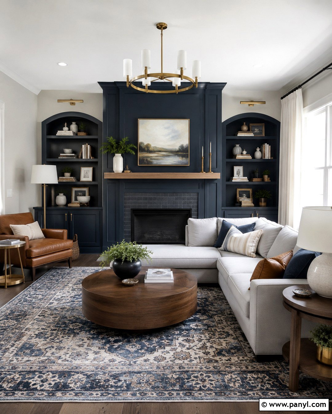
Deep navy and soft gray can make a living room feel polished, comfortable, and thoughtfully layered. Use pale warm gray across three walls, then place navy on the wall containing the fireplace, television unit, or main artwork. The gray keeps the room bright, while navy creates depth and anchors the seating area. Choose a light gray sectional, medium-toned walnut furniture, and a patterned rug combining blue, ivory, and muted tan. Brushed brass lighting adds warmth without making the palette overly formal. White trim gives both colors a crisp boundary. Finish with textured blue pillows, cream curtains, and a few cognac leather accents. This complete scheme works especially well in rooms receiving good natural light, where the navy can appear rich rather than heavy.
3. Terracotta And Cream Interior Walls
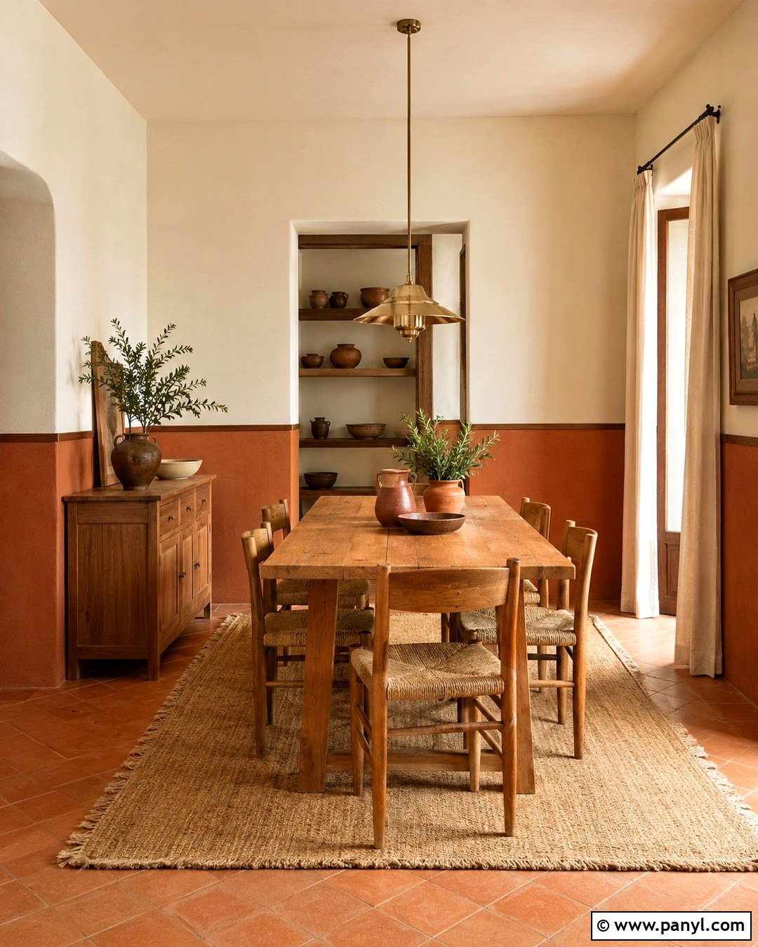
Warm terracotta paired with soft cream gives a dining room an inviting, sunbaked character. Cover the lower two-thirds of the walls in muted clay terracotta and use cream above, including the ceiling when you want the room to feel taller. A slim wood picture rail can create a clean transition between the colors. Ground the space with a solid oak dining table, woven dining chairs, and a natural fiber rug. Add cream linen curtains and a simple pendant in aged brass or woven rattan. Ceramic tableware, olive branches, and rust-colored textiles continue the earthy story without clutter. Avoid bright white because it may look harsh beside terracotta. The finished design feels warm, social, and relaxed, making it suitable for casual meals and special gatherings.
4. Dusty Blue And Crisp White Interior Walls
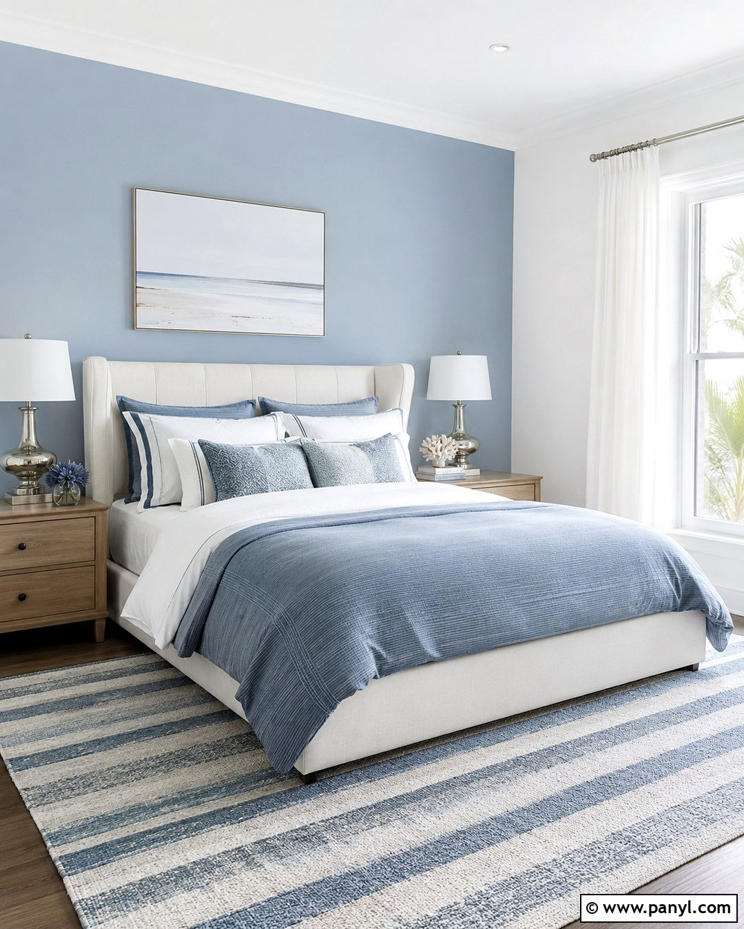
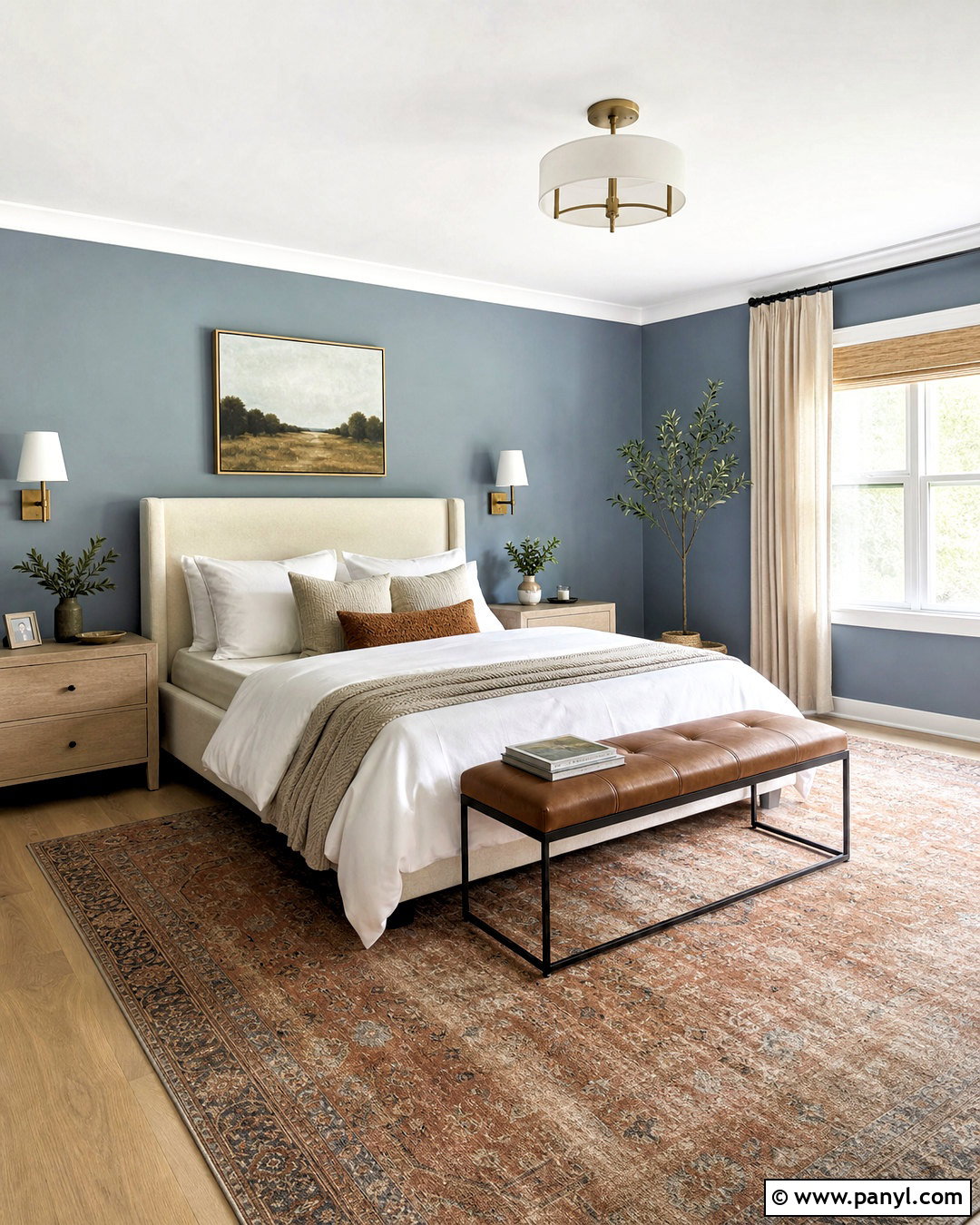
Dusty blue and crisp white form a clean bedroom palette with a calm, airy appearance. Paint the wall behind the bed in muted powder blue and keep the remaining walls, ceiling, and trim fresh white. This arrangement highlights the sleeping area without surrounding the entire room in color. Choose a white upholstered bed, pale oak nightstands, and bedding layered in white, blue-gray, and light taupe. A subtle striped rug introduces pattern while maintaining the restful atmosphere. Use polished nickel or brushed silver lamps for a cool, refined finish. Sheer white curtains help distribute daylight across the blue wall. Complete the bedroom with simple coastal artwork and one or two woven accessories. The look feels relaxed and timeless without depending on obvious nautical decorations.
5. Olive Green And Beige Interior Walls
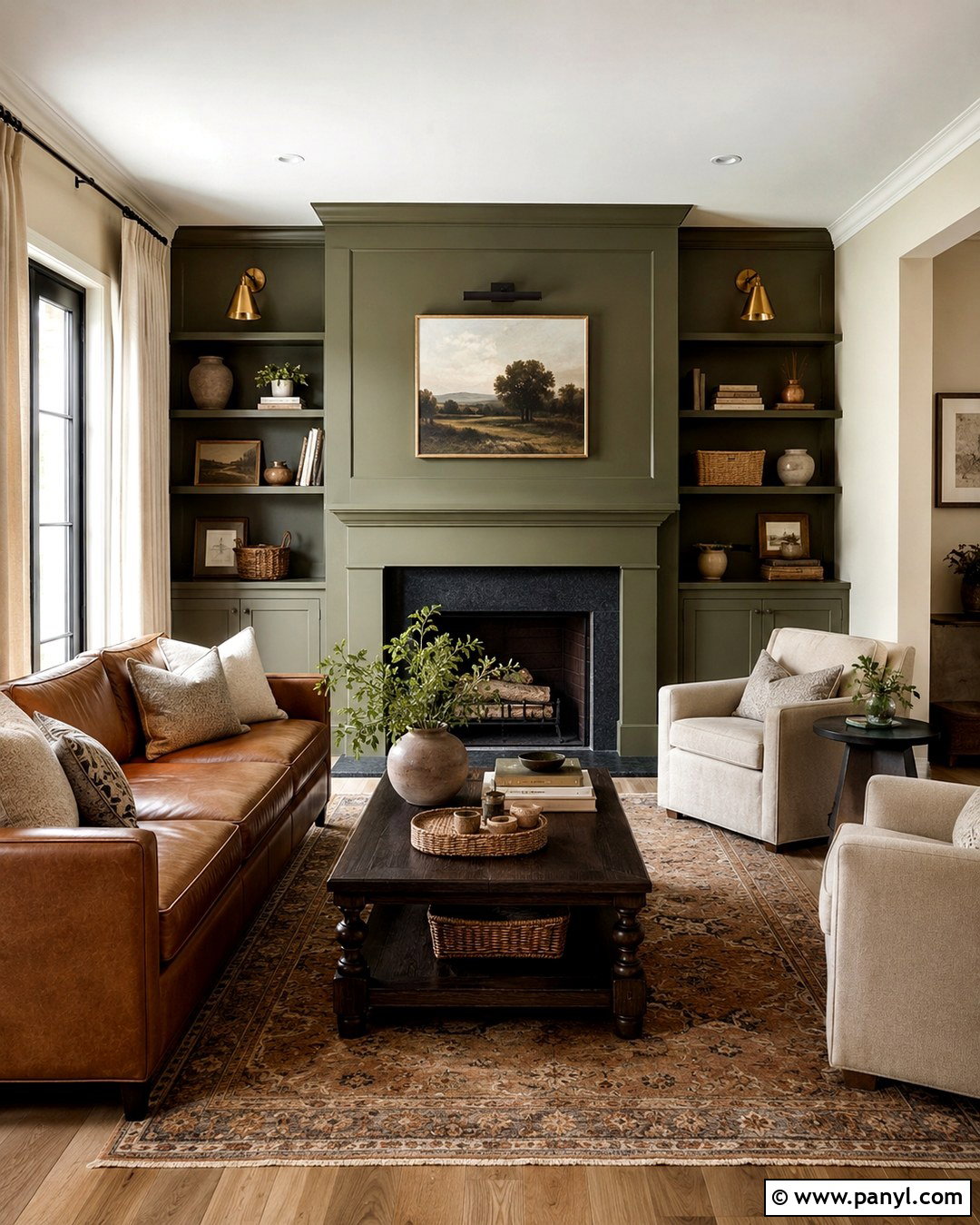
Olive green and beige bring depth and natural warmth to a family room. Use soft beige as the primary wall color, then wrap olive green around the fireplace wall and adjacent built-ins. Extending the green across connected architectural features makes the contrast feel intentional instead of random. Furnish the room with a camel leather sofa, beige armchairs, and a dark wood coffee table. A vintage-inspired rug containing olive, brown, cream, and faded red adds character. Select warm brass sconces and linen window panels to soften the stronger wall color. Books, pottery, baskets, and framed landscapes can fill the shelves without disrupting the palette. This combination is particularly effective with medium or dark wood flooring because every element shares a warm, earthy undertone.
6. Blush Pink And Warm Gray Interior Walls
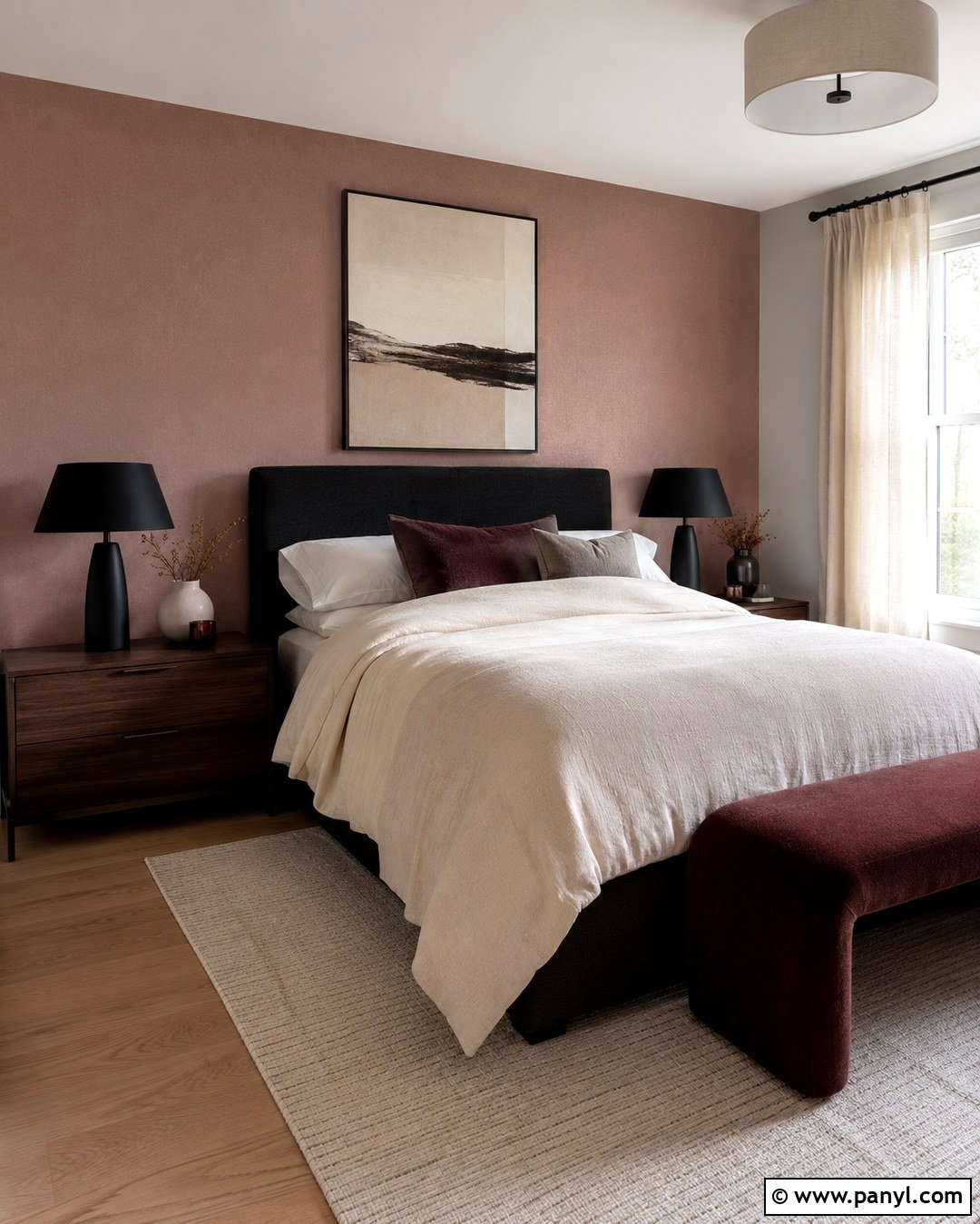
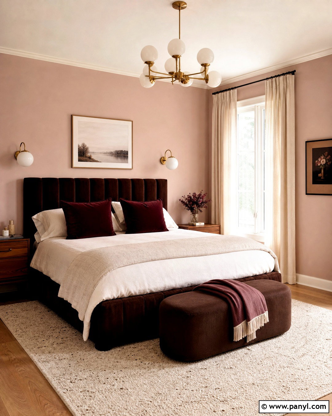
Blush pink and warm gray can create a sophisticated bedroom that feels soft but not overly sweet. Choose a dusty, brown-based pink for the wall behind the bed, then paint the other walls a light greige-gray. The muted undertones help both shades connect naturally. Add a charcoal upholstered headboard, walnut nightstands, and ivory bedding with small blush and gray details. A cream rug softens darker flooring, while black metal lamps introduce a modern outline. Keep window treatments simple with full-length oatmeal linen curtains. Abstract artwork can repeat the wall colors alongside touches of burgundy or rust. This balanced room design works for primary bedrooms, guest rooms, and compact apartments. Avoid highly saturated pink, which may overpower the quiet, grown-up quality of the scheme.
7. Teal Blue And Warm White Interior Walls
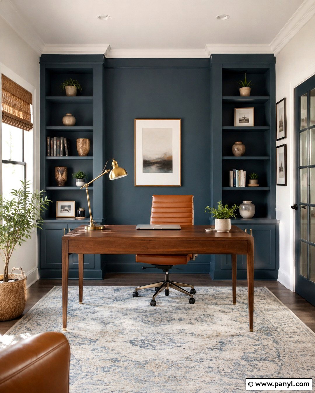
Rich teal and warm white give a home office energy while maintaining a professional appearance. Paint the desk wall deep teal, including any built-in shelves, and use creamy white on the surrounding walls and ceiling. The saturated background makes light wood furniture and decorative objects stand out clearly. Position a walnut desk against the teal wall with a comfortable tan leather chair. Add an ivory and blue patterned rug to connect the two wall colors across the floor. Brass task lighting brings warmth to the cool teal, while woven shades filter bright sunlight. Organize shelves with books, storage boxes, pottery, and a few leafy plants. The completed workspace feels focused, colorful, and welcoming. It can also provide an attractive background for video calls without needing excessive decoration.

8. Chocolate Brown And Ivory Interior Walls
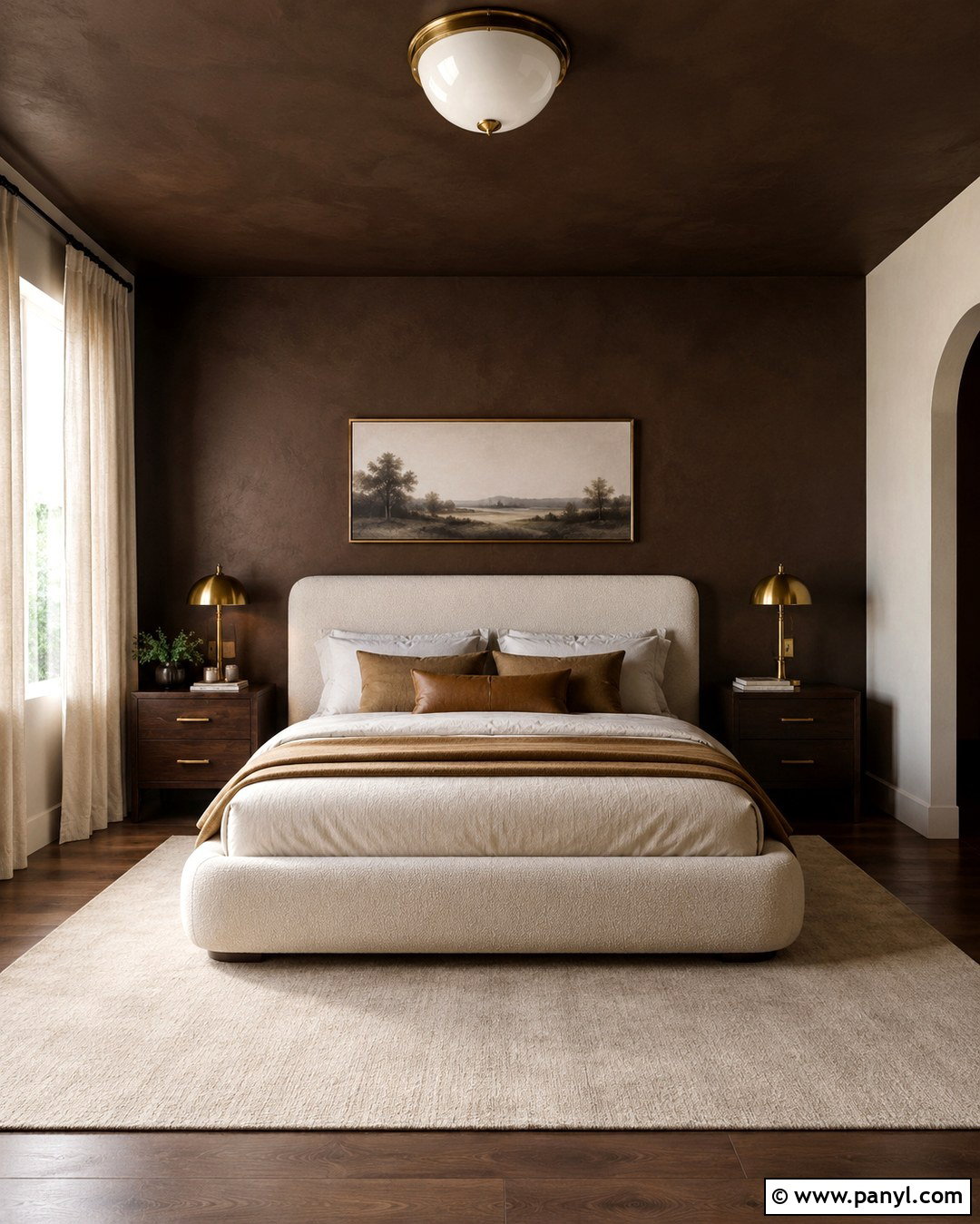
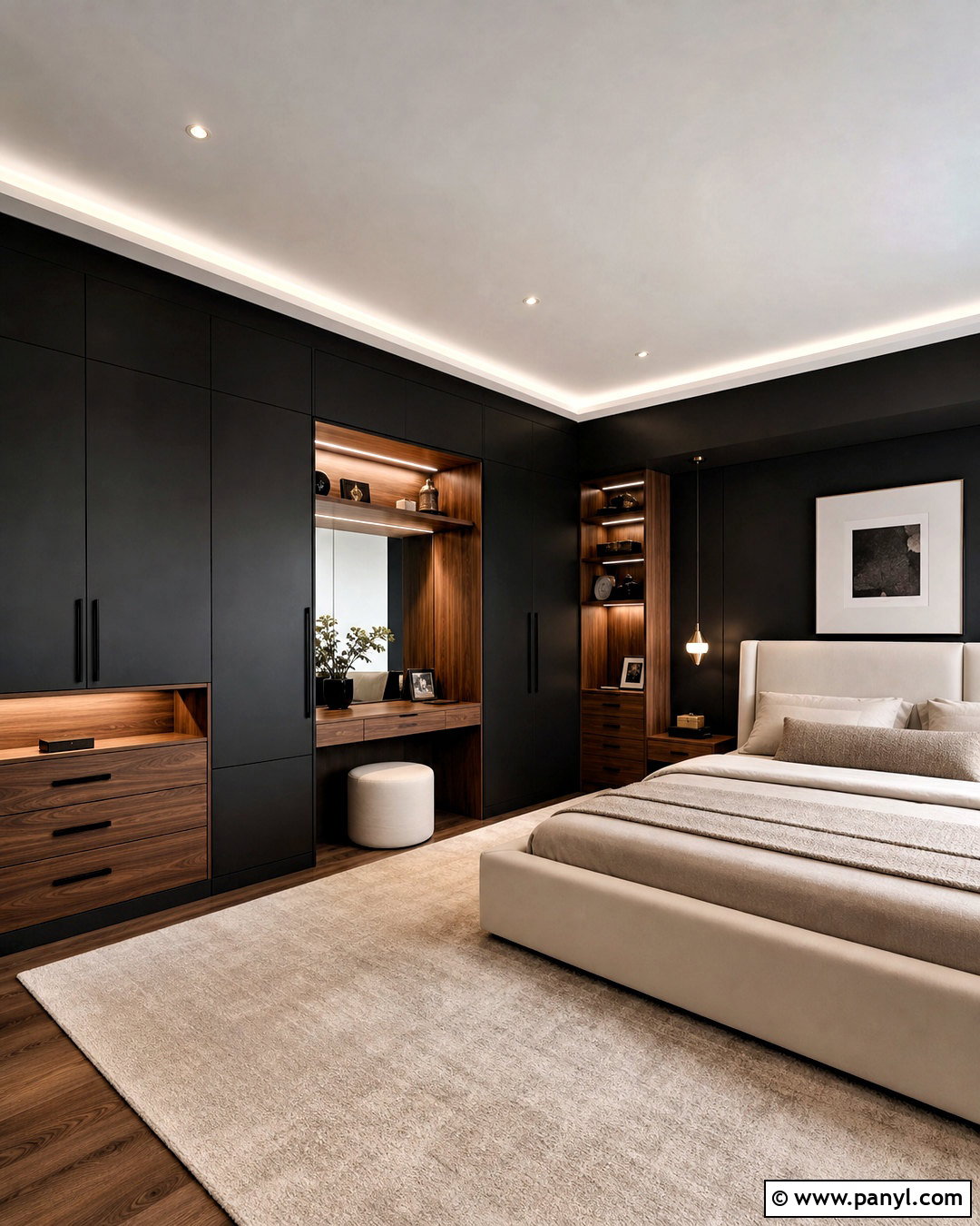
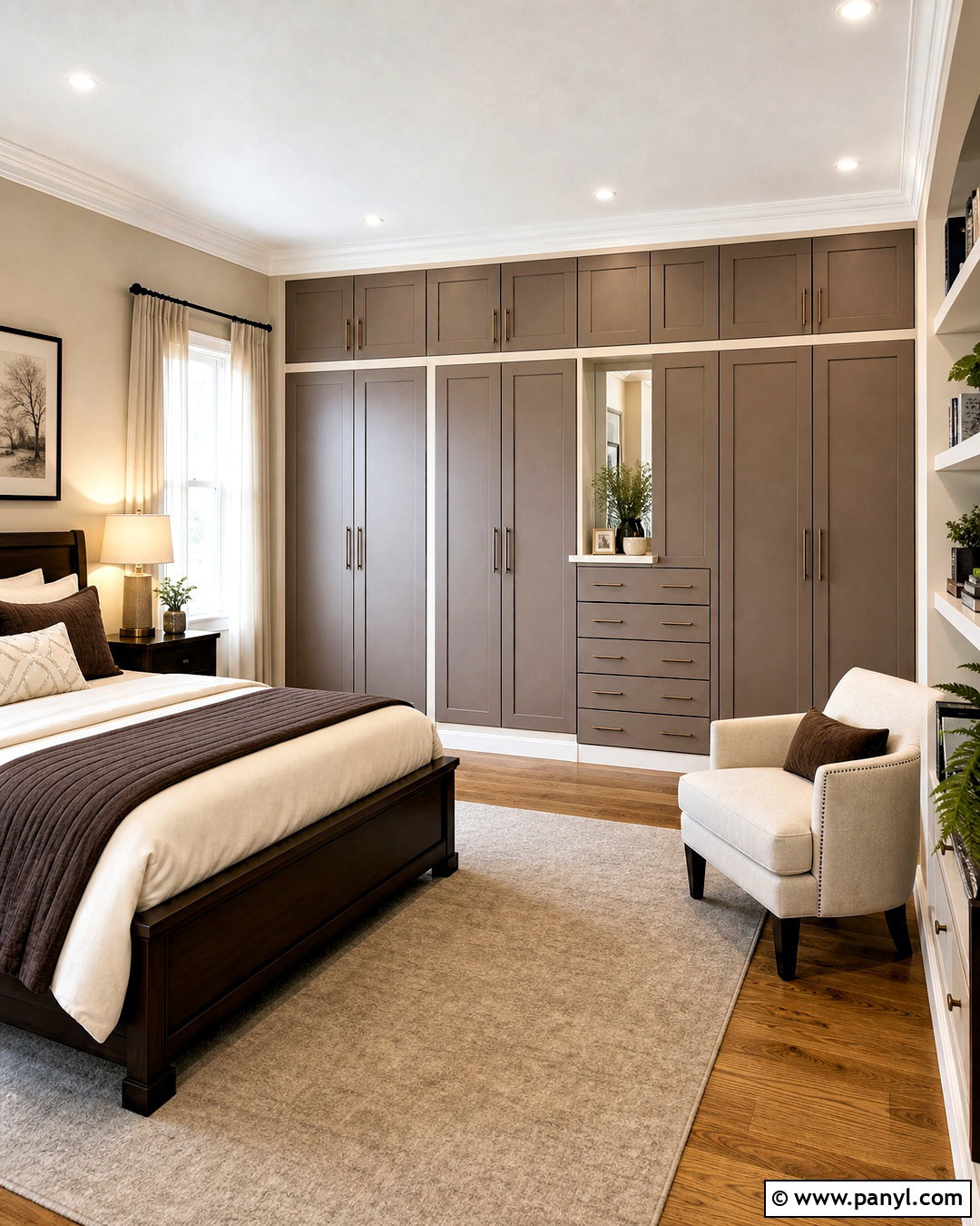
Chocolate brown and ivory can transform a bedroom into a warm, enveloping retreat. Apply deep cocoa brown to the wall behind the bed and continue it onto the ceiling for a cozy architectural effect. Keep the remaining walls a creamy ivory to prevent the room from becoming too dark. Choose an ivory boucle bed, dark walnut nightstands, and layered bedding in camel, cream, and warm brown. Soft bedside lighting in antique brass enhances the richness of the palette. Add a large wool rug in a pale neutral to brighten the floor area. Curtains should closely match the ivory walls for a seamless appearance. Minimal landscape artwork and textured cushions complete the design. This combination looks especially refined when several soft fabrics balance the strength of the dark paint.
9. Charcoal Gray And Pale Blue Interior Walls
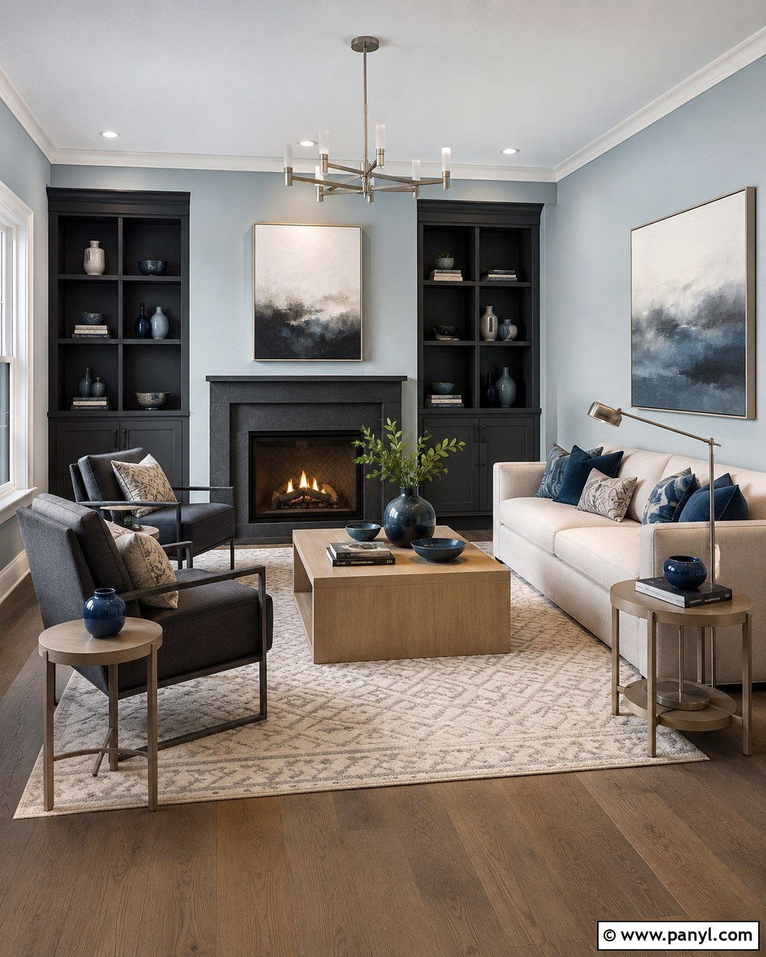
Charcoal gray and pale blue create a modern living room with controlled contrast. Paint the main walls a misty blue and use charcoal around the fireplace, media unit, or recessed shelving. The blue provides a gentle background, while the darker gray gives the room structure. Select a light oatmeal sofa and a pair of charcoal lounge chairs to distribute the wall colors throughout the seating arrangement. Pale oak tables keep the space from feeling overly cool. Add an ivory rug with a subtle geometric pattern, then introduce brushed steel lighting and blue ceramic accessories. White trim can sharpen the edges, although matching pale blue trim creates a softer result. Keep artwork large and simple. This palette suits contemporary rooms where clean lines and comfortable textures need to work together.
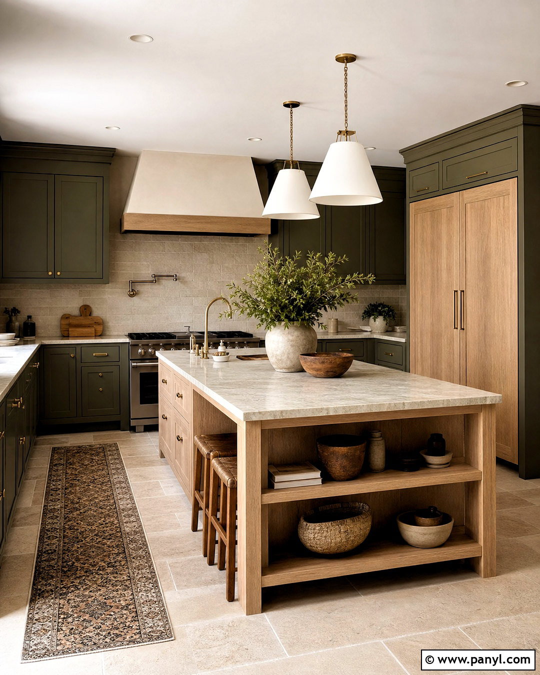
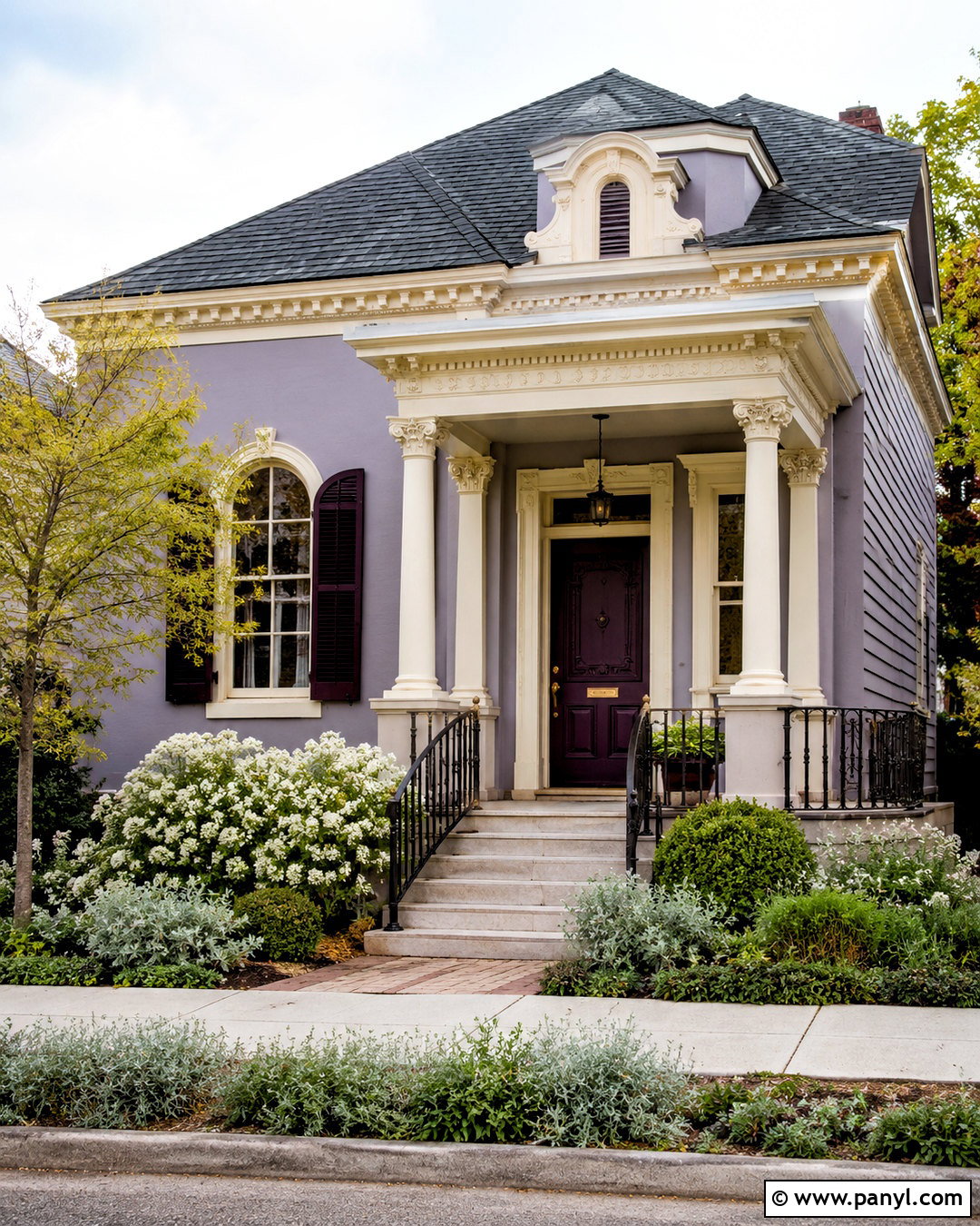
10. Mustard Yellow And Off-White Interior Walls
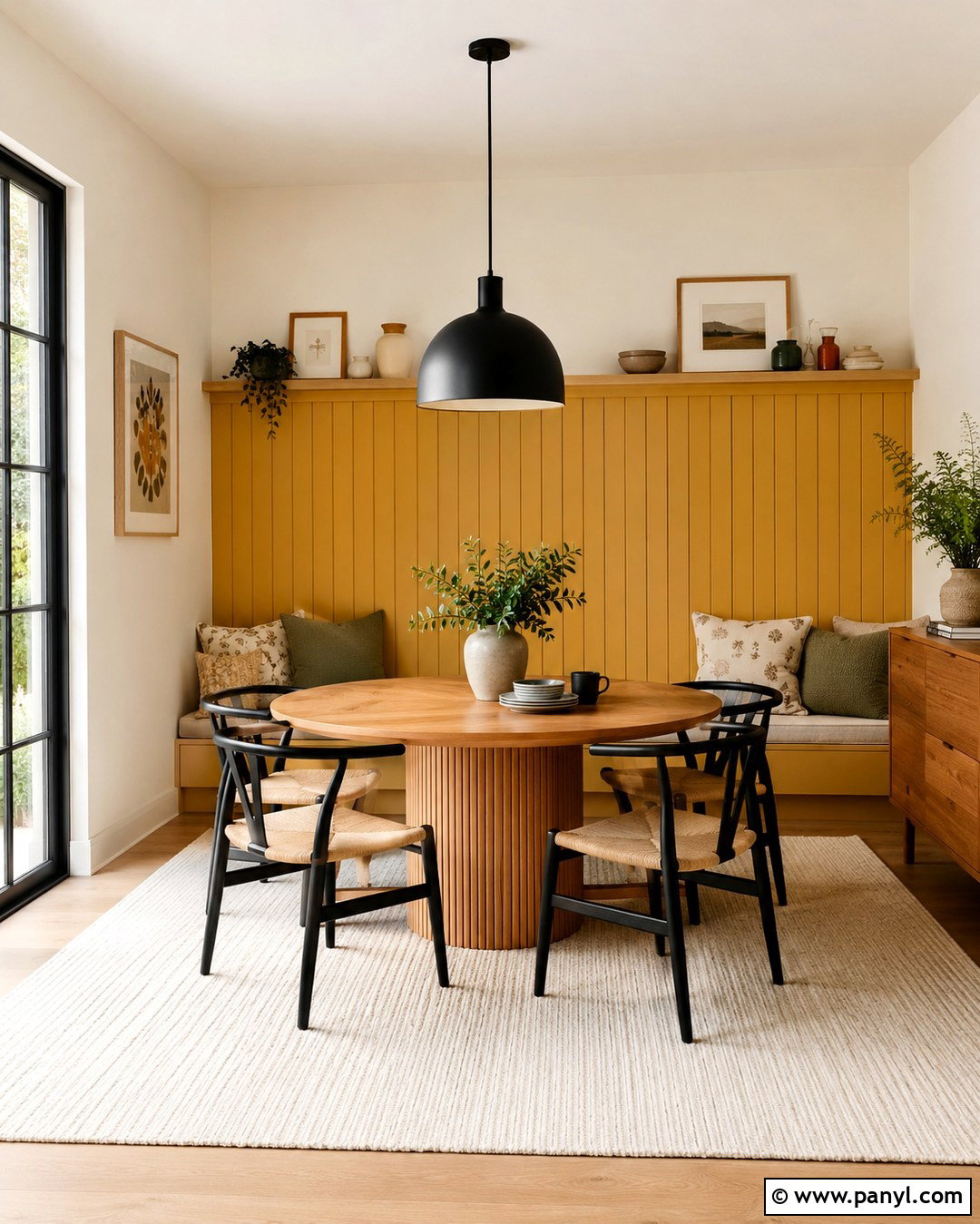
Mustard yellow and off-white make a breakfast room or compact dining area feel cheerful and welcoming. Use warm off-white on most walls, then paint the banquette wall or window alcove a grounded mustard shade. A concentrated block of yellow adds personality without overwhelming the room. Pair it with a round oak table, off-white upholstered bench seating, and simple black dining chairs. A washable striped rug in cream, tan, and charcoal provides practical pattern underfoot. Use a matte black pendant to define the table and balance the warmth of the yellow. Add natural wood frames, handmade ceramics, and seat cushions in rust or olive. Sunlight strengthens this palette, but warm white bulbs help preserve its inviting quality after dark. The finished room feels lively yet easy to maintain.
11. Forest Green And Pale Greige Interior Walls
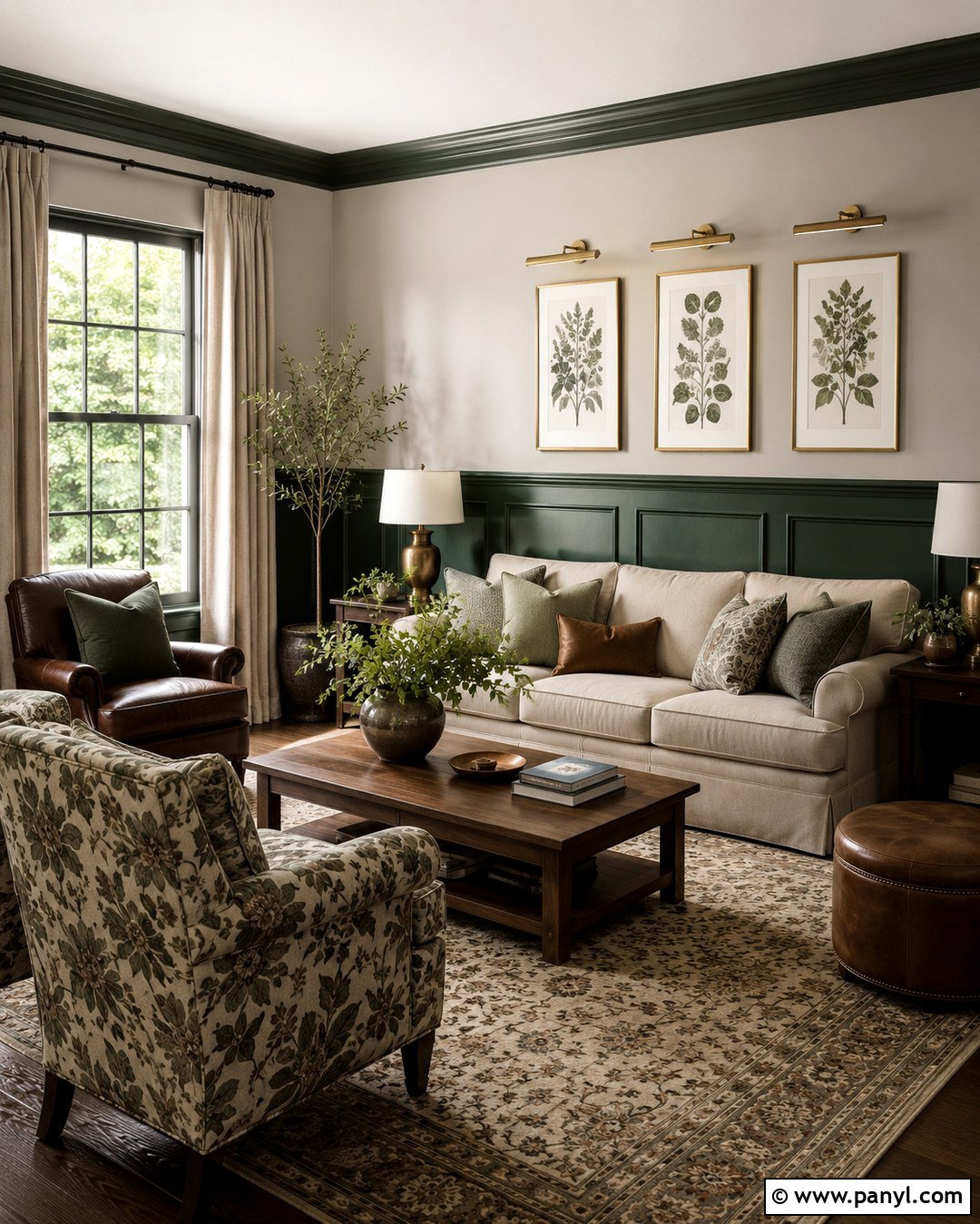
Forest green and pale greige give a traditional living room a rich, updated identity. Use greige on the upper walls and deep green below a chair rail or wall molding. This lower placement grounds the room and highlights architectural detail. Paint the molding green for a smooth, continuous finish rather than outlining every section in white. Add a tailored beige sofa, two plaid or patterned armchairs, and a medium walnut coffee table. An antique-inspired rug with cream, green, and muted red brings the full palette together. Brass picture lights and table lamps add warmth against the forest tone. Hang landscapes or botanical artwork above the dividing line. With linen curtains and a few leather accents, the complete space feels established and comfortable rather than overly formal or themed.
12. Lavender And Soft Cream Interior Walls
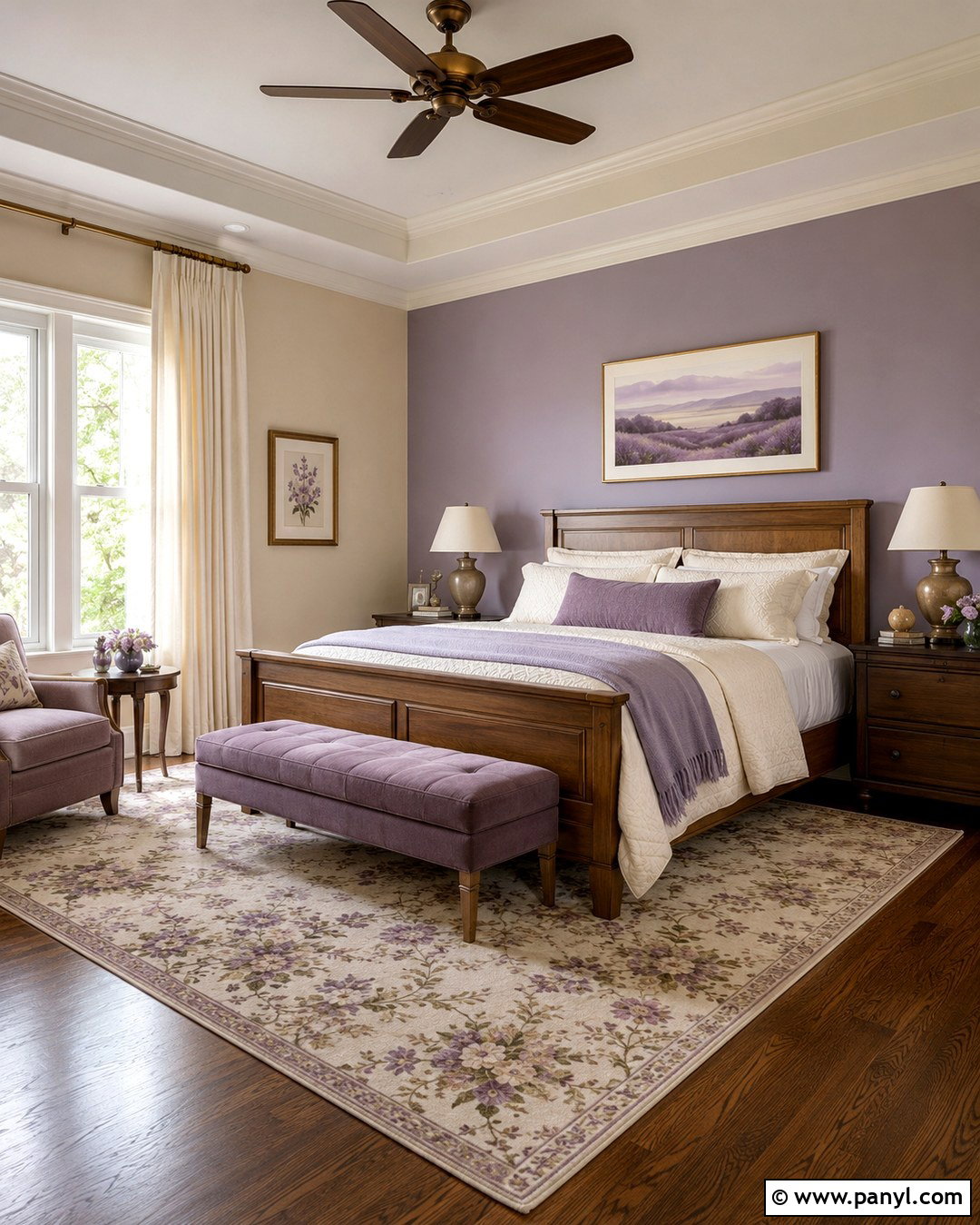
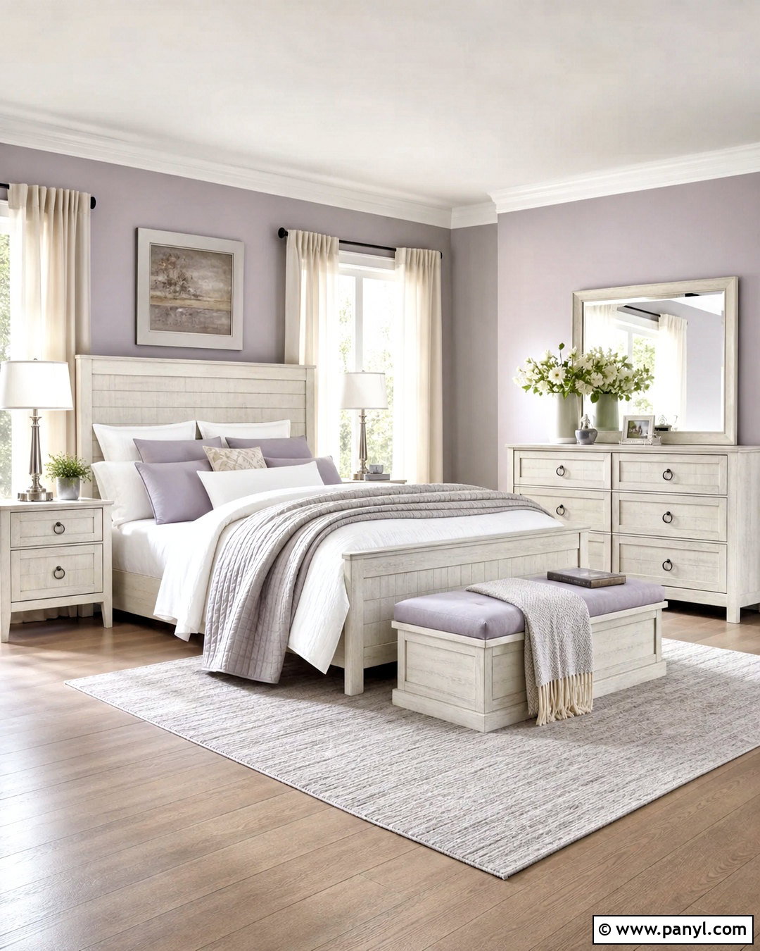
Lavender and soft cream produce a gentle guest bedroom that still feels colorful and distinctive. Select a gray-based lavender for the bed wall and use buttery cream on the remaining surfaces. This warmer neutral prevents lavender from appearing chilly. Furnish the room with a natural wood bed, cream bedding, and a small upholstered bench in muted plum or taupe. A floral or geometric rug can combine lavender, green, cream, and dusty pink in controlled amounts. Choose aged brass bedside lights and simple wood-framed artwork for warmth. Full-length cream curtains should blend with the lighter walls and make the windows appear larger. Complete the room with a lilac throw, fresh greenery, and ceramic lamps. The overall design feels restful, welcoming, and appropriate for guests of different ages.
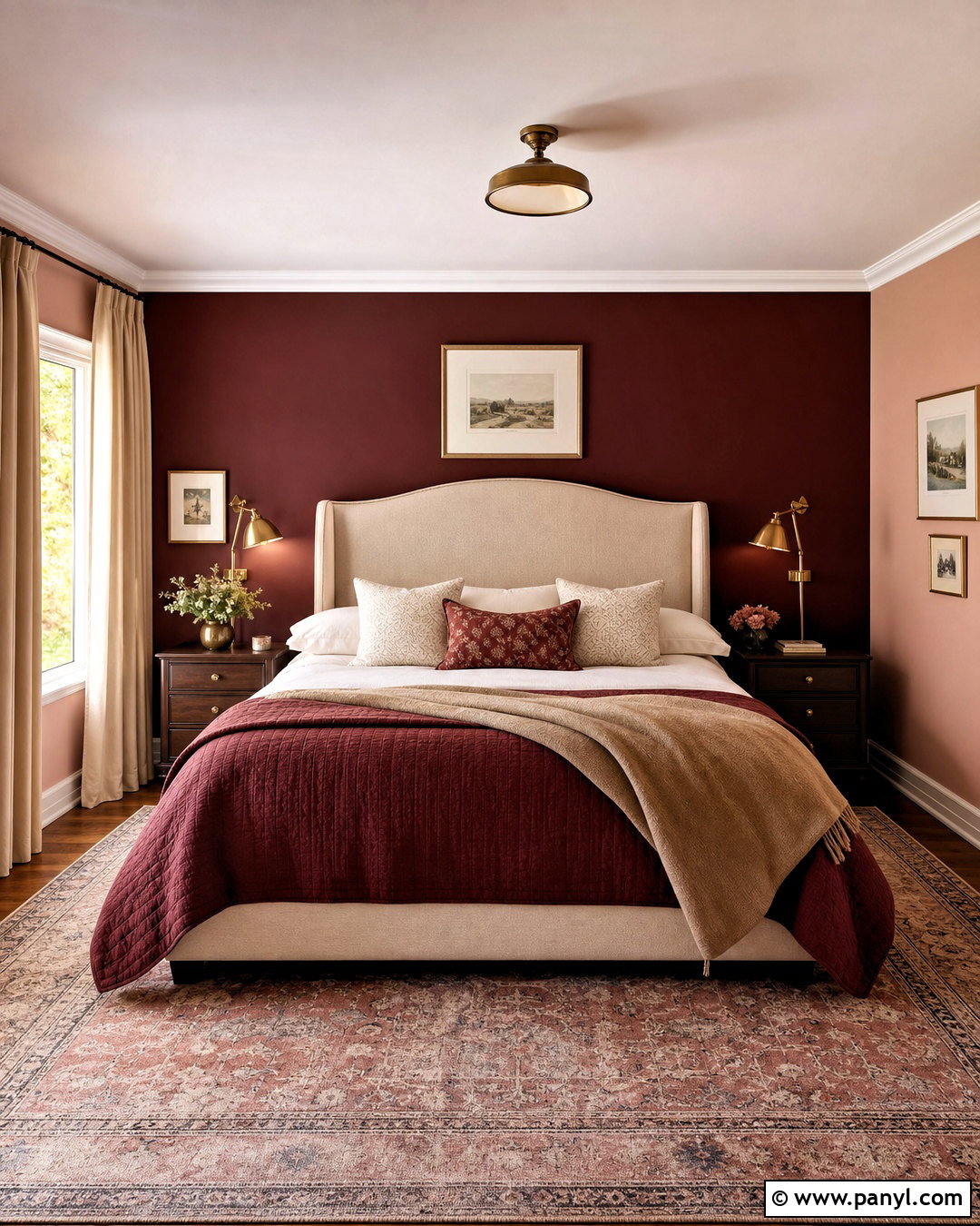
13. Burgundy And Dusty Pink Interior Walls
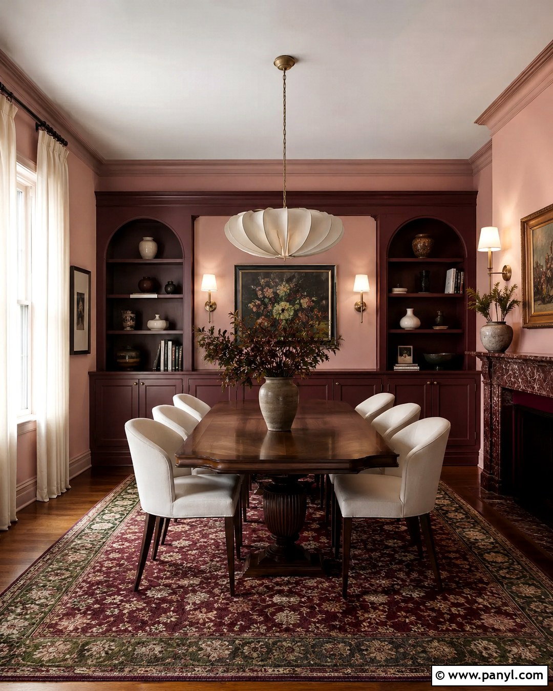
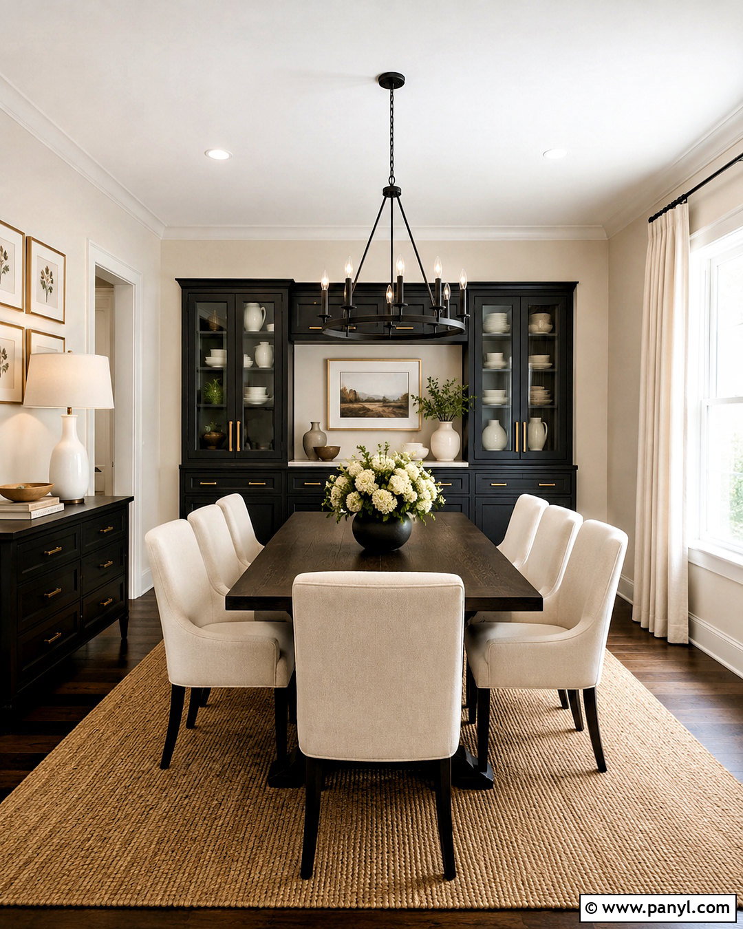
Burgundy and dusty pink create a bold dining room with warmth, depth, and a sense of occasion. Paint the walls muted dusty pink, then use burgundy on built-in cabinetry, the fireplace surround, or the wall behind a sideboard. Repeating burgundy on a substantial architectural area makes the pairing look deliberate. Add a dark oak dining table and chairs upholstered in cream or faded rose. A patterned rug featuring burgundy, tan, and soft green prevents the palette from feeling flat. Brass sconces and a sculptural pendant provide warm highlights. Use ivory curtains to lighten the windows and keep the ceiling a gentle off-white. Complete the room with framed artwork, simple ceramics, and green foliage. The final scheme feels expressive and elegant without relying on overly formal furnishings.
14. Peach And Soft Taupe Interior Walls
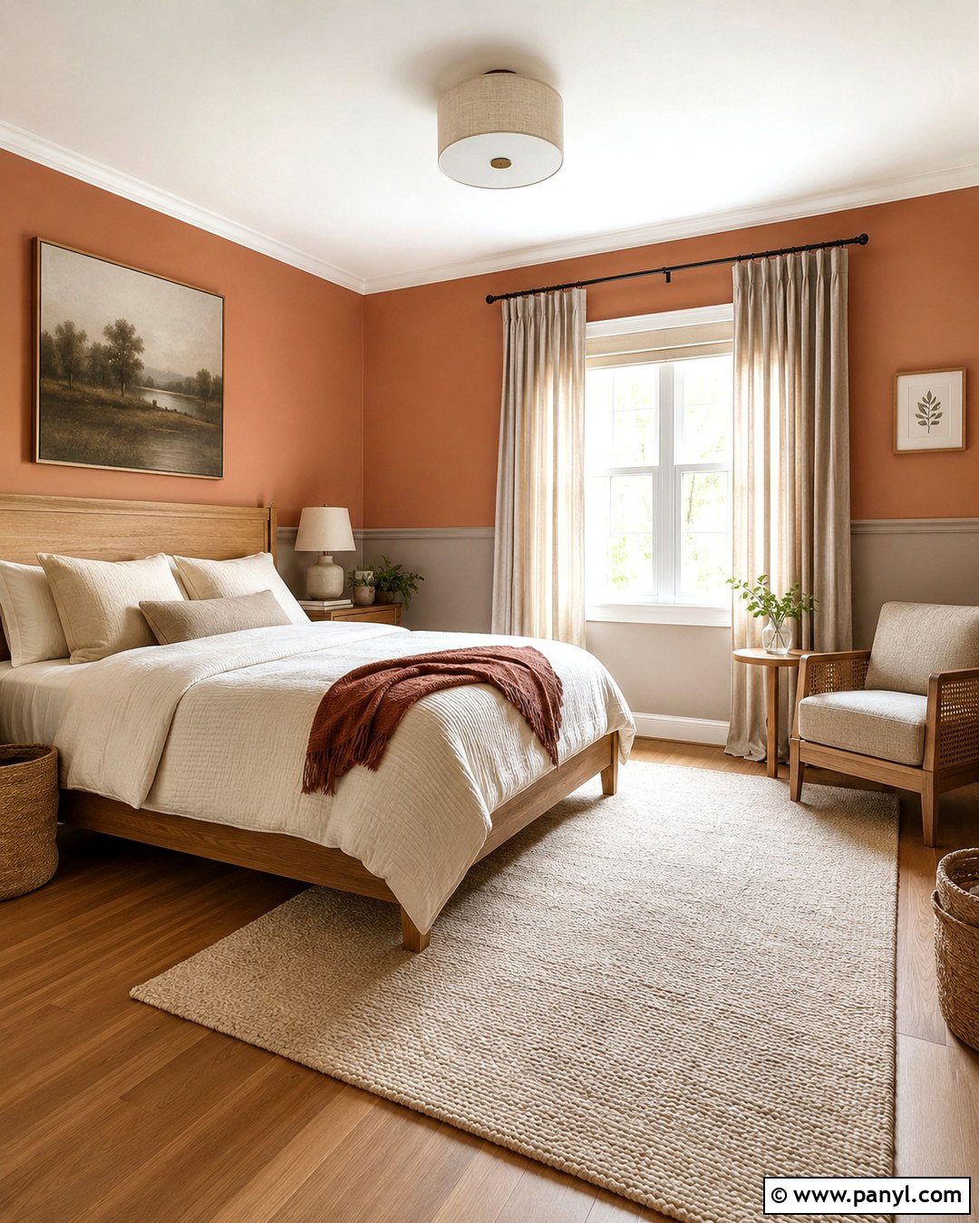
Peach and soft taupe offer a warm, flattering palette for a small bedroom or nursery. Choose a subdued peach with earthy undertones for the upper walls and a light taupe for the lower section. Divide the colors with simple painted molding or a clean horizontal line positioned slightly above the headboard. Natural oak furniture complements both shades, while ivory bedding keeps the room fresh. Add a washable cream rug, woven storage baskets, and curtains in pale oatmeal linen. Small accents of muted green provide contrast through artwork, cushions, or a comfortable chair. Use warm white lighting rather than strongly yellow bulbs. This complete design feels gentle and adaptable, allowing the furniture and accessories to change over time without requiring an immediate repaint of the entire room.
15. Cobalt Blue And Cream Interior Walls
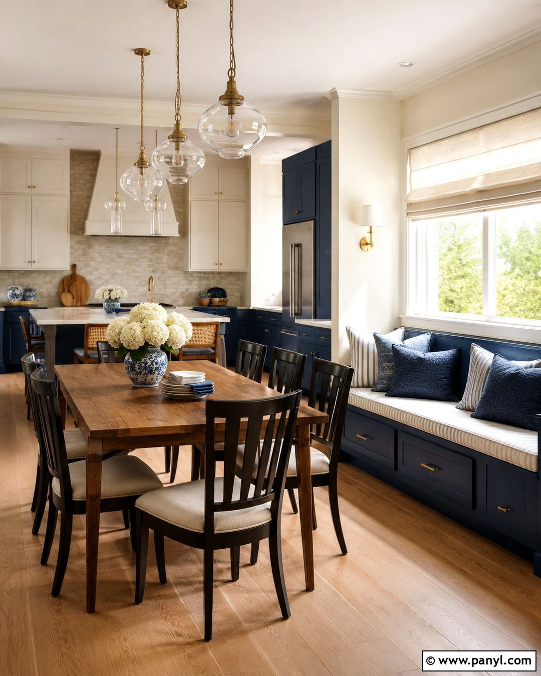
Cobalt blue and cream can give a kitchen or dining space crisp character and memorable contrast. Keep most walls a warm cream, then apply cobalt blue to a breakfast nook, pantry wall, or the area around built-in cabinetry. Repeat the blue on lower cabinets or a freestanding hutch to connect the wall treatment with the room. Choose light oak or white oak flooring, creamy quartz counters, and simple brushed brass hardware. A wood dining table softens the stronger blue and creates a natural gathering point. Add cream Roman shades, striped seat cushions, and blue-and-white ceramics in restrained amounts. The palette works best when cobalt is concentrated rather than scattered across every surface. The finished room feels energetic, clean, and practical without becoming visually noisy.
16. Burnt Orange And Warm Beige Interior Walls
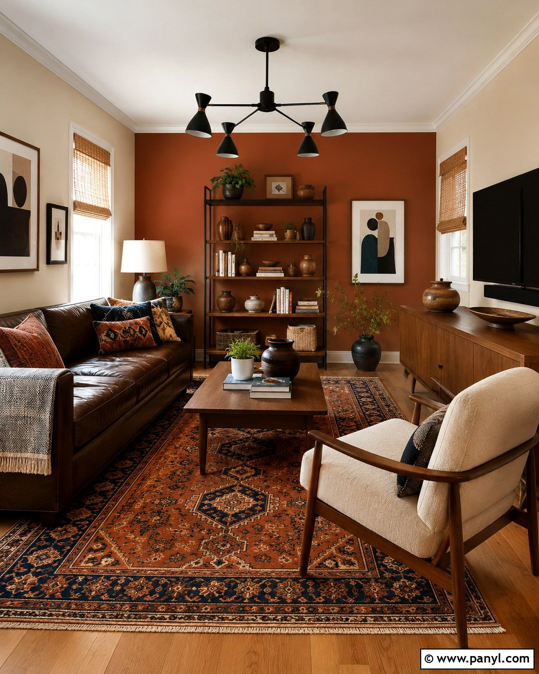
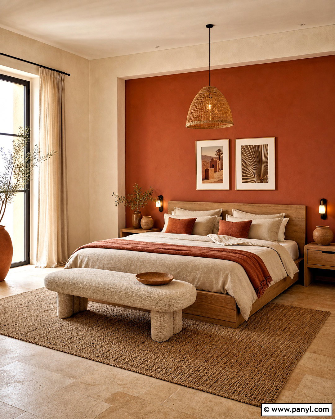
Burnt orange and warm beige make a den feel cozy, grounded, and full of personality. Paint the main walls a sandy beige and cover the wall behind the sofa or bookcase in earthy burnt orange. Choose a shade with brown undertones rather than a bright citrus orange. Furnish the room with a deep brown leather sofa, cream lounge chair, and walnut media cabinet. A patterned wool rug containing rust, navy, and beige ties the stronger colors together. Add black metal lighting and woven shades for texture. Display books, pottery, and graphic art in a controlled arrangement. Cream curtains keep the windows light and balance the darker furniture. This complete palette is particularly effective for casual rooms used for reading, relaxing, and watching television with family.
17. Mint Green And White Interior Walls
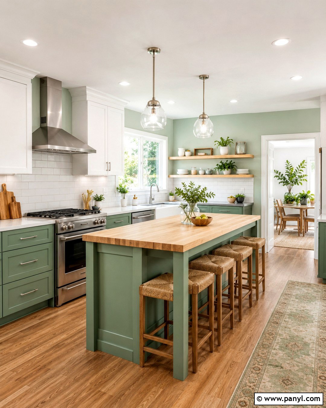
Mint green and clean white can make a compact kitchen feel bright, fresh, and organized. Paint the primary walls soft mint and reserve white for the backsplash wall, ceiling, trim, and upper cabinetry. Lower cabinets in a slightly deeper mint can create a coordinated tonal effect. Add light wood countertops or a pale butcher-block island to warm the cool palette. White tile, brushed nickel hardware, and simple glass pendants maintain a clean appearance. Use natural woven stools and a washable runner with mint, beige, and soft blue details. Open shelves should hold practical white dishes, wood boards, and a few small plants rather than excessive decoration. The finished kitchen feels cheerful and spacious, with enough color to look distinctive while preserving the brightness needed for everyday cooking.
18. Black And Warm White Interior Walls
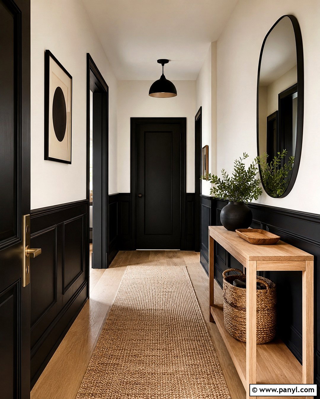
Black and warm white produce a striking entryway when their placement follows the architecture. Use warm white on the upper walls and ceiling, then paint the lower paneling, interior doors, and baseboards soft matte black. This distribution keeps the entrance bright while protecting busy lower surfaces visually. Add a slim natural oak console, a large rounded mirror, and a textured beige runner. A black metal ceiling light connects with the painted woodwork, while a woven basket provides convenient storage. Keep artwork graphic but minimal so it does not compete with the strong contrast. If the hallway lacks natural light, choose charcoal-black rather than a pure inky tone. The completed space feels crisp, functional, and welcoming, creating a confident transition into surrounding rooms.
19. Plum And Mushroom Beige Interior Walls
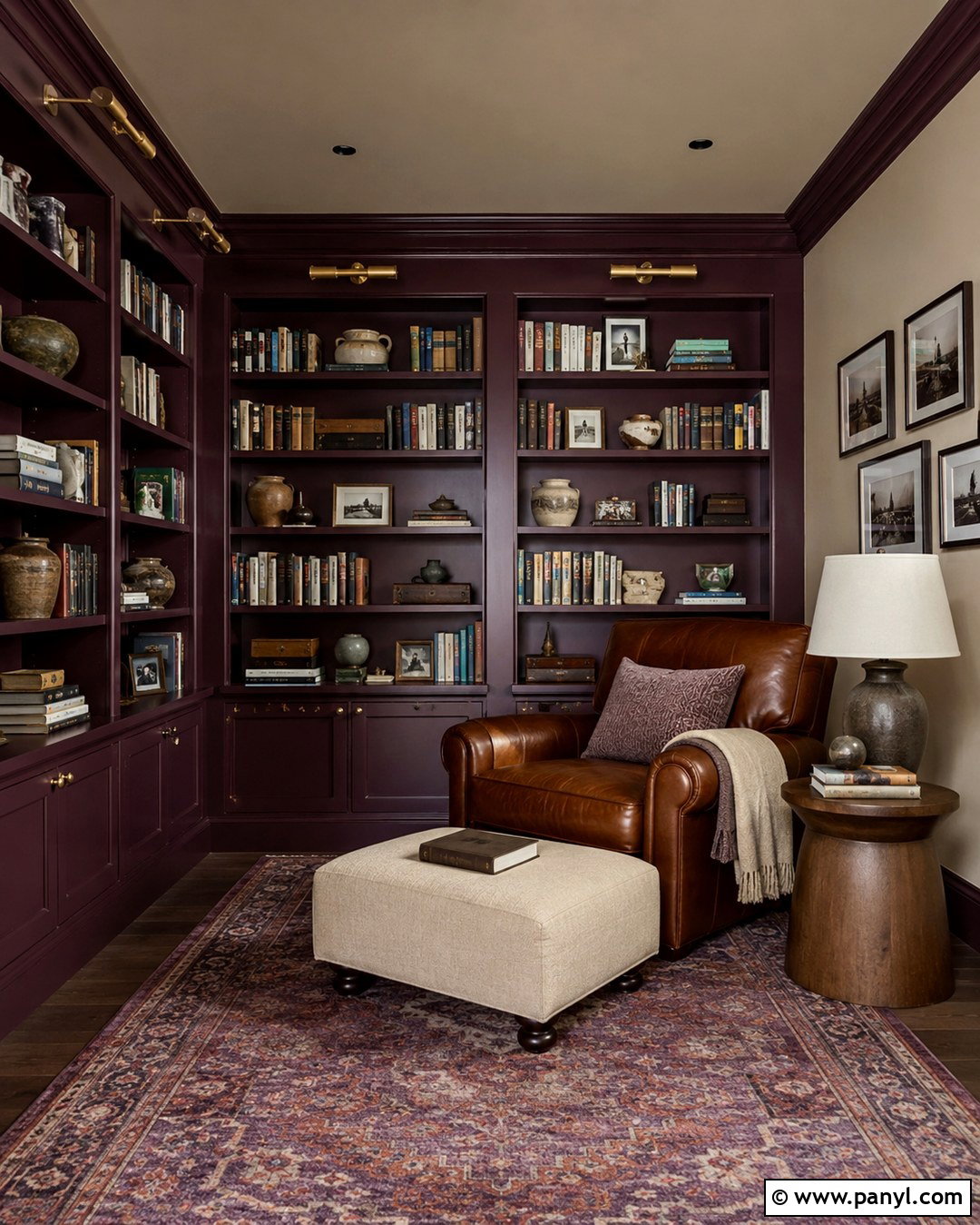
Plum and mushroom beige bring subtle drama to a reading room, home library, or quiet sitting area. Apply deep muted plum to built-in bookcases and the wall behind them, then use mushroom beige across the remaining walls and ceiling. The beige has enough brown and gray to complement plum without creating a sharp contrast. Add a caramel leather chair, a small walnut table, and an oatmeal ottoman. A vintage rug containing faded purple, rust, cream, and olive gives the room a collected appearance. Install aged brass picture lights above the shelving and place a linen floor lamp near the chair. Books, pottery, and framed photographs complete the built-ins. The finished space feels intimate and comfortable while remaining bright enough for daytime reading and everyday use.
20. Sky Blue And Sandy Beige Interior Walls
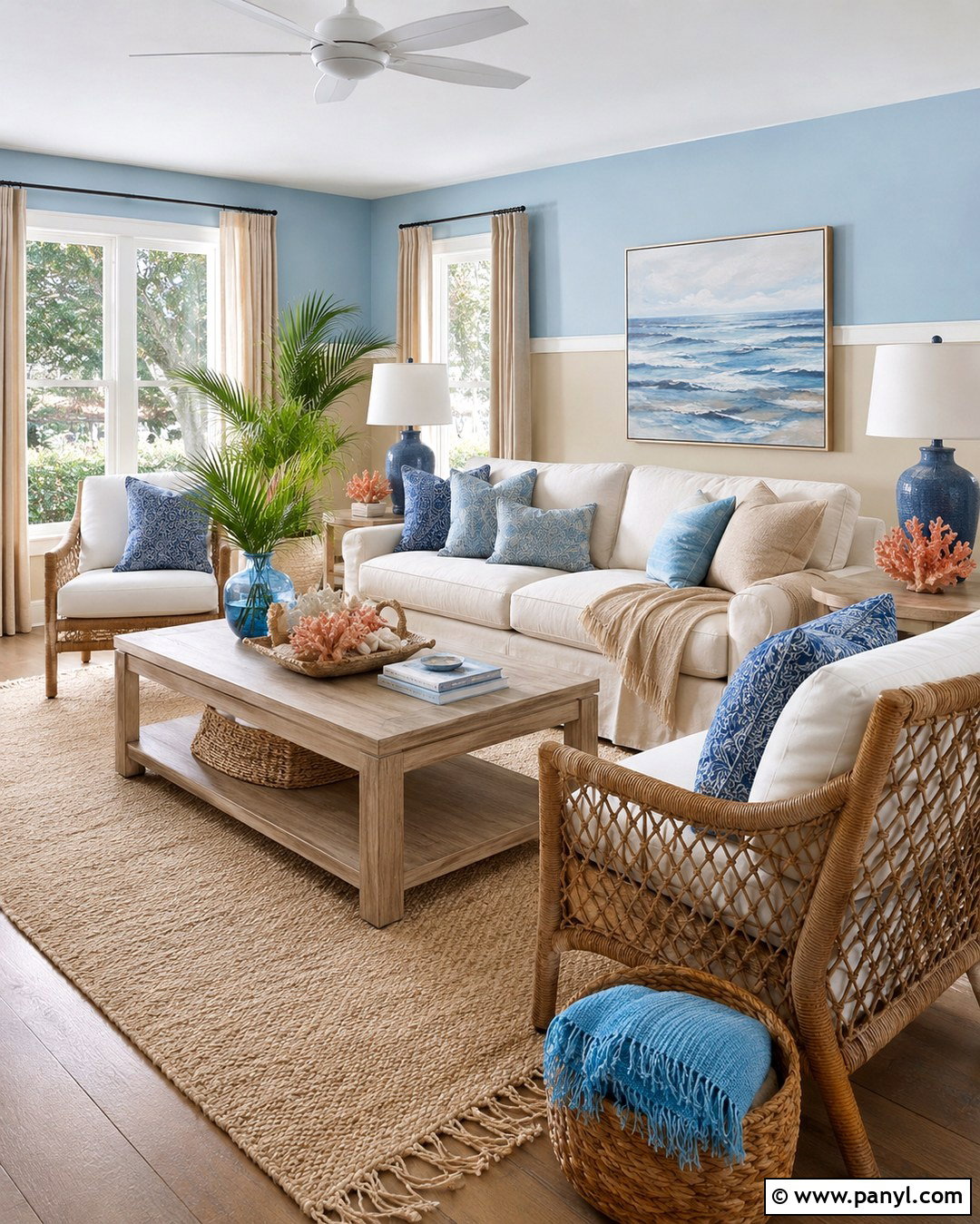
Sky blue and sandy beige create a relaxed family room inspired by natural coastal colors without looking themed. Paint the upper walls a clear, softened blue and use sandy beige below a simple chair rail. Beige grounds the room, while blue visually opens the upper portion. Choose a slipcovered cream sofa, pale wood coffee table, and woven accent chairs. A textured rug in ivory and tan should define the seating area without introducing heavy pattern. Add blue cushions, beige throws, and a few muted coral accents for warmth. White linen curtains keep the windows light, while ceramic lamps and woven baskets add practical texture. Avoid obvious seaside signs or novelty decorations. The complete room feels sunny, casual, and versatile enough for year-round family living.
Conclusion:
The most successful wall palette does more than place two attractive shades next to each other. It connects paint with furniture, flooring, natural light, textiles, and architectural features. These **20 Colour Combination For Interior Walls** range from quiet sage and cream to stronger pairings such as cobalt and ivory or burgundy and dusty pink. Choose a combination that supports the room’s purpose and existing finishes. Use the darker color to highlight a focal wall, built-in feature, molding, or functional zone. Let the lighter shade maintain balance and brightness. Always test large painted samples beside flooring and furniture before committing. With thoughtful placement and repeated accent colors, a two-tone wall scheme can make an ordinary room feel complete, comfortable, and intentionally designed.

Related Ideas and Inspiration:
Leave a Reply